WILD PONY
BRANDING
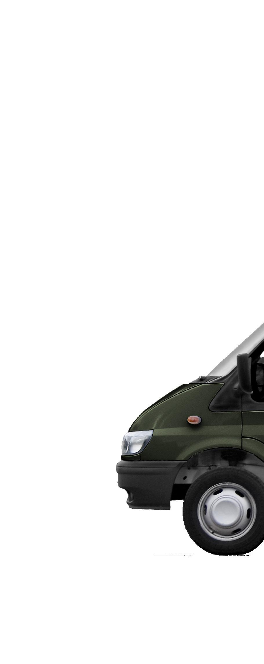
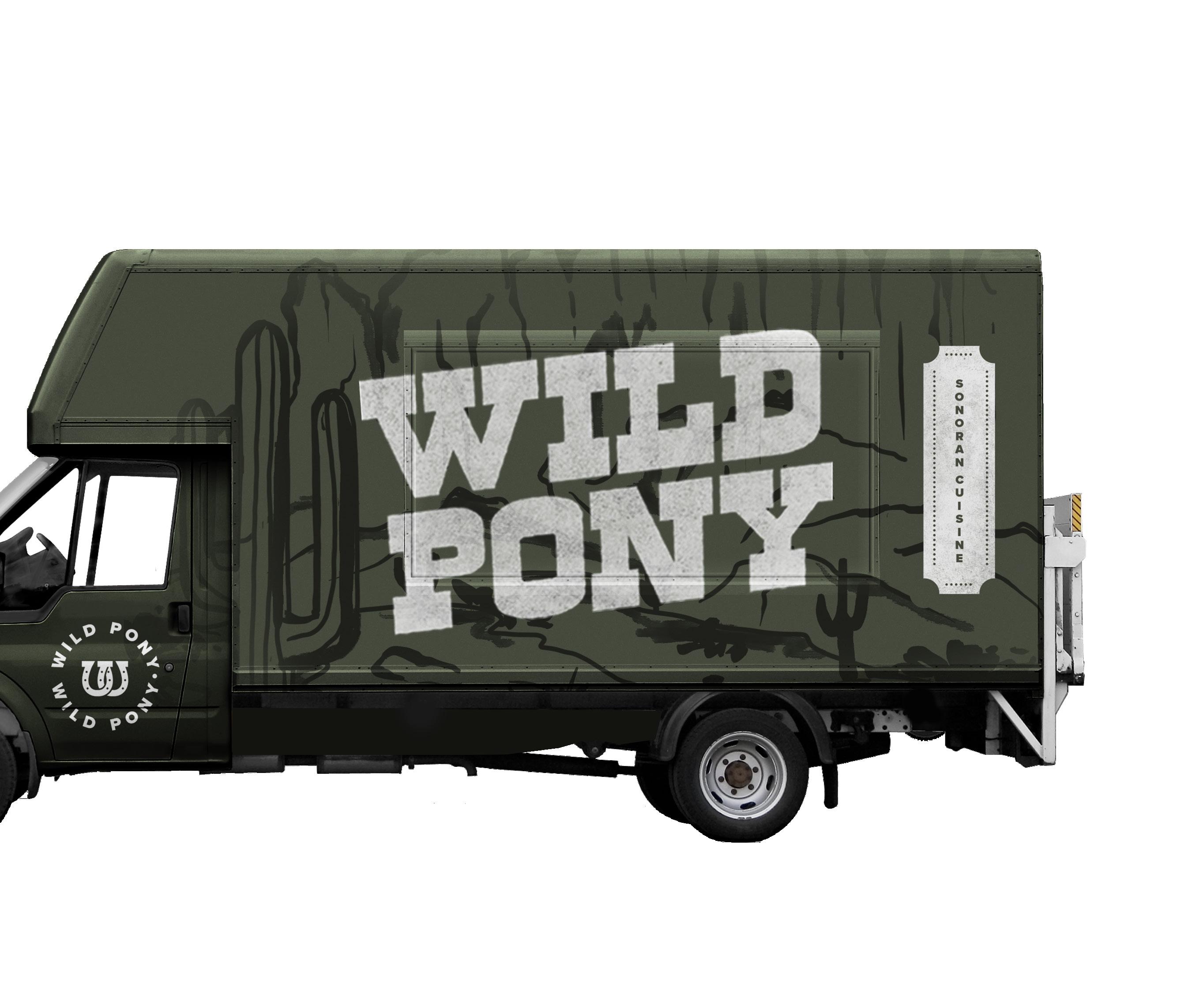
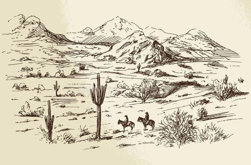
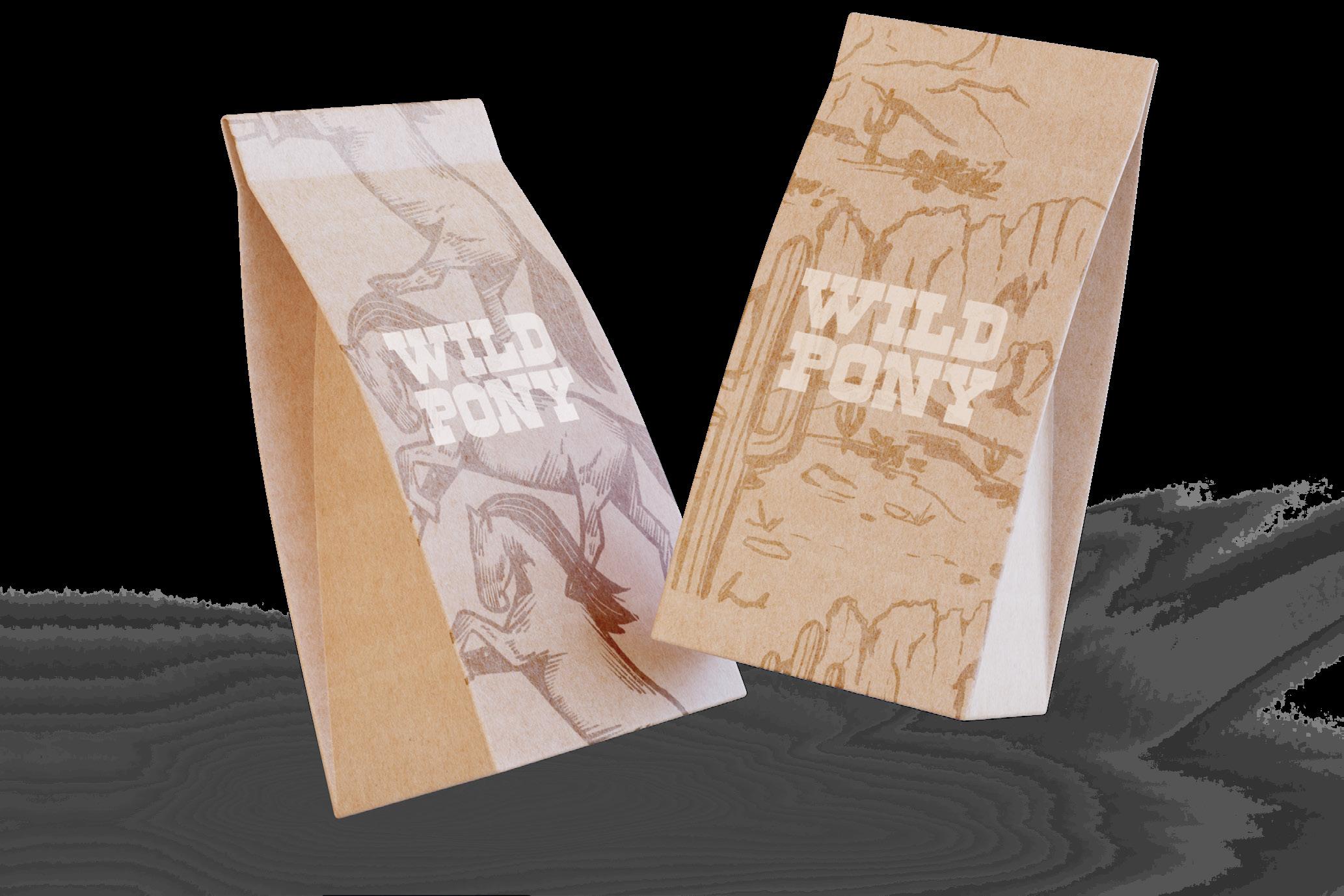
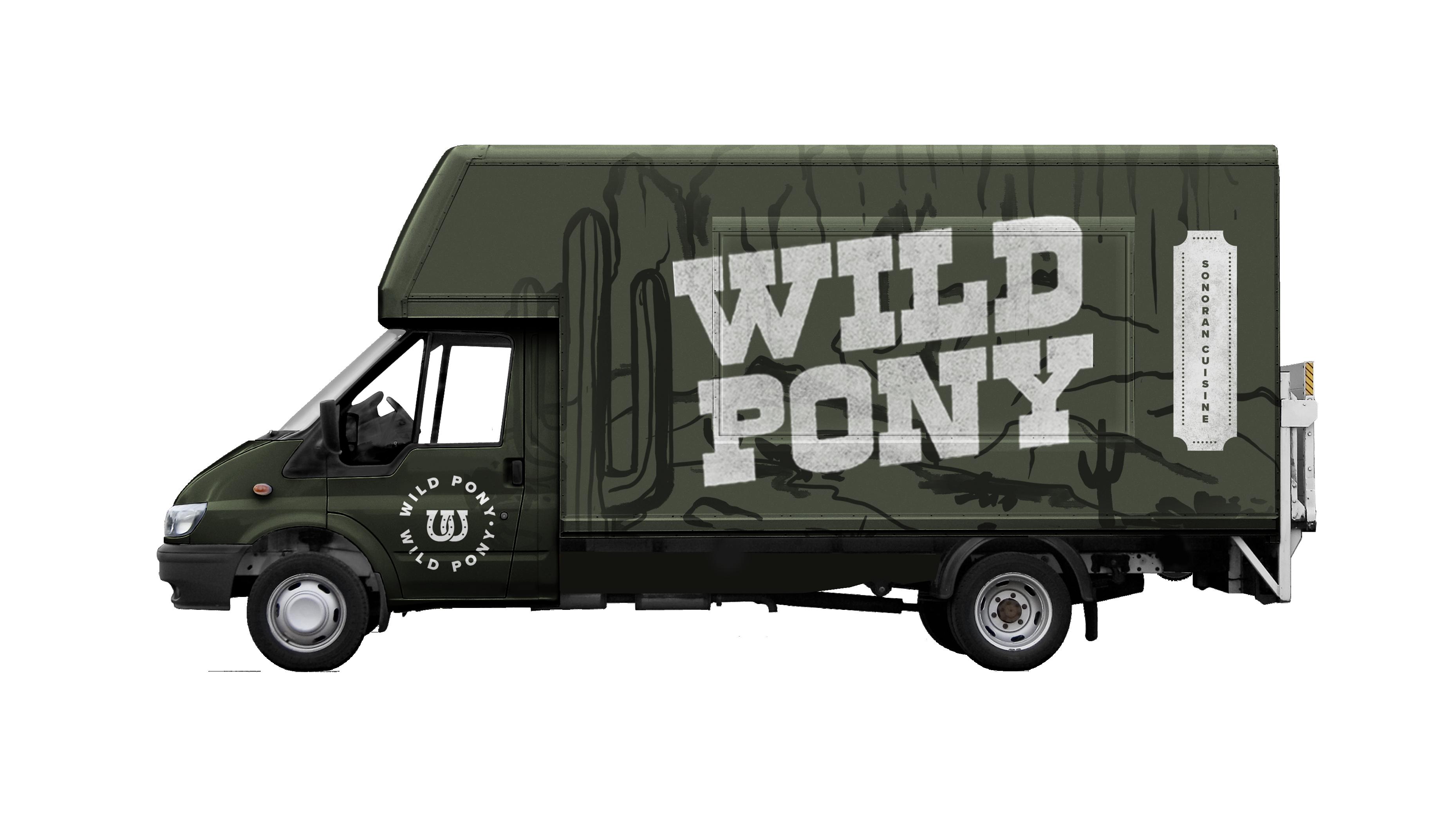
Wild Pony is a food truck located in Phoenix Arizona. They feature a Sonoran menu with elevated flavor combos that pay homage to desert culture and embrace the heat. The challenge was to create branding inspired by the wild west. The visuals were created to create an experience that teleports them back in time but provided a modern menu with unexpected wild dishes. The visuals of rough edges and organic textures achieve the wild west experience for the consumer.
CONCEPTUAL BACKGROUND
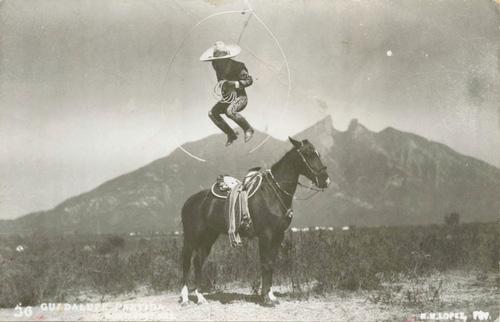
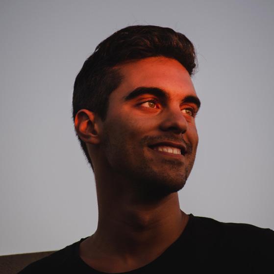
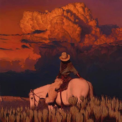
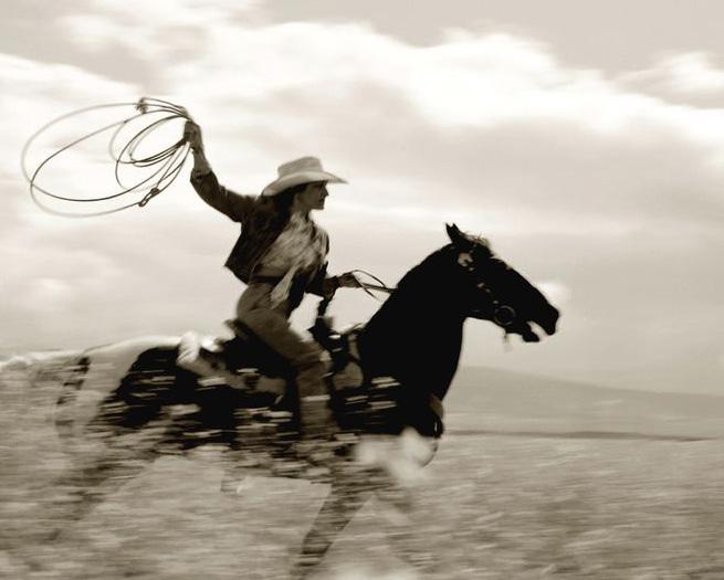
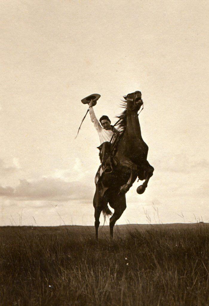
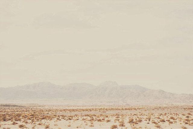
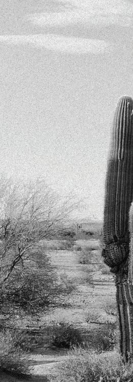
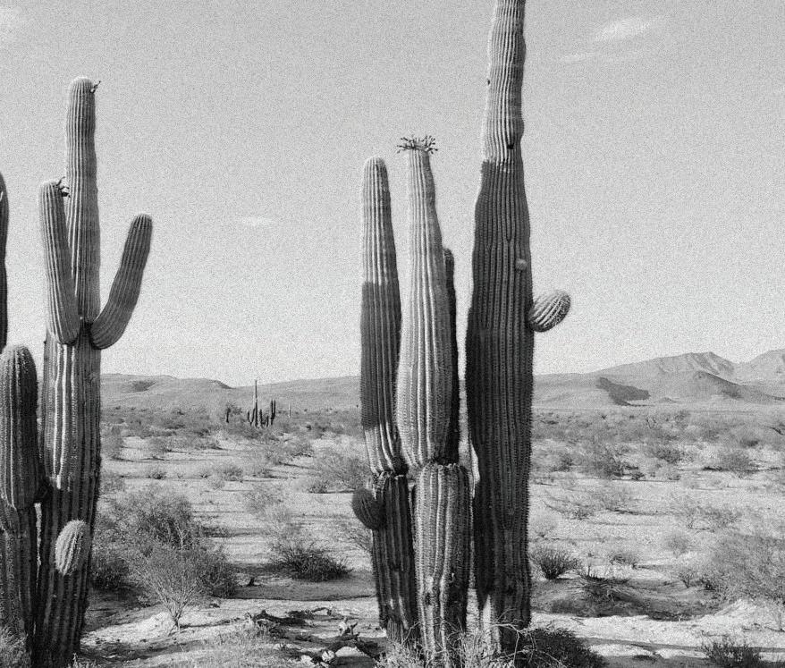
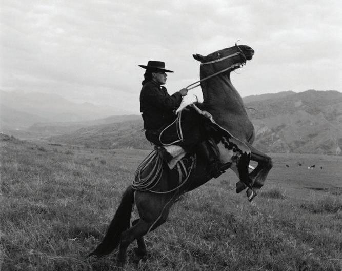
Wild Pony is a food truck that serves wild flavor combos and dishes you can’t find at just any food truck. They are inspired by the wild west, the Sonoran Desert, and a lifestyle of adventure. The tone of the brand is rough and blunt. It was a weathered and used look because they want an established look. Their menu makes their customers proud to live in the desert, embracing it instead of escaping it.
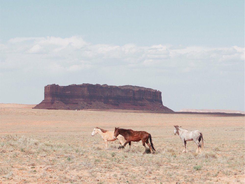
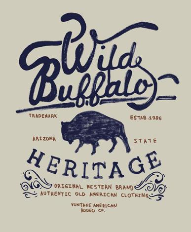
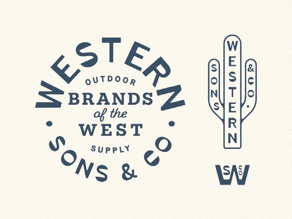
USP: Sonoran Menu with Elevated Flavor Combos Key Words Rustic Worn Yee Haw Adventurous Wild West Rough Desert Hard-Working 25-35 YEARS OLD 45k -70k INCOME Hiking New Hobbies Spicy Food Grilling Camping Off-Roading INTERESTS Adventure GOAL Target Audience
Moodboard
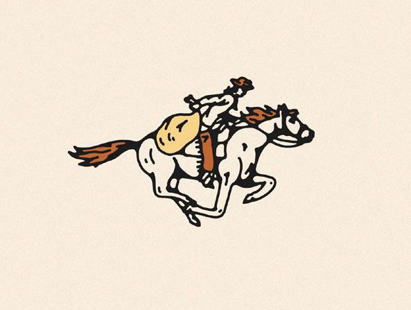
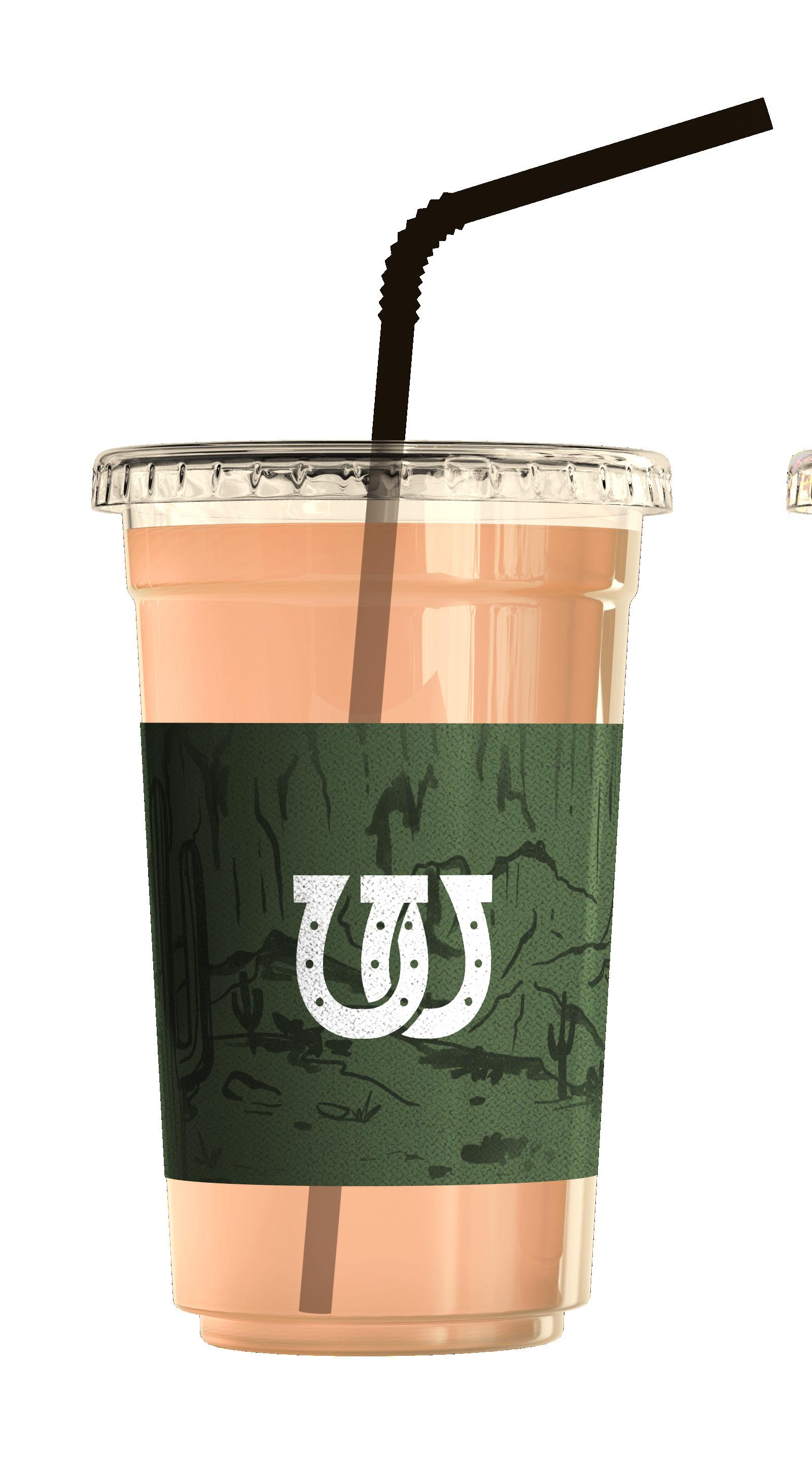
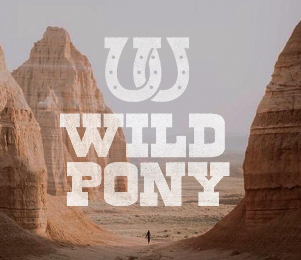
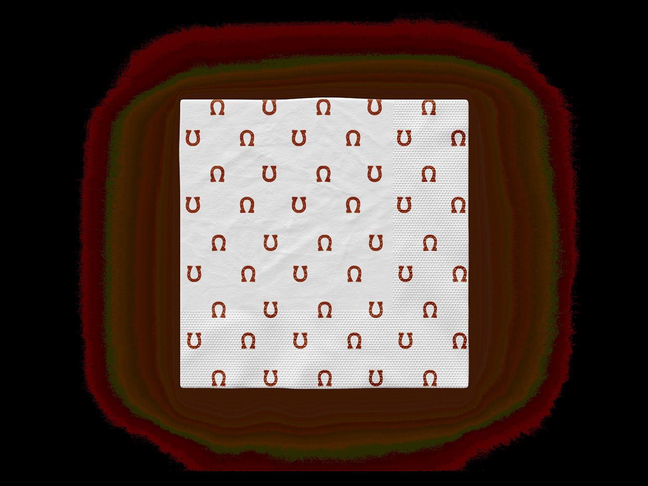
Intertwined horseshoes that form a “w.”
Western saloon font achieves the wild southwest look




DEUCE
BRANDING
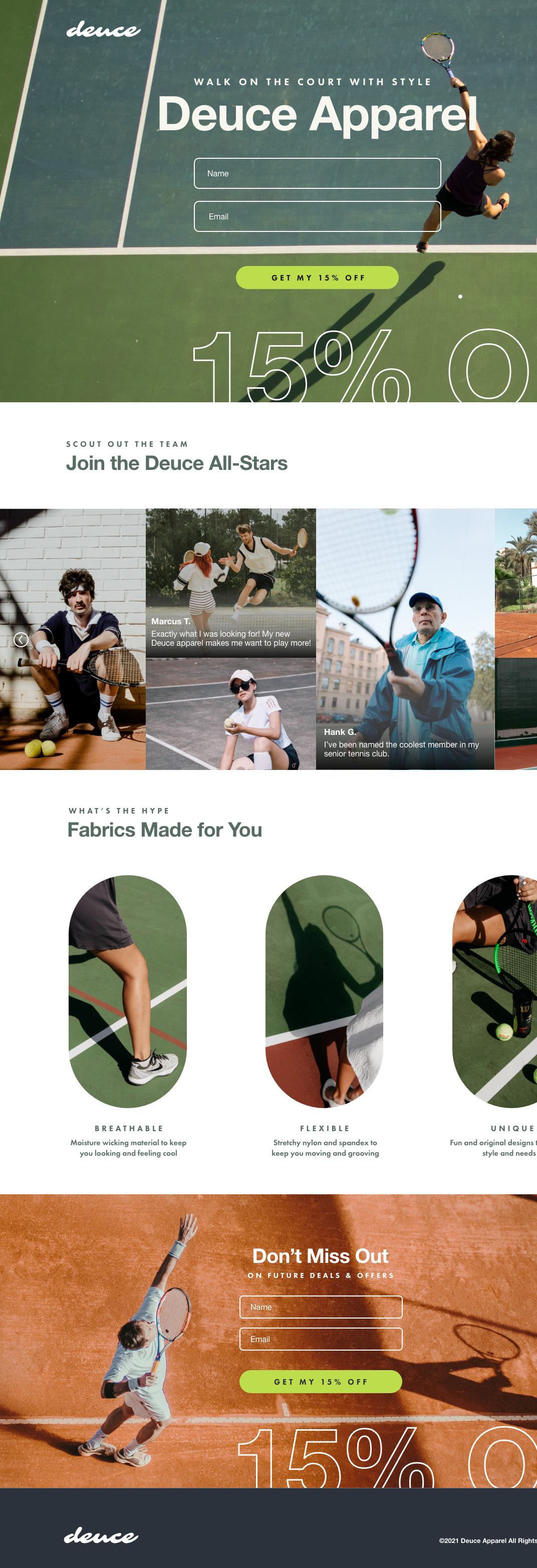
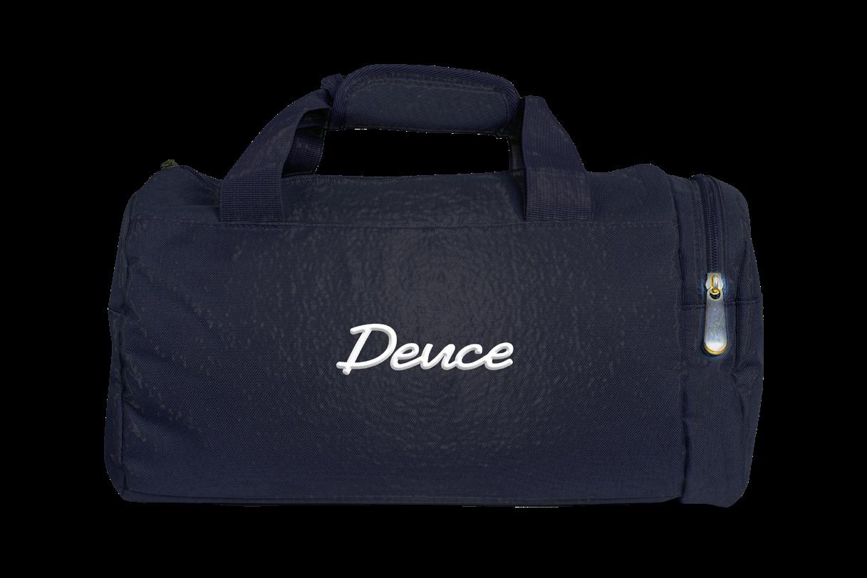
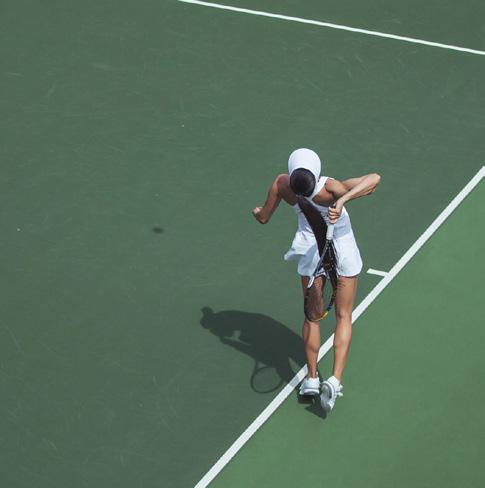
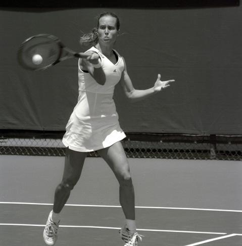
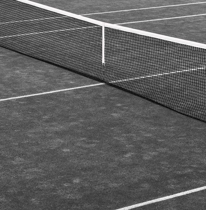
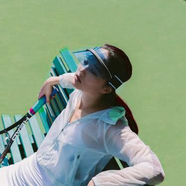
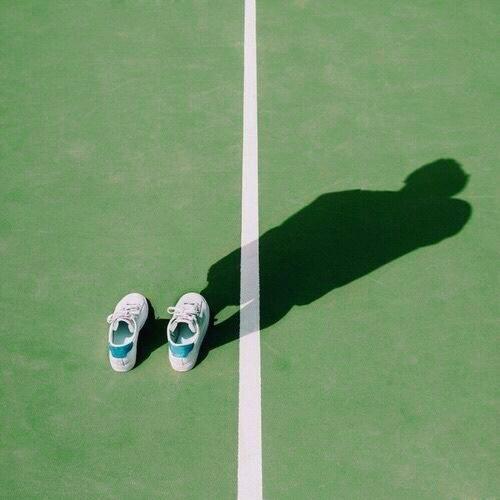
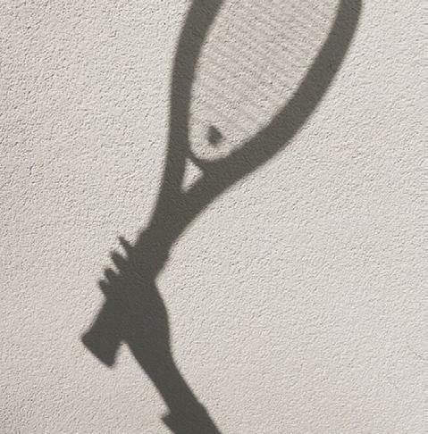
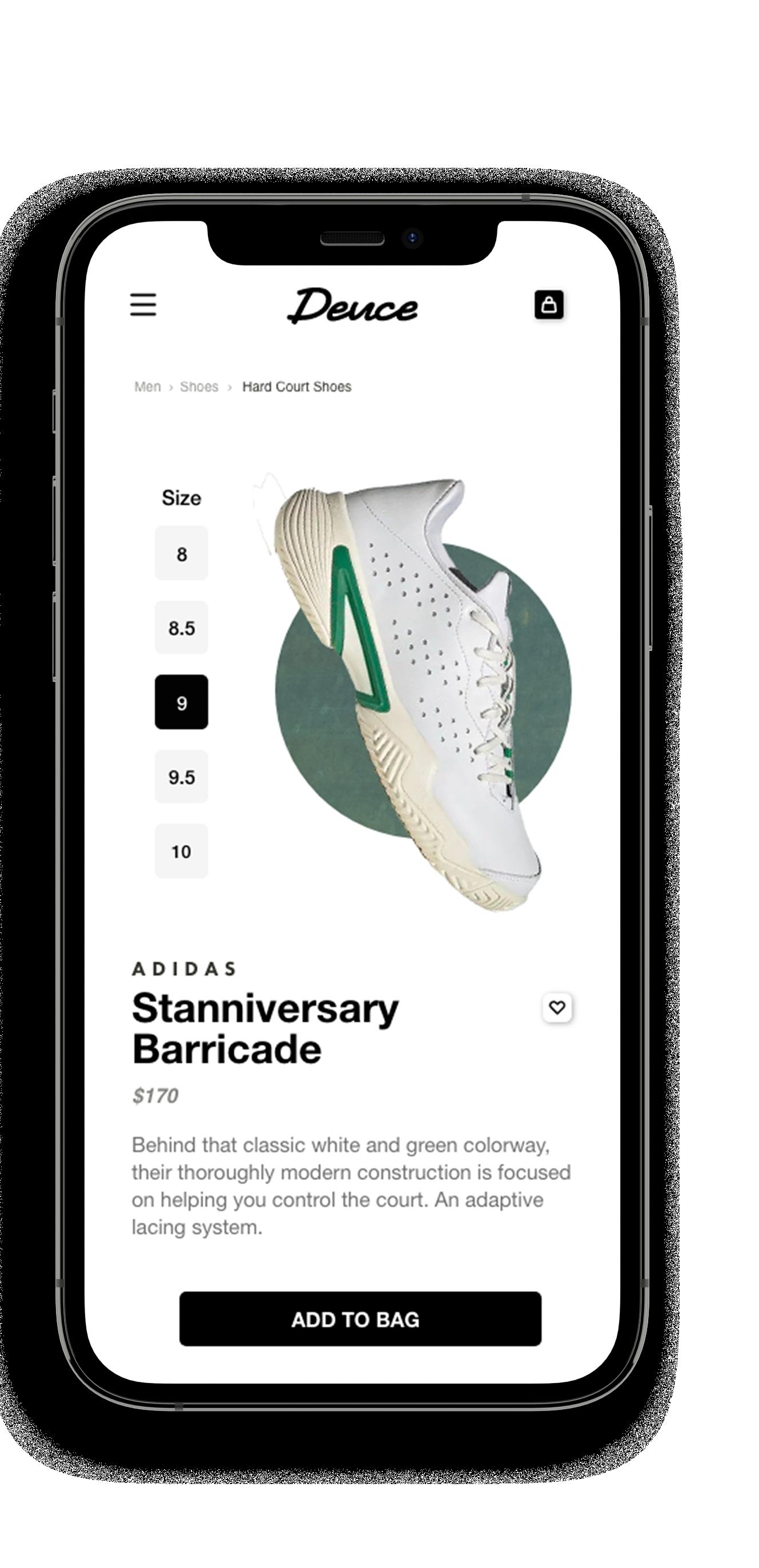
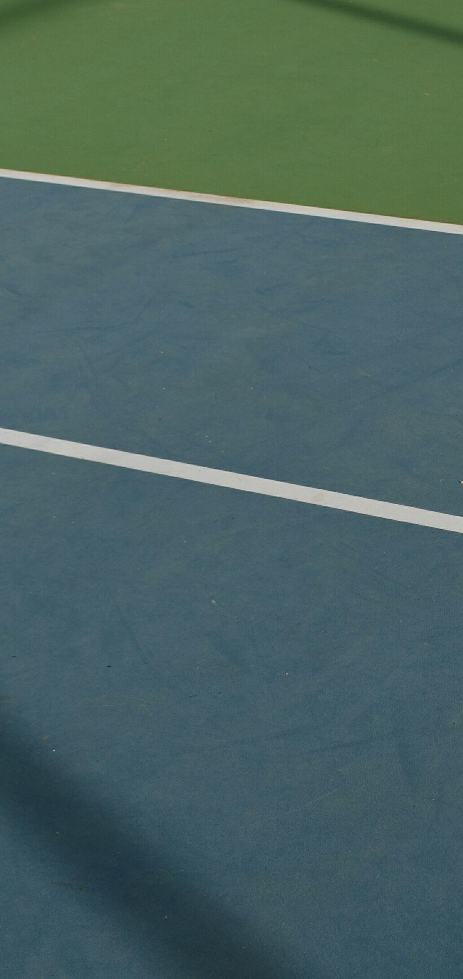
The Deuce brand is for the elevated amateur tennis player. Deuce’s focus is to bring people together and provide stylish, functional, and quality products for playing tennis. Deuce feels clean, easy to navigate, and slightly elevated without being out of reach. This was achieved through the photography of people, using elements of a tennis match as graphics.
Deuce
“I don’t like to lose, at anything, yet I’ve grown most not from victories, but setbacks.”
“You have to believe in yourself before anybody else does.”
“I fear no one, but respect everyone.”
SERENA WILLIAMS
FRANCES TIAFOE ROGER FEDERER
SPACE.COM
WEB DESIGN
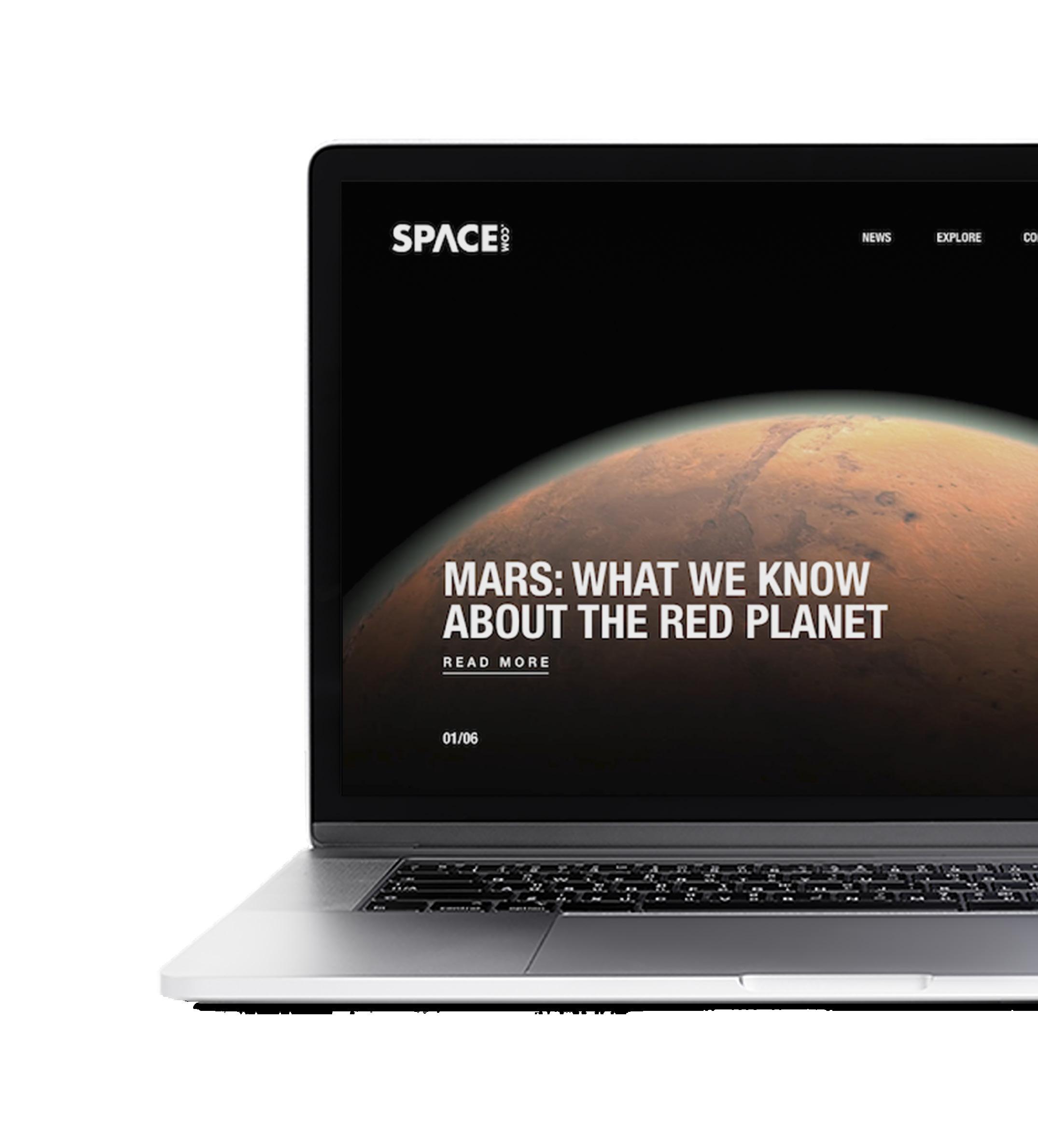
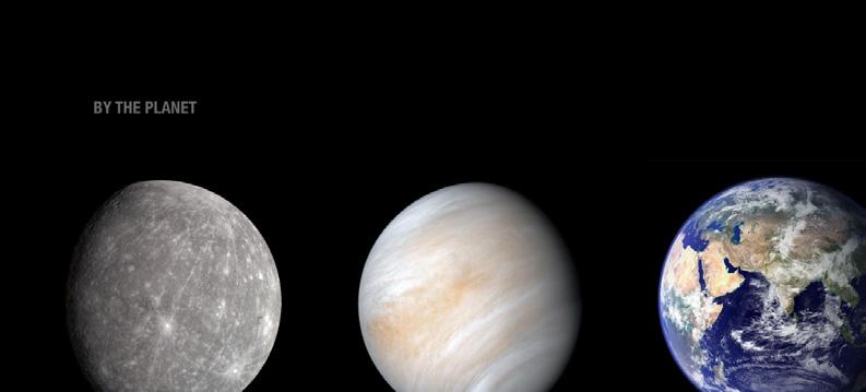
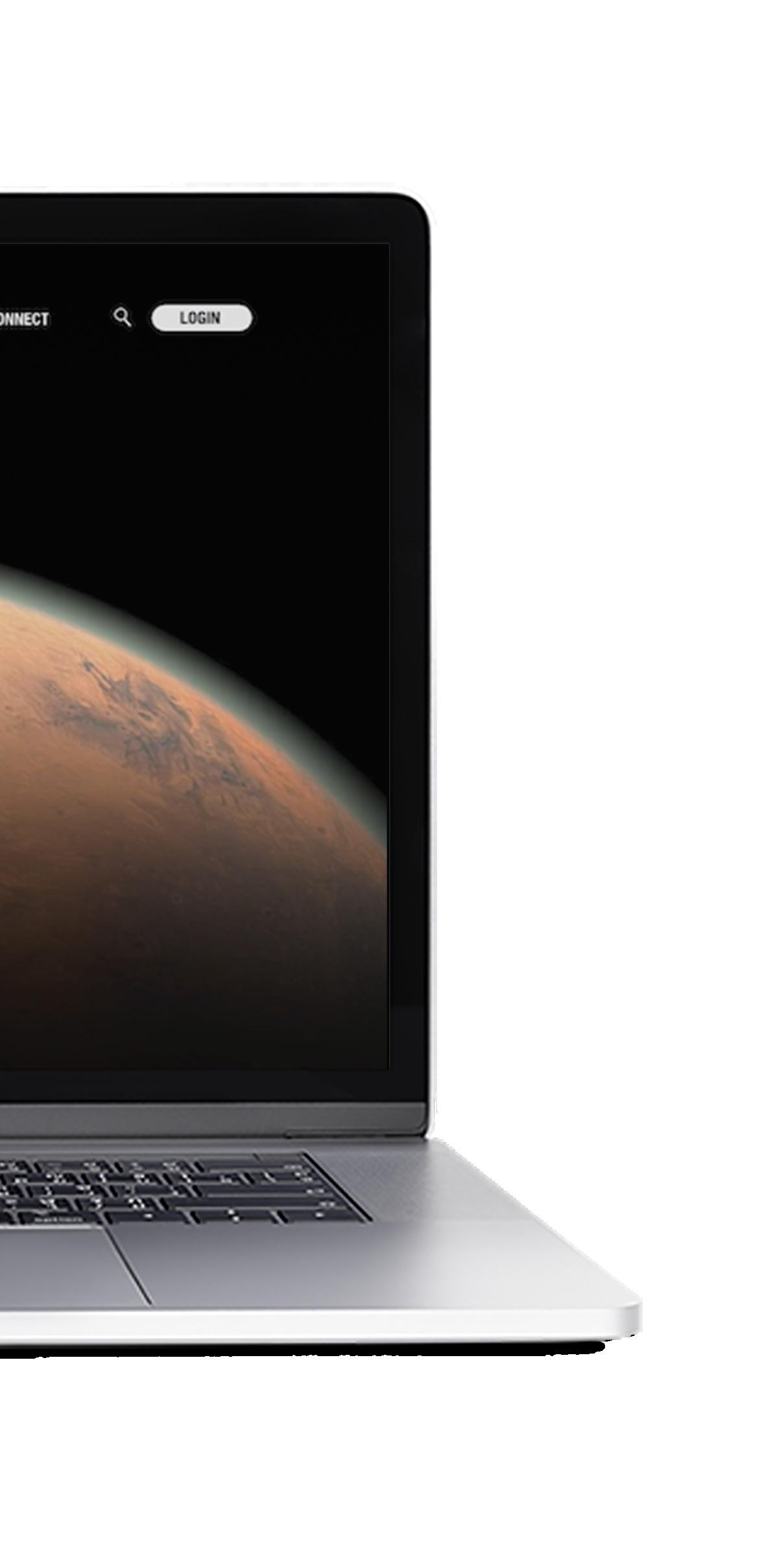
Space.com is a news website dedicated to space and science. The goal was to design a news website that contained lots of information but was still easy to digest. In the design, the content needed to make the viewer excited to learn and read about the content. The design was about creating an experience that felt interactive and like the viewer could discover and explore the web page. This was accomplished through custom space event following features, the ability to follow specific topics, searching by planets, and solar system tracking.




FORMULA 1
WEB DESIGN
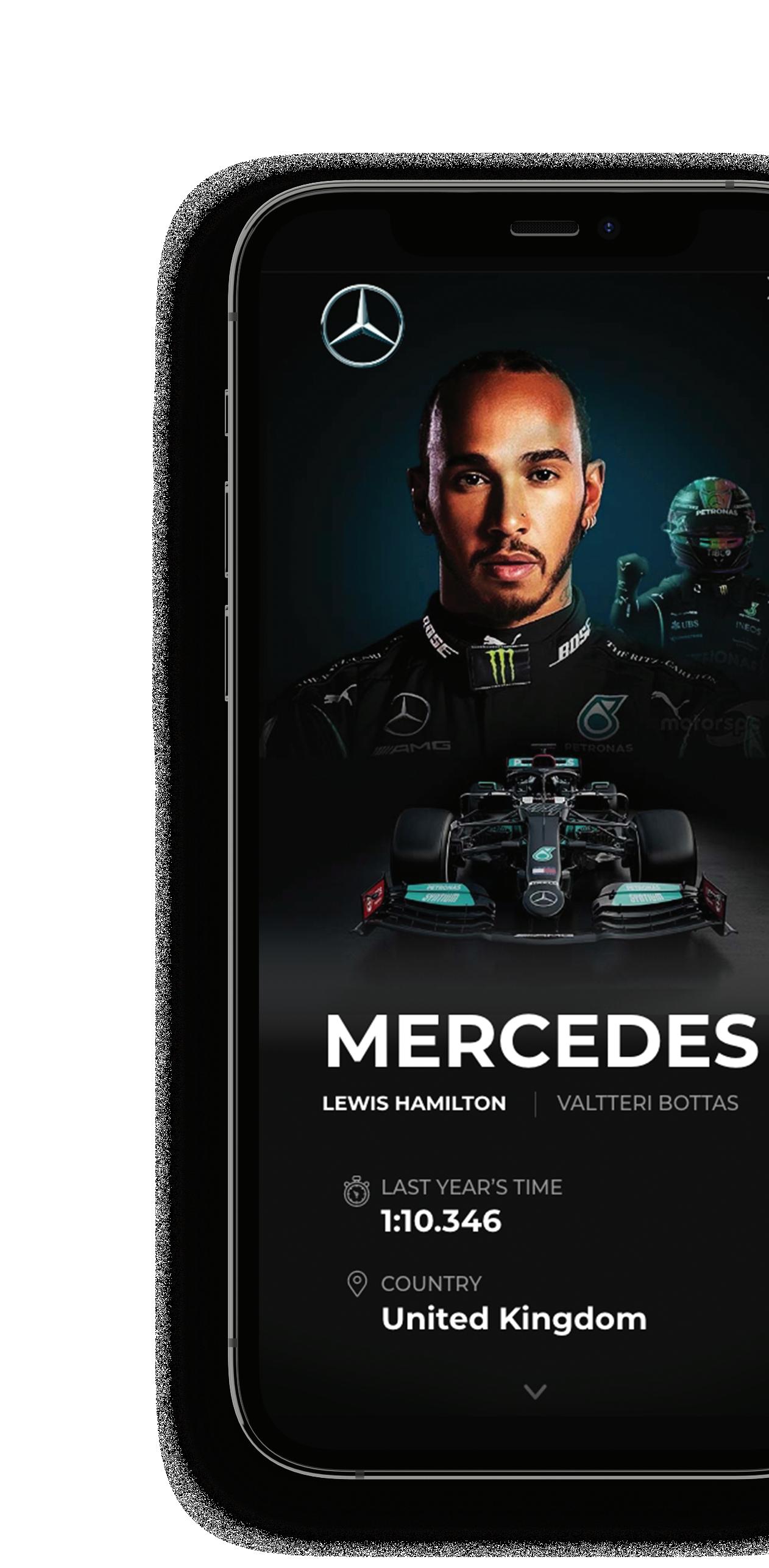
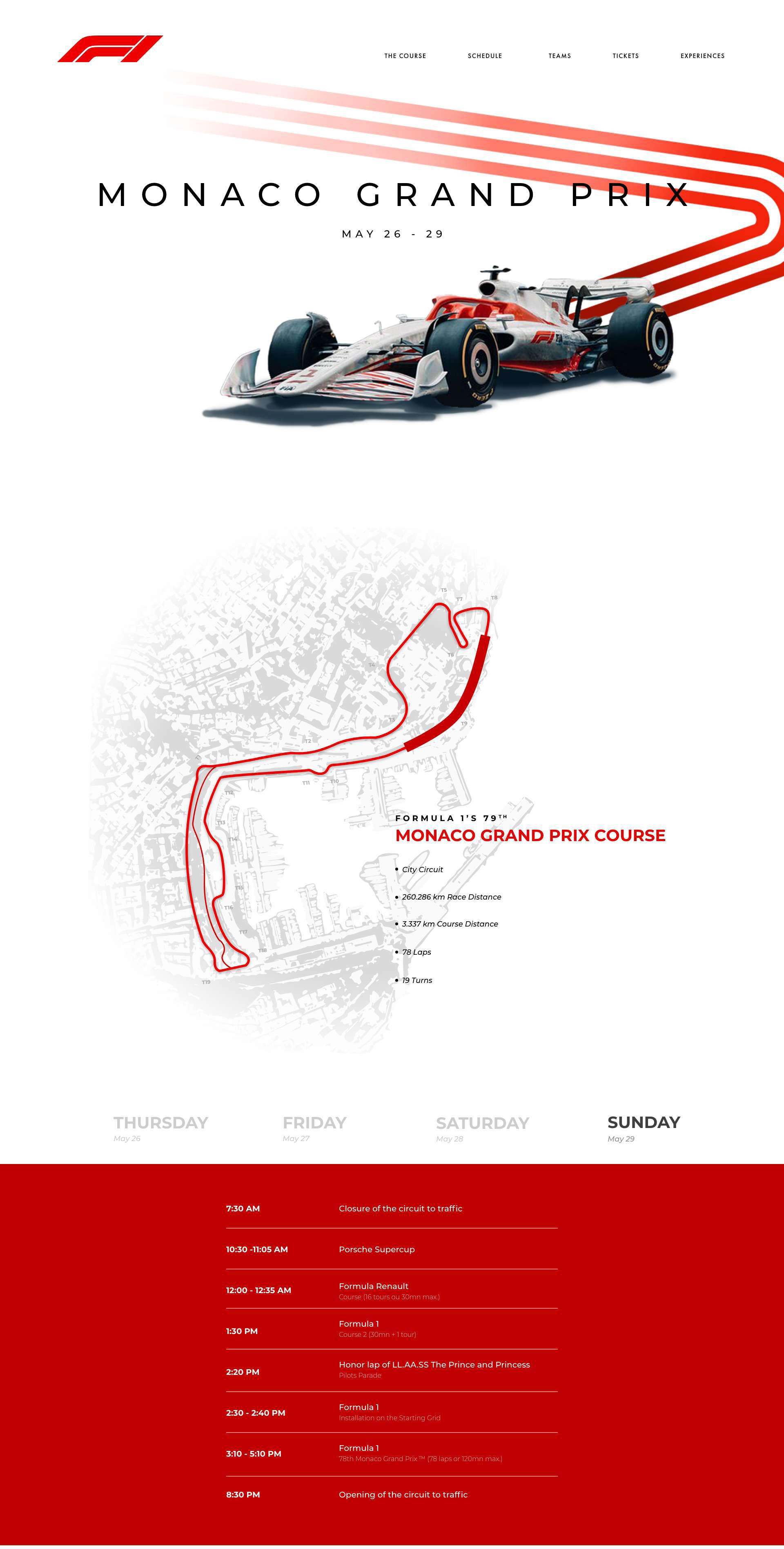
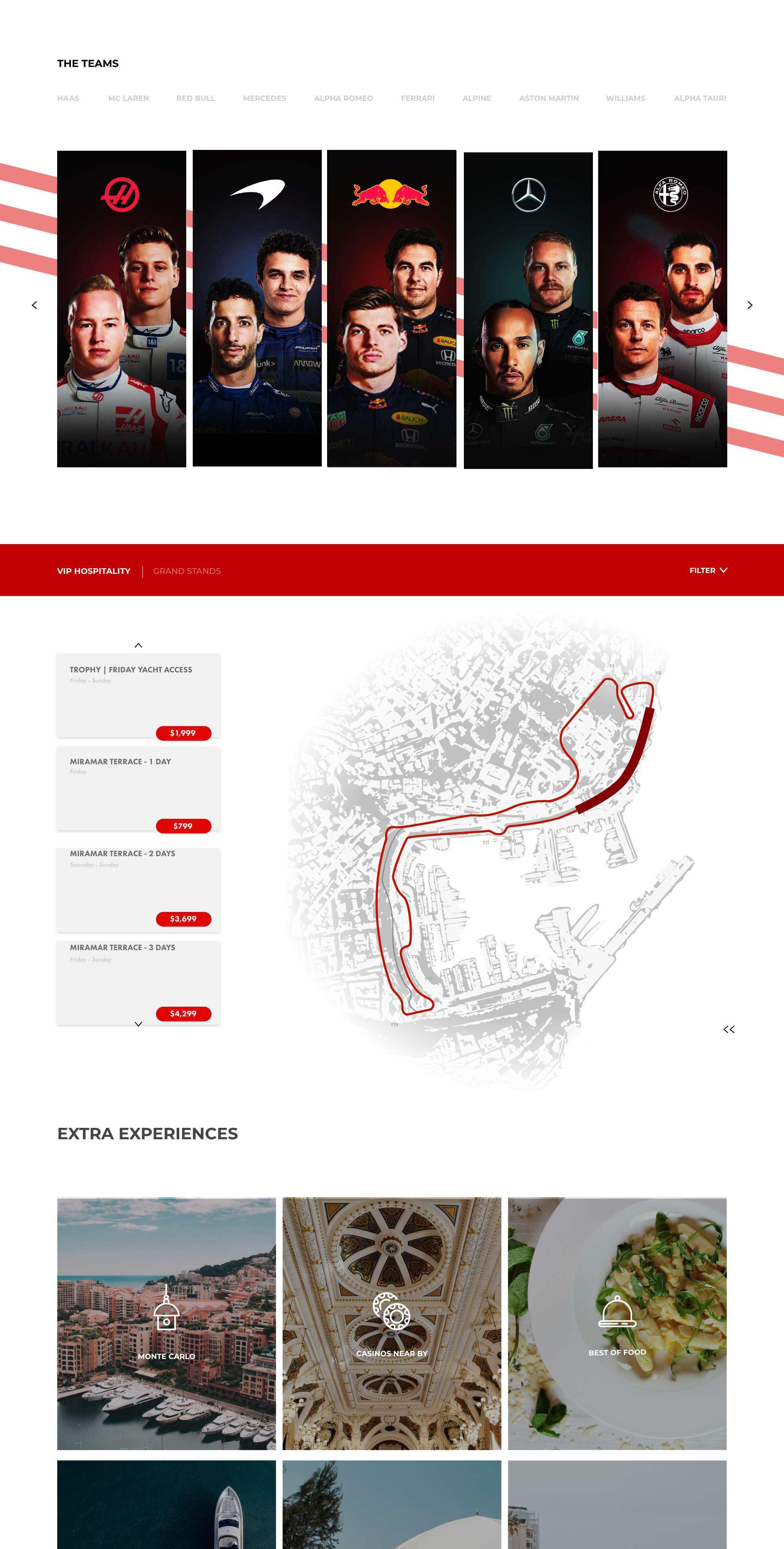
This event landing page was created for the Monaco Grand Prix for Formula 1. It features a custom icon set, composites of all the drivers and their teams, their stats, and other information needed for the event. The challenge of creating a website that fits with the brand of Formula 1 while also satisfying the elevated luxury of the Monaco race was accomplished through clean typography and graphics.

GRAND RAPIDS ART MUSEUM
UX/UI DESIGN
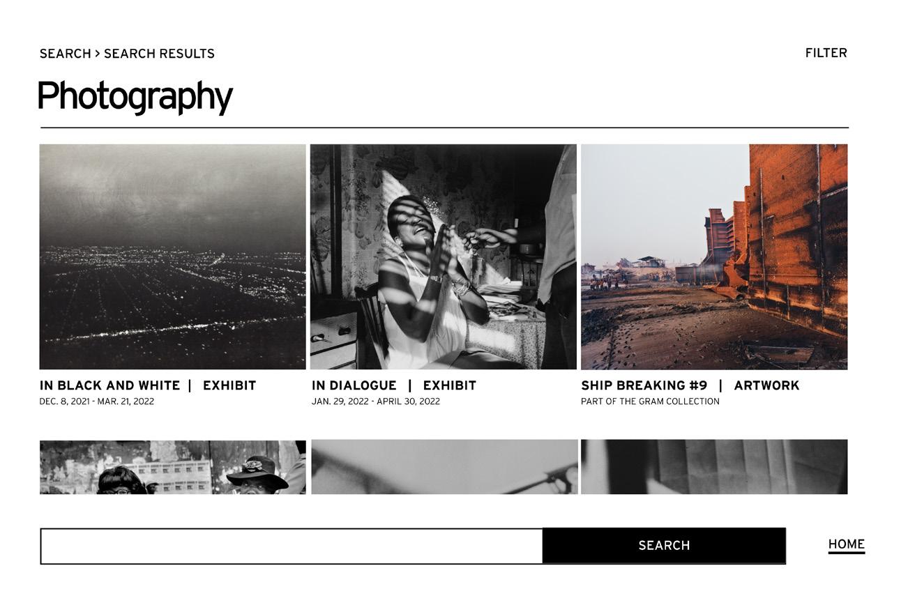
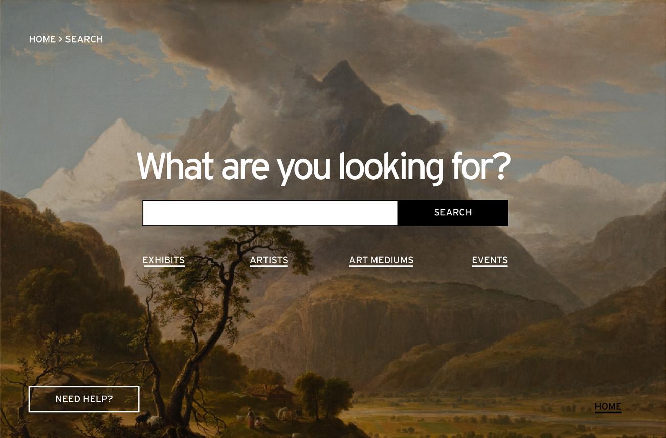
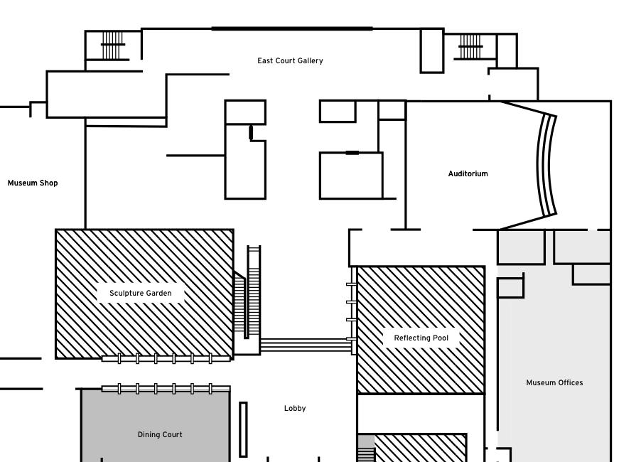
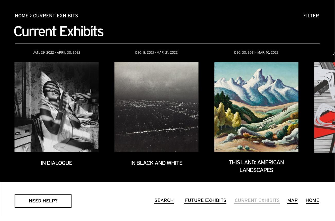
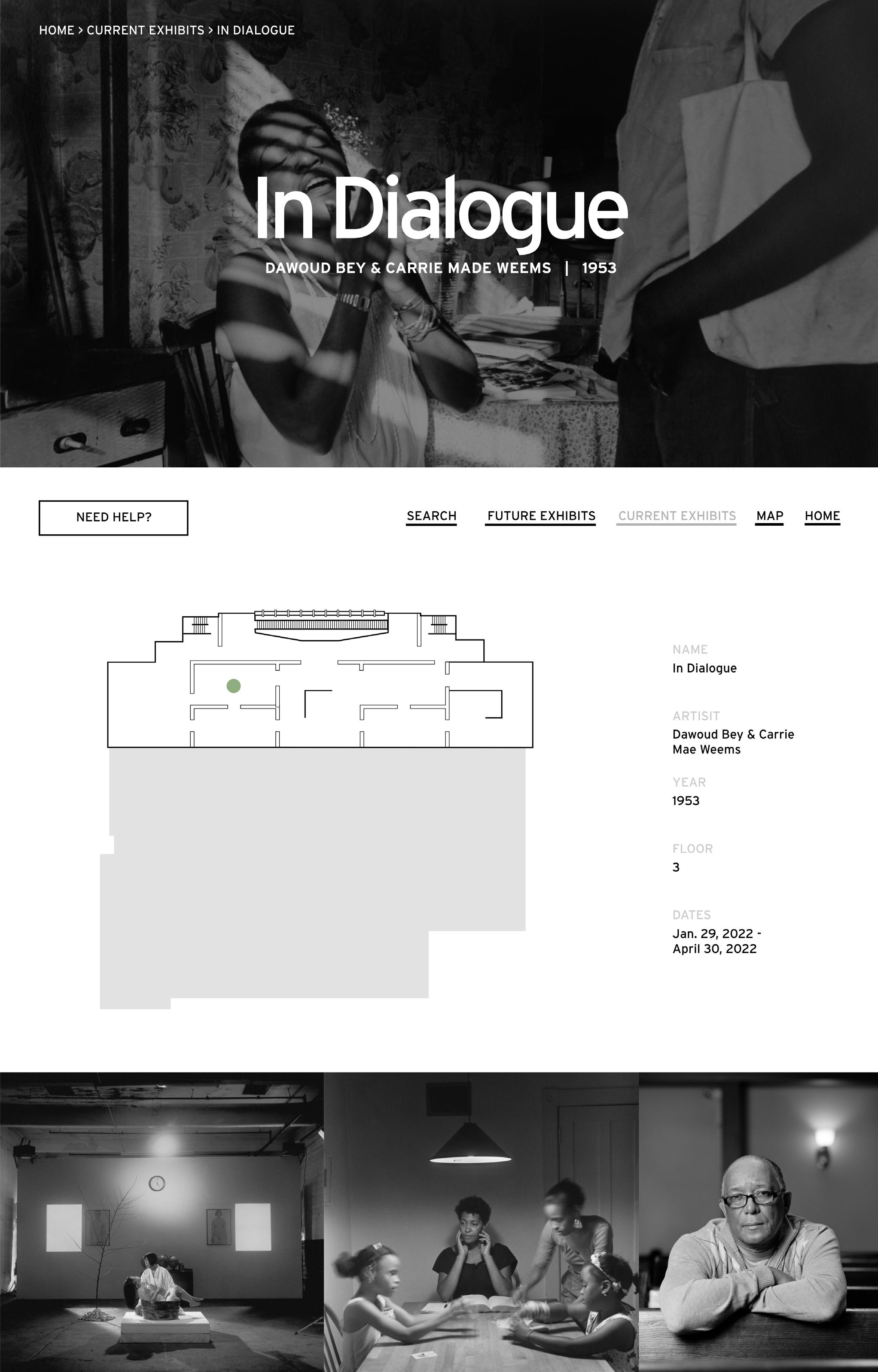
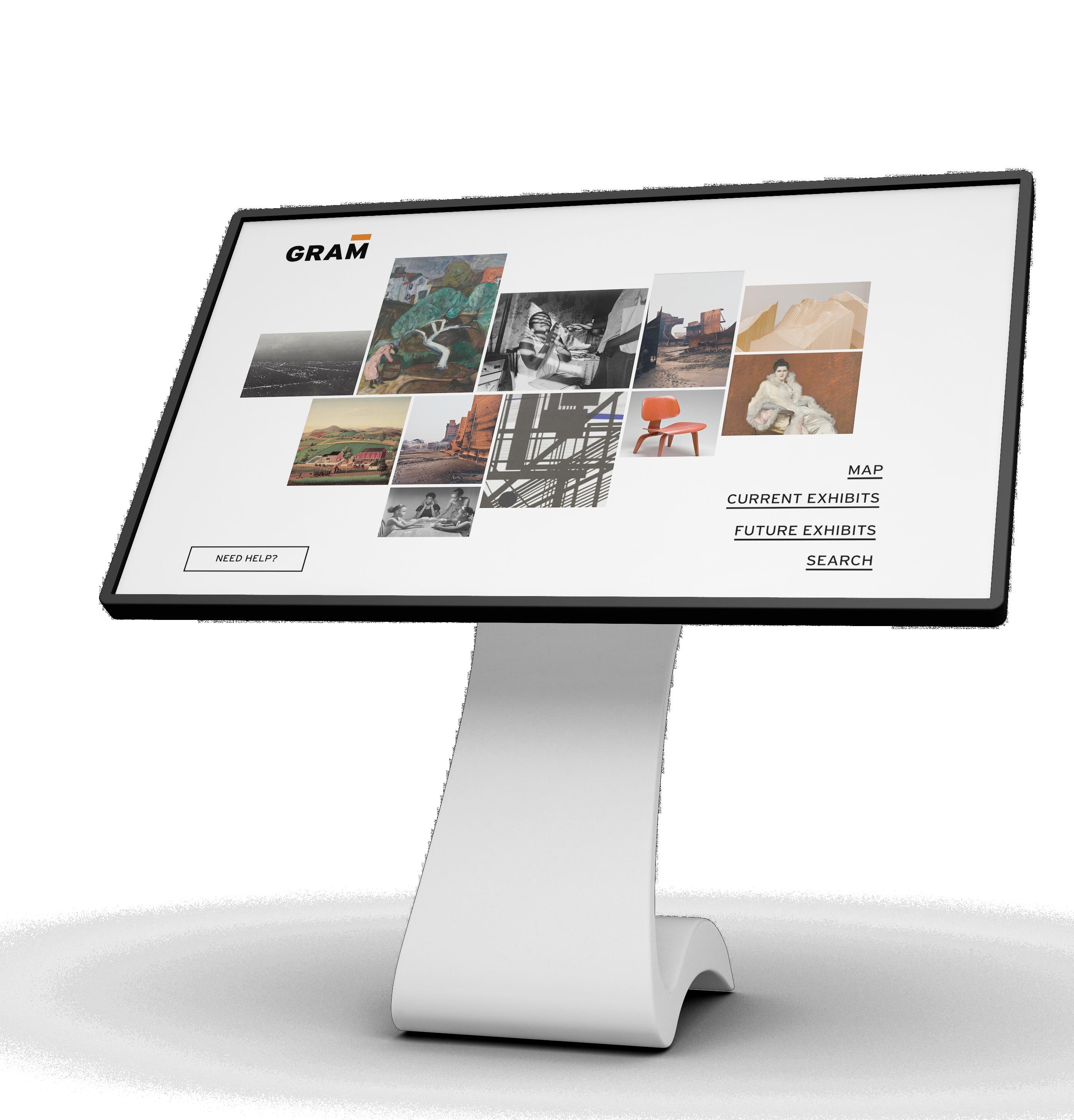
A way-finding app for a digital kiosk in the Grand Rapids Art Museum that assists guests in navigating the exhibits. The challenge of creating a piece and experience that was harmonious with the GRAM brand and the artwork without distracting from the exhibits was accomplished through a modernist design style that is simple and lets the work take center stage.
GRAND CANYON BEVERAGE COMPANY
AD CAMPAIGN
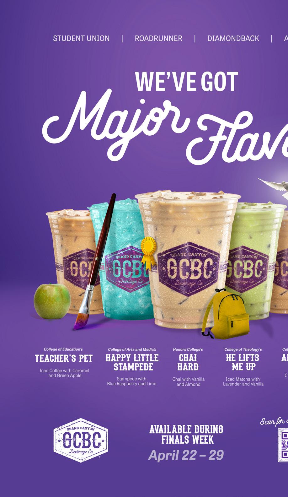
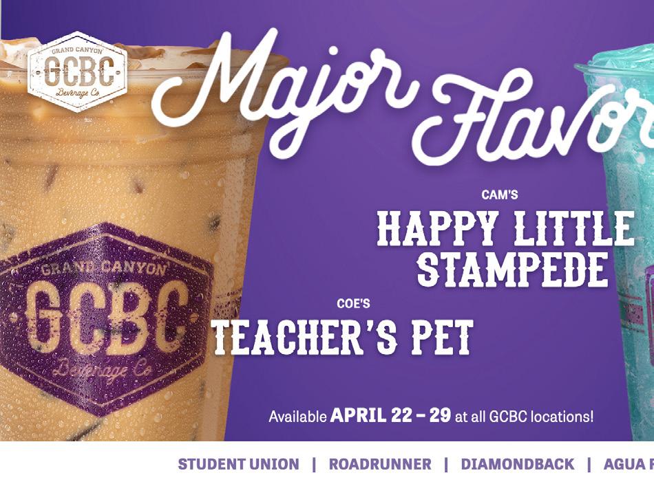
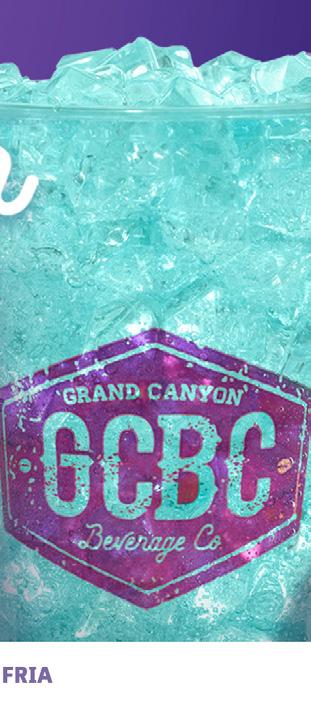
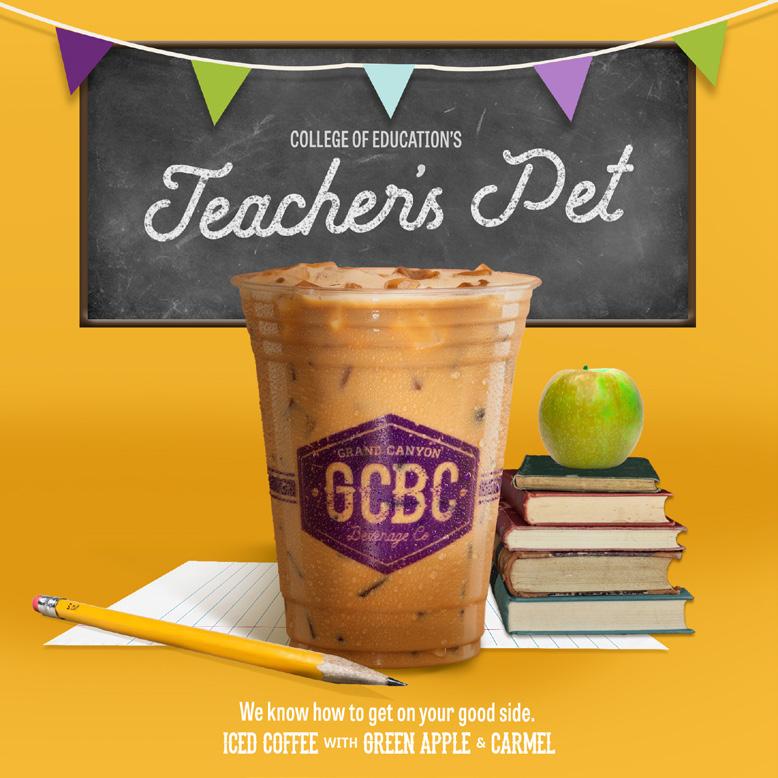
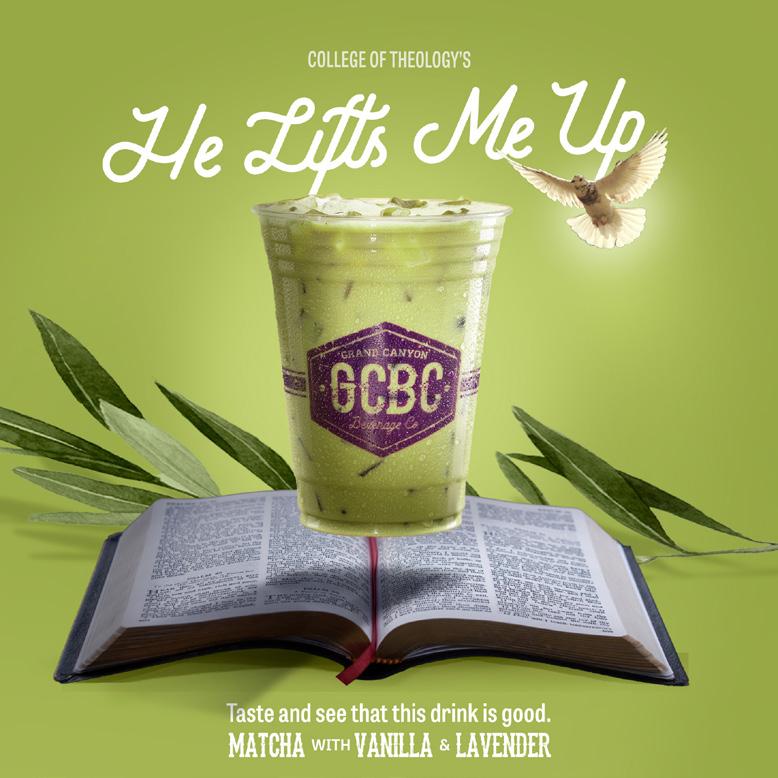
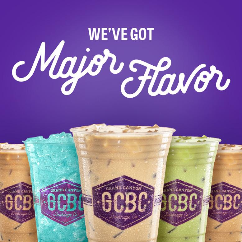
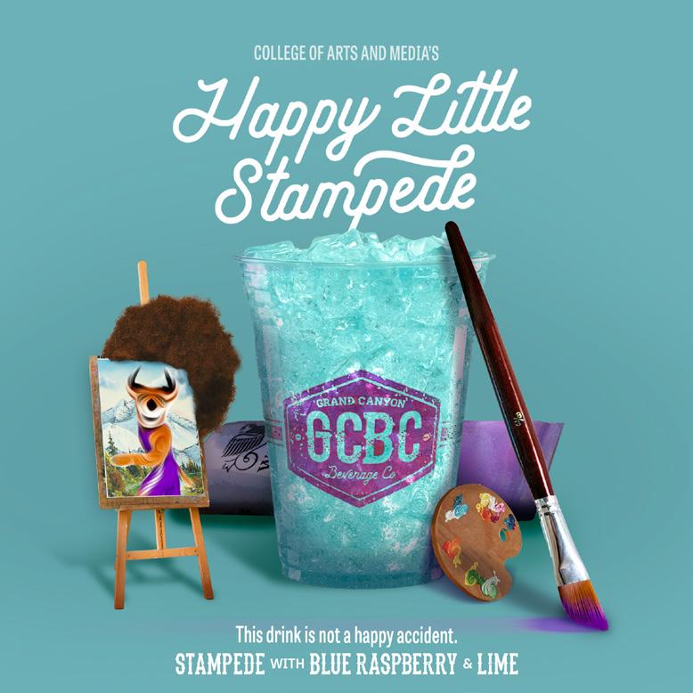
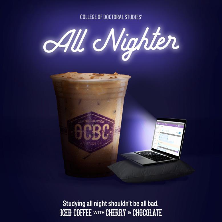
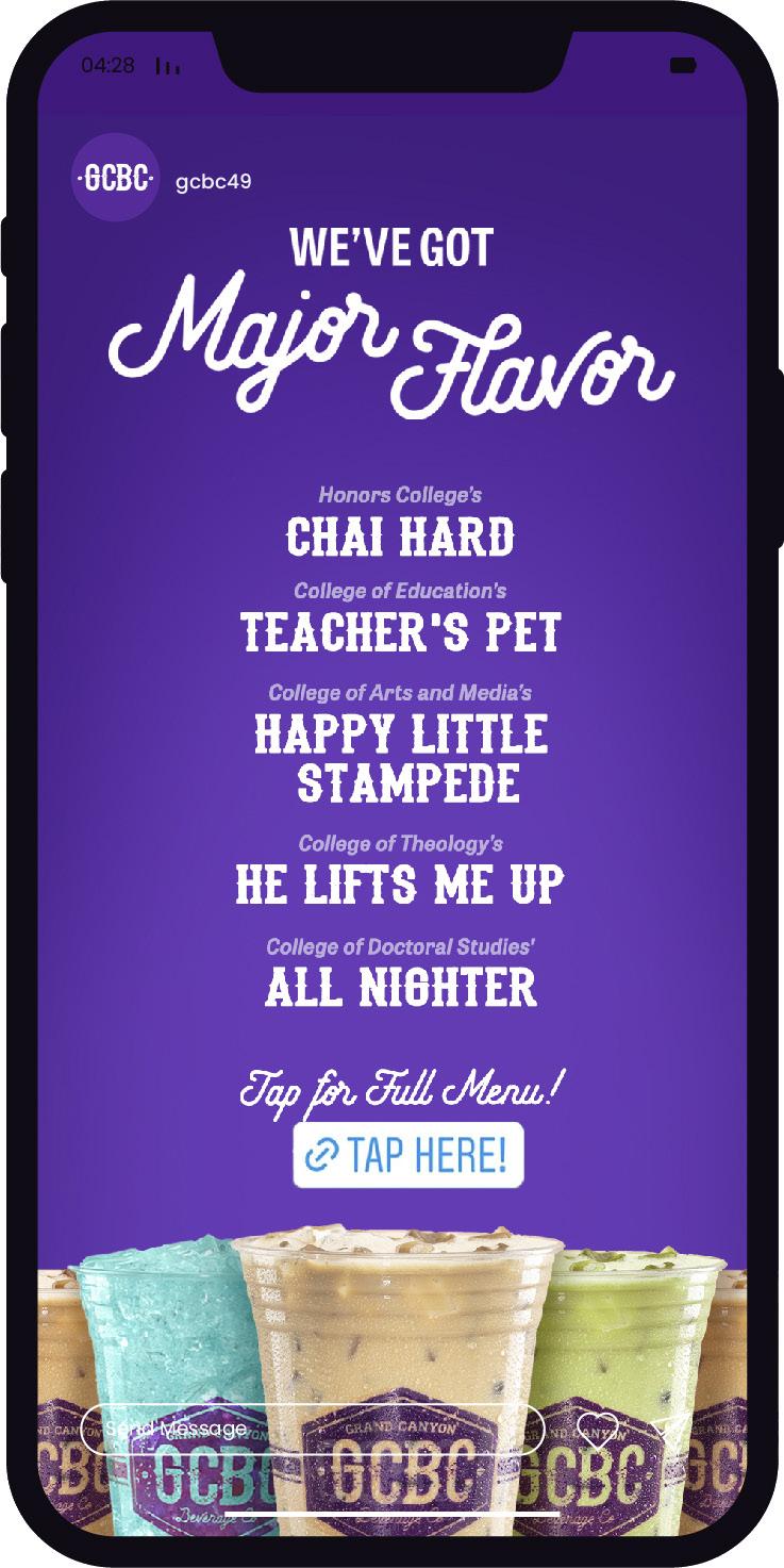
Grand Canyon Beverage Company is an on-campus enterprise that wanted a creative campaign for their special finals week menu. The campaign concept was built around majors being represented in drinks, flavors, names, and items.
 Boesel, Project Lead Diana Cheek, Art Director
Rachel den Dulk, Designer
Ireland Fleck, Copywriter
Sarah Name, Copywriter
Jason



gcbc49
SAUCE FACTORY

BRANDING
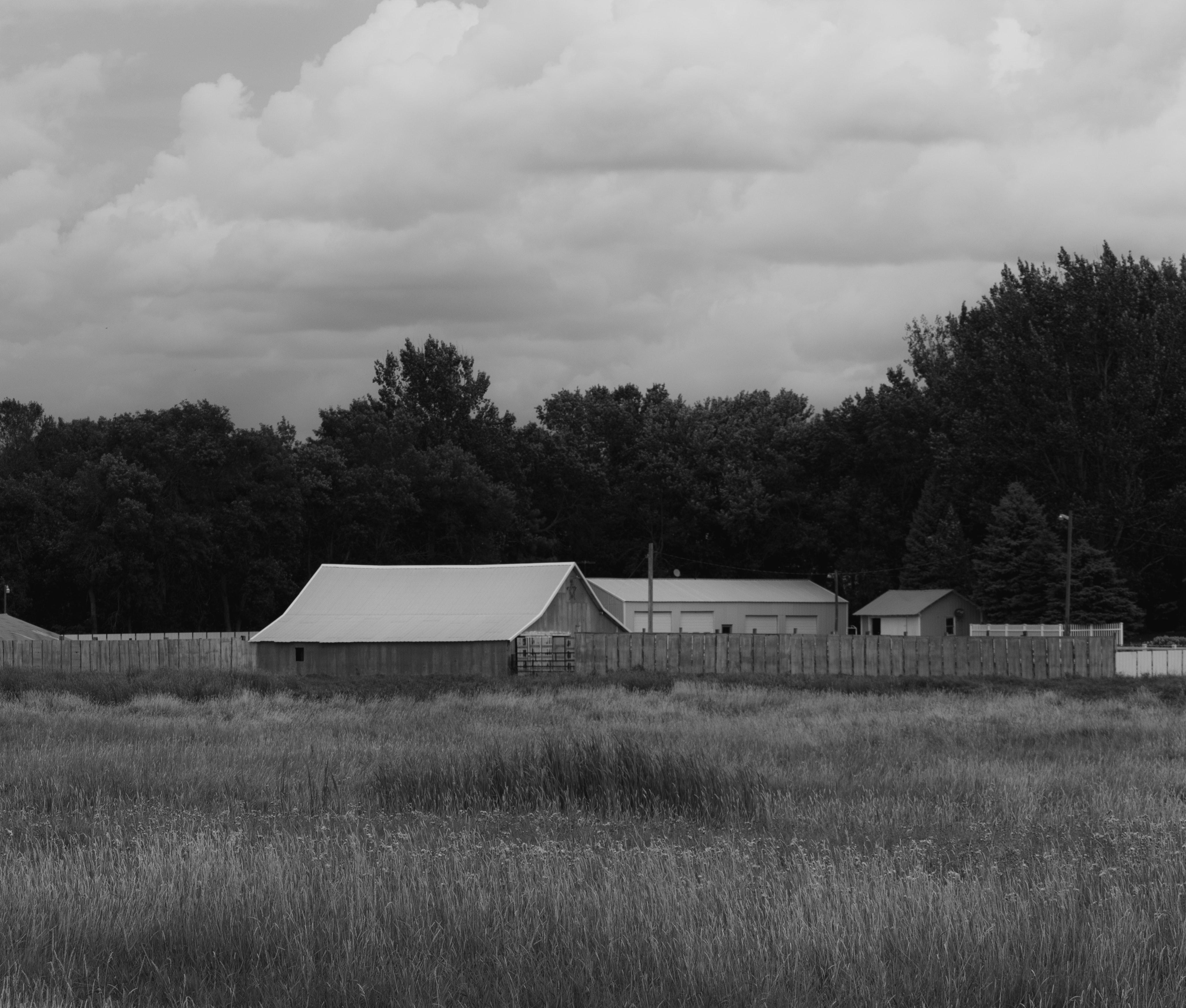
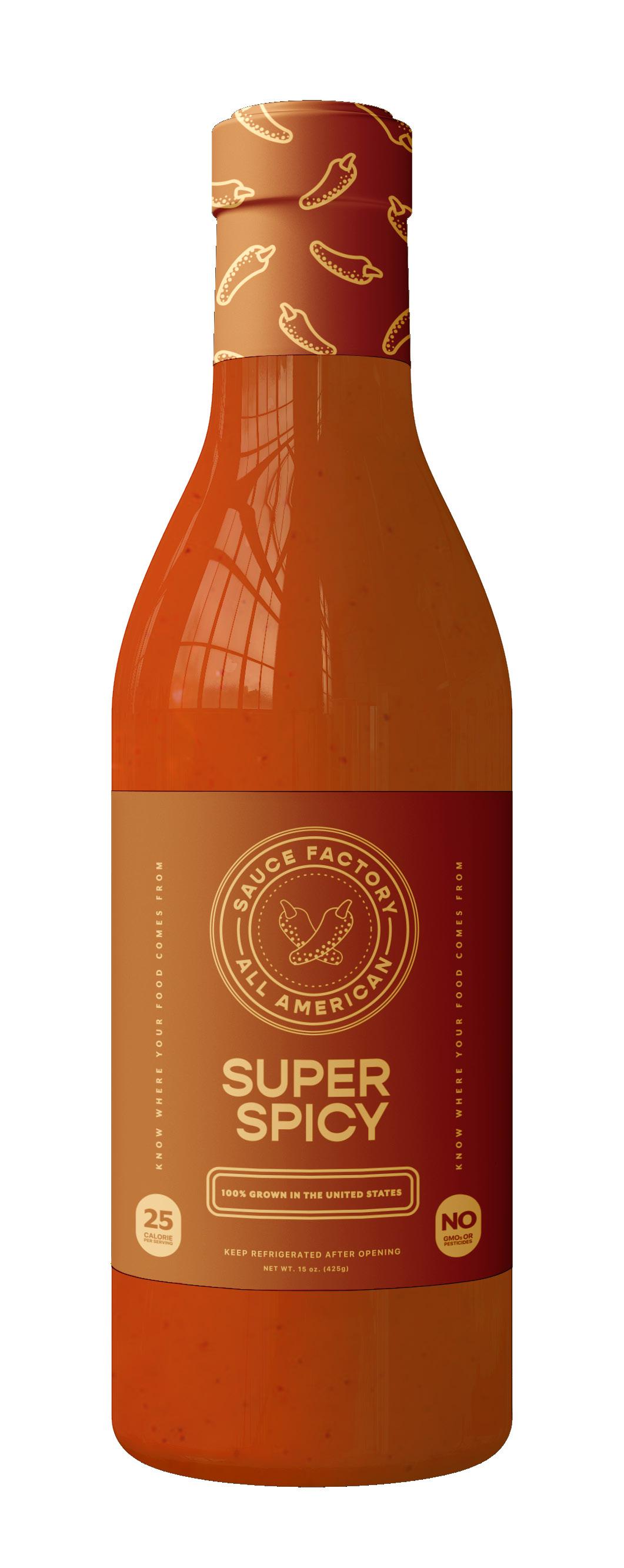
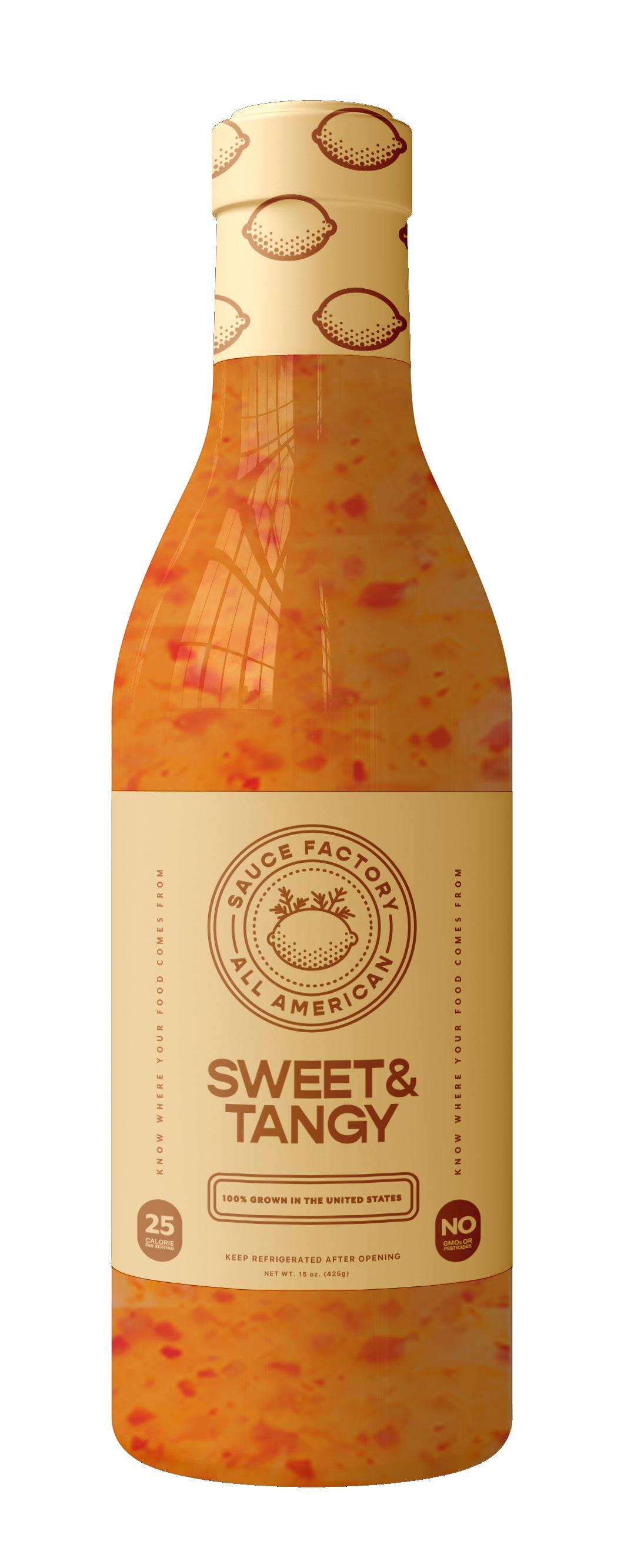
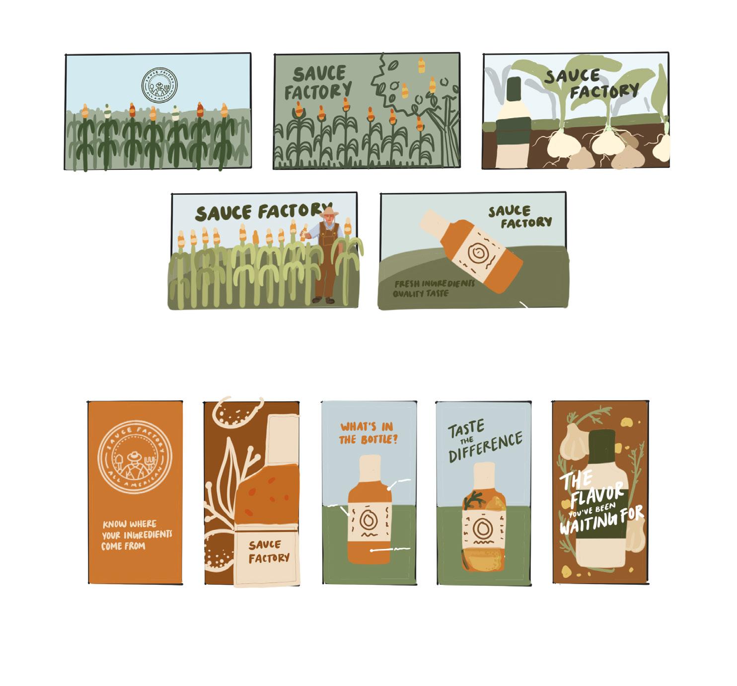
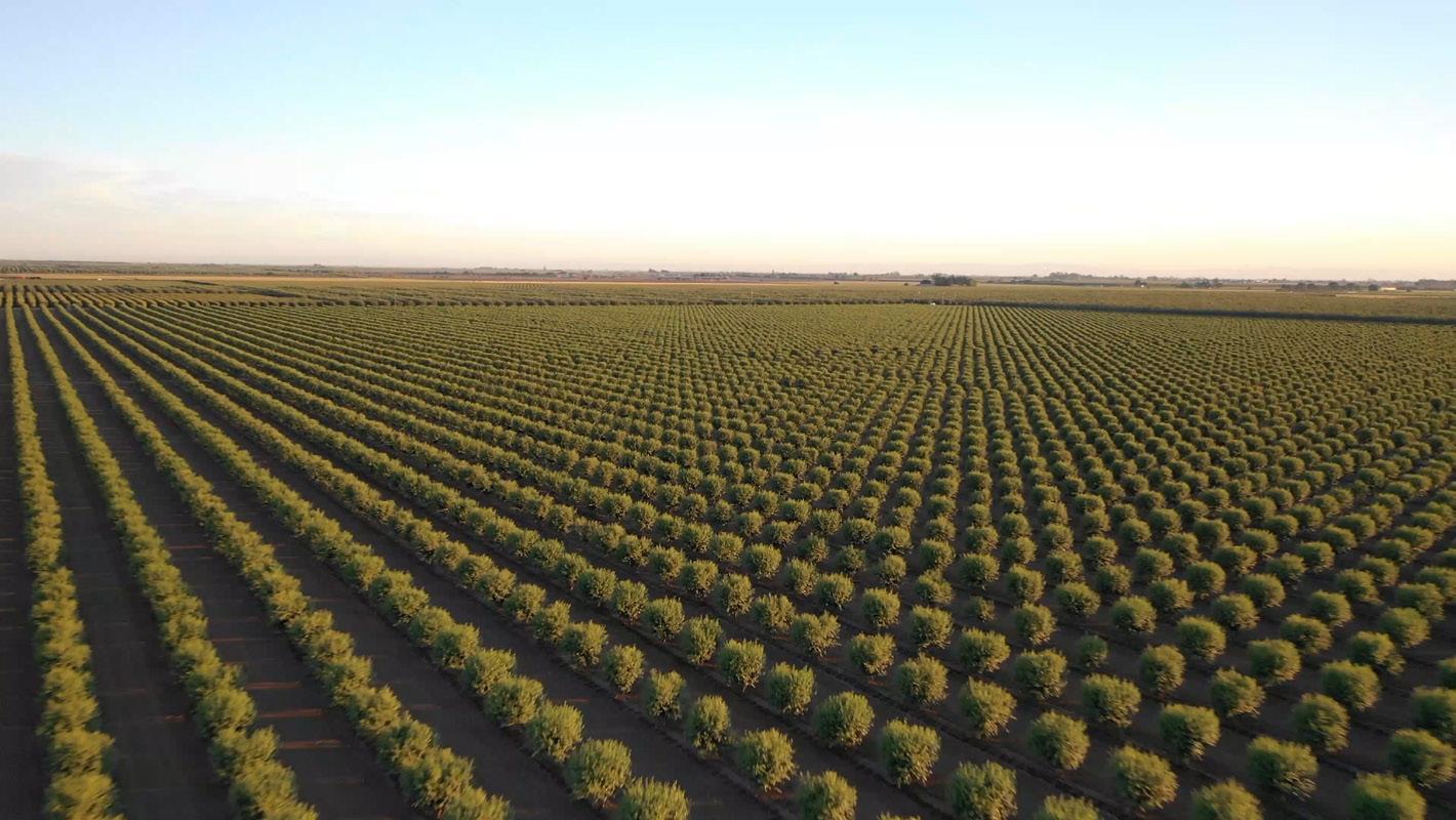
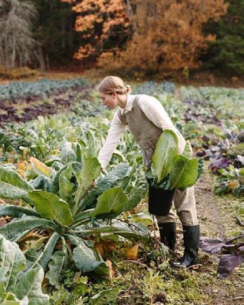
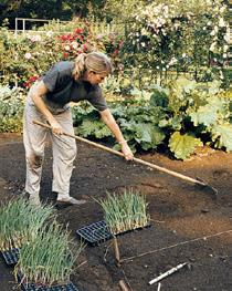
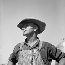
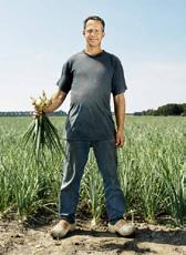
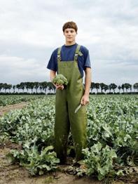
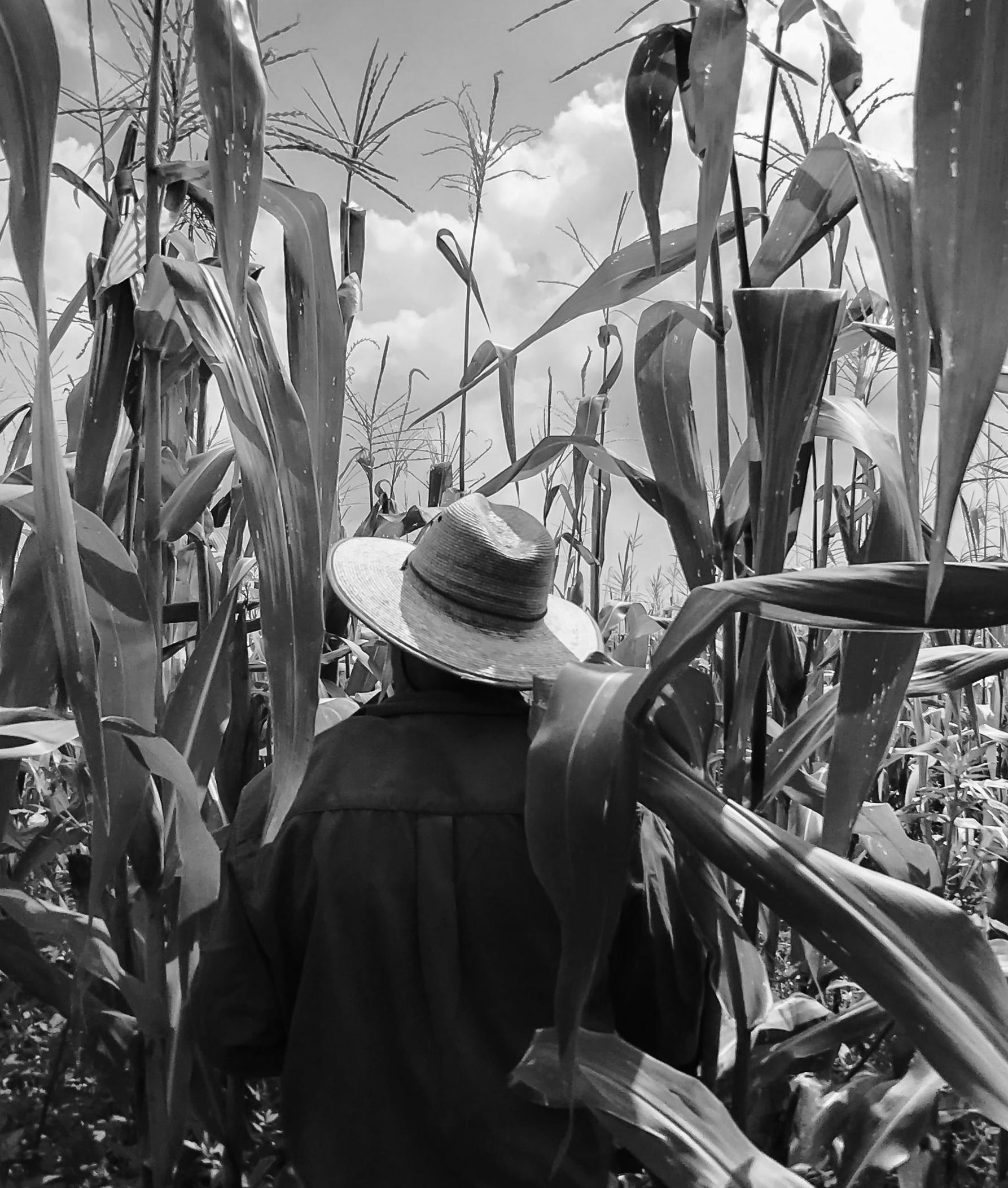
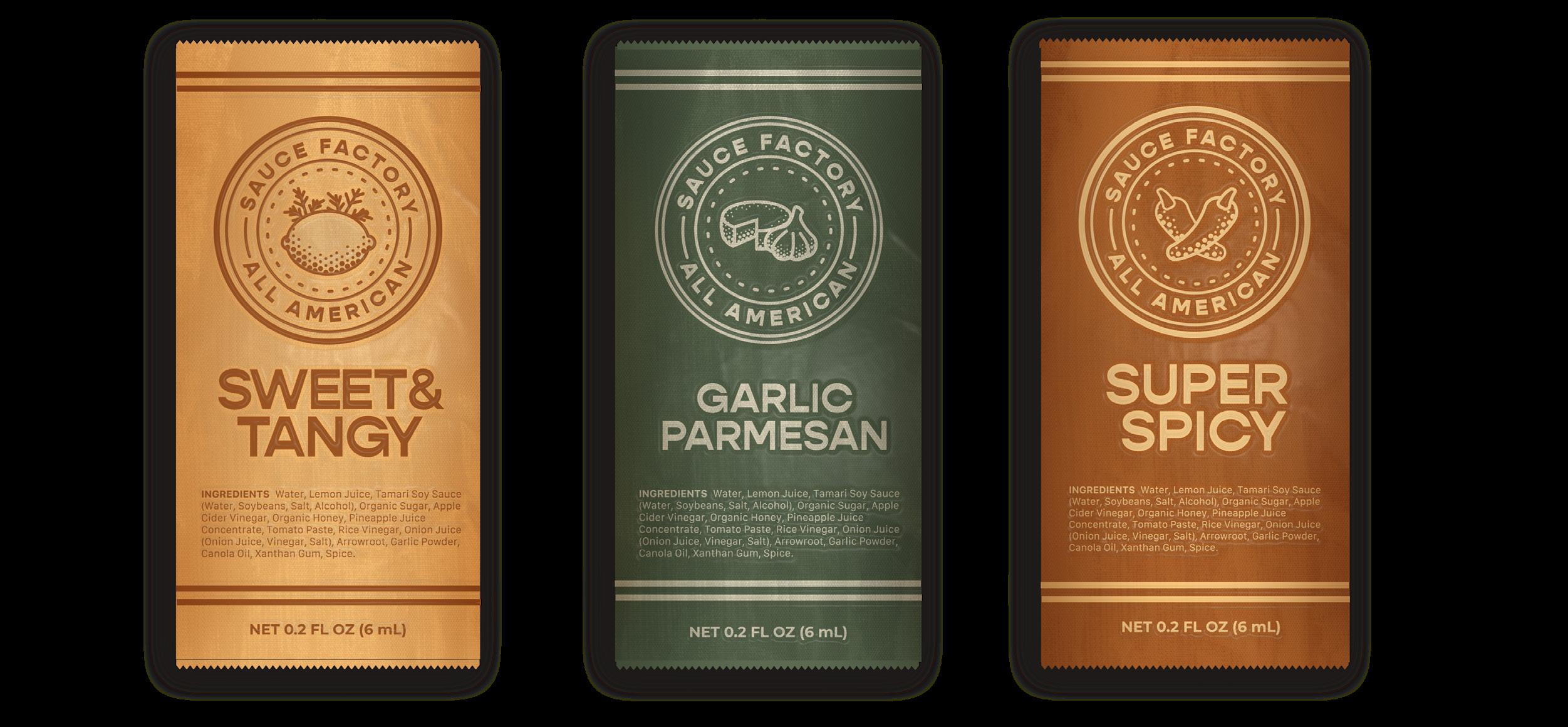
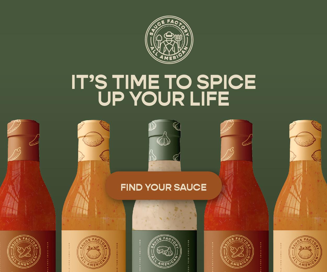
Sauce Factory is a company built around the desire to reconnect people with where their food comes from. The project goal was to create branding that included package design that clearly communicates and represents the unique value proposition of being 100% American grown. This challenge was addressed with imagery of the farmers, organic shapes, and neutral colors.


CONCEPTUAL



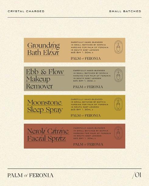
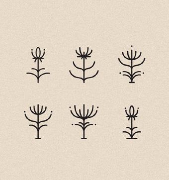
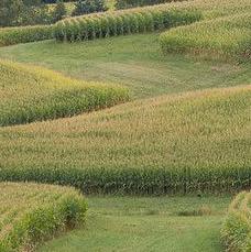
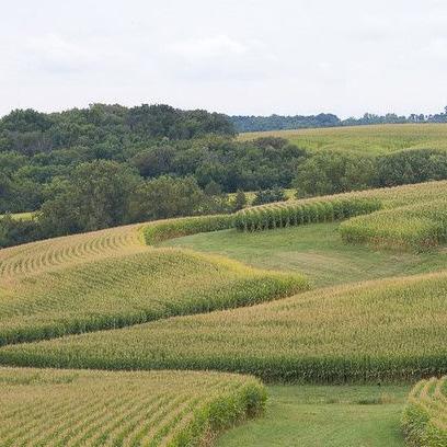
In a time where the source of our food seems more and more distant, Sauce Factory wanted to reconnect people with where their food comes from. They transform locally grown produce into delicious sauces for that local area. Each bottle has an introduction to the farm that the ingredients of that bottle came from. The look and feel mimics this with an earthy color palette, ingredient illustrations, an imperfect sans serif typeface, and a friendly serif typeface.
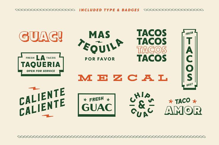
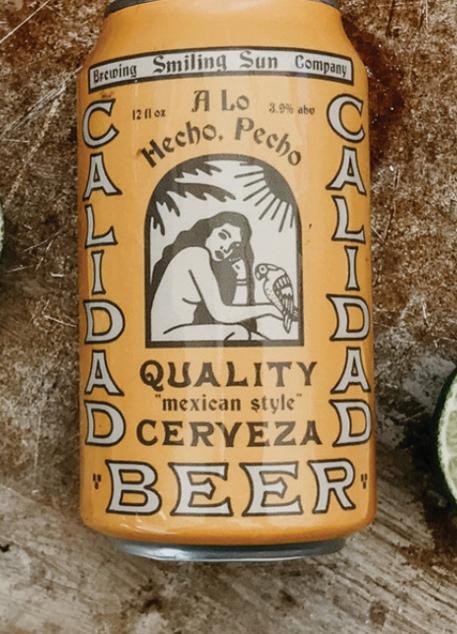
BACKGROUND
Key Words Moodboard Connection Genuine Warm Natural Rustic Transparent Trustworthy Human 25-35 YEARS OLD 75k + INCOME Cooking Meals Supporting Local Self Help Books Ethical Consumption Farmers Markets Clean Lifestyle INTERESTS Wellness GOAL Target Audience
USP: 100% American Grown
Sans serif with varying thick to thins to convey organic natural feeling
Straight forward clean look that is approachable and transparent
Recognition of hard work that goes into fresh farming
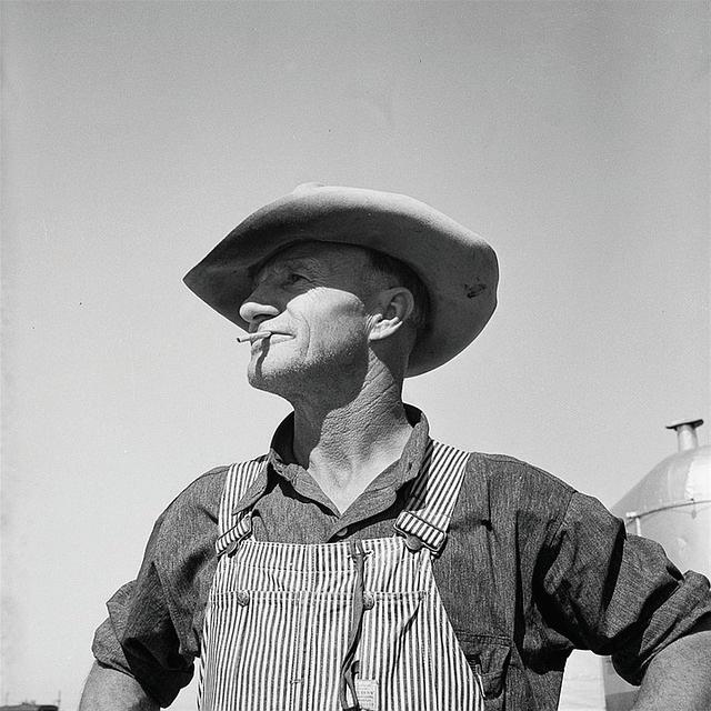
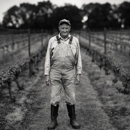
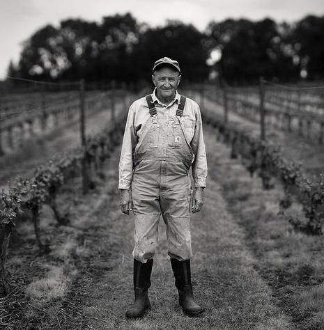
Ambiguous farmer to represent brand values


fresh
ingredients
caring
Sauce Factory was started because of the belief in American grown and sourced goods. We believe in all natural, organic ingredients for all of our sauces. With unique sauces and flavors customers could add excitement to their dishes without having to worry about GMOs, preservatives, or pesticides harming their bodies. Farm fresh for a meal refresh. O U R S T O R Y T H E P E O P L E
seed
sauce
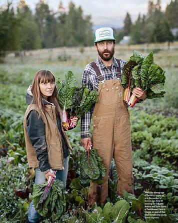
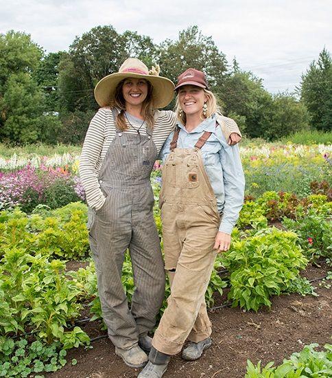
Knowing where your food comes from is important. That’s why we highlight the faces behind our sauces. Our factory isn’t made up of mindless machines but real people that care about the quality sauces that you use in your home. Sauce Factory highlight’s its farmers and introduces them through bios and stories to our customers. It’s more than a business it’s a community from farm to table. M A R K E T C O M P A R S O N $ $ $ H G H R Q U A T Y L O W E R Q U A L Y
Quality,
, local
grown by
hands that brighten any dish
From
to
and lots of love in between



DUTCH BLITZ
BRANDING


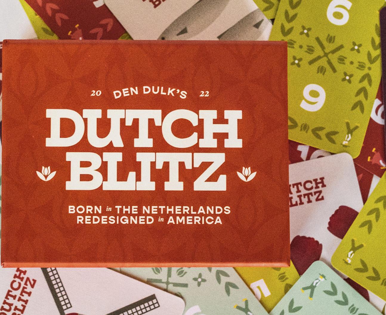
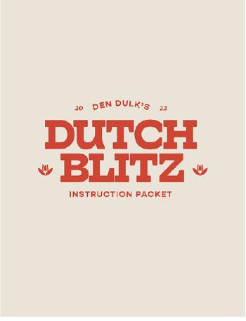
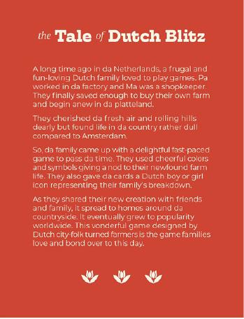
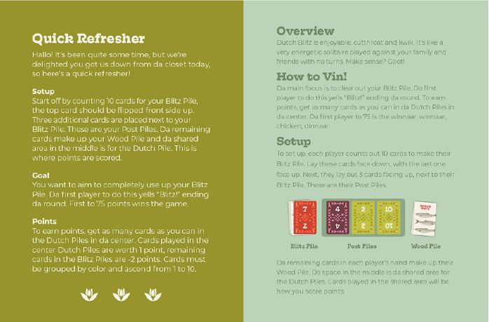
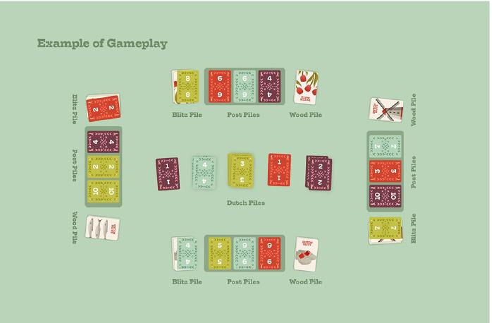
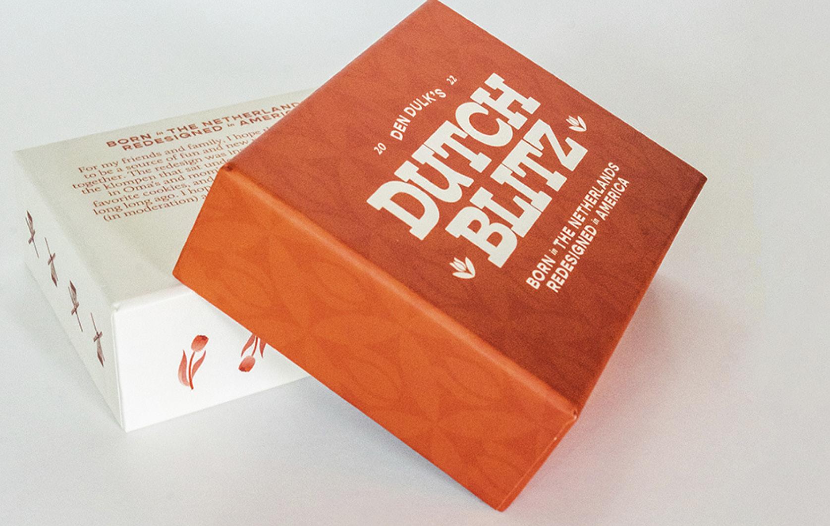
Dutch Blitz was a passion project redesign of a game that I grew up playing with my family. I recreated the classic game with more Dutch cultural elements, playful colors, and greater contrast between the numbers and colors. I also created a new instruction packet that was appealing, functional, and fit with the new look.
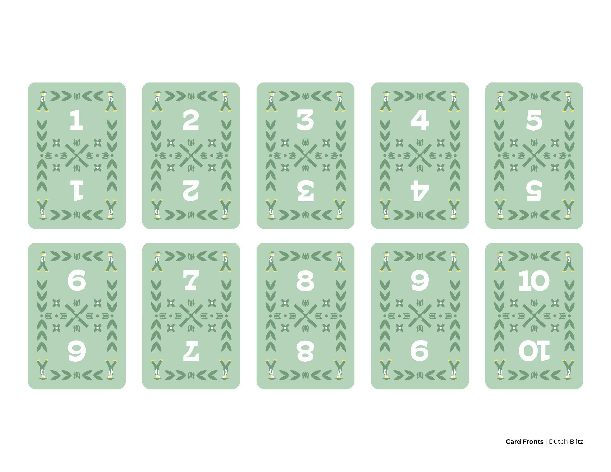
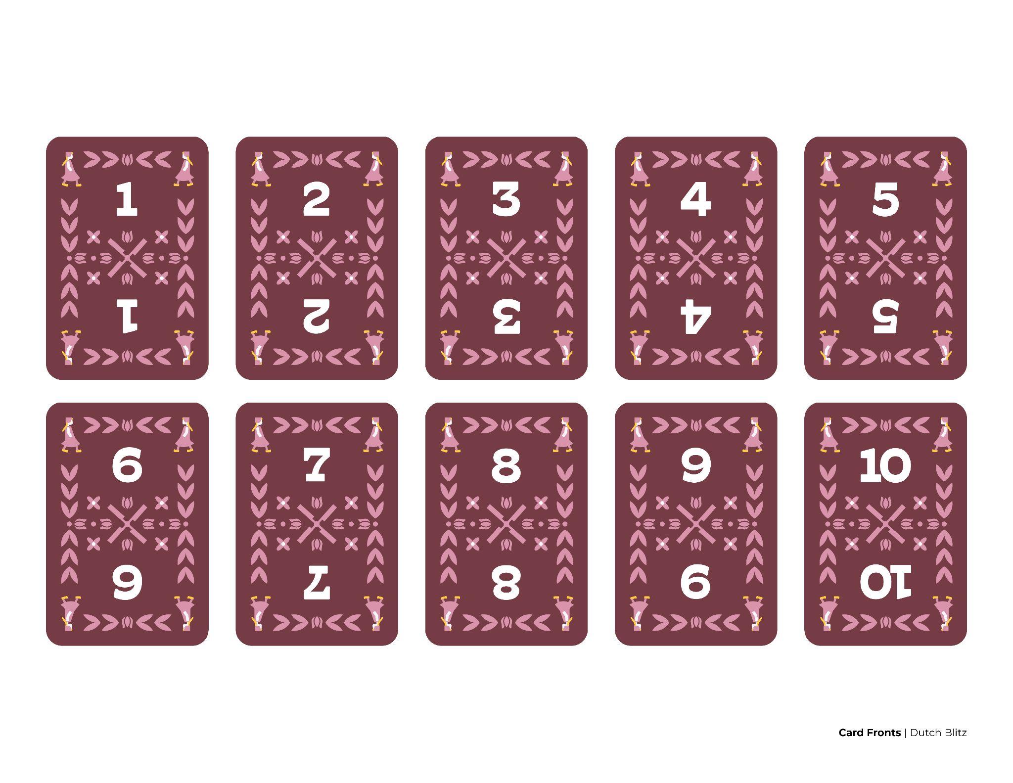
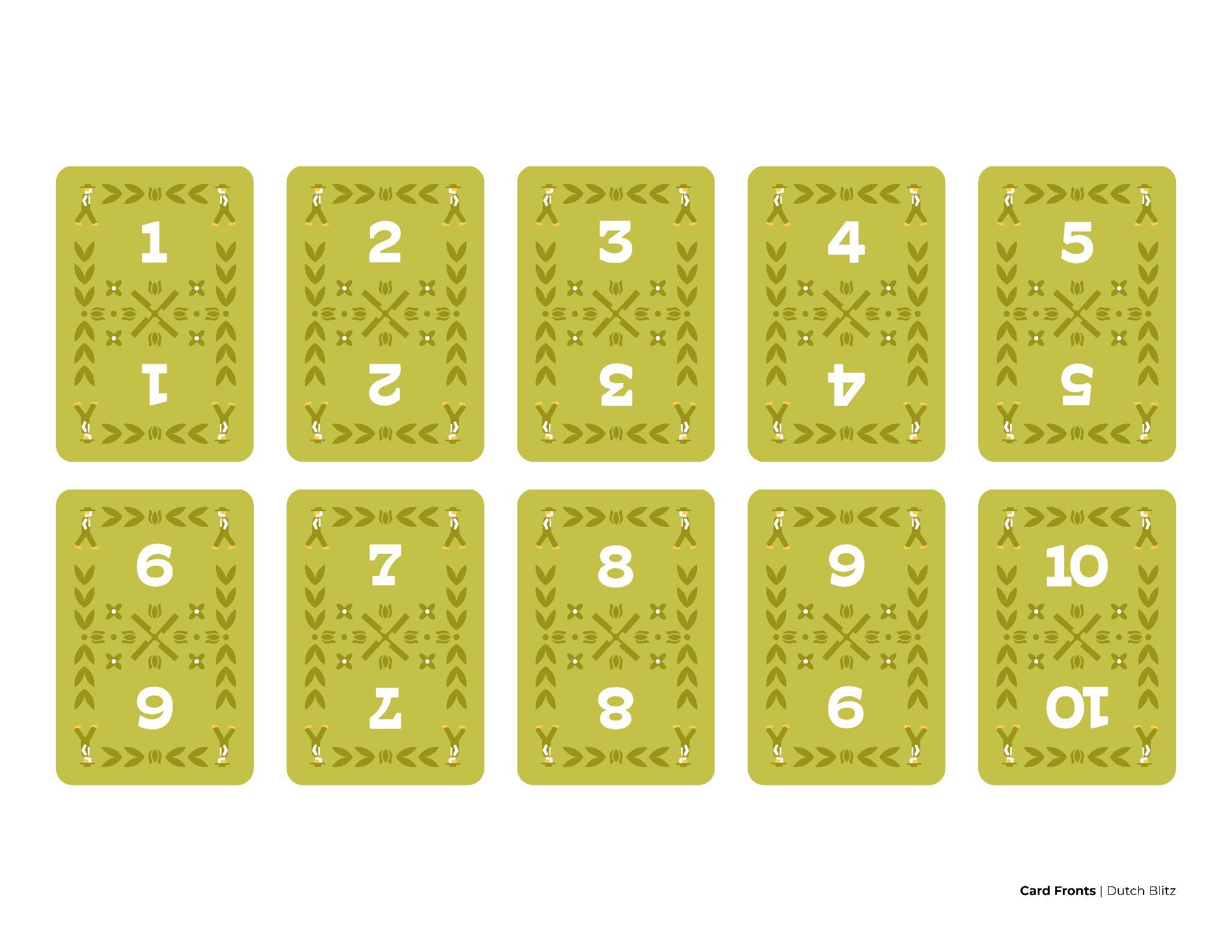
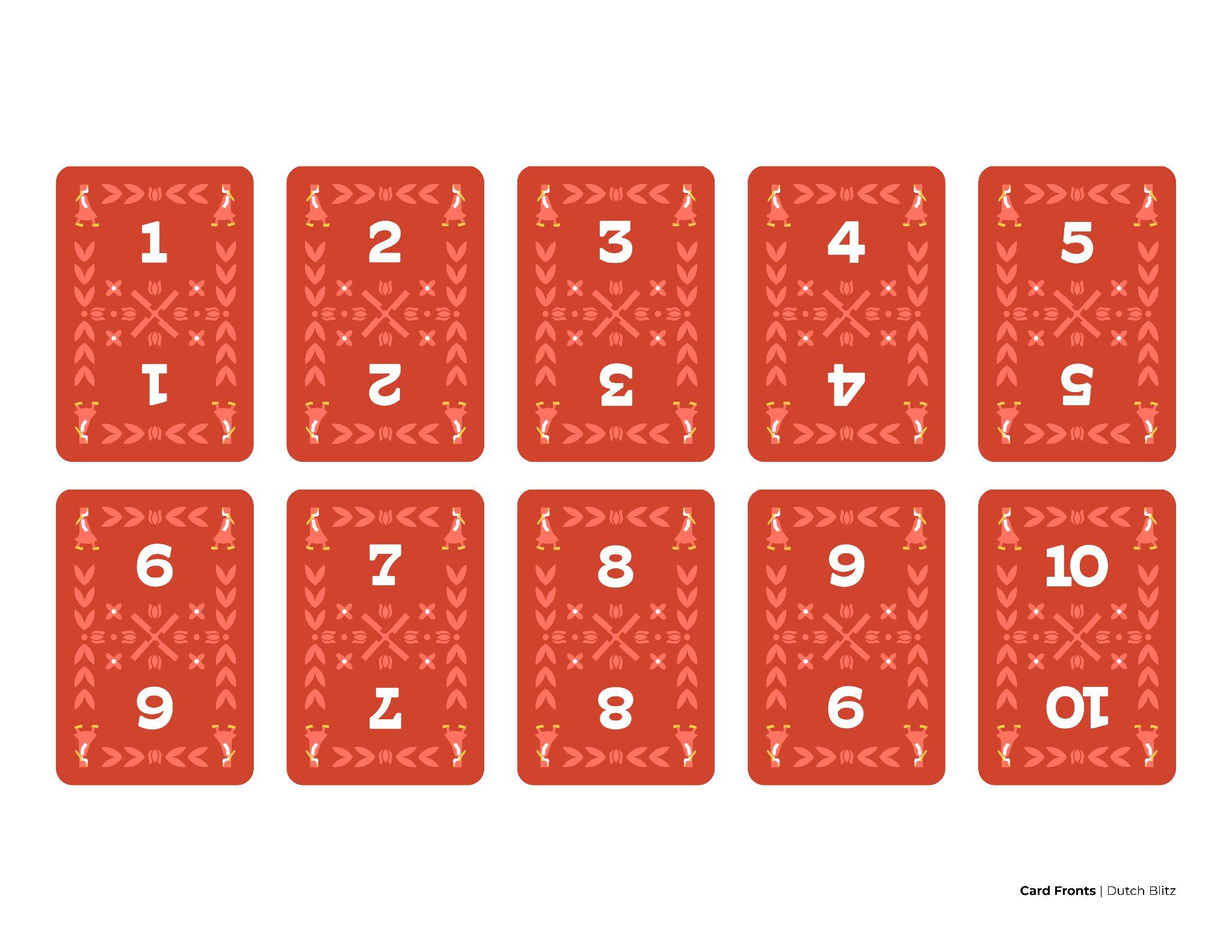
Card Design | Dutch Blitz | Dutch Blitz Card Design | Dutch Blitz Card Design | Dutch Blitz
 Rachel
den Dulk racheldendulk.com hello@racheldendulk.com


 Boesel, Project Lead Diana Cheek, Art Director
Rachel den Dulk, Designer
Ireland Fleck, Copywriter
Sarah Name, Copywriter
Jason


 Rachel