

Getting Ready
Narrative animation
An animation project based on the stereotypes on getting ready.
Here are few of the sketches I made for this animation project. These are just quick and fast ideas I did to get some general ideas of what I wanted the animation to look like and what I wanted the main character to look like.


Tabletop Tavern
Logo animation
An animation project made for a fictional store called “Tabletop Tavern”, a fantasy themed table top/card game store.
I made some sketches for what I wanted the logo to look like and put down some thoughts for color for my assets. Then made some quick sketches for the main movements for the animation.
Creating the assets within Illustrator was real fun for me because I was really figuring out the gradients for my assets and was


Flaming Bowl
Animated website menu
An animation project to promote a fictional restaurant chain I created.
I jotted down some ideas for the main movements in the storybord. After that I created a rough logo for the restaurant and website.
I then created the logo in Adobe Illustrator along with the main website page and all the other assets for the animation, which I animated in Adobe After Effects.



Personal Branding
Logo x Stickers
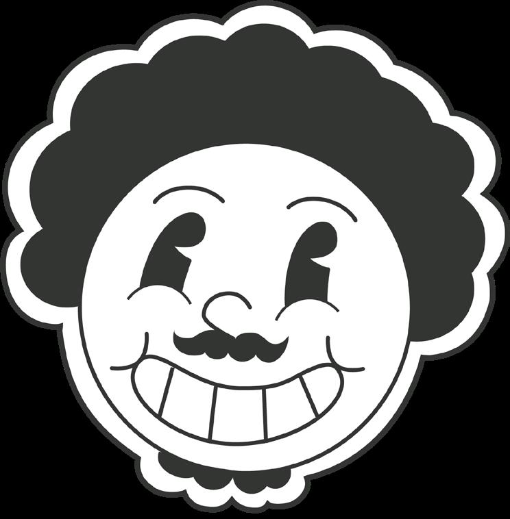
For my brand, I wanted to create a logo that encapsulates all of me in a single glance.
People tend to notice my smile first and that gives them a real positive impression of me right out of the gate. Since people see me in a positive light, I figured why not run with the positivity theme. I used yellow for my color palette, since it is represented as the color of happiness (in America) and I wanted to emphasize my smile.


Personal Branding
Résumé x Cover Letter x Stationery
For my brand to really branch off it needs to remain consistent between my social medias but also through my personal stationery. So I followed my brand guide to and create my own resume and cover letter for future applications.
I also created my business card and Thank you Letter as other parts of my stationery


Mayan Glyphs Magezine
Cover
I was tasked to create anything with a purpose in design aslong as it dealt with Mayan glyphs.
I chose to go with a magazine cover for Mayan glyphs that would highlight their unique history but also bring a new life to it in the modern age.
I added a cracked stone texture to give a sense that these were created on a wall like an original glyph would have been. However, with the glyphs and font, I wanted to make it more modern and went with more “bubbly” and stylized icons.


Self Portrait
Abstract
I created this self-portrait as a period-inspired piece. I was tasked to create something unique for the 1920s Bauhaus art style. I strived to do justice to the time, However, since my research and inspiration are all on pieces inspired by the era, my testament to the time gets a bit diluted.
With that being said, for my poster I used the font “P22 Albers” to capture the architectural and structural background that the Bauhaus comes from while also incorporating the name “Bauhaus” into my self-portrait by making my mustache the “B” and my beard the “A” in Bauhaus.

Interior Scene
Dungeon Room
I created an interior within 3D space with all assets created by me. I chose to do a dungeon because I was doing a lot of fantasy/medieval themed projects already, so this one was no exception.
I tried to go with a stylistic approach for texturing and and realized it is no easy feat. You either have to spend a lot of time sculpting or painting assets, which I have a whole new found appreciation for.


Exterior Scene
Abandoned well
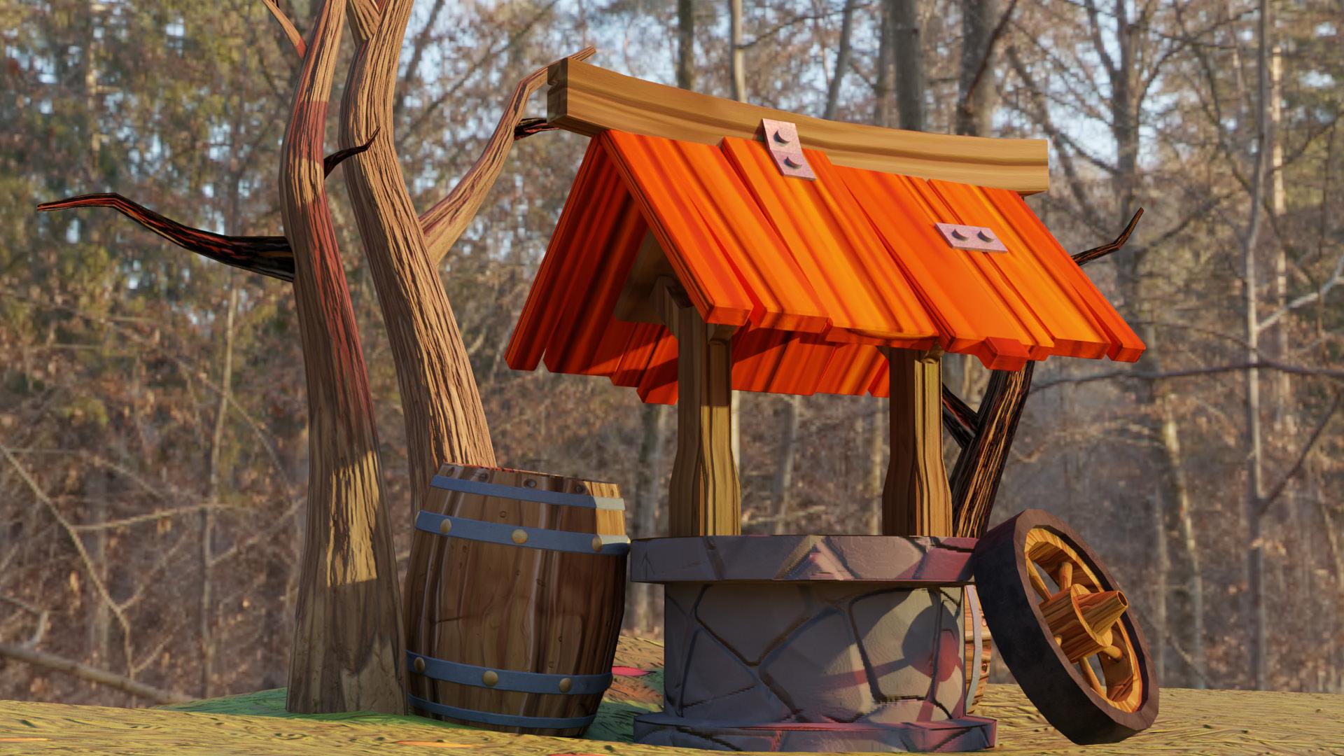
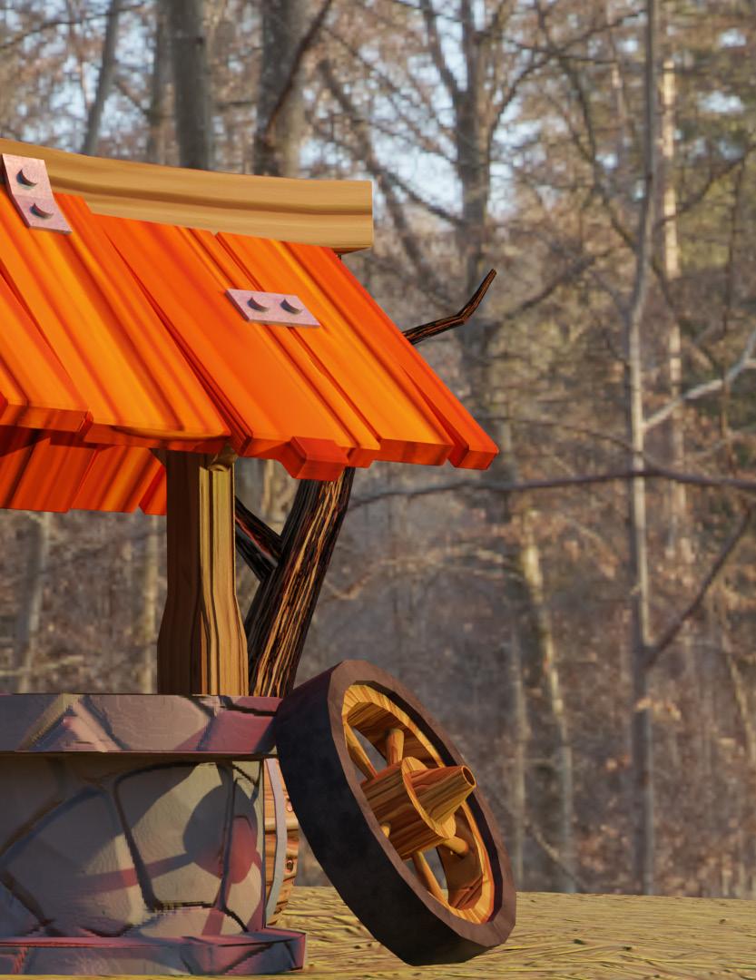
I was tasked to create an exterior scene of whatever I desired.
So I decided to go with a forest exterior focused on an abandoned well.
Assets were modeled in Maya, textured in Substance Painter, and then I would say I mainly tried to focus on the wood grain and how it would flow in real life.



Nebula Flow
Particle effect
This is a particle simulation I did in blender. I wanted to achieve something with a nice flow and spread to it. The colors chosen were to give a cool and calming tone to the animation.
This project has helped introduce me particles within Blender and I got a sense of how to use the tools and I am excited to see what more I can do.


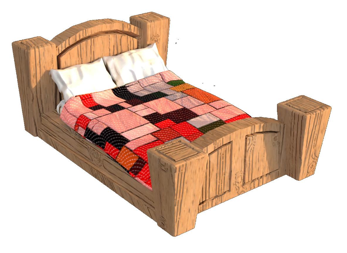

Stylized Bed
Cloth effect
In this Project, I had a chance to get familiar with the cloth physics within Blender. I modeled everything in Autodesk Maya, textured in Adobe Substance Painter, and finally imported the mesh and textures to Blender so that I could apply the cloth physic to the blanket and animate it flopping around.

Barrel & Door
Asset creation
These are just some 3D assets I made that can be used for video games or stylized animation. This marks the beginning of my asset creation so I started off very basic in terms of the model but really strived to achieve that stylistic look.
Each model was created in Autodesk Maya and then textured in Adobe Substance Painter. Finally, I imported the final mesh and textures into Blender where I created a cyc wall and established a Loop light studio setup with a slight back light.


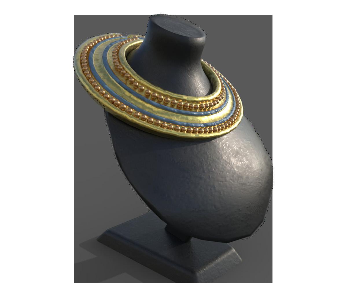
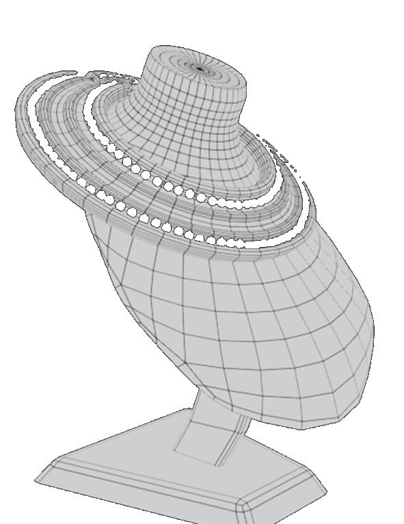
Egyptian Collar
Asset creation
This 3D asset was created to accompany a semester-long research paper that I had conducted on Egyptian jewelry.
I wanted to capture the unique metals used in their jewelry while also capturing the craftsmanship of the metal during that time.


