HYDROFLASK
Print Campaign
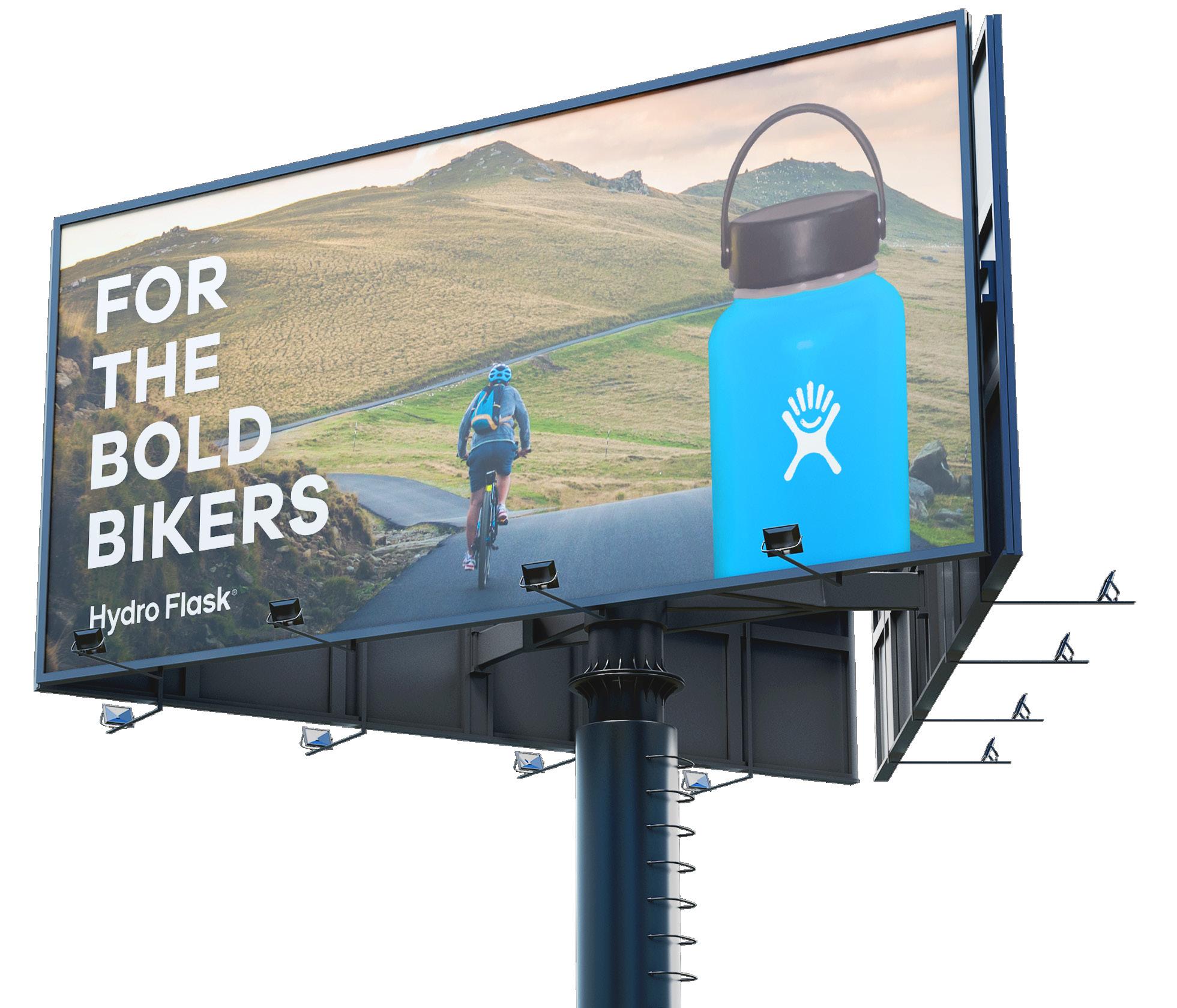
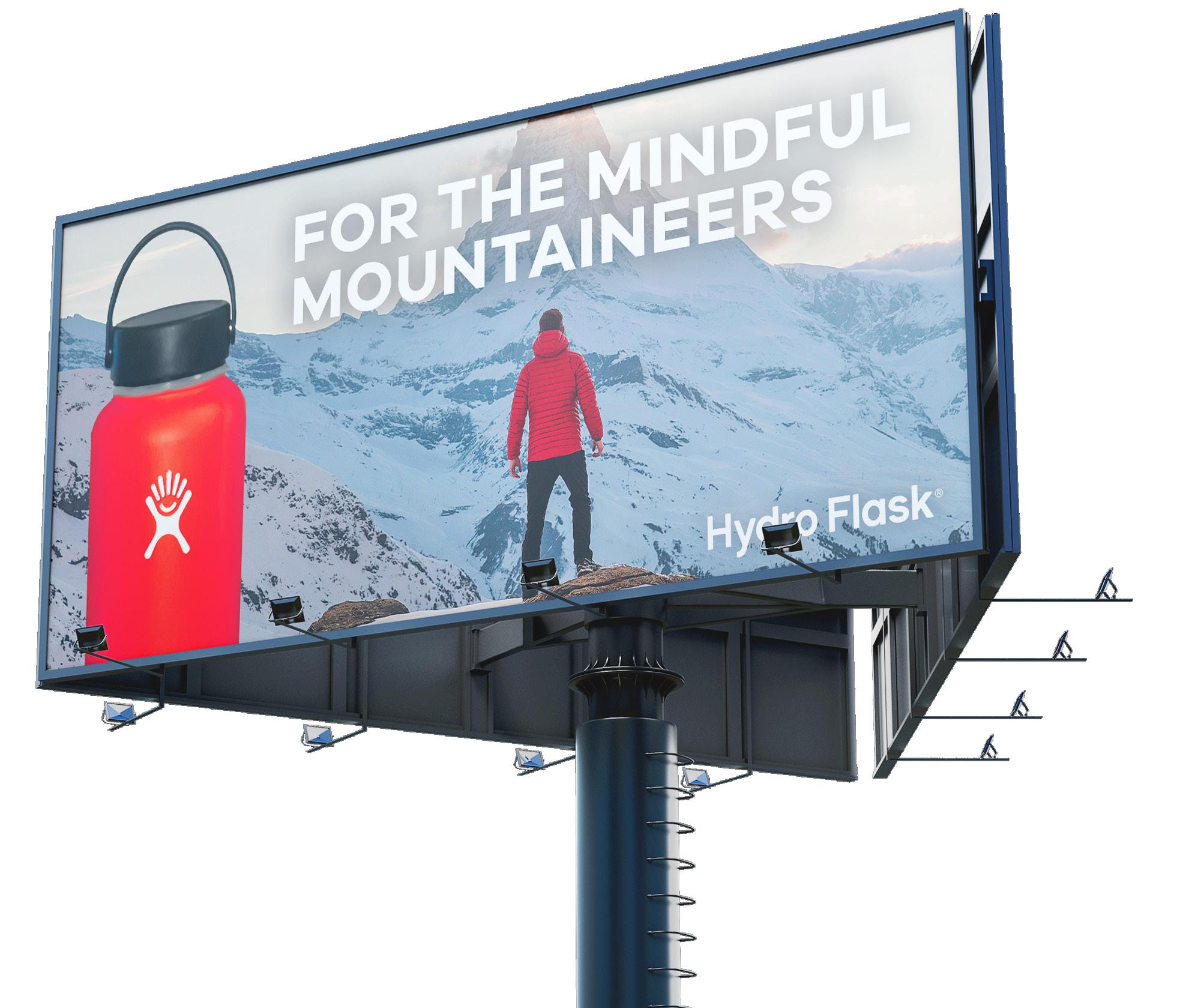
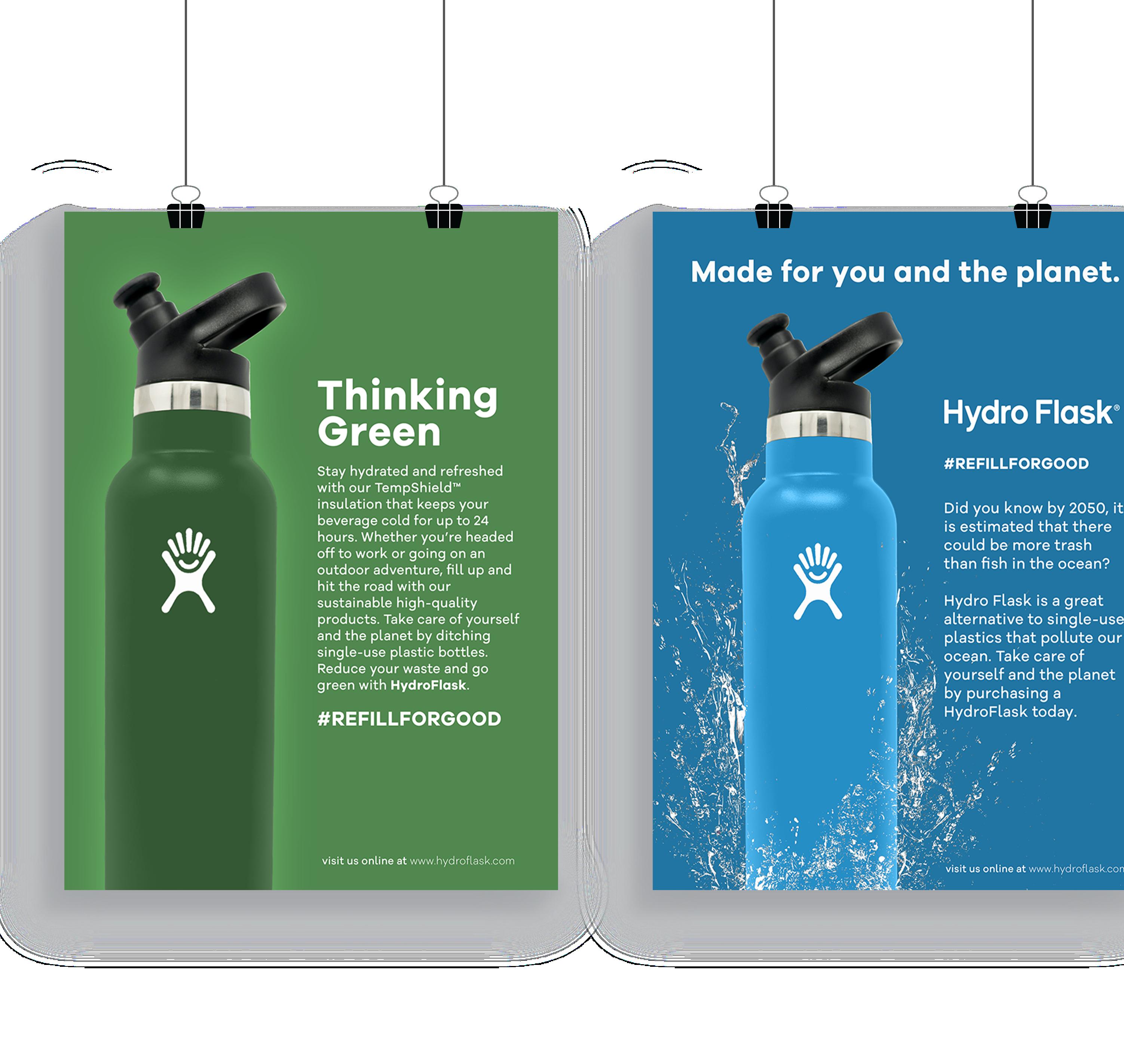
The purpose of this print campaign was to promote the sustainability of HydroFlask products and encourage the audience to take better care of our planet. In order to bring focus to the copywriting, I went with minimal and clean designs.

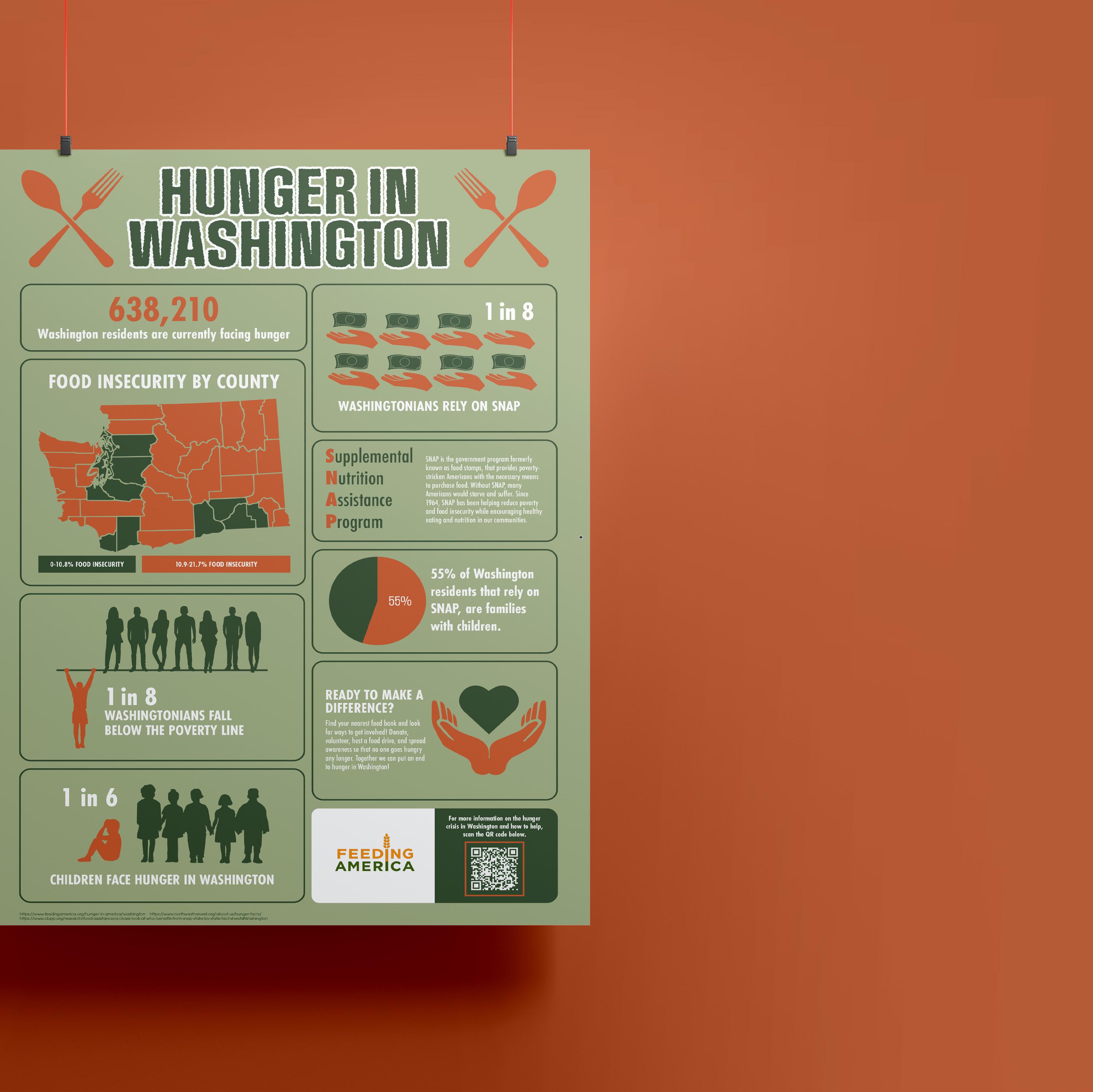
HUNGER IN WA
Infographic Poster
This infographic poster was created in order to educate the public on the hunger crisis in Washington State, as well as encourage the community to take action for the cause. As a fellow Washingtonian and an advocate for ending hunger, this design is truly meaningful to me.


LAWS ABOUT TYPE


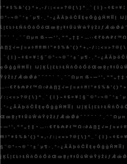
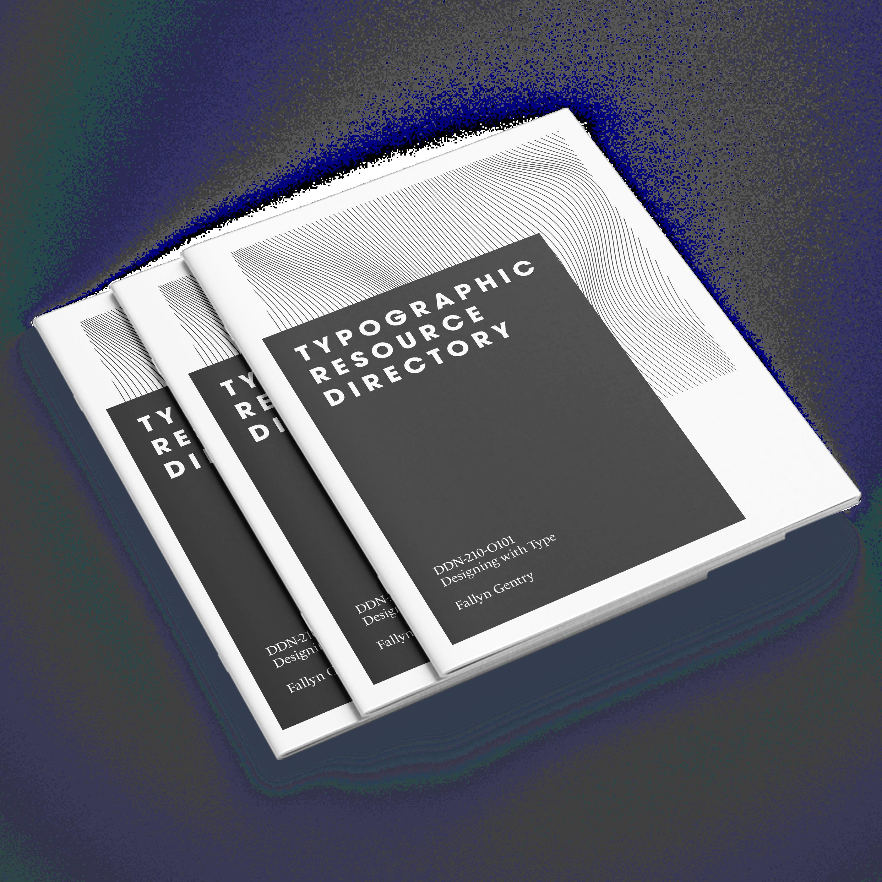
Typographic Resource Directory Typographic Resource Directory Fallyn Gentry Advertising and Graphic Design Student at Grand Canyon University INTRODUCTION A little bit about me... My name is Fallyn Gentry, and am student of Advertising and Graphic Design at Grand Canyon University. Throughout my time in this program I have learned a lot about design and about myself. Creative work within design is a great outlet for me and one that very much enjoy. My whole life I have loved all things that involve art and creativity. hope to take what learn through this program and use my creative gifts to make a positive impact in the lives of others. This Typographic Resource Directory (TRD) showcases what have learned throughout my “Designing with Type” course as well as what have learned through my other design classes within the program. The goal of this TRD is to help myself and others learn and remember the essential components of designing with typography. Typographic Resource Directory DESIGNING WITH TYPE What it’s all about Designing with type is a fundamental part of the design process. Typography can be used in a variety of ways and have powerful impact. It is important to know the form and function of type, as well as how to implement type into a design. Typographic Resource Directory Typographic Resource Directory Licensed When a font is created, a licensing agreement is created for the font to ensure that the font is only used as intended by the owner. When downloading and using a font, it is important to read through the licensing agreement in order to be aware of what the font can and cannot be used for. If the licensing agreement is neglected and the font is used illegally, it can lead to legal repercussions. Copyright Currently in the United States, fonts can be protected under copyright laws. Fonts may be protected if they meet the qualification of being computer software or program. This right comes from the 1976 Copyright Act, which gives the copyright owner the ability to reproduce, adapt, distribute, publicly perform and publicly display the work. However, typefaces, are not protected under this law. Other countries such as Germany and England, allow for legal protection of typefaces through copyright laws.
10 Typographic Resource Directory Typographic Resource Directory 11 Alignment Precise arrangement of letterforms upon an imaginary horizontal or vertical line Character A symbol, sign, or mark in a language system. Font A complete set of characters in one design, size, and style. In traditional metal type, a font meant a particular size and style;in digital typography, font can output multiple sizes and even altered styles of a typeface design Kerning The process of adjusting space between specific pairs of characters so that the overall letter spacing appears to be even. Leading In early typesetting, strips of lead were placed between lines of type to increase the interline spacing, hence the term. Pica A typographic unit of measurement: 12 points equal 1 pica; picas equal approximately 1 inch. Line lengths and column widths are measured in picas. Point A measure of size used in typesetting. One point is equal to 1/12 of a pica, or approximately 1/72 of an inch. It is most often used to indicate the size of type or amount of leading added between lines. Sans-Serif Typefaces without serifs. Serif Small elements added to the ends of the main strokes of a letterform in serifed type styles. Tracking The overall tightness or looseness of the spacing between all characters in a line or block of text. Sometimes used interchangeably with kerning, which is the reduction in spacing between specific pair of letters. Typeface The design of alphabetical and numerical characters unified by consistent visual properties. Typography Originally the composition of printed matter from movable type. Now the art and process of typesetting by any system or method. TYPOGRAPHIC TERMS 12 Typographic Resource Directory
GLYPHS What are they? A glyph is a single representation or design of a character within a font. There can be multiple representations or designs for one character within font. For example, they can have the appearance of numbers, letters, punctuation or even a decorative form. In addition, ligature is single glyph made up of two or more characters. How are they Used? Glyphs represent readable character for use in writing. Some glyphs look less like characters and more like designs, allowing them to be used for more creative purposes outside of writing. LETTERFORMS Hairline Fillet Apex Crossbar Bowl Aperture Cap Height X-Height Baseline 14 Typographic Resource Directory Typographic Resource Directory 15 INSPIRATION Where to look? Design is all around you. Almost everywhere you look there is some type of design that inspiration can be taken from. However, if you are looking for more specific inspiration regarding graphic and typographic design, there are different print and media options you can look for. When it comes to print design, great places to look are magazines, billboards, newspapers, and books. As for digital designs, social media, websites, and Pinterest, are few great places to start looking for inspiration. MY FAVORITE TYPEFACES Lemon miLk DIDONI LE MONDE LIVRE CLASSIC FUTURA
Aa
“creativity
is intelligence having fun”
Typographic Resource Directory 17 WHERE TO FIND TYPEFACES Free & Purchased Free typefaces can be found across many different websites and programs. The Adobe suite includes a variety of typefaces right at your finger tips with easy searching through the Adobe font website. Websites such as dafont.com are also a great place to look for free fonts and typefaces that are easy to download and generally good quality. Purchased typefaces can be bought from designers through their personal sites and other company sites. Purchasing a typeface can be beneficial when you are looking for something less common and higher quality. This would usually be more useful when finding a typeface for a new brand. 18 Typographic Resource Directory Typographic Resource Directory 19 HOW TO... DESIGN A TYPEFACE 1. Research & Plan The first step is deciding what kind of typeface you want to design. Look for inspiration and research different categories of typefaces to decide which fits best with the vision and design you are going for. 2. Create a Document & Guides Adobe Illustrator is best for creating vectors of your typeface. Set up artboards and guides for each character, and begin creating. 3. Export Files Once you have drawn your characters for your typeface and made any needed adjustments, its time to export. In Adobe Illustrator select “export for screens” and save the artboards as .svg files. 4. Convert to .TFF or .OTF & Enjoy Choose a font creation software to convert your files to a .tff or .otf file. Once converted, the file can be downloaded onto the computer and used for all of your typographic needs! Typographic Resource Directory Typographic Resource Directory TABLE OF CONTENTS 4. Introduction A little bit about the author & this TRD. 6. Designing with Type Learn what designing with type is all about. 8. Laws About Type Get to know licenses & copyright in typography. 10. Typographic Terms The basic terms of typography & definitions. 12. Letterforms The anatomy of typography. 13. Glyphs Learn about glyphs and how they can be used. 14. Inspiration Learn where to find design inspiration. 15. Favorite Typefaces The author’s favorite typefaces. 16. Where to Find Typefaces Learn where to find free and purchasable type. 18. Designing a Typeface A breakdown of the steps to create a typeface. TYPOGRAPHIC RESOURCE DIRECTORY DDN-210-O101 Designing with Type Fallyn Gentry
- Albert Einstein

BOOK LAYOUT DESIGN Typographic Resource Directory
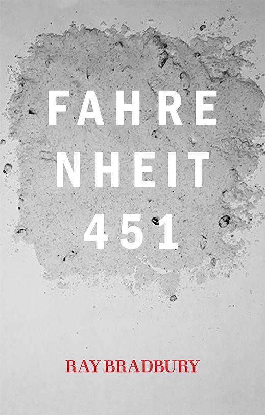
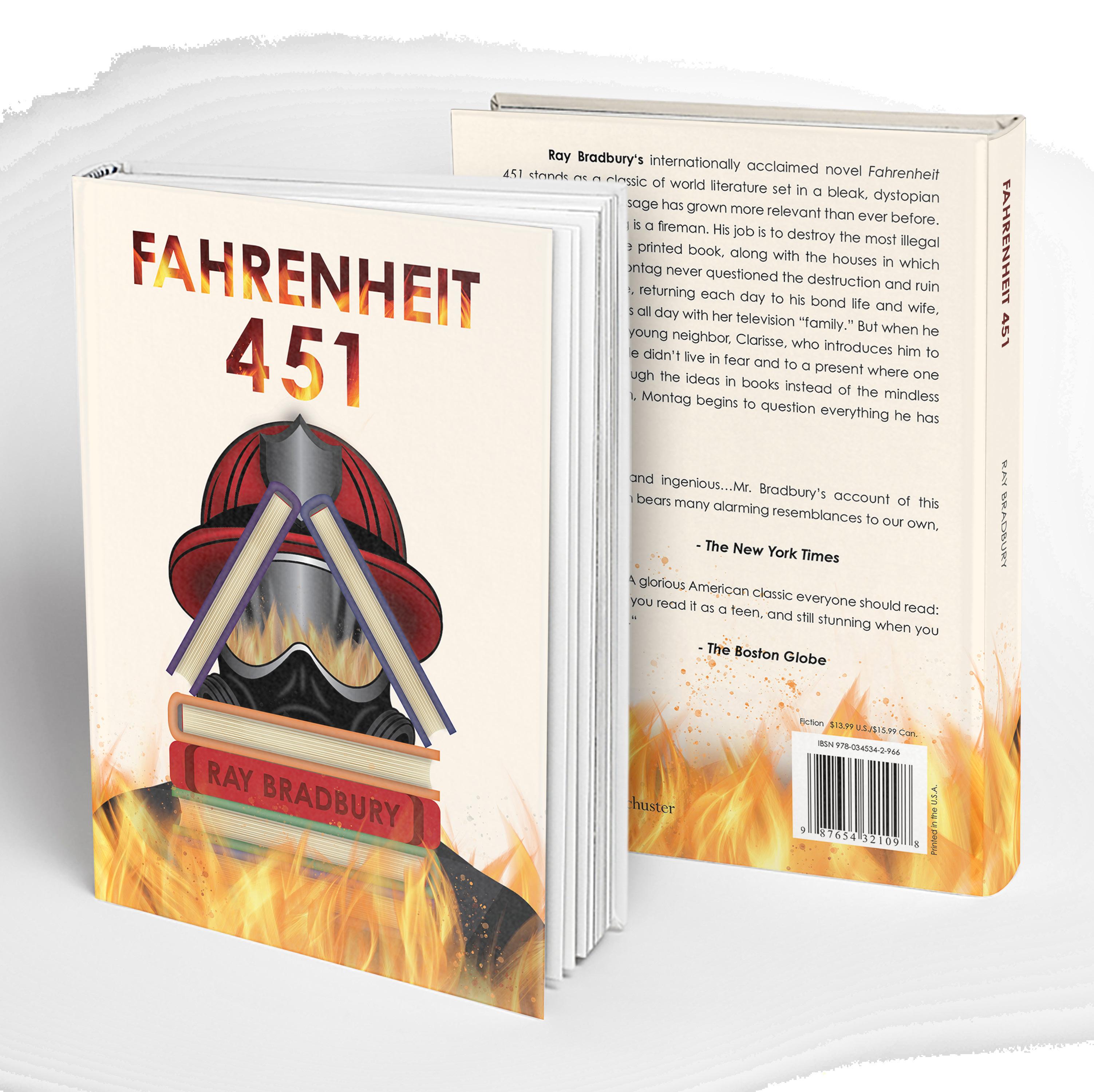
FAHRENHEIT 451


Book Cover Design

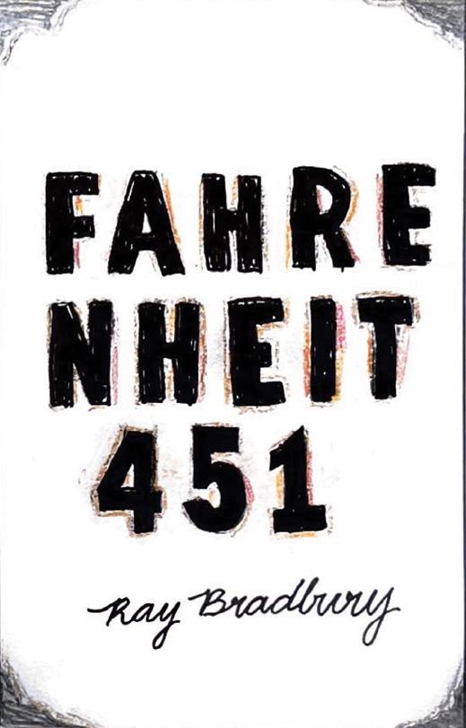
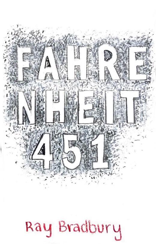
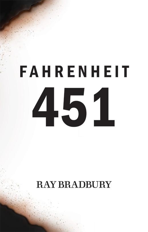
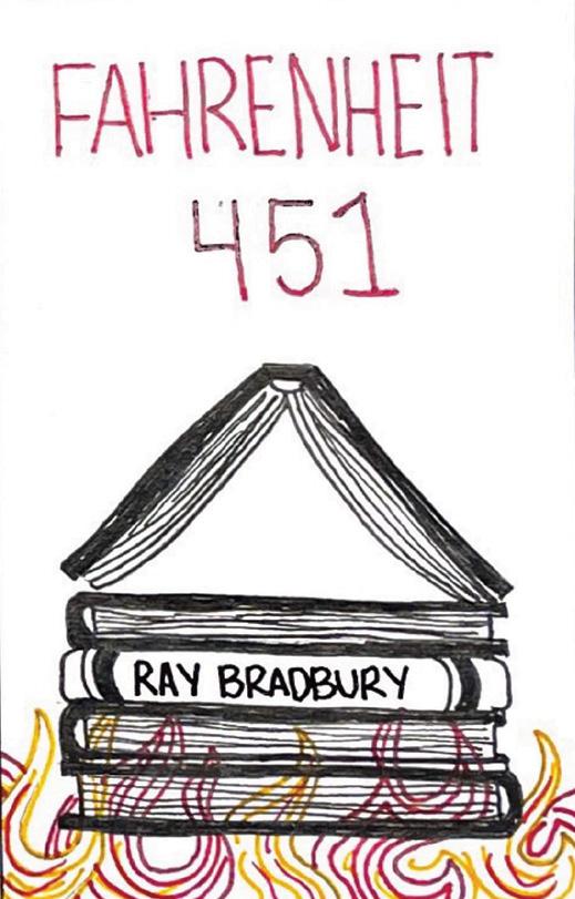
Fahrenheit 451, by Ray Bradbury, is classic novel that captures a bleak dystopian future, where books are banned and firefighters ignite the flames instead of putting them out. The purpose of this book cover redesign was to showcase this classic story using visual metaphor.


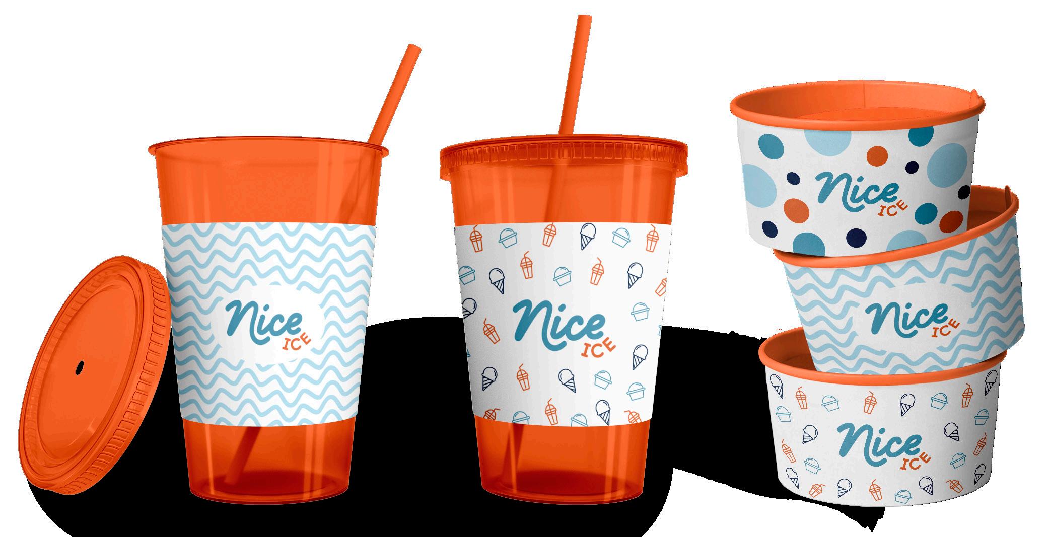
NICE ICE
Branding & Food Truck Wrap
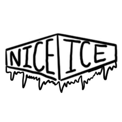
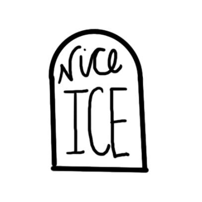
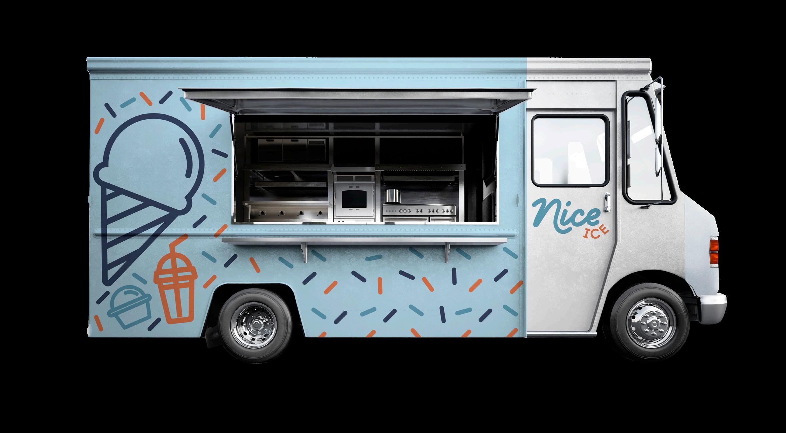
Nice Ice is a fictional ice cream & iced beverage food truck brand that was looking for a brand update including a new logo, product designs, and a food truck wrap. I created each of these designs utilizing bright and playful colors to be enjoyed by all ages.


REDDI WIP
Creative Typography Ad
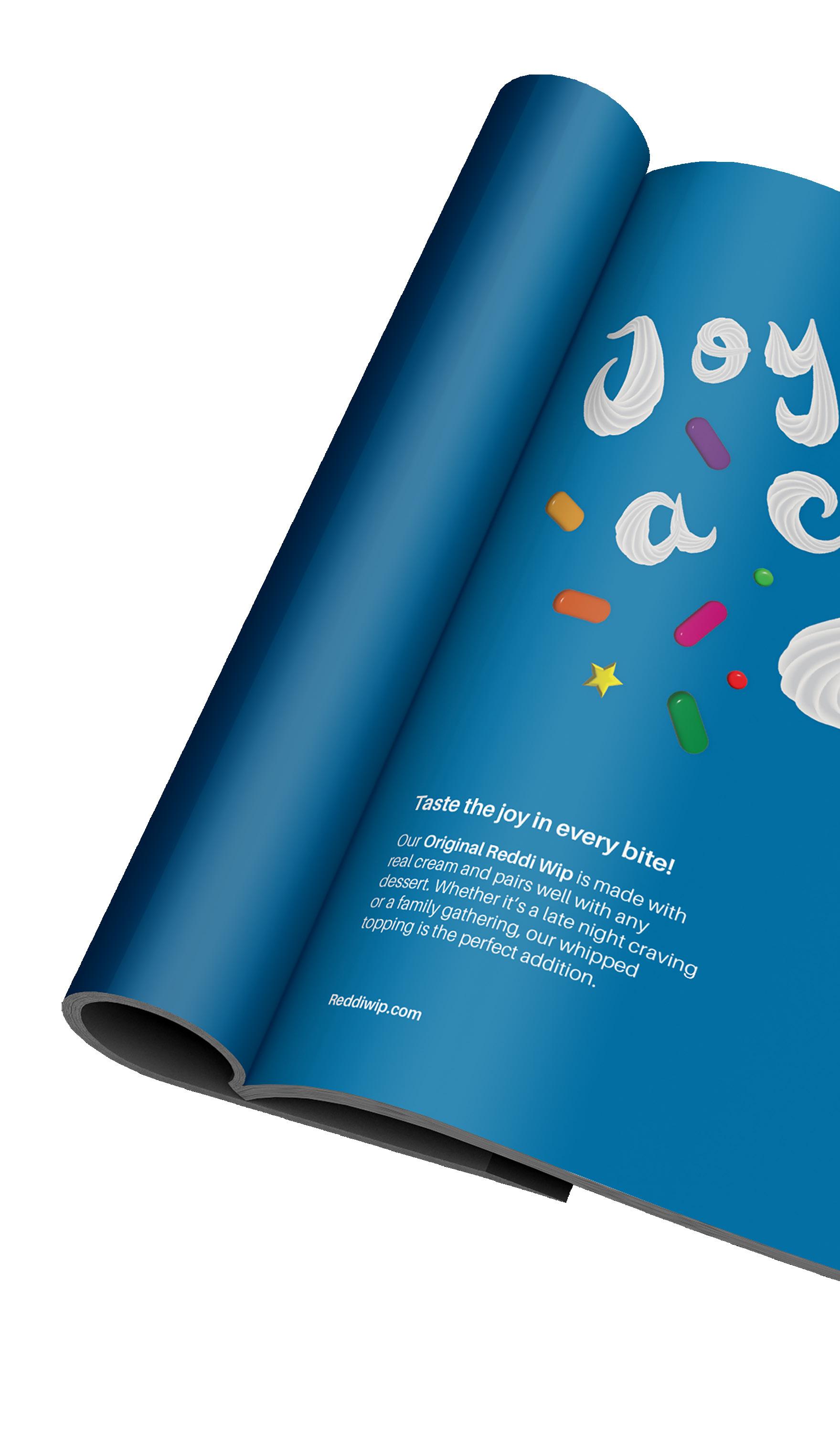
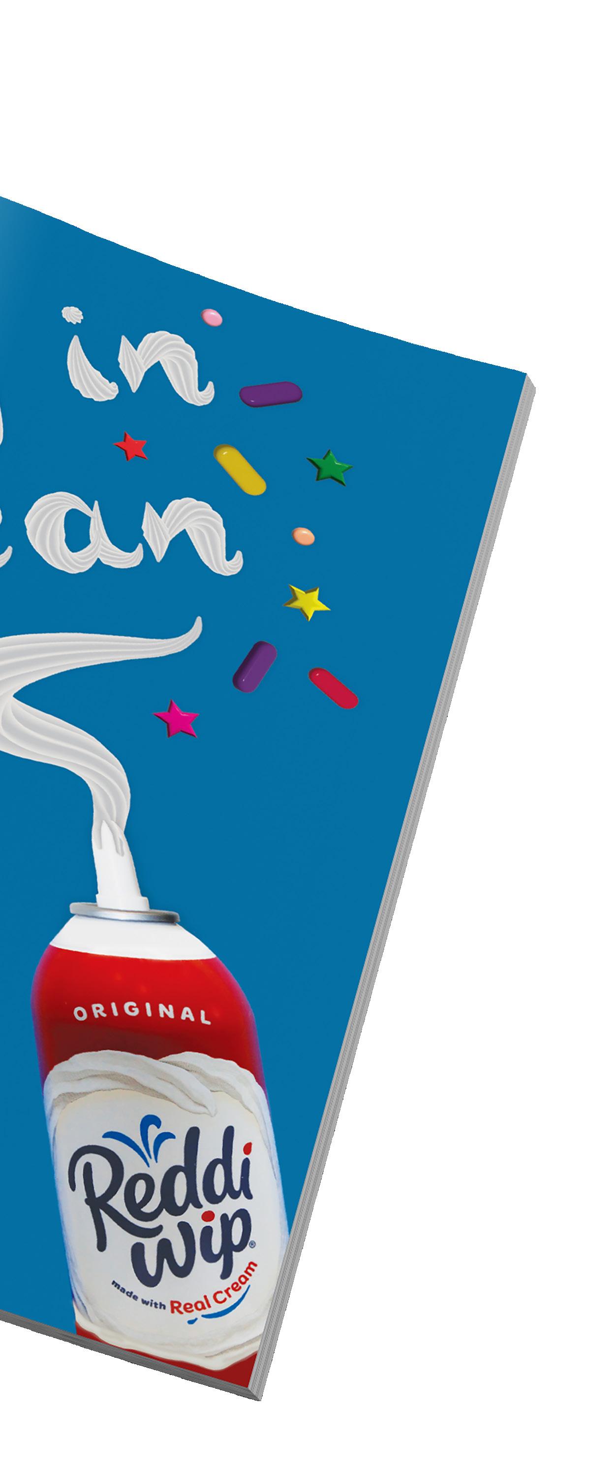
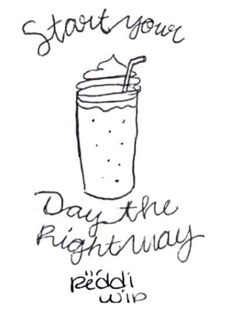
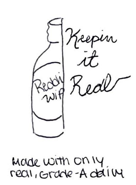
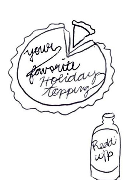
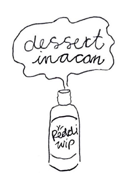
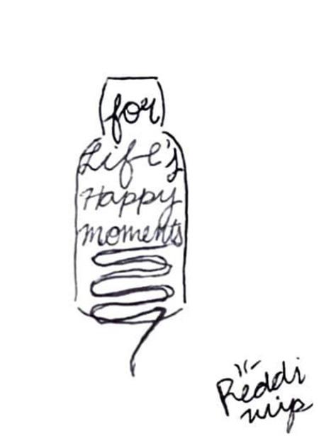
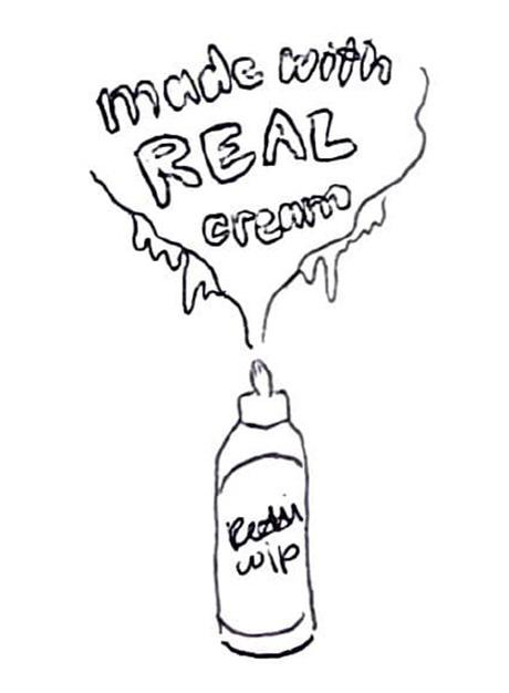
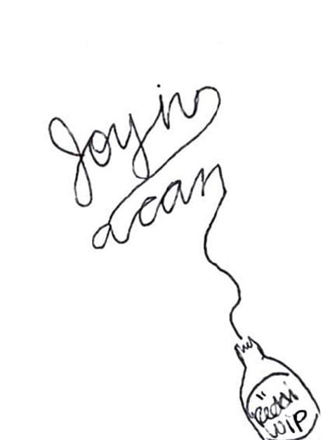
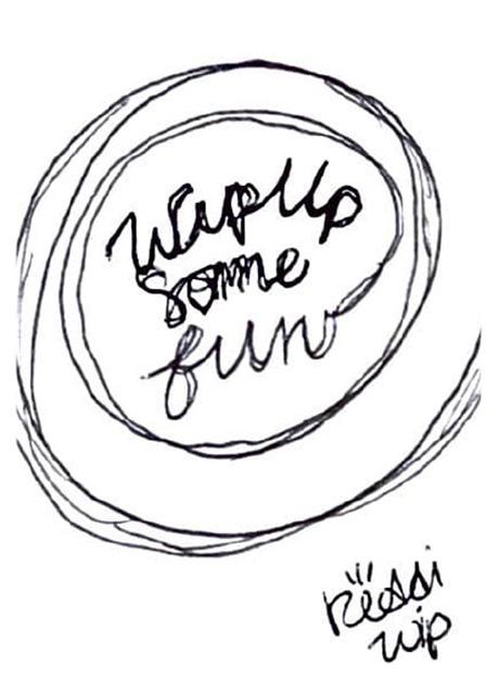
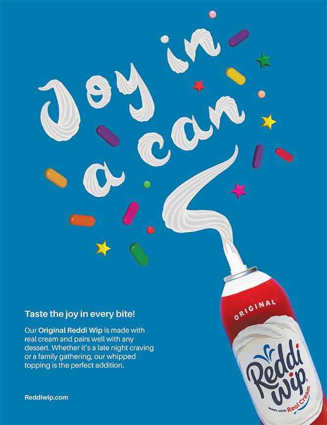
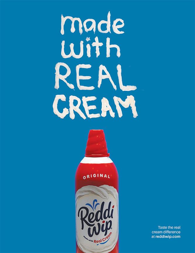
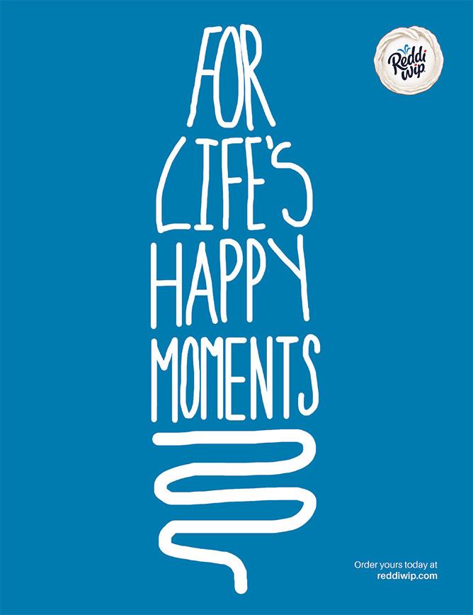
The purpose of this project was to create an engaging print advertisement for Reddi Wip using creative typography. All graphics, photography, and typography had to be original an unique. During this project I utilized various materials and concepts to achieve the final design.
