
Personal Branding


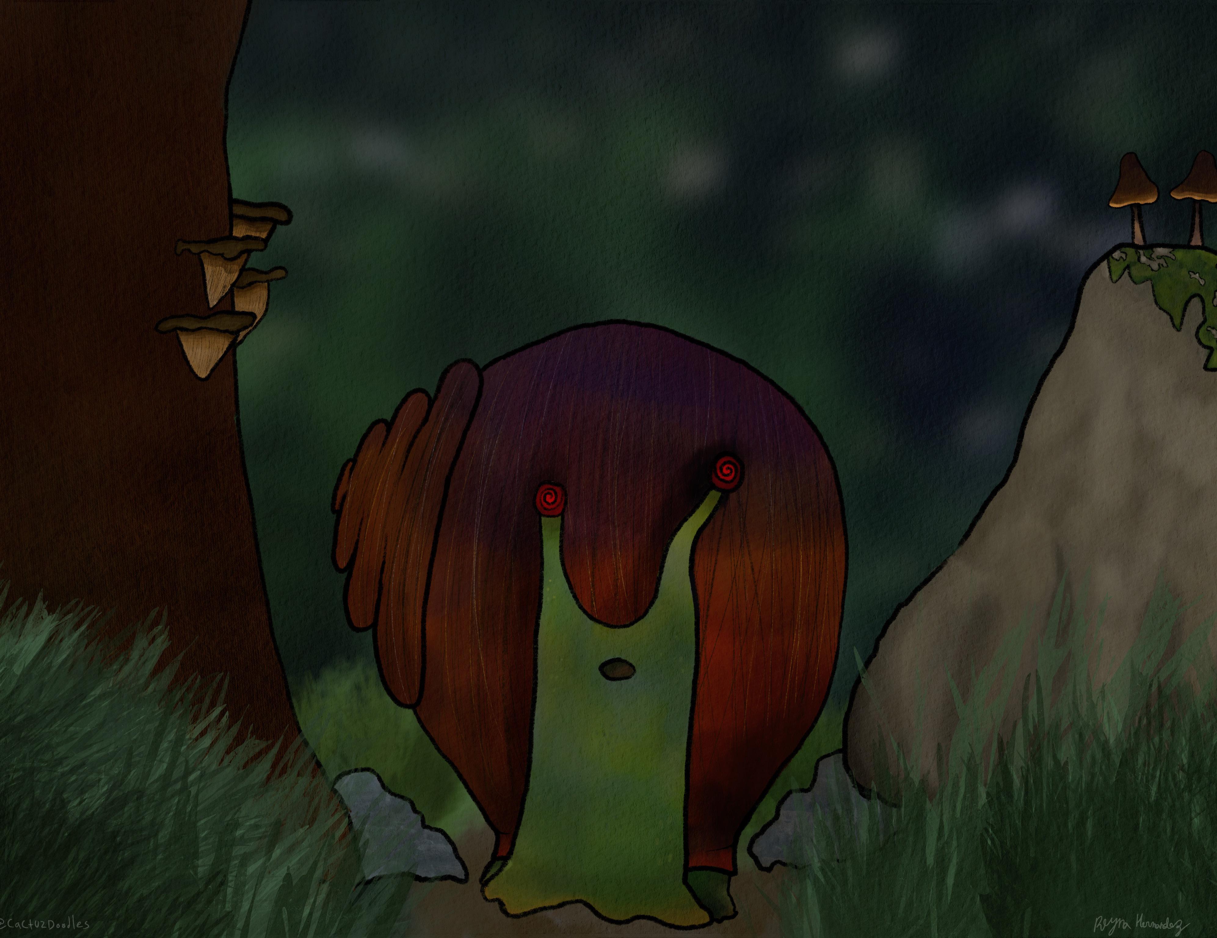
For my own personal brand and style I try to keep everything as colorful and fun as possible. I love creating cute and creative art that makes myself and others happy; there is no better feeling than seeing a smile on someones face when they look at my work.


Environmental Design

Greyscale comps

This project was for my Digital Painting class, which is really when I started to find my footing as an artist. This illustration is an original layout I came up with using multiple different photo references; I use a reference for all my work, but I always make sure to make the final piece as origional as I can.


Final Digital Painting
For my final painting in my digital painting class I went through many different layouts and ideas. I wanted to create a piece of work that is a little different than most of the work I do. The most difficult part of this painting was getting the lighting and shadows to look realistic.


Photo Referenced Speed Painting

This piece was a speed painting that had timed sketches and grey scaled comps. The drawings look plain and simple because of the time constriction. My final painting was done in one sitting and I used a photo reference for the colors and lighting.


Texture Cubes
These textures cubes are a project that I could say I have been working on for over a year. I had started painting texture cubes on my freetime to work on my texture and lighting work; I got lucky that I was able to use some of my origional work for an assignment. I am very proud of this piece and it is by far one of my favorites.

Isometric Exterior Scene

This Isometric exterior scene is a re-draw of an assignment I did my sophomore year for my Drawing for 2D Animation class. I love the look and aesthetic of isometric drawings, especially when done correctly, the drawing and style fits my aesthetic and really shows my versatility.

Premodern Portfolio Project

This poster is for a hypothetical haunted house opening around halloween time. I had to create a promotional piece of work in a premodern design style. In this poster I am replicating the German Woodcut style.


Early Modern Portfolio Project


This poster is for a hypothetical botanical garden I created for this assignment. I had to create a promotional piece of work in an early modern design style. In this poster I am replicating the stained glass styling of Louis Comfort Tiffany.

Late Modern Portfolio Project

This poster is for a hypothetical brunch restaurant I created for this assignment. I had to create a promotional piece of work in a late modern design style. I am replicating the Bauhaus design style in an abstract representation of breakfast.


