

Hello, my name is Brett Jelinek. I’m a recent graduate with a Bachelor’s in Graphic Design and Advertising. I bring a fresh perspective and passion for design. My style stems from my love of golf and art, which serves as my main source of inspiration in every project. What sets me apart is not just my technical skills, but my ability to create projects that align with the client’s needs and objectives. I am committed to creating work that exceeds expectations. With a foundation rooted in both artistry and strategic thinking, I am committed to make a meaningful impact in the field of graphic design and advertising.

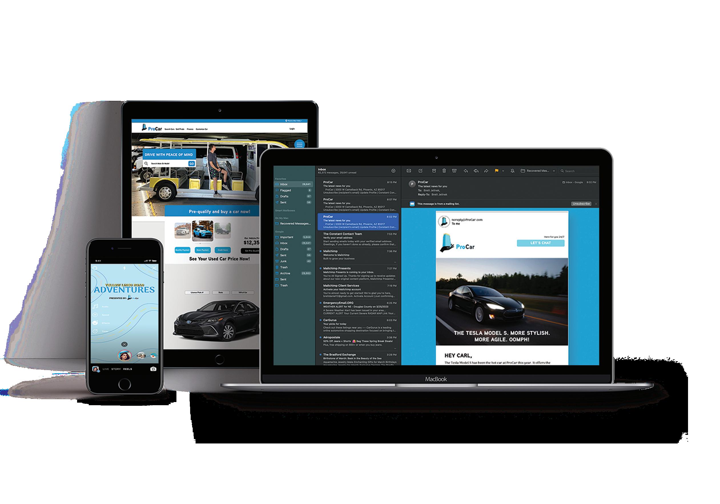
As a designer we may receive the task of completing a social campaign for a company. This series of projects are created for the brand I created, Procar. They are a car company that sells used cars onsite in a vending machine. They also offer delivery. Procar was in need of a website, socials, a calendar of upload dates, blogs, and emails. The branding was created to draw attention to the company and appeal to a wider demographic.



John Jacobs’ was looking for a re-brand and revamp for their golf schools. Their attendance has been on a decline, and they are looking to modernize themselves to jump themselves into the market of their competitors. The creation of new attraction locations will bring in customers who did not even know that John Jacobs’ existed at the course as well as let the current clients know that improvements are being made to better their experience.


Golf monitors are in every golf cart at the course. It is the one place that every golfer will be sitting by and viewing after every shot of their round. To keep the advertisment engaging, the GIF that is played inlcudes golf balls rolling down from the top of the screen to cover the image fully. The branding is consistent with the other pieces of this campaign, and creates an image that is easy to identify for John Jacobs’.

Golf is a tricky game. Without the proper teaching, bad habits can be picked up and the game can get a lot harder. John Jacobs’ sign campaign will highlight the areas that are adding strokes to your round. Signage and verbage match according to each penalty area on course. The sign concept hits hard on how many penalty areas you find in a round while still being a new and fun concept.


One of the harshest critics of your work that you will find is yourself. My branding is thought out for my personality. The logo is clean, to match the way I like things. Blue tones with grey are all throughout to showcase my love for blue and its professional look and appeal. Graphic design is all about bringing visions to life, even if it is your own.


Hex- 2F6690
CMYK - 67, 29, 0, 44
RGB-47, 102, 144
Hex- 3A7CA5
CMYK- 65, 25, 0, 35
RGB- 58, 124, 165
Hex- D9DCD6
CMYK-1, 0, 3, 14
RGB- 217, 220, 214
Hex- 16425B
CMYK-76, 27, 0, 64
RGB- 22, 66, 91
Hex- 81C3D7
CMYK-40, 9, 0, 16
RGB- 129, 195, 215

Scotty Cameron is well known for his putters, but would he be well know for his other interests? Lucky for us, his passion stays in the putter realm. This social campaign is set to show what it would be like if Scotty Cameron created other products.
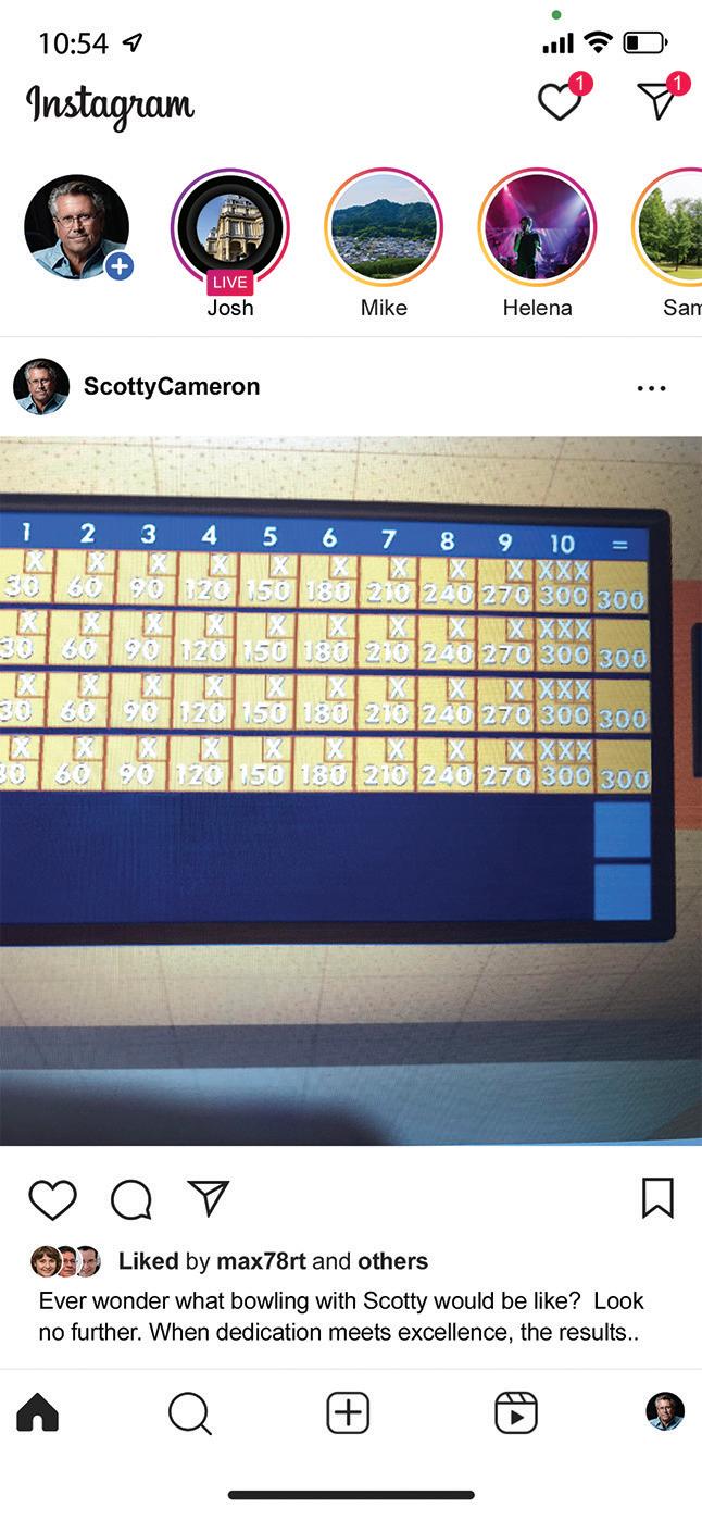
Ever wonder what bowling with Scotty would be like? Look no further. When dedication meets excellence, the results speak for themselves. His precision and commitment makes every perfect game just an average day. It’s a good thing he stuck with putters.
#ScottyCameron #Masterpiece #DedicationUnmatched #WinningSpirit #PerfectionBeyondGolf
Post 2
Cheers to Scotty Cameron’s dedication to perfection! Beer pong would be boring if Scotty Cameron made ping pong balls. It’s a good thing he sticks to putters.
#ScottyCameron #Craftsmanship #PerfectionEveryday
#DedicationUnmatched #BeerPongFun


Post 3
No game is to hard! Scotty Cameron designed corn hole would get boring fast. Find your winner today at scottycameron.com #ScottyCameron #Craftsmanship #PerfectionEveryday #DedicationUnmatched
#CornholeChampion
Post 4
Imagine if Scotty Cameron ventured beyond golf? The world isn’t ready. Let’s be thankful he sticks to what he does best, creating masterpieces for the greens. #ScottyCameron #GolfMasterpieces
#DedicationToGolf #PerfectionUnmatched


Un-edited Photos


Post 5
Let’s keep it real: Scotty Cameron’s mastery belongs on the greens, where his work is second to none. While our carnival game might hit the mark, the magic of Scotty’s dedication and expertise truly shines i on the golf course! #ScottyCameron
#RealTalk #MasteryOnTheGreens #DedicationToGolf
#UnmatchedExcellence


Hilton Head Omni is a resort in Hilton Head Island, South Carolina. The weather is amazing, and so is the atmosphere, so why not show what they have to offer? For this specific campaign, I researched the majority of the clientel and found they are coming from colder states. To maxamize the reach of this campaign, I chose for the billboards to be run in colder states, along with a direct mailer that is to be sent out to potentional customers in colder states. The combination of golf, resort, and a beach make this a destination that anyone can enjoy.


Omni wanted to hit home on showing the paradise that others are missing out on. To show this, I created a landing page that shows the bright and sunny weather in South Carolina while still keeping the brand colors present. Included on the page are buttons to make booking easy.

The biggest test of my graphic design skills has come from production. Each piece created requires thought and precision. The artwork created for the clothing includes proper sizing, pantone matching, trapping, as well as it was setup to run as a sheet Png format on a direct to film machine. Colors were tested and redone and after the last round of proofing, I was able to press the final designs.


This Women’s polo includes the newer Arizona native Rosy-faced Lovebirds. Lots of polos have been created by golf brands that are cool in design, but lack a Male and Female combo. In light of couples having matching golf shirts I created the Lovebirds shirt to represent couples and Arizona’s growing culture.
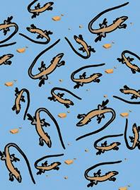
The design scattered across this shirt is the Whiptail Lizard. They are Arizona native and quite commonly seen. There are also rocks included next to the lizards as well to bring out the idea of making shirts for Arizona that included Arizona native creatures. The yellow color chosen for the shirt made the most sense with the design and the Arizona location.




After designing some Arizona themed shirts I wanted to create a fun looking shirt. This fun desing of a monkey walking up a bannana would stand out as a design, but still works well as a pattern. The bannana adds a tasteful pop of color to the shirt, and makes most of the color opotions below good choices.


Arizona is home to many cultures and themes. A recent town I have wanted to visit is Tombstone. It is a old western styled town that has inspired many pieces of work. The skull pattern I chose to create for this shirt is styled to show Arizona has many sub- cultures to offer as well as just create a fun looking shirt.

Production has pushed my skills and understanding of graphic design a lot in just a few short months. As part of my journey to understand it, I opted to create hoodies for myself. Each piece incorporates locations on clothing that are commonly pressed. The color and design was also a test of how much the machines are able to print and how accurate they turn out. Each of these hoodies include my interests.

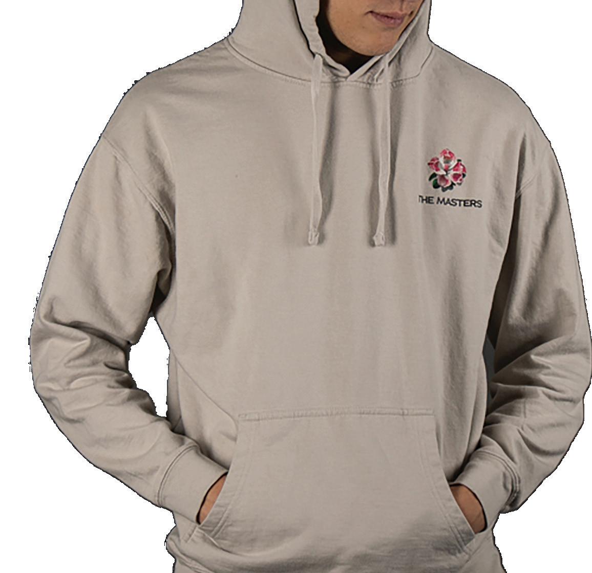


Golf is a huge part of my life. Augusta is one of the top courses you can play. I decided to create my version of what merch in their shop could look like. A common flower at the Masters are Azaleas. I included one as a front left chest piece to tie the course overview together.


Payson was the first place that I moved to in Arizona. It is a place I love to visit still so it seemed fitting to create a hoodie to promote what Payson has to offer. The national forest was my backyard, and it’s fairly unkown. I also included the forest background and cool mountain background for the front chest. Payson is also referred to as the “Rim Country” due to the Mogollon Rim being there.
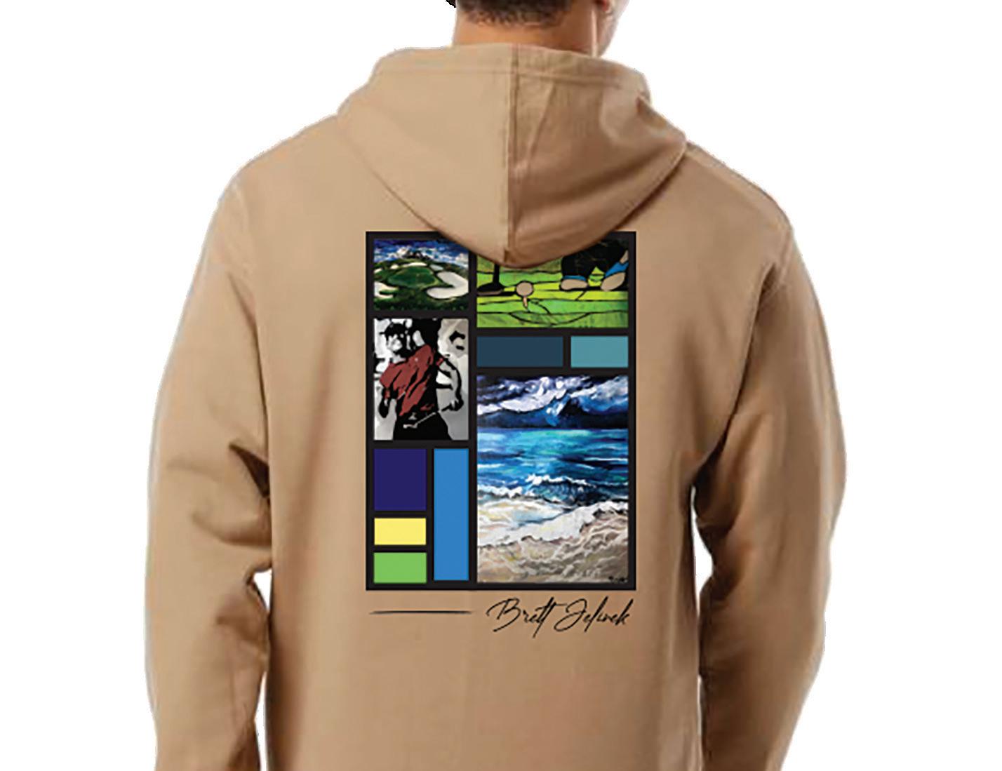


Art is always on my mind, so the question that came to mind was how do I incorporate that into apparrel design. My old house had beautiful stained glass in the patterns that you see above. I included some of my artwork along with my signature to showcase how art can be showcased in many ways.

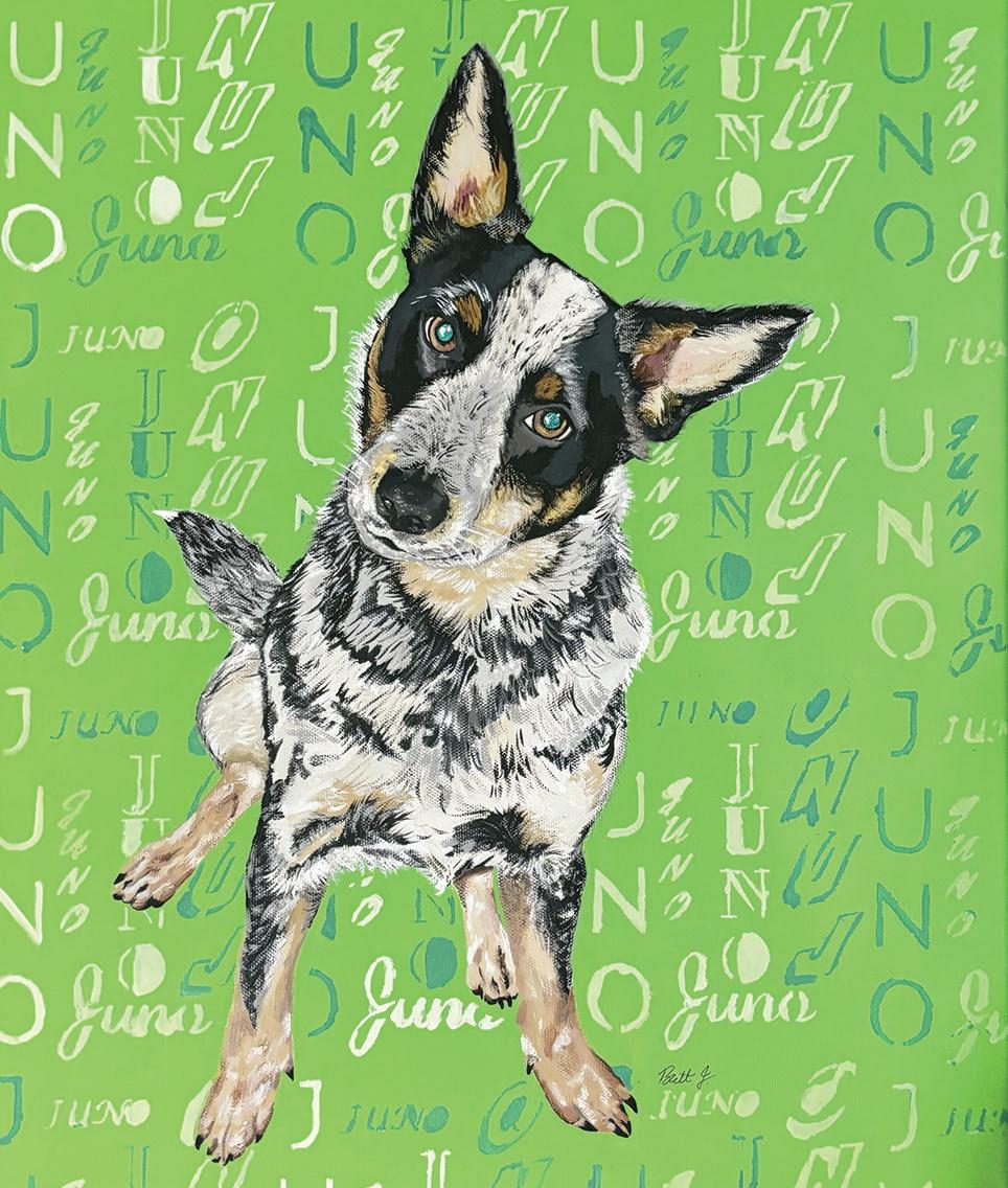
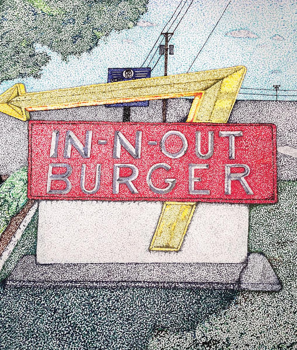
My love for design started with fine arts. My mother is an artist and had a studio when I was little. This allowed me to start painting at the age of 2. Throughout the years, some mediums have stuck out. Acrylic painting and stained glass are among my favorite. My day usually consists of digital design work, but it’s always exciting for me when I get the chance after to paint.


Here are two very different canvas options with acrylic paint at the heart of the project. It is my favorite medium with painting. The piece on the left is a hole at Pebble Beach. It captures the ocean beauty with movement in each wave. The mural on the right was painted within a 3 week stretch and really tested my ability to plan and execute.


Expanding on acrylic art is a painting of my grandfather. It tested my composition skills as well as my ability to create depth within a static piece. The stained glass piece on the right is full of curves that were a challenge to grind down and create. Art has no limit and has taken me in many directions, but the concept of creating stays the same which is why I don’t stop creating.
