PIT


GAME REDESIGN
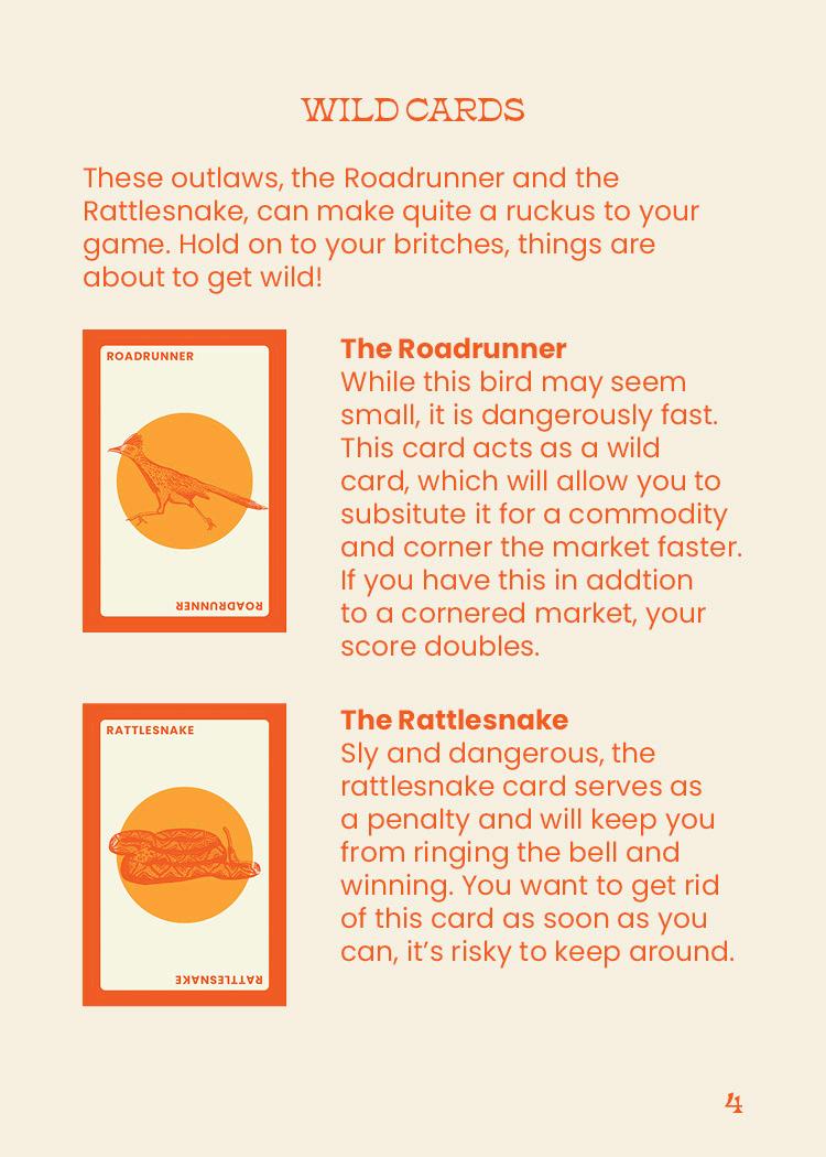
PIT is a century-old game that has defined family fun in my and many others’ households for years. A stock simulation, the game involves a loud, fast paced and exciting “market” that features eight trade-able commodities, which players attempt to collect in sets in order to win. Recent versions of the game have lost PIT’s historical charm, so when presented to opportunity to redesign a game, it felt only right to restore PIT back to its former glory, but this time with a Southwestern twist! Themed after Arizona, this new version of the game consists of hand-illustrated cards, as well as new packaging design and a custom instructions booklet.


WILLIAMS SONOMA
HOLIDAY CAMPAIGN
This holiday season, Williams Sonoma created a campaign that is centered around the idea of the table being a gathering place; a place for people to come together, share a meal, and be in community. The company was able to accomplish this through an employee family cookbook, complete with recipe submissions from every tier of the company. This also included a mailable recipe box and cards, a landing page where recipes could be submitted, and the introduction of the brand’s new recipe club program.


TRIPLE CROWN
EVENT SITE + ICONS
The Triple Crown is one of the most iconic sporting events in the United States, and this year they needed a new brand identity, website, and icon set. When creating these assets, I was inspired by the history and modern elegance of not only the event itself, but also the sport of horse racing, translating to the clean typographic lockup and overall style of the site.


LANDON CONRATH
ALBUM RELEASE CAMPAIGN


Landon Conrath is an indie-pop artist from Minneapolis, Minnesota. His music yields just under 830,000 monthly listeners on Spotify, and in September of 2022 his debut album, Nothing Matters Anyway, dropped. For this project, we were tasked with creating a promotional campaign for an up-and-coming artist. The campaign deliverables consisted of branded release event tickets, a poster, t-shirt, custom vinyl, and tote bag.


LIFE
MULTI-PAGE SITE DESIGN
The redesign of LIFE Magazine’s site was inspired by the beautiful photo archives the magazine holds. Focusing on the art and culture behind the publication, the site reflects the stunning visuals LIFE has been known for since their start.


ALTER ECO
BRAND + PACKAGE DESIGN
Alter Eco is an ethically sourced and made chocolate bar company. When given the opportunity to redesign a chocolate bar of my choice, I knew I wanted to try to take an ecoconsious brand and lean into the challenge of not making it your typical “green” and earthy brand. I chose to focus their new look on the people that walk the earth, with a bold color palette that makes the packaging stand out from its competitors on the shelf.
ILLUSTRATIONS + LOGO
This chocolate bar is made of organic, clean ingredients: no fake sugars or additives. And its carbon-neutral supply chain restores forests. So it’s good for you and the planet.


Learn more at

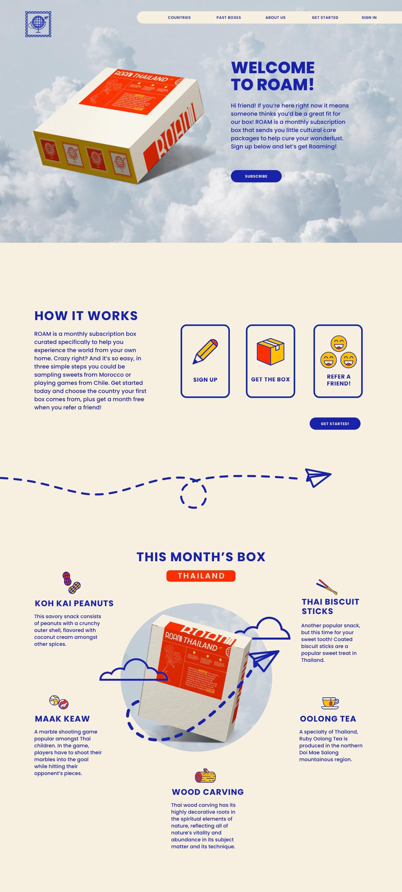
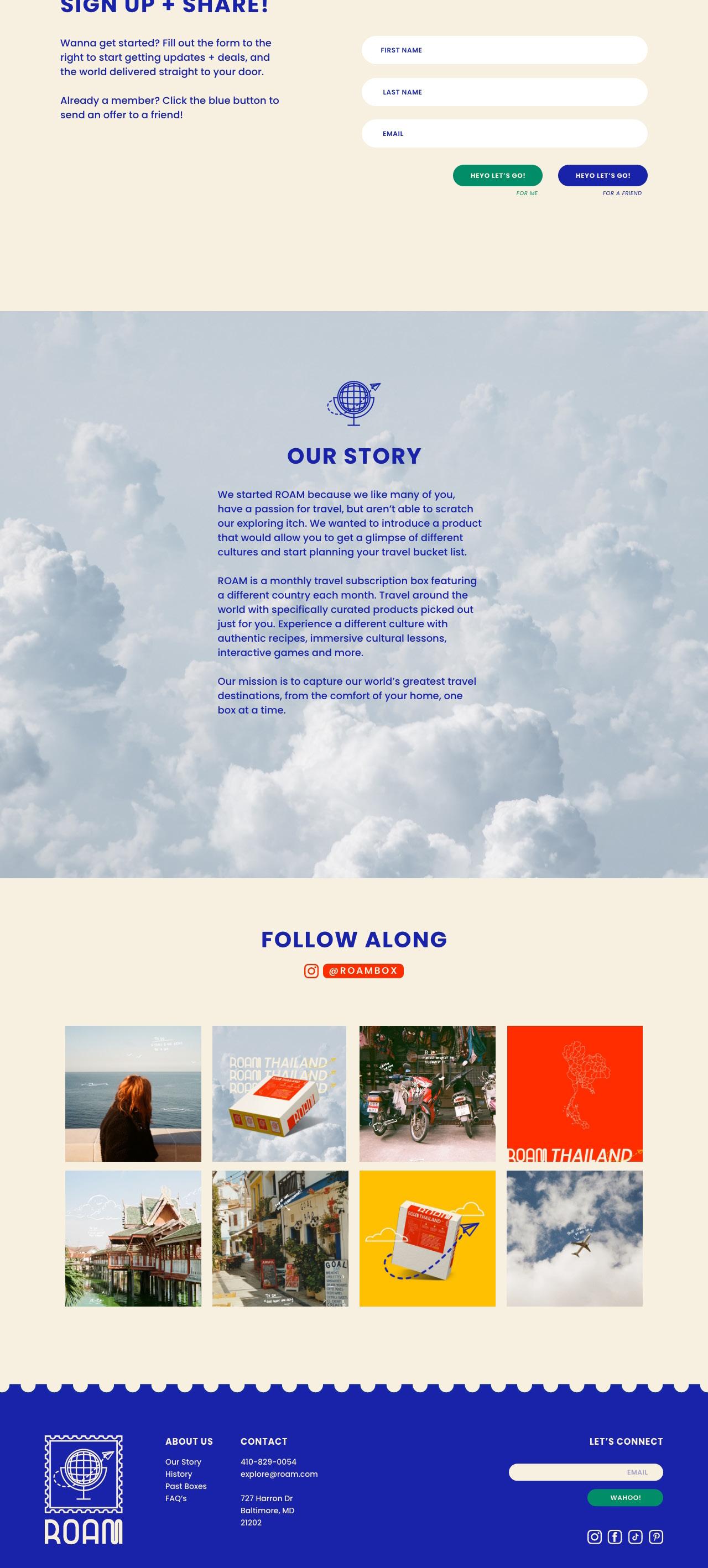
ROAM
TRAVEL SUBSCRIPTION BOX
ROAM is a travel subscription box that is themed after a different country every month. The brand is bright, fun, and engaging. The logo is representative of traveling the world from the comfort of your own home, and getting to experience a taste of a different culture in your mailbox. The project deliverables consisted of the box design, social media assets, an icon set, and a company website.


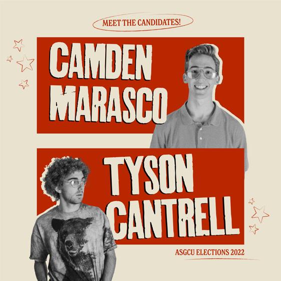
MARASCO CANTRELL


STUDENT BODY CAMPAIGN
This past school year, I had the absolute pleasure of getting to work as the campaign photographer and graphic designer for Camden Marasco and Tyson Cantrell’s winning student government presidential campaign. The process consisted of multiple media days, as well as working with campaign and social media manager Anna Shultz to create photos and graphics that successfully executed the campaign vision. The campaign was Napoleon Dynamite themed, and it was so fun getting to recreate some iconic scenes and outfits!


LIFT LOPES UP MENTAL
HEALTH CAMPAIGN
During my time at the GCE Ad Agency, I was given the opportunity to work on several different campaigns. Lift Lopes Up is a mental health advocacy campaign created to raise awareness for resources provided for students to give them the opportunity to get the help they need. The campaign deliverables consisted of a brand identity, digital messaging boards, social media assets, a sticker sheet, and a mental health resource guide.


 CONTRIBUTORS
Denisse Montoya | Project Lead
CONTRIBUTORS
Denisse Montoya | Project Lead
Copy
Julie Jordan | Design +
Copy
Rachel Den Dulk | Design +
Emily Lane | Design + Copy Micah Fischer | Design + Copy


(206) 920 - 5816
JULIEJCREATIVE@GMAIL.COM JULIEJCREATIVE.COM
