DESIGN PORTFOLIO


During the summer of 2021, I was given the amazing opportunity to intern on the creative team at P.F. Chang’s corporate office. I worked on all kinds of projects from social media to menu design, to mural creation.

One of the projects I was given to work on during my internship was designing an iconic P.F. Chang’s mural. Mine is designed for the London location. All of P.F. Chang’s murals include a samurai girl as well as unique nods to the location they are being installed in. I also did this, which explains the London skyline and underground signs included in the design.

I created a paid media campaign crossing all social platforms for P.F. Chang’s. I collaborated with the creative team’s copywriter to design this campaign that includes a YouTube ad, Instagram stills, stories, and a package of google ads.
Scan to see the video and gif campaign items.


One of my first internship projects was to redesign their menus. Since this was at a time when many restaurants were slowly starting to re-implement physical menus, it was a good chance to change things up. This redesign included the main menu, the beverage menu, and a newly illustrated kid’s menu.


For this project, I researched, designed, and illustrated a new P.F. Chang’s kid’s menu. I included puzzles and activites that I used to enjoy when I want a kid, as well as illustrated it in a fun and engaging way.
This kid’s menu design was printed and distributed to all of the P.F. Chang’s locations across the country. If you visit a P.F. Chang’s today, ask for my kid’s menu and enjoy a fun word search or color in a dragon!


I designed a new annual pin and card for the Lucky Cat Fund, an internal program dedicated to supporting employees in need. My pin was designed using a paper crane, a common symbol of peace and tranquility; things that the LCF strives to provide for its recipients.


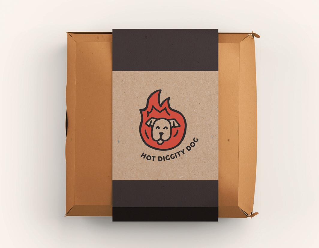
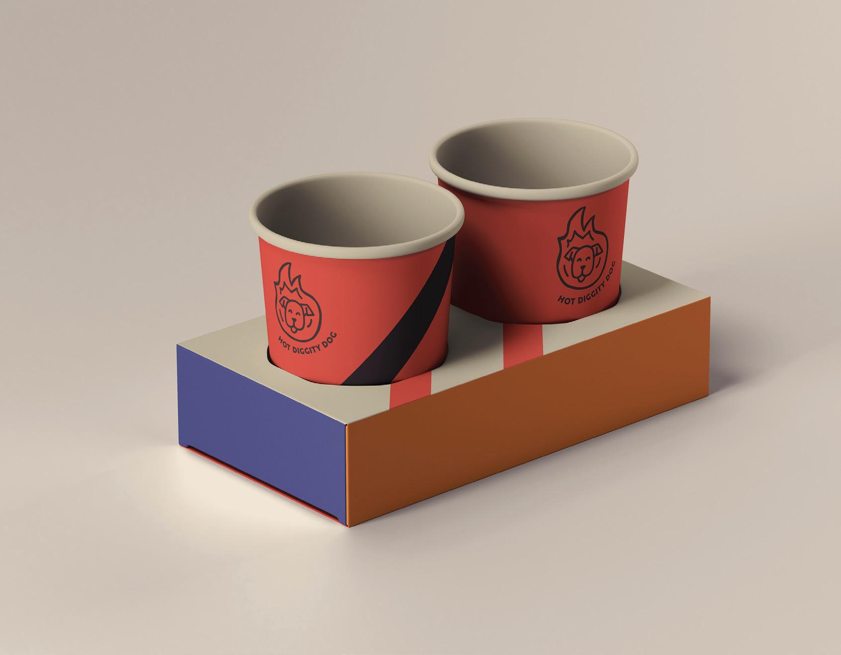
This was an ideation project for a food truck company called Hot Diggity Dog. I was tasked with creating two new logo concepts for the company. Both give the company an upbeat, exciting brand voice that is inviting and modern.


This was a large scale campaign that promotes voting among young adults. This campaign, entitled We Are The Future, uses imagery and phrases heard in protests to create urgency and camaraderie in it’s viewers. I designed social media posts for this campaign


Scan to see the GIF posts

This was created to inform and educate young adults about voting. I was provided the copy, then I designed the booklet to match the branding of the campaign. It was also designed to be given out at a trade show to people who visit the booth.


I designed two swag items to be given out at the trade show. This included a tote bag and a pin. These, as well as the information booklet were


I designed a chocolate bar package using the Theo Chocolate company. I designed a new logo and box that was fun, inviting, and something that would stand out on the shelf in the candy isle. I designed concepts that are fun and bright with an exciting style.


Costa Casita is a quick service SoCal-based restaurant. I collaborated with another designer to create the brand visuals, voice, and style for the company which I then used to design many different digital assets. I created social media posts that fit this laid back, SoCal brand.
Scan to see more social posts


This campaign piece is a paid media skyscraper ad, meant to be placed on websites that people visiting the SoCal area might frequent. It would be featured on sites like, Los Angeles Times, SantaMonica.com, and DiscoverLosAngeles.


For four years, I have worked with two theatre companies to create the promotional posters for their productions. I create the word mark, main poster, and an Instagram version for each production. I create unique branding for each so all other promotional material made by the directors can match my branding.


Each piece here is an independent project that showcases my skills of illustration and Photoshop. Some are parts of other projects, and others were made for fun.
Want to see more?
Scan to visit my Instagram


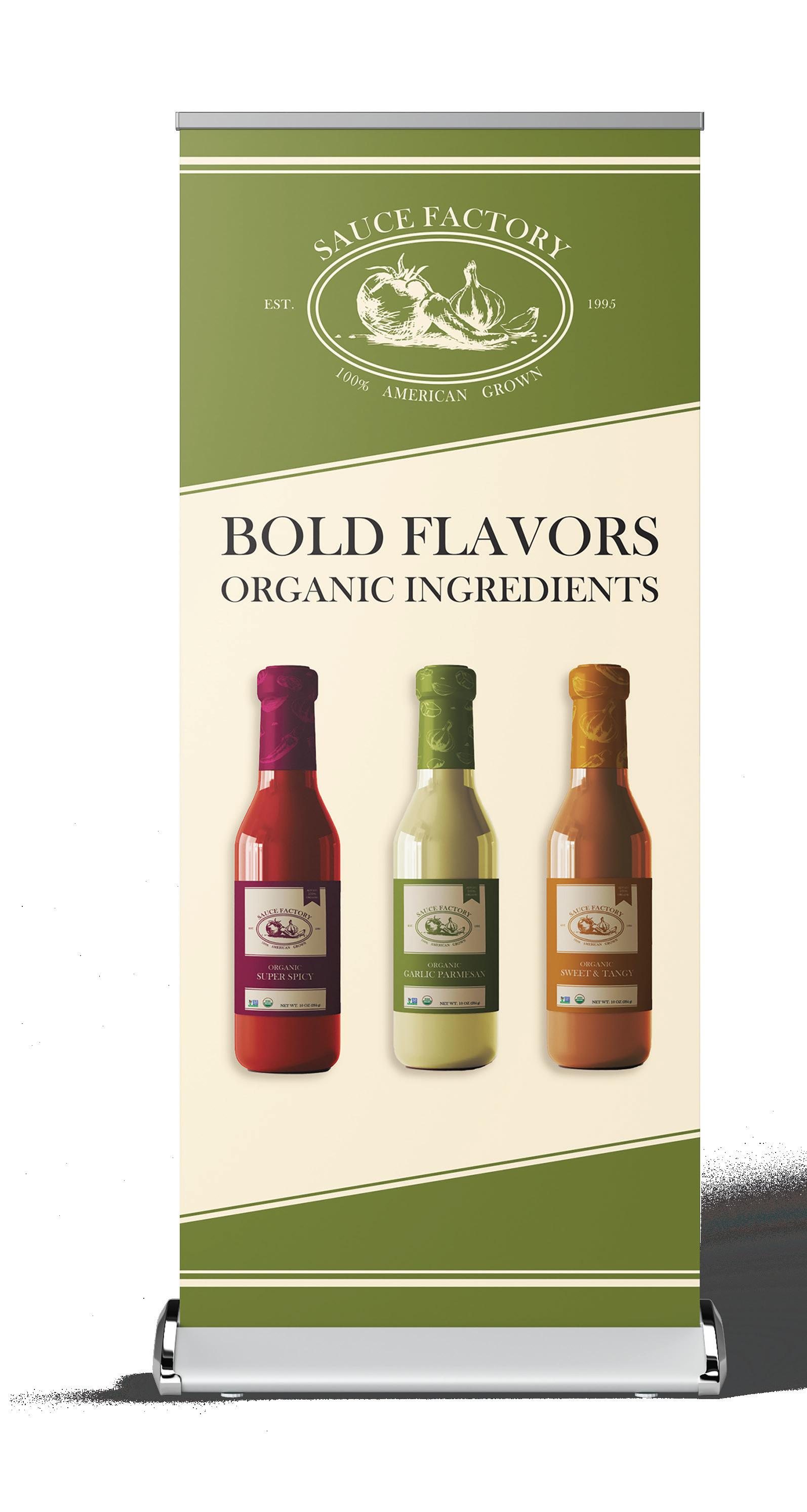
Sauce Factory is an organic, American-owned sauce brand that I created branding and packaging for. I created three unique labels for different flavors. I designed the brand to be authentic and rustic, inspired by vintage labels and stylistic illustration.


I designed a trade show booth and giveaway swag items for Sauce Factory. These items embody the brand and make the company stand out at a trade show. Both the items and the booth embody the rustic brand style.


I designed a new album cover for The Grand Collective, a GCU student produced music group. It was designed for their new album, Arise. This design was meant to focus on concepts like light and being transformed. It was digitally illustrate using watercolor-like visuals and grainy textures to give it a timeless, yet modern feel.


