
3D MODELING
HARD SURFACE & ENVIRONMENT
EXTERIOR SCENE
When creating a realistic exterior scene the most important aspect of it is the attention to detail and imperfections. The more grunge and scratches you can reasonably add, the more realistic the scene will appear. For this scene, being a dirty alleyway scene, the more dirt and grime the better.

Filling the scene with clutter and secondary objects also adds to the realism and atmosphere. With an alleyway such as this, there is no such thing as too much clutter.


PROCESS


SIMULATIONS

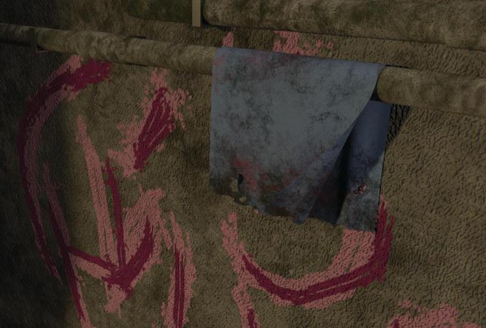
Simulations are rendered sequences that emulate motion. There are many kinds of simulations, such as, Cloth, Water, Fire, Hair, Particle etc. These simulations are created in 3D software that allows for the user to simulate naturally occurring things such as wind and fire. Simulations are used throughout media constantly and are some of the most intense 3D feats.
 CLOTH SIM
WATER SIM


HARD SURFACE
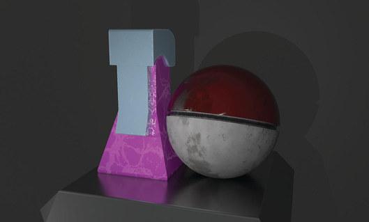
For this project, I decided to take a pre-existing item and recreate it with a realistic style. To do this I modeled the assets and textured them as if they existed in the real world, and were used for what they were originally intended to do. This means the proper damage and ware must be added as well as additional details in order to sell the realism.


MODEL TURN-AROUND


INTERIOR SCENE

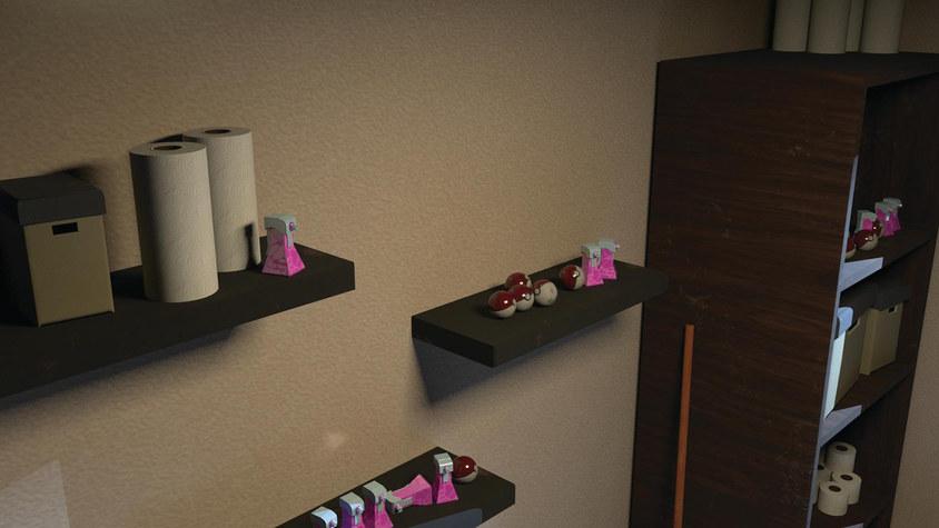
The focus of this project was getting the lighting down correctly. Being able to emulate realistic lighting is very crucial when creating environments of any kind, especially interiors.

UI/UX DESIGN
USER INTERFACE & EXPERIENCE


CALENDAR FEATURE
Calendars should be simple and easy to use, with a clean and understandable interface. This calendar features a scrolling-days style selector where it is easy to see where you already have pre-existing appointments or scheduled items. A simple 3 step process to add new scheduled items makes planning your weeks even easier.


CHAT FUNCTION
This simple chat function takes inspiration from features we are already comfortable with. Communication is key when it comes to everyday life and relationships of any kind. This feature will help you do just that as seamlessly as possible.

HOME SCREEN
This is the official home screen for the Forbie application, I was in charge of wireframing and designing the layout of the home screen within the given criteria. I also had to find a number of images that conveyed the idea of the app properly while working coherently with the typography.


DIGITAL FLYER
A digtial flyer to help promote the features and functionality of the Forbie application.

PROFILE DELETION
Simple in-app pop-up confirming a full account deletion. These pop-ups must abide by the laws of the operating system it is on, which included hazardous coloring and two -step confirmation

