Keagan Leach
360.490.7691
keaganleachdesign@gmail.com
keaganleachdesign.myportfolio.com/


360.490.7691
keaganleachdesign@gmail.com
keaganleachdesign.myportfolio.com/

I am originally from the Pacific Northwest but have begun to call Phoenix my home during my time in college. My work is very driven from a Christian Worldview where I value honesty and trust within the workplace and within my designs. I desire my art to inspire and uplift people and stand for positive values in the world and I expect the companies I work for to value this as well. As a designer I am interested in creating advertisements and working to create better consumer interaction in the brand.

Dallas Thunder is an annual country music festival located in Dallas, TX where the locals as well as fans from all over the country get to relax and enjoy their favorite artists for a weekend. Dallas Thunder needed a for their branding as well as on brand swag items for the festival.


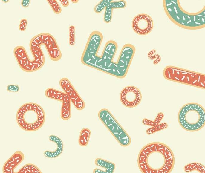
Cookie’s Confections is a new dessert company that specializes in doughnuts, ice cream shakes, and lava cookies. The owner, Christianson, was looking for a new logo that helped encompass the brand while sticking to a typography based style. The new logo features a doughnut inspired typography style logo that incorporates bright and inviting colors.


Boot Barn is a western apparel and fashion store that caters to a wide variety of country lifestyles. They wanted a specialized advertisement to showcase one of their many types of items that they sell. To make it stand out and be truly unique, they requested a custom creative typography to be used in the advertisement.


Grand Canyon University holds a film festival every year for their film students and were seeking a poster design to help announce the winner at the festival. This project was completed with two other designers and required communicating different ideas and combining all three of our design styles.
Nohmad Snack Co. is based in California and specialize in high quality vegan chocolate. The company was looking to rebrand their typography based logo as well as update their product packaging. To help make their product stand out on the store shelves, they wanted to utilize extra processes to the packaging.


Papago Hive Honey is an Arizona local honey company. They were in need of a new logo to help revamp their company as well and new packaging labels to match the new logo. Once the main logo was created, I expanded from the main colors and styles to create two other flavor specific logos and brand designs.


For this campaign I served as the Design Director creating all of the printed design elements as well as creating graphics for our Instagram page during the GCU 2022-2023 ASGCU Presidential Election Week.


American Kids is a country swing dance club at GCU that offers lessons and community for those who want to learn how to swing and line dance or already know how.


