E kūlia i ka nu‘u. Strive for the summit.
Aloha!
My name is Megan Lee-Watanabe,
Hi, my name is Megan Lee-Watanabe. My multicultural background is my driving force as a creative person. I love creating for my communities because I feel a stronger connection to them. That initial act of empathy projects my design thinking process.
I am from Hawai‘i, and based in Phoenix, Arizona. People call me crazy for leaving my beautiful home, but I love exploring new things because it makes life a little more interesting.
Kaiāulu

Card Game Redesign

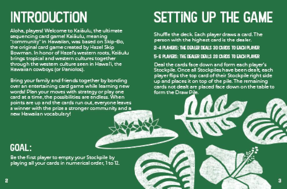
The concept of this Skip-Bo redesign is a Hawaiian cowboy theme. An ode to my heritage and the creator of Skip-Bo’s home in Texas. Hawaiian agricultural elements are seen throughout the illustrations of the cards. Design skills shown are illustration, and product design.

Ariana Blackwell: Copywriter


Kaleigh Van Dam: Project Lead

Diana Cheek: Creative Director

Instructions
4


5


6


7
Black History


Month Emblem


Emblem Identity


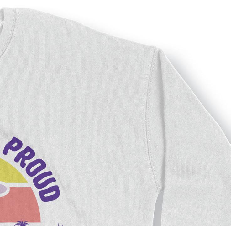
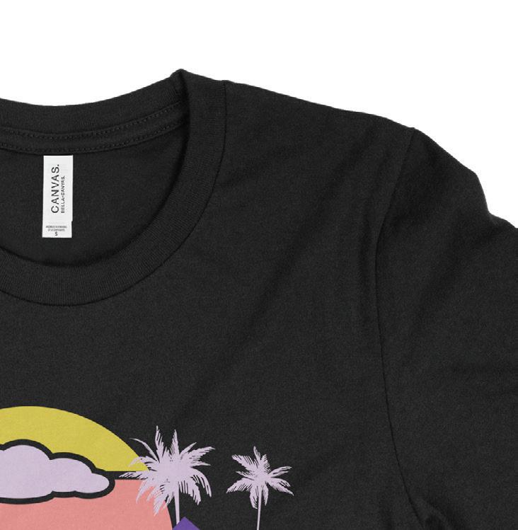
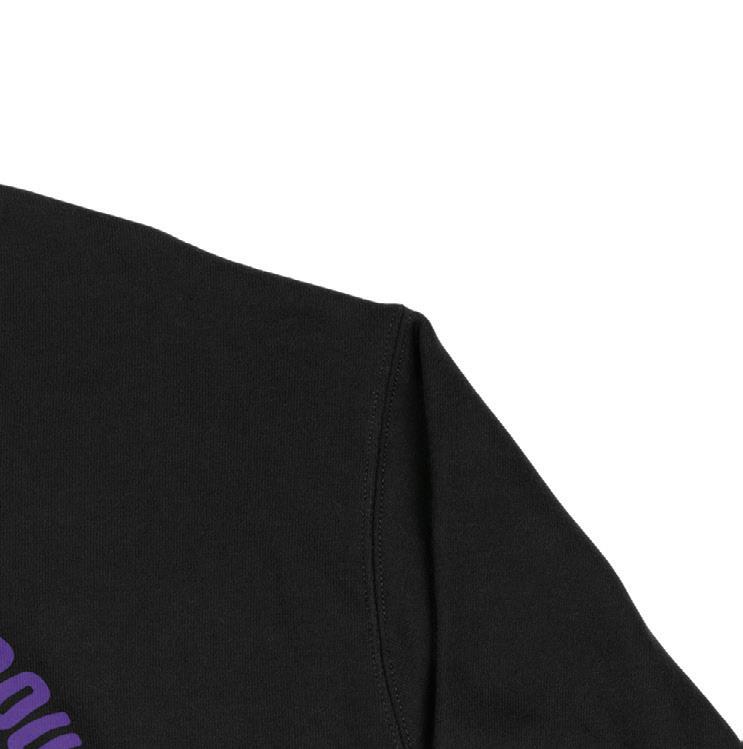
I kept inclusion in mind when creating this emblem. I kept it simple by using my university’s color palette and the overall essence of a sports emblem. This emblem was primarily seen on t-shirts to commemorate this event. Skills shown are illustration, print production, and event branding.
Thumbnails Final Emblem

8


9
Back design by, Lisa Pham
GCBC Conquer Finals Week
Ad Campaign
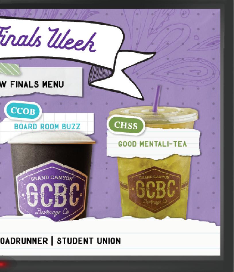
This campaign promotes finals week menu for my university’s coffee chain, GCBC. I made the designs school centric with an overall notebook theme with doodles, torn paper, tape, and sticker elements to bring it all together.


Noah Fischer: Copywriter

Marshall Angst: Copywriter
Jason Boesel: Project Lead
Diana Cheek: Creative Director
10


11


12


13
Hawaiian Homelands

Infographic Poster


In this passion project, I wanted to showcase my heritage and the social injustice within it. Showcased is an infographic poster about Hawaiian Homelands and whether or not if it is worth it to Native-Hawaiians. Skills shown are layout design, Photoshop, illustration, and print production.


Thumbnails


14


Livin’ in Color
Event Identity


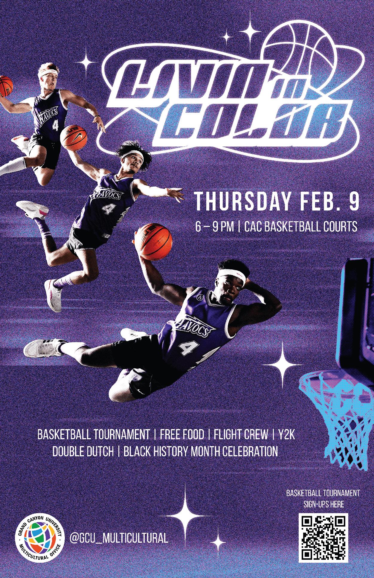
Matching sports with a Y2K theme was the challenge in this event campaign. The colors are kept monochromatic with high contrast black and white. The campaign has a very rebellious edge with hints of chrome and grunge.


16


17
Lopes Vibes

Apparel Collection


During my time at GCE, I got the amazing opportunity to design an apparel collection for my university’s school store. The designs were inspired by campus life. The main imagery consists of popular spots on campus, Student Union and Building 18, aka the “Circle” Building. These places bring great vibes on campus.


Daniel Kadish: Co-Designer
Noah Fischer: Copywriter

Sarah Verdugo: Copywriter

Brian Carbajal: Project Lead
Diana Cheek: Creative Director

18


Emblem 1

This logo mark encapsulates the collection with its overall shape. The text was distorted to give a wavy look. It goes with the concept of “vibes”, or vibrations symbolized with waves.

Emblem 2
This logo mark was primarily used on the sleeve of the long sleeve shirt. It also translated well in the advertising campaigns on print and digital mediums.


20


21


Huaka‘i
Typeface


Huaka’i is Hawaiian for “journey”. I found that it’s rare to find typefaces with accent glyphs. When I need to use them, I would have to borrow from another typeface or illustrate them myself. I wanted to make a display serif with accents used in Polynesian languages. The typeface design itself has a tropical theme with pointed and flared serifs.
Jen Shibata: Project Lead
Diana Cheek: Creative Director
24
25
Ho‘olaule‘a


Event Identity
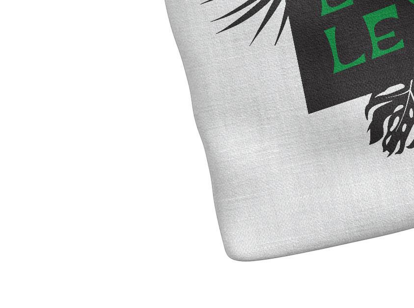
This project applies the Huaka’i typeface into this event branding project. Ho’olaule‘a is GCU Multicultural Office‘s annual lū‘au event. Ho’olaule’a translates to, “Celebration”. In this instance, a celebration of Polynesian culture. The typeface is a great choice for this project as it exemplifies what it was meant for, Polynesian language.


26


27
Mahalo! Thank you!
Volume I.
364-2991
(808)
meganmllw@gmail.com behance.net/meganlee-wat


