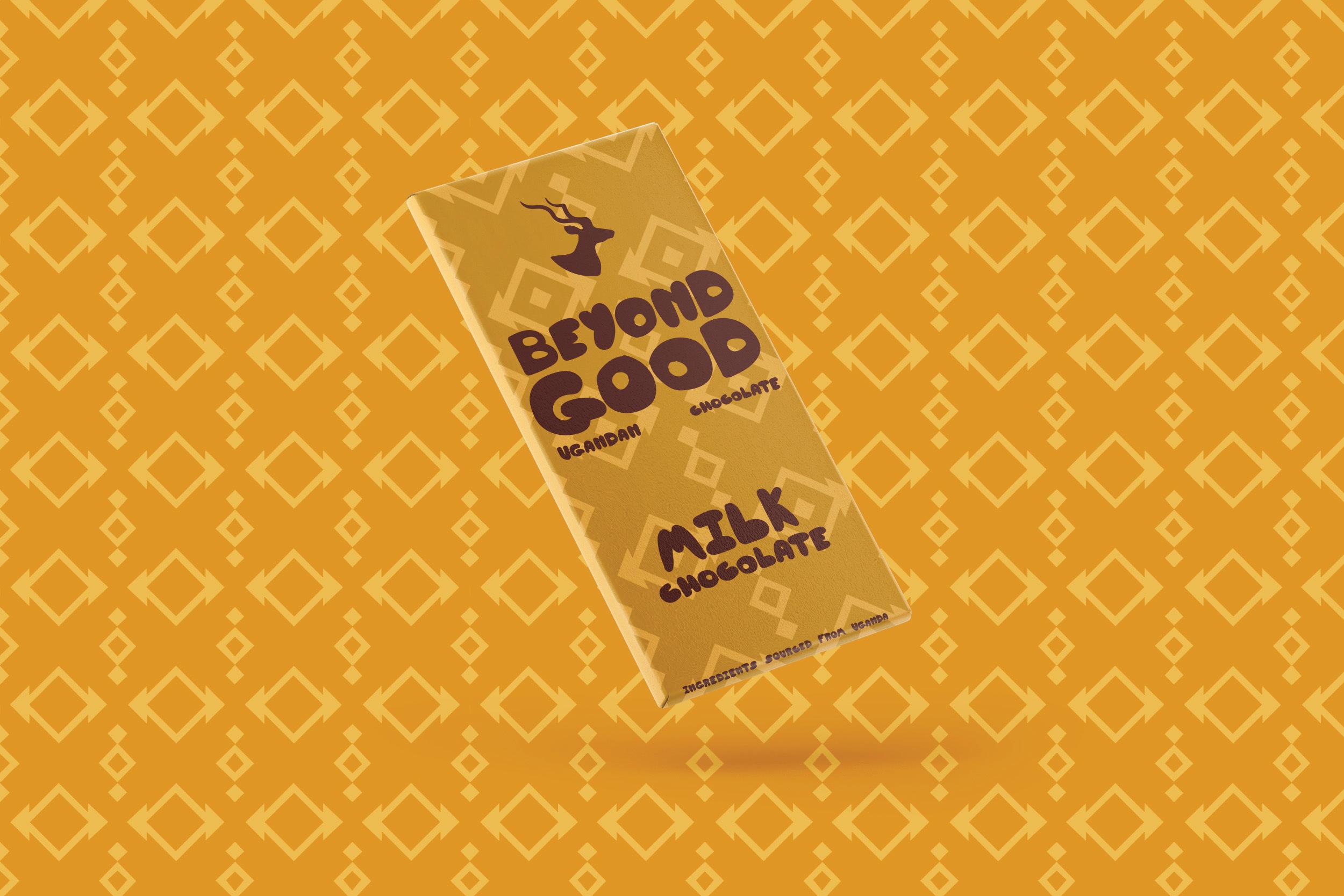


The “Beyond Good” chocolate bar packaging redesign combines the rich heritage of Ugandan culture with a contemporary flair. Traditional patterns, inspired by Uganda’s vibrant history, are seamlessly integrated into a modern design aesthetic. The packaging showcases a traditional ugandan diamond/square pattern. This pairs nicely with the hand crafted bubble text to give it that modern look with classic elements. The result is a visually striking packaging that pays homage to tradition while standing out on the shelves. This project exemplifies a blend of past and present, inviting consumers to experience Ugandan chocolate in a fresh, captivating light.


For “Fully Known,” the latest offering from Grand Canyon University’s own ensemble “The Grand Collective,” our design concept is a visual symphony of intrigue and revelation. Using biblical elements and phrases a striking typographical play invites the viewer to delve deeper, as “Fully Known” seamlessly transforms into the divine call of “Praise Him” when viewed from a different perspective. Weaving subtle imagery with this ingenious design, we beckon the curious to explore the hidden depths within. This album cover is not just a visual feast, but a testament to the art of discovery.


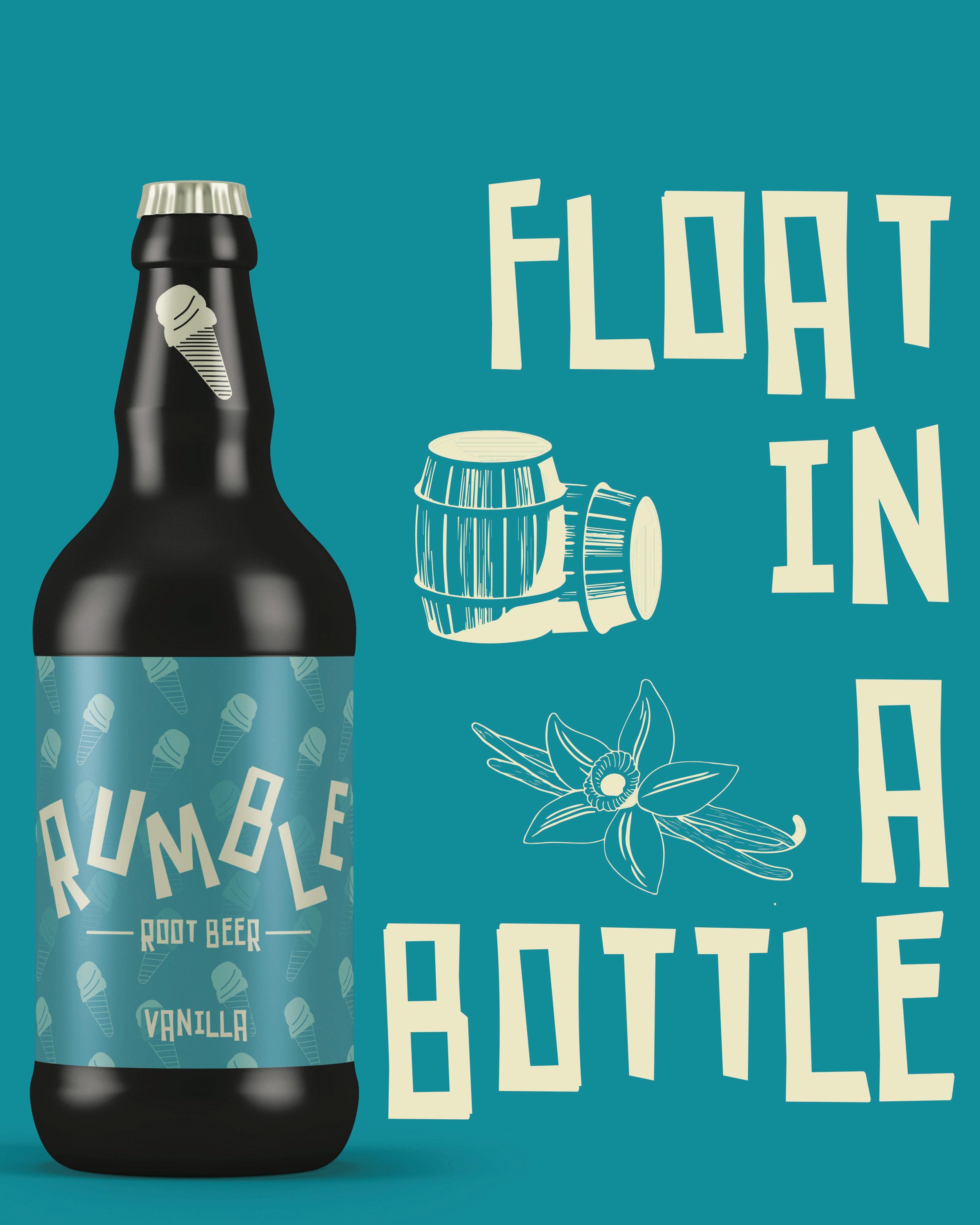
The Rumble Root Beer package redesign is a masterful fusion of timeless nostalgia and contemporary/modern aesthetics. Drawing inspiration from the classic aesthetics, we’ve crafted a label that evokes the warm familiarity of the past, reminiscent of an era your dad might recall from his own youth. This design pays homage to the roots of root beer, embracing a sense of comfort and tradition. Incorporating a clever touch, each flavor is distinguished by its own emblematic icon—a cherry for the lively burst of cherry, an ice cream cone for the creamy indulgence of vanilla, and more. Each flavor is adorned in its own distinctive hue, yet all harmonize seamlessly, uniting under the banner of Rumble Root Beer.


Elevating professionalism with a touch of heartland charm, the Turon Bank stationary redesign creates a sense of professionalism with limited assets. Drawing from the bank’s signature colors and imagery, we’ve crafted a suite of essentials that exude confidence and trust. The tri-fold brochure, business cards, thank you card, letterhead, and envelope all bear the mark of simplicity, underscoring a commitment to straightforward, reliable service. Every piece in this collection is a testament to the power of understated elegance. Clean lines and uncluttered layouts instill a sense of trustworthiness, while the brand’s colors evoke a sense of familiarity within the community. The Turon Bank stationary speaks volumes, offering clients a tangible representation of the steadfast reliability they can expect.


In the reimagining of Oscar Wilde’s literary masterpiece, “The Picture of Dorian Gray,” the cover becomes an intricate dance of revelation and introspection. Crafted with a blend of artistry and digital finesse, the cover invites the reader into a world of visual intrigue. Dorian Gray’s physical appearence is artfully divided, teasing the curious mind to explore further. Upon first glance, a visage of intrigue captivates, yet a subtle unease lingers in the gaze. With a simple turn of the book, the narrative unfolds in startling clarity—a juxtaposition of beauty and decay, a reflection of the story’s haunting dichotomy. The reader is drawn into the heart of Wilde’s tale, where the boundaries between art and reality blur.


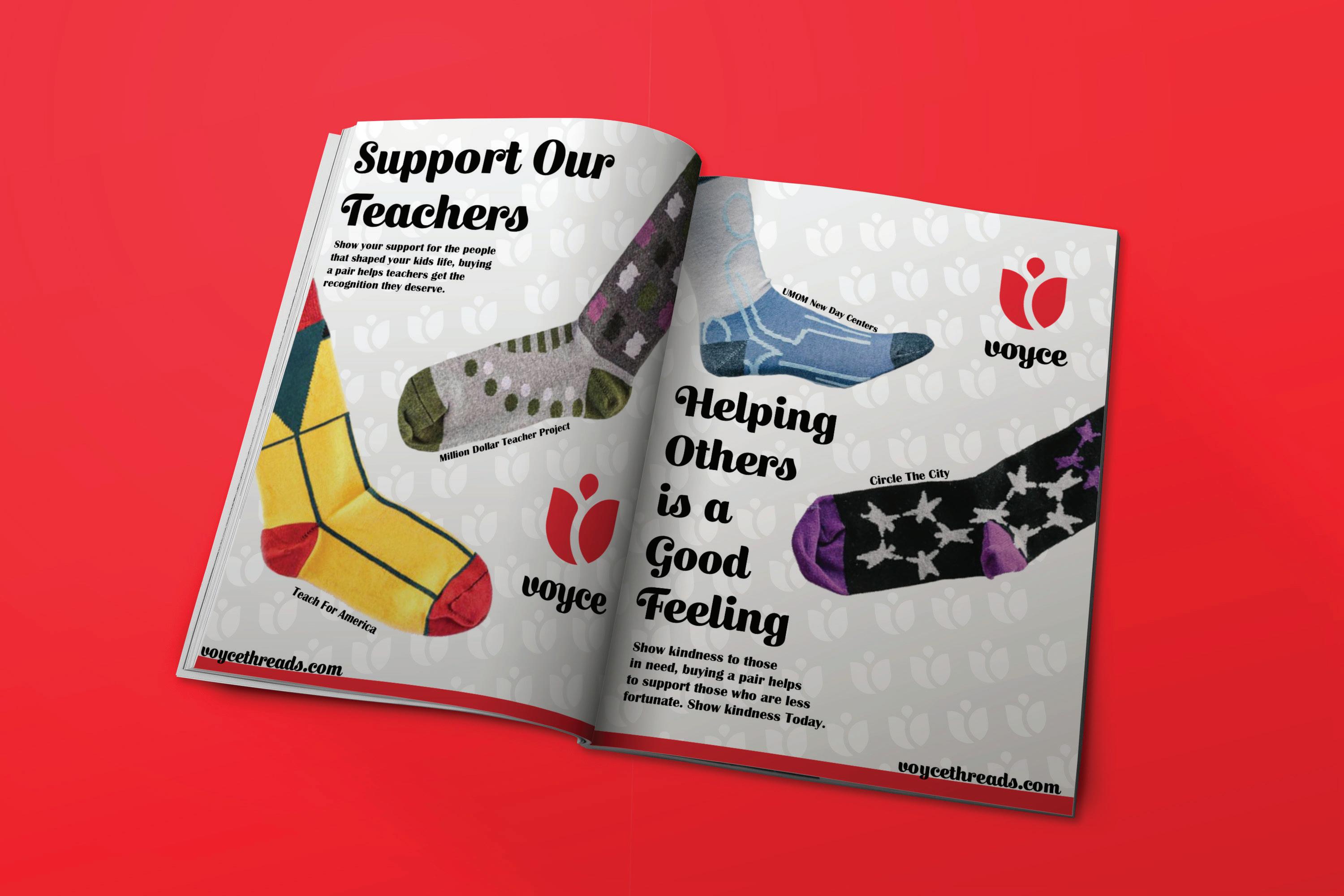
In a celebration of purpose and style, Voyce Threads’ mission-driven sock designs take center stage in our captivating ad campaign. Seamlessly blending the power of philanthropy with the artistry of sock design, we showcase causes close to the heart. Bold, striking headlines paired with the vibrant red brand color and Voyce Threads’ distinctive logo pattern create a visual symphony that resonates with passion and purpose. Our approach marries simplicity with impact, putting the socks front and center, allowing their intricate designs to shine. Each ad speaks volumes, not only through its visual language but also through the heartfelt causes it supports—be it the transformative work of Teach for America or the compassionate efforts of the Arizona Humane Society. Together, these ads not only adorn feet, but also inspire hearts, amplifying the voice of change one step at a time.


Embracing the spirit of urban artistry, the Hot Diggity Dog project breathes new life into the classic food truck experience. A typographic masterpiece takes center stage, forging a visual identity steeped in the rebellious flair of graffiti culture. The iconic logo, a brilliant amalgamation of strategically placed text, forms the unmistakable silhouette of a sizzling hot dog, capturing the essence of the culinary adventure that awaits. This typographic journey extends seamlessly to the food truck and packaging design, exuding a gritty, raw energy that resonates with the urban explorer. The fusion of rugged textures and playful elements evokes an inviting edginess, enticing passersby to indulge in a culinary escapade. Hot Diggity Dog’s revamped visual language is a testament to the power of creative typography, transcending mere words to become a bold statement of culinary artistry.


