

a graphic designer who was born in Vietnam and moved to the US during my teenage years. I came from a city where it rains 7 days a week to a dessert full of cactuses. Embracing this significant change, I’ve grown to be a flexible and open-minded person who is not afraid to adapt. As an art enthusiast, I’ve developed a passion for design, where I transform ideas into innovative solutions that solve business problems. Bringing these ideas to life through creative execution, I enhance brands’ images using marketing strategies and value-based designs. My specialty lies in turning the art of storytelling into effective visual communication. As much as I love travel, I’m excited to experience different environments and see where the creative journey leads me.
Marketing Strategy • Brand Identity • Digital Design • Illustration
Big changes start with strategic designs. Danzeisen Dairy, a local dairy in Phoenix and the first company in Arizona to sell milk in glass bottles, needed a brand refresh. Despite being a small B2B and B2C business, they were eager to explore opportunities for growth. However, the dairy market has been struggling due to a significant decline in milk consumption over the last four decades. The primary goal was to boost in-store sales and home delivery orders by attracting more consumers and guiding them through the sales funnel.
To address this challenge, I developed a comprehensive marketing strategy that encompassed various digital platforms. This strategy leveraged the brand’s unique selling propositions and employed designs to educate the target audience about the benefits of cow’s milk, emphasizing its taste and the natural qualities that set Milk du Soleil apart. Simultaneously, the campaign promoted Milk du Soleil’s delivery services. The centerpiece of this strategy was a 30-day challenge aimed at introducing consumers to the healthy habit of drinking milk.
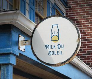
The project’s deliverables included a new logo, a landing page, blog content, email marketing campaigns, social media assets, web banners, and a homepage. All of these marketing channels were designed to guide potential customers to the main website, where they could make informed decisions to purchase.





The landing page convinces viewers to schedule milk delivery. Providing the email would enter the customer into Milk du Soleil’s mailing list.


Each week, blogs and emails are scheduled to send out, keeping the consumers informed while increasing the conversion rate by 10%


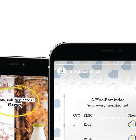


Assets are posted based on the social media calendar. The objective is to increase brand awareness, measured by the number of impressions.


The homepage helps increase conversion rate, measured by the amount of sales, delivery orders, and clicks to recipe.


Web banner helps drive traffic to the website.


Print design • Illustration
To educate college students on the topic of mental health, I created an infographic poster using illustrations for impactful visual storytelling.


People
Anxiety
People
Anxiety Disorder
People with anxiety disorders respond to certain objects or situations with fear and dread. Anxiety disorders can include obsessive-compulsive disorder, panic disorders, and phobias.
Mood Disorder
Mood disorders involve persistent feelings of sadness or periods of feeling overly happy, or fluctuating between extreme happiness and extreme

Hippocampus
Important
Studies


https://www.mentalhealth.gov/basics/mental-health-myths-facts.
https://www.mentalhealth.gov/what-to-look-for.
https://www.webmd.com/depression/depression-physical-effects-brain. https://ourworldindata.org/mental-health. https://www.nami.org/mhstats.


Website design
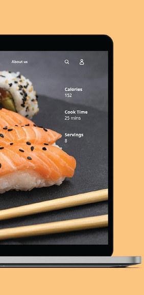
Allrecipes, a brand known for its wide range of easy-to-make recipes, required a website redesign for each of its recipes. While the previous website was clean and simple, its UX/UI was somewhat limited in terms of efficiency.
As a solution, I developed a new design that places a strong emphasis on captivating users through enticing food photography in the hero section. The main goal was to provide a seamless user experience, allowing users to read the entire cooking directions without the need for constant scrolling.




Pitch website • Responsive design • Presentation design
Designs are made to drive decisions. This project is a pitch to bring the Summer Olympics 2032 to Phoenix. As part of the criterias for becoming the host city, the proposal needs a big support from the residents living in Phoenix particularly and Arizonans as a whole.
The goal is to spread the inspiring spirit of the Olympics while keeping the audience informed. Along with the website, I created a new concept logo and a pitch presentation to propose why Phoenix is the ideal location to host the Olympics.


Packaging design
Private Selection, a brand under Kroger, specializes in premium gourmet products. They are seeking a fresh logo and packaging design for their chocolate collection to set themselves apart from competitors on store shelves.
As the brand is renowned for its vintage packaging design, I maintained its traditional aesthetic while incorporating a modern twist. Inspired by Greek architectural elements, I emphasized the pattern texture of the chocolate bar, a distinctive feature of Private Selection chocolates.


Print design • Typography
BetterHelp, an online therapy service, provided me with their logo and a specific directive: to create a print ad targeting individuals who require therapy but struggle to express their needs.
I employed creative typography to convey the message in a straightforward manner, using the analogy of a torn leaf to symbolize a person’s emotions.


Website redesign
History channel needed a website redesign improving on the user experience. While the old website features a variety of shows, users are not able to get to the stories section until reaching the end of the website, thus decreasing users’ interest on the content.
As a solution, I created a balance between the two types of media, giving the stories its own hero section, and introduced a new category called “Today in history”, which features new stories every day. The idea is to get history lovers an easy access to fresh content every day, emphasizing the significance of history channel.
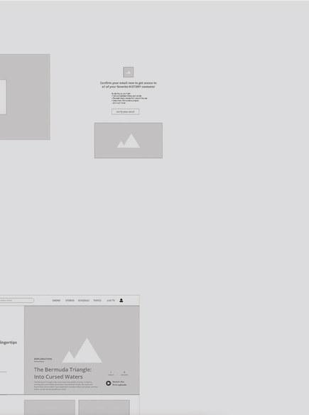
For the new website, I created a user-flow, directing how users get from the original homepage to the personalized homepage after signing in. In addition, the category page and article page are also redesigned.


Every project requires a thorough process to ensure effectiveness and efficiency. To create a website, I started by researching, looking at other websites and sketching out ideas. Afterwards, I created a userflow, illustrating the user’s journey through the website before moving on to laying out the content with wireframes.


Wireframes are the skeleton of every website. With the wireframe, I am able to design early comprehensives by adding different design elements. Based on the need of the project, the design process usually includes a lot of adjustments before resulting in the final designs. After having the website fully designed, I added prototype as a test for user experience.




Catagory page


Article page


Photography
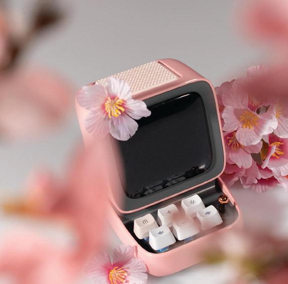
Divoom, a company specializing in Bluetooth speakers and pixel art products, assigned me the project of shooting a series of product photographs. These images were intended for Divoom’s upcoming social media campaign to promote the Ditoo Pro speaker.
For this project, I planned a spring-themed photoshoot, featuring cherry blossoms as the main element to harmonize with the pink color palette of the Ditoo Pro.
