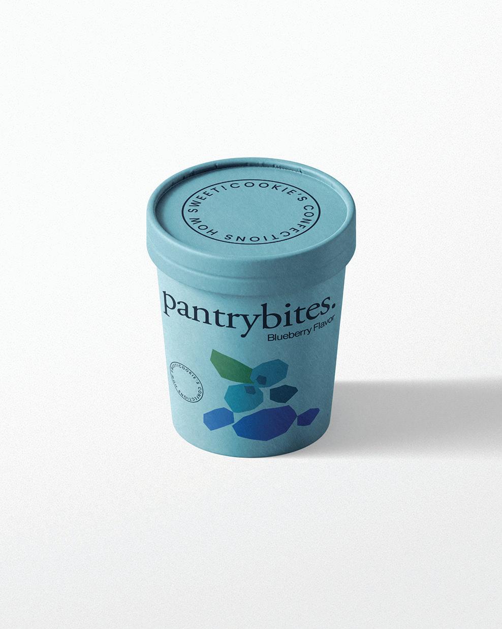


Pantrybites is a new cookie company that specializes in small-batch, artisanal cookies made using only the highest quality ingredients. These cookies are made with love and care, and they take pride in the fact that each batch is unique and delicious. Their mission is to bring joy to people’s lives through their cookies;
they believe their branding should reflect that mission. In this project, I worked on creating a brand identity for Pantrybites that is fun, playful, and whimsical. They want their branding to reflect the joy and happiness that their cookies bring to people’s lives, and believe that a strong brand identity is key to achieving that goal.


Raspberry Cookies


Pantrybites believes that every scoop should bring a smile to your face and joy to your taste buds. That’s why they use only the highest quality ingredients to create their delicious, creamy ice cream. Their flavors are inspired by the seasons and the world around us, they love to experiment with new combinations to surprise and delight their customers.

Their brand is all about creating a fun, vibrant and playful atmosphere that encourages their customers to let loose and enjoy the simple pleasures in life. The brand’s color palette remains consistent throughout all of their products.

The Phoenix Art Exhibition is an annual event that showcases the work of local artists in a variety of mediums. This year, the exhibition featured over 100 artists from a range of backgrounds and disciplines, including painting, sculpture, photography, and more. My goal for this branding
project was to create a visual identity for the exhibition that captured the spirit of creativity and innovation that defines the event. I wanted to create a brand that is both elegant and modern, reflecting the high quality of the artwork on display while also conveying a sense of excitement and
energy. Through this branding project, I hoped to inspire visitors to engage with the art and connect with the artists who created it. The goal was to create 4 product designs to give away at the event in order to engage with the audience. These designs revolve around the logo of the exhibition.


The Grand Canyon University Design Department is seeking a set of posters to promote their program and showcase the work of their students. The posters should be eye-catching and visually appealing, while also conveying the professionalism and creativity of the department. The posters should include vectors of student work and highlight the various design disciplines taught in the program, such as graphic design and advertising, web design, animation, social media and gaming. The
posters should also include information about the program, such as the courses offered and the qualifications of the faculty. The goal of this project is to create a set of posters that will inspire prospective students to join the program and showcase the talents of current students. The posters will be displayed throughout the university, high schools and used in recruitment efforts. Key deliverables for this project include a set of six posters, each highlighting a different design disciplines.


Crayola, a well-known brand in the art supplies industry, is looking to refresh their advertising campaign to appeal to a younger demographic. In this branding project, I aim to create a new advertising campaign that focuses on creative typography to showcase the fun and whimsical nature of Crayola’s products.


The goal of this project is to create a print ad that uses creative typography to showcase Crayola’s wide range of products, including crayons, markers, and colored pencils. The ads should be colorful, playful, and engaging, and should appeal to children and adults alike.


The objective of this project is to create a book cover design for “Don Quijote de la Mancha”, a classic Spanish novel. The book cover should capture the essence of the story and appeal to a modern audience. The design should incorporate elements of Spanish culture and history, such as the Spanish flag, castles, and armor. It
should also include a visual representation of the protagonist, Don Quijote. The typography of the title should be bold and legible, and should reflect the classic nature of the novel. The end result will be a book cover that captures the spirit and essence of “Don Quijote de la Mancha”, and that will appeal to a modern audience.

 Front Cover Above
Don Quijote de la Mancha
“It’s Nice That” is an online platform that celebrates creativity in all its forms, from art and design to fashion and photography. The website showcases the work of emerging and established artists, designers, and creatives from around the world. The goal of this project
is to redesign the It’s Nice That website to improve the user experience and increase engagement with the content. The new design should be modern, sleek, and intuitive, while also reflecting the brand’s playful and creative values. The new design will include a clear and consistent
navigation system, with easy-to-find categories and tags that allow users to explore the content in a more intuitive way. It will also include new features and functionality, such as a personalized homepage that highlights content based on the user’s interests and browsing history.


The chocolate packaging redesign project for Trader Joe’s seeks to improve the design and aesthetic of the current packaging for their chocolate products. I explored ways to create a more modern and attractive design that will bring attention to the product and improve customer engagement. I will be looking at a variety of design elements such as
colors, fonts, and imagery to create an eyecatching design that will increase brand recognition and customer loyalty. I will also be exploring sustainable packaging options that are both attractive and costeffective. The goal of this project is to create a design that will bring a renewed energy to Trader Joe’s chocolate products.


This design project will focus on creating three distinct book cover concepts for J.R.R. Tolkien’s classic novel The Hobbit. The project will utilize Adobe Photoshop and include three concepts: photographic, typographic and illustrative. A photographic design will focus on creating a visually stunning image that captures the essence of the novel; It will feature a high-resolution photograph that will be edited and manipulated to create the desired effect.

A typographic design will feature a bold and eye-catching typeface that is used to spell out the title of the novel, the type will be used to create intricate shapes and patterns that hint at the story of the novel. The illustrative design will include a detailed illustration of a scene from the novel, with the title and author’s name in a more decorative font.


This project will focus on creating a modern, visually appealing packaging design for Papago Honey, which offers three delicious flavors: wildflower, cactus, and plain honey. My goal is to create a packaging design that will capture the attention of potential customers and represent the quality of
Papago Honey. Through this project, I explored ways to modernize the Papago Honey packaging, while still preserving the brand’s essence and values. Papago Honey is committed to providing their customers with the highest quality honey and now they are taking it one step further.


Papago Honey is introducing a new minimalistic packaging design for their signature flavors that is sure to be a hit with honey lovers everywhere. The packaging redesign will focus on minimalistic design principles, bringing forth a sleek, modern look that emphasizes the natural beauty of the honey they produce. The client believes
that their packaging should be a reflection of the quality of the product it contains, and the minimalistic redesign will provide a visual representation of the premium quality of their honey. With the new packaging, I hope to inspire customers to appreciate the natural beauty of their honey and the hard work of our beekeepers.

This landing page project is a bold initiative to make Phoenix, AZ the host city for the 2032 Olympic Games. After researching, we are confident that Phoenix AZ is the ideal location to host the 2032 Olympics and will provide a world-class experience to athletes and spectators alike.
This project landing page is designed to provide information about the PHX32 Olympic Games project and to engage the public in the process. Here you will find information on the details on the proposed venues and infrastructure, and ways to get involved.


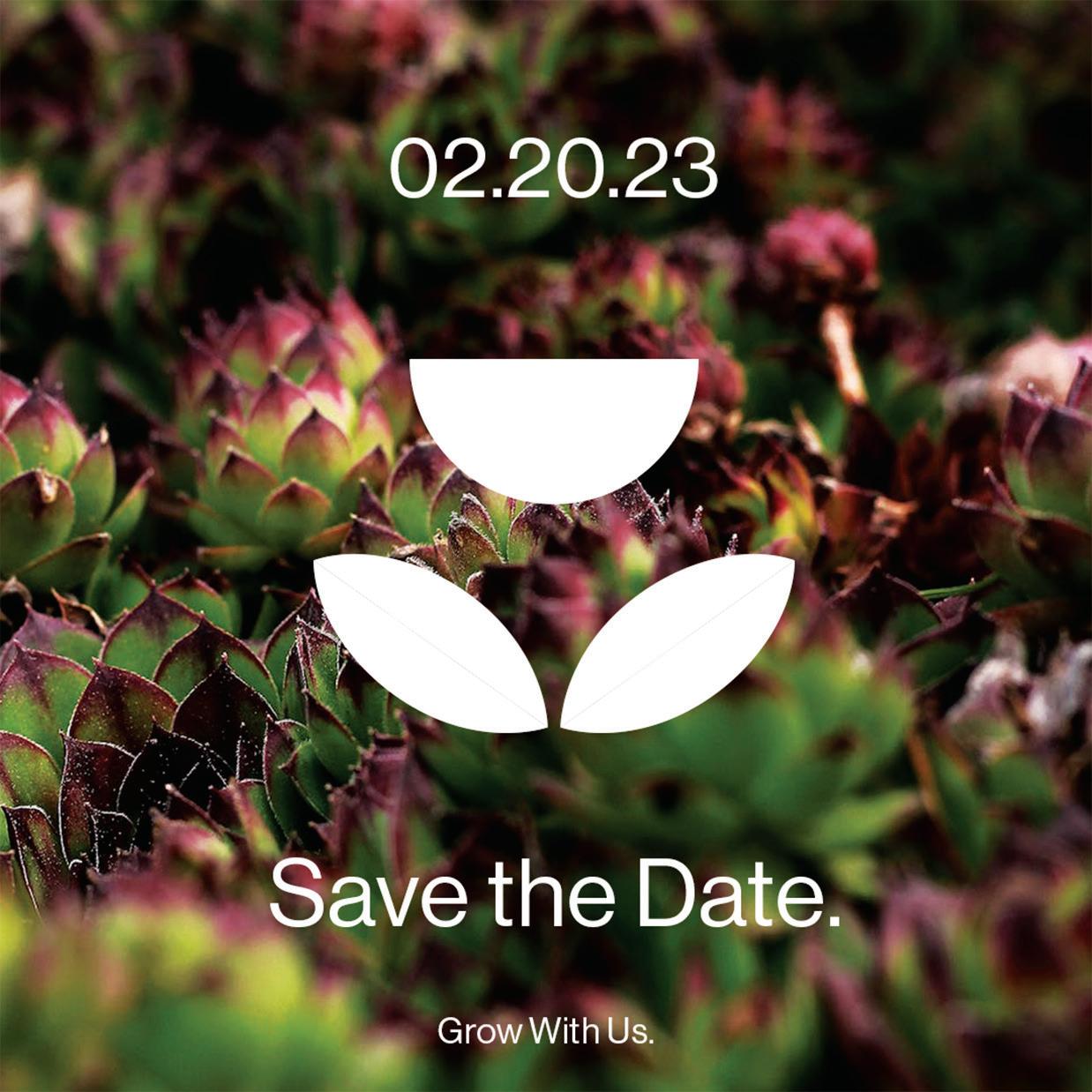
As part of this project, we were challenged to develop a brand from scratch and create a comprehensive marketing campaign to promote it. I developed the company “Flor.” The project included making a cohesive brand, website, social media marketing, blog articles, and email marketing. Flor is a leading provider of greenhouses and greenhouse accessories for home and business use based in Phoenix, AZ.
Their mission is to provide their customers with the highest quality products, services and support. They design and manufacture greenhouses that are durable, energy efficient and aesthetically pleasing. They strive to provide their customers with the best value, their commitment to excellence has earned Flor a reputation as one of the top greenhouse companies in the industry.


Ads are a great way to spread the word about Flor. These social media ads will showcase the latest trends in green house technology, a sustainable life-style and the inspiring ideas they have for creating the perfect outdoor and indoor space. These ads will reach a wide audience, helping to spread their message and build their brand. They are also a great way to promote their products and services.


Cookie Confections is a new brand of gourmet cookies that’s all about having fun. They specialize in creating unique and delicious cookies that feature fun and lovable characters. Their cookies are made with premium ingredients and come in a variety of shapes and sizes. They are committed to bringing the joy of cookies to everyone with their character cookie monsters. From their classic monster
cookies to their latest and greatest monster designs, people will find something for every occasion. The character cookie monsters will delight kids and adults alike. With a wide selection of flavors, there’s something for everyone to enjoy. Whether people are looking for a special treat for a party or just something sweet to snack on, Cookie Confections has everyone covered.


808 446 9443
hello@giovannagm.com giovannagm.com

808.446.9443 hello@giovannagm.com giovannagm.com
