Hi, my name is Shaylee

A little bit about me
Hi, my name is Shaylee Steffen! I graduated from GCU in 2023 with a Bachelors degree in Graphic Design emphasis in advertising, and a marketing minor. My strengths include social media marketing, re-branding and branding, website design, and illustration. My application strengths are InDesign, Illustrator, XD and Photoshop but I have a familiar grasp on all other Adobe Creative Cloud Applications. Overall, through my work I find a lot of inspiration from my surroundings because I love to be outdoors in nature, sightseeing and finding cool places to get my mind feeling creative.

CHOCOLATE BAR REDESIGN


For this project we were told to re-design a chocolate bar label. Adding three extra process: varnish, emboss, and foil. Ultimately to create a new packaging which is eye catching, fun and on brand for the client.


BOOK COVER RE-DESIGN

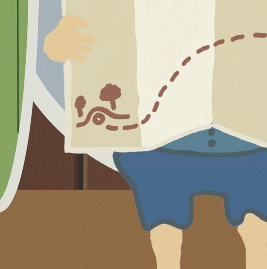
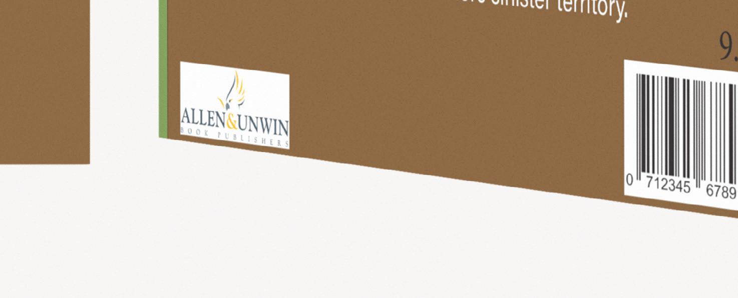
For this project our client was a book publisher. We were told to create a book cover for the well known book series the Hobbit. Really the goal was to guess how the author would interpret the book through one book design.






HOT DIGGITY DOG


RE-BRANDING


Hot Diggity Dog is an established brand, this project I was tasked with giving them a re-brand which emphasized a fun, fresh and modern feel. This assignment involved creating a new logo, food truck, and assets.


Hot Diggity Dog

HOT DIGGITY DOG


ASSETS


AMELIA’S FLOWER TRUCK
STATIONARY
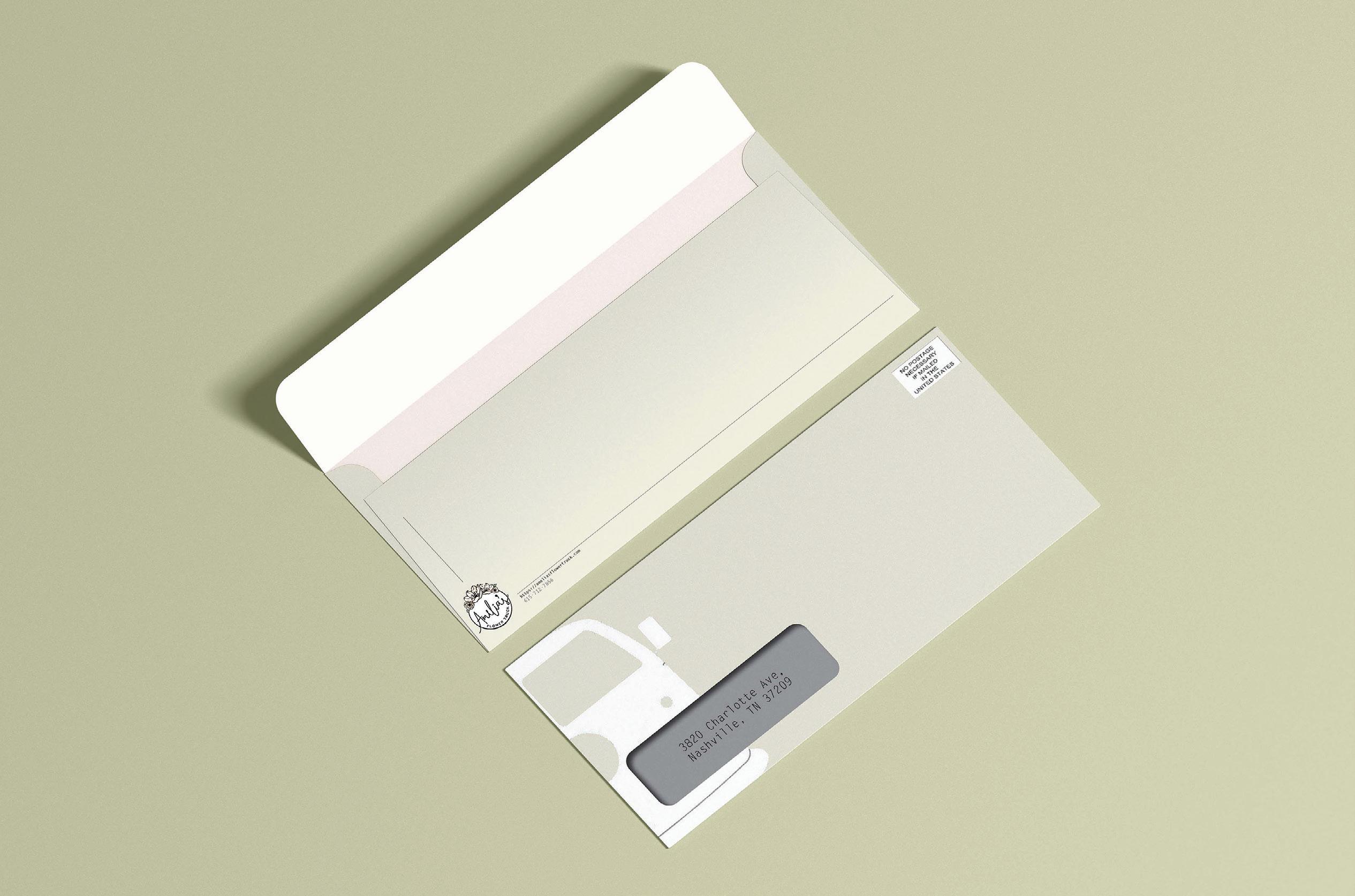
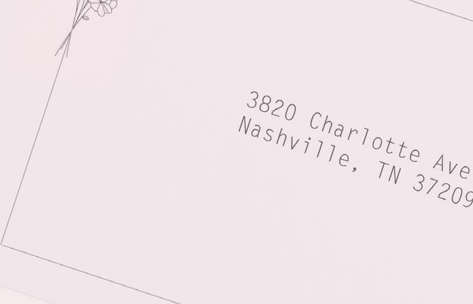
Amelia’s Flower truck is located in Nashville Tennessee. In my time I created some stationary that I thought fit the brand well taking inspiration from the truck, flowers, and overall feminine feel of this brand.






SANTA BARBARA INDEPENDENT
WEBSITE RE-DESIGN

This website re-design was for the Santa Barbara Independent. I chose this news source because it is my home town and I check up on this site often. I didn’t like looking at that website layout anymore so I created my own in a way I found fit better for their goals.


HOT DIGGITY DOG LOGOS
For this assignment we were tasked with logo exploration. Ultimately, we created 90 thumbnails and 50 comps of all different Hot Diggity Dog logo ideas. None of them could be the same however, we could explore similar themes.


TYSON FOODS RE-BRAND

In this assignment we were given the task to re-brand Tyson to show their employees and potential buyers that they do in fact care about the wellbeing of their workers. We took the strategic route of creating a billboard, three series print ad, and employee items. The overall concept was “You First” implying that they show that they care about you through this You First program.


RUMBLE ROOT BEER BRANDING


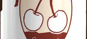
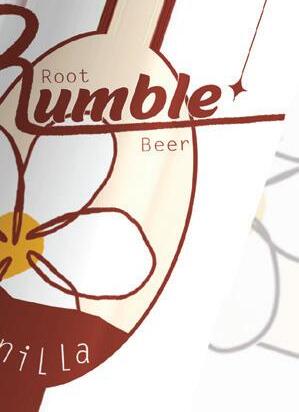
For this project we were tasked with producing three new flavor labels for Rumble Root Beer along with print ads. Ultimately letting their customers see how they are proud to support the earth and the ways they give. Overall, Rumble was looking for an eye catching logo, advertisments and flavor variations that would grab the attention on the shelves.

Root Beer




OTTIS REDDING 55TH BRANDING
This project we created posters for an Ottis Redding listening party. Here are two of the featured posters to promote the event. Overall, the theme we went with was reliving the past.

RUMBLE ROOT BEER


PRINT ADS












MILK & MORE BRANDING

This client asked us to create a tabloid advertisement using typography in a creative way. Because Arizona Farms Cheese is obviously a cheese company, I decided to use the cheese as a creative element to create the typography. I felt as though it would be eye catching to see the item for purchase as the creative element of the ad.


HAPPY HENS BRANDING


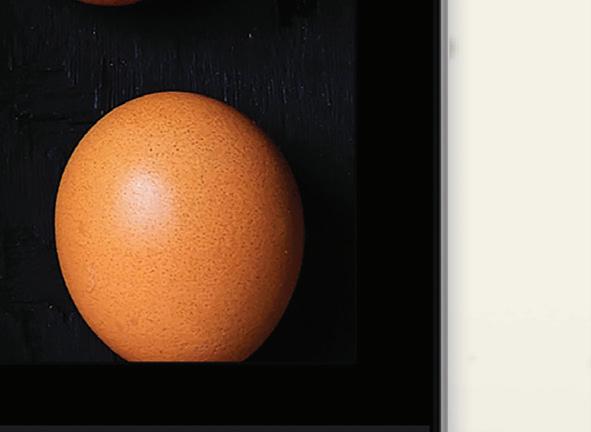
Happy Hens is a concept I came up with and created the entire brand. This website design is all about creating an engaging place for people to learn about who Happy Hens is and what they stand for. Overall, the goal being to create awareness about the quality of food we put into our bodies.



SOCIAL MEDIA HAPPY HENS


