NARRATIVE ANIMATICVISUAL DEVELOPMENT

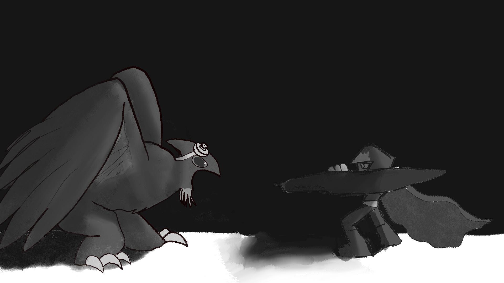
Following a young assassin character named Bim as she tracks down a monster in the woods, this narrative animatic was an exercise in fully planning and executing a narrative structure with characters and backgrounds I designed. I was given a chance to fully develop the characters from design to layout to animatic, exploring the full process of creating a character for an animated project. This character in particular was a challenging design,.sporting a mask whose facial expressions are relatively reserved.


NARRATIVE ANIMATICSTORYBOARDS


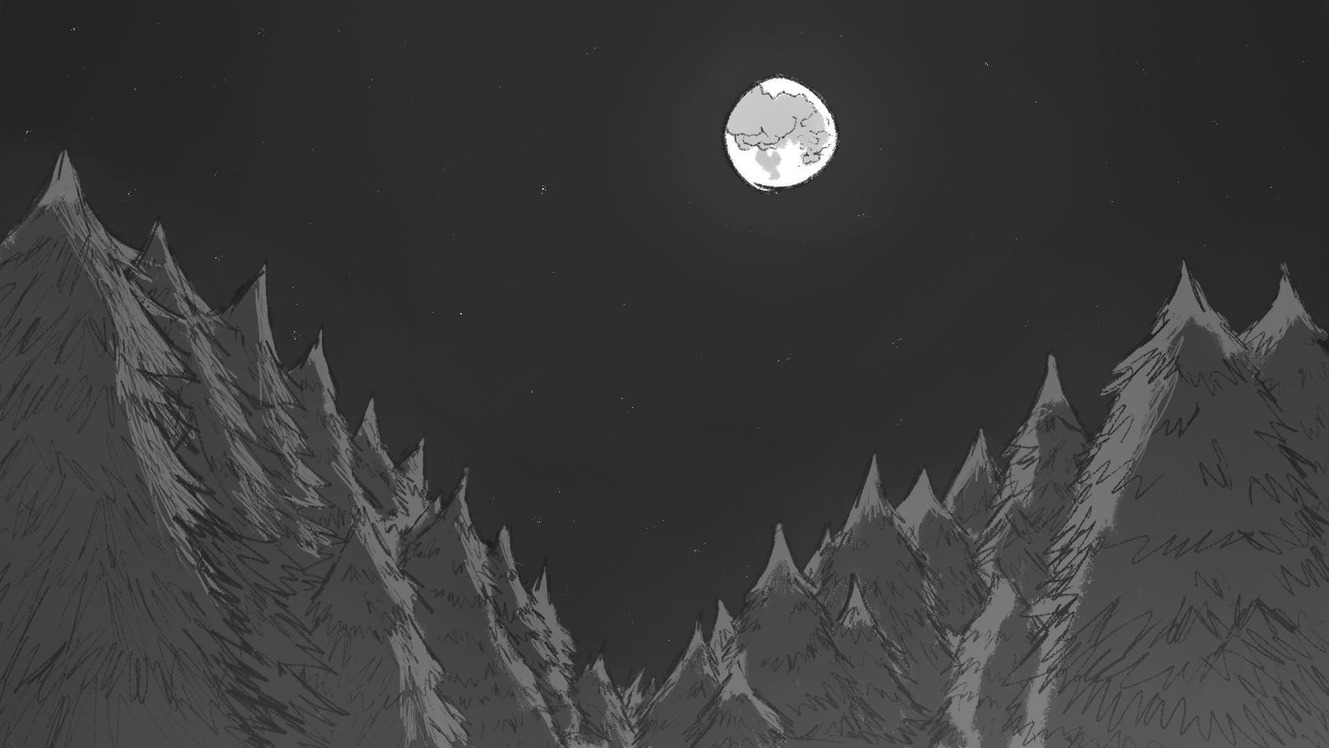
In these boards, I really wanted to lean into the emotion of the scene and the atmosphere of a quiet moonlit forest. To do this, I placed heavy focus on the light and dark values in each shot, all the way back in the boarding phase. This helped me build an idea of mood and atmosphere before I moved on to the more developed animatic frames.


NARRATIVE ANIMATIC : FINISHED ANIMATIC
The finished animatic is made of near-production quality grayscale shots. While this is unusual for an animatic, it helps to convey a more cinematic idea of what the finished story would look like in motion. The sound design in the finished animatic ties the whole scene together, creating a nearly complete animated scene.

NARRATIVE ANIMATION: STORYBOARDS


This narrative animation was built using the Blender Grease Pencil Tool, an extremely powerful animation tool that makes the best use of 2D and 3D workflows. By using this workflow I was able to create a 2D animation that was completely housed in 3D space, allowing for real camera movements. While done as an experiment, I went on to adapt this workflow to multiple other projects this year. It’s now a permanent fixture of my toolset.


NARRATIVE ANIMATION: BLENDER PROCESS
NARRATIVE ANIMATION 2


Similar to previous animations, I chose Blender Grease Pencil to allow me to quickly animate complex scenes. This project brings to life the theme song of a cartoon series. This animation makes use of much more drastic camera movements and effects than previous projects, pushing my knowledge of the tool much further along.

MOTION GRAPHICSTITLE SEQUENCE

This After Effects title sequence animation makes use of vector assets to illustrate strong transitions and dynamic visuals to engage the viewer. This animation is constantly moving, and heavily utilizes 3D camera movements and lighting in After Effects.


CHARACTER PAINTINGITERATIVE DESIGN
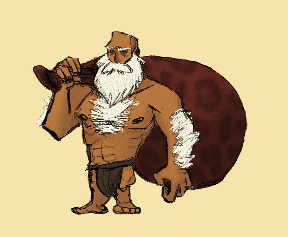
This character was designed first from a basic silhouette that was fully explored.


The design was then appplied to the final character painting




OBSERVATIONAL DRAWING


Drawing from life requires understanding of form, depth, and perspective to recreate exactly what is seen


3D ADVERTISEMENT ANIMATION
This project utilized 3D Cloth Simulation and Blender’s new pressure mechanics to simulate the mechanics of an actual balloon. I experimented in this animation with compositing 3D rendered footage onto real footage as well, so it became a great exercise in visual effects animation.


3D MODELING
This complex hard surface model of a chainsaw was designed to emulate a heart shape

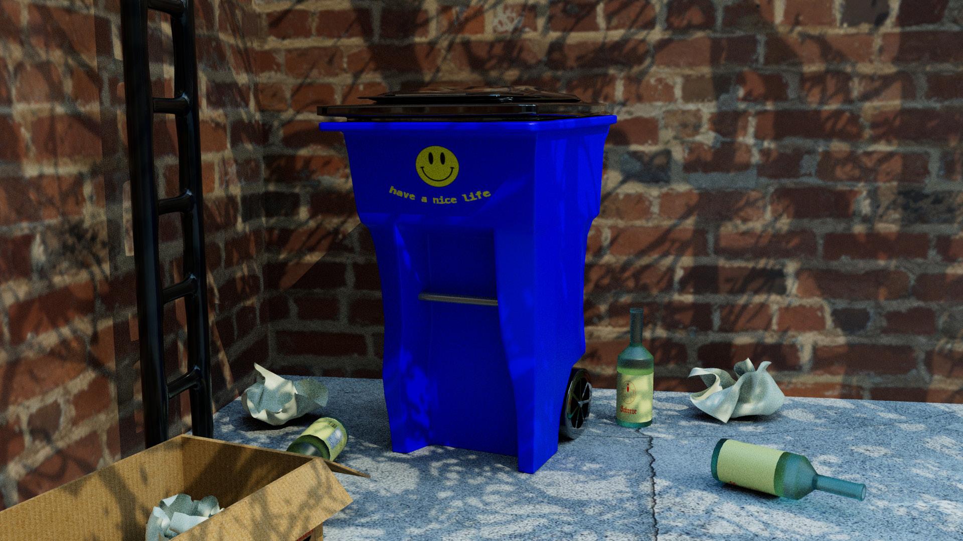
Hard surface modeling to create an exterior scene. Utilizes photo textures and gobos.

LOW-POLY CHARACTER MODELS


In asset modeling, it can be a valuable skill to attempt to keep file sizes low though modeling utilizing as few polygons as possible. These character models attempt to represent characters while keeping to these constraints, resulting in a subtley polygonal edge.

GRAPHIC DESIGN: VAIL VALLEY LIVE


These advertisements were designed to run in Vail Valley newspapers to advertise Vail Valley Live, a local lifestyle and news broadcast that was attempting to drum up local brand recognition. These advertisements were designed to be eye-catching and exciting while conveying the spirit of the show.


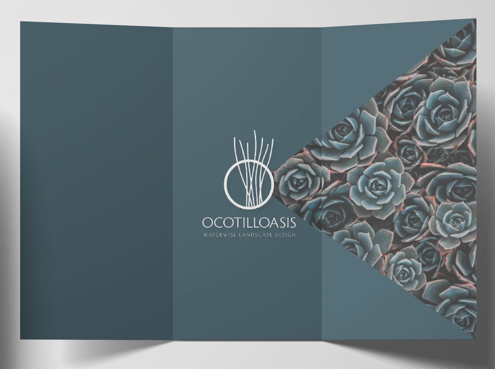
GRAPHIC DESIGN: OCTILLOASIS


This brochure and landing page were designed to advertise a local landscaping business, using beautiful local plants. The final design is sleek and reminiscent of the flora that the company installs.



LOGO DESIGN: THE URGE BURGER

This logo for a burger restaurant was intended to convey an intensity of craving so strong that it drove customers crazy. The final design is sleek but punk in a way that I find very compelling.

MOCK AD CAMPAIGN: #UBERVENTURES


STICKER DESIGN: RAGEQUIT


