VARIABLE GEOMETRY

8 USA EDITION July - Dec 2023 •ALES FI ALA STUDIO •ALVISI KIRIMOTO •BUENSALIDO + ARCHITECTS •CLB ARCHITECTS •GONÇALO BONNIZ •KOR ARCHITECTS •IOSA GHINI ASSOCIATI •MJÖLK ARCHITEKTI •NOA* •VUDAFIERI SAVERINO PARTNERS
realize your dreams p. 27
We

moltenigroup.com

MOLTENI&C FLAGSHIP STORES 160 MADISON AVE, NEW YORK NY 10016, T 212 673 7106 — 4100 NE 2ND AVE, SUITE #103-203, 33137, MIAMI, T 786 652 1500 — SHOP.MOLTENI.IT BOSTON CHICAGO DALLAS HOUSTON LOS ANGELES MEXICO CITY BOGOTÀ Dada Engineered

moltenigroup.com

MOLTENI&C FLAGSHIP STORES 160 MADISON AVE, NEW YORK NY 10016, T 212 673 7106 — 4100 NE 2ND AVE, SUITE #103-203, 33137, MIAMI, T 786 652 1500 — SHOP.MOLTENI.IT BOSTON CHICAGO DALLAS HOUSTON LOS ANGELES MEXICO CITY BOGOTÀ


The Soft Modern style has a bourgeois and suave personality. The delicate tones give the environment a comfortable flavour and the atmosphere acquires a reassuring quality, like an informal and cosy refuge. The light is warm and the shadows blend with the surfaces, reverberating textured and organic reflections. The space is resolved in a set of new textures that highlight and communicate with each other, evoking warm sensory sensations.


Discover all the new collections 2023 by FIAM Italia presented at the Salone del Mobile in Milan. Download the new brochure. fiamitalia.it
 Sofa, sideboard and chairs Oasi, armchair Sharon table Milton, coffee tables Florio - Design by Maurizio Manzoni Floor lamp and mirror Circe - Design by Luca Roccadadria. Celing lamps Luna

cantori.it

CONTEMPORAR METROPOLIS STORAGE SYSTEM YORK SOFA KUBICO COFFEE TABLE AND RIALTO SIDE TABLE CONTEMPORARY HOME TABLE

CONTEMPORARY HOME


WINDOWSFOR YOURDREAM HOME

Architectureisasdiverseasthepeoplethat livewithinit.Therightwindowsanddoorswill addsignificantcharactertoyourhome.

Ponziowindowsanddoorsallowyoutocreate yourindividuallivingspacebyoffering bespokesolutionstailoredtoyourunique requirements.
Tofindtheidealglazingforyourproject,you canchoosefromawiderangeofcolours, materialsandaccessories.
FabbricaThoroproducsalsocomeinfour distinctdesignstylestoenhanceany architecturaldesign

Fabbricathoro.it
WEAREDEVELOPINGANDPRODUCINGHIGHQUALITYWINDOWS
EachPonziowindowisproducedexactlyaccordingtoyourwishesand custom-made.
Thus,ourwindow-productsareavailableinthemostdiversewindow sizes,windowversionsandwindowdesignssuchasframeless windows,flushorsquare-edgedframesorevenwindowswithrounded edgesofsashandframe.


Thewindowswillmatchanychosenarchitecturalstyleanddesignof yourhouse.




Limited Edition LANA
TESTATA
• Progettata con tre pannelli orizzontali curvi e tappezzati
• Altezza visibile 67 cm
• Altezza complessiva dal pavimento 124 cm
• Profondità 9 cm
HEADBOARD
• Designed with three curved, horizontal upholstered panels
• Visible height 67 cm
• Overall height from floor 124 cm
• Depth 9 cm
MATERASSO
• Struttura a strato singolo con molle insacchettate rivestite in puro cotone calicò e disposte a mano

• 1638 molle di dimensioni 180 x 200 cm
• Realizzato a mano utilizzando una miscela di imbottiture naturali, tra cui strati di LANA EXMOOR HORN e TencelTM, crine di cavallo, lana Exmoor Horn agugliata e TencelTM
• Fodera realizzata con una miscela di viscosa e lana della qualità più pregiata. Naturalmente ignifugoprivo di sostanze chimiche
• Trapuntato a mano con fiocchi in feltro
• Rivestito con lana vergine britannica, sostenuta con cotone spunlace
• Due file di cuciture laterali realizzate a mano
• Maniglie orizzontali e sistema di aerazione
• Profondità complessiva del materasso: 21 cm + 6 cm di “cupola” (+/- 2 cm)
MATTRESS
• Single layer hand-nested calico pocket spring construction

• 1638 springs in size 180 x 200 cm
• Handcrafted using a blend of natural fillings, including layered Exmoor Horn wool and TencelTM, horsehair, needled Exmoor Horn wool and TencelTM
• The finest quality wool and viscose blend ticking. Naturally flame retardant - chemical free


• Hand-tufted with felt tufts
• Upholstered with British fleece wool, backed with spunlace cotton

• Two rows of hand side-stitching
• Horizontal handles and air vents

• Overall mattress depth: 21 cm + 6 cm doming (+/-2 cm)

SOMMIER
• Sommier molto basso (17 cm)
• 756 molle di dimensioni 180 x 200 cm
• Struttura in legno massello
• Fibre di cocco, miscela di lana vergine britannica e imbottitura in cotone
DIVAN
• Shallow divan (17 cm)
• 756 springs in size 180 x 200 cm
• Solid timber frame
• Coir, blended British fleece wool, and cotton upholstery

PIEDINI
• Piedini metallici effetto ottone
• Altezza 15 cm
LEGS
• Brass effect metal legs
• Height 15 cm

50 Cinquanta ULIVI SALOTTI S.R.L Via Sant’Ilario Sud 109, Cascina Pisa www.ulivisalotti.it | info@ulivisalotti.it Tel: +39 050 703258
This year we achieved really important goals. For the first time this year, during Fuorisalone, we decided to focus on quality instead of quantity of events. We organized an evening by bringing together important events. Six Archistars accompanied us in a talk on the future of architecture and design; this was followed by our partner companies taking the stage and telling their design philosophy and products in front of an international audience that appreciated their quality. We then left, at the close of the event, the most important announcement: Home Italia together with Holike will open showrooms in China where our partner companies will be able to display and sell their products. As many as three openings are planned in the next 24 months: the first showroom will be in Guangzhou, inside the Louvre; the second will definitely be in Foshan. For the third showroom we are still strategically defining where to open it. We have made an agreement with Holike that gives us the guarantee of a concrete and important development plan. Our dream has come true and we look forward to telling you about the next news. Stay connected!
Luca Valle Ceo&founder

21
N.8 | EDITORIAL





NUMBER 8 | JULY - DECEMBER 2023
CEO & FOUNDER Luca Valle luca@homeitalia.com
EDITOR IN CHIEF Marina Jonna editorialstaff@homeitalia.com
ART DIRECTOR Marina Luzzi graphicdesign@homeitalia.com
ARCHITECTURE CONSULTANT Laura Ragazzola laura.ragazzola1@gmail.com
PROJECT AND SALES MANAGER Giorgia Cesarini cesarini.sales@homeitalia.com
MARKETING MANAGER Carlotta Fiorentini marketing@homeitalia.com
SALES DEPARTMENT ITALY Riccardo Rossetti rossetti.sales@homeitalia.com
CHINA Mario Pavone elenazhang@homeitalia.com USA Wendy Cowan wendycowansells@gmail.com
Lael DeWahl lael@dewahlwilcox.com
PROJECT DEPARTMENT Antonella Lopez retail@homeitalia.com
GRAPHIC DEPARTMENT Marina Luzzi graphicdesign@homeitalia.com
WEB DEPARTMENT Periodico Studio info@periodicostudio.com
ADMINISTRATION DEPARTMENT Luca Mallia administrationoffice@homeitalia.com
INFORMATION ITALY/CHINA/USA Claudia Favaro info@homeitalia.com
CONTRIBUTORS
Words: Ramina Ayonne, Barbara JahnRösel, Amy Kadison, Manila Jo, Julia Martinez
PhotograPhy:
Ergest Ajasllari,Hava Ajasllari, Benjamin Benschneider, BoysPlayNice,Marco Cappelletti. Mattia Caprara, Alex Filz, Aaron Leitz, Lorenzo Lorenzini, Matthew Millman, Achille Mauri, Lucia Ottolini, Delfino Sisto Legnani - DSL STUDIO, Flavio Pescatori, Yuri Sarno, Kevin Scott, Jette Slagelse, Ed Simon, Woodtarget
SUBSCRIPTION - ITALY/CHINA/USA: write at: info@homeitalia.com
EXCLUSIVE ADVERTISING AGENCY FOR ITALY & WORLDWIDE: Home Italia S.r.l, via Archimede, 6 Milano (20129) – ItalyTel: +39 02 50020898
Email: info@homeitalia.com
EXCLUSIVE ADVERTISING AGENCY FOR USA: HOME Italia LLC - Email: info@homeitalia.com
PRINTING ITALY/USA: Botticelli La Stampavia Marecchia 114/116/A, 47863 Novafeltria (PS).
CHINA: No.16 Kangyuan Road, Kangqiao Industrial Park, Gongshu District, Hangzhou
HOME ITALIA HEADQUARTER OFFICES
ITALY: Via Archimede, 6 Milano (20129) –tel: +39 02 50020898 – email: info@homeitalia.com
USA: 515 E. Las Olas Boulevard, Suite 120, Fort Lauderdale, Florida 33301 Tel +1 954-231-8506 Fax +1 954-231-85130
CHINA: New Era Plaza, no.808, GuDun Road, Hangzhou,China.
WEB SITE www.homeitalia.com
Copyright @ 2019 - Home Italia S.r.l è iscritta nel Registro degli Operatori al Tribunale Ordinario di Milano al n.107. All rights reserved – Spedizione in abbonamento postale – D.L. 353/03 Art. 1.
23


Vudafieri


25
Visionary
Where would we be without you?
Wanderlust Vision & Mandalaki
Scouting
in the Landscape
studio
the Trees
40
43
46
48
54 A Ripple
Aleš Fiala
66 Sky Under
Mjölk architekti
Elegance
Giorgio Armani ----------------------------
Tribute to Beauty
Kirimoto
74 New Megayacht Rewrites
The Italian Sea Group /
84 A
Alvisi
the
of the Nature
96 With
Colours
Gonçalo Bonniz
104 Black Fox Ranch CLB Architects
----------------------------
Milan
Saverino Partners
Over The Top
Iosa Ghini
The Alps Meet Asia Noa*
Furniture in Freedom 177 New Life to Icons 178 Ad dres ses NEWS TO READ 39 51 145 HOUSES TO LIVE 83 PROJECTS TO SEE 53 81 PLACES TO BE 147 169 BRANDS TO KNOW171 177 FOR BUSINESS GENERAL CONTRACTOR CHOOSE YOUR STYLE AND WE WILL CARRY OUT THE PROJECT OF YOUR DREAMS, TURNKEY, USING THE BEST MADE IN ITALY BRANDS. A COMPLETE SERVICE WITH THE GUARANTEE OF HAVING ONLY ONE PROFESSIONAL INTERLOCUTOR TO REFER TO 27 From the article Black Fox
on page 104.
8 July Dec MJÖLK ARCHITEKTI VARIABLE GEOMETRY contents #8
114 Danish Cliff House Nordic Office of Architecture 126 The Point Kor Architects 138 Screen House Buensalido + Architects
148 Urban Hive
156
Massimo
162
172
Ranch
Design by CLB Architects. Photograph by Matthew Millman.


27
GENERAL
YOUR STYLE
WE WILL CARRY OUT
PROJECT OF YOUR DREAMS,
IN ITALY
COMPLETE SERVICE WITH THE GUARANTEE OF HAVING
ONE PROFESSIONAL INTERLOCUTOR TO
TO
FOR BUSINESS
CONTRACTOR CHOOSE
AND
THE
TURNKEY, USING THE BEST MADE
BRANDS. A
ONLY
REFER
HOME ITALIA
SERVICES
HOME ITALIA PROVIDES A “TURNKEY” SERVICE FOR THOSE WHO HAVE A PROJECT TO REALIZE. WE CREATE RESIDENTIAL, HOSPITALITY AND SPA SOLUTIONS ALL OVER THE WORLD, IN COLLABORATION WITH PRESTIGIOUS INTERNATIONAL ARCHITECTS, DESIGNERS, AND COMPANIES EXCLUSIVELY MADE IN ITALY. ALL PROJECTS ARE PUBLISHED WITHIN OUR NETWORK.
FOR INFORMATION: info@homeitalia.com

28
ph. by Matteo Guidetti
ARCHITECTS & DESIGNERS

Your dream always starts with a project! In the HOME Italia club you will find the makers of these dreams. You can choose between great international architects and designers who will give shape to your imagination.


MADE IN ITALY FURNITURES

The dream continues with your project.
HOME Italia has been working for years with the most prestigious companies of Made in Italy. By relying on us you will have the opportunity to choose the furniture you want: modern, classic or contemporary.
JOIN THE HOME ITALIA CLUB
ARE YOU A MADE IN ITALY COMPANY?
By joining the Club of HOME Italia you will be connected to the main builders, architects, designers and private customers around the world. Our goal is to enhance the Made in Italy by selling the furnitures of our partner companies.
ARE YOU AN ARCHITECT OR A DESIGNER?

Joining the HOME Italia club means having the opportunity to acquire international projects, being known all over the world and participating in training lessons organized in collaboration with our international partners.
MEDIA
Your dream spreads all over the world.
HOME Italia will publish your project in the HOME Italia and HOME Italia/USA Magazines, on the website and on our social networks.
29 29 FORMAFATAL MALFINIO COZY PLACES We realize your dreams p. 25
July December 2023 8 July Dec 2023 ALES FIALA STUDIO KOR ARCHITECTS MJÖLK ARCHITEKTI NOA* VARIABLE GEOMETRY
HOME ITALIA AT FUORISALONE

EVENT
30
Photography by Lorenzo Lorenzini, Ergest Ajasllari, Hava Ajasllari, Lucia Ottolini, Yuri Sarno
THE TALK: The future of architecture and design. From left, Marina Jonna (Editor in chief of Home Italia and Home USA), Paolo Asti (Asti Architetti) Carlo Colombo (Carlo Colombo Architect and co-founder of A++ ) Maurizio Lai (Studio Lai), Chiara Gibertini (PIinifarina Architecture), Gino Garbellini (PiuArch). Carlo Colombo. Journalist Claudio Brachino Below and right, journalist Carlo Brachino moderated the talk.
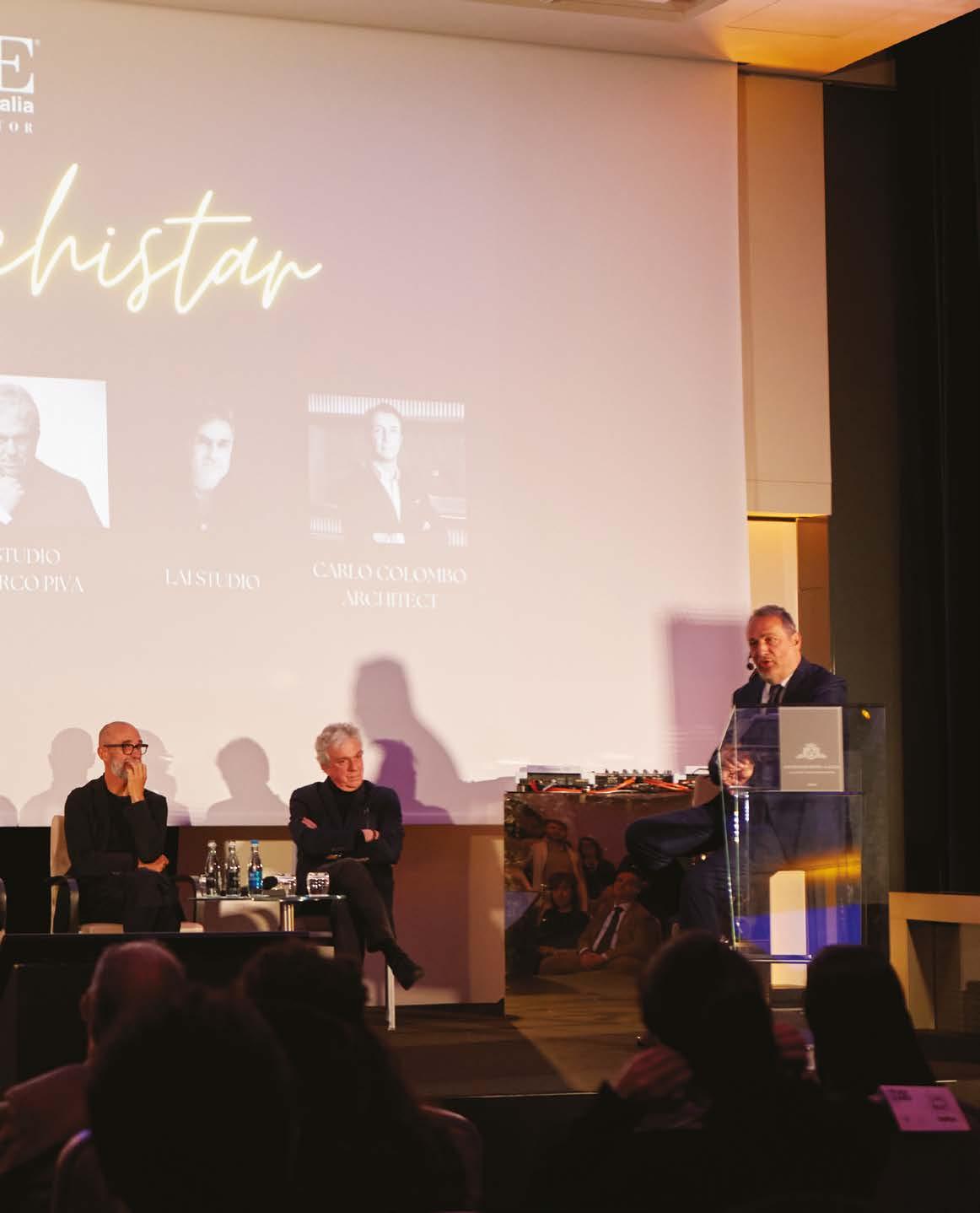
AN EVENING FULL OF EVENTS AND NEWS: INCLUDING TALKS, PRESENTATION OF HOME ITALIA PARTNER COMPANIES

AND THE ANNOUNCEMENT OF THE OPENING OF THE FIRST HOME ITALIA
SHOWROOMS IN CHINA WITH HOLIKE
31
LUCA VALLE CEO HOME ITALIA


This year at Fuorisalone Home Italia focused on quality instead of quantity, grouping several important events in a single day: a talk with six international Archistar studios, the presentation of as many as 14 brands of its partners and, last but not least, it announced the opening of Home Italia showrooms in China; we talk about this with Luca Valle, Ceo and founder of Home Italia, who tells us how this idea was born. “In all these years my team and I have worked hard to achieve this result, that is, to open showrooms in the world that would carry the name of Home Italia together with our companies. The right word for me is internationalization: it is indeed fundamental for a company to internationalize its brand by making it grow. This is why we decided to open our first showrooms in China, our main market, inserting within them, our partner companies.” A choral achievement then, as Luca Valle points out. “If to date we are here it is because we really believed in it.” But who is Holike, the partner chosen to open these Home Italia showrooms? “Holike is a publicly traded company that has, to date, more than 2,000 showrooms throughout China. Not only that, the son of Holike’s founder also owns HD, a midto-high-end Chinese furniture line. Both of them fell in love with Made in Italy: that’s why they contacted us and we were able to define the Home Italia showrooms that will allow our partners to enter this market that, more and more, demands high-quality Made in Italy furniture.”
ABOVE: the signing moment between Giorgia Cesarini (Project and Sales Manager of Home Italia) Winnie Lin (Holike) for the opening of Home Italia’s showrooms in China.Below, from left: Luca Valle, architect Mario Pavone and Winnie Lin.

INTERVIEW TO
1 2 3 32
This year Home Italia, General Contractor of Made in Italy design, has decided for Fuorisalone to focus on quality rather than quantity. As Luca Valle , Ceo and founder of Home Italia, tells us, “This year the events scheduled for Fuorisalone are really many and everything risks becoming dispersive. This is why we decided to focus on a single day, April 20, where we will have several appointments, in addition to the usual party that has always distinguished us.”
Home italia has thus brought together as many as 14 design brands that will be present with their products to enliven the halls of the elegant Excelsior Hotel Gallia in Milan (Piazza Duca d’Aosta 9). Starting at 6 p.m., a cocktail will be the prelude to the talk that will begin at 7 p.m. and will involve six internationally renowned architectural firms: Pininfarina, Asti Architetti, PiuArch, Marco Piva, Carlo Colombo, and Maurizio Lai. The theme will be “Architecture & Design: the future to come,” with Claudio Brachino moderating the debate. Next, on stage, Home Italia and Holike will sign an agreement to open in the next 24 months, three showrooms in China under the Home Italia brand. Inside, Home Italia’s partner companies will be on display: a way to better rep -
INTERVIEW TO
WINNIE LIN HOLIKE


Holike Creative Home is a very prominent Chinese listed company known throughout the China market. Holike’s core business is the sale of furniture specializing in cabinets and paneling. Holike has more than 2000 stores and showrooms all over the market China. The founder of Holike gave provision to his son to pursue his own path in the ‘furniture business and, to date, owns HD, a high-end Chinese furniture line distributed in the different showrooms they own. Father and son poib fell in love with Made in Italy, and decided to enhance it in the Chinese market. This led to the idea of collaborating with Home Italia, the General Contractor of Made in Italy. We meet Miss Winnie Lin HOLIKE Director of Product Brand Center HD Home Definition Brand Manager who told us how the idea of collaborating with Home Italia came about. “If in China you think of Italian furniture you think of Home Italia. Home Italia in China is very famous because it has already developed several projects with very important clients. Ceo Luca Valle has founded a unique company because he has been able to group all the Made in Italy into one. When you talk to Home Italia you are talking to a single interlocutor but at the same time it is as if you were talking to all the Italian furniture companies, so for the end customer it is a great added value. Home Italia is ambitious like us because they want to develop throughout the Chinese market and the world. That’s why we decided to collaborate with them.” How do you intend to develop this collaboration in the next 5 years and in which regions do you want to develop ? “We asked and wanted from Home Italia the exclusive right in the whole Chinese market to open their showrooms, and for this request we guaranteed them the ‘opening of 5 showrooms in 2 years. My father already has 500 stores throughout China under the Holike brand, so it will be very easy for us to develop Home Italia’s showrooms as well. The regions of development and openings will be decided from time to time according to the ‘trend of the Chinese market. The first showroom will be opened in Guangzhou, inside the Louvre, and will have an area of 600 square meters. We already own the showroom: we are ready to go!”.

33
resent Made in Italy abroad and directly introduce Italian brands. Following this, the different companies present told about their news and future projects, and at the end of the presentations, the exclusive party began with several guests not only from the world of architecture and design, but also from the world of entertainment. But it didn’t end there. Home Italia became Charity Friendly on this occasion: through fundraising campaigns related to its activities and events, it supports SOS Children’s Villages, a Non-Profit Association that operates in 137 countries around the world and has always helped the youngest children to grow up and face their future in the best way possible. Therefore, a fundraiser was dedicated to them during the evening. Guests framed the QRCode on the screen or on the flyer placed on the chairs and donated in real time through TrustMeUp. Because Furisalone is not only business but also an opportunity to leave a mark, making the future of these children better. H


 1) Agresti 2) Ceppi The Italia Touch 3) Quooker
4) Brionvega
5) Yourental 6) Ciclotte
1 2 3


35 4 5 6

davide@silvestriartdesign.com +39 338 710 9654 silvestriartdesign.com Luxury apartment project Master Bathroom in Calacatta Gold marble
Th The e lu luxury o xury of n f n t atural s atural stone one

Luxury Villa project
Master Bathroom in Black Portoro marble

mktg@ciclotte.com @ciclotte_official
NEWS TO READ
39
WIDE-OPEN VIEWS ON THE RIDGE
 By Laura Ragazzola
Photography by Alex Filz
A UNIQUE STRUCTURE, DESIGNED BY NOA*, OFFERS AN IMMERSIVE EXPERIENCE ON TOP OF THE SCHNALS VALLEY GLACIER, THE AREA WHERE THE REMAINS OF ICEMAN OTZI WERE FOUND


40
VISIONARY
ON THESE PAGES: Built at an altitude of 3,000 metres, the viewing platform is made by Corten steel. A balcony with a glass parapet gives the feeling of being suspended in the sky.
Abreathtaking landscape opens up to hikers and skiers who reach the top of Schnals Valley Glacier ridge. It’s a special place, which marks the divide between Italy’s and Austria’s territories. Not far from here, the remains of iceman Ötzi were found in September 1991, a discovery that brought new insight on populations living in the Alps more than 5,000 years ago. In order to enhance visitors’ experience of the beauty and history of this alpine intersection, a unique architectural structure has been designed by noa*. It’s a viewing platform with a light structure made of Corten steel, which almost floats in the air giving
visitors the feeling of becoming one with the mountains. The platform, which incorporates a pre-existing summit cross, is composed by grids supported by thin beams and is surrounded throughout its perimeter by a parapet of vertical lamellas, which frame different views as one moves along the border, an invitation to discover new perspectives. Also, a sort of geometric funnel has been designed across the platform which directs viewers’ eyes towards the place where Ötzi was found, only a few meters from the Austrian border. Visitors can walk through the funnel to reach a glass parapet suspended in the air: it seems like you are walking in the sky. H


41
Lybra
Our vision, a refined, contemporary, balanced collection, synthesis of a present always thoughtful and attentive
cortezari.it

WHERE WOULD WE BE WITHOUT YOU?

THE TENTH EDITION OF 3DAYSOFDESIGN WAS CELEBRATED IN COPENHAGEN IN JUNE. THIS YEAR’S WATCHWORD: INCLUSION


3daysofdesign was born ten years ago when four companies, all located under one roof in an old Pakhus 48 North Harbour warehouse in Copenhagen, decided to hold a joint three-day event to present their new products rather than each doing a standalone event. Tells Signe Byrdal Terenziani Ceo of 3daysofdeign, “We invited a number of international journalists, designers and collaborators, and they all contributed. One brand paid for the plane tickets, another for the hotel. It became a success and it turned out that there were many brands that wanted to be involved. Very quickly, that number grew to 50, and it has been growing ever since. Today there are more than 300 brands in our community.” Established as a way for visitors to meet manufacturers and designers in their workplaces, it has now evolved to become a benchmark for Scandinavian design and beyond. In fact, several brands from all over the world, including Italy, are present. This year’s theme is:
What would we be without you?
This year’s theme visuals were made in collaboration with a group of multidiscipli-
nary creatives. Photographer Rasmus Hjortshøj and videographer Pelle Darger Johansen captured six friends of 3daysofdesign as they formed a dynamic visual depiction of collaboration, connectivity and creativity. To explore it to the fullest, just download the 3daysofdesign app from the site on your phone, put on comfortable shoes and start walking around. Wrap yourself in the unique atmosphere of Copenhagen that amplifies the beauty of this event. H

ANNIVERSARY
Signe Byrdal Terenziani, CEO of 3daysofdesign.


WANDERLUST VISION & MANDALAKI
By Julia Martinez - Photography by Achille Mauri
ABOUT WANDERLUST VISION
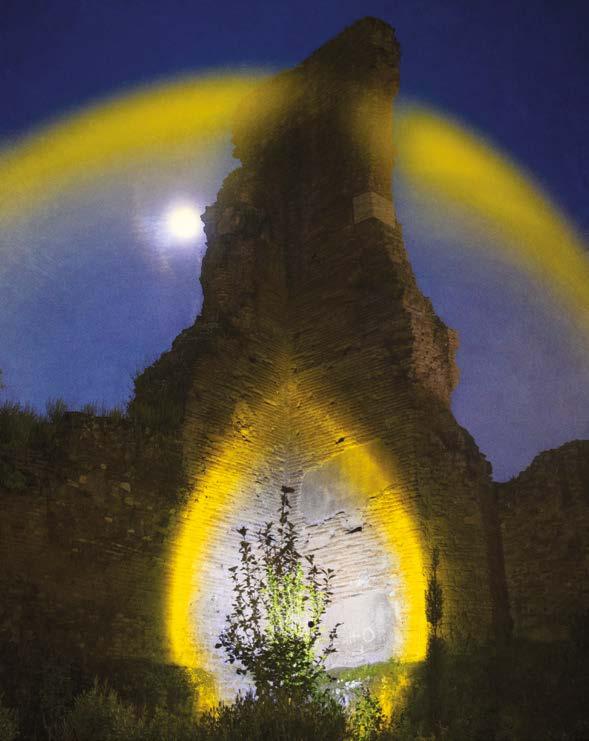


Wanderlust Vision is a 360° brand that aims to to engage multiple communities, online and offline, through the combination of music and a conscious approach to daily happenings. The project was born in 2020 as a response to geographical and social limits: the first event at the Museo del Novecento in Milan represents an ideal example of innovative cultural promotion, where different forms of art are told in a unified story. Wanderlust Vision is an event platform, a record label and a creative agency that deals with branding and product development. It is a constantly moving process that evolves and transforms according to the needs and challenges we encounter during our journey, seeking dynamic and contemporary solutions for people and the world.
David Sassoli’s words on the day of his introduction to the European Parliament are those of a people united in differences, of an environment of human beings sharing values, emotions and life stories. In order to celebrate these principles and keep them alive, Klaus, content creator and music producer, decided to narrate a multi-sensorial story called “Wanderlust Roma”, the new chapter of his Grand Tour event series. For the Rome episode, Klaus’ creative platform Wanderlust Vision departs from Piazza del Campidoglio for a journey through the history of the Urbe to the Renaissance man, the man of Michelangelo, the artist who was able to shape nature and matter, in collaboration with the European Parliament and Roma Capitale. To amplify this tale, Mandalaki and Wanderlust Vision are proud to introduce “EUROPA”, a one of a kind lamp designed specifically for Europa Experience, the multimedia format based in the most important European cities created to connect younger generations with values of equality, freedom, and integration. Through its delicate and elegant shades of color, capable of creating a welcoming, relaxing atmosphere, which arouses positive emotions giving the environment a sense of peace and tranquility, this light wants to send a message of community by lightning that light, that inner strength and motivation H
46
“WE MUST RECOVER THE SPIRIT OF THE FOUNDING FATHERS, THE SPIRIT OF VENTOTENE, OF THOSE WHO KNEW HOW TO PUT ASIDE THE HOSTILITIES OF WAR, PUT AN END TO THE FAILURES OF NATIONALISM BY GIVING US A PROJECT CAPABLE OF COMBINING PEACE, DEMOCRACY, RIGHTS, DEVELOPMENT AND EQUALITY.”
LIGHT GAMES
ABOUT MANDALAKI

Mandalaki is a product and consulting design firm founded in 2012 by Enrico De Lotto, George Kolliopoulos and Giovanni Senin in Milan, Italy. Davide Giovannardi became a partner in 2013. The team has different educated backgrounds in Product Design, Economy and Art. Mandalaki explores the intersection between design and technology to create unique pieces of high quality and conceptual values as a result of their consistent innovative approach between industrial and artisanal processes. Extremely pure shapes conceal years of meticulous technical and aesthetic research that characterize their iconic and recognizable products, architectures and art pieces. Each project is connected to one another: from modular micro houses to electric cars, from lighting installations to furniture. The projects are driven by the research of essentiality and functionality as well as sustainability and performance. In the last years Mandalaki focused their research also on lighting with the Halo Project. The light is no longer treated as a source of illumination but as a graphic projection, precise and defined. A tension is established between the physical object and the metaphysical projection. The result is a new family of lamps designed for different landscapes, capable of creating worlds of nuance in which people can dive. Mandalaki strongly believes in an interdisciplinary approach to bring value to their works, empowering their networks from artists to scientists.

THE ITALIAN PAVILLON AT VENICE BIENNALE
 By Laura Ragazzola
A NEW GENERATION OF DESIGNERS GOES BEYOND THE EXHIBITION, LAUNCHING NINE PROJECTS WHICH WILL BRING LONG TERM VALUE
“Spaziale. Everyone belongs to everyone else” is the theme of the Italian Pavilion at the 18th International Architecture Exhibition – La Biennale di Venezia. For the first time the topic was developed by curators - Fosbury Architecture, based in Milan - and designers all aged under 40: a new generation grown up against a backdrop of permanent crisis, aware of the environmental issues and the need to restore the role of architecture, naturally embracing collaboration
and sharing. They conceived the Pavilion as an opportunity to bring value beyond the exhibition, implementing real projects for the benefit of local territories and communities.
So, nine Italian young architects or groups - (ab) Normal, BB (Alessandro Bava e Fabrizio Ballabio), Captcha Architecture, HPO, Lemonot, Orizzontale, Parasite 2.0, Post Disaster, Studio Ossidiana, Giuditta Vendrame - were selected to develop as many projects on Italian sites with situations of fragility
48
SCOUTING
Photography Ph. Delfino Sisto Legnani - DSL STUDIO Courtesy of © Fosbury Architecture
LEFT: The young team of Fosbury Architecture (Giacomo Ardesio, Alessandro Bonizzoni, Nicola Campri, Veronica Caprino e Claudia Mainardi) is the curator of the exhibition ‘Spaziale. Everyone belongs to everyone else’ at Tese delle Vergini in the Arsenale.

ABOVE AND ON THE SIDE PAGE: The 9 projects presented in the two halls of the pavilion deal with urgent issues in a variety of urban and countryside contexts in Italy. The authors are (ab)Normal, BB (Alessandro Bava and Fabrizio Ballabio), Captcha Architecture, HPO, Lemonot, Orizzontale, Parasite 2.0, Post Disaster, Studio Ossidiana, Giuditta Vendrame. All architects, like the curators, are all under 40.

49
Some of the 9 projects presented in the exhibition. 1. Tracce di Belmonte, in Belmonte Calabro (Calabria), by collective Orizzontale with Bruno Zamborlin; 2. ‘The Belvedere’ in the plain between Prato and Pistoia (Tuscany), by (ab)Normal and CAPTCHA with Emilio Vavarella; 3. ‘La casa tappeto’ in Librino (Sicily) by Studio Ossidiana; 4. ‘Concrete Jungle’ in Mestre (Venice) by Parasite 2.0; 5. ‘La terra delle Sirene’ in Bay of Ieranto (Naples) by BB (Alessandro Bava e Fabrizio Ballabio) with Terraforma; 6. ‘Sea Changes’ at Montiferru (Sardinia) by Lemonot; 7. Post Disaster Rooftops in Taranto (Puglia) by the collective Post Disaster with Silvia Calderoni and Ilenia Caleo.

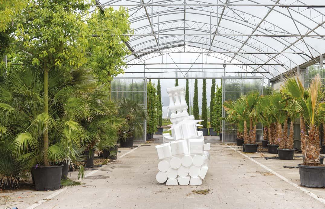

50 1 2 3
or transformation. Each designer was paired with an advisor, drawn from other fields of creativity: visual artists, performers, experts in food systems and artificial intelligence, writers, filmmakers. Also, each design group worked and will work with a series of incubators in developing the projects.
In short, the Italian Pavilion has become a space not for showing finished projects, but for the launch of multidisciplinary initiatives that will have a long-term impact, delivering a fresh image of a new and creative Italian architecture. H


51
4 6 7
5

ETERNAL COLLECTION DFNSRL.COM
PROJECTS TO SEE
53
A RIPPLE IN THE LANDSCAPE
ALEŠ FIALA STUDIO
Photography by BoysPlayNice
ALEŠ FIALA STUDIO DESIGNED A NEW WINE HOUSE
FOR THE YOUNG GURDAU WINERY CLAIMING THE GREAT WINE-GROWING HERITAGE OF MORAVIA.
SETTING THE BUILDING IN THE CENTRE OF THE VINEYARDS, BOTH PURPOSEFULLY AND POETICALLY, BROUGHT HIGH DEMANDS FOR ARCHITECTURAL AND LANDSCAPE INTEGRATION

54
CZECH REPUBLIC

55

56
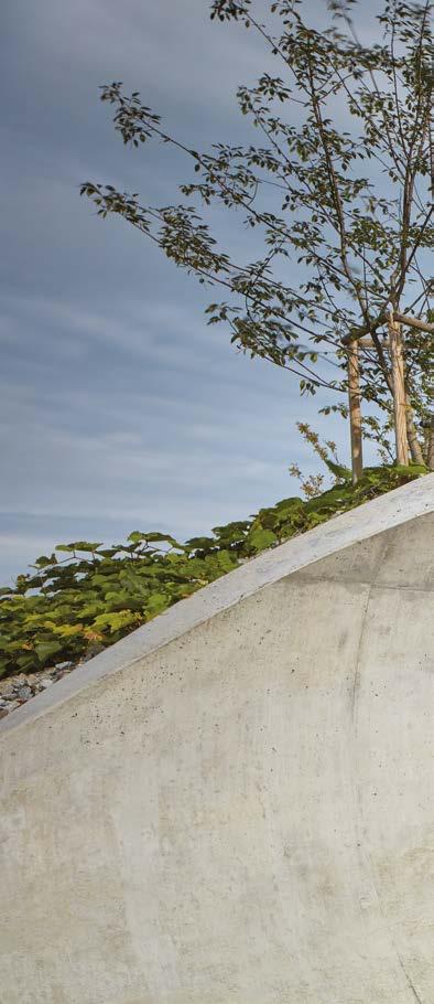
The initial ideas for the wine house considered the most operationally efficient location, literally in the centre of the vineyards. This is both purposeful and poetic, as it steps back from the village and offers soothing and enchanting views. To do so, the building’s location in the open countryside naturally brought with it high demands for architectural and landscape integration. The landscape context is addressed in the form of a gentle curve - a wave in the landscape, a hill between hills. Great care has been taken to incorporate the building into the terrain and its connection to the cultural and natural greenery. The roof of the curve is designed as an extensive green, and the surrounding area of the building has been planted with 150 shrubs and mature trees, often growing through the “perforated” roof. The overall impact and benefit of the new greenery on both the landscape and the building will only become apparent as the years go by.


Organic Architecture
The building itself is built in reinforced concrete, two storeys high. The underground part is used for producing, storing, and archiving wine. The ground floor is used for tasting, seating, and sales. Two apartments are available for occasional overnight stays.
The building’s in-ground setting is traditional for the winery, and its concept is utterly contemporary and timeless. The
57
VERTICAL SECTION

atmosphere of the setting is based on an experience of beauty, refinement, and absolute comfort. The use of materials such as exposed concrete, glass, metal, oak and acacia wood is clean and direct and supports the organic form of the building. At the same time, the utmost attention is paid to precision craftsmanship and detail.

The direct contact with the landscape, enabled by large expanses of glazing, generous terraces, and a pitched roof, brings a variety of natural moods and seasons to the experience of the space. Embedding the building in the terrain creates a feeling of a welcoming background and a natural blending with the place from which the wine comes. The view and airiness can be enjoyed from the terraces and the artificial hill of the green roof, where one can enjoy the fabulous scenery of the horizons of Kurdějov, the Pálava looming in the distance and the plains stretching towards

58
BASED FLOOR PLAIN

59
Austria. The spaces of the wine house are changeable and conducive to social, and romantic moments as well as quiet contemplation over a glass of wine. We believe that the Gurdau Winery concept will make a significant contribution to the rapidly growing and increasing wine and wine-tourist culture in the Czech Republic, and will support the growth of a new charming tradition of cultivated encounters and connections between man, wine and landscape.

Sustainability
The building is designed with the utmost respect for the surrounding landscape. It is completely covered by a curved extensive green roof so that it is almost invisible in distant views once the vegetation has grown. The surroundings of the building are supplemented with a number of new shrubs and mature trees in order to also create an optimal microclimate in the future. The location of the building right in the vineyard minimizes


61
the transport of raw materials and workers within the winery. The production areas are located under the terrain, while the customer areas are open to the sun through a glass façade, thus making use of passive energy.
To prevent overheating in the hottest summer months, thermally insulating triple glazing is designed in combination with wooden oak slats in front of the windows, a sufficient overhang of the curved roof, and shading of the pergola in front of the façade with tarpaulins. An air-to-water heat pump is used for heating. Rainwater is collected in a storage tank and used for irrigation of the vineyard.(from the architects’s report). H
PROJECT TEAM
PROJECT LOCATION: KURDĚJOV 300, 693 01 KURDĚJOV
PROJECT COUNTRY: CZECH
REPUBLIC COMPLETION YEAR2022
BUILT-UP AREA: 1260 M²
GROSS FLOOR AREA: 1141 M²
USABLE FLOOR AREA: 997 M²
COLLABORATOR
STATICS: OK ATELIÉR
MEP: PROJEKCE TZB PROKEŠ
ELECTRICAL INSTALLATIONS AND
SECURITY SYSTEM:
CATEGORY
LANDSCAPING: ZDENĚK SENDLER
FURNITURE DESIGN, INTERIOR
DETAILS : DANIELA HRADILOVÁ
GENERAL CONTRACTOR: NAVLÁČIL
STAVEBNÍ FIRMA
STEEL CONSTRUCTIONS: OMELKA
NEJEZ STAVEBNĚ ZÁMEČNICKÉ
PRÁCE
ATELIÉR ORIGINÁL HOŘÁNEK
JOINERY: DŘEVOSTYL [LIBOR ZEMAN]
BÍLEK&BÍLEK TRUHLÁŘSTVÍ
WOODEN FLOORS AND TERRACES:
BELEVEY [LADISLAV SEDLÁČEK]

62


64

65
SKY UNDER THE TREES
MJÖLK ARCHITEKTI
Render by Mjölk architekti
THE PAVILION OF THE CZECH REPUBLIC AT THE UNIVERSAL WORLD EXPO 2025 IN OSAKA, DESIGNED BY MJÖLK ARCHITEKTI, REPRESENTS THE CZECH REPUBLIC AS A PLACE THAT PEOPLE HAVE TAKEN CARE OF FOR MORE THAN A THOUSAND YEARS

CZECH REPUBLIC
66
MJÖLK ARCHITEKTI

In 2008 we finished our studies at the Faculty of Art and Architecture in Liberec and founded our own studio, which we named after the most beautiful word in the Swedish dictionary. We are Mjölk. The aim of our work is to explore contexts, to discover the qualities of places, to fulfil our clients’ deepest desires, and to have fun while doing it. We want this joy of freedom and creativity to be present not only in our projects, but also in the lives of our customers. Maximum effort pays off. When we had scored our first goals in an international competition, back in 2010, and proved ourselves among hundreds of other architects from all over the world, we discovered the struggle is worth it. Since then, our projects have taken us to many different corners of this world and we still believe it is worth to do things at full steam. Pictures are worthless. We need to create buildings, we have dreamt up with clients. That is why every project we touch matters to us. People we collaborate with are our indispensable component. They are an inner engine of the studio, that can’t be taken out. We strive to create a trust within them. A trust towards the work we do and a freedom that is essential to the creative work.

67
As a garden in the middle of Europe, which provides people with a place to exercise their immeasurable talent and creativity. Its inhabitants are able to find ways to protect their precious heritage not only for themselves, but also for future generations. The pavilion likens the Czech Republic to a shared landscape made up of millions of cultivated gardens with a single sky above. It shows the history, the present, and the environmental vision of the Czech Republic as a place of human creativity and care for the common space. The concept of the pavilion is based on the idea of a garden in the clouds. The architecture, internal layout and dramaturgical concept allow visitors to physically and spiritually interact with the central idea of the exhibition. We want to show a relationship with the land, a love of nature as well as contemporary talents to be proud of and skills in which we excel. There are many great studios in our country that are creating challenging and globally successful computer games. We also have a first-rate ability to predict the weather. These values are linked by the central work of a large-scale procedural projection placed under the garden ceiling, on which a believable impression of a blue sky is created with a program, as clouds change seamlessly and encourage the viewer to imagine. The work is a collaboration between artists, pro -


68

grammers and meteorologists.
The exhibition combines historical materials and instruments representing a quest to understand natural phenomena with technological and environmental visions on the theme of landscape care and sustainability. Visitors thus see side-by-side measuring instruments from Prague’s Klementinum dating back to the mid-18th century and a recent discovery by Brno scientists in the field of bioluminescent technology, which enables plants to produce light. Participants engage in the story through interactive elements, educational and gaming technologies. The purpose of the exhibition is also to present Czech art in a broader context and therefore also includes works by Czech designers, glassmakers, architects or even sound installations and musical compositions.
Architectural design
The pavilion represents a cloud, hovering over the heads of visitors, who are drawn into the heights of the garden. On the

way up, they are accompanied by a stream fed by rainfall, of which there is no shortage in Osaka. The pavilion’s interior engulfs visitors, allowing a view of the sky created by the projection. The ground floor is a public space with a covered atrium. Two staircases connect the entrance area with the second floor. Individual unique 3D-printed steps form a micro landscape right in the middle of the building, a touch of nature in an orthogonal system of wooden columns and panels. The second floor is dedicated to Czech cuisine, the way the interior is arranged encourages interpersonal contact. Above the gastro corner is a multifunctional auditorium that is actively integrated into the curated dramaturgy of the pavilion, a multimedia stop on the way up.
On the last level of the building, two worlds - the sky and the garden - interpenetrate. The sky under the garden roof is both an exhibition space and a venue for private events. In the delicate web of the load-bearing structure, artistic artefacts intermingle with functional objects. The indoor exhibition has
70


72
direct access to the garden terraces. The garden, too, is an exhibition space, a territory for children’s play and a place where visitors can relax and also contemplate under the trees the direction our fragile world is heading.
The landscape design of the pavilion is a reminiscence of the mosaic structure of the Czech landscape. The roof landscape of the pavilion is varied, with different heights showing the diversity of surfaces, the structure of stems, trunks and branches, the texture of leaves and the changing colours during the seasons. On the roof, a small brook springs up and weaves its way through the pavilion, ending in a pool in the parterre. The surface mirrors the clouds, the visitors and the entire exhibition, reinforcing the idea of tying people’s lives to the weather, the cycle of the year and life.
The central motif of the garden is also transferred into the form of contemporary floral illustrations. The abstracted flowers of marigolds, sunflowers, morning glories, poppies, four-leaf clovers and brooklily leaves are depicted with a delicate stroke of a line, loosely referring to the technique of Japanese calligraphy and the delicate illustrations in Karel Čapek’s The Gardener’s Year.
The principle of the design is a building that is not just a box for exhibition pieces. The building is meant to represent the Czech Republic as a work of art, therefore the design reflects contemporary building technologies and traditional Czech know-how. This philosophy is also reflected in the interiors, which are furnished with high-quality Czech products and the leftover material from the CLT panels.

Environmentally friendly operation and transport
The pavilion is designed as a prefabricated wooden building made of glued timber and wooden panels laid in a square grid. Emphasis is placed on premium appearance, optimum thicknesses, high load-bearing capacities and precise joints. The building envelope consists of CLT panels in combination with double glazing. The gallery space under the garden is clad with laminated glass slats. The walking surface in the parterre is a brushed concrete slab with recycled material from construction debris. Natural light is provided by the glazed parts of the façade and the open atrium. The primary energy source for hot water heating is waste heat from the building cooling and grey water effluent. The green roof serves to improve the microclimate, natural cooling and rainwater harvesting. The water is filtered through the root system of the green roof and further used, among other things, for fine mist sprinkling and central irrigation of the roof garden. The entire building is designed in a passive standard, with a consideration of its possible future dismantling and relocation. The logistics of construction were also taken into account in the design. The panels, beams and additional structures are designed for easy container transport, assembly and disassembly.
Materials
The building is designed with a combination of CLT panels and BSH (glued laminated timber) beams, which clearly defines its materiality.

The timber structure is complemented by 3D-printed concrete staircases and a subtle steel roof superstructure, which is covered by a ventilated float glass façade system under the livingroof. These materials permeate the entire design. We are not trying to hide them, we are revealing them in their natural beauty (from the project report). H

73
NEW MEGAYACHT REWRITES ELEGANCE
THE ITALIAN SEA GROUP / GIORGIO ARMANI

74
ON THE SEA
THE ITALIAN SEA GROUP AND GIORGIO ARMANI UNVEILED
THE 72-METER ADMIRAL MEGAYACHT AT AN EXCLUSIVE
PRIVATE EVENT AT THE MARINA DI CARRARA HEADQUARTER

75


76
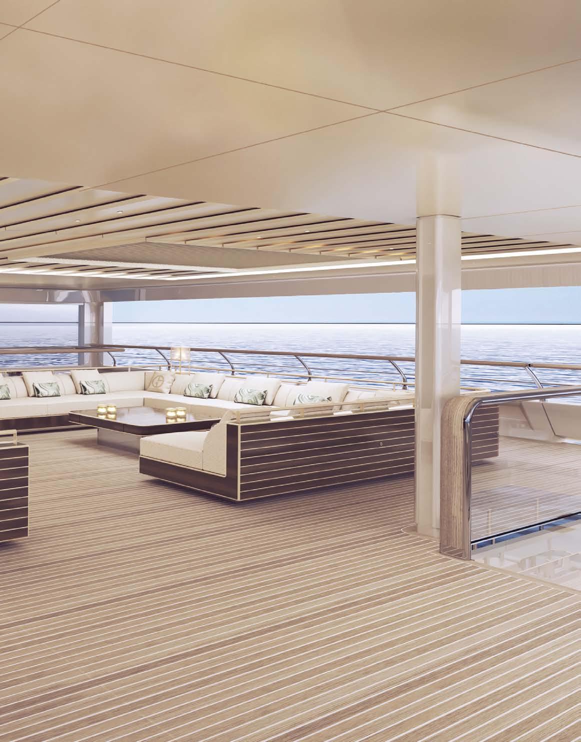
The project, launched in 2020 and developed by Giorgio Armani and his team in collaboration with the Admiral Style Centre, interprets and blends the DNA of the two brands to create a one-of-akind, avant-garde megayacht, the result of an encounter between the most exquisite aspects of the nautical and fashion worlds. This yacht is the first of two designed entirely by Giorgio Armani, whose unmistakable

style is immediately recognisable in both the exterior lines and the refined interiors. Timeless minimalism, which has always been part of the designer’s creative philosophy, redefines the very essence of the high-end megayacht concept in a radical yet elegant way, basing itself on the principles of simplicity and sophistication. The design of the exterior, featuring a clear architectural influence, is both meticulous and captivating: large, sharp, geometric
volumes are perfectly balanced with curvier, softer shapes, for an ensemble that is majestic yet dynamic. Thanks to the large, full-height glazed openings, the effect inside is one of being seamlessly immersed in light and the surrounding environment, which can be adjusted thanks to a clever positioning of sliding panels. The Armani/Casa interiors amplify Giorgio Armani’s aesthetic philosophy, offering discreet, refined luxury and subdued
77

78
79
tones. The décor is bold yet relaxed; the overall harmony is provided by a combination of elements that are skilfully combined into a space that is unquestionably exclusive and one of its kind. The apparent minimalism finds its counterpoint in the use of exquisite, refined materials, fine hand-crafted finishes, and a masterful mix of soft or vibrant colours.
“This megayacht, the result of an exciting partnership of which I am extremely proud, is further confirmation of our way of being able to realize unique projects with Made in Italy brands of excellence that share our values”, comments Giovanni Costantino, Founder & CEO of The Italian Sea Group. “Giorgio Armani is synonymous with timeless elegance and sophistication, and his stylistic vision has also increased our stylistic sensitivity. This new yacht is projected to be positioned as a stylistic benchmark, also given the countless comments and regards we’ve received from various industry players. This therefore confirms our business model, which aims to customise every detail in order to make each of our works absolutely unique, in line with the vision and desire of each owner”.
“The sea and design are two of my greatest passions. With this new collaboration, I have extended my idea of furnishing and decor to the nautical world, in which – just as in fashion – aesthetics and functionality come together in a natural and elegant style. This highly stimulating project has allowed me to create customised spaces with Armani/Casa – like made-to-measure clothing – with the same craftsmanship applied to the choice of materials, details and production”, says Giorgio Armani, Chairman and CEO of the Armani Group. H


80


81


DESIGNER ROBERTO LAZZERONI COUP DE FOUDRE Love at first sight between blown glass and metal. A light cascade suited for a vertical or horizontal development, according to the needs. www.patriziagarganti.com designer ROBERTO LAZZERONI NOVECENTO
HOUSES TO LIVE
83
 HERE : The villa with the spectacular swimming pool is located surrounded by nature.
A TRIBUTE TO BEAUTY
ALVISI KIRIMOTO
AMID THE CASTLES, VILLAGES AND VINEYARDS OF NORTHERN ITALY, ALVISI KIRIMOTO COMPLETES THE RESTORATION AND EXTENSION OF VILLA K - A REFUGE NESTLED IN A HILLY AREA OF TWO HECTARES, WHICH CELEBRATES THE LANDSCAPE AND MERGES WITH ITS SINUOUS LINES

ITALY 85
Photography by Marco Cappelletti - Drone Aerial Photography by Mattia Caprara and Flavio Pescatori
The complex is spread over an area of 910 square meters and consists of two existing volumes with the typical characteristics of rural architecture, and a small additional body, alternating with a series of outdoor spaces.

The project starts with the landscape to define the new entrance and the privileged views in the arrangement of the new elements. Among these, are the wood addition, which expands the living area and seems to dissolve among the vineyards; the terraces for the vegetable gardens and green areas dedicated to sport; and the large infinity pool with its breathtaking views over the entire valley, accompanied by an elegant wooden deck that houses the solarium area. The complex is spread over an area of 910 square meters and consists of two existing volumes with the typical characteristics of rural architecture, and a small additional body, alternating with a series of outdoor spaces. The project starts with the landscape to define the new entrance and the privileged views in the arrangement of the new elements. Among these, are the wood addition, which expands the living area and seems to dissolve among the vineyards; the terraces for the vegetable gardens and green areas dedicated to sport; and the large infinity pool with its breathtaking views over the entire valley, accompanied by an elegant
wooden deck that houses the solarium area. The large trees are preserved to shade the areas paved with local stone that extend between the two buildings. From the access gate, the gravel road and the Luserna stone cobbled walkway lead towards the main volume and the rooms with their independent entrances. The more functional service areas such as the underground parking, are hidden from view and are incorporated into the basement. The heart of the project is the wooden extension that extends the living area of the main building. Transparent and light, the volume formally asserts itself and at the same time respectfully dialogues with the pre-existence, merging in the distance with the surrounding landscape. The use of natural materials such as oak plank flooring, the light colour of the walls and ceiling, and the large windows, render the interiors bright and minimal. The structure, isolated and covered with cedar wood slats, has a regular pace that increases near the outside, until it becomes a pergola. Overlooking the garden and the panoramic swimming pool, the porch houses a BBQ area and pizza oven, and is equipped with a large teak table to enjoy the summer days. The outdoor is therefore totally renovated, with a dynamic and articulated spatiality, made up of many facets,so that the villa always appears different depending on
 HERE : Every place in the house lives in close connection with nature.


88
HERE : Living room in Building
A. Three-seater sofa Yak, by DePadova; Fratello low table, designed by Enzo Mari for Driade; Armchairs E015 Embrace, by Carl Hansen & Søn.

89
the view point. A clear geometric layout fills the original volumes and favors an outward-facing distribution scheme: “The natural element greatly inspired the genesis of the project: the idea was to compose a single permeable space between inside and out, so that the structure emerged from the hills like a hidden pearl, and the bursting energy of the landscape could be appreciated from every corner of the house “. explain the architects Massimo Alvisi and Junko Kirimoto. The structural pace, the rhythm of the openings and the wall consistency of the ancient rural houses have been preserved from the ancient complex, alongside the additions in natural materials, which create continuity between inside and outside. The generous glazed surfaces amplify the sense of openness, while maintaining the privacy of domestic environments. The extension to the basement of the main building revolves around a new green patio, favoring the natural lighting of the overlooking rooms. Clad in local stone bricks, with gravel flooring and stone walkways, it forms a more intimate open space, at the service of the new environments. The main building is spread over three levels. The ground floor houses the kitchen, the dining area and a large living room, leaning outwards thanks to the added wooden volume. To mark the rooms, separating the dining area from the living room, is a double-sided gas fireplace hung from the ceiling, entirely made of iron. The first floor houses the master bedroom, with the walk-in closet and the bathroom in close connection with the outside thanks to


90
the original entry system. In the basement, in addition to the services, the wine cellar, which houses the private collection of the owners of over 3,000 bottles, are two suites, which can be accessed from the outside or from the ground floor through the new iron and stone staircase that connects the various levels of the farmhouse. The first suite is characterized by the ceiling with the original red brick vaults and a large closed arch in iron and glass, which separates the sleeping area from the private sitting room. Overlooking the patio, it has independent access from the outside. The other suite, with more contemporary lines, is configured as a large loft with a sleeping area and a private bathroom, in visual continuity with the sitting room. Access is from the outside, through the small local grey stone cobbled path that leads to the swimming pool and the garden area. The project consists of another smaller building spread over two floors, which includes three other suites - two upstairs bedrooms and a small loft downstairs, each with independent access from the outside. Reinterpreting the territory in a contemporary way, the interiors are warm and welcoming, elegant and minimal. The abundant use of natural materials alternates with the heterogeneous mix of custom-made furnishings, Nordic designer furniture and numerous artworks. A grey micro-cement finish was used for the floor of the lower levels; the ground floor features a local grey stone; while the upper floor and the wooden volume are lined with natural oak parquet. On the lower floors and on the


91
LEFT : Kitchen designed by Alvisi Kirimoto. Finishing of the kitchen island in natural oak with insert in local Luserna stone, columns covered in white lacquered wood.
ABOVE : The wine cellar in the basement houses the owners’ private collection of over 3,000 bottles.

92
HERE : Suite in the basement of Building A, characterized by the ceiling with the original red brick vaults and a large closed arch in iron and glass. Ile Bed, designed by Piero Lissoni for Living Divani; Tolomeo tilting table lamp, designed by De Lucchi and Fassina for Artemide; Tolomeo Mega floor lamp, designed by De Lucchi and Fassina for Artemide; Yak armchairs by DePadova; coffee table designed by Alvisi Kirimoto.

93
ground floor of the main building, white walls and brick ceilings reign, while on the first floor white walls and ceilings autograph the main building, and ceilings with exposed wooden beams painted white distinguish the smaller one. Far from the hustle and bustle of the city, Alvisi Kirimoto creates a farmhouse enhancing the most authentic dimension of living. An oasis of relaxation combining rural charm and contemporary elegance (form the architcts’s report). H


94
ABOVE : Aerial view. UNDER : Pergola and view over the valley. Right: the infinity pool is accompanied by a wooden deck that houses the solarium area.
AK Alvisi Kirimoto
Alvisi Kirimoto is an international practice that works in the field of architecture, urban planning and design.

Founded by Massimo Alvisi and Junko Kirimoto in 2002, the firm stands out for its sartorial approach to design, “sensitive” use of technology and control of space, starting from The Hands Work – the manipulation of “sheets of paper”. Dialogue with nature, urban regeneration and attention to social issues make its projects unique in the international architectural scene.
By merging Italian and Japanese sensibilities, the office has carried out numerous projects in and beyond Italy. These include the Medlac Pharma industrial plant in Hanoi, Vietnam (2011); the Incà complex of small and medium industries in Barletta (2010), the new Molino Casillo headquarters (2012) and the restoration of the Teatro Comunale di Corato (2012) in Puglia; the refurbishment of the Alexandrinsky Theater in St. Petersburg (2013); the Podernuovo Winery in Palazzone, Tuscany (2013); the executive offices for a private client on the 32nd floor of a skyscraper in the heart of Chicago (2018) and the reconstruction of a new Pavilion (2022) within the LUISS Guido Carli Campus in Rome; the training centers within Whittle School and Studios shopping centers in Nanjing and Shanghai in China (2019); the restoration and expansion of Villa K, a historic farmhouse in the Langhe, Piedmont (2018); and the Great Hall of the LUISS Guido Carli University in Rome (2018); the social housing complex Viale Giulini Affordable Housing in Barletta, Puglia (2020); and the renovation of Casa C, an apartment in Rome (2020). In addition to this, the firm collaborated with OMA as Executive and Local Architect at the Prada Foundation project in Milan (2015).
Alvisi Kirimoto has won international competitions and prizes, such as the 2012 AIT Award for the Teatro dell’Accademia di Belle Arti in Naples and the International Architecture Award 2021 of The Chicago Athenaeum for the Camerino Academy of Music for the Andrea Bocelli Foundation for the Museums and cultural buildings section. The Viale Giulini Affordable Housing project in Barletta, Puglia, won the Best Residential Architecture award at the BigSEE Architecture Award 2021, the In / Arch Puglia and Basilicata 2020 Award for new construction projects and a nomination for the EU Mies van der Rohe Award in 2021. The Chicago Executive Offices won Interior Design Magazine’s Best of Year Awards in 2019, the Recognizing Exemplary Design (RED) Award from the International Interior Design Association (IIDA), and the Global Design & Architecture Design Awards for the Interior Corporate Building category. Casa B + B and Casa C
recently won the Best Project 2021 award. The office participated in the International Architecture Exhibition – La Biennale di Venezia in 2012, in 2016 and in the latest edition (2018), and was called upon by Italian Pavilion curator Mario Cucinella join the scientific committee to support the research and contribute to the exhibition with the Podernuovo Winery in Palazzone, Tuscany. Created for Giovanni and Paolo Bulgari, the project was a finalist for the Gold Medal for Italian Architecture (2015) and won the Plan International award (2015), the first edition of the Tuscany Architecture Award (2017) and Special Prize at the XII edition of the Fassa Bortolo International Sustainable Architecture Award (2017). In 2019, the firm participated in the Biennale di Architettura di Pisa — Time of Water.
The office’s work has been widely published in national and international magazines. These include the Architectural Record and The Plan, which respectively feature its project for the headquarters of a private client in Chicago on the cover of the September and December 2018 issues, Abitare, AD, Casabella, Domus, ELLE Decor, INTERNI, Living, Surface, The Plan, YAPI, Il Corriere della Sera, Il Messaggero, L’Espresso, and La Repubblica.
The office is involved in various urban regeneration and restoration projects in and beyond Italy, including the redevelopment of the historic centre of Hanoi and the strategic guidelines for the Battipaglia urban plan, the feasibility study and urban regeneration of Chianciano Terme in Tuscany. Among the various works in progress we mention: a project, won following an international competition, of a kindergarten, civic center, library and park in Grottaperfetta, in the southern outskirts of Rome; the construction of a management complex in Via Laurentina in Rome; the construction of the Colosseum Service Center, the design of a stage for concerts and events in the Basilica of Maxentius and the construction of the information center of the Centocelle Park Enhancement of Roman Villas, also in the capital; the redevelopment of the entrance to the Archaeological Area of the Port of Trajan in the Archaeological Park of Ostia Antica - Fiumicino; the consolidation, recovery and extraordinary maintenance works of the Cinema Massimo, L’Aquila; the construction of the IPSIA Renzo Frau professional institute with the Andrea Bocelli Foundation in San Ginesio, Marche; a research and development center in Oderzo in the province of Treviso; the refurbishment and expansion of the Vecchia Romagna cellars in San Lazzaro di Savena, in the province of Bologna; Villa S, a villa with park in Porto Rotondo, Sardinia.
95
WITH THE COLOURS OF THE NATURE
GONÇALO BONNIZ
 Words by Laura Ragazzola
PORTUGAL
Photography by Woodtarget
96
HERE: A clean design, which adapts to the morphology of the land, helps integrate the house into Alentejo’s landscape.
IN A RURAL AREA OF PORTUGAL, A CONTEMPORARY HOUSE BLENDS INTO THE LANDSCAPE THANKS TO A CAREFUL CHOICE OF SHAPES AND MATERIALS

97

98
HERE : The large windows offer a broad view of the countryside from all the living area, which includes a dining room, a kitchen and a conversation corner.

99


100
Aperfect combination of wood and concrete, designed to integrate with the surrounding countryside, is the key feature of the FdP house, an impressive residence that stands in a dominant position on an isolated area of the Alto Alentejo, an inland region of Portugal.


“This project has been strongly inspired by its location”, explains its author, the architect Gonçalo Bonniz, who is native of the region. “The morphology of the land, the solar orientation and stunning views, all acted as guiding elements to the design.”
With the intention of adapting the house to the site with minimal disruption, Bonniz created a curved building, a sort of arc with the common areas - the living room, the kitchen and the dining room - at the centre, distributed in a transparent and open space, while the sleeping areas are located in the two wings. However, in order to further integrate the house into the landscape, a careful selection of materials and colours was needed. In fact, a chromatic integration “was a major factor in achieving the natural blending of the house into this rural landscape, which is marked by the existence of multicoloured slate, grey and brown”, explains the architect.
101
FROM BELOW, CLOCKWISE: The master bedroom; the kitchen faced by a counter-island; the spacious living room. Common element: the wood (Kebony Clear), covering walls and furniture.
The choice to match a concrete with grey pigment with a specific dark brown wood was successful to achieve the right chromatic connection. The wood (Kebony Clear, a low-maintenance and sustainably-sourced material) has become the hallmark of the house, together with the large windows, which insulate interiors from the arid climate of the Alentejo and blur the boundaries between inside and outside.

According to the manufacturer, the wooden surfaces will not require any further surface treatment or maintenance and, over time,
will acquire a beautiful silver-grey patina when exposed to the elements, allowing it to further blend with the reinforced concrete used in the building.
The same wood was also chosen for a large part of the furniture in the house, including the kitchen area, as well as for the wardrobes and mobility areas, with doors of more than 3 meters tall. These complementary features, with their sober and minimalist style, create a quiet and relaxing space in harmony with its stunning, natural, and remote location. H
ABOVE: A detail of the façade, where large windows alternate with a wooden cladding. BELOW: The large swimming pool is flanked by an equally large deck for relax and sunbathing, made of the same wood as the façade.

102
GB Gonçalo Bonniz


Born in Lisbon in 1967, he got the Architecture Degree at Universidade Lusiada, in Lisbon, Portugal. From then, develops and coordinates several projects in a multidisciplinary team, in several areas, namely in old building rehabilitation, housing, offices, tourist developments, etc. Over his professional career has the opportunity to acquire specific knowledge in several thematic areas of architecture, engineering, and construction, on which he would highlight the Touristic Real Estate. From 2015 on, he starts his own office, gonçalobonniz arquitectos and develops his architecture activity, working for private clients, doing house projects, in Lisbon and South of Portugal.
BLOW UP

103
CONCRETE AND WOOD alternate on walls, floor and ceiling.
WOODEN FAÇADE by Kenoby Clear.
BLACK FOX RANCH
CLB ARCHITECTS

SITED NEXT TO A BAND OF COTTONWOODS AND ASPENS OCCUPYING
THE FORMER RIVERBED OF THE SNAKE RIVER, BLACK FOX RANCH
CONSISTS OF A COUPLE’S PRIMARY RESIDENCE AND A BARN WITH STABLES
104
WYOMING
Photography by Matthew Millman, Kevin Scott
HERE : Surrounded by nature, this house becomes part of the landscape, picking up its colors.


105

106
The design and planning draw from the site’s history as a working cattle ranch, with 100-year-old irrigation ditches, remnants of a 19th century trapper’s cabin, corrals, and game trails (seasonally frequented by 400+ head of elk) that crisscross the 35-acre ranch. The clients’ choice of site was influenced by their appreciation of wildlife and conservation as well as their love of horses and desire to return the land to its historic roots as a working ranch with livestock and hay production. “The house is adjacent to the historic course of the Snake River, so there is a rich riparian community on site that drove our planning approach. Because of its previous history as a working ranch, parts of the land were restored to their preranch condition by replacing the topsoil and adding native seeding.” , said Eric Logan, Design Principal. The barn, corral, and pastures are situated close to the residence, ensuring that the horses are a constant visual presence. The neighborhood has access to miles of private riding trails that access the Snake River and Grand Teton National Park. “The client, who grew up riding horses, had been living in New York City for many years and missed riding. An important part of this project was about creating a place where she could return to her roots.”, told Eric Logan, Design Principal The low-slung, three-bedroom residence gradually rises from the meadow, capped by a compact second story containing the primary bedroom suite and


107
HERE : The geometric structure is also taken up in the interior to create striking cuts of light.


108
ABOVE : In the living area, the kitchen opens onto the dining room. UNDER : The living room is enhanced by a fireplace that warms the atmosphere. RIGHT : The piano nook is arranged next to the large picture window.

109

110

111
the
HERE : A large fitness area enriches
home.
HERE : The master bedroom seems projected into nature; next to it a large fireplace completes the room.
UNDER : The bathroom organized as a private spa..

an office suite with access to a rooftop deck. The long, low slope of the roof is structured with a cross-laminated timber (CLT) roof system. The deep overhang creates cover for an outdoor dining terrace that frames Teton Mountain views to the west and the Gros Ventre Range to the east. Deliberately composed exterior spaces wrap the perimeter of the building, allowing access to the panoramic views and one’s preference for sun or shade throughout the day. “We located the
buildings to gravitate towards the grove of cottonwood trees for the character and beautiful views of the understory. The barn is closest to the trees, while the house moves into the hay meadow to maximize southern exposure and capture long views of the Tetons.”, explained Eric Logan, House and barn are defined by elemental forms and materials that nod to the site’s past. The home’s L-shaped plan separates the main living spaces—living, dining, kitchen, den, and primary
bedroom—from secondary areas including guest quarters, gym, sauna, and laundry room. Living areas on the ground floor open to sheltered outdoor areas that include a fire pit, pizza oven, and a stand of Aspen trees. Throughout the long side of the “L,” views are framed of iconic Sheep Mountain. A material palette of dark-stained cedar, steel, and boardformed concrete defines the exterior of the buildings. Inside, white oak and polished concrete floors, c ustom steel and walnut millwork establish a grounded, earthy sense of warmth.ì New topsoil and native seeding were added to restore the land and the newly planted bosque of aspen trees introduce shade and establish a sense of placemaking. Ultimately, this legacy project helps the owners return to their equestrian roots and bring the historic ranch into the future. “A key goal was to restore and regenerate the land, bringing this historic ranch site into a new phase of its life.” (form the architect’s report). H

CLB DESIGN TEAM
ERIC LOGAN (PARTNER)
LEO NAEGELE (PROJECT MANAGER)
PROJECT TEAM
CLB ARCHITECTS (ARCHITECTURE)
KWC (CONTRACTOR)
KL&A (STRUCTURAL)
DESIGNWORKSHOP (LANDSCAPE ARCHITECTURE)
LUX POPULI (LIGHTING)
ENERGY-1 (MEP)
112
Architects
CLB CLB
CLB is an architecture and interior design firm based in the Rocky Mountain West, and specializing in the design of residential, commercial, and arts related projects. Since the firm’s founding in Jackson Hole, Wyoming, 30 years ago, CLB has evolved to now encompass projects across the United States. Each endeavor is guided with the firm’s philosophy – inspired by place. With offices in Jackson, Wyoming, and Bozeman, Montana, the firm has grown to a staff of 50, led by partners Eric Logan, Kevin Burke, Andy Ankeny, and Darcey Prichard. The firm’s work has recently been documented in the book, Inspired by Place, which was published by ORO Editions. www.clbarchitects.com


 GEOMETRIC CUTS create striking plays of light and shadow..
FOR THE PIANO a corner from which to enjoy the sunset.
BLOW UP
113
© Sarah Averill

114
HERE: The summer house is located 20 metres above sea level and overlooks Storebælt, the strait of water between the main islands of Denmark.
DANISH
CLIFF HOUSE
NORDIC OFFICE OF ARCHITECTURE

Words by Laura Ragazzola Photography by Jette Slagelse
GLASS, WOOD AND A ZEN-STYLE GARDEN IN A CONTEMPORARY SUMMER RESIDENCE
OVERLOOKING THE NORTH SEA
DENMARK 115
An impressive beach residence combining rough landscape, naturalistic planting, and sharp architecture is the last building adventure for Jette Egelund and Mogens Dahl, a Danish couple who have made architecture and design the center of their lives.
In fact, Jette is the owner of Vipp, a 3rd generation family-run and family-owned company, founded in 1939, whose first product, a pedal-controlled waste bin, became a worldwide hit and today is exhibited in MoMA’s permanent design collection. In 80 years, the Danish company has grown into a brand
crossing the categories of kitchens, furniture, lighting, and accessories. Recently Vipp has also created architectural venues in which Vipp products can be experienced.
It goes without saying that the passion for architecture is also key in the couple’s private life. That’s why, after successfully transforming their apartment in Copenhagen, Jette and Morgens have focused on looking for a very special place to build a new summer residence. They found it in the coastal countryside of western Zealand: a sheer cliff side, 20 meters above sea level, overlooking Storebælt, the strait of water between the main islands of
ABOVE: The elevation of the villa reveals the simple design of the structure, made of glass and wood.
RIGHT: Dining outdoor in the patio.

116

117

118
Denmark. “We immediately knew this piece of land in front of the ocean was the location we envisioned for our city-getaway”, recalls Jette.
The couple had already spent three years in the area when they commissioned architect Mads Lund from Nordic Office of Architecture the building project. At that time they had figured out a vision on how the summer residence should be designed, how it should
take into consideration the winds, the sun, and the seasons. Their involvement in the drawing process gave rise to features such as terraces, lee sides, and an orangery where to rest in the sunsets.
The house echoes a classic Danish summer house comprised of individual structures including a main house, a guest annexe, and a shed. The three elements have independent access, yet they are united under the same

ABOVE: The shower cabin made of wood.
IN THE OPPOSITE
PAGE: The entrance to the house preceded by a zen garden.
119

120
HERE: Inside, the interiors design chooses a palette including beige, grey and white.

121

122
ABOVE: The bright dining area doubles outdoor in the patio.

LEFT: The total white kitchen: all the modules and lighting fixtures as well as the indoor and outdoor furniture are from Vipp collection.
roof and through a connecting corridor creating a passage between the functions of the home.
“The architectural vision starts with the roof under which everything unfolds”, explains Mads Lund. The house is guided by a structural grid mirrored in the visible rafters transcending the inside and outside. A concrete base supports glass and wooden walls covered by a light roof construction. As if sown together, the base and roof are connected by a repetition of two slender pillars rather than one massive pillar, a solution which emphasizes the lightness of the construction.
The residence is built with streamlined Canadian cedar panels embodying a new interpretation of classic board facades. The sharply lined wooden exterior interacts with the organic, outdoor stone flooring where each
stone is encircled by grass margins. A green scheme designed by Yards studio, which harmoniously interweaves with the architecture and recalls Japanese zen gardens. The main purpose of the project was valuing the impressive view and the experience of the natural surroundings. “Characteristic for summer houses is the blend of the indoors and outdoors”, says architect Lund. This was achieved through extensive glass walls which alternate with wooden panels to allow a 180-degree seascape entering the main living space as a key feature of the décor.
Wooden surfaces are repeated indoors, as they were deemed more suited to a summer house, than whitewashed walls. Interior designer Julie Cloos Mølsgaard envisaged a simple yet sophisticated indoor environment. She selected a neutral palette of warm hues
123
of beige, grey and white, in order to ensure that no piece of décor hinders the outside view as essential in the experience of the space.
Not surprisingly, a large part of the furnishings comes from the owners’ company: kitchen, bathroom modules, lighting fixtures and indoor and outdoor furniture are from Vipp collection and provide a unique impressive style to the residence. However, by adding art pieces, heirlooms, textiles, ceramics, and flea market finds, Jette Egelund has also succeeded in ensuring the warmth and ‘hygge’ that a second residence calls for. H


124
ABOVE: The master bedroom.
RIGHT: The children’s bedroom
NONordic Office of Architecture
Mads Lund is partner and Design Director. With 500 architects and studios in Norway, Denmark and Iceland, Nordic Office of Architecture is one of the leading architectural practices in the Nordics, with clients and projects around the world. Inspired by the Nordic design tradition of simplicity, functionality and craftsmanship, the team designs resilient and beautiful spaces, buildings and cities.

The projects are informed by a deep understanding of people and a sensitive approach to nature and combine a Nordic philosophy with local insights and international perspectives. Across the diverse portfolio of large and small projects, the office mission is always to shape thriving societies.

BLOW UP

125
THE SHEER CLIFF SIDE, 20 meters above sea level.
EACH STONE is encircled by grass margins.
THE POINT KOR ARCHITECTS

WASHINGTON 126
HERE : Various water features enliven the house, recalling the lake in front of which it stands.
Photography by Benjamin Benschneider - Aaron Leitz
A FAMILY HOME UNITES
THE DEMANDS OF AN EXTENSIVE PROGRAM WITH HIERARCHY, PLASTICITY, NATURAL LIGHT, VIEWS, BLURRING OF INTERIOR/EXTERIOR SPACE AND A UNIQUE CONNECTION TO THE NATURAL LANDSCAPE

127


128
LEFT : LAbove, the staircase to the upper floor. Below, the corridor that distributes the living area. HERE : The large living area with windows overlooking the lake.
Building elements are organized into attached/detached pavilions based on program, hierarchy of structure and levels of privacy. The pavilions are dislocated around a unifying north/south glass spine/ bridge that allows for an abundance of natural light, compelling vistas through the building to the surrounding landscape, lake, and beyond. The push-pull of building elements around the organizing circulation spine generates intriguing exterior landscaped
spaces that inhabit the zones between each pavilion. A simple, cyclical palette of wood, stone, concrete, steel, and expansive window walls allow the architecture to recede and let nature take center stage. A series of water features reinforce the pavilion’s relationship to the lake. A spring box at the edge of the auto court and a spring box west of the two main pavilions feed water features which appear to flow under the buildings into a larger architectonic water feature. This water

129

130

131
HERE : The two living areas communicate with each other in the large living area. Color is given to the cushions that enliven the sofas.


132
LEFT : Above, the large dining room surrounded by large windows that connect it with the outdoors. Below, natural materials cover the interior walls. HERE : The large kitchen inside the living area.
feature then pours into a larger body of water that was developed to feel like a native pond adjacent to the lake. This pond is connected visually (and when it rains, literally) to the lake beyond. Terraces are positioned adjacent to primary living areas in order to further integrate the buildings to the site. The existing monolithic bulkhead is pierced by three new coves that restore the lakeshore back to its imagined natural beauty which in-turn allows the family to enjoy activities at the water’s edge. A hidden stone patio to the north creates
a private space to engage the lakeshore, and two outdoor rooms with fire pits were placed at some distance from the pavilions for the family to enjoy the lake at night. In order to directly connect the main living areas of the house to the adjacent lakeshore, large concrete “lily pads” were designed, which appear to float on the water feature, and provide dry passage over it between the house and the main terrace. In order to balance the environmental impact of a large pre-existing lawn, the remaining gardens utilize a palette of

133
contextually appropriate native plant materials. The end result is a seamless integration of architecture, landscape architecture, and nature. Low-E energy efficient double-pane thermally broken steel windows and doors made from 100% recycled materials with narrow sight lines allow for unobstructed views of the surrounding landscape, maximize daylighting, and provide passive ventilation. High R-value foamed-in-place insulation was utilized throughout the structure for an energy efficient envelope. Geothermal energy is captured to heat/cool the building through radiant floor heating/cooling. Ultraviolet water purification systems along with natural in-place filtering beds within the water features allow for the use of recirculated/recycled water and lake water can be utilized as auxiliary irrigation (as allowed by the local jurisdiction) to conserve fresh water (from the architects’s report). H


134

 HERE : The master bedroom in connection with the surrounding nature. Below, two pictures of the bathroom.
KOR ARCHITECTS DESIGN TEAM
MATTHEW KENT, AIA, PRINCIPAL MICHAEL CONOVER, PROJECT ARCHITECT
PROJECT TEAM
ARCHITECTURE: KOR ARCHITECTS

INTERIOR DESIGN: BARBARA LELAND INTERIOR DESIGN
CONTRACTOR: TOTH CONSTRUCTION
CIVIL ENGINEER: COTERRA ENGINEERING
STRUCTURAL ENGINEER: RSE ASSOCIATES
MECHANICAL ENGINEER: FRANKLIN ENGINEERING
GEOTECHNICAL ENGINEER: PANGEO
LANDSCAPE: OHASHI LANDSCAPE SERVICES
LIGHTING: DEPELECYN STUDIO
ACOUSTICAL ENGINEER: SPARLING
BUILDING ENVELOPE CONSULTANT: RDH BUILDING SCIENCES
PRODUCTS/BRANDS
1. BROMBAL – WINDOWS & DOORS
2. ARRIS STONE WORKS
3. ACOUSTICAL CEILING - DECOUSTICS
4. ARCHITECTURAL GLASS – GLASSWORKS INC.

5. CABINETS – INTERIOR ENVIRONMENTS
 HERE : Spectacular water features enliven the house with concrete walkways to cross them.
KA Kor Architects
Our purpose is to enrich the human experience. When a house speaks to us, we call it a home. When a job speaks to us, we call it a passion. At Kor, we pride ourselves on listening— to the materials, to the environment, to the people who will live in the homes we create. That’s why we work at the human scale, embracing collaboration and deep focus, appreciating the challenges and joys in every project. Through communication, inspiration, and sheer tenacity we imbue every home with a unique and compelling spirit. While our designs embody decades of collective expertise, we deliver something greater: spaces that speak to our clients’ most authentic selves.


Kor Architects is led by principals Matthew Kent, Brie Nakamura, and Michael Conover with projects that cover the American West; from Washington to Arizona, Montana to Southern California, even as far-flung as Slovakia. We design spaces that become the seat of life; homes that feel distinctive and authentic to our clients; architecture that arises from the singular spirit of a place.

137
SCREEN HOUSE
BUENSALIDO + ARCHITECTS
THE HOUSE IS ORGANIZED BY A CENTRAL AXIS THAT RUNS THE ENTIRE DEPTH OF THE PROPERTY, STARTING FROM THE ENTRY FOYER AND TERMINATING THRU A SERIES OF SEQUENTIAL EXPERIENCES WITH THE MAIN LIVING AREA, THE OUTDOOR DECK, AND ULTIMATELY AT THE LANDSCAPED GARDEN AND POOL

138
PHILIPPINES
Photography by Ed Simon

139
HERE : The large pillow; all around, outdoor furniture by Kettal.

140
Translated as a covered exterior walkway, this central ‘avenue’ becomes the organizational component of the plan, from which volumes jut out on both sides containing spaces of various functions. On the south side are service spaces and on the northern side are served spaces, with each volume separated and punctured by outdoor areas that afford all spaces with cross-ventilation and an abundance of natural light. A consequence of this, combined with the generous heights of each space, is a general feeling of lightness and airiness or what we locally know as ‘maaliwalas’ . This is a character that must be present in tropical architecture.


141
HERE : Spectacular stained-glass windows connect interior spaces with the outdoors. Clockwise: the dining room, meeting area and kitchen.
ON


142
THIS PAGES : The black window frame structure also becomes a graphic play repeated in the master bedroom (right).
The massing of the architecture is simply an expression of its internal functions, where private spaces are enclosed with solid planes, and the less private spaces are considered as voids, enclosed with transparent planes that function as fenestrations and opportunities for light and air. To mitigate the tropical heat, the ‘screen’ was employed as a secondary layer that also provides a sense of security and privacy.
Architecture becomes a Screen, Screen as a Transitional Strategy, and the Transitional Strategy becomes Language. The Screen, therefore, becomes a dichotomous essay between the natural and artificial, between outside and inside, between transparency and opacity, and between openness and privacy (from the project report). H
DESIGN TEAM
PROJECT : SCREEN HOUSE, METRO MANILA, PHILIPPINES
PROJECT BY :
ARCHITECTURE AND INTERIORS: BUENSALIDO + ARCHITECTS

WWW.BUENSALIDOARCHITECTS.COM
PRINCIPAL ARCHITECT – JASON BUENSALIDO
LEAD PROJECT ARCHITECT – CHOLO RAMIREZ
LANDSCAPE: BOBBY GOPIAO, RPG CORPORATION
GENERAL CONTRACTOR : EVERMOUNT CONSTRUCTION
CORPORATION
PROJECT MANAGEMENT : AVA CONSULTANCY
143


144
ON THIS PAGE : The geometric structure of the house is softened by natural materials and some unexpected works.
JBJason Buensalido


Jason Buensalido is the Principal Architect and Chief Design Ambassador of Buensalido Architects, a design firm that is committed to introduce fresh, bold, and innovative concepts to the Philippine design setting. Along with his team, he bears the torch in contemporizing Filipino architecture and the local design scene with the goal to bring the nation global, by staying true to our identity. His company veers away from the conventional and common, infuses function and innovation in all its creations, ultimately breathing new life into traditional design models and methods. It challenges and stretches the possibilities of design context in the Philippines. He is an alumnus of the University of Santo Tomas College of Architecture, as well as the Architectural Association Global School. He placed first in the Architectural Board Examination in 2005. Architect Buensalido also graduated as a Gold Medal Awardee for the Ateneo Graduate School of Business in 2014, is a Certified User Experience Practicioner by the British Computer Society, and was conferred as an ASEAN Architect in 2019. Aside from his day-to-day projects, his firm has garnered several awards in multiple national and international competitions, such as Nayong Pilipino Cultural Park (Nayong Pilipino Foundation, 2002), Cultural Center of the Philippines Masterplan (CCP and NCCA, 2005) , Millenium Schools (DepEd, 2008), Pinakamagandang Bahay Sa Balat Ng Lupa (U.P. and La Farge, 2008), and a shortlist for the Design of the Artists Center and the Performing Arts Center for the Cultural Center of the Philippines in 2010. In 2014, he wrote and published a book called‘Random Responses : A Crusade To Contemporize Philippine Architecture’, a compendium of the firm’s past, future, built, unbuilt, small, and large scale projects, which is also his and Buensalido Architects’ “love letter” for Philippine architecture, which the firm believes still holds great relevance amidst the thematic, foreign, and non-contextual architectural styles in vogue in the country today. He has also recently used this understanding of design and space into visual art and sculpture, often exploring parametric patterns and phenomena of nature. He translates these into sculptural abstract forms that communicate the same essence of these phenomena, often extracting clues, learning, and questions from them, on how humanity can attain a sustainable existence.
BLOW UP

145
ALL OUTDOOR FURNITURE is manufactured by Kettal.
WISHBONE CHAIR designed by Hans J. Wegner for Carl Hansen & Søn.

PLACES TO BE
147
URBAN HIVE MILAN
VUDAFIERI SAVERINO PARTNERS
IN A NEWLY DESIGNED HOTEL AT THE HEARTH OF BRERA DISTRICT, FLEXIBLE AND OPEN SPACES FOR LEISURE, CO-WORKING AND SOCIALISING

148
Words by Laura Ragazzola
ITALY
Photography by Paolo Valentini

149
HERE: Selected furniture makes the hotel lobby as confortable as the living room of a house: from the wooden bookcase (custommade by architects) to the velvet armchairs (Montbel); from the desk lamp (Artemide) to the chandelier (Masiero).
FROM LEFT, CLOCKWISE: The bar counter with stools by Pedrali; the reception area (Pedrali and Arflex chairs; in the background, suspended wicker armchairs by Bonacina); a reading corner furnished with armchairs by Galligaris and Seletti (in the foreground) and a floor lamp by Contardi Lighting; the corridor leading to the rooms: the carpet is designed by architects Vudafieri Saverino Partners (wall lamp by Tooy).


For those coming to Milan and willing to experience the vibes of the bohemian Brera district, Urban Hive is a choice to keep in mind. The newly opened 4-star hotel offering co-working spaces, leisure, fitness, and relaxation, is born from a complete redesign of the historic Carlyle Brera. The project by Vudafieri-Saverino Partners, an architectural firm with offices in Milan and Shanghai, has given life to an inviting, informal place full of character and colour, where elements of Milan’s past coexist with its modern dynamic spirit. As an example of a new trend in the hospitality industry, the project also aimed at creating open and flexible spaces for meeting and socialising, with closer ties to the city life and the new needs of travellers and inhabitants.

The eclectic and functional design makes Urban Hive the perfect cosmopolitan destination for international travellers: a dynamic yet intimate social hub that welcomes both guests and passers-by thanks to a range of services open to the public, including co-working spaces, meeting rooms, cultural events, business lunches, and aperitivos at the in-house Portico84 Café and Bar.
The interiors and soft decoration recall the timeless elegance of the post-war city’s maestros. Colourful sofas, light oak wood flooring, soft lights, wooden bookcases, pop art elements, create an elegant and relaxing atmosphere on the ground floor. The lobby has been


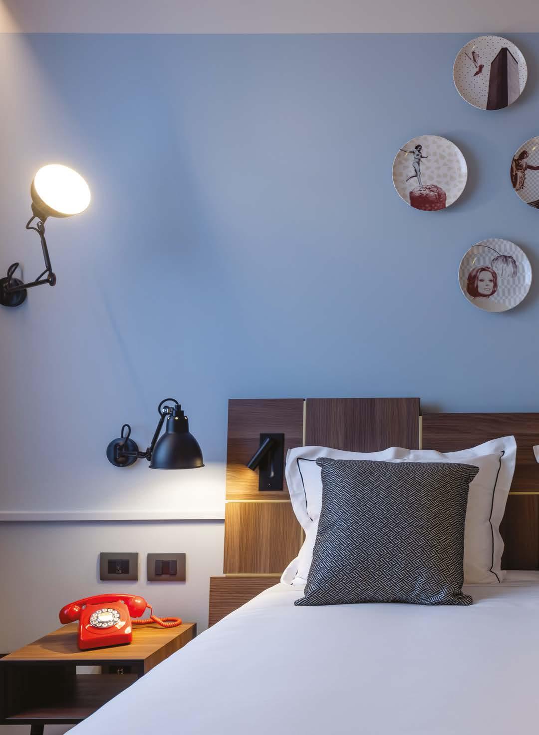
152

153
HERE: One of the bedrooms: bed and bedside tables are by Vudafieri Saverino Partners’s design; lamps by DCW, spotlights by Astro Lighting, Dedar curtain and decorative plates by 150UP.
transformed into a welcoming space where guests and locals can meet for business, a cocktail, or coffee at the bar. The 97 rooms and suites have also been redesigned combining special colour palettes and architect designed furniture to create a sophisticated ambience.


A key concept of the project is a ‘circular’ vision for communal areas, some of which
have been designed to be used differently throughout the day. For example, after 11:00 am, the breakfast room on the mezzanine floor, accessed through an oak and steel heptagonal staircase, becomes a co-working space for local start-ups, thanks to moveable walls that create three modular rooms for business meetings and conference calls. H
154
ABOVE, CLOCKWISE: One of the bathrooms of the rooms: the furniture is designed by Vudafieri Saverino Partners; two details of a bedroom.
Vudafieri-Saverino Partners
VSP
Vudafieri-Saverino Partners is a creative atelier whose work ranges from architecture and interior design to retail, hotellerie and restaurant design.


Based in Milan and Shanghai, the Studio, founded and run by architects Tiziano Vudafieri and Claudio Saverino, in its twenty-year career has developed projects in almost every country and continent, always adopting an attentive approach to face the major issues of the contemporary culture, city, landscape and society.
Every space designed - residential, commercial, industrial or mixed-useexpresses the close relationship between the values of the client and those of the context, creating a meticulous composition of form and function, sign and detail. The result is a project method that combines the identity of places with a specific “storytelling strategy”.
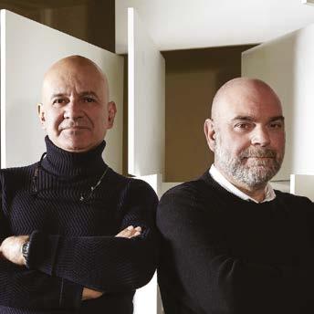 A Vertiae videm inpra perivil iquonsul curbi terceresit vitus bon sedemus tarbis
XXXXX XXXXXXX
A Vertiae videm inpra perivil iquonsul curbi terceresit vitus bon sedemus tarbis
XXXXX XXXXXXX
A Vertiae videm inpra perivil iquonsul curbi terceresit vitus bon sedemus tarbis
A Vertiae videm inpra perivil iquonsul curbi terceresit vitus bon sedemus tarbis
XXXXX XXXXXXX
A Vertiae videm inpra perivil iquonsul curbi terceresit vitus bon sedemus tarbis
XXXXX XXXXXXX
A Vertiae videm inpra perivil iquonsul curbi terceresit vitus bon sedemus tarbis
XXXXX XXXXXXX
A Vertiae videm inpra perivil iquonsul curbi terceresit vitus bon sedemus tarbis
BLOW UP
SOFT COLORS and soft materials
155
SOFT LIGHTS and soft designs
A SPECTACULAR PROJECT ENLIVENS
MIAMI’S ROOFTOPS THAT INCLUDES A SPA AND POOL FROM WHICH THERE ARE UNIQUE VIEWS

156
OVER THE TOP
MASSIMO IOSA GHINI

157
MIAMI
Courtesy Iosa Ghini Associati

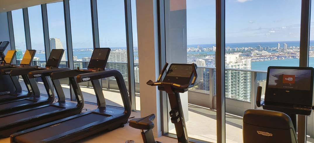
158
In 2020 Iconic Italian architect Massimo Iosa Ghini has completed the interiors of Brickell Flatiron, a 64-story luxury condominium tower developed by real estate veteran and longtime friend Ugo Colombo of CMC Group. It is a significant addition to the architect’s rich portfolio of work, which includes recent and renowned projects such as the Marconi Express, or People Mover—a futuristic transport system in Bologna, Italy, high-end Ferrari stores on both continents and in the U.S., and the eco-conscious Starhotels, also in Bologna, Italy. The towering glass-and-steel Brickell Flatiron soars 736 feet over Downtown Miami’s Brickell neighborhood, offering panoramic views of Biscayne Bay and the city skyline.

In the lavish amenity spaces, Iosa Ghini created sophisticated environments that spare no comfort. On the 64th floor,
he redefined luxury living with the Sky Pool, a 6,400-squarefoot state-of-the-art fitness center, and the Sky Spa. The spa, which features a hydrotherapy circuit with steam, sauna, relaxation, and treatment rooms, offers residents an oasis of tranquility with its lavish marble and wood-laden design. Visitors to the Sky Pool will enjoy 360-degree views of Miami and Biscayne Bay from ultra-comfortable yet stylish daybeds, inviting lounge areas, and a refreshing juice bar. Meanwhile, the fitness center showcases an architectural feat—gorgeous, angled wooden pillar-like forms break up the space and create entrancing, sculptural points of interest that recall the building’s exterior. Full-height windows overlooking the city and Biscayne Bay serve as motivation for gym-goers, which also includes a dedicated studio for spin, pilates, and yoga classes. H
159
MASSIMO IOSA GHINI

Considered as one of the most prominent Italian architects and designers in the international world of design, MASSIMO IOSA GHINI (Bologna, 1959) contributed in the 1980s to the innovative action carried out by design avant-gardes, by establishing the cultural movement Bolidism and by taking part in Ettore Sottsass’ Memphis group. In 1990 he opened the Iosa Ghini Associati firm, which now operates in Milan, Bologna, Moscow and Miami, developing projects for large international groups and developers and dealing with the design of residential, commercial and museum architectural spaces, areas and facilities for public transportation, as well as with retail projects for international groups.

Among his main interior design and architectural projects there are the worldwide development of the chains of Ferrari Stores and Kiko Stores, Casa Museo Giorgio Morandi in Bologna, the underground station in Hannover, and airports, the new IBM Client Center in Rome, the electric transport line People Mover in Bologna, the Brickell Flatiron residential building in Miami, and Starhotels E.C.HO. Bologna.

160

THE ALPS MEET ASIA

NOA*
Words by Barbara Jahn-Rösel – Translation by Amy Kadison
162
ITALY
Photography by Alex Filz
ARCHITECTURE THAT SPANS THE HISTORY OF MULTIPLE GENERATIONS HAS ALWAYS HAD A CERTAIN ALLURE TO IT.
LIKE THAT OF THE HISTORIC ‘MOARHOF’, TODAY KNOWN AS HOTEL SILENA.
LOCATED AT THE FAR END OF VALLER TAL, THE HOTEL HAS RECENTLY MARKED A NEW CHAPTER IN ITS HISTORY THAT BEARS THE SIGNATURE OF NOA*

163
In 2017 the family that owns Hotel Silena decided to make a striking architectural change based on a bold and unusual decision. The 2022 transformation is the second the house has undergone, and completes a concept that began five years ago, also carried out by noa* studio. The structure has been enriched with a new entrance, six new suites, and an adults’ wellness area, thus bringing the original concept to fruition. It was during a long trip through Asia that the owners developed a passion for the customs and rituals observed along their journey, and which they chose to integrate as central elements of the hotel design and concept. It was therefore obvious to integrate classic elements and ambiances associated with the Asian world even more so than in the initial intervention. The entire concept of the interior draws on this imagery, both in terms of material and colour composition. This already begins in the newly designed entrance, where guests pass through a round wooden portal crafted according to an Asian technique that captures the purity of traditional woodworking. The piece is simply constructed of horizontal and vertical trusses, interlocked to one another at the joints. To place further importance on the welcome, the walls of the entryway have been painted black using a rough trowel


164
technique with mineral finish: thus transforming the entrance into a sort of tunnel and intensifying the passage that punctuates the beginning of the holiday.
A PASSAGEWAY TO ASIA
Particular emphasis has been placed on the moment of arrival: visitors are welcomed into an open space, and the eye is free to meander along the axis that stretches from the northern entrance toward the indoor garden to the south. This relaxing atmosphere invites guests to take a moment to rest and have a drink upon arrival. The stone fountain, newly designed fireplace area, and cosy seating alcoves damper the rigidity of a classic checkin. This intention is emphasized by the placement of the reception desk to the side. Echoes of Asia are subtle yet omnipresent and reveal themselves in the form of dark wood paired with shades of blue and grey, delicate pine bonsai trees in ceramic pottery, vertical boulders of local stone, and discrete lantern-shaped lights. An entire wall is dedicated to Tibetan prayer wheels: wooden cylinders that with the touch of a passer-by’s hand are set into a perpetual spin. Crisp lines create a harmonious atmosphere and give a resounding

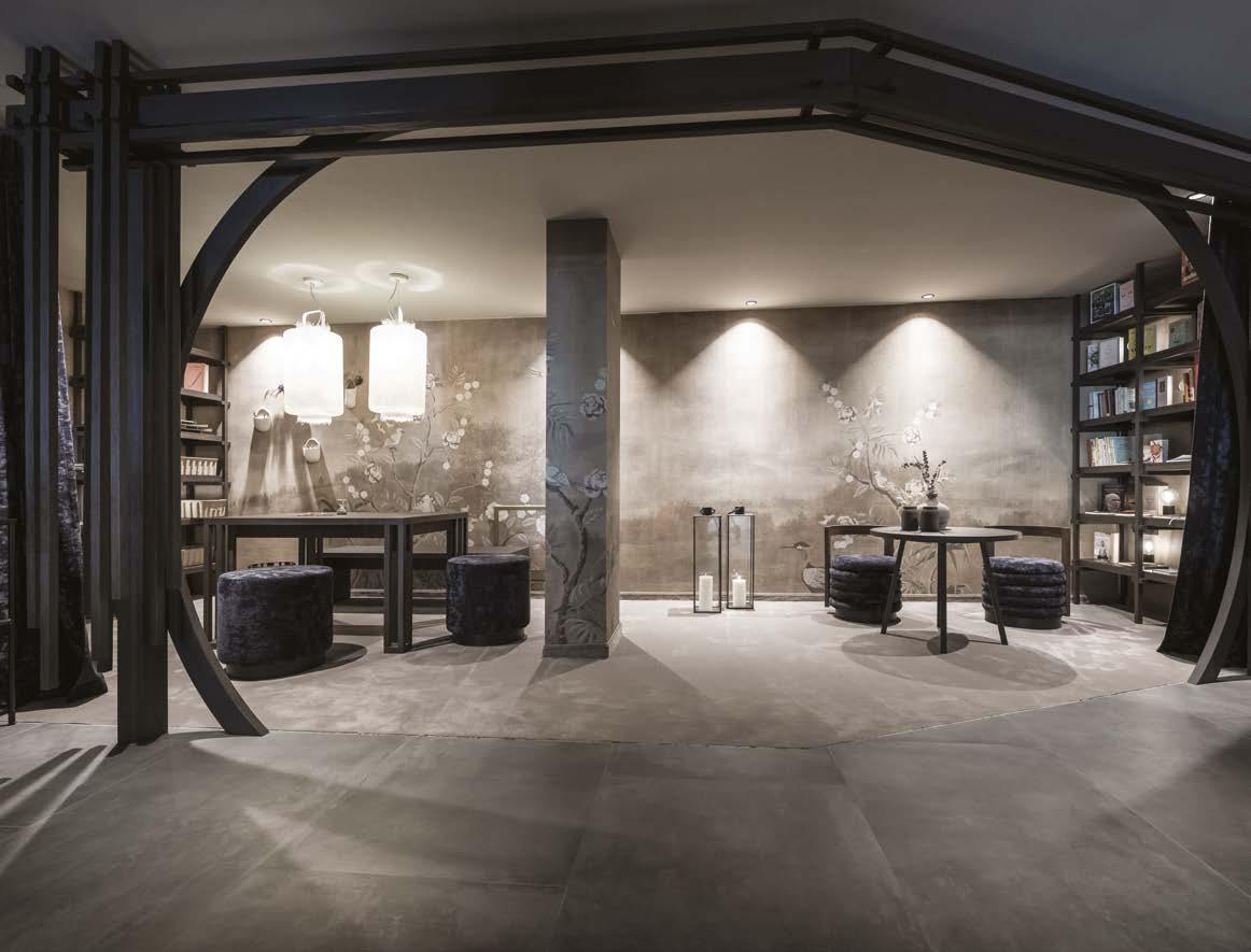
165
calmness and depth to everything. Like an annex to this scenery lies the classic Tyrolean stube — the very heart of the original Moarhof — its history, rustic style, and original wood are further highlighted by its direct proximity to the new bar area featuring minimalist tea ceremony platforms.


“The stube and tearoom are separated from one another by a mere thin door frame: they seem to make the transition between origins and future of Silena visible.” - Christian Rottensteiner, Project Lead Architect.
ONE WITH THE LAND
Dark oak acts as a reference material and fil rouge throughout the building. The surrounding bog landscape that gave the original farmhouse its name (Moar means “marsh” in local dialect) permeates throughout the building and is echoed in its colours and materials. All custom furniture was made using oak, and it is oak that is used for the floors of the hotel’s six new suites. Despite belonging to three distinct categories with dimensions and furnishings that subtly vary between them, all the suites are bound together by a unifying room design and concept. A pow-
166
erful sense of connection to the ground is present in every room, with individual areas delimited by the podiums they each sit on, such as the bed, the meditation corner, and the ceremonial tea table, which can be lowered into the floor and out of sight. This arrangement draws on the Japanese tradition of creating small, well-defined spaces. The Asian room theme continues out onto the individual terraces, conceived as outdoor rooms: each suite features a small outdoor garden equipped with a bathtub, small flower beds, and curtains, evoking symbolic elements of the culture’s rich origins.
“Everything is connected to that which touches the ground: the bed, the tea ceremony platform, the meditation corner — there is always a podium situation that shifts the centre of gravity downward when standing inside the room. So you remain firmly rooted to the ground.” -
Christian Rottensteiner
SHIFTING BOUNDARIES
The 30 to 55 square meter suites are characterized by an alluring interplay of light and shadow, of visibility and intimacy. The geometrically patterned wooden room partitions


167


168
contribute significantly to this, perpetuating the lively play of light that enters through the patterned aluminium panels of the façade. The separation between the sleeping area and bathroom is intriguing and even illusory at times: inspired by Japanese rice paper walls, noa* created a partition composed partly of opaque glass panels, partly semi-transparent glass, and in some places of open panels, to maintain a relationship between the two spaces and evoke flow in the ambiance. Two ceramic, tulip-silhouetted sinks are reflected in the vanity’s glass countertop and underlaid wallpaper. While the vanity is located away from the window in the bathroom, the shower is positioned right up against the window, favouring a direct relationship with the open air. The building’s façade ensures privacy, transforming the terraces into a semi-private space. Guests experience a pleasant feeling of seclusion and at the same time a magical view of the surrounding landscape.
CEREMONIAL WELLNESS
In the new wellness area on the top floor, noa* has designed a retreat and wellness zone reserved for adults and inspired by Japanese
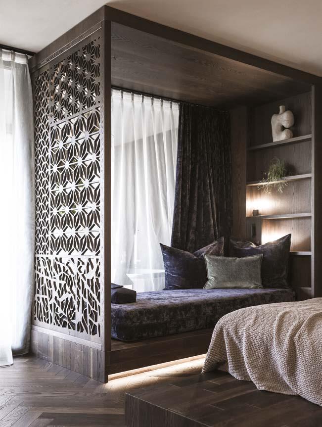


Onsen springs. Here there is a relax area, showers for traditional purification rituals, and an open-air pool maintained at a constant 40 degrees. The pool’s design, with exposed black concrete steps reminiscent of volcanic stone, creates a striking textured mise-enscène. The water that flows over the infinity edge and ripples across the rough concrete surface creates unforeseen reflections and becomes part of the ubiquitous meditative ceremony at Silena. How far can one go with -
out breaking old traditions while simultaneously introducing new impetus to an unfolding story? With this project, noa* has answered this question in an unconventional manner. Forms were taken up, materiality continued, the new juxtaposed with the existing. In a traditionally alpine place, where the mystical and the enchanting invite contemplation: it is here where architecture tells the story of two distant cultures that harmoniously intercept and complete one another. H
169


BRANDS TO KNOW
171
FURNITURE IN FREEDOM
 By Manila Jo
SEVERAL NOVELTIES WERE PRESENTED AT THE LAST SALONE DEL MOBILE IN MILAN. TO LIVE YOUR HOME IN EXTREME FREEDOM


STILNOVO
The shape of this collection of lamps recalls and pays homage to the old candle holders with Bugia is a table or wall lamp in the single or double light versions, as simple as it is ingenious. handles, commonly called “bugia” . Design by Roberto Beretta, Antonio Macchi Cassia for Stilnovo.
CONNUBIA
The Reef armchair, designed by Michele Menescardi for Connubia: every material used, from the upholstery, to the internal structure, to the packaging, was selected from an eco-sustainable and circular perspective. It won the IF Design Awards 2023.
ZANOTTA
Sciangai - the iconic folding coat stand design by De Pas, D’Urbino and Lomazzi in 1973, celebrates its 50th anniversary. Zanotta celebrates this milestone anniversary with Paolo Lomazzi by creating a special unlimited numbered edition: Sciangai 50, an explosion of bright and joyful colours.


VALENTINI
Stone is a sofa by Valentini characterized by informal lines and dynamic shapes. Individual modules and repositionable backrests combine to accommodate the space, while tailored details, such as the double stitching that runs through the seat, embellish it.
172
PRODUCT
FIAM
Echo, designed by Marcel Wanders Studio for Fiam, is an elegant display cabinet with a painted aluminum frame, available in metallic champagne and volcano gray finishes, and LED lighting system integrated into the front uprights of the structure.
POLTRONA FRAU
Acqua di Parma, together with Poltrona Frau, presents the first Smart Hom e Diffuser, Smell, for environments that combine design and home-automation technology in an entirely innovative way. The cover in Pelle Frau®, delicately created by hand with tailored sewing and details, expresses the noble workmanship of Poltrona Frau. Designed by GamFratesi.

DRIADE
Kalmo is a simple, minimalist chair with essential lines. Designed by Karim Rashid for Driade, it is composed of 3 elements that come together to form a piece of furniture for everyday use, Kalmo is an object with a domestic flavour that conveys a sense of calm and serenity to the environment.
MIDJ
A set consisting of three wall mirrors with bronzed, silvered and smoked back frames. The three mirrors, of different sizes from each other, can be oriented as desired; design Roberto Paoli for Midj.

FOSCARINI


From work with Ludovica+Roberto Palomba comes Hoba by Foscarini, a family of blown glass lamps that translates the perfect imperfection of a handcrafted object into a mass-produced lamp.
VENINI
A capsule collection, Magenta by Venini, interprets the symbolic color of 2023 by using it to dress some of the brand’s icons: Fazzoletto, Balloton, Deco and Opalino.


PAOLA LENTI
Agio, design Francesco Rota for Paola Lenti, is a modular seating system for the interior consisting of large elements that can form both large islands, where the elements are oriented in different directions, and more traditional linear sofas (ph. Sergio Chimenti).


Dott. Massimo Nicastro www.nicastrogroup.net Miami - New York - Milano Leader Alumni Bocconi Miami cell 305 481-2233 e-fax 646-355-0171 cell IT +39-334-230-8869 email mn@southbeachestates.com 3050 Biscayne Blvd Ste 201 Miami FL 33137
LUXI
Clop, is the new nonconformist chair, the brainchild of Il Prisma: its ‘nonarmrests’ allow for different postures depending on the occasion of use: from moments of intense work to moments of pause and relaxation. By Luxi.


CECCOTTI
The new edition of the Deriva table by Noè Duchaufour-Lawrance for Ceccotti: “Deriva”. Great interpreter of elegance and modern experimentation, the Deriva table has an elegant, clean design with the tabletop shaped like a large porthole. A large and important solid wood frame holds the tabletop available in two different versions.

CALLIGARIS


Breeze is a table born from a play of geometries, almost a 360° optical illusion, and is inspired by the “ellipses” of artist Turi Simeti. Designed by Archirivolto for Calligaris, it is available in 2 sizes.
Papillo Outdoor is the freestanding seating system created by Stefano Spessotto for Ditre, composed of three new totally water-repellent organic modules that are also perfect for poolside.
175
CANTORI
Inspired by the roundness of clouds and their free arrangement in space, the modular Cloud sofa supported by a slender metal “T” frame. Produced by Cantori.
DITRE
SHORT AND LONG TERM SERVICES.

w w w . y o u r e n t a l . i t i s a l w a y s w i t h Y O U T h e c a r m a r k e t s c h a n g e , w e e v o l v e w i t h i t .
cept store in Milan, to redesign some of the most iconic products of its catalogue. These creations will be available in Milan in a unique spot that combines culture, fashion and design. Four iconic United Pets’ products coated in the concept store’s black&white pattern, in a unique mix of art and pop. Bon Ton disposal pick up kit, Crick & Crock food container and Pappy bowls become real furnishing accessories that will merge human’s and pet’s world.
Crick & Crock, design:
Stefano Giovannoni
Funny dry pet food container made of black matte recycled plastic, with white circle and signature in contrast. Crick & Crock feature semi-hermetic covers in the shape of cat and dog that keep the food fresh and are washing machine safe. Spoon for food measurement included.

Bon Ton, design:

Ilaria Gibertini e Giulio Iacchetti
Dog disposal pick up kit. Bon ton is made of black matte recycled plastic, with white circle and signature in contrast. 10 biodegradable plastic bags included.

Pappy, design:
Ilaria Gibertini e Giulio Iacchetti
Cat and dog’ bowl made of black matte recycled plastic, with white circle and signature in contrast.Pappy features anti-skid bottom and frontal handle. H
NEW LIFE TO ICONS
MILAN’S CELEBRATED LUXURY MULTIBRAND REINTERPRETS THE MOST ICONIC PRODUCTS FROM THE UNITED PETS CATALOG
By Manila Jo
177
AArtemide artemide.com
ADDRESSES
Kettal kettal.com
CCalligaris calligaris.com
Cantori cantori.it
Carl Hansen & Søn carlhansen.com
Ceccotti ceccotticollezioni.it Connubia connubia.com
LLiving Divani livingdivani.it Luxi luxy.com
KR Rimadesio rimadesio.it S Stilnovo stilnovo.com U
MUnited Pets unitedpets.com
DDePadova depadova.co
Ditre Italia ditreitalia.com Driade driade.com
Midj midj.com
Vaselli vaselli.com
PPaola Lenti paolalenti.it Poltrona Frau poltronafrau.com
FFiam fiamitalia.it Flos flos.com
Foscarini foscarini.com
ZZanotta zanotta.com
178


Armoires with safes, luxury safes and more. www.agresti.com TO SHOW, NOT TO HIDE
Fiocco


 Sofa, sideboard and chairs Oasi, armchair Sharon table Milton, coffee tables Florio - Design by Maurizio Manzoni Floor lamp and mirror Circe - Design by Luca Roccadadria. Celing lamps Luna


 1) Agresti 2) Ceppi The Italia Touch 3) Quooker
4) Brionvega
5) Yourental 6) Ciclotte


 By Laura Ragazzola
Photography by Alex Filz


 By Laura Ragazzola


 HERE : The villa with the spectacular swimming pool is located surrounded by nature.


 HERE : Every place in the house lives in close connection with nature.


 Words by Laura Ragazzola


 GEOMETRIC CUTS create striking plays of light and shadow..
FOR THE PIANO a corner from which to enjoy the sunset.


 HERE : The master bedroom in connection with the surrounding nature. Below, two pictures of the bathroom.


 HERE : Spectacular water features enliven the house with concrete walkways to cross them.


 A Vertiae videm inpra perivil iquonsul curbi terceresit vitus bon sedemus tarbis
XXXXX XXXXXXX
A Vertiae videm inpra perivil iquonsul curbi terceresit vitus bon sedemus tarbis
XXXXX XXXXXXX
A Vertiae videm inpra perivil iquonsul curbi terceresit vitus bon sedemus tarbis
A Vertiae videm inpra perivil iquonsul curbi terceresit vitus bon sedemus tarbis
XXXXX XXXXXXX
A Vertiae videm inpra perivil iquonsul curbi terceresit vitus bon sedemus tarbis
XXXXX XXXXXXX
A Vertiae videm inpra perivil iquonsul curbi terceresit vitus bon sedemus tarbis
XXXXX XXXXXXX
A Vertiae videm inpra perivil iquonsul curbi terceresit vitus bon sedemus tarbis


 By Manila Jo


