BRAND IDENTITY GUIDE
G
reenville University’s brand is over a century in the making, and it is our responsibility as an institution to respect and protect that brand.
The success of the Greenville University Brand Identity Guide depends on the use of consistent standards by everyone involved in Greenville University communications including employees, vendors, students, and others who use the school’s name or graphics.
Greenville University is the sole owner of its name and graphics including any logo, signature, symbol, mark, seal, nickname, letters, word or derivative, whether or not registered, that can be associated with Greenville University and distinguished from those of other institutions or entities.

Greenville University protects and enhances its reputation by assuring that its graphics are displayed according to institutional guidelines appearing on only appropriate materials or products.
You are encouraged to create your own material, but you must submit any materials you make to marketing for approval. The Marketing Department will provide production assistance as needed and answer any questions regarding graphic standards, trademarks, and licensing. Please send questions to marketing@ greenville.edu
All materials for external communication must meet the requirements set forth in this document. The Marketing Department provides ongoing governance and implementation for these content and visual standards.
LOGO & LOGOMARK
LOGOMARK: VERSIONS
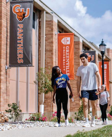
The official Greenville University logotype is the primary element of the school’s visual identity. Two versions are available, Greenville University Stacked and Greenville University Horizontal. There are two stacked and four horizontal options within those two versions. Appropriate uses for the logotype include print and digital communication such as business cards, e-mails, envelopes, letterhead, marketing materials, merchandise, publications, and web pages.
Greenville University logotypes can be obtained at greenville.edu/ graphics by clicking “Download .png ” next to the desired graphic. Contact the Marketing Department for files with transparent backgrounds, vector formats, or specific dimensions.
The typeface used for the logotype has been customized. Do not attempt to recreate the logotype using a standard typeface. The logotype must always be clearly
legible. The logotype may not be combined with other words or modified in any way.
Contact the Marketing Department if a specific situation requires the use of an office, department, or school within the logotype. Include a deadline, and a description of the desired use (letter, application, web page, etc.).
LOGOMARK Greenville University Acedemic Brand Guide
STACKED HORIZONTAL
LOGOMARK: COLOR VARIATIONS
Appropriate logomark color variations are determined by the background on which the logo will be placed. Some background colors may conflict with the orange of the shield. For backgrounds on the warm spectrum, consider the solid white or black logomarks. The color of the background only comes through the windows when the logomark windows are transparent. For example, the standard color has white windows no matter the background color.
Standard color. Do not put this logomark on black or orange.
White text with white windows. Do not put this logomark on white or orange.
White text with transparent windows. Do not put this logomark on white or orange.
White text/shield with orange windows. Do not put this logomark on white.
One color white with transparent windows. Do not put this logomark on white.
One color black with transparent windows. Do not put this logomark on black.
STANDARD COLOR WHITE TEXT/SHIELD WITH ORANGE WINDOWS WHITE TEXT WITH WHITE WINDOWS ONE COLOR WHITE WITH TRANSPARENT WINDOWS WHITE TEXT WITH TRANSPARENT WINDOWS ONE COLOR BLACK WITH TRANSPARENT WINDOWS LOGOMARK
Acedemic Brand Guide
Greenville University
LOGOMARK: UNACCEPTABLE USES
Avoid the following unacceptable uses:
1. Do not stretch, resize or distort any portion of the logotype. 2. Do not crop any portion of the logotype. 3. Do not tilt or rotate the logotype. 4. Do not rearrange components in the logotype. 5. Do not alter the relative size of any component of the logotype. 6. Do not alter the typeface of the logotype. 7. Do not alter the type style (e.g., from all caps to cap/lowercase, or italics). 8. Do not separate the “GU” from the logotype and use it as a freestanding graphic or mark. 9. Do not create stylized Greenville University text. Use the official logotype when appropriate or approved typefaces.
University GREENVILLE UNIVERSITY
LOGOMARK Greenville University Acedemic Brand Guide
4. 7.
5. 8.
9.
1.
2.
3. 6.
LOGOMARK: FREE SPACE REQUIREMENTS
A prescribed amount of clear space around the logotype should be maintained at all times. Adhere to the measurements shown in the clear space diagram. The free space would be equivalent to putting another “G” in all directions. No type or graphic element may appear in this space.
Clear space should also exist between the logotype and the edge of the page design area. Minimum surrounding space requirements prevent the Greenville University logotype from being misrepresented or trivialized. Exceptions may be necessary for return addresses, business cards, or other small imprint areas.
Contact the Marketing Department with any questions. Follow the clear space requirement unless given exception from the Marketing Department.
height of the “G” in Greenville
LOGOMARK
Acedemic Brand Guide
Greenville University
LOGOMARK: DEPARTMENTAL LOGOS
Logomarks are available for departments across campus when materials apply directly to the respective department. Free space and unacceptable use rules need to be observed in regard to department logos. Univers Bold is the department text. The same color options are available as are in our traditional logo suite.
The creation of department logomarks is discretionary. It is understandable that specific groups would like individualized logomarks, but these are strictly reserved for departments. Even with department logomarks, departments should defer to the official university logotype when in doubt.
LOGOMARK Greenville University Acedemic Brand Guide
STACKED HORIZONTAL
LOGOMARK: USE OF THE SHIELD MARK
The logo is inspired by the library arches and the natural cross that is formed in the window panes behind them. Ruby E. Dare Library is the intersection of faith and learning on campus, and our logo is a commitment to continue in the tradition of providing a Christ-centered education.


When choosing a background color for the shield mark, ensure that it remains clearly visible and readable. A photograph or illustration may appear as a background if it is neutral enough for the logotype to be legible.
Do not place the shield mark on photographs, illustrations, or patterned backgrounds that impair readability.

A minimum of 50% of the shield mark must be visible horizontally.
PANTHER PREFERRED
Exceptional character deserves to be rewarded. If you’ve persevered through a difficult situation, made service towards others a priority, or believe you possess strong leadership qualities, you should apply for this scholarship. At GU, we give Panther Scholars lots of opportunities to grow, to serve, and to lead. If you are accepted as a Panther Scholar, you will receive a scholarship up to $19,500, renewable annually.

BECOME A PANTHER SCHOLAR
� Apply to GU.
� Upon acceptance, fill out our Panther Preferred application.
Recipients of the Panther Preferred scholarship are notified shortly after review of application.

Apply at greenville.edu/apply
Office of
315 E. College Avenue Greenville, IL 62246
LOGOMARK
Brand Guide
Greenville University Acedemic
Admissions
2020_nov_panther_preferred_postcard_6x9_v3a_draft.indd 2 12/2/2020 1:34:42 PM DON’T FORGET TO DEPOSIT! Your $200 deposit is not a fee! Your deposit reserves your housing, lets you register for classes, and goes towards your tuition. To-Do: Pay Your Deposit at greenville.edu/deposit
This academic seal is intended for limited use. It is a ceremonial mark most often related to commencement and other academic traditions. The academic seal should never be stretched, but it can be resized. Contact the Marketing Department for assistance at marketing@ greenville.edu.
Standard. Do not place this seal on black or orange.
Orange. Do not place this seal on orange.
Black. Do not place this seal on black.
Orange/White Reverse. Do not place this seal on white or orange.
White Reverse. Do not place this seal on white.
LOGOMARK: ACADEMIC SEAL
LOGOMARK Greenville University Acedemic Brand Guide
STANDARD ORANGE BLACK ORANGE/WHITE REVERSE WHITE REVERSE
COLOR PALETTE
COLORS
Orange Pantone 158 C CMYK 0 / 64 / 100 / 0 RGB 244 / 123 / 32 HEX #F47B20 Panther Black Pantone Black 6 C CMYK 75 / 68 / 57 / 90 RGB 0 / 0 / 0 HEX #000000
COLORS
Blue Pantone 106-7 C CMYK 83 / 49 / 0 / 0 RGB 38 / 119 / 189 HEX #2677BD
Slate Pantone Black 7 C CMYK 69 / 63 / 62 / 58 RGB 51 / 51 / 51 HEX #333333
PRIMARY
Panther
SECONDARY
Panther
Greenville
COLOR PALETTE: PRIMARY, SECONDARY, TERTIARY
Primary Colors
Orange and black are the official Greenville University colors. Pantone 158 C has been selected as the specific shade of orange to create consistency in representing the Greenville University identity.
Secondary Colors
Grey helps soften the starkness of the official orange and black. Incorporating the use of grey and blue commonly occurs in academic materials.
Tertiary
These additional colors should only be used for nontraditional purposes to support and separate print and digital items.
The primary, secondary, and tertiary colors were created to complement each other. Adhering to these colors maintains consistency across all created materials, and this consistency is key to the overall strength of the Greenville University brand.
PRIMARY COLORS
SECONDARY COLORS
PANTONE 158 C
CMYK 0 / 64 / 100 / 0 RGB 244 / 123 / 32 HEX #F47B20
TERTIARY COLORS
PANTONE 91-7 C
PANTONE Black 6 C
CMYK 75 / 68 / 57 / 90 RGB 0 / 0 / 0 HEX #000000
PANTONE Black 7 C
CMYK 69 / 63 / 62 / 58 RGB 51 / 51 / 51 HEX #333333
PANTONE 106-7 C
CMYK 83 / 49 / 0 / 0 RGB 38 / 119 / 189 HEX #2677BD
CMYK 54 / 84 / 10 / 0 RGB 138 / 75 / 145 HEX #8A4B91
PANTONE 7-8 C
CMYK 4 / 18 / 98 / 0 RGB 246 / 203 / 25
HEX #F6CB19
PANTONE 7626 C
CMYK 18 / 92 / 100 / 9 RGB 188 / 55 / 38
HEX #BC3726
PANTONE 179-11 C
CMYK 60 / 51 / 51 / 20 RGB 102 / 103 / 102
HEX #666766
PANTONE 154-6 C
CMYK 45 / 0 / 76 / 0 RGB 150 / 203 / 108 HEX #96CB6C
PANTONE 179-2 C
CMYK 12 / 9 / 10 / 0 RGB 221 / 221 / 220 HEX #DDDDDC
COLOR PALETTE
Greenville University Acedemic Brand Guide
COLOR PALETTE: COLOR DISTRIBUTION & USAGE
Formal. High-profile, official, and athletic materials should use the formal color palette.
Academic. High-profile, official material regarding academic programs, majors, and initiatives may incorporate blue.
Non-traditional. Material made for marketing, editorial, general, or internal communication can incorporate tertiary colors. See examples below for both potential color distribution and usage suggestions. Note how the examples use a single color for most of the design, with accent colors appearing in a smaller amount.
FORMAL ACADEMIC
NON-TRADITIONAL
COLOR PALETTE
Greenville University Acedemic Brand Guide
COLOR
We are able to use most of our GU color pallette on the website with a few exceptions.
We often use white text on a colored background. However, we need to be aware of contrast issues for people with sight disabilities. In order to be compliant with the ADA, we must make some considerations.
You may use white text on Panther Red, Panther Blue, Panther Purple, Greenville Medium Grey, and Greenville Slate. On white backgrounds you may use Panther Blue, Panther Purple Panther Red, Greenville Slate, and Greenvill Medium Grey for colored text.
Due to ADA compliance issues we MAY NOT use white text on Panther Orange, Panther Yellow, Panther Green, or Greenville Light Grey backgrounds. Also, you may not use Panther Orange, Panther Yellow, Panther Green or Panther light Grey as a text color on a white background.
PALETTE:: COLORS & ADA CONTRAST
WHITE TEXT COLORED TEXT BLACK TEXT WHITE TEXT BLACK TEXT COLORED TEXT WHITE TEXT COLORED TEXT BLACK TEXT WHITE TEXT BLACK TEXT COLORED TEXT WHITE TEXT COLORED TEXT BLACK TEXT WHITE TEXT BLACK TEXT COLORED TEXT COLORED TEXT BLACK TEXT WHITE TEXT WHITE TEXT COLORED TEXT BLACK TEXT WHITE TEXT COLORED TEXT BLACK TEXT COLORED AND REVERSED TEXT: NOT ADA COMPLIANT FOR CONTRAST COLORED TEXT AND REVERSED TEXT: ADA COMPLIANT FOR CONTRAST
BLUE BG:
PANTHER PURPLE BG:
PANTHER RED BG:
GREENVILLE SLATE
GREENVILLE
BLUE:
PANTHER PURPLE:
PANTHER RED:
GREENVILLE SLATE #333333 GREENVILLE
BLUE BG:
PANTHER PURPLE BG:
PANTHER RED BG:
GREENVILLE SLATE BG:
GREENVILLE
ORANGE
PANTHER GREEN
ORANGE:
PANTHER
PANTHER GREEN:
COLOR & ADA CONTRAST Greenville University Acedemic Brand Guide
PANTHER
#2677BD
#8A4B91
# BC3726
BG: #333333
MED. GREY BG: # 666666 PANTHER
#2677BD
#8A4B91
# BC3726
MED. GREY: #666666 PANTHER
#2677BD
#8A4B91
# BC3726
#333333
MED. GREY BG: # 666666 PANTHER
BG: #F47B20
BG: #96CB6C PANTHER YELLOW BG: #F6CB19 GREENVILLE LIGHT GREY BG: #DDDDDC PANTHER ORANGE BG: #F47B20 PANTHER GREEN BG: #96CB6C PANTHER YELLOW BG: #F6CB19 GREENVILLE LIGHT GREY BG: #DDDDDC PANTHER
#F47B20
YELLOW: #F6CB19
#96CB6C GREENVILLE LIGHT GREY: #DDDDDC
APPROVED UNIVERSITY FONTS
abcdefghijklmnopqrstuvwxyz 1234567890 abcdefghijklmnopqrstuvwxyz 1234567890 abcdefghijklmnopqrstuvwxyz 1234567890 Adobe Garamond Univers Lato TYPOGRAPHY
Garamond,
The three approved type families for the Greenville University brand are Adobe
Univers, and Lato. They are available through the Marketing Department. To request these fonts for use in college materials, please email marketing@greenville.edu.
TYPOGRAPHY: ADOBE GARAMOND
Adobe Garamond Pro is a complete composition family, suitable for the most demanding typesetting projects. The roman and italic designs are offered in three weights—regular, semibold, and bold—giving users a highly functional palette of fonts to choose from. The regular roman font is the core typeface for composing text, while the additional weights and styles serve to complement the regular design.The semibold and bold designs are used primarily to accentuate words and phrases within regular text.
The semibold design offers a subtle weight difference from the regular while the bold makes a more emphatic statement; its weight, however, is not so heavy as to disrupt the color of the page. Adobe Garamond Pro makes an important contribution to typography in the electronic age. It is well-suited to a wide range of applications in newspapers, books, magazines, advertising, technical publications, and corporate communications.
USES
• Use bold for headings.
• Use italics as a subheading or substitute for highlighting text.
• Use regular for body text.
• Adobe Garamond is for formal purposes. Traditional or institutional materials use Adobe Garamond, particularly in the body text.
Adobe
ABCDEFGHIJKLMNOPQRSTUVWXYZ abcdefghijklmnopqrstuvwxyz 1234567890
ABCDEFGHIJKLMNOPQRSTUVWXYZ abcdefghijklmnopqrstuvwxyz 1234567890
TYPOGRAPHY Greenville University Acedemic Brand Guide
Garamond Regular
Adobe Garamond Italic
ABCDEFGHIJKLMNOPQRSTUVWXYZ abcdefghijklmnopqrstuvwxyz 1234567890
Adobe Garamond Bold
ABCDEFGHIJKLMNOPQRSTUVWXYZ abcdefghijklmnopqrstuvwxyz 1234567890
Adobe Garamond Bold Italic
Univers is a large sans-serif typeface family designed by Adrian Frutiger and released by his employer Deberny & Peignot in 1957. Classified as a neo-grotesque sansserif, one based on the model of nineteenth-century German typefaces such as Akzidenz-Grotesk, it was notable for its availability from the moment of its launch in a comprehensive range of weights and widths.
The original marketing for Univers deliberately referenced the periodic table to emphasise its scope.
Univers was one of the first typeface families to fulfill the idea that a typeface should form a family of consistent, related designs. Past sansserif designs such as Gill Sans had much greater differences between weights, while loose families such as American Type Founders’ Franklin Gothic family often were advertised under different names for each style, to emphasise that they were not completely matching. By creating a matched range of styles and weights,
USES
• Use bold for headings.
• Use italics as a subheading or substitute for highlighting text.
• Use regular for body text.
• Univers is well-suited to a wide range of applications in newspapers, books, magazines, advertising, technical publications, and corporate communications. Univers is less formal than Adobe Garamond, but should be considered the default font when in doubt. Most institutional pieces use the Univers font, particularly in headlines.
TYPOGRAPHY: UNIVERS ABCDEFGHIJKLMNOPQRSTUVWXYZ abcdefghijklmnopqrstuvwxyz 1234567890 ABCDEFGHIJKLMNOPQRSTUVWXYZ abcdefghijklmnopqrstuvwxyz 1234567890 Univers Condensed Univers Bold Condensed Oblique ABCDEFGHIJKLMNOPQRSTUVWXYZ abcdefghijklmnopqrstuvwxyz 1234567890 Univers Condensed Oblique ABCDEFGHIJKLMNOPQRSTUVWXYZ abcdefghijklmnopqrstuvwxyz 1234567890 Univers Light Condensed ABCDEFGHIJKLMNOPQRSTUVWXYZ abcdefghijklmnopqrstuvwxyz 1234567890 ABCDEFGHIJKLMNOPQRSTUVWXYZ abcdefghijklmnopqrstuvwxyz 1234567890 Univers Light Condensed Oblique Univers Bold Condensed ABCDEFGHIJKLMNOPQRSTUVWXYZ abcdefghijklmnopqrstuvwxyz 1234567890 Univers Light ABCDEFGHIJKLMNOPQRSTUVWXYZ abcdefghijklmnopqrstuvwxyz 1234567890 Univers Light Oblique TYPOGRAPHY Greenville University Acedemic Brand Guide
TYPOGRAPHY Greenville University Acedemic Brand Guide
UNIVERS cont’d
abcdefghijklmnopqrstuvwxyz
Univers Roman Univers Bold Oblique Univers Bold Oblique
TYPOGRAPHY:
ABCDEFGHIJKLMNOPQRSTUVWXYZ abcdefghijklmnopqrstuvwxyz 1234567890 ABCDEFGHIJKLMNOPQRSTUVWXYZ abcdefghijklmnopqrstuvwxyz 1234567890 ABCDEFGHIJKLMNOPQRSTUVWXYZ
1234567890
Univers Oblique
abcdefghijklmnopqrstuvwxyz
Univers Bold Univers Bold
Black
ABCDEFGHIJKLMNOPQRSTUVWXYZ abcdefghijklmnopqrstuvwxyz 1234567890
ABCDEFGHIJKLMNOPQRSTUVWXYZ abcdefghijklmnopqrstuvwxyz 1234567890 ABCDEFGHIJKLMNOPQRSTUVWXYZ
1234567890
ABCDEFGHIJKLMNOPQRSTUVWXYZ abcdefghijklmnopqrstuvwxyz 1234567890 Univers
ABCDEFGHIJKLMNOPQRSTUVWXYZ abcdefghijklmnopqrstuvwxyz 1234567890 Univers Black Oblique
Lato is a humanist sans-serif typeface designed by Łukasz Dziedzic. It covers all Latin alphabets, along with Cyrillic, Greek, and IPA. The name “Lato” is Polish for “summer”.
Dziedzic created the typeface in the summer of 2010 for a Polish bank. When the bank changed its stylistic vision, he shelved the typeface, and released it later that year under the libre SIL Open Font License. After Lato was added to Google Fonts it quickly gained popularity, becoming the third most used web font after
Google’s own Roboto and Open Sans, with over one billion views per day as of August 2018.
The Lato typeface is available in nine weights from hairline to black, each of which has a distinct italic variant. Each of these 18 variants is additionally available in a LatoLatin version, containing just the subset of glyphs required for European languages based on the Latin alphabet; this allows for smaller file sizes.
USES
• Use bold for headings.
• Use italics as a subheading or substitute for highlighting text.
• Use regular for body text.
• Greenville University has a custom typeface, GUpanther. This typeface should only be used for athletic purposes.
ABCDEFGHIJKLMNOPQRSTUVWXYZ abcdefghijklmnopqrstuvwxyz 1234567890
ABCDEFGHIJKLMNOPQRSTUVWXYZ abcdefghijklmnopqrstuvwxyz 1234567890
ABCDEFGHIJKLMNOPQRSTUVWXYZ abcdefghijklmnopqrstuvwxyz 1234567890
ABCDEFGHIJKLMNOPQRSTUVWXYZ abcdefghijklmnopqrstuvwxyz 1234567890 Lato Thin Italic
Lato Hairline Italic Lato LIght
ABCDEFGHIJKLMNOPQRSTUVWXYZ abcdefghijklmnopqrstuvwxyz 1234567890
ABCDEFGHIJKLMNOPQRSTUVWXYZ
ABCDEFGHIJKLMNOPQRSTUVWXYZ abcdefghijklmnopqrstuvwxyz 1234567890
ABCDEFGHIJKLMNOPQRSTUVWXYZ abcdefghijklmnopqrstuvwxyz 1234567890 Lato Italic
TYPOGRAPHY
Acedemic Brand Guide
TYPOGRAPHY: LATO
Greenville University
abcdefghijklmnopqrstuvwxyz 1234567890 Lato Thin Lato Light Italic
Lato Hairline
Lato Regular
• Use for athletic and spirit purposes only • Stroked version has to be created manually and should be converted to outlines with a 0.5 pt. stroke at 14pt font size (scale stroke with sizee adjustments). Stroke should be aligned to the outside.
LATO cont’d and GUpanther Custom Athletic Font
GUpanther USES
TYPOGRAPHY:
ABCDEFGHIJKLMNOPQRSTUVWXYZ abcdefghijklmnopqrstuvwxyz 1234567890 Lato Medium
ABCDEFGHIJKLMNOPQRSTUVWXYZ abcdefghijklmnopqrstuvwxyz 1234567890 Lato Semibold Italic ABCDEFGHIJKLMNOPQRSTUVWXYZ abcdefghijklmnopqrstuvwxyz 1234567890 Lato Black Italic
ABCDEFGHIJKLMNOPQRSTUVWXYZ 1234567890 ABCDEFGHIJKLMNOPQRSTUVWXYZ
Lato Heavy GUpanther ABCDEFGHIJKLMNOPQRSTUVWXYZ abcdefghijklmnopqrstuvwxyz
Lato Heavy
GUpanther Stroked TYPOGRAPHY Greenville University Acedemic Brand Guide
ABCDEFGHIJKLMNOPQRSTUVWXYZ abcdefghijklmnopqrstuvwxyz 1234567890 Lato Medium Italic ABCDEFGHIJKLMNOPQRSTUVWXYZ abcdefghijklmnopqrstuvwxyz 1234567890 Lato Semibold ABCDEFGHIJKLMNOPQRSTUVWXYZ abcdefghijklmnopqrstuvwxyz 1234567890 Lato Black
abcdefghijklmnopqrstuvwxyz 1234567890
1234567890
Italic
ADDITIONAL LOGOS
Additional campaign logos designed for use in both print and internet marketing.
EXPERIENCE. THE DIFFERENCE: BRAND OUTLINE
Brand Promise
GU’s commitment to our very earthy and tangible mission, combined with a student-focused priority to pro vide an immersive, interconnected, and innovative experience invite students to an experience at Greenville University that will make a transformative difference in their lives.
Positioning Statement
Experiences at GU – provided through education, through faith, through mentors, and through community, create the difference for students.
Audience
Traditional Undergraduate (16-22) This audience wants to know they belong, and that their college experience will be worth the investment.
Tone of Voice
Experience. The Difference is invitational, evocative, and authentic. It offers multiple meanings: Experience as the difference; as well as an invitation to Experience the difference.
Standard Horizontal Logos
Standard Stacked Logos
EXPERIENCE. THE DIFFERENCE Greenville University Acedemic Brand Guide
EXPERIENCE. THE DIFFERENCE: CASUAL LOGOS FOR SOCIAL MEDIA
USAGE
These more casual logos use the “Paint with Chocolate” font (from the previous Uniquely Made campaign), and a more casual layout. They are intended to be used only for Social Media posts and marketing.
Casual Logos for Social Media Use Only
EXPERIENCE. THE DIFFERENCE. Greenville University Acedemic Brand Guide
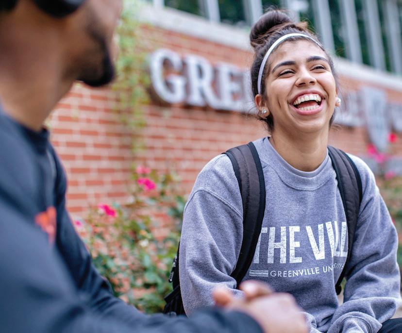
THE VILLE: THE VILLE LOGO
The Ville logo has been developed for use both for official athletic usage and for mainstream brand use on clothing and other GU branded items. The word had been approved for official athletic wear, team stores, and clothing for sale in the Panther Clawset. The approved font for the non-athletic use of the logo is the GU athleticcs script font.
THE
THE
THE
THE
THE THE THE THE THE VILLE LOGO Greenville University Acedemic Brand Guide
DESIGN COMPOSITION
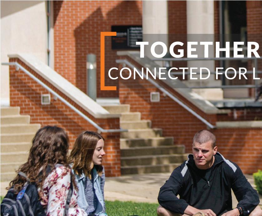
For both print and web materials, Greenville University uses stylized brackets to differentiate important headlines. The headlines on white and in reverse can be used on solid backgrounds. Headlines used over images or patterns require a low opacity textbox on top of the background to improve readability.

UNIVERS CONDENSED BOLD UNIVERS CONDENSED BOLD UNIVERS CONDENSED BOLD UNIVERS CONDENSED BOLD UNIVERS CONDENSED BOLD UNIVERS CONDENSED BOLD UNIVERS CONDENSED BOLD UNIVERS CONDENSED BOLD UNIVERS CONDENSED BOLD UNIVERS CONDENSED BOLD UNIVERS CONDENSED BOLD UNIVERS CONDENSED BOLD HEADLINES ON WHITE HEADLINES OVER PHOTOGRAPHY HEADLINES IN REVERSE EXAMPLES Why fill out your FAFSA? The FAFSA is a free government application that determines your eligibility for financial aid. We use it to help you find support in the form of grants and scholarships. File your FAFSA on or after OCTOBER 1st. Use School code: 001684 FAFSA REMINDER Friday, April 5th 6:30 pm Registration Begins 7:00 pm Peter Smerick, “Inside the Mind of a Rapist” 8:00 pm Russell and Myra Strand, “Trauma Informed Response and Care” Saturday, April 6th 7:45 am Registration for those who did not attend Friday evening 8:00 am Continental Breakfast 8:30 am Conference Begins Among the line-up of presenters are Peter A. Smerick retired FBI profiler and forensic scientist, will share from his extensive history with high profile cases across the country, Deb and Rob Smith of H-E-A-R-T. org (Hope Exists After Rape Trauma), Deb is a rape survivor who was instrumental in getting CODIS (Combined DNA Index System), through the Debbie Smith Act, and her husband, who was a police officer at the time of the crime. Russell and Myra Strand of Strand Holistic Innovative Forensics Techniques. Russell is a retired Senior Special Agent, and Myra is founder and former CEO of Victim Witness Services. Dr. Gary Cumberland retired forensic pathologist and medical examiner for the state of Florida. Troy Stabenow Assistant Public Defender in Western (Jefferson City) Missouri, in addition, he is an adjunct professor at the University of Missouri Law School. He regularly speaks on computer crimes. Also joining us will be SAFE (Sexual Assault and Family Emergencies), Eden’s Glory (Human Trafficking), SANE Nurse, Jaclyn Rodriguez, Illinois State Police, and more! Plan to join us! Conference format will include large group presentations, break-out sessions, panel discussion, and opportunities for meaningfu connection among participants. High School or Greenville University Students $10 REGISTER BY MARCH 29, 2019 FORENSICS CONFERENCE 2019 SEXUAL ASSAULT AND SEX CRIMES SCHEDULE DESIGN COMPOSITION Greenville University Acedemic Brand Guide
DESIGN COMPOSITION: HEADLINES
DESIGN COMPOSITION: EXAMPLES

See these examples for appropriate design ideas that adhere to brand regulations. Note their use of:
• Logomarks and Shield marks
• Color Palette
• Typography
• Headlines
EXAMPLES
Shape the World
The bracketed headline draws the eye to the important statement. Note the headline elicits a low opacity background, making the text legible. The shield mark reveals more than 50% of the shield horizontally. The one-color white with transparent windows logomark appears on an orange background, and the logomark follows the free space rules.
We’re with You
The bracketed headline has a blue, low opacity background. The GU approved blue is used frequently in this piece because of its academic nature. It’s use complements the orange in the piece and helps to differentiate and structure sections of content. Notice the borders for sections use obtuse and acute angles. This style choice makes for a more dynamic piece, but the angles should not be severe or overused.
SHAPE THE WORLD Take part in an innovative, Christ-centered education! Greenville
transforms lives for character and service. 2019_general_conference_tote_bag_insert_v2a_draft.indd 1 7/2/2019 3:16:21 PM
WE’RE WITH YOU 2018_decision_maker_piece_v8a_draft.indd 2 1/22/19 10:13 AM DESIGN COMPOSITION
University
Greenville University has offered students a transformative, Christcentered education for over 125 years. We are committed to providing students with an excellent education, no matter where they are located. That’s why Best Colleges awarded us for being one of Best Online Colleges in Illinois. Whether you’re completing your degree or furthering your education, we’re here for you. Let us show you how today!
Guide
Greenville University Acedemic Brand
UNIQUELY GU
If you know what you’re looking for and want to get on the fast track, we have three-year and partnership degree options to get you where you want to be.


The buzzword on our campus is community, and that community is #thriving. With student organizations, intentional professors, and personalized mentorships, you’ll find a place here.


We believe every GU student can live a life of character and service. We’ll help you maximize your abilities and give you the space you need to uniquely impact your community and the world!

DESIGN COMPOSITION Greenville University Acedemic Brand Guide DESIGN COMPOSITION: EXAMPLES cont. EXAMPLES Study abroad in Austrailia, Costa Rica, Los Angeles, The Middle East, Nashville, Northern Ireland, Oxford, Uganda, Washington D.C., and more! More than 125 years of education! 11:1 student/faculty ratio 45 miles from St. Louis, MO 30+ undergraduate, degree completion, and graduate options Education for character & service 300+ scholarships #1 safest campus in Illinois* 20+ student organizations ✔ ✔ ✔ ✔ ✔ ✔ ✔ ✔ *As reported by Niche in 2019 2019_acceptance_package_why_gu_checklist_8.5x11_v5a_draft.indd 2 12/12/2019 8:59:41 AM
YOU
College-bound students say that choosing
major
of their biggest fears,
with
you’ll get
will help
you
you’re
you’re
you’ll
big
opportunities
offer.
The education
want.
a
is one
but
GU’s liberal arts approach,
a well-rounded education that
guide
into the studies that
most passionate about. Once
there,
find
school
with the hands-on attention only a small campus can
We want to help you support your future and make your goals a reality. Ask about our 300+ scholarship opportuni ties. 100% of our full-time, traditional undergraduate students receive financial aid.
2019_acceptance_package_why_gu_checklist_8.5x11_v5a_draft.indd 3 12/12/2019 9:01:19 AM admissions@greenville.edu 315 E. College Ave, Greenville, IL 62246 800-345-4440 POPULAR MAJORS • Engineering • Education • Digital Media • Music • Criminal Justice • Biology • Business Management • Music Business ONLY 45 MILES FROM ST. LOUIS! GREENVILLE AT A GLANCE Greenville University empowers students for lives of character and service with a Christ-centered education that inspires students to shape the world. At GU you’ll find: • Experience driven education with programs like Experience First where you can work with local businesses to provide solutions. • A thriving community where music performances happen every week and student-led programs host events. • Support with personalized advising, tutoring, and career and internship counseling. MAJOR SCHOLARSHIPS McAllaster. $18,500 Mosaic. . $18,000 Panther Preferred. $18,000 WILL BE VISITING ON: YOUR GREENVILLE UNIVERSITY ADMISSIONS COUNSELOR: YOU CAN LEARN MORE ABOUT YOUR COUNSELOR AT GREENVILLE.EDU/COUNSELORS YOU GIVE ME THE CHANCE TO BE 2020_donor_thank_you_card_5.5x4_v1a_draft.indd 1 2/19/2020 9:09:54 AM
WEBSITE DESIGN STANDARDS
MOBILE-FIRST STRATEGY
Mobile-friendly used to be the best approach to the growing use of smart phones. Now, we must embrace a mobile-first strategy. More than half of our users do their research and apply to GU on their phones. Mobilefirst improves user experience and increases the likelihood of engagement.
WEBSITE DESIGN STANDARDS: FONTS LATO & OPEN SANS
Greenville University uses only two fonts on our website. One of them is Lato. It is the third most used font on websites. The other font that Greenville University uses on it’s website is Open Sans. It is the number one most used font on websites. Both of these fonts are open source and available freely for download through Google Fonts at http:// www.google.com/fonts.
Lato
USES: Lato Bold is used at varying sizes for all website headings. All headings ise the color #333333.
Lato Regular
ABCDEFGHIJKLMNOPQRSTUVWXYZ abcdefghijklmnopqrstuvwxyz 1234567890
Lato Italic
ABCDEFGHIJKLMNOPQRSTUVWXYZ abcdefghijklmnopqrstuvwxyz 1234567890
Lato Bold
ABCDEFGHIJKLMNOPQRSTUVWXYZ abcdefghijklmnopqrstuvwxyz 1234567890
Lato Bold Italic
ABCDEFGHIJKLMNOPQRSTUVWXYZ abcdefghijklmnopqrstuvwxyz 1234567890
ABCDEFGHIJKLMNOPQRSTUVWXYZ abcdefghijklmnopqrstuvwxyz
WEBSITE DESIGN
STANDARDS
Greenville University Acedemic Brand Guide
1234567890 Open Sans Bold ABCDEFGHIJKLMNOPQRSTUVWXYZ abcdefghijklmnopqrstuvwxyz 1234567890 Open Sans Bold Italic ABCDEFGHIJKLMNOPQRSTUVWXYZ abcdefghijklmnopqrstuvwxyz
Open Sans Regular ABCDEFGHIJKLMNOPQRSTUVWXYZ abcdefghijklmnopqrstuvwxyz
Open Sans Regular
Open Sans
1234567890
1234567890
USES: Open Sans is generally used for everything but headlines in the website. Body text, link text, navigation text, button text, form field text , quoted text, and list items. Body font color is black (#000000) and links are underlined and in Panther Blue (#2677BD).
WEBSITE DESIGN STANDARDS: COLORS, & ADA CONTRAST COMPLIANCE
We are able to use most of our GU color pallette on the website with a few exceptions.
We often use white text on a colored background. However, we need to be aware of contrast issues for people with sight disabilities. In order to be compliant with the ADA, we must make some considerations.
You may use white text on Panther Red, Panther Blue, Panther Purple, Greenville Medium Grey, and Greenville Slate.
Due to ADA compliance issues we MAY NOT use white text on Panther Orange, Panther Yellow, or Panther Green backgrounds.
PANTHER ORANGE BG: #F47B20
PANTHER
WEBSITE DESIGN STANDARDS
Greenville University Acedemic Brand Guide
WHITE TEXT BLACK TEXT WHITE TEXT BLACK TEXT WHITE TEXT BLACK TEXT WHITE TEXT BLACK TEXT WHITE TEXT BLACK TEXT WHITE TEXT BLACK TEXT WHITE TEXT BLACK TEXT WHITE TEXT BLACK TEXT REVERSED TEXT: NOT ADA COMPLIANT FOR CONTRAST REVERSED TEXT: ADA COMPLIANT FOR CONTRAST
BG:
BG:
RED BG:
SLATE BG: #333333
BG:
PANTHER BLUE
#2677BD PANTHER PURPLE
#8A4B91 PANTHER
# BC3726 GREENVILLE
GREENVILLE MED. GREY
# 666666
RED BG:
SLATE BG:
PANTHER BLUE BG: #2677BD PANTHER PURPLE BG: #8A4B91 PANTHER
# BC3726 GREENVILLE
#333333 GREENVILLE MED. GREY BG: # 666666
ORANGE BG: #F47B20
PANTHER GREEN BG: #96CB6C
PANTHER YELLOW BG: #F6CB19
PANTHER GREEN BG: #96CB6C
PANTHER YELLOW BG: #F6CB19
BUTTONS/CALLS TO ACTION COLOR
Wherever buttons are to be used to call a visitor to action on a white background, we’ve chosen three colors that meet ADA contrast compliance, as well as stand out from other page elements.
All buttons that are calls to action, on a white backgound should use one of the colors at right.
These buttons should also have a 5px border-radius to create small rounded corners. The padding for the text inside the button is adjustable. Please try to be generous (10px top and bottom). The button text is white (#FFFFFF), Lato Regular at 28pt.
PANTHER BLUE: #2677BD
PANTHER MED. GRAY:#66666
PANTHER SLATE: #333333
PANTHER ORANGE #F47B20
PANTHER ORANGE #F47B20
PANTHER GREEN #95CB6C
PANTHER GREEN #95CB6C
PANTHER YELLOW #F6CB19
PANTHER YELLOW #F6CB19
Learn More Learn More Learn More Learn More Learn More Learn More Learn More Learn More Learn More
WEBSITE DESIGN STANDARDS: CALLS TO ACTION REVERSED TEXT: NOT ADA COMPLIANT FOR CONTRAST REVERSED TEXT: ADA COMPLIANT FOR CONTRAST WEBSITE DESIGN STANDARDS Greenville University Acedemic Brand Guide
2021 v1d
315 E. College Ave. Greenville, Illinois 62246 800.345.4440 / 618.664.7100 www.greenville.edu/graphics
