6 minute read
PEOPLE
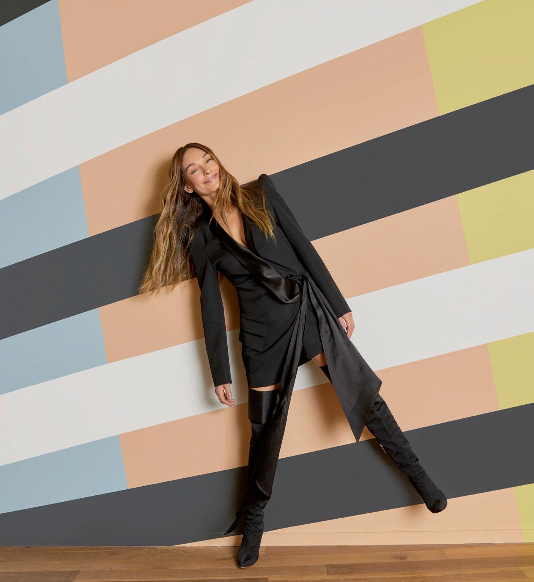
Photo © Joyce Park
INTERVIEW WITH KELLY WEARSTLER
text by Alessandra Bergamini
Her projects, her eclectic interiors for private homes, hotels and restaurants, are ‘adventurous’ journeys between contemporary and vintage, signature design, art and fine craftsmanship, “masculine and feminine, raw and refined”, instinct and intellect. The aesthetic of Kelly Wearstler, founder and principal of the design studio of the same name, has always pivoted on the concept of mixology, combining influences, materials, cultures and – last but not least – the tastes of clients. Including Proper Hotels, Four Seasons, Viceroy Hotels and Residences, Westfield. The aim is to explore their desires, but also to challenge cultural contexts and mental scenarios.
How does your creative process work? How do you get to achieve such a refined eclecticism?
I approach every project, whether a residence or hotel, dining room table or rug design, with the same process of exploration and passion. I always want to tell evocative stories, adventurous and full of soul, incorporating a mixology of materials and influences. A creative cross-pollination in the studio inherently informs each interior project and product design of every scale. Working with different artisans and coming up with creative solutions, customizing pieces for clients is also very inspiring. Learning to use different materials and artisanal approaches keeps product design fresh. I am also fortunate to have collaborative partnerships with leaders in different industries that allow my voice and vision to be aligned with their expertise, such as Farrow & Ball, The Rug Company and Lee Jofa.
Considering different client briefs and the many facets you take into consideration, from textiles to arts, how do you get to design successful cultural layering and hybridization?
My interior projects are truly a collaborative effort. My clients are my greatest muse – each project is a reflection of their distinctive personalities. One of my favorite aspects of my work is learning to be a great listener and explore the tastes of my clients. I take into consideration what the program is and what the client wants, and run this through my own filter. The best projects are inevitably the ones in which the client has a strong voice and distinctive point of view. I’ve been fortunate to have worked with incredible clients along the whole of my career. When projects are successfully articulated, there’s a natural progression that occurs and allows for growth.
What about the research for the single objects to be integrated in the whole concept?
My aesthetic has always been about mixology – the juxtaposition of contemporary and classic, masculine and feminine, raw and refined. Important vintage and soulful historical reference points lend such spirit to a space. I love mixing my own designs with a mélange of progressive contemporary furniture designers and artists, with important vintage furniture and curated unique finds from my travels.
How would you describe Los Angeles area lifestyle and architecture development in the last decade?
From the towering palm trees, azure sky, mountain hiking and stretches of surf and sand to on-fire culture, worldclass museums, innovative artists, food wellness and total decadence, this city is so unique and inspiring. It’s a city of passion and exploration. A perfect coming together of history and modernity. There remains so much to discover and watch unfold in Los Angeles. What I love most about LA is its ever-evolving infusion of new soul and old soul. Each of the iconic and original dwellings has its own pedigree and story. It is an ever-evolving infusion of spirit and place. I think the design landscape in LA will continue to surprise and move boundaries and have its own unique point of view.
And please tell us about your ongoing or future works
I have just launched my first paint collection for Farrow & Ball which is a dream come true. I have such a love for color, and I’ve always used paint in my projects to help evoke a certain mood or feel with the interiors. I’ve used Farrow & Ball paints throughout my career, and I am continuously appreciative of the quality and craftsmanship that goes into their products. We both have a deep understanding and love for how color can create a dynamic space, so the partnership felt natural. I also strive to create a natural, clean environment within my projects, and I respect the Farrow & Ball mission to create beautiful colors sustainably. All of their paints, including The California Collection palette, are water-based with low VOCs, and come in a recycled metal tin. In addition to this I am currently working on upcoming furniture, textile and lighting collections. I do also have several residential projects underway. I always make time for private client work. I am so passionate about design and every project truly has a special place in my heart.
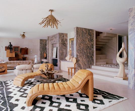
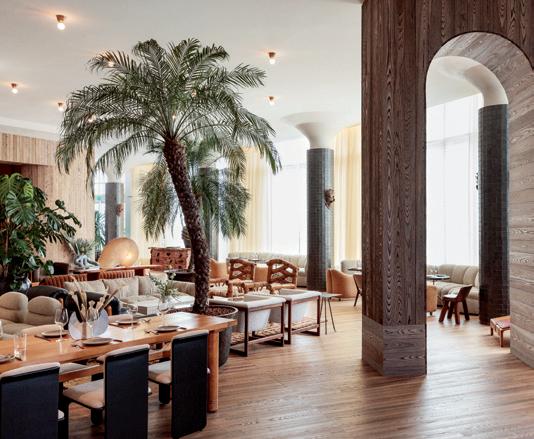
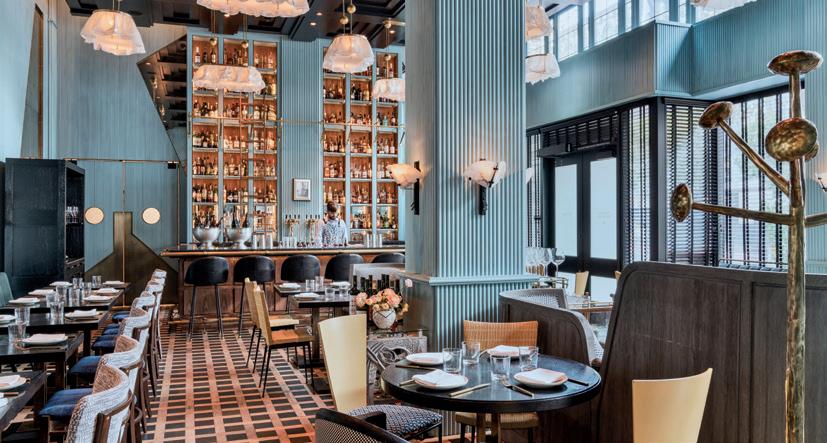
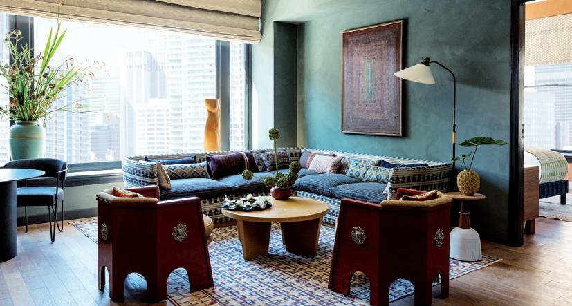
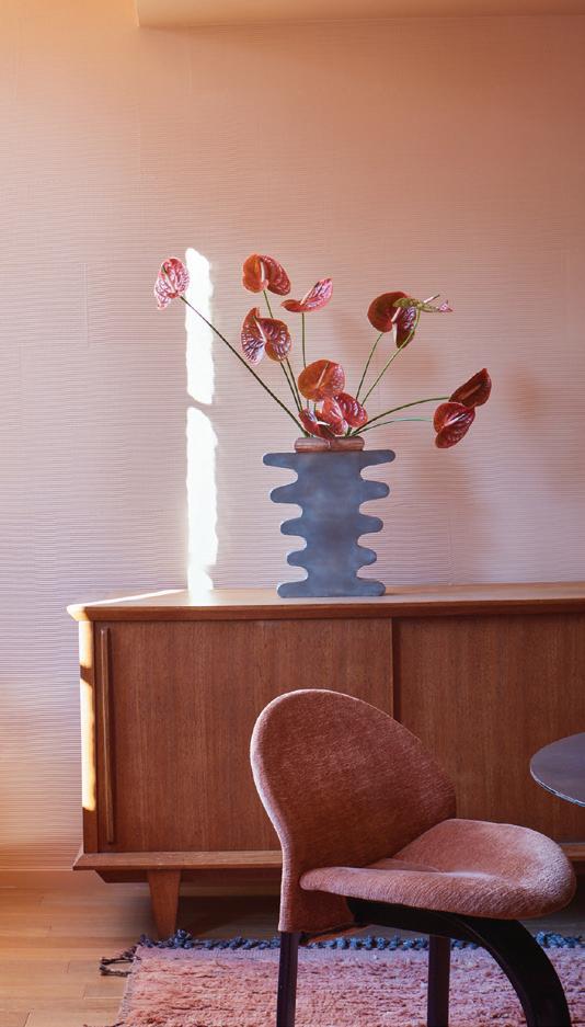
1. The Wearstler-Korzen residence, Beverly Hills, was originally built in 1926 as a Spanish Colonial Revival, and remodeled five years later by architect James E. Dolena in a classic Georgian style. Preserving the historical integrity of the home, all the structures were extensively renovated, including the pool and gardens, and a new wing was added. 2. Situated above Malibu Beach’s, this seaside residence has a castaway allure with a sun-bleached color palette that is muted yet complex, consisting of shades of driftwood taupe, misty gray, watery green and shell pink. Wave-patterned marble walls evoke the feeling of abstract art and chunky, modernist furniture contradict the idyllic setting. 3-4. The climate, history and iconography of the city is the inspiration for the identity of the Santa Monica Proper Hotel, spanning two stylistically disparate buildings linked by an artfully crafted bridge. Its interiors are a lesson in restrained elegance, nature-inspired palettes, light hardwood floors, and organic textures augmented by artworks from local artists. 5. In the creative direction and design of the Proper Hotel, Kelly Wearstler looked to Downtown L.A. as her muse, soulfully blending past and present into a sensory, residential environment of deep, warm color and feel. Her vision deftly layered the building’s vestiges of the 1920s with elements of Spanish, Portuguese, Mexican and Moroccan design. 6. The California Collection, a palette of 8 fresh, sun-soaked hues created for Farrow & Ball. The debut partnership represents the first palette created by an outside designer since the company’s founding in 1946 and it is inspired by the light of the Pacific and the landscape of California, providing a feeling of serenity and belonging in the surrounding environment. 7. Situated in the restored historic lobby of the San Francisco Proper Hotel, Villon Restaurant takes its name from Jacques Villon, a French cubist painter at the turn of the 20th century. The intimate and richly detailed space combines furnishings and elements from various European modernist styles inside a Cubist inspired envelope.
1

3 2

4
5


