56 minute read
FOCUS ON
Photo © Andrea Garuti
ILA ILA armchairs armchairs
A big hug from Pedrali
LET YOURSELF GO, WITH THE ULTRASOFT UPHOLSTERED FURNITURE BY PEDRALI, BASED ON “AFFECTIONATE” DESIGN THAT WELCOMES AND WRAPS THE BODY IN EVERY MOMENT OF THE DAY. EVEN WHEN YOU ARE WORKING
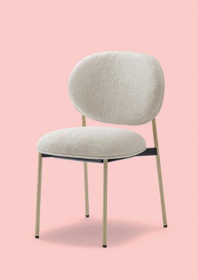
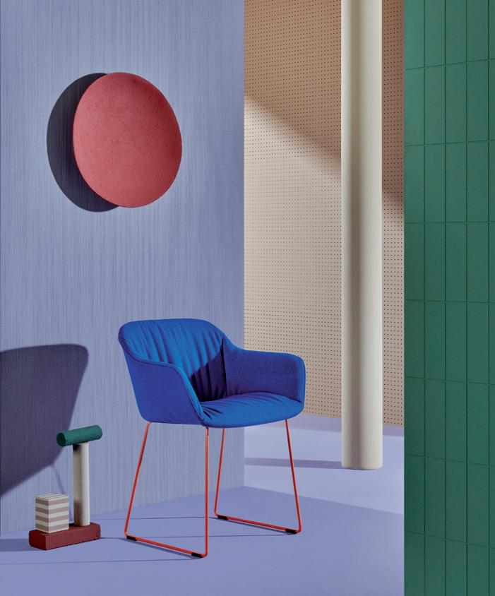
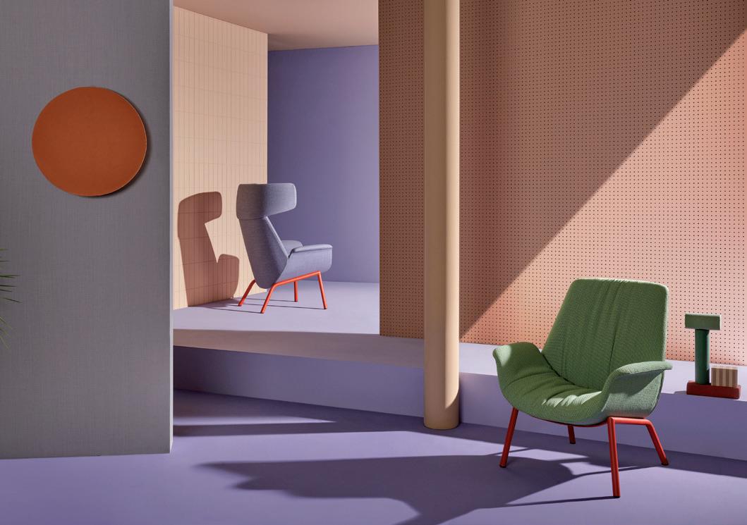
Photo © Andrea Garuti Winter days, stretched out on seating created by Pedrali, are not just about absolute comfort. Their abundant design goes further, soothing the body (and the mind) in an ergonomic embrace of forms, soft padding, intense color combinations, and warm fabrics. All shaped to respond to personal needs, offering relaxed living in every moment, during every activity, from work to leisure. The Ila armchair, for example, has been created by Patrick Jouin with the aim of providing a refuge, a private niche. The curved lines of the outer shell in rigid polyurethane, with the inner part in soft, flexible polyurethane foam, create a sense of protection for those who want to grab moments of relaxation and escape. A flight from reality accentuated in the headrest version, for a pleasantly secluded effect. The seat can be combined with a central swivel base shaped like a truncated cone, or with a structure of four legs in steel tubing. Above all, it is composed of three parts that permit updating of the cover, while all the components can be easily separated for correct recycling at the end of the product’s life. Comfortable and rounded, the chair created in a recent collaboration with Sebastian Herkner reminds us of a flower in its shape and its name, Blume, where personal wellness is the central focus. The structure in extruded aluminium supports a seat padded in polyurethane foam and visibly ‘rounded’ for a sensation of relaxation or convivial pleasure. Again in this case, the parts can be separated for correct disposal. Babila XL – the size indication speaks worlds about its wearability – is comfortable like a tailored garment. The chair designed by Odo Fioravanti has a shell (and armrests) molded in polypropylene laden with fiber glass, with a completely removable cover. A version made completely with recycled material has just been released, composed 50% of post-consumer plastic waste and 50% of industrial plastic scrap. These are some of the first items in the ‘recycled grey’ series, the latest ecological initiative by Pedrali.
BLUME chair, new textile
www.pedrali.it
Island of comfort
RELAXED ATMOSPHERES, COMFORTABLE LIFESTYLE. THE ARGO COLLECTION DESIGNED BY PAOLA NAVONE REFLECTS NATUZZI’S INTENTION OF OFFERING PRODUCTS THAT EMBRACE A MEDITERRANEAN IDENTITY
www.natuzzi.it
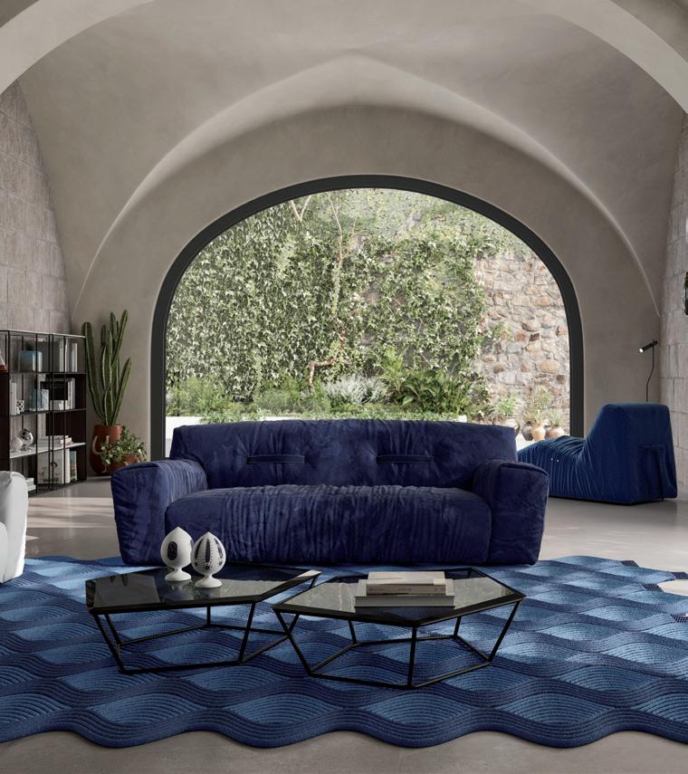
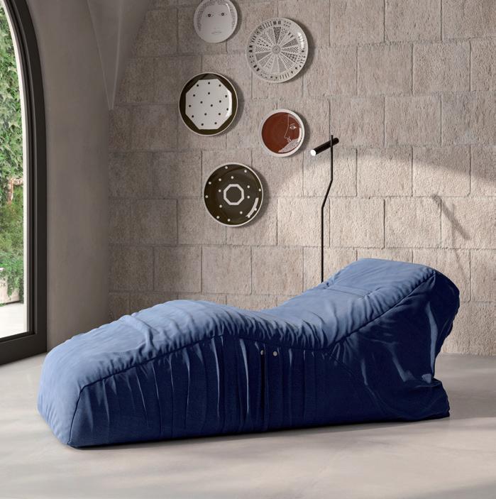
The Argo sofa, with its imperfect beauty and Mediterranean colors, evokes the sea and the Apulian roots of Natuzzi, which the designer Paola Navone has interpreted with mastery. The results are also based on collaboration with the company’s in-house styling division, capable of creating products that reflect the craftsmanship, tradition and culture of Apulia. The sofa becomes a protagonist of the living area with its ample forms and soft, almost pop look. Argo is a two or three-seat sofa, also available in a swivel armchair version. The feet are low, almost invisible, developed by Navone to increase the sensation of comfort. The eye-catching details are undoubtedly the two giant braces that sink into the back, passing through it to underscore the effect of softness. But also the belt on the back, making the sofa an ideal choice for use at the center of the room. Particular care has gone into the upholstery, thanks to the use of materials that combine strength and softness. The collection is completed by the chaise longue Sleeping Argo, which moves sinuously to encourage relaxation thanks to electrical mechanisms, based on Natuzzi’s know-how, activated with touch controls. The Mediterranean colors and atmospheres extend to the sinuous waves of the Calçada carpet by Sopa Studio. The particular weave simulates the patterns of antique mosaics and suggests the image of the sea, due to the various tones of blue and the alternation of two types of wool: bouclé and shaggy. Entirely made by hand, the Calçada carpet has an irregular form, highlighted by the fringe at the extremities.
ARGO sofa
SLEEPING ARGO chaise longue
Squaring the circle
SQUARE IS THE FIRST TABLE BY RIFLESSI WITH A PATENTED TOP, AND A BARREL SHAPE THAT IS A CROSS BETWEEN THE SQUARE AND THE CIRCLE, EXPLOITING THE ADVANTAGES OF BOTH FORMS
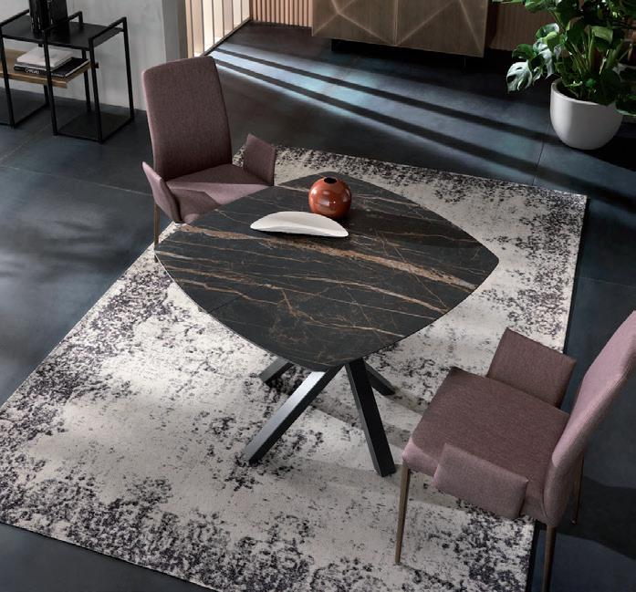
Riflessi has patented a top for the Square table that has the ‘classic’ surface of a squared dining table, but without sharp corners, making it safer for children. The new creation of the company is that of the wooden tops with a thickness of 20 mm, made with sunburst wood veneer with natural grain, obtained by working with certified wood taken from forests managed with strict environmental, social and economic standards. The available finishes are Canaletto Walnut and Heat-treated Coke Oak, as well as other elegant matte finishes in ceramic for a ‘marble effect,’ resistant to scratching and impact, suitable for domestic spaces where comfort, functional quality and style are indispensable factors. The table used as a kitchen island or worktop rests on the Shangai base and is offered in a fixed version with sides of 100 cm, and an extensible version – using practical central inserts – to reach a length of 150 cm.
SQUARE table
www.riflessi.it
SAINT-GERMAIN sofa & LE CLUB armchairs
The elegant curve
CURVED, SINUOUS DESIGN IN THE CREATIONS FOR 2021 BY JEAN-MARIE MASSAUD FOR POLIFORM. A NEW INTERPRETATION OF THE LIFESTYLE AND “SUSTAINABLE QUALITY” OF THE COMPANY
SAINT-GERMAIN’s detail

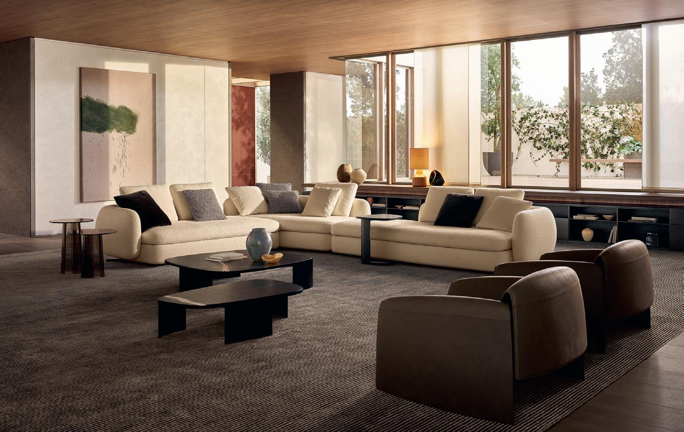
The inimitable touch of Jean-Marie Massaud is back for Poliform, in the design of the new proposals for the living room in 2021. Westside, Mondrian and Bellport are now followed by Saint-Germain, an upholstered furniture system with sinuous, sensual forms. As in the previous iconic collections, the modular approach is wide ranging, with an accent on comfort: islands of extreme relaxation, composed of multiple elements. The stylistic plot changes, however, since Saint-Germain stands out for soft roundness in all the modules of the series; an enveloping nature that creates linear sofas, L-shaped configurations or organic compositions. This is a novel concept with respect to the more rigorous linear approach usually applied by the French designer, emphasized even in the coverings, in fabric or leather, that frame the full volumes. The same design trajectory can also be seen in the Le Club chair, a name that indicates an inspiration, namely the emulation of the voluminous leather armchairs in the clubs of the last century. Jean-Marie Massaud reinterprets archetypes, filtered by his contemporary gaze: the forms are radically lightened, the materials reduced to an essential minimum, and elegance becomes more nonchalant. The result is an airy, almost suspended place to sit, defined only by a continuous line that frames the perimeter, in a game of full and empty zones between the base and the back. The new items are the result of a longterm dialogue between Massaud and Poliform, with an experimental approach that thrives on a solid, shared vision of intent: “a shared evolution,” to use the words of the designer, in a perspective of sustainability understood as “consistency, the quality of what we offer to our audience. Sustainability lies in things well made, things we can love for a long time.” And while “the company has a unique way of giving rise to a refined, timeless elegance,” the new furnishings created by Massaud “are all inspired by this search for something unique but universal, by the desire to share beauty, sensuality, culture and quality,” Massaud emphasizes. Saint-Germain and Le Club fit perfectly into this idea of a warm, familiar landscape, producing a precise sensation of pleasant domestic wellbeing.
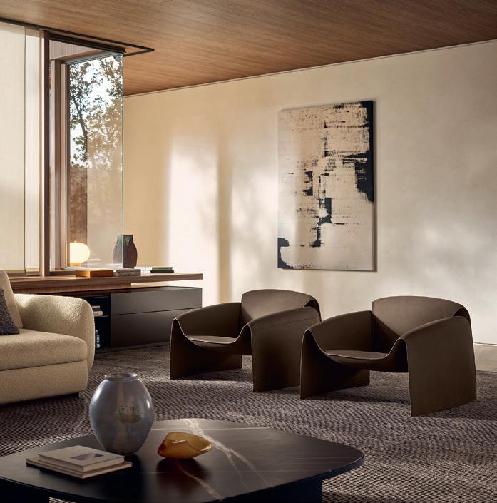
LE CLUB armchairs
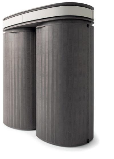
The objective was to create a cabinet for fluid positioning in the home: from the living area to the bedroom zone. It’s a piece that defies classification. Not a credenza, not a storage unit, not a bar cabinet: but a bit all of those things. I wanted it to be a mysterious object, harboring secrets and magic: this initial idea led to the name,” says Roberto Lazzeroni, the creator of Houdini for the company Giorgetti. The name is that of history’s most famous magician, Harry Houdini, famous for his impossible escapes. From that aura of mystery, Lazzeroni has invented this object to contain jewelry, glasses or other things, which in the two-door version resembles two columns, true trunks that open to reveal shelves, compartments and drawers. The magic of Houdini also lies in its workmanship, with an exterior featuring inlays of Canaletto walnut or maple, arranged in the direction of the grain, vertical and horizontal, for an intriguing effect on the surface. The inlays have been studied and arranged to create a sort of optical illusion depending on the vantage point. From a distance, the inlays seem to converge at the center, then extending towards the upper and lower extremities. In the version with a single column, there is the possibility of choosing hinged opening to the right or the left. The internal materials are also precious, where the shelves are enhanced by bronze or gray colored glass inserts, while the raised panel is covered in leather.
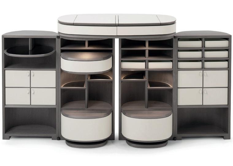
HOUDINI cabinet
Houdini: sculptural magic
AN OBJECT THAT CONCEALS SECRETS AND DISPLAYS THE UNIQUE QUALITY OF THE CABINETMAKING TRADITION OF GIORGETTI, COMBINED WITH THE MOST MODERN TECHNOLOGY, TO TRANSFORM AN OBJECT INTO A GEM
www.giorgettimeda.com

The state of ideas
NOMADIC, MULTIFUNCTIONAL, THE MRWOLF TOWEL RACK DESIGNED BY BRIAN SIRONI REFLECTS NEW LIFESTYLES, IN THE INSTALLATION ‘THE STATE OF IDEAS’ CREATED BY CALVI BRAMBILLA FOR ANTONIOLUPI
Based on in-depth research on the evolution of contemporary homes, MrWolf, the towel rack designed by Brian Sironi for Antoniolupi, embodies new residential lifestyles. The company, a high-profile reference point for the bath environment, presented the installation ‘The State of Ideas’ created by Calvi Brambilla inside the brand showroom in Milan. Rich in detail and current design thinking, MrWolf speaks of nomadism and multifunctional décor. It is a towel rack that rests against the wall, ready to be moved at any time, to adapt to spatial compositions that can vary to respond to changing needs. Accessorized with a shelf and object caddie in Flumood or Colormood, it becomes a valid helper in everyday actions, facilitating movement and gesture. The extremely functional surface permit easy access to objects and accessories. In terms of form, lightness and solidity coexist perfectly thanks to the slim ladder structure in brass, coated in white or black, or in the color range of Antoniolupi. A clean, linear design that makes MrWolf a sort of passepartout, positioned near the washbasin zone or near fixtures, showers and bathtubs.
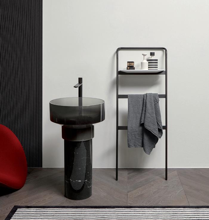
Eastern virtuosity
THE INIMITABLE STYLE OF POLTRONA FRAU BLENDS WITH AN ORIENTAL TOUCH IN THE COMPLEMENTS OF THE NEW 2021 COLLECTION
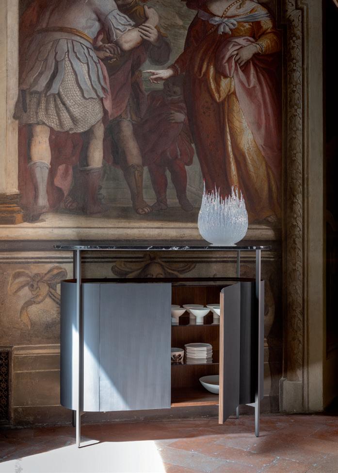
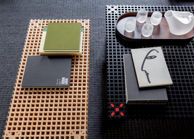
The time has come to rediscover quality of life and living spaces. To take back control of a living experience enhanced with a wealth of contents, comforts and functions. It is time, in other words, to See, Feel and Touch, sensations that define and categorize the new offerings of Poltrona Frau. “Take your Time” is not only the name of the 2021 collection. It becomes a sort of message, a manifesto that urges us to bring value to this ‘suspended time’ in which we are immersed by the pandemic, to fill that time with sense, through all the senses. The many proposals of the brand for the living area and bedroom zone are organized around this concept, to achieve a multisensory experience (and at the same time multi-material: alongside the distinctive use of Pelle Frau®, the items also feature fabrics, wood and marble). In this setting, which gives rise to a new collection and a new habitat ideal, the pathway of design branches out with curiosity, with style and inspirations that take their cue from the Orient while blending with the typical stylemes of Poltrona Frau: many of the new products for the living area, in fact, link ack to the harmonious gestures and poetics typical of the oriental world, perfectly matching the updated sensorial philosophy of the brand. Starting with Iren, the desk designed by Kensaku Oshiro, whose identity relies precisely on the value of gesture: while the term “iren” in Japanese means continuity in the tracing of points, lines and characters, the complement that bears this name connects to the concept of the game of surfaces, where a simple gesture can suffice to make them slide one atop the next, fulfilling multiple functions. Oriental echoes can also be perceived in the Mi storage units: the duo Neri&Hu have worked by subtraction to achieve a balance between essential simplicity and refinement. The line includes a high cabinet with two doors, a low cabinet with four hinged doors, and a trolley on wheels: the red thread is a game of full and empty volumes, lights and shadows, revealing or concealing the objects inside; cowhide returns as a protagonist, now enhanced by a cannetté texture of vertical lines, combined with a metal structure, a raised marble top, and the bronze-tone glass of the upper surface of the cabinet. The same dualism of full and empty portions is even more striking in the Kyoto table created by the designer Gianfranco Frattini in 1974 (drawing on the mastery observed in workshops he visited in that Japanese city), accurately reissued by Poltrona Frau in 2020: the result is embellished with a new black lacquer open-pore finish of the solid wood, accentuating the perfection of the interlocking workmanship.

IREN desk
KYOTO tables MI cabinet
www.poltronafrau.com
Nomadic objects
MOVING WITH EASE BETWEEN INDOOR AND OUTDOOR SETTINGS, THE PIERRE CHAIRS BY FLOU ARE AN INVITATION TO SOCIALIZE
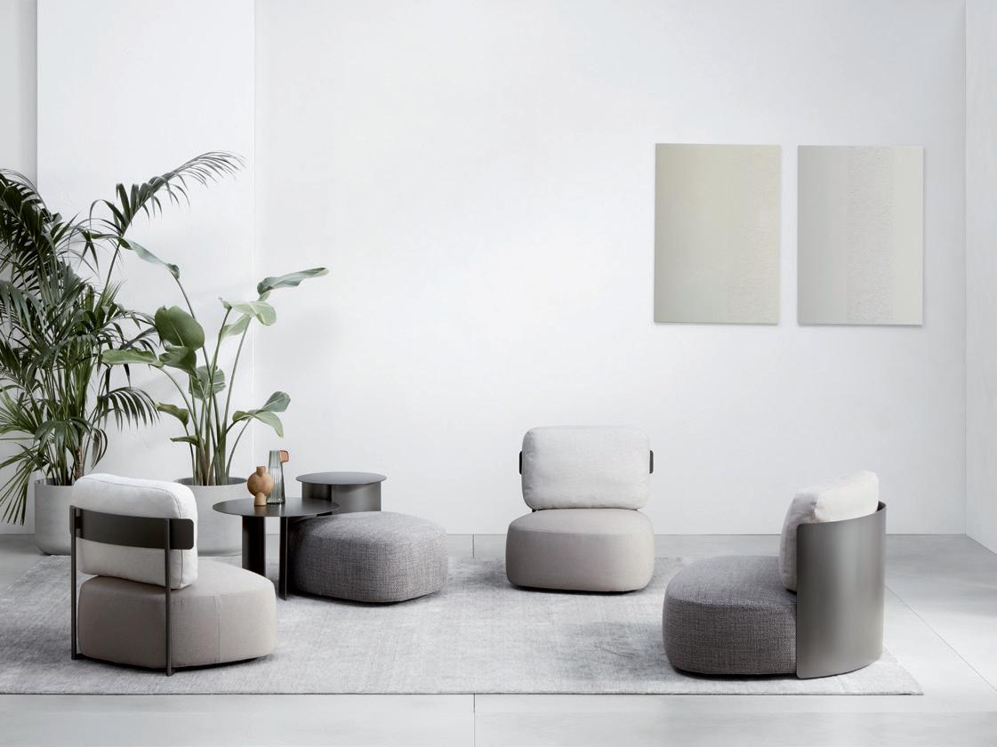
Asoft, irregular form for the Pierre chairs, expanding the family of poufs and tables created by the Contromano design studio for Flou, in a reminder of river stones smoothed by flowing water. Padded and covered in removable fabric or leather, they come in three sizes (small, medium and large) and have two types of backs. One version has a back like a curved metal shell, wrapping and protecting the cushions, while in the second model the back is formed by two tubes and a horizontal band, also in metal, in a very minimal design where the fabrics are the protagonists. There are many possible combinations for Pierre, thanks to the range of different types of covers (also for outdoor use), two back models and various metal finishes, including burnished matte, oxide, black, greige and white, along with the new Magma and Oceano finishes.
www.flou.it
PIERRE armchairs
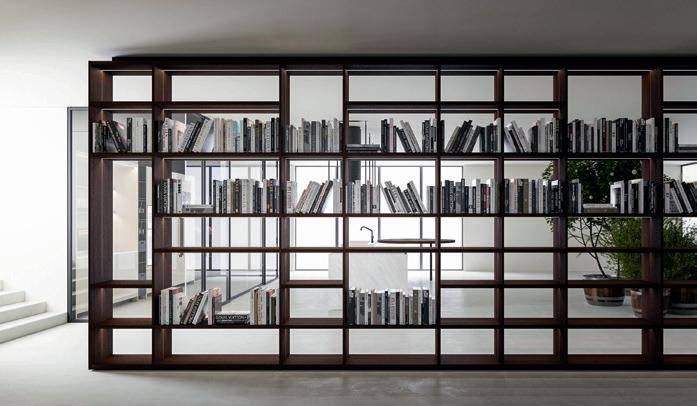
Design and architecture are the intertwining elements that create the shared, geometric language found in many Boffi products, such as the Antibes bookcase with its rigorous lines, and the APR60 kitchen, with essential styling, both designed by Piero Lissoni in collaboration with CRS Boffi. Antibes is a modular
system, a grille that divides space with elegant horizontal and vertical lines, without a back. It can be attached to the wall or become the protagonist of a room with a floorto-ceiling structure. The system offers great compositional flexibility, and in the kitchen it can become an accessorized storage wall. It also comes with an LED bar lighting system that contributes to underscore the geometric and architectural character. The APR60 kitchen plays with encounters between forms and materials and adapts to use in the living area or in a separate space. The pure form is enhanced by the lack of handles on the base cabinets, whose fronts have a protruding upper border to permit opening. The bases with hob, washing zone and storage
cabinets under the counter are enhanced by paneling equipped with shelves and hanging cabinets, which can be open or closed. The gaze is captured by the details, the carefully gauged thicknesses and shifted volumes, but also by the range of colors or combinations with materials like wood and glass or wood and steel.
Architectural atmosphere
A COMPOSITION TO INTERPRET SPACE WITH TASTE AND RATIONALITY. THE ANTIBES SYSTEM AND THE APR60 KITCHEN BY PIERO LISSONI CREATE THE DESIGN PERFECTION THAT ALWAYS SETS BOFFI’S SOLUTIONS APART

ANTIBES bookcase
Being consistent
ALSO IN THE NEW TWENTYONE COLLECTION, THE ELEGANT, ENVELOPING LANGUAGE THAT SETS PORADA APART MOVES CONSISTENTLY FORWARD, WHERE RESEARCH ON MATERIALS GENERATES AN ESSENTIAL VOCABULARY of creating a harmonious, cohesive whole with the spaces in which they are placed, and with each other. An uninterrupted line seems to extend through the elegant, tactile complements, which punctuate the domestic landscape and then expand the area of action of the great décor protagonists.
Continuity and research are the key terms of interpretation of the Twentyone collection by Porada, including new developments in 2021 for the living and bedroom areas. “Continuity, with respect to design, which over time becomes increasingly recognizable and clearly formulated. Research, because the materials and forms evolve and adapt, in a perspective of flexibility and functional quality,” the company explains. This pairing has led to the definition of products capable
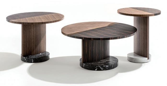
LEAF tables CHIBA coffee tables & SAITAMA back-sofa console
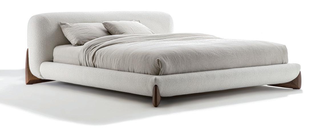
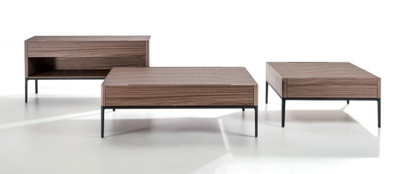
A soft, sinuous line, with a stylistic approach that brings out the tactile and natural appeal of materials, especially in the case of wood. The concept is reflected in the Leaf tables designed by Patrick Jouin: an ode to the natural grain of wood, in which “the beauty of nature becomes a graphic principle in its own right,” the designer remarks. The top and the particular rounded wooden leg rise from a circular pedestal in marble, generating games of direction and an idea of movement. The consistent styling continues in the Chiba coffee tables and Saitama back-sofa console, extensions of the Kanto project, part of the 2020 collection. The two products inherit the graphic structure in black coated aluminium, and the construction of the wooden volumes, conserving the original character of the design but reshaping its language through different proportional relationships between the parts, and different modes of use. The Softway bed joins ranks in this escalation of functions and scale, with its soft, curved image. The solid walnut feet at the four corners are the true protagonists, whose solidity forms a contrast with the softness of the upholstery.
SOFTWAY bed
www.porada.it
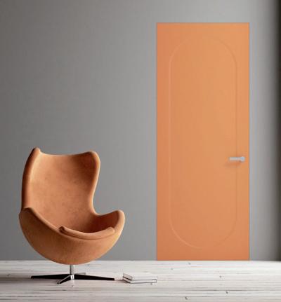
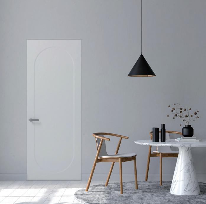
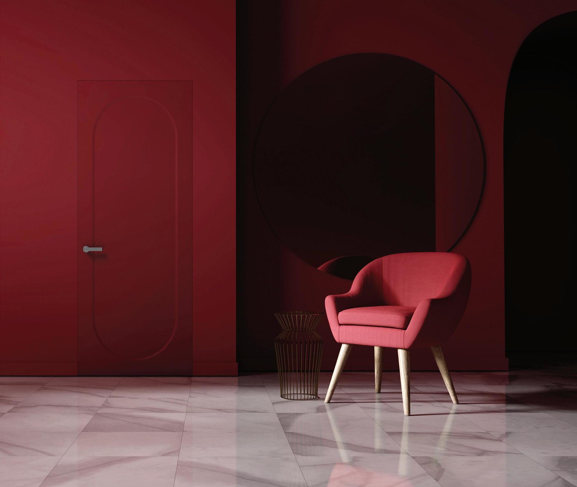
Alight graphic sign, an elliptical imprint. The distinctive signature is in this geometric space, which for its author was simply a symbol of the concept of passage. The designer was Joe Colombo, and the project is the Luce door produced by TREP+. While for Colombo doors were elements of communication, opening towards other spaces, the ellipse becomes a perfect representation on a vertical plane; a form that links back to “VISIONA 1”, the futuristic habitat prototype created by Joe Colombo for Bayer, shown in 1969 at the Interzum fair in Cologne and at the Milan Science Museum. The new product by TREP+ is a synthesis of design and technology, which also relies on the Beta handles by Olivari, again designed by Joe Colombo, and the exclusive S-MATT finishes by ICA Group with an ultra-matte effect (resistant to fingerprints and scratching, with self-repairing properties in a water-base product, hence with very low VOC emissions).
Authorial imprint
TREP+ PRESENTS LUCE, A PROJECT BY JOE COLOMBO
AURORA lounge chair and ottoman
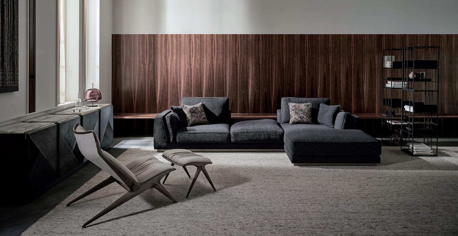
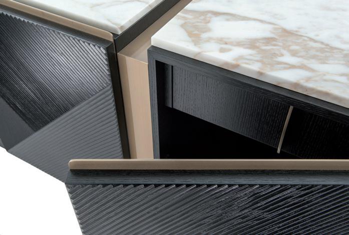
Contemporary which when combined with inserts in marble and metal brings out the nobility of the wood, creating unexpected optical effects. In the New Brian tables the metal struc(designed by DL studio) concentrates many material elements of Opera Contemporary in its metal structure, containing shelves in wood, marble and leather. Finally, and Glam ON THE OCCASION OF THE OPENING THE NEW SHOWROOM IN MILAN, ON ture with asymmetrical legs welcomes an elegant top in marble with rounded and beveled borders, on which to etch the new for 2021, comes Aurora: a lounge chair and ottoman created by the design duo Draga Obradovic and Aurel K. BaseTHE VERY CENTRAL VIA MANZONI, brand’s logo. The New Doris collection – dow, concentrating their expressive flair in OPERA CONTEMPORARY SIGNS a sideboard, a bar cabinet, a TV cabinet, a a very refined compositional eclecticism,
Elengance and attention to EVERY SPACE IN THE HOME WITH dressing table with or without mirror, bed- between vintage memories, contemporary details. These are the dis- FURNISHINGS THAT ARE SEDUCTIVE side tables, and a dresser with four drawers style and innovation. This is an iconic piece tinctive features of a timeless FOR THEIR HARMONY OF STYLE AND – is made with frisé maple with contrasting with a structure in solid wood – suggesting beauty, an identity in con- NOBLE MATERIALS stant evolution, described in a harmonious encounter of forms, colors and materials, carefully selected and combined. of materials, joining the leading role of Opera Contemporary matches manufac- wood with the precious qualities of noble turing excellence with contemporary style materials like marble, leather and metal. in a range of luxurious and glamorous fur- In the living area, the structure of the New nishings conceived to address the tastes of Cosmo sofa, for example, stands out for the a vast, demanding and cosmopolitan clien- triangular cross-section of the solid wood, tele. The identity of the Lombard brand, in ash or Canaletto walnut, and for the borenhanced with the stylistic approach of art ders embellished with metal in gold, bronze direction by the studio Bestetti Associati, or chrome finish, or with black coating. comes to terms with the unique character The New Victor family of cabinets features of an increasingly rich, dynamic vocabulary doors with an exclusive geometric pattern, accents in metal, wood and marble. In the the design of the 1960s with its curved, bedroom zone, the protagonist is the Alba restrained organic forms – covered in the bed, whose double headboard is enhanced finest soft leather. Aurora also stands out by the use of different materials. The back for its well-gauged thicknesses, and for the headboard unveils a refined wooden core extreme lengthening of the legs, which bearound which to fasten cowhide cords by come a forceful architectural sign thanks to hand, in a vertical arrangement, granting the presence of delicate metal accents. a sense of dynamism and lightness. Alba as the previous products are designed by Castello Lagravinese. The Taylor bookcase
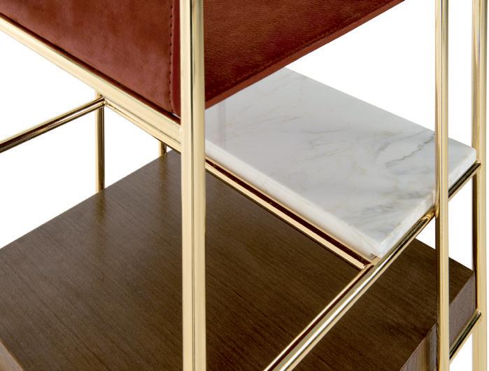
TAYLOR bookcase
LUCE BY JOE COLOMBO
IPALYSS washstand & JOY mixer
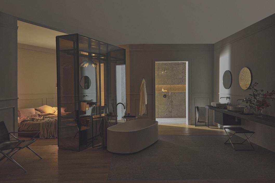
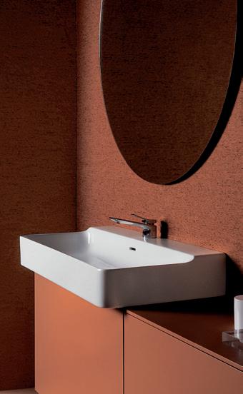
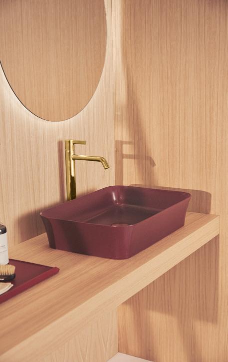
The vision of Ideal Standard is to “improve the life of our clients,” and the way to achieve this, in partnership since 2018 with Palomba Serafini Associati and with Roberto Palomba in the role of Chief Design Officer, is to study the society as it continues to evolve, redefining the concept of modern living, working to create a perfect synergy between impeccable functioning and aesthetic harmony. In the light of these considerations, the Atelier Collections represent the latest contribution to design culture. The approach of Ludovica and Roberto Palomba for Atelier Collections is based on quality, intuitive and inclusive design that makes it possible to create combinations using ceramics, furnishings and faucets, while offering maximum personalization. The Conca series of washstands is the first range of Atelier Collection products: it takes its inspiration from the original line designed in 1972 by Paolo Tilche. Starting with the iconic washstand, the designers have beveled the corners to modernize the model, with a squared, minimal design in tune with the latest trends, while conserving the unique, sophisticated character of the piece. The Extra washstand, a simple block with a slim border and precise edges, represents a break with the tradition of curved ceramic forms. Its lightness and simplicity make it ideal for contemporary and minimalist bathrooms. It combines perfectly with the Blend range of bath fixtures and the Conca and Joy lines of mixer taps. The Blend Curve fixtures, with their neutral, rounded design, and those of Blend Cube, with a squared form, include the revolutionary AquaBlade® technology that boosts cleanliness and hygiene, making the series suitable for residential, commercial and healthcare projects. Conca and Joy are two lines of mixers, the first featuring a squared design with an ultra-flat body and a slim, slightly curved handle, while the second offers a solution with a timeless cylindrical form, whose smooth continuous surfaces are easy to clean, preventing the formation of deposits of germs and limescale. The mixer faucets, in the washstand and bidet versions, include an ecological aerator for five liters per minute, permitting reduction of water consumption. The Atelier Collections also include Linda-X, a new entry for 2021, composed of a range of washstands and an elegant bathtub with ultra-light, clean, minimalist design, also thanks to the use of Diamatec®, a technology patented by Ideal Standard, which permits the creation of very slender ceramic lines, as small as 3 mm but exceptionally strong. Thanks to its base of limited size, the washstand can be mounted with an overhang, also on cabinets of small depth. A solution that adapts even to small spaces, to meet the needs of modern lifestyles. The Ipalyss series of rectangular ultra-slim washstands is also made with the same revolutionary ceramic material, offered in the historic matte-finish Ideal Standard colors.

The eternal value of design
LINKING BACK TO ROOTS AND GREAT MASTERS, WITH THE ATELIER COLLECTIONS BY PALOMBA SERAFINI ASSOCIATI, IDEAL STANDARD CONNECTS THE PAST, PRESENT AND FUTURE OF DESIGN
LINDA-X washstands and bathtub
EXTRA washstand
Photo © Carlo William Rossi + Fabio Mureddu
www.idealstandard.it
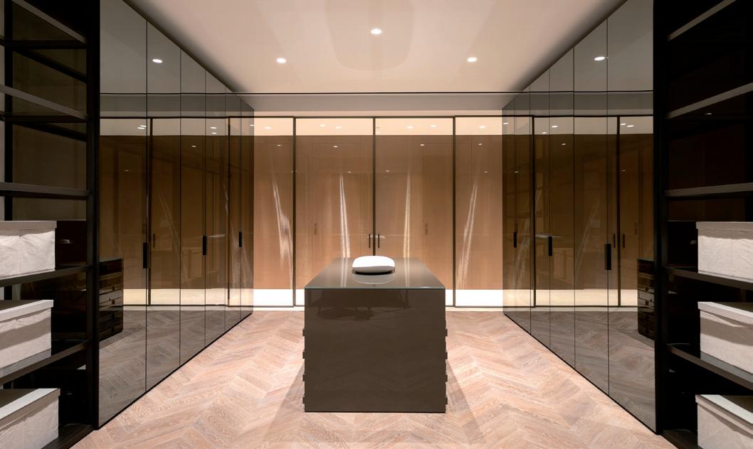
PALOALTO IBOX walk-in closet
The highest levels of contemporary living
Beverly West Residences is a luxurious residential complex developed by Emaar Properties, already the proprietors of the famous Burj Khalifa and the Dubai Mall. The complex is on one of the main boulevards offering direct access to Beverly Hills. The five penthouses, from the 18th to the 22nd floor, have breathtaking views scanning all the way to the ocean. The interiors are ample, measuring over 760 sqm, in keeping with the design codes of a concept of extreme prestige, which takes on expressive impact and identity in the sartorial approach Made in Italy of MisuraEmme products. The Brianza-based company confirms its bespoke attitude with extraordinary versatility, formulating spaces with a contemporary, essential and at the same time refined language, to respond to the taste of the clients, giving them a “dream made to measure, suspended in the sky.” The Crossing living system (designed by the architect Mauro Lipparini) and the Urban living system (designed by the architect Iriam Bettera) give the large, luminous rooms a sense of unique visual lightness, reinterpreting the traditional role of bookcases in configurations that adapt to the architectural space. Thanks to the possibilities of combination of shelves and counters, the modular solutions permit free design of walls with dynamic and – if so desired – colorful compositions. The PaloAlto Ibox walk-in closet designed by the engineer Gianni Borgonovo transforms the bedroom zone into a total ‘transparent’ vision of pure, refined volumes. Stemming from the interaction between two systems already contained in the collection, the closet stands out for its hinge that permits installation of the doors in a classic wooden upright, or in a framework – opening up to 180° – generating infinite compositional options thanks to the wardrobe-closet coordination. The countless intersections between the
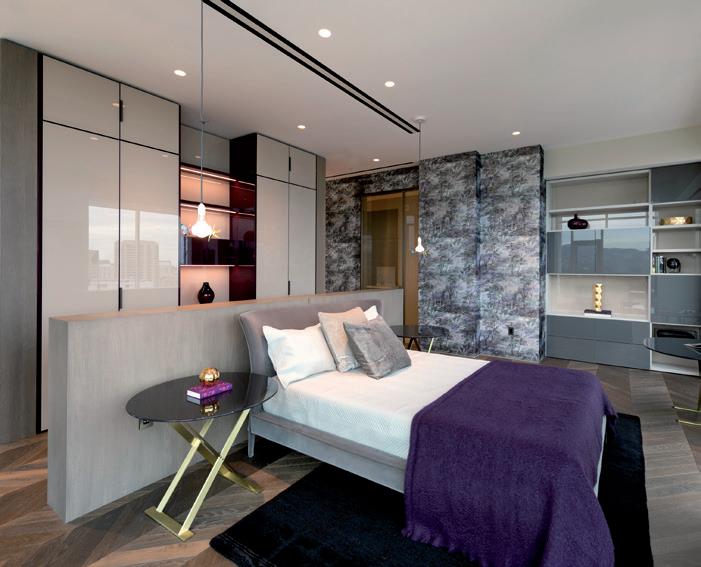
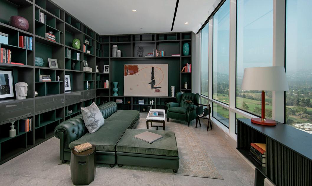
THE PRESTIGIOUS PENTHOUSES OF THE BEVERLY WEST RESIDENCES OPT FOR A CONTEMPORARY LANGUAGE AND SARTORIAL PROWESS MADE IN ITALY, WITH CUSTOM CREATIONS BY MISURAEMME
CROSSING system CROSSING system
support structure and the various surfaces produces functional spaces with multiple internal equipment, like chests of drawers, suspended elements, object caddies, jewelry compartments, trouser hangers and all the storage solutions for everyday objects. The bedroom zone becomes a place in which to experiment with new juxtapositions of design and materials, granted by the wide variety of luxurious finishes – ranging from glass to technomarble, from the noble grain of wood to metal – and the rigorous lines of the London, Narcisse, Milano, Brillanta and First wardrobes, enhanced by sophisticated LED lighting built into the frame to convey a delicate atmosphere of remarkable class.
B SOLITAIRE line

Privacy or socializing
THE BOX-IN-BOX LINE BY FANTONI ADDS MOVEMENT TO THE WORKPLACE AND FINDS THE NECESSARY PSYCHOLOGICAL AND FUNCTIONAL MIDDLE GROUND BETWEEN LOW DENSITY AND HIGH TRAFFIC

While utilization of the architectural and real estate heritage of office buildings and headquarters is increasingly combined with a focus on human resources to improve wellbeing and performance, the Acoustic Rooms developed by Fantoni represent a new key of interpretation of space: by ‘shrinking’ the architectural box on different scales, the complete range contributes to create ‘work scenarios’ that are open but livable, functional and safe, flexible and connected. With six different sizes, from XXL to S, the Acoustic Rooms balance needs of socializing, which are more pressing in recent times, with the necessity of privacy and concentration, safeguarding the sense of community and connection between people and ideas. A protected oasis with a modular structure in square or rectangular form, with a height of 240 cm; the ceiling and internal walls are made with MDF 4akustik sound-absorbing panels, which guarantee excellent reverberation reduction. The internal lighting is built into the ceiling, like the ventilation system.
ACOUSTIC ROOM
Convivial architecture
THE B SOLITAIRE LINE BY BULTHAUP BECOMES THE CENTER OF DOMESTIC SPACE AND CONVIVIAL EXISTENCE, WITH ITS LINEAR DESIGN AND NATURAL SPIRIT
To develop interior architecture in the world of kitchens with innovative solutions of high-quality design. While this is the constant mission of Bulthaup, the b Solitaire line is a natural development of this path. In the context of the kitchen, this table – the heart of the program and of convivial life itself – becomes the catalyst for enjoyable moments, with its simplicity, “architectural” lines and warm, welcoming atmosphere. This identity is the result of fine craftsmanship: the top is in solid oak, resting on a framework of matte black anodized aluminium. The line also offers matching benches, featuring naturally tanned leather covers, and open cabinets: extractable shelves and grilles placed at variable heights offer room for small and grand ideas.
www.bulthaup.com
www.fantoni.it
Upgrade for Centimetro
AMONG THE NEW DEVELOPMENTS FOR 2021, LEMA PRESENTS AN EVOLUTION OF THE “ARMADIO AL CENTIMETRO”
The name means “wardrobe by the centimeter,” offered by Lema as a way of providing personalized solutions for any space. The new insertion, in 2021, of framework sides raises the potential of the system to greater heights. Three new internal and external structural elements open the way for a new dialogue between pure storage and domestic architecture. The project is extremely contemporary in character, thanks to the development of a set of aluminium frames, one internal, the other external, available in two finishes: bronze and sand. The outer back is closed by a glass panel, which can be replaced by a traditional melamine back, offered in three transparent finishes, as for the enclosing side: transparent extra-light glass, reflecting bronze glass and gray smoked glass. For the façade, the framework side can contain any type of hinged door offered in the catalogue, and the theme of opening brings us to another new feature: the Anta Dandy hinge in the 180° version. All the way to the Open version, without doors.

Narrating the Torii collection coordinated by Rodolfo Dordoni with Minotti Studio, the Japanese designer Nendo talks about visual lightness, referring to the way the horizontal parts rest on the uprights, creating a structure so support upholstered or flat volumes. The collection by Minotti includes sofas with high or low backs and a linear, rounded shape, inclined sofas of different depths, armchairs, lounge chairs and dining chairs, ottomans, low tables and a slim oval console. With all these available items, it is easy to create a living area by playing with their combinations, generating visual harmony and bringing a totally Japanese atmosphere into the home. The repetition of the metal structural detail triggers the image of the “Senbon Torii, the wooden colonnade that forms a galleria composed of 1000 vermilion torii gates,” Nendo explains. Particular care has gone into the development of the backs. The slim back of the sofas is crossed by quilting with vertical staves and piping in eco-leather and econabuk along the perimeter of the padding. The back of the small chair, in the Torii Nest version, features woven leather, based on the image of Vienna straw. Certain elements conclude the base with a marble surface, used as a small table, which thanks to the careful study of the proportions and thicknesses goes perfectly with the seating. Leather magazine caddies with metal details enhance the seating models, along with the small decorative disk in the form of a button-jewel, which seems to hold the back in place. The collection also offers the Torii tables, with the same metal structure as the sofas and chairs. The marble top can also reach a diameter of 120 cm, and the tables come in various heights, with matte polyester finish, in glass or in wood.
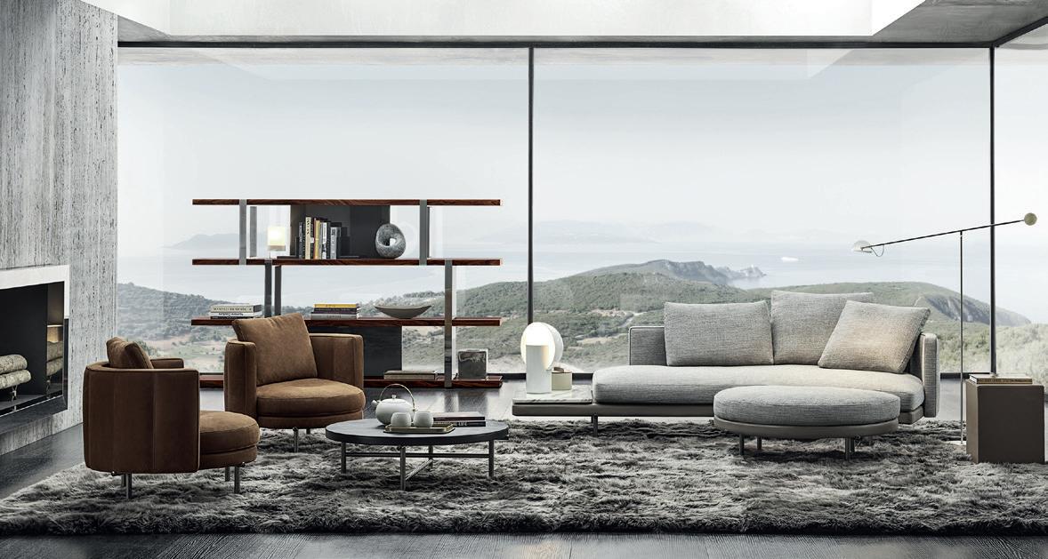
TORII collection

A game of interlocks
THE NAME OF THE TORII COLLECTION BY MINOTTI TAKES ITS CUE FROM THE GATES OF SHINTO SANCTUARIES IN JAPAN. THIS IS THE DETAIL DEPLOYED BY NENDO TO ADD CHARACTER TO THE LEGS OF SOFAS, SEATS AND TABLES, BRINGING AN ARCHITECTURAL TOUCH TO NEW FURNISHINGS
www.minotti.com
A Totem display in your living area
Separate, but not too much: Euromobil presents Totem, a floor-to-ceiling bookshelf-system to define and organize various spaces, to hold books and objects, and display memories. But that’s not all: Totem is a flexible and versatile solution, ideal for creating and carving out a corner of the home for home-working, study, and long-distance education, which can be personalized and accessorized with various shelves, compartments, tops, and desks, elements which can be freely added to create and develop the composition most suited to the available space and intended uses. A multitasking structure based on a pole that runs from the floor to the ceiling, which can be positioned at the center of the room and even fixed to the wall, a totally new concept with the possibility for LED lighting to embellish and emphasize its silhouette, making it shine, even in the dark, like a scenic presence that becomes the feature element of the living area. A product available in the new Wood Canetè finish, a texture featuring a light, three-dimensional effect offering luminous vibration, and a tactile surface that’s pleasing to the touch, decorated with small slats available in the colors Brown and Black.

EUROMOBIL PRESENTS TOTEM, THE FLOOR-TO-CEILING BOOKSHELF-SYSTEM TO DEFINE AND ORGANIZE VARIOUS SPACES, TO BE CONFIGURED AND COMPLETED WITH SHELVES, COMPARTMENTS, AND DESKS, PERFECT FOR HOME-WORKING AND STUDY ARRANGEMENTS


JANUS ET CIE AND PAOLA NAVONE TOGETHER AGAIN FOR A THIRD, NEW COLLECTION OF OUTDOOR TABLES AND SEATING: CHOPSTIX
Soft weaves and ‘interrupted’ lines
Aubergine violet, peacock green and pepper gray are the colors of the new Chopstix collection designed by Paola Navone for JANUS et Cie, a ‘velvety’ palette that makes the appearance of the woven material chosen by the designer for the seats in her third line of furnishings for the California-based company – after Strada and Dolce Vita – even ‘softer.’ With a structure in aluminium treated with the special JANUScoatTM, both the armchair and the side chair offer a harmonious place to sit, in which the macro-weave of the handwoven olefin takes on a pleasant tactile effect, linking back to age-old weaving techniques with contemporary comfort and allure, a distinctive feature of Paola Navone’s work. In the Chopstix collection, the chairs become the perfect companions of two different dining tables. The 221, with an oval top measuring 221 cm, or the 219, an asymmetrical modular model that permits doubling of the length (438 cm) by juxtaposing two tables. The tables have terrazzo tops in a more luminous Luce Bianca Grande pale composite, or the darker Grigio Tetra – a clear reference to Mediterranean design sensibility. The aluminium base features a game of shifts in the alignment of the horizontal parts – hence the name of the whole collection, Chopstix. Confirming the company’s excellence in design and manufacturing, the armchair has recently won the Red Dot Award 2021 in the Product Design section, inside the category of garden furnishings.
www.janusetcie.com
CHOPSTIX collection
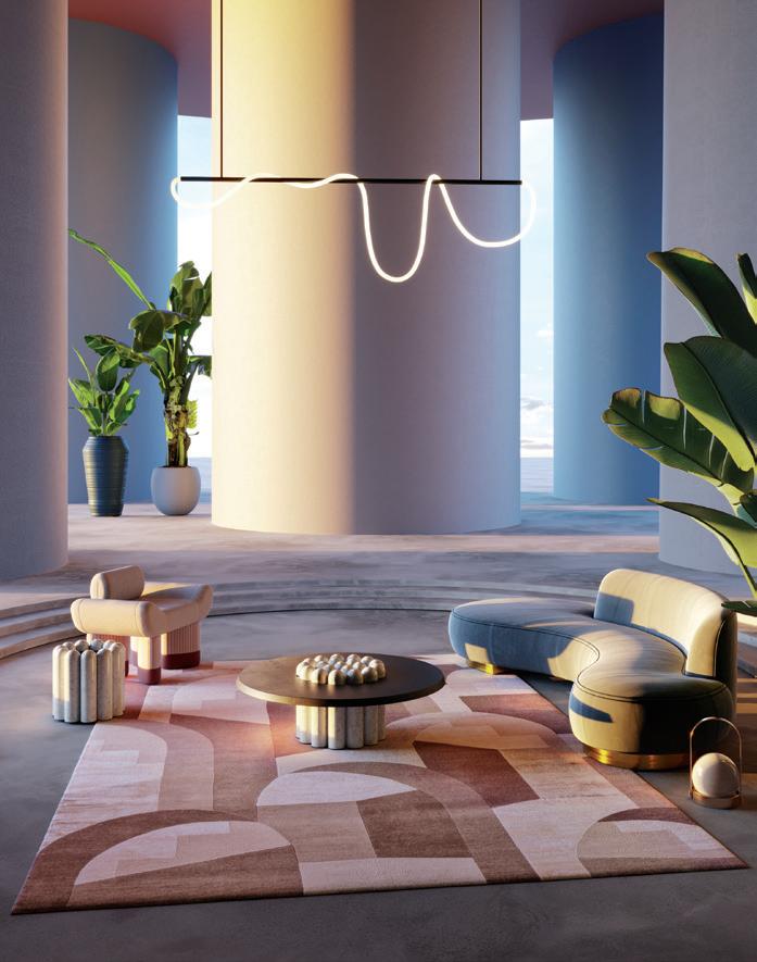
In search of depth
A TROMPE-L’ŒIL EFFECT CREATED BY SHIFTS OF PERSPECTIVE AND TONE, IN THE CHIRICO CARPET DESIGNED BY CHARLOTTE TAYLOR FOR ILLULIAN
Walking on the Chirico carpet by Illulian means entering a surreal vision of classical architecture. The London-based architect and artist Charlotte Taylor takes her inspiration from the buildings of Ricardo Bofill, Xavier Corberó and Richard England to create a complex, otherworldly space on the soft surface of the rug, prompting the observer to discover a third dimensional in an otherwise two-dimensional surface. The effect is also sustained by the delicate chromatic choices, masterfully applied. Two qualities are available – Gold 100 in wool and silk, and Platinum 120 which is the most exclusive line, featuring the use of wool and silk of the highest quality, spun by hand with extremely complex workmanship that generates very striking ‘sculpted’ effects. The custom-made service, a strong point of the brand, makes it possible to have an absolutely bespoke carpet, choosing colors, designs and measurements. Also for this reason, the rugs are ideal for any situation, from residences to contract projects, but also museums, showrooms, hotels, restaurants and solutions for the nautical sector. Chirico is part of Limited Edition, the exclusive line created thanks to collaboration with artists, to create intriguing contaminations of design with other fields such as graphics, architecture, sculpture, fashion, photography and television.

The Versace lifestyle enters the home
VERSACE VENUS armchair
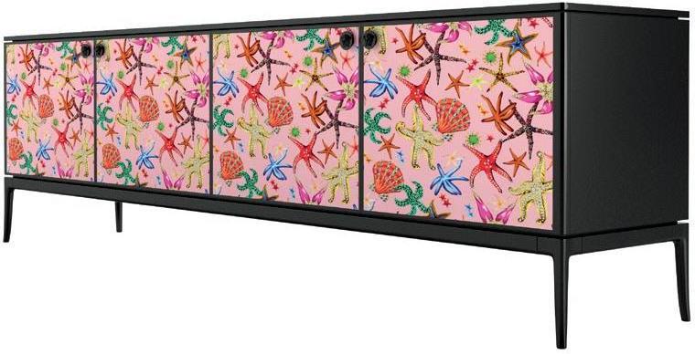
The iconic Medusa, gold, black leather, bold color combinations, enchanting forms. The 2021 Versace Home collection features all the attitude and energy typical of Versace. But there’s something more: the baroque style, the rich and opulent decorations, the prints and symbols that made fashion history, are now revisited in a contemporary key and merged into the world of furniture. A new creative vision that further enhances the brand’s DNA and expertise thanks to the partnership between Versace Home and Lifestyle Design, the Italian division of the American company Haworth Group, in charge of the development, production, and distribution of the brand’s furniture line. The first three pieces embodying the spirit of the new collection are now unveiled: the Versace Venus armchair, the Goddess sofa, and Stiletto cabinet, three furniture items characterized and united by the brand’s unmistakable design, unique style, and manufacturing savoir-faire, in fashion just like in furniture. The first, the Versace Venus armchair, with its soft black leather covering, is a tribute to Versace ready-towear and accessories with its asymmetrical silhouette embellished by a shimmering zip on the back, adorned with a plate depicting the famous and magnetic Medusa, and finishes in gold-plated steel recalling the brand’s inclination for hardware. The Goddess sofa is an ode to Versace’s sensuality, with its curved lines recalling the emblematic leather jackets, available as a two- or three-seater, modular with central or side element, chaise longue and pouf. Lastly, the Stiletto cabinet, a genuine example of expert craftsmanship, in lacquered wood and extra-clear laminated glass, featuring clean lines lit up with colors and designs: the front doors are in fact decorated with a selection of Versace prints, such as Virtus, Jungle, Medusa Amplified, and Trésor de la Mer. A precious storage element embellished with yet another detail, a true delight for enthusiasts of this brand: knobs with the Medusa logo, which add the final, exclusive touch to this product.

VERSACE HOME UNVEILS THE FIRST THREE PIECES OF ITS 2021 COLLECTION: THE VERSACE VENUS ARMCHAIR, THE GODDESS SOFA, AND STILETTO CABINET, FURNISHINGS THAT RECALL THE CLASSIC PRINTS AND SYMBOLS OF THE FAMOUS FASHION HOUSE
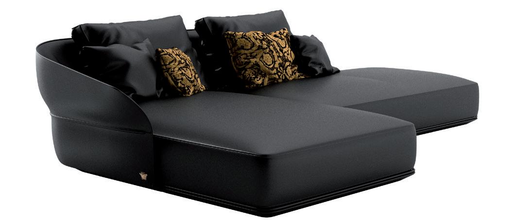
GODDESS sofa STILETTO cabinet
www.versace.com
Bizarre creatures on the table
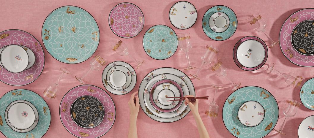
A FANTASTIC PLACE WHERE EVERYTHING IS POSSIBLE, THE ARCADIA COLLECTION BY GINORI 1735 IS INHABITED BY LITTLE CREATURES THAT BRING HAPPINESS AND DREAMS
They flit lightly over white porcelain – flowers with eyes, plants with whiskers, seahorses, angels and devils, all created by the fashion designer Orazio Stasi for the Arcadia collection by Ginori 1735. These asymmetrical compositions remind us of the fruit and flower decorations of the late 1700s, while the ‘total gold’ decoration that embellishes the place markers and fruit plates with colorful textures (in tones of black, pink and aquamarine) links back to the ancient art of agate burnishing. The Arcadia collection is composed of 24 table, tea and coffee items. The decoration is a decal in many colors applied by hand, while the outer border is made with the threading technique.
The new normal of outdoor cooking
NORMA IS THE NEW OUTDOOR KITCHEN PRODUCED BY RODA AND DESIGNED BY RODOLFO DORDONI. A DYNAMIC STRUCTURE THAT COMBINES REFINED DESIGN WITH HIGH PERFORMANCE
The Norma model like a mobile set of components for informal, convivial life, in a kitchen that thrives on a sense of rediscovered social contact in a carefully coordinated outdoor area. As a new development for Roda, Norma opens the path for the company in the world of cooking, providing a natural complement to the outdoor context. The new openair kitchen designed by Rodolfo Dordoni combines minimalism in its forms with dynamism of its functions, becoming a place of experimentation, technology and design. Created in collaboration with Ilve, an Italian company specialized in the production of professional kitchens for domestic use, Norma is a summary of the authentic, shared values of two Italian firms: a focus on ‘beautiful and well-made’ and an accent on personal wellbeing, with the commitment to improve the quality of time spent in a domestic setting. The elegant profiles and high performance make this a complete kitchen. The independent structure makes this model adaptable in limited outdoor spaces, or larger areas with more variegated furnishings. The freestanding island, made in the distinctive Smoke color of RODA, contains a sink block in AISI 304 stainless steel grafted into the durable top in Lapitec® with a structured finish. The peninsula offers an extension of the work area, which lengthens to form a suspended counter that can also be used for dining. The hob with a triple crown and five gas burners exists on its own with respect to the other units, and can be placed on fixed feet or wheels for easy movement, also to be stowed away below the peninsula worktop.
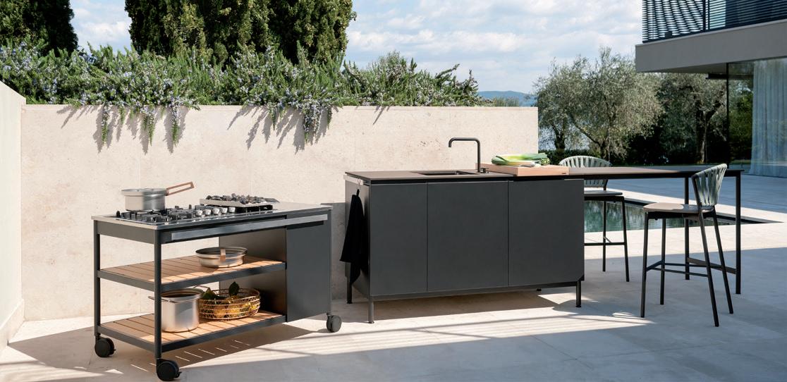
NORMA kitchen
www.rodaonline.com
Imperceptibly technological
FLOS OUTDOOR EXPANDS ITS RANGE OF LIGHTING ELEMENTS FOR OUTDOOR SPACES, DESIGNED TO BLEND INTO THE NATURAL CONTEXT
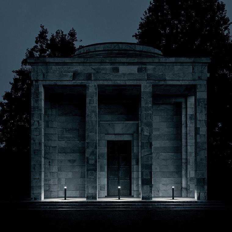
Photo © Tommaso Sartori Not just lighting fixtures, but elements capable of blending perfectly into an outdoor context, following the natural rhythms of flora and fauna. These are the new creations of the Outdoor Spring 2021 collection by Flos. Families of coordinated lighting devices punctuate the open-air ambience, balancing aesthetic elegance, low environmental impact and the most advanced technologies (like the new anti-corrosion treatments). Among the new offerings, In Vitro Unplugged stands out, as the latest addition to the elegant In Vitro family of outdoor lights created by Philippe Starck for Flos Outdoor. It is a glass lantern, rechargeable and portable, with a handy fastener in soft-touch orange silicone to facilitate movement into any location – though designed for outdoor use, it is also ideal as an indoor lamp. The head conceals a luminous disk, an ultra-flat circular LED light source, whose glow is captured and spread by an empty sealed capsule in borosilicate glass, creating a magical volume of light. An absolutely new entry, on the other hand, is Pointbreak by Piero Lissoni: a family featuring exceptional technology and essential but sophisticated design, starting with the original supercircle form (halfway between a square and a circle), with light emission at 360°. Conceived as a technological candle, it is ideal for gardens, plazas, parks, public and residential spaces. The great variety of models, available in various diameters and sizes, all offer the soft, delicate light of Pointbreak, an almost imperceptible presence designed so as not to interfere with the setting, if not in a sensual way, becoming a reliable point of reference along a path.
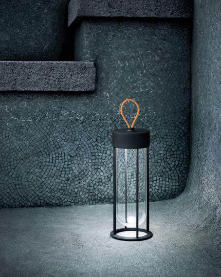
Photo © Tommaso Sartori
IN VITRO UNPLUGGED lamp

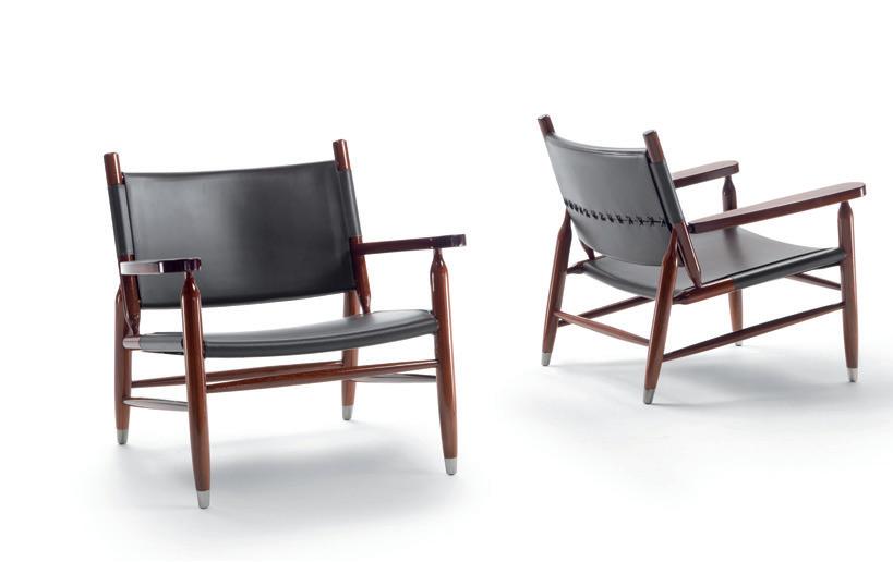
TESSA armchair
Manual knowledge
IN THE TESSA ARMCHAIR DESIGNED BY ANTONIO CITTERIO FOR FLEXFORM, THE HIGH LEVEL OF MANUFACTURING QUALITY CONVEYS ALL THE COMPLEXITY OF SIMPLE THINGS
Every detail of construction reveals the great complexity that lurks behind an appearance of simplicity. The Tessa armchair narrates this expressive capacity of forms, designed by Antonio Citterio and made with exceptional skill by the artisans of Flexform. Highly specialized craftsmen, utilizing expertise passed down through generations, making complex, heterogeneous parts into a linear, essential whole. The very concept of Tessa reflects all the ingenuity of a structure in polished mahogany, with seat and back in cowhide and refined stitching on the back. The cowhide and wood have been selected to meet the highest standards of quality and sustainability. The excellence of the materials and the working processes have an impact not only on the durability of Tessa, which brings lower environmental impact, but also on its timeless aesthetic. An aesthetic that in keeping with the company’s philosophy has to follow canons of sober elegance, tactile and visual comfort, and coherent design.
www.flexform.it
All the shades of cold
THE REFRIGERATION LINE OF SIGNATURE KITCHEN SUITE OFFERS HIGH-TECH DEVICES, EXCEPTIONAL DESIGN, FLEXIBLE SOLUTIONS AND RELIABILITY, NOW ALSO IN FREESTANDING VERSIONS. LIKE THE FRENCH DOOR OR THE VINO CANTINA SERIES
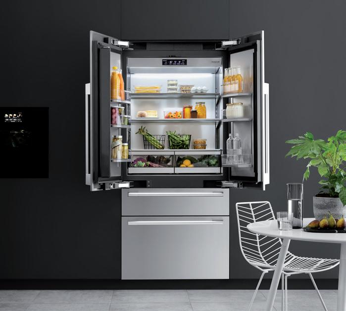
Composed of built-in or freestanding modules for cooling, freezing and wine storage, the Signature Kitchen Suite collection for the conservation of food stands out for its high technology and striking image based on painstaking macro- and micro-design, and great flexibility that permits configuration of different personalized combinations of spaces, solutions and operative areas. The top of the line is the built-in French Door refrigerator, ready for paneling with the same finishes as the kitchen, or with doors in stainless steel. The unit offers a versatile internal space with three separate compartments, for total capacity of 486 liters. The two-door refrigerator (from 0° to 6°C) has interiors in glass and stainless steel, three shelves brightened by the LED True-Illumination™ system, two drawers with telescopic guides and soft closing, 6 removable door bins in ABS, and a chilled water dispenser built into the internal side wall. The convertible drawer can function as a refrigerator or a freezer, automatically setting to the same temperature as the upper or lower compartments, thus boosting

VINO CANTINA wine cellar
storage space. As an alternative, it can be independently set to four different temperatures: -1°C (meat and fish); 1°C (chilled beverages); 3°C (prepared foods); 5°C (cool wine). The freezer drawer (from -16° to -24°C) incorporates an automatic ice-maker containing up to 2.3 kg of ice cubes. With zones regulated to different temperatures and humidity levels, and a dedicated evaporator, the Vino Cantina wine cellar, built-in or with paneling, is available in two widths, 60 cm (113 750ml bottles) and 45 cm (71 bottles) and equipped with a Linear Inverter compressor to make the unit extremely quiet, reducing vibrations to a minimum. The natural beech used for the 10 shelves adds stability and functions as a natural regulator of internal micro-climate, while the glass door shields against UV rays, to avoid harming wines with light. The Smart Knock door technology activates the internal lighting, with two knocks, for a view of the bottles without opening the door. All the products of the food conservation series are also presently available in the freestanding version with lateral paneling, applied to the individual product or to a combination of different refrigeration units.
In dialogue with nature
AN OUTDOOR COLLECTION THAT CREATES A SOLID BOND BETWEEN MAN AND NATURE. STANKAR, FARNESE AND AMINTA ARE THE NEW PRODUCTS PRESENTED BY VISIONNAIRE, DEVELOPING ITS IDEA OF GLOBAL DESIGN FOR PSYCHO-PHYSICAL WELLBEING
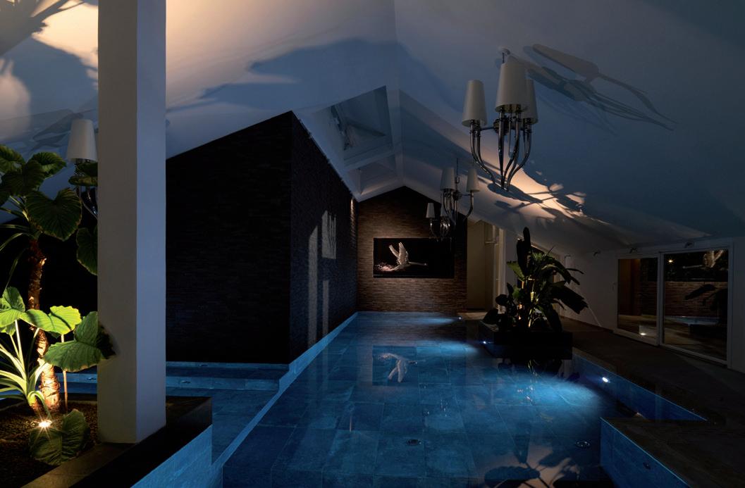
Photo © Max Zambelli
AMINTA armchair
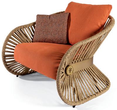
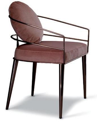
‘Life according to nature’ is the slogan chosen by Visionnaire for the presentation of the new outdoor collection for 2021. Contemporary man needs to have a closer relationship with the environment, especially in this moment when the planet is in danger. This is why the company has conducted research on living spaces, raising environmental standards and putting an accent on factors like orientation, natural ventilation and thermal efficiency. One example is the Casa Piscina (housepool) project created in collaboration with the architecture firm Rizoma, on the Tuscan-Emilian Apennines. This is a private home with the characteristics of a professional therapy center. This project led to reflection on the fact that the more related with are to nature, the more our sense of wellbeing is increased. How can this mechanism be set in motion? Through the presence of water, greenery, and the study of solar exposure, ventilation and orientation. The aesthetic aspect becomes a value capable of creating regenerating spaces, such as those furnished with Visionnaire products from the outdoor collection for 2021. The Stankar family, with strong ties to the world of fashion, is made by La Conca and composed of a sofa, an armchair, a rocking chair and a low table. The structure in cord, using natural hemp and lurex, is inspired by espadrilles, whose soles are made of the same material, for defense against summer heat. The low table combines the cord structure with a circular top in volcanic stone. The protagonist of the Farnese daybed designed by Samuele Mazza is another natural material, the black rattan of the main structure, supported by elegant feet. An example of precious workmanship applied to this material derived from Calamus Rotang, a climbing palm widespread in tropical and sub-tropical zones. The daybed is completed with a parasol canopy surrounding the headboard. Aminta is the seat designed by Giuseppe Viganò, perfect for both indoor and outdoor use. The project develops the idea of steel tubing that creates a skeleton for a chair with a removable padded cover, for use in the home, while the outdoor version calls for a throw cushion with a circular form. The Sveva chaise longue is also ideal for the living room or the garden, again designed by Viganò, with a form inspired by the waves of the sea, and a cover in white Sangallo lace.
CASA PISCINA project
www.visionnaire-home.com
STANKAR armchair
Ancient wellbeing, contemporary comfort
YOKU SH IS THE LATEST CREATION OF EFFE, COMBINING A SAUNA, A TURKISH BATH AND A SHOWER IN A SINGLE SPA AREA
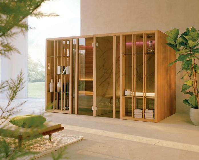
The internal space is warm and welcoming, essential and rigorous. The exterior, wrapped by vertical elements in natural wood, conveys the sensation of being immersed in nature: hence the name, referencing the Japanese branch of natural medicine known as shinrin-yoku, of “forest bathing.” The Yoku SH mini-spa by Effe (designed by Marco Williams Fagioli) is a solution that combines sauna, Turkish bath and shower, generating surprising effects of wellbeing. The distinctive feature of the system is the presence of large smoked glass windows, set back from the front; in the Yoku S/SH version, the façade becomes a large open “bookcase” that helps to insert the spa into its surroundings, while boosting the level of internal privacy. There is also the D/SH version with a wooden door on the sauna side, or the G/SH with a glass door on both sides (sauna and hammam).
Dressing the home
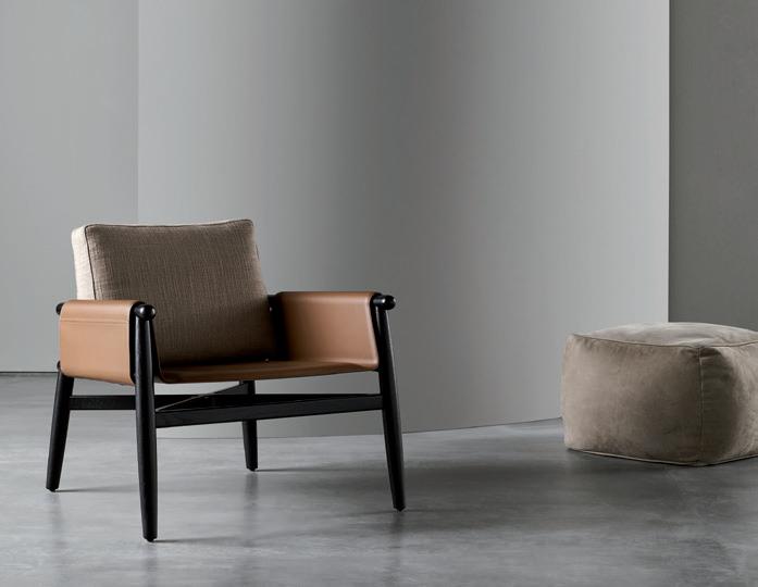
THE SARTORIAL APPROACH OF MERIDIANI CREATES INTERIOR DESIGN PROJECTS MADE TO MEASURE FOR THEIR USERS. THE NEW EMILIA, TERESA AND TERESINA SEATING MODELS PROVIDE A GOOD EXAMPLE WITH THEIR ELEGANT PERSONALITY
www.meridiani.it
Materials and an appealing range of colors are the factors applied by the designer and art director Andrea Parisio for the new Meridiani collection, tailored down to the smallest details and stylistic touches. Emilia is a model that conveys a sense of essential lightness; its structure in solid wood has been designed with rounded forms and lines. The back stems from the extension of the two back legs, and is completed with a soft line that embraces the user. The version in wood provides a contemporary look, while the lacquer finish adds a more elegant, refined touch. There are two types of seats: one is padded, available with covering in the fabrics and leathers of the collection; the other has a cowhide shell. The collection also includes Teresa and Teresina, an armchair and lounge chair in solid oak, created in the ‘soft’ and ‘kuoio’ versions, depending on the materials. In the first case, Parisio has chosen the softness of upholstery covered in fabric or leather, enhanced by special double-ribbed stitching. In the second case, the back, armrests and seat are in cowhide, fastened to the oak structure. Both seats can be enhanced with a pocket for objects, an optional for the padded versions and built into the cowhide versions, for handy storage of magazines, books, blankets, tablets or small items. The pocket can be placed to the right or left, or on both sides.

TERESA armchair
EMILIA chair
Speed of transformation
FOR TWO OR FOUR PERSONS, BUT ALSO FOR MEETINGS WITH LARGER GROUPS, WITH CURTAINS, WITHOUT CURTAINS, IN DIFFERENT FORMS AND CONFIGURATIONS: THE PAVILION O MODULAR STRUCTURE BY KETTAL RESPONDS TO ALL NEEDS
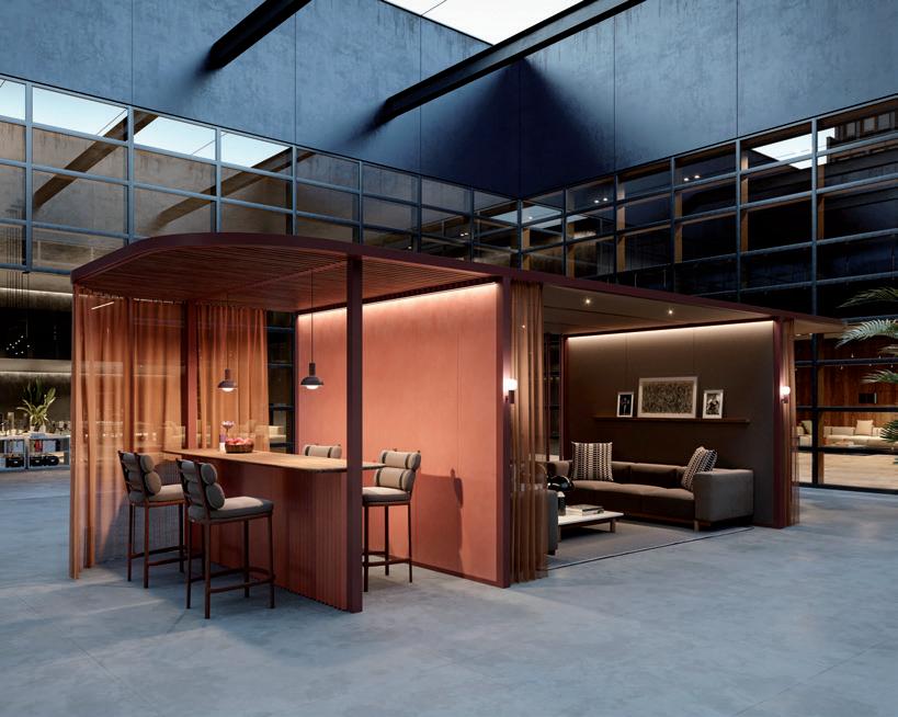
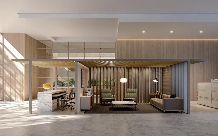
By now we are all aware of the fact that the workspace needs to be reinvented. Now we need to understand how to do it, and Kettal, with Pavilion O, offers a very valid solution, because it not only transforms spaces, but also does so through an agile organizational structure that keeps pace with the changes of our time. Pavilion O, designed by Kettal Studio, consists of a structure in aluminium with which to combine various materials like glass, wood and fabric. It can be enhanced by practical accessories like shelves, screens, slates and display cases. The entire demountable structure, for rapid installation, is also ready to channel wiring and to work with various functional tools. Its modular nature permits creation of infinite configurations of offices and workspaces, for easy, quick modification in the future. It is possible to create meeting rooms for two or four persons, all the way to spaces for 8 participants. The form can vary, producing a more rounded, open hub, or a setting with sofas for lounges and reception areas. Click & Work is the unique Kettal configuration system that permits transformation of spaces into true ecosystems of style. From wall to wall, or corner to corner, the options for creating adaptable workspaces are practically unlimited – and the fundamental factor is speed of transformation.
Japanese style
DEBUT OF THE NEW ESSENTIAL WALLPAPER COLLECTION FOR 2021 IN COLLABORATION WITH STUDIOPEPE. INSPIRATION MADE IN JAPAN FOR WALL&DECÒ
KOMOREBI wallpaper
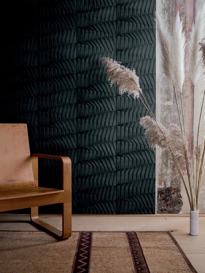
Wall&decò continues to produce aesthetic surprises. In January the brand launched the Contemporary Wallpaper 2021 collection, in a completely novel way, through a virtual museum, the WeMU | Wall&decò Experience Museum, a digital invention for the occasion. Now the brand is back with an exclusive presentation of a new collection, created in partnership with Studiopepe: Essential Wallpaper 2021 offers five new patterns – three by the designers Arianna Lelli Mami and Chiara Di Pinto, two by the art director of the company, Christian Benini. A collection known as “essential” due to its aesthetic language, but also featuring intriguing touches thanks to its accentuated 3D design. These virtues are the result of the workmanship that goes into the entire range: skillfully hand-finished plates bring out the stucco coloring and the natural effects; the deep reliefs sculpt the surfaces, enhancing walls with unusual ton sur ton architectural elements. The main inspiration for the wallpapers – Ashi, Ha, Hikari, Komorebi, Yoku – comes from the Japanese tradition, which has influenced the development of the various patterns: “We observed the fascinating manual skills of folded paper, typical of Japanese culture – the designers explain. – The names have meanings directly linked to traditional techniques. The idea was to start with a sheet of paper and make it come alive through the three-dimensional effects of folding.”

www.wallanddeco.com
Sensorial surfaces
THE PREMIUM COLLECTION OF ARPA INDUSTRIALE: A SELECTION MADE IN ITALY OF HIGH-QUALITY SURFACES FOR INTERIOR DESIGN
Raw materials are a clear focus for Arpa Industriale, the manufacturer for over 60 years of panels with HPL technology, and the creator of the innovative Fenix®, a high-tech material that has revolutionized interior design. Architecture, interiors, healthcare, yachting: the destinations for the Arpa collections are various, and lead to an even wider range of expressive possibilities for the company based in Bra, developed by starting with its surfaces. The new Premium Collection fits into this scenario: 208 decorative effects, combined with 23 exclusive finishes. The collection is divided into five families: the essential solid colors of Colorsintesi, the natural tactile effects of Legni (woods), the versatility of Pietre (stones), the intriguing contaminations of fabrics, oxidations and cements of Fantasie, the luminous glow of Metalli (metals, for vertical application). The material dimension of Premium is then interpreted in various finishes by Arpa, as Alevé, Flatting, Kèr, Losa, Luna, Mika and Urban.
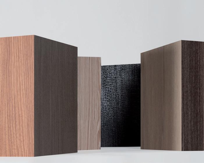
HIKARI wallpaper
www.arpaindustriale.com
The material that creates
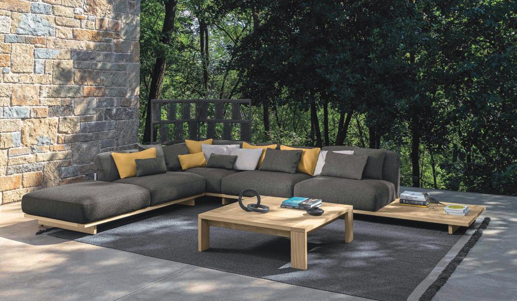
THE SKILLFUL USE OF VARIOUS MATERIALS LIKE THE WOOD OF THE EXTERNAL BOX, THE FABRICS, THE CUSHIONING AND WOVEN CORDS, GIVES RISE TO THE ARGO OUTDOOR COLLECTION DESIGNED BY PS+A PALOMBA SERAFINI ASSOCIATI FOR TALENTI
ARGO collection
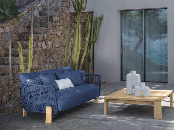
ARGO love seat sofa
The studio Palomba Serafini Associati wagers on a selection of innovative materials, geometric lines and various types of workmanship to create the Argo outdoor collection, whose name refers to the wooden vessel sailed by Jason and the Argonauts through the Greek islands, in search of the Golden Fleece. Wood is the material of the box, with sides enclosing cushions and comfortable, abundant seats. Apart from the elegance of the lines and forms, Argo offers maximum personalization, with a modular sofa capable of providing everyone with their own space, made to measure, to create the preferred outdoor setting. The new Talenti collection includes sofas, tables, chairs, cots and ottomans, and reflects the Umbria-based company’s ability to work with wood, aluminium and fabrics, creating masterpieces of craftsmanship. The cushioning of the three-seat sofa, with its large seat, is made with padding in quick-dry foam. The runners make the sofa seem to float over the ground. The same characteristics apply to the Love Seat for moments of relaxation, with feet curved on the outside, and an armrest and back produced with a handmade weave of synthetic cords. The fabrics utilized for the collection stand up to weathering, while the external structure is made with innovative Accoya wood, a material with exceptional physical and mechanical virtues, for great durability in contact with water, earth and other substances. This wood has been utilized for the entire collection, including the dining tables, available in different sizes and shapes, and the coffee tables that respond to all spatial needs.
www.talentisrl.com
Retro atmospheres
LEATHER, COWHIDE, MENSWEAR FABRICS COMBINED WITH SOLID WOOD. THESE ARE THE MATERIALS OF WARM LIVING, USED BY GIANFRANCO FERRÉ HOME TO CREATE A METROPOLITAN MOOD AND VINTAGE STYLE
Every detail, every color, every type of material selected – everything has a role to create a particular atmosphere inspired by the Fifties. Gianfranco Ferré Home presents The Warm Living with the Phoenix sofa that becomes a protagonist, thanks to its ample forms and original reinterpretation of the classic roll-arm sofa, also in the armchair from the same line. While the sofa, with an armrest and back slightly angled outward with an oval shape, is covered in cowhide with elegant exposed stitching, the armchair embraces the user with its forms and its warm Prince of Wales fabric covering. As opposed to these soft lines, the Matrix tables seem to float thanks to their light form and essential structure, with finishing in black chrome and movable tops covered in natural cowhide with stitched borders. The puzzle is completed with a final element, the Franklin chair, which creates a warm, enveloping atmosphere with its Pied-de-Poule cover, thanks to the bronze tone of the fabric and the fine wood of the structure.

Under the sign of art
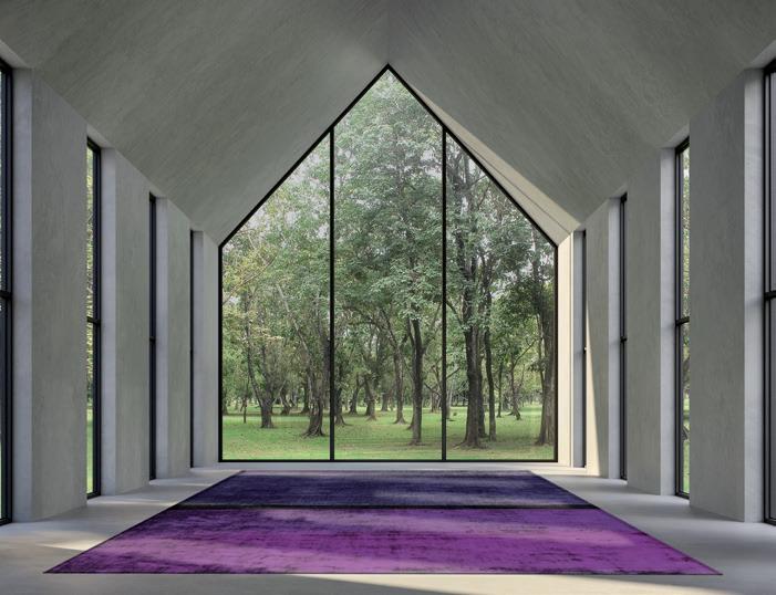
TWO NEW BESPOKE COLLECTIONS HAVE BEEN ADDED TO SAHRAI’S EXTRAORDINARY PRODUCTION. A TRIBUTE TO THE INTERNATIONALLY ACCLAIMED ARTISTS SAMUELE MAZZA AND CHRISTIAN HETZEL
GOLD IN SAND NO. 2 by Christian Hetzel
The new collections of Sahrai carpets on view in the showroom on Via Manzoni, Milan, are true works of art. A heartfelt tribute to the artists Samuele Mazza, Italian, a desire with a past in fashion who has made a name in the world of interior design, and Christian Hetzel, German, known for his minimal works. The foundation concepts of Sahrai – creativity, experimentation,

research, design, innovation and sustainability – are harmoniously blended with the permeating theme of nature, together with an accent on color, applied in a skillful but extremely different way. The 6 carpets designed by Samuele Mazza within the Designers Selection Collection spring from a sense of freedom one feels when immersed in nature and its spaces. Influenced by his origins in Sicily, which he likes to depict in is works, and by the abstract artist Mark Rothko, whom he admires, Mazza amplifies vivid tones and combines them with geometric aspects. Gold, lemon yellow, blue, ice gray and violet burst forth. The colors of the sky, the sea, the infinite shadings of natural light, invade carpets full of contemporary
MOMA 05 by Samuele Mazza
simplicity, all made in the completely biodegradable Tencel fiber. The 8 projects of the Tranquility collection, inspired by Christian Hetzel and inserted in the Artists Selection Collection, are the offspring of the large abstract paintings that have made the artist so popular in the world of contemporary art. We see the same minimalist expressive power, based on the concept of ‘less is more,’ and the same source of inspiration: nature, represented with discreet colors and textures without contrasts. The dominant hues are delicate blues and grays, with varying degrees of intensity and warmth, along with brown, gold, and the countless tones of the sunset.
www.sahrai.com
Living in connection with nature
PRATIC PRESENTS THE FIRST BIOCLIMATIC PERGOLA WITH MIRRORED WALLS, A STRUCTURE THAT MERGES WITH THE LANDSCAPE TO EXPERIMENT A NEW WAY OF LIVING EN PLEIN AIR
Living in osmosis with nature until almost disappearing in one’s surrounds: Pratic presents Connect, the bioclimatic pergola with mirrored walls that blends in with the landscape, reproducing the ever-changing beauty of the panorama on its very surfaces. A patented design allowing total relaxation en plein air in complete privacy and comfort: the Spy Glass panes offer a perfect view of the outdoors, but make the interior invisible from the outside, while the walls in tempered glass, certified by the Giordano Institute for their resistance to air, wind, and water, guarantee utmost insulation. The pergola combines bioclimatic design with home automation technology: the covering, with its aluminum louvers adjustable from zero to 140 degrees, or even retractable, adjust the sunlight, heat, and ventilation, and can be controlled via voice commands with Amazon Alexa and Google Home; in case of rain, snow, or strong winds, the louvers automatically close thanks to the weather sensors, thus protecting the space below and conveying the rainwater through a perimeter guttering system hidden in the uprights of the pergola. Connect can be supplied in custom dimensions up to a size of 5.5x7 meters, or composed with multiple modules featuring personalized finishes and accessories such as glass walls in the mirrored or fumé version, the aluminum structure in a selection of colors, Raso vertical drop shades, Led Line dimmable perimeter lighting, Spot Lights or Quadra Lights inserted in the louvers, and the Set platform to resolve any slopes or uneven surfaces.

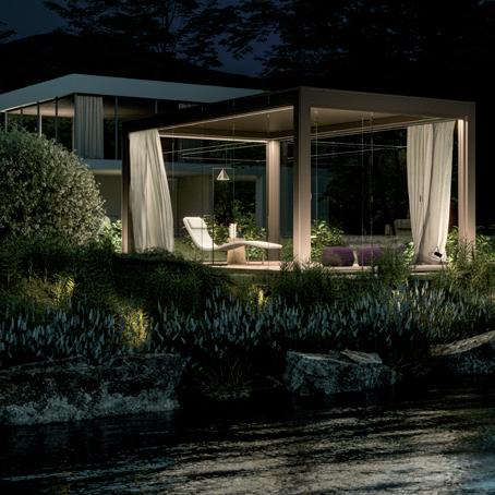
CONNECT pergola
