
8 minute read
PEOPLE
Photo © Alessandra Ianniello
INTERVIEW WITH FEDERICO PERI
text by Veronica Orsi
An aesthetic language visually identified with a “trapezium with beveled corners”: Federico Peri likes things to be linear, a trait that set him apart from the outset, as it sets apart the Bauhaus style he so admires. But in his path of evolution – and of rapid success – he has become “gentler” due to new experiences and materials, rapidly leading to a delicately sinuous poetic. He applies it to interior panoramas and worlds of furnishings – with brands like Baxter, Wall&decò, FontanaArte, Purho Murano, Salviati, Nilufar – where he finds and brings inspiration.
Milan - Paris - Milan: your debut has been a pathway of contaminations. What have been the most important stimuli, that are still with you today?
Having completed my studies at the IED in Milan, I received a study grant, a residency for artists in Paris. So I moved there and found a place to work, to design, and at the same time I have my first work experience, inside an architecture studio. I would have stayed in Paris, but I felt the need for different stimuli, especially in the area of design quality. I had the chance to interview for a job with Claudio Saverino, of the studio Vudafieri Saverino Partners, who had been my teacher, and with whom I was still in contact. They hired me and so I came back to Milan. With their team, we focused on interior design, which was also my background, especially for retail fashion stores, with lots of custom furnishings. This made a difference, after which I opened my own studio in 2010-11, and then when I began to work on product design in 2014.
It all began when Nilufar Gallery “discovered” you at the Fuorisalone…
Exactly. In 2015, after a positive experience the previous year on the Ventura Lambrate circuit, where I showed my first pieces, I returned to the Fuorisalone with new ideas: Nina Yashar of Nilufar Gallery saw my work and acquired the entire collection I had made over the last two years. That was the start of a collaboration that continues today, creating custom items for the gallery. I was and I still am very enthusiastic about this: Nilufar was I gallery I had been watching since my college days! So 2014 and 2015 marked a turning point in my career, when I began to put more emphasis on product design. Until today – now I focus more on interiors than on products.
The products you create for Nilufar are stylistically distant from those you make for design companies: are these two different approaches?
Working for the gallery, I have more freedom to interpret and to represent myself, because there are no marketing constraints. Sometimes companies ask for artistic expression, but in other cases they want a certain type of product, and you have to work on a specific brief. Obviously there is also the economic aspect: with companies you have to stick to a budget and optimize production costs, while with galleries there is more openness, since we are talking about limited editions (usually 20, 30 pieces at most) or custom pieces. So each product has its own story. Finally, there is the question of materials: I focus in different ways on different materials, depending on the counterparts. If I am designing for FontanaArte, the main material is glass. For Baxter, it is leather. The gallery, on the other hand, isn’t tied to specific materials, so the results depend on what you are creating in that particular moment.
Has there been a stylistic evolution in your work, since the early phases?
In general, I always seek clear lines, and to make the material speak for itself, with respect to the design. Not by chance, the combination of styles I love, and from which I take inspiration, is that of the Bauhaus and the Viennese Secession. But I do believe there has been an evolution. In my first works the main material was metal (it still is, but initially it was more dominant). This is because I grew up in contact with my family, and my grandfathers had a factory that made industrial shelving, where I spent a lot of time in my childhood, playing, utilizing the pieces of metal I found there. The first products I made were all connected with this material, because I knew it better than others. Metal leads you to ideas that are very rigorous, clear, squared, made of tubing and flat surfaces: so it is a terse, precise style, like the world of the Bauhaus. Now, I think that approach still exists in me, but having experimented with other materials like glass or leather, and the fabrics of upholstered furniture, I have shifted towards slightly rounded form (though they are not organic, which is a concept to which I don’t relate). So I am in a phase in which I mix a delicately soft part with a more rigid, precise part that has been in my work from the outset.
So what is your favorite material today?
Metal still tops the ranks! But lately I am working a lot with blown glass, going to the glassworks in Murano, also thanks to collaborations with Salviati, Purho Murano and sometimes Nilufar: it is a material that offers endless possibilities, also in terms of colors and shadings – though it also has big limits, such as sizing, weight or feasibility, because blowing a sphere of 60cm in diameter is quite a feat. I like it because it calls for an instinctive gesture: you can also design a product on paper in the studio, but when you reach the glassworks and meet with the craftsmen, or if you want to change a detail on the spur of the moment, the material forces you to make an immediate decision, otherwise the glass gets cold and you can no longer shape it.
What new developments will you be presenting this year?
At the start of the year, we had a preview of the 2021 collection of Wall&decò, for which I designed three wallpapers; and we have just presented two lamps created for Purho Murano. Other news will soon be arriving with Baxter and Nilufar. And a boutique hotel is now opening in the center of Milan, for which I’ve done the interior design: Amabilia Private Suite.
Could you tell us more about this project?
I can’t wait to complete it, because it is a real gem, just four rooms, facing the cathedral. When they asked me to do the interiors, the client did not have a clear direction. Given the great location, I thought we should narrate something about Milan. As if to say: “This is Milan, and then there’s the cathedral, right outside.” So each room has a theme, with a very similar basic structure that differs in terms of colors and materials: La Scala, referring to the theater; Monte Napoleone, with fashion affinities; Aperitivo, not as in happy hour but as a serious Milanese social ritual, in cognac tones; and Triennale, a tribute to design and its history in Milan – which means a sofa by Cassina, a Flos lamp, a chair by Gio Ponti.
You range from product design to interiors: what have you not worked on thus far, something you would like to tackle?
I would like to do a line of clothing. I began with interior design, now I focus more on products (though there are many typologies in this field I have not yet approached), but clothing is away from my pathway thus far, so it fascinates me and makes me curious.
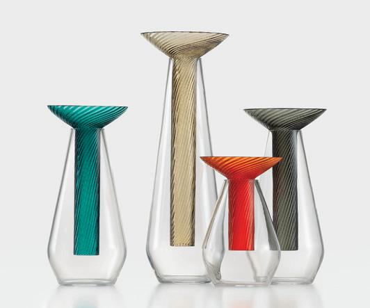
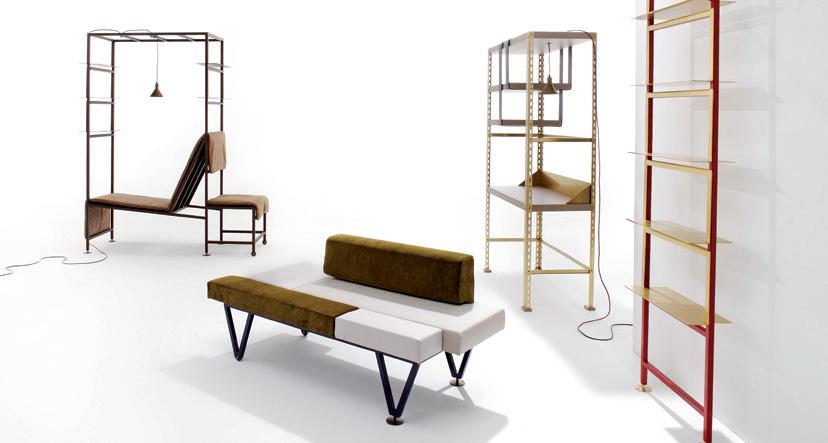
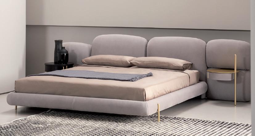
1. In the Calici collection realized for Salviati, the project emphasizes the preciousness of the material almost as if it was exposed on a pedestal and highlights a contemporary attitude, making the product easily declinable to different aesthetics by replacing the colored element. 2. This is the first collection designed by Federico Peri in 2014, observing and revising the world of the industrial furniture: objects that usually used far from the “noble” environments of the house, adopt a new connotation through the use of precious materials and thanks to their handmade feeling. Now in the Nilufar Gallery catalogue. 3. In the collection presented by Baxter in September, the Stone bed designed by Federico Peri is an outstanding item. A slight curvature has been applied to the padding of the sides (raised from the ground by brushed brass-finished metal feet) and of the headboard, which in the modular version is expanded and can contain a bedside unit with built-in lighting. 4. The designer has now enriched the Incisioni Collection by Purho Murano with two new table lamps: Haute and Petite. Created in two sizes — the larger Haute designed as a rechargeable lamp, the smaller Petite with cable — the two new lamps press forward with Peri’s research around the theme of glass engraving. 5. Part of the 2021 Contemporary Wallpaper Collection by Wall&decò, Zen is a project characterized by material and natural references. It represents a view of the outside through full-height doors opening out onto an imaginary garden. 6. In 2017 Peri began working with FontanaArte, with the Galerie family of lamps (a product that made him a candidate as “best designer debut” at the Salone del Mobile Milano Awards 2017). The Fontanella lamp is a natural continuation of the work with this company. Glass, marble, metal and cowhide are combined in a spirit of maximum lightness. 7. The Belt furniture collection designed for Baxter takes its name from the belt placed around the back: a distinctive graphic sign, for the armchair and the sofa, which adds linear rigor to a product with ample upholstery.
1
3

4 2
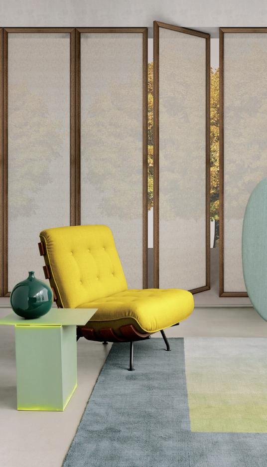
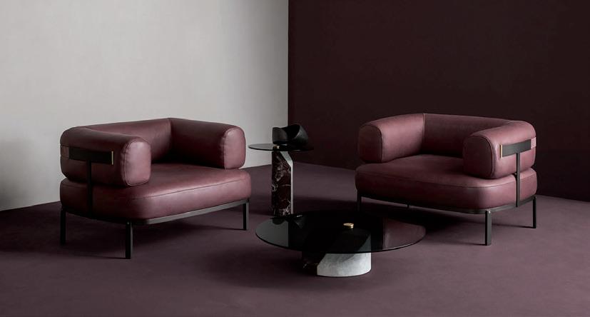
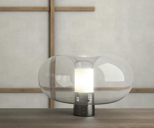
Photo © Studio Rocci
5


