8 minute read
PEOPLE
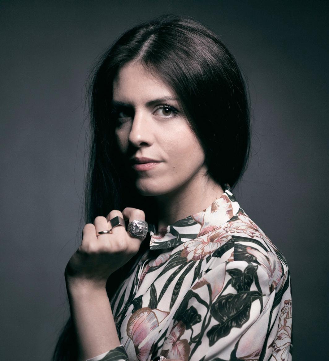
Photo © Virginia Bettoja
INTERVIEW WITH
ELENA SALMISTRARO
text by Veronica Orsi
Trained as an artist, followed by studies in fashion design and product design. This is the background that has made her “a designer in the fullest sense of the term,” always in pursuit of expressions that can channel all of her abilities. Elena Salmistraro is now one of the most outstanding personalities of design Made in Italy, who believes in experimentation and relies on creativity that draws freely on life and emotions. With hyper-decorative results. Thanks to this hybrid yet identifying approach, her career has rapidly extended into prestigious and equally varied collaborations: Apple, Disney, Vitra, Lavazza, Alessi, Bosa, De Castelli, Cc-Tapis. And more to come.
What guides your creative activity, for the most part?
Definitely emotions. When I began drawing, I felt the need to put my emotions, my needs, my necessities down on paper, first, and then canvas. I had no aspirations or aims, it was just a need, which over time has shifted and become a job. Growing up, I realized that my drawings were increasingly oriented towards the description of spaces, places made of objects and imaginary creatures. Elements I have learned to encode, to strip down, to deconstruct, then reworking them to make something concrete and real. It has been a long journey of intellectual and professional growth. Getting acquainted with ceramics has helped a lot, gaining in-depth knowledge, shaping the material, enabling a three-dimensional visualization of what I experienced previously only on a sheet of paper. This was a fundamental passage, and today I try to repeat the same process with other materials too. One of the priorities of my work is to be able to communicate, to express myself, to portray emotions through materials.
What are your biggest inspirations? I am also thinking about the anthropomorphic or animalesque forms that often recur in your works.
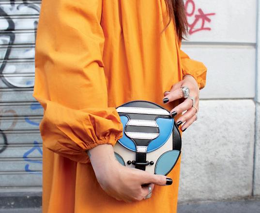
It might seem banal, but the real inspiration is life itself. I am not ashamed to say that the idea has to be sought in what surrounds us, in what is closest to us, because in the end it is what we know best, what we can narrate, resolve and investigate. The inspiration can come from a film, a book, a piece of music, a person or a personality we particularly admire. There are no limits, no rules to define what becomes the starting point, the input, the stimulus of design research. Personally, I let myself be transported by a documentary and a journey to design the Primates, but I have also addressed my design mentors in the Most Illustrious collection. I was moved by the story of a family of artisans in the Marches when I designed Lisetta and its embrace, and I had fun narrating my daughter’s smile when I designed Greta, the bag for UpToYouAnthology. Obviously the next project evolves and changes, depending on needs, materials and costs. It is always a long process, constantly evolving.
Your use of color is a distinctive feature, never banal, often with daring combinations: what is its value for you?
Color, in my view, is a fundamental factor in design, which can bring out characteristics or flatten them completely. There is no doubt that a good project will still be a good project, but skillful use of color can make the difference, taking it to another level of complexity and expressive impact. I should mention that all my projects begin in black and white, also in the first prototypes, which we make as monochromes. The colors and decorative features are addressed in a second phase, precisely in order to emphasize the volumes and forms already made. The choice of colors is often dictated by the story, the mood we want to assign to a given project. In practice, I use color in the same way I use drawing, seen as depiction, embodying precise characteristics aimed at granting the design a deeper spirit.
You work with many different materials – ceramic, rattan, fabrics – each with a wealth of types of workmanship: is it more about crafts or technology? Or both?
Absolutely both. I like to navigate in the middle, mixing, making hybrids. I have never believed that craftsmanship excludes technology, or vice versa, because I have never seen then as conflicting elements. I believe we simply have to learn to make every single aspect as well as possible, considering the pros and cons, not looking only at costs, which is reductive and embittering. On the one hand technology helps us to get beyond certain limits that effectively do exist in crafts, for example in the exchange between three-dimensional models instead of two-dimensional drawings, but at the same time craftsmanship offers a level of detail, quality and uniqueness that would be hard to achieve through mere technology, as in the case of decorations, cutting or stitching. I don’t like negations, contrasts, oppositions, so I believe it is always better to interact, to communicate, to establish a dialogue, which I think is a fundamental approach, the only one that can create real evolution.
Do you think interior design should take on a more open, “contaminated” perspective?
It depends what you mean by interior design. In the case of private residences, I think a lot depends on who will live there. I have often entered apartments designed and furnished perfectly by excellent architects, which nevertheless have no link with the personalities and the essence of the inhabitants. For public spaces, on the other hand, I believe we have to make the visitor have a different experience – the place should have a unique, concrete character. In rough terms, I believe it is more about uniqueness vs. standardization. I don’t believe people who propose universally valid formulas, to be endlessly repeated. Every place has the right to be thought out and conceived in its own particular essence.
Regarding the project “Antechamber of Dreams” for IKEA: how did this collaboration come about, and what do the results set out to represent?
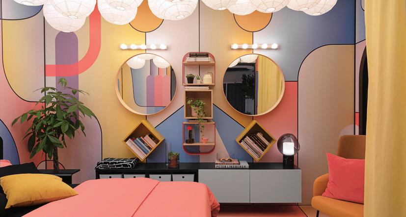
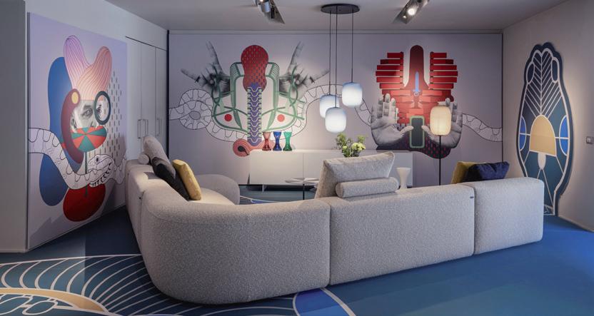
“Antechamber of Dreams” was a lot of fun, a project proposed to me by IKEA Italia. For the first time, an IKEA store made displays in the space in collaboration with an external designer. The request was obviously to narrate IKEA from a different vantage point. I studied the various catalogues, trying to connect the different elements in my own way, and after finding the ploy of a young graphic arts student to connect the story to the installation, I had fun mixing elements with almost surreal characteristics, with bright, lively colors, creating a sort of visual distortion. It was great to see this multicolored, almost psychedelic space, with a big face on the wall created by using mirrors and bookcases, and a ceiling full of white spheres, like clouds, in contrast with the surrounding settings, made in the classic IKEA style, namely in the most rational way possible.
What new developments will you be presenting this year? New collaborations?
Everything is rather slow this year, companies are having trouble planning things in the situation of uncertainty. With Capellini we have just opened a new installation in the store on Via Santa Cecilia in Milan, where we have approached the theme of “Amor Fati” in relation to design and the company itself. A narrative of images that will also be visible online. My Urban Minerva will be arriving soon to keep Topolino company, again in collaboration with Bosa and Disney. Many projects are still on stand-by for almost a year, waiting for a chance to do an official launch. Another new initiative will be my collection designed for a fashion brand… but I can’t add anything more, for the moment.
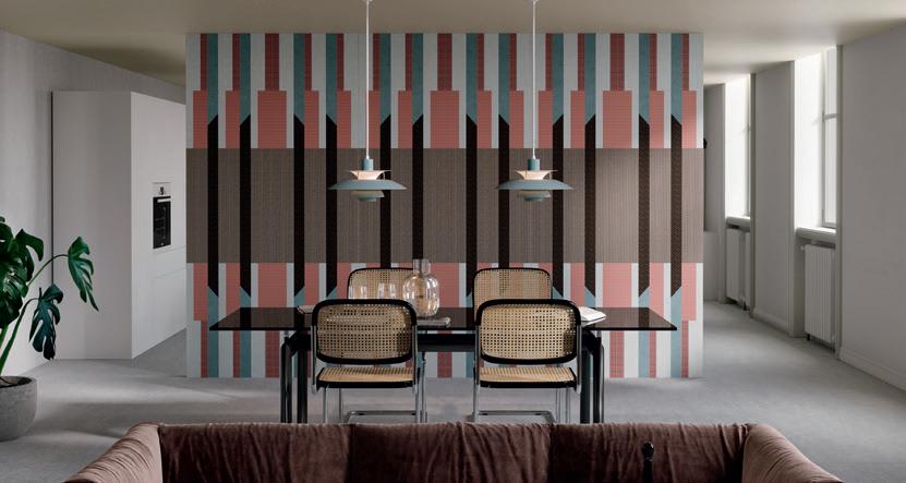
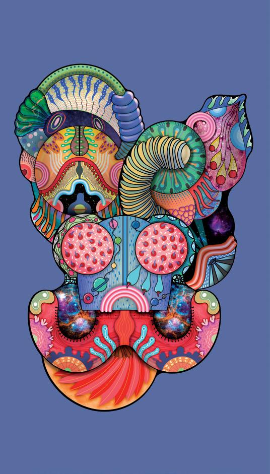
1. A tribute to the art of weaving and its origins, Lisetta is a chair designed for Bottega Intreccio, in a dual version with different heights for the back. The idea of transmitting warmth and empathy guides the design: the result is a seat of great formal and aesthetic lightness, to enhance the craftsmanship behind it. 2. The Chimera of Greek mythology provides the decorative inspiration for a collection of ceramics, of the same name, created for Cedit. Four graphic themes for a family of large slabs featuring an innovative technique of workmanship on the ceramic surface, capable of creating indented or protruding decorations. For tactile and visual effects of extraordinary impact. 3. The temporary installation “Antechamber of Dreams” created by Elena Salmistraro for IKEA (in the store at San Giuliano Milanese) is a mixture of contemporary style and energetic imagination. A concept designed for the bedroom zone of a young creative globetrotter, where the Nordic design of the brand is immersed in a poetic, symbolic setting. 4. “The idea came by chance, while playing with my daughter: a small cylindrical kaleidoscope convinced me to enclose an infinity of colors inside a perfect shape, a circle.” This is how the designer narrates the inspiration and concept of the Greta bag created for the fashion brand Up To You Anthology. 5. Primates is the collection of ceramic vases designed for Bosa. Reinterpreting the friendly animistic character of antique pottery of the Roman era in a contemporary way, the designer brings out the delicate relationship between human beings and apes. The vital force of the animal emerges through colorful textures and details. 6. The Space Escape collection of carpets designed for Moooi is a story of the unknown, of escape from everyday life, a future beyond the atmosphere, beyond the end. All enclosed in an aggregate of citations, non-forms, irregular contours, lively colors, like new primordial life forms. 7. In the installation “Amor Fati”, Elena Salmistraro interprets the world of Cappellini (hosted in the Milanese showroom of the brand), presented through the hyper-decorative language of the designer, in a story about the concept of ‘love of fate’ as a solution with which to cope with the unexpected conditions of existence.

1
3 2

4
5


