14 minute read
TREND
DUMB NUMB
The first, Dumb numb narrates the increasingly overriding dependency on screens and digital devices, which makes human relations a matter of privilege: devices are always with us, to capture every moment, every experience or event. Human engagement becomes a luxury (a concept summed up in the expression ‘luxurification of human engagement’), along with the most authentic luxury, far from hyperconnectivity, in contact with nature, off-grid, so to speak; experiences that become a new, sought-after status symbol. The colors of this Story are all connected with key concepts: a bright pink; the tones of gold, discreet and sophisticated; the strong orange that symbolically suggests friendship; a soft delicate green as screens; and the grey of technology.
Aesthetics
Stupidify The golden ticket
Color Stories
THE PALETTE FOR THE 2021 IS AN ENGAGING RAINBOW OF WARM, DEEP HUES. A FAR CRY FROM THE TONES THAT DOMINATED IN 2020, WHERE THERE HAD BEEN MORE SPACE FOR COOL, FORCEFUL TONES, REPRESENTING A SOCIETY IN CONFLICT, IN PURSUIT OF BALANCE. THERE IS A CLOSE CONNECTION BETWEEN THE EMERGING MOVEMENTS OF SOCIETY AND THE COLORS THAT SET CHROMATIC TRENDS: THE RESEARCH AND INTERPRETATIONS HAVE BEEN CARRIED OUT BY COLORWORKSTM , AND GROUPED IN 4 MACRO-THEMES, OR STORIES, LITERALLY TRANSLATED INTO 20 COLORS (5 PER STORY) TO REFLECT THE SPIRIT OF EACH THEME
text by Rachele Frigerio
Photo © Gianluca Cisternino
Ciaokefai? No WI-FI Why-FI?
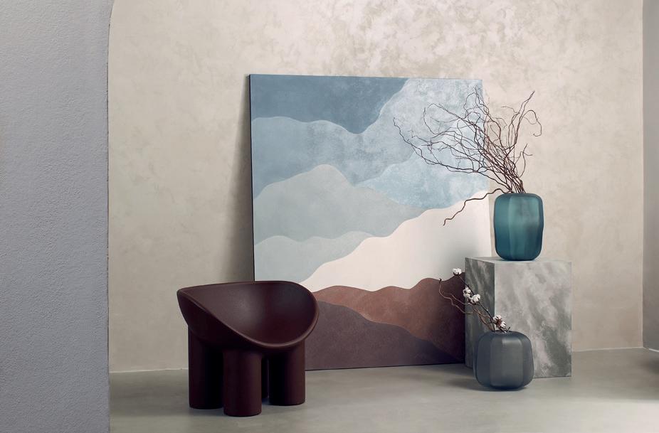
1. NOVACOLOR | LUCE_WALL PAINTING Around the concept for 2021 “Be Grateful,” Novacolor has created a line of products in praise of light. The design becomes even more refined thanks to natural colors and materials that immediately convey a sense of comfort and wellbeing. Luce_Wall Painting is a standout, with a special binder derived from sustainable biomass.
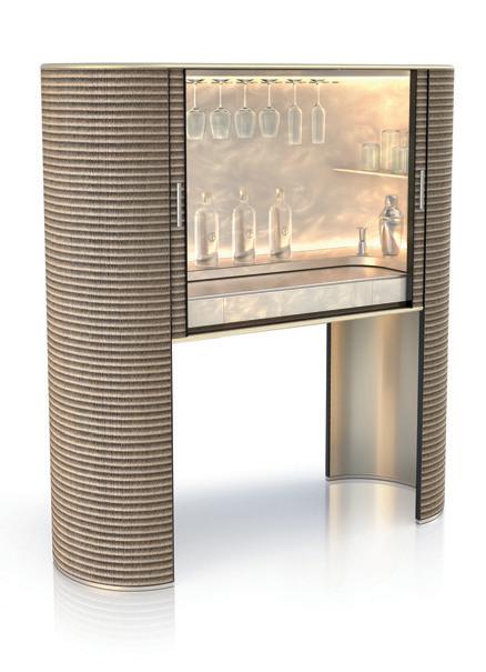
2. ARMANI/CASA | ROYAL A limited edition of just 88 pieces, Royal is a “sartorial handmade” cabinet featuring details that suggest a revised sécretaire with a shutter for closing and opening. Conserving strong ties with oriental influences and fashion inspirations, the piece is faced in a special weave of paper and cotton, similar to Japanese tatami mats, and the textured fabrics typical of the aesthetic of Giorgio Armani.
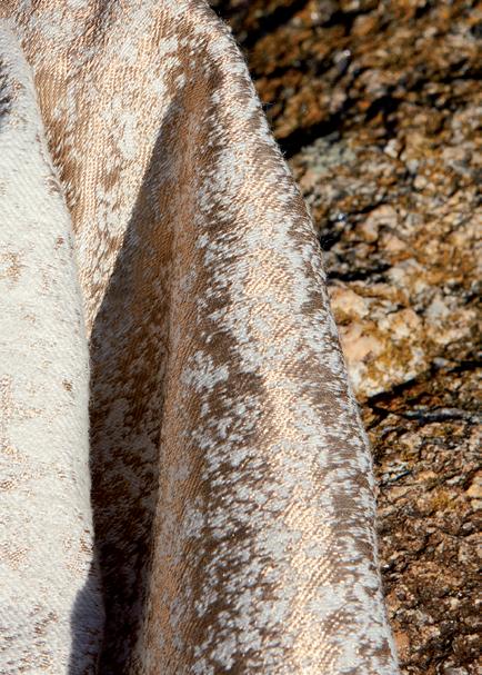
3. MÉTAPHORES | PÉPITE Pépite wool satin has the precious glow of gold. Its texture is based on a double weft that makes the fabric extremely soft, enhanced by golden threads that catch the light. Impressions range from the mineral world to a cloudy sky where sunbeams break through the haze. 1
4
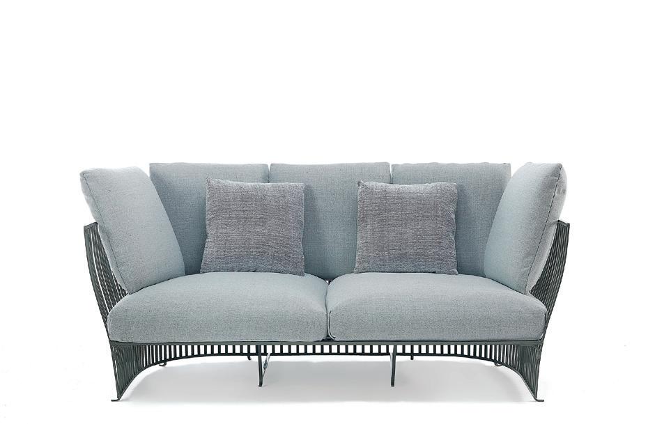

5 6 4. ETHIMO | VENEXIA A tribute to the functional elegance of furnishings typical of city living in the late nineteenth century, Venexia is the new design challenge from Ethimo and Luca Nichetto. Visually reminiscent of old-fashioned railings, the structure of the furniture is made of a refined harmonious series of very thin aluminium slats, shaped with ad hoc moulds to ensure uniformity.

5. PEDRALI | PANAREA Light, sunny, elegant. These are three good adjectives for Panarea, the new outdoor collection from Pedrali, created by CMP Design. Panarea stems from an idea of a Mediterranean coastal landscape, with an armchair and a lounge chair featuring a crafted weave, 100% Made in Italy.
6. MUUTO | AMBIT PENDANT LAMP Embodying the values of Scandinavian design, the Ambit Pendant Lamp is made of hand-spun aluminum that has been hand-painted. The collection now is introduced in a new, grander size of Ø55 cm / Ø21,6, alongside a new Light Blue color. Design by TAF Studio.
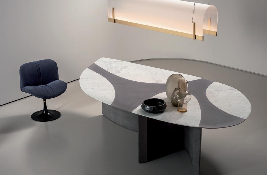
7. BAXTER | RONCHAMP Elegant, sinuous, sculptural. The new Ronchamp table by Baxter is a combination of forms and materials. Juxtaposing marble with nubuck leather, the various lines are enhanced, creating games of light and shadow.
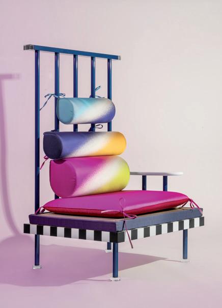
8. MEMPHIS | UTAMARO Forty years after the creation of the Memphis Group and the presentation of the famous Tawaraya boxing ring, a new family of products designed by Masanori Umeda, some of them dating from the early eighties – fully in line with the spirit of Memphis – now takes its place in the family of Post Design collections. Among them, the Utamaro series, consisting of a double bed, sofa and armchair.
Photo © Delfino Sisto Legnani. Courtesy of Memphis
Photo © Andrea Ferrari
Aesthetics

Pure False
El Dorado The Mask The naked truth
Myrddin
C-TRUE
The second Story embodies the distrust of society towards information and brands, and at the same time the growing demand for transparency. This is C-True. We live in the era of authenticity, society demands truth, both in people and in what surrounds us. We look for authenticity in our leaders and the celebrities we follow on the social networks, in the products we purchase and the brands that produce them. Colors get darker and more serious (as required by the theme of true, authentic products and services), while the touches of light rely on tones that suggest the light at the end of the tunnel. A blue that evokes the hues of marble, deep and dark; a classic faded orange evoking the color of the Financial Times, one of the few newspapers that has kept faith with its mission; the golden nuance seems to remember us that “all that glitters is not gold.” The lime green references the masks and false identities; and a hue of blue that in color psychology implies trust, loyalty and intelligence.
1. ARFLEX | MARENCO This bestseller of contemporary furniture owes its name to the designer who created it in 1970, Mario Marenco. The piece has been redesigned to make it even more comfortable. The system to assemble the cushions and armrests on the base is innovative: the cushions are simply inserted in a frame of metal tubing, to guarantee strength and resistance to wear and use.
2. INKIOSTRO BIANCO
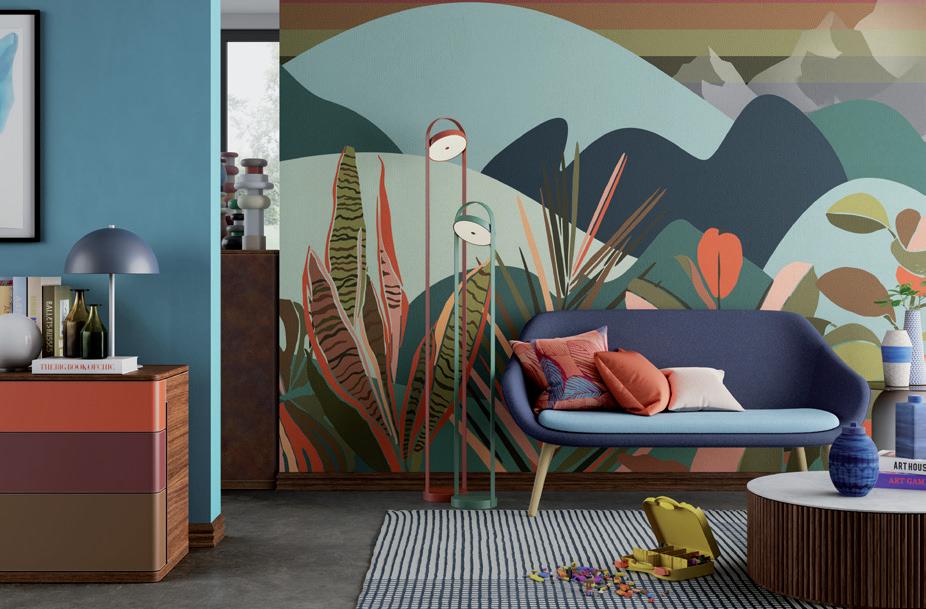
INEDITI SERIE 04-ARCADE Inediti Serie 04-ARCADE proposes a new challenge, a collection of wallpapers that transports us into a playful dimension of fun and imagination. The new collection enters a playroom and offers a series of levels, 15 in all, like the new wallpapers. A stimulus to let fantasy run wild and to explore new scenarios inside which to play your own “game.”

3. PAOLA LENTI | HARBOUR Harbour is a modular system designed by Francesco Rota, with multiple compositional possibilities. The structures covered in fabric host comfortable cushions made with Aerelle® Blue, the new completely recycled fiber with which the company has decided to make the upholstered furnishings of its indoor and outdoor collections even more eco-sustainable. 1
2
4
5
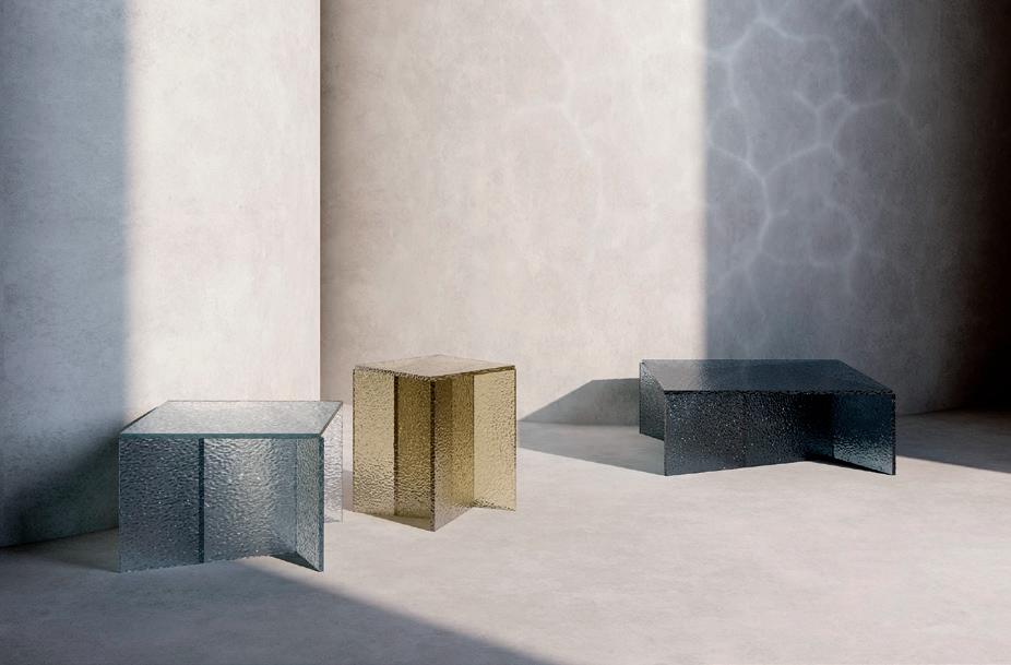
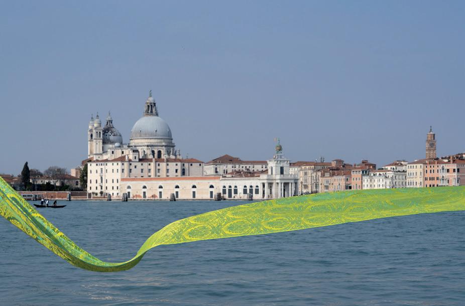

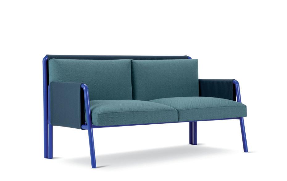
Photo © Massimo Colonna 4. ADRENALINA | SWING The match between Adrenalina and Debonademeo designer duo yields new experimental scenarios, as Swing, a series of sofas and armchairs that mixes canon and innovative design. A tubular metal frame is anchored to the upholstered seating shell. At first glance the design seems seriously rigorous, but as you sit down the feeling changes and extreme relaxing comfort is what prevails.
5. PULPO | ASPA The Aspa table series by Spanish studio MUT Design presents the perfect platform in which to express the brand’s love of glass in all its forms. The series is an exercise in simple geometry – Aspa translates to the intersection of straight planes. Each table brings together five glass panels converging at their centre. The coloured transparency of the glass form darkens to produce a layered aesthetic to the series.
6. DESALTO | SOFTER THAN STEEL Ultralight carved tops of different shapes and complementary heights define the Softer Than Steel range. Almost a playful Nendo design, with an arrangement of interesting personal variations and nestings. Also available in outdoor version.
7. RUBELLI | SAN POLO Rubelli is presenting Venice, for its 1600th anniversary, with a new pure silk damask: San Polo. Eight tonal variants are counterpointed by eight variants with contrasting warp and weft. The latter are the result of studied colour combinations, the product of colour contrasts and juxtapositions that enhance the iridescent effects.
SENSE APPEAL
The third story, Sense Appeal, puts the accent on neuroaesthetics. Every human action is connected to emotions. A factor big companies are trying to quantify and analyze through technology to get more connected with consumers. Researchers working in the discipline known as ‘neuro-aesthetics’ are attempting to identify the systems and mechanisms of our brain that respond to aesthetic input (color, design, visual art, architecture, music…), to find out how human beings react. The palette of colors to identify this trend spreads through a soft coral pink of the emotional intelligence to a metallic green; then comes the intense violet, the orangey shiny copper and apparently white hue that contains pigments of copper nuances.
Aesthetics
Motus intelligentia Sweaty Art

Mona-Lise me D.A.B.E. Yuan bei

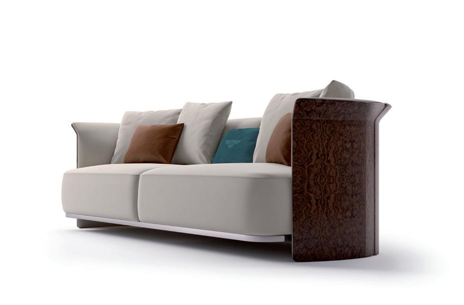
1. BENTLEY HOME | RAMSEY The new Ramsey line designed by Carlo Colombo defies gravity, with its seat suspended off the floor. Its shell, sensually tapered, flows into the armrests that reach upwards like outstretched wings. A gun metal grey insert frames the profile, reaching down below the seat. Here featuring a Burr Walnut frame.
2. RUBELLI | NADAR Nadar is a décor damask, flameproof and easy to use, connected with the world of nature. This time the reference is to the art of photography and its techniques. The lens is pointed at an expanse of flowers (waterlilies, perhaps), which when ‘printed’ become vaguely floral, rarefied and blurred forms.
3. POLTRONA FRAU | CHESTER LINE The Chester Line family is growing up with new two curved sofas, with and without armrests. The classic sofa with its sculpted design becomes a genuine system of modular sofas with various different elements: chaise longue and armchair, pouf and now two corner elements.
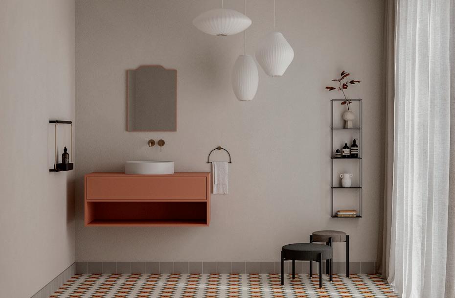
4. EX.T | NOTO Noto is a new multifunctional, versatile and dynamic system featuring storage units for the bathroom. Available in two sizes and thicknesses, it can be paired with integrated or countertop washbasins. Multiple solutions for a single component featuring clean and essential lines, suitable for different living spaces. 1
2 3
5

Photo © Marina Denisova

6
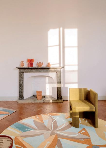
Photo © Alessandro Paderni 7
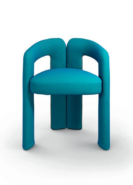

Photo © Alberto Parise
5. DE CASTELLI | WAVE Lanzavecchia + Wai reinterpret a quintessential piece Asian furniture: the shoe bench, transformed into a welcoming element. The micro architecture, designed with simple, flowing forms, is produced using solid natural copper which plays with curves, solids and voids. The upper surface provides ample space to sit down, while the base provides storage space for bags and shoes.
6. CC-TAPIS | AVINO As a natural continuation of the bespoke rugs designed for the Palazzo Avino (Ravello, Italy), Cristina Celestino presents five new designs developed with cc-tapis to be included in their permanent collection. The new Avino rugs feature monochromatic geometries and patterns and oversized floral designs, taking inspiration from the colors and natural elements of the Amalfi Coast.
7. WALL&DECÒ | PAPERCUT A multitude of fragmented forms – restructured and casually reassembled in several layers – generate new imagery and graphic compositions. The Papercut collection is a material wall which, like a canvas, becomes a place of formal experimentation. Designed by Studio Salaris & Sans Nom Studio.
8. MOROSO | GETLUCKY The Getlucky armchair (design Patricia Urquiola) stands out for the simplicity of its forms. Created as a “dining” small armchair, its nature stands in its minimal shapes. A soft backrest wraps around the back like a ribbon before interweaving with the comfortable seat. Precise lines, which embody the grace of the sign and the elegance of shape.
9. CASSINA | DUDET 70s inspiration for Dudet armchair (design Patricia Urquiola). Dudet is a small architecture defined by three individual padded elements: a seat cushion and two tubes that fluidly design its legs, armrests and backrest in a continuous line.
Aesthetics
Stigmergence Ant attack
Magurgur Waggle Dance Deep Shi(f)t
UBUNTU
The voyage continues with the last Story, Ubuntu, a term that has been borrowed for its efficacy from the Zulu language: it means “I am because we are” or “Humanity towards others.” This trend, in fact, puts the accent on collective cooperation. The interdependency of today’s society calls for new methods that rely on collective awareness to continue to evolve and to build new social systems. For instance? Swarm Intelligence, based on algorithms biologically driven by nature replicated by robots, or Blockchain as a vehicle of trust and transparency. Dark, contrasting colors, suggesting the earth and Africa, emerge from this Story: a dark metallic violet tone symbolizes collective minds that interact; we can see a return to brown tones with points of red having light metallic and translucent effects; the dark green (with a pinch of yellow) suggests nature and the idea of safeguarding the human race; there has to be an amber tone, the color of honey and beehives, a direct reference to bees; finally, a bright red concealing tiny internal glitter: the tone of alarm indicates the complexity of today’s problems.
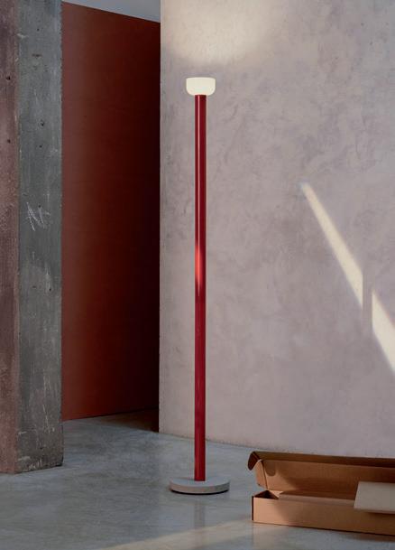
1. FLOS | BELLHOP Bellhop Floor is the new floor lamp designed by Edward Barber and Jay Osgerby to enrich the Bellhop family. The archetypal elements remain similar to the existing collection, but the Bellhop Floor has a more sculptural character: it features a stable concrete base with a finish that is pleasant to the touch, an aluminum body (available in different colors) and an opal glass diffuser.
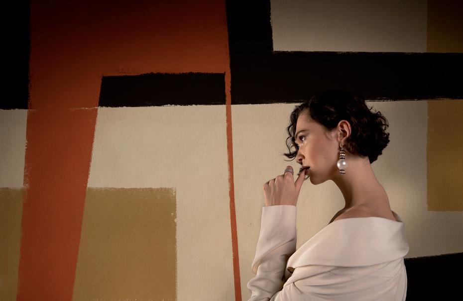
2. LONDONART | THE DAYDREAMER The new wallpaper collection created by GIOPAGANI for Londonart is a reinterpretation of distinctive signs in an eclectic and imaginative stylistic language. Pop accents, cinematographic representations, Japanese and geometric motifs from the 70s alternate in a sophisticated aesthetic journey. The capsule collection features an extensive experimentation in the use of color.

3. OLUCE | MINI COUPÉ The brand is expanding the Coupé family with the introduction of Mini Coupé: at 34 cm in height and in brand new colours (black, anodic bronze, scarlet red, mustard yellow), the Mini Coupé wittily maintains all the vigour common to Joe Colombo’s designs of the 60s. 2
Photo © Federico Torra
1
4

5 6

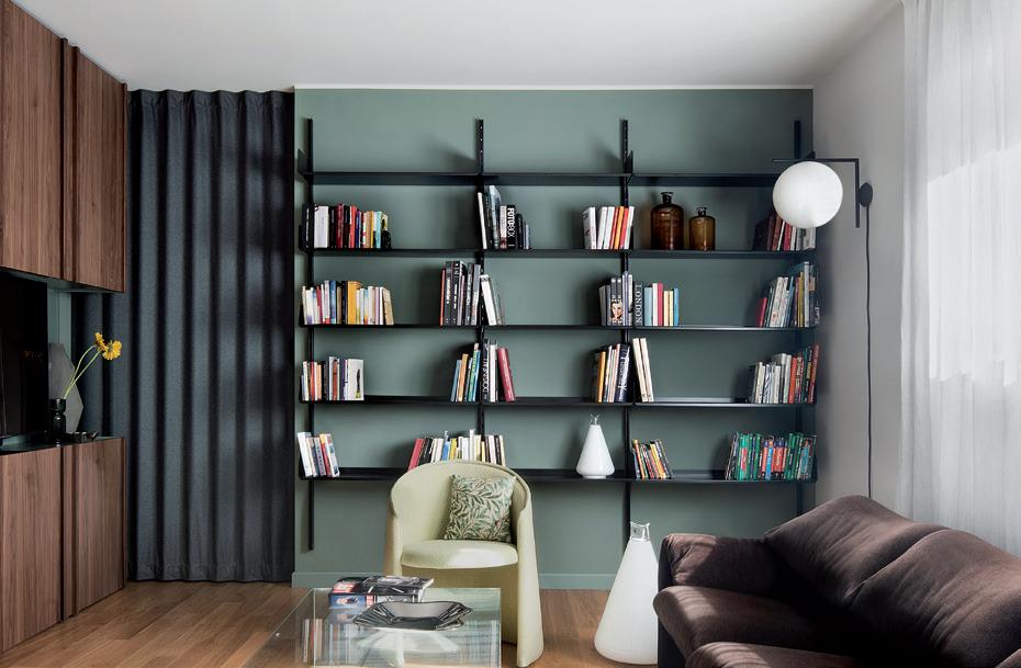
Photo © Alessandro Paderni
Photo © Carola Merello 4. DIESEL LIVING WITH MOROSO
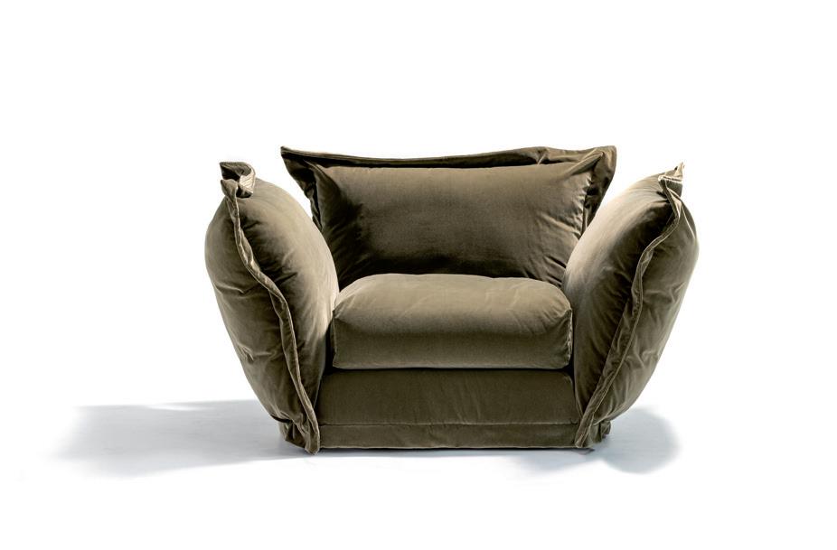
CLOUDSCAPE SOFA The Cloudscape system features outsize shapes and large cushions for the maximum comfort. In addition to the traditional two-seater, three-seater and modular versions, Cloudscape is also available in a one-seater version, an extra-large armchair. The back and the side of the elements are the same height, and both come with optional movement functions to adjust their positioning.
5. RUBELLI | DI VARIA NATURA Fabrics very different from one another, but all with vivid character, are found in the new Di Varia Natura collection, which brings together eco-sustainables with new bio-sourced fibers, geometric patterns for indoor-outdoor use, silks and damasks, all the way to cotton prints, like the La Vie en Rose model seen in the photo: energizing colors for strong visual impact.
6. JANNELLI&VOLPI | JV453 IGUSA With JV453 Igusa, a collection of wallcoverings is born, made only with natural reeds woven on a loom (traditionally used for the making of Japanese tatami mats). Thanks to the game of weaves and chromatic contrasts, the product brings a warm, natural look to spaces, while spreading the scent of freshly cut grass.
7. DOOOR To expand, border or screen interiors: multiple functions performed by a single tool. The textile door collection of the young brand Dooor conserves the functional specificity of this architectural element, while expanding its aesthetic range. Various models are available: with lateral, bilateral, central, off-center or multiple opening. (Interior design project: Arch. Andrea Rubini)
8. GALLOTTI&RADICE | AUDREY MOTION Based on a virtually infinite line, Audrey Motion is the evolution of one of the company’s bestsellers, now revised by Massimo Castagna to accentuate its sinuous, ‘moving’ shape. A modular structure created for different configurations offers the possibility of larger measurements and more or less wide curvatures.


