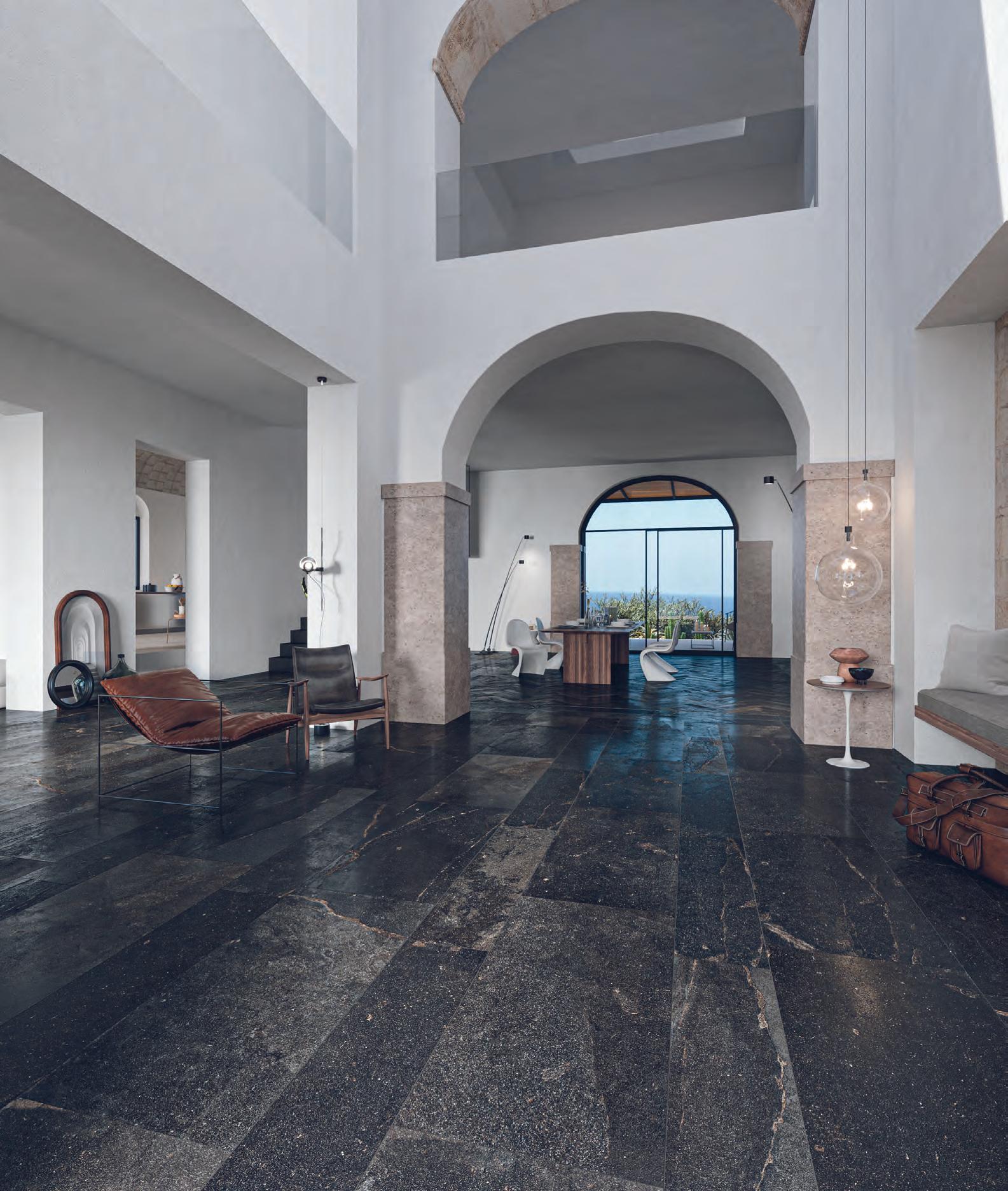

This innovative, ultra-matte, soft-touch surface makes an impact in any design.
fenixforinteriors-na.com
J0791 GIALLO EVORA


This innovative, ultra-matte, soft-touch surface makes an impact in any design.
fenixforinteriors-na.com
J0791 GIALLO EVORA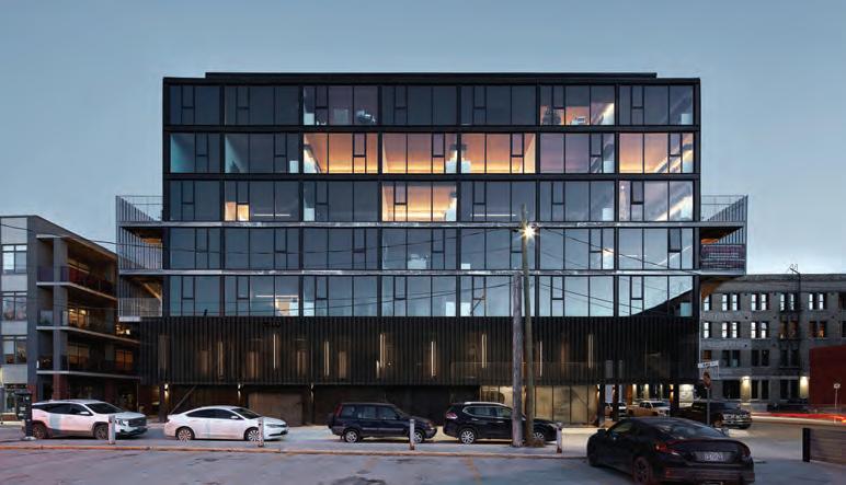
18 PUMPHOUSE
A new development by 5468796 deftly negotiates the challenges and opportunities of a heritage site on Winnipeg’s Waterfront Drive. TEXT Trevor Boddy
A striking pair of towers face Montreal’s Quartier des Spectacles while remaining sensitive to the historic St. Laurent Boulevard. TEXT Claire Lubell
A subway station-topping office and seniors’ housing complex is the last piece in the 20-year transformation of a city-owned brownfield in Montreal. TEXT Odile Hénault

4 VIEWPOINT
Advocacy efforts are underway to reform the double-egress requirement for mid-rise multiresidential buildings.
6 NEWS
Remembering Morden Yolles, 1925-2024.
11 AIA CANADA SOCIETY JOURNAL
The architecture and communityengaged design winners of the recent AIA Canada Society Awards program.
38 TECHNICAL PERCH architecture’s Suresh
Perera shares learnings from his firm’s mass timber, modular, pre-fabricated mid-rise in remote Chibougamau, Quebec.
42 INSITES
Douglas MacLeod on planning and designing for resilience against the growing threat of forest fires.
46 REVIEW
Peter Sealy reports on Design for the Global Majority, a retrospective exhibition on 50 years of work by McGill’s Minimum Cost Housing Group.
50 BACKPAGE
Two Steps Home unveils their prototype for a mass timber, prefab transitional cabin community.
COVER Pumphouse, Winnipeg, Manitoba by 5468796 Architecture.
Photo by James Brittain.
When North America’s building codes were first drafted in the late 1800s, they had strict measures to prevent the spread of fire a reaction to conflagrations that consumed New York, Chicago, and other cities built quickly from wood. That legacy has repercussions to this day, including in Canada’s requirement for two exits from any multi-unit dwelling above two storeys.
This turns out to be the world’s secondmost restrictive multi-unit residential exiting requirement (Uganda requires two exits in all multi-unit buildings above a single storey). In Hong Kong, single staircases are allowed in buildings six storeys in height; in Norway, Australia, and New Zealand, the limit is eight storeys; Sweden and France allow single egress in buildings up to 16 storeys; China up to 18 storeys.
The stringency of Canada’s requirement is outdated, says intern architect Conrad Speckert, who works at LGA Architectural Partners, and who has spent two years researching the issue full-time. Now, over a century of building performance and fire mitigation measures provide more effective tools for fire safety. Moreover, says Speckert, updating the code would unlock the possibility for greater housing density and affordability.
“After zoning reform and revisiting parking minimums, it’s the next most obvious barrier to building small multi-unit buildings,” he says. This is primarily achieved by freeing up more space, he notes: “A staircase is roughly the same floor area as an extra bedroom on each floor.”
In April 2022, Speckert and fire protection engineer David Hine submitted a code change request to the Canadian Commission on Building and Fire Codes (since restructured as the Canadian Board for Harmonized Construction Codes) the body in charge of maintaining and updating the National Building Code. Speckert also petitioned Ontario’s Housing Affordability Task Force, in a letter co-signed by some four dozen local architects, planners, and developers a who’s who from Shirley Blumberg of KPMB to Mazyar Mortazavi of TAS.
Speckert emphasizes that the requests are based on maintaining and in many cases outperforming current fire safety standards. The proposal sets out the possibility of single stair access in buildings up to six storeys, with
a maximum of four dwellings per floor, sprinklering throughout, and stringent fire separation and positive pressurization of the exit stairwell.
British Columbia’s architects are advocating for a similar change. Public Architecture recently completed a report with grants from BC Housing and the City of Vancouver studying how point access blocks could transform Vancouver. BC ’s Ministry of Housing just closed an RFP asking for a policy and technical options report for single egress stair buildings up to eight storeys in height, paving the way for possible changes by this fall. “It’s a political priority the province is sold on the benefits of this,” says PUBLIC senior associate Jamie Harte, who led the report.
The Canadian research is also helping to catalyze state-side pushes for reform. In the United States, single egress is allowed in buildings up to three storeys high only a single storey higher than in Canada. Seattle, New York City, and Hawaii are exceptions: in these jurisdictions, a single stair is possible in buildings up to six storeys. Now, other West Coast areas experiencing housing shortages including Oregon, Washington state, and California are showing an interest in going higher.
Beyond creating more room for housing, the potential code change creates more room for creativity. “It makes all kinds of small apartment buildings more high quality,” says Harte. “Everything gets a little bit more flexible and more creative when you don’t have to drive a corridor through the middle of your plan.”
What kinds of things would be possible with the change? Vancouver’s Urbanarium is running an ideas competition for mid-rise buildings that challenge the double-egress requirement and other existing policies. A comprehensive design studio at U of T’s Daniels Faculty of Architecture, Landscape and Design also allows for a single egress stair in its program for a 200-unit building. “There are really good benefits for that typology,” says studio coordinator and SvN principal Sam Dufaux. “With more cores and more stairs, you get small communities within a building. You can put a lot more design ambition behind the project, and think about making great living spaces. It opens up a whole new world of possibilities.”
The Royal Ontario Museum (ROM) has announced the launch of Open ROM , an initiative that will open the museum up more to the public and create a cultural and civic hub in the heart of the city. OpenROM includes an architectural transformation of the museum’s main floor and a redesigned Bloor Street entrance. Following the renovation, the museum will offer admission-free access to its entire ground floor.
Siamak Hariri, of Hariri Pontarini Architects, is leading the design. Building on the iconic Daniel Libeskind-designed Michael Lee-Chin Crystal, Open ROM will transform 8,000 square metres on the main floor as well as create 560 square metres of new gallery space on the second and third levels.
“We’re going to re-introduce ROM to Toronto with a design that, in effect, turns the museum inside out,” said Siamak Hariri. “We’re going to bring daylight and views deep inside and create new connections with Bloor Street, within the ground floor public spaces and the galleries themselves.”
The project also includes enhancements to the exterior spaces. A new showcase water feature will wrap around the heritage façade at the corner of Bloor Street and Queen’s Park. A newly designed and fully accessible Bloor Street entrance will be sheltered by a bronze canopy. A floor-to-ceiling glass entryway will offer pedestrians direct sightlines into the building.
On the inside, visitors will enter a bright, open foyer, which will feature artworks and specimens from ROM’s collection, with an unob-


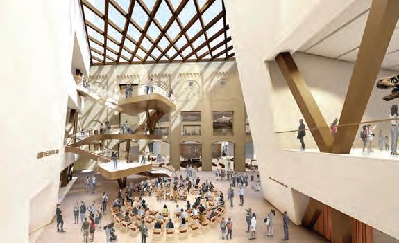
structed view into the museum. An oculus will draw visitors’ eyes upwards, while also offering a view of the dinosaur galleries above.
The foyer will lead into the new heart of the museum, Hennick Commons: a sunlit four-storey atrium capped with a sweeping, highperformance diagrid glass ceiling. Within the atrium, a forum will host regular performances, programs, and hands-on experiences, while a lily-pad-style grand staircase will offer accessible overlook platforms, and knit together the old and new wings of the building.
Work has begun, and the museum will remain open throughout the three-year construction period. www.rom.on.ca
The Royal Architectural Institute of Canada (RAIC) has announced that Justice Murray Sinclair will be the recipient of the 2024 RAIC Gold Medal.
The RAIC Gold Medal is an award that represents the highest honour for a significant contribution to Canadian architecture. The award also recognizes excellence in design, research, education, expertise, public presence, sustainability, social justice, and commitment to future architects.
Sinclair was the chair of Canada’s Indian Residential Schools Truth and Reconciliation Commission. This role exposed historical injustices and systemic structures that treated Indigenous people as less than human.
His dedication and leadership in promoting truth and reconciliation, dismantling colonial relationships, and advocating for the rights of Canada’s founding peoples have had an important impact on the Canadian architectural landscape, both in present and in the future.
“The RAIC acknowledges the profound connection of Canada’s colonial history and its impact on First Nations. To promote reconciliation, the RAIC instituted the Indigenous Task Force in 2016 and the Truth & Reconciliation Task Force in 2020,” says Jason Robbins, President, RAIC. “Honoring Murray Sinclair with the 2024 RAIC Gold Medal reflects the profession’s recognition of architecture’s transformative power in promoting reconciliation, social justice, and a more inclusive built environment.” www.raic.org
The Ontario Association of Architects (OAA) has announced the launch of a landscape design competition for its headquarters.
The landscape design competition explores how buildings and their site contexts can be designed and adapted sustainably, while also considering the land of users and Indigenous communities on which the building is situated. Along with acknowledging the Don River ravine context, participants will be asked to create a welcoming arrival experience, enhance the building, and recognize the role of sustainability and water use in the health of the environment.
The winning design will be awarded a prize of $20,000 and the winning team will be awarded the contract to redesign the landscape at the OAA property, located at 111 Moatfield Drive. Two honourable mentions will also be selected with an award of $5,000 each.
Final submissions are due on May 16. www.oaa.on.ca
As both a practising architect and as the president of the governing Council of a provincial architecture regulator, I have been following the national housing design catalogue initiative with a lot of interest as well as some hope and a little frustration.

The issue of housing affordability is absolutely critical right across Canada, and architects have an important role to play. Just a few months ago, in October 2023, Statistics Canada released alarming data about housing in our country, stating almost 17% live in a home too expensive for their household income. Unfortunately, the numbers are even more alarming among newcomer Canadians (almost 23%), visible minorities (25%), and those living below the poverty line (69%).
For more than a decade, the Ontario Association of Architects (OAA) has engaged with all levels of government, allied organizations, and other parties to find new approaches to deal with this housing crisis in ways that do not compromise durability, affordability, climate resilience, or safety. It’s a hugely important issue, and one we have made the explicit theme of our Conference this May in Niagara Falls.
So while swift and innovative actions need to be taken to address housing affordability (and availability!), the federal government’s recent announcement it is commencing discussions about the creation of a house design catalogue does not seem to truly address the problem at hand. It could be that this is one tool in a toolkit of varied approaches, but it is certainly not a universal fix. I don’t see this as moving the needle forward significantly on housing affordability in the province.
Recent articles in the general media about this topic seem to be misunderstanding the core problems and suggesting that architects are responsible for rising costs and delayed timelines in building homes whether condo high-rises or single-family townhouses. The erroneous claim goes that not only does architectural design significantly drive the cost of housing up, but also the implementation of this few-sizes-fit-all schematics will allow other hurdles to be more easily cleared.




Readers of Canadian Architect already well know that architect fees are a fraction of the overall costs to design and build a home, and that this investment will pay for itself over time. In November 2021, the Construction Design Alliance of Ontario (CDAO) released a report, “Impacts of Pre-project Investment & Quality of Documents on Project Delivery Efficiencies” that showed an error that costs $1,000 to address during the design phase can cost $10,000 to address during construction.
The federal government’s creation of a home design catalogue could leave ample room for error. Standardized design does not consider specific user needs, multi-generational families, aging-in-place flexibility, site-specific conditions, local bylaws (zoning, drainage, fencing, fill, parking, etc.), or municipal planning approval processes (site plan control, infrastructure, forestry, heritage, etc.).
That said, a design catalogue can be an effective approach, when it is one of many. It may serve as a starting point between the client and architect to discuss fundamental requirements for the new home while also providing visual reference for typical room sizes and layouts to assist the design process to move more swiftly. Nevertheless, it should be understood that in most cases the design process only amounts to a fraction of the time it actually takes to have something built. Other lengthier processes like municipal approvals, development of the land, and construction itself take more time and money.
This national housing design collection idea is similar to the school catalogue that was developed by Ministry of Education to assist individual school boards in the design of new schools. In that particular circumstance, though, the concept is that these projects have been built and therefore thoroughly vetted at the provincial level to meet room size guidelines and costs. When it comes to K–12 projects, this approach can assist both the individual school boards and local

architects to move more swiftly through the initial schematic design process and the required Ministry approvals.
With respect to residential design and construction delays, the OAA has long advanced recommendations to address housing affordability across Ontario with a particular focus on the lengthy development approval process that project proponents face. In 2013, our commissioned research found “approximately half of all applications took six months or more to obtain approval” in the province.
Pre-pandemic, the OAA has also noted in previous government submissions worrying statistics from various municipalities, such as the City of Ottawa which, in 2018, reported that even after setting a 105day target for site plan approval, the City only managed to hit that target for 28% of “standard applications.” Just because a design comes from a catalogue is no guarantee it will not face regulatory and planning hurdles.
With recent legislative developments in Ontario, such as the 60-day timeline for approvals mandated through Bill 109, More Homes for Everyone Act, 2022 and the exemption of projects with 10 or fewer dwelling units mandated through Bill 23, More Homes Built Faster Act, 2022, the government has started to chip away at the regulatory hurdles. However, more work is needed. It should also be noted that many municipalities are averse to adopting these changes, even with the guarantee of significant federal funding. I note that, as of this writing, my own city of Windsor is one such community.
Speaking as OAA president, effectively tackling the housing affordability crisis involves numerous approaches beyond a catalogue. These include:
Increasing intensification in the yellow-belt areas of municipalities across Canada (Bill 23, for example, has allowed triplexes as-of-right across Ontario the City of Toronto has taken this a set further by making fourplexes as-of-right) so all levels of government are encouraged to do their part to update zoning permissions to facilitate a diversification of housing stock;
Addressing the levers government can pull to make housing more financially attainable (e.g. encouraging smaller entry-level units, housing alternatives for aging in place, and larger family-sized units in all building types), as well as promoting innovative design solutions to reduce project costs (e.g. pre-designing for intensification through the introduction of vertical additions that optimize the use of existing structures) and incentivizing developers to build purpose-built rentals by eliminating barriers such as HST; and Having all levels of government advance energy efficiency as a key to housing affordability retrofitting existing homes and building new homes for energy efficiency is not only good for the environment, but also a key part to achieving housing affordability by lowering building operating costs.
A design catalogue can certainly offer an option, but it won’t solve the issue itself. Similarly, the architecture profession is not part of the problem, but rather a key partner in finding the solution.
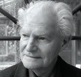
-Settimo Vilardi, OAA President, Architect, M.Arch., FRAICStructural engineer Morden Yolles died peacefully at his home, surrounded by his family, on Monday, January 22, in his 99th year of life.
Morden Yolles was born in Toronto in 1925, the third of five siblings and the youngest son of Dora and Leon Yolles. His father was a pioneering developer with work in Miami and Toronto. After his son graduated from the University of Toronto in 1948 with a degree in civil engineering, Leon pre-empted Morden’s ambition to study architecture by arran-
ging to have his son work at the engineering firm of J.H. Hopper, and apply new computational techniques in concrete design to one of his father’s best-known projects: the Benvenuto. Though his father had worked with prominent international architects on his Miami projects, the Benvenuto would be Morden’s first collaboration with Peter Dickinson, and mark the beginning of an engineering practice that would see collaborations with many of the important early modernist architects of the time Dickinson, Ron Thom, Irving Grossman, Macy DuBois, Raymond Moriyama, Jack Diamond always with the practical brilliance of his engineering partner Roly Bergmann as his creative complement. While attending a Sigfried Giedion lecture at the University of Toronto, he met his wife Edie Wasserman, with whom he had two children, Eric and Dylan. Edie, who had studied with Marshall McLuhan, expanded his passion for all aspects of the arts music, literature, dance, art and ultimately food, as they opened the celebrated Scaramouche restaurant in Benvenuto Place in 1980.
Morden’s engineering philosophy was summed up in a quote from the 2002 publication Yolles: A Canadian Engineering Legacy, which I co-wrote with John McMinn: “To enter the artistic realm, the work of a structural engineer must go beyond the application of technical knowledge and skills and achieve a collaborative balance of the visual,
innovative, economic, and functional.” The Yolles firm was responsible for engineering notable structures in Canada and abroad, including the Katimavik and Polymer Pavilions at Expo 67, the Ontario Science Centre, Trent University, Toronto Zoo, the Toronto YMCA , the galleria at BCE Place, and the McKinsey & Company offices. His team of engineers developed a specialty in tall buildings in Canada and abroad, including the 72-storey First Canadian Place in Toronto, World Financial Center in New York, and Canary Wharf in England.
He received an Order of Canada in 2002 in recognition of his role as one of Canada’s leading structural engineers. Second-generation Yolles engineer Andy Bergmann noted, “What was unique about Mordy as an engineer was that he was not your typical technical engineer. He was about the artistic side, and how buildings fit in a broader cultural context. Mordy was an inquisitive listener, and endeared himself in a design world in a broad, collaborative way that was rare and special. A generation of engineers and architects learned a lot from him, and we recognized what a broad thinker he was, shaped by unconventional and diverse interests like food, photography and a deep love of architecture.”
A generous philanthropist, Mordy oversaw the Leon Yolles and Dora Yolles Foundation supporting Jewish charities, shelters, schools, and causes. He set up the Edie & Eric Yolles Research Fund for cancer research. He also contributed to diverse architecture, arts, education, and healthcare charities. In 1997, he and his late partner Roly Bergmann endowed a scholarship at the University of Toronto Faculty of Engineering for innovative structural design.
-Beth KapustaFor the latest news, visit www.canadianarchitect.com/news and sign up for our weekly e-newsletter at www.canadianarchitect.com/subscribe


President’s Letter
Dora Ng President, AIA Canada Society
By the time this editorial goes to press, spring will be upon us with colourful flowers, birds chirping and blooming trees. But as I draft this President’s letter in mid-February, the supposed middle-ofwinter in Toronto has already been somewhat spring-like. The temperature hit a record high of 15 degrees Celsius on February 8, 2024. Although many appreciate the mild winter, I can’t shake the concern about how this warmer winter will impact other living species around us.
As architects, our actions can make a difference. The building sector accounts for over one third of global energy consumption and emissions. We have a social obligation to advocate and engage in responsible and sustainable design.
Designed to track architecture’s progress toward a carbon-neutral future, the 2030 AIA Commitment program offers architects a way to be publicly accountable in lowering emissions. Every year between January to March, 1,300 signatory firms report their project data to the Design Data Exchange. Through this process of data collection, we remind ourselves—and encourage each other—to do better. It’s a helpful tool to challenge ourselves to be climate leaders. If you have not signed up yet, I encourage you to learn more about the 2030 AIA Commitment program at www.aia.org.
The AIA Canada Design Awards program runs each fall to recognize best practices, innovative thinking, and design excellence in the work of AIA Canada members and future design professionals. Since its inception in 2020, we have received many high-calibre submissions, and we are proud to see increasing participation from small and large firms, as well as from students across Canada.
The awards program includes the AIA Canada Student Architecture Awards, whose top prize is a scholarship of $2,500 USD. These awards celebrate exceptional work by students and recent graduates in the fields of Architecture, Interiors, Planning, Landscape and Urban Design.
The 2023 Awards invited entries in the categories of Architecture, Interior Architecture, Special Projects, Urban Design, Community-Engaged Design, Open International, Unbuilt Works and Student Projects. Two winners from the awards program will participate in the 2024 AIA International (AIAI) Awards Program.
This year, our jury members were Dr. Brian R. Sinclair Baillargeon, PhD DrHC FRAIC AIA (Intl Assoc), President of Sinclairstudio Inc., and W. Neil Robertson, AIA, Principal Architect at Stuart Howard Architects.
The winners were announced at the Annual General Meeting on November 29, 2023. Turn the page to see the winning projects in the Architecture and Community-Engaged Design categories.


Don’t miss the AIA’s Annual Conference on Architecture & Design! AIA24 will be held in Washington, DC on June 5-8, 2024. For the first time, AIA is broadening the conference’s audience to convene diverse perspectives from across architecture, design, engineering, and construction to create the premier AEC industry event. Our vision: AIA24 will bring together the often-siloed AEC industry in one location to network,
share knowledge, gain exposure, and find multidisciplinary solutions to today’s most pressing issues. conferenceonarchitecture.com
AIA International Conference
The AIA International Conference will be held in Hong Kong on October 24-27, 2024. Held virtually and in-person, the three-day conference explores the architectural intelligence we refined from the past, and the intelligence we are har-
vesting from multiple new technologies going towards the future. The conference includes tours of masterpieces from world-renowned architects, as well as global speakers who will address tough questions on sustainability, urban planning, and hospitality design.
www.aiainternational.org
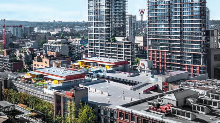
Gastown Child Care Centre, Vancouver, British Columbia Acton Ostry Architects Inc.
The Gastown Child Care Centre is a creative response to a City of Vancouver concept to develop childcare centres atop under-utilized parkades in the downtown core. The innovative solution features two 400-squaremetre prefabricated, Passive House and LEED Gold certified childcare centres, each with a capacity of 74 people and a focus on net-zero energy and low-carbon fuel sources. To optimize efficiency, economy and repeatability, the elements of building, storage shed, canopy, support plinth, enclosure, and outdoor play are virtually identical prefabricated components, repeated between the two centres.
Neil Campbell Rowing Centre (NCRC)
St. Catharines, Ontario
MJMA Architecture & Design, Raimondo + Associates Architects
Located on Henley Island, NCRC serves both as a venue for elite tournaments and a year-round training centre for athletes. The profile of the building is expansive and striking, including a mass timber overhanging roof, extensive glazing, and operable sliding doors—all steps from the historic rowing course. The facility meets both zero-carbon emissions and net-zero energy design benchmarks, with cross-ventilation and sun control built into its form. The NCRC has become a vital amenity on the island, housing an entry space, rowing ergometers, a weight-lifting gym, lounge, and universal change/ washrooms.
University of Calgary MacKimmie Tower and Hunter Student Commons, Calgary, Alberta DIALOG
The MacKimmie Complex underwent a complete transformation to become a net-zero, high-performance space at the University of Calgary, aligning with the institution’s vision to become a leading sustainability research hub and achieve a net-zero campus by 2050. The 1973 brutalist MacKimmie Tower was redesigned to symbolize innovation and future-thinking: it was stripped to its concrete core, and rebuilt with a responsive double skin, which automatically adjusts windows for user comfort. The new design fosters collaboration with classrooms, study areas, and student gathering spaces, and the complex as a whole contributes to the revitalization of the campus core.

SFU Student Union Building (SUB)
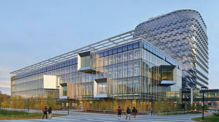
Vancouver, British Columbia Perkins&Will
The new SUB provides students with a fresh and welcoming focal point to student life. It comprises over 10,500 square metres of student activity and study space, including individual study stations, lounge spaces, event and social gathering spaces, rehearsal rooms, a napping room, a gaming lounge and a large dining hall connecting to Maggie Benston Centre. The design approach sought to create a contemporary building, while honouring the legacy of Arthur Erickson’s iconic campus design. By respecting the historic campus in its massing, rhythm of façade articulation, and play of light and shadow, the building harmoniously integrates into the heritage fabric.
Orillia Recreation Centre (ORC), Toronto, Ontario MJMA Architecture & Design
ORC is a re-inhabitation and reclamation of an industrial brownfield site to create a new recreational and social heart for Orillia. The project references both the site’s previous use as a foundry and the area’s legacy of brick civic buildings. The built form of the facility is integrated into a 26-acre naturalized park that includes a wetland and is connected to the City’s trail system. Careful work with the Ontario Ministry of the Environment, Conservation and Parks in organizing the site uses, along with significant capping and venting methodologies, were deployed to transform the brownfield site into a safe civic facility. The city’s civic vernacular is reinterpreted with the bold masonry massing of the new facility.
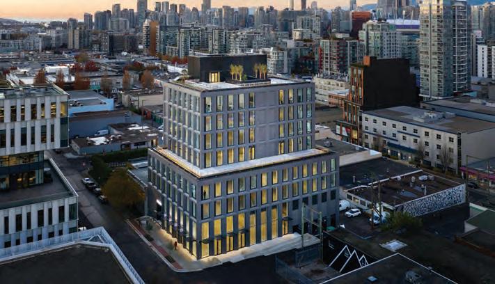
The Workshop, Vancouver, British Columbia Perkins&Will
The Workshop emerged from a city-initiated rezoning to create an innovative industrial hub in the heart of the traditional light manufacturing district of Mount Pleasant. As one of the first buildings designed under the new policy, the project sought to create a strong identity that reflected the character of the existing neighbourhood; to foster an active and engaging public realm within the new emerging district; and to exceed city policy requirements for sustainable design and energy performance.


Manitou a bi Bii daziigae, RRC Polytech, Winnipeg, Manitoba Diamond Schmitt, number TEN architectural group
Manitou a bi Bii daziigae is a highly sustainable learning hub that facilitates social innovation, enterprise and pioneering research. The facility unites new construction with the historic brick-and-beam Scott Fruit Building, which has been repurposed and transformed. Together, the two structures host a unique combination of Indigenous and international student environments, including classrooms, labs and event spaces. Indigenous design elements and artwork form a deeper connection with the site, its history and the surrounding community. The result is an engaging crossroads in Winnipeg’s historic Exchange District.
Centennial College A-Building Expansion, Toronto, Ontario DIALOG
A celebration of the Mi’kmaq concept of “Two-Eyed Seeing,” which harmonizes Indigenous wisdom and Western perspectives, the design of Centennial College’s A-Building Expansion centres inspirational and innovative thinking, while allowing the building to be the primary storyteller. As Canada’s first LEED Gold, net-zero carbon, WELL-certified, mass timber higher-education facility, the project exemplifies an unwavering commitment to environmental sustainability and social responsibility.
Canoe Landing Campus, Toronto, Ontario ZAS Architects, Inc.
Recognizing a vital need for a social and educational nexus in Toronto’s booming downtown core, the new Canoe Landing Campus houses a community recreation centre, public and Catholic elementary schools, and a childcare centre. The campus architecture supports a new platform for connection, allowing for social interactions which are vital for a vertical urban community where neighbours often experience solitary lifestyles. Community input generated innovative spaces including indoor play areas geared to enhancing children’s gross motor skills, and multi-purpose rooms that adapt to both active and passive uses.


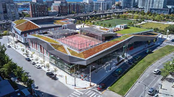

Winners of the remaining awards categories will be published in the next AIA Canada Society Journal in June 2024. They include Awards of Excellence for York University’s School of Continuing Education, Toronto, Ontario (Perkins&Will); David Geffen Hall, New York, NY (master plan and concert theatre by Diamond Schmitt, public spaces by Tod Williams Billie Tsien Architects); The Hidden Eruption – Volcanic Retreat and Visitors Centre, Reynisfjara, Iceland (Romanov Romanov); GHETTO
(Henriquez Partners Architects); Nemesis Coffee at Great Northern Way Pavilion, Vancouver, BC (Perkins&Will); and Caribou Point, Pictou, Nova Scotia (Peter Braithwaite Studio).
Awards of Merit were given to Facility Chicago, Chicago, Illinois (Carlo Parente Architects) and Gable Ends Cottage, Lower Prospect, Nova Scotia (Peter Braithwaite Studio). Citations went to Farm 2.0, Lippetal, Germany (Carlo Parente Architects)
and Greenwood Yard, Toronto, Ontario (SvN Architects + Planners).
Student awards were given to Alexander Romanov (Centennial College) for The Bark HAUS; Gabriel Garofalo (Toronto Metropolitan University) for Digital Endemicity: Localized Characteristics for Architectural Fabrication; and Nour Abdelfattah (Toronto Metropolitan University) for The Dufferin Grove High School and Community Centre.

1. Route & Return
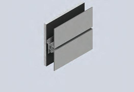
The drain-back ventilated rainscreen system protects the wall of the building from high and rapid temperature changes.
2. ALUCOBOND ® E asyFix TM

ALUCOBOND® EasyFixTM offers simplicity and efficiency in meeting tight construction schedules.
3. ALUCOBOND ® F ace F astened
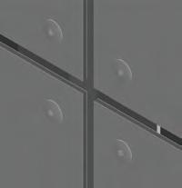
The simplicity of the system ALUCOBOND® FaceFastened reduces cost on shipping, fabrication and installation.
• Passes NFPA 285
• Ease of fabrication
• Complementary AXCENT colors & finishes
• 91 stocked colors/finishes & custom color capabilities
• Leader in the metal facades for over 50 years
• High material recycled content contributes to earning LEED points

Featuring a unique selection of patterns that capture the essence of nature and embrace vibrant colour resurgence.
Discover the Collection
Formica.com/SpecialtyCollection


The Formica Group, the leader in realistic design and the manufacturing of surfaces, adds seven new acrylic surfaces to its Everform® Solid Surface collection and four new high-pressure laminate (HPL) designs to its standard line.
The latest offerings add a sophisticated touch to various designs without compromising the renowned durability and reliability Everform® is known for. Everform® can be used for modern commercial applications in healthcare and hospitality settings or any other high-traffic space. This surface delivers beautiful, long-lasting designs.
With nature as the inspiration for these new additions, they counter the plethora of grays and whites featured in previous trends. Playful new colours are being introduced gradually as part of the Return of Colour trend, including three new designs: Sage Speck, Indigo Speck and Nero Terrazzo Matrix.
The Speck series – Indigo and Sage – reintroduces contrasting colours that lend depth to the pattern in a unique way. The series is also neutral, as the tones of the chips in its patterns are organic white, clay and translucent. For its part, Nero Terrazzo Matrix is a bolder pattern that features striking tones of light blue, terra cotta, butterscotch, and gray on a saturated black surface.
While the following four colours – Fossilized Pebble, Fossilized Lava, Frosted Gray and Tumbled Harvest – are inspired by the Design trend, they also reflect natural elements in their organic tones. For instance, Tumbled Harvest evokes tumbled beach glass worn smooth by water, and its pattern has inconsistent particulate shapes and colours. This latter feature is evident in tones of neutral beige and gray in the two Fossilized patterns, with blue and monochromatic particulates adding depth and sophistication to the material. Finally, Frosted Gray creates a neutral yet sparkling effect courtesy of the fine chips embedded in its material.
Four new sophisticated and cozy colours have also been added to the Formica® laminate collection. Indeed, the linen-inspired Fabric Collection is perfect for large-scale applications, since patterns only repeat every 51.2 inches. This product, which can be applied vertically or horizontally, comes in everything from a wispy warm white to a neutral light denim blue and is the perfect complement for any work environment, healthcare or hospitality setting or travel-oriented space.

Finally, six new colours have been added to the FENIX™ collection, which already features a broad range of colours. These new designs’ warm, earthy tones match well with previous styles and are ideal for modern spaces. However, their super-matte texture also makes them a great choice for any office or workspace.
Did you know that all FENIX™ colours derive their name as follows: the first part is the Italian word for the hue, and the second part is an inspirational location from around the world. The six new FENIX™ colours are aptly named:
Giallo Evora – A yellow found in Portuguese architecture
Rosso Namib – A red inspired by African brick structures
Grigio Aragona – A warm grey reminiscent of Sicilian volcanoes
Verde Kitami – A green distilled from the misty mountains of Japan
Blu Shaba – A blue-green inspired by Congolese gemstones
Viola Orissa – An Indian aubergine
These unique colours are the newest additions to the timeless FENIX collection. To see the inspiration gallery or order samples of the new FENIX™ colours, please visit www.fenixforinteriors-na.com
For more information about the 2023 Specialty Collection or to get inspire or order free samples, visit www.formica.com/SpecialtyCollection

PROJECT Pumphouse, Winnipeg, Manitoba
ARCHITECT 5468796 Architecture
Medium density housing remains one of the most conservative realms of architectural design. Looking beyond surface effects, its fundamental forms are generated by an almost biological mode of evolution: changes in housing types and layouts come slowly, by minor increments, with new species of layouts dying off if they do not fulfill the needs of changing markets and varying profitability markers. As in nature, true innovation in housing is usually the response to a stressor, with artistic creativity being its means, not its end.
Historically, key housing forms in Canada were produced from such navigation of constraints and seizing of entrepreneurial opportunities. Hard rock foundations and the free availability of sawdust for furnaces led to Vancouver’s characteristic wood frame houses, in which the main level is raised up twelve steps the most on the continent to make room for bulky sawdust burners in the basement. (Those burners were removed between the wars and the lower levels turned into suites, meaning my home city’s houses were almost never single-family.) Toronto’s and Ottawa’s landscape-defining high-rise slab towers were the product of cheap con-
crete construction in cities without mid-block lanes, combined with the availability of new large-scale bank financing to developers.
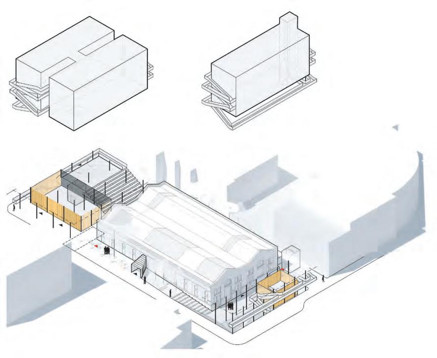
Then there is Winnipeg. Not discounting innovations from the late David Penner, Stephen Cohlmeyer, and others, the current leading edge of Winnipeg housing is the output of a single firm, 5468796. The book just released by partners Johanna Hurme, Sasa Radulovic, and Colin Neufeld entitled platform.MIDDLE a weighty collection of their housing ideas alongside built demonstrations firmly secures 5468796 as one of the most important housing design firms on the continent. The trademark axonometric analytic diagrams collected there show how it is done, and any architect wanting to innovate in housing form and detail should study them.
This background is useful for understanding 5468796’s many accomplishments at Pumphouse (CA Award of Merit, December 2018), the most complex synthesis of their housing ideas to date. Pumphouse can be understood as a palimpsest of the entire run of housing innovations by 5468796 in their eighteen years of practice, a careful layering and modulation of their own previous design ideas.
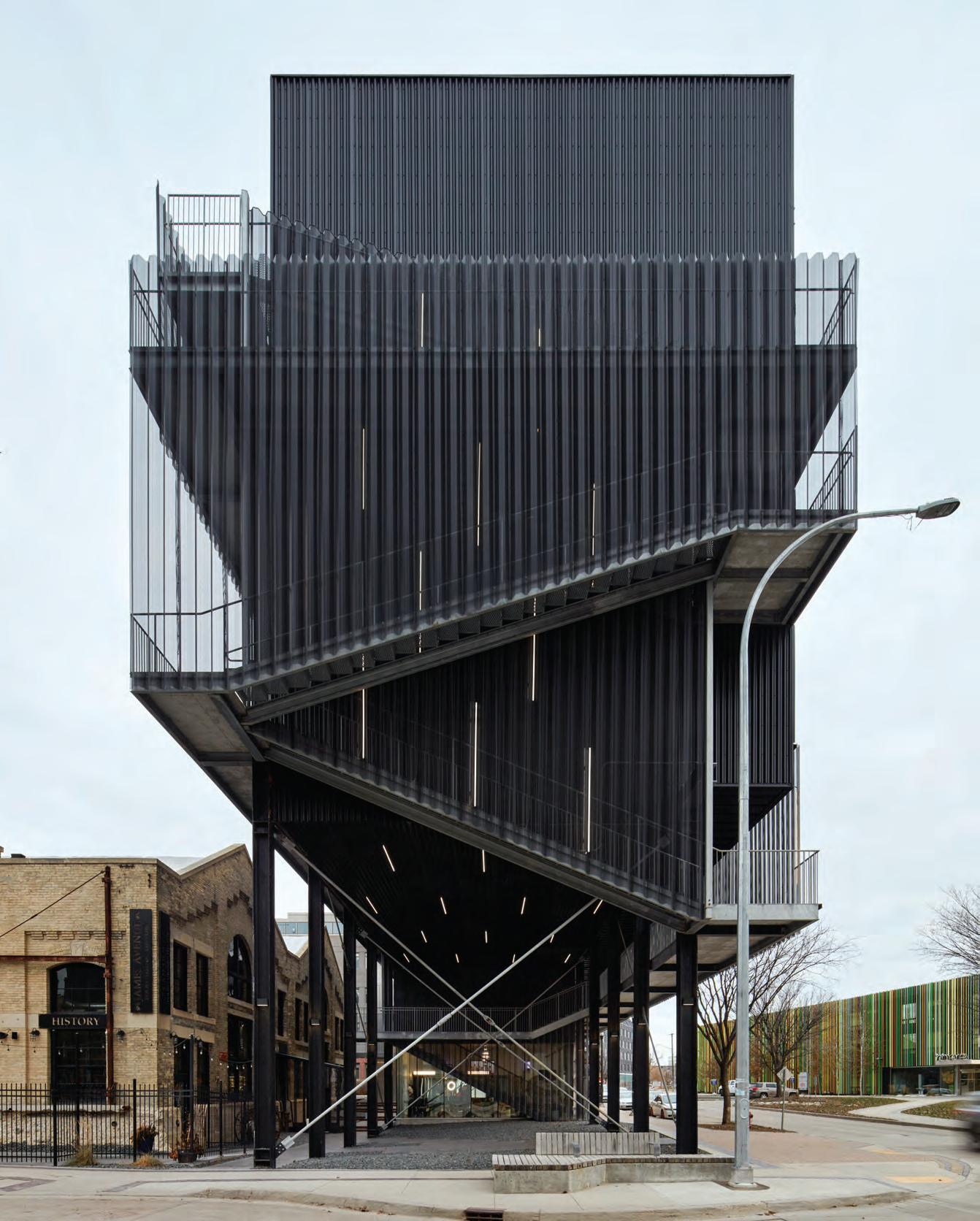
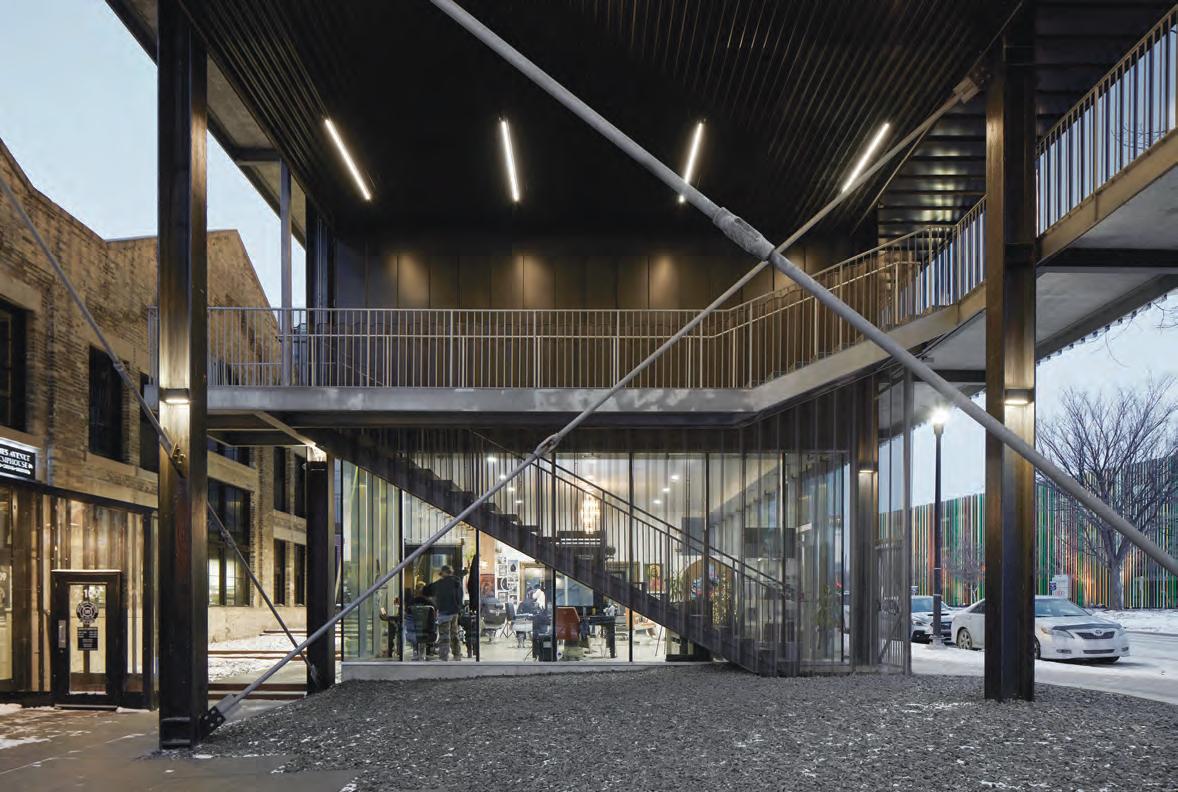
As with other truly innovative designs shaped by housing’s evolutionary forces, Pumphouse emerged from a complex set of constraints: it sits on a site dominated by a large, low-slung heritage building occupied by bulky equipment that could not be removed because of a 1982 designation. There is little room for development along the edges of the site to offset the cost of restoring and opening access to the heritage building. While the property was listed for $1 by the city for several decades, and many have hoped to see the heritage structure reopened as a museum, dozens of previous proposals for redevelopment couldn’t pencil out.
The 1906 James Street Pumping Station itself was produced in response to one of the greatest urban stresses of those times fire control in the face of conflagrations in Chicago, Vancouver and elsewhere that destroyed huge swaths of cities. Water was taken from the Red River and pressurized within the building’s Brontosaurus-scaled pumps, manufactured by the same Manchester company that built engines for the Titanic, to be distributed to fire mains throughout the adjacent Exchange and Warehouse districts. The Pumping Station’s equipment was built to last, and it served its original purpose until changes in firefighting precipitated its closure in 1986.
The desire to redevelop the property emerged in the following decades. A riverside rail spur line had long defined the eastern edge of downtown Winnipeg, blocking public access to the waterfront. In 1987, the city acquired the line and, at the turn of the millennium, replaced it with a road. New waterfront possibilities emerged, with a civic non-profit CentreVenture formed at the same time to encourage the area’s redevelopment.
In 2008, some of the earliest new housing in the area included 5468796’s fairly conventional youCUBE (2012) housing development at the north end of Waterfront Drive, and the Mere Hotel (2013) by David Penner and others, which transformed the Pumping Station’s waterside intake pavilion into a restaurant, and added a colourful block of boutique hotel rooms.
Johanna Hurme says the eventual development of the Pumping Station itself is the perfect illustration of 5468796’s long-standing and practice-defining dedication to what she calls “creative opportunism.” Starting in 2015, the firm started producing a string of increasingly sophisticated schemes for the pumphouse parcel, but with no commission and no payment for them. Co-founder Sasa Radulovic notes the hugely increased value of this site courtesy of their imagination and hard work. Once thought useless, this heritage-listed building on a marginal site went from a nominal price of one dollar back then to a final value of one million dollars upon completion in 2023. “A one-milliontimes land lift is rare anywhere!” he jokes.
There is a lesson here to all young Canadian firms waiting by the phone for that call from Developer Mr. Right, or endlessly polishing their tiny portfolio on Photoshop for hoped-for webzines. A national reality and realty check, please: practicing architecture means far more of entrepreneurial improvisation than willful art or science. Winnipeg is one of the coldest architectural laboratories in the world and a comparatively underfunded one, and the difficult discipline of working there has honed 5468796’s brilliance. Please follow their lead, dear archi-brethren, and hustle with creativity and disciplined imagination around site and budget challenges, as they do.
A breakthrough was achieved when 5468796’s team (at that time including designer Kenneth Borton) realized that an office floor could be hung from an intact gantry crane, locating a new level above and to one side of the machine room. This created a visually stunning working perch that could be leased to a commercial tenant, tipping the building’s pro forma into viability. This early thinking impressed the young and formerly Victoria-based heritage developer Bryce Alston, who then received CentreVenture’s approval to take on the unusual project.
A new future for the heritage space being set, the architects went on to identify two zones for housing at either end of the pumphouse. The one at the west accommodates 70 units in a pair of wood and steel frame buildings set on concrete plinths, and a smaller single block at the river-facing eastern edge holds 28 more this address now generates the highest rental rates in all of Winnipeg. Construction details are similar for all three blocks, and were kept simple: the only way Pumphouse would meet its financial targets was by using stan-
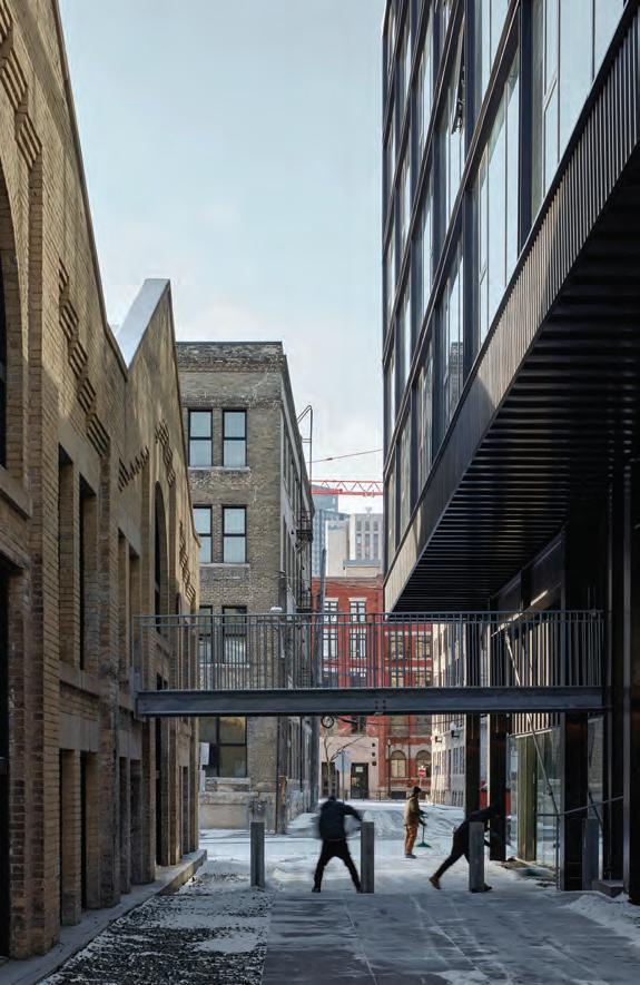
dard materials and workmanship. (The developer’s instructions, Radulovic recalls, were to make a design “that could be built by guys hired off Kijiji.”) Fire codes and access routes necessitated bridges to tie together the bifurcated project.
5468796’s existing portfolio equipped them well for dealing with the many additional challenges that arose from the dumbbell plan loading housing at either end, plus the complex layering of civic requirements for the space in-between. The east and west housing pavilions at the Pumphouse need to be understood as meta-projects, folding together ideas from 5468796’s eighteen years of practice, so a brief survey of those now. For instance, the city required views to be retained between the riverfront park walkway and a portion of the yellow-brick heritage structure. This led to a cutting back of ground-plane occupied space at the property’s southeast corner. Most of the rest of this main floor is now occupied by the Miesian temple of an entirely glass-wrapped hair salon overlooking the Red River surely the nicest locale I have

ever seen to get one’s curls chopped. On the west side of the Pumping Station, an access lane was required to be retained, resulting in a flanking cube of leftover space too far from windows for use as part of the west block housing. The solution? Adding tiered seats to this zone allows it to host resident gatherings, and serve as a covered amphitheatre during Winnipeg’s Fringe Theatre Festival. The playful interpenetration of public and private space is a signature 5468796 theme, found in many of their designs.
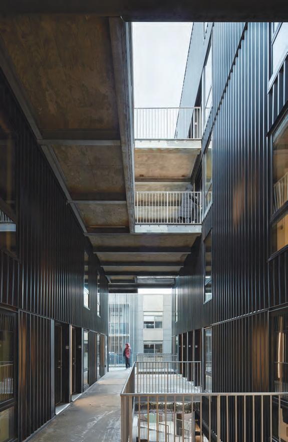
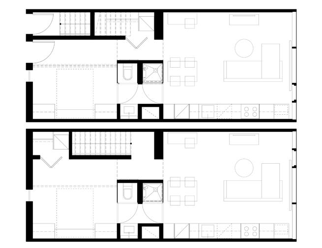
The details and disposition of the rental housing units even more clearly show how 5468796 draws, with sagacity, from its own prior design ideas. The smallest of Pumphouse’s rental units feature Murphy beds and walk-through, glass-walled and double-doored bathrooms, to save space and borrow light, a trick refined in prior projects. On a larger scale, 5469796’s 2010 Bloc 10 project on Grant Avenue demonstrated how corridors can be eliminated for three-storey, stick-built walk-up apartment buildings. As both an ex-Edmontonian and ex-Winnipegger, I can attest that apartment corridors in these two cities smell permanently of boiled cabbage. There are no boiled cabbage smells at Pumphouse, as corridors are almost entirely outdoor and ventilated by soft Prairie breezes off the Red River. In the west wing, a parliament of eight doors (half of which access stairs to units above a skip-stop arrangement seen in several previous 5468796 projects) form a raised open-air small piazza with compelling views south to the brickish pleasures of Exchange District architecture.
Noting that residents are not yet personalizing their entrances during our site tour, Radulovic pledged to buy each renter a pot for succulents and other hardy plants this spring. (Acts like this to assist residents in realizing their fully inhabited potential of designs ought to be the last phase of any housing commission, but sadly remain rare and “out of scope.”) It’s an idea that can be scaled up: open-air apartment lobbies with plantings marketed as “sky gardens” are similarly a feature on all 57 residential floors between the towers of Vancouver’s Butterfly, a project initiated by Bing Thom, and soon to be completed by Revery’s Venelin Kokalov. In the conservative realm of housing design, interrogating a feature as seemingly banal as corridors can be a breakthrough to innovation.
Hurme and Radulovic learned from the curving corridors of nearby 62M that vistas to neighbour’s doors help build both safety and community. Accordingly, one now cannot pass from the street, up Pumphouse’s dramatic exterior access stairs cantilevered out over public sidewalks, and then on to approach one’s own door without seeing many others, and at intriguingly different angles. Drawing again from Bloc 10, Pumphouse’s sections pack a surprising variety of unit types within the black box of its corrugated galvanized metal elevations. The Roman historian Suetonius quoted Emperor Augustus as saying, “I found Rome a city of bricks, and left it a city of marble,” and Arthur Erickson declared concrete “the marble of the twentieth century”; furthering the same line, corrugated metal has become cost-conscious Winnipeg’s signature cladding for the 21st century.




But this corrugated metal is black, entirely black, set in black frames, punctuated by black mullions, and so on; the building is a raven set amongst the sparrows and starlings of Waterfront Drive housing designed by other firms. The only time there is coloured relief from black metal, silver metal and grey concrete comes solely at night, and only when viewing the west elevation, where the gang-nailed soffits of panelized wood mill flooring can be seen through the large windows a riot of colour by 5468796’s recent standards. Relax, my friends: a bit more generosity with smart hits of colour would humanize designs that are not nearly as aggressive in occupation as their blackness first indicates.
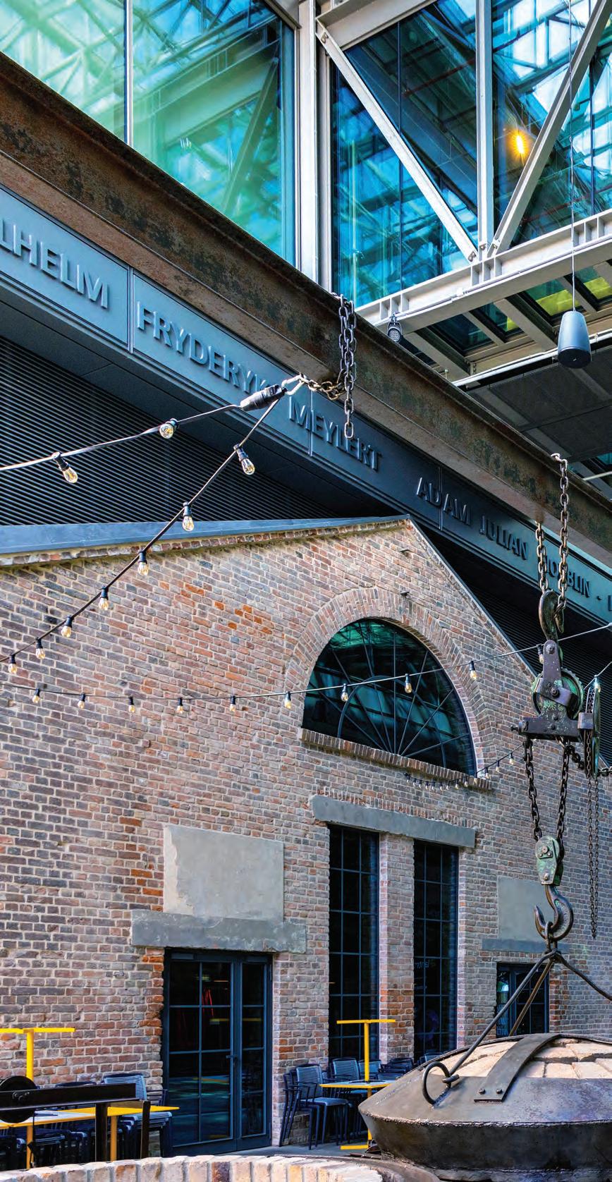
Where the designers have certainly got things right is in avoiding overrestoration of the yellow brick and steel trusses of the old Pumping Station. “We did not have budget to clean and repoint all the brick or repaint the metal, and they did not really need it,” says Radulovic. A patina of history remains on the Pumping Station, with its stains and cracks clear evidence of authenticity. Canada’s zealous over-restorers in the Federal Government and National Capital Commission need to go back and read William Morris’s 19th-century screeds against “scraping” the age and character off their restored buildings.
With their new book and breakthroughs into more ambitious large works such as the Pumphouse and Calgary’s Platform 9th Avenue Garage, 5468796 has evolved to the point where their repertoire of housing
forms and details have emerged as the true genetic structure of the firm’s brand so now, the camouflage of black can drop away. The gifts to all Winnipeggers from these architectural leaders in their renewed Pumphouse complex are many, but are crowned by gracious good humour, and an aggressive comfort with local realities. Oh, that all cities could be so lucky!
Trevor Boddy, FRAIC wrote the introduction to 5468796’s platform.MIDDLE book and participated in the original 2019 IIT housing symposium of that name that started the publication rolling. Boddy will co-lead tours of downtown housing and Erickson’s Smith House II at the RAIC national convention in Vancouver, May 12-15, 2024, where there will also be a platform.MIDDLE book launch and talks with Hurme and Radulovic.






A DOWNTOWN MONTREAL DEVELOPMENT CREATES A NEW IDENTITY FOR A FRAGMENTED SITE.
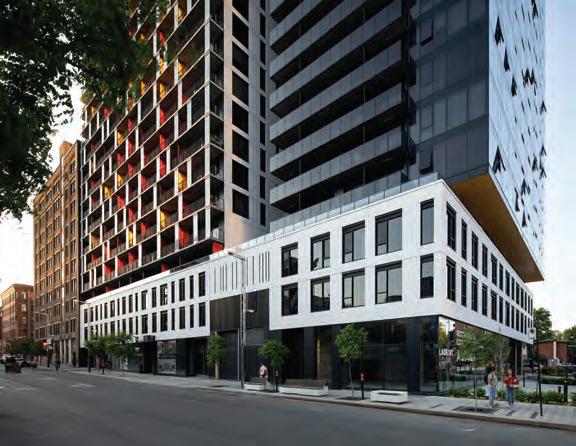
The recently completed Laurent & Clark condominium building in Montreal’s Quartier des spectacles is perhaps the most ambitious and certainly the most high-profile of a string of collaborations led by Jean-Pierre LeTourneux, principal of MSDL Architectes, and Denis Robitaille, founder of developers Rachel Julien. According to LeTourneux, who has worked on projects with Robitaille since the 1990s, it takes an “audacious” developer to make good architecture one who cares about details like, as LeTourneux points out to me, air exhaust vents seamlessly incorporated into a façade. The project as a whole has impressive presence: its first phase tower includes an array of colourfully partitioned balconies facing an urban park, while its second phase centres on a slim black tower.
But more than its striking façades, what distinguishes Laurent & Clark is how its massing intricately responds to the constraints of a complex site. The project occupies two-thirds of a very particular block, transformed several times since the 1960s through major projects that changed the urban structure of the city. If we look back to the early 2000s, the site was vacant and bisected by an arc of Boulevard de Maisonneuve, one of the main car-dominated arteries that traverses Montreal’s downtown, effect-



ively making the area unbuildable. This was not the original urban grid, but rather an alteration born from the construction of the metro in the 1960s: below ground, a tunnel follows the same arc as the street.
But after 2008, the grid was returned to its pre-1960s Cartesian organization, when the City of Montreal began to remake the area into the Quartier des spectacles. Boulevard de Maisonneuve was severed, liberating an open area opposite the site to become the Parterre one of the main public parks that host concerts and performances during Montreal’s summer festivals but also leaving two awkwardly shaped residual parcels at the corner of the re-directed Boulevard de Maisonneuve, which were too small to be developed.
This remained the case until 2016, when Rachel Julien purchased both parcels from the city, and the larger adjacent parcel from the developer of Loft des Arts, the 1914 brick building (converted into condos in 2010) that occupies the other end of the narrow block. Together, the three parcels have now become one of the most visible developments in the city.
The project’s fragmented massing is both pragmatic and contextual. On one hand, as LeTourneux explains, the project’s 356-unit count made it too large for the developer to easily build in a single phase. But more importantly, MSDL wanted to avoid an imposing and massive structure that would create deep, dark units. Moreover, they felt that it was important to acknowledge the mix of building scales and eras around the site.
In fact, the surrounding city blocks epitomize the patchwork of much of Montreal’s present-day urban realm. While Boulevard Saint Laurent remains one of the city’s key commercial arteries and is historic-
ally important to many communities, the blocks on either side of Laurent & Clark are suffering from a noticeable decline. Just across the street are a series of small-scale shopfronts in historic brick and greystone buildings, some apparently vacant, and many in evident need of restoration. The telltale signs of gentrification are also visible along the block: a trendy bar, café, and restaurant have moved in beside a vacated tire and mechanic’s shop, whose prime corner lot now awaits redevelopment. The opposite corner was home to the legendary punk-rock venue Katacombes until 2019, and will soon be occupied by high-rise student accommodations, a project by social economy organization UTILE
It is relevant to note that Laurent & Clark was initiated before city regulations mandating affordable units were in place, so the project primarily offers relatively small studios and one- or two-bedroom units, rapidly snatched up at market rates that were no doubt unattainable for many. So yes, the project inevitably marks a sharp divide between an existing context in transition and the sparkling newness of the Quartier des spectacles. But, to their credit, MSDL’s solution quite deftly mediates between the nine-times density allowed by the city and the competing priorities on either side of the block. Along the relatively narrow Boulevard Saint Laurent, a three-storey base avoids creating an overpowering and claustrophobic tunnel, and maintains the views from windows on the south face of the Lofts des Arts. In contrast, along the more open Boulevard de Maisonneuve and Rue Clark, the project presents two towers, one light and playful, the other dark and minimalist.

Both towers have surprisingly slim profiles and are connected by footbridges made with discrete metal grate decks and glass railings.
Aesthetics aside, achieving the effect of a reduced scale by breaking the project up into two smaller, thinner volumes was not a straightforward design solution. For LeTourneux, the first and most challenging condition to negotiate was the metro, because it forced a setback of the building’s vertical structure from Boulevard de Maisonneuve to avoid the tunnel below. To make up for the lost floor area, the darktinted glass tower has extended slabs that cantilever above, which in turn results in a somewhat awkward density of columns within the units on the southern end. On the positive side, the setback benefits the public realm by opening up a welcoming passage from Saint Laurent metro to the Parterre, and creates space for a corner café patio that is sure to become a popular spot.
To complicate things further, the only pre-existing structure on the site a small building housing electric equipment for the metro had to be maintained. While it is discretely integrated into the facade, its presence interrupts what could have otherwise been a continuous groundlevel of inviting commercial and social spaces spilling onto the Parterre.
Another challenge was how to create passthrough units in the lighter building facing the Parterre, so that residents could enjoy concerts from their front balconies, but have a quiet area to retreat to. First, MSDL designed units with a floorplate that is only fourteen metres deep much less than the standard eighteen metres. This allows for natural light to penetrate most of the space, notes LeTour-
neux. But the more important innovation is how MSDL did away with a central corridor, in favour of four single elevators for access, and an exterior passageway and stair for egress. Each elevator rises directly from the underground parking and, once past the fifth floor, gives direct access to either one or two units. While passthrough units and exterior egress stairs are quintessential to Montreal’s urban fabric visible walking down hundreds of streets of duplexes and multiplexes on the island the way this principle is applied to a 65-metrehigh, 21-storey tower is uncommon and very well-resolved. In the two-sided units at Laurent & Clark, bedrooms give access to narrow exterior passageways, which lead to either the sculptural-but-utilitarian exterior egress stair, or, via a vertigo-inducing footbridge, to the core of the phase two tower. The ingenious solution allows the two separate towers to share egress stairs. (A temporary stair was in place while phase two was under construction.)
The exterior passageways overlook the building’s central courtyard. LeTourneux says that this space, although accessible, serves primarily as a light well, akin to that of historic apartment buildings in Paris. This is not his only French reference. Le Corbusier’s Unité d’habitation is mentioned as an inspiration for the passthrough unit design. Yet, in a sense, it is the dual-access elevators that serve the role of Corb’s alternating corridors. Laurent & Clark’s exterior passageways, connecting footbridges, and visible egress stair could perhaps be more closely connected to the brutalist housing classics of 1960s and 1970s England consider Ernö Goldfinger’s Balfron Tower, or Jack Lynn and Ivor
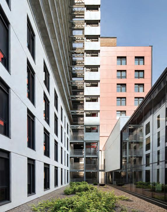

ABOVE LEFT The exterior stair and walkways overlook a courtyard that doubles as a lightwell for units on the lower floors. ABOVE RIGHT Bridges connect the two towers, providing shared access to the exterior stairs for emergency egress.
Smith’s Park Hill estate. But while those projects had front doors opening onto public pedestrian decks intended to function as “streets in the sky,” Laurent & Clark’s residents are not in the habit of using the passageways for circulation, out of respect for the privacy of their neighbours. Rather, they can make use of them in the summer, to enjoy the morning sunlight and the impressive views across eastern Montreal.
Laurent & Clark responds to the demands of its complex site with an innovative and refined form. It draws on the past half-century of change in its urban context to set a hopeful example for inventive, human-centered residential tower design for the half-century to come.
Claire Lubell is a designer and editor with an international background in architecture and urban design, and has guided print, digital, and open-access publications of several major research projects. She was a long-time editor at the Canadian Centre for Architecture and now works in heritage and territorial research at the Montreal cooperative L’Enclume.


We design. We manufacture. We build.
A MIXED-USE SOCIAL HOUSING DEVELOPMENT SETS A NEW BENCHMARK FOR TRANSIT-ORIENTED DENSIFICATION IN MONTREAL.
PROJECT Îlot Rosemont, Centre de services de l’Office municipal d’habitation de Montréal + Résidence des Ateliers, Montreal, Quebec
ARCHITECT Lapointe Magne et associés
TEXT Odile Hénault
PHOTOS David Boyer
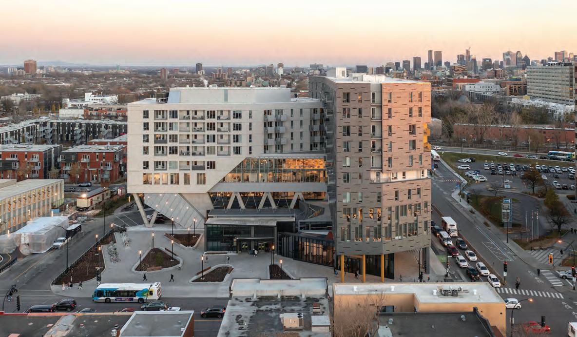
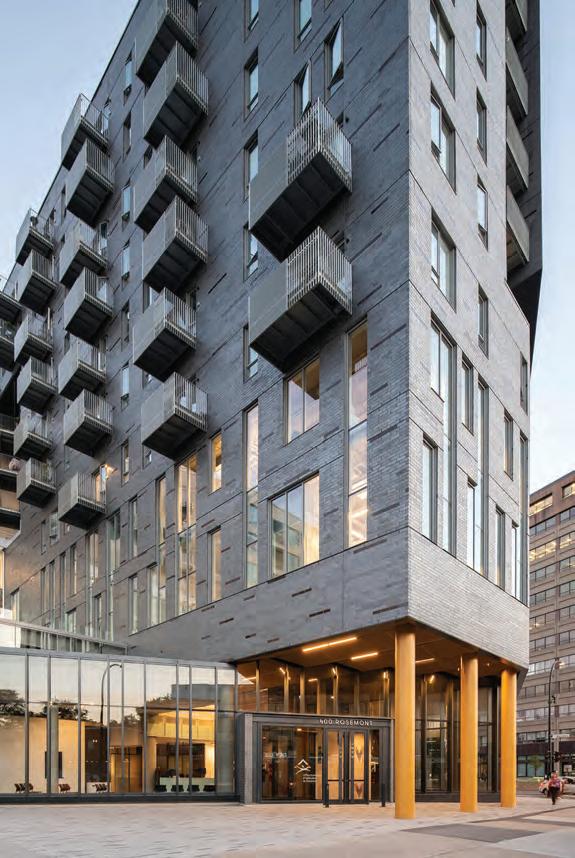
Emerging from Montreal’s Rosemont subway station, these days, one may be in for a bit of a shock. Where there used to be a small pavilion with direct access to the subway system and a generous turning loop for buses there is now the strong presence of an L-shaped complex, eight storeys high along Rosemont Boulevard and ten storeys along St. Denis Street. This recent addition to Montreal’s highly eclectic urban fabric epitomizes the city’s progress towards promoting mixed-
use, urban densification, and public transit. Translated into reality, this means a subway station-topping complex that offers affordable housing for 200 seniors, as well as holding the headquarters of the Office municipal d’habitation de Montréal (OMHM) a not-for-profit responsible for the management of some 880 buildings and close to 21,000 social housing units across the metropolis.
A complex context
The building sits at the border between the Plateau Mont-Royal and Rosemont-La Petite-Patrie, central boroughs which span either side of a long, curving CPR freight line. For decades, the 40,000-squaremetre site to the north of the rail line was occupied by municipal works yards and workshops, which were gradually demolished over time.
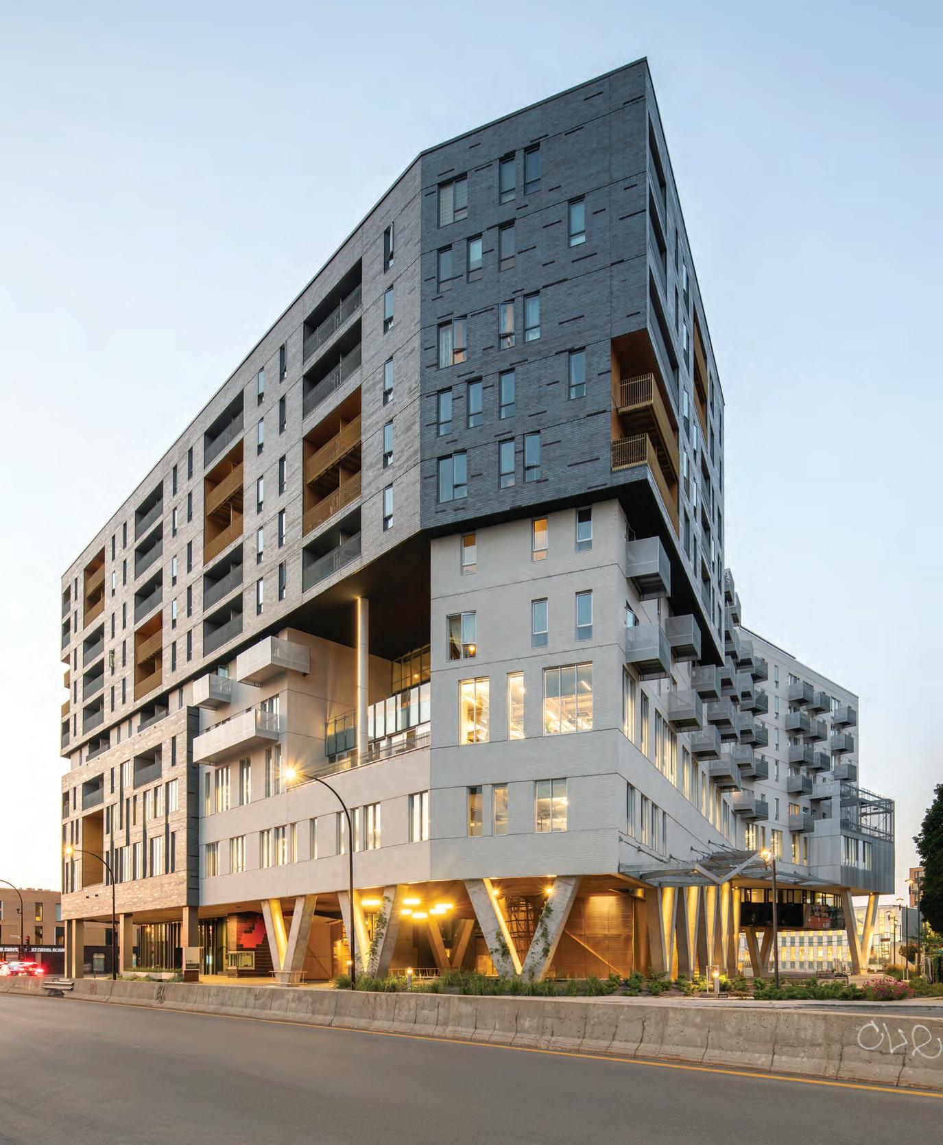
OPPOSITE Access to the Résidence des Ateliers is located along St-Denis Street. Individual balconies and loggias on the upper seven levels provide residents with a strong connection to the surrounding neighbourhood. The bus loop is visible to the right of the entrance. ABOVE This view facing south from Boulevard Rosemont shows the building in its immediate context. To the left, one can glimpse the light-coloured Bibliothèque MarcFavreau and the red-brick cooperative housing behind it. A small plaza in front of Îlot Rosemont provides access to Rosemont subway station.
In 2006, a new Master Plan was adopted to redevelop the city-owned area, with an emphasis on both market housing and social housing, as well as on public amenities essential to support a new neighbourhood.
During the following years, the area saw developments including Bibliothèque Marc-Favreau (Dan Hanganu architects, 2013), Quartier 54, a thoughtfully designed eight-storey condominium complex (Cardinal Hardy Beinaker architects, 2012) and the Coopérative du Coteau vert, a three-storey social housing project built around a central garden (L’Oeuf, 2010).
The last site on this major lot was earmarked for affordable and social housing. In 2013, Lapointe Magne & associés was mandated to design the project, which by then had grown in size to include the OMHM headquarters. One of the architects’ main challenges, apart from the actual building design, was to secure and harmonize the labyrinthine movements of pedestrians, bikes, buses, cars, and emergency vehicles gravitating on and around the site. To top it off, bordering the parcel is an underpass heading south, and an overpass going east. A strong urban gesture was needed.
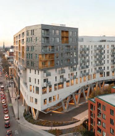
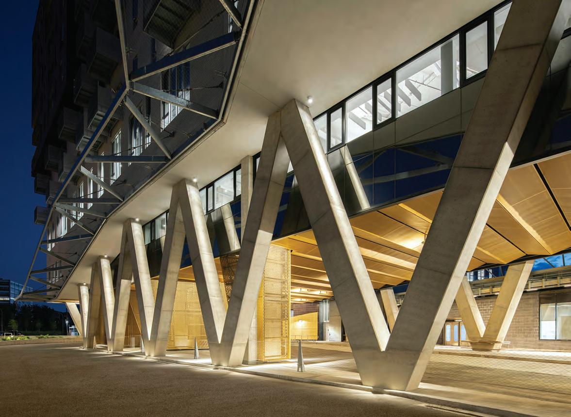
The architects’ mandate to renovate the existing subway access and integrate a bus terminal and turning loop was to have a major impact on the structure and the overall shape of the complex, as well as on its visual identity. Approaching the site, one is struck by the unexpected presence of giant V-shaped supports, zigzagging along the building’s perimeter. They form part of the intricate structural solution found by the engineers and architects as they looked to accommodate the large spans required by the public transit program, without compromising on the number of affordable units above.
The 193-unit Résidence des Ateliers occupies the upper five levels of the complex’s east wing and the upper seven levels of its west wing. The exterior volume of the overall complex is softened by the introduction of balconies and loggias, which reveal the presence of its occupants. Most of the units are one-bedroom apartments, which were designed with care despite the strict budgetary constraints attached to subsidized housing: the Résidence des Ateliers is the 11th initiative of a city-sponsored program called Enharmonie, which targets low-income seniors.
As it happens, Lapointe Magne was the first architecture firm to be hired when the program was launched, designing the Résidence JeanPlacide-Desrosiers (inaugurated in 2006; see CA , Feb. 2007), and later commissioned with the Résidence Alfredo-Gagliardi (2008), located above the busy Jean-Talon subway station.
Given Îlot Rosemont’s peculiarly shaped site, the architects were able to avoid conventional, identical apartments and come up with almost 34 different unit types, all universally accessible. The lack of lavish budgets was compensated for by great attention to the treatment of spaces within the units and in commodious corridors with whimsical, oversized wayfinding graphics. Particular emphasis was put on lightfilled communal and dining spaces. These were placed at the wings’ junction point in order to take full advantage of the obtuse angles generated by this irregular site.
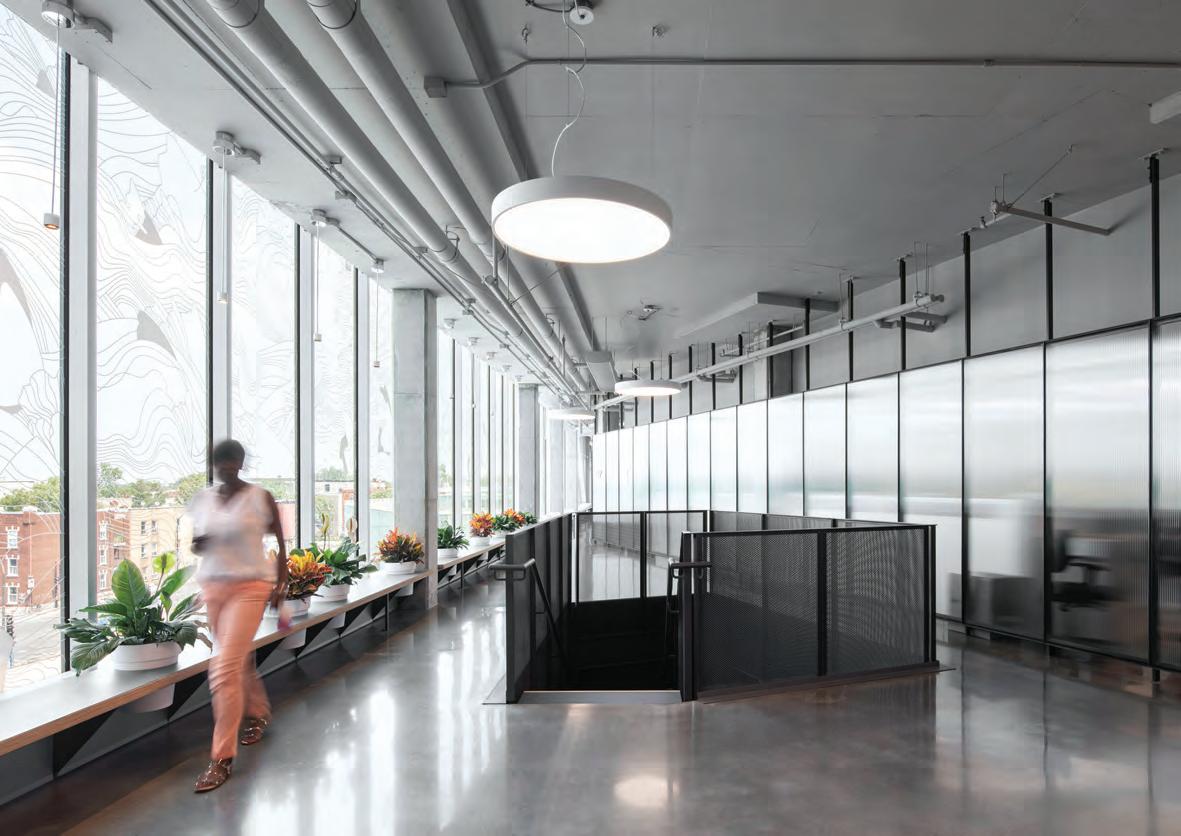
These gathering spaces are also found on the office floors, where light abounds thanks to an open plan and high ceilings with exposed mechanical and structural elements, which are particularly impressive at the third level. The communal rooms, such as the south-facing cafe-


teria on the third floor, offer generous views of the immediate surroundings and of Mount Royal in the distance. The OMHM ’s doubleheight reception area is directly accessible from St. Denis Street, in a spot some neighbours would have preferred to see given over to a more glamorous function. The choice made by the OMHM was to offer its equity-deserving clients a space with dignity, defying the possibility of NIMBY sentiments.
A strong urban presence
Îlot Rosemont is a robust, unexpected object in the landscape. And it does take some getting used to, despite the looming presence across the road of a far bulkier structure built in 1972 for a then-rapidly expanding textile industry. Lapointe Magne’s response to this condition was to integrate the brutalist building by making it part of a symbolic gateway to an area of the city that is still undergoing major changes. In an effort to soften the transition towards the massive concrete volume, a dark brick interspersed with subtle aubergine inserts and ochre finishes was selected for the west wing of Îlot Rosemont. For the east wing, a contrasting white brick was adopted in homage to the much gentler Bibliothèque Marc-Favreau. At ground level, the soffit and bus loop that run underneath the raised building are clad with ochre-colored perforated aluminum panels.
Key to understanding this latest urban intervention is the eclectic nature of Montreal’s streetscapes. A certain appearance of unity is given by the residential neighbourhoods with their regular, orthogonal grid and their two- and three-storey-high rowhouses, known locally as duplexes and triplexes. Attempts at building anything that breaks away from tradition are often met with scepticism. Nonetheless, the need to densify the city around subway stations and on any of Montreal’s innumerable vacant lots creates valuable opportunities for planners and architects to propose new formulas.
What has been built in Rosemont-La-Petite Patrie since 2006 can definitely be called a success. In less than twenty years, a new urban environment has sprung up here, anchored by some 800 housing units, more than half of which are affordable or cooperative housing. It is an exemplary showcase for the urban densification so often called for as a response to urban sprawl. Municipal leadership should be applauded for leading the way, by demonstrating how its own properties can be developed in ways that embrace complex programs and sites, as well as promoting affordable housing. Furthermore, the Îlot Rosemont and its immediate neighbours constitute a unique illustration of what committed, talented architects can contribute to their city if and when there is political will.
CLIENT OFFICE MUNICIPAL D’HABITATION DE MONTRÉAL (OMHM) | ARCHITECT TEAM LAPOINTE MAGNE & ASSOCIÉS: FRÉDÉRIC DUBÉ, KATARINA CERNACEK, PASCALE-LISE COLLIN, ALAIN KHOURY, OLIVIER BOUCHER, ISABELLE MESSIER-MOREAU, ESTHER GÉLINAS, ALIZÉE ROYER, FRÉ -
DÉRICK BOILY, YVES PROULX | STRUCTURAL TETRATECH | MECHANICAL/ELECTRICAL NORDA STELO | LANDSCAPE VLAN PAYSAGES | INTERIORS LAPOINTE MAGNE ET ASSOCIÉS | CIVIL AECOM | CON -
TRACTOR POMERLEAU | SIGNAGE/WAYFINDING PASTILLE ROSE AREA 24,560 M2 BUDGET $91.2 M |
COMPLETION NOVEMBER 2022
ENERGY USE INTENSITY (PROJECTED) 151.2 KWH/M2/YEAR | WATER USE INTENSITY (PROJECTED) 0.55
M 3/M2/YEAR
ELEVATION
OPPOSITE The main dining area in the Résidence des Ateliers offers generous views of the immediate surroundings. Low-budget, high-impact design touches include coloured flooring insets and chandelier-style lights. ABOVE The open staircase linking the top floors of the OMHM headquarters is located at the junction of the building’s east and west wings, facing Rosemont Boulevard. The presence of an angular wall reflects the site’s unusual configuration and enlivens the space.

A MASS TIMBER, FACTORY-FABRICATED MODULAR APARTMENT BUILDING HELPS ADDRESS THE HOUSING SHORTAGE IN A REMOTE QUEBEC COMMUNITY.
PROJECT Les Pavillons du 49° apartment building, Chibougamau, Quebec
ARCHITECT PERCH architecture
INTERVIEW BY Marco Marini
PHOTOS Ulysse Lemerise, unless otherwise noted
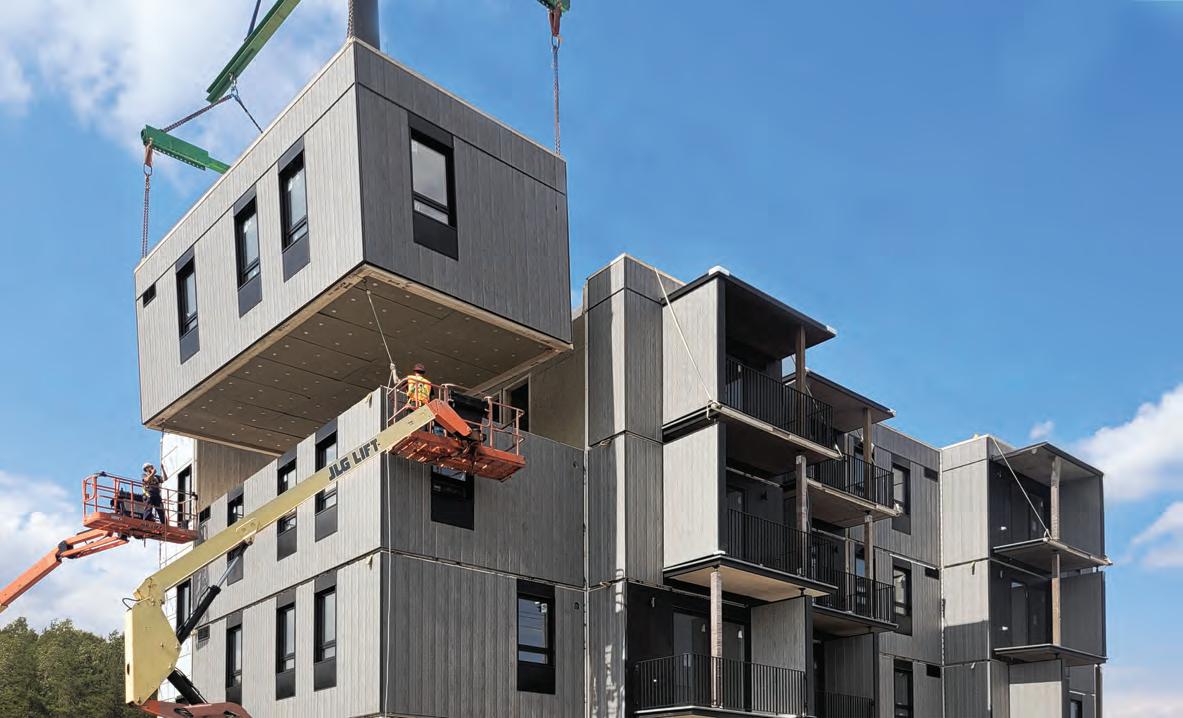
Last summer, one of Quebec’s first mass timber, factory-fabricated modular apartment buildings was built at lightning speed in the city of Chibougamau (population 7,500), a community some 700 kilometres north of Montreal. The four-storey Les Pavillons du 49° apartment complex was constructed from 47 modules, delivered and assembled on site in a mere four days.
The project was spearheaded by Nordic Structures, whose sawmill and production facility is located in Chibougamau, and whose engineered wood products are distributed throughout North America. They worked with Montreal-based studio PERCH architecture, a firm led by architects Suresh Perera and Julie Charbonneau.
The 20 rental units of the building accommodate a varied clientele. It’s anticipated that workers and retirees will live in the building’s studio unit, two accessible units, and five two-bedroom units, while families may rent its dozen three-bedroom units.
It’s only the second mid-rise apartment building in this remote northern town, where the main industries are forestry and mining, and an acute housing shortage leaves many locals living in temporary trailers. This housing shortage is exacerbated by a lack of construction labour, intense
winters, and a short exterior construction season. Those factors made an alternative approach to design and construction both necessary and ideal.
In this exclusive interview, we spoke with architect Suresh Perera to learn more about the project.
CANADIAN ARCHITECT: Can you explain how the mass-timber modules fit together to create the finished building, and why you feel this was the right approach in this situation?
PERERA: For this project, mass-timber and modular are intrinsically linked. Continuous cross-laminated-timber (CLT) panels make up the walls, floors and ceilings of each module. This CLT shell is the core concept and forms both the structural and architectural components it is self-supporting, inherently fire-resistant (without needing interior gypsum finishing, for example) and forms an interior vapour barrier.
Each module is, in many ways, a mini-building. Two linked modules become an apartment. The corridors, stairs and elevator are their own modules, which is important in order to avoid sound transmission.

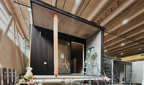
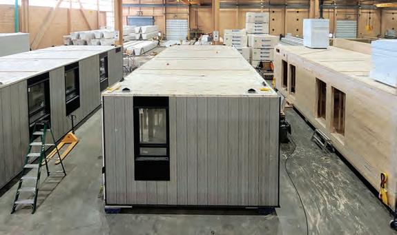
OPPOSITE The 20 rental units of the four-storey apartment building were constructed as prefabricated mass timber modules. The modules were delivered and assembled on site in four days. ABOVE, CLOCKWISE FROM LEFT The column support for balconies was flipped in sections of the building to create visual interest for the façade; construction on the modules took place entirely within a controlled factory environment; the completed modules included installed doors and windows, exterior cladding, interior finishes, electrical and plumbing fixtures, and millwork.
These “mini-buildings” were individually constructed in a factory setting, and were then assembled into one complex system on site. An apartment building is essentially a collection of smaller repeated units, without large spaces or high ceilings, and is a perfect candidate for a modular building especially in this case, considering all the constraints of building in the North. Being close to the factory and the source of the wood made the CLT construction an even more sustainable choice.
CA: From an on-site perspective, when you’re assembling the project, what are some of the big differences between this type of modular structure and a more traditional approach?
PERERA : The construction of each module each mini-building occurred in a controlled factory environment and included the installation of doors and windows, exterior cladding, interior finishes, electrical and plumbing fixtures, and millwork. This process continued for many months over the winter and spring. The foundations were poured in early summer and, within just four incredible days, the modules arrived on trailers and were hoisted into place. The roofing joints were sealed, making the building waterproof.
The advantages are obvious. Not only are site-related weather issues no longer a problem, the factory fabrication allows for a high level of control, easy inspection and testing of systems, and safe working conditions, as the modules are always only one floor high.
CA: How did you and your relatively small Montreal-based firm end up working with Nordic Structures on a project in such a remote northern city?
PERERA : A few years ago, Nordic Structures was looking to build modular mass-timber classroom additions to schools. They approached us to help develop the concept, as we had relevant experience with institutional projects. What started out as simple one-storey additions eventually led to more complex two-storey structures, where fire and acoustic separations and stair modules had to be carefully considered.
These projects were very successful not only because of their technical efficiency, but also because the CLT product allowed us to leave the wood structure exposed on the interior, making the classrooms very attractive learning spaces.
Based on these early experiences with modular CLT construction and our experience with various scales of residential projects, it seemed a perfect next step to work on this building. Certainly, working on a project so remote posed many challenges!
CA: Working on a project so far away, with so many different people involved, sounds like it could be a major headache. Can you describe the working relationships that evolved as the project got underway? How complicated was it for you to work with a remote fabrication site?
PERERA : Being a design-build collaboration, the entire process was different from a traditional design process. Strangely, the process also coincided with the pandemic, when remote work came into its own. Right from the very beginning of the early design stages, we had daily and often more than just once-a-day video-conference meetings and phone calls with the factory fabrication team at Chantiers Chibougamau and the engineers at Nordic, to work through design questions and details.
It was a huge learning curve for us, and for them as well. Not a single detail was standard, and we had to understand the factory fabrication sequence, limitations, and how to detail CLT structures from an architectural point of view. The engineering was inseparable from the architecture, and so, as our drawings developed, so did the engineering drawings.
There were ten distinct types of modules. We would physically visit the factory at the start of the construction of each type to ensure a complete coordination, and to make adjustments to the details and drawings as necessary. In some ways, the drawings were only complete at the end of the building process!
Nordic Structure’s engineers and the team at Chantiers Chibougamau were extremely dedicated throughout, and had a high understanding of their product and the process. Given that the entire approach was new to us, we relied on them as much as they did on us, to guide the process.
CA: Can we talk about some of the specific architectural and design challenges related to the project? How did your approach to the design manage to overcome these and turn them into advantages?
PERERA : Factory fabrication means the completed modules are limited in height and width due to the limitations of transporting them by road. However, using CLT panels means the wall, floor and roof compositions could be comparatively thin. We worked closely with the fabrication team to achieve the maximum height possible.
Our interior finished ceiling was 8’-9”. By combining several modules, we were able to get living space widths of 14.5 feet and bedroom widths of 12 feet, which compares favourably with traditional apartment building sizes.
The CLT shell had other benefits, such as a highly thermally efficient structure in comparison to wood-frame. We strongly felt that the wood should be exposed on the interior, and we picked certain areas to do so, including the ceilings, certain accent walls in the units, and the walls of the staircases. The big advantage is that the CLT plays multiple roles structural, technical and architectural thereby reducing the total material consumption while creating warm, aesthetically pleasing interior spaces.
CA: From the viewpoint of aesthetics, modular buildings have a reputation of being quite repetitive and banal, with minimal architectural opportunities. “Generic” is a word that’s plagued the modular approach. How did you flip this impression and create a building worth talking about?
PERERA : Modular construction becomes most cost-effective by repeating identical components, which often leads to monotonous and flat buildings with small openings. The concept here was to find visual shifts
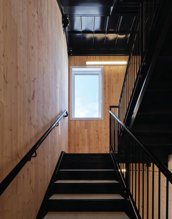
and variations within repetition that did not reduce structural or construction efficiency. Shifting window positions in modules that were identical on the interior reduced the monolithic aspect of the building, as did pulling in and pushing out adjacent modules.
We also worked closely with the structural team to create large balconies that appear to flip and shift on the façade, but are identically attached to each module, in order to standardize construction. Likewise, we worked with the structural team to have large windows in the living spaces that provide ample natural light and animate the façade. The structural capabilities of the CLT also allowed for open interior living spaces without the need for columns, structural division, or large structural members.
CA: Sounds like the materials used in this project really allowed you to push the conventional understanding of what modular structures can be from a design perspective. How did the technical aspects of working on this project compare to standard construction methods?
PERERA : An important challenge was resolving some of the acoustical and fire safety details within the construction especially dealing with construction voids, points of contact between the modules, and the passage of electrical and mechanical building services. The other significant challenge was understanding how to deal with differential movement between the modules over time, and how to maintain accessibility for people using mobility devices. The building is a prototype in many ways, and will continue to be monitored over time, as part of a project between Nordic Structures and FPInnovations.
How to configure and build certain modules was another challenge. The entire stair shaft, for example, was a single module, for several reasons, including fire resistance. It was built horizontally including the installation of the staircase and then installed on site vertically.
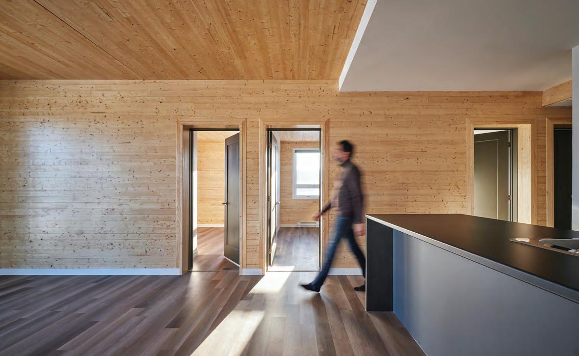
CA: Wood construction is usually considered far inferior to a material such as concrete when it comes to acoustics and fire resistance important elements when designing a multi-unit building like this. Can you discuss how you were able to use wood so effectively in this project?
PERERA : We worked closely with acoustical experts and testing companies to evaluate wall, floor and inter-module compositions, shifting the design and detailing to respond to the results.
Conceptually, the idea was to structurally separate the residential units from each other and from the public spaces. The modular system of construction allowed us to do this, as each apartment had its own shell its own floors, walls and ceiling separate from adjacent units. The corridors were their own modules. There are no attachments tying the modules together, removing a major weakness that causes sound transmission. Each module simply rests on the module below, with acoustic pads to separate them. The tested STC and IIC values were well above the building code requirements.
The CLT panels have an inherent fire resistance, making it a much more effective building material for fire resistive assemblies than, say, wood frame construction.
CA: Sustainability has evolved to become the foundation of so many projects in the past decades. How does Les Pavillons du 49° fit into this approach to building? How does it move the concept forward?
PERERA : It’s estimated that the 987 cubic metres of wood used in this project is grown in US and Canadian forests in three minutes. With the stored carbon and avoided greenhouse gases, it’s easy to argue for the benefits of mass-timber versus, say, concrete or steel construction. But each module still has its own floor and ceiling, and though this is great from a sound transmission and fire resistance point of view, it also means more wood is used compared to a typical wood-frame construction. I believe there’s still room for an improved efficiency of construction. We are still searching for that perfect balance of responding to needs and working within construction limitations, while achieving minimal material and energy use.
This being said, the higher density achieved by the mid-rise compared to the typical North American neighbourhood of single-family homes is great in terms of minimizing urban sprawl and dealing with deforestation in this type of ecosystem. Especially in light of last year’s fire season which saw Chibougamau evacuated as forest fires approached the city the need to be conscious of the fragility of this ecosystem seems more urgent than ever.


ARCHITECTS HAVE A KEY ROLE TO PLAY IN CONSTRUCTING BUILDINGS RESILIENT TO THE THREAT OF INCREASINGLY DESTRUCTIVE WILDFIRES.
The sky on that Friday morning last August was a bright, bright yellow. I went outside to find my neighbours milling about on their driveways and pointing to smoke billowing above the hills to the north. Close to 10 p.m. the night before, the McDougall Creek wildfire had jumped the lake and started two new fires the Walroy Lake wildfire in Kelowna, and the Clarke Creek wildfire in Lake Country, where I live. Together, the three fires were labelled the Grouse Complex. Now the Clarke Creek wildfire was heading straight for my neighbourhood.
No one panicked, but everyone began the process of loading pets, suitcases and keepsakes into their vehicles. Some of us put lawn sprinklers on our roofs. Long before the police came through our subdivision, pounding on doors and ordering people to evacuate, most of us were packed and gone. I was one of 35,000 people to leave. Later that same day, as the fire worsened, smoke filled the valley, the Kelowna Airport was closed, and first responders began heading for the Okanagan from around the province, across the country and even from distant parts of the globe.
The problem, however, began decades before the summer of 2023. Much of it has to do with the way we have managed or mismanaged our forests. According to Paul Hessburg, Senior Research Ecol-
ogist, Pacific Northwest Research Station, our forests used to be much more ‘patchy.’ As he notes in a TEDx talk titled “Living Dangerously in an Era of Megafires,” the forest fires that have historically been part of the natural environment were smaller, more localized, and less intense because of what he has dubbed ‘the power of the patch’.
Now, those patches have been connected with flammable development, but also by more forest. Our emphasis on fire suppression has been so successful that forests across the United States and Canada have filled in with a dense mat of trees that often touch one another. The lack of intermittent, small fires has also clogged the forest floor with dead and dying trees fuel for larger fires. Moreover, the forest floor has become filled with a ‘duff’ layer of pine needles and dead grass. This duff layer not only acts as kindling, but also inhibits the growth of the fire-resistant grasses that used to grow between the trees.
All of this means that when fires do occur, they are massive, intense and volatile.
John Betts is the Executive Director of the Western Forestry Contractors’ Association, an industry association headquartered in Nelson, BC, that represents tree planters, contract wildfire fighters and independent forestry consultants. He frequently works with regulatory bodies to increase public safety and awareness. “We are learning,”


ABOVE LEFT Smoke from the MacDougall Creek wildfire, as seen from Kelowna the day before it jumped the lake, starting two new fires.
ABOVE CENTRE The Okanagan resort was destroyed by the 2023 fires.
ABOVE RIGHT Security camera footage of the fire approaching McCoubrey Road, in the author’s neighbourhood.
While climate change is not the root cause of these fires, it has exacerbated the situation with droughts, higher temperatures, higher winds, and the migration northward of insects such as the pine beetle, which have killed thousands of trees that are then added to the forest floor. As such, climate change has extended the fire season by 40 to 80 days.
The result is enormous fires. In the past, the Clarke Creek fire in Lake Country at 373 hectares and the Walroy Lake fire in Kelowna at 733 hectares would have been considered large fires. But these were dwarfed by the immensity of the McDougall Creek fire, at 13,970 hectares. In 2023 alone, 61 fires burned a total of 71,971 hectares or 720 square kilometres, an area larger than the city of Toronto in the Penticton Zone, which runs from the American border to Lake Country.
The AEC industry needs to pay attention, in order to avoid seeing our work go up in smoke. According to Hessberg, “more than 60 percent of all new housing starts [in the United States] are being built in this flammable and dangerous mess.” As Betts puts it, “We have energized the landscape and put our infrastructure at risk.” As I drove down Highway 97 to stay at my son’s house in Kelowna and watched the smoke rising from my neighbourhood, I really didn’t have much hope that my house would be standing the next day.
When a fire is burning away from human settlements, it is described as a wildfire. But when that wildfire approaches people and structures, it becomes a wildfire-urban interface fire, or simply, an interface fire. Wildfires and interface fires have their own unique characteristics, and are often fought by different kinds of firefighters. Craig Moore is the owner of Rider Ventures, an Indigenous-owned company with a focus on fire and flood protection. He’s a structural firefighter, which means he usually deals with buildings and infrastructure, rather than wildfires. This year alone, throughout the province, his company has protected 3,500 homes with only three losses one of which was an outhouse. “The nemesis of a structural firefighter,” he explains, “are the little nooks and crannies of a building where embers can get trapped underneath building materials.” Embers are a formidable nemesis. They can easily jump or “embercast” two to five kilometres, and with a good wind, they’ve been known to travel up to 16 kilometres.
he says, “that fire-adapted forests are dynamic. They rely on fire to maintain themselves. When we suppress fire, as we have now done for decades, we change their structure and composition. These ecosystems are now so out of composure they burn with far more destructive intensity and severity.”
Betts notes that many of the fires we are currently experiencing are “crown fires,” which occur in the tops of the trees, rather than “grass fires,” which burn on the forest floor and are much less dangerous, because they’re neither as high, nor as hot. As he notes, “There is now enough fuel and enough trees to keep the fire in the crowns.” He explains that, “It’s a question of flame length, or the height of the flames. The crowns can’t carry the fire unless there’s enough energy coming up from the floor. We need to bring the fire down to the ground, and then deny it fuel.”
Particularly spectacular and deadly is when a tree “candles,” or bursts into flames. When multiple trees candle, they can create a crown front. Fires are ranked from 1 to 6, with a rank 6 fire being the most intense. Rank 4 and above is when the crown is involved. Fortunately, the fires in Kelowna and Lake Country never rose above a rank 4, but the McDougall Creek fire may have achieved rank 6 in the forest and rank 5 in built-up areas.
Structural fires burn differently from wildfires. Wildfires move quickly through a forest at 23 kilometres per hour or more, depending on factors such as the wind. But structures, such as our homes, can burn for over 24 hours. As our communities become denser, structures larger than houses are also at risk. Jason Brolund is the Fire Chief for West Kelowna, which was particularly hard hit by the McDougall Creek fire, with 70 homes affected by the fire. As he notes, “I never thought I would be protecting an apartment building in an interface fire.” They saved that building and hundreds of others, including a newly completed water treatment plant. His experience points to the kind of fires we may encounter with greater frequency in the future.
Sadly, the Okanagan is no stranger to fires large or small. Two decades earlier, the Okanagan Mountain Park Fire consumed close to 26,000 hectares of forest. During the 2017 Nighthawk fire, the evacuation alert line was right along my back fence. I had my car packed, but that time, I did not have to evacuate.
Yet there is hope. Everyone I spoke with emphasized the importance of programs such as FireSmart, which sets out construction and maintenance guidelines for increasing the fire-resilience of buildings. Larry Watkinson, the Fire Chief for Kelowna, even went so far as to say, “The FireSmart principles are a game changer. They’re the most important thing a homeowner can do.”
Taking action to FireSmart your property will dramatically decrease the risk of wildfire damaging your home. The best part is, it's surprisingly easy to do.
FireSmart Canada was founded in 1993, and includes programs designed to engage not only homeowners, but also local governments, Nations, children, and homebuilders. “Homebuilders,” says Rachel Woodhurst, Program Lead for FireSmart BC, “are one of the most critical pieces of the FireSmart puzzle.” This is because decisions made during construction particularly in terms of materials can be critical in ensuring that a house is resistant to wildfires. This means encouraging the use of materials such as fibre cement siding rather than vinyl siding or cedar shakes; shingles that are rated Class A (which is the highest level of fire resistance); and even energy efficient windows (which are also more fire resistant). Details, too, are critical. External vents in homes, for example, should be covered with non-flammable screens to prevent embers getting into the attic.
The landscape around a building is also important. Locating easily combustible cedar hedges and juniper bushes close to your house is, according to Chief Watkinson, “like placing a blowtorch next to your home.” Wooden fences and woodpiles, if too near to a building, clogged gutters, and a yard full of pine needles can all be equally dangerous. Woodhurst noted, “90% of the risk to your home is in the roof
Relocate propane tanks 10-30 metres from your home, and keep combustible vegetation a minimum of 10 metres from propane tanks.
Move firewood and lumber 10-30 metres away from home.
Add non-combustible 3 millimetre screens to external vents (except dryer vents).
Reduce
and what’s directly against the house.” At the same time, FireSmart suggests that trees anywhere on your property should be spaced three metres apart, and be trimmed so that no branches are less than two metres above the ground.
Given that FireSmart Home Assessments are free in British Columbia, it seems a service that every homeowner in a forested area should take advantage of. In writing this article, I learned that my house with cedar shakes, vinyl siding, juniper bushes and over two dozen large, untrimmed pine trees would probably be classified as “fire stupid.”
Nonetheless, on Saturday morning, the day after I evacuated following the fire warning last summer, one of my neighbours shared photographs from their security camera that showed my house was still standing. The sense of relief I felt was overwhelming.
Other forms of infrastructure can also make a difference. Burying utility lines underground is one positive step municipalities can take. As Watkinson says, “Power poles can fall and compromise aboveground operations. We need to get things in the ground, so we can work above.” The McDougall Creek fire destroyed over 400 power poles and more than 25 kilometres of power lines, leaving 1,200 people without electricity.
While every firefighter I spoke to praised the FireSmart program, there is no escaping the fact that the hundreds of first responders who descended on the Valley were the real heroes who saved thousands of homes in the McDougall Creek fire. On the east side of the lake, only three homes and two outbuildings burned in Kelowna, and only three homes and one detached garage were destroyed in Lake Country. The west side of Lake Okanagan suffered most: 70 homes were affected in West Kelowna, 20 were lost in the Westbank First Nation, and approximately 100 structures were destroyed in the Trader Cover and Okanagan Resort areas including the historic Okanagan Resort itself. But as Darren Lee, Fire Chief for Lake Country said, “It could have been so much worse.” By comparison, the 2017 Nighthawk fire in Lake Country covered only 55 hectares but destroyed eight homes, and the Okanagan Mountain Park fire in 2003 burned 239 homes.
It is also little short of a miracle that there was no loss of life. All of this is a tribute to the crews who worked day and night to protect our communities and ourselves. In one extraordinary example, someone posted a video from their security cam of police fighting backyard fires with garden hoses.
The combination of social media and security cameras provided ongoing, accurate, and sometimes unsettling information about the fires. On Sunday, one of my neighbours posted an image of firefighters in their backyard, while another showed flames burning to the edge of a road near my house. At the same time, websites livestreamed the daily press conferences that began on Monday, and provided links to interactive maps that showed areas under evacuation alerts.
Over the life of these fires, firefighters came from all over British Columbia and Canada, while others arrived from Australia, New Zealand and South Africa. But in the first 24 hours of the inferno, it was only the local fire departments that were available to fight the blaze.
Brent Penner, Deputy Fire Chief Lake Country, provided me with a detailed description of the personnel and equipment involved in fighting the Clarke Creek fire. On that first Friday they had 12 vehicles fighting the fire a mix of fire engines, tenders or water trucks, bush trucks (for rough terrains) and ATVs. The firefighting crew included 47 on-call members from the community and eight career firefighters.
On Saturday, the City of Kelowna was covered in a thick blanket of smoke, the airport remained closed, and travel to the valley was banned. The Air Quality Health Index rose to 11 indicating a Very High Risk the top of the scale. I foolishly went outside for a few moments, and immediately became short of breath.
As the weekend wore on and the fire ramped up, equipment and personnel poured in and the totals rose to 26 vehicles with 82 personnel and these were only the ones fighting the structural fires in Lake Country. In Kelowna, there were upwards of 500 structural firefighters on the ground by Day 2 of the Walroy Lake fire. Overhead, small planes, water tankers and helicopters helped to direct and lessen the intensity of the fires, for instance by slinging “mud” (fire retardant) along ridgelines.
The cost of wildfires
I mention these developments in detail because they emphasize how much time, effort, equipment and money are involved in a fighting these fires. Across the province, between April 1 and October 31 of last year, there were 2,245 wildfires, which burned 2.84 million hectares of land. While the final numbers are still coming in, the provincial government estimates that it will have spent close to $1 billion in 2023 fighting wildfires a staggering $762 million over the budgeted amount. And that’s just the beginning. The McDougall Creek fire alone caused over $480 million in insured damage. Just north of the
Okanagan in the Shuswap area, the Bush Creek East wildfire, which was burning at the same time, destroyed 270 structures and caused an additional $240 million in insured damage.
The Insurance Bureau of Canada has declared the BC wildfires of 2023 to be the most expensive natural disaster in the history of the province, and the 10th costliest natural disaster in the history of Canada. The costliest natural disaster was also a wildfire the one that consumed Fort McMurray in 2016 and cost $4.3 billion in insurance claims.
Sadly, much of this would never have occurred if we had taken action earlier. As Betts says, “We are grappling with the inertia of the status quo.” After the fires of 2003, British Columbia commissioned the “Firestorm 2003: Provincial Review,” which recommended better forest management procedures, removal of fuel hazards, and community fireproofing programs. It took another series of disasters in 2017 and another report (“Addressing the New Normal: 21st Century Disaster Management in British Columbia”) with many of the same recommendations before things began to change in earnest.
Mitigation measures do take place across the province, and they continue apace today. The province allows for both Indigenous cultural burning, which has been practiced for centuries for both cultural and environmental reasons, and prescribed fires, which are aimed at replacing catastrophic wildfires with more frequent, less intense fires. Both kinds of fires reduce the accumulation of forest fuels.
These methods can be effective. Southwest of Kamloops, Logan Lake (pop. 2,000) is a pioneer in wildfire mitigation. It was recognized as Canada’s first FireSmart Community in 2013, and the measures implemented there, a combination of prescribed burns and preventative maintenance, are widely credited with saving the town from the Tremont Creek wildfire, which burned 63,500 hectares in 2021. Typically, communities receive a few hundred thousand dollars from the provincial government for such measures this, of course, pales in comparison to the cost of a major wildfire.
Even with mitigation measures, however, the danger will not go away. As Chief Lee warns, “As our community grows, the risk grows. We need to become stewards of the land.” The fact is, that we live in a region where fire is an inevitable and even necessary. It’s part of our ecosystem, and we need to design our homes and infrastructure accordingly.
On Friday, August 25th, I was allowed to return home. The same day, the airport was reopened. My neighbourhood was intact, but driving northward I passed many charred and burnt trees, and a number of destroyed structures. My home was untouched, but there were large, muddy boot prints on my back porch that showed how close the fire had come. Firefighters had thrown flammable items from the porch, such as chair cushions, into my backyard and away from my house. On October 18th, all the fires in the Grouse Complex were officially declared to be out. Hiking around my neighbourhood that month, I noticed that new grass had already begun to sprout, and deer and other wildlife had returned to burned out areas.
Future fires, if not completely avoidable, can be effectively mitigated and greatly reduced in terms of cost and damage through inexpensive preventative measures. To achieve this, however, many different disciplines need to begin cooperating. As Lee says, “Fire departments and the forest service can’t do it by themselves. Builders, architects and developers need to be integrated into the system to make it work better for everybody.”
Dr.

A RECENT EXHIBITION SURVEYS THE PIONEERING WORK OF MCGILL’S MINIMUM COST HOUSING GROUP.
In recent years, housing has returned to prominence as an acute issue for Canadians, rising in salience in our municipal, provincial, and now federal politics. Across North America, the sense of a housing crisis and its proposed remedies have proved capable of both hardening and fissuring existing socio-cultural coalitions, with “gentrification,” zoning reform, “gentle density,” the “fifteen-minute city,” and greenbelt development provoking heated reactions. The sense of urgency around these issues was exemplified by Architects Against Housing Alienation (AAHA)’s “Not for Sale!” campaign, the latest iteration of the Canadian Pavilion at last summer’s Venice Architecture Biennale.
For many Canadians, these debates often revolve around access to housing as a government-sponsored savings vehicle or an aspirational consumption product in other words, matters of abundance. But the rising numbers of unhoused persons living in our cities, together with increasing awareness of desperate housing conditions in many First Nations communities, have also focused attention upon housing needs requiring immediate rectification matters of scarcity.
Whatever the cause of such anxieties and failures speculative market overreach or sclerotic regulation, population growth or declining
household sizes, increasing wealth or economic precarity they are now central issues facing Canadian architects, linking debates from the Global North and South in our current world of uneven and unsteady globalization.
Curated by McGill professors Vikram Bhatt and Ipek Türeli, and doctoral candidate Ariele Dionne-Krosnick, a recent exhibition at the Peter Guo-Hua Fu School of Architecture charts their university’s Minimum Cost Housing Group (MCHG) and its five decades of sustained research into the scarcity side of this wicked problem. Presented last fall, Design for the Global Majority showcases a plethora of ground-up, low-tech, participatory approaches developed by the MCHG to address housing and related issues within their local contexts, all under conditions of extreme material and financial constraint. These efforts, with their underlying humanist imagination an offshoot of 1970s critiques of modernist dogma and functionalist overreach retain their salience today as approaches to dealing with constrained resources and growing ecological emergency.
While the figures involved in creating and sustaining the MCHG are fascinating Álvaro Ortega, Witold Rybczynski, and Vikram
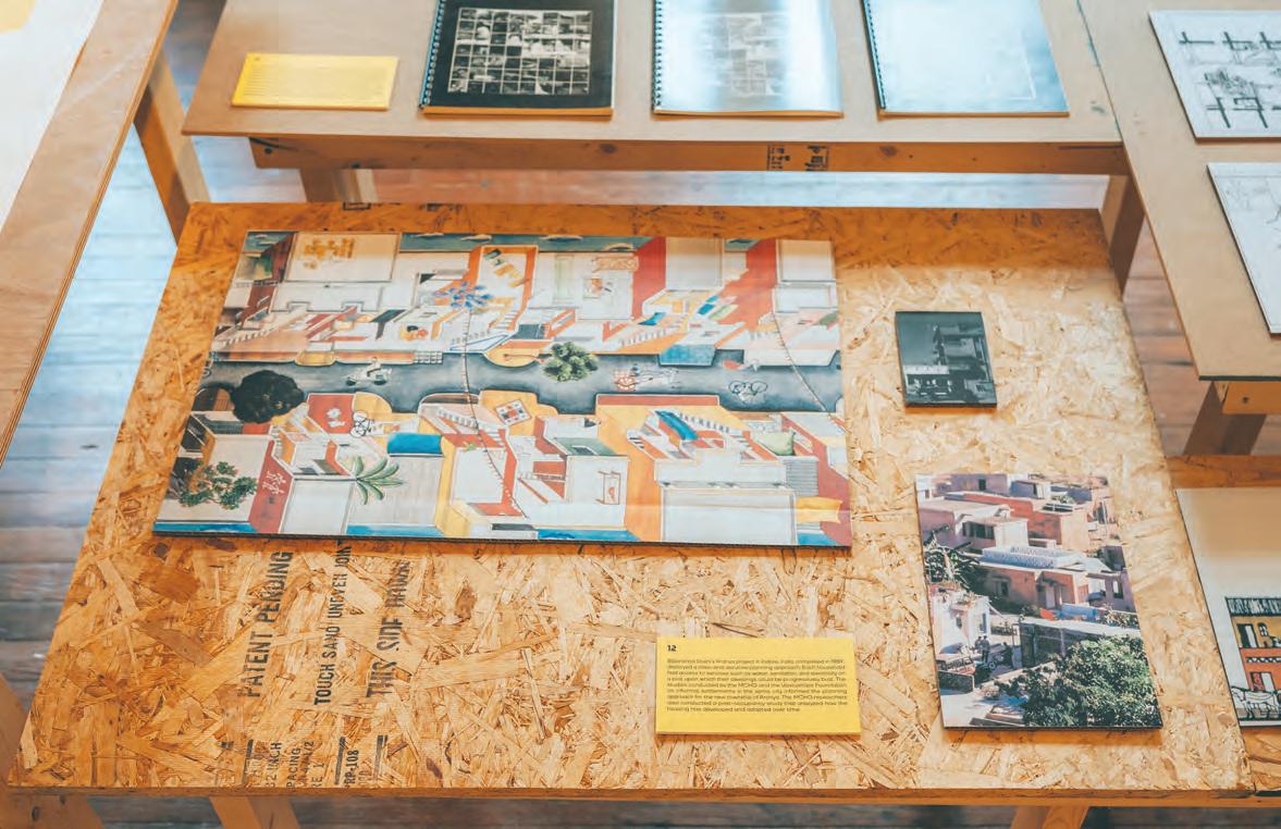
OPPOSITE In the 1970s, the Minimum Cost Housing Group developed interlocking concrete blocks and colourful tiles using sulphur, a waste product of petroleum production. ABOVE MCHG researchers collaborated on Balkrishna Doshi’s low-cost housing complex at Aranya. RIGHT The Group’s research on urban agriculture in Montreal eventually expanded to integrate productive growing in and around housing in cities in Africa, Asia, and South America.
Bhatt have directed the program in turn since its founding in 1971 the exhibition wisely focuses upon the group’s experiments and output, not its leaders’ biographies. In keeping with the MCHG ethos of sustainability and cost-minimization, the exhibition is built using donated, recycled, and second-hand materials where possible. Densely filled with remarkable objects and documents, Design for the Global Majority offers a humble manifesto for iterative, incremental change. It’s an affirmative response to Le Corbusier’s challenge of “Architecture or Revolution?” set out in Towards an Architecture (1923).
The exhibition is organized in five thematic groupings, each illustrated with multiple examples from the MCHG ’s praxis. UPCYCLE presents the group’s early experiments with material recuperation and reuse, especially attempts to develop sulphur-based concrete as a usable building material. Widely available as a waste product of petroleum refining (as well as in areas of volcanic activity), sulphur was used by the MCHG to make interlocking concrete blocks, colourful tiles, and waterproofing agents. The concept was tested with the ECOL house built on McGill’s MacDonald campus in 1972


(a visiting Buckminster Fuller gave the two-room structure its moniker), in a community structure for the Cree National in Saddle Lake in the Amiskwaci wiyiniwak region of central Alberta, and with the Maison Lessard, a fully winterized building in St-François-du-Lac, Quebec. While the sulphur blocks’ poor insulative value and flammability prevented their widespread adoption, the MCHG ’s experiments belong to a rich vein of 1970s experimentation with material reuse.
HARNESS addresses issues of hygiene, showing MCHG ’s initiatives to conserve precious fresh water while offering DIY sanitation systems built with off-the-shelf hardware and locally available materials. Solar water purification equipment, garbage bag solar water heaters, and mist showers were all intended to provide bodily dignity without increased water use. One of the MCHG ’s most successful publications, Save The Five Gallon Flush! (1973) provided instructions for building composting toilets.
With PLAN, the exhibition shifts scale from building and sanitization techniques to urban development proposals in India, China, and Mexico. Working with institutional partners, the group meticulously documented the architecture and spatial practice of informal settlements and their inhabitants. MCHG ’s collaboration with Balkrishna Doshi exemplifies this way of working. The group’s study of Indore in the central Indian state of Madhya Pradesh was published in How the Other Half Builds (1984–90), and then applied in Doshi’s Aranya low-cost housing project, for which the MCHG designed a 200-house neighbourhood.
In China, the MCHG studied rural inhabitants’ housing needs, leading to demonstration projects in Sichuan province and Chongqing city; this research was published in Housing a Billion (1993). The MCHG’s approach took the form of “village upgrading” an alternative developmental approach intended to house farmers and support rural development. A similar concern for collaboratively improving challenging conditions is evident in the MCHG’s project for La Esperanza in Zihuatanejo, Mexico. Entitled “Fingers of Hope,” this analysis of an informal settlement for migrant workers takes its title from the steel rebars extending skywards from dwellings, ready for upward expansion when resources permit.
LEVERAGE explores the MCHG’s research into urban agriculture through rooftop and container gardens in Montreal, Sri Lanka, Uganda, and Argentina. Locally, the group played a role in the growing popularity of urban food production as a means of greening the city and addressing food insecurity. Many visitors to the McGill campus in recent years will have seen the “Edible Campus” project, a 120-squaremetre container garden on a disused concrete terrace, built in partnership with Montreal’s Santropol Roulant Meals-on-Wheels program. Decades earlier, the “Rooftop Wastelands” demonstration garden (1974) topped a Montreal community centre. In a strange repurposing of one of Le Corbusier’s five principles, here, the “wasted” space (and frequent heat island) of the urban roof became a socially meaningful and ecologically productive oasis.


HACK presents more recent MCHG research in collaboration with First Nations and Inuit communities in northern Ontario and Quebec. This research focuses on the improvisational building cultures developed by these Nations in the face of systematic exclusion and atrocious housing conditions. One case study looks at the Cree village of Chisasibi in the Eeyou Istchee territory, which was created after the displacement of communities to make way for Hydro Québec’s James Bay project the very energy wealth which makes possible the material and ecological excess of lives in Canada’s south. Other projects in this section include the Kuujjuarapik Planning Workshop, which developed a masterplan with culturally resonant housing layouts, and the Kuujjuaq Hackathon, at which an outdoor pavilion was built from materials salvaged from the village dump.
Across these five themes, research is presented as an iterative process of making. In each case, a chain of collaborative experiments is generated from and tested in specific contexts. Design for the Global Majority joins with exhibitions such as the Canadian Centre for Architecture’s 1973: Sorry, Out of Gas (2007), which featured the MCHG’s ECOL House, to argue that many answers to our present crises lie in the past, not the future. Or, to be more precise, that low-tech solutions derived from current practices often provide the best solutions to our many challenges.
How convincing is this argument? When contemplating the MCHG’s 50-year span, the exhibition visitor is faced with contradictory conclusions. On the one hand, the ethos and knowledge produced by the MCHG are more relevant than ever: if the planet’s available resources
OPPOSITE Initiatives to preserve fresh water included research into solar water purification, mist showers, and composting toilets. ABOVE, CLOCKWISE
FROM TOP LEFT The ECOL house (1972) was built with sulphur-based concrete blocks; slides were one tool used in the meticulous documentation of informal housing settlements; participants in the Kuujjuaq Hackathon built an outdoor pavilion from salvaged materials; experiments with porous concrete as a medium for urban agricultural production.
are diminishing, then surely they must be used judiciously and shared equitably. On the other, the biggest challenges to the MCHG’s proposed solutions come from the massive increase in living standards achieved by the “global majority” since the research group was founded. While very welcome, the rising affluence in countries of the Global South such as India and China alongside accelerating wastefulness in the Global North has exacerbated many ecological challenges, as greater numbers of global citizens enjoy more prosperous, energy-intensive, and resourceintensive lives. There are no easy answers, but the MCHG’s research approach, grounded in observation and iterative design, offers a mode of inquiry with which to articulate the right questions.
Architectural
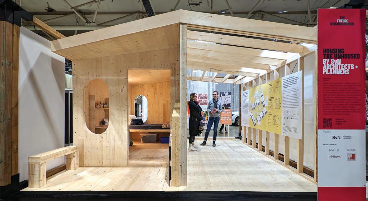
A NEW INITIATIVE PROPOSES ENERGY-EFFICIENT, MASS TIMBER CABIN COMMUNITIES AS AN INTERIM HOUSING MEASURE.
Toronto architect John van Nostrand’s firm, SvN, has long worked with housing at all scales from individual cottages, to highrises and masterplans. In doing this work, van Nostrand was keenly conscious of a problem exacerbated during the pandemic a “gap in the housing continuum” between the growing population of unhoused people in shelters and encampments, and the currently available supply in affordable or supportive housing.
The non-profit he founded to address this problem, Two Steps Home, aims to fill that gap, 50 people at a time. Its prototype cabin was unveiled at Toronto’s Interior Design Show this winter. It’s a mass timber, shed-roofed, tiny dwelling, sized to be moved on the back of a flatbed trailer. Developed with the support of prefab manufacturer CABN, the Two Steps Home is intended to be durable, sustainable, and most of all pleasant to live in.
The compact housing units are “designed to Passive House standard,” explains lead architect

Aaron Budd. In contrast to many poorly constructed temporary dwellings, the units include robust thermal insulation, reduced thermal bridging, quality windows and doors, and heat recovery ventilators. Each cabin has a lockable door and a small canopy over the entrance that allows for interactions at the threshold.
Inside, the exposed mass timber “gives a sense of warmth, a sense of home,” says Budd. At IDS , many visitors approached Budd saying, “I would love one of these in my backyard” a positive sign, to him, that the cabins would be welcoming places, rather than second-rate shelters.
Manufacturer CABN helped further refine SvN’s design, with energy performance, durability in use and transportation, and material efficiencies in mind. Through its non-profit arm, CABN Foundation, the manufacturer was able to apply lessons learned through the R&D from its for-profit lines of prefab buildings. It will build the cabins for cost plus a minimal
seven percent premium. The efficient, affordable use of mass timber is at the heart of CABN ’s work, says founder Jackson Wyatt. “These are a true home rather than a steel box that’s something wood can bring. Because the wood walls are 4 ½” thick, there’s a sense of security you feel from that, as well as the ability to transport and repair it, that make these a healthy place to live regardless of where you are in life.”
While the dwellings don’t have their own plumbing, SvN envisages communities of 50 cabins that would share communal kitchen and washroom facilities. The cabin communities would be located on development sites that are in limbo, near to future affordable housing. As that affordable housing is completed, residents would move from the cabins into permanent housing, and the cabins could be moved wholesale to another site ready to house new residents taking their own steps towards housing security.


Our incredible selection of light colours gives you the freedom to create one-of-a-kind custom homes bursting with sophistication and modern flair.
Choose from a beautiful selection of calcium silicate brick and building stone styles or explore our natural Adair® limestone options - all made right here in Ontario.
 LIGHT BRICK, STONE & LIMESTONE

