



To repair the Ontario Science Centre, let’s start by using the money it’s taking to close it, writes editor Elsa Lam.
Analyzing the documents surrounding the Ontario Science Centre’s sudden closure.
11 RAIC JOURNAL
Highlights from the RAIC 2024 Conference on Architecture.
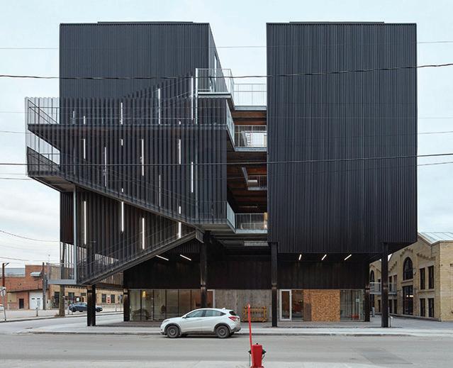
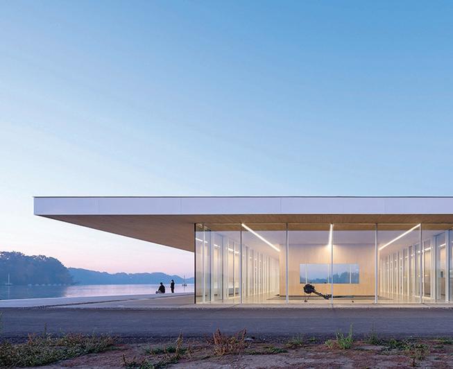
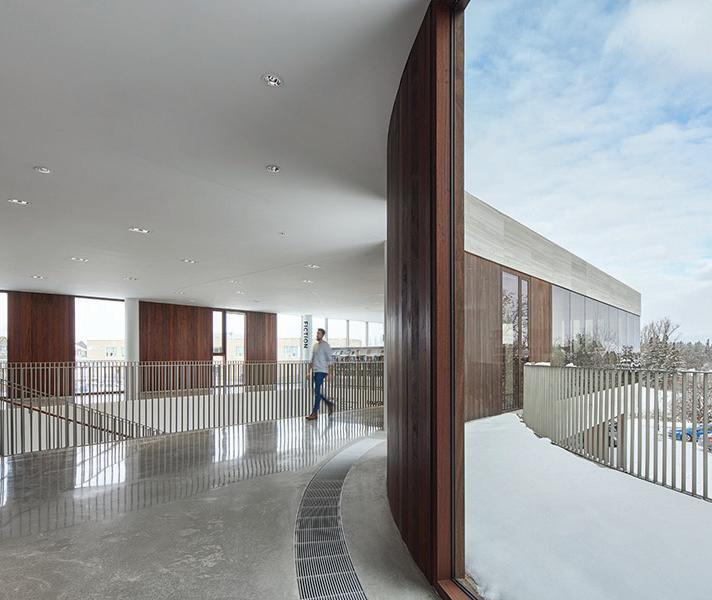
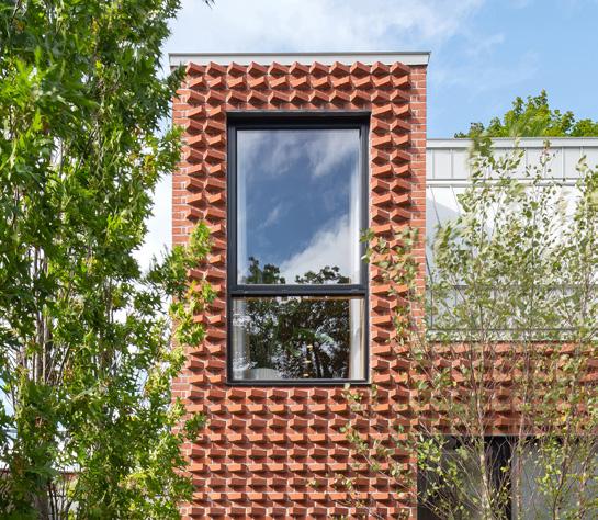
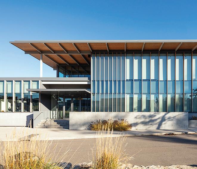
Jake Nicholson revisits an intersection with four Governor General’s Medal-winning buildings in Waterloo, Ontario.
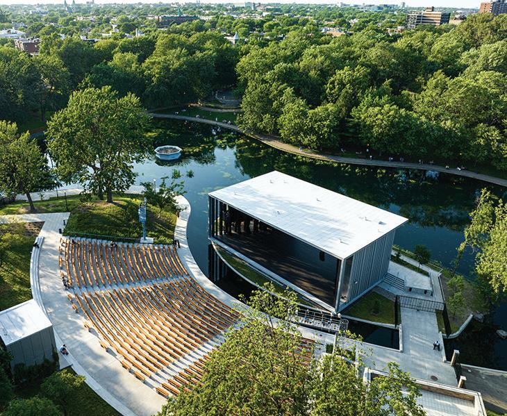
Peter Sealy on Kapwani Kiwanga’s stunning installation Trinket at this year’s Venice Art Biennale.
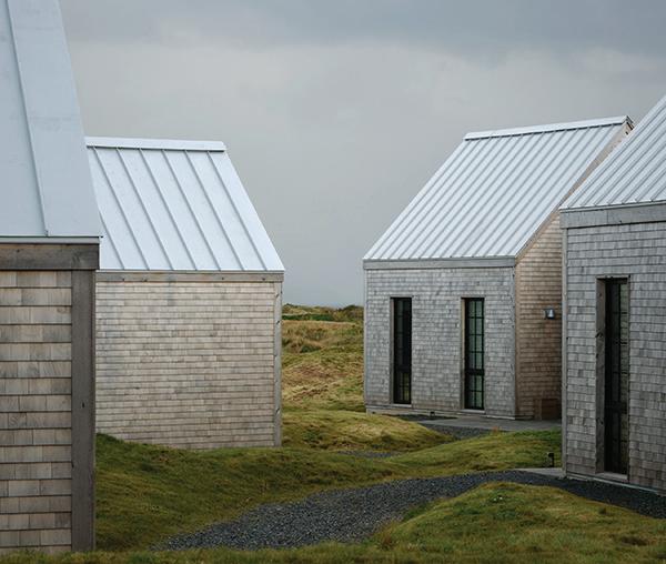
COVER Cabot Cliffs: Cliffs Residences, Halfway Hut, and Pro Shop, Inverness, Cape Breton, Nova Scotia, by FBM Architecture | Interior Design. Photo by Doublespace Photography
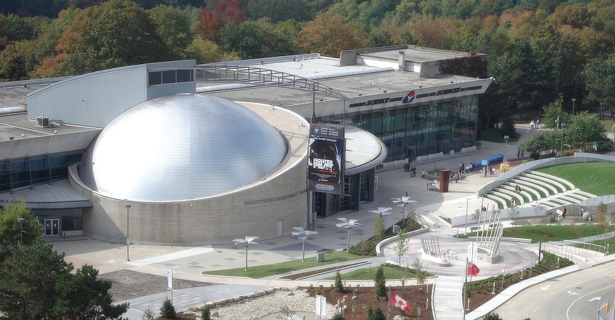
Over 80,000 people have signed a petition demanding the reopening of the Ontario Science Centre. And it’s clear, as with any older building, that repair and reinvestment will be needed.
It’s true that in addition to the cost of roof repairs, there are other repairs needed to maintain the Science Centre’s buildings in good working order. But the actual cost of repairs over the next 20 years, as estimated by consultants Pinchin in 2022, was $142 million not the $478 million that the Province cites.
Pinchin’s report was part of a business case presented to government decision-makers arguing for the relocation of the Ontario Science Centre to Ontario Place a business case that the Auditor General has criticized as being based on “preliminary and incomplete cost information.” In order to make their case, the Province aimed to maximize the costs of repairing and restoring the existing Science Centre, thereby minimizing the costs of building a new Science Centre.
To reach its grossly exaggerated cost of repairs, Pinchin was asked by Infrastructure Ontario to “adjust” its initial estimate of $142 million by a factor of 1.85 to account for project fees and complexity, and then further grow the estimate to factor in yearover-year inflation for the 20-year course of repairs. The Province then added 40% for cost escalation on top of this inflated estimate, coming up with a total repair estimate of $369 million. It topped this off with a generous $109 million for cosmetic and exhibition upgrades to reach the $478 million number.
This $109 million appears to double-count some $25 million in interior finish upgrades already included in the Pinchin estimate. At $66.5 million, the exhibition upgrade budget is equivalent to the entire budget for exhibitions at the proposed new location of the Ontario Science Centre at Ontario Place.
Starting from Pinchin’s original construction cost estimates, adding in repairs not counted in this estimate, and using industry standard figures for construction escalation, consultant fees, and contingency (instead of the Province’s markups) would give a final repair bill of $211 million.
But what about just keeping the building operating for a shorter term say, until a new facility is opened at Ontario Place? In its business case for the relocation, Infrastructure Ontario had planned to do just that. It estimated that the repairs needed to keep the Science Centre functional on a smaller footprint (presumably within the valley-side Building C, which contains the bulk of the exhibitions) until a new Science Centre was ready would amount to $32 million.
Let’s also assume that roof repairs were an unexpected addition to this cost and that the Province opts to undertake the full $2 million in roof repairs and replacements recommended by their consultants to take place in the coming five years for Building C alone. The total comes to $34 million.
$34 million is not insignificant, but it is also far less than the $478 million figure that Infrastructure Ontario says it is unwilling to invest in a Science Centre that will be soon closed. It’s also far less than the $83 million it may take to lease and fit-out a temporary location for the Science Centre.
Even if the Province manages to pull off the leasing and fit-out of a temporary location for $25 million (at the very lowest end of my calculations), that space would not be open for two years, costing $14 million in lost admission and membership revenue a total of $39 million.
It would be less expensive, by the Province’s own numbers, to simply keep the existing facility running on a smaller footprint. The repairs would more than pay for themselves.
EDITOR
ELSA LAM, FRAIC, HON. OAA
ART DIRECTOR
ROY GAIOT
CONTRIBUTING
EDITORS
ANNMARIE ADAMS, FRAIC
ODILE HÉNAULT
LISA LANDRUM, MAA, AIA, FRAIC
DOUGLAS MACLEOD, NCARB FRAIC
ADELE WEDER, HON. MRAIC
ONLINE EDITOR
LUCY MAZZUCCO
SUSTAINABILITY ADVISOR
ANNE LISSETT, ARCHITECT AIBC, LEED BD+C
VICE PRESIDENT & SENIOR PUBLISHER
STEVE WILSON 416-441-2085 x3
SWILSON@CANADIANARCHITECT.COM
ASSOCIATE PUBLISHER
FARIA AHMED 416 441-2085 x5
FAHMED@CANADIANARCHITECT.COM
INTRODUCING ALIGN® 12" BOARD & BATTEN COMPOSITE CLADDING FROM GENTEK® Building on the success of our original ALIGN Composite Cladding, this latest advancement offers the same exceptional beauty, durability and ease of installation in a sleek board and batten design. Elevate your projects with the best exterior cladding yet.


EASIER INSTALLATION
12" profile width with 3/4" projection and integral batten strip; available in two textures.
Strong, lightweight construction is easier and quicker to install than fibre cement; no skilled labour, special tools or respirators needed.


(GP)2 TECHNOLOGY®
1001 Corporate Drive Burlington, ON L7L 5V5 gentek.ca Make us a part of your home.

Ensures lower expansion and greater structural integrity.
FASTER TURNAROUND TIME, LESS LABOUR

No sealing, touching up, joint flashing or caulking.


Discover the value of ALIGN at gentek.ca/align
On Friday, June 21 at 4 pm, the Ontario government announced that the Ontario Science Centre’s landmark 1969 building, by JapaneseCanadian architect Raymond Moriyama, would be closed immediately and permanently. The closure follows on a provincial announcement last year that the Ontario Science Centre would relocate to a new building at Ontario Place, and its present site redeveloped with housing. However, the Science Centre was expected to continue operating at its current site until the new facility was complete, around 2028.
The Province cited an engineering report by Rimkus to justify the sudden closure years ahead of schedule, saying that the report found “serious structural issues with the Ontario Science Centre building.” While these issues would not be expected to materialize until the winter, according to Infrastructure Ontario, the intervening months were needed “for staff to safely vacate the building.”
But a deep dive into the engineering report reveals a different story. It suggests that the building’s key exhibition areas could continue to operate safely for years to come even if the Ontario government chooses not to invest in any structural roof repairs this year.

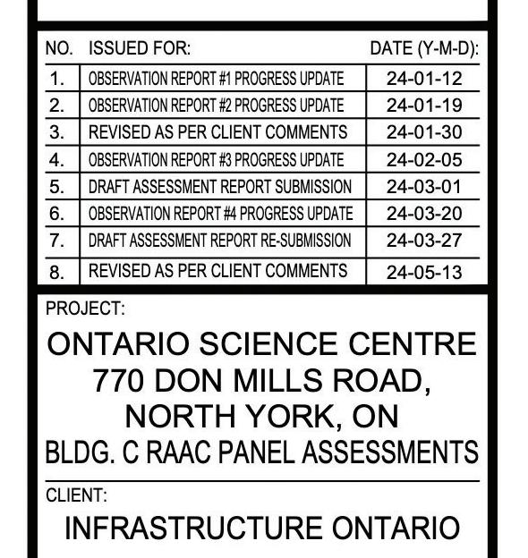
ABOVE The engineers’ drawings indicate that Infrastructure Ontario had a draft assessment report in hand on March 1, 2024—contradicting the agency’s claim that they had received the report in June and acted quickly to impose an emergency closure.
The issue at stake is the presence of Reinforced Autoclaved Aerated Concrete (RAAC) roof panels, sold under the brand name Siporex, which make up 57% of the Science Centre’s roofs. A popular material in Ontario from the mid-1950s to mid-1970s, the lightweight panels were made from an aerated blend of sand, Portland cement, and aluminum.
However, concerns have been raised that the panels have an overall reduced robustness compared to steel decks or traditional concrete, especially if there are leaks in the area. It’s a known issue over the past decades, the roofs of the Ontario Science Centre have been monitored and sections of the RAAC roof panels have been replaced with steel decking.
Rimkus’s report is a comprehensive, panel-by-panel visual assessment of all accessible RAAC roof panels in the facility. It recommends a staged approach to addressing the RAAC issue once and for all: by removing and replacing all remaining RAAC panels with steel deck roofs, mostly when they come up for regular scheduled renewal over the next 10 years.
In assessing the panels, R I mkus found that a total of six of the 18-inch-wide, 5- or 10-foot-long RAAC panels in the facility were in what it deemed “critical” condition. These were reported as soon as they were identified, and all of these panels have been shored or are in the process of being reinforced.
Rimkus assessed a number of additional RAAC panels as being in “high risk” condition, and recommended that these be reinforced or replaced before the next snow season begins at the end of October, when an exceptionally large snow load could compromise the panels. In total, the “high risk” and “critical” condition RAAC panels constitute less than 2.5% of the Science Centre’s overall roofs.
The remediation of these “high risk” panels is estimated to take at least three months per building and floor areas directly beneath the high risk panels would “need to be treated as construction zones within the building,” according to the report.
However, this doesn’t mean closing the building entirely: it means restricting access or erecting barrier walls to eliminate pedestrian traffic in the areas directly below the 2.3% of the roof panels being repaired or replaced. The hoarding could be similar to what’s currently present inside the ROM, where parts of the museum are undergoing renovation.
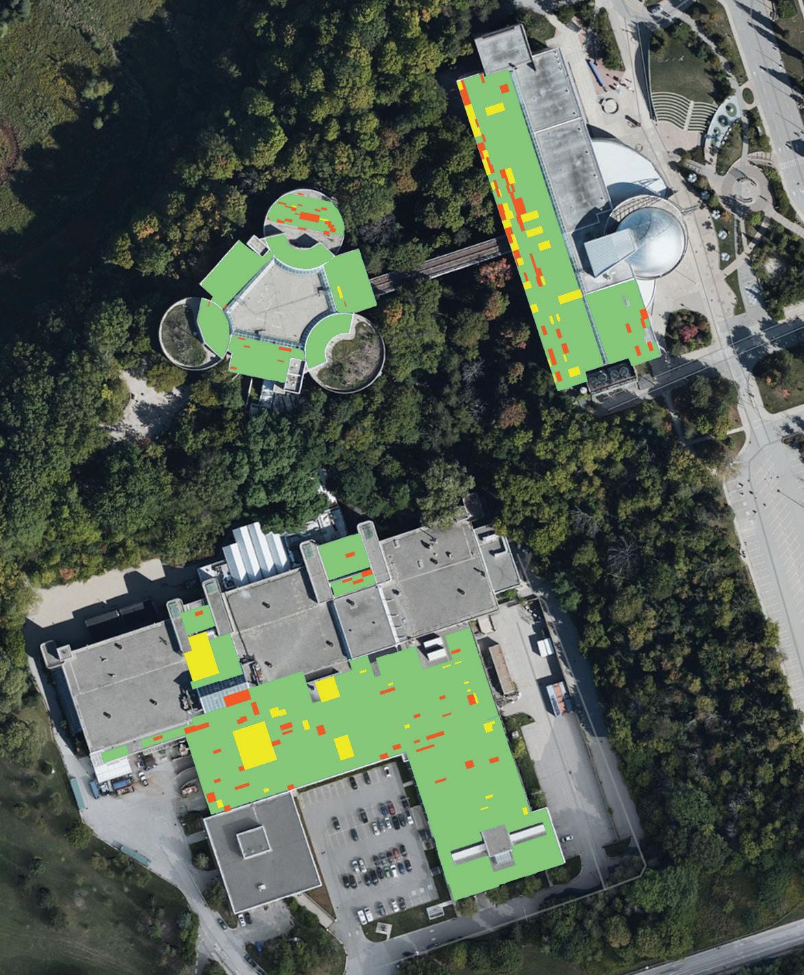
At the Ontario Science Centre, the construction would arguably affect visitors even less than at the ROM, because the RAAC panels do not exist above most key exhibition areas.
In the lowest and largest building, facing the Don Valley, the main exhibition spaces are in a part of the building with regular concrete panels on the roof not the RAAC panels. Areas under the regular roof, which is not in need of repair, including the Weston Family Innovation Centre, AstraZeneca Human Edge, Living Earth, Science Arcade, Hot Zone, A Question of Truth, School Area Learning Centres, and the Valley Cafeteria.
In the trillium-shaped Building B, the highly popular KidSpark and the Space Hall as well as the Rube Goldberg-esque machine outside of these areas could also remain open, since they are not immediately beneath a roof, but one level down. The IMAX theatre and entrance, as well, have a different roof type and could remain open with no danger.
There are some areas that would be more affected, but these are largely outside of the permanent exhibition areas. The report notes that the Science Centre’s in-house workshop would need to pause operations for the repairs to be completed, since that area includes large machinery that couldn’t be easily moved out of the way for repairs.
The most notable temporary closure would be of the Great Hall, where special exhibitions are hosted; the special exhibition space at the lowest level may also need to be temporarily, partially closed. From what is shown on the drawings, the Rock Paper Science hall a space that is currently only sparsely populated with a handful of exhibits is the only permanent exhibition area that may require partial, temporary closure to accommodate repairs.
The Rimkus report acknowledges that getting the first wave of needed repairs done by October 31 may be challenging. So, it offers some alternate options for maintaining public safety. You could install temporary
24_006361_Canadian_Architect_AUG_CN Mod: June 25, 2024 3:23 PM Print: 07/02/24 2:52:03 PM page 1 v7

We provide over 42,000 shipping, packaging and office furniture products to businesses across North America. From crates and tubes to tables and chairs, everything is in stock. Order by 6 PM for same day shipping. Best service and selection. Please call 1-800-295-5510 or visit uline.ca
reinforcement for the panels, it says, or horizontal hoarding below the panels. The absolute safest option, it notes, would be to close the areas immediately below the less than 2.5% of roofs with high-risk panels, to stop people from walking in these areas.
Since the areas with high-risk panels are largely above non-exhibition areas, this means that even if there was a need to delay roof repairs past October 31, the Ontario Science Centre’s permanent exhibitions could remain safely open to the public.
In short, whether the roofs will be repaired or not, there is no material in the engineering report that calls for the complete closure of the Science Centre, either now or even by the October 31 deadline. Those repairs should be made, of course, presuming there is the intent to keep the building functional in some way in the future but the idea that a life safety issue requires complete closure of the centre is false. If the repairs take longer than the fall, the construction hoarding can stay up, and this solution is judged by the engineers to “completely eliminate the risk to public or staff.”
The timing of the sudden closure of the Ontario Science Centre on June 21 also seems to have been calculated, rather than resulting from a newly received report. Officials with Infrastructure Ontario said they had received the report detailing the building’s structural roof issues in the week of the announcement, and made the decision to close the building “as quickly as we could move.” However, the drawings included with the engineers’ report indicate that Infrastructure Ontario had received progress updates about Rimkus’s roof assessment as early as January 12, 2024, and that it had a draft assessment report in hand on March 1, 2024 almost four months before the June 21, 2024 announcement of the immediate closure.

On Monday, June 24, 2024, just three days after the closure of the Ontario Science Centre’s sudden closure, the government’s search for a temporary location for the facility began. Infrastructure Ontario put out a Request for Proposals (RFP) for a 50,000 to 100,000 square foot commercial/retail space to house a temporary Science Centre until its planned new facility at Ontario Place is complete.
The temporary location, which would not be open until 2026, will put the Science Centre in a location that is significantly smaller and likely much more remote than its current site. It will be there for up to eight years until the new facility at Ontario Place is open.
Ironically, relocating to a temporary location will also be at least as expensive and up to three times more costly as making the $22 million in roof repairs which Infrastructure Ontario cited as the reason for the Centre’s abrupt closure. The option that best serves Ontarians (and the one that may also prove the most economical) appears to be making repairs to the Science Centre, and reopening it.
The RFP for the relocation initiates a search for a space that the document says will take up to 12 months to fit-out, with a subsequent movein date as late as January 1, 2026. In theory, the document implies, the renovation of a space could happen more quickly and the move-in date could be sooner, but the reverse is more likely the case: for a project of this size and scope, 18 to 24 months would be a more realistic schedule.
Even if the project moves exceptionally quickly, it means that Toronto would have no Science Centre for at least a year and a half, and more likely over two full years.
The RFP ’s terms also suggest that a new, smaller Science Centre would not be completed until 2030, or perhaps as late as 2034 not the 2028 date that has been publicized. This is apparent from the RFP ’s ask for a five-year lease starting as late as January 1, 2026, with the option to terminate the lease anytime after the fourth year, and to renew the lease for up to three years.
What would a temporary Science Centre look like? Overall, the new space will be a fraction of the current Science Centre’s 568,000 square feet possibly less than a tenth of its overall size.
The current Science Centre has been critiqued for having a small ratio of exhibition space to overall space, at around 25%. An environmental scan commissioned by the Province from Lord Cultural Resources says that the median ratio of exhibition-space-to-building-space for science centres in North America is somewhere between 39 to 45%.
At the most efficient end, the exhibitions in the temporary location may occupy 22,400 to 44,800 square feet of space. That’s a 61 to 85% reduction from the 153,360 square feet of exhibition space in the current location of the Science Centre.
While the RFP states a preference for a downtown, central location, the reality is that its requirements a very large, high ceilinged building, with up to 500 parking spots, a bus drop-off, a freight elevator and loading dock, and the ability to accommodate up to 5,000+ visitors in peak periods make a remote location more likely. It’s probable that the location will be at the edge of TTC boundaries. An empty big box store might fit the bill, out near Kipling or Vaughan stations, or up by the zoo in Scarborough.
According to The Toronto Regional Real Estate Board, the average commercial/retail lease rate in Toronto is $29.08/square foot, meaning that annual rent on such a space, depending on its size, would be around $1.5 million to $3 million per year $6 to $24 million over the four to eight year term of the lease.
Preparing such a space will be expensive. I spoke with an architect familiar with this project type, who estimated that bringing an empty commercial space up to public museum standards would cost from $200
to $300 per square foot, depending on the base building conditions, for a total of $10 to $30 million. If the government settled on a large industrial space, it would be especially costly to bring this up to public assembly standard, with modifications needed to meet requirements including fire code, exiting, floor loading, and HVAC. According to the industry expert, the cost could be as much as $400 per square foot $40 million in all if the location was a large, empty industrial shell building.
Standard practice would be to budget 12% on top of this, to cover the consultant fees of architects, engineers, project managers, and others involved in delivering the project, and to include a 10% cost contingency. This adds $2.2 to $8.8 million more.
The move itself is expensive, too Infrastructure Ontario estimates that a single move to the smaller facility at Ontario Place would cost $4.9 million; a temporary space will mean paying for that move twice over. Since not all of the exhibitions could be shown in the temporary space, storage would also need to be arranged for a substantial amount of material. TRREB reports that the annual industrial lease rate in Toronto is $16.90 per square foot. Assuming that the contents of the remaining 500,000 square feet or so of building could be packed into a 20,000 square foot space, this would add up to half a million dollars in annual storage costs.
This back-of-napkin math brings us to a one-time cost of $17-55 million dollars, plus $8 to $28 million in rent, depending on the size of the temporary space and the length of the lease $25-$83 million in all.
Ironically, the space that best meets all the needs of a temporary location, including the RFP ’s stated preference for a space that enables the Science Centre to “open more quickly,” is almost certainly the Ontario Science Centre’s current location on Don Mills Road.
It’s centrally located, and on the doorstep of the Eglinton LRT
The complex’s lower building, Building C, alone contains 273,465 square feet of space, including almost all of the Science Centre’s permanent exhibitions. As I have written in my analysis of Rimkus’s engineering report on the roof, these permanent exhibitions are under a section of the building with a standard concrete roof.
RAAC roof does exist over the current temporary entrance to the Science Centre, and a temporary exhibitions hall. This area includes 11 RAAC panels classified as being high-risk, and a 2,500 square foot section of roof that is recommended for replacement in the coming year, as its EPDM membrane is in poor condition.
The cost to fix these areas? About $450,000, according to the Rimkus report. For an additional $17,200, the report details, you could also replace the three high-risk panels over an area that connects to the remaining permanent exhibition areas and school spaces on the balcony level of Building C, and to the permanent exhibition areas in Building B the popular Space Hall and KidSpark. The latter, the engineering report suggests, can safely remain open as they are not directly under the roof, but one level down. Likewise, the Ontario Science Centre’s full IMAX theatre, along with its entrance atrium, could remain open.
The RFP says that “ IO is evaluating several alternatives and cost is a critical issue. Please specify any concession package to be provided by the Landlord (e.g. free rent, Tenant Improvement Allowance, etc).”
The existing Science Centre is already fit-out and owned by the province, and rent on the land will continue to be a bargain at $1 a year.
As for timing?

A new location for a smaller, temporary Ontario Science Centre in a different location will likely take two years to materialize.
The existing location was closed within a single day. It could be reopened just as quickly.
For the latest news, visit www.canadianarchitect.com/news and sign up for our weekly e-newsletter at www.canadianarchitect.com/subscribe
Since 1967, our annual national awards program recognizes the architectural excellence of projects in the design and construction phases.
Submissions will be accepted in PDF format , up to 12 pages with dimensions no greater than 11” x 17” . Total file size is not to exceed 25 MB There is also the option to submit a video up to two minutes in length.
This year, we are also presenting the sixth edition of the Canadian Architect Photo Awards of Excellence.
Winners of the architectural project and architectural photo competitions will be published in a special issue of Canadian Architect in December 2024.
Architecture project entry fee: $195 *
Architectural photo entry fee: $75 *
For more details and to submit your entry, visit: www.canadianarchitect.com/awards
* plus applicable taxes
Deadline: September 12th, 2024


Save the Date: RAIC Congress on Architecture October 7-8, 2024
RAIC will be hosting its next Congress on Architecture in Saint-Andrews, New Brunswick. This event will bring together professionals to discuss and explore key topics and advancements in Climate Action and Architecture. raic.org/raic-2024-congress-architecture
Congrès sur l’architecture de l’IRAC
Les 7 et 8 octobre 2024
L’IRAC tiendra son prochain Congrès sur l’architecture à Saint-Andrews, au Nouveau-Brunswick. Des professionnels s’y rassembleront pour se pencher sur des questions de fond et sur les progrès réalisés en matière d’action climatique et d’architecture. https://raic.org/fr/congres-sur-larchitecture-2024
Webinar: Design Professional Contracting Risks November 26, 2024
The final webinar in the series The Resilient Architect: Law and Practice with the Canadian College of Construction Lawyers covers the architect’s role in contract administration, scope of services, payment, responsibility for changes, errors and delays, dispute resolution, and limiting liability. raic.org/product/design-professional-contracting-risks
Webinaire Design Professional Contracting Risks 26 novembre 2024
Le dernier webinaire de la série The Resilient Architect: Law and Practice offert en collaboration avec le Collège canadien des avocats en droit de la construction portera sur le rôle de l’architecte dans l’administration du contrat, l’étendue des services, le paiement, la responsabilité en cas de modifications, d’erreurs et de retards, le règlement des différends et la limitation de la responsabilité. raic.org/product/design-professional-contracting-risks
Join the RAIC!
The RAIC engages in many activities on behalf of archi tects and architecture in Canada. Learn more about the benefits and how to join at: raic.org/why-join
Joignez-vous à l’IRAC!
L’IRAC s’engage dans de nombreuses activités au nom des architectes et de l’architecture au Canada. Pour en savoir plus sur les avantages et les modalités de l’adhésion : https://raic.org/fr/raic/ pourquoi-adherer
The RAIC is the leading voice for excellence in the built environment in Canada, demonstrating how design enhances the quality of life, while addressing important issues of society through responsible architecture. www.raic.org
L’IRAC est le principal porte-parole en faveur de l’excellence du cadre bâti au Canada. Il démontre comment la conception améliore la qualité de vie tout en tenant compte d’importants enjeux sociétaux par la voie d’une architecture responsable. www.raic.org/fr
(THE FUTURE WE ENVISION)
To facilitate a rapid scaling of the transition to a low carbon, resilient and regenerative built environment through approaches that concurrently strengthen ecosystem and human health for present and future generations
Excerpt from the RAIC Climate Action Plan
Extrait du plan d’action climatique de l’IRAC
POURQUOI?
DU CANADA (IRAC)
Le changement climatique est une menace existentielle pour toute l’humanité et pour le monde naturel. À l’échelle mondiale, les bâtiments et leur construction sont responsables de près de 39 % des émissions de gaz à effet de serre reliées à l’énergie.
Les architectes comptent parmi les principaux acteurs de la conception de l’environnement bâti. À ce titre, ils ont une responsabilité professionnelle et éthique d’agir. En tant que seule voix nationale de l’architecture au Canada, l’IRAC a quant à lui
(L’AVENIR QUE NOUS ENVISAGEONS)
Faciliter une transition rapide vers un environnement bâti sobre en carbone, résilient et régénératif par des approches qui renforcent simultanément la santé des écosystèmes et des humains pour les générations actuelles et futures
Intégrer la réconciliation et soutenir les principes de la DNUDPA dans notre travail

Inclure la justice sociale et l’équité intergénérationnelle dans tout ce que nous faisons


Favoriser la santé holistique et un avenir régénératif

ACCÉLÉRER la transformation de la pratique vers un avenir régénératif
1 PLAIDER énergiquement en faveur de la création de voies vers le changement
2 MOBILISER des partenariats et mener une action collaborative
4
3 INVESTIR dans l’éducation et la recherche en matière d’action climatique

Harmoniser les distinctions, les prix et les publications de l’IRAC avec notre engagement en faveur d’un environnement bâti résilient, sobre en carbone et régénératif.
Plaider en faveur du développement professionnel obligatoire pour renforcer les connaissances et les compétences nécessaires à une action climatique efficace.
Catalyser une approche multisectorielle avertie sur le plan régional et en phase avec les objectifs internationaux et les cibles fondées sur la science.
Mettre en lumière des études de cas, des histoires de réussites et des précédents inspirants qui montrent comment passer à l’action.
Renforcer le plaidoyer en faveur de politiques, de lois et de règlements visant à accélérer l’action climatique.
Organiser une table ronde nationale pour promouvoir les environnements bâtis résilients et sobres en carbone.

Soutenir une plus grande collaboration, le mentorat et l’apprentissage transformateur entre les firmes d’architectes et à l’intérieur de celles-ci pour accroître leur capacité d’agir.
Giovanna Boniface Chief Commercial Officer Chef de la direction commerciale

Renforcer rapidement les connaissances et les compétences des architectes en vue d’une action climatique efficace en leur offrant davantage de parcours de développement professionnel pour leur permettre de réaliser des environnements bâtis résilients, sobres en carbone et régénératifs.
Lancement du Plan d’action climatique à la Conférence 2024
Plaider en faveur de la reconnaissance et de la rémunération des nouveaux champs d’exercice nécessaires pour réaliser des environnements bâtis adaptés aux conditions climatiques.

Inclure la prochaine génération d’architectes à la prise de décision concernant l’élaboration de programmes et d’orientations pour l’action climatique.
Collaborer avec les petites firmes pour identifier les soutiens particuliers dont elles ont besoin et les obstacles auxquels elles font face dans la lutte au changement climatique.
Créer des cadres et des ressources pour aider les firmes à promouvoir l’action climatique et à présenter leurs progrès.
Renforcer la présence et la voix de l’IRAC et des architectes dans les forums locaux, nationaux et internationaux portant sur l’environnement bâti, le climat et la biodiversité.
présenter leurs progrès. Renforcer la présence et la voix de l’IRAC et des architectes dans les forums locaux, nationaux et internationaux portant sur l’environnement bâti, le climat et la biodiversité.
Plaider en faveur de mesures incitatives et de soutiens pour des environnements bâtis résilients, sobres en carbone et régénératifs en mettant l’accent sur la réutilisation et le renouvellement.
Over the last few months, the RAIC has been exceptionally busy on its climate action initiatives, culminating in some significant developments. Focusing on the climate crisis as the biggest global threat in the 21st century, the RAIC formed the Climate Action Engagement and Enablement Plan Steering Committee (CAEEP). The CAEEP launched a first view of the Climate Action Plan during our 2024 Conference in Vancouver, BC. The plan aims to facilitate a rapid scaling of the transition to a low-carbon, resilient and regenerative built environment through approaches that strengthen ecosystem and human health. To learn more about what we are doing in climate action, please visit: www.raic.org/climate-action
Plaider en faveur de taux d’assurance différenciés pour des projets résilients, sobres en carbone et régénératifs et pour les firmes engagées dans leur réalisation.
S’engager dans la collaboration, le partage de ressources et les partenariats internationaux pour l’action climatique. Élargir et approfondir l’engagement en matière d’action climatique parmi les écosystèmes qui soutiennent l’éducation et la réglementation de la communauté architecturale.
Mieux faire connaître l’interdépendance entre la crise du climat et de la biodiversité, les droits et la réconciliation des peuples autochtones et la justice sociale, y compris le logement abordable.
Renforcer l’acquisition de connaissances sur les Autochtones et l’apprentissage basé sur le territoire dans tous les programmes de développement professionnel.
Élaborer, seul ou en partenariat avec des établissements d’enseignement, des programmes de microcrédits portant sur la préparation à l’action climatique.
Au cours des derniers mois , les initiatives de l’IRAC en matière d’action climatique ont occupé une part importante de ses activités et ont donné lieu à certains développements majeurs. Comme la crise climatique est la plus grande menace mondiale du 21e siècle, l’IRAC a créé le Comité directeur sur le Plan d’engagement et d’habilitation en matière d’action climatique. Ce Comité a lancé une première ébauche du Plan d’action climatique lors de notre Conférence 2024 à Vancouver (C.B.). Le plan vise à faciliter une transition rapide vers un environnement bâti sobre en carbone, résilient et régénératif grâce à des approches qui renforcent la santé des écosystèmes et des personnes. Pour en savoir plus : https://raic.org/fr/raic/ engagement-et-habilitation-en-matieredaction-climatique.
Élaborer des ressources à l’intention du public et de clients éventuels sur l’investissement dans des environnements bâtis résilients, sobres en carbone et régénératifs et sur l’aide que les architectes peuvent apporter à cette fin.
Créer des bourses pour soutenir les efforts des praticiens universitaires dans l’élaboration de ressources visant à accélérer la transformation de la pratique.
Collaborer avec les écoles d’architecture et les groupes de formation professionnelle pour accélérer la création d’une nouvelle génération de diplômés pour assurer un avenir régénératif.
accélérer la transformation de la pratique.
Collaborer avec les écoles d’architecture et les groupes de formation professionnelle pour accélérer la création d’une nouvelle génération de diplômés pour assurer un avenir régénératif.

Giovanna Boniface Chief Commercial Officer Chef de la direction commerciale
The RAIC Conference 2024 was our largest in-person gathering since Covid, providing the opportunity for many in the architectural profession to engage in unique learning experiences, listen to distinguished guest speakers, and network with colleagues from across the country. From May 14-18 this year, architects, interns, students, and associates from Canada and abroad converged in K’emk’emeláy/Vancouver for the Conference.
The RAIC Conference is—first and foremost—about building the knowledge and expertise of current and future architects. This year, the RAIC provided more than 50 in-depth education sessions, as well as keynotes that tackled the latest issues architects face today. These sessions discussed topics such as climate, EDI, Indigenous-led architecture, social justice, and accessibility, and were led by experts in their fields.
The 2024 RAIC Conference on Architecture kicked off with an exhibition on iconoclastic Vancouver Island architect John Di Castri, providing an opportunity to explore a distinct chapter of the architectural history of Western Canada. The first day ended with
renovated by Measured Architecture, in West Vancouver. A studio crawl featuring five local firms—Kristen Reite Architecture, MA+HG, McKinley Studios, Omer Arbel and DALOG—closed a busy day.
On Day three, conference participants were invited to join in the long-standing tradition of inducting new members to the RAIC College. This year welcomed five honorary Fellows and 41 new Fellows to the College. Both past and current members of the College continue to inspire the next generation of architects, and to move the profession forward.
Days four and five provided additional full days of continuing education and architectural tours, and culminated in the RAIC President’s Reception and Dinner – Celebration of Excellence, which recognized experts in the field. Award winners were honoured for their outstanding contributions to the architectural community, and to the world at large. Winners of the National Urban Design Awards were also honoured this evening, and later featured during a special panel presentation.
The opening conference gathering at the Expo.
Des délégués lors de la soirée d’ouverture dans le hall d’exposition
a keynote presentation by James P. Cramer, Hon. AIA, titled “The Future of the Profession,” where he delivered an inspiring glimpse into his “Seven Lessons in Agility Leading to New Success and Significance.”
Day two provided the opportunity for sponsors, businesses and professionals to showcase their products and services, as the doors opened to both delegates and the public for the RAIC Expo on Architecture. It has been a sold-out exhibition two years in a row, with more than 40 exhibits each year.
The Conference, though a national event, is also a chance to explore local architecture and those who make it. Through special events and architectural tours, attendees were able to take in the vibrant design culture of Vancouver, and visit some of its buildings and spaces through architectural tours led by local experts. Twelve sold-out tours were led by architects and guides wellversed in the local architecture deepened participant understanding and sparked conversation around the history, significance, and technical details of buildings new and old. Popular tours included a downtown Tall Buildings tour with architecture critic Trevor Boddy, a visit to Patkau Architects’ awardwinning Polygon Gallery, as well as a oncein-a-lifetime pop-up tour of the Arthur Erickson-designed Smith House II, recently
The Conference ended on a high note with the After Parti, where six small Vancouver architectural firms—MOTIV, ph5, Twobytwo Architecture Studio, WNDR and TOAD—partnered with local artists to deliver a breathtaking Beaux Arts Ball performance concept, with incredible participation from attendees donning hats and costumes for the event.
The RAIC is deeply thankful to everyone who contributed to the success of this year’s Conference, including volunteers, presenters, tour leaders, special guest speakers, exhibitors, architectural firms and sponsors. A special shout out to our title sponsor, the Canadian Precast Prestressed Concrete Institute (CPCI). We could not have put on this amazing event without your support, and the support of all of our sponsors. Let’s meet again at the 2025 Conference—next year in Tiohtià:ke/Montréal—to make more great connections and memories.
La Conférence 2024 de l’IRAC a été notre plus grand rassemblement en personne depuis la COVID et a donné à de nombreux membres de la profession l’occasion de suivre des séances de formation uniques, d’écouter des conférenciers de renom et d’échanger avec des collègues de la grandeur du pays. Du 14 au 18 mai cette année, des architectes, des stagiaires,

des étudiants et des membres associés du Canada et de l’étranger ont convergé vers K’emk’emeláy/Vancouver pour assister à la Conférence.
La Conférence de l’IRAC vise d’abord et avant tout à renforcer les connaissances et l’expertise des architectes d’aujourd’hui et de demain. Cette année, elle a présenté plus de 50 séances de formation spécialisées, ainsi que delus récrésentées par des experts dans leur domaine, ont porté notamment sur le climat, l’EDI, l’architecture dirigée par des Autochtones, la justice sociale et l’accessibilité.
Le coup d’envoi de la Conférence sur l’architecture 2024 de l’IRAC a été donné par une exposition sur l’architecte iconoclaste de l’île de Vancouver, John Di Castri, qui présente un chapitre distinct de l’histoire de l’architecture dans l’ouest du Canada. La première journée s’est terminée par l’allocution inspirante de James P. Cramer, Hon. AIA, intitulée « L’avenir de la profession », qui a présenté le concept de l’agilité et ses sept leçons menant à une nouvelle réussite et à une nouvelle pertinence.
La deuxième journée a donné aux commanditaires, aux entreprises et aux professionnels l’occasion de présenter leurs produits et services, alors que l’Exposition sur l’architecture de l’IRAC accueillait les délégués et le grand public. L’exposition a affiché complet pour une deuxième année consécutive en présentant plus de 40 exposants, tout comme l’année dernière.
La Conférence, malgré son caractère national, est aussi l’occasion de découvrir
l’architecture locale et les architectes qui la réalisent. Divers événements spéciaux et des visites architecturales ont permis aux délégués de découvrir le dynamisme du design à Vancouver. Douze visites à guichets fermés ont été animées par des architectes et des guides qui connaissent bien l’architecture locale. Elles ont permis aux participants de mieux comprendre l’histoire, l’importance et les détails techniques de certains bâtiments anciens et nouveaux. Parmi les visites les plus courues, mentionnons celles du quartier des tours du centre-ville avec le critique en architecture Trevor Buddy; de la galerie primée Polygon, conçue par Patkau Architects; et de la Smith House II conçue par Arthur Erickson et récemment rénovée par Measured Architecture, à West Vancouver. La journée s’est terminée par la tournée de cinq bureaux d’architectes— Kristen Reite Architecture, MA+HG, McKinley Studios, Omer Arbel et DIALOG.
Au troisième jour, les délégués ont été invités à participer à la cérémonie d’intronisation des nouveaux membres du Collège des fellows de l’IRAC, une tradition de longue date. Cette année, le Collège a accueilli 5 membres honoraires et 41 nouveaux fellows. Les membres du Collège, anciens et nouveaux, inspirent la prochaine génération d’architectes et contribuent à l’avancement de la profession.
Les quatrième et cinquième journées ont été consacrées à la formation continue et aux visites architecturales et ont culminé avec la réception et le dîner du président
et la célébration de l’excellence qui rend hommage aux experts du domaine. Les lauréats des prix ont été honorés pour leurs contributions remarquables à la communauté architecturale et à la société dans son ensemble. Les lauréats des Prix nationaux de design urbain ont également été honorés au cours de cette soirée et ils ont été présentés plus tard lors d’un panel spécial.
La conférence s’est conclue en beauté avec la fête de fin de soirée au cours de laquelle six petites firmes d’architecture de Vancouver—MOTIV, ph5, Twobytwo Architecture Studio, WNDR et TOAD— se sont associées avec des artistes locaux pour créer un concept de spectacle de bal des beaux-arts qui invitait les délégués à se déguiser.
L’IRAC remercie toutes les personnes qui ont contribué à la réussite de cette Conférence, notamment les bénévoles, les intervenants, les guides des visites, les conférenciers invités, les exposants, les firmes d’architecture et les commanditaires. Nous remercions tout particulièrement notre commanditaire principal, l’Institut canadien du béton préfabriqué et précontraint. Nous n’aurions pu organiser cet événement extraordinaire sans votre soutien et celui de tous nos commanditaires. Nous vous donnons rendez-vous à notre Conférence 2025 qui aura lieu à Tiohtià:ke/Montréal, pour créer d’autres liens précieux et vivre d’autres moments mémorables.

The opening ceremonies of the RAIC 2024 Conference
Cérémonie
d’ouverture de la Conférence de l’IRAC 2024
Conference attendees wear hats at the “After Parti”
Des délégués de la Conférence portent de drôles de chapeaux à la fête de fin de soirée
Delegates at the Halifax Partnership Convention on Quality in the Built Environment examine posters that are part of a Living Atlas of Quality in Architecture and the Built Environment
Les délégués à la convention du partenariat sur la qualité de l’environnement bâti examinent les affiches qui font partie d’un Atlas vivant de la qualité en architecture et dans l’environnement bâti
recherche
Feuilles de route vers l’équité, la valeur sociale et la durabilité
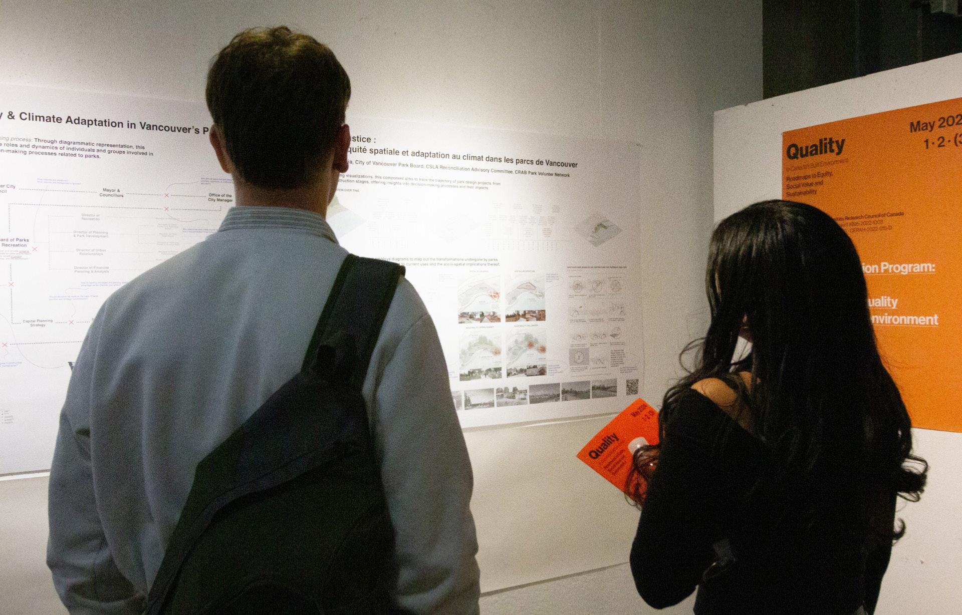
Authors:/ Auteurs : Susan Speigel, OAA
Robert Wright, CSLA
Jean-Pierre Chupin, OAQ
A diverse team of design students, academics, and practitioners are engaged in a remarkable collaborative consideration of the concept of Quality in the Built Environment in a Canadian architecture context. This five-year SSHRC Research Grant initiative brings together 14 schools of architecture in interdisciplinary teams across Canada, including three levels of government and over sixty organizations and public institutions.
The 2023 SSHRC Partnership Convention on Quality, hosted by the University of Calgary, highlighted the importance of incorporating non-expert lived experiences into evaluating quality in the built environment. Though uncommon in professional design protocols, this practice is crucial for understanding and enhancing our built spaces.
In 2024, the conversation advanced at the Halifax Convention, where participants reported positive outputs from their experiences over the past two years. This discussion centred around two key questions:
• What are the main positive outputs of the partnership through research on quality?
• How have two years of research and a diverse partnership changed your understanding and definition of quality in the built environment?
The built environment is inherently a collective project, where designers, though essential, are not the sole arbiters of quality. The concept of “partnering” was pivotal in raising quality standards collectively. This approach underscored the importance of interdisciplinary collaboration in achieving excellence in our built environments.
One of the most significant outcomes of this partnership was the creation of 14 roadmaps
toward greater quality in Canada’s built environment. These roadmaps integrated the perspectives of citizens, cities, professionals, researchers, and importantly, First Nations communities. Including First Nations input provided invaluable insights into equity and sustainability, further enriching the project’s objectives. This initiative aimed to redefine the social value of built environments, providing a comprehensive framework that transcends traditional design paradigms.
At the Halifax 2024 convention, each team presented its initial roadmap, shifting the focus from purely knowledge-based strategies to actionable plans. These roadmaps, tailored to specific local contexts, offered unique approaches to achieving higher quality. They were designed to answer the pressing question: how can we raise the level of quality swiftly and effectively across diverse built environments?
This transition from research to action necessitated clearly defining each roadmap’s
destination, transforming research questions into tangible, transformative projects. This approach reflects a significant shift in the professional architectural landscape, emphasizing the creation of actionable, context-specific strategies that address the unique challenges of different communities.
For the professional architectural audience, this conversation’s importance lies in its potential to redefine the standards of quality in the built environment. By incorporating diverse perspectives and focusing on equity, social value, and sustainability, these roadmaps offer a blueprint for creating more inclusive and resilient communities. The insights gained from this partnership will enhance professional practices and contribute to the broader discourse on quality in the built environment.
The Halifax Convention marked a pivotal moment for the architectural culture in Canada, providing a platform for sharing innovative strategies and fostering collaboration. By embracing these roadmaps, we can foster the creation of built environments that are aesthetically pleasing and socially and environmentally responsible. Including First Nations perspectives ensured a richer, more comprehensive approach to defining and achieving quality, underscoring the importance of diverse voices in shaping the future of our built environments.
For further information on this important research project and the roadmaps, please see: livingatlasofquality.ca
té de l’environnement bâti. Bien qu’elle ne soit pas un protocole de conception courant dans les milieux professionnels, cette pratique est cruciale pour comprendre et améliorer nos cadres bâtis.
La discussion s’est poursuivie à la convention de 2024 à Halifax. Les participants ont été invités à rendre compte d’un résultat positif basé sur leur propre expérience du projet après deux ans et à répondre aux deux questions suivantes :
• Quels sont, selon vous, les principaux résultats positifs de notre recherche partenariale sur la qualité?
• Comment pensez-vous que ces deux années de travail aux niveaux local et national ont contribué à modifier votre compréhension et votre définition de la qualité de l’environnement bâti?
L’environnement bâti est un projet collectif dans lequel les concepteurs, bien qu’essentiels, ne sont pas les seuls arbitres de la qualité. Le concept de « partenariat » a été déterminant pour élever la barre de la qualité pour tous. Cette approche a fait ressortir l’importance de la collaboration interdisciplinaire pour atteindre l’excellence dans nos environnements bâtis.
possible – compte tenu de la diversité des situations construites?
Pour passer ainsi de la recherche à l’action, il a fallu clarifier chacune des 14 destinations des feuilles de route et transformer les questions de la recherche en projets transformateurs tangibles. Cette approche témoigne d’un important virage dans le paysage de la profession architecturale et met l’accent sur la création de stratégies réalisables, adaptées aux contextes, qui tiennent compte des défis particuliers des différentes communautés.
Pour les professionnels de l’architecture, l’importance de cette conversation réside dans son potentiel de redéfinir les normes de qualité dans l’environnement bâti. En intégrant divers points de vue et en se concentrant sur l’équité, la valeur sociale et la durabilité, ces feuilles de route offrent un schéma directeur pour créer des collectivités plus inclusives et résilientes. Les connaissances acquises dans le cadre de ce partenariat amélioreront les pratiques professionnelles et contribueront à élargir le discours sur la qualité de l’environnement bâti.
Une équipe diversifiée formée d’étudiants, d’universitaires et de praticiens de la conception est engagée dans une remarquable étude collaborative du concept de la qualité de l’environnement bâti dans le contexte de l’architecture canadienne. Cette initiative quinquennale financée par une bourse de recherche du CRSH rassemble 14 écoles d’architecture au sein d’équipes interdisciplinaires de tout le Canada, y compris trois ordres de gouvernement et plus de soixante organisations et institutions publiques.
La convention annuelle du partenariat de recherche du CRSH sur la qualité de 2023, organisée par l’Université de Calgary, a mis en lumière l’importance d’intégrer les expériences positives vécues par des non-experts dans l’évaluation de la quali-
L’un des résultats les plus importants de ce partenariat a été la création de 14 feuilles de route vers une plus grande qualité de l’environnement bâti au Canada. Ces feuilles de route rassemblent les points de vue des citoyens, des villes, des professionnels, des chercheurs et, il est important de le souligner, des communautés des Premières Nations. L’inclusion du point de vue des Premières Nations a permis d’obtenir de l’information précieuse sur l’équité et la durabilité et d’enrichir les objectifs du projet. Cette initiative visait à redéfinir la valeur sociale des environnements bâtis et à fournir un cadre exhaustif qui transcende les paradigmes du design traditionnel.
À la convention d’Halifax de 2024, chaque équipe a présenté sa feuille de route initiale qui passait de stratégies purement basées sur les connaissances à des plans réalisables. Ces feuilles de route, adaptées à des contextes locaux particuliers, ont offert des approches uniques pour assurer une meilleure qualité. Elles ont été conçues pour répondre à la même question urgente : Comment élever le niveau de qualité – le plus rapidement
La convention d’Halifax a marqué un tournant pour la culture architecturale au Canada. Elle a offert une plateforme pour le partage de stratégies innovantes et a favorisé la collaboration. En souscrivant à ces feuilles de route, nous pouvons stimuler la création d’environnements bâtis agréables sur le plan esthétique et responsables sur les plans social et environnemental. L’inclusion des points de vue des Premières Nations a permis d’adopter une approche plus riche et plus exhaustive à la définition et à la réalisation de la qualité et de souligner l’Importance de la diversité des voix pour façonner l’avenir de nos environnements bâtis.
Pour de plus amples renseignements sur cet important projet de recherche et les feuilles de route, veuillez consulter le site de l’Atlas vivant de la qualité en architecture et dans l’environnement bâti: livingatlasofquality.ca/fr
Courses coming Fall 2024
Cours à venir à l’automne 2024


Giovanna
Boniface
Chief Commercial Officer Chef de la direction commerciale
In today’s world, the need for accessibility in architecture has transcended mere compliance with regulations. Today’s architects are creating equitable spaces that work for everyone, recognizing individual needs and the diversity of needs that exist in people. From the tallest of skyscrapers to single-family homes, architects are directly impacting how people with disabilities are navigating and enjoying their environments.
In Canada, nearly half of adults either currently have or have experienced a permanent or temporary physical disability, or live with someone who does. Disabilities require unique solutions that can ameliorate the user’s way of living, and architects must include accessibility as a factor
when designing. Regardless of circumstance, many of us will encounter disability at some juncture in our lives and will need accessible communities in order to continue to participate in society and live fulfilling lives.
It can be hard for able-bodied individuals to truly understand disabilities. What might seem like a welcoming environment to most of the world could present significant barriers to others. However, when architects are able to understand the scope and prevalence of disabilities in communities, they can confidently communicate and understand the needs of those with disabilities, and can furthermore communicate those needs to other key shareholders in the construction and design of these buildings, it is not just people living with disabilities who benefit. Accessibility for individuals also leads to increased satisfaction and quality of life for communities as a whole.
Rick Hansen, former paralympian and accessibility advocate, founded the Rick Hansen Foundation (RHF) in 1988, with the goal of creating a world where anyone can go anywhere. Recognizing the essential role of architects in accessibility, the Rick Hansen Foundation Accessibility CertificationTM (RHFAC) was created to change the design culture to better respond to the real needs of people with disabilities by identifying barriers and solutions using common language and common methodology. The RAIC has partnered with the Rick Hansen Foundation and the University of Alberta to bring the Rick Hansen Foundation Accessibility Certification™ to architects, teaching a cutting-edge architectural framework that provides architects, business owners, and operators with a holistic, practical and people-focused framework to measure meaningful access, create roadmaps for improvements, and celebrate their commitment to making their spaces
truly accessible for all. Certification demonstrates architects’ and clients’ commitment to accessible architecture and putting people first. It gives a competitive advantage to businesses by attracting more visitors, staff and customers, and future-proofs buildings in a rapidly changing world.
To learn more about and register for RHFAC training, please visit: tinyurl.com/yj5unat9
Dans le monde d’aujourd’hui, le besoin d’accessibilité en architecture va plus loin que le simple respect de règlements. Les architectes créent des espaces équitables qui fonctionnent pour tout le monde et qui tiennent compte des besoins individuels et de la diversité de ces besoins. Que ce soit pour la conception des plus hauts gratte-ciel ou celle de maisons unifamiliales, les architectes ont des impacts directs sur la capacité des personnes handicapées de se déplacer dans leurs environnements et d’en profiter.
Au Canada, près de la moitié des adultes vivent actuellement ou ont déjà vécu avec un handicap physique permanent ou temporaire ou vivent avec une personne handicapée. Lorsqu’ils conçoivent des bâtiments, les architectes doivent tenir compte de l’accessibilité et trouver des solutions uniques qui amélioreront le mode de vie des usagers. Quelles que soient les circonstances, nombre d’entre nous seront confrontés à un handicap à un moment ou à un autre de leur vie et auront besoin de collectivités accessibles pour continuer de participer à la société et de mener une vie satisfaisante.
Les personnes valides peuvent avoir du mal à bien comprendre les handicaps. Ce qui peut sembler un environnement accueillant pour la plupart des gens peut représenter des obstacles importants pour d’autres. Cependant, lorsque les architectes comprennent l’étendue et la prévalence des handicaps dans les collectivités, communiquent en toute confiance avec les personnes handicapées, sont conscients de leurs besoins et en font part aux autres parties prenantes de la conception et de la construction des bâtiments, tout le monde en sort gagnant, car l’accessibilité pour les individus a aussi pour effet d’améliorer la satisfaction et la qualité de vie des collectivités dans leur ensemble.
Malgré le besoin croissant d’accessibilité, les architectes peuvent avoir de la difficulté à trouver les ressources qui les orienteront et les aideront dans le processus de conception. La conception accessible aux fauteuils roulants, par exemple, soulève toute une série de considérations, notamment en ce qui concerne l’anthropométrie, les rampes, les virages, la largeur des portes et toute une série d’autres facteurs qui, s’ils n’étaient pas pris en compte, pourraient compromettre l’expérience d’une personne.
Rick Hansen, l’ancien athlète paralympique et défenseur de l’accessibilité, a fondé la Fondation Rick Hansen (FRH) en 1988 dans une volonté de créer un monde accessible pour tous. Consciente du rôle essentiel des architectes en matière d’accessibilité, la Fondation a créé le Programme de certification en matière d’accessibilitéMC dans le but de changer la culture du design et de mieux répondre aux besoins réels des personnes handicapées en identifiant les obstacles et les solutions dans un langage commun et selon une méthodologie commune. L’IRAC s’est associé avec la Fondation Rick Hansen et l’Université de l’Alberta pour offrir aux architectes la certification en matière d’accessibilitéMC de la Fondation Rick Hansen. Ce programme dispensé dans un cadre architectural de pointe donne aux architectes, aux propriétaires d’entreprises et aux exploitants des bâtiments un cadre holistique, pratique et axé sur les personnes pour évaluer l’accès significatif, créer des feuilles de route pour les améliorations et célébrer leur engagement à rendre leurs espaces réellement accessibles pour tous. La certification témoigne de l’engagement des architectes et des clients en faveur d’une architecture accessible qui donne la priorité aux personnes. Elle donne un avantage concurrentiel aux entreprises du fait qu’elle attire davantage de visiteurs, de personnel et de clients et qu’elle assure la pérennité des bâtiments dans un monde qui évolue rapidement.
Pour en savoir davantage et vous inscrire à la formation de la FRH, visitez : tinyurl.com/yj5unat9
Lawrence Bird, MRAIC Yew-Thong Leong, FRAIC RAIC Advisors to Professional Practice Conseillers à la pratique professionnelle de l’IRAC
As has been the subject of a number of posts in this space, RFPs are a perennial point of contention for architects across the country. On the one hand, most of us depend on them for our livelihood; on the other hand, responding to them can consume significant resources and expose firms to potential pitfalls.
To help mitigate this situation, the RAIC has been pursuing stronger connections with RFP professionals and industry groups. This April 23rd, RAIC Advisors to Professional Practice (RAPP) Yew-Thong Leong and Lawrence Bird participated in the Annual Forum of the Canadian Public Procurement Council (CPPC), presenting on the subject of architectural RFPs. The CPPC is an industry group founded in 1999; it aims to be the leading forum for information and knowledge exchange related to public procurement in Canada. It includes key federal and provincial agencies tasked with the procurement of architectural services, as well as notable private sector entities with the same role.
The talk was entitled “Professional Architectural Services Contracts Done Right: The Good, Bad and Ugly,” and was part of RAPP work supporting the Canadian Handbook of Practice (CHoP) and the Fees and Procurement Working Group (FPWG). The goals of this session included connecting with key agencies involved in architectural procurement, communicating to them some of the vagaries of the RFP process from architects’ point of view, and advocating for RFPs that work equally well for clients and practitioners.
We began with an introduction of the RAIC and an overview of CHoP and the resources it offers for procurement, in particular Chapter 2.2 Appendix B Guidelines and Checklists: Issuing Requests for Proposals. Offering some casestudies of RFPs that went wrong—from unkept promises to deadlines extended after the fact—the talk focused on what an RFP needs if it is to get a useful response from architects.

As has been discussed in numerous meetings of the FPWG, as well as in these pages, RFPs need transparent and equitable processes, consistency with the regulatory boundaries of professional practice, and a reasonable assurance of insurability. We introduced the FPWG’s ongoing project to develop an assessment tool for RFPs, including key criteria for identifying problematic RFPs.
The presentation also emphasized the importance of gearing RFPs to Quality Based Services (QBS) for specific kinds of projects. We emphasized that when an elevated standard of care is called for, provision for QBS needs to be made, and that must be articulated in scope of services, timeline, and remuneration of the practitioner. We also expressed the RAIC’s willingness to act as a consultant for organizations looking to develop better RFPs and RFP processes.
The presentation ended with a Q&A which produced questions about appropriate fees, the evolution of CHoP, and how procurement agencies can engage productively with the profession. Considerable support was expressed for architects’ experience, and several representatives of CPPC member organizations conveyed a desire for engagement with the document and process development. Refinement and reworking of both CHoP and the RAIC Guide to Determining Appropriate Fees for the Services of an Architect are in their early stages; seeking the input of client groups and procurement agencies as this happens is an important objective.
This presentation is one step towards continued and meaningful involvement with the CPPC to represent the position of architects to organizations involved in procurement—all towards the broader goal of forging greater mutual understanding between those who write RFPs, and those who respond to them.
Comme il en a souvent été question dans ces pages, les demandes de propositions (DP) sont un sujet épineux pour les architectes du pays. D’une part, bon nombre d’entre nous en dépendent pour gagner leur vie; d’autre part, pour y répondre, les firmes doivent parfois y consacrer des ressources importantes, ce qui les expose à des pièges potentiels.
Pour atténuer cette situation, l’IRAC cherche à renforcer ses liens avec les professionnels de la DP et les groupes de l’industrie. Le 23 avril dernier, Yew-Thong Leong et Lawrence Bird, conseillers à la pratique professionnelle de l’IRAC (CPPI), ont participé au Forum annuel du Conseil canadien des marchés publics (CCMP), où ils ont présenté un exposé sur les demandes de propositions pour services d’architecture. Le CCMP a été mis sur pied en 1999; il vise à être le principal forum d’échange d’informations et de connaissances sur les marchés publics au Canada. Ses membres sont les principaux organismes fédéraux et provinciaux chargés de l’approvisionnement en services d’architecture, ainsi que d’importantes entités du secteur privé qui jouent le même rôle.
L’exposé intitulé « Professional Architectural Services Contracts Done Right: The Good, Bad and Ugly » s’inscrivait dans le cadre des travaux des CPPI à l’appui du Manuel canadien de pratique de l’architecture (MCPA) et du groupe de travail sur les honoraires et l’approvisionnement (GTHA). Il avait comme objectifs d’établir des liens avec les principaux organismes responsables de l’approvisionnement en services d’architecture, de les informer de certains aléas du processus de DP du point de vue des architectes et de plaider en faveur de DP qui fonctionnent aussi bien pour les clients que pour les praticiens.
Nous avons commencé par présenter l’IRAC et donner un aperçu du MCPA et des res-
sources qu’il offre pour l’approvisionnement, en particulier le chapitre 2.2 Annexe B - Lignes directrices et listes de contrôle : Émission d’une demande de propositions (DP). Nous avons également présenté certains exemples de DP qui ont mal tourné—qu’il s’agisse de promesses non tenues ou de délais prolongés après coup—et nous avons insisté sur ce que doit comprendre une DP pour obtenir une réponse utile de la part des architectes.
Comme cela a été discuté lors de nombreuses réunions du GTHA, ainsi que dans ces pages, les DP doivent être transparentes et équitables, cohérentes avec les limites réglementaires de l’exercice de la profession et garantir raisonnablement l’assurabilité. Nous avons présenté le projet en cours du GTHA visant à créer un outil d’évaluation des DP et à déterminer les principaux critères permettant d’identifier les DP problématiques.
Nous avons également insisté sur l’importance d’orienter les DP sur la prestation de services basés sur la qualité pour certains types particuliers de projets. Lorsqu’une norme de qualité élevée est requise, nous avons souligné qu’il faut le prévoir dans la DP et l’inclure dans l’étendue des services, l’échéancier et la rémunération du praticien. Nous avons également indiqué que l’IRAC était disposé à agir comme consultant auprès des organisations qui cherchent à améliorer leurs DP et leurs processus de DP.
La présentation s’est terminée par une période de Q-R au cours de laquelle les participants ont posé des questions sur les honoraires appropriés, l’évolution du MCPA et la façon dont les responsables de l’approvisionnement peuvent s’engager de façon productive avec la profession. Les participants ont exprimé un vaste soutien à l’expérience des architectes, et plusieurs représentants des organisations membres du CCMP ont fait part de leur souhait de participer à l’élaboration du document et du processus. L’amélioration et la mise à jour du MCPA et du Guide de l’IRAC pour déterminer les honoraires appropriés pour les services d’un architecte n’en sont qu’à leurs débuts; il est donc important de recueillir les commentaires des groupes de clients et des organismes d’approvisionnement.
Cette présentation est une étape vers un engagement continu et significatif avec le CCMP pour représenter la position des architectes auprès des organisations impliquées dans l’approvisionnement—tout cela dans le but plus large d’améliorer la compréhension mutuelle entre ceux qui rédigent les demandes de propositions et ceux qui y répondent.
Yew-Thong Leong and Lawrence Bird at the CPPC Forum in Montreal
Yew-Thong Leong et Lawrence Bird au Forum CPPC à Montréal














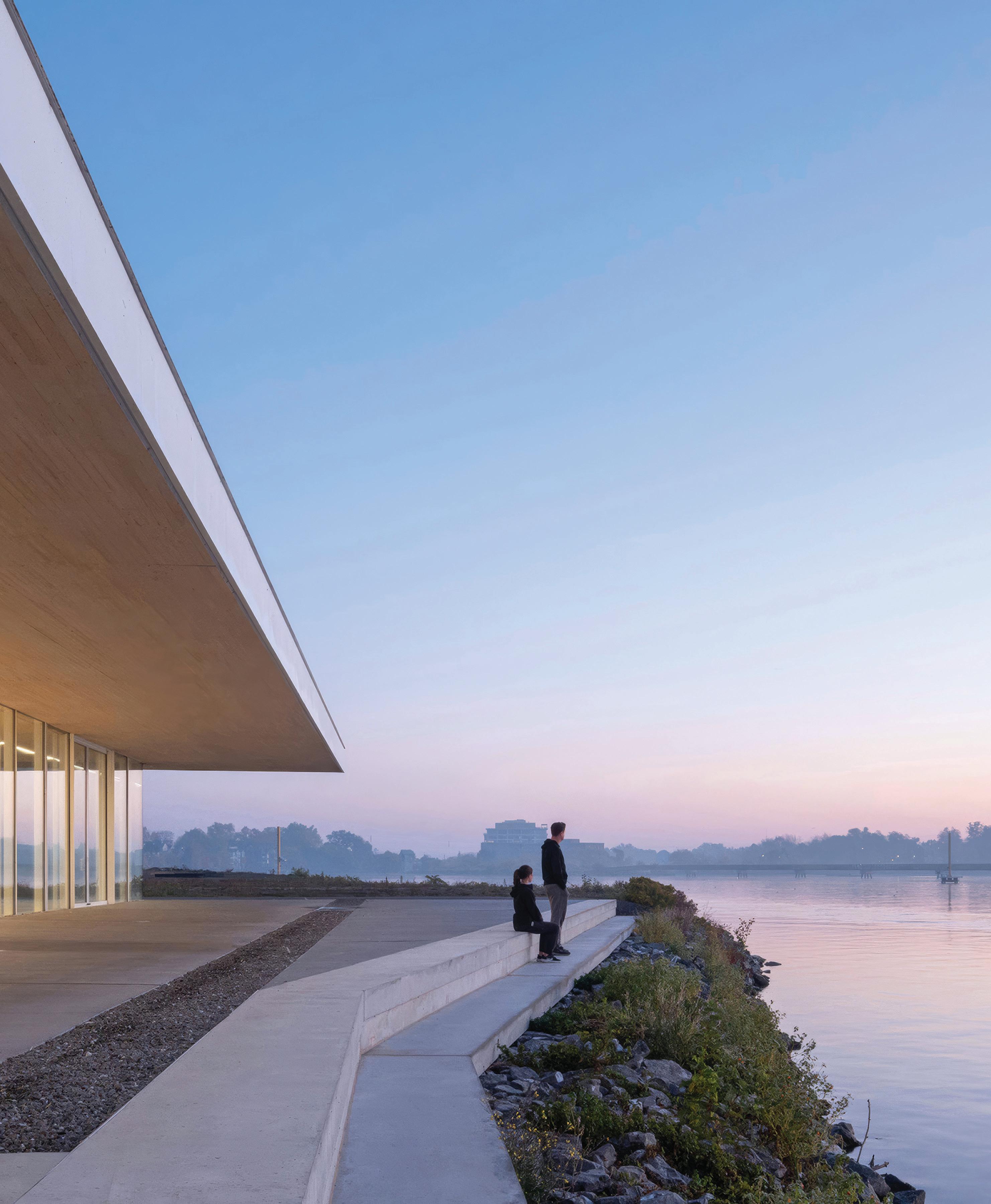
EVERY TWO YEARS, THE GOVERNOR GENERAL’S MEDALS IN ARCHITECTURE RECOGNIZE EXEMPLARY WORK BY CANADIAN ARCHITECTS. THE COMPETITION, ADMINISTERED JOINTLY BY THE ROYAL ARCHITECTURAL INSTITUTE OF CANADA AND THE CANADA COUNCIL FOR THE ARTS, CONTINUES A TRADITION INITIATED BY THE MASSEY MEDALS IN ARCHITECTURE, WHICH BEGAN IN 1950. HERE ARE THIS YEAR’S WINNERS.
ARCHITECT Perkins&Will
LOCATION Simon Fraser University, Burnaby, British Columbia
PHOTO Andrew Latreille
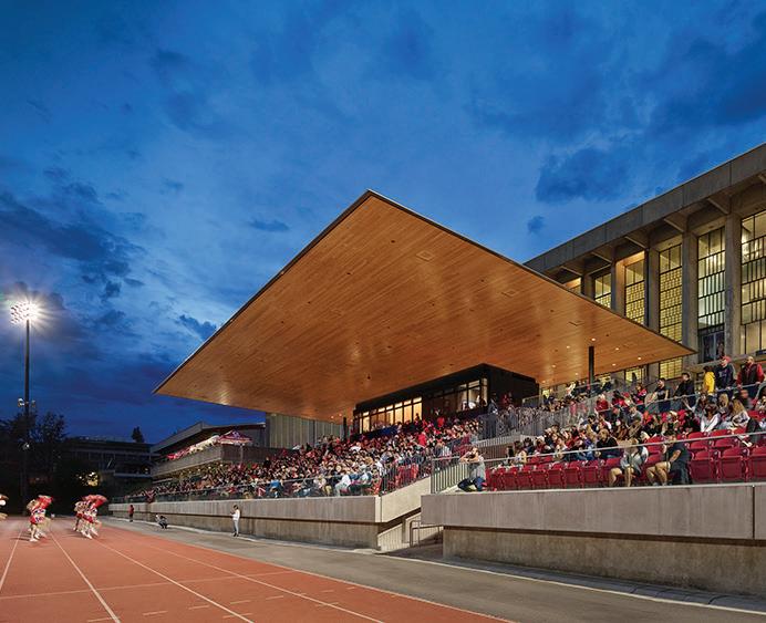
Erickson Massey’s original masterplan for SFU’s Burnaby campus included concrete bleachers in front of the Lorne Davies Complex (LDC)—housing gyms, a fitness centre, and a pool—to provide seating for sporting and cultural events. Deemed too expensive at the time, the seating was never constructed, and the campus has lacked this critical community-building space.
In 2012, the Simon Fraser Student Society passed a vote to collect an annual levy from students to fund the construction of new student facilities, including a stadium. The resulting design takes inspiration from the terraced planes of the original masterplan, and maintains the LDC’s key experiential element of uninterrupted views to the south from its pool deck. The stadium is conceived as a minimal intervention synchronized to the structural rhythm of the LDC, and topped by a canopy that floats above the seats.
The stadium is designed to host events throughout the year, and to be a sheltered public space when not in use. Mass timber panels are both
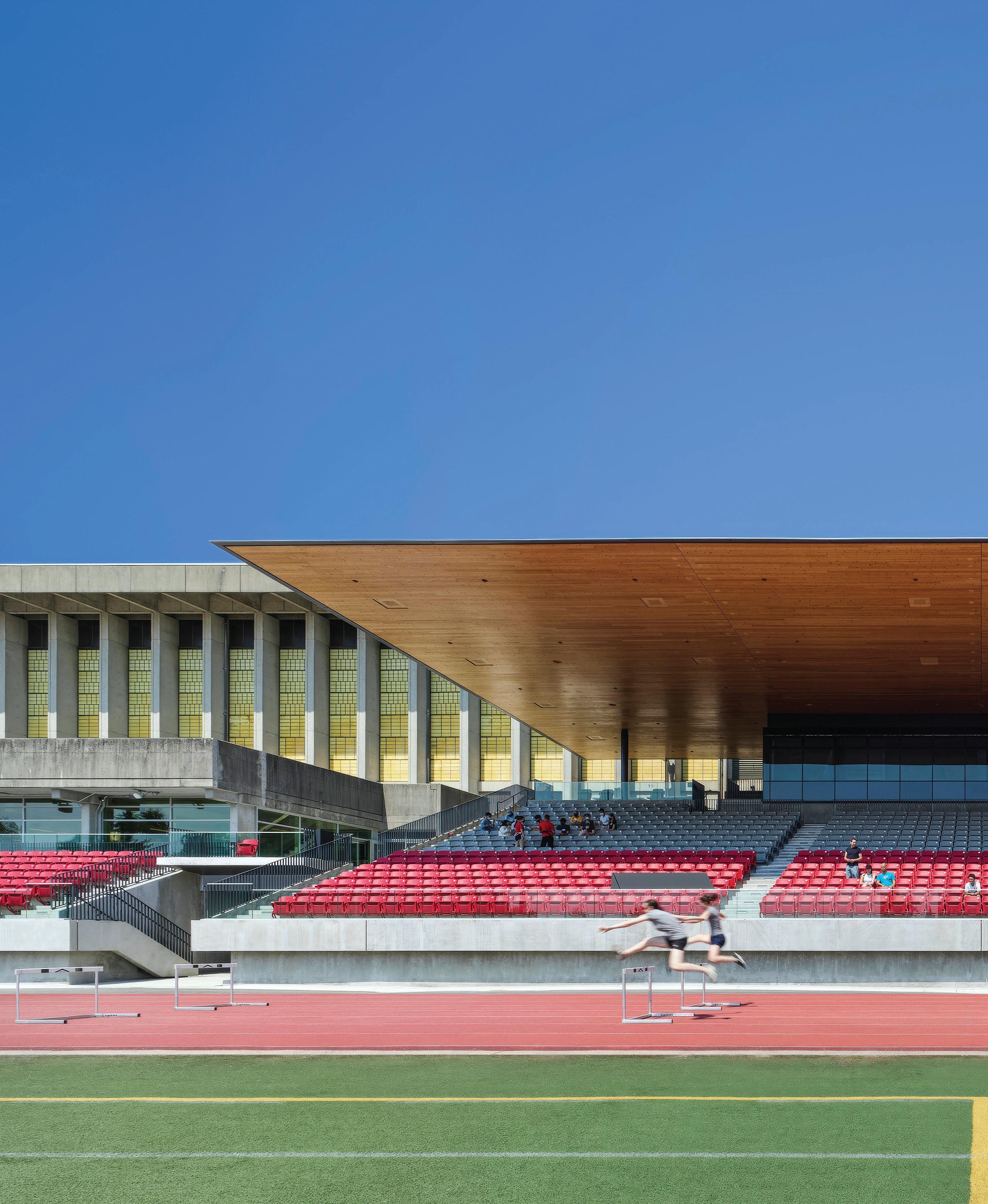
the finish and structure, creating a warm place of welcome to the campus. The seating area has been used as a marshalling space for sports camps, an outdoor lecture theatre, and an informal hang-out space for students. During events, the facility offers a variety of viewing experiences, from formal seats to more casual areas for socializing.
The jewel of the design is the canopy over the central seating area— a structure that seems impossibly thin for the span it covers, and is supported by slender columns that almost disappear in the background.
As a minimalist element, it frames clear views to the field, with a supporting structure that sits above the plane of the soffit. The wood surface amplifies the noise of the crowd, enhancing the spectator experience and providing inspiration to the players.
Jury Comment :: The jury appreciated the quiet and clear response of the SFU Stadium project to its context and purpose. The main
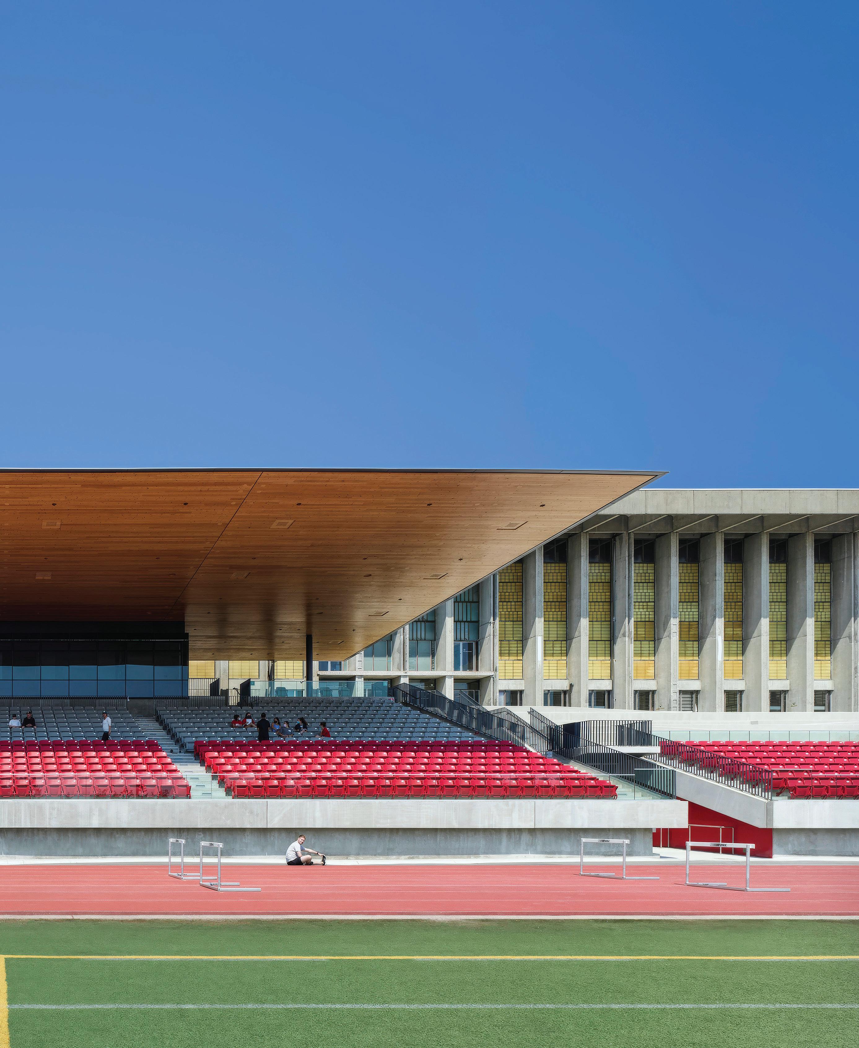
architectural feature of the project is the canopy that shelters the stadium seating. The design’s simplicity was well executed and was an elegant choice given the context of the brutalist backdrop of the Lorne Davies Complex Building. The jury noted the efficient use of materials including CLT and the handsome honest detail of the structural approach. In a time of excess, the SFU Stadium illustrates restraint and elegance that will no doubt remain functional and beautiful for many decades to come.
CLIENT SIMON FRASER UNIVERSITY ARCHITECT TEAM MAX RICHTER, ABU BENJAMAN, PAUL COWCHER, NIC DUBOIS-ROBITAILLE, JANA FOIT, BOJANA JERINIC, HORACE LAI, SARITA MANN, GAVIN SCHAEFER, ELSA SNYDER, KIM STANLEY, LAURENCE RENARD BUILDING ENVELOPE
ARCHITECT Modern Office of Design + Architecture (MODA)
LOCATION Calgary, Alberta
PHOTOS Ema Peter, unless otherwise noted
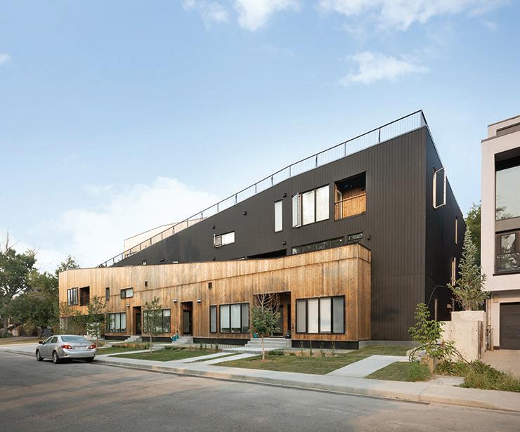
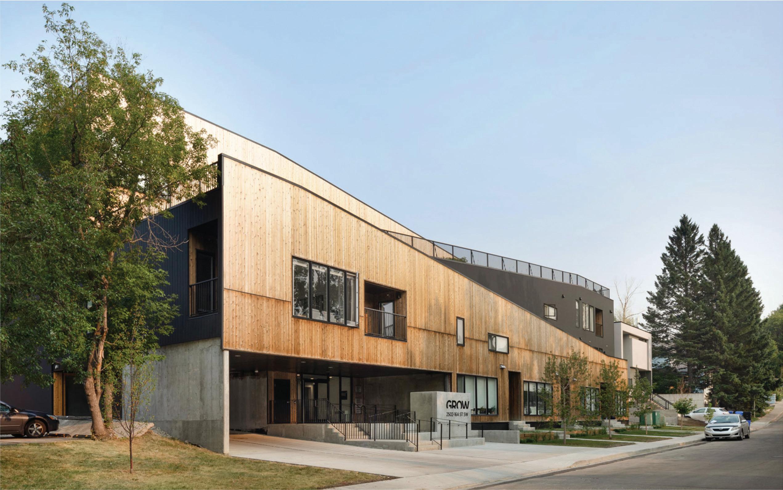
GROW is a 20-unit housing project in the inner-city neighbourhood of Bankview, Calgary. It’s also an urban farm: its zigzag sloped roof is topped with 0.6 acres of rooftop gardens that act as a place for residents to meet, walk the dog, and get a breath of fresh air.
To further support social interactions across generations and demographics, GROW ’s rental units suit a range of ages and family sizes, including small (42 square metre) studios, medium-sized (56 square metre) condos, 1.5-storey lofts, and large (79-93 square metre) twostorey townhomes. This arrangement potentially places a retired couple next to a young family with children, or a single student next to a young professional, building resilience and social connections through proximity.
The development’s formal strategy evolved from its restrictive setbacks and steep slope, with six metres of elevation change from the northwest to the southeast corner of the site. The architects responded by placing the parkade at grade, pushing units at the rear of the build-
ing up to create a terracing effect that provides equal access to light and view for all of the units. Offsetting the terraced bars opens up the development’s generous outdoor amenity space.
In most multi-unit buildings, the only opportunities for social interaction occur in shared corridors and at the mailboxes. At GROW, residents can participate in all facets of the rooftop garden, which is managed by a local, not-for-profit urban farming collaborative, or simply enjoy spending time in the outdoor space. Trust is built through the shared ambition to cultivate and care for a resource that benefits the community.
Lead architects Ben Klumper and Dustin Couzens describe the development as “unusual in Calgary, where private/speculative development drives housing provision, and cost-cutting takes precedence over community growth.” But, they add, “if GROW ’s approach […] were to become more prevalent in our inner-city communities, and we were to focus on building social capital in tandem with real estate capital, we could create more equitable, inclusive and diverse inner-city urban spaces.”
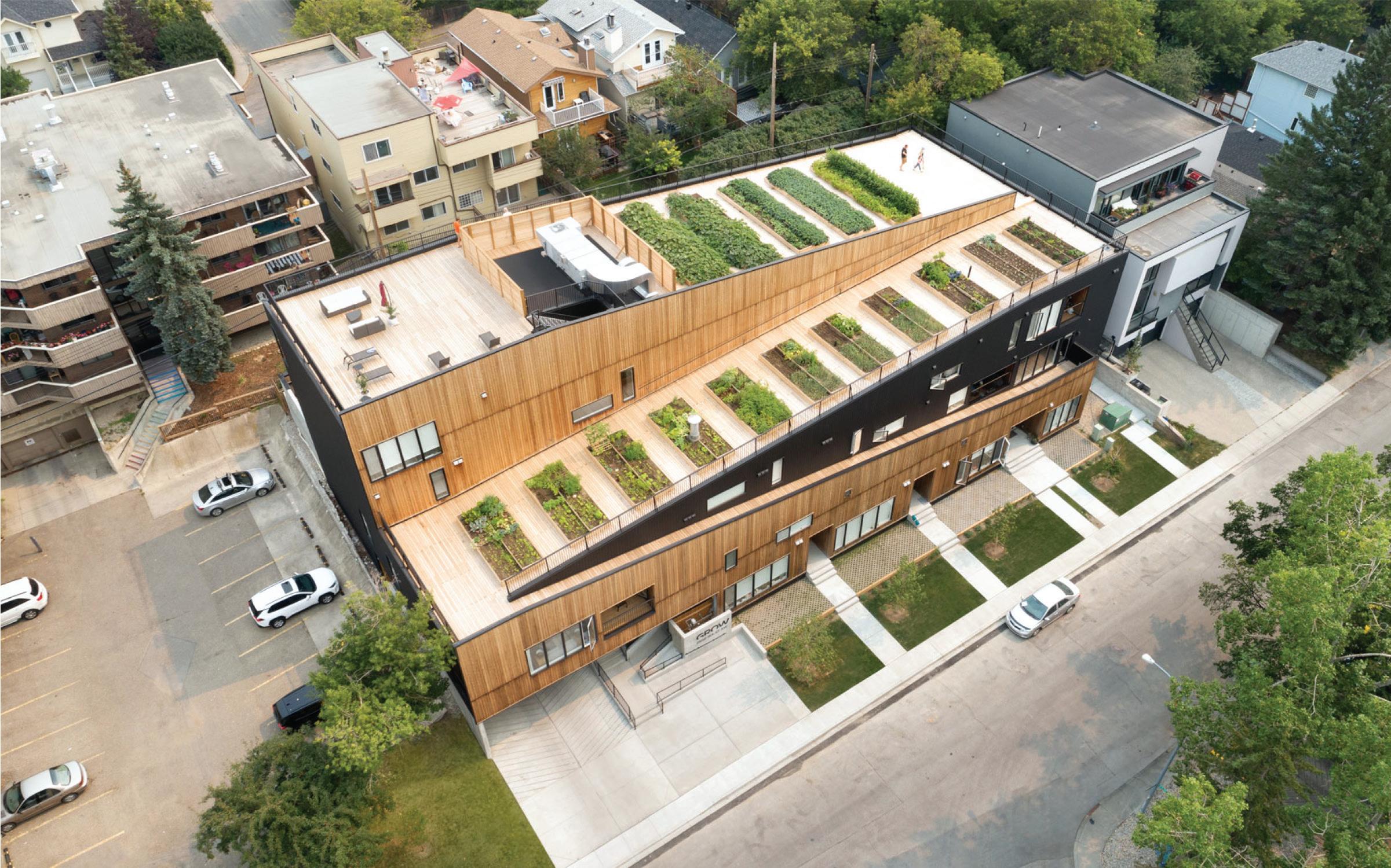
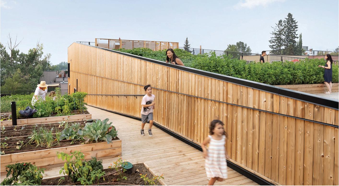
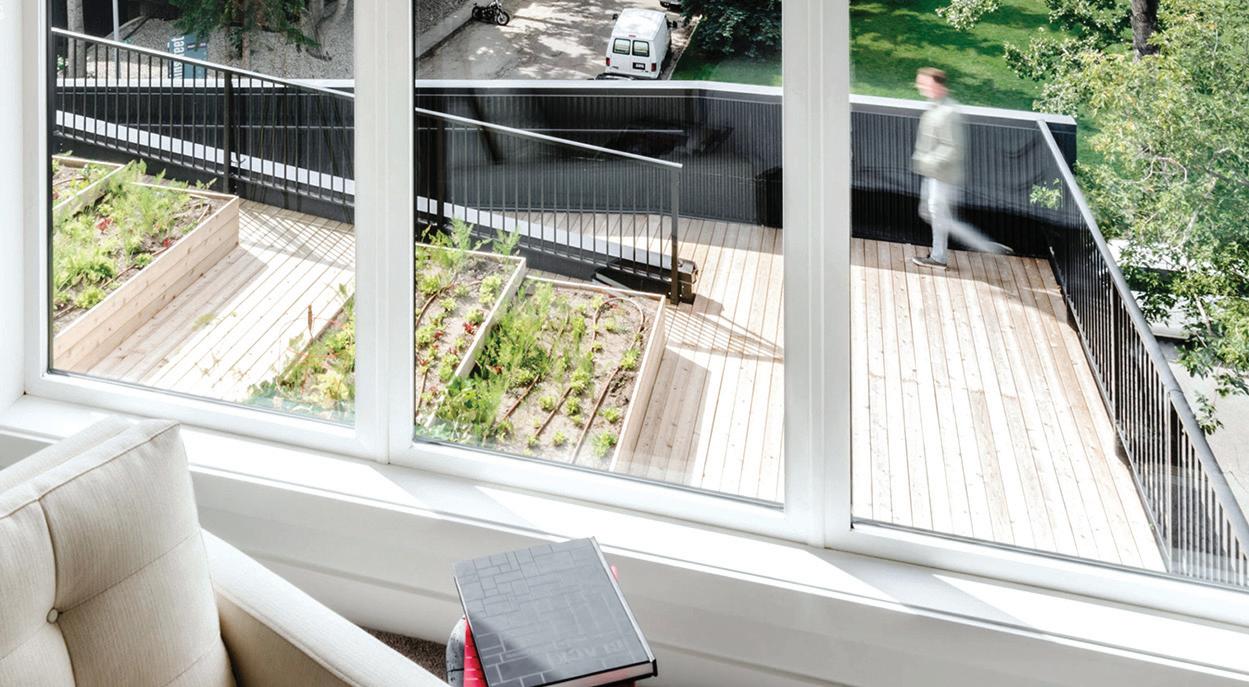
OPPOSITE In response to a steeply sloped site, the building includes at-grade parking that pushes the rear units up to create a terracing effect. TOP The building’s zigzag form creates space for a large rooftop garden. ABOVE LEFT As a common amenity space, the rooftop is accessible to people of all ages and abilities. ABOVE RIGHT The building’s 20 units enjoy views onto the roof garden, back terraces, and front gardens.
Jury Comment :: GROW creatively reimagines the typology of a multiunit residential complex and offers a much-needed new take on collective living. The jury praised the project’s form, program, and organization as a sensitive response to its suburban context. In particular, the clever sculpting of the topography of the ground and the roof levels provides the building with an animated communal stepped garden. The jury also recognized the significance of the project’s contribution as a new case study to the “missing middle” housing crisis.
CLIENT ANDREI METELITSA ARCHITECT TEAM DUSTIN COUZENS, BEN KLUMPER, NICHOLAS TAM, CARA TRETIAK | INTERIOR DESIGN MODERN OFFICE OF DESIGN + ARCHITECTURE (MODA) | LAND -
SCAPE MODERN OFFICE OF DESIGN + ARCHITECTURE (MODA) URBAN FARMING CONSULTANT YYC
GROWERS (ROD OLSON) | ENERGY MODELLING EMBE CONSULTING ENGINEERS (MOORTAZA BHAIJI, PAUL CAICEDO) | ENVELOPE/SUSTAINABILITY WILLIAMS ENGINEERING (HILLARY DAVIDSON) | CIVIL RICHVIEW ENGINEERING (ROBIN LI) STRUCTURAL WOLSEY STRUCTURAL ENGINEERING (DANNY WOLSEY) | MECHANICAL/ELECTRICAL TLJ ENGINEERING CONSULTANTS (KEVIN VIG) BUILDER RNDSQR + BMP CONSTRUCTION + SIGNATURE PROPERTIES AREA 1,806 M2 (INTERIOR) / 856 M2 (EXTERIOR-URBAN FARM) BUDGET $4.78 M COMPLETION JULY 2020
ARCHITECT
LOCATION Winnipeg, Manitoba
PHOTOS James Brittain
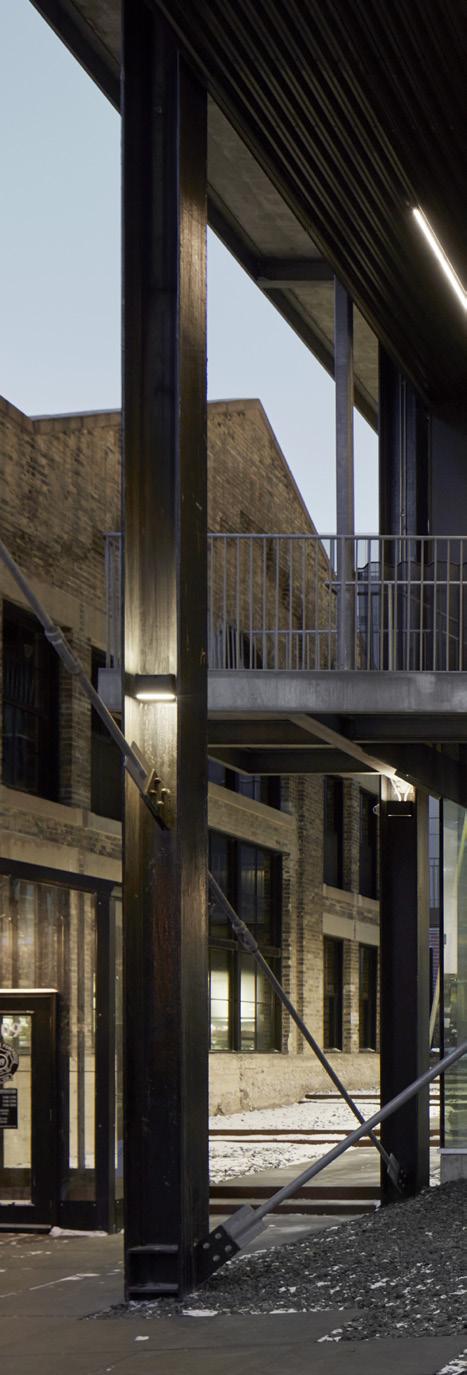
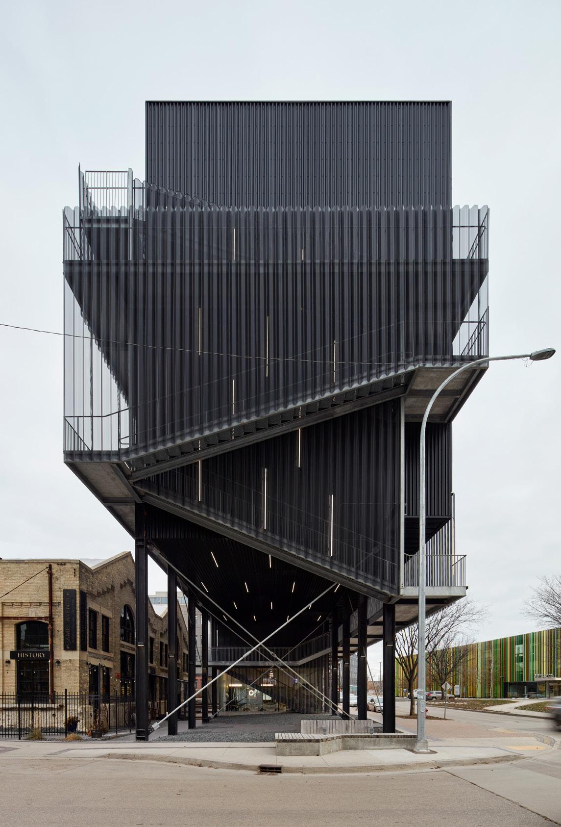
Winnipeg’s historic James Avenue Pumping Station was slated for demolition after 14 failed attempts to revive it. Taking on a role outside of the usual scope of architects, 5468796 Architecture developed an unsolicited conceptual design paired with a financial pro forma, and presented the business case to an existing client. This combination eventually led to the building’s successful preservation.
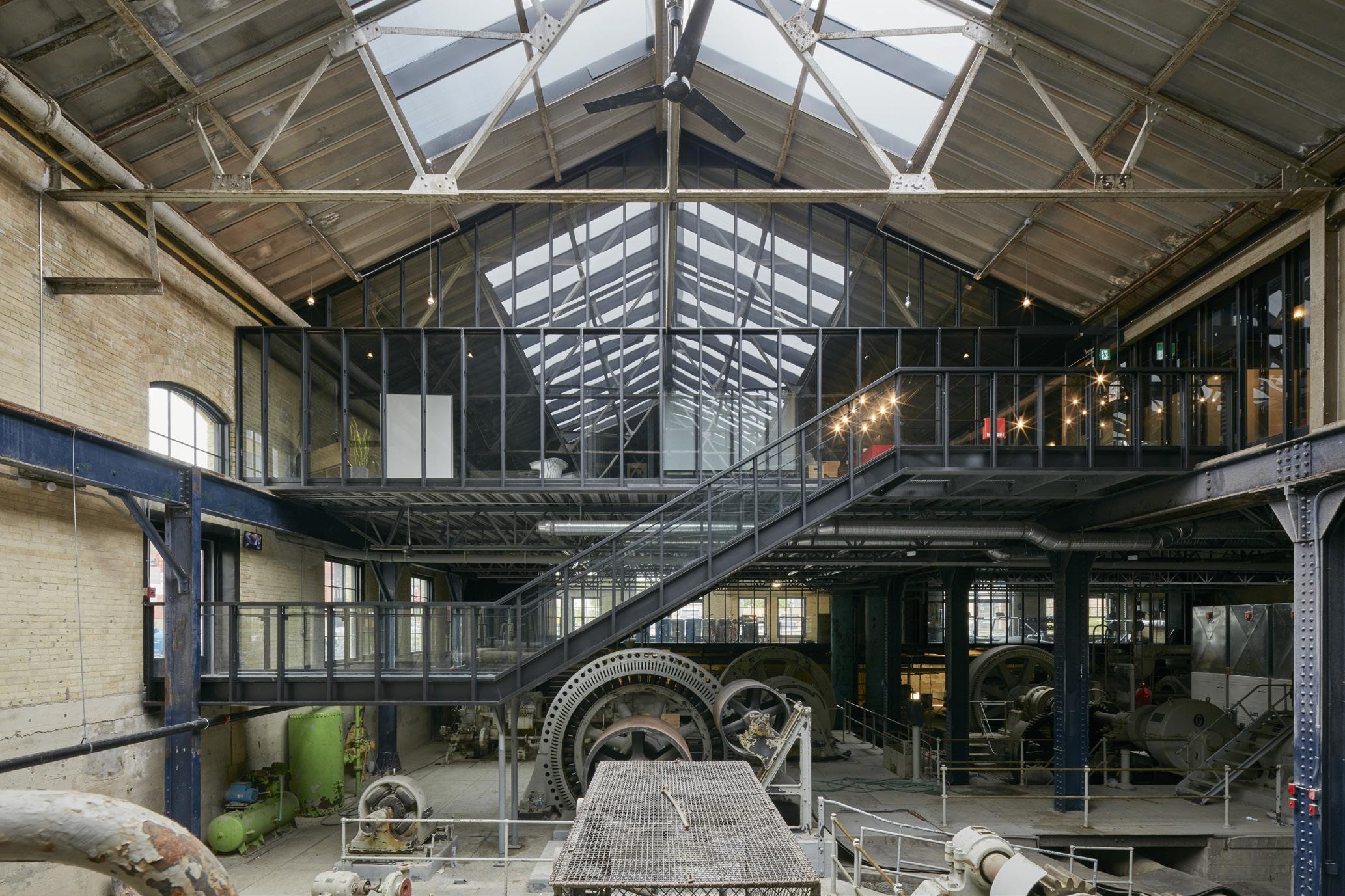
Two design interventions made the project financially viable: repurposing the capacity of original gantry crane rails to suspend a floating floor above the preserved pumping equipment below; and building a residential block on the 13-metre-deep sliver of land between the historic building and Waterfront Drive. A larger residential building was also placed on the opposite end of the pumping station.
In the completed project, the pumping equipment remains in its found state, free of complicated programming. Above, a flexible office floor plate opens fresh views of the equipment, enhanced by floor-to-ceiling glazing. New skylights pierce the roof, bringing natural light deep into the expansive space.
Materially, the upper level of the pumping station is grounded in the straightforward, industrial quality of the place. Steel studs and stiffening bars are repurposed as supports, allowing for thinner glazing,
reducing embodied carbon by half, and increasing construction speed and affordability by removing the need for specialized installers.
The residential blocks are offset from the existing building, creating new laneways that respect the original pumping station envelope, reference the human scale, and expand the ground floor commercial frontages. Barrier-free access points are nestled along these paths, and the massing makes room for an outdoor amphitheatre, a number of public plazas, and a pair of footbridges suspended between the residential blocks and the heritage building.
The mid-rise residential buildings bookending the site have Nail Laminated Timber (NLT) technology composing the floors and ceilings, nodding to the Exchange District’s century-old warehouses. Rethinking the norms of multi-unit residential design, they include a skip-stop configuration and open-air egress. The vibrant exterior passageways act as sites for neighbourly interaction and encourage a sense of shared ownership over communal space. Open-air stairwells provide unobstructed vistas to the city, park, and river.
Blending historic revitalization and sustainable development, this multifaceted, mixed-use development has brought back a historic structure using practical innovation, and gained the support of heritage advocates, neighbouring residents, and the community at large.
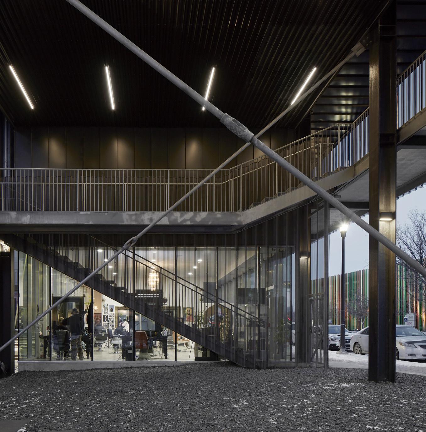
ABOVE LEFT Within the pumping station, the original gantry crane rails were used to support a new upper floor. The pumping equipment was left intact on the ground level. ABOVE Residential blocks were inserted at the two ends of the historic pumping station, with public areas and commercial spaces nestled beneath the volumes. RIGHT Exterior stairs and passageways act as sites for neighbourly interaction in the residential blocks. BOTTOM RIGHT The new upper office floor offers views of the historic pumping equipment below.
Jury Comment :: The jury noted the excellence of this sensitive and convincing rehabilitation, which demonstrates a deep understanding of the site’s potential and qualities, proposing adapted programs and additions integrated into the logic of the existing elements. Using the load-bearing capacity of the gantry crane rails to support a new floating floor frees up floor space and highlights the architectural qualities of the building and the industrial equipment as artifacts of the former use. The densification of the site with two new residential buildings ensures the feasibility of the project. The jury also appreciated the way in which the apartments are distributed by external walkways, offering to each of them double exposure and through-ventilation.
CLIENT ALSTON PROPERTIES | ARCHITECT TEAM EMEIL ALVAREZ, PABLO BATISTA, BRANDON BERGEM, KEN BORTON, JORDY CRADDOCK, DONNA EVANS, BEN GREENWOOD, RALPH GUTIERREZ, JOHANNA HURME, AINSLEY JOHNSTON, JEFF KACHKAN, STAS KLAS, LINDSEY KOEPKE, MATTHEW KURTAS, KELSEY MCMAHON, COLIN NEUFELD, SASA RADULOVIC, ANIKA THORSTEN, MATTHEW TRENDOTA, SHANNON WIEBE | LANDSCAPE SCATLIFF + MILLER + MURRAY | INTERIORS 5468796
ARCHITECTURE | STRUCTURAL LAVERGNE DRAWARD & ASSOCIATES MECHANICAL/ELECTRICAL/ CIVIL MCW CONSULTANTS ENERGY FOOTPRINT | CODE GHL CONSULTANTS SURVEYOR BARNES & DUNCAN | CONTRACTOR BRENTON CONSTRUCTION CORP. AREA 7,108 M2 | BUDGET $22 M | COMPLETION DECEMBER 2023
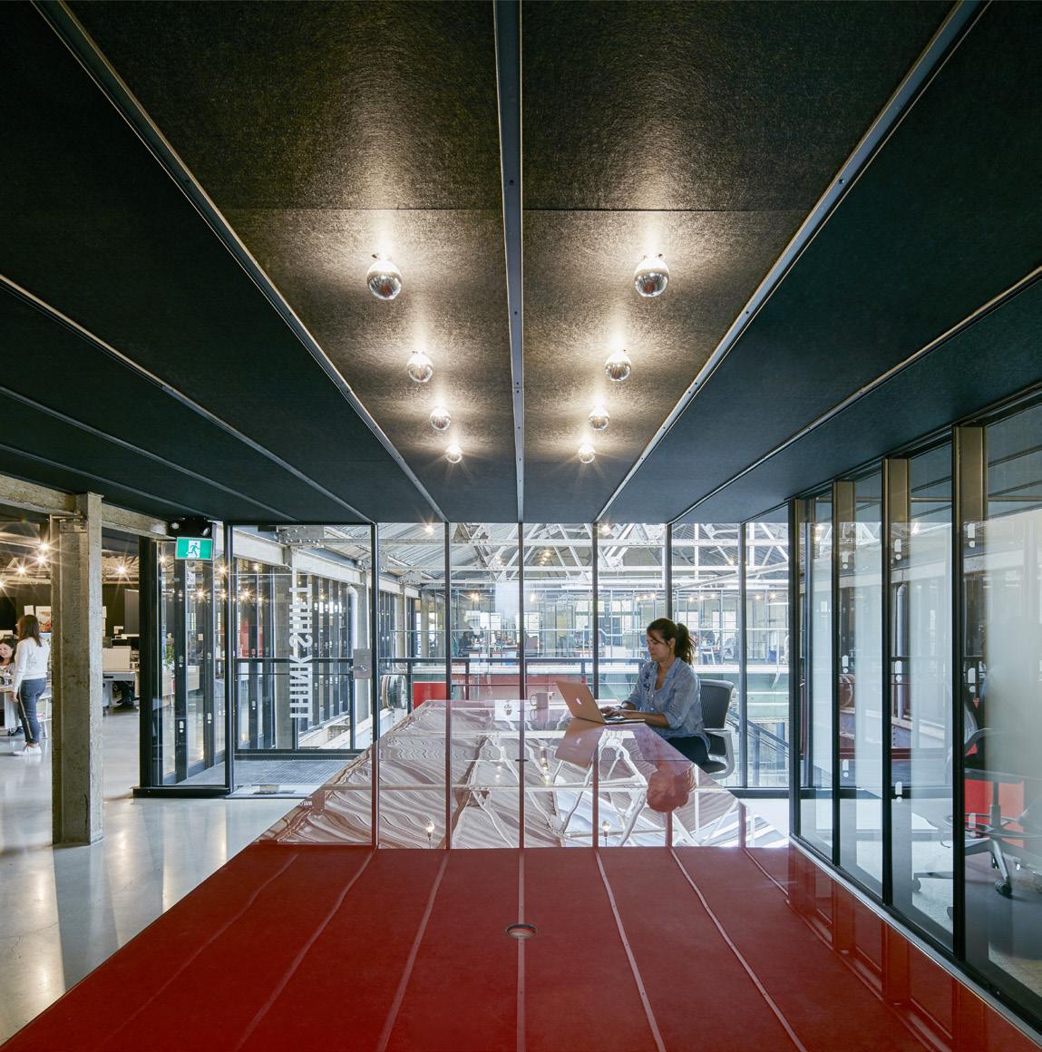

ARCHITECTS MJMA Architecture & Design | Raimondo + Associates Architects
LOCATION St. Catharines, Ontario
PHOTOS Scott Norsworthy
Located in the Port Dalhousie community of St. Catharines, Ontario, Henley Island and its two-kilometre racecourse on Martindale Pond have been the epicentre of Canadian rowing since 1903. The site has hosted the yearly Royal Canadian Henley Regatta and rowing competitions for Olympic Trials, the Pan Am Games, and World Championships.
The new Neil Campbell Rowing Centre (NCRC) continues Henley’s tradition as a venue for elite competitions, while also serving as a yearround training centre for athletes. The project demonstrates how simple, elemental, and respectful design can support a broad spectrum of uses, while also achieving both Net Zero-Energy and Zero-Carbon Emission benchmarks.
Built on a gentle promontory, the NCRC reconfigures a previously ill-defined staging area. Its signature mass timber roof is topped with photovoltaic panels, and uses Canadian glue-laminated (GLT) and cross-laminated timber (CLT) products. It is supported by a light steel column structure and a centralized service core. Steps running down
to Martindale Pond serve as seating, but also allow spectators and children to dip their toes in the water. The facility rests on 15-metre-long screw piles that extend down to bedrock.
The biased and overhanging roof, extensive glazing, and steps to the racecourse give the NCRC a striking visual identity. Its linked interior and exterior spaces offer ample space to host events. With its sliding doors open, it becomes a pavilion a central space for viewing races and gatherings.
The building’s design inverts the opacity of the typical boat shed and introduces aspects of the glass house, reimagining these traditional typologies to create a new functional and social amenity that elevates the experiences of athlete and spectator alike.
Jury Comment :: The Neil Campbell Rowing Center illustrates how a powerful singular gesture against a natural backdrop delivers a flexible program in a beautiful, restrained manner. The jury appreciated the
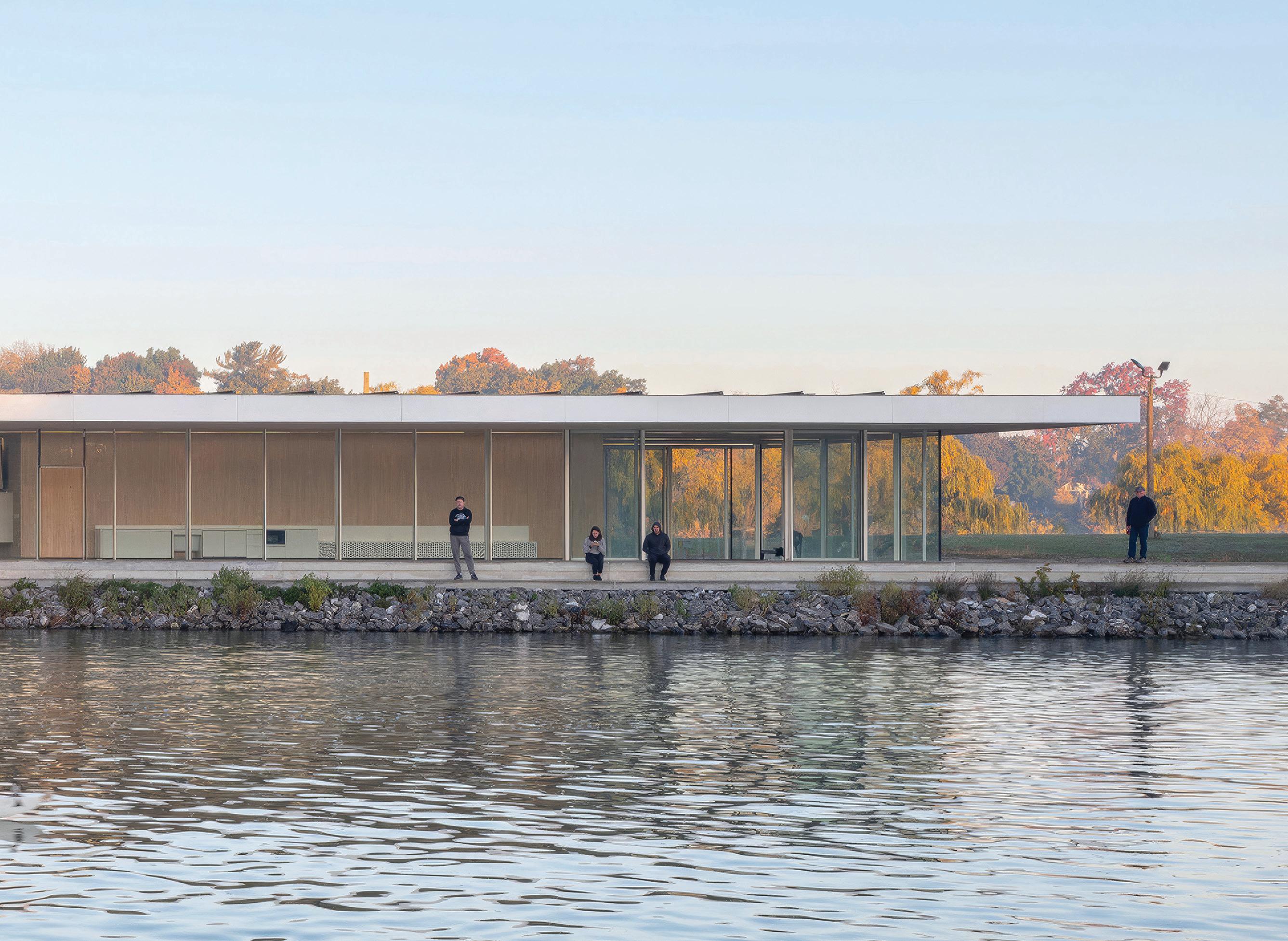
ABOVE An elegant mass timber roof tops the Neil Campbell Rowing Centre in St. Catharines, Ontario. The facility contains specialized workout areas for athletes, and doubles as a spectator area during regattas on Martindale Pond. BELOW Careful detailing creates a continuous floor and roof plane between the interior and exterior of the pavilion.
clear construction and use of mass timber, Passivehaus envelope detailing, PV array and other sustainability features as well as the architect’s ambition to meet Zero-Carbon and Net Zero-Energy aspirations. Although programmatically relatively simple, the design is well considered to ensure that the simplicity was rigorously executed.
CLIENT 2021 CANADA SUMMER GAMES/CANADIAN HENLEY ROWING CORPORATION ARCHITECT
TEAM MJMA—ROBERT ALLEN, DAN KRONBY, TYLER WALKER, TED WATSON, TARISHA DOLYNIUK, TIM BELANGER, ANDREW FILARSKI, MATT LAMERS, MONICA LEUNG, TIMOTHY LAI. RAIMONDO + ASSOCIATES—EMILIO RAIMONDO, BRAD AUGUSTINE, JOHN-ALEXANDER RAIMONDO, JEFF VISENTIN, BRENNAN KLYS, CARRIE ROSE | INTERIORS MJMA ARCHITECTURE & DESIGN STRUCTURAL
BLACKWELL MEP SMITH + ANDERSEN | CIVIL UPPER CANADA CONSULTANTS SUSTAINABILITY
FOOTPRINT CONTRACTOR AQUICON CONSTRUCTION | AREA 527 M2 | BUDGET $7.2 M | COMPLETION FEBRUARY 2022


ARCHITECT MJMA Architecture & Design
LOCATION Mississauga, Ontario
PHOTO Scott Norsworthy
Located in Mississauga, Ontario, the Churchill Meadows Community Centre and Sports Park transforms a 50-acre former agricultural field into a richly textured park centered on a pavilion-like building.
The Community Centre is ringed by extensive glazing, and its entrance elevation is clad in white standing-seam metal, modulated with bold faceting that opens up the building’s form towards approaching visitors and the sky above.
Interior spaces are arranged into two bars running the building’s length. The eastern bar holds the changerooms at grade, with a teaching kitchen, multi-purpose rooms, and a fitness area on the mezzanine level above. To the west, a wider bar houses the triple gymnasium, lobby, and aquatics hall. Here, the sculptural ceiling’s inverted peaks diffuse natural light from a series of sawtooth skylights, with an overall effect evoking serenely lit caverns.
In the lobby, a generously proportioned switchback stair provides clear wayfinding to the mezzanine level, and allows for views to the pools, gym, and park.
The fully glazed park-facing elevations to the west and south boast a striking exterior canopy that extends and makes visible the building’s mass timber structure. The canopy is clad in an expanded aluminum mesh that protects the wood from the elements, while filtering light to mitigate glare inside the lobby, pool, and gym.
MJMA also completed the park’s masterplan and the design of the park’s initial phase, allowing for an exceptional programmatic and formal integration of community centre and park. The building is set diagonally with respect to the urban grid, with its four elevations facing each cardinal direction, and the playing fields and courts are aligned with it for optimal solar orientation. Parking areas are pushed
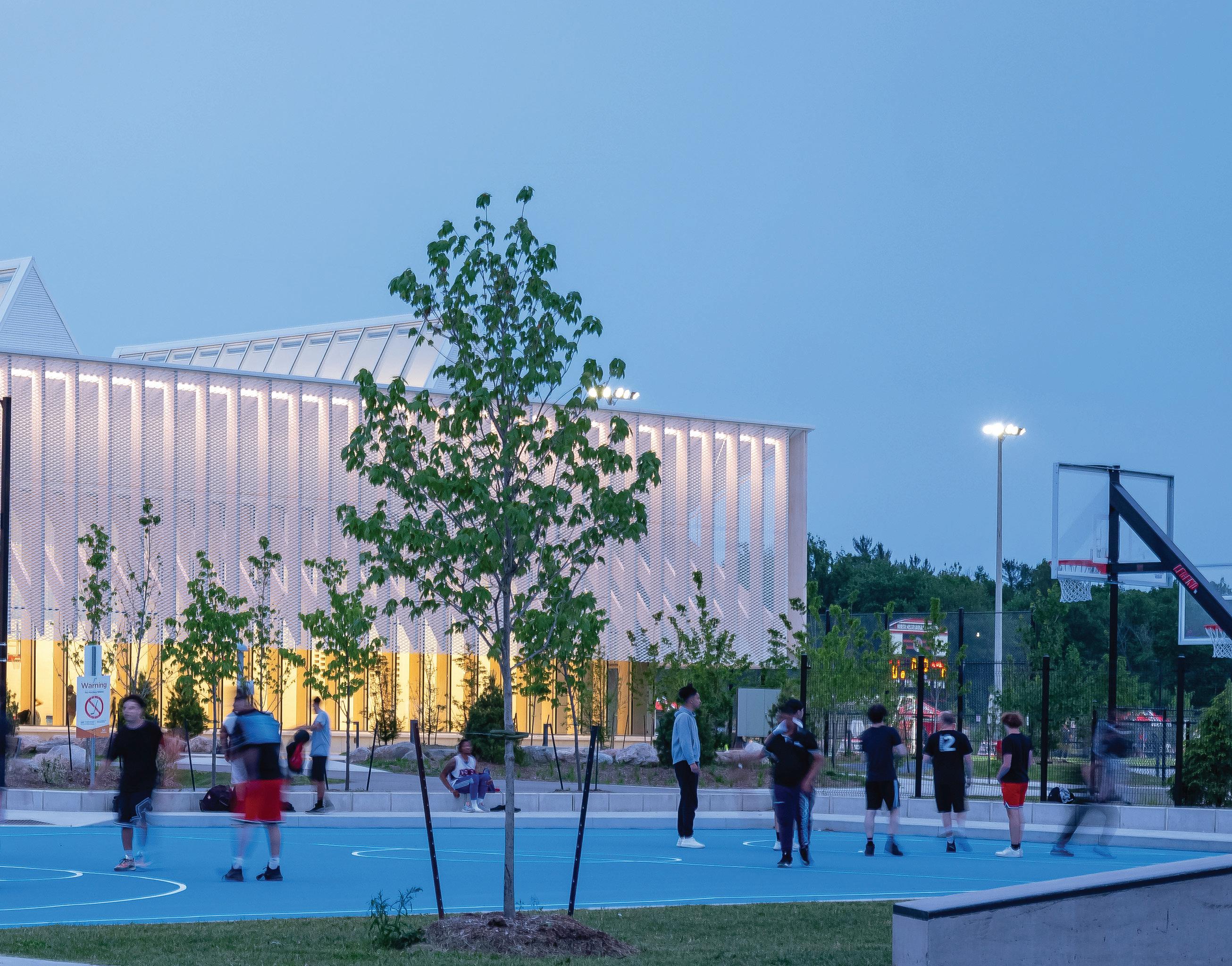
ABOVE The design of Churchill Meadows Community Centre and Sports Park entailed a single architecture firm working on the site’s masterplan as well as the building and its surrounding landscape.
to the north and south ends of the site, so that park and building can occupy an uninterrupted car-free zone. The park includes a covered walking track that rings the building, and sports fields and courts spread across a landscape whose gently rolling hills, made from soil reclaimed during building excavation, offer elevated seating and viewing points. At virtually every point inside the building, the facility’s primary program spaces are transparent to the outside. The experience throughout is accompanied by panoramic views through the array of glulam columns into the park.
Jury Comment :: The Churchill Meadows Community Centre and Sports Park is a welcome addition to the community of Mississauga, Ontario. With the Community Centre at the heart of the design, the building creates spaces of safety, accessibility, and equity for all users.
The scale and massing of the building creates a new landmark in the suburban landscape, with the expression of materials and structure being key. A nuanced understanding of light and transparency between the inside and outside creates a delightful play of shadow and light.
The jury was taken by balance between sensitivity and pragmatism, the consistency of concept and detail, and the durability of the execution.
CLIENT CITY OF MISSISSAUGA ARCHITECT TEAM DAVID MILLER (FRAIC), CHRIS BURBIDGE (MRAIC), TYLER WALKER (MRAIC), TED WATSON (FRAIC), TARISHA DOLYNIUK (FRAIC), TIM BELANGER, ANDREW FILARSKI (FRAIC), ROBERT ALLEN (FRAIC), OBINNA OGUNEDO, LELAND DADSON, KRIS VASSILEV, DARLENE MONTGOMERY, JASPER FLORES, CALEB TSUI, NATALIA ULTREMARI, JEREMY CAMPBELL, CAILEIGH MACKELLAR, KYUNG-SUN HUR STRUCTURAL BLACKWELL | MEP SMITH +

ARCHITECT Kongats Architects
LOCATION King City, Ontario
PHOTOS Riley Snelling
Stretching out like an open hand, the King City Library and Seniors Centre is a multigenerational community hub: a place to meet, share stories, exchange knowledge, and access information.
Kongats Architects was initially retained to investigate the program and feasibility of a facility that would replace the existing library. The study and its public consultations identified the benefits of a shared public library and seniors centre as a place for community building, and a configuration that could realize operational savings.
The resulting building is centered on a welcoming core, whose intimate, wood-lined study rooms contrast with glazed, light-filled reading rooms that offer views to the surrounding landscape. Program areas across the two-level building include a senior’s centre with flexible event spaces, collaborative meeting zones, a digital media and ‘make-it’ lab, exterior reading balconies and patios, and dedicated areas for adult collections, local histories, children and teens.
The entry from King Road was re-envisioned as a welcoming public space, where the curved façade of the building symbolically embraces community markets, book fairs, and barbeques. Elements of the interior spill out to entice potential patrons. Sustainability initiatives are also interwoven throughout the site and building: stormwater is managed on site through bioswales, natural daylighting is provided to all occupied areas within, and operable windows allow for cross-ventilation.
At a moment when libraries are perceived to be under threat from a shrinking public realm on one side and digitization on the other, the King City Library and Senior’s Centre creates an innovative and vital “third space” that is neither home nor work. It’s a place where the community benefits from intergenerational learning and making, and has wide access to well-curated information.
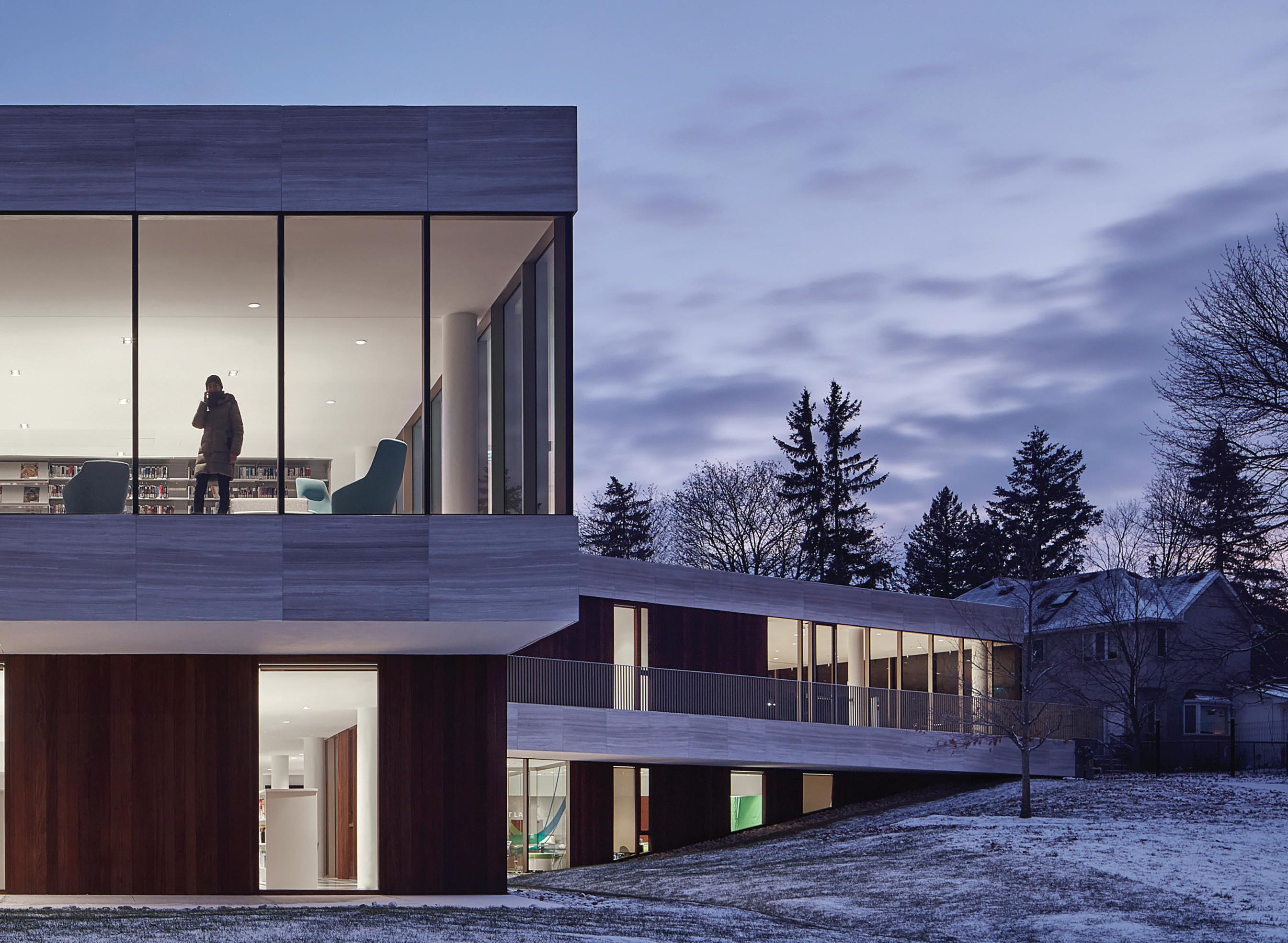
ABOVE The library and seniors centre features porch-like reading and gathering spaces that curve out into the landscape. BELOW A double-height atrium connects children’s and seniors’ spaces on the main floor to study and work areas on the lower level.
Jury Comment :: The King City Public Library and Seniors Centre provides a multi-generational community hub for residents of King City that integrates two vital urban functions an urban social space and a seniors’ centre. The jury noted the social and cultural value of the combined program. The jury discussed the contextual approach, material detailing and the sustainable strategies which included bioswales, natural daylighting, natural ventilation and optimized heating and cooling systems.

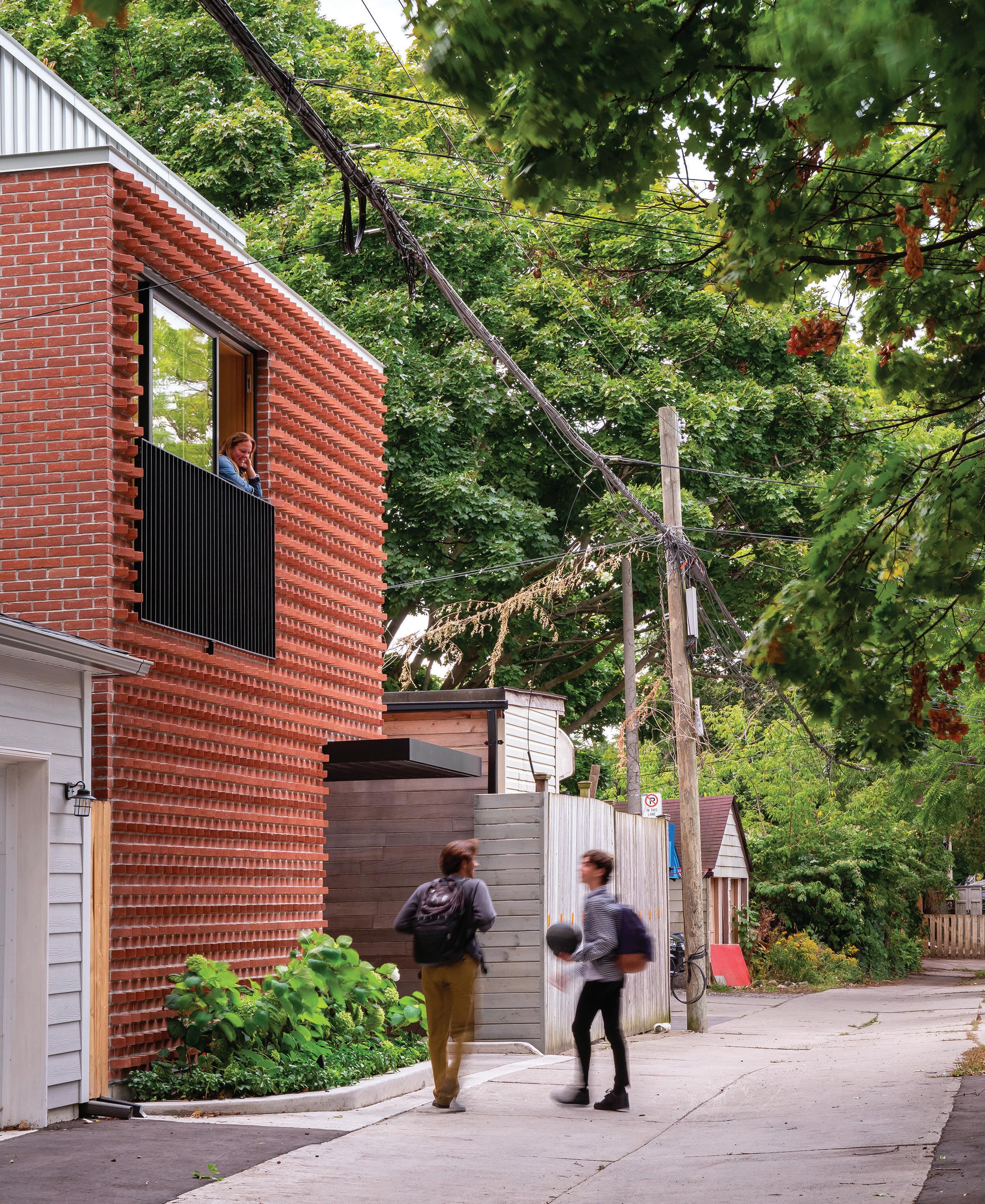
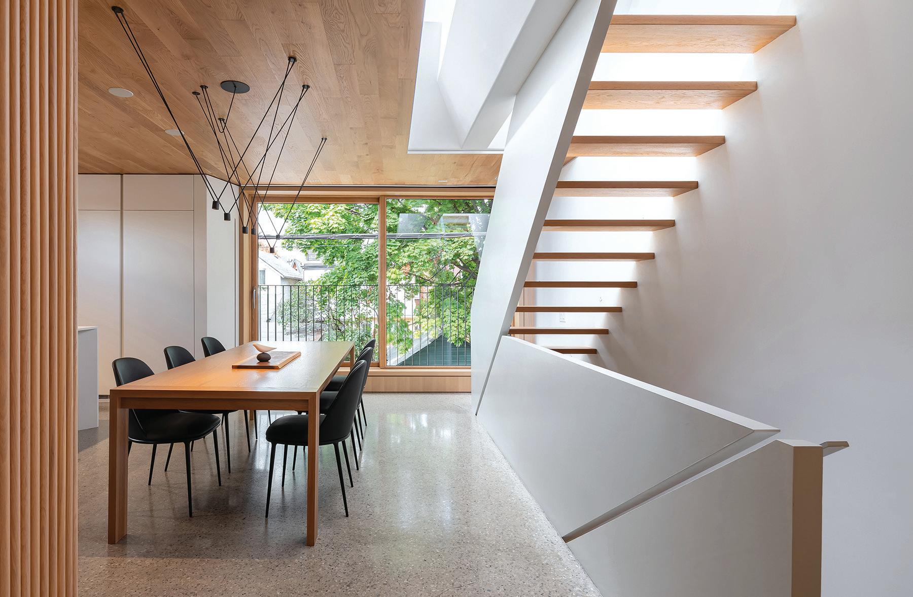
ARCHITECT Williamson Williamson Inc.
LOCATION Toronto, Ontario
PHOTOS Scott Norsworthy
Facing a service lane in the west end neighbourhood of Roncesvalles, Toronto, the Garden Laneway House reimagines the possibilities for small-scale urban densification.
The four-bedroom home accommodates a family of five, and its ample spaces and light-filled rooms counter the stereotype that laneway homes have limited space and unappealing sightlines, and lack privacy.
The house was designed to feel like a primary home, clad in a rotated brick façade that brings beauty to the laneway. The front door is recessed under a carport canopy clad in charred cedar, ensuring privacy from the cars that access the garages surrounding the home. Inside, the house’s program is flipped upside-down from a typical home. The primary suite is on the lowest floor and enjoys a large lightwell, the teenagers’ bedrooms are on the ground floor, and the living spaces are on top. A skylight above the stairwell ties together the levels, and the main living area and rooftop deck enjoy picturesque views of the neighbouring treetops.
Material innovation maximizes the interior space. The use of a coldformed steel joist system increased ceiling height by four inches on each level and left room to run the services directly through the supports, eliminating the need for dropped ceilings. Smart home lighting and zonespecific radiant heating and cooling systems enable the house to run efficiently, while providing an added level of comfort for the family, achieving a TEDI of 27.50 kW h/m2/yr.
This project provides inspiration for how laneway and garden suites can allow property owners to unlock value in their backyards, while encouraging increased density in well-established neighbourhoods.
Jury Comment :: Nestled between garages and an alley, Garden Laneway House is a true gem, with whimsical yet quiet architecture that more than compensates for the site’s lack of context. In an oftenoverlooked typology, the jury was delighted by the effectiveness and efficiency of the space layout, complemented by the strategies implemented by the design team to achieve the project’s spatial qualities such as the views and natural lighting. This project is exemplary in its approach to small-scale urban densification. The jury was also impressed with the overall quality of its construction and details, particularly the beautiful brick facade providing a playful texture contrasting with the banality of the laneway.
CLIENT SUZANNE AND JEFF WILKINSON | ARCHITECT TEAM BETSY WILLIAMSON, SHANE WILLIAMSON, JAVIER HUERTA, DIMITRA PAPANTONIS, STEVEN CHEN, NASSIM SANI, CHRISTINA VOGIATIS, SILAS CLUSIAU | INTERIORS DESIGN COLLABORATION SUZANNE WILKINSON INTERIORS INC. | CON -
JEFF WILKINSON, WILKINSON CONSTRUCTION
FAET LAB MECHANICAL
OPPOSITE A façade made from rotated bricks gives the home a distinctive presence on a west end Toronto laneway. ABOVE The four-bedroom home is planned with bedrooms on the lower two levels and open-concept living spaces at the top, looking out to the surrounding treetops. A skylit stairwell ties together the floors with natural light.
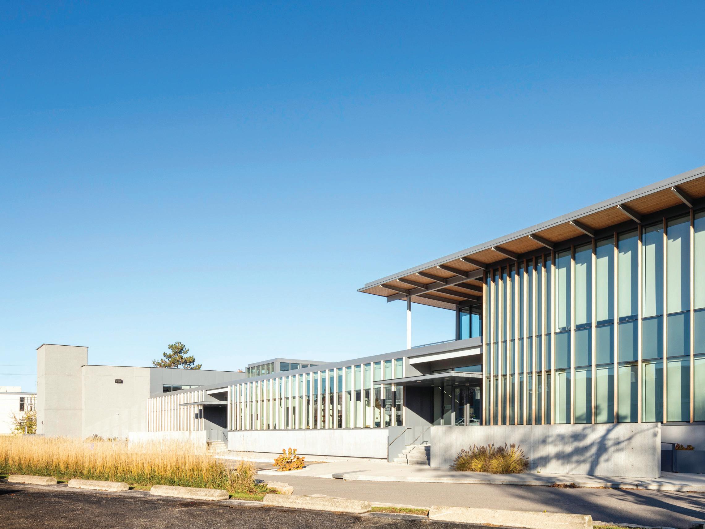
ARCHITECT Suulin Architects Inc.
LOCATION North York, Ontario
PHOTOS Anton Kisselgoff, unless otherwise noted
31 Scarsdale Road is an adaptive reuse of a warehouse and office complex in Don Mills, Toronto. The original light-industrial development was part of the area’s modernized approach to the Garden City. Over time, the complex became an ungainly assemblage of three buildings. It included a one-storey warehouse built in 1962, a one-storey rear warehouse/showroom added in 1977, and a two-storey front office/ showroom added in 1985. These additions were joined, but functioned and appeared as separate, disparate buildings.
Together, the architect and client created a brief to unite the parts into a cohesive whole, while balancing the technical aspects of sustainability with the cultivation of social spaces. The rear building would receive a second-storey addition and be converted into the client’s headquarters. The other two buildings would be modernized and subdivided into tenant spaces that celebrate the contemporary workplace with natural materials. The project was designed to LEED Platinum standards, though it was not certified. An early decision to retain and expose the structure
of all three buildings minimized the amount of new construction and associated embodied carbon. The existing structure of steel and precast concrete provided the basis for the added layering of new materials.
At the rear second-storey addition, exposed Douglas Fir decking softens the existing open-web steel joists. The front building’s precast cladding was stained to integrate with the new precast concrete panels at the back, which were made with a high fly-ash content.
The new workspaces were organized around two new light-filled interior courtyards, which allow for sunlight and views to the surrounding pine trees. The central atrium in the middle building connects four tenant spaces, providing a circulation hub with generous, light-filled common social spaces. In the rear building, a similar double-height atrium with a feature stair is an expansive connecting space, surrounded with breakout spaces and adjoining a cafeteria with a rooftop deck. Energy usage is reduced through passive design elements, such as the wood fins and deep canopies.
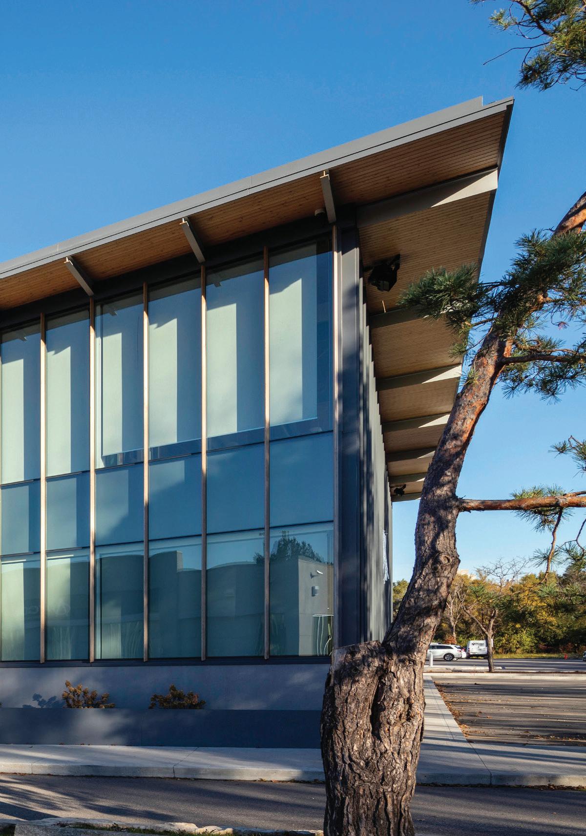


Coupled with the continuity of natural light, these architectural features knit the buildings into a harmonious whole, and create a new sense of place and connection, while paying homage to the building’s industrial origins. As industrial mid-century buildings reach the end of their life cycle, this project is a valuable case study in how these buildings can be adapted to meet current needs, while raising the bar on building sustainably.
Jury Comment :: The jury appreciated 31 Scarsdale Road foremost for its important recognition that the preservation and renovation of existing building stock is one of the most important choices societies can make when considering sustainable building. Putting forward sober means and passive bioclimatic strategies, the project is well executed with straightforward details that create a light-filled environment.
LEFT 31 Scarsdale Road transformed a three-building warehouse and office complex into a cohesive set of modern office spaces. TOP In the rear building, exposed Douglas Fir decking was chosen to soften the structure’s existing open-web steel joists. ABOVE A light-filled atrium in the front building provides high-quality common spaces for tenants.
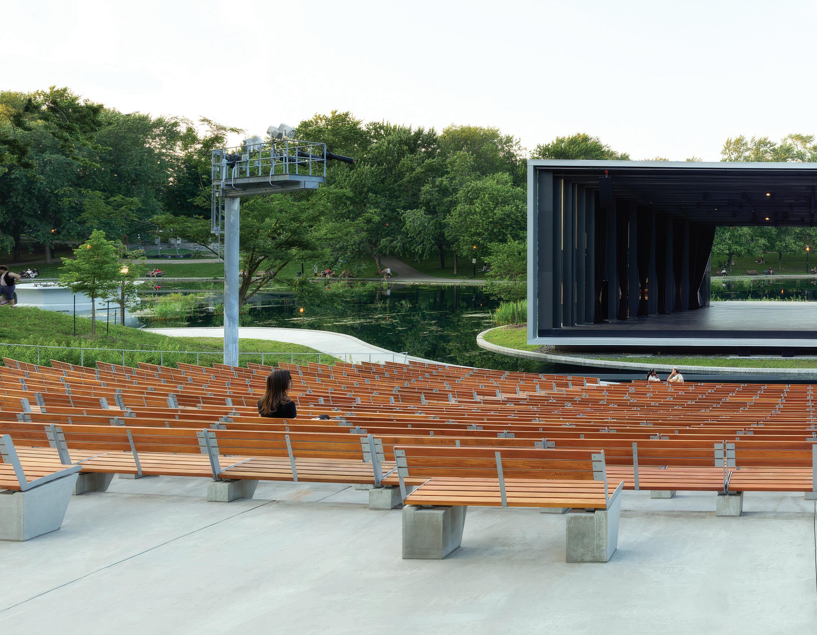
ARCHITECT Lemay
LOCATION Montreal, Quebec
PHOTO Adrien Williams
The Théâtre de Verdure is an iconic venue in the heart of Montreal’s Parc La Fontaine. The original amphitheatre and modernist stage opened in 1956, but was shuttered in 2014 due to obsolescent equipment.
To bring art back to the centre of the park, the venue required a complete overhaul. The vision for the new Théâtre de Verdure is based on the relationship between landscape and architecture, and the dematerialization of architecture to showcase the site, making art and culture accessible and visible to all.
The new theatre is built on the footprint of the previous structure, with the stage delicately placed on an island at the end of the park’s artificial lake, and the stones from the old theatre salvaged for sitework. The approach to the theatre has been completely reworked, with multiple access points from which the stage gradually appears through the trees. The theatre’s 2,500 seats are set in tiers within a natural amphitheatre.
From the stage, the curtain opens to a theatre set against the backdrop of landscape sober, modern, dynamic in harmony with the historic memory of the place and Montreal’s unique cultural identity.
All of the theatre’s elements are embedded in the landscape, from its stage and backstage to its lake-view dressing rooms, storage rooms, control room, reception, rest areas, and green room. Support functions are carefully concealed under the seats, and multifunctional service areas extend out towards the park, enhancing the heritage character of the site and inviting exploration both inside and outside this urban oasis.
In line with the City of Montreal’s sustainable development policy for buildings, the design aimed to promote general well-being, while having a minimal impact on the environment. The theatre’s existing canopy was preserved, and local species were selected for new plantings.
When the stage lights come up, theatre takes on the scale of the
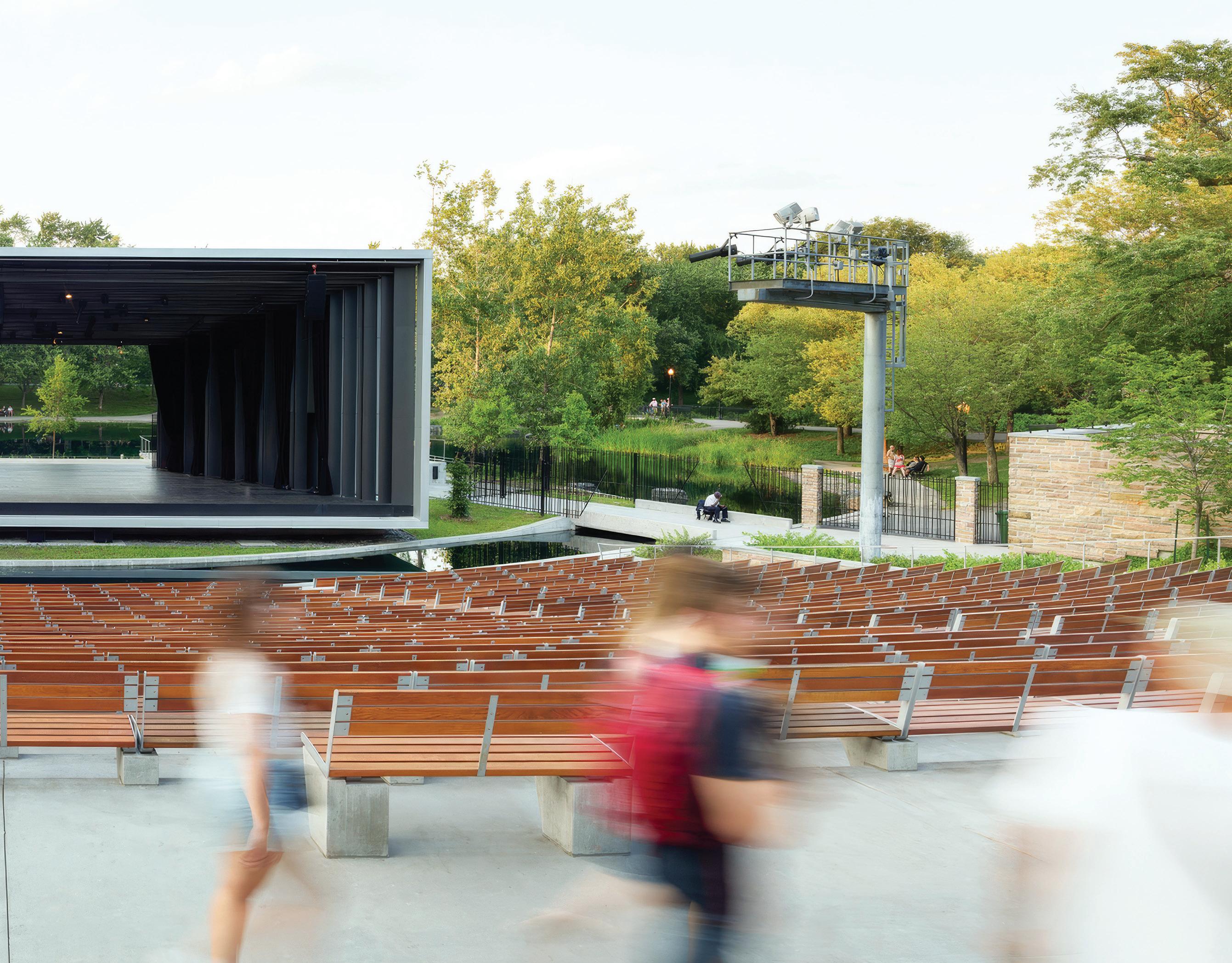
landscape as the performance resonates out and into the park, and art and place come alive together.
Jury Comment :: The redevelopment of Montreal’s Théâtre de Verdure has breathed new life into Parc La Fontaine and created a public amenity which is positively contributing to the urban landscape of the city once again. The building becomes a theatrical play in itself, with the observer becoming an active participant in the way one experiences the journey through the park, with glimpses of and through the building. The idyllic setting is enhanced by the theatre being set on the water. This creates the illusion that the building is delicately floating, creating transparency and capturing views of nature beyond. The well-considered laying of materials and lightness of structure makes this project a delight to experience and a sensitive addition to the park.
ABOVE The rear of the redeveloped Théâtre de Verdure opens fully, connecting the stage to spectators throughout Montreal’s Parc La Fontaine, and allowing the theatre to integrate discretely with its landscape surroundings.
CLIENT VILLE DE MONTRÉAL | ARCHITECTURE AND LANDSCAPE TEAM ERIC PELLETIER (MRAIC), MARIA BENECH, MARIE-EVE PARENT, VALÉRIE T. GRAVEL, YANICK CASAULT, MARC-ANDRÉ LEMAIRE-PERREAULT, MARYSE BALLARD, ARNAUD VILLARD, FRANCOIS MÉNARD, JEAN DESLAURIERS, ERIC ST-PIERRE, PHILIPPE LAFRANCE, DANIEL SMITH, ALEJANDRO MENDOZA VAZQUEZ, DONALD LAVOIE LANDSCAPE LEMAY MECHANICAL/ELECTRICAL BOUTHILLETTE PARIZEAU | STRUCTURAL CALCULATEC CIVIL MARCHAND HOULE | THEATRE TRIZART ALLIANCE | LIGHTING OMBRAGES | FORESTRY NADEAU FORESTERIE CONTRACTOR AXE CONSTRUCTION | AREA SITE— 7,825 M2; BUILDING—635 M2 BUDGET $11.5 M COMPLETION JUNE 2022

ARCHITECT Daoust Lestage Lizotte Stecker
LOCATION Quebec City, Quebec
PHOTOS Adrien Williams, unless otherwise noted
The recently concluded third phase of the Promenade Samuel-De Champlain, completed fifteen years after the inaugural phase by the same design team, offers a continuation of the design language, while evolving to provide distinct and enhanced visitor amenities.
The site transforms what was previously a desolate expanse of highways and rail corridors into an urban boulevard with a significant recreational and cultural riverfront. The primary goal of the project was to return the river to the people of Quebec. The architectural vision embraced a comprehensive, multidisciplinary approach, encompassing all scales from the masterplan down to urban furniture and signage.
Drawing inspiration from the area’s history rooted in the timber trade and shipbuilding, the architectural language centres on wood. Phase 3 also includes an urban beach that is open and accessible to all, reminiscent of the beloved Plage du Foulon that animated the area in the previous century.
The design of the beach area’s Pavillon des Baigneurs is composed of two elongated rectangular volumes. The first volume, in granite, extends from the curvilinear beach wall, while the second, fashioned from wood, sits atop the granite base, offering panoramic views of the landscape. The strategic use of high-performance glass blurs the boundaries between interior and exterior, while the interior’s white wood pays homage to the sunny character of coastal locales.
A seamless connection is created between the infinity pool swimming area, the shallow Mirror of Water, and the river, offering the illusion of bathing and strolling within the river’s embrace. A sandy beach and sea lyme grass plantings contribute to a resort-like landscape, tailored to the unique character of the waterway.
Flanking the beach, the promenade unfolds with areas including picnic platforms, gardens that mimic the coastal meadows, a dockside trail that highlights a restored marshland, and architectural elements such as the Pavillon de la Côte, the Frontenac Quay, and the Pavillon de la Voile. Biodiversity was restored to this neglected area with the planting of 1,055 trees, 28,950 shrubs, and 117,000 native herbaceous plants.
The outcome of this multidisciplinary effort is a project seamlessly woven into its environment and a place that has been a resounding success among visitors. The Promenade Samuel-De Champlain is a source of collective pride and identity, offering users a meaningful, enjoyable experience while making positive contributions to public health, ecology, biodiversity, and climate action.
Jury Comment :: The Promenade Samuel-De Champlain - Phase 3 project continues the requalification of the riverfront on the north shore of the St. Lawrence River, in front of Quebec City. Initiated fifteen
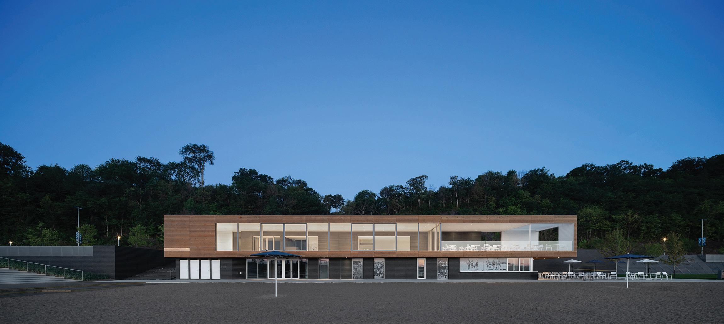

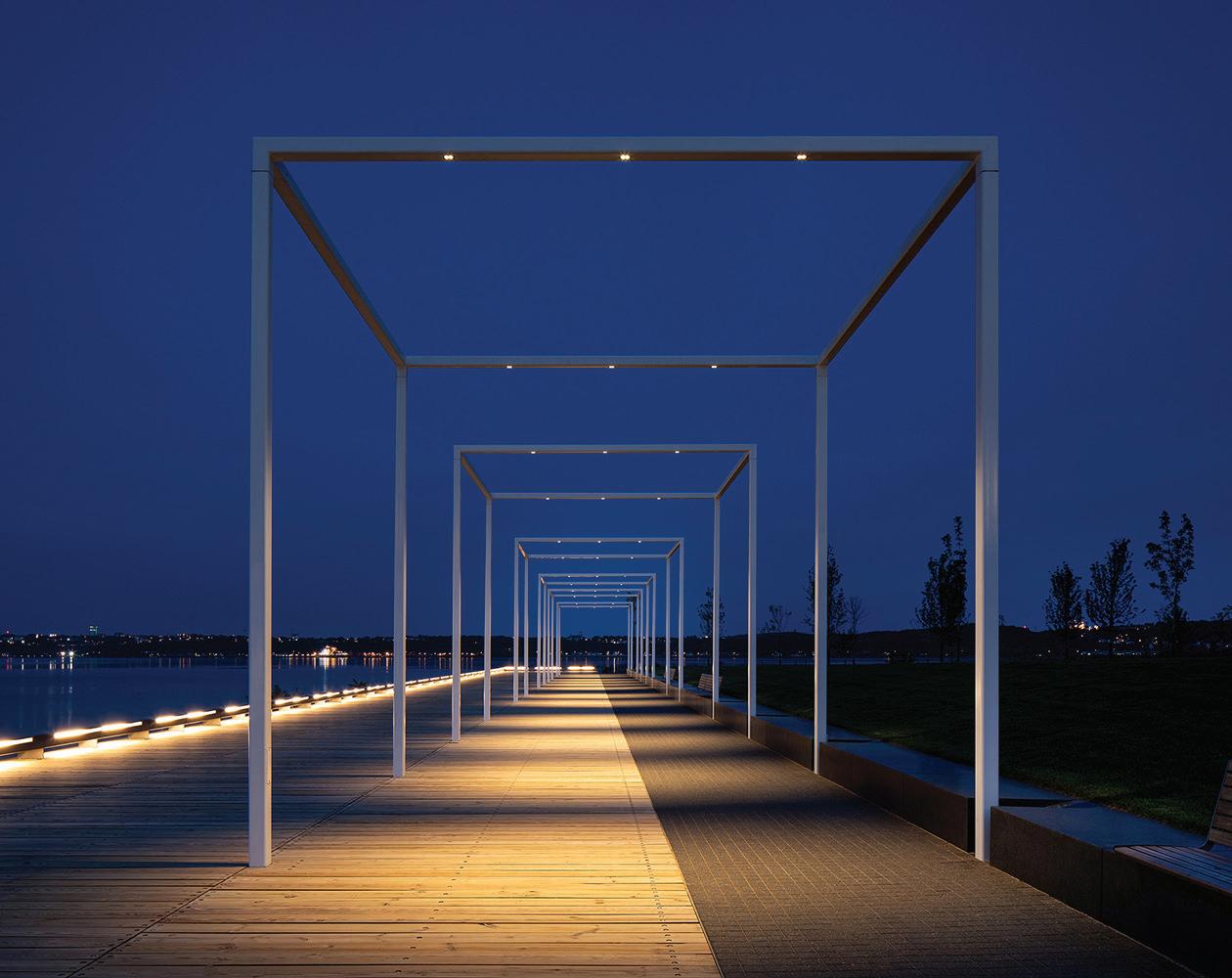
OPPOSITE The 6.8-kilometre-long Promenade is tied together by continuous, multi-use pathways. In the new Beach sector, a granite retaining wall echoes the form and materiality of the nearby cliffs. TOP The Pavillon des Baigneurs includes public washrooms and changerooms, topped by a restaurant and terrace. ABOVE LEFT An infinity-edge swimming pool creates the illusion of plunging into the St. Lawrence River. ABOVE RIGHT Open structures frame views of the river and pay homage to the wooden piers of the past.
years ago, the project has enabled the transformation of a heavy industrial zone bordered by traffic infrastructures.
The jury appreciated the clarity of the architectural intentions, their sobriety, and the remarkable quality of execution of the interventions. The architecture takes full account of the river landscape and engages in dialogue with it. The jury underlines that only the collective support of a strong development vision, endorsed and supported by successive governments over time, has enabled the coherent and integrated realization of such a major urban project, which the population has rapidly embraced.
CLIENT COMMISSION DE LA CAPITALE NATIONALE DU QUÉBEC (CCNQ) | PROJECT MANAGER SOCIÉTÉ QUÉBÉCOISE DES INFRASTRUCTURES (SQI) | LEAD DESIGNER (ARCHITECTURE, URBAN DESIGN, LANDSCAPE) DAOUST LESTAGE LIZOTTE STECKER—RÉAL LESTAGE, ERIC LIZOTTE, CAROLINE BEAULIEU, LUCIE BIBEAU, GRÉGORY TAILLON, DAVID GILBERT, MÉLISSA SIMARD, LUCA FORTIN, MARIA
BENECH ARCHITECTURE DAOUST LESTAGE LIZOTTE STECKER | CONSORTIUM - LANDSCAPE DAOUST LESTAGE LIZOTTE STECKER, OPTION AMÉNAGEMENT ET WILLIAMS ASSELIN ACKAOUI
PARTNER MINISTÈRE DES TRANSPORTS ET DE LA MOBILITÉ DURABLE | ENGINEERING ATKINSRÉALIS, WSP, TETRA TECH | PROCESS ENGINEERING FRANÇOIS MÉNARD | CONSTRUCTION MANAGER POMERLEAU CONTRACTORS CONSTRUCTION BML (STATION DE LA CÔTE, STATION DE LA VOILE AND BOULEVARD); CONSTRUCTION DERIC (STATION DE LA PLAGE, MIRROR OF WATER AND THE SWIMMING AREA); CONSTRUCTION CITADELLE (PAVILLON DE LA CÔTE AND PAVILLON DE LA VOILE); BAUVAIS & VERRET (PAVILLON DES BAIGNEURS) AREA 150,000 M2 (PROMENADE) + 1,200 M2 (BUILDINGS) | BUDGET $135 M COMPLETION JULY 2023
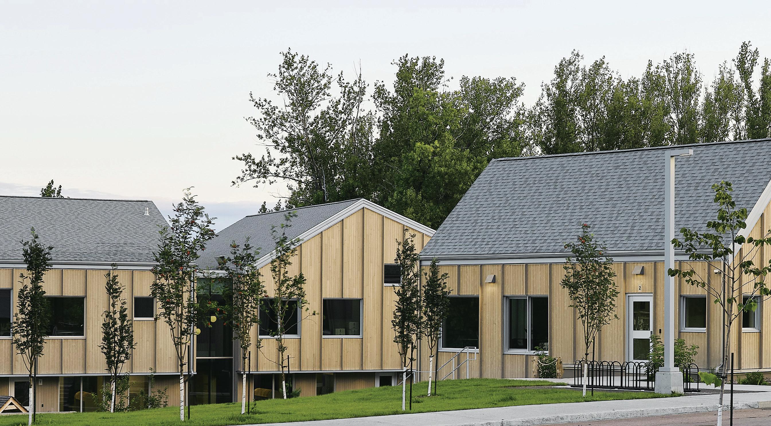
ARCHITECTS Agence Spatiale – APPAREIL Architecture –BGLA Architecture
LOCATION Chicoutimi, Quebec
PHOTOS Maxime Brouillet
Located in the Chicoutimi district north of Quebec City, the École de l’Étincelle exemplifies architecture rooted in its context. The design reimagines the conventional school as a welcoming, accessible environment for children. Built to resemble of grouping of vernacular house forms, the design aims to create a reassuring and familiar home-like atmosphere.
Inside, the school is divided into three distinct sections. The section facing the street houses administrative offices on the ground floor and kindergarten classrooms on the garden level, linking the youngest students directly to the playground.
The central section redefines the traditional library as a community learning hub. This area is designed to be open to locals outside of school hours. In the middle, bleachers serve as gathering and collaboration spaces. To one side, the Creative Lab is a maker space equipped with the latest technology. On the other end, the Culinary Lab is a place where produce harvested from the school garden can be cooked and shared with students and the community.
The final section, containing classrooms, is articulated as three smaller peaked-roof houses, each an intimate mini-school for a single grade.
Collaborative spaces at the centre of each classroom cluster mimic public squares to encourage mutual support and teamwork. Sunlit interstitial spaces connect the houses and open to the courtyard, inviting informal gatherings.
The Chalet, a distinctive element of the program, is a space for children with special needs. It includes a small living room, kitchen, and dining area, providing a safe space for discussions, building trust, and developing social skills.
The landscaping extends spaces for learning and discovery beyond the school walls. Designed with the area’s northern location in mind, the U-shaped layout creates a microclimate with a sports track, an outdoor classroom, a vegetable garden, individual and group play zones, and a sheltered area for use during inclement weather. The design encourages free, open-ended play by enhancing the site’s natural topography with mounds and surfaces for climbing and sliding.
Jury Comment :: Stemming from a new Quebec elementary school program, which is based on the development of spaces that enable
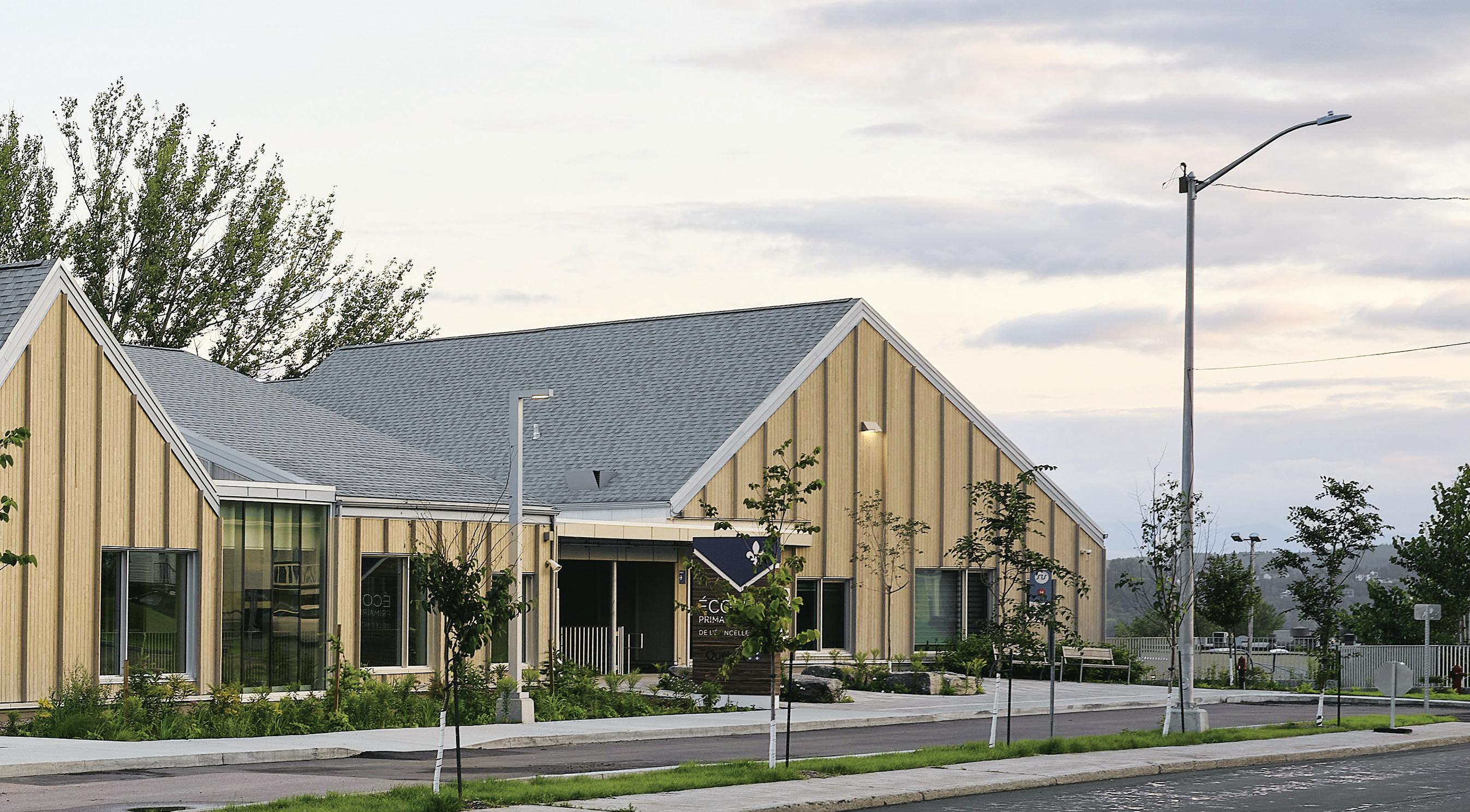
ABOVE Part of the provincial Lab-école program for new schools, the École de L’Étincelle takes shape as a series of house-like forms surrounding a courtyard. RIGHT The school’s central section is designed as a learning lab with gathering areas, a maker space, and a community kitchen.
a diversity of learning activities and promote collaboration, the École de l’Étincelle proposes an original solution, organized around the courtyard. The jury notes the interest of this organization, which favours intuitive orientation for children wherever they are in the school, and offers, on the first floor, a direct relationship between each classroom occupied by the youngest pupils and the outdoor space. The scale of the building, divided into modules reminiscent of a house, contributes to the children’s sense of ownership and comfort. The jury salutes the substantial use of wood (structure, exterior cladding, interior finishes, integrated furniture), which gives the school a strong identity and helps reduce its carbon footprint.
CLIENT COMMISSION SCOLAIRE DES RIVES DU SAGUENAY | ARCHITECT TEAM STÉPHAN GILBERT (BGLA), KIM PARISEAU (APPAREIL ARCHITECTURE), ÉTIENNE BERNIER (AGENCE SPATIALE), LYDIA LAVOIE (BGLA), MARC-OLIVIER CHAMPAGNE-THOMAS (APPAREIL ARCHITECTURE), JOHANIE BOIVIN (PREVIOUSLY WITH AGENCE SPATIALE), JÉRÔME DUVAL (AGENCE SPATIALE), PASCAL DROLET (BGLA) | CONTRACTOR AMEC CONSTRUCTION INC. | ENGINEERS LGT (NOW WSP | LANDSCAPE COLLECTIF ESCARGO + ROUSSEAU LEFEBVRE ENVIRONMENT/SUSTAINABILITY MARTIN ROY & ASSOCIÉS | MEP PRO-SAG MECHANICAL INC | ARTIST MATHIEU VALADE AREA 3,577 M2 | BUDGET $16.75 M
COMPLETION MARCH 2023
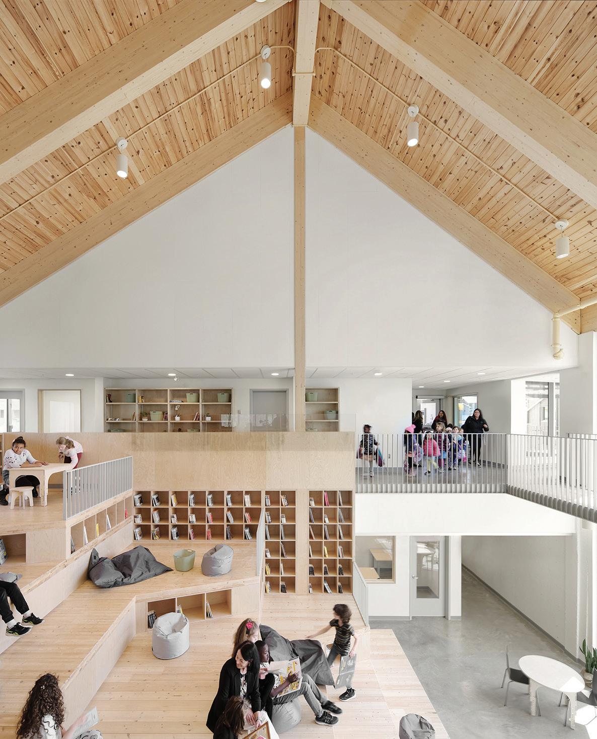
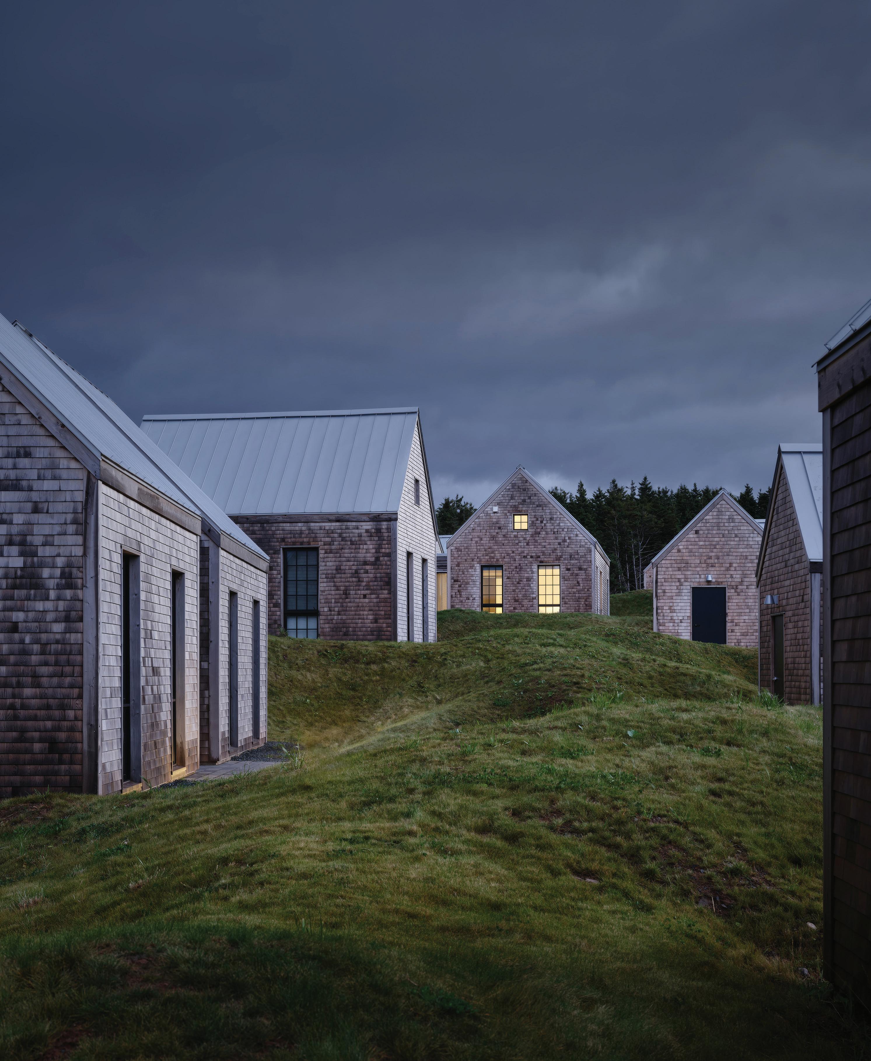
ARCHITECT FBM Architecture | Interior Design
LOCATION Inverness, Cape Breton, Nova Scotia
PHOTOS Doublespace Photography
Located on the rugged west coast of Cape Breton Island, Cabot Cliffs is among the most celebrated golf destinations in the world. The design of the walking-only links course, by Bill Coore and Ben Crenshaw, is profoundly sensitive to its dramatic landscape, and to the experience of topography, views, vegetation, and wind, in tandem with the game itself.
The architecture at Cabot Cliffs echoes this sentiment with its relationship between landscape, building, and human play. This begins with sensitivity to the historical and cultural context of the area. The region was once home to extensive coal-mining activity; the demise of the coal industry destroyed the livelihood of the town and left a contaminated landscape. The Cabot golf courses (Links and Cliffs), and the associated tourist economy, have brought employment to the region. New development at these courses bolsters the community’s resilience by creating a year-round construction industry. Wood construction is very much a part of the vernacular of rural Cape Breton, and this material selection allowed the buildings to be constructed from local products, by local tradespeople.
The brief for the project was to design eight seasonal holiday homes with four-to-five-bedroom suites, a Halfway Hut to provide refreshment along the course, and a Pro Shop. Additional buildings, including two-to-three-bedroom homes, a restaurant, and a thermal bath, are to be added in the future.
To allow for the seamless addition of these future programs, an incremental and adaptable approach to the architecture was adopted. A kitof-parts of typological forms was developed, comprising single-storey gabled sheds, bedrooms, and kitchen/living/dining rooms, joined together by flat interstitial roofs.
In the first phase, these forms are arranged in various combinations and orientations, creating unique dwellings that sit playfully on the site while remaining similar in materiality and scale. Cedar shingle walls and galvalume roofs scatter across the sand dune and fescue grass landscape. Black masonry fireplaces punctuate the horizon, providing cozy spaces to watch the course while linking the earth to the vast sky. The planting around the homes, considered an extension of the links landscape and part of the larger ecosystem, uses drought-tolerant fescue grass to reduce the need for intensive irrigation.
The houses’ interiors offer a rich spatial experience, where the corridors linking spaces expand into full-height gabled volumes that bring daylight into gathering and sleeping spaces. The communal kitchen/ living/dining areas create dynamic social spaces, while each home is oriented to provide privacy with doors and windows that open to refreshing ocean breezes and decks.
The modern aesthetic of the homes underscores the idea that a large house can still feel like an airy seaside cottage and, when combined, they create a village at the edge of the ocean.
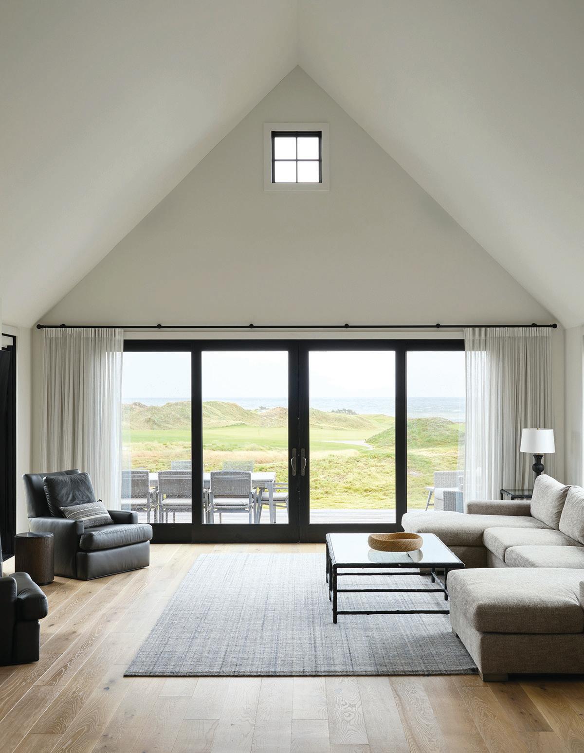
OPPOSITE Cabot Cliff’s seasonal holiday homes are tucked into the grassy dunes adjoining the celebrated links course. ABOVE The interiors of the houses include full-height gabled living areas. Doors and windows are oriented to provide privacy as well as sweeping views.
Jury Comment :: The jury noted the contextual response and materiality, as a refreshing departure for this landscape-driven recreation residence. The simple wood vernacular traditions of Cape Breton aligns with the dramatic landscape. The jury also noted the social connections offered by the communal kitchen, dining and living areas, which allows this village to go beyond typical recreation properties. The result is an architecture that is rooted in the place, offering a connection with the natural setting - complete with natural pathways and views to the ocean. The sustainable approach includes regional construction that employed local craftspeople, vernacular plantings to control erosion and low irrigation plants. The jury also noted the innovative kit of parts assembly that can be replicated to support incremental growth.
ALICIA MCDOWELL, STAVROS KONDEAS, RITA WANG, STEPHEN HEWITSON, BEN GRIFFITHS, SHAWN DOYLE, DANNY GOODZ | STRUCTURAL BMR STRUCTURAL

TEXT Jake Nicholson
There is constant foot traffic at the corner of Erb Street West and Caroline Street North, an intersection at the edge of downtown Waterloo, Ontario, close to both the University of Waterloo and Wilfrid Laurier University. That’s how I originally came to know this area, meeting it on-foot as a self-important undergrad taking the scenic route home from the WLU library in the mid-aughts. In overt ways, the place contributed to my education, and it has followed me around ever since.
Of the buildings on this corner, four have been recognized with Governor General’s Medals in Architecture. The first of these was given in 1986 for a renovation and expansion of what was then the Seagram Museum; the most recent was given in 2014, for a new building: the home of the Centre for International Governance Innovation (CIGI). The other two award-winners are the Canadian Clay & Glass Gallery (awarded in 1997) and the Perimeter Institute for Theoretical Physics (awarded in 2006). Over the 38 years from ’86 to the present day, the surrounding neighbourhood has densified significantly, defining an area now referred to as “Uptown Waterloo.” Within this context, the intersection of Erb and Caroline acts as a transition for pedestrians between a well-used public park and the nearby commercial thoroughfare of King Street.
There are other places where you can find similar high densities of nationally recognized architectural projects (the University of Toronto’s Mississauga Campus springs to mind), but Erb and Caroline is distinct in that it isn’t a campus presided over by a single client group or mandate. Its buildings were each designed for different organizations, all of them with their own missions, goals, and personalities; and this
is legible within the finished work. It’s as though clients and designers quietly conspired that nothing would cut it for this corner except for thoughtful, elegant buildings.
The Seagram Museum the site’s original award-winner was designed by Barton Myers Associates, and is a deeply unusual mash-up of postmodernism and adaptive reuse. I don’t levy that as a criticism; it’s more-or-less a statement of fact about a project that I like. The building also includes one of the most indelible spaces that I’ve ever encountered: a five-storey atrium ringed by preserved barrel-racks from the Seagram distillery’s adjacent historic warehouse. The wood is rich and warm, and the place has a welcoming intricacy about it, like a nowstagnant Rube Goldberg device that could conceivably end its protocol by pouring you a glass of rye.
The Seagram Museum closed in ’97, but the building still stands today. It was repurposed as an early home for CIGI (before the completion of their more recent facility) and then repurposed again as commercial office space for a couple of Waterloo’s well-known tech companies. Happily, the Museum’s original atrium is still there.
Of the four Governor General’s Medal-winning projects at the Erb and Caroline intersection, the Canadian Clay & Glass Gallery (Patkau Architects) is unquestionably the project that I know the best. That knowledge comes honestly from time spent with the building. I volunteered at the gallery as a student in my 20s, helping to take down and set up exhibitions. Then, I was hired as a part-time bartender for weddings in the space, and then hired again as the gallery’s Marketing and Development Assistant (my first “real job” out of university).
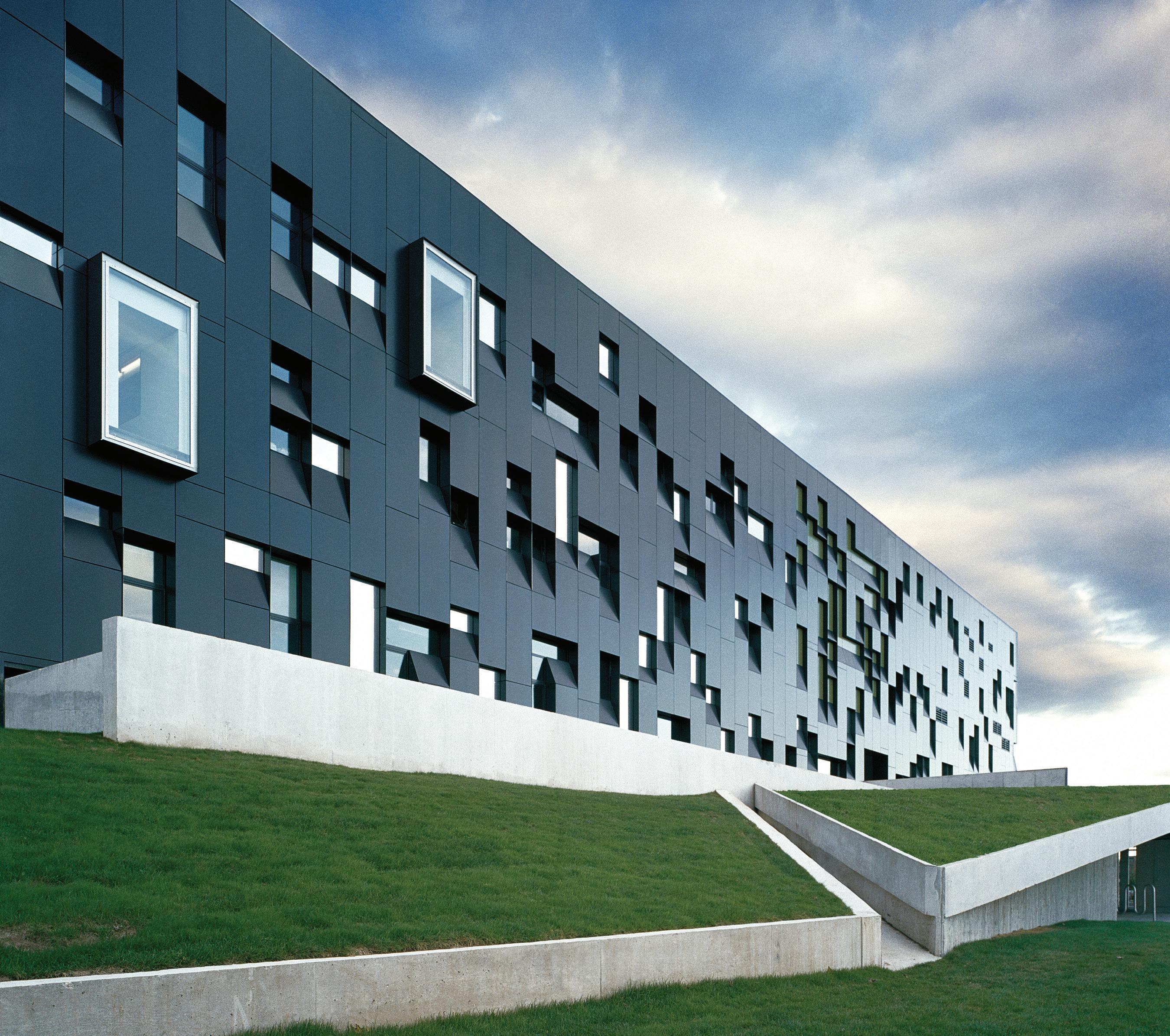
OPPOSITE The KPMB-designed Centre for International Governance Innovation (CIGI) is one of four Governor General’s Medal-winning buildings at the corner of Erb and Caroline Streets in downtown Waterloo, Ontario. ABOVE The original Perimeter Institute for Theoretical Physics building, designed by Saucier + Perrotte architectes, features an inventive façade composed from pixel-like office and meeting room windows.
When I say that I know the Gallery, I mean that I’ve helped to repaint its walls in exhibition grey. I’ve worked in its offices. I’ve tended bar in its cylindrical concrete interior gallery. I’ve been there late at night and early in the morning. Throughout all that time, the design of the place never stopped working on me. The building made the art better, and the art returned the favour. The people too (in my estimation) recognized they were working in a special environment and allotted their care accordingly. The Gallery was a spectacular venue for events. Only a few years after Canada legalized same-sex marriage in 2005, I bartended a wedding between two men who shut the place down dancing together in one of the happiest moments that I can ever remember witnessing: the slow-dancing couple, laughing under the lights within this elegant space,
surrounded by ecstatic onlookers. I was only an observer, but I remember it still. Part of that comes down to history. Part of that is sentimentality and the genuine happiness of the moment. In my mind’s eye, that scene was also beautifully framed by the space.
By chance, when I visited last year, the Gallery was in the midst of a show to celebrate its 25th anniversary. The place was largely as I remembered, in a way that made me conscientious of how much I had changed (me now in my late 30s, nervous about my two boisterous young children in a gift shop full of highly breakable items). This will always be one of the best tricks of the built environment: it moves through time ever-so-slightly more slowly than we do: “I’m an aging mortal, but these custom wood doors are just how I left them.”
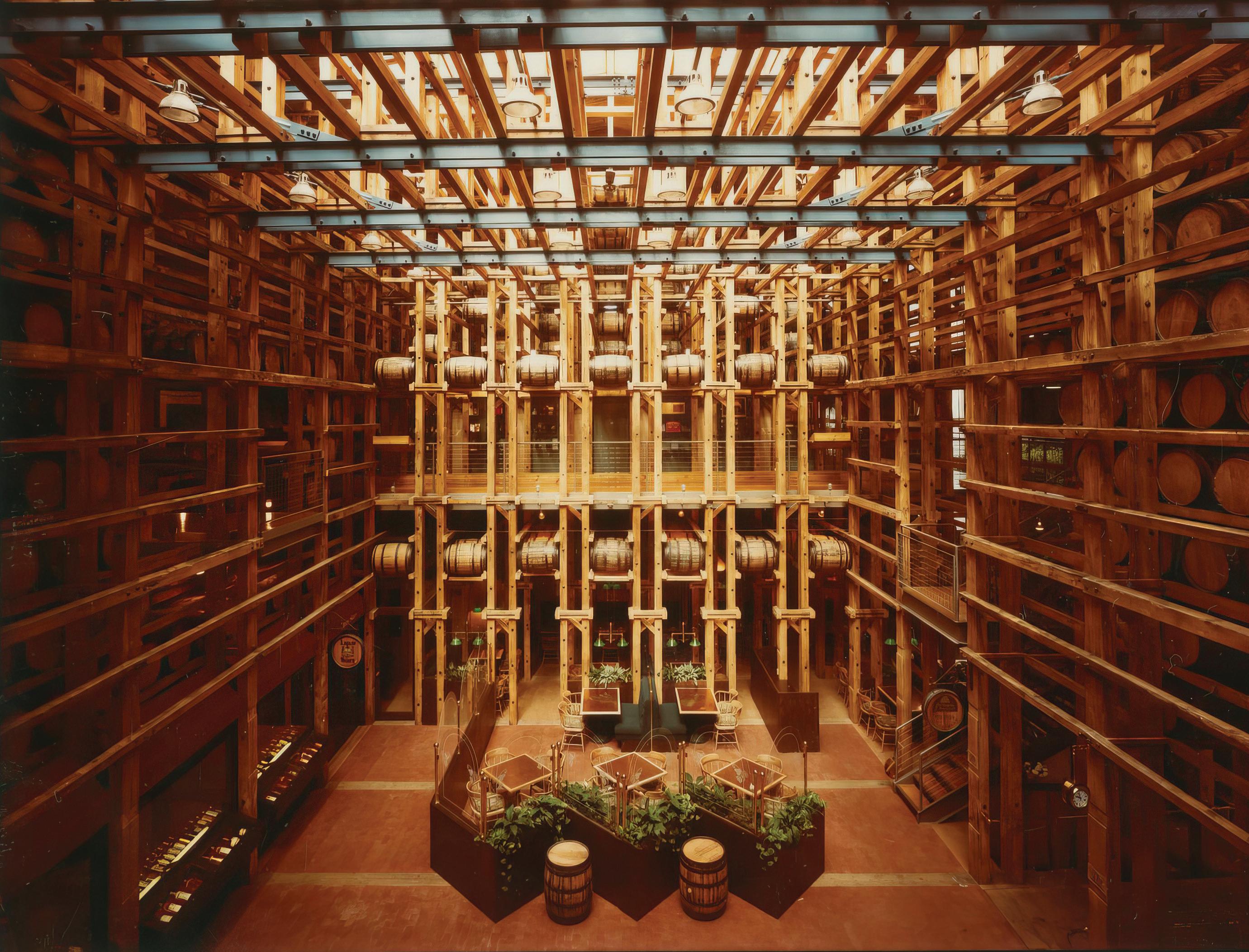
The Perimeter Institute for Theoretical Physics (PI) is a building in two distinct parts. The original structure, completed in 2004 and designed by Saucier + Perrotte, was awarded a Governor General’s Medal for Architecture in 2006. In 2012, the Institute was expanded with an addition-renovation project designed by Teeple Architects: the Stephen Hawking Centre, an award-winning project in its own right. I largely remember the original PI building from the outside, looking in at night. I remember a sense of “we’re all still up at this hour” solidarity with anybody I observed working out in the facility’s first-floor fitness centre, or puttering away in their meticulously considered office modules. The latter are visible as distinct rectangular “particles” when viewed from outside. Looking at the Institute in this way taught me lessons about how the details of a workplace can be better designed for its functional purposes. Within PI ’s offices, walls were painted as chalkboard, a medium (apparently) unmatched for considering problems in theoretical physics. I think about this every time I have occasion to set up a new workspace for myself, and I’ve never managed anything half as clever. Chalkboard paint walls are more common now than they were at the time, but PI is their best potential use. There’s something beautiful about extremely advanced physics problems that you don’t get in other chalkboard paint applications (like say, coffee
shop menus or a child’s bedroom accent wall). There’s also an admirable clarity to the original building. It puts something normally inaccessible to people on display in a way that is appealing, making the incomprehensible feel legible, inviting even.
Shortly after the completion of PI, Waterloo was recognized as the world’s “Top Intelligent Community 2007.” Not all the credit for this belongs to the buildings at Erb and Caroline, but a couple of them were mentioned in the press release I found on CIGI ’s website. I remember the news being mentioned in a staff meeting in 2007 when I was working at the Gallery. Even though I’m prone to cynicism, I wore this news like a mental badge of honour.
The CIGI building, designed by KPMB , is a well-considered addition to the site, clearly caring about both its context and being a respectful neighbour. CIGI is a non-partisan think tank founded by former Blackberry execs Jim Balsillie and Mike Lazaridis, and operates collaboratively between Waterloo’s two universities. Influenced by campus design, the building boasts handsome materials and a robust structure that feeds its sense of belonging on this site. In seeing the finished building for the first time last year, I thought about its designers, and their determination to realize a continuity of design excellence for this special place. I think they were successful.
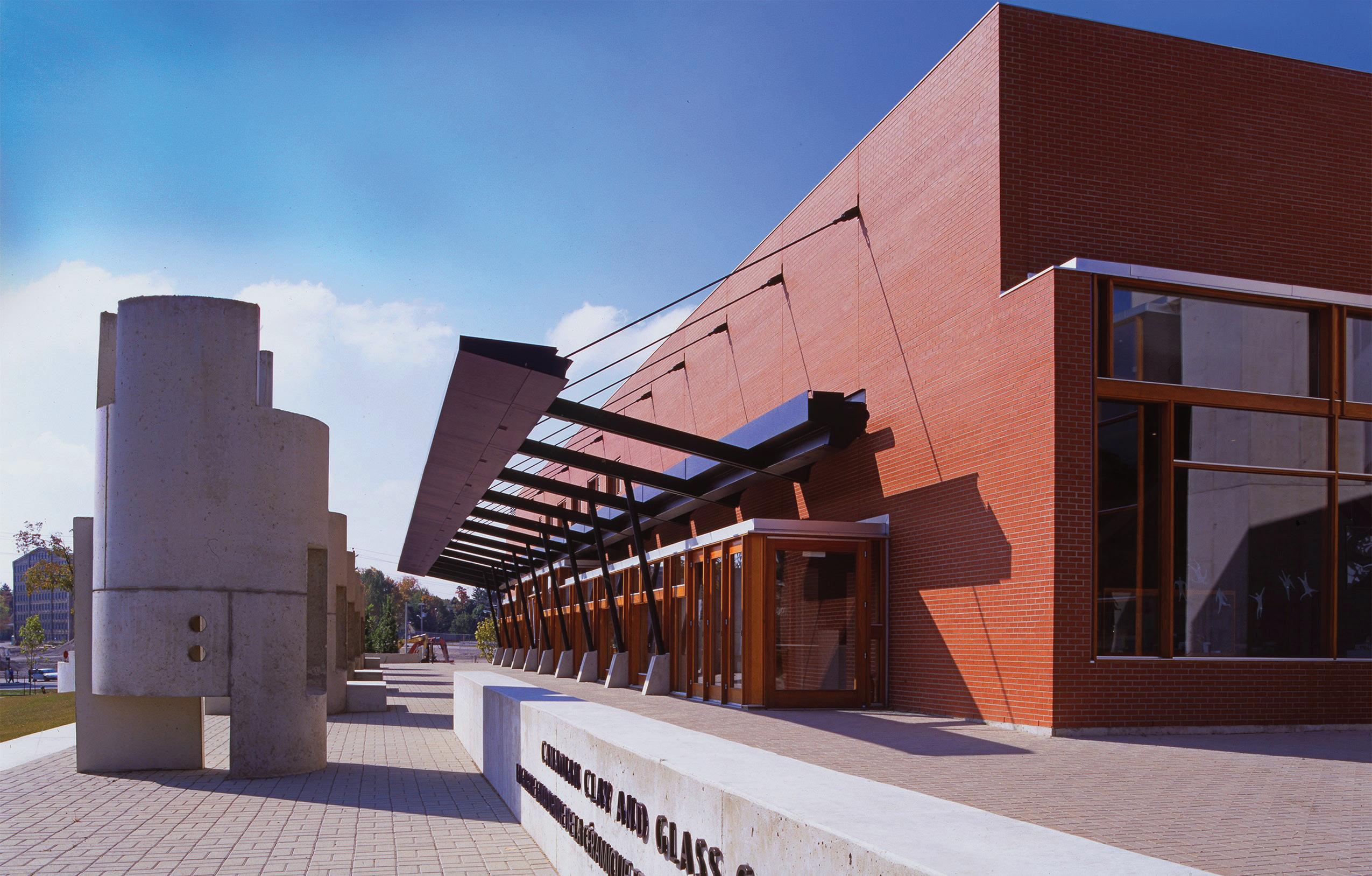
What does it take to cultivate this type of distinct little corner?
There are the obvious things the backing of willing money, decadesworth of time, and a continuity of focused attention by talented designers. The culture and history of Waterloo is also a contributor to the overall DNA of the place. The intersection is a veritable history lesson in how a former industrial site can evolve beautifully into a place focused on technology and academics. You could also see it as a city’s architectural expression of the importance of art, governance, science, and technology. I think both outlooks are valid. There is something utopian about the place, and I chalk that up to the architecture. Personally, this intersection served as my introduction into the workforce. Moreover, it showed me the care and importance that people place upon their wildly different professional disciplines, across hundreds of years of history: from distillery barrels to theoretical physics. The corner framed this notion with some of the best designed buildings that this country has to offer. To the extent that a street corner can shape a personality, I think this one transformed me for the better.
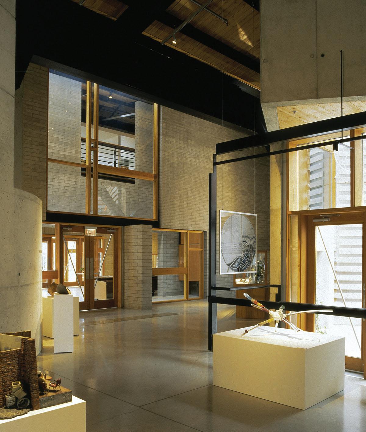
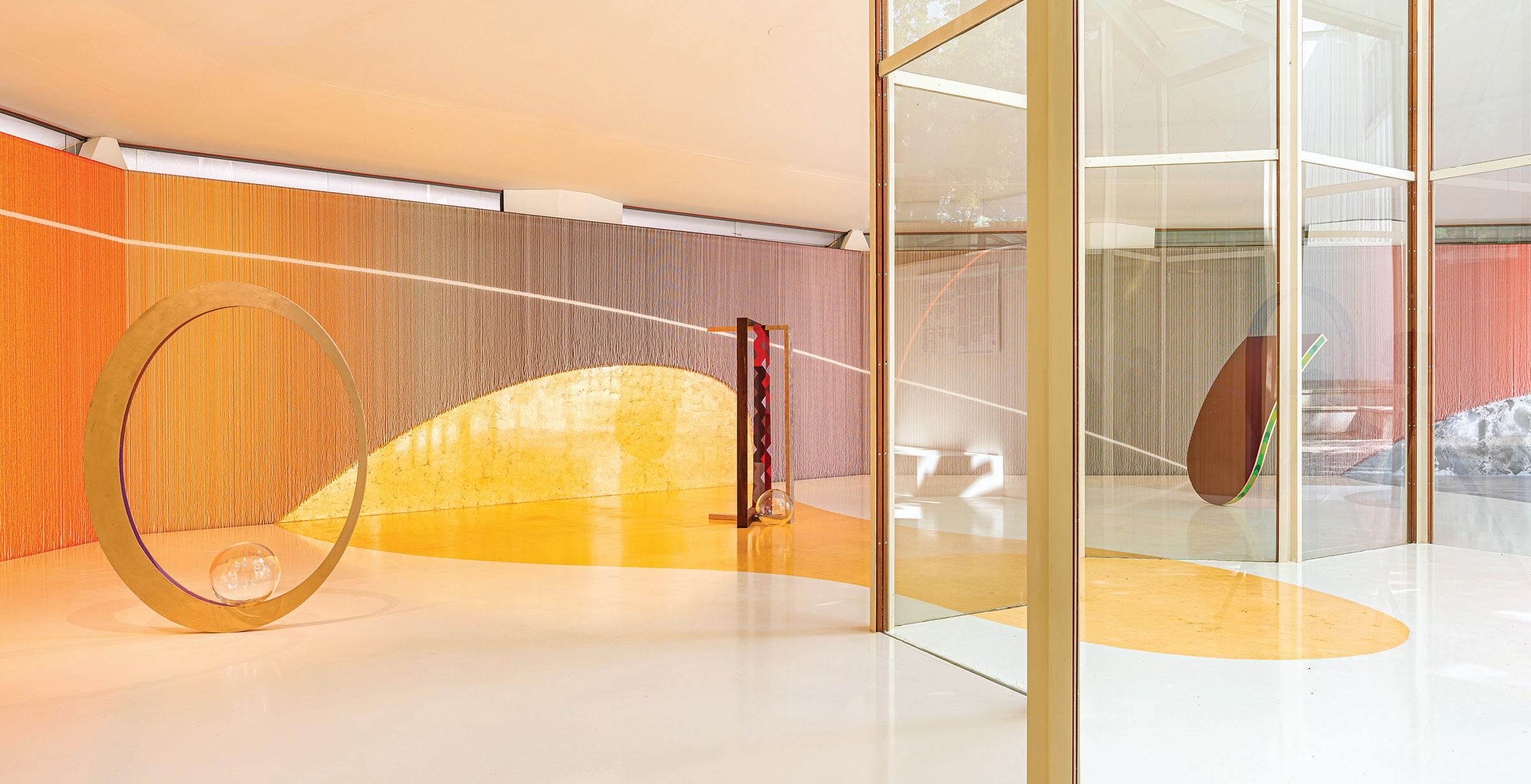
TEXT Peter Sealy
Artist Kapwani Kiwanga’s installation in the Canada Pavilion at this year’s Venice Art Biennale is a stunning delight. Commissioned by the National Gallery of Canada and curated by Gaëtane Verna, Kiwanga’s Trinket features millions of suspended Venetian conterie, or seed beads, whose presence transforms the pavilion’s surfaces with their delicate, shimmering appearance. Enfolded within the beads’ elusive beauty is a provocative commentary upon the exploitative imbalances which fuelled colonial commerce, for which seed beads were often used as currency. Trinket thus reminds its viewers of Venice’s history as a centre for artisanal glasswork and expansionist mercantilism, thereby querying the sources of the wealth behind the city’s grandeur.
The care with which the beads have been installed offers a beautiful homage to the BBPRdesigned 1957 Canada Pavilion, one of the great works of postwar Italian modernism. While the pavilion is sometimes critiqued as a difficult space in which to exhibit, Kiwanga’s installation is perfectly calibrated to its surroundings. The details of the suspended strings of beads are exquisite, and bear the close scrutiny of an in-person examination. Just as the pavilion itself was thoughtfully


designed around two trees growing on its site, the strings of beads have been carefully installed around exit signs, fire alarms and other accoutrements which punctuate modern buildings. A temporary raised floor, slightly removed from the walls, allows the beads to fall into a shallow reveal. The resulting effect emphasizes the vertical continuity of the iridescent bead surfaces.
Displayed within the pavilion are several sculptures made from more beads, and from other valuable materials used in colonial commerce, such as blown glass, Pernambuco wood, copper, bronze, and palladium leaf. The resulting composition honours not only BBPR’s design, but also the Renaissance city’s tradition of using sculpture and painting to complete architecture.
Curated by São Paulo Museum of Art Artistic Director Adriano Pedrosa, this year’s Biennale was organized under the theme Foreigners Everywhere, and celebrates Indigenous, queer, and folk artists—many now deceased—whose works have not previously been shown at the Biennale. The theme stands in defence of multiplicity and outsider-ness (for we are all strangers in certain contexts) against current xenophobic trends in global politics and culture.
While the national pavilions are free to chart their own courses, it is fruitful to reflect upon Kiwanga’s work through this lens. At the pavilion’s opening, Elissa Golberg, Canada’s ambassador to Italy, described Canada as a place where one finds foreigners everywhere. While such a comment invites further scrutiny (especially when seen from the perspective of Indigenous Canadians), one could find far worse places to begin defining our national identity.
While Kiwanga’s masterpiece is on display in Venice until November 24, 2024, another exhibition at the National Gallery in Ottawa this summer helps to complete our understanding of beadwork as a medium of material culture, artistic endeavour, and collective identity. Radical Stitch features Indigenous artists’ beading works—many of which are truly stunning— in a celebration of this medium of cultural selfexpression. Taken together, Trinket and Radical Stitch elevate beadwork while inviting us to question: which materials have value, and why?
Architectural historian Peter Sealy is an Assistant Professor at the


