Canadian Architect December 2016

Page 1

CANADIAN ARCHITECT DEC/16

2016 CANADIAN ARCHITECT AWARDS OF EXCELLENCE

THE OFFICIAL MAGAZINE OF THE RAIC

16-12-05 8:23 AM

CA Dec cov FIN .indd 1

$6.95

DEC/16 V.61 N.12

COMPLEXITY

COAST CAPITAL HEAD OFFICE Vancouver, BC

CERNER WORLD CAMPUS Kansas City, MO

Flynn designed a seamless curtain wall system that fits over the dramatic positive and negative slopes of Coast Capital Savings’ new headquarters.

FLYNN GROUP OF COMPANIES

Flynn’s work at the Cerner World Campus, which included the Cerner Icon Tower shown here, garnered two different awards from the American Institute of Architects.

TOTAL BUILDING ENVELOPE TOTAL BUILDING ENVELOPE

dps-template.indd 1 ca dec 16.indd 2

2016-11-29 9:28 AM


IS SKIN DEEP

YORK UNIVERSITY Toronto, ON

The Bergeron Centre at York University features 10,000 triangles of metal and glass, a facade of nine different radii, arranged in a mathematically-generated pattern. Capped off with a stunning green roof.

NOVA CENTRE Halifax, NS

The Nova Centre in Halifax features 34-foot window panels, the largest our Toronto manufacturing facility has ever produced.

VISIT FLYNNCOMPANIES.COM FOR MORE INFORMATION

11/16/2016 11:36:52 AM ca dec 16.indd 3

2016-11-29 9:28 AM


ca dec 16.indd 4

2016-11-29 9:28 AM


ca dec 16.indd 5

2016-11-29 9:28 AM


ca dec 16.indd 6

16-12-05 8:16 AM


ca dec 16.indd 7

16-12-05 8:16 AM


OKO SKIN EXTRUDED CONCRETE PLANKS; PRIVATE RESIDENCE SAUNA, MAISHOFEN, AUSTRIA; PHOTO: RIEDER GROUP SOUND SOLUTIONS INNOVATIVE ARCHITECTURAL PRODUCTS 389 DEERHURST DRIVE BRAMPTON, ONTARIO CANADA TEL: 1.800.667.2776 OR 416.740.0303

WWW.SOUNDSOLUTIONS.CA

SSOL076_CanArch_v1.indd 1

2016-10-25 2:10 PM

ca dec 16.indd 8

2016-11-29 9:28 AM


2016 CANADIAN ARCHITECT AWARDS OF EXCELLENCE

24 B arry Johns (Architecture) Limited

h3 (lead design architect) with 28 g Morrison Hershfield (prime consultant)

32 K ANVA

36 KANVA

40 L eckie Studio Architecture + Design

42 S TUFF (Studio for Transformative Urban Forms and Fields)

44 5468796 Architecture

46 Batay-Csorba Architects

09

CANADIAN ARCHITECT

DECEMBER 2016

˝

48 h eneghan peng architects and Kearns Mancini Architects in collaboration

50 P rovencher_Roy and GLCRM Architects

14 AWARDS OF EXCELLENCE

Jurors Patricia Patkau, David Sisam and Manon Asselin consider the strong competition for this year’s awards, and discuss their selection of projects that embody modesty, generosity and innovation.

18 WINNING TEAMS

Profiles of the 2016 award recipients.

58 LIST OF ENTRANTS

˝ Vass, The University 52 Lorınc of British Columbia

54 A lec Ring, The University of British Columbia

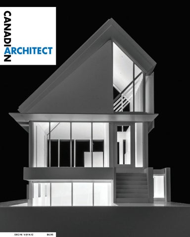
Rendering of Infillhaus by Barry Johns (Architecture) Limited.

COVER

V.61 N.12 THE NATIONAL REVIEW OF DESIGN AND PRACTICE / THE OFFICIAL MAGAZINE OF THE RAIC

5 2:10 PM ca dec 16.indd 9

2016-11-29 9:28 AM


THOMAS BILLINGSLEY

CANADIAN ARCHITECT 12/16

VIEWPOINT

10

LEFT TO RIGHT Bing Wing Thom, 1940-2016; Theodore Fujio (Ted) Teshima, 1938-2016.

ca dec 16.indd 10

ART DIRECTOR ROY GAIOT ASSISTANT EDITOR SHANNON MOORE

Visionary Leaders The Canadian architecture community has recently lost two giants of the profession: Bing Thom and Ted Teshima. Thom’s office is tucked at the edge of downtown Vancouver, and I first met him there a few years ago. At that time, he never entered competitions unless invited. He handpicked clients. He had visions for building links between cultural institutions in Canada and his native Hong Kong. I was in the presence of an immense intellect, strategist and master of his craft—but I also felt Thom had all the time in the world to chat with a curious journalist. At a lecture in Toronto the other year, when he received the inaugural Margolese National Design for Living Prize, Thom described approaching a new project in Dallas, Texas by first meandering through the streets with quiet intent, observing the particular colours of the city’s sky, earth and river. Similarly, he listened with seriousness to his clients—both those who paid for his buildings, but also (and especially) those who would ultimately use them. At Surrey City Centre, for instance, he built a university and office tower around a nondescript one-storey shopping mall, keeping it operational during construction because it was an important gathering spot for locals. In the final project, the mall’s roof has been removed, and an atrium soars above it. Thom was not afraid to be outspoken. He publicly criticized the Canada House pavilion at the 2010 Olympics, and argued against a proposal for a casino in the city—positions that other architects held privately, but few aired for fear of damaging relations with future clients. I asked Thom, after his Toronto lecture, how he came to his insights, which he backed with such passionate conviction. He replied, “Mindfulness meditation—half an hour every morning and every night.” This personal practice was perhaps also behind his relaxed, confident demeanour—a quality of presence that couldn’t help but affect everyone who was lucky enough to interact with him. While I never met Ted Teshima, from the tributes offered at a recent Toronto celebration of his life, he was by all accounts a similarly thoughtful, kind and collaborative leader. “He was a gentleman—and a gentle man,” offered

­­EDITOR ELSA LAM, MRAIC

EDITORIAL ADVISOR IAN CHODIKOFF, OAA, FRAIC

Wally Eley of Crossey Engineering, who worked with him on numerous projects, large and small, over the past decades. Zool Samji, a client representative for the Aga Khan Museum and Ismaili Centre in Toronto and the Delegation of the Ismaili Imamat in Ottawa, spoke of Teshima’s inner calmness and resolve, care for the built environment, and belief in creating quality buildings that would stand the test of time. As a team leader, said Samji, Teshima fostered an enabling and welcoming atmosphere that allowed all around him to succeed. Raymond Moriyama, FRAIC, who brought on Teshima as a partner to his then-12-year-old firm in 1970, simply described Teshima by saying, “he was the best.” Over almost four decades of working together, Moriyama couldn’t recall a single instance when Teshima raised his voice. His son, Paul Teshima, confirmed that Ted “never got angry.” He said, “but you could disappoint him, which was ten times worse.” On vacations, said Paul, they would sometimes visit architectural projects that Teshima competed for but didn’t win. Teshima did not criticize them, but rather learned from them, seeing how others approached a problem that he himself had been deeply immersed in. Thom and Teshima’s accomplishments were hard-won. Both grew their practices during a period when Asian-Canadians were still not fully integrated in Canadian society. Thom’s father had been an early immigrant to Canada, but had then returned to Hong Kong, embittered at the racist policies of that era. Teshima, like Moriyama, went through several years of childhood in a Japanese internment camp. Some years ago, a personality study of successful architects concluded that, in general, these top dogs are obsessive, stubborn, and somewhat surly to deal with—traits we might still associate with the stereotypical “starchitect.” In contrast, Thom and Teshima were certainly devoted to their values: but they were also humble, generous, optimistic and wise. Our heroes were also exceptional Canadians, in the highest and finest sense of the word. Elsa Lam

CONTRIBUTING EDITORS ANNMARIE ADAMS, FRAIC ODILE HÉNAULT DOUGLAS MACLEOD, NCARB, MRAIC REGIONAL CORRESPONDENTS HALIFAX CHRISTINE MACY, OAA REGINA BERNARD FLAMAN, SAA MONTREAL DAVID THEODORE CALGARY GRAHAM LIVESEY, MRAIC WINNIPEG LISA LANDRUM, MAA, AIA, MRAIC VANCOUVER ADELE WEDER PUBLISHER TOM ARKELL 416-441-2085 x105 SALES MANAGER FARIA AHMED 416-441-2085 x106 CUSTOMER SERVICE / PRODUCTION LAURA MOFFATT 416-441-2085 x104 CIRCULATION CIRCULATION@CANADIANARCHITECT.COM PRESIDENT OF IQ BUSINESS MEDIA INC. ALEX PAPANOU HEAD OFFICE 101 DUNCAN MILL ROAD, SUITE 302 TORONTO, ON M3B 1Z3 TELEPHONE 416-441-2085 E-MAIL elam@canadianarchitect.com WEBSITE www.canadianarchitect.com Canadian Architect is published monthly by iQ Business Media Inc.. The editors have made every reasonable effort to provide accurate and authoritative information, but they assume no liability for the accuracy or completeness of the text, or its fitness for any particular purpose. Subscription Rates Canada: $54.95 plus applicable taxes for one year; $87.95 plus applicable taxes for two years (HST – #80456 2965 RT0001). Price per single copy: $6.95. Students (prepaid with student ID, includes taxes): $27.00 for one year. USA: $105.95 US for one year. All other foreign: $125.95 US per year. Single copy US and foreign: $10.00 US. Return undeliverable Canadian addresses to: Circulation Dept., Canadian Architect, 101 Duncan Mill Road, Suite 302 Toronto, ON M3B 1Z3. Postmaster: please forward forms 29B and 67B to 101 Duncan Mill Road, Suite 302 Toronto, ON M3B 1Z3. Printed in Canada. All rights reserved. The contents of this publication may not be re­produced either in part or in full without the consent of the copyright owner. From time to time we make our subscription list available to select companies and organizations whose product or service may interest you. If you do not wish your contact information to be made available, please contact us via one of the following methods: Telephone 416-441-2085 x104 E-mail circulation@canadianarchitect.com Mail Circulation, 101 Duncan Mill Road, Suite 302, Toronto, ON M3B 1Z3 MEMBER OF THE CANADIAN BUSINESS PRESS MEMBER OF THE ALLIANCE FOR AUDITED MEDIA PUBLICATIONS MAIL AGREEMENT #43096012 ISSN 1923-3353 (ONLINE) ISSN 0008-2872 (PRINT)

WE ACKNOWLEDGE THE FINANCIAL SUPPORT OF THE GOVERNMENT OF CANADA THROUGH THE CANADA PERIODICAL FUND (CPF) FOR OUR PUBLISHING ACTIVITIES.

ELAM@CANADIANARCHITECT.COM

17-01-05 9:37 AM

CANAM-


looks good, sounds great

reVeal serIes THE ARCHITECTURAL STEEL DECK SYSTEM THAT LOOKS AS GOOD AS IT SOUNDS The Reveal Series combines the esthetic appeal of a flat ceiling, the linear look of wood, and the inherent strength of structural steel in a remarkably versatile product line with outstanding acoustic properties. Explore the full potential of Reveal’s unique shapes, lines, colors, and acoustic options for projects that require standout looks and noise reducing performance. Find out how our BuildMaster approach can help you build faster and better by optimizing planning, design, and delivery at every step of the way.

canam-construction.com 1-866-466-8769

CANAM-PUB PLEINE PAGE-CanadianArchitect.indd 1 ca dec 16.indd 11

16-05-06 11:44 2016-11-29 9:28 AM


U

B Request a sample today EngineeredAssemblies.com | #brilliantbuildings

   

ca dec 16.indd 12

16-12-05 8:13 AM


Uniting the house of design with the field of construction

ABCP architecture, Monastère des Augustines, Quebec

Beauty and strength of natural timber.

ca dec 16.indd 13

16-12-05 8:13 AM


CANADIAN ARCHITECT 12/16

14

MODESTY AND GENEROSITY

FOR THE 49TH ANNUAL CANADIAN ARCHITECT AWARDS OF EXCELLENCE, JURORS MANON ASSELIN, DAVID SISAM AND PATRICIA PATKAU SELECTED TEN PROJECTS THAT EXEMPLIFY SOLID PLANNING, INNOVATIVE THINKING AND A STRONG SENSE OF SOCIAL PURPOSE.

ca dec 16.indd 14

2016-11-29 9:35 AM


15

CANADIAN ARCHITECT 12/16

AWARDS OF EXCELLENCE

The Art Gallery of Hamilton by Their + Curran Architects knits together the surrounding urban fabric. ABOVE RIGHT Ryerson University’s Daphne Cockwell Health Sciences Complex by Perkins+Will Canada provides a new passageway into the campus.

ABOVE LEFT

For 49 years, the Canadian Architect Awards of Excellence program has celebrated projects in the design stage. This year, our jury—consisting of Manon Asselin, MRAIC, Patricia Patkau, FRAIC and David Sisam, FRAIC—picked 10 winning projects from nearly 150 submissions, following two days of deliberation on the quality, importance and future of Canadian design. The jurors were drawn to projects that exuded modesty and generosity, which they believe will have a strong ability to sustain their quality. “What will a project look like in 20 years?” asked Sisam. “It’s a test of endurance, which speaks to the importance and success of a building over time.” For Asselin, the most successful projects were those that demonstrated a thoughtful approach to program. “It’s not only about establishing an architecture that is aesthetically elegant, but one that is aware, efficient and significant in its purpose and design,” she said. Patkau was struck by projects that speculated about the nature of architecture and its elements. “The projects we picked offered certain insights into architecture: from framing a time-based idea of domestic space, to reimagining the wall as an urban surface, to issues of pure delight,” she said. A number of residential projects feature amongst the winners: the multi-unit dwelling Elää in Montreal by KANVA, the co-housing prototype C House in Calgary by STUFF, and an infill dwelling on a halfwidth Edmonton lot by Barry Johns. Each articulates generous ways of living within a relatively compact footprint, and gives considerable attention to the balance between private, public and semi-public spaces. Elää, for instance, creates an intimate inner courtyard that contrasts with the street-facing realm of the project; C House includes a suite of shared, patio-like spaces within. Barry Johns’ Infillhaus is the most private dwelling of the trio. But it serves as a model neighbour, adopting a modest size and avoiding views into adjoining yards, while including clerestories that pour sunlight into its loft-like living spaces. A system of flat-packed prefabricated huts by Vancouver-based Leckie Studio also received an award, with the jurors remarking on its economy of means. “It’s a handsome structure that’s quite organized with very little space,” said Sisam. Intended for backwoods use, the compact dwellings can be ganged together to create larger shelters—or kitted out for use in urban settings as tiny houses. Several housing projects captured the attention of the jurors for their innovative approaches, although they fell short of winning awards. The

ca dec 16.indd 15

Breathe Box by Calgary firm Bioi, for instance, imagined a minimal living space placed in the middle of a house that was gutted following the city’s flood. “This armature of occupation is a stable core, that can then affect the space around it according to the circumstances of daily life, or through time-based changes that occur over a lifetime,” noted Patkau. The jurors were also impressed by several projects that related deftly to their historical context. A new visitor’s pavilion for the Quebec provincial legislature by Provencher_Roy and GLCRM Architects, for instance, underscored the primacy of the heritage building by carving out space beneath its grand staircase. The design for the new Canadian Canoe Museum by heneghan peng and Kearns Mancini Architects similarly sinks down into the landscape, transforming the museum into a viewing platform towards the adjacent Trent-Severn waterway with its lift-locks. A winning project from Montreal relates to its surroundings with a playful touch. The series of inflatable arches by KANVA (a second honour for the firm in this year’s awards) lends vitality to St. Catherine Street during a protracted upcoming period of street repairs. The jurors appreciated how the system brings a bit of joy to the dismal business of street work, and could potentially be adapted for use in other locations. Certain urban submissions did not merit awards, but were nonetheless notable for their role in strengthening the surrounding built fabric—including the Art Gallery of Hamilton by Their + Curran Architects and Ryerson University’s Daphne Cockwell Health Sciences Complex by Perkins+Will Canada. “The Art Gallery of Hamilton really attempted to bind things together,” said Patkau, noting its sensitive edge treatments that will result in widened streets, retail spaces and an interior courtyard for the gallery. Sisam noted that the Ryerson University project, for its part, enabled thoughtful connections between streets. “These projects reinforce the idea that a building can go beyond satisfying its program, and also contribute to ameliorating the place that it’s set within,” he said. A similar idea was evident in certain suburban projects, such as the Columbia Valley Centre in Invermere, B.C., by SHAPE Architecture. “It made a real effort to make a connection with the main street of the town, while at the same time dealing with the suburban condition of parking and making an entrance that was generous for both,” said Sisam. The Williams Parkway Operations Centre in Brampton, Ontario, by RDH Architects, was another instance of a municipal project that added architectural quality to a suburban setting.

2016-11-29 9:37 AM


CANADIAN ARCHITECT 12/16

16

Calgary firm Bioi’s Breathe Box contains a wooden core that unfolds to provide amenities including a kitchen, bathroom and bedroom. BELOW, A church doubles as a library in this design by Dominique Laroche; the Columbia Valley Centre by B.C. firm SHAPE Architecture connects users to mountain views. OPPOSITE A view from a student installation by Michael Fohring entitled An Architecture of the Earthly Grotesque.

ABOVE

LEFT TO RIGHT

A renewed interest in the art of building was evidenced in three winning projects: an office building by Batay-Csorba Architects in Toronto’s Liberty Village, the North East Transit Garage in Edmonton by gh3, and a brewery at The Forks market in Winnipeg by 5468796 Architecture. Batay-Csorba’s office building is a contemporary take on Toronto’s ubiquitous precast concrete constructions from the 1970s. “It’s very much a play on rethinking a technology that we know,” said Asselin. Added Patkau, “It is a highly original attempt to reinvent both material solidity and experiential depth in architecture.” The Brewery at The Forks uses corten steel in an intriguing way that celebrates the material presence of architecture. The transit garage, for its part, uses custom stainless steel panels to investigate the question of surface in a rigorous manner. The jurors also applauded the garage as an exemplar of durable, well-designed infrastructure. “It’s really interesting that cities are investing in these projects,” noted Asselin. The question of municipal investment applies at all scales. While it did not receive an award, the jurors were drawn to an inventive solution for a library in Saint-Calixte de Kilkenny, Quebec by architect Dominique Laroche, which inserted bookshelves along the side aisles of an existing church, allowing both functions to co-exist in the space. During services, stained glass panels slide over the windows and inte-

ca dec 16.indd 16

grated screens cover the books. “Overlaying these things makes so much sense for smaller communities that are in need of new services, but may not have the resources to produce them,” said Asselin. Turning their attention to the next generation of architects, the jurors were particularly impressed with the depth of thinking in the student submissions. Two thesis projects—both by University of British Columbia Students—were selected for Student Awards of Excellence. Lőrinc Vass’s project addresses contested spaces in the greater Vancouver area, while Alexander Ring’s submission details a strategy for tackling sea level rise in a threatened island nation. “In most cases, the students weren’t just interested in designing elegant buildings, but in addressing very substantial issues,” said Asselin. “It’s refreshing and comforting to see young architects embracing their responsibility as the designers of tomorrow.” “The ambition of some of the students is remarkable,” added Patkau, “and many of their drawings are just fantastic.” The jurors also admired the aesthetic qualities of a cast concrete installation by Michael Fohring, a graduating student of McGill University. The winning projects that follow were ultimately chosen for their depth, optimism and insight into the issues facing architecture today. As we look to the 50th anniversary of the Awards of Excellence in 2017, we believe these winners point to a promising future in Canadian architecture.

2016-11-29 9:28 AM


David Sisam is a founding principal of Montgomery Sisam Architects in Toronto, whose commitment to design excellence and sustainability is rooted in the belief that buildings must play a dignified and lasting role for their occupants and the wider community. David has had a particular focus on a more holistic view of health, both in terms of building design and within the broader urban environment. He led the firm’s pioneering work to change the paradigm of long-term care homes from an institutional medical model to a more residential model, focused on the quality of life for the residents. He has also led the design of a number of nonhealth-related projects, including the Humber River Bicycle and Pedestrian Bridge and the Toronto Botanical Garden. An assistant professor at the University of Toronto’s School of Architecture from 1972-1983, David has been a visiting instructor at Dalhousie University and a visiting critic at many universities. Patricia Patkau is a founding partner of Patkau Architects in Vancouver. For over 30 years, her firm has insisted on a practice that integrates architectural, urban, social, environmental and cultural concerns. Projects range in scale from gallery installations to urban planning, focusing on the intricacies of local cultures, the specificities of places and the material imaginations of construction. Patkau Architects’ research arm, Patkau Studio, investigates and researches cladding systems, material-based processes, and the design of reproducible products. Throughout her career, Patricia has been engaged in both teaching and professional practice. She is currently Professor Emerita at the School of Architecture and Landscape Architecture at the University of British Columbia and a Member of the Order of Canada. She is also a recipient of the Tau Sigma Delta Gold Medal for exemplary commitment to architectural education and the practice of architecture. In conjunction with her partner, John Patkau, she received the Royal Architectural Institute of Canada’s Gold Medal in 2009.

ca dec 16.indd 17

CANADIAN ARCHITECT 12/16

17

Manon Asselin formed the Montreal-based architectural practice Atelier TAG along with her partner Katsuhiro Yamazaki in 1997. Since its inception, the studio has sought to create meaningful spaces by reinterpreting the civic function of architecture through the careful study of the socio-cultural contexts within which a given program operates. The office’s output has been rewarded for its design excellence, receiving three Governor General’s medals, the Prix de Rome in architecture from the Canada Council for the Arts, and the 2012 Emerging Voices award from the Architectural League of New York. A professor at the University of Montreal since 2008, Manon oversees core design studios and lectures on materiality, culture and constructive imaginaries. Manon has lectured on TAG’s built work and has participated in numerous national symposia. She has also served on numerous international, national and local design juries as an advocate for design excellence, including at the Canada Council for the Arts.

2016-11-29 9:28 AM


CANADIAN ARCHITECT 12/16

18

WINNING TEAMS

LEFT TO RIGHT

Bobby Harris, Barry Johns, Stephen Ellis, Wei Yew.

gh3 designs in the increasingly complex realm where architecture, urbanism and landscape overlap. The studio designs landscapes with a modernist’s eye to order, beauty and social possibility, and an environmentalist’s awareness of sustainability and long-term thinking. Applying global learning to local problems, team members bring specialized expertise in architecture, landscape architecture and urban design to each project. Thinking is grounded in knowledge, and design in creative excellence. Partners Pat Hanson, FRAIC (architecture) and Diana Gerrard (landscape) bring learning from three decades of collaboration to the design of all projects, blurring the edge between buildings and the out-of-doors. gh3 believes that the best way to encourage sustainable thinking is to bond people to their environments through deep understanding, and to make good design an indispensable part of everyday life. Creating instructive, engaging environments is an underlying principle of the studio’s work. In bringing a site- and context-specific approach to every design, and combining the tools of landscape and architecture, the studio develops

ca dec 16.indd 18

Since its founding in 1981, Barry Johns, FRAIC, and his firm Barry Johns (Architecture) Limited have sustained a local and international reputation as an innovative design practice, winning a total of 96 design awards and a small number of architectural competitions from around the world, including an Olympic Gold Medal for the Arts and the Governor General’s Medal for Architecture. Deeply influenced by a six-year tenure with Arthur Erickson Architects in the 1970s, the firm is passionate about the role of architecture as a means to leading positive change in communities. This has led to a multi-faceted practice that includes architecture and urban design, teaching, public lectures, architectural juries and public service on volunteer fundraising and professional boards across Canada. The firm’s collective design experience and reputation for sustainable buildings has enabled it to remain small and participate in a variety of rewarding collaborations with other larger Canadian practices since the 1990s, including Smith Carter (now Architecture 49), Stantec, Gibbs Gage Architects, Group2 Architecture Engineering and Perkins+Will. The firm believes in a world finally beginning to re-evaluate the need to tread lightly upon the earth, by working in harmony with nature and in the creation of architecture that champions gracious and inclusive humanistic relationships. Barry Johns currently serves as the Chancellor of the College of Fellows of the Royal Architectural Institute of Canada.

projects that are inspiring, beautiful and fundamentally modern in outlook. gh3’s integrated approach to the ground plane means that landscape, which can add so much to the quality of experience and the sustainability of building, is a fundamental and inseparable part of design. Founded in 1946, Morrison Hershfield is an employee-owned professional services firm providing engineering and management consulting services in the areas of energy and industrial, buildings, technology and telecom, transportation, environment, water and wastewater, and land development. The firm has delivered vertical and horizontal infrastructure projects from 16 offices across North America. LEFT gh3 —Pat Hanson, Diana Gerrard, Raymond Chow, Louise Clavin, Jeffrey Deng, Byron White, Joel Di Giacomo, Daehee Kim, John McKenna, Bernard Jin. RIGHT Morrison Hershfield—Catherine Karakatsanis, Haris Wijayasiri, Ali Hosseinian, Bina Puri. Missing: Andrew Aguanno.

2016-11-29 9:48 AM


Founded in 2003, KANVA is a Montreal-based multi-disciplinary collective led by Tudor Radulescu, MRAIC and Rami Bebawi, MRAIC, and made up of passionate architects whose work is at the forefront of thinking, imagining, drawing and constructing. KANVA demonstrates architecture’s transformative power through a range of disciplines and scales, from the ephemeral to the institutional, including student housing, large-scale public art installations, mixed-use buildings, museums, and corporate and public spaces. KANVA treats each project

Leckie Studio Architecture + Design is an interdisciplinary design studio based in Vancouver, Canada. The studio was founded in 2015 by architect Michael Leckie, MRAIC. It engages in the practice of design across a variety of scales and media, including architecture, interiors, installations and product design. The studio’s residential and commercial projects are informed by an environmental sensitivity that includes an

STUFF (Studio for Transformative Urban Forms and Fields) is a Winnipeg-based design studio founded in 2010 by Jae-Sung Chon. The studio focuses on designs and interventions that are generative and affective in urban living. Alongside its formal works, the studio is also actively engaged in developing collective and collaborative platforms to raise public awareness towards design as an act of urban engagement.

ca dec 16.indd 19

as an opportunity to reshape the built environment through storytelling. Each project is engaging, memorable and responsive to human experience and addresses the contemporary complexities of culture, economy, sustainability and innovation. KANVA regularly collaborates with artists, musicians and other creators in interdisciplinary research to maximize the innovative potential of a project. The collective’s vanguard work has won awards including the 2015 RAIC Emerging Architectural Practice Award, several RAIC Awards of Excellence, Canadian Architect Awards of Excellence, Ordre des Architectes du Quebec Awards of Excellence and Grands Prix du Design Awards. KANVA has been shortlisted two years in a row at the World Architecture Festival and recently won the international Space for Life architecture competition to re-imagine the Montreal Biodome.

19

CANADIAN ARCHITECT 12/16

WINNERS

LEFT TO RIGHT Joyce Yam, Olga Karpova, Tudor Radulescu, Katrine Rivard, Léon Dussault-Gagné, France Moreau, Rami Bebawi, Minh-Giao Truong, Dina Safonova, Gabriel Caya, Dale Byrns, Éloïse Ciesla, Killian O’Connor, Laurence Boutin-Laperrière.

emphasis on passive solar design and flexible, modular spaces. Its design process is committed to a rigorous process of discovery: the core of the practice relies on a deeply rooted fascination with the act of making. LEFT TO RIGHT Michael Leckie, Ryan Nelson, Emily Dovbniak, Symon Tiansay, Irena Jenei, Elaine Tat, Oskar Geyti.

In 2012, STUFF together with 5468796 Architecture led Migrating Landscapes, Canada’s official entry to the 2012 Venice Biennale in Architecture. In 2014, the firm was invited to Seoul, Korea to develop and construct a multi-family housing prototype within the context of the city’s impending renewal. This year, the studio developed and directed the Bee House Lab international design competition at the University of Manitoba, which was recognized with the AASHE Campus Sustainability Achievement Award. It will be presenting research-based projects Next Home and Para-Portal at the 2017 Seoul International Biennale on Architecture and Urbanism, curated by Alejandro Zaera-Polo and H.M. Pai. Chon’s backgrounds in urbanism (UCL), housing (McGill), architecture (Manitoba), architectural engineering (Yonsei), and research interests in the post-human urban condition and interiority are fundamental in shaping the studio’s mandate and interests. Chon has taught architecture since 1996 in Seoul, Tokyo, Shanghai, Berlin and London. He currently teaches environmental design in the faculty of architecture at the University of Manitoba. LEFT TO RIGHT

Jae-Sung Chon, Kent Mundle.

2016-11-29 9:48 AM


CANADIAN ARCHITECT 12/16

20

5468796 is a Winnipeg-based design studio established in 2007. Working around a single table, the office unites the diverse knowledge and experience of nineteen young professionals. Together, its designers believe that every client, user and civic environment—regardless of budget—deserves an outcome that advances architecture.

Batay-Csorba Architects was established in 2010 by Andrew BatayCsorba, MRAIC and Jodi Batay-Csorba as a collaborative research and development design studio. The practice was created in Los Angeles, California and moved to Toronto, bringing with it a fresh outlook to the progress of design in Canada. Jodi and Andrew designed, directed and managed over 96 internationally celebrated projects in 38 cities and 11 countries, both on their own and at Pritzker Prize-winning offices, before founding Batay-Csorba Architects. Their own work has been distinguished with international awards, published in over 60 international publications and exhibited across 19 international galleries.

heneghan peng architects is a design partnership practicing architecture, landscape and urban design. The practice was founded by ShihFu Peng and Róisín Heneghan in New York in 1999, and in 2001 opened an office in Dublin, Ireland. The firm takes a multi-disciplinary approach, and has collaborated with leading designers and engineers on a range of projects, including largescale urban masterplans, bridges, landscapes and buildings. Current and recent work includes the Grand Egyptian Museum at the Pyramids, Giant’s Causeway Visitors’ Centre, Central Park Bridges at the 2012 London Olympic Park, a library and school of architecture at the University of Greenwich in London, and a Mittelrheinbruecke in the Rhine Valley. Kearns Mancini Architects is a professional practice that leverages its design, technical and consulting expertise to transform and enhance environments for working, learning and caring. For more than 30 years, Kearns Mancini has developed a reputation for creating signature solutions for its clients that are closely attuned to their needs, providing the knowledge and expertise to help them realize their vision and goals. The firm

ca dec 16.indd 20

TOP ROW, LEFT TO RIGHT Eva Kiss, Colin Neufeld, Trent Thompson, Apollo Au, Kelsey McMahon, Renee Struthers, Ken Borton, Dazhong Yi, Johanna Hurme. BOTTOM ROW, LEFT TO RIGHT Sasa Radulovic, Caroline Inglis, Jordy Craddock, Sean Radford, Ben Greenwod, Shannon Wiebe, Jeff Kachkan, Pablo Batista, Stas Klaz, Brandon Bergem.

Batay-Csorba Architects strives to create projects that engage their context, users and the public realm. The practice is committed to creating transformative spatial experiences through the exploration of site, typology, materiality and movement. Batay-Csorba’s work is dedicated to the construction of real spaces that engage people and place, and is based on the belief that architecture has a fundamental role in shaping how people experience the world. Each project is generated through a deep reading of the site in search of unexpected relationships that can both tie it to a larger urban contribution and shape new perceptual experiences. Their work ranges from small-scale installations, graphic visualization and multi-media design, to architecture, interior design and large-scale urban planning. Batay-Csorba’s accolades include a 2015 Canadian Architect Award, a 2015 Twenty and Change Next Generation Award, a 2014 OAA Concept Award, participation in the 2012 Venice Biennale Migrating Landscapes exhibition, an AIA LA 2x8 Award, being named a guest lecturer at the 2012 Festival Abierto in Panama City, and being featured in the 2013-2014 Proteiforme Architecture Parametrique exhibition in Montreal and Quebec City. LEFT TO RIGHT

Andrew Batay-Csorba, Jodi Batay-Csorba, Michael Fohring.

is driven to truly understand and define the soul of a project, and never rest until it has found the ideal solutions—an approach that allows the end-users of the buildings to naturally become a part of their new space while being liberated by it. By deeply engaging with its clients and leading them through the best possible consultation, the firm strives to achieve amazing results. heneghan peng —Róisín Heneghan, Shih-Fu Peng. Missing: Doreen Adler, Catherine Opdebeeck, Amy McKeogh. Kearns Mancini— Jonathan Kearns, Dan McNeil. Foggy River Farm (landscape)—Phillip Collins. LEFT TO RIGHT

2016-11-29 9:59 AM


Provencher_Roy specializes in architecture, urban planning, landscape architecture, interior design and industrial design. Over the past 30 years, whether designing contemporary projects or remodeling iconic buildings, the firm has had a major impact on Montreal as well as other Canadian cities. Provencher_Roy has also developed an ability to provide established institutions with a new lease on life. The company employs more than 200 dedicated professionals working in all areas of the built environment in Canada and abroad. The firm’s portfolio demonstrates its outstanding achievements in the institutional sector, as well as in the fields of science, education and transportation buildings. Recognized in 2015 with the RAIC ’s Architectural Firm Award, Provencher_Roy has received numerous architecture and urban design awards in Canada and abroad. For more than forty years, Gagnon Letellier Cyr Ricard Mathieu et Associés architectes (GLCRM) has combined traditional services in architecture with a multidisciplinary approach that gathers specialists in architecture, interior design, planning and urban design, sustainable development, BIM and 3D modelling. After serving and developing a clientele in Quebec City’s private and public sectors, the firm began expanding its reach by creating multiple

21

CANADIAN ARCHITECT 12/16

WINNERS

regional offices targeting markets in various regions of the province and elsewhere. GLCRM’s projects include the Canadian Embassy in Berlin, the Canadian Museum of Nature in Ottawa, and the Centre Vidéotron and Jean-Lesage International Airport, both in Quebec City. The firm includes a team of fifty architects and collaborators, generating a wealth of expertise and experience in all facets of architecture and construction. More than half of the staff are architects, and many have been working with the team for more than a decade. This stability ensures continuous knowledge and expertise within the firm, allowing the studio to maintain a high quality standard in its services. The pairing of quality control methods with the pursuit of excellence has earned the team numerous awards and honours.

Provencher_Roy—Claude Provencher, Matthieu Geoffrion, Nicolas Demers-Stoddart, Maxime Giguère, Marilina Cianci, Andres Moreno, Daniel Legault, Sami Bouzouita. Missing: Émilie Banville, Maïda Beylerian, Fanette Montmartin, Franck Murat, Normand Desjardins, Karim Duranceau. GLCRM Architects—Janie Lacoursière, Josué Martineau, Jocelyn Martel, Réal St-Pierre, Suzanne Castonguay, Raphaël Hamelin, Louis-Xavier Gadoury, François Bécotte, Shirley Gagnon, Marc Letellier, Sarah Landry, Maxime Turgeon, Vincent Lavoie. Missing: Valérie Morin. LEFT TO RIGHT

Born and raised in Hungary and living in Vancouver, Lőrinc Vass is a designer with a B.F.A . in Visual Art from Simon Fraser University and a Master of Architecture from the University of British Columbia. His interests span architecture, urbanism and infrastructure. Vass has been involved in research projects ranging from representing contested Aboriginal landscapes along the coast of B.C. to documenting the socio-spatial products of real estate bubbles in Ireland, Spain and the U.S. He has also mapped the landscapes of unconventional fossil fuel extraction in Western Canada and envisioned the implications of self-driving cars on cities. Vass is currently teaching in the UBC Architecture Tokyo 2016 study abroad program, and hopes to continue explorations at the intersection of design, scholarship and education.

Alexander Ring is an intern architect who graduated from Ryerson University with a Bachelor of Architectural Science and the University of British Columbia with a Master of Architecture. Working at Adamson Associates, E.R.A. A rchitects, HCMA and Lamoureux Architect, Ring has been involved in a wide variety of projects. These include a commercial high-rise in New York, restoration and adaptive reuse work in Toronto, residential, community and faith buildings in British Columbia, community-led design projects in Canada and Kenya, and smallscale freelance design-build projects. Ring has a particular interest in the role of the architect as steward, and his realized and theoretical projects explore ways in which architecture can have agency. He is currently volunteering his project management and design expertise with not-for-profit Harambee 4 Humanity, where he is working towards the realization of Oleleshwa Primary School in the Maasai village of Ewaso Ngiro, Kenya.

ca dec 16.indd 21

2016-11-29 9:59 AM


SAFETY IN EVERY STEP. College and university stairwells serve as important connecting spaces and primary emergency routes. Stairtread solutions from nora® combine design, safety and comfort for your most heavily trafficked areas. Available in pre-shaped stair nosing, riser and tread combinations, norament® stairtreads make it easy to implement an all-in-one solution that speeds and simplifies installation.

“The way the nora all-in-one stairtread piece fits over the existing steps was just perfect. The stairs don’t look industrial any longer; they look nice, and the rubber adds an element of safety.” — Robert J. Spagnoletti manager of maintenance Syracuse University

Take the next step toward achieving an optimum learning environment at

www.nora.com/us/products/stairtreads

HiEd_FPAd_CanArch_1116.indd 1 ca dec 16.indd 22

11/8/16 1:32 PM 2016-11-29 9:28 AM

16-2436 A


6 1:32 PM

A NEW LEVEL OF SUPERHEROES Sworn to flatten your villainous subfloor problems

Ultraplan Lite

®

Able to flatten floors using about half the weight of normal self-leveling compounds

Ultraplan LSC

®

Super fluid abilities to smooth out substrates in thin layers, replacing trowel-applied counterparts

Ultraplan

®

QuickTraffic

Incredible fast-curing properties that allow for solid vinyl floor installations within 3 hours of application

Contact your local MAPEI superhero sales representative for details.

Keyword: MAPEIAmericas

16-2436 Ad_Revise_CDNArchitect_Q4_Levelers.indd 1 ca dec 16.indd 23

11/25/16 10:46 AM 2016-11-29 9:28 AM


CANADIAN ARCHITECT 12/16

24

WEST ELEVATION AND MAIN ENTRY

EAST ELEVATION

INFILLHAUS Edmonton, Alberta Barry Johns (Architecture) Limited

In the sprawling city of Edmonton, sensitive infill dwellings are a rarity. Infillhaus, originally conceived as a competition prototype, explores the merits of compact, flexible living in the prairie capital. The single detached dwelling is half the width of its neighbours, contributing to urban densification in the leafy inner-city Norwood district. The dwelling’s bedrooms are embedded in the ground, using the natural insulating capability of the earth to maintain winter warmth and to provide cooling in the summer. The living space is contained above in a high-ceilinged, pavilion-like volume, zoned between “servant” and “served” spaces by tree-like structural columns. This floor overlooks the street and backyard, with no windows peering into adjoining lots. A thin, galvanized steel canopy extends over both ends of the building, providing a simple, contemporary lid and protection against the elements. As a good neighbour, the house includes a raised entry and veranda to welcome visitors. It significantly reduces excavation and construction times by choosing a smaller footprint and opting against a full basement. The home aims to achieve net zero energy consumption—beginning with its building orientation that tracks and captures the sun’s energy from east to west, and layering in an efficient envelope, building integrated photovoltaics, and a ground source heat pump.

ca dec 16.indd 24

Manon Asselin :: This is an incredibly refreshing and charming project.

The proportions and connections are impeccable, and the design offers a surprising and unexpected solution to the need to integrate the house into the typology of the heritage neighbourhood. The architect has taken a mansion and sliced it down the middle, playing with a half profile to see what it could become.

Patricia Patkau :: The Infillhaus is carefully drawn and successful in its

presentation. It is precisely calibrated to its tight lot, and you can see how light would get in everywhere. It reads as both a Japanese temple on the side façade and a strangely warped idea of a home on the front. It’s done with such elegance, care and consideration, and is really a phenomenal little project.

David Sisam :: I am a real fan of the Charleston Single House typology,

and this one-room-deep house reminds me of that model—particularly in its challenge to residual side yards and inappropriate scale. This house inverts the conventional arrangement of having bedrooms at the top, by placing them below and raising the living areas in a very eloquent way—a piano nobile taking advantage of the volume created by the roof form. The project has a very convincing and well-considered sustainability strategy. Most of all, the project is both highly rational (using served and servant spaces) and very elegant at the same time, as illustrated by the beautiful model and clear drawings.

2016-11-29 10:06 AM


1

25

CANADIAN ARCHITECT 12/16

AWARD OF EXCELLENCE

2 5

3

6

7

3 4

6

3

SECTIONAL PERSPECTIVE 1

5

BASEMENT

MAIN FLOOR

1 STORAGE  2 PATIO  3 BEDROOOM / MEDIA / DEN  4 MECHANICAL

SOUTH ELEVATION

5 VERANDA / PORCH  6 LIVING SPACE  7 KITCHEN

0

3M

SUMMER SUN

N

WINTER SUN

NORTH ELEVATION

The detached infill house includes raised verandas at the front and rear. The main floor is a flexible open plan containing the home’s living spaces, while bedrooms are on the lower level. ABOVE, TOP TO BOTTOM Tree-like structural columns create a gentle division between “servant” and “served” spaces on the main floor; photovoltaic panels are optimally tilted towards the south; the north elevation includes screens that filter light and protect against the prevailing winds.

OPPOSITE

ca dec 16.indd 25

PREVAILING WINDS

SUN AND WIND

2016-11-29 10:07 AM


CANADIAN ARCHITECT 12/16

26

AWARD OF EXCELLENCE

ABOVE, TOP TO BOTTOM The house occupies a relatively compact footprint, providing a model for urban densification; the design sensitively balances between providing light, views and privacy to both the homeowners and their neighbours.

MAXIMUM ANNUAL SOLAR EXPOSURE

R80

R40

WIND AND PRIVACY SCREENS

BIPVS

B B

R80 STACK EFFECT

• XERISCAPE • WATER MANAGEMENT • G ROUND SOURCE HEAT PUMPS • RECYCLED MATERIAL • IAQ / NO VOCS

B-B

A A-A

R40

WATER CISTERN NET ZERO

A

6 X 6 NAT. STEEL BASE FLUSH WITH FLOOR

NATURALLY INSULATING EARTH

HARDWOOD CLAD HSS INTERIOR TREE COLUMN

CLIENT STEPHEN ELLIS | AREA 1860 FT 2 + DECKS | BUDGET WITHHELD | STATUS DEVELOPMENT PERMIT APPLICATION PENDING, ANTICIPATED COMPLETION DECEMBER 2017

ca dec 16.indd 26

2016-11-29 9:29 AM


5th INTERNATIONAL LAFARGEHOLCIM AWARDS FOR SUSTAINABLE CONSTRUCTION

Total Prizes of $2 Million We are committed to sustainable construction and projects that support PROGRESS - PEOPLE PLANET - PROSPERITY - PLACE. LafargeHolcim Awards Silver 2014 – $50,000 USD. Lieu de vie on the new Paris-Saclay university campus hosts a mix of activities including indoor and outdoor sports facilities, food outlets and various public spaces across more than 4,000 sq m of floor area. Using rough materials, robust and long lasting techniques, the “urban shelf” is organized vertically with its different activities superimposed on one another, using the roof as a panoramic playground for football and basketball games. Paris, France

LafargeHolcim Awards Gold prize – $100,000 USD. The central flower and vegetable garden at Benny Farm was always the neighborhood focus of social interaction. At the core of the design is the establishment of participatory models and investment in sustainable construction, centered on common energy, water & waste management. Montreal, Canada

Enter your project in one of these categories: l Architecture, building and civil engineering l Landscape, urban design and infrastructure l Materials, products and construction technologies Professional and Next Generation awards.

LafargeHolcim Acknowledgment Prize – $7,500 USD. The sustainable library and classroom building demonstrates environmental responsibility and stewardship for the student body and the community. Such forces are put to work in an ingenious way by the warped concrete roof that is shaped so as to increase the velocity of air currents, thus eliminating the need for mechanical ventilation. Vancouver, Canada

LafargeHolcim Acknowledgment Prize – $25,000 USD. Heritage Reframed: University building renovation and extension. The complete DFALD restores the architecture, landscape and urban design within the round of Spadina Crescent. The site’s hydrology is evident in the roof profile, shaped to guide water into pools, bio-swales and ultimately to cisterns for irrigation. Toronto, Canada

For more information: application.lafargeholcim-awards.org

ca dec 16.indd 27

2016-11-29 9:29 AM


CANADIAN ARCHITECT 12/16

28

NORTH EAST TRANSIT GARAGE Edmonton, Alberta gh3 (lead design architects) with Morrison Hershfield (prime consultant)

The North East Transit Garage is big architecture on a big site. The 38,340-square-metre building will accommodate approximately 320 workers and 300 buses, and includes the Edmonton Transit System’s administrative offices. Bordered by the Trans-Canada Highway, the Edmonton LRT corridor and Fort Road, the 9.7-hectare site was once industrial; the only artifact remaining from its previous use, a 50-metre-tall Canada Packers smokestack, is preserved. The project performs at the scale of urban infrastructure, while providing more intimately scaled amenities for transit employees. Sheathed in corrugated stainless steel panels and mirrored glass, the building has an elemen-

SITE PLAN

ca dec 16.indd 28

0

tal and simply articulated presence. It invokes the industrial legacy of the site and of modern architecture, without lapsing into nostalgia for either. Roof lanterns bring diffused natural daylight into the workplaces, while social areas such as the cafeteria enjoy views to a garden and the historic smokestack. The alignment of angled walls and a footpath create visual and physical connections across the site. The need to remove three metres of contaminated soil provides an opportunity to locate one level of employee parking under the bus storage area, freeing up space to insert a mediating landscape of trees, bio-swales and gabion walls between the vast building and the surrounding traffic.

100M

2016-11-29 10:10 AM


29

CANADIAN ARCHITECT 12/16

AWARD OF EXCELLENCE

Manon Asselin :: It’s amazing that cities are investing in architecture

for these types of utilitarian buildings, and this one is nicely done. The profile of the stainless steel custom panels is beautiful, and I like the way the same panel is shifted and modulated throughout. We see the elegance of a simple and rational construction logic at play.

Patricia Patkau :: This project is fantastic. I like how it invests itself

in the landscape (through reflection) and relates to the communities around it. Its site development is interesting as it doesn’t just disregard its neighbours as so many such buildings do. It reminds me strangely of Jorn Utzon’s Bagsvaerd church, in its quiet “industrial” repetitive massing.

David Sisam :: This project is all about the wrap. The brushed stainless

steel panels are not inexpensive, and they are skillfully deployed here— a welcome investment in a building type not usually accorded this level of design excellence. From the underground parking, one ascends through a skylit concourse, a generous welcoming gesture for all the occupants. Also encouraging is the decision to invest in significant planting around the building as a transitional landscape.

OPPOSITE TOP Custom stainless steel panels form a rhythmic skin around the transit garage, including around roof lanterns and mechanical penthouses. OPPOSITE BOTTOM Bioswales and densely planted trees help remediate the site, while creating a thick threshold between the building and its surroundings. ABOVE, TOP TO BOTTOM The historic smokestack is preserved as a beacon within the site’s large expanse; generous roof lanterns provide natural light to the main atrium; a view from the south towards the entrances to the bus storage and maintenance garage.

ca dec 16.indd 29

2016-11-29 10:10 AM


CANADIAN ARCHITECT 12/16

30

AWARD OF EXCELLENCE

ABOVE

A roof lantern with light-diffusing glass brings a wash of daylight into the tire shop and loading bays on the northwest side of the building.

FO RT RO

IL

9 YELLOW HEA D TRA

11

10

25 7

8

AD

3

4 2

12 13

1

1 BUILDING ENTRANCE 2 CONCOURSE 3 ETS ADMIN OFFICES 4 CAFÉ 5 CREDIT UNION 6 DRIVERS’ LOUNGE 7 PARTS STORAGE 8 FLEET SERVICES ADMIN 9 TRAINING AND LUNCH ROOM 10 TIRE SHOP 11 LOADING BAY 12 BUS MAINTENANCE GARAGE 13 PAINT SHOP 14 INTERIOR WASH BAYS 15 BUS PARKING GARAGE 16 BUS ENTRANCE 17 BUS EXIT 18 STEAM BAYS 19 BUS WASH MECHANICAL ROOM 20 SERVICE VEHICLE STORAGE 21 RAMP TO LOWER LEVEL PARKADE 22 DIESEL UNLOADING AREA 23 HERITAGE SMOKE STACK 24 EXIT STAIR / EXHAUST LANTERN 25 TERRACE 26 TRAINING ROOM 27 DAYCARE OUTDOOR TERRACE 28 PARKADE

23

5

14 6

24 20 15

18 19

22

16

21

17 24

LRT

GROUND FLOOR

3 SECTION

BUS CIRCULATION CAR CIRCULATION

OFFICE

26

2

27

2

15

2

28

0

50M

BUS GARAGE

CLIENT THE CITY OF EDMONTON | ENGINEERING/CODE/LEED MORRISON HERSHFIELD | LANDSCAPE GH3 | AREA 38,340 M 2 | BUDGET $123 M | STATUS UNDER CONSTRUCTION, ANTICIPATED COMPLETION OCTOBER 2018

ca dec 16.indd 30

2016-11-29 9:29 AM


VARIDESK® IS THE HEIGHT-ADJUSTABLE STANDING DESK SOLUTION FOR ANY OFFICE SPACE. • Solutions for desktops, cubicles, or full-desk replacements • Special pricing for bulk orders available

• Usually ships within 24 hours • All products require little or no assembly

Order online or call 647-243-7951

Shipping charges may be added for shipping to remote locations within Canada. See shipping details at ca.VARIDESK.com/shipping-policy. Pricing and availability subject to change. Patent and trademark information: ca.VARIDESK.com/patents | ©2016 VARIDESK®. All rights reserved

ca dec 16.indd 31

2016-11-29 9:29 AM


CANADIAN ARCHITECT 12/16

32

ELÄÄ Verdun, Quebec KANVA

Elää is a 41-unit residential complex located at the entrance to Verdun, a predominantly residential area adjacent to downtown Montreal. Instead of occupying the corner lot with a single volume, the project creates a miniature village by fragmenting the building into many volumes. The result is a porous, spatially varied environment. The volumes are articulated through a series of slight setbacks and extrusions, which help to match the project to the scale of the surrounding neighbourhood. Each unit is given both a public and a private façade, and enjoys natural light and ventilation. The exterior perimeter is clad in charred cedar, while by contrast, the interior façades and courtyards are clad with white acrylic. To animate the courtyard spaces, select walls include cables for supporting climbing vines, while a series of suspended lights creates a luminous canopy overhead. Elää aims to achieve LEED platinum certification through the creation of a long-lifespan structure that is easy to maintain. It hopes to encourage indoor-outdoor living and inspire walkability in the surrounding community. The units are net-zero ready, meaning that individual residences can achieve net-zero energy by adding solar panels to offset their use of natural gas.

ca dec 16.indd 32

ABOVE The residential complex is composed of several smaller volumes, articulated with varied setbacks. OPPOSITE The communal courtyard includes multiple access points, interspersed planting beds and vegetated walls, creating a diverse set of outdoor spaces.

Manon Asselin :: This project has that intimate quality that you find

in Montreal’s older neighbourhoods, where buildings sit on the sidewalks in the front, but have a sense of community and proximity to neighbours in the back alleyways.

Patricia Patkau :: What makes this project intimate and strong is that

interior community space. The one unit sitting out in the space breaks down the scale of the whole. Windows are carefully placed to maintain privacy for each unit while giving a sense of the larger community. It is a project where you believe that people will use their common space in ways that enhance daily life, but also in ways that build a strong local neighbourhood.

David Sisam :: This project is very well considered in terms of unit

arrangements. It is village-like, and even though the space in the courtyard is small, the windows never look into each other. Privacy isn’t compromised and units achieve cross-ventilation and multi-directional views—the courtyard perspectives are very convincing. The material palette and the environmental strategy were carefully considered. There is a real sense of place here.

2016-11-29 10:12 AM


SECOND FLOOR

ca dec 16.indd 33

0

33

CANADIAN ARCHITECT 12/16

AWARD OF EXCELLENCE

5M

2016-11-29 9:29 AM


CANADIAN ARCHITECT 12/16

34

AWARD OF EXCELLENCE

The complex includes one-storey flats as well as two-storey units; balconies and windows are interspersed throughout, allowing for ample natural light and cross-ventilating breezes; the courtyard is clad in a luminous white acrylic finish and topped with a canopy of cables and lights; planted walls allow for views of greenery from each unit.

ABOVE, CLOCKWISE FROM TOP LEFT

NORD

TYPICAL SITING POOR SUNLIGHT UNILATERAL UNITS COMMON CORRIDORS OVERSIZED VOLUME VERY LITTLE DIVERSITY IN GREEN SPACES

FRAGMENTATION OF THE BLOCK GENEROUS SUNLIGHT FRONT TO BACK UNITS VOLUMES AT THE SCALE OF THE NEIGHBOURHOOD

GREENING DIVERSIFIED GREEN SPACES VEGETATED WALL AND GROUND VARIED AMBIANCE ENVELOPPING VEGETATION

ACCESS MULTIPLE ACCESS ROUTES OF ENTRY PROMENADE EFFECT

CLIENT DISTRICT ATWATER INC. & KNIGHTSBRIDGE | STRUCTURAL L2C EXPERTS | HVAC MARTIN ROY & ASSOCIÉS | CIVIL VINCI CONSULTANTS | LANDSCAPE VLAN | AREA 11,000 FT 2 | BUDGET $5 M STATUS TENDERING, ANTICIPATED COMPLETION FALL 2017

ca dec 16.indd 34

|

2016-11-29 9:29 AM


Let a professional handle your document management and printing. Every time.

Make sure your provider is a member of the

LE TEMPS UNE CONTRE-HISTOIRE ENVIRONNEMENTALE DU CANADA MODERNE

PRESSE 16 NOVEMBRE 2016 — 9 AVRIL 2017

IT’S ALL A COUNTER-HISTORY OF THE MODERN CANADIAN ENVIRONMENT

Find a member near you today at APDSP.org

HAPPENING 16 NOVEMBER 2016 — 9 APRIL 2017

S O FA S T What goes up shouldn’t come down. Find out how Calgary’s new Building Maintenance Bylaw will help building owners prevent the risk of debris falling from buildings. • Exterior visual assessments are required every five years • Includes buildings five storeys and taller, 10 years and older • Fills the gap after the final inspection when a building is first constructed or renovated • Addresses possible safety issues before they happen

Nettoyage improvisé du pétrole déversé à Stanley Park, Vancouver, 1973. Photographie de John Denniston / Improvised oil-spill cleanup at Stanley Park, Vancouver, 1973. Photograph by John Denniston

calgary.ca/ buildingmaintenancebylaw 2016-2426

ca dec 16.indd 35

2016-11-29 9:29 AM


CANADIAN ARCHITECT 12/16

36

IMAGO Montreal, Quebec KANVA

Several blocks of St. Catherine Street, a main commercial artery in downtown Montreal, are undergoing a four-year infrastructure improvement plan. During this renewal, segments of the street will be closed to vehicular traffic, but businesses will remain open. Imago won a City of Montreal competition as a creative means of minimizing the construction process’s negative impacts. The competition sought design solutions for an “innovative urban experience” that would direct the flow of people, reduce construction-related disruptions, and disseminate information about the work and its progress. An imago is the adult stage of a winged insect. This project features modular, inflatable catenary arches with latticed intermediary members that, like a butterfly’s wing, combine lightness, strength and flexibility. Hinged at the top and anchored to concrete construction fence sections at the bottom, the connectable arch components are width-adjustable. Widened, they enclose construction work on the central roadway. When work shifts to the sidewalks along the perimeter, narrowed arches form a shelter­ ing, vaulted pedestrian corridor that can double as a temporary event space. The inflatable structures are composed from a recyclable high-resistance polymer, and their structural efficiency makes them easy to move and erect. Some of the diamond-shaped voids in the modules are left open for natural ventilation, while others are filled with translucent historical images that narrate the evolution of St. Catherine Street.

ABOVE A series of modular catenary arches is deployed as temporary protection zones during the renovation of Montreal’s St. Catherine Street. OPPOSITE, LEFT TO RIGHT The arches are hinged at the top for width adjustment to suit different phases of construction; some of the openings are filled with images from the city’s urban history.

Manon Asselin :: It’s great that the city recognizes the need for these

kinds of interventions and is investing in a temporary structure. This one is particularly intelligent because it uses air, and presumably, you can dismantle it and move it somewhere else in the future. It’s a great intervention.

Patricia Patkau :: While we have seen inflatable archways before, the

innovation here is in using an inflatable form as an urban repair tool— a band-aid for the city while things around it are under construction. It’s essentially a kind of alleviating device and a mechanism that works to everyone’s benefit. It’s a very interesting and innovative attempt to deal with a temporary and specific condition in the city of Montreal, yet it is generalizable to any city with similar disruptive situations. David Sisam :: Sections of our large cities are being dismantled because

of aging infrastructure. Given this constant state of repair and restoration, it’s encouraging to see that someone has provided funding to instil a sense of joy in the process. In some respects this light, portable and reusable inflatable structure celebrates the city’s renewal.


MODULES ARCH RIDGE ARTICULATED JOINT

OPENINGS ALLOW NATURAL VENTILATION AVOID SNOW ACCUMULATION

ENTRANCE / EXIT

SUPERVISION BOX POWER SUPPLY AIR DISTRIBUTION 1 BOX FOR 5 MODULES

ADJUSTABLE BEAM

CENTRAL AXIS

37

CANADIAN ARCHITECT 12/16

AWARD OF EXCELLENCE

INFLATED TUBES PRESTRESSED MATERIAL

HISTORICAL IMAGES

TRANSPARENT MEMBRANE MATERIAL: ETFE

CONCRETE BASE BALLAST - 2,340 KG X 2 PER MODULE (PROTECTION MTQ)

ENTRANCE / EXIT MODULE A

CHAIN FENCE- MTQ PERIMETER OF SITE

TECHNICAL DETAILS

ADJUSTABLE TECHNICAL TEXTILE FASTENERS

IMAGO ARCH ROAD WORK

ca dec 16.indd 37

CONCRETE BASE MTQ JERSEY BALLAST - 4 M LONG WEIGHT - 2,340 KG

FLEXIBLE TUBES, 75 MM DIA. CONNECTED TO BOTH PRIMARY RIDGE TUBES TO JOIN THE TWO INFLATABLE COMPARTMENTS INTO ONE

MODULE A ROTATED 180°

HSS, 200 MM DIA. HELD BETWEEN BOTH PRIMARY RIDGE TUBES WITH TECHNICAL TEXTILE FASTENERS

IMAGO ARCH SIDEWALK WORK

2016-11-29 9:29 AM


CANADIAN ARCHITECT 12/16

38

AWARD OF EXCELLENCE

While the sidewalks are being renovated, the archways transform the street into a pedestrian-only promenade and event space. BELOW, TOP TO Access paths to the commercial storefronts double as viewing areas overlooking the construction below; during streetway renovations, the inflatable structures provide a porous roof overtop of the construction workers.

ABOVE

BOTTOM

ARCH - SIDEWALK WORK LENGTH: 25,950 MM HEIGHT: 11,167 MM WIDTH: 9,363 MM

TRANSPARENT MEMBRANE FOR MERCHANT VISIBILITY; LINEAR LED LIGHTING

SECTION - SIDEWALK WORK ARCH - ROAD WORK LENGTH: 25,950 MM HEIGHT: 10,272 MM WIDTH: 13,835 MM FAÇADE PROTECTION AGAINST CONSTRUCTION DUST

OPENINGS FOR VENTILATION, NO ACCUMULATION OF SNOW ON THE STRUCTURE

INFLATABLE STRUCTURAL TUBES DIAMETER: 600 MM INFLATION PRESSURE: 60 MBAR

SECTION - ROAD WORK

CLIENT CITY OF MONTREAL | STRUCTURAL BLACKWELL | CIVIL ALTA CONSTRUCTION | LIGHTING LIGHTFACTOR | HISTORIAN PAUL-ANDRÉ LINTEAU | HERITAGE SUSAN BRONSON | ART HISTORY GABRIELLE MATHIEU | BUDGET $2.8 M | STATUS DESIGN DEVELOPMENT, ANTICIPATED COMPLETION JANUARY 2018

ca dec 16.indd 38

2016-11-29 9:29 AM


2018 source guide Product Guide for Architectural and Interior Specifications The product guide is distributed to all readers of Canadian Architect and Canadian Interiors magazines. Your listing will be seen by 12,000 architects and 8,450 interior designers in Canada. The Design Source Guide is also distributed at trade shows such as IIDEXCanada, Construct Canada and the Interior Design Show (Total circulation: 26,577 plus 5,000 trade show copies). In addition, the online listings attract upwards of 30,000 unique visitors per month. If you want to put your products in front of the A&D community, reserve your space in 2018 Design Source Guide today. www.canadianarchitect.com/design-source-guide-listing/

CANADIAN INTERIORS / CANADIAN ARCHITECT

2014

design source guide

Product guide for interior and architectural SPecification

published by

design source guide 2014 www.canadianinteriors.com www.canadianarchitect.com

ca dec 16.indd 39

cdn $16.95

PM#40069240

2016-11-29 10:20 AM


CANADIAN ARCHITECT 12/16

40

ABOVE Designed for use in remote locations, the modular shelters are prefabricated and erected with minimal site disruption and no need for heavy machinery. OPPOSITE, LEFT TO RIGHT The huts are rustic and simple in design to ensure durability, but can also be more elaborately finished for use as all-season dwellings; the flat-packed design allows the house components to be transported by air or by off-road vehicles.

THE BACKCOUNTRY HUT Leckie Studio Architecture + Design

The Backcountry Hut takes IKEA founder Ingvar Kamprad’s ideal of affordable, well-designed products “for the many people” into the realm of lodging. Created for outdoor enthusiasts, the modular hut is designed as a f lat-packed kit of parts that are easily assembled into an affordable recreation structure. Packed onto pallets, the hut’s components can be shipped by air or off-road vehicles to remote sites. Minimal site work is needed: sonotube footings sit in hand-dug holes. Volunteers can erect the engineered wood post-and-beam frame by hand, and then, using a winch and pulley system, hoist prefabricated infill panels into place. The basic 10-foot-wide module encloses 191 square feet and sleeps up to four people; additional modules can be connected to accommodate more people. Optional inserts include a propane tank, composting toilet, and a solar power storage unit. The design encourages passive cooling, and includes photovoltaic panels to be installed on the sloped roof at mid-latitudes, or on a vertical façade at high and low latitudes. A range of interior fit-out options and exterior finishes is available. This includes the possibility of furnishing the prefabricated shells to support year-round occupancy as a tiny “frontcountry” house.

ca dec 16.indd 40

Manon Asselin :: I like the cloning potential of this little hut. A DNA

module that can be copied, extended and retracted, plopped anywhere and not just used in the north. I think the drawings convey that idea very well. I also like the rawness of what’s presented on the interior, an understanding that the experience of backcountry is mainly about spending all of your time outside, and offering a simple and functional shelter when you come in.

Patricia Patkau :: This project is beautifully done. It’s careful about its

openings and its allocation of solidity and enclosure, but you don’t get a sense of claustrophobia. And when you look at the common space, it’s very minimal. You can understand the rituals of daily life that would occur here—people making meals together, being social.

David Sisam :: In a sense, this project has the same sensibility as the C House (see page 42). It’s at a different scale, but it shares the idea of flexibility and variable occupancies—a kind of economy of means—and the expression of generosity and organization achieved with very little space. The modules combine to make very handsome structures that are beautifully illustrated in the presentation.

2016-11-29 10:28 AM


41

CANADIAN ARCHITECT 12/16

AWARD OF MERIT

2 2

12 3

2 1

4 5 6 1 STRUCTURAL POST  2 STRUCTURAL BEAM  3 KNAPP CONCEALED

TIMBER CONNECTORS

4 INTERIOR CLADDING  5 DIMENSIONAL LUMBER

11

STRUCTURE  6 BATT INSULATION  7 EXTERIOR SHEATHING  8 VAPOUR BARRIER  9 VERTICAL STRAPPING 10 EXTERIOR CLADDING 11 SONOTUBE FOOTING 12 SOLAR PHOTOVOLTAIC PANEL

7 8 9 10

CLIENT THE BACKCOUNTRY HUT COMPANY | PRE-FABRICATION AND STRUCTURAL CASCADIANWOODTECH | AREA AND BUDGET 191 FT 2 ($69,000) / 527 FT 2 ($89,000) / 748 FT 2 ($119,000) / 937 FT 2 ($139,000) – ALL BUDGETS FOR SHELL ONLY | STATUS CONSTRUCTION DOCUMENTS; CONSTRUCTION OF FIRST PROTOTYPE IN SUMMER 2017

ca dec 16.indd 41

2016-11-29 10:28 AM


CANADIAN ARCHITECT 12/16

42

C HOUSE

Winnipeg, Manitoba STUFF (Studio for Transformative Urban Forms and Fields)

Described as “an urban co-habitation prototype,” C House is a co-housing concept that responds to the lifestyle needs of a wide spectrum of household types, from retired empty nesters to students sharing a space, to young families. Occupying a basement level and three above-ground storeys, the three-dimensional jigsaw of living spaces is distributed around a core of infrastructural needs, including circulation and washrooms. On either side of the core are living areas, which can be configured for various uses, as well as shared collective spaces: a communal dining space on the first level, a second-floor laundry and rest area, and a roof deck. The split-level distribution of spaces around the core, coupled with the alternating front/back orientation of the side-by-side units, allows for a balance of privacy and social interaction between the tenants. At the street edge, a set of steps invites passersby to pause, sit or converse, while simultaneously demarcating a transition between public and

ca dec 16.indd 42

ABOVE, TOP Each floor includes a service core separating two flexible spaces on split-levels. ABOVE, BOTTOM Collective spaces include a semienclosed washing and drying area. The development is wrapped by a brick screen to give it a uniform urban presence.

more private space. A planted slope in front of the building, together with wide stairways inside, encourages social encounters between tenants. The carport at the back of C House is conceived like a boathouse, with transparent doors and an upper level annex that tenants can use as a studio office or for storage. A dark brick skin, perforated with openings and brise-soleils, gives C House a unified presence at the urban level. Manon Asselin :: A number of housing projects that were submitted to the awards have circled back to the post-war preoccupation with housing. Housing, as a social concern and field of research, was subsequently somewhat abandoned by architects and became driven by developers. As a result, we have built lots of condominium projects where the most important design parameters are efficiency and cost. It’s interesting to see housing being re-invested by architects in such a sensitive

2016-11-29 10:28 AM


43

CANADIAN ARCHITECT 12/16

AWARD OF MERIT

SECTION

2

4

3

1

5

THIRD FLOOR

9 7

6

8

10

SECOND FLOOR

17

12

13

14

15

16

11

0

10M

GROUND FLOOR

18

way, with a concern for community and everyday-ness. C House is an example of this. The drawings are also very interesting and intriguing, with a surreal, almost Alice-in-Wonderland quality to them.

15 20

19

Patricia Patkau :: C House is rigorous in its exploration of program. Its

design tests the precise dimensions of the human body and makes sure that the scenarios fit inside the space. The resulting house can accommodate all sorts of different lifestyles and family units, and as you grow older, you can redefine the space to fit your needs.

David Sisam :: What I think is key about this project is that the living

spaces of the house type are not over-designed. They are calibrated to particular dimensions that work for a variety of occupation scenarios, which are tested with various furniture layouts. The core, with its potential for variable edges and stairs to either side, anchors and divides the living space. Less convincing is the exterior expression of the project as a whole.

ca dec 16.indd 43

BASEMENT

1 SLEEP  2 PARTY / SAUNA  3 STUDY  4 BATHE  5 CLEAN  6 L AUNDRY / DRYING / RESTING  7 SLEEPING

8 EATING BELOW  9 WASHING 10 GARDENING /

STORAGE / STUDIO

11 CARPORT 12 COOKING / EATING 13 PANTRY 14 LOUNGING

15 GRASS SLOPE 16 PUBLIC STEP 17 STEPS TO BACKYARD 18 COOKING 19 WASHROOM 20 STORAGE

0

5M

CLIENT GEA OK JEON | STRUCTURAL WOLFROM ENGINEERING | AREA 6,000 FT 2 (3,000 FT 2 PER UNIT) | BUDGET WITHHELD | STATUS DESIGN DEVELOPMENT, EXPECTED COMPLETION 2018

2016-11-29 10:28 AM


CANADIAN ARCHITECT 12/16

44

BREWERY AT THE FORKS Winnipeg, Manitoba 5468796 Architecture

Part addition and part renovation, the Brewery at The Forks adds 2,000 square feet of new construction adjacent to a 1,750-square-foot space in Winnipeg’s historic Forks Market. Due to height and load limitations, the existing space in the former railway facilities (dating from the early 1900s) was unsuitable for use as a full-production craft brewery. These restrictions created the opportunity for a new form inspired by the area’s industrial past. Site constraints necessitated a compact footprint, and the vertical breweries of the 1870s—organized to make efficient use of gravity—inspired a three-level distribution of functions. Malted grain stored in roof deck bins flows down to the second-floor brewery for crushing, before being transferred to the adjacent brewhouse for mashing and boiling. The final stage of production, fermentation, takes place in tall tanks on the ground floor, where brewmasters and the public sample the results. The addition interlocks with the existing building at each level, and celebrates the industrial aesthetic of the site. Its corten steel skin provides support for the significant lateral loads that result from the structure’s high centre of gravity, while framing a series of level-straddling apertures that provide intriguing glimpses of the operations within. These slivers of view encourage passersby to step inside, see the whole process, and visit the tap room.

ca dec 16.indd 44

Manon Asselin :: The formal solution proposed creates an iconic struc-

ture that coexists seamlessly with the original industrial typology while avoiding the obvious mimetic addition. It is playful and sculptural; an elegant solution derived from a quasi-machine aesthetic that creates a new harmonious ensemble.

Patricia Patkau :: The Brewery at the Forks has a handsome corten

steel cladding to it. It provides a smart and empathetic addition to the old industrial building, while stacking its program in a way that relates to pre-industrial methods of gravity-fed brewing.

David Sisam :: The brewery’s expression reflects the historic industrial

nature of the area, while its effort to engage the public is a catalyst for the area’s renewal. Programmatically it works—its vertical stacking is reminiscent of early gravity-fed breweries and establishes it as an iconic landmark. The corten steel fins are structural while allowing framed apertures in-between for viewing the process. CLIENT THE FORKS RENEWAL CORPORATION | STRUCTURAL LAVERGNE DRAWARD & ASSOCIATES INC. | AREA 1,750 FT 2 (RENOVATION) + 2,000 FT 2 (ADDITION) | BUDGET WITHHELD | STATUS CONSTRUCTION DOCUMENTS, COMPLETION EXPECTED 2018

2016-11-29 10:30 AM


1

1

1 2 LEVEL THREE (GRAIN STORAGE)  1 GRAIN BINS   2 LADDER   3 FORKS MARKET EXISTING ROOF

3

5

6 4

2 3

1

LEVEL TWO (BREWHOUSE)  1 STAIR DOWN TO FERMENTATION   2 BREW KETTLE (BOILING)   3 LAUTER TUN (MASHING)   4 COLD LIQUOR TANK   5 HOT LIQUOR TANK   6 UTILITY SINK   7 RAMP THROUGH TO MARKET

7

2 2 2 3

1

5

LEVEL ONE (FERMENTATION)  1 NEW MAIN ENTRY   2 FERMENTATION TANKS   3 STAIR UP TO BREWHOUSE   4 TAP ROOM (TASTING)   5 PATIO   6 BACK OF HOUSE (STORAGE, COOLING BLOCK, KEGGING ETC.)

0

4 6

5M

OPPOSITE A craft brewery occupies a corten steel addition to The Forks market in downtown Winnipeg. ABOVE, TOP TO BOTTOM The aesthetic of the brewery and an adjacent tasting room are inspired by the industrial past of the site; production on the tight available footprint takes its cue from historic gravity-fed brewing systems, and includes a different phase of the process on each floor.

45

CANADIAN ARCHITECT 12/16

AWARD OF MERIT


CANADIAN ARCHITECT 12/16

46

6

8

7

9

6 ROOF

2

5 3

1

GROUND FLOOR  1 STORAGE  2 CONCIERGE  3 MAIN LOBBY  4 CAFÉ  5 DELIVERY  6 CONFERENCE ROOM  7 COMMUNICATIONS ROOM  8 ELECTRICAL ROOM 9 ROOF PATIO

4

1’

5’

10’

1 2 3 4 5

/ / / / /

STORAGE CONCIERGE MAIN LOBBY CAFE DELIVERY

0

10FT

MISFIT[FIT] Toronto, Ontario Batay-Csorba Architects

Liberty Village, one of Toronto’s oldest industrial districts, has become a rapidly intensifying mixed-use neighbourhood. How does one add to the area’s unique building fabric without simply reproducing what is there, or reverting to the contemporary default of a glass curtain wall? Misfit[Fit], a new boutique office building in Liberty Village, is a compelling answer. The building references the district’s heritage brickwork, while attempting to rekindle Toronto’s faded love affair with precast concrete. Misfit[Fit] capitalizes on the economy of repetition offered by precast concrete without creating a static pattern of solid and void. A key inspiration was the neighbourhood’s old brick buildings—the way bricks protrude, shift and stack to produce ornament. Similarly, individual edges and profiles are pronounced within the precast façades, whose panels are designed with seeming disregard for adjacent units. Just two façade panels—divided into six sub-panels and created from reusable moulds—are used to produce the office building’s concrete façades. Each façade reads not as a continuous surface, but as an accumu-

ca dec 16.indd 46

lation of individual objects, revealed by the misalignment between them. Apertures are created through the removal of units, a process divorced from the stacking logic. Instead of creating a monolithic volume, the design celebrates the imperfect and tenuous characteristics of the misfit, producing new perceptual, formal and spatial effects. Manon Asselin :: This project’s expression reminds me of that period

in the Renaissance when architecture became rusticated, chunky and exaggerated. Although it’s ornate, it is the result of a pragmatic construction logic, creating a depth from its building envelope that is associated traditionally with masonry construction.

Patricia Patkau :: There’s something really original about this project.

It’s quite provocative and is smart on many levels by thinking through an old material and making it appear new. The pre-cast façade is interesting because it uses punched openings, but unlike the brick ones in

2016-11-29 10:34 AM


47

CANADIAN ARCHITECT 12/16

AWARD OF MERIT

OPPOSITE In a twist on the rigid appearance of many concrete buildings, modular precast panels are used to produce a dynamic surface that exhibits both continuities and discontinuities. ABOVE The panel profiles are most evident at the building’s corners, where the façade appears like a rough stack of blocks.

1 2

the nearby area. The openings allow the amount of light that you need without letting excessive light in. They also offer a reasonable amount of window to solid. It is environmentally smart in such considerations. This is someone really thinking through the problem—you may or may not like the result (I really like it), but anyone can appreciate the thinking. It will stop people in the street. We haven’t seen this before.

16

3

17

4

18

5

19

6

20

7 8 9 10 11

David Sisam :: It is interesting to see this rigorous investigation into the

potential of precast concrete to create a robust, highly articulated “thick” wall as an antidote to the pervasive glass curtain wall or thin brick veneer. Discontinuity, repetition and considered adjacencies create a dynamic (if rather heavy) façade. The most convincing aspect of the project is the roofscape, where the sculptural quality of the precast has a wonderful scale and beautifully frames the view of the city beyond. CLIENT VALARI LEVIN | PLANNING SVN | AREA 32,000 FT 2 | BUDGET WITHHELD | STATUS DESIGN DEVELOPMENT, EXPECTED COMPLETION 2019

ca dec 16.indd 47

12 13 14 15

21 22

DETAIL

1 PRECAST CONCRETE PANEL  2 CONTINUOUS SHEATHING  3 RIGID INSULATION  4 2” X 6” STEEL STUD @ 16” O.C.  5 5.5” FIBREGLASS BATT INSULATION  6 0.5” DRYWALL  7 FLOOR VENT  8 0.5” GAUGE STEEL ANGLE  9 CAST-IN-PLACE ANCHORS 10 PLASTIC HORSESHOE SHIMS 11 SMOKE SEAL AND FIRE STOP 12 CAULKING 13 SLOTTED INSERT 14 PRECAST CONCRETE PANEL 15 PLASTIC HORSESHOE SHIMS 16 FINISHED FLOORING 17 HAT CHANNEL 18 PEDESTAL SYSTEM 19 CAST-IN-PLACE ANCHOR 20 CONCRETE FLOOR SLAB 21 THREADED ROD WITH NUTS AND WASHERS 22 STEEL PLATE WITH SLOT

2016-11-29 9:29 AM


CANADIAN ARCHITECT 12/16

48

THE CANADIAN CANOE MUSEUM Peterborough, Ontario heneghan peng architects and Kearns Mancini Architects in collaboration

Taking the form of a serpentine glass pavilion with a gently sloped, two-acre rooftop garden, the Canadian Canoe Museum rises out of the ground alongside the Trent-Severn Waterway. Embedded into the drumlin-lined landscape instead of dominating it, the museum provides spectacular views of the water and the Peterborough Lift Lock National Historic Site, originally constructed in 1904. The museum’s deference to its surroundings embodies the Aboriginal tenet of building lightly on the land. The structure nestles between its green roof and the earth to provide energy-efficient and environmentally controlled display spaces for canoes, kayaks and other artifacts dating back to the 1780s. A sinuous central skylight draws light deep into the interior along the access path. Flexible, internally partitioned floor plates enhance the museum’s ability to adapt to programmatic and technological changes over time. Although the building’s lines are organic, it has been designed to be straightforward to construct. Two concrete slabs, one at grade and one forming the roof, are the main structural elements, and the undulating elevation will be glazed with a 4:1 straight-to-faceted glass ratio; no curved glass is required. The green roof affords opportunities to establish a variety of native and pollinator-friendly plantings, while facilitating storm water management.

ca dec 16.indd 48

Manon Asselin :: The museum defers to the landscape and the need

to integrate with it, as opposed to standing out like a Bilbao. It’s not architecture as an object, but rather architecture linked to experience. The most significant thing beyond the integration in the landscape is the experience from within, and how the museum frames the view to the outside. It’s a very soft and generous approach to building.

Patricia Patkau :: The Canadian Canoe Museum identifies with the

landscape and allows the locks to be the object of focus. My understanding, however, was that the museum wanted to establish a similarly meaningful interaction with the artifacts. They wanted more space to display their canoes, and knowing the amazing quality of the collection, it seems important to address this as the design continues to develop.

David Sisam :: The museum provides two promontories to view the canal.

One is the museum itself with its ample glazing and the other is its landscaped roof. It’s very generous in that way, reinforcing the connection to the locks and to the waterway where the canoes have travelled. The single floorplate of the museum offers great flexibility, but moving forward, its undifferentiated exhibit area would benefit from some “interior landscape” elements to frame and highlight this remarkable collection.

2016-11-29 10:36 AM


0

49

CANADIAN ARCHITECT 12/16

AWARD OF MERIT

25M

OPPOSITE The museum’s low-slung, serpentine form creates a gentle presence adjacent the Trent-Severn waterway with its historic lift-locks. ABOVE Exhibition areas within the pavilion offer stunning landscape vistas. BELOW, TOP TO BOTTOM The museum partially nestles into the site’s drumlins, allowing for passive heating and cooling; the building is a dramatic backdrop for formal and informal outdoor events.

1 CANOE EXHIBITS  2 PARKS CANADA EXHIBITS  3 CANOE STORAGE  4 MULTIPURPOSE ROOM  5 PRE-FUNCTION ROOM  6 ARTISAN WORKSHOP  7 CURATORIAL WORKSHOP  8 CAFÉ / BAR  9 RESTAURANT 10 MULTIPURPOSE SERVICE 11 KITCHEN 12 SHIPPING & RECEIVING 13 MECHANICAL ROOM

1

6

7 8 2

3

9 12 13

10 4

11 5 CLIENT THE CANADIAN CANOE MUSEUM / RICHARD TUCKER (PROJECT DIRECTOR), BILL MORRIS (MUSEUM CHAIRMAN) | ENGINEERING ARUP | LANDSCAPE FOGGY RIVER FARM - PHILLIP COLLINS | AREA 80,000 FT 2 | BUDGET $35 M | COMPLETION SCHEMATIC DESIGN, EXPECTED COMPLETION 2020

ca dec 16.indd 49

GROUND FLOOR

0

25M

2016-11-29 10:36 AM


CANADIAN ARCHITECT 12/16

50

PAVILLON D’ACCUEIL DE L’ASSEMBLÉE NATIONALE DU QUÉBEC Quebec City, Quebec Provencher_Roy and GLCRM Architects

In recent years, Quebec’s provincial legislature, designed by EugèneÉtienne Taché and completed in 1886, has been in need of revitalization. The addition of a reception pavilion was recommended to improve security systems as well as to allow greater citizen access to the National Assembly, and room for additional parliamentary commission sessions. The new reception pavilion nestles beneath the building’s monumental staircase, modernizing the heritage site while preserving the Parliament’s historic façade, with its iconographic depiction of the province’s history. The underground addition includes commission rooms and spaces dedicated to security, reception, services and teaching. It links to an entrance with an elevator, located in the renovated inner courtyard, to allow access to the upper floors. A 300-metre-long ramp organizes the spaces of the 5,100-squaremetre expansion around an agora with a central oculus that provides a view of the National Assembly’s tower. The ramp performs not only as the main circulation element, but also in housing building systems. Its perforated, wood-panelled narrative wall doubles as a mechanical plenum, and the wall’s imagery continues the story of Quebec’s history that begins on the historic façade.

ca dec 16.indd 50

Manon Asselin :: This project is generous yet humble vis-à-vis the ori-

ginal building. As it should, it discreetly adopts a background position as part of the landscape, while at the same time proposing a new way to view the tower. The oculus is an effective and symbolic way to transform the experience of the site while providing underground, essential new services for the public. It is a perennial and timeless addition.

Patricia Patkau :: If you need space around a building, then learning

how to knit the structure into the existing context is crucial. The provincial assembly’s forecourt is an instance where the relationship to the site is very carefully orchestrated. New opportunities for the community are uncovered without damaging the representation of the existing building. This is a smart project.

David Sisam :: There is a very delicate assertion to this project that preserves the quality and integrity of the existing building and its forecourt and gardens while adding a substantial amount of area. Though it contains a complex below-ground program, daylight is brought inside by means of a large oculus above and through glazing beneath the grand exterior staircase.

2016-11-29 9:29 AM


51

CANADIAN ARCHITECT 12/16

AWARD OF MERIT

NORTH-SOUTH SECTION

EAST-WEST SECTION

5

6 7

OPPOSITE A spiraling ramp gives access to public hearing rooms, classrooms, a central agora, and a security screening zone. ABOVE, TOP TO BOTTOM The addition sits underneath the existing grand staircase, seamlessly integrating the new areas with the heritage structure, while also preserving the surrounding gardens and formal approach; glazing and a central oculus offer views of the National Assembly building’s tower and bring ample daylight into the addition.

4

3

2

1 7

8

8

MAIN LEVEL CLIENT ASSEMBLÉE NATIONALE DU QUÉBEC | STRUCTURAL WSP CANADA INC. | MECHANICAL/ ELECTRICAL CIMA+ | SECURITY CSP CONSULTANTS EN SÉCURITÉ INC. | CONTRACTOR POMERLEAU | AREA 5,100 M 2 | BUDGET $30 M ($35 M CONSTRUCTION, OVERALL PROJECT BUDGET $65 M) | STATUS UNDER CONSTRUCTION, EXPECTED COMPLETION 2019/2020

ca dec 16.indd 51

1 RECEPTION  2 ENTRANCE HALL  3 SECURITY  4 REGISTRATION  5 CLOAKROOM  6 BOUTIQUE  7 PUBLIC CONCOURSE  8 COMMISSION ROOM

0

10M

2016-11-29 9:29 AM


CANADIAN ARCHITECT 12/16

52

CONSTELLATIONS OF THE IN-BETWEEN

ARCHITECTURAL SPECULATIONS IN METRO VANCOUVER’S INTERSTICES Lőrinc Vass The University of British Columbia (Thesis Advisor: Blair Satterfield)

In cities, usage patterns overlap, collide and shift—between groups, across history and over the course of a single day. This thesis project selects five interstitial locations across Metropolitan Vancouver that are characterized by ambiguous or contested relationships between spatial jurisdiction and temporal occupation. An architectural intervention poised between realism and provocation is presented for each site. By responding to multiple viewpoints, the proposals have a transformative effect. Among the sites is Kitsilano Indian Reserve No. 6, the repatriated vestige of a Squamish Nation reserve, where a series of large scale acoustic mirrors are proposed to engender provisional connections across the territory.

ca dec 16.indd 52

In a second instance, a greenway where a natural gas pipeline slices diagonally through a suburb is populated by collapsible shelters, which facilitate communal gathering. A set of floating shacks on the edge of Vancouver’s mudflats invites squatting, while doubling as nodes in a system of tidal booms. A fourth episode proposes a series of canopies for Burnaby’s infamous winter roosting site of northwestern crows, providing civic amenities for both human and avian occupation. Finally, a series of parking silos responds to the uneasy coexistence of assembly and agricultural uses along Richmond’s “Highway to Heaven,” allowing both activities to expand beyond their conventional zoning boundaries.

2016-11-29 10:39 AM


53

CANADIAN ARCHITECT 12/16

STUDENT AWARD OF EXCELLENCE

OPPOSITE Commuter Cover’s lightweight canopies provide crow-friendly perching areas, interspersed with human “nests” that invite the two species to interact peaceably. ABOVE Interfaith Silo provides a means for congregations to share cooperatively farmed lands, parking and other amenities.

Manon Asselin :: The project experiments with the poetic expression

of architecture as a discovery through the juxtaposition of adjacent programs. It’s a very positive and refreshing way to rethink programmatic innovation.

Patricia Patkau :: This project is not bombastic or heavy-handed. It’s

delicate, and yet that delicate thinking can have incredible consequence. This project includes a sincere and simple mediation between habitat and human occupancy, and at the same time, its power is in its ideas. I thought this was really beautiful.

ca dec 16.indd 53

David Sisam :: This project takes conditions of tension and perceived

negative adjacencies and turns them into positive places, making the adjacencies into a celebration of their juxtaposition. I especially liked the description and proposal for the farmland and interfaith community, consolidating both as a way of preserving the agricultural land while accommodating the interfaith community. The whole notion of looking at these in-between places was in itself an interesting point of departure. For the full project presentation, visit www.falseboundaries.xyz

2016-11-29 9:29 AM


CANADIAN ARCHITECT 12/16

54

POLYVALENT ADAPTATIONS

PROJECTIVE INFRASTRUCTURES FOR SEA LEVEL RISE AND REGIONAL MIGRATION Alexander Ring The University of British Columbia (Thesis Advisor: Raymond Cole, FRAIC)

Sea levels could rise several metres by the end of this century, while extreme weather events simultaneously increase in frequency and severity. These pressures are already beginning to force coastal populations to migrate to higher elevations. Polyvalent Adaptations proposes to create networks of soft and hard infrastructures that meet current needs for resource independence, while also offering emergency support in the aftermath of severe storms. Ultimately, these infrastructures become armatures guiding new, more resilient settlement patterns. The author chose Tongatapu, a low-lying island home to 70,000 Tongans—and a place that could lose half of its land to the ocean in the coming decades—as a test location. The thesis takes the form of a narrative spanning from 2020 to 2080, centred on a Tongan named Fokai. When he is 17 and living

ca dec 16.indd 54

on his family’s farm near the sea, the Vaota (“forest” in Tongan) is being developed as a new infrastructure strip, stretching the length of the island along the 20-metre elevation line. Planted with trees, it also contains resources such as a market and a water treatment facility. Over the course of Fokai’s lifetime, the pre-planned intensification of the Vaota enables it to become his refuge after a catastrophic hurricane and f lood in 2045, and ultimately, the site of his new home in Tongatapu’s transplanted capital. Manon Asselin: I was quite impressed with the breadth of what was presented in the student projects. It’s enlightening to see young architects taking on serious and substantial issues, and seeing it as part of their responsibility to respond to these issues in building the world of tomorrow—it’s going beyond just making pretty buildings.

2016-11-29 10:43 AM


Example Plan of Vaota 0

2KM

400M

0 400M

ma xim u 3 pro m wid pe rtie th s

0

Example of Vaota Expansion Below 20m Line

newly planted trees min 1.5 imum pro wid pe rtie th s

POLYVALENT ADAPTATION PROPOSAL FOR TONGA

extraction road

below

vaota expanded below to enclose cultural historic site

property line 20 metre Contour

55

CANADIAN ARCHITECT 12/16

STUDENT AWARD OF EXCELLENCE

Ha’ Amonga a Maui

below vaota

vaota 20m contour line

main spine road

shallow waters

above

existing trees

container or node

inundated with 10 metres of sea level rise

1

Ha’Amonga a Maui

royal palace limestone quarry

import + export storage

national stadium below

below

plant nursery

royal tombs

outline of vaota

2

8

3

14

extraction road

6

15 16

plant nursery

12

plant nursery 20 metre contour

10

limestone quarry

main spine road

4

7

vaota

5 13

MINIMUM REQUIREMENTS FOR RESIDENCE

9

17

historic Mu’a

18

0

above airport

Example of Vaota Expansion Above 20m Line

3M extra room with access to the washroom and a separate entrance for use by others in an extreme weather event

11

m2

80 residence

minimum 72 m2 urban garden on ground or on a roof

0 400M extraction road 20 metre contour

below

vaota

maximum 225 m2 urban lot

main spine road

rainwater collection and storage

hill of pleistocene limestone

single parking spot

Patricia Patkau: What’s most convincing about this project is that it deals with a serious issue in a rather matter-of-fact way. It suggests that communities can help themselves before the water rises and disaster strikes, and helps them to manage and plan. It has depth and optimism, offering a fully integrated way of approaching these kinds of problems. It’s thorough but also accessible, explaining itself in such a way that anyone can understand. David Sisam: This project takes a very real situation—rising sea levels—

and deals with it in a thoughtful and modest way. The proposal accounts for a decades-long period over which the scenario of reconstruction takes place, and recognizes the importance of both community involvement and proactive initiatives to respond to this crisis. The project was clearly presented, with an impressive degree of pragmatism.

ca dec 16.indd 55

above

vaota expanded above to enclose natural limestone resource

existing limestone quarry

The Vaota (Tongan for forest) is planted at the twentymetre elevation line across the island, marking off the land that could be inundated with sea water in the future; new homes are constructed on lots above the Vaota line, each with extra room to shelter evacuees during extreme weather events. OPPOSITE, BOTTOM ROW Paddocks within the Vaota are used to store cattle during a storm; a market square adjacent a a quarry-turned-cistern is a new centre for the island in its relocated capital city. ABOVE A series of soft and hard infrastructures is proposed to mitigate the effects of sea level rise and guide the inevitable process of migration to higher land. Its key element is a new forest encircling the future coastline, and providing resources for adaptation. OPPOSITE, TOP ROW

For the full project presentation, visit www.alecring.ca

2016-11-30 1:11 PM


CANADIAN ARCHITECT 12/16

56

PRODUCT SHOWCASE Introducing MICROFLEX® ADVANCE™ Ceiling array microphones Networked array microphones that capture pristine audio while preserving meeting space aesthetics.

Elegantly. Precisely. Invisibly. Distributed in Canada by

1 800 363 8855 www.sfm.ca | info@sfm.ca

Make your building brilliant with our façade lines, systems and interior solutions: • Parklex wood veneer façade • TcLip™ thermally broken subsystem • Equitone fibre cement façade • Gentas solid phenolic façade • Tonality ceramic façade • Fiandre porcelain façade • CPI Daylighting systems • Imetco metal products • Parklex, Equitone & Gentas Interiors

Don’t Let Moisture Damage Your Creativity. When architects want to push the boundaries of building design, one of the biggest complications is moisture control. DELTA®-VENT SA allows architects full artistic freedom, while giving them the confidence of a leakfree building. If you are designing a unique structure, don’t hesitate to contact DELTA®. 1-888-433-5824 www.cosella-dorken.com

Flynn Group of Companies Total Building Envelope We are renowned for the expertise and care we bring to each project. When the building envelope concept calls for size, complexity, or an uncompromised aesthetic, North America’s top architects count on Flynn. Flynn is North America’s leading building envelope contractor, with 28 offices across Canada and the United States.

info@engineeredassemblies.com

World Woven™, a global collection of Skinny Planks™ and squares with colours that recall undyed wools with just a bit of contrast, is deeply influenced by the timeless familiarity of local textiles found around the world. Keeping with Interface’s sustainability commitment, the collection is made with 100% recycled content nylon. Interface sources 85% of its global energy needs from renewable sources. www.interface.com

THE CHOICE IS CLEAR For your next project, consider closedcell spray foam made with Solstice® Liquid Blowing Agent for its superior insulating and environmental performance. CcSPF is a certified air barrier† and a vapour retarder that significantly increases building strength and durability. Non-ozone depleting Solstice LBA has an ultra-low global warming potential of 1 (99.9% lower than the products it replaces). www.honeywell-solsticelba.com or 800-631-8138 † According to ASTM E-2178 testing by the Air Barrier Association of America when a 1” minimum of ccSPF is applied.

Cool Roofs from Kemper System offer among the highest solar reflectance ratings to help keep a lid on building energy costs. Choose the odor-free Kemperol® Reflect 2K FR or the fast curing PMMA Kemperol® AC Speed FR System. Both products exceed LEED reflectance requirements and achieve Class A Fire Rating. (905) 624-5463 inquiry@kempersystem.net www.kempersystem.ca

Metl-Span Mesa and Light Mesa Mesa and Light Mesa insulated metal wall panels are well-suited for exterior and interior wall partition applications. The lightly corrugated profile ensures symmetry from outside the building to inside, and from room-to-room in partition applications. An aesthetically pleasing Mesa pattern is embossed on both interior and exterior skins. www.MetlSpan.com

More than waterproofing

ca dec 16.indd 56

2016-11-29 9:29 AM


Co-create. Make it your own. With the Collections Infinies Visualizer, Tarkett invites you to co-create with renowned artists like Krista Ninnivaggi of K&Co. This innovative design process is new to the category of LVT. Choose a designer. Layer your colours. And make it your own. Visit:

57

CANADIAN ARCHITECT 12/16

PRODUCT SHOWCASE

www.collectionsinfinies.tarkettna.com

Cast light longer with the NEW VELUX Dynamic Dome!

Stairtread solutions from nora® combine slip resistance, design and comfort to create safer spaces in schools. Available in pre-shaped stair nosing, riser and tread combinations, norament® stairtreads provide an allin-one solution that speeds installations, resists foot traffic and simplifies maintenance. Discover safety in every step at

An innovative commercial skylight designed to harvest low angle light for up to two more hours, keeping the fluorescent lights off longer. In addition to delivering brighter diffused light midday it also creates a more consistent light level through the day. The revolutionary dome balances the structural demands of industry professionals with an architecturally progressive design.

www.nora.com/us/products/stairtreads

www.velux.ca/commercial

Modernfold’s Acousti-Seal ® Encore® operable partitions provide an industry-leading acoustical performance level of 56 STC. Acousti-Seal® Encore® panels are completely trimless, allowing for seamless transitions into any space and also feature the new SureSet™ top and bottom seal mechanism which eliminates the possibility of set-up errors and provides a superior sound seal for unmatched acoustical control.

Your product or service could be promoted here!

1/8 PAGE

Ad Sizes 1/4 Page, 100 Words 1/8 Page, 50 Words For information about placing an ad in our Showcase & Literature Reviews, contact: Faria Ahmed 416-441-2085 x106 1/4 PAGE

ca dec 16.indd 57

Canadian Architect 101 Duncan Mill Road Toronto, ON M3B 1Z3 www.canadianarchitect.com

Canam-Buildings is an industryleading fabricator of steel joists, girders and steel deck. It also designs, manufactures and installs the Reveal Series decking system, Murox prefabricated building system, and Hambro composite floor systems.

Stéphane Groleau

800.869.9685 www.modernfold.com

Canam-Buildings: Better Building Solutions

The BuildMaster approach – Canam’s advance planning, design and improved steel delivery features – can be combined with any of our construction solutions. 1-866-466-8769 | canam-construction.com

MAPEI Ultralite™ S2 The mortar for thin-tile installation MAPEI Ultralite S2 is a lightweight, single-component thin-set mortar that is ideal for thin-tile applications. This high-performance mortar features a long open time, extended coverage and superior transfer properties to enhance backbuttering, which is ideal for thin porcelain tiles. MAPEI Ultralite S2 is TCNA Green Squared Certified for use on sustainable projects. www.mapei.com

2016-11-29 10:45 AM


CANADIAN ARCHITECT 12/16­

58

LIST OF ENTRANTS SASKATCHEWAN Kreate Architecture and Design Ltd. NEWFOUNDLAND Gibbons + Snow Architects Inc., Weiss Architecture and Urbanism Ltd. YUKON Kobayashi + Zedda Architects. NEW YORK Bjarke Ingels Group (BIG). ILLINOIS bKL Architecture LLC.

2016 Awards of Excellence In addition to this year’s winners, the editors thank the following individuals and firms for participating in the 2016 Canadian Architect Awards of Excellence: BRITISH COLUMBIA Architecture Building Culture, Arno Matis Architecture, Besharat Friars Architects, Campos Studio, Cascadia Architects, D’Arcy Jones Architecture, DIALOG, Evans Architecture, Evoke International Design, GBL Architects, Lang Wilson Practice in Architecture Culture (LWPAC), Lubor Trubka Associates Architects, Michael Epp Architect, Nick Milkovich Architects Inc. / Hapa Collaborative / Matthew Soules Architecture, One SEED Architecture + Interiors Inc., Peter Cardew Architects, SHAPE Architecture Inc., Stantec Architecture Ltd. ALBERTA Bioi, DIALOG, Dub Architects Ltd., Modern Office of Design + Architecture (MoDA), SAHURI + Partners Architecture Inc., Sheedsun Co., Stantec Architecture Ltd., the marc boutin architectural collaborative inc. MANITOBA David Penner Architect + h5 architecture, DIN Projects with

ca dec 16.indd 58

Allan Coppinger Architect, Monteyne Architecture Works Inc., Peter Sampson Architecture Studio Inc. (PSA), Stantec Architecture Ltd. ONTARIO AGATHOM Co., Aleph-Bau with Options Architects, Architects Luc Bouliane, Architecture 49 with KPMB Architects, Baird Samson Neuert Architects, Bogdan Newman Caranci Inc., Bortolotto Design Architect Inc., CannonDesign Ltd., +citylab, CSV Architects, Daniel Karpinski Architect, Design Workshop Architects Inc., DIALOG, Diamond Schmitt Architects / Chernoff Thompson Architects in Joint Venture, Drew Mandel Architects, Gabriel Fain Architects, Giaimo, GREAT LAKE STUDIO, Hello Architecture Inc., Heneghan Peng Architects / Kearns Mancini Architects, HDR Architecture Associates Inc., Kohn Shnier Architects + ERA , KPMB Architects / Michael Van Valkenburg Associates Inc. / Urban, Lintack Architects Incorporated, MJMA , Moriyama & Teshima Architects, Moriyama & Teshima Architects with Barrie and Langille Architects, Perkins+Will Canada Inc., RDH Architects Inc., Stantec Architecture / KPMB Architects in Joint Venture, Strasman Architects Inc., SUSTAINABLE.TO Archi-

tecture + Building, SvN in association with CM Peck, SvN / ERA Architects / Omar Gandhi Architect Inc., TACT architecture inc., Their + Curran Architects (TCA), The Living An Autodesk Studio, Tyler Sharp Architect, Vanessa Fong Architect (VFA), ward99 architects, Weiss Architecture and Urbanism Ltd. QUEBEC Atelier Barda, Atelier Ville Architecture Paysage, AQUABLU Phase 1 LP, CannonDesign Ltd. + NEUF architect(e)s, Chevalier Morales Architectes, Coarchitecture, ekm architecture and environmental design, ekm architecture and environmental design + Shepley Bulfinch, est architecture, EVOQ | NFOE Architects, Laroche architecte, Lemay, Marc Blouin Architecte, Menkès Shooner Dagenais Letourneux Architectes, Philippe Drolet architecte, Provencher_Roy, Rayside Labossière, Smith Vigeant Architectes Inc., Smith Vigeant architectes inc. / Bisson associés architectes inc., Thomas Balaban Architecte (TBA), UN architecture inc. NEW BRUNSWICK D.M White Architecture. NOVA SCOTIA Fowler Bauld & Mitchell Ltd.

Student Awards of Excellence In addition to this year’s winners, the following architecture students were chosen by their schools to enter their thesis project in the 2016 Student Awards of Excellence program: Julien Beauchamp-Roy (Université Laval), Kyle Brill (University of Waterloo), Jayla DeKraker (Carleton University), Vuk Filipic (University of Calgary), Michael Fohring (McGill University), Arienne Gerrits (Dalhousie University), Francois-Luc Giraldeau (McGill University), Chloé Haguette (Université Laval), Jessica Hall (University of Calgary), Taylor Hammond (Carleton University), Catherine He (University of British Columbia), Meredith Innes (Dalhousie University), Moumtaz Kaoukji (Université de Montréal), Kanika Kaushal (University of Waterloo), Ye Lin (University of Manitoba), Ronli Mak (University of Calgary), Sakshi Misra (University of Manitoba), Julia Mozheyko (Ryerson University), M. Ali Navidbakhsh (Carleton University), Theodore Oyama (McGill School of Architecture), Anna Pavia (Ryerson University), Gabriel Payant (Université de Montréal), Fraser Plaxton (Dalhousie University), Natali Rodriguez Servat (Université Laval), Nazanin Sepehry-Rad (Ryerson University), Matthew Winter (University of Waterloo).

2016-11-29 9:30 AM

Epson TS


THE NEW MULTIFUNCTION SURECOLOR T-SERIES ®

Produce presentation-quality 24" x 36" colour copy in under 40 seconds*

High productivity with colour scanning speeds up to 12” per second*

Advanced image processing hardware for superb image quality

Scan to file, email and remote SureColor T-Series multifunction printers

Single-roll or Dual-roll models available in 36" and 44" print widths

Epson® SureColor T-Series MFP Configuration Starting at $8,470† Single Roll

Another Innovation from Epson® Business Solutions. * Speeds are based upon print engine speed only. Total throughput times depend upon factors such as computer, file size, printer resolution, ink coverage, and networking. † Estimated street price after instant rebate and dealer discount. Check with an Epson Professional Imaging Authorized Reseller for actual price, as dealer prices may vary. EPSON and SureColor are registered trademarks and EPSON Exceed Your Vision is a registered logomark of Seiko Epson Corporation. Adobe and PostScript are either registered trademarks or trademarks of Adobe Systems Incorporated in the United States and/or other countries. Copyright 2016 Epson America, Inc.

Docket #: T16-241 Epson TSeries Canadian Architect NOV 2016.indd 1 ca dec 16.indd 59 Client: Epson

Trim: Bleed:

9 inches x 11.5 inches .125

epson.ca/plotters

2016-11-10 6:34 PM 2016-11-29 9:30 AM


��-����� � . � � � � � � ��� � ���. With the Collections Infinies Visualizer, Tarkett invites you to co-create with renowned artists like 2 x 4. This innovative design process is new to the category of LVT. Choose a designer. Layer your colors. And make it your own. collectionsinfinies.tarkettna.com

LVT COLLECTIONS INFINIESTM: RIOT FLORA, RIOT STATIC, RIOT TRANSITION - DESIGNED BY 2X4

800.248.2878

ca dec 16.indd 60

2016-11-29 9:30 AM


Turn static files into dynamic content formats.

Create a flipbook
Issuu converts static files into: digital portfolios, online yearbooks, online catalogs, digital photo albums and more. Sign up and create your flipbook.