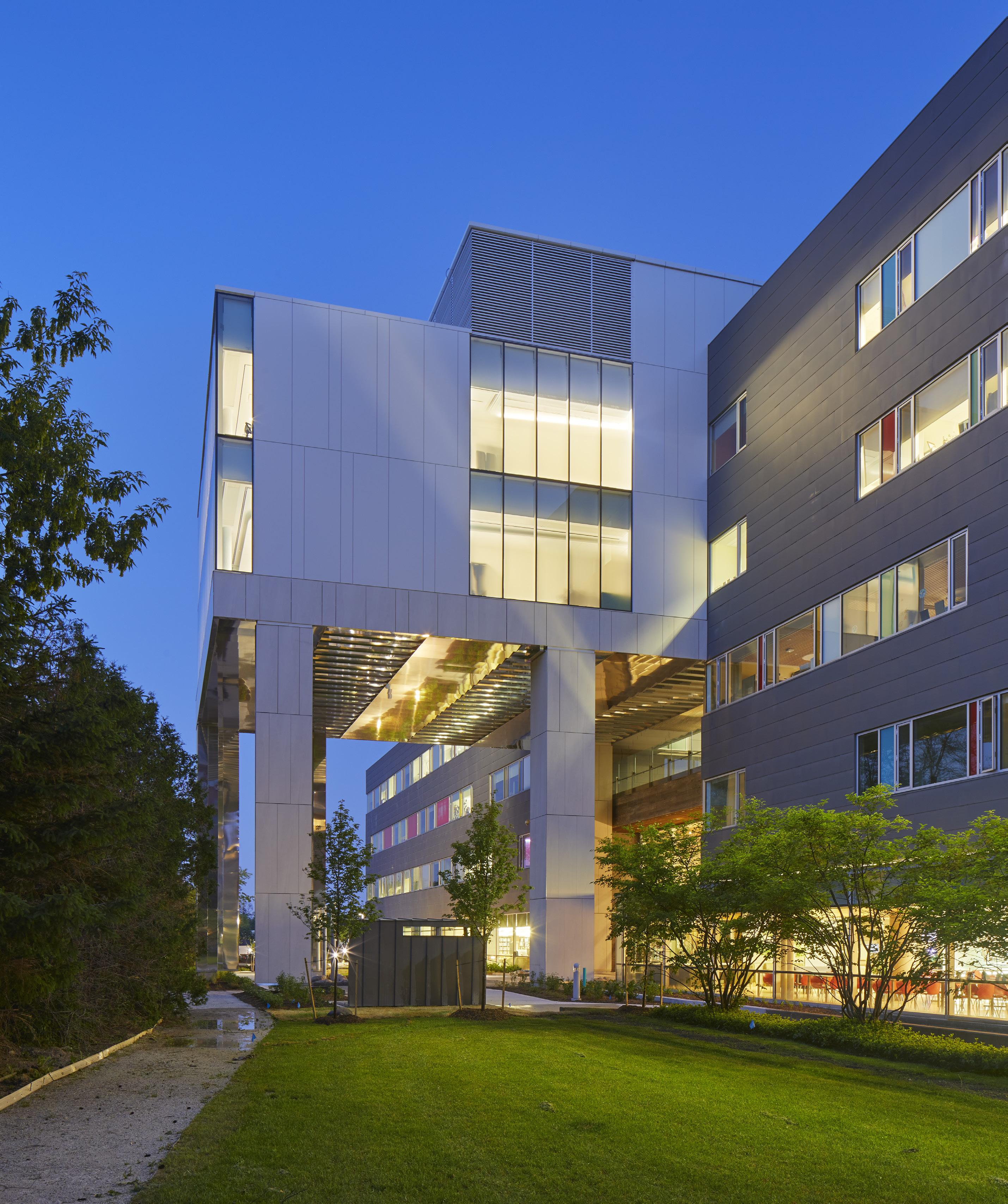


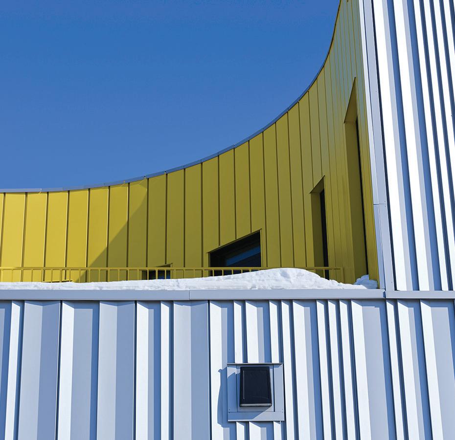
Lateral Office and Verne Reimer’s sculpted addition to Iqaluit’s downtown provides vital community services. TEXT Adele Weder
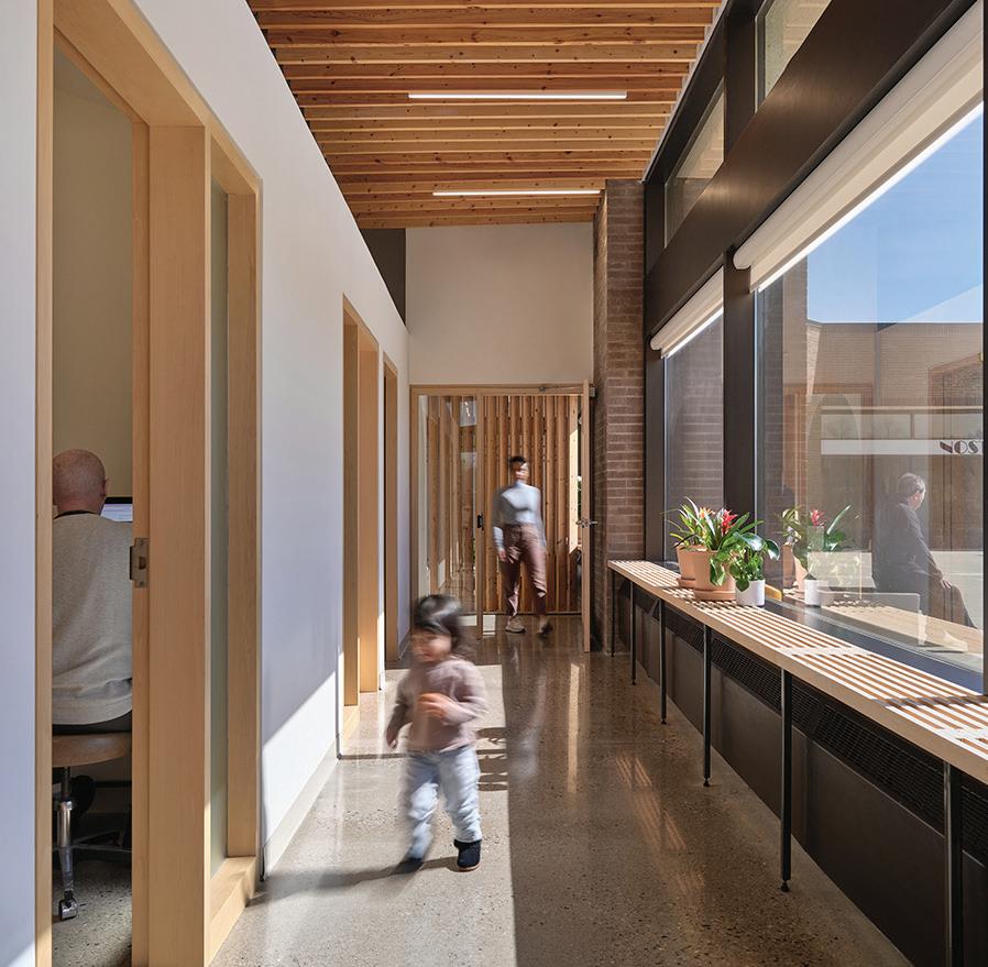
A deep sense of care—for both patients and clinicians —underlies Jaliya Fonseka’s design of an Ontario clinic. TEXT David T. Fortin
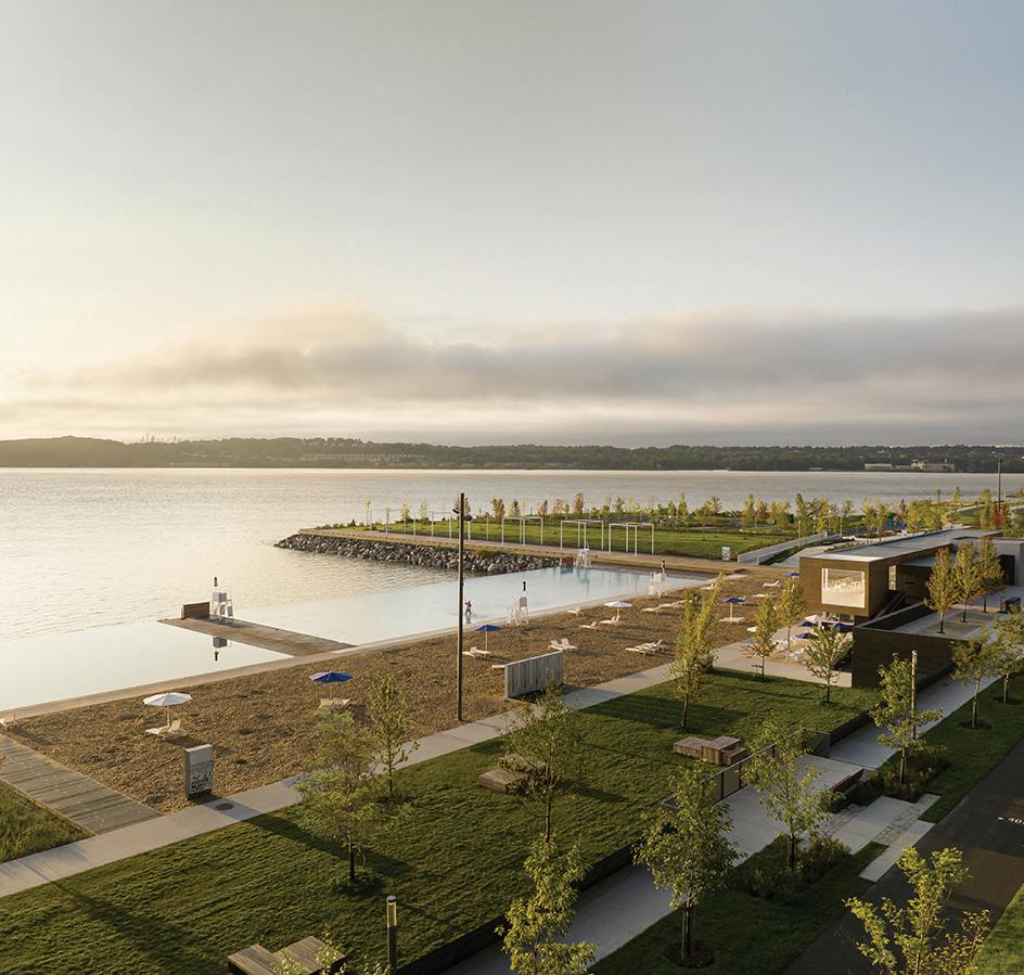
Daoust Lestage Lizotte Stecker’s extension to a St. Lawrence River park invites Quebec City’s residents closer to the water. TEXT Odile Hénault
MJMA’s newest community centre marks a significant milestone in their decadeslong evolution of the aquatic centre. TEXT Elsa Lam
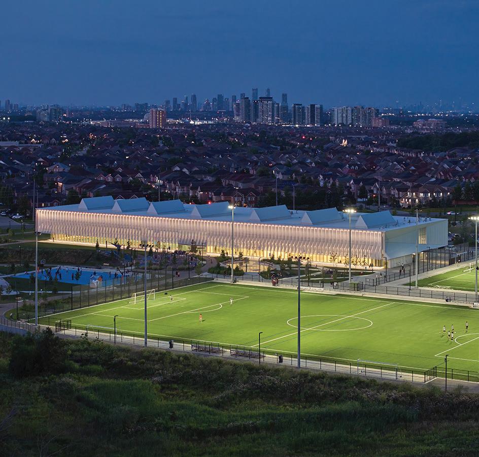
Approvals are being accelerated in Ontario but at what cost?
Design unveiled for Calgary’s Arts Commons; OAQ award winners.
The winners of the AIA Canada Society Design Awards in the categories of interior architecture, open international, unbuilt, special projects, and student work.
Stantec’s renewal of Toronto’s Mount Sinai Emergency Department exemplifies how hospitals can heal through human-centred design.
Reviews of recent publications on designed landscapes, salutogenic architecture, and healthy cities.
A film on progressive seniors’ housing in Barcelona and Baltimore concludes the CCA’s threepart documentary series.
COVER Inuusirvik Community Wellness Centre, Iqaluit, Nunavut, by Lateral Office (design architect) with Verne Reimer Architecture (prime consultant). Photo by Andrew Latreille
The slowness of the approvals process has been pegged as a key villain in the goal to increase the supply of housing in Ontario. But the truth is more complicated.
In recent years, the province has seen a flurry of bills in support of a provincial ten-year target to build 1.5 million homes. In October 2022, there was the More Homes Built Faster Act (Bill 23) and the More Homes for Everyone Act (Bill 109). Now, 2024 has seen the introduction of the Cutting Red Tape to Build More Homes Act (Bill 185).
A key theme in these Acts is the streamlining— and quickening—of approvals. Bill 23 removed the public meeting requirement for plans of subdivision, exempted developments of up to 10 units from site plan control, prevented third-party appeals on minor variance applications, removed the ability of municipal staff to require changes in exterior materials, and limited the role of conservation and heritage authorities.
Next, Bill 109 required site plan approvals to be completed by municipalities in 60 days, and to review projects requesting a by-law amendment within 90 days (or 120 days if the decision was concurrent with an official plan amendment application). To respond to what William Johnston, Toronto’s Interim Deputy City Manager of Infrastructure and Development Services, characterized as the “punitive legislated timeline provisions” of this bill, the City of Toronto hired an additional 150 staff to manage the workload. The new timelines did not allow staff to provide even a single round of comments about matters as basic as a building’s height or the size requirements of a new sanitary pipe, so comments were pushed to a mandatory preapplication consultation phase.
Bill 185, if passed, will remove the requirement for mandatory pre-consultations—curtailing the excessive comments on applications that have been a source of frustration to both architects and developers, but also effectively eliminating the ability of municipal staff to provide any meaningful feedback on applications. In many cases, this will have the effect of further shortening the timeline with which developers proceed along the well-trod route of appealing an application rejected at the municipal level to the Ontario Land Tribunal, which has the authority to override local decisions.
While this may be helpful in smaller centres where staff are less well equipped to evaluate applications, in larger cities, the move to further reduce the review and oversight process for development applications will almost certainly have an overall negative effect on the quality of build-
ings. Perhaps this is a worthwhile trade-off for a rapid influx of new homes. But will quicker approvals ultimately get us more housing?
A 2023 report from Gregg Lintern, Toronto’s Chief Planner and Executive Director of City Planning, suggests that the answer is: no. It found that 103,638 residential units had been built between 2017 and 2022, and that there were an additional 203,793 residential units—twice that number—that had already been approved, but not yet built. Many of these properties, presumably, are held by speculators who strategically upzone without ever having the intention to build. An additional 409,896 units were still under review at the time of Lintern’s report. If all of those units were realized over time, this would increase the total number of dwellings in Toronto by one half—exceeding the city’s projected 2051 population of 3.66 million by 14%.
The same year, the Regional Planning Commissioners of Ontario undertook a similar exercise. It reported that, province-wide, there were already over 1,250,000 housing units approved before Bill 23 even came into the picture. If stakeholders were to collaborate in getting these already-approved units built, the report implied, the province would get to its goal without rushing further approvals or removing environmental controls.
In response, a report commissioned by developer lobby groups Building Industry and Land Development (BILD) and Ontario Home Builders’ Association (OHBA), countered that there were only 331,600 “shovel ready” units, and that an additional 731,000 were in the application process, needing additional approvals, requiring a servicing allocation, or awaiting decision from a municipal council.
Perhaps a balance will come into place with an additional provision proposed in Bill 185—a “use it or lose it” provision that will give municipalities the option to specify the expiry of site plan approvals after three years.
All of this points to problems in housing supply that go beyond what can be solved by cutting red tape alone: a meaningful acceleration in homebuilding would require addressing systemic problems such as inflation and the lack of tradespeople. As Lintern concluded in his 2023 report: “Provincial targets are aspirational and their pursuit will not result in actual completed homes without a complete rescaling of the capacity of the development industry to construct new homes.”
EDITOR
ELSA LAM, FRAIC, HON. OAA
ART DIRECTOR
ROY GAIOT
CONTRIBUTING EDITORS
ANNMARIE ADAMS, FRAIC
ODILE HÉNAULT
LISA LANDRUM, MAA, AIA, FRAIC
DOUGLAS MACLEOD, NCARB FRAIC
ADELE WEDER, HON. FRAIC
ONLINE EDITOR
LUCY MAZZUCCO
SUSTAINABILITY ADVISOR
ANNE LISSETT, ARCHITECT AIBC, LEED BD+C
VICE PRESIDENT & SENIOR PUBLISHER
STEVE WILSON 416-441-2085 x3
SWILSON@CANADIANARCHITECT.COM
ASSOCIATE PUBLISHER
FARIA AHMED 416 441-2085 x5
FAHMED@CANADIANARCHITECT.COM
CIRCULATION CIRCULATION@CANADIANARCHITECT.COM
PRESIDENT & EXECUTIVE PUBLISHER ALEX PAPANOU



ASI OFFERS THE ONLY METAL PARTITIONS WHERE PRIVACY IS ENGINEERED INTO THE DESIGN. DON’T SETTLE FOR AN ADD-ON PRIVACY STRIP AS AN AFTERTHOUGHT. AT ASI, PRIVACY ISN’T OPTIONAL. IT IS OUR STANDARD.


ASI’s proprietary, Integrated Privacy ™ partitions are engineered with built-in privacy and manufactured as one color matched unit, o ering complete privacy without the need for any retrofitted components. Exactly what building occupants want and deserve. See the di erence at asi-globalpartitions.com/privacy.


The Agora des Arts, a venue for performance arts in Rouyn-Norand, Quebec, designed by Chevalier Morales, has officially opened.
Chevalier Morales won the project, which adaptively reuses and adds to a 85-year-old church, through a 2018 competition.
The revitalization aims to increase opportunities for social engagement by creating three new exterior forecourts. The main entrance forms a public space of interest, while the natural slope of the site is used to create a small, tiered seating area. A second-floor terrace acts as a complementary exterior space to the interior foyer.
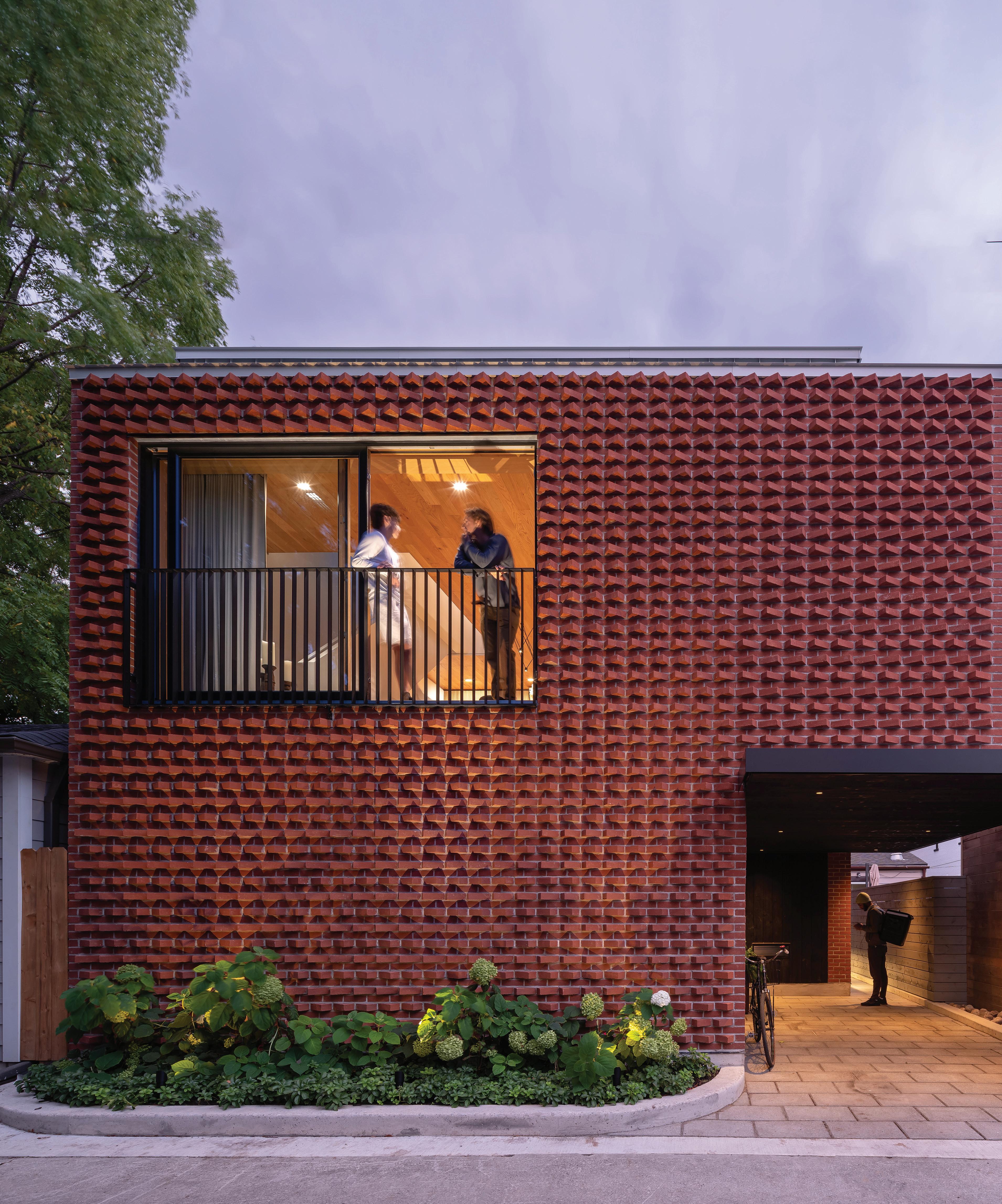
The performance space occupies the former sanctuary, and a new reception pavilion with a grand staircase is clad in a red brick latticework. chevaliermorales.com
Calgary Municipal Land Corporation (CMLC) and its partners at Arts Commons and The City of Calgary have revealed the architectural design for the Arts Commons Transformation expansion.
The building’s design is led by Toronto’s KPMB Architects, Calgary’s Hindle Architects, and Arizona- and Calgary-based Tawaw Architecture Collective. It will feature a new 1,000-seat theatre and 200-seat studio theatre. The announcement marks a significant step forward in the delivery of the largest arts-focused infrastructure project currently underway in the country.

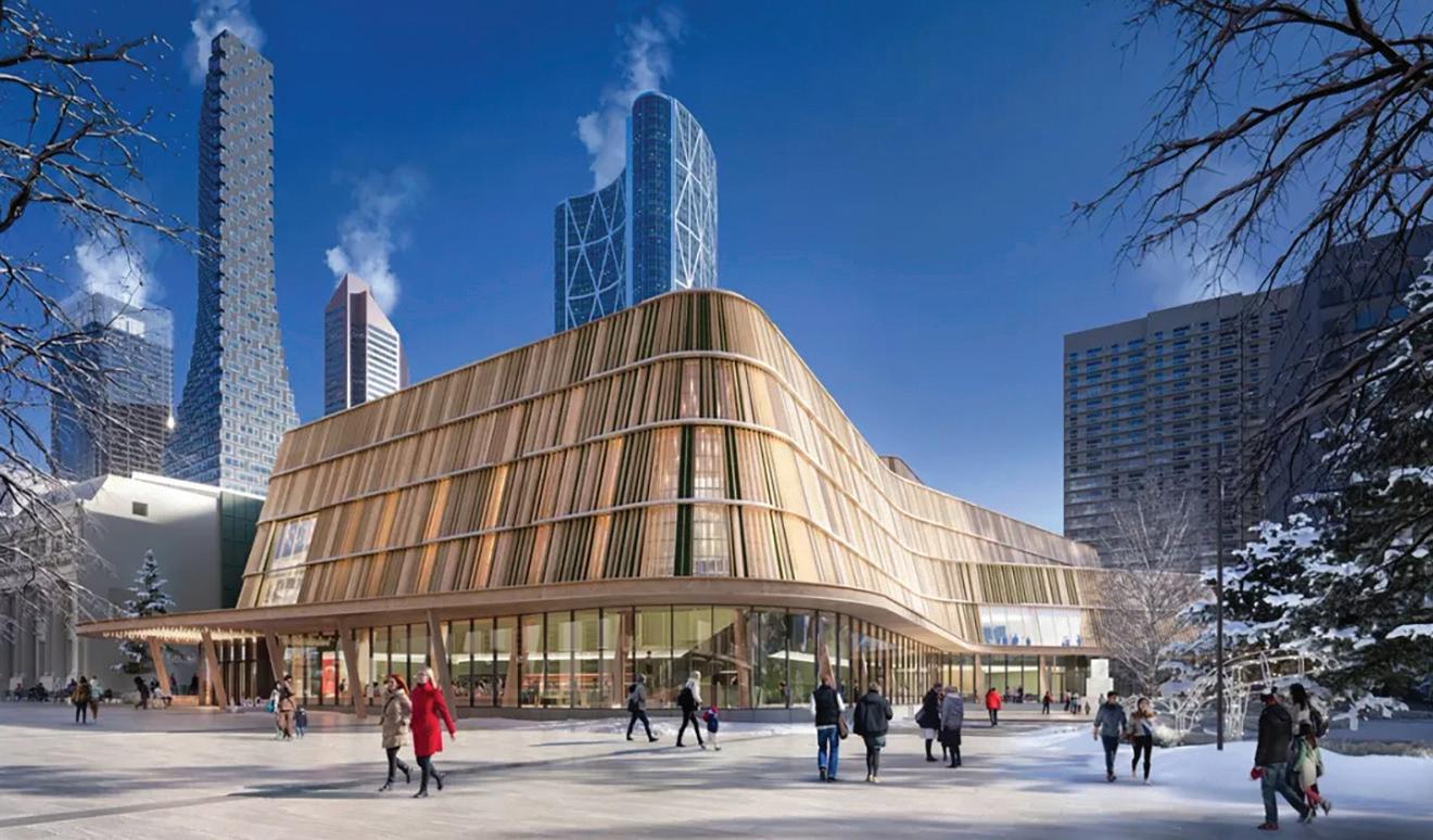
Hindle Architects, and Tawaw Architecture Collective.
“At the heart of the Arts Commons Transformation project is an intention to create a new performing arts space that is ‘of and for Calgary’ a place where everyone is welcome,” said Kevin Bridgman, partner at KPMB. “The expansion building’s curved form, exterior cladding, and interior finishes are inspired by Alberta’s dramatic landscapes and the regional lodge typologies. On the naturally lit, fully transparent ground floor, the design team placed importance on the southeast corner, where a gathering circle with a skylight provides space that welcomes Calgarians and encourages visitors to come together and share stories.”
The $660M project includes the Arts Commons expansion and modernization, the transformation of Olympic Plaza, and a $50M Arts Commons endowment.
Construction on the expansion is expected to begin in late 2024, and the building is expected to open in Arts Commons’ 2028/2029 season. artscommons.ca
Teams selected for Saint-Charles library and Centre Gadbois
The winning teams of the architectural competitions for Saint-Charles library and Centre Gadbois, both in Montreal, have been announced. Lapointe Magne & Associés + L’OEUF Architectes in collaboration with VINCI Consultants / L2C Experts / Dupras Ledoux have been announced the winners of the Saint-Charles library architectural competition, for a new library in Pointe-Saint-Charles.
Prisme + ADHOC inc. has been announced the winner of the architectural competition for Centre Gadbois, on the city’s Lachine Canal. designmontreal.com
The Ordre des architectes du Québec (OAQ) has announced the 11 winning projects of its Prix d’excellence en architecture 2024.
The Grand Prix d’excellence en architecture was awarded to Phase 3 of the Promenade Samuel-De Champlain, in the Quebec City region, whose design was led by Daoust Lestage Lizotte Stecker. The Complexe multisport de Saint-Georges by ABCP Architecture won the People’s Choice Award.
The other winners are: Pavillon d’accueil de l’Insectarium de Montréal by Pelletier de Fontenay, Station L in Westmount by Jean-Maxime
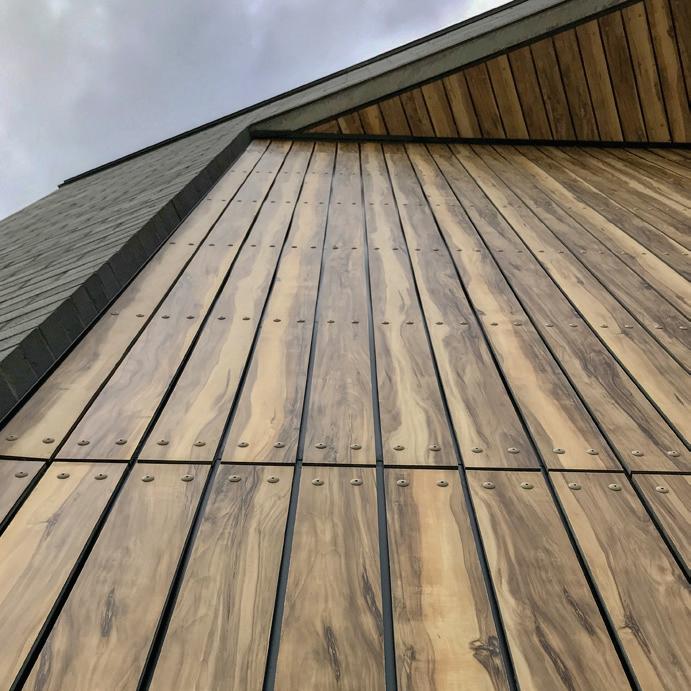
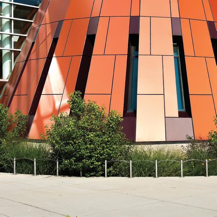




Labrecque, Distillerie du St. Laurent in Rimouski by Atelier Pierre Thibault and ultralocal architectes, The Port of Montreal Tower by Provencher_Roy, Micro-Cabine – Méandre in La Tuque by Appareil Architecture, Cité Angus Phase II in Montreal by Ædifica, Îlot Rosemont in Montreal by Lapointe Magne et associés, École de l’Étincelle (Lab-École) in Chicoutimi by Agence Spatiale, Appareil Architecture and BGLA architecture, and La boîte à lumière in Montreal by _naturehumaine.
The Medal of Merit, the OAQ’s highest distinction for an individual, was awarded to architect Julia Gersovitz, co-founder of the firm EVOQ Architecture. Architecture sans frontières Québec (ASFQ) was awarded the Social Commitment prize for its outstanding work towards community well-being. The Emerging Firm award was given to Épigraphe, and the Ambassador for Quality in Architecture Award went to Kollectif. www.oaq.com
Urbanarium recently announced the winners of Decoding Density, an affordable housing ideas competition that highlighted and challenged current building codes in order to explore new apartment designs, with $44,000 in prizes.
A total of eighty-five proposals were submitted from nine different countries. Participating teams spanned from students and housing advocates, to design and architectural professionals, to urban planning enthusiasts.
Two projects tied for first place: Towerhouse by Studio Oh Song (New York, US) and Shared Density by Switch (Vancouver). Towerhouse also won the Planners Prize. Third place was awarded to Cul-de-
sac Nouveau by PAC Lab (Auckland, New Zealand). Honorable mentions went to From NIMBY to NIMBY by Bobo (Vancouver), Sharing is the Core Thing! by Catlab (Seoul, South Korea), Co-Finity Village by Co-Finity (Burnaby, BC), Micro-hood by Micro-hood (Vancouver), and Lots! of Bundles by Rebuild Collective (Cincinnati, US).
“We were blown away by the innovation and thoughtfulness of the submissions,” says competition co-chair Sara Stevens. “It’s clear that there are some exciting and compelling directions that architects, designers, and city planners can explore in the future. Collective solutions to shared space, adaptability to extreme heat events, and porosity as communities become more spatially connected the only limits are our creativity and current building codes.”
A publication about the finalists and a solutions video by About Here launches on June 3. urbanarium.org
Architect Anik Shooner is among the individuals that the Executive Committee of the Ville de Montréal has named to the Order of Montreal in May.
The Order of Montreal is the city’s highest honour, and pays tribute to Montrealers who are committed to the community and who make an outstanding contribution to the city’s development and influence.
Shooner is the president and co-founder of Menkès Shooner Dagenais LeTourneux (MSDL) Architectes, and began her career in 1987. Throughout the years, she has headed projects for institutional, aca-


demic, residential and corporate clients. These include landmark projects for the city, such as the Centre for Sustainable Development, Grandir en santé (Growing Up Healthy) for CHU Sainte-Justine, Maison Manuvie and, more recently, the Université de Montréal Science Complex. She is currently overseeing construction of 1 Square Phillips and the new National Bank head office.
Shooner was made a Fellow of the Royal Architectural Institute of Canada in 2000. She has been chair for many years of Construction Specifications Canada’s Montreal Chapter. She is also a member of the Association des Architectes en pratique privée du Québec, president of the Société de musique contemporaine du Québec, member of the International Women’s Forum–Canada, and outgoing president of Les 40 et une.
Council
Toronto’s City Council has formally endorsed the Under Gardiner Public Realm Plan, opening the way for an extension of the Bentway’s civic realm from Dufferin to the DVP
Development of the Under Gardiner Public Realm Plan was led by the Bentway Conservancy in partnership with the City of Toronto, along with an integrated team of urban designers, architects, climate engineers, and consultation experts including PUBLIC WORK , Two Row Architect, Frontier, Transsolar KlimaEngineering, and Third Party Public.
“Council approval of The Under Gardiner PRP represents a collective acknowledgement of the importance and potential of spaces below the Gardiner Expressway. Together with the City of Toronto and the
Province of Ontario, we are excited to play a key role in ensuring the plan informs and supports future development of the expressway from end-to-end,” said Robert McKaye, senior manager of planning and design at The Bentway.
The next step will include the formation of an interdivisional working group with representation from several City departments, The Bentway, and the Province of Ontario. The group will work together to develop an implementation strategy for the plan, including a prioritization framework and funding strategy.
thebentway.ca
Architect Anthony “Tony” Frank Leong, senior designer with MBAC (formerly the marc boutin architectural collaborative), passed away suddenly on April 9, 2024, at the age of 55, after a battle with cancer.
Leong was well respected in the architecture community as an adjunct associate professor at the University of Calgary, and made significant contributions to the landscapes of Calgary and Edmonton throughout his career.
Most notably, Leong was the lead designer and project manager for Poppy Plaza along the Bow River in Calgary, as well as for the Children’s Precinct at the Edmonton Valley Zoo.
For the latest news, visit www.canadianarchitect.com/news and sign up for our weekly e-newsletter at www.canadianarchitect.com/subscribe


Our present issue of the AIA Canada Society Journal features the second part of the 2023 Design Award winners, including the three student award recipients.
Through the support of the AIA National’s Component Matching Scholarship Grant program, AIA Canada has increased its student prize amounts, with this year’s first prize student winner receiving a $2,500 USD scholarship. The student winners also participated in a panel discussion—the second of its kind—which was broadcast as a continuing education webinar in February. This year’s discussion was moderated by Dr. Brian Sinclair PhD DrHC FRAIC AIA (International Associate), and explored topics that are top of mind for the next generation of our profession: how do science and technology integrate in our future built environments, given the fast rate of change, over-abundance of data and information, and imperative for adaptation in a post-Covid world?
Reaching out to students, as well as mentoring and supporting young architects, is one of AIA Canada Society’s key endeavours. A diverse cohort of professionals and students is necessary to realize an equitable, talented, and culturally diverse community. We hope you will join us in this work through supporting students and young architects in your everyday practice.

ecently, I had the privilege of attending an Architectural Leadership Summit in Washington DC, where the central theme was advocacy. Although the term is familiar, I wanted to grasp its full meaning before delving into the conference. According to Wikipedia, advocacy is defined as: An activity by an individual or group aimed at influencing decisions within political, economic and social institutions.
I serve as the Secretary on the Board of Directors for the AIA’s Canada Society. Our mission is to support Canadian architects in advancing architecture through professional collaboration and continuing education. Supporting Canadian architects involves various facets, one of which is examining how our government engages with our profession. What measures are our elected officials taking to empower and inspire the architectural community to contribute positively to society? Conversely, what actions might hinder such progress?
At the Architectural Leadership Summit in Washington, the focus was squarely on the political landscape and understanding the ramifications of legislative decisions. Day 1 of the three-day-long summit involved preparation for Day 2, which was dedicated to meetings on Capitol Hill with various Senators. Each AIA State Chapter had appointments with their respective Senators to
New Board Members
We are welcoming two new Board Members joining the AIA Canada Society this year as Directors.

John Cheng, AIA, is a licensed architect with over 25 years of experience in the field. Initially based in Washington, DC, he specialized in independent educational projects before transitioning to Vancouver, where he currently focuses on mixed-use and multi-family residen -
tial projects. John holds an MBA from the University of British Columbia, and has an interest in the organizational dynamics and management strategies within architectural practices.
Dr. Nancy Mackin, AIA, is the founder of Mackin Architects Ltd. She is a recent recipient of the CAGBC’s Against the Grain and Western Red Cedar awards, as well as a Canada Green Building Award and AFBC Award of
address three bills slated for consideration in Congress. These bills were identified as posing potential threats to the practice of architecture in the United States. The collective effort of six hundred architects lobbying senators in a single day sent a powerful message. Day 3 comprised debriefing sessions and planning for future action.
Inspired by this endeavour, it became evident that the AIA Canada Society needs to engage more deeply with our political landscape. We are now scrutinizing bills before our elected officials to discern which ones, if enacted, would benefit our profession and which ones warrant opposition from architects across Canada. In the coming year, we will actively seek collaboration with our government to enhance our capacity to serve our architectural communities. If you are aware of any bills that require attention or are interested in getting involved, please reach out to the AIA Canada Society at advocacy@aiacandasociety.org. We are committed to advocating for you.
Excellence. Nancy is an adopted killerwhale in Gitwinksihlkw (Nisga’a) and Kitselas (Tsimshian). Nancy’s architectural and landscape work with polar and sub-polar Indigenous peoples has been presented internationally.
We are looking for volunteer members to fill the roles of Treasurer and Director for Sponsorship. If you would like to learn more and join us, please email dora@aiacanadasociety.org.
The 2023 AIA Canada Society Design Award winners were announced at the Annual General Meeting on November 29, 2023. Winners of the Architecture and Community Engaged Design categories were published in the April 2024 AIA Canada Society Journal. The winning entries of the remaining categories are:
AWARD OF EXCELLENCE (INTERIOR ARCHITECTURE)
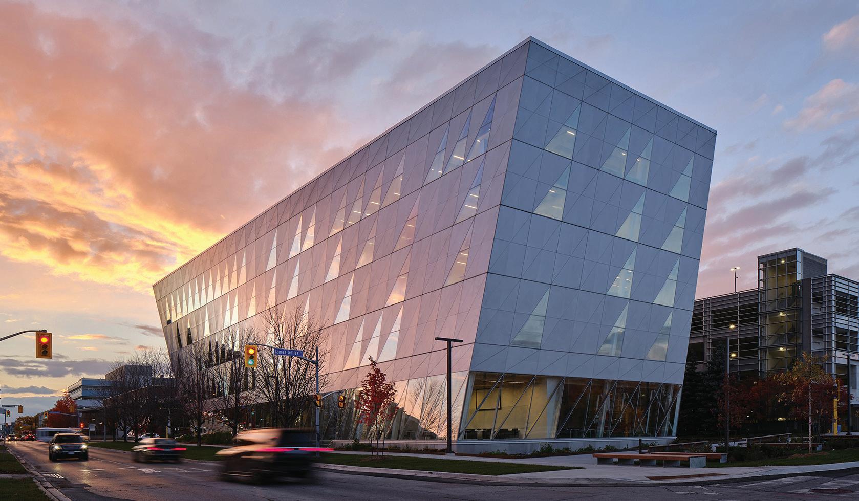
York University’s School of Continuing Education
Toronto, Ontario
Perkins&Will
York University’s School of Continuing Studies aims to bring programs together into a single home with lofty, bright spaces promoting community, culture and identity for the faculty’s students and staff. The bold, twisted volume shapes a new pedestrian plaza and accommodates highly flexible learning environments, social and collaboration spaces, and offices for students and faculty. Through the intelligent use of materials, the project reduces embodied carbon and improves occupant health. The low-energy design anticipates a campus-wide switch to renewable energy generation.
AWARD OF EXCELLENCE (OPEN INTERNATIONAL)
David Geffen Hall, New York, New York
Diamond Schmitt (Master Plan and Concert Theatre); Tod Williams
Billie Tsien Architects | Partner (Public Spaces)
The re-imagined David Geffen Hall offers new, welcoming public amenities and a state-of-the-art theatre to improve the entire concert-going experience. What was once a building with an acoustically challenged hall and tangled common spaces is now a living instrument. The design and material choices came from a desire to make everyone feel immediately welcome. Relocating the stage forward by 25 feet and eliminating the proscenium has enabled the seating to wrap around the stage and brings the entire audience closer to the performers. Improved physical accessibility was key to the design, including a livestream setup in the public lobby to bring free performances to audiences beyond the hall.
AWARD OF MERIT (OPEN INTERNATIONAL)
Facility Chicago, Chicago, Illinois, USA
Carlo Parente Architects Inc.
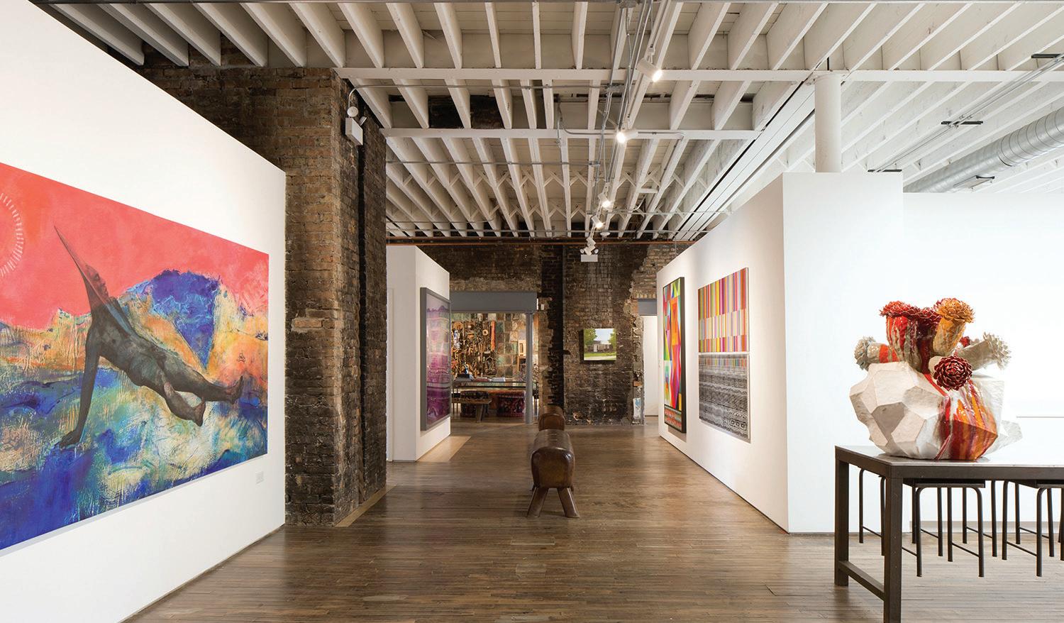
Facility Chicago is a hub for living, working, making and connecting for artists Nick Cave and Bob Faust. Located in Chicago’s lrving Park neighbourhood, the vernacular 1920s brick building once contained a mason’s shop. Today, the street level holds a library, workspaces for both artists, and space for installations, performances and public events. The upper level contains their residence and an artist-inresidence apartment. Placed on a busy arterial street that cuts diagonally through many Chicago neighbourhoods, the southern frontage of the building is lined with 70 feet of shipping container fencing that acts as a public art wall. Existing masonry walls and structural components were kept and exposed as much as possible, with their patinas preserved.

CITATION (OPEN INTERNATIONAL)
Farm 2.0, Lippetal, Germany
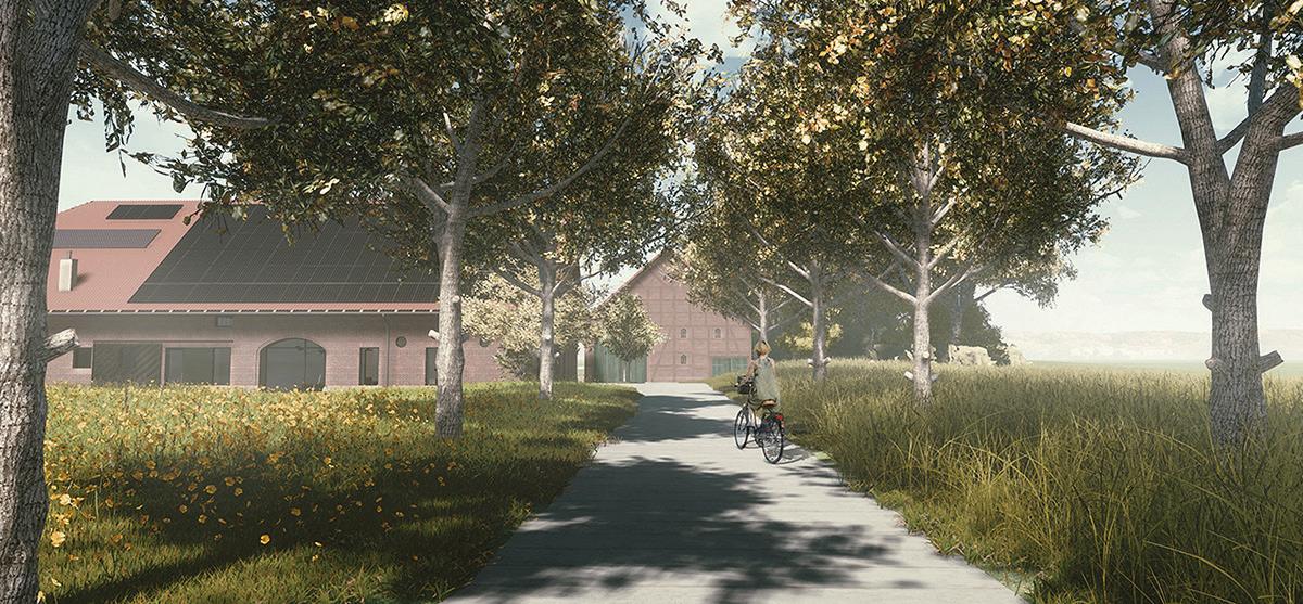
Carlo Parente Architects Inc.Farm 2.0 is a master plan to transform a 1920s former hog farm in the small town of Lippetal, Germany, into a mixed-use site including spaces for locals to work and socialize. Farms originally formed the backbone of the social fabric in the Lippetal area. Farm 2.0 repositions the farm as the key place in the region for working, living and connecting with others by making big changes to the programming, yet minimal strategic changes to the existing buildings.
AWARD OF EXCELLENCE (UNBUILT)
The Hidden Eruption – Volcanic Retreat and Visitors Centre, Reynisfjara, Iceland
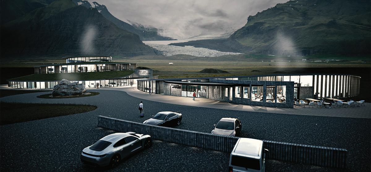
This project presents a lyrical interpretation of place and purpose. The conical and sublimated forms evoke the volcanic surrounds, while also imitating the form of the inner ear—this being the primary sensory organ of the blind. The volcano spirals upwards and accesses guest rooms that hug the perimeter of the rough walls; far below at the base of the volcano is an indoor hot plunge pool. In contrast, the dormant void houses the outdoor cool pool, providing a quiet solitude for contemplation and relaxation.
AWARD OF EXCELLENCE (UNBUILT)
GHETTO – Vancouver & Venice, Vancouver, British Columbia & Venice, Italy Henriquez Partners Architects
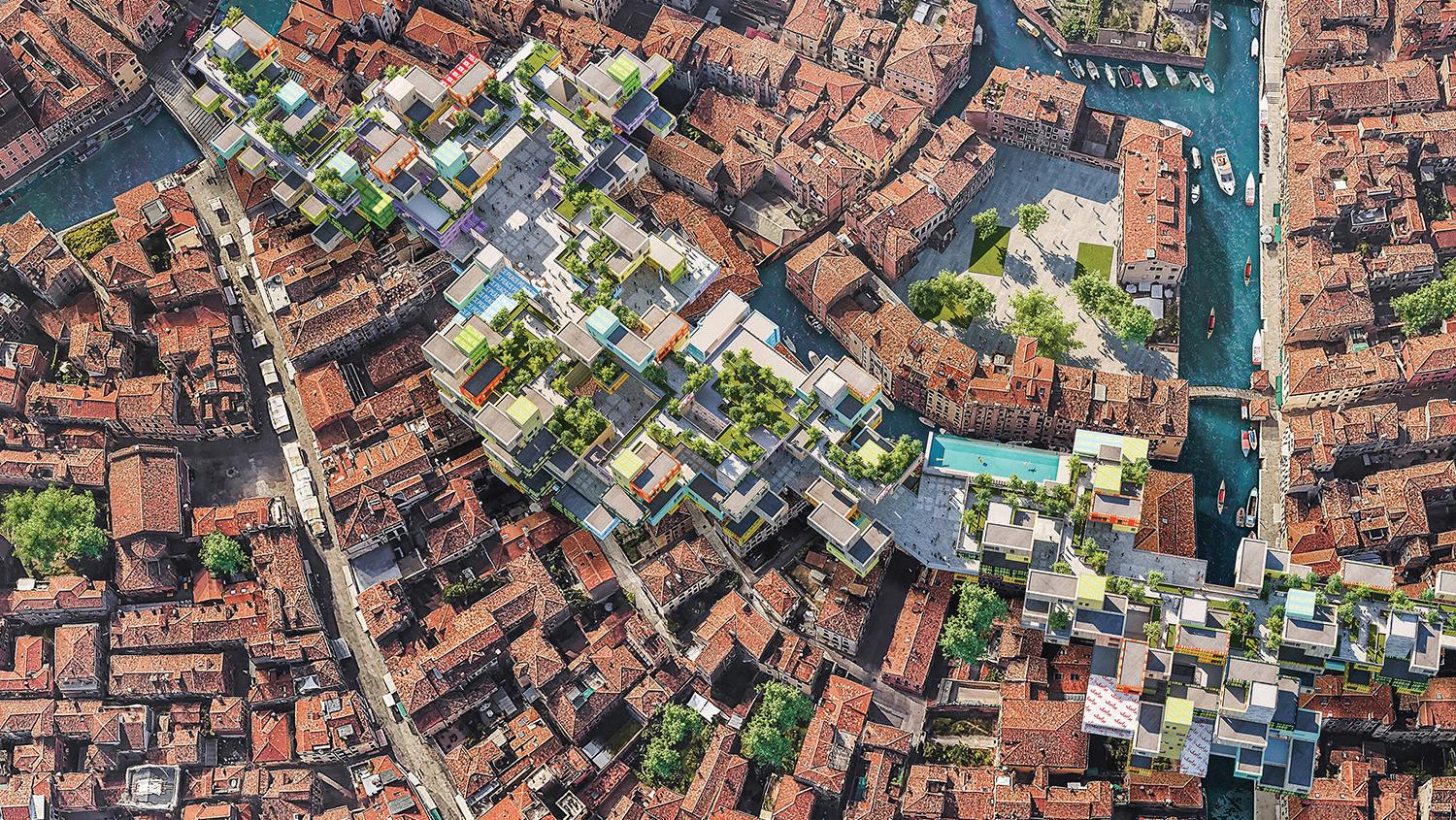
GHETTO was originally exhibited at the European Cultural Centre’s 2021 Venice Architecture Biennale show, themed “How will we live together?”. In the effort to explore our shared responsibility to care for one another, GHETTO looks at four Venetian architectural sites and proposes a “theoretical rezoning” that imagines a housing timeshare project as the vehicle for the distribution of wealth from tourists to refugees. While this project explores one iteration of the redistribution of equity, the community amenity contribution concept can be applied across a variety of geographies, scales, and contexts to provide a myriad of social benefits.
AWARD OF MERIT (UNBUILT)
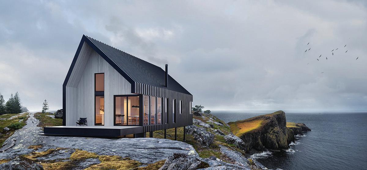
Gable Ends Cottage, Lower Prospect, Nova Scotia
The Gable Ends Cottage is an economical model home offered as a prefabricated structure. It is compact in shape but provides 1,800 square feet of interior and exterior space. Three bedrooms and a loft space are included in this model, providing room for larger families or guests. By using pre-engineered scissor trusses, waste is minimized while creating a spacious living area that allows abundant amounts of natural light in. This modern take on the gable form is reminiscent of the local Nova Scotia vernacular, and the home can be customized.
CITATION (UNBUILT)
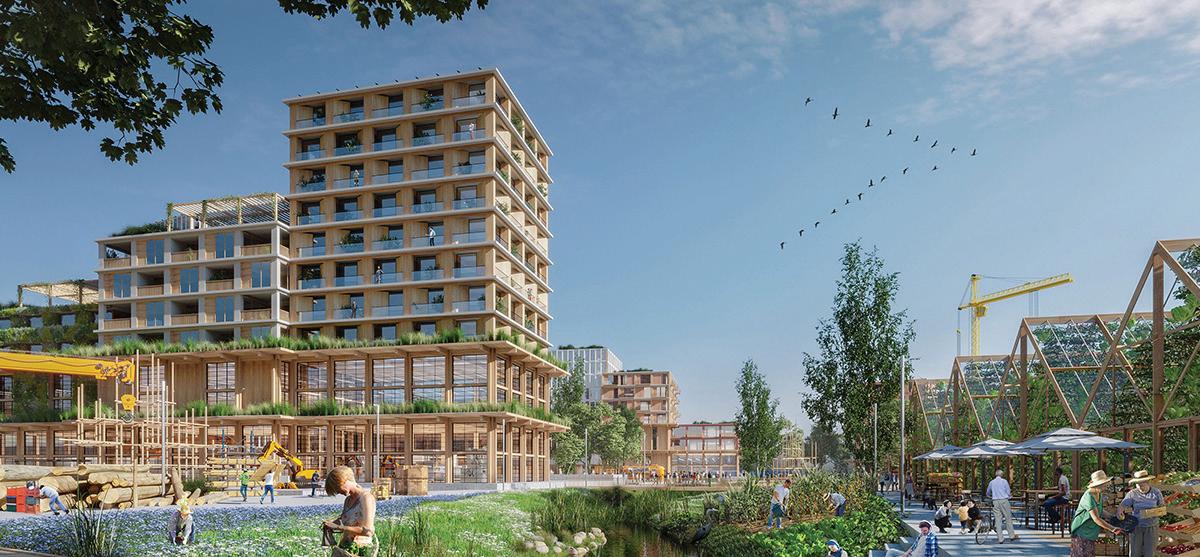
Greenwood Yard, Toronto, Ontario
SvN Architects + Planners Inc.
Greenwood Yard is a prototype for city-making, organized around the principles of transit-oriented communities, circular economy, and technical innovation for a postcarbon economy. It proposes a mixed-use hybrid program on a reclaimed rail yard, and includes an educational and research campus, an industrial area with manufacturing, a residential neighbourhood with community facilities, office and commercial spaces, naturalized landscapes, waste treatment and energy production.
AWARD OF EXCELLENCE (SPECIAL PROJECTS)
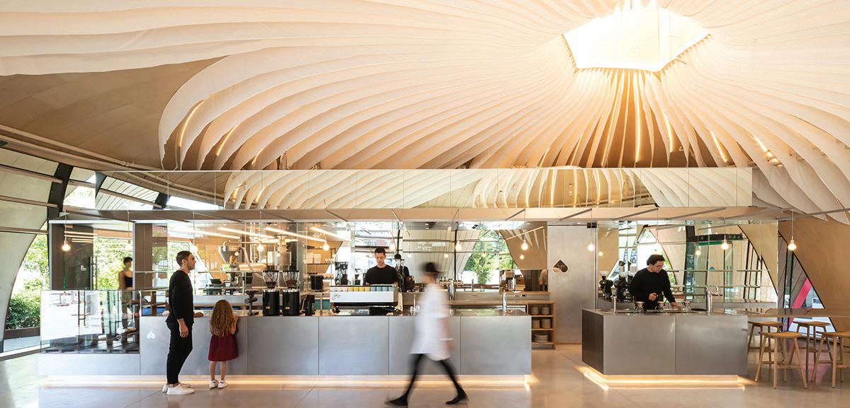
Nemesis Coffee at Great Northern Way Pavilion, Vancouver, British Columbia Perkins&Will
The design team’s approach for Nemesis Coffee’s flagship location was to complement the architecture of the sculptural Pavilion on the Great Northern Way campus, and create a memorable experience: the interior details subtly reveal the unique architecture, add refinement, and bring delight. Celebrating the petal geometry, a light flowing fabric traces the interior silhouette of the organic forms, acting as acoustic panels and creating a glowing play of light. A mirrored back-of-house pod floats inside, putting the coffee roasting and commercial kitchen on display.
AWARD OF EXCELLENCE (SPECIAL PROJECTS)
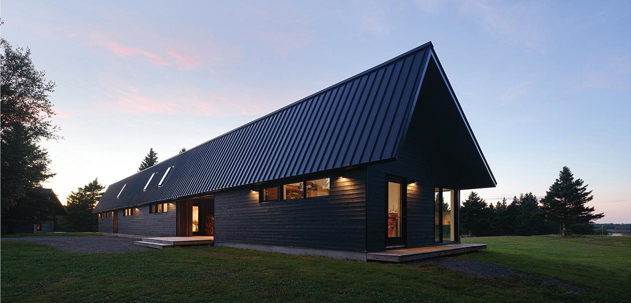
Caribou Point , Pictou, Nova Scotia
Peter Braithwaite Studio Ltd.
This dwelling and studio was designed for two artists in the rural Nova Scotian community of Pictou, an area well known for its fishing industry. The elongated linear form stretches along the flat sweeping natural landscape and creates a harmonious connection between the natural and the constructed. The building acts as a type of aperture for viewing the ever-changing seasons and climatic conditions along the Nova Scotia coast.
FIRST PLACE
Bark HAUS, Toronto, Ontario
Alexander Romanov (Centennial College)
Bark HAUS proposes a new architectural approach to human co-existence with nature, in harmony with nature’s temporality. Engaging biomimicry, the architectural form is shaped as an artificial organ that emerges from the empty void of rotten tree trunks, without hindering the breathtaking landscape formed by the surrounding trees. Occupying the void is the minimal gesture necessary for human habitation. The result has the sensibility of a natural forest fused with the concrete jungle of the city.
Digital Endemicity: Localized Characteristics for Architectural Fabrication, Toronto, Ontario
Gabriel Garofalo (Toronto Metropolitan University)
This project explores how digital fabrication can be used in a more ecological, place-based manner. It proposes a digitally enhanced system for extracting, fabricating and assembling site-specific architecture in Hamilton, Ontario. The system uses waste wood and steel from local industry to create a multi-use structure, including on-site robotic assembly and parametric steel connections, that bridges between the downtown core and the waterfront park, and grows over time.
Dufferin Grove High School and Community Centre, Toronto, Ontario
Nour Abdelfattah (Toronto Metropolitan University)
The design for the Dufferin Grove High School and Community Centre aims to support a pedagogical approach centred on social sustainability, which approaches knowledge as a multifaceted exchange from and between peoples. The design is expressed through transparency between spaces on the ground floor, which evolves into a radical openness of form on the roof garden, creating a healthy divide between the school’s public and private areas. This transparent medium also reflects the school’s intention to openly address complex social issues, instilling its students with values centred on generosity and care.
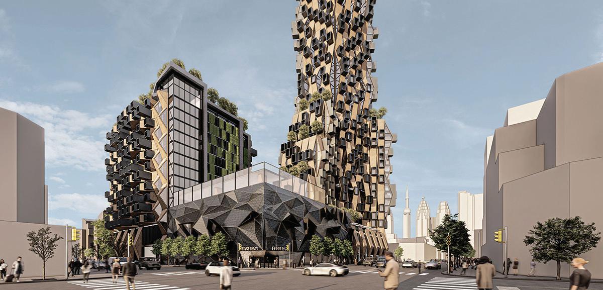
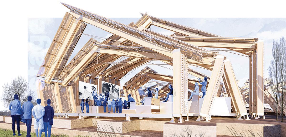
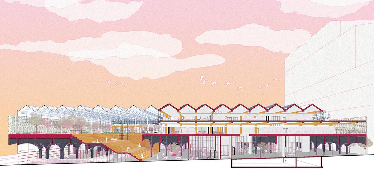


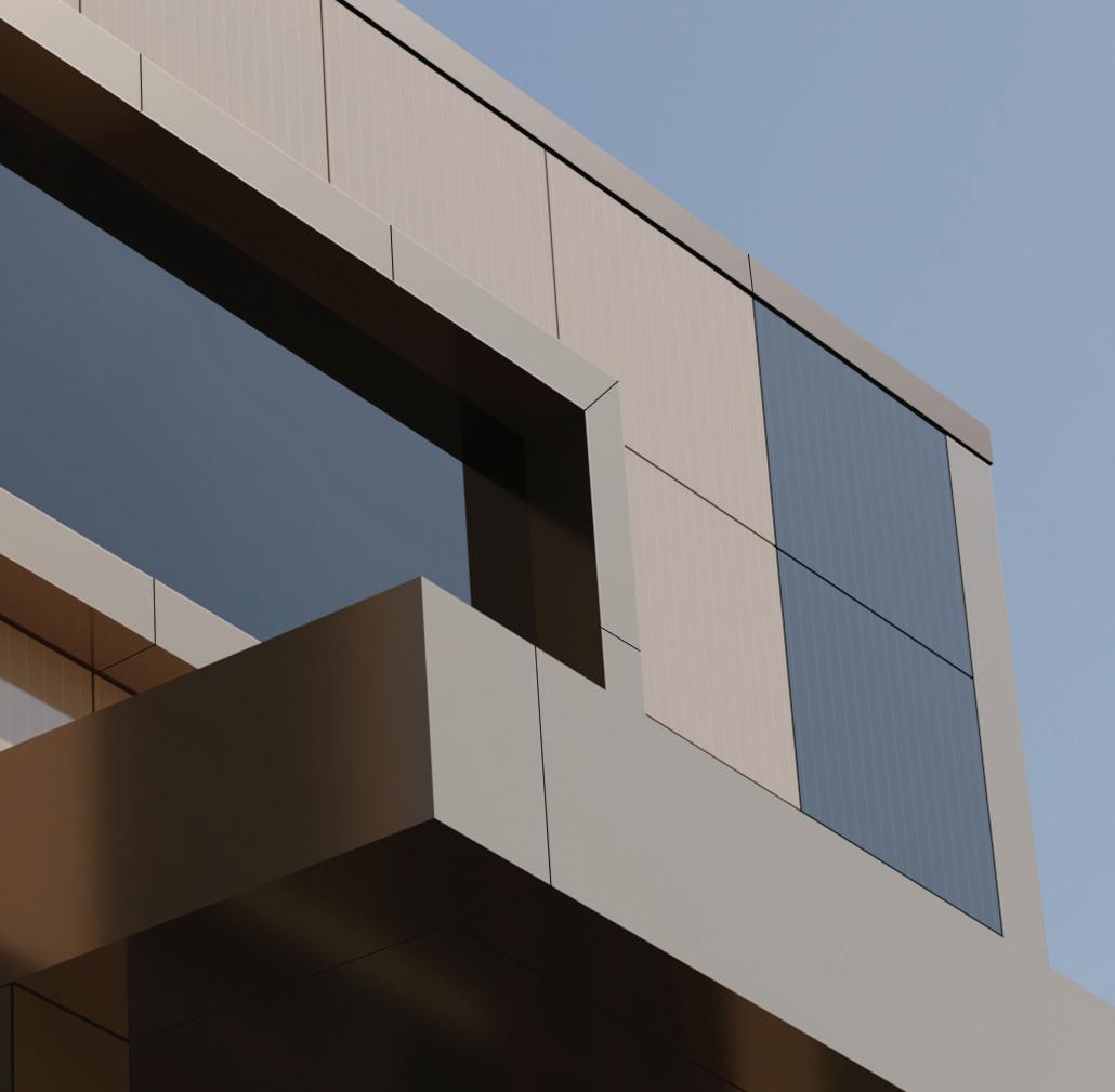
Ontario Panelization is pleased to now offer Solstex® – Solar Facade System by Elemex®. Colour match ACM around the windows & canopy with the solar panels for a sleek, unified appearance.



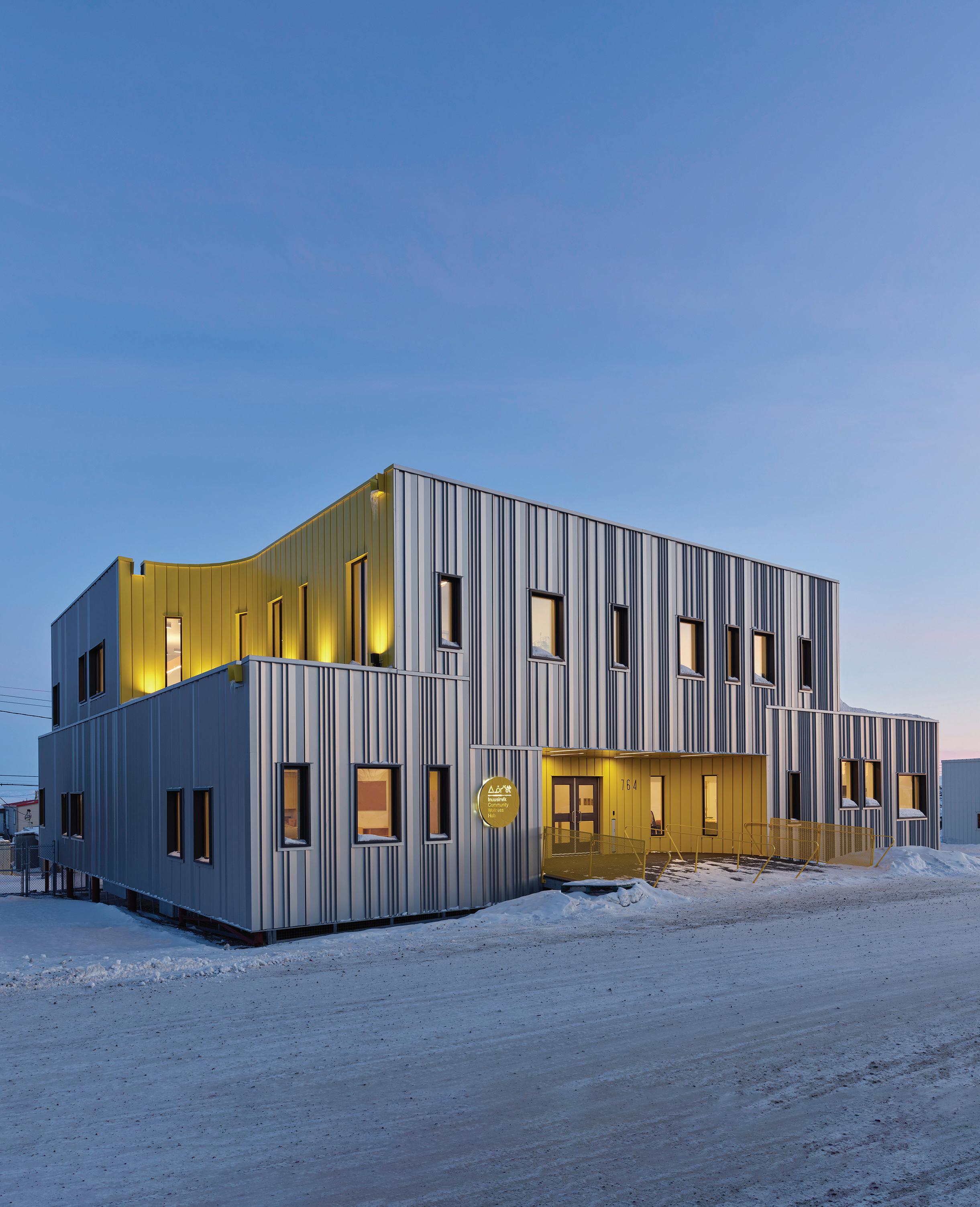
A NEW HEALTH HUB PROMOTES CULTURE AND HEALING IN AN UNDERSERVED ARCTIC CAPITAL.

PROJECT Inuusirvik Community Wellness Hub
ARCHITECTS Lateral Office Inc. (Design Architect); Verne Reimer Architecture Inc. (Prime Consultant)
TEXT Adele Weder
PHOTOS Andrew Latreille
As I entered the Inuusirvik Community Wellness Hub in Iqaluit last fall, it seemed like I was walking through a door into another universe. Aside from the hemispherical St. Jude’s Cathedral down the road, the building is mostly surrounded by starkly orthogonal edifices that relay no urban logic nor sense of place. Next door to the Wellness Hub is the windowless concrete hulk of NorthMart, one of the town’s main grocery stores. Beyond that are scores of former military housing units and recently built shoeboxes. But upon stepping into the Wellness Hub, a visitor is met with curves, birch plywood, and soft daylight seeping in from above.
The building opened late last year in Iqaluit’s downtown core and was instantly beloved. In a community that struggles with social and geographic isolation, the Wellness Hub could turn out to be the town’s most important new building in years. Spearheaded by Qaujigiartiit Health Research Centre director Gwen Healey Akearok, and designed by Toronto-based Lateral Office with Winnipeg’s Verne Reimer Architects as prime consultant, the project offers a refreshing approach for designing in Arctic communities.
The Wellness Hub is a compact multi-purpose community centre that brings together many sorely needed services: counselling, daycare, wellness research centre, research library, food preparation, and gathering spaces. Iqaluit, the capital of Nunavut, is a fast-growing town of 8,000 residents, and such programs have been underserved for years. Equally important, it offers something more: a visceral connection to the rich local culture.
Over a decade ago, Healey Akearok and other community members had begun conceiving of a place that would provide more of the essential community services necessary to local residents. At a serendipitous moment, she met Lateral Office partners Lola Sheppard and Mason White in 2012 while all three were researching health architecture in the Arctic. They then enlisted her as a collaborator for Arctic Adaptations, Lateral Office’s exhibition at the 2014 Venice Biennale of Architecture. Healey Akearok saw Sheppard and White as the logical choice of designers to help realize her vision.
The next part of the puzzle came into place when the Research Centre acquired the abandoned house next door to its office in downtown Iqaluit. The two lots, joined together, became the site for the project.
From the start, Healey Akearok and the architects worked in an intensely collaborative manner, discussing form, program, cultural expression, and seasonality. In the course of their research prior to and after receiving the commission, White and Sheppard have made numerous treks to the region to understand its culture and geography. (Their observations and analyses of the North are the basis of their 2016 book Many Norths: Spatial Practice in a Polar Territory.)
“The Arctic has always been like building on another planet,” says White. Or on planet Earth, he clarifies, it’s like building in a climate as extreme as the tropics, or the desert. “In Canada, this is our extreme environment.”
The extended winters of sub-zero temperatures, permafrost that precludes subgrade construction, high windspeeds with no trees to break
PREVIOUS PAGES In contrast to the prefab sheds typical in Iqaluit, the community wellness hub is inflected by curved, indented spaces that deflect wind in the winter and offer green roof decks in milder weather.
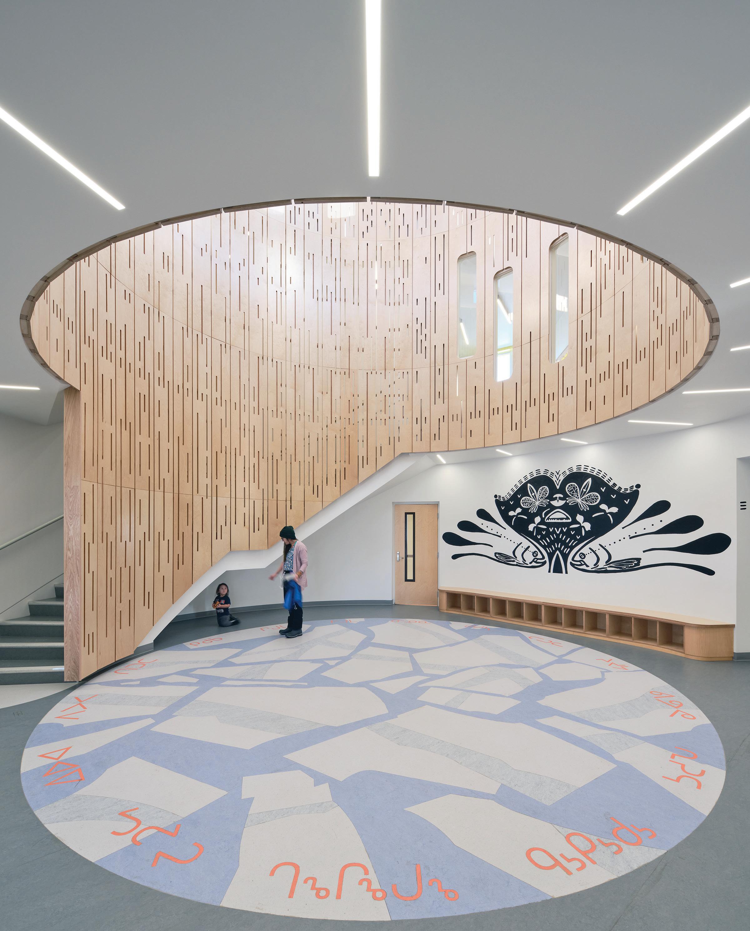
LEFT The central rotunda is ringed by monitor windows, inspired by the tradition of using ice blocks to top an iglu or qaggiq. A bespoke floor captures ice floe patterns and includes Inuktitut syllabics, reminding visitors of the links between the land and language.
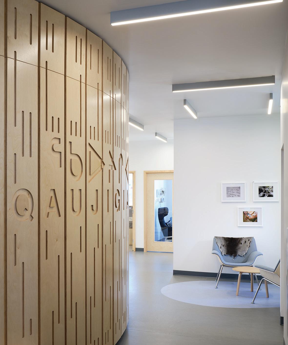
ABOVE The rotunda’s back-lit vertical plywood panels include slotted linear perforations that recall Inuit snow goggles.
the wind, and the sheer remoteness of the place require a completely different mindset and building approach, he explains. Take the usual challenges of construction budget restraints, labour shortages, unexpected shipping delays and multiply each one by five or six. There is no road route to Iqaluit: every object, person, and piece of material must be flown in or barged in or sealifted in, in northern parlance. Both modes of transportation are enormously costly. Air transportation limits the size of construction components to be transported. Sealifts allow for larger components, but pose other difficulties: Frobisher Bay’s sometimes-unpredictable schedule of spring thaw and winter freeze delayed this particular project among others by half a year when one shipment of materials missed the delivery-schedule window.
In recent years, the response to Iqaluit’s surging demand for housing has been the construction of subdivisions and sprawl. In contrast, the Wellness Hub has been constructed on two adjacent single-family house lots in the downtown core. Although it might seem like land is endless in the Arctic compared with the metropolises of the south, the imperative for density is arguably greater in such a community. Densification of the downtown core makes better use of the area’s limited infrastructure, it reduces the carbon emissions from inner-city travel, and it makes for mercifully shorter pedestrian journeys in the biting cold of winter.
Both Healey Akearok and the Lateral Office principals caution against the stereotype of the region as buried in snow year-round. On one hand, Iqaluit is undeniably colder: average winter temperatures fall to minus 45 Celsius and rise to an average of just nine degrees in summer. On the other hand, the local Inuit who live and work on the land are intensely attuned to richly variegated annual cycles, and recognize six distinctive seasons over the course of the year, rather than the standard four.
I spent most of last January in this town, when walking to a building a few hundred metres away required gearing up in head-to-toe Arc’teryx. On my second visit last fall, the earth was bare and raw, dusted with frost on colder mornings, but perfectly hospitable for walking around downtown or hiking the nearby Apex Trail. “Our seasons are different here, and they determine what people are doing throughout the year,” says Healey Akearok. “There are different hunting and harvesting seasons, and we wanted our building to support all those activities that happen throughout the year.”
Part of that support is a recognition of the different ways that space is used by the local community. The hunters’ bounty must be brought into the building’s food-preparation room, where the carcasses are butchered right on the floor. The option of dragging freshly harvested seals, caribou, and beluga through the common spaces of the building is a nonstarter, so in starkly practical design terms, a large, separate ingress point was required. The opening started out as a hatch and evolved into a fullsize door at the unloading level of a vehicle, once the design team had figured out how to resolve the related code requirements.
The relationship of the Inuit people to the land is central to their culture, notes Healey Akearok. She worked with the architects to find contemporary ways to express that relationship visually and address it pragmatically. The syncopated corrugated-metal cladding is evocative of the shimmering sea, she notes. It’s also light on the land, in keeping with the values of contemporary environmentalists and age-old Indigenous traditions, and it’s less expensive to bring in than heavier cladding materials.
Many Indigenous cultures favour circular forms, reflecting the historic rationality of domed structures. The iglu is the most widely known of those forms, but as Healey Akearok points out, there are other curvilinear forms that remain contemporary and are familiar to Inuit residents: the qammaq (a temporal structure, like a tent) or the qaggig (a very large iglu, built on four smaller ones to form a large gathering space). Even the iconic iglu, which I took to be anachronistic as a housing type, is still in use, albeit more as a secondary dwelling.
“Those round forms are out on the land; they are what’s familiar to people here,” says Healey Akearok. “You just don’t see them in the towns.” For Lateral Office, the design directive to visually reinterpret the cultural norm required a creative approach. “We told them: ‘You’re not going to get a dome; we just don’t have the budget for that,” recalls White. “And, by the way, we do love rectangles!”
Although Iqaluit is filled with rectangular buildings, that standard is strongly associated with its years as a colonial military outpost, as well as with expeditiously built government housing. “We all agreed that a rectangle wasn’t an acceptable form,” says Healey Akearok. “So they came back with five different concepts, and everyone let them know which one was their favourite.”
The final design resolution involved rethinking the conventional mode of architectural curvilinearity, seeing the challenge more in conceptual terms. “We didn’t take the iglu as a form,” says White. “The iglu as a form would be a cartoon building. Instead, we took elements of an iglu, the spirit and aspects of an iglu, and used them selectively.” Instead of configuring the massing as a dome or tacking on rounded shapes, the design team embedded curves as subtractions rather than additions.

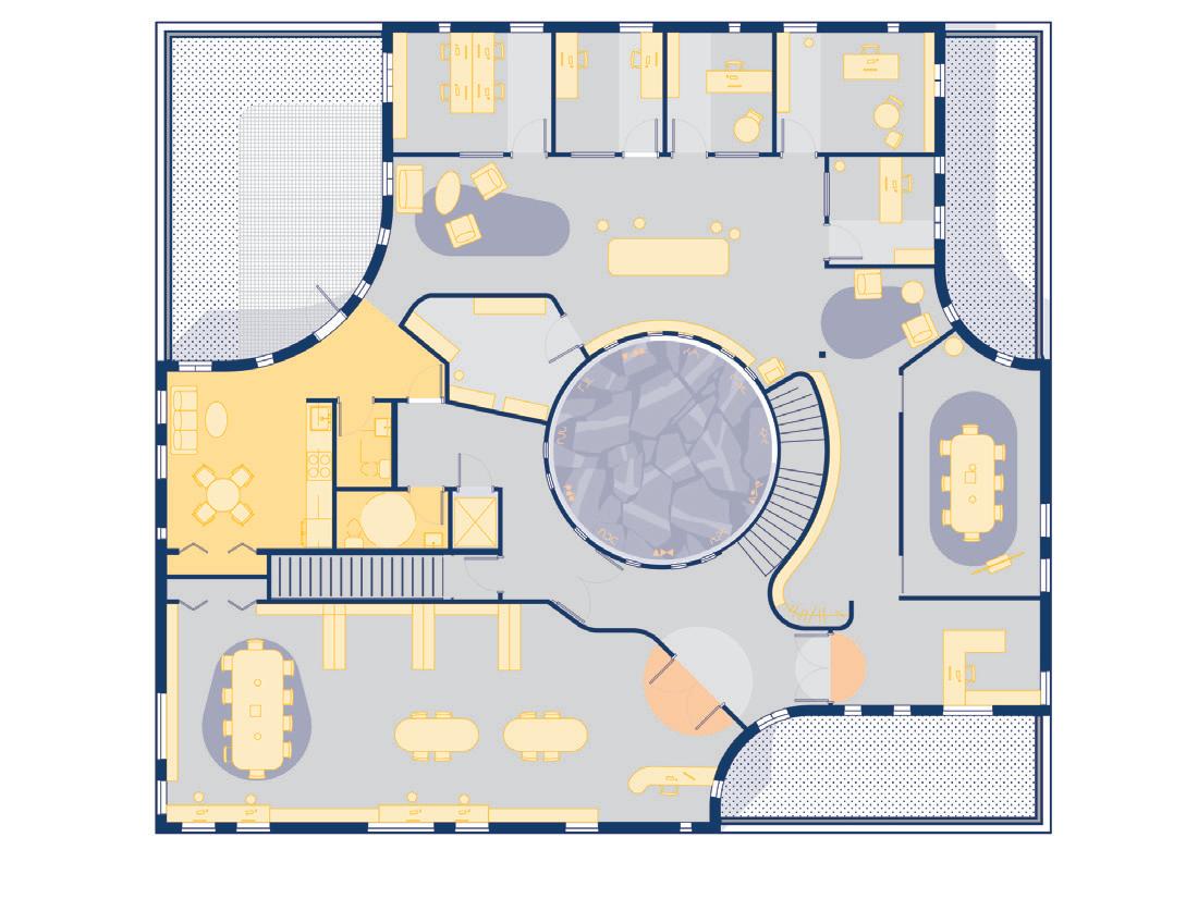
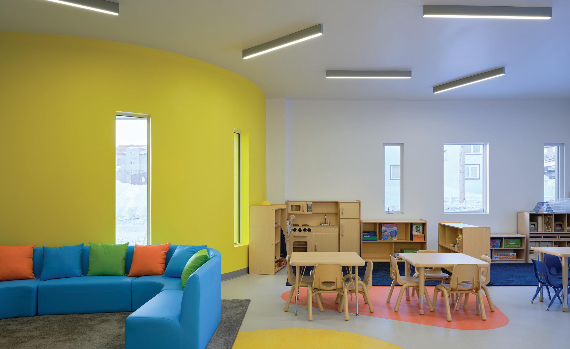
OPPOSITE The drum-like rotunda provides a central point of orientation on the upper floor, which includes a community library, along with office and meeting spaces for Qaujigiartiit Health Research Centre. ABOVE A daycare facility, with rooms for toddlers and infants, includes yellow walls to mark the scooped entry, and lower windows that encourage all ages to look outside.
The footprint is orthogonal, and the basic massing is close to cubic, but the subtractions which read as five “scoops” break the orthogonality of the volume and transform it into a different form altogether. These curved, indented spaces on the corners and front entrance help deflect wind in the harsher months, offer outdoor space in the milder seasons, and provide access to the green roof decks of tundra and moss. Snow will collect in the scooped-out spaces in the winter, but that’s all right, says White: “The snow will insulate the building: this the Inuit have taught us.”
The design also embodies the concept of an iglu in its treatment of light. Iqaluit receives as little as four hours of daylight in the winter, but up to a full 22 hours of daylight in high summer. That cyclical shift required the architects to favour indirect glazing, in order to shield the occupants from being flooded by light in June, while still allowing light in during the dark months of winter.
The rotunda at the centre of the building embeds curvilinearity into the entire sequence of interior spaces that surround it. The tundra roof and clerestory glazing atop the rotunda bring landscape, light, and views into the building in an indirect manner, acting in a similar manner to the fenestration pattern of an iglu. The rotunda itself a woodsheathed cylinder embedded with Inuit art serves as a performance hall and social hub of the building. “At the top of this cylinder of space at the heart of the building is a full ring of windows, which is one of the ways you’d bring light into an iglu,” says White.
Iqaluit is now one of the fastest-growing cities in Canada and will need a profusion of new buildings in the years to come. For Sheppard and White, this burgeoning demand is both an architectural opportunity and an imperative to design responsibly in a locale with a starkly different climate and way of living within it.
For all their years of research, the Wellness Hub is the first completed building for Lateral Office, whose principals hold academic positions at the architecture schools at the universities of Toronto and Waterloo. Their practice has long been more focused on raising questions than chasing commissions. “There is a wider conversation about circumpolar architectural typology: What is an arctic vernacular today?” says White. “This building is a response to that question, but it is not the response. We’re just happy that this building can contribute to the wider conversation.”
Adele Weder is a contributing editor to Canadian Architect.
CLIENT QAUJIGIARTIIT HEALTH RESEARCH CENTRE | ARCHITECT TEAM LATERAL OFFICE INC.— MASON WHITE (FRAIC), LOLA SHEPPARD, KEARON ROY TAYLOR. VERNE REIMER ARCHITECTURE INC.—VERNE REIMER (FRAIC), JEFF PENNER (MRAIC), DARYL HOLLOWAY, STEPHEN MEIJER, YOUCHEN WANG. STRUCTURAL/MECHANICAL/ELECTRICAL WSP CANADA INC. | LANDSCAPE LATERAL OFFICE INC. WITH ROXANNE MILLER, SOPRANATURE (GREEN ROOF); AND WSP CANADA INC. (CIVIL) | INTERIORS LATERAL OFFICE INC. | CONTRACTOR NCC DEVELOPMENT LTD. | PROJECT MANAGEMENT COLLIERS PROJECT LEADERS AND MLPM INC. AREA 883 M2 BUDGET $10.2 M COMPLETION NOVEMBER 2023
ENERGY USE INTENSITY (PROJECTED) 553 KWH/M2/YEAR

PROJECT Galt Health, Cambridge, Ontario
DESIGNER Jaliya Fonseka Studio
TEXT David T. Fortin
PHOTOS Riley Snelling
Spaces for healthcare present, in many ways, the ideal opportunity to explore an ethos of care through design an approach that is grounded in being mindful of one’s intuitions and individual well-being, but also based in empathy and compassion for others. Since Tommy Douglas first introduced medicare to Saskatchewan in the 1950s, the idea of universal healthcare has arguably remained one of the most broadly embraced Canadian values. A society that sees access to basic health services as a human right is one that, ultimately, believes in a collective responsibility to care for each other.
Yet the bedrock of universal healthcare the family physician’s office is often an uninspired space, wedged above pharmacies and into strip malls. It is rare for the designers of such clinics to earnestly embrace
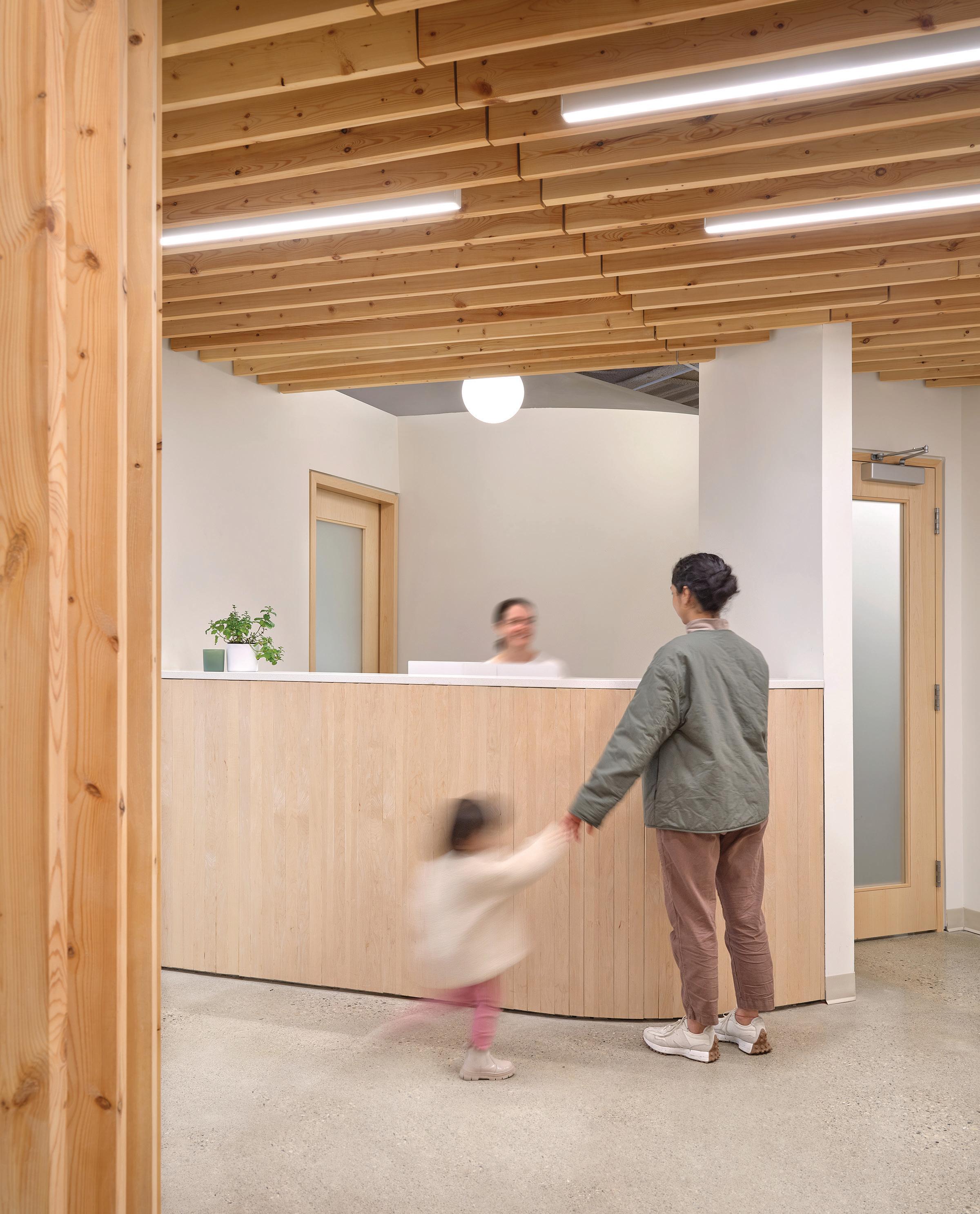
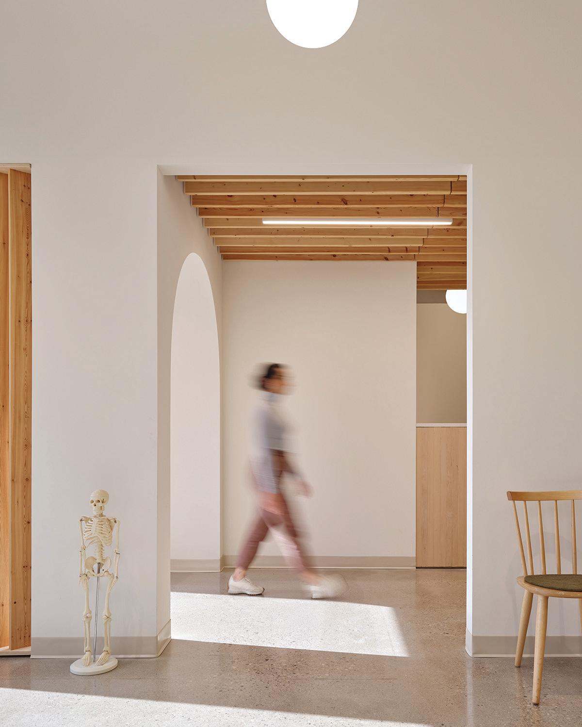
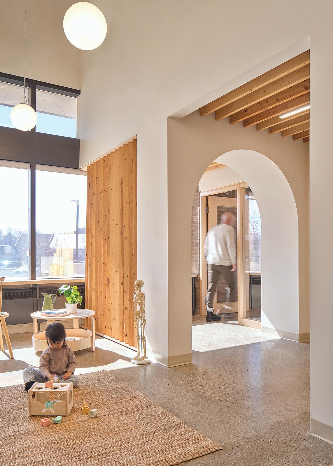
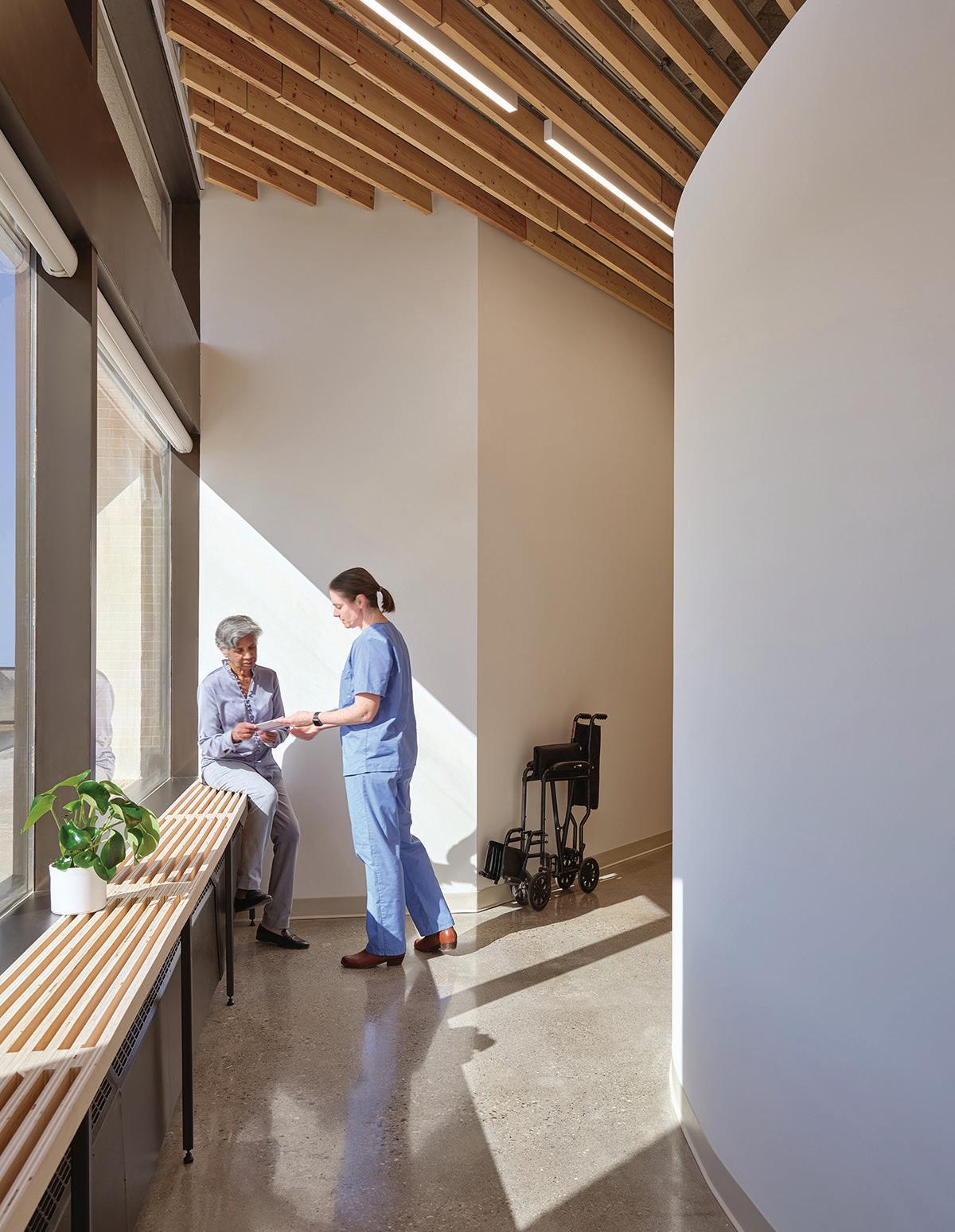
OPPOSITE A wood reception desk greets clients at the new health clinic in Galt, Ontario. TOP Wood slat ceilings and rounded doorways give the clinic a comfortable, domestic sensibility. LEFT A continuous hallway loops the clinic, facilitating ease of movement for staff.
an ideology of care. Many, if not the majority, of family health clinics across the country have a bare minimum of design thinking invested into them, offering a series of sterilized and compartmentalized windowless patient rooms flanking equally utilitarian corridors. These kinds of spaces hardly inspire optimism for someone who is likely feeling vulnerable, or in at least somewhat of a compromised state.
Jaliya Fonseka has designed a clinic for Galt Health Centre in downtown Cambridge, Ontario, that is clearly an exception. Upon entering the space, there is immediately a sense of warmth, framed by its humble material palette and careful attention to light. But as one spends more time in the clinic, its carefully composed arrangements become increasingly evident. Everything about the project is modest: its budget, its size, its location off the atrium of a standard office building, its materiality. And yet, its thoughtful design skillfully creates a place where one instantly feels uplifted.
The organization of the project emerged from Fonseka’s consultations with the clinic’s medical professionals and staff, as well as community members, to ensure their insights were foundational to the design. This led to a focus on access to daylight, views, and a sense of openness. Despite the efficient and compact use of space, the exposed wood-fin ceiling, with utilities set between and behind the slats, allows
for a surprisingly generous sense of volume. The plan, resulting from a thorough study of the users’ daily activities and movement patterns, positions the patient rooms in a central block, accessed along the building’s exterior wall. This allows daylight to flood the hall, extending into the reception and waiting areas through carefully arranged openings. A circulation loop links the patient corridor to the staff working areas, allowing for a certain fluidity and ease of movement. Strategic curved walls and arches allow natural light to softly guide movement throughout the project. Inside the patient rooms, simple pitched roof ceilings bring a sense of domestic familiarity and added volume, while translucent glazing creates planes of natural daylight.
Perhaps the most defining attribute of the project is its wood millwork. Vertical wood fins, made of standard dimensional lumber, are positioned thoughtfully to maximize light while offering a sense of enclosure and privacy from certain angles. They are composed to strategically break up and contain spaces at the same time. Meanwhile, wood ceiling fins and a custom-built 35-metre-long plywood bench tie the clinic’s various areas together at the perimeter.
In this project, the use of wood is about more than just its composition. All of the wood was locally sourced and milled on-site. It was finished with natural and renewable raw materials a mix of soybean

ALUCOBOND’s rich tradition of innovation drives our discipline forward in exciting, unexpected directions. We have a vision for how exterior surfaces can improve the design and functionality of a building, and our passion for what’s possible gives shape to great ideas.
Meets today’s fire performance requirements set by the International Building Code (IBC)
84 Stocked Finishes + Custom Color availability
Durability & Formability | Flatness & Rigidity
Complementary AXCENT Finishes
Easy of Fabrication
100% Recyclable
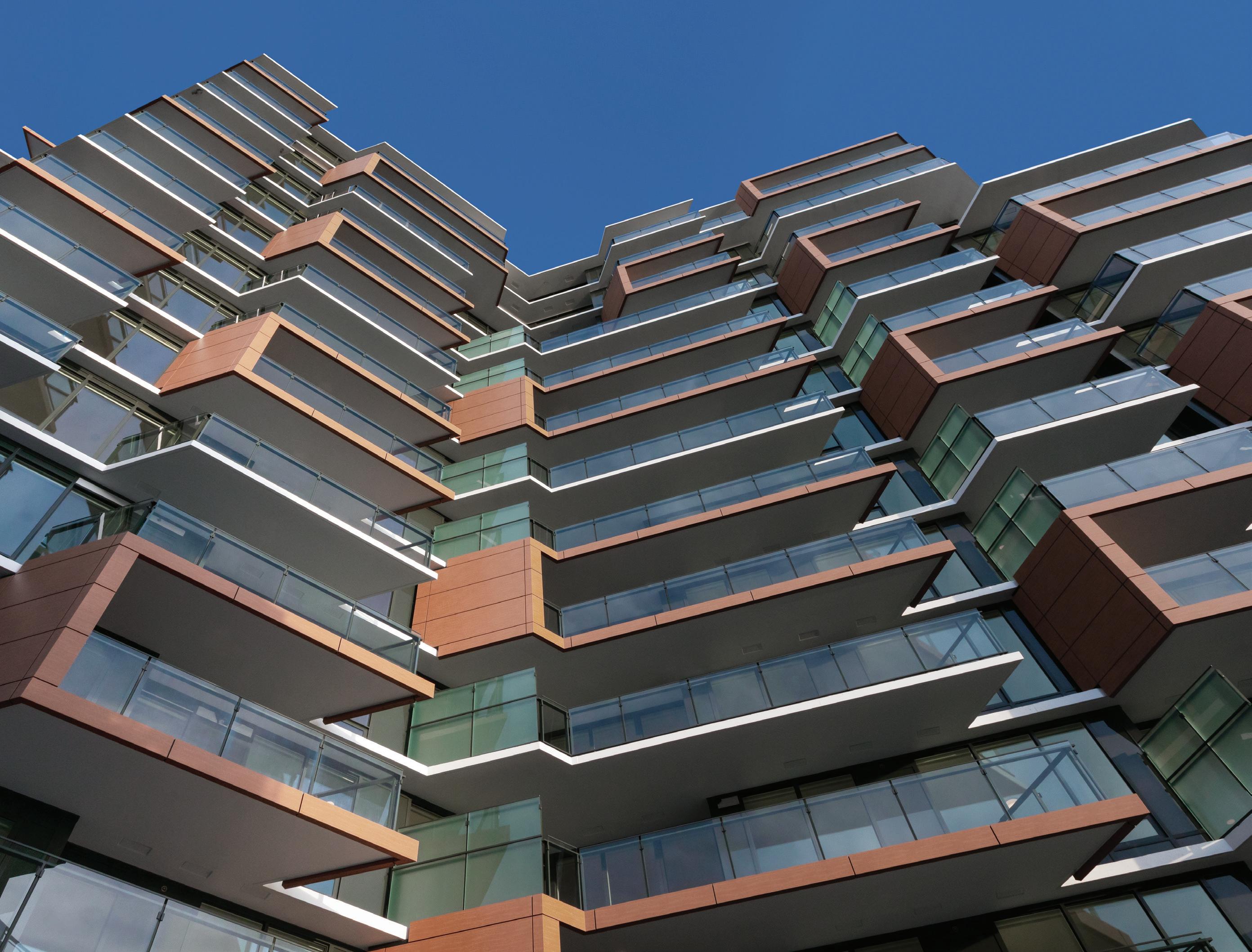
ALUCOBOND® PLUS Project Details: Semiah Condominiums
ALUCOBOND PLUS: Chestnut
Architect: Arno Matis Architecture
Fabricator: Keith Panel Systems
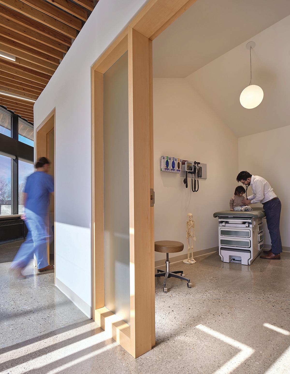
ABOVE LEFT The patient rooms are shaped with a house-like ceiling, and include translucent glazing to the daylit corridor. ABOVE RIGHT A long wooden bench provides an inviting opportunity for patients and staff to sit and rest.
oil, sunflower oil, thistle oil, carnauba wax, and candelilla wax. Perhaps most impressively, Fonseka constructed the millwork himself, by hand, acting also as the general contractor for the project. The personal commitment to craft can be sensed at all levels. In a profession that seems like it is constantly challenged by diminishing budgets and timelines, it is easy and most often necessary to prioritize efficiency in billable hours, material sourcing, and constructability. But in the frenzy of such means of production, it is easy to forget the importance of sometimes slowing down and taking care of the process.
Nowadays, whenever I am forced to slow down and sit with my family in the waiting room at the Galt Health Centre, I can’t help but sense the personal investment and careful intentions for the project. Despite the discomfort that we may be feeling, the clinic offers a sense of respite, with the sun filtering through Fonseka’s hand-crafted wood fins. It serves as an important reminder of how a quiet and empathetic approach to design can indeed be powerful and uplifting, even in the most humble of places.
David T. Fortin is a Professor at the University of Waterloo and Principal Architect of David T Fortin Architect. His research and practice focus on concepts of home and alienation, and the structural impact that colonization and commodification have on these conditions, with particular interest in how design can instead embed relationality—between humans and more-than-humans—as its first priority.


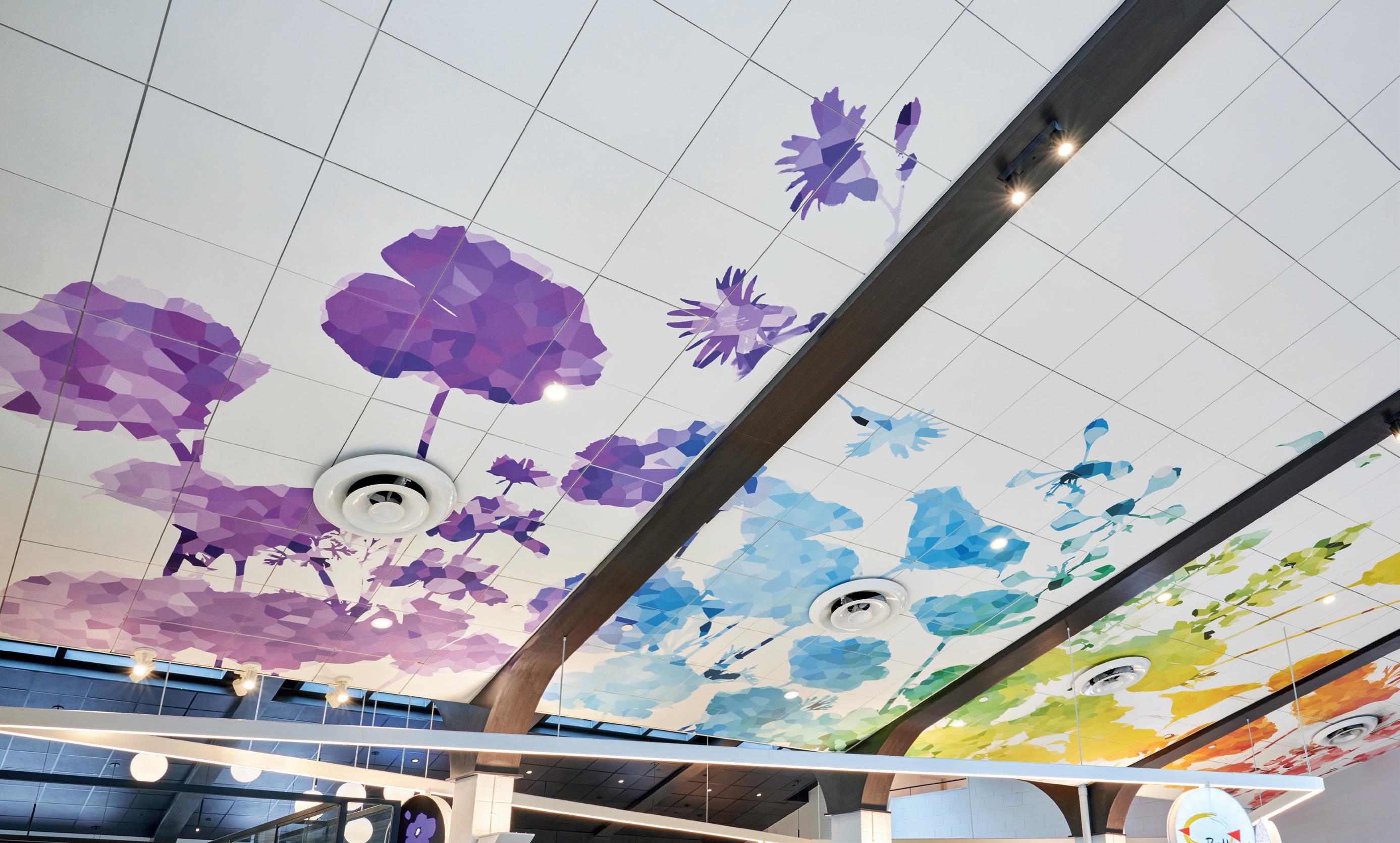




Turning a standard acoustic ceiling into a colorful one-of-a-kind bouquet is a lot easier than you might think. Create!™ ceiling panels become your blank canvas for artistic expression. Start with Ultima® or Optima® panels for the best performance benefits in your space. Then we transfer your images and patterns onto the panels for an acoustical masterpiece. Your unique visual sets the stage for a memorable space with the flexibility to fine-tune the acoustics. Let your creativity bloom at armstrongceilings.com/create



A DELIGHTFUL ADDITION TO QUEBEC CITY’S PROMENADE SAMUEL-DE CHAMPLAIN GIVES RESIDENTS NEW OPPORTUNITIES FOR LEISURE ON THE ST. LAWRENCE RIVER’S SHORES.
PROJECT Promenade Samuel-De Champlain, Phase 3, Quebec City, Quebec
ARCHITECT Daoust Lestage Lizotte Stecker
TEXT Odile Hénault
In 2008, as Quebec City celebrated its 400th anniversary, its citizens received a major birthday present from the provincial government: a stunning 2.5-kilometre park along the St. Lawrence River. It was Phase 1 of Promenade Samuel-De Champlain (see CA, November 2008), named after the French explorer who founded the city in 1608. Designed by Montreal-based Daoust Lestage (now Daoust Lestage Lizotte Stecker) in collaboration with Williams Asselin Ackaoui and Option aménagement, the project was met with great enthusiasm as people flocked to it at all times of the day and in all seasons.
Extending the Promenade
Fifteen years later, in 2023, a second stretch of this waterfront park has opened to the city’s residents. (A short connecting path west of the initial phase was completed in 2016, so the current project is technically the Promenade’s Phase 3.) Thankfully, the consortium led by Daoust Lestage Lizotte Stecker was once again commissioned to design this recent leg of the project. This meant continuity: in terms of philosophy, attitude to design, and architectural language. As in the 2008 project, wood was the signature material used for the Promenade’s pavilions, large and small, and for the urban furniture provided throughout.
During the first phase, the architects had faced a number of challenges related to reclaiming the site from its previous industrial uses. To reconnect Quebec City’s residents to the river, they created a linear park, with a pedestrian path, bicycle trails, and access to the shore. The design was
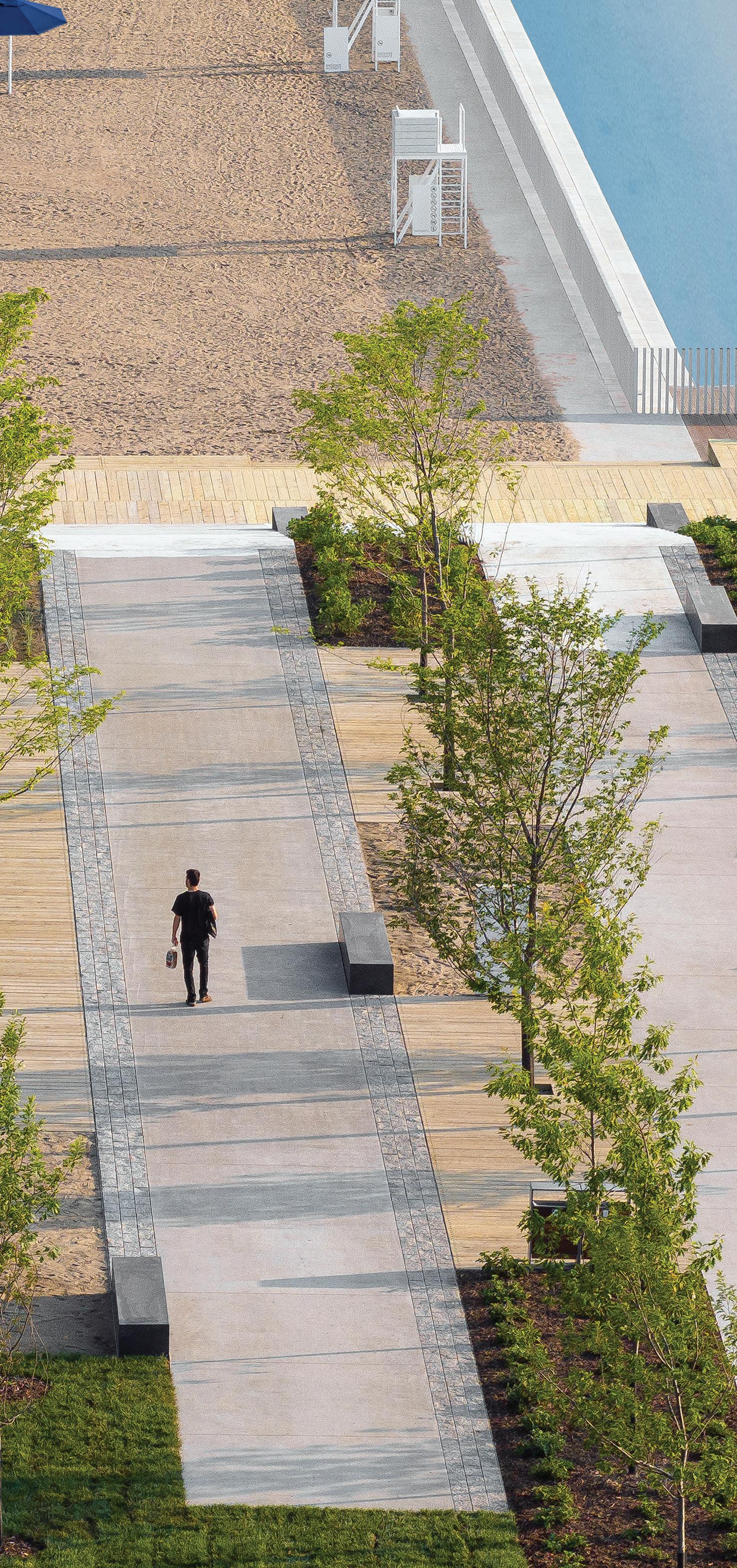
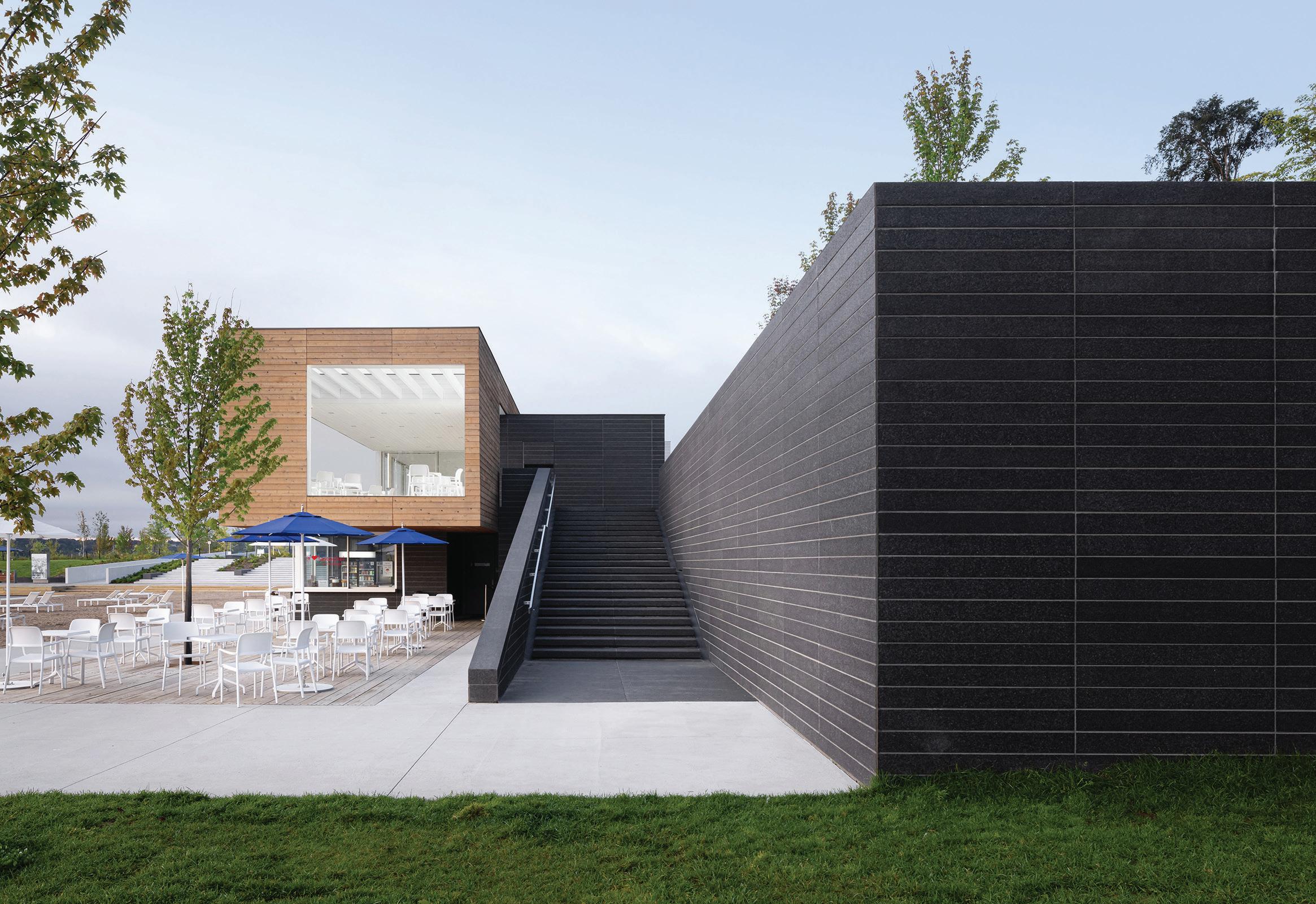
LEFT A sandy beach, swimming area, and splash pad form a popular destination in the new park. Just west of this, the former St-Michel Pier was turned into an evocative exterior space.
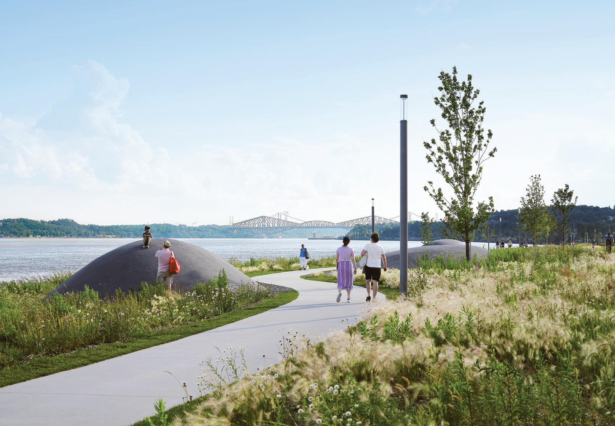

punctuated by thematic pier-shaped poetic gardens, evocative of the St. Lawrence’s tidal waters, windy storms, misty days, and the centuries-long presence of humans on the river. Phase 1’s focal point was the Quai des Cageux, a reference to the courageous raftsmen who floated logs down the St. Lawrence towards the coves of Sillery, the final destination for enormous quantities of timber bound for England.
Two decades later, preparations for the Promenade’s recent extension were equally if not more challenging. Significant infrastructural changes were needed to open up the site, including the relocation of the road a process initiated in Phase 1 and its transformation into an urban boulevard with integrated parking. On another front, negotiations with CN authorities led to the shifting of a freight rail corridor closer to the nearby cliff. Thanks to these two major changes, some 37 acres of land were unlocked for recreational use.
As the concept for the new 2.5-kilometre addition to the Promenade was being developed, it became obvious that history would play a significant role in the design. Remnants of former wharves were still present, severely damaged from decades of neglect. One of these was
Frontenac Pier, a favourite spot for Sunday strollers in the first half of the 20th century. Then there was Foulon Beach, once a major summer attraction: traces of it were still visible along the shore, but, more importantly, memories of it endured in older citizens’ minds. Finally, a few hundred metres east from the beach, an existing marina was to be upgraded and incorporated into the new park. These three locations became the focal points of a triad of distinct sectors, each of which is served by a new pavilion: the Pavillon de la Côte, at the western end, the Pavillon des Baigneurs, serving the beach area, and the Pavillon de la Voile, next to the marina.
The surrounding park was designed to reflect current ecological concerns. Major efforts were made to preserve and revitalize existing ecosystems, including ecologically sensitive marshlands. This led to the planting of over 1,000 trees and 29,000 shrubs, as well as the widespread re-introduction of plant species such as lyme grass, native to the St. Lawrence shores. Much appreciated by the public are three giant “pebbles,” placed along a sinuous path, which provide perfect observation posts for enjoying the new landscape and watching ships passing close by.
The Promenade’s brightest jewel is its central sector, where the historic sand beach was resuscitated in the form of an infinity pool, cleverly

of
views of the
and swimming area below, and the
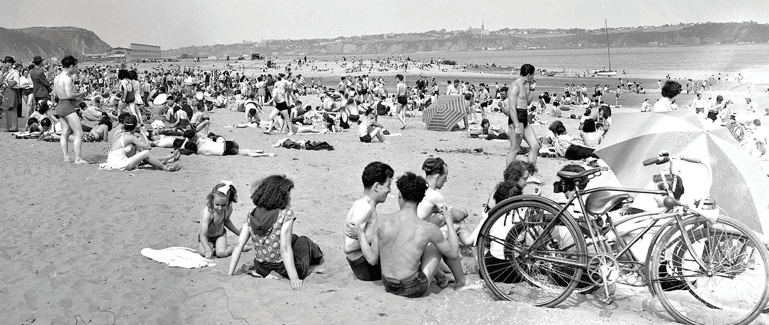
Lawrence beyond. The Pavillon’s white interiors are a whimsical allusion to seaside cottages. ABOVE This 1955 photograph illustrates the popularity of the former Foulon Beach as a swimming spot during hot summer days.
inserted in the St. Lawrence River. There is an obvious reference to the seaside basin (1966) designed by a young Álvaro Siza Vieira in his native Matosinhos, Portugal. Of course, six decades and the Atlantic Ocean separate the two. The Portuguese pool is inserted among the rocky shores of a wild Atlantic a stark contrast to the park setting of the Promenade’s pool, and the relatively tame shores of the St. Lawrence which in part explains Siza’s use of robust monolithic concrete walls.
The Pavillon des Baigneurs expresses strength in its own way. The two-storey volume is much more elaborate than the smaller wood pavilions that Daoust Lestage Lizotte Stecker has placed elsewhere along the Promenade. The added level of complexity relates to the pavilion’s program, but also to the site’s topography, since the building acts as
a transition point between the new urban boulevard and the shore, four metres below. A break in the pavilion’s stark granite walls marks the entrance to an upper-level restaurant, with an outdoor terrace facing the river. It also opens to an exterior stair leading towards the beach.
At the bottom, a sandy expanse is capped by the pool, whose infinity edges create the illusion of its being part of the St. Lawrence. It’s a source of absolute delight, particularly for those of us who were children in the fifties, and who still remember the original beach. Younger generations and new residents are just as thrilled to discover this unusual bathing spot, more akin to a riverine beach than to a typical sports facility.
In actuality, the pool, 1.2 metres at its deepest point, is totally contained within concrete walls that, even at high tide, prevent the

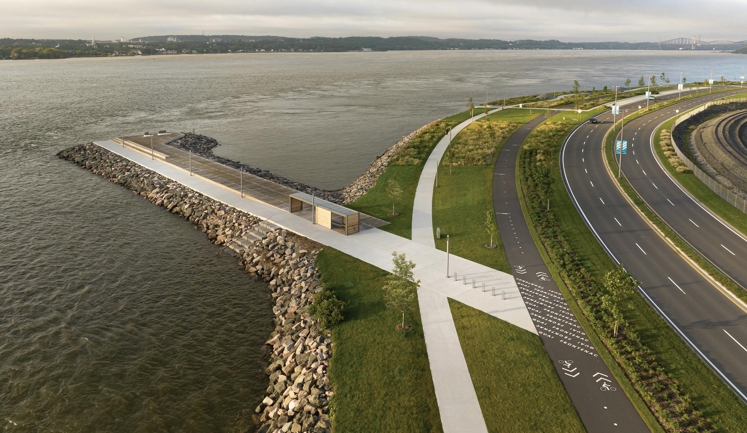
ABOVE In the Coastal Meadows sector, the long-neglected Frontenac Pier was revitalized, allowing Quebec City’s residents and visitors to approach the river. The Samuel-de Champlain linear park, which now spans over five kilometres, includes parallel pedestrian and cyclist trails, as well as a new urban boulevard with integrated parking.
St. Lawrence waters from flowing into it. Adjacent to the pool is a shallow basin just a few centimetres deep where intermittent water jets are an attraction for young children or those just wanting to wet their feet.
Faced with pool safety requirements and wanting to avoid the ubiquitous chain-link fence, the architects went on a worldwide search for a barrier that could disappear when the pool was open. They found what they were looking for in Poland, where they sourced retractable post fences that they were able to adapt to the needs of the project. The elegant solution matches the pool area’s bespoke lifeguards’ chairs and echoes the minimalism of the portals used throughout the Promenade to help break down its scale.
A new phase, an old conclusion
In 2008, I concluded my first article on the Promenade Samuel-De Champlain with the following words: “The project truly shows what can be accomplished when enlightened professionals manage to convince politicians to move towards the completion of a visionary concept. […] One can only hope this project will be a source of inspiration for professionals and politicians around the country as waterfronts and former industrial areas are being adapted to the 21st century’s new realities.”
Unfortunately, the inspired vision that has led to the success of the Promenade Samuel-De Champlain continues to be rare. This April, the Crown Corporation which oversees Montreal’s Old Port announced that, for “financial reasons,” its 2017 project to revitalize the area would not be implemented as designed. The project, also by Daoust Lestage Lizotte Stecker, is a refined proposition that would have gone a long
way to mend the unfortunate, piecemeal approach adopted in the Old Port since the destruction of Silo no. 2 in 1978.
The same firm also authored an admirable proposition for the National Memorial to Canada’s Mission in Afghanistan. Last fall, the project was declared the jury-selected winning entry of an architectural competition held by the federal government, only for the decision to be overturned by the same administration in favour of an approach focused on more literal imagery.
What is obvious from these two recent events is that the message is not getting through to politicians. Fortunately, professionals continue to champion quality architecture at the urban scale: the Promenade Samuel-De Champlain was the recipient of the Ordre des Architectes du Québec’s Grand Prix d’excellence, the highest honour in its awards program. It is a well-deserved recognition of the value of contemporary, urbane architecture as practiced by Daoust Lestage Lizotte Stecker.
Odile Hénault is a contributing editor to Canadian Architect.
CLIENT COMMISSION DE LA CAPITALE NATIONALE DU QUÉBEC (CCNQ) ARCHITECT TEAM DAOUST LESTAGE LIZOTTE STECKER—RÉAL LESTAGE, ERIC LIZOTTE, CAROLINE BEAULIEU, LUCIE BIBEAU, GRÉGORY TAILLON, DAVID GILBERT, MÉLISSA SIMARD, LUCA FORTIN, MARIA BENECH | CONSORTIUM - LANDSCAPE DAOUST LESTAGE LIZOTTE STECKER, OPTION AMÉNAGEMENT ET WILLIAMS ASSELIN ACKAOUI PARTNER MINISTÈRE DES TRANSPORTS ET DE LA MOBILITÉ DURABLE | ENGINEERING ATKINSRÉALIS, WSP, TETRA TECH | PROCESS ENGINEERING FRANÇOIS MÉNARD | CONSTRUCTION MANAGER POMERLEAU CONTRACTORS CONSTRUCTION BML (STATION DE LA CÔTE, STATION DE LA VOILE AND BOULEVARD); CONSTRUCTION DERIC); STATION DE LA PLAGE, MIRROR OF WATER AND THE SWIMMING AREA); CONSTRUCTION CITADELLE (PAVILLON DE LA CÔTE AND PAVILLON DE LA VOILE); BAUVAIS & VERRET (PAVILLON DES BAIGNEURS) AREA 150,000 M2 (PROMENADE) + 1,200 M2 (BUILDINGS) BUDGET $135 M | COMPLETION JULY 2023
Since 1967, our annual national awards program recognizes the architectural excellence of projects in the design and construction phases.
Submissions will be accepted in PDF format , up to 12 pages with dimensions no greater than 11” x 17” . Total file size is not to exceed 25 MB There is also the option to submit a video up to two minutes in length.
This year, we are also presenting the sixth edition of the Canadian Architect Photo Awards of Excellence.
Winners of the architectural project and architectural photo competitions will be published in a special issue of Canadian Architect in December 2024.
Architecture project entry fee: $195 *
Architectural photo entry fee: $75 *
For more details and to submit your entry, visit: www.canadianarchitect.com/awards
* plus applicable taxes
Deadline: September 12th, 2024

PROJECT Churchill Meadows Community Centre and Sports Park, Mississauga, Ontario
ARCHITECT MJMA A rchitecture & Design
TEXT Elsa Lam
PHOTOS Scott Norsworthy, unless otherwise noted
Toronto-based MJMA has steadily evolved the typology of the aquatic centre since its competition win for the Grand River Aquatic Centre in Kitchener, Ontario, in 1988. In the 36 years since, the firm has been awarded three Governor General’s Medals in Architecture for pool buildings. And this spring, one of its recent projects cinched Ontario’s top architecture prize: the Lieutenant Governor’s Award for Architecture went to Churchill Meadows Community Centre, located at the suburban western edge of Mississauga, Ontario.
The new facility shows how MJMA is not content to rest on its laurels, but rather, has been continuing to innovate from the basis of its successes. Churchill Meadows Recreation Centre shares a similar planning approach to MJMA’s Pam McConnell Aquatic Centre in Toronto’s Regent Park, which was acclaimed for its generous natural light and new-to-Canada introduction of universal change rooms. Both facilities have windowringed pools, flanked by a block of universal change rooms, and edged with an access corridor set alongside a glazed façade; to this parti, Churchill Meadows adds a triple gymnasium and partial second floor.
But here the similarities end. Churchill Meadows has decisively raised the bar for design excellence. This was in part enabled by MJMA’s wide scope on the project: the firm was responsible not only for the building, but for its surrounding landscape and for the masterplan of the 50-acre park in which it sits. Instead of sinking the rec centre to the back of the site, behind a sea of parking, the designers decided to rotate it 45 degrees relative to the urban grid, so that the building faces the cardinal directions. As a result, parking is pushed to two corners of the site, and the building becomes a focal point for the surrounding park.
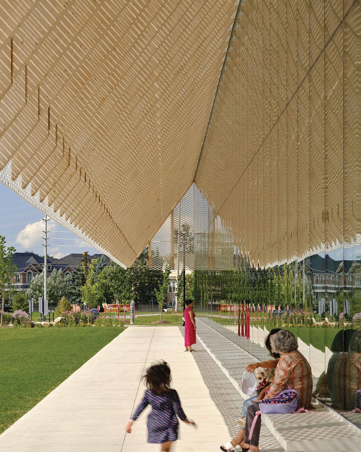
Led by MJMA principal Chris Burbidge and design architect Tyler Walker, the team next opted to design the rec centre as a long, skinny rectangle, ringed by covered walkways. The most spectacular of these is a 130-metre-long promenade that stretches alongside the building’s western edge, facing the park. The two-storey outdoor space is topped by a sculptural parade of V-shaped glulam rafters edged with expanded metal mesh, providing a snow-free promenade in the winter, and a shady respite in the summer. Many recreation centres boast an outdoor public promenade of some type a kind of enlarged version of a home’s front porch but few achieve the combined sense of both intimacy and grandeur that is present at Churchill Meadows.
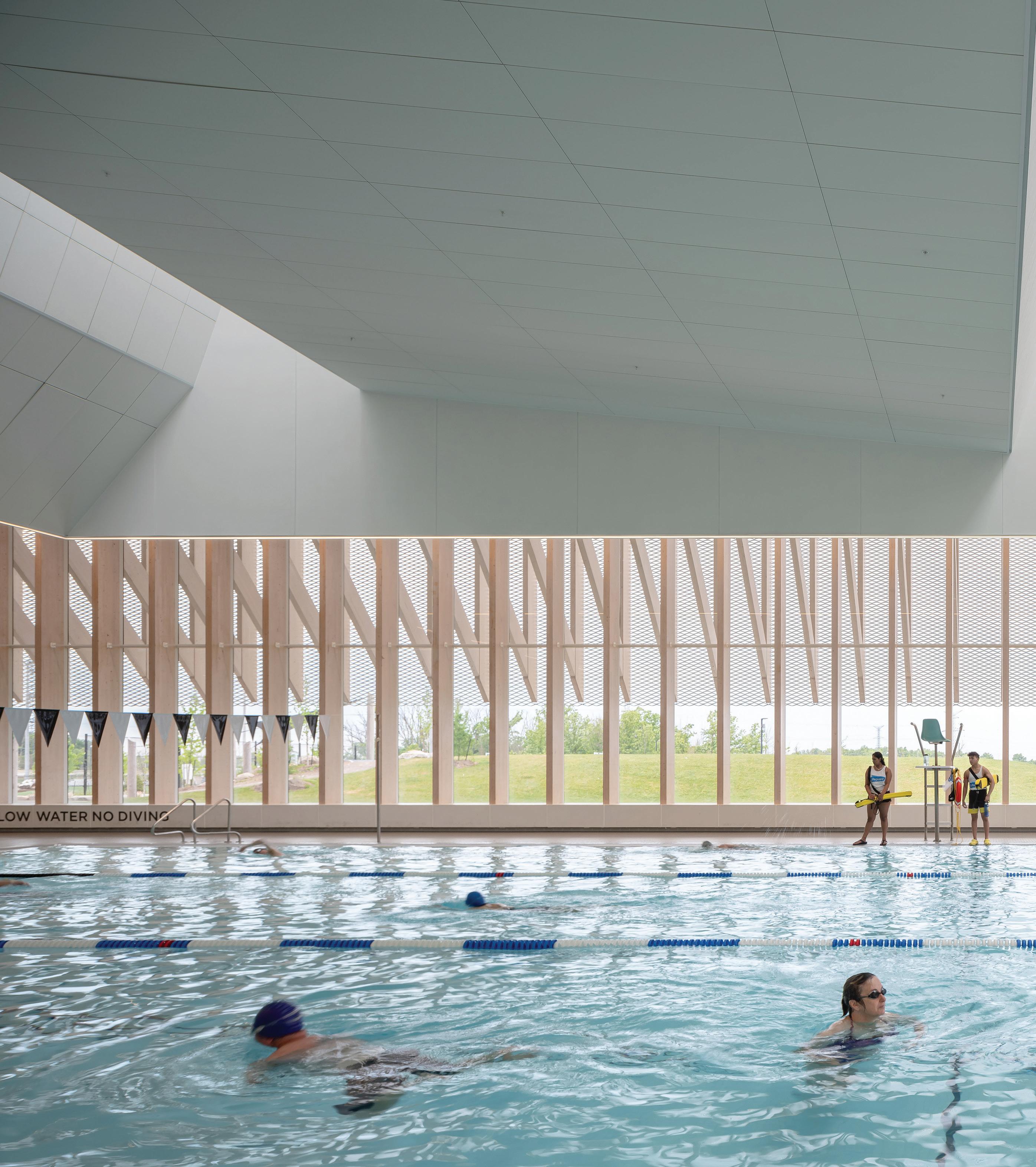
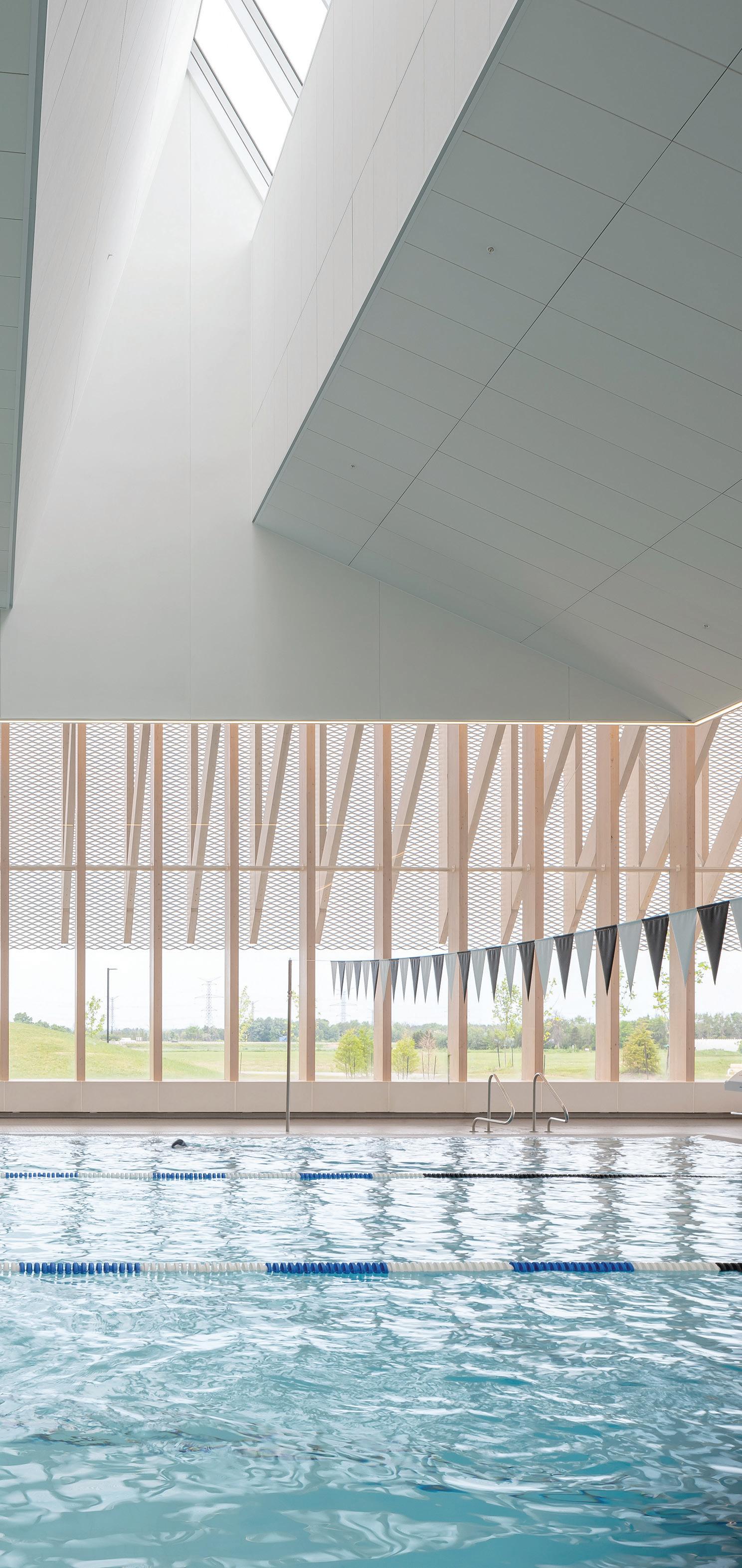
LEFT The swimming area enjoys generous natural light from skylights above, and two fully glazed exterior walls. The ceilings are shaped to diffuse light and frame the pool basins below.
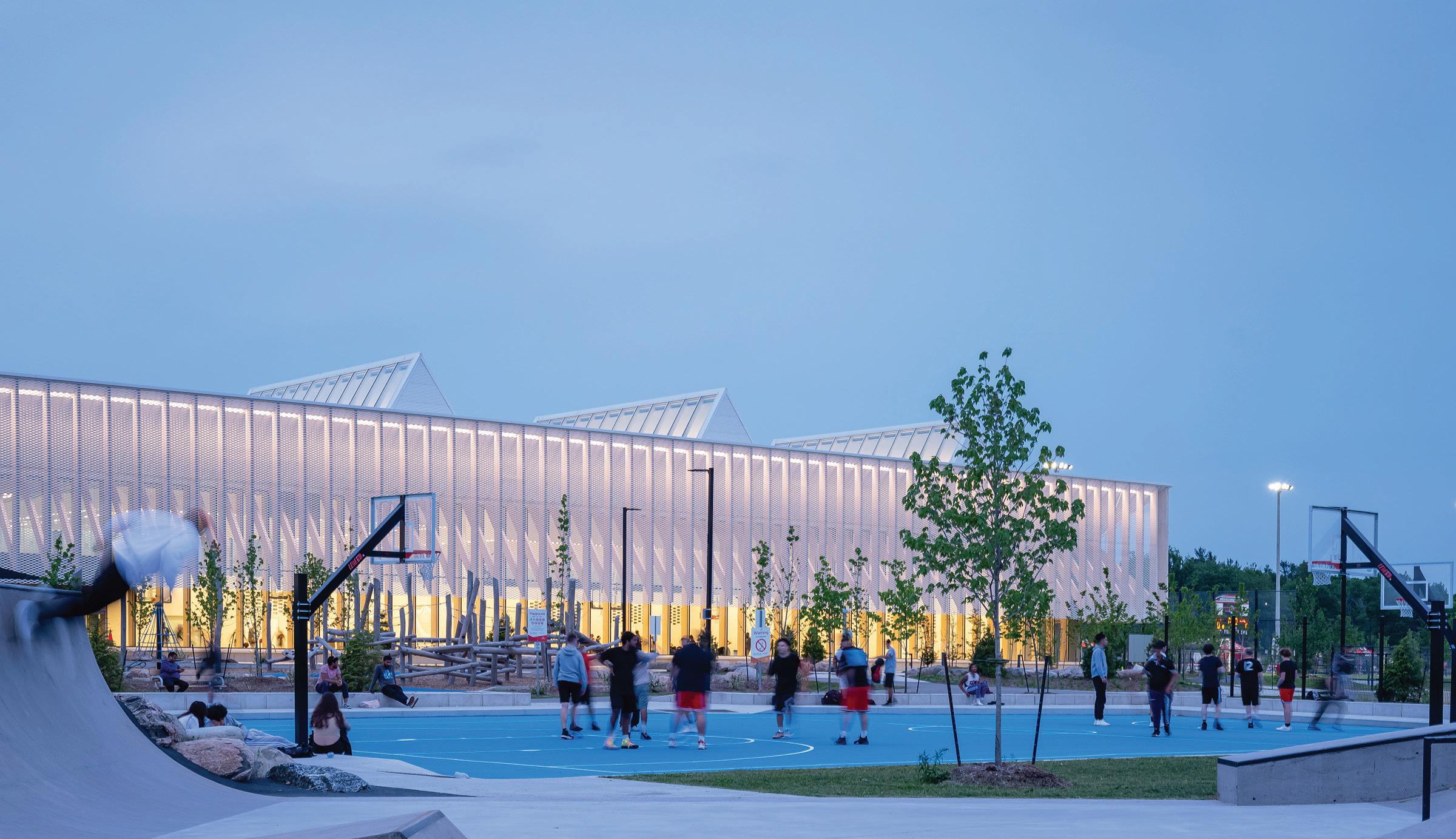
The creation of this promenade, explains Walker, stems from the core idea of the project: “pulling the façade apart and making it do as much as possible,” in order to blur the boundary between inside and outside. “The hope was that it would wrap the building in this kind of ‘sticky’ space where people gather, pause, and socialize the idea of social infrastructure while simultaneously shading the building and interiors.”
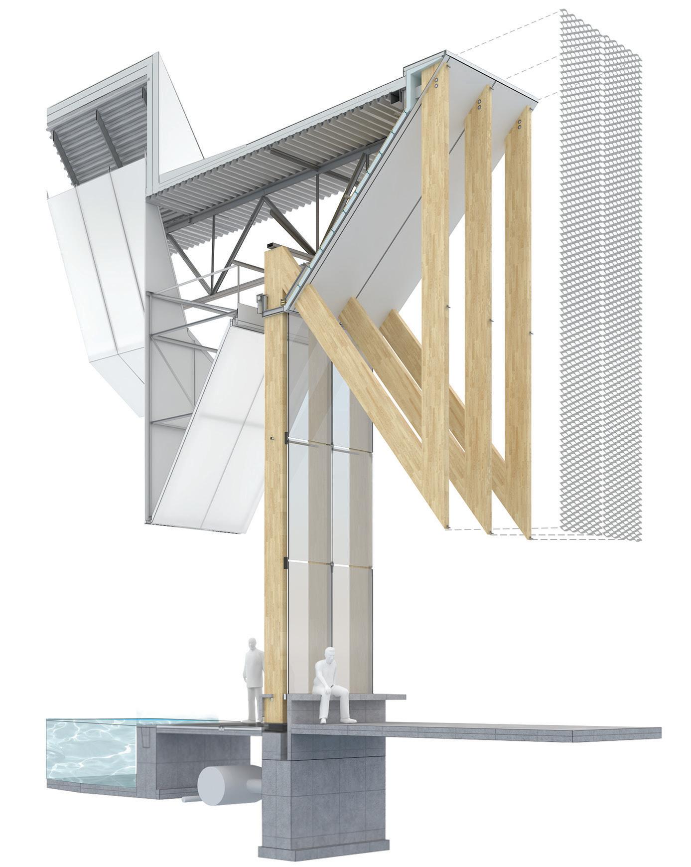
A highly efficient building section was developed with Blackwell Structural Engineers’ Ian Mountfort to work within the project’s tight budget, while maximizing visual impact. A series of glulam columns supports the building’s roof, and is the main support for the façade panels. To avoid diagonal members detracting from the rhythm of the columns, lateral bracing was moved into the core of the building, which was possible because of the volume’s thin proportions.
The glulam columns are remarkably slender just 136mm wide and 450mm deep. This is because they work in triads, with each steel roof truss supported by three columns tied together at their top, middle, and bottom points for stability.
The steel angle tying the columns together at their bottom point supports a bench that extends the length of the building’s interior and exterior. Air supply vents and radiators are tucked under this bench, out of sight and safe from kicking feet chasing stray balls. In the gym and pool areas, the generous ledge is a convenient place for depositing backpacks, water bottles, and swim towels. Outside, it welcomes lingering a sheltered place to sit, chat with friends, or watch playing kids.
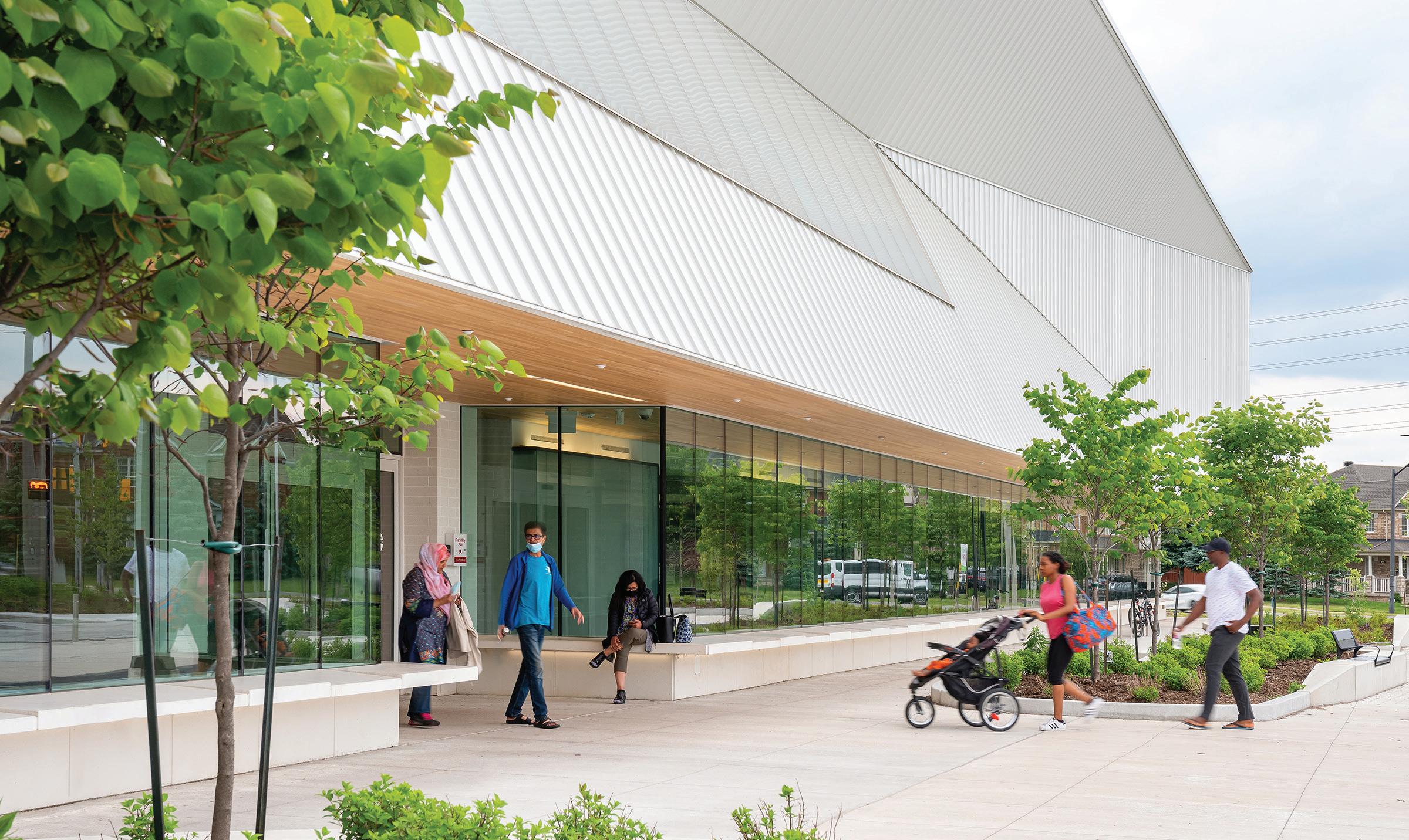
On the east façade, the second floor volume cantilevers out to create extra-deep window alcoves on the upper floor favourite activity nooks for children attending programs in the community kitchen and multi-
purpose studios. On the lower floor, the projecting volume forms a canopy that creates a sheltered approach to the centre. The long bench makes an appearance here, too, providing indoor and outdoor amenity.
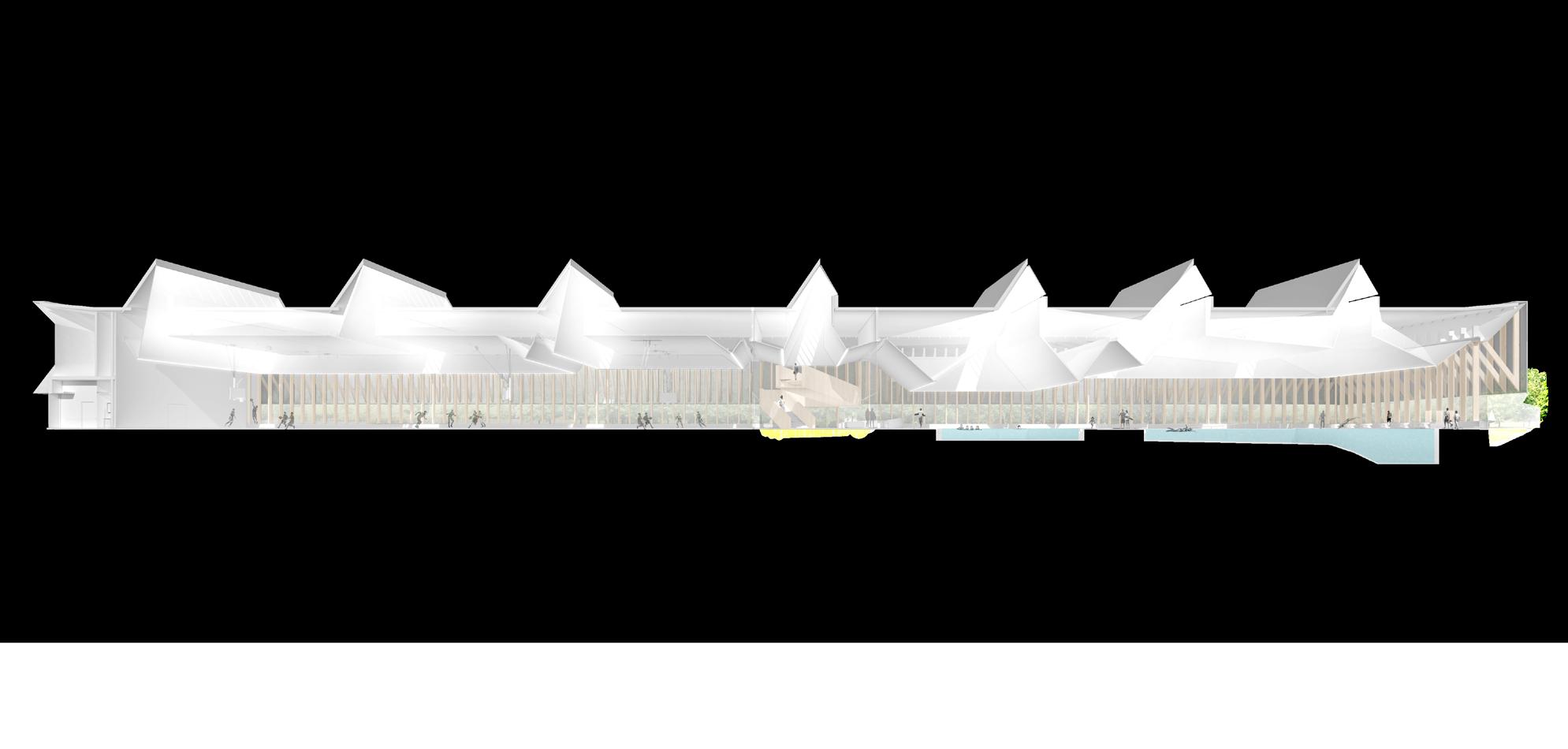
If the short section of the project is an essay in maximizing the function and efficiency of a structure and its façades, the long section tells a story about inviting in light. Seven north-facing skylights, arrayed along the length, mark out the functions of the building: three skylights illuminate the three sections of the gymnasium, one crowns a central atrium, and three mark the pool.
While the ceiling is shaped over each program space to support lighting, acoustics, and ventilation, the most dramatic sculpting happens over the warm water leisure pool, where the ceiling dips down to create a more intimate interior space. This continues an exploration of shaped roofs from the firm’s aquatic centre at the University of British Columbia, completed with Acton Ostry Architects, where a lowered ceiling caps and frames the leisure pool. “Pools are grand rooms and they want ceilings to define the space,” says Burbidge.
Both views and light are carefully considered in the natatorium. Swimmers enjoy park vistas to the west and to the north of the pool; a strategically located hill brings extra green into the view and conceals sports fields and a distant highway.
“The quality of light that’s captured in this building is one of the most successful parts of the project,” says MJMA partner Ted Watson. Daylight is carefully filtered and balanced to cut glare, minimizing the need for the City operators to lower sun-blocking blinds. From the west, the expanded metal mesh and glulam struts provide shade without impeding the sense of openness between indoors and out, while the 450-milli-

metre-deep glulam columns act like giant venetian blinds, lowering heat gain. The use of a universal change room, equipped with individual and family-sized privacy cubicles, allows for daylight to enter through glazing to both sides of the change area.
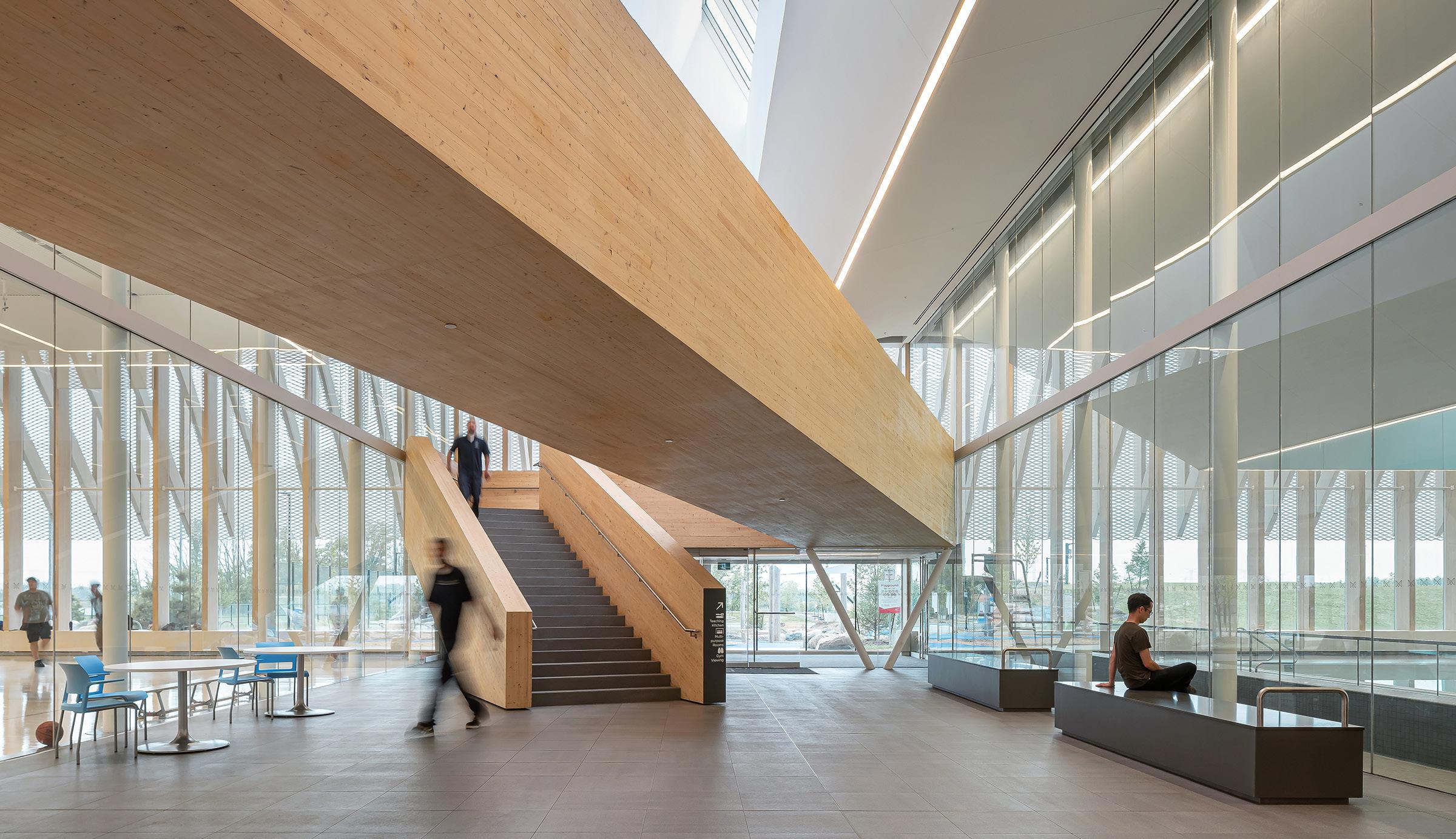
The inclusion of a mass timber feature stair in the main atrium is audacious for a project that aims to be as open and transparent as possible. But it works, in part because it’s treated like a freestanding sculptural element. The upper portion of the stair is supported by 20-metre-long CLT beams the longest self-supporting mass timber members available from Nordic Structures at the time of manufacturing. These eight-foot-wide, one-foot-thick beams land on delicate V-shaped steel supports, while the rest of the stair is supported by glulam hangers that integrate with the west wall. Beyond its impressive structural gymnastics, this serves to maintain a clear view corridor from the main entrance through to the park beyond. The only point of visual friction is the rough quality of the mass timber because of the way that large CLT members are manufactured, it can have visible cracks and inconsistencies, unlike the more polished look one has become accustomed to with glulam.
The project began in 2016, before embodied carbon was a widespread topic of discussion, but the building has also proven progressive in this aspect. The optimized structure means that there is no secondary steel, reducing a major contributor to a building’s embodied carbon footprint. MJMA recently undertook a carbon analysis of 14 projects in its portfolio, and found that Churchill Meadows’ embodied carbon intensity of 435 CO2e/m2 put it at the lower end of its buildings with concrete pool basins.
The learnings from this internal embodied carbon study, as well as from the design of Churchill Meadows, are already informing MJMA’s next set of buildings, particularly several mass timber buildings on its drawing
ABOVE Thin glulam columns are the key component in a structural system that optimizes the use of material. OPPOSITE TOP V-shaped rafters and expanded metal mesh panels create dappled shade along the parkfacing promenade. OPPOSITE BOTTOM The community centre is ringed by a sheltered concrete bench—part of the architects’ strategy of creating a ‘sticky’ social space around the building.
boards. But while all recreation centres are similar in program, the buildings are also distinct reflecting the diversity of individual communities.
The unique identity of Churchill Meadows is perhaps most evident on Friday evenings, when the gymnasium hosts Muslim prayers, a function facilitated by foot baths built to the sides of the gym’s twin access corridors. “It’s amazing when you see it they come up and set up all of the prayer mats straight to Mecca,” says Burbidge. Basket hoops pulled up and pickleball nets tucked away, with sunset colours framed by the wood structure to the west, the architecture gracefully transforms from a sports facility to a place of worship a building truly at the heart of its community.
CLIENT CITY OF MISSISSAUGA | ARCHITECT TEAM DAVID MILLER (FRAIC), CHRIS BURBIDGE (MRAIC), TYLER WALKER (MRAIC), TED WATSON (FRAIC), TARISHA DOLYNIUK (FRAIC), TIM BELANGER, ANDREW FILARSKI (FRAIC), ROBERT ALLEN (FRAIC), OBINNA OGUNEDO, LELAND DADSON, KRIS VASSILEV, DARLENE MONTGOMERY, JASPER FLORES, CALEB TSUI, NATALIA ULTREMARI, JEREMY CAMPBELL, CAILEIGH MACKELLAR, KYUNG-SUN HUR | STRUCTURAL BLACKWELL | MECHANICAL/ ELECTRICAL SMITH + ANDERSEN LANDSCAPE MJMA ARCHITECTURE & DESIGN INTERIORS MJMA ARCHITECTURE & DESIGN | CONTRACTOR AQUICON CONSTRUCTION | EXPERIENTIAL GRAPHIC DESIGN/SIGNAGE & WAYFINDING MJMA ARCHITECTURE & DESIGN AREA 7,000 M2 | BUDGET $48 (COMMUNITY CENTRE & DISTRICT PARK) / $61.8 M (2023 ESCALATED) | COMPLETION OCTOBER 2021
ENERGY USE INTENSITY (PROJECTED) 570.2 KWH/M2/YEAR
A TORONTO EMERGENCY DEPARTMENT EXEMPLIFIES HOW HOSPITALS CAN HELP HEAL THROUGH HUMAN-CENTRED DESIGN.
PROJECT Renew Sinai - Phase 3A Emergency Department Renovation, Toronto, Ontario
ARCHITECT Stantec
TEXT Naomi Kriss
PHOTOS Tom Arban
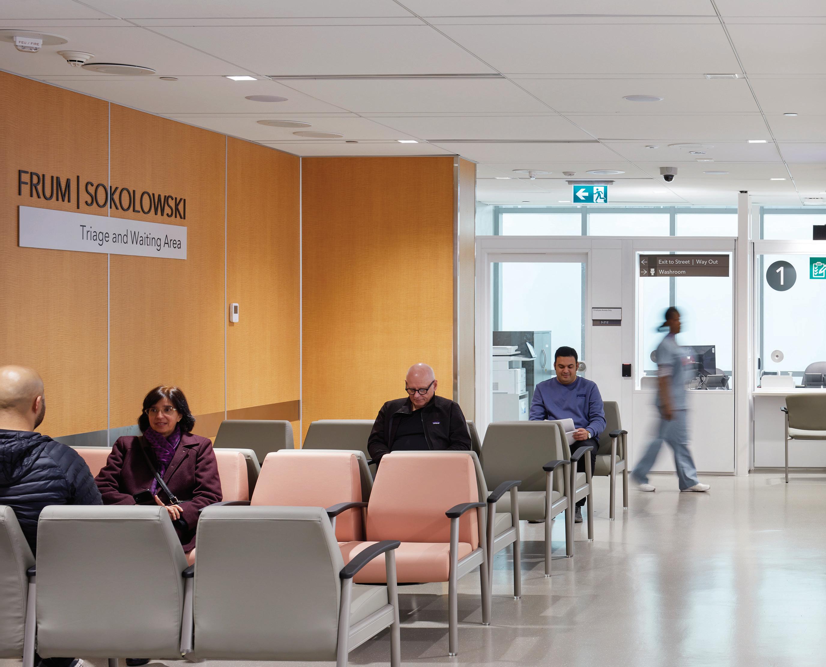
ABOVE Mount Sinai’s revamped emergency department, developed in tight consultation with hospital staff and clinicians, includes a smaller triage area, increased number of examination rooms, and in-department diagnostics—part of an integrated process of guiding patients more efficiently towards care providers.
As my parents’ health slid into serious decline over the past few years, I have become a regular visitor to a handful of downtown Toronto’s hospitals and emergency departments. I’ve built a career immersed in understanding and developing narratives about how design contributes to creating a better world. So during those long visits, I became curious about healthcare environments and their impact on visitors as well as on the staff for whom these are daily workplaces. Unfortunately, many of Toronto’s hospitals feel less than great. Soaring atriums lack human scale. Infantile colours and inelegant signage make a feeble attempt to deliver warmth. There’s a corporate stiffness. What happened to the idea that hospitals can heal through human-centred design?
But when I took my critically ill father to the new Schwartz/Reisman Emergency Centre at Mount Sinai Hospital, I encountered a highly
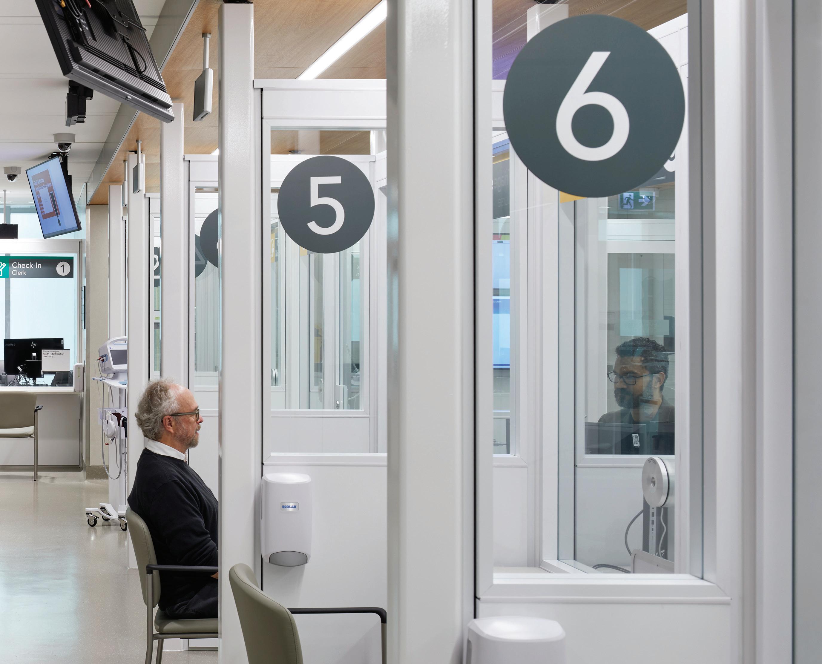
considered environment. We arrived by ambulance, were swiftly processed through triage, and shown into a spacious private examination room. As we rolled my father’s gurney through the emergency department, I noticed how clean and fresh it was and how the ceilings an often-overlooked plane, but one a person notices so often in hospitals was thoughtfully designed with seamlessly integrated lights and vents, and canopies clad with a wood-look laminate. In lieu of standard blue privacy curtains, we entered through an acoustically separating, sliding glass door. An unexpected clerestory window brought in rays of sunlight while still maintaining our sense of shelter and privacy. The room was quietly neutral with more of the wood-like panelling which emitted warmth and reassurance. Equipment offered pops of colour. The room had its own sink. A headwall panel above the bed neatly organized equipment and switches. For the first time in months, I exhaled.
Mount Sinai Hospital plays a vital role in the lives of many Torontonians, while also conducting world-class research and training. To do so effectively, its facilities need to feel fresh and exemplify leading standards. Since 2009, Stantec Architecture’s Gail Hannah and Michael Moxam have been collaborating with a close-knit team of seasoned Mount Sinai administrative and clinical staff on renovations throughout the hospital’s 1953 building. This effort has required nothing short of military-style planning, with over 150 sequenced phases and temporary “decants and relocates” to upgrade the hospital while maintaining ongoing 24/7 operations. According to Dr. David Dushenski, Chief of Emergency Medicine at Sinai Health, following a renovation in 2000, the hospital had exceeded the emergency department’s capabilities within only four years. The new emergency department (ED) is now nearing completion, after seven years of phased construction.

Touring the ED with representatives from Stantec and Mount Sinai, I learned how this kind of project requires close partnerships, deep listening, and patience to combine clinical and design requirements. The team’s challenges are on par with a complex urban intervention: a deliberately protracted schedule, zero-downtime, multiple experts, stakeholders and sub-consultants, and additional code requirements, especially to meet Infection Prevention and Control Canada (IPAC) standards. This project also involved repurposing functional spaces. To double the ED footprint to 2,230 square metres, they absorbed areas previously occupied by elective surgery and administrative offices. Technological requirements add further complications, particularly when working within an existing floor slab. There’s no room for designers to take experimental risks nor make trendy choices that will quickly age the space. This is also the kind of project that requires a certain nimbleness. As Dr. Dushenski explained, healthcare design is both linear and nonlinear: “We do our planning at a fixed point in time, but the protracted schedule doesn’t slow down for us to incorporate technical innovations and clinical technologies. So midstream during a project, we some -
times need to improve on best practices, add new and important features, or adjust for new requirements.”
The project began with an exercise in research and development, in which Stantec’s team evaluated design concepts and considered future scenarios, such as evolving technologies. They developed full-scale mockups of critical spaces complete with materials and equipment including the very room that my father and I were waiting in so that users could experience what it would be like to manage and treat people there. “That exercise greatly informed a lot of the design outcomes,” Gail Hannah explained. “It also helped the clinical staff, who aren’t accustomed to reading architectural drawings, to understand what they were getting.”
A key criterion for evaluating an ED is speed of service. When the final phase of the project is complete, ambulance and drop-off patients will arrive through a newly constructed emergency driveway, and enter through dedicated doors to help alleviate congestion. The triage waiting room is intentionally smaller than it was previously, part of an integrated process of guiding patients more quickly towards providers. An overhead monitor outlines the check-in process in which patients

MURRAY STREET ENTRANCE UNIVERSITY AVENUE ENTRANCE LOBBY
EMERGENCY DEPARTMENTS
RED ZONE: TRIAGE, STRETCHER HOLDING AND MAIN WAITING AREA
BLUE ZONE: PROCEDURE AND TREATMENT SPACES
PURPLE ZONE: BEHAVIOURAL SUITE
YELLOW ZONE: ACUTE CARE AND RESUSCITATION ROOMS GREEN ZONE: RAPID ASSESSMENT (ISOLATION POD)
IMAGING: CT AND RADIOLOGY MAIN REGISTRATION DESK
ENTRANCE
WALK-IN ENTRANCE
are registered in the hospital’s system, enabling care such as bloodwork or an intravenous drip to be ordered right away and indicates where patients are in the queue.
To help expedite service, Mount Sinai increased its examination rooms from 37 to 52, and there are now dedicated rooms for specialized services within the department such as ophthalmology and dentistry, and even CT scans and X-rays so that patients do not need to be transported elsewhere within the hospital, nor interrupt regularly scheduled services. I was told that with this renovation, Mount Sinai is Canada’s first ED to have dedicated in-house diagnostic services. Standardized examination rooms accelerate both service and safety, as staff are always familiar with the placement of equipment and other elements. And Mount Sinai’s “nobody owns a bed” philosophy means that between examinations or consultations, patients are directed to internal waiting areas, freeing rooms for other patients.
Another critical indicator of success is an ED’s ability to induce calm. With the new design, instead of being told to go to the perhaps stressinducing “acute care waiting area,” patients wait in the “yellow zone”
indicated by yellow lines on the floor and a supersized photograph with yellow hues. These photographs, superimposed onto fibre-reinforced laminate (a durable material only recently approved by IPAC), multitask as wayfinding and stress-relieving distractions.
Interestingly, the ED is not as laden with technology as I expected. Monitors similar to those in an airport indicate where everybody in the department is located, when a room needs to be cleaned, or if a patient needs assistance. The examination rooms are outfitted with computers, enabling a full-scale switch to digital charting. In some cases, there was a deliberate effort to reduce the presence of technology: for example, high-security staff phones substitute for overhead intercom pages to minimize extraneous noise pollution.
Over the past few years, mental health care has become an increasingly important aspect of emergency health. The final phase of Mount Sinai’s ED will reveal a dedicated pod for patients experiencing behavioural and substance issues. This contained unit is designed to help keep both patients and staff safe, and incorporates more soothing design elements.
When I asked the team what they were particularly proud of, I was ushered into the resuscitation room the most critical space within the ED. This operating room was almost completed when the Covid pandemic struck, and the team needed to reverse its approach. Previously, patient, clinicians and equipment were all within the room. But the IPAC requirements switched to allowing only essential people and equipment. It was challenging to quickly design a response that met the needs of both the clinicians and IPAC. The solution features an operating room with an anteroom and equipment room divided by glass partitions, so that a supporting team can feed the necessary equipment into the operating room as needed. The teams communicate via intercom, as well as via a whiteboard the latter proved to offer the quickest and clearest form of communication when one is dressed in full PPE According to Dr. Dushenski, “This space has fundamentally changed the way that we do critical care in emergency medicine.”
As my visits to the hospitals increased, I came to realize that when it comes to design, the primary users are the physicians, nurses, and allied health professionals for whom they are a regular workplace. While patient care is top of mind, in the hospital, design excellence is determined by how the space can support medical services to be delivered quickly, safely, and effectively, under what are often the most intense and life-changing circumstances. A clinician’s ability to cope, respond and perform effectively under pressure is deeply dependant on the design. So much is determined by clinical and code requirements that investment in more nuanced design details might otherwise fall to the wayside. However, the thoughtfulness applied to these areas has a subtle yet important impact on everyone’s wellbeing. This is why the Mount Sinai ED excels much of its design is exceptional for both staff and patients.
Naomi Kriss is the founder of Kriss Communications, a consultancy that aims to broaden national and global awareness of contemporary Canadian architecture and design. Since 2020, Naomi has also been exploring ways to leverage her skills to improve the design of healthcare and wellness environments.
CLIENT SINAI HEALTH SYSTEM | ARCHITECT TEAM JOHN STEVEN FRAIC, MICHAEL MOXAM, FRAIC, GAIL HANNAH MRAIC, MARK PITMAN, SYLVIA KIM MRAIC, BRIAN MOELLER MRAIC, NORMA ANGEL MRAIC, NICOLAS CORREA-CORRILLA, STEVE MOORE, ARSHAD SIDDIQUI MRAIC, ANTHONY LUE, BARIA ABU GHOUSH, DAMIR KUSEC, ENA KENNY, JANE WIGLE, JIM MCCULLAM, KO VAN KLAVEREN, LAURENA CLARK, LLOYD HILGERS, NANCY LINDSAY, RICHARD EAVES, SARAH O’CONNOR-HASSAN, SYLVINA JONES-NOEL STRUCTURAL ENTUITIVE | MECHANICAL/ELECTRICAL H.H.ANGUS & ASSOCI


Fresh off the press, Designed Landscapes: 37 Key Projects, by Alan Tate and Marcella Eaton, is a beautiful and fascinating volume, and a pleasure to read. The book is a profusely illustrated exploration of a series of outstanding landscapes, all designed by human hand though many are located within, and skillfully exploit or complement, the natural or vernacular landscapes in which they are located.
The authors, both longtime professors in the Department of Landscape Architecture at the University of Manitoba, previously collaborated on the second edition of Great City Parks (Routledge, 2015). The format of their new book is similar to that of their earlier work: a kaleidoscope of extremely varied projects, held together by a common theme. While Great City Parks focused on urban parks in North America and western Europe, the focus has been greatly expanded in the current work to include landscapes of twelve different project types, varying from private gardens to campus plans.
A return to primary sources
Designed Landscapes is organized according to project types, allowing readers to compare and contrast the responses of different places, times, and cultures to similar design challenges and opportunities. Each type is represented by two, three or four contrasting projects, typically chosen from different countries and representing, overall, a wide variety of geographical locations.
The projects span a vast time period, from the Alhambra in Granada, Spain (13th-15th centuries), all the way up to innovative projects from the first decade of the 21st century. They include such familiar faces as Vaux-le-Vicomte in France and Paley Park in New York City, along with lesser-known projects that merit attention, such as Chatham Village in Pittsburgh.
Projects are primarily situated in the United States and western Europe, along with a sprinkling of Asian selections and two projects from Canada:
Cornelia Oberlander and Arthur Erickson’s Robson Square in Vancouver (1972-83) and the Promenade Samuel-De Champlain in Quebec City, conceived by the Commission de la Capitale du Québec (CCNQ), designed by the consortium of Daoust Lestage, WAA Inc., and Option Aménagement, and realized over two decades beginning in 2002.
Grouping projects from different venues by type allows the reader to see and understand patterns of design that would be less evident from a sequential or territorial exposition. I was fascinated, for example, by the striking integration of Renaissance squares into pre-existing medieval town layouts in Pienza, Italy; Nancy, northern France; and Edinburgh in Scotland, all grouped under the rubric of “Urban Landscapes.”
Each project is described in a stand-alone essay of some six to ten pages; typically, the social and geographical context of its creation are explored, followed by a profile of the personages who gave rise to the project. Each text then provides a thoughtful analysis of the project’s principal design features, site organization, and vocabulary of materials and planting. Besides this in-depth analysis, each densely packed essay includes all the dates, names, facts, and references needed to satisfy the most enthusiastic and inquisitive scholar. As one would expect, Tate and Eaton identify and provide considerable information about the designers of their designed landscapes, including household names like Olmsted and Vaux, André le Notre, and Hideo Sasaki and many who are relatively obscure despite their distinguished work.
In researching their book, the authors have followed the dictum of John Brinckerhoff (J.B.) Jackson that the primary sources to be studied are the landscapes themselves. They have personally visited and explored in depth all the projects that they discuss, and have taken all but one or two of the extensive colour photos that accompany each essay. While five of the projects in Designed Landscapes appeared in the authors’ previous book, it’s nice to see that they have recently revisited and rephotographed even these overlapping projects. A special treat espe-


ABOVE LEFT Northala Fields is a contemporary park adjacent England’s A40 roadway. Its design, which centres on mounds made of construction debris, was led by Art2 Architecture (later FoRM Associates). ABOVE CENTRE Downtown Vancouver’s terraced Robson Square emerged from a tight synergy between architect Arthur Erickson and landscape architect Cornelia Hahn Oberlander. ABOVE RIGHT The misty Quai des Brumes is part of the first section of the Promenade Samuel-De Champlain, designed by Daoust Lestage, Williams Asselin Ackaoui, and Option Aménagement.
cially for freehand aficionados is the inclusion of pen-and-ink site plans of each project, hand-drawn by University of Manitoba doctoral student Mojtaba (Moin) Hassanzadeh. On occasion, the overall site plan of a project is supplemented by a larger-scale sectoral plan, a crosssection, or an axonometric view.
The book concludes with a discussion of specific lessons that the authors wish to impart to readers. Recognizing and making the most of a project’s existing site conditions is high on their list: conditions first regarded as negative may prove to be highly advantageous, as at the abandoned limestone quarry that became the Parc des Buttes-Chaumont in Paris. They also emphasize the importance of historical context, and its evocation in the present-day landscape through the use of symbolic references and the inclusion of heritage elements. They underline the ability of landscape to establish powerful spatial structures through landform and vegetation (like the “apparently endless” Long Meadow in Brooklyn’s Prospect Park) and highlight the importance of strong positive relationships between client and designer, and among members of multi-professional design teams, as essential ingredients of successful landscape design. Finally, they explore the unique role of time in landscape projects. Tate and Eaton consider landscape design to be “a long-term endeavour that never ends.” While buildings are at their best on Day One and subsequently deteriorate under all the forces of nature and man (gravity, rust, wear and tear), a well-maintained landscape can continue to mature and improve for centuries. The authors note, for instance, that urban spaces are likely to last longer than the buildings that enclose them.
Beyond providing a multi-dimensional and in-depth study of a broad spectrum of outstanding man-made landscapes, the book promotes understanding and preservation of designed landscapes generally, and inspires designers to achieve a high quality of work in their own projects.
Who are its readers likely to be? The authors’ primary target would
naturally consist of professionals and students in the fields of landscape architecture and urban design or city planning. In fact, many of the projects examined are studied in courses on landscape and planning history, though not always at the level of detail one sees in Designed Landscapes. Architects and students of architecture will also find this book fascinating: almost all the sites illustrated in the book are either settings for buildings; are enclosed by buildings; or feature incidental buildings such as follies, gazebos, or viewing pavilions, and provide many lessons in how to integrate buildings and landscapes. Beyond the world of professional and student designers, even the enthusiastic amateur or studious tourist will find this book highly readable, and a helpful guide while visiting the locations where the projects are situated.
How does this book fit into the existing literature on parks and designed landscapes? While it contains many historical examples, it is definitely not a systematic landscape history book that follows a clear through-line. It is, in fact, a compendium, defined by Oxford Languages as “a collection of concise but detailed information about a particular subject, especially in a book or other publication.” As such, Designed Landscapes will fit in well on the same bookshelf as Edmund Bacon’s Design of Cities (The Viking Press/Macmillan, 1961), Geoffrey and Susan Jellicoe’s The Landscape of Man (Thames and Hudson, 1975), Allan Jacobs’s Great Streets (MIT Press, 1995) and Steen Eiler Rasmussen’s Towns and Buildings (Harvard University Press,1951). All of these books include detailed drawings and descriptions of various town-planning, landscape and architectural projects; but surprisingly, they only rarely overlap with Tate and Eaton’s book, which largely explores new ground.
Like these classics, Designed Landscapes provides a splendid reference to specific projects that can suggest general principles of design to readers, or inspire them in approaching similar design challenges. It deserves an honoured position in their company.
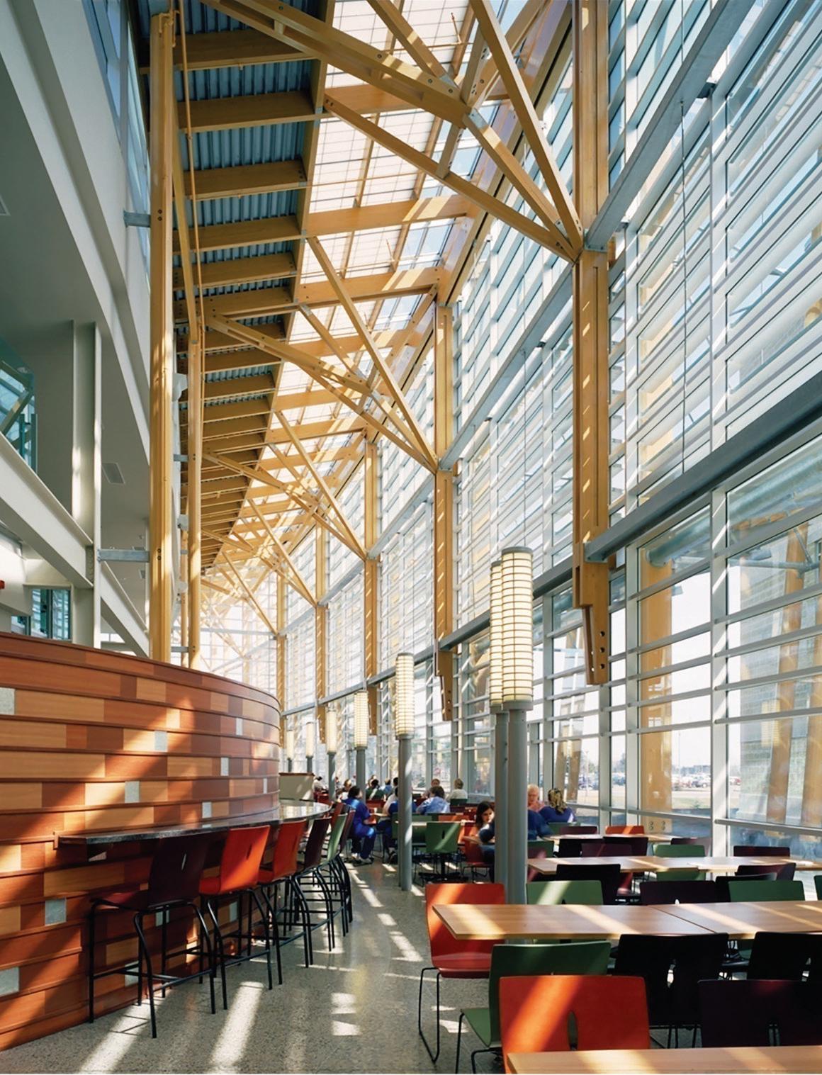
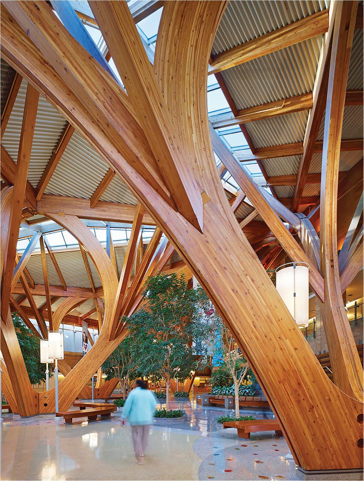
For a moment, recall a memory of when you felt instantly at ease when you entered a building. You may have felt your heart rate slow down as you took a deep breath. Perhaps your nervous system regulated as the stress and noise of the outside world faded, and your senses gradually attuned to the space. A glimmer of light and shadow may have brought a moment of delight, a turn of a corner revealing a compelling materiality you began to trace with your fingers.
Whether we are aware of it or not, the environments we inhabit have an impact on the mind and body; on our cognition and physiology. For over two decades, architect and urban designer Tye Farrow, founder of Farrow Partners, has asked how meaningful, health-generating personto-place relationships can be nurtured through the medium of architecture. His new book, Constructing Health, offers a touchstone for designers, clients, and others embarking on a similar journey.
Farrow invites readers to reframe their understanding of what buildings can do by posing a series of questions, such as: “How do buildings make us feel, and how can they make us feel better?” A guiding concept is salutogenesis, a term proposed by sociologist Aaron Antonovsky to describe the factors and conditions that promote health and well-being, rather than focusing solely on the causes and treatment of disease. Far-
row suggests that for most of the past 5,000 years, health was valued as an asset to be maintained through a holistic understanding of the intricate connections between mind, body, environment and community. Recently, however, many aspects of the built environment have been constructed in ways that deviate from these values. Farrow’s solution is to actively construct environments that enhance optimal health.
What exactly does this mean? Rather than offering prescriptive instructions, Constructing Health explores salutogenic possibilities in an open-ended way. The book’s first section is an overview of contributing theories, ideas and concepts that are part of the emerging field of salutogenic design, from thinking about environments as a source of enrichment to a deep dive into understanding beyond the five senses.
The next section offers case studies on themes of city-making, living places, educational spaces, and healthcare environments. These convincingly demonstrate how inhabited spaces can have a measurable impact on human health, performance, and experience. Take, for example, the radiation treatment rooms of Thunder Bay Regional Hospital (designed by Salter Farrow Pilon Architects, of which Farrow Partners is a successor firm), a space where natural light is rarely possible due to strict

LEFT Farrow Partners and Salter Pilon Architects’ Thunder Bay Regional Hospital maximized natural light in all parts of the building, from the atrium to the radiation treatment areas. ABOVE CENTRE Tree-like structural columns convey shelter and protection at the Credit Valley Hospital, designed by Farrow Partners. ABOVE RIGHT Farrow Partners and Rubinstein Ofer Architects’ Helmsley Cancer Centre in Jerusalem, Israel, boasts a butterfly-like timber structure.
health and safety requirements. The design team delved into the dynamics of radiation energy dissipation, realizing that altering its trajectory could limit its spread. Taking cues from art galleries, where natural light is both ideal for viewing art and potentially damaging to it, they integrated a skylight into the treatment area, bathing an interior garden below in natural light. This resulting environment fosters a sense of hope and healing for patients and staff alike.
The final part of Constructing Health empowers designers with a reading list of fifty suggested books, as well as plans, sections, and perspective drawings of projects presented earlier in the book.
The average Canadian spends 90% of their time indoors, and in the post-pandemic era anxiety, stress, and depression are at all-time highs. Now, more than ever, it is important to understand that as architects, designers and stewards of the built environment, we have an ethical responsibility to create environments that are restorative for the body and mind, activate optimal well-being, and are health-generating. As Farrow asserts, when it comes to whether a building causes health, the answer is either “yes” or “no,” never in-between a building is never neutral. Comprehensive and compelling, this book is a guiding light towards design as a healing modality.

Avi Friedman and Alexandra Pollock believe we should consider our cities as “exercise machines.”
In Fundamentals of Planning Cities for Healthy Living, they critically examine urban design’s integral role in shaping public health outcomes. This book aims to support the work of design professionals, often emphasizing the self-evident: our built environment directly influences lifestyle choices related to physical activity, nutrition, social interactions, public health and climate change.
The book highlights the disparity in health outcomes observed in underinvested urban neighbourhoods. The lack of access to recreational spaces, healthy food options, and safe pedestrian routes exacerbates issues like obesity, diabetes, and mental health disorders, especially in lower-income neighbourhoods. The authors call for a multidimensional approach that includes strategies like food security, active mobility, green spaces, and inclusive public places. The book also stresses the need for greater cooperation between government, private and healthcare sectors, nonprofits, and more effective public awareness cam-
paigns, underlining the procedural tactics necessary to move the needle for healthier outcomes for our cities and urban populations. The authors recognize that urban design needs to be justified in economic, environmental, and sociological terms, and actors in any community will disagree on how to prioritize action. I would have appreciated a deeper discussion on the process of working with those disparate actors rather than a checklist of healthy design outcomes. Nevertheless, case studies, such as the Grow Community in Washington or the Skaftkarr community in Porvoo, Finland, provide concrete examples of how cities can foster active living and social well-being. Other examples, like Edmonton as a “Winter City,” are presented as a paradigm for designing urban environments that remain vibrant and accessible year-round despite challenging weather or geographic conditions.
One of the book’s strengths lies in its historical analysis, tracing the inexorable decline of planning for health, which has only contributed to other global challenges, such as warming climates, aging populations, and widening income disparities: this is an excellent argument for re-integrating health considerations into contemporary urban planning.
It is reassuring to read that the authors allude to the critical role technology and policy play in advancing health-centred urban design, from using digital apps to enhance access to health services and information, to zoning and land-use regulations.
Concluding with a call to action for urban planners and architects to adopt a holistic, life-cycle approach to planning that accounts for the changing needs and dynamics of urban populations, the book provides insights and strategies for creating healthier, more equitable urban environments. By reading this book, the reader will become more informed and knowledgeable about the profound impact that thoughtful, intentional design can have on the health of urban populations.
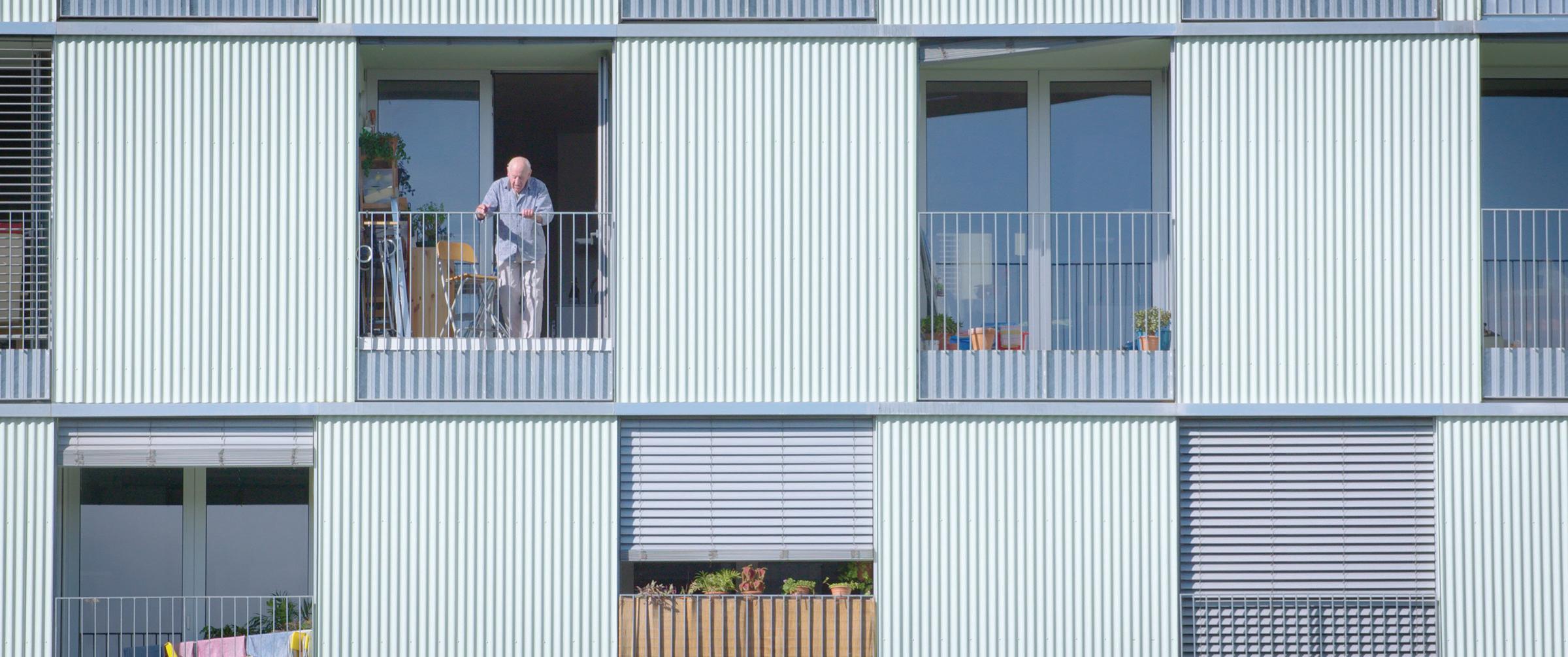
A TRIO OF FILMS PRODUCED BY THE CCA POINTS THE WAY TOWARDS AN ARCHITECTURE OF PEACE AND CARE THAT REQUIRES US ALL TO SHARE.
Montreal’s Canadian Centre for Architecture (CCA) strives to “make people think” about architecture as a public concern. One way they do this is by commissioning, screening and even producing films.
The CCA’s cinematic strength shines in Where We Grow Older, the culminating segment of a trio of housing documentaries directed by Daniel Schwartz, whose prior housing hits include The Disappearance of Robin Hood and Torre David. Conceived by CCA Director Giovanni Borasi, this new film trilogy explores housing innovations in cities around the world. Beyond sharing great projects, these films help viewers to see and to empathize with people who need an architecture of care and those working to provide it.
The first film, What it Takes to Make a Home (2019), shares what led to Star Apartments, an iconic supportive housing project for the chronically homeless designed by Michael Maltzan in Los Angeles (where the homeless population exceeds 75,000). It also examines an even more inclusive mixed-use co-housing project in Vienna called VinziRast-mittendrin, by Gaupenraub+/- architects, which brings university students, workshops, and a restaurant into the homeless housing mix. In both cases, quality architecture centres and protects vulnerable people, defending their right to the city, and to good design.
The second film, When We Live Alone (2020) peeks at people living solo in Tokyo, where, squeezed for money, time and space, individuals balance intimate solitude with urban adventures. As the film reveals, however, a society of individuals is possible only in communities with generous public spaces, parks, libraries, affordable restaurants, and cafés, where social life is risked and shared.
Where We Grow Older (2023) hits a home run, with seniors’ housing success stories in Barcelona and Baltimore. Now playing internationally, the film screened recently at Winnipeg’s Architecture + Design Film Festival. The film features elders happy to have quality housing and care, seniors keen to access it, and a chorus of thoughtful architects, community advocates, and support staff. A tale of two cities, the film compares successful municipally funded projects like Alí Bei, in Barcelona, a city rich in innovative housing and social infrastructure, with the soon-to-be-built Carehaus, an intergenerational co-housing project in a neglected neighbourhood of Baltimore.
Designed by Pau Vidal and Vivas Arquitectos, Alí Bei (completed in 2020) is one of 20 seniors’ apartment buildings in Barcelona funded and managed by the city. The growing network aims to provide housing and care for hundreds perhaps eventually thousands of low-income seniors, allowing them
longer lives in their own neighbourhoods. Generous courtyards, terraces, and balconies overlook lively social amenities, like market squares and sporting fields, bringing a mix of people and activities together.
In Baltimore, Carehaus is an ambitious intergenerational co-housing project, aiming to integrate professional caregivers and their families with elderly tenants they care for together in the building. Co-designed by community-based artist Marisa Morán Jahn, architect Rafi Segal, and affordable housing developer Ernst Valery, the project is a promising pilot. If expanded, and more fully funded, it could profoundly reverse patterns of isolation and neglect that have damaged and divided people around the world.
The world urgently needs an architecture of care and peace! Sadly, the political architecture remains woefully inadequate, with too many caring only for wealth, amplifying inequalities and divisions, neglecting basic human conditions and potentials we ought to share.
These three CCA films on housing and the people and projects they gather show us how and why change might yet be achieved.


Build excellence with Kingspan Insulated Panels. www.kingspanpanels.ca
Pioneering Products that Embolden Your Vision. At Kingspan Insulated Panels, we are pioneering better technologies and methods of building for a low carbon world. Kingspan insulated metal panels are the next generation of building envelope, offering an unparalleled combination of aesthetic flexibility, energy efficiency and thermal, air, water and vapor barrier performance.
Carson Wealth Management | Omaha, Nebraska QuadCore® KS Azteco™