Canadian Interiors January/February 2015

Page 1

CANADIAN INTERIORS

January february 2015

CDN $6.95

January February 2015

www.canadianinteriors.com

Official publication of IDC

Danish Des ig n De b u ts at

Official soft line store Cosy Comfy. A low lounge chair that can transform into a cosy wing chair.

Rio Award-winning. Recipient of the world’s oldest and most prestigious award for design excellence.

Lazy Smart. The backrest of the sofa flips backwards and becomes a part of the bed.

Monday

Havana

Balance. A versatile sofa/side table.

Classic. The classic armchair has been given a super-modern makeover.

Drum Poof! Put the tray on top of the pouf for a stylish coffee table.

145 TECUMSETH ST., TORONTO (416) 591-8834 www.urbanmode.com info@urbanmode.com

FOLLOW US:

SOFT

LINE


Interior: Toronto Interior Design Group

DESIGNERS WALK SHOWROOM 160 Pears Ave. Ste 310 Designers Walk Bldg 5 416.929.9290

Opening Soon

Piece Nº25884

CASTLEFIELD GALLERY 1330 Castlefield Ave. Bldg C 416.929.9290 Coming Soon

SALES CENTRE 1120 Caledonia Rd 647.345.6888 Now Open

W Studio is pleased to announce a

new dream studio that will be built in Spring 2015 (shown in the image to the left). This will open the doors to a gallery, like no other in the world. A 12,000 square foot state-of-the-art studio, located at the northeast corner of Caledonia Rd and Castlefield Ave in Toronto, will allow W Studio to continue to revolutionize the floor-covering industry. In preparation for this exciting change, W Studio will host a once-in-a-lifetime Sales Centre at 1120 Caledonia Rd. Premium W Studio carpets will be exclusively available at 30%-70% off in order to make room for a complete inventory revamp. wstudio.ca


M Y

SE C R E T

G A R D E N

of Art

ENJOY THE NEW

BATHROOM

godibathroom.ca | 1.877.254.4634 BOOTH# 542


542

Official publication of Interior Designers of Canada

Features

01/022015

€4

TWIN PEAKS In Montreal, conjoined houses by Blouin Tardif Architecure Environnement mirror one another with precision. By Rhys Phillips

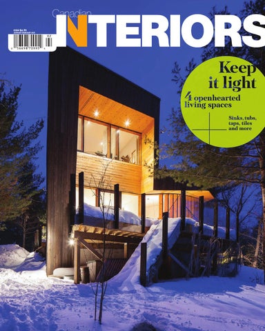
€8 ON THE ROCKS In dramatic response to a rugged Ontario landscape, a cottage by Teeple Architects Inc. takes a sculptural form. By Michael Totzke

3€TRIPLE THREAT A third-floor addition up top connected to a three-storey addition at the back transforms an Ottawa Victorian. By Michael Totzke

35 FAUX BIG OR FAUX HOME Everything was big at Cersaie this year, the exhibi-

tion of cermamic tiles in Bologna fairly bursting at its seams to show it all. By Peter Sobchak

38

PLANT PORN Great ideas from BIO 50, held in Ljubljana, Slovenia. The design biennial has a new experimental approach and ambitious goals. By Peter Sobchak

Regulars

9 INSIDE 11 CAUGHT OUR EYE 14 HOW IT’S MADE Ash356.0 series of tables and stools by Stacklab. 16 SEEN Lucky 7: top picks from a revitalized IIDEXCanada. 19 THE GOODS Making waves: the latest bathroom beauties. 40 SCENE 41 OVER & OUT Ash to ashes: a prototype coffin by George Dougals killed at IIDEX. COVER – Delta Road Cottage near Gravenhurst, Ont., by Teeple Architects Inc. Photo by Scott Newsworthy


com

Fair Exchange

In Caledon, Ont., is a food bank with a difference. To combat stereotypes of impoverishment and marginalization that typically arise when people think of such places, Toronto designer Johnson Chou used light to create an uplifting space that inspires hope, giving and communication. A look inside the Exchange Food Bank and Community Centre. with Dialog Design created a dynamic open-plan space. All of the materials used within the office were pulled from Earls Restaurants' own materials palette, in order to embody the brand not only on an intellectual level but on a sensory one as well.

18 Announcing the 18th annual Best of Canada Design Competition

Nordic kid stuff

The exhibition “Century of the Child: Nordic design for children – from 1900 to today” settles in for a long run at Designmuseum Danmark in Copenhagen. It continues to Aug. 30.

Granted

Its name is Earls

For Earls Restaurants Head Office in Vancouver, Earls' creative director in collaboration

Émilie F. Grenier, a narrativeexperience designer and graduate of London’s Central Saint Martins College of Arts and Design, is the recipient of the 2014 Phyllis Lambert Design Montréal Grant. In February, she embarks on a study trip to Reykjavik, Iceland.

Be part of the country’s only design competition to focus on interior design projects and products without regard to size, budget or location.

07

For information and entry form, visit canadianinteriors.com


January|February 2015 / V52 #1

Publisher

Martin Spreer 416-510-6766 Editor

Michael Totzke Deputy Editor

Peter Sobchak Associate Editors

David Lasker, Rhys Phillips, Leslie C. Smith Art Director

Roy Gaiot

Account Manager

Maris Langer 416-510-5245

Circulation Manager

Legacy™ retractable screen doors by Phantom® features an integrated Latch & Release handle, eliminating the need for magnets, and won’t spoil the aesthetics of your home or your views.

Beata Olechnowicz 416-442-5600, ext. 3543 Reader Services

Liz Callaghan Production

Cheryl Fisher 416-510-5194

Senior Publisher

Tom Arkell

President of Canadian Publishing

Alex Papanou Head Office

custom cellars . racks . racking kits

80 Valleybrook Drive, Toronto, ON M3B 2S9 Telephone 416-442-5600 • Facsimile 416-510-5140

wine storage experts

since 1995

Canadian Interiors magazine is published by Annex-Newcom LP. Tel: 416-442-5600, Fax: 416-510-6875 e-mail: info@canadianinteriors.com website: www.canadianinteriors.com Canadian Interiors publishes six issues, plus a source guide, per year. Printed in Canada. The content of this publication is the property of Canadian Interiors and cannot be reproduced without permission from the publisher. Subscription rates > Canada $38.95 per year; plastic wrapped $41.95 per year (plus taxes) U.S.A. $71.95 US per year, Overseas $98.95 US per year. Back issues > Back copies are available for $10 for delivery in Canada, $15 US for delivery in U.S.A. and $20 overseas. Please send payment to Canadian Interiors, 80 Valley brook Drive, Toronto, ON M3B 2S9 or order online www.canadianinteriors.com For subscription and back issues inquiries please call 416-442-5600 ext.3543, e-mail: circulation@canadianinteriors.com, or go to our website at: www.canadianinteriors.com Newsstands > For information on Canadian Interiors on n ­ ewsstands in Canada, call 905-619-6565 Canadian Interiors is indexed in the Canadian Magazine Index by Micromedia ProQuest Company, Toronto (www.micromedia.com) and National Archive Publishing Company, Ann Arbor, Michigan (www.napubco.com).

Member of Canadian Business Press • Member of the Alliance for Audited Media

ISSN 1923-3329 (Online), ISSN 0008-3887 (Print), H.S.T. # 815380985 RT0001

Annex-Newcom Limited Partnership Canada Post Sales Product Agreement No. 40069240 “We acknowledge the financial support of the Government of Canada through the Canada Periodical Fund of the Department of Canadian Heritage”.

1.888.253.6807 • 416.285.6604 • RosehillWineCellars.com RWC_CI_DSG14_TP.indd 1

2014-06-04 3:27 PM


inside

Gaiot, “The design for the editorial pages is centred on the structure of the body text and the space around it. Emphasis has been put on bold, clean pages that hopefully convey a look that's both understated and innovative.” - - - - - - - - - - - - - - - - - - - - - - - - - - - - - - - - - - - -------------------------------------------------We open the magazine with a new department, “Caught our eye,” which neatly illustrates our new approach: curiouser and curiouser about design developments all over the world (while that “shook down” in this issue as a collection of products, future issues will feature all manner of design, from interior and graphic and fashion to industrial, communication and systems). We close the magazine with another new department, “Over & out,” which aims to leave you with a smile on your face, a question to ponder, or a bee in your bonnet. In between, you’ll find a new online page, regular departments (some with new handles) and as many feature stories as we can fit. - -------------------------------------------------As it has been for the seven-plus years I've been editor (why mess with a good thing?), January/February remains our “Houses” issue. In this installment, you'll find cleverly conjoined houses by Blouin Tardif Architecture Environnement, in Montreal (”Twin peaks,” page 24); a sculptural cottage by Teeple Architects Inc., in Gravenhurst, Ont. (“On the rocks,” page 28); and a Victorian reno by Batay-Csorba Architects, in Ottawa (“Triple threat,” page 32). - - - - - - - - - - - - - - - -------------------------------------------------•

Forward march

“And the seasons, they go round and round / And the painted ponies go up and down / We're captive on a carousel of time / We can't return, we can only look / Behind from where we came / And go round and round and round / In the circle game.” Such is the chorus of one of the earliest and most eloquent songs by Joni Mitchell (the cranky but ever-creative Canuck, who, at the age of 71, stars in a new campaign by Yves Saint Laurent – to which I say, “You go, old girl!’). I spent a good part of 2014, Canadian Interior’s 50th-anniversary year, thumbing happily through bound issue after bound issue, registering the changes throughout the years. But here it is 2015, another year/ circle completed, and our focus has shifted firmly from “behind from where we came” to ahead to where we’re going. - - - - - - - - - - - - - - ------------------------------------------------You'll have of course noted our fresh new design, beginning with our brand-new logo, which makes use of the middle-aged (1957) but evergreen Helvetica font (having entered this world a year earlier, I consider myself equally adept and adaptable). Says art director Roy

09 Michael Totzke

Bachelor of Interior Design Bridging Program Turn your diploma into a degree... Graduates with a three-year Advanced Diploma in Interior Design may be eligible to complete our Bachelor of Interior Design degree.

fanshawec.ca/bidbridging

mtotzke@canadianinteriors.com


Bass Lounge Series

A unique sense of personal space.

design: busk + hertzog


caught our eye

BEAUTIFUL BOUNDARIES Norway ratcheted up its cool factor by holding competitions to redesign key pieces of its identity: money and travel documents. Sea-themed banknotes to be issued in 2017 will use pixilated coastal interpretations on the back, courtesy of Snøhetta, and Neue Design Studio’s winning passport designs also focus on Nordic landscapes, which switch from fjords to Northern Lights when held under UV lamps. snohetta.com/ neue.no

11

1/2 2015 CANADIAN INTERIORS


Š2015 California Closet Company, Inc. All rights reserved. Each franchise independently owned and operated.

californiaclosets.com

|

866.221.0415


caught our eye

GRAB BAG Clever canine waste bags designed by students stood out at the Packplay exhibition at Montreal’s UQAM Centre de Design. centrededesign.com

WHERE’S THE FIRE?! Designed by Francesco Faccin, Re-Fire is a manual fire-starting kit. Its near-poetic simplicity and beauty is both in stark opposition to, and yet pays elegant homage to, our shared ancestry when fire was the key to survival for primitive Man. francescofaccin.it

NEW FLAME Based in Paris, Giuseppe Bessero Belti reinterprets the classic kerosene lamp – with the flame as flower, the fuel as water. gbessero.com

HARD CANDY La Trama e l’Ordito centerpiece for Alessi began life as the winning entry in a Concrete in Design workshop. alessi.com

13

— more

canadianinteriors.com 1/2 2015 CANADIAN INTERIORS


how it’s made

1—Each Ash356.0 base is milled from a diseased ash log victim of the Emerald Ash Borer.

Ash356.0

3—Defective aluminum beer cans donated by Steam Whistle Brewery are melted and cast into the sawdust mold to form a conic shape.

Tables and stools made from common materials prove there is beauty in recycling

Photography by Sean McBride

2—Reclaimed sawdust mixed with plaster is compacted around the base to create a mold.

By Peter Sobchak

4—The sawdust mold burns away when it comes into contact with the molten metal, leaving irregular, textured impressions on the aluminum cone.

The brief set out by the annual Design By Nature competition – to create functional furniture or forms of public art made from at least 50-per-cent salvaged or recycled materials – fell right in Stacklab’s wheelhouse. A Toronto-based multidisciplinary design and fabrication studio led by Jeff Forrest, Stacklab focusses its efforts on exploring ways to fuse traditional fabrication techniques with experimental research “to demonstrate how sustainable design fundamentally enriches process and product.” With the Ash356.0 series of stools and tables, Stacklab upped the ante by devising a casting process that uses 90-per-cent repurposed material, earning the studio its second consecutive win in this competition. - - - - - - - - - - - - - - - - - - - - - - - - - - - - - - - - - - - - - - - - - - - - - - - - - - - - - • stacklab.ca

CANADIAN INTERIORS 1/2 2015

14

5—Each cone is subsequently polished and fastened to the wood base to form functional yet aesthetically exciting stools and tables.

Cnd Inte


Fibonacci

Codes Collection

Cnd Interiors Jan 2014.indd 1

architex-ljh.com

12/12/14 1:15 PM


seen

Virtual visuals Say you’ve got a drawing for a new condo building, from a napkin sketch to an entire set of blueprints. You can picture it all in your head, but clients and especially homebuyers may have trouble doing so. That’s where Invent Dev (inventdev.com) comes in. A new, Canadian-created computer program that renders any drawing in colour 3D, it allows you to “walk” through and interact with the proposed space. You can instantly customize materials, change lighting along a day’s axis to examine its indoor effects, capture images and videos, even stroll over to the windows for a full perspective of the view outside. Coming soon will be a set of interior design tools. Fun, smart, and did I mention fun?

Lucky 7

By Leslie C. Smith

Top picks from a revitalized

anada

You know it’s a huge show when it takes up both buildings of the Metro Toronto Convention Centre. This year for the first time, IIDEXCanada, the country’s National Design and Architecture Exposition & Conference, joined forces with six other previously independent exhibitions – Construct Canada, Concrete Canada, PM Expo, Construct International, the Real Estate Forum, and the Home Builder & Renovator Expo – to create The Buildings Show. Instantly the largest such gathering in North America, the three-day event in early December featured over 1,600 exhibitors, from 10 countries, along with 500 speakers. An estimated 35,000 visitors attended. - - - - - - - - - - - - - - - - - - - - - - - - - - - - - - - - - - - - - - - - - - - - - - - - - - - - - - - - - - - ------------------------------------------------------------------------------I found more than enough to occupy myself by simply concentrating on the IIDEXCanada side of things. This expo-within-an-expo showcased 11 subsections that ran the gamut of the design field, from healthcare to textiles. As usual, I scoped out many fascinating objets, the first of which (Invent Dev) happened to be at the top of the escalator, as I headed into the show. - - - - - - - - - - - - - - - - - - - - - - - - - - - - - - - - - - - - - - - - - - - - - - - - • CANADIAN INTERIORS 1/2 2015

16

Sì saw Piemonte, the provincial home of Turin and Asti, among other northern Italian cities, sponsored a group of five regional design lines to the show. I particularly liked the versatile Suede sink by Cerasa (cerasa.it), which came in a multiplicity of shapes, colours and options, including many free-standing units that allow for complete bathroom liberation. I was also im­pressed with Caino Design’s (cainodesign.com) MePa series of decorative metal-lace panels. Their intricate, semi-obscuring patterns are the result not of lasercutting but a more precise technique of chemical etching originally developed for the automotive industry.


Sight lines Toronto-based Quadrangle Architects (quadrangle.ca) took home a Silver Innovation Award for its #Started booth, but to me the experience was golden. Quadrangle was one of three architectural groups competitively tasked by IIDEXCanada to present a 3D representation of the ideal start-up office. Quadrangle’s answer was literally a sketch brought to life. Full-dimension wire frames made from welded steel rods showed where windows, doorways, credenzas and light fixtures were to be placed. Here and there, “jotted” notations in custom-fabricated metal stuck out to the side, indicating sizes, LED placement and other design minutia. Herman Miller’s (hermanmiller.com) attractive new Public Office Landscape furniture, in white, provided the “room’s” only substance. And for visitors’ digital enjoyment, Toronto’s Designstor (designstor.com) offered a tablet app that changed black-and-white sketches to rendered settings with one sweep of the finger.

Photo by Cindy Blazevic

Wood watch For the past couple of years, IIDEX has presented the Woodshop display, dedicated to the utilization of a small fraction of Toronto-area ash wood devastated by the Emerald Ash Borer. Here, a contemporary offering by well-known local maker Michael C. Fortune (michaelfortune.com) caught the eye. Twinned ovoid forms of steam-bent ash whose hardwood tops can be flipped to leather-upholstered cushions created a combination coffee table/ottomans/side tables unit that would be tough to beat for furniture versatility. Close by Woodshop was a small booth occupied by show newbies Lisa and Brian Honing, of Melancthon, Ontario’s Honing Design (honingdesign.com). I loved their Hagensborg indoor bench, a simple structure of wooden planking and stainless-steel framing. I loved it even more when I found out that several of the benches had been constructed from antique hemlock boards rescued during the couple’s reno of their 1870s home. No roundup of reclaimed wood would be complete without mentioning Toronto’s marvellous Brothers Dressler (brothersdressler.com). Their latest this year is the Mesh Nook, an articulated six-foot screen made from wood offcuts (including ash) that can be fitted with shelving, lighting and recycled felt seating in a variety of cosy, modular configurations.

17

1/2 2015 CANADIAN INTERIORS


as TOLD

Every home has a story. Tell yours with the anthology of kitchen and bathroom products from DXV. Culled from 150 years

by d x v

of pivotal design movements, each piece tells a distinctive story. What will yours be? Visit dxv.com to find your local showroom.


the goods

1—SURF'S UP From Stone Forest comes Wave, a fluid pedestal sink carved from a solid stone mass. It's offered in Papiro Cream, Blanco Carrara and Honed Basalt. 2—ROCK STEADY Also from Stone Forest: the Papillon Bathtub, constructed of silver travertine with rich natural veining (shown with the Veneto pedestal sink). stoneforestcom

1

Making The latest bathroom beauties By Michael Totzke

2

19

1/2 2015 CANADIAN INTERIORS


the goods

4

3

3—STRIKE UP THE BAND

Orchestra is Ceragres's latest series of highquality Italian tiles. ceragres.ca 4—CURVES AHEAD Hastings' Onda collection from Italy comprises curvaceous vanities with basins. hastingstilebath.com 5—LIGHT TOUCH ThermaSol's MicroTouch control works in the same manner as a smartphone or tablet. thermasol.com 6—WATER TO GO In certain configurations, My.Bag from Olympica Ceramica can actually be folded into a vanity counter. olympiaceramica.it

5

7—CRYSTAL PALACE

A second colllaboration between THG Paris and Baccarat has produced Beyond Crystal, a collection of accessories with rectangular crystal handles. thg.fr

6

7

€0


Raindance Select Shower System ®

A perfect combination

Discover the Metris Raindance Select Shower System at www.hansgrohe.ca ®

®

© 2015 Hansgrohe, Inc.

Transform your bathroom into a custom spa with the Raindance Select showerpipe. It’s a showerhead, mixing valve and handshower all in one sleek design. Unwind with the generously-sized Raindance E 360 showerhead and Raindance E 120 AIR handshower while enjoying the benefi ts of a thermostatic mixing valve — all in one. Beautiful.


the goods

9

8

10

11 8—OUT IN THE OPEN The MGS CB Semi Exposed Thermostatic Shower System makes much of its refined hardware, including a generous rain head. mgstaps.com 9—JAZZ AGE The patterns on Hasting Tile & Bath's Artisan Deco collection (sinks, toilets, bathtubs and bidets) are hand-painted onto the ceramic before baking and glazing. hastingstilebath.com 10—FASHION & ACCESSORIES Wetstyle's new accessories line comprises towel bars, soap dispensers and more. wetstyle.ca 11—STRAIGHT & NARROW From Fabio Luciani comes Graffio, a family of five Ceramilux sinks (top- or wall-mounted) characterized by thin borders. fabioluciani.it 12—GEOMETRY Ciot's Deco D'Antan collection of porcelain tiles consists of three main graphic elements, ideal for mixing and matching. ciot.com - - - - - - - - - - - - - - - - - - - more canadianinteriors.com --------------------------------------------•

12

€€


In Montreal, conjoined houses by Blouin Tardif Architecture Environnement mirror one another with precision

Twin By Rhys Phillips

CANADIAN INTERIORS 1/2 2015

Photography by Steve Montpetit

€4

Montreal’s storied Plateau Mont-Royal neighbourhood occupies a broad plane that falls gently away from the mountain on its east flank. It is a dense urban community of narrow, tightly compacted, welltreed and mainly residential streets but crisscrossed by some of the country’s finest commercial boulevards including iconic St. Urbain as well as St. Denis, St. Laurent and Mount Royal. - - - - - - - - - - - - - - -------------------------------------------------Not far from the many delightful shops and cafés of the last, a previous client of Blouin Tardif Architecture Environnement purchased an entire commercial operation just to obtain its building site. He then asked Alexandre Blouin to replace the existing one-storey garage building with two conjoined homes, each 2,500 square feet. The result is back-to-back three-storey units covering the entire 25-by-100-foot lot with their entrances on different parallel streets. Skilfully manipulated to ensure privacy and copious natural light


Opposite Officially known as Siamoises Mentana-Boyer, the conjoined three-storey units, each 2,500 square feet, cover an entire 25-by-100-foot lot with their entrances on different parallels streets. Above With light, views and privacy essential, the architect carved a hole in the middle of each unit, wrapping living spaces around second- and third-level open terraces. Shown here is the Boyer residence. Right While cedar is used on ceilings in the Mentana residence, the ceilings in Boyer are left white, to respond better to its north-facing direction.

â‚Ź5

1/2 2015 CANADIAN INTERIORS


CANADIAN INTERIORS 1/2 2015

€6


for the interior, Blouin’s design avoids replicating immediate historical precedents while still contributing to the tight but varied morphology of the streetscape. - - - - - - - - - - - - - - - - - - - - - - - - - - - - - - - ----------------------------------------------------Much separates the resulting houses from their neighbours. Singlefamily homes are rare on the Plateau and both are unadorned minimalist boxes. Despite large asymmetrical windows, says Blouin, they appear relatively closed compared to nearby older residential buildings. Their garage doors are unique but do reflect those once found on the now-demolished commercial building. Their heights, however, replicate those of older multi-dwelling neighbours. Finally, two carved openings, deeply recessed garage and entrance doors at street level and fully framed openings to the top-level terrace, provide animation. - - - - - - - - - - - - - - - - - - - - - - - - - - - - - - - - - - - - - -------------------------------------------------The most difficult design challenges relate to the organization of the interiors. Important for the client, says Blouin, was privacy and desire for views to the plateau, city and mountain. “But the most crucial issue was the search for light, how to get natural light deep into the main living spaces.” His response to all three demands was to carve

Opposite top and bottom The third floor of each unit features soaring 12-foot ceilings; shown here is the Mentana residence, which is the client's unit. The architect employs considerably more than just a few accents of varied, richly toned woods to ensure a warm, natural and decidedly homey sensibility. The most striking of the woods is the exotic reddish-brown African rosewood with cheeky natural blonde streaks used on the two upper-level floors; supplied by the client, this West African hardwood is also used for Mentana’s sculptural, zigguratshaped stairs. Above The Mentana bathroom almost glows with the contrast between pristine white fixtures and abundant, russet-toned, western cedar planks stretching across the floors and ceiling.

€7

out a hole in the middle, wrapping living spaces in each of the mirror units around second- and third-level open terraces. While the full first floor of each basement-less residence contains a garage, entrance, home office, leisure room and mechanicals, the second and third floors house bedrooms (as well as a sauna) and more public living spaces, respectively, all folded around the 11-foot-wide terraces. - - -------------------------------------------------On the second level, two bedrooms stretch across the street front while the master suite occupies the rear. Connecting the two sleeping areas is the circulation space, dominated by a two-storey transparent glazed wall framed with black aluminum and overlooking the totally private inner terrace. This glazing wraps around the master suite and extends up to also front the living room on the third level. Ascending across the glass terrace wall are wood and steel stairs whose balustrades of seamless glass almost completely de-materialize. - - - - - - - --------------------------------------------------If the second level is U-shaped with enclosed spaces arrayed around its terrace, the third assumes an open-plan L-shape. The living room takes up the back while the space along the stairs overlooking the void serves as the dining area. The front is divided between the kitchen and the third-level terrace with the latter’s framed view out to the city. - - - - - - - - - - - - - - - - - - - - - - - - - - - - - - - - - - - - - - - - - -------------------------------------------------Given the importance of teasing in as much natural light as possible through the terraces helped by soaring 12-foot ceilings on the third floor, there might be an expectation of a palette of ubiquitous modernist white. Certainly the units’ clean, linear lines and minimalist detailing ensures a distinctly modern aesthetic but, in line with the lesson so well taught by the great Alvar Aalto, Blouin employs considerably more than just a few accents of varied, richly toned woods to ensure a warm, natural and decidedly homey sensibility. - - - - - - -------------------------------------------------The interior space almost glows with the contrast between the relatively limited pristine white walls and the abundant wood planks stretching across the floors and ceiling as well as the bathroom and terrace walls. Russet-toned western cedar, used on the garage doors, is brought inside for the third-level ceiling of the client’s unit – a.k.a. Mentana unit – as well as on the bathroom ceiling and one wall. “Cedar on the outer wall of the terrace,” says Blouin, “makes it a textured feature wall that changes with weather and light including artificial light at night.” On the other unit – a.k.a. Boyer unit – however, the cedar ceiling is absent, left white to respond better to its north-facing direction. - - - - - - - - - - - - - - - - - - - - - - - - - - - - - - - - -------------------------------------------------The most striking of the woods is the the exotic reddish-brown African rosewood with cheeky natural blonde streaks used on the two upper-level floors. Supplied by the client, this West African hardwood is also used for Mentana’s sculptural, ziggurat-shaped stairs. (Oak is used in Boyer.) Lighter but no less rich tones are found in the kitchens’ open shelving made from sapelli. Set against dark grey walls, this West and Central African hardwood, quarter-sliced to provide a glossy striped grain, is a mellow, slightly orange colour. The same lighter wood is used on the first level in both units for the office desks and cabinetry. There the contrast of a dark grey wall is complemented by a natural polished concrete floor. - - - - - - - - - - - - - - - - - - ----------------------------------------------------The Siamoises Mentana-Boyer residences introduce externally austere but not off-putting cloistered housing to the evolving Plateau. Like a medieval cloister, the terraces provide sheltered “gardens of light” that bring alive the sumptuousness of the home’s abundant woods. - - - - - - - - - - - - - - - - - - - - - - - - - - - - - - - - - - - - - - - - - - - - - - - - - - - - - - - - - - - - - - - - - - • — more canadianinteriors.com 1/2 2015 CANADIAN INTERIORS


CANADIAN INTERIORS 1/2 2015

On the Rocks €8


Opposite Delta Road Cottage, in Gravenhurst, Ont., captures striking views of both Sparrow Lake and the surrounding woods. The sustainable project is predominantly composed of glass and local cedar, the latter refined at a nearby sawmill. Above left In this view of the west elevation, the office (at centre) is topped by one of the cottage's three bedrooms. Above right Detailed computer modelling was used in the fabrication of the glazing system, given the simultaneous curvature and slope of the glazed elevation.

In dramatic response to a rugged Ontario landscape, a cottage by Teeple Architects Inc. takes a sculptural form By Michael Totzke P hotography by Scott Norsworthy

Located on the shores of Sparrow Lake, near Gravenhurst, Ont., Delta Road Cottage sits between a rock (the rocky shore of the lake) and a hard place (the dense surrounding forest). Designed by Toronto-based Teeple Architects Inc., this sculptural gem is predominantly composed of local eastern white cedar refined at a nearby sawmill. - - - - - - - - - - - - - - - - - - - - - - - - - - - - - - - - - - - - -------------------------------------------------Two contrasting, curved elevations – one solid, the other transparent – define the building. Approaching by road, you encounter the solid elevation: a dark-stained cedar wall, with the front door set obliquely into a single opening in the curved wall plane. Entering, all becomes crystal clear as you step into the large central living space, cradled by a lake-facing curved wall of full-height glazing. - --------------------------------------------------

€9

1/2 2015 CANADIAN INTERIORS


The large central living space is cradled by a lake-facing curved wall of full-height glazing. An austere, aluminum-backed curtain wall did not seem appropriate to the project; thanks to the expertise of glazier Luc Harrison, a structural silicone-glazing system was engineered and fastened onto deep Douglas fir mullion back sections. The resulting system provides a cost-effective and thermally efficient solution.

Because an austere, aluminum-backed curtain wall seemed wrong for this project, the architect relied on the expertise of glazier Luc Harrison, who helped engineer a structural silicone-glazing system, which fastened onto deep Douglas fir mullion back sections. A costeffective and thermally efficient solution, the system adds the warm materiality of wood to an otherwise pared-down interior. - - - - - - - -------------------------------------------------Principal Stephen Teeple sums up Delta Road Cottage poetically: “A glass curtain wall is stretched along a swooping black textured cedar band; a perch, with panoramic views of its Sparrow Lake setting, is captured in between. It is a flowing, dynamic space that reaches upwards toward the lake, capturing the spirit of its demonstrative owner.” - - - - - - - - - - - - - - - - - - - - - - - - - - - - - - - - - - - - - - - - - - - - - - - - - - - - - - - - - - - - - - - - • — more canadianinteriors.com

CANADIAN INTERIORS 1/2 2015

30


made in the USA

Self-Aligning, Lightweight Wall Panels and Wall Blocks for Seamless Gypsum Surfaces.

Notes™ PANEL ©2014 modularArts, Inc.

Crush™ PANEL ©2011 modularArts, Inc. Image credit Design First Interiors

206.788.4210

now with 50 InterlockingRock ® designs ™

modulararts.com

WALL = SCULPTURE


TRIplE ThReAt

2 1 A third-floor addition up top connected to a three-storey addition at the back transforms an Ottawa Victorian By Michael Totzke Photography by Doublespace Photography CANADIAN INTERIORS 1/2 2015

3€

Call it the family tree: a historic sugar maple treasured by a household of four outdoor enthusiasts, before and after a major renovation of their home in the southern portion of Ottawa known as the Glebe (a couple of blocks from the Rideau Canal). Batay-Csorba Architects retained the two-storey brick original, but replaced the structurally compromised gambrel roof with a third-storey addition that uses the tree as a central pivot, creating a series of diagonally cantilevered masses. -------------------------------------------------On the third floor, the master suite opens up to a private roof garden nestled within nine-foot cedar walls, and beyond that to a sliver of deck from which to commune with the specimen tree and enjoy the view. - -------------------------------------------------Within, the architects penetrated the volume with a series of interconnected voids, bringing in light and creating relationships between rooms typically separated in Victorian times. “The kitchen and its interconnected volumes transformed the kitchen into the new living room and social space for the family,” says architect Andrew BatayCsorba. “The scale of the island allows for a myriad of functions — from eating and cooking to working and arts-and-crafts; from social events to baby bathing and toddler dance parties.”- - - - - - - - - - - - - - - - - - - - - - - - - - - - - - - - - - - - - - - • — more canadianinteriors.com


3

4

5

6 7 one The third-floor addition is subtly peeled back from the front facade and cantilevered along the north side of the existing two-storey, rectilinear brick massing. two The new third storey extends the length of the house and connects to the rear three-storey addition. three The main floor is one large open space, with the living room up front and sitting room at the back, separated by the kitchen and dining room. four Opposing view of the main living space. five The second-floor family room is penetrated by a three-storey void that terminates in a series of solar-powered operable skylights. six On the third floor, the master suite extends to a private roof garden. seven The roof garden in turn extends to a sliver of deck space exposed to the foliage of the specimen tree.

33

1/2 2015 CANADIAN INTERIORS


Fauxbig home or faux By Peter Sobchak

Everything was big at Cersaie this year. Ceramic tiles are coming in even bigger shapes and sizes, brighter colours, bolder innovations and better quality, and the international exhibition of ceramic tile and bathroom furnishings held in Bologna in September almost seemed like it was bursting at the seams to show it all

ccimola.it

Big impact

Ceramic tiles can be anything. But what they shouldn’t be is bland. And ImolaCeramica’s new Pop collection will certainly never be accused of that. Inspired by the Pop Art of Roy Lichtenstein, the line carries 10 different illustrated tiles within a range of 10 bright colours, bringing facial close-ups, cult symbols and explosive exclamations to normally staid bathroom walls. - - - - - - - - - - - - - - - - - - - - - - - - - - - - - - - - - - - - - - - - - - - - - - - - - - - - -

35

1/2 2015 CANADIAN INTERIORS


brixweb.com / ceramichelea.com / refin.it / ceramicasantagostino.it

Big names No one will deny that name recognition means something, so some companies obviously decided if you’re going to get a name designer to create your tile collection, you might as well get a big one. Brix got Jean Marie Massaud to design Alea, a system of mosaics based on three different shapes that explore an organic theme; Ceramica Sant’Agostino wrangled Philippe “It’s not a collection, it’s a system!” Starck for Flexible Architecture, which among other traits actually highlights tiles’ ugly joints instead of trying to hide them; Alessandro and Francesco Mendini entered Ceramiche Refin’s DesignTaleStudio and came out with the FILO collection, which distorts a traditional orthogonal grid into an almost three-dimensional optical illusion; and Lea Ceramiche tapped HOK’s Product Design department for the Nest collection of large, irregular and colourful hexagons. - - - - - - - - - - - - - - - - - - - - - CANADIAN INTERIORS 1/2 2015

36


caesar.it / sicis.com / century-ceramica.it / flavikerpisa.it / atlasconcorde.it

Big fakes

The quest to make a ceramic tile that perfectly mimics other materials is seemingly never-ending, and many companies debuted collections that are shockingly close to their source in look and feel. The Dakota collection by Flaviker is a new interpretation of alder wood planks, with surprisingly realistic natural aging imperfections typically caused by scratches, stains and tiny woodworm holes; Trace by Ceramiche Caesar uses a mottled colour effect similar to oxidized bronze to give tiles the irregular character of worked metal; marble imitation is quite possibly the Holy Grail, and Atlas Concorde does an admirable job with its new Marvel PRO line of floor slabs and coordinated wall tiles; mosaic heavyweight SICIS launched the thin, long, rectangular Fiber Collection, which has certain pieces imbedded with real gold flakes; the new Keramos collection by Century is doubly duplicitous by replicating the colour of traditional terracotta but the feel of cement. - - - - - - - - - - - - - - - - - - - - - - - - - - - - - - - - - - - - - - - - - - - - - - - - - - - - - - - - - - •

37

— more

canadianinteriors.com 1/2 2015 CANADIAN INTERIORS


Plan

l

Porn

l

…and other great design ideas from BIO 50 1 By Peter Sobchak

Photography by MAO | Muzej za arhitekturo in oblikovanje

Too often in the breakneck industry of modern design everyone is focussed on the finished product. “Shipping is a feature” began as an axiom in software programming but has since been adopted in the design world, and basically means “Get something to market!” As a result, this push to sell typically makes the design process get lost in the noise. But at BIO 50 in Ljubljana, Slovenia, this past September, process was the point. - - - - - - - - - - - - - - - - - - - - - - - - - - - - - - - - -------------------------------------------------Relatively unknown in the West, BIO was Europe’s first industrial design biennial when it was founded in 1964, making 2014 its 50th anniversary. To stir things up a bit, an ambitious transformation was undertaken, refocussing BIO from a traditional design exhibition into a six-month collaborative process. This experimental framework – devised by renowned Belgian critic and curator Jan Bolen, head of the Social Design department at the Design Academy in Eindhoven and chairman of the Flemish Committee for Architecture and Design – involved 120 international multidisciplinary designers engaged in a large-scale collaborative effort over a period of six months to devise possible futures for design. Different groups tackled the themes of Affordable

Living, Know­ing Food, Public Water Public Space, Walking the City, Hidden Crafts, The Fashion System, Hacking Households, Nanotourism, Engine Blocks, Observing Space and Designing Life, creating specific projects displayed at various galleries and museums during BIO 50. -------------------------------------------------Following this period of intense research, where collaboration and learning were fundamental values, the outcomes were widely diverse, ranging from a series of household appliances developed under the same principles that shape open-source software to a garden pavilion developed with local residents to encourage new discussions about food. Other outcomes included a performative experiment that challenges the way one experiences walking in a city, as well as a multipurpose engine that doubles as a survival tool in a dystopian vision of the future. While decidedly unsexy and in most cases nowhere near market-ready, these “products” came out of a design biennial with such a strong experimental approach and ambitious goals that it should be seen as a case study for what design and design events can be in the contemporary world. - - - - - - - - - - - - - - - - - - - - - - - - - - - - - - - - - - - - - - - - - - - - - - - - - - - - - - • — more canadianinteriors.com

CANADIAN INTERIORS 1/2 2015

38


2/3 Engine blocks— Vehicles have become increasingly specialized and unique, yet their mechanical essence remains largely the same. So this team asked, “Could the future of transportation lie in a sustainable, modular mechanical solution where the main element – an engine – is adaptable in and to a variety of local contexts?” The answer was a system of objects – dirt bike, boat propeller and others – that use an interchangeable and easily removable engine. This simple, playfully executed idea makes an intriguing contribution to the emerging culture and community of DIY makers and fixers.

2

3

1/6 Designing life—This team was intrigued by reinterpreting design’s relationship to science. Using plants as a starting point, and more specifically a plant’s sex life (sex being one of the few things all organisms on this planet share), the team came up with unusually witty, provocative and polemical ideas of how to interact on that level, even going so far as to be a plant’s sex therapist and propose (theoretical) sex toys that could improve its reproductive potential.

6

4 4/5 Fashion system— Echoing Slovenian textile tradition and technology as it relates to the fashion industry, several teams explored new dynamics in material and shape relationships, such as this collection, which uses both traditional Slovenian wool and modern polyester.

5

39

1/2 2015 CANADIAN INTERIORS


scene

2 3

1 2

Industry “fun”ctions

1

Text and photos by David Lasker

1

3 2

C-2

Niagara WiNe CouNtry FoNthill $499,000.

62

2

C-2

15

C-

-1 W

W -1

C-3 66

64

-1 W

3

15

C-2

C-

28

68 C-392

0 2 C-434 C-42 C-41

2 4 C-436 C-41 C-42

3 5 C-437 C-42 C-41

4 6 C-438 C-41 C-42

1 3 C-435 C-41 C-42

C-394

C-393

70

C-3

C-391

69

C-390

C-3

66

C-2

1 5 7 C-439 C-42 7 C-37 C-395 C-41

8 2 56 26 -37 96 6 8 C-430 48 -1 C- C C-3 C-42 -1 C W

#105 #104 Pg #103

-26 55 C

-1 46 C

-1 W

C-3

65

67

C-2

4 15 C-

30

C-3

44

T-3 39 W -11 W4 -1

63

42

W -11

2

T-116 T-24 4 T-3 W40 -11 W6 -1 32

1

26

8

T-24 3

15

W -1 T-3 3

T-115

40

0

T-24 2

C-

W -11

-1 W

T-114

Completely renovated from the ground up with highest quality design, materials & craftsmanship. A perfect mix of energy efficient improvements & carefully selected finishes while retaining the original 1920’s charm.

Innovative colour chart for specifying white and transparent colours in digital printing. TM

Includes White, White Tint & Transparent. Exclusively from

Toll free: 1-800-268-7744 - Tel: 416-756-3600

sales@lumitone.com

2

416.925.9191 Gayle Marshall, Sales Representative gaylemarshall@chestnutpark.com 1300 Yonge St. Suite 100, Toronto ON M4R 1V6 www.chestnut park.com


Global at the Gardiner

Global’s A&D Portfolio annual Gardiner Museum soiree took place two days before Halloween. So Mark Campbell, Global’s VP design and mastermind of ceremonies, took the calendar cue and proclaimed a “Designer cool or Voodoo ghoul” dress code. In the lobby, guests lined up for a sugar-skull face-painting makeover in the style associated with Day of the Dead celebrations in Mexico and Latin America. - - - - - - - - - - - - - - - - - - - - - - - - - - - - - - - - - - -------------------------------------------------------

4

5

1—Christopher Rizzo, senior manager, national program workplace strategy, construction and design, real estate, Deloitte; Corinne Spiegel, senior VP, financial advisor, BMO Nesbitt Burns; and Jonathan Kearns, director, Kearns Mancini Architects. 2—Global A&D rep Helen Gillard with Canadian Interiors editor Michael Totzke. 3—Global founder and CEO Saul Feldberg and his wife, Toby. 4— Pumpkin by Intercede Design. 5—Global’s president and COO Joel Feldberg, and David Glass, senior VP, sales and marketing (Canada), flank SCI Interiors consultant Heidi Lynch.

Stone Tile

It was strictly elbow-to-elbow at Stone Tile’s annual gala, held in its new showroom in north Toronto’s Castlefield design district. - - - - - - - - - - - - - - - - - - - - - - - - - - - - - - - - - - - - - - - - - - - - - - - - - - - - - - - - - - - - - - - - - --------------------------------------------------------------------

3

1—Paul Seggie, director of business development, and Patrick Roy, business development manager at (Teknion dealer) Holmes & Brakel Business Interiors; and Craig Waldron, sales rep at Coldwell Banker R.M.R. Real Estate Brokerage. 2—Lara Spine, design consultant, decor, at condo developer Great Gulf; Kostas Kokkinakis, interior designer at Daniel Johnson Architect; and interior designer Dolores Pian, Spaces Custom Interiors. 3—Personal trainer Eric Quarshie of EQ Fitness Training; Stone Tile’s Daniel Sultan, director of corporate development, and his mother, Silvia Benchimol, president and CEO; and Elmer Olsen model Christian Mazzilli.

Leaders Breakfast

At the IDC/IIDA Toronto Leaders Breakfast, Interior Designers of Canada and the International Interior Design Association presented Peter Grimley, owner of Grimley & Associates, and Lynn McGregor, principal, McGregor Design Group, with the 2014 Leadership Award of Excellence. The award recognizes outstanding contributions to the profession of interior design. - - - - - - - - - - - - - - - - - - - - - - - - - - - - - - - - - - - - - - - - - - - - - - - - - - - - - - -----------------------------------------------------------------------------------------------------------• 1—Seated: Eliisa Petersen of her self-named interior design firm; Steven Feruglio, director, strategic markets, Global; Deborah Rutherford, director, workspace management, Brookfield Johnson Controls; Bennett Design’s Jennifer Torok, principal, design director, and Sue Bennett, principal. Standing: Global’s Brad Dennis, Ontario contract sales manager, Eric Kirsten, A&D rep, Rick Galbraith, VP sales and Helen Gillard, A&D rep; and Ron Hughes, contract furniture sales consultant. 2—Teknion’s Mark Harris, manager, media relations, design and marketing, and Jeff Ball, director of corporate marketing. 3—Leadership Award of Excellence winners Peter Grimley and Lynn McGregor flank IDC CEO Susan Wiggins.

Architect: CEI Architecture Photo: Ivan Hunter Photography

Visualize Customize Realize

CAN 1.800.607.3876 USA 1.877.607.6789 europtimum.com


Photo by Mike Ford

over & out

Ash to ashes

A prototype coffin killed at Woodshop

By Leslie C. Smith

We knew Toronto’s Emerald Ash Borer infestation had grave consequences – nearly a million ash trees will be destroyed either by the beetle or proactively by the city over the next 10 years – but we didn’t expect designers to take this fact literally. - - - - - - - - - - - - - - - - - - - -------------------------------------------------And yet there it was, dominating IIDEXCanada’s IIDEX Woodshop display, a prototype coffin dubbed Fraxinus (Latin for “ash tree”). Its umber-washed rectangular body featured four protuberant corners whose perfect roundness echoed in the ends of the lightly shaded, incised lid. The same natural blonde wood was smoothed into two elongated bars and attached to sliding leather bands to form unobtrusive pallbearer handles on either side. - - - - - - - - - - -------------------------------------------------Crafted by industrial designers Adam Shepperdley and David Green (whose middle names constitute the Toronto-based George Douglas collaborative), the casket fulfilled two directives. “Overwhelmingly, ashwood is either mulched or ends up in landfill,” Green said, “so we wanted a large project that used a lot of it. We also wanted to bring better design to an industry with no real design focus.” - - - - - - - - - -------------------------------------------------CANADIAN INTERIORS 1/2 2015

42

Whether the funeral business appreciates these efforts or not, Fraxinus certainly was the belle of the IIDEX ball. Raised upon its own bier, it consistently drew admirers who fondled the smooth-as-silk wooden container and toyed with its sliding handles. Green must have heard, “What is it? Oh, it’s a coffin!” a thousand times over the two-day event. - - - - - - - - - - - - - - - - - - - - - - - - - - - - - - - - - - - - - - -------------------------------------------------Truth is, it’s such a handsome piece that it seems a pity to (eventually) cremate or bury it. As a one-off, it’s sure to be snapped up quickly by some forward-thinker with deep pockets. But then what do you do with it while awaiting your turn to shuffle off this mortal coil? Slap on a glass top and call it a coffin-table? Stand it in a corner and fit in a few temporary shelves filled with tomes from the Dead Poets Society? Place it on its side with a TV atop and tell everyone it’s your home inter-tainment centre? - - - - - - - - - - - - - - - - - - - - - - - - - - - -------------------------------------------------You might find yourself justifiably murdered for the cheesiness of such puns. In the end, though, all will be forgiven as soon as you make your ultra-stylish exit. - - - - - - - - - - - - - - - - - - - - - - - - - - - - - - - - -------------------------------------------------•


PANORAMA COLLECTION

Taking design to new vistas.


GLOBAL A+D PORTFOLIO Š 2015 All Rights Reserved. Global Design Center 15.0003 Bridges II Shown in Asian Night and Designer White with Spree seating shown in Ultraleather, Apricot (UL32) with Orange (S5) mesh back.

works for me SpreeTM is a great fit for people that frequently move between computer work and desk work in their daily routine. Connect. Share. Achieve. BridgesTM facilitates collaboration, connecting SPREE SEATING & BRIDGES II DESKING.

people, ideas and technology in a progressive work environment.

Together it's a solution that works for you.

1.877.446.2251 CAN

1.800.220.1900 USA

GLOBALADPORTFOLIO.COM


Turn static files into dynamic content formats.

Create a flipbook
Issuu converts static files into: digital portfolios, online yearbooks, online catalogs, digital photo albums and more. Sign up and create your flipbook.