A Lens on Living
Designers, photographers and the dialogue they create between indoors and out.
The Need for Supply Chain Transparency


interface.com/lostpalms


Designers, photographers and the dialogue they create between indoors and out.


interface.com/lostpalms


As the world-class leader in Tile, Natural Stone & Countertops, Daltile offers the largest assortment of high-style solutions to elevate any space or design.


22LINESOFSIGHT Using the art of photography to create a dialogue between the comfort and warmth of new residential spaces and the glorious Québec landscapes in which they are immersed. By Martha Uniacke Breen


30SHOOTTOCHILL Establishing relationships and shooting fashion photography for office furniture. By Steve Delfino
33 IN CHAINS New legislation aims to eliminate material suppliers bidding on the backs of slave labour. By Bulent Akman
10CAUGHTOUREYE 12THEGOODS New collections for the kitchen and bathroom will help you find a balance; and a selection of outdoor furniture to help you smile, drink, and soak up the sun. 16 SEEN Highlights and insights from IFEX 2023 in Jakarta; and Salone del Mobile.Milano 2023. 37 GOODREADS A peek inside the houses some of the world’s best-known architects built for themselves. 38 OVER&OUT New furniture set inspired by a traditional Indigenous story
COVER – Farouche Tremblant on Lac-Supérieur, Québec, by Atelier L’Abri (Photo by Raphaël Thibodeau)GR7 Architecture transforms a high school’s swimming pool into much-needed music and multimedia rooms.





Oakville, Ont.’s very own Pioneer Village opens its Coach House, restored by +VG Architects, for International Museum Day.
EVOQ and ARTCAD create a new air terminal for the city of Rouyn-Noranda in Quebec’s remote Abitibi-Témiscamingue region.
Outfield District brings “the city into the ballpark” with five distinct neighbourhoods and new social spaces.

Skycove is a projected glass structure that provides expansive views and captures light from three sides and from above. It’s an intimate space to disconnect, relax, and rejuvenate. While cozy for one, the seat can reach up to 20 square feet, which is large enough for multiple people. When hectic schedules and frequent distractions limit time spent with friends and loved ones, Skycove presents a unique and inviting place that can encourage people to gather and share their lives.
Skycove is a projected glass structure that provides expansive views and captures light from three sides and from above. It’s an intimate space to disconnect, relax, and rejuvenate. While cozy for one, the seat can reach up to 20 square feet, which is large enough for multiple people. When hectic schedules and frequent distractions limit time spent with friends and loved ones, Skycove presents a unique and inviting place that can encourage people to gather and share their lives.
or visit us at www.marvincanada.com


Editor in Chief Peter Sobchak
Art Director Roy Gaiot
Contributors
Bulent Akman, Martha Uniacke Breen, Enrico Cleva, Steve Delfino, Leslie Jen
Online Editor Lucy Mazzucco
Senior Publisher Martin Spreer 416-441-2085 x4 mspreer@canadianinteriors.com
Associate Publisher Faria Ahmed fahmed@canadianinteriors.com
Circulation Manager circulation@canadianinteriors.com

President of iQ Business Media Inc. Alex Papanou
Canadian Interiors magazine is published by iQ Business Media Inc. 126 Old Sheppard Ave, Toronto, ON M2J 3L9 Telephone 416-441-2085
e-mail: info@canadianinteriors.com website: www.canadianinteriors.com


Canadian Interiors publishes six issues, plus a source guide, per year. Printed in Canada. The content of this publication is the property of Canadian Interiors and cannot be reproduced without permission from the publisher.
Subscription rates > Canada $38.95 per year (plus taxes) U.S.A. $71.95 USD per year, Overseas $98.95 USD per year. Back issues > Back copies are available for $15 for delivery in Canada, $20 USD for delivery in U.S.A. and $30 USD overseas. Please send payment to:
Canadian Interiors, 126 Old Sheppard Ave, Toronto, ON M2J 3L9 or order online www.canadianinteriors.com For subscription and back issues inquiries please call 416-441-2085 x2 e-mail: circulation@canadianinteriors.com, or go to our website at: www.canadianinteriors.com
Canadian Interiors is indexed in the Canadian Magazine Index by Micromedia ProQuest Company, Toronto (www.micromedia.com) and National Archive Publishing Company, Ann Arbor, Michigan (www.napubco.com).
Member of Canadian Business Press


Member of the Alliance for Audited Media ISSN 1923-3329 (Online), ISSN 0008-3887 (Print)
H.S.T. # 80456 2965 RT0001 iQ Business Media Inc. Canada Post Sales Product Agreement No. 43096012
In the last issue, I used this space to harp on the damage that greenwashing is doing to those in the design industry who want to follow true biophilic practices and principles (and by the number of responses I received, it seems I’m on the right track). In upcoming issues, I will be opining on the need to understand the product manufacturing ecosystem in order to hasten a transition to circularity. But here I am going to momentarily moan about a fundamental mindset that seems to plague the built environment in ways almost unique to its related industries and practitioners.
We all know that the building sector is a major contributor to waste and emissions. Why? Because nearly every element of a building is destined for landfill or incineration. The linear model of “take, make, use, dispose” is unsustainable, and it is an approach every design profession is culpable of. The building sector lags far behind (in fact is near the back of the pack) when it comes to transitioning to a circular economy that reduces costs and waste and mitigates climate
change. Why? Because it seems all we know how to do is assemble. We are so proud of our remarkable ability to put materials together with safety, speed, and accuracy. The problem is, we design and build in ways that leave no option but to ruin materials to remove them, be it for minor repairs, refitting interiors, or dealing with the end of a building’s life. And what’s worse is that this isn’t inevitable: buildings are designed that way by people who think that way.
But buildings can be designed differently to achieve very different outcomes. This was hammered home for me in the must-read book Build Beyond Zero: New Ideas for Carbon-Smart Architecture by Bruce King and Chris Magwood. A particularly poignant example of differing mindsets that the authors bring up is the automobile industry, which “has always provided users with functional and visually appealing products that are designed to enable mechanics to remove, access, repair, and replace every single component. If cars were made like buildings, we’d have to smash out the door panel and throw it away to repair the latch and saw out the engine to fix the transmission.” How stupid is that? The building industry needs to eliminate design thinking and business decisions that excuse the making of what are almost exclusively single-use products and instead prioritize the design and installation of components, with the goal being to think about materials not as static objects but as part of a moving, constantly dynamic system.
Peter Sobchak psobchak @canadianinteriors.com

Milan Design Week 2023

Down the Garden Path
Listone Giordano Arena was transformed into an indoor forest not just for the fun of it, but so that researchers could study the nervous system’s interactions with nature. Developed by a group of designers, scientists and other interdisciplinary specialists, participants spent 15 minutes along the Neuro Nature path while “neuronal caps” measured the actual effectiveness of this immersive experience in restoring well-being, for example stress reduction, increase of positive emotions and improved attentional functioning.

The Big Show Avowed lovers of high-impact sculptural interventions, Cosentino Group enlisted Tom Dixon for some wow in Milan. “I’ve long been fascinated by prefabricated bathrooms inserted into buildings as modules, which was the departure point and initial inspiration behind ‘Metamorphic,’” says the British designer, who solely used Dekton to bring his ideas for four installations of varying sizes to life.
Bits n’ Pieces Normally a slam dunk on the MDW circuit, this year’s Superdesign Show by Superstudio was a bit of a dud. But one outstanding piece was “Italia” by Alberto Gianfreda, a mesmerizing artwork created from fragmented and then reassembled ceramic shards, meant as a nod to the ups and downs of Italy’s long-standing crafts industries and in particular the ceramic traditions practiced across the country’s 11 regions.

PLUS Series Grab Bar | HealthCraft Products Humble-looking but a potential lifesaver for older adults or those with mobility issues, this ADA-compliant family of grab bars by an Ottawa-based manufacturer is capable of supporting weights of up to 500 lbs., enough to grab the judges attention and pick up a 2023 Red Dot Award for Product Design. www.healthcraftproducts.com
Verso | Moen Good design is not just aesthetically pleasing, but also removes life’s hassles. Thanks to their Magnetix magnetic-docking technology, this showerhead can be easily removed, wiped clean, then snaped back into place. No tools required, and “No more wasted time scrubbing hard water stains. Just soak in a 50/50 water/vinegar solution and wipe dry,” says Danielle Radic, senior product manager at Moen. The rainshower also features the Infiniti Dial to seamlessly switch between spray modes. www.moen.ca


Undici Inox a Colonna | Agape A new freestanding version by Benedini Associati expands the washbasin series with a clean, rounded shape in stainless steel or brushed brass on a painted metal column. “The idea draws its inspiration from the diffused bathroom trend. Increasingly, storage furniture is moving into adjacent spaces, such as the bedroom. The washstand can then focus on its specific function, becoming lighter and simpler,” says Giampaolo Benedini. www.agapedesign.it
Multi-Materials Collection | Caesarstone The Interior Design Show in Toronto has typically been the stage upon which Caesarstone makes a grand impression, and this past January’s affair was no exception, with the countertop company announcing a massive expansion of its solid surfaces portfolio: Porcelain and Natural Stone have joined the Quartz and Outdoor Quartz portfolio for which the company is known, now with more than 100 colours on offer in a range of surface technologies and application possibilities. www.caesarstone.ca
Chronos 2.2 | L’Ottocento Italian walnut panelling with a tobacco finish is the common thread running through this streamlined two-sided peninsula, with accent pieces such as: shaped doors in the work area; display cabinets in wood and bronzed glass with internal lighting system; Alpi green marble countertop and backsplash and metal-finish portholes all provide a touch of the dramatic. www.lottocento.it
Largo | Acquabella Aptly named using the Spanish translation for “long,” this new shower tray breaks with tradition by placing the drain on the tray’s longest side. This shift creates more options for installation configurations and adds a gentle slope as a subtle design element. Made of a proprietary Akron compound of polyurethane and mineral fillers, the resulting non-slip surface is durable, resistant to impact and thermal shock and features antibacterial properties. www.acquabella.us
Conviviality and privacy: we need both in equal measure. These new collection for the kitchen and bathroom will help you find that balance.


Compiled by Peter Sobchak
Reef Collection | Talenti The Italian outdoor furniture maker is bringing two of their collections, Allure and Reef, to the Great White North via Canadian-owned Jardin de Ville. With Reef, the goal of designer Marco Acerbis was to develop a comfortable no-frills seat with clean shapes, that rests organically on the ground and recalls the sea’s waves. www.jardindeville.com

Al Fresco Collection | Carnegie Fabrics This collection of Outdoor Biobased Xorel fabrics includes Marseille and Catania: resistant to water, sun, and tearing, they are the only indoor/outdoor textile to achieve Cradle to Cradle Gold and Living Product Challenge certifications. Both are sourced from rapidly renewable sugarcane and contain 85 per cent biobased PE content. www.carnegiefabrics.com
Jackout | Rolf Benz A re-imagined version of Luca Nichetto’s iconic Jack armchair was shown at Salone del Mobile.Milano 2023 as an outdoor version. Called Jackout, a powder-coated stainless-steel frame uses crossed struts to stabilize it, and a breathable water-repellent seat shell made using a fabric membrane from Rolf Benz’s Outdoor collection, carefully interwoven by hand with the frame to create an interesting contrast with the technical shell. www.rolf-benz.com
Bonaventure Armchair | LIVØM Handwoven with durable rope and metal, this outdoor seating offering is indicative of the Canadian slow-living lifestyle brand’s minimalist aesthetic. In addition to an online presence, LIVØM is set to expand a brick-and-mortar retail experience across Québec and Ontario through 2023. www.livom.ca


Summer days are meant for outdoor living. Here is a selection of furniture to help you smile, drink, and soak up the sun.
ADAIR® LIMESTONE

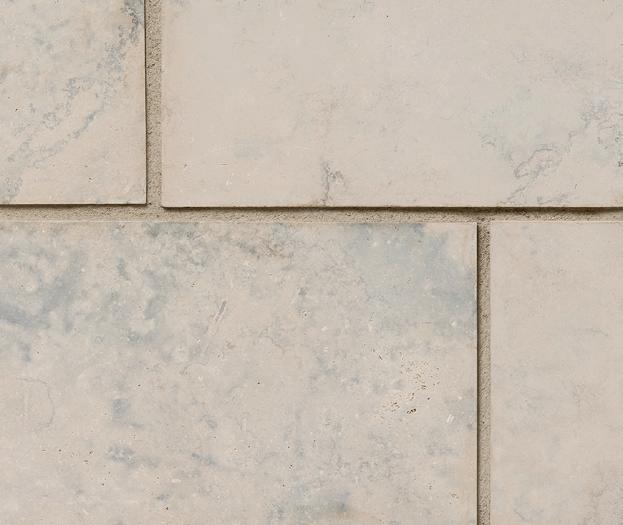
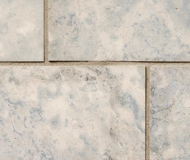
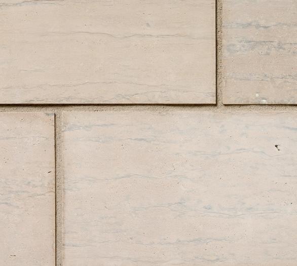
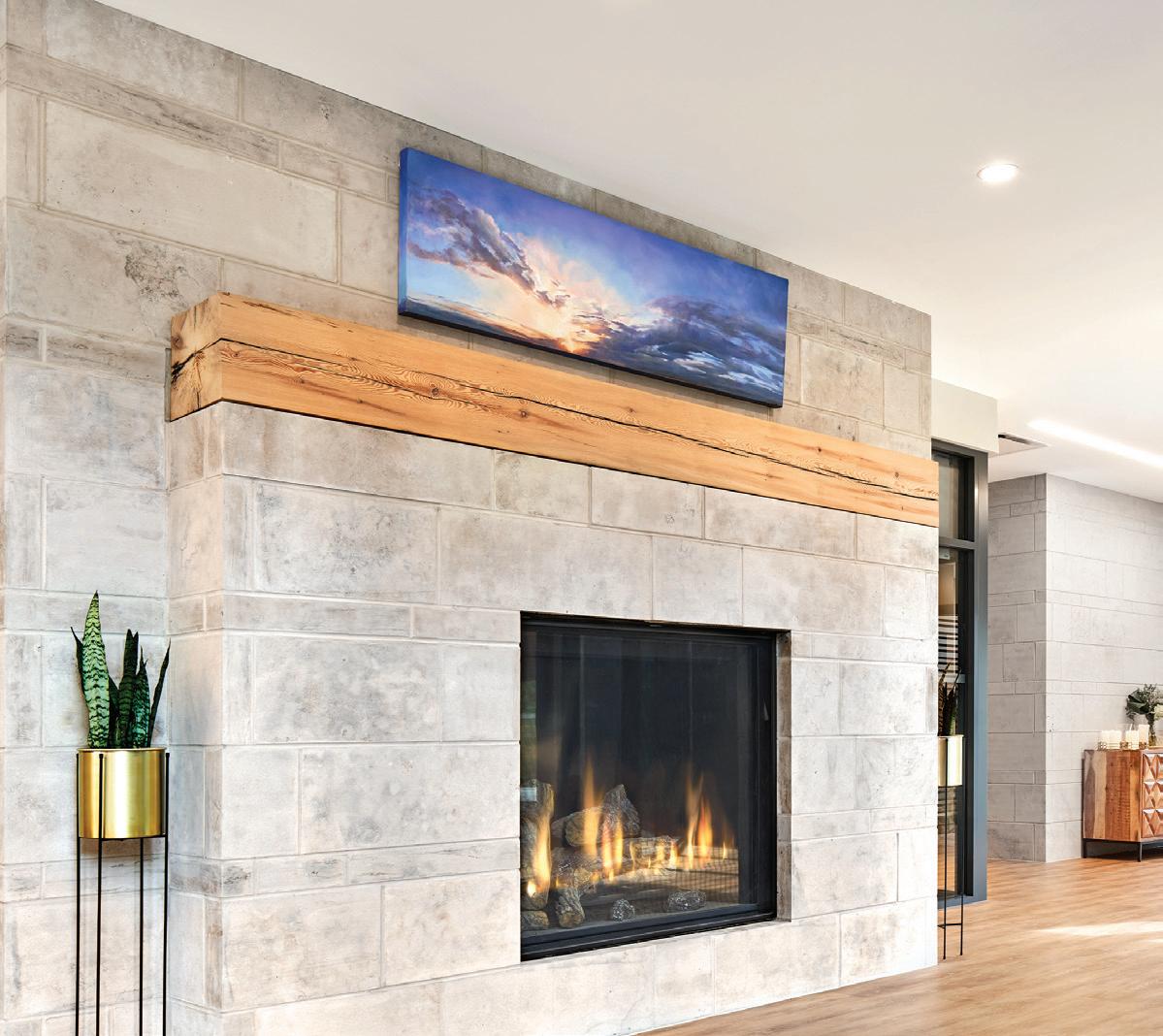

Since the 1960s, we’ve extracted Adair® limestone from our quarries in Ontario and it graces many iconic buildings, from embassies to symphony halls. Today, we offer the most exceptional product offering, with formats and finishes unparalleled in the industry. Contact us to uncover your design opportunities.
solutions@arriscraft.com
Adair® Sepia Veined Adair® Blue-Grey Veined Adair® Blue-Grey Fleuri Adair® Sepia Fleuri

Salone del Mobile.Milano 2023, back in its original April slot for the first time in three years, was elevated by architect Beppe Finessi’s expanded cultural program which brought architecture, art and photography to the fairgrounds as well as the returning biennial Euroluce exhibition devoted to innovative new lighting products.

1 Bilboquet | Flos Conceived by Canadian designer Philippe Malouin, this lamp is deceptively simple yet full of character. Inspired by magnetic ball joints, the lamp’s range of movements are both playful and precise, and its versatile design make it useful as a task light on a desk or table lamp that emits a soft glow against a wall. www.flos.com
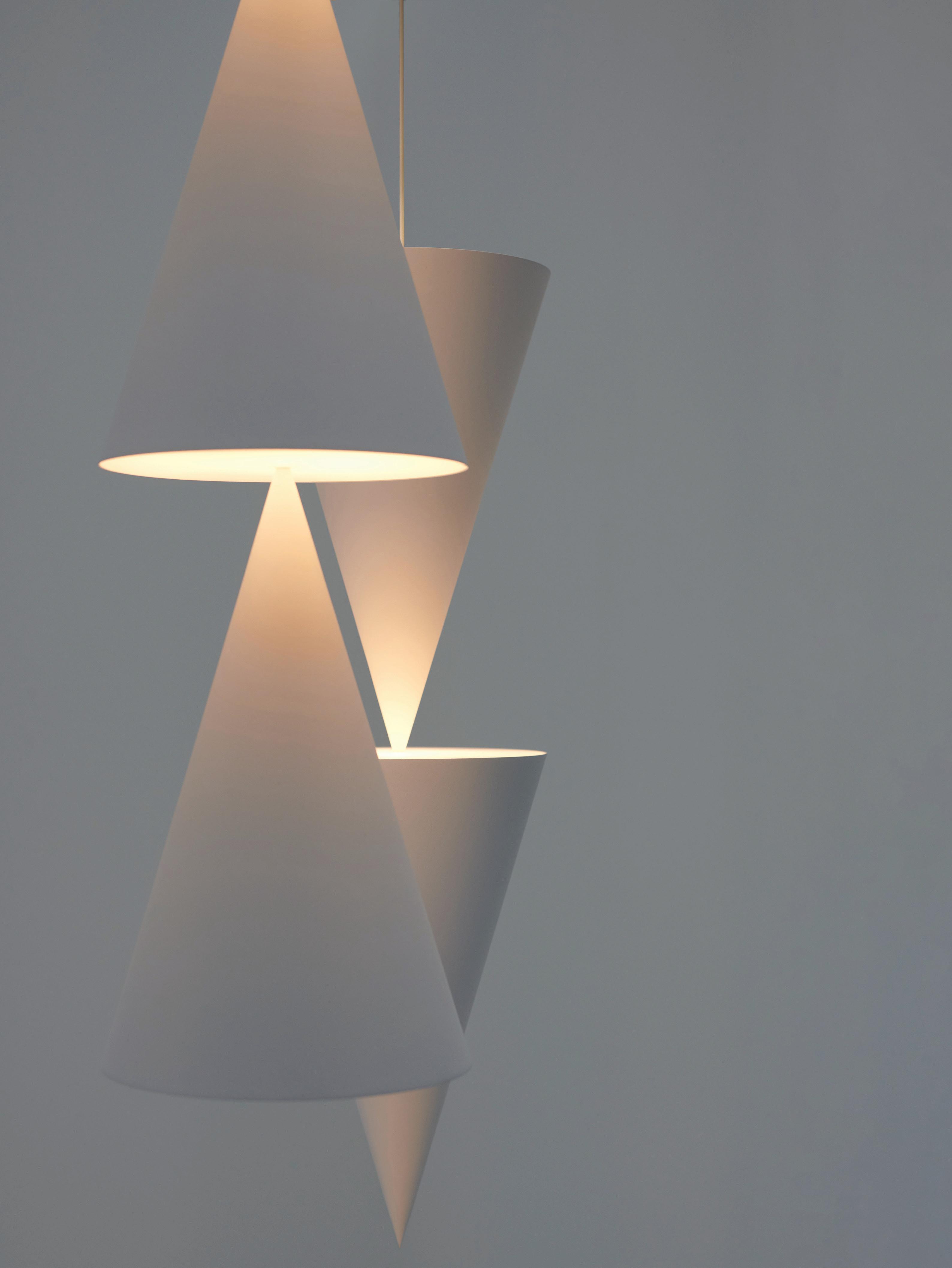
2 Peak | Michael Anastassiades This series of lighting fixtures with minimalist elongated cones allow for different configurations, resulting in a range of sleek and subtle designs. Each piece in the collection is crafted with precision, showcasing the company’s signature style. www.michaelanastassiades.com
3 Mickey | Gebrüder Thonet Vienna This new collaboration with designer India Mahdavi got its name from the pair of distinctive “ears” that recall those of a famous mouse. Mahdavi’s praise for the company’s ability to translate freehand drawings into high-quality wooden pieces is seen in the chair’s black wood structure set in slight contrast with two different shades of green upholstery. www.gebruederthonetvienna.com
4 Raphael | Minotti Italian-Danish design duo GamFratesi have delivered a full domestic collection with three sofa variants, two types of armchairs, dining chairs and a footstool. The organic forms of the pieces are enhanced by sophisticated upholstery, and the design adapts to the morphology of the seating shapes. www.minotti.com

5 Knitty | Moooi This larger-than-life lounge chair designed by Nika Zupanc is a striking conversation piece, with its chunky basket weave made of extra-large ‘yarn’ resembling giant ship ropes. With the online

configurator, you can choose from 15 colours in a quilted diamond pattern and see what it looks like in your home with AR. www.moooi.com
6 Ami | Honoka Fujiwara Kazuki’s stool is an innovative fusion of Japanese 2D weaving expressions and 3D forms. The shapes are crafted by dripping 3D printed resin from air, creating a unique appearance that changes depending on the angle of view. As part of the Tatami ReFab Project, Honoka has developed a biodegradable material by mixing resin with discarded igusa (rush) grass from tatami mats to re-weave the legacy of that traditional object into modern life. www.honoka-lab.jp

7 Meriggio | Flexform Antonio Citterio utilized an iroko structure for this outdoor collection of an armchair and two- and three-seat sofas, skillfully smoothed, turned, and finished by hand, while a sledlike base rests on thermoplastic spacers for outdoor use. Generously padded seat and backrest cushions, available in a variety of shades, enhance the sofa’s retro appeal. www.flexform.it

8 Kalmo | Driade From Canadian darling Karim Rashid comes a minimalist chair composed of just three elements: two curved ash plywood layers coupled with front legs of solid ash. Understated and simplistic, Rashid’s personality still oozes through the four colour options that are available in a two-tone finish. www.driade.com

9 Unut Oval Wall Mirror | Nomom A natural solid walnut frame manufactured and polished by hand and irregularly offset from the perfect geometry of the glass strikes a provocative balance between innovation and tradition. The mirror itself is silver, providing a clear reflection that enhances any room. www.nomonhome.com

1 Fusilli Chair | Rattan de Guadalajara Alán and Ayrton Miranda’s creation offers a cheeky take on outdoor furniture equally suited to any setting. Inspired by the curved shape of fusilli pasta but inflected with a touch of Mexican sensibilities, this chair combines textile seating with an aluminum frame and a backrest design that functions as a cable-stayed bridge, making it both eye-catching and very comfortable. www.rattangdl.com

2 Twain | Magis This collaboration between Konstantin Grcic and Hella Jongerius takes inspiration from the classic Safari Chair but goes further to become a study in sustainability. The frame is made of interlocking spindles in solid ash held in tension by a strap and ratchet. Leather armrests are produced using a chrome-free tanning process and the fabric component features patterns designed by Jongerius. The backrest tilts with the movement of the sitter, providing a feeling of freedom and pure comfort. www.magisdesign.com

3 Vector | A-N-D Lighting Designed by Lukas Peet, this floor or table lamp channels the spirit of Brutalist architecture, playing with the interchange of voids and volumes and offering
a gradient effect as light washes down its inner surfaces. The lamp’s bold materiality is conveyed in either weathered steel, black steel or polished stainless steel, affirming its simple yet powerful form. www.a-n-d.com


4 A.I. Console | Kartell Philippe Starck is forever in search of the pure and basic form of the graphic design element. Here, the console embodies artificial intelligence’s search for “the minimum and ground zero of style.” Available in white, grey, green, terracotta, and black, the recognizable lines of a larger collection are present, but with a unique central leg that leaves an uncluttered yet strong mark on entrances and hallways. www.kartell.com
5 Airframe | De Castelli Designed by Pio&TitoToso, this bookshelf is a celebration of the art of hammered metal. Its aerodynamic shape is composed of asymmetrical elliptical loops that support four horizontal shelves while an outer shell is shaped to the structure, creating a micro-architecture that adds refinement and drama. www.decastelli.com

Despite the sensory overload that is Milan Design Week, certain projects still manage to rise above the noise, and in the last few years that feat has consistently been achieved by Alcova. Having previously activated sites such as a bakery, a cashmere factory and the buildings of a military hospital complex, for its fifth edition Alcova invaded the derelict landscape of Ex-Macello di Porta Vittoria, a former abattoir. Here, over 90 international designers with varying degrees of professional experience were invited to “explore the direction of contemporary design practice,” says the brief. Most jostled to demonstrate their cleverness with whatever is considered “new” (be it ideas, materials, processes, representation), but for me it was one understated exhibit that struck a nerve.
“A Valuable Collection of Things” by Stantec was a very simple inventory of objects found throughout the abandoned Ex-Macello


Clockwise from top left A series of elements were collected from Ex-Macello buildings about to be demolished and then repositioned as if they were tiles on the floor. Other objects and elements were photographed and shown on the walls, generating a pattern in which the subjects are shown in a serial way. The results could be read in different ways: as abstract decorations in which shapes and colours alternate; as a focus on the beauty and particularity of the artifacts themselves; or as a contemplation on the meaning and future of these objects.

site, organized in abstract patterns on both the wallpaper and the floor. Stantec’s involvement in an exercise as erudite as Alcova may seem odd, but the 15-hectare Ex-Macello site is slated as the future home of ARIA, a massive redevelopment project with a variety of a multidisciplinary teams involved, including Stantec.
This exhibit both subtly and poetically dwelt on the potential value of resources found in abandoned industrial sites, reminding us that there is always residual intellectual, material, and economic capital in the memory and identity of a place (a phrase Alcova used in promotional messaging, but was particularly poignant here). In a town overrun by a stampede to the new, it is important to appreciate the quality of lasting objects and their present and future meaning.

www.otazen.com
Wave Side Table | dBodhi A tabletop made from reclaimed teak wood and a body made of organic rattan, this accent piece is handwoven according to an ancient Javanese technique into a detailed, organically shaped pattern. www.dbodhi.com


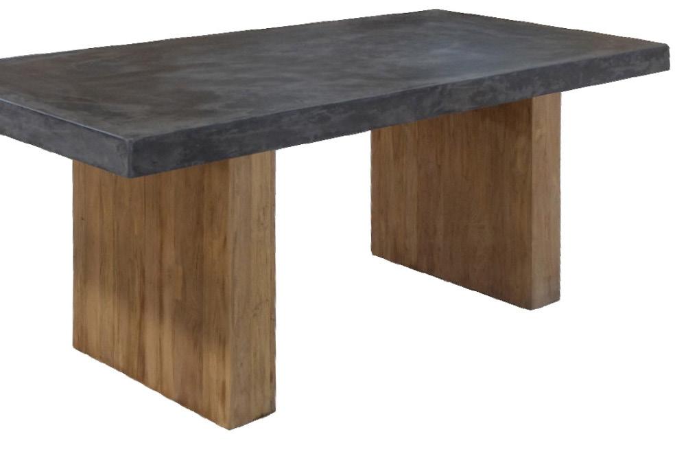
Concrete Collection | Kusmin Antiek One of the biggest recycled antique furniture makers in the Jepara region of Indonesia, Kusmin Antiek uses a varied palette of materials for its furniture lines, including reclaimed teak materials, solid wood, veneer, metals and even GRC concrete, which creates a striking textural counterpoint in a sea of traditional rattan. www.kusminantiek.com

Compiled by Enrico Cleva
One of the largest international trade exhibitions in Southeast Asia for the furniture and craft industries, the Indonesia International Furniture Expo (IFEX) was held in early March at the Jakarta International Expo Kemayoran (JIExpo). Part of the Asia Furniture Show Circle of exhibitions, it succeeded in attracting 12,118 visitors and buyers from 115 countries and unsurprisingly put particular emphasis on the beauty and application of Indonesia’s natural resources in various furniture products such as woodcraft and rattan furniture.
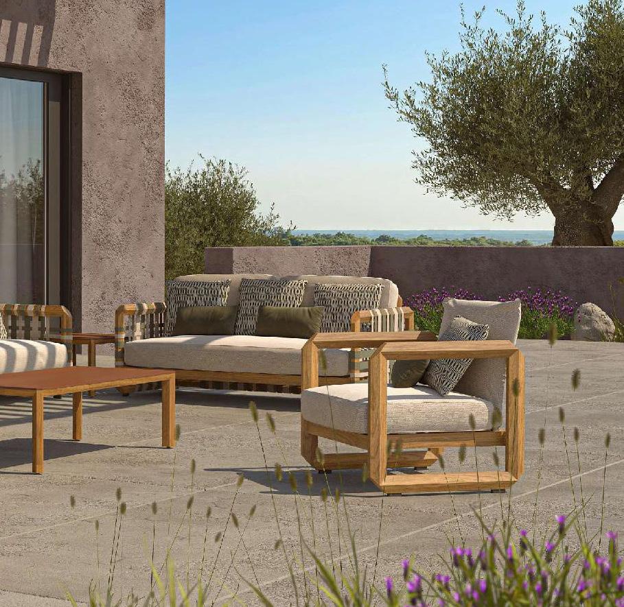
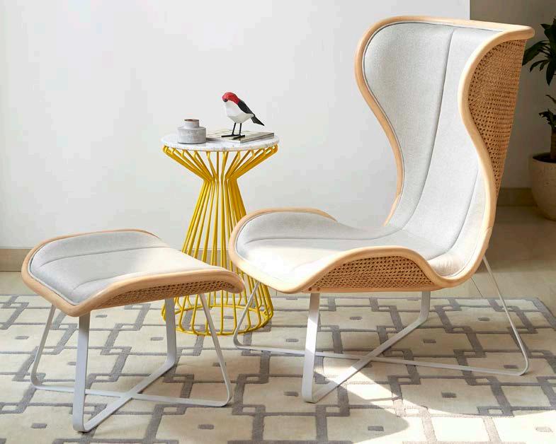
showcases Indonesian craftsmanship and material preferences in the country’s growing furniture segment.Stripe Collection | Otazen From the minds of Lagranja Design, a Barcelona-based multidisciplinary design studio primarily focused on interiors and products, comes this teak outdoor furniture collection that showcases intricate weaving and clean lines, suitable for any outdoor setting. Volare | Vivere Designed by Abie Abdillah, this lounge chair and ottoman pair combines a traditional rattan weaving pattern and natural rattan frame with the modern design of a wing chair concept, hence its name, Italian for “to fly.” www.viverecollection.com
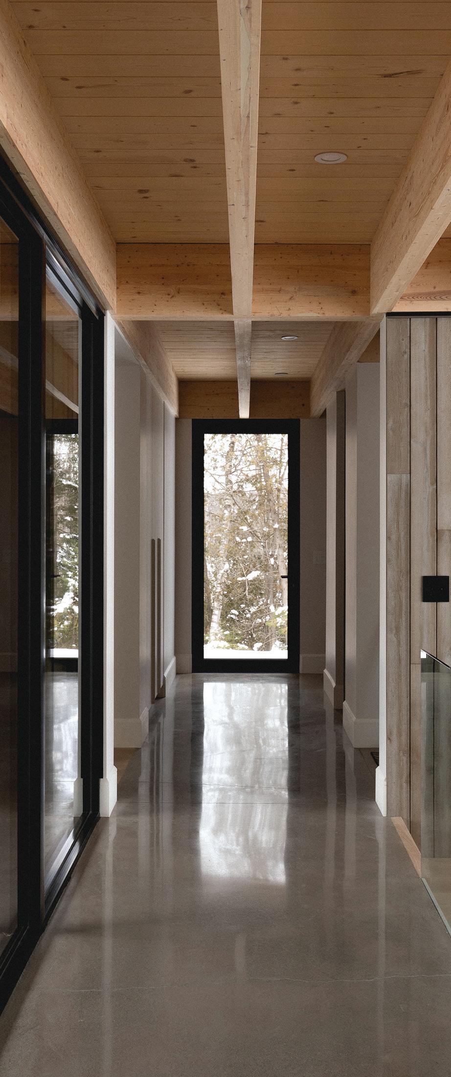
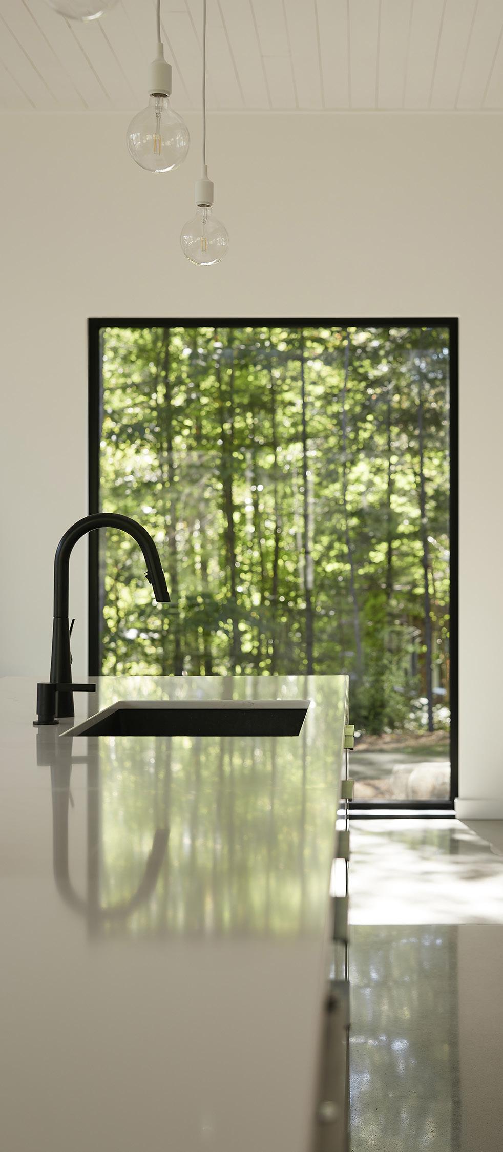
Using the art of photography to create a dialogue between the comfort and warmth of new residential spaces and the glorious Québec landscapes in which they are immersed.

If photography is the art of producing a realistic representation of an artfully arranged scenario manipulated through composition, lighting, editing or other magical arts, then the architectural photographer does exactly the reverse: taking an artist’s eye to the very real subject of built structures.

Québec-based architectural photographers Raphaël Thibodeau and Maxime Brouillet are considered among Canada’s most respected practitioners of the art. Both are clear that theirs is an applied rather than fine art (equal parts head and heart, as Raphaël explains); but that doesn’t mean there isn’t room for poetry, and their best work is as arresting as anything you’d find in a gallery.

According to Jean-Francois St-Onge, co-founder and creative director of Montréal-based ADHOC Architectes, “Maxime Brouillet acts like a director to generate emotion, to bring us into the intimacy of the daily life of the users of our projects.”
Brouillet credits his cinematic eye to his early training at Concordia University, where he earned a BFA majoring in film production, with a minor in photography. “At the end of my studies, I was mostly drawn to photography, (but) I was still helping friends in cinema to locate spaces, helping with the decor and props. So all those interests were pointing to a form of design and architecture sensibility that I was not even aware of.”
Symmetry features in a lot of Brouillet’s work; it has a profound psychological effect that people universally respond to. But clearly, a picture like “Hallway at Lake Arthur”* of a project designed by Montréal-based Ghoche Architecte presents much more than just a deeply satisfying composition of strong lines and rectangles. It’s brimming with life and movement: you want to climb the stairs or wander down the hallway to the back room and its bright, tree-filled window where the family dog is waiting for you to play. “Ideally you

have an ‘event’ of some kind, like a sunbeam, or something going on that’s interesting,” says Brouillet. “You can’t plan it in advance. You have to have your eyes open for that.”
In another photo of the Lake Arthur house,* he chose to shoot the living room from outside, peeking past a giant birch tree slantwise into the room, and onwards to a forested view out another window behind the sofa. Shadows of branches on the carbonized-wood siding seem to sway in the afternoon sun; you can almost smell the pine needles.
The Denison Mills project designed by ADHOC was even more rich with subject matter, says Brouillet, even though unlike many of the projects he photographs, the architects had only worked on a portion of the house. A historic flour mill built in the 19th century loyalist era in the Québec township of Shipton, it had been updated in the 20th century before the current homeowners had the new section added. What’s striking about the pictures from this day is their humanity. In one,* three people lounge in Adirondack chairs outside the library, chatting amiably; another takes two opposing views of the library,*

each notable as much for the much-used and enjoyed books and the homeowners’ comfort in the room, as it is of the room itself.

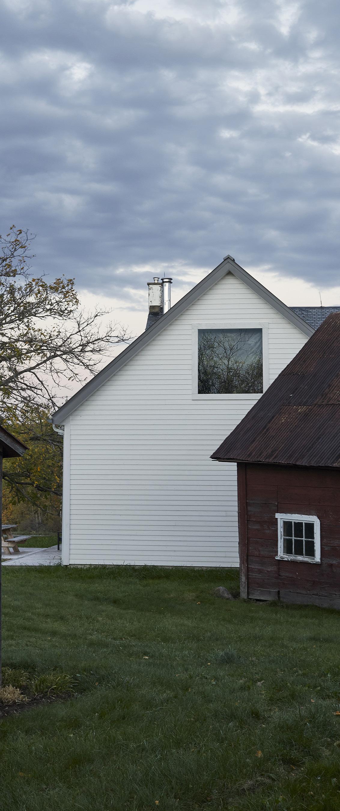
But one of the most striking photos from the day tells little from an architectural perspective. It gives the entire history of the property in a single image: under a richly textured sky, three rustic buildings, representing each of the three centuries the mill has stood. “Obviously, the architecture has to look good, but that’s really only a part of the picture, so we have to look at other elements: the placement of the furniture, the people in it, or leaves that tell you that you are looking through trees, even if you don’t see the trees. These are things that make a good scene.”

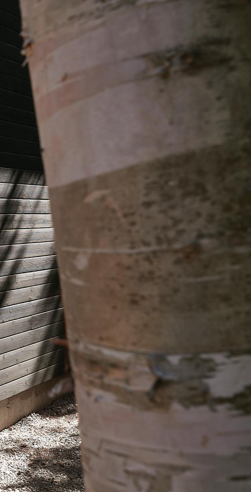
Opposite page Reminiscent of a traditional wooden cottage and composed of a single rectangular volume covered with black wood siding, the House on Lake Arthur is set on a gentle slope leading to the dock, with views and sunlight carefully studied to maximize the natural light while limiting views towards the neighbours. This page ADHOC Architectes was tasked with restoring and adapting a farmhouse originally built in 1831 to meet the needs of a new family. Large windows on either side of the building reconnect the residents with the surrounding landscape, and the architects used cedar shingles and clapboard painted white for the exterior cladding. A new modular winter reading room was added to the space.

Interestingly, Raphaël Thibodeau started his career in cinema studies as well. He also studied architecture and for the first six years of his professional career he worked for several different architecture studios while doing photography on the side. Eventually it struck him that architectural photography combined elements of all his favourite pursuits in one occupation, and by 2020 he decided to dedicate himself to it full time.
Many of Thibodeau’s photographs clearly show the advantages of a keen eye: for a great moment; an interesting angle; or a serendipitous combination of elements. For example, he describes being first struck by the interesting, zigzagged line of a vaulted ceiling and the adjacent wall in a cottage on the edge of a Laurentian lake.* The
resulting photo uses the crisscross to draw you into the shadowed coziness of the room, cloistered from the snowy scene outside. Details like a half-pulled-out chair at table add humanity. Despite its simple geometry, the picture gives you a lot of information about this room, the house and the landscape it’s set in.

“What’s really nice about working with Raphaël is that I’m talking to a fellow architect as well as a photographer,” says Eric-Joseph Tremblay of Atelier Boom-Town, who designed the cottage in the Laurentides. “He can communicate the architectural concepts we’re experimenting with through images. With simplicity and restraint, the photos express the very essence of this project. The focus is on space, natural light, textures, and the relationships between all these components.”
The first view of a property, Thibodeau explains, is always the most important. He’ll spend the first part of the shoot simply walking

around the site, just open to everything he sees. “And then, unconsciously, this more poetic/contemplative way to shoot blends with the factual information that the architects told me before. And when it all works together, it gives a photo set with both factual and emotional information, sometimes in the same images.”

Thibodeau’s pictures often invite you to fill in a complete narrative through the placement of a few telling details: binoculars on a table near a seaside window, ready for you to pick up and look at the view;* or a beach scene, featuring a wooden bench with a draped towel and a couple of paperbacks.* It’s so beachy, you don’t notice there’s no actual beach in the picture.


Storytelling aside, part of being truthful is accepting, and then embracing, the conditions on the day of the shoot. Sometimes that can mean going with the gloomy light of a cloudy day, or a sun that’s too high in the sky, creating unfriendly glare; in a situation like this, he might choose to focus on the reflected sunlight through a window onto a rear wall, with a stray beam glinting off a carafe of water,* as Thibodeau did in a forest chalet near the village of Morin-Heights, Québec.
But sometimes that openness to circumstances can provide a big payoff, as in a rare 24-hour shoot at a rustic mountain resort in the Laurentians called Farouche Tremblant. “This was a perfect photo shoot, because it’s a working farm but with cabins you can stay in. I was able to go and stay there for 24 hours and shoot in every kind of light.”

The objective, he says, was not so much to chronicle the architecture itself — although the steep peaks of the cabins were the perfect shape for a group of structures set amongst mountain peaks and sharppointed pines — as about communicating the feeling of the location. (“Also, there wasn’t a lot of room to shoot inside,” he quips.) The series of photographs he produced reads like chapters in a book, starting with the peaks of the cabins set in front of hump-backed Mont-Tremblant rising in the distance but shrouded in fog, and ending with the cabins sleeping peacefully as the moon rises behind them.*
One of the most effective scenes in the grouping, though, was taken in the middle of the day. “I happened to be walking by a bit of a distance away,” he recalls, “when I noticed the architect was standing outside one of the buildings in the compound, by the window.” It was the perfect moment to showcase the sheer scale of the location: a tiny figure standing next to a not-much-bigger building, with the vast mountains looming high above them. * “To document a project
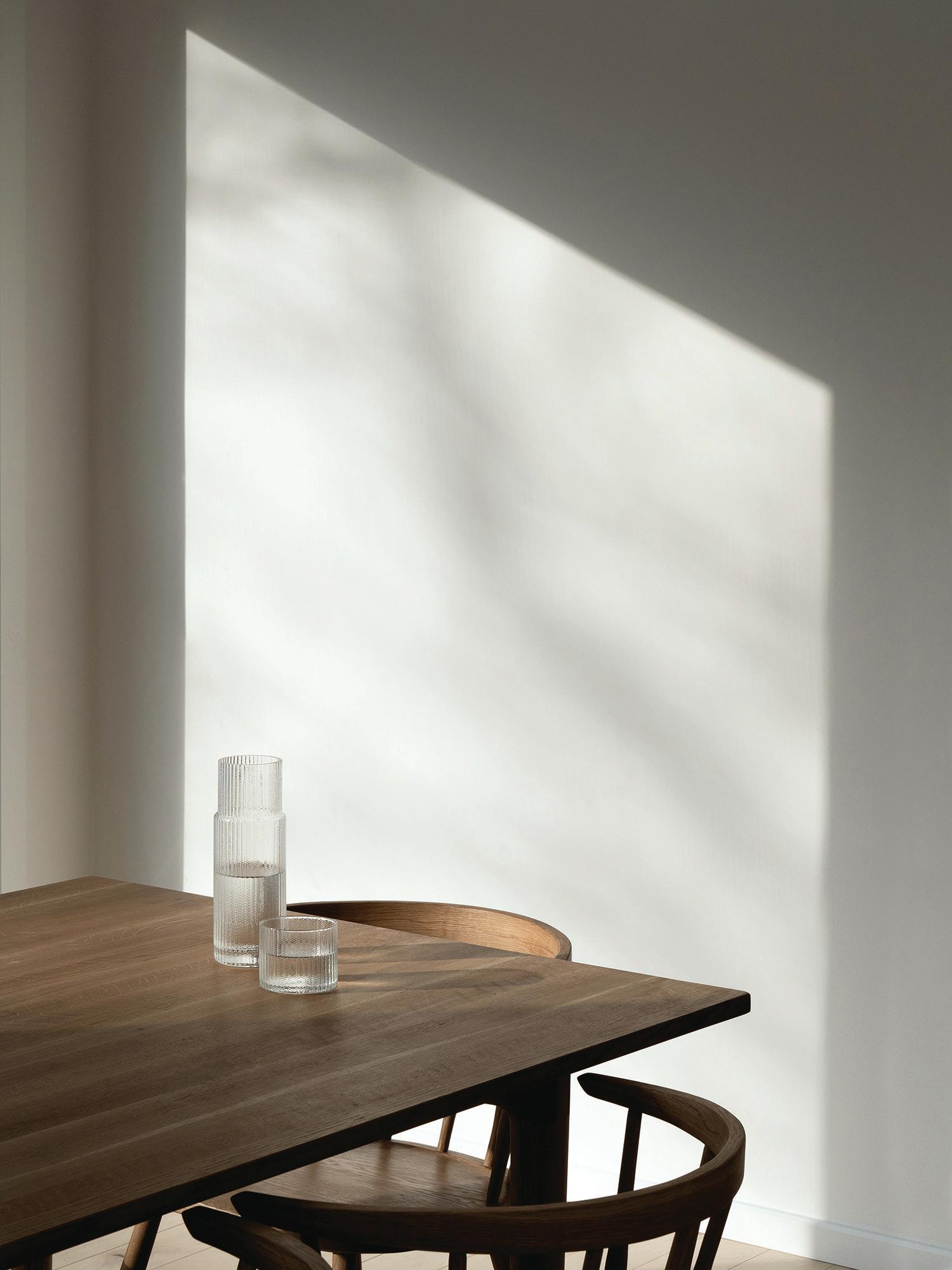
through 24 hours gave exceptional results, and the entire set produced by Raphaël is incredibly poetic. His photographs invite you into the wild,” says Nicolas Lapierre of Montréal-based Atelier L’Abri, who designed and built Farouche Tremblant.


“One of the best results of a photoshoot for an architect is to discover new aspects and angles of the project through the photographer’s work,” continues Lapierre, who’s firm was also responsible for the Morin-Heights chalet. “The photographer brings hers or his own vision and perception of the project, which shapes how others will discover it. As such, the photographer contributes greatly to the project’s story and how it lives, becoming a part of the project’s team.”
Far left The design language of the Morin-Heights chalet is borrowed from Austrian Alpine architecture, an inspiration that also lends itself to the project’s name: Schnee-Eule is German for snowy owl. Interior custom furniture was handmade by Inat, a Montréal-based woodworker. Middle and above Set against Mont-Tremblant National Park and nestled within the Devil’s River valley on the north side of Chemin du LacSupérieur, the Farouche agrotourism site combines a Nordic farm, a café-bar, four-season micro-refuges and an outdoor basecamp.
Whether one is a weaver, product designer, photographer, or interior designer — among other careers in the design industry — these artistic individuals possess a singular commonality: strict attention to detail. Designers and photographers have historically developed mutually beneficial relationships because of their ability to view and analyze content with a fine-tooth comb.
For example, creating desirable interiors to entice employees into the office has been a leading topic in the ongoing and evolving return-towork narrative. From designing a “resimercial” space — interiors that use softer, warmer materials and tones found in residential spaces — or embracing “office peacocking” which focuses on the incorporation of bold colour palettes and untraditional elements within the office setting, these tools are some of the many used to attract employees back to the shared workspace.

To embrace this new way of outfitting commercial interiors, designers are looking to interior photographers to capture the intent behind each minute detail and provide a proper framework for each element within the shared space. While the purpose for each individual component may be generally understood, it is part of the photographer’s job to compose the intention that illustrates the message behind the photoshoot.
When collaborating with photographer David Peterson on Bow Tie 2.0 — a recent photoshoot from Teknion that highlights the elements of fashion in furniture design — he emphasized the importance of structure and landscape. The house’s frame, angle, and positioning, as well as its natural exterior background, are analyzed separately and then together to determine if the furniture and chosen location can co-exist in harmony.


Shot at the iconic Stahl House in the hills above Los Angeles, also known as Case Study House #22, Peterson drew inspiration from the modernist principles — economy, practicality, material innovation — of this residential project. The rationale for using the Stahl House’s simplicity and Southern California’s tranquil aesthetic was to remove the brackets that separate office and residential furniture, allowing people to look at furniture with fresh eyes, see the breadth of the product offering and how pieces pulled from different categories work together.
Peterson’s experience in curating softened office interiors helped this shoot embody the impact of more contemporary product designs on mid-century innovation and used colourful textiles to add a layer of materiality, balancing the architecture’s strict metal, glass, and concrete geometry. Adding simple tables and lamps maintained a warm, inviting residential tone that evoked a calm yet energized, and purposeful yet pleasant feeling. “We could create images that tell a story to which viewers can relate, that create a look to which one can aspire,” says Peterson.

Creating a theme and overall purpose for any photoshoot is similar to developing a storyboard for a new film or novel. There is usually a clear beginning, middle and end laid out, a predetermined setting, planned colour schemes, and, of course, proper lighting. For this shoot, taking the idea that a bow tie is both a moment and a potential conversation
starter, the image portfolio reimagines the concept of “office furniture” in the same way; more than a simple display of furniture, the Bow Tie 2.0 photoshoot is a “vibe” that captures the designer’s vision.
Keeping this theme in mind, Peterson drew inspiration and photographic techniques from fashion shoots while providing a subtle nod to California’s laid-back nature. Shooting from every top, bottom, and side angle — with and without models — highlights Bow Tie 2.0’s ideas about supporting basic human needs like comfort and wellbeing in any location, not just inside our own homes. The Stahl House’s entirely open framework promotes fluidity and evokes effortless yet sophisticated energy presented in residential living areas and commercial offices alike.
Any discrepancies or differences can potentially fracture the melody created by each person on-site contributing to the photoshoot, so it’s important to keep the lines of communication open. This ensures the photography represents the design and captures the desired ambiance and emotional impact. For Teknion, emphasizing that work can be done anytime and anywhere was key in this photoshoot, if the environment provides users with the components that make them happy, promotes productivity, and supports the natural rhythm of work.
Choosing to showcase office furniture at the Stahl House removes the familiar lines of residential, commercial, and hospitality spaces, shifting the tides of normalized comfort (and slight conformity) to rework interior and exterior spaces into working for, instead of against us.
While yearly trends come and go, a constant will be producing visually stimulating interiors that consider colour psychology and are inclusive of residential interior elements. We’ve emerged victorious from an age of dark, dusky cubicles, and strive to create office interiors and workplace furniture that embraces the softer, more comfortable elements of life while maintaining a professional profile. Remote work has made employees appreciate feelings of relaxation and comfort during work hours; a feeling many are not ready to let slip from their grasp. Taking inspiration from fashion photography allows for new ways to illustrate how designers can develop functional spaces that directly serve user needs without sacrificing aesthetics.
As unbelievable as it may seem, look around you right now and likely something you touch or use daily is partially or wholly the product of forced labour. It’s telling that in 2020, the Canadian mineral extraction company Nevsun Resources opted for a landmark settlement rather than face three workers in a Canadian court who alleged torture, slavery and crimes against humanity during construction of Nevsun’s extraction facility in Eritrea. This case, along with growing waves of evidence, alerted the Canadian government to significant (and costly for businesses) gaps in its legislation, gaps it aims to fill with the newly passed Bill S-211, Fighting Against Forced Labour and Child Labour in Supply Chains Act, an Act that will directly impact the Canadian architecture and design industry by introducing stringent supply chain transparency
If Canadian designers and architects are serious about combating modern slavery in their supply chains, here are key questions to ask your suppliers, and for them to ask their suppliers:
1.Are employees trained to self-audit?
2.What is your auditing and certification expense?
3.What is the role of auditing firms in your supply chain?
4.How are auditors paid to avoid conflicts of interest?
5.How are audits structured to spot labour standard violations?
6.How do you detect labour violations in non-audited suppliers?
7.Are you developing alternatives to supply chain monitoring?
8.Who helps develop these alternative monitoring methods?
9.Can you publicly share your worker condition improvements?
10.Is there oversight for your auditors ensuring accountability?
11.Do you comply with human rights due diligence laws?
12.Do you report labour issues?
13.Can you make audit reports public for better scrutiny?
These questions can guide designers and architects in determining the ethical commitment of their suppliers, promoting transparency and fostering improvements in worker conditions.
and reporting requirements aimed at rooting out modern slavery and sexual exploitation of children and adults. Abhorrent as it is to contemplate, the International Labour Organisation reports modern slavery is presently endemic to the construction of the built environment globally and Canadian firms are no exception. Given the lack of response to industry queries in researching this article, neither, it appears, are they ready for the changes Bill S-211 will wreak when it comes into force.
Imagine a new supplier coming to your office and impressing you with the look and feel of new upholstery swatches at prices per square foot that are quite simply unbeatable. But before signing be aware. Coming into force January 1, 2024, the new legislation affects all entities meeting certain criteria in size, revenue, and presence in Canada, warns Dentons, a global legal practice. The Act places a responsibility on companies to actively assess, report, and reduce the risk of forced and child labour in their supply chains, with hefty penalties for non-compliance. For designers and the product makers they work with, understanding this legislation’s impact is key to ensuring ethical sourcing and maintaining their reputations.
The urgency of this legislation is underscored by the alarming rise in global forced labour, with a reported 27.6 million individuals trapped in 2022, up by 2.7 million since 2016. This surge, according to the International Labour Organization and Walk Free, is largely due to far-reaching impacts of the pandemic, political instability, and hazardous migration. And while the Canadian government’s actions are intended to leverage public reporting and sanctions for greater transparency, critics of the new legislation question whether it goes far enough. “Bill S-211 offers us a starting point,” says Kam Phung, assistant professor of Business & Society at the Beedie School of Business, Simon Fraser University. “But if we want to have a serious chance of addressing forced labour and other forms of human exploitation, we need legislation that goes beyond disclosure (i.e., transparency and reporting) and requires real action from business to both remedy any human rights violations and change the practices that they embrace in the first place that enables modern slavery to thrive, such as business models centred around the lowest cost or policies/practices favouring the lowest bidder.”
More broadly, academics point to the inadequacies of earlier supply chain transparency laws, such as those enacted in California, the U.K. and Australia, to argue that these laws often result in superficial reporting focusing more on procedural aspects rather than the actual outcomes of anti-slavery efforts. Such a shallow approach has failed to eradicate forced labour and exploitation from prevailing business models, underlining the need for a more robust, outcome-focused approach.
As Canada’s Act aligns closely with these earlier transparency models, its potential effectiveness in addressing supply chain labour is up for scrutiny. “The prospects for addressing the key flaws of the global production system, including forced labour and slavery, or environmental destruction, seem increasingly limited due to the shortcomings of
the audit system,” said Genevieve LeBaron of Simon Fraser University and Jane Lister of the University of British Columbia, in an article published in Review of International Political Economy
The professors argue that audits, despite their popularity, often serve to reinforce private interests over public good, rather than driving tangible improvements. The audit system’s weaknesses, rooted in design, power relations, and implementation, often stabilize, legitimize and reinforce endemic supply chain problems, while providing an illusion of certainty and control. This, they say, helps companies fend off more stringent forms of regulation.

Canada’s new legislation, despite being a worthy step in combating modern slavery, may fall short in addressing the crux of the issue. The legislation, largely focused on corporate transparency and reporting rife with conflicted interests, lacks elements critical to this fight, such as imposing a broad due-diligence obligation on companies to actively detect, prevent, and mitigate forced labour; establishing grievance mechanisms involving workers and unions at every chain link; offering a clear civil remedy for victims; and creating a public supervisory agency. Furthermore, the Act’s potential inability to address the international scale of the problem is concerning, with six G20 nations, including key sources of Canadian imports, topping the list of countries with high incidences of modern slavery.
Simply, Canada’s domestically focused law may be insufficient, and critics are demanding a more comprehensive, globally oriented, and proactive approach to effectively combat this pervasive cross-border issue. As Phung reminds us, “When designing projects, we need to think full scope and be cognizant of the social impact of whatever is being built. Imagine who will be bringing your projects to life at all stages of development and the supply chain as well as the work conditions that they will face.”
In terms of opportunities, a deliberate commitment to eradicating forced labour from supply chains can significantly enhance a firm’s reputation. Clients, investors, and the public are becoming more aware and concerned about the ethics of labour practices. Adopting a transparent, proactive approach can position a firm as a leader in social responsibility, potentially attracting more business and positively impacting the bottom line. Moreover, firms that prioritize ethical supply chains can pre-emptively mitigate the legal risks of non-compliance.
As laws like Canada’s Modern Slavery Act evolve and become more stringent, firms with established ethical protocols will be ahead of the curve, saving potentially significant costs associated with legal penalties and necessary restructuring. Reputational damage is also a major concern: the discovery of forced labour within a firm’s supply chain can lead to negative press coverage, client loss, and a drop in share value for public companies. The damage can be long-lasting, tarnishing the company’s brand image. Non-compliance can also invite negative publicity, further damaging reputations. Finally, unethical
As global economies become ever more intertwined and complicated, so too do the relationships between material purchasers, suppliers, and the labour that produces them. On every continent, forced labour is producing materials used to build structures and furnish interiors, be it upholstery textiles in India, brick kilns in Bangladesh or timber harvested in South America, Africa and Russia. Speaking of Russia, in response to the ongoing war in Ukraine the international community has imposed heavy sanctions on Russian exports, including the very popular Russian Baltic birch. Recent reports from The Environmental Investigation Agency (EIA) have revealed that despite these sanctions, Russian Baltic birch is still finding its way into North America through southeast Asia, undermining government efforts to penalize Russia. This not only compromises the efficacy of the sanctions but also puts companies’ Forest Stewardship Council (FSC) certifications at risk, as Russian timber no longer holds these accreditations.
supply chain practices can contribute to operational risks. The reliance on forced labour often correlates with substandard working conditions and practices, which can impact product quality and lead to delays, jeopardizing client relationships and contracts.
While the route to ensuring supply chain transparency and ethical labour practices may initially seem challenging, the long-term benefits of risk mitigation, improved reputation, and legal compliance make it a strategic choice for Canadian designers and architects in a competitive global market. It is essential to remember that transparency and commitment to ethical practices are no longer just optional: in Canada, they’re the law.

The recently released Architects at Home by Images Publishing presents a survey of architects’ own homes located around the world — specifically, a few European countries, the U.S and Australia. While a more balanced selection from a wider global scope would have been appreciated, the projects featured are a pleasing demonstration of how architects design these most intimate domestic spaces for themselves and their families.

What better than to experiment and test one’s ideologies through the design of one’s own home? As an embodiment and personal expression of the architect’s beliefs, experiences and ambitions, each project in the book moves well beyond merely a nice place to live and becomes a personal manifesto. It allows the architect to make full use of her toolkit: the experiential qualities of the home are achieved through material innovation, sculpting space with light, manipulating circulation, and merging interior and exterior to strengthen the connection to nature. A pressing focus on sustainability and reducing environmental footprint is necessary and welcome given the current reality of the climate crisis.
A variety of contexts — from the tight urban confines of south London to the vast, open landscape of rural Idaho — determine formal responses to site and manifest in such typologies as tower, bridge and shed, and everything in between. Historical context is also critical: in Brisbane, Terry McQuillan designed a new, two-storey expansion to an existing cottage dating from the early 20th century. A louvered breezeway separates the two contrasting forms, respecting the integrity and heritage of the modestly scaled cottage while the project in its entirety achieves a masterful integration between old and new.
David Thompson’s home in Los Angeles’ Laurel Hills neighbourhood comprises three low-slung pavilions clad in red cedar and charcoal cement-board panel linked by corridors of glass, forming courtyards that bring the harmonious relationship between indoors and outdoors into sharp focus. Amongst a landscape of wild grasses, olive trees and concrete pavers, a 40-foot-long swimming pool in the rear courtyard invites residents and guests to gather. Transparency and light are other key characteristics of the project, enhanced by an open plan that encourages fluidity of circulation.
Recipient of the Manser Medal from the Royal Institute of British Architects, Carl Turner’s Slip House in London’s Brixton neighbourhood presents a translucent icy façade to the street. Comprised of vertical glass panels attached to a steel and concrete frame, the extremely energy-efficient home occupies a compact site amongst Victorian-era homes within a dense urban context. Three cantilevering boxes ‘slip’ past each other in a stacked, sculptural assemblage, and are designed with flexibility in mind: at one time the house accommodated independent functions of both studio workspace and residence, but can also serve as a singlefamily residence.

A house as a container for art is nothing new, but Corbett Lyon’s Housemuseum in Melbourne represents a new hybrid typology of private home and public museum that showcases the architect’s own contemporary art collection. A bold but judicious use of colour and graphic patterning characterize the interior, complementing the diverse and numerous artworks mounted and installed throughout the house. Landscaped courtyards extend the experience to the outdoors, with large sculptural pieces on prominent display.
These are just a few highlights amongst the 43 projects featured in Architects at Home, but each is certain to reveal both the pleasures and challenges of designing a home for oneself.
Peeking inside some of the world’s bestknown architects’ homes provides insight into how they inject interior design flair into their own personal philosophies.Above middle Corbett Lyon’s Housemuseum, Melbourne. Above right Carl Turner’s Slip House, London.
works and lives in the water and land and creates things that have an impact on the environment and those who live there.

supported and that humans continue to educate themselves on the past in order to improve the future.


