PostPandemic Collaboration
Optimizing what can’t be done at home: the meeting experience.
The Future of Educational Common Spaces


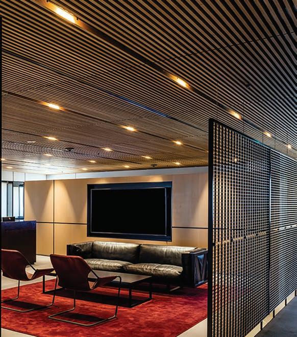
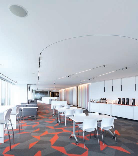
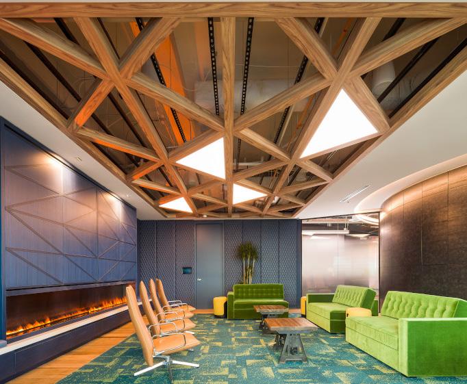
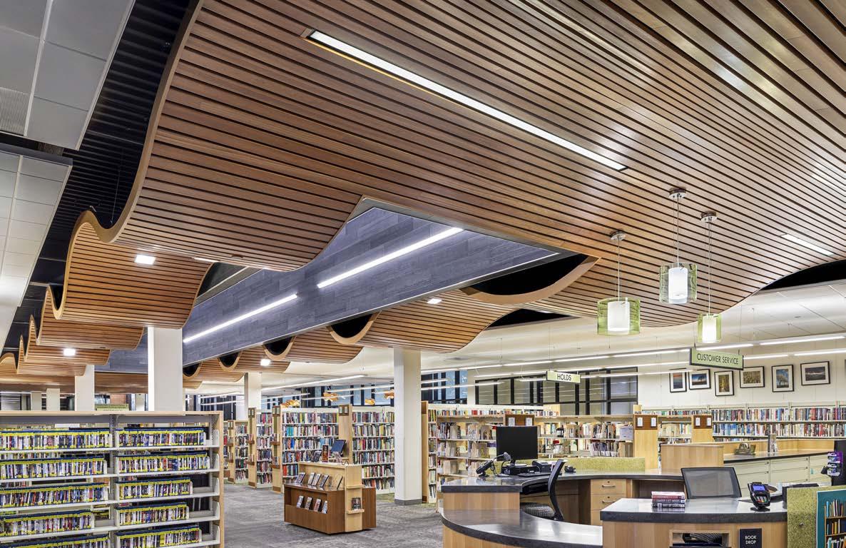
Some ceiling designs are so visually striking they feel more like art installations. WoodWorks® Custom Grille Ceiling Systems give you the freedom to express yourself with 3-dimensional shapes, linear patterns, and biophilic materials. Frame it all in the proper light with integrated fixtures from certified lighting partners. Our complimentary ProjectWorks® design service can even help develop your design intent into safe and manufacturable solutions and provide mock-ups, budgets, and detail drawings that bring your ideas to life. Get started on your masterpiece today at armstrongceilings.com/woodworksgrille




 WoodWorks® Custom Grille Ceiling System > Redwood LIFE Café - Redwood City, CA > Habitec Architecture & Interior Design - San Jose, CA
Design & Pre-Construction Service




23 MODERN OPULENCE With the new Velar, Range Rover takes a reductionist design approach that puts small details like leather-free luxury upholstery front and centre. By Peter Sobchak
24 SO HAPPY TOGETHER Four recent projects reflect how employees want to collaborate in the post-pandemic workplace landscape. By David Lasker
34 WONDER WALL A master of directing movement and framing views, Johnson Chou creates a showroom where designers, specifiers and end-users can be inspired by Global’s vast offerings. By Matthew Hague
41 STUDY AIDS Scholastic institutions call on Gow Hastings Architects to upgrade the design caliber of their campuses, realizing it is a key tool for recruiting and keeping both students and faculty. By Rhys Phillips
50 THINGS ARE LOOKING UP Three ways metal ceilings are influencing design trends. By Robert Marshall

12 CAUGHT OUR EYE 15 THE GOODS Office design is constantly adjusting to new working realities, and the products that fill it are evolving too, including unique materials that are new to commercial design. 20 SEEN Highlights and insights from Heimtextil 2023 in Frankfurt. 52 OVER & OUT Exploring and exploding the potential of a vase.
COVER – Bonduelle’s Station B by Lemay. Photo by Claude-Simon LangloisSenior Publisher Martin Spreer
416-441-2085 x4
Editor in Chief Peter Sobchak
Art Director Roy Gaiot
Contributors
Reza Aliabadi, Matthew Hague, David Lasker, Rhys Phillips, Caroline Till
Online Editor Christiane Beya
Customer Service / Production
Laura Moffatt
416-441-2085 x2
Circulation Manager circulation@canadianinteriors.com
President of iQ Business Media Inc. Alex Papanou
Canadian Interiors magazine is published by iQ Business Media Inc.
126 Old Sheppard Ave, Toronto, ON M2J 3L9 Telephone 416-441-2085
e-mail: info@canadianinteriors.com
website: www.canadianinteriors.com
Canadian Interiors publishes six issues, plus a source guide, per year. Printed in Canada. The content of this publication is the property of Canadian Interiors and cannot be reproduced without permission from the publisher.
Subscription rates > Canada $38.95 per year (plus taxes) U.S.A. $71.95 USD per year, Overseas $98.95 USD per year. Back issues > Back copies are available for $15 for delivery in Canada, $20 USD for delivery in U.S.A. and $30 USD overseas. Please send payment to:
Canadian Interiors, 126 Old Sheppard Ave, Toronto, ON M2J 3L9 or order online www.canadianinteriors.com
For subscription and back issues inquiries please call 416-441-2085 x2
e-mail: circulation@canadianinteriors.com, or go to our website at: www.canadianinteriors.com

Canadian Interiors is indexed in the Canadian Magazine Index by Micromedia ProQuest Company, Toronto (www.micromedia.com) and National Archive Publishing Company, Ann Arbor, Michigan (www.napubco.com).
Member of Canadian Business Press

Member of the Alliance for Audited Media
ISSN 1923-3329 (Online), ISSN 0008-3887 (Print)
H.S.T. # 80456 2965 RT0001
iQ Business Media Inc.

Canada Post Sales Product Agreement No. 43096012
We already know the tagline: COVID-19 has dramatically impacted workplace norms regarding flexible working. Here is what we now accept: there is less need for employees to be physically present in the office; most employees will not come into the office more than four days a week, with many only in once; less office space will be available in the future and it will be utilized differently. “Freed from their workplaces during the pandemic, employees have been vocal about not wanting to return to open-plan offices,” say the authors of the ASID 2023 Trends Report. These changes are affecting not just how the use of office space is viewed, but also many aspects of office culture, such as presenteeism and the long hours culture that had always been prevalent.
Office culture is influenced by many actors, but during COVID-19 it was mostly the worker we were worried about: surveys and studies came fast and furious analyzing their likes and dislikes, wondering aloud what it would take to bring them back. Which makes a recent study conducted at the University of Birmingham all the more interesting: they talked to managers about attitudes towards flexible working.

Fret not: for the most part, managers surveyed are accepting of flexible working practices (they are workers too, after all). But some finer details still raised eyebrows, for example a surprising percentage believe long
hours were still needed for employees to advance in the organization. But what really caught my eye was the question of surveillance: over a third of managers across all sectors reported that monitoring phone logs and calls (including recording calls) was acceptable at work. In addition, nearly half of all managers surveyed viewed the monitoring of employee work emails, files, and browser history as an acceptable form of monitoring.
Surveillance isn’t going anywhere, says the study, despite an overriding view that it does not improve performance and erodes trust, a pillar not just in a healthy company culture but also the mental health of individuals. The September 2022 edition of the Mental Health Index by TELUS Health (formerly LifeWorks) explored Canadian workers’ trust towards their employer, finding that one in five report declining employer trust since the start of the pandemic. This group also has the lowest mental health score, more than eight points below the national average, indicating that employee wellbeing, productivity and retention are not only influenced by trust in the workplace but are largely dependent on it.
“As the super-hot job market gradually cools, employers are drawing in the reins, offering fewer remote-work positions, and requiring more current remote workers to return to the workplace,” says the ASID report. “Job seekers want remote work options, but on-site only job posts are becoming more common.” There are already some signs that the long hours culture may be returning in workplaces, which highlights the fragile nature of these evolving norms and raises some interesting questions about what design can really be expected to do as the office world around us fluctuates: designers can change the spaces, but what, if anything can these spaces do to change the culture?


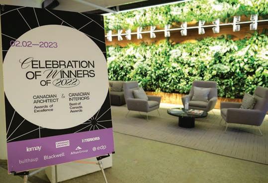
On February 2, winners of the 2022 Canadian Interiors 25th Best of Canada Awards gathered to celebrate at Le Phénix, the new Montréal headquarters of Lemay.

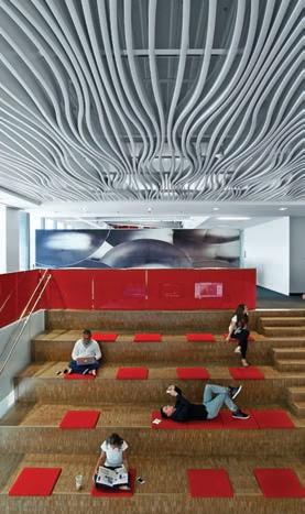
Vives St-Laurent helps the Montréal-based skateboard lifestyle company relocate to a former industrial sector in the Mile-End district.
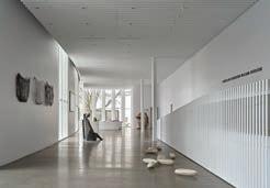

KPMB Architects’ Harrison McCain Pavilion at Beaverbrook Art Gallery in Fredericton, N.B. is the final and most public of the gallery’s threephase expansion.
Canadian design studio Reigo & Bauer relocate from Toronto to greener pastures in rural Ontario.


Manufactured Wasteland Part of DesignTO and housed in a dark cube-shaped pavilion at Toronto’s Sugar Beach Park North, miniaturized landscapes by Québec artist Olivier Roberge depict a natural environment transformed by human intervention and climate change. In Territories 2.0 , billboards and graffiti dominate the scene and make not-so-subtle symbolic comments on capitalism and consumerism.

Through a Lens A seven-year stalwart of DesignTO, Sylvia Lee, executive and creative director of The Goodman Studio, has always done well with the shop window format and utilized it again this year at luxury retailer Clementine’s to launch Salt Frames, a series of three interior screens and two tables inspired by aerial images of coloured salt fields geographically separated by levees. “The levees that create the geometry around the fields are a human intervention creating an accidental stained-glass appearance. I wanted to explore the colour and geometry of the salt planes in champagne glass,” says Lee.
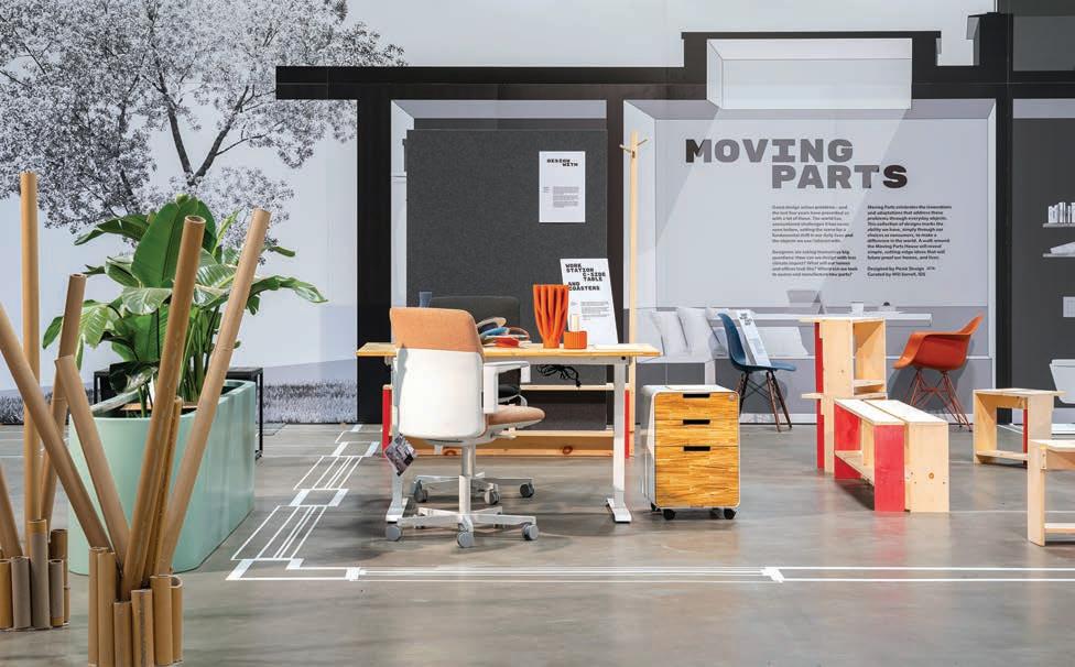
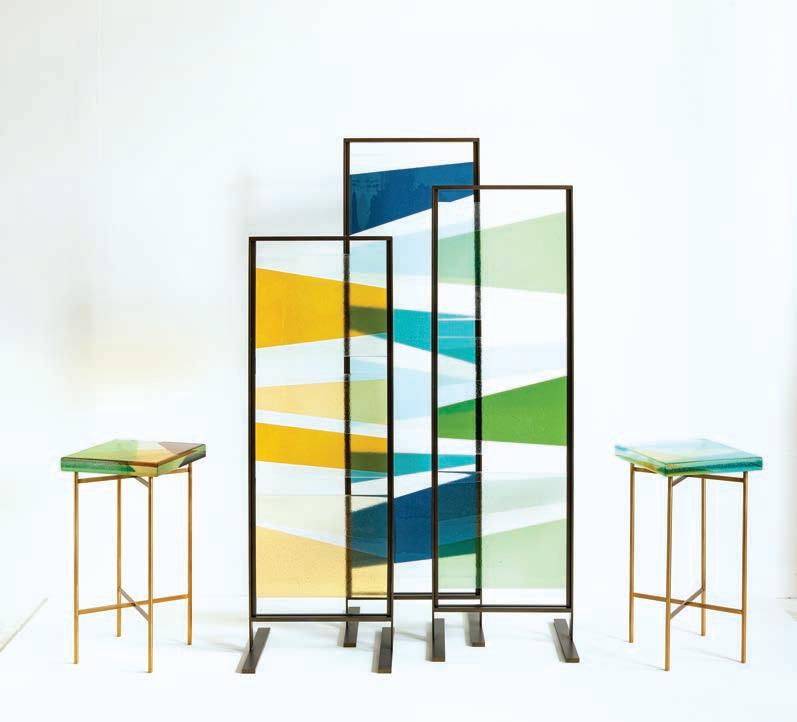
Marking Lines
The theme of IDS23, “Moving Parts,” was also the name of an exhibit showcasing designed pieces that represent how the pandemic affected our behaviour, including an emphasis on sustainability. “In keeping with that idea and due to time constraints, we designed it without building anything to minimize the amount of material generated by the end of the show,” says Joanne Lam, principal at Toronto-based Picnic Design. “We designed a sectional perspective of a live/work house that pulls all the pieces in one place and drew a floor plan in tape. Everything is designed in black and white so the pieces themselves are the only parts in colour.”
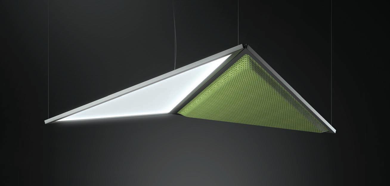
Inspired by papiroflexia, the art of papyrus-folding, Flexia is reminiscent of the Japanese art of origami. Designed by Mario Cucinella and made from recycled fibers (the external fabric comes from PET bottles while the internal panel uses waste materials), the suspended fixture combines lighting with sound absorption to create a lived softness through both light and sound. www.artemide.net
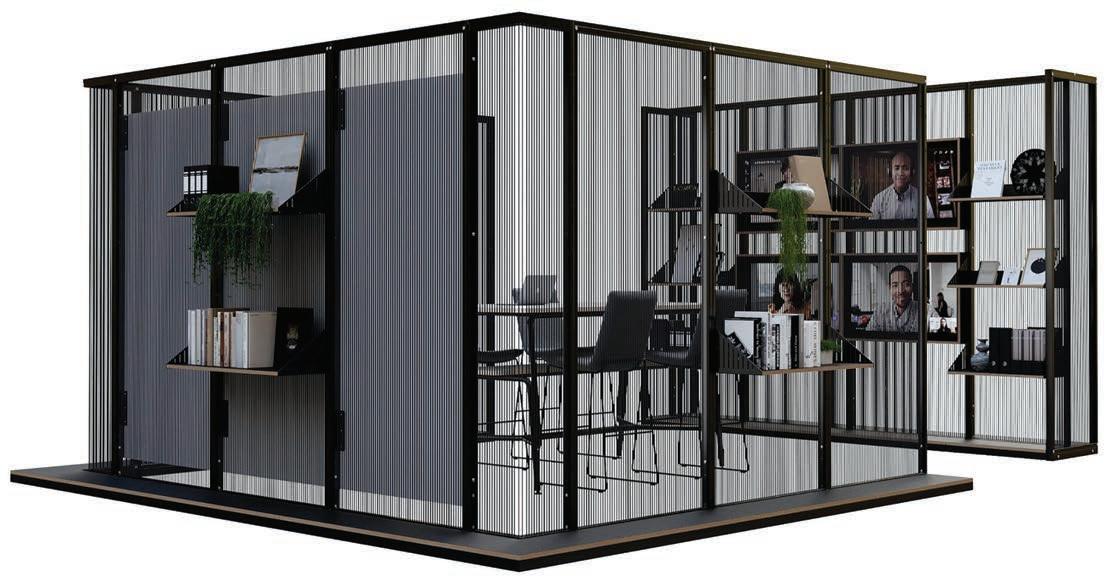
Harp | Inscape
In contrast to traditional office drapes or curtains, this space divider is designed with bungee cords to construct ‘walls’ without obstructing visibility or creating a permanent barrier. The cords provide contrast between the solid industrial steel frames and the more subtle touches of detail given by the accessories. This is the first product to come out of a new partnership with commercial furniture manufacturer Connection. www.myinscape.com

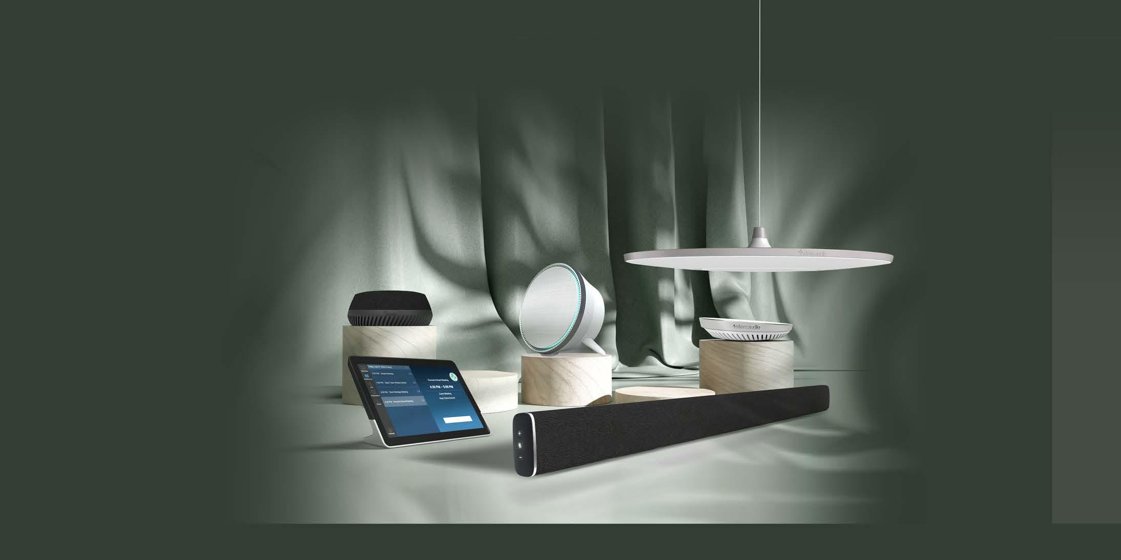
Hybrid; resimercial; fluctuating schedules; condensed square footage: office design is constantly adjusting to new working realities, and the products that fill it are evolving too, including unique materials that are new to commercial design.
Innate | Allseating Todd Yetman of Toronto-based Yetman & Co. checked all the comfort boxes for this task chair: plush upholstery; an absence of hard surfaces; flexible webbing straps which move and contract to mimic the natural curvature of the spine; multiple positional modifications hidden in its fullyintegrated core; and a headrest with 60 degree pivot and five height positions within a 2.5-inch range, among other features. www.allseating.com
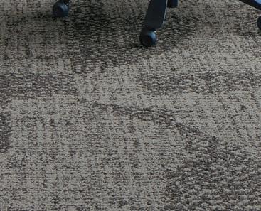
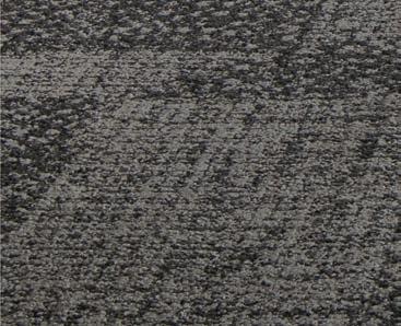
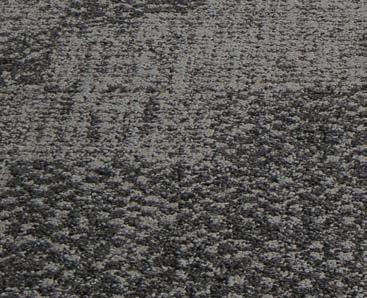
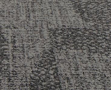
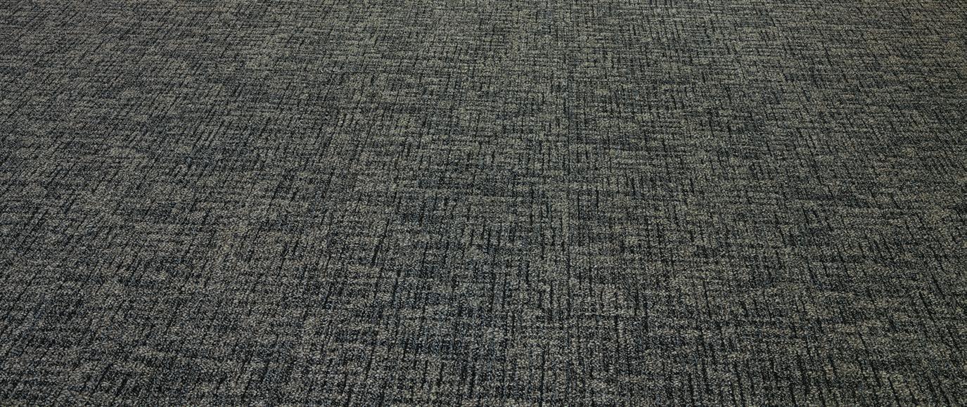
Himitsu San | Bentley The next generation in the company’s Himitsu Ni collection evokes nubby wools and the organic slubs in raw silks in a palette of 14 colours that explores complex and nuanced soft hues and shadows in order to create visual depth in what otherwise appears as fairly neutral floor coverings. www.bentleymills.com
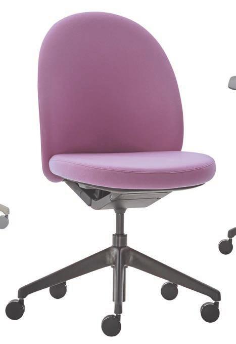
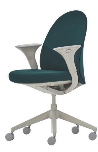
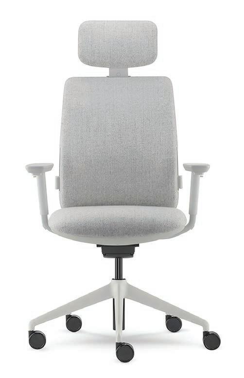
Essa | Teknion PearsonLloyd took cues from the classic club chair when designing this light task chair with a pared-down scale. Offered fully upholstered with Luum Textiles or upholstered with plastic back options, and with or without armrests in both fixed or height adjustable formats and a five-star base with casters for stability and ease of movement. www.teknion.com
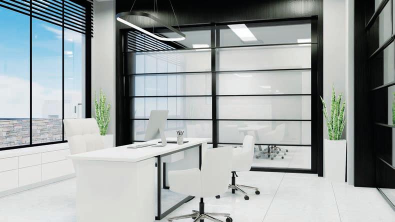
Prisma | Skyfold The Montréal-based space separation provider has launched an acoustically advanced vertically retracting glass wall with a rating of 52 STC/Rw that requires no wall or floor tracks. The wall system combines clear panels with a variety of different glass and opaque options, plus frame colours, and is available up to 12 feet in height with unlimited lengths. www.skyfold.com
Part of the latest Acoustic Product Collection produced in collaboration with Instyle, this prefabricated acoustic modular ceiling tile fits multiple drop-in ceiling grid profiles and combines sound absorption with an elegant wood aesthetic. Available in an ecoustic fire-retardant or moisture-resistant base, the tile comes in 10 finishes, six profiles, and two sizes. www.unikavaev.com
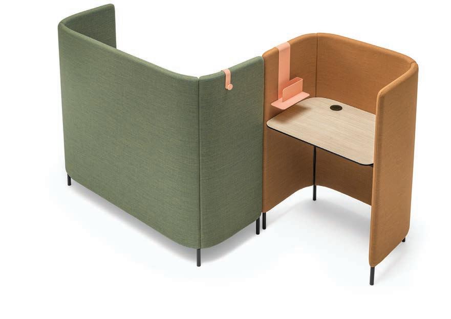
Buddyhub | Pedrali Launched at Orgatec 2022, this latest addition to the Buddy family of upholstered workplace seating designed by Busetti Garuti Redaelli is a modular workstation featuring a perimeter soundabsorbing panel that embraces a solid laminate top, creating a sort of enclosed niche that ensures acoustic and visual privacy. Accessories powder-coated in a variety of colours can be added such as steel coat
Dau | Stylex This colourful collection of tables, upholstered sofas, benches, poufs, and lounge chairs by Clara del Portillo and Alex Selma of Valencia-based Yonoh Studio are designed around the hexagon motif to encourage non-traditional seating layouts that suit any given situation, made easier by cleverly concealed self-locking casters hidden beneath the geometric frame. www.stylexseating.com
 Blade FR + MR Ceiling Tile | Unika Vaev
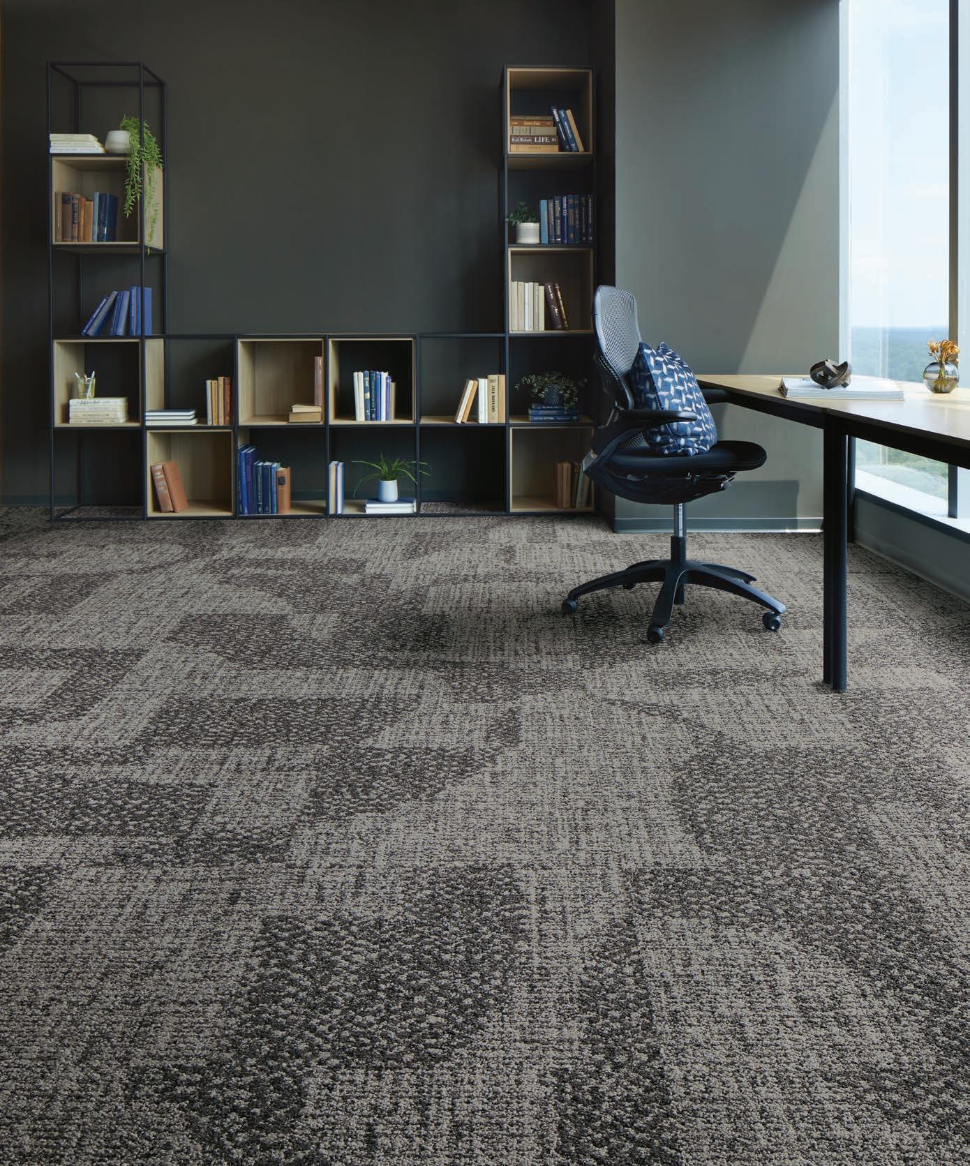
Connectivity Collection | Tarkett Continuing a decades-long partnership between the flooring company and designer Jhane Barnes, the Connectivity collection features three designs: Celestial (shown), Celtic Knots and PM Square. Integrating mathematical sequencing, geometry and art into the designs, and utilizing Powerbond RS, an asthma and allergy friendly soft surface floorcovering, makes the series ideal for education environments, including K–12 and higher education settings. www.tarkett.com

Passport Work Table | Herman Miller This height-adjustable table fits in a home, corporate or educational environment, “fit” being the key: available in two intentionally compact sizes with enough space for a laptop or notebook, the most notable feature is its untethered height-adjustable design that doesn’t require a plug or access to power which makes it easy to move. Optional bag hooks or privacy screens are available without increasing the footprint. www.hermanmiller.com


IDS23 was the launchpad for Staples Canada to debut its new Longevity height adjustable desk, part of the gry mattr collection, designed by Joe Mimran together with ergoCentric. One of the company’s first Hybrid Certified products, it checks the expected boxes in ergonomic furniture for hybrid work: smooth transition between seated and standing positions; three-position memory and quiet motors. www.staples.ca
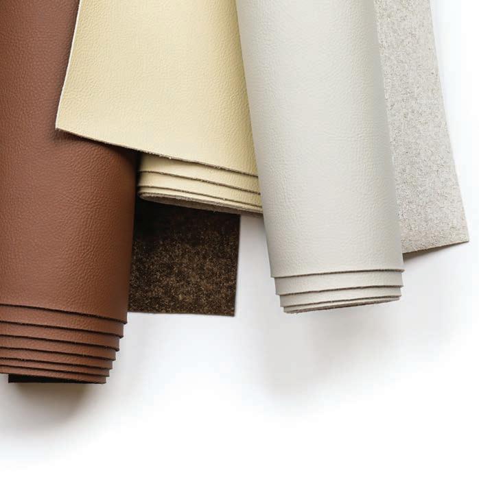
Leatherly | Architex Harvesting leather waste produced from crusts and scraps and using a solvent-free and low carbon emission process creates an upcycled leather upholstery alternative. 13 colourways are sold by the yard allowing for ease in specification and furniture manufacturing, and are bleach cleanable for disinfection protocols. www.architex-ljh.com

Reishi | Ligne Roset The French furniture brand has partnered with biotechnical firm, MycoWorks, to introduce the world of luxury furnishings to this natural, sustainable material made from mycelium, the root structure of mushrooms with the feel and performance of fine leather. First adopted by the fashion industry with recent expansion into automotive, this is the first use in home decor and furniture. “Decades ago, my co-founder Phil Ross and I explored using mycelium to create moulded chairs and stools as part of our art practice,” says Sophia Wang, MycoWorks co-founder and Chief of Culture. “Furniture demonstrates the beauty, utility, and performance of materials.” www.mycoworks.com
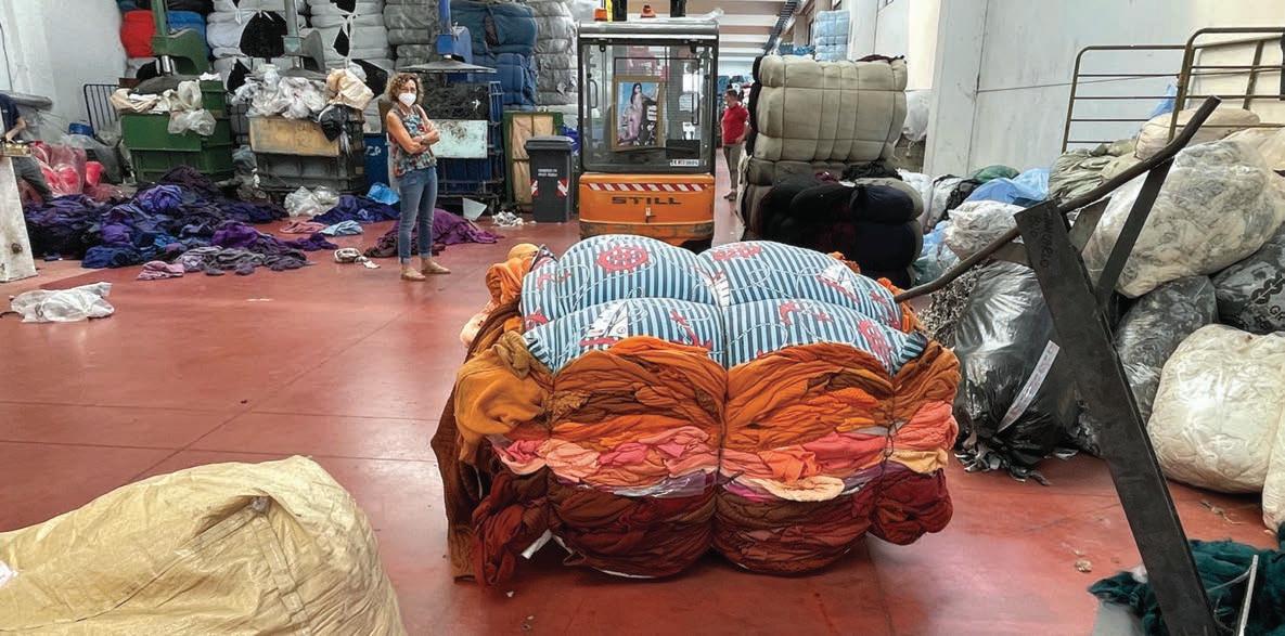
We are currently using 1.75 planets worth of resources every year — that’s nearly two planets worth of resources — and that number is set to rapidly increase over the next decade. In the United States alone last year, there were 11.3 million tonnes of textile waste produced. In fact, textile production today accounts for 10 per cent of the global carbon dioxide output. That’s more than all international flights and shipping combined. And only a fraction of what’s being manufactured is getting recycled: 87 per cent of the total fiber input that we’re using is ultimately incinerated or sent to landfill.
It’s clear that we can’t carry on with business as usual. We’re depleting very limited resources and producing huge quantities of waste.
Instead, encouraging repair, refurbishment, reuse, or resale is a viable approach. Once products reach the end of their first lives, circularity becomes a really key concept: meaning keeping textile materials in closed loop systems to be remade again and again.
The Ellen MacArthur Foundation — a global charity launched in 2010 that helps support major corporations shift towards more circular approaches — states that within the circular economy there are two cycles in relation to materials: the technical cycle and the biological cycle. The technical cycle generally means materials that are human made, whereas the biological cycle are materials directly drawn from nature that can ultimately degrade
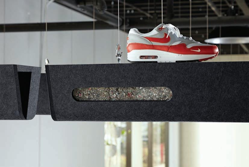
Designed by Michael DiTullo, these acoustic baffles combine the performance of recycled PET felt with a soft filling made from Nike Grind, which is a mix of materials harvested from recycled Air Max shoes and water bottles. The baffles feature windows inspired by the shoe’s classic air bubble to view the shredded substance. “In my career, I have worked on hundreds of shoes for Nike, Jordan, Converse, and other brands. It was a real joy to design a product that helps rescue those shoes from the landfill at the end of their useful life as footwear and find a new, longlasting use case for them as a visually striking architectural acoustic product,” says DiTullo.
www.kireiusa.com
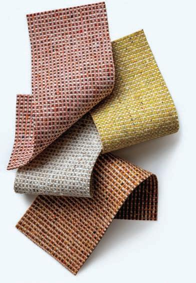
Woman-owned design studio Luum Textiles has worked alongside a woman-owned mill to develop Melange Check, Wool Fleck and Graph Speck with 100 per cent pre- and postconsumer recycled garment waste blend of 51 per cent recycled wool, 39 per cent recycled acrylic, 10 per cent recycled polyester, and using European fiber recycling traditions. Developed by hand on the Tick Studio loom, each colourway begins when discarded garments and post-industrial textile waste are shredded back into fiber which are then spun together to create complex mélange yarns. www.luumtextiles.com
Melange Check | Luum Textiles
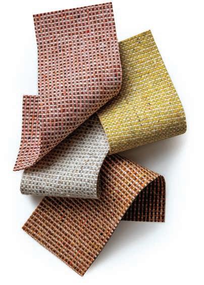
One of the most important actions the textile industry can take to bring about meaningful and significant change is the transition to a circular economy.
ByAir
with hopefully no impact as they go back into the soil. This does not mean categorizing good or bad materials; it’s not like natural is good and synthetic is bad. Often, for example, plastics get demonized, but plastic is not a bad material, because it has the capability to be infinitely melted and remade.
When looking at the technical cycle, the goal is to think about materials not as static objects but as part of a moving, constantly dynamic system: thinking about where it comes from; the process of transformation; and thinking about where it can go at the end of life, this is celebrating zero waste and looking at closed loop production approaches that allow materials to remain in completely closed loops to be made again and again, and really keeping low impact at the front of mind.
An important component in making a circular perspective work is manufacturers acknowledging their responsibility as a custodian of the material: not just at the point of sale, but beyond that, understanding that even after the customer has finished with the product, they need to have the connection and the system to be able to take it back from them, and put it back into production.
Then there is the biological cycle. As I mentioned, this is about celebrating and exploring a real appreciation for natural materials and even promoting a sort of spiritual connection to materials and collaboration with nature, rather than controlling it. This involves both elevating the importance of natural material but also looking at it from a more technological perspective in the same way an exciting raft of designers and material innovators are working with bio-based materials in more technological ways.
In the architectural and interior design sphere, there’s lots of exciting material innovation around this sort of theme, be it a strong focus on regenerative materials, where possible, and really thinking about using technological means to elevate the manufacturing potential and the performance of unexpected raw materials to increase our palette and think about what’s abundant in nature that we can work with.
of the U.K. future agency FranklinTill, who were responsible for the Heimtextil 2023 Trend Space exhibit titled “Textiles Matter” which brought four perspectives of circular textile economies to life. The preceding is a collection of excerpts from her Heimtextil 2023 Trends presentation.
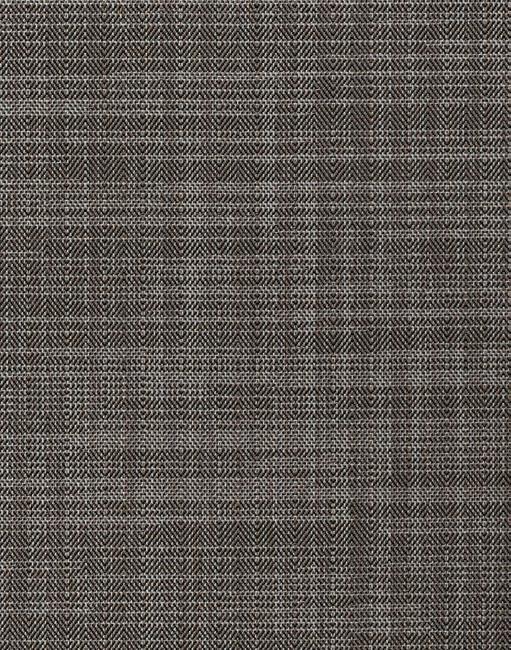
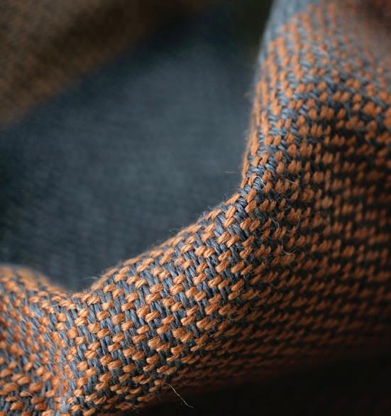
“Today’s designers, especially commercial designers, need to be knowledgeable across a range of design specialties in order to integrate a mix of best practices and products.” This was a key takeaway from the recently released American Society of Interior Designers (ASID) 2023 Trends Outlook report. Throughout a variety of sectors, designers are blending techniques: offices, hospitality and healthcare have all borrowed residential cues to make their spaces more comfortable and “homey” (it even has a term in office design: “resimercial”); healthcare facilities are introducing retail-like spaces as a means of generating additional revenues; and hotels are converting amenity lounges into co-working spaces.
Product design is seeing similar overlaps, with resimercial inflecting commercial furniture and vice versa, as work-from-home becomes a norm. But one sector that always innovates especially when it comes to materials and yet seems under-used as sources of inspiration for interior designers is automotive. Yet Range Rover, a name associated
with modern luxury design, should regularly be seen on moodboards, not be new to them. Take, for example, the interiors of the brand-new Velar, officially launched in February, with new seat designs using Kvadrat materials. An option Range Rover has been building on for several years, the leather-free cabin combines wool from the Danish textile experts with Ultrafabrics polyurethane textile inserts, featuring a new Diamond Herringbone perforation pattern.
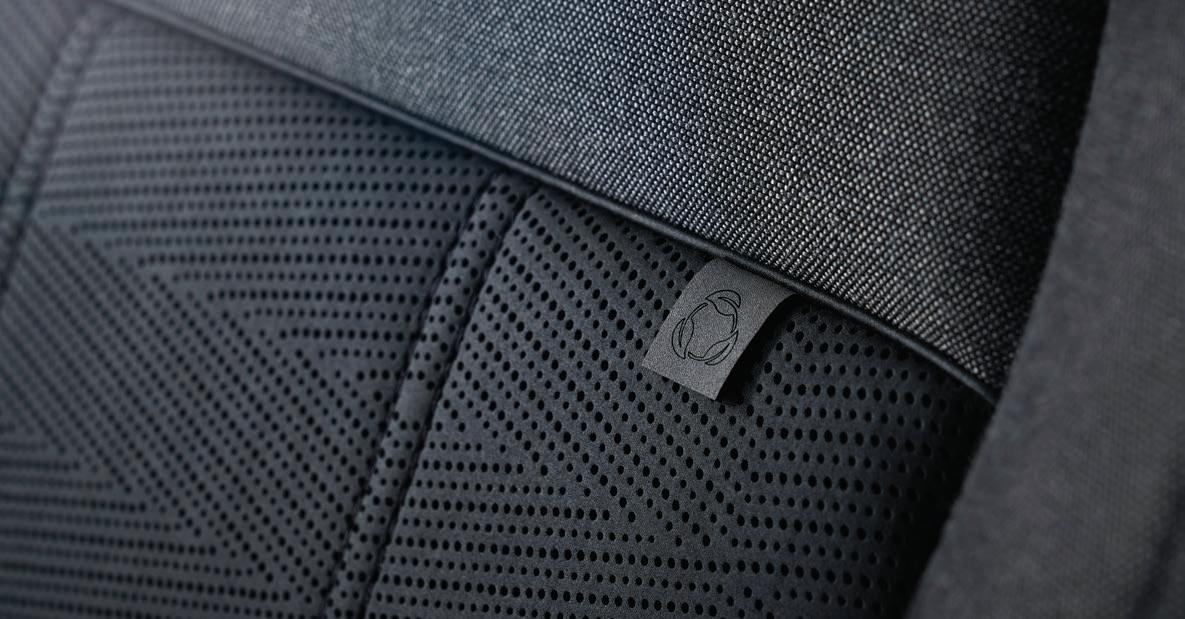
The innovative textile has been subjected to rigorous in-house durability testing in the Range Rover materials lab to ensure it delivers customary robustness throughout the lifetime of the vehicle, going through 60,000 cycles of abrasion testing — the equivalent of 10 years of usage — and UV tests capable of simulating three years of unrelenting exposure to the sun in just a month. Inspired by bespoke tailoring, Kvadrat wool blends are 58 per cent lighter than leather and provide a modern appearance and enhanced tactility for a contemporary take on traditional luxury.
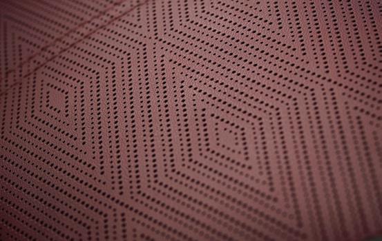
With the new Velar, Range Rover takes a reductionist design approach that puts small details like leather-free luxury upholstery front and centre.By David Lasker

After Treasury Board president Mona Fortier announced last December that all federal public servants would return to the office a few days per week, Jennifer Carr, president of the Professional Institute of the Public Service of Canada, filed a bad-faith bargaining complaint against Canada Revenue Agency for its “one size fits all” return mandate.
As the headlines attest, the post-pandemic return to the office has been fraught. Why not take a carrot rather than stick approach and preempt return-to-office strike threats by providing an office whose design seduces workers into returning voluntarily? A place “that gives employees compelling reasons to come back to the office — to

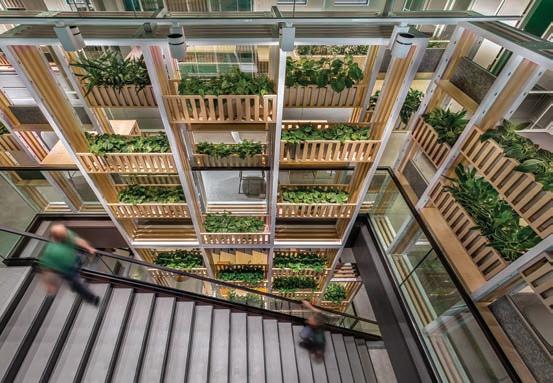
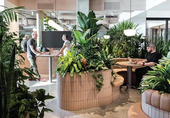
Previous spread and above Bonduelle’s Canadian office located in Brossard, Qué. anchors its identity in plant life with a design guided by the metaphor of a tree’s interconnected ecosystem. Stacked over four levels, the staircase acts as a tree trunk and is flanked with growing vegetation in market crates. The entry to each level has a centralized hub space for relaxed work or collaboration, while open workspaces branch out into smaller team zones balanced with glass enclosed greenhouses for private meetings. Green, orange, and yellow colours are applied to energize collaborative and common areas, natural colours and patterns are used in work areas and customized wall graphics illustrate typography symbols and leaves of various plants.
‘earn their commute’ — by empowering them to do their best work,” suggests Caitlin Turner, senior principal, Director of Design, Interiors at HOK Toronto.

Businesses thrive on a healthy collaborative culture. While focus work may be done more productively at home, it’s difficult to work collaboratively and build relationships from a remote home silo. In the office, workers learn from mentors, network with peers, imbibe the corporate culture and share in the esprit de corps while catching the boss’s eye and climbing the corporate ladder.
“No longer does one size fit all. Prior to March 2020, collaboration focused primarily on two space types: the conference room and the open collaboration area,” say the authors of the 2022
whitepaper by IA Interior Architects titled The Evolution of Collaboration: Meeting Considerations in the Post-Pandemic Landscape . “As organizations return to the workplace, collaboration settings have to adapt and support a new way of working.” Then the report mandates a laundry list of collaboration-space types to cover every conceivable task:
• Presenter and audience: formal presentations, town halls and external customer facing events;
• Open collaboration: ad hoc and impromptu meetings, stand-ups and changes of scenery;
• Formal training: instructionals, question and answer, interactive sessions and hands-on onboarding;
• Traditional meetings: check-ins, reporting and alignments, and interactive conversations;
• Workshop and brainstorming: Ideating, problem solving and pursuing innovative solutions.
Au revoir, Florence Knoll and the clean-lined, hard-edged, geometric buttoned-down Modernist aesthetic. These offices sport a more casual, “uncorporate” corporate look. “Open, dynamic spaces with a hospitality or residential feeling that drive collisions and connections giving people serendipitous moments to interact with their colleagues are table stakes at this point,” says Turner.
Recognizing the importance of serendipitous meetings isn’t new. As early as 2001, New Yorker trend guru Malcolm Gladwell, speaking at a reception in Steelcase Canada’s head office, said, “If you want to foster innovation, your people need to spend less time at their desks and

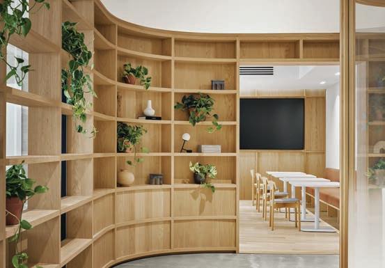
Previous page and above The flow of Zendesk’s space sends staff and visitors through the reception, café, and event space. From there, it is through a large garden which uses plants to create private spaces for both individual focused work as well as collaborative meeting spaces. Moving past the garden, a series of meeting rooms creates a buffer between the louder spaces at the entrance, and the workstations beyond. Glass and polycarbonate acrylic panels are favoured over solid walls wherever possible, and are combined with a muted materials palate of white oak, stainless steel, grey felt, concrete and tan leather, emphasizing a Scandinavian design aesthetic.

more time chatting idly.” As the following four projects show — Bonduelle’s Station B by Lemay and Zendesk by MRDK with Studio MHA in Montréal; and in Toronto, Boston Consulting Group’s (BCG) Canadian headquarters by HOK and a biotechnology company by IA Interior Architects (IA) — that message still applies but jacked on steroids.
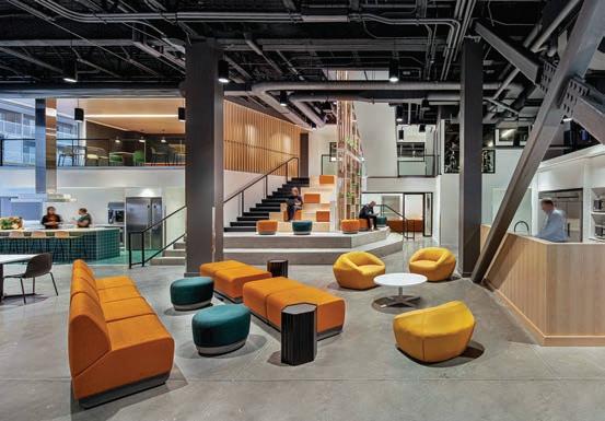
With the exception of Zendesk, these projects are multi-storey offices with an atrium or lightwell, enabling serendipitous vertical encounters as well as the usual horizontal ones. Bonduelle exploits its atrium to maximum effect with a wide staircase forming a hingepoint on the lower levels, where the stair treads broaden into stacked seating with colourful upholstered segments that encourage sit-down encounters. The oversize steps act as amphitheatre seating for the ground floor’s gathering space adjoining the test
Alexkitchen. Ascending to the upper floors, balcony-like tiers of stacked market crates overflowing with plants wrap the staircase, making for a dramatic Hanging Gardens of Babylon vista while referencing the agricultural origin of the firm’s product lines.
As the office for a business selling packaged fruits and vegetables, Bonduelle, not surprisingly, uses a biophilic connection to convey the brand message. The messaging starts, Lemay’s Marie Leveillé Tremblay says, “with a design guided by the metaphor of a tree’s interconnected ecosystem” taking root at ground level with a gathering place and testing kitchen. The four-storey staircase acts as the tree’s trunk. Open workspaces branch out into smaller team zones with glass-enclosed greenhouses for private meetings. Carpet patterns depict farmers’ fields from a bird’s-eye view.
Biophilia looms large at Zendesk too, where a large space called the garden has intertwining, very robust walls of greenery (verging on Little Shop of Horrors) to demarcate private spaces for individual focused work and for collaborative meeting spaces. Traditional desks were kept to a minimum and assigned workstations were replaced with bookable desks.
“Collaboration and event space would be the emphasis for the new design,” Zendesk’s design brief states. “Flexible spaces offering relaxed work environments at a residential scale, similar to those people had become accustomed to working in at home, were provided throughout the office.” The spaces build the brand by harking back to Zendesk’s Danish origins with blond (white oak) millwork and Fifties Scandinavian-looking ladder-back easy chairs with loose upholstery.
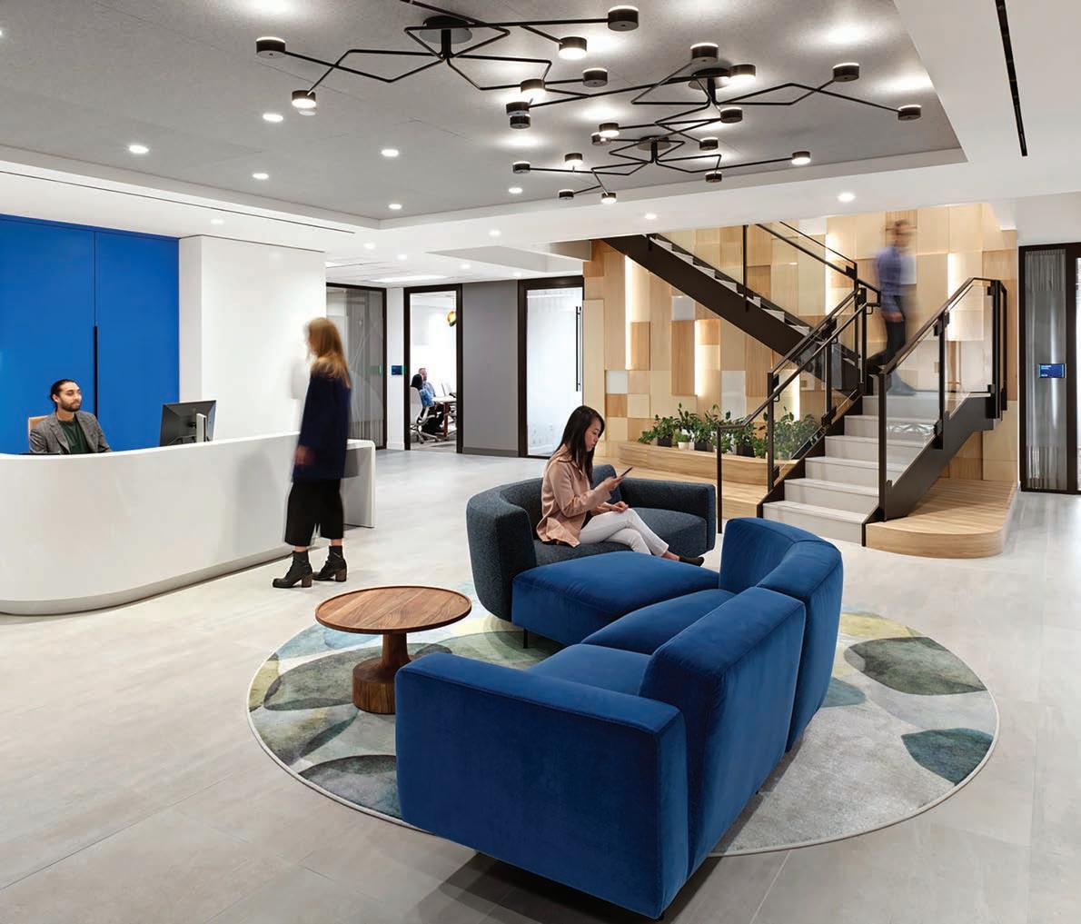
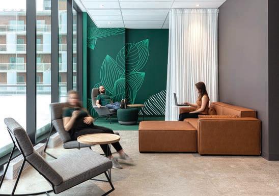
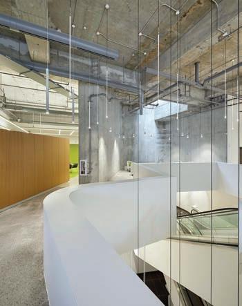
Previous page and above A biotechnology company wanted to renovate its 24,000-sq.-ft. Canadian headquarters, located in a west end downtown Toronto office tower, which IA was able to design and complete during the height of the pandemic. The complex interconnecting stair linking two floors of the headquarters is designed with locally sourced wood, a nod to the redwood trees native to Canada’s west coast. The colour palette reflects shades seen in nature and acts as a neutral background for bold, energetic, and saturated tones. Areas between open offices and collaboration areas are delineated by colour and texture. Bright ceilings are a design element in common areas. Locally sourced lighting as well as used furniture and vintage pieces are incorporated into the design.
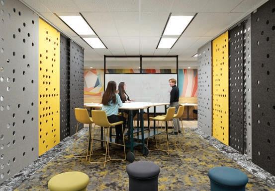
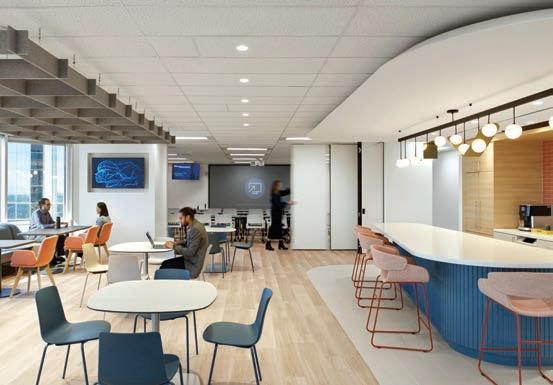
As for the biotechnology company’s biophilic credentials, the design brief by IA explains that “The Canadian landscape and culture’s love of outdoor spaces inspired the design. The colour palette reflects shades seen in nature.” The interconnecting stair climbs along a tactile feature wall with projecting cuts of locally sourced wood, “a nod to the redwood trees native to Canada’s West Coast forests.”
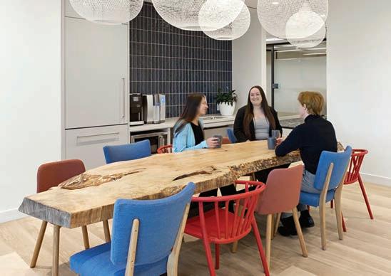
“The colour palette reflects shades seen in nature and acts as a neutral background for bold, energetic, and saturated tones,” often mingling with a sense of rumpus-room playfulness, as in a lounge with a rustic tree-trunk slab tabletop flanked by mix-and-match, brightly coloured chairs (strange bedfellows with the white acous-
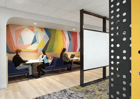
tic-tiled dropped ceiling); and an ad hoc meeting room with sliding gray, black and yellow wall panels resembling giant pegboards.
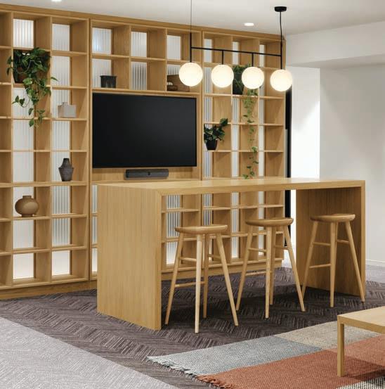
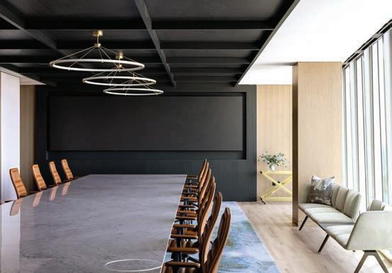
HOK’s design for BCG broadens the definition of “biophilic” and embraces less-familiar concepts: hackable; materiality; neurodiversity and stylization. “Now, huddle rooms and meeting rooms are baseline,” Turner opines. In addition to formal and informal workspaces in every possible configuration, HOK created “innovative, tech-enabled, flexible ‘case team rooms,’” says Nina Abdelmessih, BCG’s Chief of Operations and External Relations, where teams can collocate for the duration of a project and work in a variety of ways, including heads-down individual work, collaborative brainstorming sessions and hybrid team meetings.

“These rooms have hackable furniture, both soft and fixed, so that people can break their tables away for different kinds of work sessions,” adds Turner. “Their shelves feature books, baskets and plants as elements of stylization,” a term she defines on the website hokforward.com as “the inclusion of artwork, plants, objects, textures and other design elements that bring a space to life.”
Searching “neurodiverse” (autistic, dyslexic, Tourette syndrome and so on) brought up zero stories in Interior Design and just one in Architectural Record (however Canadian Interiors covered it in 2022), so HOK is on the leading edge here. “We feel strongly that designing for neurodiverse populations will become part of the Accessibility Act,” Turner says. BCG accommodates hyper- and hypo-
Previous page and above Much of BCG’s new Canadian headquarters in Toronto was designed and built during quarantine, providing an opportunity to demonstrate that the office is not “dead.” The daylightfilled central atrium, measuring 80 feet long by 20 feet wide, was created to help foster the collisions and connections that are critical to consulting and hybrid work. To accommodate BCG’s neurodiverse population, design elements include a range of lighting temperatures, the creation of both buzz and quiet spaces through acoustical treat- ments and soft music, and furniture that promotes movement and posture changes. A materials palette of leathers, natural linens, wools, rich Canadian wood, stone and brick evokes elements of hospitality design.
sensitive people with workspaces ranging from private, where a worker can fidget in peace, to active and buzzy; with acoustics ranging from absorbent to reverberant; and even with lighting colour temperature ranging from warm to cool.
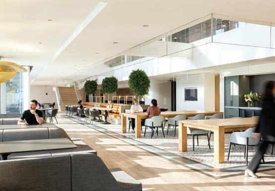

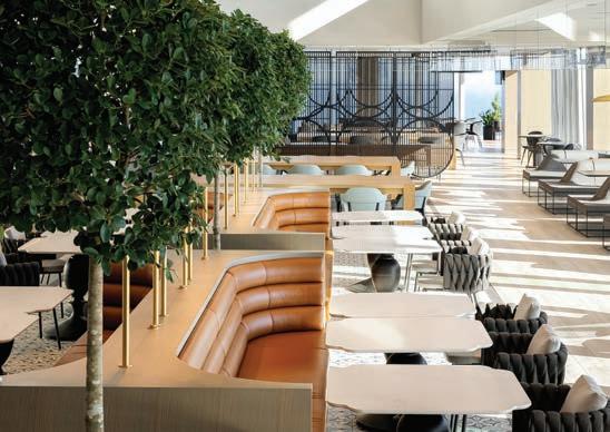
While plant life plays its part at BCG, Turner also groups natural woods, curved shapes and soft, diffuse lighting under the biophilic rubric. “They remind people of natural forms and have a calming effect.” Hence the café’s oversize Parsons tables with massively chunky legs. The table’s size also signals to BCG’s young-hipster cohort that the etiquette in restaurants with long communal tables prevails. It’s cool to sit near a stranger and strike up a conversation like, “Hey, I’m in accounting. So, what are you working on?”
The tables sit on a flooring sector of handmade clay tiles. Along with the leathers, wools and linens in the café’s materials palette, and the handcrafted tables themselves, the tiles evince “materiality” that enhances comfort and relaxation in the space. The tufted banquettes, custom handmade table bases resembling oversize spindles, and round-back chairs upholstered in thick woven fabric add to the Easter eggs in this project that soften the base building’s sharp elbows.
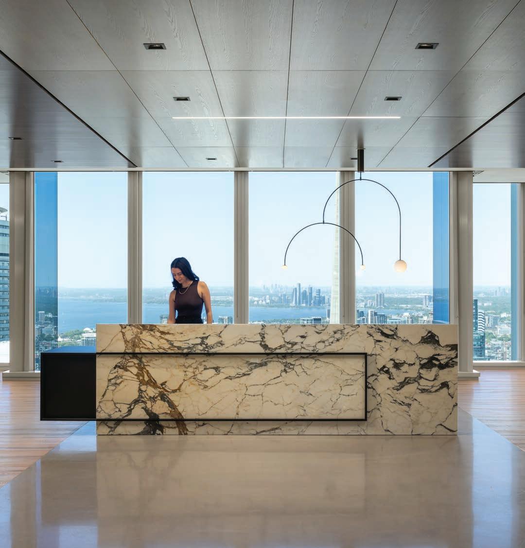
HOK’s unique creative vision, coupled with Svend Nielsen’s custom manufacturing expertise and craftsmanship, lead to a beautiful one-of-a-kind statement piece reception desk for the Toronto office of an American Professional Services Firm.
It was a pleasure to work with HOK in transforming their idea into reality.

Good design solves problems. Before a recent renovation, the Global Furniture Group showroom in Manhattan had a problem with flow. The floorplate has an L-shape, with the elevator bay located roughly in the middle, by the bend in the L. When visitors used to get off the lift, they rarely knew whether to turn left, right or go straight. Instead, they would mill about awkwardly waiting for a salesperson to greet them.

A master of directing movement and framing views, Johnson Chou creates a showroom where designers, specifiers and end-users can be inspired by Global’s vast offerings.Photography by Ben Rahn/ A-Frame Hague


Toronto-based designer Johnson Chou resolved the issue with a seemingly simple yet highly elegant intervention: a wall. No, not a wall with a sign saying “walk this way.” That would have been too obvious, too easy and kind of dull. “People are coming in from the bustle from midtown Manhattan,” says Chou. “I wanted to give them a moment to recalibrate, as well as a visual guide through the space.”
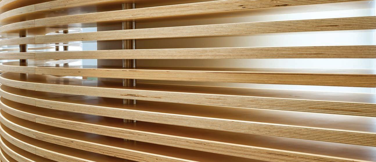
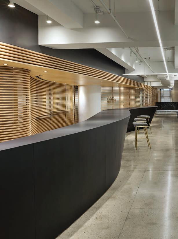
For Chou, that translated into a sensual, curving structure fabricated from slats of blond Baltic birch. As visitors arrive, they see calming, natural wood. To get to reception, they simply follow the wall anchored on one end by a striking black desk. Along the short walk, they get inviting glimpses of the showroom through the gaps in the slats.

This is not Chou’s first collaboration with Global Furniture Group, having previously designed the company’s headquarters in Toronto.
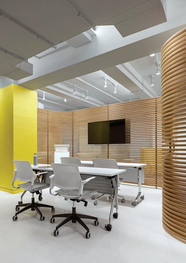
For that project, he created a series of vignettes to highlight Global’s encyclopedic array of products (the company ships over 100,000 chairs per week alone, in myriad styles, in addition to its countless desks, cabinets and other accoutrement). “I wanted to take a similar approach with the New York City showroom,” says Chou, however the two showrooms have different aesthetics: Toronto, which was completed in 2017, is more formal, with high-contrast whites and greys; whereas New York feels warmer, which could reflect its completion in a post-COVID-19 world.
Chou actually started working on the design before the onset of the pandemic. Still, he notes how the space reflects the evolving nature of office work. “Office designers are moving towards providing a number of experiences that cater to individual preferences,” says Chou. “In the showroom, there is a broad mix of more intimate and more open areas, spaces for privacy and for groups. It’s all about showing the variety of choices.”
Part of the warmth is provided by the furniture itself. “Furniture design is changing so that it’s more residential looking,” says Chou. “That started happening pre-COVID. The pandemic just cemented that desire for more casual, residential aesthetic.” Global’s furniture roughly falls into three main categories: office, healthcare and education. Office offers the most choice and is where the vignettes start in New York. The first tableau, a kitted-out boardroom, is adjacent to

reception with handsome yet cozy walnut walls and an eccentric pendant from New York design studio RBW. Fittingly, it’s near a series of other office-appropriate set-ups, including a lunch bar that’s nestled into a deep bend in the Baltic birch wall. The bar has its own curves, though is rendered in a juxtaposing, much darker material called Fenix that is scratch resistant.
Close by are open workstations, soundproof booths for solo concentration and something called the “meeting pod” — a brass box open at one side so passersby can peak in. “The meeting pod is like a proscenium,” explains Chou. “It can display furniture and there is a slit in the ceiling where a screen can drop down to show videos. Much of the overall showroom is inherently rough. As a contrast, I wanted to have finely detailed objects like the brass pod.”
Chou employs other ingenious tricks to mask various “rough” aspects of the raw space. Between the reception and the meeting pod, a series of low-hanging mechanical equipment cluttered up a large swathe of the ceiling. “It looked terrible,” says Chou. As a solution, he slung a low-hanging, thin metal frame covered in a reflective white fabric that acts like a mirror, reflecting the furniture below, keeping the focus where Global would want it to be.
Saul Feldberg, founder and Chairman of Global Furniture Group and Teknion Corporation, passed away on January 13, 2023, at the age of 87. Saul founded Global in 1966, with a singular vision; to manufacture an office chair the average person could afford. In 1983 he established Teknion to pursue the architecture and design community. “Above all, Saul will always be remembered as a very kind, attentive, hardworking, funny, and inviting person, who treated everybody around him with respect,” says Martin Spreer, senior publisher of Canadian Interiors magazine. “I fondly remember the laughter and closeness of our first meeting, many years ago, which included a personal factory tour followed by the obligatory Global big chair photo-op. His hard work paved the way for a flourishing Canadian furniture industry and all of us at Canadian Interiors would like to express our deepest condolences to Saul’s wife, Toby, their four children, Janice, David, Joel, and Bernie, along with the rest of the Feldberg family. May his memory be for blessing.”

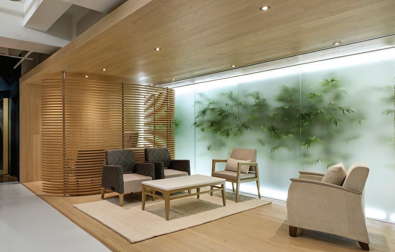
Beyond the proscenium, visitors can explore more vignettes, including several for education (seminar spaces and classrooms) and healthcare. Although the Baltic wall from the lobby doesn’t wend its way through every inch of the showroom, similar smaller slatted walls show up at key moments to highlight certain special features and give cohesion to the overall design. For example, in the healthcare section the slats wrap a private consultation bay, shielding it from a communal waiting area. The vignette itself is impressive: one wall is lined in milky, backlit glass that sit in front of an ethereal bamboo garden. “To underscore the idea of wellness, we wanted to create the impression of being in nature,” says Chou. Escaping to nature, of course, was something many did to cope with the pandemic.
The showroom not only comes at a moment of change for the working world, but for Global Furniture Group as a company. In early 2023 Global’s founder, Saul Feldberg, passed away at the age of 87. “He was such a generous, charming gentleman,” says Chou. “And he did something truly remarkable. It’s not easy to start a design brand, let alone one as successful as Global.” When Feldberg started Global in 1966, he wanted to create high-design furniture at an affordable price. Like the latest showroom of the empire he created, the concept was seemingly simple. But also like the showroom, excellence in execution made it thrive.
Online Content Distribution to Architecture + Design Professionals
Reaching ALL your target audiences online with ONE post:
Your content posted to ADwire.ca is distributed to the national digital readerships of three leading media titles — Canadian Architect, Building and Canadian Interiors magazines via:
WEBSITES
simultaneously hosted on CanadianArchitect.com Building.ca CanadianInteriors.com
E-NEWSLETTERS included on the national e-News of each title
SOCIAL CHANNELS
shared to the social media audiences of each title
YOUR CONTENT POSTS WILL REACH MORE THAN 120,000 BUILT ENVIRONMENT PROFESSIONALS THROUGH THE A+Dwire NETWORK!
YOU can post ANY TYPE OF CONTENT to A+Dwire for full market distribution:
– Press Releases and News Announcements
– Appointment Notices
– Content Articles of Any Nature, Including Longform
– Project or Product Reviews and Updates
– Technical Articles
– Blog Posts (reposted from your site or blog)
– Video/Multimedia Posts (embedded) And much more...









COVID-19 laser focused designers on rapid responses to reducing the spread of pathogens and adapting treatment facilities. Adjusting offices, commercial venues and distant work soon followed. As the pandemic lingers, attention in post-secondary education has shifted to enticing students back on campus, all under the shadow of troubling patterns indicating declines in mental wellbeing.
Ensuring returning students feel comfortable is core, while accommodating students who prefer distant learning complicates the response. When the pandemic is finally in the rear-view mirror, the on-campus/ distant learning ratio of today will evolve, demanding facility flexibility.
 By Rhys Phillips
A 2021 KPMG student study found a strong majority supported their institution’s pandemic responses, but an overwhelming percentage believe the pandemic has fundamentally changed their expectations. Technology, from robots to holograms to virtual reality, will become commonplace. Yet 82 per cent want a stronger focus on mental health hurt by a loss of community. This strongly suggests social isolation and distancing from academic mentors requires physical environments that reinforce safe social and learning interactions. Students want “a more personalized experience that encompasses the student as a learner, a digitally savvy person, and a customer.”
Scholastic institutions call on Gow Hastings Architects to upgrade the design caliber of their campuses, realizing it is a key tool for recruiting and keeping both students and faculty.
Four recent projects by Toronto-based Gow Hastings Architects provide insights into how design can encourage a return to campus life. Since the University of British Columbia grads set up their firm in 2002, partners Valerie Gow and Philip Hastings, along with design director Jim Burkitt, have completed over 450 university, college and academic projects.
Two of the projects — Université de l’Ontario français campus and York University Osgoode Professional Development Centre, both located in Toronto — were designed during the pandemic, however the other two — Niagara College Welland Campus Student Commons and Fleming College’s Sutherland Campus A-Wing building in Peterborough, Ont. — opened in 2018. Why include projects designed and opened pre-pandemic? The three firm principals stress that while the pandemic has honed and intensified demands for specific practices, the key to enticing students back is student-centric

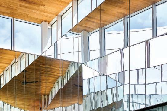
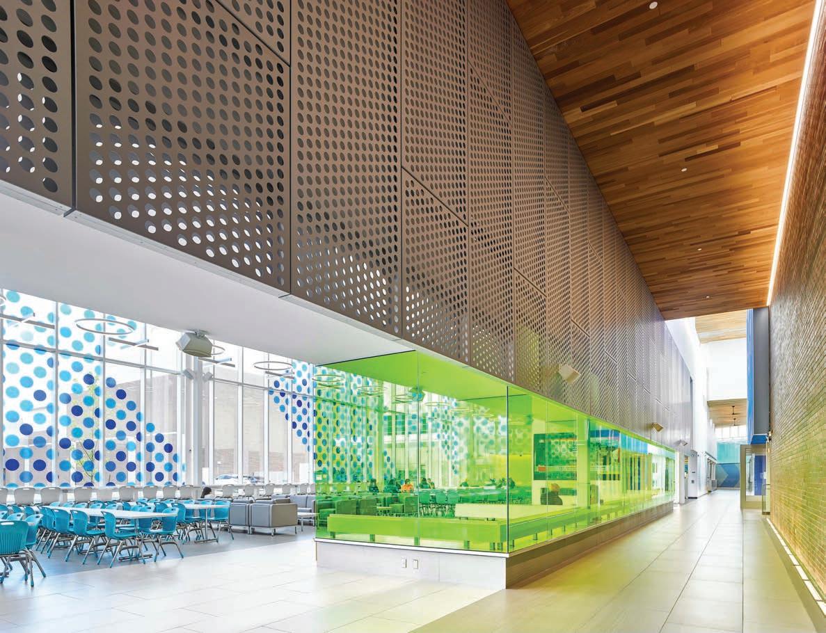
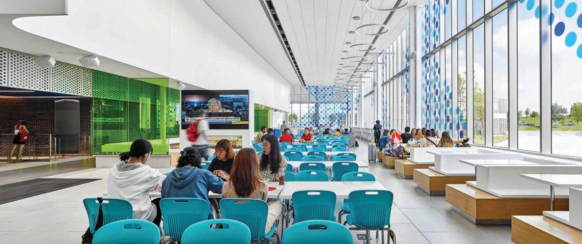
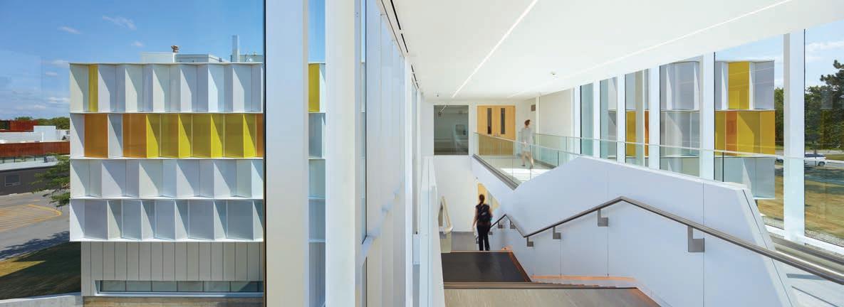
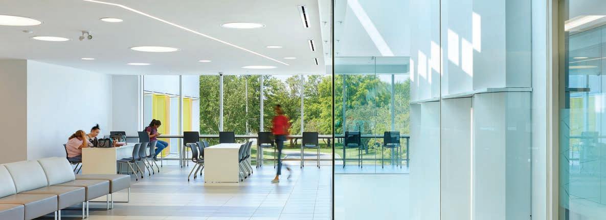
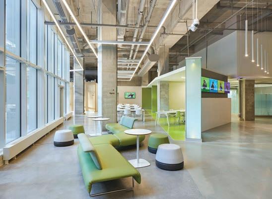
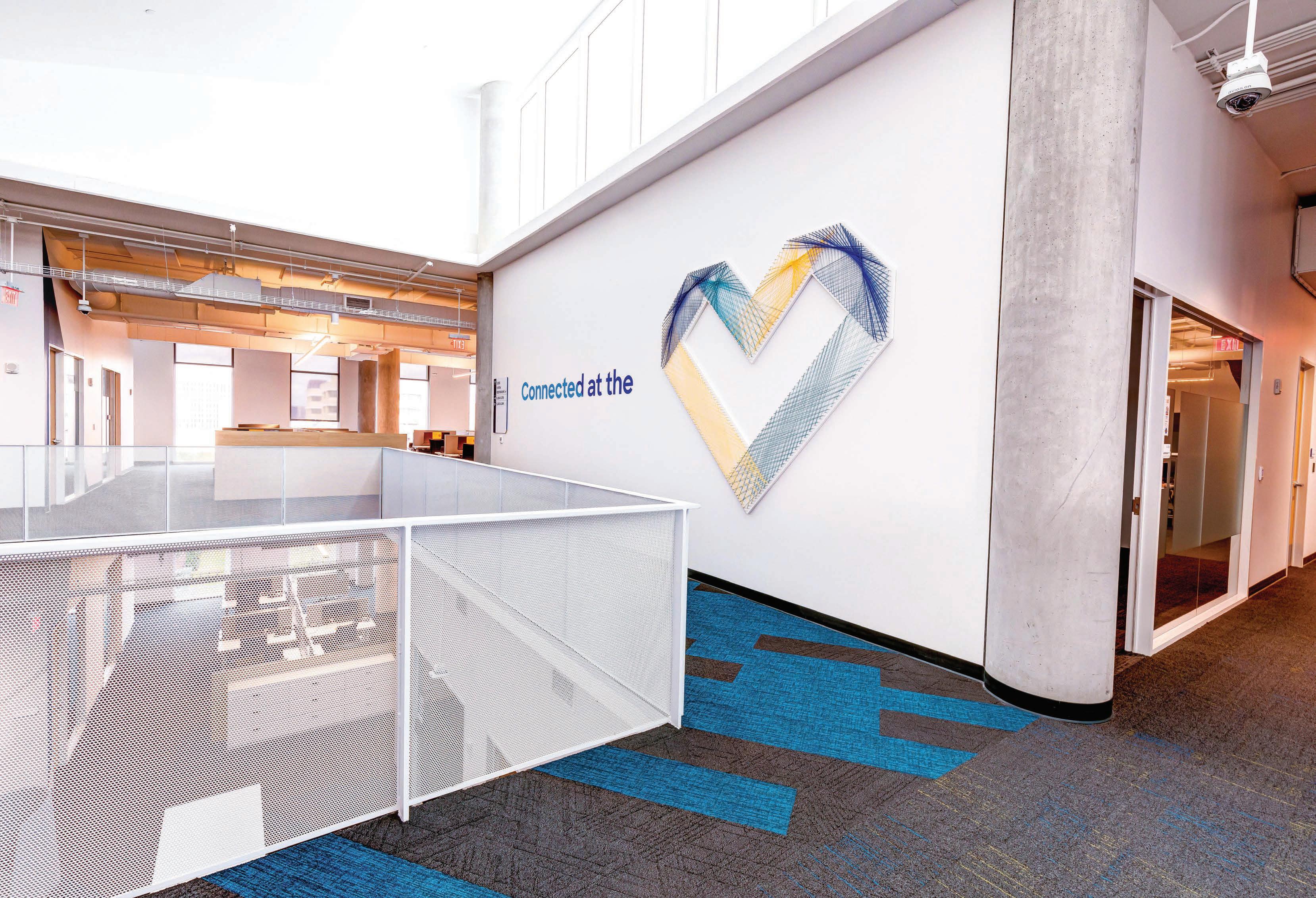
Previous page and above At Niagara’s student hub, old claustrophobic corridors have been exploded to create different social/study workspaces opening to the outside. Colour, wood and perforated screens add texture and clerestory windows tease in light which is then fractured by large wall mirrors. Varied seating clusters including booths along the window are popular for socializing. Large blue dot chevrons and suspended circle lighting are part of the wayfinding system. Opposite page The revitalized, glazed staircase provides views to Fleming’s new aluminum panels. Original loading bays were replaced with a student hub connected to the outside environment. Clean white interiors for the hub are countered by bright colours brought in from the exterior cladding.



spaces that actively engage them as the primary client. This includes strong visual branding that reinforces student’s consistent institutional attachment as found by KMPG. Such design attracts both top students and faculty.
The two pre-pandemic projects, they argue, already realize many required transformative elements. In summary, the firm’s mantra is not a house style but a vibrant integration of architecture, interior design and graphics that creates “tailored, purposeful and playful” outcomes, says Gow. In addition to recognizable graphic branding reflecting institutional character, Niagara and Fleming focus on creating dynamic and engaging student spaces. Intuitive wayfinding elements facilitate easier movement while traditional single use circulation corridors are eschewed for multipurpose learning, socializing and upscale service areas. Transparent classrooms and labs are now visually open to these spaces.
Daylight is maximized, exterior transparency is introduced to bring in the outside and strong campus gateways are introduced. In addition to sparkling white, bold colours ensure animation and visual variety. Finally, common and budget-conscious materials, such as LED strip lighting, coloured felt, large porcelain tiles and rich-toned woods are creatively employed.
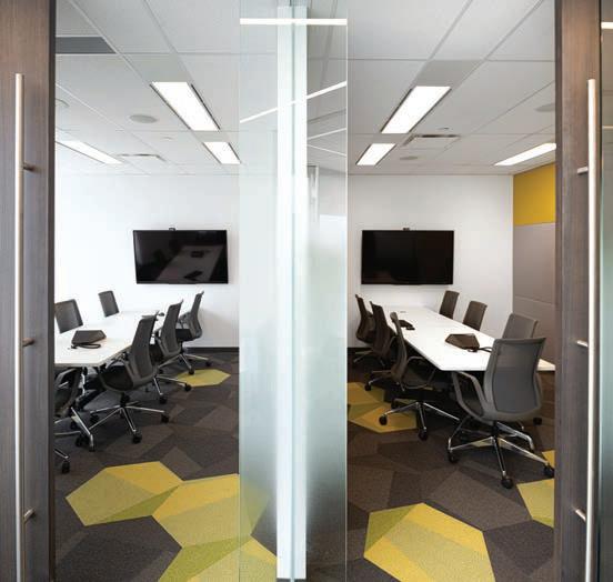
While carried over into the later projects, other pre-pandemic elements are now an easier sell. These include in/out doorway separation, accessible outdoor spaces for learning and socializing and use of infection abating materials previously employed in cooking and health labs. Examples include large antibacterial tiles and materials and antifungal grouting. Flexibility in all spaces to reduce or reinstate distancing when appropriate remains vital. Not surprisingly, there has been a greater demand for seamless integration of digital technology allowing for hybrid learning as well as podcasts and eventually metaverse-type experiences. A significant inversion of the faculty/student ratio on campus means fewer individual faculty offices. Instead, unassigned touch-down spaces, often along desirable window locations are provided.
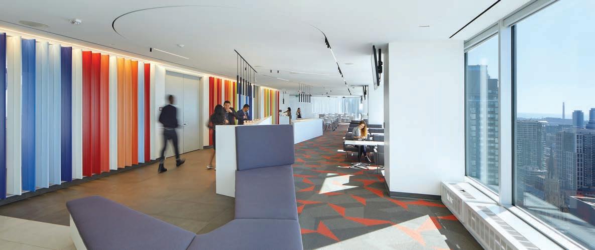
Opposite page The Université de l’Ontario français hub spreads out from the middle of a large floor plate, its ceiling tamed only by limited interventions and multiple small suspended light fixtures. Different seating arrangements add options for socializing or study. In front of now transparent classrooms and labs, the corridor becomes flexible workstations looking out onto the city. In the irregularly shaped corner of the floorplate, “The Agora” contains a 150-seat teaching, meeting or performance space overlooking Toronto’s harbour. Above Overlooking Toronto, York’s hub hosts networking events as well as casual socializing or individual study, all with panoramic views and a dash of colour.
Student Union driven, the Commons opens up and revitalizes a cramped in-between space, the product of decades-long building cluster creep. Part conversion, part new build, the student-centric design creates a vibrant, light-infused hub providing different forms of social and learning spaces with a high-end cafeteria. By pushing the structure up, six-foot high clerestory windows are introduced below a rich wood ceiling. Natural light is teased in, then magnified by a broad band of mirrors on the opposite wall. Extensive interior and exterior glazing open the myriad of spaces to the exterior. Large, blue dot chevrons on the walls and glazing reinforce the college’s “blue” brand and provides key wayfinding cues.
Ron Thom’s 50-year-old A-Wing on the Sutherland Campus has been completely transformed using the original structure but re-clad in white and yellow aluminum panels. Some are folded accordion-
style to increase textural depth while others are perforated to provide filtered light to the reconfigured classrooms and labs.
The combined entrance and stairs for the three-level building is fully glazed on one side. The original delivery bays at the structure’s middle were ripped out and restructured to accommodate a multi-space student hub. Natural light spills into all levels of the hub through introduced ceiling breaks. Transparency to the outside, lacking in the original, provides striking landscape views. Like Niagara, light-hued Italian porcelain is used on the floor. The result is a much brighter student-centric building providing an engaging gateway imbued with clearer circulation supported by intuitive wayfinding.
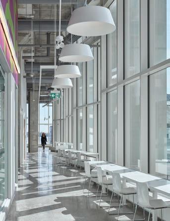
Located next to Toronto’s Gardiner Expressway, the campus is designed to take advantage of a large floorplate on the second level of a new-build tower’s podium. The leased site offers excellent natural light with floor-to-ceiling windows augmented by a skylight. An exterior terrace overlooks the entrance courtyard while a second open courtyard is accessible off a classroom. 25-foot floor-to-ceiling heights create a sense of spaciousness which the architects have left largely unimpeded.
The core accommodates the architects’ signature fluid and varied student hub wrapped around a large gap through which ascends the entrance escalators. A spectacular corner agora provides tiered telescopic seating fronted with full glazing overlooking the harbour. Similarly, many classrooms are fully translucent on their exterior facing side. These open onto perimeter circulation lined with window workstations. Faculty have similar touchdown desks overlooking the city. Wayfinding in this complex spatial composition is primarily handled by bespoke “ladders” of connected LED lights suspended from the high ceiling.
Osgoode, also in a downtown Toronto new-build, is a single floor campus, but 26-storeys up. Like the other three projects, it is designed not just to provide good academic classrooms, but as a networking environment facilitated by dynamic social gathering areas. At the floor’s centre is a colour saturated multi-space heart for socializing, networking events and study, all open to panoramic city views. An adjacent classroom featuring an operable partition can be opened to expand the community hub.
This project exemplifies a state-of-the-art hybrid learning model in which the latest networking and wireless communication technologies are seamlessly integrated. This includes a multimedia studio and green screen as well as the technical capabilities for simultaneous in-person and remote learning.
Campuses will never fully return to their pre-pandemic models, in part because the model was already changing. But with overt playfulness, flexibility and technology, coupled with reassuring pandemic elements, student-centric design will smooth the transition to an eventual return of most students.

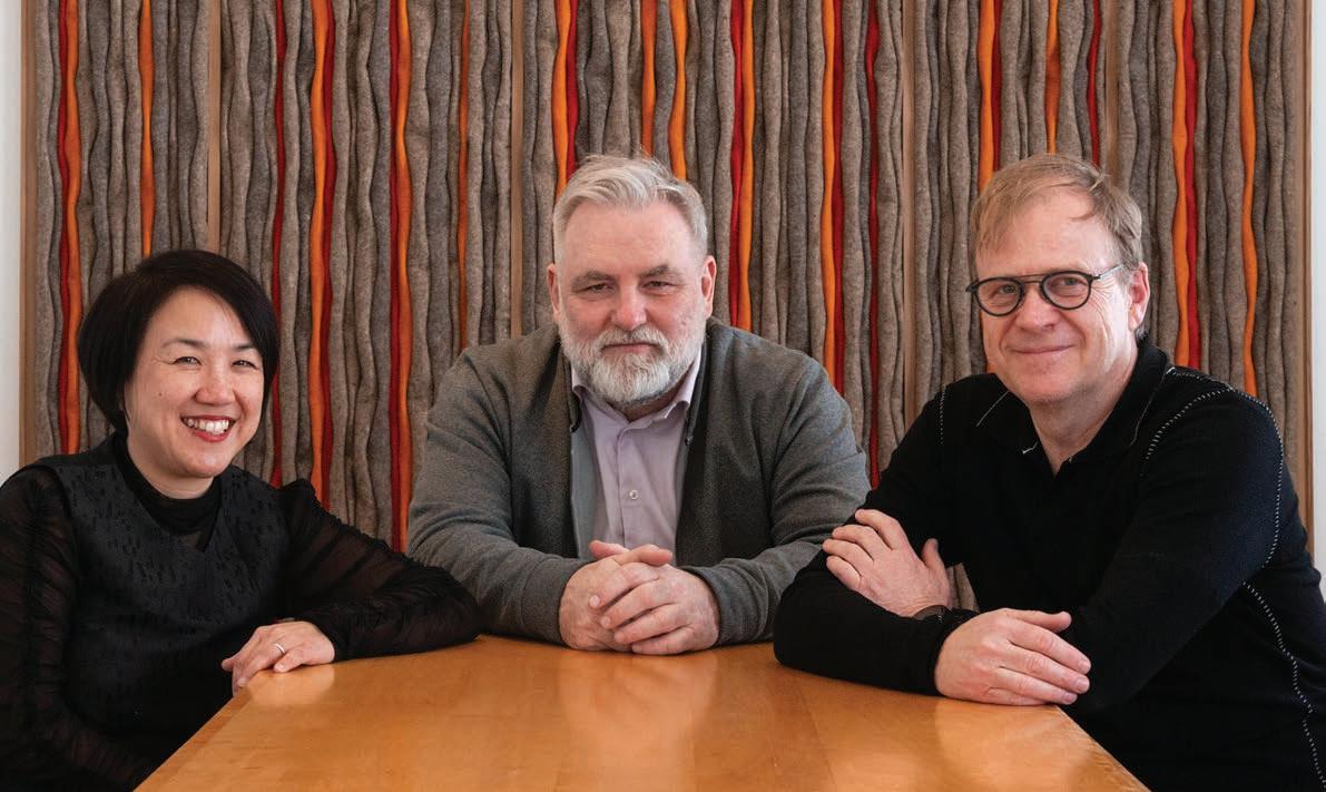
Tapping into over 20 years of experience designing frequently awardwinning facilities for post-secondary institutions, Rhys Phillips spoke at length with Gow Hastings Architecture partners Valerie Gow (above, left) and Philip Hastings (above, right) along with design director Jim Burkitt (above, middle) about how educational institutions can attract students back to their campuses with a sense of confidence and comfort. The following is a snippet of that interview: visit CanadianInteriors.com to read in full.
How can the design of campus and commons spaces transform the student experience, and encourage students to stay and spend time on campus?
Philip Hastings There are two things we’ve noticed that have already changed on campuses over the last few years. One is the importance of outdoor space, [which] have now become very valuable and clients see the value in it. They see them as learning space, teaching space and as socializing space. We are looking with our institution clients at how to improve and develop those areas, such as internal courtyards or turning roads into pedestrian pathways. I think that this trend has really been fueled and pushed on by going through this pandemic.
The other thing that’s really changed is not quite about the student space question, but staff and about their offices and their staff space.
I want to mention office space and how it relates to the changing campus environment because there are many fewer administrators and faculty on campus now than there were prior to the pandemic. It’s rare for people to be working five days a week on campus. Now there are many more students than faculty. As a result, we’ve been working to design [for the staff and administrators] very flexible, agile, adjustable workspaces for faculty who drop in two days a week and need a space to work. We’re doing one right now at Conestoga College. Once arrived, staff have two monitors into which they plug in their laptop. They’ve got acoustical separation from other people along with a little room for small meetings, take a Zoom call or meet a student. It’s a different way of working. That’s an area that has changed more than any other space on campus.
This also increases the amount of space for students, for both informal and teaching spaces. Is that what has happened?
Jim Burkitt The Université de l’Ontario français campus (U de O) plan was developed right when our article came out regarding new demands from the pandemic [Editor’s note: in 2020, Gow Hastings Architects wrote an article for our sister publication, Canadian Architect, outlining 10 immediate pandemic design imperatives]. At the time there certainly was a lot of fear. We showed increased distances between everything really. Certainly comfort levels have increased but there is
one design aspect that has persevered. There are many locations on these campuses where there is one entry into a space and one entry out. An example is washrooms. [Just to] the west of Agora 2, there is a new example of how we approached that issue. This is a washroom block. Instead of gang washrooms, individual washrooms were proposed with a common corridor that allowed for an entrance south of the washroom block and a separate exit to the west of the block. Individuals can walk in from one place and then just casually walk out in another direction. More and more clients are asking us about unisex washrooms or single washroom stalls. They are perceived as more hygienic as well as they are organized in the plan differently. If things get difficult again, there are solutions.
We speak a lot about abstract ideas for moving people around these big floor plates efficiently. We try to have fun with this. We can use super graphics, changes in ceiling heights and we can use colour. Most importantly, we try to avoid use of conventional signage to subtly let people know where things are. It can be as simple as showcasing natural light at precise moments. The big mural of colour [facing out to the exterior on the second floor at U de O] is located right beside the Gardiner Expressway. In this case, just having a big block of colour visible as one zooms by on the Gardiner lets people know something goes on here. It is another example of branding in an abstract way. In every plan we try to use this abstract branding in many large and small ways.
Valerie Gow We started taking a look at widths of corridors and spacing and providing a little bit more generosity around circulation. [We put] mechanisms in place to bring people through the space [such as] patterning on the floor or a unity of treatment

of the glass. [Another issue] a lot of people were saying, “Oh, we should have a sink beside every classroom,” but what’s going to happen after the pandemic? Post-pandemic, how are we going to work with these things that have been designed and constructed? At U de O a lot of the learning happens outside of the classroom in collaborative spaces or “third spaces.” [These are] neither home nor classroom, but something in between. The client came to us right in the beginning of the project [saying] that they want as much third space as possible.
Taking a look at these kinds of spaces, six feet was determined as the optimal distance. So, workstations were split out on three-foot modules. During the pandemic, you just simply pull one of the chairs away and you have that spacing. But when things went back to normal, then you could double your capacity again. You structure in order that [space] could be flexible and then adapted to a maximum capacity afterwards. The same principle operated for office workspaces. We took a look at three-foot deep desks so you are naturally six feet away from somebody rather than having somebody sitting right across from you. We really thought long and hard about that as well as how to incorporate the latest technology to allow virtual meetings and Zoom calls, which were just beginning at that point of time.
JB Lighting has a significant impact on wayfinding. With respect to U de O the space was unique in that its entire footprint was a giant square, having the area of approximately 60,000 square feet. Despite having a floor to ceiling height of 20 to 25 feet the floorplate was very deep without many opportunities for natural light. We used artificial light to connect spaces and draw users through the space.

Their main presentation space occupies a massive portion of the plan at the exterior of the floorplate [while] other spaces might be 100 feet away from natural light. We always try to use corridors and other non-academic spaces for more than just getting people from A to B. While every project has a finite budget, there are straightforward solutions for using linear LEDs and many LED providers are starting to think about how to connect their product to provide seamless lines of light. We developed specific solutions where we brought together multiple linear lights to create what we call ‘light ladders’ to connect spaces around the floor plan.
We used these lights as a datum within the space which allowed us to use conventional materials and finishes below the lights and leave all space exposed above the lights. This allowed us to showcase the character of the neighbourhood in the design by exposing the precast concrete structure as well as save the client some development cost of the fit out.
VG This is just about creating great student spaces, a variety of areas for students to lounge, to study or to meet. [The objective] is to really encourage them to spend more time at school rather than going elsewhere. We provide a place that feels like home to them because a lot of the students are commuter students who need a place to land and spend the day. And then there are other students who may be living in a small student residence who don’t have those kinds of social spaces. Providing a comfortable environment for them at school [enables them to] collaborate with their classmates.
From far left Off the core of Niagara’s hub, an additional multi-use area with pivot doors are signalled by a vibrant blue canvas wall crossed by LED strip lighting. Above transparent classrooms and labs in the U de O campus is a graphic branding mural visible from the street. Red hexagonal tiles at OsgoodePD are concentrated towards the floor to ceiling windows, creating a pathway that leads users through the gathering space towards sweeping city views.
PH At colleges, they really want to up the ante when it comes to things like food offerings, for example. It’s not the cafeteria serving French fries and soggy hamburgers. It’s much more [about providing] extensive offering. These are as good as anything you’ll get going outside for lunch.
VG And we created some spaces that really take advantage of circulation space where you can turn that [once singular function] space into student collaborative and social spaces. [Many of these] areas have comfier lounge chairs, have views out, have touchdown tables or have [furniture] for more individual study.
JB In the past, the same clients might have asked us to design the academic spaces only with less expectation on the connection between these spaces. At that time, the solution would have involved a narrow, double loaded corridor. Rarely now do we start to think about things in this way. Now, we try to integrate more activity into those ‘corridors’ and use changes in scale and changes in lighting quality to create smaller identifiable zones all the way through the campus. Ultimately these spaces have become a significant piece of any design and in the life of the student. [They] are as valuable as the academic spaces themselves. Our clients understand that their student bodies are typically on their campuses anywhere from 8:00 am straight through until 10:00 pm at night on most days. Consequently, these students spend large blocks of time in spaces outside of classrooms and therefore the design of these spaces have a large impact on students.
Three ways metal ceilings are influencing design trends.
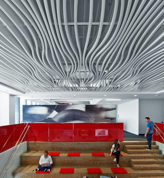
Metal ceiling tiles have a rich history that date back to the late 1800s, when they were originally made from corrugated iron or tin covered steel. They were considered cost-effective and decorative solutions for interiors. The metal tiles brought intricate patterns to ceilings and lifted the eye upward, giving both residential and commercial spaces a feeling of ornate elegance.
Fast forward 150 years and the vision for metal ceilings has expanded considerably. Today, specifiers choose metal ceilings for their durability, cleanability, and sustainability. Robust panels resist wear and tear, rarely needing to be replaced. And they are ideal for the rigorous cleaning standards demanded by the global pandemic. Metal ceilings don’t harbor microbes and are moisture and corrosion resistant, enabling them to withstand harsh cleansers. Made from high recycled aluminum content, they contain no VOCs, and manufacturers even offer GREENGUARD Gold Certified metal ceiling products. But beyond their performance, sustainability, and practicality, today’s metal ceiling tiles are eye-catching and can aid in promoting health and well-being.
From large-format tiles and linear planks to beams and baffles, metal ceiling products can be customized to meet virtually any specifications. “We have brought amazing renderings to life, creating some truly incredible projects,” says Steve Udolph, specialties sales manager for CertainTeed Architectural Products and Hunter Douglas Ceiling & Wall Products.
Metal ceilings go far beyond standard tiles and traditional ceiling structures. Segmented flat panels can be placed in uniquely designed suspension systems for eye-popping three-dimensional geometrical forms or bend along the arch of a corridor.
Because it is such a versatile and durable material, metal can be bent and curved easily, which allows architects and designers to create the feeling of movement across a ceiling. Baffles can be transformed into undulating waves and beams can simulate railroad tracks, suspended overhead or weaving throughout a building to aid in wayfinding.
“The design trend is leaning toward bigger and deeper beams to create even more unique effects,” says Udolph, and manufacturers are listening to these creative thoughts. They are expanding their portfolios with the addition of larger products (one metal beam ceiling product is available up to 12-feet long and up to 15-inches deep).
With the ability to mimic almost any wood species, metal is a costeffective substitute for wood ceilings that are viewed from a distance. Manufacturers also feature an array of colours – some offer over 80 different finishes – and hues can be customized to match specific design palettes and brand identities.
Even acoustical comfort can be customized. While metal is a reflective surface that doesn’t absorb sound itself, perforations in the material paired with sound-absorbing infill on select panel types can de-
By Robert Marshallcrease noise levels to varying degrees. The exact degree to which sound is absorbed is dependent on the type of backing material, as well as the number, size, and shape of the perforations. Highly perforated metal ceiling panels can provide an NRC rating up to 0.90.
Perforations can also serve an aesthetic purpose. Advances in technology paired with mathematical algorithms have resulted in the ability to perforate metal ceiling panels with custom designs and patterns that result in one-of-a kind works of art.
Ceilings can express movement with panels perforated in circular patterns, rolling waves, or streaks of rain – to list just a few possibilities. A single image can be perforated into many standard-size panels for a more holistic look that seamlessly flows from one panel to the next. Or designs can be repeated panel by panel and positioned in a randomized pattern. Even asymmetrical patterns can be perforated into the metal panels for a more contemporary aesthetic.
“Manufacturers are always searching for more innovative ways to allow designers and architects to express creativity, while at the same time increasing a product’s performance,” says Udolph. The artistic use of perforation designs is just one way manufacturers are melding acoustical needs and design aesthetics.
Metal ceilings can contribute to occupant well-being beyond acoustical comfort, however. With the ability to mimic specific species of wood or offer high light reflectance, metal ceilings contribute to biophilic design principles. Studies have shown that biophilic design improves productivity for employees in offices, increases learning functions for students in schools, and decreases healing time for patients in healthcare facilities.
A metal ceiling with a wood-look finish adds biomorphic texture to the space. Used in biophilic applications, metal ceilings help create natural-looking environments that are shown to increase cognitive performance and reduce stress. Natural wood ceilings generate the same responses. However, metal ceilings are often more cost-effective, easier to clean, and resist fading and discoloring in sunlight. White metal ceilings also improve well-being. By reflecting light and brightening a space, they induce positive moods and increase productivity. Large-format panels specified in white give a sleek, contemporary, monolithic look to a large room, while offering the added benefits of being durable and easy to clean.
Likely, the first manufacturers of metal ceilings never considered whether their products were customizable, enhanced acoustical comfort, or promoted a sense of health and well-being. Today’s manufacturers are rising to the demands of these trends with products that help architects and designers achieve effects beyond their imaginations.
This past summer, I was very humbled to be selected among seven international designers to participate in a design workshop at Vignelli Center for Design Studies in partnership with Corning Museum of Glass. The assignment was to ideate, design and prototype a glass vase. Working with gaffers and the inflating molten glass in a hot shop, prototyping a vase pushed me quite out of my comfort zone. My Modernist brain operates in terms of milling, tooling, machining, often on a Cartesian framework. Yet white-hot gather spooled at one end of a blowpipe struggling with gravity didn’t go very well with my past learnings. Glass blowing happens impromptu and on a much faster pace; there is no time to go back to a drafting table and make a revision. It is agile, it is acrobatic, it is hot, and it is glassy.

Very challenging, yes. But as a designer, quitting was never an option. After a few failed attempts, glass taught me a lesson or two. Only then could I manage to realize working prototypes. They are ambiguous. They do not declare singular utilitarian purpose. Besides holding flowers, they are open to serve at least one more function. They extend invitations to engage one’s mind and body in in-
teracting with them. In a Duchampian way, one’s participation becomes necessary in exploring and expanding the possibilities. For these prototypes, think of a little museum, a display case, a paperweight, a pencil holder, or a fish tank. What if a vase can rotate or pivot until it finds its balance in relation to its content, the water and the plant? Why not hold a plant other than vertically? How about flipping a vase upside down?
Perhaps a vase should not settle to be an ornament, a mere decorative container. Perhaps a vase is a vase if it goes beyond a passive beauty object. Perhaps a vase triggers some questions and suggests more possibilities. Perhaps a vase could trap a moment in time. Perhaps a vase could also become a vessel for your mind, keeping your thoughts fresh and your dreams ever-growing. It is very humbling to affiliate with the lineage, to participate in the collective effort, to share the obsession, and to search for timelessness, which is the ultimate aspect of an archetype.
As a world-class leader of custom interior display solutions, we combine innovative materials and advanced fabrication techniques to deliver superior design options and exceptional service. Elevate your space with eurOptimum.
Learn more at eurOptimum.com
Design: Corgan, Dallas TX
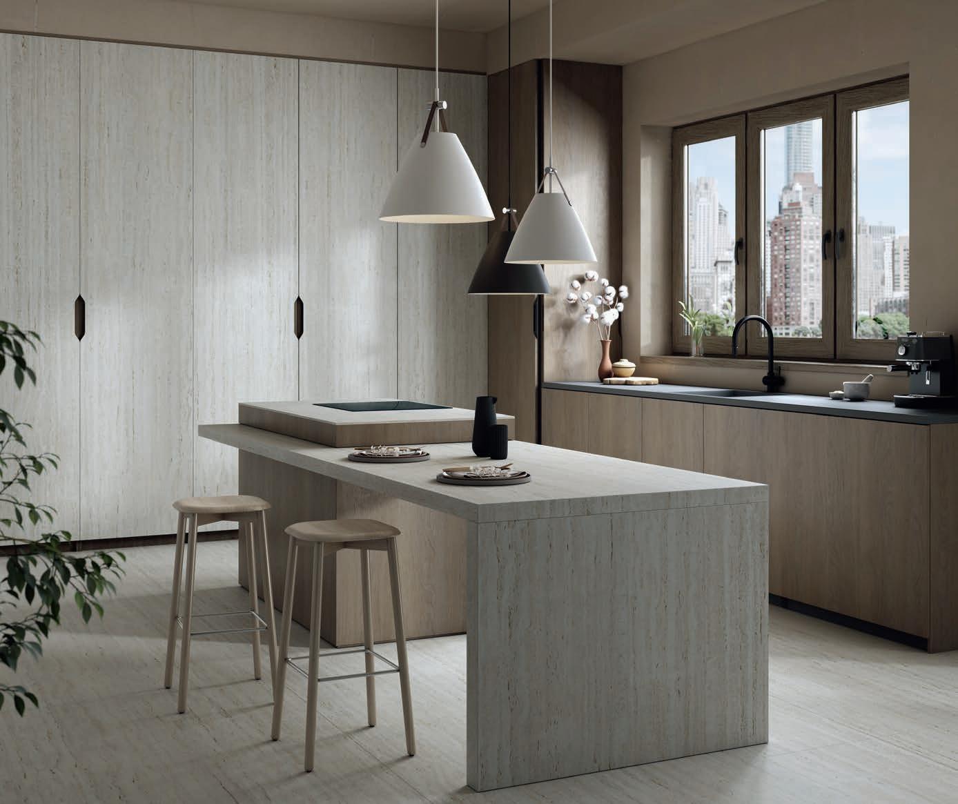
Introducing Pietra Kode: the Italian stones of yesteryear recoded by DEKTON for contemporary architecture and design.

