Finding a Greater Good
How Mason Studio is bringing humanity back to the workplace
Cafés with well-grounded objectives.

MAY JUNE 2023 CDN $8.95


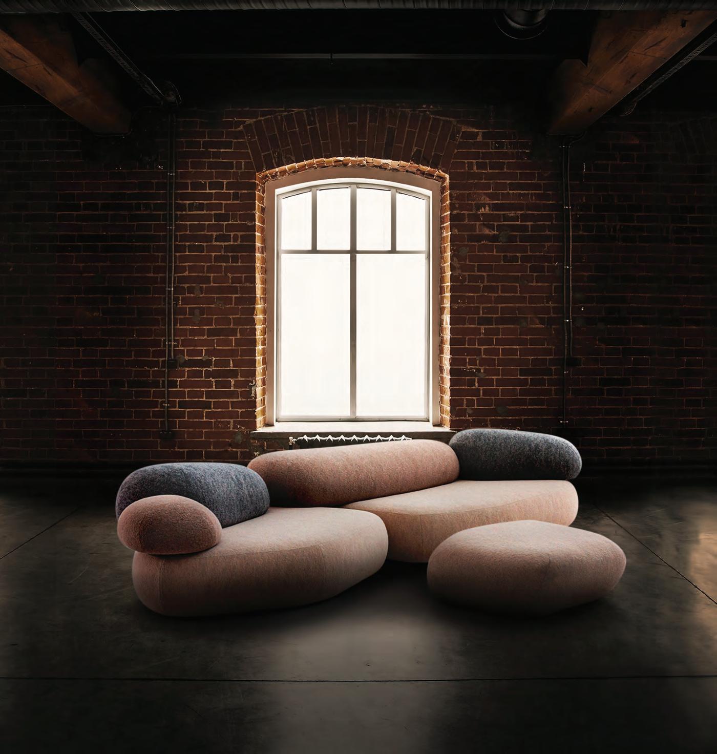


Our Italian brands introduces Design professionals to the best Italian-made products and furnishings for residential and hospitality projects. blackbreadandjam.com 36 Distillery Lane Suite, 430 - Toronto +1 416 359 0044 info@blackbreadandjam.com NEW SHOWROOM BY APPOINTMENT ONLY
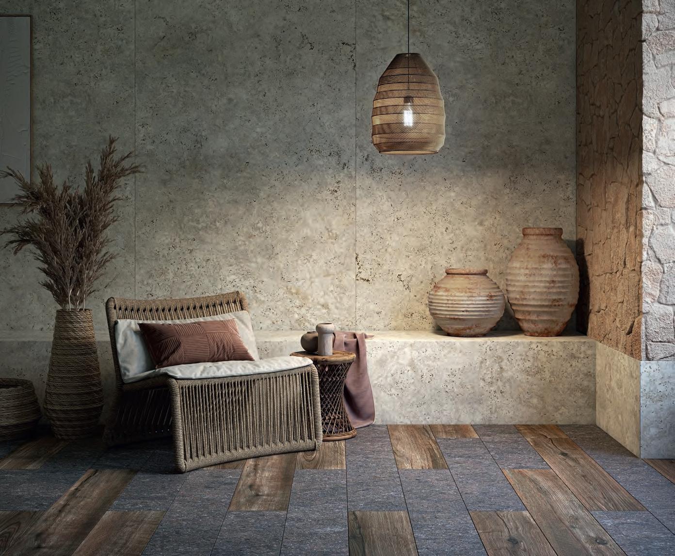
Introducing Pietra Kode: the Italian stones of yesteryear recoded by DEKTON for contemporary architecture and design.







CARBON
TK05 TK06 GK07 SABBIA MARMORIO CEPPO TRAVERTINO KODE CEPPO KODE NEBBIA AVORIO GRIGIO VK03 VK04 VK02 VK01 GRAFITE VICENZA KODE
A
NEUTRAL PRODUCT BY COSENTINO
Find inspiration at cosentino.com F Tò @CosentinoCanada COSENTINO CENTRE CALGARY 10301 19th Street N.E. Unit 101, Calgary, AB T3J 0R1 I 587.538.8301 CENTRE OTTAWA 903 Ages Dr, Ottawa K1G 6L3, ON I 343.804.0551 CENTRE QUEBEC 240 Chemin des Ursulines, Stan stead, QC JOB 3EO I 819.876.2123 CENTRE TORONTO NORTH 8905 Highway 50, Units 3-4, Vaughan L4H5A1, ON I 647.350.6009 CENTRE TORONTO SOUTH 3455 N Service Rd, Burlington, ON L7N 3G2 CENTRE VANCOUVER 8603 Glenlyon Parkway, Burnaby, BC V5J 0H6 I 778.508.9867 CENTRE WINNIPEG 3020 Red Fife Rd, Rosser ROH 1EO, MB I 204.515.7060 CITY MONTREAL 240 Rue Saint-Jacques Ouest, Suite 110, Montreal, QC H2Y1L9 I 514.335.8669 CITY TORONTO 665 Caledonia Road ,Toronto, ON M6E 4V8 I 416.247.9090 CITY VANCOUVER 1640 W 3rd Ave, Vancouver, BC V6J 1K2 I 604.900.8011
Features
/
24 FROM THE LOOKS OF IT An innovative ceiling feature created to address residual building issues became an inspiration throughout the design. By Andrew Sun

26 GRAM FOR ‘GRAM Using light and geometry to sharpen the visitors’ experience. By Peter Sobchak
28 DOLLARS TO DOUGHNUTS How the haptic experience of making and eating doughnuts inspired Kilogram Studio. By Peter Sobchak
31 SIP HAPPENS Four firms produce new café projects thoughtfully designed to maximize commercial traffic while remaining friendly and accessible. By David
Lasker
41 CREATING ENGAGEMENT How to foster innovative thinking and encourage an exchange of ideas within and outside the studio. By Stanley Sun & Ashley
Rumsey
49 AWASH IN GREEN Spaces designed with biophilic principles are gaining popularity, but greenwashing is creeping into the messaging. By Dr. Michael
J. Berens
Regulars
10 CAUGHT OUR EYE 12 SEEN Highlights and insights from Coverings 2023; and MIFF. 17 THE GOODS As light sources become more invisible, companies are experimenting with shape and form, resulting in sophisticated lighting statement pieces; plus how Vitruvian principles of harmony and nature inspired a collaboration with Cosentino Group. 52 OVER & OUT Denizens of Design delivers a restaurant rooted in nostalgia.
COVER – Mason Studio founding partners, Ashley Rumsey and Stanley Sun. Photo by Stacey Brandford Photography
3202 24 41
05/06
Senior Publisher Martin Spreer
416-441-2085 x4
Editor in Chief Peter Sobchak
Art Director Roy Gaiot
Contributors
Dr. Michael J. Berens, Daniel Germani, David Lasker, Ashley Rumsey, Rohan Sajnani, Andrew Sun, Stanley Sun


Customer Service / Production
Laura Moffatt
416-441-2085 x2
Circulation Manager circulation@canadianinteriors.com
President of iQ Business Media Inc. Alex Papanou
Canadian Interiors magazine is published by iQ Business Media Inc.
126 Old Sheppard Ave, Toronto, ON M2J 3L9 Telephone 416-441-2085

e-mail: info@canadianinteriors.com
website: www.canadianinteriors.com
Canadian Interiors publishes six issues, plus a source guide, per year. Printed in Canada. The content of this publication is the property of Canadian Interiors and cannot be reproduced without permission from the publisher.
Subscription rates > Canada $38.95 per year (plus taxes) U.S.A. $71.95 USD per year, Overseas $98.95 USD per year. Back issues > Back copies are available for $15 for delivery in Canada, $20 USD for delivery in U.S.A. and $30 USD overseas. Please send payment to:
Canadian Interiors, 126 Old Sheppard Ave, Toronto, ON M2J 3L9 or order online www.canadianinteriors.com


For subscription and back issues inquiries please call 416-441-2085 x2
e-mail: circulation@canadianinteriors.com, or go to our website at: www.canadianinteriors.com







Canadian Interiors is indexed in the Canadian Magazine Index by Micromedia ProQuest Company, Toronto (www.micromedia.com) and National Archive Publishing Company, Ann Arbor, Michigan (www.napubco.com).
Member of Canadian Business Press


Member of the Alliance for Audited Media ISSN 1923-3329 (Online), ISSN 0008-3887 (Print)


H.S.T. # 80456 2965 RT0001
iQ Business Media Inc.

Canada Post Sales Product Agreement No. 43096012


May | June 2023 / V60 #3
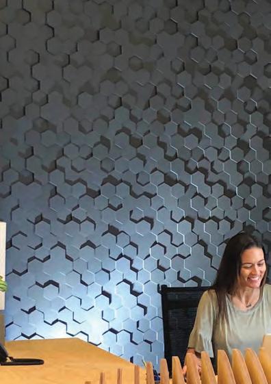
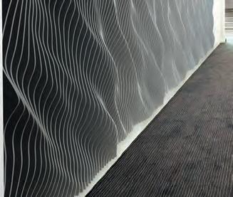
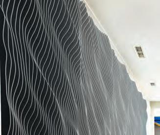
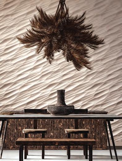
Breeze™ Acoustic @2022 modularArts, Inc.
modulararts.com | info@modulararts.com
Dune PANEL ©2003 modularArts, Inc. | Photo credit: Jessica Delaney
• New steel alignment tabs ensure precise registration in all dimensions
• GRG with lightweight cores, Class A, NFPA PASS
Breeze™ PANEL @2022 modularArts, Inc.
sculptural walls in modular components
AuralSc ap es
Greta™ PANEL ©2021 modularArts, Inc.
Bizbee™ PANEL ©2015 modularArts, Inc.
Up and Down the Green Chain
“Heightened awareness of the growing threats to our planet has increased attention on how the ways we design and build contribute to poor environmental stewardship.” said Dr. Michael J. Berens in one of our early correspondences that would later evolve into his op-ed that appears in this issue. He is obviously right in this assessment and pointed out that the “alarm about climate change and a greater sense of social responsibility have pushed sustainability and eco-ethics into the mainstream of design practice.” That mainstream he refers to typically means those who make interior products and those who spec them, but it also refers to an invariable link of consequences: where there’s products there’s money, and where there’s money there’s corner cutting, which leads to misinformation and then confusion and then inaction.


Manufacturers and practitioners may only pick certain aspects of sustainability and ignore the rest to suit whatever business conditions they face, but it is unfair to lump the growing greenwashing problem solely at the feet of small independent product designers with limited resources and maybe even more limited knowledge, or at the feet of small design firms who do not have the capacity to vet every single product to rigorous standards, instead taking manufacturers at their word.
Calling out “greenshit” (a term I am test driving) on products or projects that qualify as sustainable by only the thinnist definition is important now, but so too is the need for some sensitivity in how we do it. Greenwashing is detrimental to genuine sustainability efforts, but so is scaring off honest practitioners interested in progress but whose efforts, while genuine, are imperfect and fail to hit some sweet spot we are unable even to define at this point. I saw a lot of greenwashing at Salone del Mobile.Milano in April, but also some diamonds in the rough (more on that in the next issue), and I would hate to see them suffer by association. The industry needs to recognize those who genuinely want to work sustainably and provide better resources to assist designers in becoming better sustainable practitioners.
Peter Sobchak psobchak @canadianinteriors.com


07
inside
Canadian Interiors conversations Available at canadianinteriors.com/podcasts, as well as: Apple Podcasts Bevel is the podcast series where lovers and practitioners of design speak openly about their thoughts and experiences in the industry and ignite dialogue about a discipline always interested in making things better.
When Digital Meets Physical

potential to add value.
Catwalking Into New
Developments:

The Décor Studio


dkstudio architects creates an upscale decor centre for a developer building a condo hotel in Toronto.
Dream Staycation: Memphremagog
Lake Residence
MU Architecture designs a 6,700-sq.-ft. shoreline residence in Québec’s picturesque Eastern Townships Region.

Lock it Up: NFB
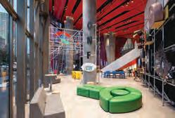
Taktik designs The National Film Board’s new reception area inside the distinctively red Îlot Balmoral flagship building.

Next time in
Bright ideas erupted at Salone del Mobile.Milano, Euroluce and Milan Design Week.

Largest stop on the Asia Furniture Show Circle posts

CANADIAN INTERIORS 5/6 2023 Visit the expanded digital edition at www.canadianinteriors.com
The first in a series of columns by Digby co-founder Andrew Lane that explore how invisible technologies have the
com
08
Diego Ravier
MIFF ExclusivetoourDIGITALEDITION
record sales.
Transition to Next-Level Sophistication


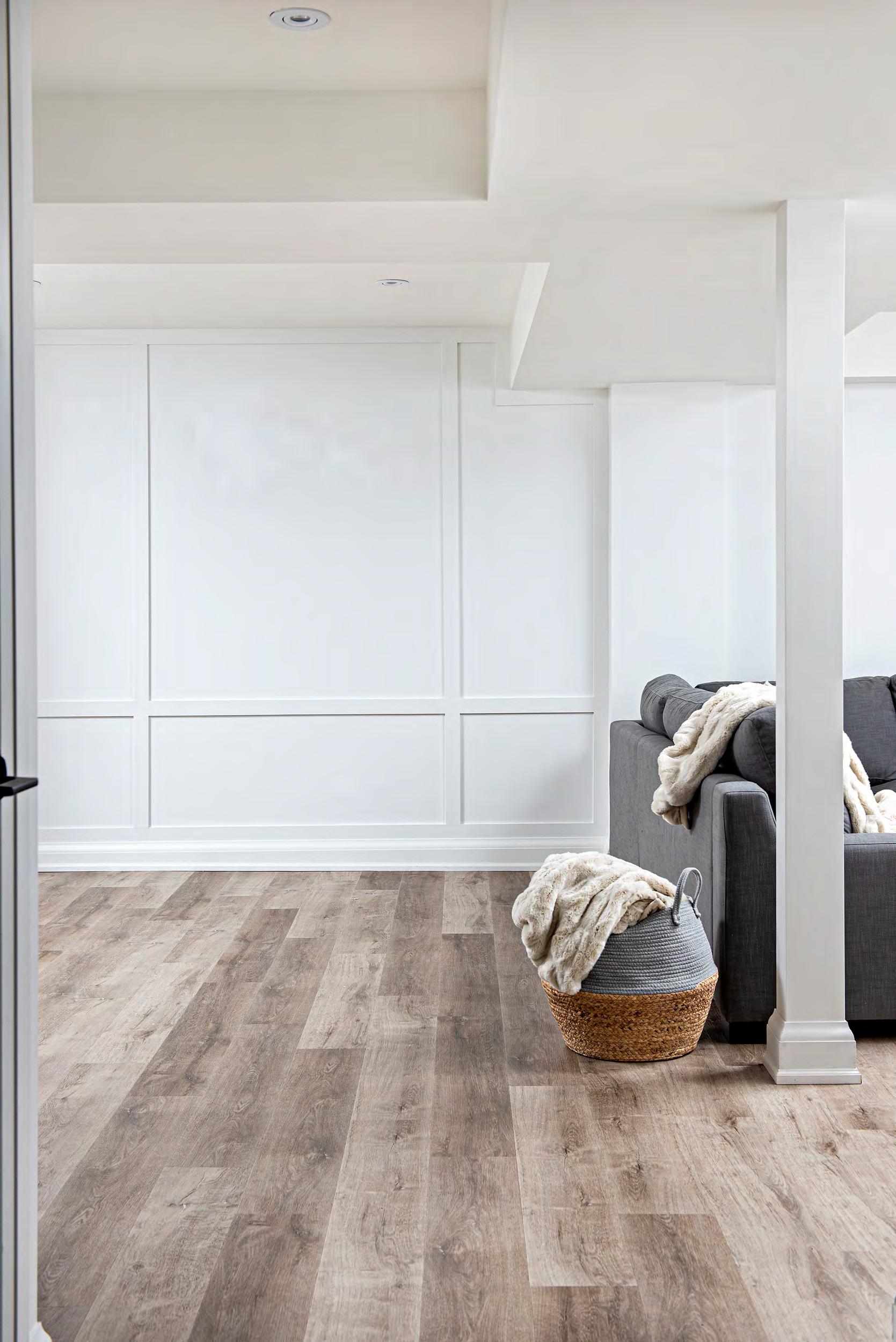
Silk Complex™ LVT collection features a brushed matte texture, reminiscent of silk fabric, as well as metallic accents. Each style is stunning alone; together they deliver beautifully refined transitions tailored to your preferred intensity.







Spin the Black Circle For the fourth consecutive year a Canadian took top honours in the 2023 FORM Student Innovation Competition, which challenges students to create furniture pieces using Formica products this year under the theme of “maximalism.” Tom-Elliot Monette, an 18-year-old interior design student at CEGEP Saint-Jean-SurRichelieu in Québec, grabbed the judges’ attention with his vinyl records storage cabinet, dubbed “Voluta.” The top three winning students receive cash prizes, but Monette will have the additional pleasure of seeing Voluta manufactured and displayed at NeoCon.


10 CANADIAN INTERIORS 5/6 2023
caught our eye
Another Brick in
done it again, this time at one
most
pieces
entirely
is
metres in length and spans an entire wall in London’s
Museum where Ai
Making Sense is being staged, Weiwei’s biggest U.K. show in eight years. The piece is both a recreation and criticism of one Claude Monet’s most famous paintings: the garden lily ponds of his home in Giverny near Paris and world-renowned for its depiction of nature’s beauty. However, Weiwei wants to remind people that the pond and gardens were a man-made construct by Monet himself, who diverted the nearby Epte river to create a tranquil landscape. Weiwei challenges these ideals by using nearly 650,000 Lego bricks to strip away Monet’s brushstrokes in favour of a depersonalized language of industrial parts and colours, a motif he has famously explored many times with other materials such as pottery shards and neolithic tools.

A Whole New World Montréal-based studio Moment Factory was tasked with transforming the lobby and main hall of the Grand Magic Hotel in Paris into essentially a theme park attraction that fuses scenography, architecture, and multimedia. Upon arrival, guests are greeted by “Mr. Maurice,” the fictional owner who comes to life in a digital portrait that hangs above the Reception Desk and encourages them to explore everchanging interior environments brought to life through architectural effects and trompe-l’oeil illusions that not only evolve throughout the day, but also over the course of the seasons.

11 5/6 2023 CANADIAN INTERIORS
the Wall Notorious for giving famous icons the middle finger, Ai Weiwei has
of the
celebrated
of Impressionist art. Titled Water Lilies #1 and constructed
of Lego, the work
over 15
Design
Weiwei:
Ela Bialkowska/OKNO studio
Moment Factory
Got You Covered
The Orange County Convention Center in Orlando, Florida was abuzz for Coverings 2023, as professionals, buyers and public alike toured the three primary pavilions of show sponsors Ceramics of Italy, Tile Council of North America and Tile of Spain, to be inspired by the newest and most innovative ceramic tile, natural stone and installation products.




CANADIAN INTERIORS 5/6 2023 seen
2 3 4 7 8 1 12
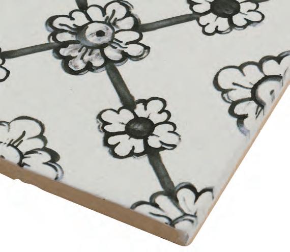
1 Matisse Moonstone | Anthology Tile
This is a new addition to the Artistic Impressions collection and was inspired by old-world traditional hand painting yet created by an inkjet process and made in soft hues with perfectly on-trend colours.
2 Rok Candy | AlysEdwards Tile & Stone
An organic collection of artistically designed terra cotta wall tile is hand pressed into molds forming hills and valleys; the clay is fired, hand glazed and fired again creating a sugar crystal effect.
3 Pluriball | Iris Ceramica Part of the Diesel Living collection, this line is inspired by the look and feel of bubble wrap, perfect for a plastic world where everything is delivered to our doorsteps.
4 Songbird | Florida Tile Inc. Several design motifs are at play in this collection all at the same time: undulations in the surface are reminiscent of both “rippling water, drawing your eye and creating a sense of calm” while also “a soaring journey through nature.”
5 Vulcano | Azteca Products & Services

Inspired by the movements of incandescent lava and produced by hand, the most intriguing part of the collection is the “gloss-matte” and “double gloss” contrast techniques.
6 Kerdi-Drain-F | Schluter-Systems This new drain system has been specifically designed for floors without a slope, and features a flat, narrow bonding flange with an integrated Kerdi collar.

7 Millennium Porcelain | Wonder Porcelain
This series combines the appearance of Byzantine mosaics with the trendy look of terrazzo, features a chic style with a lappato finish and is offered in white and dark grey colours with cool grey tones throughout each.

8 Astrum Porcelain Tiles | Ceramiche

Supergres This porcelain stoneware tile collection is inspired by one of the most widely used materials in architecture: travertine. Astrum offers a reinterpretation of durable, compact natural stone with a modern taste that is sensitive to the needs of contemporary design.

CID Winner
The Coverings Installation & Design (CID) Awards were handed out to projects that demonstrated “outstanding accomplishments in the design and installation of ceramic tile and natural stone for residential and commercial projects.” The 17 winning projects were completed between January 2021 and December 2022, and the lone Canadian representative in the group was Calgarybased LFT Professionals Inc. for their Mansion in a Rockies project, a winner in the Residential Ceramic Tile - Installation category.
5/6 2023 CANADIAN INTERIORS
6 5
Come Out Swinging
Compiled by Peter Sobchak
Easily considered the heavyweight in the growing Asia Furniture Show Circle of southeast Asian trade shows, the Malaysian International Furniture Fair (MIFF) has the tale-of-the-tape to back up the claim of being the region’s largest design industry trade event. After four days in early March (and first out of the gate in a string of backto-back-to-back shows in Vietnam and Indonesia), MIFF boasted ground-breaking sales hitting US$1.21 billion, a 19 per cent increase from its pre-pandemic peak of US$1.01 billion in 2019.
Returning to a full-scale event spread across two trade show venues, a scale-tipping record of 673 exhibiting companies were on hand to welcome 19,275 trade buyers, with nearly a third of them from outside the region and 40 per cent as first-time visitors. Interestingly, top sellers were furniture for the dining room, bedroom, living room, upholstered furniture/sofa, and kitchen, showing that the evolution of “resimercial” that we are seeing in full swing here has migrated to Asian markets.
Flatpak
The undeniable anchor in the show’s X-Ordinary Pavilion, a curated gallery to promote emerging creative talents in Malaysia’s furniture industry, Flatpak is a design-to-make company focusing on digital carpentry and panel-based products, with the goal of making furniture design accessible to all. At this edition they unveiled a new Kids line of two chairs (Kuki and Rusi) and a table, scaled to a child’s dimensions. www.flatpak.my


14 CANADIAN INTERIORS 0/0 2017
seen
The largest brand of the coalescing Asia Furniture Show Circle punches above its weight class and posts record sales numbers.
Fuku Studio
A good example of a local brand that sees clients’ interests shifting to the growing “resimercial” trend, Fuku Studio presented the new Kayu Collection which blends elements of Gustav Stickley’s protomodern design with influences from Japan’s wood design element,
along with the traditional Malaysian kampung home stairs railing. The actual ‘kayu’ part of the collection is made with local Semangkok timber, sourced from a sustainably managed forest in Malaysia. www. fukustudio.com

15 0/0 2023 CANADIAN INTERIORS

MARBLE | PORCELAIN | MOSAIC | CERAMIC | TERRAZZO | HARDWOOD
CIOT.COM
BEYOND MATERIAL
Ciot Studio - Gatto
Master Glass
Atmosphere | Karman “Every single blade of grass is meant for at least one drop of dew,” says Matteo Ugolini, quoting a Chinese proverb that was his inspiration for this new outdoor/indoor floor lamp. The stem, available in different heights, is a knurled fiberglass bar painted in white or black, placed on a round metal base (with additional ground support to protect the swaying effect), while the drop is a spherical reflective orb made of PVC.
www.karmanitalia.it

As light sources become ever more invisible, companies are willing to experiment with shape and form, resulting in highly sophisticated statement pieces.
17 5/6 2023 CANADIAN INTERIORS the goods
Compiled by Peter Sobchak


18 CANADIAN INTERIORS 5/6 2023 2 3 1 7
Akoya | RBW Named after the saltwater cultured pearl from the akoya oyster, the pendant form arose from the “caught pearl.” The hand-blown, opal glass bulb has been re-engineered with improved technical capabilities and more refined perforations to its sheer, spun-aluminum shade (now being produced in Canada), creating the appearance of weightlessness. www.RBW.com
Visio | Masiero There is a distinctive nod to Surrealism in this new collection, given how many ways one can configure and reconfigure the facial geometries. Designed by young Italian duo Nava + Arosio, polished chocolate-coloured painted metal tubing is curved to replicate mouths, noses, ears and eyes either in the form of suspensions or as wall compositions. www.masierogroup.com
Edie Pendant | Lightmaker Studio The Kingston, Ont.-based studio has added a new pendant version to their Edie Lighting Series, pairing two similar forms in glass that is hand-blown and hand-finished in Ontario. Vintage or blackened brass metals use solid brass as a foundation and a contrasting black-and-white colour scheme evokes a Bauhaus sensibility. www.lightmakerstudio.com
Shuttle | Prandina Designed by Marco Alessi, the portable table version is an attractive addition to outdoor settings, with a rechargeable battery capable of eight hours of LED light diffusion across various intensities. The diffuser comes in transparent or opal white blown glass with a structure in painted metal. A suspension version for indoor use is also available. www.prandina.it
Hover | Lodes Designed by Tokyo-based studio YOY, the new collection of table and floor lamps fulfills its appellation with a lampshade that appears detached from the base. The balloon-like light source appears to float weightlessly, connected by a single cable wrapping down to the power source. A dimmer controlled by a power switch is placed on the upper end of the stem, but other functional elements typically applied externally are integrated into the lamp’s internal structure. www.lodes.com

Pix | Normann Copenhagen Debuted at the Stockholm Furniture Fair, this reinterpretation of the archetypical spherical pendant lamp still uses a recognizable globe silhouette but with a new surface treatment derived from recycled plastic waste. The production process granulates and mixes plastic in various shades of white, then heats it to a melting point of 120°, allowing the material to be reheated and reused at the end of its life without altering its properties. www.normann-copenhagen.com

Bul-Bo Mini | Axolight The original floor lamp version, designed by Studio Gabetti & Isola back in the early 1970s, has earned a bit of a following. So naturally Axolight wants to keep the love coming and has released a new table version, designed by Fabrizio Pellegrino and Lodovico Gabetti, now with several high-tech updates, including the addition of an adjustable swivel and an LED source instead of the original incandescent bulb. The rest remains the same: the onion-shaped base in black eco-leather, filled with marble granules, and tiltable shaft in aluminum terminates with the laser-cut silhouette of a lightbulb. www.axolight.it

Perpetua | Bronzetto Designer Valeria Giuva’s unmistakable inspiration for this new line was the water drop (the name comes from the water nymphs of Greek mythology, after all), represented beautifully in a blown glass globule that hides an LED light source and embellished with a decorative brass element, available in a smoothor raw texture in four motifs. www.ilbronzetto.com

Woody | Ethimo This new lamp created by Marc Sadler is designed to illuminate outdoor areas in private homes, contract and hotel settings, and brings suffused light to gardens and patios in the evening. At 152cm, its slender tripod structure made entirely from FSC-certified teak holds a shade with a volume dictated by the ‘rhythm’ of strips placed close together that filter and diffuse the light between their gaps. www.ethimo.com

5/6 2023 CANADIAN INTERIORS
19 4 6 5 9 8 1 2 3 4 5 6 7 8 9
The Comforts of Home, But With A View
After exploring the idea of opening a small showroom or pop-up store somewhere in the downtown core, Le Studio, the decorative division of LumiGroup architectural, Québec’s largest lighting agency representing lighting and furniture manufacturers from both the province and rest of the world, ultimately decided on an 18th floor VIP Showroom located in a condominium tower in the Old Montréal district. The new 2,400-sq.-ft. showroom designed by Imperatori Design has the unique distinction of forming part of an actual living space.
“While the idea is quite unique, the general concept fits into a larger trend that we have been seeing post-pandemic, where the lines between commercial and residential design are closing,” says Chantal Ladrie, project manager and senior designer at Imperatori Design.

“On a daily basis, we are being asked to infuse more of a home feel into office designs in order to smooth transitions back to the office.”
The original layout of the condominium was conducive to a central showroom. An open core leads straight through living and dining room areas towards a wall of expansive windows. Creating a central standalone gas fireplace, clad in hot roll metal sheets, Imperatori Design delineated a living room populated with Moooi furnishings (a brand that Le Studio represents) from the dining room and open kitchen, which includes an expansive black marble centre island that can double as a chef’s table for special events. Then, of course, come the lighting collections which take centre stage: chandeliers illuminate the entrance and dining room spaces, while multiple configurations deployed in other spaces can be easily exchanged for other brands.

20 CANADIAN INTERIORS 5/6 2023
Francois Descoteaux
the goods

Decoding Classics for the 21st Century
How Vitruvian principles of harmony and nature inspired this third collaboration with Cosentino Group.
By Daniel Germani
The Ten Books on Architecture, written by Roman architect and military engineer Marcus Vitruvius Pollio and the only major treatise on architecture from ancient antiquity, is a source of many of the principles of modern design. In it, Vitruvius outlines several qualities that help make buildings beautiful, stating that “firmness, commodity, and delight” remain essential components of all successful architectural design. He also asserts that “truth of nature” is a timeless notion and that design should embrace its universal laws of proportion and symmetry.
In researching Pietra Kode, I asked myself if such a universal sense of beauty can be decoded and applied to our colour development? The ideas of beauty shift and change through space and time, yet nature is our only constant. I spent a lot of time decoding the history of three classic Italian stones — Pietra di Vicenza; Travertino; and Ceppo di Gré — and their use in Italian architecture, reimagining them in contemporary design. Each of these natural stones is decoded and then recoded within three Dekton concrete series, enhancing their properties and the many possibilities for architecture and design. We strove to create colours with rich shades and textures creating a contemporary sensory experience beyond what the eye can see.
Pietra Kode is a collection that showcases luxury in small, understated details designed to interact with each other, while the carbon neutral Dekton surface allows the collection to be used in a wide range of indoor and outdoor applications.
The Vicenza Kode series includes four warm and versatile colours that reinterpret the code of Pietra di Vicenza, a classic Italian stone that has been quarried since Roman times and has captivated Renaissance architects like Andrea Palladio. VK01 Nebbia’s fine-grained white creamy base dotted with warm taupe accents is reminiscent of the timeless beauty of Palladian architecture. VK02 Avorio is charac-
terized by the presence of fossil shells that add depth and complexity in a very timeless way. VK03 Grigio is inspired by the texture of Grigio Alpi and boasts grey shades with warm nuances of browns and light yellows. VK04 Grafite combines a mix of black and grey scattered with whitish and reddish cloud-like patches, channeling the texture of dark, fine-grained limestone.
Travertine Kode reinvents Travertino. Found in vast deposits by ancient Romans in the city of Tibur thousands of years ago, this stone was used throughout history and helped build the Roman Empire. Over the centuries, this robust and versatile limestone inspired countless architects and artists. TK05 Sabbia reinterprets Italian Travertine, cut “a falda” creating clouds and veins that flow through the pieces in a disorderly and colourful way. TK06 Marmorio is a take on the Travetine cut “a controfalda” and takes cues from Travertino Navona in its colouring and structure.
Ceppo Kode reinterprets the beauty of Ceppo di Gré, often used in the Lombardia region to make buildings look exclusive and prestigious. The multiform structure of this tenacious rock gives it a conglomerate appearance. Brutalist in its nature, this stone makes a statement wherever you place it. Like Vicenza Kode, CK07 Ceppo also features design along the edges making it ideal for revealing applications, while the unmistakable pebbled pattern is ideal for both indoors and outdoors.
Pietra Kode was a labour of love and I believe that it truly translates, in a contemporary way, the timeless beauty of Italian stones.
22 CANADIAN INTERIORS 5/6 2023
the goods the goods
Daniel Germani is the creative director and founder of multidisciplinary design studio Daniel Germani Designs, which specializes in product design, design consultancy, interior design and architectural renovation.


23 5/6 2023 CANADIAN INTERIORS
From the Looks of It
By Andrew Sun Photography by Joel Esposito
Innovation Eye Clinic, a 1,400-sq.-ft. optometry clinic and eyewear retailer located in Kitchener, Ont. presented me and my team at Atelier Sun with a variety of interesting dilemmas. Instead of designing a conventional eyewear retail and combined clinic space, we planned to showcase a new retail experience focusing on the mood of coziness and feeling of contentment. We believe that the feeling of hospitality needs to not only to be expressed in restaurants and hotels, but also revealed in retail and residential spaces.

Considering the commercial unit is located at ground level of a condominium with overhanging canopies, our design approach was to emphasize the spatial experience, a connection to the street and the integration of mood lighting. When we first visited the space, we noticed there were various concrete drop beams in the unit: at first an impediment, but we took the drop beam character as inspiration and created a continuous ceiling feature composed of wooden slats and suspended at varying heights. A group of linear lights were designed to be embedded in the wooden slats to not only provide general lighting to the space, but also highlight the details of the ceiling structure as it fluctuates in elevation. We wanted the spotlighted details of the ceiling structure to add a series of interesting atmospheres to the space.
A feature wall covered with wood panels from wall to ceiling at the end of the retail environment was designed to create a wooden
niche for the reception area, while at the same time infuse a sense of spatial layering and order into the space by contrasting with the surrounding white plaster walls. Wood toned display shelves and backdrop panels were lined to create a consistent visually appealing line around the retail space. Highlighted with the warm glow, we wanted each element to be carefully crafted to create this unique retail experience that is welcoming and memorable.
When the project was completed and our photographer, Joel Esposito, and myself were capturing the space, we decided to keep the photos simple and focus on the atmosphere and experience of the space. As COVID -19 has led to a surge in e-commerce and accelerated digital transformation, retail has started to transform itself into more of an experience hub than just a place to buy stuff. Retailers and brands want their customers to be part of the brand experience in the physical store, which is what we wanted to capture from our design and photography. We want the space to inspire and captivate, to invite visitors to immerse themselves in the experience of the space, and to elevate the brand through those experiences.
24 CANADIAN INTERIORS 5/6 2023
An innovative ceiling feature created to address residual building issues became an inspiration throughout the design.
Andrew Sun is the principal of Atelier Sun, a Toronto-based multi-disciplinary design studio that focuses on architecture and interior design.

25 5/6 2023 CANADIAN INTERIORS
Gram for ‘gram
By Peter Sobchak Photography by Ryan Fung
Using light and geometry to sharpen the visitors’ experience.
The new owner of a pre-existing bakery shop asked Toronto-based RZ Interiors to inject a new sense of light and energy into a tiny 700-sq.-ft. footprint. As such, light became the primary material (to paraphrase Emerson), endlessly manipulated using multi-layered hexagonal prisms anchoring the ceiling plane and iridescent surface effects, the combined results of which are central to the interiors, product packaging, overall branding and even the name: Lumière Pâtisserie.
Geometry and light motifs are perhaps most notable in the custom-designed triangular tables. “The versatility of using a triangular table is particularly useful for businesses that are dealing with a smaller front-ofhouse area and find it challenging to fit conventionally square and round shaped tables without making the space feel cramped,” says Bahar Zaeem, principal of RZ Interiors. The brass trim tables can be placed in corners to allow for more flow in the center, or they can be aligned to form a rhombus, which accommodates different group sizes and seating configurations during workshops, which the bakery likes to do.
Another primary tool was applying 3M dichroic film — known for highly reflective surfaces which can create prism-like impressions
when viewed from different angles — to the tabletops, which are now dynamic focal points in the space as they appear to change colours depending on the angle of the light source and the position of the viewer. A bonus to this animation effect is it also gives patrons a dynamic surface to ‘gram their purchases on.
“Social media platforms like Instagram have become important tools for businesses to promote [themselves]. Visual appeal is a key factor in attracting attention on these platforms, and businesses that can create visually stunning and unique content are more likely to attract followers and engagement” says Zaeem. “It is interesting to note that every photo or video taken of the triangular tables is likely to be unique, as the colours and patterns reflected by the dichroic film will vary depending on the time of the day, the position of the light source and the angle of the photo.”
Customers now readily snap the tables with the pastries on it to share on their social media profiles, promoting the bakery to their followers and increasing its exposure.

26 CANADIAN INTERIORS 5/6 2023


27 5/6 2023 CANADIAN INTERIORS
Dollars to Doughnuts
By Peter Sobchak
Photos by Scott Norsworthy
Biting into a doughnut is an ephemeral experience, amplified by tiny details like texture, temperature and decoration. While Torontobased COPS Doughnuts see themselves not as a doughnut shop but as “a creative studio that happens to sell doughnuts,” they still needed a place from which to sell. So when approached to design such a space “we asked ourselves what setting would prepare you for that exquisite moment of a first bite?” says Kfir Gluzberg, founder and principal at Kilogram Studio. The answer was to look at building materials the way a baker looks at ingredients.
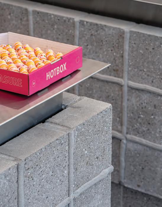
In Glaze, visitors are surrounded by textures frozen in time. Creaminess is expressed through concrete especially in joints around the service counter “where float spreads stucco and pressure extrudes mortar, like icing,” says Gluzberg. Gloss is represented in the exposed aggregate of the polished floors, stainless steel, rippled glass, shadows cast by window muntins and swirly handles on the doors.
Colour was also an important detail, as COPS is known for their proprietary drizzled glazes that change on a weekly basis. Entering Glaze, one’s gaze is drawn to colourful and bright packaging, the

CANADIAN
2023
INTERIORS 5/6
The haptic experience of making and eating doughnuts inspired Kilogram Studio in their transformation of a car garage.
28
only colours in a space that is otherwise monochromatic and highly textured. Facing west, the shop is filled with the rectilinear shadows of the windows facing Lewis Street during opening hours. The light filters through glass screens that are slightly larger than human scale and separate the front and back-of-house. The fluted glass elements are angled and direct customers to the order and pick-up counters. “LED circles ripple in the glass to create a dream-like environment, like a dopamine rush of pleasure,” says Gluzberg. The reflections are extended in the large stainless steel countertops, shelves, frames, and mirror at the entryway.

“Commercial car garages are a wild card in Toronto’s downtown,” says Gluzberg. “Their rich textures, exposed structures, and large openings allow for minimal renovations to result in beautiful daylit spaces. The century-old brick shell with concrete floors was tarnished with decades of fumes, oils, and chemicals. There was an obvious parallel between the absorptive nature of the historic masonry textures and the rich textures of the doughnuts that would replace its industrial nature.”
5/6 2023 CANADIAN INTERIORS
29







1 9 7 6 - 2 0 2 3 47 ISA INTERNATIONAL BALTHAZAR SER IE S WW W.HAV AS EAT.C OM | 1. 800 .881. 3928
Sip Happens
Four firms produce interesting new café projects, thoughtfully designed to maximize commercial traffic and create effective sales while remaining friendly and accessible.
 By David Lasker
31 5/6 2023 CANADIAN INTERIORS
Brendan Burden
From Charles Rennie Mackintosh’s Scottish tea rooms, on the cusp of Art Nouveau and Modernism, to Starbucks, arguably the prototype driving the trend to the casual clubby layout of today’s postpandemic hybrid offices, and even the title of MSNBC’s Your Morning Joe lefty politics commentary show, the coffee shop and ye olde tea shoppe remain archetypes of community engagement.
This survey of four design firms from across Canada creating coffee and tea cafés is timely because business in the market sector has never been brisker. “In big cities, boutique high-end coffee shops have become a cultural thing,” says Nicholas Waissbluth of Waissbluth Architecture Office in Vancouver. “Because there are so many, each needs to be unique. Even big corporate coffee shops realize they must compete against the boutique across the street for the young customer who will spend $5 for a latte.”


Who knew, for instance, that Starbucks has different-coloured awnings and signage depending on the level of design in the shop? “There’s the typical green one in strip malls; then black awnings for Starbucks Reserve Roasteries, their specialty branded coffee shops; and finally their highest level, with gold on the front window.”
5:2:8 Creative Coffee Collective, Ottawa
There are so many “unusuals” about Ottawa-based 25:8 Architecture + Urban Design. Explaining the numeric name, Jay Lim, the firm’s founder and lead designer, recalls that just after graduating from Columbia University with his M.Sc. Architecture and Urban Design (having already obtained a MArch from Syracuse), he and a few colleagues entered an international competition to design emergency housing for New York City. “We were all working at firms, so we did this at night and lo and behold, we end up winning. They asked for the name of the firm so they could send us the cheque. We were working 25 hours, eight days a week, so we named ourselves 25:8.”
After employment at a Who’s Who of practices — Kohn Pedersen Fox, and Pei Cobb Freed in New York; then KPMB, and MJMA in his native Toronto — he moved to Ottawa to join Stantec, then Perkins & Will before leaving to hang out his own shingle while teaching as an adjunct professor at Carleton University. Which accounts for why, uniquely among these four or probably any other design firms, the studio and coffee shop share premises, with concept sketches and maquettes on the eatery’s walls.
32 CANADIAN INTERIORS 5/6 2023
Brendan Burden
By 2019, his start-up firm was growing and in need of more space for client meetings. However, the team (now five) didn’t want to work in an office. They found an old garage attached to a house that was zoned commercial. “It was cheaper than rent, so we picked it up. But the garage had been fit up as a restaurant in the ‘80s. We thought we’d open an independent coffee shop and if people come great; if not, it didn’t matter because it’s our office where we mentor students and offer them part-time coffee-shop staff work.” Its name, 5:2:8 Creative Coffee Collective, mirror-images the company logo. Inside, custom modular plywood furniture recycles leftover material from 25:8’s construction sites.


Also unusual is 25:8’s practice niche, aimed at “The half of the one per cent of the city that’s ready to do something fun and different; they know we’ll play ball with them,” says Lim. “We just finished a house with a three-storey rock-climbing wall inside. Our cottage for a client with young kids is red with a slide coming off the roof.” Flight Deck, a house for bird-watcher clients overlooking a big open field, features a blind that touches the ground lightly with a graceful central V-shaped support, evoking a sailboat with a big keel in profile, rather than corner columns. “We might as well become kings of the capital and push the design agenda here in a way that no one else is willing to right now.”
Previous page and this spread The concept was simple enough. “If a garage was good enough for Apple and Amazon, it was certainly good enough for architecture,” says Jay Lim. “As the popularity of 5:2:8 grew we realized we need a more prominent location. In 2022 we moved to our second location, a 100-year-old house on Somerset Street in Ottawa. The ground floor still welcomes the public but now the upper floors give us space for Zoom rooms and more staff.”
33 5/6 2023 CANADIAN INTERIORS
Camellia Sinensis Teahouse, Montréal

Camellia sinensis is an evergreen shrub whose leaves are used to make tea, and a Québec specialty tea-shop chain. The newly remodeled flagship on Emery Street in Montréal’s Latin Quarter is a serenely Wi-Fi-free space with a palette of white oak, brushed brass and muted greens. The imaginative display wall behind the main counter comprises tea-storage cannisters floating on rods. Castiron, glass, porcelain, raku ceramic and Japanese tea-ceremony vessels march along retail shelving like miniature sculptural objects. At the tasting bar, customers can compare two teas served in a professional tasting kit.

Local design firm Machine won — to strain the hospitality metaphor — the soup-to-nuts commission, incorporating architecture, interior design and industrial elements. “We designed, hand-made and installed everything but the lighting,” says Joël Desmarais, founder, designer and project manager at Machine. His vertically integrated, multidisciplinary business operates in a 6,000-sq.-ft. building in the Rosemont neighbourhood that boasts an office, metal shop, wood shop, paint booth, stockroom, kitchen and adjoining garden.
Machine had no predecessor retail project in their portfolio. But their industrial/temporary space aesthetic evidently sealed the deal. Desmarais, an artist, cabinetmaker and Université du Québec à Montréal
art-history grad, began his career as a set designer for playwright Gabriel Plant’s Cube Blanc at La Chapelle Theatre. The budget was $400 “and a lot of energy and sweat,” he remembers. He screenprinted advertising posters in his bathtub, bought a sewing machine for the textiles and welded metal at his auto-mechanic brother’s garage in the country. The experience, he says, “gave me confidence so that when someone offers a commission, I’m a ‘Yes’ man. If a coffee shop would like to order three dozen chairs, we’re ready.”
He started Machine in 2014 and aims to grow his seven-person staff to 20 by next year. The company has two subsidiaries: Kermesse builds temporary structures for events; and Alphabet (the “h” in the logo made of two stacked chairs), an IKEA or Umbra in the making, offering a wide range of furnishings from tables, chairs and wall systems with a hint of Scandinavian influence, and the San Laurent laundry bag ($156), available online and at La Maison.
34 CANADIAN INTERIORS 5/6 2023
Camellia Sinensis
This spread Inspired by boutiques they visited in Asia, the owners wanted a minimalist interior. Here, soothing shades of green, brushed brass and white oak provide a Zen environment that still makes patrons want to move around the space. The display containers rest on rods and appear to be floating in mid-air, making retail items such as teapots and cups more accessible and within reach.


35 5/6 2023 CANADIAN INTERIORS
Giovane Caffè, Vancouver

The term “coffee shop” conjures up images of cozy intimacy, so opening a quick-service grab-and-go Giovane Caffè in the double-height lobby of Vancouver’s Deloitte Summit office tower called for remedial design action, ably executed by Waissbluth Architecture Office (WAO), lest customers feel that they’re sitting at the bottom of a well. To that end, tiered wooden wall paneling acting as a tall wainscot shrinks the scale into a more snug and user-friendly setting. The grid in the wood screen running along the glass partition facing the main lobby softens the hard edges of the space.
Nicholas Waissbluth opened WAO in 2016 as a solo practice. He made his mark with his first coffee shop, Nemesis, in the muchawarded, Patkau Architects-designed Polygon Gallery. “It keeps on winning every year as the top coffee shop in Vancouver,” he says. His firm has grown to five staffers including one dedicated to the growing
project roster in Switzerland, including an apartment building and a large brewery. Still, “We do about five restaurants at any given time in the office. I like doing them because the designer gets very intimate with the operator, especially if they’re a chef-owner and they’re putting their life savings into the project. I’ll get phone calls over the weekends or after they’re done at 10 o’clock at night. You don’t get that many projects where you’re that close with a client all the time. Half of our clients have established coffee shops and they’re opening their second or third location. The others are first timers who may know how to pour coffee, but not what it takes to open a business: Who do you call for branding? How do you get a permit? What’s the right price point?”
After graduating from Carleton University, he worked in Copenhagen at Dorte Mandrup Arkitekter, whose founder was the subject
36 CANADIAN INTERIORS 5/6 2023
Andrew Latreille
of the Architecture & Design Film Festival’s Another Knowledge. “She’s one of the most amazing persons I’ve ever met. She ran the office more like a teacher than other bosses I had worked with, where you’re just executing their design vision. She would give us a problem, we would try to figure out solutions and she would come and do desk crits, saying, ‘Let’s think about this and about that.’ That’s how I run my practice today, figuring out as a team versus telling staff to execute my idea.”
He adds that at around 2:00pm in Denmark, everyone has a few drinks and enjoys the last couple of hours of work together. Dorte Mandrup’s office, on the second floor, would socialize with the new architecture firm on the third floor, BIG (Bjarke Ingels Group). “I remember seeing Bjarke. He was in his early 30s and he was a cool guy,” Waissbluth says of the soon-to-be starchitect. “His trajectory was going up.”


37 5/6 2023 CANADIAN INTERIORS
This spread In response to its context, the design focuses on creating an environment that is both intimate while also embracing the exposed nature of the space. A continuous wood screen runs along the glass partition facing the main lobby to create a filter from the office surroundings, and the repetitive grid that forms the screen softens the hard edges of the space. At the bar, dark stone contrasts the red terrazzo flooring throughout the lobby and its reflective ceiling finish.
Hale Coffee, Toronto, and Wet Coffee, Oakville, Ont.

Hale Coffee’s fourth Toronto location, at Bloor and Church Streets, and Wet Coffee in Oakville exemplify the house style of Torontobased Sansa Interiors. There’s the neutral, natural, light-coloured palette, featuring unstained red oak at Hale, and biophilic or organically curving forms, such as the rounded main bar with natural wood detailing that welcomes customers and acts as a wayfinding element to guide them through the space at Wet Coffee.
Sansa founder Jude Kamal explains that the company name is Sanskrit for charm, poise and attention to detail. She aspires to eco-friendly and sustainable design, as in the base of the Hale counter made of reclaimed brick salvaged from local demolished buildings. Then there’s the serenity associated with a lack of clutter. “We believe in lots of negative space. Not every corner of your shop needs to be filled with something. That way, there’s a moment of release.”
“When I started my business, most cafes had a rustic feel, probably because the owners built it themselves,” says the OCAD University environmental design graduate. “We bring a higher level of detail, with super-minimal, clean, sharp lines.” She’s inspired by nature and tries to convince clients to use real wood and plants in their space “so that it’s full of life. Wood and stone are connected to nature; they have water or oils in them.”
If her ideology borders on New Age-ee — as in “If you want to look at it from a spiritual side, everything has vibrations and you want to increase the vibrations in a space to make it accommodating” — she’s pragmatic too. She embraces holistic design, which she defines as “creating a full, cohesive space that a person can fit into no matter their age, height or health condition, which promotes well-being.” By way of example, Wet Coffee’s chairs, residential appearance notwithstanding, are commercial-grade and
38 CANADIAN INTERIORS 5/6 2023
Bruno Belli
This spread Inspired by the owner, whose extensive world travels helped hone her skills in sourcing beans and who believes that coffee tastes best when “wet-processed” (hence the name), the design vision for Wet Coffee (shown) was the bean itself: soft curves, nods to nature, and fairly neutral tones, all evident in the rounded main bar accented in natural wood detailing.
rated for 450 lbs. Should a supersized customer find the chairs too narrow, they can repose on the wide-open banquette.


Indeed, Sansa strives to meet ADA accessibility standards. However, the initials stand for Americans with Disabilities Act, which cuts no legal ice north of the 49th Parallel. “It’s not always applied by code here. That’s where I always find a gap.” Or she may be hampered by an unaccommodating base building as in Wet Coffee, where those with wheelchairs or strollers struggle at the front-door step.
Her three-year-old firm has four staff working on hospitality and residential design. She attributes getting new jobs to social media and being a friendly extrovert. Indeed, she landed her first Hale Coffee gig through casual conversation at an event, where she asked a nearby partygoer what he did for a living and he replied that he was a coffee roaster. You know the rest of the story.
39 5/6 2023 CANADIAN INTERIORS

www.canadianinteriors.com/BoC PEOPLE GET READY! 26th Best of Canada Awards, the only national design competition in Canada to focus on interior design projects and products without regard to size, budget or location! All winners will be published in the Nov/Dec issue of Canadian Interiors. Submission portal opens May 2023 Mouvement Desjardins’ Executive Floors at the Complexe Desjardins, Montréal Provencher_Roy Design D’Intérieur, Montréal Photography by David Boyer Sponsored by
Creating Engagement
 By
By

41 5/6 2023 CANADIAN INTERIORS
How a community focus can help foster innovative thinking, encourage an exchange of ideas within and outside the studio, and be the place that people want to come back to.
Stacey Brandford
Stanley Sun & Ashley Rumsey

42 CANADIAN INTERIORS 5/6 2023 Scott Norsworthy
Opposite Operating as a gallery space, community library, fabrication hub, non-profit space and even including a coffee bar, Mason Studio’s new headquarters at 91 Pelham Avenue in Toronto provides a venue for exhibitions and events and is open to participation from other designers, artists, architects and the general public.
Above The hub’s programming and amenities include a Study Garden, which is an indoor green space where staff and visitors are encouraged to “rejuvenate the mind and body.”

Being part of a community is an essential human need. It gives a place for belonging, the feeling of identity and creates meaningful human experiences and connections. Studies over the past decades suggest that social connection and interaction are directly linked to happiness.
Businesses have discovered the value of creating working spaces that focus on community culture. Today’s office is no longer just for work, but a dynamic place for conversation and discourse, inspiration and rejuvenation, and a space for community to get involved, gather and share knowledge. As we evolve from the pandemic’s effects on the social fabric, more companies recognize the importance of creating an environment where the needs, well-being and experiences of employees are a top priority. We are rethinking how we want to live our lives and what can be done to build a better future.
Integration of Family and Children into the Workplace
The concept of a family-friendly workplace is not new. Due to rapidly changing attitudes, priorities and values within society in recent
43 5/6 2023 CANADIAN INTERIORS
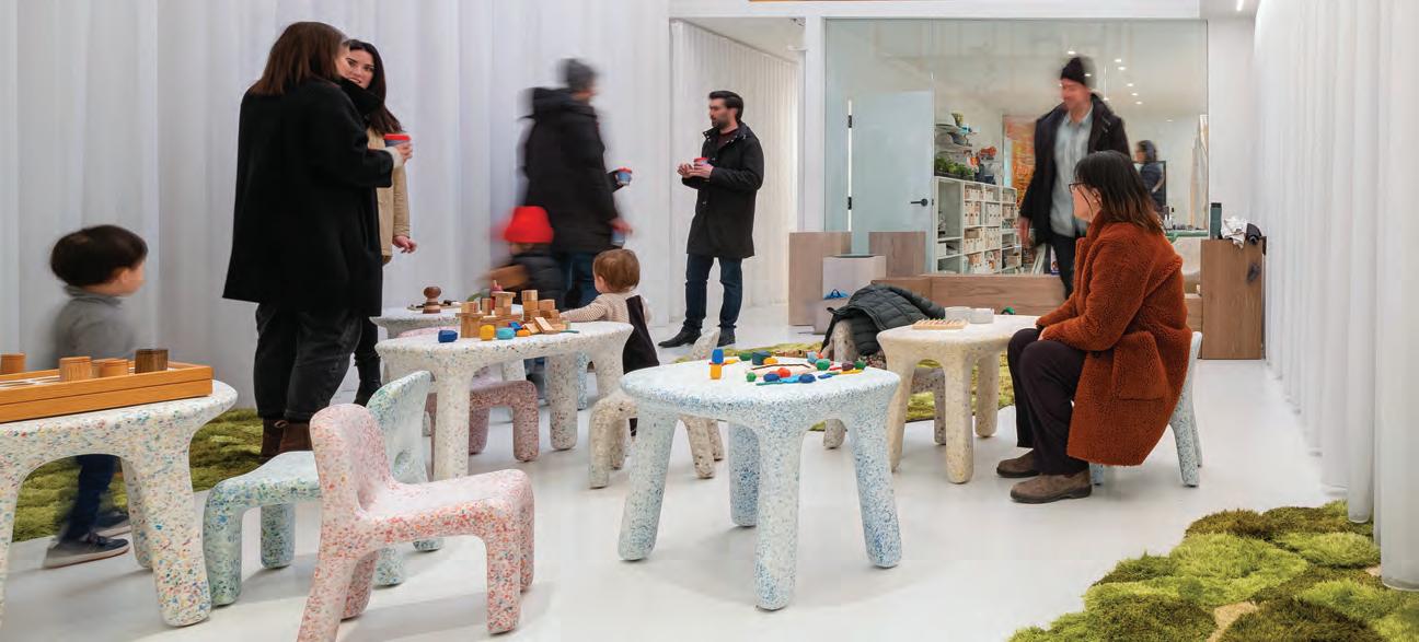
This spread For the DesignTO festival in January, Mason Studio worked with collaborators on an exhibition that explored the theme of “an optimistic vision of the future.” The building’s entry hall was turned into a shoppable Market Gallery space featuring products promoting people, and elsewhere a hands-on materials workshop.

years, the trend towards integrating family and children into the workspace has gained greater prominence, and the momentum for change is growing.
The benefits this type of workplace can offer are numerous. From an improved work-life balance to increased employee satisfaction and higher levels of productivity and motivation, a workspace where families are integrated in some respect creates a more positive and supportive work environment, which in turn benefits both employees and the company as a whole.
This integration also results in stronger bonds and relationships within a team. The more they know each other as individuals, the richer the collective knowledge is. The work of an interior design studio considers many demographics — from differing ages, cultural upbringings and social expectations — and bringing in people of diverse backgrounds and their life histories is critical to a more empathetic place.
Earlier this year, as part of the DesignTO festival, Mason Studio transformed its space into an all-ages cafe playhouse for its exhibition titled
44 CANADIAN INTERIORS 5/6 2023
Scott Norsworthy
“2033: An Optimistic Future.” With the goal of activating a sense of belonging, giving parents and caregivers an opportunity to bond with their children, and just making space and time for play, the firm introduced studio-led storytime sessions for the little ones of their team and community members. This experiment was a reminder of how vital play is as a tool to socialize, learn and focus, even in the workplace.
Hands-On Programming and Introduction of New Amenities
Engagement and collaboration with industry and community members whose vision and mission align can be a powerful instrument for achieving shared goals, creating a more effective force for change, and making a meaningful impact in the world. In addition to cultivating stronger ties, collaboration with like-minded partners can also help foster innovation and creativity and generate novel ideas and approaches.
This can take many forms: from introducing new amenities that benefit the local community; to creating hands-on programming

that provides opportunities for education and skill-building; or developing partnerships with community and non-profit organizations to reaffirm your commitment to social responsibility. While there is no one-size-fits-all answer as to what the workplace of the future will look like, community engagement has the potential to be the focus area for forward-thinking organizations seeking to reimagine their human-centric workplace.
For one of the latest exhibitions in the gallery at Mason Studio’s design and cultural hub, the firm showcased market goods of local vendors and designers, and celebrated the people and processes behind them, giving visitors a deeper understanding and appreciation for the products on display. The exhibit also functioned as a shoppable retail space that was open to the public, and visitors were able to take home a piece of the experience and support the vendors directly. To give back to the community, the studio set up a temporary pay-what-you-want cafe, with donations going to local non-profit organizations. These types of new amenities not only stimulate local economies but also contribute to the cultural vitality of the community.
45 5/6 2023 CANADIAN INTERIORS
Additionally, to help foster creative thinking and collaboration among the local design and architecture community, the firm’s studio houses a community give-one-take-one book library, which provides space to explore different ideas, perspectives and knowledge. Eliminating the traditional desk and chair model encourages more dynamic and interactive brainstorming sessions, where designers can move around and engage with each other and share new ideas they learn about from the library.
Meant to be a continually dynamic and evolving experiment, the programming of Mason Studio’s community hub also includes initiatives like art exhibits of emerging and underrepresented artists, public talks, lectures and tours of the space for the students and aspiring designers. The studio will also offer space to local food and beverage (F&B) companies to make Pelham a destination not just for design and culture, but also for socializing and enjoying local fare.

46 CANADIAN INTERIORS 5/6 2023
Above The hub also includes a book exchange library and a workspace for post-secondary students.
Opposite Full Moon Reflected on the Ocean At 01:34 was the very first installation displayed while most of the office was still under development. Made from commonly found materials such as foil thermal blankets and desk fans, the moonscape setting was a metaphor for how we reflect on normally universal encounters when experienced at a time of isolation.
Designing An Engaged and Thoughtful Workplace
Using design as a tool to engage with employees can be an efficient way to help them be more involved and engaged, motivated and productive, and create an environment where everyone feels welcome, valued and seen. Customizing the workplace in a specific way that considers the needs, personal preferences and diverse cultural backgrounds of employees is essential for creating a truly inclusive and engaging work culture.
Designing a workplace also requires a thoughtful and holistic approach and involves a range of strategies. Some of them include incorporation of natural lighting in all spaces, and biophilic design elements into the built environment to create a sense of safety, or introduction of spaces that are dedicated to rest. Another example is offering quiet nooks to those who prefer to work in a more private and focused environment, opposed to an open workspace.
Created for the rejuvenation of mind and body and as a place to be present and have a personal moment, the Study Garden is one of the latest additions at the Pelham cultural hub, where one can surround themselves with dozens of plants to study, read, medi -
tate, or just be. The greenery and natural elements of the garden create a sense of tranquility, which helps reduce stress and improve overall well-being.
Experimentation, practice and hands-on learning are part of the firm’s ethos, and the installations at the cultural hub are a tangible example of employee engagement, where everyone on the team has the opportunity to contribute their unique skills and ideas and be involved in the process. One such example was the inaugural art installation in the new Mason Studio gallery dubbed Full Moon Reflected on The Ocean At 01:34. As a result of a collaborative effort, the installation explored the idea of inspiring human connection through shared experience and transported participants into an ethereal moon-lit ocean-scape using commonly found materials. The use of fans undulating mylar film mimicked the movement and sound of waves to create a sense of calm and reverence while the “moonlight” danced on the “ocean.”
 Stanley Sun and Ashley Rumsey are co-founders and creative directors of Toronto-based Mason Studio, known for its commitment to experimentation, education and collaboration. Scott Norsworthy
 By Dr. Michael J. Berens
Awash in
Green


Spaces designed with biophilic principles are gaining popularity, but greenwashing is lurking around the edges and creeping into the messaging.


49 5/6 2023 CANADIAN INTERIORS
As manufacturers and practitioners have sought to lean into customers’ and the public’s sense of urgency about climate change, more have assimilated aspects of eco-friendly, nature-friendly and sustainable approaches into their products and practices to varying degrees. Today, the interior design industry is awash in “green,” from natural fabrics and finishes to literally more visible green, be it paint, wall coverings, upholstery, or plants. But, as any designer knows, there are many shades of green. And that has generated a lot of controversy and conflict about what it means to practice “green” design.
Rising energy costs and concerns about burgeoning landfills in the 1990s spurred the adoption of sustainable building and design practices. The sudden interest in what had been a niche sector of the built environment industry generated demand for eco-friendly products and ushered in a menagerie of certification and eco-label programs, some more rigorous than others. It wasn’t long before hard-core sustainability practitioners began to accuse some manufacturers and organizations of “greenwashing” — that is to say, making claims that their products or services were more “green” or sustainable than, by some standards, they actually were.
Now that demand for eco-friendly and sustainable design has rebounded, so have the controversies over “greenwashing.”

Complicating the issue around “greenwashing” is the range of methods and solutions that could be called “green” or sustainable. At one end of the spectrum are manufacturers and practitioners who refer to themselves as “green” or eco-friendly but who cherry-pick some attributes of sustainable practice and ignore the rest. On the other end are those who view sustainability as a holistic approach that encompasses the entire lifecycle of a product or project or building: from where and how materials are sourced; to how they are obtained and shipped; manufactured and packaged; delivered; installed and operated; maintained; and how they can be reused or recycled when they no longer serve their present purpose. It is this group that often accuses the former of “greenwashing.”
Without question “greenwashing” does exist. Some manufacturers will call themselves “green” or eco-friendly because they use organic, renewable materials, although no other part of their manufacturing or delivery process qualifies as sustainable. Likewise, some practitioners promote their practices as eco-design because they specify natural materials and finishes, enhance daylighting, reduce energy use, and improve indoor air quality. The problem is not that those practices are not “green,” but rather that they are only partial solutions to a much bigger problem and can mislead consumers into thinking they are being more responsible than they really are.
A further complication arises from the fact that sustainable solutions often involve trade-offs between competing “green” priorities, or they may be reengineered later on in the implementation process in order to reduce costs.
Message pruning
Of late, the issue of greenwashing has crept into the application of biophilic design, which seeks to introduce natural elements and natural lighting into the interior environment. In the past few years biophilic design has been widely embraced by the A&D community in response to concerns about the impact of interior environments on health and mental wellness.
During the pandemic, consumer media glommed onto biophilic design as a wellness panacea, transforming what had been a developing, evidence-based industry trend into a fad. Homes and Gardens magazine dubbed it “2021’s most exciting new interior trend,” and Vogue declared “this nature-based interiors trend promises wellness.” The Vogue article featured photos of chic “biophilic” products for the home, such as furniture with leafy patterns. With consumers expectations set so low, purveyors of all sorts of “naturalistic” products and plants have been quick to jump on the biophilic bandwagon.
As with sustainability, there are those that view biophilic design holistically and those who claim to practice biophilic design but in fact incorporate only certain aspects of it, such as introducing more plants or natural forms into their designs. While there is research showing that those interventions can indeed be beneficial to occupants, they are of limited impact compared to creating an entire environment that seeks to maximize occupants’ connection to nature. This is leading to what one journalist has framed as a distinction between truly sustainable biophilic design and “greenwashed aesthetics.”
All this confusion and controversy has stymied some designers. A recent opinion piece on Dezeen asserted, “all these ‘greenwashing’ headlines are striking fear into the hearts of designers, makers, interior designers and architects who want to do the right thing, but haven’t quite got it all worked out yet.”
What are designers to do?
First, the industry needs to recognize the difference between those manufacturers and practitioners who are misleading consumers and those who are trying to work themselves through a dizzying
50 CANADIAN INTERIORS 5/6 2023
LEED for Interior Design and Construction (LEED ID+C) helps project teams develop healthier indoor spaces for everything from offices to coffee shops, new buildings or old.
LEED v4.1 ID+C introduced critical new concepts for building sustainability and remains available today. The experience of LEED v4 users is the basis for LEED v4.1, which is now more achievable, providing new options and simpler metrics to help projects reach key outcomes. Project teams across the country are adopting the LEED v4.1 credit requirements, using the flexible v4.1 pathways on their LEED v4 projects.
LEED v4 ID+C updates include:
— A new Environmental Tobacco Smoke Control requirement option that recognizes potential limitations addressing smoking areas outside of the project’s control;
— Acknowledgment for projects in a LEED-certified building;
— Lower entry points for the Daylight and Acoustic Performance credits to encourage use;
— More approachable air testing options and the use of the latest standards for ventilation to improve indoor air quality.
array of complex and sometimes conflicting guidelines, standards and certifications. These latter designers, who are less guilty of “greenwashing” than of a lack of knowledge, would benefit from more clarity and explanation and less finger-pointing.
Secondly, there should be more and better coordination of resources to assist designers into becoming better sustainable practitioners. They certainly are not aided by membership organizations that offer to help them promote themselves as “green” rather than educate and train them into how to practice truly sustainable and/or biophilic design. Add to that the plethora of product and building certification programs they must wade through with little or no assistance and you can understand why so many designers are exasperated.
Aside from the occasional course or panel discussion at a conference or expo, little help is available from professional or industry organizations to interior designers who want to learn more and improve their skills. But tools are available:
Ecolabel Index provides a list of all current ecolabels in Canada, a number of which pertain to interiors and buildings;


The Canada Green Building Council has information about LEED ID+C for new commercial interiors (see sidebar);
Annette Stelmack and Lisa Tucker have each authored good comprehensive introductions to sustainable interior design, which can be purchased online;
The International Living Future Institute offers a free biophilic design toolkit for those both new and more experienced with the practice;
For a good primer on biophilic interior design, start with the book, Nature Inside: A Biophilic Design Guide by Catherine O. Ryan and William J. Browning.
Finally, while it is true that there are shades of green, it is also true that “greenwashing” is a violation of several Canadian consumer laws. For more information, consult the article on environmental claims and greenwashing on the Competition Bureau Canada’s website.
The need for sustainable design is only going to increase. Designers have an opportunity but also a responsibility to provide clients not just with fixes but with the best solutions possible.

51 5/6 2023 CANADIAN INTERIORS
Source: Canada Green Building Council (CaGBC)
Dr. Michael J. Berens is a writer, editor and researcher who authored the 2023 American Society of Interior Designers’ (ASID) Trends Report. Berens has 30 years of experience in association management, communications, research and knowledge management.
How History Grows
By Rohan Sajnani
Entering Florette, a modest new restaurant on Queen Street West in Toronto, one immediately notices the massive barrel-vaulted ceiling that extends the entire space. Backed by impressionistic floral wallpaper, it creates an immersive effect reminiscent of a greenhouse or solarium. “We wanted to create a welcoming environment for the community, not something implanted that didn’t feel like it belonged” says owner Jerry Zhang.
Designed by Toronto-based Denizens of Design, the restaurant represents the organic evolution of inhabited spaces and their history. Dating back to the late 1800s, it has been a multi-generational home, art gallery, karaoke bar, gay club and dive bar. Understanding the community that has grown around the space was a keystone in the design process. “It had been built up, torn apart, built up again,” says Zhang, “but each time leaving little mementos and Easter eggs of the many spaces that existed before.”
A restaurant rooted in nostalgia.

“We love the ceiling and people have really responded to it, but we never start a project with a particular feature in mind. We let research and listening drive the process” says Denizens’ principal Dyonne Fashina. “The vault is eye-catching from the street and all-encom passing once inside, but it wasn’t intended as a photo opp. We see it more like a giant hug for our guests.”
Cutting across individual cultures and identities, Florette provides a strong sense of familiarity for the existing community while welcom ing in newcomers. Gimmicky concept spaces are fleeting; Florette offers sincere roots and authenticity, not pretension. Zhang describes it this way: “Good food, good drinks, good times, with an emphasis on warm comfort. Somewhere you can go with friends and loved ones and feel like you’re always home.”

CANADIAN INTERIORS 5/6 2023 over & out
52
Elevate Your Space.
As a world-class leader of custom interior display solutions, we combine innovative materials and advanced fabrication techniques to deliver superior design options and exceptional service. Elevate your space with eurOptimum.

Learn more at eurOptimum.com

100% Waterproof Commercially Rated Wear Layer

Välinge 5G Locking System

Vinyl
Luxury
Flooring SureWood Collections
The Perfect Combination of Fashion and Performance


 By David Lasker


 By
By


 Stanley Sun and Ashley Rumsey are co-founders and creative directors of Toronto-based Mason Studio, known for its commitment to experimentation, education and collaboration. Scott Norsworthy
 By Dr. Michael J. Berens


