Issuu Brand System 02 Table of Contents 04
07
12
05
08
09
10
13
16
18
22
23
25
26
27 24
28 Logo
Colors
Typography
logo clear space
Color sheets [hex]
Gradient Breakdown
of
Type Kit Fonts
Spacing and lengths
Colors
Devices & Renderings
I Brand Elements
Use
Colors
Core
Accessibility
Square Grid
Size and proportion
Colors & usage
Supporting graphics
03 Logo
Issuu Brand System
Logo lockup and clear space
The Issuu logo is precisely proportioned. The size and position relationship between the symbol and logotype must remain intact.
The logo shape, proportion, color and orientation must not be alteres=d in any way.
Clear space must surround the the logo on all sides, so that no type, design or photographic elements encroach the logo. The space may be white or a single background color, and at a minimum, must be the width of the symbol.
Issuu
04
Brand System
Logo
EQUAL EQUAL EQUAL EQUAL EQUAL EQUAL EQUAL EQUAL EQUAL EQUAL
Logo clear space
Logo lockup and clear space
The Issuu logo is precisely proportioned. The size and position relationship between the symbol and logotype must remain intact.
The logo shape, proportion, color and orientation must not be alteres=d in any way.
Clear space must surround the the logo on all sides, so that no type, design or photographic elements encroach the logo. The space may be white or a single background color, and at a minimum, must be the width of the symbol.
Issuu Brand System 05
Colors
Issuu Color Palette
Primary Issuu Colors
Our primary brand colors are Issuu Orange and Issuu Gradient. One or the other should always be present within a layout.
Secondary & Highlight Colors
Our secondary colors are a great supplement to the primary ones. Depending on the shade they can have many applications, especially in our product.
Highlights are a further extension to the secondary color palette and are designed to cover ever y
imaginable need, especially grabbing attention, within a small sur face.
Primary Secondary Highlights
Issuu Brand System
07
Base Orange [500] #FF5A47 #F2F3F8 #FFF9ED #5F5DE4 #9B4CA8 #D7D7FF #363565 #D7D7FF #E4FF77 #9B9AFC #E89FF5 Base Grey [50] Base Beige [50] Base Indigo [200] Base Lime [100] Issuu Gradient Base Indigo [600] Base Indigo [800] Base Indigo [400] Base Violet [600] Base Violet [800] Base Violet [300]
#552C5C
Extended Palette & Status colors
Indigo 25 #fafaff 50 #f5f5ff 100 #e5e5fe 200 #d7d7ff 300 #b9b8fd 400 #9b9afc 500 #7c7af0 600 #5f5de4 700 #4b4aa1 800 #363565 900 #1b1b33 Blue 25 #f5faff 50 #eaf4ff 100 #d5e9ff 200 #abd3ff 300 #57a6ff 400 #2d90ff 500 #2473cc 600 #1b5699 700 #123a66 800 #0d2c4d 900 #091d33 Violet 25 #fefaff 50 #fdf5fe 100 #f6d9fb 200 #efbcf8 300 #e89ff5 400 #cd7fdb 500 #b463c2 600 #9b4ca8 700 #783c82 800 #552c5c 900 #221225 Red 25 #fff6f6 50 #ffeded 100 #fcd8d9 200 #f5bfc0 300 #ee9596 400 #e37b7c 500 #e45556 600 #e82c2e 700 #b12223 800 #85191a 900 #581112 Orange 25 #fff7f6 50 #ffefed 100 #ffdeda 200 #ffbdb5 300 #ff9c91 400 #ff7b6c 500 #ff5a47 600 #cc4839 700 #99362b 800 #66241c 900 #33120e Yellow 25 #fffbe0 50 #fff7c0 100 #ffec71 200 #fad900 300 #ebb800 400 #d19600 500 #bd7800 600 #a35c00 700 #854200 800 #5e2600 900 #301400 Lime 25 #f9ffdd 50 #f2ffbb 100 #e4ff77 200 #cde861 300 #b5d143 400 #9db53a 500 #859931 600 #6d7d28 700 #515e1e 800 #374014 900 #1a1f0a Green 25 #f3fdfb 50 #e6fbf6 100 #b7faea 200 #82f0d5 300 #37edc1 400 #01e3ad 500 #01bd90 600 #019873 700 #017055 800 #004a39 900 #00261c Beige 25 #fffcf6 50 #fff9ed 100 #f0e7d5 200 #dbd2bf 300 #c4bba7 400 #ada492 500 #948c7c 600 #756f63 700 #575249 800 #3b3831 900 #1c1a17 Gray 25 #f9f9f9 50 #f3f3f3 100 #e5e5e5 200 #cccccc 300 #b2b2b2 400 #999999 500 #808080 600 #666666 700 #4d4d4d 800 #333333 900 #1a1a1a
Gradient breakdown
Issuu Gradient
Issuu Gradient colors should not be changed or manipulated with opacity etc. The direction can be changed as needed, horizontaly or verticaly.
Issuu Brand System
0% 50% 100% Issuu Orange 500 Beige 50 100% Indigo 600 100% Indigo 600 Indigo 700 0% 100% 100% 100% 70% Gray 200 Indigo 600 100% Indigo 600 100%
Red 400 Green 50 Violet 500 Blue 50
100% 100% 100% 100% Indigo 50 Gray 50 Yellow 25 Yellow 25
Use of Colors
Purpose
For each group of colors there's an intended way of usage. In layouts we differentiate backgrounds, accents (primaries), highlights and secondary midtones.
Proportion
It's especially important to follow the proportion guidelines. If the colors are our brand ingredients, the proportions are the measures and the guidelines are our recipe to put together the Issuu look and feel.
10
Use of Colors: Background
White and light grey
White and light grey should, as backgrounds, dominate the layout and always serve as first choice.
Contrast: Dark background
As contrast and for emphasis we should use dark backgrounds on a regular bases. Indigo and violet should be used in equal proportions so that neither one or the other dominates.
Midtones
A midtone color contrasts well with both dark and light backgrounds but should be used in smaller proportions and sparingly.
Issuu Brand System
Cool Grey [50] Violet [800] Indigo [800] Indigo [200] Cool Grey [50] White
Typography
Publish smarter, faster, better
Publish smarter, faster, better
You’ve got great content. We’ve got the tools to make it shine. Publish your PDFs as beautiful flipbooks, make them interactive with videos and live links, and remix everything for social, email, and more. All in one place.
You’ve got great content. We’ve got the tools to make it shine. Publish your PDFs as beautiful flipbooks, make them interactive with videos and live links, and remix everything for social, email, and more. All in one place.
FOR CREators INTER FOR CREators
Try Now Try Now Try Now Try Now
Core Type Kit
Inter Bold for hero headlines 48/60
Marketing Web Materiels
This is a core type kit that consists of 6 styles that can be mixed and matched. The kit is defined for use on the web but can be applicable to many uses.
Standard Heading
Inter Bold 40/48
For best results, core kit should be used and should be sufficiant. Additional type styles can be added if special needs arise, guided by rules on following pages.
Section Subhead Inter Semi Bold 24/32
Paragraph 16/32
You’ve got great content. We’ve got the tools to make it shine. Publish your PDFs as beautiful flipbooks, make them interactive with videos and live links, and remix everything for social, email, and more. All in one place.
Issuu Brand System 13
ALL CAPS
Used in hero web modules and large formats All Caps One-liner: INTER 19pt, 2px Letter spacing, 4 words maximum
Web hero module
example
Standard text color
Button Text
Inter 14pt, Medium
Issuu Brand System
Inter Bold for hero headlines 48/60
You’ve got great content. We’ve got the tools to make it shine. Publish your PDFs as beautiful flipbooks, make them interactive with videos and live links, and remix everything for social, email, and more. All in one place.
14
Core Type Kit
Try Now
Core Type Kit
Web standard
module example
Standard text/ Disclaimer text
Button Text
Inter 14pt, Medium (White text on Indigo 600)
Inter 14pt, Medium (All other buttons)
CATEGORY
Heading Inter Bold 40/48
Section Subhead Inter Semi Bold 24/32
You’ve got great content. We’ve got the tools to make it shine. Publish your PDFs as beautiful flipbooks, make them interactive with videos and live links, and remix everything for social, email, and more. All in one place.
15
Disclaimer Text 9/16, 3% Letter Spacing
Read More Read More Read More Read More
Display Font: Inter
Headings
We use Inter Bold as our Display font, for headings.
Use Inter font only when font size is 24px or higher. Do
Inter 64/72
Inter 56/64
Inter 48/56
Inter 40/48
Inter 32/40
Inter 24/32
Issuu Brand System
Inter 64/72
Inter 56/64
Inter 48/56
Inter 40/48
Inter 32/40
Inter 24/32
16
Body font: Inter
Body: Inter
We useInterd as our body/ paragraph font, and in any style smaller than 24pt
Do
Use Inter only for paragraphs. Use Inter Bold to highlight some paragraphs or words.
Inter Regular
Inter SemiBold
Inter Bold
Inter 24/40
Inter 20/33
Inter 16/32 Inter 14/28 Inter 12/24
Inter Regular
Inter SemiBold
Inter Bold
Inter 24/40 Inter 20/33 Inter 16/32 Inter 14/28 Inter 12/24
Issuu Brand System
17
Paragraph length
Line length should not be too short but neither too long. For standard paragraphs use the line length between 45 - 60 characters. For longer body text use lines no longer then 85 characters.
You’ve got great content. We’ve got the tools to make it shine.
Publish your PDFs as beautiful flipbooks, make them interactive with videos and live links.
You’ve got great content. We’ve got the tools to make it shine. Publish your PDFs as beautiful flipbooks, make them interactive with videos and live links.
You’ve got great content. We’ve got the tools to make it shine. Publish your PDFs as beautiful flipbooks, make them interactive with videos and live links.
Issuu Brand System 01
30 45 60 90 0 Too short # of characters Perfect length Too long Do Don't Don't
length
Line
Vertical Spacing
Spacing between text blocks
Overall, spacing between the text blocks should be a multiplication of 8px. It is recommended to keep the biggest space between the paragraph and header or subheader.

Use Inter Bold for headlines FOR CREators
Use Inter Semi Bold
for subheadlines
You’ve got great content. We’ve got the tools to make it shine. Publish your PDFs as beautiful flipbooks, make them interactive with videos and live links, and remix everything for social, email, and more. All in one place.
Issuu Brand System 01
24px 32px 40px 48px
Try now
Use of font size: Hierarchy
The purposeful usage of font size and weights creates hierarchy on the page and should be carefully chosen. Don't
Headline
The body text should be written in 1/3 smaller font size
then the headline.
Headline should only have maximum six words
The subheadline should be written in
1/2 smaller font size then the headline and compose of no more then five lines.
The body text should be written in 1/3 smaller font size then the headline.
Headline Headline
The body text should be written in 1/3 smaller font size then the headline.
Issuu Brand System 20
Do Do
Do
Use of line heights
Increment line height when font size decreases
Use Inter Bold for headlines
Use Inter Semi Bold
for subheadlines
Sed ut perspiciatis unde omnis iste natus error sit voluptatem accusantium doloremque laudantium, totam rem aperiam, eaque ipsa quae ab illo inventore veritatis et quasi architecto
Issuu Brand System 21 Inter
line height
1.1 line height
1.4
line height
1.7
Do
Color combinations
Avoid using too many colors. In general, use white or black for text color, depending on background color.
Text colors on white
Text colors on black/ dark
Always use white text on elements with Issuu Orange and Issuu Gradient backgrounds Do Do
Always use black on highlighted backgrounds
Issuu Brand System 22
Aa Aa Aa Aa Aa Aa Aa Aa
Colors
Don't
Aa Aa Aa Aa Aa Aa Aa Aa Aa Aa Aa Aa Aa Aa Aa Aa Aa Aa Aa Aa Aa Aa Aa Aa
Accessibility
Colors
Contrast and font size
In terms of contrast and font sizes we follow WCAG 2.0 level AA.
https://webaim.org/resources/contrastchecker/
Paragraph or standard / Disclaimer text Header text
Readability
Good use of line heights, line length, hierarchy and spacing between the lines, as prescribed in the guidelines, ensure good readability and accessibility.
Button Text
Inter 16pt, Bold (White text on Issuu Orange)
Inter 16pt, Medium (All other buttons)
Link Text
Inter 16pt, Medium, Underlined
Issuu Brand System
23
Base Black Base Black Indigo 600 Base Black #000000 #000000 Base Gray 600 #5F5DE4 Base White Base White Base White #FFFFFF #000000 #FFFFFF #666666 #FFFFFF
Supporting graphics
sizes and proportions
Square unit
All the shapes should belong to the same square grid. A shape size is defined by multiplying a square unit by integer numbers. The grid should be build based off the square unit of a size of 1/18 of the layout width.
The minimum size of a shape should be equal to 1 square (1/18 of the layout width).
The maximum shape size should be equal to 6 squares (6/18 = 1/3 of the layout width).
Issuu Brand System 32
Supporting graphics
square grid Square
All the shapes that are used to build the supporting graphics were build on the base of the square.
Issuu Brand System 25
Supporting graphics - system
Issuu Brand System
Use of colors and contrastbackground shapes
Issuu Brand System 27
Bring flat designs to life Bring flat designs to life Bring flat designs to life Bring flat designs to life
Do
Do
Use gradient that blends with the background color and does not take the user’s attention from the main content.
Use a darker shade of the background color.
Product renderings & Devices


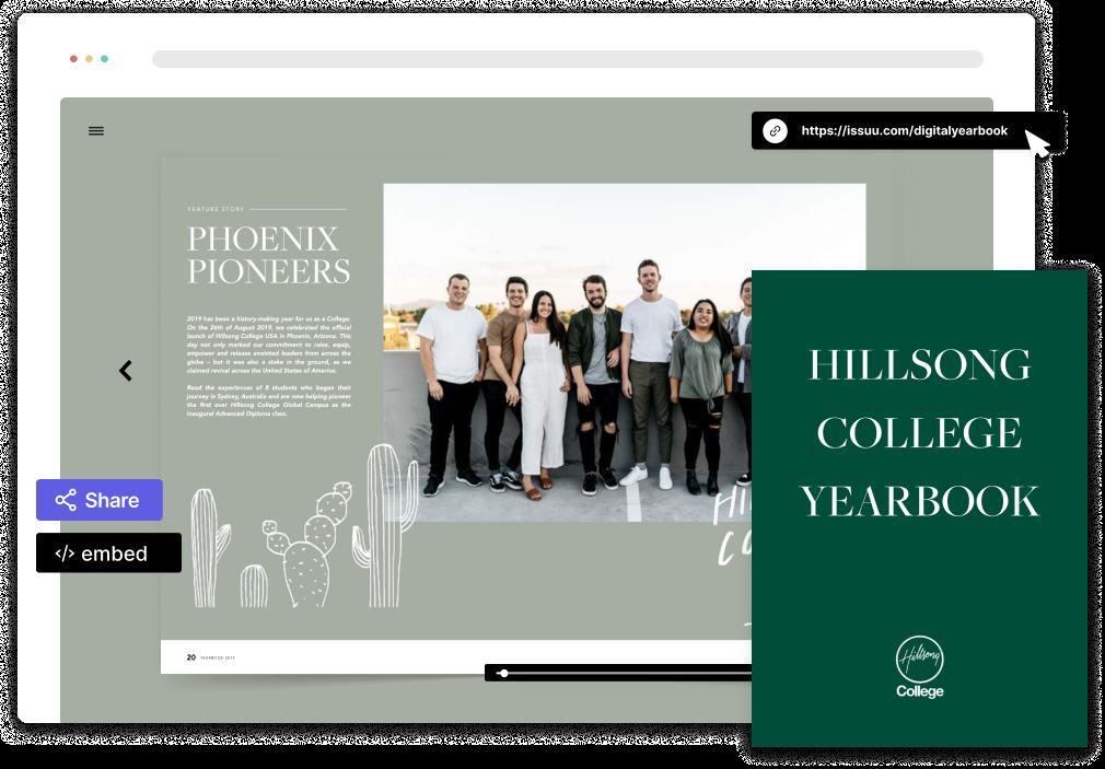
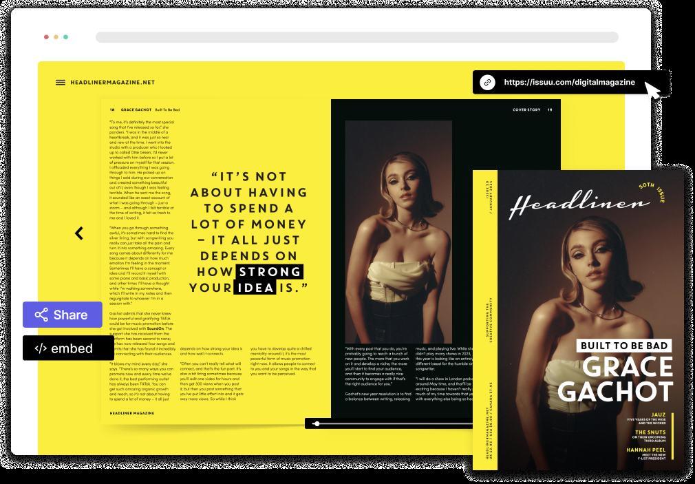
Issuu Brand System
01
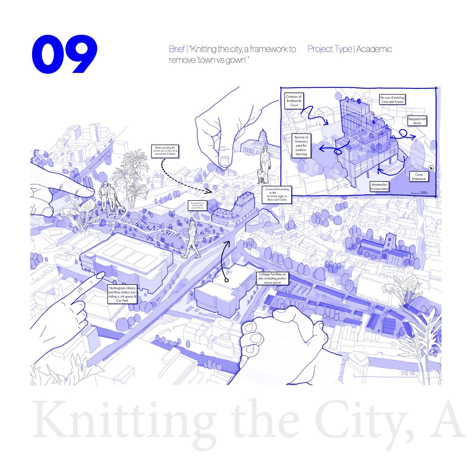
Architecture
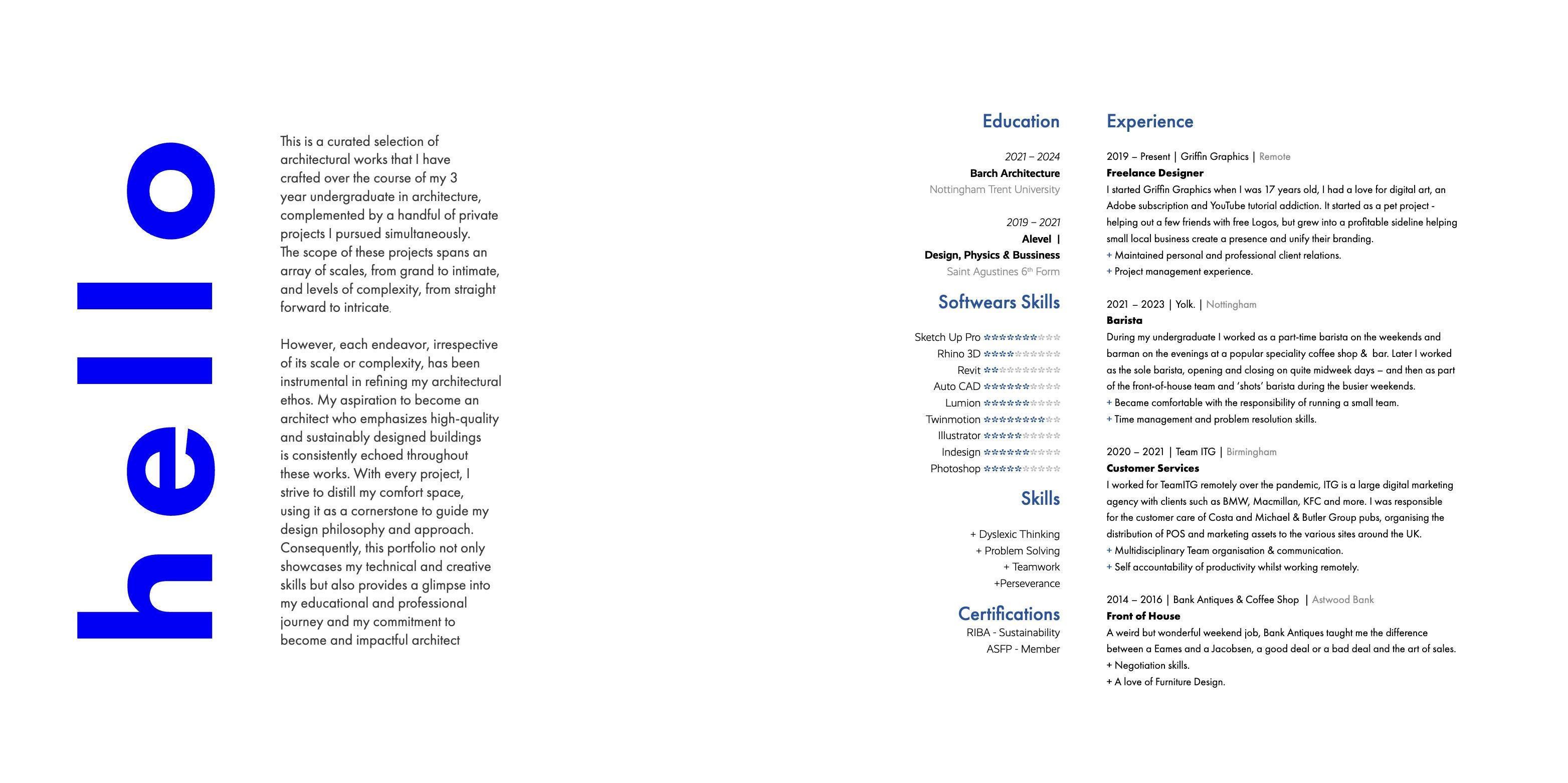
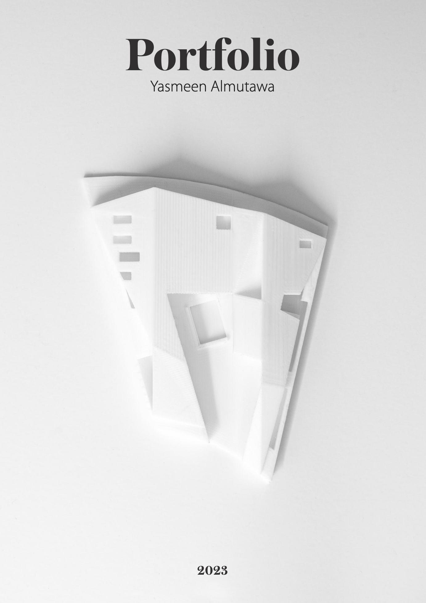
Portfolio
01 https://issuu.com/portfolio...
Aztek
Product Renderings
Feature representation
In order to quickly represent a feature or concept, instead of product screenshots we use product renderings: an illustrated, stripped version.
Issuu Brand System 29
Device Illustrations
Desktop/ Tablet/ Phone
When there's a need to show content within a device, we use these illustrations.


Issuu Brand System
