DESIGNING TO HELP OTHERS SPEAK


HALO Foundation is headquartered in Kansas City, Missouri. The HALO Foundation is committed to enhancing the living conditions and providing art therapy for orphans worldwide. HALO provides American youth with opportunities to learn philanthropy and volunteerism by seeing the world through the eyes of the less fortunate.

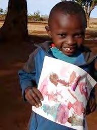
Orphans supported by HALO are provided food, water, shelter, clothing, education, and art therapy. HALO works with orphanages in Mexico, India, Uganda, Kenya, Nicaragua, and residential homes in the United States. Children from these homes submit their artwork to be sold at events in the United States to aid in raising funds for continued support.
The HALO product line is a marketing component for HALO that strengthens donor, volunteer, and patron loyalty by enlisting supporters to spread the HALO word. The merchandise is sold at HALO events and through their online store.
Create a positive outcome for a new branding look for HALO’s foundation product line for the upcoming year that exemplifies characteristics of a vintage modern style intertwined with a boutique feel. The new identity will speak a consistent tone from their logo to the interior of their event space to the personality of the products.
01 02 HALO MISSION
Empowering youth in the greatest need to become contributing members of their communities.
Provide a fresh look to their current HALO product line logo while incorporating the product tagline, Give a Gift + Give a Chance.
Design and develop new retail hang tags, retail gift bags, note cards, and retail visual signs for their product line while consistently employing the new fresh identity look.
I met with the HALO Foundation director of operations, Nicole Gerken, and marketing member, Jen Grammer, to learn more about the organization and their mission statement, details about the orphans in need, and their approach to help improve the lives of these children.
The Halo Foundation was established in 2005 by Rebecca Welsh as a result of her eye opening experiences outside of the United States; while working in extremely poor orphanages, she received the opportunity to learn about individual lives and the needs of the children who lived there. Once back in the U.S., the image of these children fighting for survival without a soul to care for them could not escape her mind.

Back in the U.S., Rebecca was a martial arts instructor at Kids2Leaders in Lee’s Summit, Missouri. She developed a “compassion curriculum” to teach her students about the orphans that she worked with in Mexico. The students received the opportunity to learn about another culture and what a day in the life of an orphan was like. Her martial art students came up with an idea to host a fundraiser for the orphans Rebecca worked with.
The students raised close to $5,000 for the orphans in Mexico and the next event they put on with other Kansas City area schools raised $40,000.
These two lifetime experiences of children helping children led to the birth of HALO. HALO developed from the efforts of children and adults providing for the poor while utilizing their determination and talents to make a difference for children in need. These events and others made it possible for HALO to grow from supporting education in orphanages in Mexico to fully supporting 46 children in India, three orphanages in Kenya, programs in Uganda, and local programs. HALO Kansas City recently opened for at-risk and foster youth. They are very excited about their growth and look forward to bringing more children off the streets.
A respectful community collectively improving the lives of children in need while giving them the opportunity to be contributing members of their own communities once on their own. The HALO model is heavily reliant on a mutual growth relationship of its organization and the volunteer as well as an inclusive relationship that inspires the donor to give and share the HALO mission.
The target audience is successful professionals, who are passionate about art, partake in nonprofit events, and want to help provide for individuals who are less fortunate.
These successful professionals are very active in the community. They don’t mind spending money if it benefits the less fortunate children. Typically they are seen at food & wine events, non-profit events, and at the independent restaurants throughout the city.
This supporter doesn’t feel guilty when they purchase unique art especially when it goes for a cause. They tend to care about fashion & design and enjoy shopping at the plaza on a regular basis.
Enjoys cooking, hanging out with family and friends, and attending social events.




I plan to provide a fresh, dynamic brand identity for HALO’s product line for the upcoming year that exemplifies characteristics of a vintage modern style intertwined with a boutique feel. The new identity will speak a consistent tone from their logo to the interiors of the event space to harmonize with the personality of their products.
I will create a fresh look to HALO’s product line identity while incorporating the product tagline,“Give a Gift + Give a Chance”. Design and develop new retail hang tags, retail gift bags, note cards, and retail visual signs for their product line while consistently employing the fresh new identity look and feel.
The final outcome of the identity design for HALO’s product line will promote and compliment the kids artwork that is displayed at events and art auctions, simplistically and visually speak to the target audience, and support the organizations vision and values.
LINKS
haloworldwide.org
facebook.com/HALOFoundation

During this phase, I focus on creating a coherent solution that encompasses the project as a whole. I begin my exploration by generating a brain dump of words that relate to awareness, art, and a kids vision. The outcome of the word lists direct the gathering of inspirational images that influence the formation of my thumbnail sketches.


Gather images that portray simplicity, vibrant colors, and communicate the message through successful usage of iconographies.


Assembly of images that express an effective blend of typography, graphic elements, and layouts.


Thumbnail sketches exemplifying visual, creative possibilities that communicate the essence of the iconographies.

From Professor Montero:
“Thank you for your submission. What a eye-catching and friendly process book!...
I would like to see more sketches....
I found a possible connection to go... The similarity between a color palette and a heart. See the attached image to get what I mean.”

Dynamic thumbnail sketches that illustrate the content, successful usage of hierarchy, and eye-catching designs that express the meaning of HALO.
Side note: I plan to utilize typography that I create in the final campaign logo.

identity thumbnails

Sketches that express the integral of HALO through creating interesting visuals that tell the story.
Selected to transform into vector art.
Possibly utilized to unify on the component designs.
identity thumbnails
INTENT
Sketches that visually illustrate a connection to HALO, what it symbolizes, and expressions of reliability and quality.

Selected to transform into vector art.
Possibly utilized to unify on the component designs.
Moving forward with transforming a few of the sketches into vector artwork.

The intent is to create an identity that exploits a playful, fun approach for Halo’s message of art, giving, and love. The color palette speaks a positive yet energetic tone that compliments the identities form. The typography is hand drawn to personalize the value of spontaneity, happiness, and friendship.
Dynamically the conceptual ideas here exemplify an artist approach that employs harmony and love in a positive tone. The icon development employs a consistent color palette and hand created typography.
identity concepts Give a Chance Give a Gift Give a Chance Give a Gift Give a Chance Give a Gift
DIRECTIONAL FEEDBACK 05/10/2012

From Professor Montero:
“Thank you for your passion and hard work... Here I am sending you some ideas from your sketches...”

give a gift give a chance
give a gift give a chance Give a Gift Give a Chance Give a Gift Give a Chance give a gift give a chance
8A 8B 9A 10C 11A 12A
12B 12C
13A 14A
13B 13C
9B ROUND 1
Moving forward with a few of the selected identities to further explore their aesthetics, tone, and personality fit for Halo.
Further development of a few identities.
GIVE A GIFT & GIFT A CHANCE
A GIFT & GIFT A CHANCE
From Professor Montero:
“Here I am sending what I think are the best among your recentness sketches. Select the one you like the most and based on it design all those components you have been showing on your sketches.”
GIVE A GIFT & GIFT A CHANCE GIVE A GIFT & GIFT A CHANCE

GIVE A GIFT & GIFT A CHANCE
GIVE A GIFT & GIFT A CHANCE
Nicole with HALO states:
“Hi Jamie. Jen and I just reviewed all of your hard work. AMAZING. Seriously!! Here’s a list of the versions we love because you are hitting the messaging of “art, giving and love”:
1E
Mary states:
Professor Montero states:
Sara states:
3A-D 9A 14A
10a-10c
16A-16G (like the soft warmer font here)
17 A-D (Font is a tad rigid but like the other aspects)
Also like your sketches for: P3 R3 L2
Like your professor’s feedback.
Hope that’s helpful. Let us know if you have any questions. GREAT JOB!!!”
“Jamie, Your sketchbook pages are always so wonderful to view. I look forward to seeing them every time I open your posts! I definitely like the logo idea of a halo being created out of a brush stroke. One thing that I would suggest—and maybe it is just a person thing—put the icon of the halo above everything else. I also like the counter inside area in the shape of a hear, like you have at the bottom of one of your logos. The bright, contrasting colors work well to make the icon pop and also to differentiate the various shapes that make up the icons. Looking forward to the next round.”
“Dear Jamie...
I am also very impressive and pleased when I see your process and your beautiful sketches... As we agreed before, let’s keep developing your campaign’s logo and from it we will develop the visual identity system to be applied on all your items.
Best!”
“Jamie, your process book and sketches are really great. You have a nice style in your illustrations. I think you are making great progress. Below is some feedback that I hope you find helpful!
Your logo design are look great, lots of variety. I’m finding that the color palette you are using is a bit off for creating the feel for the foundation. I’m wondering if you used some more earth tones with just one pop/accent color if that would help them not look so cartoony. Your digital designs with the brush straight up, 12A, 12B, etc., look a little like torches and not so much like a paint brush, but I really like the idea and simplicity of the arrangement. I’m wondering if there is a way to tighten or simply the brisles of the brush so it represents more of a paint brush?
Your packaging sketches are awesome, again your sketch illustrations are outstanding!!
I look forward to seeing your progress! Have a great weekend!!”
thumbnails

A few different sketches showing my exploration and thoughts for a possible bag or package that HALO could employ.
Some brain dump sketches exemplifying my thoughts and ideas for retail bags and hang tags that HALO could utilize for their art events.

Illustration of hang tags and note cards that fit the tone and style of HALO’s brand.

Further exploration with my sketches; illustrations of note cards, possible material, color palette, and product form.

[Retail Bags/Package, Hang tags, Note cards] Sustainable, Economical Approach


This concept employs sustainable, recyclable, or refurbished products. All products voice the green support for our environment.
From Professor Montero:
“My main suggestion at this pint is to be more inspired and guided by your trademark. Apply that idea of the brush with the heart better on those items.... the red stroke, etc.... Use your imagination... let’s get crazy.... Have fun... Play with all the components of those items...
See the attachment as example...
[Retail Bags/Package, Hang tags, Note cards]
This concept carries a similar tone of my first concept, but plays up the color identity approach, and layers of materials that provide the sense of hand made products.


Tangerine Tango
C0 M94 Y100 K0
R254 G42 B18
C52 M3 Y4 K0
R109 G198 B231
Sky BlueHappy, Peaceful, Cool, Water, Clean, Classy
Tangerine Tango- Fun, Whimsical, Childlike, Glowing, Vital, Tangy


7531
Vintage Khaki
C46 M48 Y59 K15
R133 G115 B98
Solar Power- Enlightening, Friendly, Energy, Cheerful

Solar Power
C0 M22 Y91 K0
R255 G200 B46
OUTGOING, COMICAL, FUN LOVING PALETTE


Vintage Khaki- Classic, Neutral,Timeless, Quality, Basic

JOYFUL, CHILDLIKE, NOISE PALETTE


Ocean Blue- Electric, Energetic, Vibrant, Happy, Dramatic

Warm, Durable, Wholesome


intent usage: identity display
intent usage: body copy
[ Realist Sans Serif ]
The quick brown fox jumps over the lazy dog
The quick brown fox jumps over the lazy dog
The quick brown fox jumps over the lazy dog
The intent and purpose of this typeface is to provide a fun, child like, whimsical approach to type. The simplicity of the uppercase letters read strong and very positive to a child’s eye.
DESIGNER: D. Stempel AG
Helvetica became very popular in the 1960s and 1970s, in which this led to more exploratory versions of the family. In the early 1980s, Linotype decided to redraw the entire Helvetica family due to the original families differences in alignment, inconsistency in subtle features from one face to the other, and the weights and widths weren’t designed proportionally to identity the family.
source: adobe.com/type
The intent is to provide a fun, energetic vibe that echoes the children that HALO supports.
This pattern represents ART.
This pattern represents GIVING


This pattern represents LOVE


An overall look of the materials and products that I purchased to explore with for creating HALO’s fresh, new look. Majority of the products that I purchased voice sustainability.

Sunny states: “Hi, Jamie!
This is coming together really nice. Your sketches are so detailed and it’s very easy for me to understand where you are going with the development. I particularly love the tshirt tubeit’s a clever idea. You mentioned you’ll be using Kraft - what type of materials will the actual tube be made of? Recycled chipboard? If you can think of economical ways to reduce the footprint that would be smart.
Great job! Sunny”
Evan states: “Does the hierarchy of the design reflect the hierarchy of the intended message?
I have felt that many of the initial designs did form an intact and complete message. The ones that were chosen with Professor Montero’s help do convey the art therapy theme well.
Is the typography appropriate to the message and the design style?
I believe that the hand worked typography works particularly well considering the artistic and youth facets of the HALO organization. The typography encapsulates these qualities with its playful rhythm and bright color.
Is the color scheme working effectively?
Again, the colors, like the typography, are well suited to the basic core mission of HALO with its focus of art therapy for children and youth.
Is the message clearly conveyed?
The message received from the whimsical typography and energetic, youthful colors is one of hope for youth through art. If that is in fact the intended message then it is clearly conveyed.”
Professor Montero states: “Dear Jamie....
My main suggestion at this pint is to be more inspired and guided by your trademark. Apply that idea of the brush with the heart better on those items.... the red stroke, etc.... Use your imagination... let’s get crazy.... Have fun... Play with all the components of those items... Best!”

Exploration

Utilizing a custom burlap handle on a kraft bag, transforming the identity to exemplify I “heart” HALO.


Employing a single, custom burlap handle on a kraft bag. Exemplifying the handle and paintbrush intermingled together while providing unity for the heart palette.
Side panel employs the color palette while representing a kid vision for the gift bag.
Utilizing two, custom burlap handles on a kraft paper reinforced bag. This approach is influenced by Professor Montero’s direction with the heart below the asymmetrical handle. I kind of feel like the heart could be reduced some, what do you think?
Side panel employs the color palette while representing a kid vision of a patchwork approach.


Dear HALO Supporter,
REVERSE COLOR [NOTECARD VERSION]
ENVIRONMENT COVER COLOR PALETTE TYP. 4.5" TYP. 4.5"


LOCK-UP VERSION] FOR ILLUSTRATION SERIES [NOTECARDS ONLY]
give a gift give a chance
REVERSE COLOR [NOTECARD VERSION]


OF




Wrapping paper printed on recyclable kraft paper. The three types of messaging for the wrapping paper relate to whether the gift is for their Love one, Giving a gift to friend or family for a milestone in their life, or wanted to share their love of Art.


Height of Wrapping Paper is 24"

The signage exemplified is burned onto ¼" birch plywood. The overall size is 32" x 32". The signage has flexible usage; for exterior use as a hanging sign near the main entry of their building, utilized at art events, or as an interior way finding element.


Three different types of buttons for the volunteers, supporters, or the children to wear to voice their support for HALO.
Diameter is 2.25"


This final project has been a great experience an eye opener for me. I’m glad that I had the opportunity to work with a local non-profit organization and provide some superior designs for them to utilize over the next few years.
I’m very pleased with the overall outcome of the identity icon and products. This project allowed me to provide some fun and innovative approaches for the exploration and development of the project.
In closing, this project was an exceptional experience due to the opportunities and challenges that I received from Professor Montero and the class. I really appreciate everyone chime in and providing creative insights.