



Today’s hotels and resorts are created as spectacular destinations of incredible design that bring together culture, beauty and modern-world comforts.


Today’s hotels and resorts are created as spectacular destinations of incredible design that bring together culture, beauty and modern-world comforts.

Great expectations for design are never easy to meet, but global design and architecture firms like Gensler go beyond what we expect, surprising us in the most inspiring way with their portfolio of exceptional hospitality projects. Take The Gate Hotel Tokyo and JW Marriott Hotel Shanghai Fengxian, for example. With breathtaking architectural features and unique details that reflect the destinations these hotels are located in, they are nothing short of impressive. I am also in awe of the art gallery concept that has brought Portman Ritz-Carlton, Shanghai to life. The project shows that traditional elements can be a strong source of inspiration to create a timeless yet modern aesthetic.
Furnishing and lighting also play a vital role in pulling together different elements of a design. The W Algarve, which features Kettal’s unique furniture collection, is a prime component of the hotel’s cosy and luxurious ambience. Meanwhile, Preciosa’s artistic lighting infuses a distinctive sparkle across the key spaces of Sydney’s Crown Towers Hotel. From large-scale, dynamic, programmable staircase lighting to delicate glass lighting sculptures, Preciosa’s signature touch truly transforms the hotel interior into a spectacular environment of bespoke beauty.
There are many more design pieces to marvel over in this issue. So take your time and let your imagination merge with the striking ideas and innovations you see in this year-end issue. I am looking forward to a brighter year ahead, and I believe even more heartwarming and thought-provoking designs will emerge in our post-pandemic spaces. Until then, enjoy this issue, and I will see you the next year!
Kenneth Khu k.k@kenneth-media.com







MANAGING EDITOR Kenneth Khu DEPUTY EDITOR Pang Yin Ying EDITOR Christine Lee
ART DIRECTOR Eric Phoon SENIOR DESIGNER Sandy Liew
WRITERS Adele Chong, Lily Wong DESIGN STUDIO Gensler
SENIOR SALES MANAGER Edward Chen SALES EXECUTIVE Kelvin Ong publication
PUBLISHER Kenneth Khu
ADVERTISING advertise@hotelresortdesign.com
SUBMIT EDITORIAL submit@hotelresortdesign.com
CONTRIBUTOR joinus@hotelresortdesign.com SUBSCRIPTION subscribe@hotelresortdesign.com website www.hotelresortdesign.com
contact
KENNETH MEDIA SDN BHD 4, Jalan Hopea U15/28B Elmina West, Seksyen U15 40170 Shah Alam, Selangor Malaysia. T: +603 5038 3022
PERCETAKAN IMPRINT (M) SDN BHD No.538, Jalan 20 Taman Perindustrian Ehsan Jaya, Kepong 52100 Kuala Lumpur Malaysia.
permit number
KDN PP18850/09/2015(034307) MCI(P) 059/03/2022
H+R | Hotel & Resort Design Magazine is published three times a year and is circulated throughout the Asia-Pacific region. Opinions expressed are those of the contributors and not necessarily endorsed by the publisher.


All rights, including copyright, in the content of this publication are owned by Kenneth Media Sdn Bhd, Malaysia. You are not permitted to copy, broadcast, download, store in any medium,transmit, show or play in public, adapt or change any in any way the content of this publication for any other purpose whatsoever without the prior written permission of Kenneth Media Sdn Bhd, Malaysia.
PHOTOS: Except otherwise noted, all photos and drawings are owned by photographer or design studio or project owner.
acknowledgement COVER: Gensler

The San Siro sofa, a key piece of the San Siro collection, elegantly represents the bespoke style of Luigi Caccia Dominioni. This sofa collection, like many of Dominioni’s creations, features curved and soft lines that form an exquisite silhouette. The collection includes an armchair and a series of two-, three-, and four-seater sofas with compact dimensions. For its upholstery, the sofa is adorned with wool fabric or the elegant Kasia or Koto leather.


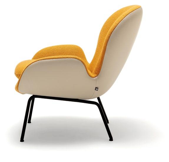
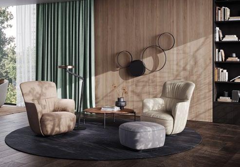
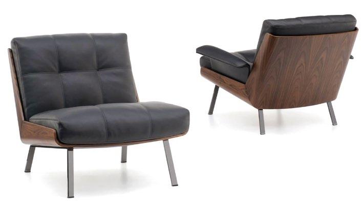
Everything about the ultra-cosy Ishino Lounge Chair designed by Daï Sugasawa is a holistic experience of pleasure. This chair features a higher back covered in velvet leather for ultimate comfort while exuding an upscale look and feel. Perched on a stylish plinth, the Lounge Chair also offers the option of a decorative back cushion that fits the curve of the chair. Aestheticwise, Ishino is the embodiment of perfect proportions that turns comfort into style.
Following the success of the Lud’o Lounge armchair, winner of the 70 th edition of the Good Design Award, Patricia Urquiola makes a comeback with a refined desk chair version of the former: the Lud’ina. Staying true to its original concept, this piece features a recycled plastic framework and is available in different base options and removable upholstery in various fabrics and leathers. Each of these options denotes a distinct meaning, ranging from sporty to formal.


If you are looking for a classy piece that doesn’t compromise functional comfort, the new Rolf Benz MIOKO sofa system by Rolf Benz is a must-have all-rounder. Featuring different variations to meet diverse specifications and a contemporary, monochromatic colour scheme, MIOKO is made to create a striking atmosphere in every residential and hospitality setting. A soft, continuous seat cushion provides the sofa’s design language of clarity while maximum comfort is guaranteed by an extra headrest.


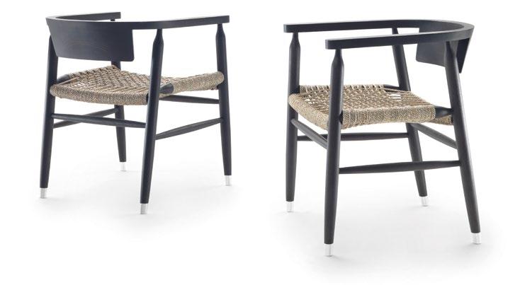
The warmth of wood shines through the Doris chair. Designed by Antonio Citterio, the chair’s flawless elegance is evident from every angle, creating a happy union of form and function that makes it the perfect piece for all of the dining tables in the Flexform line. The design is kept simple with just four solid ash legs and a single half-moon-shaped component that connects the backrest, armrests, and seat to a handwoven cord base.
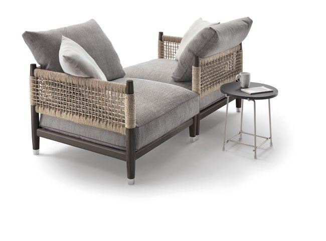
GamFratesi’s Lido “Cord” Outdoor family celebrates two of their latest elements: a linear two-seater sofa and a bench, which can be used as a small tabletop in the centre of the living area. Made of solid teak wood or mahogany, the new pieces stand on four legs – a signature trait of the Lido family aesthetic. The seats also utilise innovative technologies and materials made especially for outdoor settings to fully express Minotti’s vision for inside-out spaces.
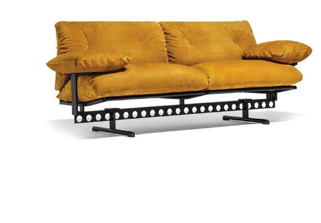
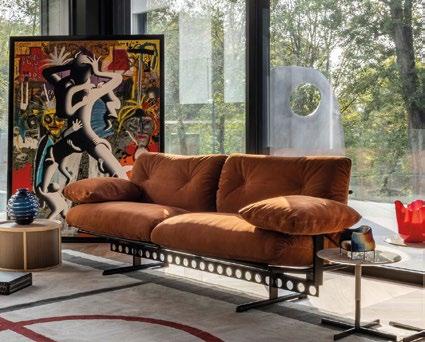
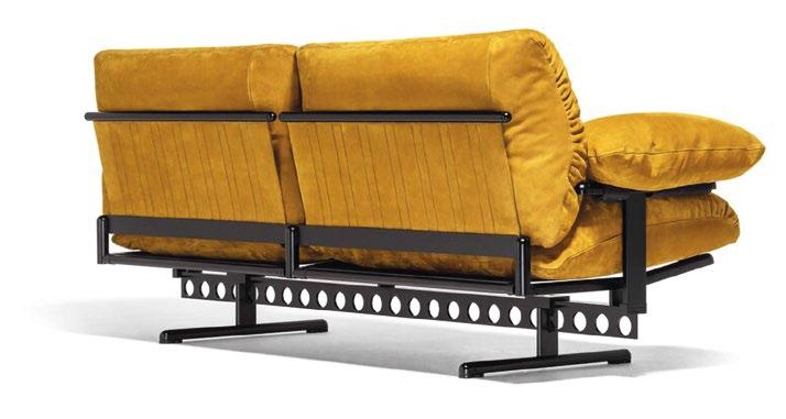
The Ouverture sofa designed by Pierluigi Cerri is airy and slender yet invitingly plush, thanks to its steel frame featuring a “T”-shaped beam that is separated from the crossbars to support the padded part of the seat in a floating manner. There’s more to the beam than meets the eye – the structure is free of joints and connected by aluminium profiles so that the interconnections are visible from the side, creating a distinguished appearance.

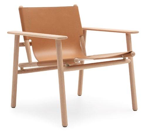
Eco-consciousness and elegant design mark the Cordoba armchair created by Foster+Partners Industrial Design Studio. This piece blends style, accuracy, and environmental awareness to evoke Nordic precision and an oriental spirit. The oak wood frame is spacious and welcoming, with impeccable details highlighting its unique appeal. Built with the environment in mind, the armchair’s lightweight components can change according to function, ensuring comfort while presenting a more responsible design approach.

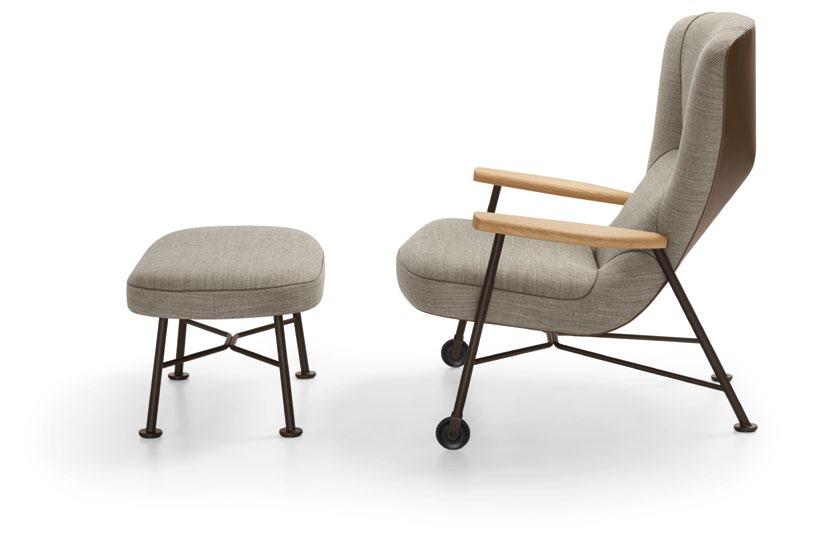
A commanding statement piece, the Shinzo Lounge Chair instantly infuses any room with a striking presence. Authentic craftsmanship elevates its silhouette with inspired details – from its precise upholstery to refined decorative seams, as well as a unique blend of wood, leather, fabric, and steel, Shinzo’s timeless quality is unparalleled. Multiple variants are available and can be placed together individually. The armchair comes in a high or low back and is complemented by matching footstools.
Plush padding, fluffy as pillows, makes Ambroeus a charming sofa for evoking comfort and style. Whether it’s placed in the lobby or a guest suite, Ambroeus effortlessly conjures an impression of unmatched warmth and hospitality. Designed by Antonio Citterio, the sofa conveys a striking visual contrast between the lightness of the aluminium frame, which comes in a variety of finishes, and the large, generously padded goose-down seat and backrest set against a cowhide-covered base.

The Daiki collection of chairs was created by Marcio Kogan / studio mk27 and was prompted by the Brazilian architect’s passion for Japan and its culture. The seat is made using a unique woodworking technique and is composed of two elements joined at a 45° angle to achieve a backrest inclination that ensures maximum comfort. A fixed footstool, comfortable bergères and swivel armchairs, both with and without armrests, are included in this family of seats.

Expect a cosy haven of relaxation when you nestle into the Rolf Benz 594 high-back armchair. This iconic designer piece by Sebastian Herkner is excellent for compact spaces with its organic lines and plush upholstery. Comfortable and adaptable, Rolf Benz 594 welcomes you to kick back, relax, and lounge to your heart’s content. A charming all-arounder, this armchair serves as the perfect club chair in various settings, from a private lounge to a public lobby.
The Parker sofa continues the legacy of Antonio Citterio and Flexform to carry on their traditioninspired designs. With a frame constructed from solid-turned wood that has been hand-finished to precision, Parker evokes a sense of familiarity while summoning a visual culture that goes beyond typical material beauty. The sofa comprises a single seat cushion and oversized, loose cushions with thick padding that rest on the backrest, which is available in cowhide or woven cord.


Piero Lissoni’s Planck collection presents a family of three small round tables, each with its distinct personality and style but sharing a common shape and material. Lacquered bases with various glossy or gloss colours, chic rosewood-effect finish, and etched semi-transparent glass tops adorn the surfaces. What stands out is the precise play of proportions in each of the ring-like tables: as the diameter increases, the height drops, resulting in a dynamic scene.
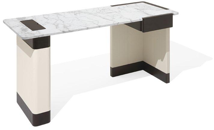

Writing with a keyboard or scribbling with a pen, filing essential documents or churning out a masterpiece for work: the elegant yet pragmatic Edward desk says yes to all these activities and invites you to multitask as well. A sophisticated reinterpretation of a conventional writing desk, this all-purpose workstation is rich in nifty features and also comes with drawers, storage compartments, multi-socket outlets and practical details to fulfil all your needs for higher productivity.
FLEXFORM.IT BEBITALIA.COM GIORGETTI.EU
The Superquadra storage unit by Marcio Kogan / studio mk27 impresses with its minimalist aesthetic and airy, ample space. The units are designed with different sizes, meant for multiple uses and encompass a contemporary vibe highlighted by a floating appearance. The sideboard is available in several sizes and heights, starting from the dining, living/TV and cabinet versions. As for the cabinets, pure and geometric shapes create a refined contrast between wood, varnished aluminium and glass.

Simplicity and serenity form the Ishino Wood Side Table by Dai Sugasawa. Characterised by the distinctive organic pebble shape of the Ishino family, the naturally refined design language makes way for harmony between volume and lightness. The table is available in all Walter Knoll solid wood surfaces with a choice of three different dimensions. The highly versatile pieces can be matched with other variations from the Ishino family to create a sense of flow and cohesiveness.

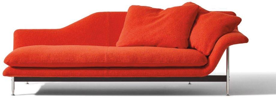
A fluid living room system designed to define living spaces, Esosoft by Antonio Citterio is reminiscent of the 1960s’ idea of casual comfort. This system comprises an aluminium exoskeleton and a shell with an organic silhouette complemented by soft cushions. Eight modules are available and can be connected to create L-shaped sofas or used as standalone pieces. Timeless, elegant and flexible, this versatile system comes complete with benches, ottomans and a series of coffee tables.
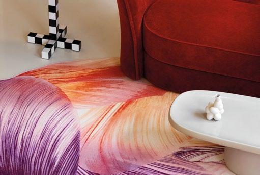
The beauty of tulip flowers takes the spotlight to become the muse for the Tulip Mania carpet designed by Hilde Koenders. Inspired by Koenders’ artistic approach of infusing pigmented water into tulips, allowing water to colour the petals, and laying the delicate veins bare, Tulip Mania brings the delicate nature of flower petals to life. The carpet is available in two colours (Red Shell and Red Cocoon) and two models (Rectangular and Round).


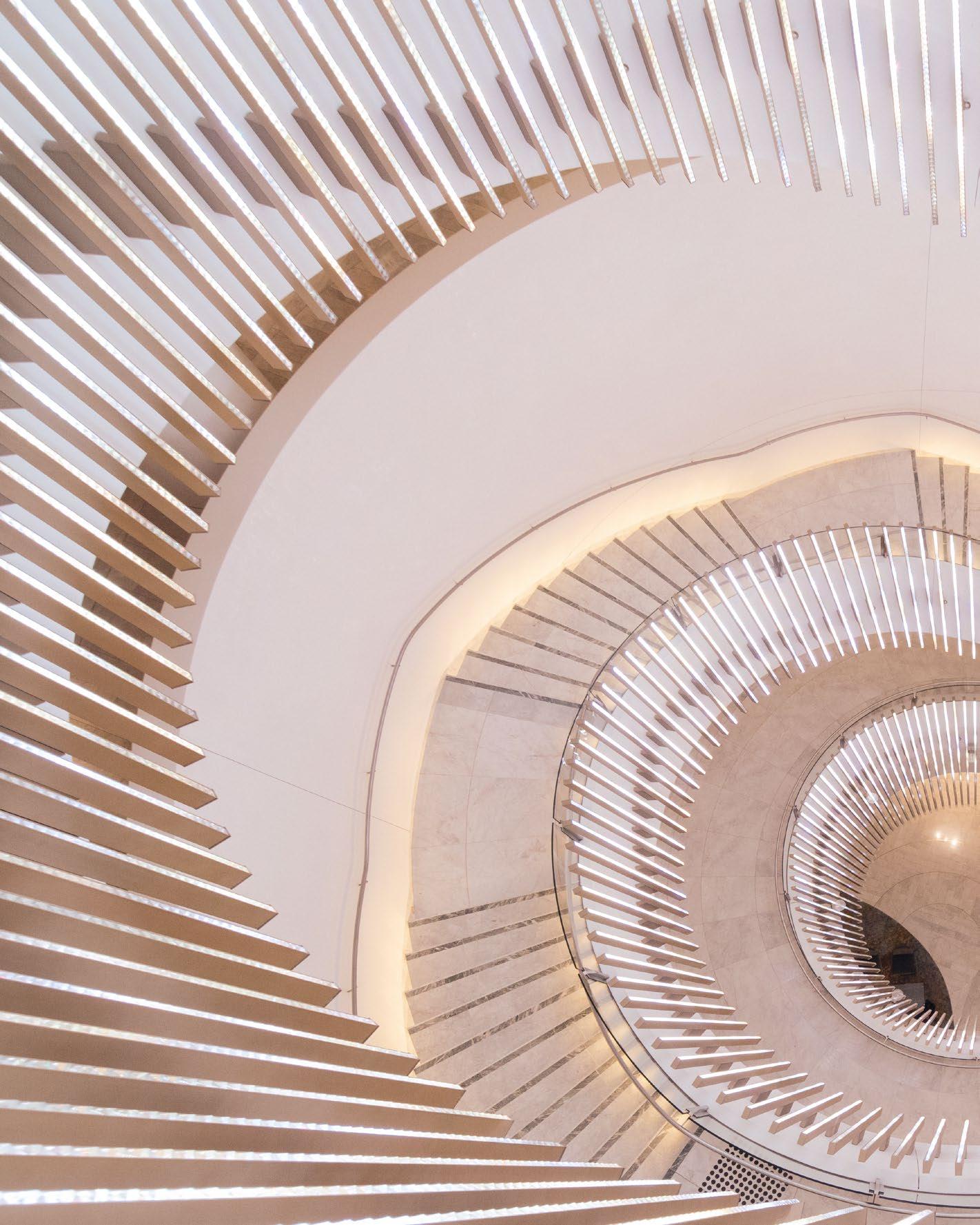

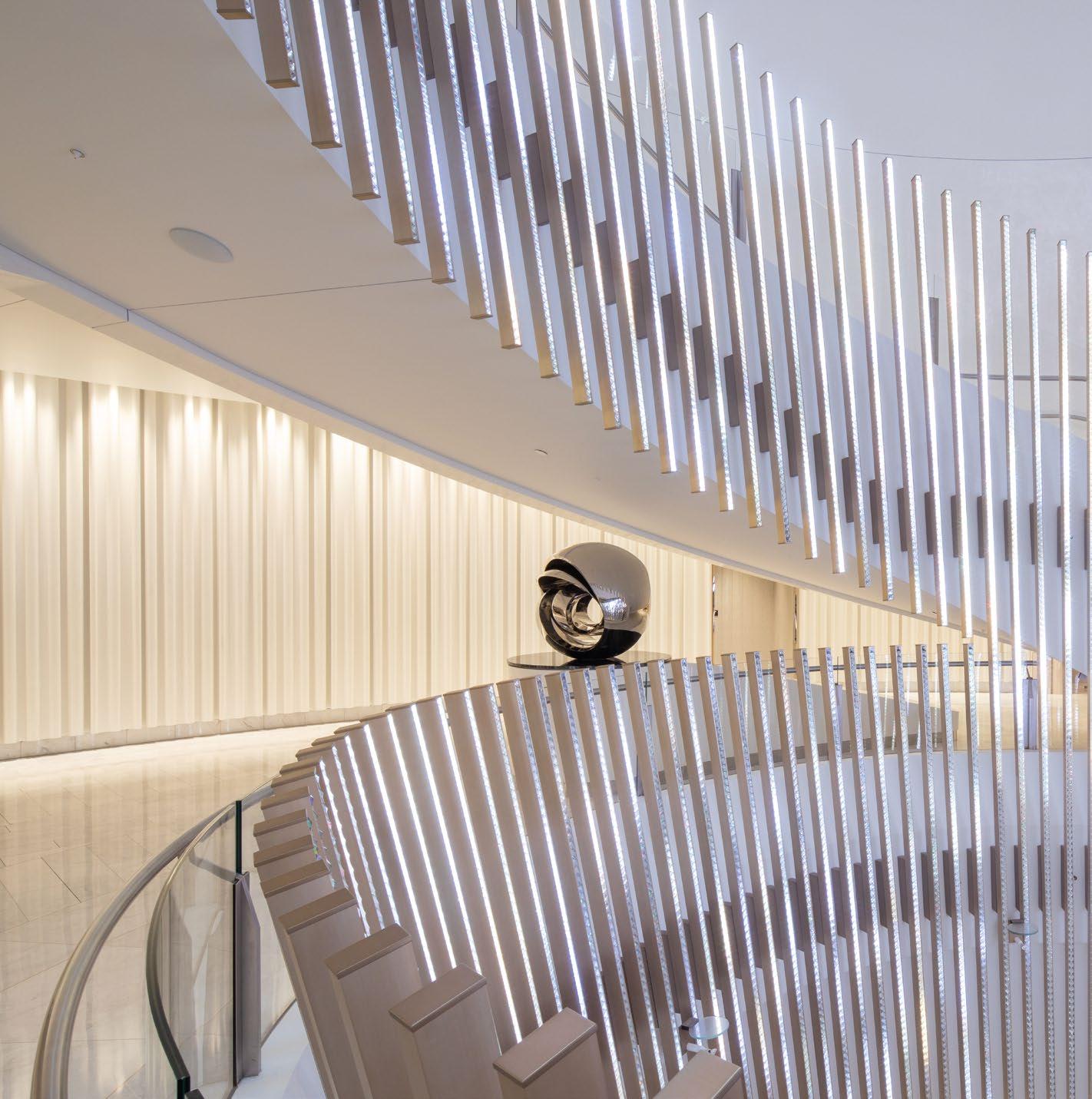
Stunning vistas of Sydney’s harbourside attractions and famed bridge surround the Crown Towers Hotel, complementing the waterfront building that the hotel resides in: the iconic landmark Crown Towers. The design of the hotel itself takes inspiration from its natural landscapes while emulating the tower’s form that twirls and ascends to the sky in a dramatic fashion. Inside, the main spaces further enchant the senses with exquisite interior design and awe-inspiring Preciosa Lighting pieces to create unforgettable focal points.
“Crown Sydney was one of the biggest projects we have ever delivered. Preciosa Lighting created 130 types of chandeliers, with the final result being 475 pieces of chandeliers. Our work ranged from large-scale, dynamic, programmable staircase lighting to a fragile glass sculpture gracing the entryway to a restaurant,” Jan Volsik, Sales & Marketing Director of Preciosa Lighting, comments. “The key to success with this extensive, global project was team effort and expertise, not only from our in-house design, R&D, engineering, construction, and assembly teams but also our partners, as well as strong collaborations worldwide. The Crown Sydney is an amazing property, and we’re very pleased to help make it shine.”
TOP: The ring-like chandelier incorporates programmable blades, resulting in a dynamic installation that changes colours and scenes.


 BOTTOM: The iconic landmark, Crown Towers in Sydney, is renowned for its unique architectural design and incredible vistas.
Upon stepping into the bespoke foyer, a sculpted, statement staircase chandelier infuses a welcoming ambience while setting the scene with a touch of dazzling sparkle. The chandelier echoes the design of the staircase, which is reminiscent of the spiralling aesthetic of the tower’s facade. Composed of 396 crystal blades and 102 crystal blocks, the ring-like chandelier illuminates the lobby with a definitive glow. In addition, the chandelier, which combines luxury stones with metal detailing, incorporates programmable blades, resulting in a dynamic installation that allows users to change its colours to generate their preferred ambience.
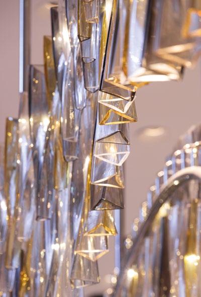

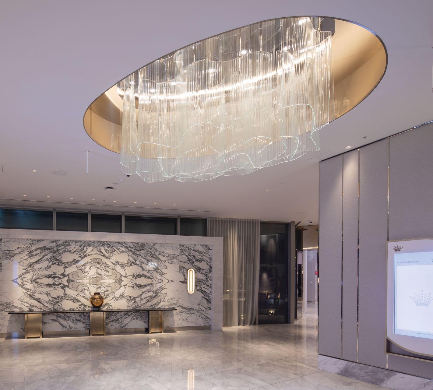
Across the foyer, the reception area and podium lobby beckon the eye with two large hand-blown glass chandeliers anchoring the central space. Featuring 506 hand-blown twisted triangles that connect with one another, these crystal components were made by being pulled from the mould, rolled and blown while still hot. Their metal frames were also handcrafted into the desired shape.
The sparkling light effect continues in the Ballroom and Atrium, where slumped glass chandeliers enhance the ambience. Slumped glass is a unique technique

ACROSS THE FOYER, THE RECEPTION AREA AND PODIUM LOBBY BECKON THE EYE WITH TWO LARGE HAND-BLOWN GLASS CHANDELIERS ANCHORING THE CENTRAL SPACE. FEATURING 506 HAND-BLOWN TWISTED TRIANGLES THAT CONNECT WITH ONE ANOTHER, THESE CRYSTAL COMPONENTS WERE MADE BY BEING PULLED FROM THE MOULD, ROLLED AND BLOWN WHILE STILL HOT.
 THIS PHOTO: Slumped glass chandeliers illuminate the Ballroom and Atrium, creating a cosy and opulent environment.
THE SPARKLING LIGHT EFFECT CONTINUES IN THE BALLROOM AND ATRIUM, WHERE SLUMPED GLASS CHANDELIERS ENHANCE THE AMBIENCE. SLUMPED GLASS IS A UNIQUE TECHNIQUE THAT SHAPES GLASS OVER MOULDS AT HIGH TEMPERATURES IN A KILN. IN THE ATRIUM, THE SMALLER CHANDELIERS INCORPORATE 23 PIECES OF GLASS, WHILE THE BALLROOM’S CHANDELIERS COMPRISE MORE THAN 40 GLASS PIECES.
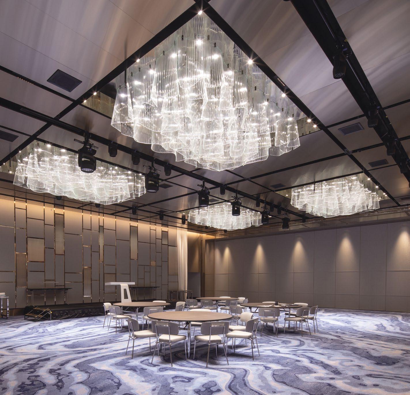
that shapes glass over moulds at high temperatures in a kiln. In the Atrium, the smaller chandeliers incorporate 23 pieces of glass, while the Ballroom’s chandeliers comprise more than 40 glass pieces.
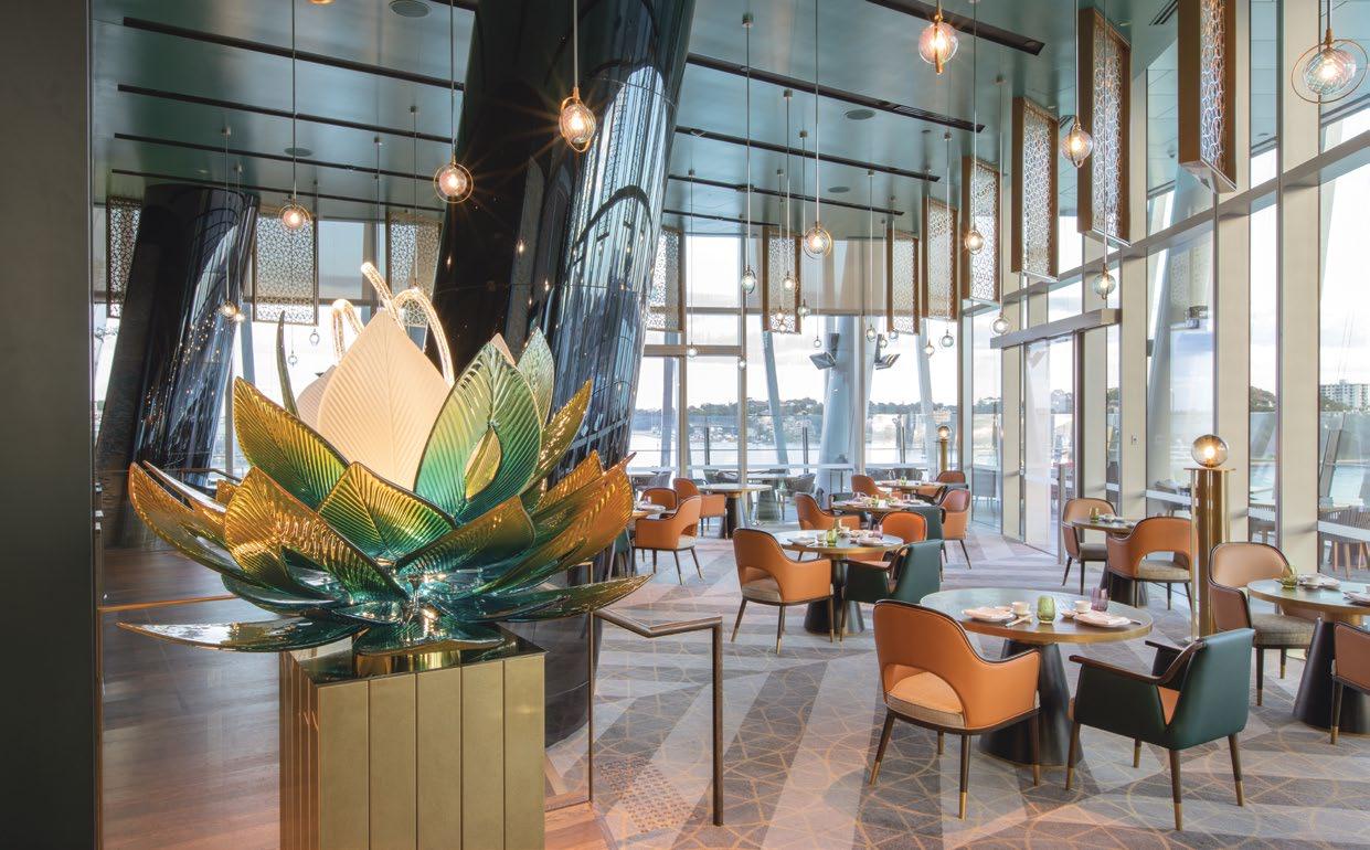
Further within the hotel, colourful lights twinkle across the opulent Silks restaurant. Guests are instantly presented with a beautiful work of lighting art made of glass and light where finely blown crystal leaves change colour from blue-green to yellow-gold to clear. Throughout the fixture, the glass pieces mesmerise with a blend of clear, frosted, and bubbled shapes. According to Preciosa, each leaf took about 45 minutes to craft. To enhance the lighting piece, the central structure conceals LED modules, which are highlighted by external lighting.
One of Preciosa’s most fascinating installations can be found in the hotel’s Spa & Gym. Constructed of large crystal hand-blown plates, some of them more than a metre in length, opals in the glass conjure an alluring effect to give the space a tranquil mood. Each piece is an original, handmade to capture the brand’s distinct aesthetics.
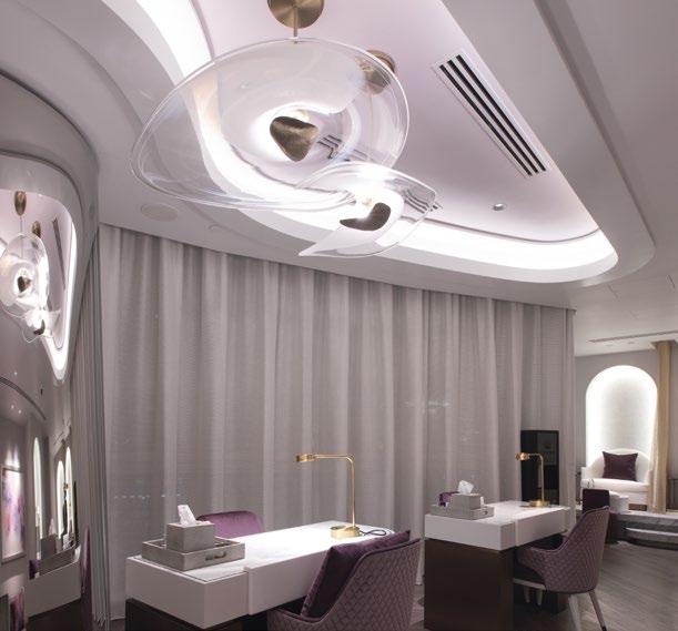 BOTTOM: At the Spa and Gym, large crystal hand-blown plates with opals in the glass generate a calm and relaxing mood.
TOP: The colourful light sculpture at Silks restaurant is made from finely blown crystal leaves which change colour from blue-green to yellow-gold to clear.
PRECIOSALIGHTING.COM

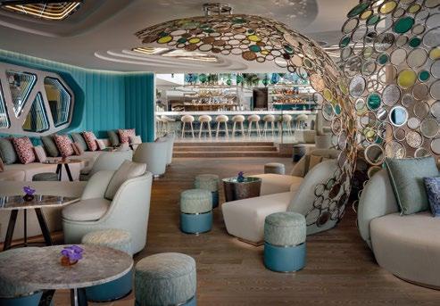
 THIS PHOTO: Inspired by the destination’s unique landscape, W Algarve’s interior features various touches of local culture through curated artwork, custom-made furnishings, and Portuguese-influenced details.
The awe-striking W Algarve, tucked amidst dramatic cliffs and sparkling waters of the Algarve, evokes an incredibly scenic ambience that blends its location’s beautiful scenery and rich Portuguese history with the W Hotel’s brand’s impeccable style. A project helmed by AB Concept, the flowing design of the hotel’s interior spaces takes inspiration from the destination’s breathtaking curved Benagil caves. In addition, blues, aquamarines and turquoise, which form the colour palette, are a subtle nod to the clear skies and balmy breezes of the Atlantic Ocean.


“We love to create expressive designs for both experience and memory, creating both impactful first encounters and lasting impressions. We are delighted to be working with W Hotels Worldwide to bring our joint vision of W Algarve to life, combining the cultural nuances and local traditions of this beautiful region of Portugal with W Hotels’ inimitable flair for thoughtful, intriguing and imaginative design across its hotel and residences,” says Ed Ng of AB Concept.
Every aspect of the design – from the fabrics to textures that grace the hotel, serves its own aesthetic and functional purpose. Here’s where Kettal’s exquisite
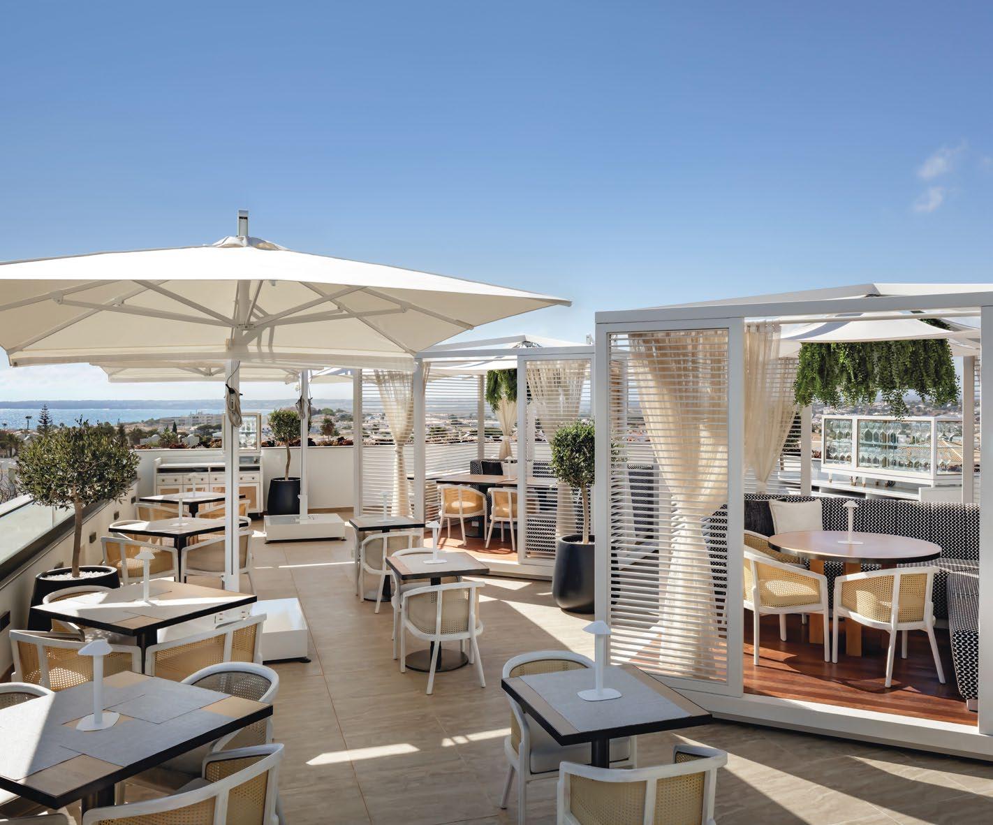
TOP: Kettal unique outdoor pieces play a pivotal role in bringing out the hotel’s chic and airy decks and terraces.
“THROUGH THE SOPHISTICATED, STRIKING DESIGN AND COLOURFUL, STORIED INTERIORS, W ALGARVE WILL OFFER A VIBRANT ESCAPE THAT INJECTS THE LOCATION’S CHARM WITH W HOTELS’ PLAYFUL STYLE.”
 THIS PHOTO: Kettal pieces such as Patricia Urquiola’s Band chairs, Basket series by Nanna & Jorgen Ditzel and Meteo sunshade by Konstantin Grcic enhance the poolside.
Candice D’Cruz, Vice President, Luxury Brands, Europe, Middle East & Africa, Marriott International
ACROSS THE CHARMING FURNISHING THEME IN THE HOTEL, KETTAL PIECES CREATE A WELCOMING SENSE OF COMFORT AND STYLE. THIS IS ESPECIALLY EVIDENT IN THE OUTDOOR AREAS LIKE THE WET DECK AND THE ROOFTOP RESTAURANT PAPER MOON. | HOTELRESORTDESIGN.COM
THIS PHOTO: A charming composition of furnishing elements infuses a vibrant touch to the exotic decor of the restaurant’s main dining area.

collection plays a pivotal role in bringing the enchanting concept together while ensuring a cosy and luxurious atmosphere throughout the key areas.
Cala by Doshi Levien, as well as the Maia, Vieques, Band, Mesh, and Vimini collections by Patricia Urquiola infuse a touch of elegant comfort within the indoor and outdoor spaces, while the Bitta and Boma collections by Rodolfo Dordoni along with pieces from the Basket series by Nanna & Jorgen Ditzel complement the unique details of the interior design. Other notable collections from Kettal include Park Life by Jasper Morrison, Meteo by Konstantin Grcic, Mia by Michel Charlot and Zigzag by Emiliana Design Studio. Kettal Studio’s Net and Landscape pieces were also employed to bring out the thematic tones of the nature-inspired concept.
Upon stepping into the entryway, guests are welcomed by a composition of design features based on Algarve’s extraordinary heritage. From here, the W Lounge draws attention immediately with an


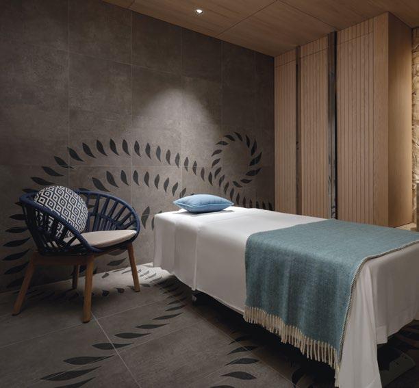
TOP & MIDDLE: A warm neutral palette inspired by the hotel’s natural surroundings generates a tranquil ambience throughout the indoor-outdoor spaces.

enthralling “wave” centrepiece comprising delicate glass panels fashioned after Moorish jewellery and oceanic bubbles.
Across the charming furnishing theme in the hotel, Kettal pieces create a welcoming sense of comfort and style. This is especially evident in the outdoor areas like the WET deck and the rooftop restaurant Paper Moon. For example, Patricia Urquiola’s Vimini and Vieques, Basket pieces by Nanna & Jorgen Ditzel and Meteo sunshades by Konstantin Grcic accompany guests as they soak up the sun while conjuring a chic outlook that blends with the hotel’s design language.
“The arrival of W Hotels in the Algarve marks a new chapter for both the brand and the Algarve region, which is known for its enviable Mediterranean climate and stunning coastline scenery,” said Candice D’Cruz, Vice President, Luxury Brands, Europe, Middle East & Africa, Marriott International. “Through the sophisticated, striking design and colourful, storied interiors, W Algarve will offer a vibrant escape that injects the location’s charm with W Hotels’ playful style.”
 40 | H+R
TOP: In the guestroom, Cala chairs by Doshi Levien lend a rustic yet cosy look to the colourful interior.
BOTTOM: Kettal pieces elevate the rustic-luxe style of the AWAY® Spa featuring a design inspired by local fishing decks. | HOTELRESORTDESIGN.COM
“WE LOVE TO CREATE EXPRESSIVE DESIGNS FOR BOTH EXPERIENCE AND MEMORY, CREATING BOTH IMPACTFUL FIRST ENCOUNTERS AND LASTING IMPRESSIONS. WE ARE DELIGHTED TO BE WORKING WITH W HOTELS WORLDWIDE TO BRING OUR JOINT VISION OF W ALGARVE TO LIFE, COMBINING THE CULTURAL NUANCES AND LOCAL TRADITIONS OF THIS BEAUTIFUL REGION OF PORTUGAL WITH W HOTELS’ INIMITABLE FLAIR FOR THOUGHTFUL, INTRIGUING AND IMAGINATIVE DESIGN ACROSS ITS HOTEL AND RESIDENCES.”
 Ed
Ed
Ng, Principal/Co-founder of AB Concept
“INNOVATION HAS BEEN PART OF GENSLER’S DNA AND WE HAVE BEEN PROMOTING A CULTURE OF RESEARCH AND INNOVATION THAT STRENGTHENS OUR CLIENT RELATIONSHIPS, INFORMS OUR PROJECT WORK, AND YIELDS NEW THOUGHT LEADERSHIP.”
Calkins, Gensler’s Regional Managing Principal in Asia Pacific and Middle East
Gensler is a leading global architecture, design and planning firm with 52 locations across Asia, Europe, Australia, the Middle East, and the Americas. Founded in 1965, the firm has over 4,300 active clients in virtually every industry and delivers projects at multiple scales — from planning and building entire cities to defining the future of places with projects that respond to the new way that people work and live and that reflect the most influential issues we’re facing today in climate change, inclusion, and community.
Gensler is a mission-driven firm, and it believes in making the world a better place through the power of design. “We’re deeply committed to shaping the future of the world’s cities,” commented David Calkins, Gensler’s Regional Managing Principal in Asia Pacific and Middle East. “There are several key aspects that go into this, including climate change and how we can design in a highly sustainable and reliant way. We’re also looking at the future of mobility in these cities, along with technology and smart cities. Our job is to make the world a better place. We’re the biggest purely architectural and design firm in the world,” David boasts. “We have more than 7,000 team members. We’re an incredibly diverse group, with a diversity of thought, which is important to us.”
Gensler is widely recognised as the world’s leading collaborative design firm, not just the largest. The ability to work together as an integrated team is part of our DNA and we’ve embraced it at every level, from our Co-CEOs to our studios and project teams. The focus of Gensler leadership is on serving our clients effectively wherever they need our services. Our one-firm firm ethos saves time, cuts costs and delivers innovation. We offer the design industry’s deepest bench of expertise, matched with experience gained by working with our clients across the global economy. We bring that broad knowledge to bear on every project and location where we work.
We create memorable experiences. Our hospitality design team brings global perspective and unprecedented design expertise in planning, architecture, interior design, and branding to projects across every scale. Constantly seeking new ways to push the boundaries and create truly memorable spaces, Gensler partners with owners, developers, investors, operators, and brands to deliver distinctive, thought-provoking, and emotional connections to hotels, resorts, spas, restaurants, bars, entertainment, fitness, and gaming environments. Dedicated to creating innovative and functional designs that cater to the unique needs of the hospitality industry, we believe that the spaces we create have the power to inspire and enrich the lives of those who experience them. Our award-winning designs drive extraordinary guest experiences, brand loyalty, and lasting value. With a focus on sustainability and innovation, we are constantly pushing the boundaries of what is possible in the world of hospitality design.

WE BELIEVE DESIGN HAS A UNIQUE AND PROFOUND ROLE TO PLAY IN MAKING A DIFFERENCE IN THE WORLD AND TACKLING THE WORLD’S TOUGHEST CHALLENGES.
RELISH THE PANORAMIC VIEWS OF GINZA THROUGH THE DUAL MOTIFS OF HANA AND IKI AT THE GATE HOTEL TOKYO, WHICH IS PART OF A GROUP OF INTIMATE LIFESTYLE HOTELS THAT UNITE GUESTS WITH LOCAL COMMUNITIES THROUGH DESIGN.

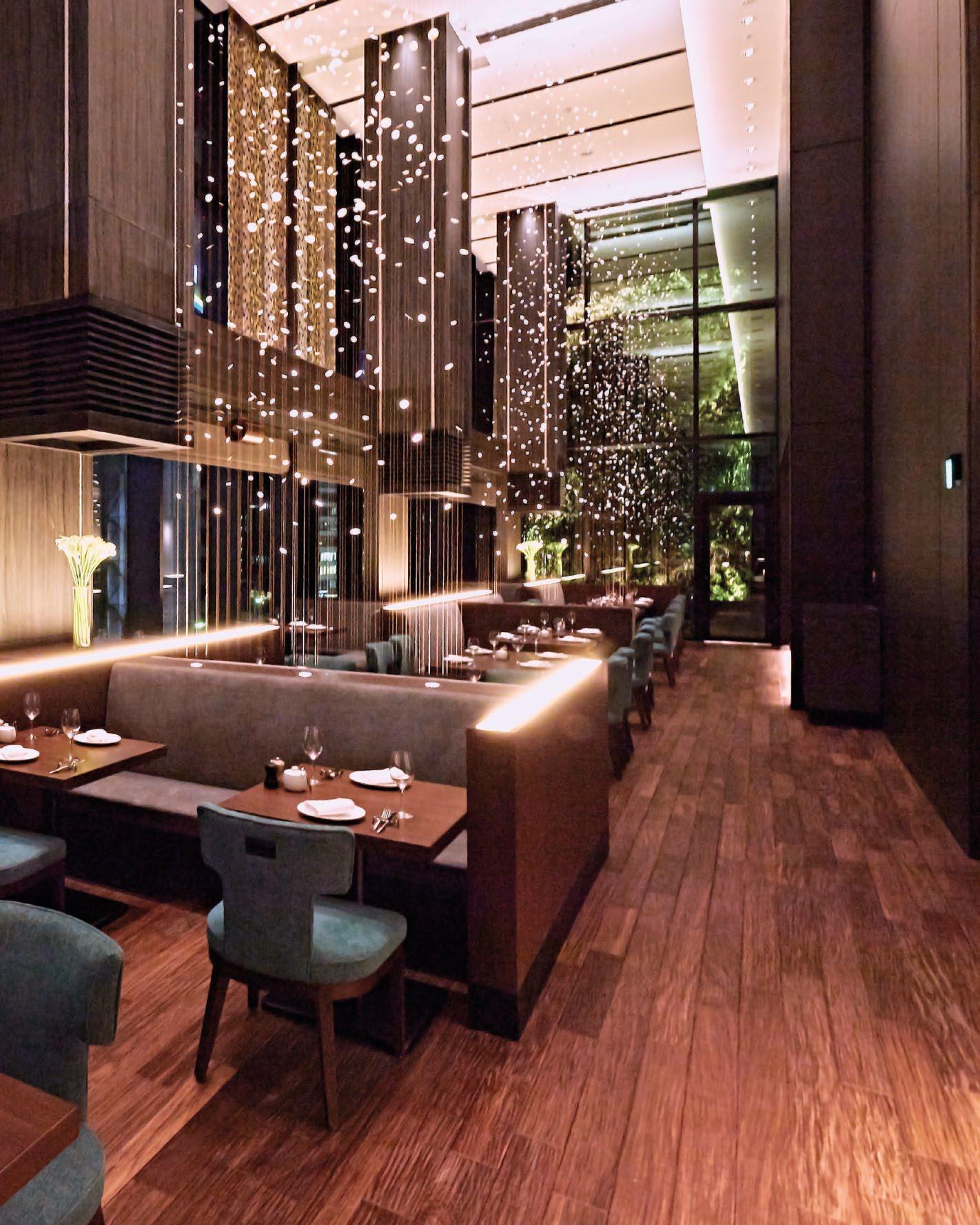 THIS PHOTO: An all-day dining with dramatic art screens inspired by the bubbles of champagne rising from the glass.
THE GATE HOTEL | TOKYO, JAPAN
The Gate Hotel is a group of intimate lifestyle hotels that serve as a gateway to local communities, creating a sense of unity with the environment. The first hotel in the series opened in Asakusa, Japan, and the second hotel was opened in Ginza in late 2018. Featuring a collection of foil, paper, and ceramic art pieces, The Gate Hotel aims to provide peaceful and memorable experiences for all of its guests.
The Gate Hotel Tokyo had its interior designed by Gensler and welcomes guests from home and abroad. The design firm has redefined Ginza, a special place in Tokyo known for its cultural spots such as the Kabuki Theatre and high-fashion stores. As the sun sets, pedestrians and neon lights create an atmospheric metropolis. The Gate Hotel Tokyo adds to the charm of Ginza with its brightly lit shopping streets, home to brands exuding class and elegance.
The Gate Hotel Tokyo is now a flagship of the


brand and occupies the 4 th to 13 th floors of the Hulic Square Tokyo building, providing guests with stunning panoramic views of the Ginza district. The hotel has six different variations of rooms, all inspired by Ginza’s exotic atmosphere. Drawing from the design concept of hana, representing Ginza’s glamorous and elegant elements, and iki, representing a sophisticated look, The Gate Hotel Tokyo has achieved smooth and efficient operation and impressive customer experiences through Gensler’s consistent design from the interior to art and fixtures.
Gensler successfully brought the vision for The Gate Hotel Tokyo to fruition through their expertise in design. The design firm seamlessly incorporated the charm of Ginza with the hotel’s cultural essence, resulting in a place where guests can unwind and experience a sense of openness. The combination of these features makes The Gate Hotel Tokyo a premier destination.
THE DESIGN FIRM HAS REDEFINED GINZA, A SPECIAL PLACE IN TOKYO KNOWN FOR ITS CULTURAL SPOTS SUCH AS THE KABUKI THEATRE AND HIGH-FASHION STORES. AS THE SUN SETS, PEDESTRIANS AND NEON LIGHTS CREATE AN ATMOSPHERIC METROPOLIS. THE GATE HOTEL TOKYO ADDS TO THE CHARM OF GINZA WITH ITS BRIGHTLY LIT SHOPPING STREETS, HOME TO BRANDS EXUDING CLASS AND ELEGANCE.
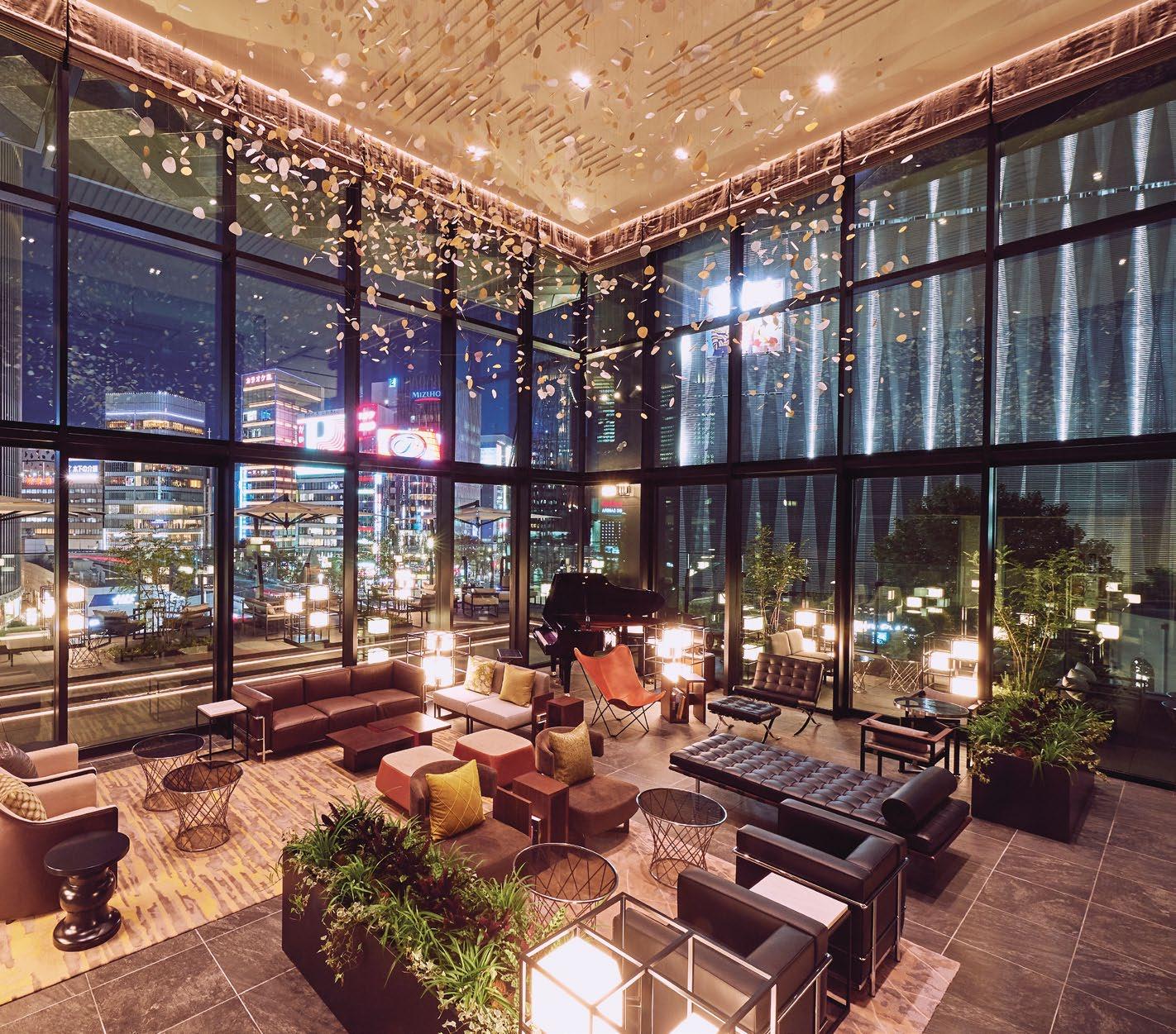 THIS PHOTO: Relax and immerse in the culture of Ginza at the vibrant lounge and inviting terrace seating.
GENSLER SUCCESSFULLY BROUGHT THE VISION FOR THE GATE HOTEL TOKYO TO FRUITION THROUGH THEIR EXPERTISE IN DESIGN. THE DESIGN FIRM SEAMLESSLY INCORPORATED THE CHARM OF GINZA WITH THE HOTEL’S CULTURAL ESSENCE, RESULTING IN A PLACE WHERE GUESTS CAN UNWIND AND EXPERIENCE A SENSE OF OPENNESS.
 48 | H+R
THIS PHOTO: Premium rooms with canopy beds on the top floor.
| HOTELRESORTDESIGN.COM
Float in the Sky: The hotel’s suite room, perfect for visitors seeking a luxurious stay, offers access to an open-air jet bath with spectacular views of Ginza, especially in the evening. The room also features a bookshelf stocked with both English and Japanese literature and travel guides.
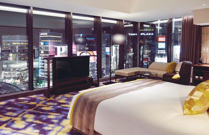


In addition to the suite room, The Gate Hotel Tokyo’s premier Luxe guestrooms offer a luxurious experience with carpets inspired by the neon lights of Ginza and floor-to-ceiling windows that allow sunlight to flood the room during the day. At night, the view from the bed creates the illusion of floating above Ginza, and the sofa placed by the windows allow guests to fully appreciate the cityscape with a special ambiance.
Premium Lounge: At The Gate Hotel Tokyo, hotel guests can access the premium lounge, which offers a stunning view of the Ginza landscape. The lounge features a variety of chairs, including a rocking chair and a vivid blue sofa for two, where guests can relax and take in the panoramic views. When the weather is nice, the lounge is the ideal spot for guests to read a book, soak up some sun, or enjoy a drink or two while lounging at the top of the hotel.
Feel the Pulse of the City: The Gate Hotel Tokyo is designed to interact with the city, providing guests with a unique experience and access to the Ginza atmosphere. As they relax and enjoy their time in the hotel, guests can take in the quintessential sounds of Tokyo, including traffic ambiance and the voices of pedestrians in the background.
At the end of their stay, guests leave The Gate Hotel Tokyo with a peaceful and memorable experience. Through the concept of hana and iki, they have had the opportunity to fully experience the unique culture of the city, not just within the hotel, but in Ginza as a whole.
TOP: A suite room with an open air jet bath, overlooking the city of Tokyo.
BOTTOM: A premium lounge on the top floor, reserved exclusively for guests staying at the hotel. MIDDLE: The corner room offers views of Ginza and Yurakucho through large windows on both sides.
 THIS PHOTO: Enjoy conversation with baristas and locals while admiring Nagoya’s unique Shachihoko art.
NIKKO STYLE | NAGOYA, JAPAN

As the first lifestyle hotel brand by Okura Nikko Hotels, Nikko Style Nagoya aims to attract travellers seeking new and unique travel experiences. Designed by Gensler, Nikko Style Nagoya caters to the interests and tastes of guests who value culture, health, the environment, and a one-of-a-kind hotel experience. The entire space, from the hotel entry to the public lobby, dining areas, and guest rooms, is designed to create a welcoming atmosphere that permeates throughout the entire hotel.
Rich in history, traditional crafts, and food, Nagoya has actively promoted the performing arts since the Edo period and is also known as the “Nagoya of the Arts.” The city has long been a place where different peoples and cultures interact, attracting visitors from all over Japan and the world to experience its unique culture.
The hotel aims to incorporate Nagoya’s unique local character to give guests a more authentic experience of the city. To this end, the hotel features local craftsmanship, including room signs inspired by Seto pottery, mirrors inspired by Shachihoko, and ornaments featuring designs from Arimatsu-shibori, a traditional Nagoya tie-dye.


TOP: The restaurant offers creative but casual cuisine with plenty of seasonal ingredients and local foods.
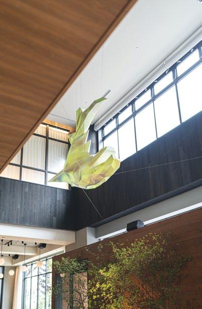 BOTTOM: Floating on the ceiling of the entrance hall is the symbol of Nagoya City, the ‘Shachihoko’.
Photo Credits: Masahiro Taketomi / Yumi Shimizu / Hiroyuki Mori
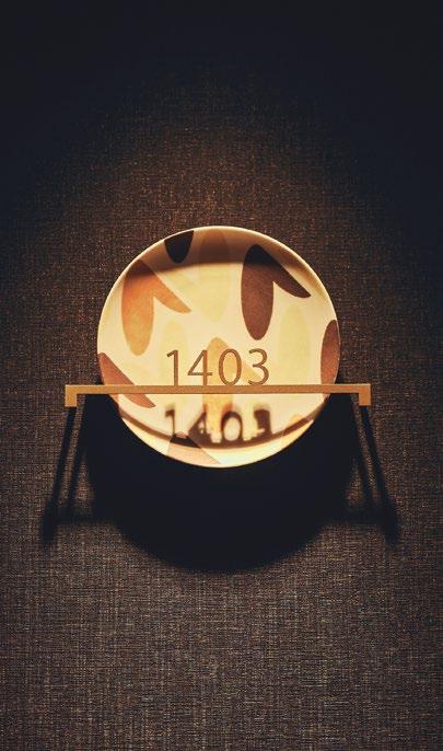
The hotel features local craftsmanship, aiming to give guests a more authentic experience of Nagoya city. Seto pottery influenced the design used for the room signs, which feature six patterns based on local food and symbols. The lift hall signs feature lily flowers, the symbol of Nagoya City, with the number of floors represented by the number of flowers. Upon entering the room, guests are welcomed with glass reliefs and gold foil art glass inspired by the scales of Shachihoko, a symbol of the Nagoya castle. Additional touches, such as Shachihoko ornaments, coffee cups inspired from Mino pottery, and cushions inspired by Arimatsu-shibori, a traditional Nagoya tie-dyeing technique, help guests to fully immerse themselves in the local culture.

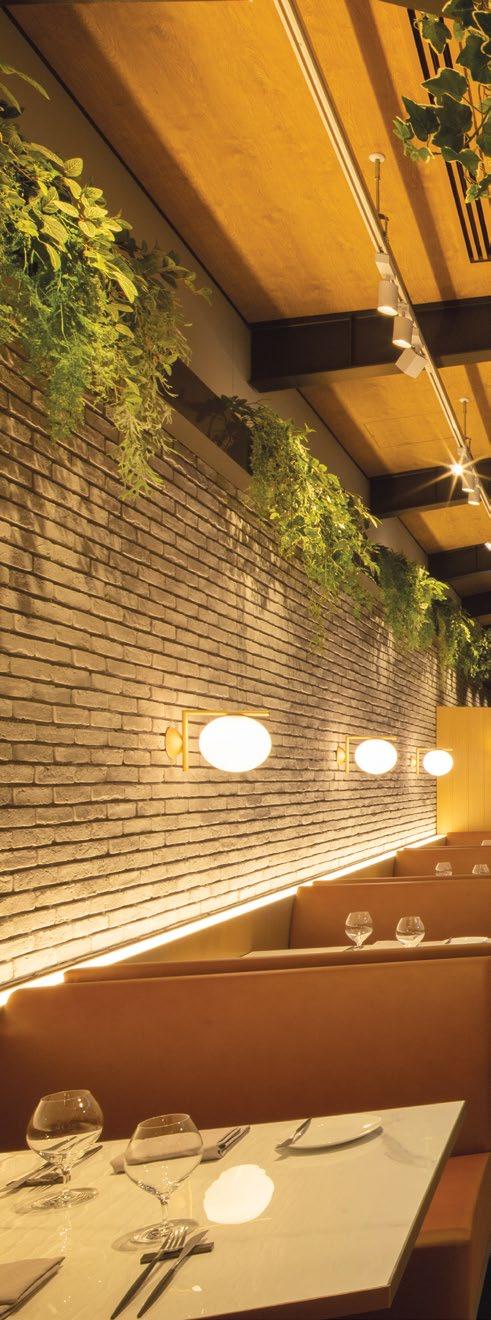
Large windows allow natural light to enter the space, seamlessly blending the indoor and outdoor areas and enhancing the warm and cozy ambiance at the entrance. The ceiling piece, inspired by the Shachihoko, is projection-mapped with ethereal light that changes throughout the day, welcoming both the local community and travellers. At night, the skylights in the communal lounge and restaurant are illuminated, providing a distinct experience as compared to the daytime.
 MIDDLE: Cushions in room and the lobby feature the Arimatsu tie-dye.
 THIS PHOTO: Enjoy the sizzle of the kitchen while dining under the skylight.
THE HOTEL AIMS TO INCORPORATE NAGOYA’S UNIQUE LOCAL CHARACTER TO GIVE GUESTS A MORE AUTHENTIC EXPERIENCE OF THE CITY. TO THIS END, THE HOTEL FEATURES LOCAL CRAFTSMANSHIP, INCLUDING ROOM SIGNS INSPIRED BY SETO POTTERY, MIRRORS INSPIRED BY SHACHIHOKO, AND ORNAMENTS FEATURING DESIGNS FROM ARIMATSU-SHIBORI, A TRADITIONAL NAGOYA TIE-DYE.

Nikko Style Nagoya offers guests a new and innovative style of travel through a fusion of Japanese hospitality and local culture, cuisine, and creative experiences. The lobby lounge also provides unique opportunities for immersion in art and music, such as comedy performances by English Rakugo storytellers, workshops on traditional Japanese culture and art, and live DJ events.
To create a relaxing atmosphere and avoid repetition, a diverse selection of lounge music has been carefully chosen by musicians and played throughout the day in seven segments, each corresponding to a different time of day. The background music blends seamlessly into the environment and operates on the subconscious of the guests, creating a sense of calm. This is further enhanced by the hotel’s original blend of coffee, crafted by a popular local coffee shop specifically for Nikko Style Nagoya.

Nikko Style Nagoya offers a unique and special experience for all visitors through its combination of traditional culture and modern design, creating a uniquely Nagoya charm.
 BOTTOM: The mirrors in the rooms, made of foil and glass with Japanese craftsmanship, are inspired by the scales of Shachihoko
TOP: A room sign welcoming guests with Seto pottery depicting local motifs such as foods and symbols.
POSITIONED IN THE HEART OF A RESORT AREA, JW MARRIOTT HOTEL REFLECTS THE SURROUNDING WATER AND ITS GREENERYFILLED VIEWS WITH A UNIQUE DESIGN THAT EMPHASIZES THE FLUIDITY AND HARMONY WITH NATURE.

 THIS PHOTO: A serene lake peacefully reflecting the exterior as the sun sets over the horizon.
JW MARRIOTT | SHANGHAI, CHINA
With its breathtaking scenery and a taste of a life far removed from the concrete metropolis, the beautiful surroundings of Jinhai Lake quickly made it one of China’s premier tourist destinations. The flowers bloom in all four seasons, and the leaves are green year-round, while the lake is wide and pristine, with sheer cliffs and scattered pavilions and homes, making it an ideal setting for sightseeing and vacationing. The JW Marriott Hotel Shanghai Fengxian is inspired by the vision of water flowing over stones and is structured atop three islands that support the structure and provide space for the ground-floor hotel amenities, including retail, dining, and sporting facilities. The hotel is located in the heart of the Jinhai Lake resort, which is centered around an artificially created lake, and features 265 guestrooms and suites.

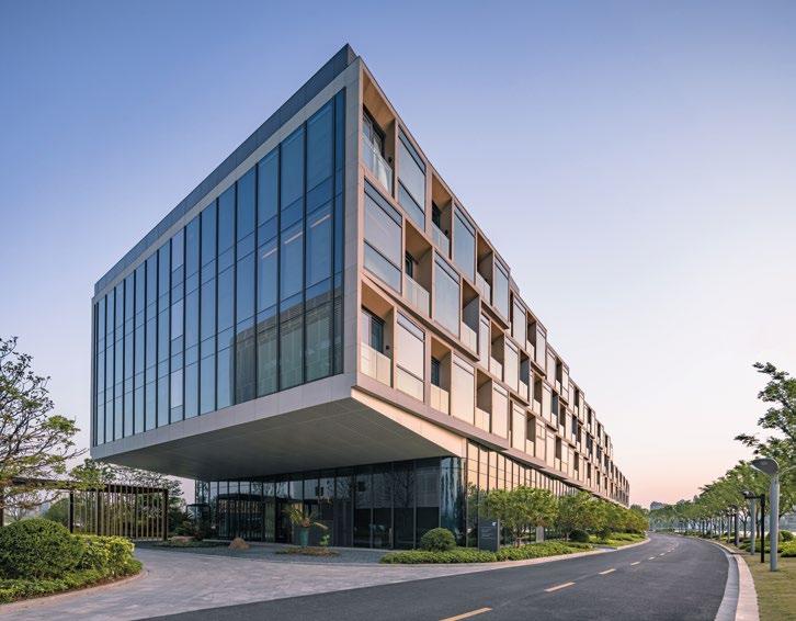
TOP: The dynamic form of the building breaks the design limitation of the long and narrow site.

BOTTOM: The smooth, curving form of the east and west wings are structured atop three geometric bases.

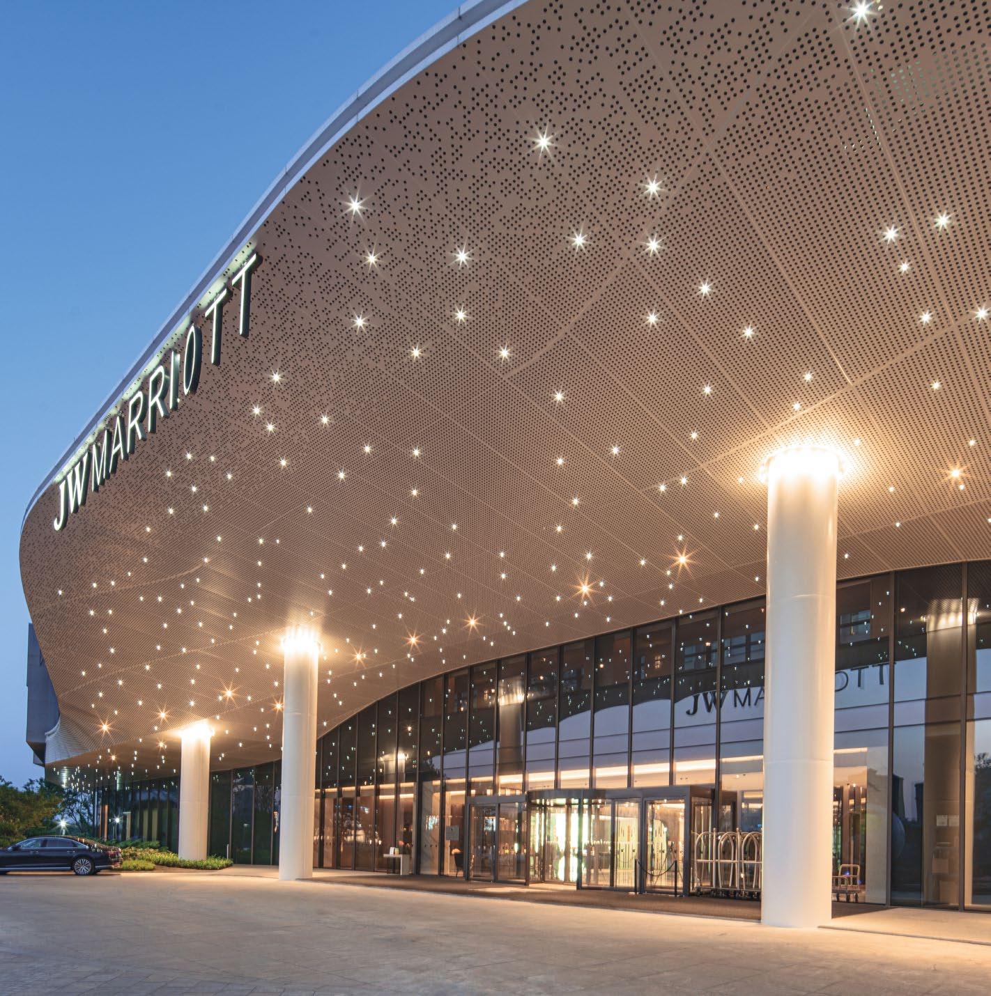 THIS PHOTO: Enter into a world of luxury and relaxation through the stunning hotel entrance, complete with a ceiling adorned with twinkling star lights
“AS DESIGNERS IN THE BUILT ENVIRONMENT, WE HAVE A GREAT RESPONSIBILITY TO THE COMMUNITIES, CULTURES AND INDIVIDUALS WE DESIGN FOR. IT’S UP TO US TO REALLY UNDERSTAND HOW PEOPLE LEAD THEIR EVERYDAY LIVES, AND HOW THEY THINK AND FEEL, TO OFFER PROGRESSIVE, INTELLIGENT, VARIED AND AUTHENTIC HOTEL SOLUTIONS THAT DO JUSTICE TO THE VAST ARRAY OF HUMAN VALUES AND LIFESTYLES.”
Xiaomei Lee, Regional Managing Principal, Gensler
THIS PHOTO: From above, the hotel’s picturesque lakeside location is revealed, with the sparkling waters and surrounding greenery providing a stunning backdrop.

The spectacular and unusual wavy, snake-like design of the hotel emphasizes its connection to nature and fluidity, complementing the water and lush surroundings. The smooth, curving form of the east and west wings is structured atop three geometric bases, which support the structure and provide space for the ground-floor amenities, including the convention center, dining, lobby, and amenities. The dynamic form of the building also breaks the design limitation of the long and narrow site, making it the focal point of an emerging art, entertainment, and tourism-oriented neighborhood.

Flowing over the supporting structure is the residential section of the hotel, shaped to ensure views of the water from every room. Instead of a traditional hallway separating the suites, the design of the hotel creates a courtyard through its split-flow design, inviting light and air into the project, while providing a further connection with nature through the use of green space.

 TOP & BOTTOM: The wavy shape of the hotel’s design highlights its connection to the natural environment and the fluidity of water, perfectly complementing the verdant surroundings.
“As designers in the built environment, we have a great responsibility to the communities, cultures and individuals we design for. It’s up to us to really understand how people lead their everyday lives, and how they think and feel, to offer progressive, intelligent, varied and authentic hotel solutions that do justice to the vast array of human values and lifestyles,” said Xiaomei Lee, Regional Managing Principal, Gensler.
The circulation plan for the project confines automotive traffic to the northern shore of the peninsula, while creating space for the pedestrian environment in the south. This exposes the guests of the hotel to vast, uninterrupted views of the lake. The convention center, which has busy peak traffic, is planned at the entrance of the site, and the hotel lobby is planned at the end to provide a more private guest experience.
The design introduces water elements on the site that connect with adjacent water resources and landscaped parks, creating a unique water transit system to enhance the hotel and conference experience. The movement of water is also reflected in several hotel terraces with clustered, outdoor gardens. The intent is to create several smaller enclaves where hotel guests can enjoy their natural setting and vistas in this unique site.
“We designed this building for the people to be engage and experience the water. When you come in, you forget that you are not far from the city and you will be stepping in to a still and calm environment,” said Jaime Gimeno, Design Director, Gensler.

THE DESIGN INTRODUCES WATER ELEMENTS ON SITE THAT CONNECT WITH ADJACENT WATER RESOURCES AND LANDSCAPED PARKS - CREATING A UNIQUE WATER TRANSIT SYSTEM TO AUGMENT THE HOTEL AND CONFERENCE EXPERIENCE.
 THIS PHOTO: Tranquil waters provide a stunning reflection of the building’s grand architecture
GEARED TOWARDS AN “ART GALLERY” CONCEPT, THE PORTMAN RITZ-CARLTON SHANGHAI’S LOBBY PROVIDES NOT ONLY AN URBAN SANCTUARY SPACE TO THE LOCAL COMMUNITY BUT ALSO A WELCOMING SPACIOUS AND MODERN HOSPITALITY TOUCH TO ALL THE GUESTS.
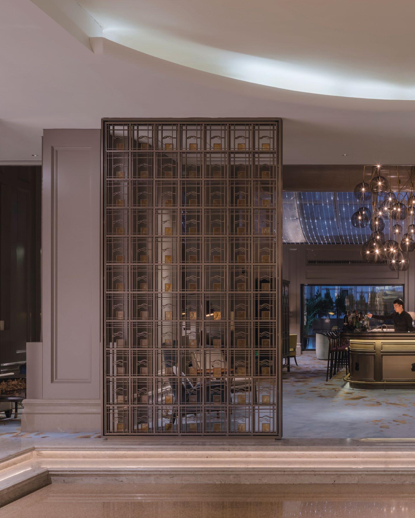
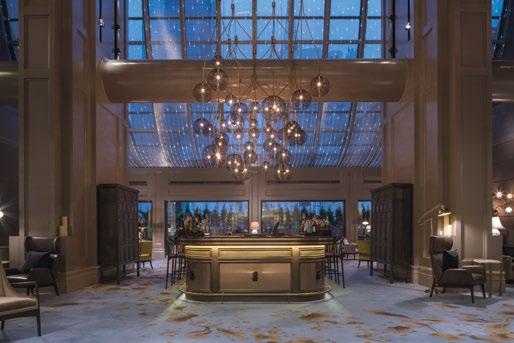
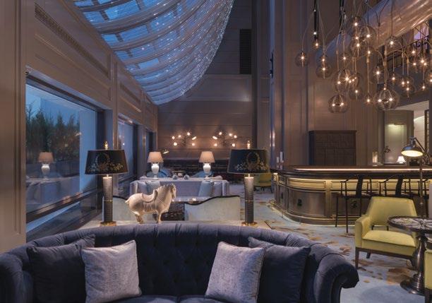
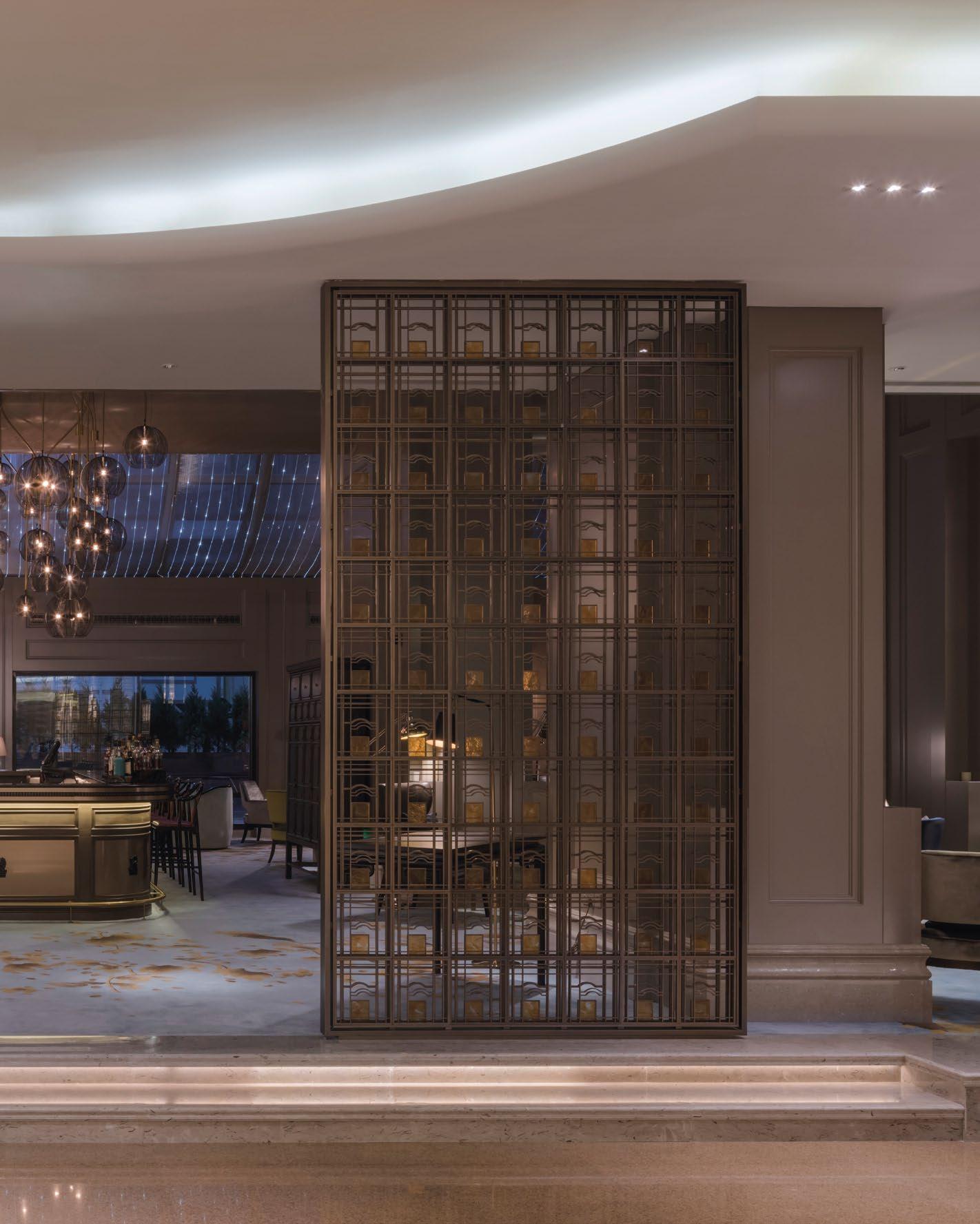 THIS PHOTO: The lobby features a blend of modern and traditional design elements, including large wooden columns, tall windows and dark wood roundtables.
PORTMAN RITZ-CARLTON | SHANGHAI, CHINA

Once awarded the “Best Hotel in Shanghai” by Institutional Investor magazine, the Portman Ritz-Carlton, Shanghai is designed to exude luxury centred on the principles of excellent customer service, with a modern interior enhanced by Asian-inspired details. Located in the heart of the city’s historical past and the modern-day buzz, the hotel provides easy access to the best dining, shopping, and entertainment in the city thanks to its prime location on the renowned Nanjing Xi Lu. After a day of sightseeing, visitors can unwind with a relaxing spa treatment, savor a delicious meal at one of the six on-site restaurants, or just relax in their opulent suites while taking in Shanghai’s beautiful cityscape.
Inspired by the richness of the “Old Shanghai” style, Ritz Carlton’s lobby calls for a connection with the hotel’s legacy design language on the entrance façade, while adding a modern twist to the interior. By preserving the existing environment and integrating traditional elements, the lobby’s stunning transformation honors Shanghai’s
 TOP & BOTTOM: Step back in time to the glamour of old Shanghai in the hotel lobby, featuring traditional design elements and a luxurious atmosphere
The Portman Ritz Carlton’s
Photo Credits: Gensler / Derryck Menere
original role as the first foreign luxury hotel in China and a longtime favorite of US Presidents. With original design and artistic details, Gensler’s design exemplifies the trend of hoteliers transporting guests back to a bygone era.

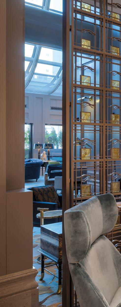
Through removing non-loadbearing walls and columns in the back of the space, underutilized space are minimised and created better circulation throughout the lobby. The design of the main atrium mimics a traditional Chinese courtyard, through use of light and natural elements. Massive wooden columns are a perfect regal welcome to the lobby’s foyer. Extravagant chandeliers and lighting fixtures highlight every architecture element and décor at its finest, while a super high ceiling completes the scene. With dark wood round tables and polished brass, the lobby’s decor is modern-meets-traditional.
One can enjoy afternoon tea over a business lunch or even a finely crafted whiskey during the evening hours.
 THIS PHOTO: The design of the main atrium resemble a courtyard using light and natural elements to create a rich comfortable space
INSPIRED BY THE RICHNESS OF THE “OLD SHANGHAI” STYLE, RITZ CARLTON’S LOBBY CALLS FOR A CONNECTION WITH THE HOTEL’S LEGACY DESIGN LANGUAGE ON THE ENTRANCE FAÇADE, WHILE ADDING A MODERN TWIST TO THE INTERIOR.

A library defined by Art Deco-inspired furnishings, vintage mirrors, and a fireplace casts the space into a rich glow of opulence. The space is filled with 1920s Shanghai artifacts, such as a Chinese-inspired apothecary cabinet, Oriental screens, and ceramic porcelain. From the texture of the chair to the lighting fixtures, each item was carefully curated from several different periods, sources, and uses, creating something that feels entirely new.
At the bar area, the color scheme changes from light creams and taupes to silvery greens and yellows. Above the bar are beautiful lighting pendants, reminiscent of Chinese lanterns. A dramatic curtain wall of light drapes over the window siting area, bringing the space into a whole new realm.
The new space re-created the nostalgia of Shanghai through a careful collection of Heritage, Elegance and Nature. The lobby brings about a feeling of 1930s shanghai and elements of western design together in one holistic space.
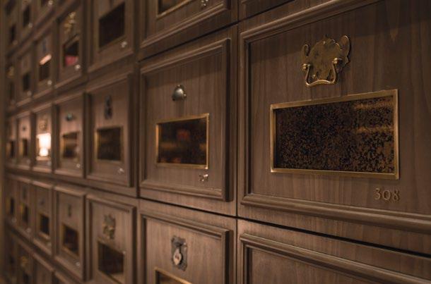

 MIDDLE & BOTTOM: Every element in the room, from the texture of the chairs to the lighting fixtures, was carefully selected from various periods and sources to create a new and unique feel
COMBINING TECHNOLOGY AND SUSTAINABILITY ELEMENTS INTO ITS DESIGN, SURF SIMPLY RESORT IS A HAVEN FOR SURFERS AROUND THE WORLD. THE RESORT TAKES ADVANTAGE OF TECHNOLOGY TO TEACH SURFING.

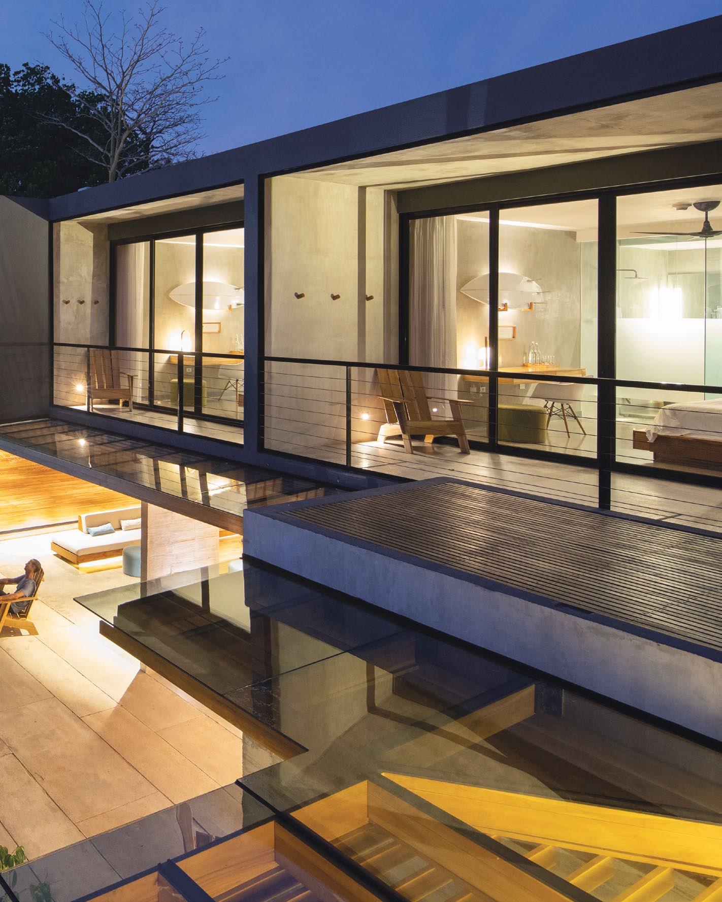 THIS PHOTO: Escape to paradise at the luxurious Surf Simply Resort, where breathtaking waves and luxurious amenities await.
SURF SIMPLY RESORT | NOSARA, COSTA RICA
Located in Nosara, a village in Costa Rica known for its Pacific beaches, Surf Simply Resort isn’t your average resort or typical surf school. The 1,200-square-meter coaching retreat is well known for its simple and highly efficient design. The property consists of 12 villas, a pool, restaurant, kitchen, bar, lounge, employee facilities and other amenities and basic services.
Inspired by the phrase “surf can build happiness”, the Gensler team made use of common spaces and Surf Simply’s teaching values as the core vision behind the design. The founder of Surf Simply, Ru Hill, who moved from England, used to teach out of his car before opening a coaching resort not far from Playa Guione, where the current Surf Simply Resort is located.
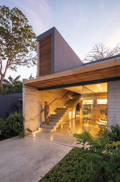


Hill and his business partners wanted to inject new life into the resort – one that would bring the environment and technology together. He had a vision of creating a haven for surfers where they can be inspired by nature while benefiting from the modern technological advancements. Now, Simply Surf Resort is a premium destination for renowned surfers around the world, with slots often running out quickly even with advanced booking a year ahead.
TOP & BOTTOM: The resort takes care of everything the moment guests step into the facilities, with the only worry that is catching the perfect wave
 THIS PHOTO: The focus on shared spaces set Surf Simply apart from other resorts, where different areas such as the dining room, pool, fire pit, and shared living spaces are interconnected
SURF SIMPLY WANTS TO PROVIDE A HOME FOR GUESTS AND SURFERS. WHILE EACH ROOM HAS ITS OWN DEDICATED FEATURES AND AMENITIES OVERLOOKING THE NATURE RESERVE, THE MAIN HIGHLIGHT OF THE RESORT IS ITS SHARED LIVING AND DINING AREA WHERE GUESTS CAN GATHER.
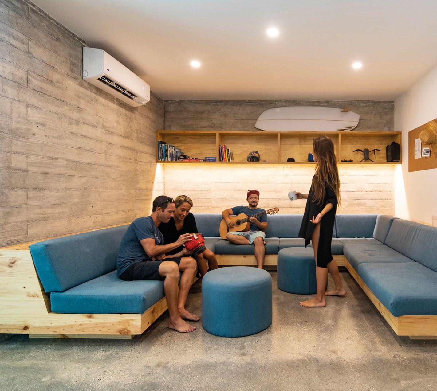
The Gensler team drew design inspiration for Simply Surf Resort from its surrounding nature and technology. Using methodical, systemised pattern language as a concept, they also included a constant of human scale, raw materials, modular spaces and open areas to promote social interaction amongst users. Here are the key concepts behind the boutique surf coaching resort in Playa Guiones.
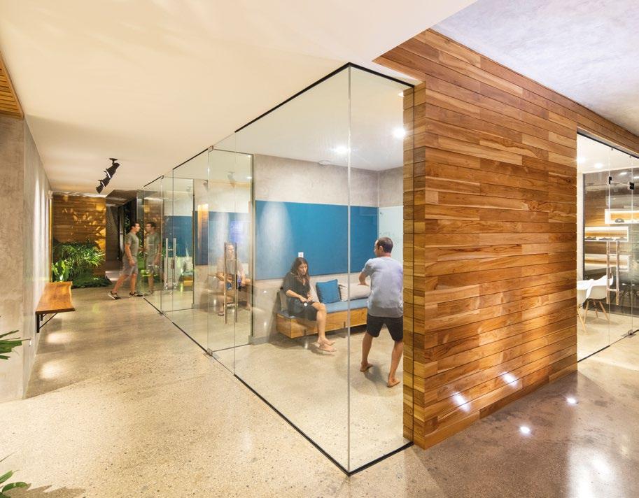
Data Rules: When surfers are catching a wave at Surf Simply Resort, they are videotaped by eight different cameras – as part of the tech-based coaching. At the end of the session, the videos are uploaded onto a private server and edited into a personalised showreel, where guests get to review their performance on a giant screen in video-coaching suite.
TOP: Video coaching rooms with glass walls provide a comfortable space for guests to review their morning surf sessions with their coach


Looking After the Environment: Surf Simply Resort was designed by Gensler to be the world’s first purpose-built, premium surf coaching facility. The resort was built to not only boast elegant design but also be Platinum L.E.E.D Certified – the highest title that any building can be awarded with for minimising environmental repercussions during construction and everyday operation.

By incorporating technology into its design, Surf Simply Resort has modern capabilities such as rainwater harvesting, wastewater purification, highefficiency faucets and photovoltaic panels to minimise energy and water use. While it was unfortunate that 11 trees above 30cm had to be removed during construction, the surf resort made it their mission to give back to the environment by planting 70 new trees surrounding the resort and giving it special care to preserve existing monkey trails. They also give back to the community by investing efforts into the water infrastructure of Playa Guiones. Through this initiative, gone are the days of water outages that previously troubled locals.
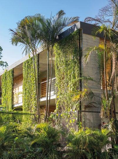
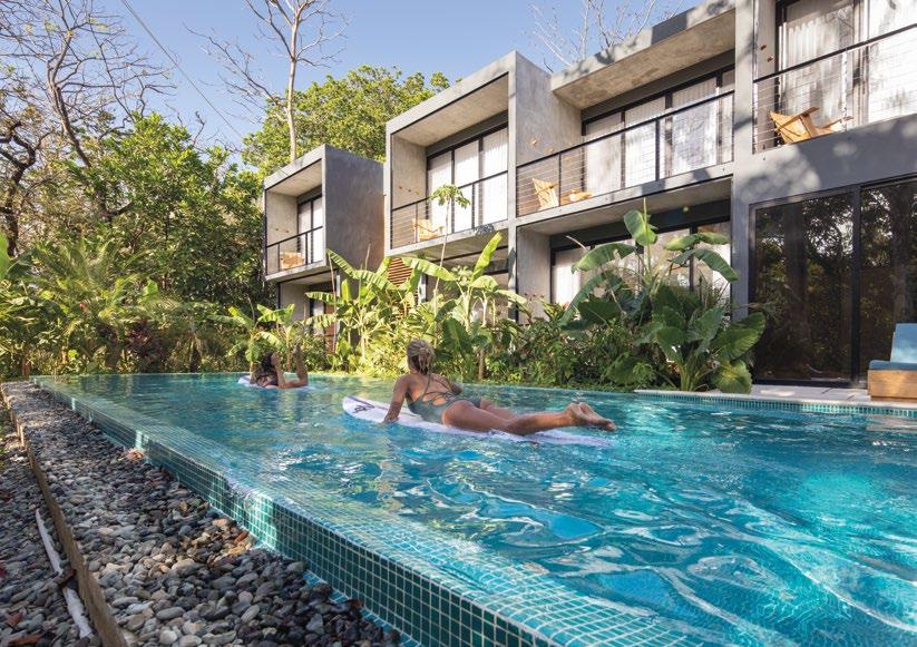
THE RESORT WAS BUILT TO NOT ONLY BOAST ELEGANT DESIGN BUT ALSO BE PLATINUM L.E.E.D CERTIFIED – THE HIGHEST TITLE THAT ANY BUILDING CAN BE AWARDED WITH FOR MINIMISING ENVIRONMENTAL REPERCUSSIONS DURING CONSTRUCTION AND EVERYDAY OPERATION.
 THIS PHOTO: Given its location near Playa Guiones and the natural reserve, it was important that the resort be designed with simplicity, elegance, and sustainability in mind.

Guests First: Surf Simply wants to provide a home for guests and surfers. While each room has its own dedicated features and amenities overlooking the nature reserve, the main highlight of the resort is its shared living and dining area where guests can gather. With a pool, hot tub, sofas and a fire pit, the area has been designed to facilitate conversations amongst guests. Users can easily find their own space in this common area while helping themselves to drinks, homemade snacks or fruits. The resort also provides guests with three meals a day, prepared by their own chef, which are served around a single, large dining table in the common living space.
Besides the common area, guests are also free to explore the stretch room, where the iconic Surf Simply Tree of Knowledge is displayed along the wall. In this room, guests are able to practise some surfing skills, while checking out board design and the latest forecast updates on upcoming waves.

With all the inspiration, ideas and design coming together to form one surfing resort, the result is an intimate and minimalist building hidden under a jungle canopy. Simply Surf Resort aims to provide guests with surf coaching sessions like no other and it has successfully created a sanctuary for surfers to call home.
 TOP: The stretch room features the iconic Surf Simply Tree of Knowledge displayed on the wall

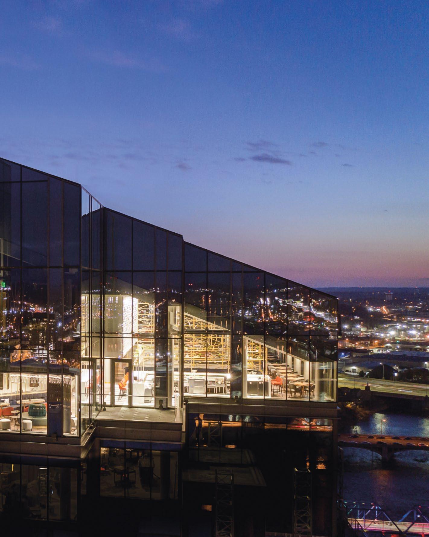

Located in the heart of Grand Rapids, MDRD is a three-story restaurant that offers guests Spanish-influenced cuisine and sweeping views. At the pinnacle of the Amway Grand Plaza Hotel, the 27th floor encompasses the main dining and bar area while the 28 th and 29 th floors are dedicated to private dining rooms. The restaurant design concept for MDRD at the Amway Grand is derived from the avant-garde mood of Spanish carnivals, which celebrates the culture of Spain with festivities before Lent. The theatrical ambiance and ornate details of the restaurant’s interiors encourage diners to experience heightened social unity and shared moments, creating an exclusive atmosphere with sophisticated global flair.

It all began with a love for Madrid. This passion for a city brimming with culture and cuisine inspired the Spanish-centric menu and provided a vibrant, celebratory starting point for the design of the newly renovated MDRD Restaurant at Amway Grand. Gensler set out to create an energetic, artful experience that offers design and dishes one would expect in a major city while also providing an accessible, decidedly unstuffy environment where locals can relax and enjoy good food and good company.

 TOP & BOTTOM: Inspired by the energetic and imaginative mood of Spanish carnivals, the lavish interiors and dramatic atmosphere of the restaurant encourage diners to come together and share special moments
Photo Credits: Dan Ham Photography
The fresh design approach allows visitors to select from a variety of experiences depending on the group or occasion. The social lounge near the entry invites diners to pop in for small bites and cocktails, enjoying a cozy atmosphere and a stunning vantage point to enjoy the sunset. Beyond the lounge is the bar, which connects the lounge to the dining area. Plush niches and elongated barstools for two complete the space, offering the ideal setting for date night, while a long banquette allows for casual dining.
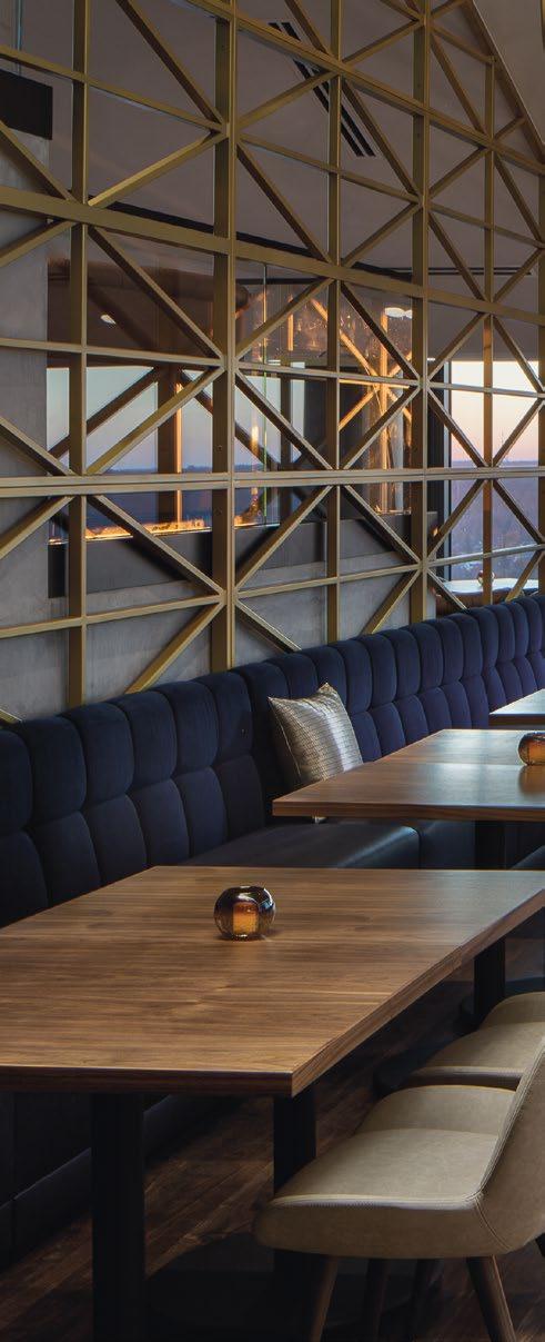
Every seat is the “best seat in the house” in the dining area. Situated along the new glass facade, the space is designed with a unique terraced seating element, offering city and river views for all who visit Grand Rapids’ restaurant in the sky. A custom tile installation spills through the dining and bar areas, reminiscent of falling confetti and the classic costumes associated with Spain’s famous Carnival celebration. Custom lighting hangs above, a modern take on the hoops and batons of street performers.
TOP: Gold and white tiles flow across the wall above the bar, resembling confetti falling during Spain’s renowned Carnival celebration

“WE WANTED TO CAPTURE THE ESSENCE OF MADRID WITH THIS NEW DESIGN, SO WE HIRED THE BEST IN THE BUSINESS, GENSLER CHICAGO, TO INTERPRET THE ‘RHYTHM OF MADRID’ INTO THE CONCEPT. WHAT WE ACCOMPLISHED IS THE RESTAURANT’S ABILITY TO TRANSPORT OUR GUESTS INTO A REFINED INTERIOR SPACE THAT REFLECTS A MODERN MADRID RESTAURANT.”
 THIS PHOTO: The dining area features diverse seating options for all types of diners
George Aquino, vice president and managing director of AHC Hospitality
EVERY SEAT IS THE “BEST SEAT IN THE HOUSE” IN THE DINING AREA. SITUATED ALONG THE NEW GLASS FACADE, THE SPACE IS DESIGNED WITH A UNIQUE TERRACED SEATING ELEMENT, OFFERING CITY AND RIVER VIEWS FOR ALL WHO VISIT GRAND RAPIDS’ RESTAURANT IN THE SKY.
THIS PHOTO: Furnished with gold, metal and wood finishes, the sophisticated dining area creates a luxurious experience for all guests
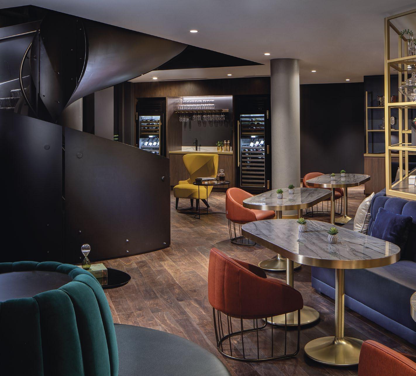
The renewed space expands private dining options at MDRD, increasing private rooms from three to five. Each is themed based one of the many cultural experiences and historic moments Spain is known for, including the Chueca High Heel Race, the matadors of Salamanca, Madrid’s Puerta del Sol, renowned heroine Agustina de Aragon, and the El Rastro flea market. Large scale, textural artwork adorns the walls to bring the concepts to life.

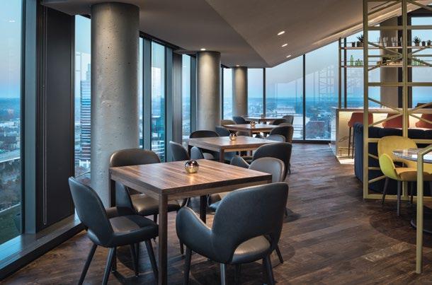
“MDRD was a natural progression from the Spanish menu Cygnus offered,” says George Aquino, vice president and managing director of AHC Hospitality, the management company behind Amway Grand Plaza and MDRD. “We wanted to capture the essence of Madrid with this new design, so we hired the best in the business, Gensler Chicago, to interpret the ‘Rhythm of Madrid’ into the concept. What we accomplished is the restaurant’s ability to transport our guests into a refined interior space that reflects a modern Madrid restaurant.”
 MIDDLE & BOTTOM: Floor-to-ceiling windows offer views of downtown Grand Rapids from all areas of the restaurant

THE HISTORIC CLIFT HOTEL REINVENTS ITSELF BY FUSING THE HOTEL’S ORIGINAL CRAFTSMANSHIP WITH MODERN-DAY SAN FRANCISCO SOPHISTICATION, MAKING IT A DESTINATION THAT REVEALS THE PAST AND EMBRACES THE ACCELERATING PACE OF THE FUTURE.
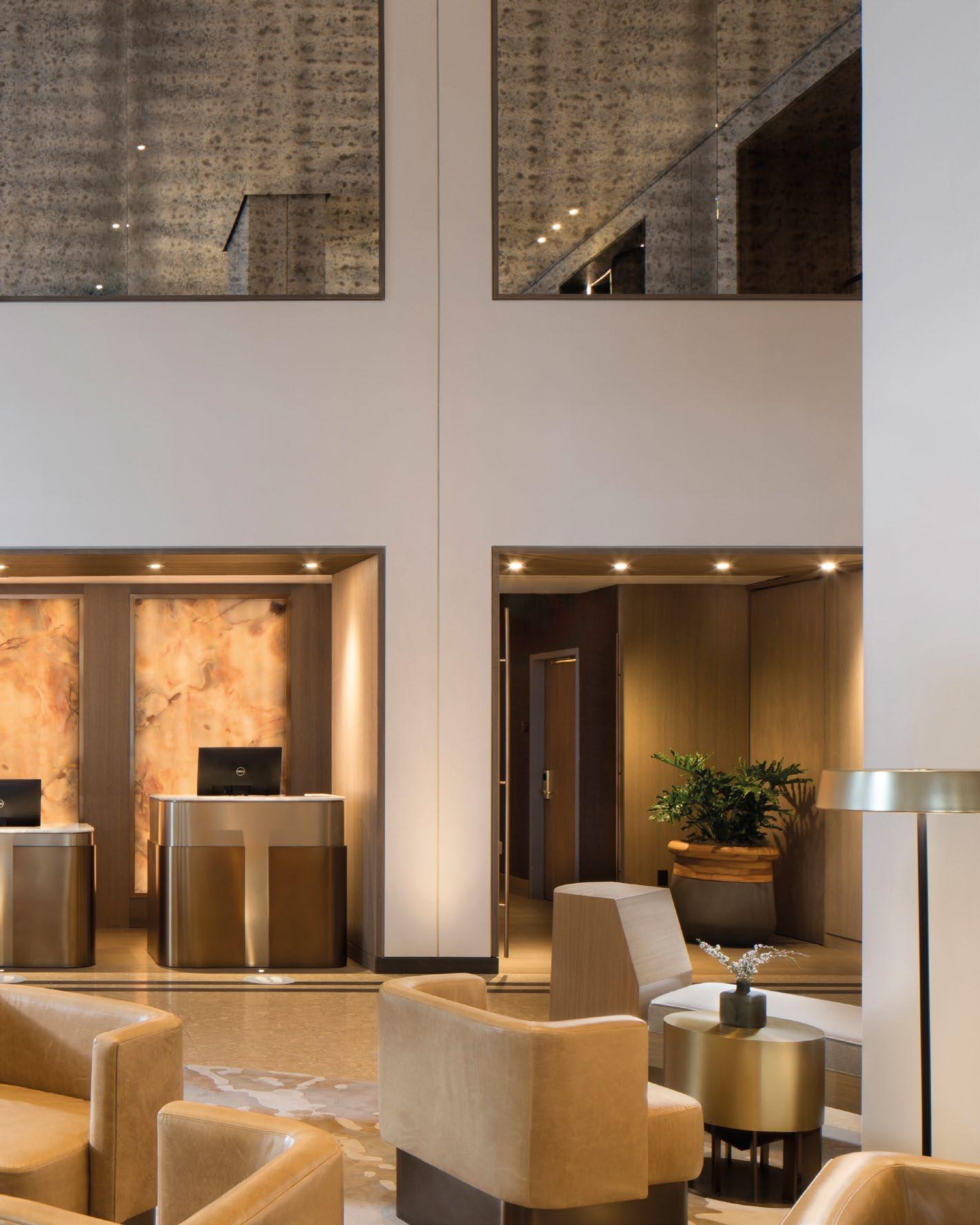 THIS PHOTO: The Clift hotel, which has a rich history spanning over a century, has recently undergone renovations to add a modern touch while still honoring its past.
THE CLIFT ROYAL SONESTA HOTEL | SAN FRANCISCO, USA
The Clift Hotel has been a hamlet for decades, providing a welcome respite for both its guests and community to refresh and engage. Built on the San Francisco horizon in 1915, this storied hotel was brought to life to serve tourists venturing into the Bay Area for the Panama-Pacific International Exposition. The site was a grand celebration of human spirit and ingenuity, an essence that still resides within the hotel’s walls decades later.
Since its inception, the Clift Hotel was at the forefront of technology, designed to be the first building in San Francisco that was both fire and earthquake proof. Fast forward to present day, this classic destination was in need of a transformational look to reclaim its standing as an iconic property for visitors and natives, alike.
Polished and refined, the new lobby is brighter and reoriented to improve access and circulation. The modern furniture complements the warm neutrals of light driftwood, rich charcoal greys and metallic bronze accents. Sitting adjacent to the lobby, a new Living Room provides a dynamic space with multiple seating options for guests to socialize or find a quiet place to work.
TOP & BOTTOM: The lobby and other public areas have been given a brighter appearance, with a color scheme of warm neutral tones paired with light driftwood, deep charcoal grays, and metallic bronze accents


 THIS PHOTO: The new furniture fits in with the modern, sophisticated style of the lobby, offering various seating options for working, socializing, or relaxing
THE WORLD-FAMOUS REDWOOD ROOM, KNOWN FOR ITS UNIQUE PANELING MADE FROM A SINGLE REDWOOD TREE, IS RESTORED TO ITS FORMER GLORY, ADDING A TOUCH OF 21ST CENTURY SOPHISTICATION. THE NEW DESIGN INCORPORATES MODERN ART DECO ELEMENTS WITH SLEEK LINES AND NEUTRAL TONES.
PHOTO: The newly restored Redwood Room bar, the piece de resistance of this iconic property, combines modern appeal with its classic Art Deco glamour

Gensler was tasked to re-establish the hotel’s standing at the forefront of technology & breathe life into what was once a San Francisco icon. The renovation draws inspiration from original architectural elements and drawings to revitalize the property, this time as The Clift Royal Sonesta Hotel. Enveloped by the beauty of a landscape that lures the world to its shores, the refreshed interiors celebrate the past with an eye toward the future.
The world-famous Redwood Room, known for its unique paneling made from a single redwood tree, is restored to its former glory, adding a touch of 21st century sophistication. The new design incorporates modern Art Deco elements with sleek lines and neutral tones. New seating and carpet provide the bar with a modern refresh, which includes additional recessed lighting to bring more visibility to the original wood marquetery above the bar. Original Gustav Klimt art pieces were pulled from archives, restored, and now re-adorn the walls. These renowned artworks were originally displayed in the Redwood Room upon its opening in 1933, following the end of Prohibition, for the San Francisco World’s Fair celebration.


 TOP & BOTTOM: The original Gustav Klimt paintings uncovered onsite during the hotel renovations have been painstakingly restored and re-hung
Moved back to its original location, Fredericks Café seamlessly integrates its classic aesthetic with a San Franciscan contemporary style. Black and white flooring inspired by the café’s original flooring drives the remainder of the design, with neutral walls and original exposed brick complimenting the tones and texture. High seating and smaller tables help establish the quick serve area while booths and banquette seating define a more leisurely dining experience.

The hotel’s rich history and original architectural elements found in the original drawings provided a framework for a design concept inspired by the evolution of an icon. The restoration blends modern classical with elements of art deco and celebrates the building’s original craftsmanship. The parallelism between past and present is reinforced by highlighting local artisanal craft and elements from artwork carpet weaving to tilework. With a new guest experience of ‘Modern Classical meets San Francisco Contemporary’ in mind, Gensler breathes life back into this historic establishment with an ambiance that engages traditional touches while enveloping all the beauty of modern day San Francisco.

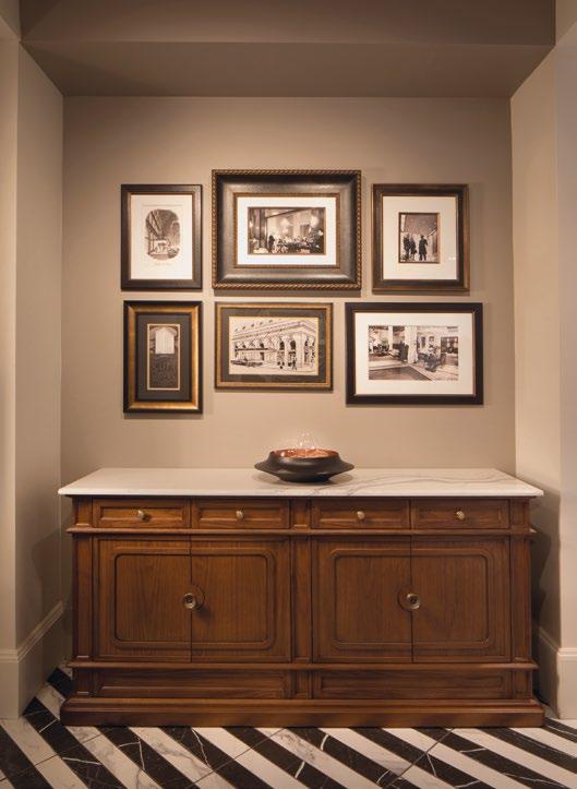
ALL 372 GUEST ROOMS AND SUITES ARE UPDATED WITH A SOPHISTICATED NEUTRAL PALETTE OF COLOR AND TEXTURES DONNING A HANDCRAFTED, HIGH END RESIDENTIAL LOOK. THE SPANISH SUITE, A STAPLE RESIDENCE WHICH HOUSED THE HOTEL’S FIRST OWNER, WAS RE-ENVISIONED TO INCLUDE ADDITIONAL EVENT SPACE ON THE TERRACE.
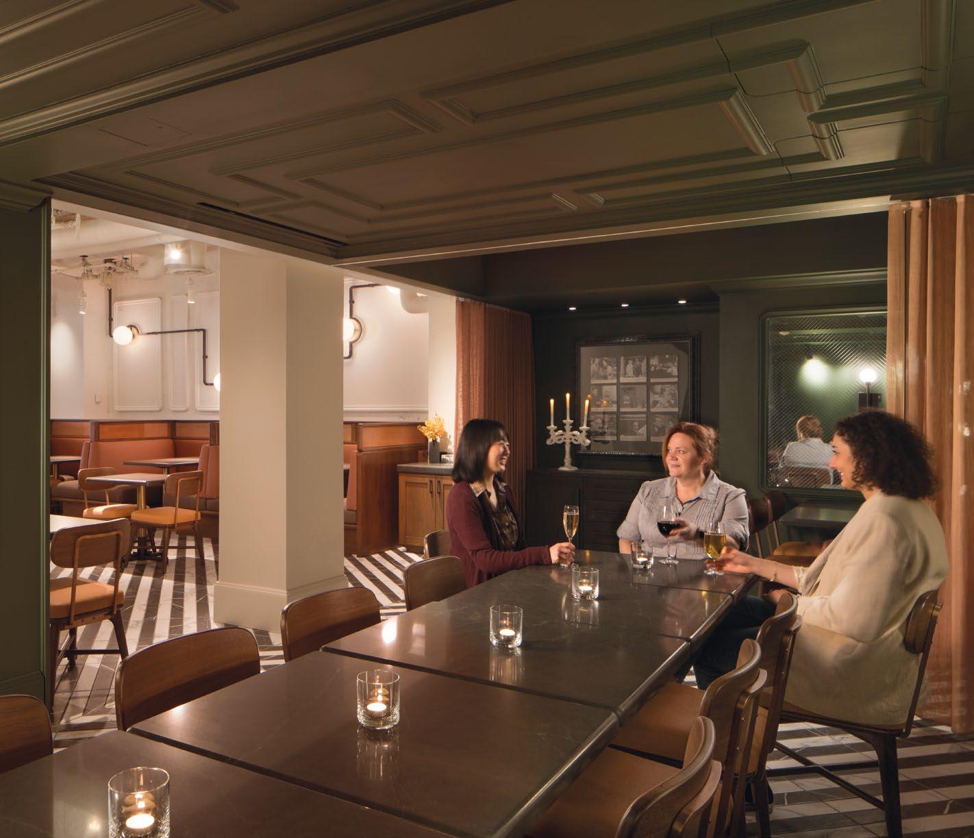 THIS PHOTO: In honor of the hotel’s founder, the Clift’s premier dining option is named Fredericks
CONCEIVED AS A PLACE OF RESPITE IN THE EARLY DAYS OF THE 20TH CENTURY, THE CLAREMONT CELEBRATES ITS CENTENNIAL BY COMBINING THE BEST OF THE PAST AND THE PRESENT.

 THIS PHOTO: Experience the grandeur of a castle-turnedluxury-hotel upon arriving at the property
CLAREMONT CLUB & SPA, A FAIRMONT HOTEL | CALIFORNIA, USA
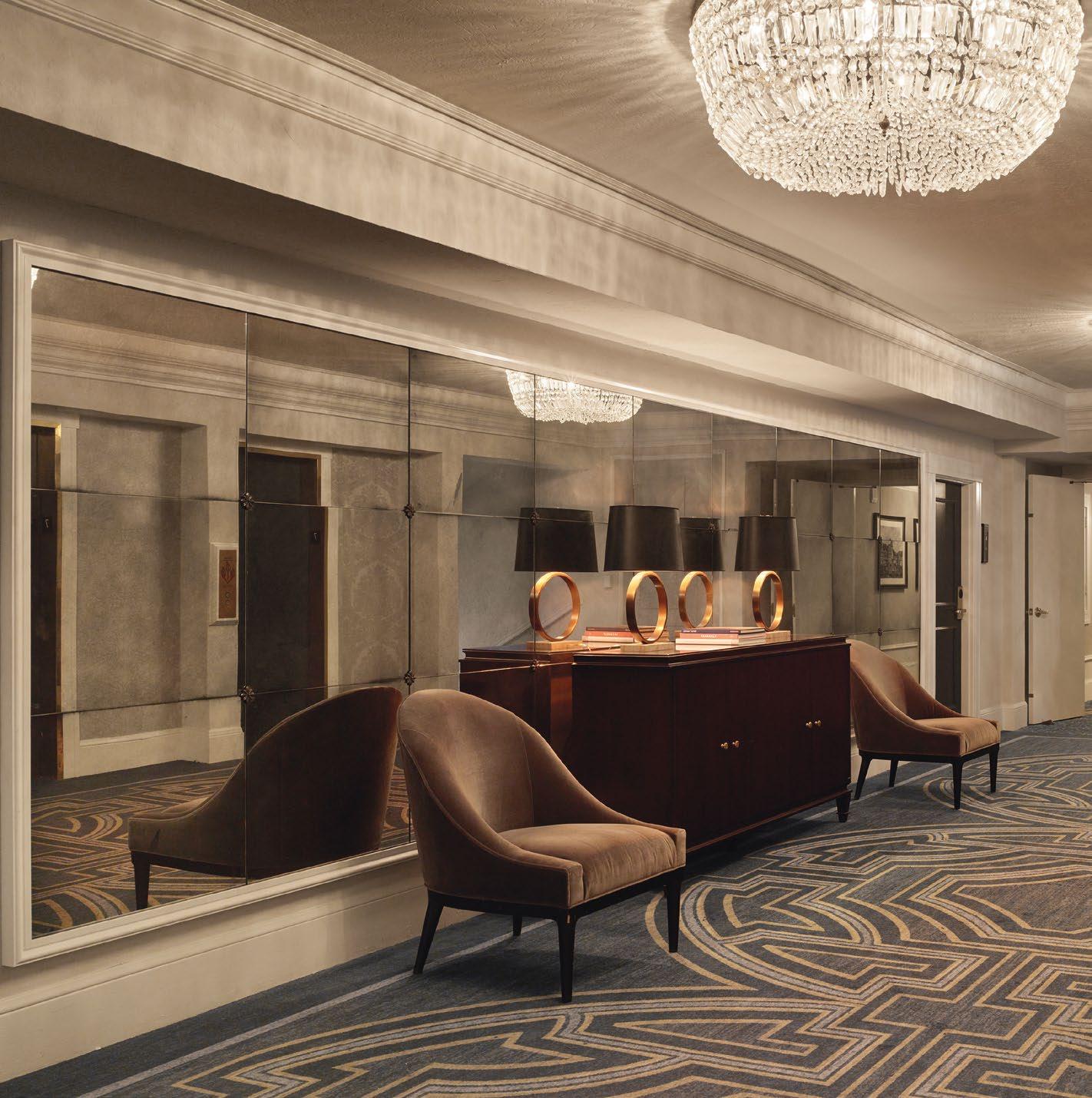
Built in the era of the Pan Pacific Exposition, the 276-room Claremont Hotel, across the Bay in Berkeley, boasts unparalleled views of the City and 22 acres of lush landscaping and club facilities. To honor the hotel’s rich heritage, Gensler’s redesign of the guestrooms and corridors evoke a bygone era of classicism by preserving the castle-like architecture, while imbuing them with the comforts and amenities required by today’s savvy guest.
The luxury hotel features a spa and club facility that features a kid’s pool, as well as a tennis and fitness center; an estimated 20,000 square feet of meeting space, which encompasses the 450-person Empire ballroom; a private social and tennis club; three existing restaurants and lounges; and a new brasserie.
There are two distinct color and decor schemes used, both hearkening back to unique aspects of the hotel’s history. One is “City Escape,” which evokes a feeling of nostalgia with travel-inspired details and a classical design sensibility. Deep hued navy leather, soft blue tones, dark woods and brass detailing invite
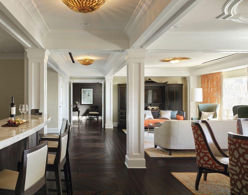

 TOP & BOTTOM: Navy leather, soft blue tones, dark woods, and brass detailing create a welcoming atmosphere for guests to relax and recharge.
Photo Credits: Matthew Millman Photography
guests to settle in and recharge. The other décor scheme, “Garden Glamour,” gives a nod to the lush grounds with modern floral accents in lavender and pear green, champagne finishes and vibrant hues to create a fresh, bright mood.
Although the feel of the spaces is classic, the amenities are state-of-the-art. The Presidential Suite is an entirely new space that was created by combining two existing suites into a stunning masterpiece designed with an eye toward capturing the classic lines of the hotel, while speaking to a modern upscale experience.

Most of the guest bathrooms have been completely redesigned to evoke a timeless, upscale spa environment. There are elegant Italian marble floors and vanities, polished chrome fixtures and detailing, gleaming glass shower doors, and backlit mirrors, some incorporating data screens. Many have freestanding soaking tubs and most have views of the City. The traditional finishes and detailing coupled with all the modern touches provide the guest with the best of both worlds.
 104 | H+R
TOP: Elegant Italian marble floors, polished chrome fixtures, gleaming glass shower doors, and backlit mirrors add to the upscale bathroom design.
BOTTOM: A combination of traditional finishes and modern touches offer guests the best of both worlds.
| HOTELRESORTDESIGN.COM
MOST OF THE GUEST BATHROOMS HAVE BEEN COMPLETELY REDESIGNED TO EVOKE A TIMELESS, UPSCALE SPA ENVIRONMENT. THERE ARE ELEGANT ITALIAN MARBLE FLOORS AND VANITIES, POLISHED CHROME FIXTURES AND DETAILING, GLEAMING GLASS SHOWER DOORS, AND BACKLIT MIRRORS, SOME INCORPORATING DATA SCREENS.
 THIS PHOTO: Redesigned bathrooms now offer a luxurious, spa-like atmosphere
DIRECTLY ADJACENT TO THE MAIN LOBBY LOUNGE IS THE HILLARY TENZING LOUNGE, CONCEIVED TO PAY HOMAGE TO THE FAMOUS MOUNTAINEERING DUO OF SIR EDMOND HILLARY AND HIS SHERPA, TENZING NORGAY. WITH PRICELESS VIEWS OF THE BAY, THE LOUNGE IS INTIMATE, QUIET, AND FEATURES A UNIQUE COLLECTION OF PHOTOS AND MEMORABILIA ENDORSED AND/OR PROVIDED BY THE HIMALAYAN FOUNDATION.
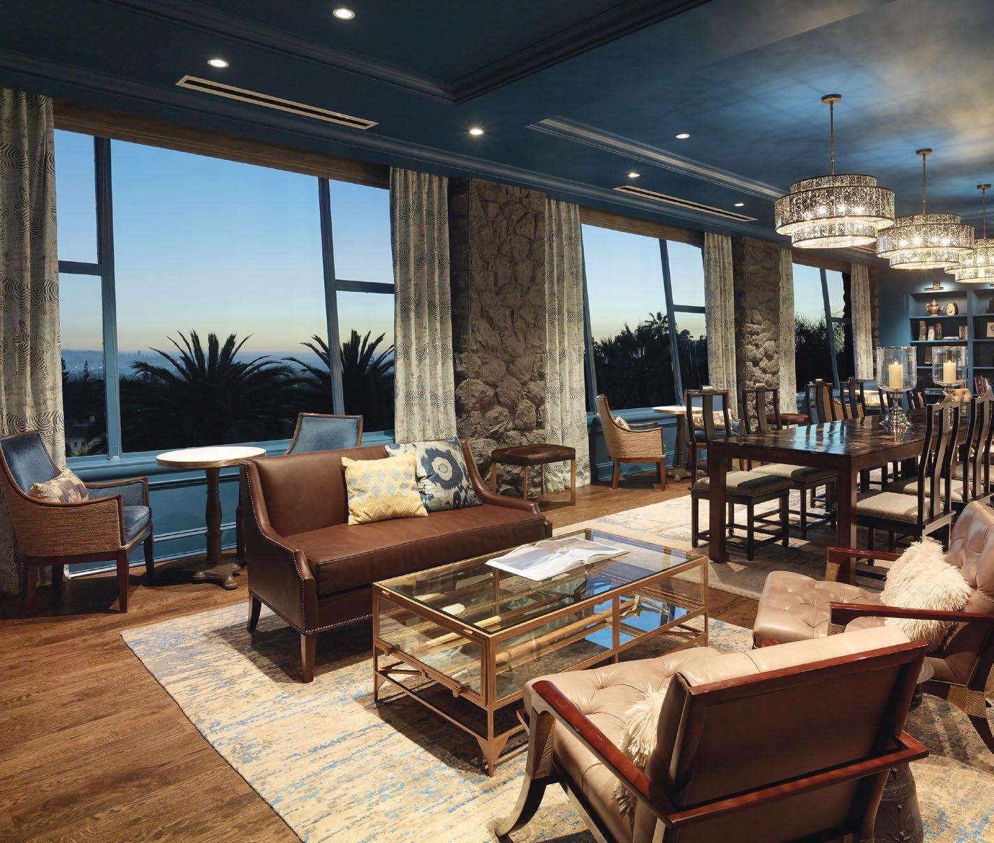


Although the guest rooms received the most radical makeover, many of the Claremont’s public spaces have also been refreshed and reimagined. Directly adjacent to the main lobby lounge is the Hillary Tenzing Lounge, conceived to pay homage to the famous mountaineering duo of Sir Edmond Hillary and his Sherpa, Tenzing Norgay. With priceless views of the Bay, the lounge is intimate, quiet, and features a unique collection of photos and memorabilia endorsed and/or provided by the Himalayan Foundation. Like the rest of the hotel, this is a place to lose yourself in the romance of history while enjoying top-of-theline amenities and service in a world-class location and setting. The intimate lounge evokes feeling of nostalgia, hearkening back to the unique aspects of the iconic Claremont Hotel’s history. Claremont Club & Spa is ideal for those seeking either an active or restorative vacation with onsite amenities that allow for complete relaxation, or serve as a base for exploring the surrounding culture and activities.
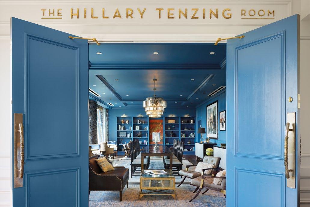 TOP & BOTTOM: Experience the romance of history while indulging in top-notch amenities and service at this worldclass location
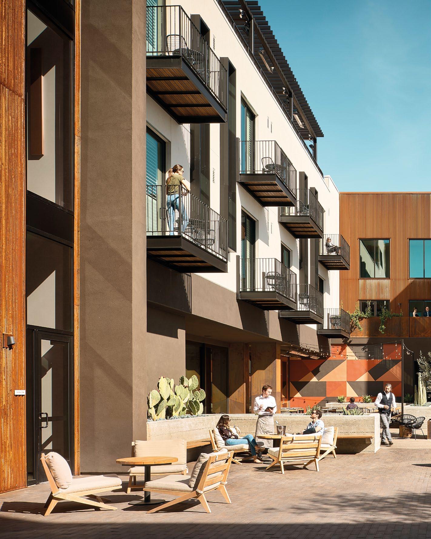
NESTLED IN SAN LUIS OBISPO’S DOWNTOWN, HOTEL SLO IS A MODERN URBAN RESORT THAT EMBODIES THE AUTHENTIC CULTURE OF THE CENTRAL CALIFORNIA COAST WHILE SERVING AS THE QUINTESSENTIAL COMMUNITY DESTINATION.
 THIS PHOTO: Located in the heart of the town, Hotel SLO showcases the rich history of San Luis Obispo while also embracing its vibrant fine art and bohemian music scene.
HOTEL SAN LUIS OBISPO | CALIFORNIA, USA
Once known as “the happiest place in America”, San Luis Obispo is a popular tourist destination located in the Santa Lucia Mountain foothills, known for its lively city centre, historic architecture and vast vineyards. Nestled in its quaint downtown, Hotel San Luis Obispo, or Hotel SLO is only steps away from premier restaurants and shopping, an independent movie theater, and the historic Mission San Luis Obispo de Tolosa.
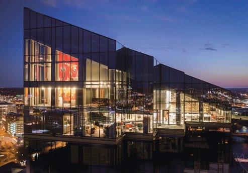
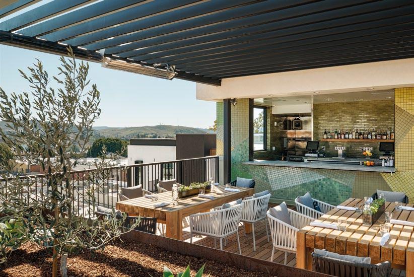
Gensler was engaged to create a ground-up hotel that allows visitors to experience the authentic culture of the California coast. Hotel SLO features an inviting 78-room boutique hotel with flexible gathering spaces that can accommodate 350 guests, amenities include a full-service spa, courtyard, pool, gym, and two on-site restaurants. The hotel’s sizable rooftop patio and adjacent lounge, High Bar, offers breath-taking views of the nearby mountains and San Luis Obispo’s bustling city. Offers a full bocce court, handcrafted cocktails, wine, craft beer, and light fare, High Bar also has a chef’s garden with lush plantings, the produce from which is used in the hotel’s two main restaurants, the informal Piadina and the fine-dining steakhouse Ox + Anchor.

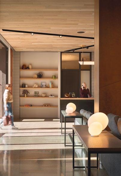
TOP: The hotel features a large rooftop patio with an adjacent lounge that offers breathtaking views of the surrounding mountains and the bustling city of San Luis Obispo
 THIS PHOTO: The lobby is designed with warm wood and features custom paper artwork, creating a relaxing and welcoming atmosphere for visitors as they enter
Inspired by simple agricultural buildings from the area and the wineries to the north and east, unique materials are used throughout including corrugated and plate Corten steel, terra cotta and brick screens, light and dark plaster, brick pavers, and cobblestone motor court. Ten local artists were commissioned for custom blackened steel pieces used as architectural elements.
Hotel SLO is a feast for the artistic senses, with its instagrammable living wall at the entrance, the “wood knots” found over each bed, and the limitededition prints of SLO architectural landmarks that are found in each room and hallway. Visitors entering the hotel are welcomed by a sizable, specially created, three-dimensional cut paper sculpture. The elaborate artwork incorporates many discoveries from the hotel’s own site digs to illustrate a multi-layered history of San Luis Obispo.
The hotel offers a large event space that serves as a gathering point in downtown, while elevated


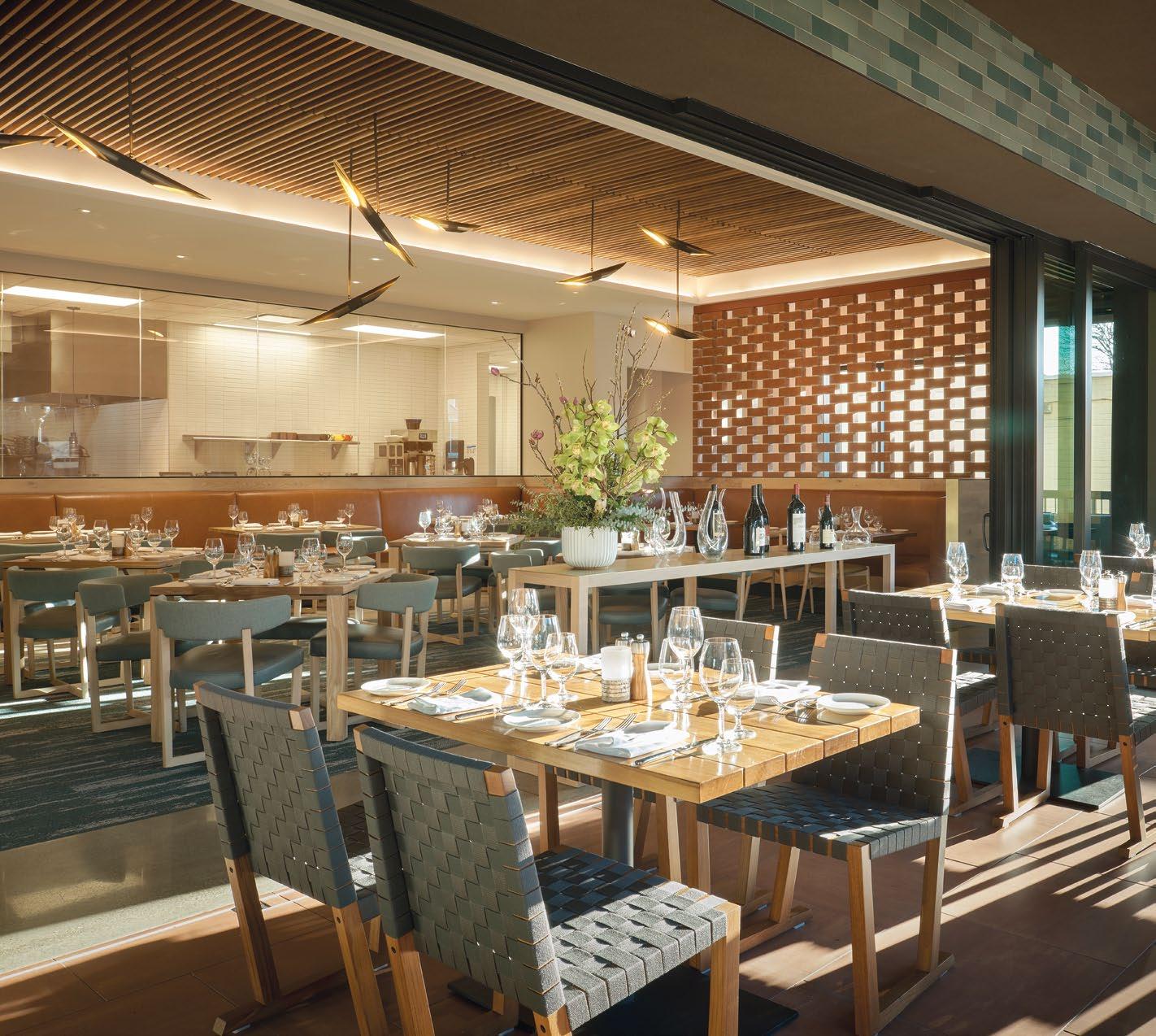
 TOP & BOTTOM: The Italian concept restaurant and adjacent bar has a beach bonfire-inspired interior with shades of light ash wood and terracotta tones
food and beverage experiences attract more intimate groups. A public courtyard accented with outdoor sofas, teak chaise lounges, and firepits is just one of the many outdoor spaces that are meant to be yearround sanctuaries. The hotel’s garden courtyard is divided by strolling paths and San Luis Obispo’s famous paseos, which connect it to Monterey Street’s dining and shopping districts. The design, which draws inspiration from the surrounding beautiful beaches, rolling vineyards, vast golden ranch lands, and volcanic mountains, is intended to be an exciting and distinctive social meeting space for its visitors and the local community. Hotel SLO is more than a downtown resort - it’s a cultural hub distinctive to the flavor of the region, making everyone who visits feel like a local.

Travelers who care about the environment will enjoy the hotel’s dedication to sustainability, which includes providing reusable water bottles to each guest, refill stations all across the property, and electric vehicle charging stations. The urban hotel is LEED Silver certified with features like a card key lighting control system, building control system, innovative envelope design, a cool roof, and a green education program for guests.
Built near the origins of the town, Hotel SLO’s design highlights San Luis Obispo’s history with its emerging fine art and charmingly bohemian music scene. An escape to Hotel SLO provides the opportunity to experience a SLO-er pace of life, with its popularity with visitors and locals, ultimately achieving its goal of being a community destination.
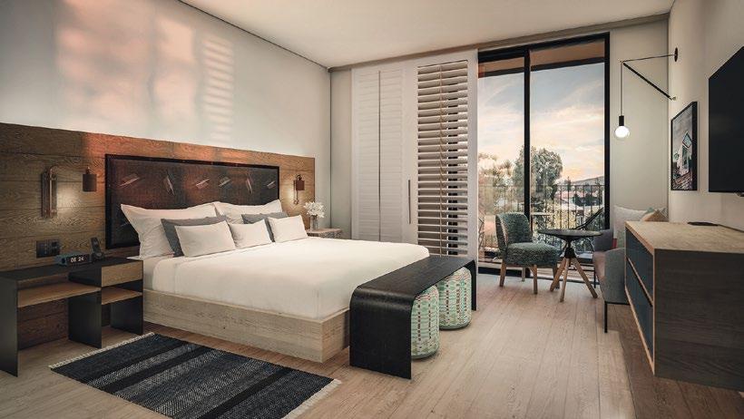
TOP: The eco-friendly rooms are naturally bright and spacious, with a modern, playful aesthetic that promotes relaxation

THE URBAN HOTEL IS LEED SILVER CERTIFIED WITH FEATURES LIKE A CARD KEY LIGHTING CONTROL SYSTEM, BUILDING CONTROL SYSTEM, INNOVATIVE ENVELOPE DESIGN, A COOL ROOF, AND A GREEN EDUCATION PROGRAM FOR GUESTS.
 THIS PHOTO: The indoor space, combined with the outdoor courtyard is versatile and can be used for a variety of purposes and events
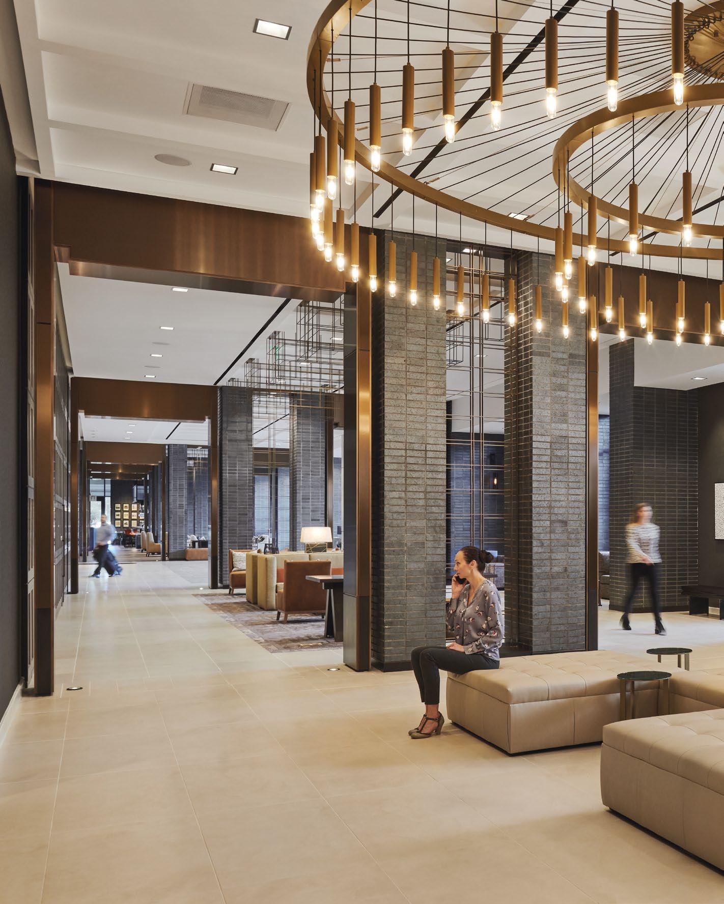
 THIS PHOTO: The design of the space combines industrial and natural elements, taking inspiration from the surrounding environment and local railroad history.
HOUSTON CITYPLACE MARRIOTT AT SPRINGWOODS VILLAGE | HOUSTON, USA
Part of the center of a walkable urban community, the Houston CityPlace Marriott at Springwoods Village sets a hard edge against its urban setting on one side, while gently engaging the site’s pastoral pond and woodlands on the other. Between the two, Gensler created a 339 key property which provides the guest with an energy which is distinctively urban, balanced with an ability to relax and unwind in this sustainable development. Drawing inspiration from the railroad and lumber industry in Spring, Texas, the space features metal detailing throughout, creating a distinctively urban ambiance that simultaneously acts as an oasis, taking guests away from the chaos of the surrounding city.

Elements that compose the influential history of Spring are incorporated throughout the space –from the brick colonnade to the stained wood panels, all accented in bronze detailing, down to the abstracted track switch art installed behind the reception desk. The lobby’s sophisticated design includes metal details that draw inspiration from the railroad industry, which both defined Spring’s past and paved the way for its future. As guests explore the conference center, they will notice subtle hints of the local pines and enjoy panoramic views across the ponds outside of the prefunction space. Here, the rustic brown carpets relate back to the needle-covered floor of the pine forest that was once on this site.
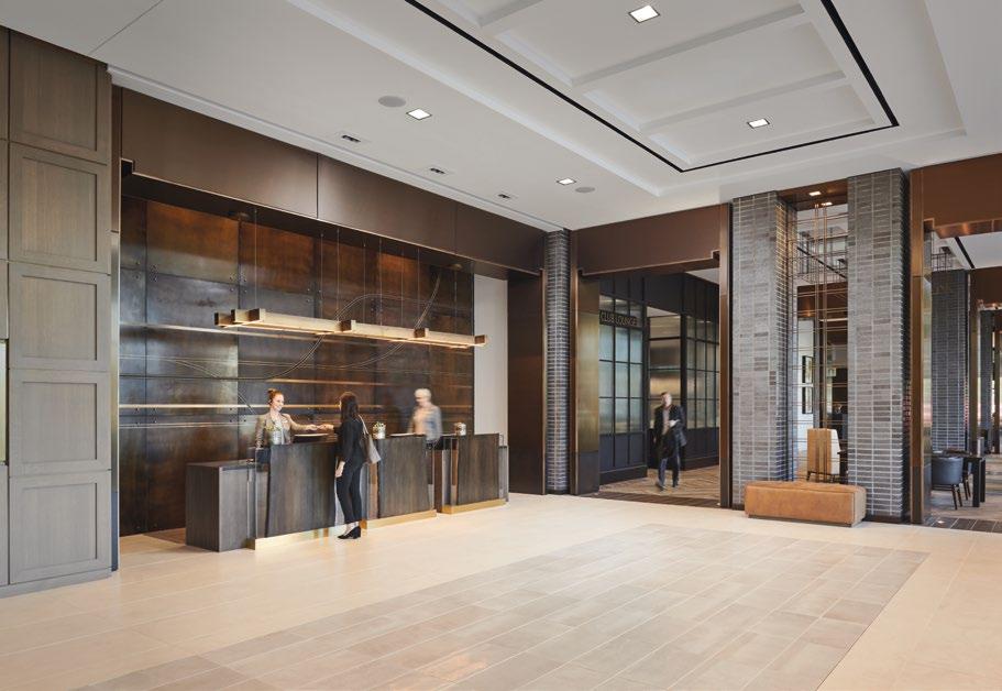
TOP & BOTTOM: Above the front desk and main lobby elevators, rail-inspired metal detailing are arranged in a decorative display

 THIS PHOTO: Guests are greeted with vast, open spaces and views through soaring glass windows
GRACEFUL AND SOPHISTICATED, THE DESIGN OF HOUSTON CITYPLACE MARRIOTT AT SPRINGWOODS VILLAGE IS INSPIRED BY MEANDERING PATHS, FOREST TRAILS, FLOWING CREEKS, CALM LAKES, AND INDIGENOUS SPECIES OF OAK AND PINE. THE LAYERING OF REGIONAL AND HISTORIC DETAILS ARE THOUGHTFULLY CRAFTED IN A CONTEMPORARY STYLE TO CAPTIVATE AND CONNECT GUESTS TO THE BRAND.

Graceful and sophisticated, the design of Houston CityPlace Marriott at Springwoods Village is inspired by meandering paths, forest trails, flowing creeks, calm lakes, and indigenous species of oak and pine. The layering of regional and historic details are thoughtfully crafted in a contemporary style to captivate and connect guests to the brand. The brick and stone elements nod to the urban setting, while earth tones and long-leaf pine relates closely to the landscape native to this land, establishing a distinct link to nature. Returning to the urban edge, the bar and restaurant, Switchouse, invites the working community into the property morning, noon and night. In addition, the hotel features unique spaces including a grand ballroom, a junior ballroom, five meeting rooms, a boardroom, a pool bar event space and an expansive outdoor event area.
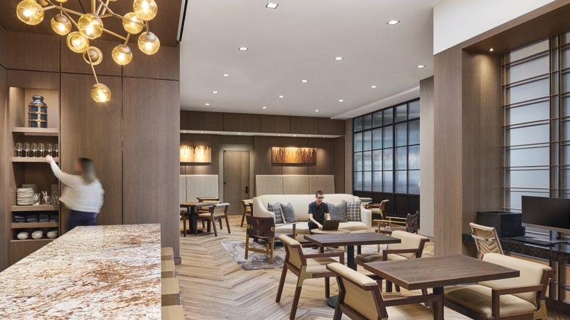
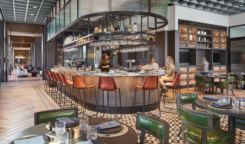
 MIDDLE & BOTTOM: Diverse configuration of seating options help to accommodate the varied needs of guests
Being USGBC’s LEED Silver certified, the hotel places special emphasis on building envelope design and mechanical systems performance. The mechanical systems for the guestrooms have an enhanced locking system, which allows the building to understand room occupancy and adjust the mechanical system accordingly in order to save on cooling loads. The building massing allows for primary views to the north and south, away from the major interstate highway, which also provides for minimized western exposure to heat gain. Additionally, the pool deck is located in such a way as to receive sun throughout the spring, summer and fall.

Houston CityPlace Marriott at Springwoods Village celebrates the journey of a new way of being for a new generation, leading the growth of Spring, Texas into the twenty-first century, offering a variety of uses for residents to live, work and play in one place. It supports guests who are traveling through locations and life by empowering, captivating, and delighting them. The hotel is a unique destination for both locals and travellers alike, an alternative hospitality experience.
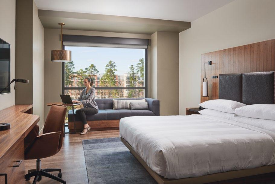
TOP: In addition to wood flooring, the rooms also feature tooled-leather headboards and lounge furniture

BEING USGBC’S LEED SILVER CERTIFIED, THE HOTEL PLACES SPECIAL EMPHASIS ON BUILDING ENVELOPE DESIGN AND MECHANICAL SYSTEMS PERFORMANCE. THE MECHANICAL SYSTEMS FOR THE GUESTROOMS HAVE AN ENHANCED LOCKING SYSTEM, WHICH ALLOWS THE BUILDING TO UNDERSTAND ROOM OCCUPANCY AND ADJUST THE MECHANICAL SYSTEM ACCORDINGLY IN ORDER TO SAVE ON COOLING LOADS.
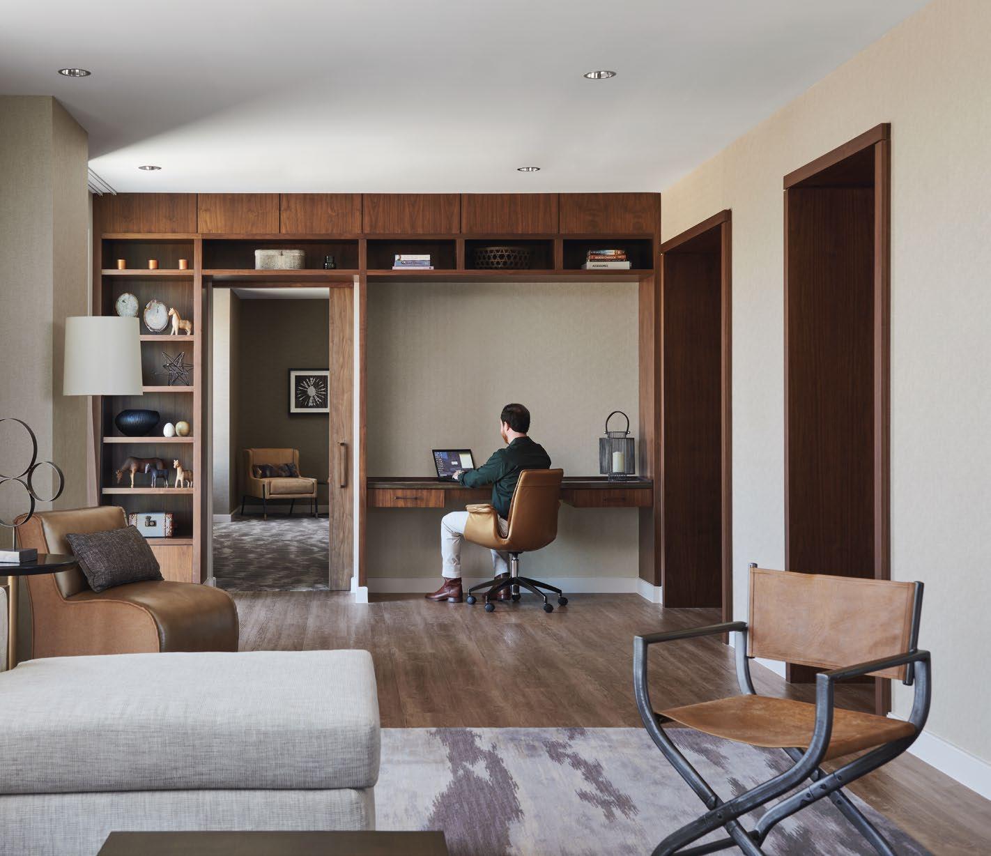 THIS PHOTO: The rooms are equipped with a flexible work station setup, along with soft tone colors to create a calming ambiance for guests

 DESIGNLAB by PRECIOSA LIGHTING
For Kamila Mizerakova, Managing Director of Preciosa Lighting Singapore, passion and creativity are her key inspirations. In this interview, she reflects on her journey with Preciosa Lighting and what it takes to lead the brand to great heights of success in this region.

Q: Can you describe your professional journey? What inspired you to venture into the lighting business?
A: My professional journey is literally paved with light (smiling) since my whole career has been connected with Preciosa and Bohemian crystal lighting. Bohemian crystal is a truly fascinating material and light has the magical ability to bring it to life. Once you start exploring it, you are captivated by a world of endless possibilities and enchanted with its potential to create emotions. It simply becomes a passion. Or an obsession (laughing). While one might find it old fashioned to stay with one company for 18 years, for me, it has been an exciting ride formed by interactions with the most inspiring and creative people from various businesses and cultures, always with the backup of the best professionals in Preciosa team. And I am truly grateful for it.
Q: In your opinion, how does Preciosa Lighting stand out from other lighting brands – globally, and within Singapore?
A: I have had the pleasure to work in London, Arabic countries and, Asia on an amazing mix of projects from residences and hotels to royal palaces and superyachts. Each client was unique with their very
own needs but there is one thing they all have in common. They all look for a trustworthy, experienced partner who will help them elevate their projects, bring additional value to their vision, see solutions others might not see both from the design and technical perspective and be there for them throughout the whole journey. I truly cannot imagine a better partner for this than Preciosa. We have an amazing collection of one hundred crafts under one roof in our factory in Crystal Valley, Czech Republic, the most talented artisans as well as state of the art technology specialists in our InnovationLab and a brand new collaborative space the Preciosa DesignLab. And indeed, the dedicated local teams guarantee support along the way and the execution of perfect results on site. Perfect light from our perspective is not only aesthetically pleasing but has the ability to engage with your emotions and create a unique experience, a memory that will last.
Q: When was Preciosa Lighting established in Singapore? What led to the decision to set up in this region?
A: The Preciosa branch in Singapore was incorporated in 2002 so we are excited to celebrate our 20 year anniversary! This region was full of opportunities 20-years ago and it is still today. We are extremely grateful we could participate in the forming of a highend hospitality scene here many years ago and it is a great testimony for us that the same clients reach out again when they plan refurbishments now.
A: Preciosa Lighting has come a long way. From a solely strong retail portfolio to one of the strongest leaders in the bespoke hospitality lighting industry. Along the way, we opened our InnovationLab for the R&D team. We launched the first kinetic installation Crystal Automata in 2017, followed by the awardwinning interactive Breath of Light in 2018 and the introduction of our design concepts, Preciosa Signature Designs, in 2019. This November, we opened an interactive space for designers to learn, play, and create with crystal and light - The Preciosa DesignLab.
So today, our portfolio’s historic chandeliers and contemporary projects can be found in hotels, resorts, fine restaurants, luxury residences, cultural institutions and on-board yachts and cruise ships in locations as varied as New York, Hong Kong, Dubai, Moscow and London and of course, here in Singapore.
We focus on delivering added value for your customers. It is all about understanding their circumstances, needs and preferences. So I would say that the most important key milestone for us is a happy client. With every client we start their own lighting journey respecting a unique mix of their design intent, budget, and timeframe. If there is a happy client at the end of the journey, it is an important milestone for us regardless of how big or small the project is.
Q: What are some lighting trends that would drive Preciosa’s upcoming collections?
A: We prefer not to follow trends actually, we focus on creating lighting that is timeless; chandeliers and installations that will look as beautiful and memorable
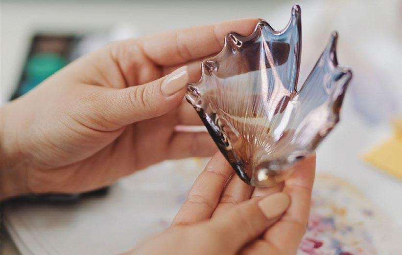
Q: What are some of the key milestones?Kamila Mizerakova
today, and in 10, 20 years’ time. Our mission is to connect people through light and our focus is to get the most emotion possible out of crystal. We will continue to do that through our dynamic and interactive installations. One recent example is Composition in Crystal which debuted at Milan Design Week 2022. It was just awarded a Red Dot award as well.
We also believe nature and natural materials will continue to inspire designers. Composition in Crystal was based on our Signature Design, Crystal Spin, which was inspired by the majesty of the polar lights. Two of our recent bespoke installations in Asia are inspired by nature. Garden Metamorphosis is a dynamic installation in Changi Airport. It blends in unique compositions, exploring the shapes and patterns of nature, capturing every moment of a garden’s neverending transformation. Another dynamic installation, Crystal Harmony, is in the lobby of the Shangri-La Qiantan. It’s a sculpture featuring crystal yulan flower petals and crystal wings.
In the first half of 2023 we will introduce a new Signature Design and in April we will attend Euroluce in Milan, so many exciting things are coming up.
Q: What’s in the pipeline at Preciosa? What can we look forward to in the final quarter of 2022, and 2023?

A: It has been a busy end of the year for us. We are still finalising some projects which were delayed by the pandemic measurements and are finally being completed now. We are eagerly starting new projects which might appear on the skyline in 2024 or later. Everyone and everything is in full swing now.
You can soon admire our masterpiece at the new convention centre in New Delhi, a more than 100-meter long Bohemian crystal dynamic lighting sculpture inspired by the goddess Saraswati. Also, we have fine luxurious chandeliers in the newly refurbished Paiza casino at Marina Bay Sands and next year our enormous bespoke installation will be a key part of a public areas refurbishment of one of the iconic hotels in Marina Bay. I would also mention the newly opened shopping mall in Riyadh, for which we have designed three large-scale installations based on our Signature Design Crystal Spin. Then we have the honor of decorating the Royal Family Palace in Thailand with our classic chandeliers. And from the Maritime programme we light up a private yacht lighting fixtures that are inspired by underwater corals. Stay tuned.
Q: How has the pandemic affected the brand? What were the challenges and opportunities? A: It was indeed challenging for us as for anyone else. The firmly closed borders in this region which lasted for nearly two years were something none of us counted on in their business plans. Nevertheless, it was also an opportunity to prove one of our strengths, local presence. Against all odds we have successfully completed the installation of artistic bespoke chandeliers and a stunning crystal tree in the JW Marriott in Bangalore in India, installed a dynamic lighting sculpture at the Changi airport in Singapore and also fitted the Laos National Assembly house with 24K gold chandeliers. The last one was almost a mission Impossible; not because the main
chandelier was an artistic, 3m diameter crystal flower hanging in a dome 30m above the floor; but because our technician had to spend in total six(!) weeks in quaranteen to get to site and back. He made it and I believe it perfectly demonstrates our commitment to do anything to ensure our client´s projects are successful.
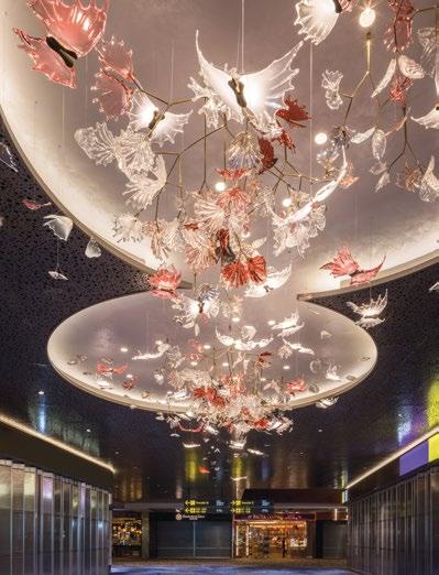
Q: Anything else that you would like to add?
A: One part of my job I truly enjoy are trips to our factory in Czech Crystal Valley. There is no better place where clients can understand what makes a Preciosa experience so distinctive and immerse in the breathtaking craft, expertise and innovation. In November, we opened a new interactive space for designers to creatively engage with crystal and light - The Preciosa DesignLab. It encompasses 2000 square metres and features 2500 crystal samples with various treatments, colours and lighting sources. This will help designers easily navigate through the crystal’s optical, aesthetic, and illuminating properties. The collaborative space showcases the range of talent and craft Preciosa possesses, from its long tradition and extensive glassmaking know-how to the materials and their variations and the latest technologies. The Preciosa DesignLab aims to bring inspiration to and educate designers and architects; making the creative process of designing decorative lighting a simple and enjoyable experience. It is an exciting and enlightening space and we look forward to seeing you there!
THROUGH BESPOKE ITALIAN CRAFTSMANSHIP AND MATERIALS, TOBI-ISHI PORTRAYS A NEW ARCHITECTURAL LANGUAGE THAT BRIDGES THE GAP BETWEEN FORM AND FUNCTION.

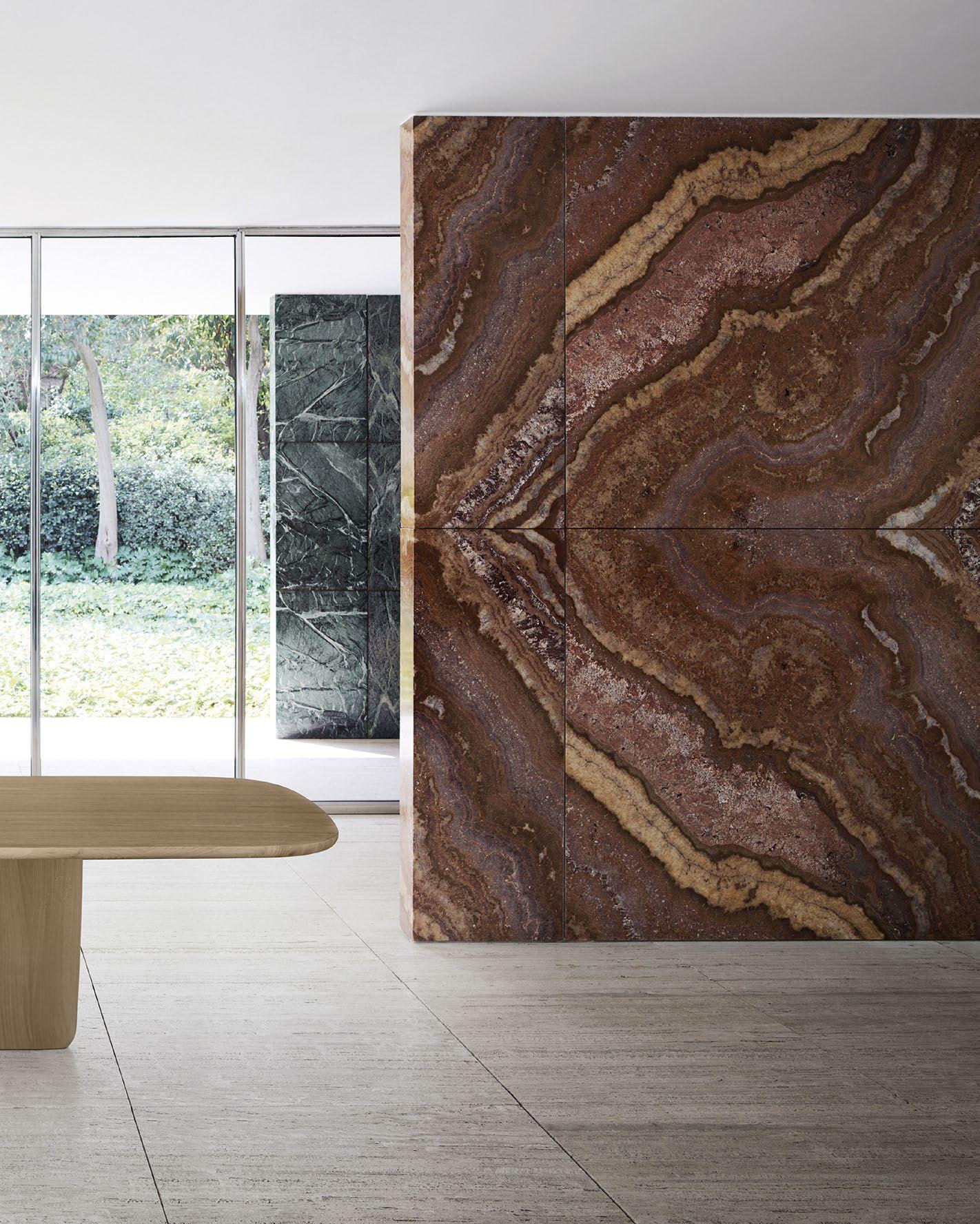 THIS PHOTO: In its ten years of life, the Tobi-Ishi table has become a true icon of international design with its sculptural aesthetic.

“THE TOBI-ISHI TABLE IS A MONUMENT. IT HAS BECOME AN IMPORTANT PIECE FOR THE STUDIO OVER THE LAST 10 YEARS, NOT LEAST BECAUSE IT MARKED OUR FIRST COLLABORATION WITH B&B ITALIA. THE TABLE’S SCULPTURAL NATURE ENABLES US TO INTERPRET THE ELEMENTS IN DIFFERENT MATERIALS AND THIS HAS BEEN PART OF THE NARRATIVE FROM THE BEGINNING. TO MARK THE 10TH ANNIVERSARY WE LOOKED AT PRE-MEDIEVAL AND MEDIEVAL BUILDINGS IN ITALY AND THE INCREDIBLE USE OF MARBLE THERE. THE NEW, CELEBRATORY TOBI-ISHI TABLE IN MARBLE, UTILISES A MATERIAL AND TECHNIQUE THAT AMPLIFIES OUR DEEP PERSONAL LOVE OF BOTH THE COUNTRY’S AND B&B ITALIA’S DESIGN HERITAGE.”
Edward Barber and Jay OsgerbyAmonumental piece that transcends time, The Tobi-Ishi table has evolved into a true icon of global design over the decade. This remarkable piece of art comprises components inspired by the “flying stones” that mark the pools found in Japanese gardens, which give it an impeccably sculptural air in all of its forms.


“The Tobi-Ishi table is a monument. It has become an important piece for the studio over the last ten years, not least because it marked our first collaboration with B&B Italia,” says designers Edward Barber and Jay Osgerby. “The table’s sculptural nature enables us to interpret the elements in different materials, and this has been part of the narrative from the beginning. The new, celebratory Tobi-Ishi table in marble utilises a material and technique that amplifies our deep personal love of both the country’s and B&B Italia’s design heritage.”

As highlighted by the designers, the new edition of Tobi-Ishi, which is created with strips of white Carrara and green Alpi marble using a highly meticulous hand-crafting technique, evokes a distinctive balance of solidity and lightness. Moreover, with the use of Italian craftsmanship and materials, Tobi-Ishi portrays a new architectural language that bridges the gap between form and function, upscale and refined. This edition, in particular, features a surprising variation of the rectangular table measuring 310cm long and 114cm wide, resulting in a magnificently designed product that can comfortably seat ten diners.
TOP & BOTTOM: Tobi-Ishi takes on a new architectural flavour in this new edition, becoming even more exclusive and refined.

IMAGINATION


PRECIOSA DESIGNLAB ENCOMPASSES 2,000 SQUARE METRES AND FEATURES 2,500 CRYSTAL SAMPLES WITH VARIOUS TREATMENTS, COLOURS AND LIGHTING SOURCES AIMED AT HELPING DESIGNERS NAVIGATE THROUGH THE OPTICAL, AESTHETIC, AND ILLUMINATING PROPERTIES OF CRYSTAL.

Built on centuries of tradition and the unique art of master glassmakers from Crystal Valley, Preciosa Lighting elevates the heritage of Bohemian crystal through contemporary lighting designs. Preciosa honours this heritage and craftsmanship by creating innovative lighting products that stand the test of time.
One of the brand’s latest endeavours is Preciosa DesignLab, where designers are welcome to learn, play, and create with crystal and light. Located at Preciosa Lighting’s northern Czech Republic production facility and headquarters, Preciosa DesignLab encompasses 2,000 square metres and features 2,500 crystal samples with various treatments, colours and lighting sources aimed at helping designers navigate through the optical, aesthetic, and illuminating properties of crystal. Ultimately, the lab provides designers with the opportunity to delve into the intricacy of working with light and crystal, bringing their lighting visions from concept to completion.
“Preciosa DesignLab is a space dedicated to inspiring, dreaming and creating,” says Michael Vasku, Creative Director of Preciosa Lighting and co-designer of DesignLab. “It encompasses our 300 years of heritage, our knowledge of handmade glass production, and the latest innovative technologies strengthened by our interdisciplinary approach. We can’t wait for designers to come and play with crystal and light.”
TOP: There are over 2,500 components of different shapes, colours, treatments and lighting effects for designers to explore and experiment with.
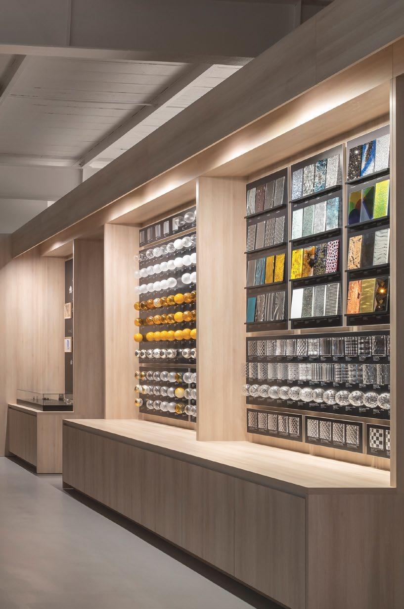

Visitors to Preciosa Lighting’s factory are often impressed with the brand’s impeccable craft, expertise, and innovation. Preciosa DesignLab offers yet another sensory experience for the art of light where visitors can immerse themselves in the materials and technologies that makes a Preciosa light so distinctive. While Preciosa’s priority is to offer clients the best interactive experience, they have also set up a Digital DesignLab catering to clients who are unable to visit the centre in person. For instance, colours and materials can be digitally mixed and matched online to ensure they work with one another.
“Our goal every single day is to make the process of concepting and specifying lighting projects a simple and enjoyable experience for our clients,” adds Andreas Klug, Creative Director of Preciosa Lighting and co-designer of DesignLab. “Crystal and light can be a challenging combination to work with. Understanding our client’s needs, wishes, and challenges helps us create better and more approachable products and services.”


Above all, Preciosa DesignLab is more than just about materials and technology, as visitors are taken on a journey of the senses. Meeting artisans, discovering over 100 crafts, feeling the heat of the furnace, witnessing master craftsmen at work...it’s an experience of a lifetime to see how Preciosa’s incredible creations come to life.
 TOP LEFT & RIGHT: Designers can mix and match colours and materials on site to see how they work together, while physical samples add to the individual experience.
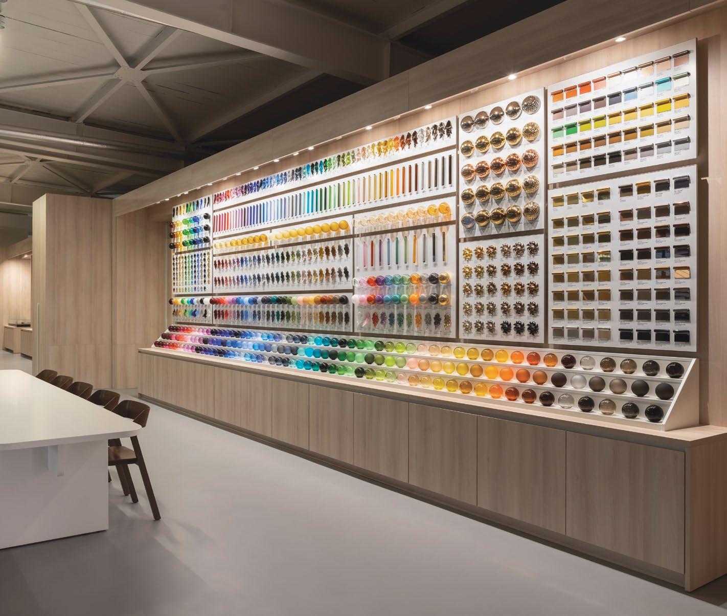 THIS PHOTO: At Preciosa DesignLab, designers have the opportunity to touch the metals and fabrics, compare colours, and experience the effect light has on crystal.
PRECIOSALIGHTING.COM
“IT ENCOMPASSES OUR 300 YEARS OF HERITAGE, OUR KNOWLEDGE OF HANDMADE GLASS PRODUCTION, AND THE LATEST INNOVATIVE TECHNOLOGIES STRENGTHENED BY OUR INTERDISCIPLINARY APPROACH. WE CAN’T WAIT FOR DESIGNERS TO COME AND PLAY WITH CRYSTAL AND LIGHT.”Michael
THANKS TO ITS VERSATILE UPHOLSTERED PIECES, THE MODULAR PERRY SEATING SYSTEM HERALDS A NEW WAY OF DESIGNING SEATING LANDSCAPES THAT GO BEYOND THE ORDINARY.


 THIS PHOTO: The modular Perry seating system is composed of understated upholstered pieces that can be combined in different ways.
TOP & MIDDLE: An interesting detail is the option to replace the upholstered armrest with a cowhide-clad container element that comes with a handy storage compartment.
With its highly flexible design, the modular Perry seating system comprising versatile upholstered pieces can be assembled in various ways. Using modules with an irregular shape to break up straight-line compositions, this modular collection makes it possible to create unique seating configurations with a more casual and dynamic flow. For the modern home, Perry seamlessly offers plenty of versatility to create a new way of designing living spaces.


Perry impresses with its elegant appearance, where its adaptable form gives rise to a flexible style to fulfil different spatial requirements. The collection comes in a wide range of modules – stand-alone, L-shaped, asymmetrical seating components, ottomans, chaise longues, and storage components, which lets users create a variety of seating landscapes, from traditional stand-alone versions with scaled-down sizes to more complex and expansive solutions. Whether it’s for residential living spaces or public settings within a hotel or resort, Perry is designed to enliven spaces with a cordial and contemporary flair.
Some of the distinguishing characteristics of the Perry collection include soft curves, generously padded in goose down, calibrated proportions, and impeccable tailoring elements, such as the piping that outlines the silhouette of the upholstered pieces. Another interesting key feature of this seating system is the option to swap out typical upholstered armrests with a chic yet practical cowhide-covered container element that comes with a nifty compartment for storing throws, magazines and books.
PERRY IMPRESSES WITH ITS ELEGANT APPEARANCE, WHERE ITS ADAPTABLE FORM GIVES RISE TO A FLEXIBLE STYLE TO FULFIL DIFFERENT SPATIAL REQUIREMENTS. THE COLLECTION COMES IN A WIDE RANGE OF MODULES – STAND-ALONE, L-SHAPED, ASYMMETRICAL SEATING COMPONENTS, OTTOMANS, CHAISE LONGUES, AND STORAGE COMPONENTS, WHICH LETS USERS CREATE A VARIETY OF SEATING LANDSCAPES, FROM TRADITIONAL STAND-ALONE VERSIONS WITH SCALED-DOWN SIZES TO MORE COMPLEX AND EXPANSIVE SOLUTIONS.
THIS PHOTO: Various modules are available, including stand-alone, L-shaped and asymmetrical seating elements, ottomans, chaise longues, storage elements and more.
FLEXFORM.IT
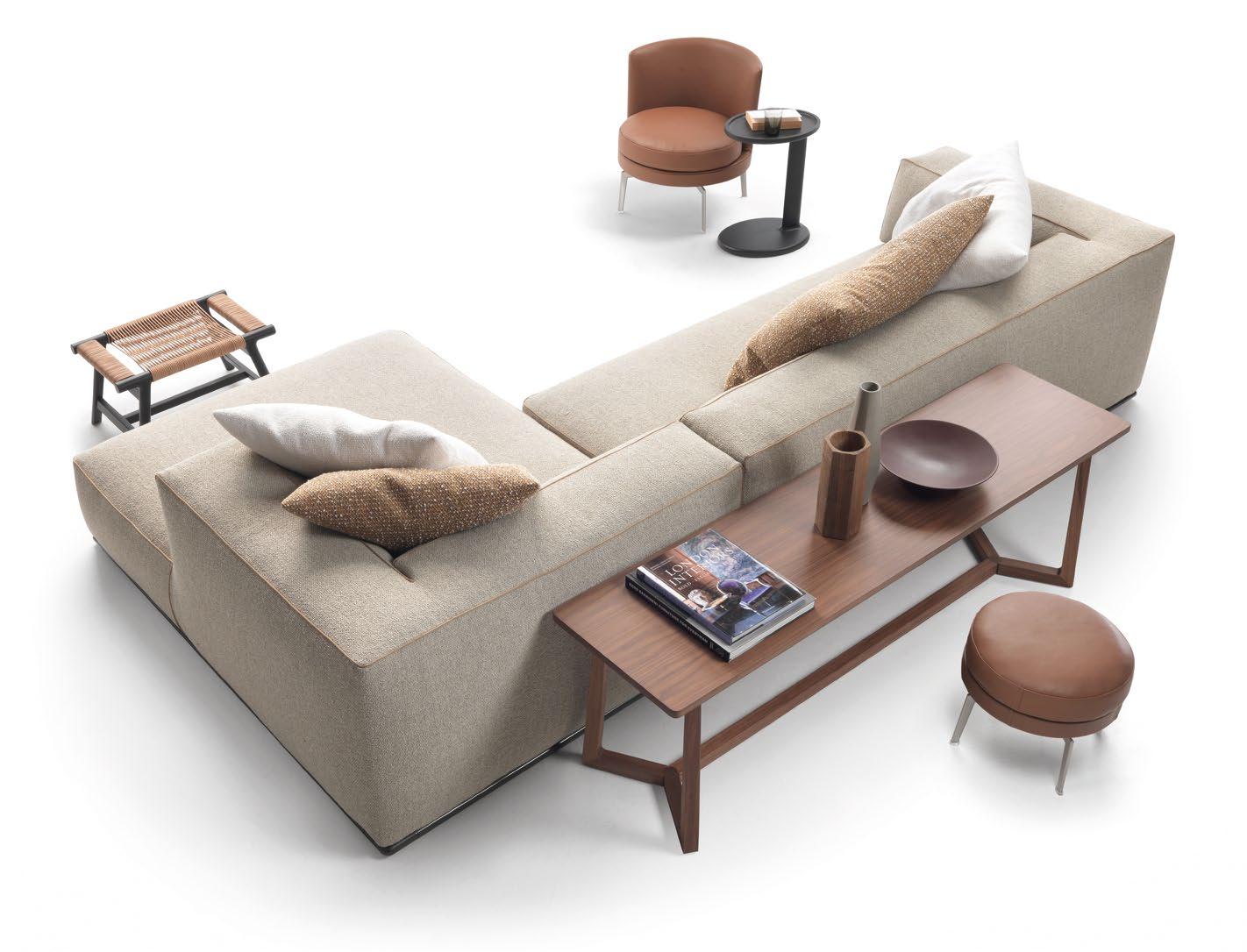
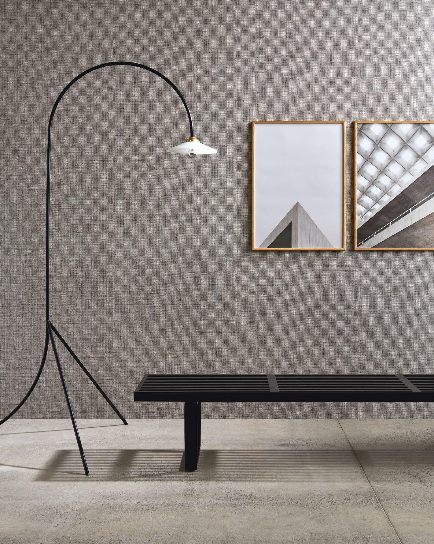
 THIS PHOTO: The Textura wallpaper collection brings forth the most beautiful textures found in nature to create striking effects on the wall.
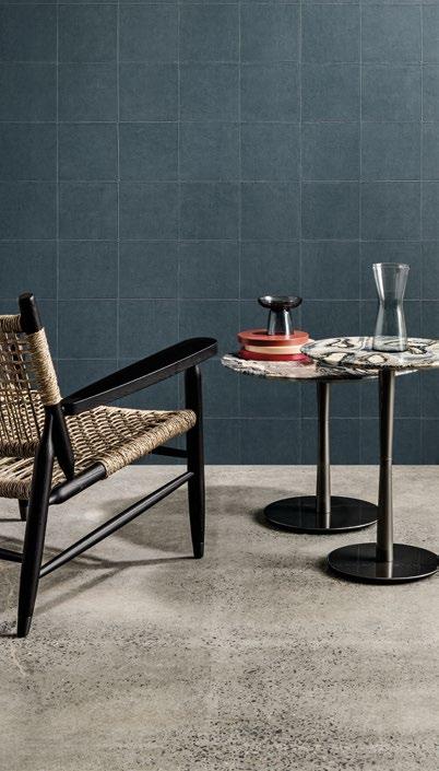
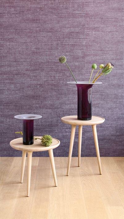


Inspired by nature, the Textura collection brings forth the beauty of woven grasses, braided leaves and even leather to grace the ordinary wall, turning our vertical surfaces into visually arresting focal points. To create an even more striking effect, rough or very finely woven linen and brilliant silk complement Textura’s unique wallpapers resulting in a truly eye-catching work of wall art.


Puro’s woven grass texture elegantly evokes nature, while Pandan is breathtaking with its diagonally woven tiled wickerwork. To generate elegance, Aspero further turns on its charm with its outspoken thicker weave. In addition, walls of woven grass from the Marsh series and Nongo wallpaper resembling traditional woven baskets from Zimbabwe provide a distinctive natural appeal.
For those who love the feel of leather, Weave’s braided leather relief creates a realistic impression of leather strips for a natural look. On the same note, Alma and Campo offer an authentic showcase of soft, luxurious leather, complete with all its natural nuances and irregularities.
Meanwhile, Eri is pure luxury with its open weave silk against fine mesh. Tasar, also inspired by silk, features subtle irregularities of silk fabric, resulting in a rich, intense colour palette. Other notable wallpapers from this elegant collection include the linen-dominant Canvas, the tropic-inspired Puro with its glossy finish, Lignes with its light and dark threads, the refined linen beauty of Gioco and Cuadro, which presents a patchwork of irregular rectangles.
