25 HOTELRESORTDESIGN.COM ISSUE SINGAPORE | HONG KONG | MALAYSIA | INDONESIA | THAILAND | VIETNAM
AND PARTNERS: PLACES OF DELIGHT AND SUBSTANCE A SPACE FOR EVERYONE | SERENITY IN NATURE | SUSTAINABILITY WITH ATTITUDE | CREATIVE FUSION | AN URBAN OASIS TEXTURAL SOPHISTICATION | AN UNFORGETTABLE WATERFRONT RETREAT | PLAYFUL AUTHENTICITY | POETIC MODERNISM
CONRAN




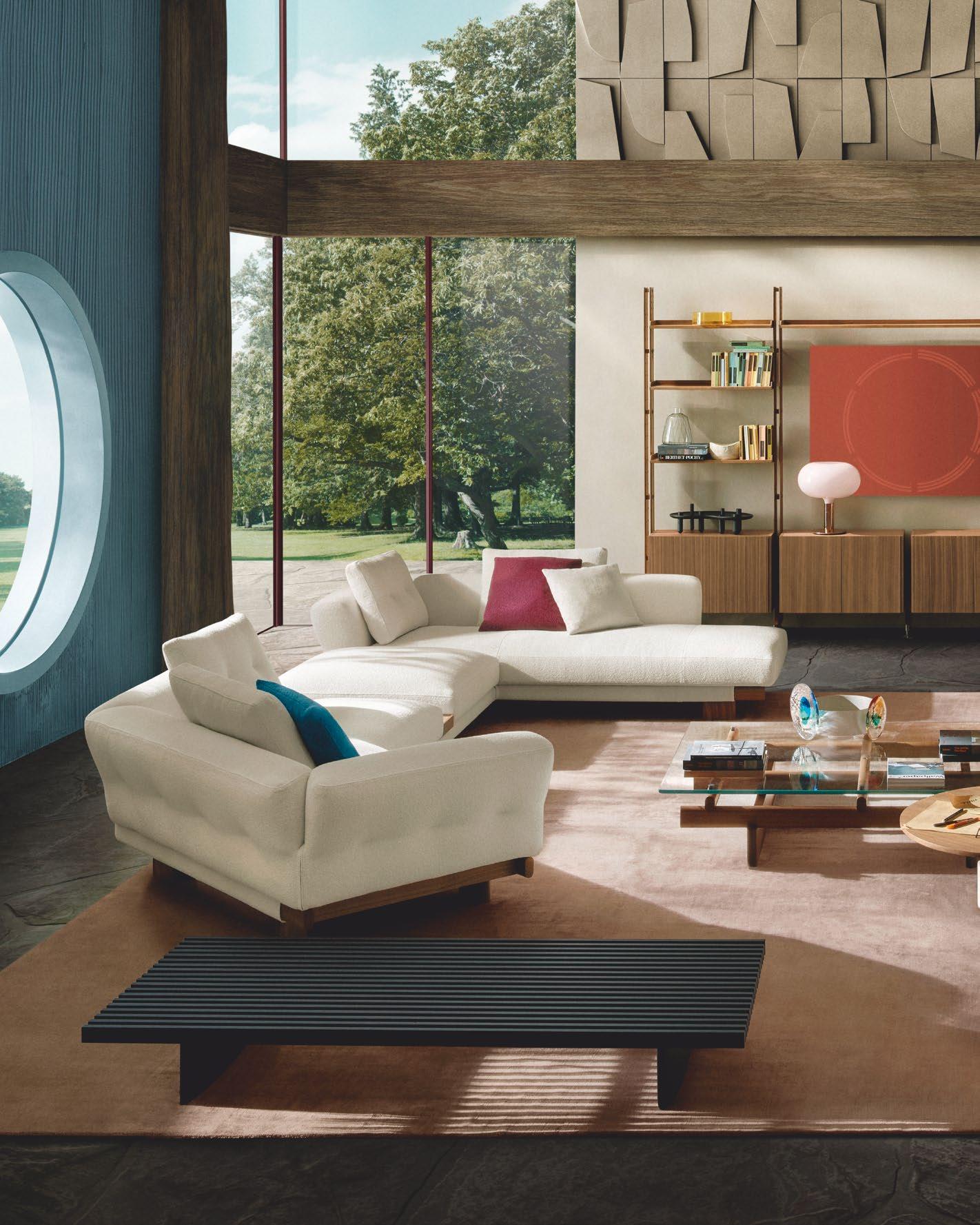

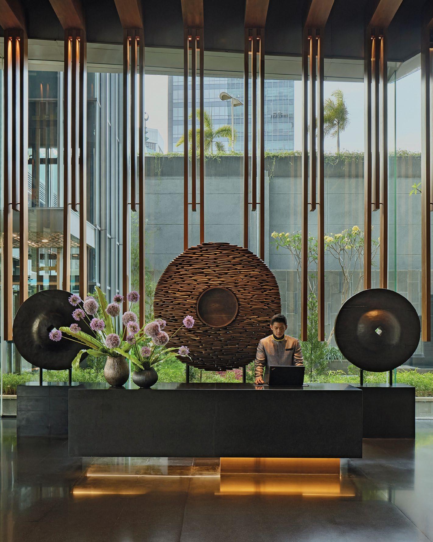
Hospitality design trends are not only prioritising sustainability and biophilic design principles that integrate nature indoors, but also incorporating heritage elements and flexible, multifunctional areas that cater to a diverse range of preferences.
CRAFTING EXPERIENCES, SHAPING SPACES
As always, we are thrilled to present to you the latest trends, innovative designs, and timeless inspirations shaping the hospitality industry’s landscape, where each space tells a story of class, comfort, and cultural richness.
In Showcase, we spotlight the masterful luxury hospitality design creations of internationallyrenowned architecture and interior design practice, Conran and Partners. From the textural sophistication of Nusantara artistry infusing Park Hyatt Jakarta to the winsome waterfront charm of Park Hyatt Auckland, from the fun-and-flexible East Hong Kong to the tony and tranquil Taj the Times Mumbai, these projects testify to the convergence of artistry, heritage, and modern luxury.
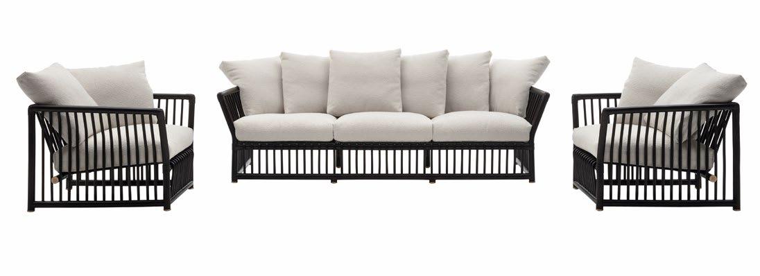
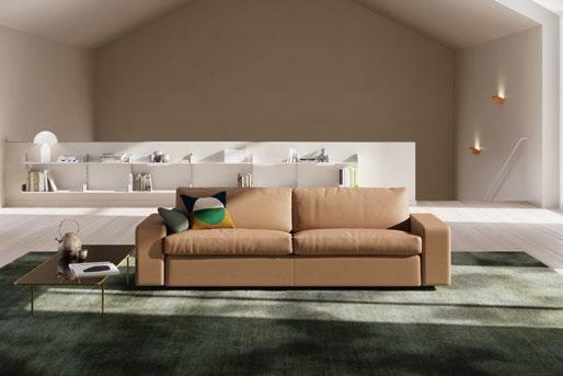
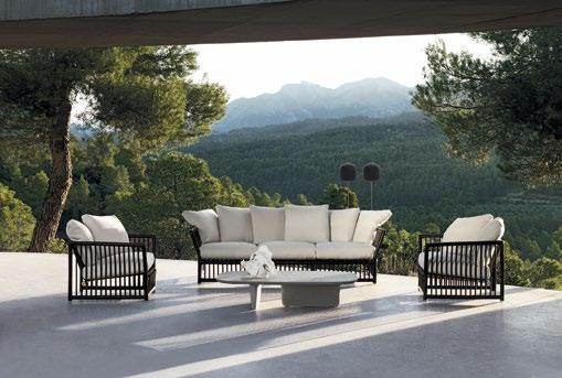
In Design Library, every piece of furniture narrates its own tale of form and functionality. Whether it’s the timeless elegance of COR’s Conseta sofa or the revival of rattan embodied in B&B Italia’s Softcage collection or the heritage of Royal Thai’s vaunted woven carpets and acoustic panels, each item promises to elevate spaces with its unique design, character and craftsmanship.
And in Mélange, we turn you to a run of exquisite furniture items, from shape-shifting sofa systems and all-weather armchairs to stylish storage solutions and a state-of-the-art shading element, carefully crafted in keeping with sumptuous hospitality spaces.
Whether you are a seasoned professional in the design industry or an enthusiast with a keen eye for design, we hope you do not merely see, but feel the narratives woven into every design, envisioning the extraordinary experiences they help create in the hearts of those who utilise these spaces and products.
Kenneth Khu k.k@kenneth-media.com
PUBLISHER’S NOTE
10 | H+R | HOTELRESORTDESIGN.COM
SOFTCAGE by B&B ITALIA
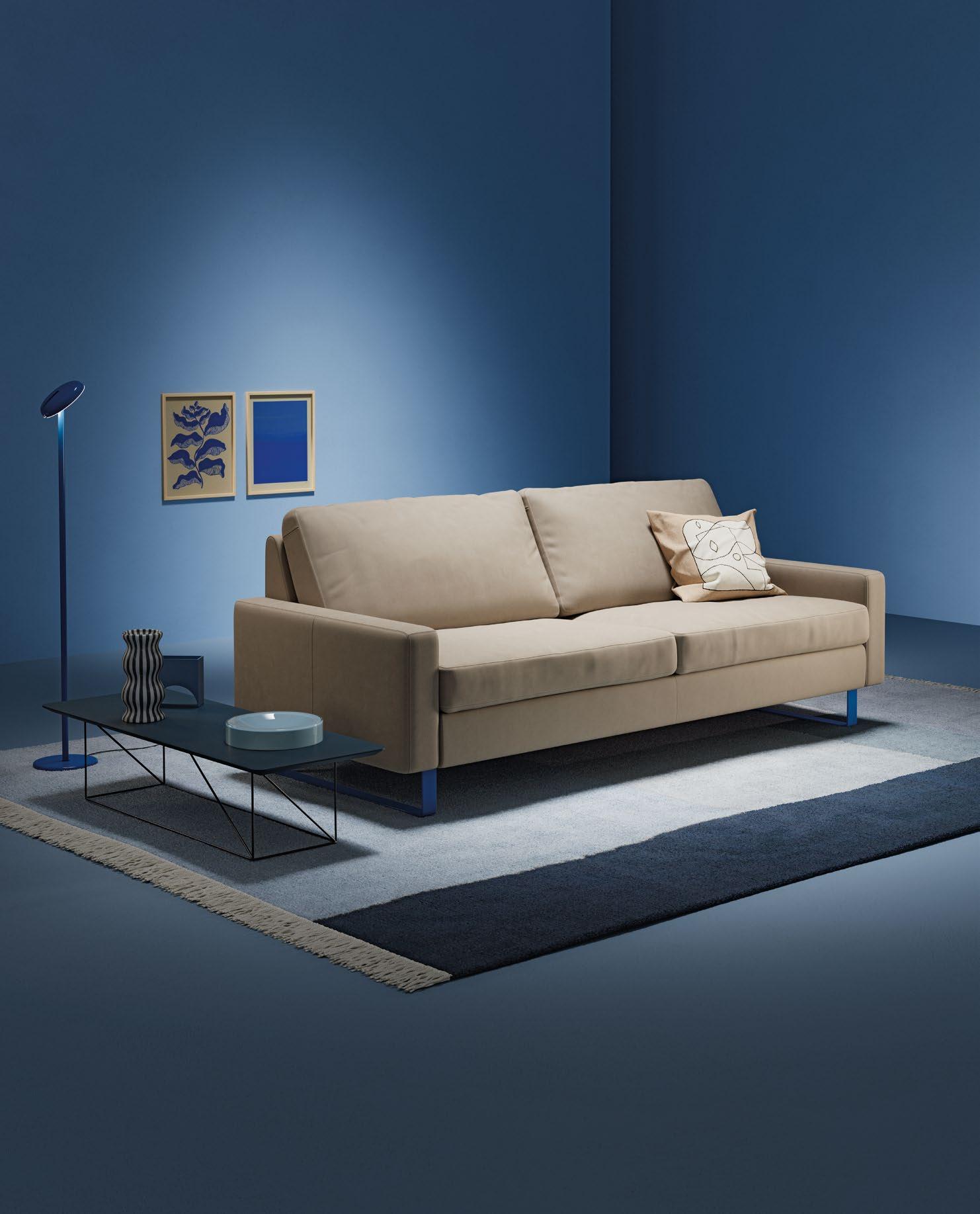
The f ac t that our C onset a is s till in such good shape af ter 60 years is due to it s timeles s simplicit y And it s sophis tic ated modular s ys tem, which c an be configured into countless combinations From seat dimensions, armres t s and foot shapes through f abric s and colours to various cushion filling s, it c an be composed according to personal preferences and requirement s How about elec tric blue runners, for example?
C on s e t a . N ew sin c e 1964 . C O R.D E / C ON S E T A
16 58 106 18 66 118 20 74 128 CONTENTS 12 | H+R
KISSS LOUNGE CHAIR
| HOTELRESORTDESIGN.COM
by MOOOI
ARTEMONE by MAXALTO
24 82 132 36 90 136 46 98 142
PAPYON by DEDON
ROLF BENZ SINA by ROLF BENZ

editorial
MANAGING EDITOR Kenneth Khu
DEPUTY EDITOR Pang Yin Ying
EDITOR Christine Lee
design
ART DIRECTOR Eric Phoon
SENIOR DESIGNER Sandy Liew
contributors
WRITERS Adele Chong, Lily Wong, Dorothy Lung
DESIGN STUDIO Conran and Partners
sales & marketing
SENIOR SALES MANAGER Edward Chen
SALES EXECUTIVE Kelvin Ong
publication
PUBLISHER Kenneth Khu
enquiries
ADVERTISING advertise@hotelresortdesign.com
SUBMIT EDITORIAL submit@hotelresortdesign.com
SUBSCRIPTION subscribe@hotelresortdesign.com
websites
hotelresortdesign.com kenneth-media.com
contact
KENNETH MEDIA SDN BHD
4, Jalan Hopea U15/28B
Elmina West, Seksyen U15 40170 Shah Alam, Selangor Malaysia.
T: +603 5038 3022
printer
PERCETAKAN IMPRINT (M) SDN BHD No.538, Jalan 20
Taman Perindustrian Ehsan Jaya, Kepong 52100 Kuala Lumpur Malaysia.
permit number
KDN PP18850/09/2015(034307) MCI(P) 085/03/2024
magazine
H+R | Hotel & Resort Design magazine is published three times a year and is circulated throughout the Asia-Pacific region. Opinions expressed are those of the contributors and not necessarily endorsed by the publisher.
copyright notice
All rights, including copyright, in the content of this publication are owned by Kenneth Media Sdn Bhd, Malaysia. You are not permitted to copy, broadcast, download, store in any medium,transmit, show or play in public, adapt or change any in any way the content of this publication for any other purpose whatsoever without the prior written permission of Kenneth Media Sdn Bhd, Malaysia.
credits
PHOTOS: Except otherwise noted, all photos and drawings are owned by photographer or design studio or project owner.
acknowledgement
COVER: Conran and Partners
PARTNERS
THE TREES by CONRAN AND PARTNERS
TEAM &
TAJ
14 | H+R PUBLISHED BY | HOTELRESORTDESIGN.COM

MODULAR MAGNIFICENCE
Maxalto’s Florius sofa system is timeless upholstered luxury revived. With its minimalist frame and manifold cushions, it is a contemporary take on bespoke comfort and chic. Florius presents two versions: a frame in wood or wood in shellac finish of black, red or soya, both complemented by cushions in fabric or leather upholstery. Florius’s myriad configurations ensure it adapts to any space. A pinstripe fabric option amplifies its modern allure.
EMBRACE THE ETHEREAL PUCKER PERFECTION
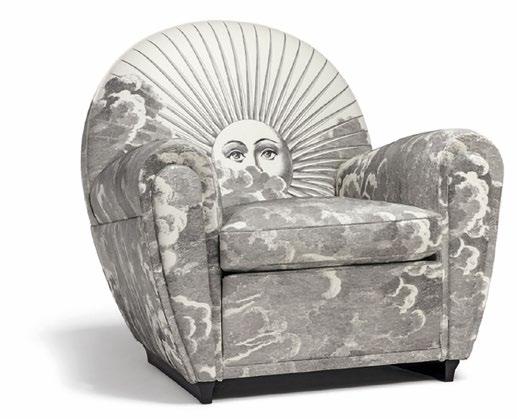
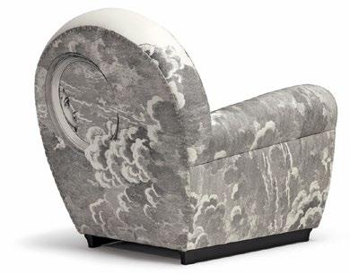
Revel in a dreamscape of luxury with Poltrona Frau’s Vanity Fair XC Imagine Edition armchair. Limited to just fifty pieces, each adorned with Fornasetti’s whimsical Soli e Nuvole motif, it’s Italian craftsmanship nonpareil. From its seasoned beechwood frame to the indulgent goose feather cushioning, every element oozes opulence. An alliance of artistry and design, this emblematic edition captures the celestial dance of the suns and moons in its lush Pelle Frau ® leather.
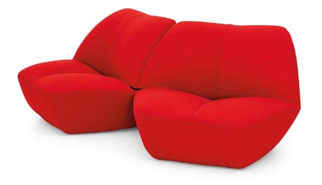
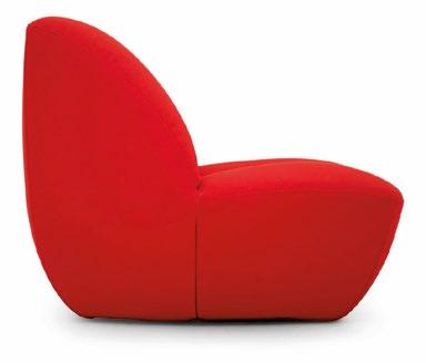
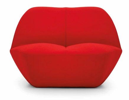
Kiss bland interiors goodbye with Kisss. Moooi’s lounge chair puckers up to interiors with a daring dash of red, mimicking Salvador Dali’s iconic lips. More than a seat, Kisss is a statement piece. Its curvaceous silhouette confers both comfort and chic, blending into any setting. An added boon is its connectable design, providing boundless configurations. Upholstered in Kvadrat Divina 3 wool, it’s a tactile delight in a multiplicity of hues.
1 2 3 MÉLANGE | PRODUCTS 16 | H+R | HOTELRESORTDESIGN.COM MAXALTO.COM POLTRONAFRAU.COM MOOOI.COM

FIBRE MOJO
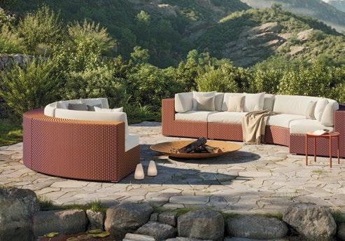
There’s something supremely soothing about simplicity. With its rectilinear modules, DEDON’s Mystique Bluo modular sofa offers countless creative configurations, from sinuous shapes to convivial circles. The exclusive Mystique Fibre mesmerises as it shifts between vibrant oranges and deep blues, thanks to innovative weaving techniques. This cutting-edge material not only reinvents fibre but also raises the bar for outdoor luxury. Loll in an aura of fibre wizardry with DEDON’s Mystique Bluo.
PATIO PIZZAZZ
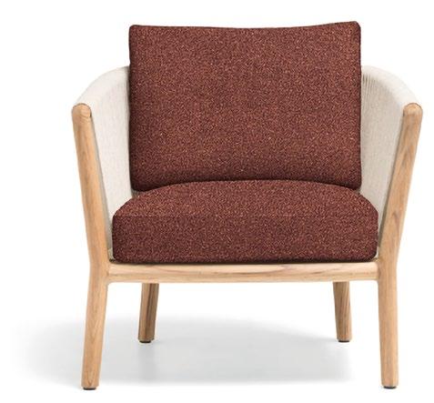
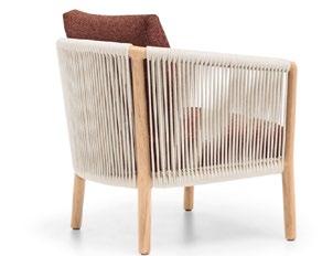
Molteni&C unveils the Boboli outdoor armchair, a masterpiece successfully integrating nature and innovation. Made of solid teak wood, its handwoven polypropylene fibre backrest exudes organic charm. Marta Ferri’s curated fabric options ensure personalised comfort, while its seamless design blends effortlessly outdoors. Paired with the Boboli sofa for a complete retreat, it exemplifies Molteni&C’s heritage of enduring elegance. With Boboli, elevate your outdoor space into a contemporary haven.
AL FRESCO ALLURE
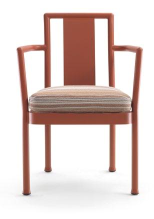
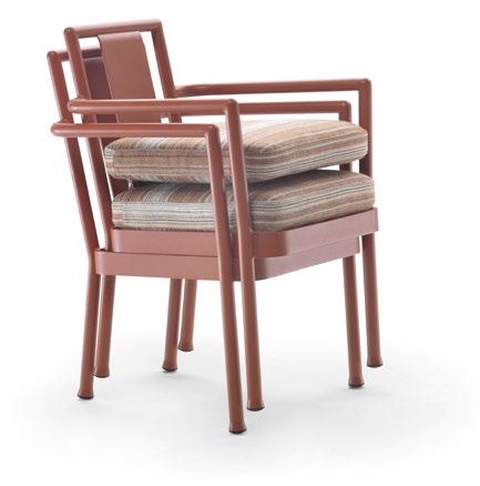
Camargue armchair evokes outdoor enchantment, melding durability with sophistication. Crafted from weather-resistant aluminium, its lightweight structure offers versatile seating solutions for any outdoor space. The soft lines and rounded corners showcase simplicity, while a choice of epoxy powder-coat finishes adds a dash of refined colour. Removable cushions beckon relaxation, ensuring comfort in every season. Form meeting function, Camargue echoes elysian ease, setting the stage for serene al fresco moments.
4 5 6 DEDON.DE MOLTENI.IT FLEXFORM.IT

INNOVATIVE LUXE
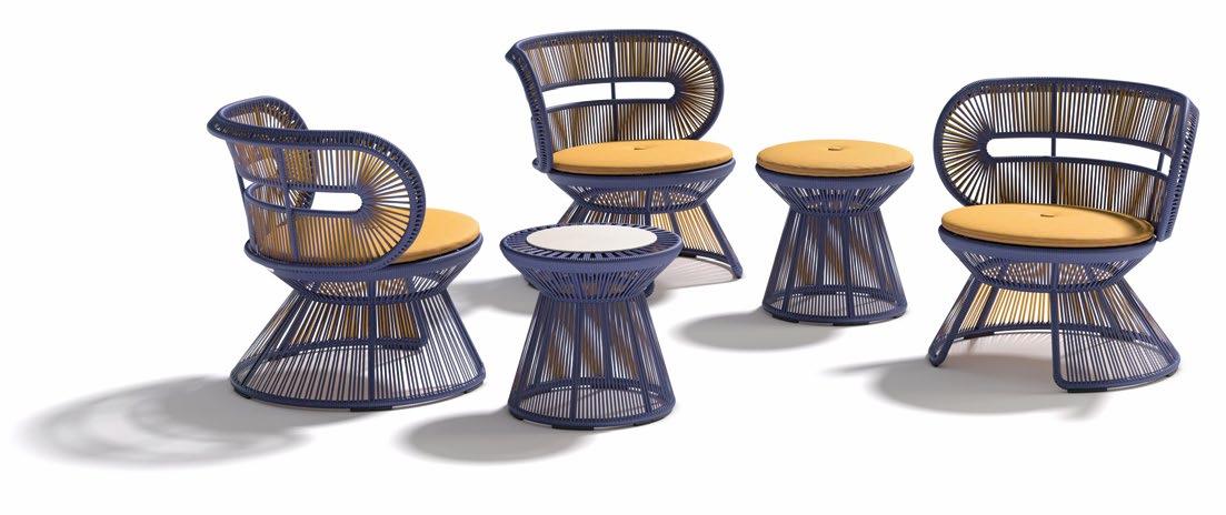
Crafted with DEDON’s groundbreaking invert fibre, the CIRQL NU series is emblematic of the brand’s evolution. Employing co-extrusion, Werner Aisslinger integrates each piece with audacious colourways and intricate textures, culminating in a dazzling 3Deffect. From armchair to lounge chair, side table to footstool, each piece radiates an almost iridescent allure, guaranteeing luxury and durability for outdoor living. With CIRQL NU, DEDON invites you to embrace al fresco living without reservation.
SWIVEL IN STYLE
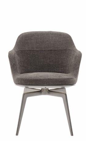
Discover the Italian passion for prowess and finesse in two Caratos additions from Maxalto. These upholstered chairs boast a die-cast aluminium structure, exuding formal elegance in every stitch. Whether in fabric or leather, this Caratos combo captivates with its versatility, tailored for both residential and commercial spaces. With swivel bases in amber, graphite, or bronzed nickel, they elevate your seating experience with comfort and convenience, supremely blending style with practicality.
ERGONOMIC ECO BLISS
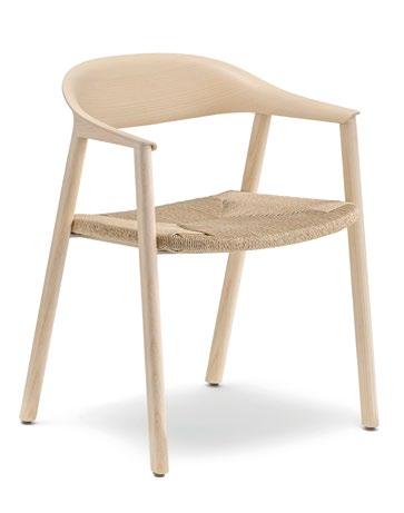
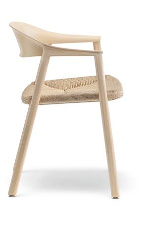
Exult in Héra’s allure, where fluidity meets functionality. Designed by Patrick Jouin, this armchair transcends boundaries with its woven cellulose rope seat, marrying lightness with comfort. Its sleek design forged in ash or American walnut, boasts a 6mm plywood backrest and seat of hand-woven, waterrepellent cellulose rope, ensuring easy maintenance. With FSC® -certified wood and eco-friendly finishes, Héra is sustainability squared, enlivening any living space with its sophistication and ergonomic chic.
1 2 3 18 | H+R | HOTELRESORTDESIGN.COM MÉLANGE | PRODUCTS DEDON.DE MAXALTO.COM PEDRALI.COM
NATURE HOLDS SWAY
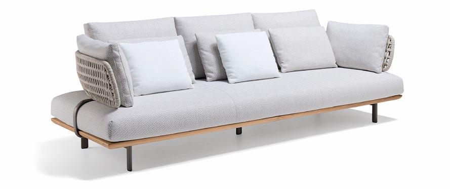
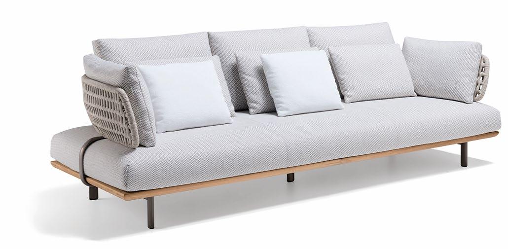
Sway sofa is a testament to outdoor luxury, blending nature-inspired design with modular innovation. Fashioned from solid teak, the Sway sofa features fluid lines and versatile elements. The woven backrest, in teak or olive-green EVA polyurethane, exudes Mediterranean ease. With weather-resistant cushions and customisable configurations, Sway beckons endless relaxation. Imbued with a sense of understated sumptuousness, Sway’s design intertwines art with technology, taking outdoor living to the next level.
MOLTENI.IT
CUTTING-EDGE CRAFTSMANSHIP FUTURISTIC FINESSE
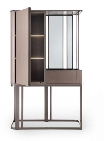
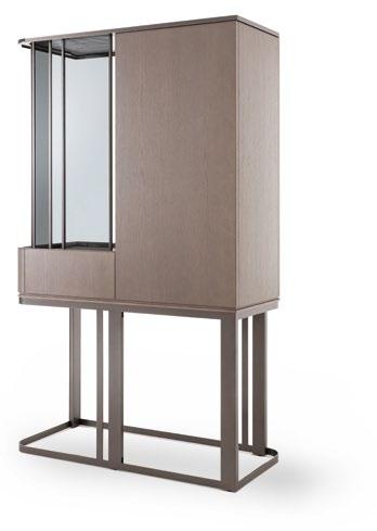
An amalgam of design mastery and sensory delight, Giorgetti’s Hikari bar cabinet and sideboard personify luxury living. Partially clad in ash wood and glass, Hikari is an interaction of volume, light, and shadow, evoking tactile exploration. Leather accents and smoked tempered glass add to its vivacious vibe. With a nod to tradition and an eye on innovation, Hikari is a paragon of craftsmanship, imbuing any space with grace and allure.
GIORGETTI.EU
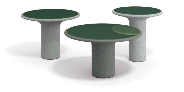
COR’s Echo table resonates with a jaunty, futuristic vibe courtesy of its cylindrical base and a circular top in undercoated glass or PARSOL®. The softly upholstered base, reminiscent of a blossoming flower, adds a tad of tranquility. Designed for versatility, the table’s fabric border and twist-off top facilitate fuss-free maintenance. Echo’s organic design, offered in various sizes and heights, blends effortlessly into any space, echoing COR’s penchant for timeless elegance.
COR.DE
4 5 6

PRACTICAL PANACHE CHIC CONVIVIALITY
Silvia Musetti’s Liz collection for Giorgetti embodies elegance and functionality. The Liz trio offers graceful geometries for organising bedroom or entry areas.
Sculptural yet practical, Liz Valet features leather-clad double cylinders with optional sensor lighting. Liz Bench flaunts fluid lines and an upholstered seat, while Liz Console impresses with an onyx top and multifunctional design. With meticulous detailing and versatile functionality, Liz infuses an unmistakable showpiece allure into any space.
MATERIAL SYMPHONY
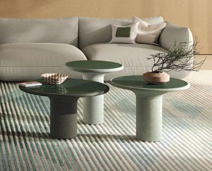
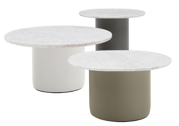
B&B Italia’s Button tables are an interplay between softness and stiffness, a playful yet functional ensemble. With lacquered cylindrical bases and marble tops, they marry contrasting materials seamlessly. The oval and round variants, reminiscent of trays, offer a formal exercise in design, invoking subtle movements. Available in indoor and outdoor versions, these tables promise versatility with a smidgen of palpable British design language, every detail harmonising with precision and charm.
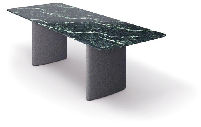
COR’s Ipa panel table has earned a well-deserved place in any dining space. The essence of homely dining, it features subtly padded elliptic sides, merging comfort with style. Its rectangular top, juxtaposed against softer lines, emanates sophistication, while rounded corners echo its graceful form. Upholstered in earthy tones, the Ipa’s legs bestow a delicate touch, providing harmony or contrast to any setting. With Ipa, every detail speaks of cosy refinement.
GIORGETTI.EU COR.DE
BEBITALIA.COM
1 2 3 20 | H+R | HOTELRESORTDESIGN.COM MÉLANGE | PRODUCTS
STORAGE WITH STYLE NATURE’S GRACE
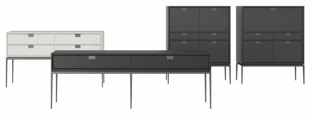
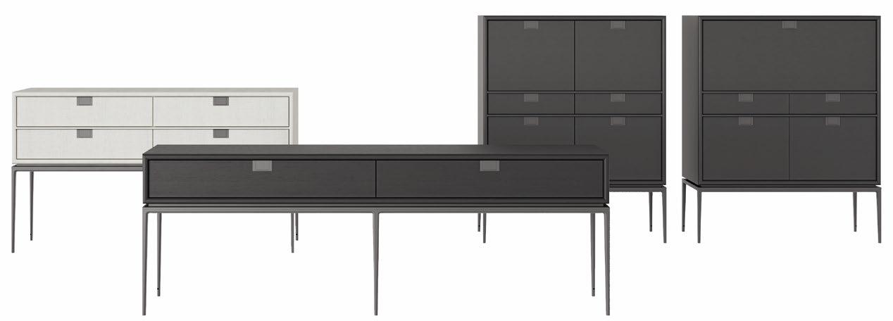
Maxalto’s Artemone, by Antonio Citterio, reimagines the classic kitchen dresser, albeit with a modern eye. Versatile combinations of doors and drawers, adorned with painted handles, offer customisable storage solutions. Its sleek design, with die-cast aluminium base and shadow gap, lends an airy vibe while harmonising metal and wood contrasts. Available in a spectrum of finishes, Artemone is designed to command attention, serving as statement piece for residential and contract spaces.
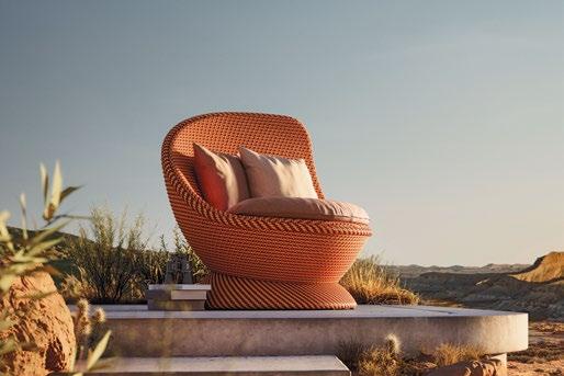
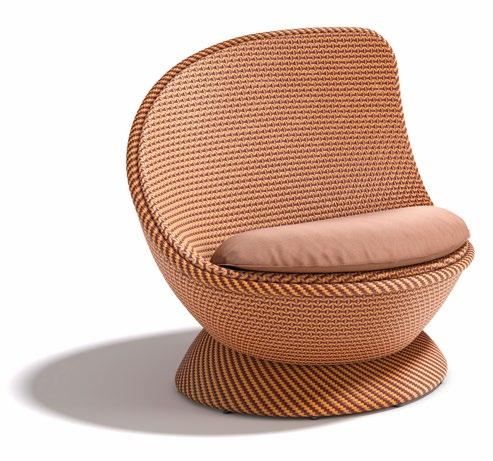
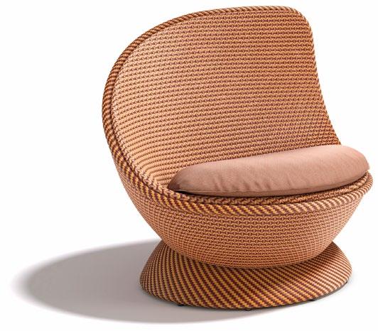
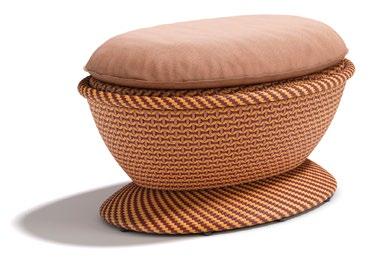
Revel in nature’s beauty with DEDON’s PAPYON wing chair. The comely chair, by Arnd Küchel, derives design inspiration from elegant butterfly wings. Composed of DEDON fibre framed in sturdy aluminum, PAPYON offers both gracefulness and comfort. Each element is meticulously designed for ergonomic support, a come-hither to stretch out in style with a matching footrest. With its winsome weave and vibrant, assertive colours, PAPYON converts outdoor spaces into cosy retreats.
ECO GRANDEUR
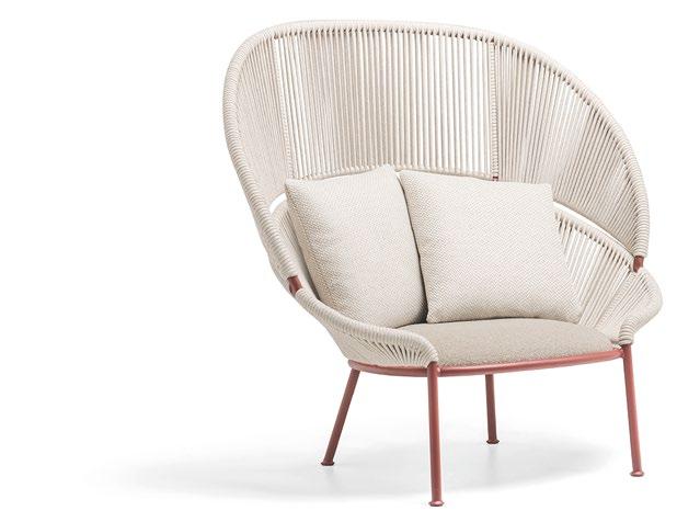
Petalo armchair oozes outdoor pomp. With a solid aluminium frame in rich merlot red, Petalo is an ode to stylish sustainability. Its high backrest, embellished with polypropylene fibre ropes, offers both visual allure and weather-resistant durability. Adorned with an ergonomic seat cushion, Petalo makes a striking statement in any outdoor space. Molteni&C’s commitment to eco-sustainability shines through, making Petalo a celebration of comfort and dolce far niente.
4 5 6
DEDON.DE
MAXALTO.COM
MOLTENI.IT
SHADE SENSATION
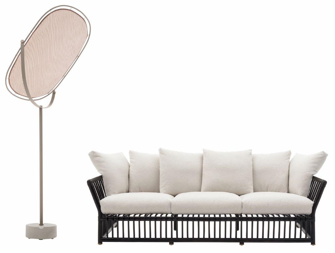
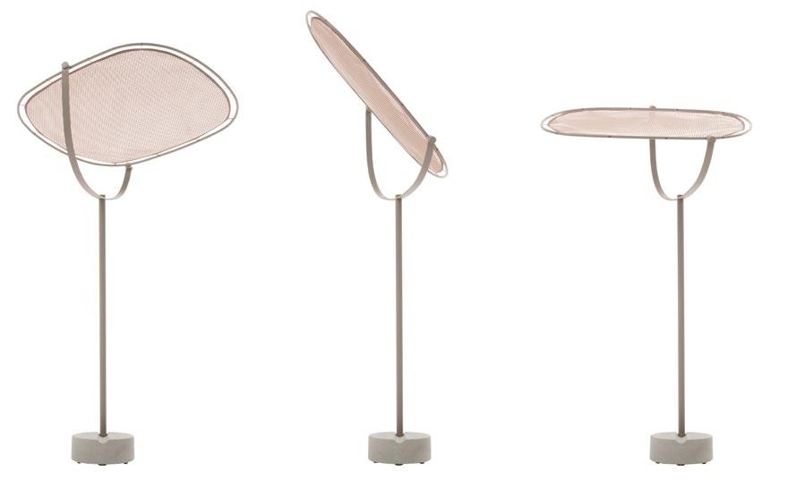
Futuristic design and finesse are the makings of B&B Italia’s Tesa O’ by Monica Armani. Flaunting an unabashedly Italian suavity of al fresco lifestyle and the shelter-you-from-the-sun cred, this adjustable shading marvel, with its lenticular design, supremely merges form, flair and function. Its 110-cm sunshade perched on a 360-degree jointed aluminum support rod, offers tastefully-tailored protection. Sporting a concrete base for stability, Tesa O’ takes outdoor living to new heights.
BEBITALIA.COM
22 | H+R | HOTELRESORTDESIGN.COM MÉLANGE | PRODUCTS
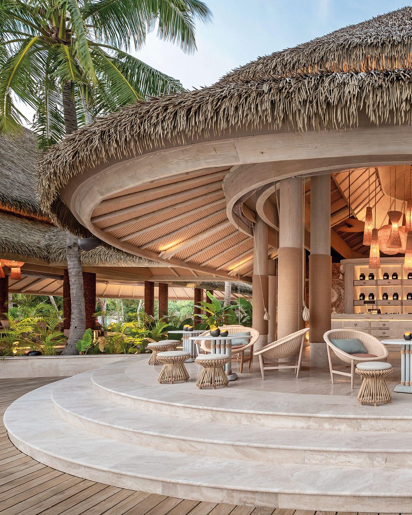
JOALI GOOD!
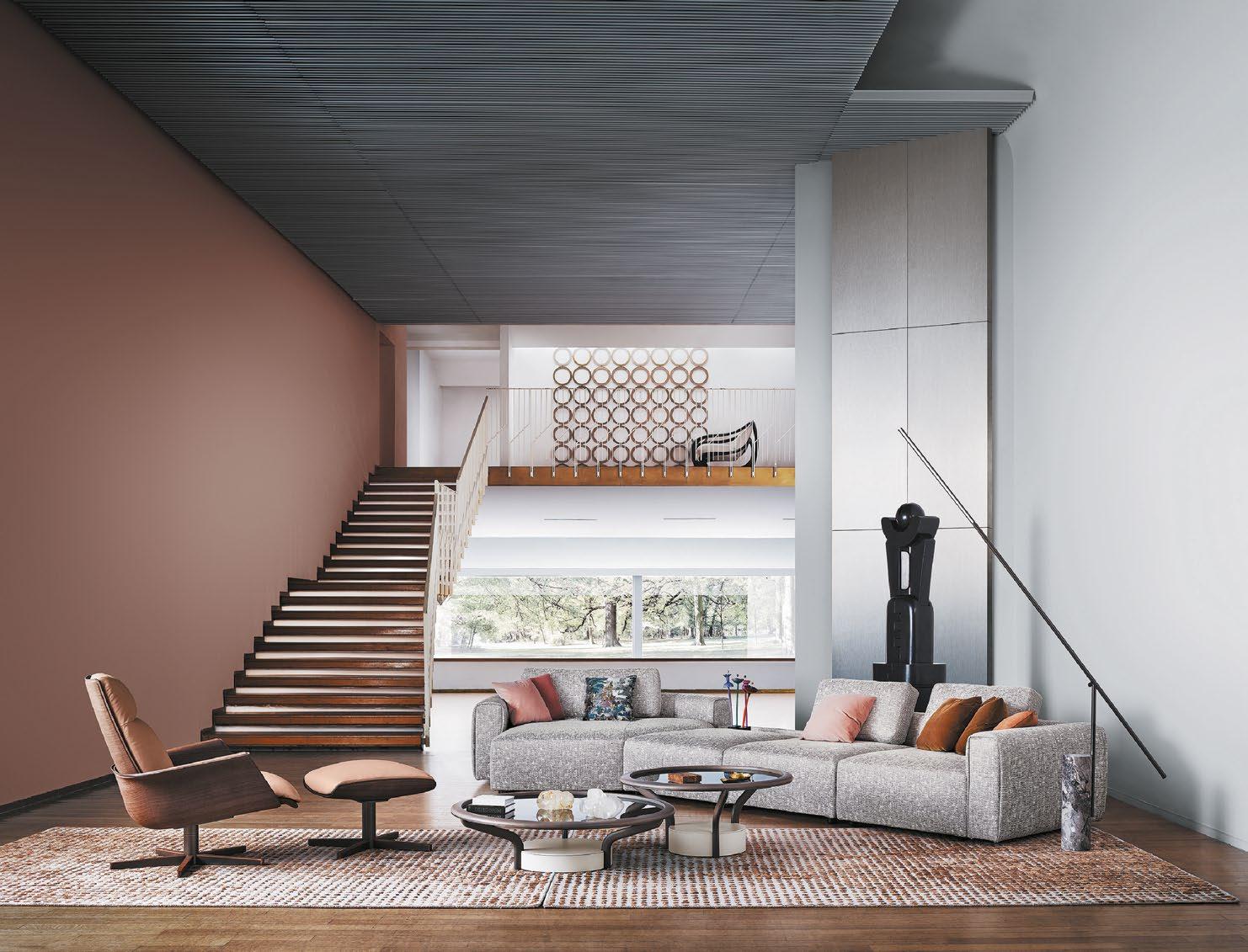
SYNERGISTIC MOMENTS ARE CREATED AND CELEBRATED IN THE REALM OF INTERIORS AND FURNITURE WHEN TWO RENOWNED BRANDS, AUTOBAN AND KETTAL, SUCCESSFULLY COLLABORATED TO DESIGN AND FURNISH A LUXURY NATUREIMMERSIVE RESORT.
24 | H+R | HOTELRESORTDESIGN.COM
MÉLANGE | INDOOR & OUTDOOR SEATING
 THIS PHOTO: The woven outdoor edition of the Basket club chair is made from artificial fibre and yellow balau, and comes with custom fabric cushions.

26 | H+R | HOTELRESORTDESIGN.COM
THIS PHOTO: Craft materials and sedulous craftsmanship come together in the Basket club chair to form the bowlshaped seat that accommodates various positions.

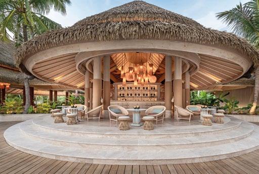
Ensconced within the pristine beauty of the Maldives lies Joali Being, an unabashedly luxe nature-centric wellness resort designed by Autoban, an international multidisciplinary studio.
At the heart of Joali Being’s philosophy is the concept of ‘weightlessness’ — a journey of shedding unnecessary excess to reconnect with nature. Indeed, Autoban’s biophilic design narrative reflects this ethos, intertwining the uniqueness of the island with the resort’s wellness mantra. The result: a ground-breaking retreat where guests are cocooned in a sense of renewal and re-connection with nature.
From the moment guests set foot on Joali Being, they are greeted by the landmark welcome jetty, a modern-day reiteration of traditional Maldivian architecture. Whimsical wooden screens and rhythmic thatched roofs set the tone for the immersive experience that awaits.
Throughout the resort, Autoban’s meticulous attention to detail is evident, with organic textures and handcrafted elements echoing the island’s natural splendour, while stunning pieces curated from
 BOTTOM: The Basket club chair’s pure wool seat padding comes in four colour combinations and eight Norwegianthemed ‘Hallingdal’ fabrics by Kvadrat.
TOP: Featuring aluminium frames with hand-braided polyester cord, deep cushions and teak legs, the Bitta dining armchairs are the embodiment of lightweight cosiness.
Design Studio: Autoban
Photo Credits: Kerem Sanliman

AT ITS CORE, JOALI BEING IS EMBLEMATIC OF SUSTAINABILITY AND ENVIRONMENTAL PRESERVATION, ITS DESIGN HARMONISING WITH THE NATURAL LANDSCAPE, PRESERVING THE ISLAND’S LUSH FLORA AND FAUNA WHILE OFFERING THE UTMOST IN WELLBEING AND COMFORT.
28 | H+R | HOTELRESORTDESIGN.COM
THIS PHOTO: A reinterpretation of the Nordic basket chair, Basket chair by Kettal showcases a snug and striking silhouette thanks to its enveloping and comfortable lines.


 BOTTOM: The Maia lounge chair by Kettal encapsulates the very essence of pura vida with its airy elegance and laid-back vibe.
TOP: The embodiment of modular mojo, each module of the Molo sofa system can be dismantled and rearranged, spinning up new uses and configurations.
a medley of high-end furniture collections by contemporary outdoor furniture studio Kettal, furnish both the interiors and outdoor living spaces.
Central to Joali Being’s allure are its 68 exclusive guest villas, each flaunting a private pool and carefully-curated interiors. Autoban’s design aesthetic permeates every corner, with transparent divisions and fluid
architecture blurring the lines between indoors and outdoors. Softly curving roofs and hexagonal rattan columns evoke the organic beauty of the ocean.
The resort’s communal areas are equally inviting, with terraced pavilions overlooking the shimmering waters of the Indian Ocean. Under striking thatched


MIDDLE: Highly weather-resistant and ideal for outdoor use, the Vieques armchair with teak armrests and club armchair afford elegance and comfort.

BOTTOM: Boasting an orthogonal geometry based on a rectangular modularity design, the Molo modular sofa is space-conscious and adapts to any setting.
30 | H+R | HOTELRESORTDESIGN.COM

THROUGHOUT THE RESORT, AUTOBAN’S METICULOUS ATTENTION TO DETAIL IS EVIDENT, WITH ORGANIC TEXTURES AND HANDCRAFTED ELEMENTS ECHOING THE ISLAND’S NATURAL SPLENDOUR, WHILE STUNNING PIECES CURATED FROM A MEDLEY OF HIGH-END FURNITURE COLLECTIONS BY CONTEMPORARY OUTDOOR FURNITURE STUDIO KETTAL, FURNISH BOTH THE INTERIORS AND OUTDOOR LIVING SPACES.
THIS PHOTO: Composed of an aluminium structure, wooden or concrete feet and fabric upholstery, the Molo modular sofa comes in different finishes and compositions.


32 | H+R | HOTELRESORTDESIGN.COM
TOP: Aesthetically minimalist with oversized pieces, the Molo sofa is designed to allow fabrics, colours and desired details to take centre stage.
BOTTOM LEFT & RIGHT: Incorporating natural materials like wood and organic textiles to create a tactile connection to nature, Kettal’s collections can be mixed and matched.

roofs, guests can revel in social and dining experiences surrounded by lush greenery and unobstructed ocean views. The interactive dining space, with its dramatic undulating roof inspired by beach textures, offers a convivial atmosphere nonpareil.
At its core, Joali Being is emblematic of sustainability and environmental preservation, its design harmonising with the natural landscape, preserving the island’s lush flora and fauna while offering the utmost in wellbeing and comfort. Through a delicate balance of style and simplicity, the resort beckons guests to embrace, treasure, and celebrate the beneficence of nature.
In every aspect of its biophilic design, Joali Being encapsulates the essence of nature-immersive luxury. From its thoughtfully-crafted villas to its sumptuously-designed communal spaces, the resort offers a revolutionary experience that rejuvenates mind, body, and soul. Autoban’s vision has brought into being a veritable paradise amidst the turquoise waters of the Maldives, where guests can escape the everyday and exult in the extraordinary.
Live well, live Joali!
 BOTTOM: A defining characteristic of the Vieques dining armchairs and club armchairs lies in the aluminium metal framework and three-dimensional nido d’ape fabric.
TOP: With its open-lattice rope weave design, the light and airy Cala stackable armchairs combine low maintenance and comfort for al fresco dining.
KETTAL.COM AUTOBAN.COM Click here to view more photos >>
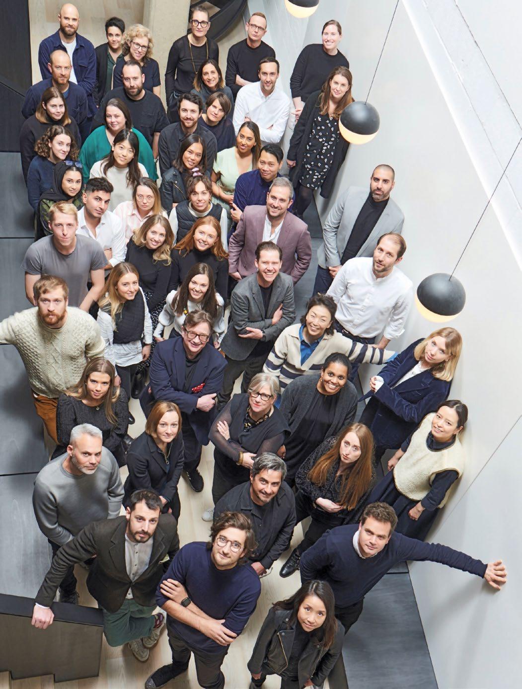
PROFILE | CONRAN AND PARTNERS 34 | H+R | HOTELRESORTDESIGN.COM
PLACES OF DELIGHT AND SUBSTANCE
CONRAN AND PARTNERS’ MISSION IS TO CREATE TIMELESS SPACES THAT TELL A STORY AND PROVIDE A SENSE OF PLACE AND DELIGHT.
Founded over 40 years ago by designer and visionary Sir Terence Conran, the practice has since been committed to improving people’s lives through good design. Over the years, the practice has evolved into an international, award-winning studio, with projects across urban regeneration, hospitality, residential and workplace.
With a strong team of 60+ creatives across its offices in London and Hong Kong, Conran and Partners’ portfolio extends around the world and embraces a rich and varied range of cultures, typologies and scales. The studio delivers award-winning buildings and spaces, that endeavour to be progressive and sustainable. This is achieved through a carefully considered and collaborative design process that addresses the needs and desires of the users, as well as the wider environment.
Each project, whether it’s the regeneration of Tokyo’s Futako Tamagawa district or a boutique hotel like Hotel Maximilian in Prague, is given its own sense of location and personality through their response to their context and use, manifested by their performance, crafted form, detail and materiality.
“Conran and Partners is first and foremost a creative business” commented Principal and Partners Tina Norden “We pride ourselves on offering a distinctive boutique service to clients in the UK and internationally, whether we’re delivering architectural design for a new urban neighbourhood or creating unique interiors for a global hospitality brand.”
Tina Norden leads the studio’s hospitality team both internationally as well as the Hong Kong studio and boasts an impressive portfolio of projects including the Park Hyatt in Auckland and Jakarta, Taj the
Trees in Mumbai and the Peninsula Boutique & Café in both Hong Kong and London.
For Conran and Partners, design is always about the user, both front and back of house, and creating a journey with a story for each project. Three-dimensionality and a spatial approach always comes first in this before they layer in texture and materiality, both at the wider scale and in the more intimate internal spaces. “It’s not about conforming to fleeting trends but adhering to a compelling narrative and a robust concept. With these elements in place, design can stand the test of time, unaffected by the transient nature of fashion.” continues Norden.
When designing a hotel, the studio adopts a holistic approach to space and materiality that prioritises the end-user and its four senses to create spaces that not only look beautiful but also feel good and help the guests’ mental and physical health.
They believe in design over disciplines and their team consists of a variety of backgrounds that gives the studio a broader approach to each project. This means that the studio has a deep understanding of all elements of a project, from the urban scale to the interior design, allowing their interior design team to work within buildings while respecting their own design.
“From an interior design perspective, we never propose anything that’s unattainable.” says Norden “We have a keen understanding of the architect’s vision. In certain cases, we focus on enhancing the project’s first impressions by bolstering entrances and the point of arrival. At other times, our efforts are directed towards optimizing room sizes.”
CONRANANDPARTNERS.COM
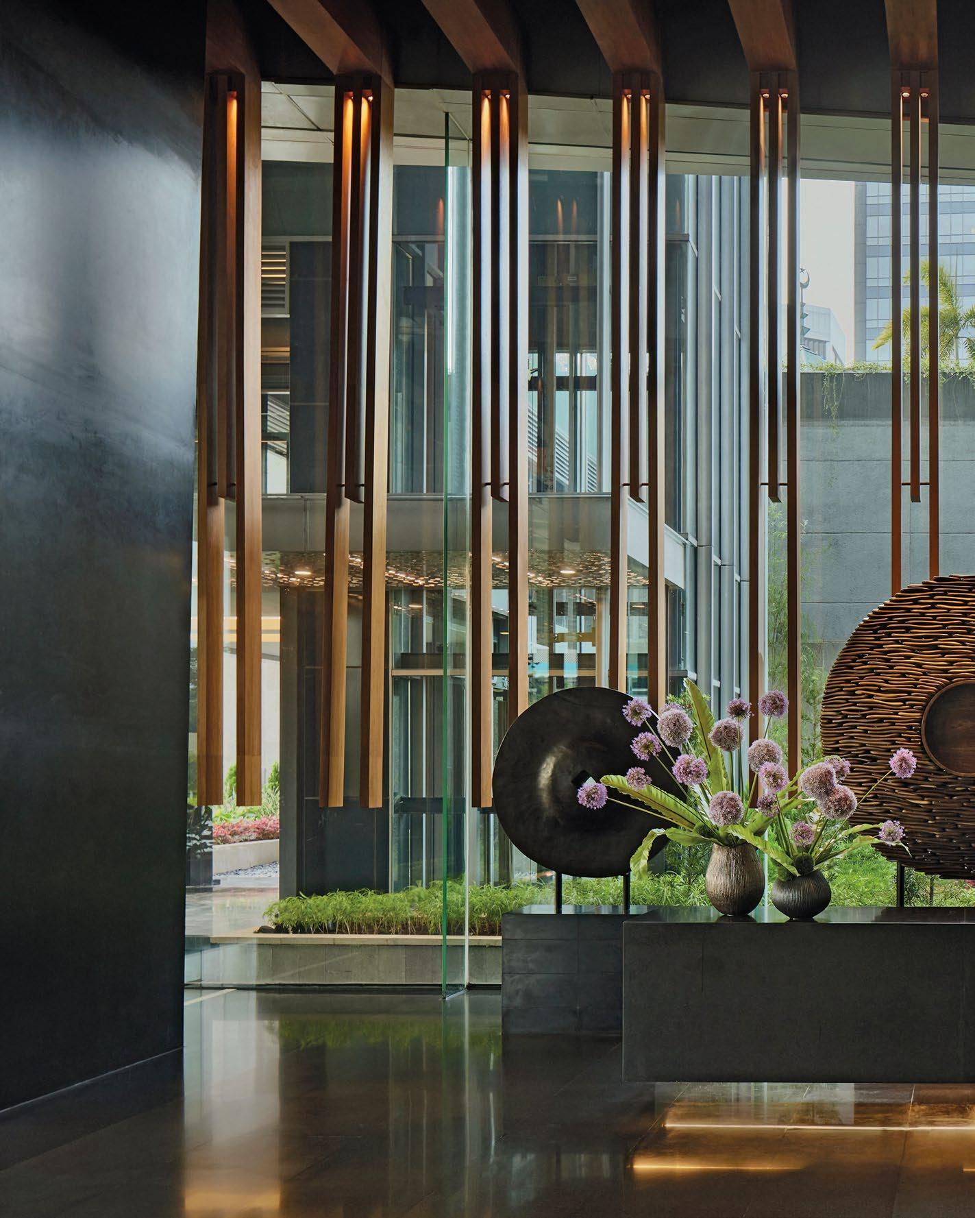
TEXTURAL SOPHISTICATION
CONRAN AND PARTNERS’ ELEGANTLY CRAFTED DESIGN OF
PARK HYATT JAKARTA IS A SUMPTUOUS RETREAT INFUSED WITH INDONESIAN ARTISTRY, REDEFINING LUXURY HOSPITALITY IN THE HEART OF JAKARTA.
SHOWCASE | HOTEL 36 | H+R | HOTELRESORTDESIGN.COM
 PARK HYATT | JAKARTA, INDONESIA
THIS PHOTO: Guests are welcomed in the lower lobby adorned with local shields and a ‘rock glass’ chandelier.

38 | H+R | HOTELRESORTDESIGN.COM
THIS PHOTO: The Living Room features bespoke perforated screening to create a cohesive space while allowing for subtle privacy


Park Hyatt hotels are defined by individuality and character, with an emphasis on a residential feel in the public areas, spacious guest bedrooms and suites inspired by prime residential architecture. Of the range of hotel brands under the Hyatt umbrella, Park Hyatt is the most luxurious and contemporary, with Conran and Partners interpretation in Jakarta inspired by the natural beauty and traditional craft of Indonesia, combined with the contemporary diversity and culture of modern Jakarta.
Conran and Partners was appointed to design the interiors of the new-built Park Hyatt in Jakarta. Set within a landmark tower – developed by MNC Land and set in the centre of the Indonesian capital – the hotel occupies the first three and the uppermost 17 floors of the 37-storey mixed-use tower.
The design includes the interiors of over 220 guest rooms and suites, a variety of food and beverage spaces, a pool, fitness centre and full-service spa plus a three-storey function and ballroom facility. It also seeks to interpret the essence of Park Hyatt to create a luxurious sense of place for guests, combining inspiration from the multi-cultural aspects of Jakarta and the natural beauty and traditional crafts of Indonesia.
 Photo Credit: Himawan Sutanto
BOTTOM: A warm oversized chandelier frames the Library creating a semi-private space
TOP: The Private Dining Room with expansive views over the city of Jakarta

For many people, the city is the first point of arrival or only touchpoint in Indonesia, so the practice endeavoured to bring some of Indonesia’s fasacinating variety into the hotel to connect the visitor to the country and its culture.
At the core of the design narrative lies a homage to Indonesia’s lush rainforests, with each floor of the hotel artfully mirroring the journey from the dark, earthy tones of the forest floor to the ethereal lightness of the canopy above. This gradient of hues, transitioning from darkness to lightness, creates a dynamic sense of progression as guests ascend through the hotel, culminating in breathtaking views of the city skyline.


40 | H+R | HOTELRESORTDESIGN.COM
TOP: The intimate private rooms feature traditional yet modern decorations and shapes
BOTTOM: The Sake Bar brings relaxed ambience with Japanese charm
AT THE CORE OF THE DESIGN NARRATIVE LIES A HOMAGE TO INDONESIA’S LUSH RAINFORESTS, WITH EACH FLOOR OF THE HOTEL ARTFULLY MIRRORING THE JOURNEY FROM THE DARK, EARTHY TONES OF THE FOREST FLOOR TO THE ETHEREAL LIGHTNESS OF THE CANOPY ABOVE. THIS GRADIENT OF HUES, TRANSITIONING FROM DARKNESS TO LIGHTNESS, CREATES A DYNAMIC SENSE OF PROGRESSION AS GUESTS ASCEND THROUGH THE HOTEL, CULMINATING IN BREATHTAKING VIEWS OF THE CITY SKYLINE.
 THIS PHOTO: The sushi counter at Kita restaurant is designed as a stage for diners to enjoy the culinary experience


42 | H+R | HOTELRESORTDESIGN.COM
TOP: Perched on the 22nd floor, the Dining Room is your culinary escape with the best of Indonesian and regional Italian cuisine
BOTTOM: Local stone creates the backdrop in the private rooms, with fluted sliding doors to create division from the main room

Conran and Partners’ vision was to create an immersive experience that introduces guests not only to the vibrant city of Jakarta but also to the diverse tapestry of Indonesia. Drawing inspiration from the country’s natural beauty and rich cultural heritage, the design approach was grounded in the ethos of local craftsmanship and materials. Collaborating with artisans and consultants, Conran and Partners curated a palette that celebrates Indonesia’s artistic legacy, from native timbers to intricate Ikat patterns and traditional wedding adornments.
Central to the Park Hyatt experience is the concept of timeless luxury with a residential touch. From intimate nooks like the Library in the Sky Lobby to the convivial atmosphere of the Conservatory, every space is meticulously crafted to evoke an elevated concept of home. The Cellar Bar beckons guests to unwind in the evenings, while the adjacent veranda offers an enchanting setting for starlit conversations.
 BOTTOM: Located on level 36, KITA Bar provides both outdoor and indoor spaces, as well as stunning sunset views of the Indonesia’s National Monument
TOP: The main dining room is an ode to Japanese kitchen with front-row seats to the artistry of the kitchen

Ascending to the higher floor, guests are greeted by a myriad of tantalising spaces, each offering a distinct yet cohesive design language. The top two floors are taken up by a desitination dining experience with a Japanese flavour. From the relaxed ambience of the sake bar to the intimate charm of the tatami private dining rooms, Kita unfolds as a culinary journey through the rich tapestry of Japanese cuisine. At Kita restaurant, diners are invited to experience the culinary theatre, with front-row seats to the artistry of the kitchen. The lower floor boasts the Kita Bar, a lively hub where guests can interact with bartenders amidst live entertainment DJs and incredible city views from the large terrace, which provides an oasis for savouring panoramic vistas of the city skyline.
Throughout Park Hyatt Jakarta, every space seamlessly flows into the next, offering a cohesive journey that celebrates the diversity of Indonesia whilst ensuring each area retains its unique identity. Whether indulging in a leisurely afternoon tea or a gourmet Japanese feast, guests are enveloped in an atmosphere of refined luxury and unparalleled hospitality, setting the stage for unforgettable experiences in the heart of Jakarta.

44 | H+R | HOTELRESORTDESIGN.COM
TOP: The Park Suite Deluxe Monas View offers luxurious features including a rain shower, deep soaking marble bath and floor-to-ceiling windows
BOTTOM: The interiors of the 220 guest rooms combine inspiration from the multi-cultural aspects of Jakarta and the natural beauty of Indonesia

 BOTTOM: Natural finishes in the bathrooms create a serene escape with full length windows offering views across the city
Click here to view more photos >>
TOP: The pool on the 35th floor offers a sun deck and vast city views
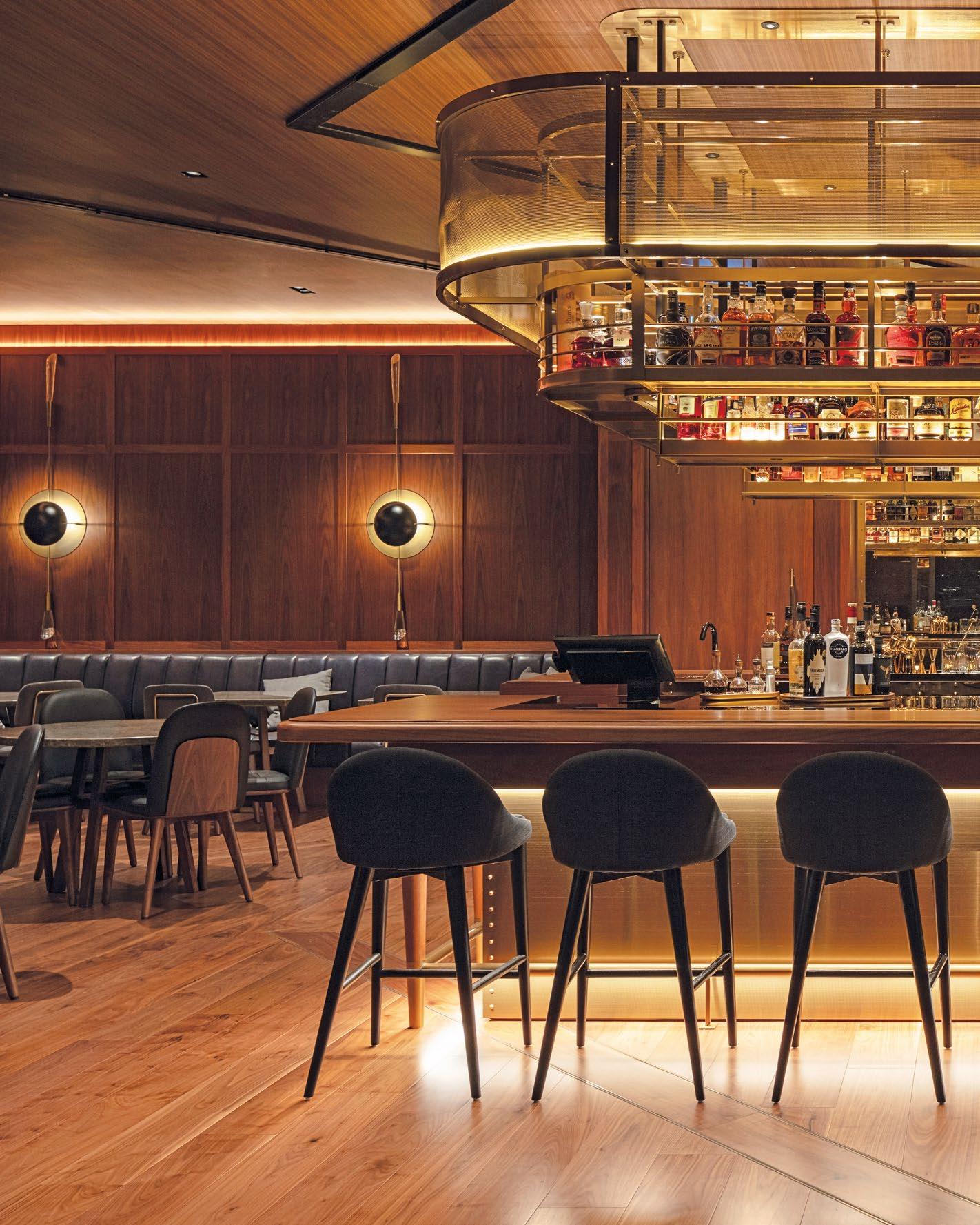
AN UNFORGETTABLE WATERFRONT RETREAT
A STRIKING 5* HOTEL ON THE ICONIC AUCKLAND WATERFRONT, CONRAN AND PARTNERS’ DESIGN FUSES URBAN GRIT WITH MAORI CRAFT, DELIVERING A MEMORABLE EXPERIENCE CELEBRATING NEW ZEALAND’S RICH CULTURAL HERITAGE AND WATERFRONT CHARM.
SHOWCASE | HOTEL 46 | H+R | HOTELRESORTDESIGN.COM
 PARK HYATT | AUCKLAND, NEW ZEALAND
THIS PHOTO: Natural and locally sourced materials, with references to Maori heritage and its arts and crafts, contrast with modern influences from Europe and Asia.

Conran and Partners created a luxury hotel with a difference, balancing the industrial gutsiness of its waterfront location and urban references with celebrating the rich tapestry of New Zealand’s natural beauty and cultural heritage through natural materials and Maori craft.
Park Hyatt Aukland’s design is a testament to the vibrant spirit of the city. The seven storey 195-guestroom Park Hyatt Auckland is located in a bespoke building creafted by ar+d from Singapore and Auckland based Bossley Architects. It is located in a historic plot of the former Team NZ sailing sheds along the waterfront in Auckland’s Wynyard Quarter and offers guests views across Lighter Basin and beyond to Waitemate Harbour. With several distinct dining venues, flexible event spaces, a serene day spa, external swimming pool, and state-of-the-art gym facilities, Park Hyatt Auckland promises an unparalleled experience.


48 | H+R | HOTELRESORTDESIGN.COM
Photo Credit: Hyatt
TOP: The lobby reveals the bold architectural concept with open corridors and central courtyards
BOTTOM: A pavilion, anchored by the tukutuku woven screen, houses the reception desk
 THIS PHOTO: The Living Room offers relaxed lounge furniture arranged on two levels looking out over the harbourside
THE DESIGN APPROACH IS INSPIRED BY AUCKLAND HARBOUR’S STRONG SENSE OF PLACE AND ITS CLOSE RELATIONSHIP TO THE VIBRANT CITY’S URBAN GRAIN. DRAWING UPON NEW ZEALAND’S RICH NATURAL BEAUTY AND ITS STRONG MULTICULTURAL HERITAGE CONRAN AND PARTNERS HAS CREATED A UNIQUE SPACE WITH A DISTINCTIVE SENSE OF MODERN LUXURY BUT INFUSED WITH THE DOEN TO EARTH NATURE OF NEW ZEALAND.

50 | H+R | HOTELRESORTDESIGN.COM
THIS PHOTO: The Boathouse, a nautically inspired intimate function space is complemented by a rooftop bar and function space
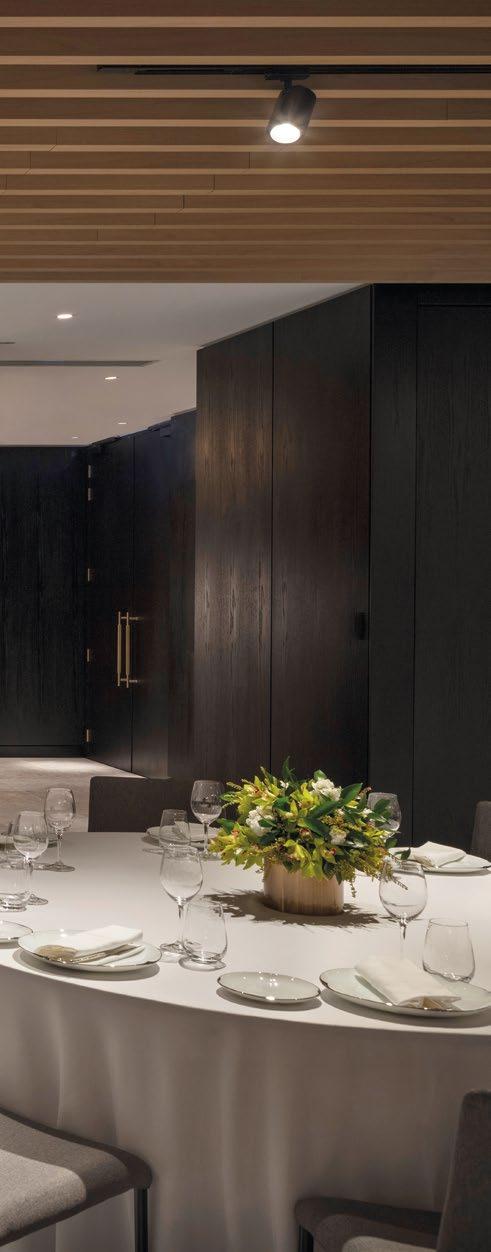

The design approach is inspired by Auckland Harbour’s strong sense of place and its close relationship to the vibrant city’s urban grain. Drawing upon New Zealand’s rich natural beauty and its strong multicultural heritage Conran and Partners has created a unique space with a distinctive sense of modern luxury but infused with the doen to earth nature of New Zealand. Stepping into the hotel, guests are greeted by a striking reception area that seamlessly transitions from intimate spaces to a dramatic full-height atrium, which reveals the hotel’s open corridors and central courtyards.
On the ground floor, visitors and locals are invited to mix in the numerous public areas that surround the atrium and face out onto the harbourside and its public boardwalk. A gallery wall runs along one side of the atrium serving as a canvas for collaborations with local galleries and changing exhibitions to animate the space.
TOP: Located on the ground floor, the Boathouse features a fireplace, an outdoor terrace and stunning views across Wynyard Quarter’s Lighter Basin

The design includes a range of dining and function spaces to suit every guests’ requirements. Starting from the street-facing Pantry, a casual ground floor eatery with a dramatic, full-height atrium space that also serves as the staff dining room in democratic New Zealand. Onemata, a more fine dining experience in a relaxed setting that features an open kitchen and benefits from spectacular views out over the harbour on two sides. The Captain’s Bar, a contemporary take on a harbourside ‘pub’ but layered with Park Hyatt’s sophistication and a cosy fireplace. Then last along the waterfront is The Boathouse, a nautically inspired intimate function space that is complemented by a rooftop bar and function space and an array of larger event spaces on the first floor.


52 | H+R | HOTELRESORT
DESIGN.COM
TOP: Guests are invited to a more fine dining room experience at Onemata, which features an open kitchen and views over the harbour
BOTTOM: Onemata features welcoming yet minimal interiors with an intimate private dining room

THE DESIGN INCLUDES A RANGE OF DINING AND FUNCTION SPACES TO SUIT EVERY GUESTS’ REQUIREMENTS. STARTING FROM THE STREET-FACING PANTRY, A CASUAL GROUND FLOOR EATERY WITH A DRAMATIC, FULL-HEIGHT ATRIUM SPACE THAT ALSO SERVES AS THE STAFF DINING ROOM IN DEMOCRATIC NEW ZEALAND.
THIS PHOTO: The street-facing Pantry invites locals in and serves as the staff dining room

54 | H+R | HOTELRESORTDESIGN.COM
THIS PHOTO: The studio created a seamless journey through the series of spaces, contrasting dramatic volumes with intimate spaces

The guest rooms are located on the upper floor levels with aspects across the Wynyard Quarter and the Harbour with suites at the building’s four corners with the largest on the top floor boasting views across to the wider harbour. All rooms have full height windows and many have balconies, the guestroom corridors are open to the atrium and have windows out on all sides as well as a Sky Garden on each floor, a dramatic cantilevered terrace space which entices guests outside to enjoy the views. In addition, almost all rooms feature an external bathroom with views out over the Auckland waterfront or city. The design for the guest rooms is again inspired by nautical references and Maori craft with a warm palette of timber and furniture in-built as if on a yacht. Each room has a woven wall art panel that was deisgned by a Maori weaver and produced by a New Zealand based mill for the hotel.
 BOTTOM: Conran and Partners’ design approach has been inspired by the surrounding harbour
TOP: The design for the guestrooms is inspired by nautical references with a warm palette of timber and fabrics and furniture in-built

The guest rooms exude warmth and restrained sophistication, with a palette of timber and soft fabrics reminiscent of a luxury yacht. Every detail has been thoughtfully curated to give a sense of elegance and luxury, ensuring an unforgettable stay for every guest.
Park Hyatt Auckland stands as a testament to the city’s vibrant energy and timeless allure, offering guests an unparalleled luxury experience that blends urban chic with natural beauty. Whether indulging in culinary delights, unwinding in the serene spa, or simply soaking in the panoramic views, guests are invited to embark on a journey of indulgence and discovery in the heart of Auckland’s vibrant waterfront.

56 | H+R | HOTELRESORTDESIGN.COM
TOP: Conran and Partners created a serene spa where guests can unwind in an elegant and luxurious environment
PARK HYATT AUCKLAND STANDS AS A TESTAMENT TO THE CITY’S VIBRANT ENERGY AND TIMELESS ALLURE, OFFERING GUESTS AN UNPARALLELED LUXURY EXPERIENCE THAT BLENDS URBAN CHIC WITH NATURAL BEAUTY.
 THIS PHOTO: The spa is an ode to luxury with locally-sourced natural materials and modern details
Click here to view more photos >>
PLAYFUL AUTHENTICITY
CONRAN AND PARTNERS BLENDS RICH HISTORY WITH CONTEMPORARY DESIGN WHERE INNOVATION AND AUTHENTICITY FLOURISH IN THE HEART OF KRAKOW’S CULTURAL HUB.
SHOWCASE | HOTEL 58 | H+R | HOTELRESORTDESIGN.COM
 PURO KAZIMIERZ | KRAKÓW, POLAND
THIS PHOTO: ‘PRISMA’ offers a ‘Urban Spa’ with gym, sauna, steam, beauty stations and treatment rooms.
CONRAN AND PARTNERS’ INTERIOR DESIGN OFFERING SEAMLESSLY COMPLEMENTS AND ENHANCES THE ARCHITECTURAL WORK, CREATING A HARMONIOUS ENVIRONMENT THAT CELEBRATES THE BUILDING’S HERITAGE WHILE PROVIDING A CONTEMPORARY AND INVITING SPACE FOR GUESTS TO ENJOY.

60 | H+R | HOTELRESORTDESIGN.COM
THIS PHOTO: Halicka restaurant offers diners a menu of dishes using locally sourced ingredients, and an independently-run, destination cocktail bar.


Providing an unconventional combination of charming and cheeky; PURO embraces the rich history and vibrant community of the Kazimierz neighbourhood, maintaining its true bohemian culture and providing a relaxing rest stop to an international network of visitors.
The Kazimierz neighbourhood is a hub for design innovation whilst preserving the area’s cultural roots, embracing innovation whilst giving visitors a visual journey through its rich history and contemporary culture. Conran and Partners’ design represents a fusion between the energy, history, authenticity and art culture of its location and the dynamic, progressive brand principles of PURO, demonstrating its passion for contemporary art, design-led furniture and forward-looking hospitality. This conceptual narrative has provided a rich source of inspiration for the creation of a unique PURO hotel which is firmly grounded in its location.
 BOTTOM: The wall behind the reception area features a bold graffiti art installation by Polish artist ‘Nawer’ and is a taster of the wider artwork collection which is to be found throughout the hotel
TOP: The design clearly references elements of the area’s history, including its once-bustling industrial heritage, while still achieving a strong residential feel.
Photo Credit: Anna Stathaki

ASW Architekci led the architectural side of the design, crafting a stripped-back brickwork building that pays homage to the area’s rich history. Conran and Partners’ interior design offering seamlessly complements and enhances the architectural work, creating a harmonious environment that celebrates the building’s heritage while providing a contemporary and inviting space for guests to enjoy.
The design creates a welcoming 228-room hotel with a residential atmosphere, designed to encourage guests to inhabit the ground floor spaces, throughout the day. The hotel envelopes guests in a distinct hygge style with lighting by &Tradition and furniture crafted by Carl Hansen & Son to Moroso and Baxter and Fogia.
The two characterful eateries – the MAK café and the Halicka restaurant offer a blend of indoor and outdoor dining areas, each boasting intimate pockets of space for guests to savour culinary delights in a relaxed setting. The practice intensely researched how the spaces could function and flow together harmoniously, despite having their own memorable and individual identities. Also ensuring that they authentically blend into the Kazimierz neighbourhood for both guests and locals alike to enjoy.


62 | H+R | HOTELRESORTDESIGN.COM
TOP: The overall palette mixes natural, raw materials such as terracotta, faded bronze and reclaimed timber with bold splashes of colour
BOTTOM: The design of garden is a continuation of the interiors with warm materials contrasted by colour accents.

THE TWO CHARACTERFUL EATERIES – THE MAK CAFÉ AND THE HALICKA RESTAURANT OFFER A BLEND OF INDOOR AND OUTDOOR DINING AREAS, EACH BOASTING INTIMATE POCKETS OF SPACE FOR GUESTS TO SAVOUR CULINARY DELIGHTS IN A RELAXED SETTING.
THIS PHOTO: Mak Bread & Coffee offers freshly baked bread, pastries and cakes in a cosy setting with a sunken lounge, open fire and large sharing table

THE FUSION OF INDUSTRIAL FINISHES WITH VIBRANT HUES NOT ONLY ENERGISES THE SPACE BUT ALSO OFFERS GUESTS AN IMMERSIVE OASIS OF RELAXATION AND RENEWAL, WHERE EVERY DESIGN DETAIL CONTRIBUTES TO A LUXURIOUS AND REJUVENATING EXPERIENCE.
64 | H+R | HOTELRESORTDESIGN.COM
THIS PHOTO: The design creates a welcoming 228-room hotel with a residential atmosphere in a distinct hygge style

The guest rooms and suites are lifted by a layered range of textures, including timber floors and vibrant tilework for the shower rooms. Space-saving design features help enhance the sense of light and volume in the smaller rooms especially, with sliding screens to separate sleeping areas and bathrooms, ensuring both functionality and style.
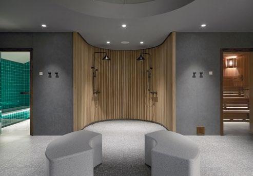
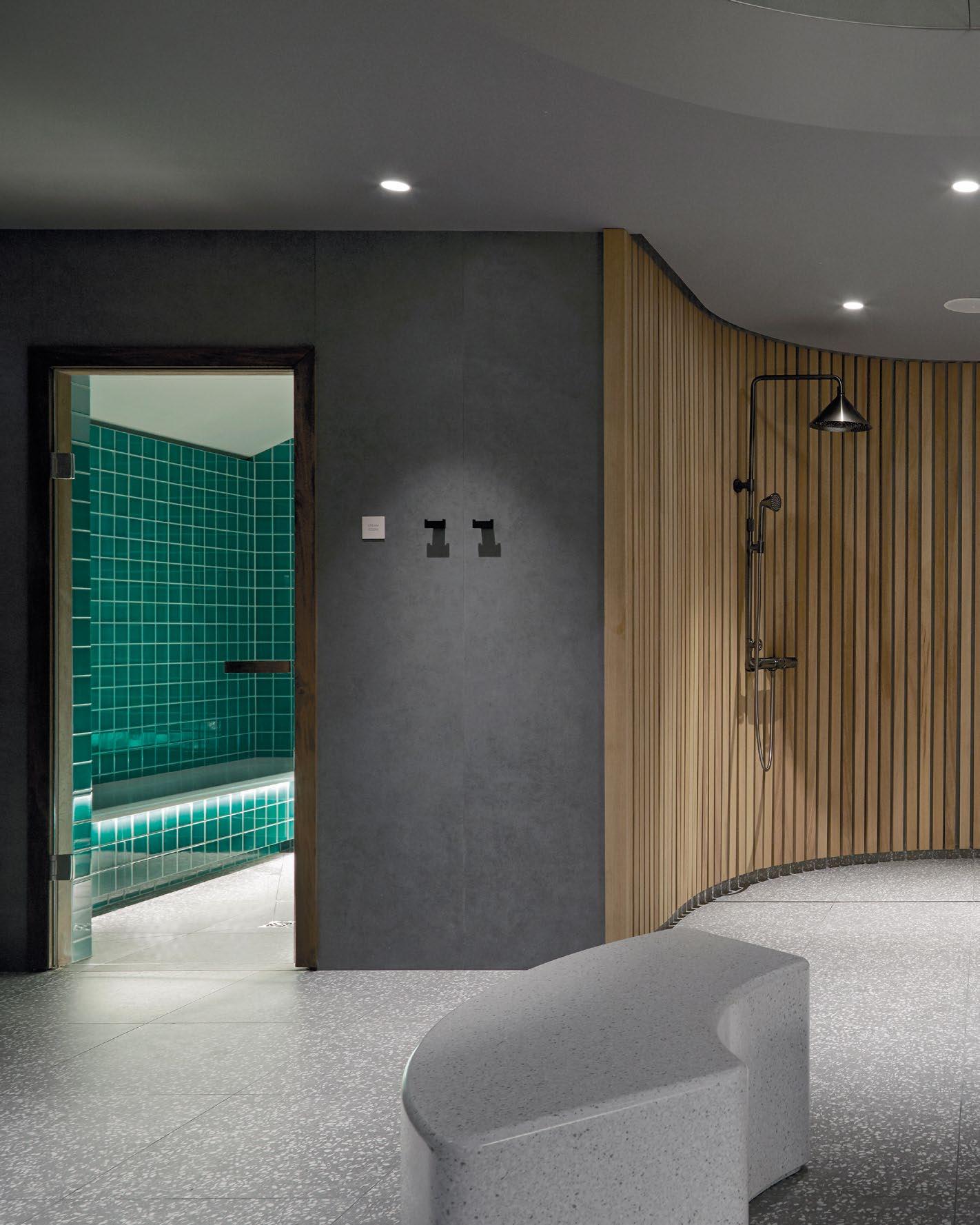
The Prisma spa seamlessly blends contemporary aesthetics with natural elements. The bold graphic elements of emerald-coloured tiles, vivid pink flooring, and saturated blue ceiling create a visually stunning environment. The fusion of industrial finishes with vibrant hues not only energises the space but also offers guests an immersive oasis of relaxation and renewal, where every design detail contributes to a luxurious and rejuvenating experience.
PURO stands as a vibrant testament to innovation and authenticity, celebrating the city’s rich heritage while embracing a bold, forward-thinking vision. Whether immersing oneself in the vibrant art culture or simply savouring a moment of tranquillity in the spa, guests are invited to embark on a captivating journey of discovery and delight at PURO, where charm and cheekiness converge to create an unforgettable hospitality experience.

 BOTTOM: An etched, grooved, fluted glass screen physically separates the shower from the bedroom while allowing light and abstracted views through
TOP: The beds are backed by bespoke, woven headboards and covered by specially-designed throws referencing one of Conran and Partners’ early concept sketches for the hotel
Click here to view more photos >>
POETIC MODERNISM
CONRAN AND PARTNERS’ BOLD FUSION OF CULTURAL HERITAGE AND CONTEMPORARY DESIGN TRANSFORMS MAXIMILIAN INTO A VIBRANT URBAN ESCAPE INFUSED WITH CZECH MODERNISM AND PLAYFUL ECLECTICISM.
SHOWCASE | HOTEL 66 | H+R | HOTELRESORTDESIGN.COM

HOTEL MAXIMILIAN | PRAGUE, CZECH REPUBLIC
THIS PHOTO: Conran and Partners’ design approach references Czech modernism and the progressive art movement.

Conran and Partners’ playful yet functional ‘poetic modernism’ approach reinvents Maximilian as one of Prague’s most unique boutique hotels with a contemporary edge.
Located in the heart of the city amid a row of 19 thcentury buildings, the practice undertook a momentous project that fully reimagined and refurbished an Eva Jiricna-designd boutique hotel of over 70 guest rooms including the complete reconfiguration of the existing ground-floor.
The practice’s biggest challenge was the complete conceptual redesign of the ground floor spaces wich previously were elegant but did not have openness and vibrancy. Conran and Partners opened up and unified the spaces to create a holistic journey and experience for guests throughout their day and for a number of requirements. The previously centre stage reception has been tucked away to the raised ground floor to create a much more private and personal welcome, whilst the rest of the public areas have been opened up to the public, welcoming in visitors from outside.


68 | H+R | HOTELRESORTDESIGN.COM
TOP: Maximilian is situated on Haštalská Street facing the Haštal Church – close to Prague’s Old Town Square – and opened in 1995
BOTTOM: The living-room provides an open engaging social space for both guests and visitors
Photo Credit: Matthias Aschauer and Stefan Schuetz
 THIS PHOTO: The studio opened up and unify the spaces to create a coherent and engaging journey for guests and visitors.
REFLECTED THROUGHOUT THE DESIGN OF THE HOTEL ARE THE INFLUENCES OF THE CULTURAL AND ARCHITECTURAL HERITAGE OF THE CITY. REFERENCES OF CZECH MODERNISM AND THE PROGRESSIVE ART MOVEMENT INFLUENCED BY FAMOUS AVANT-GARDE ARTIST AND ARCHITECTURAL WRITER, KAREL TEIGE, WHO IS SAID TO BE ONE OF THE ARCHITECTS OF THE ORIGINAL HOTEL BUILDING.

70 | H+R | HOTELRESORTDESIGN.COM
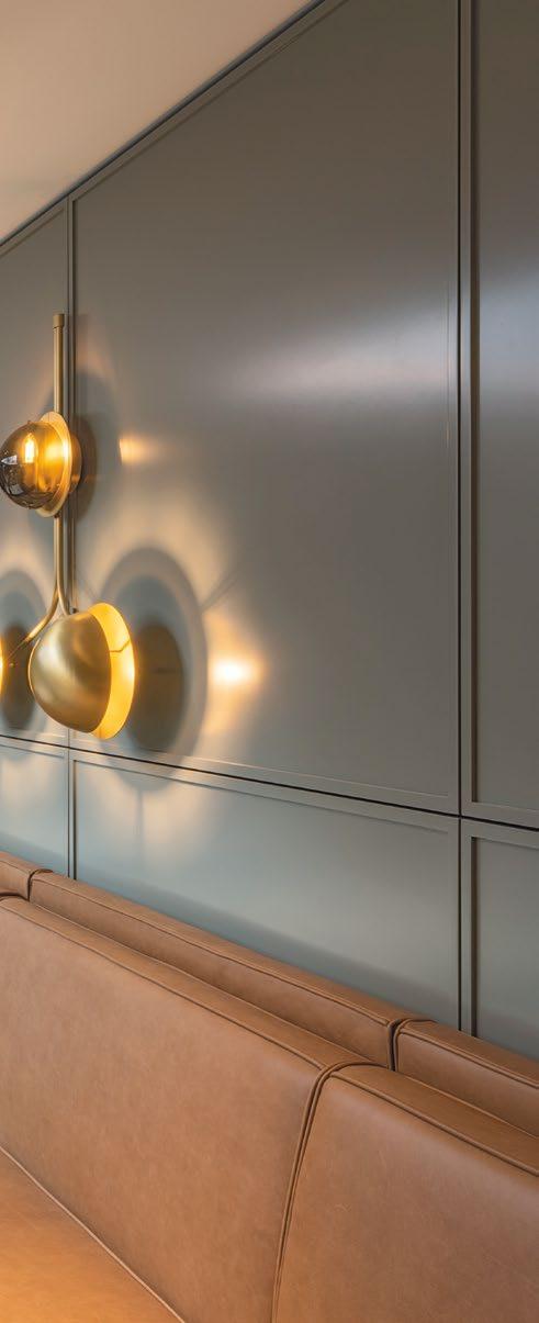
THIS PHOTO: Bespoke lighting elements designed by Conran and Partners, and made by Czech manufacturer Sans Souci, feature throughout the public areas


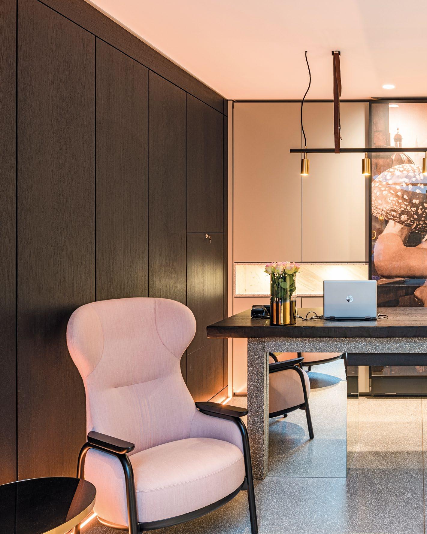
The redesign included the addition of a sophisticated café and wine bar at the main entrance, which animates the building’s façade and engages with the adjacent streetscape, creating an inviting sensory experience that extends beyond the interior spaces and embraces the rich external culture and heritage.
Alongside this, the raised ground floor now also hosts a brasserie set within a newly revamped livingroom hub at the heart of the hotel, providing an open engaging social space for both guests and visitors.
To complement the ground floor areas, there is a cosy library space opening out to the courtyard terrace, as well as a generous meeting room with a glass roof, which also faces the courtyard.
Reflected throughout the design of the hotel are the influences of the cultural and architectural heritage of the city. References of Czech modernism and the progressive art movement influenced by famous avant-garde artist and architectural writer, Karel Teige, who is said to be one of the architects of the original hotel building.
MIDDLE: Bar Maximilian has been added by Conran and Partners to improve the food and beverage offering
TOP: Artwork plays a key part in the design combined with prints of iconic Teige collages
Teige- in his distinctive approach to modernist principles - unlike many of his peers created work that sourced inspiration and embodied the foundation of much softer elements. Embracing the use of both texture and colour, as well as more playful eclectic elements which are infamously represented in his life’s work of surreal collage pieces.
His collage artwork can be found throughout the hotel including his well-known alphabet works in each of the guestrooms.
A strong thematic aspect of poetic modernism has been consistently retained in the hotel, balanced with the creation of a sense of place deeply rooted in the city and the history of the neighbourhood. This involved drawing inspiration upon the iconic colour palette of Prague’s historic architecture and local crafts – including traditional processes such as weaving and glass-making – which interplay to make up the materiality of the design.
The defining element and characterisation of Maximilian is enriched by the bold use of colour
within Conran and Partners’ design approach. Each area of the hotel is highlighted in a different shade to encourage guests to connect on an unexpected and engaging journey through Prague’s tonality. This ranges from light green tones on entry, to pinks in the historic stairwells followed by a deep blue for the guest rooms.
This unique choice of string colour for the uestrooms has become the trademark of the hotel and makes it stand out. The blue tone is combined with local light oak, textured Czech glass panels to the bathroom and rattan panels to the bed head – all reflecting specific local crafts.
All is intricately woven into bespoke interiors tailored exclusively for the hotel.
Complementing this is a thoughtfully curated selection of contemporary and classic furniture pieces, arranged to showcase soft and lively shades that resonate with the broader colour scheme and seamlessly creates an elevated guest experience.
Maximilian is a welcoming and playful boutique destination in the heart of Prague that carefully connects the history of design in its setting with a contemporatry, yet timeless interior design style.


72 | H+R | HOTELRESORTDESIGN.COM
TOP: Conran and Partners’ design approach for the rooms has sought to optimise the spaces across various guest room layouts
BOTTOM: The terrazzo in the bathroom areas is both decorative and functional

THE DEFINING ELEMENT AND CHARACTERISATION OF MAXIMILIAN IS ENRICHED BY THE BOLD USE OF COLOUR WITHIN CONRAN AND PARTNERS’ DESIGN APPROACH. EACH AREA OF THE HOTEL IS HIGHLIGHTED IN A DIFFERENT SHADE TO ENCOURAGE GUESTS TO CONNECT ON AN UNEXPECTED AND ENGAGING JOURNEY THROUGH PRAGUE’S TONALITY. Click here to view
THIS
PHOTO: The design of the rooms combines a deep blue with softer highlights and warm oak joinery
>>
more photos
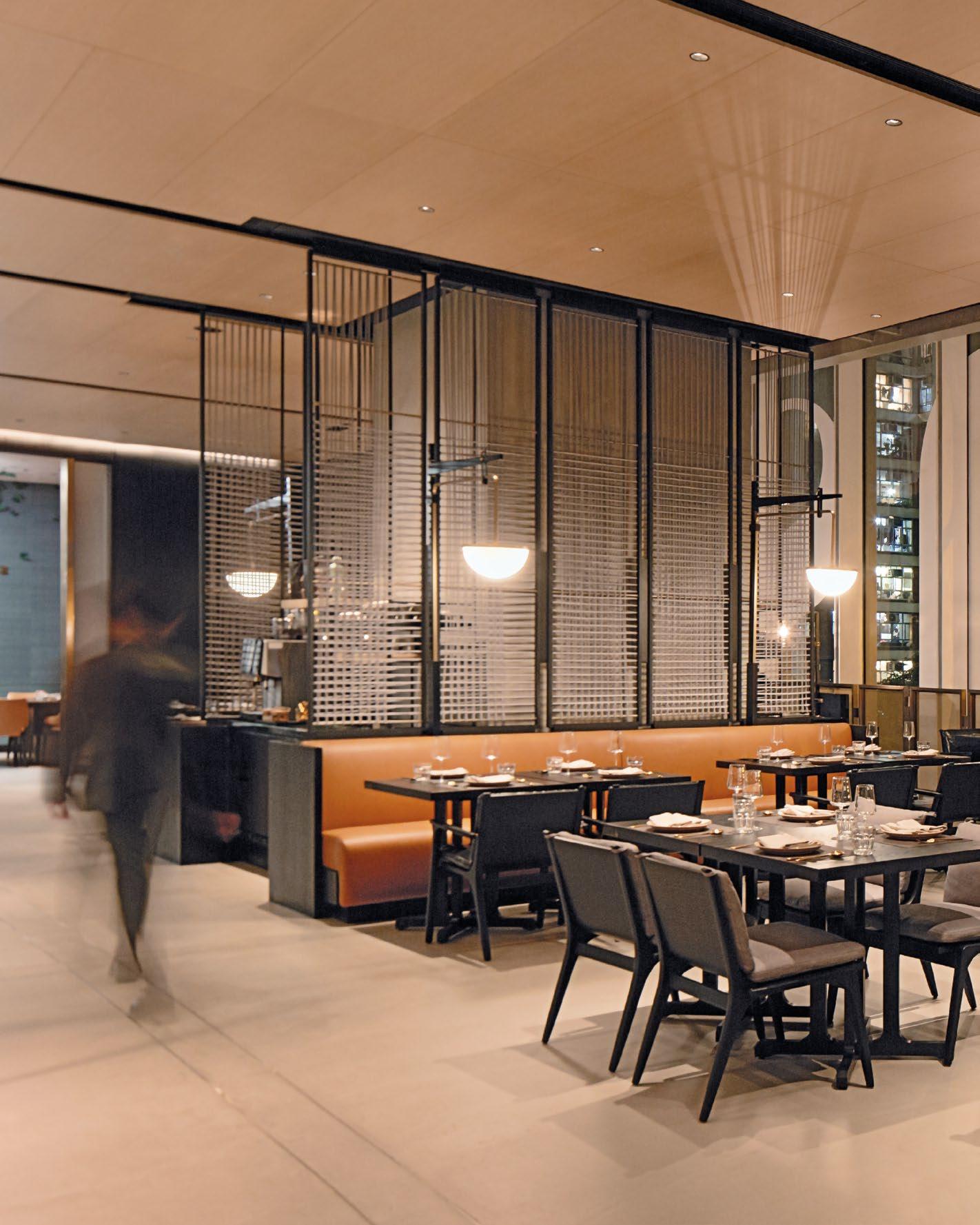
A SPACE FOR EVERYONE
A NEW ALL DAY EXPERIENCE IN HONG KONG’S EAST HOTEL THAT PROVIDES AN ENJOYABLE YET FUNCTIONAL SPACE WHERE GUESTS AND VISITORS CAN WORK, MEET, RELAX – AND EAT.
SHOWCASE | HOTEL 74 | H+R | HOTELRESORTDESIGN.COM

| HONG KONG, CHINA
FEAST
THIS PHOTO: The FEAST dining space features vibrant earthy tones with luxury finishes for an impactful experience.


Designed with a subtle eastern influence, layered with charm and playfulness, Conran and Partners used contrasting, yet complementary palettes to create an enfilade of complementary spaces, creating a seamless transition from casual to intimate. The practice reimagined the popular FEAST restaurant that sits within Hong Kong’s EAST Hotel located in the heart of Taikoo Shing, a vibrant eastern business district. Conran and Partners’ aspiration for FEAST was to create a new dining experience but also provide a functional space where guests and visitors can work, meet and relax. The hotel did not have any communcal areas outside of their food and beverage outlets, so the aim was to create an area that could be enjoyed by all guests throughout the day and night.

76 | H+R | HOTELRESORTDESIGN.COM
Photo Credit: Swire Hotels
TOP & BOTTOM: Domain is a shared workspace area and café finshed with natural materials for a contemporary feel
 THIS PHOTO: At the far end of the space lies FEAST, a bustling eatery with a richer, warmer palette and luxurious materials

THE DESIGN APPROACH SUPPORTS THE FUNCTIONALITY OF ITS GUESTS AND VISITORS BUT STILL EMBODIES THE PHILOSOPHY OF BEING CONTEMPORARY YET INVITING WHICH ARE THEN LAYERED WITH COLOUR AND COLLECTION OF PLAYFUL ELEMENTS.
78 | H+R | HOTELRESORTDESIGN.COM
THIS PHOTO: Playful design elements create a warm space for breakfast and a grab-and-go coffee from the barista station and bakery


The new restaurant benefits from generous ceiling heights, full height glazing along the perimeter and a dramatic glazed atrium. The long linear space has been carved up into clear zones of different yet overlapping functions to give variety of space and function to guests at different imes of the day, each facilitating a different guest experience: working, unwinding, socialising through to dining.
The bespoke careful curation of materials supports and enhances a sense of transition – in particular the implementation of a timber slatted wall which gradually shifts from lightly-limed oak in Domain, the shared work place and café area, to a more dramatic black-stained finish in FEAST, the dining area. This shifting tonality is echoed by the overall choice of materials throughout the space, from light and airy pastels complemented by terrazzo counters and concrete flooring with a fine brass inlay, transitioning to a much richer, darker palette for the dining spaces.
The redesign also features a selection of various seating styles that reflect the overarching design transition informal to intimate; the new Domain
 TOP & BOTTOM: The open kitchen in FEAST encompasses the use of vibrant earthy tones contrasting with the light oak finish


workspace includes private working booths, oneto-one seating, informal meeting spaces and shared tables for co-working where guests can drop in and work or have a light breakfast, a grab-and-go café with a barista coffee station and bakery. The design approach supports the functionality of its guests and visitors but still embodies the philosophy of being contemporary yet inviting which are then layered with colour and collection of playful elements.
In contrast, FEAST, the bustling open kitchen eatery at the far end of the space, adopts a richer, warmer palette with the encompassing use of vibrant earthy tones and enrichment of more luxurious materials. To counteract the spatial drama of the atrium, Conran and Partners has created areas of more intimate dining spaces, with an open kitchen to provide a lively visual focal point for diners.
The journey to the restaurant area culminates in a newly-created private dining and meeting room with sliding glazed doors that can be used either as part of the restaurant or separated out for the use of dining or meetings to complete the multi-faceted offer of the new space.
EAST Hong Kong is known for its distinctive collection of artwork and the new restaurant integrates the original iconic Butterflies which were part of the older space. Artist Jayne Dyer was commissioned to return and recolour her butterflies in the new space , ensuring continuity that transitions with a subtle new twist.

80 | H+R | HOTELRESORTDESIGN.COM
TOP: A private space featuring sliding glazed doors used for a private dining or meeting room
BOTTOM: Lightly-limed oak finishes allow for a calming experience to encourage a clear mind
IN CONTRAST, FEAST, THE BUSTLING OPEN KITCHEN EATERY AT THE FAR END OF THE SPACE, ADOPTS A RICHER, WARMER PALETTE WITH THE ENCOMPASSING USE OF VIBRANT EARTHY TONES AND ENRICHMENT OF MORE LUXURIOUS MATERIALS.
 THIS PHOTO: The timber slatted wall continues throughout the space with different finishes to create a transitional experience
here to view more photos >>
Click

SERENITY IN NATURE
A TIMELESS RETREAT TRULY CONNECTED TO ITS LANDSCAPE, CONRAN AND PARTNERS MERGE MODERN DESIGN WITH NATURAL SPLENDOUR IN NASU, CRAFTING AN IMMERSIVE EXPERIENCE FOCUSED ON WELL-BEING AND SERENITY AMIDST HONSHU’S VERDANT MOUNTAINS.
SHOWCASE | RESORT 82 | H+R | HOTELRESORTDESIGN.COM

CLUB | NASU, JAPAN
NIKI
THIS PHOTO: Niki Club is home to 34 acres of serene green space as well as a range of amenities and guest pavilions.


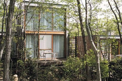
Situated in Nasu, set among the dense green mountains of northern Honshu, an area of particular beauty that is renowned for its hot springs, forests, mountains and ski resorts. Niki Club is a retreat connected to the landscape, combining a modern ethos with a focus on wellbeing and locally sourced food. The resort is a celebration of modern design in an idyllic rural setting.
Beginning with just six rooms, Niki Club gradually expanded to include 14 hectares (34 acres) of land, as well as boasting a range of amenities and guest pavilions.
Conran and Partners was asked to work on the expansion of Niki Club with a brief to design and build a new communal hub, as well as 24 new pavilions within the grounds. The practice was involved in the master planning of this third phase, as well as the architecture and interior architecture. The resulting buildings included a tranquil network of wood-clad guesthouses and a communal building housing the restaurant and spa. Using simple materials such as timber and beautifully made Japanese concrete, the intention was to allow the materials to mellow gracefully over time.

84 | H+R | HOTELRESORTDESIGN.COM
Photo Credit: Jeremy Sutton-Hibbert
TOP: Natural architectural elements seamlessly integrate into the surrounding landscape
BOTTOM: The green mountains of northern Honshu are a key design inspiration for Niki Club
 THIS PHOTO: The surrounding context led to design choices of earthy finishes using wood and concrete


86 | H+R | HOTELRESORT
DESIGN.COM
TOP: Watercolour sketches from the design process highlight how the pavillions sit within the landscape
N
BOTTOM LEFT & RIGHT: Testing spatial dialogue through detailed models to show how the built forms integrate with the woodlands

From the initial watercolour sketches to the final execution, every aspect of the design reflects a careful attention to detail and deep respect for the surrounding environment. The architecture seamlessly integrates with the mature surrounding landscaping, creating a harmonious dialogue between the built form and the natural environment. The resort aims to reconnect city dwellers with nature through not only the location but also the design. Each pavilion serves as an immersive sanctuary, meticulously designed to captivate the senses. In some of the pavilions, bathtubs are positioned on private terraces, extending an invitation for guests to fully immersive themselves in the surrounding nature.
At the heart of the resort lies the communal hub, a dynamic space that serves as both a dining venue and a spa retreat. Designed to blur the boundaries between indoors and outdoors, despite its modernist concrete volumes the structures enhance the connection to nature, offering guests a seamless transition from the tranquillity of their surroundings to the comfort of the interior spaces. Elements of comfort executed in a modern way were a priority so guests could relax and take full advantage of their surroundings, such as the classic moss green Swan chair which perfectly suited all criteria.
 BOTTOM: Beautifully made Japanese concrete will see the structure age gracefully overtime in harmony with it’s natural surroundings
TOP: The communal hub serves as a dining space and spa retreat with indoor-outdoor architectural features
THE RESORT AIMS TO RECONNECT CITY DWELLERS WITH NATURE THROUGH NOT ONLY THE LOCATION BUT ALSO THE DESIGN. EACH PAVILION SERVES AS AN IMMERSIVE SANCTUARY, METICULOUSLY DESIGNED TO CAPTIVATE THE SENSES. IN SOME OF THE PAVILIONS, BATHTUBS ARE POSITIONED ON PRIVATE TERRACES, EXTENDING AN INVITATION FOR GUESTS TO FULLY IMMERSIVE THEMSELVES IN THE SURROUNDING NATURE.

88 | H+R | HOTELRESORTDESIGN.COM
THIS PHOTO: The wood-clad finish allows for users to fully immerse themselves into the Honshu forests
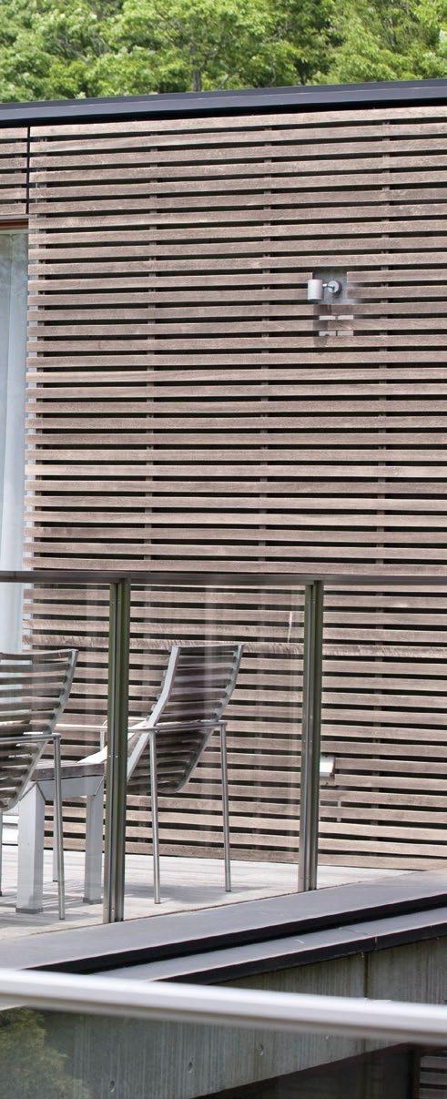


At Niki Club, the architectural and natural elements exist in a seemingly strong contrast yet complement each other, creating a captivating resort environment. Both the architecture and interior design have a quiet confidence that almost acts as a backdrop to the breathtaking vistas that surround them. Conran and Partners crafted an aspirational retreat that celebrates the beauty of simplicity and the timeless allure of the natural world. Niki Club is a destination where design converges with nature, creating a retreat that reveres the beauty of simplicity and pays homage to the allure of the natural world.
MIDDLE: Double height spaces in the pavillions give a treehouse like feel, with the natural finishes cohesive throughout
TOP: The spa pool delicately reflects the trees for a full Honshu experience
Click here to view more photos >>
SUSTAINABILITY WITH ATTITUDE
A GREEN HAVEN IN AMSTERDAM DESIGNED THAT REDEFINES LUXURY THROUGH INNOVATIVE SUSTAINABLE DESIGN AND THOUGHTFUL INTEGRATION OF SUSTAINABLE DESIGN AND MATERIALITY.
SHOWCASE | HOTEL 90 | H+R | HOTELRESORTDESIGN.COM

QO | AMSTERDAM, NETHERLAND
THIS PHOTO: Design with simplicity and functionality in mind, Conran and Partners’ design creates an enhanced user experience.

92 | H+R | HOTELRESORTDESIGN.COM
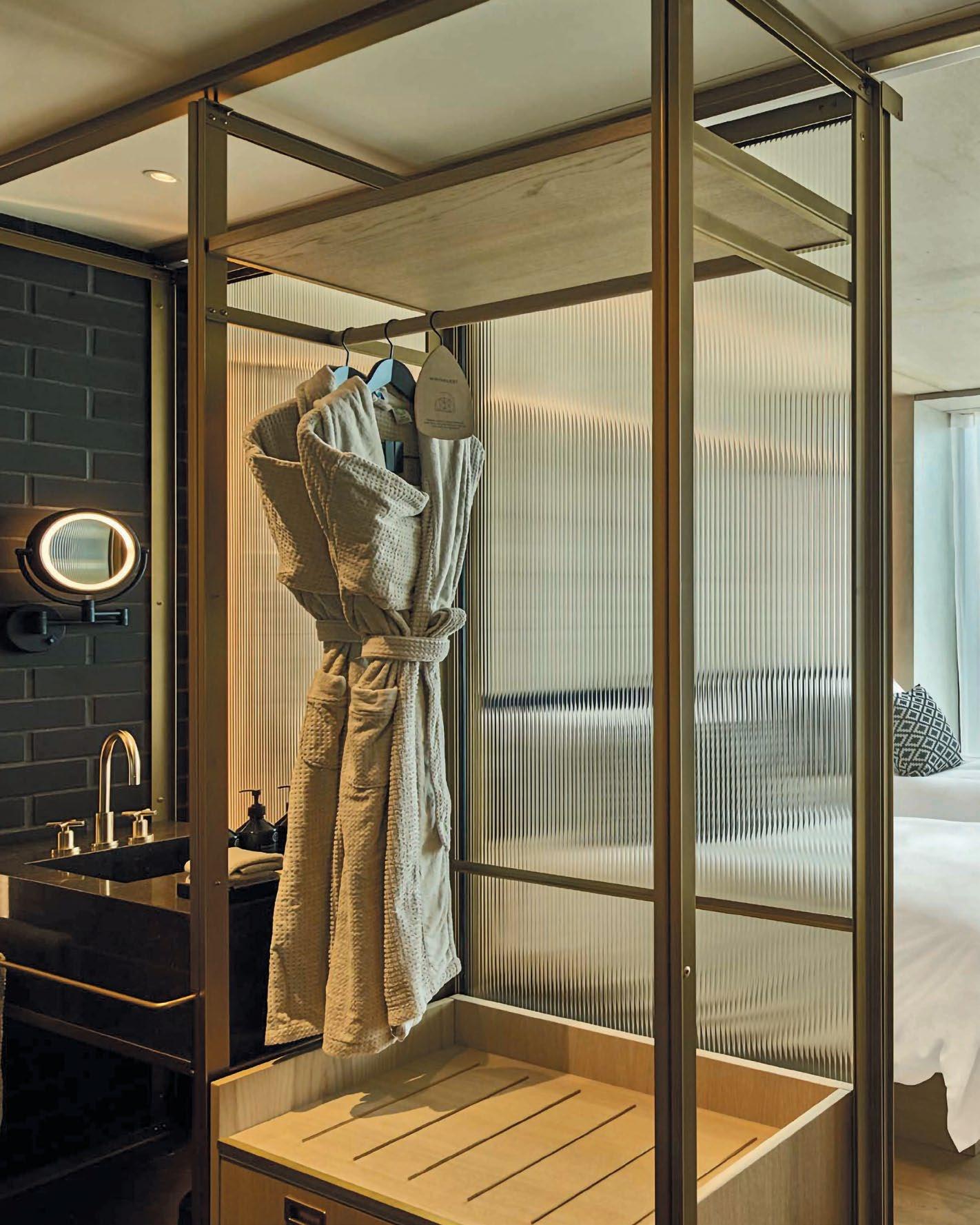
THIS PHOTO: Conran and Partners has paired exposed concrete ceilings, oak panelling and dark brick bathrooms

Embodying a new approach to sustainability in the hotel industry, the QO Hotel on the senic bans of the Amstel in Amsterdam has a ‘circular design’ concept that ensures unused resources are either recycled or re-used within the building. Architectural firms Mulderblauw and Paul de Ruiter led the design of the high rise new-built hotel, incorporating its own basement energy generator, a rooftop greenhouse and an intelligent façade responsive to the environmental conditions. Conran and Partners was responsible for the guestroom floors and corridors with Amsterdam-based Practice Tank looking after the public areas.
Operated originally by IHG, the QO Hotel has garnered acclaim for its innovative sustainable features, earning recognition in the Hospitality Interior category of the 2018 Dezeen Awards and the same years AHEAD Awards for New Built Hotel.
From the communal spaces to the guest rooms, the design ethos revolves around the concept of circularity, emphasising longevity and minimal environmental impact. For instance, the rooftop greenhouse and fish farm supply fresh ingredients for the hotel’s kitchens, while stone paper packaging and filtered drinking water taps reduce single-use waste.
The hotel’s commitment to sustainability extends to its energy-efficient systems, including geothermal heating and a greywater recycling system. Additionally, the building’s facade features automatic insulating shutters controlled by guests to regulate room temperature, contributing to overall energy efficiency.
Conran and Partners’ approach to designing the guest rooms of the hotel is guided by a commitment to simplicity and functionality. The room layouts are tight but functional, with open bathrooms and unusual
 Photo Credit: IHG
BOTTOM: Each area in the rooms has views through full height windows over the edge of the city


layouts for the various room types to make best use of the space. The rooms share a meticulously curated timeless colour palette drawn from the natural world yet feels very contemporary and unique. The same principles extend to the corridors, which have their own distinct character while facilitating seamless wayfinding for guests.
Despite its simple and industrial material palette, the rooms have a warm and inviting ambience Conran and Partners’ design narrative revolves around the notion of contemporary luxury, the honest use of materials and a focus on enduring quality. Exposed concrete ceilings and dark brick bathrooms set the tone, picking up on the beautifully made building structure and the key Dutch construction material made locally.
Materials were locally sourced using brick from the Netherlands, limestone for bathroom vanities from Belgium, and European oak flooring and joinery. Even the smallest details, such as brass fittings in the bathrooms, have been selected with environmental consciousness in mind.
The interior finishes are complemented by bespoke furnishings crafted from brass, oak, and leather, evoking a sense of understated luxury and comfort.

94 | H+R | HOTELRESORT
DESIGN.COM
TOP: The natural and timeless colour palette allows for a serene space to escape the hustle and bustle of the city.
BOTTOM: The commitment to sustainability runs through to the smallest details in the QO Hotel
CONRAN AND PARTNERS’ APPROACH TO DESIGNING THE GUEST ROOMS OF THE HOTEL IS GUIDED BY A COMMITMENT TO SIMPLICITY AND FUNCTIONALITY. THE ROOM LAYOUTS ARE TIGHT BUT FUNCTIONAL, WITH OPEN BATHROOMS AND UNUSUAL LAYOUTS FOR THE VARIOUS ROOM TYPES TO MAKE BEST USE OF THE SPACE. THE ROOMS SHARE A METICULOUSLY CURATED TIMELESS COLOUR PALETTE DRAWN FROM THE NATURAL WORLD YET FEELS VERY CONTEMPORARY AND UNIQUE.
 THIS PHOTO: Materials such as brass, leather and oak create a robust and honest finish

MATERIALS WERE LOCALLY SOURCED USING BRICK FROM THE NETHERLANDS, LIMESTONE FOR BATHROOM VANITIES FROM BELGIUM, AND EUROPEAN OAK FLOORING AND JOINERY. EVEN THE SMALLEST DETAILS, SUCH AS BRASS FITTINGS IN THE BATHROOMS, HAVE BEEN SELECTED WITH ENVIRONMENTAL CONSCIOUSNESS IN MIND.
96 | H+R | HOTELRESORTDESIGN.COM
THIS PHOTO: The dark bathroom tiles contrast with the bright brass finishes creating a modern feel
The commitment to sustainability extends beyond the guest room materials to encompass the guest room corridors, where the bespoke carpets were made from recycled fishing nets, with more exposed concrete elements highlighting the building’s construction, adding a layer of authenticity to the space.
Whether it’s framing captivating city views or creating a cosy retreat, Conran and Partners’ design ethos remains rooted in simplicity and functionality, offering a refreshing perspective on a modern version of living. The typical rooms have a series of different set ups along the window elevation – either a slender full width bench that allows views out, a bench and desk combination that elegantly folds up to the relevant heights or two free-standing armchairs with a generous table. The idea was to give a different functionality to different guest types, from business travellers to visitors.
The luxury of QO lies in the quality of the experience rather than the extravagance of materials. By prioritising sustainability, functionality, and enduring design, Conran and Partners strove to create spaces that not only inspire but also endure, leaving a lasting impression on the guests and the environment alike. The spaces are calm and welcoming – and instead of feeling monastic in their simplicity have a warmth and timelessness that has gained much praise.
The strong collaboration between the design teams ensured that every area of the hotel enhances the relationship between guests and the hotel. Whether it’s the lobby’s strategic location on the first floor or the panoramic views from the rooftop bar, each space is thoughtfully designed to foster a sense of connection and immersion in the surrounding environment.
The QO exemplifies a new paradigm of sustainable luxury, where design innovation and environmental stewardship converge to create a truly aspirational hospitality experience. Click

 BOTTOM: A slender leather bench sits along the window elevation allowing for a moment of calm
TOP: Fluted glass screens used to seperate individual spaces while allowing for natural light to penetrate through the whole room
>>
here to view more photos
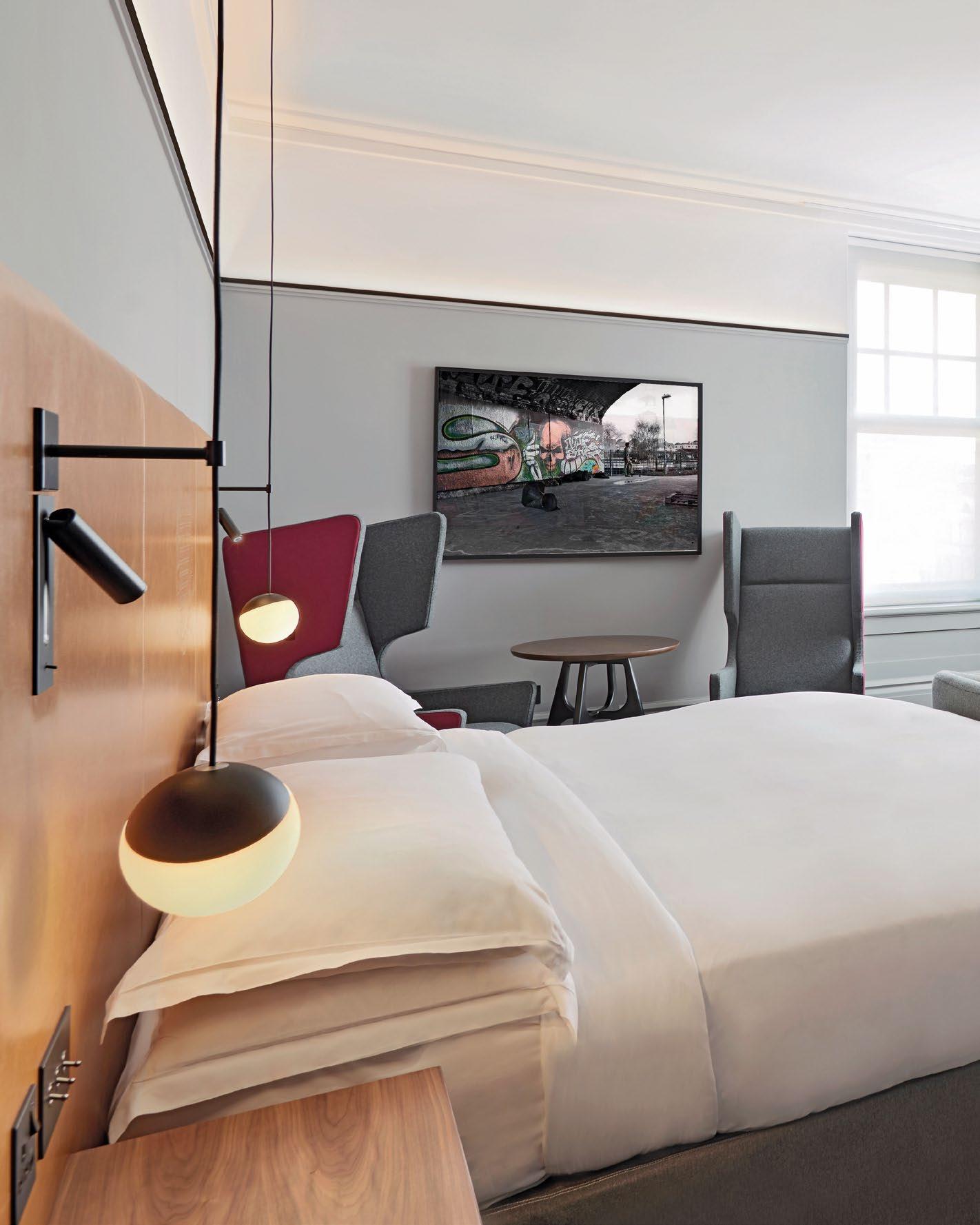
CREATIVE FUSION
CONRAN AND PARTNERS REDEFINE PLAYFUL LUXURY WITH A BLEND OF CITY SOPHISTICATION AND SHOREDITCH CHARM, CREATING A RENEWED VITALITY AT THE ANDAZ HOTEL.
SHOWCASE | HOTEL 98 | H+R | HOTELRESORTDESIGN.COM

ANDAZ | LONDON, UNITED KINGDOM
THIS PHOTO: A contemporary design to foster a modern lifestyle that speaks of its location.


The Great Eastern Hotel is one of the classic glamorous London rail terminus hotels. Like many of its bethren, it fell out of favour and into disrepair until a renovation by Maser Practice and Conran and Partners gave it a new lease of life the late Nineties. It became a real destination for artists, creatives and City types alike.
Subsequently, the Hyatt Hotel Group acquired the building and relaunched it as the very first Andazbranded hotel. Since the opening of Andaz Liverpool Street, other hotels around the world have joined the Andaz collection, each with a completely distinct, lifestyle-focused, contextual identity that responds to its individual surroundings.
Nearly two decades after the opening of the original reimagined Great Eastern Hotel, Conran and Partners was appointed by Hyatt to return to renovate the guest rooms in line with the current Andaz brand DNA. The rooms had truly stood the test of time having lasted two decades and a new brand incarnation.

BOTTOM:
100 | H+R | HOTELRESORTDESIGN.COM
TOP: Design choices to reflect the long established artistic and avant-garde identity of Shoreditch
Collaborating with local artist Sophie Mo, Conran and Partners used her illustrations to create bespoke headboards
Photo Credit: Hyatt Hotel Group
 THIS PHOTO: As the guest rooms have different layouts, Conran and Partners created a unique design identity for each one of them

Tasked with infusing the guest rooms and corridors with renewed vitality while staying true to the brand’s ethos of individuality and contextual identity, the firm embarked on a journey to reimagine the guest experience, ensuring that each room reflects the distinctive spirit of Andaz while honouring the heritage of the iconic hotel.
Hyatt were keen on a very London focused design to honour its location, so Conran and Partners explored the idea of ‘the City meets Shoreditch’ to create a design that seamlessly weaves together the distinctive characteristics of these two locales. Through a thoughtful and innovative design approach, the final result encapsulates a narrative that beautifully unfolds the unique essence of both the urban sophistication of the City and the vibrant, eclectic spirit of Shoreditch, harmoniously converging into a cohesive and captivating design.
The 267 guest rooms are all different and uniquely laid out as is often the case with historic hotels. The practice therefore created an approach which allowed for a cohesive aesthetic, with standardised focal elements and artwork that could be adapated to different layouts and configurations. Drawing inspiration from the City, Conran and Partners developed a series of design elements rooted in the timeless elegance
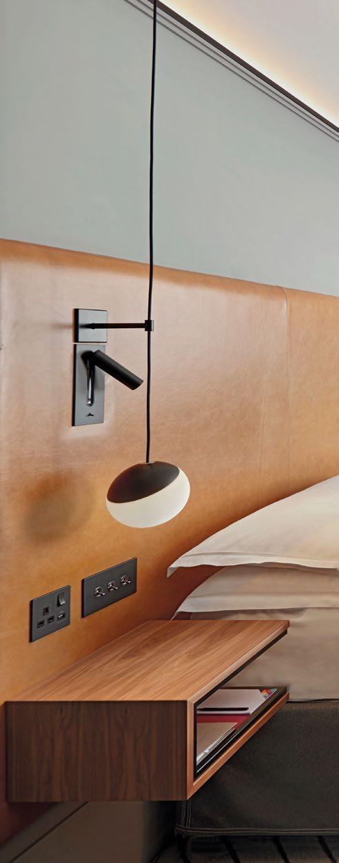
TOP: Classic tonal finishes exude a sense of understated luxury and sophistication
102 | H+R | HOTELRESORTDESIGN.COM

FROM SHOREDITCH, A NEIGHBOURHOOD RENOWNED FOR ITS LONG-ESTABLISHED ARTISTIC AND URBAN IDENTITY, CONRAN AND PARTNERS DREW INSPIRATION TO INFUSE THE DESIGN WITH EDGY AND UNCONVENTIONAL ELEMENTS. EMBRACING THE VIBRANT SPIRIT OF THE AREA, THE PRACTICE INTRODUCED A DYNAMIC INTERPLAY OF ART AND LIGHTING TO THE SPACE, ADDING LAYERS OF CREATIVITY AND INDIVIDUALITY.
THIS PHOTO: A design centred around City living with the charm and vibrancy of Shoreditch
FROM SHOREDITCH, A NEIGHBOURHOOD RENOWNED FOR ITS LONG-ESTABLISHED ARTISTIC AND URBAN IDENTITY, CONRAN AND PARTNERS DREW INSPIRATION TO INFUSE THE DESIGN WITH EDGY AND UNCONVENTIONAL ELEMENTS.

104 | H+R | HOTELRESORTDESIGN.COM
THIS PHOTO: Artwork in the bathrooms was created by local tattoo artist Sophie Mo, also found on the headboards and mini bars


bursts of colour and energy, while ‘tattoed’ concrete panels in the minbar and headboard leather panels bring and urban grittiness.
of formal tailoring. Every detail was meticulously curated to mirror the sophistication and refinement synonymous with tailored attire. Pinstripe carpets evoke the sleek lines and structured patterns of a bespoke suit, while crisp detailing and classic tonal materiality exude a sense of understated luxury and sophistication. The lush curtains carry on a dado line introduced in the rooms, which also conceals a new LED uplighting to modernise the outdated lighting scheme in the hotel.
From Shoreditch, a neighbourhood renowned for its long-established artistic and urban identity, Conran and Partners drew inspiration to infuse the design with edgy and unconventional elements. Embracing the vibrant spirit of the area, the practice introduced a dynamic interplay of art and lighting to the space, adding layers of creativity and individuality. Bold photographic artworks adorn the walls, injecting
Collaborating with local tattoo artist Sophie Mo, Conran and Partners used her illustrations for these bespoke leather headboards and splashbacks in the mini bar as well as bathrooms.
Feature lighting fixtures and the new LED lighting cast dramatic shadows and illuminate the space with a sense of intrigue. These edgy notes pay homage to Shoreditch’s rich cultural tapestry, celebrating its unique heritage and eclectic charm, while also imbuing the design with a contemporary flair that resonates with the neighbourhood’s dynamic ethos.
This innovative approach transforms the space into a vibrant lifestyle destination, seamlessly blending elements of the surrounding neighbourhood with the now iconic Andaz brand ethos. Every aspect of the design, from the sleek furnishings to the curated artwork, contributes to a unique and immersive experience that not only pays homage to the building’s rich heritage but also embodies the distinctive essence of the Andaz brand.
TOP: Another illustration by local tattoo artist Sophie Mo used in the splashback of the mini bars.
to
more
>>
Click here
view
photos
AN URBAN OASIS
PART OF A SUSTAINABLE MIXED-USE DEVELOPMENT IN MUMBAI, THE TREES BLENDS TAJ’S HERITAGE WITH CONTEMPORARY ARCHITECTURE TO CREATE AN OASIS IN THE BUSTLING CITY OF MUMBAI.
106 | H+R | HOTELRESORTDESIGN.COM
SHOWCASE | HOTEL

TAJ THE TREES | MUMBAI, INDIA
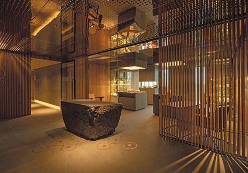
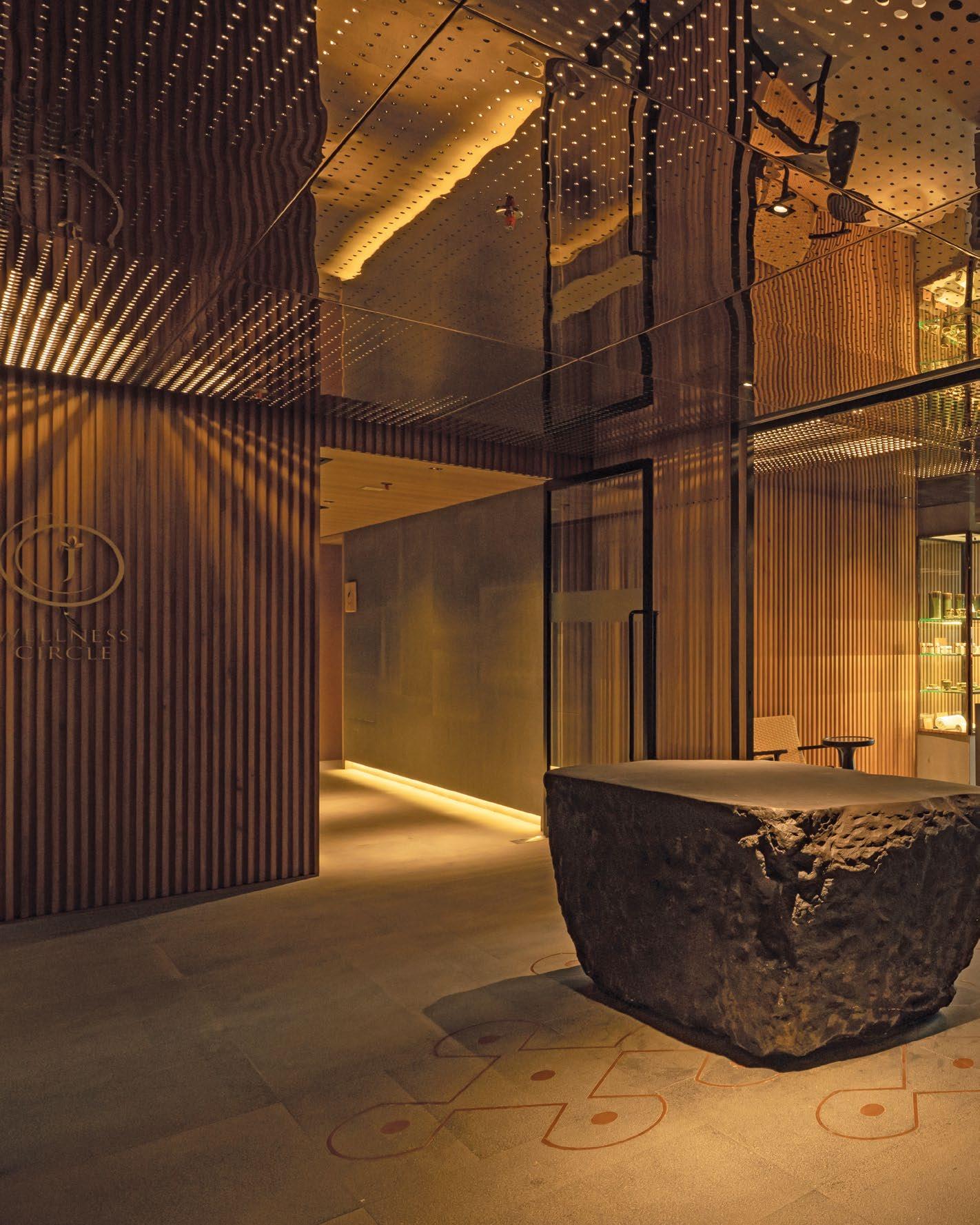
THIS PHOTO: An immersive spa area surrounds a beautiful Rangoli symbol set into the floor below a hovering natural rock sculpture.

108 | H+R | HOTELRESORTDESIGN.COM
THIS PHOTO: The reception area is a warm and inviting space with natural finishes.


Conran and Partners collaborated with Studio Vikhroli, Godrej Properties’ in-house design team, on Taj The Trees in Mumbai’s Vikhroli. The latest addition to Godrej’s ‘The Trees’ campus, the new building by WATG is part of one of India’s most sustainably planned mixed-use developments, replacing what was the family-owned historic factory complex. Located next to the largest mangrove forest in the region, the campus offers a unique oasis of calm amid one of India’s busiest cities, with the hotel set at its centre.
This project brought together the two iconic Godrej and Tata families, blending Taj’s heritage with contemporary architecture. The existing industrial buildings on the site give a nod to the heritage of the area, home to India’s Swadeshi movement – the original ‘Made in India’ movement. Conran and Partners went beyond the expected ‘industrial aesthetic’ and set about representing the core values of such important companies in India’s industrial revolution over the past century with a focus on creating spaces that celebrate manufacture, craft, details and beauty in precision.
 Photo Credit: Vikas Munipalle and Jaideep Oberoi
BOTTOM: The statement spiral staircase nods to the industrial past of the area
TOP: The lower level entrance lobby is a bright space with bespoke artwork that is choesive through the entire space
The design seamlessly integrates the hotel with the surrounding campus, serving as a vibrant asset for both tourists and locals. The ground floor features a café for guests and visitors from the surrounding offices and residences, always intended to become the heart of the community. It also comprises a contemporary ballroom with an exceptional mirrored three-dimensional ceiling and access to a private courtyard garden – creating a smooth flow from inside out.
The first-floor lobby space makes use of soaring ceilings contrasting with more intimate areas for the reception and more private areas. Bespoke artwork create moments of awe as you enter and move through to reception. Beyond the lobby facing the mangroves are the extensive bright and modern meeting and events facilities, envisaged more as a co-working space, with sophisticated industrial detailing and an openness that embraces the needs of modern workers.


110 | H+R | HOTELRESORTDESIGN.COM
BOTTOM: The quiet, natural palette, without too many strong colours, pays homage to materials in their natural state

CONRAN AND PARTNERS WENT BEYOND THE EXPECTED ‘INDUSTRIAL AESTHETIC’ AND SET ABOUT REPRESENTING THE CORE VALUES OF SUCH IMPORTANT COMPANIES IN INDIA’S INDUSTRIAL REVOLUTION OVER THE PAST CENTURY WITH A FOCUS ON CREATING SPACES THAT CELEBRATE MANUFACTURE, CRAFT, DETAILS AND BEAUTY IN PRECISION.
THIS PHOTO: A prominent community table takes centre stage, setting the tone for the spirit of the development.
THE DESIGN SEAMLESSLY INTEGRATES THE HOTEL WITH THE SURROUNDING CAMPUS, SERVING AS A VIBRANT ASSET FOR BOTH TOURISTS AND LOCALS. THE GROUND FLOOR FEATURES A CAFÉ FOR GUESTS AND VISITORS FROM THE SURROUNDING OFFICES AND RESIDENCES, ALWAYS INTENDED TO BECOME THE HEART OF THE COMMUNITY.

112 | H+R | HOTELRESORTDESIGN.COM
THIS PHOTO: Both restaurants offer expansive terraces adjacent to the spacious pool deck and overlooking the campus sculpture garden
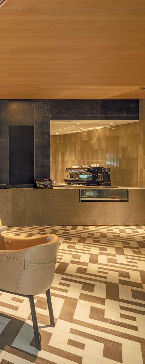

On the second floor is the immersive wellness and spa area made up of a luxurious wet spa, five treatment rooms, a relaxation room, a salon, a gym and a studio. As you enter, guests are greeted with a beautiful Rangoli symbol set into the floor below a hovering natural rock sculpture. This traditional geometric art form represents happiness, positivity and good fortune complementing the simple forms that celebrate the beauty of the natural timber and stone materials, instantly transporting guests into another world of calm and serenity.
The third floor is home to the extensive outdoor pool terrace with generous landscape and decking areas as well as two restaurants facing the pool and the mangroves on the other side. One is an all-day dining restaurant intelligently designed for functionality throughout the day, with open flexible spaces and open counters and kitchen areas. The space is flooded with light and features a beauitful mural artwork and geometrically patterned stone floors.
TOP: The panelling in the dining room is inspired by the local flora
Adjacent is the pan-Asian destination restaurant Nonya, which in imbued with a subtle Art Deco influence taking inspiration from Mumbai’s extensive architecture of that period. Dark timber veneered walls with brass detailing create a warm and luxurious atmosphere that still retains its contemporary feeling through the sharp detailing and open kitchen. Both restaurants have generous terraces, Nonya’s including an outside bar, facing out to the pool deck which also overlooks the campus sculpture garden beyond, connecting the hotel to its surroundings.
The 150 bright and modern guestrooms have full height picture windows facing the campus or the mangroves. Bathrooms are have large sliding doors to the room or are more enclosed and private for twin rooms. The rooms include king rooms, as well as two bay suites and one sumptuous Presidential Suite.


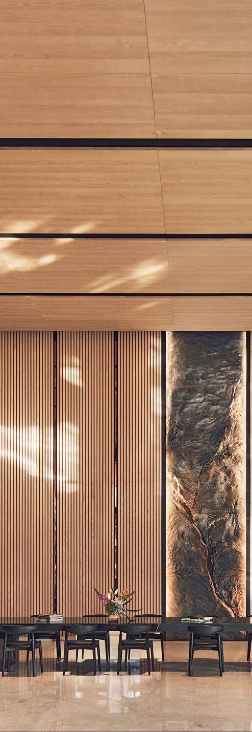
114 | H+R | HOTELRESORTDESIGN.COM
MIDDLE: The Nonya restaurant imbueds an Art Deco style signature to Mumbai
BOTTOM: The embroided headboards reflect the serene lanscape that surrounds Taj the Trees
 THIS PHOTO: The first-floor lobby exudes the grandeur of a classic Taj hotel, reinterpreted in a contemporary manner
ALL GUEST ROOM AREAS DISPLAY BREATHTAKING VIEWS ACROSS THE MANGROVE TREES OR ALTERNATIVELY THE TRANQUILLITY OF THE INFINITY POOL AND SCULPTURE GARDEN. THE AIRY OPENNESS IS ENHANCED BY A CONTEMPORARY MATERIAL PALETTE COMPRISING LIGHT COLOURED LOCAL STONE, LIGHT OAK AND HIGHLIGHTS OF CHAMPAGNE AND BLACK COLOURED METAL.

116 | H+R | HOTELRESORTDESIGN.COM
THIS PHOTO: Functional guestrooms with a contemporary, airy feel through natural materials
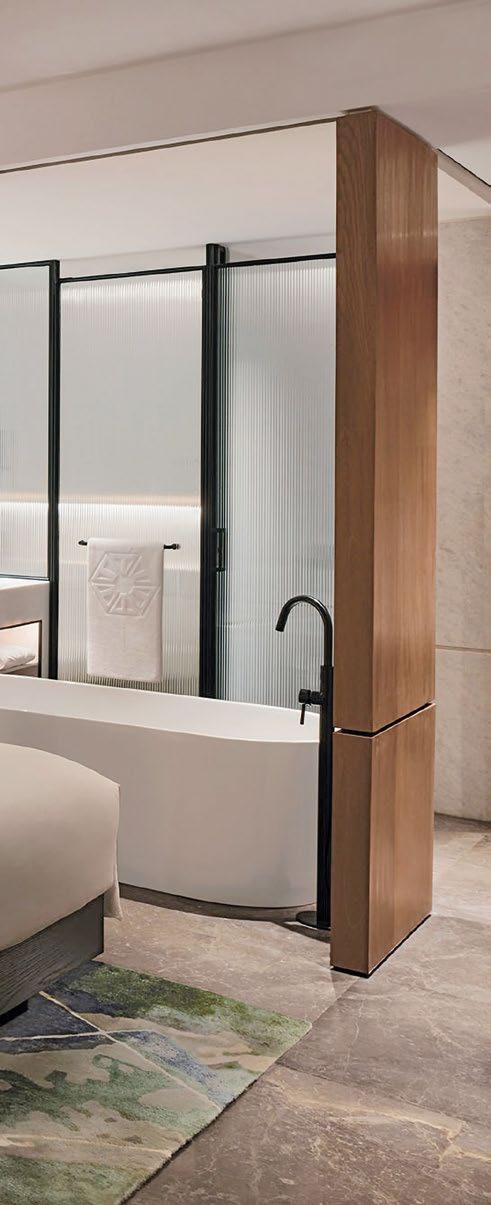


The guests also have acces to an Executive Lounge which provides a more intomate breakfast space and work and relxtion areas for VIP guests.
All guest room areas display breathtaking views across the mangrove trees or alternatively the tranquillity of the infinity pool and sculpture garden. The airy openness is enhanced by a contemporary material palette comprising light coloured local stone, light oak and highlights of champagne and black coloured metal. Detailed bespoke joinery and artwork reflecting the site’s design principles add a layer of texture while creating an inviting environment for guests.
To finish of the hotel spaces, an intimate gin bar on the top floor has an expansive terrace overlooking the mangroves, celebrating the distillation process from start to finish, creating a unique experience for guests to enjoy.
MIDDLE: Treatment rooms in the spa offer a serene escape with natural finishes for a calming atmosphere
>>
TOP: The state-of-the-art gym looks out onto the landscape through full length windows
Click here to view more photos
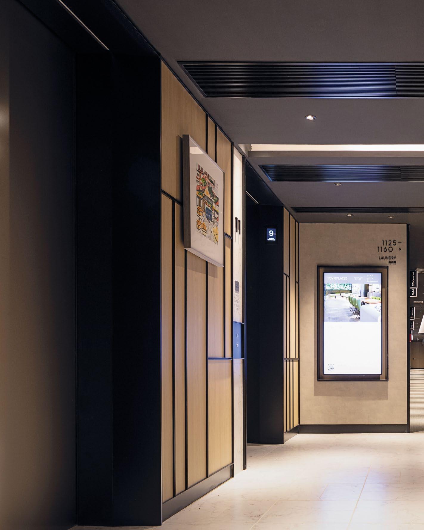
118 | H+R | HOTELRESORTDESIGN.COM SHOWCASE | HOTEL
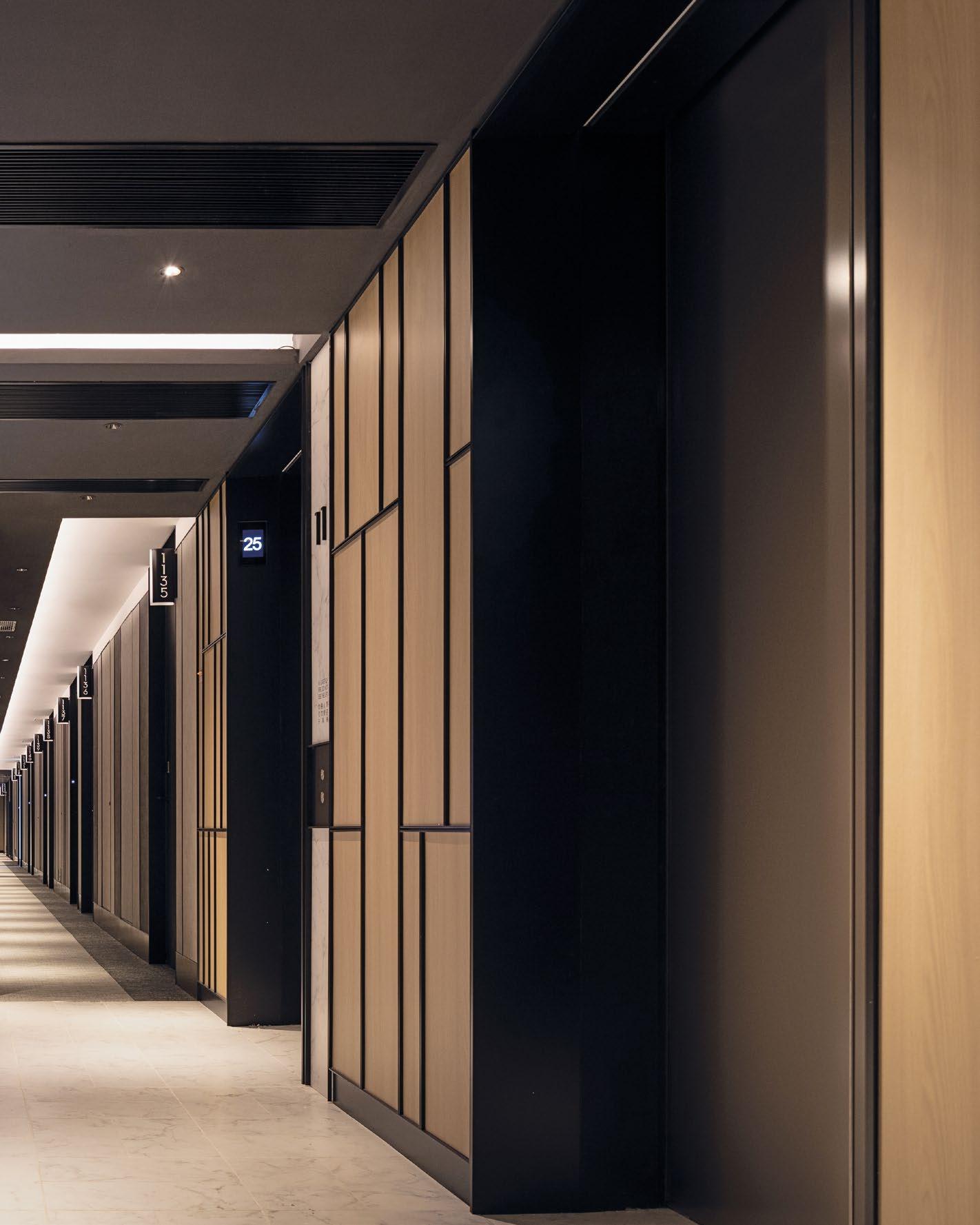
FUNCTIONAL BEAUTY
A FLEXIBLE AND DYNAMIC LIVING EXPERIENCE THAT EMBRACES THE HERITAGE OF WEST KOWLOON WITH A DESIGN INSPIRED BY VIBRANT LOCAL TAPESTRIES TO CREATE A DYNAMIC LIVING SPACE.
TOWNPLACE
|
WEST KOWLOON
HONG KONG, CHINA
THIS PHOTO: Townplace West Kowloon’s design nods to the local area with its industrial shipping.
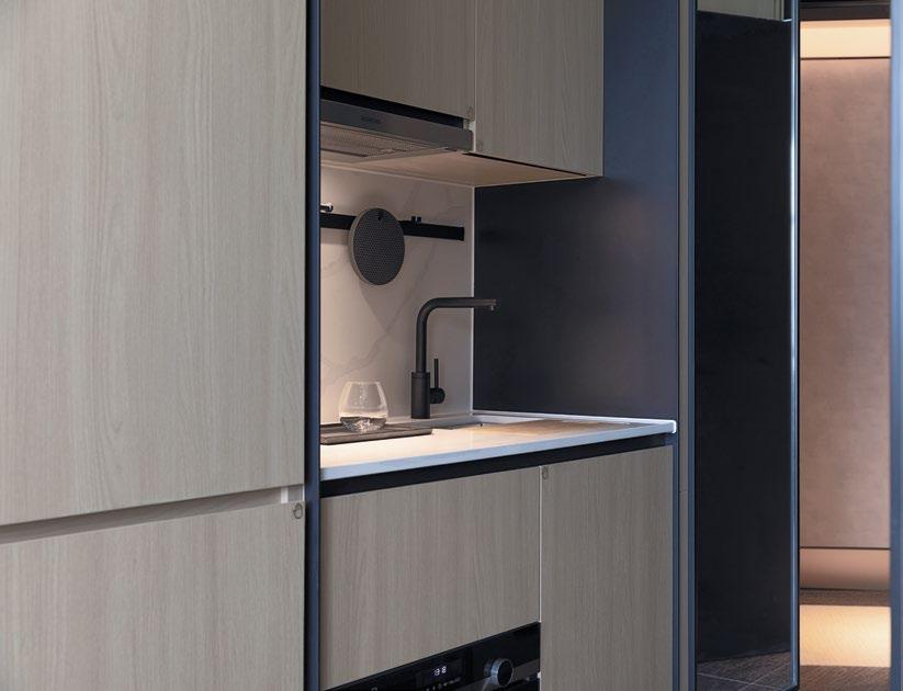
Conran and Partners was appointed by Sun Hung Kai Properties to design a flexible dynamic living experience that embodies the local heritage of West Kowloon. The project is in an up and coming urban neighbourhood right next to the iconic harbour, which has become a nexus for young creatives and independent businesses.
Conran and Partners was engaged to design the majority of the hotel and long stay rooms, working with local practice LAAB, who looked after the remaining rooms and public areas.
The neighbourhood has a rich tapestry of authentic craft, steeped in its industrial history that serves as an ideal backdrop for nurturing the next generation of contemporary young artists and artisans. This vibrant artistic legacy infuses the area with a palpable energy and inspires a community of forward-thinking creatives to call it home.
The design created by Conran and Partners for Townplace West Kowloon was thoughtfully curated as an amalgamation of the research into the local area, from industrial shipping heritage to the surrounding architecture.
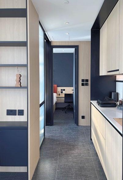

120 | H+R | HOTELRESORTDESIGN.COM
TOP & BOTTOM: The storage solutions were thoughtfully designed to maximise functionality within the constraints of limited space
Photo Credit: Sun Hung Kai Properties
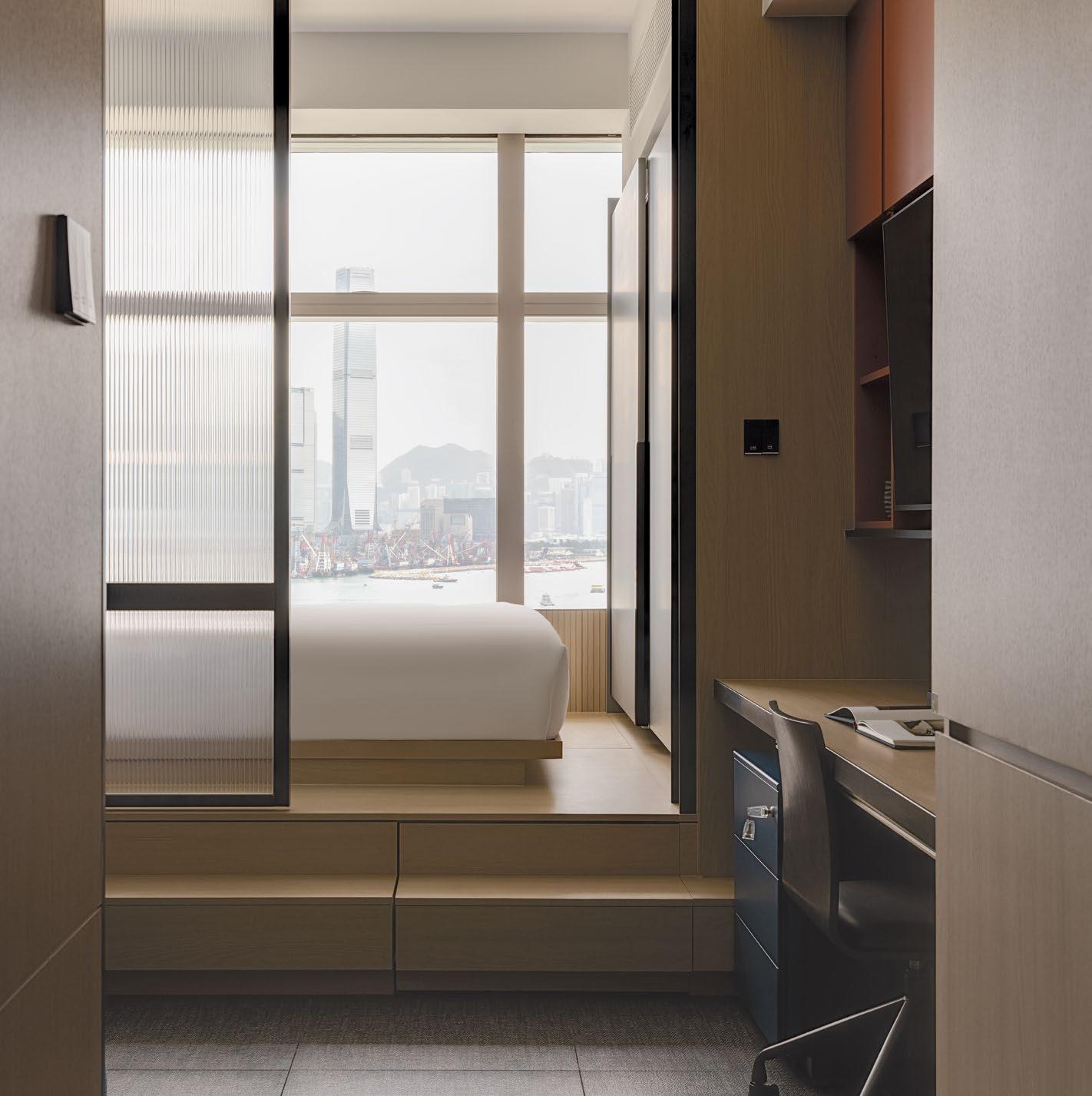 THIS PHOTO: The muted palette lets the breathtaking views across the vast expanse of the sea take centre stage
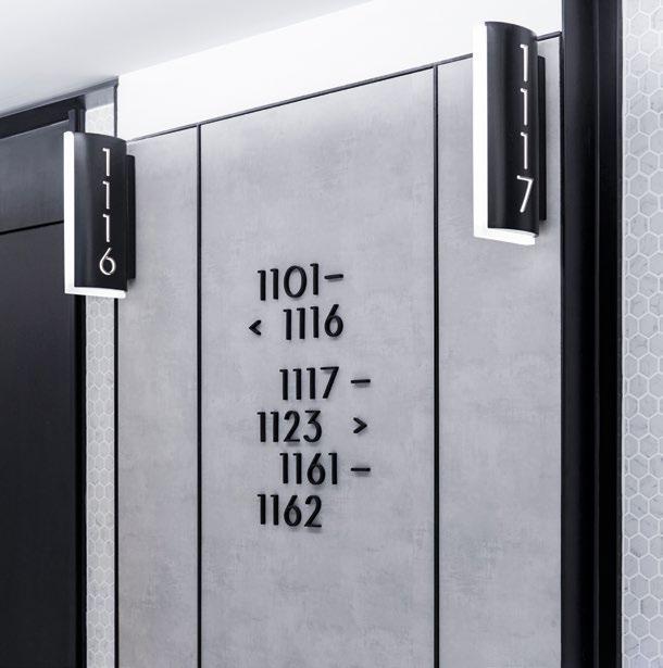
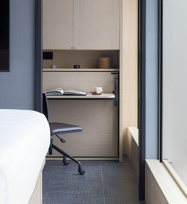
Nestled within this dynamic locale, the project occupies a truly distinctive location. While surrounded by the hustle and bustle of urban life, the rooms to the South offer breathtaking views across the vast expanse of the sea, where the glittering skyline of Hong Kong Island beckons in the distance. Conversely, to the North, the rooms overlook majestic mountains, creating a captivating juxtaposition of urbanism against the serene beauty of nature. This harmonious interplay between the vibrant cityscape and the tranquil natural surroundings encapsulates a holistic approach to wellbeing, fostering a sense of escape and harmony for residents and visitors alike.
Conscious not to reference the industrial style too overtly, Conran and Partners created a refined industrial palette that has elements of colour, detail and materiality that has a quiet confidence and luxury.
The design of Townplace West Kowloon was meticulously crafted to cater to the needs of two distinct types of clients, as the hotel serves as both a hotel and long-term stay destination. This duality presented a unique challenge, requiring a design that seamlessly transitioned between these two modes of occupancy.
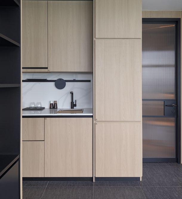
122 | H+R | HOTELRESORTDESIGN.COM
TOP: Industrial-inspired signage directs the guests to their rooms
BOTTOM LEFT & RIGHT: Luxurious wooden joinery is used throughout the rooms to define spaces
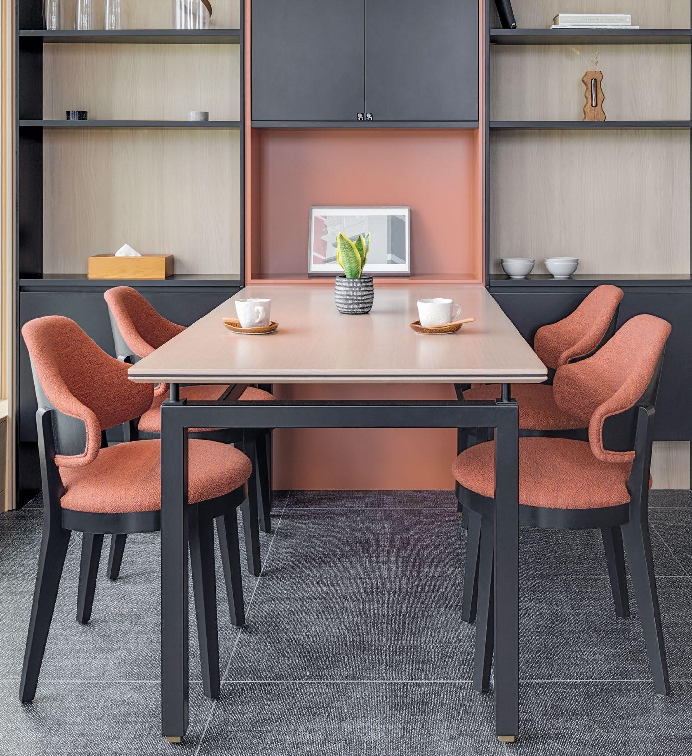 THIS PHOTO: The palette is industrial yet colourful with luxurious details and materiality
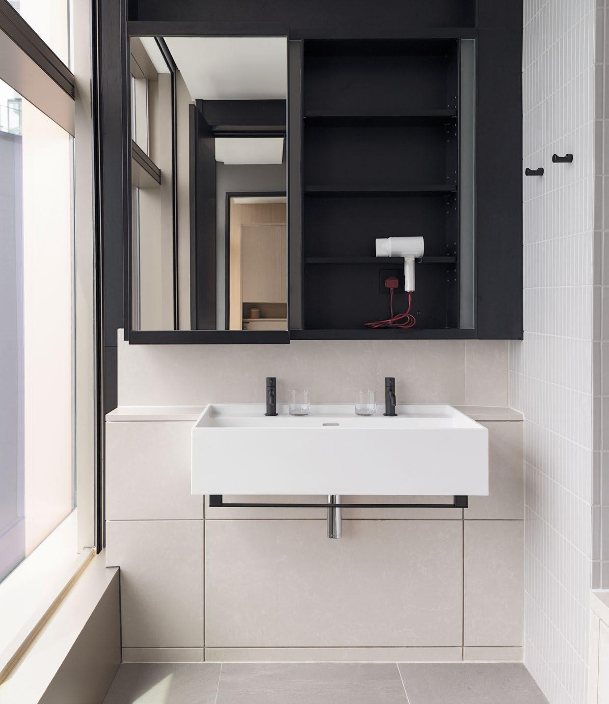
124 | H+R | HOTELRESORTDESIGN.COM
THIS PHOTO: The bathrooms are simple and functional, with industrial details contrasting with muted colours

A key consideration in the design process was the integration of ample storage solutions despite the small size of the rooms, recognising the importance of efficient organization for guests staying for varying lengths of time. Every item was allocated a specific space within the room, with careful attention to detail to ensure simplicity and tranquillity in the design aesthetic. The storage solutions were thoughtfully designed to maximise functionality within the constraints of limited space, ensuring that the rooms remained uncluttered and conducive to relaxation, while also allowing guests to enjoy the stunning views of the surrounding area.
The collaborative effort between Conran and Partners and LAAB was instrumental in achieving this balance, with a shared vision for creating an environment that prioritised both comfort and practicality. Whilst the guest rooms were meticulously tailored to meet the occupants needs for privacy and escape, the design of the public areas by LAAB created dedicated spaces that foster community engagement and social interaction.
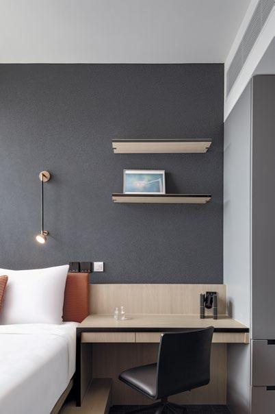
Click here to view more photos >>
LEFT & RIGHT: The bedrooms are as both a hotel and long-term stay destination with dedicated working areas.
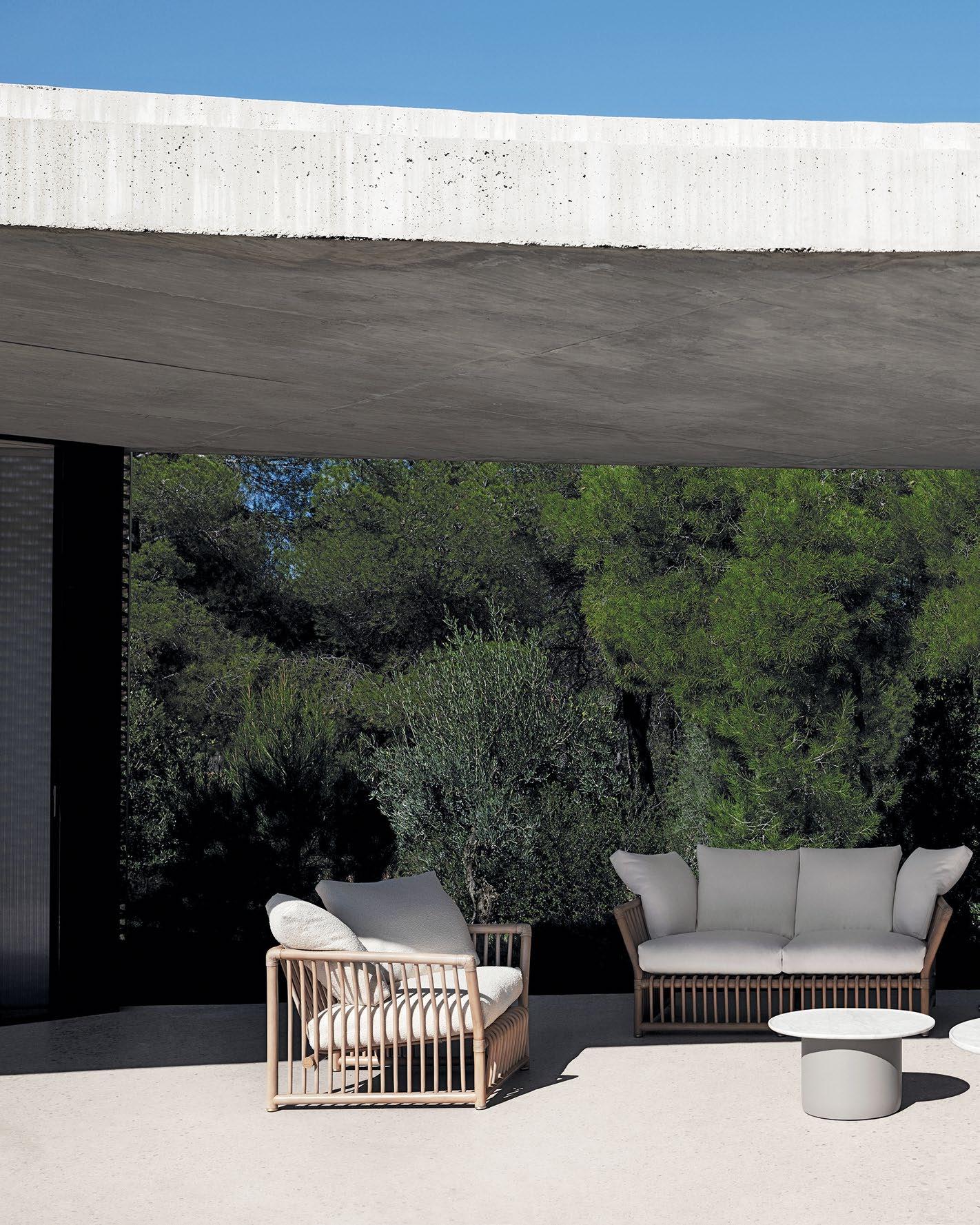
DESIGN LIBRARY
126 | H+R | HOTELRESORTDESIGN.COM
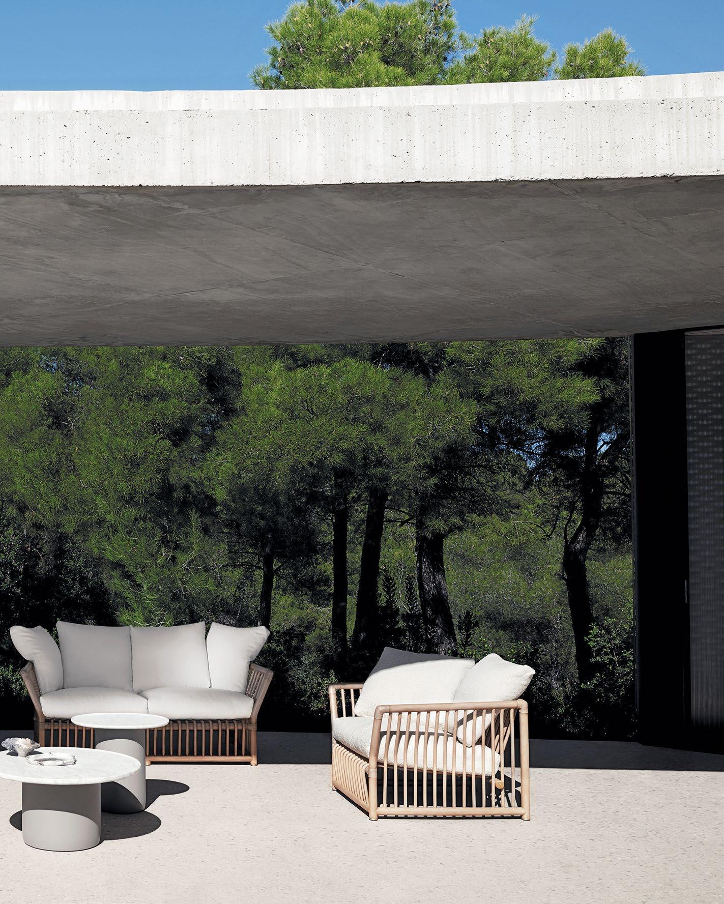
SOFTCAGE by B&B ITALIA
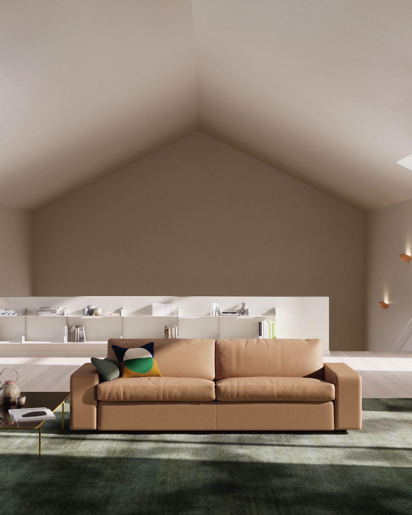
ENDURING ELEGANCE
EXUDING FLAIR AND FUNCTIONALITY, THE CONSETA SOFA’S TIMELESS DESIGN STANDS AS A BEACON OF ENDURING ELEGANCE, EMBRACING CLASSIC PRINCIPLES WHILE INCORPORATING ELEMENTS THAT WILL CONTINUE TO INSPIRE FOR YEARS TO COME.
128 | H+R | HOTELRESORTDESIGN.COM DESIGN LIBRARY | TIMELESS SOFA
 THIS PHOTO: The timeless design of Conseta seamlessly blends with evolving trends, providing a solid foundation that can be updated and refreshed.

“CONSETA IS A CLASSIC FURNITURE PIECE THAT HAS ADAPTED OVER TIME WITHOUT LOSING THE CORE ASPECTS OF ITS DESIGN.”
Leo Lübke, Managing Partner, COR

130 | H+R | HOTELRESORT
TOP LEFT & RIGHT: Quality materials and craftsmanship not only enhance the aesthetic appeal of Conseta but also contribute to the longevity of its design.
DESIGN.COM


Click here to view more photos >>
Longevity is a rare achievement in luxury furniture design. Yet, as COR’s iconic Conseta sofa celebrates its 60th birthday, it is a testament to enduring excellence in both form and function.
Originally unveiled at the Cologne Furniture Fair in 1964, the Conseta sofa was met with skepticism, its modular design a departure from convention. However, over the decades, it has evolved from a revolutionary concept into a timeless classic, embodying COR’s commitment to innovation and quality.
What sets Conseta apart is its adaptability. Whether as a snug two-seater or a sizeable multiseater, its modular elements offer endless possibilities for customisation. Upholstered seat cushions, headrests, footrests, each component of the Conseta, which — fun fact! — means ”sit together,” can be tailored to suit individual preferences, ensuring aesthetic appeal and ergonomic comfort.
Still, despite its versatility, Conseta remains remarkably consistent in its design ethos. Its clean lines and understated elegance create a sense of balance and sophistication in any space, be it a chic hotel lobby or a cosy resort lounge. As Leo Lübke, Managing Partner of COR, aptly puts it, “Conseta is a classic that has adapted over time without losing its essence.”
As COR continues to refine and evolve the Conseta principle, even as trends come and go, one thing remains certain — this celebrated sofa will continue to stand the test of time, ensuring its appeal in the years ahead. COR.DE
BOTTOM LEFT & RIGHT: Conseta’s neutral palette imparts a sense of tranquility and allows the architectural details and other furnishings in any space to predominate.
RATTAN RENAISSANCE
THE REVIVAL OF RATTAN AS EMBODIED IN B&B ITALIA’S BRAND-NEW SOFTCAGE COLLECTION IS A TRIBUTE TO NOSTALGIA, A PERFECT EXAMPLE OF A TIMELESS MATERIAL IN FURNITURE WITH A MODERN VIBE.

DESIGN LIBRARY | TIMELESS OUTDOOR SEATING 132 | H+R | HOTELRESORTDESIGN.COM
 THIS PHOTO: Timelessly charming, rattan confers the Softcage collection with a modern rustic vibe that complements a wide range of design aesthetics.

WITH RATTAN NOW ENJOYING A COMEBACK, THIS SOFTCAGE EDITION IS A FRESH TAKE ON A TIMELESS MATERIAL, ITS AIRY, OPENWORK DESIGN ALLOWING RATTAN’S SUAVITY AND ADAPTABILITY TO SHINE THROUGH.
134 | H+R | HOTELRESORTDESIGN.COM
THIS PHOTO: The flexibility of rattan lends well to the Softcage’s ergonomically designed base and backrest, both of which are inclined and suspended.


Nostalgia intertwines with modernity in B&B Italia’s reimagined Softcage outdoor collection, where echoes of the past resonate in the design of the present, a homage to Mario Bellini’s visionary 1975 project.
Bellini’s avant-garde philosophy, which once pushed the boundaries of furniture design, had artfully harnessed the rustic charm of the rattan, a natural material that complements a wide range of design aesthetics, from bohemian to modern and traditional. With rattan now enjoying a comeback, this Softcage edition is a fresh take on a timeless material, its airy, openwork design allowing rattan’s suavity and adaptability to shine through.
Imbued with a sense of quality and craftsmanship which is often associated with classic, hand-woven furniture, the Softcage’s intricate cage structure, made up of 45 mm sections and 18 mm rods, exemplifies the marriage of tradition and innovation. Its suspended backrest and inclined seat offer ergonomic comfort and support, cradling the sitter in a snug and sturdy embrace.
The Softcage consists of a sofa in two sizes, and an armchair, with its rattan structure offered in three colours: from the timeless allure of black to the fiery passion of red, and the understated elegance of grey. To further customise the outdoor space, the collection is available in a palette of colours and fabrics, transforming it into a stylish seating area.
In the realm of furniture design where trends come and go, the Softcage ensemble stands as a testament to the enduring power of design to recapture the imagination, and transcend time and seasons.
BEBITALIA.COM
BOTTOM: A picture of rustic elegance, B&B Italia’s reinterpreted Softcage series interweaves ergonomic comfort with the classic craftsmanship of hand-woven furniture.
TOP: Consisting of a sofa in two sizes and an armchair, the Softcage collection features a rattan structure in black, red and grey.
Click here to view more photos >>
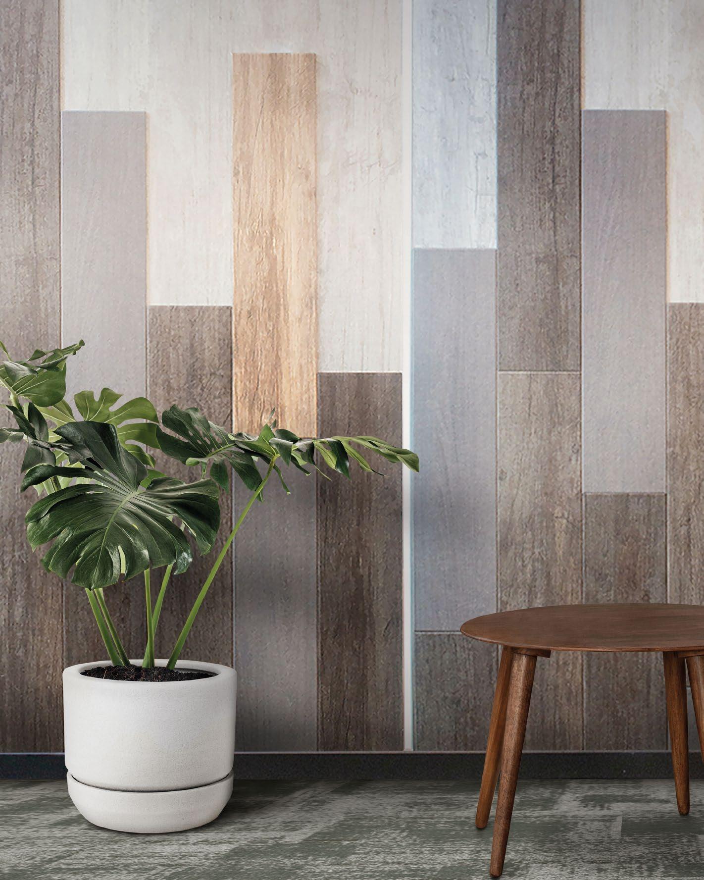
THE CACHET DIFFERENCE
FROM HIGH-END CARPETS TO HIGH-PERFORMANCE ACOUSTIC PANELS FOR WALLS AND CEILINGS, ROYAL THAI HAS GARNERED A BRAND TRUST IN ITS PRODUCTS THAT OFFER A SUPERIOR DIFFERENCE IN THE USER EXPERIENCE.
DESIGN LIBRARY | LUXURY CARPET & WALL PANEL 136 | H+R | HOTELRESORTDESIGN.COM
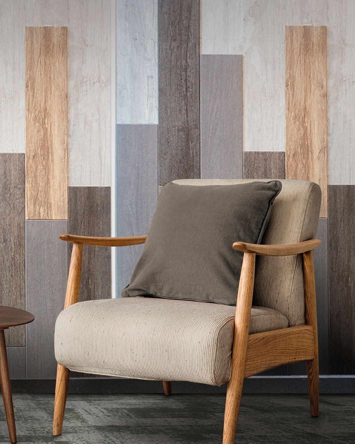
THIS
PHOTO: Design-savvy, high-performance and sustainable, RT acoustic panels confer a sense of wellness and wellbeing to any space, enhancing the user experience.
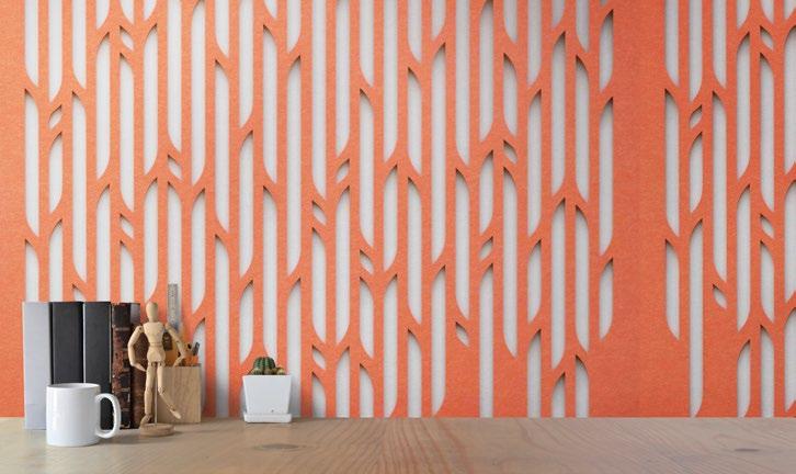
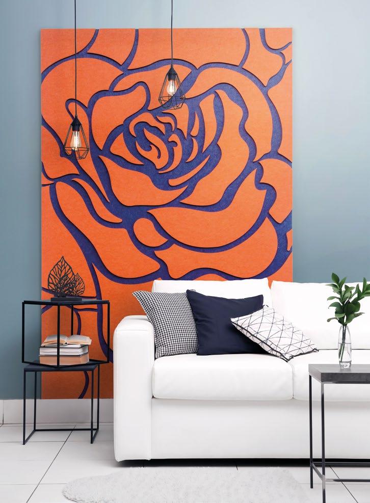

Aleader in manufacturing custom-designed woven carpets and hand-tufted rugs, ROYAL THAI has recently expanded into high-performance acoustic panels. Stephen Wong, Senior Executive VP, discusses the company’s evolution, challenges, and pioneering “total solution” strategy—and how its integrated approach reshapes the industry landscape, promising superior aesthetics, sustainability, and unparalleled client satisfaction.
Q: To begin with, could you kindly provide additional information about yourself?
A: I have gained extensive background in commercial projects since 1992 upon my return to Hong Kong. After I joined Tai Ping Carpets in 2000, I have gained additional experience in the hospitality carpet industry. With the experience in managing sizable casino, airport, convention center and hotel projects, I have grown together with the company building up a strong Sales and Project Management team and sales network in the industry in Asia.
Q: What are your roles and responsibilities at ROYAL THAI?
A: With the acquisition of the Tai Ping Commercial Division by TCM Corporation in 2017, I have moved to ROYAL THAI since then with bigger responsibility of managing all product sales and overall operations in both APAC and EMEA regions. I found it very interesting to working with different colleagues and customers from around the world in the industry, developing custom design carpet products to suit individual project needs. The sense of success in contributing to each project is amazing.
138 | H+R | HOTELRESORTDESIGN.COM
Stephen Wong Senior Executive Vice President, EMEA, APAC ROYAL THAI
“THE INTRODUCTION OF OUR NEW PRODUCT OFFERINGS, INCLUDING CARPET, WALL ACOUSTIC PANEL, AND CEILING MATERIALS, ALIGNS SEAMLESSLY WITH OUR COMPANY’S OVERARCHING MISSION AND VALUES. AT ROYAL THAI, WE ARE DEDICATED TO PROVIDING INNOVATIVE SOLUTIONS THAT EXCEED CUSTOMER EXPECTATIONS WHILE UPHOLDING THE HIGHEST STANDARDS OF QUALITY, SUSTAINABILITY, AND DESIGN EXCELLENCE.”
Stephen Wong, Senior Executive Vice President, EMEA, APAC - ROYAL THAI

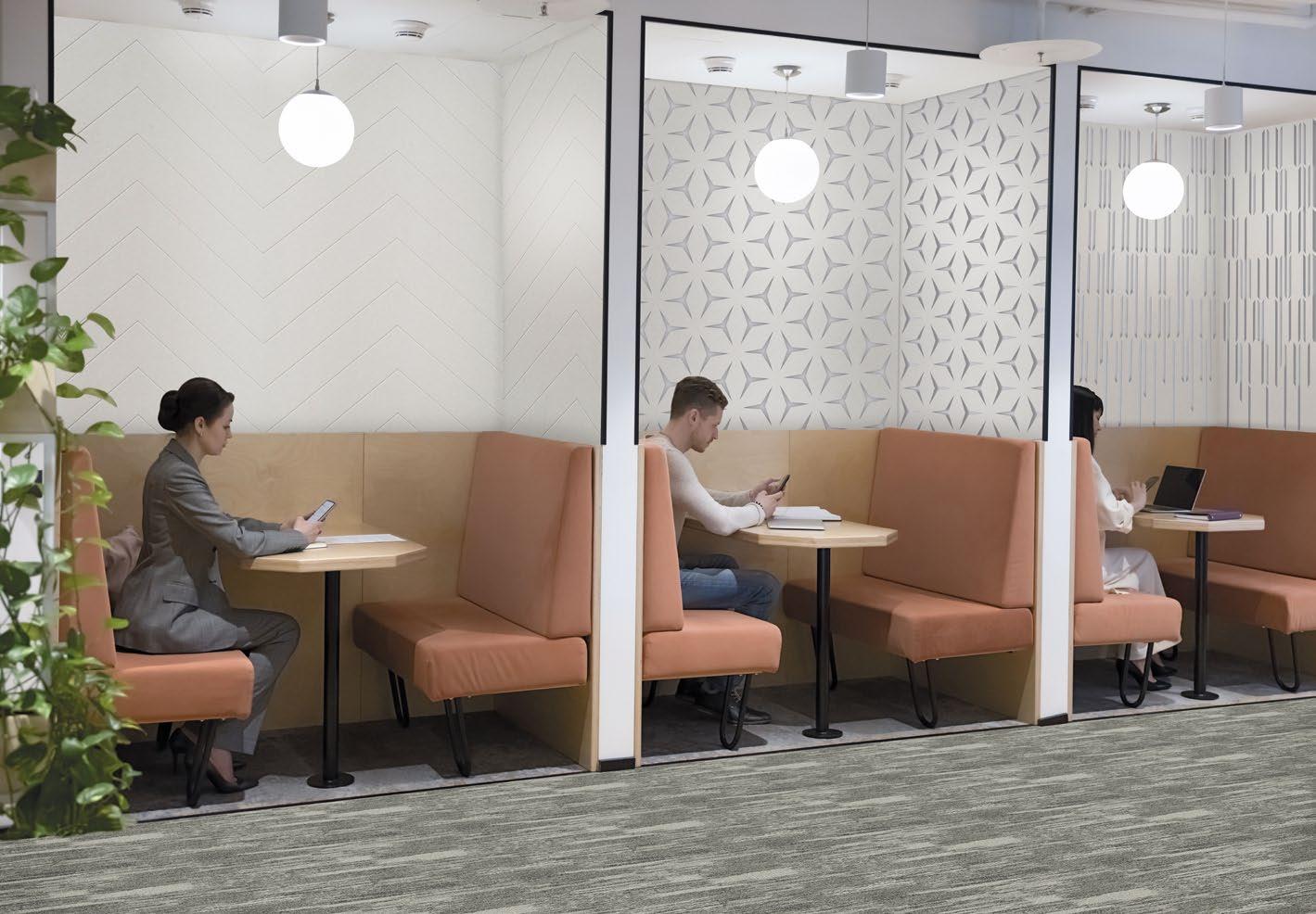
multi-purpose, customisable
surface, with creative applications of precision print pattern.
ALL PHOTOS: Engineered using EcoSoft ® recycled PET fibre, SOLO is a
acoustic
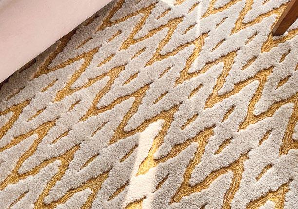
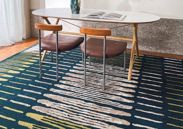
140 | H+R | HOTELRESORTDESIGN.COM
ALL PHOTOS: ROYAL THAI ’s luxury carpets offer unmatched design versatility, with a wide array of colours, patterns and textures to choose from.
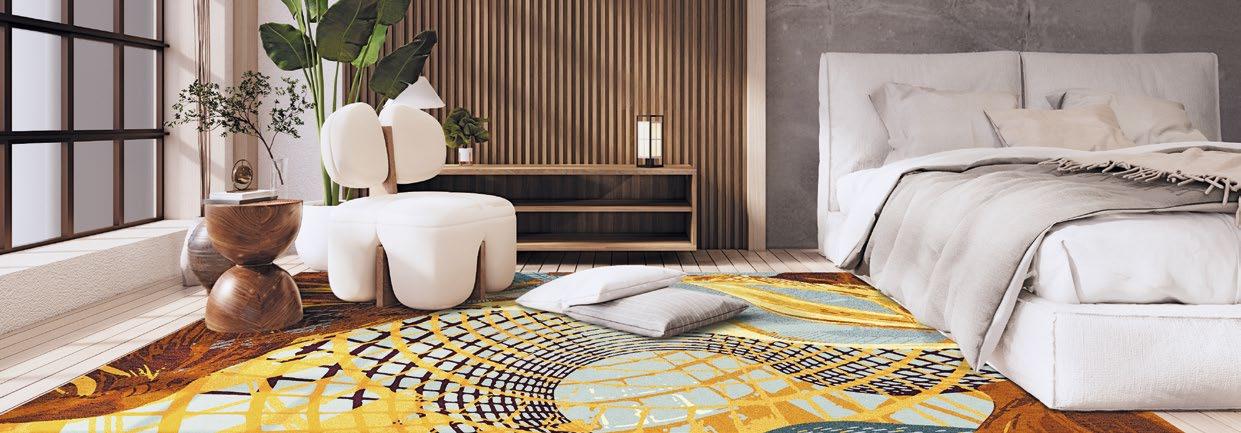
Q: What is your biggest challenge in managing ROYAL THAI ’s business?
A: In the past few years COVID has affected not only our personal life but also our business model. The hospitality industry was hard hit by the pandemic and therefore, competition has naturally become more intense.
Q: What inspired the decision to expand into offering a total solution provider approach, incorporating flooring, wall panel, and ceiling materials?
A: As we see there is a design trend change in the hotel guestroom environment that wall-to-wall carpet is replaced by other hard flooring materials, we expand our horizon on other flooring materials (e.g. SPC flooring), wall panel, and ceiling materials in order to continue to provide ‘total solution’ to our customers.
Q: How do these new product offerings align with the company’s overall mission and values?
A: Besides our market positioning as ‘total solution’ provider, our new product does not only offer great aesthetic appearance to our customers, but also contributes to our client’s environment with our accreditations on sustainability
The introduction of our new product offerings, including carpet, wall acoustic panel, and ceiling materials, aligns seamlessly with our company’s overarching mission and values. At ROYAL THAI , we are dedicated to providing innovative solutions that exceed customer expectations while upholding the highest standards of quality, sustainability, and design excellence. These new products are a natural extension of our commitment to offering comprehensive solutions to our clients, catering to their diverse needs and preferences.
By expanding our offerings, we are now able to offer an even more complete package that addresses every aspect of interior design and construction. This not only simplifies the procurement process for our clients but also ensures a cohesive and harmonious result in their projects. We have invested significant resources in research and development to ensure that our materials are not only aesthetically pleasing but also environmentally friendly and ethically sourced. By prioritizing sustainability and responsible manufacturing practices, we are not only fulfilling our corporate social responsibility but also meeting the evolving expectations of today’s conscious consumers.
Q: Can you discuss the unique positioning and brand identity of each product line within the company’s portfolio?
A: Each product line within our company’s portfolio possesses a unique positioning and brand identity tailored to meet the specific needs and preferences of our diverse customer base.
Our ROYAL THAI carpet line stands out for its luxurious feel, exceptional durability, and extensive range of colors and patterns. Design-led to elevate any space, from residential homes to commercial offices, our carpets embody sophistication and expertise.
Our Carpet Tile under the brand Carpets Inter, is characterized by its modern aesthetic appearance with our trendy designs, and user-friendliness. Carpets Inter provides a sophisticated solution for every inspired interior and spaces.
Lastly, our acoustic materials from RT acoustic distinguish themselves through their innovative designs for wellness, acoustic performance, and sustainable features. From acoustic ceiling tiles to decorative wall panels, our collection offers total
acoustic solutions to create inspiring and environmentally friendly environments.
Q: How do the individual brand experiences complement each other to provide a cohesive and comprehensive solution for clients?
A: All of our brand products can be used in different areas of a project complementing each other. For example, when our carpet and acoustic panels are used in the same area, the noise absorption level can be enhanced. Therefore, 1 + 1 > 2.
Q: How does the integration of these products enhance the company’s competitive edge in the market?
A: The ‘total solution’ approach can help customers to enhance their procurement efficiency.
Q: What strategies are being implemented to ensure seamless coordination and delivery of all components within the total solution package?
A: We provide not only ‘Supply’ but also installation service providing a total solution package to our customers. With this business model we enable customers to achieve faster project completion lead-time.
Q: In what ways does the company anticipate fostering long-term relationships with clients through its total solution provider approach?
A: Repeat customers are always part of our success. By providing ‘total solution’ with professional aftersales services, we provide excellent procurement experience to our customers encouraging them to come back to us for their next purchase.
ROYALTHAI.COM
here to view more photos >>
Click
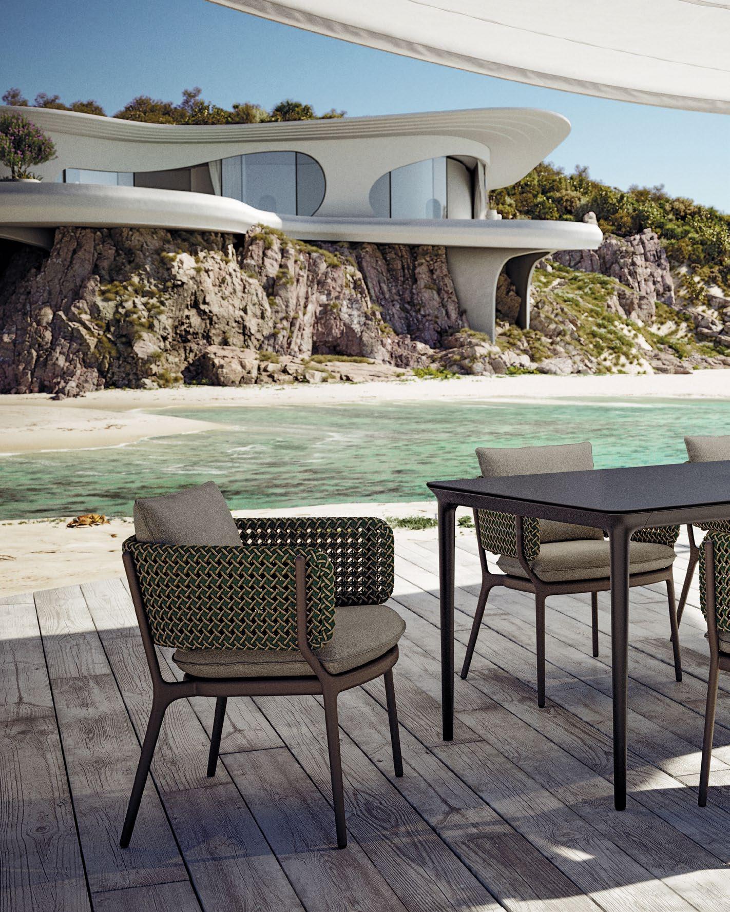
WOVEN COMFORT
DEDON’S NEW BELLMONDE COLLECTION BY RENOWNED DESIGNER HENRIK PEDERSON HIGHLIGHTS REFINED OUTDOOR LUXURY THROUGH ITS SOFT ORGANIC FORM AND SIGNATURE TEXTURED WEAVE –SERVING UP A WARM AND RELAXING WELCOME.
DESIGN LIBRARY | OUTDOOR SEATING 142 | H+R | HOTELRESORTDESIGN.COM
 THIS PHOTO: Its inviting design comes with 2 weave colours and over 48 fabric selection for thoroughly customising your outdoor seating.

144 | H+R | HOTELRESORTDESIGN.COM
THIS PHOTO: Crafted with aluminium for sturdiness, DEDON’s armchair comes with plush, removable, weatherresistant seat cushions for outdoor get-togethers.

For those seeking to elevate your patio experience subtly, DEDON’s Bellmonde collection – designed by Henrik Pederson, offers the sleek lines of modern design while blending with the warm embrace of a summer evening. The armchair and lounge chair pieces are made to be elegant and yet comfortable.
The armchair features a slender, organic frame with continuous armrests constructed from a unique textural fabric in a beautiful “Pine” finish. This textural detail adds a touch of visual intrigue, while the plush cushions with removable, weather-resistant covers ensure year-round comfort. The lounge chair, with its lower profile, invites laid-back evenings spent unwinding under the open sky.
DEDON isn’t messing around when it comes to quality. Each piece is built to last, with its frame being sturdy aluminium for durability, and removable, weather-resistant cushion covers for effortless maintenance.
Their signature DEDON Fiber, hand-woven by skilled artisans in the Philippines, is known for its strength, weather resistance, and luxurious feel. This meticulous attention to detail ensures that each piece not only looks stunning but also withstands the elements, guaranteeing lasting enjoyment. Furthermore, DEDON prioritises environmentally friendly practices throughout the production process, a commitment that resonates with today’s designconscious consumer.
By exploring the full collection, you can discover how DEDON’s dedication to quality and innovative design can elevate your outdoor living experience, transforming your space into a personal sanctuary for relaxation and rejuvenation.
 BOTTOM: The armrests are made of structural fabric in a pine weave; while its fabric fibre is hand-woven by skilled artisans.
TOP: In contrast to the armchair, the lounge chair is shorter in height for a more laid-back round-the-table catching up.
DEDON.DE Click here to view more photos >>


 THIS PHOTO: The woven outdoor edition of the Basket club chair is made from artificial fibre and yellow balau, and comes with custom fabric cushions.


 BOTTOM: The Basket club chair’s pure wool seat padding comes in four colour combinations and eight Norwegianthemed ‘Hallingdal’ fabrics by Kvadrat.
TOP: Featuring aluminium frames with hand-braided polyester cord, deep cushions and teak legs, the Bitta dining armchairs are the embodiment of lightweight cosiness.
Design Studio: Autoban
Photo Credits: Kerem Sanliman


 BOTTOM: The Maia lounge chair by Kettal encapsulates the very essence of pura vida with its airy elegance and laid-back vibe.
TOP: The embodiment of modular mojo, each module of the Molo sofa system can be dismantled and rearranged, spinning up new uses and configurations.


 BOTTOM: A defining characteristic of the Vieques dining armchairs and club armchairs lies in the aluminium metal framework and three-dimensional nido d’ape fabric.
TOP: With its open-lattice rope weave design, the light and airy Cala stackable armchairs combine low maintenance and comfort for al fresco dining.


 PARK HYATT | JAKARTA, INDONESIA
THIS PHOTO: Guests are welcomed in the lower lobby adorned with local shields and a ‘rock glass’ chandelier.


 Photo Credit: Himawan Sutanto
BOTTOM: A warm oversized chandelier frames the Library creating a semi-private space
TOP: The Private Dining Room with expansive views over the city of Jakarta


 THIS PHOTO: The sushi counter at Kita restaurant is designed as a stage for diners to enjoy the culinary experience


 BOTTOM: Located on level 36, KITA Bar provides both outdoor and indoor spaces, as well as stunning sunset views of the Indonesia’s National Monument
TOP: The main dining room is an ode to Japanese kitchen with front-row seats to the artistry of the kitchen


 BOTTOM: Natural finishes in the bathrooms create a serene escape with full length windows offering views across the city

 PARK HYATT | AUCKLAND, NEW ZEALAND
THIS PHOTO: Natural and locally sourced materials, with references to Maori heritage and its arts and crafts, contrast with modern influences from Europe and Asia.


 THIS PHOTO: The Living Room offers relaxed lounge furniture arranged on two levels looking out over the harbourside


 BOTTOM: Conran and Partners’ design approach has been inspired by the surrounding harbour
TOP: The design for the guestrooms is inspired by nautical references with a warm palette of timber and fabrics and furniture in-built


 THIS PHOTO: The spa is an ode to luxury with locally-sourced natural materials and modern details

 PURO KAZIMIERZ | KRAKÓW, POLAND
THIS PHOTO: ‘PRISMA’ offers a ‘Urban Spa’ with gym, sauna, steam, beauty stations and treatment rooms.


 BOTTOM: The wall behind the reception area features a bold graffiti art installation by Polish artist ‘Nawer’ and is a taster of the wider artwork collection which is to be found throughout the hotel
TOP: The design clearly references elements of the area’s history, including its once-bustling industrial heritage, while still achieving a strong residential feel.
Photo Credit: Anna Stathaki


 BOTTOM: An etched, grooved, fluted glass screen physically separates the shower from the bedroom while allowing light and abstracted views through
TOP: The beds are backed by bespoke, woven headboards and covered by specially-designed throws referencing one of Conran and Partners’ early concept sketches for the hotel


 THIS PHOTO: The studio opened up and unify the spaces to create a coherent and engaging journey for guests and visitors.


 THIS PHOTO: At the far end of the space lies FEAST, a bustling eatery with a richer, warmer palette and luxurious materials


 TOP & BOTTOM: The open kitchen in FEAST encompasses the use of vibrant earthy tones contrasting with the light oak finish


 THIS PHOTO: The timber slatted wall continues throughout the space with different finishes to create a transitional experience


 THIS PHOTO: The surrounding context led to design choices of earthy finishes using wood and concrete


 BOTTOM: Beautifully made Japanese concrete will see the structure age gracefully overtime in harmony with it’s natural surroundings
TOP: The communal hub serves as a dining space and spa retreat with indoor-outdoor architectural features


 Photo Credit: IHG
BOTTOM: Each area in the rooms has views through full height windows over the edge of the city


 THIS PHOTO: Materials such as brass, leather and oak create a robust and honest finish


 BOTTOM: A slender leather bench sits along the window elevation allowing for a moment of calm
TOP: Fluted glass screens used to seperate individual spaces while allowing for natural light to penetrate through the whole room


 THIS PHOTO: As the guest rooms have different layouts, Conran and Partners created a unique design identity for each one of them


 Photo Credit: Vikas Munipalle and Jaideep Oberoi
BOTTOM: The statement spiral staircase nods to the industrial past of the area
TOP: The lower level entrance lobby is a bright space with bespoke artwork that is choesive through the entire space


 THIS PHOTO: The first-floor lobby exudes the grandeur of a classic Taj hotel, reinterpreted in a contemporary manner


 THIS PHOTO: The muted palette lets the breathtaking views across the vast expanse of the sea take centre stage


 THIS PHOTO: The palette is industrial yet colourful with luxurious details and materiality


 THIS PHOTO: The timeless design of Conseta seamlessly blends with evolving trends, providing a solid foundation that can be updated and refreshed.


 THIS PHOTO: Timelessly charming, rattan confers the Softcage collection with a modern rustic vibe that complements a wide range of design aesthetics.


 THIS PHOTO: Its inviting design comes with 2 weave colours and over 48 fabric selection for thoroughly customising your outdoor seating.


 BOTTOM: The armrests are made of structural fabric in a pine weave; while its fabric fibre is hand-woven by skilled artisans.
TOP: In contrast to the armchair, the lounge chair is shorter in height for a more laid-back round-the-table catching up.
