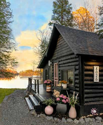


Where luxury meets nature.


Where luxury meets nature.


effortless maintenance for exceptional homes
refined


I t ’ s W h e r e Y o u B e l o n g .


view our design gallery at mint-design.biz see updated projects on instagram @mintdesignbiz
Dear Friends,
Welcome to the Autumn issue of Lake Society Magazine. Publishing a magazine is like having children—I love every issue equally, but there’s something extra-special about this one. I adore the warm, rich palette of fall colors and the intriguing mix of historic and new houses, including a modern home at White Oaks Savanna by InUnison Design and Christopher Strom Architects. I think you’ll get a kick out of seeing Suzie Stegic’s irreverent, Englishinspired interiors, and reading Don Forsman’s story, as he reminisces about Elizabeth Hyatt, an architectural designer and mentor who renovated many historic homes around Lake of the Isles in the 80s and inspired his passion for quality.
“ It ’s often said that a great house is never finished, and the same is true for a great design story.”
Last summer, our roving editor Melinda Nelson wrote about an enchanting Lake Minnetonka garden created by Barbara Burgum, a retired landscape architect, and her friends. Barbara’s house, a 1905 Craftsman, is equally glorious, because she carefully renovated it with her dear friend David Heide and his colleague Brad Belka. I know you’ll enjoy reading about how David, Brad and their team created a “mocktail” party for Barbara in a warehouse, complete with wine spritzers and spray cheese on crackers, to make sure the floor plan would accommodate her signature Sunday night suppers.
Most of all, I love this Autumn issue because it’s a cornucopia of everything I appreciate about great home design—authentic style, an appreciation for history, a strong sense of color, incredible craftsmanship and most importantly, a sense of humor.
Thank you for being part of Lake Society Magazine.
–Karen Stoeckel, Publisher


ON THE COVER
THE FOYER OF BARBARA BURGUM'S 1905 CRAFTSMAN HOME, LOVINGLY DESIGNED BY DEAR FRIEND DAVID HEIDE AND TEAM.
Lakesocietymagazine.com Lakesocietymagazine@gmail.com @lsm_magazine
PUBLISHER
KAREN T. STOECKEL
GRAPHIC DESIGN
SHEBA CONCEPT & DESIGN, INC.
ART DIRECTION
KAREN T. STOECKEL
SOCIAL MEDIA
PATTY BURLEY
CONTRIBUTING WRITERS ANDRÉA DIXON
ANDREW FLESHER
SANDY LAMENDOLA
RICHARD MERCHÁN
MELINDA NELSON
BERIT THORKELSON
JEN ZIEMER
CONTRIBUTING PHOTOGRAPHERS SPACECRAFTING
SCOTT AMUNDSON
SUSAN GILMORE


Andréa Dixon and Jen Ziemer, interior designers and co-owners of the award-winning Fiddlehead Design Group, share what they’re loving during Minnesota’s finest season.
Autumn is high voltage color straight ahead for artist Richard Merchán.
The Alexander Family with their twin daughters combine art and music to create their beautiful home.
Together with dear friend Barbara Burgum, David Heide and his team infused her 1905 Craftsman home with warmth, character and plenty of room for cooking.
World traveler Kelly Caruso details a coast to coast vintage tour.

50 NORDIC HOMECOMING
A geologist returns to his roots with a Nordic-inspired home that embraces the surrounding prairie, inside and out.
58 DESIGN CHRONICLES
Sandy LaMendola chronicles entertaining in style.
60 ANDREW ON DESIGN
Interior designer Andrew Flesher collaborates with a long-time client on her dream home.
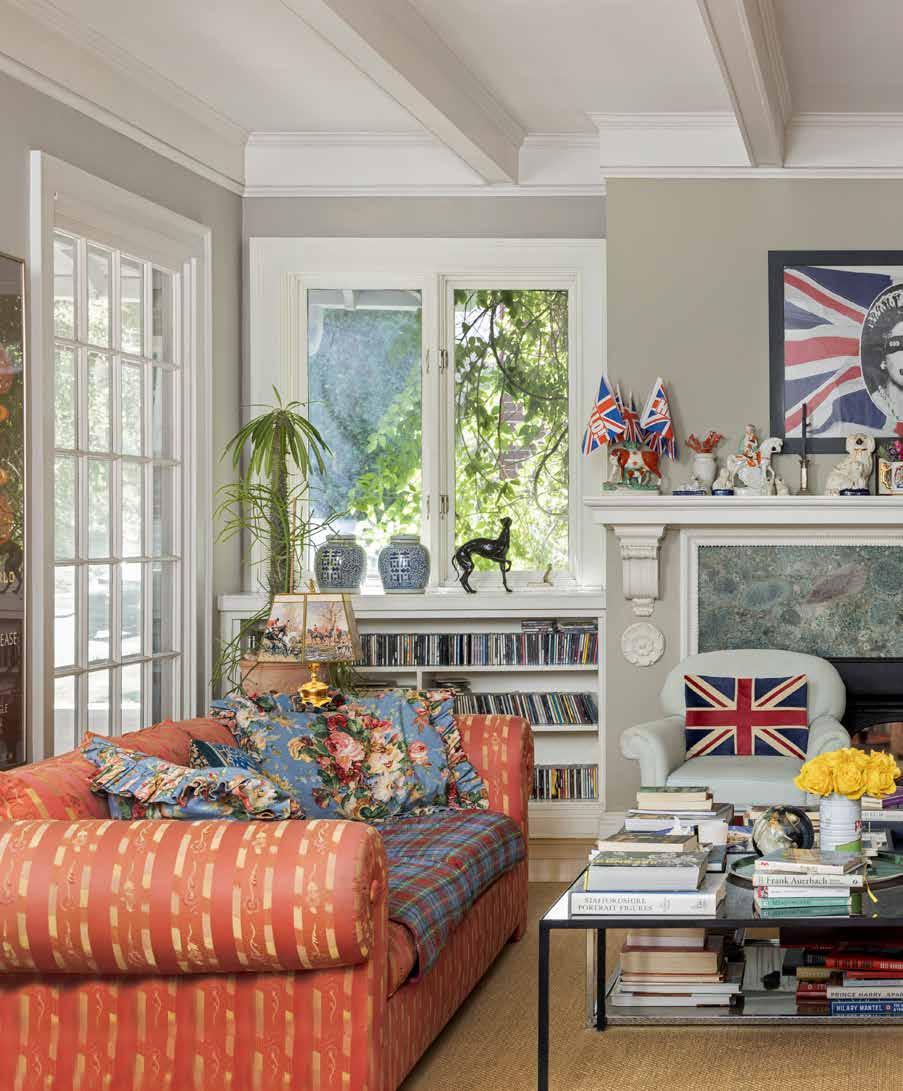
Infused with Suzie Stegic’s love of all things English, her 1904 Lowry Hill home is a highly curated cabinet of curiosities and a travelogue of treasures.
Inspired by Minneapolis architectural designer and mentor Elizabeth Hyatt, Don Forsman brings reverence and craftsmanship to a 1915 home on Lake of the Isles.




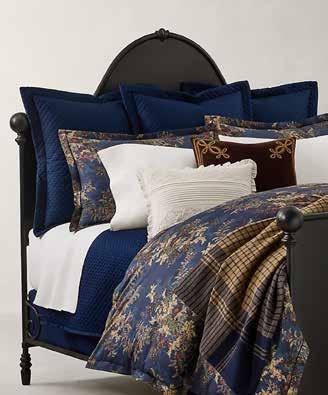


The trees are on fire and I can’t imagine any person with a pulse not affected by the pigmented drama of the trees. People living in the Twin Cities will sometimes drive upstate to get a jump start on witnessing the turning of the leaves in a more woodsy and rural environment. Autumn is without question my favorite season.
Actually, growing up in South America’s hot climate, I was not exposed to birch trees, but I am so glad today I am. Birch trees are a big deal. I consider them as one of the most beautiful contributions to nature. The golden yellow, red and orange-colored leaves delicately juxtapose against the white bark. The black markings that cover the trunk, exhibit a powerful graphic design that reminds me of zebras running beneath the fiery branches.
Indigenous people of North American used the birch tree for so many practical things including building material for wigwams to canoes and arrow quivers. It was also a source of food for many animals including deer during the Winter. Some tribes also used birch bark shavings to create intricate baskets. The Ojibwe tribe name is thought to come from the word “ozhibii’ige” which means “to write” and refers to inscriptions found over the years on birch scrolls and books.
Landscapes have always been a popular subject in paintings because they make us feel closer to nature and bring a sense of calmness. While I am not necessarily known for creating landscapes, I, like many other artists, enjoy them as subject especially when painting on location.
Artists like Gustav Klimt, Paul Cézanne, Wolf Kahn and many others have worshipped the birch. One of my birch paintings titled “FOREST” is a 48 x 48-inch canvas using acrylic paint, created in 1996. My background started with layered soft focus muddy and neutral minty shades and as I moved toward the foreground, the color of the leaves and trunks became more saturated and vivid.
Welcome to Autumn. Take yourself on a journey to a wooded area to witness and breathe in the beauty of my favorite tree – the birch.

Richard Merchán is a painter and sculptor creating in Minnesota and California. Learn more @ richardmerchan.com Merchán is represented by Hollie Blanchard hollie@artgirlsmpls.com 612.834.6565


The Alexander Family with their twin daughters combine art and music to create their beautiful home.

ART &


“I love that Carter’s unique and delightful touches pop up in unexpected places throughout our house.”

TThe Alexander twins started playing cello when they were only four years old. “I don’t remember a time when I did ‘not’ play cello, said sixteen year old Emily. “My favorite part of being a musician is getting to travel to places like Barcelona, where we played at the Palau de Música, renowned for Pablo Casals’ performances in the 1900s. Music also lets you connect with people from completely different backgrounds.”
Her sister Sophia echos her thoughts about music. “What I love most is making music with my friends. It’s so much fun to explore new music together. Without cello, I wouldn’t have gotten the chance to do things like playing in World Orchestra week with the National Youth Orchestra at Carnegie Hall, or playing at the Minnesota Orchestra’s Symphony Ball with our quartet. Quartets only need one cellist, so Emily learned to play viola just so we could do this with our friends.”
The Alexander family, Hue and Tim moved to Minneapolis so their twins could study cello. Their “new” 100 year old house near Lake of the Isles offered a completely blank slate for them to decide how each room would function best for their family. The library was the perfect place to put all of the kids’ musical instruments: cellos, violin, viola, trumpet, guitar, harp, and even a Chinese erhu.
The rich hued library is the heart of their home, and the other spaces flow from this idea of music intersecting with art and nature. The fun, swirly chairs echo the beautiful curves of their cellos, and the concept spills into the living room, where the tables look like the bells of trumpets. There are many plants that look like their unusual colors and shapes must have been inspired by music. Much of the art displayed around our house was made by the twins, so everything fits together in a deeply personal way.
Their mother, Hue Alexander is a design-enthusiast, and has a strong vision for the familys’ new home. “I happened to drive by Carter Averbeck’s Omform Design studio, where the unique style caught my eye. He takes old antique furniture and gives it new life by covering it in a fun modern fabric, or dipping it in rubber, or something else unexpected like that. I knew right away that he would be able to help me translate my ideas into a cohesive look for the entire house,” said Hue.
“He painted a beautiful mural in the entry vestibule, and instead of the usual mirror by the door, we used a piece by Adam DeJarlais of Twelve Vultures: a giant green stick bug behind an antique curved glass frame. The juxtaposition of new and old continues into the foyer, with a bright raspberry modern chair against the traditional curved staircase.”
“My favorite project is the grisaille mural he painted in our tiny powder room. When you walk in, it feels like you’ve stepped into an ethereal garden, and it’s not until you look closer that you realize he has tucked whimsical creatures into all the corners, and even the flowers look like birds. The trompe l’œil scroll was a clever way to bridge the neoclassical structures in the mural with the modern marble counter and alabaster light”, she said.

David Heide and Brad Belka infused Barbara Bergum’s 1905 Craftsman home with warmth, character and plenty of room for cooking.


“When I saw Barbara’s home for the first time, I was struck by the
romanticveryspirit
of place… it could easily have been 1905 or 1935, when the front of the house faced the lake to greet family and friends arriving by boat.”
–DAVID HEIDE


EEvery September, the Twin Cities Arts & Crafts Design show at the Fine Arts building at the State Fairgrounds is a convivial gathering of connoisseurs, collectors, designers and other devotees. The event is now in its 24th year and David Heide, principal of David Heide Design Studio, has never missed a show.
“The Twin Cities has so many wonderful bungalows, Prairie School homes and other houses with Arts & Crafts sensibilities, and my team and I are honored to be part of the conversation,” says David. “We love meeting people who share our passion and want to do right by their homes.”
At one show, David met the owner of a Frank Lloyd Wright house in Illinois, who invited him and his team to restore the home. At another show, Barbara Burgum, a retired landscape architect, introduced herself to David, saying, “People tell me I need to know you.” Barbara and her family were building a new legacy cottage on Pelican Lake, a twoyear project that resulted in a wonderful friendship.
“Barbara and I are design soulmates,” says David. “With every space, we love having the same conversations and asking the same questions—how are people going to live in the room? What should it feel like? Should the light switch be on the left or right?”
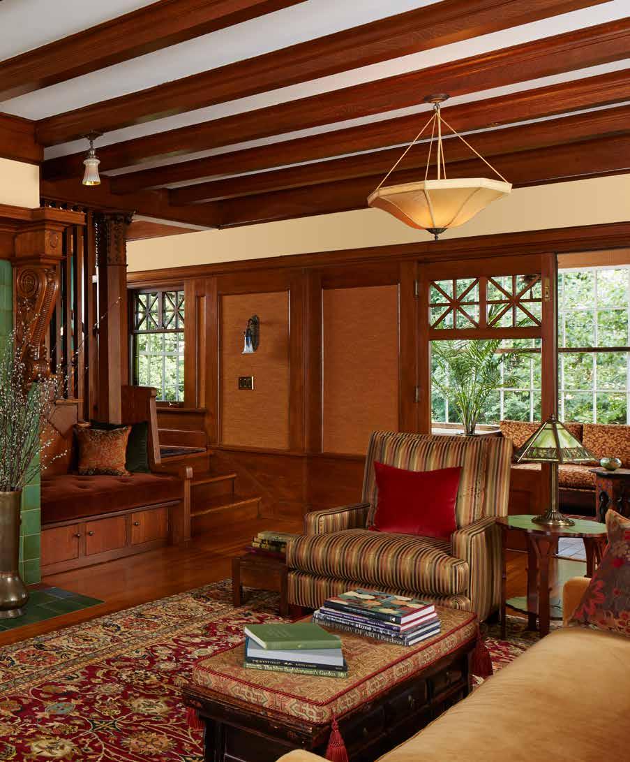
Once the cottage was finished, the friends turned their attention to Barbara’s 1905 Craftsman home on Carson’s Bay on Lake Minnetonka. Designed by noted Chicago architect Hugh Garden as a summer retreat, the home had been billed as a tear-down, but Barbara was intent on restoring the original character while gently updating the spaces.
“When I saw Barbara’s home for the first time, I was struck by the very romantic spirit of place,” says David. “The original bones of the house were intact, and it could easily have been 1905 or 1935, when the front of the house faced the lake to greet family and friends arriving by boat.”
An avid cook, Barbara loves hosting Sunday night suppers for her friends, so she wanted to re-design the kitchen with cooking stations to accommodate multiple chefs. Back in the day, the kitchen faced the street for ease of receiving fresh milk and other deliveries, so David and colleague Brad Belka opened up the sightlines to the lake. To ensure that the new floorplan would work for Barbara’s gatherings, they took rolls of tape and laid out the main level on the floor of a friend’s warehouse. Barbara invited a dozen friends and served wine spritzers and spray cheese on crackers as they moved through the “rooms” and pretended to cook in the “kitchen.” Informed by the findings from the “mocktail” party, the renovation resulted in a home that appears to be original to 1905.
“It’s just the way we do things,” says David. “As a studio, our work is about creating enduring relationships with our clients, doing the right thing for their homes, and making it look as though we were never there.”
“As
a studio, our work is about
creating enduring relationships
with our clients, doing the right thing for their homes, and making it look as though we were never there.”
–DAVID HEIDE


•

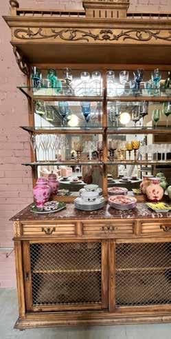
Le Corbusier once said, “The home should be the treasure chest of living.” For interior designer and travel correspondent Kelly Caruso, this rings true as she scours fields and dusty warehouses, searching for unique finds. The thrill comes when an unexpected piece suddenly feels perfect, bringing joy to her work. Each treasure she uncovers adds charm and warmth to the rooms they inhabit. Every antique tells a story, and learning about its history, craftsmanship, or past owners adds depth to the designs. Some items are bought with a space in mind, while others stand out purely for their beauty. Regardless, each piece eventually finds its perfect home. Whether exploring Europe’s flea markets or sourcing in the U.S., every object selected brings soul and life into the spaces she creates.




Kelly’s Edit
A Coast-to-Coast vintage tour
Olive Ateliers (Los Angeles)
Thoughtfully curated selection of globally sourced vintage and hand-crafted home décor.
Big Daddy’s Antiques (Los Angeles)
Renowned treasure trove of one-of-a-kind vintage and reclaimed pieces.
South Loop Loft (Chicago)
Where modern elegance is paired with classic style through a mix of high-end vintage furniture, art, and décor.
The Golden Triangle (Chicago)
Acclaimed gallery offering a stunning collection of antique furniture, art, and decor from across Asia and beyond.
Hen House Antiques (Birmingham)
Charming boutique where timeless elegance meets Southern hospitality.
Round Top (Fayette County, TX)
World-renowned antiques fair, drawing collectors, designers, and enthusiasts to its expansive marketplace.
Scott’s Antique Market (Atlanta)
Celebrated monthly market featuring over 3,500 booths filled with unique antiques, vintage treasures, and rare collectibles.


A geologist returns to his roots with a Nordic-inspired home that embraces the surrounding prairie, inside and out.
written by berit thorkelson, photography by spacecrafting


IIt was a homecoming of sorts. After years of living and working as a geologist around the world, the client felt pulled back to Minnesota, where he discovered White Oaks Savanna, an architecture-driven community on 200 acres of restored prairie wetland near Stillwater. It reminded him of the lush swath of central Norway from which his family emigrated, and he imagined a structure inspired by and connected to its wild natural beauty. He would call it Valdres, after his ancestral home.
“He knew exactly what he wanted, so our job was to listen, create, then listen some more, which is a capstone of our firm’s characteristic you-centric approach,” says Christine Frisk of InUnison Design. Teaming with Architect Christopher Strom and Redstone Builders early in the process created a best-case scenario where architecture, interior design and the build deliver a cohesive and award-winning result.
InUnison’s mission was, as always, to create a space where the client could become their best authentic self. His specific vision and impeccable taste, Frisk said, made the design process an exercise in interpretation. “We had to yield to the best mix of direction, desire and design, to create the exact environment the client needed to express his vision for a forever home where he can flourish on all levels,” she said.
The driving client desire: an indoor-outdoor connection, which naturally called for a multitude of windows to usher in natural light and seasonal views. All interior choices reinforce that connection, including white oak flooring and Minnesota-sourced black ash ceilings, washed in a cohesive natural tint. InUnison layered unifying woodsy references throughout, as in the bathrooms’ custom-crafted vanities and the kitchen island’s casual Muse counter stool, apt expressions of the home’s contemporary-Nordic roots.
The client collected art while living around the world and wanted his most beloved pieces to find proper prominent wall space. InUnison placed each with intention, to inform key spaces throughout the home. All furniture, textiles and lighting choices coordinated with both art and client vision.
It often comes down to what Frisk likes to call “the alchemy of esthetics and science.” While the client’s large-scale Australian Aboriginal dot piece nicely defined the living area, for example, it was also clear the vaulted space needed rotational pull. InUnison custom designed a fireplace in natural stone, which grounded the room and confirmed the geologist client, who personally picked out the stone.
In the vaulted spaced created by the architectural team, InUnison designed the open-concept kitchen to maintain the client’s wishes for a calm, serene environment. Displayed art connects it with the living room and gray Miele appliances blend seamlessly with custom millwork, stained to camouflage them. The client was clear: No statement lighting to detract from vibe or views. Instead, recessed lighting pairs with a sleek linear LED task light suspended over the kitchen island.
In fact, all InUnison’s lighting choices mimic this subtlety, like the overlapping geometric panels in the study and the pair of discshaped LED pendants that seem to float above the dining room table. It’s what made him happy, Frisk said, and the home a privilege to design.
“The space has everything it needs and nothing it doesn’t,” she said. “And the best part is, it embraces and affirms the human being who’s living in it so completely.”
A happy homecoming indeed.


“
It’s about creating this experience for our clients where you don’t really know where the line of architecture and interior design begins and ends.” –CHRISTINE FRISK, ASID, INUNISON DESIGN


project credits:
• designers: christine frisk and olivia jones, inunison design
• architect: christopher strom architects
• builder: bob appert and david washburn, redstone architectural builders
• development: white oaks savanna
• landscape design: travis van liere studio
Curate your china cabinet’s contents to suit the event. If it’s a holiday party, why not put the Limoges in temporary storage and showcase items that celebrate the season?
There’s still time – consider swapping out your existing chandelier for one that will bring a whole new energy to your space.
Perhaps you have a piece that would capture the tone of your event but currently hangs elsewhere in your residence. Why not rotate your artwork for the day?

Change out your old standbys with newer acquisitions, or mix and match heirlooms with contemporary pieces for a more eclectic appeal.
If your existing upholstery or chair frames don’t reinforce your vision, a change of slipcovers or tablecloth will alter the vibe.

By Sandy LaMendola, ASID
The mission of an interior designer is to create environments that facilitate, celebrate and enrich our clients’ life journeys. To do that, we embark on a voyage of our own – one of discovery, understanding and creation. Design Chronicles invites you along for the ride.

IIt’s not the food or drink that sets the tone for gracious entertaining, it’s the spirit of the host. And by bringing that spark to your environment, you’ll set the stage for a remarkable holiday gathering.
For some homeowners, that’s easier said than done, but what I tell them is to surrender to the spirit of the occasion. Don’t treat the environment as sacrosanct. Survey your space and make room for whimsy.
Consider the impact you can have by adding or changing out a tablecloth or centerpiece. Your grandmother’s china on display in the cabinet? She’ll forgive you for showcasing more unexpected objets d’art. And as gorgeous as your dining room chairs may be, perhaps the occasion calls for slip covers. Fanciful ones will amp up the energy; neutral ones will give prominence to the tabletop and that fabulous spread you’ve laid out. You can even swap out your chandelier for another.
Trust in the bones of your room. It can accommodate different moods and occasions. You strive to live in the moment. Let your home do the same and see how guests react. Conversation with flow and laughter will ring as they take their cue from a host who has the confidence and verve to treat their home not as a still life, but as a canvas for creating lasting memories.
Consider both the vessel and its contents. A distinctive container can balance a single-stem branch. An elaborate floral arrangement may call for something simpler.
Contractor: John Kraemer & Sons
Photographer: Gaffer Photography Stylist: Heather Neurer

Andrew has a deep understanding of his long-time client, having collaborated on various projects throughout her life. This time, they embarked on an exciting journey together: building her dream home from the ground up. The design concept focused on creating a light and airy atmosphere, infused with a feminine touch. With their established rapport, Andrew expertly captured her vision, ensuring every detail reflected her personal style and preferences. This project not only marks a milestone in their partnership but also showcases the evolution of her design aesthetic over the years.

A carefully curated palette of neutrals with accents of blush, lavender, and soft textures grounded the spaces while promoting an inviting feel perfect for relaxation.

“I wanted to capture a light feminineandfeel for my longtime client by using soft shapes and pretty colors.”
–Andrew Flesher, interior designer

In keeping with the design, it was important that the upholstery had soft edges and the color palette kept everything soft and pretty.

It was important to the client to keep the living/ dining room open and ideal for entertaining.
To encourage lingering after meals, Andrew selected comfortable dining chairs paired with an oval table. The table's soft shape promotes better conversation and connection among guests.

Infused with Suzie Stegic’s love of all things English, her 1904 Lowry Hill
written by melinda nelson,
home is a highly curated cabinet of curiosities and a travelogue of treasures.
photography by spacecrafting


OOnce upon a time, the British Empire encompassed much of the world, the Union Jack flying proudly over English ships as they ferried fine china, handwoven textiles, cases of tea and hampers of foodstuffs between the colonies. But, even though the sun set on the Empire long ago, the inimitable English lifestyle is alive and well, thriving in far-flung outposts from Bermuda and the Cayman Islands to the British Antarctic Territory and Suzie Stegics’ 1904 foursquare in Lowry Hill, where she lives with her husband Ivan and their teenagers Eva and Cooper.
The Stegics’ house is fiercely guarded by a pair of diminutive English Cream dachshunds—Daphne, named for British novelist Daphne du Maurier, and Liberty, after Liberty of London, one of Suzie’s favorite shops. Upon the dogs’ approval, guests are invited to hang their coats in the boot room, where vintage portraits of Princess Diana and the now King Charles preside over a row of well-worn Barbour jackets and Wellington boots. Barking loudly with a posh accent, the dogs lead the way to the kitchen, where Suzie is making espresso in an iconic yellow Illetta, originally designed in 1935 by Francesco Illy. While the coffee is brewing, Suzie arranges Bon Bon Swedish gummies, Instagram’s itcandy of the moment, in a vintage Portmeirion bowl— one of several dozen pieces acquired on trips to England, jaunts to Wisconsin and Iowa, and frequent spins through H&B Gallery, one of Suzie’s favorite East Isles haunts.
Coffee is served in the living room-slash-library, an expansive space lined with hundreds upon hundreds of books and illuminated by the original leaded windows, a vintage Artemide light fixture, a pair of blue and white export porcelain lamps with red and white striped lampshades and a 1970s Swedish neon sign. Like her dachshunds, Suzie loves the hunt, so the sofas are from Paris by way of H&B Gallery, the cozy white linen chairs are from Facebook Marketplace, and the poster of Queen Elizabeth and the pair of antique Staffordshire dogs traveled from England in Suzie’s suitcase.
Suzie comes by her style—a confidently irreverent mix of British, Scandinavian and European design— naturally. She studied art and applied design at the University of Minnesota College of Design, where she honed her unerring eye for design integrity and quality. After running her own home goods store in Saint Paul for several years, Suzie’s passion for punk rock, reggae and rock-and-roll led her to the Electric Fetus record shop, where she met Ivan, a South African software developer who is equally talented at programming complex infrastructures and building topiaries and trellises for their garden.
Inspired by her belief that design is a reason for being, the backdrop to a well-lived life, and a catalyst for the increasingly important conversation about the value of craft, Suzie recently launched Summers & Cox, an online vintage shop. Named for her two English grandmothers, the shop is a highly curated cabinet of curiosities and a travelogue of treasures—just like her enchanting Lowry Hill home.


Inspired by Minneapolis architectural designer and mentor Elizabeth Hyatt, Don Forsman brings reverence and craftsmanship to a 1915 home on Lake of the Isles.


“(Elizabeth Hyatt) never cut a corner, and we don’t either.” –DON FORSMAN


•
•
•

TThe Welch Forsman yard sign is a familiar sight around Lake of the Isles. Don Forsman and his team have restored dozens of homes, earning accolades for their warmth, positive attitude and fine craftsmanship. But, of all the honors that Don has received, a simple brick is the most meaningful.
The brick, which has pride of place on Don’s desk, is engraved with the words, “The Emery Mapes Mansion. Presented for outstanding achievement in restoration. August 1988.” It was a thank you gift from Elizabeth Hyatt, an architectural designer and contractor who worked in Minneapolis in the 1980s. A former fashion designer with a passion for historic preservation, Elizabeth restored many iconic homes around Lake of the Isles. She was renovating the mansion, a 1915 Renaissance Revival built for Cream of Wheat cofounder Emery Mapes, when Don’s friend Chad Johnson suggested he join the crew.
“I was in my early twenties, and I was a novice carpenter, but I became a better craftsperson because of Elizabeth,” Don says with a laugh. “She was magnificent— the best of the best—and I can’t say enough good things about her. Chad and I worked with Larry Vensel, Denis Rider and other great craftspeople, and we all learned so much from her about how old homes are put together, and how to do things the right way. Attitude was also really important to Elizabeth. She always said, “I don’t care if you have the skillset I’m looking for—if you’re not smiling, you’re not working with me.”
Don worked with Elizabeth on numerous historic homes, an experience that instilled an appreciation for architecture and inspired him to start his own firm with Pete Welch. Don and his team still work with Chad, who runs Ingrained Wood Studios, plus many of the original craftspeople. “We love working with architects and we’re still using Elizabeth’s joinery techniques which were based on turn-of-the-century and historic methods,” Don says. “She never cut a corner, and we don’t either.”
Like Elizabeth, architect Jean Rehkamp Larson of Rehkamp Larson Architects is a connoisseur of quality and craftsmanship, so when her clients invited her to restore a 1929 French Provincial home on Lake of the Isles, she knew Don would be the perfect partner. Inspired by the original architecture and the clients’ passion for cooking, Don and his team worked with Jean and her colleague Anders Matney, interior designer Alecia Stevens and the clients to re-imagine the home with timeless beauty and modern flow and functionality.
And, just as Elizabeth would have done, Don brought in a cadre of trusted local artisans to lend their talents to the renovation, including Jon Frost of Frost Cabinets, Peter Vanni of Archipelago Metalworks, Darril Otto of Otto Painting Design, Brad Norris of NVR Surfaces, expert tile artisan Nick Reuter and others. When the renovation was finished, it was honored with two coveted local design awards, but for Don, the real reward was seeing the clients’ appreciation—and knowing that Elizabeth would thoroughly approve.


“Attitude was also really important to Elizabeth. She always said, ‘I don’t care if you have the skillset I’m looking for—
if
you’re not smiling, you’re not working with me.’” –DON FORSMAN


