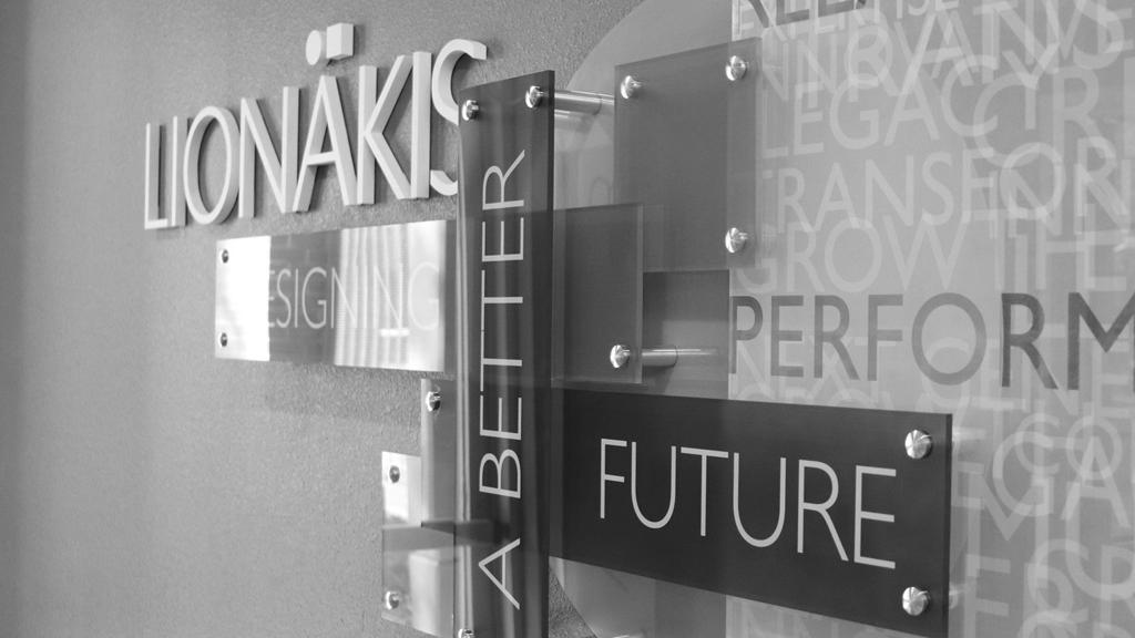
LIONAKIS BRAND STANDARDS


OUR VISION
At Lionakis, we create environments that transform the communities in which we live and work. By 2027, we will broaden our reputation as a design leader by extending our influence throughout the western United States.
Our clients and our staff know that we operate in a true open partnership.
From our 100–year history, our quality of work, our staff and clients know about our tremendous reputation.
We design projects collaboratively with our clients while promoting the highest and most innovative levels of design and sustainability. We’re passionate about design, it’s why we’re here.
We see design in every opportunity.
We act with integrity, respect and trust.
We lead with passion and inspiration.
We know it’s the right thing to do.
We are committed to a culture of giving.
We are one team.
Our brand not only includes our logo and colors, but also our voice and style to ensure consistency across marketing collateral, whether a client is reviewing our brochure, our social media, or a proposal written specifically for their project. To ensure consistency of our voice across materials, review all written narrative for:
Lionakis’ brand voice is client-focused, active and accessible. Consider the following:
The “You” Factor: Leadership in design. You expect it and that’s what you get
You discover that through the process, you become an integral part of a passionate, collaborative team. One founded on experience and one built on trust.
In the end, you will enjoy the relationship as much as your design because it’s not about us…it’s about you
We design with community in mind.
We’re active members of the communities we serve. That’s why we always design with community in mind.
We unite more than 15,000 employees working in over 250 locations. We collaborate across disciplines and industries to bring buildings, energy and resource, environmental, and infrastructure projects to life. Our begins at the intersection of community, creativity, and client relationships.
Our local strength, knowledge, and relationships, coupled with our worldclass expertise, have allowed us to go anywhere to meet our clients’ needs in more creative and personalized ways.
We write to communicate with our clients; we meet them where they are and avoid overly technical writing. We assume that most people reading our materials are non-technically inclined stakeholders, such as community members, faculty, and staff.
We keep materials concise and skimmable. When possible, we say more with less.
Keeping our client in mind, we lead with the big idea first.
We are solutions oriented. We identify challenges and highlight solutions, rather than emphasizing the challenges and problem areas.
Where possible, we show instead of telling, using concrete case study examples, client quotes, and statistics to back up our claims. Case studies should clearly identify a problem, the solution we helped provide and a clear definition of how the client benefitted.
We avoid contractions and slang to keep our brand style and voice polished.
Social media and blog writing is expressive, friendly, humancentered and accessible. Posts highlight the people of Lionakis and how our mission, the work we do, and our projects impact the profession and the communities where we live and work.


ABCDEFGHIJKLMNOPQRSTUVWXYZ abcdefghijklmnopqrstuvwxyz
ABCDEFGHIJKLMNOPQRSTUVWXYZ abcdefghijklmnopqrstuvwxyz
ABCDEFGHIJKLMNOPQRSTUVWXYZ abcdefghijklmnopqrstuvwxyz
ABCDEFGHIJKLMNOPQRSTUVWXYZ abcdefghijklmnopqrstuvwxyz
Proposal Use Only
ABCDEFGHIJKLMNOPQRSTUVWXYZ
abcdefghijklmnopqrstuvwxyz
ABCDEFGHIJKLMNOPQRSTUVWXYZ
abcdefghijklmnopqrstuvwxyz
Consistent use of the color palette across all forms of commuinication will reinforce brand cohesion and help solidify the perception.
The primary colors Lionakis uses are teal and green . Teal brings recognition, but draws on an energetic green to emphasize creativity.
A collection of dynamic saturated colors representing the lively and inclusive culture fostered at Lionakis.
Colors that have been chosen for internal use only. Can be used on unofficial branded materials, social media graphics, etc.
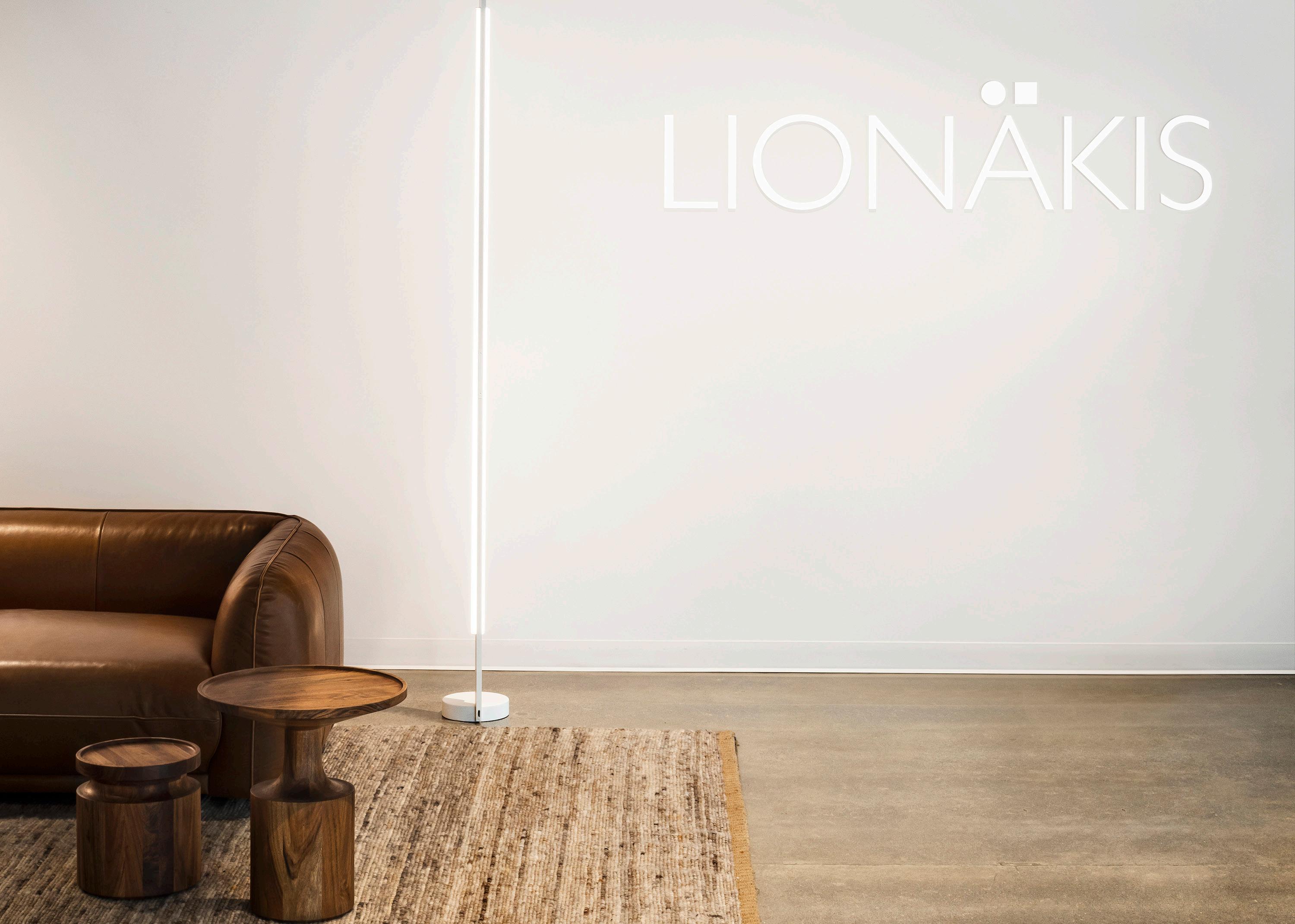
When putting the logo on a field of color, the entire logo should remain legible. We always want our signature recognizable.


Do not distort, include tag lines no longer attached to our logo, or place on color fields that render the logo illegible in any capacity.

beyond design.

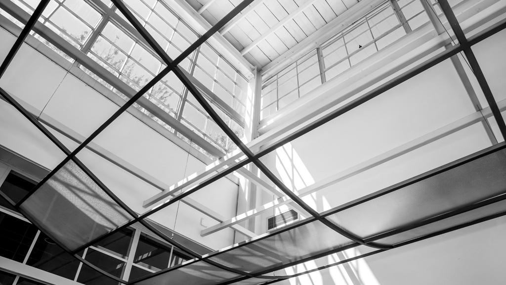
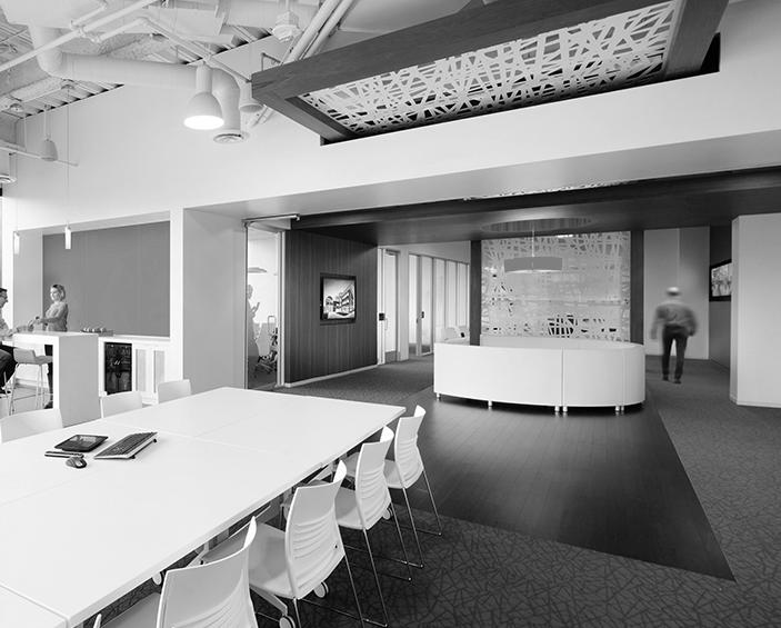
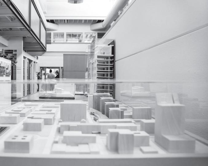
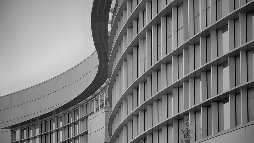
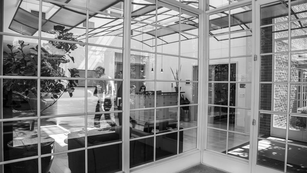
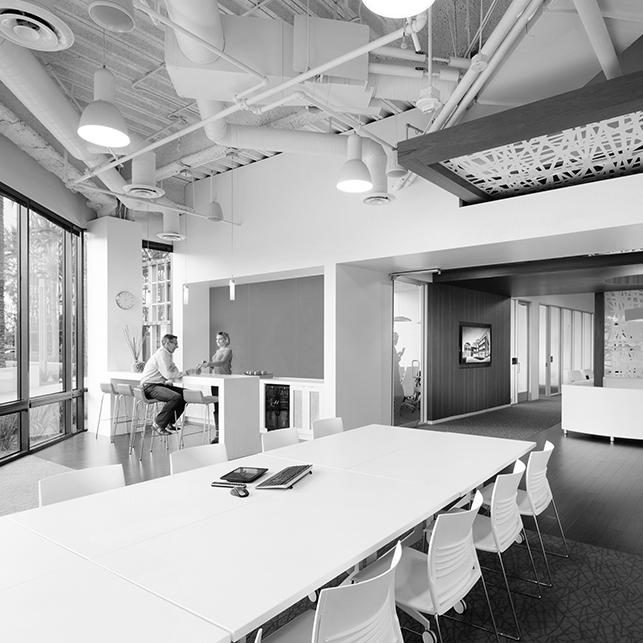
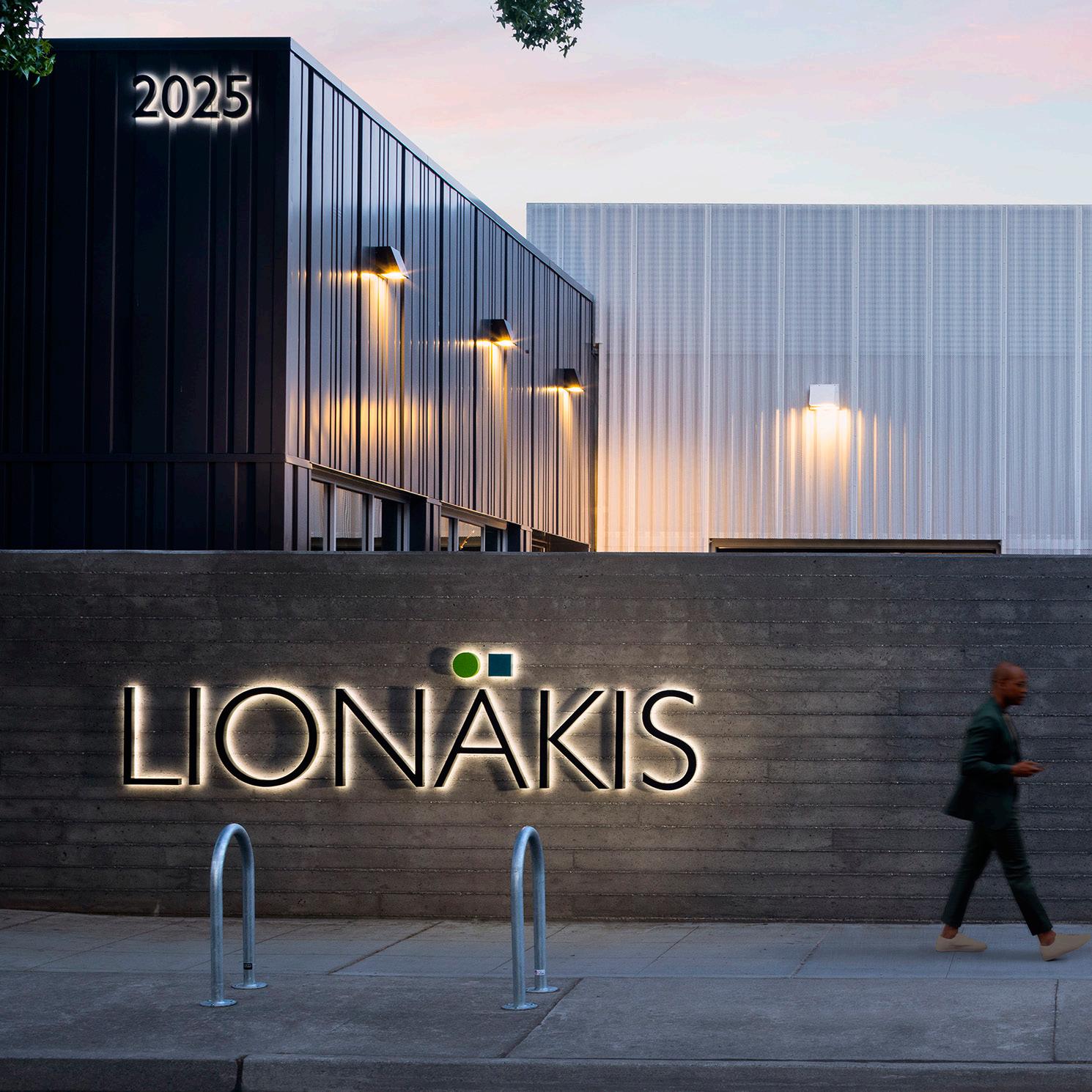
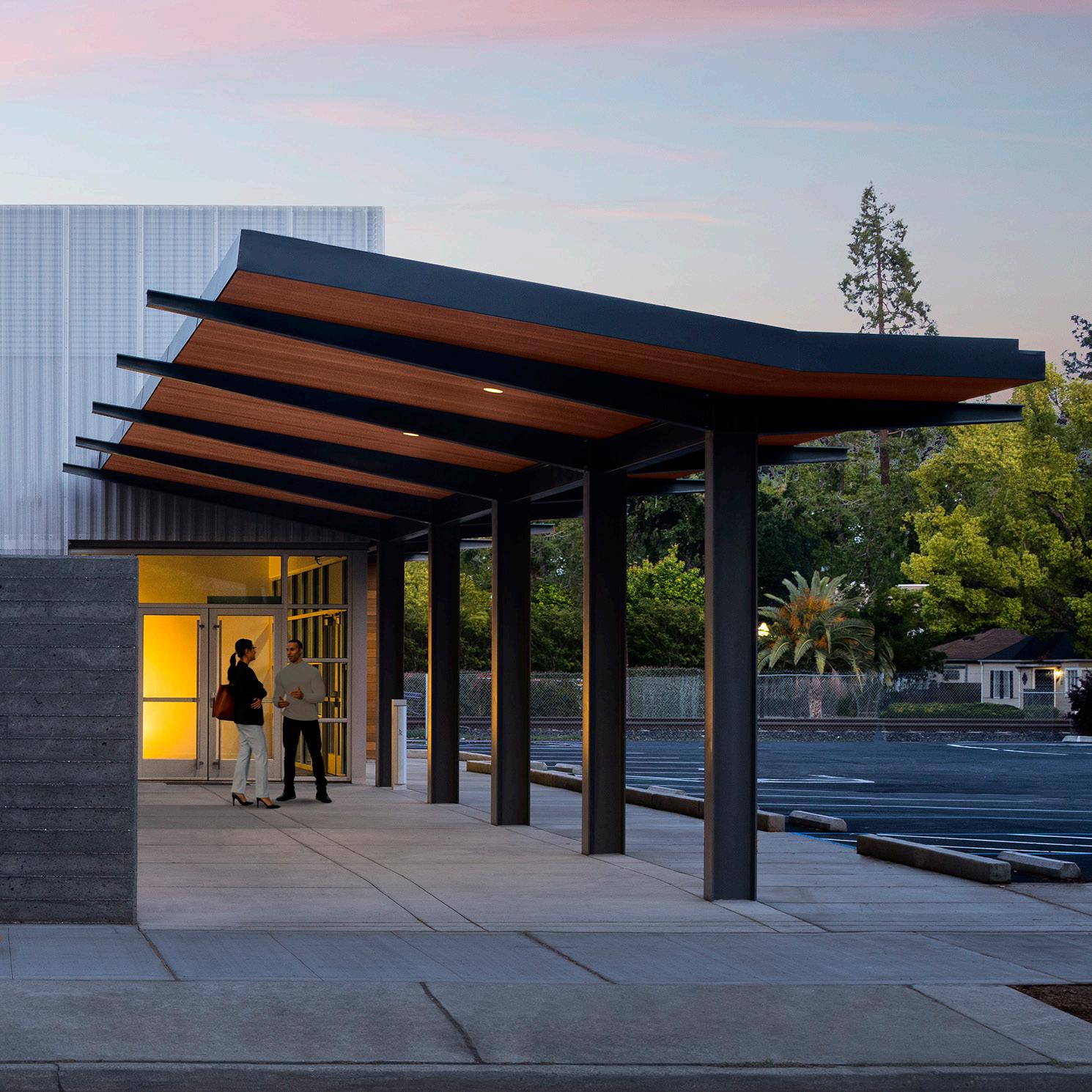
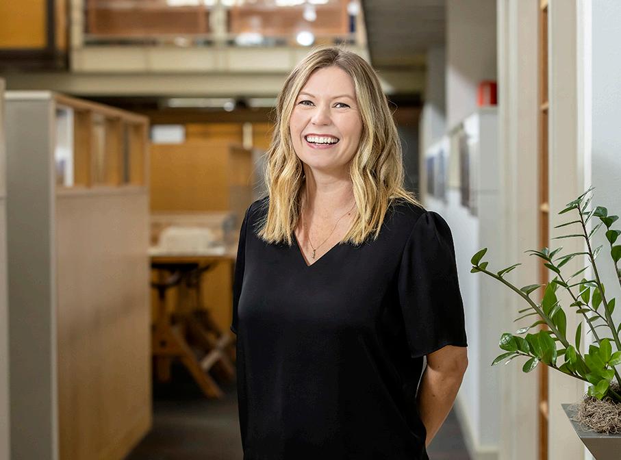
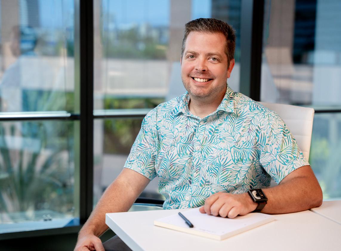
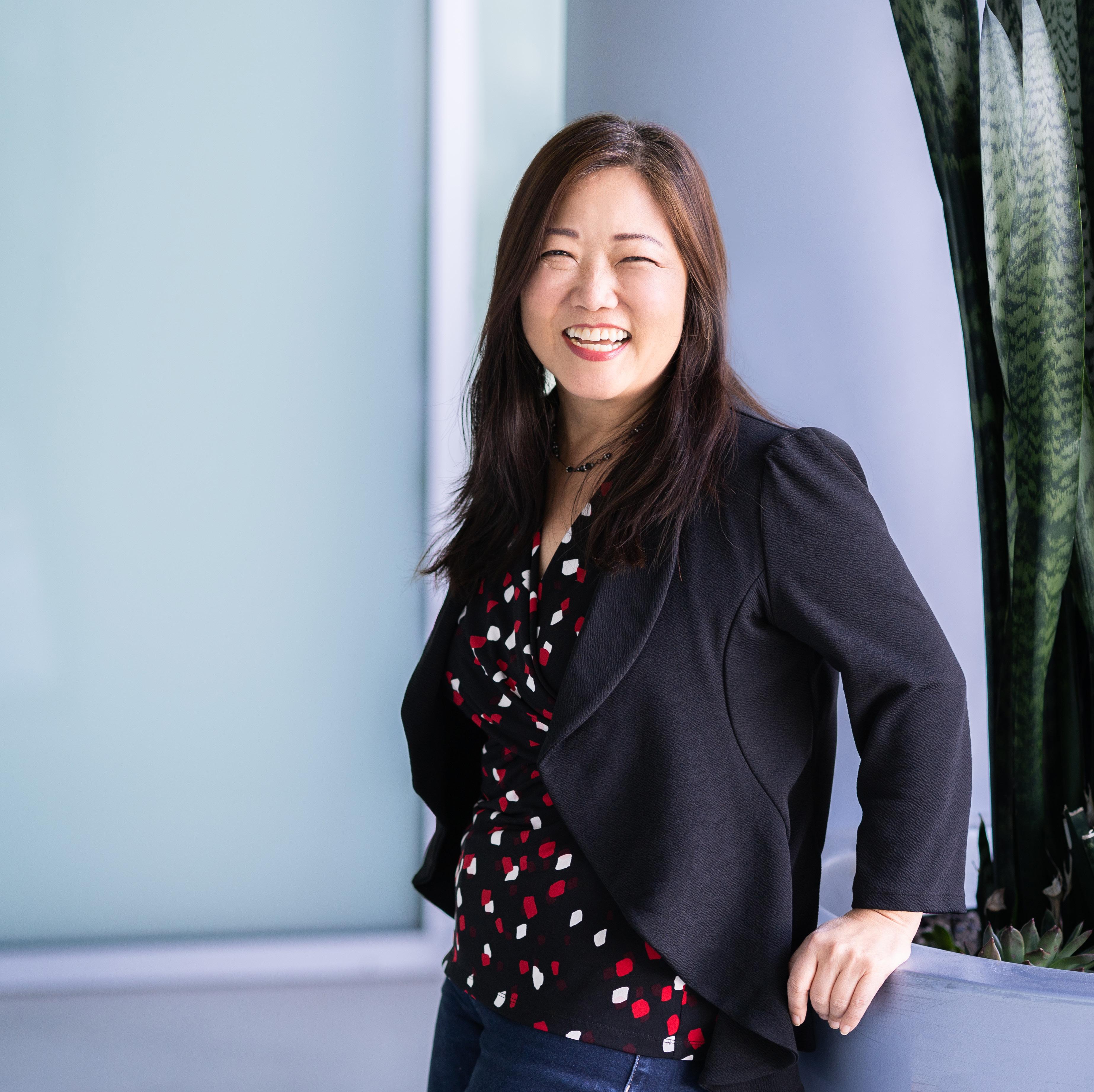
Use project photography from Lionakis projects (resolution permitting) when possible. Whether shooting new imagery or using stock, aim for :
+ Light, bright, natural lighting for daytime images
+ Dramatic, warm lighting for twilight and night time images
+ Simple, open compositions
+ A mix of straight-on and unexpected camera angles
+ Engaged physical spaces, with moving people and plant-life
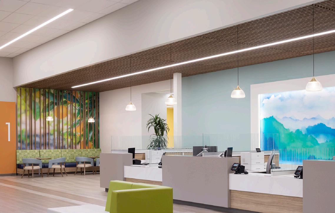
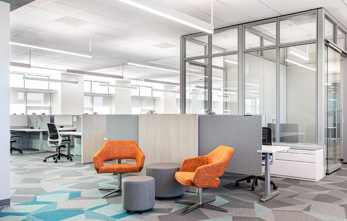
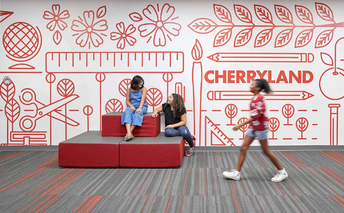
+ Horizontal with room to crop
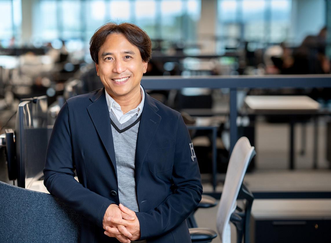
+ Allow room above head
+ Not full body
+ Selective focus on the person
+ Good depth of field without an overly busy background
+ Friendly/ Approachable subject
+ Not overly formal attire (Work Casual)
+ Variety in location around workplace (Indoor/ Outdoor) Move the person around and don’t photograph all of the same group in the same locations.
+ Good color and lighting
Image is poorly lit and the subject matter isn’t compelling.
Image is overly treated and unnatural.
Poses are unrealistic.
Cliché
Avoid overdone concepts.
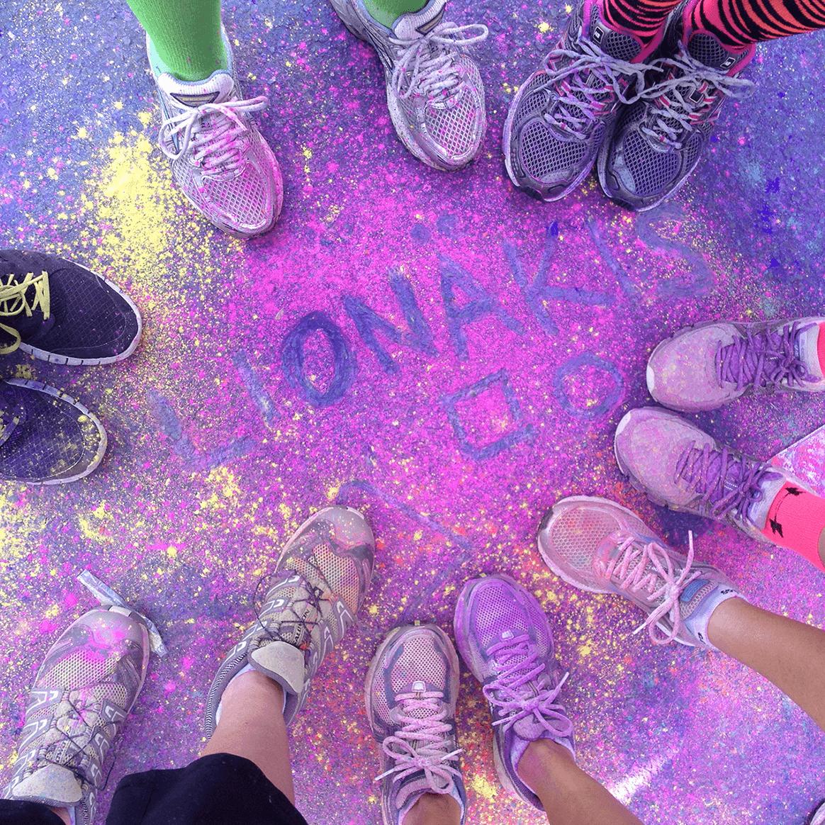
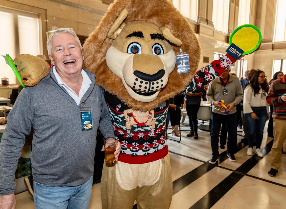
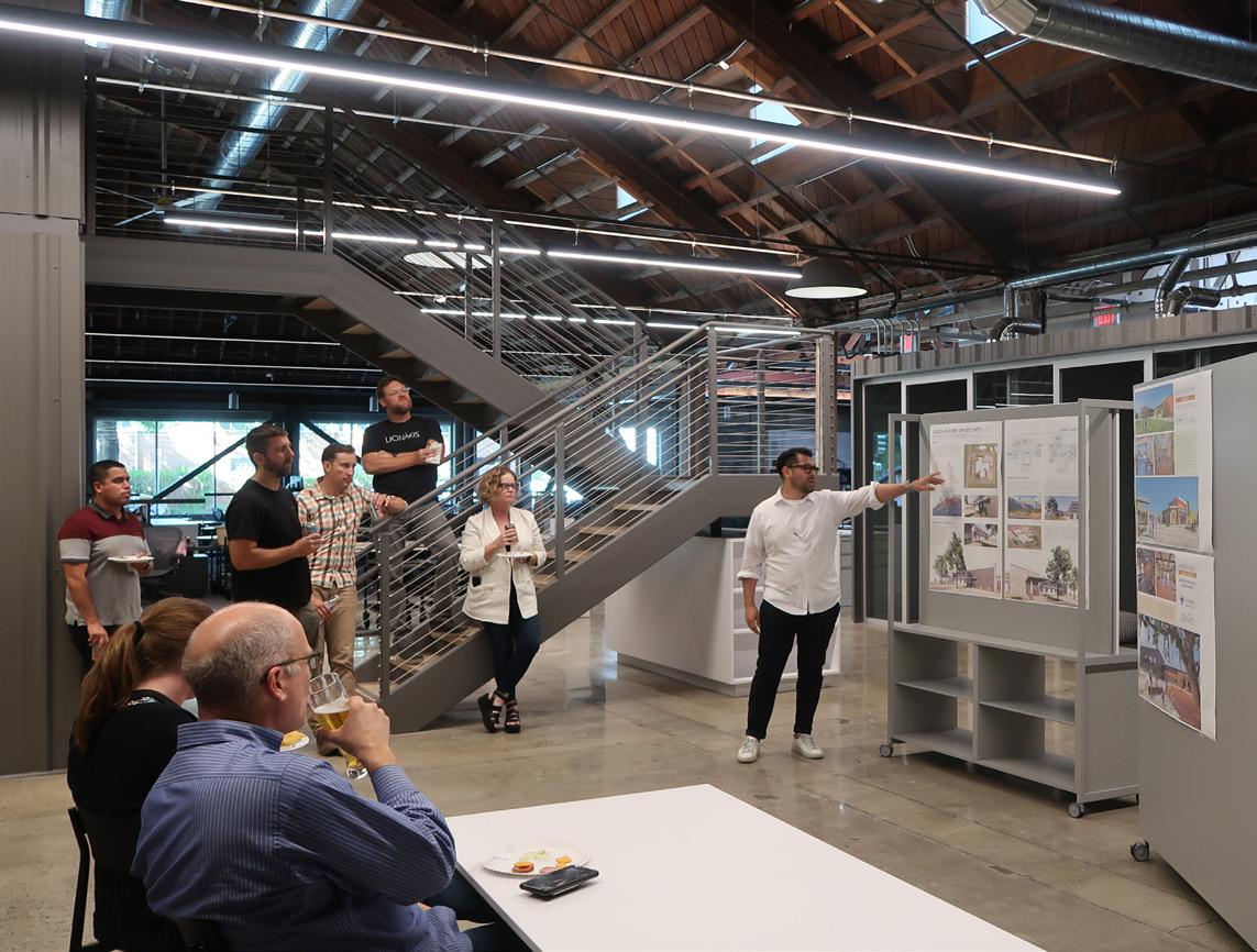
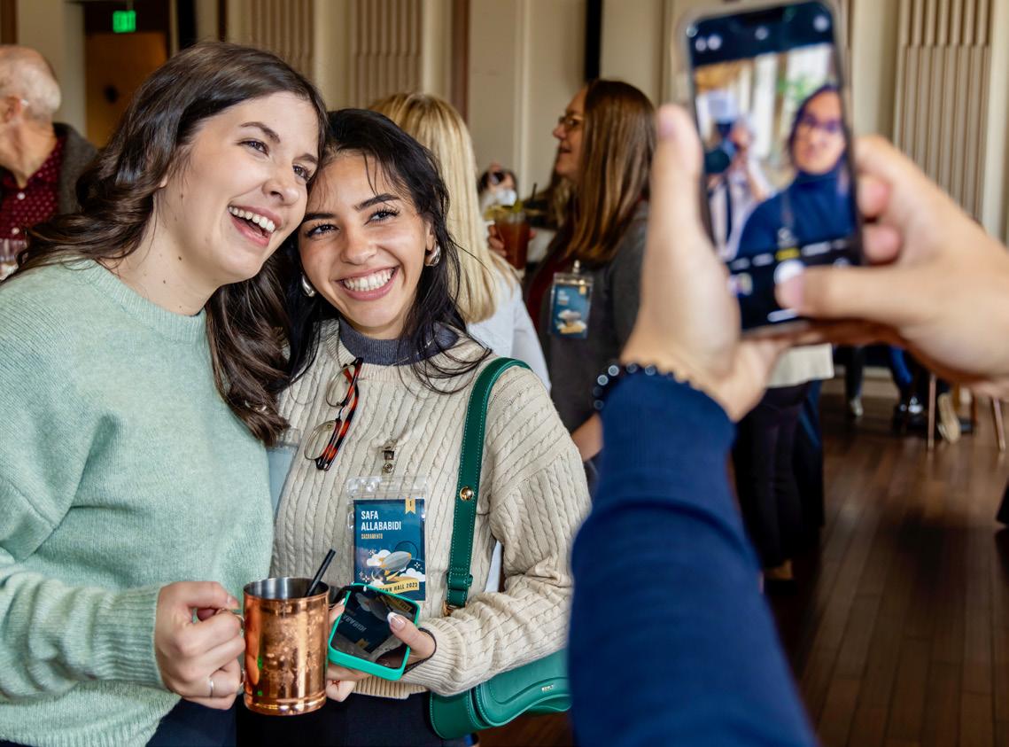
+ Capture people in the moment
+ Avoid awkward situations
+ Take advantage of positive culture events & activities
+ Try to caprure positive emotion
+ Posed shots are good but read the situation
+ Zoom in across the room for candid moments
+ Horozontal format is best when possible
+ Variety in location around workplace (Indoor/ Outdoor) Move around at social events and activities and don’t photograph all of the same group in the same locations.
Read what is happening in the moment and avoid interrupting a conversation or awkward situation.
If dining is part of a social event, be selective with the shots you take and avoid unflattering shots of anyone about to take a bite.
Lionakis services and markets share a custom curated icon library built for the brand. These icons should be used wherever applicible. Icons that are not present in our library can be used as long as they have similar line construct and quality to our existing library of icons. Consistency is key.
GRAPHICS ARCHITECTURE
SUSTAINABILITY ENGINEERING
INTERIORS PLANNING LABORATORY DESIGN
COMMERCIAL CIVIC
SCIENCE + TECHNOLOGY HEALTHCARE EDUCATION
Lionakis Logos
M:\1- LIONAKIS LOGOS
Employee Headshots
M:\BOILER PLATE\_IMAGES\LIONAKIS EMPLOYEES\_STAFF PHOTOS
Culture Images
M:\BOILER PLATE\_IMAGES\EVENTS
Project Photography
M:\PROJECTS
Templates
HTTP://INTRANET.LIONAKIS.COM/THELIONAKISWAY/WIKI/ALL%20GUIDELINES.ASPX