1 minute read
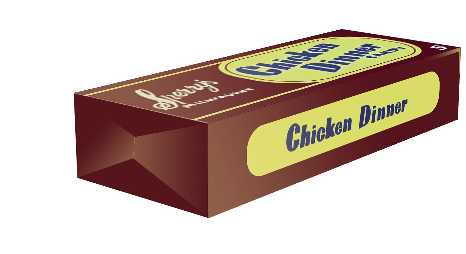
Chicken Dinner Design - Result


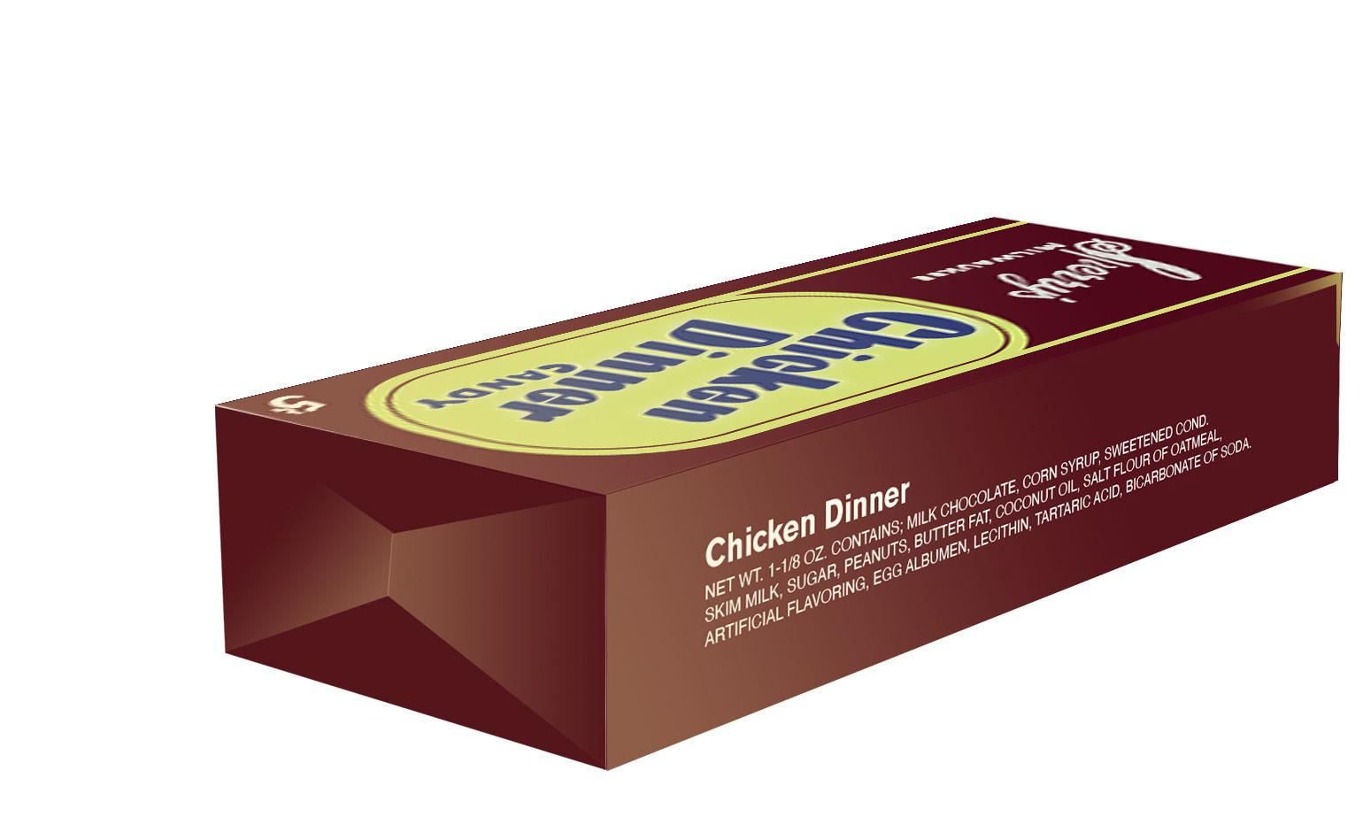
This is the result of doing research on how the packaging used to look like, based on a limited access to pictures. It might not be fully correct, but for now - this is the most accurate available.
Advertisement
The colours are eyedropped and the shapes are just rec- reated as accurate as possible. The logo “Chicken Din- ner” is written by hand so it would be as accurate as pos- sible because finding a font for it will ruin it when the original font isn’t stated. Lastly, the name of the company “Sperry’s” and “Milwaukee” is also handwritten for the same reason.


