MOTOMI MATSUBARA
LANGUAGE
English (Proficient) / Japanese (Native) / Chinese (Native)
EDUCATION
University of California, Los Angeles, United of States
Master of Architecture, Department of Architecture and Urban Design [GPA 3.9] / 2020 - Current
Kyoto University, Kyoto, Japan
Master of Engineering, Department of Architecture and Architectural Engineering [GPA 3.5] / 2019 - 2020
Keio University, Tokyo, Japan
Bachelor of Engineering, Department of System Design Engineering [GPA 3.5] / 2019 - 2020
WORK EXPERIENCE
Sharif, Lynch; Architecture (Architecture Designer)
Los Angeles, CA 06/2022 - Current
[Schematic Design/ Awards Documentations/ Visual Presentations]
Kawai Architects (Architecture Intern) Kyoto, Japan 07/2021 - 08/2021
[Schematic Design/ Competitions/ Exhibition Documentations]
Nikken Sekkei LTD (Part-time) Tokyo, Japan 03/2019 - 04/2017
[Model-making/ Presentation Documents/ Surveys]
N MAEDA ATELIER (Architecture Intern)
Tokyo, Japan 03/2019 - 04/2015
[On-site Construction/ Model-Making/ Translation]
TEACHING EXPERIENCE
University of California, Los Angeles
Los Angeles, CA 12/2022 - 10/2022
[Studio II: House in a House, led by Katy Barkan]
Kyoto University Kyoto, Japan 10/2019 - 06/2020
[Drawings/ Introductory Studios/ Cultural Complex Studio]
EXHIBITIONS & PUBLICATIONS (selected)
"Notes on Form-making Game" traverse22 Kyoto University Architecture Journal Kyoto, Japan 12/2022
UCLA AUD SUMMER SHOW - A(rt)Morphos Los Angeles, CA 07/2022
"NIWA: An Expansive Architectural Thoughts" Sey Kiyoshi Takeyama and Takeyama Laboratory Kyoto, Japan 10/2019
traverse20 Kyoto University Architecture Journal Kyoto, Japan 10/2019 [vice-chief editor]
Practice for Beginning, Architecture Exhibition 2019 Tokyo, Japan 05/2019
Keio Architecture Exhibition Tokyo, Japan 06/2018
Tokyo Design Week 2015 Exhibition of Pavillions Tokyo, Japan 10/2015 [selected works]
AWARDS & DISTINCTIONS (selected)
UCLA AUD Franklin D. Israel Memorial Fellowship Los Angeles, CA 06/2022
UCLA AUD Welton Becket Scholar Awards Los Angeles, CA 06/2022
UCLA Architecture and Urban Design Fellowship Los Angeles, CA 09/2020 - Current
Takenaka Foundation of Scholarship for Overseas Study Tokyo, Japan 09/2020 - Current
SKILS SET
Microsoft Office/ AutoCAD/ Autodesk Revit/ Sketchup/ Rhinoceros+GH/ Vray/ Enscape/ Processing/ Adobe Illustrator/ Adobe Photoshop/ Adobe InDesign
In this project, I focused on the performance of a single sheet of paper and studied what forms and spaces of vocabularies can be created. In particular, I examined how much complexity and internal/external relationships can be explored on a single sheet of paper. The results of the studies were archived as a catalog, and transitions of changes were recorded in a tree of evolutions.
From these studies, I focused on the enclosure system and developed it. This form is characterized by two completely different emotions, the formal vocabulary of the apertures, and the contrast between interior and exterior.
At the same time, in the course of the study, it became clear that there are limits to the spatial and morphological complexity created by a sheet of paper. In order to develop the project while retaining the above morphological and spatial characteristics, another sheet of paper was introduced. Instead of creating the interior and exterior on a single sheet of paper, I shifted to the idea that the interior and exterior are generated by the intersection of two sheets of paper. Through designing the unfolding plan, I attempted to control the output of form and space. Here, another important idea arises: to what extent is the paper model able to approximate the architecture.
There is no clear distinction as to which of these two sheets of paper constitutes the interior or exterior only; the whole is only made up when they intersect. The program is arranged in the space where the sheet is wrapped and the space created by the intersection of the two. Thus, a smooth sequence to each program is guaranteed. The interior and exterior spaces are considered to be seamlessly connected, and the landscape of the exterior space can be considered to be incorporated into this whole as a 'third sheet'. The space created between the two sheets triggers the movement of people to come and invites them into the interior. By being wrapped up, a large top light is created; the four apertures created by the behavior of the paper give emotion to this architecture and illuminate the interior space.
First there is outside, so then there is exteriority. Outside comes first because we come first to architecture from outside: outside of buildings and outside of their disciplinarity.
Coming to architecture school is to move from an initially commonplace understanding of buildings to a more complex body of knowledge (and practice) defined as a discipline. With this move comes a sense of passing from outside to inside. But before this happens too quickly we should pause on the outside, problematized as exteriority and studied for its potential role in a larger field of architectural problems.
YEAR AUTUMN 2020 INSTRUCTOR REGINA TENG PROJECT SITE LOS ANGELES, CALIFORNIA

Archive of Manipulations

The experiment of paper-based morphogenesis started with some basic operations, and was developed by adding asymmetry, subdivision, or combination with other methods to each method. The results were represented as a phylogenetic tree, which enabled us to visualize the transition of each form and the process of thinking. As a result of multiple experiments, we concluded that there were a total of eleven types of form manipulation for paper. What is important here is that these manipulations are repeatable, and this can be achieved by noting both the photographs of the models and the notations of the papers.

Catalog of Paper Models
While a phylogenetic tree can show the relationship between each form, this catalog aims to display them in a natural history style, with the relationships stripped down to the bare minimum. Of course, in order to show a minimum of relationships, the items are listed by category. In total, 55 paper models are recorded in this catalog.
Here, paper models and notations of operations added to paper are shown in a flattened relationship. The catalog is more of an abstract intellectual archive from which the reader can extract operations and gain expertise in creating new forms

One from Two
The quality and complexity of form and space can be secured by extracting the properties of form and space from a single sheet of paper and constructing them in such a way that two sheets of paper intersect. Each sheet has an ambivalent function as each constitutes a part of the external and internal space. I sought to maximize the explanatory potential of the forms through paper notation. The aim was to minimize the gulf between physical quality and abstract notation. As the building is designed to be situated on the landscape, the landscape naturally becomes the object of the design as the third sheet, and the three sheets are used to design an experience that gently moves from inside to outside and from outside to inside.


Digital: Mimesis of Physical
The behavior of paper resulting from physical manipulations such as folding and cutting can be formulated in some way. Meanwhile, however, we cannot ignore the fact that the output will be different depending on the contingency of the moment. Rather than formulating, why don't we try tracing the behavior of the paper in front of us with a digital model? I call this process the digital mimesis of the physical. And I have a feeling that the discrepancies caused by this translation process may evoke a new morphological vocabulary. When a force is applied to a torn paper, a rupture is created. The elasticity of the edges is the result of physical action, and is beautifully even. The tears sublimate into a morphological language that invites visitors through digital interpretation and mimesis.


This botanical garden is a place where moss is vegetated on various surfaces for appreciation and study.
Moss grows on surfaces and responds differently to changes in the environment. In order to observe such place-dependent changes, we have set up different places where moss can vegetate, such as on the outer skin of the building and stone pillars, and also in the interior herbarium.
The moss stone was the starting point of this design, and I was interested in the deep surface of the moss stone itself and the ecosystem it forms by itself. From the 3D scanned model of the moss stone, I was able to find an order, give it an architectural meaning, and reconfigure the whole from the extracted chunk of the moss stone model. The resulting form coexists with the deep surface characteristics of the moss stone and its order as an architectural space.
The tubular form, which arose accidentally as a 3D scan, is embedded with a circulation system that allows water to circulate through the building and the site's stone columns. This water system was necessary because Los Angeles has a relatively dry climate and the moss stone needs to maintain a certain level of humidity.
The arrangement of the stone columns, the alignment of the building frame, and the arrangement of the interior functions were abstracted from the precedent study. Therefore, the sequence of the interior space has inherited some of the characteristics of the Fundacion Francisco Giner de los Rios, the work by Amid Cero9, the subject of the precedent study.
This project is the result of mimicking the deep-surfaced moss stone and not stopping there, but redefining the order and system of architecture anew from the morphological information obtained incidentally. Visitors will wander through this deep-surfaced architecture with a somewhat ambivalent feeling, as if they were walking on the surface of architecture but also an enlarged stone.
The 412 Building Design
Studio focuses on the development of synthetic design skills derived from a focus on order and structure, with related conceptual and formal implications. The studio introduces foundational structural concepts as they relate to issues of enclosure and the environmental conditioning of interiors. The central theme of this studio explores the relationship between order (organization) and structure, with an understanding of each one’s unique place in architectural design. These two foundational categories of architectural knowledge - order and structure - have a special relationship in architecture, each disposed to combine with the other to form larger, more complex, compound ideas and forms.
YEAR WINTER 2021 INSTRUCTOR JAKE MATATYAOU PROJECT SITE LOS ANGELES, CALIFORNIA

Deep Surface: Moss Stone as Formal Material
Contrary to what one might expect from its appearance, the surface of the moss stone has depth, creating a space on the surface of the stone. Let's call this "deep surface". The moss stone has its own environmental system, and a kind of microcosm is formed here. I believe that this space and system can be expanded to the scale of architecture.
By scanning the moss stone in 3D, a digital model of the moss stone is generated on a computer. This "moss stone" itself is also different from the actual moss stone. This is because the errors and accidental patterns generated by the 3D scan strongly suggest that it is a "digital product. In this project, I extracted and reconstructed the parts with significant patterns that could be read from this scan data.


Chunk: Self-contained Eco-system
Moss stones are then cultivated on the surface of the aforementioned reproduced stone pillars and placed in concentric circles. Small hoses are attached to the surface, and water transported from the underground water transport network is sent to the surface to moisten the surface and ensure the necessary humidity for the moss stones. What is interesting is that the 3D scanned forms themselves can be read rationally again and function as part of the environmental system. By re-reading the digitized natural objects in this way, the architectural form takes on a different aspect, and at the same time, it is interpreted functionally, suggesting the possibility of contributing to the construction of an environmental system.

Returning to Ecological Systems
The scanned data of the moss stone revealed a repeating pattern that could be taken as a "pillar". By extracting these patterns, abstracting them, and formulating them as an array of three-dimensional points, we were able to reproduce a large number of similar pillars.


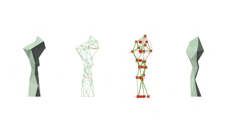
Just as the original moss stone had one small environmental system, I introduced an environmental system into this architecture. Since Los Angeles is climatically dry, moisture savings is very important to nourish the moss stone. In order to conserve the limited amount of precipitation, a depression designed into the top of the building serves as a reservoir. It is then transmitted to the underground water conveyance network via "conduits".


Reinterpreted Moss Stone: Scaled Out Spatiality
The main spatiality of this architecture is expressed in the outdoor space on the second floor. The micro-landscape of the stone surface is reconstructed at the scale of architecture, beyond the human scale. As a result, it appears as a completely different semi-artificial and semi-natural landscape, which cannot be said to be either the spatiality of an original natural object or that of an intelligently constructed building. The process of using digital scanning as a medium gives us a sense of the possibility of bridging architecture and nature.


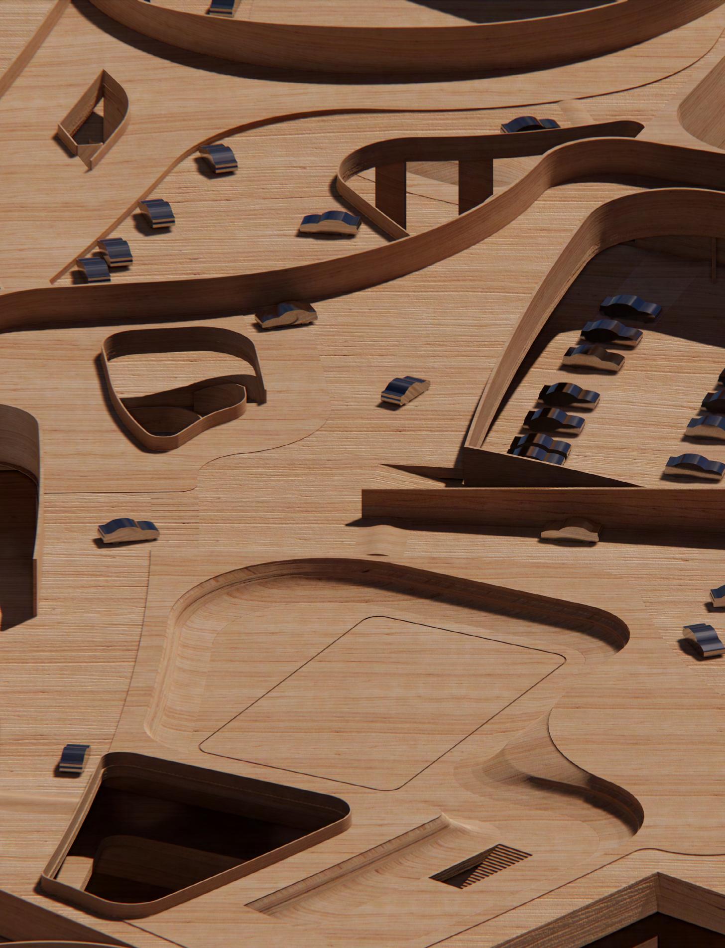
The most important element of this project is (in)efficiency. Not only in the program, but also in getting into the site, moving cars around the site, and so on, the efficiency of car movement rises as an issue. Therefore, we focused on the (micro-)topography, and the fact that these elements can control the speed of the flow of the car. And it is the control of the speed that more directly affects the efficiency of the car and the program.
The site is shaped as if it is sandwiched between two arcs. An arc is a line drawn with a certain curvature, which reminds us of the smooth movement of an object. In other words, the grid composed of arcs in the site can be regarded as a kinetic grid itself. By using these arcs to draw lines and create surfaces, it is possible to construct a rich foundation that fosters a variety of coincidences.
Section’, its authors assert that the origin of section as a representational mechanism “has typically been associated with its capacity to reveal the hidden workings of an existing building or body –often as a retrospective or analytical technique.” It is precisely this conventional use of the section we wish to challenge. While you have already utilized the section in its capacity as a representational tool in fall and winter, we will leverage its full potential as a driver for design development this spring.
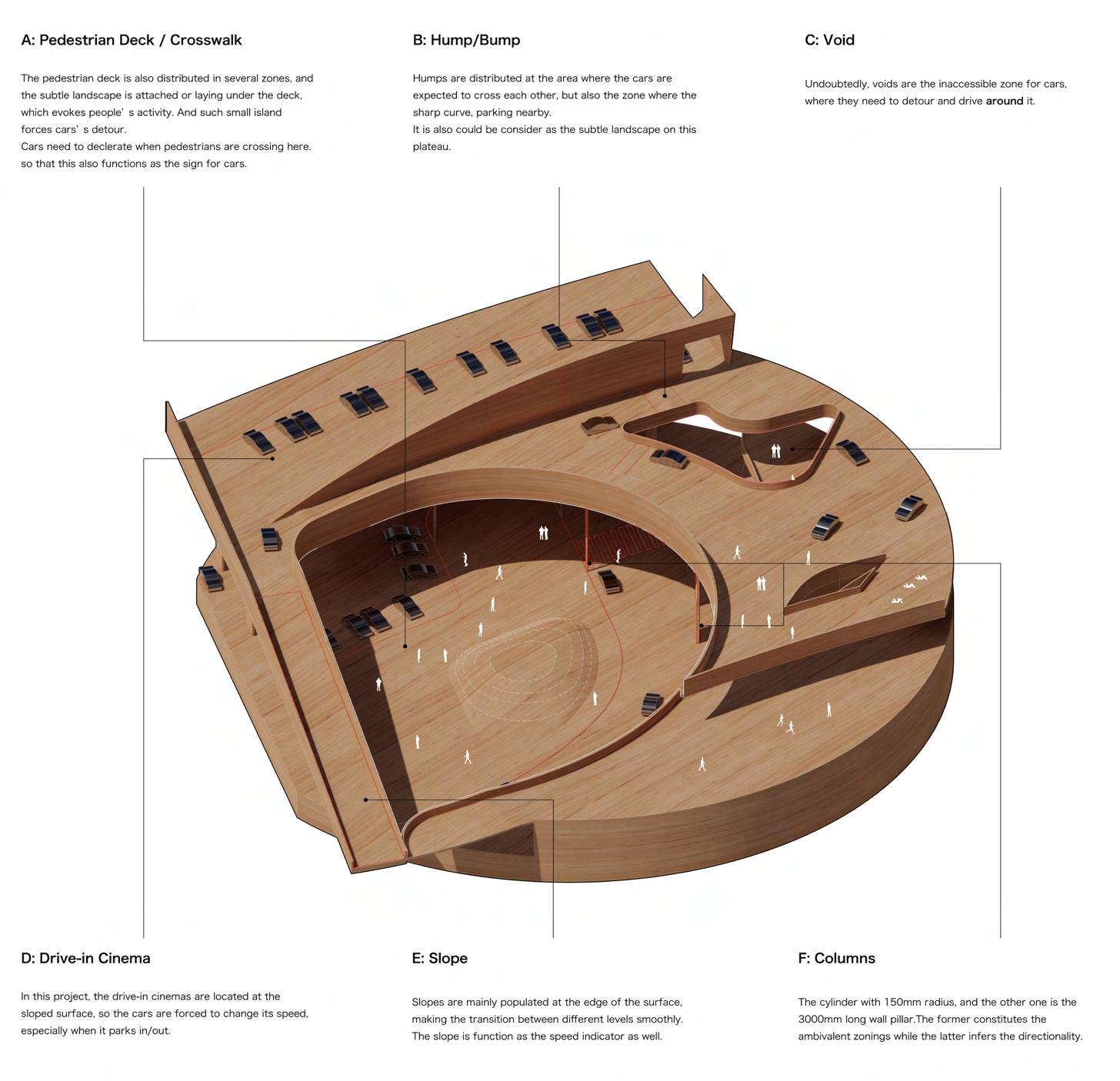
The three seemingly completely disassembled lands are gently connected by the large, gently sloping topography of the drivein theater. The introduction of artificial topographical elements such as slopes, voids, humps, and pedestrian decks creates detailed changes in the land, and the cars change their behavior in response to these changes.
In the space between ambiguity and clarity, the car may derive here as an extension of our body and as a new medium of our pleasure. That's why I call it d(e)rive park(ing).
YEAR SPRING 2021
INSTRUCTOR MOHAMED SHARIF
PROJECT SITE LOS ANGELES, CALIFORNIA

Speed Indicators
In this architecture, drive-through functions that require high flow efficiency (such as food distribution centers and drive-through restaurants) and drive-in functions that require a dwell time (such as drive-in cinemas and parks) are co-located. It is therefore necessary to consider the economics of this efficiency and inefficiency. A key factor in this is the speed of the car. Architectural elements such as humps, columns, and voids were introduced to control the speed. Unlike an efficient and linear flow line that simply connects two points, a "play" part is created, and the organic behavior of the car is developed on the surface.
Notation
As if in response to various elements in the architecture, the car changes its speed, direction, etc., and shows its behavior on the plateau. It is as if the architecture is in dialogue with the car, the second "body" of man. In other words, the above notation can be regarded as a "dance score" of the car. While ensuring efficiency, in certain places something happens that is out of harmony with the schedule. It is an interaction not only between the cars, but also between the people who operate on the plateau. This is a structured improvisation, and we can think of this notation as the scenario.

Composition
In the basement, there is a parking space and a sunken garden. In the center of the site, a two-story food distribution center is planned, one underground and the other on the ground floor, which will allow vehicles to enter the site from both the east and west sides and unload their goods efficiently. The ground floor will have a skate park and restaurants from the northern part of the building, the latter of which will also have a drive-through. In the two-story plateau above, three drive-in theaters of different sizes are planned,.

introducing a clear direction. Due to the slope that the theater has, each level is composed of a series of gently sloping terrains. As mentioned earlier, various topographical elements such as humps, voids, and pedestrian decks are scattered throughout, enriching the "experience" of the car. At each level, there are decks and parks, and especially on the rooftop level, a small futsal court is planned. The pleasure of the body is not limited to the car, and we can also enjoy it here.



This workshop will not have an entity site. This is because we will reconstruct reality. Each of us will need to come up with a scenario and prepare a stage and actors to recreate the space and depth of reality in a video of no more than 10 seconds. It is important to note, however, that this is not a movie. This is a reality that we have created.
In order to construct reality, we first need a background space, which is produced by modeling and rendering. This is produced by modeling and rendering, and then you put people or things in it. The only gimmick we are looking for in this workshop is to warp from one world to another, and it would be better if this were as seamless as possible. The only gimmick required in this workshop is to warp from one world to another, and this should be as seamless as possible, like envisioning the world of zoom as one continuous and twisted world.
COVID19 has forced us to teach remotely. In this unprecedented situation where everything is exchanged in the information space of zoom and miro, we may need to rethink the space itself. As everything is compressed on the screen, depth seems to have been lost, but has the room for stories and sideshadowing been completely lost?
Now, we discussed that it would be better to think of situations that are as close as possible. Of course, crafting reality will inevitably expose its failures at the seams. We thought that if we take on this natural risk, the multiple appearances of such discomfort would confuse the viewer's perception and lead to a certain state of stability. What we need are various surfaces such as mirrors and screens.
We came up with the following scenario. After the all night working for the desk critique at the morning, i went to the bathroom to have my tooth brush, while i found that something is wrong inside the mirror. It seems strange but familiar... And I finally realized that it is the kitchen that i modeled last night! I need to go back to my bed to take some rest...
Under normal circumstances, the plurality of myself, the performer, is easily expressed by a physical phenomenon, reflection.There is no intention here, but rather a consequence of standing in front of a mirror. In order to mimic reality, it is necessary to reproduce these phenomena in concrete form. Therefore, I photographed three images of myself, each from a different angle. In this way, we can see that the phenomena that occur in reality are made up of various constituent factors, each of which creates reality through a perfect balance and precise mechanism. No, reality is not created, but is a result of it.
YEAR SPRING 2021 INSTRUCTOR JIMENEZ
LAIPROJECT SITE ZOOM / OUR "ROOM"

diagram for reconstructing the reality


After the all night working for the desk critique at the morning, i went to the bathroom to have my tooth brush, while i found that something is wrong inside the mirror. It seems strange but familiar... And I finally realized that it is the kitchen that i modeled last night! I need to go back to my bed to take some rest...
Counterfeit the Reality, but the "dirty" one I thought about how to create a rich story in less than 10 seconds, and decided to focus on the multiplicity of "(sur)faces". In order to reconstruct "reality," I need to superimpose multiple elements, but something doesn't fit and it is somehow unnatural. You will realize that reality is indeed an interesting mechanism composed of precise mechanisms.

World is unwillingly Flattened, but...
The "apparently" flat world compressed into Zoom grid is actually rich in narrative and reveals the existence of "depth". Have you ever imagine about the world behind you, or the world lurking behind the friends, lovers you talk to in Zoom? This pandemic has seemingly severed the world, but it may also allow the world of our images to expand infinitely.

The universal problem in housing complexes is the relationship between the individual and the whole. In housing, the floor plan is designed to suit the lifestyle of each individual family, and functions as a container for the family, the most intimate social group. In contrast, multi-dwelling units are designed to accommodate a larger number of unspecified residents and to efficiently pack the space into one large container.
However, both of these approaches have their own merits and demerits, and especially in today's society where the forms of individual and collective identity are becoming more diverse and unstable, it may be difficult to standardize the way of life as well. Therefore, I came to the conclusion that it is necessary to conceive of a more fluid living system when conceiving a housing.
We need to dissolve the polarized forms of dwelling, which until now have been either individual or whole. Extending the concept of units in housing complexes, we consider housing as a single unit. Houses with multiple scales overlap each other to form a single open-ended network of half-open dwellings, connecting dwellings that correspond to conventional lifestyles. Residents will be able to find a suitable place to live by wandering through this network, corresponding to their individual and collective modes of existence. The granular houses will overlap to form one large building fabric. This urban fabric may be a new way of coexistence between the individual and the whole. It could also be said that this is a residence for the new urban "nomad".
This studio introduces you to the logics, generics and genetics of cities, through the medium of the fabric(s) that both constitute and characterize them. At its best, housing smartly balances the desire for a certain uniqueness of place with a connectedness to the wider, surrounding population— whether via a street network, the implantation of public spaces/functions within it, the treatment of edges, or by anticipating its growth/ proliferation. The project is decidedly not a field of dreams: rather, its success will in large part depend on how well you are able to reconcile the management and organization of its inhabitants, visitors and their material requirements (housing as prototype) with the management and organization of the site as partly an extension of, and partly distinct from the larger city (housing as urban fabric).
YEAR FALL 2021 INSTRUCTOR GARRETT
RICCIARDIPROJECT SITE LOS ANGELES, CALIFORNIA

Learning from Venice

For this project, the Venice Canal near Los Angeles was selected as the subject of the case study. In sharp contrast to most housing complexes, here a group of adjacent dwellings facing the canal form a single building fabric. It is interesting to note that while each is independent of the others, the forms behave in a reciprocal manner according to their adjacency. At the same time, I would like to note that the houses have a clear duality and linearity because they are sandwiched between a waterway and a roadway. Applying these compositional principles, I took out an area of the dwellings and verified whether it was possible to manipulate the form as a chunk by adding operations such as re-proportioning and rotation.


House(ing) ceases to be House(ing)
The universal house is composed of functions that are filled without excess or deficiency, and self-contained lines of flow connect them. If the house were to be scaled up to 150% or 200%, each room would gradually have a "blank space," and at 200%, the functions would no longer be able to fill the space. At this point, the house ceases to be a house. When the house is inserted in the blank space, the closed flow line of the house becomes half-open, and an open flow line is created for this large "house. By repeating this operation, it is possible to construct a semi-autonomous network in which the house is closed but open to the whole. In this ambiguous whole, the outside of the house is only an interior space, and a network of multiple layers of living environments is formed.


As Found: House as a Unit
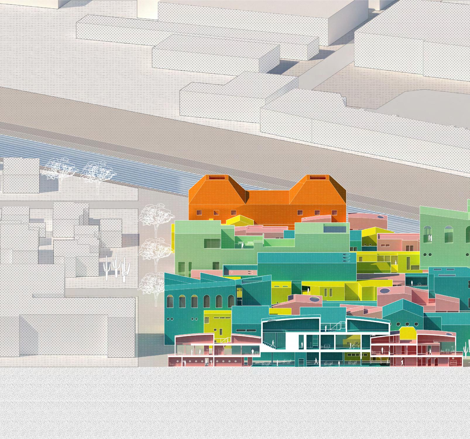
Individual granular features are essential to the composition of a fabric. At the same time, in order to realize the aforementioned linear connection system without contradiction, it is most appropriate to apply the housing forms found in Venice. Therefore, fifteen types of houses were selected from the group of houses on the Venice Canal. They can be further divided into five categories: courtyard, terrace, annex, exterior staircase, and symmetry. We then redesigned the plans of these houses based on the aerial photography information. The overall composition was based on the aforementioned rules, and the color scheme was redesigned based on the scale of the houses. At the same time, the functions were graded according to the scale: private, semi-public, and public.


Section
The connection of housing volumes with different scales naturally creates a difference in height in the interior space. Therefore, this housing complex is not only complex in plan, but also appears dynamic and three-dimensional in the vertical direction. A part of the roof of the house penetrates into the interior of the larger house, and the rooftop space, which used to be an external space, is internalized, etc. The space that was supposed to be filled with the original function is dismantled by the intervention of another space, and continuity and intermittency emerge simultaneously in the space.

Landscape: the Space left behind
As the effect of morphological manipulation works in both figure and ground, I would like to note that the effect of overlapping houses of different scales is demonstrated not only in the interior space but also in the exterior space. The behavior of the multiple scaled forms each makes the courtyard space local, and the spaces are dotted with a variety of openness and closure.

Roofscape
The effect of scale change and overlay is strongly expressed in the rooftop space as well. In addition to the different roof shapes of each unit, the three different scales reveal a special contour in which repetition is recognizable but equally complex.Iconic forms often have simple contours, but by overlapping them based on simple rules, it is possible to create a "difficult whole" that is both complex and symbolic.
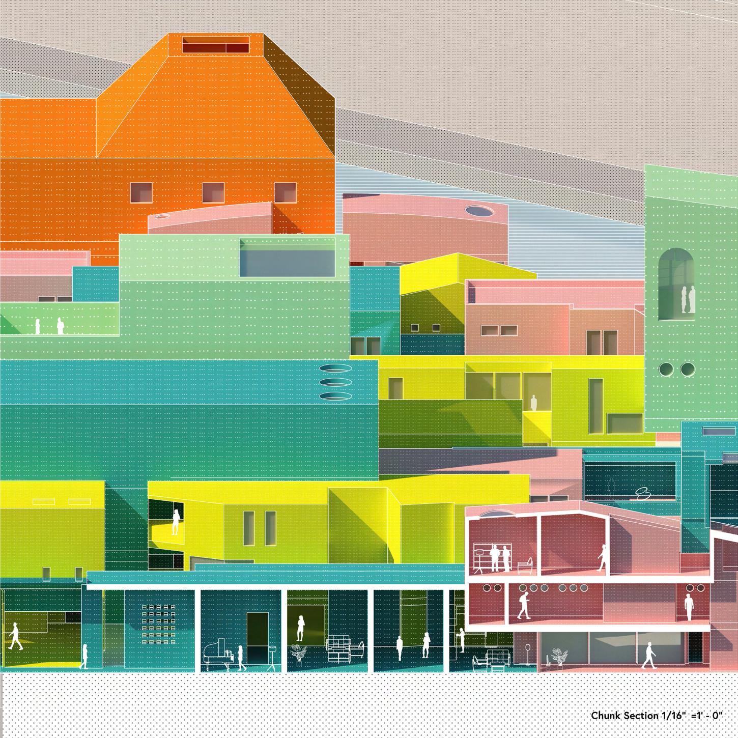
Chunk: Tectonic of Congestion
The complexity of this project is also strongly represented by the intermingling of multiple tectonics. Here, too, scale ratios play a strong role in manifesting the order of these structural complexes, with the skeleton of the largest scale "house" serving as a kind of spline that glides across the whole, to which other scale structures snap in their place.


This project required me to think about the relationship between two types of printed objects. I thought about what relationship between a plant and a pot would be appropriate to move back and forth between these two types of printed media. The plant I chose as a reference was a succulent called Crassula. Its cushion-like form has an interesting ambivalence: it can be seen as a pot or the plant itself.
By redefining this form using strict geometry, I reinforced its repeatability. In the meantime, the system of joints into this “plant” is introduced, allowing it to be stacked repeatedly, making it possible to stack them vertically while rotating them 90 degrees. Such industrial properties couldnot be acquired from the plant itself, and was only here that it could be transformed into PLA/NT. In order for the 3D printed object to cooperate with its industrial nature, a translucent material was used for the plant part, while a dark-gray matte material was chosen for the pots for the contrast.
The lineworks on the PLA/NT serves to reveal the digital origin of the object, and the zoomed-in image serves to emphasize the materiality of the object.
Controlling nature has always been a condition of human inhabitation. When we build, we not only intervene in natural systems, we disrupt and realign them, even with the most environmentally sensitive politics and techniques at work. The (western) Origin Myth of architecture as a primitive hut hewn from trees in the forest already had conflciting forces embedded in its theory: while the hut is found or discovered to be nat- urally accomodating as a shelter, the implicit idea of design (or control) makes an appearance in the simple pediment of branches. Here, the hut is a conceptual premise, suggesting that architecture (design) should emanate from the idea of nature as a representation of universal forces. Later, in 1851, Gottfried Semper devel- oped a materialist discourse through an anthropologi- cal lens, arguing that what humans did to survive/thrive was the basis of architecture’s coming-into-being. With regard to controlling nature, the project of the seminar is to design, draw, and 3D print a potted plant.

PLA-SSULA / CRASSULA
In this project, which required me to go back and forth between two types of printed materials, 3D printed objects and posters, the most important thing for me was that the form was systematic. By increasing the clarity of the system of forms, I wanted to make questions about the forms themselves non-existent, so that the viewer would be led to the mood created by physical texture, rather than the forms themselves.
As proof that the material is PLA/ANT rather than plant, the model shows industrial transparency and a linear pattern that shows traces of 3D printing. In the poster, on the other hand, the physical texture is overlaid on the rendering to suggest such traces.


This is an ambivalent icon.
To be the art collective in Sunset, rich in culture and history, it is required to have two contradictory characters: iconicity and collectivity.
The architecture consists of three volumes, two plateaus and an envelope. The ground level and the first floor of each building are connected, creating a space for the public and artists to encounter and inspire each other. As one moves up the floors, the space becomes more and more differentiated, becoming a space for each artist to create. The envelope, formed by a mesh, wraps around the three volumes to create a single overall figure. The external space between the volumes is internalized by the envelope, acquiring an ambivalent spatiality, as if the urban space has been inverted. The public derive this space as if wandering in the city.
Externally, the architecture mimics the building fabric of the Sunset Strip, while in the interior space, the shadows cast by the mesh create a spectacle. In this way, the architecture is charged with iconicity both interior and exterior.
The proposed site is located at the corner of Sunset Boulevard and North Doheny Drive. As you see in the image above, the building is a vintage 1970’s exposed concrete horizontal plinth type with a single floor tenant and a parking deck above. With a small public plaza as an interface to the street, it is both a building and non-building. This site is the host for a new program, the SUNSET ARTS COLLECTIVE, a building concieved as the meeting point between the musuem, the artists studio, and the commercial gallery. While the digital world has deeply affected the production and value of art, its more material / physical media and practices are as vital as ever especially in a post COVID era where we are emerging from near total isolation. West Hollywood is a city that celebrates the arts and the diversity of people that make it for an equally diverse set of audiences.
YEAR WINTER, SPRING 2022
INSTRUCTOR NARINEH MIRZAEIAN PROJECT SITE LOS ANGELES, CALIFORNIA

Catalogs: Choreography of Form-finders
Two types of operations were conceived to interfere with the architecture: Salmon-Pink: Juxtaposition of Three Objects; Fresh Green: Chubby Gummy on the Top. The former is a scaled-down version of the Sunset Strip's street-like character on an existing building, while the latter is an addition that adds a gravity-induced languid quality to the operation of an extension. Both operations inherit the existing core located in the center and the two Bull-noses associated with the south side, and in particular utilize the fillet language of the Bull-noses as the overall design code. For each pattern, studies were conducted and catalogued to exhaust the number of cases of placement, orientation, etc. These are a set of choreography of volumes dancing on the existing Citibank building.

Read and Re-contextualizing the Figures
he lines left by the existing architecture create a unique context. By interacting with these lines and overwriting them with new ones, it should be possible to give new context to the architecture. Here, the relationship between the three newly introduced volumes and the existing architecture, as well as the relationship between the volumes, is considered through the axis lines.
The contours of the volumes themselves, as well as the space created between them, are influenced by the contours of the volumes themselves. The contours were determined while envisioning a line of sight that draws the viewer into the interior from the sunset strip side, and a space with a street-like character that is experienced at deck level.


Three Volumes, Two Plateaus, One Envelope
The building is organized by a clear formal system: three volumes are extrapolated to the existing building, and two key levels, the GL surface and the deck, constitute a fluid landscape. A mesh-like envelope then wraps around them, giving the architecture a soft figure. Although it appears to be a collection of solid volumes, the visual translucency of the mesh obscures the contours of the architecture, creating an ambivalent objectivity.


Functional Gradations
The functional arrangement of the building is clear and gradational: on two key levels, public exhibition spaces, admins, stores, and cafes are arranged, while three annexe cores absorb the respective flow lines vertically. The lower level of the volume is devoted to indoor exhibition spaces, while the upper level is devoted to artists' production spaces. The arrangement is designed with an awareness of the segregation of the public and the artists.


Filleted Landscape
Especially at the basement level, it is easy to see that the three volumes melt into a fluid landscape. It seamlessly draws people along Sunset Boulevard and invites them into the art space. The slightly recessed space enhances the visual effect, and a stage or exhibition space is placed there, making the art more open to the public. The language of fillets read from existing architecture is applied, and by controlling the size of the fillets in each spot, the artist induces a physical experience of fluidity, or the strength and weakness of boundaries. In this way, a space with both softness and fluidity is created inside.

Ambivalence: Eroded Anexes
As one moves to the upper level, the three volumes, which had been melded together, gradually differentiate and reveal their respective figures. Each has its own studio space and maintains internal autonomy. The envelope, on the other hand, continues to envelop these three volumes, giving the space between them an interiority. There is also a strong consideration of the "eyes from the car" characteristic of Los Angeles, and in addition to the visibility of the architecture observed from afar, the depth of the architecture seen as one passes by is also taken into account.

Chunk: System of Building Construction
This steel-framed structure is literally conceived as one continuous complex, with the volume and the enveloppe also connected by a steel frame. The interior and exterior walls are paneled with different intentions. The exterior walls adopt a long horizontal paneling pattern to maximize the expression of mute-ness, and the size of the openings is kept to a minimum. In contrast, the interior walls have large paneling that emphasizes verticality.

Details, Details and More...
The wire mesh netting is structured with C-channels placed at the roof parapet or curved gutters to receive the wires. The exterior walls are made of aluminum panels, whose reflective properties express different phenomenal qualities depending on the time of day. In addition, the paneling is based on a constant e-numeric pattern, expressing an ordered randomness.


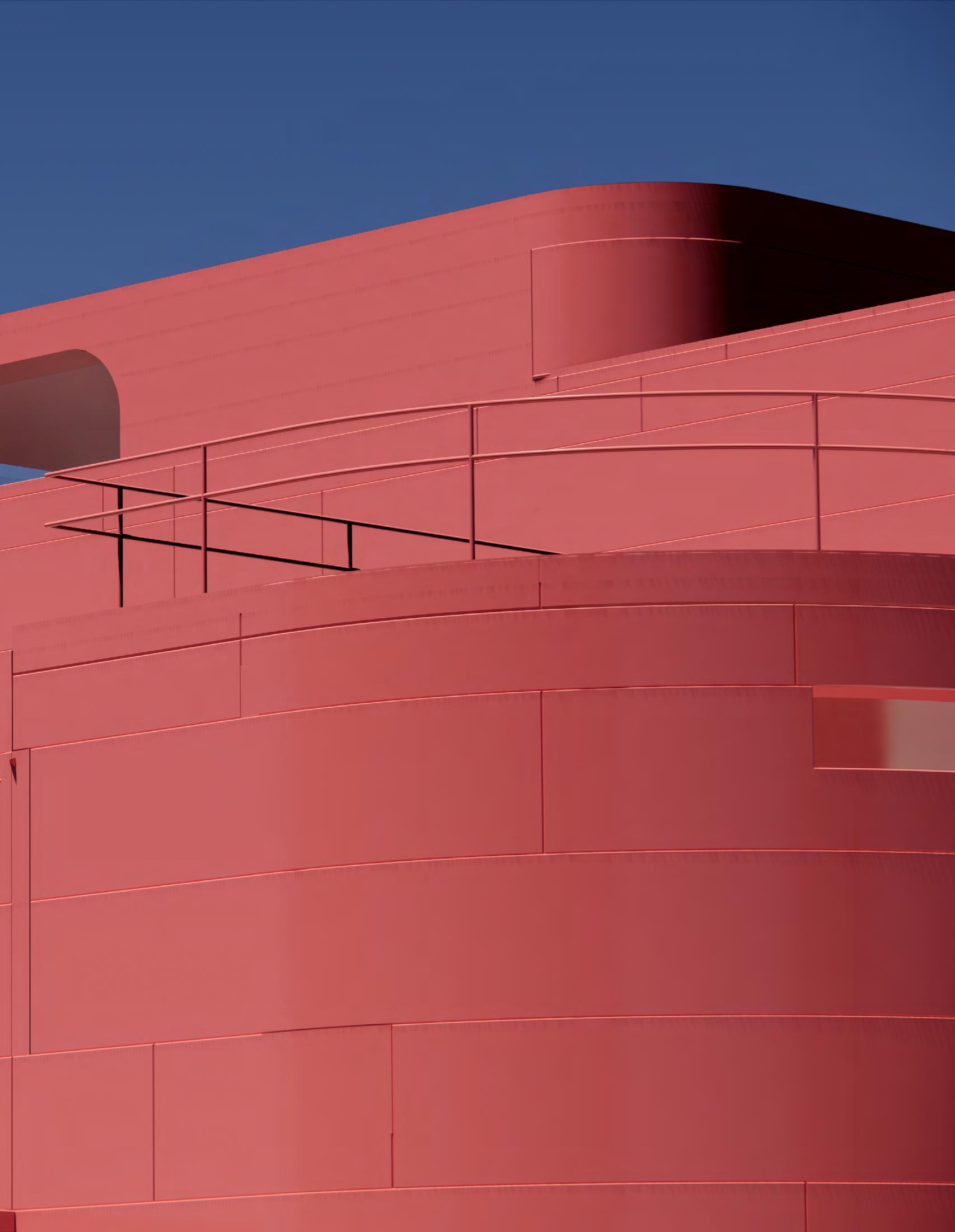


This project is recondensing and repatching the existing landscapes, material-scapes in order to recreate the second nature with intimacy and surreal sceneries, diverging from existing historicity and creating a new independent historicity in the countryside of Carcassonne.
Patches of landscape, rusticated walls...these are things that certainly continue to exist today in the Carcassonne countryside.
By bringing them into a new relationship and recontextualizing them as a new history, you are witnessing a new landscape that diverges from the pure historicity of the known and has a familiar but unknowable quality. The strange connections and collisions that occur as a result of the fragmentation of the site and its continuity create a strange ensemble.
As urban developments in cities across the globe grow at a rate never seen before throughout history, our discipline seems to have failed to produce any underlying theory which could grapple with that which is decidedly not urban. Known as “the rural” or countryside, these areas are characterized for low density, low population and small settlements. Rem Koolhaas argues that it is precisely in the countryside where some of the most progressive and innovative aspects of our culture are being developed.
The project asks for the design of an ensemble of buildings in a historic countryside, a form of strange outskirts and weird peripheries. The site is located near the city of Carcassonne, France, and provides a remarkable canvas for investigation. The physical and historical presence of the medieval castle and fortress; the contemporary industrial context of the new city and the agricultural grid, all will allow the studio to pursue ideas of context beyond the known specificities of site, by understanding it as a larger cultural and a social framework from where projects can cultivate and construct new physical images.
YEAR FALL 2022 INSTRUCTOR GEORGINA HULJICH PROJECT SITE LOS ANGELES, CALIFORNIA

Broad Site Speculations: Materializing "Facts"
As a new means of intuitively understanding the site and its surroundings, I attempted to rewrite the sanitary image using photomontage to maximize the various elements latent within the site and expose the logic behind it. The site in the suburbs of Carcassonne is an accumulation of various patches of farmland, and by replacing these components with either pure farmland or lots of neighboring buildings, I explored both ends of a kind of human territory on the land. Furthermore, it was confirmed that inhabiting the edges of the patches would not compromise the authenticity of the suburban patchwork. The information taken from satellite imagery is material and plays a very important role in reconstructing and examining the new reality.


On -Site Speculations: Masterplanning through Photo-montage


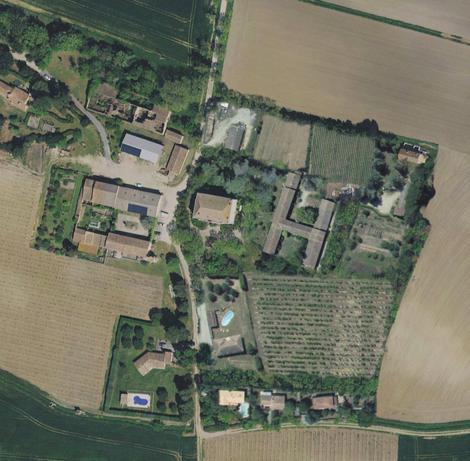


Using the same logic of photomontage speculation, the same procedure was applied to the site to develop a master plan. The site was manipulated to provide feedback on the results of the extensive research, and the master plan study gradually became a call for order, introducing a new grid of order and applying multiple landscape textures to ensure complexity and order at the same time. The master plan was driven.
Gradually, the precision and intentionality of the operations became more precise, finally converging on the proposal shown bottom right.
Quad-tree Grids: Logic of New Artificial Nature
The organizing principle of the patchwork requires some kind of logical rule. And it is desirable that it be as intrinsic a logic as possible. Looking again at the survey of this site, the existing tree plots show varying sparsity and density in each area. The algorithm applied here is Quad-tree Subdivision, a planar subdivision algorithm that divides the site based on the sparseness and density of the point cloud plotting. This allows us to maximize the preservation of existing trees and to narrow down the areas where intervention is suitable.

Congestion of Landpatches, Walls and Trees
This Strange Ensemble is ambiguously composed of existing trees, a patchwork of landscape patches and multiple wall structures. The landscape patches intervene with the site in a variety of variations, and the walls that are integral to the unit stand between them. They do not show clear interference or clash, nor do they form the boundary of a single area by themselves. However, by showing their interaction, the site creates multiple ambiguous areas.

Hatch! Patch!
As a result of the application of the Quad-tree Subdivision described above, we were able to lay out a grid field based on the intrinsic logic of the site. Now, based on this, a new landscape hatch was applied to the site, adopting the material pattern of the landscape taken in Survey near Carcassonne in the wider region. I call this landscape a hatch patch, because it can be seen as an abstract hatch pattern as shown in the figure above, and at the same time it can be recognized as a patchwork rich in color and material.

Hatches and Patches
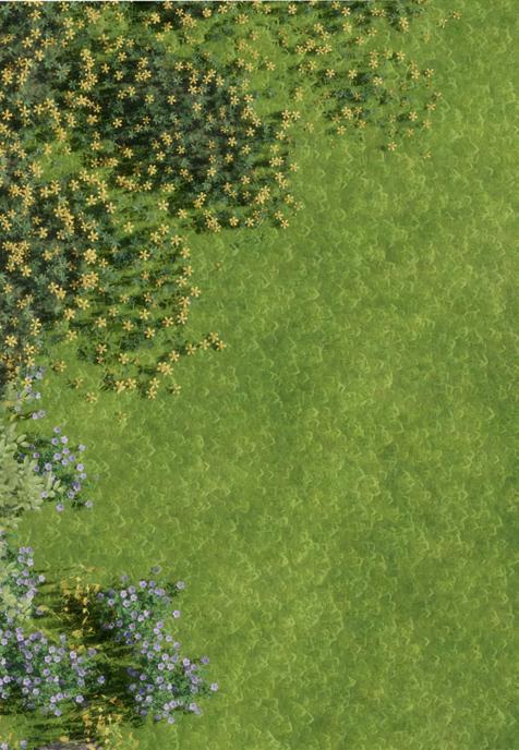


As mentioned above, the Carcassonne landscape pattern was applied based on Survey, but these were reorganized under a new site-less, situated order. In other words, the neighborhood conditions, transitions, etc. are very different, and because they are recontextualized, the experience and perception of each is also very different. Many of these patterns are abstract, but at the same time, they are sure to have a significant effect on the spatial cognition of the people standing there, visually, olfactually, and tactually.

Choreography of Walls
Six wall structures are located on the site along the edges of the patchwork. Two of these are Wall Park, with a park function, and four are integrated with the three unit structures, with an accommodation function. These walls have a variety of choreographies and interrelate with the landscape, sometimes parallel to the patchwork, sometimes crossing it. The interaction of these factors results in an ambiguous division of the site.

Walls


The wall becomes architecture, sometimes dividing both sides, sometimes suggesting the opposite side of the world, and sometimes providing a space in which to spend time. The structure of the wall is based on the material of the rusticated wall of La Cite in Carcassonne, and the structure of the dwelling unit is made of metal paneling in order to collide and contrast with it. This material contrast blends in with the existing trees and the landscape, and stands out more bewitchingly in the sunlight.

Ambiguous Domain
The wall stands along the boundary of the landscape patch, but it is not closed in form and never creates a clearly enclosed area. Nevertheless, the wall creates an ambiguous enclosure through its interaction with existing trees and the landscape patch. This creates an intimate enclosure of space, whereby the area is not sharply delineated, but rather encapsulated by multiple ambiguous boundaries. There, the eye toward "that side" is tolerated, and even visitors from "that side" are not rejected. However, the enclosure gives people a sense of intimate and secret belonging.


Division by Landcape
The walls are linear and connected, yet in the space shown in the drawing above, the space is divided into units. It is not a division by walls, but by a patchwork of connected units. Each unit is assigned a different landscape material, which means that the landscape and atmosphere at each point is completely different.
Here we can see the strange effect of the walls and the landscape being constructed in different logics and overlaying them.


Along the Edge
The wall sometimes runs parallel to the edge of the landscape patch. In such cases, there is no retrogradation of any grain, and a strong directivity appears in the landscape viewed from the unit. The same strong vector appears in the landscape, and the viewer's gaze is strongly guided. And likewise, this directivity can lead to strong area fragmentation. As can be seen in the drawing above, the division of the site into north and south is gradually revealed to function as a clear north-south switch.


Across the Domain
Afterall, the patchwork is continuous, therefore it sometimes intersecting the wall and extending to the "other side. At this point, the wall plays a game of territory with the edges of the patchwork, acting as a filter between areas as a surface and stirring up images of the landscape "over there".


