7 minute read
Historical Context
Born in April 1958, during the opulent era of the 58th Universal Exhibition and car dominated city era, the project already arose debates. ARAU will even describe it as ‘the most absurd project of North-Midi Junctions masterplan’ (Y. Cantraine, 2011)
[Situation] The site is situated at the edge of the second city wall of Brussels. Back in XVII century, it was an ancient convent with multiple orchards. In 1821, it was landfilled during the demolition of the old fortification and creation of Rue Royale. At that time, the site already attracted the interest of the city. The aim to modernised ‘this poor unclean city block’ by creating some new city equipment was pursued.
Advertisement
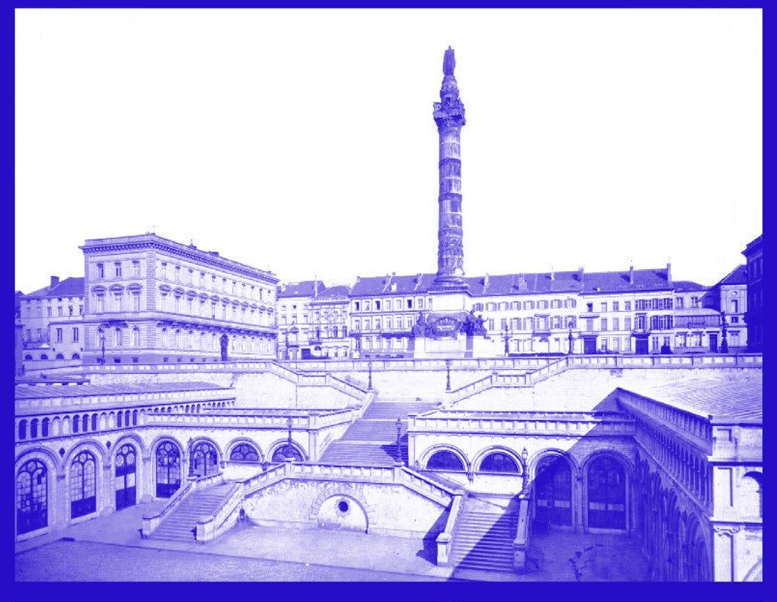
Few years later, in 1847, the city retained the project of J. P. Cluysenaar. His vision imagined to link the two sides which had a difference of height of 17meters. The Neo-Romanesque design featured a covered market with a monumental staircase and a sloped street.
[Congress Column] In continuation, in 1850, J. Poelaert was commissioned to rethinking the square over the market, also known as Panorama square. He proposed the erection of a new monument, the Congress Column, and 2 private mansions to better frame the edges of the square.
With a height of 47 meters and an interior a 153 steps staircase, the Congress Column was build was finalised in 1859. The most remarkable characteristic is the overhanging statue of King Leopold-I. It also figures the 9 provinces, the name of the 237 members of the National Congress and the foundational articles of the Belgian Constitution.
After the first world war, the Unknown Soldier was buried under the column. Since then, the nearby Eternal Flame reminds us of this historical event.
[Hegemonic city tool] In 1937, the idea of regrouping on the same plot all the administrative organisation of the country arose. At that time, the government administrative centre was divided in 57 buildings which had to be maintained. The proposal to gather them on the same place would also reinforce the connections between the multiple administrations. The Pacheco Site was nearly directly chosen because it was situated in the Pentagon – defined as the location of the capital city- but also because it was easily accessible by car. The positioning of the project would also allow the area to be regenerate in a ‘sanest district’.
The aim was to solve ‘the problem of insalubrity, to clean up the area of shabby constructions deprived of architectural values’.(Y. Cantraine, 2011) At that time 690 households lived there still. The full plot was demolished, leaving a blank page ready for an new chapter of history.
[Proposal] On July 8th 1955, the decision was endorsed by the Ministerial Council. Soon after, a college of architects was selected by the government, it was composed of L. Stynen, M. Lambricht, G. Ricquier, H. Van Kuyck, J. Gilson, T. Daens, R. Piron and A. Vanderauwera. Several phases of thoughts and sketches were presented and discussed. The main idea was to propose a handful of modernist buildings surrounded by suspended gardens and terraces. The vast group will face some tensions and Leon Stynen will decide to leave the college. For him, it was ‘difficult to accept a program which was monofunctional, only thinking about building state offices, without involving a broader conception of social, cultural and leisure-based elements’.(Y. Cantraine, 2011)
The project moreover envisioned a huge parking complex of more than 1.418 vehicles which was finally build.
Fig. 68 - Global View (Source: Y. Cantraine - La Cité Administrative D’Etat, p.3)
Fig. 69 - Location in 1850 (Source: Y. Cantraine - La Cité Administrative D’Etat, p.4)

Fig. 71 - Cluysenaar project (Source: Y. Cantraine - La Cité Administrative D’Etat, p.7) Fig. 70 - Demolition works (Source: Y. Cantraine - La Cité Administrative D’Etat, p.9)

F D
H
A E

I B C
G
Fig. 72 - Situation Plan (Source: Y. Cantraine - La Cité Administrative D’Etat, p.26)
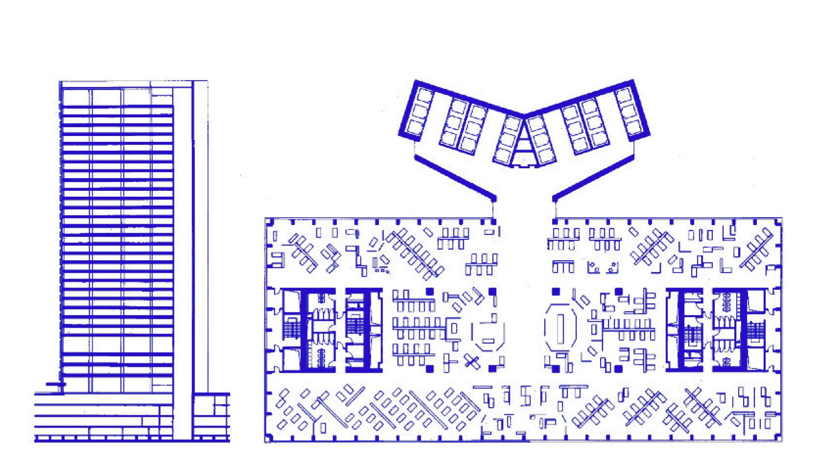
Fig. 73 - Projected Plans of the Finance Tower (Source: Y. Cantraine - La Cité Administrative D’Etat, p.31)
ADMINISTRATIVE CENTRE
In 1984, after 25 years of construction, 10.320 civil servants were finally installed inside the new complex. The modernist complex composed of multiple building on a plinth of parking spaces has a huge footprint on the area.
[A,B - Parking] Situated in a Belgian blue stone plinth of the Administrative Centre, the parking is divided into several building with a 4 and a 5 floors parking. Some public equipments are also featured in the building. Over the parking the idea of a garden and a square was implemented.
[C - Vésale Quarter] Articulating the Administrative Centre with the residential neighbourhood, it was first thought to gather the civil servants of the Colonies Ministry. After few year of abandonment, it was reconditioned for 1.170 employees of the Health Ministry. The underground part also was thought as an archive adjoined to a library.
[D,E - Arcades Quarter] L shaped building, with direct access to the garden hosted the Education Ministry and National Education grievor ( 1.650 employees). Its program was arranges with offices, meeting rooms, restaurants, and an immense cafeteria.
[F - Finance Tower] Known as the most prominent building of the country and being twice as spacious as the Midi Tower. First thought with 50 floors only 29 were finally build. An helicopter landing pad was even built on the roof. It was never used and is now employed as the antenna base used to broadcast a variety of national tv channels. [G - Esplanade Quarter] (demolished)
The Ministry of Civil Services with a capacity of 1090 employees was destroyed in 2019. Originally supposed to close the square with an angle to orient towards the view the unused building was demolished after only 30 years of existence.
[H - Decroly Conference Centre]
Decided in 1963, at the foot of the Finance tower by Leon Stynen, it intend to reorient a more public oriented program with a multi-use pavilion.The architectonic and lone-standing properties of the building aspired to break the monotony of the office aesthetic.
[I- Pechère Garden] Inspired by the ancient XVII century gardens, with rhythm and the constraints of the shallow depth of the slab, it was actually a more technical than artistic project. It features a playground with sandpits and benches. On the other side, a more cartesian design of small hedges boxes around water elements punctuating the parking slab while interacting with the monotonous glass facades.
PECHERE GARDEN
After 25 years of construction, office space were reaching completion. It is at that moment that some beautification project were launched. The creation of a park on top of those parking was then envisioned.
[Designated designer] It is with moderate surprise that R. Pechère was chosen to commission this newly imagined park. Reknown designer of the Universal Exhibition gardens but also Mont des Arts or Van Buuren museum garden, Pechère was an obvious choice. This didn’t signify that it was going to be an easy task.
[Idealistic Concept] Inspired by the pre-existing monastic gardens, Pechère’s first sketches had romanticised intentions (see figures). He describes his intent to ‘flood those modernist buildings into an immense carpet of flowers disseminated in between square basin asymmetrically stowed like a painting of Paul Klee’ (Cantraine, 2007) His suspended gardens, as he used to call them finally end up being an ordinary and rhythmic design.
[Troublesome Structure]Because the project was thought after the parking, Pechère had limited design possibilities. The romantic XIII century garden ended into a technical solving project. The complex structure system and the small amount of loads it could carry prohibit most of his actions. To create those basins and flower carpets, he has to elevate the ground. This lead to a segmented and rhythmic proposal imposed by the structure. Small modules composed of hedge surrounding 2 benches and a water fountain were disseminated around the plot. A more organic part of the design was the establishment of a playground shaped of several sandpits.
[Derelict Space ] Both of those elements, the fountain rooms and the playground sandpits are nowadays totally neglected. The lack of management of the park and its green spaces is a real pity. As shown in following site pictures, a vibe of Chernobyl is floating around. Also, like other parks of the city, transmigrants occupy few hidden places.
Fig. 74 - View of the Pechère Park (Source: Y. Cantraine - La Cité Administrative D’Etat, p.46)
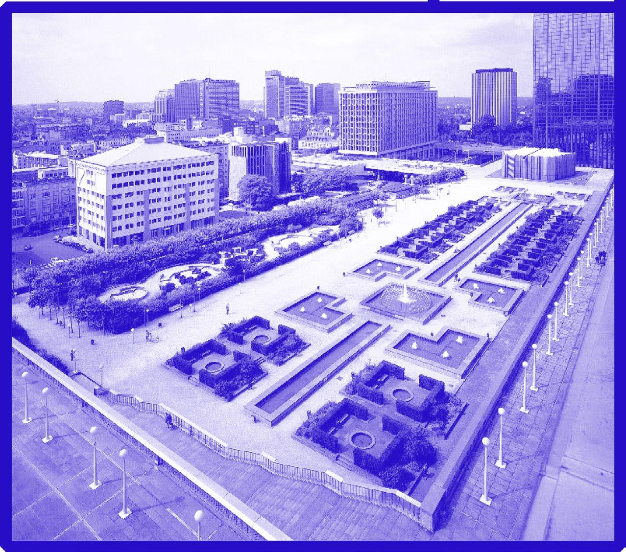
Fig. 75 - Concept Drawings (Source: Y. Cantraine - La Cité Administrative D’Etat)


