 @BristolFurniture @bristolfurniture Bristol Furniture Bristol Furniture


 @BristolFurniture @bristolfurniture Bristol Furniture Bristol Furniture


Design opens us to a world of limitless creativity. In terms of workplace design, we now have ample opportunity to explore the trends, techniques, and innovations that are shaping the way we work.
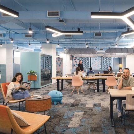
As always, we are excited to showcase the best projects from designers around the world. For this issue, we are thrilled to welcome DB&B once again as our featured designer, and we are impressed with what they have shared with us. One of the projects that caught our attention is their vibrant office in Singapore. By breaking the convention of using dark or white colours, they have created a harmonious atmosphere with a light blue tone ceiling, acoustic partitions, and carpet tiles.
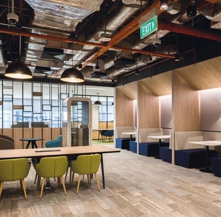
Another standout project is the Amazon Singapore office, which successfully incorporates bold colour combinations while maintaining the identity and character of its business culture. On the other hand, the SAP project, which seamlessly blends natural elements with modern materials, epitomises what a biophilic and nature-themed workspace can be – a place that promotes productivity, creativity, and employee well-being.
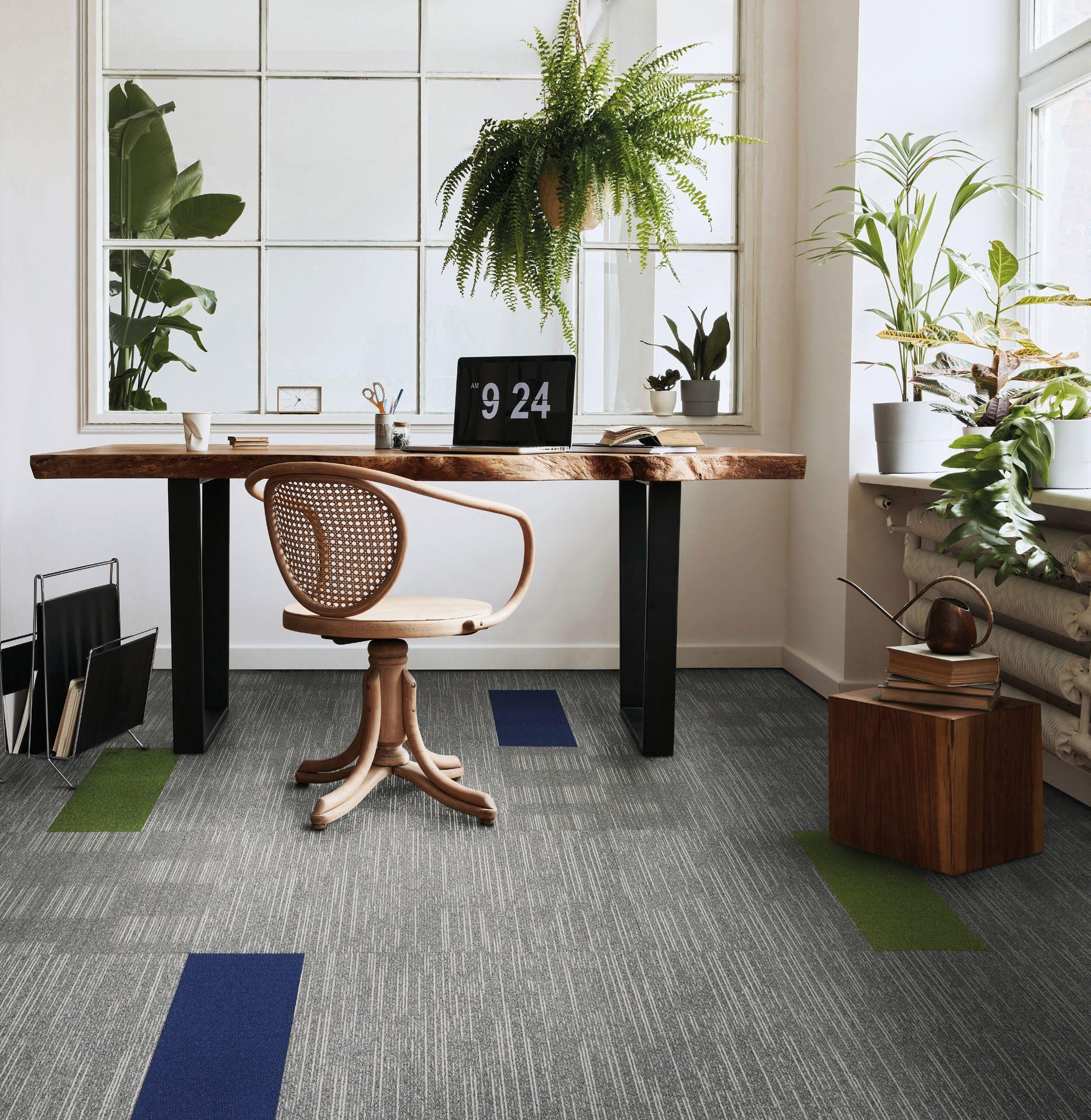
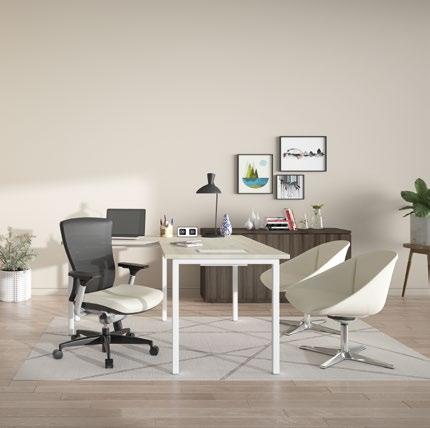
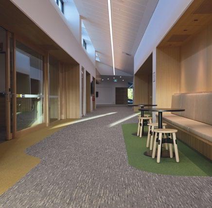
Alongside these inspiring projects, we also bring you the latest product innovations that prioritise employee comfort and well being in the office. For example, the Walter Knoll Mono-V Desk & Sideboard is a stunning embodiment of creative productivity, while the Needs 2.0 office table merges functionality and elegance in a strikingly beautiful way. We also shine a light on the use of eco-conscious materials in design: Carpets Inter EcoSoft® carpet tiles at the Ferntree Gully campus project serve as a powerful reminder of the transformative power of environmentally conscious design.
We hope this issue will inspire you to push the boundaries of your creativity, explore new techniques, and approach design with a fresh perspective. Thank you for joining us on this journey, and we hope you enjoy our latest issue!
Kenneth Khu k.k@kenneth-media.comThe revolution of workplace design begins by creating spaces that take care of the people and the planet at the same time.




editorial MANAGING EDITOR Kenneth Khu
DEPUTY EDITOR Pang Yin Ying
EDITOR Christine Lee
design
ART DIRECTOR Eric Phoon
SENIOR DESIGNER Sandy Liew
contributors
WRITERS Adele Chong, Lily Wong
WORKPLACE DESIGN DB&B
sales & marketing
SENIOR SALES MANAGER Edmond Lee
SALES EXECUTIVE Kelvin Ong
publication
PUBLISHER Kenneth Khu
enquiries
ADVERTISING advertising@officeconceptdesign.com
EDITORIAL submit@officeconceptdesign.com
SUBSCRIPTION subscribe@officeconceptdesign.com
website www.officeconceptdesign.com
A DESTINATION WORKSPACE BY DB&B
040 088
TOWARDS GLOBALISATION AND INNOVATION BY DB&B
contact KENNETH MEDIA SDN BHD
4, Jalan Hopea U15/28B Elmina West, Seksyen U15 40170 Shah Alam, Selangor, Malaysia.
T: +603 5038 3022
photo credits
COVER: DB&B
SECTION OPENER:
WORKPLACE DESIGN DB&B
FITTING INTERIORS WALTER KNOLL
printer
PERCETAKAN IMPRINT (M) SDN BHD No.538, Jalan 20
Taman Perindustrian Ehsan Jaya, Kepong 52100 Kuala Lumpur, Malaysia
permit number
KDN PP18848/09/2015(034306)
MCI(P) 067/03/2023
magazine
OC | Office Concept Design Magazine is published three times a year and is circulated throughout the Asia-Pacific region. Opinions expressed are those of the contributors and not necessarily endorsed by the publisher.

copyright notice
All rights, including copyright, in the content of this publication are owned by Kenneth Media Sdn Bhd, Malaysia. You are not permitted to copy, broadcast, download, store in any medium, transmit, show or play in public, adapt or change any in any way the content of this publication for any other purpose whatsoever without the prior written permission of Kenneth Media Sdn Bhd, Malaysia.
PUBLISHED BY
RHYTHM OF LIGHT
PRECIOSA’S CRYSTAL BEAT EVOKES AN IMMERSIVE SENSORY EXPERIENCE WHERE DESIGN COLLIDES WITH MUSIC AND LIGHT, TRANSPORTING YOU TO A WORLD OF WONDER AND ENCHANTMENT.
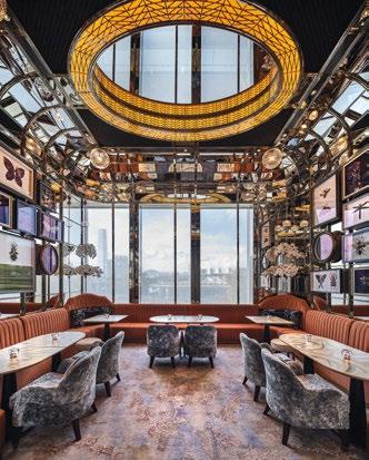
LUXURY MEETS ELEGANCE THE DESIGN OFFERS A PLACE FOR GUESTS TO ESCAPE FROM THE CONCRETE JUNGLE; A HIDDEN GEM IN THE HEART OF ONE OF THE BUSIEST CITIES IN THE WORLD.
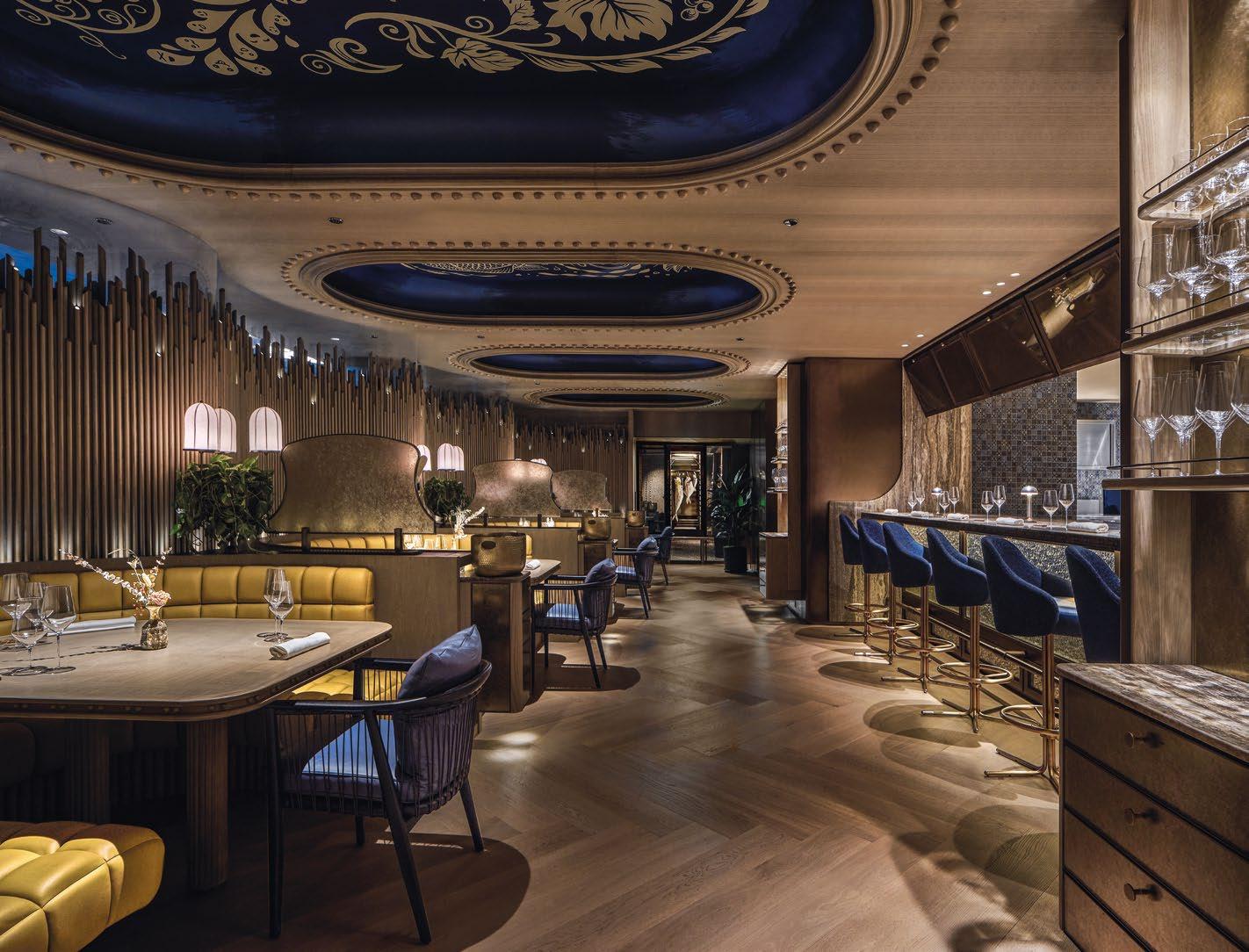
PROFOUND DESTINATION IN THE ALGARVE THE TRANSLATION OF THE CONCEPT INTO SPACE TANTALIZES GUESTS INTO DISCOVERING LAYERS OF PROFOUND SENSORY EXPERIENCES, EXPOSING THEM TO UNEXPECTED SURPRISES WITHIN SECRET ALCOVES – EMBRACING THE OLD AND UNCOVERING THE NEW.
TAKE A TOUR > HOTELRESORTDESIGN.COM
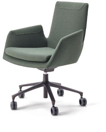
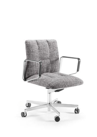
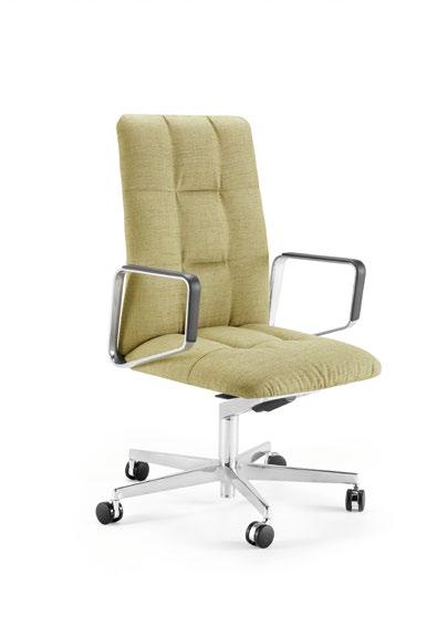
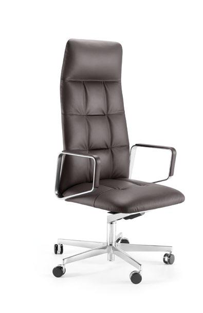
Luxuriate in the pure comfort of the Leadchair Executive Soft. Whether as an executive, conference, or visitor chair, this elegant seating piece exudes an unparalleled aura of relaxation and sophistication, making it a remarkable addition to any office. Available in three different heights, the seat and backrest angle can be adjusted to suit diverse preferences. Soft fabric or leather upholstery further enhances the chair’s elegance, seamlessly blending with its different components to create a harmonious whole. WALTERKNOLL.DE
The graceful Cordia chair collection has recently expanded its range to include sophisticated seating options for upscale offices, conference rooms, and meeting spaces. Characterised by a delicate wire frame, a unique blend of materials, and a seat shell that blends seamlessly into a graceful backrest, these chairs epitomise pure elegance and refinement. The sleek contours are further highlighted by a striking saddle stitch seam that complements the cover colour while providing a pleasing contrast.

COR.DE
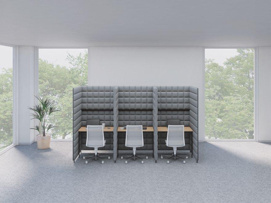
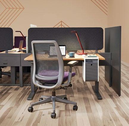
Smart yet stylish, the Migration SE desk system elevates modern workspaces to ensure a highly functional environment conducive for productive work. Its exceptional height-adjustable solution seamlessly integrates with a wide range of settings, allowing workers to choose between seated and standing postures to meet their preferred levels of comfort. From rectangle desks to 90- and 120-degree corner desks, Migration SE also offers a range of Steelcase privacy screens that integrate elegantly with the desk. STEELCASE.COM

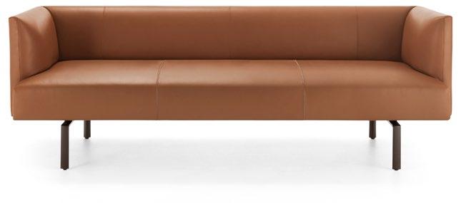
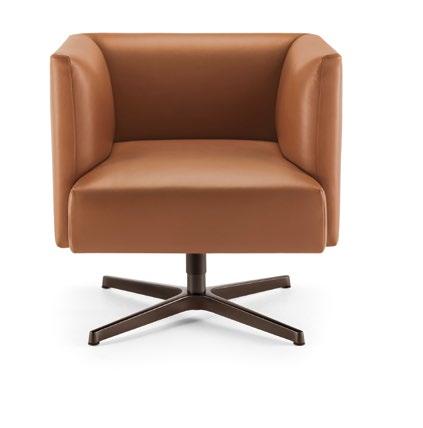
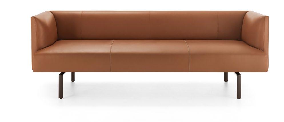
The Muud Lite Sofa stands out as a beacon of ultra-chic design that effortlessly strikes a perfect balance between minimalist design and cosy comfort. Its sleek exterior exudes precision, while its pleasantly curved sides and back offer a luxurious experience. The sofa fits beautifully into activity-based workspaces, lounge spaces, open areas, and waiting rooms, adapting effortlessly to any setting. Whether fabric or leather upholstery, the Muud sofa offers top-quality seam details for a distinctive touch.
Configure the comfortable Oval Lounge system to your heart’s desire. This modular seating piece is a versatile canvas for creativity, allowing for linear or playful curves for a variety of applications. An eye-catching element for any space, the sofa’s slimline frames crafted from coated steel tubes with a round oak tube on top create a floating illusion. Choose from a single-colour or vibrant contrast design, each one adorned with eye-catching stitching for a dynamic effect!
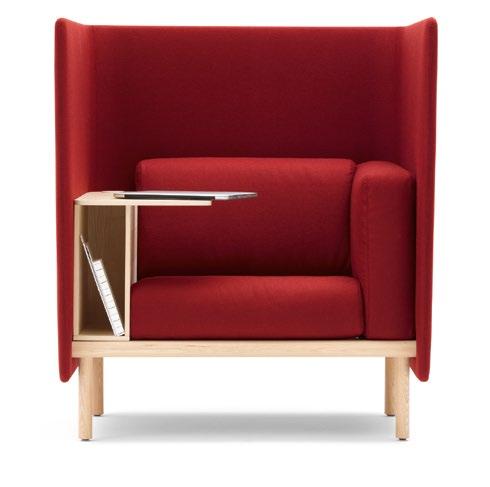
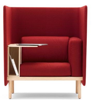
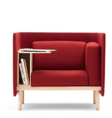
More than just a sofa, Floater is a seating “tool” that grows with you – it can be configured from a 1-seater to a 3-seater, transforming the conventional workplace into a comfortable haven for cosy work. Whether you need a private space for a meeting or a moment of respite, Floater delivers. You can choose from luxurious ash or oak wood, as well as additional storage shelves with a dedicated power connection to keep you productive.
COR.DE
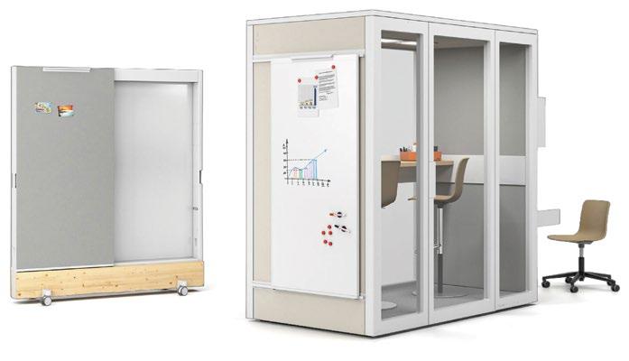
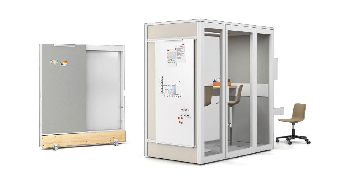
Talky is an all-rounder when it comes to creating versatile office landscapes. With its adaptable design, Talky can be transformed into a telephone booth, a private office, a mini-meeting room, or even a small workshop. Its flexibility is further enhanced by a selection of Vitra textiles for its inner and outer panels, while acoustic insulation ensures privacy. Available in sizes S75 and S109 for one to four people, Talky can be tailored to your specifications.
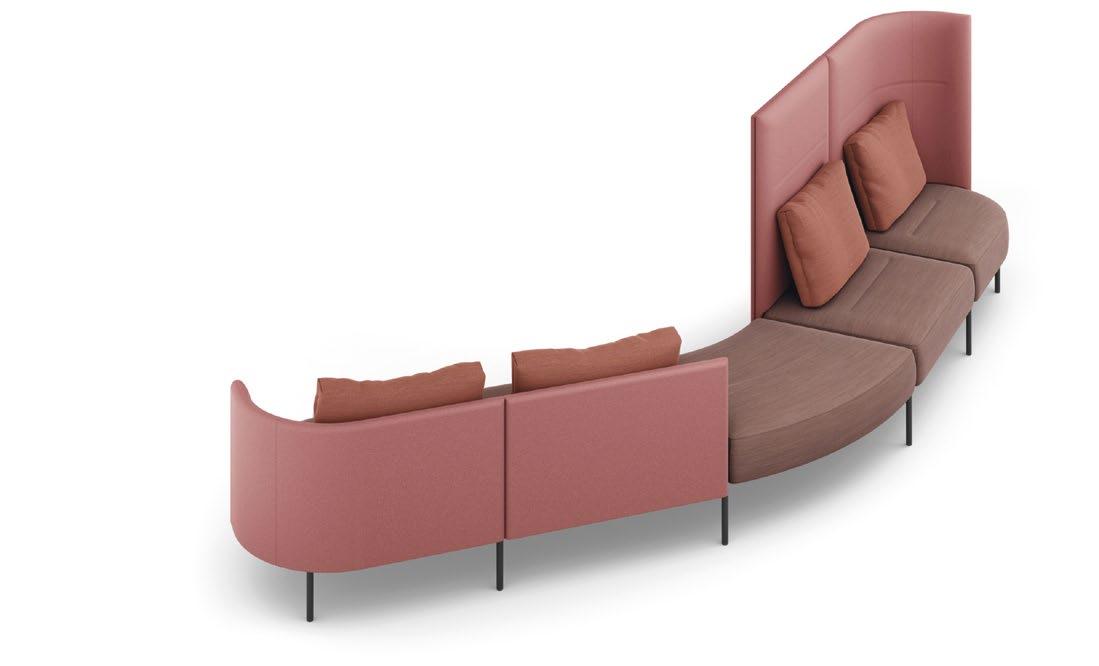
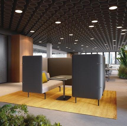
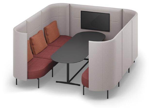
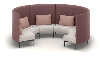
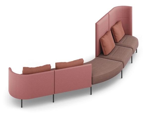
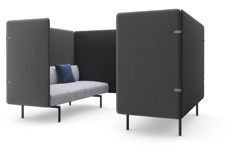
Muud Silent Sofa is the ultimate social hub, a spot where people can come together. A new sofa for communication zones, this stylish seating piece is part of the Muud family, featuring a scaled-down aesthetic to complement activitybased workspaces. The screens of the Muud Silent Sofa make it possible to create a space in a large room without compromising privacy. With its chic and cosy design, Muud Silent is a gamechanging piece for shared spaces.
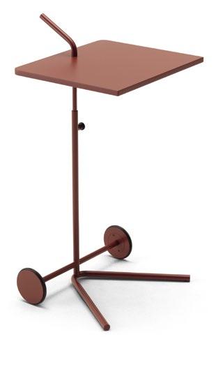
Bond joins everything – this exceptionally mobile, rollable and height-adjustable collection comprises laptop tables, trolleys, side tables, as well as a serving cart with a leather insert and various recesses for work utensils and a bottle plate. Designed by design duo Aust & Amelung, the designers aimed to create highly flexible furniture in which each part can be used as a tool. Available in various attractive shapes and sizes, Bond is the perfect addition to a flexible workspace. COR.DE
IT IS IMPORTANT TO CREATE SPACES THAT ARE WORTH THE COMMUTE, TO WELCOME AND ENTICE EMPLOYEES BACK TO THE OFFICE TO WORK IN-PERSON – IT’S ABOUT TAKING THE WORKPLACE TO A HOSPITALITY LEVEL.

Over the past few years, Covid-19 has driven change in many ways, impacting individuals and businesses globally. For most of us, we discovered that we have emerged stronger mentally and emotionally, with a newfound appreciation for technologies that were introduced to help transition towards our present form of normality. With over 27 years of experience in the design & build industry, future-proofing workplace designs through innovation is a trait DB&B has embedded into their DNA, by learning to embrace change and overcome obstacles that came with it. These challenges spurred the team to continuously innovate, evolve and pioneer a new generation of design solutions to meet the needs of the current workforce.
In recent years, we have witnessed the rise of destination workplaces with a focus on employee wellness – one that takes employees through immersive experiences and offers a variety of conveniences and amenities. This led to a multitude of design solutions where employees can be productive and equipped with new technologies or biophilic elements that drive overall wellness. It is important to create spaces that are worth the commute, to welcome and entice employees back to the office to work in-person – it’s about taking the workplace to a hospitality level.
With an increasing number of multi-national companies setting up their headquarters in Asia, it was important for them to preserve a consistent look throughout their offices, as part of their global brand identity. In recent years, companies have begun developing their own corporate real estate guidelines to govern and standardise these requirements for their offices around the world. For the most part, local offices would refine these guidelines further to suit their own operational needs and amplify their local culture, depending on geographical location.
For DB&B, they are always aiming to design a workplace that effectively balances between global consistencies while injecting local nuances. It is part of their design process to have a deep understanding of their clients’ corporate identity and local culture influences. With the appropriate knowledge of environmental branding and materiality, the team will then fuse these with the functional requirements to create a well-balanced workspace.
With ESG moving to the forefront of business agendas, the role of workplace design has become increasingly important to help companies achieve their ESG goals. It is an important benchmark for determining how responsible a business is, as well as other crucial decisions like whether it is worth investing in. Offices are designed to showcase the measures that companies are taking to achieve these goals – such as switching to LED light bulbs, installing an air filtration system, the use of sustainable materials, having recycling bins, incorporation of health and wellness amenities, setting aside recreational spaces, to name a few.
At DB&B, the team strongly believes in delivering beyond the brief, exploring and proposing base on the understanding of the clients’ needs. With a proven design and research methodology, the team engages client stakeholders constantly towards a quality delivery.
We design and build award-winning commercial interiors. With five offices across Asia, we support businesses to build, expand or relocate work spaces seamlessly.
DB&B SINGAPORE MARKED A MAJOR MILESTONE EARLIER THIS YEAR WITH A COMPLETE MAKEOVER OF THEIR OFFICE TO REFLECT THEIR EMPHASIS ON INNOVATION AND FUNCTIONALITY IN WORKPLACE DESIGN.

 DB&B SINGAPORE
6,000 SQUARE FEET | SINGAPORE | DESIGN & BUILD

Having delivered successful projects over the past 27 years, they are strong believers of innovation and functionality in workplace design. Being able to reflect these values in their creations is something they continuously aim for, and they are excited to see this coming to fruition in the design of their new headquarters in Singapore.


Spearheading their own design and build project, they engaged stakeholders from various teams to understand how they envision their workplace to be, and also identify the current gaps in amenities and facilities. At the core of it all, it was important that the new office is a representation of DB&B’s design philosophies and their latest solutions for workplaces.
They adopted an approach to facilitate their move towards an agile workspace and encourage activity-based work and collaboration. With most employees working remotely over the past two years, it was also important that the final design invites and motivates employees to return to the office to collaborate in-person. Another goal as well, was to enable the office to function as a showroom for client demonstration and mock-ups.
Entering the DB&B office, one is greeted by a customised reception counter branded with DB&B’s logo. Fully fabricated in-house, this masterpiece makes a statement as guests arrive. With frequent visits from clients and vendors, this counter also offers a discussion space at the side so quick chats can happen. To add in greenery to the space, a full height light box with plants was installed as a backdrop to create the illusion of greater depth and greenery.
Located on both sides of the reception counter, enclosed meeting spaces are available for various group sizes. The boardroom features acoustic boards to add contours to the wall, and a large quartz table. Smart conferencing technology paired with a built-in cable management system embedded within the table allows the room to maintain a tidy appearance. For formal or remote discussions in a smaller group, two private rooms are available.

To manage various work styles, the 6,000 square feet office is divided into five main types of workspaces - agile, semi-private, collaborative, fixed seating and focus spaces. This mix of spaces allows employees to explore and enjoy working at different parts of the office throughout the day.
For their Business Development team, DB&B created a semi-private space, segregated from the rest of the office by sliding panels. Made from acoustic panels, this installation provides partial privacy for discussions within the team when necessary. A bespoke communal table that hosts the team sits in front of a vibrant acoustic wall, livening up the atmosphere within the space.
The agile work area, also known as the hot-desking space, is located at the other side of the sliding panel. This space is set aside for teams who return to the office periodically between their visits to worksites and comprises of two elegantly sculpted suar wood tables and focus desks. Both tables are fitted with power tracks for effective cable management.
To encourage employees to enjoy natural light and the views outside, bar tables are placed along the windows. For focus work and private calls, pods and phone booths are available.

AT THE CORE OF IT ALL, IT WAS IMPORTANT THAT THE NEW OFFICE IS A REPRESENTATION OF DB&B’S DESIGN PHILOSOPHIES AND THEIR LATEST SOLUTIONS FOR WORKPLACES.


With potential clients visiting their office often, DB&B marked out various areas in the office that can be used to showcase their design solutions and their craftsmanship. In addition, by working closely with their partners in the industry, an array of technology and products are displayed to help clients envision the solutions DB&B can provide.
As the name suggests, The Core is located at the middle of the office. With the frequent need for cross-department collaborations, this central area offers two collaborative spaces. For discussions that require screen sharing, a smart screen is installed beside a four seater table. At the other side, lounge seats and white boards are available for a casual brainstorming session.
To drive creativity, a well-stocked material library is easily accessible along the main corridor of the office. This space serves as a sensory and exploration lab to enhance the design conceptualisation process. Full height cabinets with pigeon holes and drawers allow various samples and project materials to be stored in an organised manner.

Over the past years, DB&B has gained immense experience in adopting and applying safety and well-being measures across their projects. For their own office, it was their priority to uphold the same standards to encourage a balanced and healthy work environment. With majority of their creative division and multimedia team working with heavy hardware, desks were assigned to individual employees in these teams.
To optimise space, their design team developed a creative way to position their workstations while avoiding direct facing of any two individuals which is aimed primarily to be pandemic-resilient. Workstations were made up of height adjustable tables to promote ergonomics by allowing employees to change their positions throughout the day.
Understanding the nature of work of their finance and human resource teams, coupled with the need for storage of confidential documents, both departments are nestled at discreet locations of the office. The finance team occupies the corner of the office, with their space demarcated by planter boxes that double up as storage space. A generous full height cabinet installed against the neighbouring wall offers ample space for document storage. The human resource team has a private room segregated by a double glazed door to help maintain privacy.
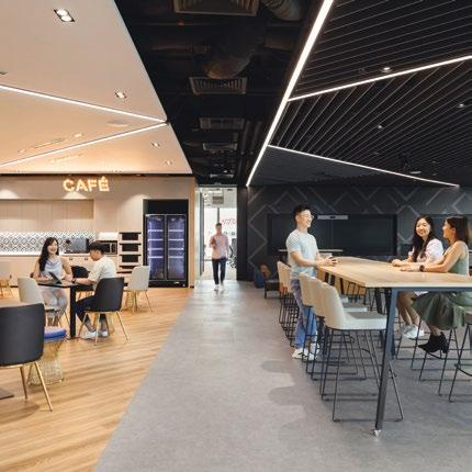
The space-efficient pantry offers employees a social hub during mealtimes or to grab a quick bite during breaks. Cushioned benches along with the brick walls add texture and colour to the space.


“We wanted to create a space that our employees would enjoy working in, feel inspired and motivated to work creatively. This is where we bounce ideas off each other, innovate and put together new solutions for our clients – and I am truly glad to see this project represent our beliefs and design philosophies in such an elegant manner,” says Jeanette Siew, Executive Director of DB&B.
“ THIS IS WHERE WE BOUNCE IDEAS OFF EACH OTHER, INNOVATE AND PUT TOGETHER NEW SOLUTIONS FOR OUR CLIENTS – AND I AM TRULY GLAD TO SEE THIS PROJECT REPRESENT OUR BELIEFS AND DESIGN PHILOSOPHIES IN SUCH AN ELEGANT MANNER. ”
 Jeanette Siew, Executive Director of DB&B

SPANNING ACROSS THREE LEVELS, SAP’S NEWLY REVAMPED SINGAPORE HEADQUARTERS PROMOTES AN EMPLOYEE-CENTRIC EXPERIENCE WITH A FOCUS ON SUSTAINABILITY, ENABLING IN-PERSON ACTIVITIES SUCH AS BRAINSTORMING, COLLABORATION AND SOCIAL INTERACTION.
 SAP
100,000 SQUARE FEET | SINGAPORE | DESIGN & BUILD

For German tech-giant SAP, DB&B aimed to create a space that facilitates their hybrid work model, with a key focus on sustainability and employee wellness. With the help of an independent workplace consultant, their team reassessed SAP’s office footprint and found that 88% of employees spent less than half of their working day at their desks.


Drawing insights on collaboration patterns and the needs of different departments, a diverse range of configurations was incorporated to suit different working styles. This agile design promotes engagement within the office. To bring the outdoors in, the new activity-based work areas are biophilic and nature-themed.
SAP is committed to protecting the environment and continuously improving its environmental performance. In response to this, and to align with the Singapore Green Plan for a sustainable future, the DB&B team sought to ensure at least 5% of the total space is dedicated to ecofriendly innovations such as energy-efficient LED bulbs and biophilia that minimizes indoor air pollutants for a healthier and greener work environment. Of the 100,000 square feet office space, 70% of the area adheres to green labelling protocols.
In efforts to maximize the lifespan of their existing furniture, pieces within their inventory and furnishings were selected to be creatively incorporated into the new layout. Creative refurbishment was also made to various furniture to improve durability, or to align with the design theme. Recycling bins are placed along the corridors or constructed within the pantry carpentry. Biophilic elements and sustainable materials were also used where possible.
SAP welcomes their guests at the third level of the office building. The reception desk is specially constructed to allow maximum visibility of the receptionist. Seated on a raised seat, it allows the receptionist to connect with visitors and employees at eye level, enhancing interaction and the welcoming experience.

Nestled at one end of the front office, contains a feature wall generously clad with greenery. Beside it, a mirror wall gives the illusion of an expanded space, and also reflects the daylight, making the space look brighter. Here, a myriad of seating options such as booth seats, meeting tables, sofas, lounge chairs and phone booths can be found to fit the nature of any discussion.

“ AS MORE COMPANIES MOVE TOWARDS A HYBRID WORKFORCE, IT IS IMPERATIVE FOR US TO PROVIDE USER-CENTRIC DESIGN SOLUTIONS THAT OFFER FLEXIBILITY AND AGILITY. ”
 Jeanette Siew, Executive Director of DB&B

On the other side of the reception counter is the waiting lounge, furnished with comfortable armchairs, sofas and plants hanging overhead. This area is connected to the Barista Café, which impresses with a robot barista fitted behind the bar counter – a great way to start conversations with guests. This café serves as an open space for discussions, dining, private functions and townhalls. The loose furniture curated allows this space to be used flexibly in various configurations.
At the back office, a range of huddle spots are scattered amongst the bench seats to encourage movement and cross-pollination between teams. High work benches, focus pods and 120 degree work stations are amongst the available options. To promote access to these amenities, pendant lights in varying shapes and colours hang over the spots to serve as wayfinding across the large floorplate.


To support their information technology (IT) needs internally, SAP’s new office includes a dedicated room for their IT department, along with service desks that allow the IT team to attend to technical matters from their co-workers. This new room was erected along with an onscreen ticketing system to help employees better gauge the waiting time, thereby using their time more efficiently.

In addition to the huddle spots injected amongst work benches, larger community spaces are carved out to motivate collaboration and interaction. Interspersed across the three floors, these settings collectively embodies the nature-themed design narratives set out for this office.


Guided by a future-driven vision and deep understanding of SAP’s needs, DB&B combined expertise in design and build to ensure a quality and sustainable result. “As more companies move towards a hybrid workforce, it is imperative for us to provide user-centric design solutions that offer flexibility and agility.” Says Jeanette Siew, Executive Director of DB&B.
GUIDED BY A FUTURE-DRIVEN VISION AND DEEP UNDERSTANDING OF SAP’S NEEDS, DB&B COMBINED EXPERTISE IN DESIGN AND BUILD TO ENSURE A QUALITY AND SUSTAINABLE RESULT.

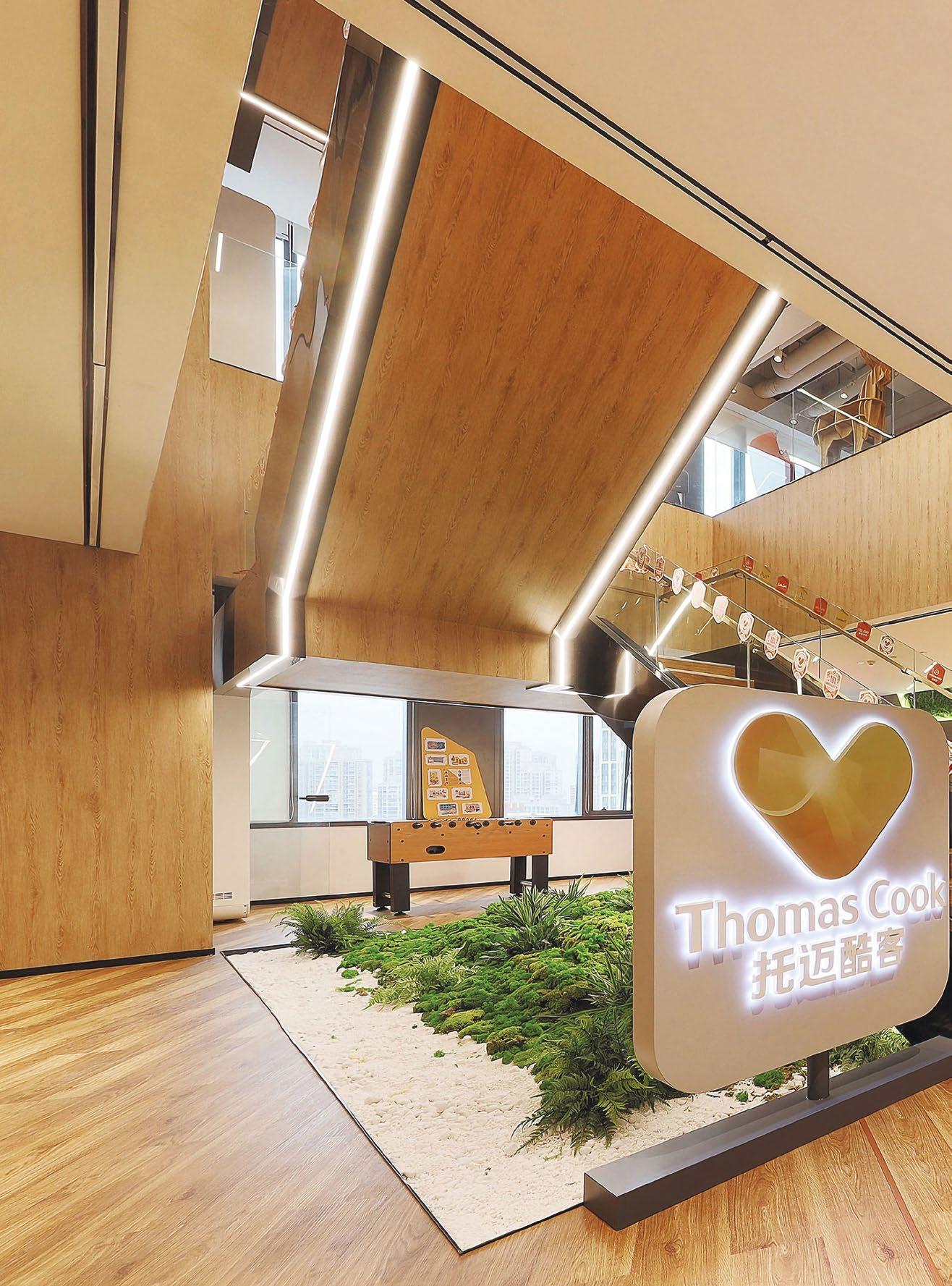
SEEKING TO CONSOLIDATE THEIR BUSINESSES IN SHANGHAI, GLOBAL LEADER IN THE FAMILY TRAVEL AND VACATION SECTOR, FOLIDAY’S NEW OFFICE HOUSES OVER 800 EMPLOYEES FROM THREE BRANDS WITHIN THE GROUP- CLUBMED, ALBION AND CASA COOK.


It was imperative to design a space which represents what Foliday stands for - to evoke the dynamic qualities of a ‘vacation destination’ instead of a mere office space. To bind the brands together, the colour palette of this threestory office reflects a mix of the corporate colours from all three entities, with hues of blues and oranges being the primary colours of the space.


To complement the primary colours chosen for the space, accent colours that mimic those of the four seasons (spring, summer, winter, autumn) are added, complementing the experiential journey of a vacation. The floorplates are also zoned after a beach resort theme, with a Port of Arrival, Deep Sea Venture, Coastal Waves, Beach and Land, and Mountain Peaks forming the various zones. The playful combination of colours inspired by these elements are reflected in the choice of carpets, wall colours and furniture accents where possible.
Wallspaces at breakout areas and collaboration hubs were cleverly used as a form of communication with employees and visitors, sharing fun facts about the various entities. Imagery used on the walls exude holidaying vibes, showcasing travel activities as well as the various properties Foliday owns globally.
To foster collaboration, scrums areas and huddles spaces were carved out near workstations for easy accessibility. These activity-based spaces are available in various configurations and group sizes so employees can move around the office at different times of the day. They also serve the dual purpose of a congregation spot for team lunches and smaller group parties.
For larger groups and townhalls, a social hub is available at the two lower floors, offering a variety of seating arrangements ranging from individual bar seats to large communal tables. This space is spruced up by overhead trellis designs, wall textures and placement of branding sculptures to represent the various brand identities. Wood and warm lighting is used to create a welcoming vibe and encourage casual interactions among employees.


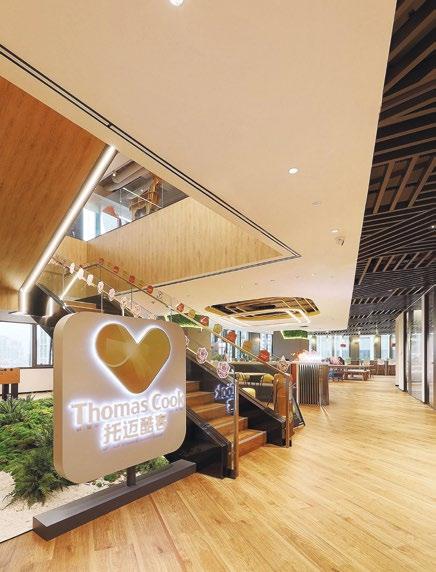
To increase accessibility between both social hubs and the main reception located at the top level, an internal staircase is erected to connect all three levels of the workplace. Located adjacent to the social hubs, this vertical connection creates opportunities for cross pollination across business entities.

IT WAS IMPERATIVE TO DESIGN A SPACE WHICH REPRESENTS WHAT FOLIDAY STANDS FOR - TO EVOKE THE DYNAMIC QUALITIES OF A ‘VACATION DESTINATION’ INSTEAD OF A MERE OFFICE SPACE.

TO FOSTER COLLABORATION, SCRUM AREAS AND HUDDLES SPACES WERE CARVED OUT NEAR WORKSTATIONS FOR EASY ACCESSIBILITY. THESE ACTIVITY-BASED SPACES ARE AVAILABLE IN VARIOUS CONFIGURATIONS AND GROUP SIZES SO EMPLOYEES CAN MOVE AROUND THE OFFICE AT DIFFERENT TIMES OF THE DAY.

Biophilic elements are injected throughout the office space to bring comfort to the eyes, dialling up on employee wellness. Hot and cold beverages, and a foosball table are readily available at the pantries for a quick respite from work. To resonate with the company’s values of wellbeing and inclusivity, mothers’ rooms are also built for breastfeeding mothers who need a private and comfortable space to provide for their child.

Collectively, the space planning, design elements, choice of furniture, lighting and materials are thoughtfully put together with employees in mind, to inspire, entertain and drive productivity.

MULTINATIONAL TECHNOLOGY COMPANY AMAZON SCALES UP THEIR PRESENCE IN SINGAPORE THROUGH A NEW OFFICE SPANNING THREE FLOORS AT ASIA SQUARE, HOUSING UP TO 700 EMPLOYEES FROM AMAZON’S CONSUMER BUSINESS AND CORPORATE FUNCTIONS.


Awarded LEED Gold in 2021, Amazon’s new Singapore office is a workplace that amplifies the company’s identity and motivates employees to do their best work. Designed to reflect their DAY 1 culture and Leadership Principles, this three-storey office features vibrant wall graphics and installations that engage both employees and visitors. To top that off, the open workspace offers an array of collaborative amenities and services to support various working styles.

The multi-level office features a unique design concept that draws significant inspiration from Amazon’s corporate culture as well as local Singaporean elements to help distinguish it from other Amazon offices. The internal corridors feature environmental graphics that highlight the organisation’s Leadership Principles and trace its evolution, underscoring its commitment to being the world’s most customer-centric company, a top employer, and a safe workplace to work.

Collaboration hubs and touchdown spaces are scattered throughout the floorplate to empower employees to choose where they want to work depending on tasks on hand. Interspersed within their three-level office are fifty break-out areas and five big meeting rooms as well as open space discussion areas for casual discussions or brainstorming sessions. To allow employees to secure a suitable workspace for their day, a smart meeting room booking system is incorporated.
To facilitate a hybrid workforce, all meeting rooms and training rooms are AV/VC capable and are equipped with video-conferencing capabilities to allow seamless connection with colleagues remotely.


Designed to be a multi-purpose space, two large training rooms are separated by an operable wall to allow extra space for larger groups and townhalls, accommodating up to 200 people in a townhall-style arrangement. These two rooms are also cleverly connected through their wall design, which features the iconic Singapore skyline surrounding the office building. For events and parties which require pantry access, another operable wall can connect the rooms to a fully equipped pantry dubbed as ‘The Social Hub’.

THE VIBRANCY OF THIS SOCIAL HUB IS RADIATED THROUGH ITS DESIGN ELEMENTS. ‘INVENT AND SIMPLIFY’, BEING ONE OF AMAZON’S LEADERSHIP PRINCIPLES, IS DISPLAYED IN NEON LIGHTS ON A SUSPENDED MESH STRUCTURE THAT HOUSES THE INDUSTRIAL LIGHTING FOR THE BAR TOP.


To create a main space where employees can host their guests for a quick discussion, or for co-workers to socialise and wind down after their daily grind, the design team inserted a social hub that offers panoramic views of the Singapore skyline. Seating is also designed to fit various group sizes – ranging from individual bar seats to large communal tables.

The vibrancy of this social hub is radiated through its design elements. ‘Invent and simplify’, being one of Amazon’s leadership principles, is displayed in neon lights on a suspended mesh structure that houses the industrial lighting for the bar top. Nestled at the corner of the hub is a product display area, where guests can learn of Amazon’s wide offerings of products and solutions.
The product showcase zone is designed to reflect Amazon’s various offerings in the business. This is achieved through branded lightboxes mounted at the side of the walls. Inspired by Amazon’s brown delivery boxes, seats, pedestals and shelves in this area are made up of wooden crates. The big screen enables users to have the full ‘Kindle’ experience when conducting product tests and presentations.

With multiple stakeholders present in the same office, recreational spaces were carved out to foster interaction and synergy. Making good use of their ample wall space, activities such as scrabble, chess, snake and ladder and spin the wheel are mounted on the walls along corridors near pantry spaces and collaboration hubs. Foosball and billiard tables are also available for employees to enjoy an occasional match.

Guided by LEED design principles, DB&B’s design team supported Amazon Singapore in achieving LEED Gold status. Adopting environmentally-friendly materials for the design was one of the key goals. This can be observed in the selection of carpets made from sustainable material and the use of low VOC paint for the walls. To promote active recycling amongst employees, recycling bins are made accessible at every utility point and pantries. Lights and air-conditioning systems are also controlled in zones to save energy. Prioritising employee wellbeing, indoor air quality is constantly monitored through smart technology while potted plants and planter boxes also incorporated to add to their visual comfort.

INTERSPERSED WITHIN THEIR THREE-LEVEL OFFICE ARE FIFTY BREAK-OUT AREAS AND FIVE BIG MEETING ROOMS AS WELL AS OPEN SPACE DISCUSSION AREAS FOR CASUAL DISCUSSIONS OR BRAINSTORMING SESSIONS.


BEING ONE OF THE PIONEERS IN THE DIGITAL BANKING INDUSTRY, GOTYME BANK AIMED TO REFLECT THEIR PASSION AND VIBRANCY IN THEIR NEW OFFICE SPACE, RIGHT OF THE BAT.

 GOTYME BANK
10,200 SQUARE FEET | PHILIPPINES | DESIGN & BUILD

After a full year of hosting their employees at a co-working space, Philippine digital bank, GoTyme Bank, recently took over the floorplate at Ortigas Center to build a place of their own, The DB&B team worked closely with their team to identify the key priorities for their business, such as user experience and to exude a professional and reliable brand image. With this understanding, the design of their office sought to express the same goals.

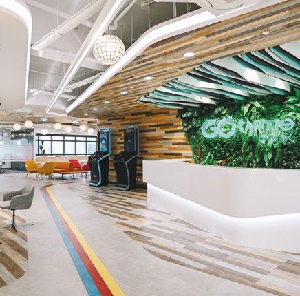
This welcoming zone is dressed with a luscious moss wall backdrop, hosting the company’s logo. The backdrop is set against a timber surface pieced together with slats of different colours, and this design extends to the ceiling, and is paired with matching vinyl flooring, creating textures and injecting vibrancy into the space. The clean white wall at the side with geometric cut-outs also serve as lighting for the space, offering a futuristic experience to guests and employees that step in.

Designed to be a customer-centric arrival zone, two kiosks are placed next to the reception counter so guests can create a GoTyme Bank account in less than 5 minutes and have their FREE debit cards printed. A lounge space is also carved out opposite the kiosks to allow customers and guests to wait in comfort while appreciating the sophisticated design within this space.

Studying the work styles of their various departments, the layout of the space was planned to support their business models and dial up productivity. For GoTyme Bank’s sales team, it was important for them to be located near the entrance in order to attend to customers promptly. Understanding that an agile work model works best for them, DB&B created an open collaboration hub with a multitude of work settings for the GoTyme Bank team to move around during the workday.
To facilitate company events periodically, this open collaboration hub can be transformed into an open space for parties and townhalls. This is made possible with the use of movable furniture that can be stowed away or reconfigured easily based on the occasion. Amenities such as a fully equipped pantry is also thoughtfully carved out next to this hub.

 TOP: A rainbow track reflecting their corporate colours extends from the front office to the back, strengthening their brand identity along the way.
IT WAS IMPERATIVE THAT EMPLOYEES FEEL ENGAGED AND CONNECTED TO THIS NEW WORKPLACE THAT TRULY BELONGS TO THEM. TO FULFILL THIS, A KEY DESIGN ELEMENT INCORPORATED INTO THE SPACE WAS A ‘RAINBOW TRACK’ THAT LEADS THE WAY FROM THE FRONT OFFICE TO THE BACK.


Similarly, for the finance team who requires a higher level of privacy, a space is allocated at the back office, with acoustic panels separating each desk to protect privacy.
Apart from the open discussion areas, private meeting rooms and semi-private huddle spots are also found around the office to support different modes of discussions. Lining the perimeter of the office, these spaces enjoy unblocked views and natural light from their full height windows, stimulating the mind for brainstorming and sharing sessions.
It was imperative that employees feel engaged and connected to this new workplace that truly belongs to them. To fulfil this, a key design element incorporated into the space was a ‘rainbow track’ that leads the way from the front office to the back. This track is made up of GoTyme Bank’s corporate colours – building the sense of identity employees would experience as they journey deeper into the office.
Similarly, pops of colours can be observed through the selection of furniture pieces, acoustic panels, carpets and wall colours throughout the office. Acting as a means of wayfinding, the carpet colours also signify the designated workspaces of GoTyme Bank’s different departments.


To introduce biophilia into the office, nature-inspired materials such as wood panelling and rattan furniture, lights and space dividers were used in various parts of the office. Besides the impressive vertical greenery at the entrance, planter boxes are also installed across the floorplate to double up as ‘soft’ demarcation within the office. At the open collaboration hub, a ‘mini tree’ is also planted as a centrepiece to the space, sending alfresco vibes to its surroundings. Collectively, these biophilic elements create an oasis of comfort within the office space.


In this new generation of the workforce, it is increasingly important for employees to be able to connect with their workplace and be motivated to head back to the office to collaborate in person. GoTyme Bank recognised this trend, and worked together with DB&B to design and build an office that reflects their brand story and journey they have taken as a young company. This user-centric space also speaks of their company values and how they prioritise employee wellness to eventually drive productivity at the workplace.
BOTTOM: Private meeting rooms are adorned with acoustic panels of various colours and equipped with a smart screen to facilitate meetings with remote colleagues.IN THIS NEW GENERATION OF THE WORKFORCE, IT IS INCREASINGLY IMPORTANT FOR EMPLOYEES TO BE ABLE TO CONNECT WITH THEIR WORKPLACE AND BE MOTIVATED TO HEAD BACK TO THE OFFICE TO COLLABORATE IN PERSON.

INSPIRED BY THE SYMMETRICAL DESIGN OF THEIR LOGO, DB&B EXPRESSES A SIMILAR CONCEPT THROUGH LINES OF SYMMETRY AND SYMBOLISM. THIS IS ACCOMPANIED BY AN AESTHETIC THEME CONCOCTED FROM THE COMBINATION OF THE ELEMENTS OF NATURE AND THE NUANCES OF JAPANESE CULTURE.

 JERA
22,800 SQUARE FEET | SINGAPORE | DESIGN & BUILD

Situated at level 42 of Capitaspring, Japan’s cuttingedge energy solutions company, JERA’s new space was designed to invoke a sense of calmness and belonging while reflecting the company’s brand values and culture. The result is a ‘Zen Garden’ themed office that facilitates the operational needs of the entity.
To leverage on the panoramic views surrounding the Capitaspring, the floorplate was planned to face Singapore’s iconic landmarks such as the Marina Bay Sands at the front office.
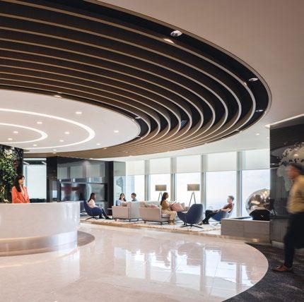
Upon stepping into the office, visitors and employees are greeted by an impressive piece of architecture fitted overhead. This series of concentric circles is inspired by a water ripple, expanding outwards, to signify a greater reach in their business and sustainability efforts. The outline of the ceiling feature is also reflected in the choice of flooring for the space, delicately marking out the concierge area. To complete the look, a circular concierge clad in solid surface is erected against a generous moss wall to resemble a steady rock perched against the greenery.

The waiting area carved out beside the concierge is paired with a water feature at the side. The sound of flowing water paired with the plants along the full height windows add to the overall zen vibes of the space.

As employees and visitors journey past the arrival zone, they would come across a series of meeting rooms for guests. All rooms are fully equipped with video conferencing facilities to connect with various parties joining the discussions remotely. For a touch of biophilia, this space features a moss framed wall that hosts the display screen. The remaining walls of the rooms are lined with fluted acoustic panels to add elegance and texture to the space.

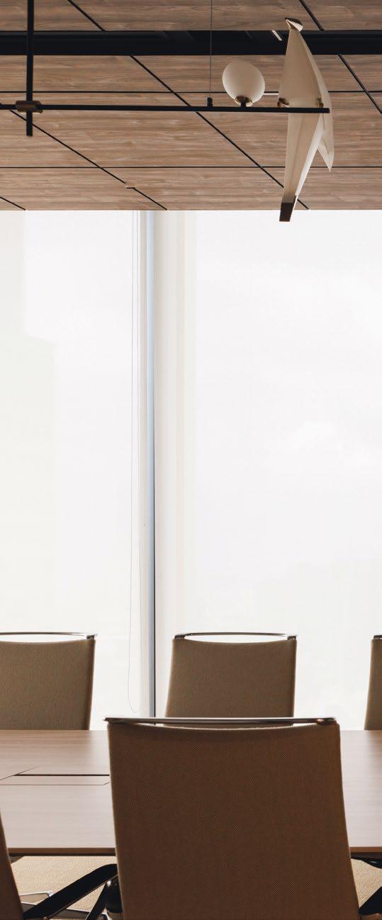
Situated at the end of the corridor, the last of these meeting rooms takes on a different design altogether – a VIP meeting room. Influenced by Japanese elements, the floor of the room is laid with tatami mats while the feature wall is clad with a patterned structure derived from Asanoha – Japanese for hemp leaves, a plant that has strong vitality and grows fast, reflecting the company’s vigour for growth. Here, plants are lined along the windows on one side of the room while a pendant light overhead holds two bird-like sculptures to complete the look of nature.
The series of meeting rooms also leads to a social hub accessible by employees and guests. Set to be for multi-purposes, this space is divided into two sections, separated by the use of double-glazed operable walls, which allow them to be used individually, or combined to form a bigger space. While the first section houses a bar counter, the second half features two projector screens along with more seating. These facilities allow the space to be used in many ways – for training, social events, product presentations and townhalls. The curation of loose furniture for the social hub also adds to the flexibility of this space.
INFLUENCED BY JAPANESE ELEMENTS, THE FLOOR OF THE ROOM IS LAID WITH TATAMI MATS WHILE THE FEATURE WALL IS CLAD WITH A PATTERNED STRUCTURE DERIVED FROM ASANOHA – JAPANESE FOR HEMP LEAVES, A PLANT THAT HAS STRONG VITALITY AND GROWS FAST, REFLECTING THE COMPANY’S VIGOUR FOR GROWTH.

“
BEING ABLE TO CREATE SPACES THAT INSPIRE PEOPLE FUELS OUR PASSION TO CONTINUOUSLY DESIGN WITH A DEEP UNDERSTANDING AND APPRECIATION FOR THEIR VALUES AND CULTURE. ”
 Jeanette Siew, Executive Director of DB&B
Here, the ceiling features a cove lighting whose design takes reference from JERA’s brand guide – a trapezium-shaped frame designed to house key branding elements. The crossing of lines within the box echoes the purpose of this social space, where conversations take place, paths cross and ideas collide.
Reflecting the same outline on the floor, wooden vinyl planks are laid in different directions to replicate the outline. They comprise of two different shades of brown, mimicking confetti used during celebrations to send out a joyful vibe within the space.
At the back office, workspaces are configured in a mix of 120 degree workstations, work benches and booth seats. This dynamic layout is coupled with pops of JERA’s corporate colours, introduced through acoustic panels and coloured phone booths of various sizes, creating a vibrant and inviting workspace.


To strike a balance between accessibility and noise control, discussion booths are located near workstations to encourage collaboration while acoustic panels are strategically placed between the settings to provide privacy. The acoustic panels are designed with an intricate cutout hexagonal pattern – Kikkou, which signifies intellect and longevity to actively demonstrate the company’s well wishes for their employees.

For further privacy, enclosed meeting rooms flank one side of the office floor. These rooms offer writable surfaces, video conferencing equipment and unblocked views of the marina, making them the choice setting for brainstorming sessions and small team huddles.
Taking into consideration employee wellness, instead of opaque walls, double-glazed partitions are used to separate the rooms from the office floor, allowing natural light to pass through while maintaining acoustic privacy. Plants lining the full height windows on the other sides of the perimeter also serve to inject biophilia and extend the theme of a ‘Zen Garden’ into the back office.

THE DESIGN OF THE SPACE ENCAPSULATES JERA’S BRAND VALUES AND CULTURE RIGHT DOWN TO THE DETAILS, THEREBY CREATING A SENSE OF CALMNESS AND BELONGING.


With direct access to a private executive lounge to host VIP guests, the CEO’s room is designed to facilitate his business needs. This room features ample storage and display shelves, including a coat cabinet for alternative work wear when the occasion calls for it. Acoustic panels are used to add texture to the walls and writable surfaces serve to support dynamic discussions. The large screen at the opposite end of the room provides him with the flexibility to take conference calls from his seat, or at the meeting table.
To celebrate the company’s Japanese roots, the office is peppered with various patterns from the culture. One space which best demonstrates is the employees’ lounge. The fan-shaped pattern ‘Seigaiha’, representing peace and good luck, is consistently used on the backsplash of the carpentry and the fabrics for the booth seats.
On a larger scale, the curvature of this pattern is also applied onto the design of the space itself, shaping the carpentry into a rounded end. Serving as a pit-stop during working hours, this vibrant space allows employees to rest and rejuvenate.
Drawing further reference from Japanese design trends, wooden slats are used to segregate the LNG business division from the bigger office space for their operational needs. They are installed at an angle for a unique appearance, and paired with clear glass panels to keep acoustics within the segregated space. This partition allows light to flow through, giving the illusion of a connected space, while respecting the privacy required.
The design of the space encapsulates JERA’s brand values and culture right down to the details, thereby creating a sense of calmness and belonging. This speaks volumes about the role that workplace design will play in future business planning and the importance of empathy in design thinking. “JERA’s new office has been one of our most fulfilling projects to date. Being able to create spaces that inspire people fuels our passion to continuously design with a deep understanding and appreciation for their values and culture,” shares Jeanette Siew, Executive Director of DB&B.
BOTTOM: To encourage collaboration, various settings can be found near workstations at the back office.

BEING ONE OF THE LEADING SEMICONDUCTOR AND VIRTUAL IDM COMPANIES, BP SEMICONDUCTOR’S NEW WELL-CERTIFIED WORKPLACE DRIVES INNOVATION AND INSPIRES THEIR EMPLOYEES TO CONTINUALLY EXPLORE THE POSSIBILITIES TECHNOLOGY CAN BRING.

 BP SEMICONDUCTORS
55,000 SQUARE FEET | SHANGHAI, CHINA | DESIGN & BUILD

Taking into consideration their goals and understanding how they work, DB&B’s Shanghai team incorporated smart technology to design a revolutionary experience for employees and visitors as they journey through the office space. Guided by the principles of WELL Design, this new office also embodies BP Semiconductor’s ongoing commitment to sustainability and employee wellness and has been certified WELL Design Gold in 2022.
Aligned with the concept of a modern and futuristic space, the colours used in this office takes on a monochromatic spectrum, with light tones of wood and pops of accent colours. At the front office, a generous space is carved out to welcome guests and employees, and to host the connecting staircase between the first two levels of the office.


To facilitate product demonstrations and corporate introductions, a large interactive screen with touchless motion sensors is also mounted onto the adjacent wall, offering an immersive and seamless presentation experience. The raised platform at the base of the stairs is thoughtfully elevated to serve as additional seating for guests.
Meeting rooms are designed with the highest standards of conferencing capabilities. Each room is equipped with an interactive screen which doubles up as a digital whiteboard for brainstorming sessions. Microphones and speakers are concealed within the ceilings to improve overall the acoustic experience. To enable employees to plan their schedules efficiently, room availabilities are reflected in a smart booking system.


GUIDED BY THE PRINCIPLES OF WELL DESIGN, THIS NEW OFFICE ALSO EMBODIES BP SEMICONDUCTOR’S ONGOING COMMITMENT TO SUSTAINABILITY AND EMPLOYEE WELLNESS AND HAS BEEN CERTIFIED WELL DESIGN GOLD.


Focusing on employee wellness, an exercise space was carved out to encourage an active lifestyle during breaks or after working hours. Teapoints are also located every 25metres to increase accessibility to water. Air quality is checked frequently through an advanced air ventilation system to ensure clean airflow and ambient temperatures throughout the office. Additional desktop lighting is also provided to all employees to enhance visual comfort while working.


LOCATED AT RAFFLES CITY TOWER, THIS LEADING SECURITY COMPANY’S NEW SINGAPORE OFFICE IS DESIGNED TO FACILITATE THEIR TECHNICAL OPERATIONS EFFICIENTLY AND DISPLAY A STRONG BRAND IDENTITY AND GLOBAL PRESENCE.


For the past 23 years, they have established presence in 16 countries worldwide with multiple regional offices. Inspired by the range of technological solutions they provide, DB&B’s design for the front office exudes a futuristic vibe with the use of coloured florescent lights embedded within the walls. To highlight this concept, hexagonal shapes and sleek light strips are applied throughout the space.

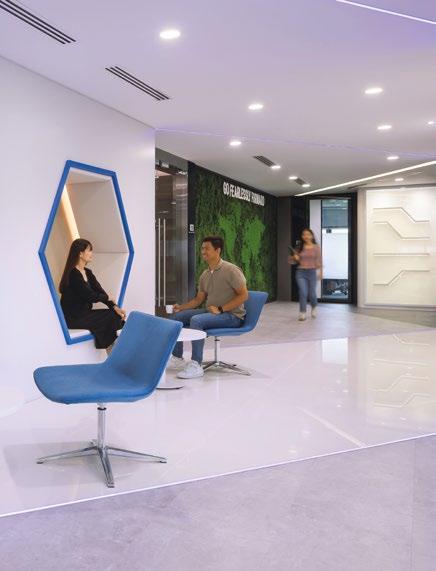
Leveraging on the layout of the main entrance, the design of the arrival space is kept minimalist and lined with florescent light to mimic a hi-tech portal. The waiting area for guests is fitted with alcove seats in the shape of a hexagon and accompanied with comfortable lounge chairs in matching colours.

Connected to the waiting area, a lounge is created to serve as the social centre of the office. This space can be used to host guests, or for employees to congregate for meals and open discussions. To facilitate periodic lunch and learn sessions, loose furniture curated here allows for flexible reconfiguration. Next to the lounge is the boardroom designed for meetings that require a formal and private setting.
For semiprivate discussions, separate booths are carved out along a corridor. The booth seats are framed with silhouettes of landmarks from Singapore, Boston and Israel, a strong reference to where their headquarters are located, reflecting their global presence.


The company also prioritises the internal security protocols set for their employees. To support the functions of their IT Team efficiently, the back office is thoughtfully laid out with a hub to provide IT support to the employees.

THE COMPANY ALSO PRIORITISES THE INTERNAL SECURITY PROTOCOLS SET FOR THEIR EMPLOYEES. TO SUPPORT THE FUNCTIONS OF THEIR IT TEAM EFFICIENTLY, THE BACK OFFICE IS THOUGHTFULLY LAID OUT WITH A HUB TO PROVIDE IT SUPPORT TO THE EMPLOYEES.


This space is paired with a dry pantry and bar seats so employees have a waiting space while their equipment is being looked into.
Workstations are also configured differently to meet the needs of various departments. Desks for the IT department are specially selected to match with confidentiality requirements, while other teams allow for more transparency, without panels. To encourage movement throughout the day, height adjustable 120-degree workstations are also available.

For private discussions at the back office, phone rooms, meeting spaces and private offices are lined along the inner perimeter of the space. To inject textures into the meeting spaces, the rooms are cladded with backlit acoustic panels.


Overall, this 10,700 square feet space is designed to honour the brand identity and needs of their employees. The mix of open collaboration spaces and private rooms, along with customised amenities work well together to create a well-balanced space for their Singapore team.
GLOBAL DESIGN AND ENGINEERING COMPANY, ARCADIS’ NEW AGILE WORKPLACE SHOWCASES THEIR GLOBAL IDENTITY, AUGMENTED WITH LOCAL NUANCES OF THE PHILIPPINES CULTURE, REFLECTED IN THE CHOICE OF MATERIALS AND ENVIRONMENTAL GRAPHICS.


For this project, DB&B’s design team worked closely with key stakeholders – Arcadis’ design consultants, workplace directors, and representatives from their management and facilities team to ensure all user requirements are met.

To deepen their understanding, DB&B’s design team attended an Arcadis workplace assessment to derive the right headcount and other test fit requirements based on their study. The final layout was a new workspace featuring huddle spots and hot-desking stations along with suitable digital solutions for that would facilitate their shift towards agility.

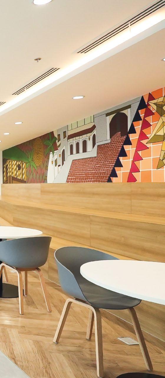
In terms of the overall design and colour palette of the space, DB&B’s design team sought to infuse the local culture by injecting nuances of Filipino patterns and materials within the design – all while keeping in mind the functional goals across their global offices.
Stepping into the Arcadis office, employees would be greeted with a variety of work settings at the reception space. These settings double-up as a waiting area for guests, as well as an open space for discussions and work. These activity-based work settings extend throughout the floorplate to suit different work styles. Huddle spaces, both private and semi-private are available for group work. Solo quiet booths are also carved out for focus work. Meeting rooms are equipped with conferencing systems to connect with employees working remotely. Collaboration spots lined along the perimeter of the floorplate enjoy unblocked views of the surroundings and allows employees to bask in natural light flowing in from the full height windows.


DB&B’S DESIGN TEAM SOUGHT TO INFUSE THEIR LOCAL CULTURE BY INJECTING NUANCES OF FILIPINO PATTERNS AND MATERIALS WITHIN THE DESIGN – ALL WHILE KEEPING IN MIND THE FUNCTIONAL GOALS ACROSS THEIR GLOBAL OFFICES.

SITUATED IN A LEED PLATINUM LEVEL CERTIFIED BUILDING, THE OFFICE DESIGN IS ALIGNED WITH GREEN INITIATIVES AND COMPLIES WITH STRINGENT GUIDELINES. FURTHERMORE, ARCADIS INHERENTLY VALUES SUSTAINABILITY, SO THIS COMMON GOAL IS ONE OF THE KEY GUIDING PRINCIPLES IN THEIR DESIGN.

By encouraging all employees to collaborate and work on the ‘cloud’, Arcadis is able to achieve a paperless workplace which helps to keep the place tidy. In addition, with the use of meeting room and desk booking systems, this smart office allows employees to reserve their preferred work settings during different times of the day for different purposes. All meeting rooms are also fully equipped with scheduling panels to help keep employees keep track of space occupancy conveniently.
With employee wellbeing in mind, biophilic elements are injected throughout the office space in the form of potted plants, overhanging plants and natural stones. These elements collectively help to spruce up the space, bringing the outdoors in. Wellness rooms and a mother’s room are also created for nursing mothers.


Learning from the recent pandemic, DB&B paid special attention to Arcadis’ request for a space to care for unwell employees. An in-house clinic and doctor’s room are placed with an isolation room next to it so unwell employees can be isolated with proper amenities in place.
Situated in a LEED Platinum Level certified building, the office design is aligned with green initiatives and complies with stringent guidelines. Furthermore, Arcadis inherently values sustainability, so this common goal is one of the key guiding principles in their design.

For instance, smart lighting is adopted within the office space and saves energy efficiently with the use of movement sensors. DB&B’s design team also made the conscious choice of materials that are environmentallyfriendly such as ‘Green’ certified carpets, vinyl flooring, wall tiles and acoustic panels. Recycle bins are also built into cabinets and easily accessible to help in waste segregation.

WITH EMPLOYEE WELLBEING IN MIND, BIOPHILIC ELEMENTS ARE INJECTED THROUGHOUT THE OFFICE SPACE IN THE FORM OF POTTED PLANTS, OVERHANGING PLANTS AND NATURAL STONES.

TO SUPPORT THE NATURE OF THEIR INDUSTRY, THIS LEADING FINANCIAL SERVICES FIRM SEEK TO EQUIP EMPLOYEES WITH A SPACE THAT PROMOTES MAXIMUM PRODUCTIVITY.
 70,785 SQUARE FEET | SINGAPORE | DESIGN & BUILD
LEADING FINANCIAL SERVICES FIRM

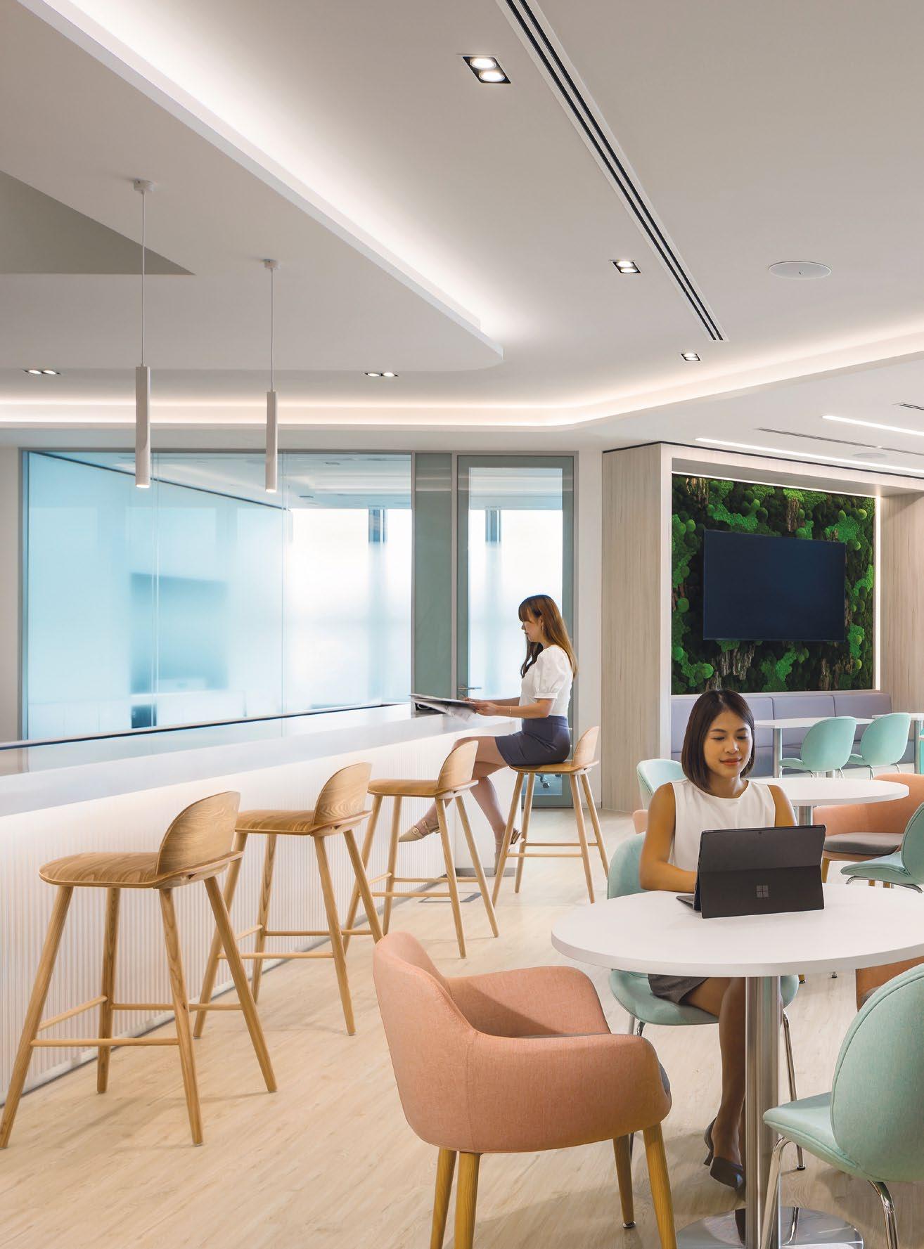
Inspired by the archetypes of their global offices and designed to emphasize their professionalism, the dual-storey office is treated with a clean, white palette with subtle pops of colours to bring focus to the things that matter. Textures are injected through the use of acoustic panels, or choice of furniture materials. This theme of astute professionalism is consistently reflected throughout the office.

To facilitate confidential discussions, the core of the floorplate is lined with enclosed meeting rooms labelled as ‘Team Rooms’. These multifunctional rooms can be easily converted to individual offices by shifting the loose furniture around, and repositioning the computer screens. To keep this space flexible, electrical wiring concealed within the acoustic panels and walls are designed to accommodate various configurations without the need to overhaul the space.
LEFT: The concierge at level 37 is treated in light natural neutral tones, and a mix of matte and reflective surfaces, providing a sense of focus and professionalism.

Workstations are customised to promote ergonomic work - with height adjustable tables that encourage movement throughout the day, along with large monitor screens to display their work efficiently. Between each desk, a dividing panel also helps to keep employees focused on their work.
Located at the upper level of the office, two multipurpose rooms are available for larger group activities. Both rooms are segregated by an operable wall which hosts a writable surface for brainstorm sessions and discussions. Moveable furniture and partitions allow the space to flex and adapt to accommodate town halls and company gatherings.
Apart from the rooms built for work related activities, to resonate with the company’s values of wellbeing and inclusivity, mothers’ rooms are also included on both floors of the office for breastfeeding mothers.

To maximise opportunities for ad-hoc interactions between employees, the office is also designed with two forms of connectivity in mind- horizontal and vertical. The horizontal connection that was incorporated into the layout was ‘The Link’, which connects the reception and workplace.
The Social Hub is where employees congregate during meal times, conversations happen and professional relationships are built. This well-equipped pantry is located on both floors and are thoughtfully designed with amenities to cater to the larger crowds.
This space offers a variety of seating options – bar counter seats, table seats, booth seats and also sofa seats. Employees who enjoy natural light would gravitate towards the window seats, while booth seats would be the choice for those who prefer a cozy nook.
TO MAXIMISE OPPORTUNITIES FOR AD-HOC INTERACTIONS BETWEEN EMPLOYEES, THE OFFICE IS ALSO DESIGNED WITH TWO FORMS OF CONNECTIVITY IN MIND- HORIZONTAL AND VERTICAL. THE HORIZONTAL CONNECTION THAT WAS INCORPORATED INTO THE LAYOUT WAS ‘THE LINK’, WHICH CONNECTS THE RECEPTION AND WORKPLACE.


Here, the vertical connection of the space can be observed through the connecting stairs at the Social Hub, allowing employees to move freely between both levels of the back office, having conversations along the way.

As they traverse across the floors at the connecting stairs, they are greeted by a generous bed of ferns that add vibrancy to the office space. The staircase is designed with glass panels to depict a connected illusion between the floors. It also allows natural light to pour into the space freely, creating a sense of openness.
The building – CapitaSpring, was awarded with the BCA Green Mark Platinum Award in 2018 for its extensive efforts in making for a greener society. With that in mind, the office was designed to reflect alignment and
advocacy of this cause. Throughout the dual level office, motion sensors are installed to detect unused zones in the office to switch off the lights automatically. Energy efficient lighting were carefully selected to meet the overall wattage limits allocated for the space. Recycling bins are found near the workstations to provide easy access and promote recycling.
With employee productivity in mind, the design of the space is centred around meeting the pragmatic requirements to ensure seamless day-to-day operations in their office. The final result is a space that speaks of their dedication to professionalism and work efficiency.
TOP: Huddle spots made up of sofa seats, lounge chairs and poufs are available on the upper level of the office, along with individual phone booths for focus work or a private call.
HOUSING UP TO 170 EMPLOYEES, THIS 24,000 SQUARE FEET OFFICE SPACE IS ADORNED WITH A RELAXING COLOUR PALETTE, EQUIPPED WITH AN OPEN SOCIAL HUB AREA TO UNWIND AND BUILD CONNECTIONS WHILE PROVIDING A MYRIAD OF SPACES FOR WORK.

 24,000 SQUARE FEET | SINGAPORE | DESIGN & BUILD
LEADING GLOBAL QUANTITATIVE ASSET MANAGEMENT FIRM

Seeking to create a warm and welcoming vibe for employees, this leading global quantitative asset management firm moved into their new workspace at level 36 of CapitaSpring along Market Street, Singapore.


To reflect the essence of their brand, the design concept for the space takes reference from their angular logo and corporate colours, and is expressed through the use of angular shapes and diagonal lines along with shades of orange, blue and purple hues in the palette. Materials such as wood and copper tone mirrors are incorporated to add warmth to the space.
The warm welcome begins with the uniquely shaped front desk. The ascending flight of stairs lends the perfect backdrop to frame the angular shaped concierge. To provide a prominent space for the sharing of corporate videos and announcements, a large display screen is embedded in the opposite wall to welcome guests and employees as they proceed through the entrance.
LEFT: Angular shapes and diagonal lines can be observed at the concierge. Overhead wooden trellis, copper mirrors and camel-tone lounge chairs add warmth to the space.
The main social hub welcomes employees with a fullyequipped pantry, along with a drinks chiller and abundant seating options. This area serves as the main space for meals, recreational activities and bonding sessions. Furnished with a pool table, foosball and table tennis table, employees can spend time unwinding after work, or simply step away for a mid-day break to have some fun with their co-workers.

Their back office houses numerous private meeting spaces with different configurations to suit different group sizes. These rooms are equipped with a smart room booking system, which allows employees to identify room availabilities at a glance and plan their work day accordingly.
Serving as a simple form of wayfinding, the various wings of their office are divided into three coloured zones – beige, purple and orange. These colours are vividly reflected on the pillars found near the workstations, and also on the acoustic panels used in the meeting rooms. To break the monotony, different shades of each colour are used in the selection of the acoustic panels, often giving off a gradient effect across the stretch of rooms.
 BOTTOM: Accent prints are applied onto bar counters and the backsplash of counters to inject a fun texture. Moss walls are wrapped around pillars to add a touch of biophilia to the space.

WITH MORE EMPLOYEES RETURNING TO THE OFFICE, IT IS IMPORTANT TO PLACE EMPHASIS ON A WORKPLACE WHERE EMPLOYEES FEEL WELCOME AND EQUIPPED WITH THE RIGHT SETTINGS AND FACILITIES TO PERFORM AT THEIR BEST.

Nestled at one side of their office is a library, where employees can visit for some quiet time in the focus pods, or to rest their eyes while enjoying the views of the Singapore River. Acoustic panels clad on the pillars and walls add to the overall aesthetics of the space while serving as noise control for small group discussions to take place simultaneously.

AN EMPLOYEE-CENTRIC WORKPLACE
With more employees returning to the office, they are focused on offering a workplace where employees will feel welcome and equipped with the right settings and facilities to do their best work.



DISCOVER THE RIGHT FIT & BALANCE WITH CAREFUL MATERIAL SELECTION
 Mono-V Desk & Sideboard by Walter Knoll
THE MONO-V DESK SYSTEM IS A MASTERPIECE OF ARCHITECTURAL PRECISION, WHERE INTRICATE ELEMENTS AND SENSUAL MATERIALS ENSURE EXCEPTIONAL PERFORMANCE IN THE WORKPLACE.

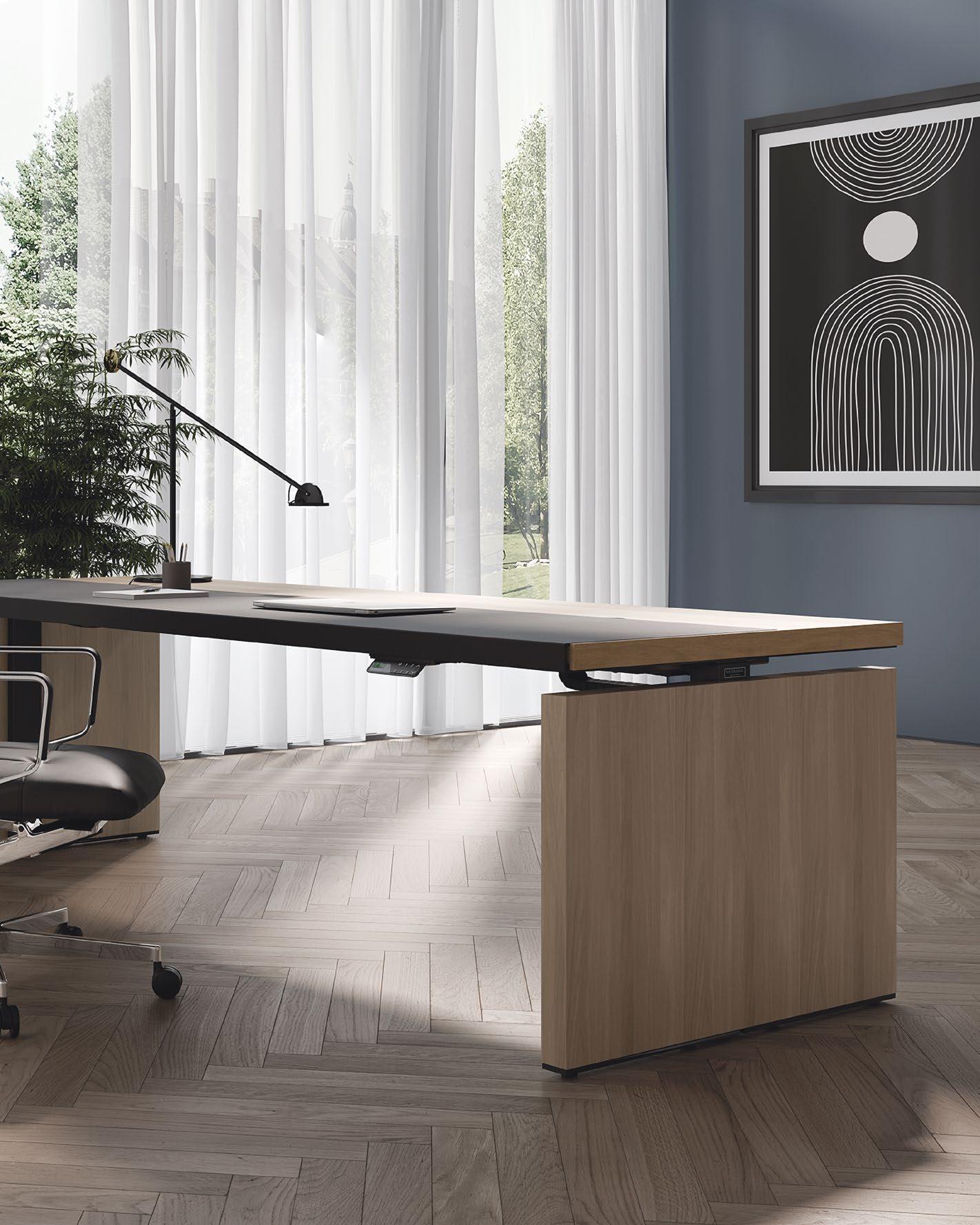
 THIS PHOTO: Made for offices with a classic approach, the Mono-V desk system is conceptualised as a “clear desk for clear thoughts.”
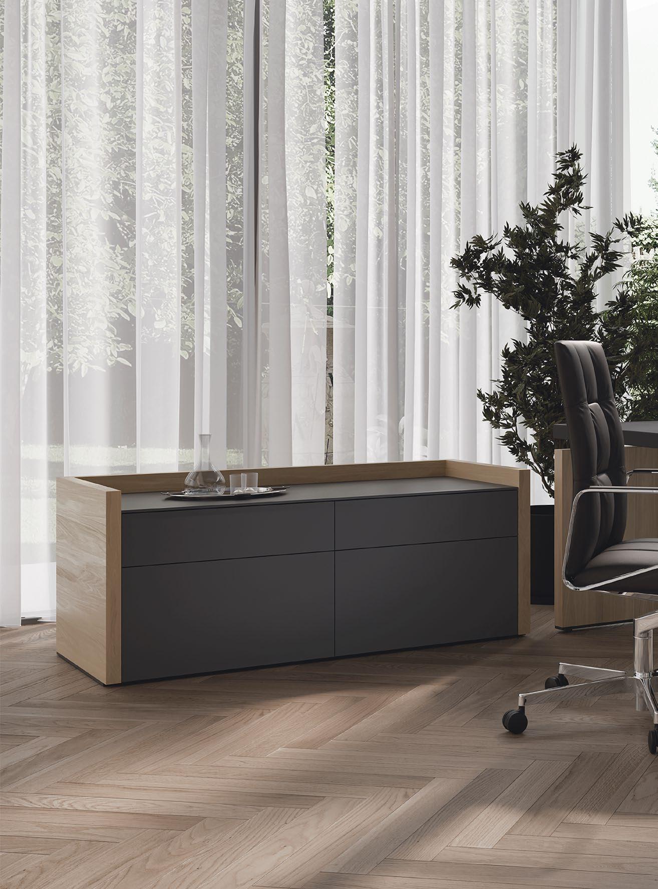
Today’s workspace has gone beyond utilitarian function. It’s no longer merely a space to get things done as it has evolved into a dynamic environment that intermingles communication, creativity, and comfort. Thus, there’s a huge demand for office furniture to meet these emerging workplace trends. Walter Knoll’s Mono-V Desk & Sideboard by Wolfgang C.R. Mezger is created to not just serve these new requirements, but also to epitomise what a high-performance and human-oriented workspace can be.
At first impression, the Mono-V Desk & Sideboard denotes a perfect blend of form and function, tailormade for executives and leaders who demand the very best. With its graphic lines and bridge shape, the desk stands for architectural clarity in which clear thoughts and creative productivity can rise and thrive in the workplace, regardless of the nature of your business.


“ EVERY TREND HAS A COUNTER-TREND; THE OPEN OFFICE CONTRASTS WITH THE CLASSIC EXECUTIVE OFFICE YOU ARE FAMILIAR WITH FROM LAW OR TAX CONSULTING FIRMS. MONO-V STANDS FOR THE INDIVIDUAL COMMUNICATION STYLE OF AN EXECUTIVE. A CLEAR DESK FOR CLEAR THOUGHTS. ”


 Markus Benz, CEO of Walter Knoll
With the Mono-V, you can rely on generous space for creating your best works. Its large desktop is not just an expansive surface for work – it’s also an invitation to elevate productivity. Whether you’re seated or standing, the desk’s height-adjustment function allows you to switch between positions, making it suitable for working low and high while opening up possibilities to achieve total and lasting comfort.
The desk’s warm, natural materials, such as wood and leather, keep workspaces cosy without compromising professional aesthetics. In addition, its mono-materiality ensures a harmonious balance of proportion and detail, contributing to the desk’s overall sophisticated appeal.

The Mono-V Desk comes in several options: you can opt for a table with panel legs, a sideboard, pedestals, or T-legs. The complementary sideboard is a noteworthy addition that makes storing and retrieving personal items and work gadgets more efficient yet discreet. The top even gives you access to ports for connecting to your favourite devices with ease.

WALTERKNOLL.DE

SLEEK AND STUNNING, THE NEEDS 2.0 TABLE TRANSLATES PRACTICAL DESIGN INTO PURE PRODUCTIVITY, SEAMLESSLY MEETING DAILY WORK NEEDS WHILE UPLIFTING THE OFFICE SPACE.
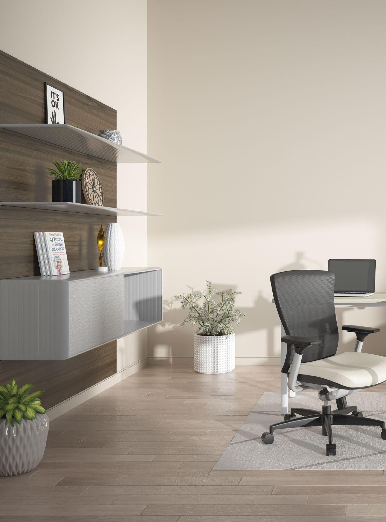
 THIS PHOTO: Sleek, streamlined and completely stunning, the Needs 2.0 table is perfectly up to the task of creating a practical and pleasant workspace.
THE NEEDS 2.0 TABLE IS VERSATILE ENOUGH TO CATER TO YOUR DAILY WORK REQUIREMENTS, WHETHER YOU REQUIRE A WORKSTATION FOR YOUR COMPUTER, A SPACE FOR CONDUCTING MEETINGS OR JUST A FLAT SURFACE TO ORGANISE YOUR PAPERS.


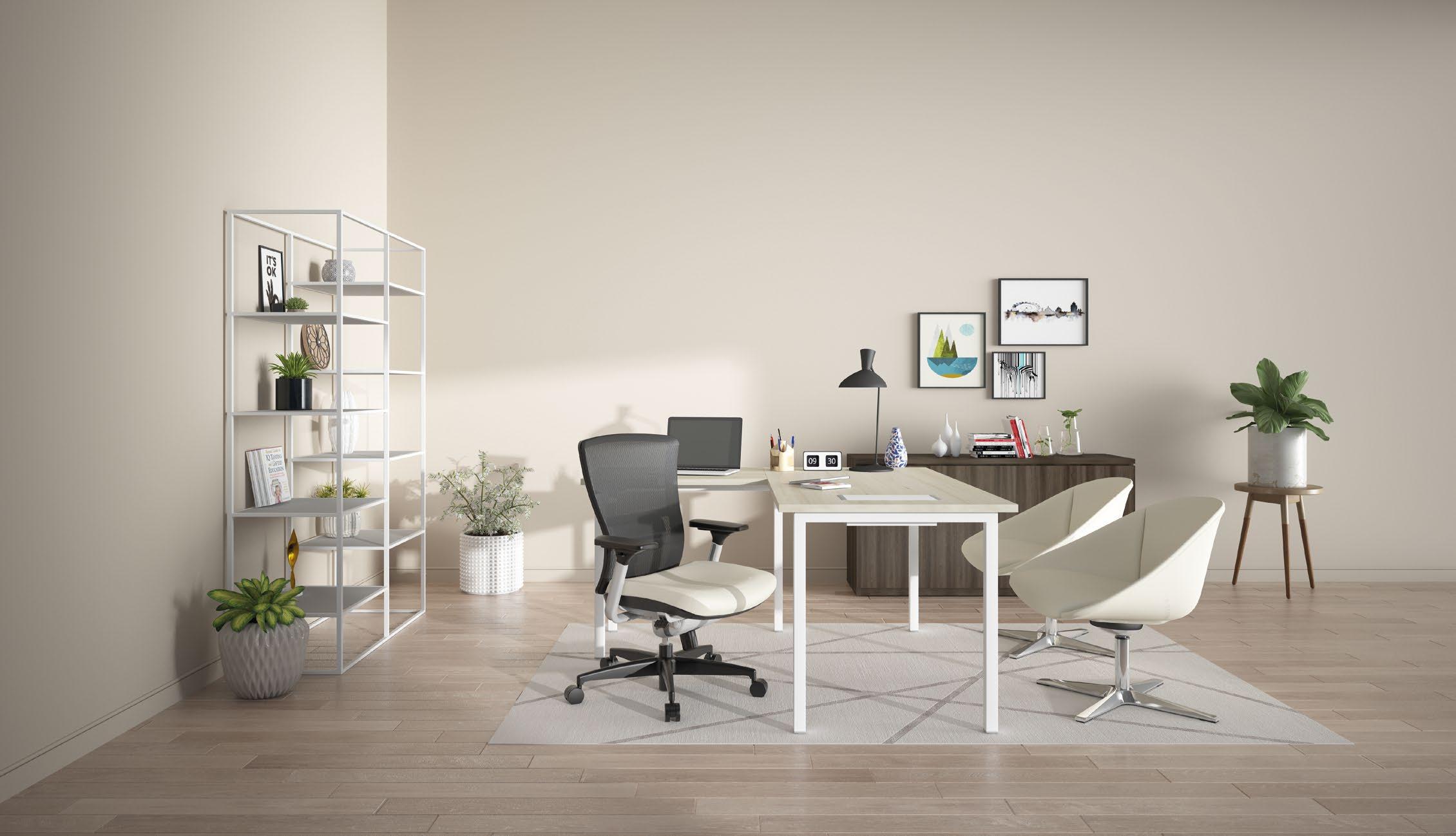
Functional furniture in the workplace can also be a sophisticated element that infuses comfort and style into the office environment. Bristol’s Needs 2.0 four-legs office table is the perfect example of a high-performance piece that bridges the gap between functionality and elegance, offering ample space that allows for easy organisation and multi-tasking, enabling users to work efficiently and productively.
Ideal for any office setting, the table’s sturdy four legs ensure stability while its sleek and contemporary silhouette conveys a distinctive touch of modernity that can adapt to any work style or requirement. Furthermore, its clean design allows the table to match seamlessly with other furniture systems, making it a convenient choice for creating a cohesive and coordinated workspace. For instance, the table can be combined with other office furniture, such as chairs, desks, and storage solutions, to create a unified look and feel that enhances the overall visual appeal of the workspace. It’s also perfect for small or tight spaces, as you can place any stools you prefer under the table to free up space when they are not in use.


Thanks to a spacious tabletop and its convenient size, the Needs 2.0 table is versatile enough to cater to your daily work requirements, whether you require a workstation for your computer, a space for conducting meetings or just a flat surface to organise your papers. The table can also accommodate a wire management tray underneath it, which allows for the organisation and routing of power and data wires. This feature helps keep the workspace tidy and clutter-free, further contributing to a productive and conducive working environment.


Solo work aside, the Needs 2.0 table works perfectly as a meeting table as well – no matter if it’s in a large conference hall or a small project room. Its flexible design allows it to be easily configured to meet the various needs of a team, providing them with the necessary support for effective collaboration.
BRISTOLFURNITURE.COM


CARPETS INTER’S ECO-FRIENDLY CARPET TILES BEAUTIFULLY BLEND WITH THE EXCEPTIONAL DESIGN LANGUAGE OF THE FERNTREE GULLY CAMPUS PROJECT TO CREATE A SERENE AND COSY ENVIRONMENT FOR LEARNING.

 THIS PHOTO: Carpets Inter’s EcoSoft ® carpet tiles are one of the key elements for the St Joseph’s College school project.

An evocation of design ingenuity, the Ferntree Gully campus project comprising a constellation of academic buildings, was a fruitful collaboration between the renowned architectural practice COX and St Joseph’s College.

Drawing inspiration from the College’s natural surroundings, the new Year 7 & Science building features a bright and colourful palette within its interior to generate distinct visual identities for the College’s junior cohorts. In contrast, the new Senior Students & Visual Arts building exudes a more mature aesthetic, with deeper colours and a more sophisticated palette to define the senior student environment. For instance, the deep blues and greens that grace the halls are infused with natural materials and textured finishes, connecting the spaces to their awe-inspiring surroundings.
To bring the project’s unique aesthetic vision to life, Carpets Inter was brought in to complement the exciting campus design with its exquisite range of eco-conscious carpets. Over 3,740 sqm of the campus space was enhanced


with EcoSoft® carpet tiles, providing premium underfoot comfort while ensuring superior acoustics to create a calm and productive learning environment.

In addition to being an element of beauty, the EcoSoft® carpet tiles contain over 187,000 recycled PET bottles, which play a role in minimising the burden on our landfills and diverting them from our oceans. Made from 80% post-consumer discarded water bottles plus 5% postindustrial recycled PET, the cushion backing of EcoSoft® carpet tiles merges top-of-the-line performance with unwavering environmental consciousness. The backing not only surpasses the rigorous performance criteria mandated for commercial applications but consistently outshines conventional PVC and bitumen hard backing, as well as all polyurethane cushion backings, in terms of dimensional stability, durability, comfort, sound absorption, thermal barrier, hygiene, and indoor air quality.


“ COLLABORATING WITH CARPETS INTER, COX WERE ABLE TO HONE AN AESTHETIC APPROACH THAT REALISED THE EXCITING VISION FOR THESE LANDMARK PROJECTS. CAPTURING A CHALLENGING DESIGN INTENT IN SUCH A REFINED AND BALANCED WAY WOULD NOT BE POSSIBLE WITHOUT THE PRODUCT QUALITY, RANGE, AND FLEXIBILITY CARPETS INTER COULD OFFER. TOGETHER WE HAVE BEEN ABLE TO CREATE SOMETHING VERY SPECIAL FOR THE STUDENTS AND COLLEGE COMMUNITY AND WE ARE INCREDIBLY PROUD OF THIS. ”
 - COX Architecture
“At Carpets Inter, we practice prevention at the source rather than relying solely on purchasing carbon credits to offset our carbon footprint. To date, we have recycled over 920 million PET bottles into the manufacturing of our unique EcoSoft® cushion back modular carpet tiles, thereby reducing the impact of plastic pollution on our planet,” the brand states.
Without the unparalleled product quality, range, and flexibility that Carpets Inter could bring to the table, achieving the challenging design intent of the project with a level of refinement would have remained an unattainable feat. “Together, we have been able to create something very special for the students and college community, and we are incredibly proud of this,” the brand remarks. CARPETSINTER.COM


