0ct - DEC 2013
VOL.6 NO.3
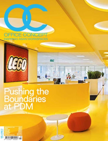
Pushing the Boundaries at PDM SINGAPORE (Incl. GST) BRUNEI HONG KONG THAILAND Philippines INDONESIA MALAYSIA (W.M/E.M)
SGD13 BND13 HKD80 THB295 PHP295 IDR70000 MYR15/18
www.teknion.com
Publisher’s Letter
Let’s Talk Collaboration Where there’s a collaborative domain, we’ll soon be welcoming creative fruition.
A
s I was working on this issue, I couldn’t help but notice the ubiquity of this C-word. I’m obviously referring to the latest buzzword in the office design realm, COLLABORATION.
In recent years, trendsetting corporations have been at the forefront of this concept – making conscious efforts to advocate open plan offices with fewer cubicles, lower panels and more collaboration spaces. Commercial interior designers got on the same bandwagon and unanimously acknowledged the benefits of this trend. Since then, we’ve had the opportunity to witness the great transformation in the office look and feel. We now frequently see offices designed ‘around’ collaboration. Brainstorm areas or relaxation corners are must-haves, as with the reception, meeting and work areas. Moving in tandem and riding the wave, office furniture designers too are influenced by the need. These days, options are aplenty; all offering to facilitate conversations and ideas generation. Things like this never fail to get us all excited. Where there’s a collaborative domain, we’ll soon be welcoming creative fruition. Think about it… when designers and brand advocates come together, we’ll be treated to a visual story-telling session. When designers mingle with office furniture suppliers, there’ll be no doubt an integrated, wholesome work space. When furniture designers and manufacturers come together, we’ll be applauding awe-inspiring products. It’s all becoming a united front. The amalgamation of great minds is poised to bring about greater stories. And you can count on us to continue featuring these great collaborations and inventions here at OC. We’ll be keeping our eyes wide open to more collaboration (of course!) for improved editorial coverage and depth. Stay tuned! Kenneth Khu kenneth@officeconcept.asia
Highway by Teknion
10
Content
18
22
32
66
72
100
12
10
Publisher’s Note Creativity Knows No Boundaries
16
Entrée
20 22 28 32 38 44 48 50 54 58 62 66 72
Bring ideas to work A Corporate Playground Inspired Banking Redefining the Lounge Raising the Bar Racing Forward It’s all Fun + Games Brand-Scaping An Inspired Office Breaking the Mould Celebrating Collaboration A Heart of Green A New Working Order
16
38
50
58
104
110
114
80 82 86
Leadership Viewpoints Taking On Asia On Full Throttle Pushing the Boundaries
94 96 98 100 102 104 106 108 110 114 118
Fitting Interiors Receive with Care The Italian Kaleido-Scope Let the Row Flow Infinite Highway It’s another MIRRA-cle Go with the FLO The Dhow Inspiration Rejuvenate and Refresh The Partnership that Worked Future-Proofing Workspaces
123 130
The social circle Visual Magic
98
13
Content & Team
82
126
Design Does Matter by Teknion, Pamela Keefe
The Power Of Design by Herman Miller
content Managing Editor Kenneth Khu Editor Pang Yin Ying assistant Editor Mandy Chin Contributing Editor Dorothy Lung Art Director Eric Phoon Senior Designer Sandy Liew Company Publisher Kenneth Khu Business Manager Edmond Lee Business Executive Kelvin Ong Customer Service Winnie Lim Contact Media Edge Publications 1002 Block D Tiara Kelana, Jalan SS7/19 Kelana Jaya, 47301 Petaling Jaya, Selangor, Malaysia. T: +603 7880 4525 Printer GRAMEDIA PRINTING GROUP Kompas Gramedia Building Jl. Palmerah Selatan no 22-28 Jakarta 10270 - Indonesia. Permit Number KDN PP15689/11/2013(033144), MCI(P) 101/01/2013
14
130 Visual Magic by Ben Ryuki Miyagi
EMAILS ADVERTISING advertising@officeconcept.asia EDITORIAL editorial@officeconcept.asia Contribution ideas@officeconcept.asia SUBSCRIPTION subscribe@officeconcept.asia WEBSITE www.officeconcept.asia Magazine Office Concept is published three times a year and is circulated throughout Southeast Asia. We’ll also be expanding our circulation to other countries in the Asia-Pacific region in the year 2014. Opinions expressed are those of the contributors and not necessarily endorsed by the publisher. COPYRIGHT NOTICE All rights, including copyright, in the content of this publication are owned by Media Edge Publications, Malaysia. You are not permitted to copy, broadcast, download, store in any medium, transmit, show or play in public, adapt or change any in any way the content of this publication for any other purpose whatsoever without the prior written permission of Media Edge Publications, Malaysia. PHOTO CREDITS COVER: PDM International SECTION OPENER: Engaging workspaces PDM International LEADERSHIP VIEWPOINTS Teknion FITTNG INTERIORS Teknion
Entrée
Sweet Koccola One might not resist having a smile while seated on these delectable, popsicle-like armchairs by Italian manufacturers, Kastel. The Koccola armchairs are versatile and statement-worthy to grace a variety of spaces – from lounges, waiting areas to relaxation corners. This adorable seating furniture effectively celebrates design with comfort; poised to infuse a little excitement into conversations. Kick-back and enjoy the company with one- or two-tone colour versions. www.kastel.it
Nuggets of Fascination Kusch+Co’s decision to relaunch the Colani lounge chairs proved to be the right one as it still holds the same fascination today as it did previously. Almost reminiscent of the sixties with a touch of present-day flavour, its organic shape and sculptural form renders it flexible for any space. These little eye-catching nuggets that come in both vibrant and minimalist colours cut a fine figure in homey environments or as architectural focal points in public spaces. This series also comes in a broad spectrum of hard-wearing fabrics and leathers. www.kusch.com
Koppa Cabana Leave it to the Koppa to provide a comfortable and elegant seating option. With its curvy back and high armrest, this contemporary armchair by Italian manufacturer, Kastel is ideal for waiting areas or to simply liven up an otherwise dull space. Built with a 4-stars frame in chrome steel or aluminium, the Koppa will jazz up one’s mood and inspire boundless conversations. www.kastel.it
16
Entrée
The Diagon office swivel chair, designed by acclaimed German designer, Burkhard Vogtherr is the epitome of minimalist comfort. Not compromising on its lean, minimalist forms, Vogtherr uses elastic materials such as woven bands and rubber cushions to offer an unexpectedly high degree of comfort. Its aluminium backrest support serves as a design feature as well as an ergonomic function. Produced by Swiss furniture manufacturer, Girsberger, the Diagon is also a proud recipient of the Red Dot Design Award 2013. www.girsberger.com
Private Domain
Building a space within a space is what the EarChair offers. This innovative product by Prooff has been designed with the proper height, rounded aesthetics and infused with sufficient acoustic features. Line it up in clusters for a quiet meeting or standalone as one’s private domain. The integrated table in the armrest allows one to simply enjoy a cuppa, jot down ideas or work on laptops. The EarChair comes in a variety of colours and fabric to characterise any genres of space. One can even opt for different sizes of the ‘Ear’ for different privacy levels. www.prooff.com
A Diffrient World Ultra-simplicity in a high performance task chair pretty much sums up what Humanscale’s Diffrient World is. Made up of less than one-third of the parts of traditional task chairs, this ultra-light weight design innovation still manages to pack a punch in terms of ergonomics and technology. The Diffrient World’s mechanism-free recline automatically adjusts to the needs of each user - providing appropriate levels of recline resistance without locks, dials or manual controls. Its Form-Sensing Mesh Technology also ensures the right lumbar support without bulky or external devises. Built to last and recognised for its uniqueness, the Diffrient World is also a proud recipient of the “Best of the Best” distinction from the prestigious Red Dot Design Awards. www.humanscale.com
18
Pushing the Boundaries at PDM Driving innovation and cultural change in today’s workplace
A Corporate Playground LEGO – a name synonymous with childhood (and adult) memories across the globe, has relocated their global headquarters to Singapore; a move designed to administer and foster the growing consumer and educational market in Asia and the Pacific.
22
PDM Singapore
Lego
23
24
PDM Singapore
Lego
PDM were selected to undertake the project after displaying a better understanding of the brand and providing localised solutions to a very specific brief developed by LEGO Group Creative Manager, Ms Janni Drejer. “I had a vision and an initial plan, PDM were able to take my initial ideas and concepts and push it further and then refine it. We needed to embody the spirit of LEGO and make reference to its history and future. A spirit filled with colour, energy and fun.” And the fun starts as you enter their new tenancy in the Marina Bay Financial Centre district. The entry brand tunnel captures the attention of guests and staff immediately. Part history wall, part iconic imagery and part product display; the tunnel invites guests to sit down and play with loose LEGO pieces before even arriving at reception. Who knows, the next great LEGO idea maybe sitting right there waiting to be discovered.
And the use of LEGO pieces doesn’t stop there. The main signage panel at reception is made up of hundreds of black, white, yellow and red LEGO men. Someone obviously had fun coming up with that design. Undulating ceiling panels make reference to the basic LEGO brick module, floating above the polished yellow vinyl floor, acts like an artery connecting all departments across the tenancy. Along the way think tanks provide LEGO designers and marketers with a secluded area where full height white boards have been installed to facilitate new product development and brand analysis.
25
26
PDM Singapore
Lego
The spacious open plan area, something a little uncommon in Singapore, given the soaring prices of rent especially in A Grade buildings like MBFC, provide staff with an working environment similar to what would be found in Europe. Manager offices are glass boxes allowing full sight across the floor to their teams. Work stations are spaced far apart allowing focused work to be done at your desk without interruption. While a variety of types and sizes of collaboration spaces are dispersed through the tenancy to foster greater cross communication of ideas and knowledge. The collaborations spaces are vital to the productivity of LEGO and its staff says Ms Drejer. We have allowed for high benches and stools, alcove sofas, low level seating and private meeting rooms.
All of which provide a different setting for teams to meet and discuss ideas. The only department segregated from the rest of the office is the Brand development team‌ hidden away so they don’t reveal the next big idea. It is hard not to get immersed in all that is LEGO when you are here. From the full height LEGO man watching over you in the boardroom, to LEGO light fixtures in meeting rooms and numerous LEGO toys spaced through the open plan. One may arrive as an adult, but leaves feeling like a small school boy wanting to rush to nearest toy store for something educational, fun and colourful... something LEGO.
One may arrive as an adult, but leaves feeling like a small school boy wanting to rush to the nearest toy store for something educational, fun and colourful... something LEGO.
27
Bank of China, currently situated at 4 Battery Road, engaged PDM as both Design Consultants and Project Managers for their new fit out of levels 36 & 37. The design scope included a new executive floor with private offices on level 36 and a sleek boardroom and multifunction facility on level 37. The main challenge on L37, the Penthouse, was the irregular geometry of the floor plate with the goal to create a symmetrical and executive space for the boardroom and lounge area. A feature timber screen at reception was inspired by details found in the 50 year old building faรงade, which has become an iconic element for the bank. That, coupled with the stone reception desk and soft cove lighting at the entry provides a welcoming space for staff and clients alike.
With a 4 metre ceiling height on the executive floor, and full privacy required to the offices and team space, the team at PDM employed the use of timber curvilinear panelling elements to create a smooth and warm aesthetic, whilst reducing the sense of enclosure and providing organic way finding. The same finishes connect the two executive floors, with the curved elements softening the harsh geometry of level 37.
Inspired Banking 28
PDM Singapore
Bank of China
29
30
PDM Singapore
“We utilised every niche possible to create either coffee points or banquette seating to increase the boardroom seating from 28pax at the boardroom table to 50pax total seated in the room�, says Senior Designer Pei Yin Loh. The boardroom table was exclusively designed in Germany for Bank of China to seat 28 people, with fully integrated audio visual systems, including touch screens that automatically recedes into the table top when not in use.
Bank of China
The boardroom table was exclusively designed in Germany for Bank of China to seat 28 people, with fully integrated audio visual systems, including touch screens that automatically recedes into the table top when not in use.
The outdoor terrace was also refurbished to allow visitors and staff to take full advantage of the impressive views of Marina Bay and the down town area during meeting breaks or company functions. The success and excellent working relationship formed during this project has led to additional collaborative projects between PDM and Bank of China.
31
32
PDM Singapore
Qantas Premium Lounge
Redefining the Lounge The new Qantas Premium Lounge at Singapore’s Changi Airport was a collaborative project between Sumu Design, PDM International and Caon Studio, and is the first of its kind anywhere in the world and for Qantas. The concept behind this project was to establish the next generation of lounges, whilst incorporating undeniable local influence to create a unique and memorable experience for Qantas and their oneworld customers. The design celebrates the vibrant nature of the Singapore outdoor hawker centre dining and its chic lifestyle. The sounds of people, live action of chefs at work and the smells of spices in the air create a hub for interaction in this fantastic city.
The layered textual and spatial design gives passengers a varied and relaxed atmosphere with unique lounge features. With the combination of live cooking, communal dining and a full service bar, this new lounge concept transcends the typical airport lounge.
33
The concept behind this project was to establish the next generation of lounges, whilst incorporating undeniable local influence to create a unique and memorable experience for Qantas and their oneworld customers. “The influences we wanted to incorporate were not just the physical elements of Singapore but also to encapsulate the atmosphere, lifestyle and everyday life of Singapore. The heart, the essence and soul of Singapore” says lead designer Felice Carlino. To bring the experience of Singapore all the way through the journey, not for it to stop at the check-in counter. The local flavour incorporated included Peranakan floor tiles at the reception area, a link to Singapore’s heritage and old shophouses. The use of urban finishes like the polished concrete floor and bars and paver style floor tiles compliment the greenery, while the use of the bamboo floor reflects the nature and warmth of Singapore.
34
The lounge is distinguished by different zones that we describe as streets. The reception, the bar and dining area are on the main street, and are the heart of the lounge creating vibrancy, movement and interaction between customers and staff alike. From the main streets you move down the paved side streets to more quiet areas to relax, plug in and enjoy a drink or snack. The entire lounge is equipped with universal power outlets, USB charging throughout and full WIFI connectivity. The programme from design concept to opening was 17 weeks, an impressive feat by the entire team involved.
PDM Singapore
Qantas Premium Lounge
35
Ideas at Work
Launching Aetna’s first office in Singapore meant working very closely with their global real estate teams in the US and the UK.
Utilising Aetna’s existing global agreements with nominated vendors, PDM was able to use these “kit of parts” to establish the plan for the fit out. The layout was clean, and simple. The necessity for an open plan area where managers have full view of staff was easily attained given the shape of the tenancy. A small but intimate break-out area was included along with multiple meeting rooms and a small but unmanned reception area.
Working in conjunction with the teams from Jones Lang LaSalle and Parsons Brinkerhoff enabled the project to run smoothly. Although with the slight technical lingo difference between Asia and the US, Parsons had to undertake a comparative study of the items requested that were not available in Singapore. But all was resolved quickly and efficiently. “We get many compliments on our fit out” says Derek Goldberg, General Manager, Aetna, Singapore. ”We are very happy with the outcome from PDM and their team.” Audio visual installations in the meeting rooms was critical to Aetna’s every day operations. For that DVI was brought on-board to ensure the link between SG, the US and the UK was always at hand.
36
PDM Singapore
AeTNa
37
Raising the Bar
38
PDM Singapore
Reed Smith
Elegant, Refined and Contemporary. The three words used by Reed Smith Executives and Partners to describe their offices globally. So when Reed Smith decided to open their new office in Singapore, they looked to the team of Jones Lang LaSalle and PDM to deliver just that. But it didn’t all start out so smoothly. An initial plan and concept had been approved and the lease signed, at Ocean Financial Centre, when the executive team arrived and deduced the tenancy and views were better on the opposite side of the building. Being lawyers they of course won the argument and the design team of Dilhan Surin and Andy Chew were tasked to space plan the proposed new tenancy overnight. Working closely with Ms Jennifer Connon, who relocated from Reed Smiths’ San Francisco office to Singapore for the duration of the project, the team were able to finalise all aspects of the design, along with the furniture and fixture selections within a two month period. “Having only two people making the final decisions on all aspects of design definitely made our life easier” says Andy Chew.
Looking to capture the newly acquired views meant keeping as much of the built environment and any furniture off the perimeter full height glazing, thereby allowing as much natural light to fill the tenancy while keeping vistas out of the building unobstructed. Preference was given to the five conference rooms with views out to Marina Bay, while the partner offices received views towards Shenton Way and Raffles Place. Looking to be certified by the Green Building Council (the project was awarded Green Mark Gold) meant introducing new elements not normally seen in RS offices. “We wanted to do something striking and not usually seen in law firms” says Dilhan Surin. “So we introduced a living wall at reception and incorporated the signage into the living element. It took some convincing but the outcome has been very well received and there are many compliments made by visitors.”
39
The tonal nature of all the finishes throughout the fit out is very soothing and calming – something vital in the stressful world of a busy global law firm. Custom designed secretary stations, printer bays and full height filing systems provide the staff with a streamlined approach to their working day. Ensuring the extended life of the tenancy is maintained, all partner offices have been designed to become shared offices in the future. “We need to safeguard ourselves in the event the office grew too quickly” says Ms Connon. Using imagery of iconic elements from various Reed Smith cities, a gallery wall was introduced to show Reed Smith’s global reach.
40
PDM Singapore
Reed Smith
We wanted to do something striking and not usually seen in law firms. So we introduced a living wall and allowed much natural light to fill the tenancy.
41
42
PDM Singapore
International Ecommerce
Pop of Colour
PDM was engaged in collaboration with Jones Lang LaSalle to design the first office in Singapore at 6 Battery Road for an international printing company.
As an ecommerce supplier of printed and promotional material and marketing services, branding was the definitive conceptual driver for the design based on the graphic nature of the business.. “We looked to fashion and pop art to extract bold colours and create impact and contrast throughout the general office with its black, white and grey foundation” says Senior Designer Pei Yin Loh. The outcome led to a pixelated design utilizing a palette of the 7 colours extracted from the company’s logo. This translated into a bright graphic feature printed onto corrugated panels at reception which was then carried through as a frosted film detail on the glazed partitions. The loose furniture became ‘pixels’ or blocks of colour in the collaboration, meeting and break out zones. This theme is then carried through the general office floor finish with block colour carpet tiles.
The integration of sustainable elements was driven by the company’s strong corporate green initiatives. With all the materials and furniture specified being Green Mark certified, a green wall was integrated into reception as a living entrance feature. Being a creative company the demand for collaboration, brainstorming and open discussion spaces was pivotal. The pantry, collaboration zones and existing workstation configurations all provide flexibility for future expansion space aiding the company to grow the business significantly from Day 2 occupancy. As strong focus was placed on audio and visual technology, thus enabling the new Singapore office to be connected to all their global offices from any room in the tenancy.
43
Looking to move to a premium A Grade office tower in Sathorn Square; Ford Thailand looked to PDM to implement a new fresh and modern fit out that reflected the pure brand essence of Ford. Covering two and half floors, the big challenge for the project team was to deliver the project within the given timeline. The team had to be very proactive, organised and have great time management. Ford also required an interconnecting internal “communication� staircase to allow a free flow of staff between the floors and limit down time taken when using the base building lift system. Another large hurdle under such a tight programme.
Utilising the same stone to neatly connect the lift lobby to the main reception allows the design to seamlessly fit within the architecture of the building. While the crisp blue of Ford then captures your eye as you enter the reception area.
Racing Forward 44
PDM Bangkok
Ford
45
46
PDM Bangkok
Tagging onto increased communication was the desire to bring interaction between staff and clients to a new level. The pantry was designed to double as a town hall space and various lounge spaces cater for informal client meetings. Multi use spaces were incorporated into this office design with vibrant colours to embrace the cheerful attitude of the team.
Ford
We wanted to introduce a gathering hub where staff can come to relax, communicate and share ideas.
“With the hectic nature of the automotive industry, we wanted to introduce a gathering hub where staff can come to relax, communicate, share ideas and brainstorm� says lead designer Jutamat Pattamavipart. We provided various forms of seating areas from bar counters, lounge seating and group benches, all with connectivity. In the meeting rooms, differing shades of the Ford blue were used as acoustic fabric panelling to provide a subtle variance. Moving through the floors, sketches of car artwork are scattered along corridors, glazing walls and in individual offices. With a clean and open workplace solution, the artworks ensure that the brand identity of Ford is conveyed without much effort.
47
48
PDM Bangkok
Garena
It’s all Fun + Games Garena is a leading Singaporean online game operator, with dominating market shares in Singapore, Hong Kong, Taiwan, China, Korea and Thailand. Their business covers online game development, online advertisement and so on. The purpose of this recent project was to consolidate multiple smaller offices in CyberWorld Tower B into one combined office space of 1,500 square metres on levels 41 – 43, which is a triple-volume penthouse space. The feature design element is a bold red steel interconnecting staircase between the three floors, which can be seen from all angles of the new office space. The key directive from Garena was to ensure the corporate identity be reflected thoroughly in the design. The full size gaming characters, oversize graphic images and extended banner between columns provided connectivity within the open office and adjacent support spaces.
The 4 month program from design conception to office migration was a feat achieved by all, as the project included a 100% sound proof studio, a broadcasting room and hundreds of customised branded items that required special fabrication. There were challenges along the way including existing base building issues that had to be rectified concurrently. The design provides a functional, creative, dynamic space that truly represents Garena’s identity and a more efficient workplace that encourages the younger generation.
49
BrandScaping
50
PDM Bangkok
Dutch Mill
Dutch Mill is the largest Dairy company in Thailand and has set its goal to be one of the best dairy manufacturing and marketing companies across the ASEAN region. Now successfully exporting to numerous countries, our clients’ vision was to shift their existing offices in suburban Thonburi to Sathorn Square Office Tower in Bangkok’s CBD to facilitate their future growth and corporate goals. PDM International were appointed as the Design + Build consultants for the 2,200 square metre corporate fit out. The design team faced two key challenges, a 60 day program from commencement to completion, and the clients’ strong belief in Feng Shui, which led to maximum planning options to ensure the principles were met completely. With the tight timeline the design team implemented a transparent communication regime to ensure the key milestones were met on target.
The conceptual development was based solely on the branding of Dutch Mill, their logo, the farmhouse style factory and thorough integration of bold colours to represent the contribution fruit plays in their products. The reception was representative of the farmhouse complete with a full size “Dutch Mill” and coordinating wind mill light feature, while the corridor flooring is a bright green vinyl to represent the grassy fields of a typical dairy farm. The design was fun and creative and captured the essence of Dutch Mill. The project was completed on time and met the Feng Shui requirements. In addition the client and design team have developed a strong working relationship.
51
The design was fun and creative and captured the essence of Dutch Mill.
52
PDM Bangkok
Dutch Mill
53
An Inspired Office Halliburton is one of the world’s largest providers of products and services to the energy industry.
To date, PDM has worked successfully with Halliburton providing them with numerous corporate fit outs in the region. The Kuala Lumpur project directive was to foster more innovative and collaborative work ethic through increased visibility and transparency amongst the teams. The conceptual direction, led by Rachel Teh, focused on a sense of place, of welcoming visitors and clients and providing a dynamic yet versatile workplace that inspires employees to do their best work.
54
The design embraces the architecture of the building by planning built zones to the core and open plan workstations to the East and West perimeter walls to retain clear sight lines and maximize natural light, reinforcing the transparency on another level. Multifunctional spaces were created centrally to increase interaction and connectivity. The new space occupies 26,000 square feet, with a combination of offices, open plan workstations and support zones. The result is an inviting and diverse environment that supports the functions of the Halliburton team.
PDM Kuala Lumpur
Halliburton
55
The Kuala Lumpur project directive was to foster a more innovative and collaborative work ethic.
56
PDM Kuala Lumpur
Halliburton
57
Breaking the Mould The PDM Kuala Lumpur design team has completed two Sudong projects recently, one in Klang and the second in Malacca.
58
PDM Kuala Lumpur
Sudong KLANG
Whilst each site had its challenges and unique features the overriding goal was to embrace an agile workspace and increase collaboration and interactivity. Rachel Teh, Design Manager, initiated a corporate, fun, functional and flexible work space that reflects the aspirations of Sudong.
The initial design stage combined user interview data and steering committee guidance to ensure the shift from the existing cellular spaces to a more mobile and flexible environment to meet the demands of the business.
59
The overriding goal was to embrace an agile workspace and increase collaboration and interactivity. The basic framework of the new office is a multipurpose cell; instead of creating rooms with fixed uses, the design team arranged modular cells that accommodate mixed use. All zones cater for meeting and collaboration and there are no assigned spaces. Teams and individuals are encouraged to freely move about the zones to suit the task at hand. The Malacca fit out features an interconnecting staircase between the 5 floors which is an architectural feature and as Rachel says, “a celebration of collaboration�.
Numerous work zones surround the interconnecting staircase, designed to house employees in adaptable neighbourhoods. Each floor was designed with unique typologies to create a sense of identity to the teams on each floor, and to provide a bit of fun in the spaces. There is a karaoke room, relaxation zone, a pantry designed based on Formula 1 themes and so on. As a result, the diversity generated in these new spaces serve as a platform for open communication between departments, encouraging engagement. Both projects won prestigious awards for best call centre designs.
60
PDM Kuala Lumpur
Sudong KLANG
61
Celebrating Collaboration The Malacca project was awarded gold in the corporation’s internal awards program.
62
PDM Kuala Lumpur
Sudong Malacca
63
64
PDM Kuala Lumpur
Sudong Malacca
65
66
PDM Jakarta
L’Oreal
L’Oreal appointed PDM to provide a full design service to fit out their new L’Oreal Jababeka Factory plant in Indonesia. As an international products branded company, L’Oreal has strict HSSE and LEED guidelines to follow in implementing the project and to maintain their design standard in the office areas but to not overly design the fit out for the plant. The challenge was sourcing the right materials specification to meet LEED requirements. This was the major challenge facing the design team; ultimately the project was awarded LEED certification, a feat for all.
Entering the lobby, L’Oreal wanted to portray a clean, elegant and contemporary image while still maintaining a level of warmth and simplicity. The double height volume to the entry space enabled the design team to explore the use of various natural stones and finishes. The new staircase connected visitors and guests from the reception to the client lounge on level two.
A Heart of Green 67
We removed the ceiling and created various seating and bar zones to allow for a mixture of dining experiences. Some spaces are open and some semi enclosed as to allow differing levels of privacy. Stepping into the client lounge, visitors are greeted with a spacious ante room softened by a timber trellis ceiling allowing natural daylight to flood the space from the skylight above. Product displays and graphic walls featured prominently, ensuring L’Oreal’s brand is always visible. Feeding off the lounge area to the left we have a collection of multipurpose meeting rooms and associated facilities while to the right the general office area is highlighted by Indonesian inspired motifs and patterns.
Due to its remote location, most of the staff dine in for lunch. PDM felt the importance to create a vibrant yet dynamic canteen that serves up to 500 staff at one sitting. “We removed the ceiling and created various seating and bar zones to allow for a mixture of dining experiences” says lead designer Simon Pan. Some spaces are open and some semi enclosed as to allow differing levels of privacy. The canteen is also used as town hall area for large internal corporate gatherings or as collaboration spaces by smaller business groups. A full industrial kitchen was designed for on-site catering for the growing differences in cuisine and dietary requirements by L’Oreal’s multi-national staff.
68
PDM Jakarta
L’Oreal
69
70
PDM Jakarta
L’Oreal
Stepping into the client lounge, visitors are greeted with a spacious ante room softened by a timber trellis ceiling allowing natural daylight to flood the space from the skylight above.
71
72
PDM Jakarta
International Financial Institution
A New Working Order In pitching for one the largest interior design fit outs in Jakarta, PDM and their joint venture team, QSpace, was faced with an adrenaline filled race to the finish line. “In the competitive market of today, preparing or pitching for a project can sometimes be harder and more stressful than actually delivering the project itself�, says Prapanca Muchtar, Director of QSpace.
Once appointed, the team developed a great working relationship with the client. They had full faith in our ability and this trust allowed us to fully explore the brief and develop something new and innovative for the bank.
73
74
PDM Jakarta
International Financial Institution
“The PDM and QSpace venture was a phenomenal experience”, says lead designer Karen Fairfax. “It was a refreshing and dynamic collaboration, where both teams were equally creative.” The design concept called for three main criteria to be fulfilled. Firstly a) the interiors had to stimulate the productivity of the employees, b) the office space need to be fully flexible to allow for the ever changing needs of the bank, c) portray a professional, progressive and honest corporate image. A nice challenge given the project covers over 38,000sqm
75
76
PDM Jakarta
International Financial Institution
In order to meet with the first criteria, the team looked for a psychological approach. It’s well documented that fresh, primary colours stimulate a human’s productivity levels. Using this, plus the addition of natural daylight, the team developed a palette of colour themes that enhanced the staff’s productivity. This open plan scenario also eliminated the presence of corporate hierarchy and therefore allowed for greater general flexibility across all floors when teams or individuals need to relocate or join other departments.
At the executive level a modern and fresh approach was adopted that still gave a professional image but still maintained a level of transparency. Although US and European furniture were used in the fit out to provide the desired image, the inclusion of batik stamps and motifs allowed the Indonesian flair to shine through and provide a level of local comfort. To top of the project, the inclusion of a penthouse entertainment floor was implemented. The space is utilised entirely as a celebration space, with an expansive dining room, cocktail bar and a large “signing” room for those BIG deals.
The inclusion of batik stamps and motifs allowed the indonesian flair to shine through and provide a level of local comfort.
77
Leadership Viewpoints Industry leaders Speak their mind
Teknion Pamela Keefe
PDM International Dennis Lim Simon Pan Dilhan Surin Jessica Golding Rachel Teh Jutamat Pattamavipart
Taking on Asia on Full Throttle Pamela Keefe Regional Vice President, Teknion Asia Pacific
82
Teknion
Grade A Office Furniture Designer, Manufacturer & Marketer
More than a year after being hired as Teknion’s Regional Vice President, Asia Pacific, Pamela Keefe continues to relish the challenges that go with the territory. Here in Leadership Viewpoints, the indefatigable Malibu native weighs in on Teknion’s three-decade success story, her vision for the future as well as the company’s Asia-Pacific journey to date.
Q: Can we start with some background on you? A: I have been with Teknion since May 1, 2012. Prior to that I was Director of Global Accounts and Sales Strategy with Haworth responsible for Asia Pacific, Latin America and Africa. I was with Haworth 12 years based in Singapore. I currently live in Singapore, but I am originally from Malibu, California, USA In my free time, I enjoy wakeboarding, working out at the gym and cooking! Q: Give us a brief historical sketch of Teknion and a picture of the company as it is now. A: Teknion is a top International brand in the contract office furniture business. Teknion is a family owned company – owned by the Feldberg family - headquartered in Toronto, Canada. 20 years ago, Teknion developed an interest in Asia and purchased a facility in Klang, Malaysia to manufacture the Teknion brand for the Asia Pacific market. Teknion currently supplies products throughout Asia Pacific with manufacturing in Malaysia, Vietnam & China.
The products that Teknion produces in Asia are seating, benching/desking systems, panel systems, storage and loose furniture such as conference tables, lounge seating and accessories. As global leader in office furniture design, Teknion has helped transform the furniture industry with its sophisticated products for the technologydriven office. Q: What is the work culture like in Teknion? A: As a manufacturing company, we are very process driven which helps us ensure the quality of our product and services and also achieve certifications such as ISO 14001. But, at the same time we value people and relationships – both internally and externally. Q: You have been Teknion’s Regional Vice President for Asia Pacific for more than a year now. What’s your ambition for the company going forward? A: We plan to grow rapidly in Asia. The Asia Pacific region contains a diverse cross section of economies. Two of the world’s top three GDP producing nations are in Asia – India and China. These countries will be a major focus for us in the coming years. Our strategy is to provide products and services that >>
83
are appropriate for the market at reasonable price points with quick delivery. We have been studying the market and believe that this is a great time to invest in Asia. We plan to add people, continue to add more products, and to focus on providing excellent customer service. Q: With such a large operation employing about 4,000 people worldwide and so many skills involved, how does Teknion develop and train its people? A: Training and development is an important investment in our people. We have developed an entire curriculum of training for our people that consists of online classes, webinars and in-person courses. Q: Sustainability has become a major issue for furniture makers. What is Teknion’s approach? A: Sustainability is important for Teknion worldwide and our Asia Pacific operations are no exception. Our products are Greenguard certified. We concentrate on the materials used in our products as well as our manufacturing techniques to follow sustainable practices. A good example of what we do is with our water treatment plant which treats & purifies waste water at Teknion Malaysia so that the water leaving the plant is cleaner than the water that goes in. We are applying for LEED Platinum certification for our newly remodeled showroom in Klang. Q: Four of Teknion’s products bagged the prestigious Best of NeoCon Awards at the recent NeoCon 2013. What was the inspiration behind these products? What do you think differentiates these winners from similar ones in the industry? A: At Teknion, we truly believe “Design Does Matter” and this drives our product development process. We are developing furniture that supports office work, but offers an expressive use of colour, fabric and material. Attention to detail and the ability to offer the designer a palette to work from are extremely important. One of the Gold Awards we received at Neocon this year was for our Surface Tension Textile Collection. This is the first collection designed by Suzanne Tick, the head of our new Teknion Textiles group. Suzanne is a very talented and wellrespected industry veteran who formerly headed up Knoll Textiles. In designing the new collection for Teknion, she strove to maintain purity in expression. The fabrics convey the textile weaving process and have delightful textures and colours. Q: What are the latest trends in office furniture systems? A: Offices today are shifting to focus more on supporting how people interact. In the past, clients were focused on
84
how many people they could fit in a space in order to drive down real estate costs. Today, instead of rows of benches to support work, there is a shift. Offices are incorporating a variety of work settings and areas for information sharing, collaboration and innovative work. This is proving to help increase productivity, employee satisfaction and improving teamwork. Q: Teknion collaborates with important designers. Tell us more about these collaborations. A: Many office furniture companies rely on their own inhouse design team for product development. While we have a great internal team, we also believe in partnering with top industrial designers. Karl Magnusson has worked with us for many years and has collaborated with us both on products and our showrooms. Our new Soft space collection includes products designed by Italian designers Carlo Bimbi, Roberto Romanello, Paulo Rizzatto, &Giancarlo Piretti. The collection is exciting and is generating a lot of interest in the interior design community. Q: How do you hire? What are you looking for? A: We believe in hiring smart, young talent with drive, energy and enthusiasm. We have a very low turnover rate and take care to hire people who will fit with our culture and stay with the company for the long run. Q: Do you expect the industry to change in any significant way over the next five years? A: As the world balance of power shifts from West to East, I believe this will have a great impact on our industry. We will see interior design firms in the East growing globally and designing projects in Western Countries. We will see more and more decisions being driven from Asia rather than made in North America and executed in Asia. Asia will start to develop and introduce products designed by Asian designers to the global market. I foresee Asian influence on design growing rapidly in the next 5-10 years. Q: What keeps you going? And what keeps you awake at night? A: I am really energized by the work we are doing to grow our business in Asia. The recent Grand Opening of our newly remodeled showroom in Klang, Malaysia and simultaneous new product portfolio launch is the beginning of an exciting strategy to relaunch the Teknion brand in Asia. We established a direct sales model in many parts of the region and are adding people throughout the region to directly serve our clients. This is exciting and fun and frankly with so much going on, I barely have time to sleep!
Teknion
Grade A Office Furniture Designer, Manufacturer & Marketer
LEFT Showroom space called the “WOW” area which displays the latest products, a chair display wall and a special area designed to support the “co-creation” of solutions with clients.
About Teknion Teknion is a leading inTernaTional designer, manufacturer and marketer of mid- to highend office systems and related furniture products. Teknion’s integrated product portfolio encompasses several lines of panel, desking and freestanding systems, architectural wall systems, casegoods, seating, storage and filing, and accessories. Corporate headquarters are based in Toronto, Ontario; U.S. headquarters are in Mount Laurel, New Jersey; and the European head office is in London. Teknion has sales offices, showrooms, manufacturing and warehousing facilities in Canada, the U.S., the U.K., India, Russia and Malaysia. Products are sold worldwide through a network of authorized dealers. When Teknion began operaTions in The early 1980s, it did so with a single product line – the Teknion Office System, or T/O/S. Today, the company also markets District, Leverage and Transit panel systems. Teknion offers such freestanding products as Sidewise compact casegoods, Marketplace worktable, ie post-and-beam system and Ability mobile furniture. Dossier is an executive furniture collection. Interpret and Expansion Desking are the company’s desking lines and CLUBtalk a new technology-furniture hub. Architectural products include Altos and Optos demountable walls, and the W/R/S Wall Rail System. Teknion seating products range from stacking, lounge, collaborative and general-use to task, wood and executive products. Teknion holds a simple yet powerful principle: design does matter www.teknion.com
Left Teknion Facility in Klang, Malaysia. The three story building which houses a showroom and working office is attached to the manufacturing facility
85
Pushing the Boundaries at PDM 86
PDM INTERNATIONAL
Office Interior design firm
17 years since it was founded, PDM International, a leading interior design consultancy firm specialising in corporate office interior design and space planning, continues to up the ante in the ID game. OC caught up with the PDM International design team to learn about the business, and what makes them tick and click. PDM International’s success is propelled by an understanding + promotion of revolutionary work space environments. Blending high-tech with a soft-touch. PDM’s work exemplifies today’s craving for environments that balance the speed and immediacy of technology with the need for human interaction. PDM puts together more than just design – creating better concepts and bringing new evolutional ideas to interior design services while encompassing its clients’ corporate image and business culture. PDM takes each individual project and provides a unique solution that supports the client’s requirements, and in some may drive a cultural change.
The company remains focused on client services and provides clients with the highest quality of professional services. Truly an integrated family at PDM, resources are shared between the various offices, an approach that helps maintain relationships with clients across the region. PDM continues to expand its horizons in an effort to provide new ideas for clients as it operates its businesses in an increasingly challenging and competitive environment.
Special thanks to: Seasons Fine Art and Home Collection, Lotus Home Design Co, Mr. Wissawa from Studio Vista, Owen Raggett - Architectural Photographer and Kaona Nilavajara - Architectural Photographer
www.pdmdesign.com
87
Dennis Lim - SINGAPORE
“Admittedly, any good design is an intricate understanding of the needs and wants of the client… Most importantly, every project is never approached with preconceived ideas in mind.”
Dennis Lim Group Director
01.
Q. Describe the underlying philosophy of the work of PDM as it relates to the tremendous social and economic change taking place in Asia? A. Asia is going through a period of tremendous growth. PDM aims to work together with clients to produce a work environment that is able to both attract and retain talent in adherence with their business objectives.
02.
Q. How selective are you with the clients that you work with? Do you have a particular approach to a dialogue with a client in a project’s early stages to understand what they want in the project? A. A large portion of our clients are multinational companies which we attribute to PDM’s ability to relate to their requirements. We are also very well-equipped to provide necessary services and assist them in their regional business expansion Admittedly, any good design is an intricate understanding of the needs and wants of the client. Hence, workshops are held as early as possible in order to ascertain their qualitative and quantitative requirements.
88
Most importantly, every project is never approached with preconceived ideas in mind..
03.
Q. What is your business rationale for opening 3 offices in Beijing, Chengdu and Shanghai? And what percentage of PDM’s projects is based in the PRC? A. China is one of the largest economies in the world and is still growing every day. Market positioning is highly important for our clients who wish to differentiate themselves from the rest in the industry while projecting a consistent corporate image. We have set up 3 offices in Shanghai, Beijing and Chengdu in response to a greater demand from our clientele in the region. Unsurprisingly, these 3 offices have contributed around 40% of the group’s annual turnover.
04.
Q. Has the European financial crisis in any way shaped PDM’s international business strategy? Any plans for opening an office in India in the next 5 years? If not, why? A. Most of our clients have been very much
affected by the European financial crisis and we are no different as well. We have since re-structured the group and decentralised our operations with two main offices in Hong Kong and Singapore. The Hong Kong office takes charge of operations in Northern Asia while Singapore covers Southern Asia. At PDM, we believe that anything is possible and India presents a very viable option for future expansion. We are currently waiting for the right opportunity to enter the market.
05.
Q. What has been the key factor to PDM’s long-standing success? A. We have always subscribed to working hard and having fun as we believe our staff are at their best when they enjoy what they do. PDM has always relied on a core team of skilled, capable workers. And it remains our goal to build confidence and trust in our employees and nurture them in developing their talent to the fullest.
Simon Pan - SINGAPORE
“I would say Jakarta is fast catching up with the rest of South-East Asia. Projects today are much larger in size, which to some extent is attributed to the economy being the largest in South East Asia.”
Simon Pan Design Associate
01.
Q. Is there any significant difference in the Indonesian ID landscape with that in the rest of South-East Asia? A. In many aspects, Indonesia is still a young country with regards to attaining international interior standard, especially in the commercial arena. A recent report of market stability in Indonesian in the last two years has impacted many high rise buildings achieving class ‘A’ standard. In fact, there has been a sharp uptick in office demand in the Jakarta CBD area with both local firms and multinational corporations seeking out international design firms to fit out their offices. I would say Jakarta is fast catching up with the rest of SouthEast Asia. Projects today are much larger in size which to some extent is attributed to the economy being the largest in South East Asia. Space planning and designing private & in-house dining area for senior management and clients have been my most recent Indonesian experience.
02.
Q. Are there any standout trends in the design of office spaces in Jakarta right now? If so, what do you think are the key drivers of these trends?
A. Against a backdrop of a buoyant economy, the culture of Jakarta has evolved from a traditional workspace towards a modern one. To be sure, the middle class has been the main driving force behind this trend. Office spaces are also becoming more flexible with many companies looking towards LEED design as a reflection of an increase in green consciousness..
03.
Q. What is the most important thing to remember when designing an office space in the Indonesian context? A. We always have to bear in mind to position the prayer room close to wet areas. Also, design trends in Indonesian are leaning towards modern contemporary, with many clients expecting the office design to incorporate quintessential Indonesian elements.
04.
Q. Talk about a recent Indonesian office project you completed. What was the concept, solution, location, highlights?
East Asia. PDM was involved in designing the main lobby, canteen, main office, lounge area, meeting spaces as well as the restrooms. Overall, the key design concept for the factory fit out is timeless, elegant and contemporary. On another note, the ‘LEED’ platinum certification was a challenge, especially with regards to the limited material selection in Indonesian. A significant amount of time was also needed to source for the most suitable materials within Indonesia for the projects.
05.
Q. Do you feel office design is an important part of our work lives? If so why, and what greater issues can it address? A. Absolutely, as office design is an integral part of our work lives. After all, we spend a third of our waking hours in the workplace. Hence, having an office with flexible and collaborative workspaces along with innovative technologies and spaces improves morale, enhances team bonding and fosters creativity.
A. The new L’Oreal Jababeka factory facility was relocated from an old factory in Indonesian and is one of L’Oreal largest plants in South-
89
Dilhan Surin - SINGAPORE
Dilhan Surin
“As people are enabled to work more effectively away from the office, and the management culture changes in tandem; allowing for a larger degree in trust, the concept of presenteeism and supervision will die.”
Design Director
01.
Q. Walk us through on the rise of agile workspace (AWS), which has brought about a big shift in the ways workplaces operate? A. In today’s world of increased competition and demand and the rising costs of corporate real estate, the workforce is demanding more flexible and innovative workspace models more now, than ever. To meet the demands of today’s workforce, industry’s most progressive workspace providers are creating innovative office options to address the changes in the workforce. These forward thinking workspace operators are not only offering offices that cater to the traditional physical office space client, but to a growing number of business people that require virtual office services or collaborative and innovative meeting rooms and support services. Studies have shown that this demand reflects the impact of the global recession, where a shift in workplace habits and the growth of technologies has made way for a major trend...the rise of the mobile worker!
02. Q. How has this cultural shift been applied in practice?
90
A. Often when people think of an agile workspace for a team, they envision the classic set of adjacent tables stretched across an open space. While this is often a component of an agile workspace, it is not the whole picture. Agile workspace is an approach to work that does not require a traditional office, but a ‘hybrid environment’ that provides a place for people with shared amenities and spaces. These spaces will be used on a needs-only basis, acting as a home for a population, providing resources and specialized facilities, as and when they are demanded. The buildings that are provided will be thin – housing less complex infrastructure that, in turn, requires less cooling and power, and so creates not just a sustainable office of the future, but a place that is attractive, energized and connected – the social networked office. The goal of an “agile workspace” is to create a physical environment that enables and supports a team entering and sustaining a “flow”. This requires multiple elements that support the various stages of team work: normal work and ad hoc collaboration; rest; and intense collaboration
03.
Q. Day-lighting is an important feature in office architecture and interior projects. What are some easy ways
to make an office or a workplace feel brighter without tearing out holes and adding more windows? A. Light levels in a building space are typically measured in lux. Light from electric lights is fairly constant so exact levels of lighting can be obtained through the selection and layout of light fixtures. When it comes to day-lighting, the light source is the sky vault which is outside the building so it becomes necessary to install glazed openings (windows and skylights) to admit adequate daylight to meet the needs of the office space. Designing for exact levels of light from daylight is difficult since the light source is constantly changing depending on time of day and weather conditions. There are three possible ways that daylight can reach the indoor working area; namely visible light directly from the sky; light reflected from exterior surfaces; and light entering the space and reflecting from interior surfaces. A daylight factor of 2 is a typical level one would want to achieve for an office space. It assumes that 2% of the total light that is outside the building ends up on the working plane or desktop. To achieve a minimum daylight factor of 2 percent to 75 percent of all space occupied for critical visual tasks, automatic dimming controls or accessible manual lighting controls, and appropriate glare control are options.
Jessica Golding - SINGAPORE
“As innovation and technology in energy and environmental building design advance, LEED has continued to evolve; it’s dynamic and very much a symbiotic relationship in our profession, as it should be.”
Jessica Golding
Design Manager
01.
Q. How did you get inspired to get your LEED accreditation in the first place? A. We talked a lot about leadership in energy and environmental design in university. In today’s world it’s essential and LEED principles align with that of my own. As a North American standard, it was fast becoming a requirement for employment at home, and abroad as well. Soon after I moved from Vancouver to London I joined a LEED study group sponsored by Canadian furniture manufacturer Teknion. That led to my accreditation.
02.
Q. Can you tell us a little bit about the process of getting LEED accreditation? A. The exciting thing about LEED is that it’s constantly changing. The syllabus today differs from my course of study in 2008. As innovation and technology in energy and environmental building design advance, LEED has continued to evolve; it’s dynamic and very much a symbiotic relationship in our profession, as it should be. In my view, LEED is an amalgam of technical information and common sense that underscore, to cite an example, the logic of the credits and their application to disparate projects. There’s
a tremendous amount to learn, to absorb – the study material is a 400-plus pages textbook – followed by strictly supervised examinations.
03.
Q. How has your LEED status helped you with designing for clients? A. As the person guiding clients through the design process it’s my responsibility to provide options and solutions that meet their goals. LEED accreditation really attunes me to the many ‘green’ options available and guides me to decisions that provide a client with efficient, aesthetic solutions on budget. One size does not fit all in our line of work so it’s key that I am current with innovations in materials and products, and the thinking that defines the ever-shifting design landscape. Success results when I find that ideal fit for a client, and through the process my LEED knowhow serves to inform, happily to everyone’s advantage.
04.
Q. What in your opinion does the ideal agile workspace look like? A. The agile workspace is a growing movement in corporate design whose ingenuity is that there is no standard. Accepting this concept requires a rethink of hierarchical expectations and a willingness to embrace changesthat
serve a work world now in constant technological motion. Productivity can emerge from any number of work/share scenarios and more and more we’re seeing that the desk is not necessarily central to the equation: some people are more productive when mobile, or as a touch- down point for just a couple of hours a day. So, design of the ideal agile workspace suits the task at hand in a way that also meets the broader requirements of the business.
05.
Q. Increasingly, more areas in workplaces are encouraging both social interaction and collaborative work. Do you feel that as a result of this trend, the workplace is becoming less corporate? A. In today’s workplace most are engaged in social interaction and collaborative work to some extent, so it’s how we help to facilitate those interactions, meeting functional and corporate requirements, that is the measure of our success. An agile workspace that encourages collaboration and social interaction, increasingly, is the ideal and there are many solutions to achieve this end. As a designer it’s my job to work closely with the client to create the environment that meets expectations and guidelines, and if you will, act as a conduit to the solution.
91
Rachel Teh - Kuala Lumpur, Malaysia
“It is important for Malaysians to start looking at greener options which are more environmentally friendly. Creating awareness is a significant step to ensure that green buildings are here to stay.”
Rachel Teh Design Associate
01.
Q. What have been one or two favorite Malaysian office design projects /clients in recent times? A. Sudong Call Centre as the numerous work zones surrounding the interconnecting staircase had been designed to house employees in adaptable neighborhoods. Each floor was designed with unique typologies to create a sense of identity to the teams on each floor, and to provide a bit of fun in the spaces. There is a karaoke room, relaxation zone, and even a pantry designed to Formula 1 themes. Even better, the project clinched a prestigious design award for best call centre.
02.
Q. Give us an insight on the evolving trends in office design in Malaysia? A. People are beginning to accept the idea that employees don’t have to be hunkered down at their desks to be productive. Instead, today some employees are strikingly less tethered to their office space. For instance, computer repair representatives are in their offices very little. However, when they are using their spaces, it’s critical that these spaces be functional. If a repair rep has to crawl under the desk to plug in his laptop to get on the network,
92
he’s going to be upset. In essence, when they are in the office, all they need is a touchdown spot. A workstation should be more open and a lot smaller, upwards from 5-by-6 feet.
03.
Q. How have the green and AWS design concepts been embraced among Malaysian corporate clients? A. Widespread concern about energy conservation, global warming and depletion of the planet’s non-renewable resources has given birth to the green building movement, with its idea of sustainable design that is becoming prevalent around the world. Simply put, green buildings represent design and construction that are sensitive to the environment now and in the future. Green building is not a common practice in Malaysia compared to other countries especially when it comes to ID fit out as not many clients are willing to go the extra mile due to the extra cost and time involved It is important for Malaysians to start looking at greener options which are more environmentally friendly. Creating awareness is a significant step to ensure that green buildings are here to stay. Fortunately agile working has been adopted by most of the corporate clients
in Malaysia especially among the “Gen Y” working population. As wireless technology is so essential to Gen Y, a flexible workspace is the norm rather a permanent desk. The Gen Y would rather opt for a smaller space as long as it has an open plan that enables them to set up work spaces based on projects and business needs. I strongly believe that agile working space will be widely accepted as it is about bringing people, processes, connectivity and technology together, hence allowing for flexible work patterns and office spaces with the benefits of reducing real estate costs, attracting and retaining top talent for companies while at the same time gaining a reputation for these organisations as fun places to be.
04.
Q. List five things that have inspired you and your work as a designer? A. Many different things, but to list a few, I would point out Mother Nature, and the myriad elements of light, colour and texture. Fashion and human behaviour and expressions are also sources of inspiration. Art history and Malaysia culture and architecture are beginning to play a significant role as well
Jutamat Pattamavipart - Bangkok, Thailand
“The Thai interior design landscape was significantly less developed in the 1990s than it is now. In my opinion, the interior design ability of local designers has improved and evolved dramatically ever since.”
Jutamat Pattamavipart Director
01.
partner in South Asia, Mr. Dennis Lim, is based in Singapore while I run the office in Bangkok employing a Thai “touch” while still maintaining a very high international standard.
A. I graduated from Silapakorn University in Interior Design with second highest honours. My alma mater is the oldest and most respected university in the field of arts in Thailand. I have loved the arts, particularly interior design, from a very young age, and have resolved since then that interior design was the area in which I could best apply my love for the arts. After graduating, I worked with several of the top interior design firms in Bangkok. In fact, I have every reason to thank them for the range of experience and skills I gained during this period in my life.
Our office has a pyramid structure with highly qualified and experienced senior designers overseeing our design teams. We are also supported by an extremely capable 3D and graphic design team, as well as site project management teams headed by highly qualified senior project managers. We adhere to a very strict policy of not outsourcing any significant tasks related to designing or project management so as to maintain high standards. I personally review, oversee, and make any necessary changes prior to submitting the final designs to our clients.
02.
03.
Q. Tell us a little bit about your background, and what path initially led you to interior design?
Q. Can you give us a little insight into the inner workings of PDM in Bangkok? How is your office structured, how many people are employed, do you outsource any significant tasks, and are you very involved in the design process day to day? A. As you know, we are an international firm with 12 offices spanning 7 countries. Our work structure is quite similar in all our offices in these 12 cities. Our senior
Q. How would you describe the Thai interior design landscape in the 1990’s compared to today, and the rise of the interior design culture? A. The Thai interior design landscape was significantly less developed in the 1990s than it is now. In my opinion, the interior design ability of local designers has improved and evolved dramatically ever since. Part of the reason may be that local designers now have access to much improved local and imported materials. We
have also been exposed to more western concepts of design both through direct contact with European, U.S., and other Asian designers.
The world has become a much smaller place as a result of the rapid speed at which information, images, designs, etc. are shared, not to mention that Thai designers now have the ability to travel freely throughout the world to experience firsthand the work and concepts of their counterparts overseas. It is a well-known fact that Thai people are inherently creative by nature. By all accounts, the information age and ample travel opportunities have allowed their creativities to evolve and thrive. I am very pleased to witness this very positive development.
04.
Q. Which Thai architects and designers do you think are doing really admirable work at the moment? A. I don’t really have any Thai architects in mind. However, I really admire the work of Zaha Hadid. For me, she is a true diva in our industry. Her creations are mind blowing, to say the least.
93
FITTING INTERIORS Discover the right fit & balance with careful material selection
ISOMI | Received with Care KASTEL | The Italian Kaleido-scope BRUNNER | Let the Row Flow TEKNION | Infinite Highway HERMAN MILLER | It’s Another MIRRA-cle AM-OFFICE | Go with the FLO Arte Como | The Dhow Inspiration TEKNION | Case Study - Rejuvenate and Refresh KOKUYO | Case Study - The Partnership that Worked INTERFACE | Future-proofing Workspaces
Kin I
Kin II
The Kin Collection seamlessly blends elegant form and practical function to create a unique focal point.
Receive with
Kin III
96
Office furniture
Isomi | Kin Collection
I
n almost any office around the globe, the reception area is the space that will have the greatest impacts on visitors. With a quick glance, the space can convey and communicate how a business wants to be seen by its target audience. Faced with the possibility of having the first and the last impressions conjured in a split moment, office interior designers have always been placing great emphasis on having the welcoming factor all factored in. One key element of this area is the reception desk. This piece of furniture serves as the key link between form and function. As the tool for meet and greet, it is also purposed as a workstation as well as a venue for transacting. Office designers today have a wide variety of designs to choose from – be it custom built or modular. In an innovative move away from the industry norm of commissioning one-off reception furniture, Isomi unveiled its debut collection, the Kin Collection of reception desks. Designed by award-winning product and interior designer Paul Crofts, the Kin Collection seamlessly blends elegant form and practical function to create a unique focal point. Comprising four distinct desk types to meet the requirements of a wide range of spaces, each piece is fully equipped with an ergonomicallypositioned sign-in desk, cable ports, pen pots and storage space. The collection is offered in a range of colours, and with the option of personalised, backlit translucent graphics and signage.
quality finish are made possible by the use of ® Porcelanosa solid surface, a sought-after solid surface material which can be seamlessly joined at the point of installation. The innovative material, coupled with its unique, distinctive 3D contours renders a close resemblance to a huge art piece carved out of a single stone. As Paul Crofts explains, ‘From my own experience as a designer working in interiors, all too often designer furniture and lighting is specified, but when it comes to a reception desk there is rarely the time or the budget to develop a piece with the same level of detail or complexity. In many situations, the end result can be simplistic in terms of materiality and tooling. In contrast to this, Isomi’s aim is to offer multiple designled configurations covering the different requirements of scale and situation, and to invest heavily in engineering and tooling. This aim is encapsulated in our debut Kin Collection, with which we are effectively offering our customers a bespoke solution off-the-shelf.’
BELOW The collection is offered in a range of colours, and with the option of personalised, backlit translucent graphics and signage
Isomi was established by Nick Welsh, Jenny Davies and designer Paul Crofts. Welsh and Davies have been at the forefront of the development of the solid surface industry in the UK and Europe for over twenty years. Recognising a gap in the market for design-led, off-the-shelf applications of solid surface materials such as ® Porcelanosa solid surface, they combined their extensive manufacturing know-how with Crofts’s design credentials to create Isomi. www.isomi.com
The collection’s sleek, tactile contours and high
Kin IV
97
Above The Kaleido creates a visual connectivity between pieces as if it was a mirror effect
98
Office furniture
Kastel | Kaleido
The Italian Kaleido-scope The Kaleido is the epitome of Italian gracefulness, bringing sheer sophistication to the space it occupies.
Right Pieces of the Kaleido can be combined to form 120 degree angles in different configurations to suit the space and aesthetic needs
I
taly has always been a world trendsetter, having produced some of the greatest furniture designers in the world. Known as the design inspiration of the world, Italian products – be it fashion or furniture; have been highly sophisticated, memorable and inspiring. As we see it with the Kaleido by Kastel, the sheer disposition of this modular seating piece is definitely headline-worthy. Trust it to plug in a gap in vast, empty spaces. Waiting will never be the same experience. With the Kaleido, waiting, conversation and meeting areas will experience an instant boost of excitement. Made up of various interchangeable units for corner or linear solutions, the Kaleido offers a seating venue as well as a design element.
True to its name, the angular shape of the Kaleido creates a visual connectivity between pieces as if it was a mirror effect. The visual effect is even more evident with the use of bi-colour options. Italian-based Kastel prides themselves as key celebrants of comfort with design. Their production lines are results of in-depth and authentic ergonomic research to offer functionality, sophistication and evolving quality. An expert in various types of seating for offices, communities and home, Kastel has much to offer in terms of high end design, quality and comfort. www.kastel.it
99
BELOW The low-key and noble look and feel of the A-chair enables it to blend into the environment effortlessly
The A-chair defines integrative design with its simplistic and versatile nature.
100
Office furniture
Brunner | A-chair
Let The Row Flow T
here is an increasing demand in furniture that is welldesigned without compromising on function. The A-chair by Brunner is a clear example of how beauty can be built in conjunction with its purpose. Designed by Stuttgart designers Markus Jehs and Jürgen Laub, the A-chair is a stackable, row-linking and modular all-purpose chair that can be configured in many different materials and colours. One can’t help be awed by the harmonious effect the A-chair offers regardless of the combination and the interior where it is placed – both in rows and on its own. The designers’ further described the A-chair exudes calmness, calming the entire room, even when 1,000 chairs are placed there. It is not supposed to deflect attention away from architecture, but to serve as a good tool for architects. Integrative Design – Creating Harmony & Low Key Elegance
Brunner, the contract furniture manufacturer from Baden, offers a great variety of versions: Connective elements and armrests as well as the highest degree of flexibility in the combination of frame and shell. The die-cast aluminium or plastic frame can be combined with shells made of different materials –plastic frame and plastic shell, resulting in a unified, monochromatic structure. Even in the variant featuring armrests or when placed in rows, the design retains its low-key elegance and harmony. An essential element of the design concept is the slim legs. Placed in a row, they present the width of only one single leg, which has an eminently calming effect on the overall view. Placed in a row, the legs practically melt into each other, letting the row flow and making it seem – just like the chair itself – as if made of one piece. www.brunner-group.com
The newcomer in the multi-faceted product portfolio of
101
Highway
Above With the Highway, Teknion redefines lounge seating with a new twist
Leave it to the Highway for endless creative possibilities.
W
e’ve been witnessing a growing and evident trend in the design and quality of workplace furniture. Be it for the private office or shared workspace, there’s an increasing demand for highly flexible, innovative and visually intriguing pieces. As the new generation continues to fuel the shift towards more collaborative facilities, workplace designers are, more often than now, aiming to buck the trend to create desirable and visually attractive workspaces. For these common areas and shared workspaces, the choice of furniture plays a critical role in facilitating dialogue, increase interaction and enhance knowledge sharing. Global leading designer, manufacturer and marketer of office
102
Office furniture
Teknion | Highway
Right The Highway can be easily reconfigured to create islands, linear and angular benches, or curved compositions
BELOW Almost playful and free-spirited, the Highway offers infinite creative possibilities in its playful lines and extensive colour palette
systems and furniture products, Teknion believes strongly in allowing companies to adapt to new forms of work as they unfold. With the unveiling of their latest modular seating range, Highway, Teknion redefines lounge seating with a new twist. The Highway range offers a marked visual impact with horizontal planes and alternation of curves. Ideally suited for breakout areas, lobbies, hotels, airports and other public spaces, the broad and versatile collection allows limitless configurations that can be easily reconfigured to create islands, linear and angular benches, or curved compositions.
BELOW The Highway is suitable for a variety of spaces such as breakout areas in the work space, lobbies, hotels, airports and other public spaces
Great as statement pieces with its almost playful and free-spirited demeanour, the Highway offers infinite creative possibilities in its playful lines and extensive colour palette. It’s almost akin to having a little indoor playground that allows people to lounge around – allowing for relaxation time or even indulging in a little brainstorming session. True to form, Teknion creates furniture that connects people, technology and spaces. With the increasing need to create more collaborative spaces, the team at Teknion continues in its quest to cater to the needs of the next new generation.
103
It’s Another MIRRA-cle
With the Mirra 2, it’s another classic in the making with Herman Miller reincarnating of one of its top selling office chairs of the past decade. 104
ABOVE The Mirra 2 brings a sophisticated profile and visual lightness to any space, likely to fit in effortlessly in today’s modern offices
Office furniture
Herman Miller | Mirra 2
A
s work patterns experience a paradigm shift from individual to collaborative environments, people will need the support to move with them. In response to this, Herman Miller, Inc., sought the help of Berlin-based design firm, Studio 7.5 to rethink the Mirra, one of its top selling office chairs for the past decade. The German quartet of Studio 7.5 comprising of – Burkhard Schmitz, Carola Zwick, Claudia Plikat, and Roland Zwick opted to build on the same principles of this best-selling original, but completely redesigning it from the casters up. The birth of Mirra 2 features a leaner, lighter, more responsive chair which moves with the sitter and dynamically supporting the person’s slightest movements. All these factors contribute effectively in supporting today’s new agile workplace. The Soul of Mirra “The chair is a reincarnation of the Mirra. It feels reassuringly familiar because we maintained its soul and essential DNA, but we advanced the materialisation and manifestation of this idea in virtually every aspect,” explains Studio 7.5. At a glance, the lean design of Mirra 2 brings a sophisticated profile and visual lightness to any space. With added selections for textile and back colours—and the opportunity to combine them creatively— this work chair is poised to fit in effortlessly in today’s modern offices.
ABOVE The sitter can make all adjustments while seated, allowing instant feedback to finetune the fit to the individual.
The Mirra 2 was designed to move as people do, at one with their body. Likening an ergonomic work chair to a pair of good running shoes, both need to balance adaptability and support, provide the adequate firmness and support. Advancing on its predecessor’s intuitive and easy-to-adjust controls, the Mirra 2 helps people make the right adjustment decisions easily. The sitter can make all adjustments while seated, allowing instant feedback to finetune the fit to the individual. Sustainable, Comfortable and Intuitive The Mirra 2 Butterfly Back™, with its exceptional responsiveness and intuitive feel, results from the invention of a new method for merging a fabric layer with polymer veins to create an intelligent support structure. It also maximises breathability and comfort with the use of fabric that avoids heat and moisture build-up. Combined with a new loop spine, enhanced passive PostureFit™ and independently adjustable lumbar support, the Mirra 2’s back design is extraordinarily responsive to the body’s slightest movements needs for support. Designed and built with the use of recycled content, the Mirra 2 ensures easy disassembly for ready recyclability. It builds on that legacy and brings sustainable design another step forward by using fewer materials. The result is a chair that is more responsive to the person, and more responsible to the earth. Mirra 2 is 25 percent lighter than the original yet can accommodate a person weighting up to 350 lb/150 kg.
About Studio 7.5 There is nothing commonplace about this Berlin design group, that functions without bosses and titles and that eats a homecooked lunch together in the studio every work day. The four designers that make up this group—Claudia Plikat, Roland Zwick, Carola Zwick, and Burkhard Schmitz—describe themselves as “partially anthropologists,” relying on the precise observation of the man-made environment. The four designers find designing work chairs to be particularly rewarding—in part because of their experience working with us on their award-winning Mirra and Setu chairs, and now the advanced Mirra 2.
105
Go with the
FLO
With the FLO, all movements flow in a harmonious manner, making sitting on it a pleasant experience.
1
2 3
106
Office furniture
Am-office | Flo
W
e all know office chairs form a critical element to any office design. How it fits into the work environment is almost akin to the final piecing up of a jigsaw puzzle. However, we mustn’t discount the key criteria of both design and ergonomics when selecting the right office chairs. These two factors reign in importance above all else. A Consistent One Flow Image Patra’s range of FLO office chairs aims to fulfill these criteria. At first glance, the most noticeable feature of this seating range is in its core design. Inspired by the surface flow of the Sansiviera plant, the armrest serves as the centerpiece connecting both the back and seat. All these piece up with almost no rough edges or odd angles. Its elegant, delicate, fluid lines make the FLO an easy fit to any modern day offices. The simplistic design of the FLO also makes it lightweight which improves mobility. Where Design Meet Functionality Awarded the Red Dot Design Winner 2013 for product design (office), International Design Excellence Award 2013 as well as Best of Year 2012 by Interior Design Magazine (US), the FLO clearly lives up to its name – offering design and functionality all-in-one. Designed in tandem with functionality and key ergonomics, the chair’s twisted structure ensures a secure backrest and tilting capacity. With a curved armrest, it provides stability and lends the swivel chair a unique appearance. Its lightweight tilt was developed using a new technique and produced without die-casting. The FLO’s stylishly slim back side-line is obtained by applying mesh material inside of the back upholstery that offers maximum comfort to users. This ‘lightness’ also ensures airflow and breathable ventilation making seated for long periods of time comfortable and healthier.
1. The FLO features the armrest as the centerpiece connecting both the back and seat
To ensure key ergonomics are seamlessly built into the overall design of this office chair, the FLO also incorporates adjustable pneumatic height features to avoid discomfort and possible health disorders as a result of prolong usage. Its synchronized tilting feature allows the most suitable movement for different postures. If there’s a preferred angle, it can be easily fixed or released to suit different working postures. The FLO also comes equipped with a five-prong base for stability and casters for extra mobility.
3. Pulling the lever to slide and adjust the seating depth
Made in Korea, the FLO is available in two different heights, two frame colours – grey and white, and as a cantilever type. The headrest is available as an optional add-on.
2. This award-winning office chair features a lightweight tilt that was developed using a new technique and produced without diecasting
4. Pneumatic height adjustments allows one to raise or lower the chair 5. The backrest tilt in a synchronised manner to allow the most suitable movement for different postures
www.amoffice.com.my
4
5
107
The
Dhow Inspiration We hear the story of how the futuristic and architecture grandeur of a worldclass stadium inspire the creation of the Shammal.
108
The Arte ComoŽShammal’s subtle curves and strong lines give substance and style to informal meeting spaces, lobby areas, lounge areas and meeting rooms
Office furniture
Arte Como | Shammal
S
ituated north of Qatar, we’ll soon witness the birth of the brand new state-of-the-art Al-Shamal Stadium. With a capacity of 45,120 with a permanent lower tier of 25,500 seats and a modular upper tier of 19,620 seats, artist impressions of the stadium reveals an architecture masterpiece with its exterior shape inspired by the traditional ‘dhow’ fishing boats of the Arabian gulf. With its grandeur and seemingly futuristic outlook, the Al-Shamal Stadium is also slated to host the 2022 FIFA World Cup event. It is in this creative expression the team at Oasis Furniture seeks for inspiration in designing their new office sofa collection. Creative Deportation The Arte Como®Shammal range of contemporary office sofa spots key resemblance to the Al-Shamal stadium in its angular shapes and futuristic disposition. The team at Arte Como took reference of the stadium’s modern simplistic lines to don the Arte Como®Shammal office sofa. In a quick glance, the Arte Como®Shammal seems like a clever piecing of a double rectangle that conjures a unique aesthetic illusion. Balancing shapes and colours, this visual harmony creates a pleasing
experience to the eye. It engages the viewer and enables an inner sense of order – a balance in the visual experience. The Arte Como®Shammal proves to be a presentable, stylish and comfortable office sofa that can fit into different environments. Available in a wide choice of colors, this creative collection of sofa will always be a statement piece. Built Versatile The Arte Como®Shammal is designed to suit any lifestyle as well as interior décor. Appropriately sized for office spaces, hospitality environments or educational facilities, one can enjoy its comfort without bumping into bulky seating. There are double layer and 2 color options. Built Tough The solid tropical hardwood structure and T nut system forms the basis of how comfortable the Shammal is for the user. The frame is designed in such a way it’s easy to get up and down from the seated position and is sturdy enough to support the weight of several people. The hand tied iron spring is an excellent suspension system that often lasts and is comfortable.
The Arte Como®Shammal is yet another testament to Arte Como’s commitment in promoting ‘Working at a We Place’. By enabling a collaborative and comfortable environment, the information sharing process will be seamless.
www.arte-como.com
BELOW The frame of the Arte Como®Shammal is designed in such a way it’s easy to get up and down from the seated position
109
Rejuvenate and Refresh Teknion strategically rejuvenates their Malaysian office to move with times 110
Above The Teknion facility underwent a timely transformation in conjunction with a re-launch of its brand in Asia and the unveiling of a new product portfolio
Case study
Office furniture | Teknion
F
or the Teknion Facility in Klang, Malaysia, there was no better time and need for a complete remodel. The three story building which houses a showroom and working office also included a manufacturing facility, was in need of a refreshing transformation. The project was also a timely exercise in conjunction with a re-launch of the Teknion brand in Asia as well as an introduction of a complete new product portfolio. The goals of the project included: • creating an environment that represented the Teknion brand and is reminiscent of any Teknion facility worldwide, • enabling a learning environment for employees, clients and designers to explore workplace concepts • having a space where clients and designers can work with Teknion engineers and design team to “co-create” work spaces • becoming a destination for clients throughout Asia to visit Teknion and discover Teknion’s capabilities • developing a design template that can be used as Teknion continues to expand throughout Asia and open new facilities • achieving LEED Platinum Certification
Above The Teknion showroom is poised to be a destination for regional clients to visit and discover its product offerings.
The Dream Team Behind It All For the Teknion Office Remodeling Project, Teknion hired G+ to spearhead the design of the office. G+, led by industry veteran, Ernest Greer, is a consultancy specialising in the office furniture industry
111
The ‘WOW’ area includes a chair display wall to support the ‘co-creation’ of solutions with clients
112
Case study
Office furniture | Teknion
Below The team worked together to build an Asian facility that spoke and breathed the Teknion brand language.
Below The Teknion products are placed in reallife settings for clients to have a realistic picture
>> and is a strategic partner to Teknion International in product development and market strategy. G+ collaborated with workspace designers D’perception and the Teknion Corporate Design team in Canada to carefully plan and carry out the complete re-design of their office. Remodeling an entire workspace environment is no mean feat. Within this existing facility, the team faced the challenges of an existing facility donned with prominent structures and extravagant detailing. Opting to carry out extensive demolition work, the team did away with slanted walls and utilizing raised flooring to counter the varying floor heights. With the open plan layout, this offered greater and improved flexibility. Design with Sustainability As Teknion owned the facility, the team had the opportunity to incorporate long term investments to the base building services to meet LEED Platinum requirements. Inefficient air conditioning units were replaced with a more sustainable solution and careful attention was given to lighting selection. Electric appliances and plumbing fixtures also met performance standards. One unique feature in the space was a feature wall that’s made from recycled polyethelene, which were slated for disposal in Toronto, Canada. Speaking the Teknion Brand Language The team comprising personnel from four countries accomplished this feat in nearly eight months. The three floors of the new facility were carefully planned to serve critical functions. The first floor consists of a client arrival area, coffee bar and dining room, training rooms, a
showroom space called the “WOW” area which displays the latest products, a chair display wall and a designated area to support the “co-creation” of solutions with clients. The co-create area resembles a television studio with multiple cameras on the walls, allowing Teknion to build product mock-ups and use technology to collaborate with clients and designers. The second floor is a working office area where the latest Teknion products were obviously deployed. Almost like a ‘live’ demonstration, clients witness the product being used. One highlight of the space is the new open coffee bar/kitchen area for employees. The third floor is the leadership space which features an open bench environment for its business leaders equipped with enclosed spaces for meetings. In line with its global brand personality, Teknion’s North American design team ensured a consistent brand language was fused into the architecture. The team worked closely with John Hellwig, Teknion Vice President of Design Strategy and Research to incorporate key characteristics of modern workspaces. Teknion’s new facility was also home to a new product portfolio. Visitors can now experience up close and personal the new desk system, ergonomic seating, loose furniture, lounge seating, café seating and tables. www.teknion.com
113
BELOW Nikon understood for a fully integrated look and feel, it had to balance and marry both the aesthetics with carefully-selected interior furniture.
The Partnership that With a clear understanding of both design and functional requirements, Kokuyo’s intricate selection of office furniture elevated the spatial value for Nikon.
114
Case study
Office furniture | KOKUYO
W
hen optics and imaging giant Nikon decided to refurbish its 20,278 square feet office in 23 Church Street, Capital Square Level 13, Singapore, it was seeking for its premises to emulate its successful global brand. The design approach they opted for obviously had to resonate with the corporation’s cultural roots and origins yet reflecting its global and international footprint. Understanding the Overall Design Brief Quintessentially minimalistic, the design brief was to have the space celebrate the brand in simple, subtle efforts. The Nikon values were to be allowed to emerge in total subtlety yet culminating in a total modern, forward-thinking experience. With clean bold lines and almost monochromatic colour palette, this minimalistic approach allowed for the Nikon brand to come through in bigger effects.
Above The customer service area is set in a more comfortable and ‘approachable’ tone with lush seating and open visibility
Nikon understood for a fully integrated look and feel, it had to balance and marry both the aesthetics with the interior furniture fittings. The workspace also had to meet >>
115
Right KOKUYO offered their Leafline training tables which are easily re-configured for different training needs
116
Case study
Office furniture | KOKUYO
Left The boardroom fitted with KOKUYO’s WT-300 Series boardroom table and M4 Chair with a darker selection of chairs to denote stability
Left KOKUYO’s VSQUARE range of workstations provided the right fit into the open concept office
the functional demands of its day-to-day operational needs. Into the picture came leading office furniture supplier, KOKUYO to ensure the partnership bore the desired results. From the start, KOKUYO delved into close consultation with the Nikon team to understand the workspace needs – from storage needs to workspace patterns. A clear understanding of work habits, operational needs were part of KOKUYO’s approach in designing the furniture and fittings for this office. Apart from the usual work space, the team also catered to a customer service area as well as meeting and training needs. Function and Aesthetics Make Up the End Result When the functional aspects were met, the KOKUYO team focused on selecting the range of furniture which aligned with
the design approaches of the office. For example, KOKUYO offered their range of VSQUARE for the general work area. The sleek bench style workstations fitted into the open space concept area effectively. The partnership between KOKUYO and Nikon proved to be the perfect marriage. With both companies possessing common understanding of the design goals, the end result was an elegant, consistent and integrated office. www.kokuyo.com Left For the meeting rooms, KOKUYO catered Alina/T discussion table and award winning AMOS chairs range to cater to smaller discussions
117
Futureproofing Workspaces With sustainability at the top of the agenda for many commercial design projects, what does it mean to design the workspace of the future?
118
Case study
cARPET FLOORING | interface
I
t’s a question that all progressive companies must ask themselves when it comes to future-proofing their offices. It was what IHS Inc., the world’s leading provider of critical information and insights from research, design and manufacturing industries pondered when they moved into their new APAC region headquarters at Asia Square Tower 1, Singapore. Their answer was imperative given the expansive 32,555 square feet space that the company would occupy. For IHS, looking at how the workplace would function in the future proved just as important as its aesthetics and sustainable features. “The fundamental client objective was to be able to operate in an office of the future with emphasis not only on contemporary beauty and operational effectiveness but also with sustainability etched firmly in mind” shares Nirmala Srinivasa, Project Director and Senior Associate of design firm, M Moser Associates, which was commissioned for the project.
The High Line in New York, a public space where biophilic design is mimicking nature, such as moss on stone, as well as incorporating natural elements in an urban environment.
M Moser Associates’ approach to the design ensured the space’s ability to successfully change and adapt to accommodate global volatility while maintaining IHS’s commitment to sustainability. The challenge with this particular project was to create a well-balanced environment that conveyed a cohesive cultural identity and fostered collaboration throughout the entire office space. >>
119
1
1. The newly LEED gold certified IHS office 2. The new office space of IHS was designed by M Moser Associates 3. Brand new interiors at IHS Inc. regional headquarter office in Singapore 4. The newly designed and future-proofed office space of IHS Inc
3
2
At the very first project meeting, a clear directive was given by Paul McAvoy, Vice President HR APAC, which centred around driving real estate efficiencies, accommodating future growth, and creating a new ‘One IHS’ branded workspace. The design brief was to integrate five different business units into a single facility with a unifying, shared sense of a single IHS identity and culture. The company sought an open, connected, organic and contemporary environment for its employees and business operations with sustainability high on the agenda. IHS worked very closely with M Moser Associates’ in-house sustainability team to achieve LEED certification for their new office through the U.S. Green Building Council. Their efforts paid off and the project has since received LEED Gold certification in the Commercial Interiors category. This is the first IHS office outside North America to achieve a sustainability accreditation, and this marks a significant milestone for the company helping to drive their sustainability efforts.
4
It was also important that aesthetically, while the look and feel of the interior scheme reflected a sense of modernism, the materials used would have to offer outstanding durability while not appearing dated with the passage of time. Flexibility and modularity in designing IHS’s workspace ensured flexibility for expansion, with the colour palette and furniture carefully chosen to support this important goal. Modular bench workstations from K+N were used because of their compact qualities. Staff chairs from Haworth were provided to directors, managers and general staff alike, while Vitra Unix chairs were chosen for visitor chairs, internal meeting rooms and training rooms. Haworth stackable chairs were used in the
120
Case study
cARPET FLOORING | interface
“Apart from being able to withstand the heavy footfall of all our visitors, we’re confident that the floors will continue to look smart and contemporary for years to come” Koong Pooi Kit, Director – Asia Pacific Real Estate, Workplace Resources, IHS
pantry area and as breakout seats for multi-purpose and town hall meetings, and Wilkhahn tables were used for meeting and training facilities. Special fabric panelling and upholstery from Woven Image were used to highlight space accents. Having worked previously with Interface’s extensive sustainable product portfolio, Eliza Reyes, Senior Designer at M Moser Associates, selected a modular flooring solution for IHS’s boardroom and conference room. Carpets from Interface’s Urban Retreat™ collection were mixed and matched to create a unique design.
5
6 There was also a concerted effort by M Moser Associates to introduce biophilic principles where possible in the selection of products and materials used. Biophilia is philosophy which embraces the connectivity of humans to nature through design, to promote the emotional well-being of its occupiers. Biophilic designs mimic natural settings or utilise natural materials to create a link back to nature. As humans tend to feel more relaxed, become more creative and perceive a general increased wellbeing when spending time in nature; a biophilic design can positively impact the productivity, collaboration and workflow of an office. By incorporating biophilia M Moser Associates further strengthened the future proofing of IHS’s premises. Koong Pooi Kit, Director –Asia Pacific Real Estate, Workplace Resources, IHS, concludes: “The new spaces look very attractive, and have been well received by our employees and clients alike. Apart from being able to withstand the heavy footfall of all our visitors, we’re confident that the new spaces will continue to look smart and contemporary for years to come.”
About Interface’s Urban Retreat Collection: Interface’s Urban Retreat collection is made from 100 percent recycled yarn, making it one of Interface’s most sustainable products to date. Utilising Biophilic principles to create its unique visual identity, Interface’s Urban Retreat collection manages to stunningly transform interiors. Robin Hales, Vice President Asia - Marketing and Product, shares “Biophilic Design is a progressive way of designing the places where we live, learn, and work. Interface’s new Biophilic inspired products including the Urban Retreat collection and upcoming Net Effect™ collection establishes an innovative and sustainable way for interiors to reconnect with the environment through innovative flooring solutions.” All Interface products boast high levels of recycled content, and are produced using the latest in sustainable manufacturing technology, as well as being supported by services like Cool Carpet™ and ReEntry™, just two of Interface’s innovative programs that are key to its progress towards Mission Zero®, the company’s promise to eliminate any negative impact on the environment by the year 2020.
7
For more information on Interface’s commercial flooring products, please contact Hanna Manneby, hanna.manneby@interface.com For more information on M Moser Associates, please contact Christine Ho, ChristineH@ mmoser.com www.interface.com
Above 5. Urban Retreat 101 Granite / Lichen 6. Urban Retreat 102 Granite 7. Urban Retreat 103 Lichen
121
The Social Circle Get the latest scoop from the region’s latest social circle
Teknion
Design Does Matter
Herman Miller
Reach Singapore - The Power Of Design
Teknion Theme:
Design Does Matter
Vanue:
Teknion Klang Facility
Date:
12 September 2013
124
Event
Teknion
125
Herman Miller Theme:
Reach Singapore - The power of Design
Vanue:
Marina bay sands Expo, B2
Date:
1 - 2 August 2013
126
Event
Herman Miller
127
Calendar Of Events
International Fairs 2013 Diffrient World by Humanscale
February 5 - 9 Feb
Stockholm Furniture & Light Fair
Stockholm Internatonal Fairs, Sweden
www.stockholmfurniturefair.se
6 - 8 Feb
Australia International Furniture Fair
Sydney Exhibition Centre, Australia
www.aiff.net.au
5 - 9 Mar
Malaysian International Furniture Fair
Putra World Trade Centre & MECC, Malaysia
www.miff.com.my
9 - 12 Mar
International Furniture Fair Singapore
Singapore Expo, Singapore
www.iffs.com.sg
27 - 30 Mar
China International Furniture Fair
China Import & Export Fair Pazhou Complex, China
www.ciff-gz.com
SaloneUfficio
Milan Fairgounds, Italy
www.cosmit.it
18 - 21 May
International Contemporary Furniture Fair
Jacob K. Javits Convention Center, USA
www.icff.com
20 - 23 May
International Design Exhibition
Dubai World Trade Centre, UAE, Dubai
www.indexexhibition.com
ARCHIDEX
Kuala Lumpur Convention Centre, Malaysia
www.archidex.com.my
Furnitex
Melbourne Exhibition Centre, Australia
www.furnitex.com.au
LED Tech Korea
KINTEX, Gyeonggi-do, Korea
www.eng.korealed.org
12 -14 Sep
100% Design Singapore
Sands Expo and Convention Centre, Singapore
www.100percentdesign.com.sg
17 - 19 Sep
Ecobuild Southeast Asia
Putra World Trade Centre, Malaysia
www.ecobuildsea.com
17 - 19 Sep
GREENBUILD ASIA
Putra World Trade Centre, Malaysia
www.greenbuildasia.org
18 - 21 Sep
100% Design London
Earls Court Exhibition Centre, London, UK
www.100percentdesign.co.uk
22 - 25 Sep
Decorex International
Royal Hospital Chelsea, London, UK
www.decorex.com
2 - 5 Oct
Milano Architettura Design Edilizia (MADE) expo
Milan Rho Fairgrounds, Italy
madeexpo.it
16 - 18 Oct
LED Japan / Strategies in Light
Pacifico Yokohama, Yokohama, Japan
www.sil-ledjapan.com
16 - 19 Oct
Saloni Worldwide Moscow
Crocus Expo, Moscow, Russia
www.cosmit.it/en/moscow
14 - 16 Nov
100% Design Shanghai
Shanghai Exhibition Center, China
www.100percentdesign.com.cn
18 - 22 Nov
MEBEL
Expocentre Fairgrounds, Moscow, Russia
www.meb-expo.ru
19 - 21 Nov
Strategies in Light Europe
M.O.C. Event Centre, Munich, Germany
www.sileurope.com
March
April 9 - 14 Apr May
June 19 - 22 Jun July 18 - 21 Jul August 21 - 23 Aug September
October
November
128
Pushing the Boundaries
CUT THE DASHED LINE
SUBSCRIPTION FORM YES! SIGN ME UP FOR OFFICE CONCEPT MAGAZINE, I WILL RECEIVE 3 ISSUES A YEAR TERM
SINGAPORE (SGD)
1 YEAR
BRUNEI (BND)
49
49
MALAYSIA (MYR)
hong kong (hkd)
69
300
THAILAND (THB)
philippines (php)
990
China (CNY)
1200
INDONESIA (IDR)
300
300,000
OTHERS (USD)
59
Rates above are included delivery charges by courier service (custom duties are to be charged in Singapore, South East Asia and Asia Pacific only)
I am an existing subscriber of Office Concept magazine (Please renew my subscription) Subscriber No.: OCM-
Subscriber Name: I am a new subscriber of Office Concept magazine (Please complete form below) PERSONAL DETAILS
CUT THE DASHED LINE
FULL NAME
COMPANY
ADDRESS STATE
COUNTRY
OFFICE PHONE
POSTAL CODE
MOBILE PHONE
PERSONAL PROFILE AGE GROUP
21 - 25
26 - 30
31 - 35
EDUCATION LEVEL
Diploma
Degree
Others
OCCUPATION
Executive
Manager
General Manager
36 - 40
41 - 45
46 - 50
Director / MD
CEO / COO / Chairman
Others
51 & above
PAYMENT OPTIONS By Cheque (payable to Media Edge Publications) No.: Not accept Cash payment
or
By Telegraphic Transfer / Bank Draft payable to Media Edge Publications Bank: Malayan Banking Berhad A/C No.: 5629 0010 1287 Swift Code: MBBEMYKL Branch: Lot C1-1-0 & C1-1-1, Phase 1F1, Lebuh Batu Nilam, Bandar Bukit Tinggi 1, 41400 Klang, Selangor, Malaysia. T: +603 3325 1002
Submit this subscription form along with your payment (T.T / Bank Draft needs to attach transaction slip) to Media Edge Publications then post it to the mailing address below:
1002, Block D Tiara Kelana, Jalan SS7/19 Kelana Jaya, 47301 Petaling Jaya, Selangor, Malaysia. TERMS & CONDITIONS • Subscriptions are not refundable • Details provided will become the property of Media Edge Publications and may be used for future marketing purposes.
T: +603 7880 4525
E: subscribe@officeconcept.asia
spotlight
Visual Magic
The first impressions of the Re bon bon brings to mind flashes of some cartoon character or a Japanese Kimono or even a baroque-inspired hairstyle. Instead, it’s the culmination of Kyoto-based Japanese designer, Ben Ryuki Miyagi’s interpretation of a structural work of art. While the raw material of the Re bon bon sofa is entirely based on flat sheets of various 2-dimensional shapes, the final product is a multifaceted, 3-dimensionally complex object. The visual impression of the sofa almost magically changes and transforms as one walks around it. Views of the sofa from the rear, sides and various angles are equally as breath-taking as the frontal image. Structure vs Aesthetics While it might at first appear to be a sofa with a focus more on aesthetics than on function, closer observation reveals the structural system itself is the aesthetics of this sofa. Every part of the Re bon bon is structurally necessary to become a cohesive final product, leaving no parts simply just as ornaments. This sofa is devoid of a conventional material content such as foam inside a typical sofa. While material substance is minimized, a concept itself becomes the substance of this sofa. The Re bon bon is made by bending 2.4 mm thick plastic sheets in such ways they become structurally stable – achieved by the density of its rolling effects. 2mm thick felt sheets are adhered to each side of plastic sheets, providing a comfortable surface. Where each plastic sheet meets, they are stapled with metal rods, behaving like a woven fabric. When a person sits, the sofa deforms slightly, almost like soft cushion. www.bma5.com
130