

The durable and maintenance free alternative to traditional materials.


The durable and maintenance free alternative to traditional materials.

Plastic waste saved from landfill since 1995, turned into high quality, long lasting and maintenance free recycled plastic products.


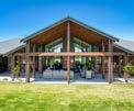
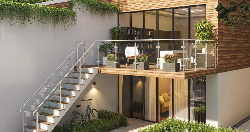
...The existing structure was difficult to clean and was not safe in wet seasons with returning patches of algae. The new structure was build using Plaswood, recycled plastic decking and support frame – designed to create a sleek and stylish contemporary look with no maintenance required...
Read the full story, visit the recent project page on our website.
Choose a product that stands the test of time.
Choose a product that stands the test of time.
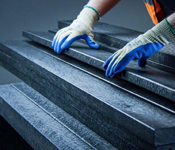
Plaswood provides a range of products and solutions, made from recycled plastic, that are maintenance and splinter free, rot and weather proof.


Begin your journey towards a maintenance free product, visit us at www.plaswood.eco or call us on +44 (0) 333 202 6800
Plaswood provides a range of products and solutions, made from recycled plastic, that are maintenance and splinter free, rot and weather proof. Full



Begin your journey towards a maintenance free product, visit us at www.plaswood.eco or call us on +44 (0) 333 202 6800
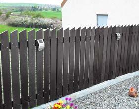




6-8
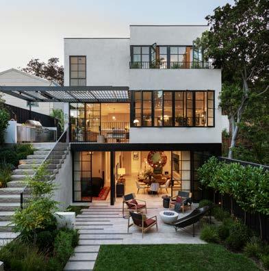
Medium Plenty gives a sprawling update to a once modest 1920s Spanish Revival Home
The redesign of this Bay Area residence refashioned the original two-story home into a four-story modern oasis.
14-16 Between lake and forest
Discovered in 2020, in the midst of the Covid-19 pandemic, the land located on a peaceful lake in Lanaudière was its owner’s ideal location to build their cottage.
18-19 Project Home of the Year!
The Rural Building Company has won praise at the 2023 HIA-CSR Australian Housing Awards, taking home 2023 HIA Australian Project Home of the Year!
26-28 Living Places Copenhagen
Seven prototypes that show how we can develop sustainable buildings with a three times lower CO2 footprint and a first-class indoor climate.
30 Introducing the Schüco Panoramic Sliding Door: A Perfect Blend of Design, Performance, and Functionality.
50 Benchmarx Kitchens
Ruth Lavender, kitchen design expert at Benchmarx Kitchens and Joinery, explains where to spend and where to save when creating a luxury kitchen look for less.
56-59 Sackett Street Townhouse
Barker Associates Architecture Office proudly presents a project delivered for clients, recent empty-nesters, who were looking to refresh their townhouse following the departure of their daughter for college.
72-73 Interest in outdoor design soars
As the mercury rises and the evenings remain lighter, homeowners are firmly fixated on the great outdoors, according to independent tile specialists.
Editor in Chief Antony Holter antony@designbuybuild.co.uk 01304 806 039
Editor Fiona Meadows fiona@designbuybuild.co.uk 01304 806 039
Sales Director Chris Nicholls chris@designbuybuild.co.uk 0203 907 9161
Studio Designer Sarah Johnson sarah.johnson@mhmagazine.co.uk
Business Manager Josh Holmes josh@mhmagazine.co.uk
Publishing Director Martin Holmes martin@mhmagazine.co.uk 01304 806 039
Editorial Assistant Tom Moore tom@designbuybuild.co.uk
Digital Manager Jamie Bullock jamie@mhmagazine.co.uk 01227 936971

The redesign of this Bay Area residence refashioned the original two-story home into a four-story modern oasis.
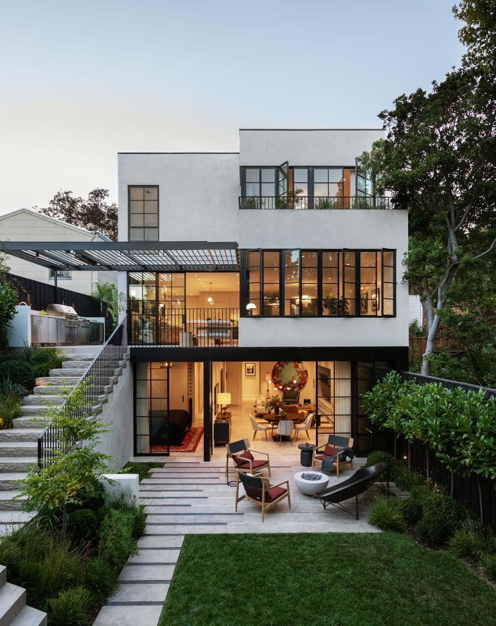
Medium Plenty, a boutique architecture and interior design practice based in Oakland and Sonoma, California, has built a reputation for its sophisticated, integrated design process and modern aesthetics with projects across California and the Western United States. Co-founders Gretchen Krebs and Ian Read have crafted a practice where every detail is always carefully considered, honored, and elevated through an exploration of light, materiality, and spatial authenticity.
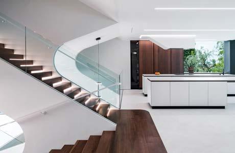
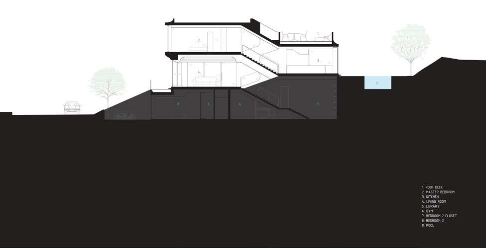
The firm’s latest Bay Area project, the Parker Residence, proved an ambitious undertaking that involved the complete renovation and addition of the property, resulting in a sustainable home that reflects the owners' unique way of living. The project was designed with the goal of fulfilling the programmatic goals of the owners, while maintaining a quiet street presence. To achieve this, the home was essentially rebuilt from within, with excavation to create a new lower level, expansion of all floors, and the addition of a roof deck. Notably, the new rear facade creates a bold statement as it faces the private backyard and terraced gardens designed by Terremoto.
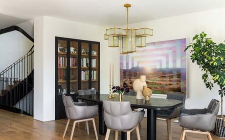
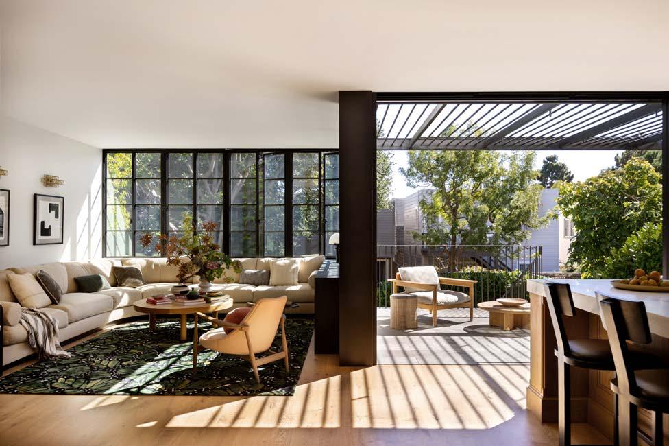
Throughout the project, Medium Plenty focused on balancing traditional and modern styles, spatial needs, and the project site. One of the most notable features of the project is the central staircase, which acts as both the centerpiece and spine of the residence. A three-story, continuous ribbon window accentuates the staircase verticality and provides continuous natural light. The result is a stunning, sculptural feature that provides a dramatic focal point for the interiors by Regan Baker Design.
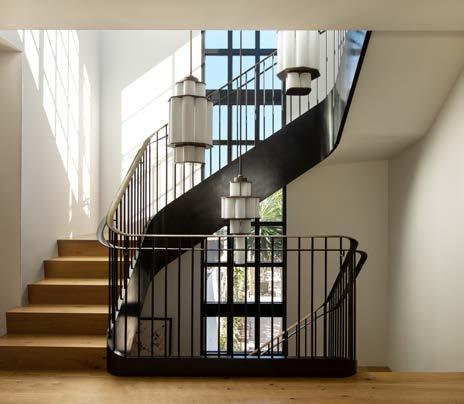
"Throughout the project, Medium Plenty focused on balancing traditional and modern styles, spatial needs, and the project site."
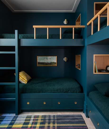
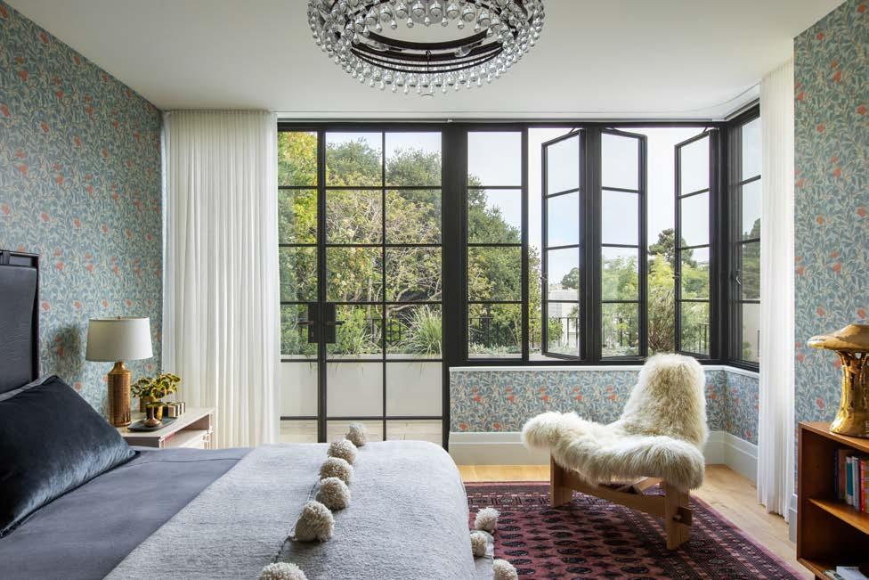
The exterior of the home consists mainly of integral color stucco, painted steel, and stone. The interiors showcase a variety of vignettes that utilize a similar palette of wood or stone floors, blackened steel elements, and painted walls. The result is an overall coherence throughout the home that, while visually eclectic, has a cohesive feel.
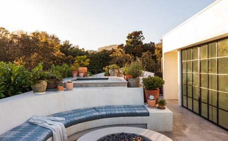
Beyond harmonizing the aesthetics, Medium Plenty incorporated state-of-the-art technology and sustainable design elements to update the home for both current and

future climate needs. Features include upgraded envelope insulation and air sealing, high-performance windows and doors, an HRV system, radiant heat with a solar thermal preheat, a Solar PV system, rainwater reclamation and reuse, and high efficiency lighting throughout. Overall, the project signifies a seamless, collaborative process between the talented design team and the ambitious homeowners.
www.mediumplenty.com | @mediumplenty
Architecture: Medium Plenty

Interior Design: Regan Baker Design
Landscape: Terremoto
Builder: Jetton Construction
Styling: Yedda Morrison
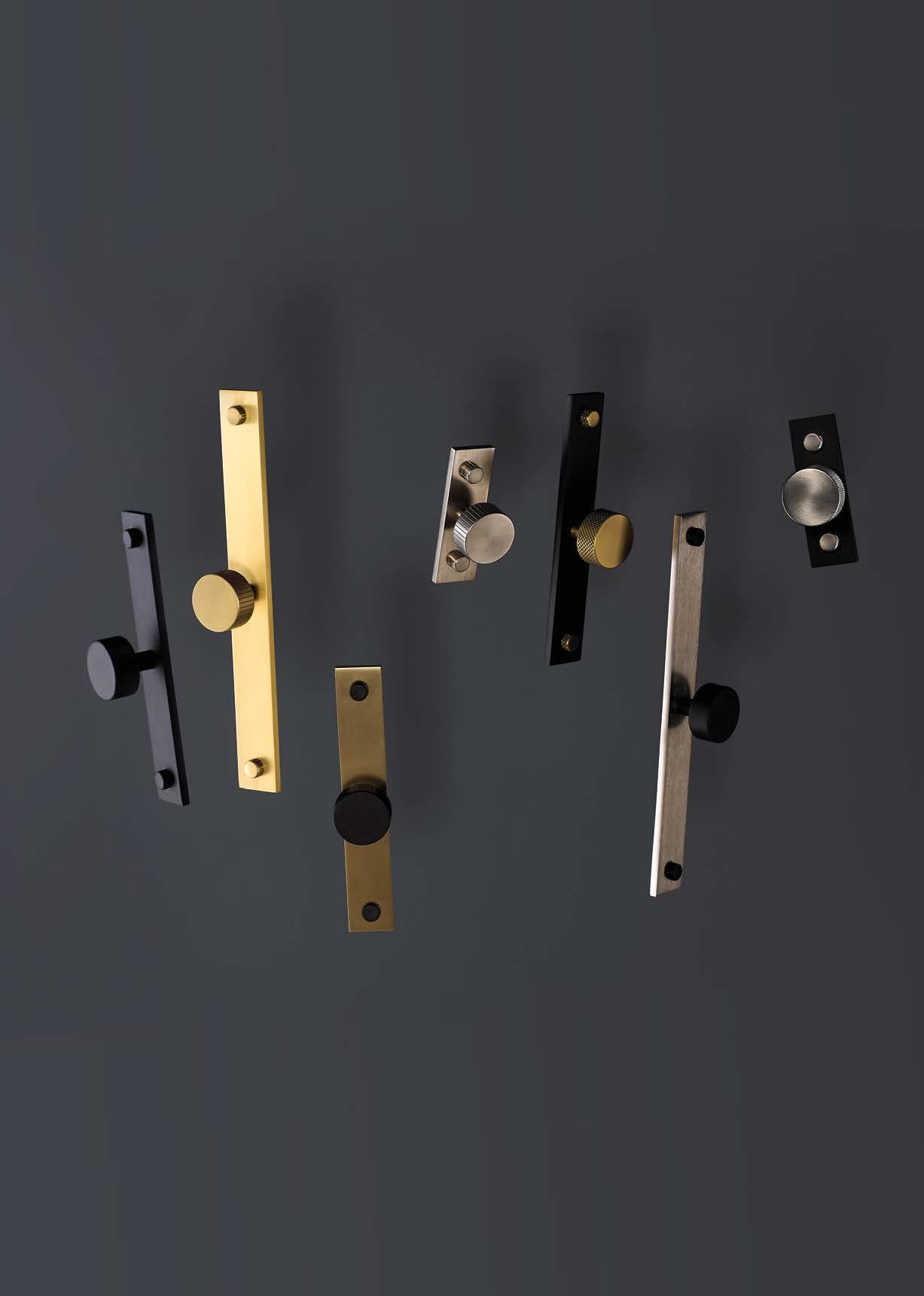
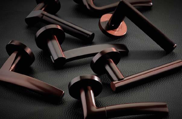
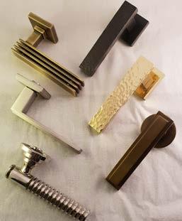
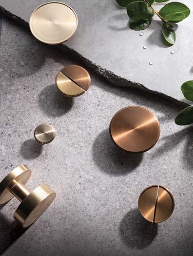
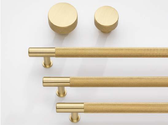
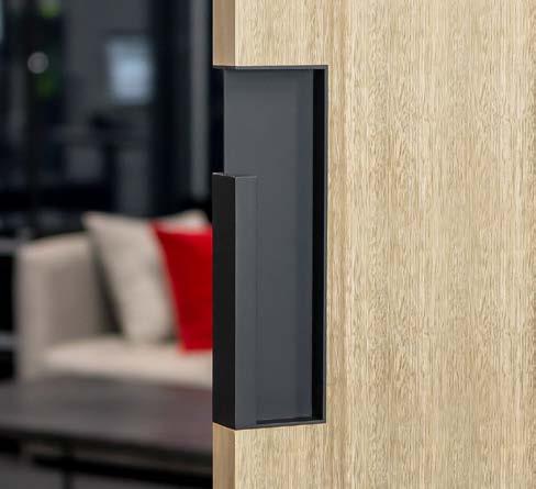
Photo credit: Laure Joliet PhotographyOur STANZA Orange range is designed to be both elegant and modern with the affordability to suit both consumer and contractor. Built on a zinc die-cast inner rose with a sprung assembly and 50mm diameter screw on rose cover, these levers are suitable for any style of interior design project.
A selection of levers in this range are now available in four amazing new finishes: Oscuro Matt Black, Etna Bronze, Tuscan Rose Gold and Favo Satin Brass.


T : +44 (0) 1228 672 900
E : sales@zoo-hardware.co.uk
W : www.zoohardware.co.uk
Stanza is part of Zoo Hardware
The use of ESG Switchable™ glass in the creation of a unique motorsport museum has highlighted its stunning properties in partitioning and displaying precious exhibits in either a retail or museum setting. The brainchild of leading YouTuber Tim Burton, known to his millions of subscribers as Shmee150, the ‘Shmooseum’, dedicated to all things motorsport, has been brought to life in a former farm milking parlour. It now houses vehicles and motorsport memorabilia collected by Shmee on his world travels.
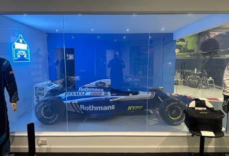
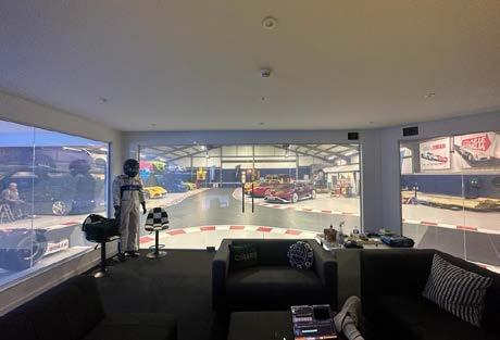
Passionate about the sport, Shmee was determined to display his collection to the best advantage, designing a race track floor with zones and bays in which to display vehicles and other exhibits. Central to the Shmooseum is his grandstand, a two-story edifice within the museum which provides a viewing gallery above and a meeting room and individual display bays below.
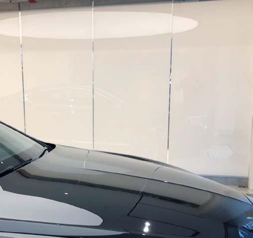
ESG Switchable™ glass holds the key to the grandstand’s versatile use of space. This LCD privacy glass allows the collection to be completely concealed from visitors’ view or proudly displayed, at the touch of a button.
Switchable glass is created by laminating two panes of glass together, using a highly technical LCD interlayer. When an electrical current is passed through the interlayer, it allows light to pass through, creating an optically clear glass pane.
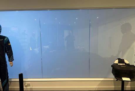
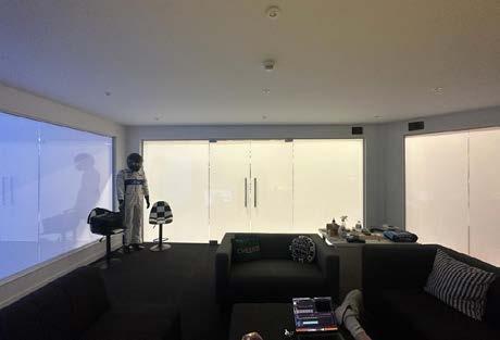
If the current is switched off, the glass becomes instantly opaque, creating an innovative room divider, or entire walls of an internal room.
In the Shmooseum setting, there are several separate controls to allow Shmee to entertain sponsors or VIP visitors in his ground floor meeting room, which itself contains hints to the main collection beyond. At the touch of a button, he can unveil the halo bay, revealing a Williams Formula One show car. A second button reveals the second side, a maintenance bay where vehicles can be lovingly restored and maintained, while the third button controls the main wall, which can be switched on to provide an instant reveal of the main collection, an unrivalled homage to F1 and other motorsport genres which he has carefully collected and curated.
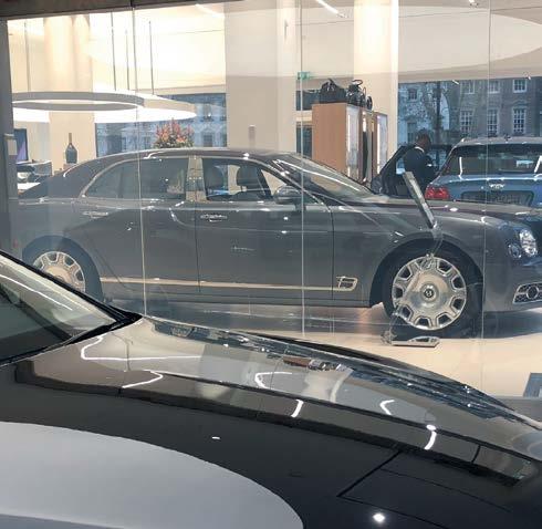
ESG Switchable allows truly versatile use of display areas for a variety of museums, but also for high value retail applications. By adding further interlayers, privacy glass can also provide high security and intruder resistant characteristics, as well as sound attenuation. In domestic dwellings, LCD switchable privacy glass is increasingly used to zone more open plan living areas and create en-suites and study areas within internal spaces.
www.esg.glass
the UK’s leading independent glass processor
get a quick quote today ...



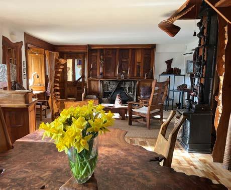
An intelligent fire alarm control panel from fire protection solutions manufacturer, Advanced, has been installed in The Steading, the home of sculptor and furniture maker, Tim Stead MBE.
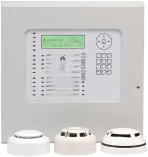
The Steading is an A-Listed building, located in Blainslie near Lauder in the Scottish Borders, and was both the creative centre and home to the Stead family across several decades. It was purchased by the Tim Stead Trust in 2021 and a programme of restoration work has included the addition of an Advanced Go new-generation, single-loop fire alarm control panel to protect this historic home.
The Steading is considered Tim's masterpiece with the interior completely clad in sculpted wood: floors, walls, ceilings, stairs, cupboards, beds, a grandfather clock, sink, conservatory, hanging sculptures, desks and so on – all made by Stead himself. This exceptional building now aims to become a hub for practical expertise in everything to do with wood and the environment, hosting a variety of day and residential courses in the unique environment of The Steading.
Fire and security service providers, Safe Services, installed the Advanced Go fire alarm panel and were involved from the design stage though to installation and commissioning. The panel is integrated with EMS Firecell radio equipment for a complete cable-free fire systemwhich was an essential requirement to preserve and protect the unique interior of the building.
Graeme Millar, Fire Systems Technical and Sales Engineer at Safe Services said: “The Steading is a truly amazing property and we are delighted to have been able to install a system that helps protect this listed building from fire, without interfering with Tim Stead’s beautiful interior. Advanced is our fire
protection manufacturer of choice and we rate them very highly, we don’t use anything else.”
Neil Parkin, Advanced Sales Manager for the North, said: “Our Go fire panel provides sophisticated Advanced configuration but with a single loop making it ideal for small projects like The Steading that still want robust fire protection to offer real peace of mind. Go was developed so that customers can still benefit from the performance, reliability, and flexibility they’ve come to expect from our premium MxPro 5 range, but in a cost-effective, single-loop format for simpler sites where networking’s not needed.”
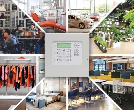
Go is the ideal solution for a wide range of single-panel sites – from restaurants, bars and guesthouses to small offices, shops, salons and surgeries. On straightforward jobs, Go’s fuss-free installation and configuration save time and money. However, the new panel also makes light work of more complex sites requiring sophisticated cause and effect programming options as well as false alarm management and reduction solutions.
Cost-efficiencies for customers have also been central to Go’s development, delivering maximum functionality on a small-site budget. The panel has 15 zonal LEDs as standard for clearer visual indication and BS 5839 compliance without the need to buy a separate LED zone card. Compatibility with three leading detector protocols provides wired and wireless options, as well as greater freedom over design and maintenance provider costs. Further cost savings as well as greater flexibility for site-specific installations are available thanks to a choice of two performance options with different maximum numbers of configurable addresses.
To learn more about Go, visit: www.advancedco.com
Discovered in 2020, in the midst of the Covid-19 pandemic, the land located on a peaceful lake in Lanaudière was its owner’s ideal location to build their cottage. Ghoche architecte was commissioned to design the project and to oversee the construction, which was completed in May 2022.
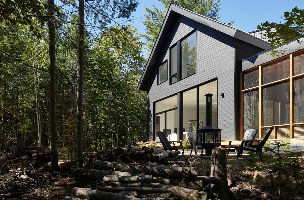
Integrated into the environment, modern, bright, and warm; these were the initial premises of the cottage intended for the couple and their two young adults.
The architectural concept began with a study of the house's layout in order to minimize deforestation and orient views towards the lake, while maximizing exposure to sunlight. Conceptual explorations led to a relatively compact volume and a long, streamlined form reminiscent of a traditional wooden cottage. The views and sunlight were carefully studied to maximize the natural light input while limiting views towards the neighbors. The house had to blend into the landscape, and it was this idea that inspired the black volume, enveloped by the forest. Like a shadow among the trees, the house aims to be discreet and concealed in the woods, and is almost invisible from the lake.
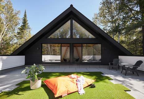
Composed of a single rectangular volume covered with black wood siding, the cottage is set on a gentle slope leading to the dock. The upper part is topped with a sloped roof that is interrupted by a large dormer window on each side. The other part, which houses the garage and entrance, has a rooftop terrace. Simple, but assertive, the volume is pierced by a large alcove lined with white wood and serving as an entrance sheltered from the weather.
The exterior materials were chosen to minimize maintenance, prioritize durability, and promote local purchasing. The exterior walls are covered with a single material, Quebec cedar, whose outer face has been burned to give it a blackened appearance (Japanese-inspired Shou sugi ban technique). The roof, on the other hand, is covered with black steel sheeting, and its steep slopes and generous overhangs were designed to keep water and snow away from the perimeter of the house.
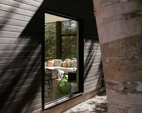
The main floor extends over two levels connected by concrete steps to gently follow the landscape. This subtle level play designed by the architects anchors the house from the entrance to the spaces located on the lake side. Furthermore, this creates a ceiling of over 11 feet in the main living spaces.
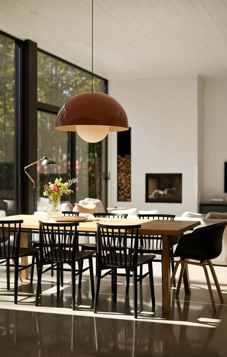
From the entrance, functionality was meticulously studied by the firm to take into account the reality of the Quebec climate and the needs of the family. First, the protected outdoor alcove leads to a large hall overlooking the mudroom and providing direct access to the garage. On the same floor, there is an office and a bathroom with laundry facilities. After going down a few steps, you discover the vast living space and imposing windows showcasing the view of the lake and treetops. The large rectangular room is punctuated by windows on three sides, taking advantage of sun from morning to sunset. In the middle of the room, the kitchen dominates the space with its natural oak cabinets that extend from the floor to the ceiling, providing a refined and warm touch. The 12-foot-long island allows cooking while
facing the view, making it an ideal space for entertaining friends. The open space also includes the living room with a wood-burning fireplace and the dining room, which extends onto a screened veranda with exposed wood beams to offer an immersive experience in the surrounding forest.
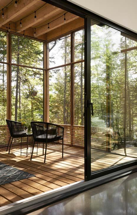
"The architectural concept began with a study of the house's layout in order to minimize deforestation and orient views towards the lake, while maximizing exposure to sunlight."
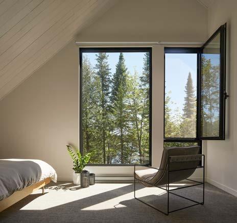
To reach the bedroom level, an oak staircase was located in the center of the plan and serves to divide the upper floor into two sections. The first impression on the top of the stairs is the grandeur effect created by the 16-foot cathedral ceiling and the open-plan living area leading to the three bedrooms. The two identical and opposite children's bedrooms were designed for hosting friends and celebrations away from the parents.
Each bedroom has access to the rooftop terrace, as well as its own private mezzanine with an impressive triangular window, an ideal spot for stargazing. The master bedroom and private office completes the upper level and enjoys the best view of the lake through its oversized windows.
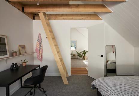
The interior finishes are limited and contrast with the dark exterior palette: white painted walls, white wooden slat ceilings, natural oak cabinets and stairs, and polished concrete floors with integrated heating. The palette was chosen to be neutral to make room for artwork, plants, and colorful furniture, allowing the house to take on the personality of its occupants.
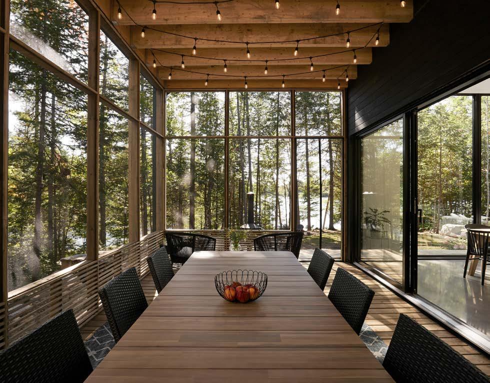
The House on Lake Arthur is a comfortable, warm, and welcoming space immersed in nature, because “Sometimes, Nature is all you need”.
www.ghochearchitecte.com
While the focus of the new acoustic calculator is education, due to its particularly stringent acoustic requirements, future developments of the calculator will expand on this strong baseline. Zentia’s new acoustic calculator also allows the user to view technical

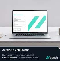
details and sustainability information, order a sample, contact Zentia’s specification team for a consultation, and to add their chosen product to an NBS specification.
The launch of the acoustic calculator comes hard on the heels of another innovative Zentia design tool – Sonify 3D Studio, an online parametric configurator that allows each design of discontinuous ceiling to be visualised and exported as a Revit file to support digital workflows.
www.zentia.com

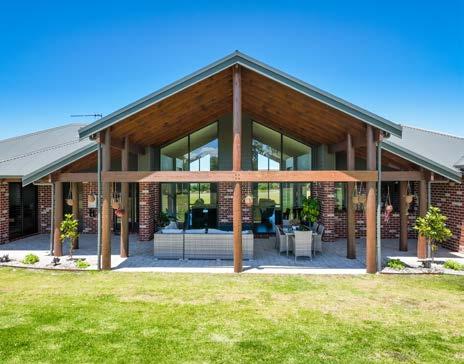
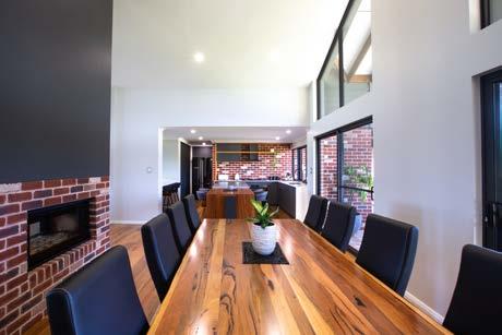
The Rural Building Company has won praise at the 2023 HIA-CSR Australian Housing Awards, taking home 2023 HIA Australian Project Home of the Year!
Hosted in Hamilton Island the awards ceremony is a culmination of a three-day national business conference showcasing the best builders and designers from all across Australia.
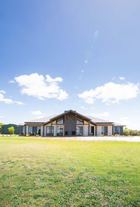
Announced on Saturday 20 May, The Rural Building Company were triumphant for this home in Marbelup that showcases a timeless spacious, farmhouse design.
Principal Designer Rob Kirkosvki, said the home was based on a design from the Retreat Range, The Hinterland.
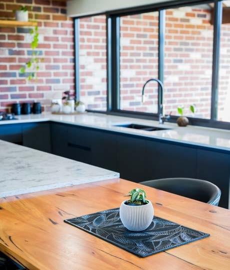
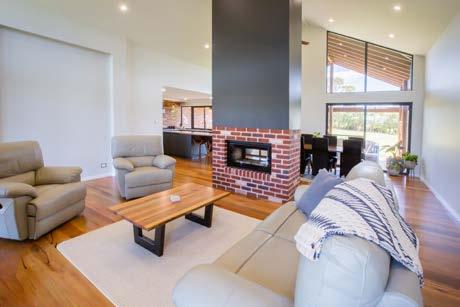
"This home emanates rustic charm and relaxes into contemporary rural living," Mr Kirkovski said.
"Covering more than 350 square metres, this idyllic home
is fit for any family and incorporates the country kitchen, spacious living areas and perfectly thought-out bedroom zones.
“The mixed palette of render, face brick and weatherboard are as at home in the rural lifestyle as the expansive raking ceilings, lofty glazing, and numerous outdoor living areas.
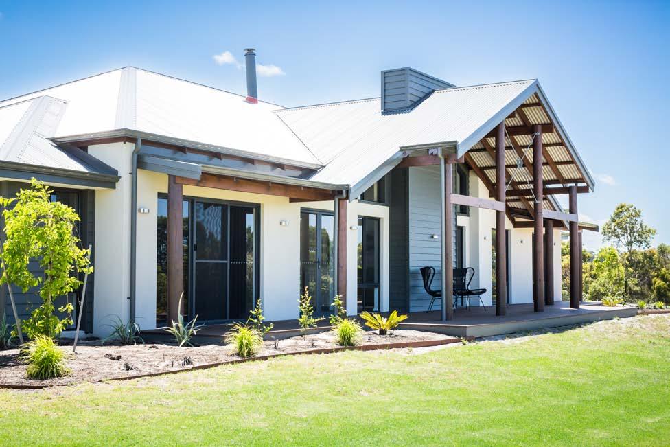
“This impressive abode takes in the tranquil views to the coastal hills and is a perfect example of how a Rural Building Company design compliments the Western Australian landscape and lifestyle.”
Set amidst the picturesque hills of the great southern region, this home is harmonious to its surrounding environment, whilst being a comfortable, functional home.
The Rural Building Company General Manager Tony Harvie said this achievement is a demonstration of the continual commitment to excellence and high standards of quality in both craftsmanship and customer experience The Rural Building Company offers its clients across the State.
“The accolade is a testament to the company’s commitment to excellence, innovation and dedication to building and delivering high quality homes to Western Australians,” he said.
“This award is a validation of our commitment to craftsmanship and our strong focus on engaging high-quality tradespeople and suppliers, who share our passion and work with us tirelessly to deliver exceptional homes.”
This remarkable achievement affirms The Rural Building Company’s position as an industry leader of innovation and design in the residential building industry.
"This home emanates rustic charm and relaxes into contemporary rural living"


Insulated external solid wall construction methods like ICF can offer numerous additional advantages when compared to other traditional methods of walling. This tried and tested construction system has been around since the Second World War when a simple build method was needed for rebuilding various badly bombed European cities.
Today, the application method and materials remain largely the same. Typically, two panels of insulating material connect to create a building block structure (these are either a pre-moulded form or connected through plastic ties. Concrete is then poured into a cavity between the panels, which creates an incredibly airtight, energy-efficient, and resilient structure.

It is the simplicity of ICF that makes it particularly appealing and incredibly fast to work with. A standard, single-story structure can easily be constructed in as little as a few days!
The ICF blocks are stacked, like blockwork or bricks, but instead of needing a bedding material such as mortar, they instead lock via a raised profile along the edge of the formwork. The walls are usually built in stages, typically to a ground floor height at first, before concrete is poured into the blocks. The process repeats until full building height is achieved.
IntegraSpec ICF blocks have the capability to create almost any design, from a traditional farmhouse to a contemporary home with bespoke shapes or curved walls. This gives your architect the opportunity to set your creativity free!
When considering sustainability, a recent report by the Environmental Audit Committee, ‘Building to net zero: costing carbon in construction’ encourages the adoption of a Whole Life Carbon (WLC) assessment. This offsets the amount of carbon created during construction over the emissions created in heating or cooling the building.

Contact us today for a free estimate, whether for the supply of components or for both the supply and installation of your external walls.
T: 028 9590 6508
E: admin@integraspec.co.uk
W: www.integraspec.co.uk


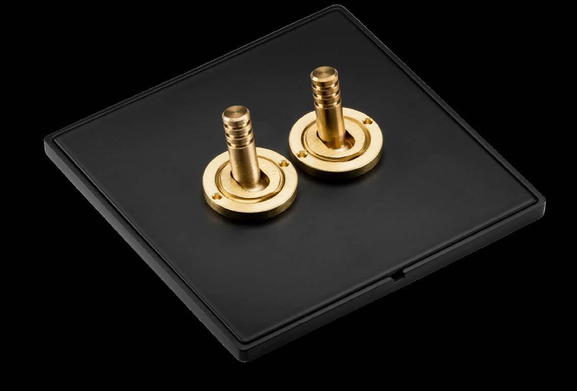
www.atouchofbrass.co.uk
Originally called “A Touch of Brass”, TOUCH changed their name in 2003 in reaction to advancing market changes in architectural Ironmongery to reflect the broader range of products and finishes that they sell.
In fact today Touch supply 20 different finishes including Brass, Satin Brass, Polished Chrome, Polished Nickel, Satin Nickel, Copper, BMA, Antique Brass, Black, Pewter, Ceramic, leather, Stainless Steel, Satin Stainless Steel, Gun Metal & 4 different shades of Bronze and the list keeps growing. Whatever finish you require, Touch can help you get the right look.
Touch occupy their recently refurbished showroom at 210 Fulham Road, Chelsea, where they stock and display a vast range of their 5,000 products. With a customer base including Architects, Interior Designers, Builders and private Individuals who are interested in the quality end of the Ironmongery market, the company also have a healthy export market to all corners of the world, namely the Middle East, Europe and the Americas.
Touch Ironmongery’s owner and founder, Bill Benham, has 42 years’ experience in the Ironmongery trade, as does his colleague Jim Haselup. Saleem Qureshi is the newest member of our team and has 21 years’ experience, meaning their knowledge is unrivalled in this industry.
The range of products supplied by Touch date from circa 1640 French (Louise XIV) and cover all subsequent periods (Georgian, Edwardian & Victorian), Art Deco and contemporary pieces also make up the product ranges.
Touch showcases the very best of British manufacturing; the best ranges are still produced in the Midlands by craftsmen in factories dating back 200 years or more.
Touch Ironmongery have recently become suppliers for Designer Doorware (Australia) Who have beautiful products with a cutting edge design Metal, Wood and concrete. We also have the exclusive rights to sell the Olaria (Barcelona) range in the UK.
Olaria make all our bespoke products, they have incredible levels of workmanship.
Touch also sell European manufactured goods which are considered to be of a very good quality.
With trends continuously evolving new and innovative products are constantly under development.
Touch understand that keeping up with the fashion-shifts is imperative in order to provide every customer with the best solution for their requirements.
Ironmongery can be a difficult and complicated aspect of a building project, as a result Touch aim to take this awkward aspect and make it user friendly and clear to understand by offering an on-site service where they carry out a detailed door by door, window by window, room by room Ironmongery schedule, highlighting all requirements and identifying all requirements.
Restoration is a large part of the business Touch will undertake complete Ironmongery refurbishment projects, and can restore old paint covered door furniture to their former glory, looking as good as new again at a fraction of the cost to replace.
For more information about Touch Ironmongery or to arrange a showroom visit please call 0207 351 2255 or alternatively visit www.atouchofbrass.co.uk
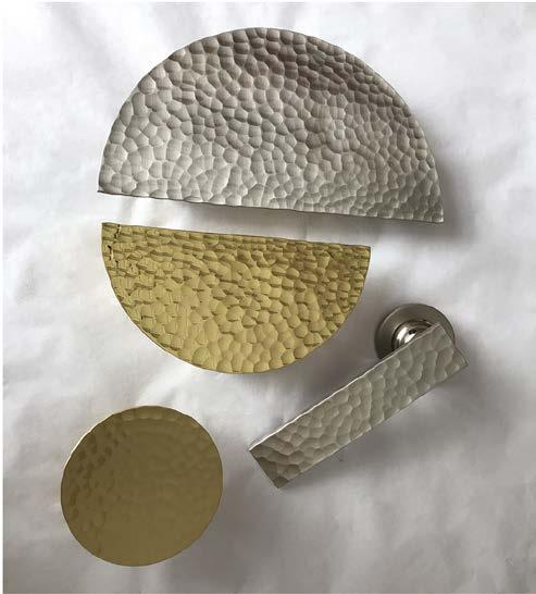
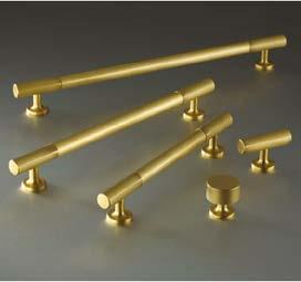
Touch combine traditional skills with modern manufacturing techniques to produce the most beautiful, quality fittings, built to stand the test of time.
As well as specialist bespoke items, Touch supply over 1000 products, available in 23 different finishes to furnish high end residential and commercial properties, royal palaces, government houses, historic castles and stately homes.
Olaria, available from Touch Ironmongery www.atouchofbrass.co.uk & www.olariabarcelona.com

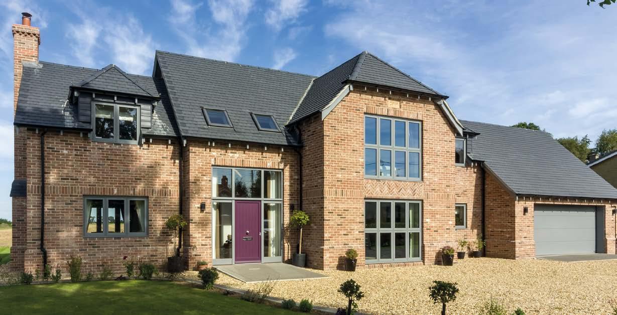
The Future Buildings Standard which is looming over the horizon in 2025 is likely to mean a big increase in the use of triple glazing in order to meet the lower U-values that will be required. However, specifiers are starting to consider vacuum glass as an alternative but which is better? Well, it depends....
What does the Future Buildings Standard say about u-values?
The Government has outlined its plans to deliver a “zero carbon ready” building strategy through its Future Buildings Standard. It aims to ensure that no new buildings from 2025 will require further retrofitting, with an uplift in energy efficiency standards, improved ventilation and requirements to mitigate overheating in residential buildings. A start was made on this last year with the changes to building regs and parts F, L and O.
Following public consultation, a Notional Building Specification has been developed which states that window U-values will need to be 0.8 (W/m2.K) down from 1.2 (W/ m2.K) currently. Doors will need to be 1.0 (W/m2.K) from 1.2 (W/m2.K) (where more than 60% glazed)
This is likely to lead to triple glazing becoming the norm in most windows for new buildings or retro fits that want to achieve the highest performance.
What is triple glazing? Very simply, triple glazing is an extra pane of glass added to the two used in double glazing but the benefits can be great. Up to now, many of our clients have opted for triple glazing in areas where they require high acoustic performance, with this comes much better thermal performance, saving money on fuel bills.
What are the advantages of triple glazing?
Excellent thermal performance that meets the new Future Homes Standard, will save you money on heating
• Great acoustic performance - ideal for blocking out noisy roads, aircraft noise etc
Better security - thicker units are harder to break
• Can help to reduce condensation
What are the disadvantages of triple glazing?
• It costs more than double glazing but usually not as much as vacuum glazing.
The windows are heavy which means they require chunkier frames and stronger fixings, all of which increase the price further.
Aesthetically, some people dislike the look of the triple glazed windows because they aren't as sleek as single or double glazed ones.
• Reduces the amount of heat from the sun limiting thermal gain. Harnessing solar energy is something homeowners have done for centuries and this is harder with triple glazed units.
What is vacuum glazing? Vacuum glazing takes two pieces of glass with a tiny gap (0.1mm in the case of Fineo) and removes the air to create a vacuum.
They used to have unsightly plugs where the air was extracted but the latest technology means this is no longer the case. Ultra thin from as little as 7.7mm compared to 44mm for triple glazing, it's great for listed historic properties or new builds looking for a sleek slimmer aesthetic.
What are the benefits of vacuum glazing?
3-4 times thinner than triple glazing, looks more like single glazing
• Same thermal performance as triple glazing. Fineo states 0.7 W/(m2K) which is better than the target the Government is aiming for in the Future Homes standard. Lasts longer - because it doesn't have gas between the panes which can leak over time
Better solar gain - allows more sun heat into the room helping reduce energy bills
Much lighter than triple glazing
• 15% more light is allowed into the room compared with triple glazing
Environmentally better - much lighter saving on transport and less product used plus last longer so less need to replace
Great acoustic performance
Better aesthetically especially for historic properties, listed properties and modern contemporary builds that want to avoid heavy frames and fixings
Easier to install
What are the disadvantages of vacuum glazing?
Typically it is the most expensive option compared with double and triple glazing, this is thought to be due to there being no UK manufacturers making it and the inherent cost of the materials, some use silver for example Low impact resistance - where micro pillars are used it can put high stress on the glass.
How much does vacuum glazing cost?
Vacuum glazing can cost up to 60% more than double glazing and around 35% more than triple glazing*. *Prices may vary depending on size and spec.
So which should builders and architects choose from 2025? Inevitably, it will end up coming down to price in most cases. We predict that most people will opt for triple glazing unless something drastic happens to the price of vacuum glazing, which may happen as the product becomes more popular and their production efficiencies improve. However, for anyone looking to balance the new regulations with heritage detailing, vacuum glass is the option that makes this possible.
“We are getting more and more enquiries about vacuum glass from architects and specifiers who like it for its performance and great aesthetic qualities, but often value engineering means they have to fall back on triple glazing.”
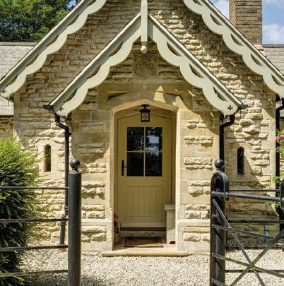
Tom Wright, MD, George BarnsdaleWhether you are looking for solutions for a new build or a refurbishment, our timber windows and doors are expertly designed to meet the most demanding design and performance specifications whilst remaining sympathetic to the building’s architecture and surroundings.



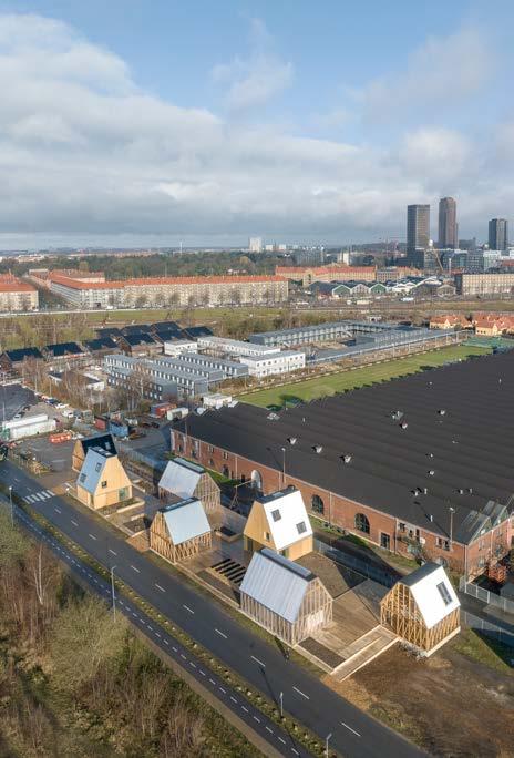
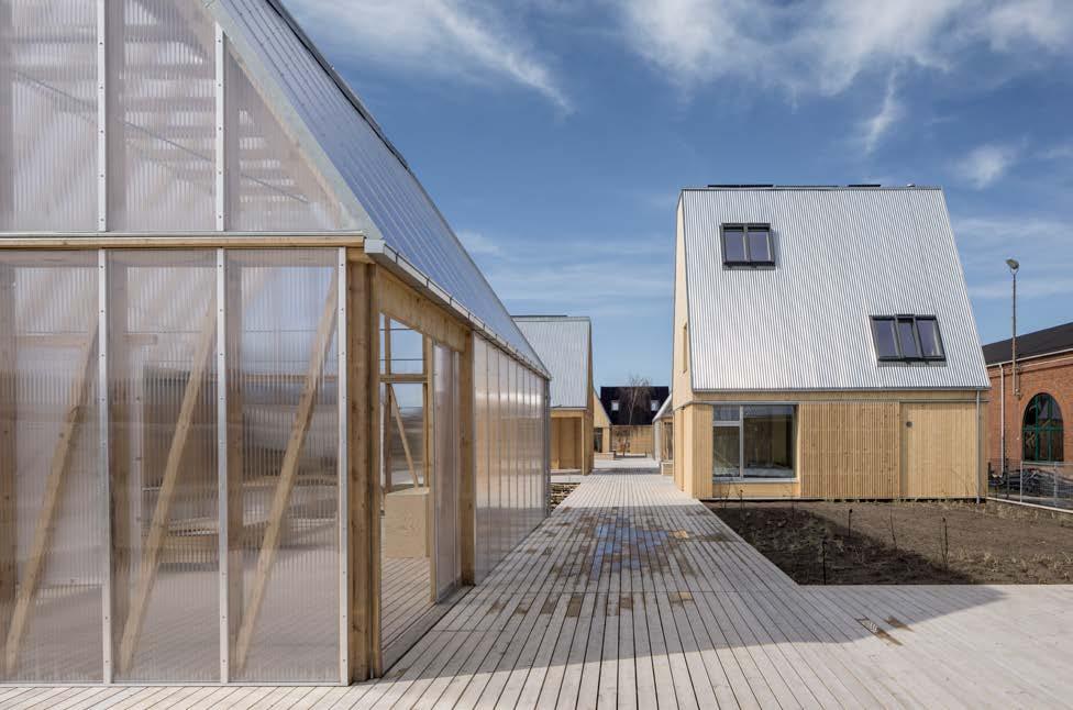
Seven prototypes that show how we can develop sustainable buildings with a three times lower CO2 footprint and a first-class indoor climate
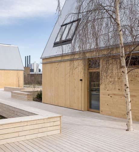
The VELUX Group and partners open the doors to Living Places Copenhagen – seven prototypes that show how we can develop sustainable buildings with a three times lower CO2 footprint and a first-class indoor climate. Living Places concept holds the lowest CO2 emissions in Denmark, demonstrating that we do not have to wait for future technology to build more sustainably.
The building industry accounts for 34% of the global energy consumption and 37% of the global CO2 CO2 emissions[1], and in the latest report from the UN's climate panel, it is clear that low carbon solutions must be scaled and implemented – also in the building industry. One of those solutions can be experienced in Copenhagen from today. With the groundbreaking project Living Places Copenhagen,
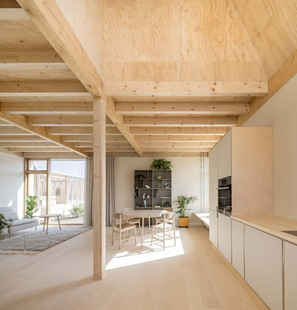
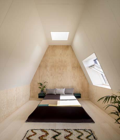
the VELUX Group and its partners, demonstrate how to build homes with a CO2 footprint of 3.8 kg/CO2/m2/year – three times lower than the current Danish legislation of 12 kg CO2/ m2/year – and to a price that matches the market price for a one-family house or rowhouses at scale. Furthermore, Living Places Copenhagen is designed with a strong focus on creating a healthy indoor climate using daylight and fresh air and it delivers best in class indoor climate.
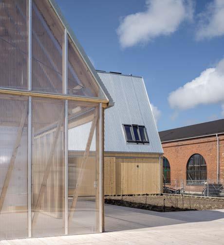
"As part of an industry that accounts for a large part of the global CO2 emissions, we wish to take responsibility for finding ways to build more sustainably. With this project, we show how it can be done already today. I’m very proud of the results we have created with Living Places Copenhagen together with our partners. This project is a good example of how building more sustainable, healthy homes can both address climate challenges within our industry and improve peoples’ health. After all, we spend 90% of our time indoors, so a healthy indoor climate in our home is crucial," says Tina Mayn, Executive Vice President for Products at the VELUX Group.
"Living Places Copenhagen is the first prototype showcasing the overall concept - Living Places – which was initiated by the VELUX Group, EFFEKT and Artelia. The vision is to lead the way within the building industry and show how rethinking buildings can help solve some of the global climate and health challenges. The concept is based on five key principles: homes should be healthy, affordable, simple, shared over time and scalable. These principles can be applied to new or existing buildings and communities.
The materials, solutions and knowledge are already here .
As a part of The Living Places Copenhagen project, the VELUX Group, EFFEKT, Artelia and Enemærke & Petersen, have carried out a complete Life Cycle Assessment. This means that each material, design and building technique has been carefully considered and mapped in terms of the emissions they project compared to a typical Danish household. Based on this, the partnership have built prototypes, showing that we do not have to wait for future technology to build homes that benefit both people and the planet.
"Living Places concept holds the lowest CO2 emissions in Denmark, demonstrating that we do not have to wait for future technology to build more sustainably."
"The monitoring and thorough assessment of every product and process has been crucial to reach the results that we are able to present with this project. The fact that we have been able to reach these record results with Living Places Copenhagen is proof that we don’t have to wait for future technologies to build more sustainable buildings. The materials, solutions, and knowledge are already here - we just need to enable and scale them. I hope that we can inspire the building industry to follow," says Lone Feifer, Director of Sustainable Building at the VELUX Group.
Living Places Copenhagen showcases a total of seven prototypes – five open pavilions and two completed fullscale homes which open to the public on Earth Day on the 22nd April. As an official partner to the UIA World Congress of Architects in Copenhagen, Living Places Copenhagen will host a programme of debates and activities designed to drive and accelerate change in the building industry.
www.velux.com
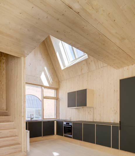

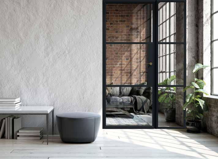
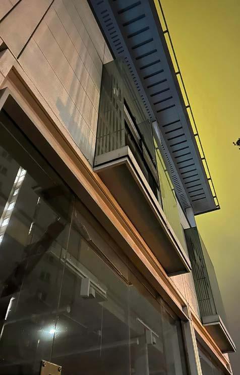


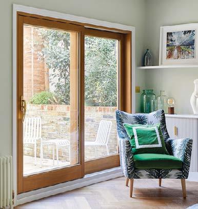
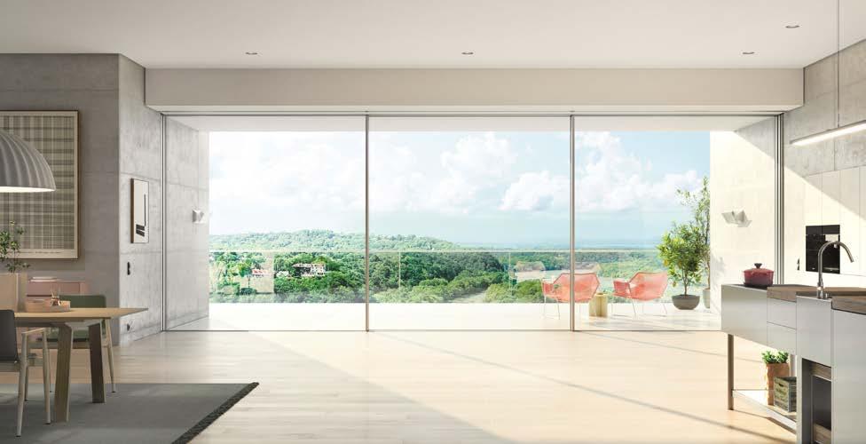
Schüco is proud to announce the launch of its latest innovation, the AS PD 75.HI Panoramic Sliding Door, a ground-breaking product that redefines the standards for sliding door systems. This state-of-the-art sliding door combines maximum transparency, ease of access, and an array of customisable design options that cater to the unique requirements of architects and clients alike.
The Schüco Panoramic Door is characterised by large-scale glass areas from floor to ceiling, with flush-fitted frames concealed in the walls, ceiling and floor. Only a narrow 35mm interlock section is visible. The result is virtually frameless views.
Developed in response to the needs of architects, specifiers, and clients, Schüco engaged in extensive dialogue to understand the specific requirements of the premium residential sector. The result is the Schüco AS PD 75.HI Panoramic Door which brings together multi-functionality and style in three distinct product lines:
The Access Line offers the perfect balance between design and function, with a level threshold and easy operation.
The completely frameless Design Line enables uninterrupted views and offers a sleek, modern look.
The Performance Line with lift-and-slide technology and automated operation offers the highest level of technical performance combining maximum comfort with stylish design.
An extensive range of add-on features can be incorporated to offer a tailored solution for a wide range of project requirements.
Architects can emphasise a minimalist appearance with the help of features such as the integrated flush pull grip and the dynamic cover profile. The flush-fitted appearance of the door when closed, as well as its seamless integration into interior design when open, make it an ideal choice for both modern and traditional spaces.
Smart technology allows sliding units to be opened at the touch of a button via app or switch, and integration into smart home systems. Optional lift-and-slide technology, a choice of double or triple glazing and integrated sun shading offer ultimate weather performance for year-round comfort.
A wide range of opening configurations and options such as Schüco WoodDesign for a timber look can be selected to suit the specific needs and tastes of each client.
The Schüco Panoramic Sliding Door is a testament to the company’s commitment to continually innovate and deliver exceptional products that combine form, function, and performance. Experience the future of sliding door systems with the Schüco Panoramic Sliding Door.
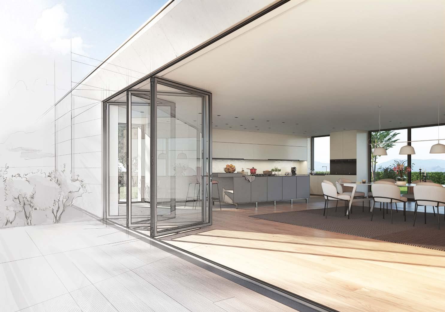
For more information about the Schüco AS PD 75.HI Panoramic Sliding Door, visit www.schueco.com/uk/ specifiers/products/sliding-systems/panoramic-door


Aluprof have attended the ICE Awards held in Dublin for the second year running. A construction highlight of the year for the Emerald Isle. As Gold Sponsor for the Gala Event, Aluprof offered awards in the best ‘Education Project’ and best ’Healthcare Project’ categories.

The awards, founded by the Irish Building Magazine in 1993, are generally known as the ICE Awards and are the original and premier recognition of performance excellence for the contracting sector in Ireland. The Gala Night is always attended by Ireland’s elite construction professionals, where construction leaders, design and supply chain partners, and clients meet and celebrate construction excellence.
Since Aluprof’s emergence onto the UK & Ireland market sixteen years ago offering a well established European portfolio of architectural aluminium systems, meeting and often exceeding the needs of specifiers, Ireland’s specifiers and major facade contractors have welcomed Aluprof as a major systems supplier. Aluprof’s logistics provides
weekly deliveries to Ireland from an extensive stock of aluminium systems and hardware located at their head office in Poland. Powder coating and thermal break facilities are all housed under the same roof allowing products to be finished to meet any specification. In addition, Aluprof also offers a fabrication service to support its network of fabricator installers across the region when required to meet programme expectations. Coupled with a physical ‘on the ground’ presence from Aluprof UK & Ireland’s team of support technicians, quickly placed the company in the region as a major systems supplier.
Members of TODD Architects, the region's leading architectural practice, were in attendance at the awards ceremony as a guest of the Aluprof UK team. During the evening Aluprof UK awarded winners trophies to best ‘Education Project' for Tyndall Institute of Technology UCC, Phase 1&3, constructed by Summerhill Construction, which was designed by Butler Cammoranesi architects and Scott Tallon Walker Architects respectively for each phase. Second category Aluprof UK presented the awards was for the best ‘Healthcare Project’ and University Hospital Galway Radiation Oncology Centre constructed by John Paul Construction and designed by MCA Architects was the winning project to receive the trophy.
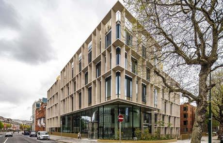
The ICE Awards ceremony venue Photo: Courtesy of ICE Awards Wojciech BrozynaAluprof UK Managing DirectorOne project winner on the evening in the ‘Commercial €10m to €60m’ category, the Cadenza project at Earlsfort Terrace, Dublin, used Aluprof systems on the ground floor with its stunning façade fabricated and installed by GLF Facades. Architects on the project were Henry J Lyons Architects who designed the building for client Irish Life.
"One project winner on the evening in the ‘Commercial €10m to €60m’ category, the Cadenza project at Earlsfort Terrace, Dublin, used Aluprof systems on the ground floor with its stunning façade fabricated and installed by GLF Facades."



Among the many other projects that have been completed in the Republic of Ireland, the headquarters of Microsoft, Twitter and Google, all play special roles as large-scale office buildings that demand high-quality specifications in building components. Aluprof UK also boasts of being a provider of the aluminium windows and doors of the recently completed six large scale commercial buildings in the Dublin Landings area.
Further information about systems and specification support is available through the company’s website at aluprof.co.uk or direct from their UK head office in Altrincham by phoning +44 (0) 161 941 4005.
Group photo (Left to right): Omer Kanipak (Marketing Manager, Aluprof UK), John O'Brien (Project Consultant, Aluprof UK), Penny Linton (Principal, Dublin, TODD Architects), Laoise McGrath (Architect, TODD Architects), Emma Cooney (Project Architect, TODD Architects), Wojciech Brozyna (Managing Director, Aluprof UK), David Connor ( Senior Architect, TODD Architects) (Photo: Courtesy of ICE Awards) The Cadenza Project, Earlsfort Terrace, Dublin (Photo: Kanipak Photography) Aluprof UK MD, Wojciech Brozyna presenting the trophy for the Education Award (Photo: Courtesy of ICE Awards)Although often overlooked, window frames play a big part in setting the tone of your home.
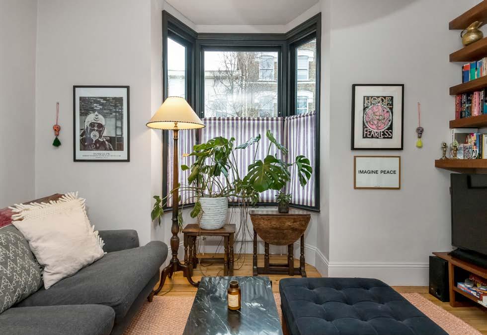
The right colour and style can highlight your house’s architectural features and provide the wow factor that accentuates your style.
However, not taking the proper steps for repainting frames will result in drips, cracks and flaking paint, making homes appear neglected which, in turn, can devalue your property.
Whether you’re hoping to refresh and repair your window frames back to their original glory or looking to embrace a brand-new colour for spring, follow my tips for achieving a professional finish…
All window frames can be repainted, but it’s important to stick to the rules of your frame material for a professional finish.
Wooden frames are the easiest to paint in terms of preparation and paint choice. For aluminium, vinyl, or fibreglass, however, you’ll need to follow the manufacturer’s guidance and select the correct paint designed for specific surfaces.
Before you do anything else, you first need to give your window frames a good scrub.
While this is particularly important for external window frames exposed to the elements, you shouldn’t neglect to clean your internal frames either.
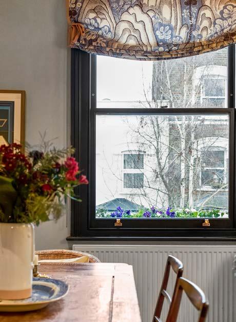
Fly dirt, dust and condensation mean internal window frames can easily become grotty, which will affect the quality of the paint job.
Simply mix warm water with a few drops of washing-up liquid to wipe away grime from your windowsills. Ensure all moisture is buffed away with a microfibre cloth.
Once your window frames are clean, you can begin sanding. This step is vital to ensure you have a smooth surface to work on while also creating enough texture for your new paint to stick to.
For wooden frames, begin with a medium-grit sandpaper. Around 120-grit should suffice. Be sure to cover your mouth and eyes and brush away dust residue.
For aluminium or PVC frames, stick to a finer grade of sandpaper. You just need to create a rough-enough surface for the paint to stick and to prevent flaking.
After a few rounds of sanding, your windows are ready to be taped.
Remove all hardware where possible, like handles, and use masking tape to cover all joining areas that you don’t want to get paint on. This includes the glass of your windows.
Some people prefer to use masking liquid which is specially formed to prevent paint from staining glass. Simply paint the liquid directly onto glass and allow it to dry.
Above all else, don’t neglect to use a primer. Primers create a bonding layer with paint that reduces the chance of it peeling over time. The smooth surface builds a more uniform tone that covers dark spots and allows the new paint colour to pop.
Aim to apply two coats and allow them to dry fully before starting on your first layer of paint.
With your window frames prepped and chosen paint at the ready, you can now begin your first layer.
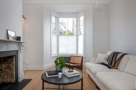
Use a paintbrush – not a roller – and work in smooth, even strokes. This will ensure even coverage and get a consistent finish without drips.
Aim to paint three thin layers until all the primer colour is covered. Thinner layers will dry quicker and more evenly, resulting in a better finish.
Waiting until your window frames are fully dry before removing your masking tape is a sure way to end up with flaking paint and uneven lines.
However, you shouldn’t remove any masking materials while the paint is very wet since this can lead to paint bleeding onto undesirable areas.
Instead, you want to peel away your masking tape or liquid when it’s just slightly wet. This will result in perfect, crisp lines.
"The right colour and style can highlight your house’s architectural features and provide the wow factor that accentuates your style."
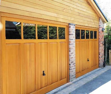
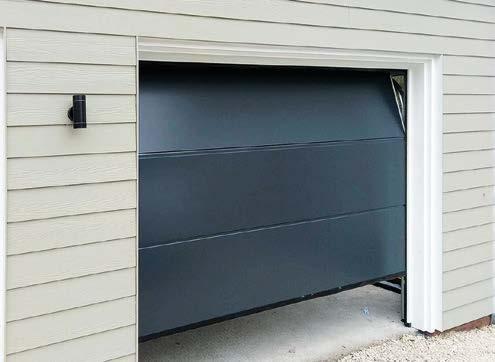
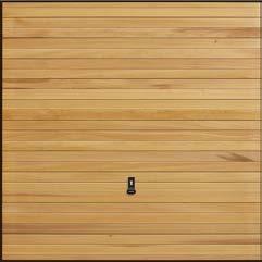
Garador’s beautiful horizontal cedar garage doors are a top choice by developers and renovators, especially on properties where timber cladding has been used on exterior walls. Garador’s horizontal cedar garage door is constructed from tongue and groove natural solid cedar boards, a design that naturally complements timber cladding.
These timeless garage doors, with their precision crafted design and glowing red cedar, will enhance the appearance of any home. They also offer many additional advantages. The cedar used by Garador is a natural and renewable material and contains self-
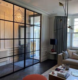
Individual style is in and creating a snug room is a great way to show it – says Crittall Windows.
Planning a new look for your home? It seems anything goes these days - the trend is for individual style. With many of us spending more time at home, householders are increasingly design savvy in creating a personal style to reflect their lifestyles.
and textures with cushions, rugs and throws and you’ve cracked it.
As is sharing natural light throughout your home.

protective qualities against warping. Garador’s cedar doors should last a lifetime if properly maintained.
A wider board version, the Countryman design, is also available when there is no requirement to match exterior cladding.
Find out more about Garador’s horizontal cedar doors at www.Garador.co.uk
Creating a cosy snug room is a great way to show individuality and very in vogue. Think home comforts. Dimmable ‘focus’ lighting; natural shades, rugs, soft sofa, Smart TV, play area or a games section, maybe a book corner for you and the
While the nature of a snug is to make it comfy, clever use of glazing via Crittall’s internal steel screens, doors and windows - made to order to your personal needs - ensure light is let in throughout the home and they look stylish,
When architects Scott Brownrigg were given a brief to create a new gateway to Cambridge Science Park they knew the building had to be impressive to attract the desired high tech and Research and Development companies.
The design features a colonnade sweeping across the front of the building echoing the curve of the spine road and a new public space. The column spacing guides occupants and visitors to the entrance – a GEZE Slimdrive SCR curved automatic sliding door.
The building has a BREEAM Excellent rating for its design so the Slimdrive SCR was the perfect complement. The circular entrance features two sets of automatic bi-parting curved glass sliding doors, creating a lobby that minimises heat loss or gain and so helps to contribute to the building’s environmental credentials
In addition the Slimdrive SCR automatic curved sliding door provides a light and airy all-glass lobby entrance which blends seamlessly into the façade and the large glass atrium, it combines high performance with unobtrusive operation.
Inside the operator’s deep canopy an integrated air curtain was installed to further minimise any heat loss and maintain the aesthetics of the building.
The Slimdrive SCR automatic operator also provides uninhibited access and so meets the demands of Part M, BS 8300 and EN 16005, whilst the access control system ensures security.
Recognising the outstanding design of the building, the Cambridge Science Park has been shortlisted for the 2023 British Council for Offices (BCO) Awards. The BCO’s primary objective is to define excellence in office space.
Ross Mcwatt, Associate Architect at Scott Brownrigg said ‘We have worked with GEZE several times, they have the same focus as we do in terms combining sustainability, accessibility and aesthetics.
Richard Richardson-Derry, National Specification Manager at GEZE UK added ‘This is an outstanding building, that meets many demands, we were delighted to play a part in creating an entrance and achieving the criteria of the brief.

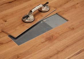


Delivering the ultimate in wood flooring innovation, Havwoods’ Magna collection is designed specifically for use in commercial spaces, offering high-quality functionality without compromising on visual appeal.
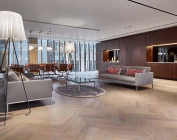
A superior solution for workspaces and retail environments, Magna provides access to underfloor services, reducing downtime for refurbishments, whilst being significantly faster and easier to install than using glue or underlay. The incredible design also provides both a practical and sustainable solution for re-using the flooring as it can simply be lifted, transferred and used in another space with ease.
Each plank consists of an Oak surface layer and engineered core, the magnetised and foam-sealed wood boards provide a secure connection to the supporting pedestal which can be conveniently disconnected using a suction lifter for enhanced access.
Alongside these exceptional qualities, the Magna boards are also available in an array of trend-led finishes across the Havwoods Herringbone, Classic and V Pro ranges.


Offering customers the choice to create a statement surface that can be removed and replaced easily thanks to its state-of-the-art system. Additionally, just like the conventional Havwoods wood floor, the boards can be sanded and maintained in exactly the same way to ensure a long-lasting, aesthetic floor surface. Whether customers are renovating one main space or a larger area, the pioneering range makes for the perfect choice thanks to its durability and diverse colour grades.
www.havwoods.com/uk magna@havwoods.com +44(0)1524 FLOORS & FLOORING 37
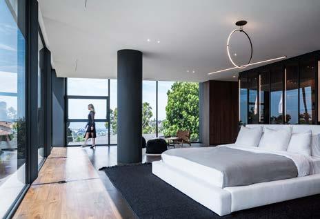
Arshia Architects proudly introduces RO54, perched on a hilltop in the Bel Air neighbourhood of Los Angeles, overlooking the Pacific Ocean and the Los Angeles basin. The project gently lands a dynamic building on top of a buried podium that replicates the natural topography that existed prior to the area being subdivided for development. This hollow post-war neighbourhood has been transforming gradually, overtaken by recent developments that rely on size, rather than spatial quality. The concept set out to reduce the massing of a rather large project in order for it to lodge within the neighbourhood proportionally. It proposes an alternative model within the confines of stringent regulations.
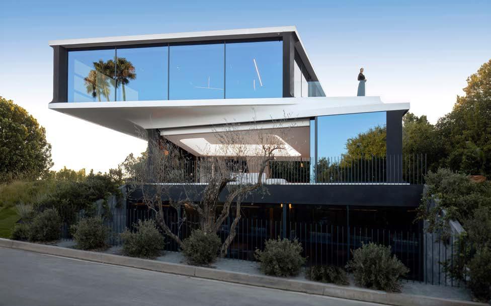
This project engages an exercise in spatial relationships to accelerate the programs of the house. It utilizes the split-level design to follow the topography of the hill, and to connect the floor half-story plates. The plates form adjacencies, both visual and functional, thus allowing twice the utility of an otherwise compartmentalized organization.
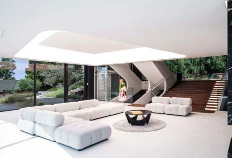
The project’s aesthetic was directed by streamline automotive design which, among others, proposed concealed performance for every technology in the house. The interior palette was based on a utilitarian approach to materials, in contrast to the overall ambient approach of the design where space overcame necessity. This balance of power proceeded in the backdrop of environmental sensitivity and clinical dearth.
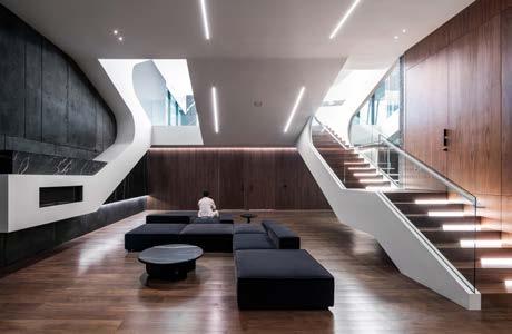
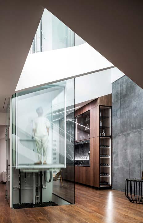
A courtyard, created by daylighting the lower bedrooms from the buried podium, also acts as the rainwater runoff filtration system for the entire site. The project meets or exceeds stringent California green building and energy conservation standards such as low-flow plumbing systems, drought tolerant planting, rainwater filtration, photovoltaic integration, high efficiency building envelope and glazing, HERS rating of the mechanical system, and more.
Indoor materials specified were sourced naturally and are compliant with Low VOC standards. The design palette was kept minimal to an all natural selection including mica plaster, hardwood flooring, and natural stone. The project sought out minimal, low-impact, and proven materials, achieving a balance between durability, ease of maintenance, and responsible design.

"The project’s aesthetic was directed by streamline automotive design which, among others, proposed concealed performance for every technology in the house."
THUS FAR, THE PROJECT HAS WON 18 INTERNATIONAL DESIGN AWARDS INCLUDING:
A Design Award 2023
ACDA - Architecture, Construction & Design Awards-2022
AMP - Architecture Masterprize-2022
Architect of the Year Awards-2022
Best Of Year_ Interior Design Magazine-2022
Built Design Awards-2022
Credaward-2023
Global Future Design Awards-2022
IDA - I Design Awards-2022-Ro54
LABC - Los Angeles Architectural Awards-2022
LIT - Lighting Design Awards-2022
LIV Hospitality Design Awards
London International Creative Competition-2022
LOOP Design Awards-2022
Outstanding Property Award London-2022
SIT-Interior Design of The Year-Professional
Titan Property Awards-2022
UDAD-Urban Design & Architecture Design Awards-2022
www.arshia.net/ro54 | www.arshia.net
Project Developer: Mike Parsee
Architect: Arshia Architects
Architect Team:
Arshia Mahmoodi (Design Principal)
Xinlei Li (Project Manager, Project Designer)
Yuheng Huang (Project Designer)
Fang Cui (Project Designer)
Ruby Wu (Project Designer)
Zhishan Liu (Project Designer)
General Contractor: Domaen Build Inc
Structural Engineer: BOLD Engineer & Associates Inc.
MEP Engineer: GMEP Engineers
Civil Engineer: GreyStone Engineering Group Inc.
Soils Engineer: Hillside Inspections, Inc
Photographers: Paul Vu / Renee Parkhurst / Yuheng Huan
Interior Architect / Designer: Arshia Architects
Landscape Architect: Arshia Architects
Lighting Designer: Arshia Architects
Project Address: 1254 Roberto Ln, Bel Air, California USA
Floor Area: 6,774
Site Area: 10,314.8 sf
Site Dimensions: 120’x85’
Building Dimensions: 65’x49’
Landscape Area: 6,438.34 sf
Zoning: Residential Estate (RE15-1-H-HCR)
Height: 26ft (max)
Program: New Single-Family Residence.
Substructure: Exposed structural concrete retaining walls with integral pigment (graphite iron oxide)
Superstructure: Structural steel with light gauge steel framing infill and wood joist framing.
Exterior Shell: CNC milled High-Density Urethane (HDU) boards coated with mineral plaster
Interior Wall Surfaces: Painted drywall, walnut wood veneer, exposed pigmented concrete, marble slabs
Floor Material: Plaster, Engineered walnut wood flooring
Lighting: Diffused LED lightfield, linear LED lights, pinhole LED lights
Air Conditioning: High Efficiency Zoned Variable Air Handler units with roof-integrated condenser compartment and custom manufactured micro-slot diffusers.
Plumbing: Water efficient fixtures with european durability
Equipment: Design and durability conscious appliances
Automation: Lutron Homeworks mainframe with Palladium interfaces and shading devices
Hardscaping: Cumaru wood decking, Silver Decomposed Granite, Aggregate finish concrete, Arizona Flagstone boulders.
Waterproofing: Encapsulated foundation membrane, polymesh applied surface waterproofing over whole house adhered membrane.
Landscaping: Native, drought tolerant planting.
Photo credit: Paul Vu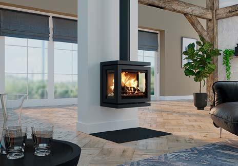
Dik Geurts is a name that has been synonymous with wood fires and stoves for over 40 years. Founded in the Netherlands in 1981, the Dik Geurts range is now produced by DRU, established in 1754 and one of Europe’s leading fireplace companies.
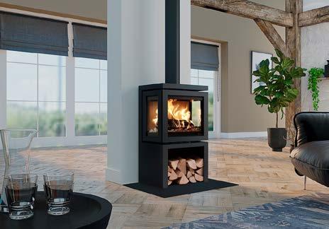
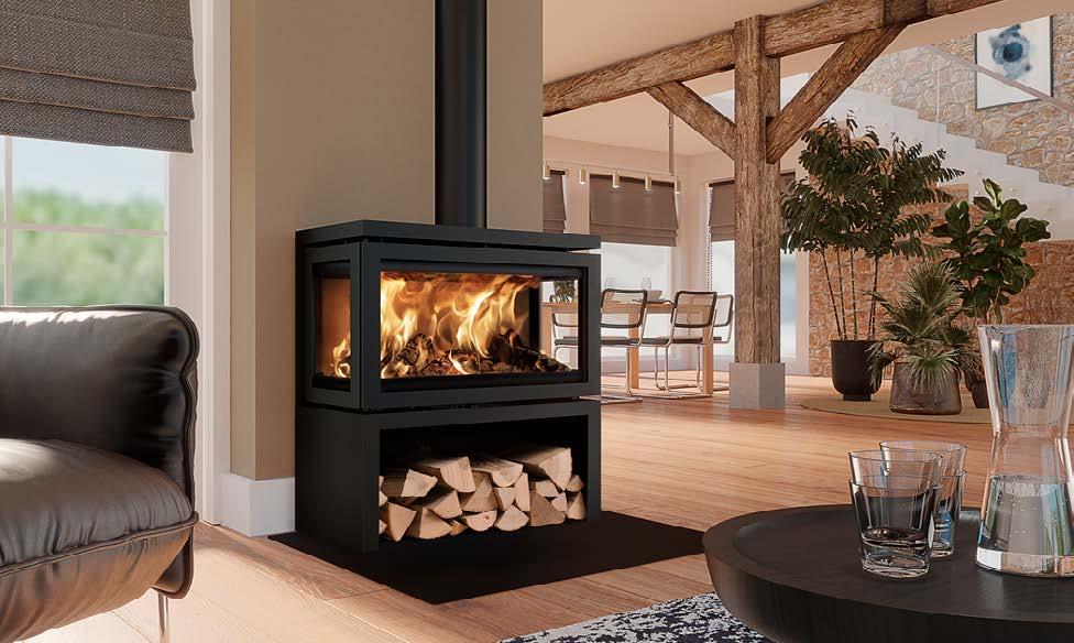
The Vidar Triple, with a panoramic, 3-sided fire view, is one of the most popular stoves in the Dik Geurts range. It is Ecodesign compliant with an A rated energy label and easy manual air slide control.
The Vidar Triple series now includes small, medium and large models, each with a freestanding or wall-mounted option. The freestanding models have ample wood
storage capacity and all models have optional external air connection for clean burning and high efficiency. All versions also have infrared side windows, which enable high flames and comfortable heating.
In addition, the small Vidar Triple models have an average 4.9 kW heat output, which means, under UK regulations, there is no need to install extra ventilation points in the room.
Dik Geurts wood fires and stoves are available from a national UK network of fireplace dealers.
For further information, email: info@drufire.co.uk or visit www.drufire.com
Vidar Triple Large Store Vidar Triple Small StoreEverybody in the country is acutely aware of the astronomical increases, 45%, in gas and electricity prices – households throughout the country are suffering and the plight of solid wall homes appears to be even more desperate. Improving the thermal efficiency of solid wall properties has largely been ignored mainly because the solutions have been very expensive and very disruptive hence, the title “hard to heat homes”.
The UK’s housing stock is estimated at approximately 25 million homes, 36% are solid wall constructed – solid brick, solid stone, pre 1944 timber frame and non-traditional, concrete construction (PRC’s). These homes are generally energy inefficient; an unfilled cavity wall loses approximately 35% of heat – a solid wall loses a staggering 45-50%.
Fuel poverty is a major issue that the Government has made a commitment to eliminate in vulnerable groups and to end it altogether by the year 2030. It is currently estimated that there are up to 3.26 million (Oct 22) households now in fuel poverty and this figure is expected to rise even further with the continued increase in the cost of living. 66% of these households live in solid wall homes, the majority of which are vulnerable householders, therefore, the most vulnerable families live in the most fuel inefficient properties.
Illnesses such as influenza, heart disease and strokes are all exacerbated by the cold. Exposure to cold results in a 30% increase in the death rate in the UK. Solid wall homes are also more prone to condensation, which results in black mould growth on the walls and ceilings, which is also a very serious health risk causing upper respiratory infections –asthma and bronchial complaints.
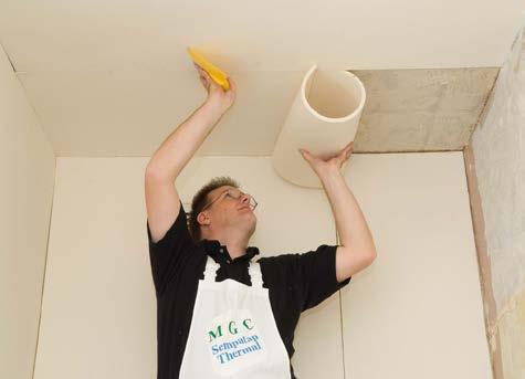
Sempatap Thermal is a unique insulation material which has been extensively used in the UK and Europe for over 30 years and installed in 1000s of flats and houses. It is insulation on a roll as easy as wallpaper to apply, and can be decorated with virtually anything – wallpaper, emulsion paint, even tiled.
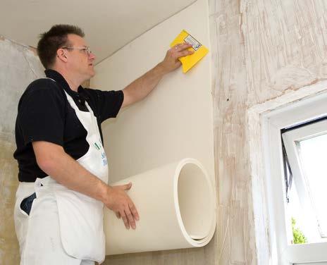
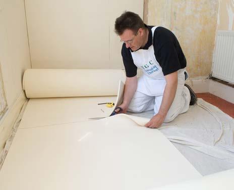
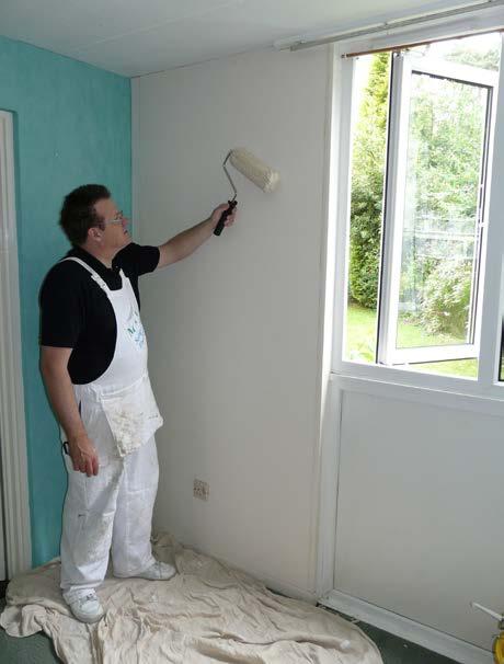
Sempatap Thermal is quick and easy to apply and at only 10mm thick it can be installed without having to vacate the property, it can even be applied on a DIY basis. It has been tested by the National Physical Laboratory and figures from the Building Research Establishment show considerable energy saving and it has a life expectancy of 30 years.
Once applied to the walls/ceilings Sempatap Thermal substantially reduces heat loss, saves on heating bill expenditure and rooms immediately feel warmer.
For current offers and promotions visit our website www.mgcltd.co.uk

Sempatap Thermal is insulation on a roll, as quick and easy as wallpaper to apply. It has been extensively used in the UK and Europe for over 30 years.

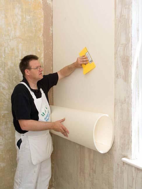
Sempatap Thermal can be installed without having to decant the tenants and has been used by Local Authorities, Housing Associations and private homeowners throughout the UK.
Sempatap Thermal can be decorated with virtually anything – emulsion paint, wallpaper, even tiled and has a life expectancy of 30 years.
The application of Sempatap Thermal will dramatically lower the “U” value of the wall presenting a surface on which condensation will not form and preventing the likelihood of mould growth occurring.
Sempatap Thermal is the economical solution to insulating cold solid walls. Once applied to the walls/ceilings in a property it substantially reduces heat loss, saves on heating bills and rooms immediately feel warmer.
For current offers and promotions visit our website www.mgcltd.co.uk


For further help, information and advice please telephone our sales office on 01372 743334 or email info@mgcltd.co.uk website www.mgcltd.co.uk
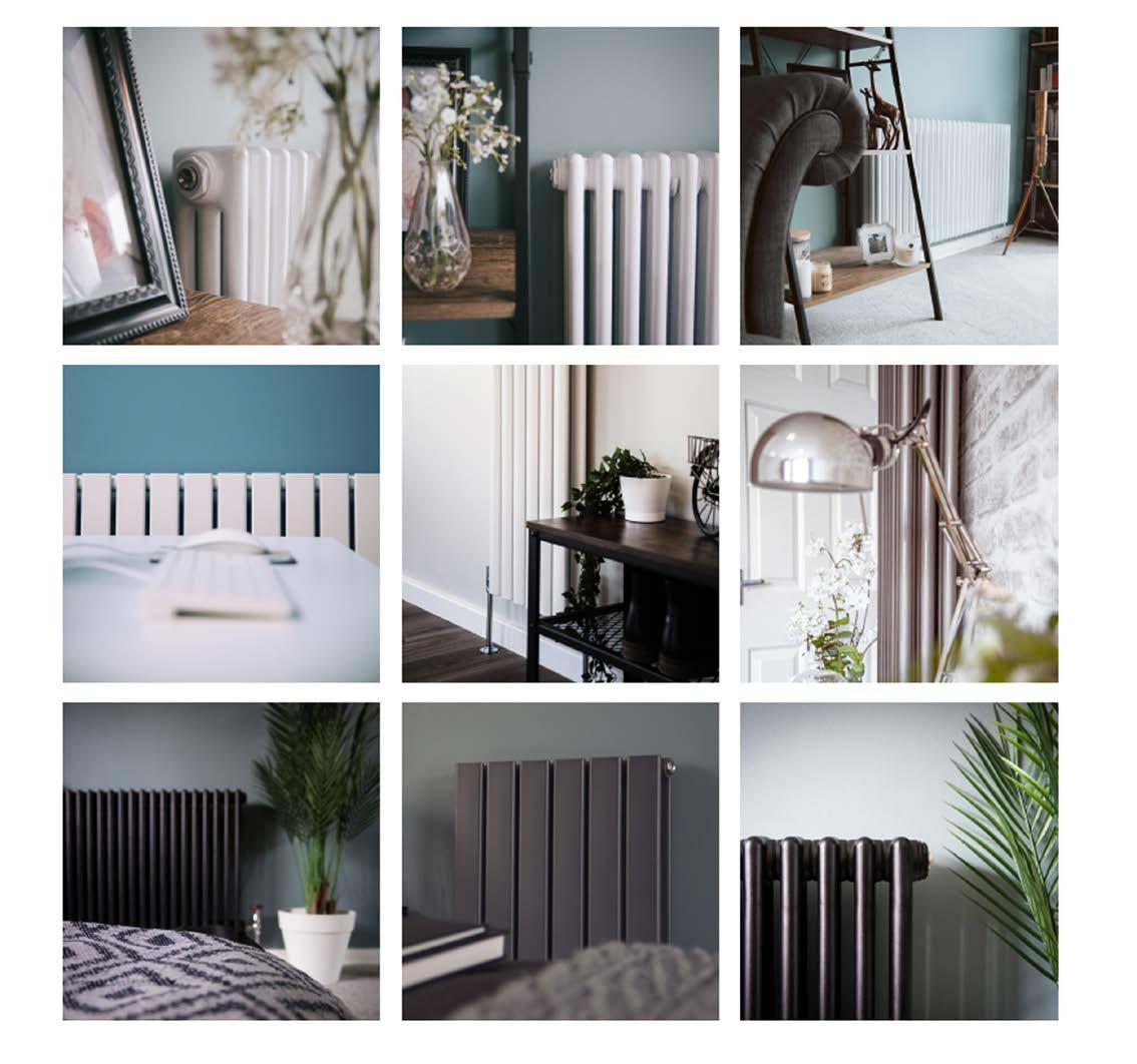
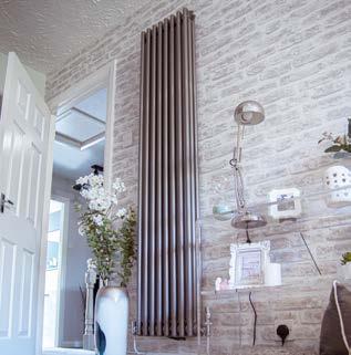
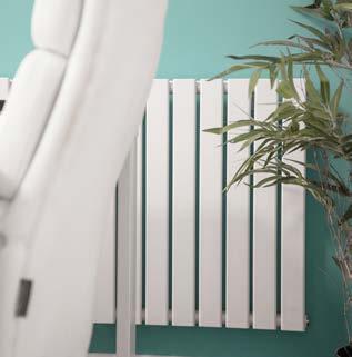
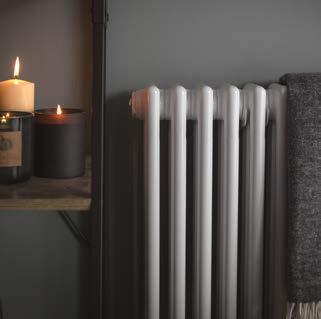
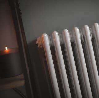
Here, at Radiator Outlet we have built a healthy reputation over the last 5 years of providing fantastic quality radiators at affordable prices. Throughout this duration, we have supplied our radiators to thousands of customers throughout the country and acquired over 13,000 5-star reviews stating how attractive and efficient our radiators are once fitted in your home!
All our radiators are manufactured to the highest standards, with no corners cut when it comes to materials used or the manufacturing process. We only supply the highest quality radiators to our customers; our reputation means too much to us to offer anything less.
Our company 'mission statement' is to provide high quality radiators at affordable prices. And that is just what we do.
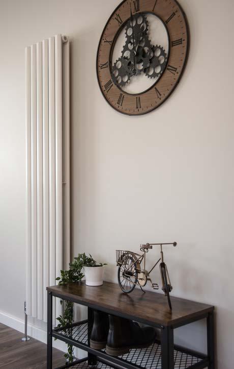
When buying radiators from Radiator Outlet, you can be assured of warm, reliable and super stylish radiators arriving quickly at your door!
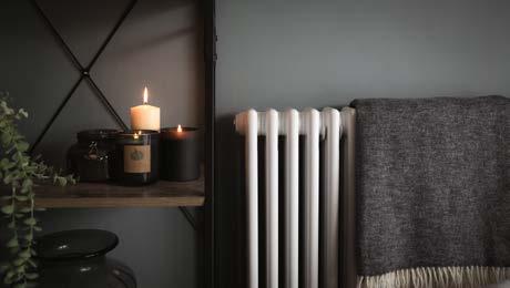
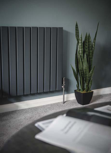
It is no secret that costs have drastically increased due to the covid 19 pandemic with many companies in all industries looking for alternative materials to keep costs down. Despite these global issues, our radiators are identical in specification to pre covid 19 with the same thickness of steel, high quality packaging, super impressive heat outputs; and showroom standard coated finishes, ensuring the same level of satisfaction every time!
Another core fundamental to Radiator Outlet, is the fact we manufacture our own radiators and have warehouses storing our catalogue of radiators, meaning that stocking issues are rare. We are in complete control of the supply chain, meaning any delays from third parties are not a factor when buying from our website.
Finally, and most importantly as a customer, should you have any issues down the line, your hassle-free 10-year warranty is with us directly, so you are covered. No longwinded process of chasing your radiator manufacturer, you have bought from us, we supplied your radiator, it is down to us to resolve any issues.
www.radiatoroutlet.co.uk

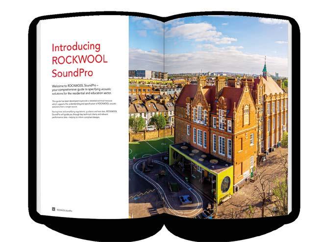
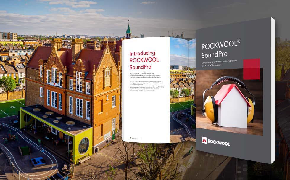
To support specifiers in selecting acoustic solutions for education and residential applications, ROCKWOOL® has launched ROCKWOOL SoundPro. The specialist guide combines technical data, product information and the latest regulatory advice in one place, aiding the specification of stone wool solutions for settings where sound insulation is key.

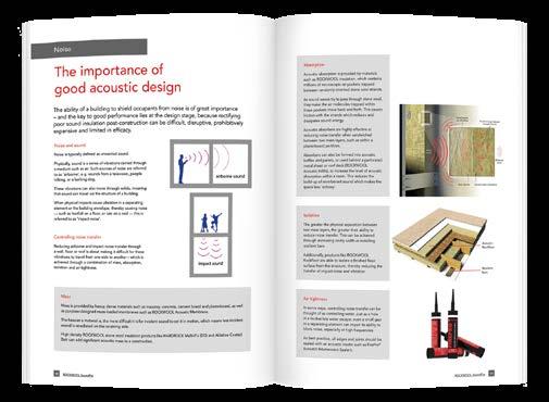
ROCKWOOL SoundPro outlines the importance and principles of good acoustic design and how to effectively enhance the acoustic capabilities of building projects. As noise pollution is now regarded as a public health problem that affects millions across the UK, the need for effective acoustic insulation in our buildings is more prevalent than ever. As such, ROCKWOOL SoundPro includes various strategies and functions that can reduce the amount of unwanted noise transfer through walls, floors or roofs.
Complementing these approaches are the latest ROCKWOOL solutions that provide acoustic benefits for each application area of the building, including internal wall solutions, façade and external wall solutions and flat roof solutions. ROCKWOOL SoundPro also outlines additional benefits of stone wool insulation beyond acoustics, including fire and thermal performance, as well as durability and indefinite recycling.




HEATING, VENTILATION & INSULATION 48

Awarding winning, MCS accredited and now Heat Geek certified, with IMS Heat Pumps you can be assured that your heat pump will be designed and installed to provide


you with a cosy, low carbon, energy efficient heating and hot water system.
IMS work with leading brands


Air Source and Ground Source Heat Pump brands including Vaillant, NIBE, Viessman, CTC and Stiebel Eltron providing quality products and guarantees. With funding available in both England and Scotland call us now to find out how a heat pump can work for you.
Sheffield 0114 327 0100 / Perth 01738 827 244
contact@imsheatpumps.co.uk www.imsheatpumps.co.uk
Designing
Installing Heat Pumps since
"Very good service from point of initial enquiry to quotation and through to installation



Flexible with regards to installation date.
Friendly and considerate installers.


Ruth Lavender, kitchen design expert at Benchmarx Kitchens and Joinery, explains where to spend and where to save when creating a luxury kitchen look for less:
“Working to a budget does not mean you have to forgo the luxe look of a designer kitchen. By making clever choices in your selections of cabinetry, worktops, lighting, and appliances it’s still possible to create that premium feel without overstepping on costs.
“When working to a budget, it is essential to get the experts involved early on as they can help you to decide which features will create the most impact and where compromises can be made.
“A team of expert kitchen designers is available at no extra cost at every Benchmarx branch. They’ll give you advice on finding shortcuts to a luxury look, update you on the latest trends, and suggest a range of options for cabinets, work surfaces, and appliances to create your desired look at various price points.
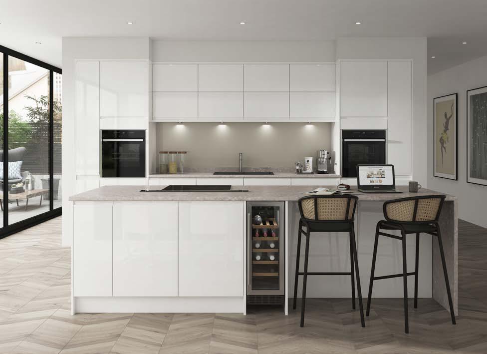
"They’ll also pull your ideas together into a tangible design, making it easier for you to work out your must-haves and see where you can save. The great thing about tapping into experts in this way is that they can suggest new possibilities that you haven’t previously considered to help keep your project within budget.
“Many of the finishes currently being seen in top-end kitchens are readily available from more accessible kitchen suppliers so, no matter how extravagant the inspiration, it is worth sharing those aspirational images with your designer to see how you can recreate them at your own price point.
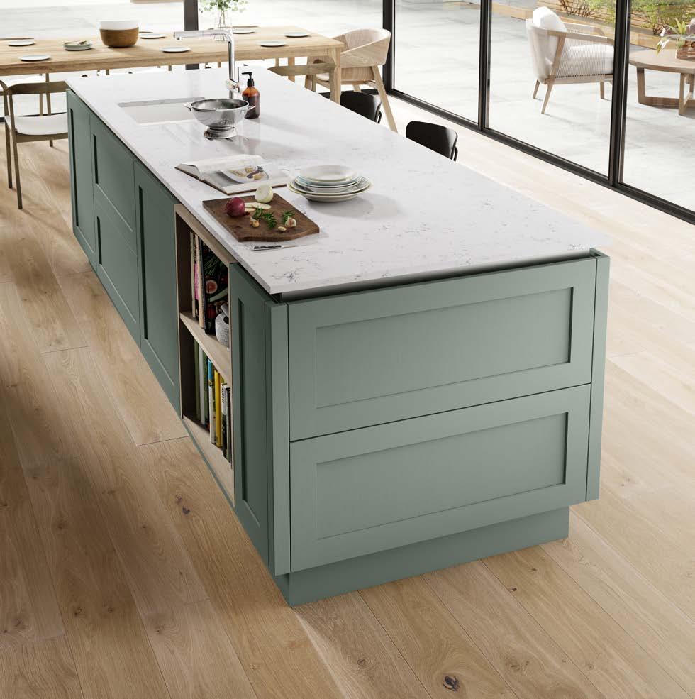
“For example, matt cabinetry is a popular, high-end look, and Benchmarx Kitchens has options such as its Soho forest green and midnight blue ranges, which feature this desirable finish at an affordable price tag, without compromising on quality.
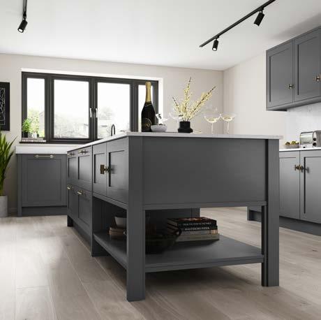
“Shaker-style cabinetry is another gorgeous option to provide a luxe look that will stand the test of time. Practical, functional, and attractive, there are scalable price points for this style of kitchen. Solid timber options provide a natural woodgrain and offer real appeal. However, if you are working to a budget, there is a lot to be said for cost-effective alternatives with a durable wood-effect foil wrap.
Traditional joints and woodgrains make the difference here. To mimic that bespoke look, choose cabinet doors that are formed using separate sections with V grooves to echo traditional joinery, along with foil finishes that reflect the individuality of wood grain.
“Opting for a more budget-friendly worktop material can help keep costs low, whilst still creating your desired look. Laminate surfaces, available in matt, satin, gloss, smooth, stone and wood grain finishes, are perfect for achieving a stunning, luxury look at an affordable price. Not only do they look great, but these types of surfaces are low maintenance, as they’re easy to clean, and incredibly durable.
“However, if your kitchen is going to experience heavy usage, you may wish to opt for a more premium surface. Although more expensive than laminate, granite is a popular choice thanks to its stain and heat resistance, long lifetime, and low-maintenance characteristics. If you need a truly hardworking kitchen, then spending a bit more here could be a good investment.
“If your budget can’t stretch to a solid work surface, compact laminate is a great alternative. A completely solid, laminate
"Shaker-style cabinetry is another gorgeous option to provide a luxe look that will stand the test of time. "
material, this type of surface is made from multiple sheets of paper which have been fused together for an incredibly durable finish. The joy of this material is that it can be extended as a splashback or waterfall island for a seamless, luxe look, as well as being suitable for use around sinks and in open shelving. It’s often these details that can take a design to the next level.
“The impact that lighting can have on a kitchen is often overlooked, but a well-designed lighting scheme can have a huge effect on the overall feel and functionality of a room.
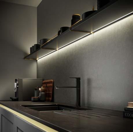
“Start by thinking about the main lighting source in the space and how it can be maximised. If you’re opting for spotlights, consider the placement of each light to ensure they are best placed for task lighting.
“When working to a budget, many people would stop at spotlights but, even though including plinth, under counter, or cabinetry lighting may seem like an unnecessary investment, it is features like these which often make a design stand out. If you are able to free up budget elsewhere and invest in your lighting scheme, you can use it to highlight the design features that set your kitchen apart. These types of lighting can also make a huge difference when it comes
to zoning open plan spaces. This is particularly important if you plan to use your kitchen for multiple purposes – such as cooking, working from home, entertaining, or spending time together as a family.
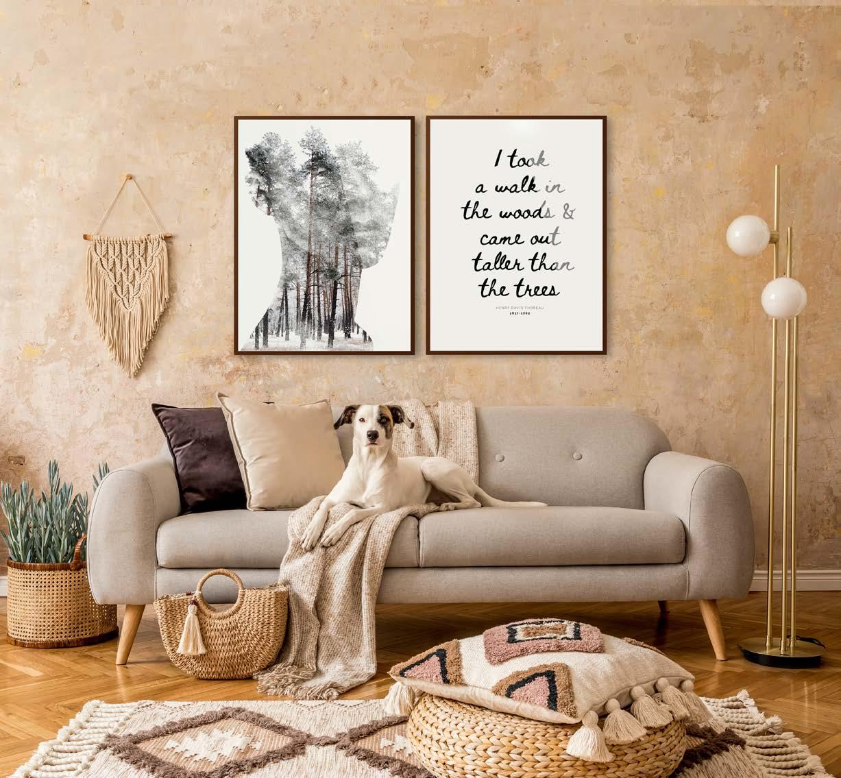
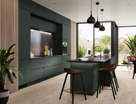
“There are many innovative lighting solutions available, such as those in our Sensio range, which allow you to truly customise a space and make it feel more luxurious, with the ability to personalise a scheme at the touch of a button or with voice activation.
“Further control can be created with correlated colour temperature settings, which provide the option to seamlessly transition from warm to cool temperature lighting, making it the ideal accessory to create the perfect ambience.
“Many high-end appliances have some exciting functions but, if what you want is to simply create delicious meals for your friends and family, you may not need something all-singing and all-dancing. Cost-effective alternatives can be just as stylish as high-end appliances and still provide you with every setting you need to develop those culinary masterpieces.
“It’s also worth bearing in mind that energy efficient options can help you continue to save money long after your new kitchen is fitted. There are a wide range of appliances, from dishwashers to fridge-freezers, with excellent energy ratings to help you minimise your energy consumption. For example, some appliances, such as the Candy heat pump tumble dryer, recirculate hot air to maximise energy efficiency, help heat your home, and reduce power usage.
“Your kitchen designer will be able to go through all the options available so you can pick the appliances that work best for your needs. They’ll take into consideration your lifestyle, the way you use your kitchen, and your aspirations, to ensure your appliances satisfy every desire.”
www.benchmarxkitchens.co.uk

How is it achieved and why is it so much more expensive then simply laying slabs side by side?
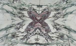
Often seen in high end residential bathrooms and corporate office entrances, 'bookmatching' is a beautiful pattern where two or four seemingly mirrored pieces of stone meet, creating a sumptuous ‘butterfly’ or ‘open book’ image.
To start, a quarried block of stone is sliced, like a loaf of bread, by huge multi bladed saws, cooled by constant water, gnawing back and forth, down through the stone. The raw slabs, now 20mm thick, are then polished, photographed and calibrated. It’s at this point that the decision is made as to which faces of the slab to polish.
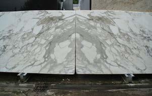

Heavily veined or patterned material is better for book matching. The direction and thickness of the veins giving the greatest effect.
If you imagine a closed book, you can only see one face - the cover. But if you open the book you can see two faces. So, like the open book, the faces touching each other in the sliced block are polished and a mirrored pattern or ‘book match’ is revealed.
If you then take four book matched slabs, cut next to each other, and turn two of them through 180 degrees and place
these on top of the others, you create the famous ‘butterfly effect’.
And if the project has enough space, and you have enough material to fill that space, then you can create the most stunning finishes such as this elegant wall of marble fabricated by Stone Circle for the watch department at Harrods, London.
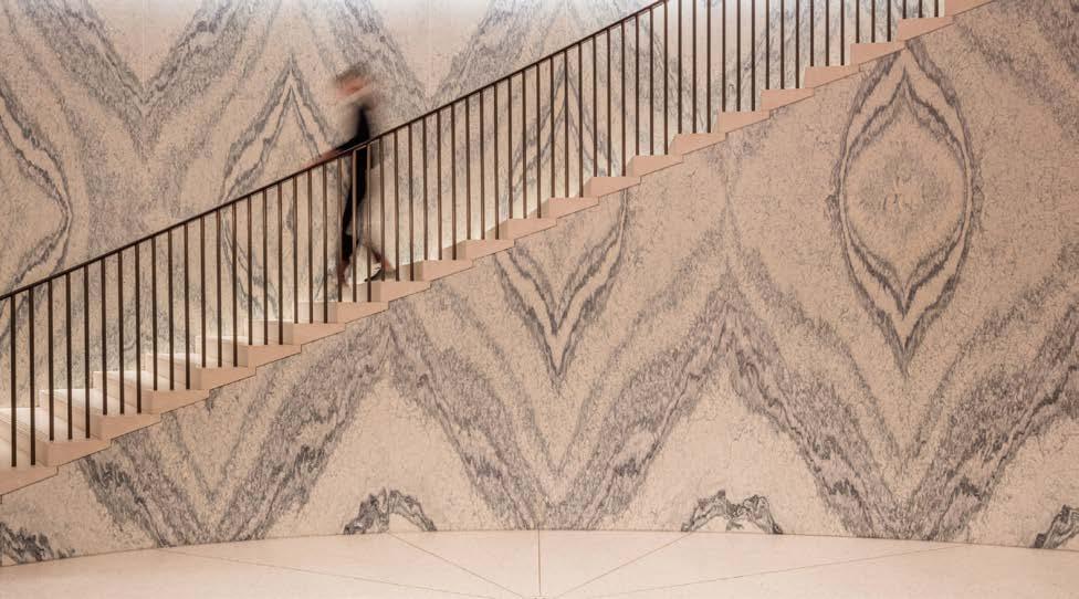
Of course, the process takes much longer than plain cutting, because the sawyer has to cut each slab in exactly the same position to create the perfect match. Wastage increases too, because reproducing the pattern limits the amount of the slab that can be used. And if you accidentally break one piece…….? You might have to start again. The risks are higher and so are the costs.
But the effects are exceptional and unique and, I would argue, worth every penny.
If you need assistance with a stone project or would like to talk to a stone expert about your project, your choices and how to use this gorgeous material to achieve fantastic results please call Robert Merry on 07771997621, email info@stoneconsultants.co.uk or visit the Stone Consultants at www.stoneconsultants.co.uk. We look forward to hearing from you.
 Four slabs used to create the “butterfly” effect Block of stone
Adjacent slab faces polished to create a mirrored pattern.
See our new collection!


A collection of 6 earthy tones with a luxurious iridescent shimmer which is visible throughout the pigment. This super matt, metallic surface is available laminated on MDF or dp-lite and is made from up to 40% recycled PET. Matching edging is available.


Barker Associates Architecture Office proudly presents Sackett Street Townhouse, a project delivered for clients, recent empty-nesters with their own consulting company, who were looking to refresh their townhouse following the departure of their daughter for college. The scope of the work included adding another floor to an existing extension to create a primary suite and a third bedroom, and to update living spaces to meet the changing circumstances of the family, which included increased time spent working from home during the pandemic. The finish palette included bright jewel tones mixed with neutrals and textured surfaces.
The clients wanted an open plan that maintained separations between spaces, thus the design approach was to configure certain spaces as semi enclosed volumes that would provide boundaries and define edges through
materiality, lighting, and color. The blue-gray toned interior of the entry vestibule volume is expressed as a red volume that separates it from the adjacent dining room. A pendant by Anony zig zags over the dining table, framing a display of the client’s ceramic vessels.
At the center of the space, the kitchen is wrapped in textured wood, painted a blue-gray with cutouts that provide views into the dining room and back toward the living space. The cabinets inside are paneled in white oak and patterned porcelain tile, and recessed lighting along the dropped arch defines the boundary of the workspace.
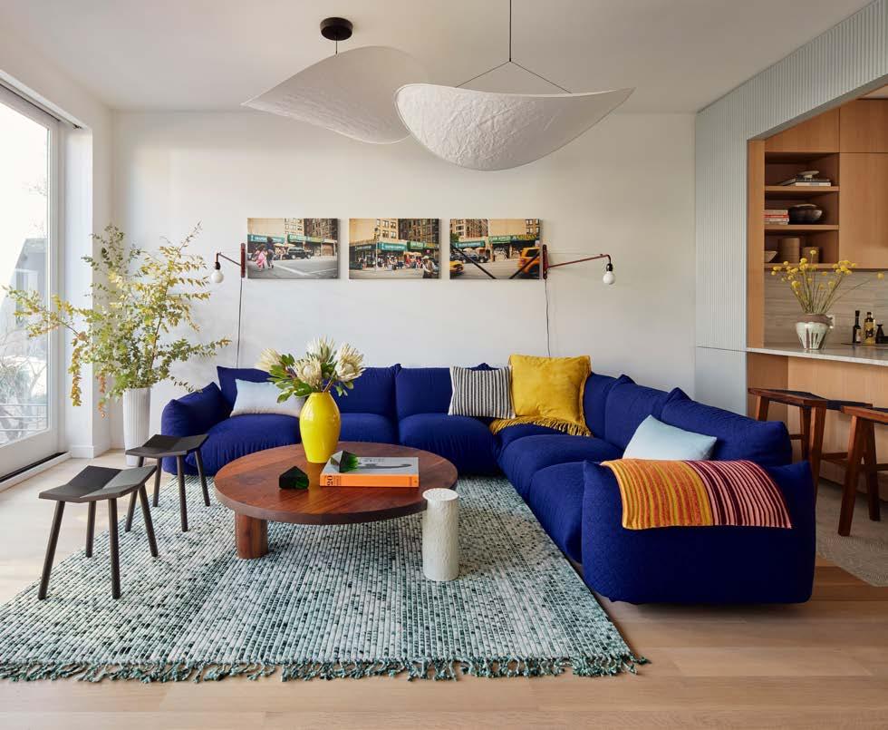
The living room looks out on the rear yard through floor to ceiling glass. A Marenco sectional in blue Kvadrat wool wraps, a coffee table by Hinterland Design, and a rug by Philippe Malouin define the space.
The powder room tucked, under the stairs, is painted in a deep blue-black with a pop of yellow provided by a Kast concrete sink. A reeded glass and steel stair rail echo the tambour texture of the kitchen enclosure.
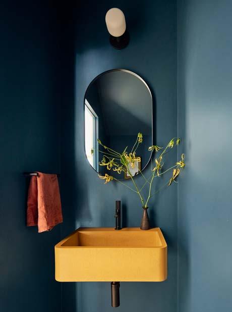
Upstairs, the new primary suite is defined by white oak and painted built-ins that define spaces in a similar way to those in the living spaces. The sleeping and dressing areas are divided by a volume that acts as a headboard on one side and storage on the other. The custom bedframe and side tables face a wall of shelving and sliding panels, and a
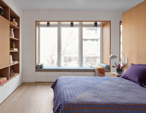
window seat frames the view to the rear yard. The custom closet wall is painted with the same blue-gray as the main floor. The primary bath features a vaulted skylit ceiling and porcelain tiles that pick up the same muted color palette.
Recent weather events prompted a re-examination of the finishes on the lower level of the house, where the spaces were revamped to create a secondary living area separated from a workspace by floor to ceiling sliding reeded glass panels. Porcelain tile provides a practical floor covering for a house in an area prone to flooding.
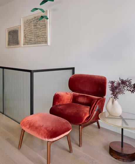
"At the center of the space, the kitchen is wrapped in textured wood, painted a blue-gray with cutouts that provide views into the dining room and back toward the living space."
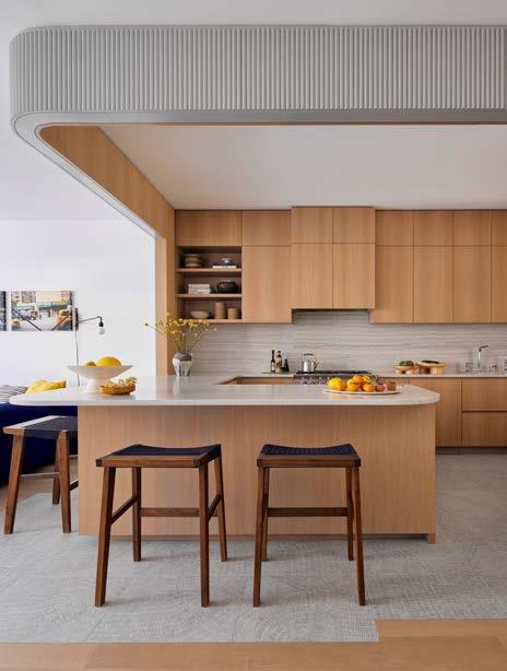
Avoa Chair by Pedro Paulø-Venzon
UFO Lamp by Atelier Robotique
Shades Tile by Gordon Guillaumier for Ceramiche Piemmefloor tile
Afteroom Coat Hanger by Menu
Lolita Dining Table & chairs, Jasper Cabinet by Wüd Furniture Design
Kreten Side Table by Souda
High Wire Trio Chandelier by Anony
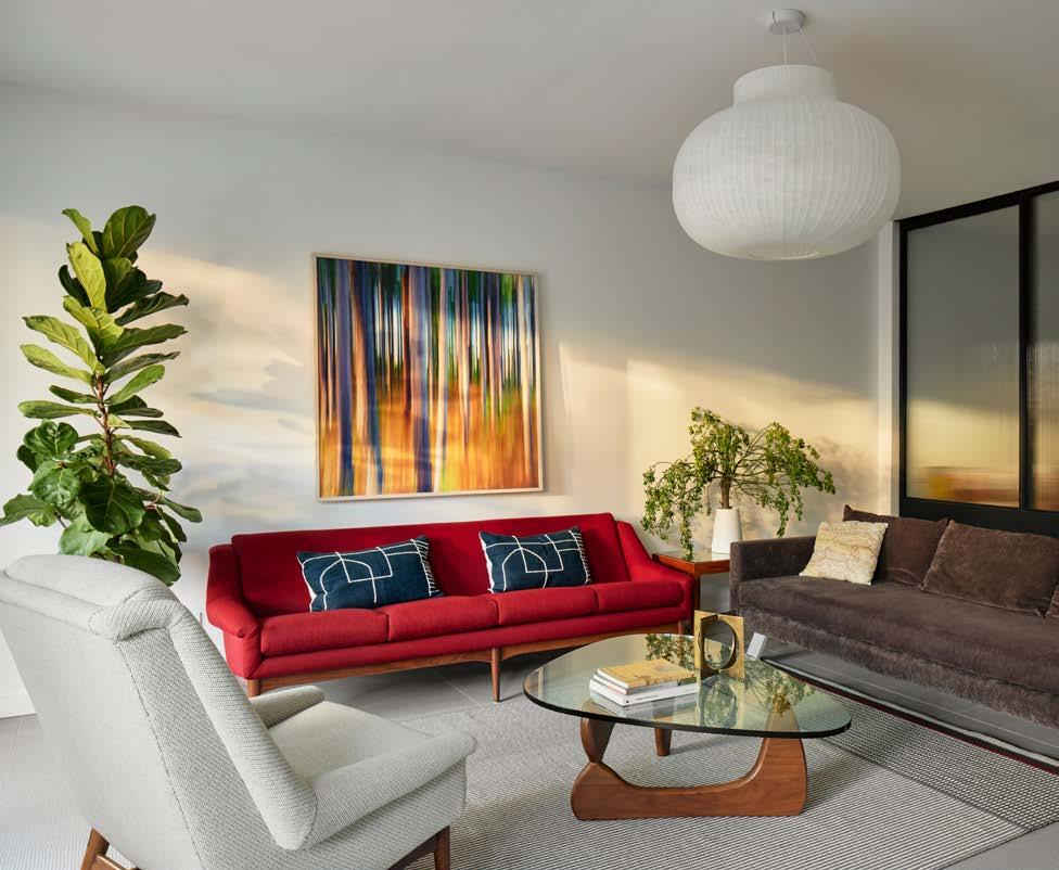
Marenco Sofa Sectional by Mario Marenco for Arflex // Kvadrat
Elysia Lounge Chairs and Ottomans by Luca Nichetto for De La Espada
Ecliptic Table by Hinterland Design
Mitre Stools by Souda
Kreten Side Table by Souda
Stella End Table by Wüd Furniture Design
Petit Potence by Jean Prouvé for Vitra
Wisp Suspension Light by Anony
Pillows: Ray Pillow by Studio Cope, Yellow Fara Cushion by Saunders, Path I Pillow by Arudeko
Two works: Trace 01, Untitled by Siang-Jen Yang
Two works: Gladys, Norman by Thomas Witte
Selenoglyph Sculpture by TJ Volonis
Mobile: Sosa by Christian Heikoop
By commission - 3 photos: Katie Delavaughn
Rug: Lines - Philippe Malouin for cc-tapis
KITCHEN AREA
White Macauba quartzite counters - Colonna Marble
Fossil Tile by Kasia Zareba for Refin Ceramiche
Burnside Stools by Joseph Ryan
Hardware - Buster & Punch
Vos Sink by Kast Concrete Basins
Art: And The Rockets’ Orange Yellow Blue Glare - by Swayspace
Swift & Terra lights - Cedar & Moss
Kate Chairs / Calvi Table - Fermob
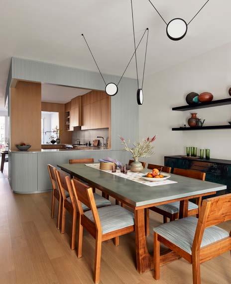
PRIMARY BEDROOM BATHROOM
Wet Style sink / vanity
Shades by Gordon Guillaumier for Ceramiche Piemme - wall & shower tile
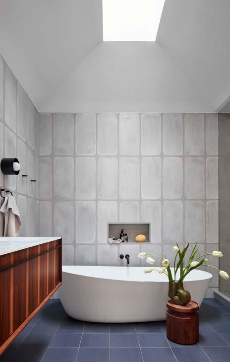
Puzzle Field Smoke Matte by Edward Barber & Jay Osgerby for Mutina- floor
Fixtures and hardware - Vola (all)
Spun Wall Sconce - Ladies and Gentlemen Studio
Porcelanosa Almond Tub
Robin Quilt by Meg Callahan
Crescent Lamp (bed wall lights) - Allied Maker
Seating area: Cape Long - Cedar & Moss / custom seating
Kvadrat, Ecua Interior
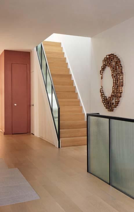
CLOSET AREA
Blue quartzite bedroom counter - Colonna Marble
Anni wall light - Cedar & Moss
www.baaostudio.com | Styling by Philippa Brathwaite
Photo credit: Gieves Anderson
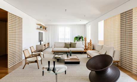
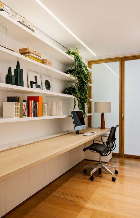
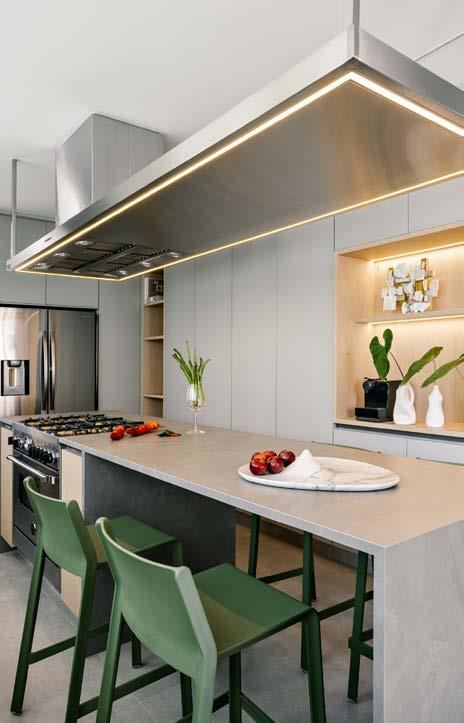
The objective was to transform the entire space, since there were many internal divisions that separated the environments and made them dark, as the light did not pass from one environment to another.
The clients' wish, a couple with two adult daughters, was to have a spacious, integrated apartment, full of natural light and comfortable to transform the city of São Paulo into their new home, where they could frequently receive friends and family. From this premise, the focus of the renovation was the social area of the apartment, where the walls were broken and the existing spans expanded, to promote greater physical and visual integration between the environments, in order to provide a free flow of people, light and ventilation.
The challenge of working with open plans, however, is to promote the subtle division of environments and bring dynamism to the space. Therefore, the intention was to convert this restlessness into a design point in order to transform the trivial and avoid monotony through creation and experimentation with the aim of surprising and enchanting.
To this end, the architects understood the space as mutable, where sensations and visuals create emotions from different modes of interpretation. In this way, they sought elements that could bring this dynamic to the space, without weighing it down in essence, and the muxarabi proved to be ideal for this purpose. Because of it, they were able to play with visuals and transparencies on the panels with a geometric grid, making it possible to understand new textures based on the way they are arranged and the user's movement in space.
"The challenge of working with open plans, however, is to promote the subtle division of environments and bring dynamism to the space."
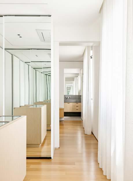
Depending on the way in which the visitor explores the environment, he is surprised by the resulting elements overlapping side by side and also by the incidence of light throughout the day, creating different games of light and shadow. The different finishes, depending on which side the users are on, are also responsible for validating this dynamism. On the side of the living room, where the white color prevails, the muxarabi was painted white, while on the side of the hall and the veranda, it assumes its original wood finish, adapting to the materials that prevail in each environment.
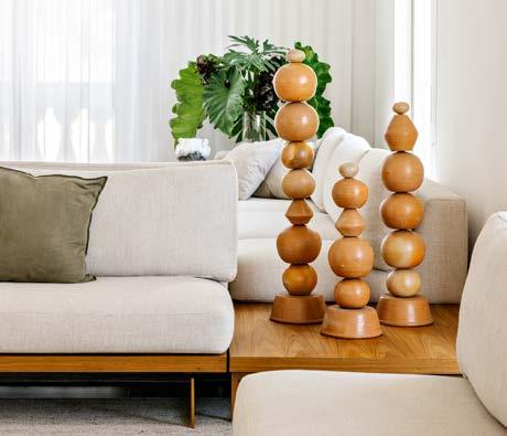
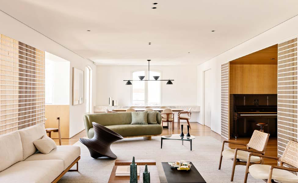
The social area is connected to the service area through a sliding door that connects the kitchen to the dining room, allowing integration only when necessary. In this environment, they transformed what was previously divided into two smaller spaces, pantry and kitchen, into a spacious and linear kitchen, with a central island for cooking and eating and cupboards on both sides, with plenty of natural lighting.
In the intimate area, the changes were smaller, but still significant. At the request of customers, they transformed what were two rooms that shared a bathroom into two separate suites. To this end, they sectioned the toilet that was adjacent to one of the bedrooms in two, which allowed the creation of the bathroom for the guest suite, without losing the quality of the toilet space.
In the master suite, the proposed new flows were responsible for the main changes. A passageway was created next to the windows and the doors to the master's and ladies' bathrooms were positioned at the ends. In the remaining space, the bedroom and closet were divided by a wall strategically positioned away from the main door, in order to form a siphon of view and maintain the privacy of the room. In order not to draw attention to the bathroom door, they mimicked it next to a white lacquered panel that also houses a sideboard and TV.
The living room, TV room, dining room, hall and balcony have been floored in Peroba Dourada by Indusparquet. The panels and the Muxarabis in white paint, both in American Oak are by Ulimax. The curved sideboard in Calacatta Michelangelo Marble is by Arthus. And the carpentry in lightened walnut veneer and painted frame is by Status Marcenaria.
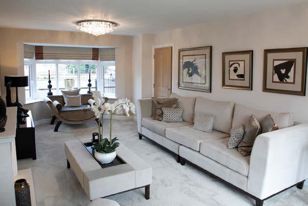
One of the highlights of the furniture project is the piano, positioned in the hall, which has been completely restored.
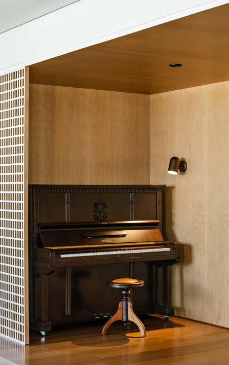
Studio AG – Architects Amanda Castro e Giovana Giosa www.instagram.com/studioagarquitetura www.studioag.arq.br
DATASHEET
Architecture and interior design – Studio AG Arquitetura
Team: Amanda Castro, Giovana Giosa, Gabriela Guimarães
Lighting Project – Studio AG Arquitetura
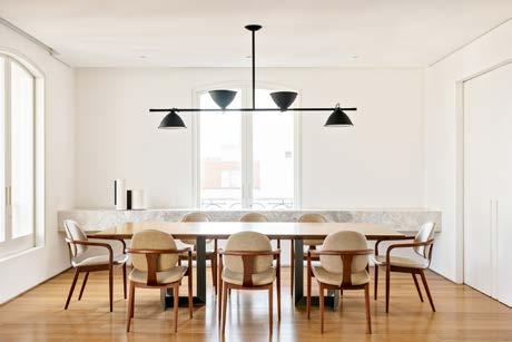
Production – Vca Artworks
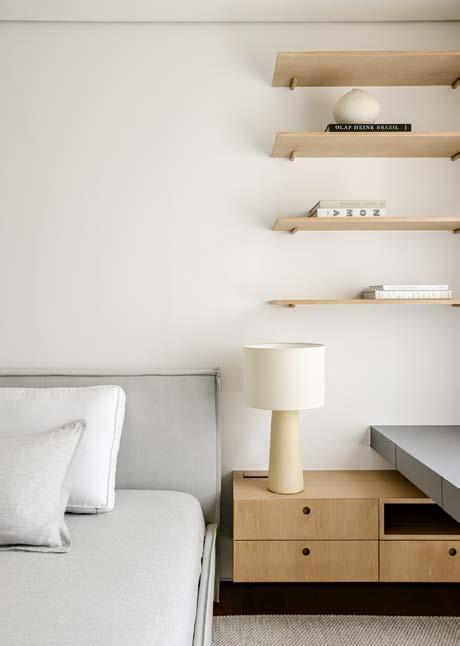
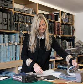
Lifestyle Interiors can turn the creative vision for your home into a reality. Our team is highly experienced in interpreting your brief and expertly project managing your transformation to deliver a truly bespoke interior design.
Our service is tailored to your exacting needs, encompassing spatial design, lighting design, interior design and bespoke furniture and soft furnishings. We can also manage your entire build or renovation –from concept to completion.
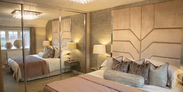
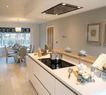

No matter where you are in the UK, or the style of your property, we will deliver projects to the highest standards, on time and within budget.
We are experienced in creating stunning schemes for high-end residential properties and currently work with some of the most respected property developers and national home builders.
01606 834536 | designteam@lifestyleinteriors.org
Our full portfolio and latest projects: www.lifestyleinteriors.org


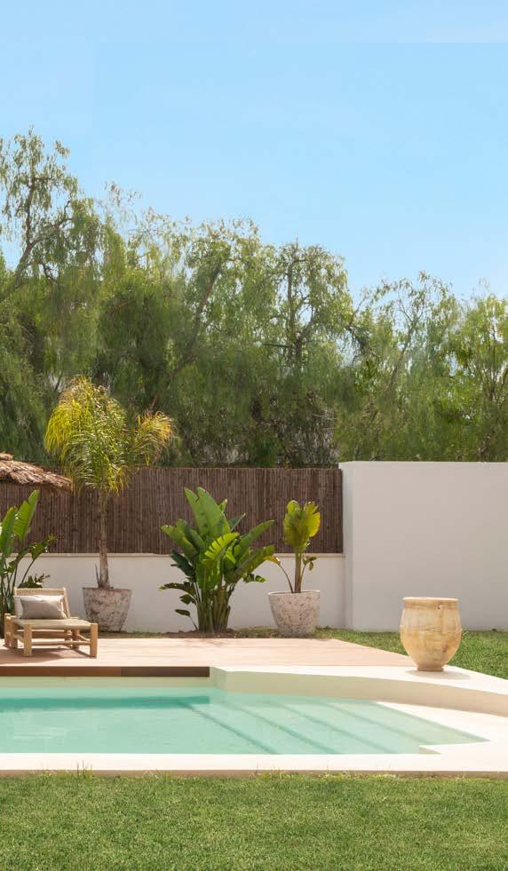
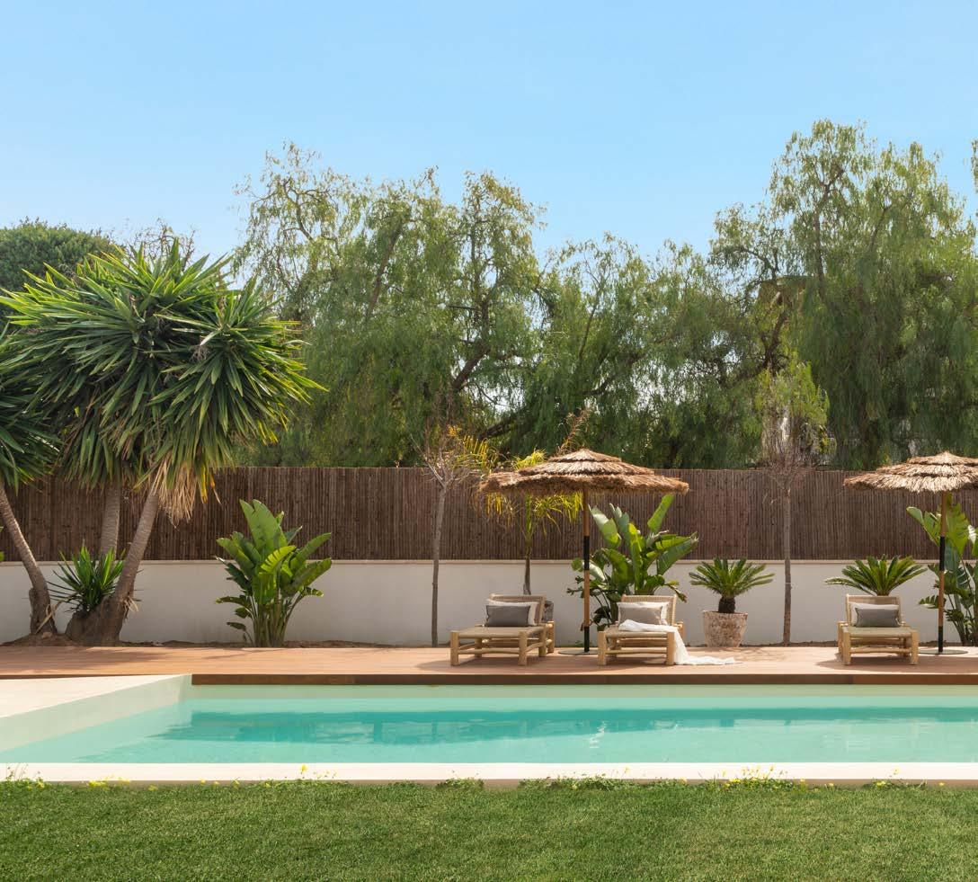
Although it is not written in any book, there is a type of spring we call Ibiza. It is a spring where white and green colours rule, and where sand is at the helm. It is a spring where a small fountain waters the sunlight, and one filled with that which is born, that which says farewell, and that which we do not see, but feel inside ourselves.
If the briefing for this project were a season, it would be a dimly lit winter in the 1970s, looking to create a new path. With that in mind, interior designer Susanna Cots took charge of the design, guiding it toward the light by opening up the space using large windows looking outward so that nature could penetrate 350m² of this Mediterranean house, with 3,000m² of garden.
The tour begins from the entrance hall, where the first opening reveals part of the garden that presides over the pool, and where the guest house can be seen as an annex to the house. It is a space that connects to the main building through a glass corridor.

"If the briefing for this project were a season, it would be a dimly lit winter in the 1970s, looking to create a new path."
This spring, as in any season at the Susanna Cots studio, there is a language of fusion between the natural and the intimate, giving rise to a symmetrical dialogue between the interior and the exterior.
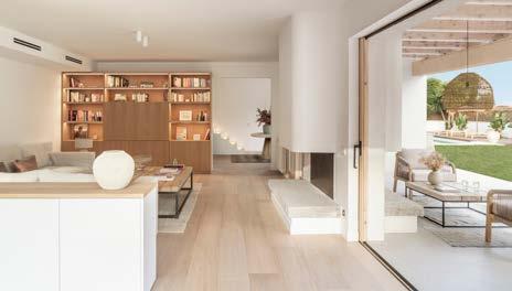
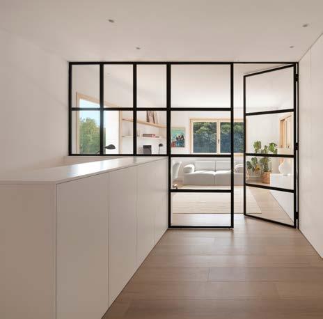
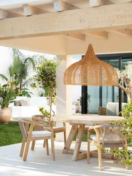

In this project, that dialogue is found in the living room and the kitchen, where the doors fully open: the porch becomes a dining room, and the dining room becomes an extension of the porch. The uniting element is a single chimney, projected in a symmetrical way, which is found in both rooms.
The dining room undoubtedly sits at the heart of the home and family activity. Like a jewel in the the designer’s subtle style of framing prominent areas, the space is crowned by a natural beam ceiling and is defined by one of two cupboards that mark the identity of the room.
In the kitchen – which covers almost the entire elongated space of the house – another cupboard is found in the form of a small office and breakfast area.

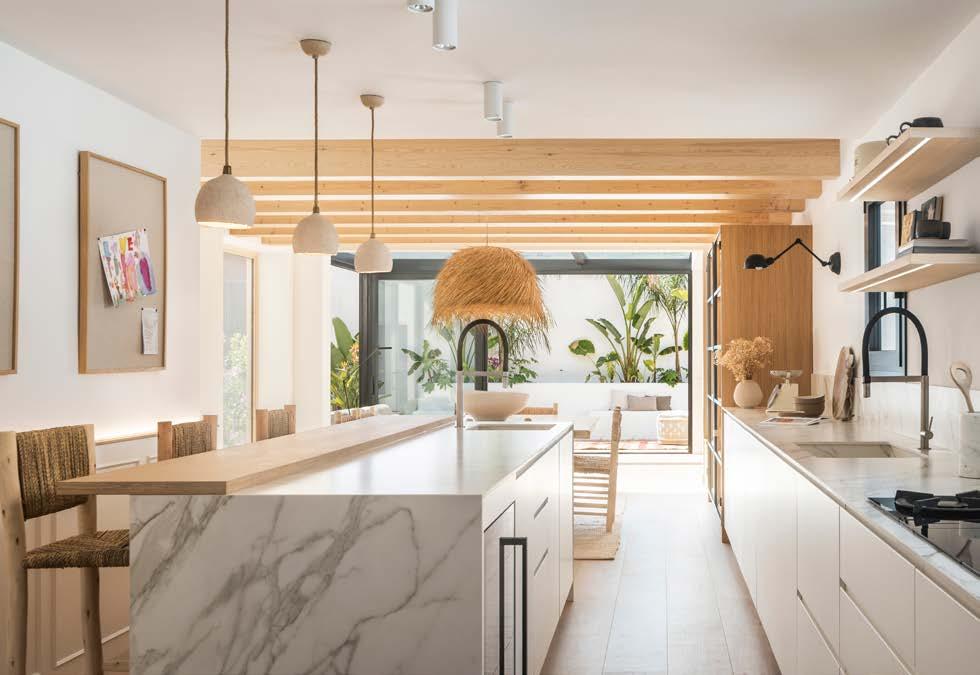
What one thinks (opening yourself to the world) and what one does (celebrating the world) are elements that the interior designer knows how to transition from thoughts to reality, with a symmetry of spaces being a mirror of fidelity between thinking and doing.
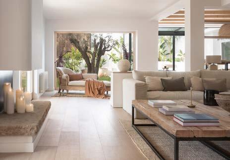
Connected to the dining room, the living room, with a television and an additional fireplace, offers moments of security and protection. Again, the designer creates a new interior-exterior projection here through doors that open completely to integrate the living room with a truly extroverted exterior: an exterior space with a purely Mediterranean-inspired white bench, accompanied by a fountain to refresh the surroundings.
With the same game of symmetries – vertical in this case –the upper floor contains the office, which is a versatile area for study and play that becomes a third living room.
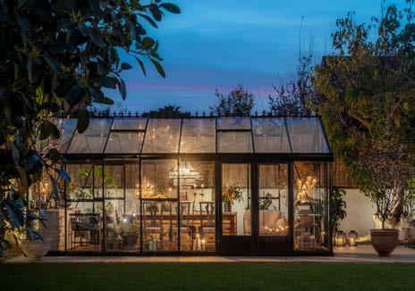
The garden features a Nordic-inspired greenhouse that serves as a meeting point for family and friends. It is a magical space that combines the enjoyment and warmth of any season of the year with ubiquitous gastronomy and beauty.
The versatility that the owners sought to infuse into the ground floor, as well as their desire to share every single corner of their home, is expressed through a protective intimacy engulfing the first floor. The maximum comfort point is reached in the master suite, where another fireplace warms the bed and the shower.
Two symmetrical suites that share a fully furnished bathroom were designed with doors integrated into the furniture, thus being hidden from the views of all rooms. The project also features another suite with a separate bathroom.
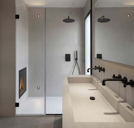
www.susannacots.com
Built-in furniture: designed by Susanna Cots and custom-made
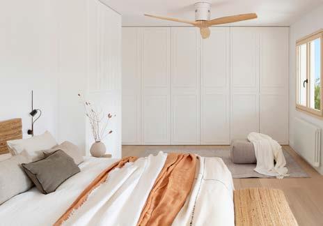
Sofa and armchairs: Atemporal
The kitchen table: antique dealer
Porch table: Antic Begur
Chaise lounge: Crearte
Lighting: Simon, Maisons du monde
The suite's rattan headboard and bench: Vivie
Porch pieces are all handmade
Photo credit: Mauricio Fuertes"With the same game of symmetries – vertical in this case – the upper floor contains the office, which is a versatile area for study and play that becomes a third living room."
In a world where we seek solace and respite, there is something inherently captivating about the allure of fire pits, BBQs, and pizza ovens. These outdoor marvels have transcended their functional roles, evolving into focal points that shape and build a room within a garden. With their attractive finishes and the promise of year-round socialising, they hold the power to transform your outdoor space into a captivating haven.
One cannot overstate the aesthetic appeal of these versatile installations. Crafted with an exquisite attention to detail, fire pits, BBQs, and pizza ovens come in an array of attractive finishes that effortlessly blend with any garden design. Whether you opt for a rustic, weathered appearance or a sleek, modern touch, these features harmoniously merge with the natural elements, turning your garden into an inviting sanctuary.
Beyond their aesthetic allure, these outdoor amenities hold the promise of fostering social connections throughout the year. Picture gatherings of family and friends, with the mesmerising flames of a fire pit casting a warm glow on their faces during cool autumn evenings. Imagine the savoury aroma of sizzling steaks on a BBQ, enticing conversations and laughter to intertwine during lively summer barbecues. Envision the joyous atmosphere created by a pizza oven, as everyone eagerly participates in crafting their own culinary masterpieces.
But their charm extends beyond seasonal limitations. These outdoor installations prove their worth, transcending the boundaries of traditional use. While they undoubtedly shine during the warmer months, they are equally captivating during the colder ones. Picture the intimate winter nights, huddled around a crackling fire pit, sipping hot cocoa
while relishing the company of loved ones. Embrace the enchantment of grilling in the brisk air, as the warmth of the BBQ envelops you, reminding you of the pleasures of the outdoor world. And why not indulge in the rustic flavours of wood-fired pizzas even on a crisp autumn afternoon?
Furthermore, these installations possess the transformative power to create an outdoor room within your garden. By strategically placing a fire pit, BBQ, or pizza oven, you can define distinct areas for family and friends to congregate. With carefully selected seating arrangements, ambient lighting, and complementary landscaping, your garden transforms into an extension of your living space—an oasis that reflects your personal taste and offers endless possibilities for relaxation and entertainment.
Buying your fire pits, pizza ovens and BBQs with confidence in the quality of the products offered from an outdoor living specialist such as Babilonia can help you navigate the many options available, also the additional products they offer which make outdoor living such a joy.

Contact Babilonia on 01565 750666 to discuss your project or email sales@aquacut.co.uk. Babilonia can recommend an affordable option for any space in your garden. Alternatively visit www.babilonia.co.uk to view the full range of outdoor living products.

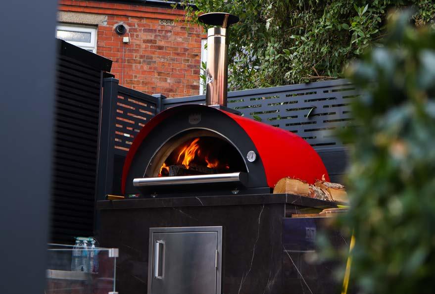


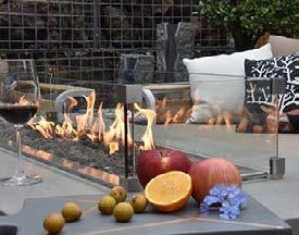
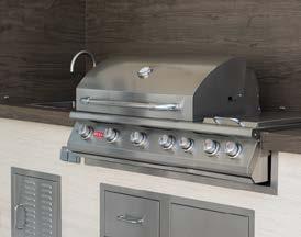
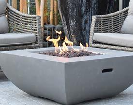
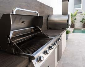
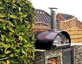


As the mercury rises and the evenings remain lighter, homeowners are firmly fixated on the great outdoors, according to new research from independent tile specialists
Porcelain Superstore
Data from Pinterest shows that interest in the term ‘home outdoor’ is currently 10,000% (yes, 10 THOUSAND%) higher than the same time last year, while ‘backyard living’ is trending 30% higher than this time last year.
And for those homeowners looking to create an outdoor oasis, Porcelain Superstore have the perfect base to kick start any garden makeover with their wealth of outdoor tiles.
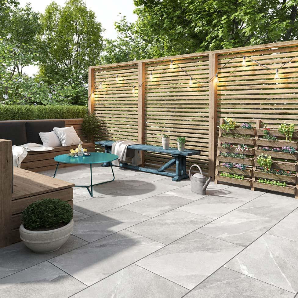
Abbas Youssefi, Director of Porcelain Superstore, said: “Homeowners are trying to maximise every inch of their living space and we are seeing more attention being paid to external flooring around which a garden makeover can be built.
“Outdoor tiles are ideal for those who want a gorgeous garden but minimal upkeep. Not only do they look stunning
tiles."
and retain their good looks over time, but they will really set the tone around which the rest of your outdoor living space can be developed.”
All of the outdoor tiles in Porcelain Superstore’s range come with an R11 Slip Rating as a minimum and at 20mm thick, are purposely designed for use outdoors.

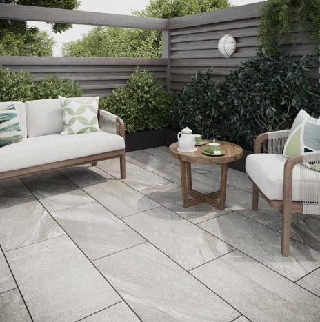
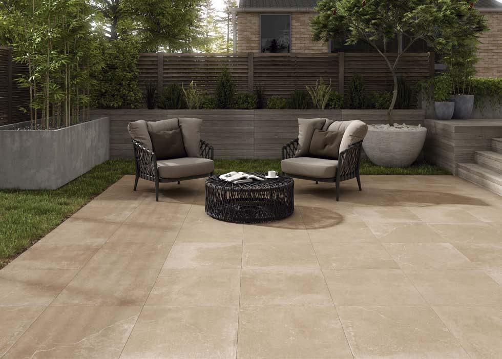
Abbas added: “We have worked hard to curate a collection of wood and stone-effect tiles that exude luxury. And even after years of footfall and everything the British weather can throw at them, a quick wash and they will look stunning for decades.”
Porcelain Superstore's collection of outdoor tiles are available now from porcelainsuperstore.co.uk with prices starting at £36 per m2.
"Porcelain Superstore have the perfect base to kick start any garden makeover with their wealth of outdoor
Imagine. The sun is going down, a loved one is on her way... Your chance to make that first impression. To feel good, to feel safe, to be yourself. Get ready to impress and open the doors to your heart and your home. Adelante, saying welcome was never that refined and intense!
The first look, the first touch. It is probably the most important one to make an impression. At home, everything starts at your doorstep. Warm welcomes, long-awaited reunions or unexpected goodbyes, Adelante is here for you and ready to receive your guests. Saying welcome was never that refined and intense.
After Lisa and Ellie, big sister Lena now completes the range as flagship touch display. Lena combines lights, shades, scenes, temperature music and even communicates with your Adelante door phone. She comes in 12 premium finishes to perfectly match any high-end interior.

At home, it’s important to feel good, to feel safe and secure. It’s the place where you welcome your guests and make them feel a little bit special. It all starts at your doorstep with our luxury door phone Adelante, bringing our sophisticated design from inside your home to your front door.
“I believe your home should be as personal as possible. Adelante has a modular design with different options at your fingertips including access control and all of that in our highquality durable finishes.”
Klaas Arnout, CEO BasalteWe want to elevate that first moment of saying hello and take it to a more personal level. That’s why Adelante is using multiple cameras to create the best possible experience.
Everything is built around this gorgeous OLED display. Adelante still has physical button, it is like a diamond in a ring. Giving you that tactile feeling you would expect.
Your door phone is no longer a necessity, it’s a design statement, perfectly integrated into your Basalte Home.
www.basalte.be
The first look. The first moment at your doorstep. You know you have arrived at a remarkable place. Adelante, welcome home. The luxury door phone for your Basalte Home.


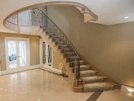
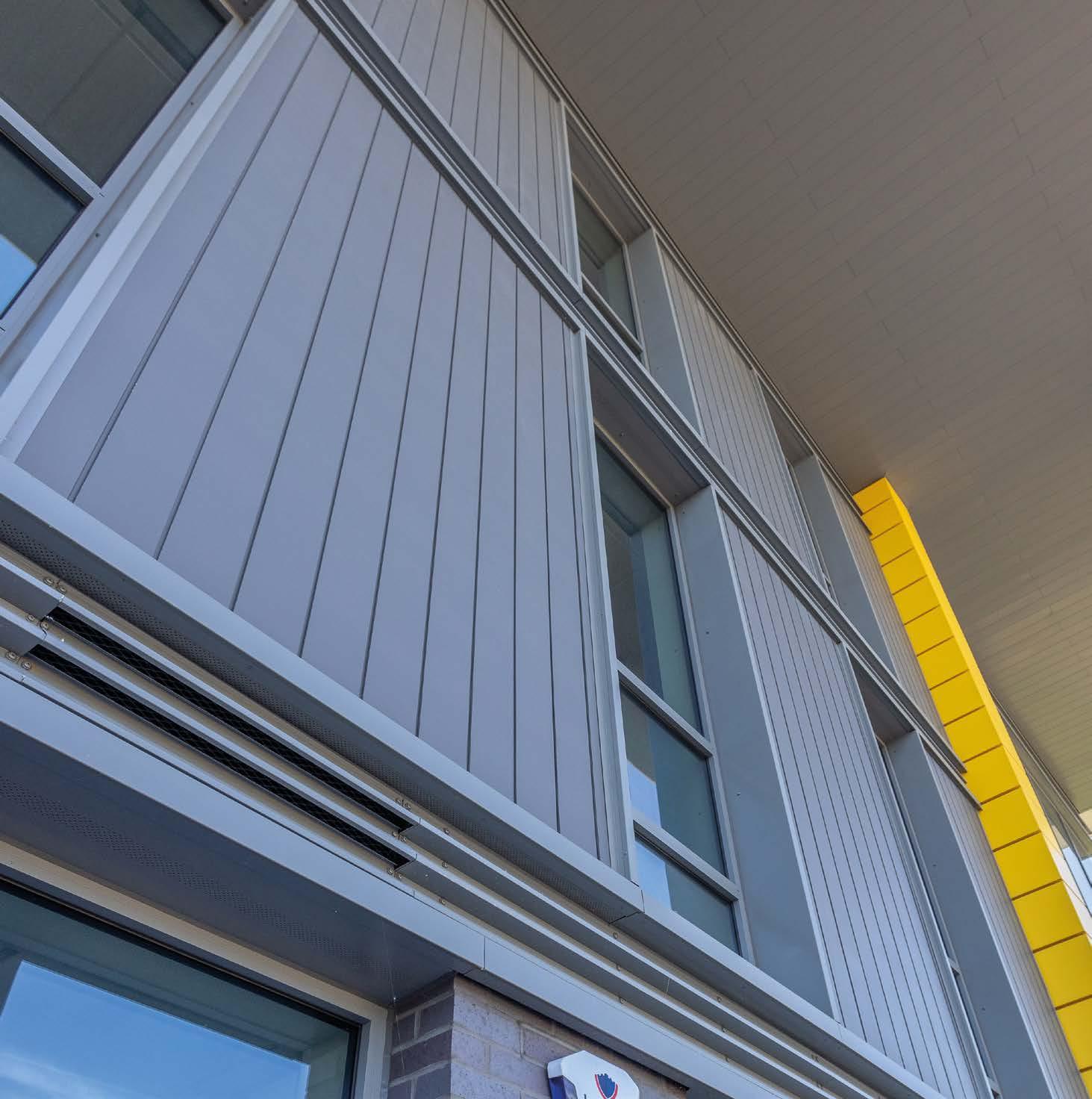




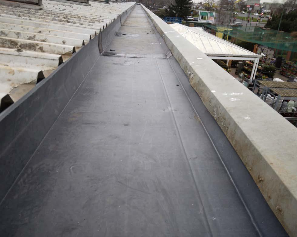
Numerous corners, overflows and outlets comprised the workup of this particular building, which had been plagued by persistent leaks over many years.
The installation of Unifold® was completed and resolved the ongoing issues.
Ampteam is a knowledge based organisation with over 100 years of cumulative technical experience in the roofing and cladding industry with an emphasis on roof drainage problems.
Unifold® is manufactured from the highest quality materials with a life span in excess of 50 years, and comes with a 30 year guarantee.
For further information about our Unifold gutter lining system, samples or prices, please call 01384 252777 or email unifold@ampteam.co.uk.
6 runs of gutter totalling over 200 metres of the Unifold® gutter lining system, including some intricate in-house fabrication, were installed on this project in Gloucester.UNI-DAM , a rainwater management system designed to prevent heavy storm rainfall from overwhelming gutter systems and flooding into buildings.

The system is fixed to the roof and once installed slows and controls the flow of rainfall into the gutter.

For more information or quote please contact our office on 01384 252777.
But none can match the excellence of a system that is truly complete


THE UNIFOLD GUTTER LINING SYSTEM.
Having faced and solved every problem experienced in its long life with consummate ease UNIFOLD remains THE GOLD STANDARD to which others aspire!
UNIFOLD – Unrivalled excellence in Gutter Lining Technology.



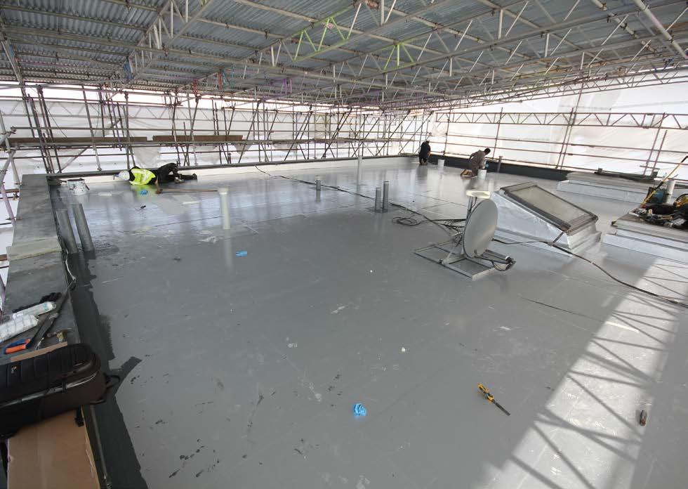
The total replacement of the flat roof covering on a residential apartment building in North London presents a prime example of why leading waterproofing systems manufacturers are specifying the use of Magply boards as a decking which offers critical fire resistance as well as good load-carrying and weathering capabilities.
The property involved is Block 6 at Tiltman Place in the Finsbury Park district where water ingress through the original felt roof covering had caused the plywood decking to deteriorate badly while, along with other damage, the insulation had become saturated: necessitating total strip back and replacement.
The managing surveyors for the five storey property duly decided to appoint Detailed Waterproofing Ltd. as a wellexperienced roof specialist, while the supplier of the roofing system specified the use of high performance Magply boards to provide a sound new decking across the retained metal frame structure.
The build-up features the use of 20mm Magply Al boards, proteus self-adhesive vci, cut to falls insulation, Proteus selfadhesive carrier membrane, then followed by a cold applied Proteus ‘Pro-System’ waterproofing membrane.
The Contract Manager for Detailed Waterproofing, Jamie Tarry, commented “We hadn’t previously used Magply before it was specified to us here as part of the new built-up system on Tiltman Place, but it has proved very easy to handle in terms of cutting and fixing. The job went well and we finished on schedule.”
Backed by a number of industry recognised standards Magply provides an ideal alternative to conventional plywood or OSB products. Additionally, the unique production process keeps the chloride content to just 0.01%, enhancing both stability and long-term durability. The different thicknesses of panel are also widely used for flooring and pitched roof installations; as well as being approved by many different manufacturers of render finishes.
For further information, please contact:
Oliver Pirret, Sales & Marketing Manager, IPP Ltd. Bradwell Hall Bradwell On Sea, Essex Tel: 01621 776252 | Email: ollie@magply.co.uk Web: www.magply.co.uk


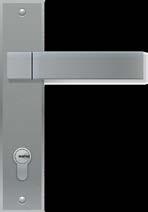
PAS 24 has long been the go-to security certification standard for domestic doors and windows. Approved Document Q made it mandatory for builders to provide security in new build homes, and PAS 24 is the easiest way to meet this requirement.
In 2009/10, cylinder snapping became a serious issue in some parts of the country, leading to the development of the SS 312 Diamond Specification for Cylinders for Locks. This allowed locksmiths to offer a serious security upgrade to any door and was the first-ever UK upgrade for high-security cylinders for doors.


Sold Secure (SS) 312 has now been referenced in the latest version of PAS 24 along with SS 301 Specification for Mechanical Security Systems for Domestic Buildings. The reference can be found in Section 4. Enhanced Security Requirements; 4.1.2 Doorsets.
You can choose either:
• a Sold Secure SS 312: 2019 cylinder with a Diamond rating; or a Sold Secure SS 312: 2019 cylinder with a gold rating, plus a Sold Secure SS 301; 2015 handle or escutcheon with a minimum Bronze rating.
The latest update to the PAS 24 standard means that products certified by Sold Secure (SS) 312 and SS 301 can now be used to meet legal requirements. This is in addition to TS 007 products, giving you even more options to ensure your products meet approved document Q.
This is the first ever time that Sold Secure specifications have been referenced in a standard used to meet legal requirements and is a testament to the important work carried out by this independent test lab in helping to reduce crime.

LOVE IT LOCK IT. BE SURE ITS SOLD SECURE.
www.soldsecure.com


