231 interiors

ARCHISONIC® Cotton is a natural product solution that solves the problem of sound absorption while being fully circular. The tiles are completely reusable and 100% of the sound absorbers can be returned to the production process at the end of their life.

Circular acoustic solutions
All our high-quality acoustic products are made from waste materials such as discarded cotton linters or upcycled PET bottles.
Tailored to your specific requirements, engineered in Switzerland. Now conveniently available in the UK and Ireland.
Visit
impactacoustic.com or contact us at uk@impactacoustic.com to learn more.
ARCHISONIC® Cotton enables a closed loop system through the use of natural cellulose.

14 Upfront Projects, products and people through a future-centric lens.
24 Things I’ve learnt Pooja Agrawal, CEO and co-founder of non-profit Public Practice, shares lessons learnt from a career in architecture and the public sector.
26 Height of design
Artist and designer
Lois O’Hara spotlights the one piece she sees as the pinnacle of great design.
28 Colour Story
Colour designer and forecaster
Laura Perryman
(author of The Colour Bible) explores whether the drive for trends has come to a natural end.
30 In conversation with: David Collins
Studio
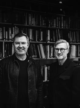
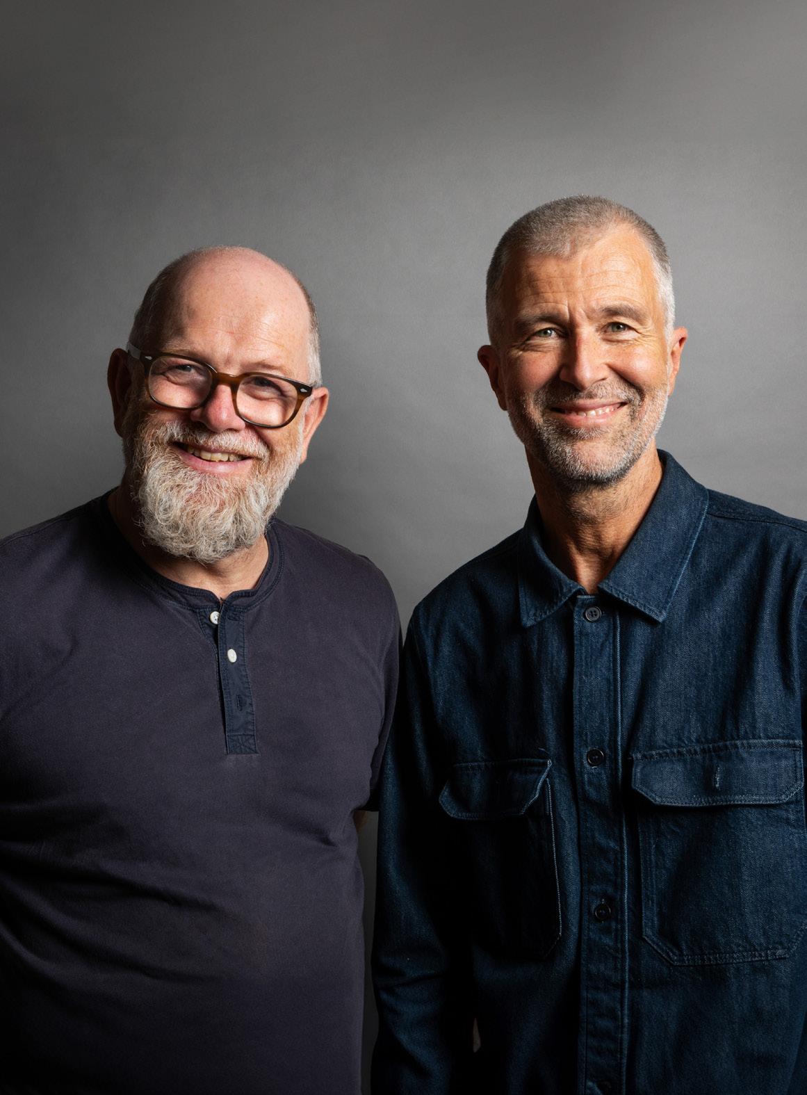
Iain Watson and Simon Rawlings discuss creating icons, designing to last and why time is the greatest luxury.
38 In conversation with: Pearson
Lloyd Co-founders Luke
Pearson and Tom Lloyd on closing the loop, shifting material perceptions and radical design for change.
46 Building Narrative
Patrick McCrae, founder and CEO of art agency Artiq, on the pivotal role storytelling plays in art, design and in helping us foster connections.
48 Case study: Myo, London
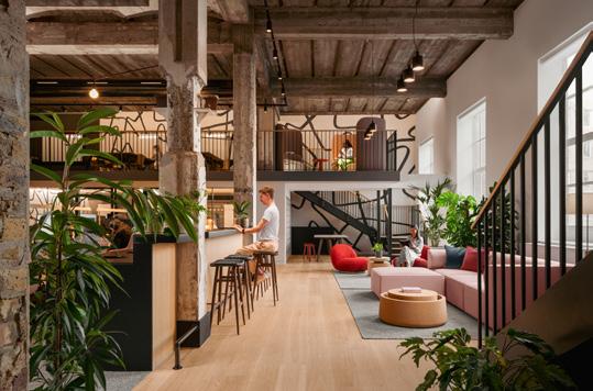
Myo’s latest offering – designed by local architects Basha-Franklin – brings the principles of hospitality and retail into the workplace.
56 Case study: Hôtel de la Boétie, Paris London-based designer Beata Heuman has
brought her fanciful aesthetic to the French capital for this boutique property.
64 Case study: Fivefields, London Barr Gazetas sets a new standard for purpose-driven design at this charity-funded workspace in Central London.
70 Case study: Francis House, London
Relocating to a redbrick warehouse, a local PR agency reflects its shifting working style with a flexible new office by Gensler.
231
Mix Interiors
56 30 70 1
Contents

78 Case study: Park Hyatt Milano, Milan
In the heart of the fashion capital, this Milanese hotel celebrates its 20th anniversary by completing a multiyear redesign.
86 Positive Impact
In an era defined by the climate emergency, we explore why forging a more sustainable future miay mean reassessing our notions of beauty.
90 Fast Forward
Pioneering artist and designer
Refik Anadol discusses the power of AI to push the boundaries of creativity, technology and the human experience.
94 Innovative Thinking
Steve Gale, head of strategy at M Moser Associates, on how intelligent data analysis can help us create better, more efficient and more responsive workplaces.
96 Mix Roundtable with Interface
Beyond the new: is fast design at odds with sustainability?
104 Mix Roundtable with Atlas Concorde
How can we make room for luxury in the workplace?
114 Events
From London to Milan, we’ve compiled guides for two of 2024’s most anticipated
design events: Milan Design Week and Clerkenwell Design Week.
126 Mind Matters
Applied's Tim Fendley on whether our spaces can speak to us.
128 Jaime Hayon X
Fritz Hansen Hayon discusses his longstanding relationship with the brand and creating modern classis.
132 Material Matters
Gensler’s principal and design director Lindsay Roth shares four key materials the practice uses to create more consciously.
133 Material Innovation
Crafted from recycled wine corks, a spray upholstery by Dutch innovators Cooloo is pushing the boundaries of circular furniture production.
134 Mix Talking Point
Radical retail and the future of the high street: how can we reimagine spaces and redefine experiences?
136 Living Better
Futurist designer and artist Freyja Sewell looks ahead to examine which emerging sci-fi genres could make their mark on the world of design.
Mix Interiors Contents 128 90 86 2


Configure your ONE here Connection Furniture Connectionfurnitureltd Connection Connectionpin Connectiontweet
The cover Designer Manufacturer
fully reintegrated into the manufacturing process. Designed for a circular lifecycle, each acoustic tile is meticulously manufactured to be fully recyclable and even compostable. Impact Acoustic takes back the material at the end of its life, ensuring that 100% can be seamlessly returned to production.
impactacoustic.com
Get in touch
Managing Editor Harry McKinley harry@mixinteriors.com
Deputy Editor Chloé Petersen Snell chloe@mixinteriors.com
Editorial Assistant Charlotte Slinger charlotte@mixinteriors.com
Managing Director Leon March leon@mixinteriors.com
Account Manager Stuart Sinclair stuart@mixinteriors.com
Account Manager Patrick Bowley patrick@mixinteriors.com
Marketing Manager
Paul Appleby paul@mixinteriors.com
Head of Operations
Lisa Jackson lisa@mixinteriors.com
Events & Editorial Executive Yasmin Waters yasmin@mixinteriors.com
Art Director Marçal Prats marcal@mixinteriors.com
Board Director
Marcie Incarico
Founding publisher
Henry Pugh Columnists
Laura Perryman
Patrick McCrae
Freyja Sewell
Steve Gale
Tim Fendley
Contributors
Rima Sabina Aouf
Clare Dowdy
Lauren Jade Hill
Dominic Lutyens

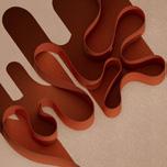
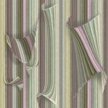
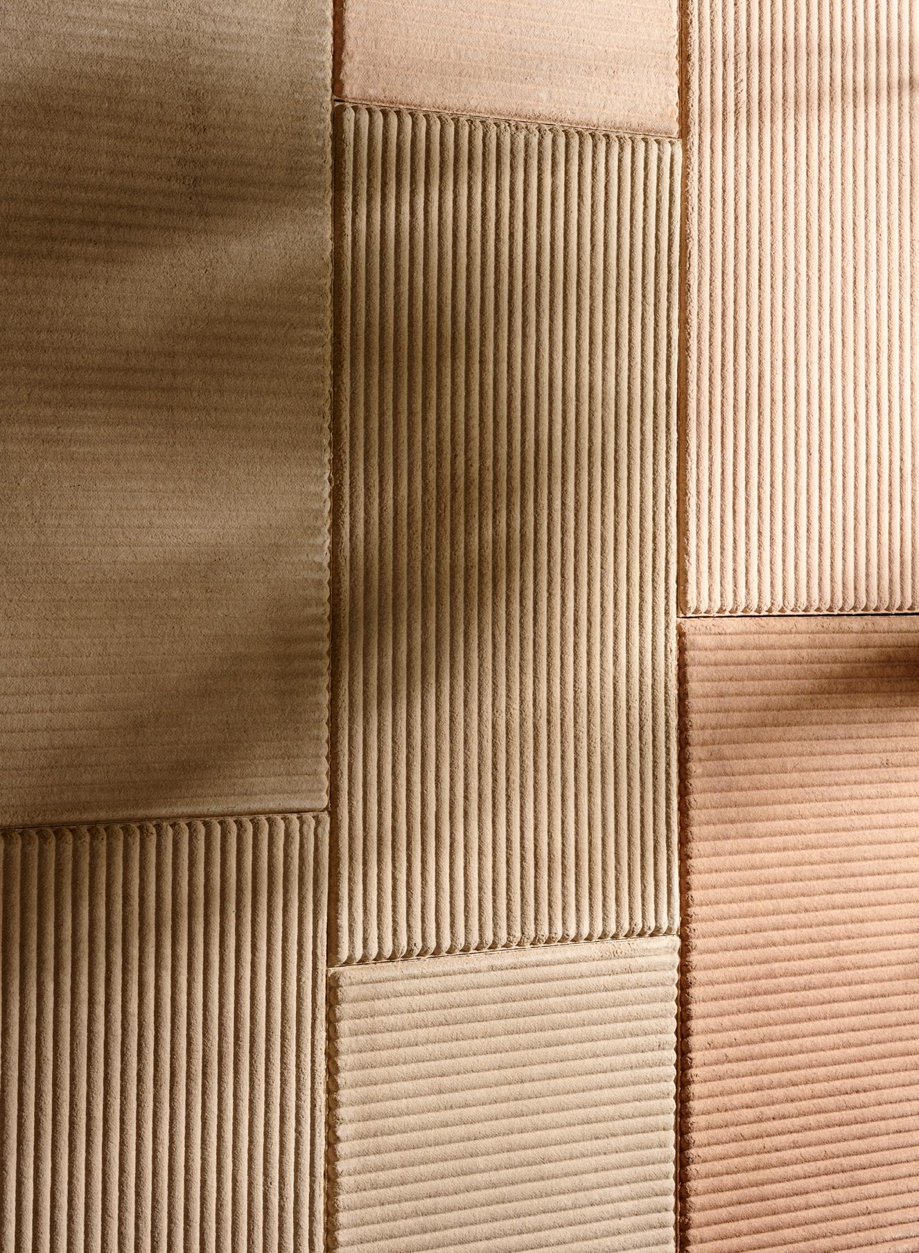
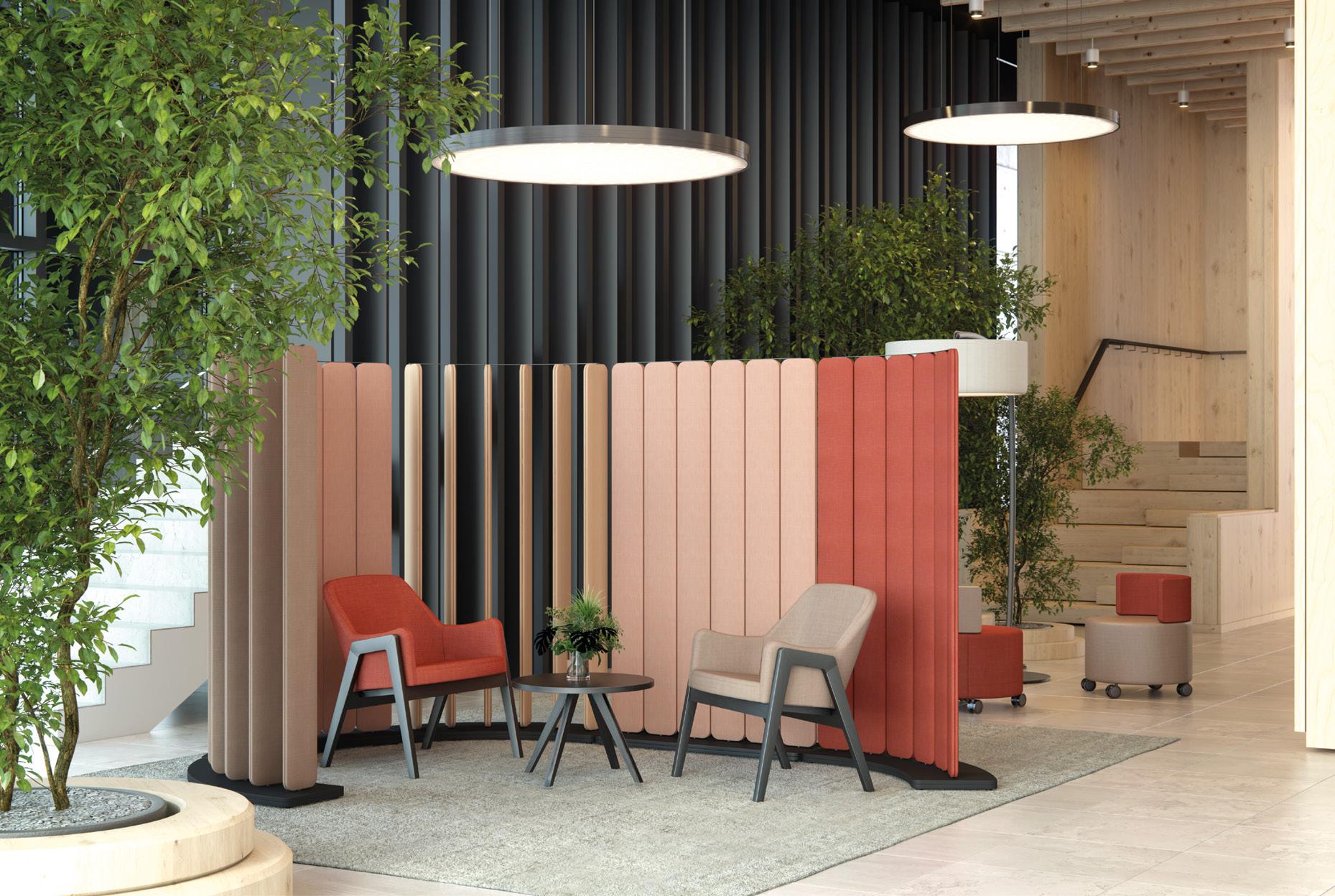
230 228 229 interiors Subscription To ensure that a regular copy of Mix Interiors reaches you or to request back issues, call 0161 519 4850 or email lisa@mixinteriors.com Annual Subscription Charges UK single £45 50 Europe £135 (airmail) Outside Europe £165 (airmail) Contact Unit 2 Abito, 85 Greengate, Manchester M3 7NA Telephone 0161 519 4850 editorial@mixinteriors.com www.mixinteriors.com Twitter @mixinteriors Instagram @mix.interiors LinkedIn Mix Interiors Printed by S&G Print ISSN 1757-2371 Colophon Mix Interiors Issue 231 April 2024 Mix Interiors 4 We were first inspired by the sleek lines and rich texture of the Impact Acoustic panels. Through multiple overlays of vertical patterns, we looked to emulate the depth and rhythm found in the product’s design. Each layer reveals a vibrant composition that echoes the dynamic nature of sound waves, while adding a bold visual texture. The design showcases the straightforward elegance of the product, blending it seamlessly with the surroundings to emphasise the relationship between sound, space and colour. sodastudio.co.uk ARCHISONIC® Cotton is made entirely from natural materials. Unlike conventional acoustic materials, which rely on synthetic binders that are difficult to recycle, the solution developed by Impact Acoustic allows the absorbers to be
Harry McKinley
Welcome
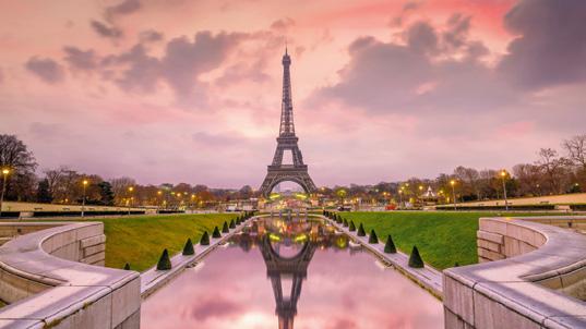
I’ve just returned from Paris. As I taxied along the runway at Charles de Gaulle, by the cover of night, the Eiffel Tower sparkled in the far distance. A beacon over the city, on a clear evening the immense funnel of light shot from its peak can be seen up to 80km away. It is as emblematic of Paris – of France – as baguette, wine and chain smoking.
It got me thinking about the ‘iconic’; of the enduringly timeless and powerfully symbolic. In the world of commercial interiors, we celebrate design that withstands, be it concepts, spaces or products. Design that lasts is inherently good design, we collectively agree.
This issue we speak to David Collins Studio CEO Iain Watson and chief creative officer, Simon Rawlings (p30) about what it means to design outside of time and trends, creating genuinely iconic, ageless destinations –from The Wolseley and Claridge’s Bar to the Dining Hall at Harrods. We also explore the development of timeless Danish
design in our feature with Fritz Hansen (p128), speaking to Jaime Hayon about the merging of continuity and legacy with creativity and modernity; and unpack the nature of classic luxury, asking if it can even find a place in the workspace of today, in our Mix Roundtable with Atlas Concorde (p104).
What of change, then? We can also agree that transient trends are anathema to sustainability. But our world is evolving apace and design needs to speak to timely concerns; to react and adapt. For Pearson Lloyd founders Luke Pearson and Tom Lloyd (p38) this means an emphasis on circularity and purposeful, responsible innovation. How this sits alongside our appetite for the ‘new’ is the basis for our Mix Roundtable discussion with Interface (p96), while our Positive Impact feature (p86) posits that we may need to rethink our sense of aesthetics and beauty in creating more sustainable environments.
Tomorrow’s ‘timeless’ may look radically different from
today’s then, with Refik Anadol’s Fast Forward piece (p90) also investigating the power of AI to imagine a boundary-breaking design future.
At the heart of all of this, of course, is experience. Whether creating for the ages or in pursuit of the disruptively, challengingly pioneering, all of the projects and conversations in this issue coalesce around the notion that great design is rooted in emotion, meaningful experiences and human connection. Our cover, a collaboration with Impact Acoustic and SODA Studio speaks to this – a bold ‘visual texture’ that represents the relationship between sound, space and colour; a testament that design should speak to all of our senses. In the end, whether it’s a glittering Eiffel Tower or an impactful graphic artwork, what truly defines the iconic is perhaps not how something looks, but how it makes us feel.
Harry McKinley Managing Editor
Mix Interiors 5
Perfectly balanced seating.
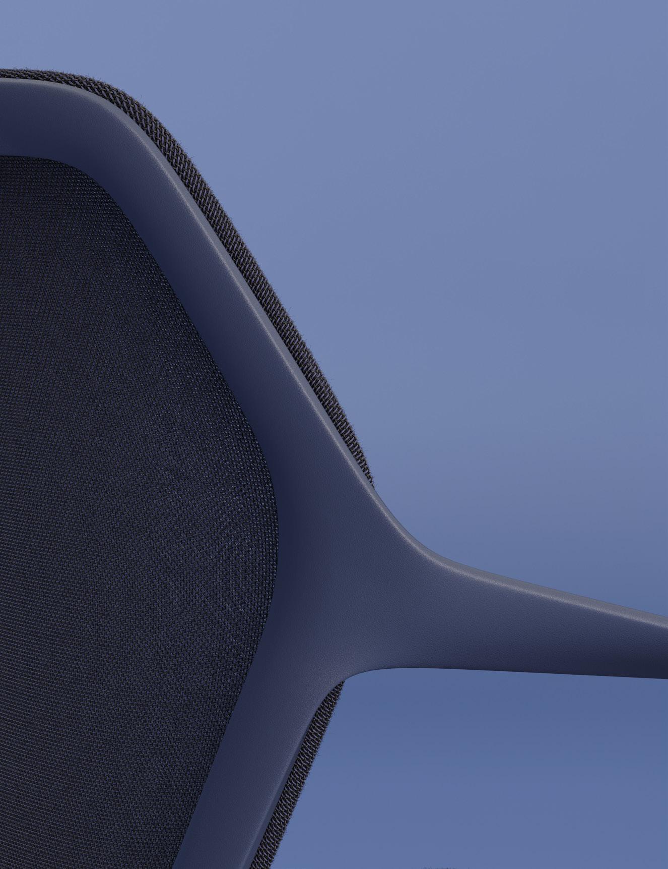
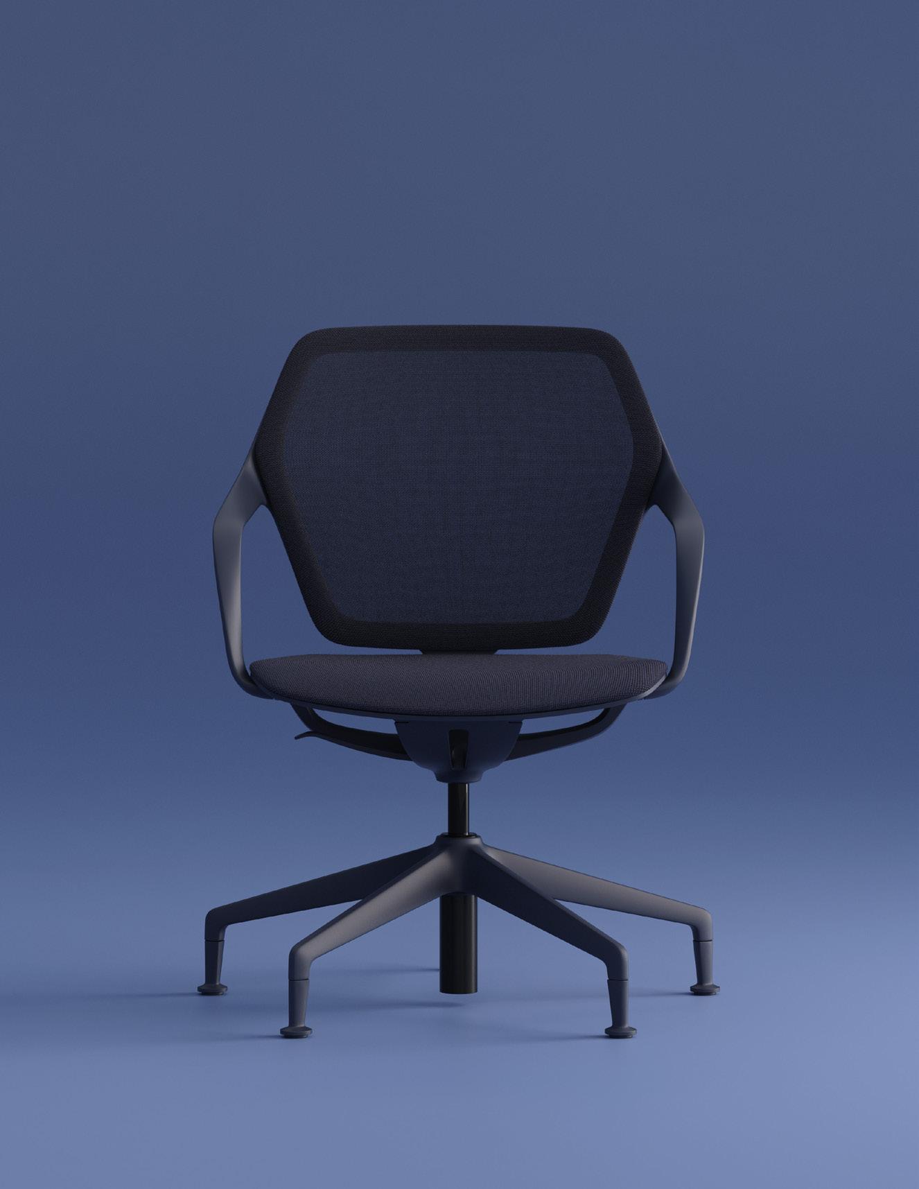
IN HARMONY WITH PERSON, SPACE AND SHAPE.
Whether in the office, a conference room or the home office: the exceptionally light and elegant ray work swivel chair can be customised and seamlessly adapted to suit any environment and body movements. A completely new seating experience.
brunner-uk.com
RAY WORK

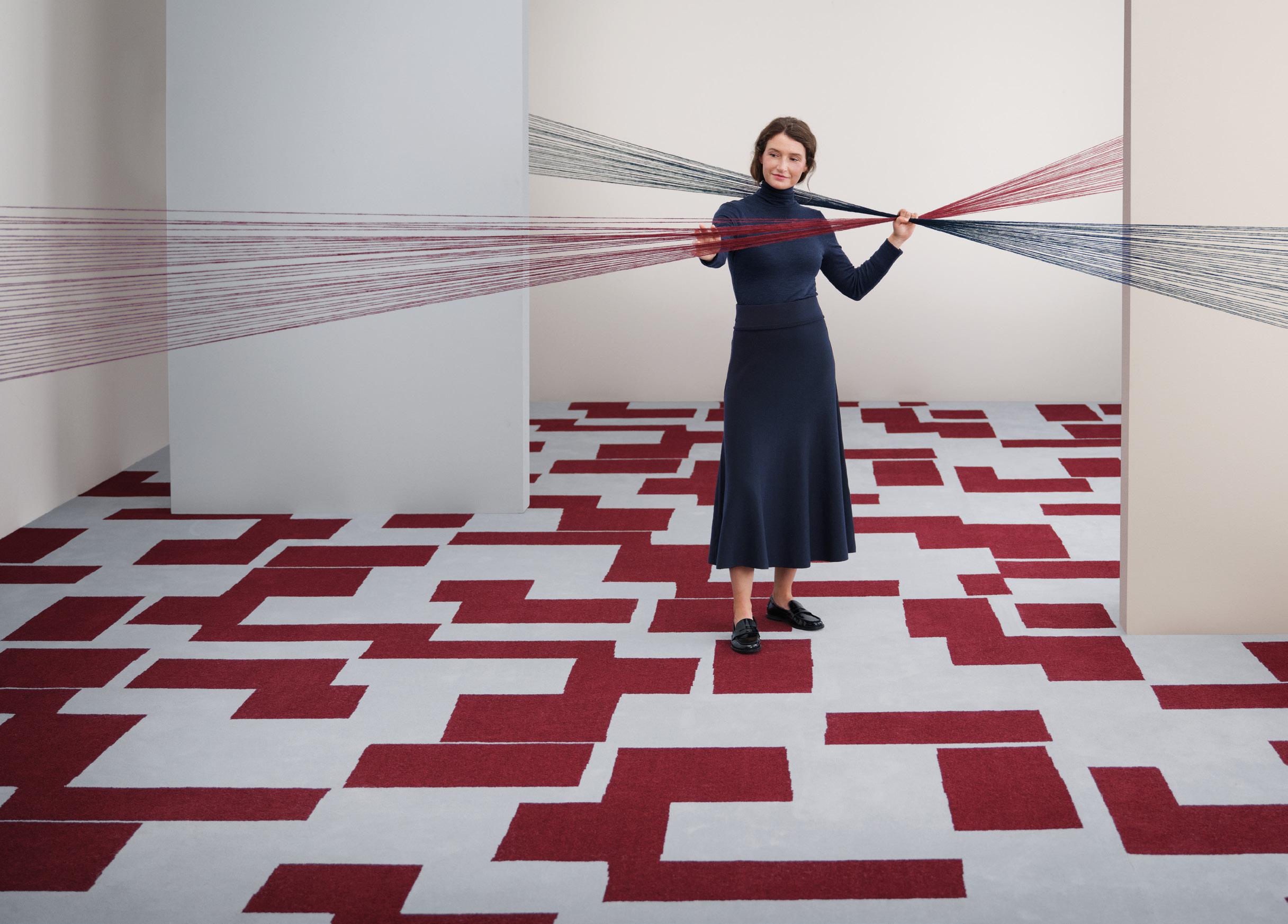
To say wool carpet doesn’t last is a bit of a stretch
Our new WOOL100 carpet collection, SHE, is crafted from 100% pure new wool spun from extra-long fibres perfectly matching the durability of mixed wool/nylon qualities.
Join us at Clerkenwell Design Week
Step into innovation and design at Ege Carpets showroom during Clerkenwell Design Week! Our programme is brimming with activities and events, from a DJ and cocktails evening to soothing massages and crafty workshops. Dive deeper into the SHE collection and be among the first to discover Ege Carpets’ newest product offering. Please visit the official Clerkenwell website to book your Lunch & Learns and workshop spaces with us. See you there! Ege Carpets UK
egecarpets.com
13-16 Britton Street London EC1M 5SX Tel. +44 020 7336 0992

sustainable design at your feet
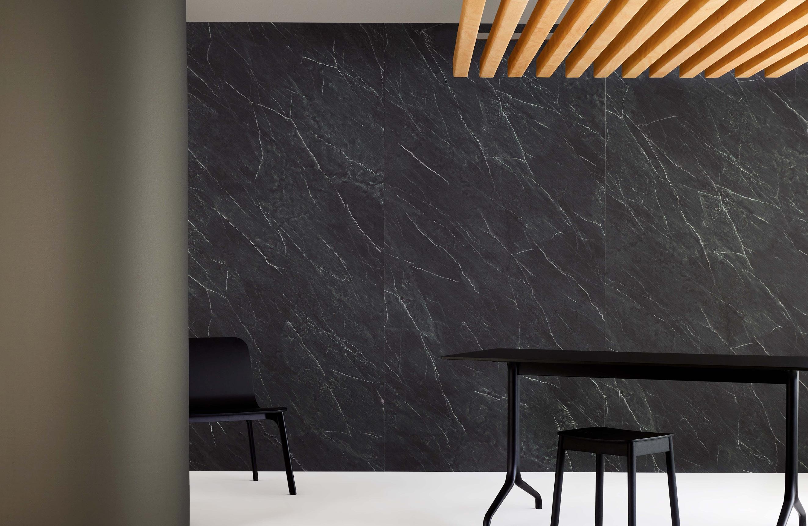
A curated collection of designs to turn your projects into reality.
Our array of Surface Finishes provides you with an opportunity to explore contemporary, meticulously selected patterns, textures, and stone finishes.
SF- Stone Collection


below to learn more
Scan
DESIGNED TO OFFER
COMPLETE FREEDOM OF EXPRESSION

Design is an endless journey


Discover Opus
Designed to mix and match vibrant tones, textures, and sizes, Opus o ers unparalleled creative freedom without the need for a bespoke cut floor. Whether you’re aiming to define zones, guide navigation, or create a captivating canvas, Opus is your tool for elevating any space.

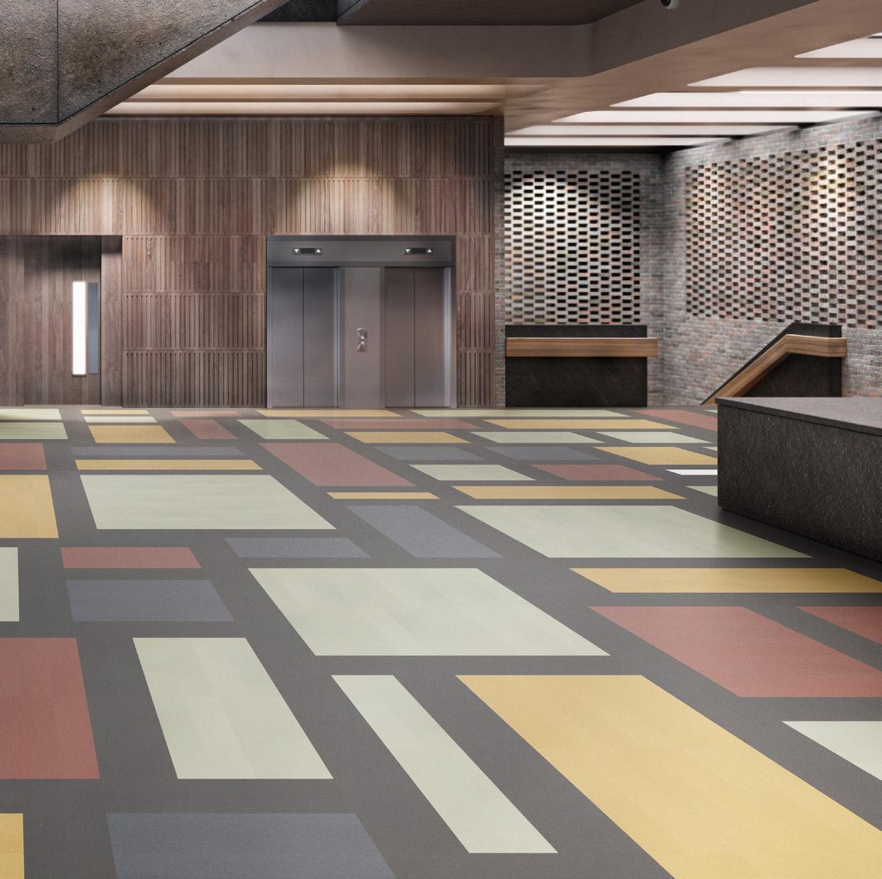
Opus | SP719 | SP720 | SP724 | SP726 | SP727 karndean.com/opusabstracts
The future of co-living
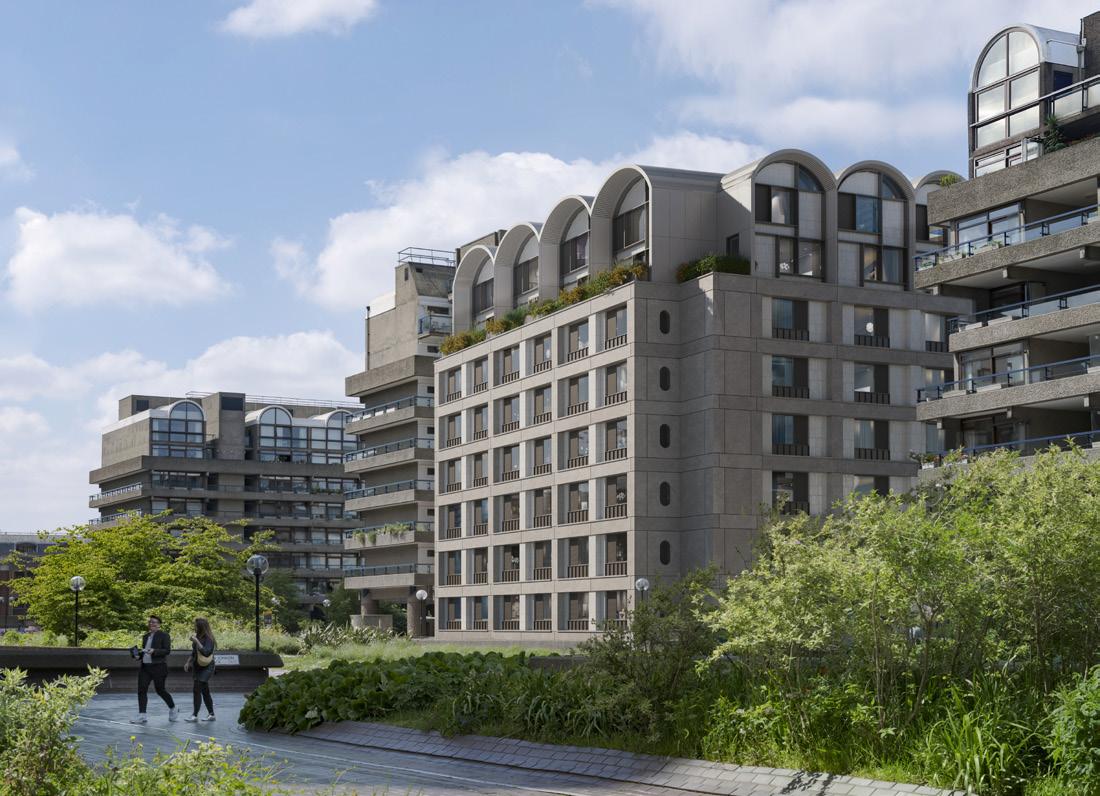
Submitting plans for a future-forward development on the Barbican Estate, property developers HUB are set to reimagine a neglected 1950s office block into a community-focused residential complex. This project marks HUB’s third collaboration with sustainable impact investors Bridges Fund Management, following co-living projects in Hammersmith and Fulham (the latter in partnership with Women’s Pioneer Housing). London architecture firm Allford Hall Monaghan Morris (AHMM) has been tapped to lead the upcoming design of 45 Beech Street, which will reportedly deliver 174 coliving residences as well as a selection of reinvigorated public realm spaces.
As a site that pioneered city centre living and continues to rub shoulders with cultural institutions such as the Barbican Arts Centre, the Museum of London and the Guildhall School of Music and Drama, the proposals outline a building that responds both sensitively and creatively to its surroundings. The project is also set to include a commercial space on the ground floor and a selection of on-site amenities for residents, a choice informed by outreach workshops with Barbican residents, project stakeholders and the local business community.
“The opportunity to develop a scheme adjacent to the most iconic residential development in London is hugely exciting,” explains Tom Stoneham, Senior Development Manager at HUB.
“Our proposals would reinvigorate an existing building at risk of becoming a stranded asset, demonstrating the potential for new models like co-living to not only bring much-needed new homes to city centres, but also to minimise carbon emissions by giving new life to tired office buildings.”
ahmm.co.uk
Upfront 14
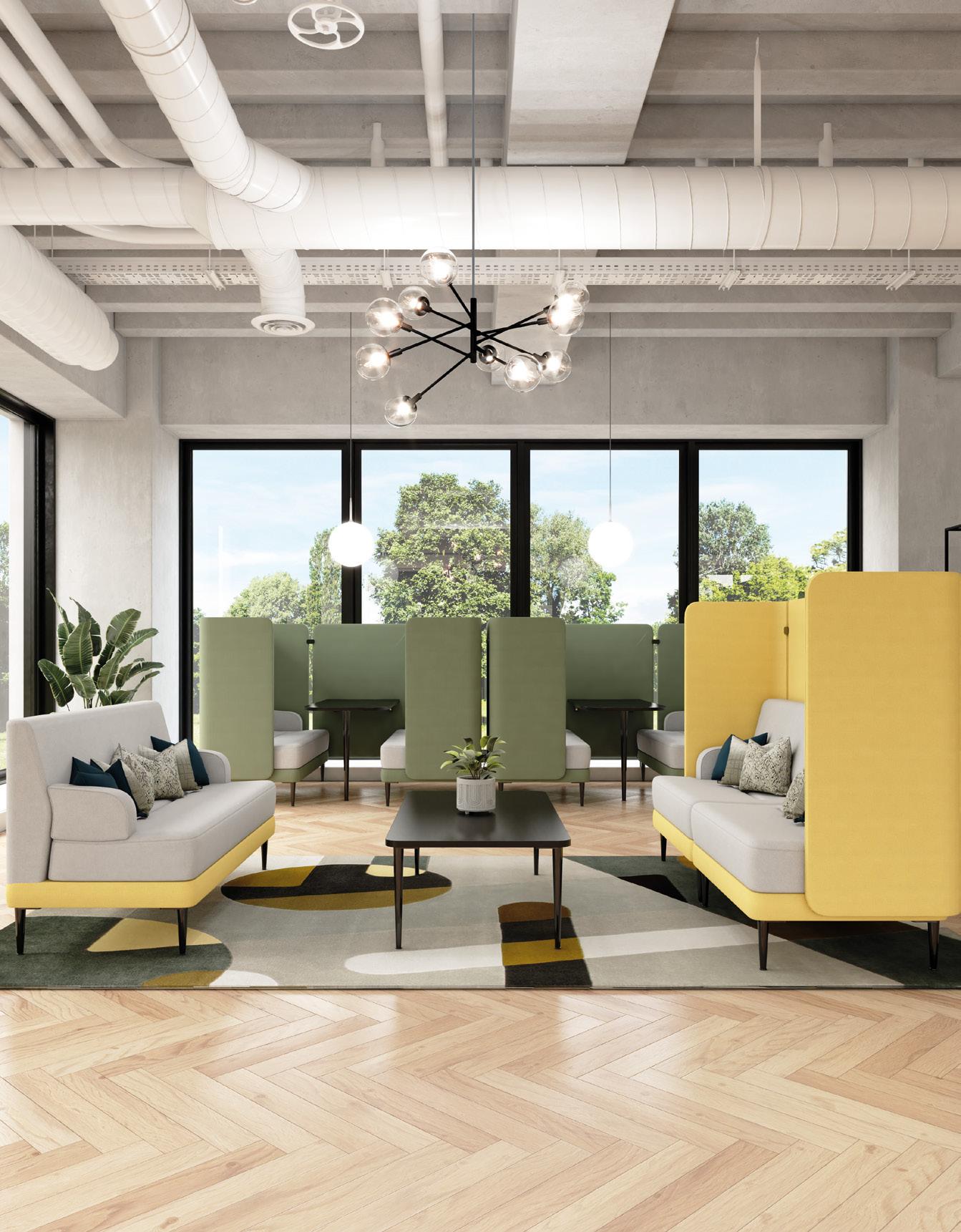

MODULAR SEATING socialspacesfurniture.com TRINITY Visit us at clerkenwell design week Stand PA9 Clerkenwell Green
by Dams
The mass timber movement
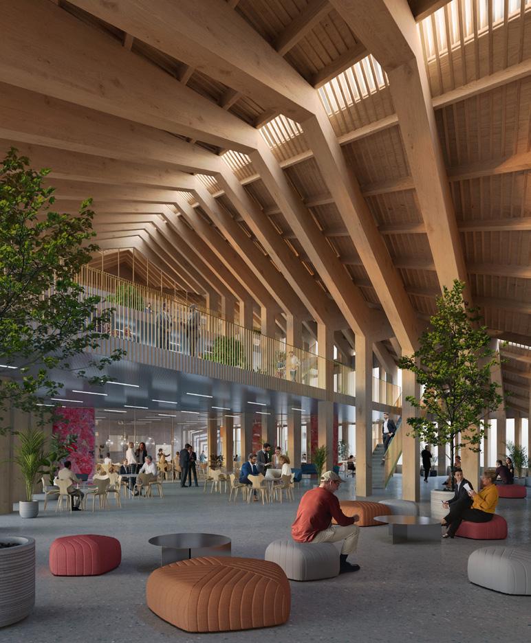
First introduced to commercial construction in the late 1980s, the use of mass timber is growing in popularity as we strive to build consciously. This specific type of engineered, man-made wood is reinforced by joining composite layers together to form durable beams and panels, which are strong enough to build tall structures like concrete and steel but with significantly lower carbon emissions. It is this renewable material that forms the basis of BIG’s latest project, the Marengo Multimodal Transport Hub in Toulouse.
Partnering with A+ Architecture, the practice’s plans for a mass transport hub in the south of France propose a 2,800 sq m building next to Toulouse’s main city station to act as an interchange point for passing travellers. The multi-use scheme is also set to include retail and community spaces on the lower floors, as well as 6,000 sq m of new office space for regional businesses and a vast open-air bike park.
The hub will therefore provide a space for metro, train and bus passengers to take a moment’s rest between journeys, while also offering local residents a new destination to spend their leisure time. Striving to be the region’s new landmark, the design includes three striking pitched roofs ranging from one storey to seven storeys tall, finished with the pink ‘foraine’ bricks that give Toulouse its affectionate nickname, ‘La Ville Rose’.
big.dk
Upfront
Upfront 16
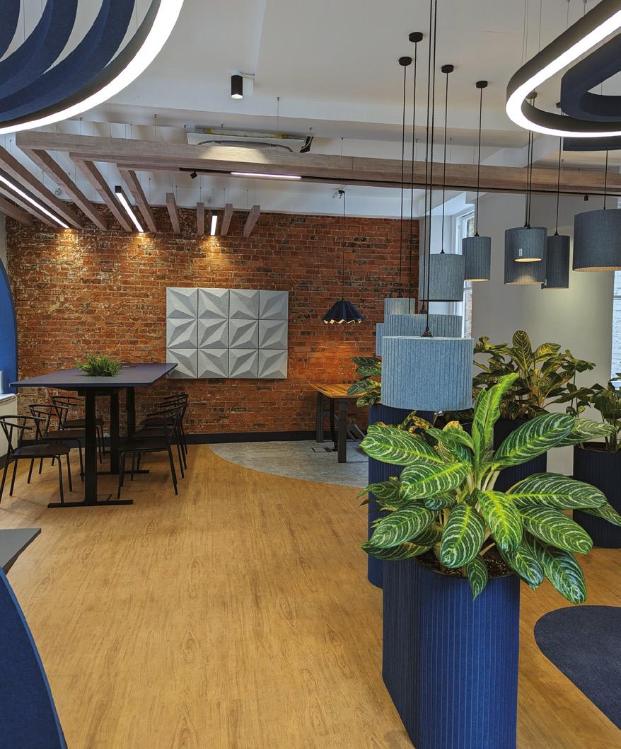


Is sustainability enough?
In an era sadly defined by the climate emergency, some are beginning to question whether sustainability alone will go far enough to overcome our pressing environmental issues. One such voice in the industry is design futures consultancy FranklinTill, who have made the case for going beyond sustainability and instead pushing for regenerative design. Knowing how ill-defined terminology can often lead to greenwashing in the production industries, the London-based agency has put forward nine core principles to define this movement, illustrated by an exhibition at Heimtextil 2024.
Titled ‘Regenerative? Moving Beyond Sustainability’, FranklinTill unveiled its nine principles at the global textile fair’s 54th edition this January.
The exhibition spotlights a roster of pioneering designers, producers and manufacturers from across the globe that are tangibly accelerating change, ranging from artisan trade collectives in Morocco to craft initiatives introduced within the British prison system. Each of the nine principles – including tenets like Radical Transparency, Preserving Heritage and Cultivating Localism –is underpinned by three real-world examples of change already in action.
Every innovative material, pioneering individual or community programme included in the exhibition serves to illustrate FranklinTill’s point that regenerative design is committed to putting back better: by creating more holistic practices that restore or renew resources, we can learn to leave a more positive environmental impact and help local communities thrive. Following its international debut in January, the Regenerative? exhibition is set to return to Techtextil – Heimtextil’s sister fair, dedicated to technical textiles and nonwoven fabrics –from 23 to 26 April 2024.
franklintill.com
Upfront 18
power designed to last.
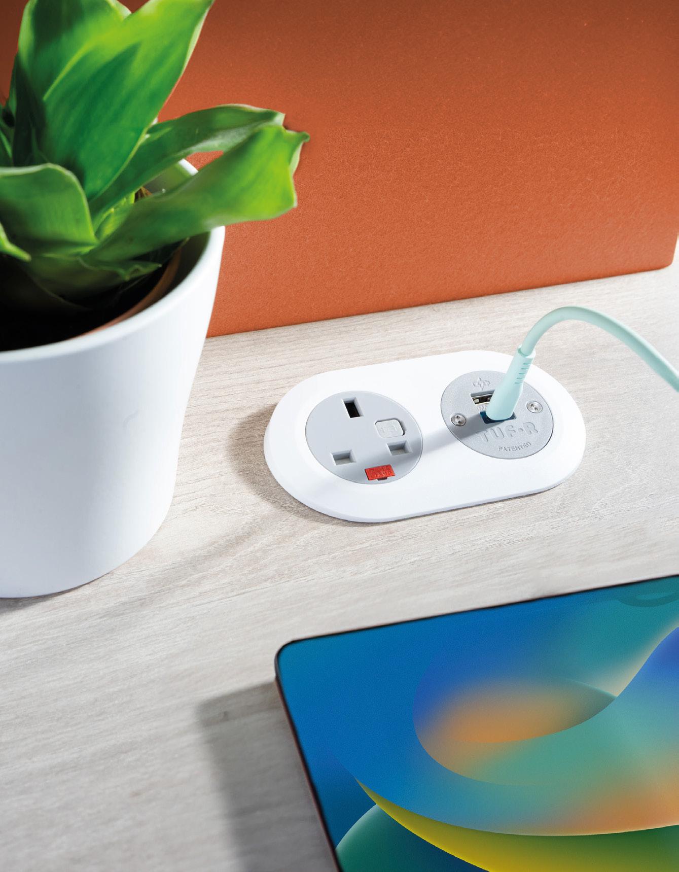
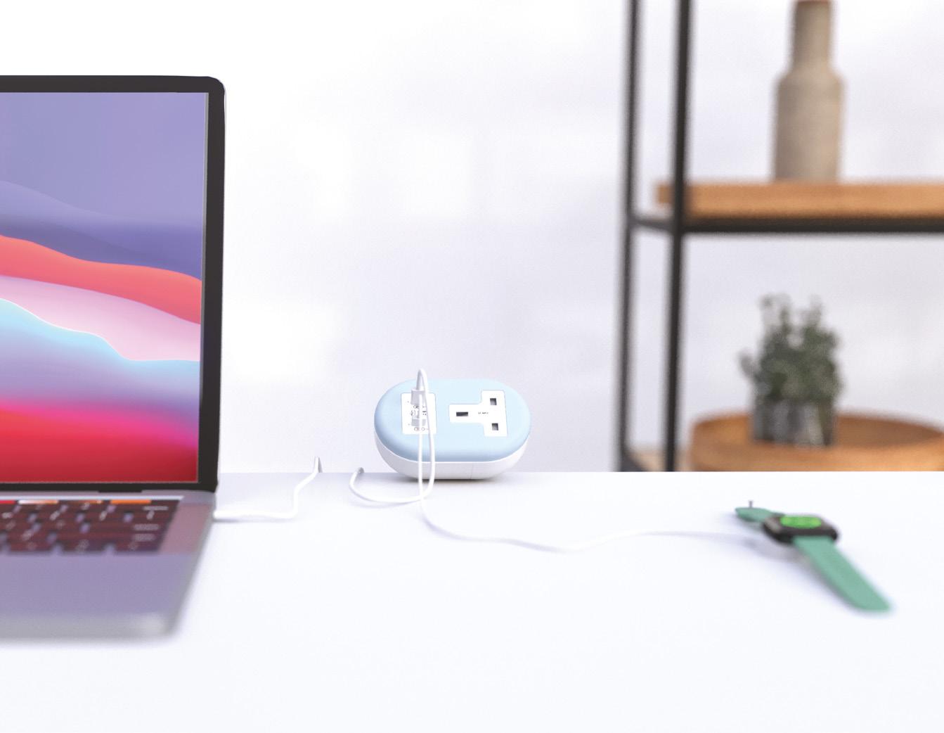
First of its kind, PIP 2 & 3 o ers a sustainable desktop power solution using recycled plastics from discarded white goods. Representing a new chapter in OE’s product portfolio and aligning with our commitment to achieve net-zero carbon emmissions by 2035.

www.oeelectrics.co.uk +44 (0) 1924 367255
made using 60% post-consumer recycled plastics. repairable & upgradeable USB modules.
A landmark listing
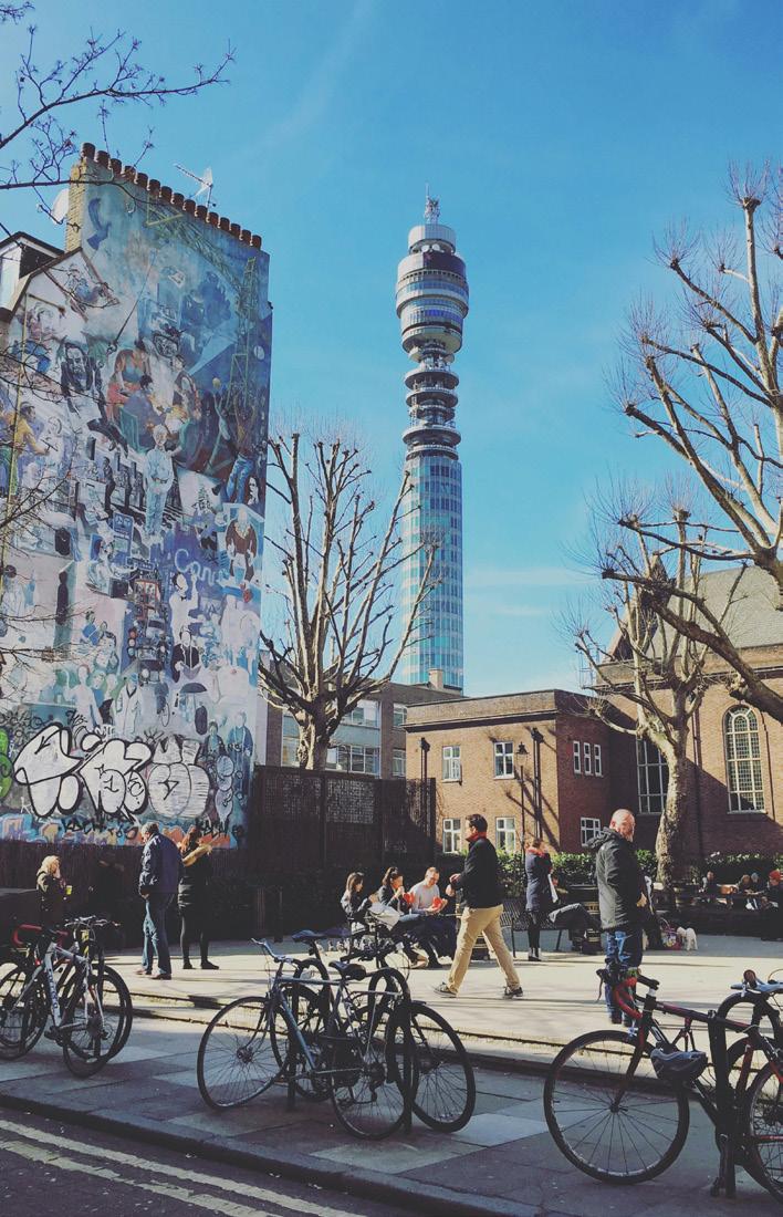
A fixture of London’s skyline is set to find new life in the hospitality industry, following its sale to America’s thirdlargest hotel operator, MCR. The BT Tower has been a landmark of London’s Fitzrovia district since 1965, when it was constructed by the telecommunications giant to house its microwave aerials. Opening its doors to the public in 1971 with a revolving restaurant on the top floor (which shuttered in the early 80s), over 50 years later the tower will return to its hospitality roots with a luxury hotel designed by Heatherwick Studio.
The vast, 581-ft main structure will reportedly take multiple years to vacate, with a similarly long-term plan for the various stages of design development for the Grade II listed building –Heatherwick Studio planning to consult Fitzrovia’s residents and ‘many thousands of Londoners’. Accustomed to large-scale projects, this will follow the studio’s recent work on two new Google campuses in California, the futuristic Little Island in New York, Azabudai Hills in the heart of Tokyo and, closer to home, Coal Drops Yard in King’s Cross.
MCR also own and operate some of New York’s most high-profile hotels, including the TWA Hotel at JFK Airport, which brought an entirely fresh take on Eero Saarinen’s landmark 1962 Flight Center. “We see many parallels between the TWA Hotel and the BT Tower,” says owner and CEO Tyler Morse. “Both are world-renowned, ground-breaking pieces of architecture. It’s been a privilege to adapt the TWA Flight Center into new use for future generations, as it will be the BT Tower.”
mcrhotels.com
Upfront
Upfront 20
Time for more.
Decorative Collection 24+

Functionality, a comprehensive product range, or perfectly coordinated aesthetics. Find the perfect material solution for any design requirement in the Decorative Collection 24+.
Discover the new Decorative Collection 24+ to.egger.link/decorative-collection
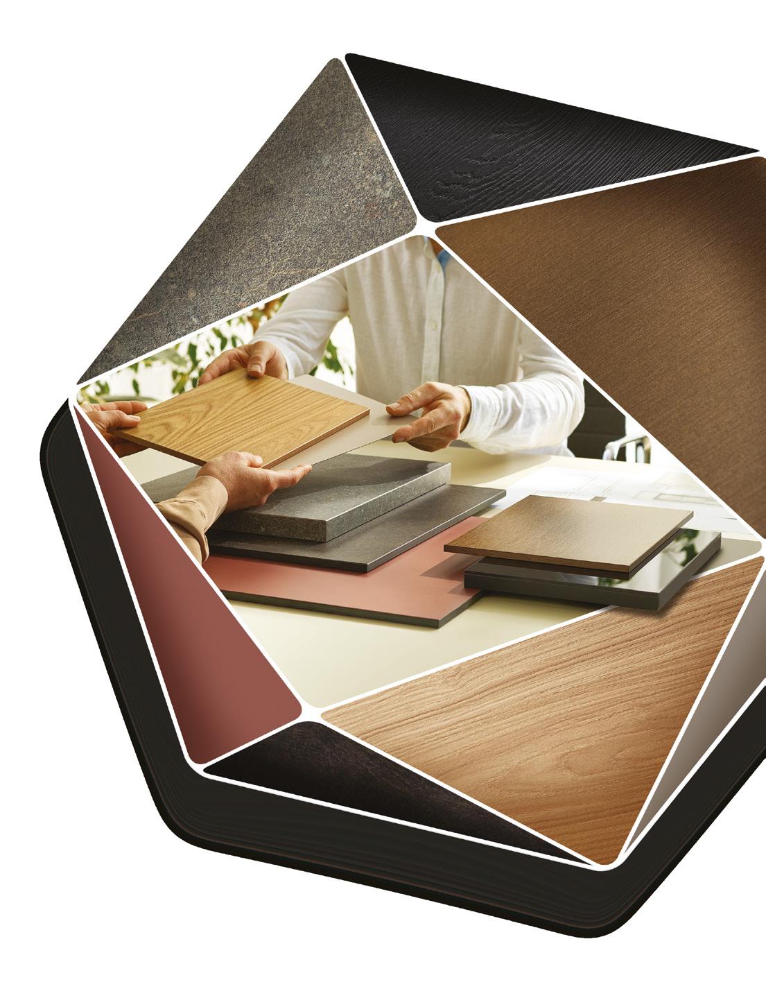
All our shown and mentioned decors are reproductions.
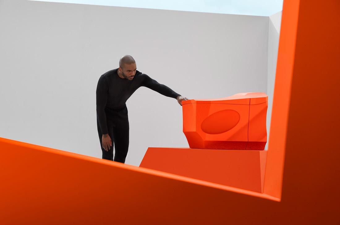
Marking the next step in a multiyear design partnership, kitchen and bathroom manufacturer Kohler launches its latest collaboration with British artist-designer Samuel Ross. Their first creation, Formation 01, was a striking tap showcasing the same dazzling hue of Haptic Orange, paying homage to Kohler’s 1967 ‘Tiger Lily’ bathroom line. Next, Formation 02 brings a new silhouette to Kohler’s Eir Smart Toilet. Alongside a bold, Brutalist style, the futureforward model features a heated seat, customisable cleansing, a nightlight, an automatic flush, touchscreen remote and hands-free opening and closing.
The bold and the Brutalist
Formation 02 will debut at Salone del Mobile this April, with a large-scale, sitespecific installation set to take place at FuoriSalone. The immersive exhibition – titled Terminal 02 – will be held at the historic Palazzo del Senato and invites visitors to journey through a maze-like network of industrial pipes and sleek black rocks, finding the striking smart toilet positioned at the very centre.
Designed to emphasise the movement of water in different shapes and at different levels, Ross describes the installation as built around ideas of flow and control, allowing both discovery and play to take
place within a natural rock landscape, contrasted with brutalist aesthetics. “We continue to look to nature's power and the defining feats of industrial engineering, be it through the unique embellishments of water character, or through nature's force to reshape the material,” explains Ross. With Formation 02, we are prompted to reconsider everyday objects and rituals, paying closer attention to the complex journeys water takes to reach us.
kohler.com
Upfront Upfront 22



Pooja Agrawal
Things I've learnt

Pooja Agrawal is CEO and co-founder of the not-for-profit organisation Public Practice, which aims to enhance skills around the built environment within the public sector. She was part of the Regeneration and Economic Development team at the Greater London Authority (GLA) and has worked as an architect and planner at design practices including Publica, We Made That and G-Tects (New York). A Fellow at the Institute of Innovation at Public Purpose at UCL, Agrwal also co-hosted the spatial equality platform Sound Advice and copublished Now You Know, a compendium of fifty essays exploring spatial and racial inequality.
publicpractice.org.uk
Know the who: who are you?
It is hard to look beyond yourself if you do not know who you are. Occupying different versions of yourself brings richness, confidence and uniqueness to how you operate in the world. As a leader at Public Practice, I aim to foster an open and safe environment for the team through my actions and approach, encouraging them to express who they choose to be at work. Building a positive work environment, with consistent twoway feedback and a culture of inclusion, is key to my leadership and bringing who I am to Public Practice.
Know the why: why do you do what you do?
If you know why you are doing what you do, you remain passionate and are able to look at the bigger picture and not get lost in the day-to-day. We’re a mission-led organisation and our mission is to build the public sector’s capacity to improve the quality, equality and sustainability of places. Every action that I and the team take comes back to this ‘why’, which guides our day-to-day work.
Know the how: how are you making a change?
It is important to know how you design an action, how you make a decision and how you instigate a change. I believe that working within the system can bring long-lasting change. At Public Practice, we support the public sector by attracting and facilitating the transition of multidisciplinary placemaking professionals to join purpose-led roles in local authorities; developing a pipeline of highly skilled people who can put their skills into practice in the public sector with our support.
Know the when: when is the right time?
From my experience, you must think and act in the short, medium and long term all at the same time – whilst having an awareness of how what you do in the short term will affect long-term outcomes. In our work we’re one step removed from the on-the-ground change. Our strength is knowing how to build long-term capacity, by attracting new skills in the short term and aiding retention in the medium term, resulting in a bigger, more resilient workforce in the long term.
Know for whom: whom are you designing for?
None of your actions matter if you do not know who it is for. Who do you want to delight, surprise, engage or activate?
My motivation always comes back to our everyday places and how we can facilitate the improvement of those for everyone.
Mix Interiors
24
Imagination Meets Innovation
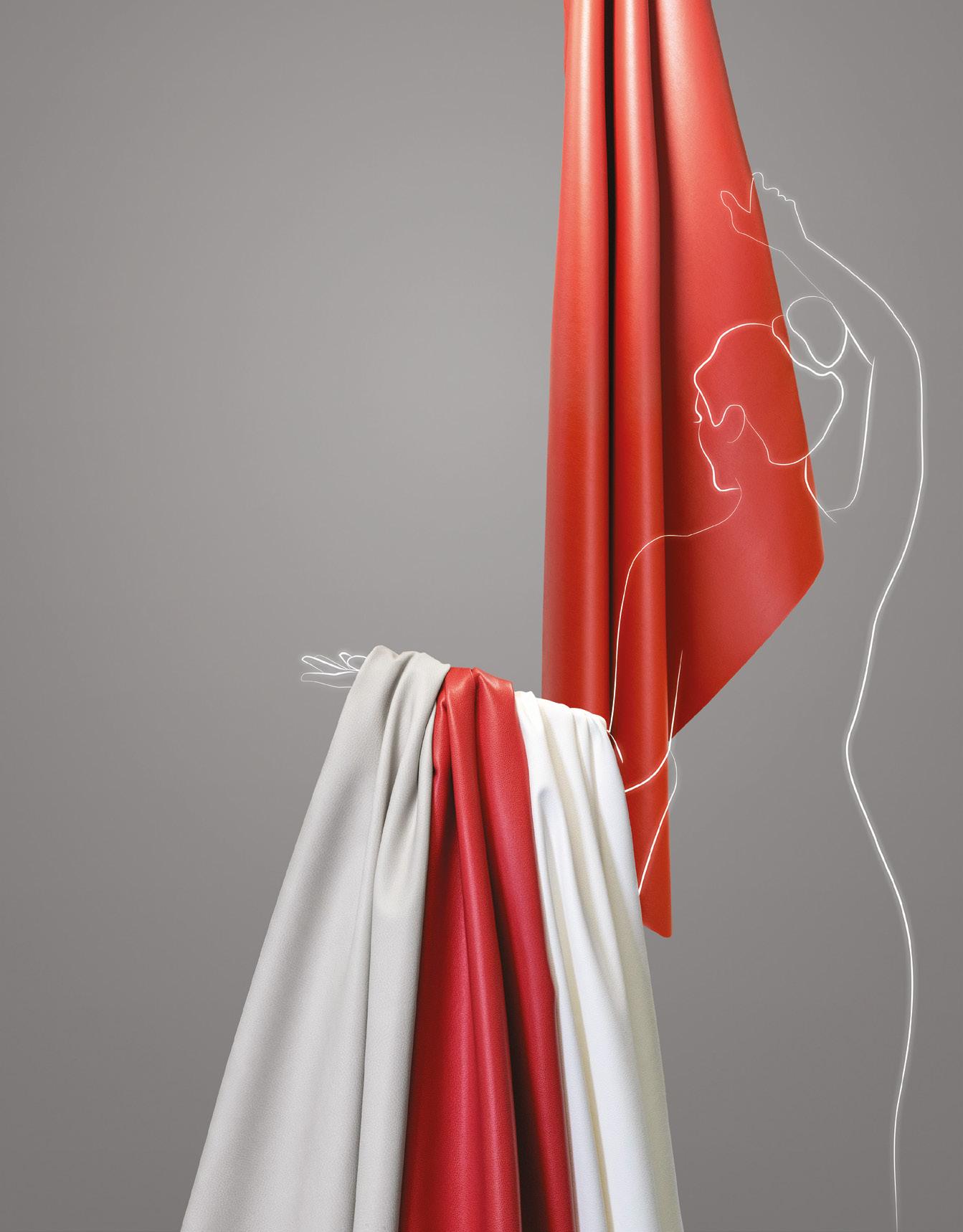
For 25 years, we’ve crafted comfort like no other. Softness that envelops, endurance that lasts. Indulge your senses and experience the difference.
ultrafabricsinc.com
Lois O’Hara
The height of design
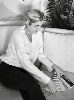
Lois O’Hara is an artist and designer who explores the ways in which colour can have positive effects on people and places. Her unique colour combinations and use of curves has made her work instantly recognisable – creating vibrant murals and public art installations for the likes of Adidas, Kohler, Tag Heur and Wembley Park.
loisohara.co.uk
@loisohara
The item
The Serpentine Sofa by Vladimir Kagan.
Why does this item represent the ‘height of design’ for you?
The Serpentine Sofa was a revolution when it was designed in 1950. Its undulating lines contrasted with the more conventional designs of the time. To me, this item perfectly represents modernism and how sleek, clean lines were integral to this movement. It was unusual to see a sofa in the middle of the room, but Kagan wanted to show off his clients’ art collections – I find this way of thinking inspiring, as well as the fact that the curved shape encourages people to be more social and engage in conversation when they are seated.
How does it inspire you or your work?
Kagan said, “a curved sofa shape makes more sense, so that you’re not sitting like birds on a wire, lined up. People like to sit out in the open, away from the wall.” My own work is based on the idea of using curved shapes and fluid lines to bring people together. I find using too many straight lines can be harsh, especially when working with interiors. I personally prefer spaces that consist of curved forms such as archways, seating and round tables – which has started to make a comeback in the 70s-inspired spaces we are seeing more and more of. Even when it is no longer a trend, I will still be creating work in this way; it represents how I like to use design to bring people together.
What do you think has been the impact of this item?
Since this item was designed, many other companies have taken inspiration and produced their own version – even my own curved boucle sofa that brings me so much joy and allows me sit in a more communal way at home. This item and the
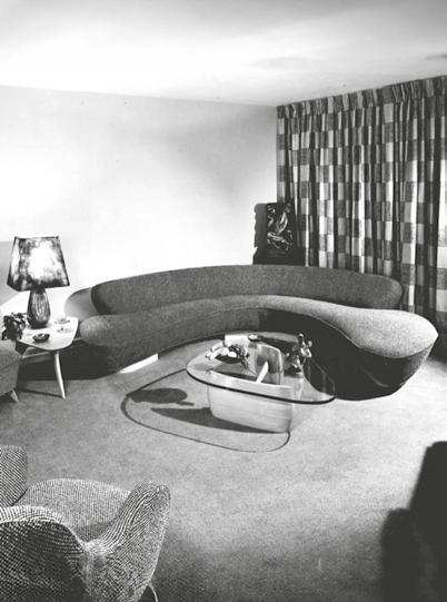
way it can be positioned in the centre of a room demonstrates the importance of ‘togetherness.’
The personal connection
In my own creative practice, I don’t like to use straight lines and my work is very organic. When I first started exploring street art in my earlier years, I realised that a lot of artists were using tape as a way of achieving strong, bold lines. I thought to myself, how can I create a design that is just as bold, but with the softness and character of using curved lines? I wanted to push myself to create everything freehand. I now like to explore compositions which are not bound to the edges of a canvas, so the shapes have no restriction. This to me represents fluidity in love and the powerful beauty of nature’s fluidity. The sofa taught me how good design doesn't need to be complex. A simple idea can be a powerful one.
Mix Interiors
26
Image: Vladimir Kagan Design Group
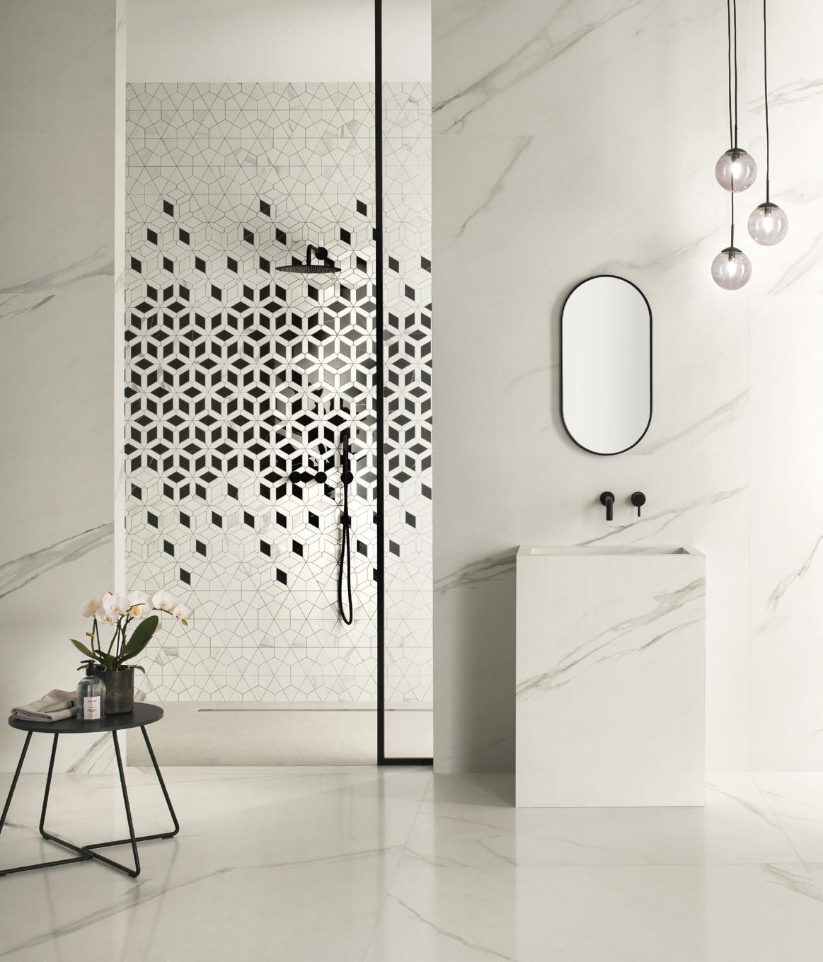

Has the drive for trends come to a natural end?
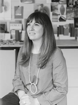
Laura Perryman is a colour designer and forecaster with over 18 years of experience in CMF design across multiple industries. The author of The Colour Bible, she is interested in material and sensorial experiences of colour. She directs Colour of Saying, a UK-based colour and material futures consultancy.
colourofsaying.com
@colour_of_saying
I’ve worked in the CMF (Colour, Material, Finish) industry for over 15 years, choosing visual identities for a raft of mass-manufactured products and spaces based on mood, aesthetic qualities and user experience preferences.
Colour and materiality are very much driving collaborations. A lot of the work that comes through the studio currently, is picking new colours for clients and industries. You'd think this was all around the latest trends but it's not always the case. I often ponder if colour can ever be new? If we are pushing the same pigments around the table, what can we expect as the results? After a few years, I found myself increasingly being asked for responsible or less-impactful material and colour choices.
I saw patterns emerge from clients and projects that revealed long-reaching themes rather than quick trends.
Colour choices, it seems, are not always following what everyone else is doing, but are evolving to have deeper, more authentic meaning and
cover increasingly nuanced preferences. More recently I've seen companies want to offer a spectrum of choices rather than a total set of on-trend colours. Why? Well with the rise and fall of economic health, climate change and political global challenges, the mood is a little less stable. Which poses the question: is colour more difficult to predict? Instead of digital colours rising to the latest TikTok hashtag or algorithm, real physical colours are solidifying their standing in the real world. Key chroma areas, such as blues, pinks, greens, yellows and warm neutrals are becoming fundamentals, coupled with a movement of ‘stay and improve’ within spaces and buildings.
As creatives and consumers, we are learning to enjoy longer-lived chroma choices. To address waste and sustainability in all areas, including the built environment, we have to find ways to be more sympathetic, building colour schemes that can be altered or restyled
without rejecting the old for the new. And as the life cycles of manufactured products and materials come under greater scrutiny, selecting colours with appropriate lifespans will be a critical part of the design process. At the same time, consumers are choosing products and services for their uniqueness and ethical credentials. So, has the time come for trend-avoidant colours and palettes? Perhaps.
My work has evolved to create colour collections that are based on purpose-driven concepts, circularity, colour psychology and meaning. Shifts in office patterns, such as remote working have a knock-on effect on consumer behaviours, which we are only just starting to see the implications of in workplace design. These shifts and their development give us much more insightful cues for future spaces, as they directly affect lifestyle patterns. Taking a different perspective is key and instead we’re asking: if the world feels unstable, what colours make us feel grounded?
Mix Interiors
Story Laura Perryman
Colour
28
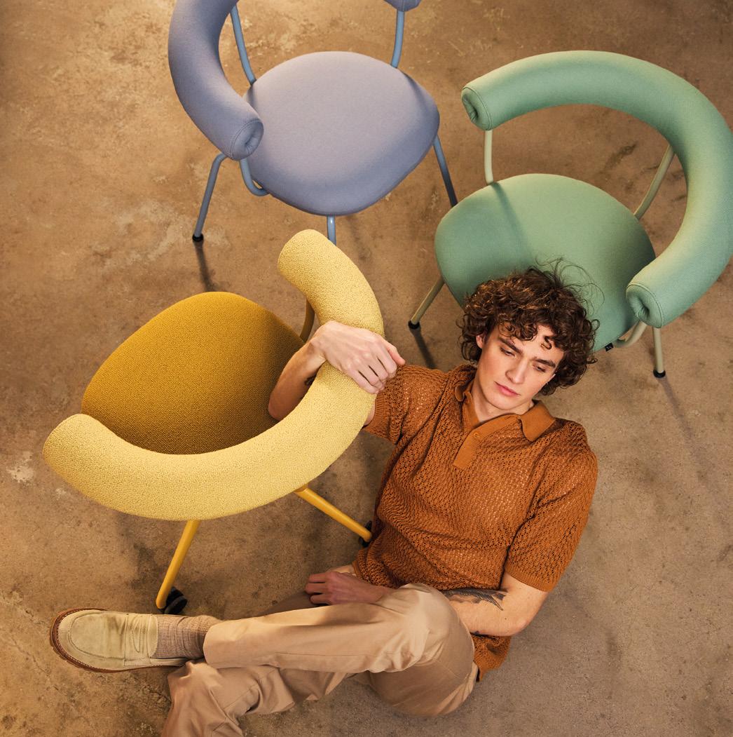
We don’t design furniture for offices – we design for open and valuable meetings between people, wherever people meet.
Discovering the great indoors since 1929
FORAFORM.COM
Photo: Ida Bjørvik / Design: LOSEN.STUDÍO
The test of time
David Collins Studio’s CEO Iain Watson and chief creative officer Simon Rawlings discuss creating icons, designing to last and why time is the greatest luxury.
Words:
Harry McKinley
It’s a bright mid-week morning and the lounge at Nobu Hotel London Portland Square is abuzz – a mix of casually dressed, coffee-supping residents; briefcase-toting, suited workers easing into informal start-of-day meetings; and the odd neighbourhood local, pouring over the broadsheets with a pot of tea and pain au chocolat.
Generally the hotel lounge is, in that sense, a very particular beast: a place to convene, a place to unwind and a place to burn time; a post checkout hangout or a spot for a pre-supper snifter. At Nobu that means plenty of plush low seating in moss green, aubergine and oatmeal; a snazzy central bar clad in Deco shapes; and adjustable ambient lighting. It’s a different attitude from the adjacent lobby – double height and rendered mostly in elegant taupe. As with the restaurant and terrace, these common spaces were both designed by David Collins Studio, a practice synonymous with statementmaking timelessness.
“Luxury doesn’t have to be quiet, but it does have to be memorable,” says Iain Watson, David Collins’ co-founder and CEO, surveying the room. Alongside chief creative officer Simon Rawlings, he’s joined me to discuss the work, legacy and future of a studio that, next year, celebrates its 40th anniversary. In those four decades it has devised and realised some of hospitality and retail’s most enduring and iconic spaces – from The Berkeley’s Blue Bar and The Wolseley to store interiors for Alexander McQueen, Vivienne Westwood and Jimmy Choo.
“In many ways David Collins has defined and redefined glamour,” continues Watson. “That’s perhaps the essence of what we’ve achieved and what we stand for. Here in London, our projects have very much become part of the city’s landscape.”
Rawlings, easing into a deep seat by the windows, nods in agreement. “And not just London,” he adds. “I’m always thrilled when I travel around the world
David Collins Studio Interview
30
and people say to me, ‘Oh I love that place. I didn’t know you designed it’. For me that means we don’t have an obvious house style and that we haven’t become something familiar; we produce the unexpected and every project is completely different.”
Both Watson and Rawlings have forged long-lasting careers with the studio; Watson working with the namesake David Collins on its inception and Rawlings joining in 1997, appointed creative director a decade later. Rawlings’ CEO title came with the untimely passing of Collins in 2013; a Dublin-born titan of the design world whose legacy lives on in the spaces – the experiences – he created.
“We talk a lot about experience at the studio,” says Rawlings, “because it’s the difference between what you might call ‘real luxury’ and luxury that doesn’t last; that doesn’t leave a mark. Real luxury you can feel and it’s that feeling we create.
When we approach projects creatively, we look at every angle: the temperature, the smell, the acoustics, the music, the ‘force’ of the space. There are touch points, such as a piece of leather detailing or even a bowl of nuts. Just as luxury doesn’t have to be quiet, it doesn’t have to be shiny and expensive; it does have to be thoughtful.”
Rawlings and Watson both grew up with a connection to design and craft, albeit worlds apart from the polished interiors they would go on to invent –Rawlings in Wales, the son of a general contractor who worked mostly on pubs. He remembers being fascinated by the ‘tacky’ mood boards and kitsch themes. It was quintessential 80s stuff, a fake Statue of Liberty and Superman comicplastered walls sticking in the memory. At school, as a teen, he would skip rugby and hide in the art class, ultimately parlaying his passion for the creative into an Interior Design degree and Masters at Birmingham University.

Interview Interview
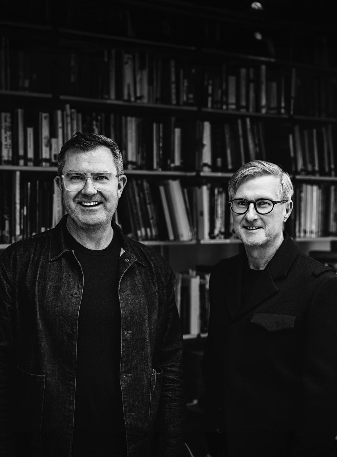
Previous page: Simon Rawlings and Iain Watson, by Philip Ammon
32
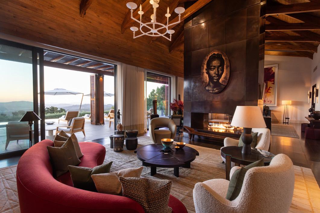
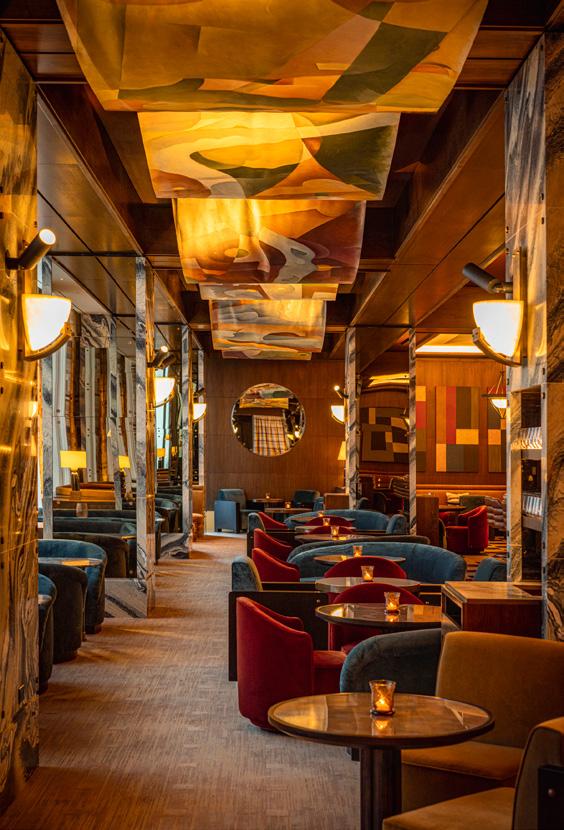
Above: Delaire Graff Estate Centre: Connaught Bar Opposite: Tre Dita
David Collins Studio
“Luxury doesn’t have to be quiet, but it does have to be memorable.”
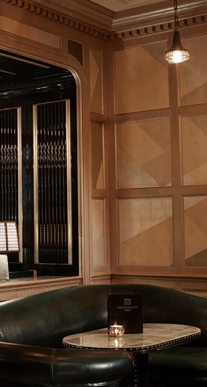
“Dave [Collins] was on my radar because, for me, a lot of the design then was not very interesting; very disposable. But Dave was designing Café Rouge at the time and I was really interested in the idea of everything being authentic,” he explains. “It was rich little chandeliers from flea markets and it was real film posters; it wasn't make believe. So I ended up faxing over a CV and the following day he called. He did a kind of fake Welsh accent on the phone, in a funny way, and the day after that I was on a train to London to interview.”
In that first in-person encounter they’d bond over Swatch watches. He was offered a month placement and dedicated his time to the office, partly to avoid the ‘smelly’ basement B&B he’d rented. Last year he was named chief creative officer, following his long tenure as creative director.
Watson was raised in Glasgow and, during holidays, worked at his father’s factory, which produced leather goods – taken
with the process of production and gaining a familiarity with how pieces are designed, manufactured and distributed. In the late 70s and early 80s he’d done a stint in the Outer Hebrides living with his grandmother, who made Harris Tweed at home using traditional methods. At university he studied Business and Economics, but always had a deep-seated interest in architecture, fashion and design – the latter, like Rawlings, ultimately proving the David Collins connector.
“I’d moved to London and, by chance, met David. We were both wearing the same jacket by Dries van Noten which – in the days before fashion became globalized and democratic – was unusual,” he says, with a smile, today in a smart blazer and patterned shirt. “I started working with him one summer and we just got on, the two of us working in his living room. I kind of did everything – I was the facilitator of his dreams really, just making it all happen and giving
33
it everything we needed to grow the business. We were debt free and had freedom to be creative. Then the two of us became five, and then 15 and that was really the start of it all.” Today the studio has a team of over 60 and has worked on projects in 25 countries.
It’s undoubtedly most famed for its tent-pole bar and restaurant projects – whether in Grand Dame hotels or standalones, those spaces that somehow feel as though they’ve ‘always’ been there, in the way that luxury London, in particular, does so well. Take Claridge’s Bar, with its wine-red leather seats, mirror panels, marble fireplace and buffed wooden floor. In design, it doesn’t sing for its supper. Instead, it’s gratifyingly, elegantly subtle, without slipping into the pedestrian. In not trying too hard it has garnered that most coveted of hospitality accolades: it is a destination.
It was a formative project for Rawlings and a place that embodies so much of what David Collins Studio is about and the impact it has had. “We left a mark,” he enthuses. “It was one of those establishments that was nothing really until we came along and planted the seed. A sexy, chic seed that inspired all of these other little bars and which everything germinated from. And it’s wonderful to see properties still flourishing and doing amazing things, because it all started with us.”
Rawlings’ credit-taking shouldn’t be confused for arrogance, of course. Firstly, in saying the studio has molded our collective idea of what great F&B design looks like, he’s not wrong. But more to the point, he personifies not a hint of loftiness. Instead, he speaks with the joyous awe of someone who can’t quite believe what they’ve managed; someone
David Collins Studio Interview Interview
34
aware of the responsibility that comes with working on and within physical and cultural landmarks.
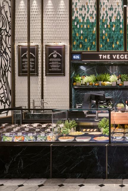
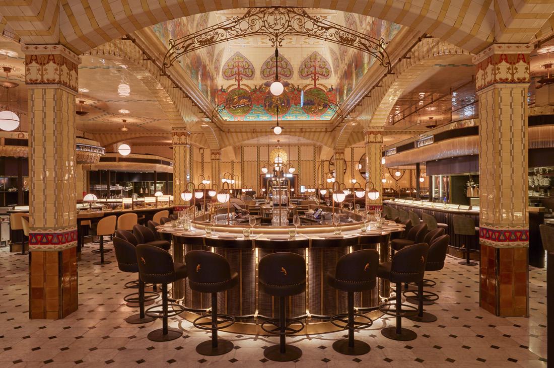
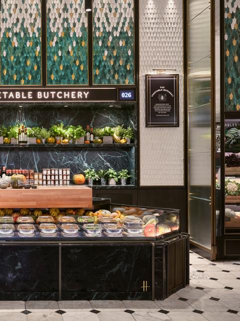
“I was asked a question once, during a presentation about the food halls and dining rooms at Harrods, which we designed,” he regales. “They’re listed of course, and some of the most important rooms in London – and I was asked how I felt about the idea that our designs could very well become part of that listed status into the future. I was speechless, because I’d never truly considered that what we’ve done, and are doing, could become part of a protected interior. And I just thought, ‘wow, the work we’re doing is important’.”
The studio’s process of creation isn’t something that can be rushed and it’s here that Watson returns to the idea of luxury – in a practical sense. In the business of design, which involves
deadlines and fee-paying clients, time is both a tool and an asset; and it’s the combination of time and vision that ultimately delivers luxury.
“Quality isn’t necessarily just about budget,” he explains. “It’s timescale and process. If everyone’s in a hurry, then everyone’s trying to cut corners and no one will get far. If we want to create something that will last decades, there’s no quick route – something our clients understand. We don’t follow trends, because projects take too long and once you’ve designed them, built them and opened them, the trend has passed. In design there's sometimes a race to the bottom on fees, but we're not that company; we want to deliver iconic projects.”
“Having almost 40 years under our belt,” Rawlings continues, “means we have conviction in our vision and, actually, it
“Quality isn’t necessarily just about budget, it’s timescale and process.”
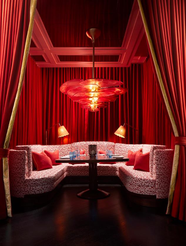 Left: Dining Hall at Harrods
Above: Food Hall at Harrods
Right: Mirabella Miami
35
isn’t about us, it isn’t about our name, it’s about the success of the design. If an idea is strong enough, you can achieve it in 20 different ways. Once you've got it, the rest is about taking ourselves and the client on the journey of that idea.”
In many ways those four decades have proven David Collins to be a studio ahead of the curve. Watson and Rawlings note the influence of technology and how their once atypical approach has now become the standard. “Early adopters wanted to see fancy panels and buttons everywhere,” Rawlings muses. “But that all became instantly dated. For us the smartest technology is invisible technology. Most of the smart technology companies now are hiding everything and you have a traditional switch on the wall. In the spirit of timelessness, we always took that approach.”
That zeal for design that endures also speaks to sustainability: luxury something that can be ‘repaired’, attests Watson. In the studio’s early projects, high quality vintage pieces were sourced and local craftspeople tapped. Over a decade ago David Collins was already working to LEED platinum standard at the Mandarin

Oriental Qatar – an evocative, complex design that weaves together elements of the Far East and the Middle East. More recently that ethos has continued in the design for South Africa’s Delaire Graff Estate, where they partnered with a Cape Town-based interior designer to identify regional artisans, suppliers and makers, not only to ensure the interiors were of the place, but to support the local economy.
In a testament to the strength of the studio’s durable creative, the justlaunched Fontainebleau Las Vegas – a titanic resort and casino on the main strip – features a lobby they originally designed in 2008. Early financial issues meant it failed to launch – but when
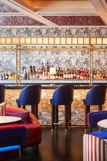
Interview
David Collins Studio
Left: Cafe de Paris, Monte Carlo
Below: Mirabella Miami
36
Right: Tre Dita
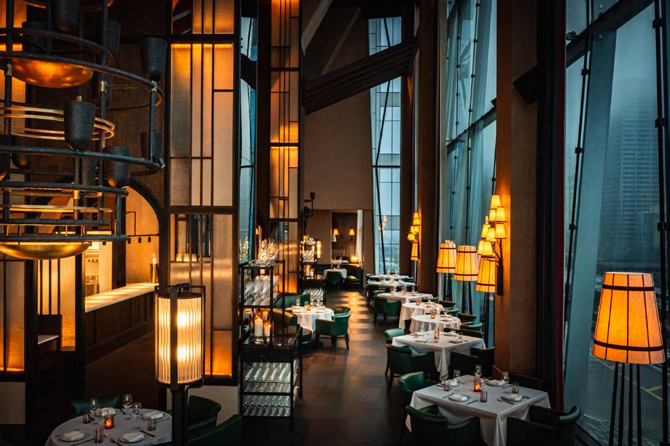
“That's the beauty of not doing too many things, just doing them really well.”
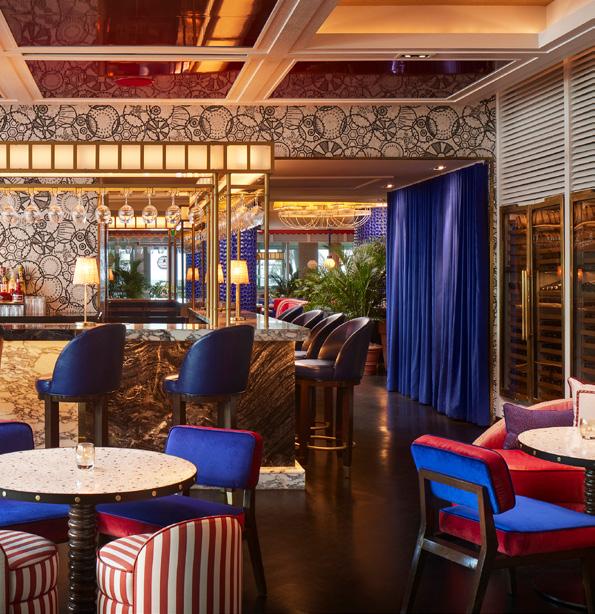
new investment saw the realization of the multi-billion-dollar project years later, David Collins was once again brought onboard, executing interiors devised over a decade previously – as well as new interventions in other public spaces. “How’s that for timeless?" laughs Rawlings.
Though legacy is an important word for David Collins Studio, it isn’t a practice stuck in aspic. It’s ventured into new territory, helming interiors for the opulent cruise ship, Queen Anne, by Cunard; and the pipeline is buoyant with a ski chalet, boutique hotel in South America and a cluster of projects in Hong Kong, among others.
“We put so much emotion, heart and soul into everything we do. I love our projects because, as a designer, they become part of me. That's the beauty of not doing too many things, just doing them really well,” Rawlings offers.
“We’re not about looking back,” explains Watson. “We’re always pushing forward and, for us, it’s about maintaining a level of quality and approach that we’ve become known for. I hope we’ve shown we’re a studio with endless possibilities.”
37
For a better world
Pearson Lloyd’s Luke Pearson and Tom Lloyd on closing the loop, shifting material perceptions and radical design for change.
Words:
Chloé Petersen Snell
Tom Lloyd greets me at the Pearson Lloyd studio, pruning a plant outside the retrofitted Victorian Yorkton Workshops. Designed in collaboration with Cassion Castle Architects, the building is split into two halves, Victorian and modern, and original features and materials have been retained – and celebrated –wherever possible, says Lloyd. For the multi-hyphenate designers, Yorkton Workshops presented the perfect opportunity to demonstrate its design philosophy in action by applying it to their own workspace.
Moving into the space peak-pandemic, the easiest approach would have been to knock it down and start from scratch, Lloyd notes, but it was agreed that
restoring and retrofitting the building would be a far more sustainable, lowcarbon approach as it would preserve the embodied carbon in the existing structure. Downstairs, a wood-fragranced workshop is filled with furniture in various forms and stages of making and prototyping. Opposite, friends of the studio Arrange Whatever Pieces Come Your Way are setting up a quilt exhibition in the brick-walled events space that hosts everything from dinner parties to secret music shows. A bright red industrial staircase leads me up to light-filled studio spaces, meeting rooms and design archive. Joined by Twig the whippet, we settle in a meeting space opposite the main workplace, seated on a cohesive blend of various Pearson Lloyd designs.
Lloyd Interview
Pearson
39
Pearson Lloyd Interview
2022 marked Pearson Lloyd’s 25th year as a studio. After years of absorbing their creative parents, Luke Pearson and Tom Lloyd met in the early 90s at Royal College of Art, both inspired by the Europeancentric blending of furniture and product design that they feel is often overlooked in the UK. Their ambitions grew with time and, after working across the UK and the continent, the duo launched Pearson Lloyd in 1997; a sense of social awareness and problem-solving design (which Pearson sums up concisely as “making a contribution to the fabric of the world”) positioning them as one of the most respected studios in Europe. Now working across furniture and product design; aviation, transport and healthcare; and with the likes of Senator, Steelcase, Modus and Flokk, a thread of ambitious relevance and quality has ensured continued success.
With a more intense focus in recent years on the importance of reuse, repair and recycling, when it comes to reimagining product design through circular innovation, PearsonLloyd is leading the charge for industry change. Their muchlauded Material Change exhibition at last year’s Material Matters fair centred on the values of renewability, repairability and modularity – also reflecting on the changes they have made to their own practice in recent years.
“In the early days, our clients seldom broached the subject of planetary impact, but fortunately, that tide is turning,” says Pearson. “Today, many of our clients are mindful of the broader implications, from the initial brief to the final delivery. The conversations are richer and more informed. Yet, certain materials and processes that are ‘anti-circular’ still
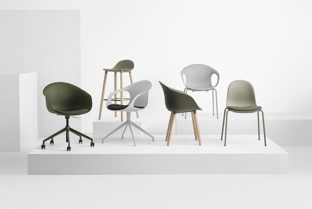 Below: Allermuir Kin
Interview
40


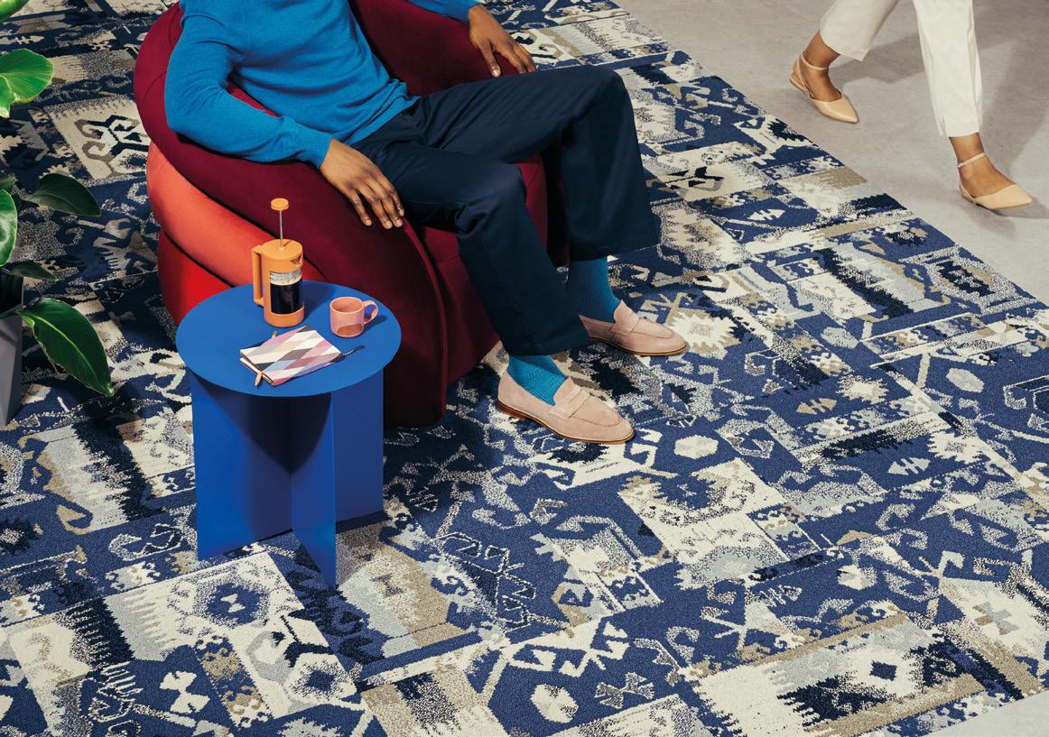
Remastered, reimagined, and remade. Past Forward™ — modern flooring inspired by decades of iconic design. A curated collection of carpet tile defining purposeful, comfortable spaces with timeless style. Discover the collection: interface.com/pastforward Tile 01 Retrospec [Royal] Tile 02 Level Set [Light Concrete] For more information: +44 (0)800 313 4465 ukcustomerservices@interface.com
lack viable alternatives. The current systems for effective material recovery are constrained by material type and geographic limitations, posing challenges for achieving circularity. We find ourselves designing products for a circular future that has yet to materialise.”
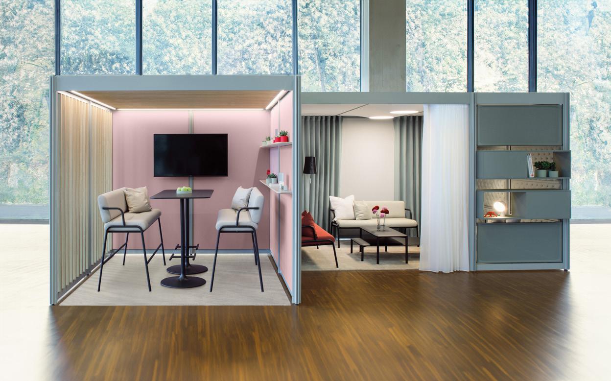
Naturally, collaborations are an exciting and important part of the studio’s work, most recently the POINTS system by Bene, a freestanding, space-defining furniture system. At a time of radical and continued change for the workplace, POINTS’ modular flexibility can be used in any building from purpose-built to adaptive reuse – and easily dismantled and reused. A range of ‘on- and infills’ are available in various monomaterials, zero-waste 3d knitted textiles and tensile structures, and the different ‘rooms’ are customisable by replacing individual (recyclable) components.
“The design ethos embraces adaptability, expansiveness and component interchangeability, ensuring continued relevance and multiple lifecycles,” says Lloyd. “The inherent adaptability and modularity of POINTS enables it to seamlessly adjust to users' evolving needs, ensuring its relevance for an extended period. These design principles ensure the product will be relevant for as long as possible.”
“Our prevalent consumer culture has been driven by marketing and sales that respond to passing trends. It’s imperative to embrace longevity as the driver,” Pearson explains. “Products will almost always wear out eventually, but we mustn’t be encouraged to discard items that are fully functional simply because they appear outdated. We design for emotional durability to avoid this.”
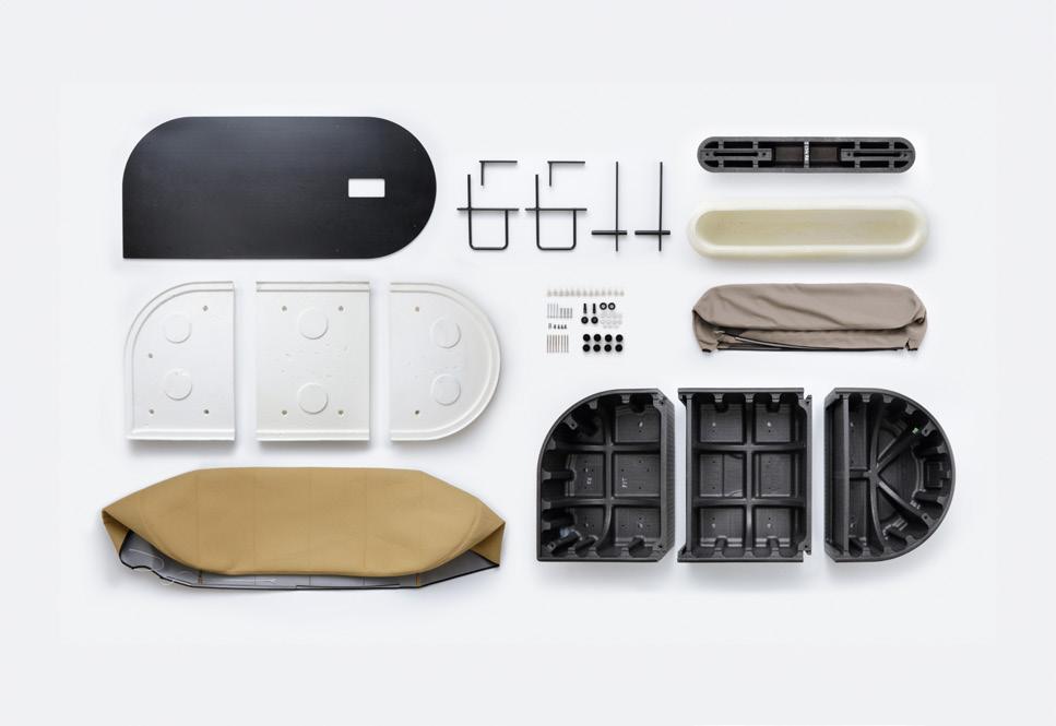
Similarly, the Revo soft system for Flokk brand Profim is designed radically for longevity, reflected through the system’s functionality and modular aesthetic. The structure is moulded from REPP (recycled expanded polypropylene) and assembled using reversible fixings for easy recycling at end of life. Fabric is attached using a drawstring, which allows it be removed and reapplied without damage.
“Solutions aimed at circularity may diverge from current visual trends, as the focus shifts towards sustainability rather than trends and aesthetics,” says Pearson. “This paradigm shift is resulting in a new aesthetics of circularity, where designs appear unconventional compared to prevailing trends.”
An example is the Edge-free sofa for Modus, which revives traditional upholstery processes using bio-based
Pearson Lloyd Interview Interview
Above image: esPattio Libro
42
PONTOON
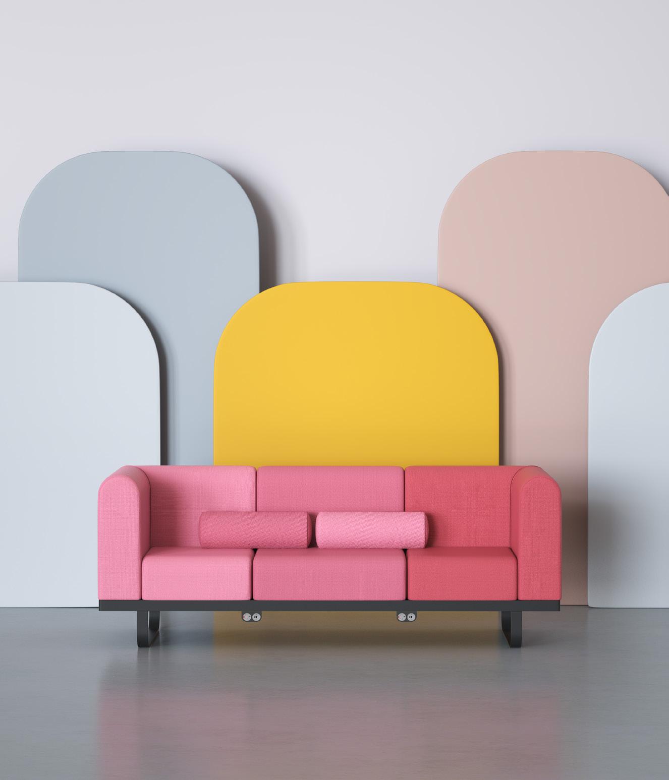

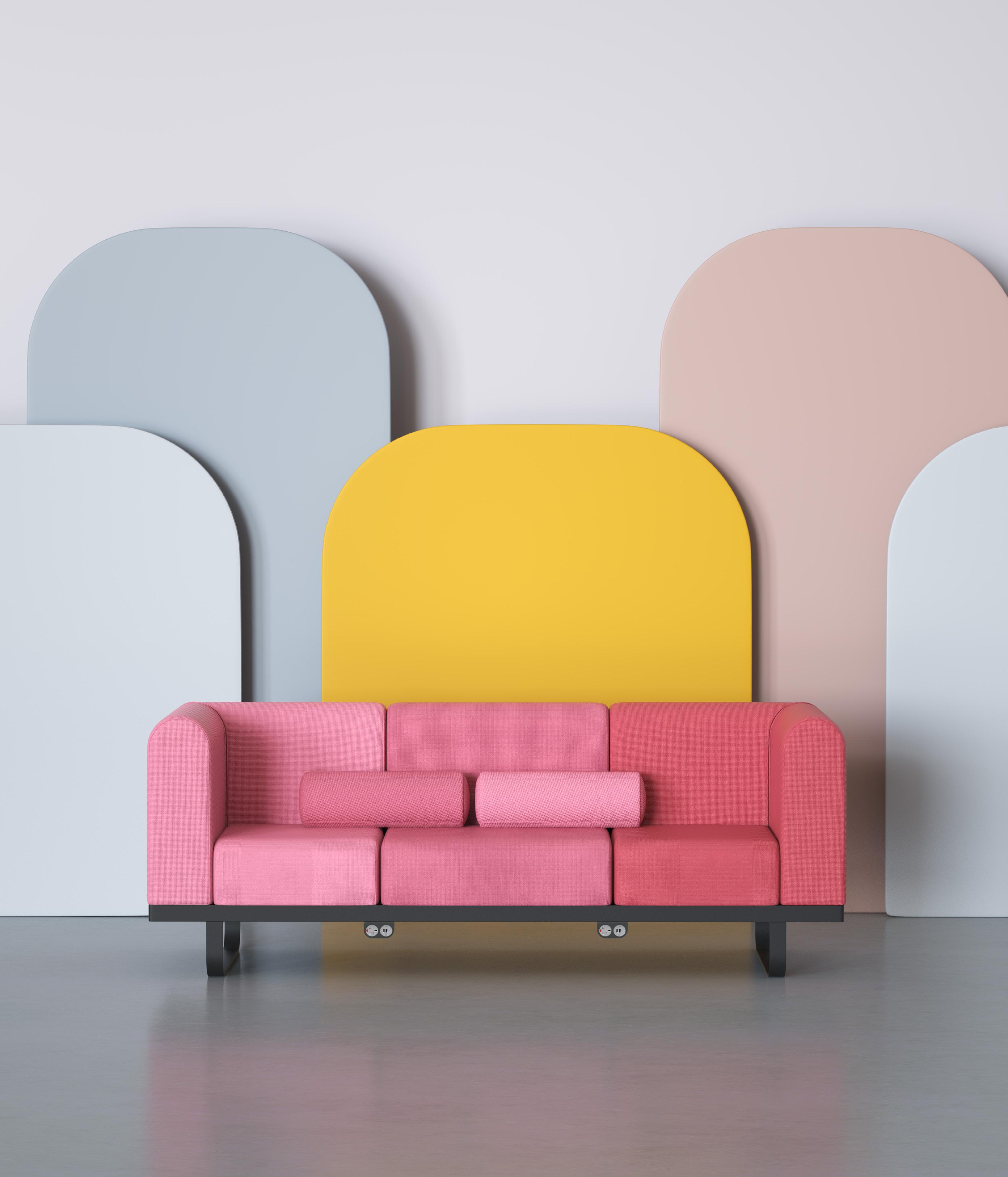
materials. Material practices once lost due to the limitations in size production thanks to the market’s love of large, cosy sofa cushions, the foam-free (and therefore chemical-free) seating comprises pocket springs and Cocolok, a coconut
“We can design things to avoid certain directions that don’t end up with a certain outcome,” says Pearson. Sometimes this means using as little of a material as possible without impacting on its design, gesturing to a mono-shell, aubergine chair from their ‘Kin’ chair collaboration with Allermuir; one of the manufacturer’s best-selling collections. The pair tried to use the minimum amount of plastic as possible without sacrificing structural integrity and sturdiness – which adds to the chair’s beautiful, flowing shape.
For Pearson and Lloyd, the move towards this new circular aesthetic is a
challenge, even for them as designers. “It’s a process of education away from the popular view. Just because you like it doesn’t mean we should make it. If it’s not sustainable, it’s not right,” says Pearson. “We are working on a product right now that from a sustainability perspective is amazing – we’ve done all the research and calculations internally. But what it looks like, how we’ve designed it? I don’t know how I feel about it.”
“Design is not art,” adds Lloyd, “and ultimately you have to solve a problem and find a market.”
Long-term relationships with manufacturers have also inherently shaped the evolution of the studio; aptly reflected in the CoLab collection for furniture giant Senator who they have worked with for nearly 20 years: “a company that is incredibly ambitious and really pushes us in terms of quality and research.”
Pearson Lloyd Interview Interview
Above: Bene POINTS
Right, above: Profim Revo
Right, below: Senator CoLab
fibre, covered with a layer of felted wool.
44
The furniture system emerged from a comprehensive two-year exploration of evolving educational practices and the parallels drawn between work dynamics and learning environments. In collaboration with the Trent Institute for Learning and Teaching (TILT) at Nottingham Trent University – who awarded alumni Lloyd as Honorary Doctor of Design in 2022 – the studio identified the need for more informal, multi-modal and multi posture space that Lloyd refers to as the ‘café classroom’.
“Gen Z, and all of us for that matter, consume the world in vastly different ways to previous generations. We all have a world of information literally in our hands at all times,” says Lloyd. “This isn’t going to change, so we need to continue exploring the new dynamics this creates and design products and environments that continue to bring people, society and organisations together in mutually beneficial ways.”
“When you get a client like that, we feel we can push them as hard as we can,” adds Pearson, “and they push us – and it’s at that point we can say we did our best. [Senator] came to us and said, let’s embark on something together. That’s how we’ve evolved as a studio – from executing the brief, to discovering it.”
45
Fostering connection

Patrick McCrae is the co-founder and CEO of Artiq, a London-based art agency that puts art to work in settings outside of the gallery; from workplaces to hospitality.
artiq.com
I spoke recently to a couple of friends who are marketeers –the ultimate storytellers. ‘Tell me about storytelling,’ I said. ‘If you can’t story-tell, you’re fucked,’ they answered.
They’re right. We love stories and are drawn to brands and people who can tell them. Walking through London on my way to work, it’s hard not to notice how storytelling permeates the city and everything within it: Matteo Berrettini on a billboard for Hugo Boss telling a tale of Italian elegance; a new mixeduse development with images of happy families showing a new form of elevated living; the Royal Academy advertising its seminal, powerful show Entangled Pasts, telling a story of change since 1768.
Contemplating the pervasive role of storytelling in design raises questions about its purpose today. Is it primarily to drive sales, as seen in the marketing of 'heritage' sourdough or 'authentic' bedroom designs? Or is it aimed at fostering engagement, showcasing a business's values, or connecting us to shared histories?
Perhaps it's a combination of all these. Yet, at its core, lies a fundamental human
desire for connection and understanding. In an era when unchecked growth, technology addiction and profit-driven agendas threaten our humanity, storytelling emerges as a powerful tool. It allows us to foster empathy and a deeper sense of connection.
Moreover, brands are increasingly turning to artists and creatives to help them amplify their values or vision, telling their story in new formats or through fresh lenses. This approach enables them to reach new audiences while also aligning with the human tendency to invest in artists with whom we feel this connection, both as brands and as consumers.
At my business, Artiq, I sit down with all new members of the team during their first week and run them through the values of the business. I tell them about our founding, history and our collective purpose. It’s important for everyone to understand why we exist, the impact of our work, how we can maximise it, and how we should manage the inherent responsibility of this impact.
This is 21st century best practice: putting people and purpose first. Our art collections today tell stories
of inclusion, social value and business objectives. Each artist has their own life experiences and brands align themselves with those narratives, because art serves as a mirror reflecting society.
We tend not to buy things from people or businesses we don’t resonate with. Our visual landscape is not just a buyable, investable stock – it’s a stock of society, what we hold dear, embodying our values and aspirations.
Whether it’s The Bindery on Hatton Gardens commissioning artist Eddie Roberts to physically upcycle steel from the building into a 6-tonne sculpture, EQT offering up space in their office for an artist to take up a paid residency, or one of our clients in Singapore commissioning a queer artist during the 2022 LGBT law change – each of these initiatives tell stories of solidarity and humanity.
I hope this trend continues and I know that at the forefront are designers, artists, storytellers and creatives. For it is we who are constantly curious, taking the time to understand ‘why’, in order to better articulate our shared humanity.
Mix Interiors Building Narrative Patrick McCrae
46
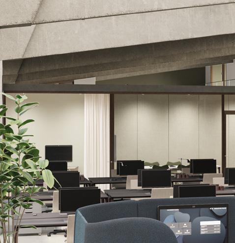
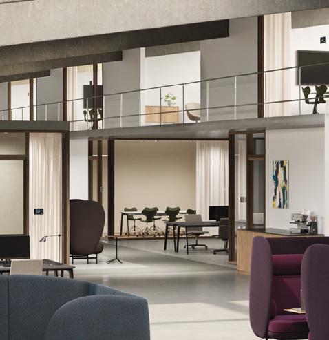
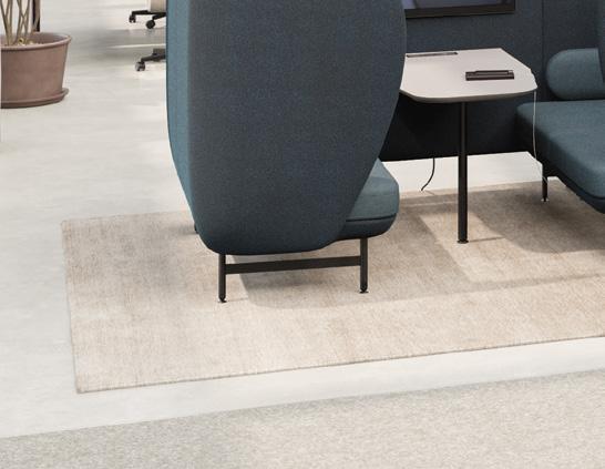
THE INVITING WORKSPACE
CLERKENWELL DESIGN WEEK - 21-23 MAY 2024
Fritz Hansen presents “The Inviting Workplace” – an exhibition at our London Showroom featuring the latest design releases and innovations made to inspire new ways of designing for inclusivity.


ADDRESS: 78 Cowcross Street, EC1M 6EJ London fritzhansen.com
Colour Codes
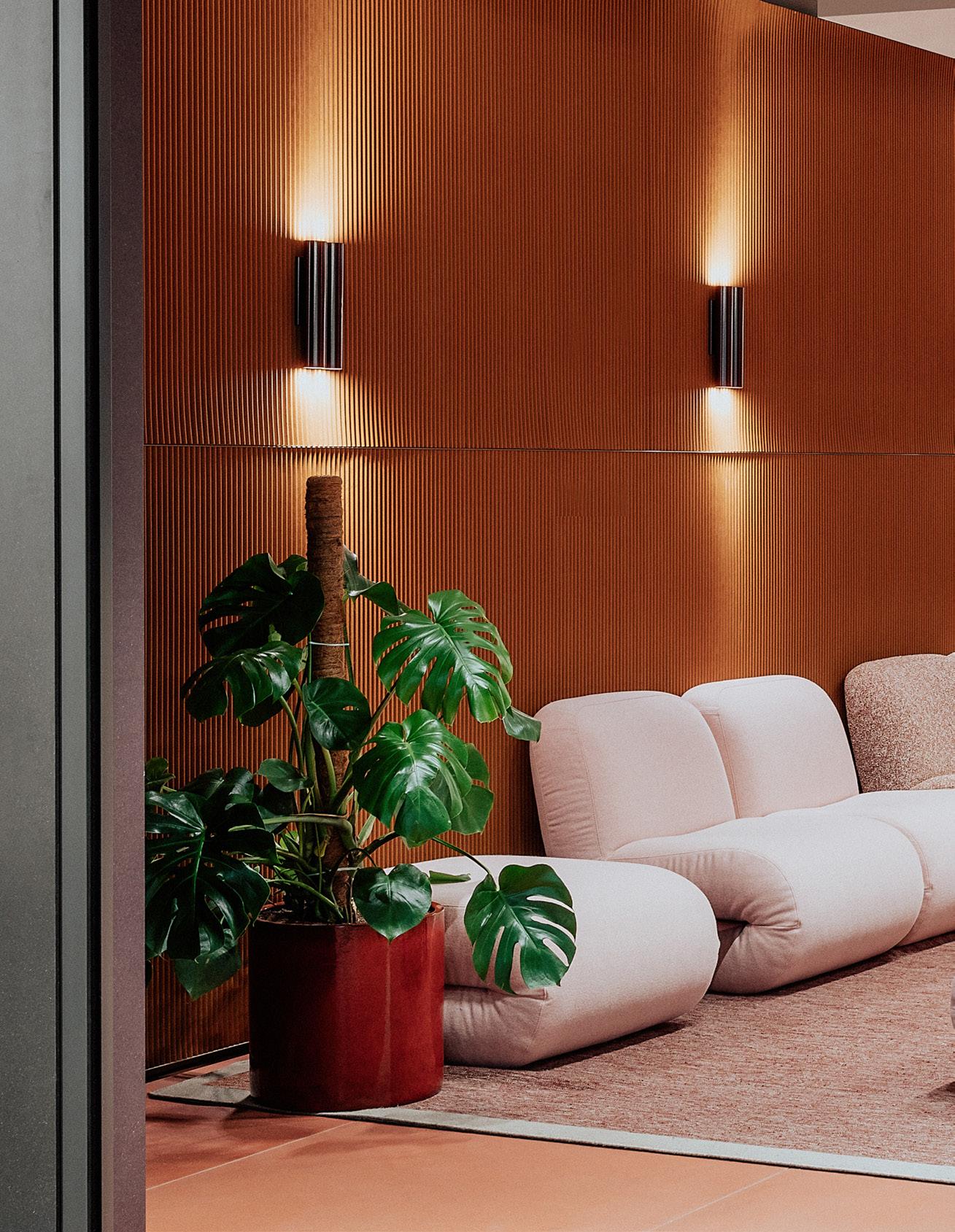
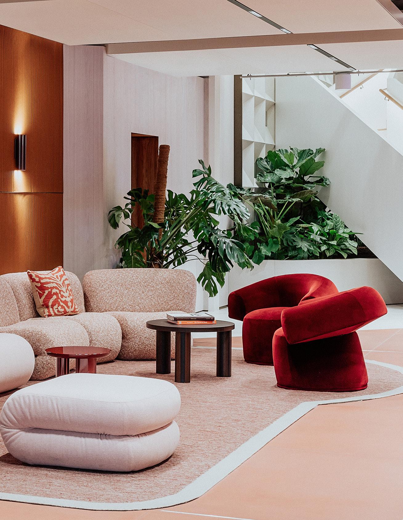
Designed by Basha-Franklin, the latest Myo offering brings the principles of hospitality and retail into the workplace.
Words: Clare Dowdy Photography: Taran Wilkhu
Basha-Franklin 48
Myo Case Study Mix Interiors 49
Basha-Franklin has completed its first ‘flexible office space’, the latest outpost of Landsec’s branded offering, Myo.
The property developer debuted Myo in 2018 and has four others around central London. This one, which completed in December 2023, comprises 47,500 sq ft in Jean Nouvel’s One New Change building opposite St Paul’s Cathedral.
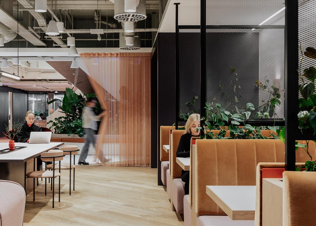
Here, the north London design firm, which worked on the workplace strategy for the Myo brand, has borrowed from the worlds of retail and hospitality.
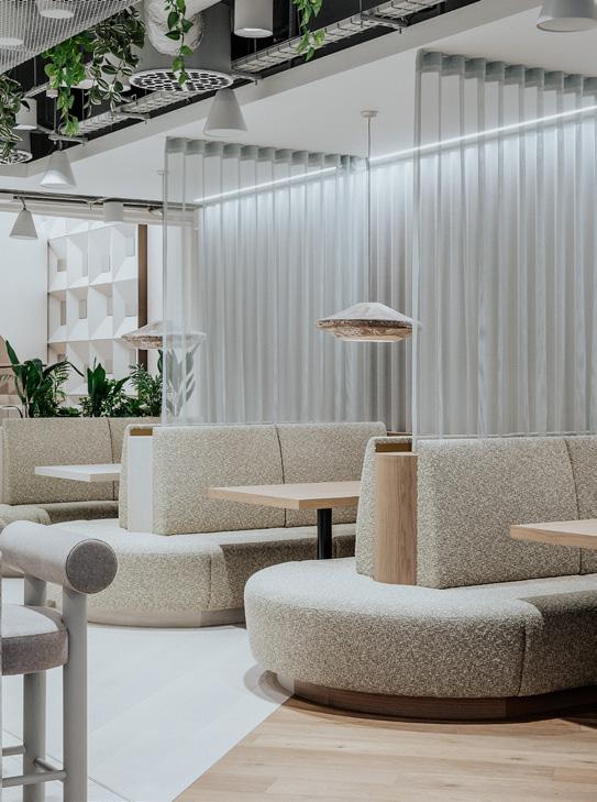
Like all such well-designed workspaces these days, this one has set out to tick the boxes of adaptability and flexibility; attracting people back to the office; connectivity and movement; health and wellness; and sustainability.
The entrance to Myo is on level two – a welcoming dash of warm colour and interesting materials on what is otherwise a bland, monochrome floor.
Principal director Rachel Basha and creative director Nicola Osborn have opened up Myo’s ‘shop front’, putting
Myo Case Study Basha-Franklin
Below left: Custom-fabricated booths
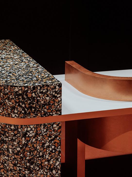
Below right: Terrazzo countertops
50
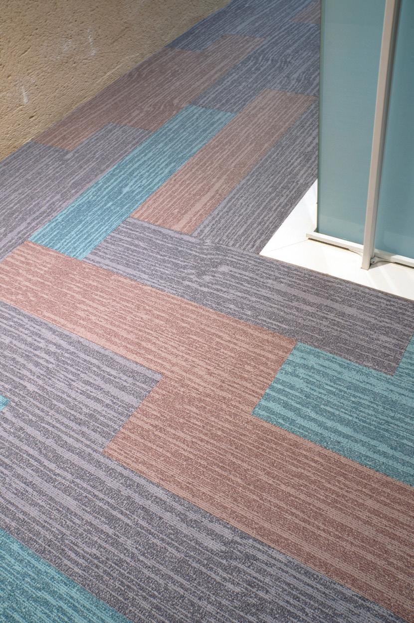
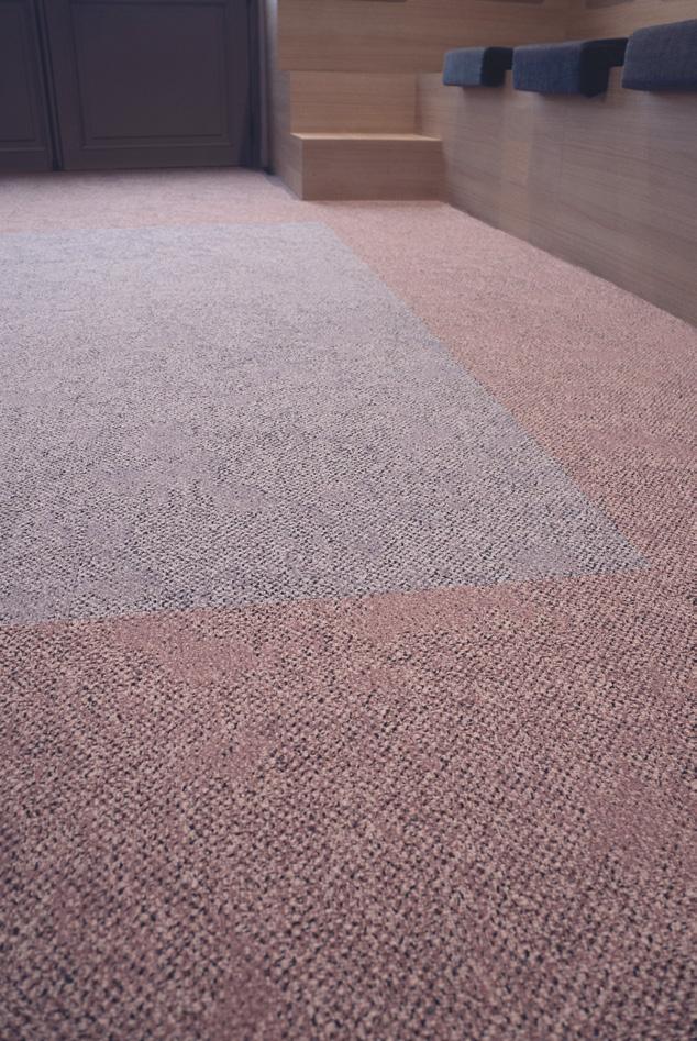



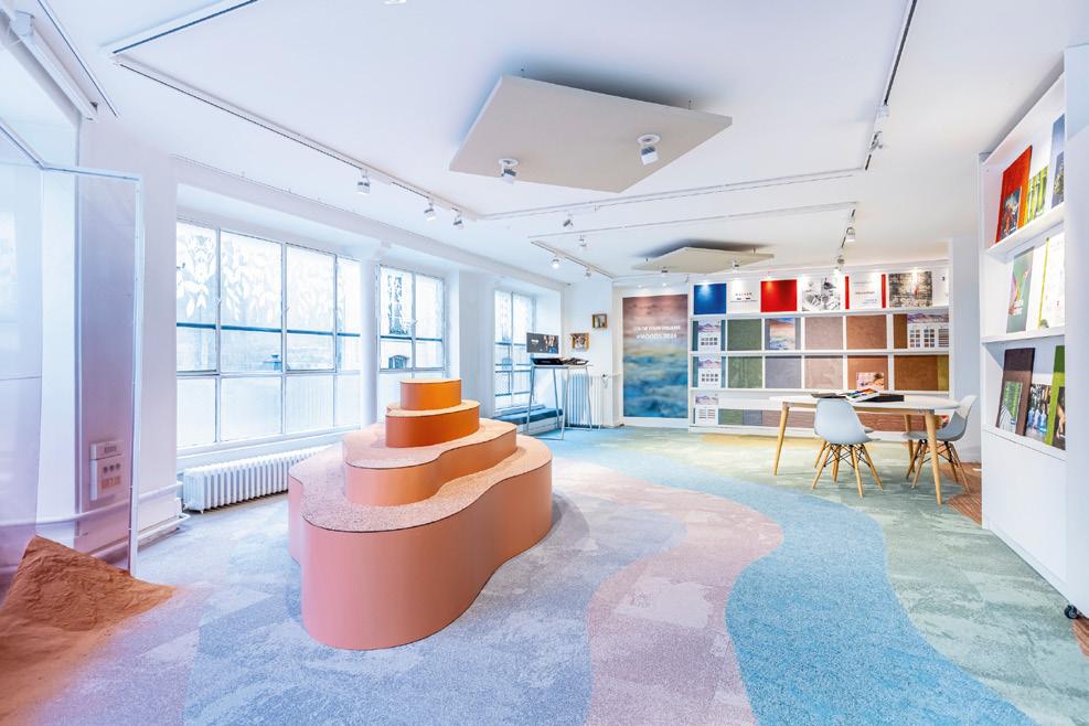
Balsan, the esteemed French manufacturer of textile floor coverings, unveils a vivid range of high-quality carpets, carpet tiles, and LVT solutions for both public and private spaces. Introducing new pastel colours inspired by the Pantone Colour of the Year, Peach Fuzz, these gentle hues not only reflect modern design trends but also promote wellness, transforming your environment with luminous charm!


FASHION HOSPITALITY WORKSPACE @BalsanUK
en.balsan.com FLAIR /Balsan-UK
Designed & Made in France
The second level is laid out to be quieter, with more closed offices, two small meeting rooms and suite of smaller rooms for private calls and concentrated work. Here, the refreshment counter has been divided in two, to avoid people queuing for hot drinks.
The stair was a key architectural addition – a way to break up the deep floor plate with an atrium-style opening (complete with a lighting feature that emulates a natural lightwell), and to visually join Myo’s three levels. On all three floors, communal spaces are centralised, while offices are positioned around the periphery to access some genuine natural light.
As well as booths and offices, the first floor has the biggest kitchen area, which can also cater for the adjacent event space – the first such space in any Myo – which can hold 100 people.
There is yet more privacy on the top level, where Basha-Franklin has created office spaces with rows of sit-stand desks. In total, this Myo has capacity for 700 desks.
These three floors are differentiated not just by their functions, but by the psychology behind their colour-coding. So while the first level has earth tones –intended to ignite productivity, passion and excitement, and to be warm and inviting; the next one has green and natural tones, supposed to activate concentration and mental clarity; and the top is blue, to calm, refresh and revive the mind.
Basha-Franklin
Above: Shared kitchen
Myo Case Study
in floor-to-ceiling glass walls and a glazed sliding door reminiscent of a high street boutique. Pink tones draw the eye towards the reception desk on the right, the new staircase and the communal space beyond that.
52
NEW PRODUCT LAUNCH

ADVANTAGES
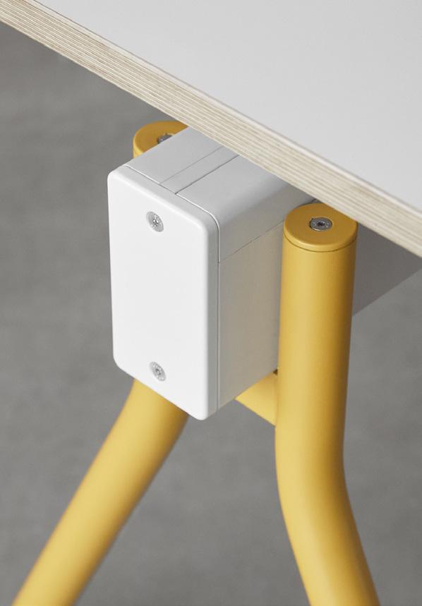
• Intelligently integrated cable entry
• For standard 80 mm drill hole
• USB A/C charger with 22W fast charging
• Available in different country variants
• Clean surface, concealed mounting screw

More information: www.bachmann.com
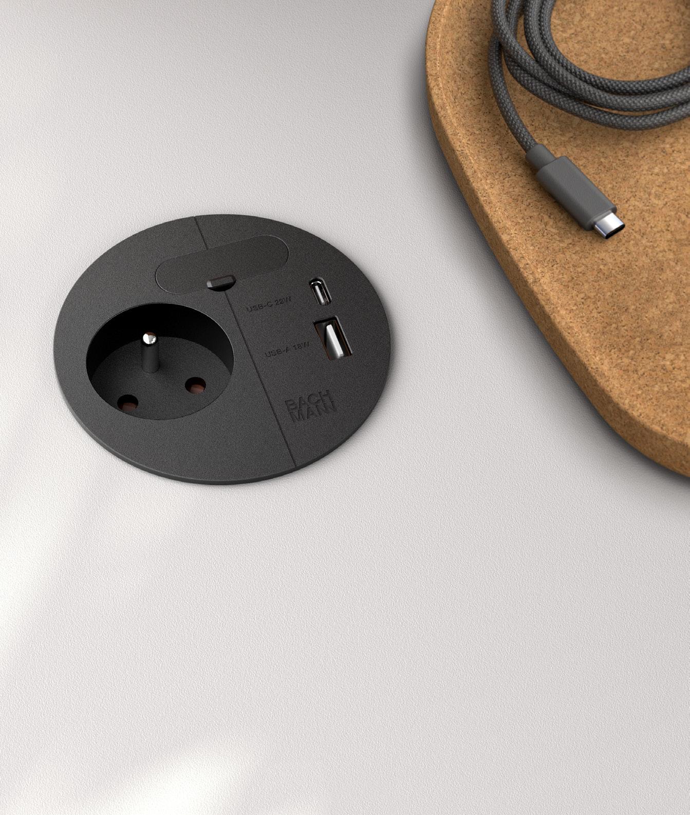
FUNCTION MEETS DESIGN LOOP IN CHARGE
Myo Case Study
These colours are applied not just to furniture and finishes, but to the handcrafted wall panels on each floor. Called Spelk!, they’re created from OSB boards by artist Orla Lawn, whom BashaFranklin found through social media. The firm commissioned Lawn to create bespoke colours for Myo and the Spelks! are intended to be an artistic point of interest, to add to Myo’s textured palette and aid wayfinding.
The thresholds help with differentiating zones, with two types of flooring laid together at an angle so “you flow into spaces in a natural way,” says Basha.
These and other elements of the design including acoustics and lighting levels are intended to support the one in seven people in the UK who is neurodivergent, according to the Local Government Association.
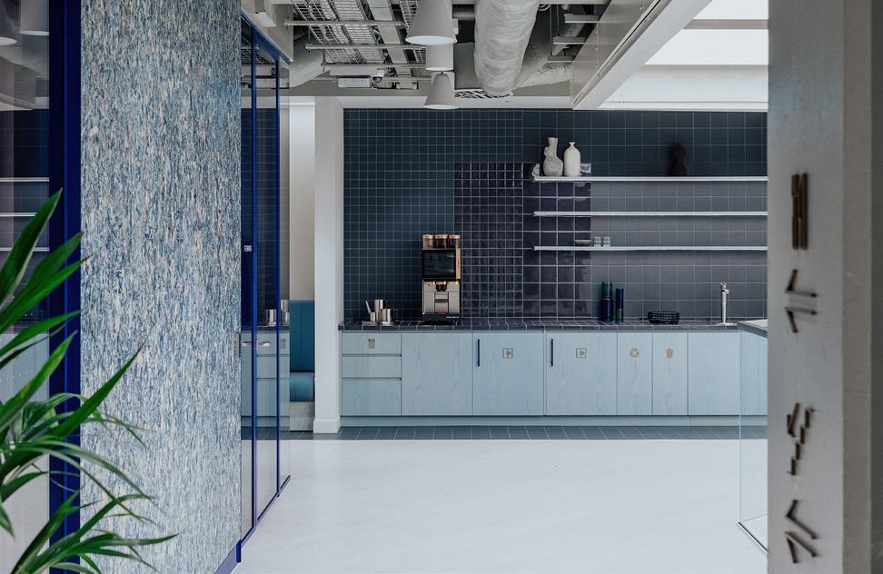
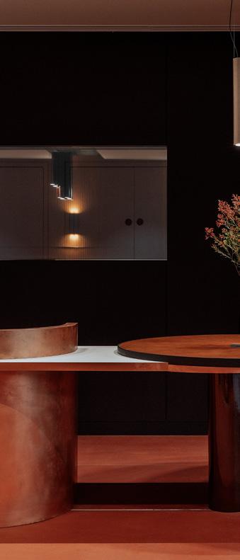
Also flowing throughout is the quality of the finishes, more suggestive of a luxe hotel than an office, which explains the low-volume pop music which follows users around. Hence the colour-coded metal trim on some of the acoustic wall panels; the bespoke reception desk, with rotund Lammhaults sofas and armchairs by Moroso standing in front of a Buxkin feature wall of leather made from reconstituted offcuts from the Italian shoe industry; the custom-fabricated booths and tables in the break-out area; the upholstery, ceiling panels and sheer curtaining from Kvadrat; Specialist Marble Group’s terrazzo counter tops; the bar stools by Noom; and Myceen’s Mycelium lights.
Osborn believes that many offices are now raising their game, in terms of the quality of their event spaces. So here there are bespoke Valchromat acoustic
 Left: Coffee station
Above: Bespoke reception desk
Basha-Franklin 54
Right: Coworking space

wood fibre wall panels, because “they elevate it from feeling institutional to being more hotel-like,” she adds.
But it’s also got to be durable. Hence the Cemento reclaimed stone wall in the meeting room, because people push their chairs back into walls; and hence the angled arms of those chairs, so they don’t get bashed against the table.
The space has been designed based on Basha-Franklin’s experience (such as its reimagined HQ for Related Argent) the client’s brief and the existing evidence around people’s workplace needs and aspirations. But as Osborn points out, very soon wearable tech will be able to read people’s emotional response to a space. When it happens, “we’ll be able to translate that into a tangible investment tool,” she predicts.
Furniture
Lammhults
Moroso
Tacchini
Bla Station
Friends & Founders
Noom
Swedese
Andreu World
Howe
Flooring
Floor Story
Domus
Mass Concrete
Bolon
Surfaces
The Collective
Buxkin
Orla Lawn
Kvadrat
Lighting
Lambert and Fils
Michael Anastassiades
Flos
Luceplan
55
A Tourist in Paris
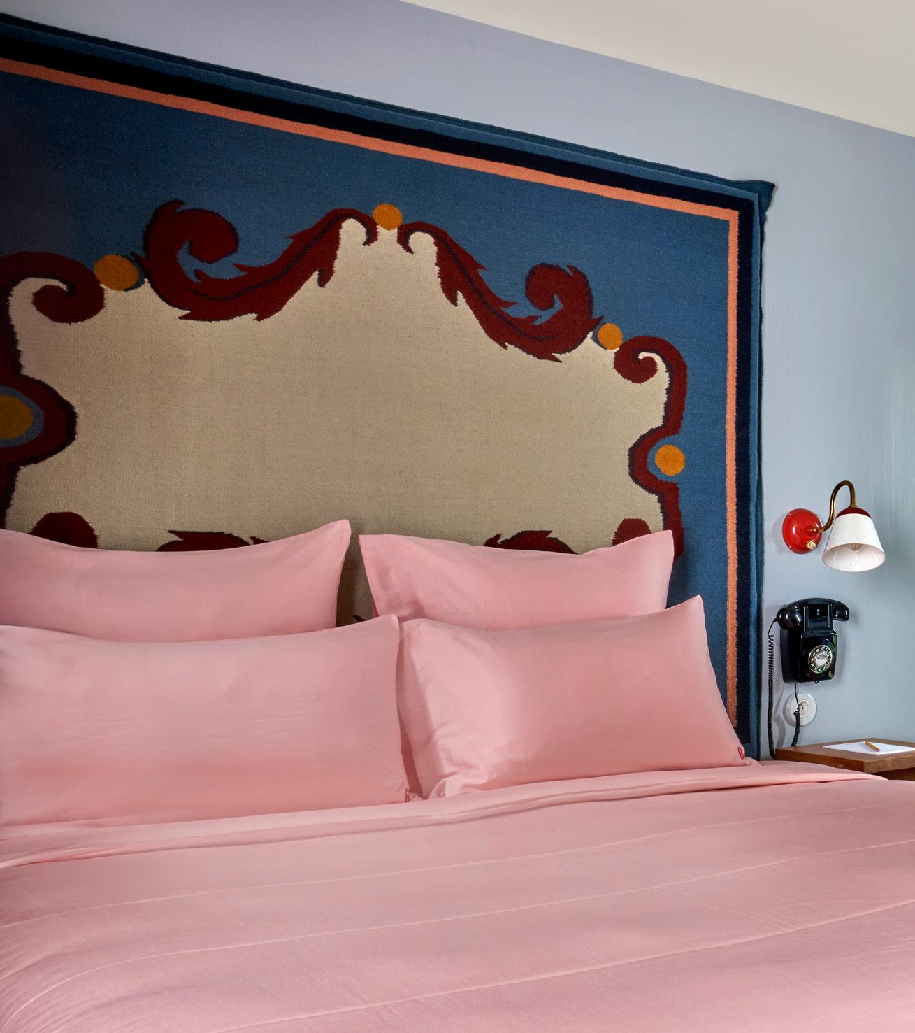
With Hôtel de la Boétie, London-based designer Beata Heuman brings her fanciful aesthetic to the French capital.
Words: Harry McKinley
Photography: Simon Brown
56
Beata Heuman
Hôtel de la Boétie Case Study Mix Interiors 57
Hôtel de la Boétie Case Study
The English and the French have a complicated relationship – like siblings who sometimes bicker, sometimes compete, but ultimately share a close and enduring connection. That being said, when pitted against the many swish stays of Paris, it’s hard to imagine anyone was wooed by the faded, three-star Hôtel d’Angleterre Champs Elysees – which featured such quintessentially English design notes as plastic orchids and assorted Eiffel Tower paintings.
To the rescue Adrien Gloaguen, who has taken on the ultra-centrally located property and transformed it into the design-led Hôtel de la Boétie – part of his achingly zeitgeisty Touriste group. Featuring 40 guestrooms, a bijou lounge and open café and working space for guests, it now marries English whimsy and French cool; an idiosyncratic bolthole in the heart of the 8th.
“The hotel carries on the artistic legacy of the neighbourhood,” Gloaguen explains.
“Henry James once lived at number 9 and Picasso had a home and studio at number 23 – only one door away from the gallery of his dealer Paul Rosenburg and the great photographer Henri Cartier-Bresson, whose famous photo ‘Hotel court, rue de la Boetie 1953’ is showcased at Musée d’Orsay. We see the hotel as an extension of the creative tradition, using inspirations from the architecture and the history.”
Touriste’s family of seven Parisian stays are all rooted in an individual approach to interiors, Gloaguen working with an esoteric assortment of designers to give each property a distinctive, wholly independent identity.
“We’ve [often offered] creatives their first opportunity to design a hotel and love giving them free rein to approach them in
Image on previous page: Bedroom details
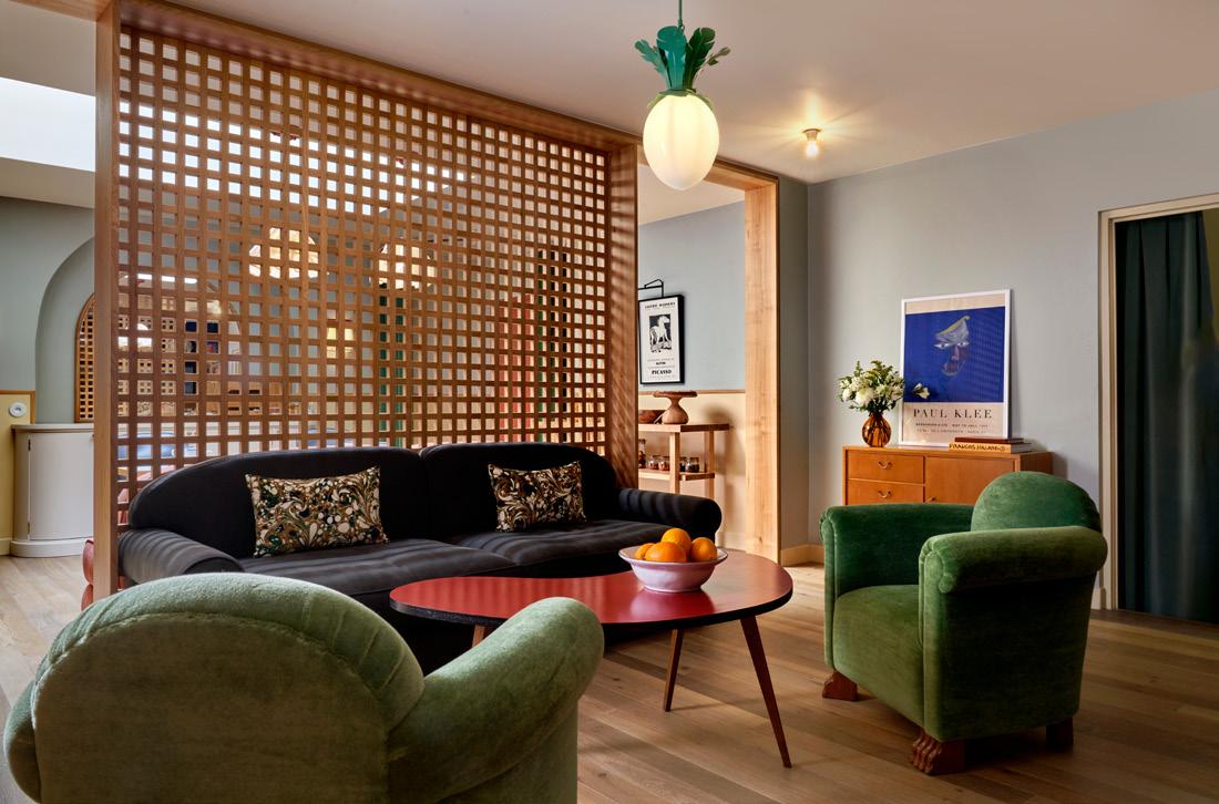
Above: Guestroom lounge
Heuman
Beata
58




Configure your ONE here Connection Furniture Connectionfurnitureltd Connection Connectionpin Connectiontweet
Case Study
Hôtel de la Boétie
their own way; to put a personal stamp,” he explains. “Each symbolises a design moment in time and we want travellers to feel the sense of exploration and excitement of being a ‘touriste’ in the city. The tongue in cheek aesthetic instilled in each hotel helps unlock this feeling.”
For Hôtel de la Boétie, the group tapped London-based Swedish designer Beata Heuman. Known for her colourful, charm-laden residential schemes – as well as her materials and product collections – this was, as with other Touriste collaborators, her first hotel project.
“But I’m always interested in doing new things,” she details. “I’d seen the work Touriste had done with Luke Edward Hall and had been impressed by their approach; and when doing a commercial project you get more freedom to create the vision as a whole.”
That vision was ultimately uncorrupted by what came before. Although a reenvisaging of an existing hotel, the property had been reworked and reconfigured over the years – any original features long since stripped away. What had replaced them was tired and lacking in any cohesive concept or design sensibility, and so she describes using the ‘bones’ of the place as a springboard, working with ‘strong, simple’ ideas to create afresh.
Despite the bolder elements deployed elsewhere, guests are greeted by a relatively restrained reception area: a pillar box red recess for the front-of-house team, a royal blue leather bench (part of Heuman’s own Shoppa range) and playful tulip light fittings.
 Beata Heuman
Below left: Checkerboard-tiled bathroom
60
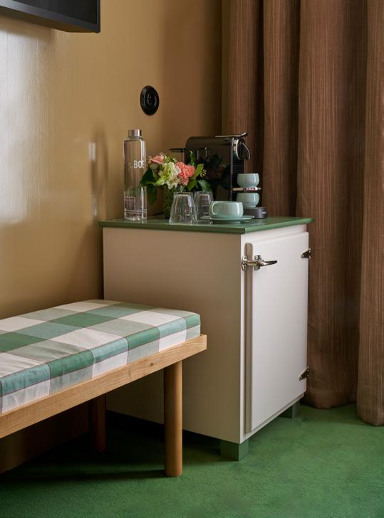
Below right: In-room coffee station


built to exceed.
“They delivered on design, budget and timescale; were fantastic on detail and simplified the technical aspects of the design in a way which we could easily understand. However, above all, they were just really charming to deal with.”
-
Russell’s
Solicitors
find out more at buildgen.co.uk
“When you work with rich colours my instinct is to off-set that using simpler materials; to complement and enhance.”

Hôtel de la Boétie Case Study
Left image: The silver-wallpapered lounge area
62
Above: The hotel's bijou bar Right The dining room-cumcowork space

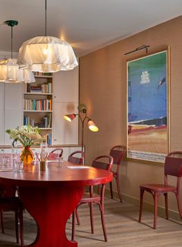
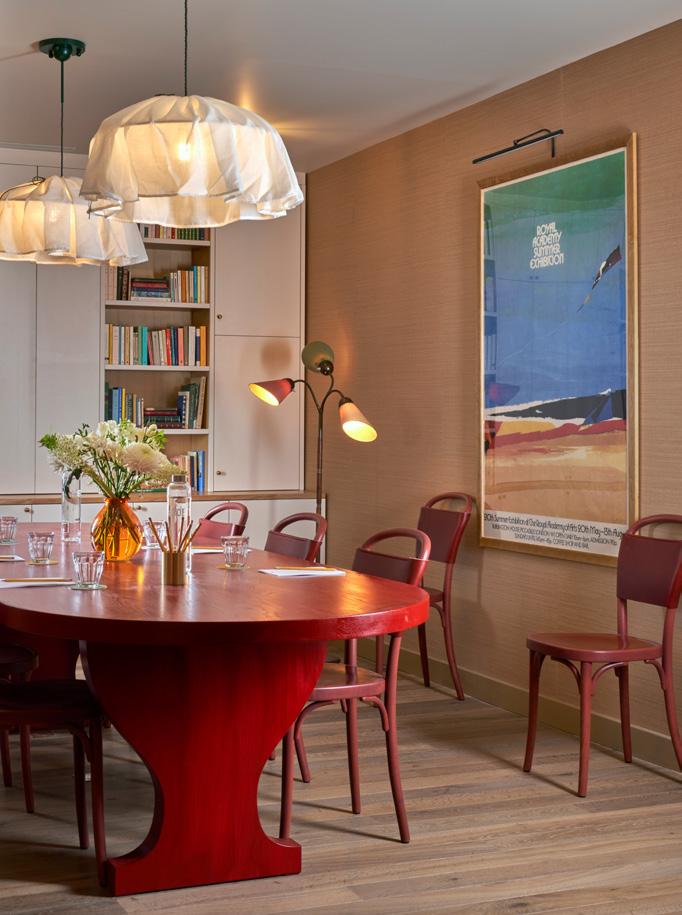
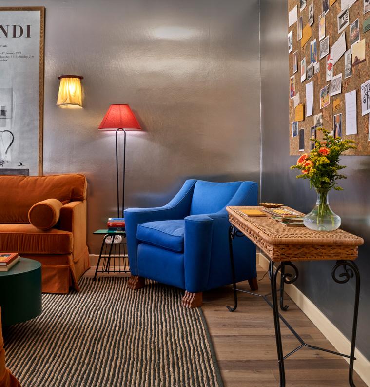
The adjacent lounge kicks things up a notch, rendered in sci-fi silver, reflective Phillip Jeffries wallpaper – part of the Vinyl Metalworks collection. As light bounds in from the street and catches on the furniture or decorative objects, it casts swelling, shimmering, kaleidoscopic colours across the walls. A deep green coffee table is flanked by burnt orange sofas; a vast Royal Academy of Arts poster nodding to the British connection.
“The colour palette is about contrast and balance,” Heuman explains. “When you work with rich colours my instinct is to off-set that using simpler materials; to complement and enhance.”
Into the belly of the building, a semi-open bar, meeting space and breakfast room unfolds. Here, an eclectic residential feel – a ruby dining table set aside a library wall, somewhere to work with an espresso; yawning armchairs inviting the weary
to rest after treading the city’s streets; and rows of bistro-style tables and seats accommodating the morning buffet crowd.
A traditional, compact elevator runs the height of the building, the stairwell wrapped around in classic Parisian fashion, with guestrooms arranged over six floors.
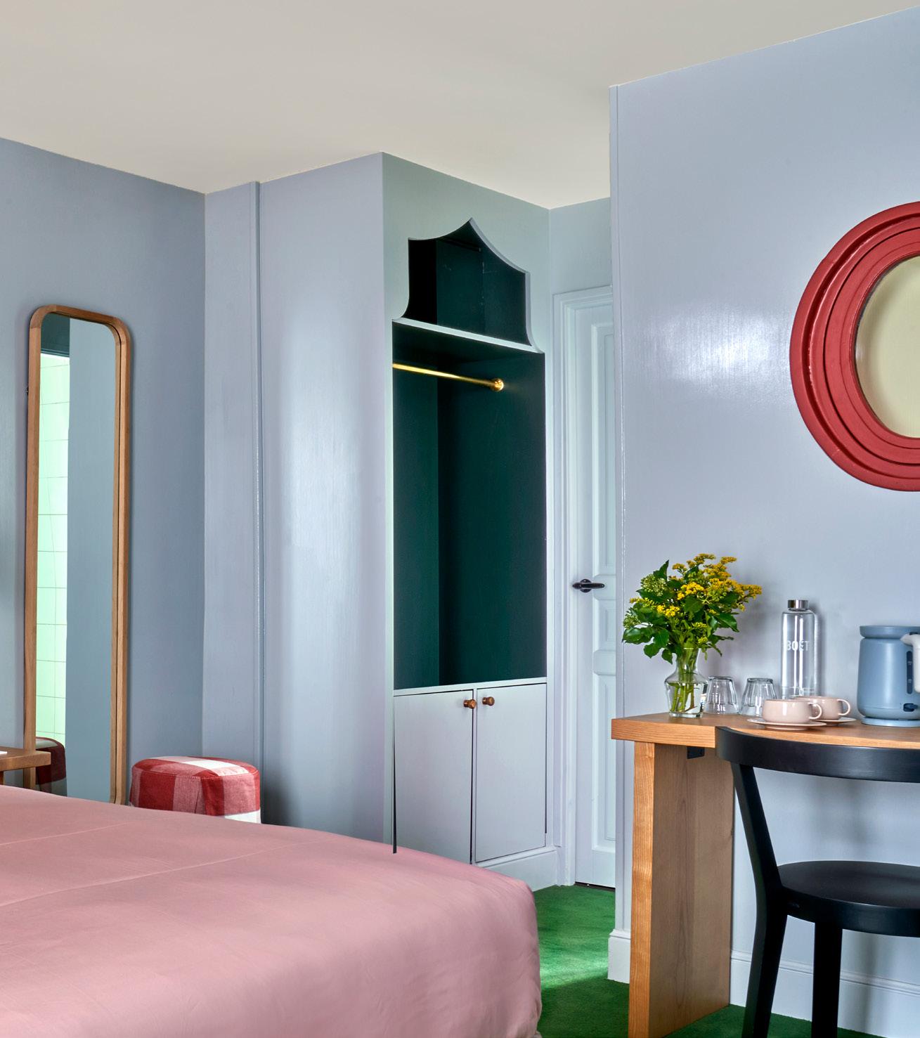
“All 40 rooms are designed using three different colour schemes: deep blue, biscuit and powder blue – one for every two of the six floors,” says Heuman, who used a hand-painted varnish to add a glossy effect to the walls. “There are dark blues on the bottom two floors, browns on the middle floors and sky blue as you ascend up the hotel.”
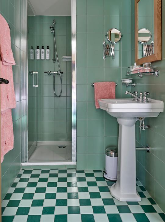
Heuman wanted to bring a theatricality to the interiors, imagining spaces almost as functional ‘stage sets’ – something perhaps most evident in the guestrooms, many of which feature exaggerated, patterned headboards inspired by the marble floor of Florence’s Medici Chapel. Checkerboard-tiled bathrooms are realised in dusty blues, pinks and yellow – while upper floors include cast iron balconies with views across central Paris.
As a means to anchor the more dramatic elements, Heuman deployed solid ash furniture, which she describes as having a ‘humble quality’ – something ‘true to the nature of the building.’
“I wanted to create something that transports you away, something that offers a sense of escape and which is fantastical,” she says.
For Gloaguen, the partnership has been a fruitful one, adding a new chapter to the Touriste story. “I had wanted to work with Beata for a long time, because I admire her signature style, where she combines elegance with imagination,” he says. “She’s imparted this into our hotel and also added a little panache to the Champs-Élysées area.”
Mix Interiors
63

All together now
At charity-funded London workspace Fivefields, designed by Barr Gazetas, a new standard for purpose-driven design is set.
Words:
Chloé Petersen Snell
Photography:
Jack Hobhouse
In the last few years there has been a ramped-up focus on inclusive design, with more designers and manufacturers than ever creating inspiring work around neurodiversity and accessibility. Fast work, but big steps can prove tricky, and sometimes box ticking exercises become a bolt-on in an otherwise inaccessible space. An example of sweating the small stuff when it comes to tuned-in, accessible design is Fivefields, a new impact-driven home for charities and social value organisations in central London.
Supported by developers Grosvenor with charitable trust The Westminister Foundation and operated by flexible workspace provider x+why, the project provides 30,000 sq ft of space for charities that would typically struggle to find such prime Central London office options; rents are subsidised by the Westminster
Foundation. Fivefields is already a success, with tenants ranging from the London Wildlife Trust to Heritage of London Trust and a number of children’s charities.
The brief for this project was ambitious: to set a new standard for inclusive design within the heritage context of the Grade II listed building, explains Barr Gazetas’ Andrea Cottam. “From the very beginning the client was set on delivering a space which promotes wellbeing, inclusivity and sustainability as well as answering to neurodiversity. The aim was to include the needs of the widest range of people, removing unnecessary barriers to enable everyone to use and enjoy an environment on equal terms. It is important to consider that disabled people include people with sensory and cognitive impairments as well as people with mobility impairments, including wheelchair users.”
Fivefields Case Study
65
Fivefields Case Study
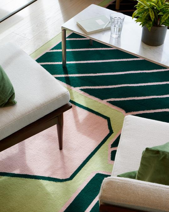
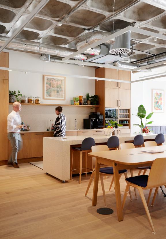
Fivefields moves away from the typical cellularised office space by introducing a mix of work areas – from expansive open plan to private quiet rooms – and the project provides adaptable and multifunctional event and training amenities, with in-house catering facilities for occupiers to use. A wide range of working environments include a communal club space, private offices and a community boardroom with bespoke wooden shelving and a unique, modular meeting table that is inspired by the Fivefields logo.
“Providing space to host events and talks was crucial given that the building accommodates charities and social organisations,” says Cottam. “The project worked beyond pushing the traditional boundaries in terms of zoning and layout, using carefully considered interior design and materiality, as well as a selection of bespoke adaptable furniture, to cater for neurodiversity and accessibility needs.”
Collaboration was key to the project and Barr Gazetas worked closely
with furniture consultants, a signage consultant and accessibility consultant People Friendly to achieve the requirements of the brief in such a restrictive building.
A key part of the design was improving accessibility to the building from the main entrance and creating a fully accessible journey throughout the workplace, with Barr Gazetas seamlessly incorporating a platform lift into the building’s heritage Victorian façade: “We didn’t want a ramp to stick out as an add-on, it needed to blend in and work for everyone using the space.” Inside, a further accessible ramp is designed as a feature over simple necessity, featuring lush planting and colourful flooring.
When adapting a heritage building sensitivity and conservation is key, adds Cottam, and comes with strict planning protocol – agreeing the lift at the main entrance required very detailed consultation with the planning consultant and local authority to ensure the enhanced building service was not placing the
Image on previous page: Peaceful library space
Above left: Bold rugs
Above right: Community boardroom and kitchen
Barr Gazetas
66


www.elite-furniture.co.uk
E. sales@elite-furniture.co.uk
E. londonshowroom@elite-furniture.co.uk
ELITE OFFICE FURNITURE UK LTD T. +44 (0)1405 746000 Head Office, Factory & Showroom. T. +44 (0)20 7490 4909 London Office & Showroom. Elite_Furniture Elite Office Furniture LTD @EliteOfficeFurn eliteofficefurniture HIVE www.elite-furniture.co.uk
sales@elite-furniture.co.uk E. londonshowroom@elite-furniture.co.uk SCREEN COLLECTION ELITE OFFICE FURNITURE UK LTD T. +44 (0)1405 746000 Head Office, Factory & Showroom. T. +44 (0)20 7490 4909 London Office & Showroom. Elite_Furniture Elite Office Furniture LTD @EliteOfficeFurn eliteofficefurniture HIVE
SCREEN COLLECTION VISIT US AT 81-87 ST. JOHN STREET, CLERKENWELL, EC1M 4NQ ELITE OFFICE FURNITURE UK LTD T. +44 (0)1405 746000 Head Office, Factory & Showroom. T. +44 (0)20 7490 4909 London Office & Showroom. Elite_Furniture Elite Office Furniture LTD @EliteOfficeFurn eliteofficefurniture HIVE
E.
www.elite-furniture.co.uk E. sales@elite-furniture.co.uk E. londonshowroom@elite-furniture.co.uk
SCREEN COLLECTION VISIT US AT 81-87 ST. JOHN STREET, CLERKENWELL, EC1M 4NQ
heritage frontage at risk. “With heritage in the mix, we were constantly finding the right level of compromise and balance between modern needs and conservation.”
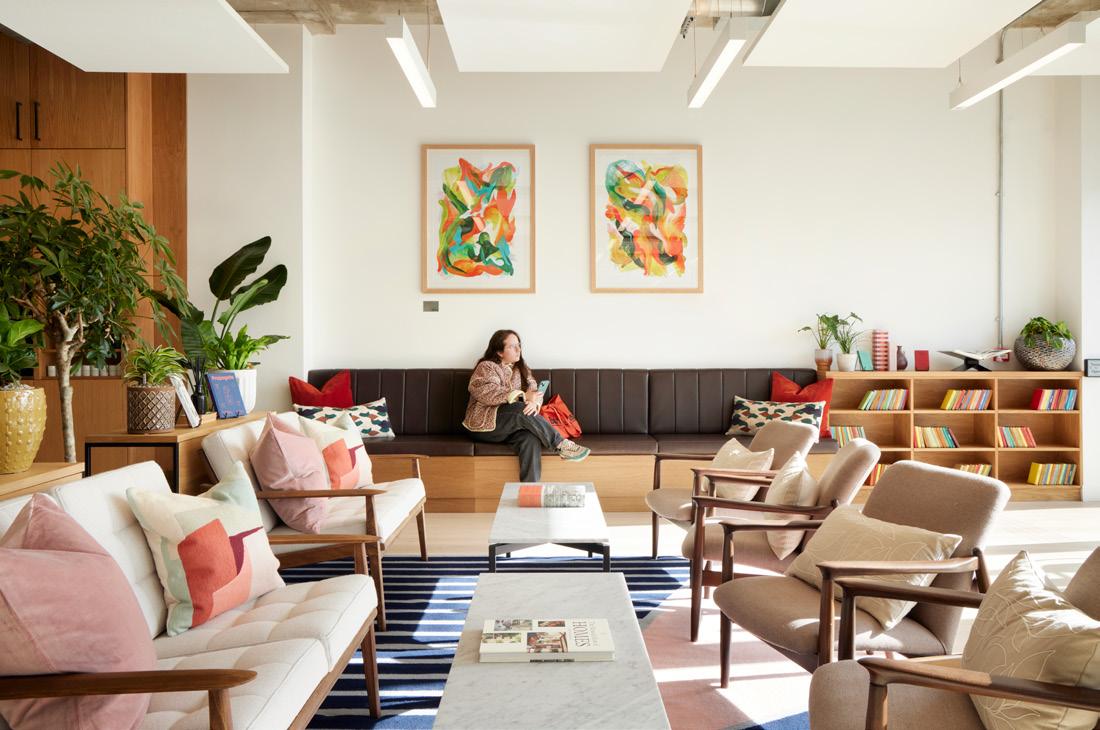
Elsewhere, colour themes facilitate wayfinding through repetition and wooden signage throughout the building includes pictograms and braille, reflecting the huge diversity within the population. Custom desks and meeting tables are height-adjustable, without compromising on style. Curated by Artiq, an extensive and vibrant art collection has been selected for its sensory appeal. Partnering with Positive View Foundation – a local charity grant funded by Westminster Foundation dedicated to transforming the lives of vulnerable 16–25-year-olds in surrounding Westminster – Artiq selected works from the charity’s ‘Youth Empowerment Programme’.
The main break-out floor is buzzing with activity, utilising a warm and natural material palette with pale wooden caféstyle seating and generous planting. Next door, a peaceful library space offers calm away from the social hubbub, with more bespoke shelving and soft lighting. A new roof terrace with views over the neighbouring mews is also fully accessible – featuring Mater’s Ocean chairs crafted from recycled fishing nets.
By adopting Grosvenor’s Sustainable Development Brief, the project minimised embodied carbon, resulting in the scheme being delivered within GLA benchmarks and in accordance with the UKGBC Net Zero Carbon framework. “As the project was reuse, it was already highly sustainable, but we were still set on making the new additions as sustainable as possible,” says Cottam. All timber used in the project is sourced from the
Grosvenor’s progressively sustainable TimberWorks estate in Cheshire, and Barr Gazetas reused steel from other Grosvenor projects and sites. This reuse concept continues through to the furnishings and décor, with thoughtfully chosen second-hand furniture featuring.
For Cottam and the Barr Gazetas team, it was refreshing to work with a client who sees inclusivity as an imperative.
“Some clients have different commercial pressures so can find it harder to balance sensory, inclusive and accessible design within this. [At Barr Gazetas] the majority of our projects are building reuse, where it is not always a regulatory requirement to provide fully accessible solutions – at Fivefields, bringing the client and building operator through the design process meant it was easier to design around inclusivity, rather than it being an afterthought.” After all, small steps lead to giant leaps.
Fivefields
Study
Case
Barr Gazetas 68
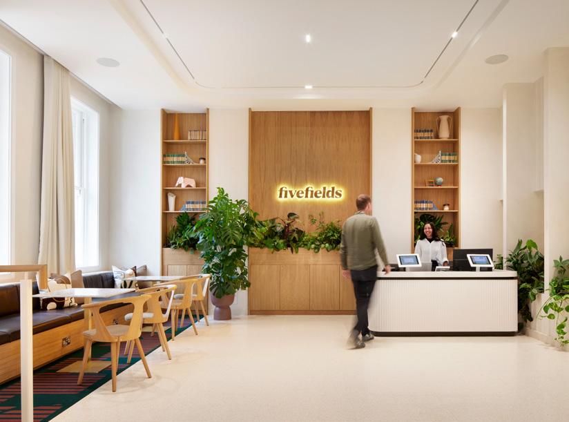
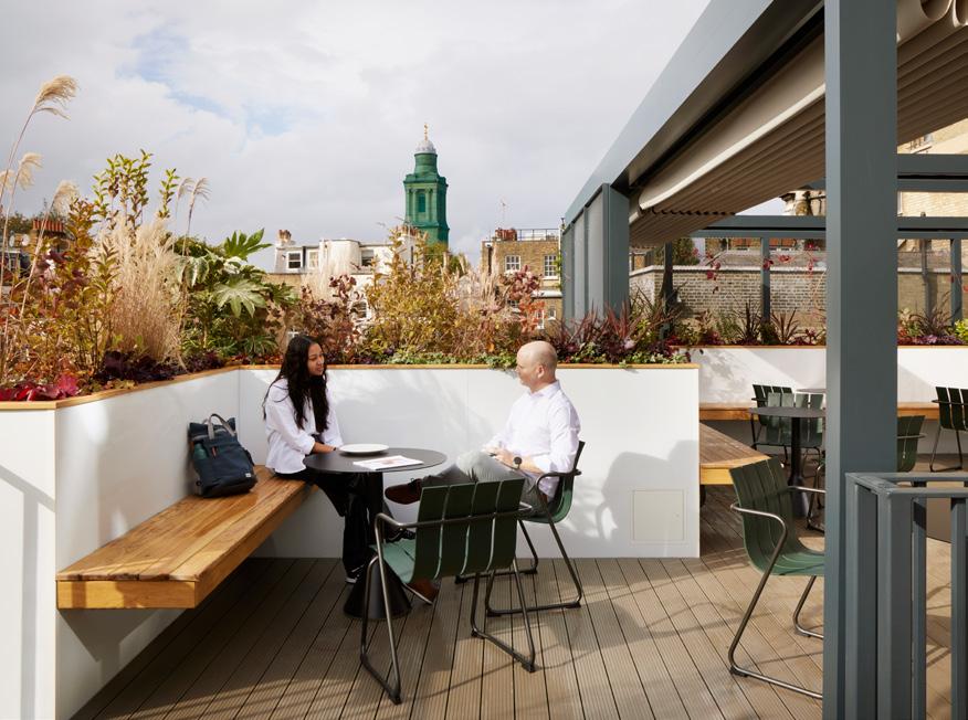
Mix Interiors
Left: Main break-out floor
Right: The bright reception area
Flooring In Opera Group Furniture Bureau Surfaces Grestec tiles Ecophon Lighting Future Designs Lamilux Other Planet Partition 3V architectural hardware Maxwood Washroom Ideal Standard Dolphin WecreateiOE GFN SAS International Muray and Stannah Zipwater 69
Below: An outside dining and social space
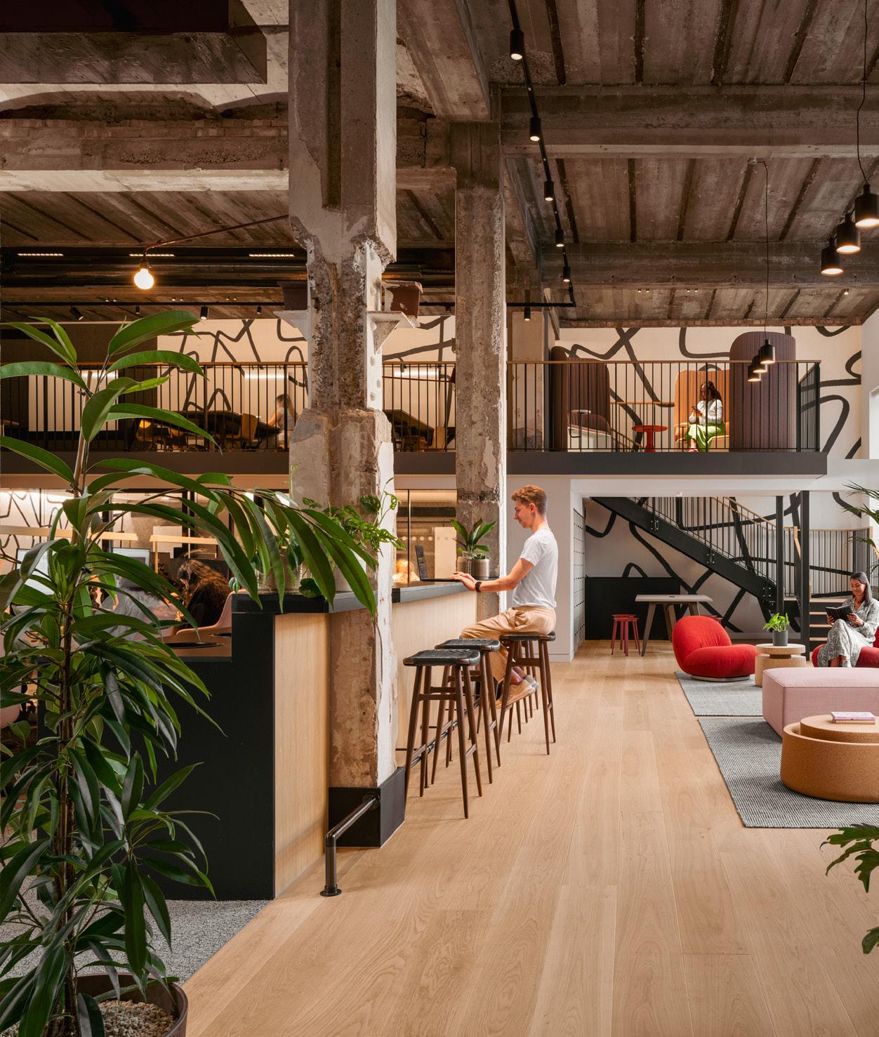
House Case Study Gensler 70
Francis

Warehouse to work place
At Francis House, Gensler worked with PR agency Edelman to develop a headquarters fit for the future.
Words: Dominic Lutyens
Photography: Vigo Jansons
71
lobal PR agency Edelman has changed the way it operates recently and this has impacted on its working practices –necessitating a rethink of exactly what type of office it needs. Edelman’s new London HQ at Francis House – a handsome, redbrick, 19th-century building on Francis Street in Victoria – reflects this change of approach. Its staff had previously worked in a 1970s office above (now defunct) department store House of Fraser (formerly the UK flagship store of Army & Navy Stores) on nearby Victoria Street – a fairly easy office move then.
Work on the building’s shell and core was undertaken by architecture firm Squire & Partners, while architectural practice Gensler was responsible for its fit-out. Originally founded in the US, Edelman has over 60 offices across the globe; its clients including Unilever, Microsoft and Samsung.
The new Francis House office is a highly complex, multi-layered design conceived to accommodate the expanding activities and requirements of this increasingly multi-faceted agency. It’s also designed to

cater to post-pandemic hybrid working. In an echo of the Victoria Street office’s connection to Army & Navy Stores and House of Fraser, Francis House once served as a warehouse for the two stores. Prior to its conversion to Edelman’s office, the interior of Francis House retained its mainly, though not exclusively, functional character. Here and there are vestigial decorative elements, such as ornate cornicing. The building also boasts large, elegant windows, so daylight and sunshine flood much of the interior.
Gavin Spicer, COO at Edelman, describes Edelman’s Victoria Street office in a none too flattering light, thereby highlighting
Gensler
Image on previous page: The main space with mezzanine
Above:
Meeting rooms and open work space
Case Study
G 72
Francis House Case Study
how much more appealing Francis House is proving. “The old office was big and open-plan and felt like a call centre. It was very uninviting.” He explains why changes at Edelman warranted a new style of HQ. “At our old office, the staff worked in silos. But our business is now far more complex and integrated, so we needed a space that fostered integration and collaboration. Francis House gave us the opportunity to achieve this.” Naturally, Gensler’s design would be free of 'call centre vibes', as he describes the atmosphere of soulless, cavernous offices.
Ruth Warder, CEO Edelman UK & Ireland & Brand Chair EMEA, said earlier this year that she recognised Francis House’s potential to meet Edelman’s needs: “When
we walked into the empty warehouse, we knew it was the perfect blank canvas to bring to life the vision we had for a postpandemic workplace.”
Its 35,000 sq ft interior might have felt coldly cavernous when Edelman first scoped it out but Gensler addressed this by punctuating it with five new mezzanines accessed by five new staircases. These include a spiral staircase, while some staircases have rather theatrical, curved, sweeping balustrades that create intriguing perspectives. These additions enlarged the space by 10,000 sq ft. Perhaps 18th-century artist Giovanni Battista Piranesi’s atmospheric etchings of prisons featuring a multitude of staircases and walkways inspired Gensler.
 Gensler
Below:
74
The comfortable lounge with characterful furnishings


Francis House Case Study
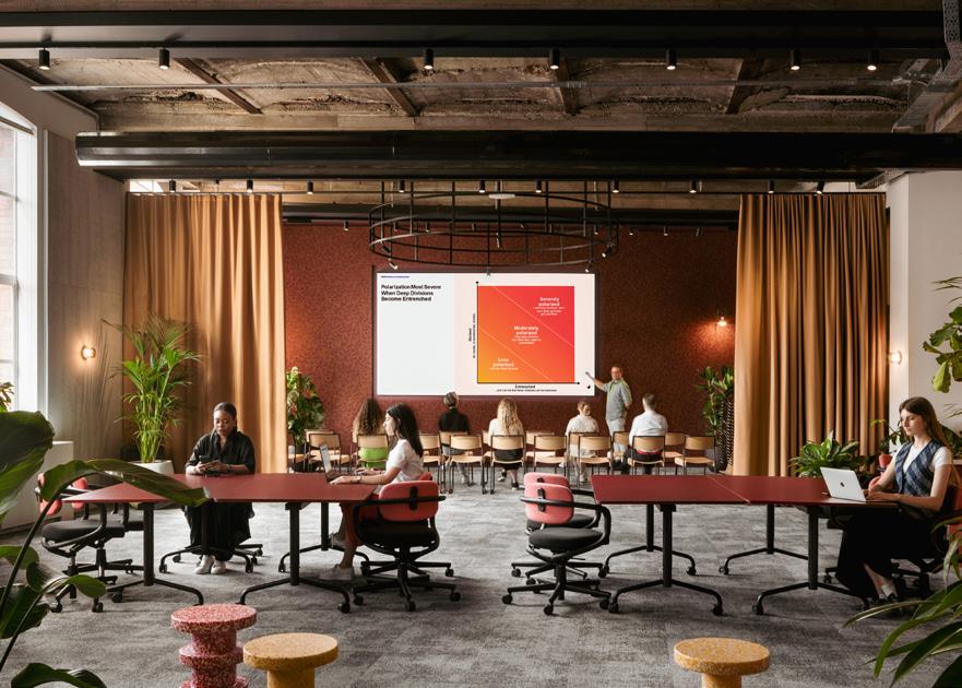
Left:
A large conference room and multifunctional workspace
Below: Communal kitchen
Right: Flexible, light-filled working zone
“Our business is now far more complex and integrated, so we needed a space that fostered integration and collaboration.”
Meanwhile, Gensler retained patches of exposed brickwork whose raw quality recalls the bare stone walls of Piranesi’s prisons, though clearly Edelman’s luxuriously furnished new office otherwise bears no resemblance. Gensler also preserved the original, decorative cornicing. And a vaulted, exposedconcrete ceiling in an events space was left visible as Gensler wanted to conserve and celebrate this gritty, somewhat Brutalist remnant of the warehouse.
The existing building’s double-height spaces perhaps made it more feasible for Gensler to install the new mezzanine levels. Conventional rows of desks and screens are found in parts of the office but the overall layout is complex and varied – a
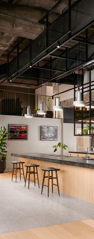
Gensler
76
Client Edelman UK
Furniture
The Furniture Practice
Lighting
Maze Engineering
Ceiling BW Interiors
Glazed partitions Optima
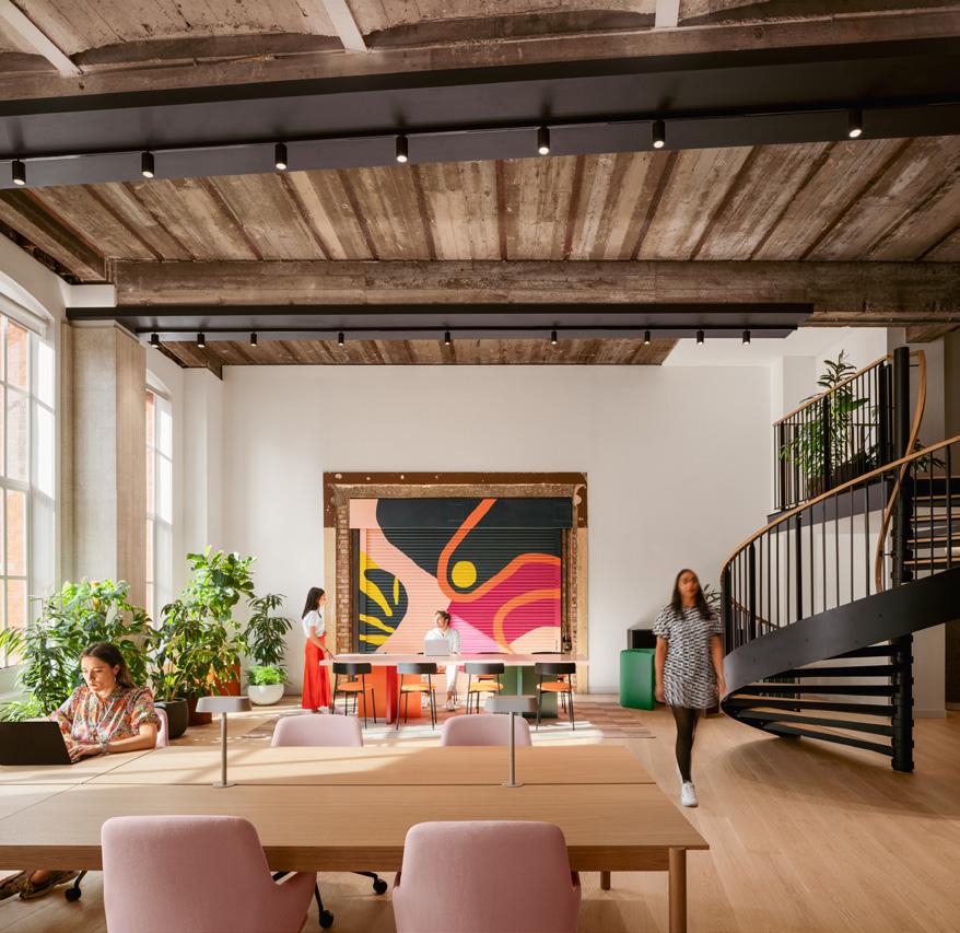
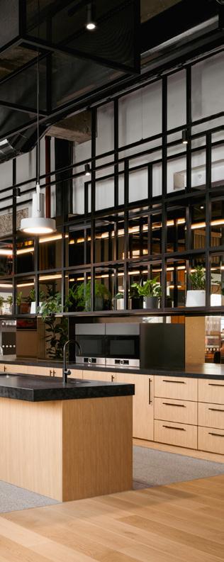
space to be explored. Most of the office’s 600 or so employees don’t have permanent desks and are free to roam around its intimate, comfortably furnished break-out areas and social spaces.
By contrast, an adventurous, contemporary colour palette and eclectic selection of plumply upholstered sofas and stools dotted around the quieter zones soften the office’s industrial quality – and give it more character. Colourful artworks aplenty have a similar effect. An abstract mural by Lois O’Hara, painted directly on to a metal warehouse hatch in a large room, creates a vibrant focal point. Gensler also introduced biophilic elements. Ivy trails romantically over some walls, while
a huge planter studded with lush mosses stands unexpectedly under the base of a metal staircase, adding visual interest to a spot that would otherwise have been a dead, neglected space.
Arguably, the reception area sets the tone of the office before setting foot in it. Walk past its small, low-key desk and the lobby features plushly upholstered, electric blue benches whose flamboyant style is picked up again in the many examples of brightly hued furniture elsewhere. A few steps away is a starkly functional lift and stairwell. Overall, the project harmoniously fuses rugged, industrial finishes and warmer, softer surfaces.
Mix Interiors
77
Made for Milan
Words:
Lauren Jade Hill
Photography:
FTFoto
H2B Studio
Felice Scoccimarro
Park Hyatt Milano celebrates its 20th anniversary with the completion of its multi-year redesign.
In the beating heart of historic Milan, one of the city’s most legendary hotels is commemorating its 20th year with the completion of a property-wide redesign. Set apart first by its setting’s grandeur, Park Hyatt Milano brings its take on luxury lifestyle to a palazzo commissioned by Marchese Alessandro Fiori, designed by the architect G.B. Torretta and built in 1875 – in the same period as the city’s landmark Galleria Vittorio Emanuele II, which the hotel neighbours.
Close to the Gothic Duomo di Milano amid avenues of high-end fashion boutiques, this palazzo, which was first occupied by a hotel before being leased by the Bocconi brothers for their
emporium, returned to its hotel roots in 2003 when it opened following a full restoration as Italy’s first Hyatt hotel.
American architect Ed Tuttle led the restoration and reimagination of this historic site and over the years additions to the hotel’s hospitality offering came in the form of its Prestige and Imperial Suites, as well as the expanded marbleclad AQVAM Spa housing treatment rooms and thermal facilities. The hotel won plaudits for its dining and imbibing venues, which join the central domed Cupola Lounge, with its fine dining restaurant earning two Michelin stars, and the 2015-opened Mio Lab Cocktail Bar becoming a go-to for mixology.
Park Hyatt Milano Case Study
78
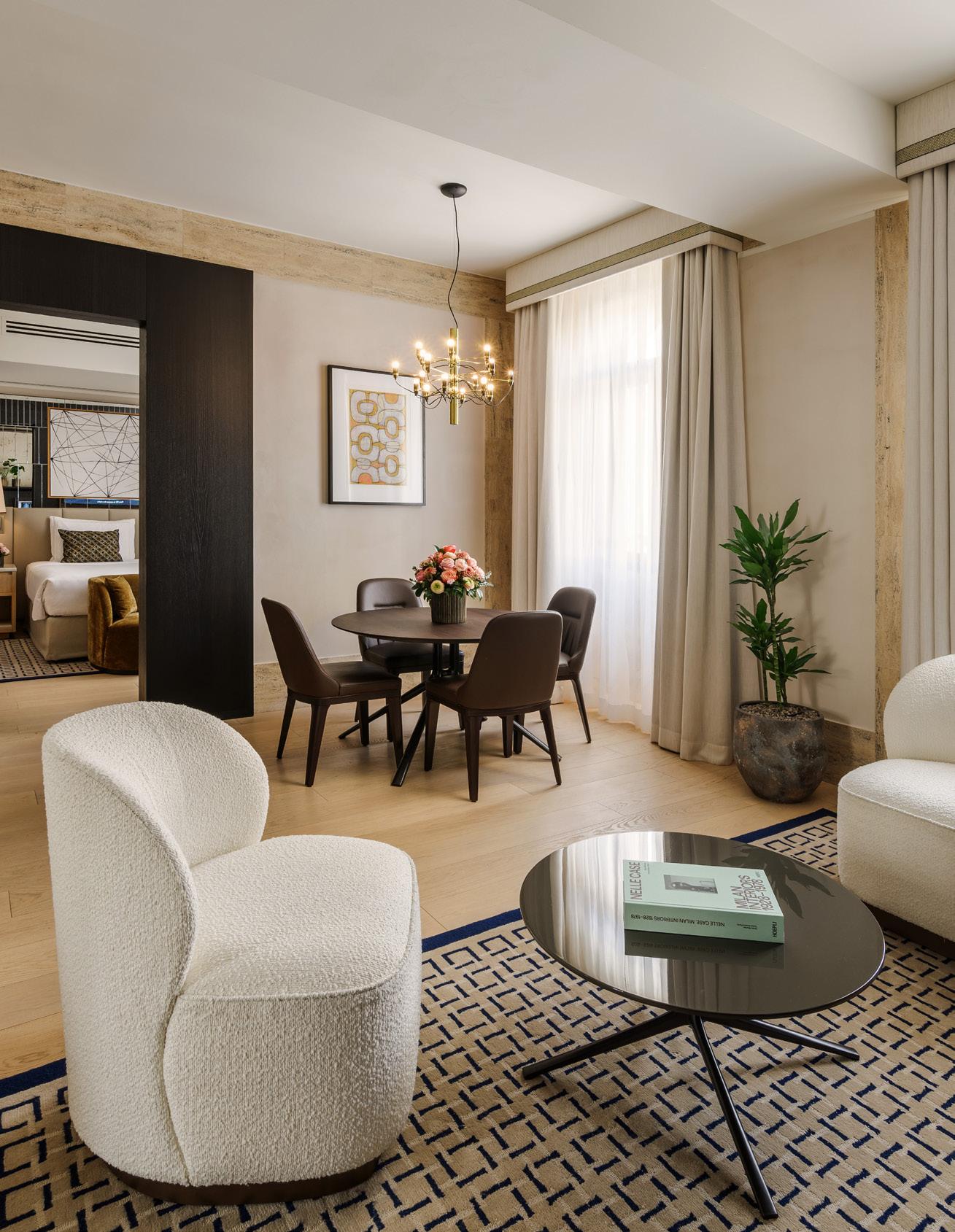
79
Park Hyatt Milano Case Study
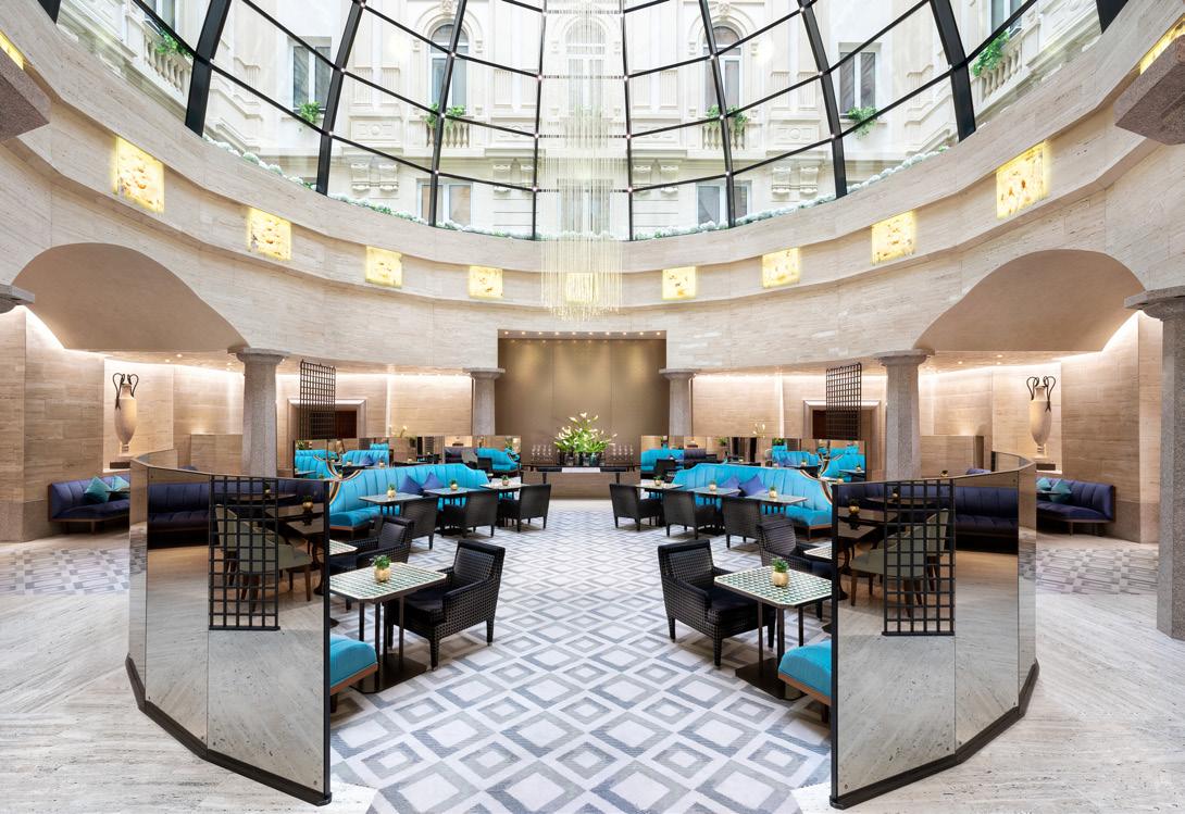
page:
The latest revival saw its first phase of completion after a two-year renovation period in 2022, with its fine dining restaurant launching with a new chef and gastronomic concept as Pellico 3 Milano, and a refresh of existing spaces including the spa. Now, in 2024, tying in with its 20th anniversary celebrations, the hotel has revealed the final stage of its full-property redesign: the unveiling of its palatial new Duomo, Montenapoleone and Brera Signature Suites.
The Bologna-born, Milan-based architect Flaviano Capriotti has been behind the design of key areas including the fine dining restaurant, bar and top suites.
“I started my relation with the hotel 10 years ago when they asked me to renovate the F&B areas,” he says. “At that time the restaurant was run by Andrea Aprea. When the chef moved on to open his own restaurant, I was then asked back to redesign the restaurant for the new chef, Guido Paternollo.
"I said to the general manager, Simone Giorgi, that I needed to meet with the new chef because the restaurant is a place that has to reflect the chef’s philosophy. I needed to understand what kind of food he cooked, what kind of tradition he followed, what ideas he had.”
Image on previous
Prestige Suite living room
Above: La Cupola restaurant
Flaviano Capriotti
80
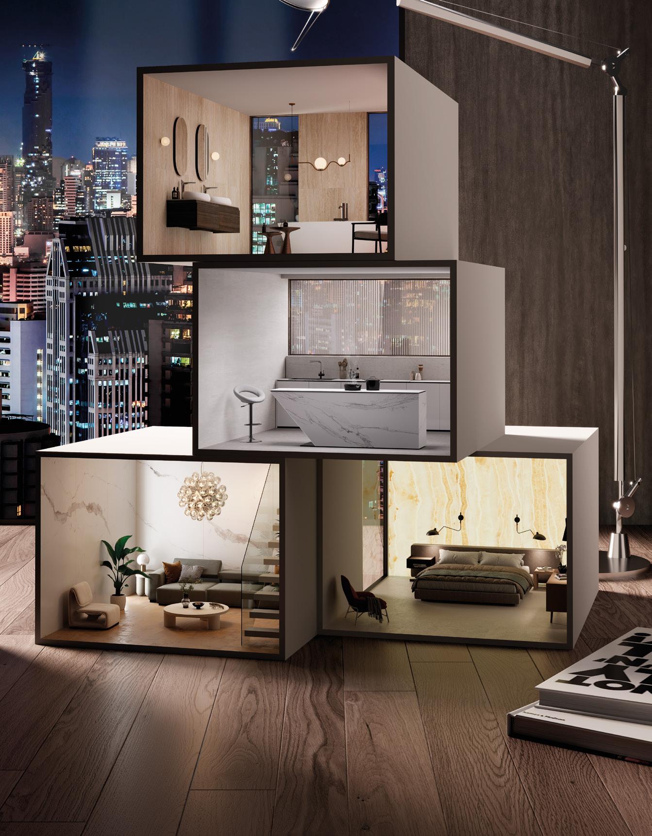
IMAGINE YOUR SPACE Imagine a space where inspiration can run free. A world that tells your own story, every single day. At RAK Ceramics we help create the perfect living space, for you and your loved ones. RAK CERAMICS DESIGN HUB - 100 ST JOHN STREET, LONDON, EC1M 4EH VISIT US DURING THE CLERKENWELL DESIGN WEEK
Park Hyatt Milano Case Study
In line with the chef’s focus on the Mediterranean, and the vegetables of this region spanning parts of North Africa as well as Europe, Capriotti set about encapsulating the nature and spirit of that vision.
“The idea was to create a garden, picking the colours of the vegetables, from their many shades of greens to the dark red and beige of artichokes, and using them in different materials. We used plaster on the walls, brought in timber and made the green flooring out of Cocciopesto (a cement-based material containing pieces of terracotta that has been used since Roman times).”
The colour of pumpkins has been used for the leather of the dining room’s chairs, and spotlights shine down from the ceiling – with the option to choose which ones you switch on according to the table arrangement or event set-up – in an irregular pattern that’s reminiscent of the star-filled sky.
When it came to the suites, Capriotti wanted to create a series of private retreats within the hotel, while integrating design details that subtly connect each space to the locale.

Below: La Cupola
Flaviano Capriotti
82
If these last few years have taught us anything, it’s that offices are not simply four walls and some desks. When done right, they become vibrant hubs for collaboration, creativity, and connection, fuelling conversation and challenging ideas.
Workplaces are the lifeblood of our cities and towns, injecting energy into local businesses. We feel they are underrated, so we’ve launched the ‘Let’s Go to Work’ campaign to celebrate all the benefits of in-person collaboration at the office. Get in touch to learn more about what this campaign means to us.

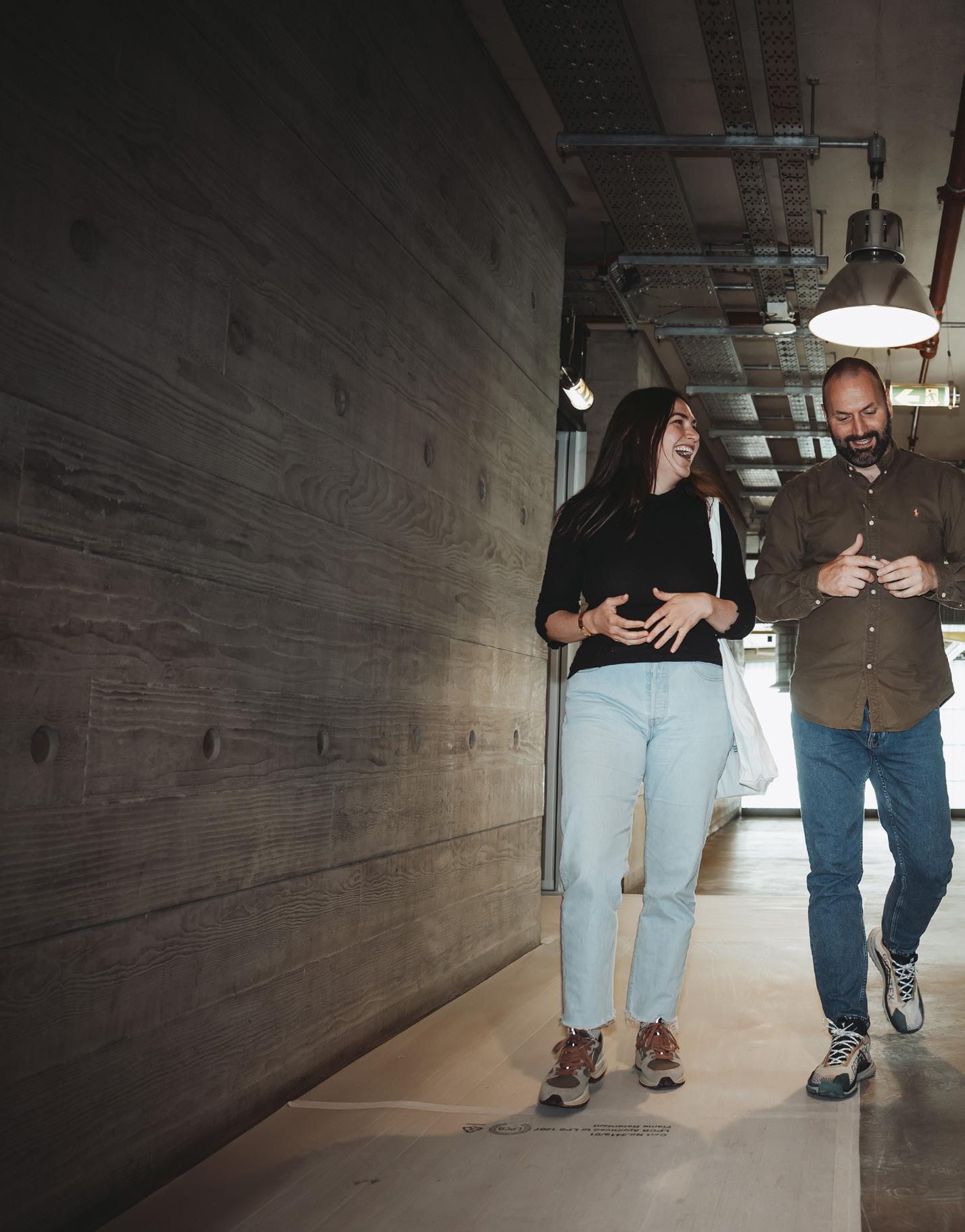
Scan the QR to visit the BW website
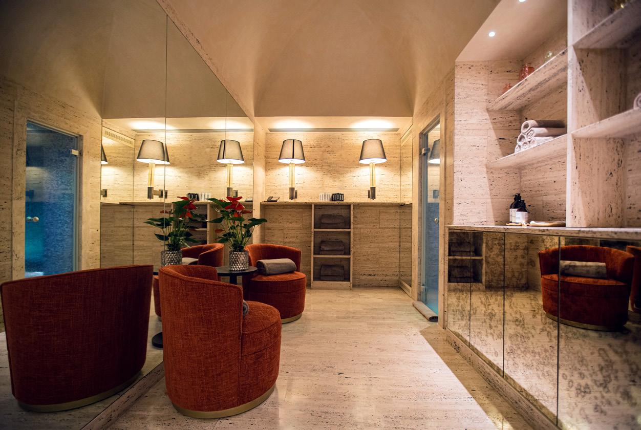
“The first step you have to take when you design something is consider where you are,” he says. “Here I’ve used walnut timber that’s traditionally used in Milan and I’ve selected some of the most representative items designed by great Milanese post-second-world-war architects, such as Franco Albini, Gio Ponti, Luigi Caccia Dominioni and Angelo Mangiarotti, who defined that era of Italian design.”
The designer brought in green Verdi Alpi marble from the Italian Alps, along with white stone from Venezia, which is seen on the streets of Milan. A colour that is representative of the city, green has been used throughout, from these marble
surfaces to the soft furnishings. Designed with comfort in mind, special attention has been paid to the lighting — ensuring proper shadow, light accents and balance — and sound insulation.
Each suite is made up of distinct areas for living, sleeping and dining, with a terrace in Duomo and Montenapoleone as well. “A project is always driven by spaces, their articulations and the circulation of people occupying them,” he says. “Every space needs its own function. You need symmetry and visual axis. You need to be able to feel each space and the relationship with the building has to be strong.”
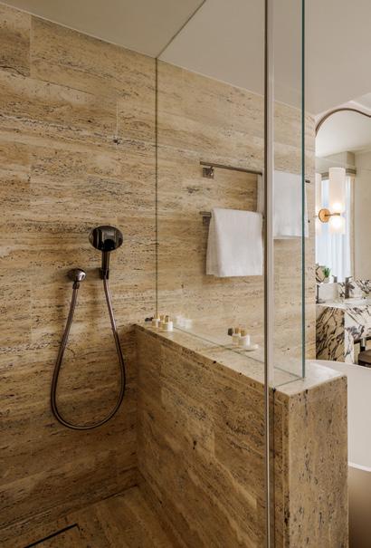
84
Flaviano Capriotti
Flooring
Domenico Mori
Rigo Marmi
Furniture
Cassina
Molteni
Poliform
Driade
Agape Casa
Surfaces
Vescom
Dedar
Lighting
Flos
Venini
Other
Dedar
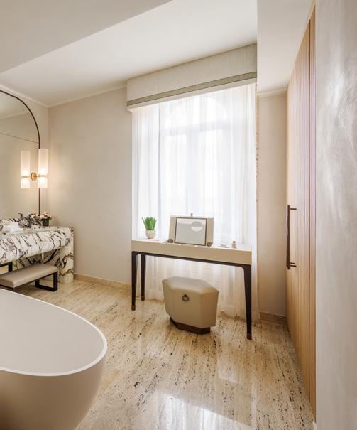
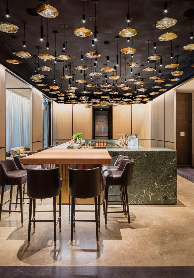
Left image: AQVAM Spa Below: Deluxe King bathroom Right: Mio Lab cocktail bar Mix Interiors Park Hyatt Milano Case Study
85
hT e n e w æsthetics of
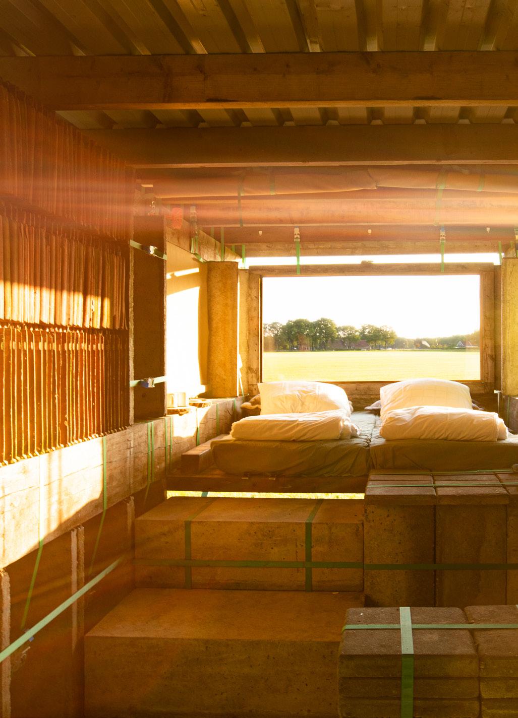
Circularity Positive Impact
86
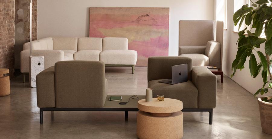
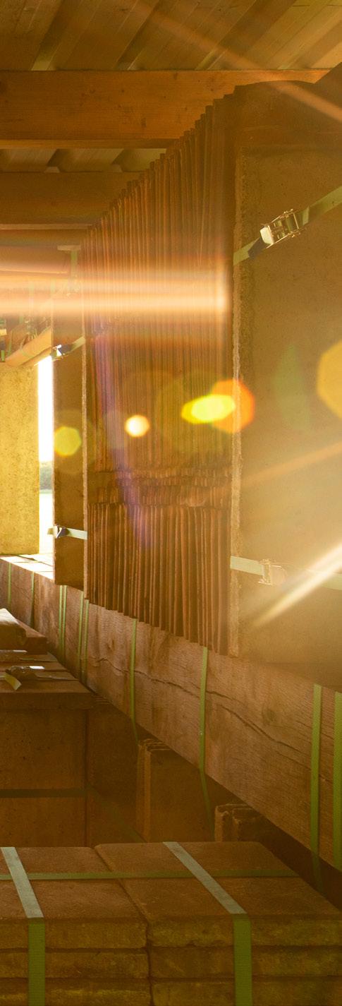
circulari
t y
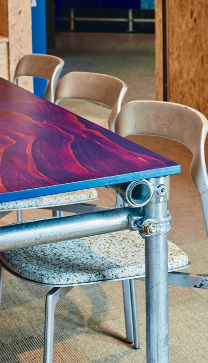
Why a more sustainable future means rethinking our notions of beauty.
In her 1999 book Waste and Want: A Social History of Trash, Susan Strasser coined the term ‘the veneration of newness’. She was exploring how the USA changed from a culture of reuse to one of disposability in the 20th century, and these four words captured how tastes shifted in tandem with changes in wealth, technology and advertising. Relatively quickly, we came to look at old things as dirty and new things as beautiful.
Now, potentially, we are on the precipice of another shift. Design features that may have last decade signified cheapness, coldness or even uncleanliness are being read differently due to their connection with sustainability and especially circular design – a more quantifiable way of thinking of sustainability that prioritises keeping materials in a closed loop of repair, reuse, recycling and regeneration. Along with a recovered appreciation for the charm of older objects, we are gamI:e dutoi awdE r d,s p h o t o g r a ph y Peter Bennetts
Mix Interiors
Image: STAPELOPbyOvertreders
W
Image: PearsonLloyd,ModusEdgeFree
87
Words:Rima Sab ina Aouf
Circularity Positive Impact
“Hopefully we are moving away from a mindset of applied finishes”
looking with fresh eyes at unfinished and monomaterials that can be easily recycled, exposed connectors that signify a construction can be taken apart for reuse, and the earthy look of biomaterials that can be returned to the ground – or the uneven colour of recycled plastic.
In architecture and interiors, one of the best ways to achieve circularity is by making a structure that is demountable and serves as a materials library for the future, and some of the more celebrated work in this area embraces the idiosyncrasy of this look. In The Netherlands, architects Overtreders W, known for its inventive reversible pavilions and spaces, built a whole holiday cabin with an assemblage of materials borrowed from neighbouring properties, with bright green straps proudly holding it together. In Australia, Studio Edwards’ office space for Today Design boldly displays its exposed orientated strand board partition walls, recycled denim detailing and ‘disassemblable’ custom furniture made from scaffolding poles.
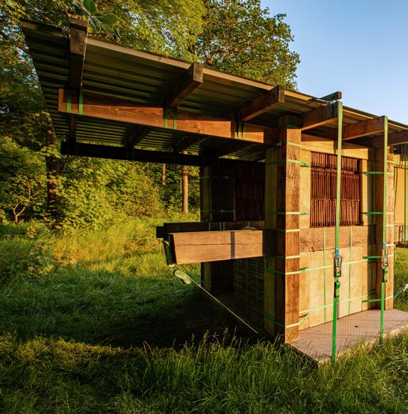
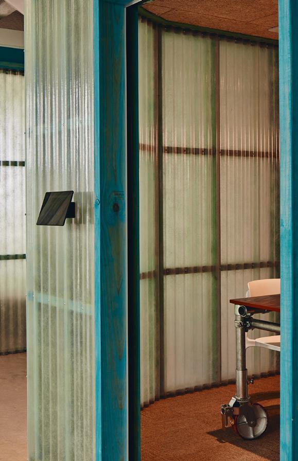
Overtreders W’s Hester van Dijk said she aims to combine the qualities of circular materials and construction approaches “in a way that looks stunning”, while Studio Edwards’ Ben Edwards said he saw people being more appreciative of “the inherent qualities of raw materials”. “Hopefully we are moving away from a mindset of applied finishes,” he added.
Of course, designers aiming for circularity aren’t doing it to achieve a ‘look’; they’re doing it to make a product or an environment that is responsible and good. More often
than not, taste is seen as the enemy – a frivolous beast that is liable to turn and leave functional items abandoned, unwanted and unvalued. But there’s no denying that when it comes to circularity, an emerging, recognisable aesthetic is helping to open the door by changing client and consumer expectations.
Can we be pushed even further? Luke Pearson of furniture design studio Pearson Lloyd, a leader in circular design, wants us to consider shape. Iconic mid-century furniture designs with concave shapes like Arne Jacobsen’s Egg chair and Swan chair shouldn’t be manufactured now, he argues, because they require textile to be glued to foam, making them impossible to reupholster or recycle. These chairs were a product of their time, when polyurethane foam replaced horsehair and fibre for seat stuffing and made a smooth, inwardly curving design
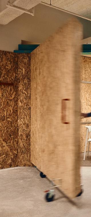
Positive Impact
I m a g e : S t ud i o Edward s /PeterBennetts 88
Image: Studio Edwards, photographyPeterBennetts
language possible. Now is the time for linear and convex shapes – over which removable covers can be pulled tight with a drawstring or zipped.
By the same logic, Pearson thinks we could question “our ideas of comfort”. “Big, fat sofas are relatively new as an idea” and “probably being driven by polyurethane foam again” – a difficult-to-recycle material. “Before that it was simply too time intensive to make a sprung horsehair sofa and, actually, they're not soft, they're quite firm,” he said. “I think our value matrix has shifted because of materials and I think as they become more expensive or more recognised as harmful or taxed differently, then we'll shift over to other models.” His studio is currently working on a seating design with a 3D-knitted textile rather than stuffing for comfort.
Conversely, one of the dangers with having an emerging aesthetic is that things might be unfairly left out. Pearson emphasises that a vast amount of data goes into every circularity-minded project at his studio and that the right choice of material will depend on the location and use case. “Plastic is demonised by so many people, but with long life use and making sure that it can be used in a circular way, it’s a very efficient material, and you can take a structure and you can melt it and you can make a new structure,” said Pearson. “Wood is not so easy to do that with. With wood, you really should be making a very, very long-life product.”
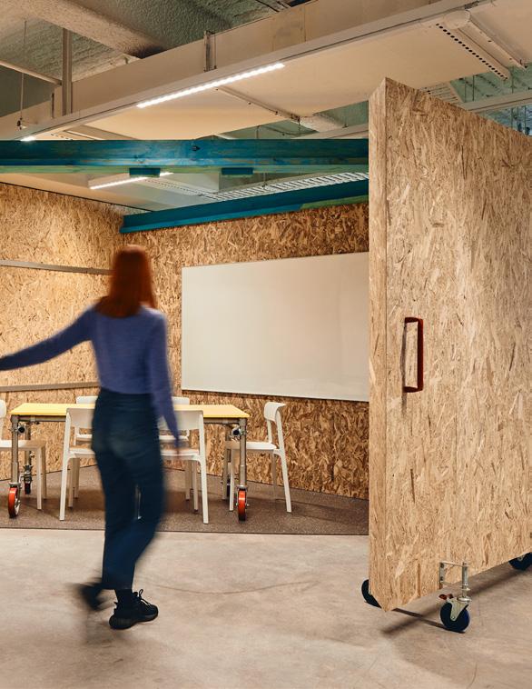
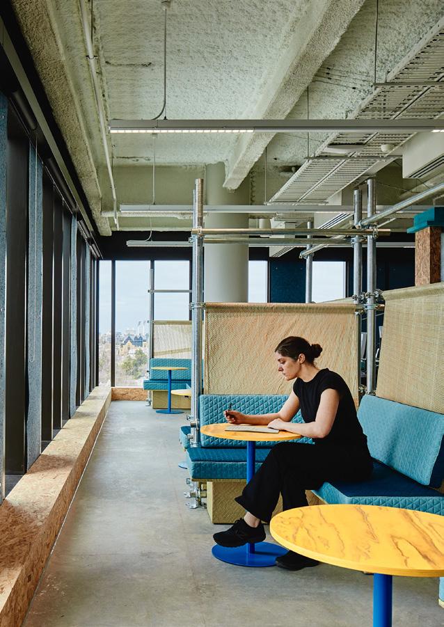
Most of all, the change that so many designers working in this space would like to see is an acceptance for things that are out of fashion, a sense that we could tweak rather than start afresh. “The rate at which interiors that are technically still good to use are trashed because a shop closes doors and the new shop owner likes to adapt the interior to the brand design guidelines is astonishing,” said van Dijk of Overtreders W. “Some shops in my street have already redone the entire interior three or four times in the twelve years I have lived there. Seriously, we have to find better ways than that.”
Mix Interiors
I ma g e : S T A P E L O P 89
Image:StudioEdwards, photography Peter Bennetts
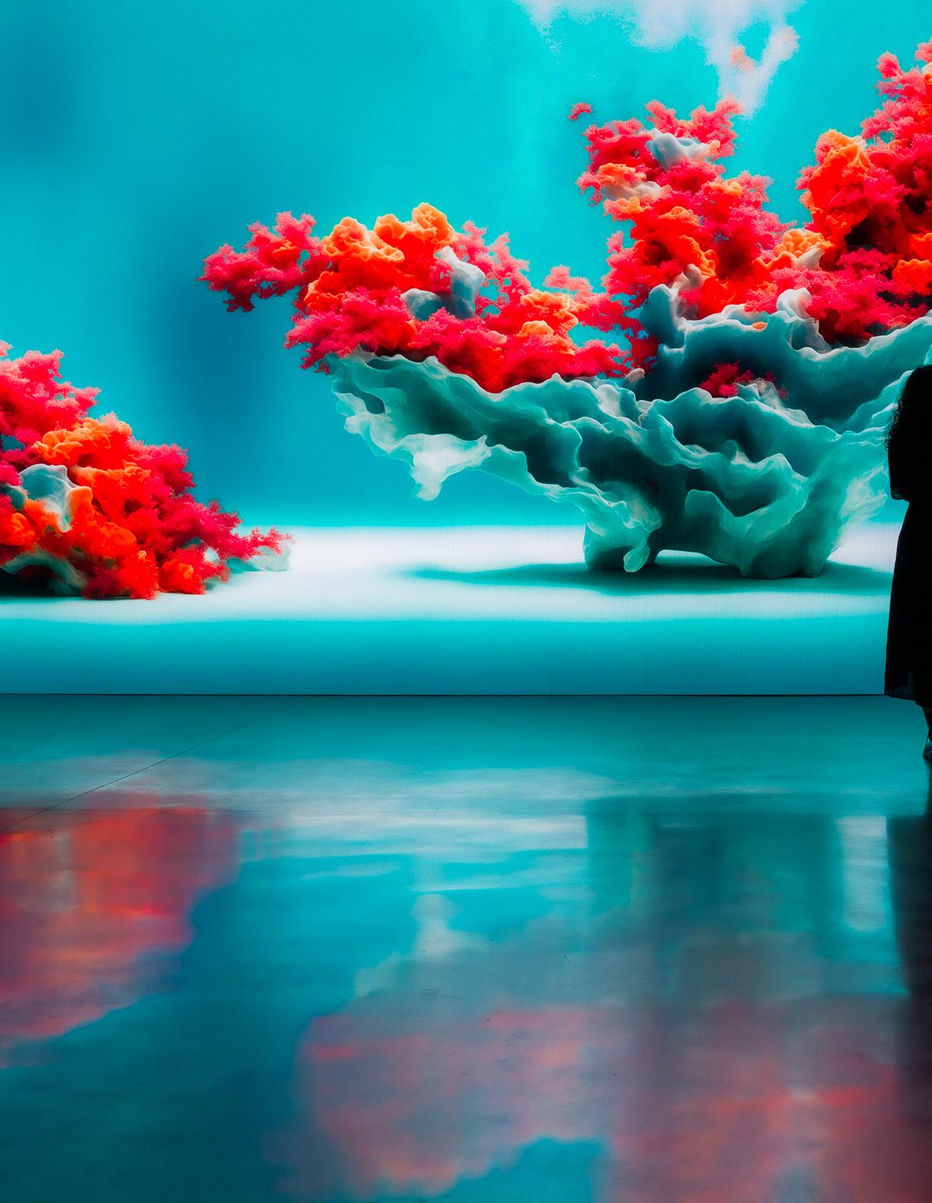
Designing with data
Refik Anadol Fast Forward
90
Words: Refik Anadol
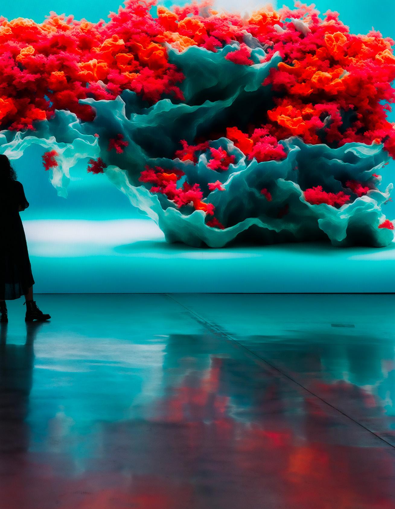
Art, AI and the new architectures of imagination. Pioneering artist and designer Refik Anadol explores the power of AI to push the boundaries of creativity, technology and human experience.
91
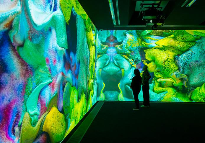
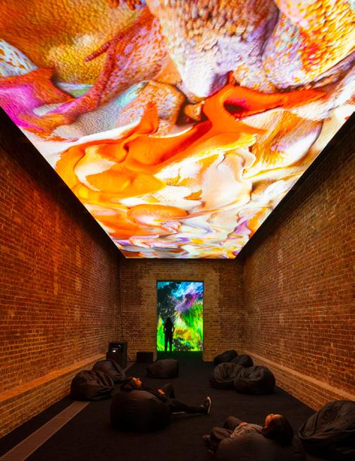
As a media artist deeply interested in the exploration of AI's capabilities to aid human creativity, my vision has always been about more than just the aesthetic or technological spectacles that can be created by using AI. It's about how these elements – design, architecture and artificial intelligence – intertwine to articulate the invisible: our memories, dreams, and futures. I believe that AI is not just a tool but a medium that expands the canvas of our collective imagination.
My fascination with architecture began in early childhood, with questions about my surroundings. Why were my walls so boring? Why did I have to return to the same space each day? This curiosity about our built environments’ static nature led me to dream of alternatives – spaces that could evolve, reflect and engage with us. This dream was further fuelled by video games, which introduced me to realities beyond the two-dimensional, sparking a long journey to explore what happens when light and data become materials.
In 2008, at a media architecture event in Berlin, I discovered a community dedicated to envisioning the future of
urban spaces through media facades. It was here that I learned about the poetics of augmented space, inspiring me to think about how an architect and artist could collaborate to make the invisible flow of data visible. This realisation became a cornerstone of my practice, especially as I delved into projects later in my career like WDCH Dreams, Living Architecture: Casa Batlló or my collaboration with Zaha Hadid Architects, 'Architecting the Metaverse.' These projects were not just about the integration of new technologies and architecture; they were about creating a dialogue between the traditional and the contemporary, between the built environment and the natural world and thinking about architecture beyond concrete, glass and steel.
As I say, “I am inspired by a strong commitment to pushing the boundaries of creativity, technology and human experience, driven by the conviction that artists, in partnership with AI, can illuminate the path toward a future where design and architecture extend beyond their traditional realms, crafting spaces that are as contemplative and interactive as they are artistic.”
Today, I and my team members at Refik Anadol Studio are in the midst of developing our most ambitious project yet – DATALAND, a museum and Web3 platform dedicated to data visualization and AI arts. DATALAND will unite pioneers in diverse fields including the arts, scientific researchers, institutional archives and cutting-edge technology under the artistic leadership of Refik Anadol Studio.
For DATALAND, we embarked on another groundbreaking initiative – developing the Large Nature Model (LNM) - the world's first open-source AI model dedicated exclusively to the study and simulation of natural environments, which first debuted at the 2024 World Economic Forum. Computing power for the Large Nature Model is driven by DATALAND partners Google Cloud, pursuing net-zero emissions across its operations and value chain by 2030, and NVIDIA, whose ground-breaking neural network algorithms and advanced tools enable Refik Anadol Studio’s visual representations and next-generation computer graphics.
Refik Anadol Fast Forward Fast Forward
92
Photography by: Hugo Glendinning
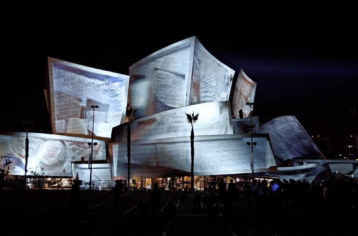
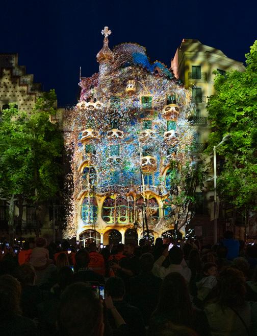
The Large Nature Model (LNM) is at the heart of my latest exhibition ‘Echoes of the Earth: Living Archive,’ currently on display at Serpentine, which is my first solo exhibition in London. Echoes of the Earth emerges from a deep-seated fascination with unveiling the hidden patterns and wisdom of the natural world by using cutting-edge AI technologies. The LNM enables the creation of hyperrealistic environmental experiences, processing extensive datasets from rainforest and ocean ecosystems. Beyond their experiential appeal, the pieces at the exhibition engage with broader themes of human-machine collaborations for understanding our environment, illustrating how technology can be utilsed to create vast multisensory archives of otherwise remote parts of the world and reconnect us with these ecosystems.
These simulations are presented through immersive, multi-channel sound, video and olfactory experiences, drawing viewers into the very heart of rainforest ecosystems, surrounded by detailed flora, fauna and landscapes. For example, at the heart of our olfactory innovation are two
advanced AI systems working in tandem: one AI, trained on about half a million scent molecules, and another, our Large Nature Model (LNM), which holds the world's biggest collective dataset on the flora, fauna and fungi of Amazonia. We start by introducing the two AI systems to each other, merging the database of scent molecules with the biodiversity knowledge from the LNM. This collaboration enables the Scent AI to generate formulas that recreate the almost realistic scents of nature you experience at the show.
The LNM is a significant project both as a technological achievement and as an example for interdisciplinary collaboration in the field of AI aesthetics. By releasing it as open-source, we will extend an invitation to artists, scientists, educators and the broader community to engage with, expand upon and explore its potential. My hope is for the LNM to inspire projects that simulate the beauty and complexity of our planet and create dialogue and action around ecological issues. This exhibition, and particularly the introduction of the LNM, encapsulates our studio's vision of pushing the
boundaries of what is possible at the confluence of art, technology and the natural environment.
My work with embedding AI into architecture to recreate environments has been a journey of finding the human within the non-human. By painting with a thinking brush, I use data as my pigment, exploring how these digital reflections can embody our collective memories and dreams. Whether it's creating immersive rooms or projected infinite spaces, my aim is to deconstruct physical boundaries and reconstruct realities that invite interaction, contemplation and engagement. As I continue to explore these ideas and connections, my team — a diverse group representing many cultures and languages — plays a crucial role. Together, we're not just creating art; we're forging a new language that blends architecture and aesthetics, accessible and meaningful to a global audience. This collaborative spirit underscores the essence of my work: a quest to architect experiences that reflect our shared humanity and dreams.
Mix Interiors
Previous page: Coral Dreams Left: Echoes of the Earth
Above right: WDCH Dreams Living Archive
Above left: Living Architecture - Casa Batllo
93
Designers get digital
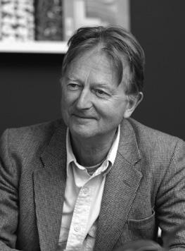
The intelligent analysis of data offers limitless opportunities to create better workplaces that are more efficient and responsive. The result is not necessarily a smart building with snazzy control systems, although that can be part of the outcome, it’s simply a better design by using technical skills rarely found in our studios. We are vaguely familiar with the engineering features of a smart building which uses automation to improve the user experience, but this story is about data analysis to resolve two new problems.
Here's some context. The business world faces two tough new challenges affecting the design and performance of their work environments. The first challenge is a wholesale adoption of remote working following the pandemic, and the second is the climate crisis that is forcing organisations to control their carbon footprint. With no simple answers and a high level of uncertainty, organisations are taking risky bets based on guesswork and intuition, or carrying on as before and hoping for the best. Design firms can cut through this if they include digital data in their toolbox.
The two big challenges do not come from competitive forces or new technology, like the desire for frictionless flexibility or a paperless office. These are external demands from employees whose workplace expectations have expanded, and from wider society seeking fair and ethical behaviour. This means that stakeholders are choosier: employees about who they work for, and investors about where they place their cash. There is a widespread battle for talent and a renewed awareness of sustainability in society – two good reasons for organisations to do things differently. Our clients need information, like anyone does when they are lost.
Fortunately, with a bit of effort we can now access the raw material for reliable information from limitless sources of data, but we have to learn how to collect it and analyse it to create insight and direction. The analysis techniques have been in daily use for decades in industries like airlines, hospitality and supermarkets. Now it’s our turn.
The solutions are many. Robust statistical analysis of occupancy data will generate a reliable space allowance for
any future growth scenario. Meeting room arrays can be configured by simulations that eliminate guesswork and intuition. Energy consumption can be monitored in detail and controlled to save money and reduce carbon emissions. Real-time occupancy and environmental conditions can be displayed to users so they can make choices about how and where they work.
Although we are used to data and algorithms being part of everyday life, it’s not easy to build these methods and systems in our industry from a dead start. The design sector is dominated by visual skills and physical artefacts and exploiting the power of data means embracing a whole new universe of expertise. It requires intimate collaboration with technologists we don’t understand, who deal in invisible products and have their own language. It is difficult for creative and not overly-numerate designers to interact with people driven by science, maths, derivative systems and software. They are separate religions and understanding and communication are needed in spades, but we have no choice.
Mix Interiors
Steve Gale
Innovative Thinking
Steve Gale is head of strategy at M Moser Associates
94
mmoser.com
Lighti n g
the UK's leading design festival
21-23 may register for free
@clerkenwelldesignweek cdwfestival clerkenwell.design.week
Furniture Surfaces
@clerkenwelldesignweek cdw2024 clerkenwelldesignweek.com &more
Beyond the new: is fast design at odds with sustainability?
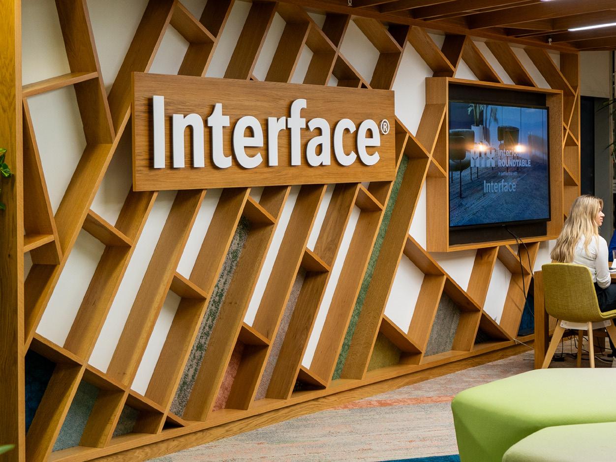
Interface Mix Roundtable 96
Words and moderated by:
Chloé Petersen Snell
If we know change is necessary, how do we create systems that needn’t come at a cost? In this Mix Roundtable with Interface we consider how to rethink the way we create and construct, explore what can be done to shift mindsets and ask how we can adapt aesthetics to fit with truly sustainable design.
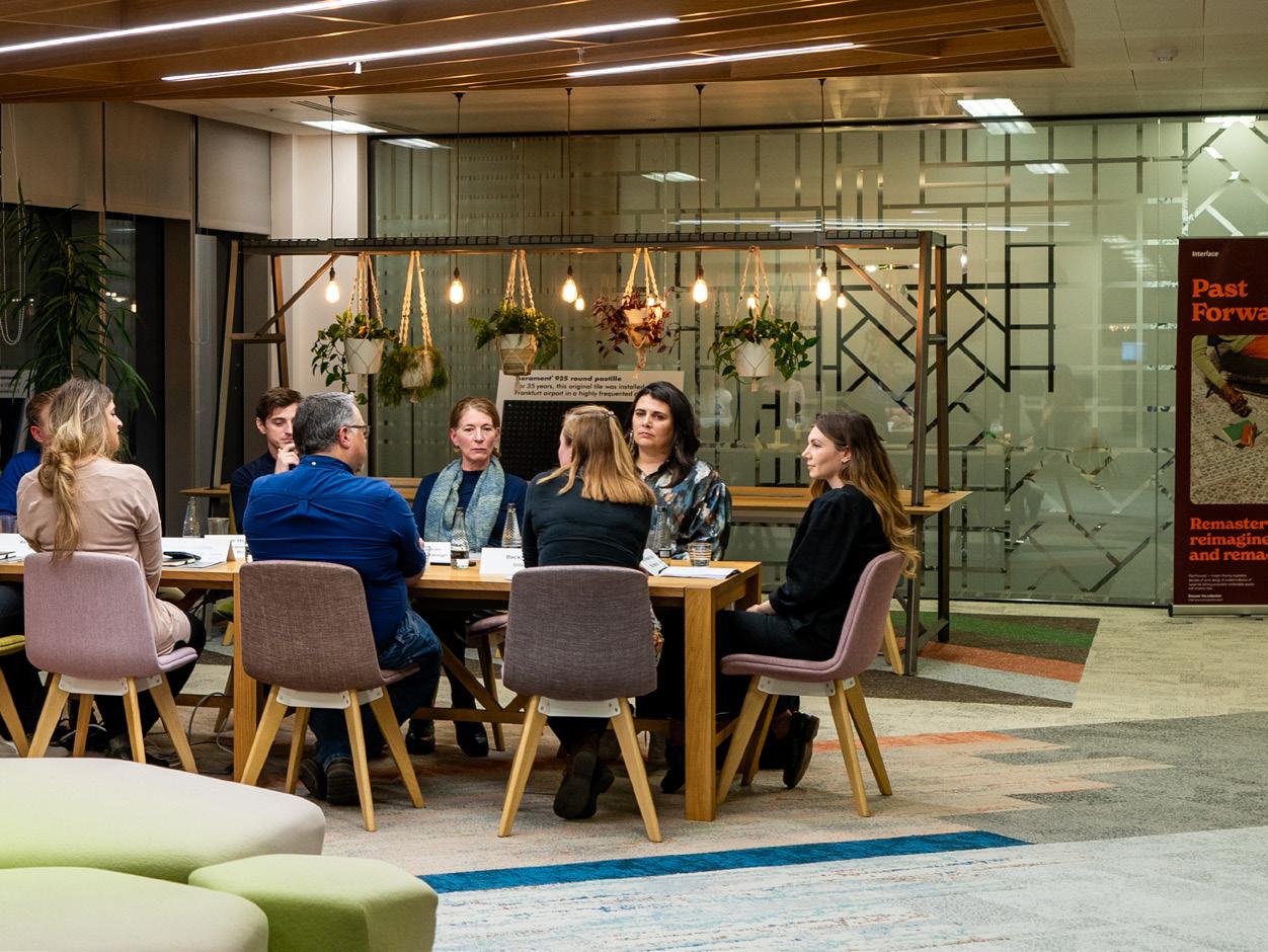
Mix Interiors
In partnership with 97

Is constant change and the desire for ‘newness’ unsustainable?
When it comes to fast design, trends and sustainability, can the two ever get along? For Magdalini Kollatou, Willmott Dixon, design is starting to follow in the footsteps of fashion. “Once you would pay more for a pair of jeans that would last, but now we have fast fashion, where jeans cost five pounds and you buy a new pair each year. It could be the influence of social media – especially when it comes to hospitality. The lifetime of a product might be great, but the environments it's placed in are too fickle and fast-paced.”
“There is a danger of following trends in the hospitality industry,” agreed Faber’s Tony Matters. “I would say probably 70% of our clients couldn't give two hoots whether something is sustainable – their focus is whether it’s going to work, and if in a year's time they are still going
to be trading, this is the nature of the sector. And often, when some of the more transient, trendled businesses close, the materials and furniture are just sent to landfill. It’s up to us to make sure this doesn’t happen.”
“We’re tasked as part of a brief that the building must last 40, 50 years,’ said Corstorphine & Wright’s Tom Higginson. “But who is doing that from an interiors perspective? Are clients asking for something that’s going to be fit for purpose and on trend for the next 20 years? I think we need to maintain integrity of design, and as designers it's our obligation to ensure that we're designing spaces which are fit for purpose for a longer period of time, suitable to be adapted and developed with or without trends.”
“That's something that's fundamentally quite broken about the industry,” added Interface’s Becky Gordon. “We need to either find a way to design in such a way that aesthetics and materials can last through those different leases – or you need to try and shift people away from the three-year leases to much longer leases. Longer and cheaper.”
Kelly Stanton Gensler Associate and Design Manager
Magdalini Kollatou
Willmott Dixon Senior Architect
Simon Jesson
Glancy Nicholls Director
Mix Roundtable
Becky Gordon Interface Regional Sustainability Manager
Interface Mix Roundtable 98




Is old still a dirty word?
Today it’s a trend, tomorrow it’s landfill: in an effort to reduce waste, can designers embrace the value of second-hand and consider modular products that can be easily replaced and repaired when needed? Eve Waldron reflected on a recent project for Cambridge Institute for Sustainability Leadership which fully embraced circularity and sustainable principles – including over 60% of the furniture bought second-hand.
“We found chairs from the 60s, others that were in the Museum of Modern Art’s permanent collection, and ended up with better quality furniture that wouldn’t have been afforded on a typical university procurement budget. At the end of the project we worked with Archetype and did a report on the embodied carbon in the job, and at the start of the project the furniture represented 13% of the embodied carbon. We looked at the figures if you replace the furniture every five to seven years versus if you buy second-hand furniture; refurbish
it, recover it and keep it for longer. After about 50 years, the embodied carbon of the furniture in the project would be equivalent to around 37% of the build cost. It just shows you that furniture is a huge consideration, but is often there to suit a trend. In some cases, design can be more about seeing what's there than it is about creating something new.”
It's not always as straight forward as simply purchasing second-hand furniture, Gensler’s Kelly Stanton said, as the certifications and warranties often required aren’t as readily available from second-hand sources. “I wish there was somewhere that I could go to find second-hand furniture that still came with everything that you need for a project. It doesn’t seem to be easily available.”
Interface’s Becky Gordon agreed with the challenges around second-hand flooring – and noted that specifiers and end-users also have a pivotal role to play. “If reused flooring is something that the industry is wanting, there does have to be a level of flexibility from specifiers to use what we have currently on
In partnership with
Tom Higginson Corstorphine & Wright Associate
Eve Waldron Eve Waldron Design Founder
Tony Matters Faber and Company Creative Director
Mix Interiors
Amy Ackerley BDP Senior Interior Designer
99
“We should be choosing products for their sustainability above everything else”
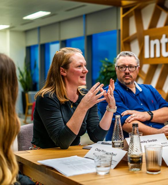
offer in our warehouse due to the nature of second-hand. We have a programme to reuse our flooring, but often a designer can’t use the product because the reality of what’s available doesn’t work when presented to the client.”
“We should be choosing products for their sustainability above everything else”, challenged Stanton. “It’s more important than what it looks like. We have a database and if it doesn’t tick all the boxes, it’s not going in.”
Yet for Gordon, choosing the most sustainable products also means meeting different functions and requirements. “Otherwise, when people are in control of that project you can't guarantee that they're going to make the right decisions – for example, our most sustainable, carbon negative products are a carpet tile, but that won’t work in a kitchen space.”
If there are complications with stricter briefs, could a leasing model prove more palatable – and, for our designers, guiltfree? “About 15 years ago we trialled a leasing model at Interface, but the market just wasn't ready for it, and no one used it,” continued Gordon. “The idea of leasing is interesting, especially if it means that a manufacturer can maintain ownership and provide maintenance for the product’s lifespan, and then find a new home for it at end of life.”
“It comes down to the lifecycle of the product,” added BDP’s Ackerley. “Can you rent it and then rent it again and rent it again? That would mean looking upstream and putting the onus on the manufacturer, meaning we wouldn’t need to feel guilty about clients wanting a new or refreshed scheme.”

Mix Roundtable
Interface Mix Roundtable 100
Changing aesthetics for a changing world
Should we follow trends (even the most well-meaning) if it means incorporating something that will be ripped out in 5 or 10 years – or can we evolve clients’ expectations for the way spaces look to adapt to truly sustainable design thinking? For Waldron and others around the table, it’s not about ticking boxes but adjusting the mentality from the start –sometimes, warts and all.
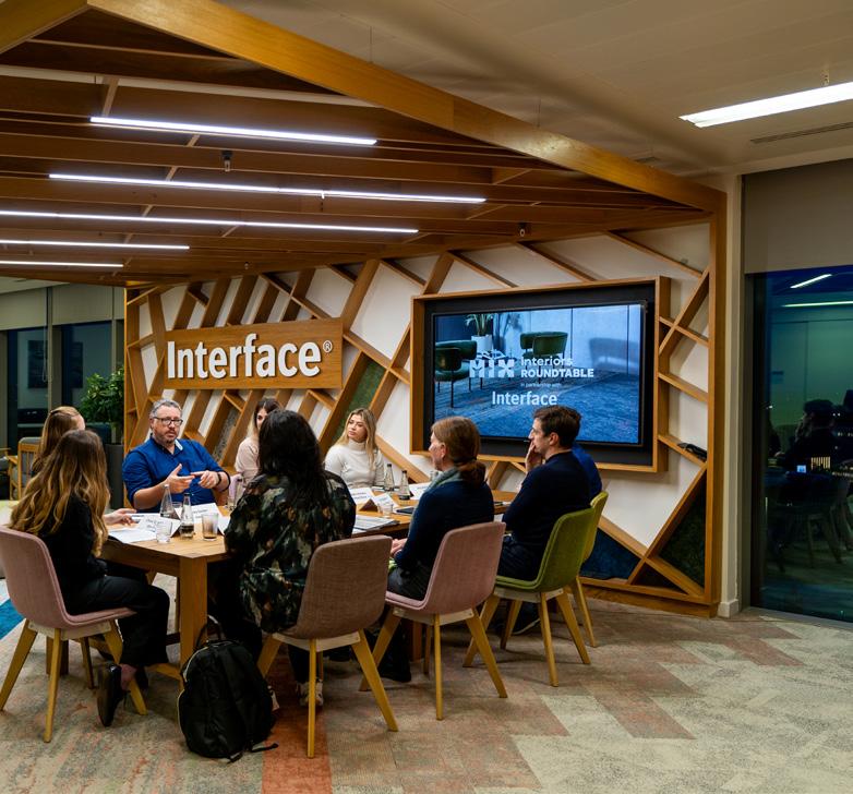
“[At CISL] there was no going back because they were reporting on it. We just had to be flexible – we might have thought we wanted orange chairs, but then we found some green ones. It was kind of freeing in a way because instead of thinking ‘what do I want’ it became ‘this is what I have to work with’; it became part of the challenge, making the best of what we could find.” Matters agreed. “I feel like when everything is so coordinated and perfect, sometimes it feels a little bit inhuman. When you do allow for that sort of flexibility and mismatch it can create these funny little human moments. Maybe there is a new aesthetic needed to allow for this sort of conscious sustainable restriction.”
“Maybe a slightly planned randomness,” laughed Waldron. “For instance, we made one of the doors a different colour to the other doors – it was a kind of planned collage, so that if you then had to replace another door it wouldn’t look out of place as not all the doors match anyway.”
“We did some toilets once in the restaurant where we used leftover tiles from other jobs and each individual space was unique,” continued Matters, “and it turned out to be one of the most popular projects we’ve done.”
“From an architecture perspective, we're having conversations now about recycling the steel that goes in the structure,” added Simon Jesson, Glancy Nicholls. “There are 80,000 tonnes of steel floating around that we can start to match into projects – even designing to show off the steel as an authentic sustainable narrative that’s part of the design. Why not interiors too?”
In partnership with Mix Interiors 101

Mindsets are changing
When it comes to clients – and even those creating within the design industry, does cost always win? Our table are generally optimistic, but there is work to be done. “We are seeing consumers making more conscientious decisions in deciding to pay more for sustainable office space and BTR schemes in order to have lower energy bills, but also a clear conscience,” said Higginson. “Once the product starts to gain more value it’s an easier pill for the client to swallow.”
Providing reassurance of quality is a start when it comes to changing mindsets of clients and developers, said Jesson, as well as pushing for changes in legislation and tax incentives and government accountability. “We need to use data to reassure developers and clients, and create innovations that won’t butt up against the bottom line.”
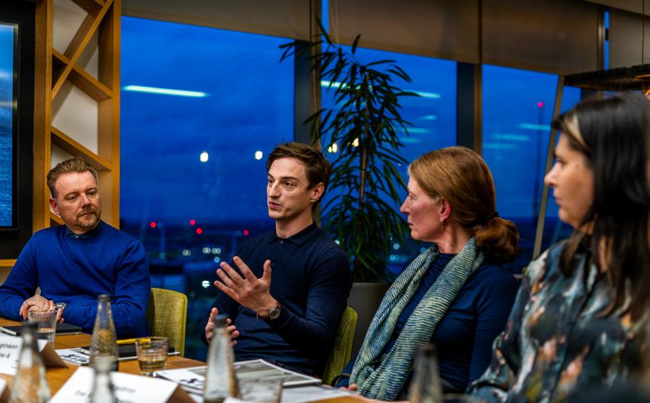
Mix Roundtable
Interface Mix Roundtable 102
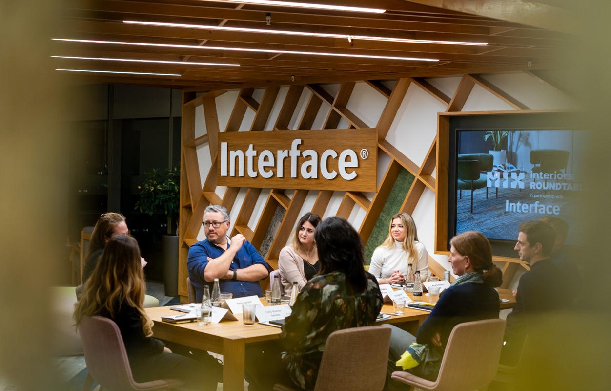
Ackerley agreed. “For most clients the focus is always going to be what it looks like and how much it costs. If you've got a client that thinks sustainability sits side by side with that, then that's great, but educating clients and advising them to make better decisions falls to us, and I don’t think we always harness that power. We need to educate ourselves on topics like sustainability, circularity, new ways of designing and then pass on that
information on in a collaborative way with client and suppliers, to look for more innovative solutions, not shortcuts.”
Gensler’s Stanton rounded off the conversation with a call to action. “There are no hacks, there are no shortcuts. It's hard work and there are big changes, and some compromises will have to be made. But we need to stop talking and start doing, we have a big role to play.”
Mix Interiors
103
How can we make room for luxury in the workplace?
In partnership with Atlas Concorde, we explore the blending of the ‘special’ and the practical, looking at how workspaces can be elevated and the evolving nature of detail-driven, luxury design.
Words and moderated by: Chloé Petersen Snell

Atlas Concorde Mix Roundtable
Mix Roundtable 104
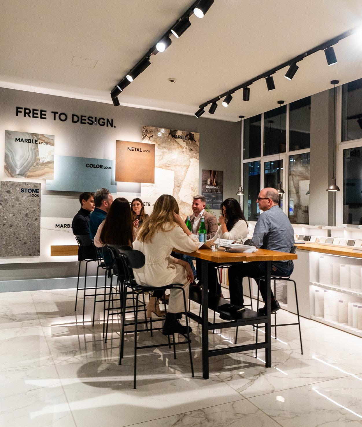
Mix Interiors
partnership with 105
In


The
meaning of luxury is evolving
Primarily considered the preserve of hospitality, retail or residential, luxury is a somewhat ambiguous term when it comes to workplace design and, for our panel who have assembled at Atlas Concorde's Clerkenwell showroom, a term that is hard to define.
“I think it's the contrast between the everyday and the one-off,” said Sheppard Robson’s Josh Stokes. “When you visit a hotel or restaurant, it’s a one-off experience that’s not going to be in your typical week. The workplace is somewhere you go day in, day out. There is luxury in the workplace, but we register it differently.”
For HLW’s Gavin Hughes, workplaces serve a practical purpose, arguably one that’s more about function than experience. “When it comes to hospitality and residential there has always been an emphasis on luxury design that doesn’t always extend well to workplace, where it’s all about practicality and function, and how needs
can be performed in different types of spaces.” For everyone around the table, luxury is the sense of feeling ‘looked after.’ It involves exclusivity and uniqueness – not because it is addressed to a few people, but because it's special. Recently popular terms such as ‘hotelisation’ or ‘resimercial’ have signalled a change from the strictly functional to comfortable, sensory spaces that are designed to entice people back to the office.
“There's also a bespoke nature to luxury for me, which is really important and exciting,” said Scott Brownrigg’s Laurence Orsini. “The idea that an artisan has made something gives it a special nature and produces an environment that makes people feel special when they enter it.”
“This sort of space also benefits your mental health and increases productivity,” agreed Atlas Concorde’s Sean Kennard. “If you feel like you’ve been considered and cared for, you’ll feel better and work better.”
106 Mix Roundtable Atlas Concorde Mix Roundtable
Christina Christou tp bennett Interiors Director
Eliza Finden-Crofts M Moser Associates Senior Design Associate
Alice Aldous Squire and Partners Associate
Sean Kennard Atlas Concorde UK Sales Manager
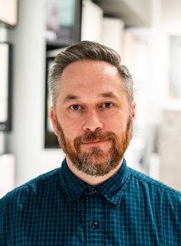
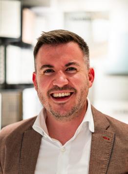
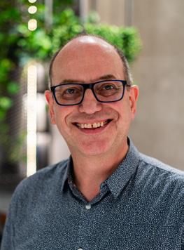
Although the group agree that adding anything beyond the conventional workplace infrastructure may be seen as a distraction, amenity-focused workplaces demonstrate the importance of ‘extras' in enhancing employee productivity and crafting work environments that prioritise individual wellbeing.
“It’s a hospitality-type environment,” continued Stokes, “but not necessarily just because of hospitality finishes and materials – more that every detail has been thought of for you, so it frees up your time to be present and do the things you need to do.”
It’s a different type of luxury, agreed Orsini. “Beyond aesthetics, luxury is the ability to modify your own space – and we as designers are able to create spaces that give a little bit of modification and independence to people.”
“We’re finding that more and more,” replied Eliza Finden-Crofts, M Moser Associates. “A recent project in Paris incorporated a lot of technology for staff to adjust air conditioning, lighting, even the air quality within a space.
These are luxuries you can’t see, right? The fact that you can adjust every element of your environment is so luxurious.”
“We've started to experiment with this too,” Orsini nodded. “A ‘tuneable’ room with your own code – the space automatically responds and adjusts the lighting, music and temperature.”
So, is the meaning of luxury now also about variety? “It’s the freedom to not only have a space that you can tune in to and make bespoke, but also having the technology to be totally nomadic and plug in to work from anywhere,” said Stokes.
For tp bennett’s Christina Christou there is a practicality to work that can’t be forgotten, and variety is key. “Not everybody is able to have that hybrid level of working – there are certain practical elements that still have to be conducted. For me it’s about balancing the different types if environments to be able to get the right level of focus and collaborative work done at the same time.”
Mix Interiors In partnership with 107
Gavin Hughes HLW International Design Director
Josh Stokes Sheppard Robson Associate
Laurence Orsini Scott Brownrigg Project Director
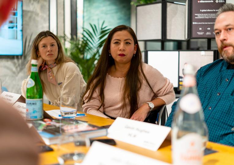
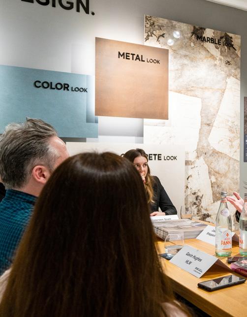
Changing aesthetics: designers need to consider maximalism vs minimalism
As the luxury aesthetic evolves, from ‘more is more’ maximalism to quiet luxury – particularly in the world of hospitality, where bold, personality-laden interiors are the latest trend in restaurants and hotels – does luxury always have to shout? Our panel were clear that whatever luxury means to an individual client, it’s timeless design that will endure, creating luxury spaces that last.
“There's nothing more luxurious than history”
For Hughes there’s a difference between luxury and decadence – which, he pointed out, is a term used to describe excess and a lack of morals. Fads and trends come and go, but the tenets of luxury remain: craftsmanship, exclusivity and quality. “Luxury doesn’t have to be expensive; it doesn’t have to mean fancy materials –quality can be considered without being expensive, without being decadent.”
“Part of luxury is design that you can’t explain, but which just feels right,” Orsini replied. “I remember doing four or five prototypes for a leather pull handle, with different stitching details on the side. We asked people to test how it felt in their hands. Something you’d never see, like the feeling of a car door when it
Mix Roundtable Atlas Concorde Mix Roundtable
108
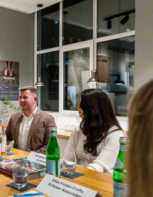
shuts. Quiet and thoughtful quality is the ultimate luxury.”
“Although you could argue maximalism has always created a wow factor that can reflect a brand’s personality really well,” countered Christou, “it comes down to the organisation and their culture. It can be a bold use of colour and layering fabrics and materials. At the end of the day, luxury means different things to different people.”
“An example that springs to mind is post World War I. We saw the roaring 20s; a time of celebration and creativity,” continued Orsini. “As the luxury market recovers from COVID we’re seeing a golden age. People are wanting more; to be excited and removed a little from reality.”
Luxury and sustainability can coexist, if approached thoughtfully
Squire and Partners’ Alice Aldous recalled a recent project from the studio at 78 St James’ – an example of making a space feel aesthetically luxurious within strict sustainability boundaries. Made up of two parts – a Grade II* listed Victorian structure and a contemporary architectural addition – the property is now a multi-functional workspace with modern, luxe amenities,
“Part of luxury is design that you can’t explain, but which just feels right”
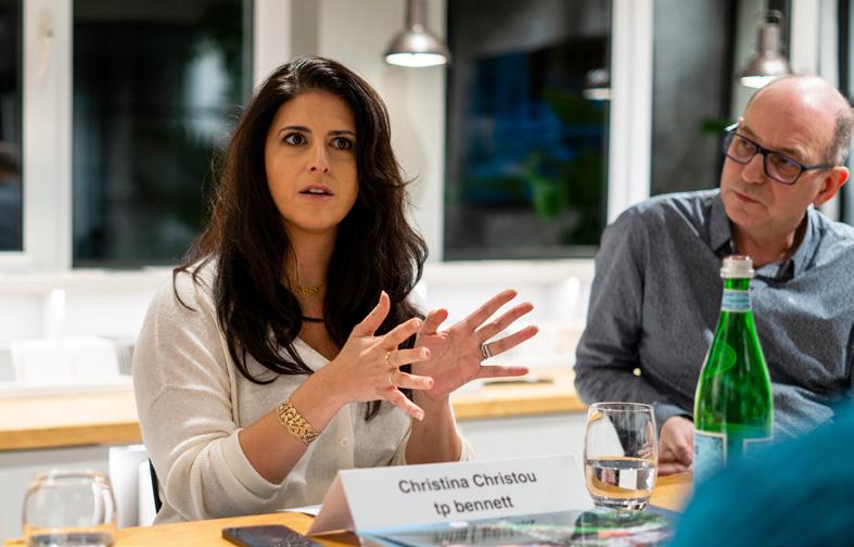
showing the possibilities that adaptive reuse offers and the power of giving existing luxury design new life.
“[That project] was all about staying true to those spaces and bringing them back to life,” she noted. “One half is minimal with quite a typically ‘modern luxury’ feel and the other is more opulent. We used bouclé, velvet and tapestry fabrics. It was a great way of preserving history but also giving a luxury feel to spaces without the cost or environmental impact.”
“There's nothing more luxurious than history,” noted Stokes, “and if you can
go into a building and you can read the past of that building, it makes it feel so permanent and timeless.”
Orisini agreed. “This is a perfect example of why there should be a longevity to our designs. In the future we can think about what we can add while leaving a lot of what is there. Some of these materials that we consider luxurious, such as porcelain and stone, are just really hardwearing and timeless."
Mindsets must change to value materials differently, said Christou. “There's so much out there now, with reclaimed
Mix Interiors In partnership with
109
“The ‘democratisation’ of luxury has led younger generations to view luxury differently”
timbers and the like, that still has that sustainability narrative and brings a different sense of luxury.” Finden-Crofts noted that there are different mindsets culturally and what the UK and wider Europe might see as luxury is different elsewhere. “A lot of our Asian clients are asking for the more archetypal luxury, with lots of bookmatch and marble, no matter the environmental cost. The sense of sustainability is not yet as front of mind as it is in the West, and it’s up to us to educate.”
Luxury can be democratic
Luxury is often defined by a blend of aspiration and exclusivity – and a price tag out of reach for many. Can introducing luxury design into the office work against creating a modern, more egalitarian working culture?
“In some ways, luxurious is an uncomfortable word,” said Stokes, “in the context of world events.” Christou agreed: “I think historically luxury has been associated with intimidating, unapproachable spaces, exclusive to client areas or executives. We’re starting to see a shift to luxury spaces based on
retaining talent and giving all staff the best experience possible.”
Luxury to one company is also very different to luxury for another, noted Hughes, and companies are starting to prioritise individual ‘luxuries’ over luxury writ large. “There’s a shift towards the democratisation of the workplace and valuing your team. We are working on a project which has a top floor terrace for staff. Traditionally it would have been an event space for entertaining clients, but now the number one priority is staff wellbeing.”
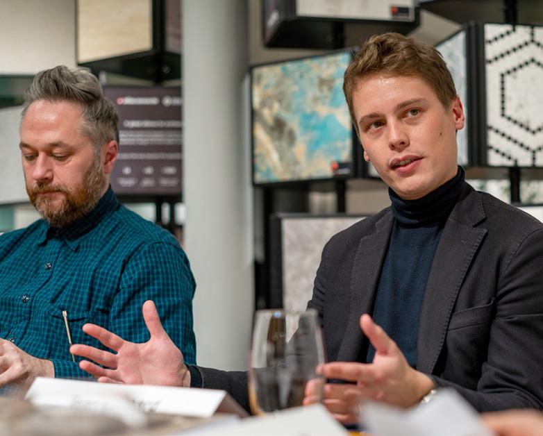
Atlas Concorde Mix Roundtable Mix Roundtable
110
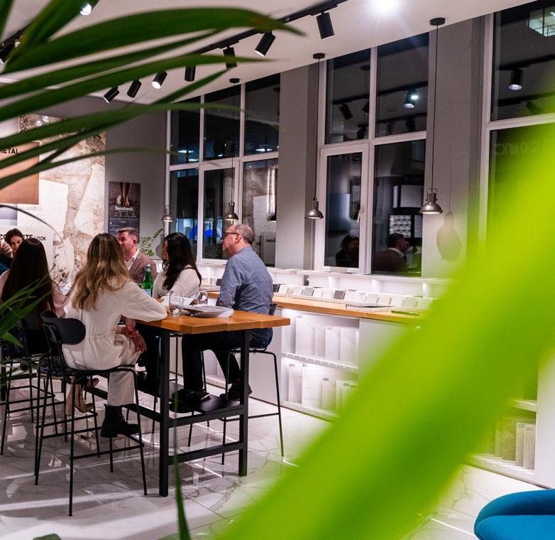
“Clients want a translation of the aspiration of their brand,” said Orsini, “and if it's asset managers, then typical luxurious design feels more appropriate. But there are some service companies where it feels very inappropriate to be expressing any form of luxury – even something that is very cost effective. You have to be very careful how you express that design because there may be
criticism from staff or clients. This is why luxury can be tricky in the workplace.”
“It’s interesting that we spend so much time and money on lobby and reception design, when it’s a transient space that you walk through,” said Stokes, who agreed that clients are now willing to spend more money on the areas people are use most of the day.
“Luxury can be expensive,” added Kennard, “but retaining staff with quality, authentic design is priceless.”
It's also a generational thing, said Hughes, and companies are adapting to meet their needs – these are critical consumers, who care deeply about social and environmental sustainability. “The ‘democratisation’ of luxury has led younger generations to view luxury differently – they aren’t concerned with ‘stuff’ as much as older generations and it’s a seamless experience they want; something unique that is tailored to them.”
Mix Interiors
111
Mix Awards 2024

Celebrating our landmark 20th edition
Find out more and book tickets at mixinteriors.com

27.06.24 Evolution London
Milan: 16 – 21 April 2024
Guide: Milan Design Week
Announcing its official programme in February, the 62nd edition of Salone del Mobile is once again welcoming visitors to Rho Fiera Milano from 16-21 April. This year, the fair will reveal a “new, bold, out of the box approach”, offering a more tightly curated, multicultural approach at a time when many are questioning the role of trade shows and their impact on the environment. With a series of unmissable installations, activations and talks programmes planned, pivotal concepts will include innovation, evolution and, of course, sustainability – under the overarching theme ‘Where Design Evolves’.
One of the most surprising reveals ahead of this year’s fair was the announcement of auteur David Lynch as a key contributor – even more surprising, perhaps, is that this will mark the director’s return to Salone, who contributed his first furniture collection in 1997. “We have chosen to work with a master of film such as David Lynch because of his ability to transport us into a mysterious and different world,” comments fair president, Maria Porro. “After all, what is design if not a quest for function and materials that subconsciously make us feel safe?”
Lynch’s involvement is part of a refreshed and energetic programme, helping Salone move from a strictly trade fair event to a wider platform and ideas exchange for the design community, year round.
Consistent with last year’s attendees, the fair expects to welcome approximately 2,000 exhibitors as well as over 300,000 international visitors.
If you’re heading to Milan, we’ve curated some of the events, installations, talks and product launches you won’t want to miss this year.
Milan Design Week Events
114
Mix Interiors 115
Milan Design Week Events
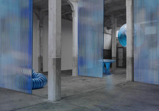
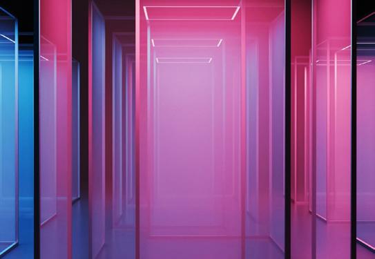
Events
Returning with the theme ‘Materia Natura’, Fuorisalone is a much-anticipated collection of events that take visitors out of Salone’s closeknit world of furniture expos and into Milan’s streets and palazzos. This year, taking place from the 15-21 April, the week-long event will include exhibitions and installations with a focus on circularity, reuse and sustainable innovation, stressing the importance of integrating nature into design processes.
Hosting an opening party on 15 April, Tecno Showroom will be home to ‘Space to the Future’, celebrating the innovative research of the Norman Foster Foundation. Isola Design
Festival will also return for its eighth year, with the theme confirmed as ‘This Future is Currently Unavailable’. More than 320 international studios and manufacturers will participate in over 40 locations, including new sites such as Lampo Milano, WAO PL7 and Galleria Bonelli.
Over at the much-anticipated Superdesign Show – set to host 11 nations, 3 continents, over 80 companies and 40 innovative projects – visitors can expect an array of artistic installations such as NichelcromLab’s ‘Like Trees In The Woods”’ specifically created for Milan Design Week by sculptor Michele D'Agostino. Masterly – the largest event
dedicated to Dutch design – will also return to the Palazzo Giureconsulti for its eighth edition, showcasing 85 exhibitors selected by curator and founder, Nicole Uniquole.
On April 17, Italian furniture brand Kartell plans to welcome visitors to its upcoming exhibition, ‘Urban Horizons: Crafting Spaces for Living’, held at both the Kartell Museum and its flagship Milanese store. Tech behemoth Google will also be joining the roster with a must-see exhibition in Garage 21, titled "Making Sense of Colour". Curated by Ivy Ross, Google’s Vice President of Hardware Design, and arts and research lab Chromasonic, the event
promises to be a captivating multi-space installation showcasing the powerful role of colour in digital technology.
Local minimalist furniture brand NEUTRA will be also exhibiting its La Grande Muraglia Outdoor Collection at the MEET Digital Culture Center – at the heart of the Porta Venezia District –throughout the duration of the fair. This event is set to feature new collaborations with an array of design giants including atelier oï, Foster + Partners, Zaha Hadid Architects, and Gabriele e Oscar Buratti.
Guide
116
Isola Design Festival – This Future is Currently Unavailable Google – Making Sense of Colour
Step into flexibility, creativity, and freedom with our eco-friendly phone booths and meeting pods.
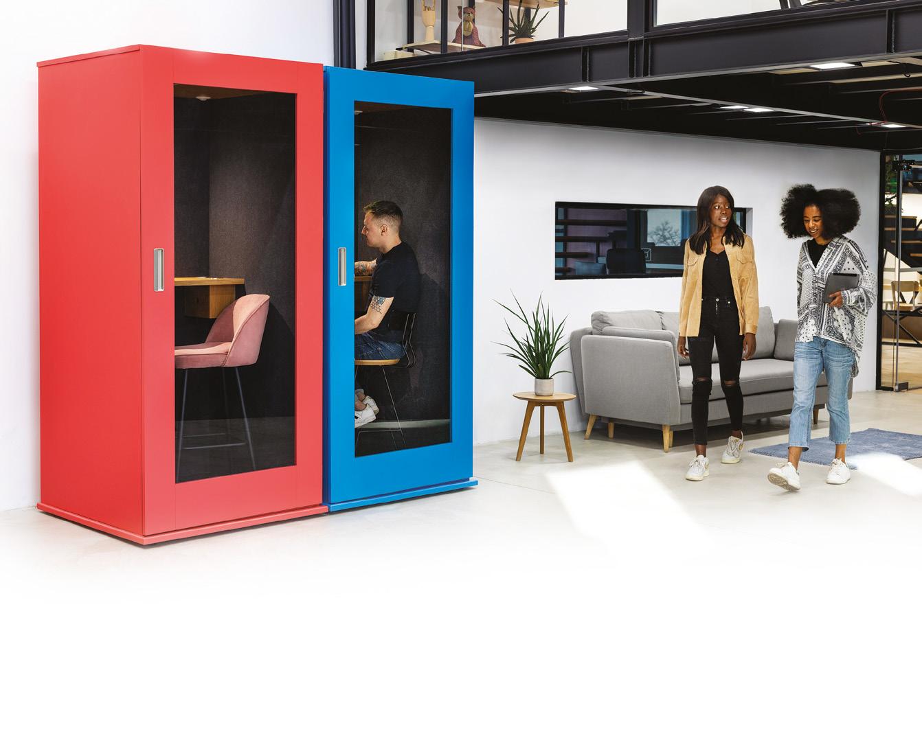
London EC4A 4AB
(0) 203 488 5200
45001:2018 Occupational health and safety
14001:2015 Environmental management systems
9001:2015 Quality management systems
27001:2022 Information security *state MIX when ordering
1.000+ custom colours | Made in Europe | Exceptional value for money | 2-year warranty* Visit our showroom: HubHub, 20 Farringdon St,
hello@meavo.com | +44
ISO
ISO
ISO
ISO/IEC
Milan Design Week Events
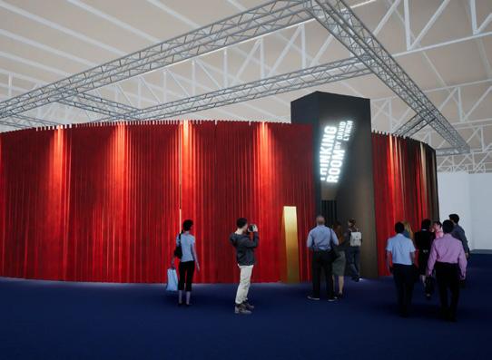
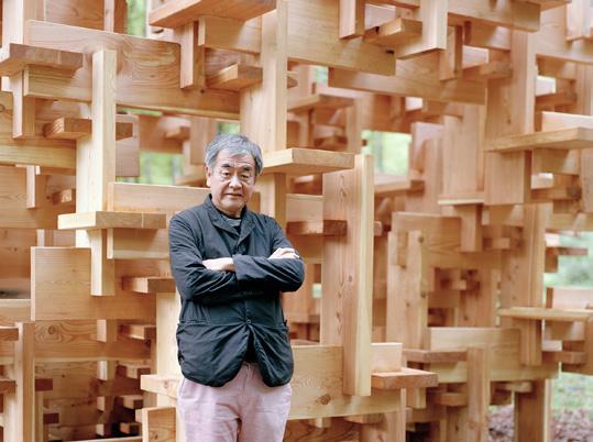
Installations
Previews of David Lynch’s ‘A Thinking Room’ have teased two identical, burgundy-curtained rooms, set to act as sensory and symbolic gates leading to the rest of the immersive exhibition. The project is curated by fellow filmmaker and writer Antonio Monda and in collaboration with Piccolo Teatro di Milano, who executed this theatrical staging.
Capsule Plaza will also be returning to Milan Design Week for its second edition, taking over Spazio Maiocchi, a striking former industrial cathedral in Porta Venezia. The 2024 edition of Capsule Plaza will extend to a new satellite venue, the iconic Milanese concept store 10 Corso Como, where exhibitions will abound in a newly renovated gallery and project space by interdisciplinary agency 2050+. Some of the contributing brands in Capsule Plaza’s line-up includes Rimowa, Herzog & de Meuron, Nike, Tiffany & Co, Verner Panton and ECCO Leather.
Just one of the designers billed for Capsule Plaza is artisanal carpet designer Amini, which is set to showcase new designs from Rodolfo Dordoni, Verner Panton and Fede Chet. Also presenting work is Kengo Kuma, founder of KKAA studio, whose installation 'Kodama, The Spirit of the Forest' celebrates Japanese culture through a sophisticated blend of design and art.
This year’s fair will additionally celebrate the 25th anniversary of SaloneSatellite, a vital platform that has been showcasing emerging designers under 35 for a quarter of a century. Spotlighting the work of over 600 emerging designers from around the world, the showcase – curated by Marva Griffin – will be complemented by an exhibition delving into the historical journey and influence of SaloneSatellite spanning the last 25 years.
Guide
David Lynch – A Thinking Room
118
Kengo Kuma – Kodama, The Spirit of the Forest

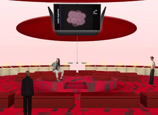
In Conversation
In the Drafting Futures Arena, designed by trade fair darlings Formafantasma, a programme of talks and roundtables have been curated by Annalisa Rosso. Titled ‘Drafting Futures: conversations about next perspectives’, the talks programme will feature a series of pioneering guests discussing projects that lay the ground for a ‘more aware
future’. The arena will reuse seating from previous editions and feature the Salone del Mobile Library (also designed by Formafantasma), which – like their Reading Room installation at Stockholm Design Week – will feature books and literature meant to influence decisions and shape future opportunities, selected by guests from events past and present.
For the duration of the fair, local lighting manufacturer Artemide is set to host a series of conferences with internationally acclaimed architects and designers such as Giulia Foscari, Benedetta Tagliabue and Ersilia Vaudo, Carolina Gismondi de Bevilacqua, Foster + Partners, BIG (Bjarke Ingels Group), Neil Poulton and Mario Cucinella.
Mix Interiors
Week Events
Milan Design
Formafantasma. Image: Renee de Groot
119
Formafantasma's Drafting Futures Arena
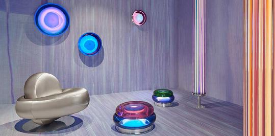
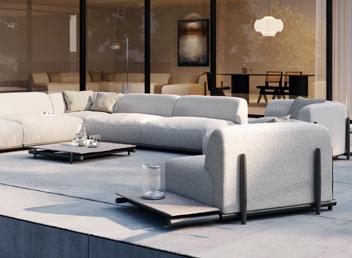
01
02
Aurel, Space
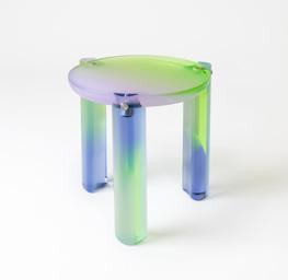
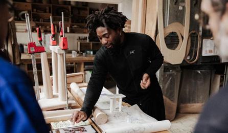
Products and Showrooms
Once again, a host of muchanticipated products and collections are set to be unveiled at Salone del Mobile 2024, including an impressive list of some of the industry’s biggest names.
Powerhouse Spanish designer Patricia Urquiola plans to launch the ALDER Collection in collaboration with Danish green-tech brand Mater, while Italian outdoor furniture studio UNOPIÙ is set to unveil two new collections, including Davos by Matteo Nunziati, an endlessly modular seating system that transitions from indoors to outdoors.
For those seeking a dash of nostalgia, French furniture brand Lignet Rose will exhibit a ‘re-edition’ of fellow French designer, interior decorator and architect Pierre Guariche's vintage designs for the duration of the fair. Visitors can also expect to see the work of British-Ghanaian designer Giles Tettey Nartey, whose new ‘Communion’ collection explores his Ghanaian roots and the notion of bringing people together with the shared acts of preparation and eating, centred around the humble table.
Local wallpaper studio SpaghettiWall will be launching its new line in collaboration with UNHCR (the United Nations High Commissioner for Refugees) and MADE51, a humanitarian program supporting artisans fleeing war-torn territories. Signed by designers including Gian Paolo Venier, Giorgio Biscaro, Patrizia Piccinini, Marco Spatti, Studio SMIT and Lorena d'Ilio, the wall coverings aim to tell unique styles and stories of social responsibility.
A spotlight will also be turned on the extensive talent and innovation within the Brazilian design and furniture industry, with the Brazilian Furniture Project set to exhibit both inside and outside of the iSaloni pavilions. Supported by ABIMÓVEL and ApexBrasil, the showcase will bring a delegation of Brazilian design representatives to Milan, including eight national brands exhibiting at Halls 03, 10, and 18 of the Rho Fiera Milano and 22 brands showcasing 41 new pieces at the Design + Industry Exhibition in Hall 03.
Guide
Milan Design Week Events
01 03 05 04 02
120
ALDER by Mater
Draga and
Couture 03 UNOPIU 04 Draga and Aurel, Glaze table 05 Giles Tettey Nartey
London: 21 – 23 May 2024
Guide: Clerkenwell Design Week
Visitors to EC1 can expect to see over 600 curated events, 160 local design showrooms and 300 exhibitors at CDW 2024, each showcasing the latest from across the industry – and the world.
Attracting a record-breaking number of visitors last year, CDW 2024 will no doubt prove once again why this corner of London is home to more design and architecture professionals per square mile than anywhere else in the world.
Visitors will find an array of site-specific installations lining the streets, while Clerkenwell Green will be taken over by brand activations from industry giants such as Dyson, Universal Fibers, Bert Frank and many more. Clerkenwell will also host a curated selection of studios across a mix of destinations,
including Paxton Locher House, Brewhouse Yard, Cowcross Yards and – for the first time – Marx Memorial Library. Here, attendees can witness the latest in Danish, Italian and Ukrainian design, while the British Collection will double in size and take over the entire crypt of St James’s Church.
Mix Interiors Clerkenwell Design Week Events
121
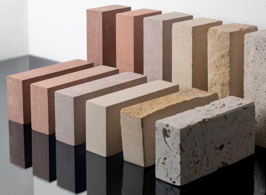
New exhibitions Installations
Three new exhibitions will be introduced to this year’s lineup, including Contract & Work on Clerkenwell Green and a pop-up space at The Goldsmiths’ Centre, both of which will be displaying the latest innovations in commercial and workplace interiors. Clerkenwell’s third new addition, The Edit, will be held in Bourne and Hollingsworth and showcase cutting-edge, contemporary designs from some of the world’s leading brands.
‘Grid System’
by Ben Cullen Williams
In the House of Detention, London-based artist Ben Cullen Williams (whose work has been exhibited at Musée d’arts de Nantes, Sadler’s Wells and The Bolshoi Theatre) will captivate visitors with his audio-visual installation.
Delving into the impact of the simple grid on our physical spaces and dayto-day existence, grids will be mapped onto the viewer as they become part of the artwork itself.
‘Aldgate Gold’
by Benchmark and London
Benchmark challenged
B.A. Product and Furniture Design students to reimagine discarded objects salvaged from the streets of London, alongside offcuts from Benchmark’s workshop in Berkshire. The students transformed these into various items that will be on display at the British Collection.
‘Stay Playful (When No One Feels Like Playing)’ by 2LG Studio
To coincide with the studio’s 10th anniversary, Jordan Cluroe and Russell Whitehead are set to breathe new life
into a vintage helter-skelter in Spa Fields. The installation is designed to be a colourful, playful spectacle, yet also evoke a more intimate insight into 2LG at its heart.
‘Mythical Forest Salon’
by Schotten & Hansen x Kit Kemp Design Studio
Using Schotten & Hansen’s pioneering magnetic floor treatment, Minnie Kemp has designed an immersive space in celebration of the wood specialist’s 40th anniversary. Also on display will be Schotten & Hansen’s new Douglas Fir Veneer collection, for which Kemp has created eight colours, showcased in bespoke wood panelling and shelving units.
Guide
Clerkenwell Design Week Events
122
Grid System by Ben Cullen Williams Albion and Hutton Stone. Image: Ivan Jones
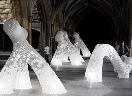
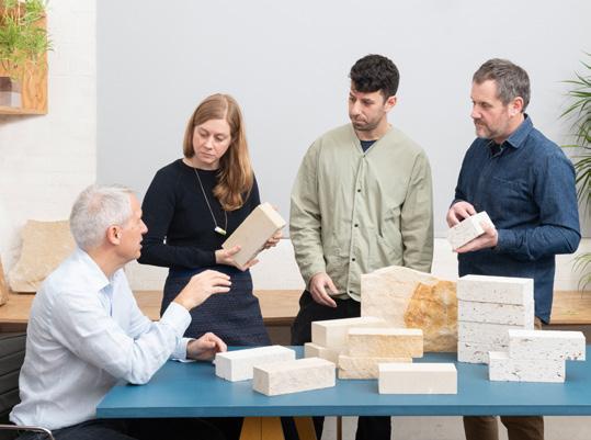
‘Brick from a Stone’ by Albion and Hutton Stone
British stone suppliers Albion Stone and Hutton Stone have commissioned London-based architecture practice Artefact to design their installation on Clerkenwell Green. Bricks made from natural stone have about a quarter of the embodied carbon of traditional clay bricks, an innovation both companies plan to launch this year.
‘Stone Tapestry: Beyond the Surface’ by Stone Federation
Collaborating once again with architecture practice Squire and Partners, the
Stone Federation will create an explorative exhibit demonstrating the sustainability, versatility and beauty of natural stone. Find the installation at Clerkenwell Green.
Impact Acoustic X Gensler
Impact Acoustic are collaborating with Gensler London to create an exhibition pavilion in St John's Square, telling the story of its Cotton along with interactive sessions, talks and gatherings within the pavilion discussing circularity and how we deal with waste.
Conversation
As well as creative workshops provided by the CDW Fringe programme, Conversations at Clerkenwell is returning to its purpose-built theatre in Spa Fields, ready to host expert speakers from across the industry and lead the dialogue of modern design.
‘Technology in design: the beginning or the end?’
ERCO & Zaha Hadid Architects, in partnership with Mix Interiors May 22, 2pm, ZHA London HQ
In this panel – including speakers such as Ali Eslami from Google DeepMind – we will explore the rise of AI and the impact of technology, asking: will a fundamental shift in how we conceive and create shape design for the better?
Mix Interiors
Events 123
Gatekeepers by Duffy London and Orsi Orban Albion and Hutton Stone
Clerkenwell Design Week
Clerkenwell Design Week Events
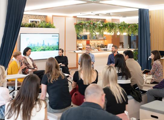
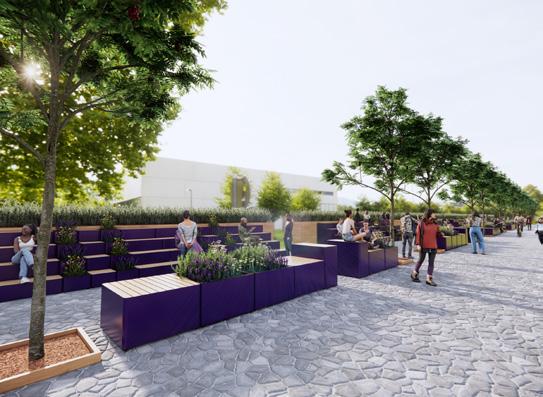
Conversation
‘The Form & Function of Design: Is beauty a dangerous word?’
ERCO & Zaha Hadid Architects, in partnership with Mix Interiors
May 23, 3pm, ZHA London HQ
We chart shifting attitudes to aesthetics, examine notions of taste and ask: what is the relationship between form and function in delivering successful, ground-breaking and culturally relevant design? Guests include Nipa Doshi, Doshi Levien; design writer and academic, Penny Sparke; and Zaha Hadid Architects’ Patrick Shumacher.
Mix Interiors presents: Harry Handelsman in conversation with Harry McKinley
May 23, 12pm, Spa Fields
As the founder and CEO of Manhattan Loft Corporation, Harry Handelsman has overseen the development of some of London’s most influential hospitality destinations – from Chiltern Firehouse to The Stratford Hotel. A believer in doing things differently, here he will be discussing taking risks, disruptive thinking and using design to create memorable experiences, with Mix Interiors managing editor, Harry McKinley.
‘Colour, behaviour, and the workplace of the future’ with Interface
May 21, 10am, Interface
Behavioural psychologist
Karen Haller and Interface concept design lead, Laura Light discuss the role of colour in inclusive workplace design.
‘Delivering Net Zero in Use Toolkit’ with AHMM
May 21, 1pm, Solus
London-based architecture firm Allford Hall Monaghan Morris will talk guests through its new toolkit, which enables users to coordinate and visualise a project’s carbon data over its full life cycle.
‘Crafting Effective AI-Prompts for Architectural Applications’ with modulyss
May 22, 3pm, modulyss
Learn how to craft the perfect AI-prompt for architectural applications with Tim Fu, head of AI-embracing architectural practice Studio Tim Fu.
‘Aging and its impact in the built environment’ with Blum
May 22, 10:30am, Blum
A renowned panel of industry experts discuss ergonomics, ageing, dementia design and how we can improve the quality of our future living spaces.
Guide
124
Talk at Interface Frem Group, Outdoor Scene
Clerkenwell Design Week Events
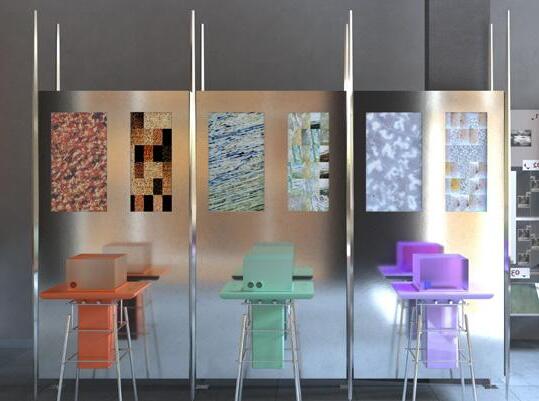
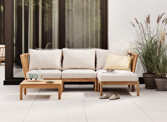
Product launches and Showrooms
‘Inviting Workspaces’
by Fritz Hansen
Danish furniture giant Fritz Hansen will exhibit its spring/summer collection for the duration of the festival. Anticipated launches include Plenum Cabin by Jaime Hayon.
‘Laboratory’ at the Solus Showroom
Designed by Holloway Li, Solus and Refin, ‘Laboratory’ explores photography and experimental design. Events include talks from Zed Nelson, Gary Wallace, Joi Lee, Alex Holloway, and Caroline Till, workshops by Annabelle
Breakenridg and Narinder Sagoo, and performances from Juice Aleem, A La Fu and Daniel Avery.
Product launches
Anticipated contract and workplace furniture launches include UK-based Brunner’s ray work chairs, Norwegian brand Fora Form’s BUD collection, Modus’ Balance Light collection and Another Country’s Series Five armchair range. Modus will also be hosting a factory popup showcasing its circular Maluma range at the Great Sutton Street showroom, alongside a talk on 'design for disassembly' in partnership
with Teknion, at the Modus stand on May 21. On Britton Street, Ege will present its latest flooring collection SHE alongside a workshop delving into the art of tufting with recycled yarns – paying homage to the pioneering female artists who inspired the collection.
Looking towards surfaces, AllSfär is set to launch its acoustic collaboration with MF Design Studio, while E Frem Group also plan to launch two new product lines, the Caimi acoustic range (displayed in an interactive sound lab) and the Creator Block Outdoor and A-Zone Outdoor furniture range, designed by Stephen Clark.
Bene will be debuting POINTS, its latest modular furniture system designed by Pearson Lloyd, at the THE POWER OF COLOUR showroom. Also exploring the role of colour in design, Tarkett’s ‘Colour: From Palette to Purpose’ exhibition will include a host of speaker sessions, panel debates, interactive activities and networking socials across the duration of Clerkenwell Design Week. On the final day of the festival (and back by popular demand), Autex Acoustic’s annual, invite-only design party will return to Fabric London. This year’s theme is Autex Unearthed, and features an immersive landscape environment and dancefloor courtesy of Jodie Harsh.
Mix Interiors
Laboratory by Holloway Li for Solus
125
Tradition by Fritz Hansen
Do places speak to us?
Tim Fendley is the founder of Applied, an award-winning spatial experience and
wayfinding design practice.
appliedinformation.group
Language is a uniquely human phenomenon. It is a method of communication between people. It’s also central to how we create social structures; how we develop thought and ideas. It is how we collaborate to build everything we have ever built.
Part of being human is that we guess. We make decisions based on little actual information. Our opinions can be affected by direct experience or the smallest of details and prejudice. They apply to things as well as people; not often that logical. This is recognised in behavioural economics, a new field kick-started by Daniel Kahneman.
There is recent neuroscientific research that starts to uncover how the brain understands and relates to places. The discovery of ‘place-cells’ by John O'Keefe shows how we create a mental map of the places we frequent. Being sight creatures, we can only imagine what we can see. As we evolved on the savanna, we are predisposed to seek long views. The labyrinthine nature of our cities is a challenge. Most recently, research by Prof. Kate Jeffery explores how head-direction cells function and how they allow us to instinctively know the
direction back to an entrance. The designers of the cities and buildings that we live in did not have the benefit of much of this understanding. They did have instinct. If they used feelings well enough, the architects, urban designers and planners created places that blended well with our emotions.
Often they didn’t. The Barbican Centre is a good example. It was originally designed to be accessed from the Lakeside Terrace – as soon as you know this, it makes sense. This route was never implemented and the centre has missed a logical entrance ever since.
Anything circular can be a specific challenge. One large circular space can work if it has a focus: the Pantheon; the Royal Opera House. Complex buildings such as BBC White City and Charles de Gaulle T1 are intrinsically confusing because they mess with our head-direction cells. They were a big idea at the time, but they fail on a human scale.
This is the same for city layouts. London’s complex mix of grids and irregularity is in one way confusing, yet at the same time its village structure is memory-creating.
This matters because the owners of buildings, places and cities want to encourage activity. They want their places to be a centre of gravity and encourage repeat visits. If places feel ‘wrong’, this is tough.
Studying neuroscience will make our designs better for people. It shows us that entrances need to be clear, obvious and different to each other; spaces clearly defined and named so that people can refer to them in language. Places benefit from difference, systems benefit from coherence. Transport systems work best as a single system. Station names need to be as unique as possible.
If we can easily describe a place or route, then it is starting to work. If places really do have a voice, they can ‘communicate’ how to use them. We get involved to help places that are already built, to work with designers to think ahead as to how people will feel in places they are designing.
Jane Jacobs put it succinctly: ‘never forget that people make cities, and it is to them, not buildings, that we must fit our plans.’
Mind Matters Tim Fendley
126
This slender metal framed version of the Wolfgang chair retains the original modelʼs architectural curvature, while decreasing its weight to allow easy stackability, portability and storage.

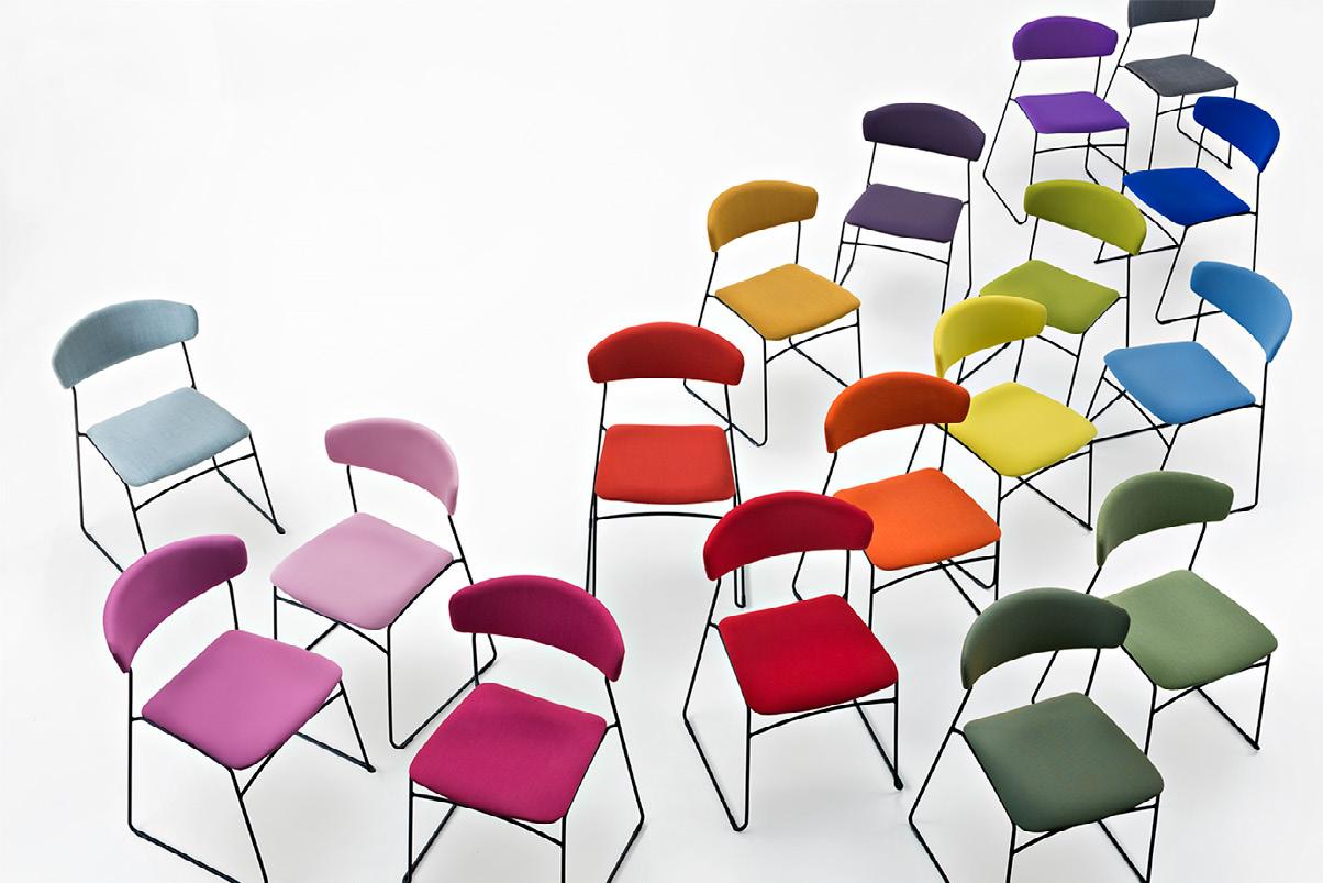

Introducing Order online at rosehill.co.uk or call our team on 0161 485 1717 Find us at Rosehill-furnishings Visit our showroom Wolfgang
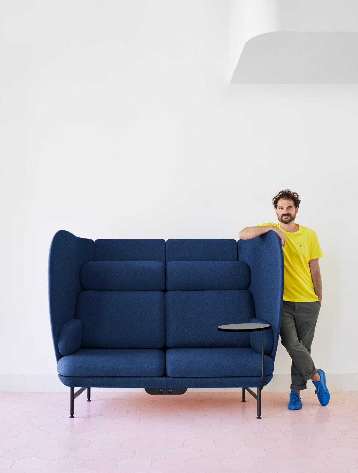
A marriage of equals
Jaime Hayon discusses his work with Fritz Hansen, developing modern classics that combine beauty and purpose.
Words: Harry McKinley
It may sound grandiose to describe Fritz Hansen as a cultural force, as much as a furniture brand. But since its founding in 1872 it has stood at the vanguard of beautiful, purposeful design – creating items that have not only become enduring emblems of Danish design, but which have shaped the way we consider, use and value furniture. Pieces developed with Arne Jacobsen in the 1950s –including the Swan, Egg and Drop chairs – are as popular and relevant today as when they were conceived.
Yet despite a legacy few makers can boast, Fritz Hansen isn’t caught in the past – continuing to surprise, innovate and invent. When Jaime Hayon joined the fold in 2011, it was considered a radical and even controversial choice; a Spanish designer known for rampant colour and pattern now a figurehead within the most Danish of brands.
“For me, the spirit of Fritz Hansen is characterized by a reverence for design and an unwavering commitment to
Mix Interiors Fritz Hansen Product Interview
129
Fritz Hansen Product Interview
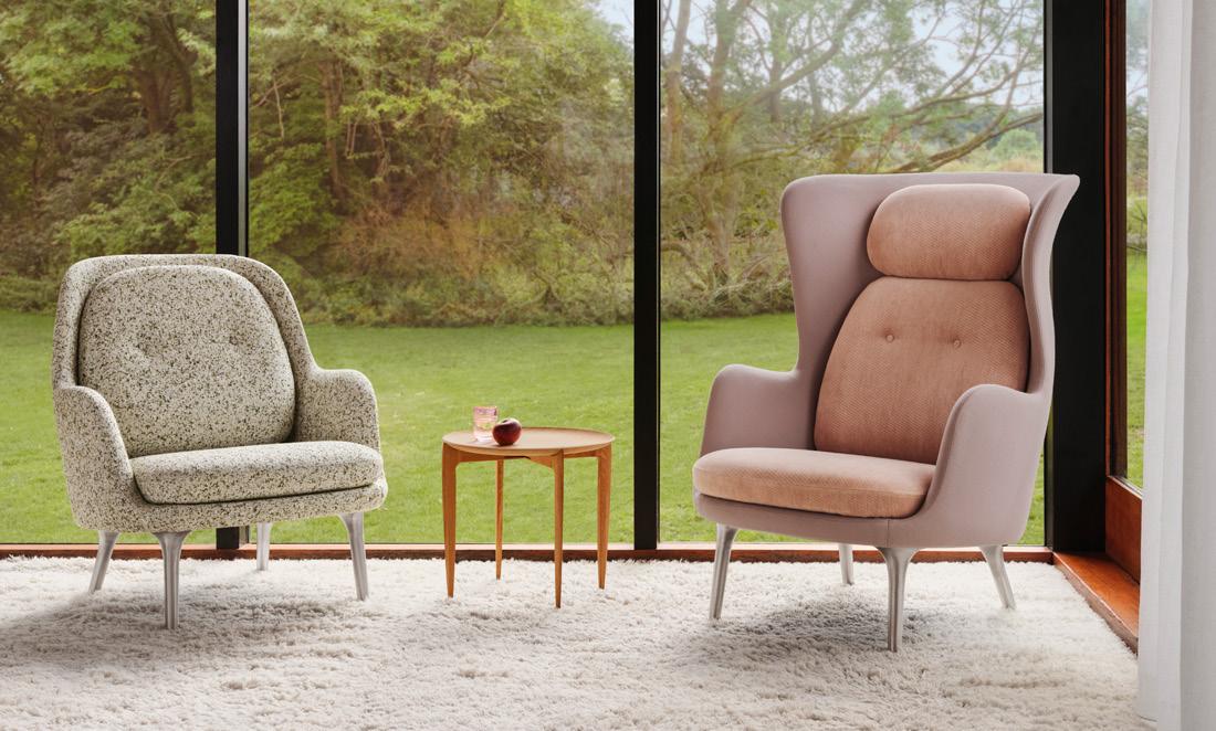
impeccable craftsmanship,” he says, discussing the meeting of their worlds. “It’s rooted in Danish design tradition and pays homage to the rich heritage of the Scandinavian aesthetic, of course, but also while embracing modernity. They are open to creativity and exploration; authenticity, integrity and passion for design a common ground on which we have achieved really cool things.”
Looking back, Fritz Hansen changed the conversation by stressing the importance of function meeting form; of design speaking to spaces and their users in a practical way. How beauty and purpose meet then, is a question Hayon similarly grappled with – an area in which he felt the collaboration could bear then-unknown fruit.
"I think the emotional connection design can establish with the user is the balancing point. For me, aside from form and function there is always the ‘what else?’ question,” he explains. “In my designs, narrative and interaction – from an emotional point of view – plays a huge part in the answer to this question.”
The synergy of Hayon’s playful, even eccentric approach and Fritz Hansen’s propensity for the pure of form and quietly profound has ultimately yielded what we might consider new design classics; part of the core collection and destined to become benchmark pieces within the Fritz Hansen archive.
Hayon’s RO Chair and Sofa, for example, named after the Danish word for ‘tranquility’, are a regular fixture in plush hotel lobbies and guestrooms, as much as stalwarts of the contemporary
design-led home. For Hayon, RO demonstrates the powerful alchemy of his style and the brand’s: “The best of Fritz Hansen’s crafting expertise with the expressiveness of my work.”
If there’s a resonance with the world of hospitality, it’s no doubt rooted in Hayon’s commitment to storytelling – design as a vehicle to say something about places and spaces. Within the world of hotels, his knack for ensnaring the imagination manifests through furniture.
“Objects and furniture elements can be characters within scenography; within a space,” he expresses. “They are capable of creating emotional links. Objects around us can feel like company or be lifeless. It is difficult to pinpoint why, but it is certainly linked to the intention and the way design is perceived and projected. There’s a delicate balance with this feeling right;
Jaime Hayon
Fri Chair and RO Chair
130
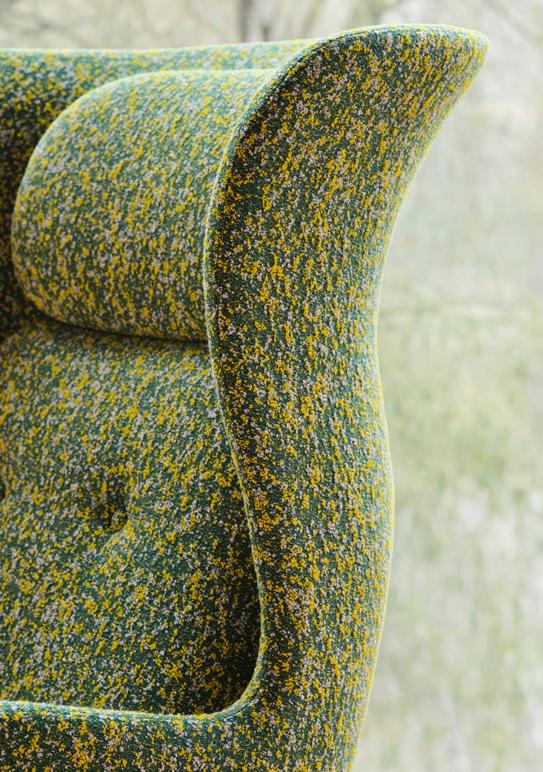
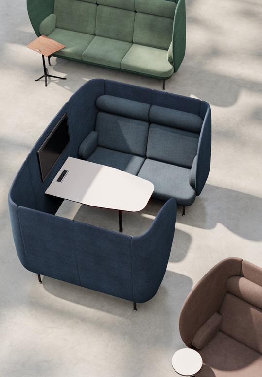
neither overwhelming nor banal. And it’s not only about form, but about comfort, quality, materiality and stance.”
Though he stresses that he doesn’t seek ‘innovation for innovation’s sake’, as an artist, as well as a maker, he also has a voracious appetite for the new and uncharted, describing a constant relationship ‘with creativity’ as a means to form fresh connections and overcome arising challenges.
Today, in interiors, that’s perhaps most reflected in the world of work, where environments are having to respond to relentlessly changing needs. The pre-pandemic workplace is, in many instances, no longer fit for purpose, as users demand flexibility, a higher degree of thoughtfulness in how spaces are equipped and, even, greater emphasis on aesthetics; considering the role visually
attractive design can play in making us more productive and more content.
His latest Fritz Hansen piece, Plenum Cabin (an extension of the Plenum sofa series), is both a reply and a solution. The sculptural acoustic booth is described as a ‘sanctuary for private conversations and informal meetings; seamlessly fostering interactions while elevating interiors’. It has the hallmarks of Fritz Hansen in its simplicity and functionality, while introducing the playful, organic silhouette for which Hayon’s work with the label has become known.
“My aim was to create a space within a space,” he describes. “It’s not just a cabin, it’s an invitation to connect, share and experience the best of human interaction in the workplace.”
Now more than 15 years since Hayon was tapped by Fritz Hansen to bring new
perspective to a time-honored maker, there can be little doubt that he’s left –and continues to leave – his mark, in as impactful a way as the likes of Jacobsen. While legacy is best appreciated through the lens of time, he is now inextricably linked to this chapter in the brand’s ongoing story, and Fritz Hansen to his.
“I believe our enduring collaboration is a testament to the remarkable synergy that exists between us,” he says. “Throughout our partnership, we have mutually benefited from each other's expertise and have developed a deep appreciation for one another's work. By combining Fritz Hansen's unparalleled know-how with the creative energy behind our designs, we have been able to produce extraordinary pieces that have truly become iconic.”
fritzhansen.com
Mix Interiors
131
Plenum Cabin The RO Chair
Lindsay Roth, Gensler
Material Matters

Lindsay Roth is a design director and principal in Gensler’s London office. She is driven by her passion for creating innovative and human-centric design solutions that define the future of the workplace – aligning client values with the key principles of sustainability and responsible design.
gensler.com
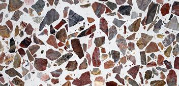
Recycled terrazzo
We recently collaborated with a client on a new office, built on the site of an existing building set to be demolished. We were lucky to have been able to save some of the existing rubble and give it new life –using what remained to create bespoke terrazzo counters in the new space so that employees could touch and encounter the material. We were bold with the size of the aggregate to make sure it was a story point in the project. Not only did it speak to the neighbourhood for employees, but also provided a sustainable solution.
Repurposed brick
Finding new ways to reuse and repurpose building material is another interesting challenge, as we consider the carbon footprint of buildings. We recently embarked upon the trial of repurposing brick from a site back into brick that is beautiful, functional and carbon light. This was a really challenging process for the team and hopefully their hard-won result will help to shift the industry, as we seek to be more sustainable in the future.
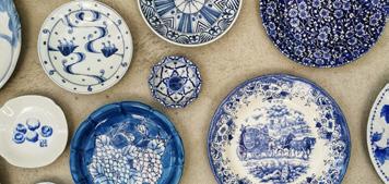
Porcelain
Crafted or found objects in the form of materials such as porcelain are often an exciting way to layer in something authentic about a client or project and can give an original feel to the design palette. We often use items such as a porcelain cup or a fashioned metal dish to give deeper expression to the narrative, which not only informs the palette but helps add texture and accessorises the project.

Fabrics
Fabric adds an important flourish and personality to projects. Selection and layering are key to bringing brand stories to life. We’re committed to creating impact through our designs and the use of fabrics help us add emotion and narrative to each project in a unique way – sustainable selection is an essential part of the process and we are always looking for new, natural materials that help us to push the boundaries of innovation and circular design. IFabrics made of seaweed and burlap have started to become popular as a natural approach.
132
Crafted from recycled wine corks, this spray upholstery by Dutch innovators Cooloo pushes the boundaries of circular furniture production.
CoolCork
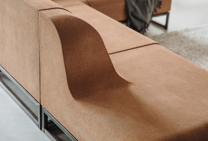
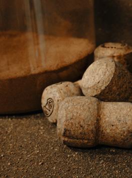
Following a hands-on career in furniture manufacturing, Cooloo CEO Leo Schraven founded his business in 2013 with the goal of disrupting and transforming the upholstery industry. Noticing how much of the production chain was becoming longer and more complex, yet with mounting losses and a decline in quality, Schraven’s radical idea began to take shape: coating could be the new upholstering.
Cooloo’s journey began with leather coatings made from waste streams in the Netherlands, where offcuts from the local tannery would previously end up in the incinerator. With the product of these waste streams, Schraven experimented with solvent-based flexible coatings, later developing ‘skins’ that could be applied as a complete coat over furniture frames. The resulting technology, christened ‘Endless Life’, is therefore able to turn local waste materials into bespoke, tactile surfaces of any shape or size, including furniture, walls, floors and ceilings.
One of the brand’s original, awardwinning spray upholsteries, CoolCork is a thick, seamless furniture finish crafted from recycled wine corks. Suitable for both soft and hard surfaces, CoolCork has a naturally matte look and feel that can be applied to everything from furniture
upholstery to product refurbishment and high-performance acoustic panels. Using Cooloo’s Endless Life technology and biobased binders, the recycled cork particles can be sprayed onto any object, surface or shape, offering maximum versatility within the production process. As well as opening up a vast range of aesthetic possibilities, this also means that CoolCork can be reused endlessly, offering designers and architects the reassurance of high circularity and low CO2 impact (as well as reduced manufacturing costs).
Opposing some of the more cynical or pessimistic perceptions of the manufacturing industry, Cooloo’s Endless Life coatings – including CoolCork, CoolJeans, CoolLeather and CoolConcrete – embody Schraven’s belief that art, design and industrial solutions can all be made possible within a more sustainable and ultimately circular economy. As well as ensuring its products consist of waterbased materials that are certified solventand VOC-free, Cooloo works alongside organisations such as Fontys University of Applied Science and Amsterdam University of Applied Sciences to continue researching, innovating and sharing knowledge into circular production.
cooloo.nl
Mix Interiors
133
Material Innovation
Radical Retail
The future of the high street: reimagining spaces and redefining experiences.
 Words: David Roberts
Above:

formroom.com
Below:
Pacific Wines was designed to be modular space, to allow the brand to host tastings, events and community initiatives.
Sustainable materials are both functional and part of the aesthetic identity.

Mix Talking Point
David Roberts discovered the retail world via positions at Selfridges and Jack Wills, delivering global immersive experiences before we had even coined the phrase. He now leads a multidisciplinary superstar team at Formroom as managing director, creative strategist and margarita-maker-in-chief.
Myriam K leverages multi-use spaces to deliver retail alongside services, hospitality and digital platforms.
Formroom Formroom
134


The once-bustling high street, battered by the surge of e-commerce giants, faces a crucial crossroads. While vacant storefronts paint a bleak picture, the future can instead embrace radical retail, a movement redefining the retail experience through innovative design, captivating experiences and a renewed focus on the human connection missing from online interactions.
Design plays a crucial role in this transformation, extending beyond mere aesthetics. Where once we may have focused purely on the physical customer journey, defined by product interaction and transactions, at Formroom we’ve begun mapping out a customer’s emotional journey through a space too.
Storytelling environments emerge, utilizing cuttingedge architecture, interactive displays and experiential elements to weave customers into the brand's narrative. We move beyond the changing room and transform into personalised style consultation zones, or a technology brand that seamlessly integrates its product into a hospitality space. This fosters a sense of community, itself tied to a positive brand impression in the consumer’s conscious or unconscious mindset.
Physical retail experiences often operate as an extension of a brand’s online identity. The importance and success of this lies in fulfilling desires that online shopping can't replicate – the human craving for social interaction, the thrill of immediate gratification and the ability to physically interact with products. This is where we lean into hyper tactile and sensory environments, two aspects that online transactions can never replicate.
Aesthetics themselves also continue to be elevated across the width and breath of the industry, celebrating a fusion of art, hospitality and storytelling that was once reserved only for the highest of luxury fashion.
This shift towards radical retail necessitates a reimagining of the high street itself. Homogenous storefronts of the past can be replaced by collaborative spaces, popup shops and mixed-use developments. We look back to the cultural invention of the ‘high street’ itself, or further
still to the historical market square or town square. These were places for people to trade, but with that necessity came community, expression and social values too.
The future high street can reclaim this crucial third space. This blending of retail with leisure, community and artistic expression will create a vibrant destination that attracts people not just for shopping, but for the entire experience.
The success of this model hinges on a collaborative effort between retailers, local authorities and communities. Working together, they can create a sustainable and dynamic high street that caters to the needs of all stakeholders. This may involve initiatives like rent subsidies for independent businesses, green tax breaks for innovative store designs with a focus on sustainability, and investments in public spaces and infrastructure.
The high street can evolve from simply a place to shop into a vibrant hub for social interaction, cultural exchange, community building and artistic expression, ensuring its place in the future. Importantly, unlike online experiences that track and target consumers through ‘cookies’, in-person retail offers the ability to feel personal, fostering genuine connections and building trust between customers and retailers. This human touch is crucial in a world increasingly dominated by digital interactions.
Mix Interiors
135

Freyja Sewell is a futurist designer and artist, creating products for the built and digital environments.
freyjasewell.co.uk
@freyjasewell
New sci fi rising
Cyberpunk has become derivative, dull and dying. What new sci fi stories are beginning to emerge in its place and what does this mean for design?
Science fiction is mass actualisation. Before we do something, individually or collectively, we need to envision it and to agree what we are moving towards so we can create it. A certain vision (Cyberpunk) has held our visual media in thrall, to the degree where many people are unable to imagine a different future. We are so sure that the future is a dark and terrible place that it becomes a selffulfilling prophecy.
The basic Cyberpunk narrative is of a violently oppressive capitalist society founded on structures of domination and extreme inequality, technocrats rule over the synthetic life they create and an environmentally degraded Earth with a population of powerless humans struggling to survive on the scraps. Sound familiar? I would argue that we largely live in a Cyberpunk world and, as it has become our present, it provides little value as an exploration of our future.
It's not a problem that Cyberpunk is dystopic, most sci fi is; it is a problem that is
always the exact same dystopia. It’s time to diversify and expand our collective horizons.
As a designer and artist, I am developing my own biophilic sci fi vision, which I call the Bioverse. To that end I am constantly searching for others who have already moved beyond the Cyberpunk rhetoric, or who create design today that could bring about a new kind of world tomorrow.
Allow me to introduce you to the Symbiocene, first coined by Glenn Albrecht in 2011. We currently live in the Anthropocene, in which humans are dangerously disrupting the systems of life on which we all depend. The Symbiocene is a bold invitation to imagine the next era of human life. In his own words: “The Symbiocene will be that period in Earth’s history where humans symbiotically reintegrate themselves, emotionally, psychologically and technologically, into nature and natural systems.”
Another great thinker who inspires me in my pursuit of alternative vision is Natasha Myers, I am enchanted with her Planthroposcenic cities which she describes thus: “Each surface will offer an affordance, a place for plants to root and
grow and decompose. Perhaps one day you will conspire with the plants to grow your own home. Perhaps cities will grow themselves into cooling forests, brimming with nourishment.”
Science fiction often extrapolates forward from a technology or design idea. Cyberpunk has exhaustively explored a narrow type of mechanistic technology, but what if we were inspired instead by biodesign; design which incorporates and learns from living organisms and the interconnected systems of life? What kind of future would flow from the kind of multispecies collaboration design exemplified by Neri Oxman’s silkworm woven structures? Or MycoWorks’ mushroom fabrics?
Perhaps the next wave of brilliant, challenging and beautiful science fiction might draw inspiration from people from indigenous cultures, in all their wide variety and individuality across the globe? A resurgence of stories understanding our world not as a mechanical resource to be dominated, but a living entity of which we are a part.
Together I know we will create visions which go beyond anything we have dreamed up yet.
Mix Interiors Living Better Freyja Sewell
136

Rowan - Timeless versatility for you.
Our Rowan family was developed with modern Scandi elegance in mind, with sleek clean-cut lines and gorgeous oak details. Providing a true home from home, this capsule collection balances character and charm with simplicity and function.
bisley.com

Caplet
A neat and vibrant on-desk power module with a UK socket and a dual port type C adaptive fast charger, with a maximum 65W, for charging high powered laptops, tablets and smart phones.
All your charging needs within arm’s reach – with a dual port USB Type C adaptive fast charger and UK socket with a 3A resettable circuit breaker.
Supercharge your devices - enjoy 65W delivery with USB Type C twin port adaptive fast charger.
Enhance your deskspace - Caplet is available in a range of elegant colours*
*subject to minimum order quantities
www.cmd-ltd.com


 Left: Dining Hall at Harrods
Above: Food Hall at Harrods
Right: Mirabella Miami


 Below: Allermuir Kin


 Left: Coffee station
Above: Bespoke reception desk


 Beata Heuman
Below left: Checkerboard-tiled bathroom


 Gensler
Below:


 Words: David Roberts
