SPECTR




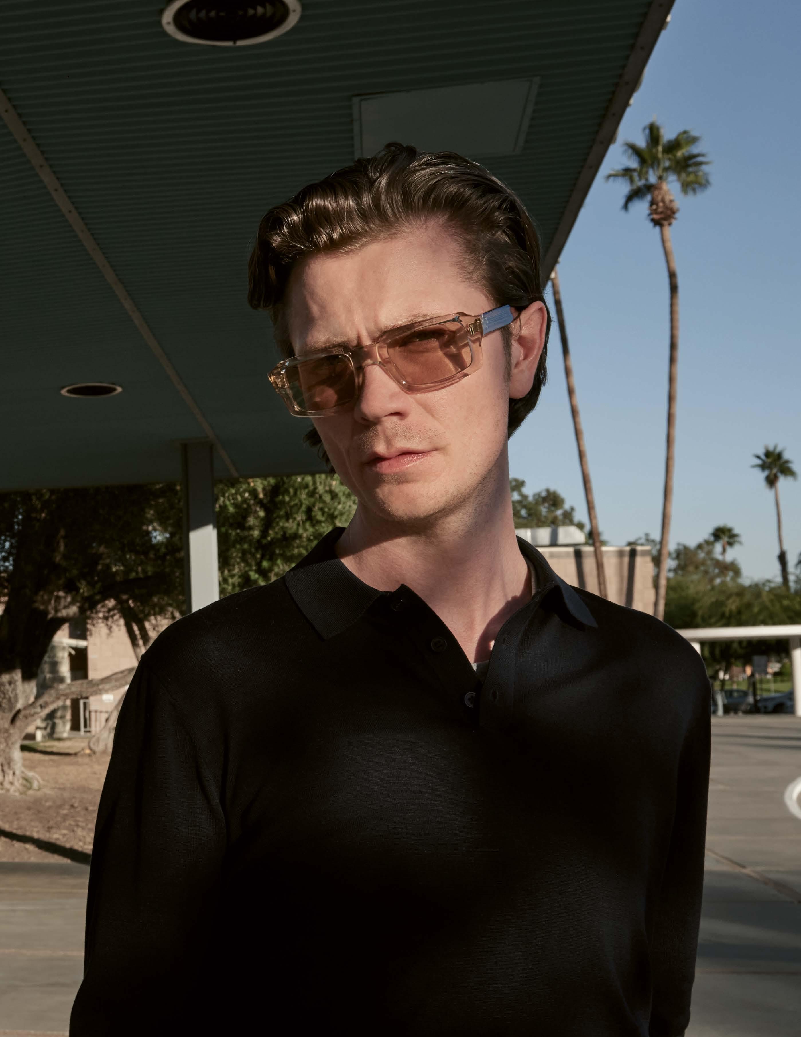
 Edward Sales Netherlands MARKUS T DOT L1058





“Raen
(pages 180 – 185)
to issue #41
Enjoy SPECTR #41 and don’t miss our optician special (pages 163 – 174).
The SPECTR Crew.
EDITOR IN CHIEF
STEFAN DONGUS [Cologne] dongus@spectr-magazine.com m: +49.(0)151.14271817
LAYOUT
CARO ROSS [Cologne] ross@spectr-magazine.com
EDITORIAL STAFF
MEIKE PRECKEL [Cologne] preckel@spectr-magazine.com
HOLGER VON KROSIGK [Cologne] krosigk@spectr-magazine.com
PROOFREADING
PETER ASHFORD [London]
INSA MUTH [Dortmund]
ONLINE EDITOR
MEIKE PRECKEL [Cologne]
CARO ROSS [Cologne]
PHOTOGRAPHERS/PRODUCERS
SABINE BERLIPP [Cologne]
BRIX & MAAS [Berlin]
SOPHIE DAUM [Hamburg]
STEFAN DONGUS [Cologne]
FELI & PEPITA [Cologne]
WILLIAM FERCHICHI [New York]
ULRICH HARTMANN [Berlin]
DAVOR JELUSIC [Berlin]
DENISE KRENTZ [Aachen]
NARÈNTE [Sardinia]
FLORIAN RENNER [London]
RAPHAEL SCHMITZ [Dusseldorf]
LOTTE THOR [Berlin]
PUBLISHER
MONDAY PUBLISHING GMBH Kamekestrasse 20-22 50672 Cologne, Germany t: +49.(0)221.945267-11 f: +49.(0)221.945267-27 www.spectr-magazine.com
CEOS
STEFAN DONGUS, HOLGER VON KROSIGK
F&W MEDIENCENTER GMBH
Holzhauser Feld 2 83361 Kienberg, Germany fw-medien.de
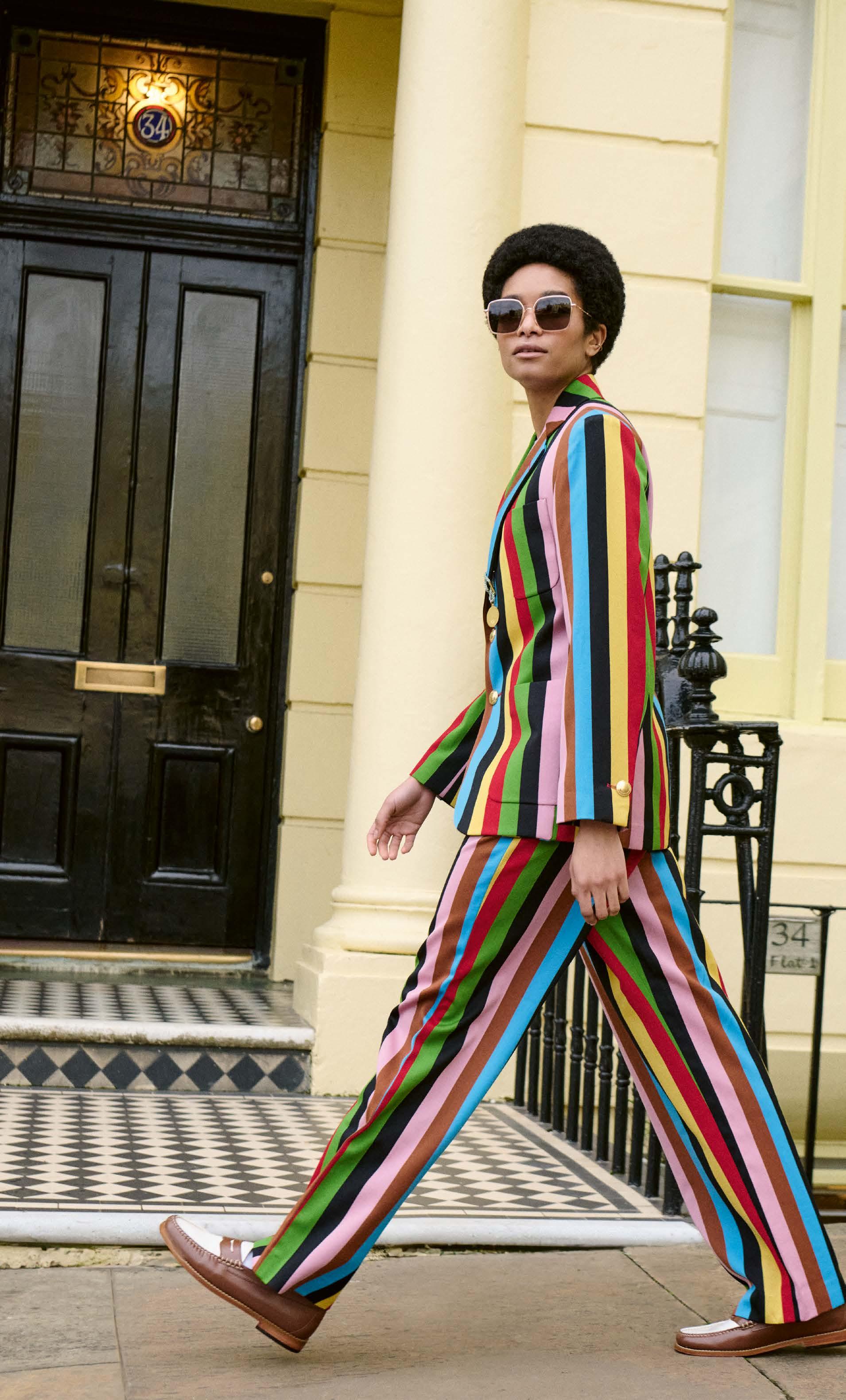
CLEMENCE & MARGAUX »CMS182 LA BLUE OCEAN«
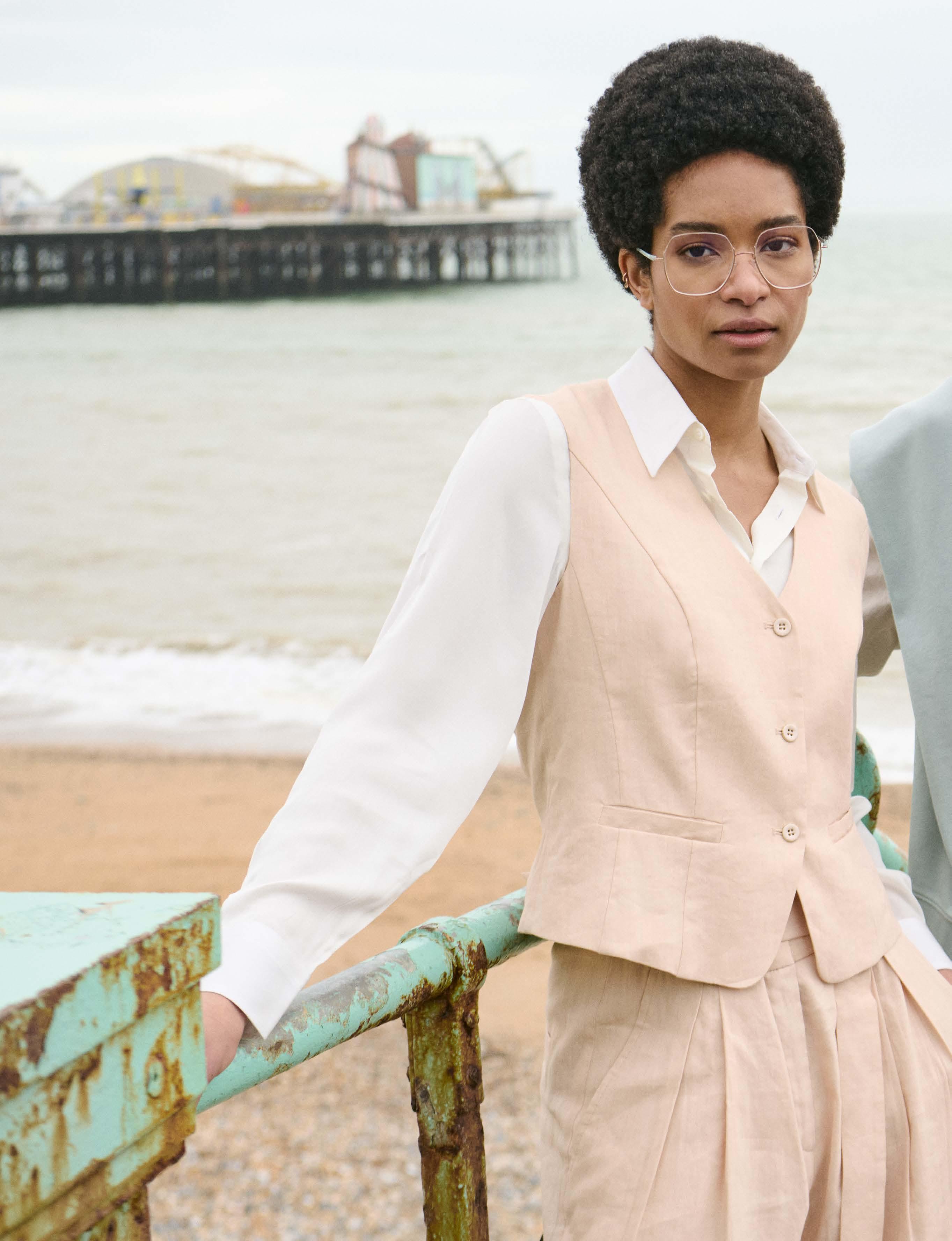
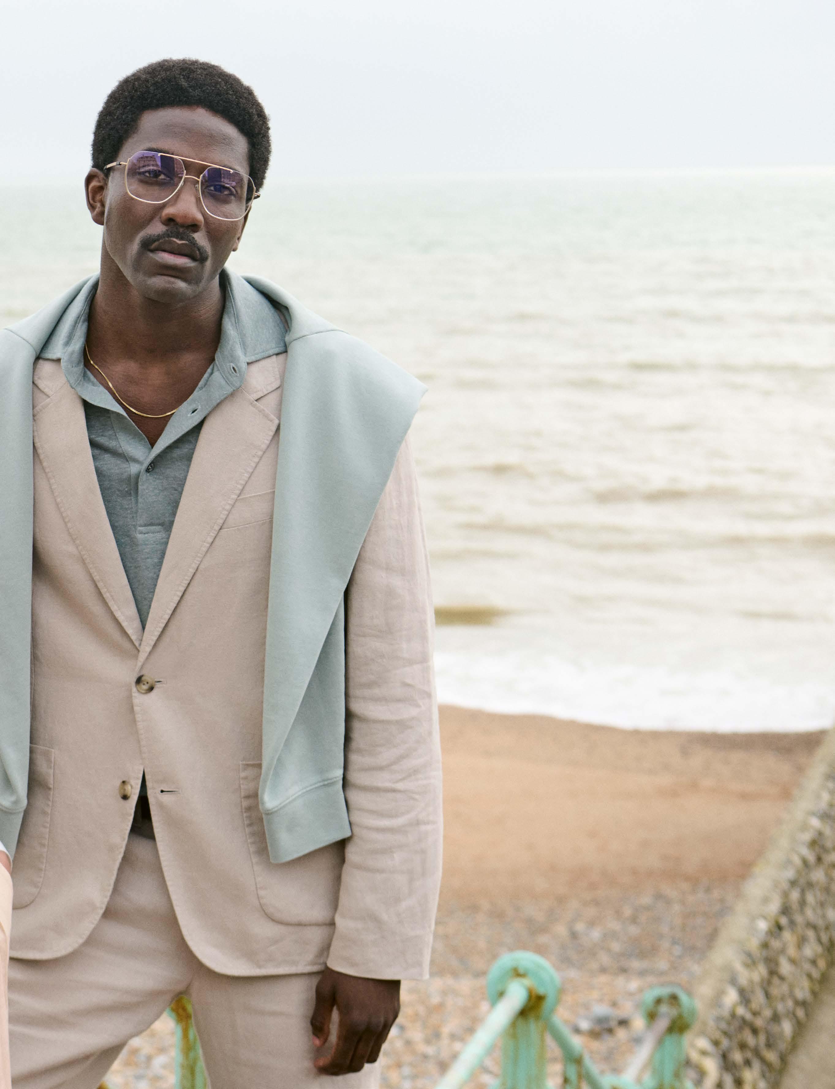
“Brighton
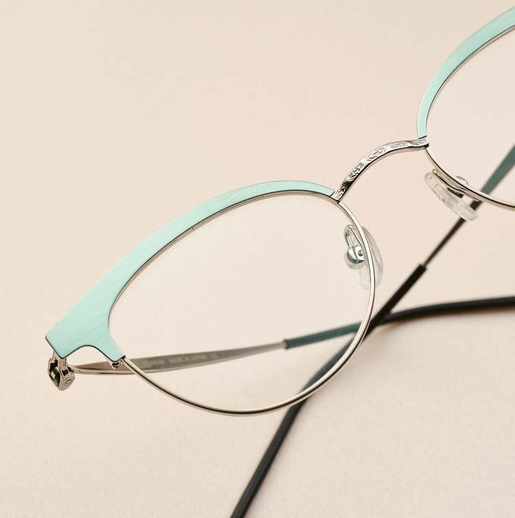


SALT. X BLACK BEAR BRAND Common Passion For Longevity
Florian Renner“Rebels With A Cause” By Denise Krentz
“From Dusk Till Dawn” By Brix & Maas
HIGHLIGHTS New 2024 Designs From Italy
Ulrich Hartmann
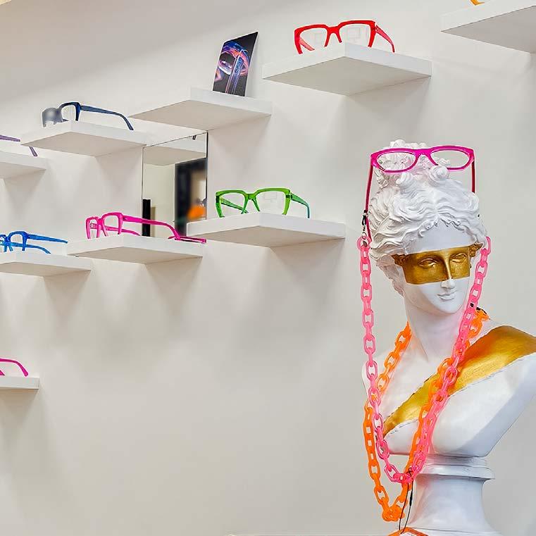

SILHOUETTE DYNAMIC DAWN New Urban-Style Half Rim Models
Narènte By Lotte ThorFavorites
By Sophie Daum
photography : FLORIAN RENNER [ London ]
styling : JESSICA PUNTER
hair : TIM PATEMAN at THE LION & THE FOX
make-up : MICHAEL GRAY at DAVID ARTISTS
models : ROBBIE JR at SUPA & BLISS at MILK MODEL MANAGEMENT

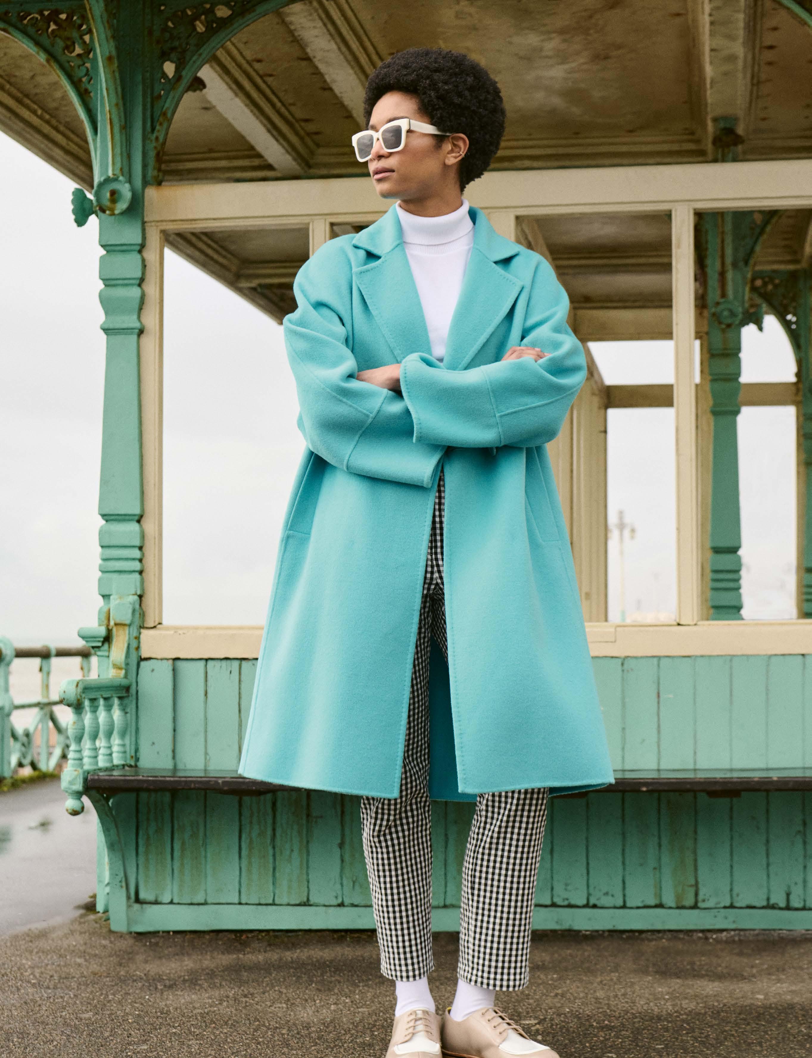

NIRVAN JAVAN SHADES OF TORONTO »05:24:01 (EST)«
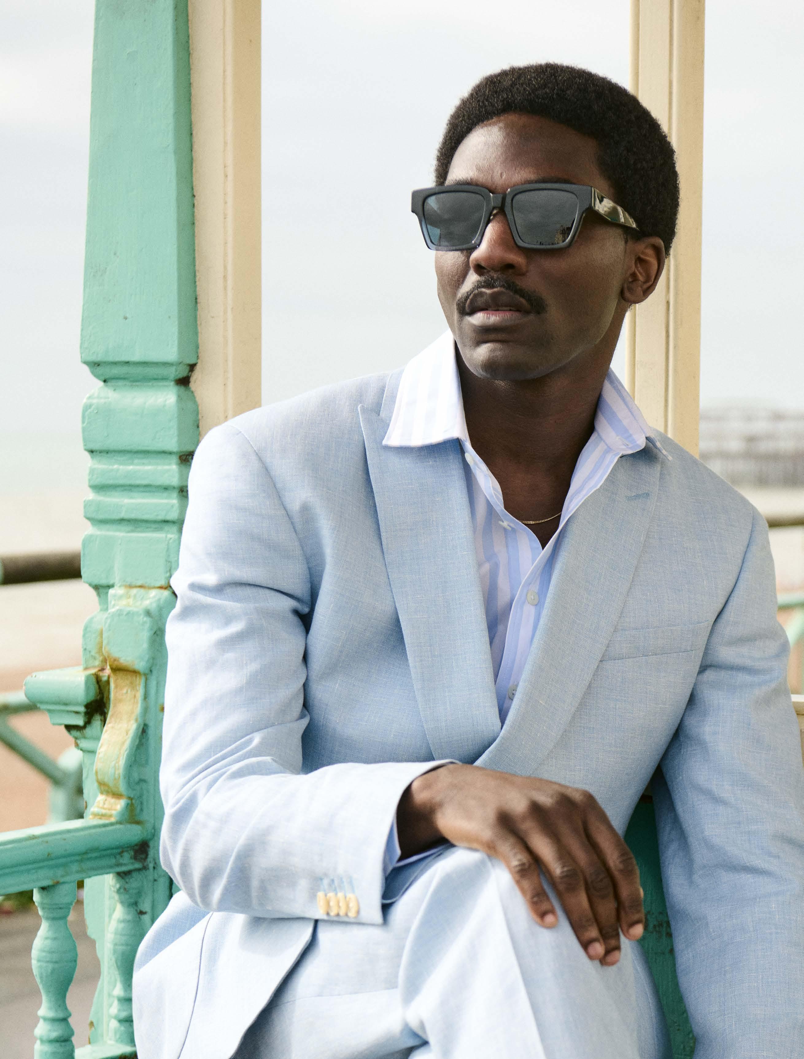

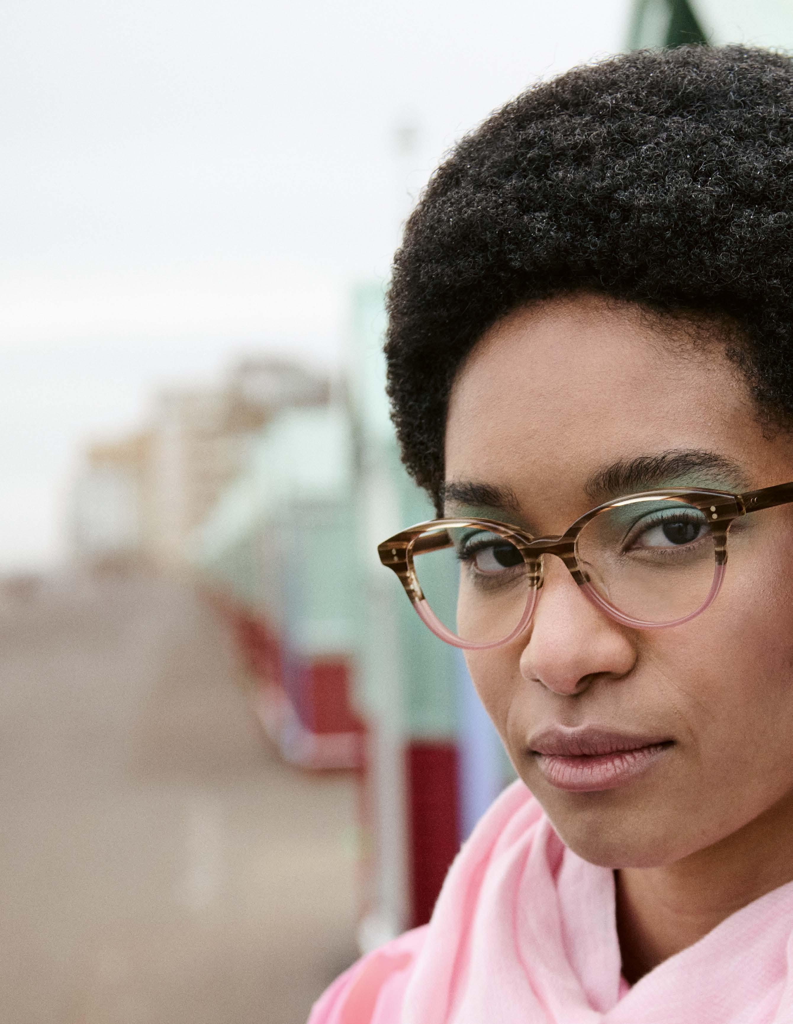

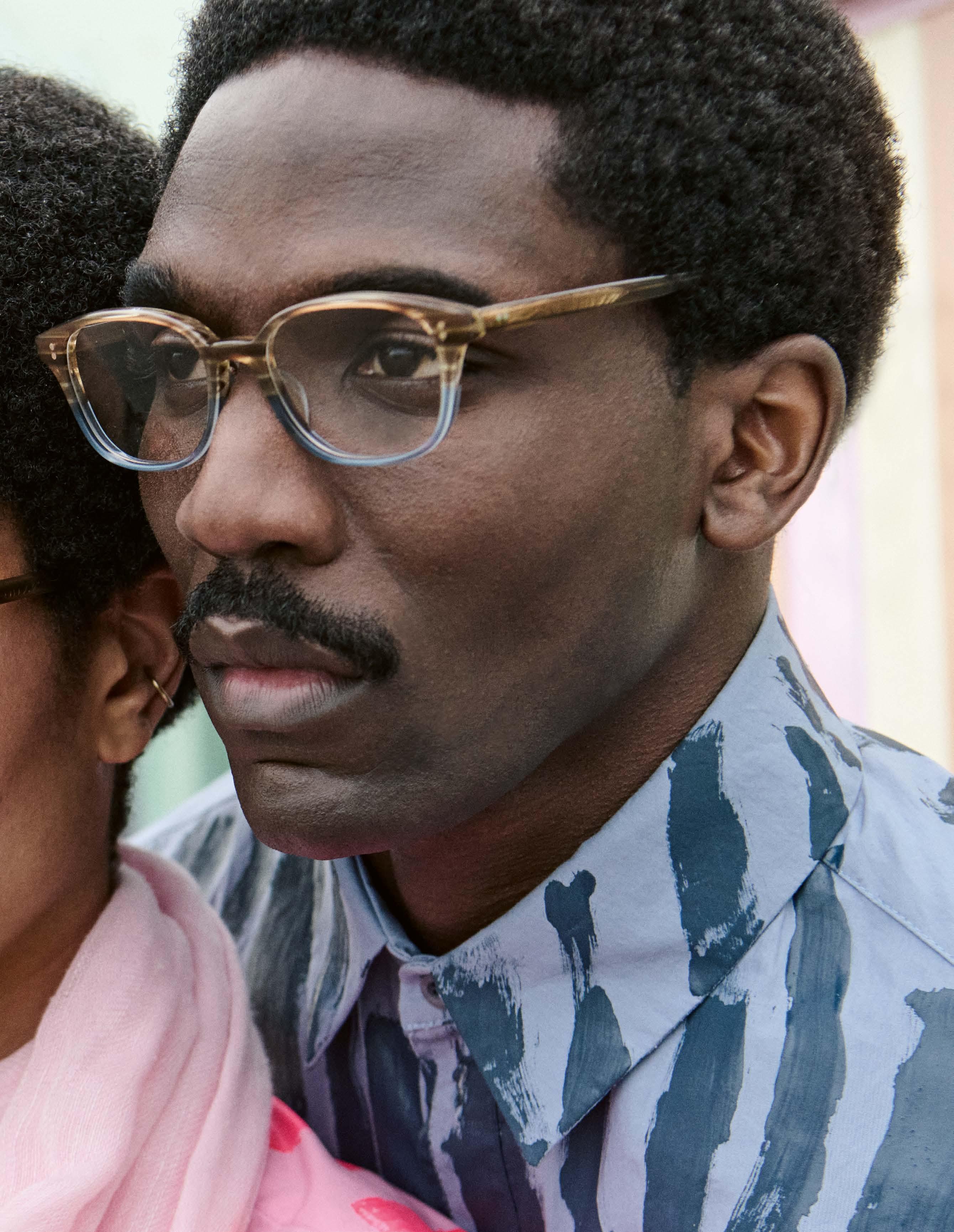

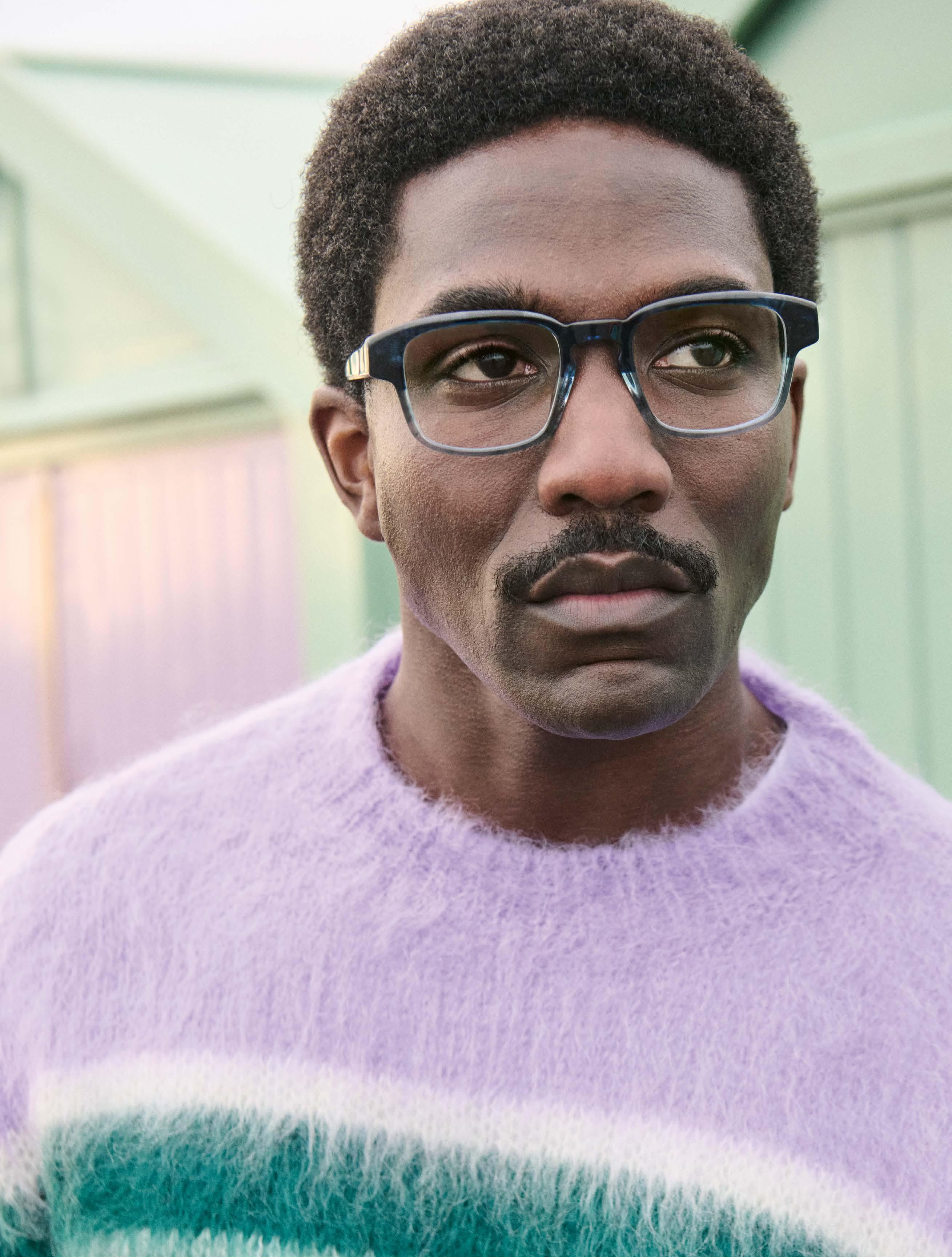

EINSTOFFEN »Roadie«
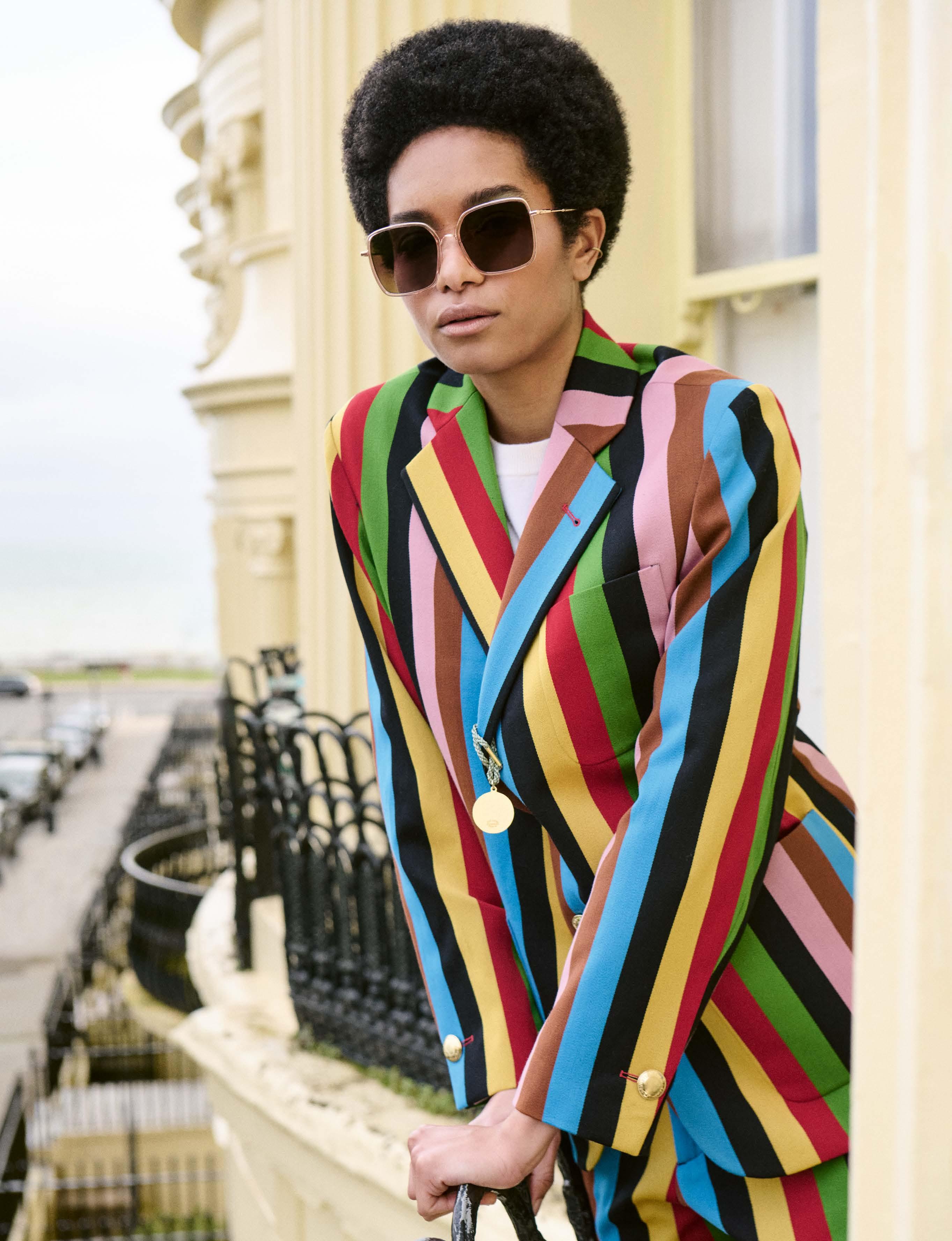
CLEMENCE & MARGAUX
»CMS182 LA BLUE OCEAN« -
suit ROWING BLAZERS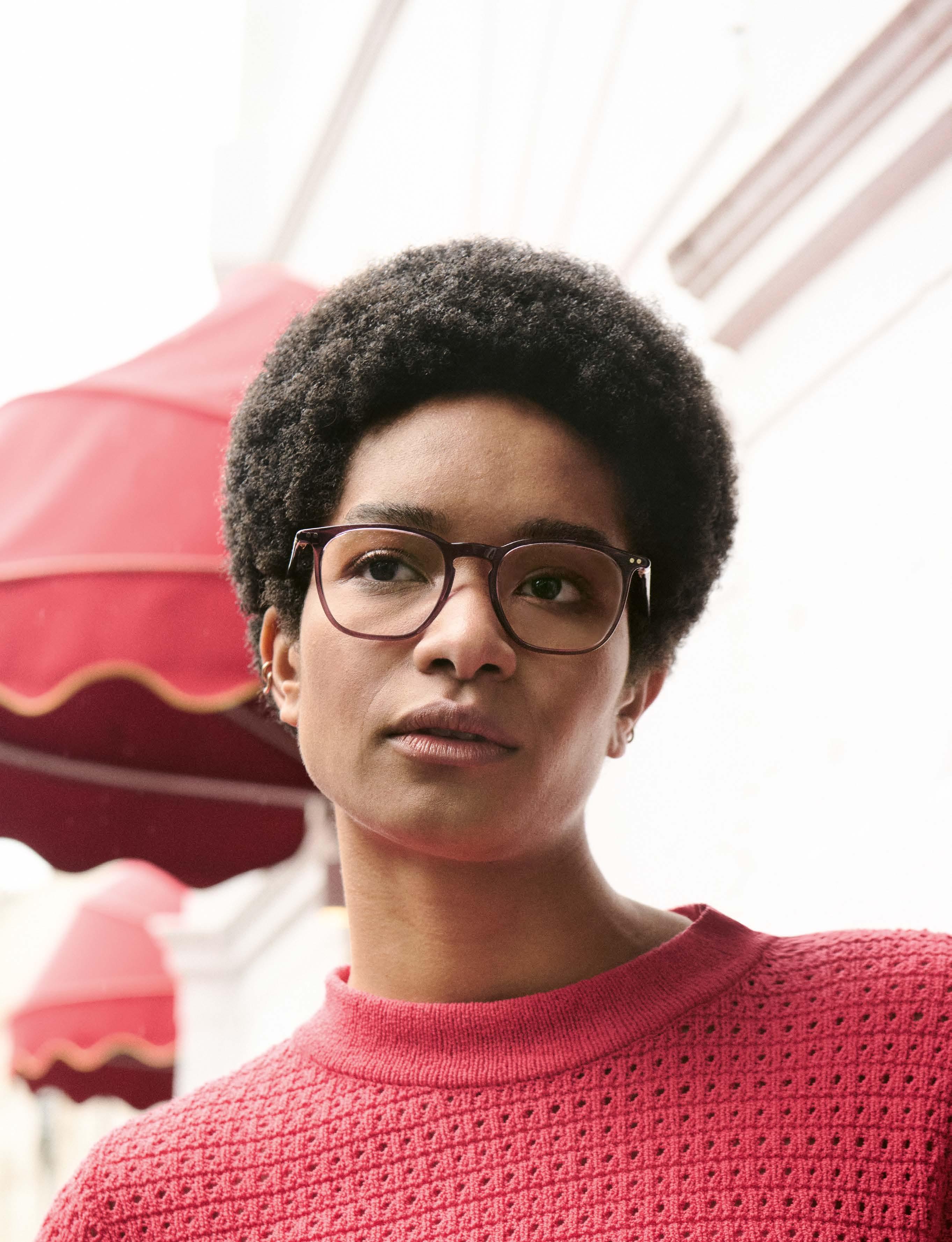

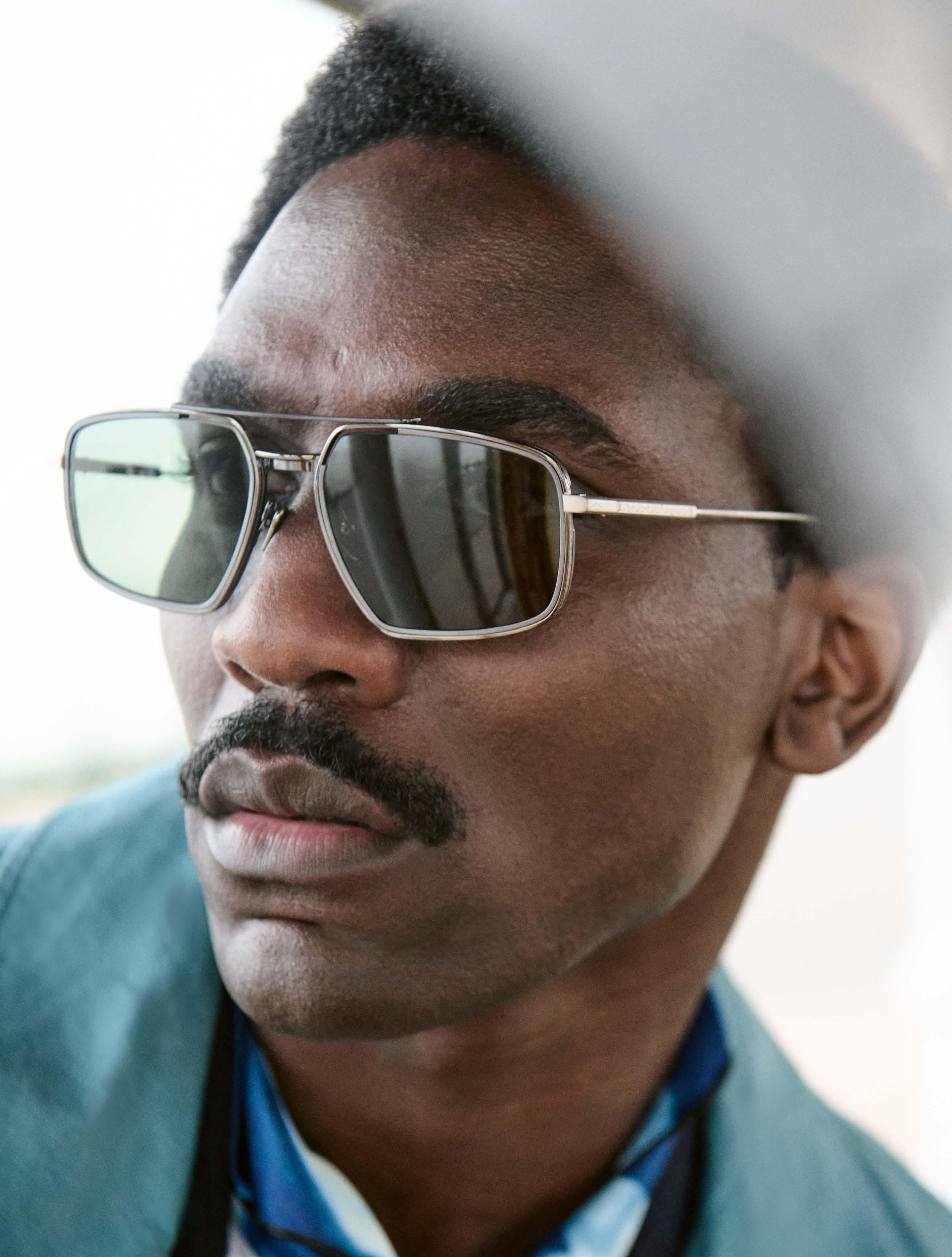

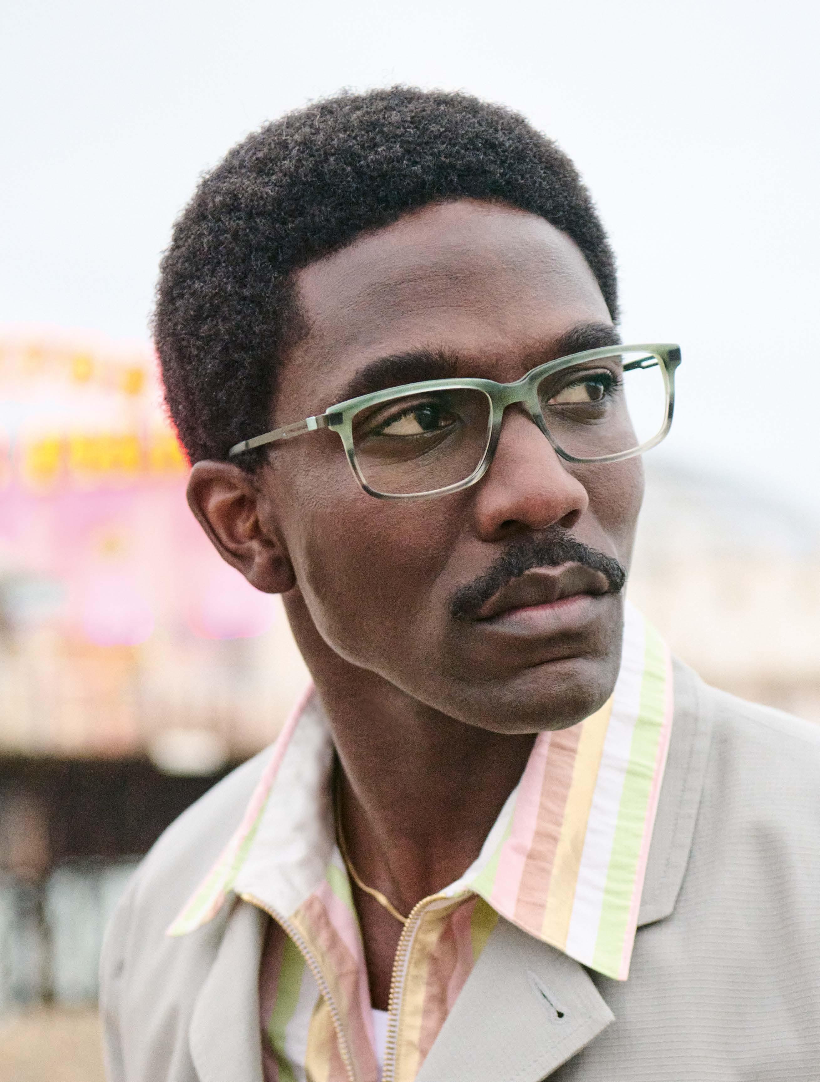
KOBERG »KT 6056« -
suit & shirt AGNÈS B.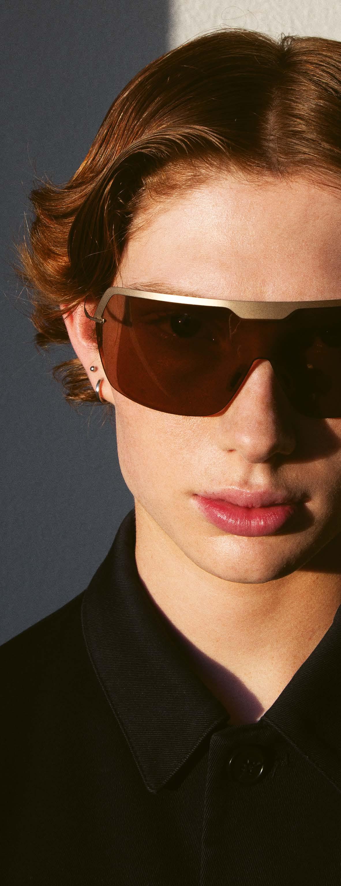


Titan Minimal Art Cosmic
Onboarding of a different kind: the spacecertified design icon from SILHOUETTE gets a new crew member with a futuristic shield look.
The digital age meets the retro glamor of the 60s and 70s: the striking Titan Minimal Art Cosmic is ideally equipped to position itself as a street style icon and eye-catcher on the international catwalks. From now on, the innovative, feather-light sunglasses will enrich SILHOUETTE’s most iconic collection. It combines apparent opposites such as softness and hardness to create a design masterpiece that ensures a G-force-strong appearance with its unique wrap-around field of vision.
As a tribute to SILHOUETTE’s first space mission 25 years ago, the Cosmic Edition is inspired by a fascinating science fiction world. The curved field of vision, which merges gently with straight-lined metals, is made possible by state-of-the-art technology. Like all models in the Titan Minimal Art collection, the Cosmic not only impresses with its design, but also with its exceptional wearing comfort and lightness.

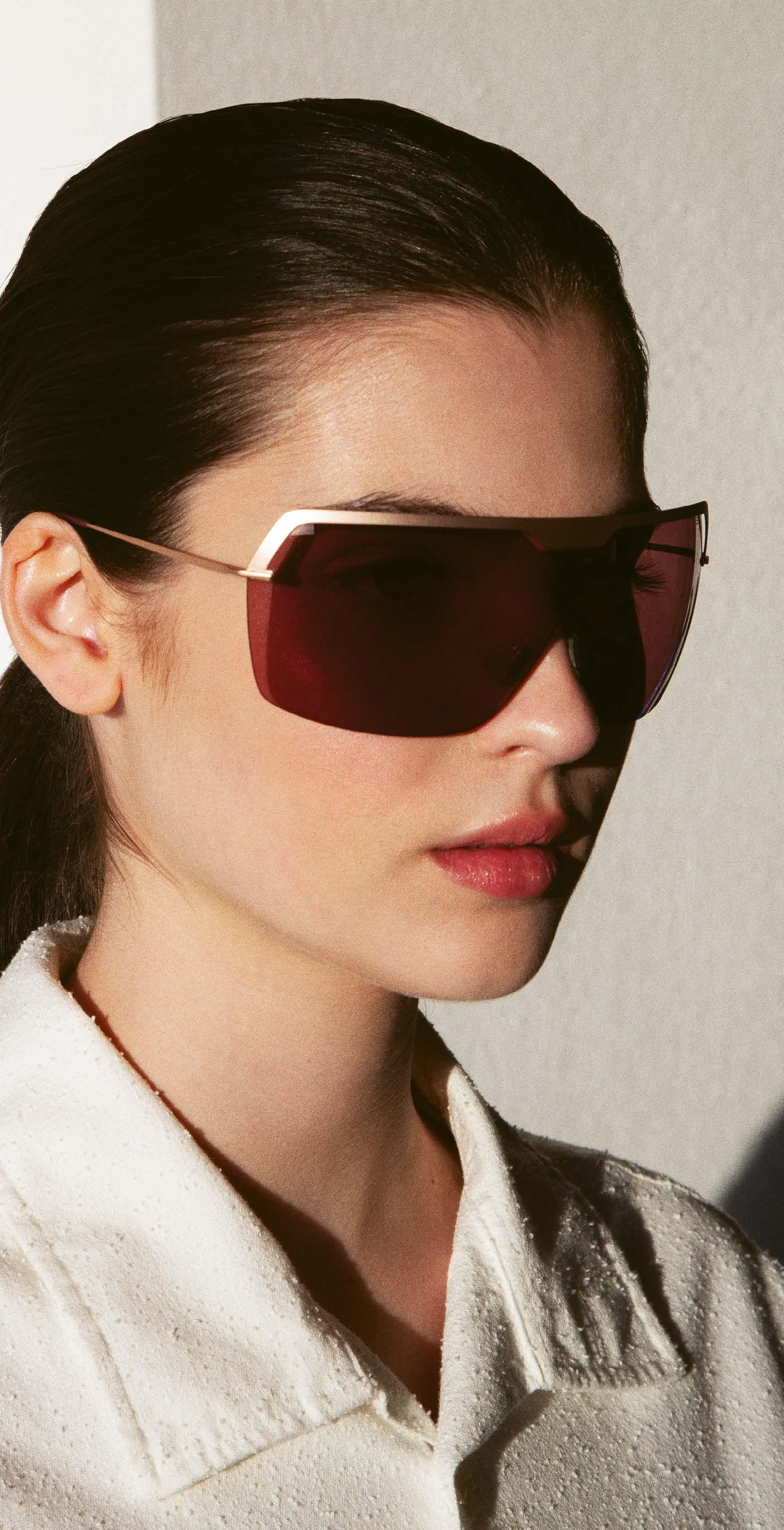
Titan Minimal Art Cosmic
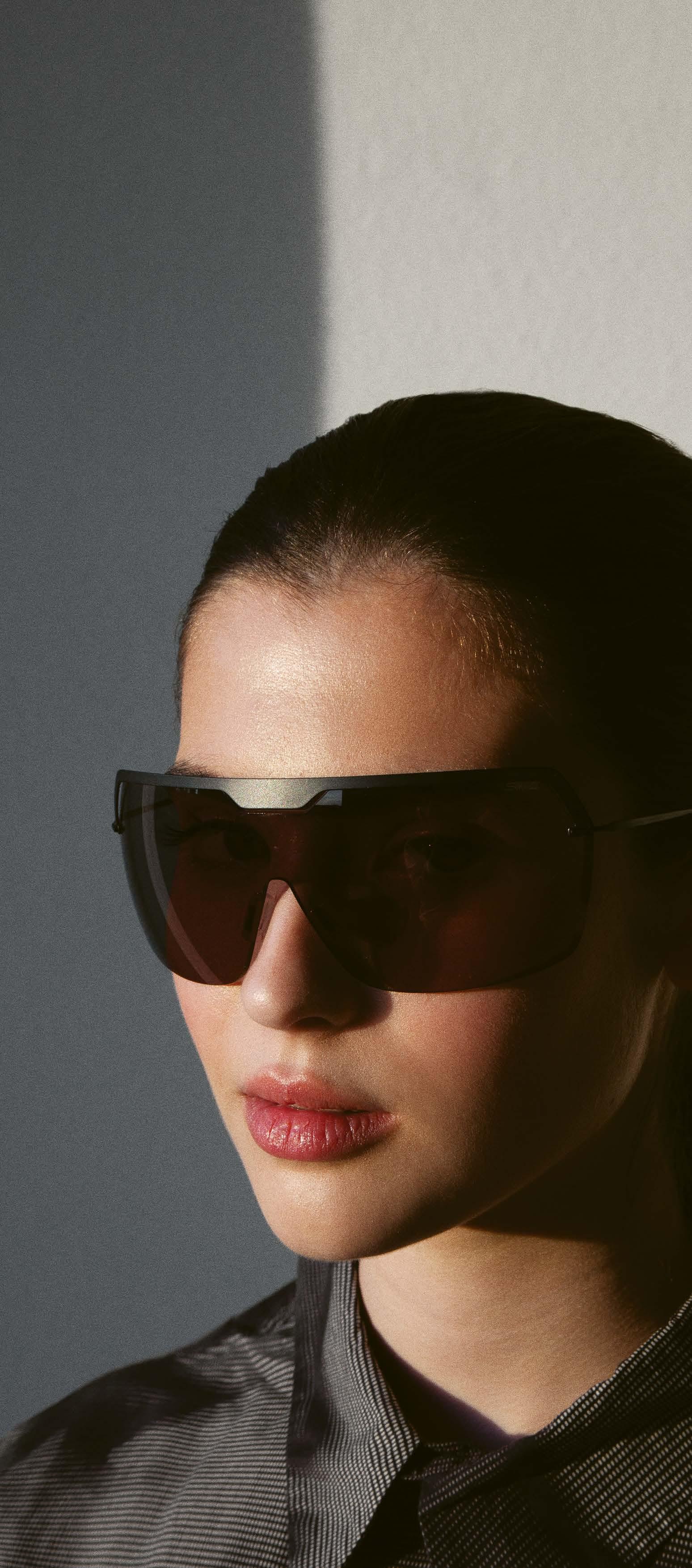
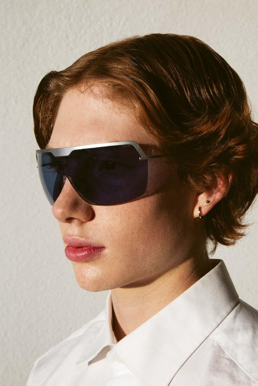
The Titan Minimal Art Cosmic is characterized by a balanced, excellent fit. The ultrathin, curved field of vision also contributes to this, providing reliable protection in any situation. The polyamide lens surrounds the eye area in a soft, delicate curve, which is accentuated at the top by a wide rim made of matt high-tech titanium.
Like the other members of the Titan Minimal Art family, the Cosmic is ultra-light, flexible and suitable for many situations – from relaxed sunbathing to active leisure activities, which are given a usability boost thanks to the improved flex zones of the adjustable titanium temples.
The Titan Minimal Art Cosmic is available in four spacey color combinations that underline its space history. The sporty model combines blue lenses with a silver frame, while the purple and gold version exudes modern glamor. Gold and brown provide a sophisticated unisex appeal, while gray and black look bold, confident and masculine. silhouette.com

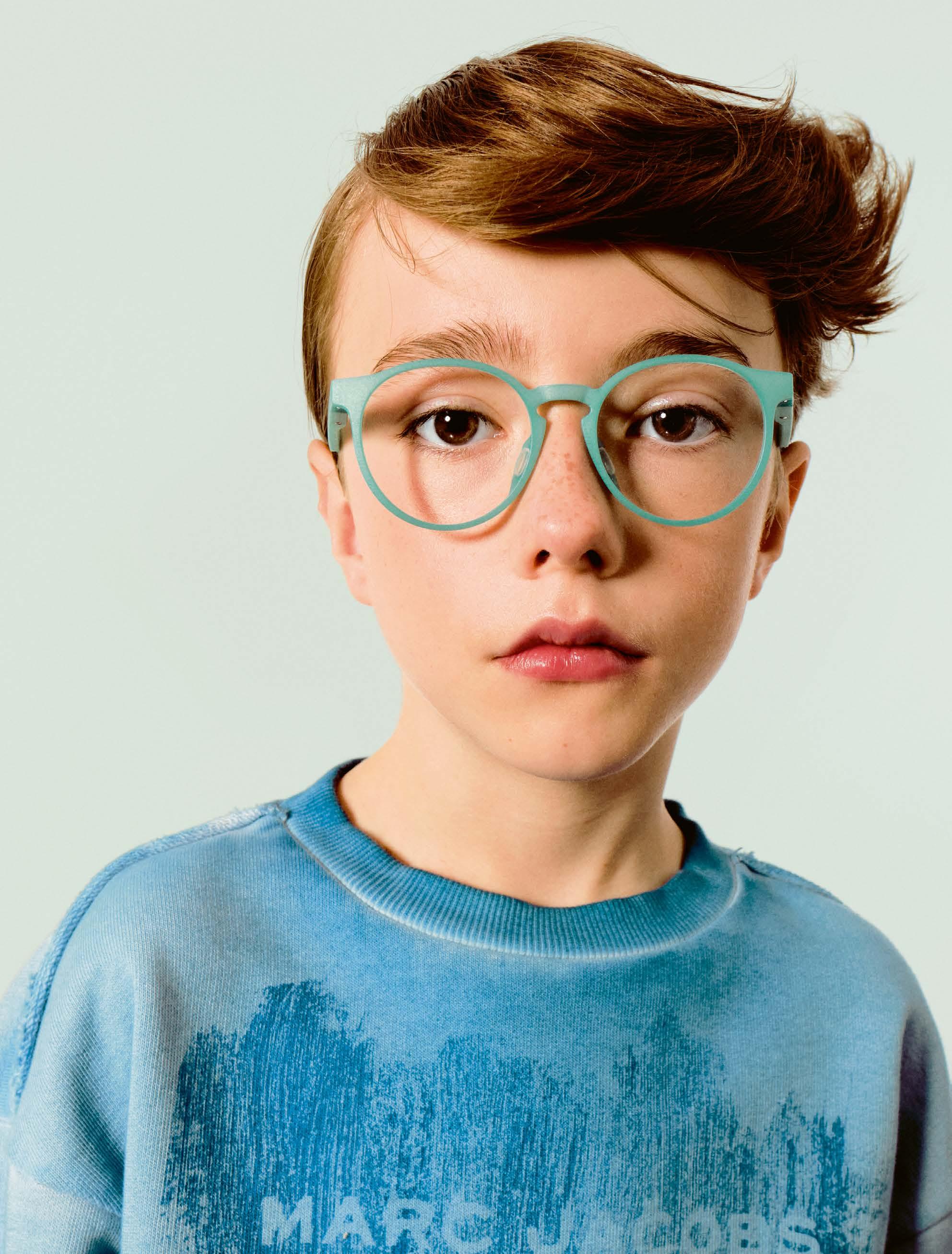
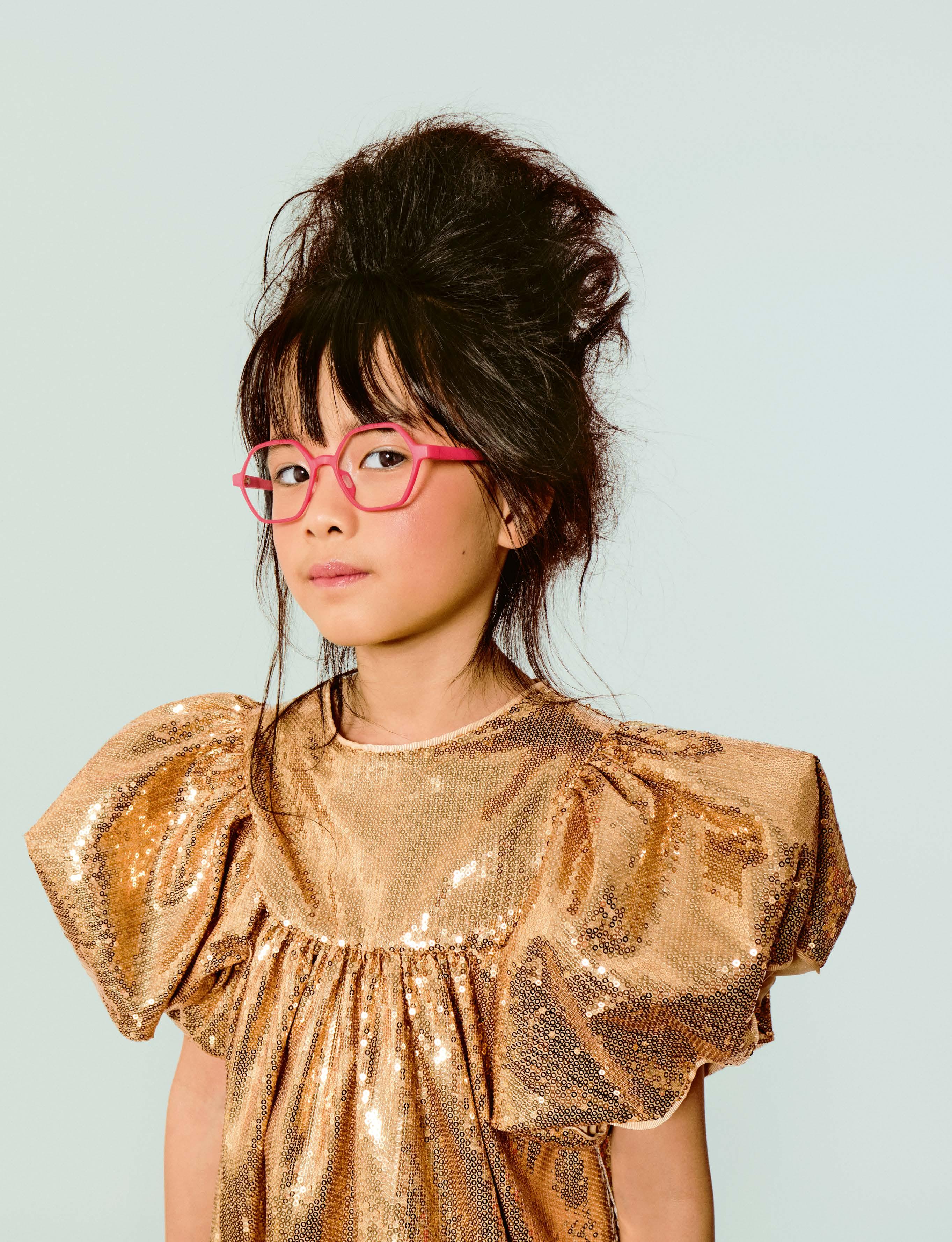
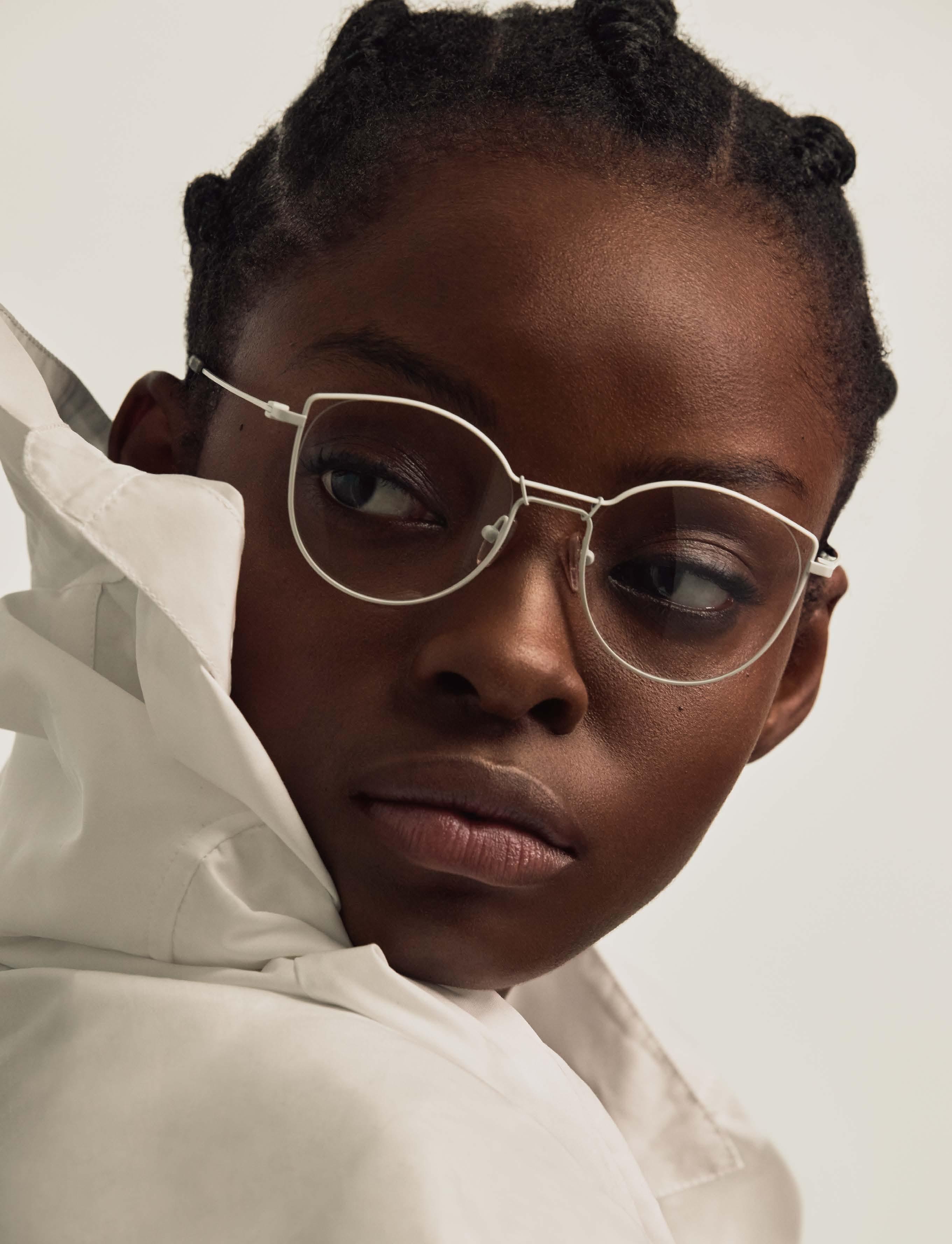
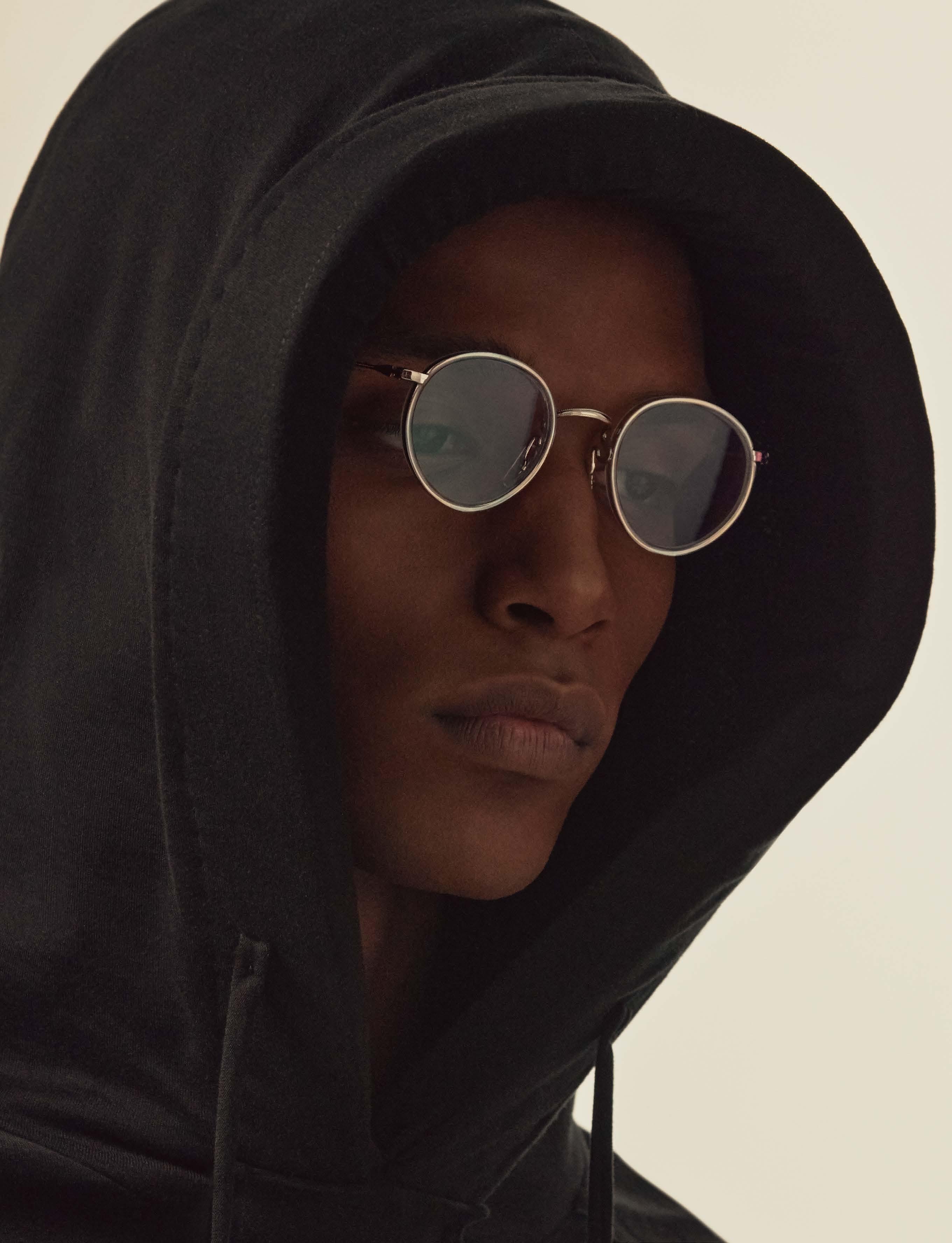
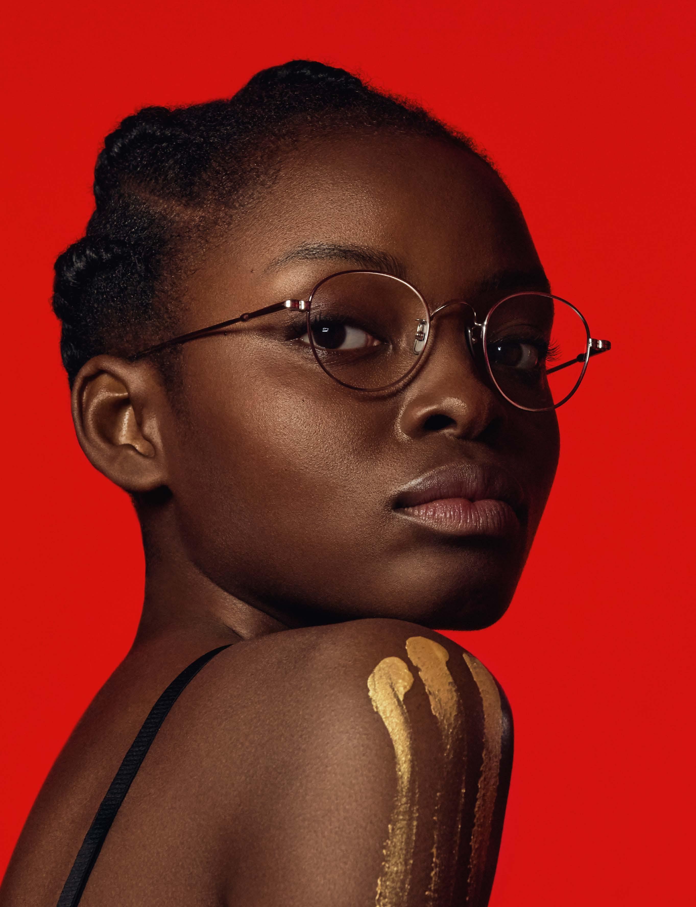
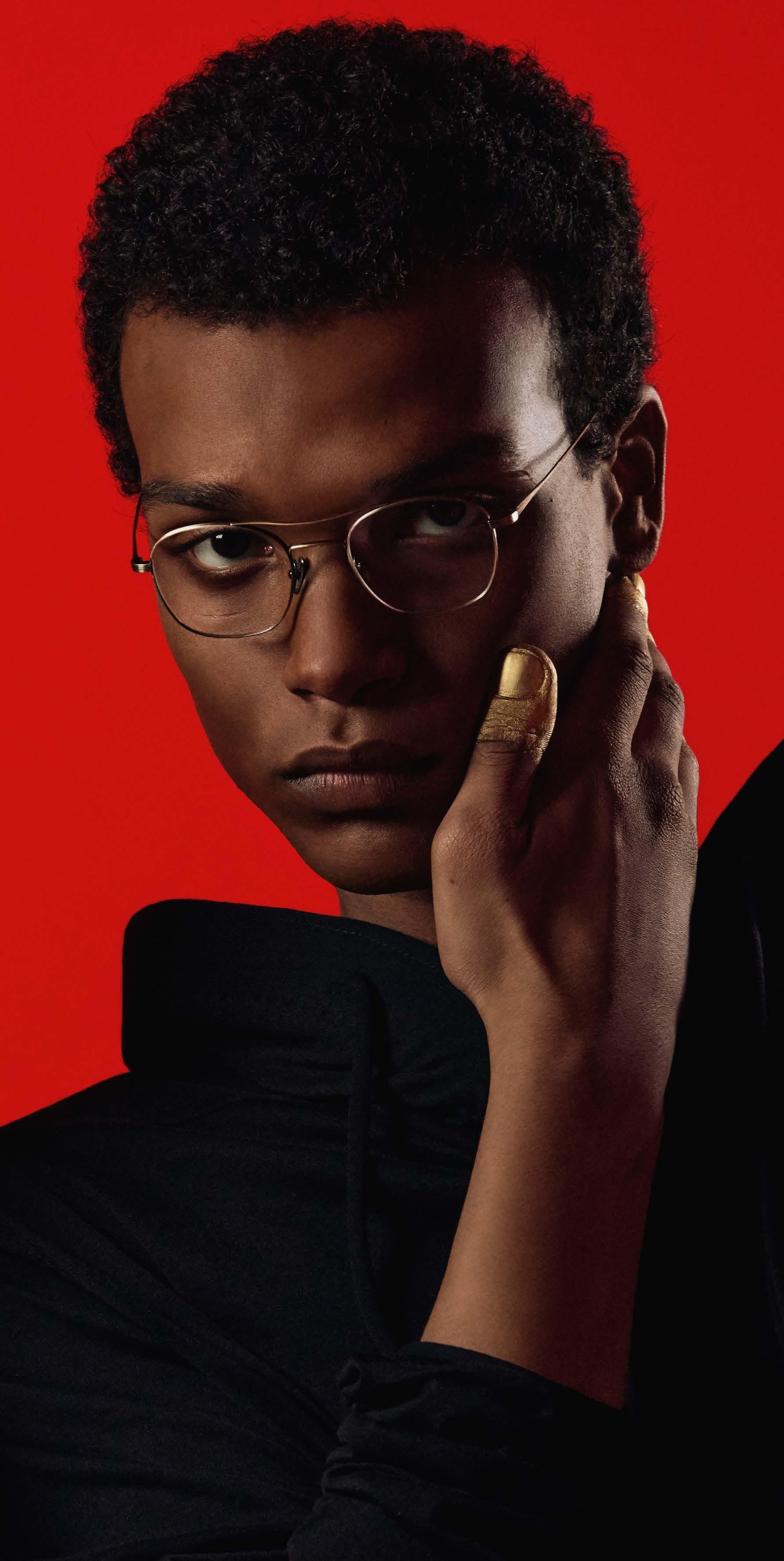
In the world of fashion, even the youngest trendsetters are rewriting the rules of style. Long forgotten or neglected as customers, children are now being treated differently. The children’s segment is booming and increasingly transcending practicality. And rightly so. As tomorrow’s fashion pioneers, children bring an innate sense of curiosity, vibrancy and unbridled imagination to every aspect of their lives. And that includes their choice of eyewear. Here’s a SPECTR eyewear shoot specifically dedicated to the youngsters.

ROLF
Sustainable eyewear – for kids too. The Austrian brand has been producing its collections in the heart of Tyrol since day one and sets the highest standards in terms of sustainability. ROLF is undoubtedly one of the pioneers in terms of responsibility and sustainable business practices in the eyewear industry. An essential part of ROLF’s philosophy is to leave behind a better planet. Rethink, Reuse, Reduce – this applies to the entire value chain.
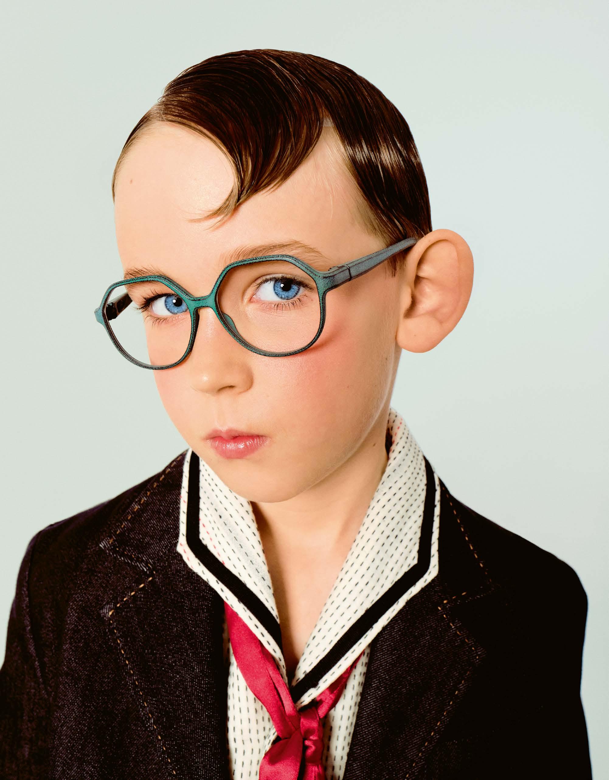
The Tyrolean company makes no exception when it comes to the children’s collection. And why should they? After all, it’s all about the future of the younger generation. ROLF produces its high-quality eyewear using plant-based materials. The models for children are made from castor bean material using a 3D printing process and impress with their fantastic comfort, robustness and lightness. The patented Flexlock joint also makes them virtually indestructible – which can be a particular advantage for children’s glasses.

ROLF »Puma«suit DSQUARED2 shirt KENZO
photography : FELI & PEPITA [ Cologne ]
styling : PETRA KLAPPROTT
hair & make-up : CLAUDIA CREUELS
postproduction : STEPHANIE WENCEK
models : LIA, LEO, LINA, THEES, JONAH, ZEYNEP & LUNA at MOMO KIDS AGENCY
MYNA & NOAH ISMAIL at KEOLAS KIDS MODELS


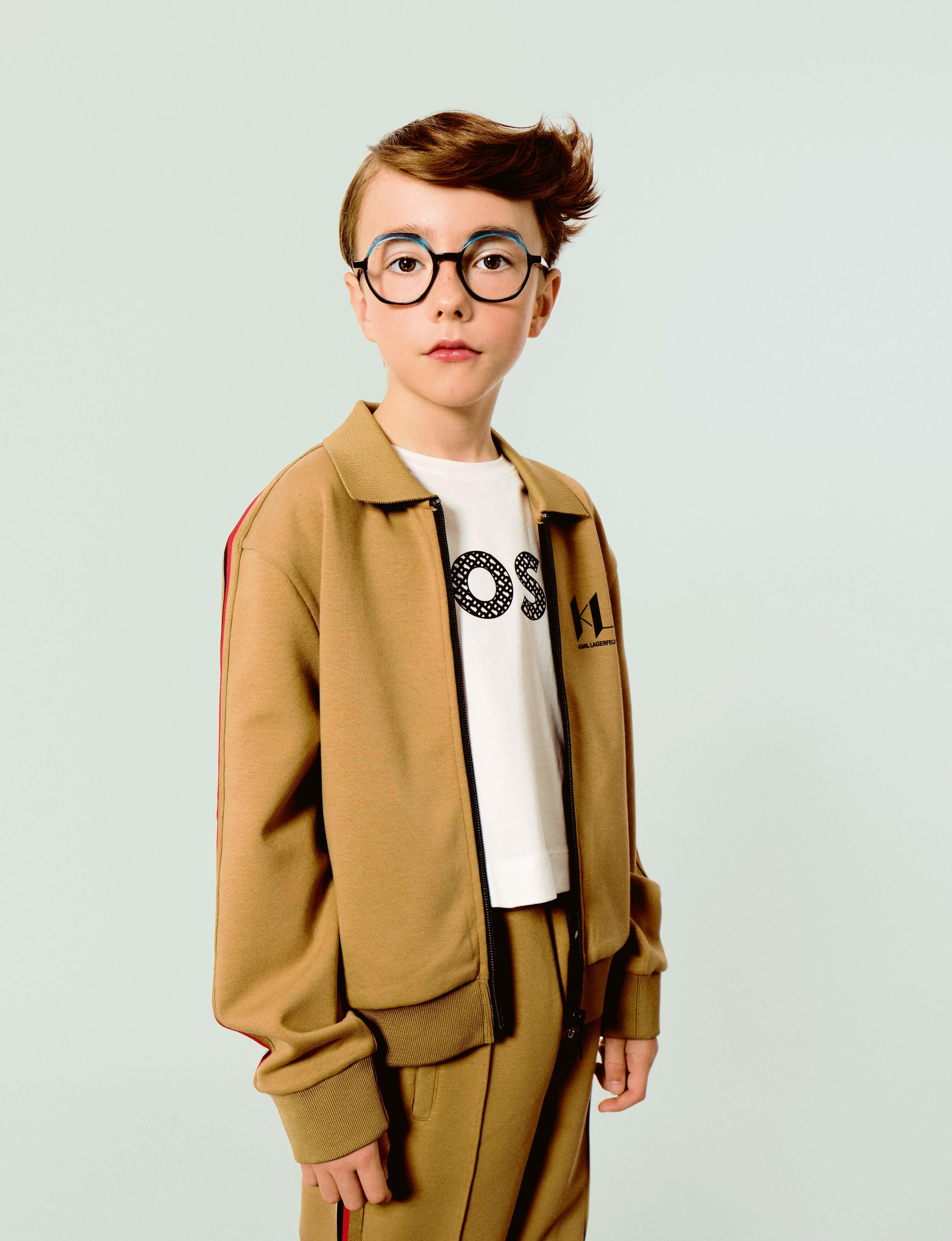
ETNIA BARCELONA »POOOOW!«sport suit KARL LAGERFELD shirt BOSS
ETNIA BARCELONA
ETNIA BARCELONA draws inspiration from the fascinating world of comics for its latest children’s line, the Cartoon collection. Cartoon is a colorful and daring collection that encourages children to express their personality, creativity and uniqueness through bold shapes and bright colors. The glasses are designed to inspire children’s imaginations to tell their own stories.
The fact that ETNIA BARCELONA has achieved a small game changer with the new collection is also proven by the Silmo d’Or 2023 award for the most innovative and creative design in the “Kids” category, which the Spanish brand received for one of the models from the new collection.
The Cartoon collection comprises a total of six models in different colors, so that every child will find their personal favorite in the collection. In our shoot, we showcase the »POOOOW!« and »KA-POOOOW!« models.
VULKAN & VULKANi
As the name suggests, the VULKAN collection comes from the Eifel region. The latest styles include modern color contrasts and trendy shapes. The modern metal frames and metal/acetate combinations offer great design details. VULKAN frames are wearable and easy to combine. Thanks to a large selection of intermediate sizes (46 – 52), VULKAN is not only interesting for teens, but also a real treasure trove for adult spectacle wearers with fine facial features.
But the even younger target group can also enjoy the glasses from the Eifel – the “i” at the end makes the small but subtle difference. VULKANi stands for light and simple frames. The metal frames are joined by acetate models such as the uncomplicated panto shapes made of transparent acetate in soft shades. Or how about “frosty” matt acetate in cool tones with cheerfully colorful temple tips?
VULKANi & VULKAN offer great looks suitable for everyday wear for young and old volcano stormers alike.
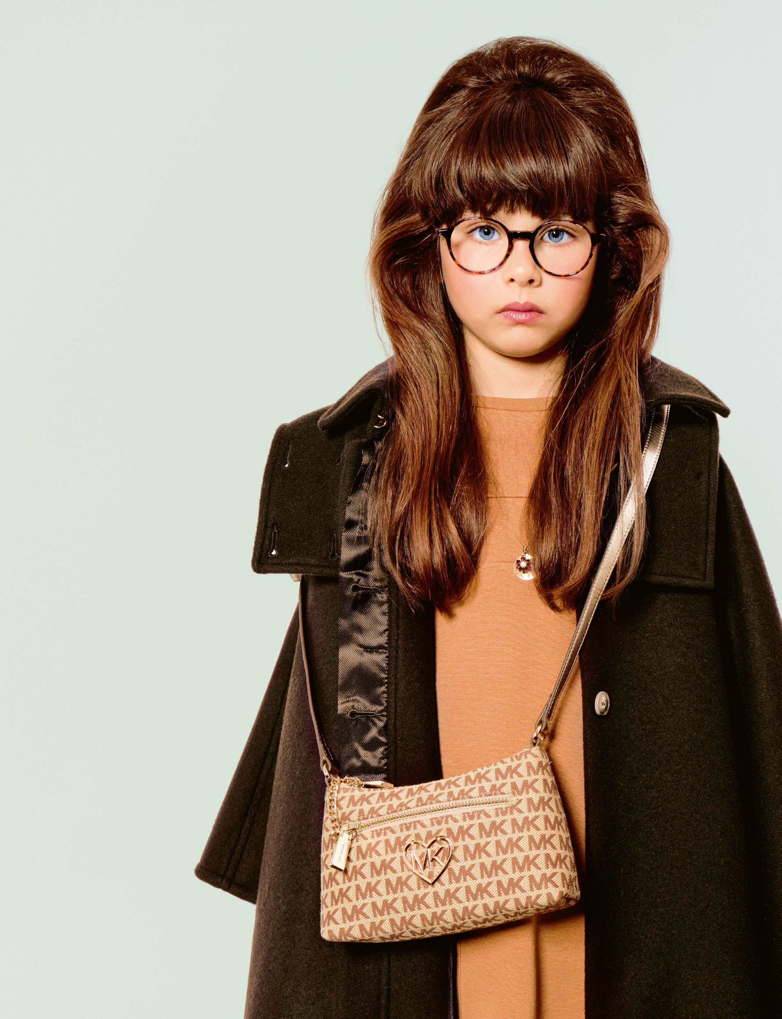

dress & coat CHLOÉ
bag MICHAEL KORS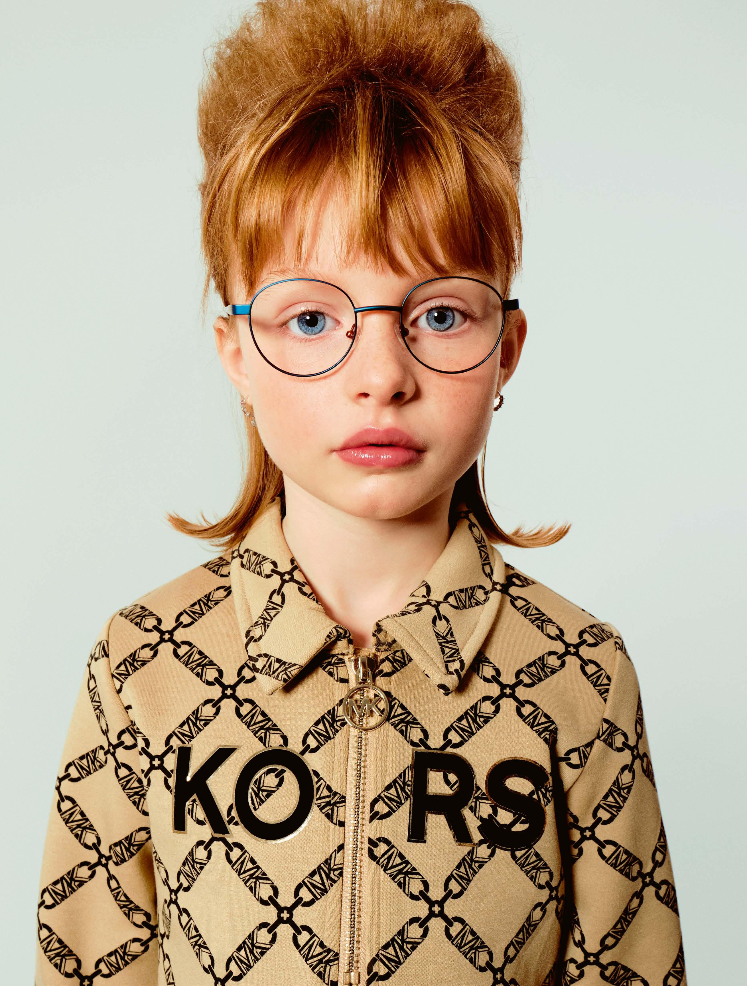
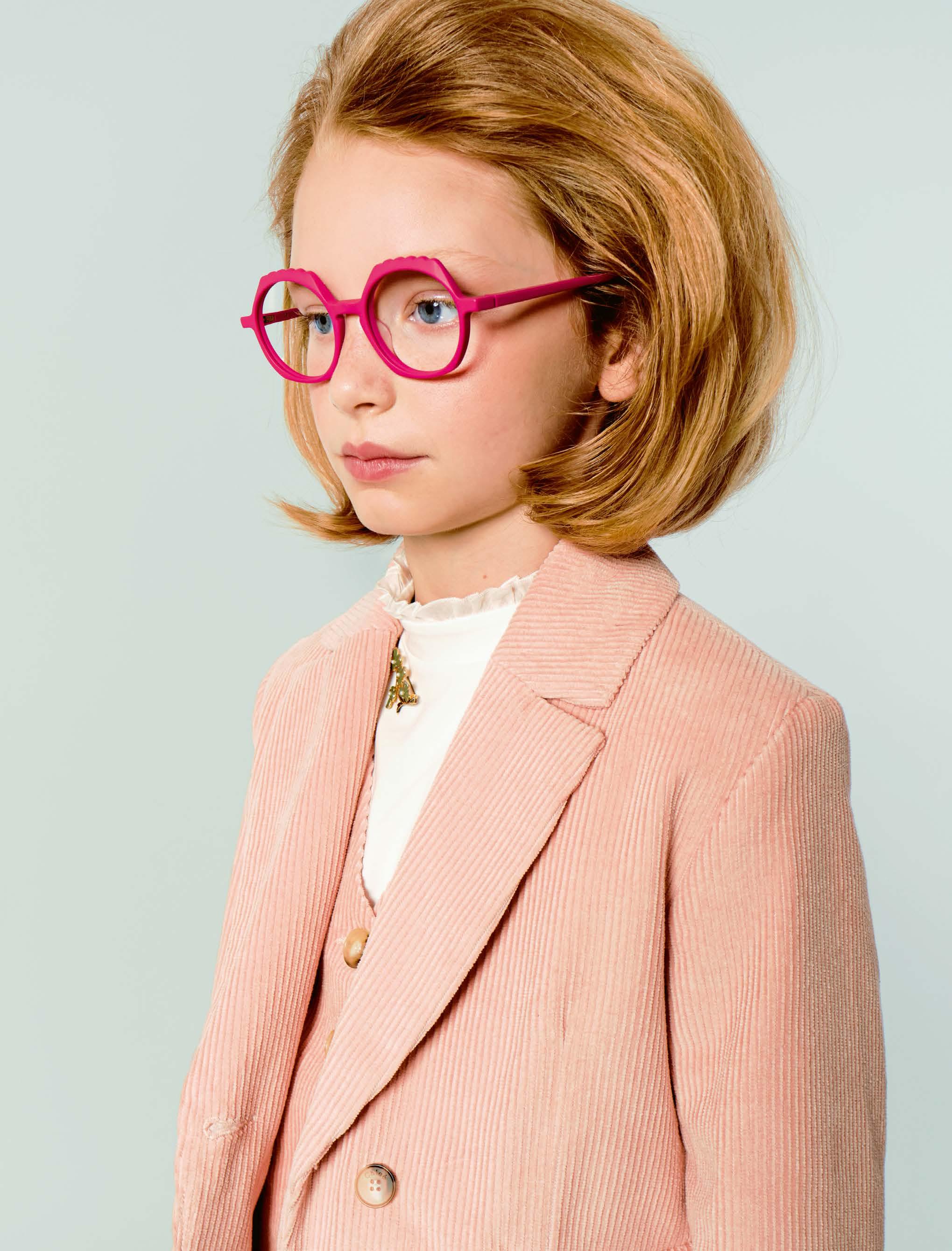
 VULKANi »Vi349« -


 MANTI MANTI
Children’s glasses have to withstand a lot. This is definitely possible with the models from MANTI MANTI, as the glasses, which are manufactured in Bavaria using a 3D printing process, are made from 100% castor oil – making them super light, flexible and robust without using any environmentally harmful substances.
The relatively young label for children’s glasses from Berlin stands for minimalist design, child-friendly function and sustainability along the entire value chain. All models are available in three sizes and nine colors, parents and children can choose from the full range and are delighted. For opticians, MANTI MANTI offers a beautiful product for its young, yet discerning target group. In our shoot, we show the »Mila« and »Suse« models.
MANTI MANTI »Mila« -
 LOOKKINO »MODA 3927«

LOOKKINO »SPORT 3884«jacket JELLY MALLOW shirt & pants REPOSE
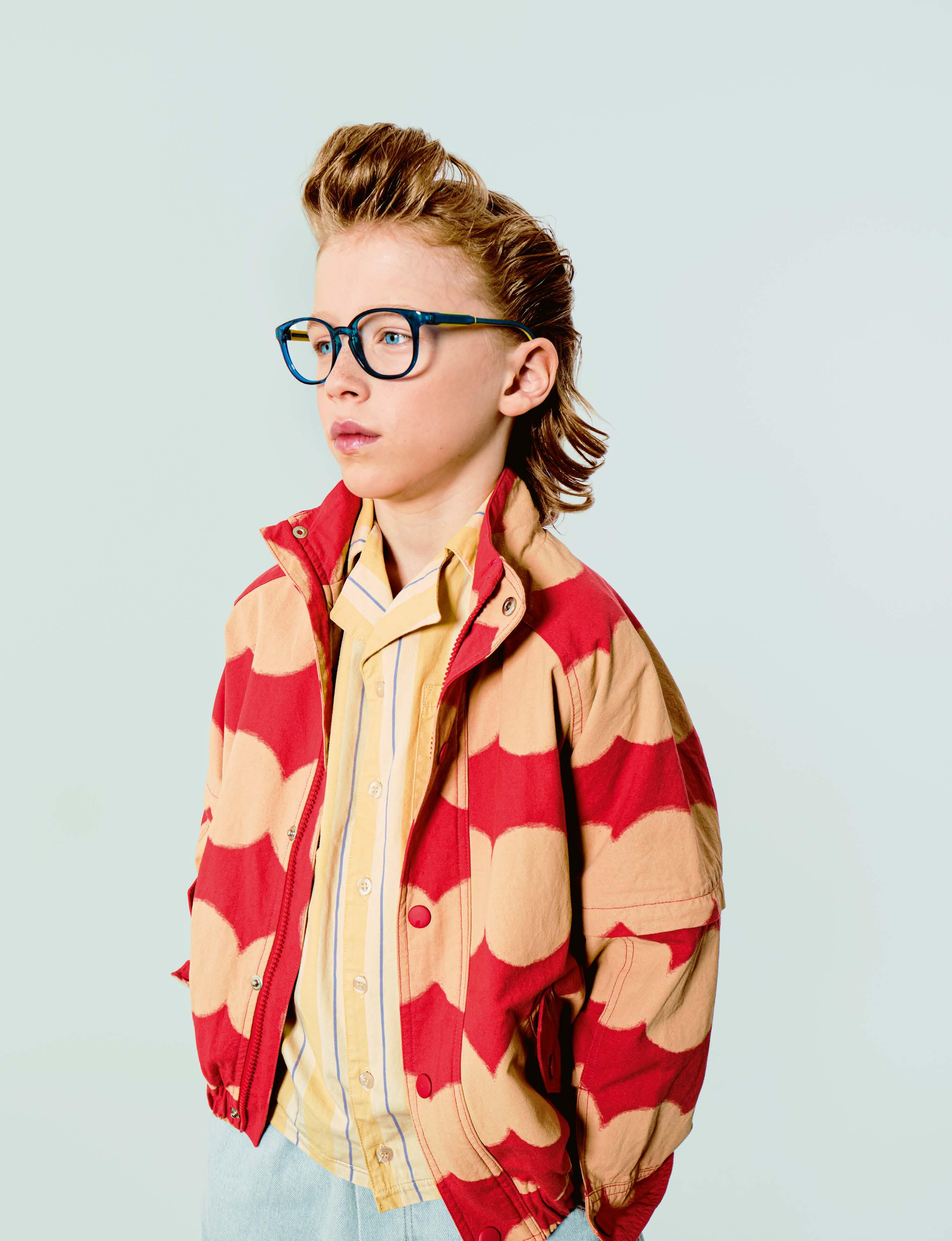
LOOKKINO is the children’s collection from the Italian brand LOOK
The same high standards are applied to the children’s models as to the glasses for adults, not only in terms of quality and durability, but also in terms of design.
Made from NIL, an extremely resistant and lightweight technopolymer, and equipped with an integrated flex hinge and hypoallergenic, adjustable soft-touch temple tips, the new models offer optimum comfort even when worn for long periods. The shapes range from the more classic, such as model »3884«, to the light cateye of »3927«.
The colorways are wide with a special typically feminine touch. Not only blue, green or orange, but also peach pink, violet, fuchsia or aquamarine in a polished, semi-transparent finish add a subtle touch of glamor – which also works for children.

-
jacket REPOSE
shirt OXOXCLUB
cap DSQUARED2
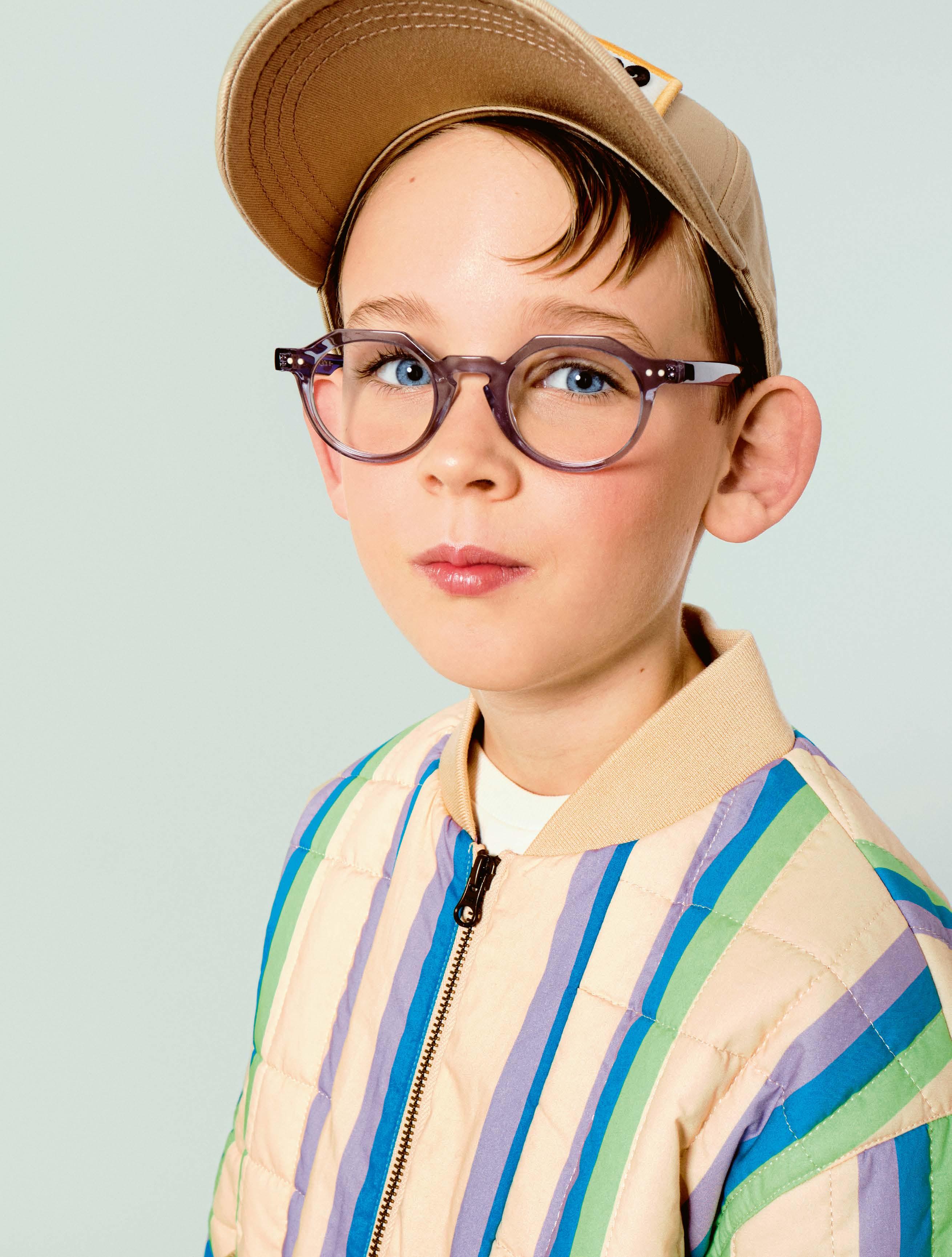
SUPERKIDS is the brand for the young target group from Anne et Valentin. With SUPERKIDS, the French label places the same emphasis on quality and design as with the styles for adults. All the styles in the Made in France collection have a great deal of personality and impress with their flexibility – because children are children.
For our shoot, we were able to win the »Marvel«, a model with rough edges that gives nimble kids on the playground, slalom racers in the canteen and space pilots wings and superpowers. The »Marvel« is faster than lightning and never gets boring.


»KT-552AU«

»KT-385U«

KIO YAMATO
»KT-478US«
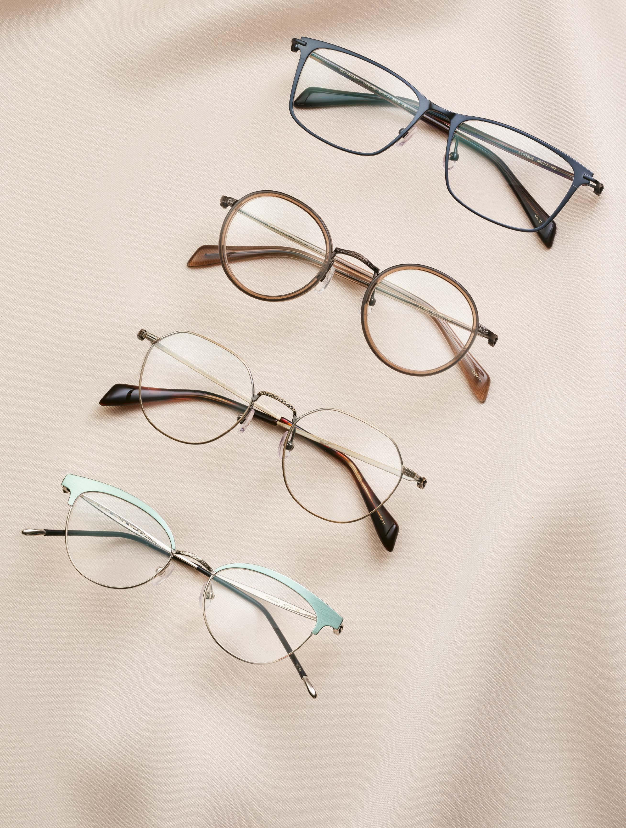

»KT-551AU«
In the world of premium eyewear, few brands capture the essence of Japanese elegance like KIO YAMATO. With its roots firmly planted in Japan, the brand is a testament to the country's rich heritage and unwavering commitment to excellence. Founded in 1998, KIO YAMATO embodies the principles of simplicity, balance and functionality, reflecting the core tenets of Japanese minimalism. Handcrafted by skilled artisans in Fukui, Japan, each frame is a masterpiece that embodies the timeless sophistication synonymous with Japanese craftsmanship. Here’s an interview with Joon Kim, the second-generation head of the brand.
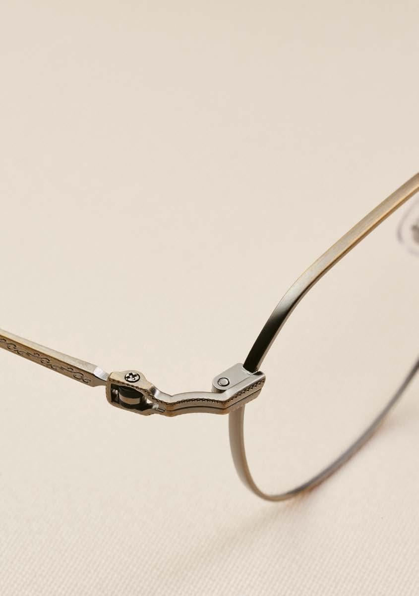
Subtle engravings, carefully selected materials and fine craftsmanship –made in Japan.
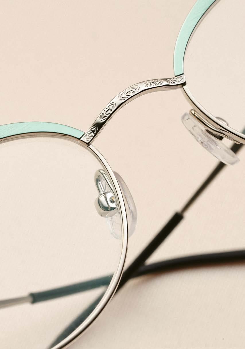
Joon, the KIO YAMATO brand was founded more than a quarter of a century ago in Japan. Can you share your personal connection to the brand? What’s the story behind it?
The brand was born out of a deep passion for eyewear craftsmanship, an unwavering dedication to comfort, and an unwavering commitment to timeless minimalist design. We wanted to create a brand that not only embodied Japanese minimalism, but also pushed the boundaries of innovation in eyewear. We have entered the second generation of KIO YAMATO, and we look forward to many more generations of building the brand with the same commitment it was founded on.
What distinguishes KIO YAMATO from other premium eyewear brands, and what unique elements contribute to its enduring appeal and distinctiveness?
KIO YAMATO stands out among premium eyewear brands for its meticulous attention to detail and commitment to craftsmanship. The brand’s enduring appeal is rooted in its ability to seamlessly blend artistry with functionality. Frames go beyond mere accessories to become statements of refined taste and enduring style. KIO YAMATO’s uniqueness lies in its dedication to creating eyewear that transcends trends and becomes a timeless expression of individuality.
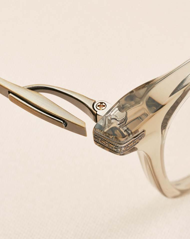
KIO YAMATO is all about meticulous details – they seem to define KIO YAMATO frames. What's the significance of these subtle details and how do they enhance the consumer experience?
The meticulous details in KIO YAMATO frames play a crucial role in enhancing the consumer experience. Each detail contributes to the overall aesthetics and functionality of the eyewear. From carefully selected materials to subtle engravings, these details add a layer of sophistication and individuality. They create a connection between the wearer and the eyewear, making the experience of donning KIO YAMATO frames a truly personal and luxurious affair.
You mentioned earlier the artistry involved in the movement of KIO YAMATO frames, particularly the act of opening and closing. Could you elaborate on how this attention to detail enhances functionality?
Beyond the visual appeal, the art of movement extends to the realm of comfort.
Understanding that eyewear is an integral part of daily life, KIO YAMATO frames are designed to provide an unparalleled level of comfort. The hinges play a crucial role in ensuring a smooth and effortless experience, allowing wearers to enjoy the individual expression of their eyewear without sacrificing comfort.
With all frames handcrafted in Japan, what do you think distinguishes Japanese manufacturing in terms of quality and craftsmanship?
Handcrafting all frames in Japan is a choice that reflects the brand’s commitment to quality and craftsmanship. Japanese manufacturing is known for its precision, attention to detail and pursuit of perfection. KIO YAMATO’s decision to manufacture its eyewear in Japan ensures that each pair meets the highest standards of quality and contributes to the brand's reputation for manufacturing excellence.
kioyamato.com
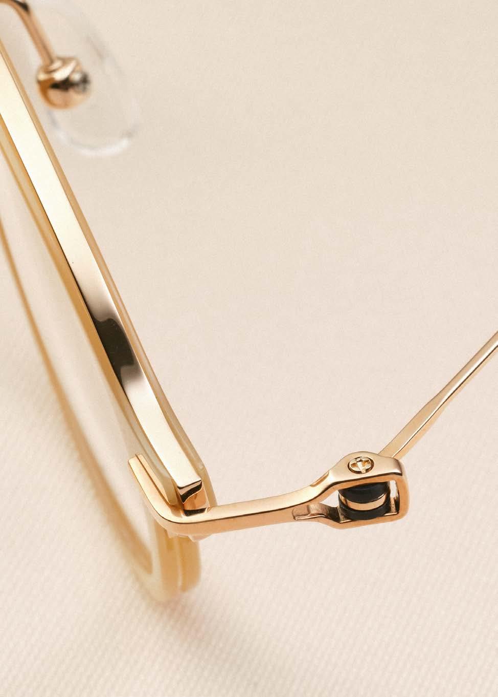
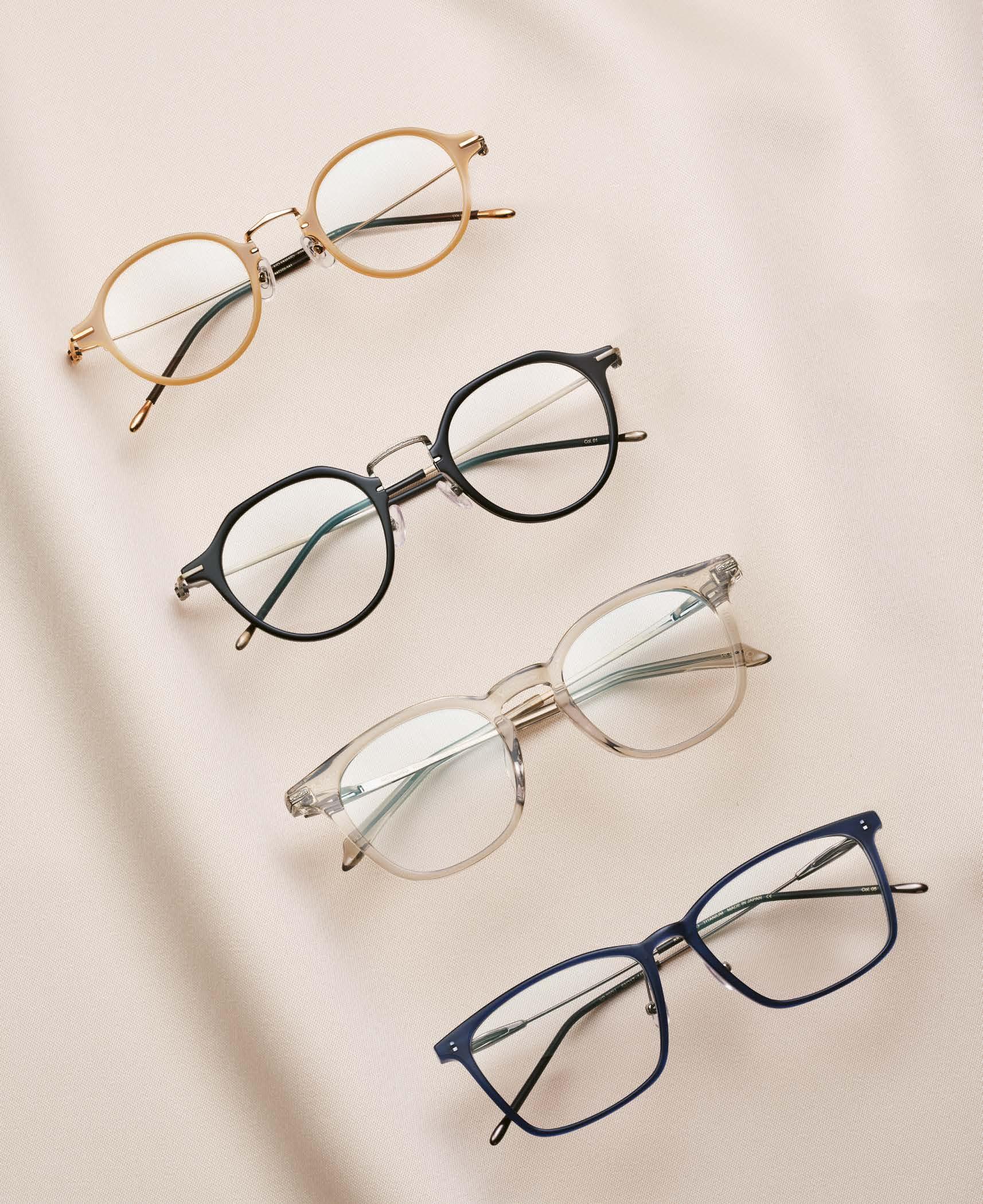



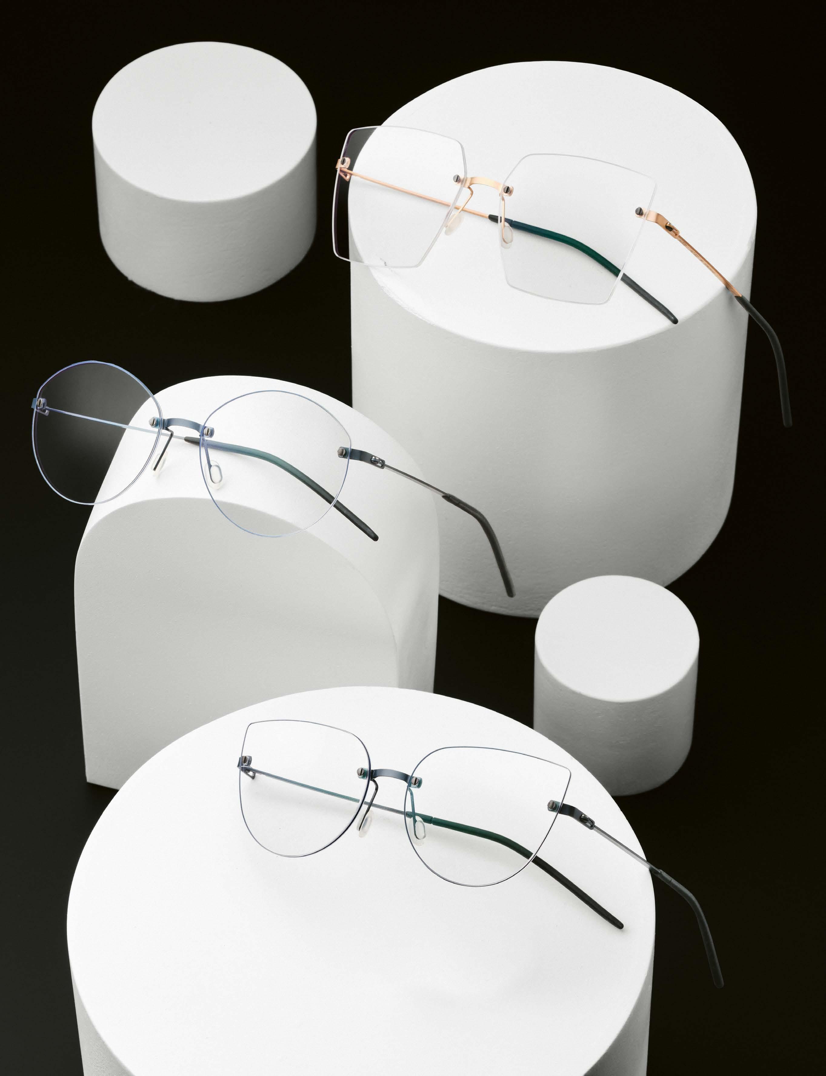


The EASE Pro collection is a further development of the rimless EASE collection that MARKUS T launched five years ago. Founder Markus Temming explains to us to what extent this is not just a visual facelift, but how the new collection also boasts new technical features.
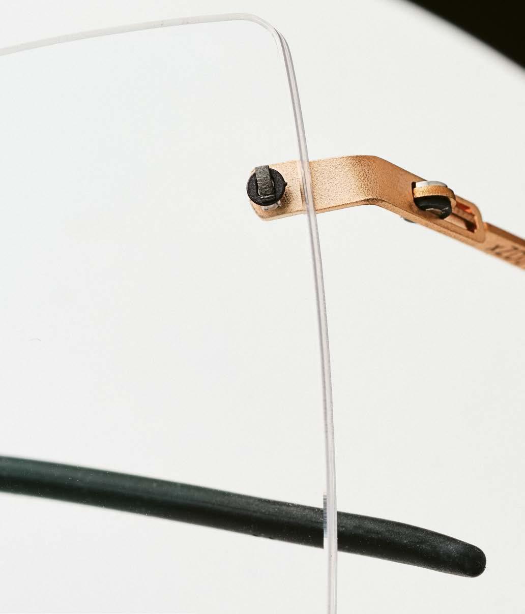
Unique glazing technology in the MARKUS T EASE Pro – the connection between frame and lens is durable yet understated.
Hello Markus, in 2019 you launched rimless eyewear for the first time with the EASE collection. In retrospect, are the rimless frames a success?
We are specialists in the field of titanium frames and use our specially developed light weight plastic TMi as an additional material for some collections. These two materials are ideal for full-rim frames. However, rimless frames are also something special for us and ideally complete the MARKUS T portfolio as a separate collection. Why do rimless glasses fit in well with MARKUS T?

two and a half years to develop the joining techniques and the additional design elements until we had a collection that we are completely convinced of.
How many models are there?
The EASE Pro starts with 20 lens shapes. With a rimless collection, the optician is basically free to design the lens shape.
Why didn’t you simply add the new models to the existing EASE collection?
On the one hand, they convey our understanding of “less is more”, because they make do with a minimum of material and, on the other hand, they sum up our expertise in technically sophisticated eyewear.
Rimless is indeed a challenge, both for you as a manufacturer and for the optician, isn’t it?
Indeed it is. Rimless eyewear can certainly be described as a supreme discipline. Developing a long-lasting, durable and at the same time barely visible connection technology for lenses and frame parts is a challenge. Despite all the technical complexity, we naturally always keep an eye on making the glazing as simple and convenient as possible for the optician. In 2024, you are once again focusing on rimless eyewear – this time in the new EASE Pro collection. How long did you work on the new models?
“Less eyewear, more effort” is a formula that fits quite well here. A lot of detailed work, which was an exciting task for us, but it also got on our nerves from time to time. In total, we took around
We somehow sensed that we could go one step further with the collection than just developing new shapes. That it could do even more visually and technically. As is so often the case, we were driven by our desire for perfection. The fact that we consistently manufacture in Germany means that we literally have development and quality “in the palm of our hand”. We are close to our customers. To our optician customers, but also close to the end customer through our MARKUS T brand store at the company site in Gütersloh-Isselhorst. This allows us to test and implement customer feedback and needs directly. With the EASE, we have recognized the potential in the technology and have also broken new ground in the design.
What exactly distinguishes the EASE Pro from the EASE? It’s not just the overall look that’s different, but also the glazing technology. We have developed a unique combination that is not yet available on the market.
In what way?
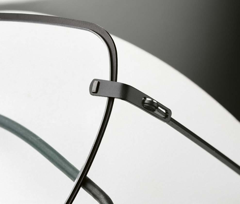
While the EASE was glazed with plastic sleeves in a double hole, the glazing technology of the EASE Pro dispenses with additional sleeves and works with the force of the filigree titanium parts.

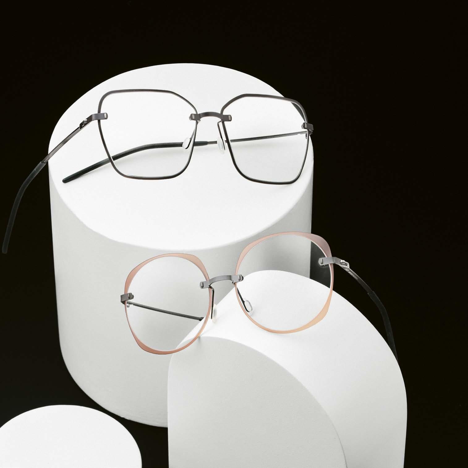

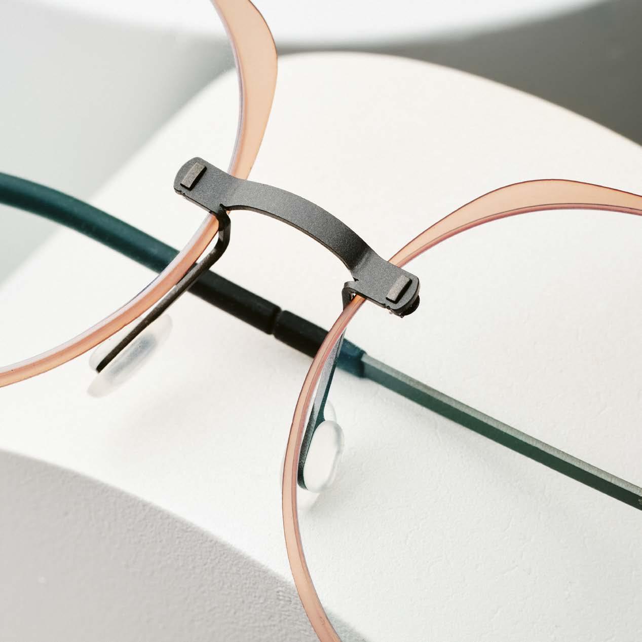
Optional add-ons give the rimless glasses volume and visibility.
Thanks to a special mechanism, the connecting parts lock into each other, creating an absolutely secure connection that can only be released again with the aid of tools – for example, for re-glazing.
Does this also affect the design of the glasses? Does anything change visually?
The bridge and temples are made from our material of choice: titanium. We deliberately opted for a less delicate look for the EASE Pro, which offers more options for an individual design. We therefore see rimless glasses with a more visible design. Does this make the glasses more self-confident?
A little more material, a bolder design language, which can be emphasized by color and additional add-ons, deliberately make a statement with the EASE Pro
As usual with MARKUS T, the glasses are certainly available in many colors.
Exactly. The basic model is available in our eleven titanium colors as well as with high-quality PVD 24 carat precious metal coating in gold, rose gold and with a new, elegant platinum coating. If you want something a little more eye-catching, you can upgrade your rimless EASE Pro with a silicone ring. What colors are these available in?
We offer the silicone ring, which lies in the glass groove, in transparent, blue, bordeaux and black. The subtle color accent emphasizes
the shape of the lens without giving up the rimless character of the frame.
But do you also have another fashionable feature?
We have designed individual add-ons for each lens shape. These polyamide add-ons are also placed around the lens, hold in the lens groove and can be easily replaced. They give the glass a more striking frame and play with shape and color.
In the EASE collection, these add-ons were made of titanium; in the EASE Pro collection, you are using polyamide. Why?
This is actually based on one of the direct customer feedbacks I just mentioned. Some customers were concerned that the lenses could scratch when putting on the titanium add-ons. Some also found the add-on on the lens annoying when cleaning the glasses.
Presumably the rimless glasses are also made in Germany, right?
Of course they are. Everything that bears the MARKUS T comes from our factory in Gütersloh-Isselhorst in East Westphalia.
From the idea to development and production: on average, a frame passes through 20 hands before it lands on a happy MARKUS T face.
Thank you for the interview, Markus.
markus-t.com
In the ever-evolving world of premium eyewear fashion, MOREL remains a timeless icon. With over 140 years of history, this familyowned French brand is an icon of independence. And it continues to push creative boundaries. The latest collection for 2024 exemplifies MOREL’s commitment to innovation and style, with acetate as its flagship material.
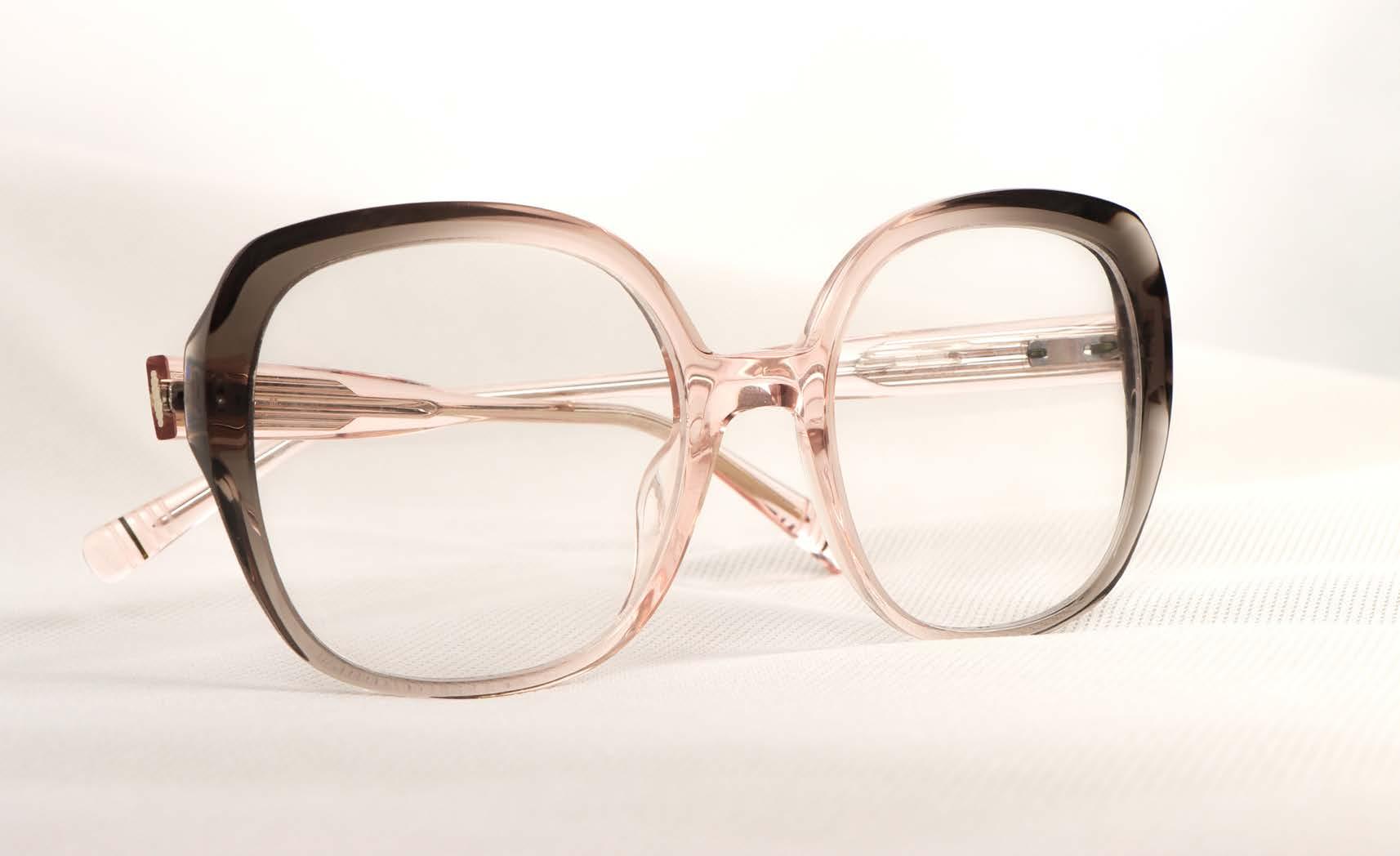
Acetate: The canvas of choice
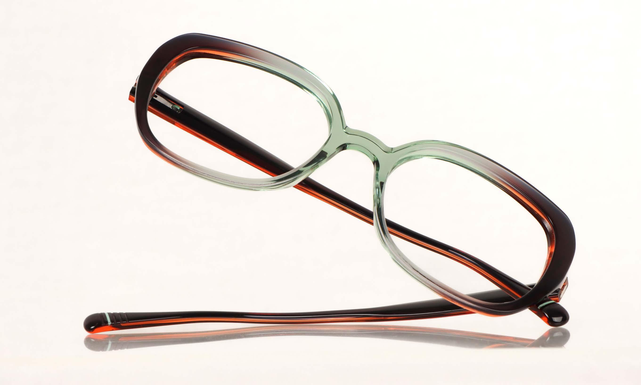
While MOREL has made waves with materials like carbon, wood and aluminum in previous releases, the 2024 collection shines a spotlight on acetate. The lightweight and malleable material allows MOREL to explore new shades and create unique shapes, resulting in eyewear that’s both vibrant and surprisingly transparent.
Anna
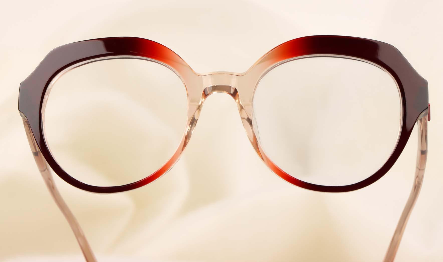
At the heart of this collection is the flagship model, »Anna«. The design is a harmonious blend of fashion-forward aesthetics and comfort. The pronounced thickness signals a shift to a bolder style. It’s a fashion statement and ultra-feminine at the same time, demonstrating MOREL’s commitment to staying at the forefront of eyewear trends.
»Anna«’s design features bold, fluttering shapes that seamlessly blend vibrant colors in a perfect gradient. Shades of purple and pink gracefully transition to a transparent bridge that allows natural light to shine through. This interplay of color and transparency creates a captivating balance that defines the character of this standout model.
All Eyes on Anna: beautiful, seamless color gradients and elegant transparencies in an exciting balance.
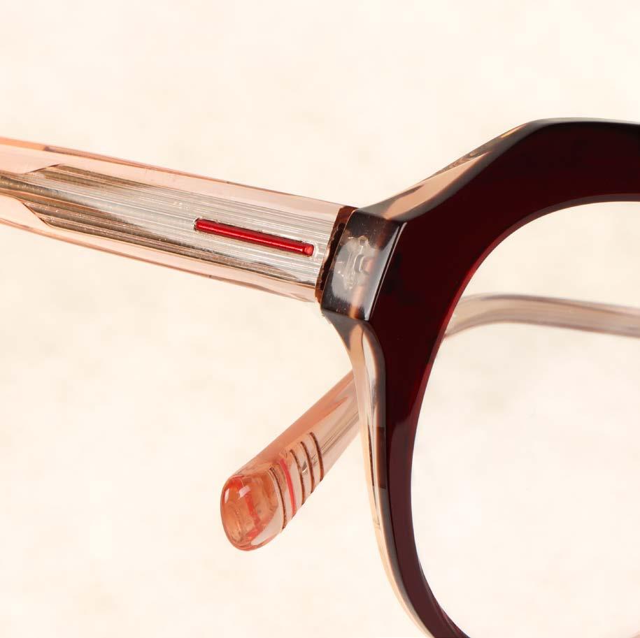
Signature hinge: A touch of innovation
You can’t help but notice the unique MOREL hinge that adorns the »Anna« model. Precisely crafted from flexible steel, this patented hinge eliminates screws and welds, reducing the need for maintenance. Not only does it improve comfort, but it also adds an elegant and distinctive touch to the design of the eyewear.


For our collection shoot, we were able to win the latest models from the ICONS spring/ summer 2024 collection from LOOK. With their contemporary flair, the ten models in the collection embody the essence of the Italian premium brand and combine classic shapes with modern design elements.
The timeless style is brought to life by iconic shapes and impresses with a choice of colors that reinterprets the Havana tones of the 1950s and 1970s. Shaded and colored block tones skilfully play with each other and lend the collection a touch of sophistication.
photography : SOPHIE DAUM [ Hamburg ] styling : KEVIN & MERVIN DIASOLUA
hair & make-up : ERIKA NEUMANN at KULT ARTISTS using NARS COSMETICS
models : NIKA at TWO MANAGEMENT & JESSICA at MODELWERK

LOOK
»4618« Amber Peach Pantone 2024 -
jacket & blouse MANGO
PILGRIM
LOOK
»4613« Havana-Dawn Blueblouse MANGO
A particular highlight of the ICONS collection is the design, which is characterized by a slim front and minimalist temples with a modern twist. The modern design gives the glasses a sophisticated and cosmopolitan look – ideal for anyone looking for a contemporary and avant-garde style that is not just based on fashion trends.
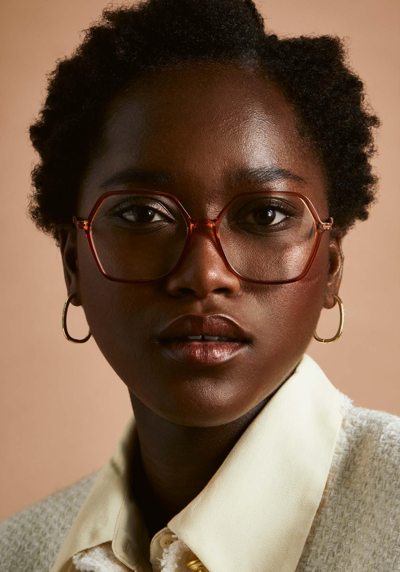
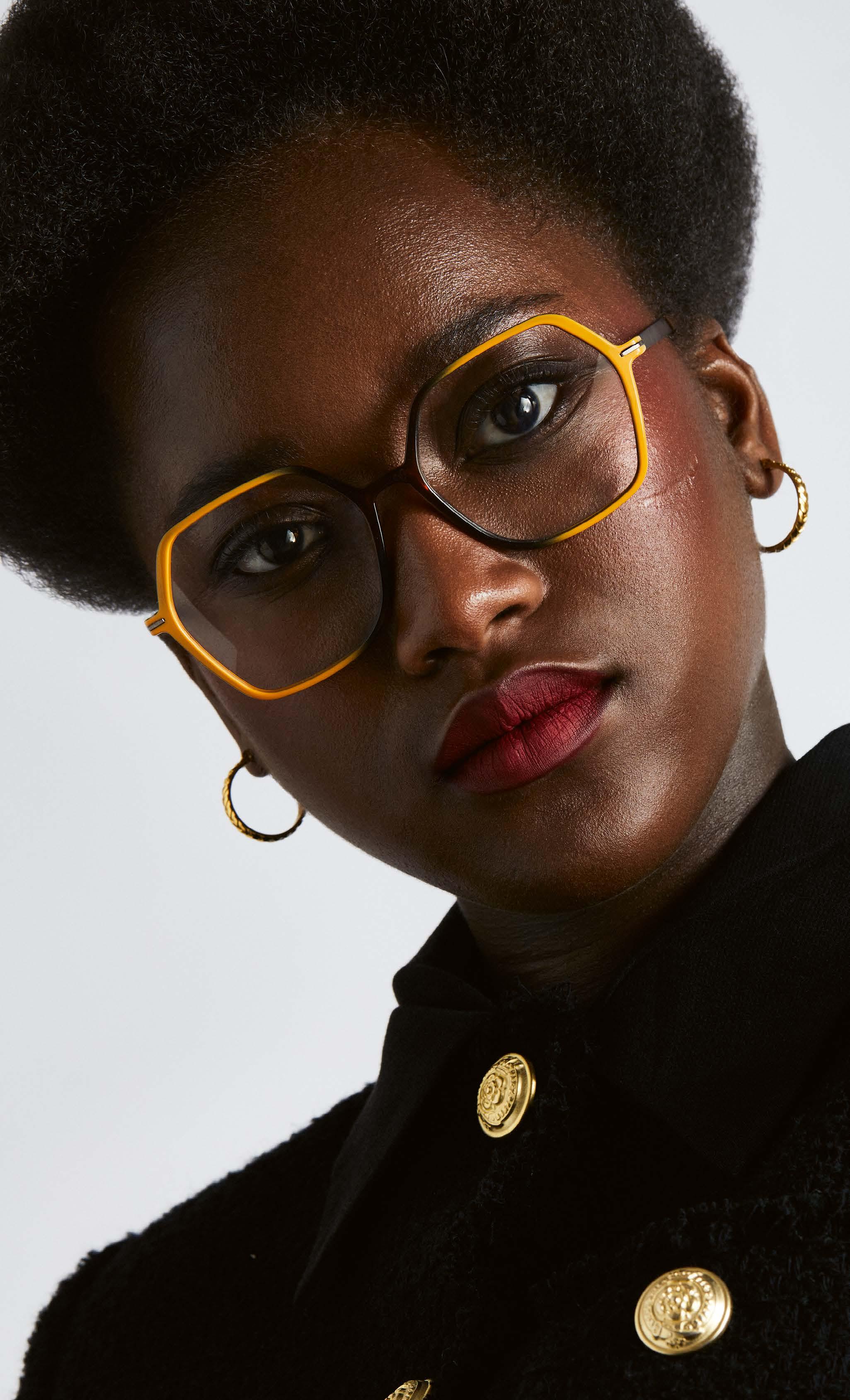
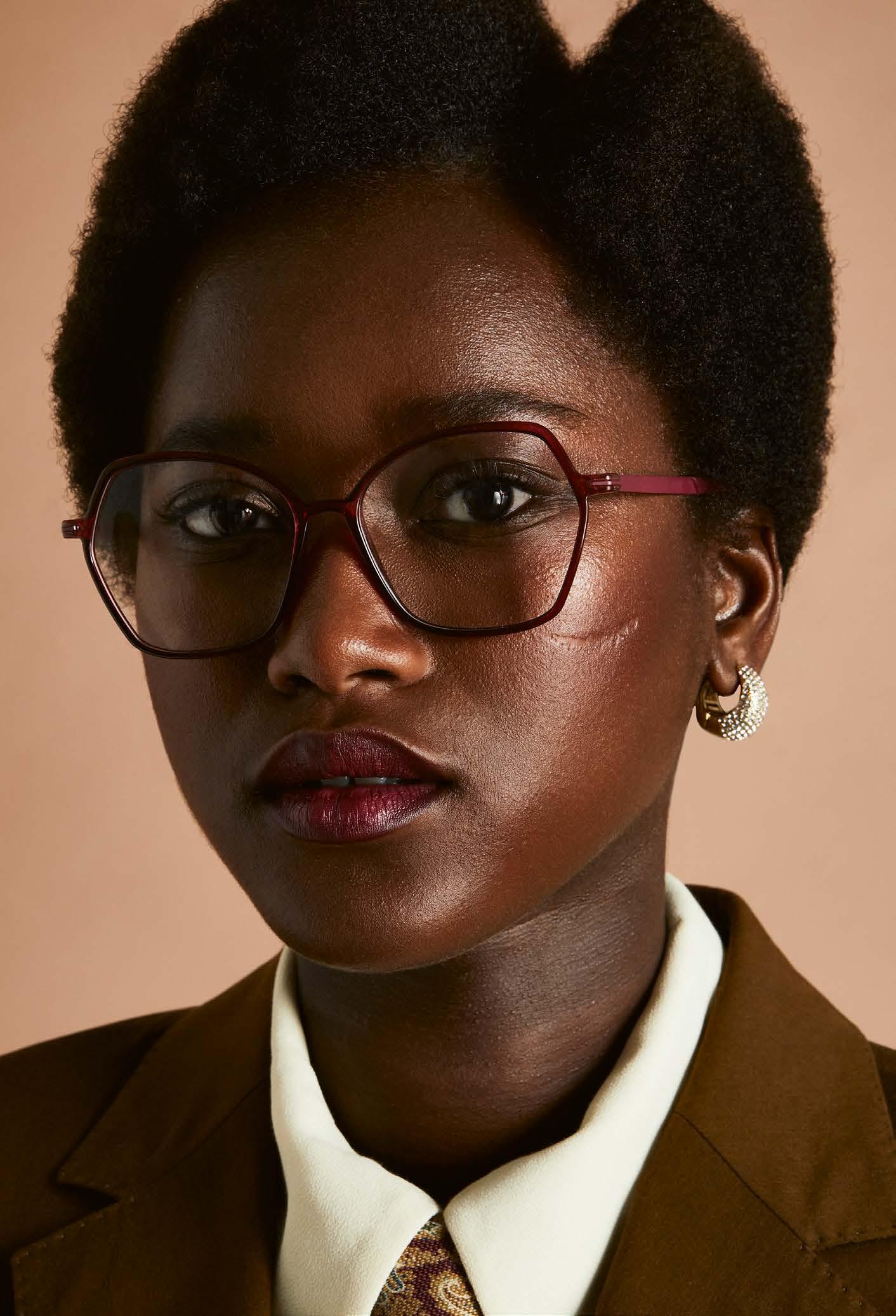
One of the most important features of the ICON models is their lightness, which is achieved by using high-quality materials such as NIL (Natural Injection Light) for the front and beta titanium for the temples. The hypoallergenic soft-touch end piece not only ensures optimum wearing comfort, but also enables length adjustment and therefore an individual fit for the wearer.
Each model in the ICONS collection is designed and manufactured with the utmost care in Italy and embodies the DNA of LOOK The quality of the eyewear can be felt and experienced, each frame is a testament to Italian craftsmanship and design.
lookocchiali.it

-



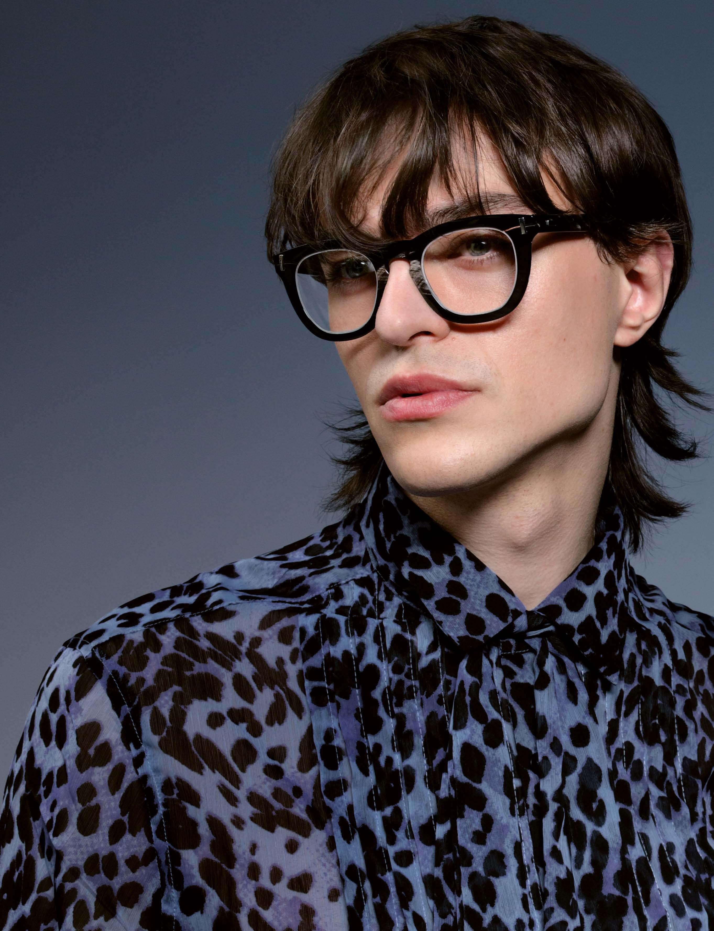

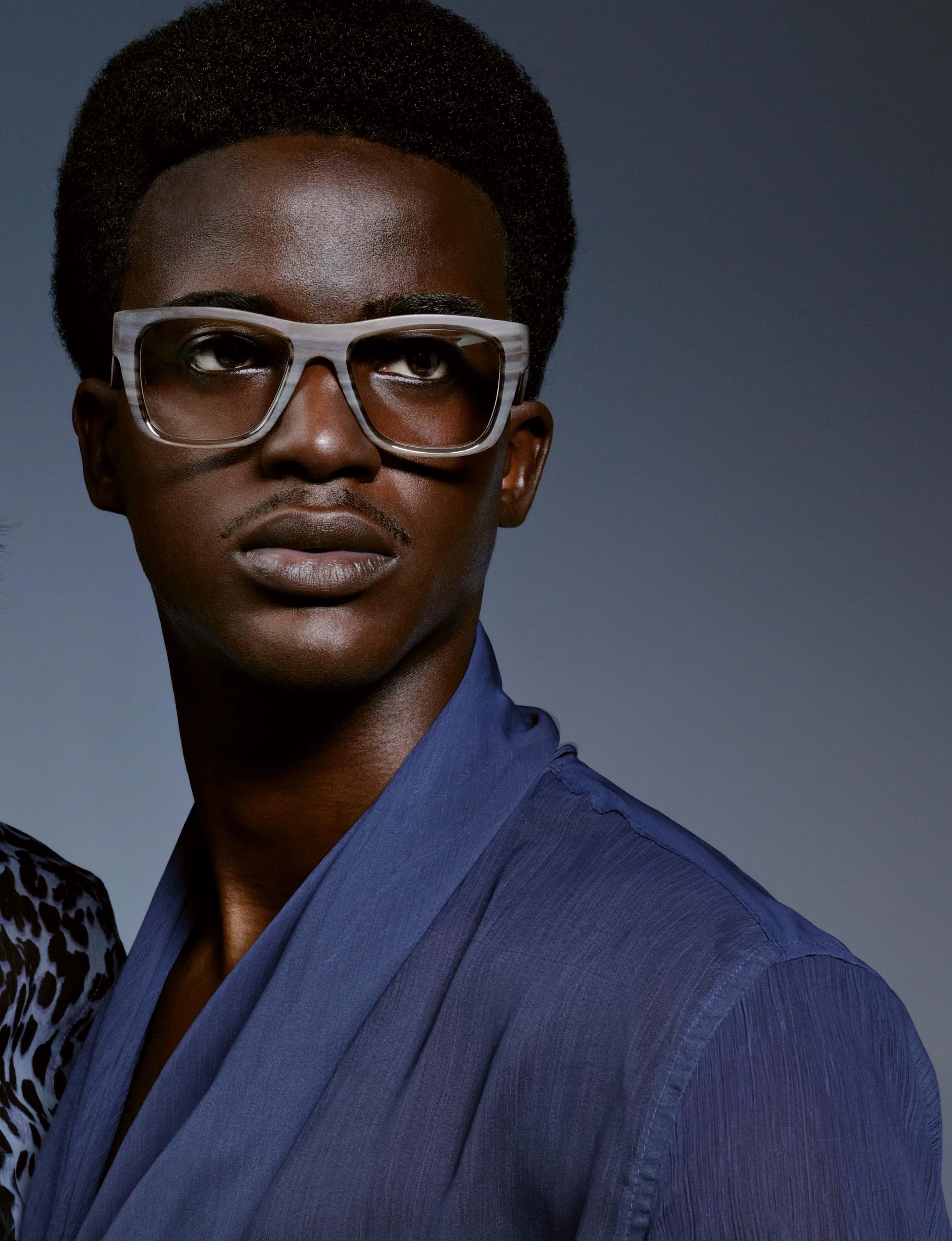
HOFFMANN NATURAL EYEWEAR »V7792«shirt STYLIST’S OWN

HOFFMANN NATURAL EYEWEAR »341«shirt STYLIST’S OWN
photography : DENISE KRENTZ [ Aachen ] styling : SABINE BERLIPP make-up : WALTER DENECHERE hair : DAVID LEE GRENDA models : CARLOS & MARCO at MEGA
Valuable Optical Designs For Men. Boom... one more beautiful than the other...
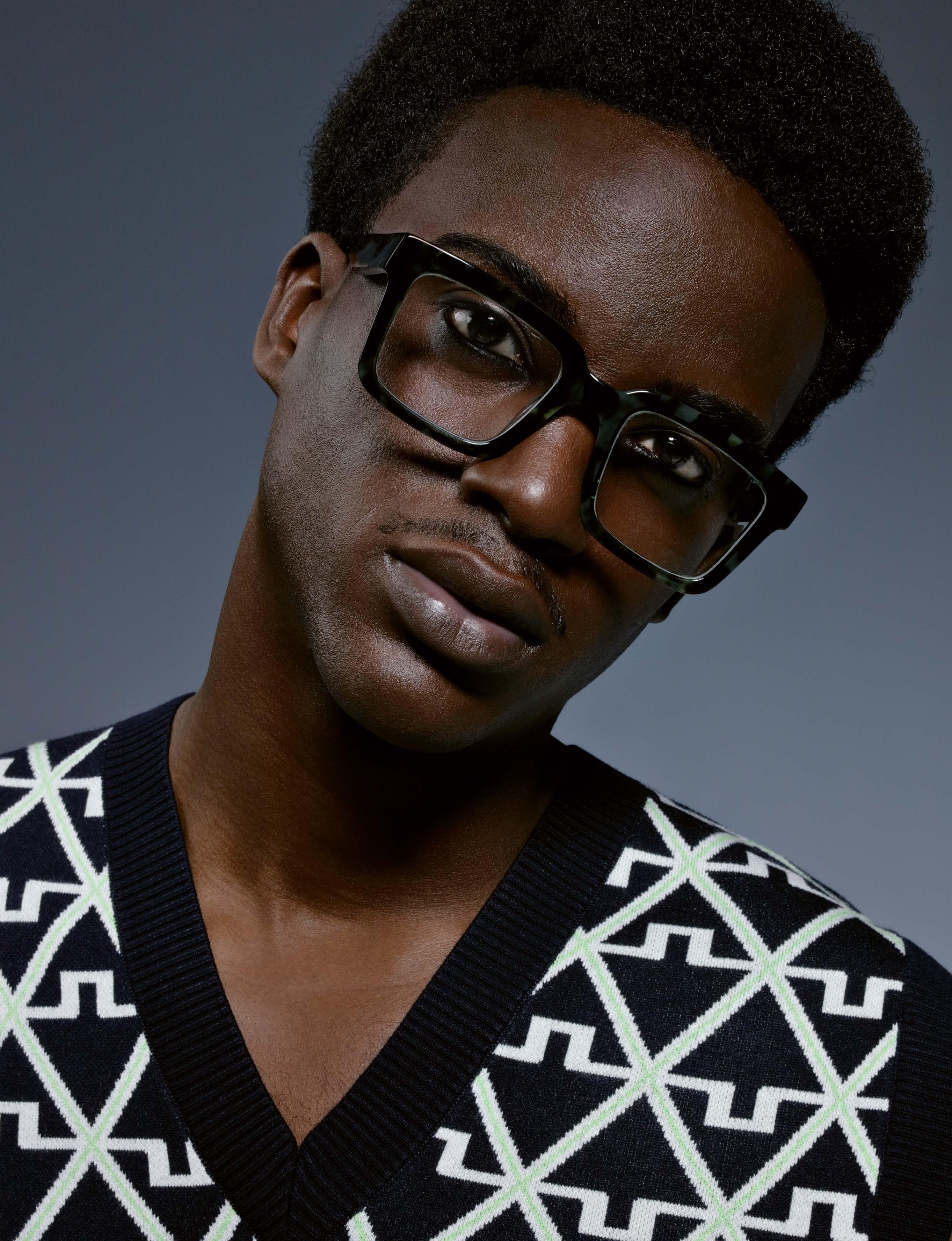
 NIRVAN JAVAN MARRAKECH
»01:08 (WET)«
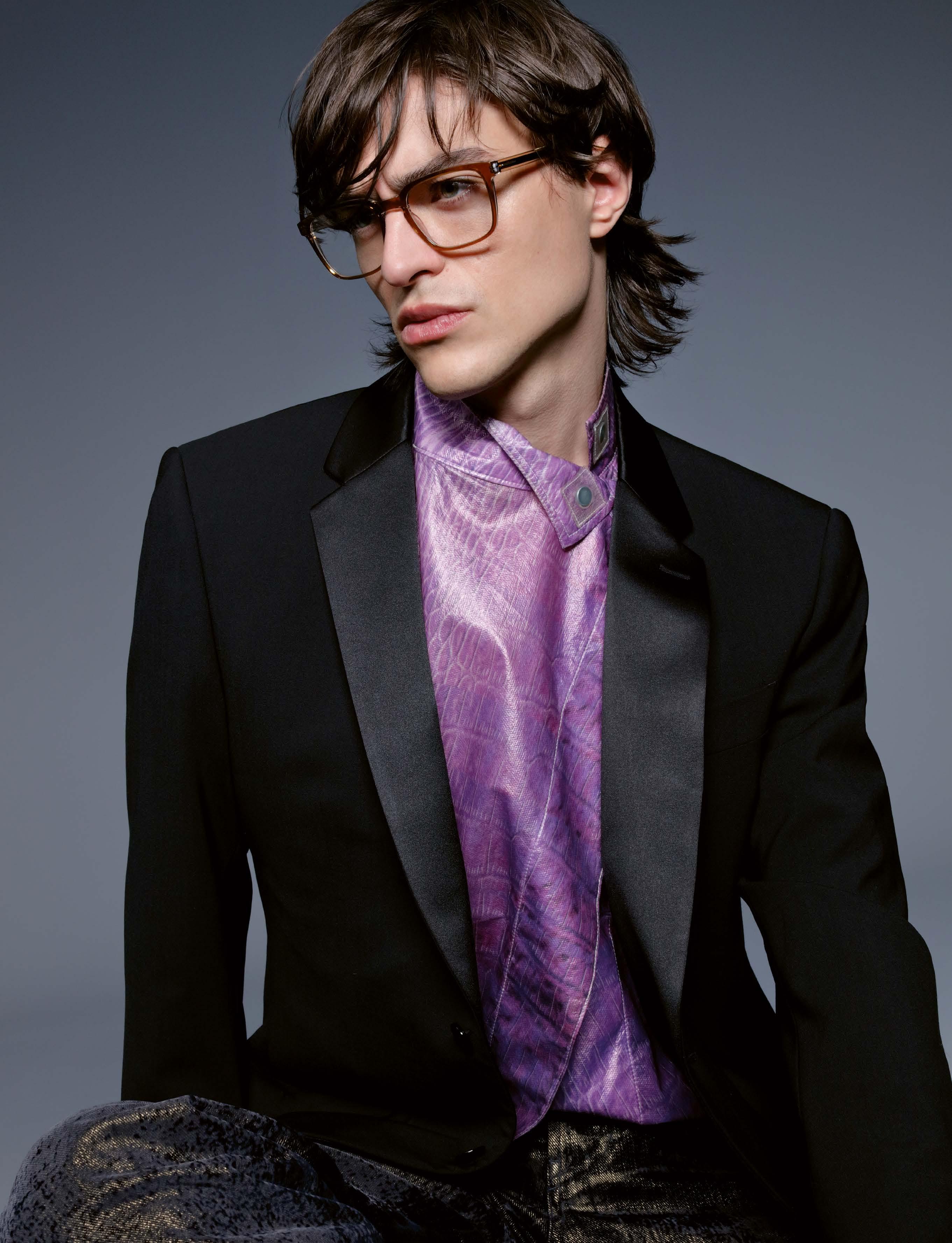


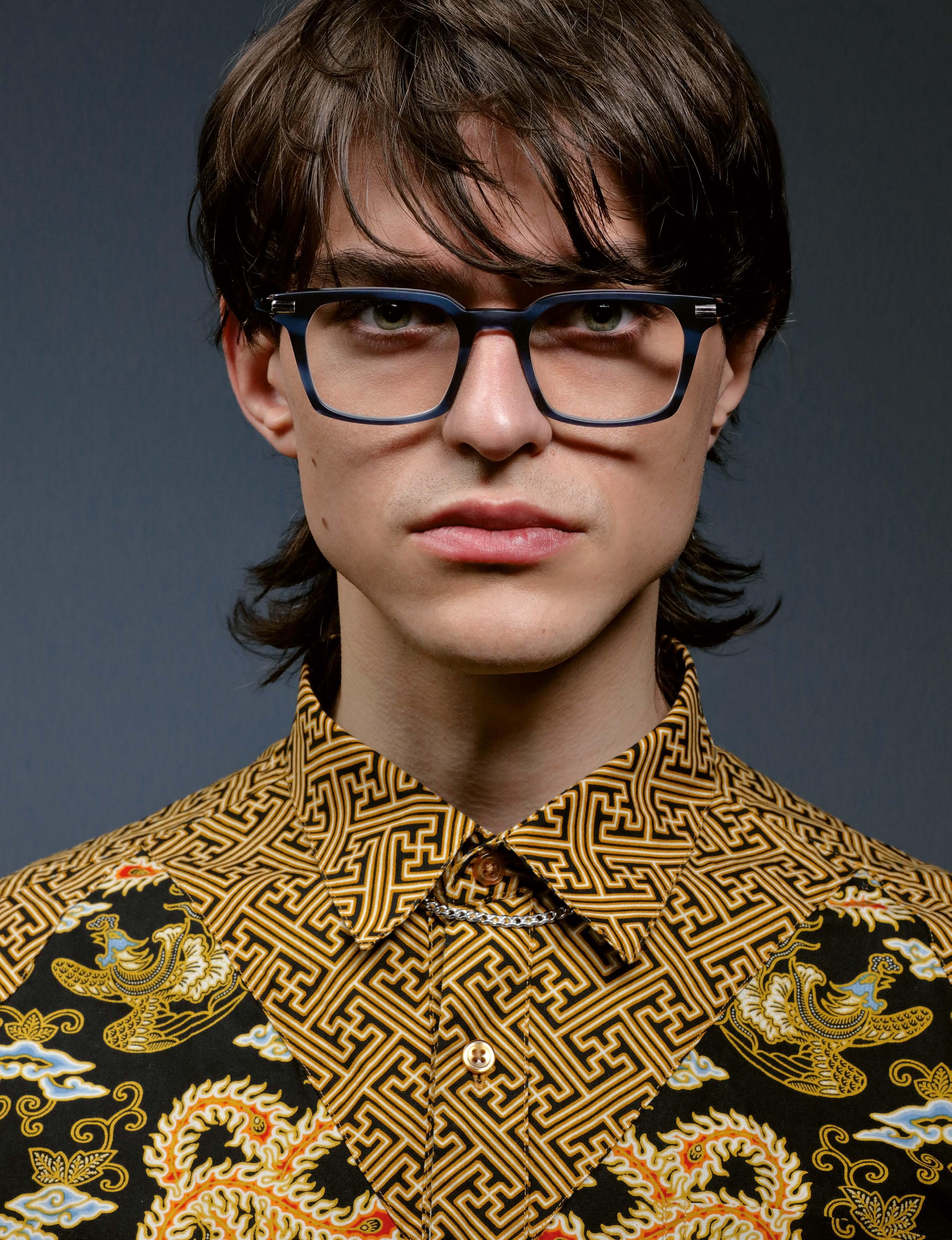
shirt POLYESTERSHOCK
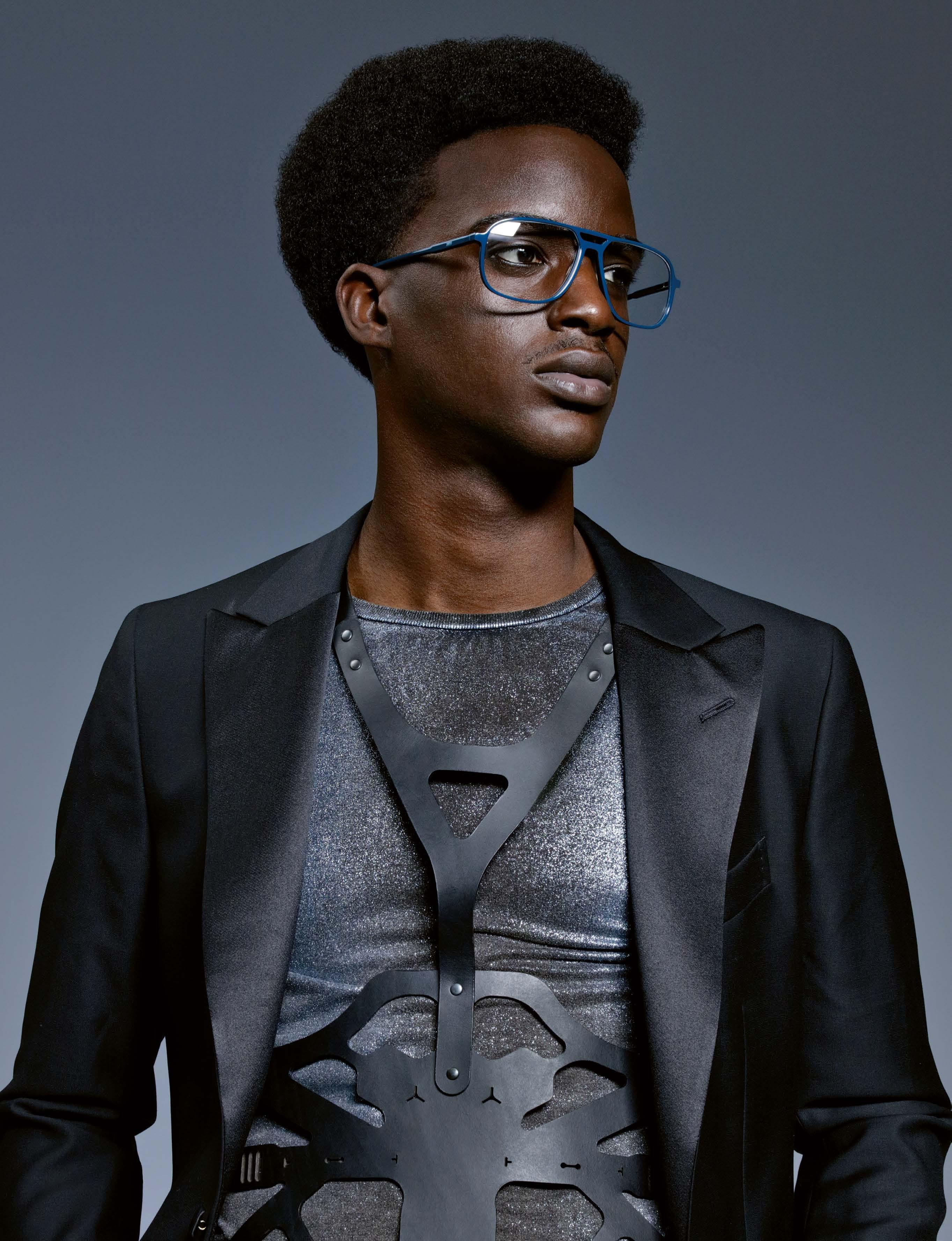
»DAP135-04«
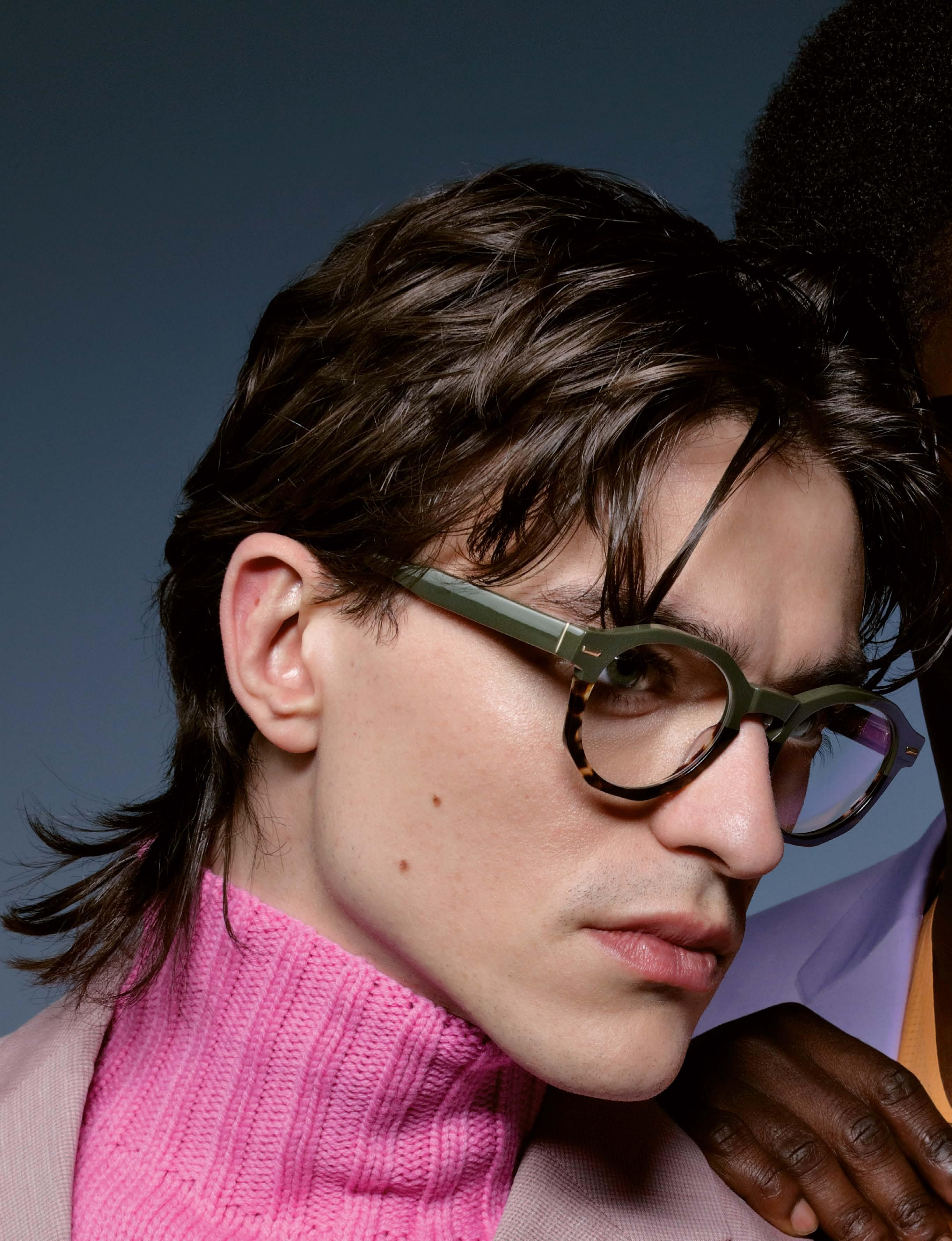
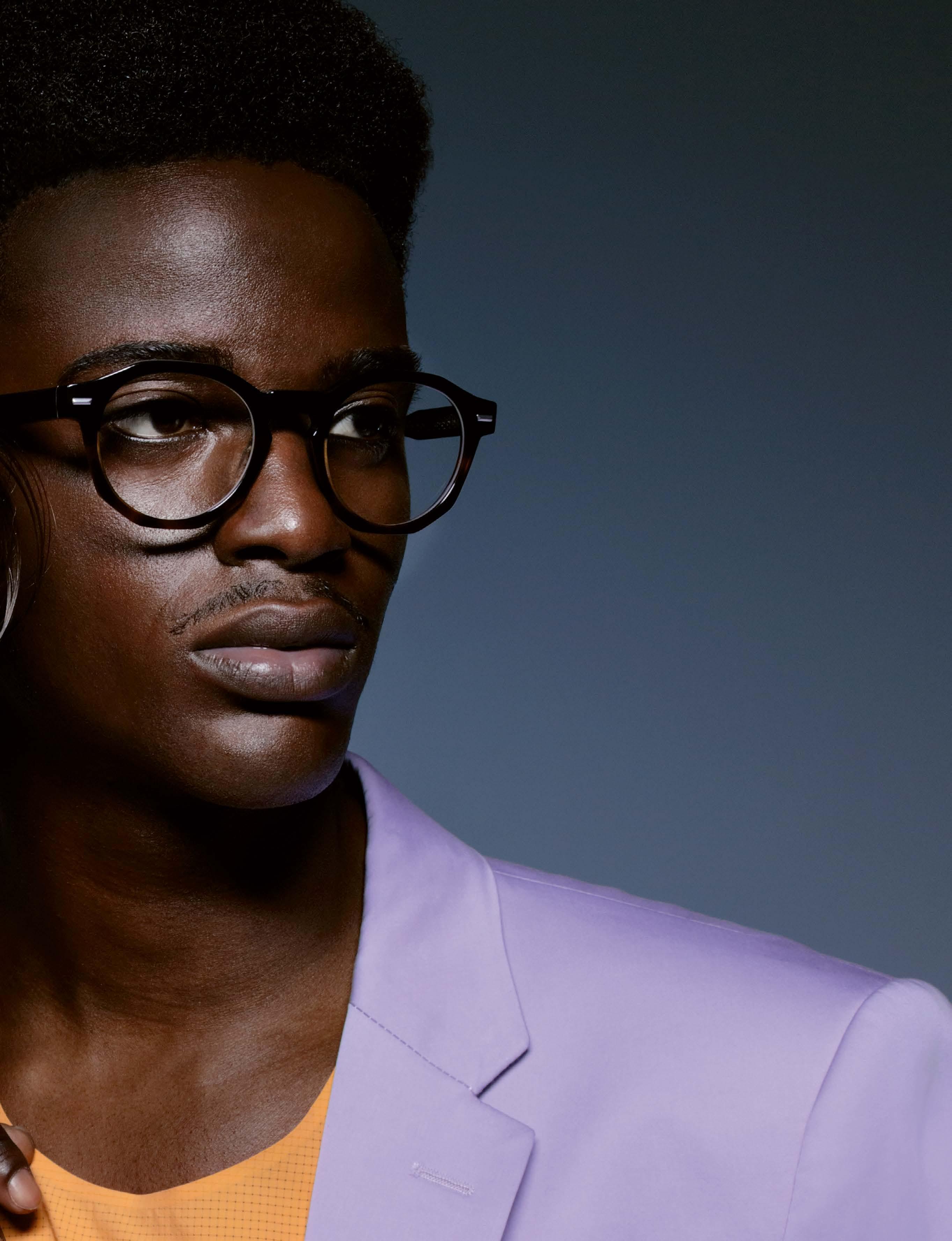
DAVIDOFF EYEWEAR »DAP135-01«
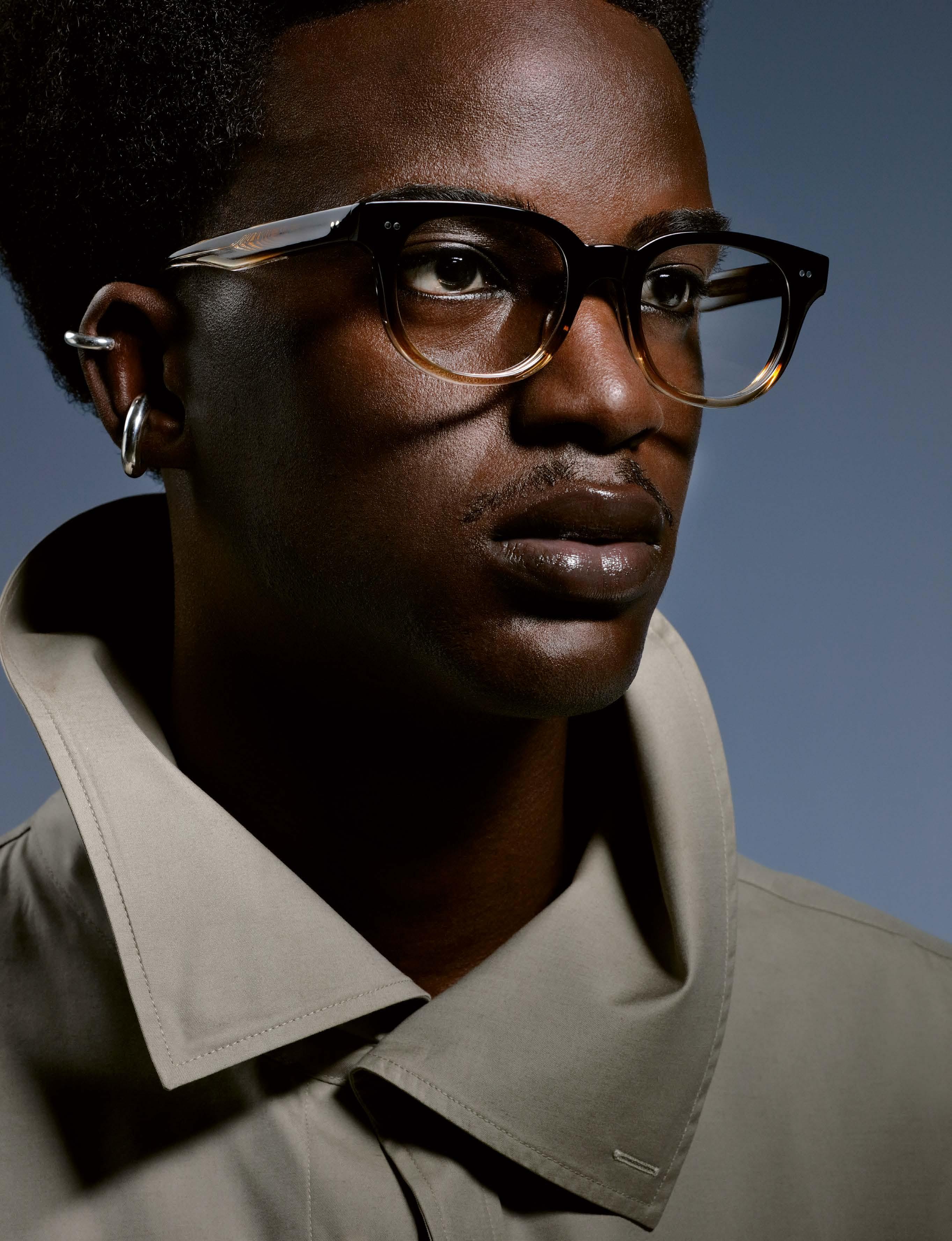

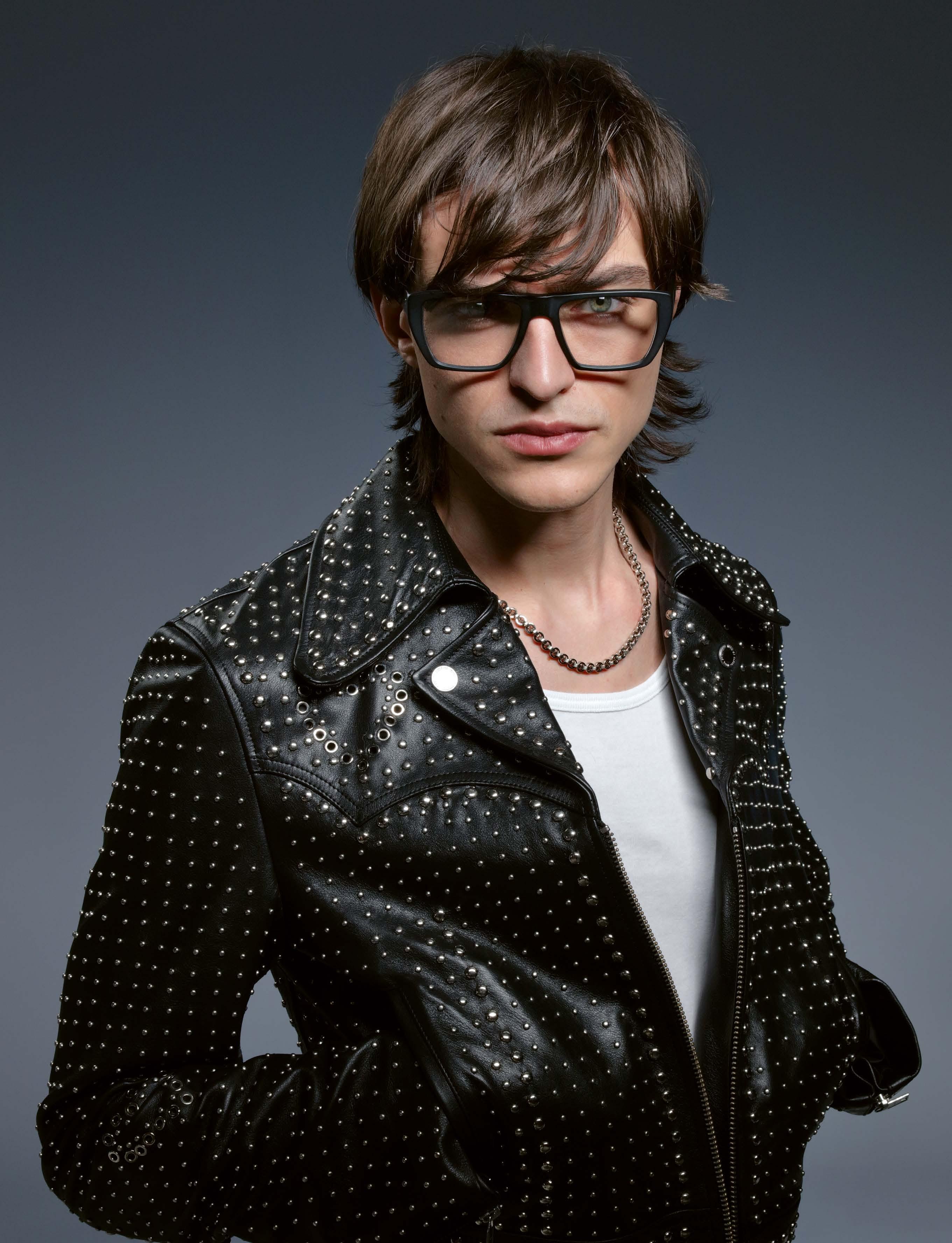 MASAO »13244« -
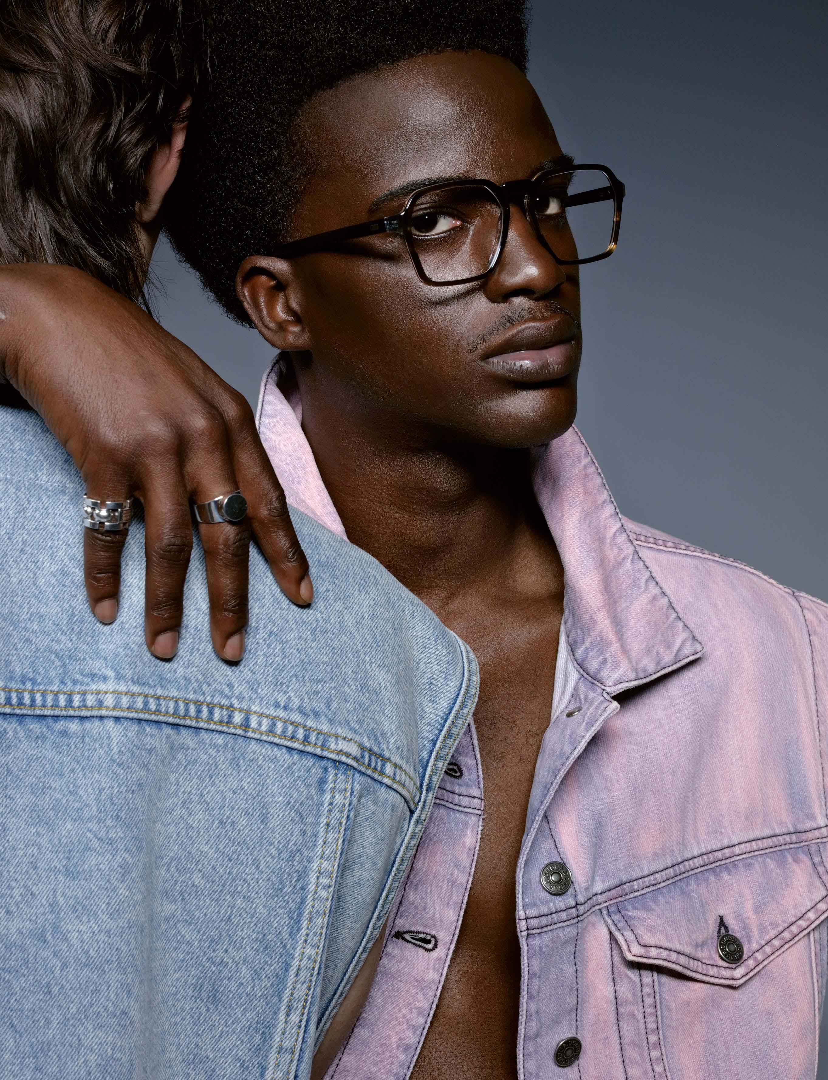

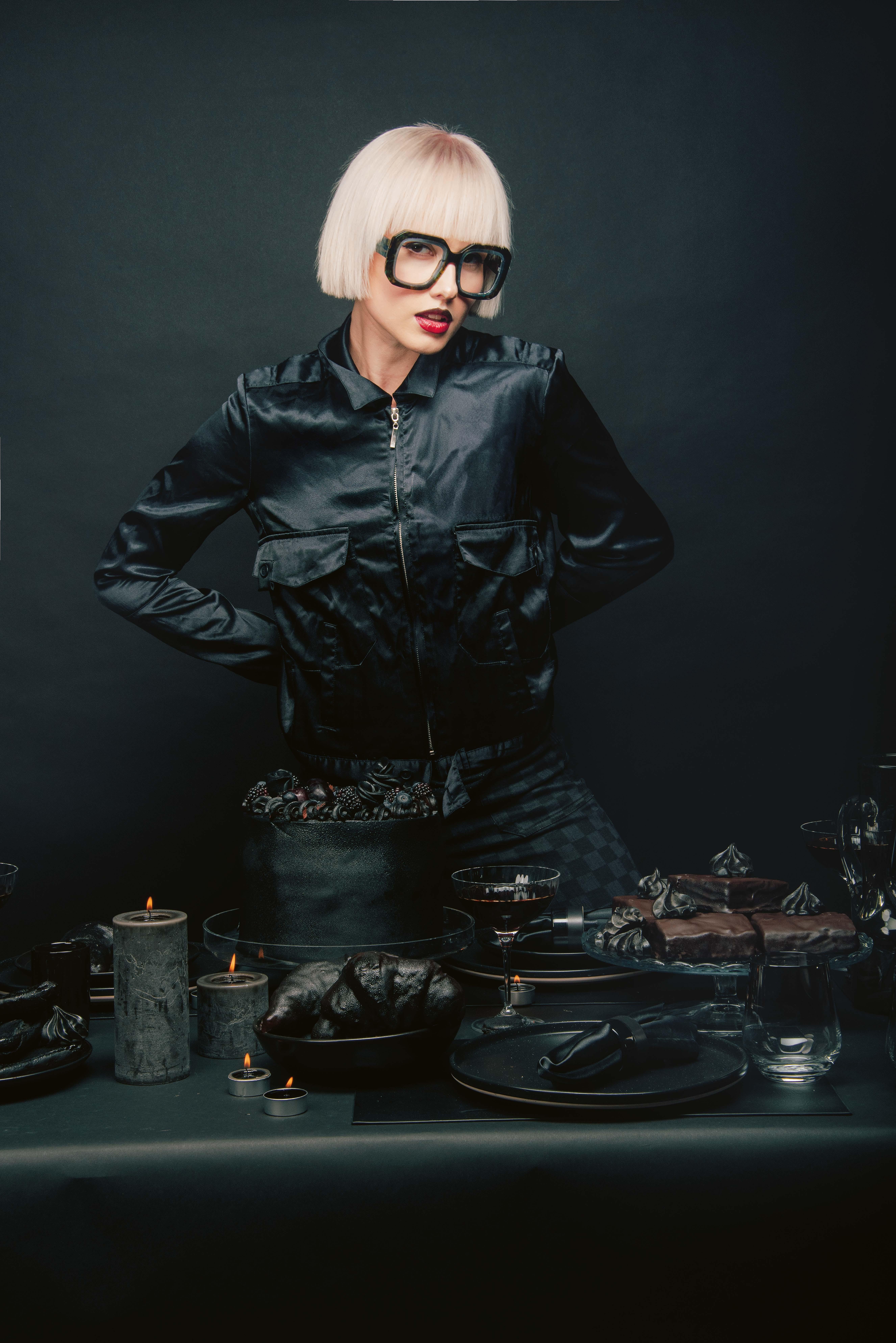
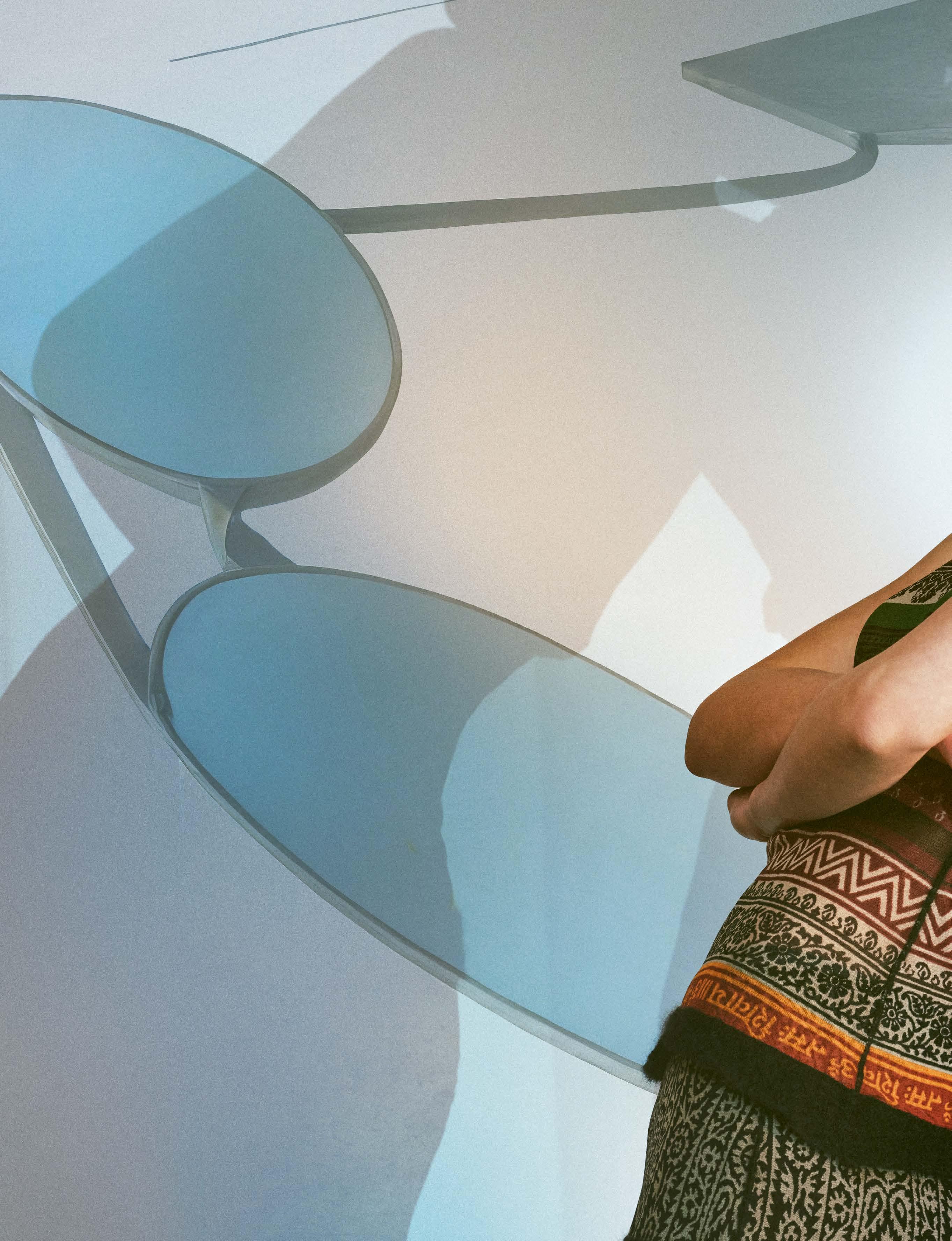
These wonderful optical glasses always suit the sophisticated woman – with a cocktail dress, but also with a business suit.
photography : BRIX & MAAS [ Berlin ]
agency : SONJA HEINTSCHEL
styling : AGLAJA BRIX & SAM HILL
hair : SAM HILL at INCLOVER AGENCY
models : LINDA & STINE at M4 MODELS

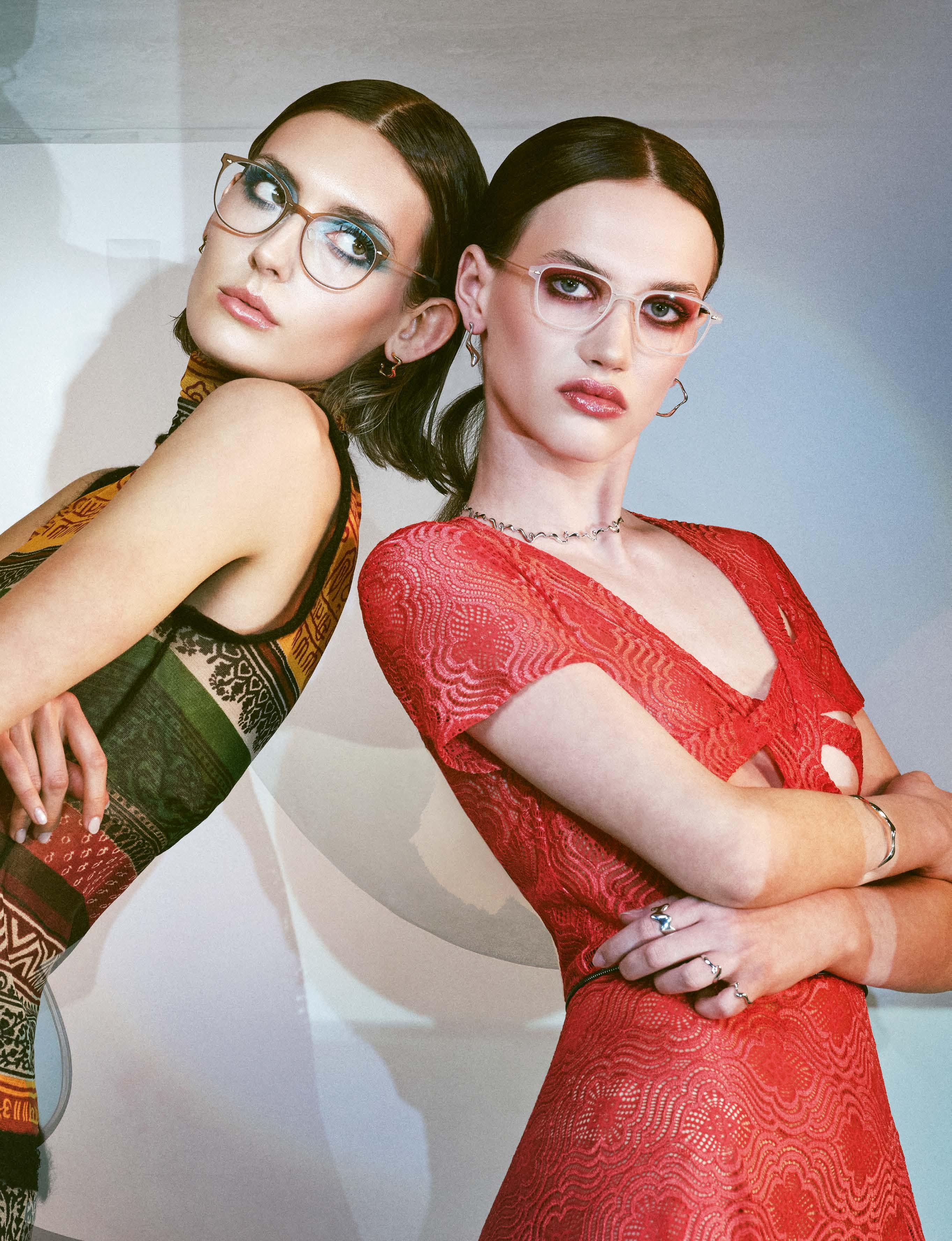

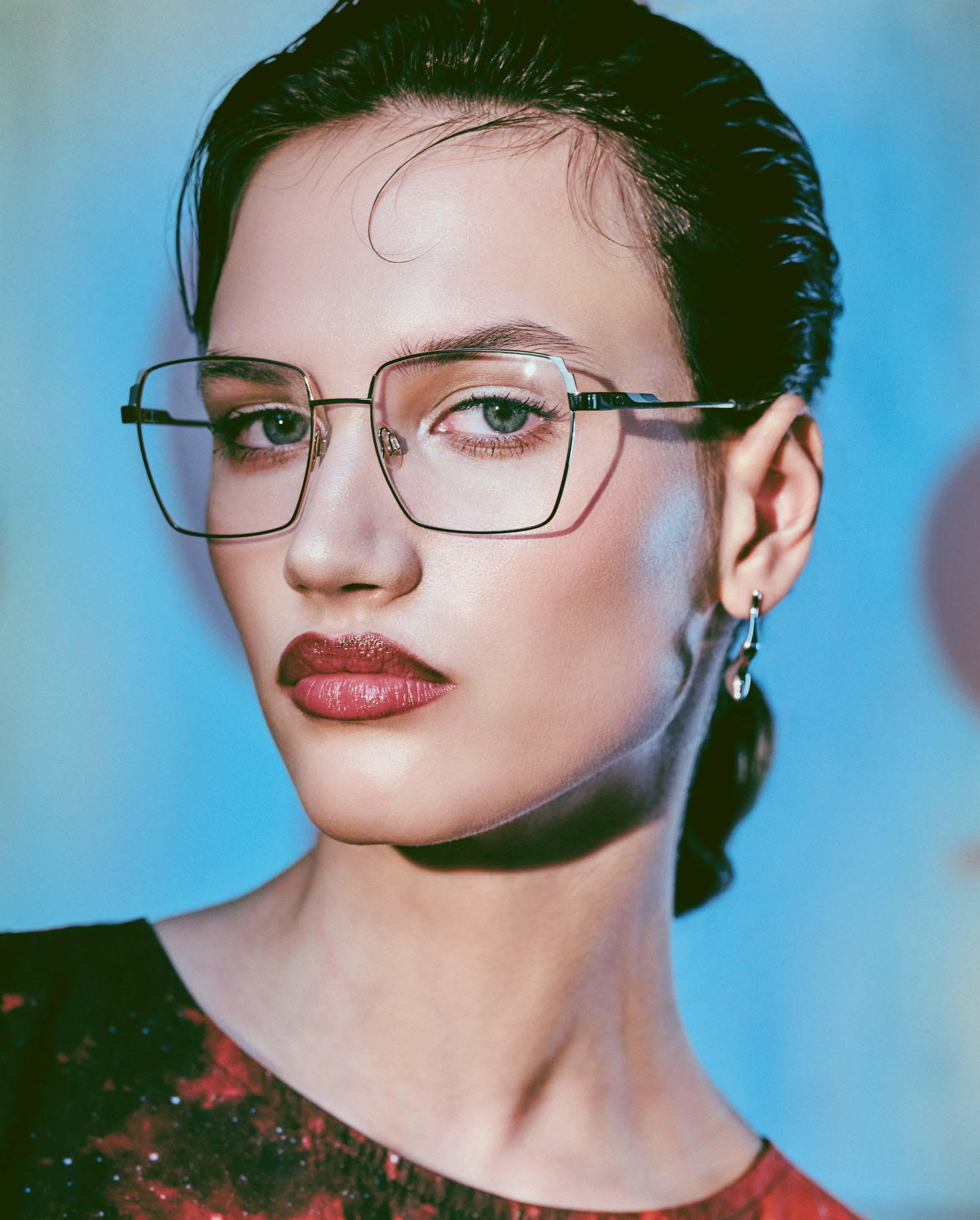


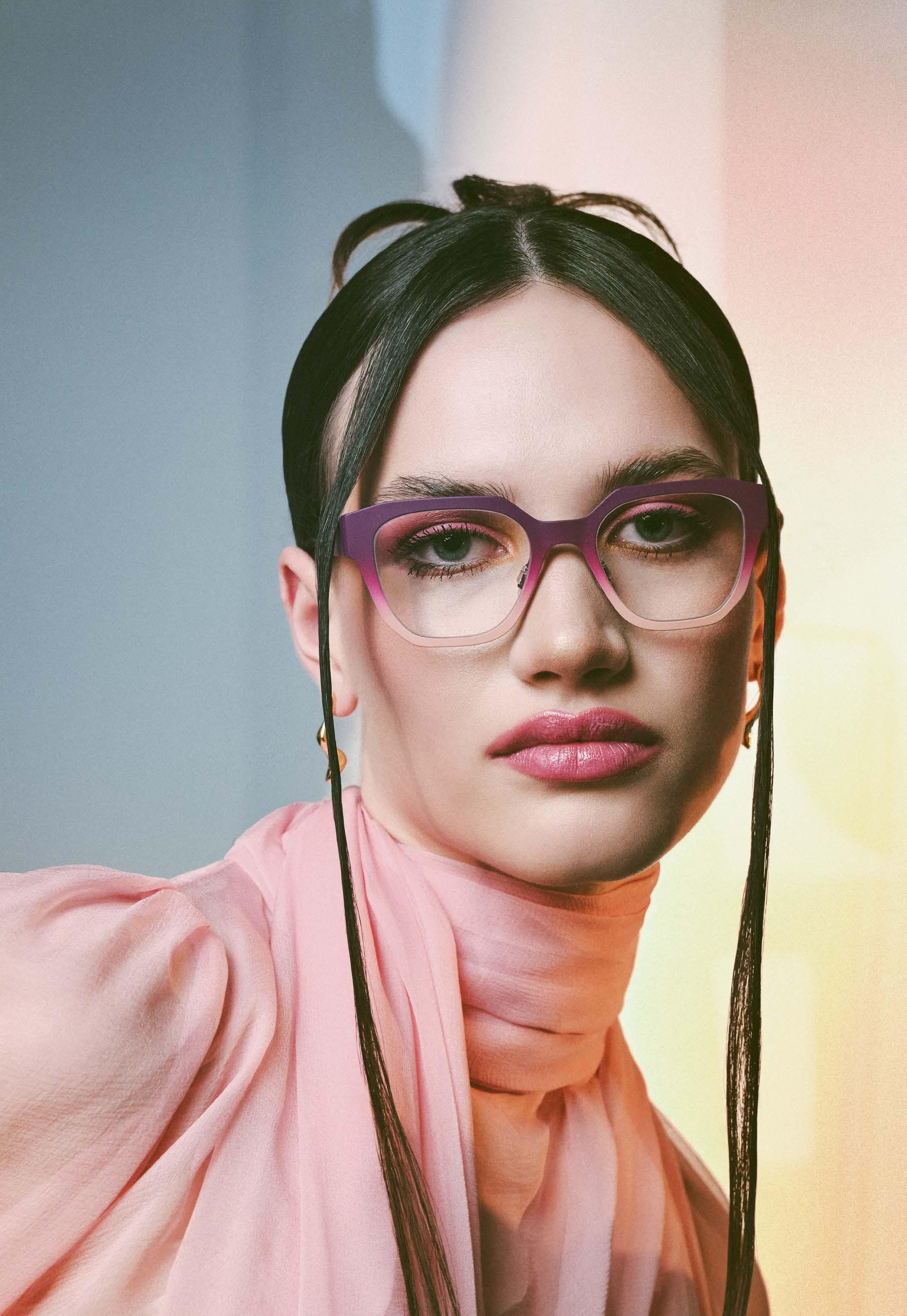

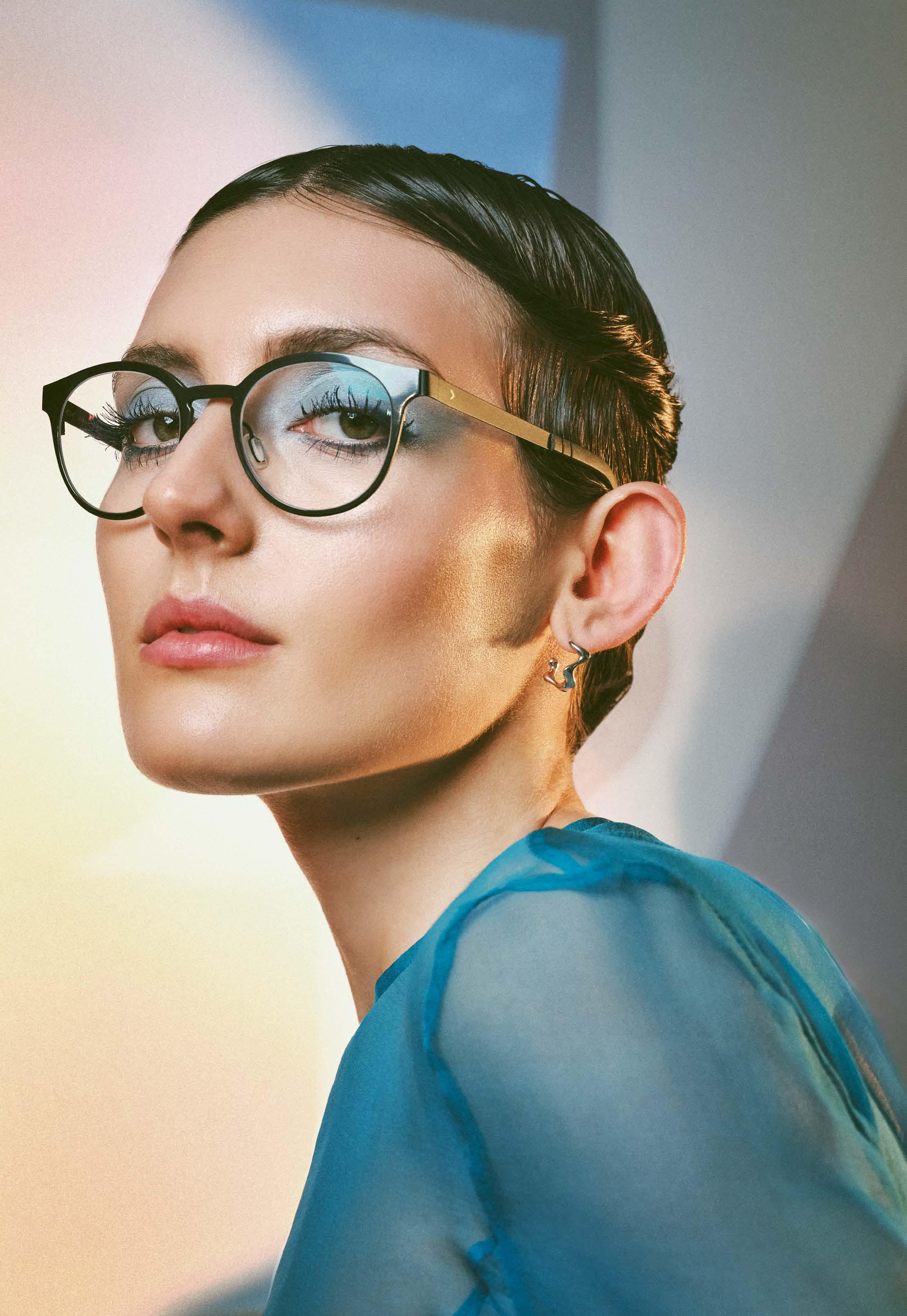

J.F.REY »JF1549 3070« -
dress MARCEL OSTERTAG
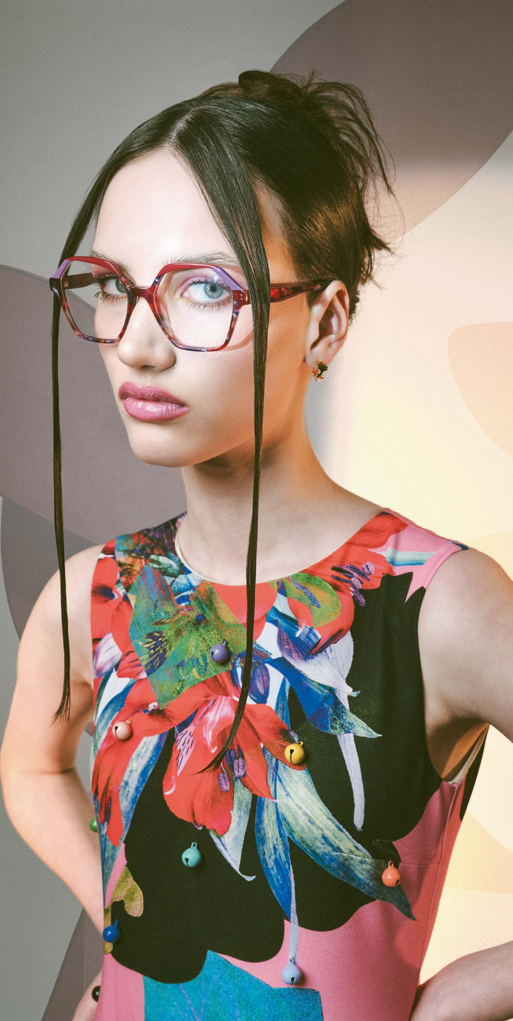

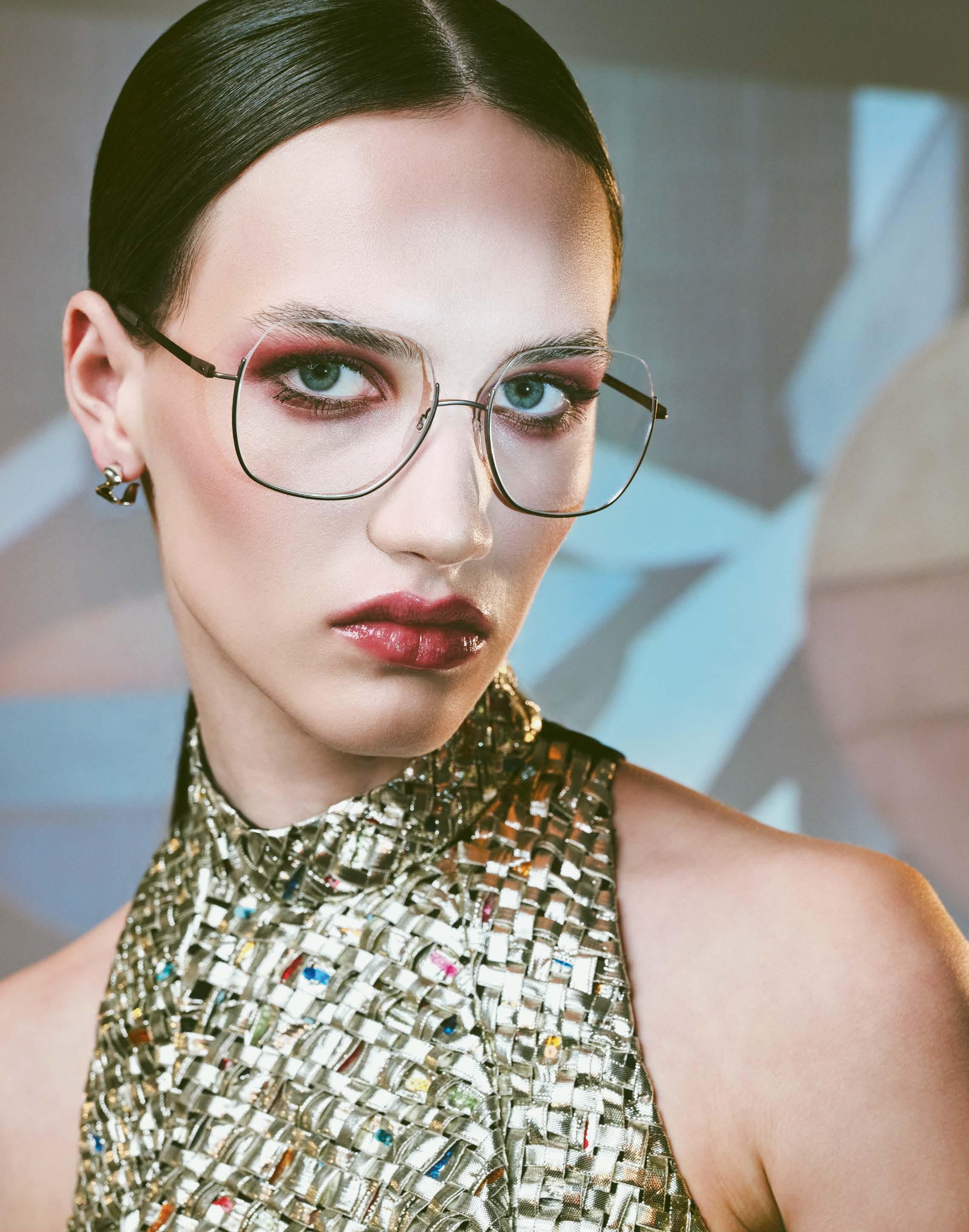


KOBERG »KT 6054« -

Made to last – both SALT. and BLACK BEAR BRAND are committed to the highest quality standards.
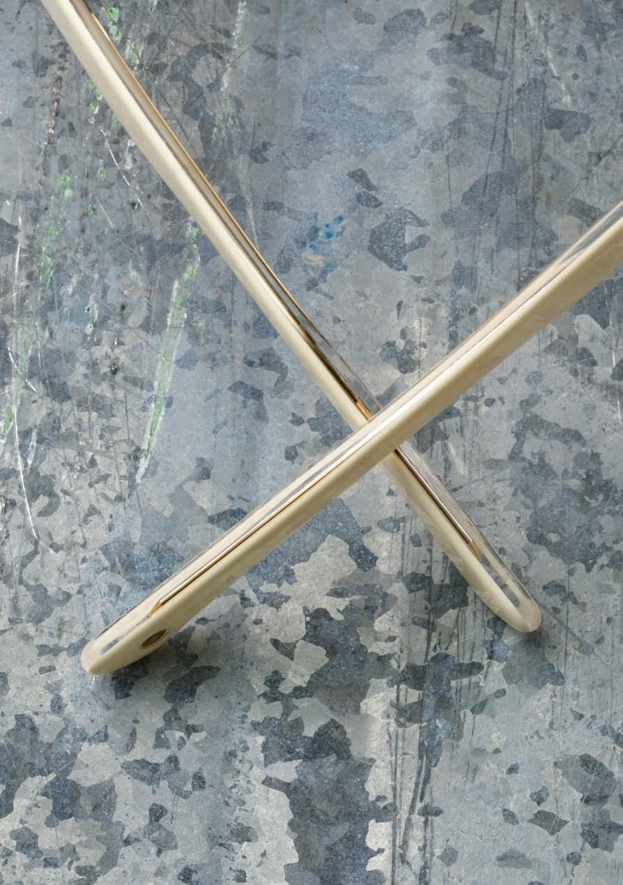

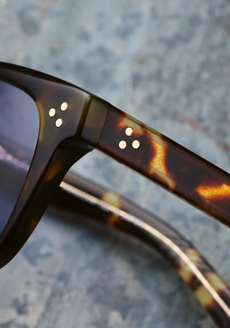
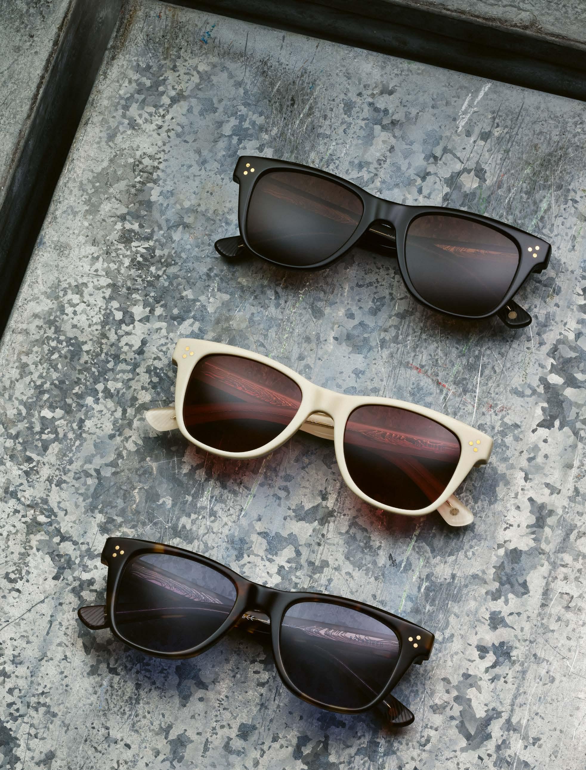
SALT. launches another high-profile collaboration. The partner this time: Black Bear Brand. The apparel brand, which is known for its exceptional craftsmanship and high quality products, is a perfect fit for SALT.. Brice Gollnisch gives us valuable insights into the collaboration between the two US-based brands.

Hi Brice, collaborations are very important at SALT.. Why is that?
Collaborations are at the very core of what SALT. stands for: human connections and highest craftsmanship. They are such a fantastic way to connect with great people – also outside of the industry – and come up with a unique product, sometimes very technical, sometimes a bit outside of our own DNA. They allow us to always push ourselves and strive for more.
What does a collab partner basically have to bring to the table so that you can imagine working together?
Rather than just looking at what a partner can bring to the table, we look more at the end-result we can achieve by working together. If we look back on our previous collaborations – Aether, Northsails, Radford… – we have always shared a common vision for quality, technicality, expertise and the will of making the best possible product, whether it is apparel, cars or eyewear.
Your latest coup is a collaboration with Black Bear Brand? What does the brand stand for?
Black Bear Brand focuses on material and a unique workmanship, free of compromise, to create pieces that will last a lifetime.
So you share these values. What else do SALT. and Black Bear Brand have in common?
We have shared a deep connection for a long time now. Not only do we both have a passion for heritage, we also have a common philosophy when it comes to design, manufacturing and a relentless pursuit of excellence.
So, longevity is a passionate topic for both of you, right?
It is. I think longevity is a passionate topic for any premium brand seeking to last and establish a lasting relationship with its community. Black Bear Brand and SALT. both aim at crafting pieces that will last for generations.
There is also an overlap in the visual language. Both SALT. and Black Bear Brand focus on timeless design, right?
Trends are fun, but they come and go, right? So, if you want your product to last, you need to go beyond the trends instead of going by them. It is something we both try to achieve and although it may look simple, it does require a lot of work.
How did the collaboration come about? Who took the initiative?
We worked with Josh Sirlin, the creative director and basically the mind behind Black Bear Brand, for some time. SALT. has always been his eyewear of choice. The first project we did was a custom Horween Leather case that was handcrafted in the USA. After that project, SALT. discussed the possibility of working on a custom eyewear piece. For us, the human connection has to be there and the timing seemed right to work on a special eye-
wear piece that captured our commitment to premium handcrafted works.
To what extent did Black Bear Brand get involved in the product design? Josh had a particular style that he liked, so he took aspects that he liked and built on that. He was involved in the whole process. It was a true collaboration, from the packaging to the smallest details. Allow me to actually quote Joshua here. “Designing this collaboration with SALT. OPTICS feels like the culmination of a journey, a convergence of two worlds steeped in the pursuit of making the best. These glasses are more than just accessories; they’re an expression of what I love about eyewear.”
With the »Sirlin« model in three colors, the collaboration is very straightforward. Why the focus on just one model and not more choice?
We have tried things we have never tried before on the »Sirlin«, which we will detail a bit further, so we wanted this one to be very limited.
What are these details? What can you tell us about the design, the material and the lenses?
Just like for any other SALT. piece of eyewear, we focused on the delicate balance of fit and style. The »Sirlin« is 100% made in Japan using the highest quality Japanese hardware. We have custom thickness transitions to ensure rigidity,

durability and a proper fit. Also, like any other SALT. sunglasses, we use 100% polarized optical grade CR-39 lenses offering superior optics. What makes this frame unique, though, are its special features. It’s the first time we’ve used precious metals to create custom hardware! We have 24K goldplated hinges and core wires, as well as solid gold functional rivets. We have a custom temple tip etching for enhanced grip and a detectable gold inner skeleton on all 3 colors.
Black Bear Brand is a very masculine brand. Can your collab glasses also appeal to women?
Black Bear Brand is focused primarily on menswear, that is true. However, the collaboration style we developed together is very unisex. We worked to achieve a sunglass that would fit a wide variety of face shapes and sizes, and the color palette we landed on is very timeless for both men and women. We think if you like it, give it a shot.
Is this exquisite model only available from opticians or is it also wherever discerning connoisseurs can buy Black Bear Brand products?
As this is a very exclusive collaboration, you will find the »Sirlin« at a limited number of SALT. partner opticians. Thanks.
The eyes must travel.
»DAPS114-02«
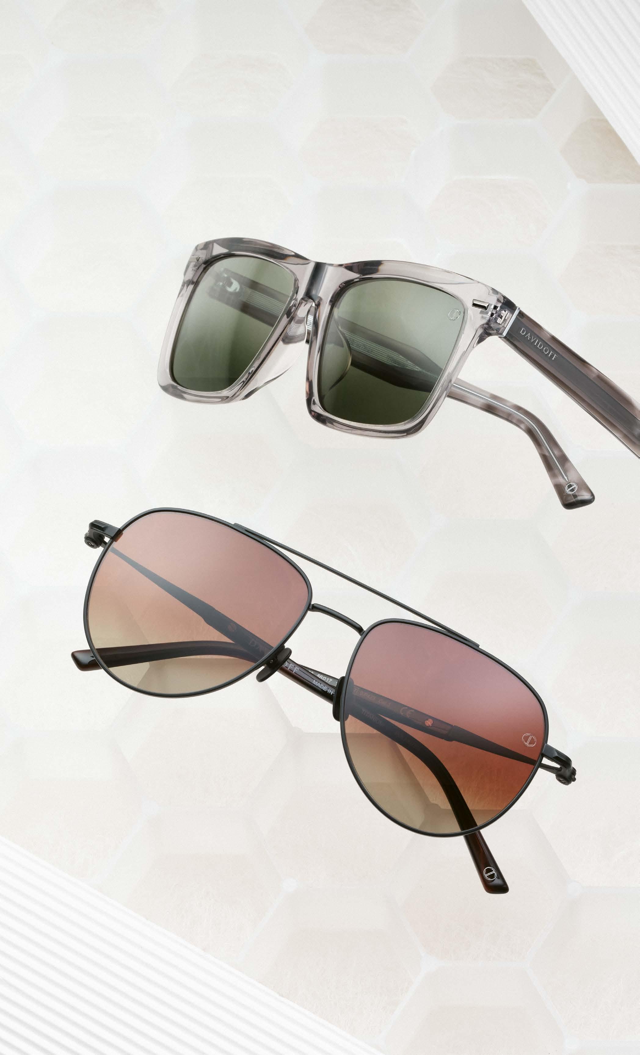
DAVIDOFF EYEWEAR is still a young brand and yet the eyewear carries a great brand promise and design heritage, after all Zino Davidoff has shaped the fashion world for decades. Designer Diego Accorsi explains how he translates the Zest for Life into eyewear design.
»DATS113-03«


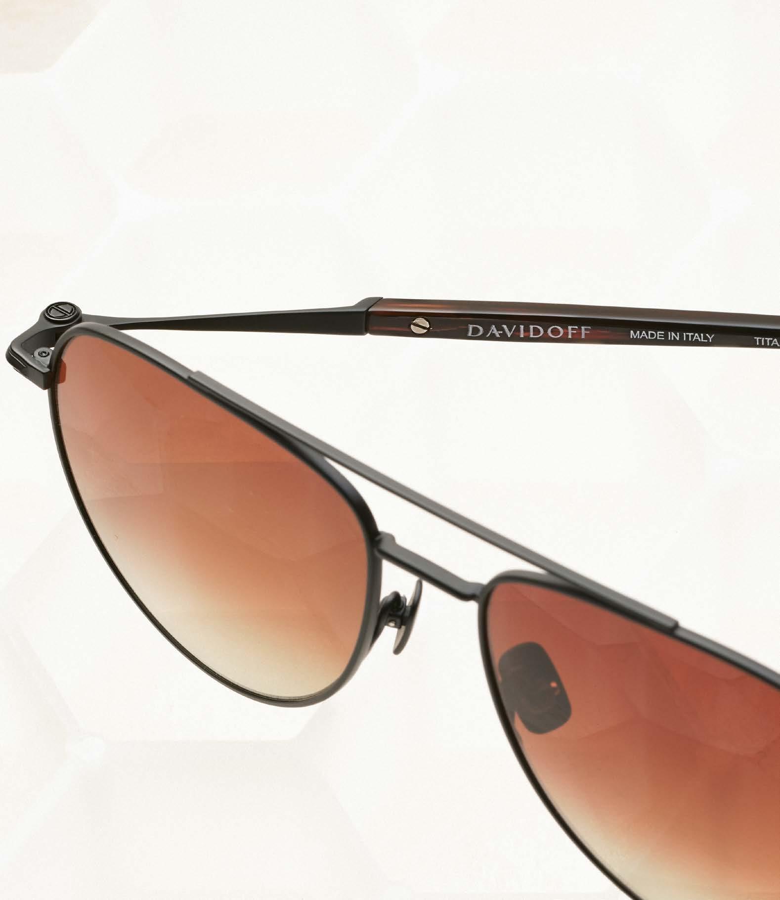
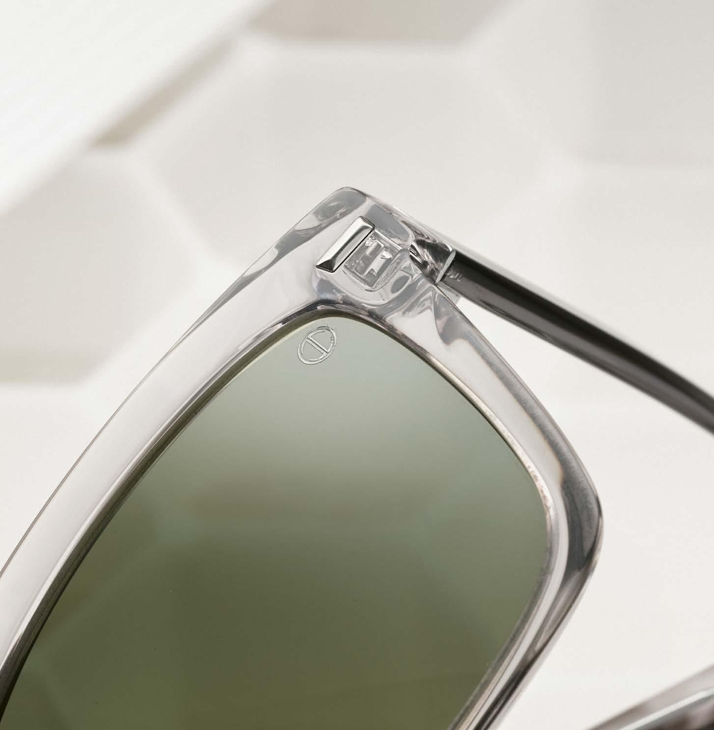
The hyphen from the Davidoff A is a signature element throughout the collection – usually clearly visible on the front of the glasses.
Zino Davidoff’s motto is “Zest for Life”. Does this also apply to eyewear?
The Swiss man with Ukrainian roots founded his company for lifestyle and luxury products back in the 1980s. The self-confessed bon vivant was a globetrotter and always on the lookout for the finer things in life. His credo “Zest for Life” is considered his personal brand legacy and is still at the heart of the luxury brand today. Is this also reflected in the eyewear collections?
Yes, the models exude a certain charm and are ideal for men who enjoy every moment and appreciate quality. The glas-
all men who appreciate good quality and craftsmanship “Made in Italy”. Do you rely entirely on production in
Yes, our eyewear is carefully handcrafted from high-quality materials between the northern Italian cities of Udine, Belluno and Venice with years of expertise. How important are sunglasses in the collection?
DAVIDOFF EYEWEAR sunglasses play a very important role in the typical “joie de vivre” of the Italian lifestyle. They are the inseparable companions of the DAVIDOFF businessman on his journey around the world, with an unmistakable reminder of the Italian “Dolce Vita”, in the land of style, good food and the good life. How has the collection changed since the first launch and what is special about the current collection?
The style has definitely become bolder, more modern and more international. The shapes are more dominant from a design perspective, with more pronounced
contours, facets and special milling of the acetates, color combinations, new interpretations of the brand logos and iconic elements. The structure of the eyewear collection no longer consists of simple embellishments, but of three-dimensional and structural elements that are both functional and decorative.
Zino Davidoff was an outspoken lover of Paris, is this reflected in the product design?
Definitely. The recently launched third collection includes prescription eyewear that is part of the core Paris line. Our “Paris concept” will also play an important role in the various sunglasses in the upcoming collections.
Which materials do you prefer to use?
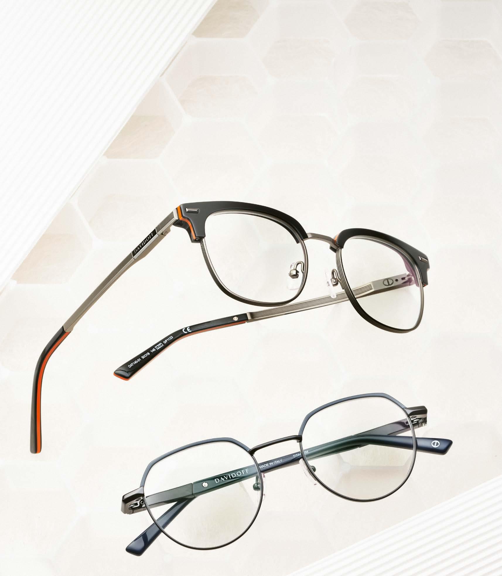
Our range includes models made of titanium, which is light and durable, as well as high-quality acetate. The choice of different materials, their combination and the high quality standard are essential
Titanium and acetate at their finest – alone or in a mix.
prerequisites for every model in the DAVIDOFF EYEWEAR collection.
What is the most striking distinguishing feature of DAVIDOFF EYEWEAR glasses?
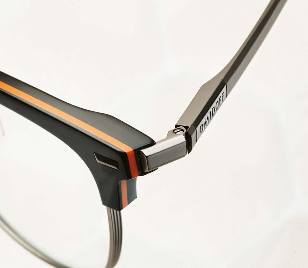
The hyphen in the “A” of the Davidoff logo is our signature logo element and runs through almost the entire collection. The DAVIDOFF hyphen as an eye-catcher can be found on the right and left of the front of the glasses, but also at the end of the acetate temple – an unmistakable feature of every pair of DAVIDOFF EYEWEAR glasses.
What exactly is behind the Iconic Concept?
The Iconic Concept is the highest segment within our collections. Here we see eye-catching models, very “edgy” shapes and contours. The models are characterized by a double lamination on the acetate fronts and a visible metal wire core with an individual pattern, the all-over
icon pattern. This icon pattern is only visible on the inside of the temples thanks to a transparent acetate lamination. The model therefore contains very elegant and subtle details that only gradually reveal themselves.
Your collection also includes the Soul Acetate Concept. What distinguishes these glasses?
The evolution of the Soul Acetate Concept literally shows the titanium wire from a different side. It can now be seen from the inside and is surrounded by a transparent acetate lamination. The extension of the temple is solved in a modern way without appearing cumbersome. The transparency of the Mazzucchelli acetate radiates a certain lightness.
Which colorways dominate the current DAVIDOFF EYEWEAR collection?
True to the brand identity, dark shades dominate above all. These colors form a versatile palette that ranges from classic black and brown to cool blue and anthracite shades, offering a rich selection that is both timeless and modern.
Thank you.
mpg-eyewear.com/davidoff
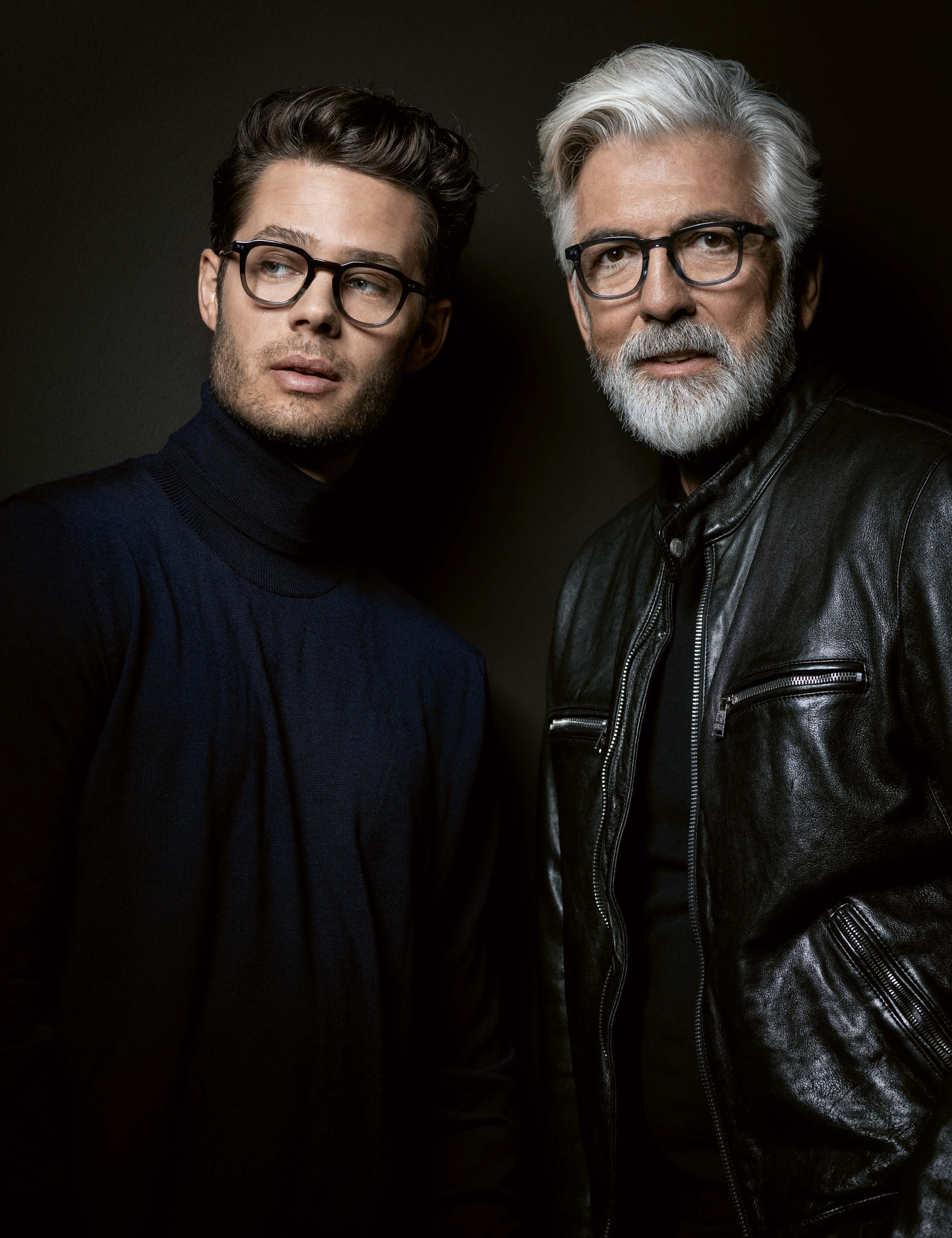

THROUGH YOUR EYES
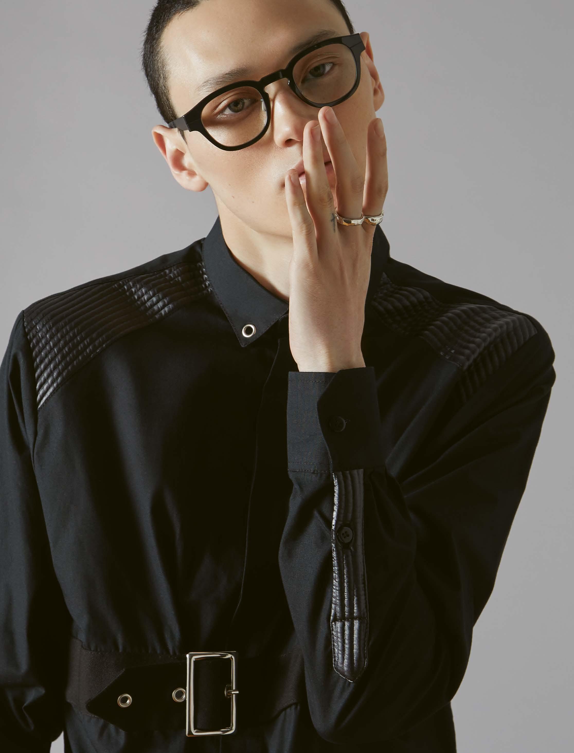

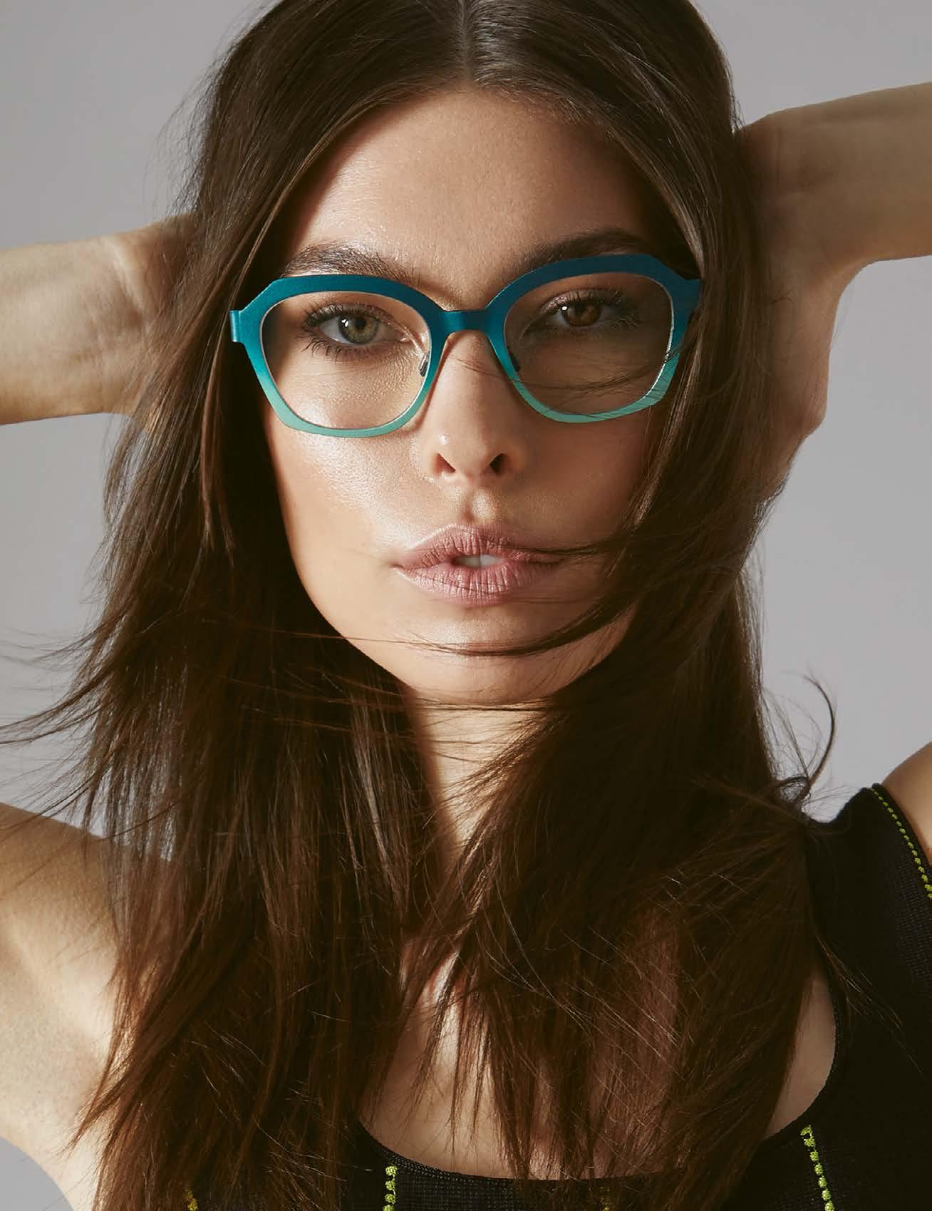
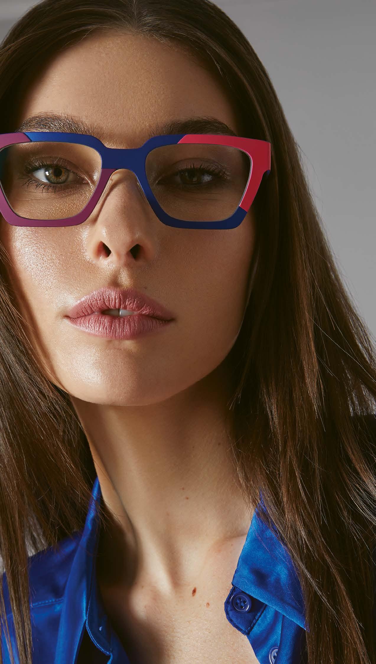
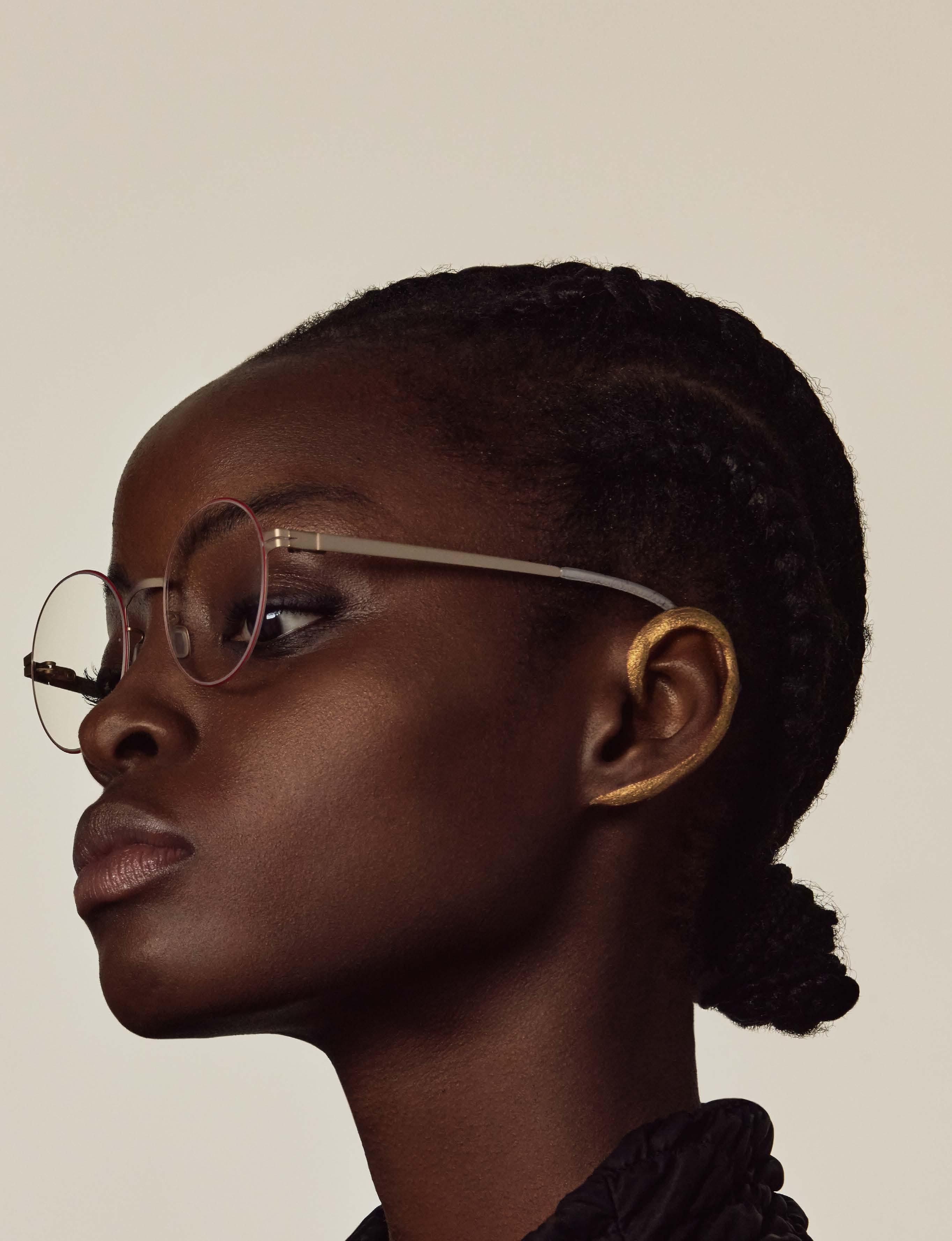
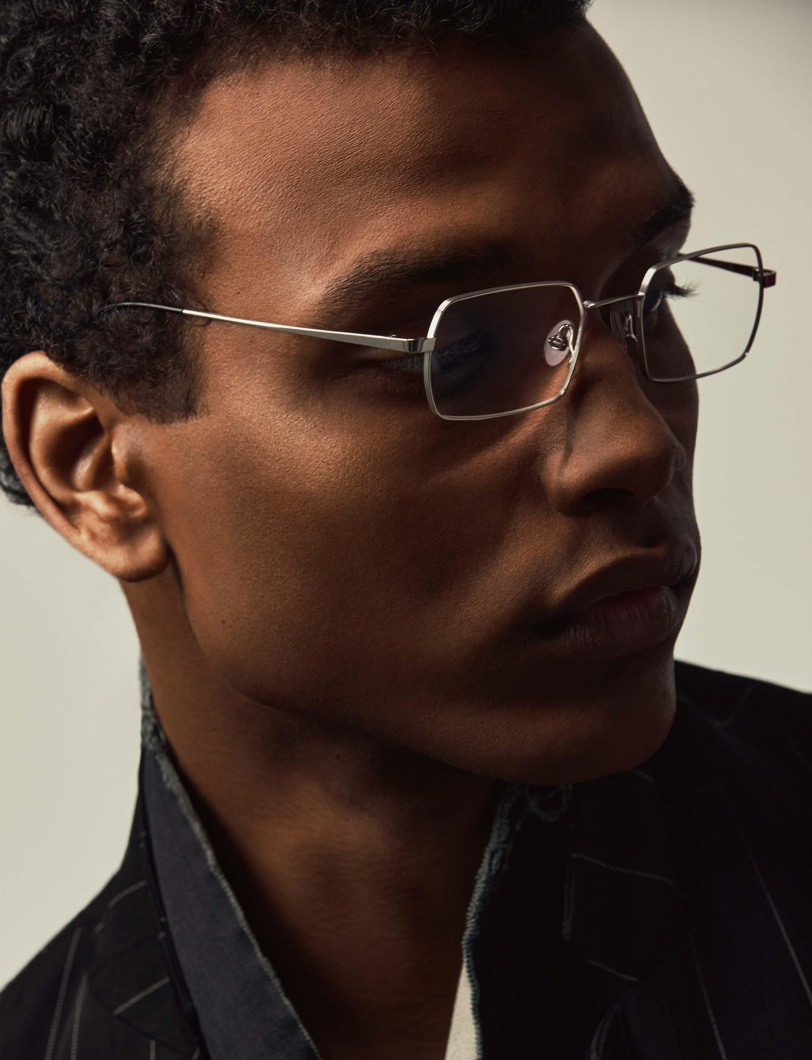
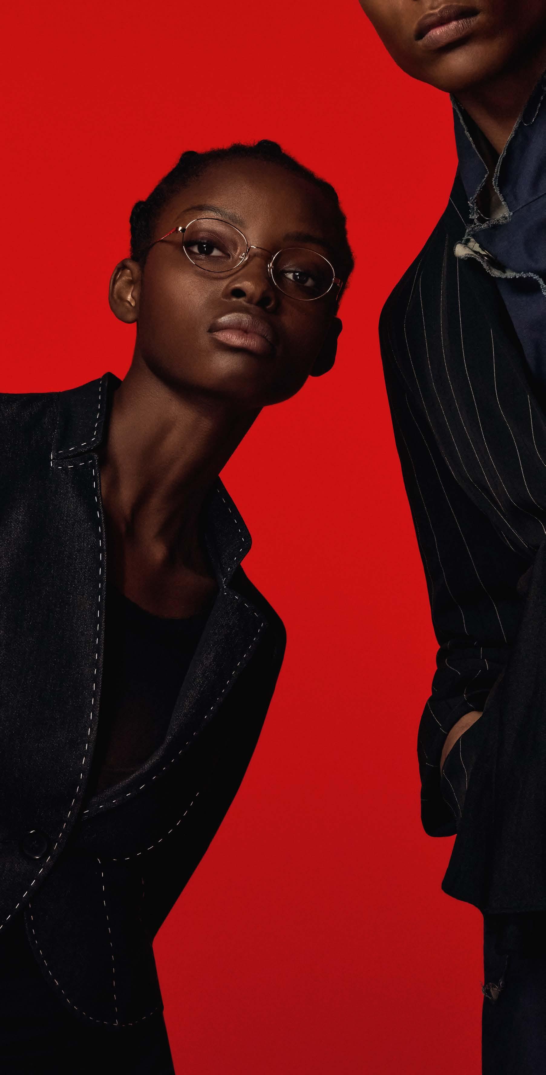
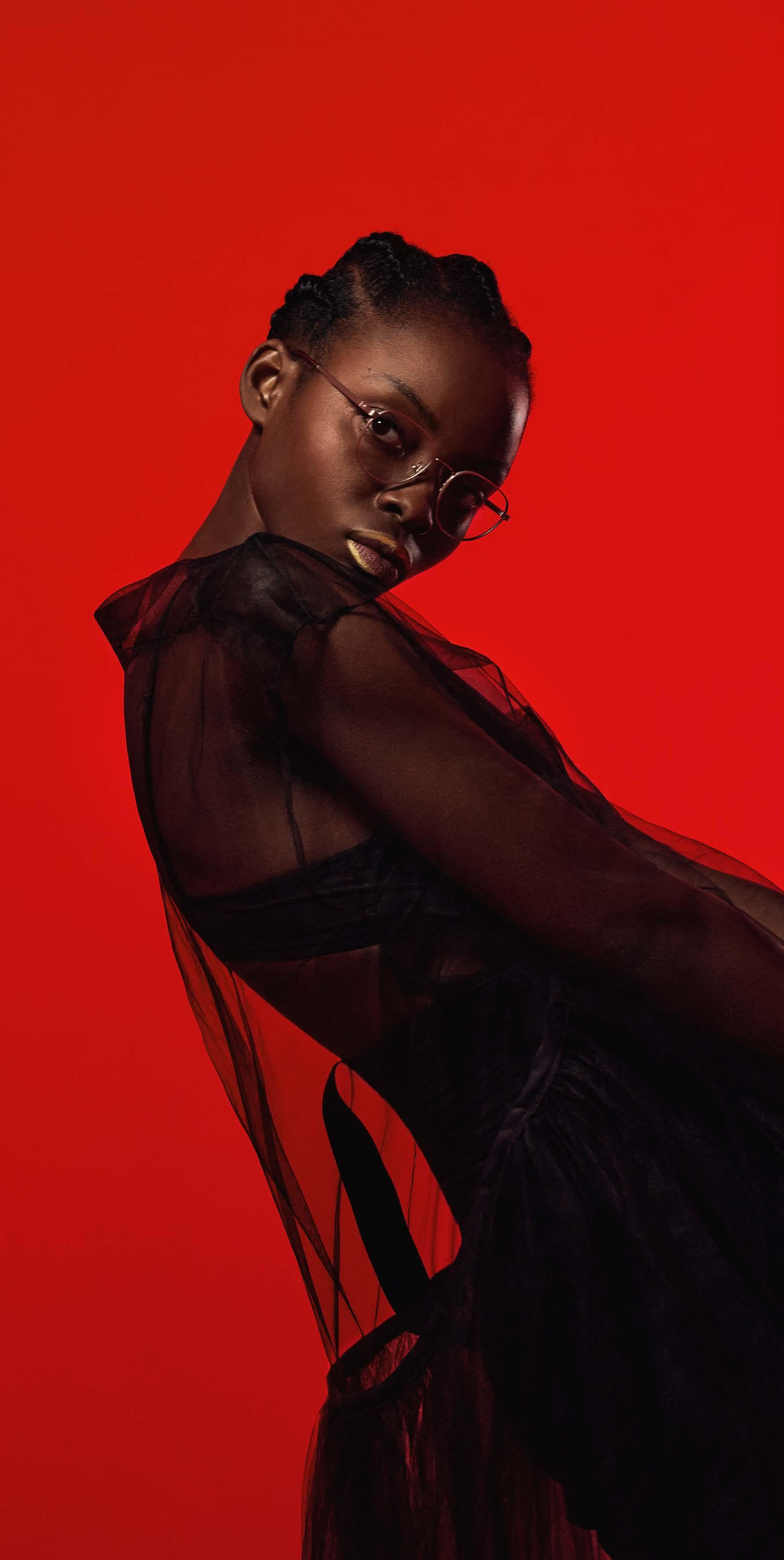
BLACKFIN is a specialist in the design and manufacture of titanium eyewear – this is evident in all collections from the Italian premium brand from the Dolomites. Each collection demonstrates a high degree of product maturity and reflects the identity of the brand.
For our current cover and collection shoot, we were able to gather highlights from three BLACKFIN collections. The product selection represents both the BLACKFIN brand and one of the three lines One, Pacific and Atlantic.
photography : WILLIAM FERCHICHI [ New York ]
assistant : HYNING GAN
styling : AISYA WASHINGTON assisted by SIBELIS TAVARES & DAKI MURRAY
models : JULYA MURRAY at OFFICIAL & COLLIN HYON at Q MANAGEMENT
make-up : J. PATRICK at SEE MANAGEMENT
hair : DAVID CARLOS CRUZ at ART DEPARTMENT




BLACKFIN One, with its creative and timeless spirit, embodies the genetic heritage of the brand like no other collection. BLACKFIN One is not only the first titanium collection to be made entirely in Italy, but also the perfect balance between creative design and timeless style. The One collection is characterized by seductive design and eye-catching colorways that reflect the technical and artistic know-how – the result of 30 years of experience with titanium. The impeccable fits also testify to the attention to detail and virtuoso craftsmanship of the Italians.

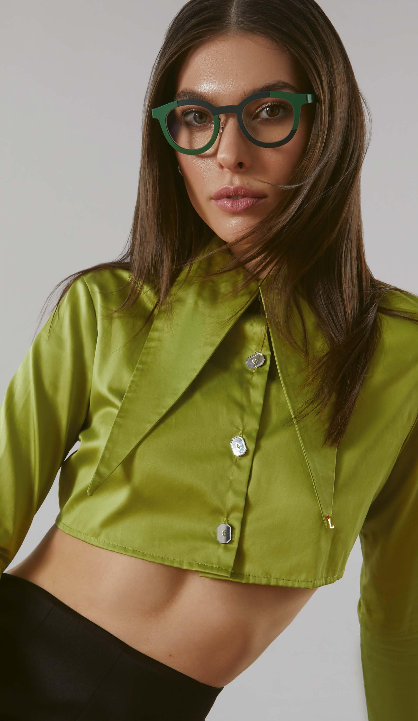
BLACKFIN Atlantic shows its preference for the British in its frames. The new models have a bold look and generous proportions without sacrificing the unmistakable lightness that comes with the use of titanium. The temples of the Atlantic collection are also milled from a single 3 mm thick block of titanium, which gives the glasses enormous stability. At the same time, the beveled shapes give the models a soft look. Thanks to an innovative patent, the angle of the temples can be adjusted so that the glasses can be perfectly adapted to any face.


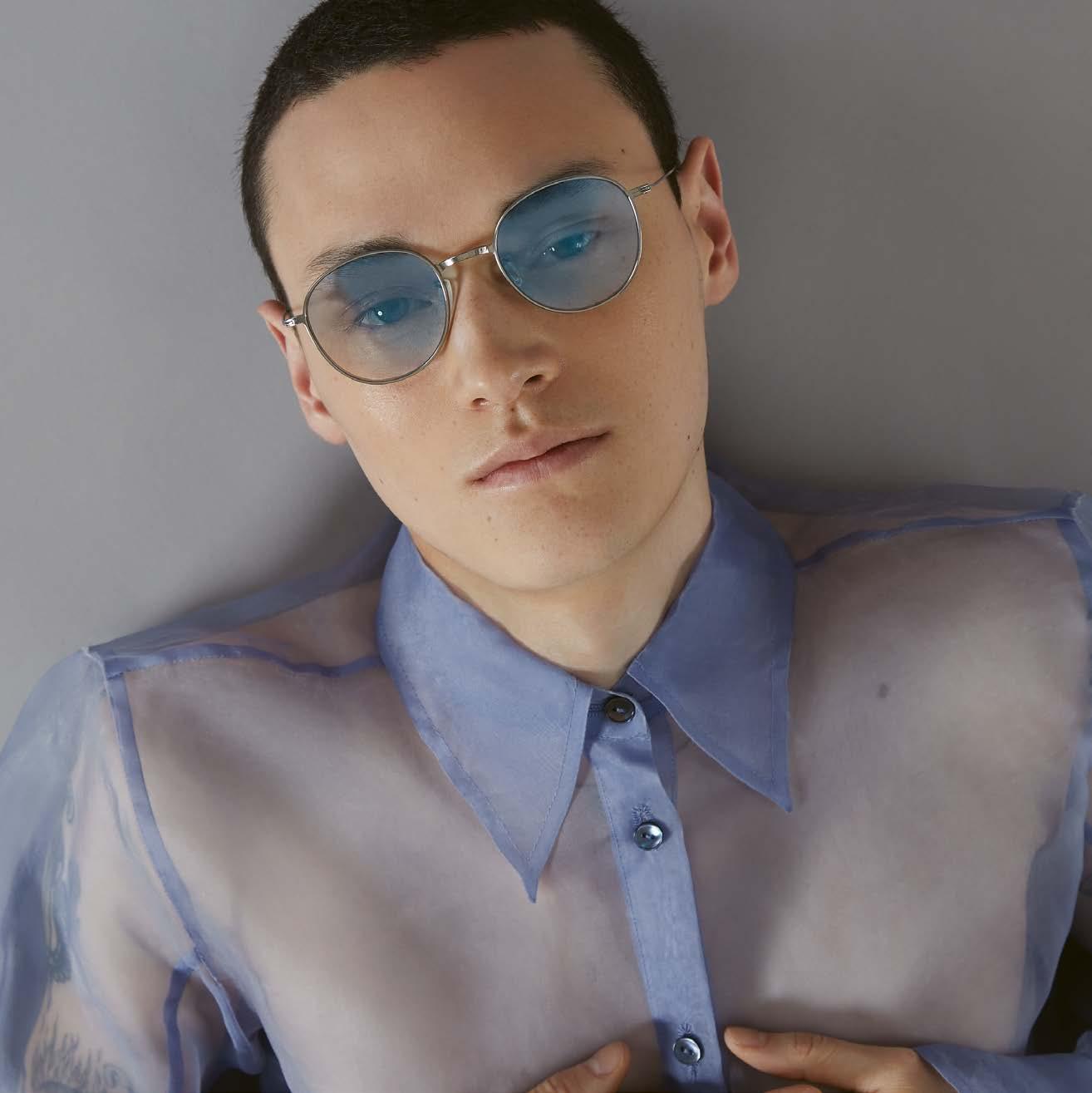
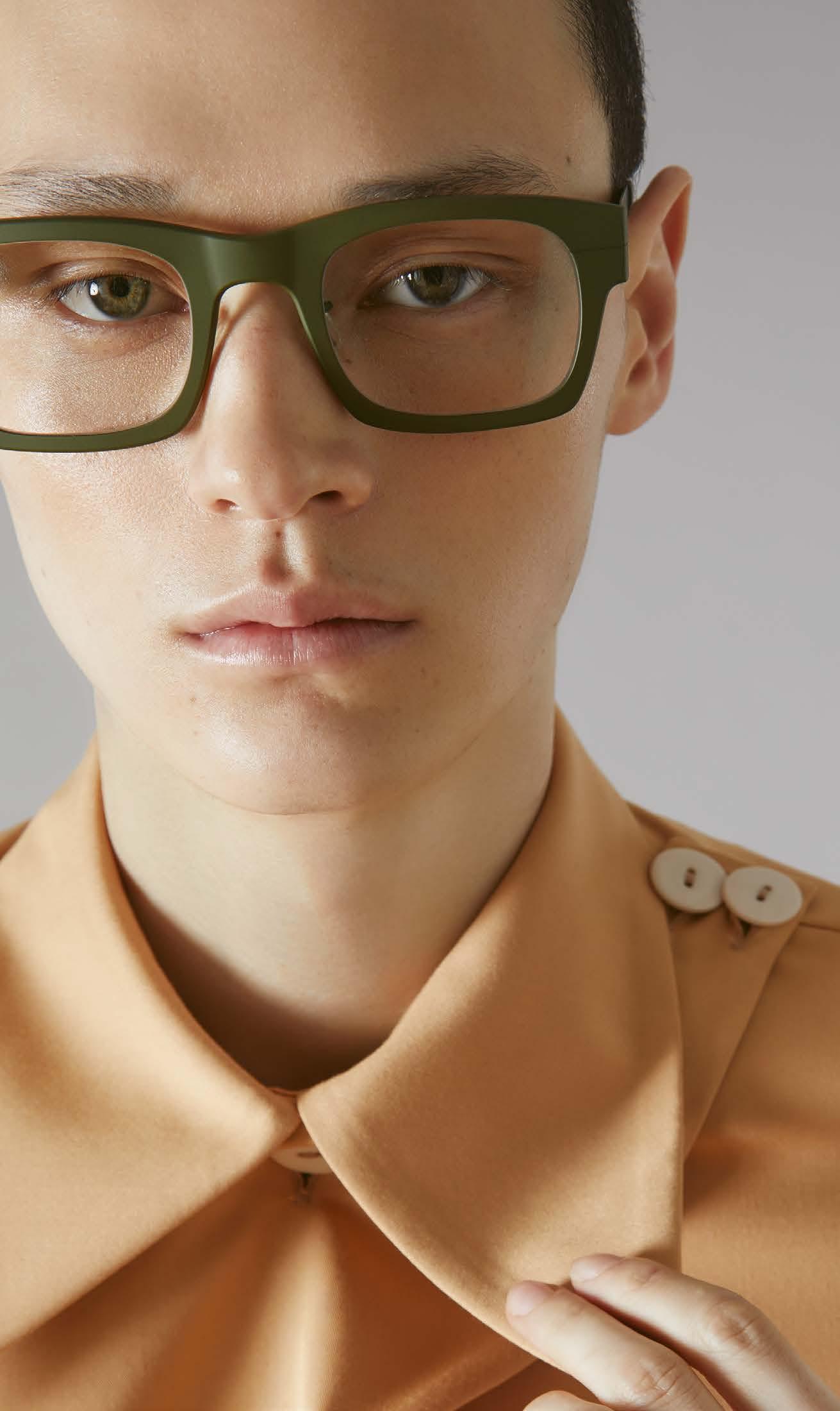


BLACKFIN Pacific combines minimalist Nordic design with the refined style of the American West Coast. The four new models in the Pacific collection are also made from a solid 3 mm thick block of titanium, but cut with very thin profiles to create ultra-light frames. With the exception of the nose pads, the Pacific models have no weld seams at all – pure aesthetics. Equipped with the patented Swordfish temple tips, the frames can be adjusted quickly and easily so that they fit perfectly on every face. There is also a separate Asian fit.


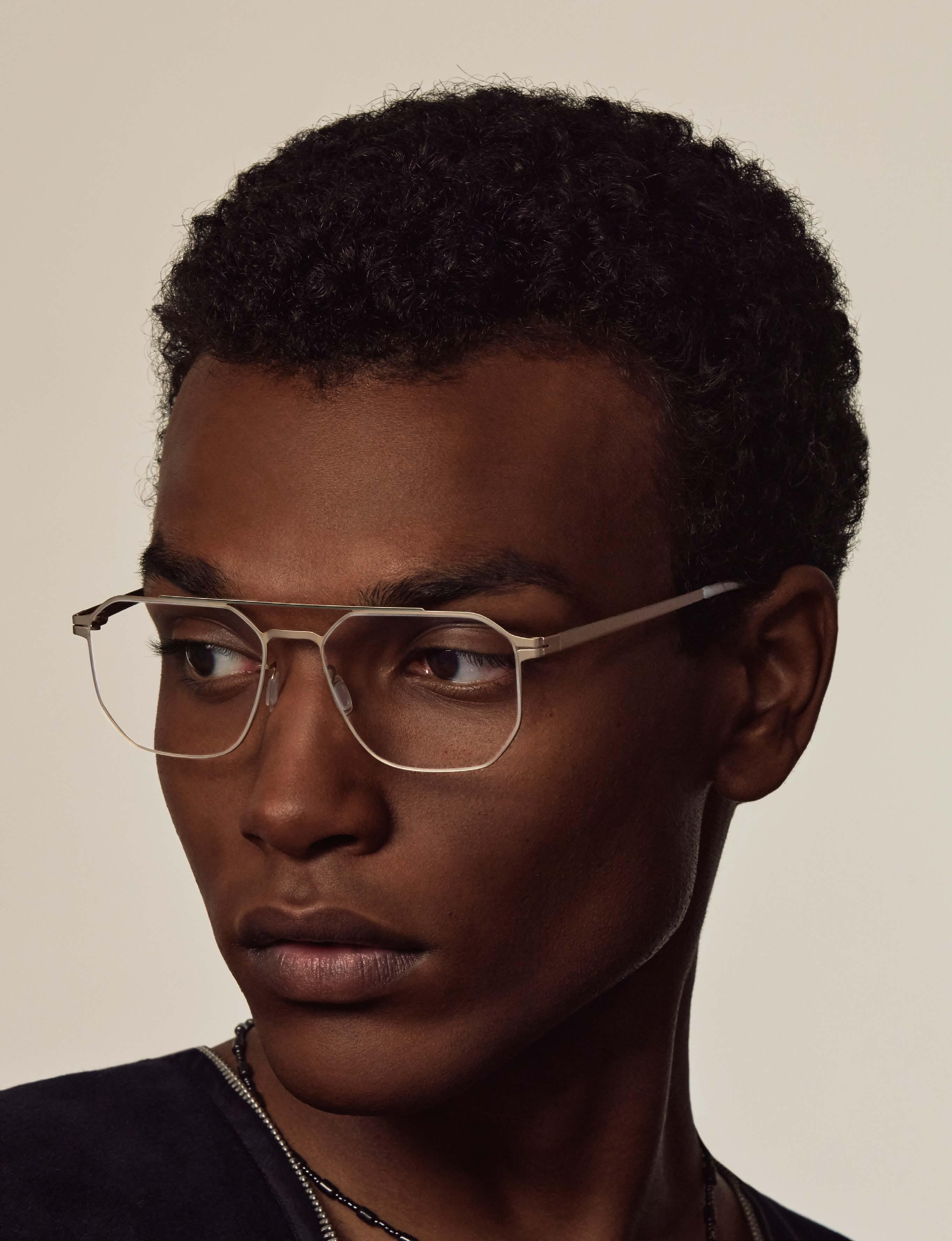
photography : ULRICH HARTMANN [ Berlin ]
assistant : MICHAEL OERTEL
hair & make-up : SHIRIN KÜRSCHNER assisted by LEONIE OHM
all styling looks by : VONUWE
models : HELEN ARKFORD at TWO MANAGEMENT & AKHMED at SYSTEM AGENCY























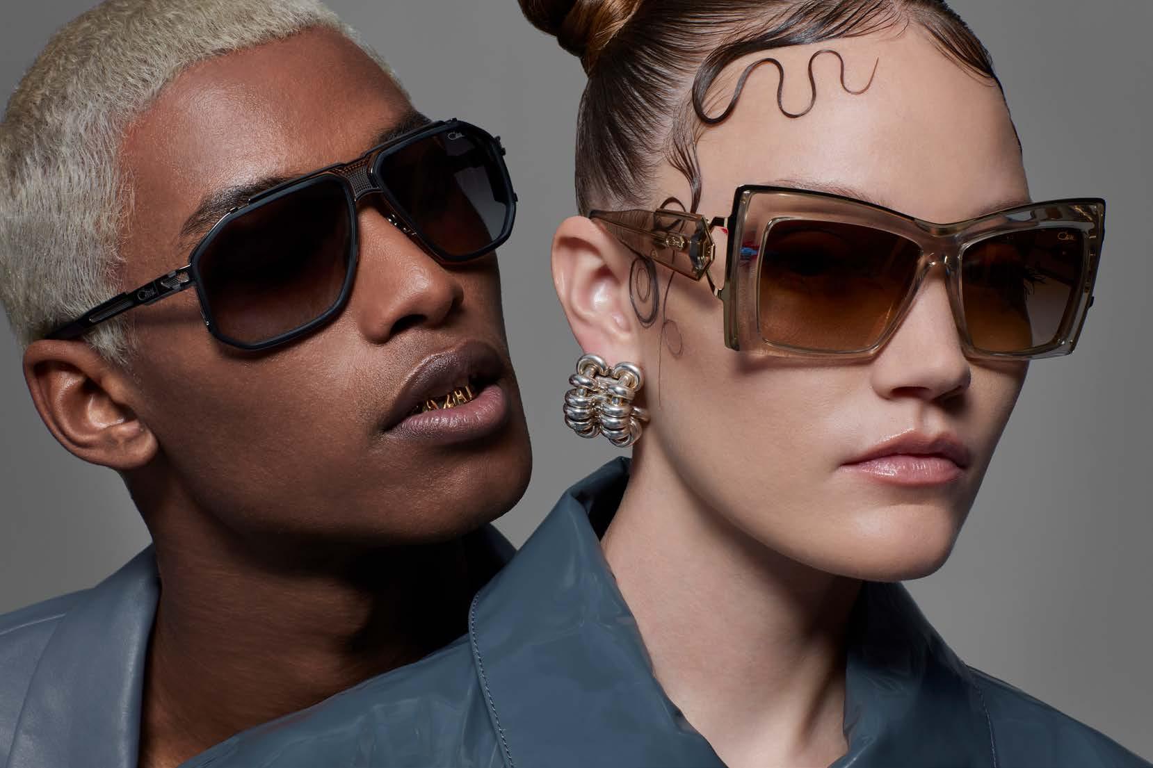
CAZAL

photos & creative direction ARMEN DJERRAHIAN
styling JEANNA KRICHEL
make-up CAROLINE TORBAHN
hair HELENA NARRA
nails PAMELA SCHOENTAG
grillz GRILLZPVRIS & SEVAN7UP
production SONJA HEINTSCHEL



As we have come to expect from the Passaubased cult brand, CAZAL is launching bold and unique designs with the 2024 collection. The interplay of uncompromising quality and exquisite materials, paired with the unmistakable CAZAL DNA, elevates every single piece to iconic status. To coincide with the product launch, the new CAZAL campaign is being released, once again radiating a unique glamor, and showcasing not only legendary models, but also many new designs. A special highlight of the campaign are the CAZAL grillz, which were specially made for the shoot! We talk to photographer Armen Djerrahian about his creative job, which we are honoring with the Campaign Award in the current issue.
Hi Armen, congratulations on your 2024 campaign that you shot for CAZAL. You are a repeat offender. What is your story?
Thank you, it is a great honor to be nominated for the Campaign Award and of course to work with such a wonderful brand as CAZAL. My story is like many creative people who grew up in the 80’s. Not necessarily knowing what we would become, but being passionate and part of all those cultural and influential movements that have led the fashion industry for the past decades. Here I am, Armen Djerrahian, born and raised in Paris, a photographer, director and creative director.
What connects you to the brand?
Well, like many kids of my generation, I discovered CAZAL through hip-hop culture. I was first a b-boy (breakdancer) who dreamed of owning the most iconic frames of the time, simply because a pair of »607« or »616« became one of the many assets that defined your style and originality (back when wearing glasses wasn’t necessarily cool). Then I started to invest more in the eyewear industry and just fell in love with CAZAL and their amazing creation. To the point of obsessively collecting them lol.
What is the main focus for you at CAZAL, the individual styles or rather the myth of the brand?

I’d say a little bit of both. First you love these unique glasses, then you realize that many brands are inspired, and that makes the brand a myth. After all these years, CAZAL is still the inspiration for many, if not most, of the trendiest and most contemporary brands on the market. So, my focus is to make sure that the younger generation understands it by keeping this legacy alive. At least visually.
What was the brief for the 2024 campaign? What was to be conveyed?
8517«
I consider myself very fortunate to have a team that trusts my vision. The great people at OP Couture and I often brainstorm about the look of the brand. With almost 50 years of existence, you have to constantly redefine the DNA of the brand, which is the secret behind the success of the last few campaigns. For the last three years, I have been in charge of the creative direction, proposing several ideas and mood boards until we all agree on one. It is not an easy task and much more challenging than just shooting. The brief is often the same: to stand out from the crowd and remain a leader both visually and through the collection. It's ambitious, but the challenge is exciting.
Which, by the way, has been successful. What criteria did you use to select the models?
In the past few years, our focus has been on today’s generations: embracing diversity, mixing cultures, and putting our own spin on fashion. The world keeps changing, trends come and go, but what always sticks around is our ability to adapt, remix, and express our unique style. The casting choice is crucial. In what way?
Beauty is a criterion that can be interpreted in different ways. For me, what matters is the character/personality that emanates from the model.
You were based in New York, but recently moved to Europe. Is that why you worked with a German creative team?
Well, we shot the past campaigns in

Lisbon, Paris and Munich. Our models are located on every corner of the globe and no matter what is our shooting location we have to fly them. Germany became more convenient and the team there is exceptional: the stylist, hair, and makeup as each of these elements are crucial to the success of the campaign. Bureau Borsch has been responsible for the artwork for the past three look books, which couldn’t be as it is without their input. I tend to say it is a teamwork. Same with the Director of Photography of the films Patrick Wulf. Communication is key and that’s what we privilege at first. Who came up with the idea for the
I did as it is part of the creative process. How did you come up with that? Each model is defined by its number. Clients and brand enthusiasts know the models by their number or series, especially the more knowledgeable ones. So, I needed to come up with an idea that would highlight all these numbers. I don’t know why or how, but I had the song “The Magic Number” by De La Soul stuck in my head, then an image of gold teeth with a number appeared and the idea came to me. The ultimate vision, haha... My friend and jeweler Sevan Koubbachian from GrillzParis, with whom I often collaborate,
followed us in the process. How would you describe the new collection?
Definitely bold, unique, modern and edgy. Which model is your personal favorite? Since the past three collections, I am very admiring of the women’s collection for which I have a preference aesthetically: the »8517«, the »8514«, the »860«, the »301« or the return of the iconic »868«. For the men: the limited »164/3«, the details on the »683«, the »9110« and the simplicity of the »7107«. You could call this a good brand identification. Thank you.
cazal-eyewear.com
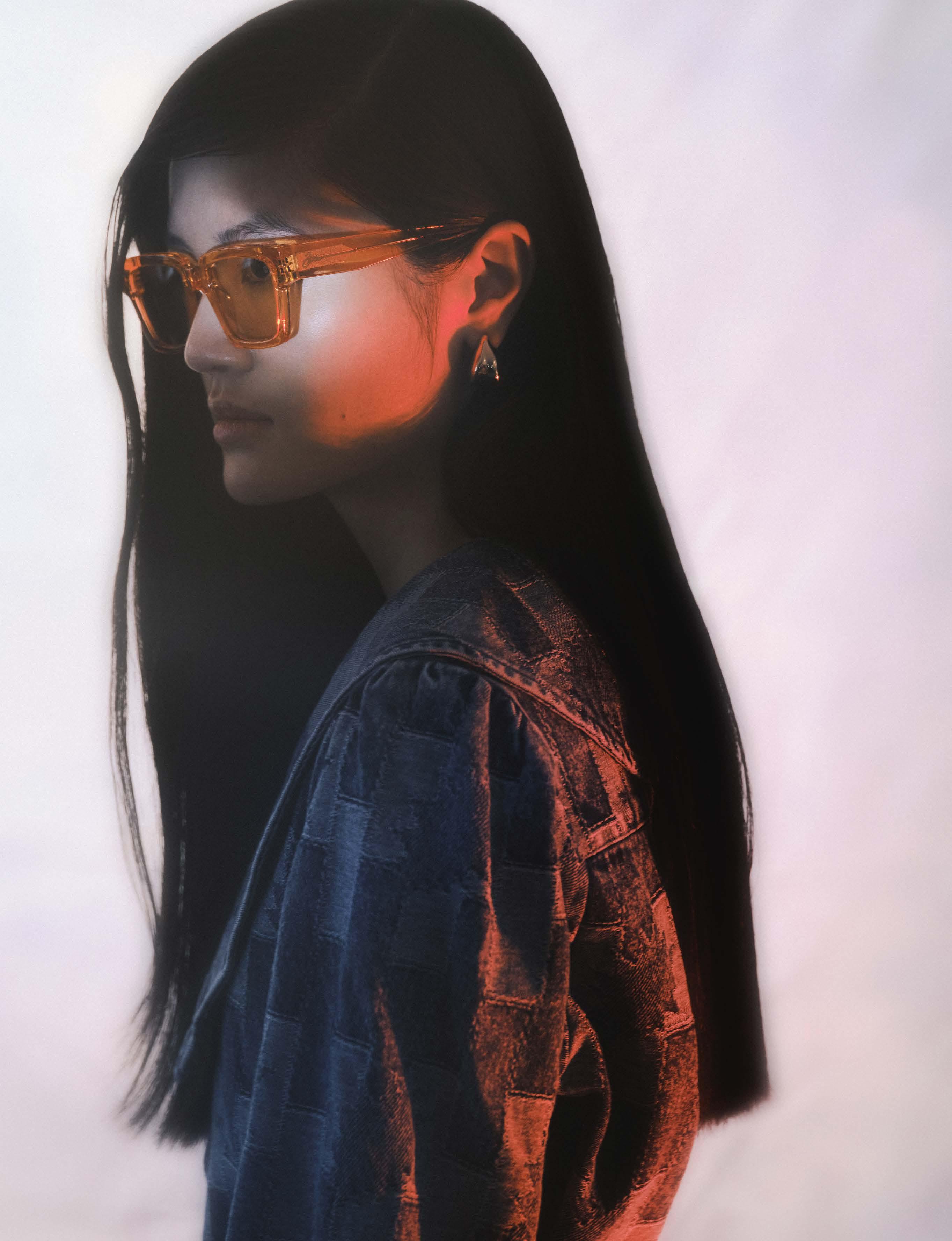

NIRVAN JAVAN SHADES OF TORONTO »06:26:13 (EST)«
Virtually try on NIRVAN JAVAN
FAVRSPECS.COM
Characterized by the symbiosis of Swiss and Persian culture, NIRVAN JAVAN creates a unique perspective with his eponymous label. In the midst of seemingly opposing worlds, the designer has developed a product world characterized by openness and the ability to fuse different impressions. This philosophy, the true essence of cosmopolitanism, is reflected in his brand, which has been presenting the stylish fusion of famous metropolises from around the world in unique eyewear frames since 2015.
NIRVAN JAVAN picks up on the cosmopolitan credo of its founder with its collections. The cosmopolitan product lines take us to Rome, London, Tokyo and other cultural hot spots. Our current collection shoot focuses on the shades of toronto sunglasses collection and the marrakech optical collection
photography of her BRIX & MAAS [ Berlin ]
agency SONJA HEINTSCHEL
styling DAVOR JELUSIC
hair & make-up IVANA ZORIC
models TRANG ANH at MODELWERK & BENEDICT KLEBB at MODELWERK
photography of him STEFAN DONGUS [ Cologne ]
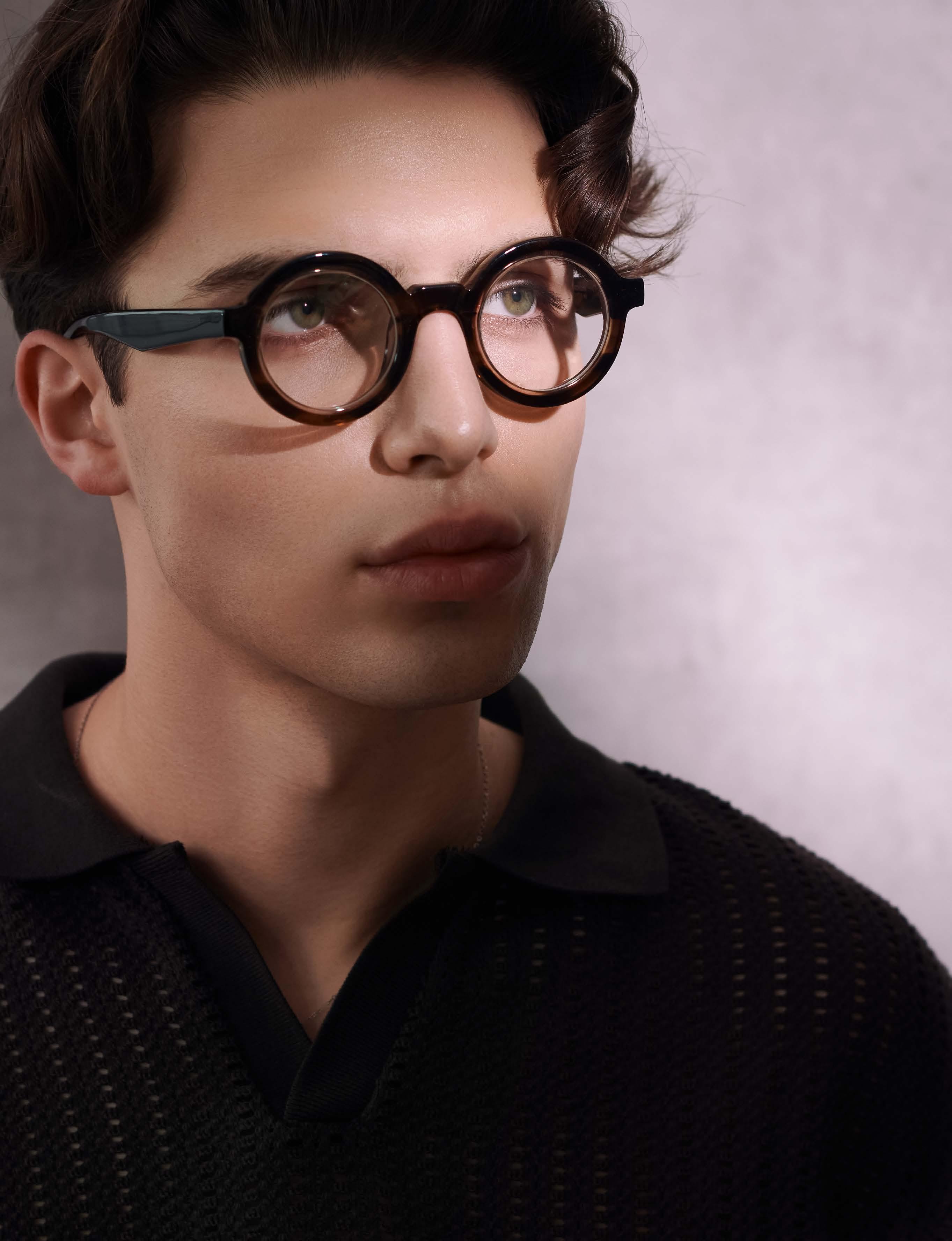

NIRVAN JAVAN MARRAKECH
»03:04 (WET)«shirt ZARA


NIRVAN JAVAN
MARRAKECH
»07:18 (WET)«shirts ZARA

NIRVAN JAVAN
MARRAKECH
»05:08 (WET)«blazer ROUGE VILA
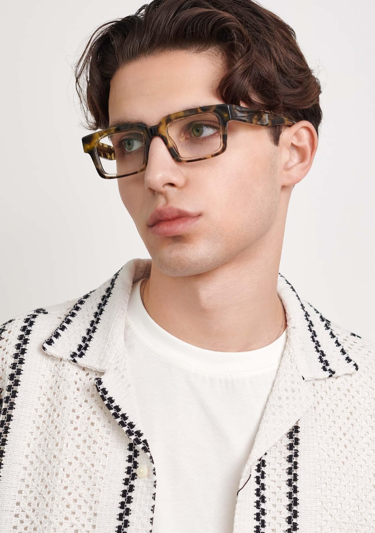
MARRAKECH
The marrakech collection is a visual counterpart. With this line, the Swiss premium brand is setting foot in North Africa for the first time and thus entering one of the continent’s most culturally vibrant metropolises. The marrakech collection brings the culture of the Maghreb to life, with colorful bazaars and oriental architecture reflected in the eyewear designs.
Made from the finest Japanese acetate, lovingly crafted details such as engraved arabesques or the brand monogram in the temple inserts lend the optical glasses a special elegance.
The Swiss brand skilfully uses its colors for lenses and frames – both tone-ontone and with complementary colors.
The shades of toronto sunglasses collection pays homage to one of the world’s most culturally diverse cities. It translates the bold architecture of the Canadian metropolis into equally bold eyewear designs. Handcrafted in Japan from Japanese acetate with anti-reflective and photochromic lenses on the back, the models in the shades of toronto collection bring the diversity of the city on Lake Ontario to life.
“Diversity is our strength” is the self-confident proclamation of the people of Toronto. The diversity of the city is also reflected in the colors of the collection. They are bold, rich in contrast and uncompromising, without losing the designer’s unmistakable signature. Green, blue, yellow, brown, black and purple. The striking and powerful architecture of Toronto is reflected in the cubic shapes of the individual eyewear designs.
nirvanjavan.com
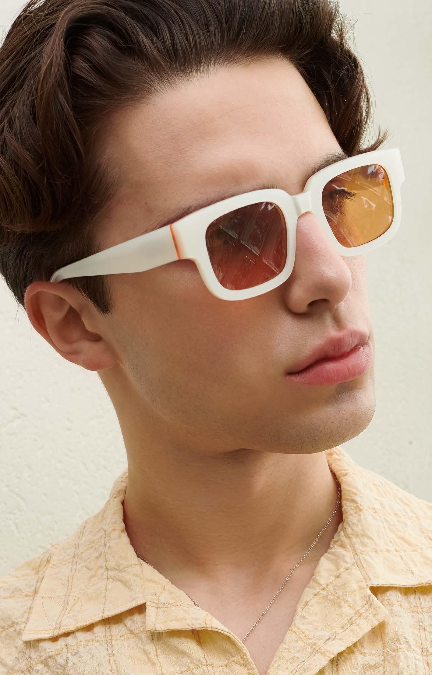



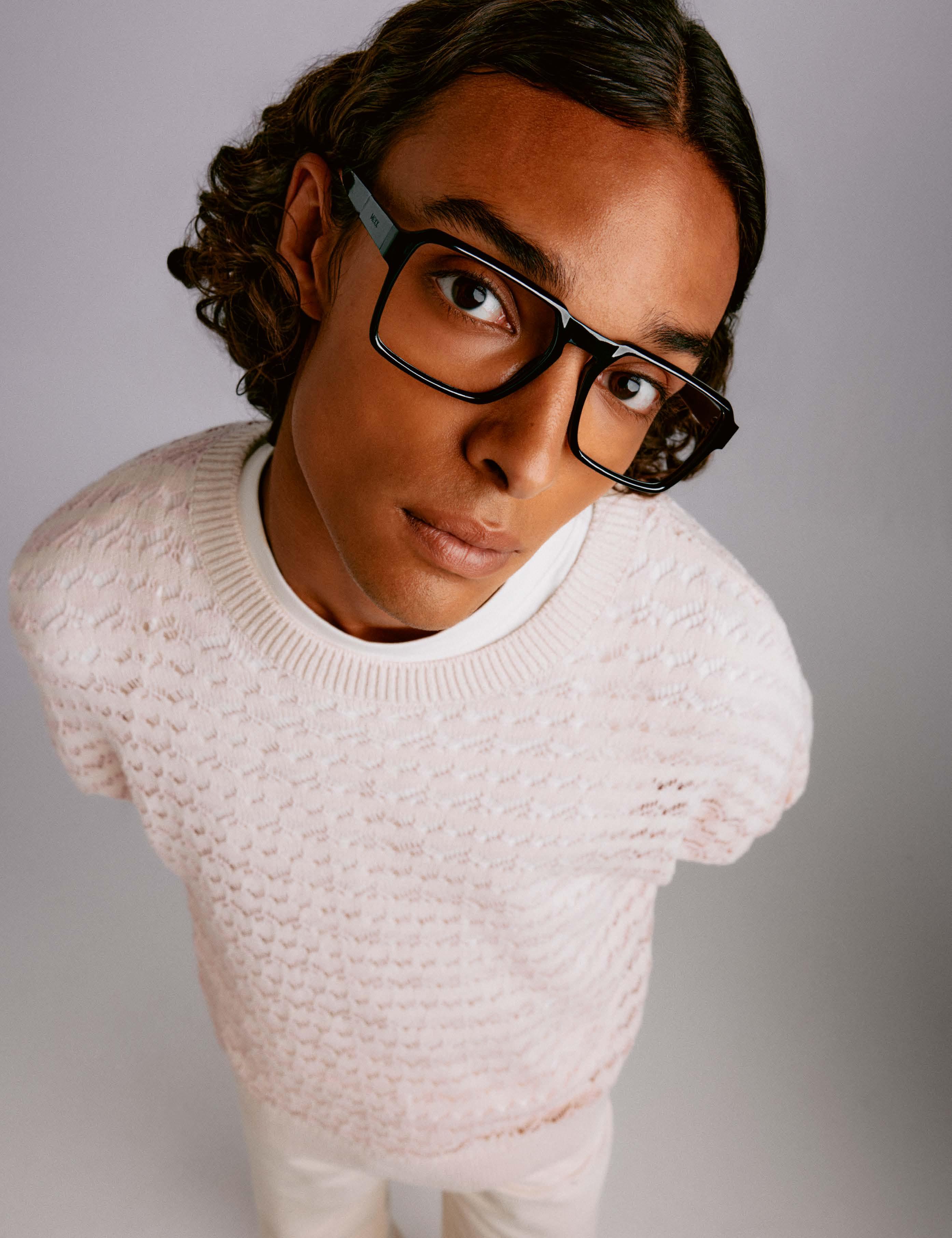
www.mexx-eyes.com
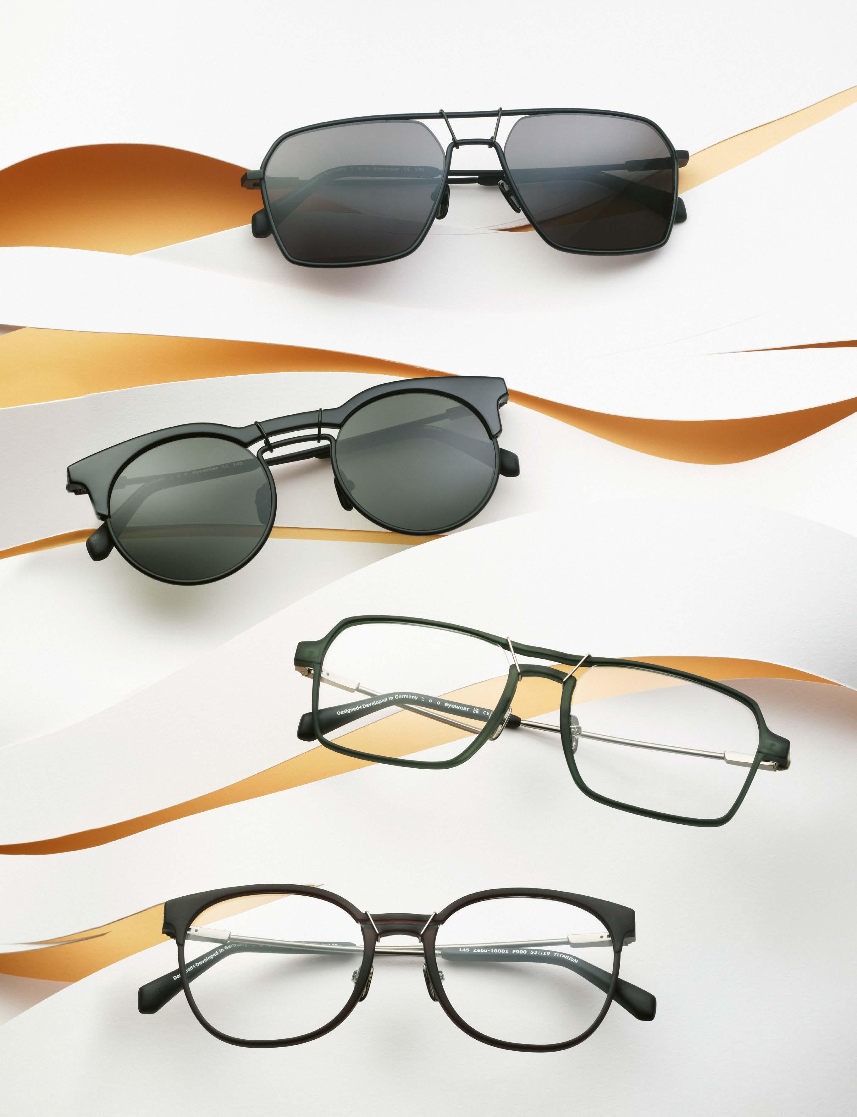
Beastly good – ZOO EYEWEAR comes in many different materials and shapes.
The still young brand ZOO EYEWEAR comes from the heart of Swabia and offers a wide range of design features and concepts. You can tell from the glasses that the team behind the brand with the “Z” can draw on decades of experience in the industry. An interview with Adam Smith, International Marketing.
Hello Adam, ZOO EYEWEAR is still a young brand. How long have you been around?
After a delayed start due to the Covid-19 virus and the lockdown, ZOO EYEWEAR has been on the market since 2022 and has had an exciting journey since then. How did you come up with the name ZOO? It mainly has a visual background. Our ZOO logo shows two temples and two lenses, i.e. a complete frame. But we also take a semantic approach, so each of our collections has a “Z” in its name.
Where does ZOO EYEWEAR come from?
Part of the ZOO team has been working in eyewear design and production for decades and has its roots near Stuttgart. Is the location in Baden-Württemberg an advantage?
Since each of our collections is produced where the technical requirements are met and our ideas are implemented with high quality and precision, the location is of secondary importance. What is the philosophy behind the brand?
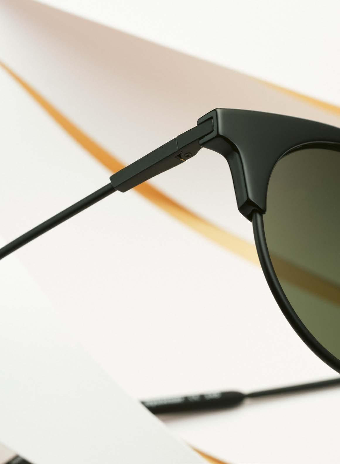
Our credo is to implement technical and material features in eyewear frames that are lightweight and fit well. Which materials meet these requirements?
We generally work with the following materials in our collections: titanium, stainless steel, BioZ and TXZ. The positive properties of stainless steel and especially titanium as a high-quality material are generally known in eyewear manufacturing. What is TXZ and what advantages does it offer?
TXZ is a recyclable material made from
transparent polyamide that was developed by the Swiss company EMS-Chemie, from whom we also source the material. The material is produced by injection molding and generates significantly less waste during production than acetate frames, for example.
And what is behind BioZ?
BioZ is based on a bioplastic made from renewable raw materials. The main component is lignin, also known as “liquid wood”, a waste product from paper production. Together with starch, cellulose, organic additives, minerals, polyester, natural waxes and fibers, the material BioZ
is created, which can also be processed into sturdy glasses using the injection molding process.
In addition to the materials, you also strive for environmentally conscious production processes. How, for example?
We focus on energy-efficient production processes, waste recycling and the use of environmentally friendly packaging materials.
Are there any styles that we see particularly often in your collections and that are typical of your brand?
No, we are open to all styles in our collections as long as they fit in with the ZOO
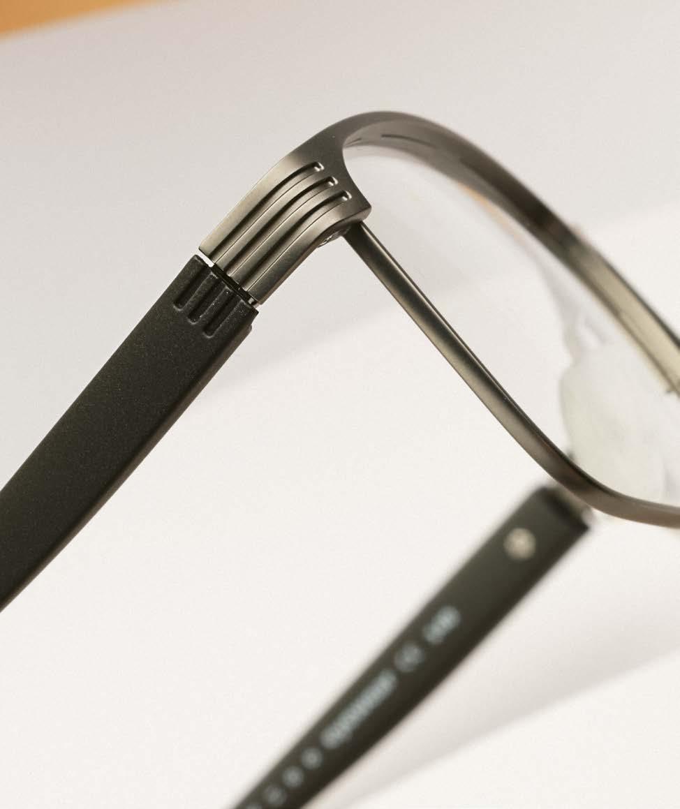
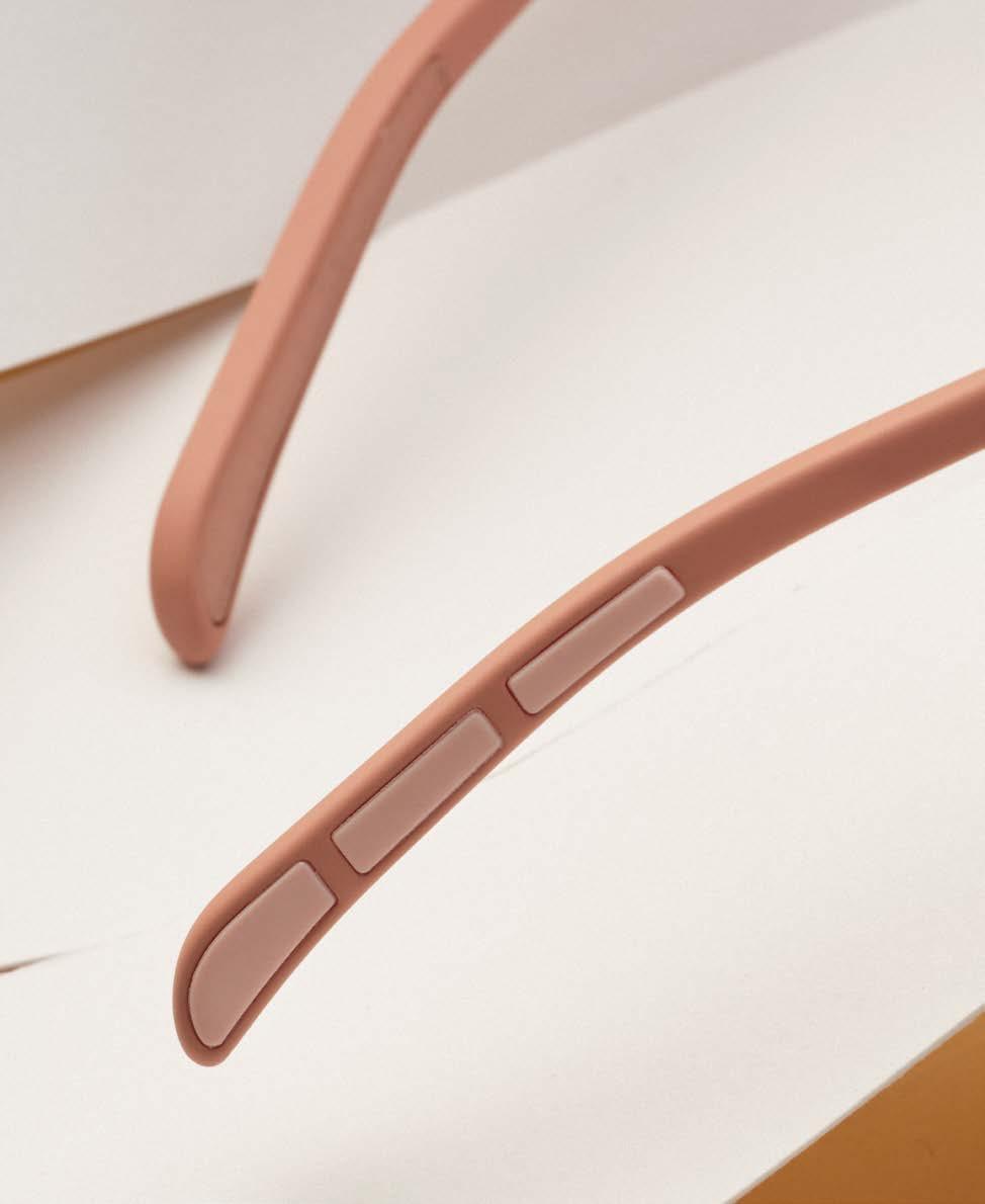
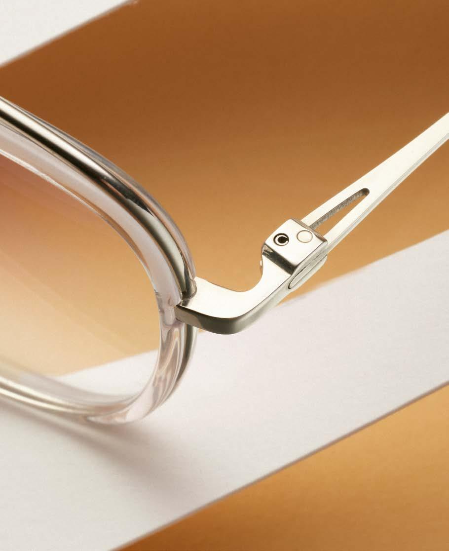
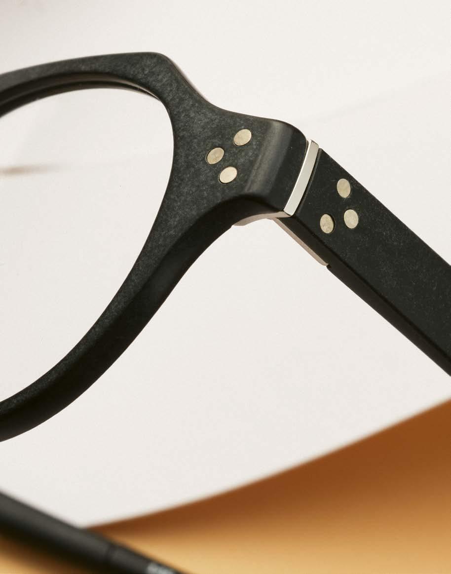
concept.
How many collections are there at ZOO EYEWEAR?
We currently have five collections, which are regularly refreshed with new designs. There are also innovative design features in your collections, some of which are inspired by nature. What are they?
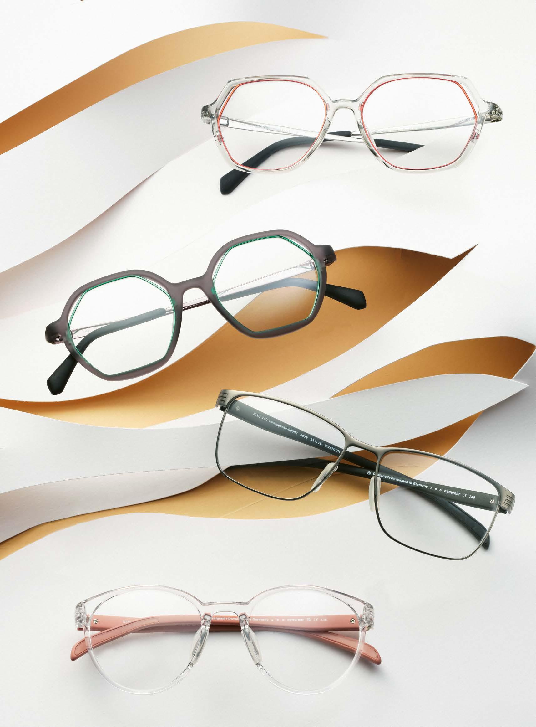
The animal world as a synonym for ZOO knows no boundaries. Here is an overview of our five collections:
The models in the holZbiene collection are made from sustainable BioZ and colored with food dyes. The oZelot collec-
gaZelle »90006«
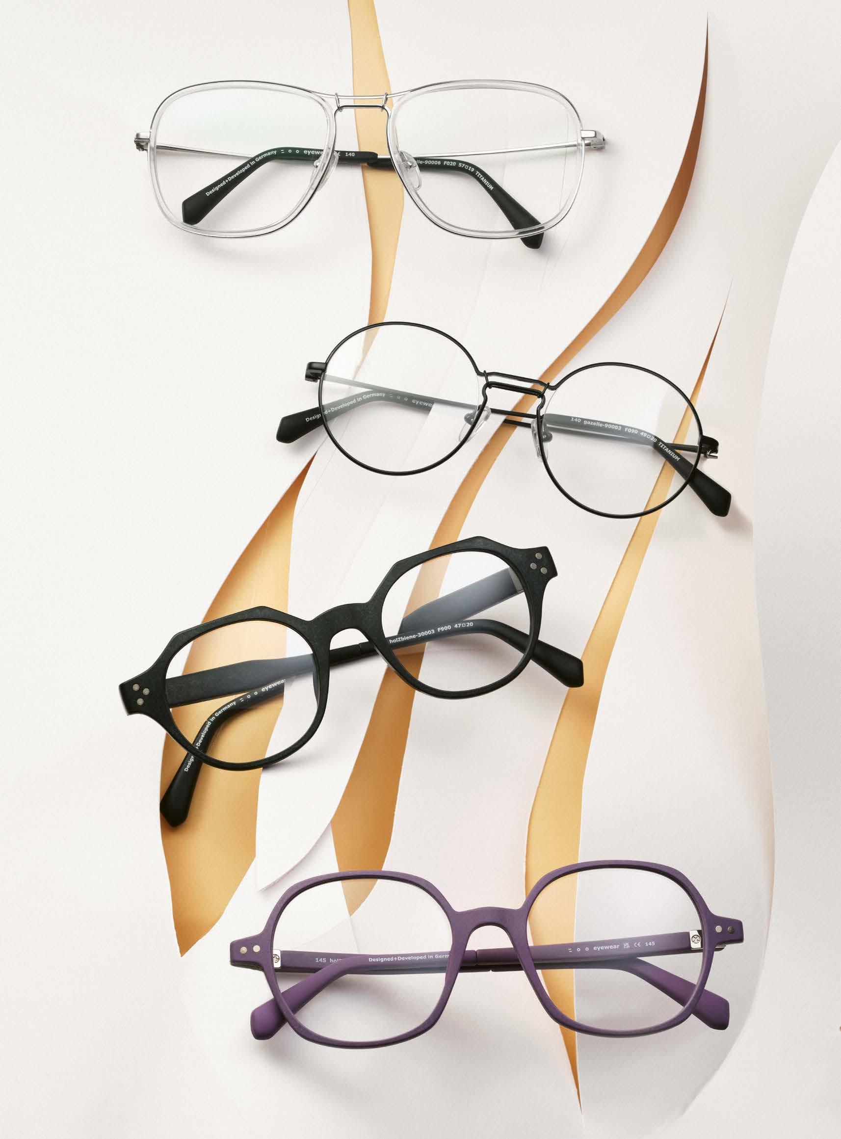
holZbiene »30003«
tion features two different shapes in one frame. gaZelle and Zebu – the design feature of these two sub-collections is a clasp that connects the upper part to the lower edge of the frame and is reminiscent of the horns of a gazelle or a zebu. In the Zwerggecko collection the nose pads and temple tips are covered with a gecko material. The gecko material, which we source from near Stuttgart, prevents the frame from slipping. ZOO EYEWEAR sounds “colorful”. Does that also apply to your colorways? We like to play with colors and offer a wide range of color options in our collec-
gaZelle »90003«
holZbiene »30010«
tions.
What is the relationship between prescription frames and sunglasses? Our collections mainly consist of prescription frames. In the Zebu collection, we have opted for a sun or fun version for some models.
Who do you particularly appeal to with your products? What does the typical ZOO EYEWEAR customer look like?
We address all people who value modern, wearable, lightweight and well-fitting glasses.
Thank you very much.
zooeyewear.com

ETNIA BARCELONA »Ampat« -
dress TAMMY GIRL
photography, casting & styling : NARÈNTE [LUCIO ARU & FRANCO ERRE] [ Sardinia ] hair & make-up : DANIELA DESSÌ
models : GINEVRA ROSETTI & DAVID BUDRONI at LA REPRESENTS














CLÉMENCE & MARGAUX
»CMS160 LA ERICA« -
jacket RECLAIMED VINTAGE
shirt VINTAGE

»BLOC VI«shirt STUDIOVERTICE




Passau is considered a stronghold of the German eyewear industry. The city at the confluence of the Danube, Inn and Ilz rivers and close to the Austrian border can proudly look back on a history of eyewear manufacturing. So why not anchor the local connection in the brand name? Hans Strätz and Franz Fremuth thought the same thing when they founded Optische Werke Passau – OWP for short – in 1947.
The two pioneers recognized early on that eyewear was much more than just a visual aid, but also a fashion accessory. The following decades were characterized by brand development and internationalization, and the OWP spirit was carried around the world from the 1970s onwards. Subsidiaries were founded in Paris and Amsterdam, and fashionable frames from Lower Bavaria were exported to the fashion capitals.
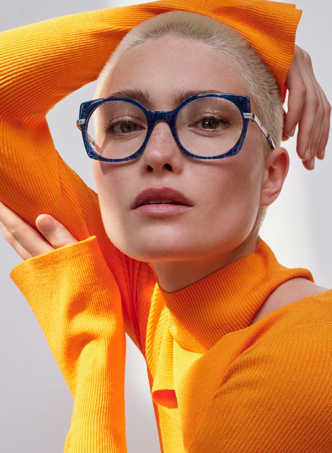
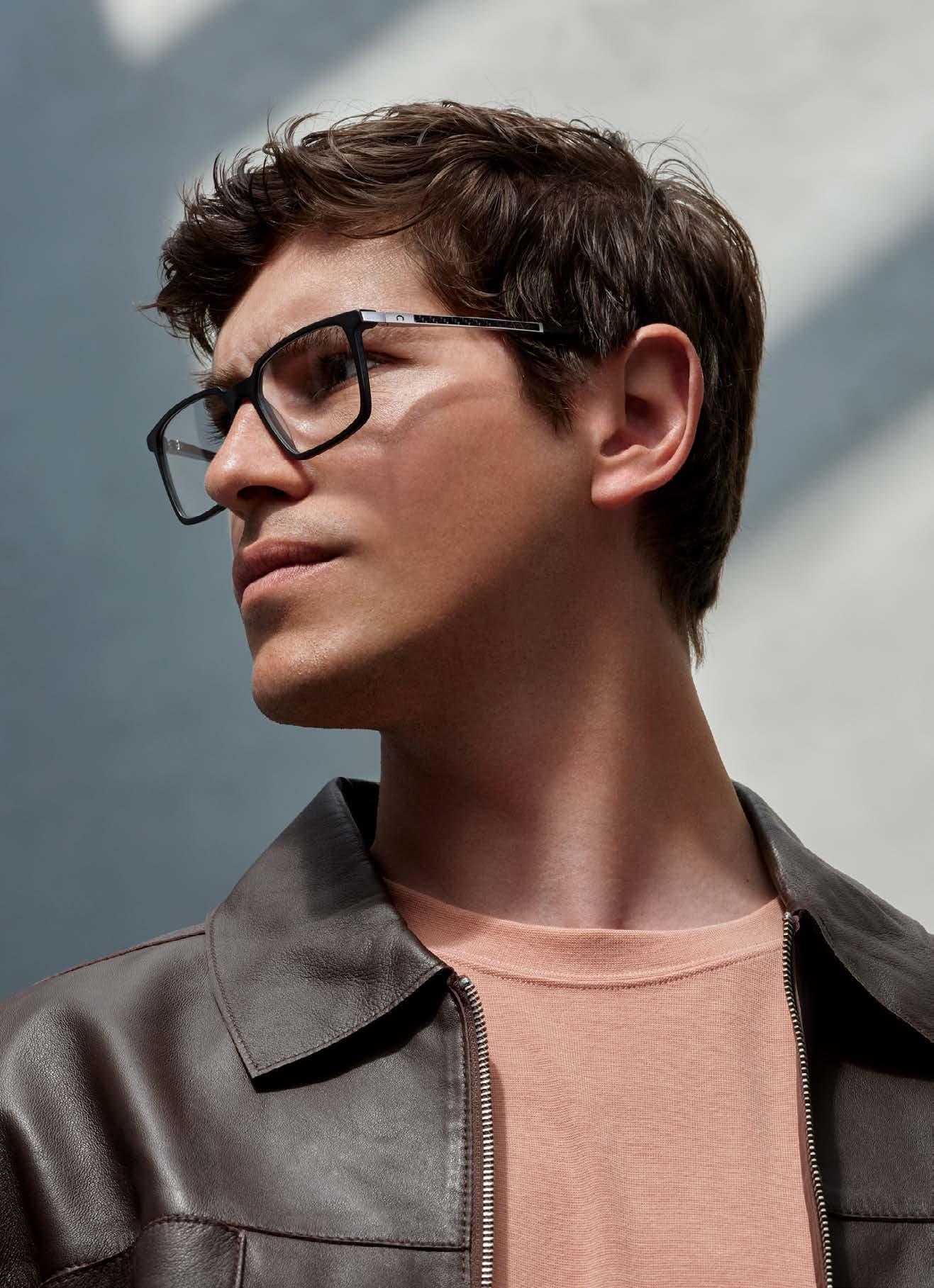
The Passau eyewear manufacturer is characterized by its constant striving for further development. In the following decades, the range of brands was expanded: MEXX was introduced as a licensed brand and METROPOLITAN was added as an urban label. Other brands were later added to the portfolio, such as FLAIR from East Westphalia and CAZAL, also from Passau, the cult brand par excellence. With 1,200 new pairs of glasses developed each year, the OWP Group is one of the leading international suppliers in the independent premium segment. The vision is clearly formulated: To create a gem of creativity in Passau and to be a home for exciting, innovative and sustainably produced products.
The OWP brand remains the heart and flagship of the company. The collections reflect the passion and experience of the
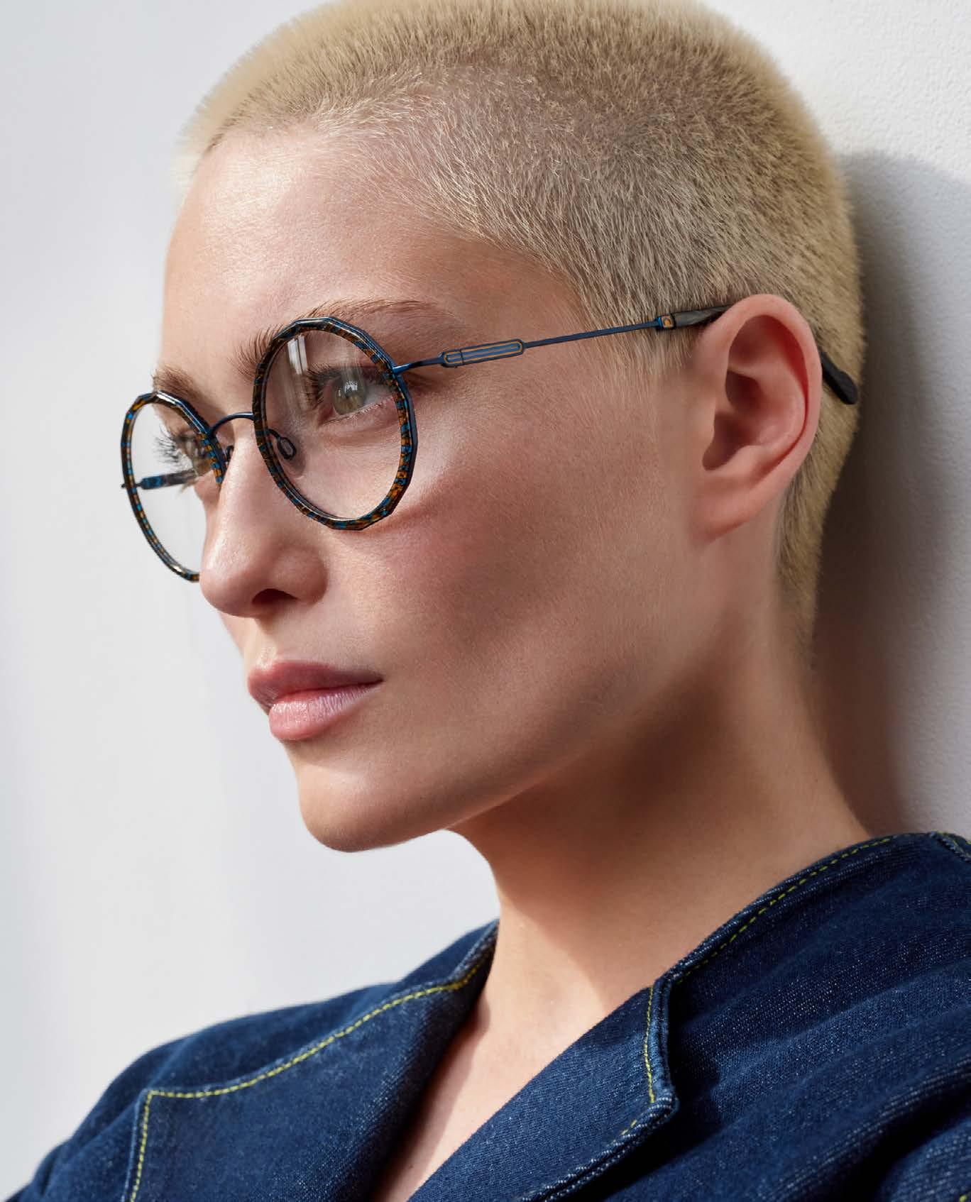


employees. Balanced proportions and shapes meet exciting color worlds, exceptional quality meets innovative design.
The women’s collection thrives on attention to detail. Whether excitingly feminine, sophisticated in color or timelessly elegant: the designs are convincing with their appealing character and make the perfect statement for the fashion-conscious woman.
The men’s collection is in no way inferior. Here, the focus is on high-quality materials, technical features and maximum comfort –implemented in cool, modern designs. The men's models from OWP are for the styleconscious man who does not want to compromise on his high quality standards when choosing his glasses.
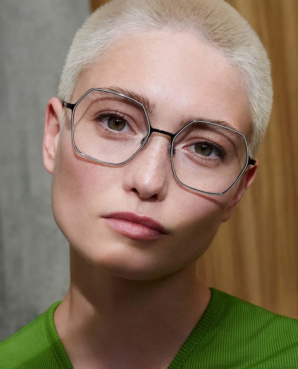
With the Opticians Special in the current issue, we want to provide insights into the work and nature of selected independent opticians. This is also a recognition of the achievements of all independent opticians, because they are the heart of our industry. With their passion, craftsmanship and fashion sense, they create the basis for one of, if not THE most versatile industry. In hardly any other segment do so many independent brands and stores offer their products to customers as in the optical industry. Preserving this unique cosmos is a worthwhile task.
At the same time, the work of the independent optician has not become any easier. On the contrary: the demands are more varied than ever, and the complexity is increasing year on year. Whereas opticians used to be able to concentrate primarily on providing an excellent technical service in-store, today they increasingly have to be present online
and deal with many issues relating to customer loyalty and acquisition. This is of great importance because the large chain stores can exploit their system advantages here.
In our Opticians Special, we present three opticians who are exemplary for many others who pursue their task with great passion. Firstly, there is EuroOptica from New York, which perfectly meets the demand for highquality eyewear with two flagship stores around Central Park. Our trip to the UK takes us to The Optical Gallery in Greater London. Here, the passion for eyewear is celebrated at the highest level. Finally, we present a concept of a different kind: In Cologne, a GÖTTI flagship store was opened in cooperation with Augenweide, allowing customers in the Rhineland to experience the Swiss brand in all its depth. Three interesting interviews –well worth a read.
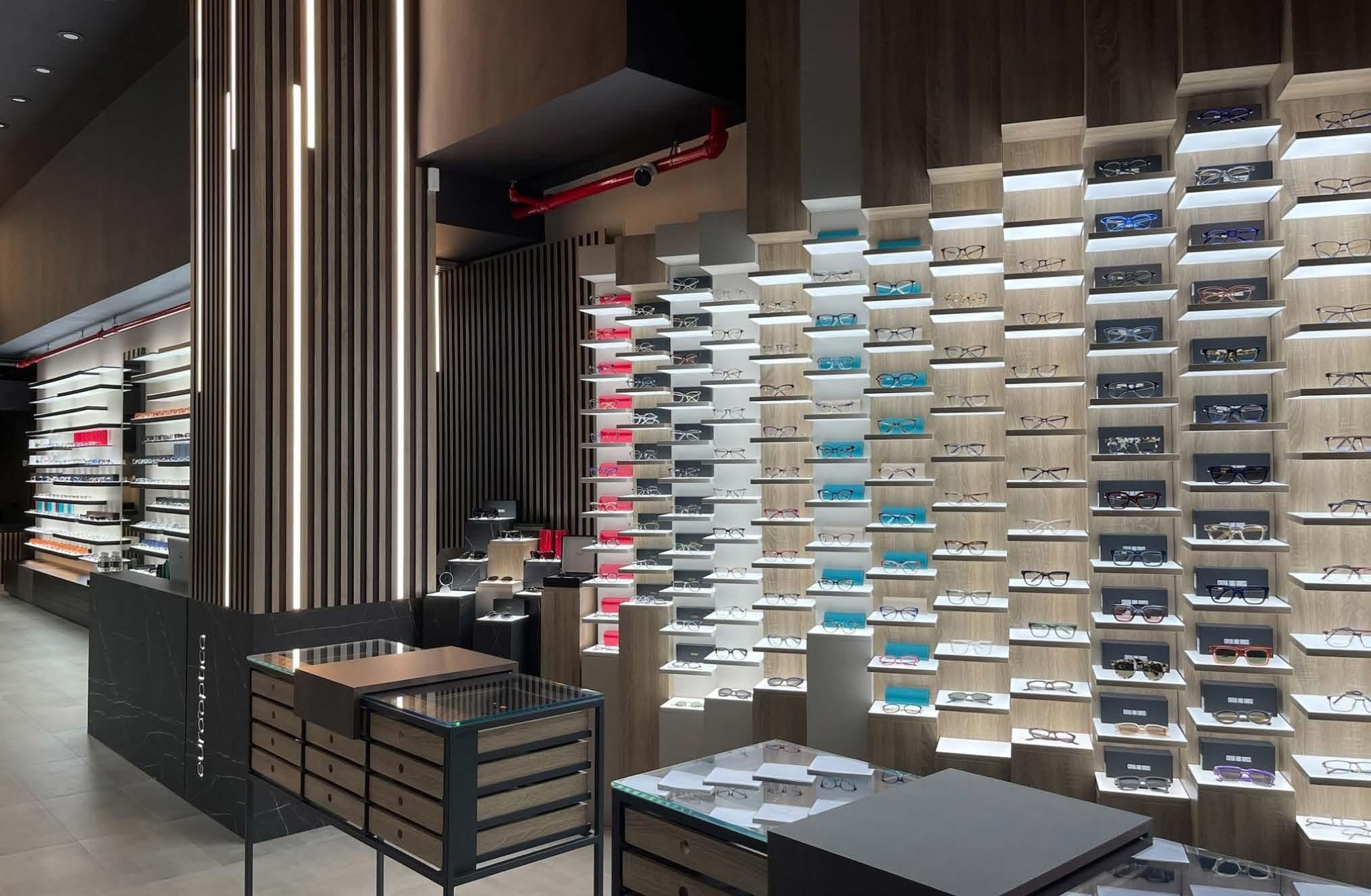
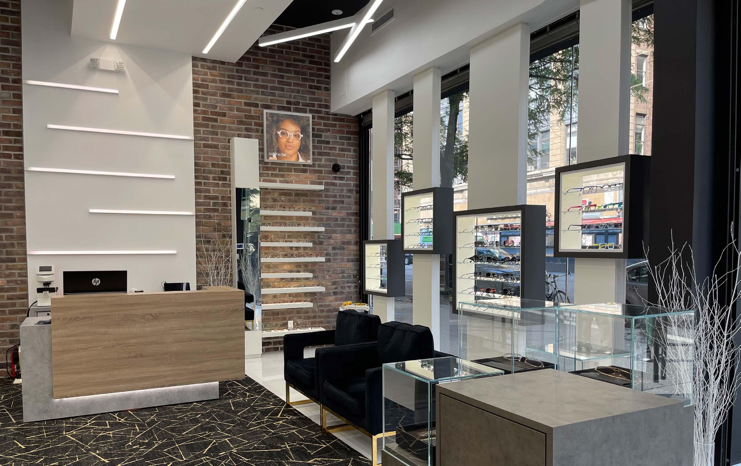
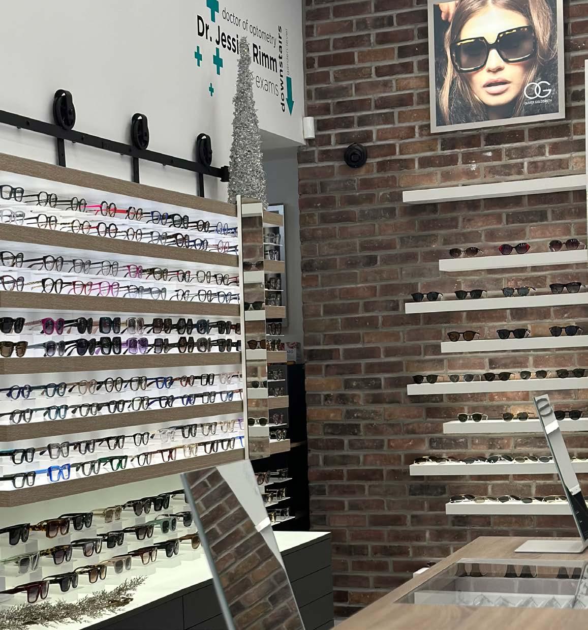
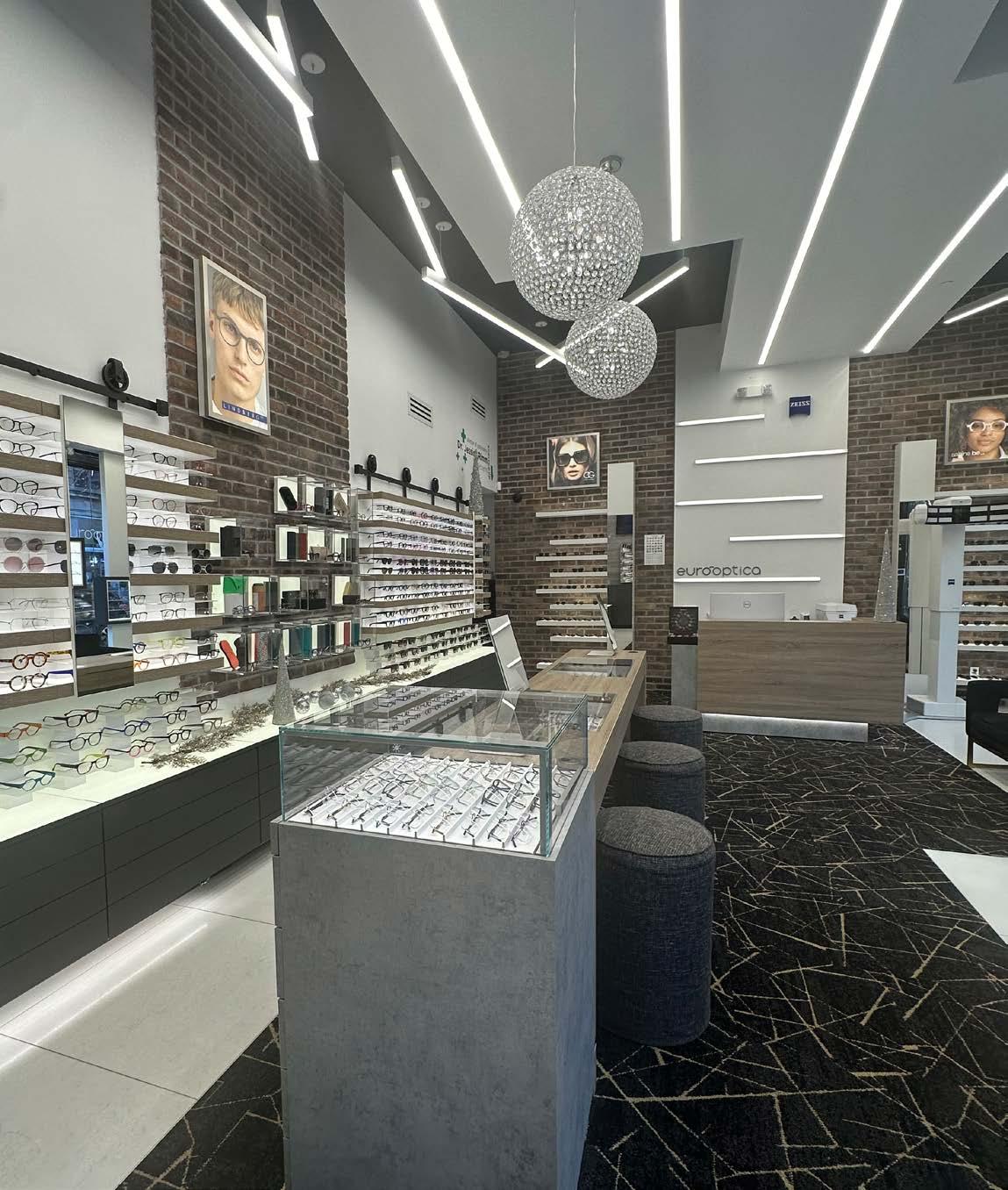
EuroOptica is one of New York’s premier optical destinations. The store, which focuses primarily on European designer brands, is a must-visit not only for locals but also for visitors to the Big Apple. And now it is even easier to visit, as the store on the Upper West Side has recently been joined by a counterpart on the Upper East Side. This means that EuroOptica is now strategically located on both sides of Central Park. We spoke with the EuroOptica team and gained some interesting insights into the company's offline and online strategy.
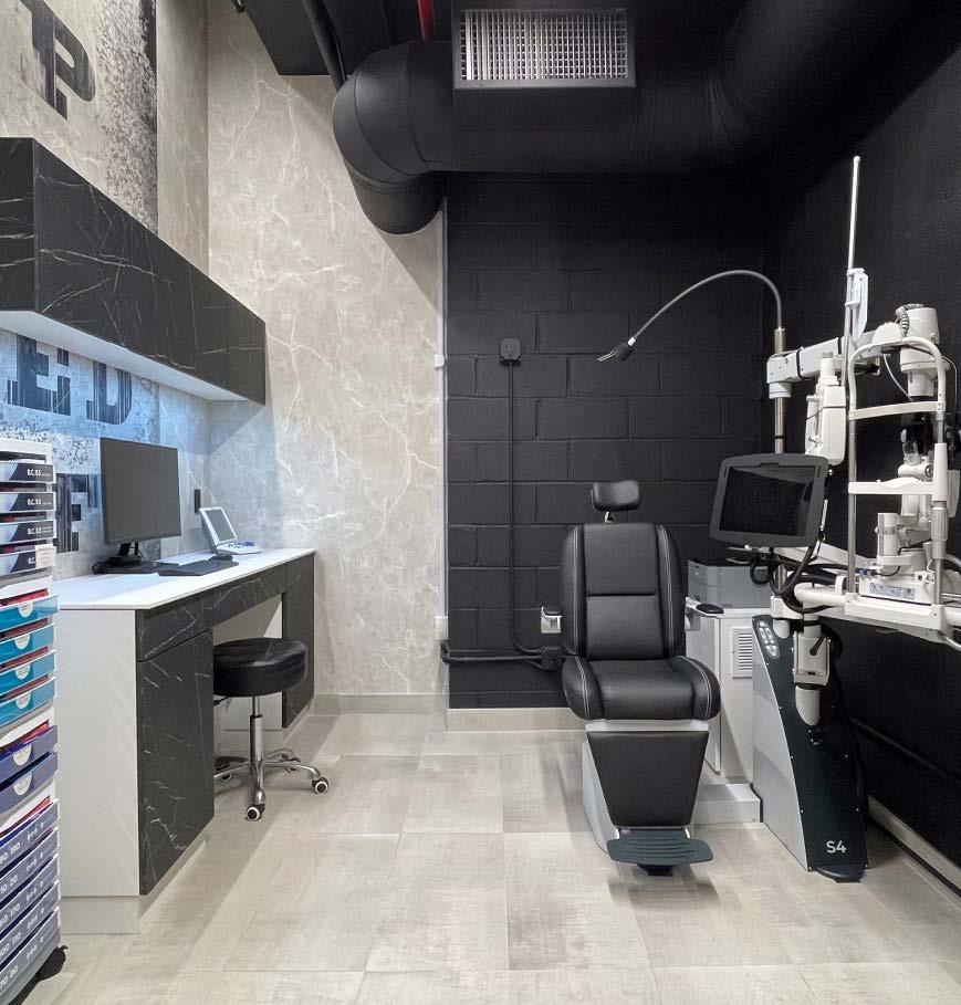
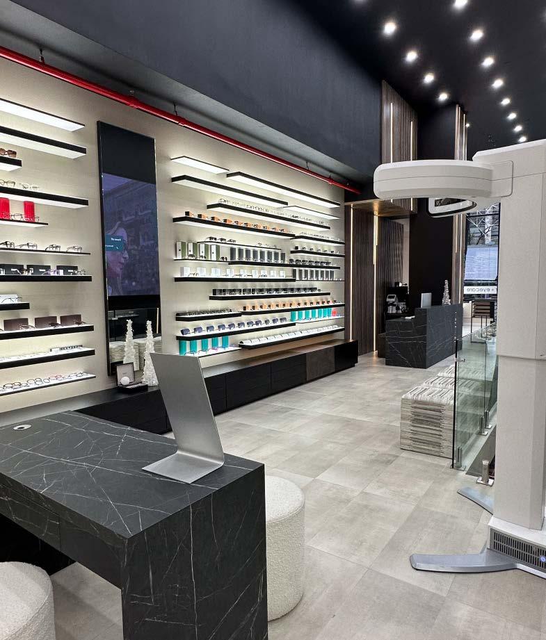
EuroOptica is one of the top stores in New York. How long have you been around?
Since our founding in 1996 on the Upper West Side, EuroOptica has shaped the eyewear landscape of New York City. Our journey reached a significant milestone with the opening of our flagship store at W73 and Columbus in 2020. In response to overwhelming demand, we proudly opened another flagship store on the Upper East Side at 72nd and 3rd Avenue in late 2023. Each store is a haven of elegance and innovation, where every frame in our boutique collection tells a unique story. Our dedicated staff is more than just customer service; they are the guardians of the personalized eyewear experience, ensuring that each lens is crafted to fit individual lifestyles through state-of-the-art techniques and lens technology.
You mentioned your new store in the Upper East Side. What motivated you to open the second store?
Our decision to open a new location on the Upper East Side was driven by the voices of our valued customers and patients. For years, we’ve had the privilege of serving many customers from the UES at our original location on the Upper West Side. Their frequent inquiries and requests echoed a clear message: there
was a strong desire for EuroOptica’s unique blend of style and personalized eye care closer to home. We listened to this growing demand.
What is the difference between the two stores?
The primary difference lies in the physical space and design concept of the UES store. It's larger, allowing us to expand our offerings and enhance the “see and feel” experience. The UES store embodies what we call the “V2 concept” – a version two of our design ethos, providing a fresh take on the look and feel while maintaining the essence of the EuroOptica brand. This new concept is an evolution, a testament to our growth and innovation in eyewear fashion and customer experience.
Why “EuroOptica” anyway? Do you only have European brands in your range?
The name EuroOptica is a nod to our roots and inspiration drawn from European eyewear fashion and design. Europe has long been recognized as a cradle of innovative eyewear, known for its impeccable craftsmanship, cutting-edge styles, and pioneering vision care technology. Our name reflects this heritage and our commitment to bringing the best of European eyewear aesthetics and quality to New York City.
However, our range is not limited to just European brands. While we proudly feature an extensive collection of European designers, known for their unique styles and unparalleled quality, we also curate a diverse selection of top-tier eyewear from around the world.
What are the special challenges for an optician in a big city like New York?
The primary challenge for an optician in a city as bustling as New York is ensuring the right staff. The pace and diversity of the city require a team that’s not only skilled in optometry but also adept at understanding and catering to a wide range of customer needs and preferences. Finding professionals who can balance technical expertise with exceptional customer service is crucial. They must be quick to adapt to the fast-paced environment, handle the high volume of customers efficiently, and maintain the high standard of care and personalized service that our clientele expects.
On the other hand, a city like New York also has an almost inexhaustible customer potential. How do new customers find you?
In the vast landscape of New York City, where the potential for
new customers is indeed vast, we find that word-of-mouth is our most powerful tool. Our existing customers become our ambassadors, sharing their experiences with friends, family, and colleagues. We believe that each satisfied customer’s story of exceptional service, cutting-edge lens technology, and unique eyewear selection resonates more deeply than any traditional advertising. This organic spread of our reputation is a testament to the quality of our service and products.
What do your customers appreciate about your store? How do you manage to keep your customers loyal?
Our customers value the exceptional experience and personalized service at EuroOptica. From the moment they enter, they’re immersed in a journey of discovery, with a focus on customtailored eyewear that meets their unique style and vision needs.
Our commitment to quality in both lenses and frames, coupled with our attentive service, is what keeps our customers returning and loyal to our brand.
You are also quite active online. Tell us more about your online business.
At EuroOptica, our online presence, established from our expe-
rience in e-commerce, is a supportive extension of our physical stores. It’s primarily an educational resource for our clients, offering insights into eyewear trends, lens technology, and eye health. While our online platform showcases our expertise, our main passion remains in providing unparalleled, personal experiences in our stores, where the essence of our “see and feel” philosophy truly comes alive.
You are a premium partner of FAVR and your product landing page is one of the most successful with 20,000 views per year. Why is it generally important to offer your customers good product inspiration?
Offering quality product inspiration is crucial as it empowers our customers to make informed choices. It reflects our commitment to not just selling eyewear, but guiding customers towards styles and technologies that enhance both their vision and personal aesthetics. This approach enriches the customer experience, ensuring they find eyewear that truly resonates with their needs and preferences.
What are the particular challenges of online business?
Our perspective on online business is that it significantly lacks the personal touch essential in eyewear selection and fitting, a
Designer eyewear on both sides of Central Park. The store on the Upper West Side has been joined by one on the Upper East Side.
cornerstone of our mission and vision. The unique challenges of replicating the high level of personalized service and detailed customization we offer in-store online are considerable. We believe that the true essence of our “see and feel” experience can only be fully realized through direct, in-person interactions, which is why we focus on providing exceptional service in our physical stores rather than expanding extensively into online sales.
Do you have all the brands you offer online in your local range?
Yes, for the most part.
How do you see the competition from the big chains and verticals?
Facing competition from big chains and verticals, we remain steadfast in our approach. We recognize that these larger entities operate differently, but at EuroOptica, we believe our strength lies in the personalized “see and feel” experience we offer. This sets us apart from the mass market approach of larger competitors.
What will be your particular focus in 2024?
Our focus in 2024 will be on expanding our presence with more locations, while rigorously maintaining the high standards of customer interaction that define EuroOptica
eurooptica.com
In this edition of our Optician Special, we’re introducing Nicos Antoniades, owner of The Optical Gallery in Twickenham, London. Alongside his brothers, Antonios and Marios, he’s transformed their family’s optician business into a trendy eyewear hub. With a deep passion for eyewear and inspired by Nicos’ background in music, they’ve created a space where glasses are more than just vision tools. Through immersive events, diverse collections, and a strong online presence, The Optical Gallery is reshaping how people view eyewear. Learn how they balance functionality and fashion, and discover their plans for future growth. Join us as we explore their journey from traditional opticians to eyewear innovators.

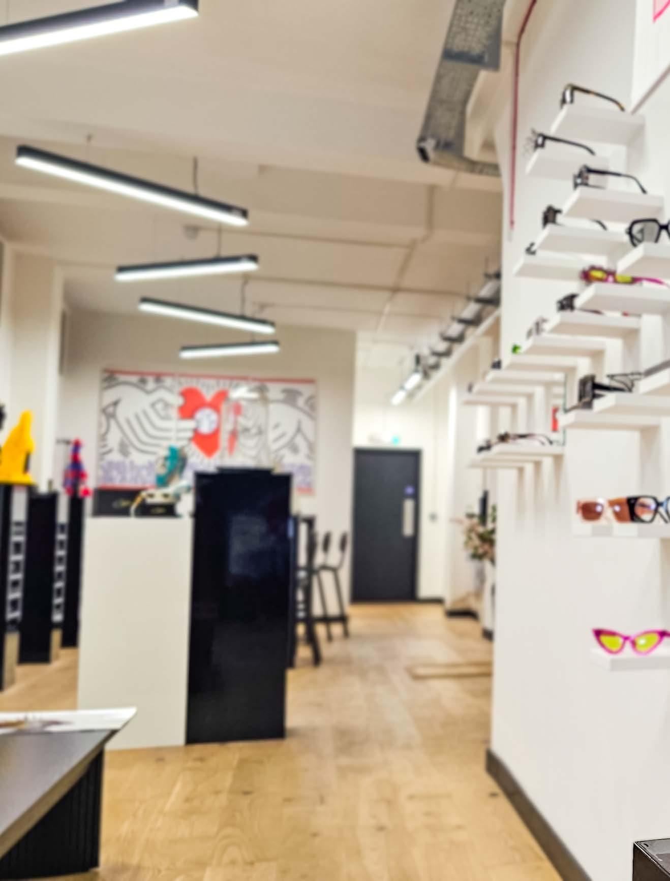
Optical store of cool –The Optical Gallery is more than just a conventional optician.
Hi Nicos, thanks for doing this interview with us. You really have a unique company history. You’re actually running the business with your two brothers and you’ve taken over from your parents in 2015. Please tell us more!
My name is Nicos, and together with my brothers, Antonios and Marios, we steer the ship of The Optical Gallery. Our family’s roots in optics stretch back to 1996, with two practices that our parents nurtured: one in Twickenham and a partnership in Chessington with a great man called Clive, who, to this day, is the senior lab tech. Back in those days, The Optical Gallery was a quintessential family-run UK optician. From the tender age of about 12, my brothers and I were woven into the fabric of the business. For a while, however, I stepped away from the family business. My fascination with the burgeoning UK urban music scene led me down a different path. Nights were spent in the pulsating heart of London underground music events, radio stations, and studio sessions. This passion evolved into a self-taught journey in videography, PR, and eventually managing artist campaigns for notable names like Ministry of Sound and Atlantic Records
Meanwhile, the Chessington practice flourished under my brothers’ care, but Twickenham was on a downward spiral. Recognizing my success outside the family business, my father extended an olive branch, inviting me back to inject new vigor into The Optical Gallery. The return was a wake-up call. The business landscape had shifted dramatically. Our traditional approach was no longer working – new ideas were needed.
Do you still remember where you found new inspiration for the store?
Yes. It was in Venice that the lightbulb moment happened. A visit to Boudoir Venice, an optician’s shop unlike any other I’d seen in the UK, revealed a new perspective on eyewear. The warm, artistic ambiance and the personalized styling service from the owner Alessandro who to this day I thank and keep in touch with, reshaped my understanding of what an optician’s practice could be. The experience was eye-opening, showing me that eyewear could be more than just a medical necessity; it could be a statement.
Tell us more about the concept of the store.
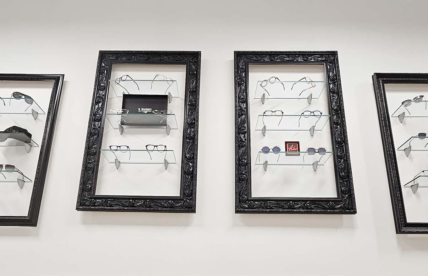
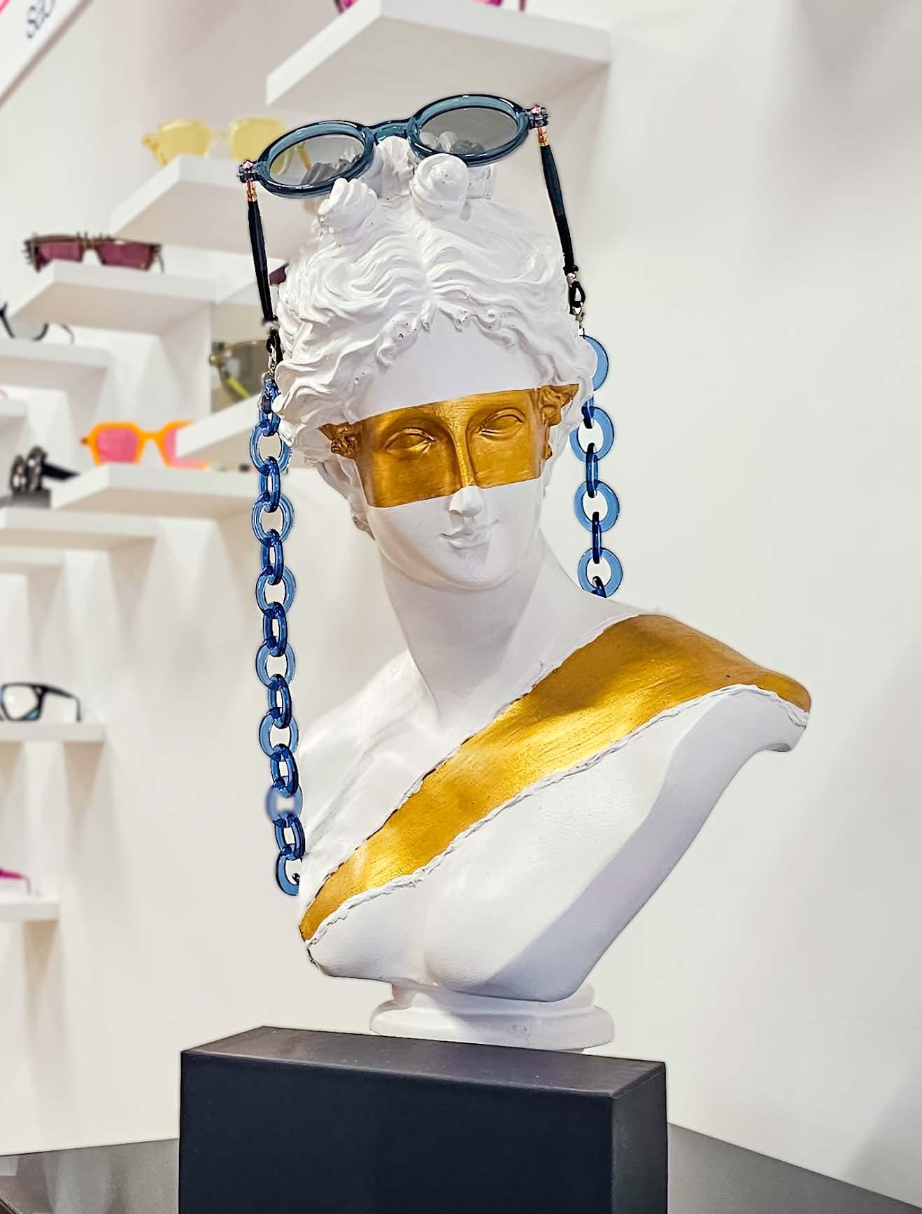
Twickenham is what we call our flagship gallery. As I mentioned, we designed it as an art gallery for eyewear. The interior is minimalist, like a blank canvas, and we have carefully chosen artistic features such as our head and hand chairs. On one wall are 5 large black custom-made portrait frames. Inside each are
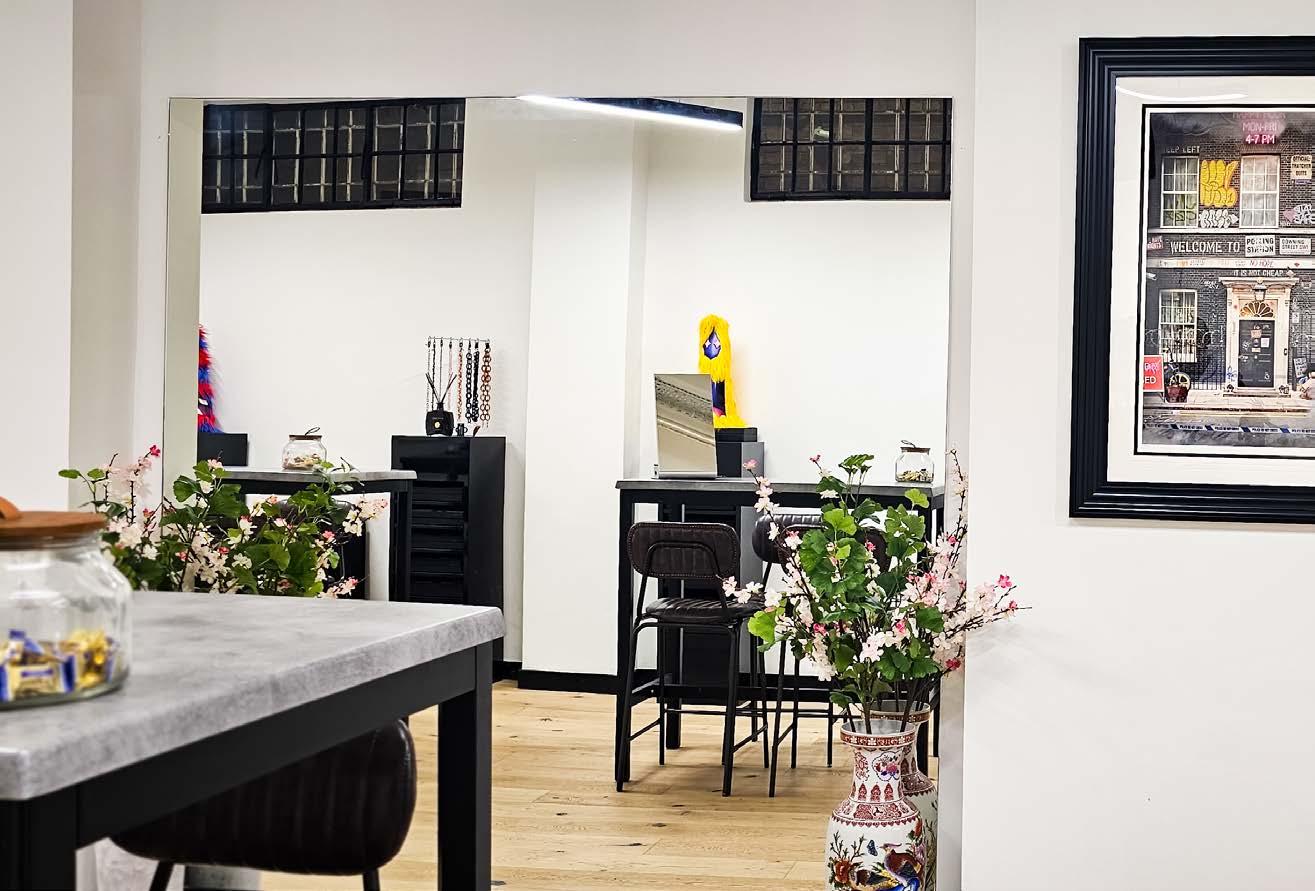
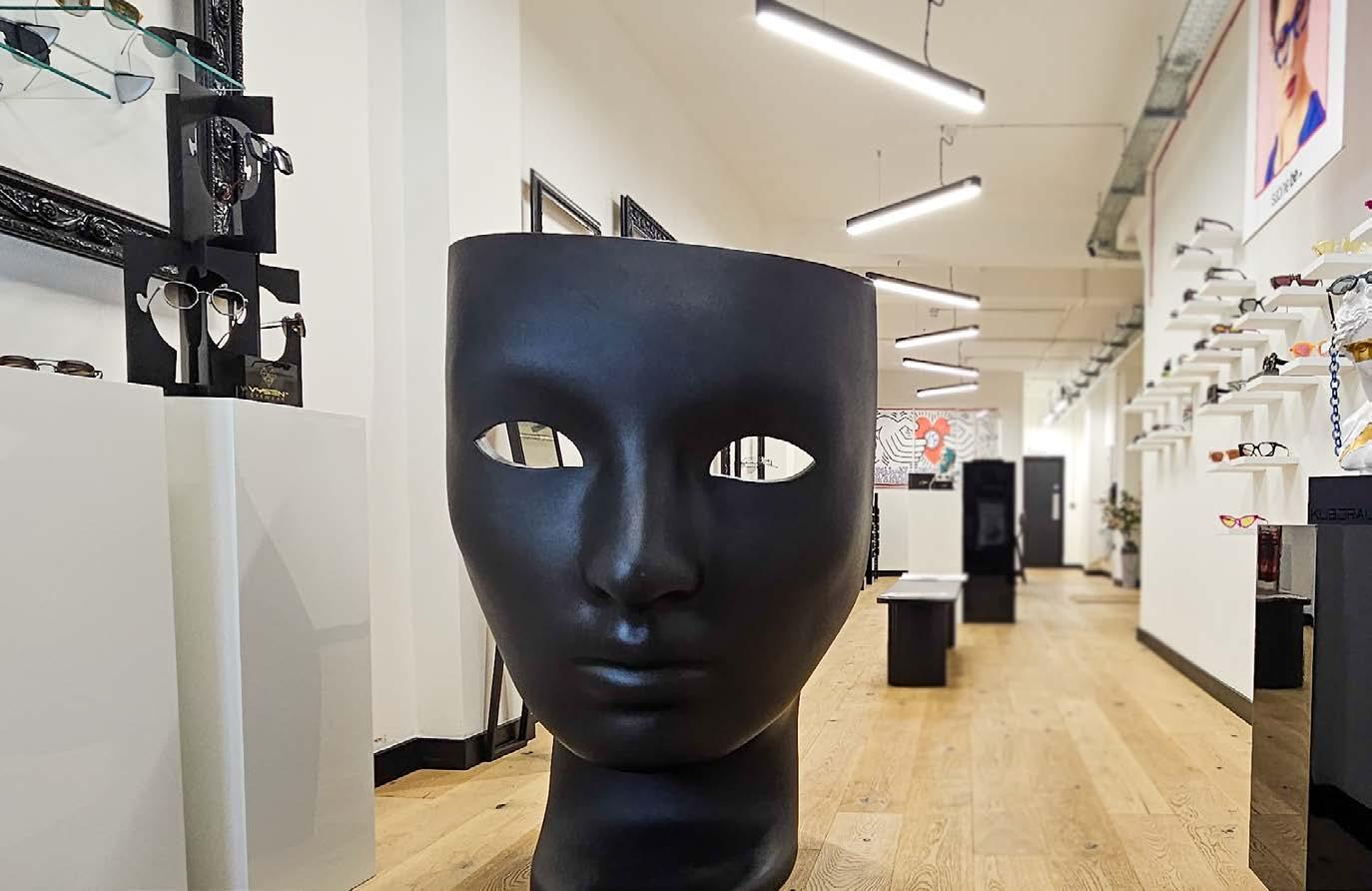
3 small glass shelves that display only 6 pieces of eyewear per frame. The adjacent wall has individual frame shelves artistically displayed and 4 black podiums on which stand pop art head busts displaying individual eyewear. Only a minimal number of frames are displayed to showcase their beauty and craftsmanship. The dispensing area consists of two bar-style tables and stools, and in the custom pedestals are our curated frame tray collections, ready to style and delight our clients. A lot of people have mistaken us for an art gallery and we look and operate like one. What kind of an area is Twickenham?
Twickenham is a great area, although many have told us to move our concept more centrally, but we believe Twickenham is a solid name in the community. It is known for rugby and major events, as well as having a beautiful surrounding area where many enjoy good food, coffee and still many bespoke independent long-standing businesses. Many of these businesses have customers who travel from far and wide. The Optical Gallery is no exception. Optical stores are in a special niche in between functionality and fashion. How do you balance the two?
Navigating the balance between clinical precision and aesthetic judgment is critical. A misstep in medical assessment can undermine trust, while a fashion faux pas can undermine confidence. The art is in harmonizing these elements to ensure a seamless journey for the client from start to finish. Our mission goes beyond mere service; we aim to create an experience, to inspire a sense of excitement and discovery in our clients.
You recently compared buying eyeglasses to picking a pair of trainers – why the analogy?
My brothers and I have a deep passion for eyewear, much like a connoisseur appreciates fine art. For us, eyewear is more than just a visual aid; it’s a fashion statement that adapts to different outfits, seasons and occasions. This perspective, while common in Europe, is still gaining ground in the UK, where eyewear is often seen as merely a corrective tool or, worse, a symbol of aging –both rather negative connotations. Think about the excitement of shopping for new shoes; people often look for shoes that will
complement a particular outfit or suit a particular occasion – that’s what eyewear should inspire.
Have you noticed any differences in how older and younger customers approach selecting eyewear?
We serve a diverse clientele that spans multiple generations. Our more mature customers often gravitate toward eyewear with vibrant hues, perhaps reflecting their extensive experience with eyewear over the years. Conversely, our younger visitors tend to favor frames with a vintage flair, opting for classic designs that give their style a distinctive, somewhat eclectic edge.
What does an eyewear brand have to have in order to be on your shelf?
Selecting eyewear brands for The Optical Gallery is a meticulous process. We prioritize depth over breadth in our collections, choosing to fully explore a brand’s range rather than skimming the surface of many. This approach stems from a desire for organization and meaningful representation of each brand, avoiding the clutter of a scattered few of many. After all, with standard shapes like round, square and rimless readily available in every collection, our focus is on what sets a brand apart – its unique story and identity. Our basic criterion is passion.
With the increasing importance of digital platforms, how do you use your online channels to complement your brickand-mortar store?
Leveraging social media has been a game changer for The Optical Gallery, thanks in part to my background in the music industry. I’ve brought with me skills that allow us to not only showcase our ethos, but also educate our audience through platforms such as YouTube, Facebook, Instagram and TikTok. This approach has effectively turned our local showcase into a global one, attracting visitors from all over the world, particularly those on holiday from abroad. Given Twickenham’s convenient access to London, it makes perfect sense to use these platforms to highlight our unique offerings and expertise.
Nicos, thank you for this interview.

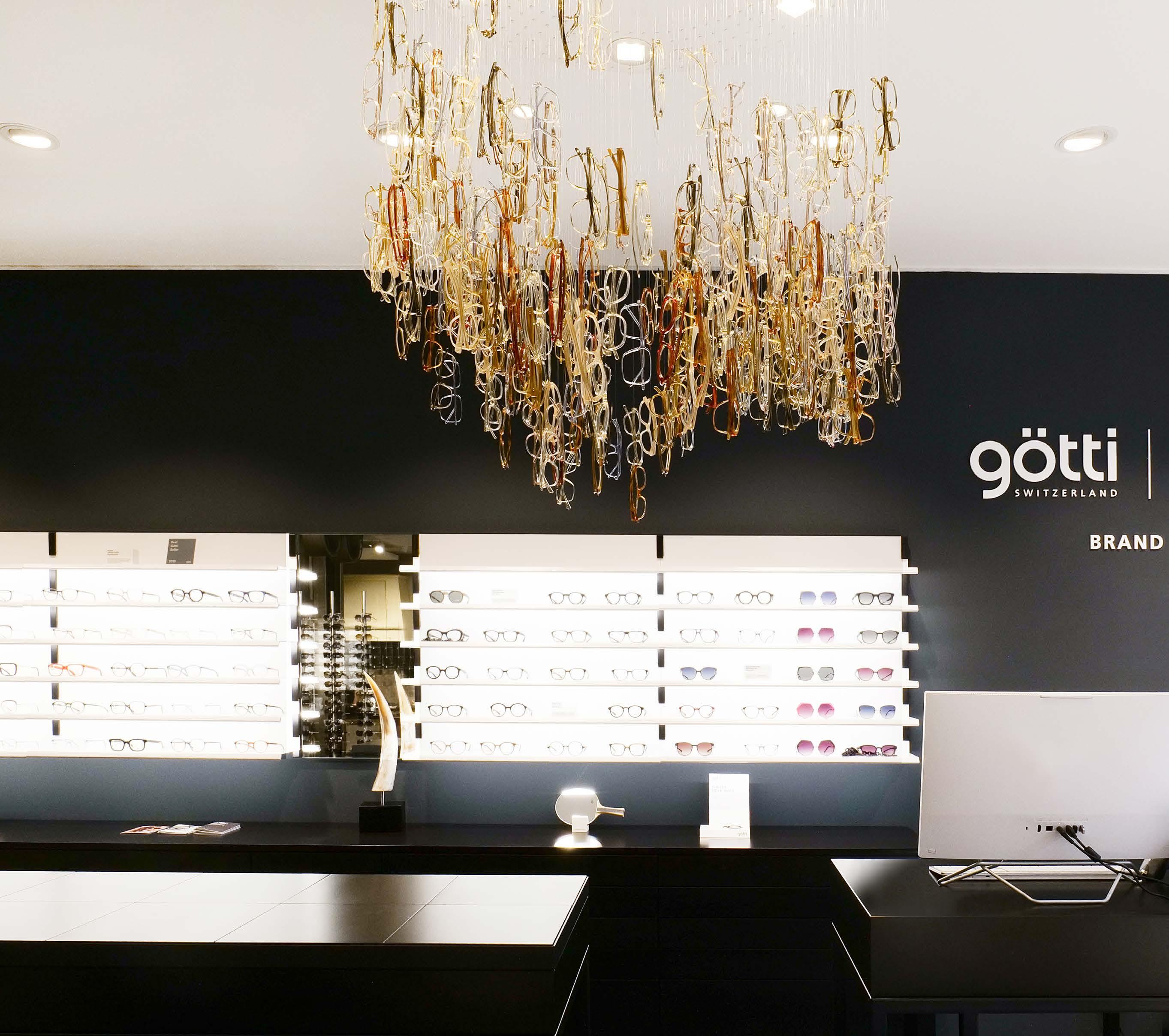
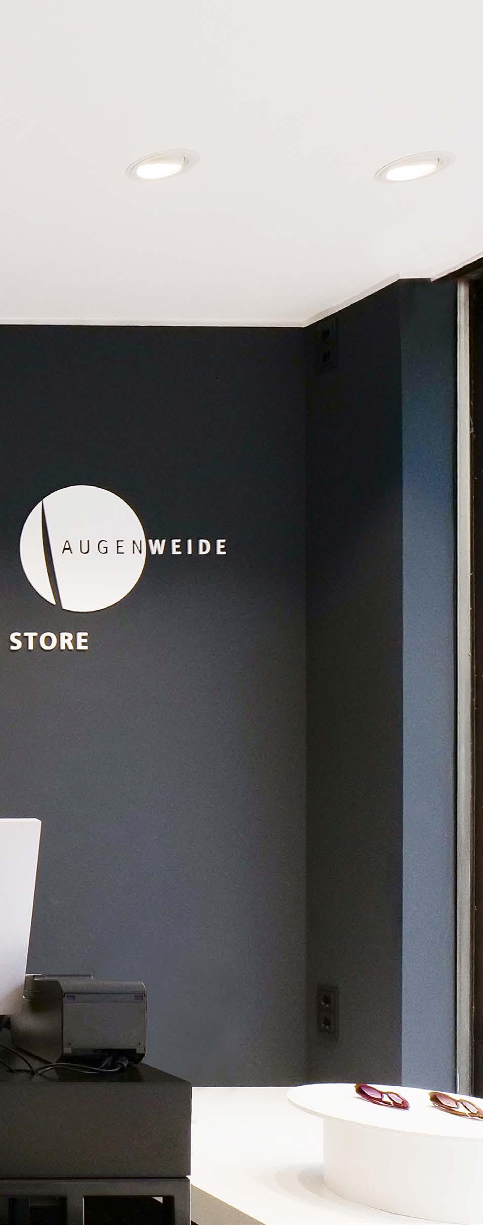
Hello Sven, congratulations on your third GÖTTI store.
Sven: Thank you very much, we are very happy about it. I would like to share my congratulations with everyone involved.
Of course, we are particularly pleased that the first German GÖTTI store is within walking distance of our studio. Why Cologne in particular?
Sven: A GÖTTI brand store simply has to happen. This is only possible through a trusting and successful collaboration.
And why did you choose Augenweide?
Sven: Augenweide in Cologne has been a customer from the very beginning and has been one of our best customers in Germany over the years.
Michael, why did you choose GÖTTI for a brand store?
Michael: As we have been working successfully with GÖTTI since 1997 and have developed a friendship as a result, our brand store is the logical next step.
GÖTTI’s eyewear collection is so comprehensive that we and our clientele are constantly impressed by its visionary design and seemingly never-ending sense of upcoming fashion trends.
Who came up with the idea for the collaboration?
Michael: The idea came from Sven and
Felix, but it immediately fell on fertile ground with me. I had had a vision in this direction for some time. It just needed the right initial spark.
How long did it take from the initial idea to the opening?
Michael: When I was at Silmo in Paris in the fall of 2021, Felix Moreno asked me if I would be interested in the project. I had to think for exactly one minute and said “yes”. Thanks to GÖTTI’s excellent planning, I'm delighted with the result.
What does the collaboration look like in concrete terms?
Sven: We try to make the process as uncomplicated as possible. The main thing is to create a win-win situation. We develop initial ideas and if everything fits, we implement the plans and share the costs amicably.
Sven, GÖTTI is one of the most successful independent brands and is represented at many opticians. What are the advantages of having your own store?
Sven: Experiencing the GÖTTI collection in all its depth is very impressive for the consumer. But it’s also a nice response to the monobrand stores for retailers to be able to present an eyewear label as a whole.
GÖTTI opens its third brand store. After Lucerne and Basel, the complete range of the Swiss premium brand is now also available in a German store for the first time - at Augenweide Optik in Cologne. We talk to brand founder Sven Götti and optician Michael Franzen from Augenweide about this special kind of cooperation.

To what extent can you guarantee that all product ranges are always available in all their variety and depth?
Michael: Thanks to the monthly stock reconciliation, the range is always complete and is constantly updated with the latest frames.
Is there a dedicated team for the GÖTTI store?
Michael: Of course I need specially trained staff for the GÖTTI brand store. My wonderful wife, herself a master optician, and a young, very experienced master craftsman, who was hired specifically for this purpose, will be instrumental in the success of our collaboration. Is the store design typically GÖTTI?
Sven: Yes, to do justice to our style, we plan and manage everything internally. A big thank you to Thomas and Coline, they are now also experienced shopfitters. The artistic chandelier, which consists of 300 vintage glasses, is striking. Is that a special feature of the store in Cologne?
Sven: Our aim is always to incorporate an element that makes people smile. The whole thing should also be fun and become a shopping experience. So we always come up with special lighting to match the store.
With the brand store, there is now also a VIP service for GÖTTI eyewear. What exactly is behind this?
Michael: In principle, we have all spare parts in stock and, as a brand store, we are given priority for deliveries and new products.
How are you drawing attention to the new offer in Cologne?
Michael: In a big city, it is sometimes difficult to attract attention and not get lost in the crowd. Our cinema advertising, which was broadcast in selected arthouse cinemas, has proved to be a very good marketing tool, as this is exactly where we reach our clientele.
Good luck with the new concept.
gotti.ch
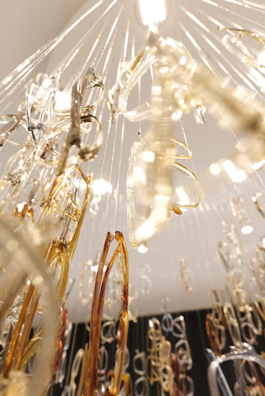
GÖTTI glasses & light –a special kind of interaction.
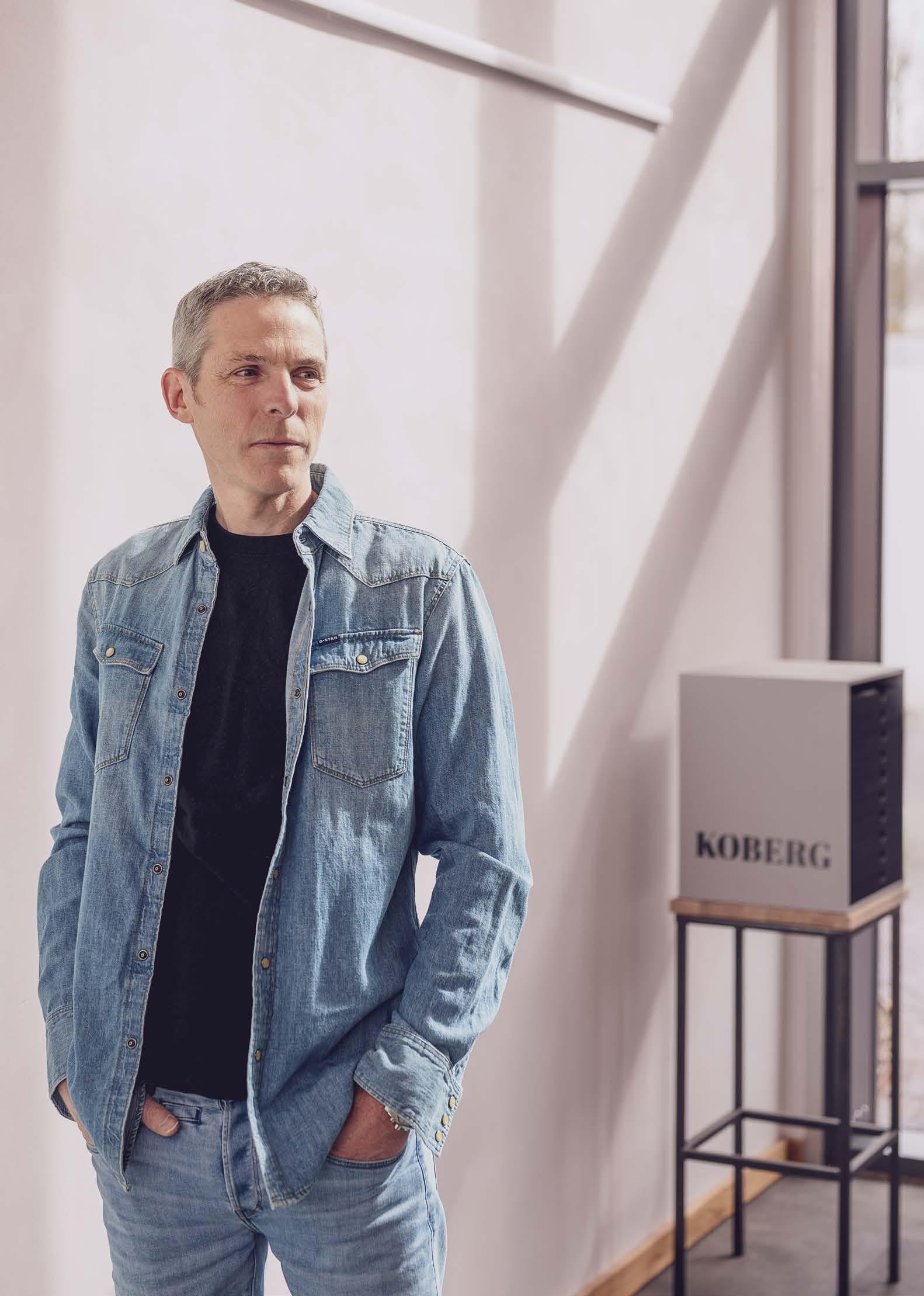
Frank Tente is committed to sustainability not only in the manufacture of eyewear, but also in the construction of the new assembly hall in Münster.
Founded in 1946, Koberg & Tente has become an integral part of the German optical landscape. Ten years ago, the Münster-based company launched the KOBERG brand, which demonstrates its design and manufacturing expertise. Managing Director Frank Tente attaches great importance to sustainability, not only in the manufacture of KOBERG spectacles, but throughout the entire value creation process – a matter close to his heart.
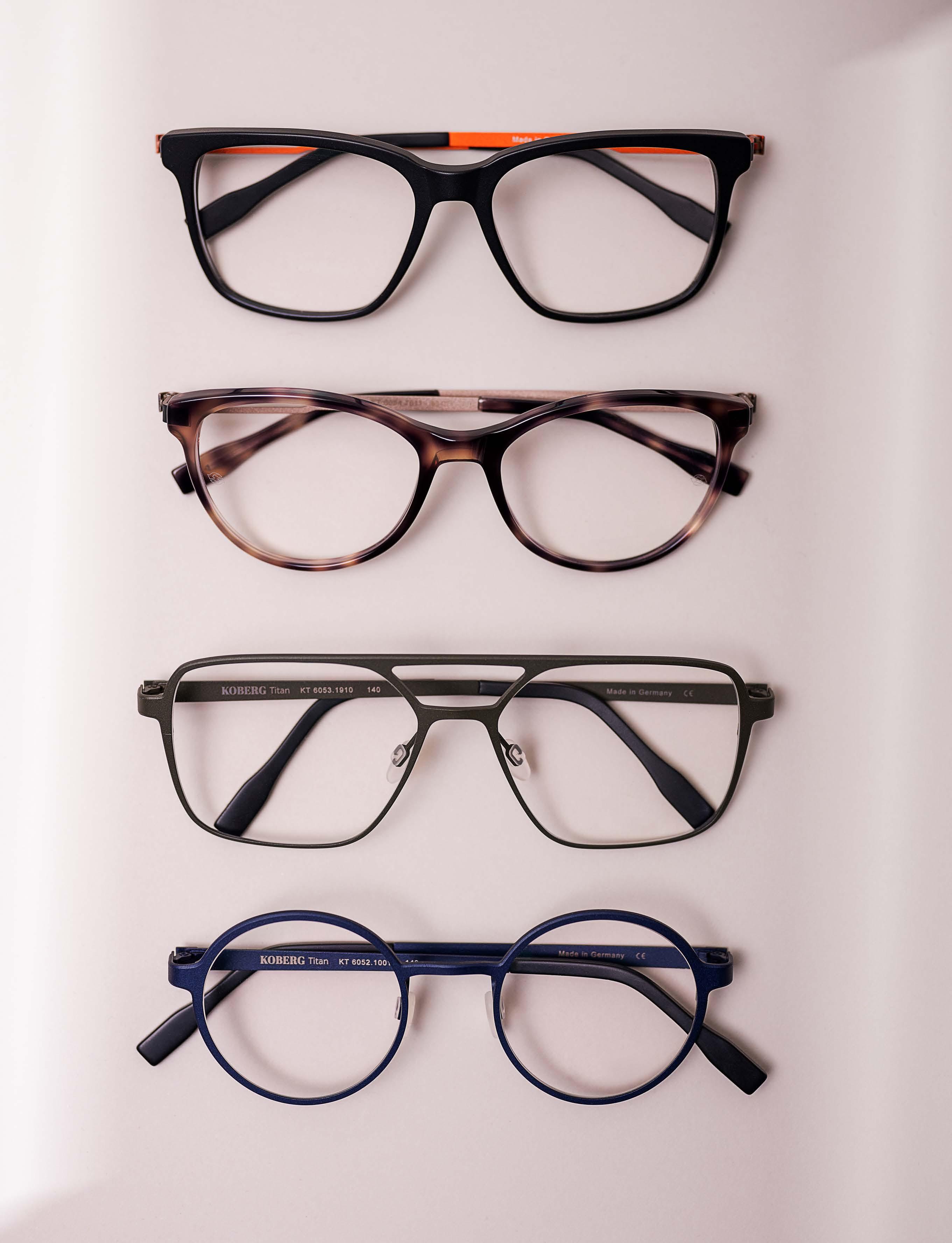
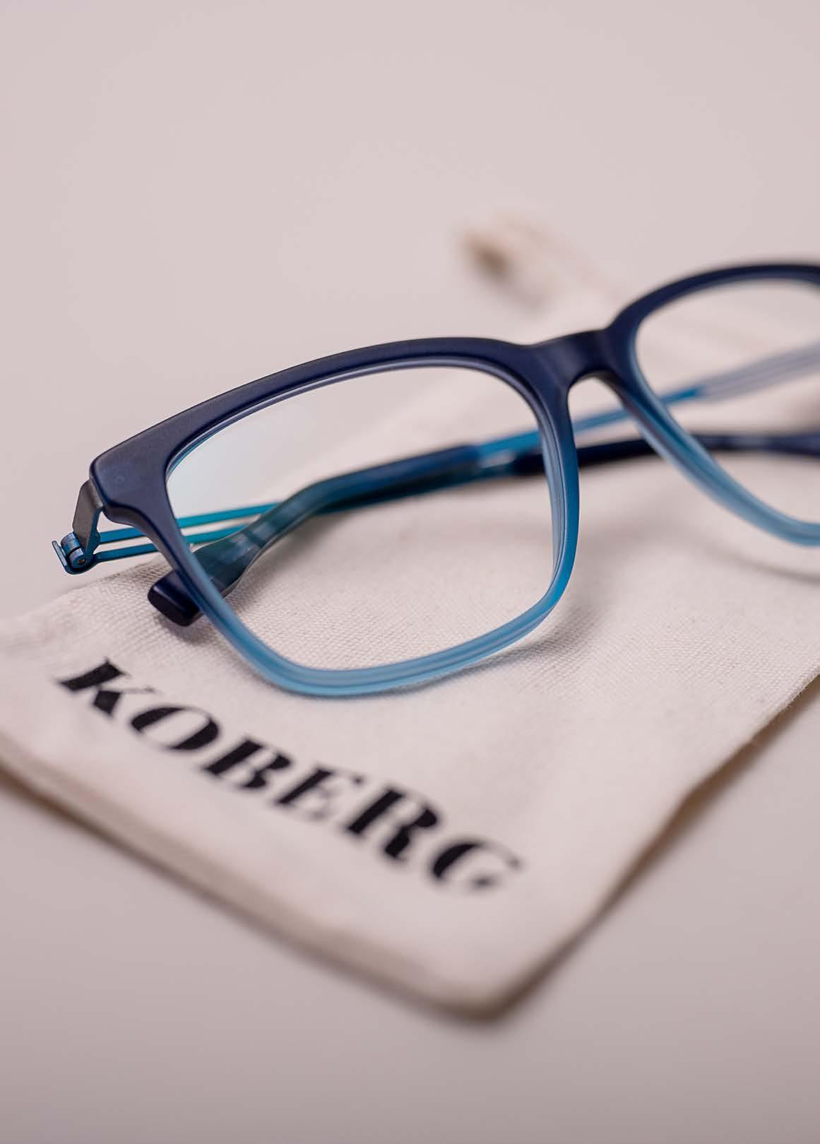
KOBERG
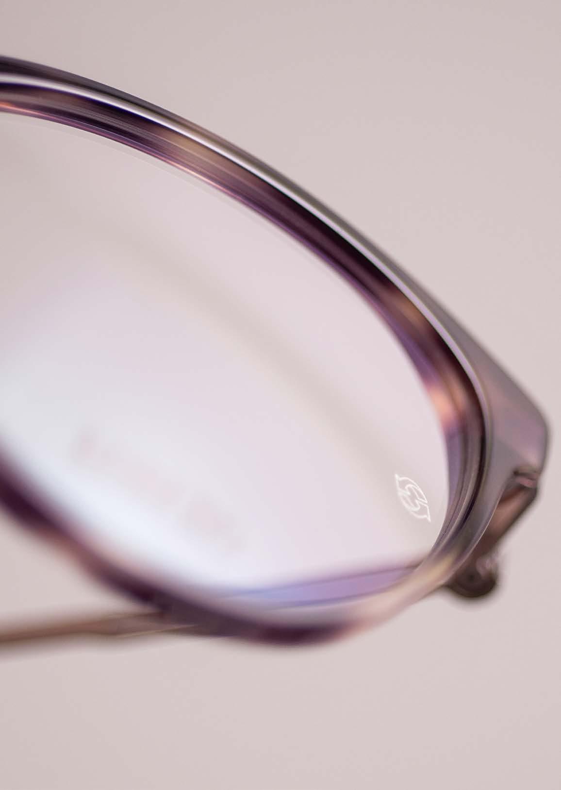
stainless steel and titanium – material quality from Germany, Switzerland and Italy.
Hello Frank, your name gives it away, you are closely associated with the company Koberg & Tente. How long have you been personally involved with eyewear?
In a medium-sized family business, you grow up with your parents’ business – that’s how it was for me and how it is for my daughters. I regularly worked in the company while I was still at school. After graduating, I sold the Spanish sports eyewear brand eassun in German-speaking countries on my own to gain my own experience in the industry. Finding or creating products that customers are enthusiastic about buying and reselling has driven me ever since.
How would you describe Koberg & Tente’s philosophy?
Koberg & Tente has changed again and again in over 75 years on the market. For me, value and sustainability are very important. We want to offer eyewear for different target groups without compromising our core values. So we don’t rely on expensive licensed brands, but create high-quality products in different collections for the respective target groups. In doing so, we always take sustainability into account in terms of ecology, economy and social issues.
You launched the KOBERG brand ten years ago. What motivated you to do this?
KOBERG was the first collection that we produced (again) in Ger-
many. We worked very closely with the designers and the producer. We wanted to produce glasses without compromise that meet our standards for high-quality eyewear fashion, that we stand behind with our name and that we also like to wear ourselves.
What can you do with KOBERG that you couldn’t do before?
We have a very personal relationship with Alex Picicci from Deoma AG, who is responsible for most of KOBERG’s production. Together we look for the best solutions to transform the design into a perfect product.
What characterizes KOBERG as a brand?
KOBERG is “normal” in the best sense of the word. KOBERG doesn’t need flashy colors or extravagant shapes. We love a clear, simple design language that still makes a statement. Is there nevertheless a special design DNA, something that makes your glasses recognizable?
Yes, at the beginning our designer developed a screwless cylindrical hinge, which was the most important design element. We then looked for a more delicate solution for the titanium models and transformed the cylinder into a small plate. What remained, however, was the special, colorful accent on the hinge.
What target group are you addressing with KOBERG? Customers who are not looking for a well-known license name,
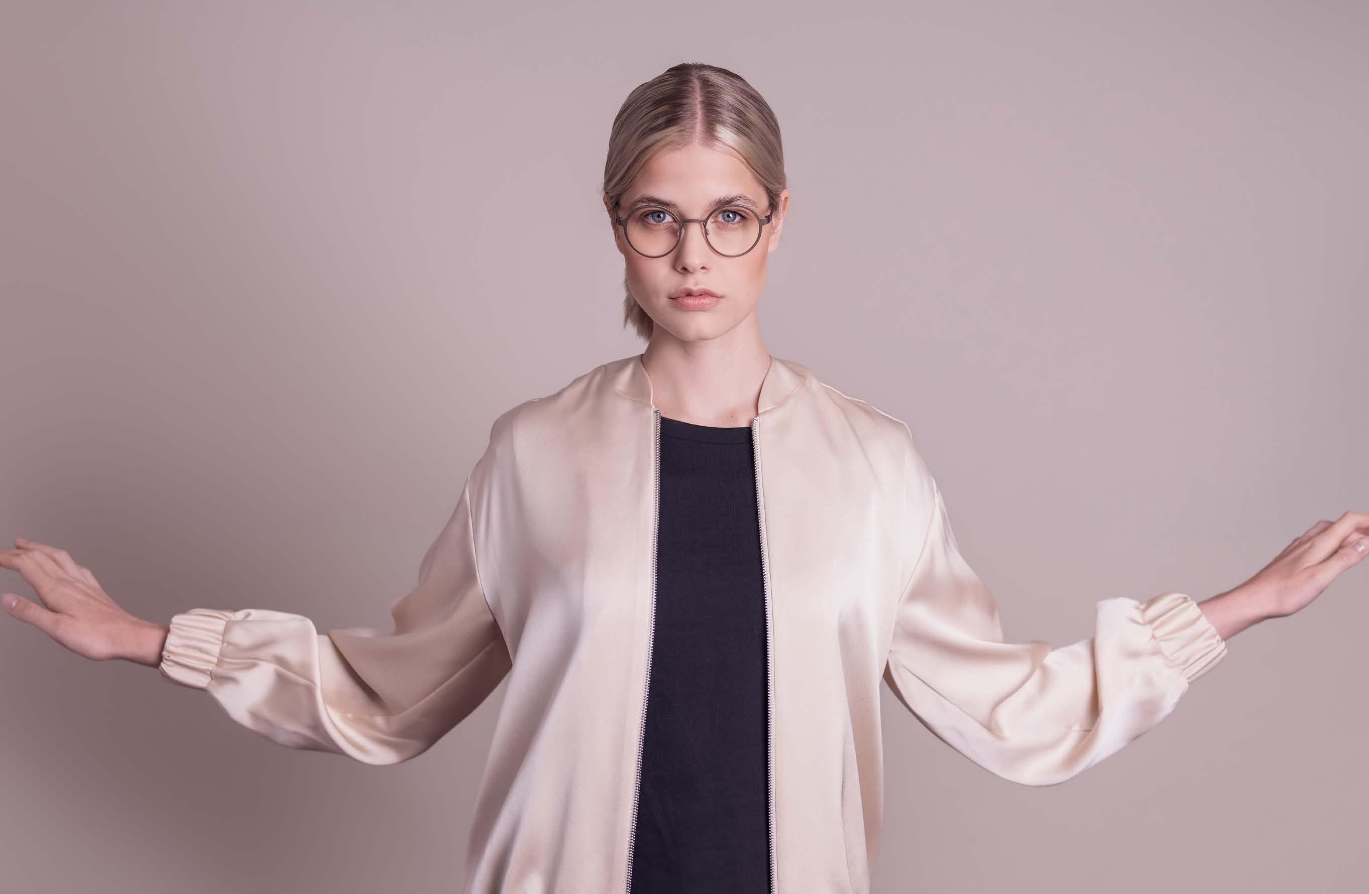
but who value a high-quality product manufactured in Germany. Customers who like it straightforward but still want to make a statement.
You also want to make a statement with your special visual language. What does it stand for?
It stands for the identity of the brand. It is timeless, but still relevant. It’s purist, but doesn’t do without rough edges. The fact that it is not loud does not mean that it is reserved. It stands out from the general noise. And all of this corresponds to the product, the idea behind KOBERG and the resulting consequence: to produce something that lasts.
In this context, you also talk about “living sustainability”. What does this mean and on what levels does it take place in your company?
For us, sustainability is not just another project, but we always try to scrutinize all processes to see how we can make them more sustainable. This could be the transport route to us or shipping to the customer, the product packaging, the trade fair appearance or even the question of soap and towels in the company. Let’s start with production. Why is “Made in Germany” important to you? Where are KOBERG glasses made?
The stainless steel and titanium frames are mainly manufactured by Deoma AG in Gerlingen, while the acetate fronts also come from a manufacturer in southern Germany. We do the final assembly, inspection and packaging ourselves in Münster.
Does that also make you faster?
Not always, unfortunately. But definitely much more flexible. We store the raw frames here and can reproduce them depending on sales figures without having to adhere to minimum quantities.
You recently built a new assembly hall in Münster. What is special about it?
The production hall is built as far as possible from natural materials. Sure, it also needs a few steel beams, but all the walls are timber frame construction and insulated with natural wood fibers. Instead of plasterboard, we used clay panels, which were then plastered with a clay-straw mixture in several layers.
To what extent do the materials you used – acetate, stainless steel and titanium – meet your sustainability requirements?
Basically, all three materials are easily recyclable. Cellulose acetate, for example, decomposes in one to three years, whereas a PET bottle takes 450 years. And the amount of material used for
Timeless and wearable design combined with a purist visual language give KOBERG its very own identity.
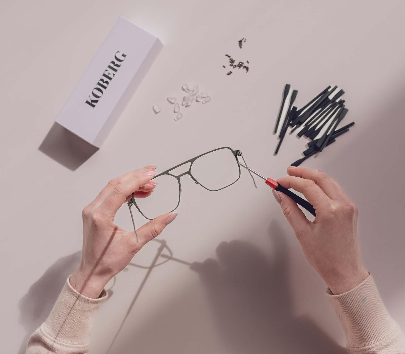
spectacle frames is not particularly high. It is much better for the environment to realign all processes than to use a specific material. We analyzed this a few years ago in a project with students from the University of Münster.
Your claim to sustainability is also reflected in the procurement of accessories, isn’t it?
Exactly! We only use components from manufacturers in southern Germany and paints from Switzerland. And we source our acetate panels from Italy. Importing from Japan, where there are also great sheets, makes no sense for us.
What does KOBERG’s packaging look like?
First of all, the glasses are not packed in a plastic bag, but in a linen bag. The customer can keep this and continue to use it or return it to us so that it can be reused. The KOBERG case is made of cardboard because we don’t like artificial leather or plastic.
In what other areas are you practicing sustainability?
We have currently discovered two new areas that we can improve: Firstly, we designed our trade fair stand for opti so that everything can be reused. In recent years, it has always hurt us to see how much was simply thrown away on the exhibition grounds after Sunday evening, from carpets to entire exhibition stands.
And we are currently tackling the issue of support panels with some of our friends. Otherwise, at best they end up in the yellow bag and are incinerated. Since January, some manufacturers have been labelling PMMA support panels accordingly and sending them directly to a recycler via jointly organized logistics so that they can be returned to the cycle unmixed.
Last but not least: What is more important for KOBERG in the future, brand and design or sustainability?
The brand stands for both and should continue to do so in the future: timeless, wearable design with a certain expressiveness while taking our sustainability goals into account. In the case of KOBERG in particular, it is the local production in Germany, the resulting short transportation routes, the flexible warehousing to avoid overproduction, the ecological packaging, the support glass recycling, the timeless design in outstanding quality for many years of use and, last but not least, the easily recyclable materials for the “end of life”. I look forward to a more conscious consumer behavior in favor of long-lasting products and a hopefully flattening fast fashion trend.
Thank you.
koberg-brillen.de




»Expedition Remmy«


photography : ULRICH HARTMANN [ Berlin ] assistant : MICHAEL OERTEL hair & make-up : SHIRIN KÜRSCHNER assisted by LEONIE OHM all styling looks by : VONUWE models : MICHELLE at INDEED MODELS, PAULA at VIVIENNE MODELS, STURM at INDEED MODELS, YANNICK at PAVE MODEL MANAGEMENT, ALEX at SYSTEM AGENCY & PHILLIP at TWO MANAGEMENT GERMANY

RAEN OPTICS from California proudly presents its latest creations 15 years after it was founded. The US brand has its roots in surfing and lifestyle and is characterized by fashionable eyewear designs. For our SPECTR Collection Shoot, the brand from the Golden State presents its latest releases – all made with the utmost care and from the best materials. RAEN attaches great importance to attention to detail and high-quality craftsmanship in its timeless silhouettes. For the RAEN fan, the models are more than just eyewear, they are an attitude to life and reflect the free spirit of California. raen.com




Kimma
The »Kimma« pushes the boundaries of cat-eye design with dramatic curves, sculptural bevels and laminated materials –a successful interplay of transparency and color. The structured silhouette and wabi-sabi inspired temple details add a touch of sophistication to these glasses.


The »Hanny« is a fashionable gem in the RAEN optical collection. Its striking, articulated silhouette is accentuated by a contrasting lamination in the center of the eyebrow that flows seamlessly into the temple tips. This coherent and luxurious look gives the »Hanny« a captivating personality.

The »Zouk« stands out with its bold and expressive silhouette inspired by the 60s and 70s. Designed in collaboration with Mikey February, »Zouk« is characterized by, among other things, a sculptural edge with sharp geometric shapes and gentle bevels.


Lonso
Inspired by the 90s, the »Lonso« takes RAEN’s design to a new level. The voluminous temples and unique hybrid silhouette are particularly striking. The round lines and the characteristic beveled detail make »Lonso« a wearable statement.

Kostin
Inspired by the »Froyd« model, the »Kostin« is a sunglasses model with a robust acetate frame and an optimized fit. The timeless silhouette is available in Recycled Black and Bio-Acetate for those who value style and sustainability.
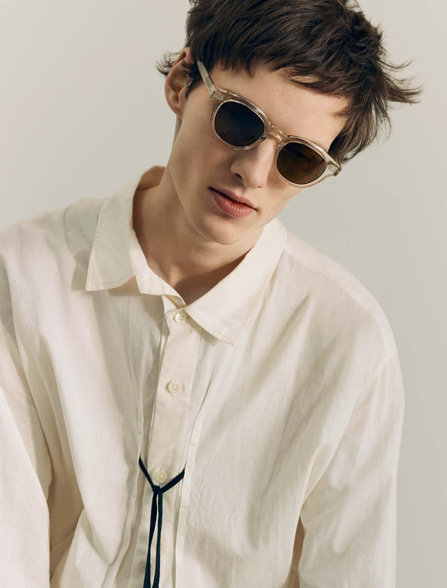


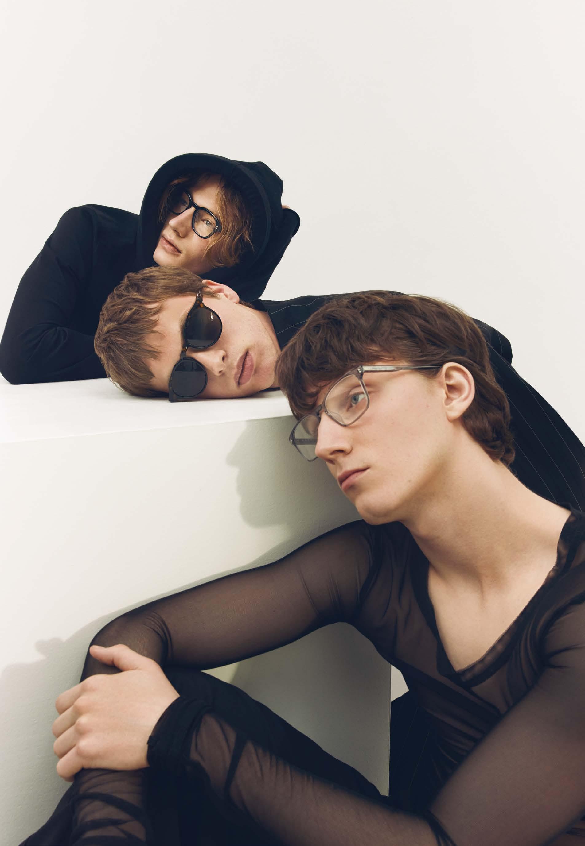
The »Rilko« is a modern classic with depth and sophistication. It is characterized by a sculptural bevel at the edges and a significant texture that catches the light beautifully. The »Rilko« impresses with triple riveted hinges and a versatile hybrid silhouette that suits a wide variety of face shapes.

The »Expedition Remmy« is one of RAEN’s latest creations and a reinterpretation of the classic with a unique hood detail. The integration of the side parts into the design of the frame is perfectly successful and results in a harmonious fusion of style and functionality.

The »Altin« is aimed at anyone looking for a wider frame with a clear, refined aesthetic. This modern classic made of HD acetate is remarkably light, thin and flexible. The »Altin« strikes the perfect balance between minimalist design and masculine appeal.

-

photography : LOTTE THOR [ Berlin ]
assistant : BENEDICKTE GAMMELGAARD
styling : DAVOR JELUSIC assisted by MARLENE UNGER
hair & make-up : EVA HERBOHN
models : EBONY at MIRRRS & PUPA at LETITGO


YOU MAWO »Sorol«dress VERSACE
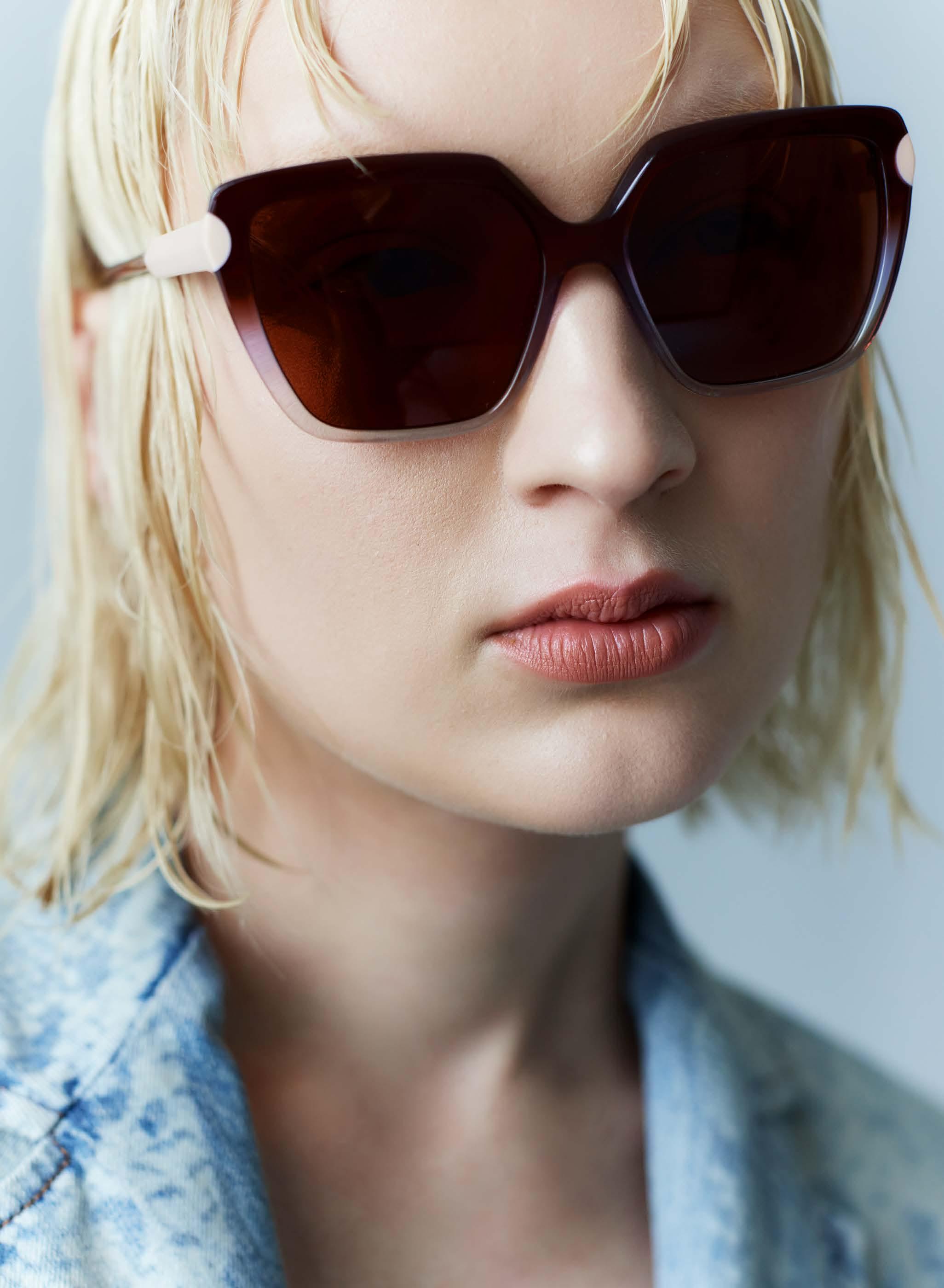
 MOREL »Naxos 3« -
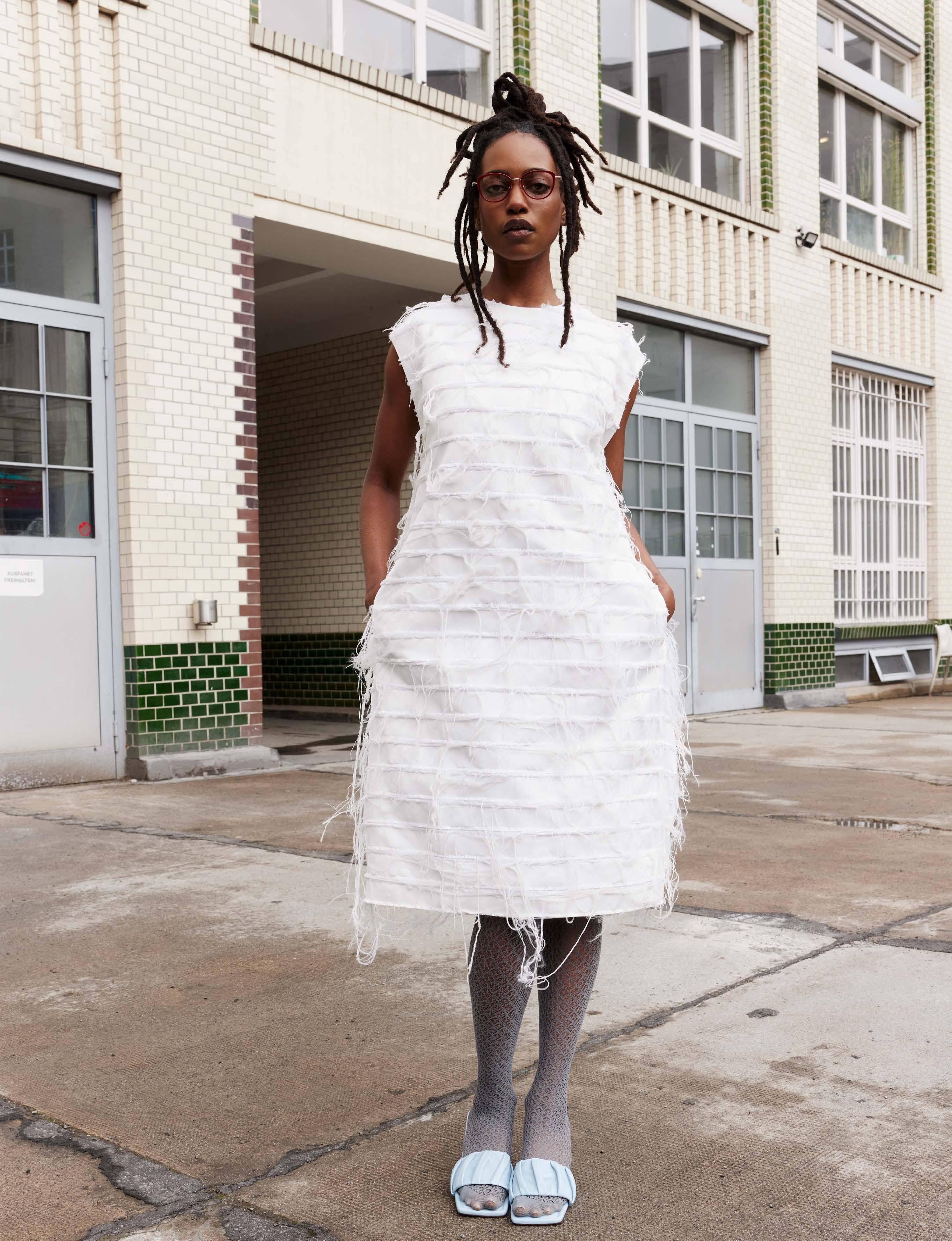

KIO YAMATO »KP-254AU« -

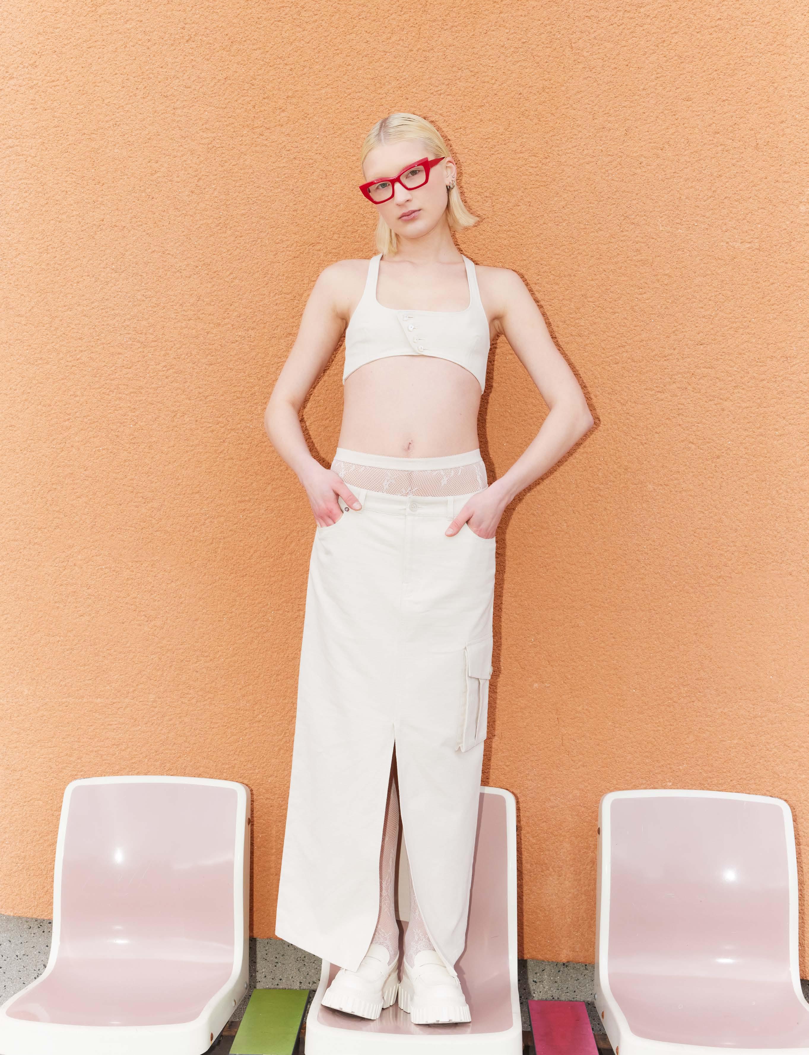
skirt & top FILIPA K shoes BERSHKA








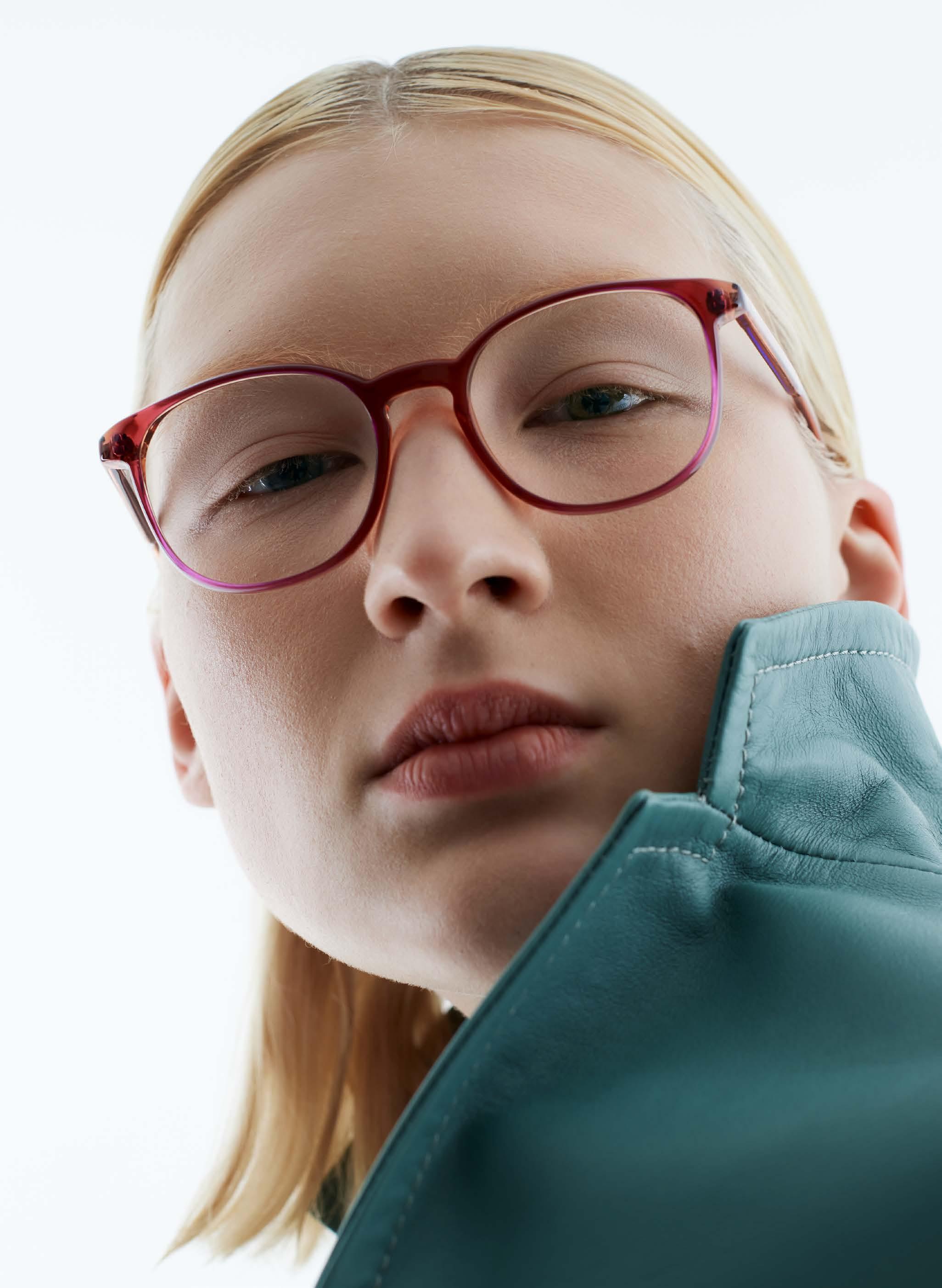

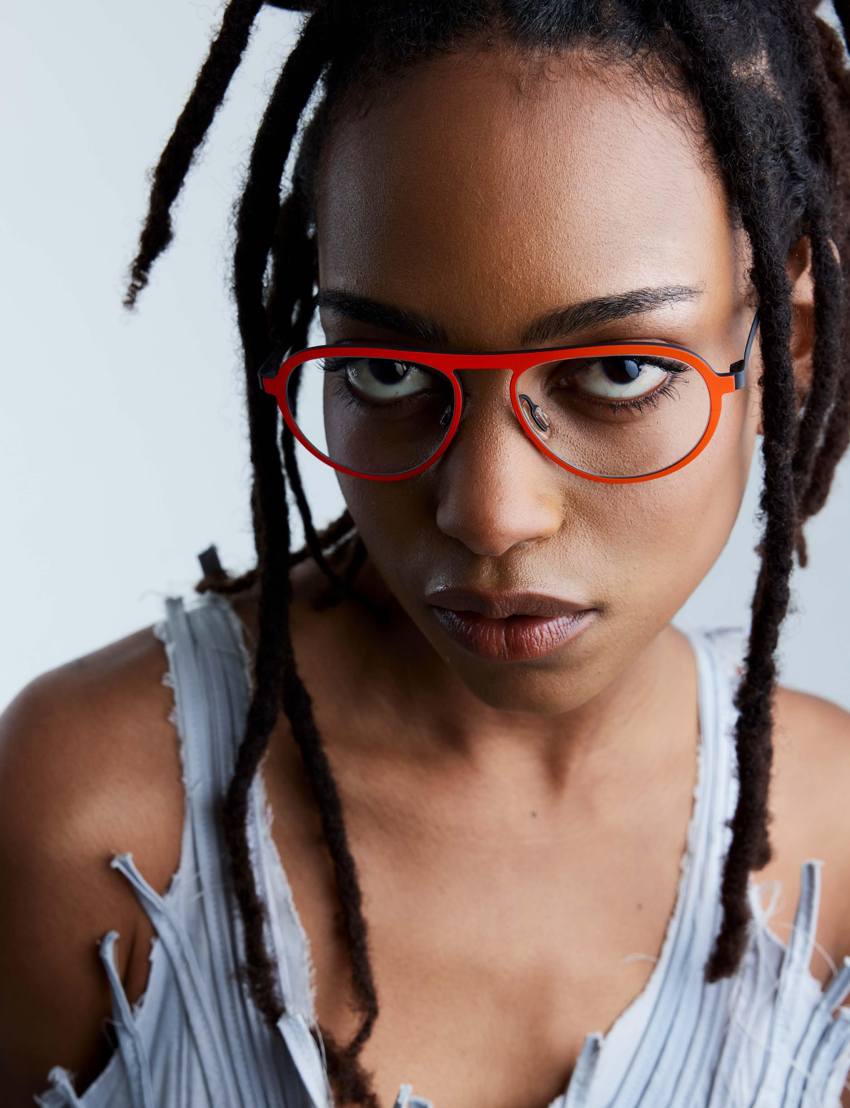


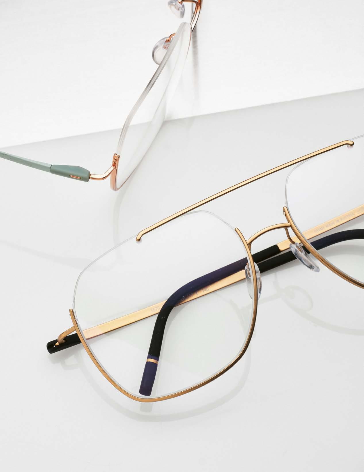
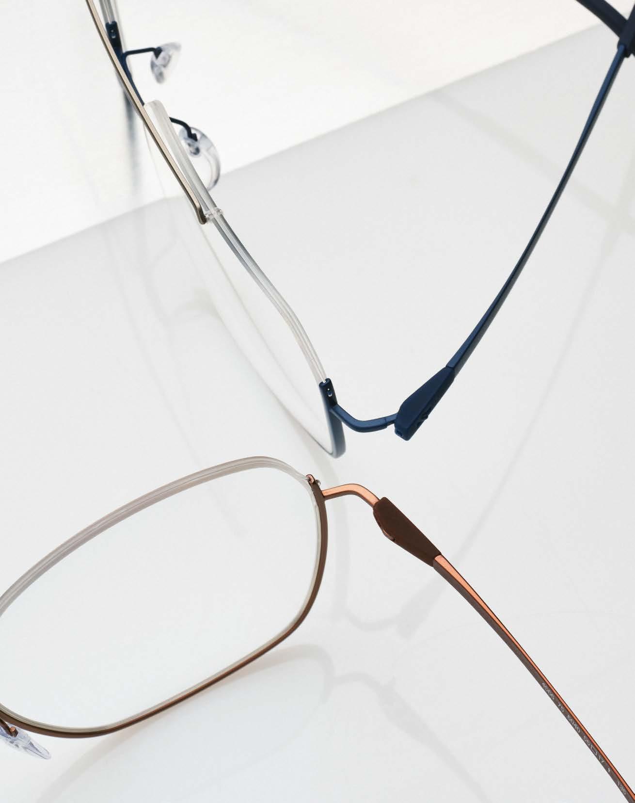
With Dynamic Dawn, the premium brand SILHOUETTE presents a new design family in the half rim segment. This exquisite collection gives the cosmopolitan customer the choice of wearing the half rim either traditionally at the top in the eyebrow area or more unconventionally at the bottom in the cheek area.
The models in the Dynamic Dawn range combine perfect front details and featherlight elegance to create a harmonious balance. In the past, Nylor half-rim glasses were considered rather conservative, but

Dynamic Dawn
Soft Bronze


today they appeal to an increasingly young, trend-oriented target group looking for a fresh, urban look. The Dynamic Dawn models are available in a wide range of trendy colors.
The Classic Blue, for example, presents itself as inverted double bridge aviator glasses with a striking lower profile and a slim upper bridge for a clean, masculine flair. The silky matt blue lower frame harmonizes perfectly with the matt titanium bridge on the top. This model is also available in the colors Steel Grey, Golden Black and Timeless Gold
Another highlight is the oversized Rosé Mint in a butterfly shape, which impresses with an inverted titanium nylon frame in shiny rosé gold. The combination with matt green titanium temples creates a stylish contrast, while polished titanium details are reminiscent of fine jewelry. This extravagant shape is also available in the unique color combinations Soft Bronze, Golden Black and Grey Coral
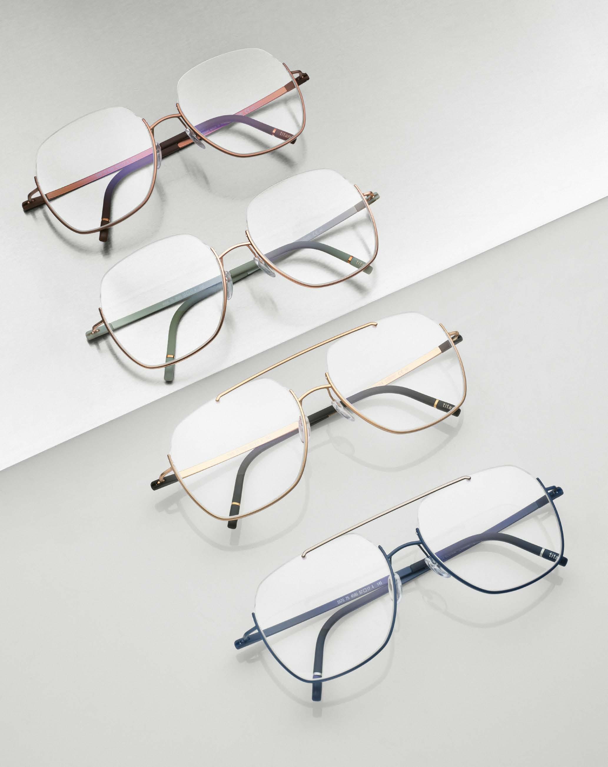

The classic models with an upper half rim complement the upside-down models in the Dynamic Dawn collection. They come in both round and rectangular shapes and feature wider temples made of polished titanium in muted colors and nylon contours in various shades.
All models in the Dynamic Dawn collection feature a new temple design in which a colored SPX®+ decor elegantly connects the front of the glasses with the titanium temples. Reliable snap-on hinges guarantee maintenance-free, long-term use, while the temples are easy to adjust and adapt.
Whether in the classic version or the upside-down version, the semi-rimless models in the Dynamic Dawn collection always impress with their understated look and avant-garde flair – a successful symbiosis of elegance and trend awareness. silhouette.com
“With its slightly feminine touch, the »Wailua« is my personal sunglasses discovery for summer 2024.”


photography STEFAN DONGUS [ Cologne ]
assistants CARO ROSS & MEIKE PRECKEL hair & make-up KRISTIN MEISEN
models NATALIE OBAYUWANA at ICONIC & SEP GRAF at KULT
Our FAVR website not only features new brands, but is now also presented by two new faces. In March, we had Natali and Sep as guests in our photo studio. As with every shoot, the models can’t keep their hands off the many pairs of glasses that we have for our many productions. Both have chosen their four favorite glasses for their personal sedcard. Here we go.

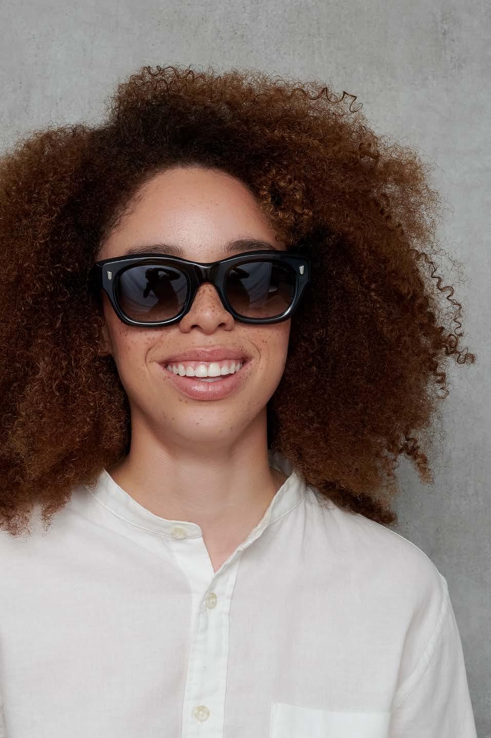
“Super classy acetate model in dark green. With the CUTLER AND GROSS, I feel extremely comfortable on every occasion.”
“French design at its finest. Expressive, very self-confident and yet wearable. Great.”


“Love at first sight – as if GÖTTI had designed the glasses especially for me.”
NATALI OBAYUWANA
What a face – and what hair! With roots in Africa and Europe, Natali was our first pick for the FAVR shoot. But beware, the Cologne model doesn’t just have a professional look in front of the camera – as a budding psychologist, Natali also has a lot of depth to offer.



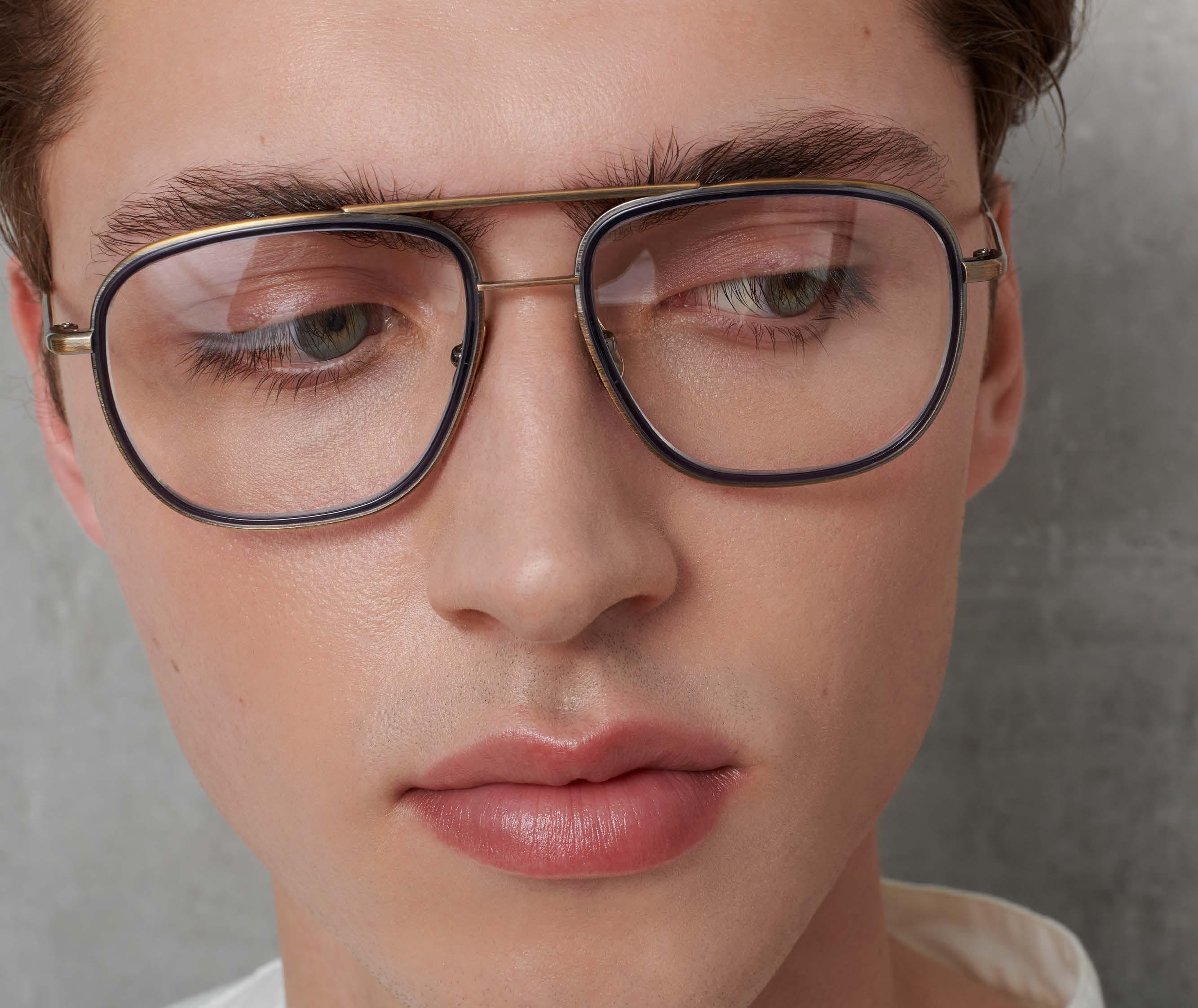
“The SALT. fits my face perfectly. Great feel.”
SEP GRAF
23 years young and from Amsterdam, Sep impresses us above all with his light blue eyes. You could almost be forgiven for thinking that Sep is the son of Oppenheimer actor Cillian Murphy. According to his own statement, however, the similarities are purely coincidental.

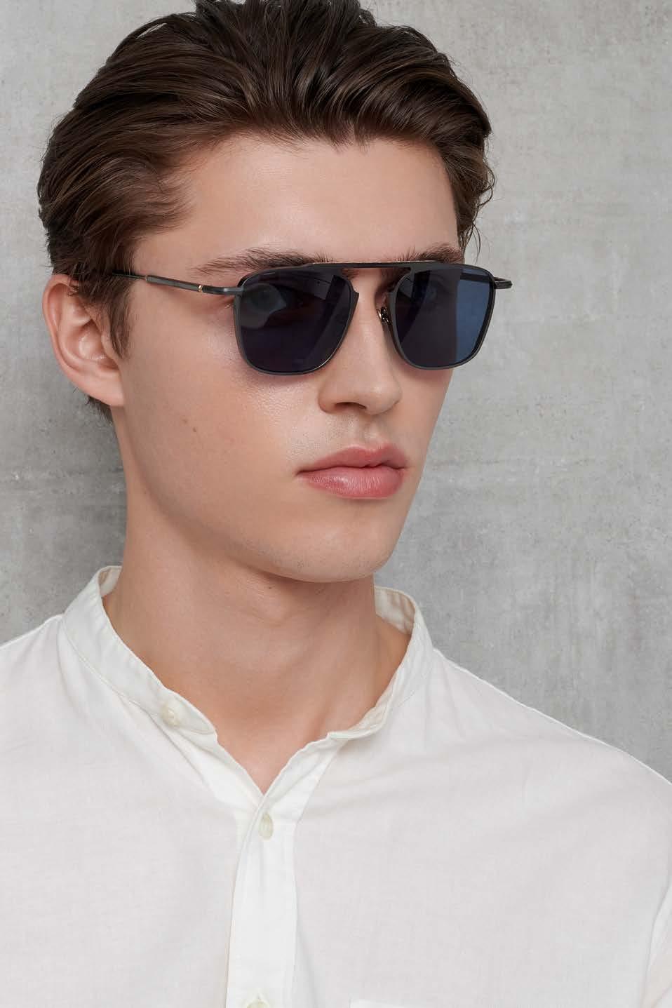
“I like the »Marsic« above all because of its modern aviator design with the single bridge and the outstanding titanium quality.”
“Everyone should have at least one CAZAL. The »9109« is my choice –it always fits.”

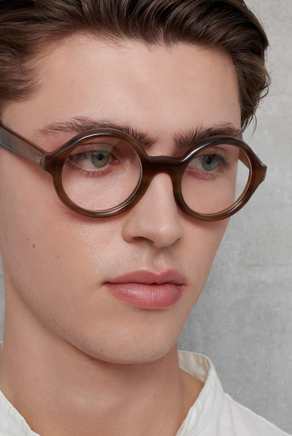
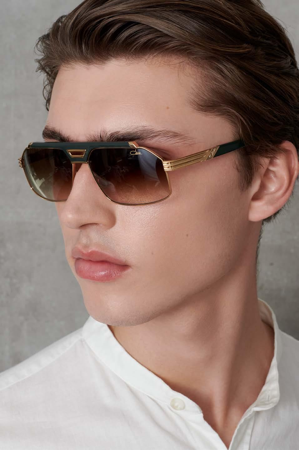
“Wow – super high-quality horn-rimmed glasses – made to last forever.”
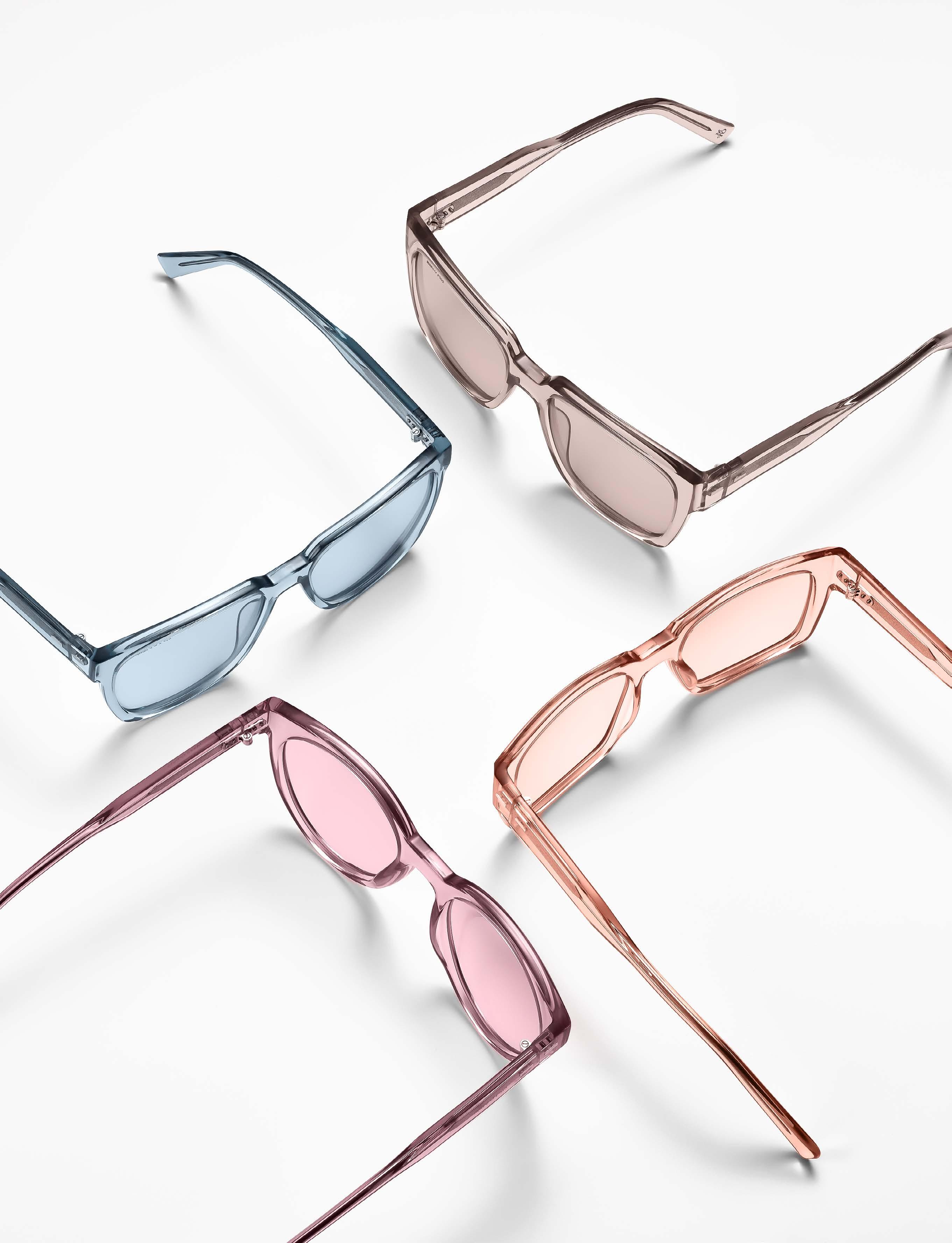
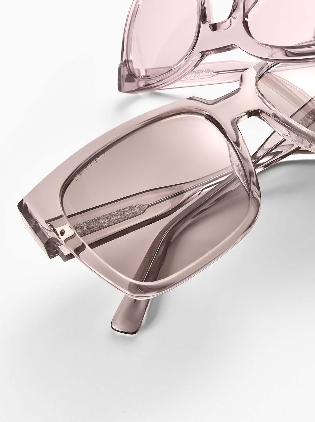
MARC O’POLO EYEWEAR embodies clarity through reduction with its new sunglasses styles. The Scandinavian-look designs are characterized by a clean design language. In our collection check, we show selected models from the 18 sunglasses in the collection. The 80s-style shapes are voluminous and bold – from square to panto to hexagon –and appear almost sculptural with a pronounced deep eye rim and deep bridge.
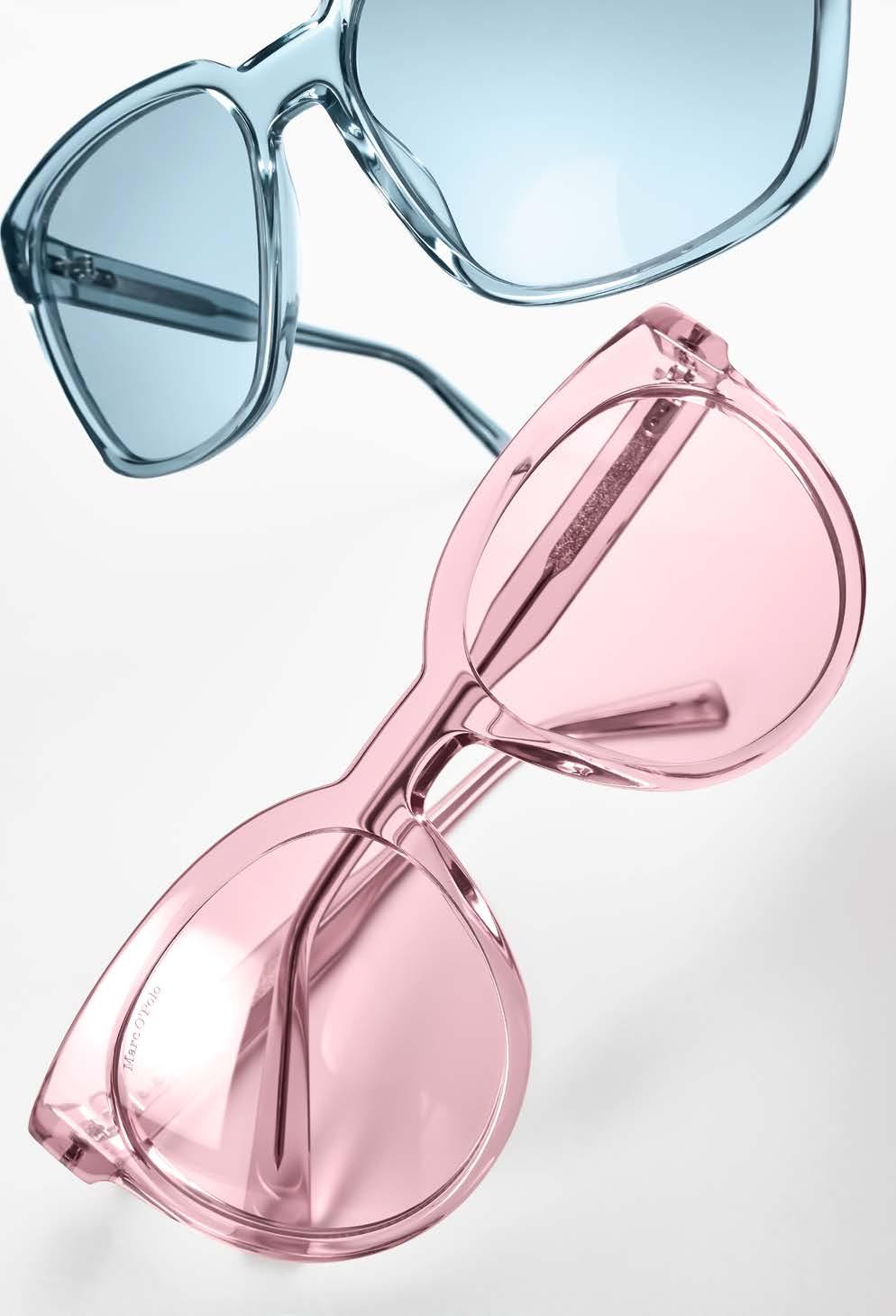
Monochrome design –the frames match the colors of the gradient lenses tone on tone.
Monochrome, opaque and matt colors reinforce the clear overall look of the coll ection. The elegant gradient lenses skilfully pick up on the colors of the sunglasses. This creates harmoniously coordinated concepts – frames and lenses tone on tone.
In order not to disturb this harmonious impression and to give the fronts all the attention, the rivet hinges are deliberately offset to one side. Adjacent to this is the new MARC O’POLO temple, which is initially wide and noticeable, but then tapers towards the end of the temple, guaranteeing a high level of comfort.
By using sustainable materials, MARC O’POLO EYEWEAR reduces the ecological footprint of its sunglasses collection: pure, transparent acetate, 76% bio-based, is com bined with fine stainless steel.
The MARC O’POLO designs not only impress with their sporty look, but also score with their casual functionality and are easy to wear. The flat lens shapes, matt on the inside and high-gloss on the outside, protect against wind and sun. All in all, a beautiful collection that makes you look forward to summer. www.marc-o-polo.com
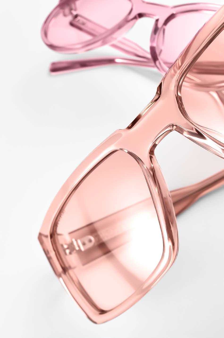
CAZAL »8514«earring PILGRIM
Breathtaking, bold, decent – always in style with this sunglasses selection.
photography & styling : SOPHIE DAUM [ Hamburg ] hair & make-up : JOHANNA MADLE
models : LINA at LOUISA MODELS & LUCA at MODELWERK


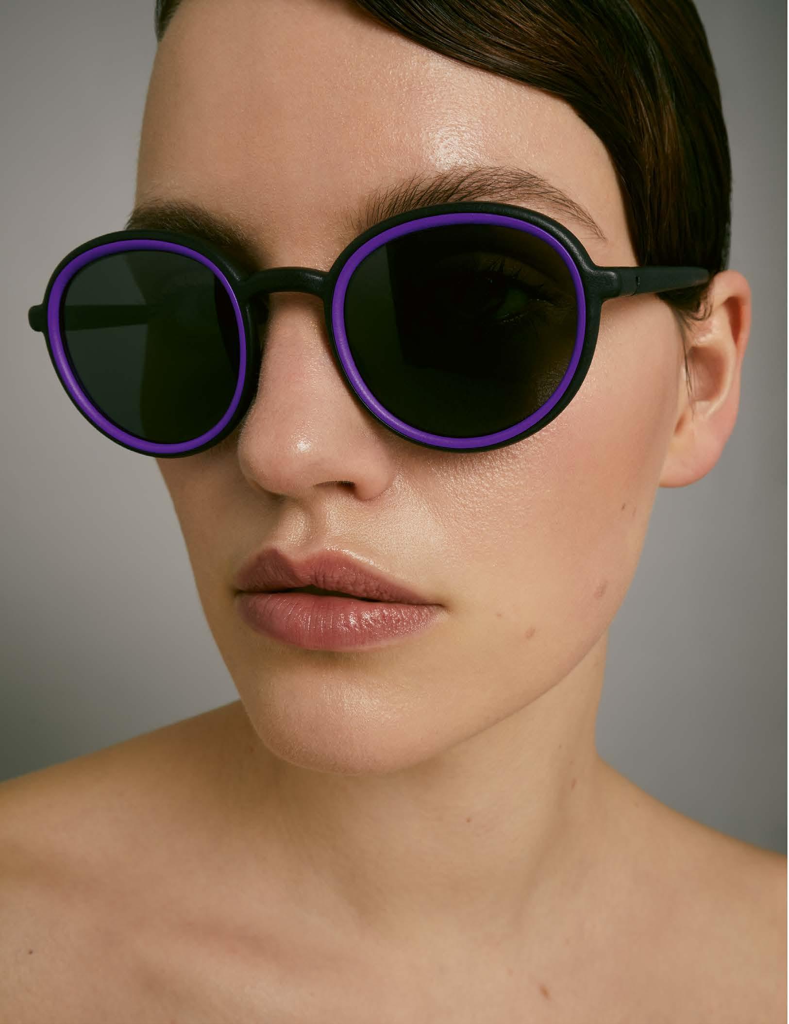

YOU MAWO »Minto«


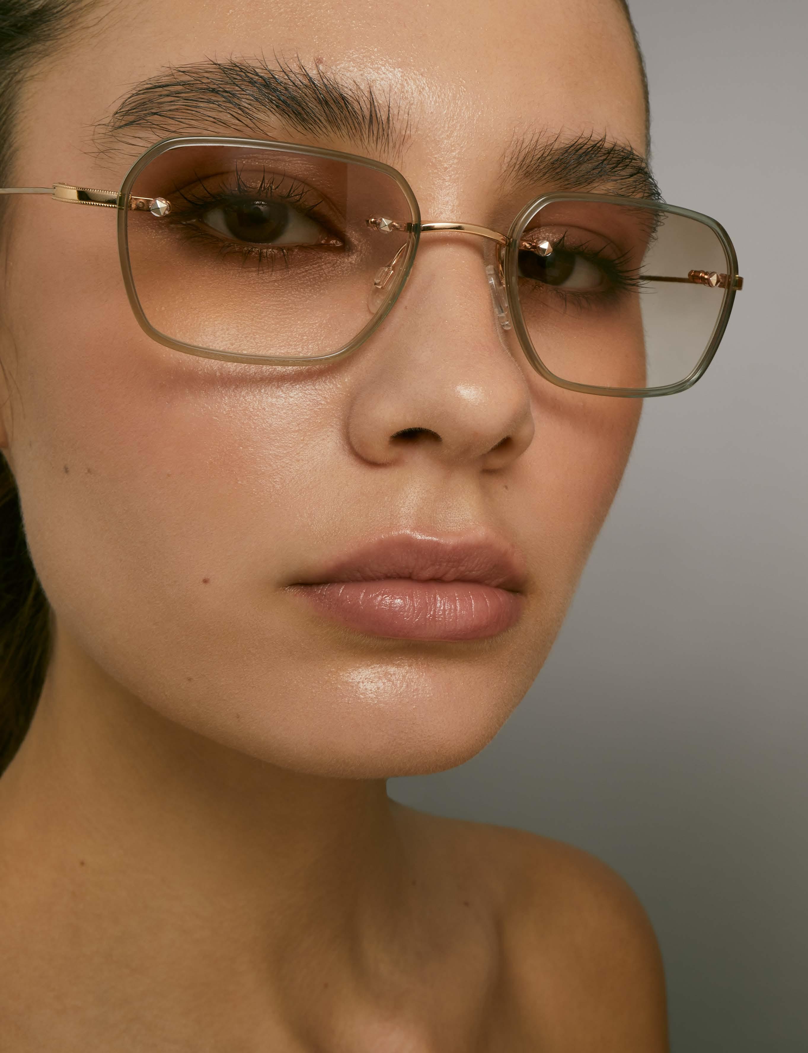

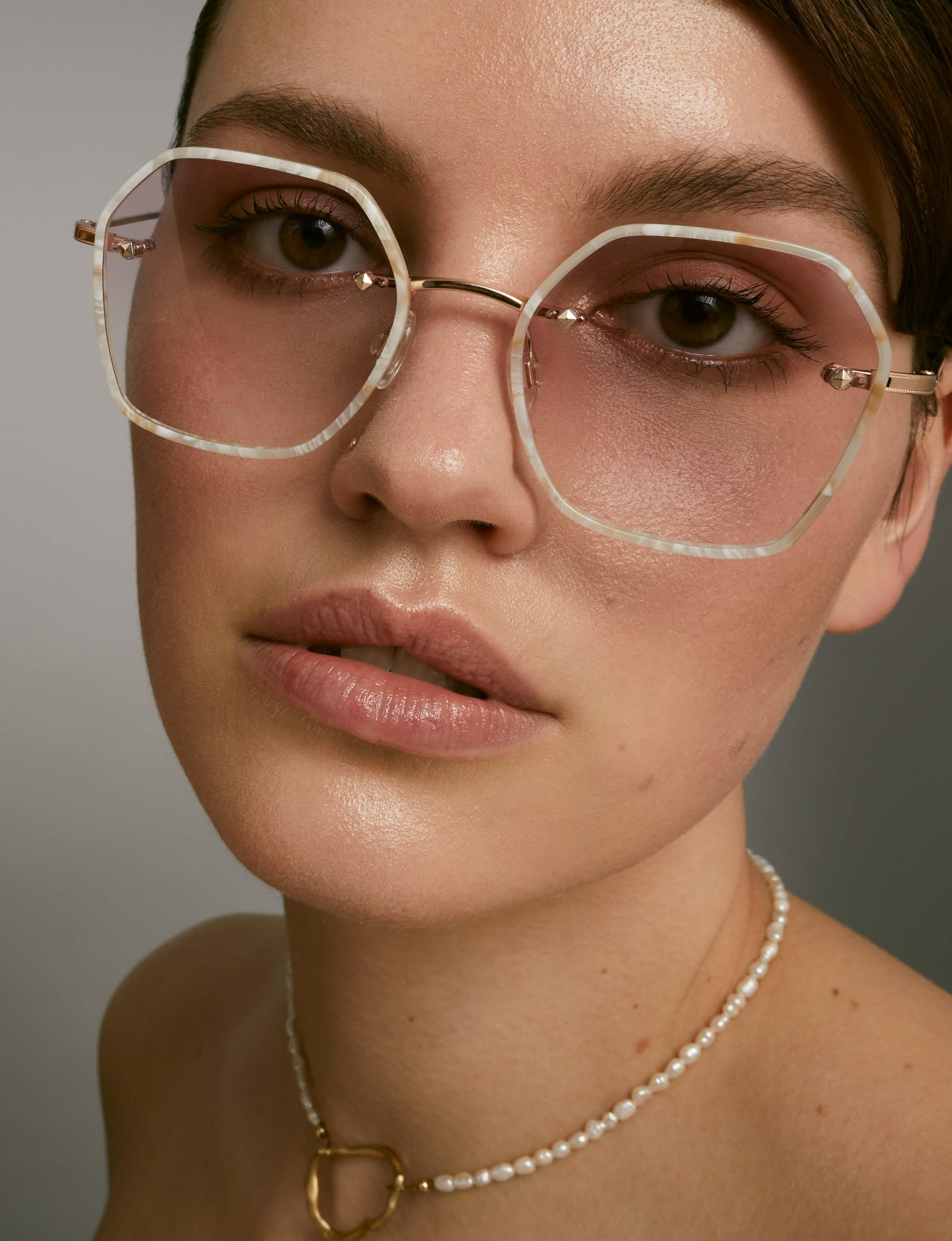



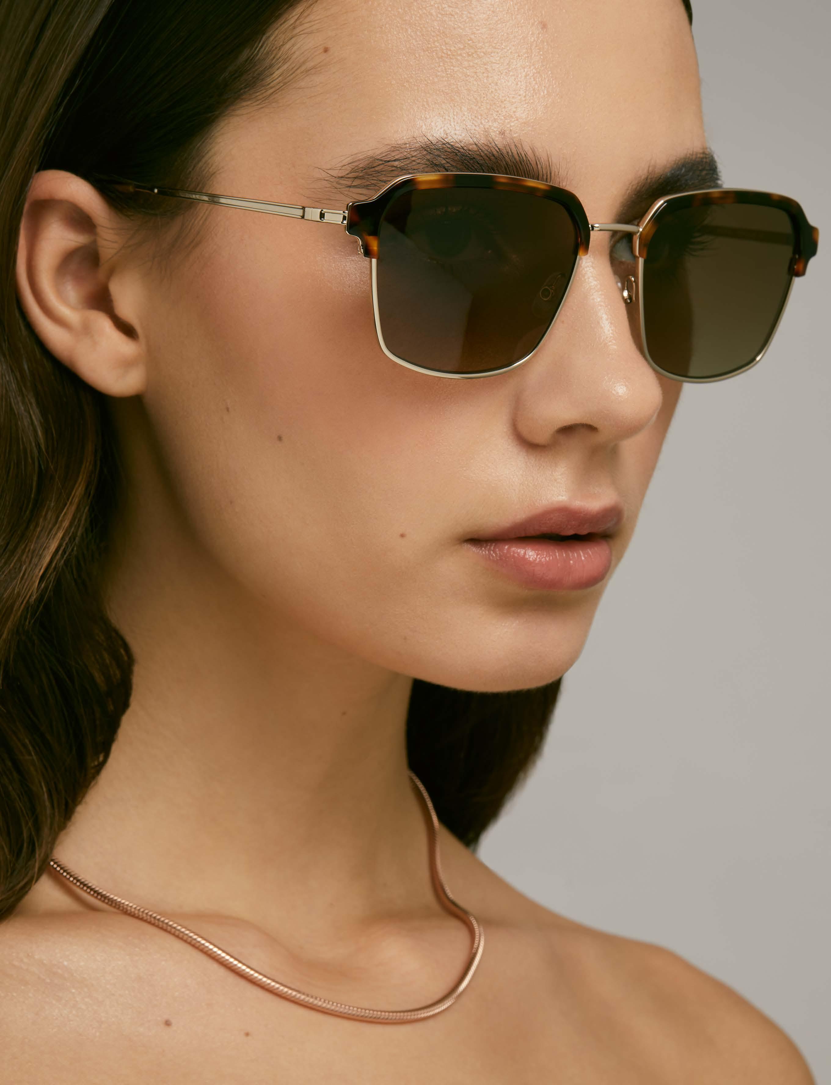
 MOREL »Syros 3«necklace
