
13 minute read
Spotlight


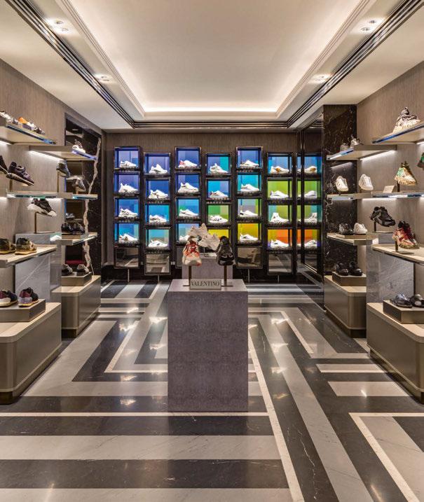
Harrods Men’s Shoes UK
Working together with interior designers David Collins Studio and architects Woods Hardwick, Lighting Design International (LDI) have brought a touch of class and distinction to the Men’s Shoes department of London’s Harrods. High-quality lighting integration, dramatic productfocused lighting and excellent colour rendering were prerequisites to the schematic design of Harrods Men’s shoes, and as such, LDI used precise light sources, carefully paired with intricate detailing and carefully coordinated finishes, to give the impression that the joinery, and the shoes themselves, magically emanate light as if they were the luminaires themselves, drawing the shopper in. The project consists of three rooms, each with its own distinctive brands and products, which are complemented by subtle changes to finishes, joinery and lighting to suit the footwear typical to each room. Graham Rollins, Associate at LDI, explained more about the design brief. “We have been working on various projects with Harrods for around six years now. As always, we are brought onto the projects as early as possible to help shape the brief and scope of the lighting through discussion with the client and interior designer. “For David Collins, this followed previous projects in the Menswear department, so the lighting for the Men’s Shoes department had to be complementary to the masterplan, but unique to the products and joinery in this area.” As such, Rollins and the LDI team wanted to “ensure that the luminaires were so well detailed and constructed that they were invisibly painting the finishes with light and providing highly focused, high quality illumination, without being noticed, to products”. “All product-focused luminaires are 3000K, >90CRI, with highly focused lensing, for high contrast on the product and glare baffles/detailing to conceal fittings from direct view. Each product display has multiple layers of light and multiple details to create the overall effect,” Rollins added. Entering off the central escalator towards room two, visitors are greeted by a transitional ‘pop up’ space that can be rented by brands, complete with dynamic video wall showcase niches. Custom video content can be played over the 24 individual niche backs, which give branding opportunity behind the shoes. Room two, in the centre of the department, has perimeter shelving units, where products are lit from high colour rendering concealed narrow beam spotlighting profiles, tucked inside black chamfered joinery detailing. The chainmail rear of the shelving units is lit by deep recessed diffused concealed linear LED, to provide ambient light to shelving and space. While room one, displaying formal shoes has the same
lighting treatment, alongside its own dynamic video wall and private shopper room, room three features zigzag, dual-layer shelving units with concealed focused fittings, adjusted in two rows to focus the light effect precisely to the footwear. These units also have chainmail backlighting, lit with diffused lighting behind the zigzag, to tie the ambient effect to the other two rooms. While the three rooms each house different brands and products, Rollins believes that it is the interior design, rather than the product, that sets each space apart, while LDI used lighting as a means of differentiating the spaces and giving them their own character. “The lighting was in response to the joinery as much as the product, and the zigzag wall in the trainer room commanded a development of the lighting that we had used for the horizontal shelving in the other rooms,” he said. “The chainmail finish at the rear of each room’s shelving joinery is also varied in tone slightly in each room, and this surface is directly washed with light to highlight the subtle difference.” Room three also has displays with bespoke designed plinth top luminaires that provide both ambient and focused light on the shoes at the edge of the walkway. This allows minimal numbers of downlights so that the ceiling in circulation spaces appear clean and lit from diffused coffer lighting. Lower levels of ambient light, with highly focussed

well-integrated joinery lighting, make the shoes the real focus, while high colour rendering and clever use of colour temperature add an extra sense of drama. While each room displays many high-end, designer brands, Rollins feels that the lighting design didn’t need to be adapted to take into account such prestigious names. “I feel that good quality lighting should suit any brand or any shoe, so I don’t feel like we adapted our design process to suit the particular high-end brands,” he said. “In the future, there is likely to be a degree of rotation, so the lighting had to be universal. Having said this, some of the shoes have crystal detailing, or bright colours that really help to show off how punchy and high quality the lighting is.” Using a range of fixtures from Precision Lighting, Applelec, Hacel, DAL, Viabizzuno and XAL, Rollins added that all luminaires were selected for their performance characteristics. “Colour rendering was first on the list, but then it came down to how we could integrate them, and what mounting options, lenses and diffusers they had available to put the light exactly where we wanted it,” he said. The end result, Rollins believes, is a lighting scheme that “marries together seamlessly” with the interior design, creating a space that feels harmonious, where the products become the focus. www.lightingdesigninternational.com


Pics: Hufton + Crow

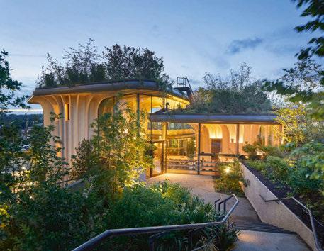
Maggie’s Leeds UK
Maggie’s is a charitable initiative, co-founded in 1995 by Scottish writer, artist and garden designer Maggie Jencks, alongside her husband, architecture critic Charles. The couple’s vision was to create a cancer care centre that provides a safe and warm space, where people could access emotional and psychological support, surrounded by good architecture and uplifting landscape. The cause has seen an influx of established architects design centres around the UK, with the latest, Maggie’s Leeds, designed by Heatherwick Studios, recently unveiled. The 26th Maggie’s centre in the UK, Maggie’s Leeds is located within the campus of St. James’ University Hospital, and marks the first completed healthcare project designed by the architecture studio. Built on a sloped site, Maggie’s Leeds is designed as a group of three large-scale planters that each enclose a counselling room. These surround the ‘heart’ of the centre – the kitchen – as well as more social spaces for group activities, including a library and exercise room. In her book A View From The Front Line, Jencks talked about the need for “thoughtful lighting, a view out to trees, birds and sky”, and a design that goes beyond corridors with “overhead neon lighting, interior spaces with no views out and miserable seating”. Following these principles, and Heatherwick Studio’s guidance, lighting designers Light Bureau sought to create kinder spaces for the user, with a lighting scheme that works in harmony with the architecture, plants, art and materials. As such, Light Bureau’s approach was to emphasise the tranquil atmosphere through the placement of warm lighting in niches that hold plants, pictures, books and other household items – making them, rather than the lighting, the priority. Elsewhere, simple uplights illuminate the soffits. Light Bureau called on a variety of fixtures from Stoane Lighting, LED Linear, XAL, LightGraphix, acdc and LED Flex to create this warm, inviting, and yet simple lighting scheme. In line with the lighting designers’ core philosophy, every luminaire justifies its presence by serving multiple purposes. Simple but good quality column-mounted spotlights provide indirect lighting to the high soffits and serve as emergency luminaires; anti-glare cowls avoid reflections on the glazing; shelf lighting accentuates objects and art, introduces vertical luminance and elevates the roof eaves. This approach means that Light Bureau was able to reduce quantities, but maintain a good specification, instead of diluting the scheme with more, but lower quality fixtures. Throughout the project, Light Bureau worked closely with the architects on the lighting integration strategy. For the team, avoiding fussy, over-integrated lighting details was essential in creating the much-desired homely feeling. Nighttime transforms the building’s appearance, making the branched pots perfectly legible against the higher hospital buildings around the site. With a fully glazed perimeter, ensuring a seamless transition from the inside out was key. From the inside, the main objective was to avoid specular reflections, maintain clear views out and an appreciation of the garden for the viewer. Façade lighting was also consciously avoided – instead, externally lighting was kept gardenscale. With custom bollards fitted with luminaires from Stoane Lighting, it is designed to appear unstructured, much like the planting, however this carefully planned lighting gently illuminates the soft landscape, and gives extra benefit to the building. www.lightbureau.com

WINNER 2018
Pic: Danijel Bartolic

Pic: Danijel Bartolic
Pic: Marko Mihaljevic Pic: Marko Mihaljevic
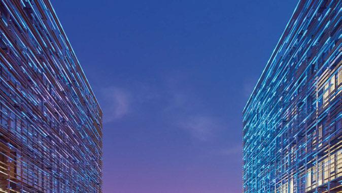
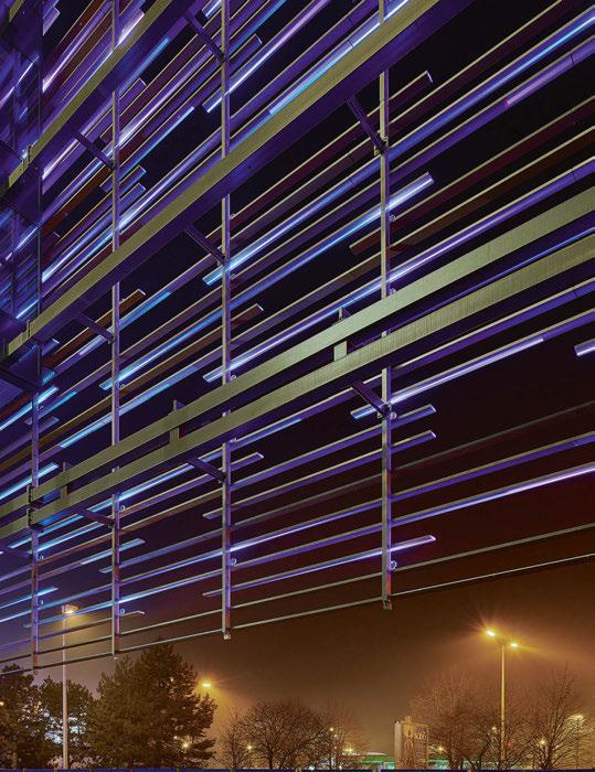
GTC Matrix Croatia
The GTC Group, founded in 1994, is a major European retail real estate investor. The Group’s operations focus on building sustainable constructions that comply with the highest standards of green building, as safeguarding the environment and human health are essential elements of the Group’s mission. One of the Group’s most recent projects, the Matrix Office Park, is located in Zagreb’s business district, at the crossroads of two of the most important roads in the city, and about 10 minutes from the airport and the city centre. For this twin-building complex with a LEED-Gold rating, the GTC Group wanted a unique, low consumption outdoor lighting system. It therefore invited Skira Architectural Lighting to present a concept that would be easy to install, had a minimum number of accessories, and power supply and control components that could all be concealed. An RGB version of the IP66-rated, 360° Trick projector from iGuzzini, designed by Dean Skira, was identified as the ideal solution to illuminate the building façades, with the idea of positioning the luminaire on the sunscreens, which would act as a secondary reflector. Bespoke fixtures were designed with a new base that contains the built-in DMX-RDM electronic driver, complete with an in-out connector for plug-and-play connection. The lighting on each building is connected via a fibre optic cable, to enable controlled scenes simultaneously. Random patterns of light were programmed to create dynamic, vibrant and colourful scenes, to accentuate horizontal linear architectural details. The project also uses a control application to manage large virtual LED-based mounting on building walls. Unique scenes can be programmed for festivals or national holidays – the preset content is automatically activated via an online calendar, or manually. After sunset, the twin buildings at Matrix Office Park delicately brighten the area, contributing to the wider urban nightscape. www.skira.hr

Pics: Stefano Ferrando, Studio Vetroblu


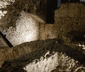
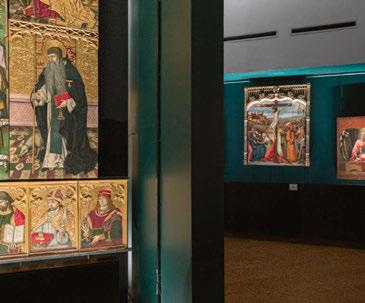
Pinacoteca Nazionale di Cagliari Italy
When developing the new lighting scheme for a museum or gallery space, a great deal of consideration has to be taken towards the artefacts on display, ensuring that they are effectively illuminated while preventing damage – particularly on items dating back more than 500 years. These are considerations that studio essequadro | p had to factor in when creating the new lighting scheme for the Pinacoteca Nazionale di Cagliari (National Art Gallery of Cagliari). Such considerations led to several months of study for the Sardinian studio, as during the relighting of the retables and tables exhibited within the gallery, there were several problems to overcome: the large size of the retables (in some instances more than 4-metres high and 3-metres wide); the reduced space for the insertion of lighting fixtures; the colouring of the walls in contrast to the works on display. The planning intervention, referring not only to the works, but also to the context in which they are displayed, was therefore complex and detailed. The old lighting, albeit with LED sources, presented numerous critical points. The goal for essequadro | p was to improve the perception of the artefacts through a uniformity of lighting, a new colouring of the walls and the backdrops of the retables, up to the use of customised devices and screens that led to a perceptive restoration of the works. Particular importance was also given to the DALI management system (absent before the renovation of the gallery), operating wirelessly through a Bluetooth system. The lighting design project was divided into two areas within the gallery – located on the existing structure of the Royal Arsenal. Before the lighting design intervention, the gallery had a lighting system that consisted of projectors placed on tracks installed both on the ground and on the ceiling. The system had a colour temperature ranging from 4000K up to 5000K in some cases, with a low colour rendering index and a lack of homogeneity that completely altered the perception of the artworks. The new lighting was therefore conceived and designed to be as homogenous as possible, rendering the retables in a more natural light, while showcasing the three-dimensionality of the works. The new lighting fixtures – custom iGuzzini fixtures fitted with Laser Blade Mini wall washers – vary in size according to the size of the works themselves. All the retables, with the exception of the altarpiece of Sant’Eligio (the largest in the collection), are illuminated with wall washer optics, while special custom luminaires were used on the Sant’Eligio, which allow for the correct levels of illumination on the entire surface of the work. The luminaires work radially in some points, allowing the flow not to be concentrated on the work, and therefore making the light appear softer and more delicate. For the new lighting of the Spanish Walls, present inside the gallery, a system of nine outdoor projectors with TCC equal to 3000K and with two different optics has been introduced in order to highlight certain areas of the walls, creating a contrast of light and shadows that was previously lacking, as the whole area was previously illuminated homogenously with two 12,000lm projectors, making them appear flat. The goal was to give a three-dimensionality to the walls, highlighting their character and adding a sense of drama to the exhibit. Thanks to a careful study of the pointing and positioning of the lighting fixtures, which are not visible to visitors, it was possible to reach this goal. www.essequadrop.com

Pics: Jack Wates

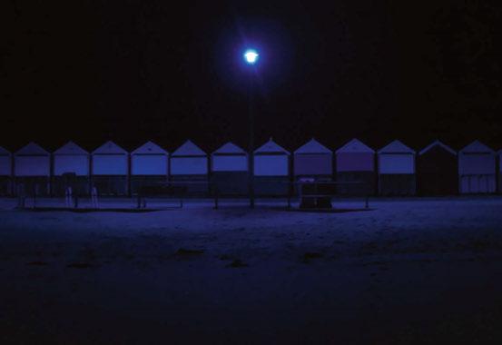

Colour Curve UK
Colour Curve is a large-scale art installation, in which 150 streetlights were appropriated to transform a six kilometre stretch of the Bournemouth coast into a spectrum of coloured light. The project was conceived by artists Jack Wates and Alex Mead for the Bournemouth Arts by the Sea Festival, held in late 2019. Designed to celebrate one of Bournemouth’s strongest assets – the beachfront – the project encouraged people to experience this territory as a coloured frontier between land and sea. The installation was designed to draw the public through a sequence of coloured beach scenes, continually changing their perception of the landscape as they go. The project makes use of 150 streetlights by wrapping each one in a specific colour filter gel. A plaque with the filter gel’s spectral distribution information was then mounted to each lamppost to allow an experiential appreciation of light to be bridged with an understanding of its material nature. By appropriating an existing streetlighting infrastructure, the installation achieved a scale and uniformity at a minimum cost, while keeping its environmental impact to a minimum. The project was commissioned by Arts by the Sea, supported by Bournemouth Council and sponsored by Lee Filters. www.jackwates.com www.alexmead.net


