21 minute read
Women in Lighting T-Shirt Competition

2
Designer Clothing
After receiving more than 200 submissions, Women in Lighting and its panel of judges has selected the five winning entries for its T-shirt design competition. Sharon Stammers tells us more.
There has been a massive rise in online collaborative activities. Whether its #LetThereBeLight, flooding Linkedin with inspirational light images, or our very own [d]arc room livestream, where more than 1000 people gathered to share knowledge, there is no doubt that the fact that we can no longer physically come together means we are looking for ways to participate in virtual initiatives and to feel like we belong to a wider community. We can see through these initiatives that as a community, light uplifts us, light inspires us and light can bring us together. After the success of the WiL in Lockdown series of mini-interviews on the WiL website - which helped WiL and WiL supporters feel a sense of solidarity with others around the world, we launched a new idea. This one was based upon messaging - of which 2020 has seen a lot. Be it Covid scariness, positive neighbourly encouragement or serious Black Lives Matter messaging, it’s incredible to see the power of a phrase or single image and how it can enable global solidarity. Women in Lighting wanted to join in this global phenomena by sharing our positive messages, and to achieve this we launched a T-shirt design competition. The T-shirt was originally designed to be a basic undergarment. But over the years, the world’s most ubiquitous fashion item has become a powerful political weapon. T-shirts are a great barometer of social change. They can shock, outrage, unite and challenge the status quo. They can also help to disseminate messages around the world. We asked the WiL community to express their creativity and create a special WiL T-shirt that shared the values of our community. Using the themes of equality, empowerment, inspiration and light, we invited people to submit a design for this competition. More than 200 of you did and all entries can be seen on the website - there is a truly international spread with designs from 37 countries and a mixture of hand and digitally drawn images and graphic messages. We selected three judges to help us narrow it down to a winning five. We asked world renowned light artist and queen of colour Liz West from the UK, Yishan Zhuang, upcoming lighting designer and visual artist - originally from Beijing but now based at Lumenarch in New York. We also - shock horror - asked a man: Giacomo Rossi, lighting designer and cofounder of Lighting Design Team and light blogger/founder of Luxemozione in Italy. We asked a man because Women in Lighting is fundamentally about equality and working side by side, and to this end are delighted to see many entries in the competition from male WiL supporters. The five winning designs selected by the judges are seen here. They are from designers Rolands Popenkovs, Michela Damon, Alex Bourganou, Hannah Moore and Giorgia Rossi. These designs will be made into actual T-shirts and housed on our very own WiL T-shirt shop. Alongside these winners is a ‘wildcard’ winner chosen via social media that will join them on the website after voting finishes so there will be six designs to choose from in total. Giacomo Rossi said of the competition: “The WiL T-shirt design competition represents an outstanding opportunity to share and disseminate the concept of equality and emancipation, the basis of the Women in Lighting project. We received numerous
4
3

5
submissions: a sign of great interest in this topic. I positively evaluated the designs which were able to best highlight both the competition goals and the values of Women in Lighting.” Liz West added: “I thoroughly enjoyed looking at all the (many) entries for the Women In Lighting T-shirt competition. The ones that made me laugh out loud or made me wish I’d thought of were of particular merit. Thank you to everyone for conveying your creativity, intelligence and wit. Congratulations to those selected. I shall look forward to seeing the winner.” Sharon Maghnagi of formalighting was delighted with the interest in the competition, and the calibre of entries. She said: “The community’s engagement and participation in this competition shows WiL’s resilience and passion for creativity, especially during a time where inspiration has had its limits and quality of life significantly altered. This competition offered the WiL network a design opportunity, a connection to three talented judges from different countries (who generously gave their time to consider how each design serves the movement) and the possibility of benefitting someone through one of the Light Reach projects. “Sharon, Martin and Katia always put such thought into the project’s communication and authenticity, while delivering layers of inspiration. I look forward to ordering my T-shirts and wearing them with pride.” Yishan Zhuang concluded: “An everyday object as simple as just a T-shirt could help convey your deepest principles, and pass the light to people around you.” Any profits from the sale of these T-shirts will go to the US-based charity Light Reach. Light Reach is a solar lighting initiative by lighting think-tank PhoScope, designed to leapfrog over utility grids to light work and play, and to boost the wellbeing and economic growth of underserved communities worldwide. Light Reach is also working with the emergency project: Light for Lebanon. Please help us support this initiative by buying a T-shirt.
www.womeninlighting.com www.lightreach.net
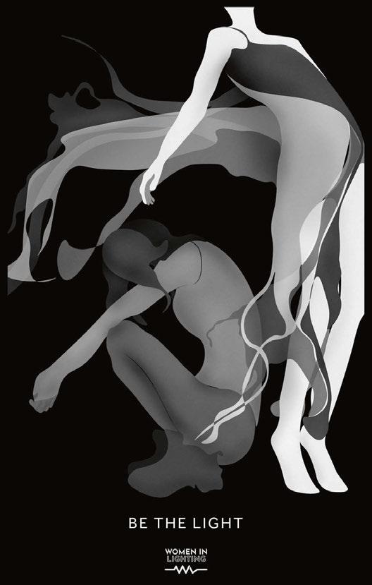
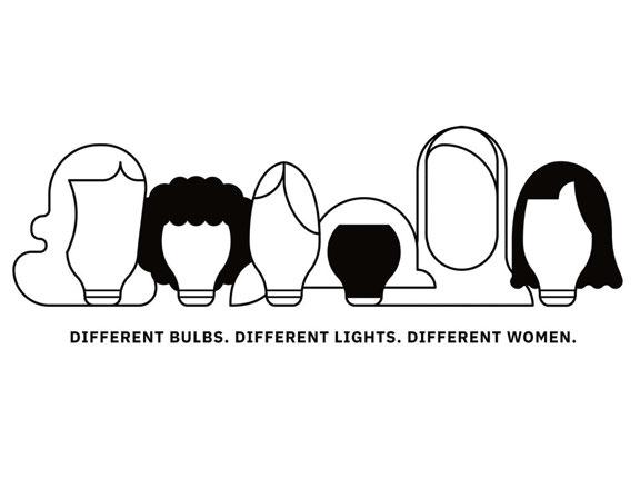
The winning T-shirt designs: 1. Light Each Other Up, by Alex Bourganou 2. WiL Ripples by Rolands Popenkovs 3. Be The Light by Giorgia Rossi 4. Different Bulbs. Different Lights. Different Women by Michela Damon 5. Full Spectrum by Hannah Poore


A Beautiful Friendship This summer, arc hosted a [d]arc thoughts panel to discuss the new partnership between Lite and Meteor Lighting.

The full panel discussion is available to view on arc tv at www.arc-magazine.com/arc-tv E arlier this year, Lite’s Architectural Lighting division entered into a partnership agreement with Meteor Lighting in a move that will see Lite bring the US manufacturer’s products to the UK market. Formed in 2001, Lite became a value-added partner with Signify (formerly Philips Lighting) in 2008, and has traditionally been more focused towards exterior architectural lighting. However, in recent years, its architectural offering has grown, with an increased focus on interior architectural solutions, and as part of this expansion the “LED Solutions Provider” has partnered with a number of lighting manufacturers such as Pharos, Color Kinetics and Lam32 to provide complete turnkey solutions for the architectural lighting design market. The latest addition to this offering, Meteor Lighting, was founded in California in 2008 with an approach centred around what it calls “Advanced High Ceilings”, providing high-end architectural and decorative fixtures to the lighting market. To mark the new partnership, arc magazine’s Matt Waring hosted a [d]arc thoughts panel discussion with Andrew Milestone, Director of Architectural Lighting at Lite, and Arjan Stevens, Senior Regional Sales Manager at Meteor, alongside Lauren Blow, Senior Lighting Designer at Arup, in which the panel discussed the new agreement, and some of the landmark projects that the two brands have worked on. Speaking on the panel, Milestone explained what drew the company towards Meteor: “As the architectural side of Lite has grown, we’re looking to work with new partners with products that are differentiated in the market. With the Meteor brand, we saw something that fitted very much into what we can offer in terms of application and support to the lighting design community.” The move comes as Meteor, which has primarily been built around US-based projects, looks to expand its offering into the international market. Stevens explained: “Lately, we’ve noticed a lot more people coming to us with international projects, and as a result of that, we were seeking some partners that could help us expand.” “We’re always trying to work in areas where we can bring some added value to projects, not just with products, but also in installation and controls, working with designers to bring the whole thing together,” Milestone continued. “And that’s where Meteor is a very exciting company for us to be working with, in the way that they view and

1
2
3

4
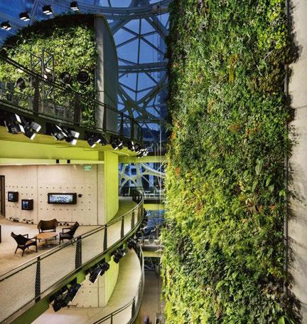
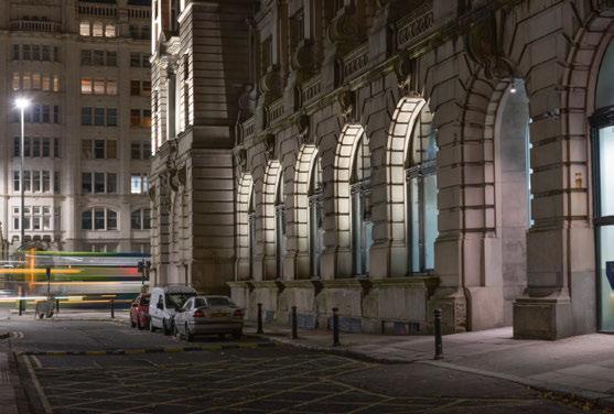
1. Meteor Lighting selected its Tetriss fixtures to illuminate the 62ft living wall of the Amazon Spheres in Seattle, USA. 2. Arup worked closely with Lite’s Architectural Lighting division to illuminate the façade of Liverpool’s iconic Royal Liver Building. 3. Lite developed special cable routes for Arup to effectively illuminate the large windows of the Liver Building’s ground floor, keeping all cabling hidden from view. 4. As the lighting for the living wall of the Amazon Spheres needed to be very uniform, Meteor made a custom bracket for its fixtures, enabling a higher degree of rotation to create a more evenly lit finish. (Royal Liver Building Pics: Courtesy of Arup / Amazon Spheres Pics: Courtesy of Meteor Lighting)
design products for high end projects.” One such high end project recently completed by Lite is the Royal Liver Building in Liverpool. Here, Lite worked alongside lighting designers at Arup on the new façade lighting for the landmark building on the city’s waterfront. Blow explained more about the project and the process of working with Lite: “We were appointed by the CBRE back in February 2019, and their vision was to highlight all of the historical features of the building and enliven the surrounding area. There was a lot of pressure to get it right and do the building and the people of Liverpool justice. “We had a six-month turnaround from us being appointed to do the concepts to the big switch on, so we really wanted a full turnkey solution. Lite offered the products that gave us the quality of lighting that we really wanted. There was a tender process and a selection process, but Lite met all of the criteria and they were really helpful in all of the mock-up processes and going above and beyond what they had to do in terms of helping us get the right lit effect.” “It was good fun to look back on, but it was pressurised,” Milestone added. “You’ve got a very iconic building in the middle of social media, in an area where everybody goes – it’s a real heartland in the city. But working on a project like this is a team effort. You’ve got to come together, because of the time, the budgets and practicalities of being able to work in a working building. But it all came together really well – we’re really pleased and we’re glad that Lauren is as well.” While the Liver Building is a landmark project for the architectural division of Lite, Stevens was keen to share an iconic project from Meteor’s portfolio – the Amazon Spheres in Seattle. “We used a Meteor fixture in that structure to light up more than 25,000 plants in a 62ft living wall. This was a really fun project and something that we’re still really proud of,” he said. “We worked together with the architects, NBBJ, a local agency, and the Amazon team to fully understand the project’s needs, and from those talks and some calculations, we selected our modular Tetriss fixture at 26,000 lumens. These were installed at various levels, but we needed to get the lighting to be very uniform, so they needed to have a higher degree of rotation. We made a custom bracket for this project, to get uniform light everywhere we wanted it. “Last year, I was actually fortunate enough to visit the site when it was finished. It was just buzzing with employees, and we were able to help bring that botanical feeling to them, helping them to work and think differently. Working with our local partners, the architects, the Amazon team and the plant team, we were able to be part of this great project.” Although the partnership is still in its early days, both Milestone and Stevens are looking forward to working together on new projects across the UK. “There’s plenty of projects out there, so we’re really looking to get out into the market as much as we can at the moment. It’s a busy time,” Milestone said, while Stevens added: “From our side, we’re very excited to bring our brand there and show what we have to offer to the UK market as a US brand to come in and hopefully excite a lot of people with what we can offer.”
www.lite-ltd.co.uk www.meteor-lighting.com www.arup.com
PROJECT DETAILS

The Orbit Urban Office Campus, Athens, Greece
Client/Project Manager: Noval Property Lighting Design: Danilof light + visual perception studio, Greece Architect: Lianou Chalvatzis Architects, Greece; Vikelas Architects, Greece Landscape Design: Ecoscapes, Greece Photography: Pygmalion Karatzas
Celestial Orbit
With bold façade illumination from Danilof light + visual perception studio, the newly-opened Orbit Urban Office Campus is the latest marvel in modern workspace design.
Opened in August of this year, the Orbit Urban Office Campus in Athens, Greece, exemplifies modern workspace design. With its glowing, undulating façade drawing you in, the clean, organic design is complemented by a crisp, homogenous lighting scheme that acts as a celebration of the architectural form. Commissioned by Noval Property, project managers and directors for the project, and designed by Lianou Chalvatzis Architects and Vikelas Architects, the low-rise building stands nine storeys tall, with six additional basement levels. Local lighting designer Thanos Danilof, Studio Director of Danilof light + visual perception studio, was tasked with illuminating the new building. Danilof explained further how his studio was selected for this particular project: “As an Athens-based lighting design consultancy, we have worked with the same client in other smaller projects at various stages in the past. “Since this project was aiming for a unique nocturnal image, and at the same time for a LEED certificate, the developers decided early on that they have to appoint a dedicated lighting designer that will work creatively and technically with all management, design and construction teams. We were involved from the concept design stage, all the way through to technical design, tender stage and construction support.” Once brought on board, Danilof was given a clear brief from the clients to create “a nocturnal city landmark that at the same time achieves LEED certification and will be completed within a reasonable lighting budget for a project of this scale”.
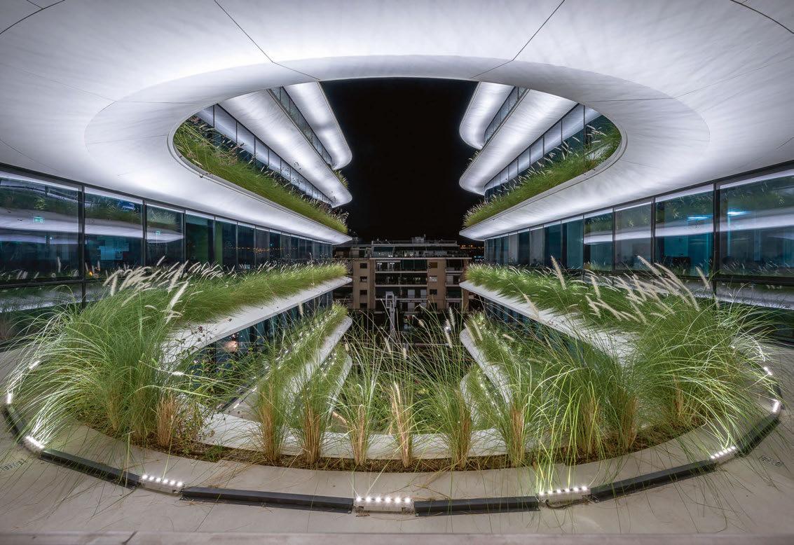
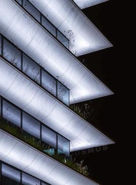
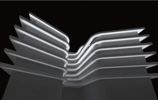
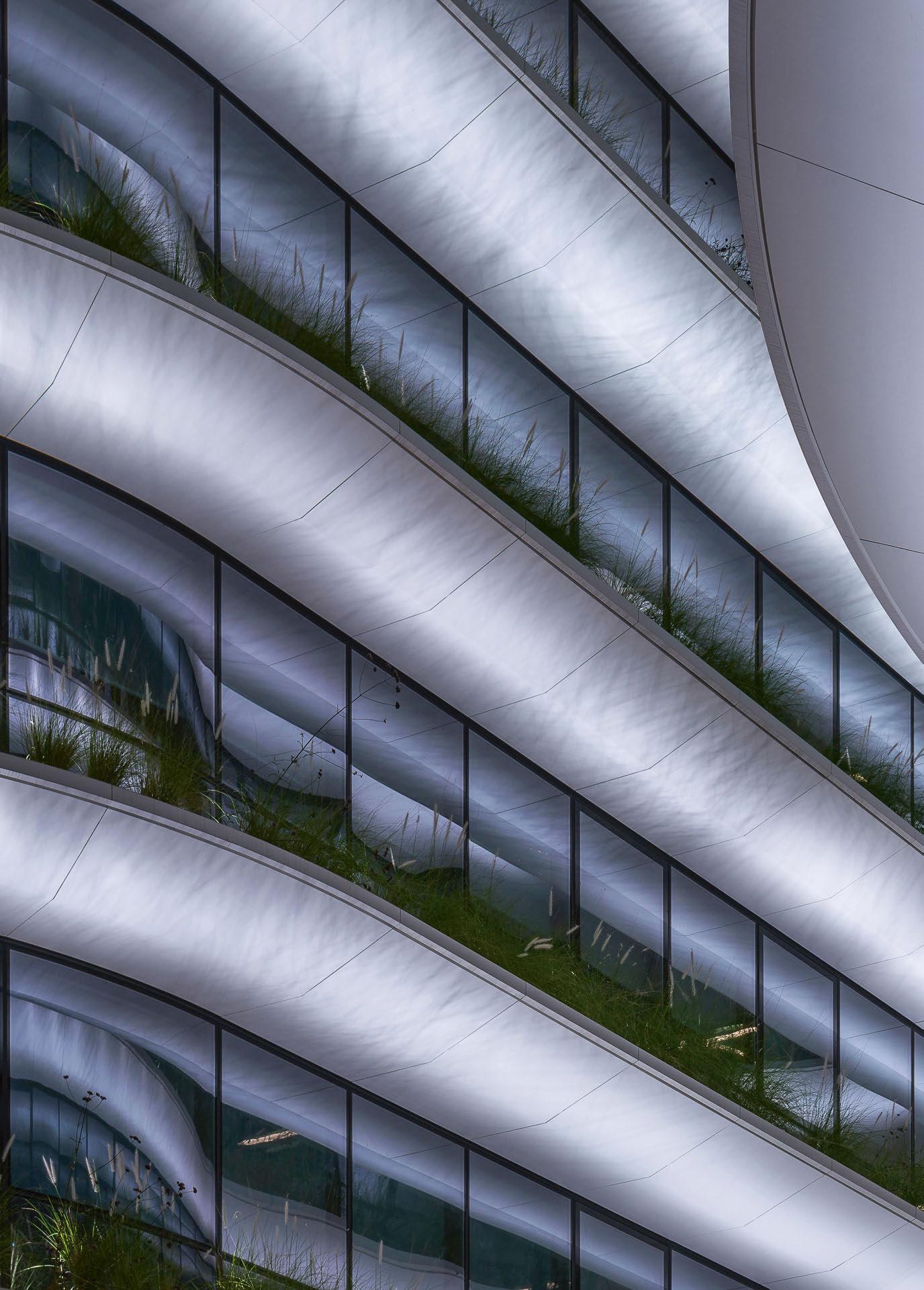
Each stratum of the façade contains a continuous planter for flowers and other organics that are partly illuminated, casting complex shadows onto the soffit above. “The architects were concerned on how the characteristic shape of the façade they designed, the continuity of its form, the sharpness and the curvilinearity are going to be perceptible at night,” Danilof added. As such, he and his design studio decided that its lighting design concept would be to make the façade appear “self-luminous: homogenous and clear”, with a pure white illumination that would allow the structural form of the building to “shimmer” over the dark, reflective glazing. “A continuous band of cool white light picks out the distinctive shape of the building, wraps around it and dissolves into darkness and ambient luminance,” Danilof explained. As the concept grew and evolved, Danilof decided that the interior lift lobby areas – the visible “spine” of the building – would be revealed in a welcoming, warmer tone. “At ground level, warm light would delineate the sculptural qualities of the landscape, while cool white light would accentuate the olive trees,” he continued. “A subtle note would also be introduced by the delicate shadows cast by façade plants on each level, that would move gently as they get caught in the night breeze.” Danilof decided very early on to specify lighting at 4000K MacAdam step 2 for the façade illumination, for a strict, pure white consistency, while all interior areas were kept at 3000K or less in order to have a colour contrast at all times. Further to this, interior office lighting has been set to automatically switch off after business hours, and the dark reflective glazing contributes to an even higher contrast while allowing for visually interesting reflections. Because of these measures, with CCT contrast, the lighting designers didn’t need to use higher lighting levels in order to bring out the form of the façade and visually separate the interior volume and the glazing. However, as the studio approached the detailed design stage, it faced some challenges, as Danilof explained: “Ideally, as a design principle, in order to have an even, homogenous wash on the façade, we wanted to keep the same projection geometry throughout the

2

3
1
4
building. Obviously this was not feasible everywhere, therefore at level 0 we asked for a bespoke luminaire housing structure of detailed dimensions attached to the glazing. This would illuminate the first white cladding at the same projection distance as at all other levels. Other areas necessitated custom long throw, short throw or in-ground fixtures that would match the visual result of the standard projection. “At this point, we did a lot of testing at the studio. We started with detailed photometric calculations and 3D models, and then we decided to do a bit of bricolage. We built a 1:1 section detail out of cardboard and double-checked the standard projection geometry optics with various luminaire samples. At the same time, we had to constantly collaborate with the sustainability consultants in order to keep everything in check with LEED criteria, and the electrical engineers to conclude on feasible wiring solutions.” By harmonising aesthetics, functionality and sustainability into one coherent lighting solution, Danilof Studio aimed to seamlessly integrate lighting within the architectural fabric of the building, while creating an environment with high levels of visual comfort that prevents light spill and light pollution. Towards that end, the studio developed architectural lighting details and lighting design specifications for bespoke luminaires with special optics, housing and light chromaticity characteristics. In doing so, during the construction stage, Danilof Studio worked with Illumination Physics and its Greek partner Luce Ataliotis, who engineered and delivered the bespoke lighting systems to meet these specifications. Peter Kemp, Co-Founding Partner of Illumination Physics, explained further how the manufacturer developed these bespoke systems: “Consistency of the quality of the white light was of paramount importance to Danilof. “The horizontal strata were to be illuminated from below: curved white surfaces lit in neutral white at 4000K. This created a set of critical parameters requiring extreme level of care in binning. Neutral white is the most sensitive colour temperature to work with, because the slightest variation in colour temperature or hue is obvious, and illuminating a perfectly white surface is a sure way to reveal any inconsistencies.” In order to create an even illumination around the curved façade, Illumination Physics developed a new family of linear light fixtures, based on a six-LED, 300mm version of its Linear Graze Mono, DC, CV and DMX. “The linear light fixtures that would be used were to be as physically small as possible for aesthetic reasons. They could not be continuous due to the curves, and therefore the overlapping beams must be perfectly overlaid to produce a homogenous result,” Kemp explained. The manufacturers developed numerous prototypes for factory mock-ups, while tests were conducted simulating the precise distances and projection surfaces that would be encountered on-site. They then took these prototypes on-site
1. The inclusion of warm white linear lines of light, courtesy of LED Linear’s VarioLED fixtures, delineates the sculptural qualities of the landscape, while cool white light accentuates the olive trees. 2. Further fixtures from Flos and L&L Luce&Light create additional moments of intrigue in the landscaped garden areas. 3. Danilof Studio worked with Illumination Physics on the striking façade lighting, with the manufacturers developing custom linear fixtures to provide a crisp, even wash of light. 4. In order to get the perfect finish, Danilof Studio developed detailed photometric calculations in 3D models, and carried out extensive lighting mock-ups, all the way through from design concept to construction.
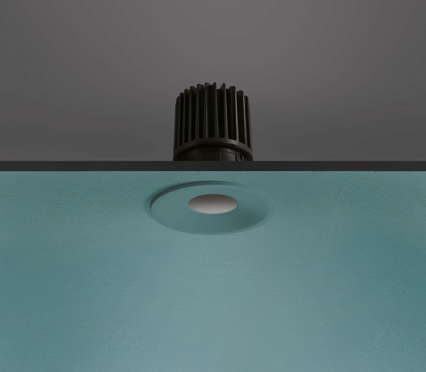
CHOOSE THE LOOK, CHOOSE THE FUNCTION, CHOOSE TRULY VERSATILE LIGHTING
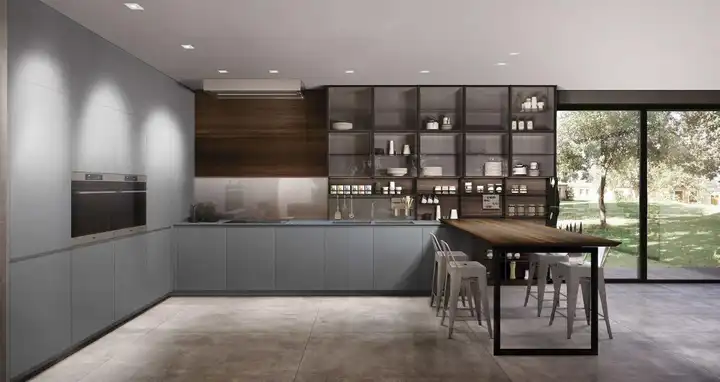
CHOOSE YOUR OWN VERSION OF COMBINA D USING THE ONLINE CONFIGURATOR AT WWW.LUCELIGHT.IT
COMBINA D INTERCHANGEABLE INDOOR RECESSED DOWNLIGHTS FOR SHOWROOMS, OFFICES, RETAIL AND HOMES


1. To achieve the maximum visual comfort in the interior lift lobby areas, all luminaires specified were either concealed or had dark light optics. 2. Danilof Studio carried out very detailed calculations examining optics, placing and dimming levels, resulting in tight luminaire specifications in the tender documents, to ensure that there was no unwanted light spill or light pollution emanating from the façade lighting.
1 2
for final testing, after which three custom variants of the new fixtures – each with different lengths and wattages – were specified, alongside an in-ground version. These custom-developed fixtures cast an even wash of light on the façade, which, when combined with the attention to detail of Danilof Studio that saw detailed photometric calculations in 3D models, and a consistent use of mock-ups all the way from concept design to construction, create a crisp, homogenous illumination along the Orbit’s curving façade. Alongside the striking façade lighting, there were numerous other considerations for the lighting designers – notably in carefully illuminating the abundant plant life. Each stratum of the façade contains a continuous planter for flowers and other organics that are partly illuminated, casting complex shadows on the soffit above. This inclusion of plant life was seen as a means of softening the hard, modern lines of the architecture – a fusion of organic and inorganic. “It was a part of our lighting concept to include discreetly the plant life into the nocturnal image of the façade,” Danilof said. “This required careful coordination during the technical design and construction stage with the landscape architects and designers.” This collaboration with the landscape architects and designers, as well as Danilof Studio’s work with Illumination Physics, is something that Danilof believes was integral to the eventual success of the project. “Collaboration is key in all projects, big or small, business or otherwise. It is how we evolve individually and collectively,” he said. “We were lucky in this project to collaborate on a daily basis with so many disciplines and diverse teams during both the design and construction stage.” Continuing this collaboration, Danilof added that, on completion of the project, he is looking to help with the maintenance of the building, to ensure that the lighting doesn’t fade with time. “We are preparing a lighting maintenance manual, and we will be having meetings with the company that won the maintenance contract of the building. In a way this is one of the most challenging parts of the project.” Going the extra mile in this way is a testament to how pleased Danilof is with the final lighting design for the Orbit – a design in which the lighting responds perfectly and organically to the unique shape and context of the design. The sharp, even illumination to the Orbit’s flowing exterior, in which the lighting is seamlessly integrated into the architecture, further enhances this new landmark, and what will no doubt become a new monument to modern workspace design.
www.a-danilof.com

lighting specified
Bega 88262 DALI ETC Response Mk2 ETC Union Mosaic MSC4 Controller Flos A-Round 240 Flos Light Shadow iGuzzini E882 iGuzzini Laser Blade In Out iGuzzini Laser Blade XL iGuzzini Laser Blade XS Illumination Physics IP linear series Illumination Physics Custom inground fixtures L&L Luce&Light Ginko 1.0 L&L Luce&Light Ginko 2.0 LED Linear VarioLED Flex Hydra LED Linear VarioLED Flex Phobos
