entity


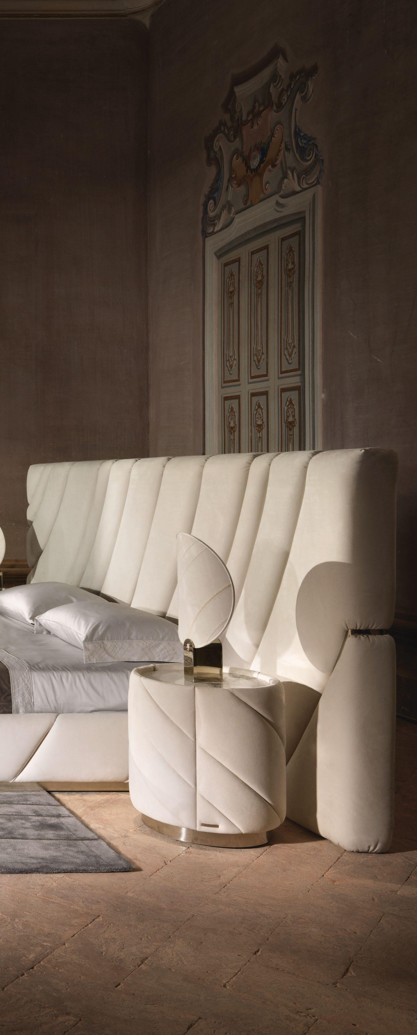


Nour Hage’s ‘Talismanic Series’ is inspired by amulets created by women in the Levant
Syrian-American designer Nader Gammas hopes to turn lighting into a narrative performance
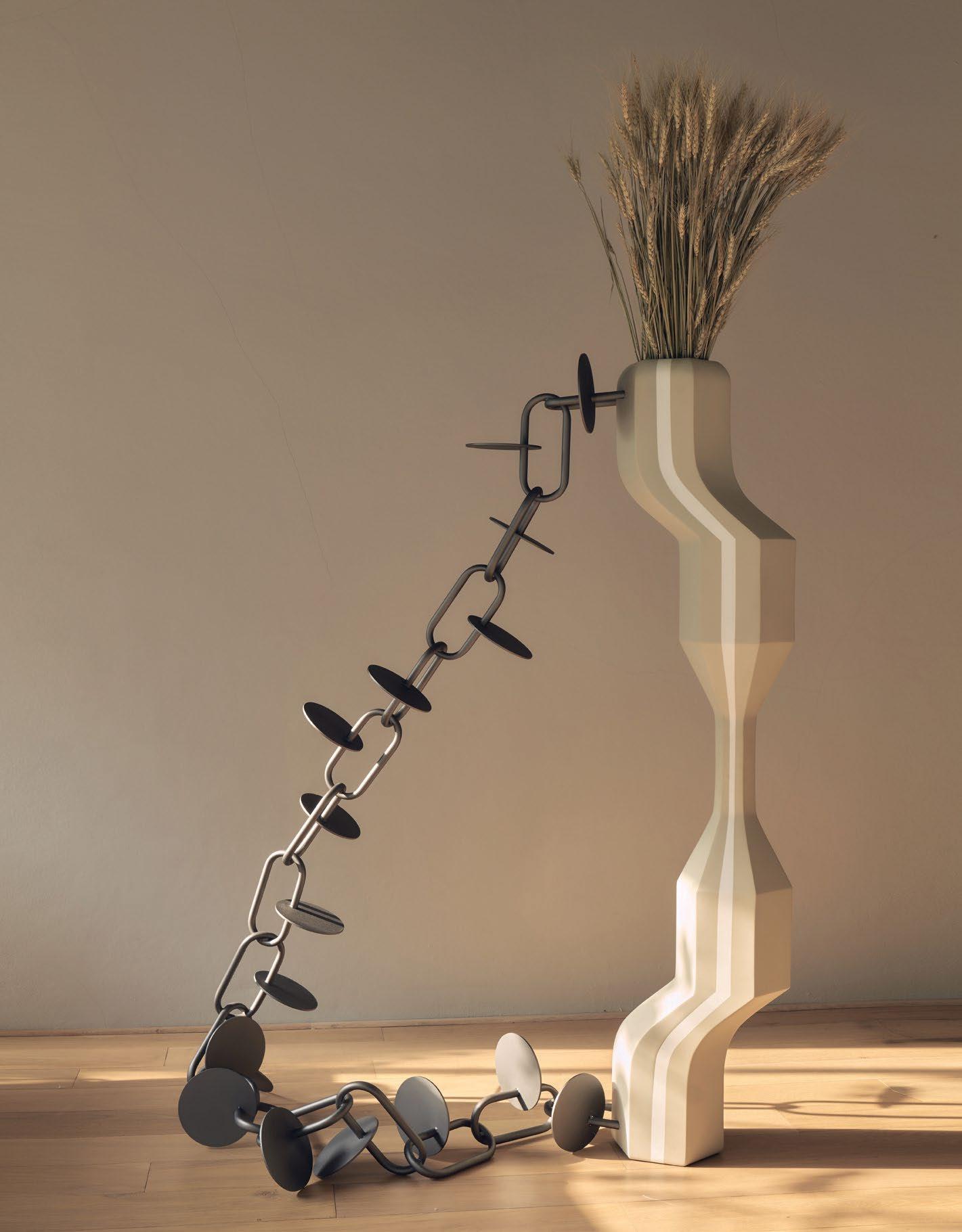
Studio Yoon Seok-Hyeon creates objects that put the environment first
The renovation of Tripoli’s Niemeyer Guest House sees the building take on a reversible design
The creative minds behind OZA have reintroduced harmony and balance into a Victorian house
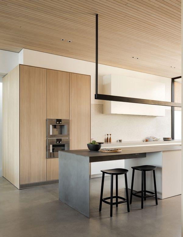
A Canada home celebrates calming ocean views and the homeowners’ extensive art collection
Two ambitious women have launched a hub dedicated to good design and innovative concepts


Editor-in-Chief
Obaid Humaid Al Tayer Managing Partner and Group Editor Ian Fairservice
Group Director
Andrew Wingrove
Editor Aidan Imanova Designer Hannah Perez Sub-editor Max Tuttle
Chief Commercial Officer Anthony Milne Group Sales Manager Manish Chopra Senior Sales Manager Sharmine Khan Sales Representative - Italy Daniela Prestinoni General Manager - Production Sunil Kumar Production Manager Binu Purandaran Production Supervisor Venita Pinto
Contributors
Karine Monié Lemma Shehadi
Head Office: Media One Tower, PO Box 2331, Dubai, UAE; Tel: +971 4 427 3000, Fax: +971 4 428 2260; E-mail: motivate@ motivate.ae

Dubai Media City: SD 2-94, 2nd Floor, Building 2, Dubai, UAE Tel: +971 4 390 3550 Fax: +971 4 390 4845
Abu Dhabi: PO Box 43072, UAE, Tel: +971 2 677 2005; Fax: +971 2 677 0124; E-mail: motivate-adh@motivate.ae
Riyadh: Office 452, Regus Offices, 4th Floor, Al Hamad Tower, King Fahad Road, Al Olaya, PO.Box 12381, Riyadh 6764, Kingdom of Saudi Arabia; Tel: +966 11 834 3595 / +966 11 834 3596; Fax: +966 11 8343501
London: Acre House, 11/15 William Road, London NW1 3ER, UK; E-mail: motivateuk@motivate.ae
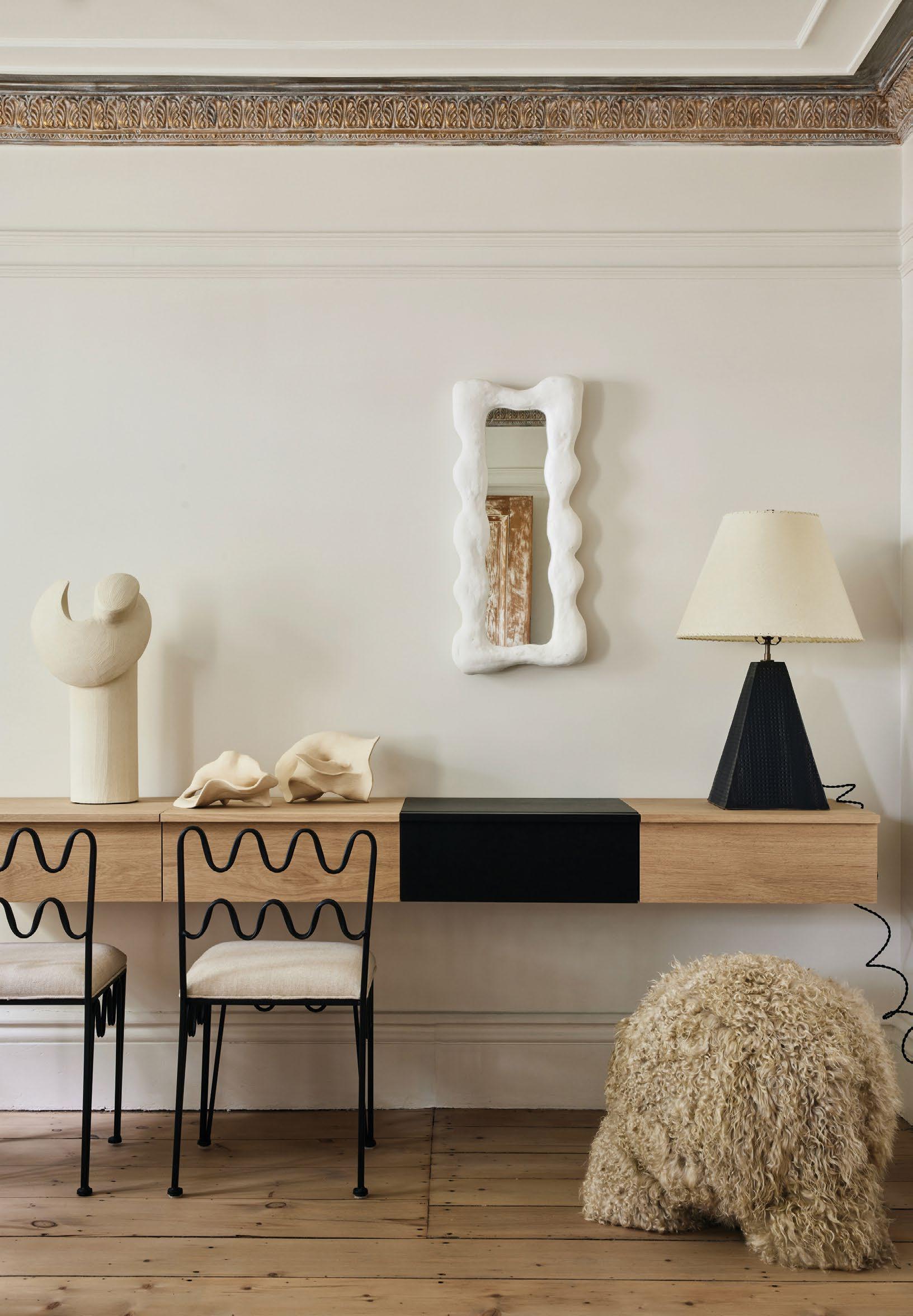
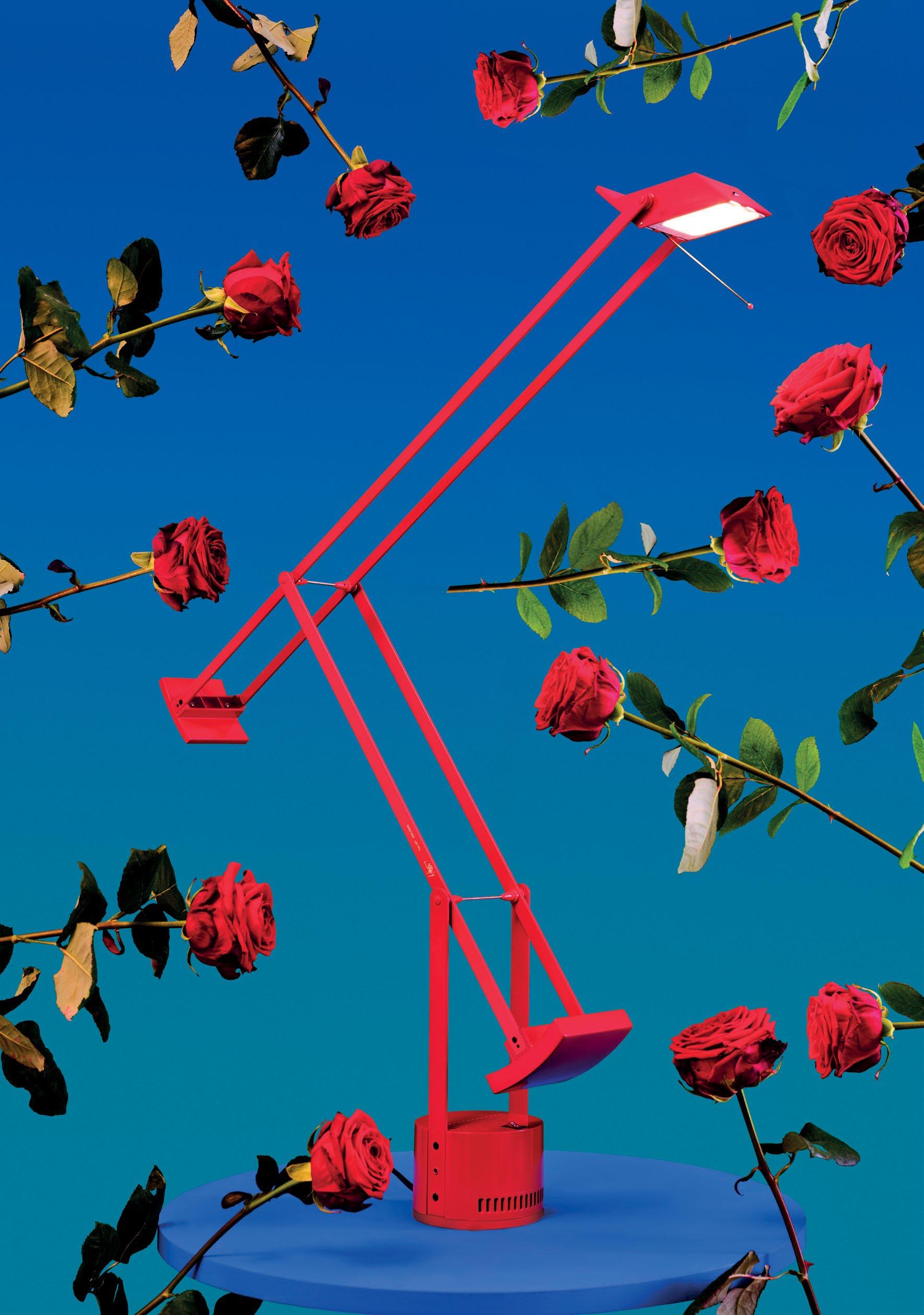
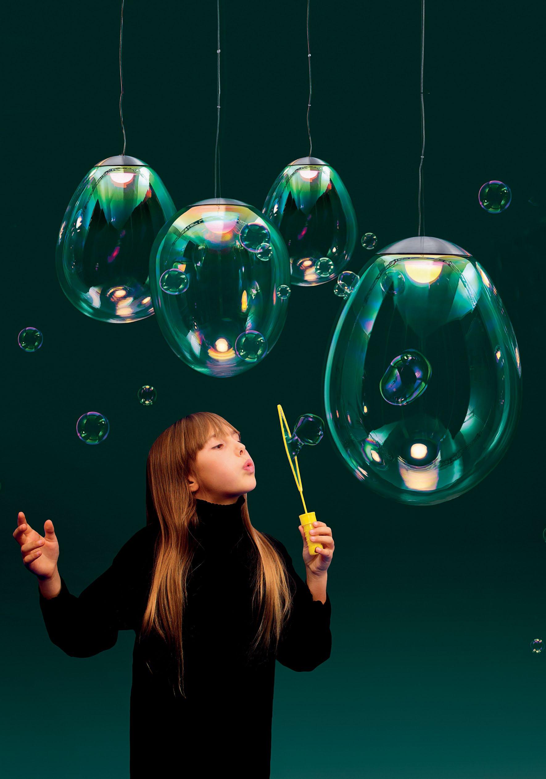
You know the phrase, ‘don’t fix what’s not broken?’ Many of us have either been told this directly or have heard it being told to someone else – and yes, there is sound logic to the statement. Attempting to change or improve something that has already been proven to work often has negative or dangerous implications: it is risky, untested and may even backfire. But my argument here is, if you don’t even attempt to change the narrative, how will you ever know?
In our ‘New Perspectives’ issue, we speak to designers, architects and creatives who dared to ‘fix it’. In my interview with fashion designer and textile artist Nour Hage, she admits to feeling disconnected from her fashion practice despite its success, turning her gaze to textile art which she feels is more in line with her deeply research-driven process.
“The thing about fashion that [makes it] trickier than other forms of design is that you are creating so many different products [and] so often that it becomes more about the physical product and the aesthetic than it is about the research and the thought process behind it,” she said. She told me that “the idea is that I want to get back to designing, because I love clothing textiles so much, but I want to do it on my own terms, and in a way that is as sustainable, and environmentally friendly, as possible.”
In other parts of the magazine, contributing writer Lemma Shehadi speaks to Syrian-American lighting designer Nader Gammas, whose aim is to create lighting objects that go beyond their function, and are more about performance and narrative. “It’s not a light bulb for the sake of a light bulb,” he says. Since moving his practice and production to Dubai, Gammas has been intent on defying the traditional relationship with skilled artisans in the city, many of whom are typically employed by large companies and are relegated to producing cookie-cutter factory items. Having discovered an independent metal workshop run by a team of Indian craftsmen, the designer hopes this will create a shift in dynamics in the city as well as in his own work.
Another designer who sparked my interest when we first met earlier this year at Maison & Objet in Paris – where he was granted the Rising Talent Award – is Yoon Seok-Hyeon. The young designer is set on finding alternatives to common practices and materials that are harmful to the environment, in the hope of creating a more responsible way of designing. His Seoul- and Eindhoven-based practice recently discovered a way to recycle ceramics using a natural resin as an alternative to traditional glazing that is impossible to separate from the clay, and which typically contains harmful chemicals.
“The sustainability of a material is important to me because I have to be [held] responsible for the things I create,” he told me.
While the safety net is comfortable, and despite certain things functioning as they were designed to do, there is power in disruption – and a chance that we can always arrive at something more valuable and responsible.
On the cover: Waterfront home in Vancouver Island designed by BoForm Architecture, Demitasse Garden Design and Falken Reynolds Interiors
 Aidan Imanova Editor
 Photo by Young Habibti
Photography by Ema Peter
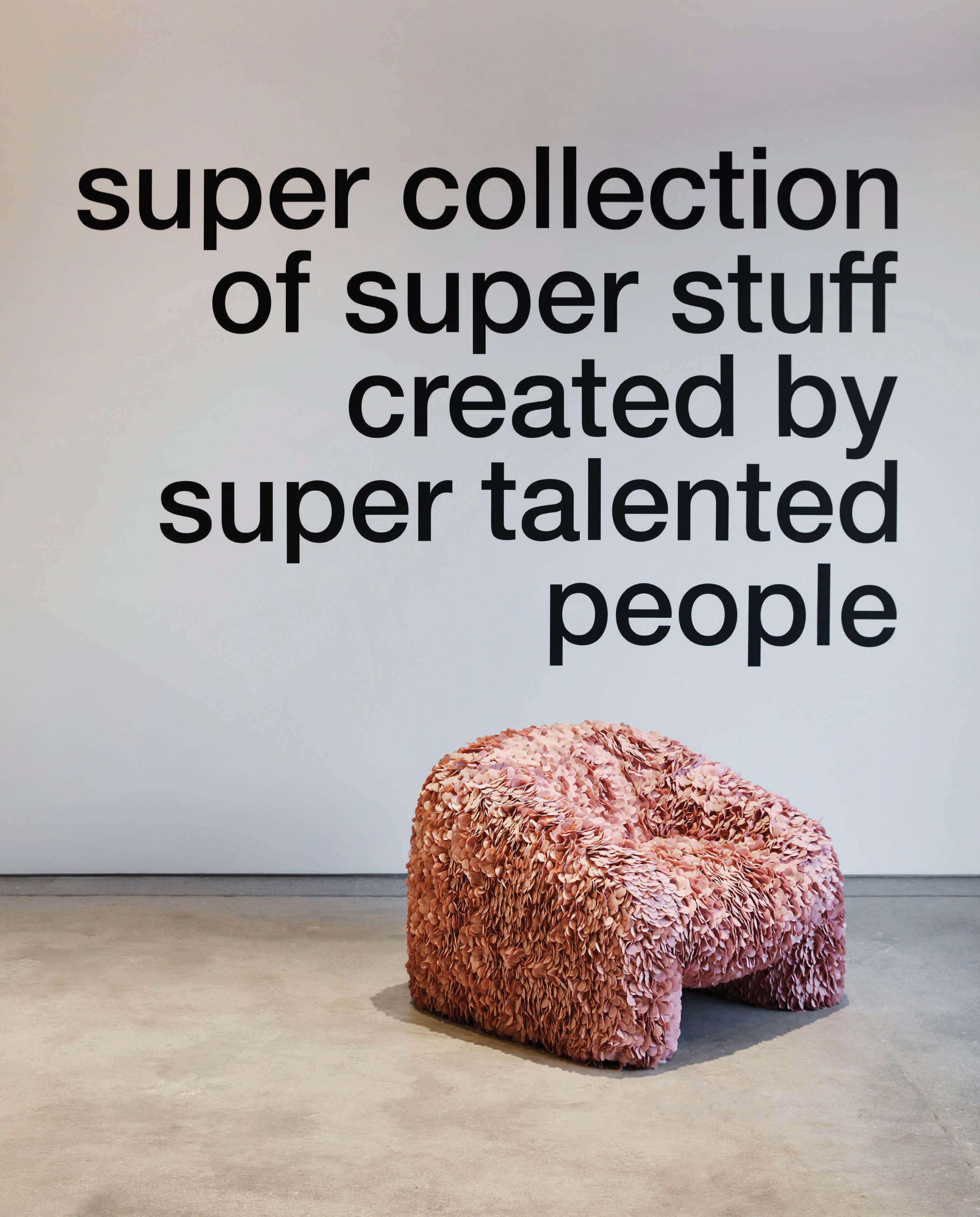
All petit h pieces begin with the materials – most notably materials that have been discarded from other metiers and given new life by creating hybrid objects that are faithful to the spirit of Hermès. Before becoming an idea, a petit h item is first conceived through materials such as leather, silk, crystal and porcelain, then improvised by combining, assembling and altering until a functional or decora tive object is formed. Established in 2010, and now under the creative direction of Godefroy de Virieu, petit h presents a playful dialogue between design and making, reuse and sustainability.
The objects have now found their temporary home in Hermès’ The Dubai Mall store, staged in
a space reminiscent of a souk, designed by Emirati architect and designer Abdulla Almulla and infused with architectural elements that evoke these tra ditional places of conviviality and trade. The petit h souk features earthy toned walls and floors and openwork ceilings that diffuse soft light, creating a welcoming atmosphere. The colour palette reflects the local terracotta, clay, fabric and wood used in its construction.
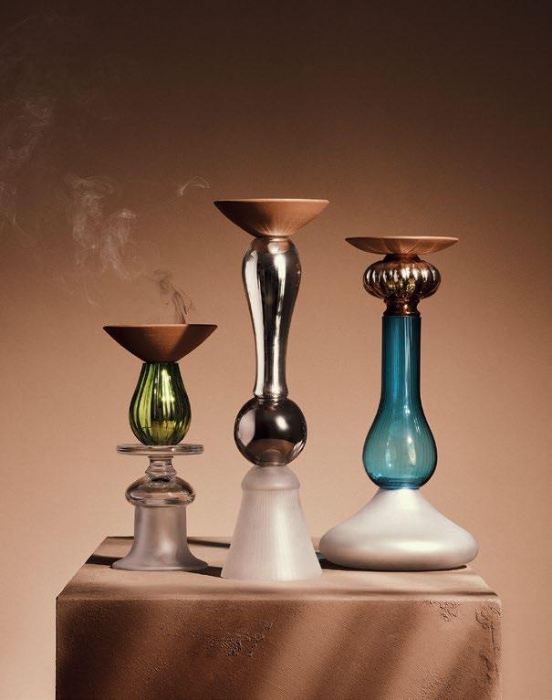
Among the objects – which are an homage to the city – is a falcon stand in terracotta and leather, por celain and crystal, and an incense burner consisting of a fine terracotta dish elevated on a green and white crystal base.
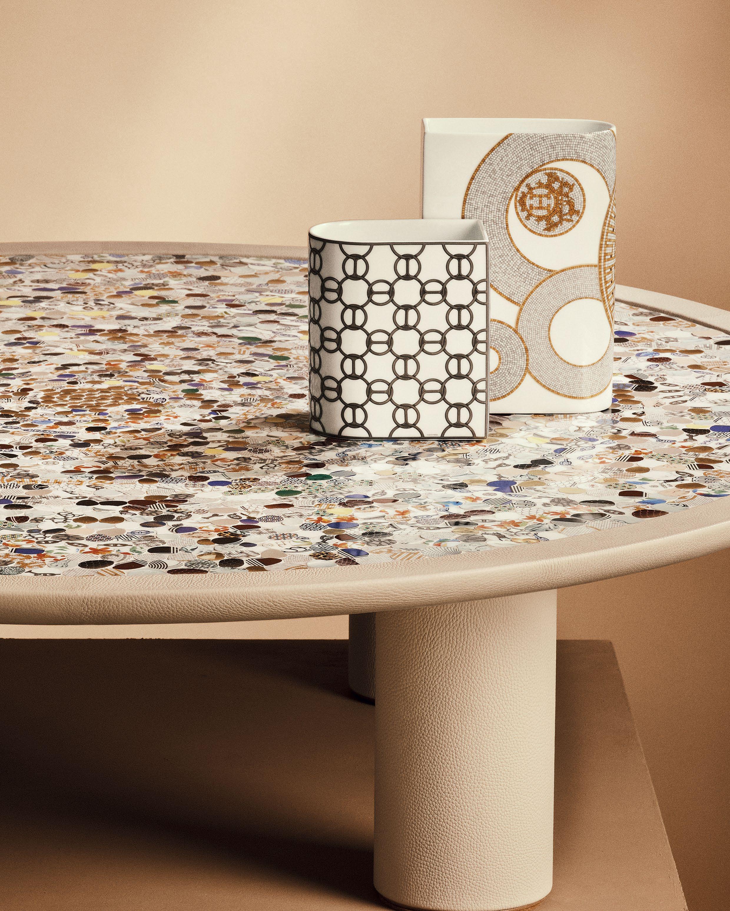
Hermès’ petit h objects are being showcased in Dubai amid a staged ‘souk’ conceived by Abdulla Almulla
True to its name, Dubai-based design brand Chapter’s latest col lection – designed exclusively for Studio TwentySeven – is an ode to ancient Persepolis, also known in Persian as Parsa (City of Persians).
The monumental dining table is a combi nation of marble and metal, resembling the ancient pillars of Persepolis, conceived in intriguing dimensions and proportions. Its cylindrical metal legs are formed with two
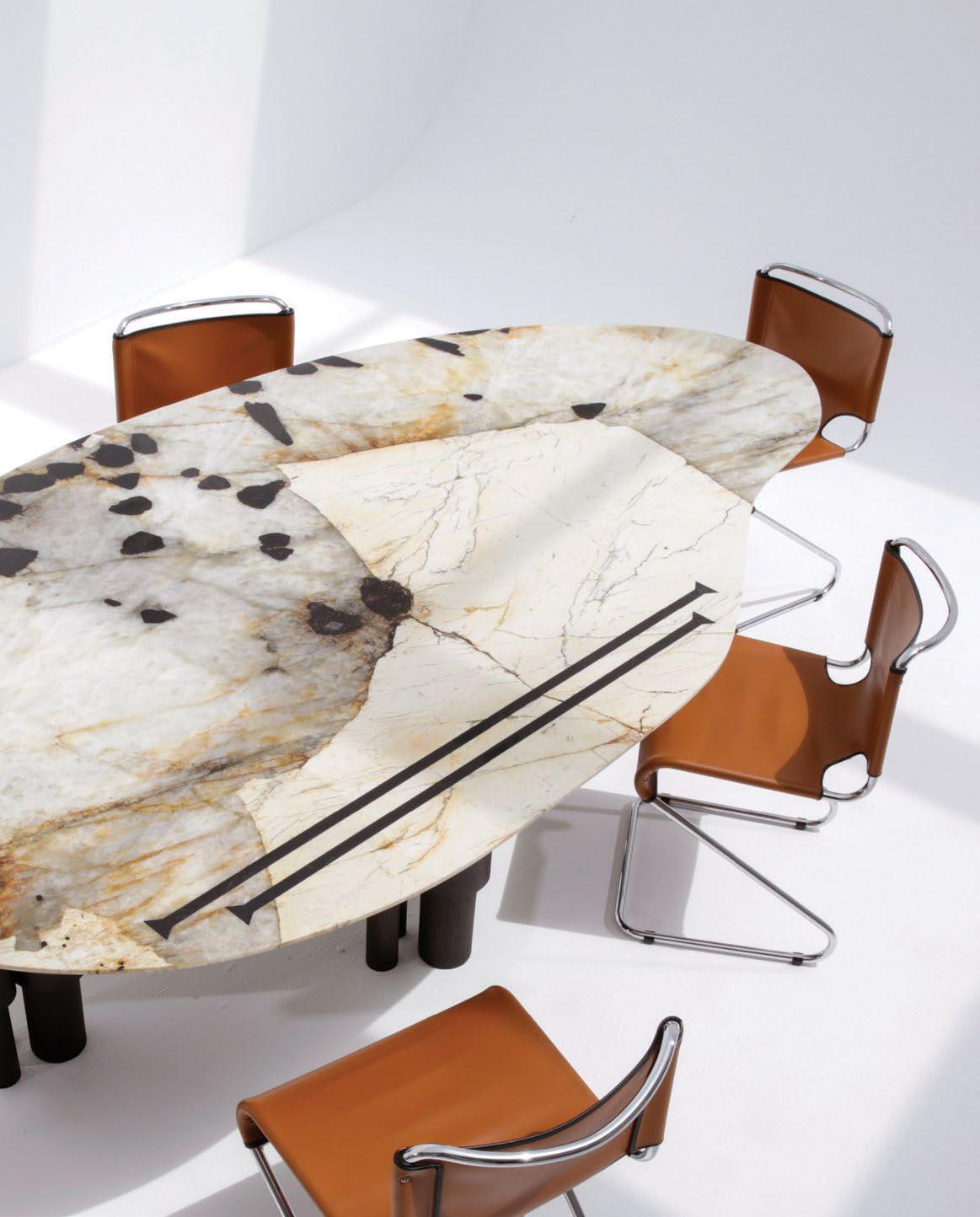
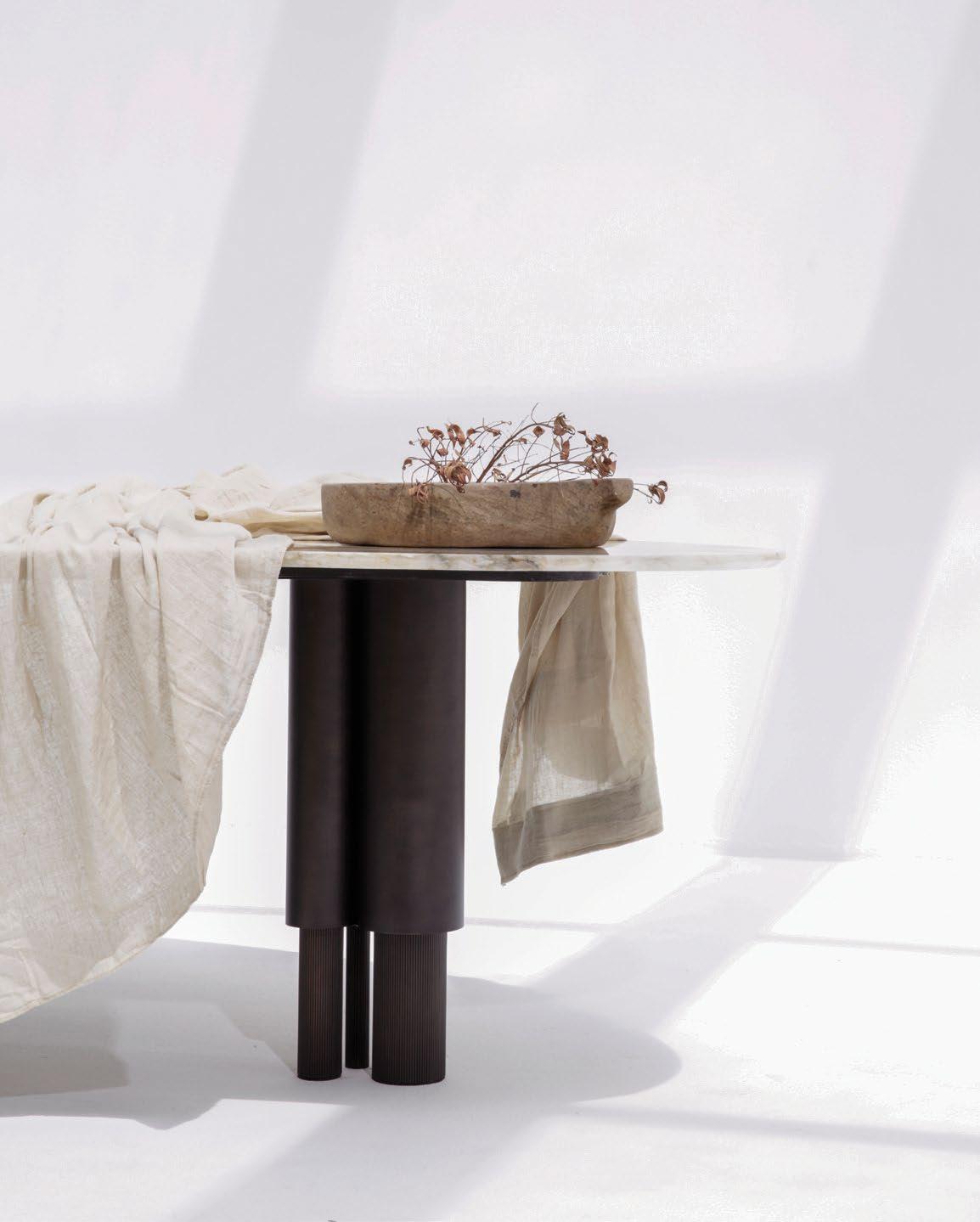
vertical structures inspired by the grandeur of Persepolitan columns. These legs carry the smooth marble tabletop that is crafted in an organic shape, with a patterned effect inspired by the rich textures and patterns found in the city, adding a sense of nature and movement to the piece. The minimal pattern is inspired by the Old Persian Cuneiform language, known as Khate-Mikh, specifically focusing on one particular glyph that resembles an arrow. When grouped
together, it creates rhythmic repetitions. “Architecture has timeless qualities and characteristics [that] make [up] the frame work of our daily life,” says Shima Samaei, founder of Chapter. “The Persepolis series represents this notion, taking into account that our indoor environments have a huge impact on our mood and that we surround ourselves with what we feel represents our personality and character in terms of materi als, colours and texture.”
Chapter’s new dining table for Studio TwentySeven is a monumental ode to its Persian roots
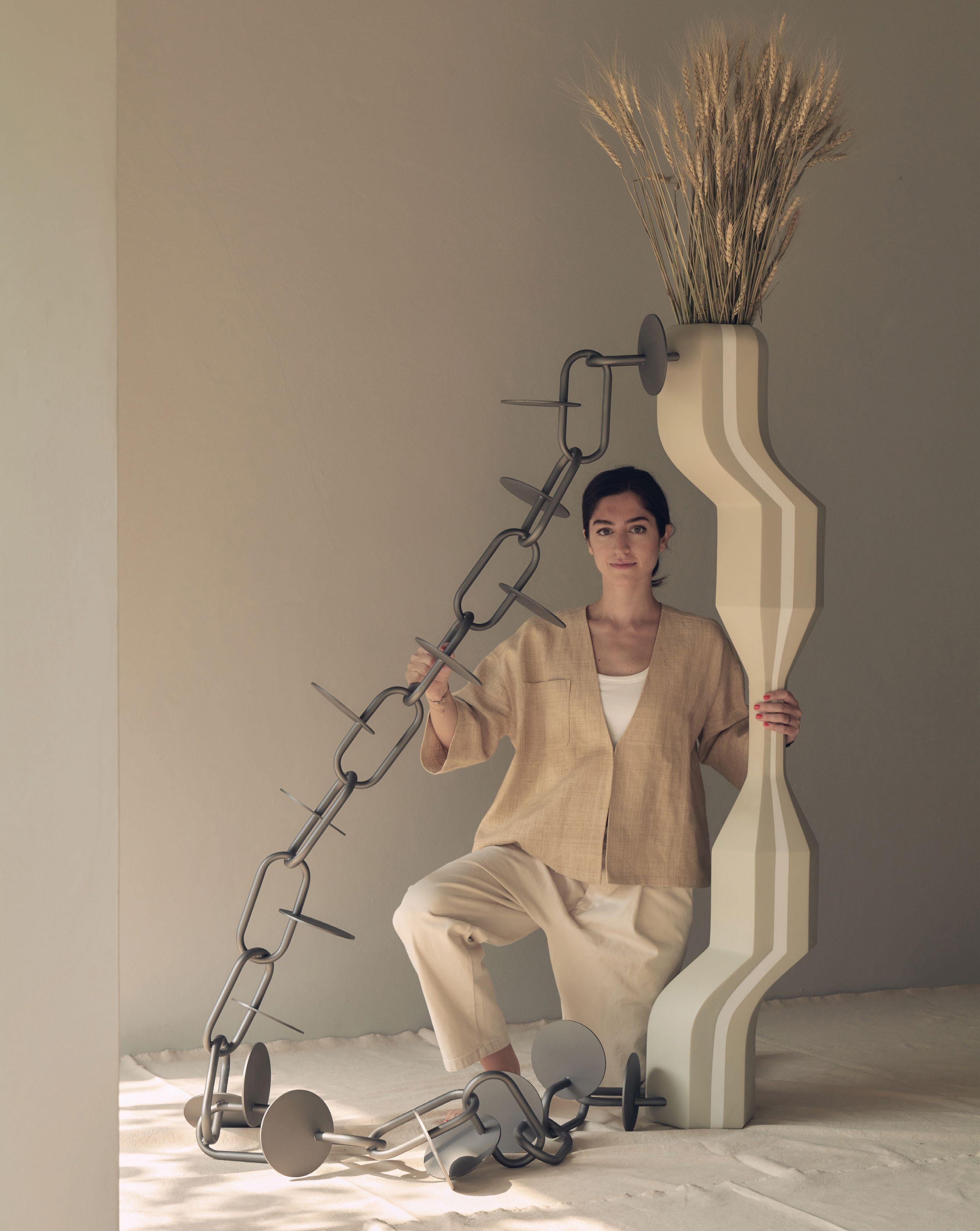
For her first series of furniture, Saba Yazdjerdi explores the richness behind Varzesh-e-Pahlevani – an ancient Persian martial art
“[My first] collection is a tribute to my grandfather,” begins Tehran-born architect, artist and now furniture designer Saba Yazdjerdi. “I grew up seeing the training equipment used in Varzesh-e-Pahlevani [‘sport of heroes’] in his bedroom and [observ ing] his love for [it].”
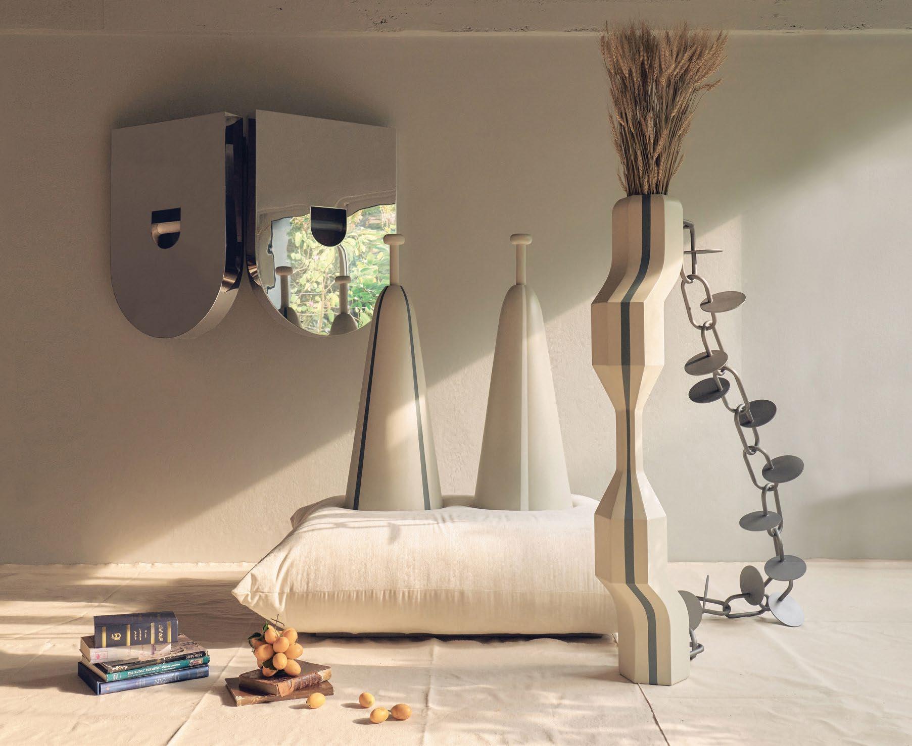
Originally used to train warriors in ancient Persia, this tradi tional system of athletics and form of martial arts became the starting point for Yazdjerdi’s first furniture series.
“As a young child I learned the meaning of a Pahlevoon [‘hero’] through [my grandfather’s] love for life and everyone around him,” Yazdjerdi continues. “There is a lot about Iranian culture and its value system that’s distilled and captured in Varzesh-e-Pahlevani.”
Staying true to what each shape represents while reflect ing on how to interpret a deeper essence of Pahlevani was at the heart of Yazdjerdi’s project. Among one of these examples is the sculptural ‘Kabbadeh-chin’, which is inspired by the equip ment that was used to prepare warriors’ arms, shoulders and back [in order] to handle the bow and arrow. “My interpreta tion of it as a large, heavy vase is meant to honour the gentle ness that I believe coexists with strength,” says Yazdjerdi.
In addition to this piece, the collection – which explores eth ical principles, athletic rituals and ancient Persian beliefs related to the sport – also comprises the Sang-ru mirror, which is a reinterpretation of the shield and invites the user to omit their self and ego in favour of their sur roundings; the Mil-gah seat that symbolises modesty, comfort and protection; and the Mil-stone bench that refers to the foundational spirit within the Iranian community.
While raised in Iran, Yazdjerdi has lived in Colorado, Rhode Island, Bangkok, New York and California. At just 31 years old,
the young designer posseses a creative maturity that makes all she conceives fascinating. At the heart of Yazdjerdi’s interests are the human experience, the celebration of her heritage and the re-im agination of her personal narrative. Reflecting a sense of nostalgia in a modern context, this collection – which is essentially an ode to tradition through contemporary eyes – embodies all of that.
“Pahlevooni is a beautiful part of Iranian culture but, historically, its participation has been reserved and limited to men,” Yazdjerdi explains. “Through design, I wanted to define new functions and interpretations that would transport its meaning from an ancient performance stage into the home, and specifically through my lens as an Iranian woman. With this collection, I aim to equalise the role of Iranian men and women as heroes – particularly now as we witness so many female Pahlevoons shining in Iran.”
Dubai-based design store The Bowery Company is home to some of the most coveted Scandinavian brands in the Middle East. Its growing portfolio includes two Danish design powerhouses – Ferm Living and MENU AS, for which is it now the official regional distributor in the GCC. Both brands are known for their pared-back and minimal design objects, furniture and lighting.
Catering to a range of projects – from commercial and hospitality to residential – The Bowery Company is paving the way in the region as the representative of iconic Scandinavian design.
Featuring a selection of collectible objects, the design store was founded in 2014 by Christiane Nasr, who carefully curates the selection of objects to create a physical narrative. Her objective is to collate a collection of creative works that together form a special visual experience. “You want
each piece to stand out on its own, but to also interact and be part of a bigger whole,” says Nasr. “A balance needs to be struck but, sometimes, rules are meant to be broken.”
The Bowery Company has already worked with many of the region’s well-known design and architecture studios, in addition to key developers, on projects such as the Emaar flagship sales centre in Downtown Design and Aldar’s renovated HQ, designed by Mustard & Linen. It has also worked across several F&B concepts in the UAE, Kuwait, KSA and Qatar, in collaboration with hospitality groups such as Gastronomica and The Independent Food Company.
The design store has recently launched its physical space in Dubai’s Al Quoz neighbourhood, where one can shop across dozens of Scandinavian brands – be it for the home or for a design project.
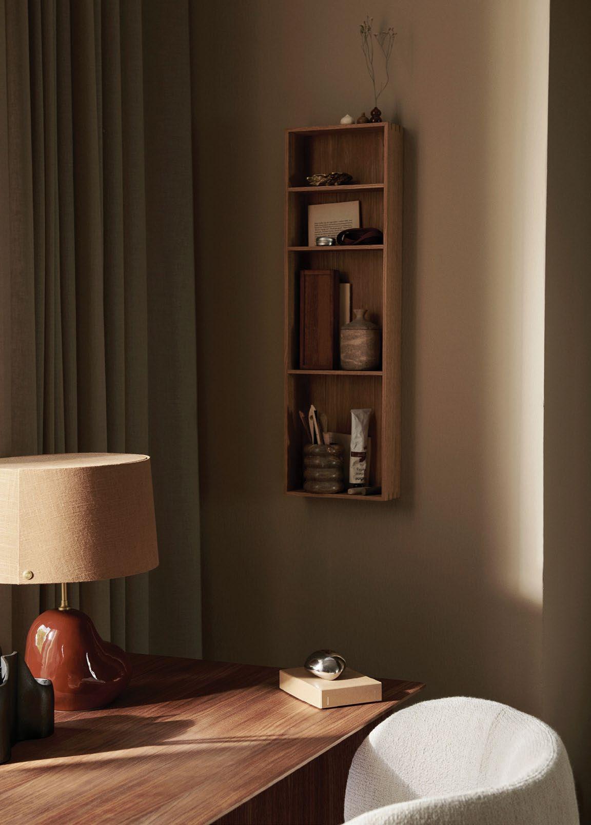
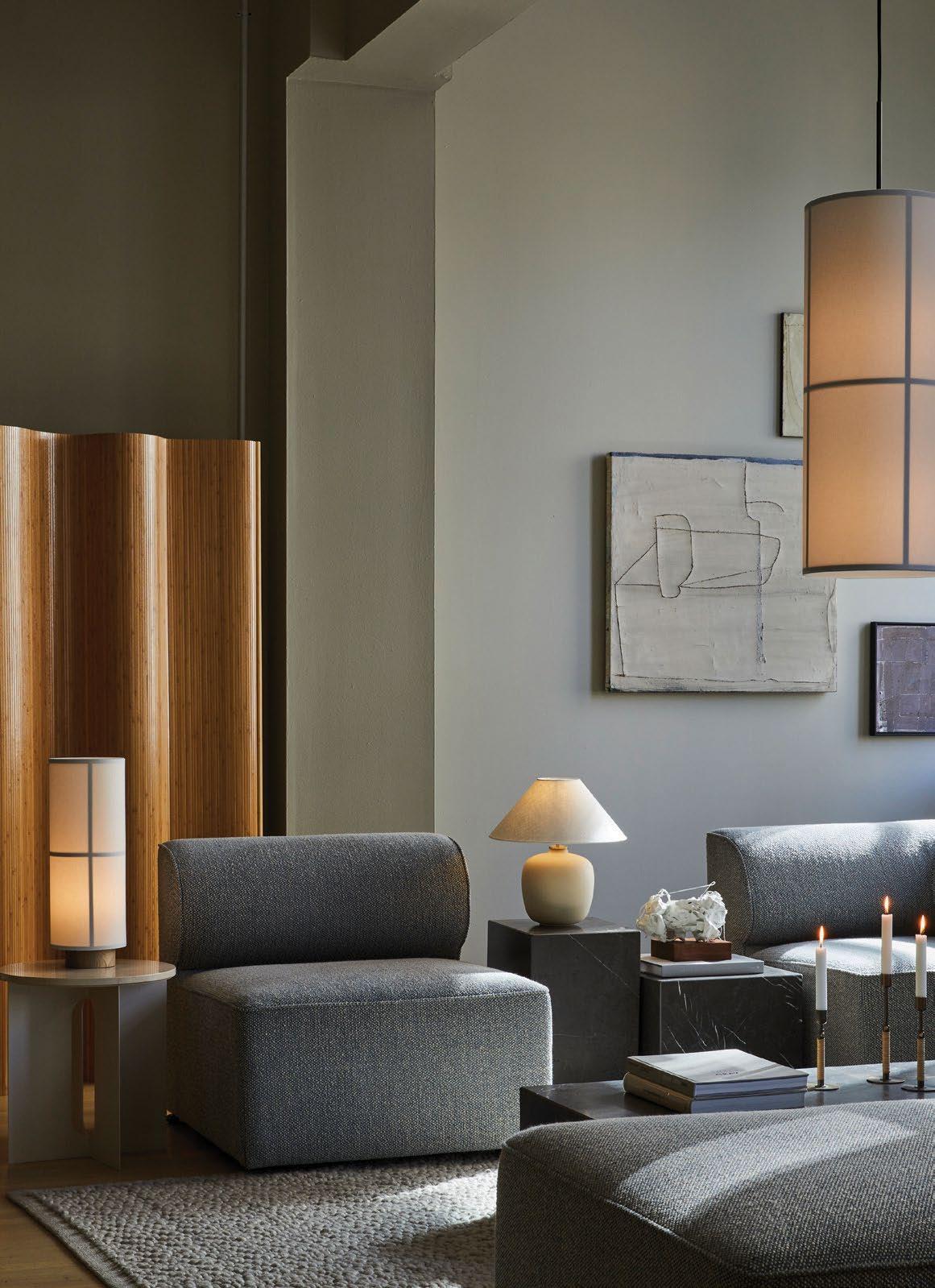
The Bowery Company is home to a plethora of Scandinavian brands including Ferm Living and MENU ASBon shelf from Ferm Living Hashira table and pendant light, Androgyne side table, Torso table lamp and Eave modular sofa from MENU AS


 WORDS BY AIDAN IMANOVA
Dubai Design Week is back (from 8 to 12 November) with a new programme of installations, exhibitions and another edition of Downtown Design
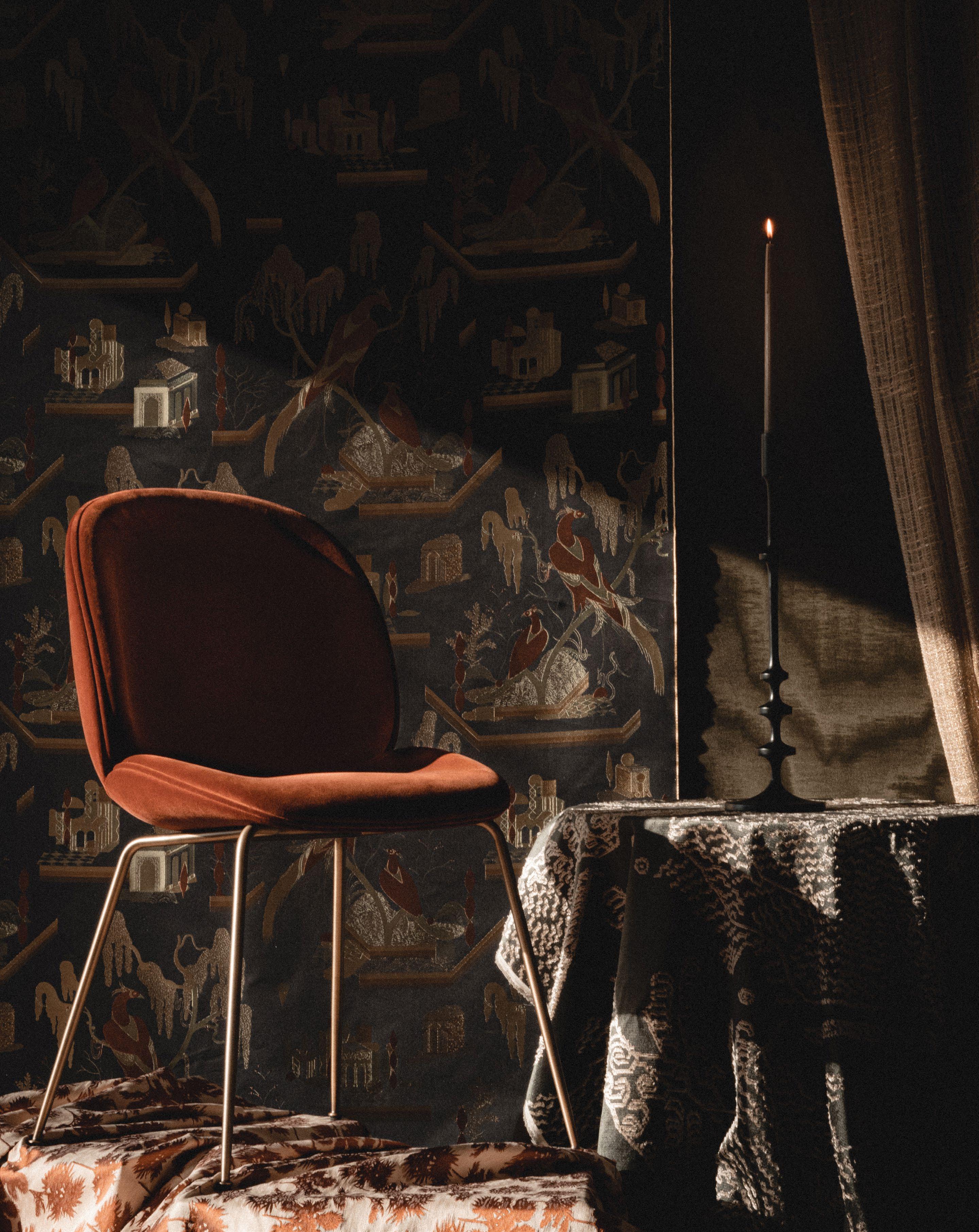
‘Saudade’ by Styled Habitat features an ‘apartment’ of nostalgia, with pieces from brands including Gubi, & Tradition and Dedar
the most important event in the city’s design calendar, Dubai Design Week – now in its eighth year – is once again bringing together emerging and established designers, brands and – sometimes – a collabora tion of the two, with many this year considering design’s impact on the environment. Focusing on ‘designing a sustainable future’ through the theme ‘Design with Impact’, this year’s immersive installations are mindful of their use of materials and design thinking – and projects include both regional and international names.
Global architecture firm OBMI will debut during Dubai Design Week with ‘Once Upon
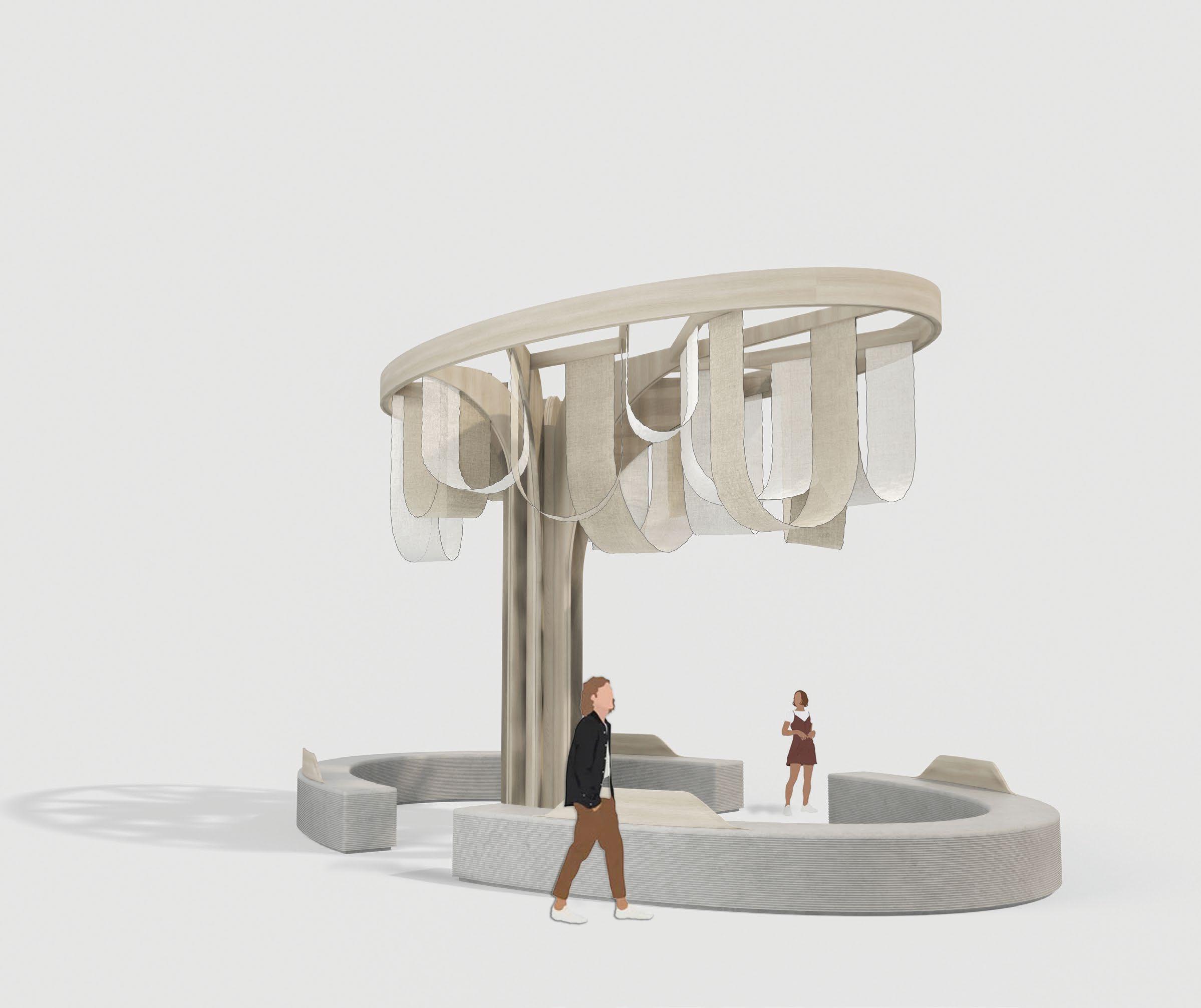
a Forest’ – an installation that celebrates the ecosystem of the UAE’s mangroves with a focus on their protection. The structure is designed entirely using sustainable materials, with a protective floating canopy made from net mesh and bamboo bracing. ‘Grounded in Hope’ is an installation by Meher Sahney and Abdul Hazeeb that uses repurposed fabric, while another –‘From the Dunes & Trees’ by ARDH Collective – is built using desert sand-based concrete, date seed-based solid surface material and plant-based vegan ‘leather’. The structure’s form is inspired by the circular life cycle of materials, and the space itself celebrates the Emirate’s history of building
techniques and deep-rooted culture that encom passes the desert and agricultural landscapes through the gaze of sustainable future-forward materials. Also inspired by Emirati culture are ‘Al Gargoor’ by Sara Alrayyes, which showcases various furnishings made from upcycled fishing nets, and ‘Palm Renaissance’ by Shema John and Murugan A, which demonstrates the potential of palm waste. Another installation, aptly named ‘How Much Does Your Debris Weight?’ by Quartz Architects asks the question ‘What if the world becomes engulfed by its waste?’, exploring different materials in its construction process, in addition to using cascading demolished waste.
In other areas, the UAE Designer Exhibition returns as a curated showcase of various design disciplines by established and emerging regional talents, taking place at the d3 Waterfront in Downtown Design. Some of the works on show include ‘Palm Veneer’ by Reem Jeghel, which introduces an innovative material that is created by pressing palm fibres, resulting in a flat surface that is similar to wood veneer. Inspired by the palm leaf, the project implements wood marquetry techniques using the innovative material. Other works include ‘Pieces of Past and Present’ by Amna Alshamsi, the ‘Khose’ stool by Dana K. Amro and ‘Transcending Cultural Boundaries’ by Hajjar Aktenaiji, which explores shared histories and their differences.
Collaborations are also highlighted in this edition of Dubai Design Week, with two powerhouse carpet brands working with artists and designers to develop new collections and installations. Lebanon-based bespoke carpet brand Nalbandian marks its debut at Downtown Design with ‘Dreamweaver’ – an immersive ‘motion sensitive’ installation designed by architect Karim Nader and multidisciplinary designer Fadi Yachoui, founder of Atelier L’inconnu. The floor-to-wall carpet-tapestry is created from an assortment
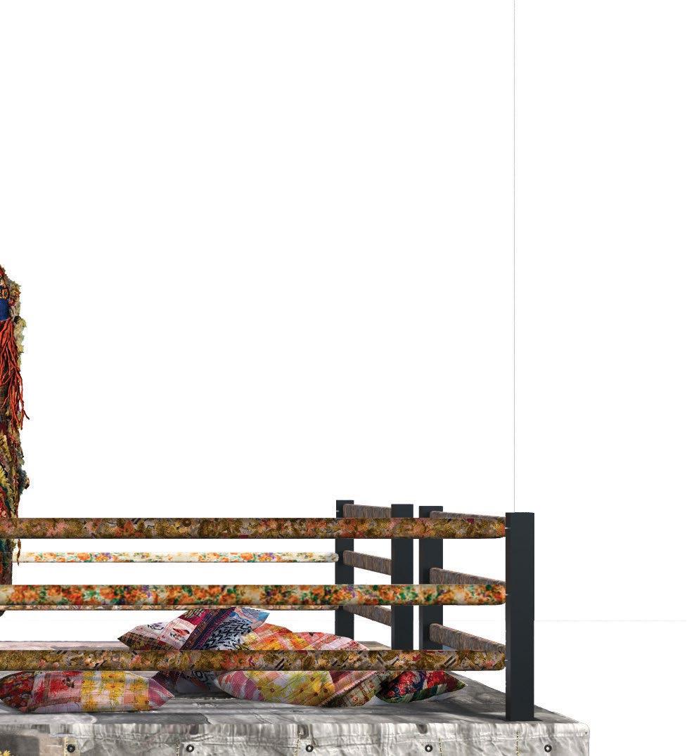
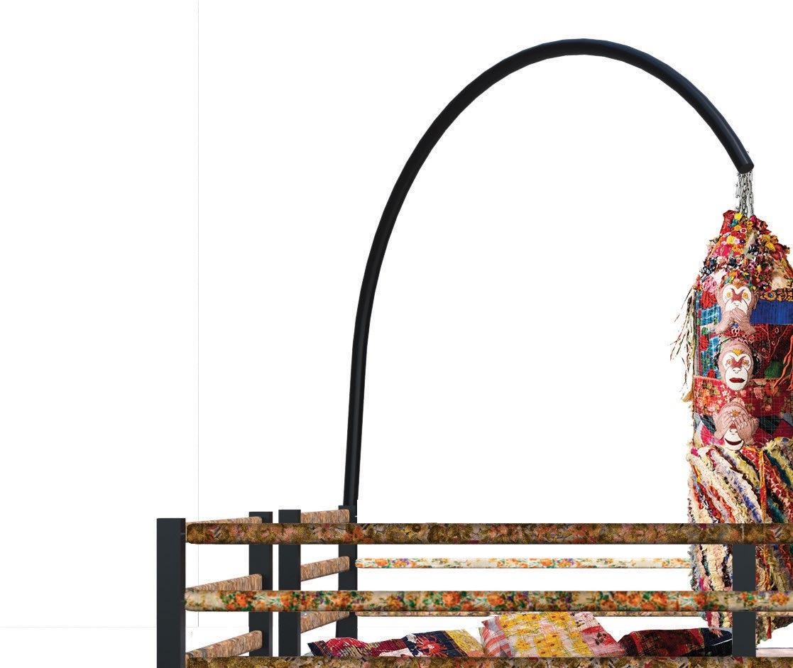
of textures, materials and shades of white from Serge Nalbandian’s bespoke collection and serves as a canvas to project a curated selection of the carpet maker’s finest designs. Outside the Downtown Design tent, third generation Beirut carpetmaker Iwan Maktabi is launching an exhibition titled ‘Terminal G’, curated by Samer Yamani and designed by creatives from the Gulf, including Emirati designers Afra and Sheikha Bin Dhaher; Architects Independent from Qatar; Aseel AlYaqoub from Kuwait; Saudi artist Sultan bin Fahad; Bahraini-Danish from Bahrain; and Ibrahim Al-Jaidah from Qatar. The collection draws inspiration from the traditional practices of the Arab and Gulf region.

Another collaborative showcase is by Dubai-based interior design studio Styled Habitat, presenting ‘Saudade’ – which sees its studio transformed into an ‘apartment’ that sparks a sense of nostalgia, with vignette-like scenographies created using a selection of objects and textiles. Curated by founder and creative director Rabah Saeid, the showcase sees a merging of craft, design integrity and timelessness, including original pieces from the likes of Gubi and &tradition sourced by ikonhouse, combined with wall coverings and textiles by Dedar and rugs by The Rug Company.
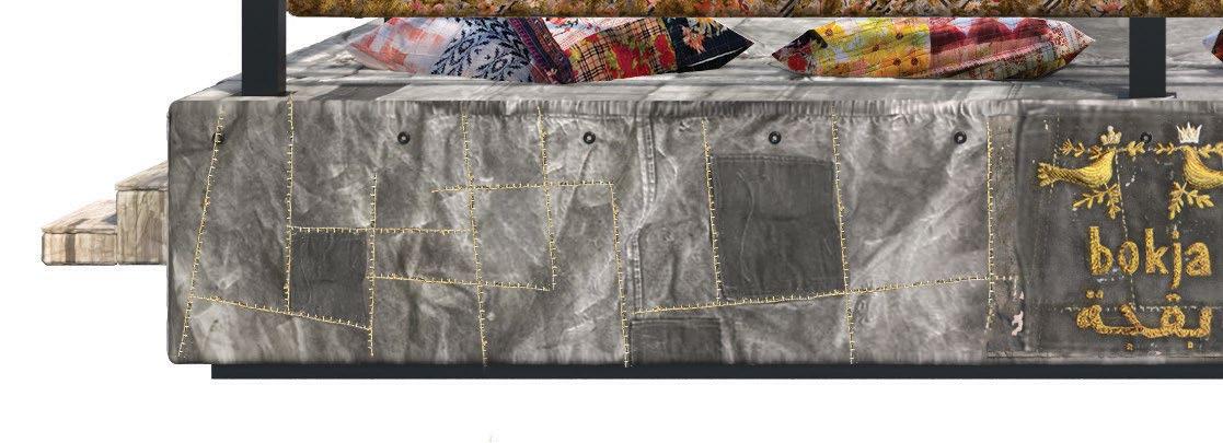
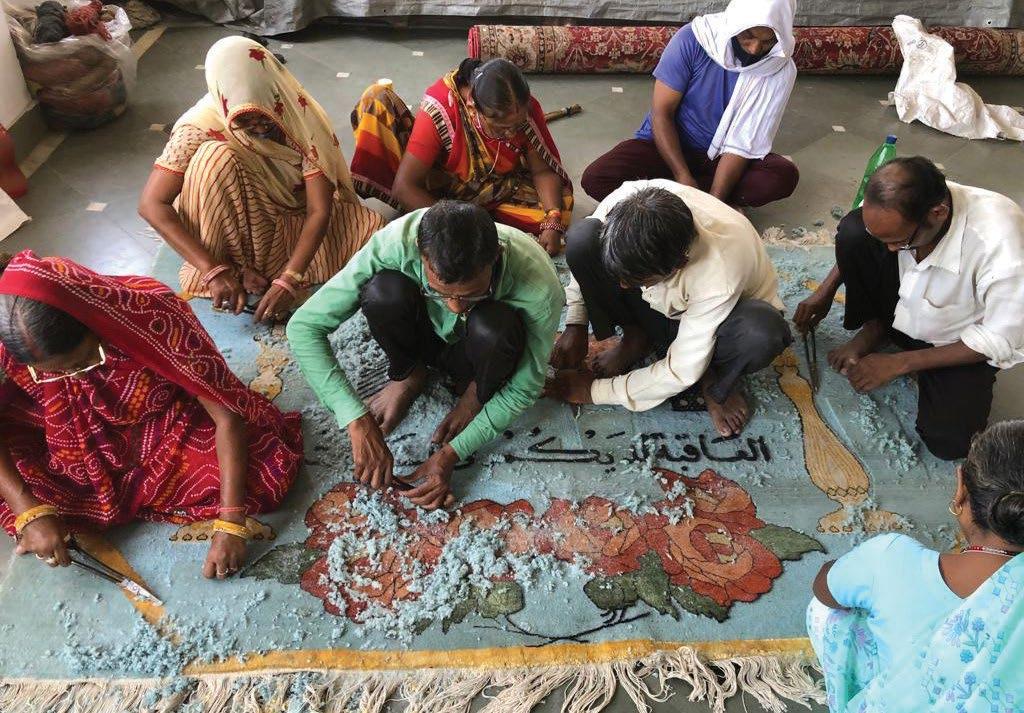
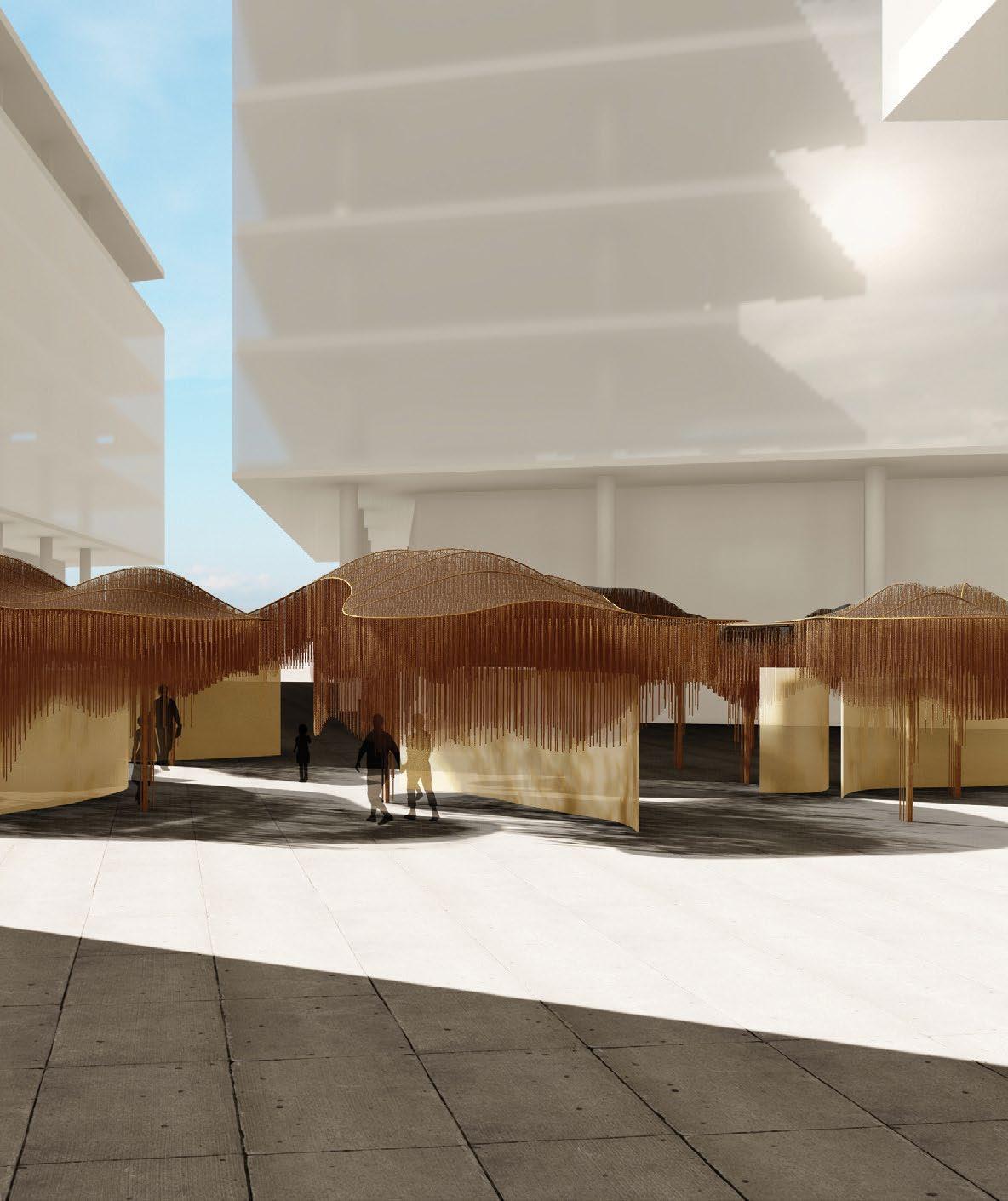
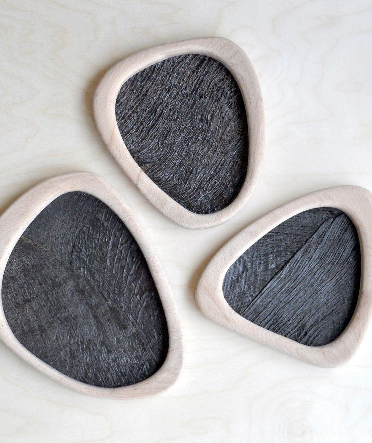

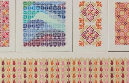
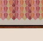
 Nour Hage’s ‘Talismanic Series’ is inspired by amulets that were historically created by women in the Levant
WORDS BY AIDAN IMANOVA
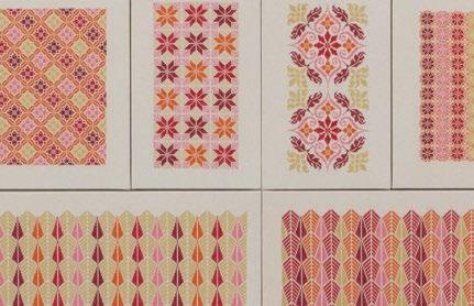
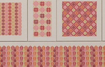
During her research fellowship at the Victoria & Albert Museum in London, where she explored textile and jewellery collections from the Middle East, Nour Hage stumbled upon a book on amulets. “Most of them were necklaces and bracelets from the Levant, specifically from Palestine. I had never seen anything like that before,” the British-Lebanese design er and artist recalls. They were a patchwork of different beads and coins, she describes, together with seashells and little bones. These could be pieces women had found in fields or archaeological sites, or things they bought or were given, but to Hage they were also remnants and symbols of centuries of empires, cultures and eth nicities that have passed through the Levant. You could make out Ottoman and Austrian coins, as well as Venetian beads. “All these different objects were believed to have talismanic powers to protect people, but were also a piece of history,” says Hage. “They were objects created by women and inherited from mother to daughter or grandmother to granddaughter. I also found this fascinating.” Out of this fascination, Hage created three textile art pieces that became talis manic objects in their own right.
Hage studied fashion design at the Parsons School of Design in Paris and, following stints at Elie Saab and Oscar de la Renta, she went on to work for Croatian-born, Paris-based fashion designer Damir Doma, where she predominantly designed menswear. However, due to issues with her paperwork, Hage was compelled to return to Beirut in 2012, where she found herself with limited options. The established fashion brands did not suit her style and the emerging brands were not in a position to hire. In 2013, Hage established her own epony mous fashion brand. A year later, she was awarded the coveted Boghossian Foundation Prize.
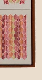
Previous page: ‘My Umuma’, 60.5x211 cm, cotton fabric and yarn, scrim, wood dowel. Right: Nour Hage

Upon moving to London, Hage decided to focus solely on menswear – which women con tinued to buy – that was inspired by traditional Middle Eastern clothing, featuring either soft or unstructured silhouettes, and a play on length. The brand’s success led to sales across North America, Japan and the Middle East – then the pandemic hit. “I paused my design practice a year and a half ago,” she recounts. A year before that, Hage got commissioned for her first textile art piece by the Arab British Centre in London, and on the back of that came the V&A Fellowship.
“All of this was happening at the same time and then the pandemic and the Beirut explosion happened, [and it] all kind of shifted the way I was looking at things and it made me realise that first, I have always designed my collections more like an artist than a designer. And I realised that I have been enjoying that process much more. And it also made me realise that I couldn’t relate to the fashion industry any more,” she says.
Hage’s ‘Talismanic Series’ – the beginning of an ongoing body of textile work – includes three pieces. ‘My heart is peaceful, my body is warm’ is made using natural indigo dyes, gold foil cotton yarn, metal bells, silver braided yarn and agate beads, while ‘My Umuma’ is a textile reconstruction that mimics the lines and effects of the different tones and shades of a white agate

stone – a stone that was believed to protect a young mother during her pregnancy. The last piece, ‘Running around mother, happy’ is created in shades of black, believed to deter the evil eye away from children. All the works have been cre ated by hand, by Hage herself. “[The pieces] took a lot of time and were very physically intense to create; and that is intentional because I wanted to reference the hard, man ual labour that women have put into creating textiles,” she says.
The ‘Talismanic Series’ pieces are themselves objects of protection, she says. They have been created to act in that way, with Hage using fabrics and materials from her studio as a way of carrying over her design practice into her art practice, as a metaphor of a past life. “If you believe that this object is going to protect you or is going keep away bad energy or help you through a tough time, then it’s that belief, that you put into the objects, that is talismanic,” she concludes. id

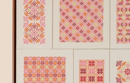
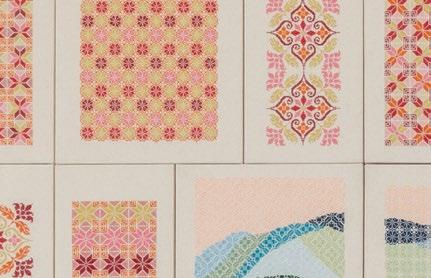
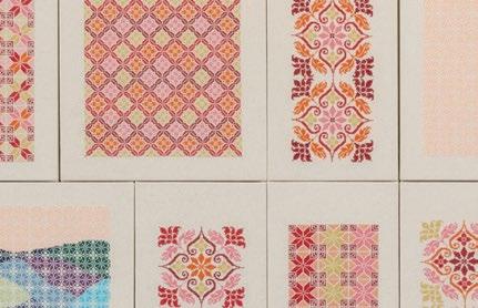
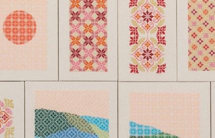
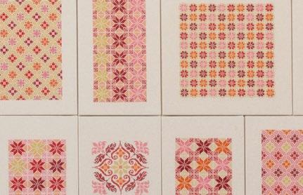
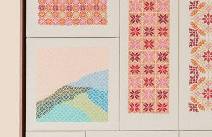
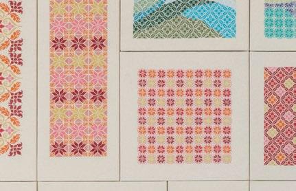
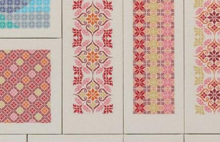
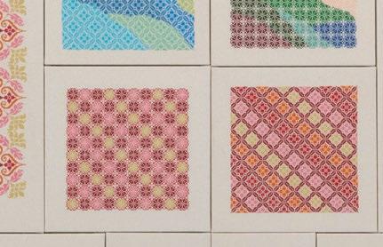
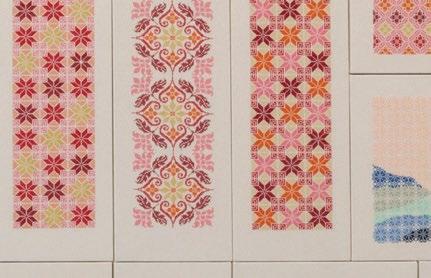
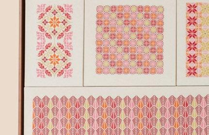
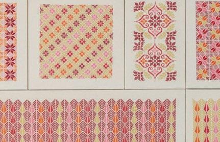
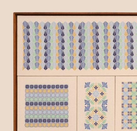
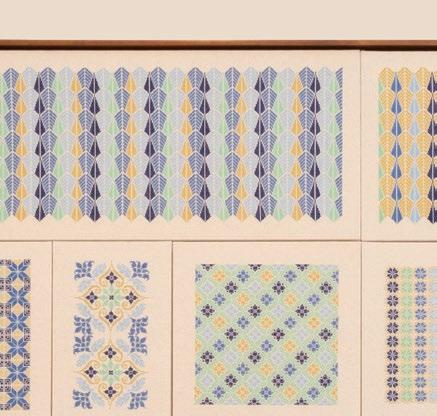
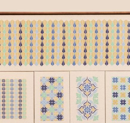
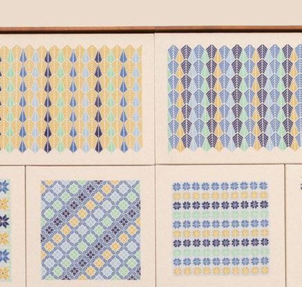
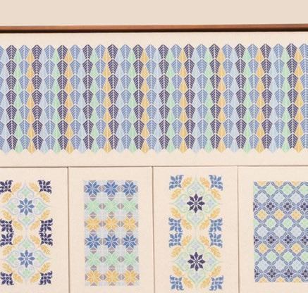
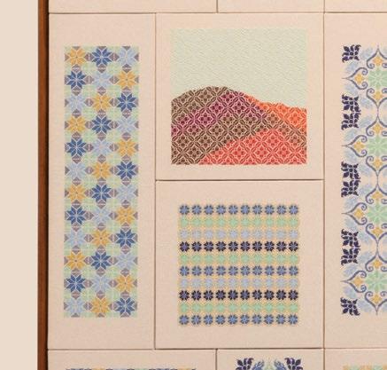
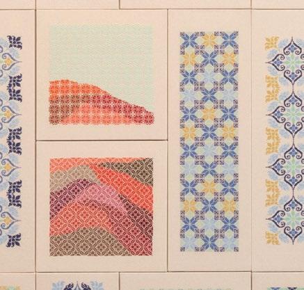
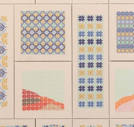
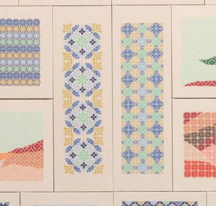
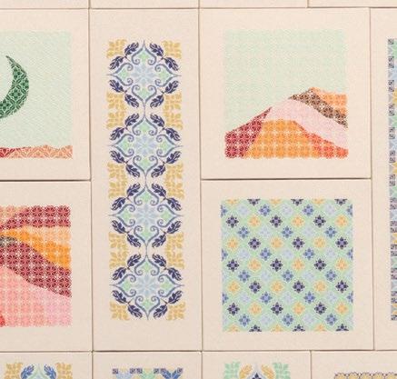
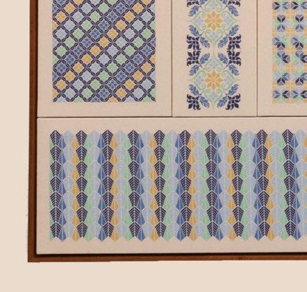
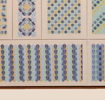
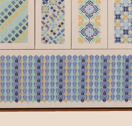
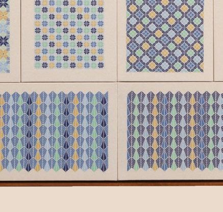
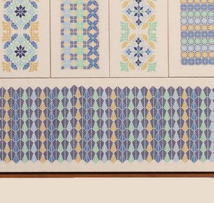
Some encounters have a long-lasting impact on a creative journey. This was the case for self-taught artist Jordan Nassar. Born in 1985 of Palestinian descent, Nassar grew up in New York City – where he is currently based – and was surrounded in his household by the motif of Tatreez, a matrilineal tradition of cross-stitching, which is deeply rooted in the history and culture of Palestine. Traditionally, the wearer’s social and familial status, as well as their different stages of life, could be identified through the colours, patterns and designs of the Tatreez.
Connected to the ideas of nostalgia, nationality and heritage since the end of the 1940s, these motifs have been part of Nassar’s work since his meeting with women-led embroidery collectives across Ramallah, Hebron and Bethlehem; collectives whom he now collaborates with.
The artist’s first solo show – on view at the Institute of








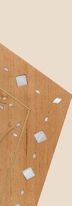
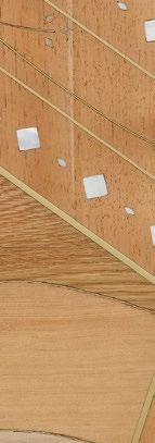



Contemporary Art, Boston until 29 January 2023 – features embroidered works on a monumental scale (as well as recent creations in wood and glass mixed media).
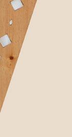


Represented by James Cohan Gallery in New York, Anat Ebgi Gallery in Los Angeles and The Third Line in Dubai, Nassar reinterprets a key aspect of his culture in his own way. The result is visually subtle yet powerful, captivating yet mysterious, rhythmic yet harmonious.
“Nassar’s work, with its complex patterning and painterly attention to form and colour, elevates our understanding of craft traditions as long-standing and deeply meaningful forms of art,” says curatorial assistant Anni Pullagura.
Titled ‘Fantasy and Truth’ in reference to the melancholic poetry collection A Tear and a Smile (1914) by Lebanese writer Gibran Khalil Gibran (1883-1931), the show comprises Nassar’s largest works to date. Each made of 57 individual panels in a variety of warm and cool colours, sizes and shapes, ‘Song of the Flowers’ and ‘Lament of the Field’ abstractly and geometrically evoke a sun rising over a blue mountain and a moon shining across a red valley.
Through his mesmerising artworks made in collaboration with a Palestinian embroidery collective based in the West Bank, Nassar explores what home, land and memory mean and represent – especially in one’s imagination.
“I like to discuss these landscapes as versions of Palestine as they exist in the minds of the diaspora who have never been there and can never go there,” says Nassar. “They are the Palestine I heard stories about growing up, halfmade of imagination. They are dreamlands and utopias that are colourful and fantastical – beautiful and romantic, but bittersweet.”
Interested in starting conversations through his art, Nassar has developed a rich visual language that goes beyond aesthetics to tackle the complexity of reality and identity.
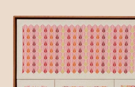



For Nader Gammas, designing with light is about perfor mance and narrative. “I’m looking at pure light performance and how the narrative morphs into something more sculp tural - so that, when the light is off, the piece stands alone and is beautiful,” he explains. The Syrian-American designer’s handmade lighting collections combine his training as an architect with his love of conceptual sculpture. “It’s not a light bulb for the sake of a light bulb,” he adds.
His latest floor lamp, Shard (2022), features a series of clear-cut, shard-like bulbs that appear to be dispersed at the tip of a stainless steel arc. The ensuing light and shade distribution recalls organic forms, like the entrance to a cave or the silhouette of a crystal. For this, Gammas explains that he was inspired by the sculptor Alexander Calder’s floor mobiles, and by mineralogy. “The bundle of light comes from a term known as prismatic crystalline growth, where light comes from a centre and looks like a quartz,” he describes.
Gammas began designing lighting objects in 2017 while work ing as an architectural consultant in Dubai. He was overseeing
the design for a private home and looking for ways to integrate a centrepiece chandelier within the dining room’s lighting design. His first piece, the Fin chandelier (2017), developed from this project. “I took the structure of a modern, mid-century chandelier [and] rede signed the shades to create a rhythmic and repetitive radial effect.”
Gammas was born in Illinois, which is home to one of his favour ite buildings: Frank Lloyd Wright’s ‘Falling Water’ house in Chicago. “It was such a departure from how homes in Chicago are [typically] situated. Usually, it’s on a plain or a development, but here it’s above a waterfall in nature,” he says. “I guess I like the horizontality that comes with Frank Lloyd Wright, and the flat plains of Illinois.”
His favourite artist, he adds, is sculptor Donald Judd, who was known for his minimalist, geometric approach. Such influences are present in Gammas’ series Wind (2018), which echoes the wind towers found in traditional Emirati architecture. Gammas re-ima gines these vernacular structures as vertical rectangles made of blackened brass, with small specks of light protruding from the top and bottom ends.
 Shard floor light showcased at AD Middle East’s ‘Art of Living’ with Adrian Pepe’s ‘Skycult’ textile art and MODU’s Ned seating
 Grand Shard chandelier with soft shades
Today, Gammas splits his time between the USA, where he lives, and the UAE, where he works and produces his collections. His work has now evolved with a focus on more organic inspirations. “I want to explore the symbiosis between geometric and organic forms,” he says. One of his most recent pieces, Wall of Light (2021), is a hand-shaped gypsum panel which echoes the surface of the moon or a crater. It is marked with a series of straight, jet-black brass light fittings. “The design doesn’t rely on noble materials – it’s pure gypsum,” he explains. For the initial iterations, Gammas worked with Boston-based sculptor Evan Morse. “He made the prototypes, looking at the topog raphy and types of gypsum, finishes and texture. Once we settled on
one, he made a larger panel,” Gammas says. However, the Shard floor lamp was made by the designer himself.

Since the pandemic, he has partnered with a team of Indian crafts men who run a metal workshop in Dubai. The setup, he explains, is unusual for the city. “Dubai is all large scale, it’s all big factories. Nobody is going there to open a clay studio as an artisan. It’s not like Barcelona, or Beirut, or Brooklyn,” he says.
He hopes this collaboration will give him more room to develop his ideas. “I was able to work closely with the makers, and I could get re-designs without any fuss. It allowed more freedom to put thoughts to paper and [move] from paper to prototyping.”
id

 WORDS BY AIDAN IMANOVA
Studio Yoon Seok-Hyeon creates objects that put the environment firstObject
“Materials are the core of my design objects,” begins Korean-born, Eindhoven-based designer Yoon Seok-Hyeon. He asserts that it is the material that informs the concept behind his objects: their textures, colours and shape. Sometimes, they even become the project itself. “The sustainability of the mate rial is also important to me because I have to be [held] responsible for the things I create,” he adds.
Seok-Hyeon was one of the seven recipients of the Rising Talent Awards at the September iteration of Maison & Object, which highlighted exceptional design from The Netherlands. Although not Dutch by birth, Seok-Hyeon is currently based between Eindhoven and Seoul, where he studied industrial design at Kookmin University before transfer ring to the Design Academy Eindhoven.
Throughout his work, one can observe a true fascination with materials and a quest to develop new processes for them. “Seok-Hyeon’s work fits in the Dutch design tradition as it is both conceptual and aesthetic: clear in form and function ality, surprising in finding new sustaina ble techniques and materials,” says Dutch designer Weiki Somers, who was on the judging panel for the award.

But while his projects may be remi niscent of the Dutch canon, many of his inspirations trace back to his own culture. “Sometimes having [a] different cultural background [creates] limitations in life and work, but it also can be our strength and [create a] strong identity,” says SeokHyeon. “I believe that each culture has a uniquenesses that can attract people from other cultures. So, as a Korean artist liv ing and working in Europe, I enjoy hav ing a different perspective and working with my Korean heritage.”
One of the projects that was highlight ed during Maison & Objet was ‘Object Ott / Another Paradigmatic Ceramic’, which Seok-Hyeon conceived in 2021, following his first collection that used the same technique two years prior. The col lection of vases is made using porcelain and ott – a natural resin that comes from
the Ott tree, which the designer uses as an alternative to typical glazing such as chamotte that is often used to create ceramics. Commonly used glazing materials are highly chemical and therefore result in difficult-to-recycle ceramics that end up in landfills, creating further pollu tion due to their chemical and toxic particles. “It’s a shame that clay, one of the most natural materials, is treated this way,” Seok-Hyeon says.
What stops ceramic objects from being recyclable is that the chemical component and the clay fuse in the glazing process, so Seok-Hyeon set himself a mission to find an alternative material that will allow ceramics to become more environmentally friendly.

Ott is a traditional Korean lacquering material and is a natural resin sourced from the Ott tree that has been widely used as glazing for woodenware in the past. Using Ott as ceramic glazing means that it does not need to be baked; it just dries out and evaporates when heated with the high temperature of the kilns, which means the clean earth from the clay can once again be utilised – complete ly changing the recyclability of ceramics and allowing for their reproduction. ‘Object Ott / Another Paradigmatic Ceramic’ now makes up part of the permanent collection of the Princessehof National Museum of Ceramics in Leeuwarden in the Netherlands as well as the Stedelijk Museum in Amsterdam.
The collection also expresses ott’s many essential and significant uses through its shape, silhouette and the Ottchilled/lacquered finish. Each vase is unique and dif ferent, reflecting the handcrafting process.


“I think about my design activities’ impact on our envi ronment. And then I think [about] if I can make any bet terments from there,” Seok-Hyeon explains. “I strongly believe that my projects can [spark] discourse on specific subjects around the environment or stimulate other solu tions by showing a starting point. I think this [approach] can create a virtuous circle for the design industry and give us, designers, the public and other related industries an opportunity to make our situation better.”

The renovation of the Niemeyer Guest House in Tripoli, Lebanon sees the building take on a reversible design
WORDS BY AIDAN IMANOVAOne of the recipients of this year’s Aga Khan Award for Architecture is Beirut-based collective practice East Architecture Studio’s reversible renovation of the Niemeyer Guest House – designed by the late Brazilian modernist architect Oscar Niemeyer. The building stands at the entrance of his Rachid Karami International Fair, which he designed between 1964 and 1975 in Tripoli – and which has remained incomplete and derelict since its construction was halted due to the Lebanese Civil War. Considered to be one of the finest examples of modernist architecture in the Middle East, the 10-hectare masterplan had been the

subject of grandiose schemes and unimagined competitions, while this current renovation of one of its structures is being praised by the jury as “an inspiring tale of architec ture’s capacity for repair, at a time of dizzying, entangled crisis around the world, and in Lebanon in particular, as the country faces unprecedented political, socio-economic and environmental collapse.”
Tripoli is one of the oldest port-cities of the Mediterranean and was once renowned for its craft indus try – particularly wood; however, its present state shows growing poverty, migration and lack of public space.
 © Aga Khan Trust for Culture Photography by Cemal Emden
Led by architects Nicolas Fayad and Charles Kettaneh, the project was commissioned for Mijara – an initiative that is working to reinvigorate Tripoli’s declining wood industry by providing a platform for carpenters to meet, share, learn skills and access tools and materials, and to meet designers.
Drawing inspiration from the existing typology, the building is a sin gle-storey introverted, windowless structure from the outside, yet flooded with light within through a central atrium and two courtyards.
“Our intervention’s main principle stays true to the building’s integral architectural qualities, materiality and imagined past,” the architects explain. “We’ve asked ourselves how Oscar Niemeyer would have completed the structure, by researching similar projects and architectural conditions with in his body of work that might recall the Guest House’s initial design intent. The result is our own interpretation of the Guest House’s ‘DNA’, that we brought to life by proposing three intervention typologies.”
These include inserting flexible partitioning using lightweight steel and glass panels, creating a transparency between the internal and external spac es, and introducing ample, playful light and shadow. “With the help of local craftsman, we were able to translate the ceiling’s structural grid into a series of slender, full-height operable panels in a cost-efficient way,” they say.
As a reference to the Itamaraty Palace in Brasilia, designed by Niemeyer in the ‘60s, the architects chose to conceal the main structural elements of the building using wooden panelling, creating columns and drop beams in linear shapes that became almost ornamental. Additionally, a custom-made lighting solution was created, made of bent recycled metal sheets, referenc ing the patterned ceiling and proportions.
“The proposed material palette and colour tones reference the state in which we first encountered the building – in its unfinished concrete grey colour – which is reminiscent of the Fair grounds. The resilience of con crete as a material, but also as a colour, gives a sense of timelessness and austerity to the incomplete city in which the building resides. We’ve inten tionally embraced this timelessness and introduced ‘monochromatism’ as an integral part of the design intervention: ceilings, walls, floors, millwork and metal frames, all predominantly grey, help reveal the building’s orig inal weightless interiors, blurring thresholds between inside and outside,” the architects describe.
The main ground floor of the building hosts a reception, materials library, and exhibition and meeting spaces, as well as an administrative zone, toilets, a carpentry workshop, an assembly/think-tank space, a machinery storage area and a service room for dust-extracting machinery. No new walls were added aside from the glass partitions, and all furniture is free-standing.

The architects describe the current function of the building as ‘ephemeral’, meaning that the building has been designed to be able to take on other functions, or perhaps even reclaim its original use. The lightweight parti tions, lighting fixtures and machinery could be removed, leaving place for another programme to take over; “However, the integrity of the original design intent would stay untouched,” they state.
“We hope that the renovation of the Guest House is the starting point towards a transitional urban renewal strategy that will gradually reclaim the smaller pavilions of the Fair through inspiring, reversible and tangible experiments,” they conclude.
 © Aga Khan Trust for Culture Photography by Cemal Emden
The bathroom space has undergone many an evolution, transforming from a highly utilitarian room to one that is not unlike a living space that promotes relaxation and respite. Here, we share six new designs for the bathroom space that are on our radar

Nendo’s founder Oki Sato has designed everything from armchairs to immersive installations, and his latest collections with Stellar Works highlight the scope of his oeuvre, and the brand’s multifunctional design pieces. Frame is one of his latest designs: a simple L-shaped steel frame system that can be used for a multitude of purposes. This includes being hung on the wall as a towel rail or holding a mirror at two points, and even being transformed into a shelf – or a combination of all three.
Inspired by traditional Japanese rituals and craftsmanship, the Zencha collection by Sebastian Herkner combines surprising above-counter basins with minimalistic furniture. The designer took cues from hand-made ceramic teacups he had discovered in Japan, which inform the gentle, organic shapes of the collection. Designed as cambered rectangles, the bathtubs are bulbous at the bottom and taper upwards with an elegant curve. The rounded shapes of the basins and bathtubs create a graceful elegance – and are paired with modular, geometric bathroom furniture using wood and textured glass, creating an intriguing contrast to the organically-shaped sanitary objects. Modularity is at the heart of the collection – one can opt for open shelves or drawers with push-open and self-closing technology. Combined with the above-counter basin, they become a beautiful centrepiece in the bathroom.

Boffi’s R.I.G (Rudimentary Interior Geometry) bathroom ‘defines a universal modular system for shelving’ using a thin, linear structure made in solid stainless steel – either embossed in black or brass painted. Developed in several versions, the system was designed by Dutch industrial designer Mikal Harrsen. In the version designed for use in bathrooms, the solid frame is built to support shelves, panels and topmounted washbasins, with metal elements also doubling as mirror frames. R.I.G creates customisable wall or island compositions, with washbasins designed specifically to fit the system, including the RD1 and R.I.G models – also designed by Harrsen – available in materials such as Corian, stone or marble. The new RD2 Stone washbasin can also be carved out of white Carrara, lava stone or grey stone marble.

The Statement showering collection is the latest addition to Kohler’s smart home portfolio – complete with a voice-enabling system that allows one to set presets for sound, water, steam and lighting to create a fully customised spalike showering experience. “Showering is so much more than just getting clean. It is a chance to feel rejuvenated; a moment to focus on self-care,” says Lun Cheak Tan, Kohler’s VP of Industrial Design. Homeowners can use voice commands or opt for the wall-mounted interface to access the presets for adjustments, in addition to using the system’s eco setting to control water usage. It includes seven immersive spray experiences, from Deep Massage to Cloud, that swathes the body in a warm mist.

In collaboration with British designers Edward Barber and Jay Osgerby, AXOR is extending last year’s One bathroom collection with a selected palette of coloured taps and fixtures inspired by a specific set of naturally occurring interactions between light, colour and water. “The palette draws on the designers’ observation that colour often increases in vibrancy and intensity when seen through water, and it reflects the design brand’s elemental connection to nature through water,” says Anke Sohn, head of Global Brand Marketing at AXOR. The colours include Aquamarine, Coral, Ice, Stone, Shell and Sand. “Each colour balances the ability to become part of a calm visual field with limitless scope for self-expression and individuality, reflecting the way in which bathrooms and small cloakrooms are increasingly becoming places that are less about neutral utility and more about original and impactful design,” Barber and Osgerby explain.

Functional beauty
Complementing the Anima Liquida collection of sinks and surfaces, designed by Giorgio Rava, antoniolupi’s Anima Liquida Living is a new line of cabinets/boiseries that are as elegant as they are functional. Suitable for use across both living and bathroom spaces, the collection has been designed as a series of scenic backdrops that sit close to the wall by superimposing surfaces in
different woods or lacquer, interrupted only by vertical cuts that mark their modularity. The cabinets have hidden shelves and come in both floor and suspended versions of varying widths and heights. Clever LED lighting has also been integrated into the cabinetry, allowing it harmonise with any type of space, remaining true to the brand’s design vision. id

For its installation dur ing Downtown Design, THG Paris is show casing an iconic collection that draws on a 20-year-long collaboration of two French houses and demonstrates a union of exceptional knowhow and creativity.
Swallows have been emblematic of the House of Lalique for dec ades. Known to explore wildlife and nature as sources of inspiration, founder René Lalique was particularly inspired by the swallow, which has made many a decorative appearance in the brand’s glass creations, from jewellery to decorative objects. Therefore, it is only fitting that its artful collaboration with THG Paris brings forth the creation of an iconic collection, Hirondelles, which depicts a flight of swallows. “The swallow is a very strong symbol. It
represents renewal and freedom,” says Marc Larminaux, design director of Lalique. “What is interesting about the swallow is the level of detail found on the plumage. The satin and repolish effects are unique to the House of Lalique [and] bring a lot of shine and light to the piece. It is not far from a jewel; [it is] is a form of jewellery.”
The swallow design features on the collec tion’s taps and accessories, marking a sensational moment of freedom and lightness, finely sculpt ed in crystal, with the swallow’s wings unfurling

in either gold, platinum or clear stamped crystal.
An aerial collection, Hirondelles required a high degree of precision. The swal low motifs are glued one by one, under heat on the body of the pieces, by Lalique’s master glassmakers. They are then hand-cut, carved, polished, sandblasted and decorated either in platinum or gold.
The dreamy, garden-style installation at Downtown Design is designed by Sari Cheaib from Dubai-based Olsen and Partners. The elegant flower arrangements paired with lush greenery complement the space’s interior, reflecting the sense of serenity, freedom and happiness that is synonymous with the spirit of the Hirondelles collection.
Downtown Design tent, booth number C09
THG Paris and Lalique have sealed their 20-year collaboration with a nature-inspired collection that represents the exceptional know-how of the two houses

While many associate the global furnishing brand IKEA with its easy-to-build furniture pieces for the home, the brand also offers services in the commercial sphere – no matter if it’s for a home, a commercial building or a hotel. IKEA for Business from Al-Futtaim IKEA is also working to reinvent all types of workspaces, offering ergonomic and sustainable furnishings to satisfy a range of needs in additional to design solutions; ideal for quick turnarounds or if you have a last-minute renovation or expansion plans.


Complete with its own team, IKEA for
Business works like any other design consultant: from tackling briefs to site visits and offering design proposals to suit one’s vision and style, or proposing a workspace concept that is rooted in the brand’s values of comfort, functionality and a love for design.


Its main mission is to meet the rising demand in the region for modern workplaces, with many people spending more time in an environment of ‘work’ than ever before. As a result of this, we are seeing a greater need for smarter workplaces that are ergonomic but also aesthetically pleasing, as the value for


good design becomes increasingly important. Al-Futtaim IKEA will also soon launch a new range of office furniture in the Middle East region, called MITZZEN FY24, which will offer exciting designs and solutions for today’s workplaces. Designed to be functional and lightweight, the new modern range will continue to carry the signature Scandinavian look of IKEA’s classic pieces.
A digital portal for business clients is also in the works, allowing for direct access to the brand’s product range and design team, for easier communication and smarter-designed spaces.

IKEA for Business offers custom ergonomic office furnishings to suit all types of workplaces
 In the main living room stands the Vitra dining table, a bespoke coffee table and a side table by OZA Furniture. The back wall light is by Holloways of Ludlow and the artwork above the sofa is by Alexandra Yan Wong
 Following a holistic approach, the two creative minds behind architecture and design studio OZA reintroduced harmony and balance into a Victorian house for a young French couple
WORDS BY KARINE MONIÉ PHOTOGRAPHY BY EDVINAS BRUZAS
 The bespoke coffee table is set against a Bo Concept sofa. The side table is by Christian Liaigre and the artwork is by Alexandra Yan Wong
For Ozge Ozturk and Alexandre Simeray, every detail matters when shaping an emotional journey through space. “Our passion, rooted in architecture and human expe riences, pushes our designs to create a sense of wonder and discovery,” the duo begins.
The co-founders of OZA (a London-based studio launched in 2011) have reflected this vision in the interiors of the typical Victorian style semi-detached house they reinvented for a French couple in the British capital. Built circa 1900, the home features coloured brick and wood, a pitched roof, bay windows and a fireplace in every room, making it instantly charming.
Its location in Battersea, in southwest London, was OZA’s main source of inspiration, reflected in the kind of living environment it had created for those living during the industrial revolution.
“This project has been thought [of] as a deliberate break away from the darkness of the past, to instil calm and lightness in a space that still references its historical origins,” says Ozturk.

The duo decided to open the wall that previ ously divided the kitchen and the living space, transforming the narrow rooms into an airy L-shaped volume – with whitewashed timber flooring throughout – for flawless circulation. To make a soft separation when needed and provide an adjustable level of privacy, curtains were installed.
“Glazed metal sections further help to define each area whilst maintaining uninterrupted visual connections, letting light deep inside and underlining the generous ceiling height,” says Simeray. “The equilibrium is found in the play between horizontal and vertical strokes,
balancing elongated shelves with tall pendant fixtures, among other elements.”
The existing architecture of the house served as a base palette for the OZA team, who opted for natural shades to capture the changing light while contrasting with furniture and accessories. The owners’ collection of art pieces, antiques and souvenirs from their regions of origin was included in the design to personalise every nook of the home.
“Blending the bright mineral existing chimney mantel with the thick oak shelves echoes the dry landscape of the Luberon in southern France, where the clients spend time in between the fam ily vines,” says Ozturk. “The timber flooring, the green-white of the walls and the sandy curtain fabric reference the coastal landscapes of the Ile d’Oleron, another place close to their hearts.”

Mixing antiques of British industrial heritage, con temporary design pieces and simplistic abstract art, OZA found the right balance between all the objects and materials that adorn this serene and timeless home. The atmosphere is minimal and warm at the same time, with inspirational detailing.

“Achieving this architectural vision was made possible through our close collaboration with craftsmen and artists who put their savoir-faire at the service of the realisation of this project,” the founders note.
For example, the deep earthy triptych on the living room wall is by Alexandra Yan Wong, and the set of four black wooden tones is by Dominic J McHenry. “Both [have been] chosen for their abstraction and their interaction with light. These pieces perfectly
reflect the subtle richness of this project,” says Ozturk.
Part of OZA’s new furniture collection, which will be launched in late 2022, the sculptural side table – made of a hammered black patinated bronze top and base – is another gem.
“We had a chance to reflect OZA’s character in a smaller capsule project,” explain Ozturk and Simeray, who – for the moment – have only completed the entrance hall, staircase, kitchen and living areas; the next phase will be dedicated to the bedrooms and bathrooms. “The client wanted to move into the property quickly, so we needed to think of the project in phases.”
Connected with the roots of the past and personal memories while embracing the contemporary, this home is breathing new life.
id

On Canada’s west coast, this home features interior spaces that celebrate both the sublime calming ocean views and the homeowners’ extensive art collection
 WORDS BY KARINE MONIÉ PHOTOGRAPHY BY EMA PETER
 The Gentry sectional sofa by Moroso and the Kangaroo chair by Cassina encircle the Darwinizm coffee table by IZM, taking in the view across the bay and the Allen Sapp painting above the Stûv fireplace
 Hemlock ceilings and oak millwork add warmth to robust and durable materials in the kitchen. The sandblasted stainless steel island counter sits above Corian solid surface millwork and polished concrete floors. Falken Reynolds designed the steel pendant hanging over the island, made by Broadwell Metal
Located at the southern tip of Vancouver Island in Victoria – the provincial capital of British Columbia, Canada – this two-level, 500-square metre house has been three years in the making (including its design and construction). BoForm Architecture, Demitasse Garden Design and Falken Reynolds Interiors all contrib uted to create a dream home for a very active family of five (a couple with three sons), who had recently moved from the city of Edmonton, Alberta. Having also grown up in this part of the country, lead designer and Falken Reynolds principal Chad Falkenberg immediately felt syn ergy with the homeowners.
One of the most crucial parts of the brief consisted of bringing as much of the ocean inside as possible by maximising sight lines. “The client had
a very clear vision for the house – a pared-back, durable and minimalist interior but with warmth and subtle sophistication,” Falkenberg recalls.

Upon approaching the residence, the waterfront home feels like a bungalow, with living areas, a primary suite, two bedrooms and a study set on the main level, while the pool floor comprises a gym, media room, two bedrooms and a recreation room.
“The modern architecture and minimal window frames really called for the ceiling in the centre of the house to be uninterrupted, so we held the top of the millwork and fireplace 0.6 metres below,” says Falkenberg. “The resulting expansive views of the ceiling pull the eye up and make the great room, with its windows at both ends, feel like it is suspended in the air.”


Influenced by its natural surroundings, the colour palette is an extension of the beach with its tones of grey, white and woody tones. The artworks add col ourful touches in the different rooms, as do a few other elements such as the Verde Alpi marble in the primary bathroom and the blue Bocci pendants in the dining area that echo the sky and the water. In the kitchen, the stainless steel counter on the island provides a robust surface that will patina over the years. In the powder room, the marble sink was quarried locally on Vancouver Island.
“A great deal of consideration was given to the selec tion of materials and products, with an emphasis on sourcing local. [This was done] both as a response to supporting the local community and also for sustaina bility [and] practically, reducing costs and energy for transporting goods to site,” Falkenberg explains.
Thanks to the polished concrete flooring, plaster walls, hemlock ceilings/soffits and low furniture, the inhabitants and their visitors are naturally yet inten tionally guided toward the panorama.
“The large open spaces and expansive views could easily have felt vacuous with the minimalist approach,” says Falkenberg. “The trick was to balance the clean lines with subtle details that add just the right layer of [cosiness] to the spaces.”
To do so, Falken Reynolds drew inspiration from modern Belgian architects, who are references when it comes to this type of aesthetic.
The serene atmosphere makes the home feel effort less and reflects a sense of quiet texture in every nook. According to Falkenberg, “The house is a peaceful beachside oasis that brings the calming effect of drift wood, sand and sea throughout.” id

 A window seat in the bedroom looks out across the bay in the primary bedroom. Obakki cushions sit on black oak millwork while a wool Timo rug by B&B Italia add warmth to the polished concrete floors
 This space features oak wall drawers by BassamFellows, vase by Olivia Cognet, Pietro Franceschini Bling Bling chair and Atlas pouf in eco-fur, Wave chairs by Rachel Donath and paints by Ressource Paints
On the East Coast of the United States, two ambitious women have joined forces to launch a hub dedicated to good design and innovative concepts
WORDS BY KARINE MONIÉ PHOTOGRAPHY BY NICOLE FRANZENThe ever-chic area of the Hamptons is now host to a new multifunctional creative space that is a feast for the eyes. Designed as an ever-evolving bou tique, a place to organise events and a hospitality concept, The 1818 Collective was born out of a successful collabora tion between Kristin Fine, who helms the interior design studio Fine Concepts, and Analisse Taft-Gersten, founder of textile, rug and handmade furnishing showroom ALT For Living. “Learning to work together – [particularly] as we were used to managing our own respective businesses separately – was[definitely] a challenge,” Fine and TaftGersten confess.
The duo fell in love with the Greek revival style property that dates to the 19th century and is locat ed in the charming town of Sag Harbor, on the East Coast of the United States, which has always been
home to a vibrant community of artists and writers. To renovate this circa 1800 merchant house and trans form it into a partially commercial and partially residential space, Fine and Taft-Gersten were inspired by the history of the building, the natural light of the region and its loca tion close to the sea. The original floors were preserved to give the feeling of going back in time, while several contem porary elements were introduced to create visual balance through the design.
The ground floor acts as a shop and an events space while the upper floor comprises two apartments. Vintage and contemporary furniture and lighting can be discovered in all the nooks, which are also adorned with artworks, dec orative accessories and textiles sourced by Fine and TaftGersten from around the world (including the United States, Australia, France and Italy, among other locations).


Even the name, The 1818 Collective, didn’t happen by accident. It corresponds to the founders’ connection to the number 18, which symbolises good luck and new beginnings. As a place to attend special gatherings, artisan workshops, meet-themaker events and book signings, as well as a showroom in and of itself, it is difficult to give the space any definitive description. “The idea is to reinterpret the space several times a year,” say Fine and Taft-Gersten. “We want to remain flexible and arouse our visitors’ curiosity.”
The common thread between all objects placed in this warm atmosphere that transforms the shopping experience is the hand of the maker, which is reflected through every detail.
“We want to present unique and custom pieces, which evoke the sense of hunt that guides us to put together this eclectic yet harmonious collection,” the duo says.
The two women love juxtaposition and creating tension to showcase an unusual balance. “It’s like [creating] a painting or putting together a meal,” they explain.
Through this surprise-filled project that is just beginning, the founders have already paid tribute to the heritage of the house while giving life to something new at the same time. The adventurous spirits of Fine and Taft-Gersten, who didn’t hesitate to step out of their comfort zone, is at the heart of this inspiring hub where designers, artists, artisans and anyone pas sionate about the world of interiors can find a limitless source of inspiration.
“We strove to create a place where you can always find something unique and leave room for ‘creative accidents’.” id

 The Khelone ottoman is by Pietro Franceschini, the oak and brass table as well as the dining chairs are by BassamFellows and the carpet is from ALT for Living

 Filmmaker sisters Amirah and Wafa Tajdin pay homage to their grandmother through the design of a new social space, Lulu & The Beanstalk
WORDS BY AIDAN IMANOVA PHOTOGRAPHY BY JALAL ABUTHINA
Amirah Tajdin describes Lulu & The Beanstalk – a new café, bar and bookstore located in Dubai’s ICD Brookfield Place – as a “celebra tion of colour”. She also uses the terms “spiritually wild” and “rooted in nature”. These words were the brief given to Swedish design practice Bofink Design Studio by Amirah and her sister Wafa, who are both film makers (Amirah is a director and Wafa, a producer). The sisters had worked together for over a decade when the pandemic’s effects on the film industry hit hard, allowing them to forge a new chapter in their career as storytellers.
Amirah and Wafa were born in Nairobi, Kenya from a Swahili-Omani background, where hosting has always been a sacred act of service – and it is something they have been known for among their social circle. So naturally, opening a restaurant had always been part of their ‘one day business’ dream.
“We felt that the city needed a space where you could have a great cup of coffee, some cosy food and a great cocktail in a relaxed yet chic atmosphere,” says Wafa. “A ‘come-as-you-are’ spot that didn’t have snobby hostesses or loud music. And so, in honour of our grandmother, Mama Lulu, and our nostalgia for how we felt when we used to hang out with her at her house, mixed in with a gap in the market for an elegant ‘dive bar’, we came up with Lulu & the Beanstalk.”
Yet it is Mama Lulu who is the main source of inspiration for the space: “She was a brilliant storyteller even though she couldn’t read or write, [and] a legendary cook in the community,” Wafa describes. “She was escapism per sonified in a person…[and] so we tried to package that sense of cosy escapism into the space. She wore a lot of colour as well, and that became a cornerstone of the design and what we wanted people to experience.”
Meeting Jenny Askenfors – the founder and lead designer of Bofink Design Studio – was “divine intervention from Granny”, the sisters say. They felt an immediate synergy between the Swedish studio’s work and their own
vision for the space. “The fact that it was a woman-owned [company] was also important to us, as we wanted to bring in a sense of feminine strength that Mama Lulu evoked – curves, colour, nature and a bold spirit. Jenny and myself immediately found a lovely sense of kinship in our aesthetic inspiration and imagination – it was a very natural flow between us, and she brilliantly took my moodboard and elevated [it] into something wild and incredible,” Amirah shares.
The open yet intimate space offers a dream-like atmosphere with its whimsical furniture pieces, floating library and rammed-earth detailing, all referencing the nature and colours of Lamu Island, where Mamu Lulu was from. “There’s a minimalism to our architecture that was a direct reference to the island’s signature style,” Amirah describes. “[Inspiration from] nature came next, as Mama Lulu was an avid gardener and had favourite papaya and avocado trees in her garden.”
The bold selection of furniture solidifies the space, while giving it a playful ambiance. At the centre of the room, adjacent to the bar, is a green Verner Panton Cloverleaf sofa, while at the back of the café – surrounded by a small library – is a mocha de Sede DS-600 sofa. A custom handcrafted chan delier by South African artist Adam Hoets anchors the space. Other notable pieces include a recycled Meltingpot table by Amsterdam studio Kooji, with Japanese artist Yuko Nishikawa’s lamp hanging above it.


While natural rammed-earth walls were structurally difficult to build in the space, the designers opted to recreate a rammed-earth wall, completed by a team of locally based artisans and Amirah herself. Finally, for the bath rooms, the brief was to fashion a “dreamy portal into another dimension”.
“Our ceiling took forever to get right due to the curves and playing with colour,” says Amirah. “[It] was a delicate process [but we wanted to] ensure that it always felt wild and magical.
id













Published by Rizzoli, this new book explores the works of UK product designer and brand Lee Broom, who has created over 100 furniture and lighting pieces since 2007
WORDS BY KARINE MONIÉ



consider myself a storyteller and have always designed emotionally since my time in fashion,” says designer Lee Broom. “It’s visceral, but balanced with a focus on materiality, form and function. It is also about the double meaning in my designs and the reinvention of what is familiar to create newness. The idea is of almost fashioning design and evolving what exists already into something new and unexpected.”
Written by Becky Sunshine with contributions from Vivienne Westwood, Kelly Wearstler and Christian Louboutin, Fashioning Design: Lee Broom explores the fascinating creative world of a designer whose background includes being a child actor and winning a fashion design competition at the age of 17. In 2007, Broom launched his eponymous studio and brand, and since then
he’s designed hundreds of pieces of lighting, furniture and accessories that are usually presented in immersive installations and exhibitions.
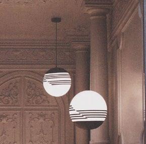
“Ultimately, what Lee designs is not just a lamp or just a chair, but an object created with a unique character of its own,” writes Stephen Jones in the book’s foreword. “Each of the pieces he designs are almost like his children, gently nurtured and formed, carefully considered and constructed with precision but then let go to do their own thing in the world.” Divided into four themes, the book delves into Broom’s influences and creative process.

Having grown up in England’s West Midlands,


where he was surrounded by “postmodern era buildings with pitched roofs, faux-Roman pediments [and] columns topped with spheres”, as he describes, Broom is particularly interested in architecture and draws inspiration from the Art Deco movement, Brutalism and 1970s Italian design.

The chapter ‘History Repeats Itself’ is dedicated to how old techniques can inform the future. “I’m interested in the emotion generated by design that places one foot in the past and one in the present,” he says. “That’s certainly something I picked up from my time with Vivienne [Westwood].”
Readers also learn about Broom’s making process and his collaboration with the people who transform his designs into reality, as well as his experience in theatre and fashion and their impact on his design approach today.
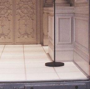
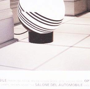
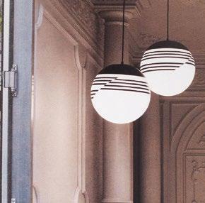
“I first noticed Lee’s work during Salone del Mobile, and I was struck by the experiential nature,” remembers Kelly Wearstler in the book. “I have Lee’s Split mirror in my home, which is a talking point due to the unusual ‘sliced’ nature of its design. It is a work of art, and I believe that any design that can create such a dynamic visual interest in a room while complementing it is a future classic and a testament to its designer.”
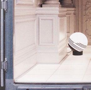



The To-Tie collection of table lamps reflects its name, which refers to tying or fastening something. In this spirit, the lamps are constructed using three simple elements – a cable, a bar and a cylinder - that together become a physical translation of designer Guglielmo Poletti’s research into structural tension. Poetic in its simplicity and rigour, the table lamp is reduced to its bare essentials in the spirit of the Castiglioni brothers and the Flos philosophy.

To-Tie by Guglielmo Poletti for Flos


