

We have finally arrived! Outside & In is officially available both instore and on the shelves at your local garden centres, and it truly is a pleasure! We’re now living our best lives, and you best believe we’re here to help homeowners and homies across the nation curate gardens and interiors with swag and sophistication.
If you judged a book by its cover and picked up this copy because of our groovy cover girl, we don’t blame you… You’re in the right place! And, so, winter is here… Nothing beats bobbing marshmallows in hot chocolate, the allure of a brisk walk on foggy mornings, or if you’re like me, a glass of snazzy shirazzy overlooking a crackling fireplace in your slippers and a game of trivial pursuit in full swing. Speaking of pursuits…
Outside & In has been on the lookout for anything and everything you might need to cocoon in style. And where to start? With the art – of course! We’re bringing the whimsy and wonder this issue with charming local artisans, enviable portfolios, and bold spaces oozing with personality and pizzazz.
To guide you through the midway point of the year, we bring you a world of adventures we can’t wait for you to explore: the art of creating your own teas with Wildly Sown, a whirl around some quirky Okra wax works, traversing the majesty of the BOSJES estate, and how to master the subtleties of effective ambience. With a trove of comfort and creativity awaiting you, all we have left to say is…
Welcome home!
 Managing Editor Liesl Lamprecht
Commissioning Editor Caitlin Hancocks
Content & Communications Manager Louise van den Bergh
Advertising
Key
Account Manager Justine ColemanDesign

@madevisual_design
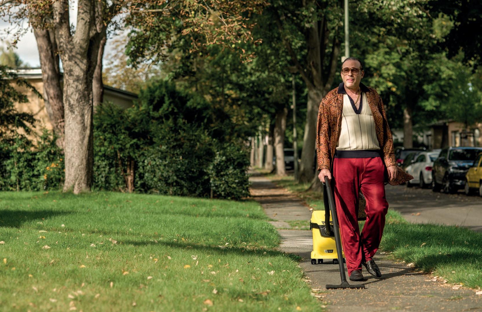
Sarah TernentAbsolutely no cables for absolute freedom. With no more cables holding it back, your WD 3-18 knows no limits. So why should you? Carry on to your heart’s desire, throughout your home and beyond, thanks to the real-time technology that always lets you know how much battery power and time you have left. See for yourself and scan the QR code below.




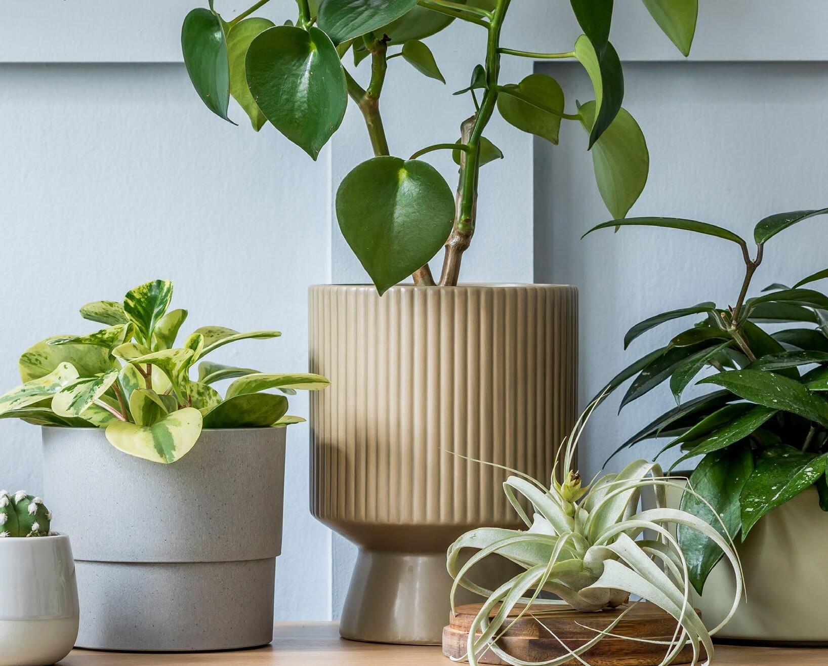
Make houseplants your new housemates! Indoor plants add to your household décor and inspire your creativity. They also promote stress relief, assist with healing, reduce depression and anxiety, improve well-being and connect one with nature.


Feed your plants with a selection of Starke Ayres Plant Foods like Nutrifeed, Nutristix, Growing Orchids, and Nutrisol every 2 weeks.



DISCOVER THE HIDDEN VALUE OF THE CHINESE MONEY PLANT
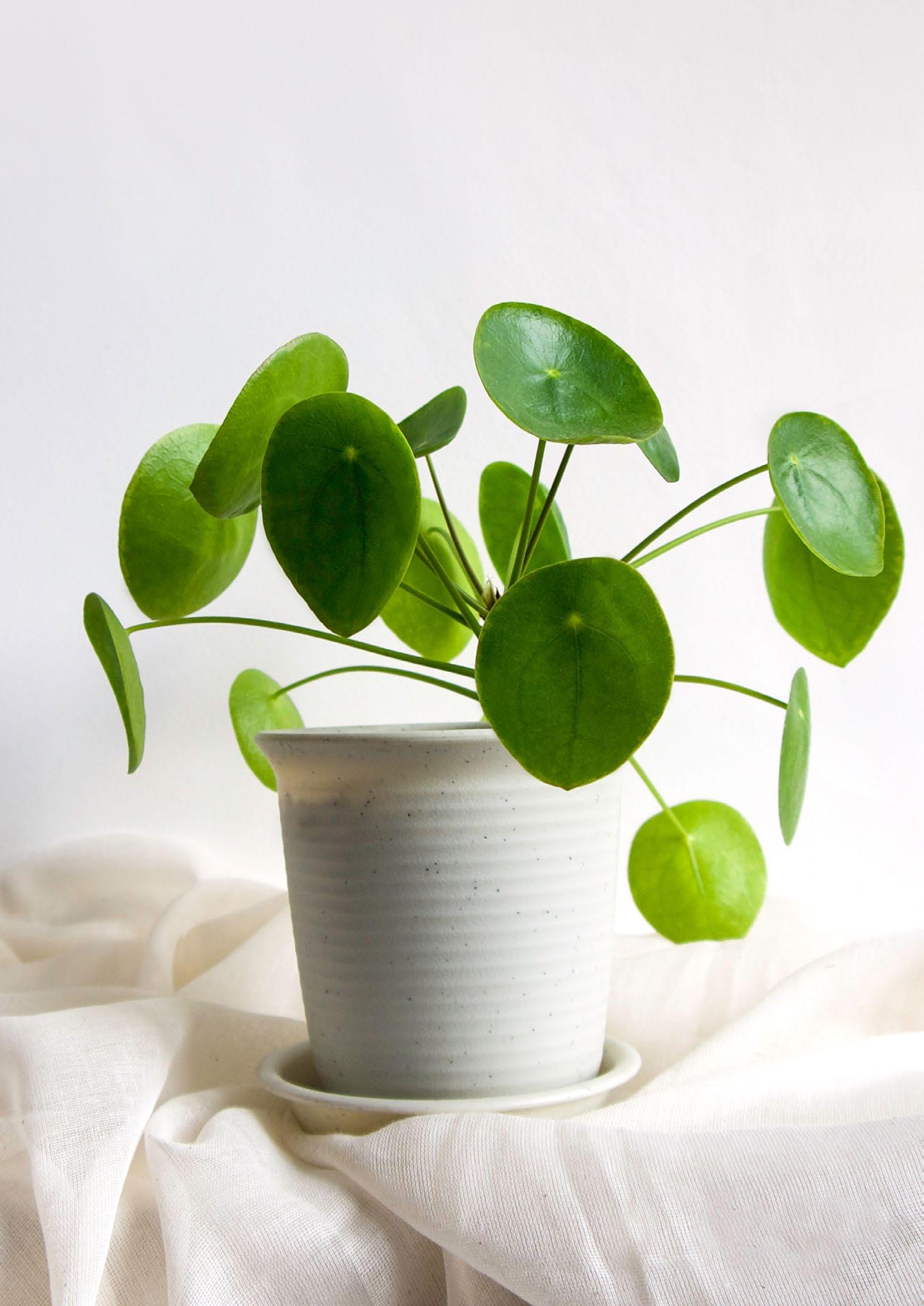

From the skilled hands that nurture over 800 plants both in and outdoors, the Chinese money plant comes highly recommended by a favourite in all things flora: local green queen, Saffron. If you’re wondering where the value lies in this botanical gem, you’ve come to the right place.
There are no two ways about it, indoor plants have taken the world by storm. So much so, there’s even a popular meme that repositions indoor plants as the new pets, pets as the new children, and children as exotic animals. The result of this ‘plant parenthood’ generation is an increased spending on plants, particularly on one fortuitously named variety: the Chinese money plant. A few years ago, the demand for this plant in America was at a fever pitch, and a single unrooted cutting could bag over R1000. But what makes this plant so special, and why were people ready to throw their money at it?
The history and origin of the money plant

Before it graced styled Instagram posts and had people foraging in nurseries globally, the Chinese money plant grew almost unknown to the world in the Yunnan and Sichuan provinces in China. In the 1900s, it started its world tour and rose to fame when Norwegian missionary Agnar Espegren took a cutting of it back to Scandinavia.
My favourite part of this story is that from there it spread like wildfire, due not only to its eye-catching foliage but also its ease of propagation. From person to person it went, gaining other names such as the ‘friendship plant’ or the ‘pass along plant’. It became a rare example of gardeners and hobbyists becoming more familiar with a plant before it was formally described by botanists. The first known image only appeared in Kew Magazine in the 1980s. With its shiny, dark green, circular leaves on long stalks, there was no doubt that this was a beautiful plant. It also became somewhat of a curiosity due to the fact that it was uncommon to see such round leaves in nature. In fact, the leaves were so round that they were described as ‘coin-like’, hence the name.
Over time, due to a growing demand for the plant, prices skyrocketed and it became a musthave for any plant collection. Adding to this pressure was the social media-driven influence: it was a design-must to have one of these plants perched on a side table next to a stack of magazines. Fortunately, these days, for those of us who have more green fingers than green bills, the growers have caught up to the demand, and the plants are now affordable and available at your average nursery.
The Chinese money plant (also known as the UFO plant, pancake plant, and missionary plant) loves its bright light; however, you should avoid direct sunlight as this will cause burn marks on the leaves. Try to place your plant close to a light source without sunlight hitting the leaves directly.
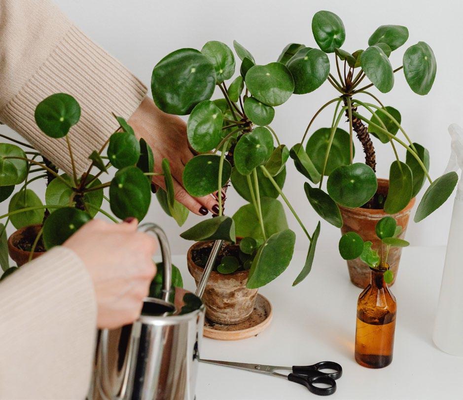
Your Chinese money plant has succulent-like qualities in that it can store water in its parts. You should rather err on the side of caution and water it less than more. Only water your plant when you see the top of the soil is dry.
To avoid soggy soil, try to keep this plant in a well-draining medium. Bark and other chunky pieces help the water to drain properly through the soil.
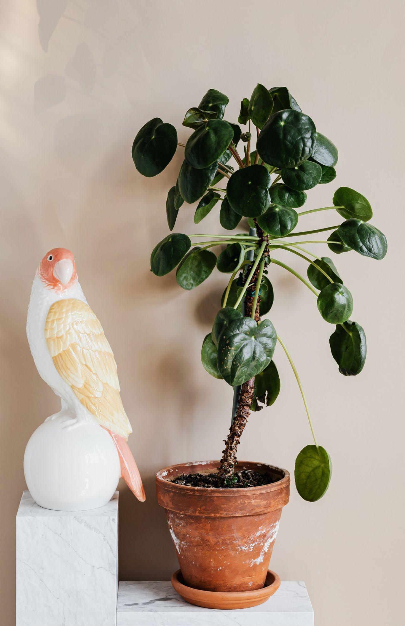
• Keep your plant’s leaves clean by wiping them down so as to maximise photosynthesis. This is particularly important during winter when there is less light around.
• The number one issue people find with their Chinese money plant is that their leaves drop. There are many reasons this could happen, but I’ve often found that the main reason is that the plant has been overwatered.
• Due to the fact that Chinese money plants produce many pups that seep nutrients from the mother plant and soil, you should consider fertilising your plant regularly.
• This round lady loves to lean towards the light, and if you’re not careful, you will end up with a sideways-leaning plant. Rotate your plant so that all sides have equal opportunity to grow towards the light.
Propagation station
Chinese money plants are excellent for propagating because they often have babies or ‘pups’ popping up around them. You can also propagate them from petiole cuttings.
Propagate by division
When you notice a plantlet coming up, let it grow to at least 10 centimetres before separating it from the mother plant. This will increase your success rate of transferring it. When you separate it, gently pull it away from the mother plant by loosening the soil with your fingertips. Once the plantlet is removed, plant it in a well-draining mix and water immediately.
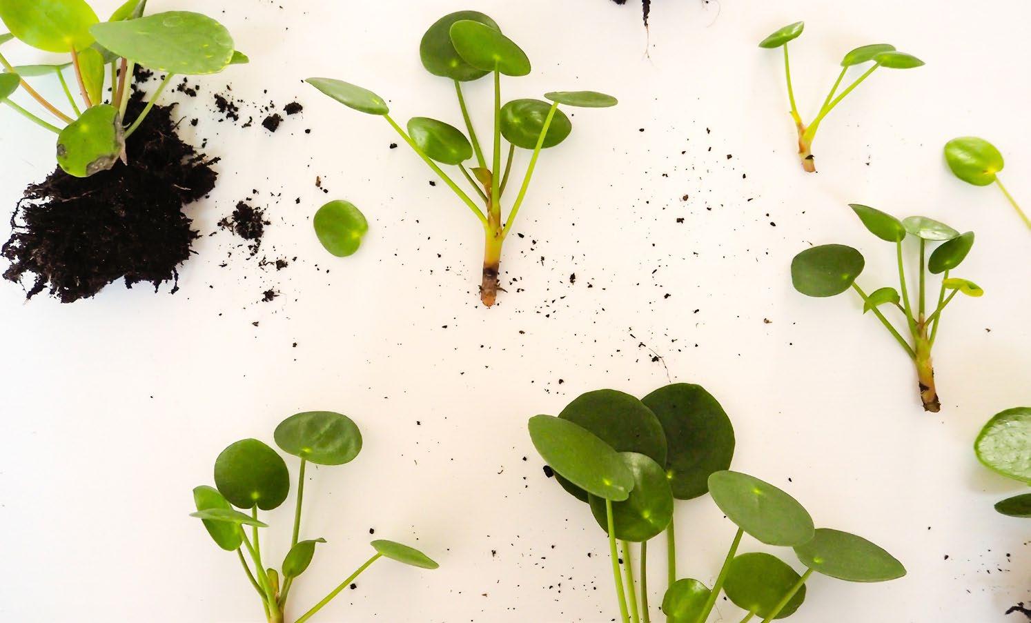
Propagate by cuttings
Use a sterile tool and cut off a petiole with its leaf from the stem. Let it sit out for an hour or two to let the cut dry. Then place the cutting in water. After a few weeks, your cutting will send out white water roots. When they are around five centimetres in length, you can transplant your cuttings in your well-draining mix and make sure to regularly water it so that the water roots don’t dry out but send out terrestrial roots instead.
All in all, it’s easy to see why the money plant is regarded as a token of good luck in China: prosperity, friendship, and beauty. If you haven’t got one in your collection, now may be the perfect time to invest.
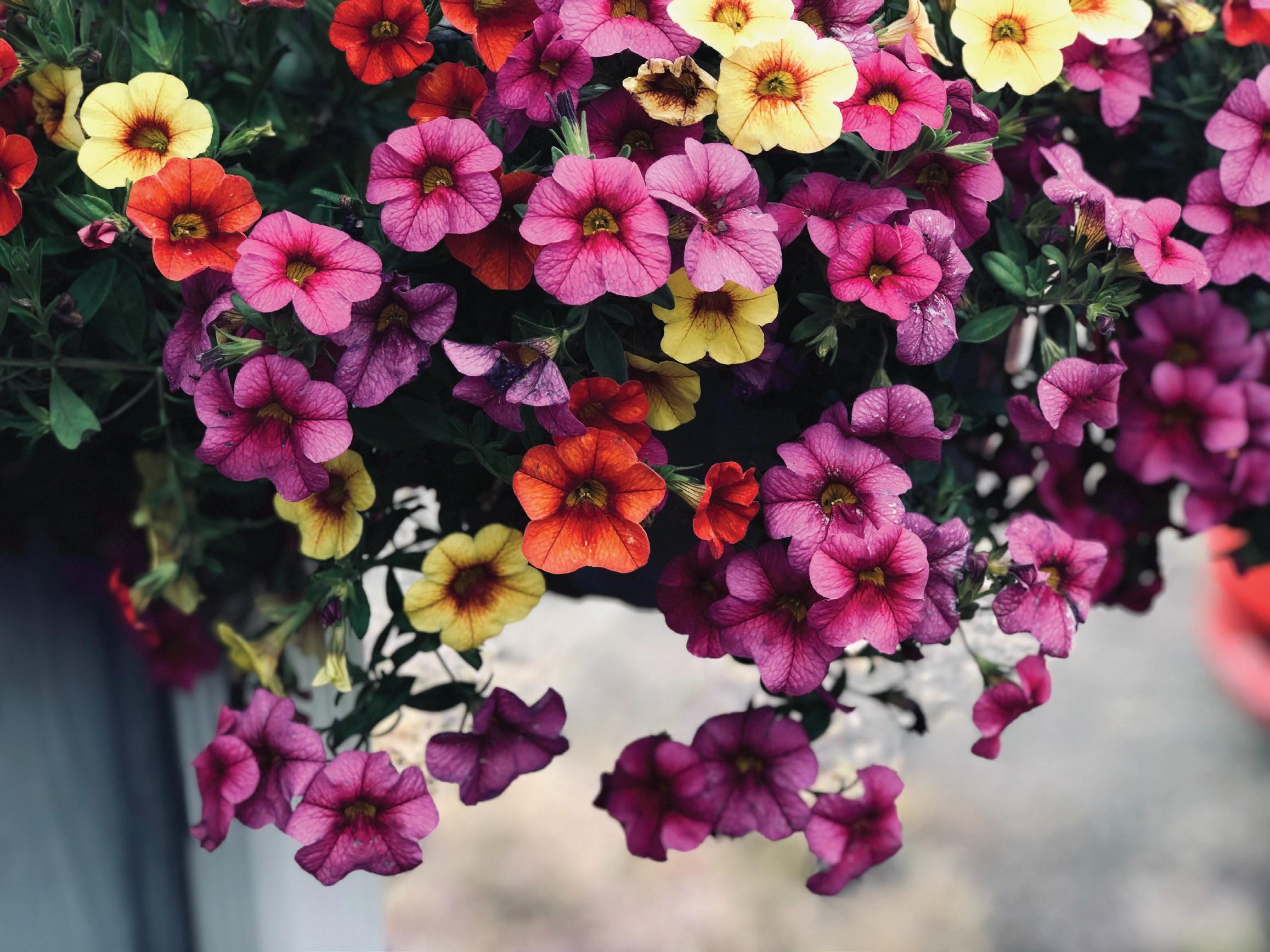




Winter in the garden calls for a targeted selection of practices and supplies, so we’ve gathered a few seasonal picks to keep your plants (and you) smiling until the sunshine returns.
01
Rose Protector
EcoBait Eco-friendly Snail and Slug Bait

Makhro Home & Garden R150 for 1 kg takealot.co.za
02 05
F.C.M. PheroLure
False Codling Moth Eco-friendly Pest Management Insect Science R80 insectscience.co.za

3-in-1 Rose Protection Makhro Home & Garden R136 for 100 ml takealot.com

ClickUp! Rain Gauge Gardena R317 plantland.co.za

03 06
Battery Blower VAC BLV 36-240 Battery Set Kärcher R5799 kaercher.com/za

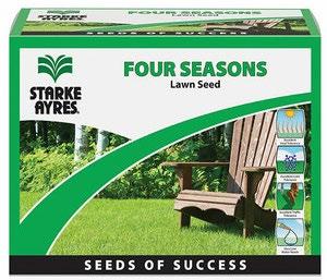
Four Seasons Lawn Seed
Seeds of Success Starke Ayres R249 builders.co.za
Bio Rock Root Builder

Atlantic Fertilisers
R95 for 2 kg agrimark.co.za
Original Chelsea Boots – Military Red Hunter R2699 trenton.co.za

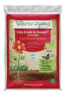
Vita Fruit & Flower
3:1:5 (18)
Fruit & Flower Fertiliser

04 07 09 08
Talborne Organics R149 for 2 kg builders.co.za
CURIOUS CROPS TO CULTIVATE IN YOUR GARDEN

Meet Sharon James, an avid gardener from the Cape Winelands, with a special interest in growing unusual edibles organically. Whether adjusting to seasonal changes, experimenting with companion planting and crop rotation, or creating a biodiverse environment that nurtures healthy soil and attracts beneficial insects, this garden guru isn’t afraid to dig her fingers into the soil. Here are her four favourite veg varieties to add to your yard this winter.
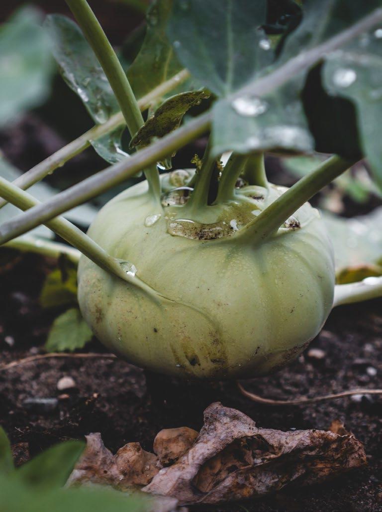
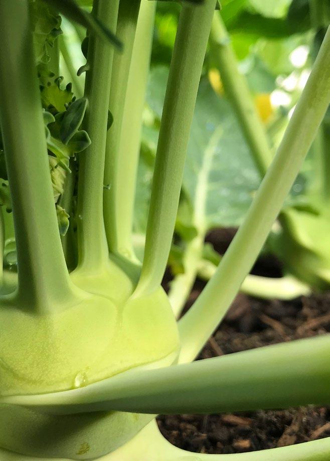
Cool season crops are here, and a firm favourite in my winter garden is kohlrabi — the sputnik of the veggie world! Grown for its funky looks, delicious, crunchy texture, and hint of peppery sweetness, kohlrabi is a bulbous Brassica that matures to the size of a tennis ball with leaves grown on long stems that emanate from the bulb in a sculptural manner. The flavour has been likened to that of a broccoli stem and its name (of German origin) translates to cabbage turnip.
It’s an easy-to-grow vegetable that comes with plenty reward. Prepare a richly composted, well-drained medium, and sow a couple of seeds at a time, 30-40 cm apart, directly into your growing area in early autumn or spring when soil temperatures are mild. Be sure to choose a sunny spot and to keep the soil moist so the seeds don’t dry out. Once established, water the seedlings regularly and harvest within 60 days (give or take a few) by cutting the stem at the base of the bulb.
Seeds for this exotic vegetable have become more readily available from local suppliers, and whether you’re growing the Purple Vienna or White Vienna variety, kohlrabi is best cultivated among veg that share similar growing needs, such as beetroot, dill, celery, and particularly nasturtiums, which shade the soil and keep it moist. Nasturtiums are also helpful for detracting cabbage aphids from Brassicas, but if your kohlrabi are affected, simply spray them with a mild soapand-water solution to deter further pests.
To prepare, simply peel the tough outer skin and enjoy them raw — either thinly sliced with a light sprinkling of salt or julienned in a salad or slaw combined with apple, dried cranberries, toasted flaked almonds, feta, and sesame seeds for a fresh and healthy, crunchy dish. Cooked variations include roasting, which brings out their nutty flavour, or making a mash with boiled potatoes and roasted garlic, topped with toasted hazelnuts and fresh parsley.

Growing the rainbow is a sure way to get the best array of nutrients and plenty of fun out of a single harvest. And nothing beats the flavour of a freshly pulled carrot!

While orange carrots provide us with all the important alpha- and beta-carotenes, and yellow carrots contain eye-protecting lutein, purple carrots are packed with powerful anthocyanins, and the reds supply us with valuable lycopene. All are rich in anti-oxidants and, surprisingly, have their own flavour profile. Your specially-prepared seed mix might often include heirloom varieties such as Cosmic Purple, Solar Yellow, Atomic Red, and Black Nebula. So, grab a pack of rainbow carrot seed and start sowing now!
Root veggie seeds are always best sown directly. When preparing your carrot seed, combine them with a handful of fine sand and sprinkle into loose soil enriched with earthworm castings to help retain moisture. Adding acid-neutralising wood ash will provide root veggies with necessary potassium and phosphorus. Keeping the soil moist throughout the germination process is crucial, and don’t lose hope if your seedlings are not up within a week, as carrot seeds do take some time to sprout.
After a few weeks and once they’re established, thin them out to allow each root enough space to develop, or simply leave them as is and harvest early as young carrots. The surprise of pulling up each root to see the colour revealed remains fun for all.
Harvest carrots anywhere between eight and 12 weeks from sowing. They like to have their roots kept shaded and develop their best flavour over the cooler seasons, but do well just about all year round in a temperate climate, except in the hottest midsummer months. Growing carrots with leeks, onions, and garlic protects them from aphids or carrot fly, while marigolds and sage are said to repel nematodes.
Their beautiful white flowers have an umbrella-like habit and are attractive to many beneficial insects. If left to go to seed one flower can provide you with enough to grow an entire bed of carrots next season.
"Adding acidneutralising wood ash will provide root veggies with necessary potassium and phosphorus."
Whether you’re growing the early-maturing and dependable classic Snowball, the easy-to-grow and vibrantly purple Sicilian Violet, or the prolific, brilliant-green Italian Macerata, these heirloom varieties are a must-have.
To cultivate cauliflower from seed, I succession sow them in modules from February to May. Plant them out over autumn and winter approximately 10 cm deep into soil that has been enriched with plenty of organic matter. Cauliflowers are heavy-feeders and benefit greatly from a good start and a drenching of seaweed tonic from time to time. Grow them in a sunny spot in the garden, keep them well-watered, and mulch with autumn leaves and clippings or grass cuttings to maintain soil moisture levels. Once the heads start to emerge, protect them from the sun by gathering some of their leaves up and tying them together. This will help to retain the vibrant colour of your cauliflower.
Cauliflower is a slow-growing crop that takes anything from three to five months to mature, depending on variety and climate. Harvesting is determined by the firmness of the head, and they should not be allowed to branch or develop into individual flowers.

Companion-wise, cauliflower grows well with celery and sage, which repel the white cabbage fly that many Brassicas are susceptible to.

Striking, delicious, and versatile, rainbow chard is a leafy green with colourful stems and leaf veins that brighten up any winter garden. The greens are lush and sweetest in the cooler months, but chard can be grown all year round provided it gets shade during the summer.

Seeds are best sown from August to May, and while transplanting seedlings is generally hassle-free you can also easily sow your seed directly where the plants are to mature. Note that each knobbly seed is actually a cluster of seeds, so be sure to sow sparingly to avoid needing to thin out the plants. The same goes for its cousin, beetroot. Consider spacing the seedlings 30 cm apart to keep them from growing too close together as this promotes fungal mildew infections.
Rainbow chard grows best in nitrogen-rich soil which encourages leafy growth. The leaves can be harvested by removing a few stems from the outer growing area of each plant as they mature. Pull them downwards and away from the plant in a twisting action. The whole plant is edible and delicious, and some of my favourite ways to enjoy this staple include preparing it in omelettes, in salads with avocado and a citrus dressing, Thai stir-fries, added to creamy garlic sauces, or in a feta and chard pie. The opportunities are endless!
Sharon James @goods_to_gather_in_the_garden
Lavender
Viola
Dianthus

Elevate any homemade cake by decorating it with vibrant Viola petals or dainty Dianthus flowers. They have a sweet, perfumed flavour and are great when crystallised.
Try Curry Risotto or Calendula Paella with Calendulas which have bright yellow anad orange petals. They not only add colour to dishes, but also have a delicious tangy, peppery taste.

Calendula
Make a Lavender Lamb roast dinner to remember by stuffing the meat with sprigs of fresh Lavender, or mixing Lavender flowers with honey and oil to form a glaze.

Vibrant, trumpet-shaped blooms in a variety of colours, with a distinctive spicy scent. Sun-loving Petunias can survive the cold.



Dazzling, daisy-like blooms with vibrant colours and contrasting patterns, Gazanias are perfect for sunny gardens and containers.

Delicate, papery flowers in pastel hues, Poppies grace sunny gardens with their elegant presence.


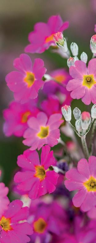
Charming, beautiful flowers in a spectrum of pastel colours, Primulas add a cheerful touch to gardens and any plate.
B e a u t i f u l b o t h d out!
Be inspired and get creative by using colourful flowers for outside in your garden, and inside your kitchen.
Makhro Compost Activator

No more battles with compost not breaking down if you use Makhro Compost Activator! This biodegradable product containing millions of bene cial microbes rejuvenates compost heaps by rapidly breaking down the material odour-free. Use Makhro Compost Activator in commercial composters and on a conventional compost heap. Once you have gathered enough composting material, mix 50 ml of Compost Activator with 5 litres of water, and wet the compost until the point of run-o . Cover the compost, if not, in a composter with plastic afterwards. Turn the compost and re-apply every two weeks until ready to use. In ideal conditions, it would take about six weeks. 500ml Compost Activator is enough for 2 tons of compost.
Grobest is a natural liquid sh fertilizer that will supply abundant minerals and vitamins to all plant types. Use Grobet as a soil drench or foliar spray.

Here is a handy tip to water and feed owering houseplants like orchids, cyclamens, or begonias without fuss:
• Fill a container with water.
• Add 2,5 ml Grobest per 3 litres of water, and mix.
• Place your houseplants from decorative cover pot covers in the container. Allow the plant to soak up the nutrient-rich liquid for about 20 minutes. Hydrating these plants from the bottom via capillary action is much better than dousing them from above.
Allow the plants to drain o and place them back in their pot covers.

Biosoil is a concentrated solution of humic and fulvic acids and an excellent carbon source. It is a natural supplement to feed the good the pathogens and microbes naturally present in the soil, encouraging vegetative matter to break down more e ciently. Biosoil improves the structure of clay soil by enhancing porosity and aeration and improves the water-holding capacity of sandy soil. The improved humic content Biosoil provides makes the nutrients already in the soil more readily available by transporting it directly to the root zones of plants, and using Biosoil as an adjuvant when fertilizing will allow plants to get the maximum use of the nutrients given. Use 50 ml of Biosoil per 10 litres of water as a soil drench or add it to foliar nutrient sprays.

Effortlessly improve soil structure, rapidly break down a compost heap, and increase yield and flower production tremendously by simplifying gardening tasks with these three natural products.
BREWING THE BEVERAGE OF BALANCE

Timeless, refreshing, and sublimely simple, tea is an age-old elixir that offers abundant bliss and health benefits. Drawing on the regenerative essence tea exudes in every situation, urban flower farmer Lisa Barrett, founder of Wildly Sown, imparts her insights on why and how we can incorporate tea into our daily routines. Boil the kettle, grab your shears, and settle in around Lisa’s kitchen table as she spills the tea on the advantages of each sip, the mindfulness of the production and preparation of the drink, as well as several recipes to create your own, home-grown brews.
As Lin Yutang discerned, ‘there is something in the nature of tea that leads us into a world of quiet contemplation of life’. Perhaps it is the memory of summer in now-dried herbs, or the time carved out to fill a strainer and wait for the water to colour, or the pause while observing the curling steam in weak winter light.
The flavonoids, the chemical compounds that give plants their flavour and aroma, are what make tea not only a cup of calm but one of restoration. These chemical compounds act as antioxidants, which help keep our DNA safe from free radicals produced by our cells during metabolism (and from simply living in this impactful time and space). If you can brew a mug from the plants in your organic garden, enjoy the hydration and aromatherapy with a friend, or take a pause to be mindful of a few lines by Mary Oliver while you sip — trust me, you’ll be all the better for it.
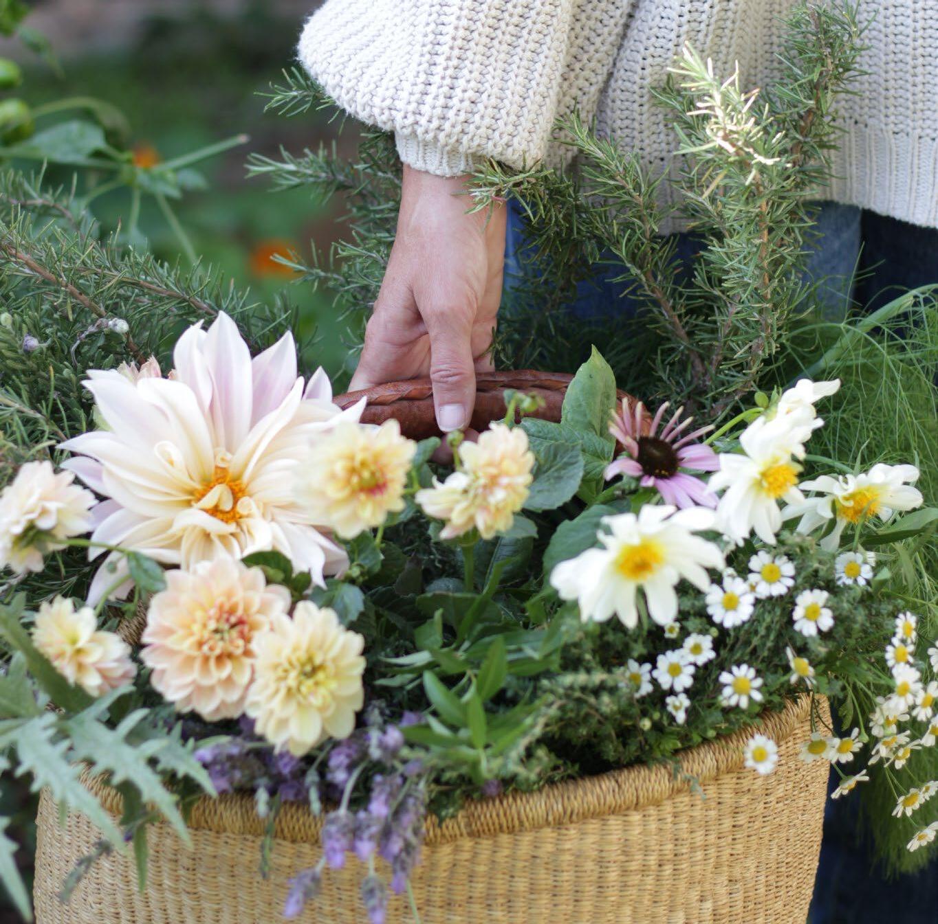
Brewing in my cup this morning are these tendrils of poetry:
‘It is a serious thing / just to be alive / on this fresh morning’

There is a delightfully long list of plants that can be tea’d, each with their own benefits:

Herbs
Use the leaves of thyme, rosemary, lemon verbena, lemon balm, feverfew, mint, sage, fennel, artichoke, and passion fruit.
Flowers
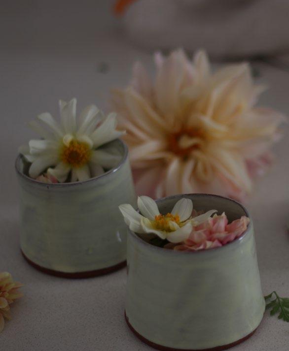
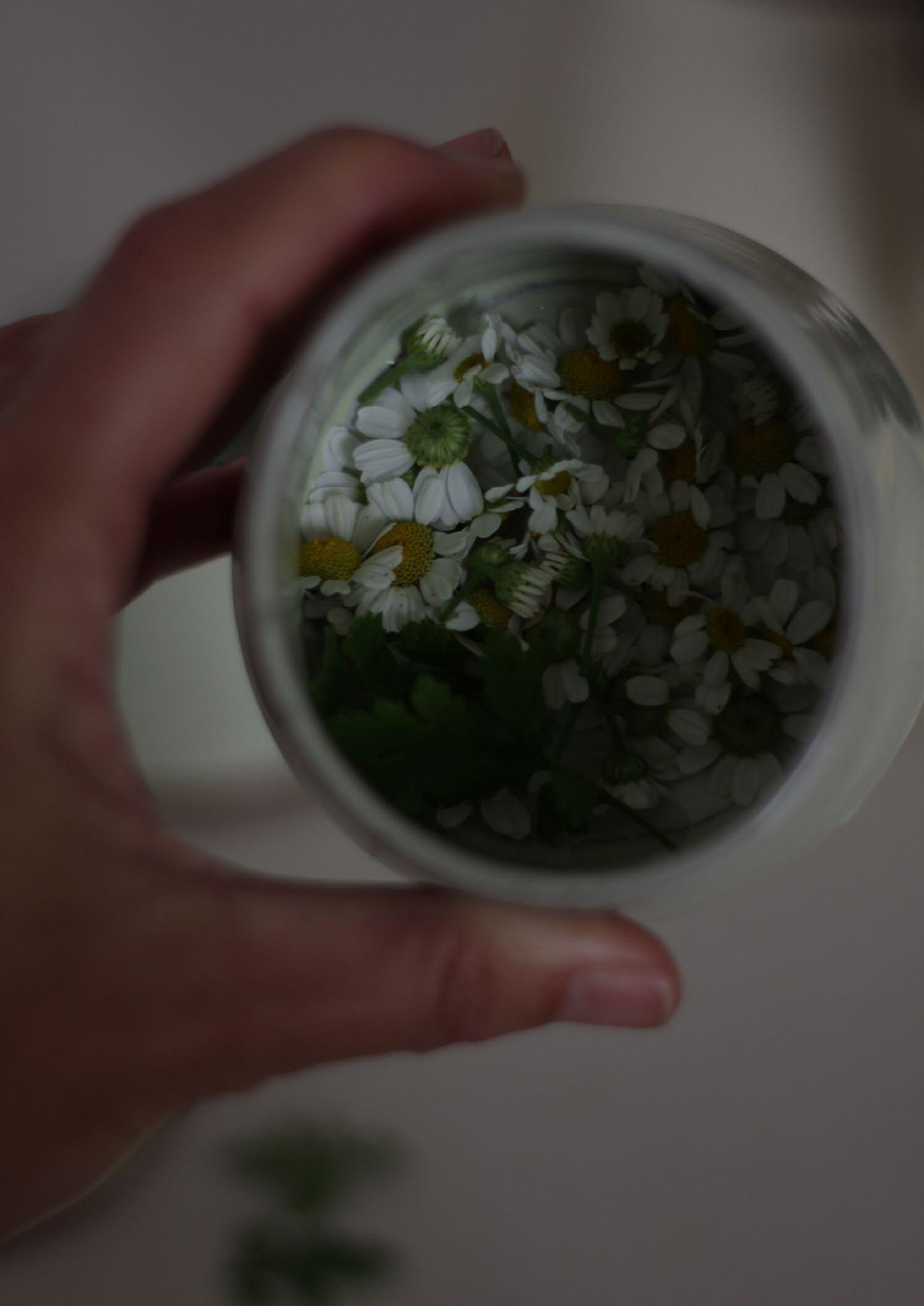
Viola, lavender, chamomile, calendula, and dahlia
Seeds
Fennel
You can use either fresh leaves and flowers, or dried. Fresh leaves harvested in the morning have a higher essential oil quantity, while drying leaves allows you to have them available all year round. To dry leaves and flowers, hang them up in a warm and dry spot, or spread them out in an oven (place on a baking tray at below 80 degrees Celsius for two to four hours with the door open). Use a tea strainer to make it easier to remove remaining sediment, and allow boiled water to cool slightly to 90 degrees Celsius before pouring it over the leaves. This ensures that maximum nutrients and less of the bitter flavour are retained. Leave it to strain for five to ten minutes, waiting less time for dried tea material and longer for fresh.
Steeped in Revitalisation
Lemon verbena, lavender, and lemon zest tea
This combination is anti-oxidant, anti-anxiety, anti-inflammatory, and helps with digestive upset, insomnia, and colds. For one cup, use two tablespoons dried or fresh lemon verbena leaves and lavender flowers, mixed, with half a teaspoon of lemon zest. Pour freshly cooled boiled water over, leave to steep for six minutes, and add a spoon of honey if required.
Flowers of Wellbeing

Feverfew and lavender tea
Feverfew helps relieve muscle spasms and can combat the widening of blood vessels that occurs during migraines. Add one tablespoon fresh lavender and one tablespoon feverfew flowers, or half a tablespoon of each if dried, to a cup of just-boiled water. Steep for five minutes, strain, and cool. Don’t let it steep for too long as it will become bitter. The lavender will add a little sweetness.
Simply Soothing Blooms
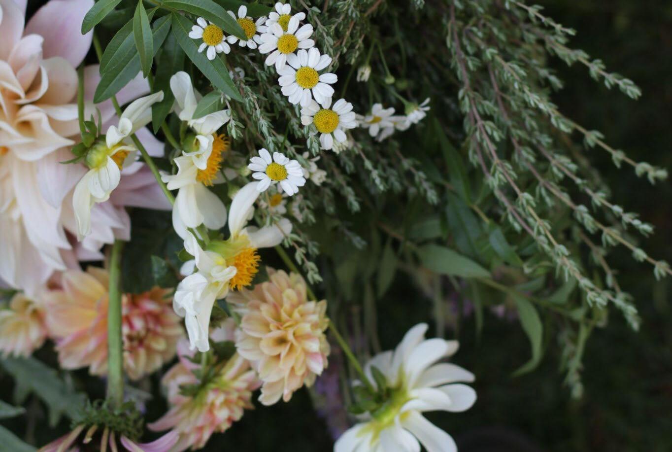
Chamomile or calendula tea
For calming the tummy, blend ten fresh chamomile flowers in a mug of boiled and slightly cooled water and strain after five to ten minutes for a delicious cup of gentle apple-flavoured tea. You can try this with calendula too (three to five fresh flowers are sufficient). Both these flowers grow well in the cooler months, so you can plant seedlings and enjoy them this season and into spring.
With the wealth of wellness that can await you in even the simplest of gardens, personally curated and produced teas are an achievable comfort and source of health for every home this winter.

Situated in the scenic Breedekloof Valley, an hour-and-a-half’s drive from Cape Town, BOSJES (meaning ‘small bushes’ in Dutch) is a garden paradise like no other. Brimming with Biblical imagery and an ethereal sense of beauty, the original Bosjesman’s Valley Farm dates back to 1790, and has been owned by the same family since 1831. And while the working farm has an undeniable Cape Dutch heritage, its strikingly modern Chapel does not feel out of place. In fact, known for its spectacular weddings and award-winning gardens, BOSJES has established a new take on winelands excursions. And it's a visit that will leave an indelible mark on your soul.
To call the entrance unassuming would be an understatement. As visitors make the trek to the 300-year-old farm, they are first met by the BOSJES Trust-funded Botha's Halte Primary School — a cleverly designed new community school on the outskirts of Worcester. The gravel road passes several rows of neatly planted protea bushes, their blooms still tightly closed and sure to be sublime in season, before coming to a modest security gate and being handed a pen and visitor’s book. Missing the winding road framed by towering oak trees reminiscent of the Cape Winelands’ typical grand entrances, there is little pomp and circumstance at BOSJES. But what might be perceived as cold hospitality, at least by aesthetic first impressions, has actually been orchestrated by intent.
As Tanya de Villiers, landscape architect at CNdV Landscape Architects, explains, ‘Entrances are not always about vehicles. In some developments, the vehicular entrance is deliberately downplayed in scale and importance, and the real sense of arrival only happens once you have disembarked and entered a space by foot.’ That is certainly true of BOSJES. The moment you step outside your car and onto the first path off of the parking area, the penny drops: ‘Aha! This is what it’s all about.’
Unfolding in sections, the gardens are designed to be a journey of discovery — a revelation. You can never quite see what’s next until you stumble upon it and are drawn in deeper.
DESIGN ARCHITECT
Steyn Studios
PROJECT ARCHITECT
Meyer & Associates Architects
LANDSCAPE ARCHITECTS
CNdV Landscape Architects Square One Landscape Architects
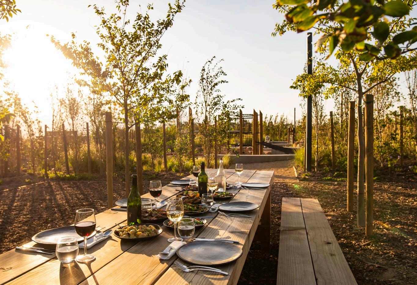
 Photograph by Byron Breytenbach
"BOSJES is one of those rare places that linger in your heart long after you depart."

"From the soft pastels of spring blossoms to the fiery reds and oranges of autumn foliage, the gardens' ever-changing palette ensures a captivating experience year-round.”

Starting at the foot of the mountain, where the Manor House is situated, and flowing back down to the entrance, where the architecturally-lauded Chapel is located, the landscape meanders in reverse chronological order of its completion. Unveiled in 2021, the second phase of the gardens reveals a forested canopy walk, with various play areas, and a pantry-style garden café and farm shop, Die Spens and Winkel.
Inspired by the ways of the San and the early Dutch settlers who first inhabited the valley, the two carefully-burrowed buildings are partially built into the hillside, the roofs overlaid with soil and planted with indigenous grasses and succulents to blend seamlessly into the landscape, leaving the panoramic mountain views untouched. The curvaceous structures were designed by architect Coetzee Steyn of Steyn Studio (who also masterminded the Chapel), and Square One Landscape Architects, with Meyer & Associates Architects appointed to assist as project architects and principal agent. Curved trellises of oak — a subtle reference to traditional cattle kraals — serve as a visual focus that twists and guides visitors inwards. Over time, these extensive trellises will be further integrated into the garden, with more than a dozen species of climbing plants — from bougainvillea and honeysuckle to star jasmine and wisteria — adding seasonal colour, texture, and aroma to these striking architectural creations.

A part of BOSJES’s ability to create staggered spatial experiences lies in the farm’s sloping topography, which was manipulated through extensive cutting and filling to create interest in the otherwise flat landscape. The gardens are spread across three terraces, connected by a curving pathway that provides universal access while creating a visual link between the wild woodland, forested play areas, spacious lawns, and conservation garden planted with endangered Renosterveld.
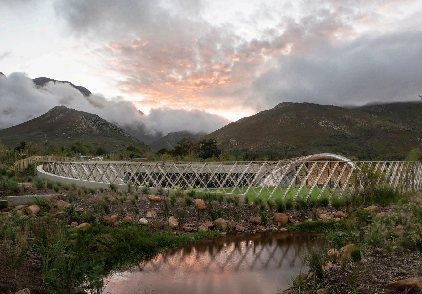
Awaking the inner child of toddlers and adults alike, the life-sized play areas are perfect for enjoying jovial respite. The Boombrug, a treetop canopy walkway that meanders amongst the hundreds of trees planted to create the indigenous woodland, offers panoramic views of the valley. Featuring a zip-line, a berm slide, and clamber-frames for kids (or adults — we shan’t judge), there is no shortage of fun for the adventurous at heart. Below the canopy walk, the underside subtly merges into beds planted with a wide array of indigenous grasses, succulents, and bulbs, each carefully chosen to ensure a planting palette of seasonal interest that celebrates the colourful diversity of Cape flora.
As you wander along the main processional route, you'll encounter ‘garden rooms’ that evoke a sense of intimacy and seclusion. Each room has its own distinct character, with carefully curated plantings, sculptural elements, and seating areas that invite contemplation and appreciation of nature's wonders. The gardens' unique sequence also protects the farm from severe seasonal winds. (The mountain immediately behind BOSJES is notoriously called Waaihoek Peak!)
An astounding 1600 trees, over 38 000 plants, climbers, and aquatics, and 1100 cubic metres of compost were used for the second phase of the gardens, with local boulders being craned into position to create the rockscapes, focal points, and natural river settings. Vula Environmental Services rescued over 3500 bulbs from the site during development stages, which were later relocated to the nature walk areas.
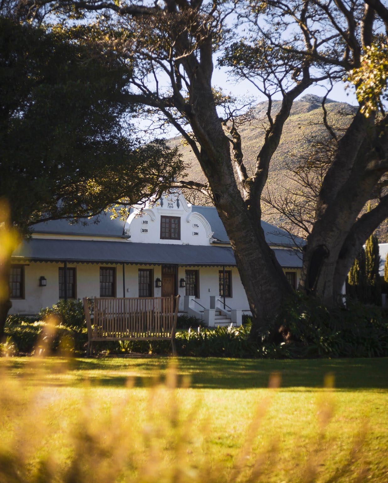
Mark Saint Põl, director of Square One Landscape Architects, shares that they set out to 'tell the tale of cultural heritage, and the tradition of living off the land, and turn that into something accessible and enjoyable.’ Their sister company, PARK, designed all the custom play equipment specifically for the BOSJES site, with the goal of merging ‘play’ with nature. Visual cues are scattered throughout, reminding visitors of the area’s rich history. A series of water furrows and channels speak to the ingenuity of farmers in taming this drought-prone wilderness, while fragrant citrus groves in front of Die Spens and Winkel are a nod to the region’s rich agricultural tradition. Circular sandpits reference traditional farm dams and reservoirs, while kidfriendly farming implements, sandpits, and splash-pads engage children with natural play systems using raw materials.
Strolling through the gardens, one cannot help but be drawn to the tranquil water features that dot the landscape. Ornamental ponds, gracefully adorned with water lilies and aquatic plants, reflect the surrounding greenery, the gentle sound of cascading water enhancing the overall ambience.
The symphony reaches a crescendo at the serene sculptural form of the Chapel. Designed by South African-born Coetzee Steyn of London-based Steyn Studio, the undulating white roof is inspired by Psalm 36:7, which reads: ‘How precious is your steadfast love, O God! The children of mankind take refuge in the shadow of your wings.’
Emulating the wings of a dove and the silhouette of the surrounding mountains, while paying tribute to traditional Cape Dutch gables, the weightless form appears to float on water. In each rising wave of the roof, the glazing of the peak adjoins at a cross. And unlike most chapels, the elegant structure lacks a spire, opting to draw from the simplicity of the Moravian Mission Stations of the 19th century vernacular instead. Looking at the breathtaking natural surroundings, one can understand why the architect chose to shift the Chapel’s sense of significance to the grandeur of God’s creation.

"The gardens are spread across three terraces, connected by a curving pathway that provides universal access while creating a visual link between the wild woodland, forested play areas, spacious lawns, and conservation garden planted with endangered Renosterveld."Photograph by Claire Gunn
 Photograph by Claire Gunn
BOSJES incorporates Biblical references in imaginative ways. There is the Lush Garden (Garden of Eden), where four streams link to a central apple tree. The Water Garden interprets the famous parting of the Red Sea, allowing visitors to walk through a giant elevated pond with water bubbling down wet vertical walls. A serene spiral walk up the Dry Mountain (Mount Sinai) leads to a majestic coral tree and 360-degree views of the farm. This ‘koppie’ ingeniously repurposed a portion of the material excavated to house the extensive pump and filtration services for all the water features. Finally, the sunken green Oasis, with its vegetated dripping stonework, gives a glimpse of the Hanging Gardens of Babylon.
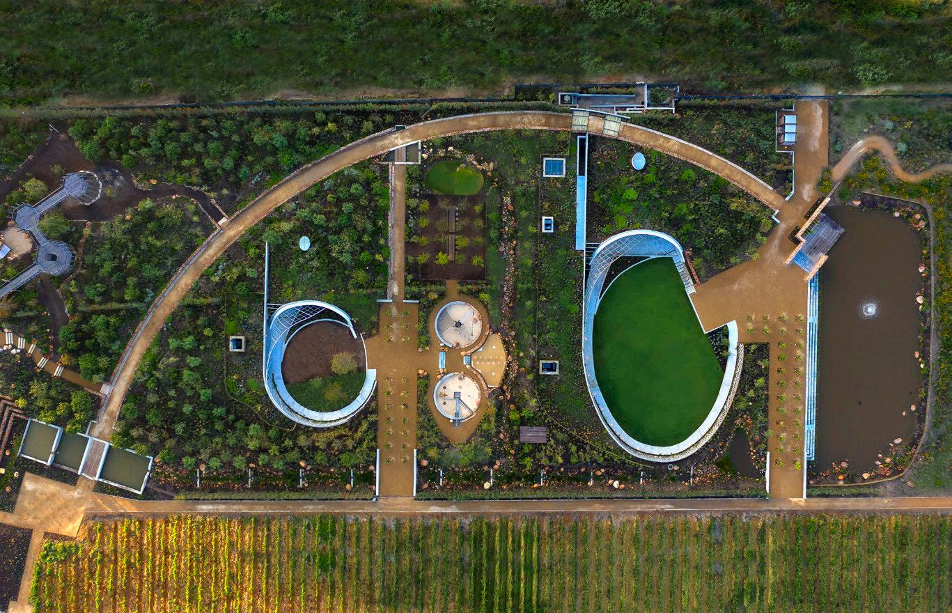
The landscape architects specially researched and propagated a variety of Biblical plants during this first phase of the project, completed in 2017. A total of 540 trees and 126 mature, fruit-bearing olive trees were planted, adding to the farm’s vibrant olive oil production. Descriptive plaques are dotted throughout the landscape, providing information about the various species, as well as relevant Scripture references to plants and trees specifically mentioned in the Bible. The gardens are bountiful with fig, almond, honey locust, lemon, pomegranate, willow, cypress, white mulberry, and thorn trees, as well as myrtle, African wormwood, and various endemic species.
BOSJES caters to all abilities — something the owner specifically requested — and uses a variety of design interventions to facilitate an encompassing garden tour. From wide, wheelchair-friendly pathways with easily trafficable surfaces to varying tactile experiences, scented planting, and braille on the plaques, the thoughtful design went a long way.
Interestingly, the Stofberg family, owners of BOSJES, share a longstanding friendship with Koos Bekker, the visionary behind Babylonstoren. While both hospitality establishments demonstrate a significant dedication to sustainability and the integration of architecture with the natural surroundings, BOSJES has carved out its own unique identity in the Winelands, embracing a distinct contemporary and modernist approach.
After savouring a scrumptious delight at Die Spens and snapping a selfie in front of the Chapel, it’s time to make the trek back to Cape Town. And if the heaviness of leaving doesn't make you spontaneously start singing ‘I hate to go and leave this pretty sight’ from The Sound of Music's ‘So Long, Farewell’ — then nothing will. BOSJES is one of those rare places that linger in your heart long after you depart.
The farm’s branding will give you an idea why. The presence of a small pineapple adorning the Manor House façade and gracing the BOSJES Instagram page is not without purpose. Throughout history, pineapples have stood as a symbol of hospitality, representing the host's extraordinary efforts to secure a ripe pineapple for guests despite the perils of sea trade routes. As BOSJES extends its warm embrace to visitors, it embodies the essence of a gracious host, creating an inviting haven on the farm. BOSJES is more than just a visit – it's a transformative experience that will replenish your inspiration, beckoning you to return whenever you need to recharge and reconnect with nature.
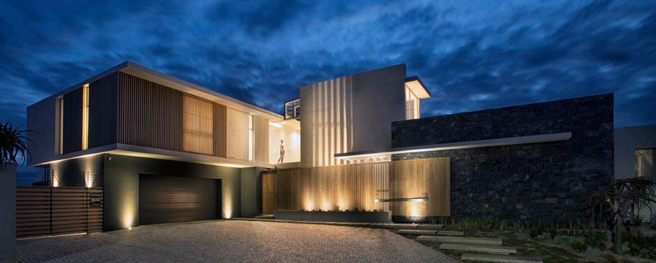
South Africa’s largest stockist of speciality timbers. We are proud suppliers to the finest residential, commercial and leisure projects across South Africa and neighbouring countries.

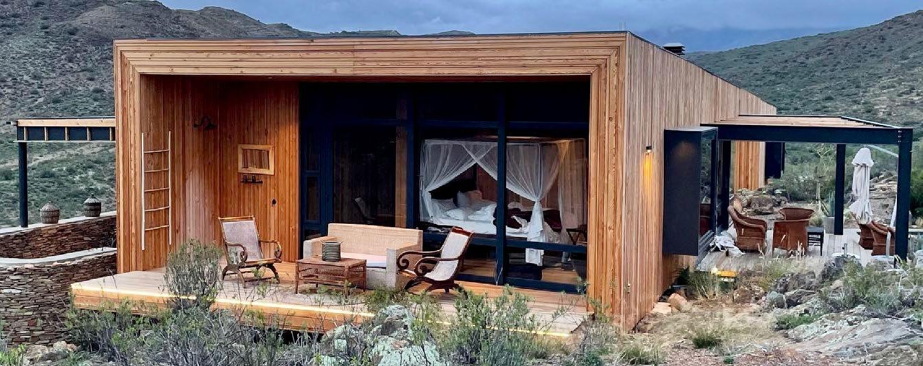
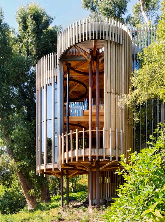
We love to get involved early in your project and be on hand to offer expert advice as your vision unfolds.

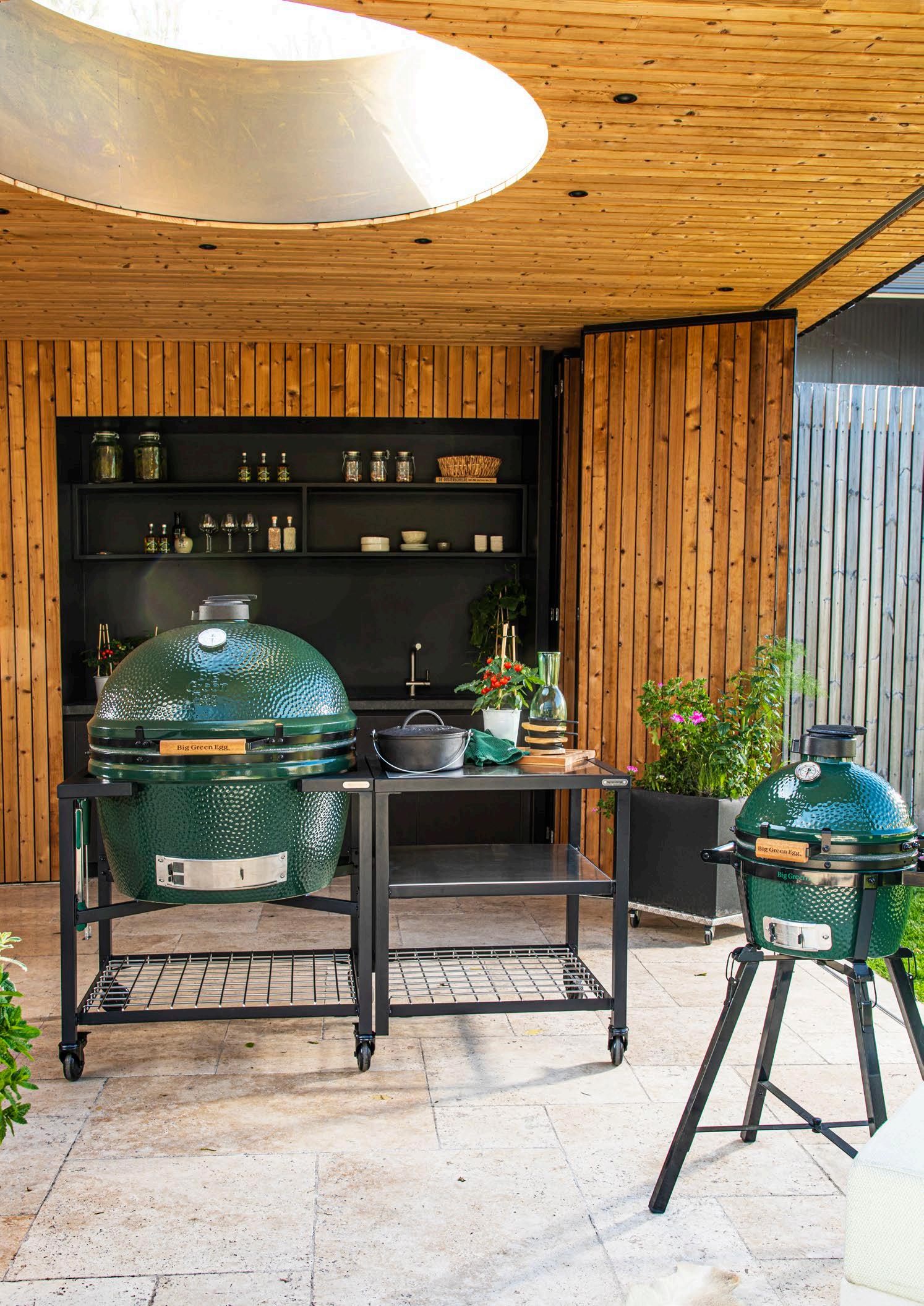
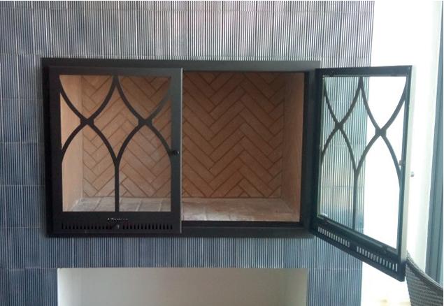
With money tighter than ever, more people are leaning towards renovating and upgrading what they already have, versus the cost of replacement. One such new trend is to turn their old steel or brick replaces into a slow-burner unit, and adding steel frames and doors on old brick braais. Another money-saver is to buy one of our locally produced replaces. Buying local does not need to mean it will be any less functional or pretty.


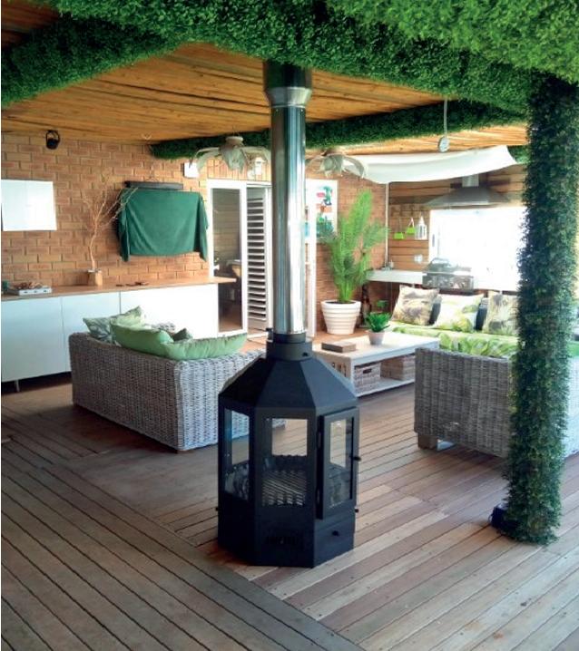
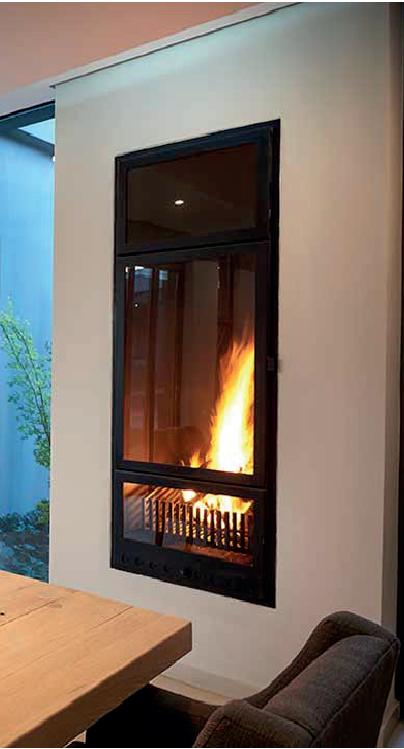
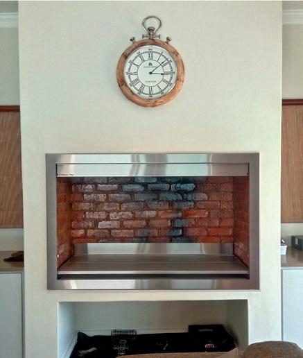

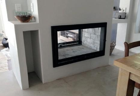


A pair of serial renovators in Johannesburg bring a mid-century gem back to life with a sense of subtlety and joie de vivre!
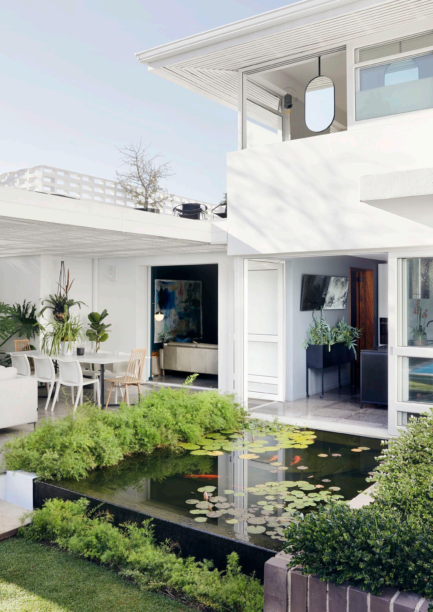
It takes a good eye to spot potential in a fixer-upper, particularly in a city like Johannesburg. There are some real gems — almost always undervalued — but their qualities are often lost beneath the add-ons that barnacle their way onto houses over time.
Christo Vermeulen and Nico Venter are serial renovators. Inevitably, after a few years of living in a house, they find their eyes wandering. They certainly have a knack for recognising the signs that something special might be lurking beneath the surface of a nondescript exterior. Over the years, a few of the city’s houses have benefitted from their transformations. Christo is a former textile designer turned builder-renovator, with a side-line in manufacturing bespoke features, especially metalwork and ironmongery. Nico is an urban designer with a keen interest in the city’s architectural history. Together, they make a formidable team: insightful and capable, with the perfect combination of vision and respect for the innate qualities of a good find.
They recognised that they were looking at something special when they walked into this early 1940s double-storey house in the suburb of Greenside. The perfection of the sensuously curved, Art Deco-inflected balustrade on the stair was the first clue that highly skilled builders had been at work here. ‘There’s not a nick on it,’ says Nico, adding that there were other details, particularly in the cast concrete, which were ‘impeccable’. He also recognised the fine workmanship of the rounded edges where the walls meet the ceiling.
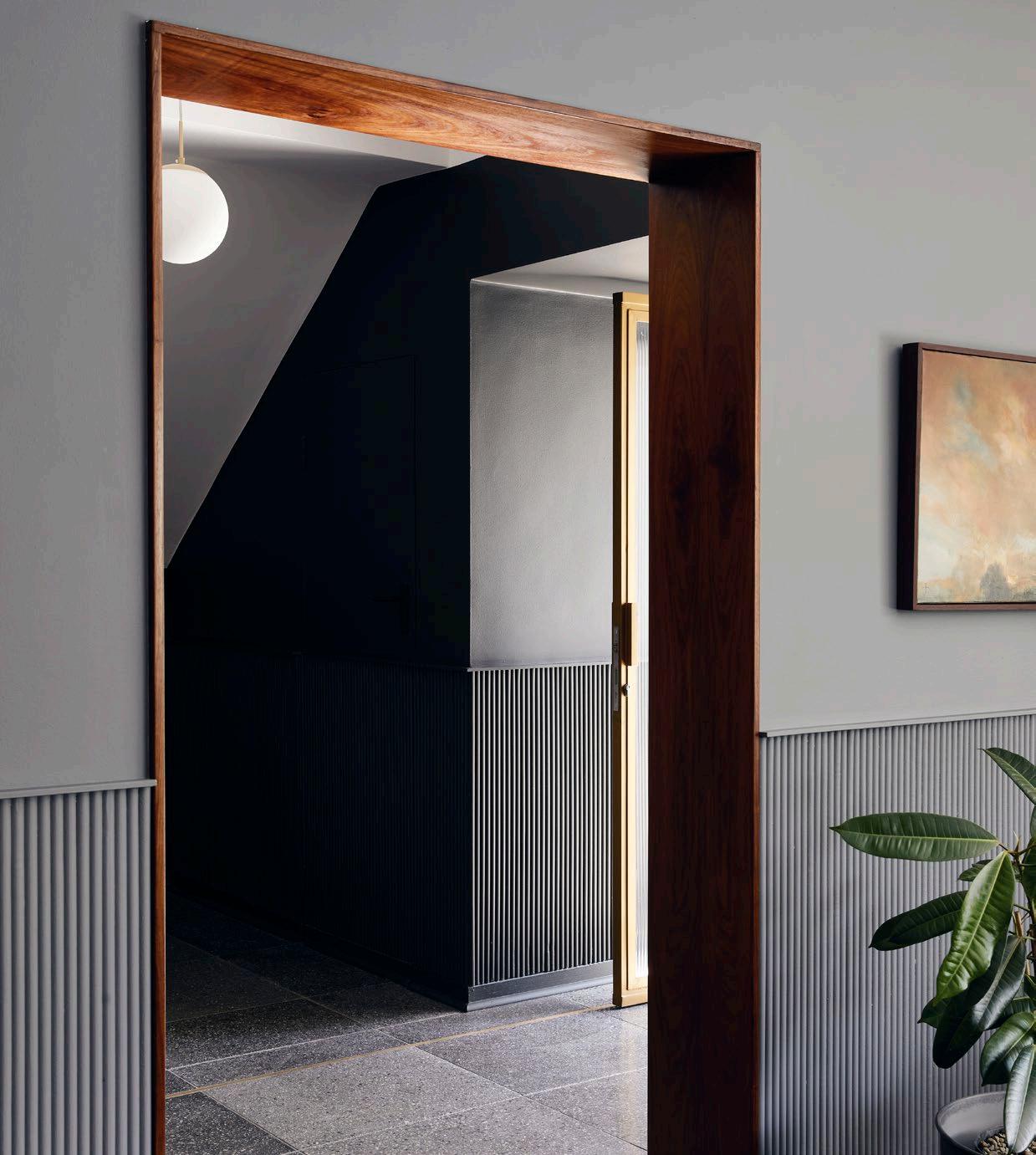
The fluted panelling, called the ‘Majoni’ range was designed by Nico and Christo and manufactured by Muse Designs, their design company. This fluted finish has been restricted to the unaltered areas of the house, while areas they changed or updated were kept smooth.
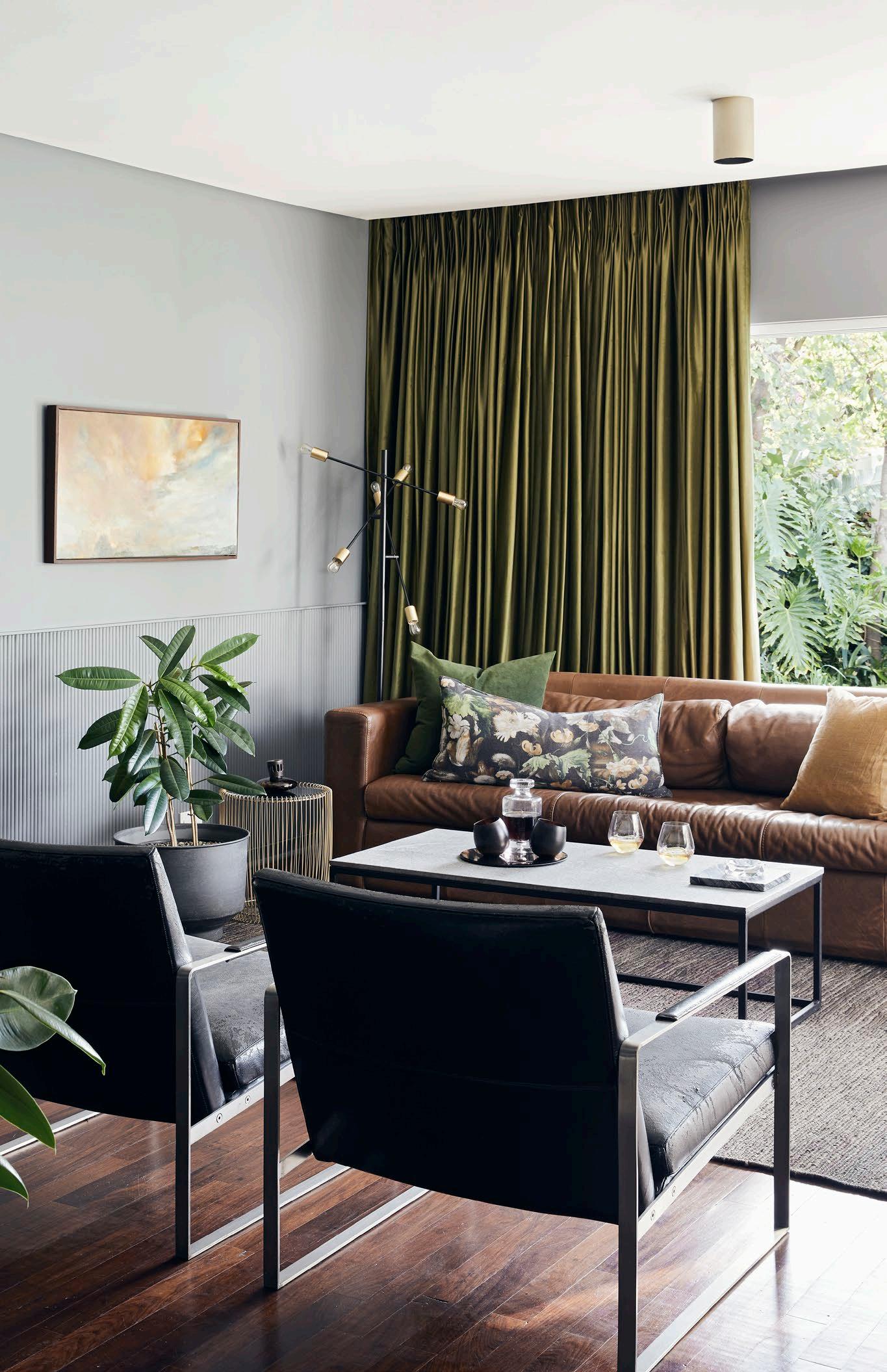 The steel and marble coffee table was made by Christo, under the banner of Muse Designs. The curtain fabric is ‘Magical in Willow’ from Hertex Fabrics. The black leather chairs are 'Zara Armchairs' from sohoConcept.
Christo soon realised that there were timber floors — parquet upstairs — and terrazzo beneath the layers of carpeting and glue. There were other ‘beautiful features of the era’, as he puts it. They were both particularly pleased with the brass fittings sprinkled throughout and the long, narrow planters outside.
The overall design suggested a thoughtful architect. Its orientation was perfect and other details such as the cantilevered concrete overhangs above the windows, were precisely designed to keep the hot sun out in summer and let it in during winter.

‘This house begged to be reborn,’ says Christo. He and Nico answered its plea.
‘The bones of the original house were absolutely perfect,’ says Christo. All was structurally sound, which, he says, is testimony to the quality of the workmanship of the era. ‘Probably Italian,’ he muses, in reference to the excellent reputation of the immigrant builders of the time.
His and Nico’s alteration brought those features decisively into the twenty-first century, so you could, as Nico puts it, live a ‘modern lifestyle’ (and use more efficient power and water sources) while still having the luxury of being surrounded by ‘the feel of the old walls’. Nico says that there’s no slavishly applied ideology or principle at work in their approach. Rather, they allowed themselves to be inventive, creative, and playful as they went along. They’ve clearly been respectful, taking joy in celebrating the finer historical features, but never becoming precious or pretentious.
Details like the wooden floors and parquet — which turned out to be the local, darker, reddish hardwood kiaat (sometimes called ‘African teak’), rather than the more conventional teak — could be revived. They were less lucky with the light green terrazzo, which had been damaged beyond repair. They replaced it with terrazzo tiles, to update it with a nod to the original finish. While the ceilings throughout the house have been kept white, the walls are darker, creating a cosy, painterly atmosphere. They also replaced the rickety old steel windows with modern aluminium frames, but Nico had noticed an intricate rhythm of proportions throughout the house.
‘All of the windows are broken down into three sections,’ he explains. On the lower floor, there was a little portion at the bottom, above it, another section double the height, and above that, the top section was double the middle one. A similar pattern was repeated on the upper level, but in reverse. The windows, in turn, become part of a larger geometric game. The composition of the front façade follows the same proportions: the height up to the flower box is doubled in the next section up to the sunshades and doubled again above it to the soffits. He and Christo replicated it in the modern material, so the integrity of the overall design remained intact.
"They began, as all good historical renovations should, by stripping away all the accumulated clutter that was layered on the building until they were left with something resembling its original form."
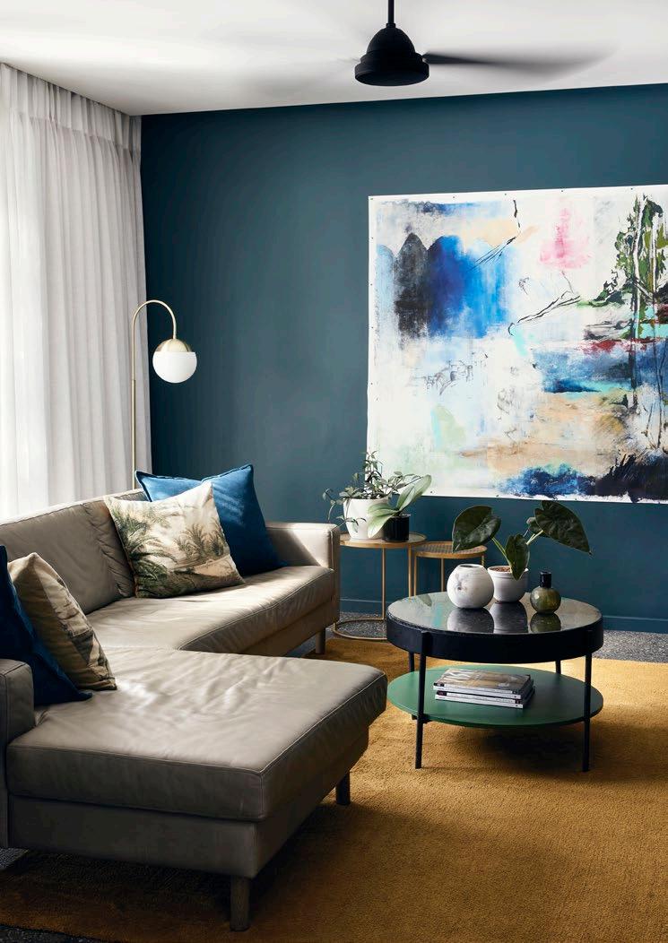
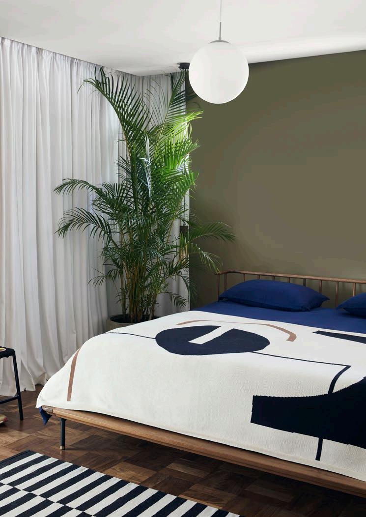
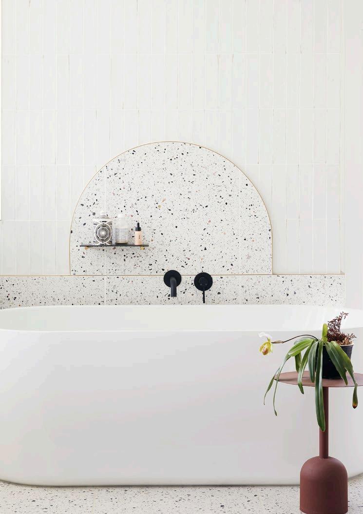
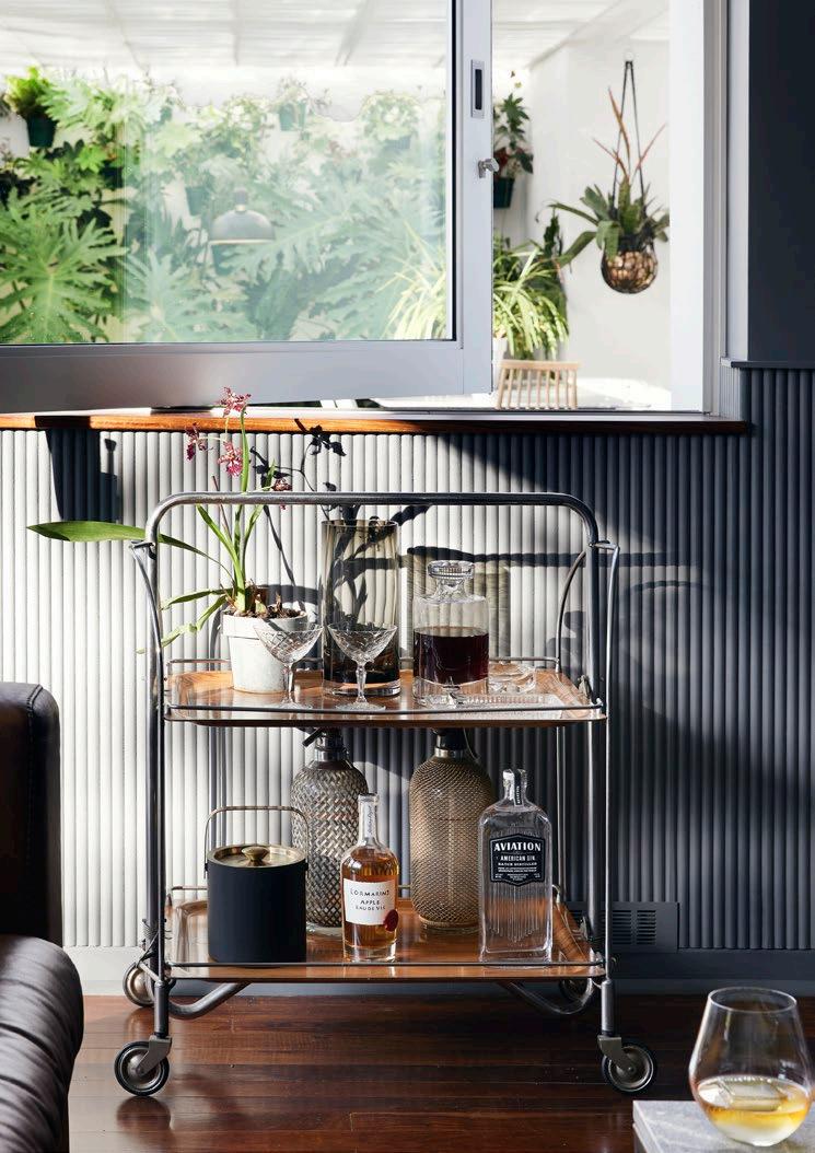
Many of the alterations they’ve made draw attention to original architectural features of the house. They’ve widened doors, for example, to improve the lines of sight between rooms. One door between the living room and entrance hall now perfectly frames the staircase. They’ve subtly distinguished the original features from the areas they’ve altered, but it comes across as a feeling rather than an overt signal. Christo and Nico designed fluted wall panelling that runs up to waist height, which is restricted to the original areas. Where the kitchen, dining room, TV room, and study have been switched around, the walls remain smooth.
Similarly, Nico points out, that wherever they’ve included new doors, they’ve used reeded glass, which has a kind of vintage feeling, but also signals a change (and complements the fluted panelling beautifully). They’ve picked up on other little details that belonged to the original house, such as the brass fittings — the door handles for example — and found ways to emphasise them. From the brass strip inlay in the terrazzo in the entrance hall and master bathroom to little brass details like nuts and bolts in the ironmongery and furniture, there’s a glimmer of brass at play throughout the house.
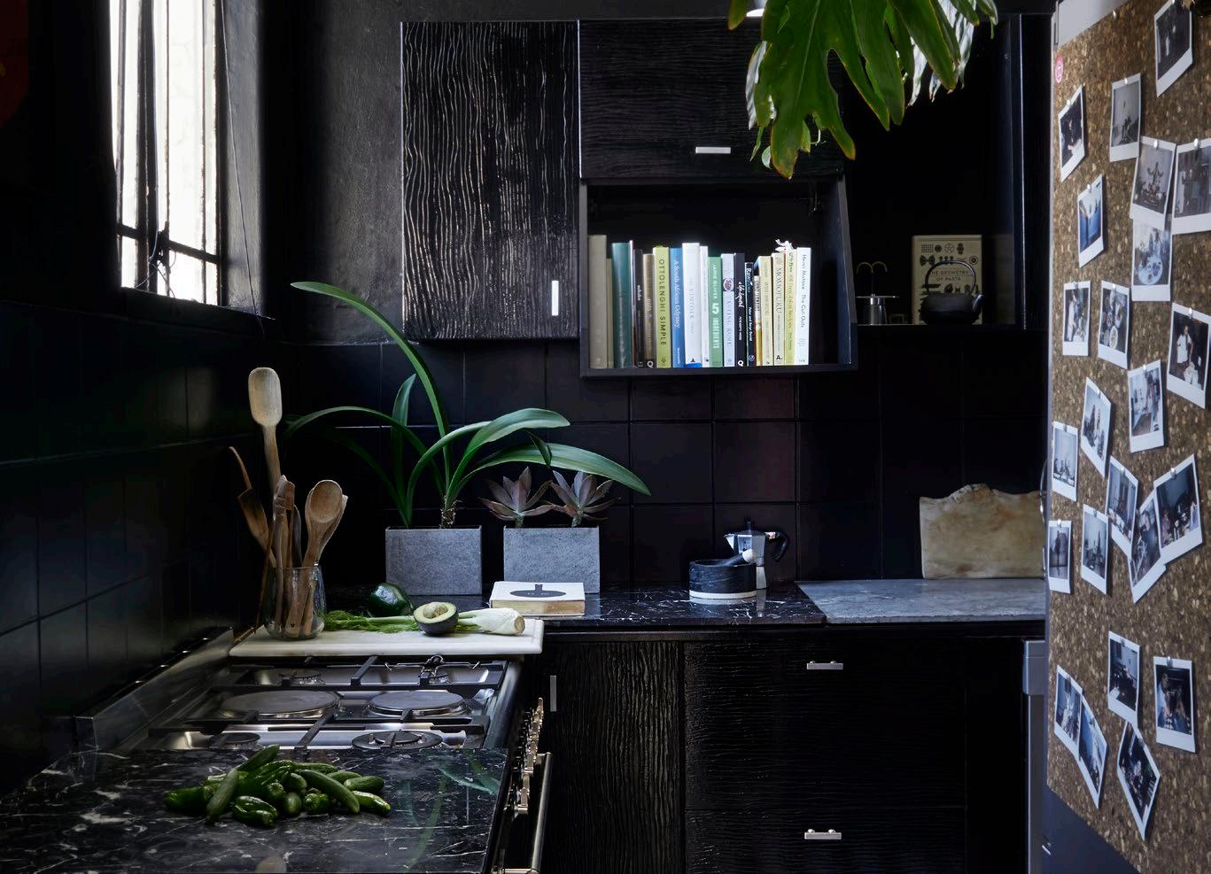
All the light fittings are spherical, which almost unconsciously harmonises with the curves in the architecture. Christo paid homage to the curves in the design of new features, such as the bathroom mirrors and other fittings, recognising and emphasising this aspect of the original design. In other instances — such as the covered patio — they’ve tried to create continuity. Its PVC strips mimic the timber soffits on the original house, as Nico says, ‘in a contemporary way’. In contrast to the bright white exterior, the interiors are dark, playing with a kind of chiaroscuro hinted at in the chocolatey floors. Christo says that he found himself studying paintings by the Dutch Old Masters, and carefully selected what might superficially look like black paint for the walls, but with undertones of brown to give it a kind of variation and warmth.
It’s not just light, but lightness that he and Nico have brought in. Their home’s mid-century features have been given a second lease of life, celebrated in the context of a contemporary lifestyle, with as much joy as reverence.
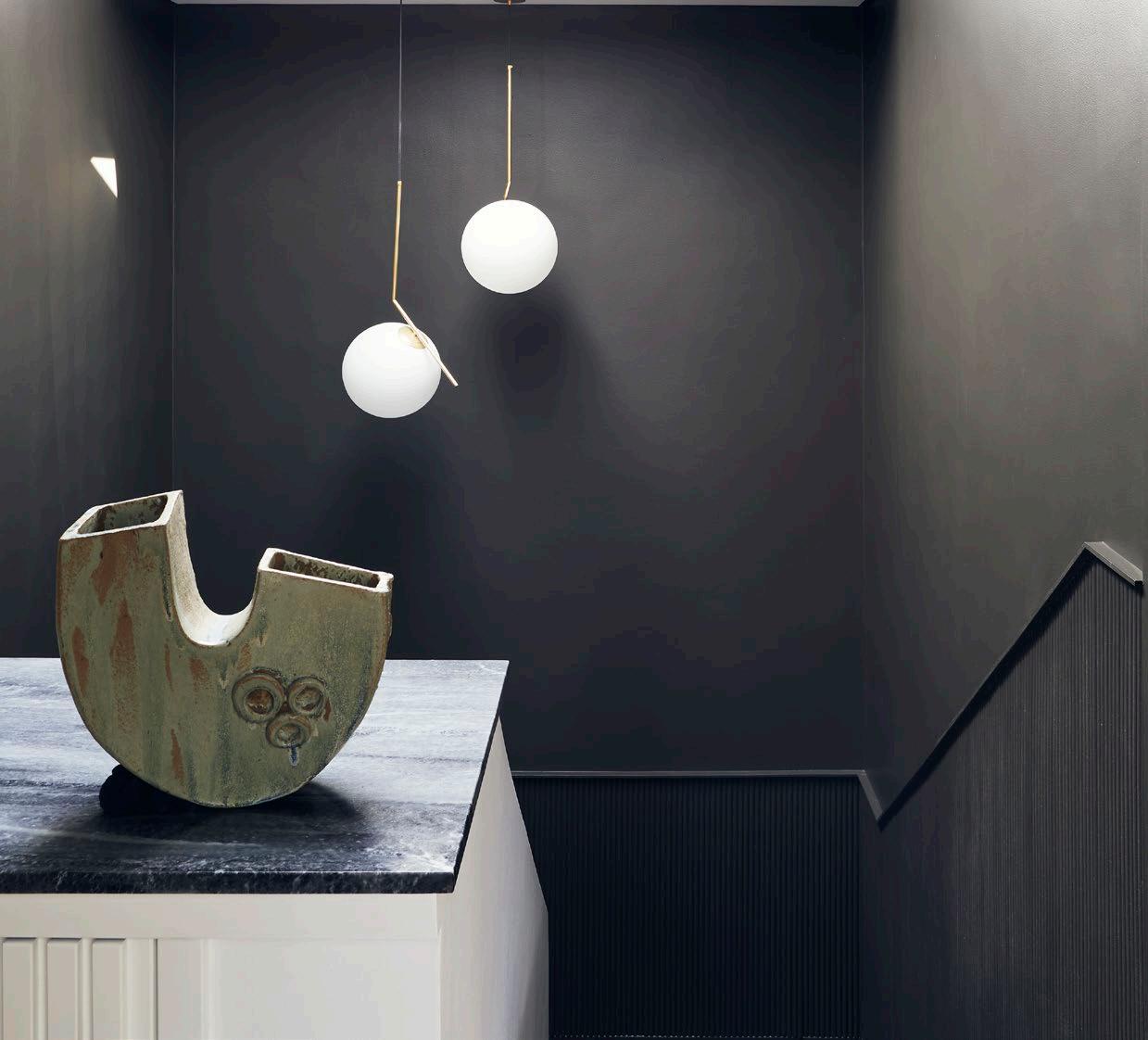
‘We also knew that we could go dark inside because the exterior is white , so there’s a lot of light coming in,’ he adds.
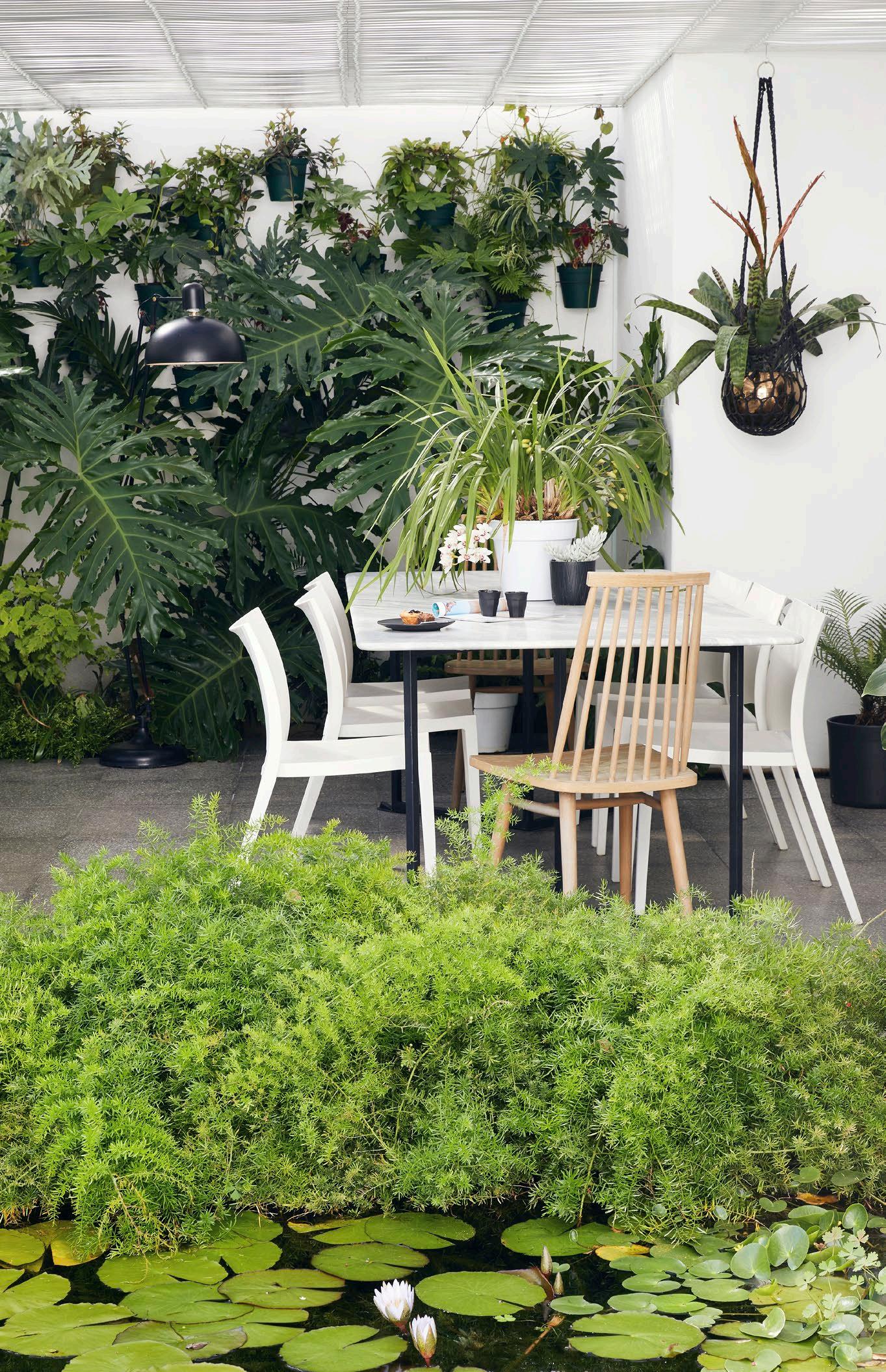 Marble table by Muse Designs













Perceiving space in the experiment of House Kane Hart
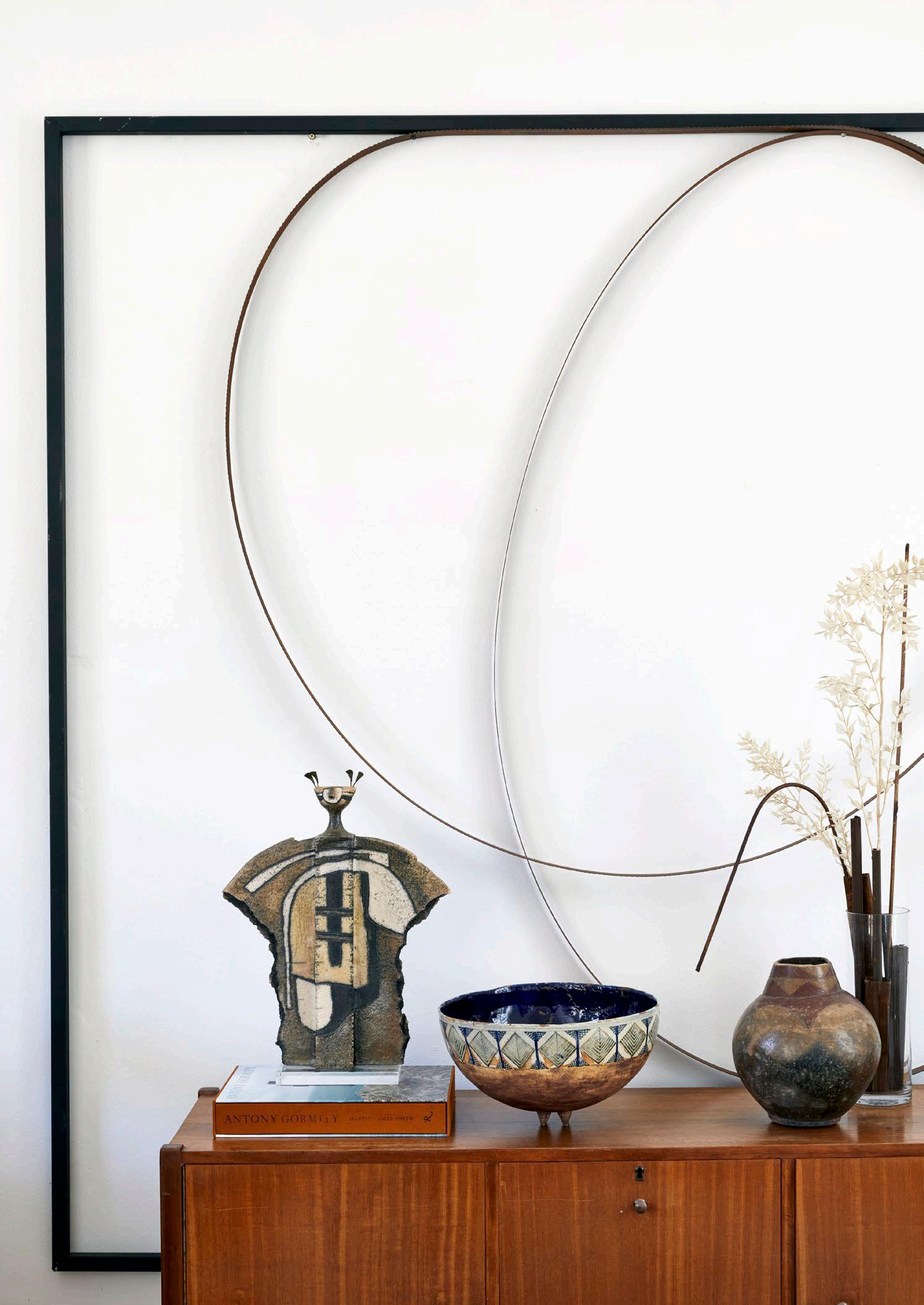
This richly detailed 1930s Cape Town apartment of artist Rodan Kane Hart and interior curator Maybe Corpaci is an ongoing experiment in design, art, and life.
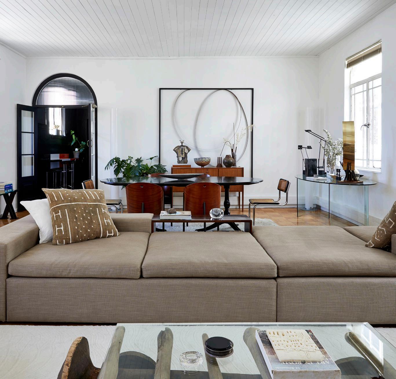
As a sculptor and an interior curator, it was inevitable that Rodan Kane Hart and Maybe Corpaci would treat their home as something of an experimental space. It is a constantly evolving creative outlet for their ideas and collections of art and design as much as a home, studio, and refuge.
It’s on the sixth floor – the very top – of a 1930s building in Cape Town’s CBD, originally built for a shipping company. Its polished granite plinth, ornate turret, and richly decorated cornice speak of an era of opulence and prosperity. The black-and-white marble entrance hall leads to a teak-paneled shipping room and boardrooms with plaster ceilings. Arched doorways and parquet floors characterise Rodan and Maybe’s apartment. They were attracted as much by the grandeur of the spaces and volumes, which would allow Rodan enough space to have his studio at home, as by the period detailing.
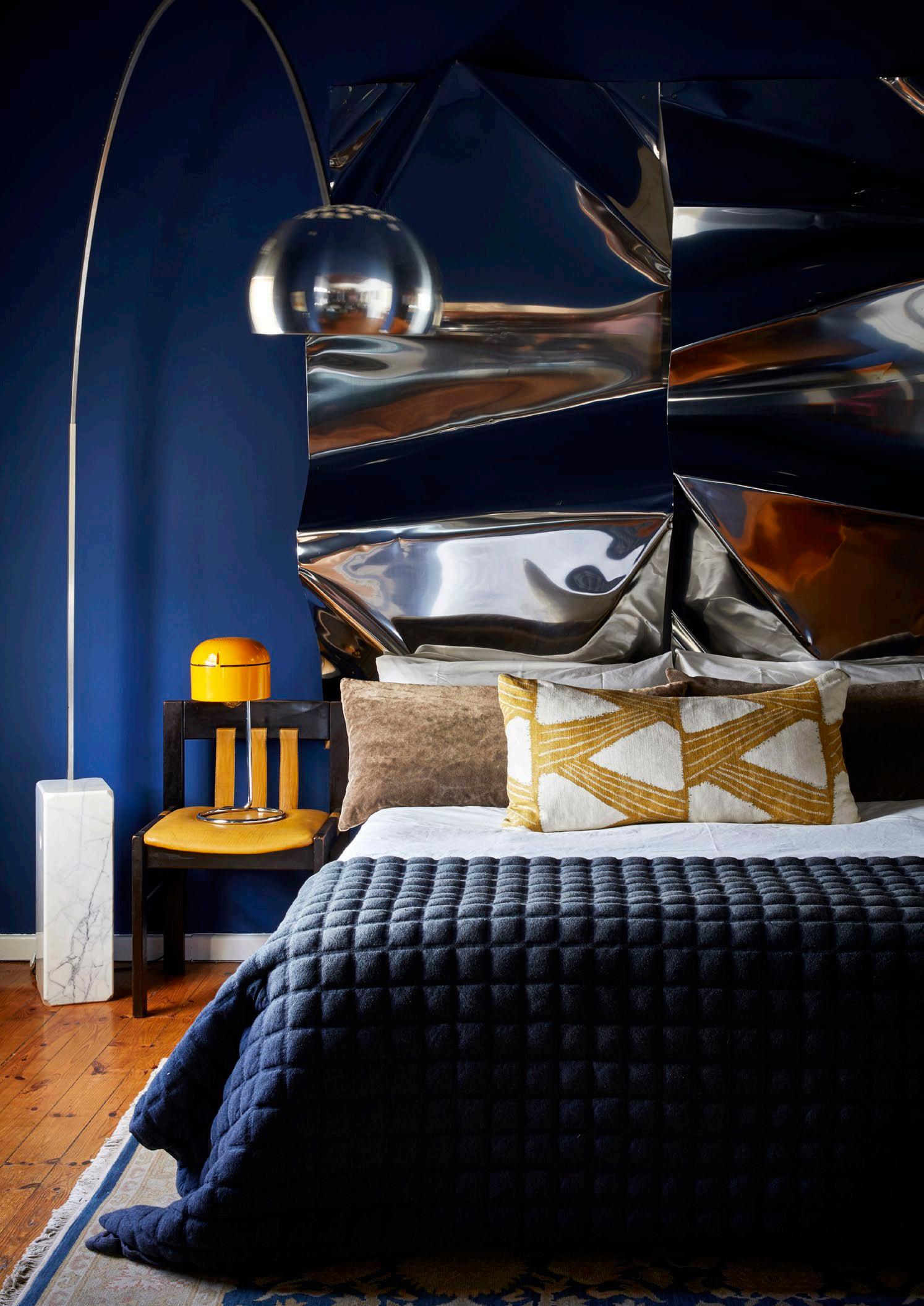 The master bedroom includes a sculpture by Rodan Kane Hart functioning as a headboard and an Arco Lamp by Achille and Pier Castiglioni for Flos. The dressing room area, picturing Maybe and Rodan, is an extension of the sleeping area.
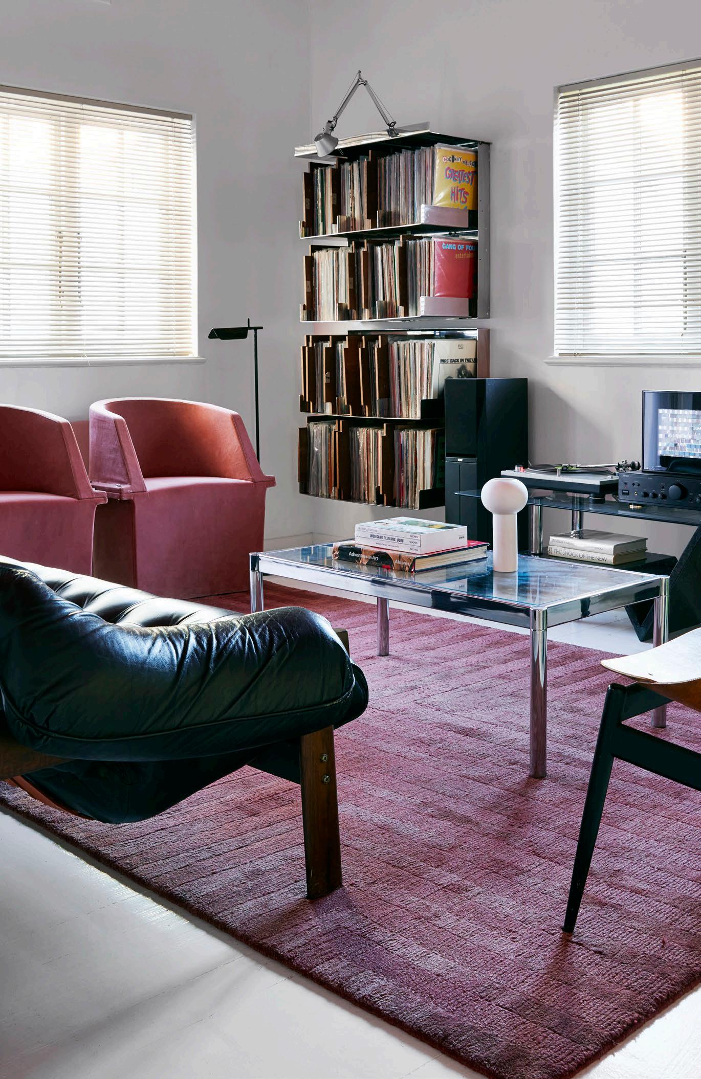
Before moving here, he had always relied on industrial buildings to provide the space he needed to work as a sculptor, creating the architectural steel forms he’s known for. Rodan began collecting furniture when he was in his twenties. ‘I’d sell a few artworks and buy furniture,’ he says.
His gradually expanding collection of largely mid-century pieces worked well in the kind of warehouse lofts he’d occupied before moving here, but now they have found fresh expression in this rather different kind of commercial space. Maybe adds, however, that the apartment left them with ‘a lot of space to [fill]’ when they moved in. ‘Then we started collecting together in seriousness,’ says Rodan.
Maybe points out that, perhaps as a result of the fact that they found themselves searching for particular pieces and designs – and the collection accumulated over time – their apartment grew around the furniture rather than from an interior design concept or preconceived idea. Their creative energies have been devoted to figuring out how to combine and recombine individual pieces, rather than adhering to a ‘top-down’ approach, as Rodan puts it.
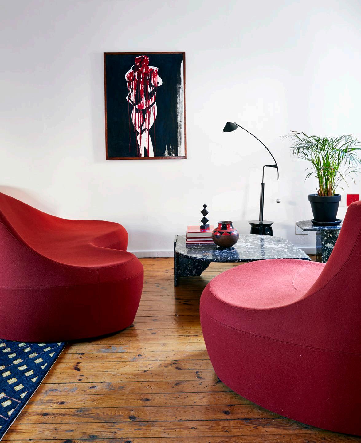
‘It starts with one piece and then we create a narrative around it,’ says Maybe. ‘It happens quite organically. There's nothing that's premeditated about it, or specific to a layout that we stick to.’ Pieces were never bought to match, but rather for their own merit and interest. Inevitably, they’ve been drawn to pieces that resonate with others they already have, but that’s about as strategic as their approach ever got. And not everything is collectible. ‘We love a bargain,’ says Maybe. They picked up the dining table for next to nothing on auction and had it ebonised to give it a new least of life. ‘It just worked in the space and we’ve grown around it,’ says Rodan. As the son of an architect, he grew up with a sensitivity to ‘spatial dynamics’, as he puts it. His sculptural works are often described as architectural, frequently interpreted as experiments in how forms affect our perception of space.
In fact, the root of his interest in collecting furniture stems from his notion of furniture as functional art – a practical manifestation of what he explores through sculpture. He’s fascinated by figures such as the midcentury designer and sculptor (and musician) Harry Bertoia, who straddled multiple disciplines. Rodan adds that he can’t help feeling we’ve become overspecialised, too constrained in our designated disciplines.
In many ways, Maybe and Rodan’s apartment is a riposte to the limits of overspecialisation; it’s an invitation to combine and cross disciplines. Rodan suggests that, whereas art often seems purely emotional, furniture design, perhaps because it is practical, retains a narrative quality that he loves – a kind of patina of use. ‘I think architecture and design are fields that are imbued with history and experience,’ he says.
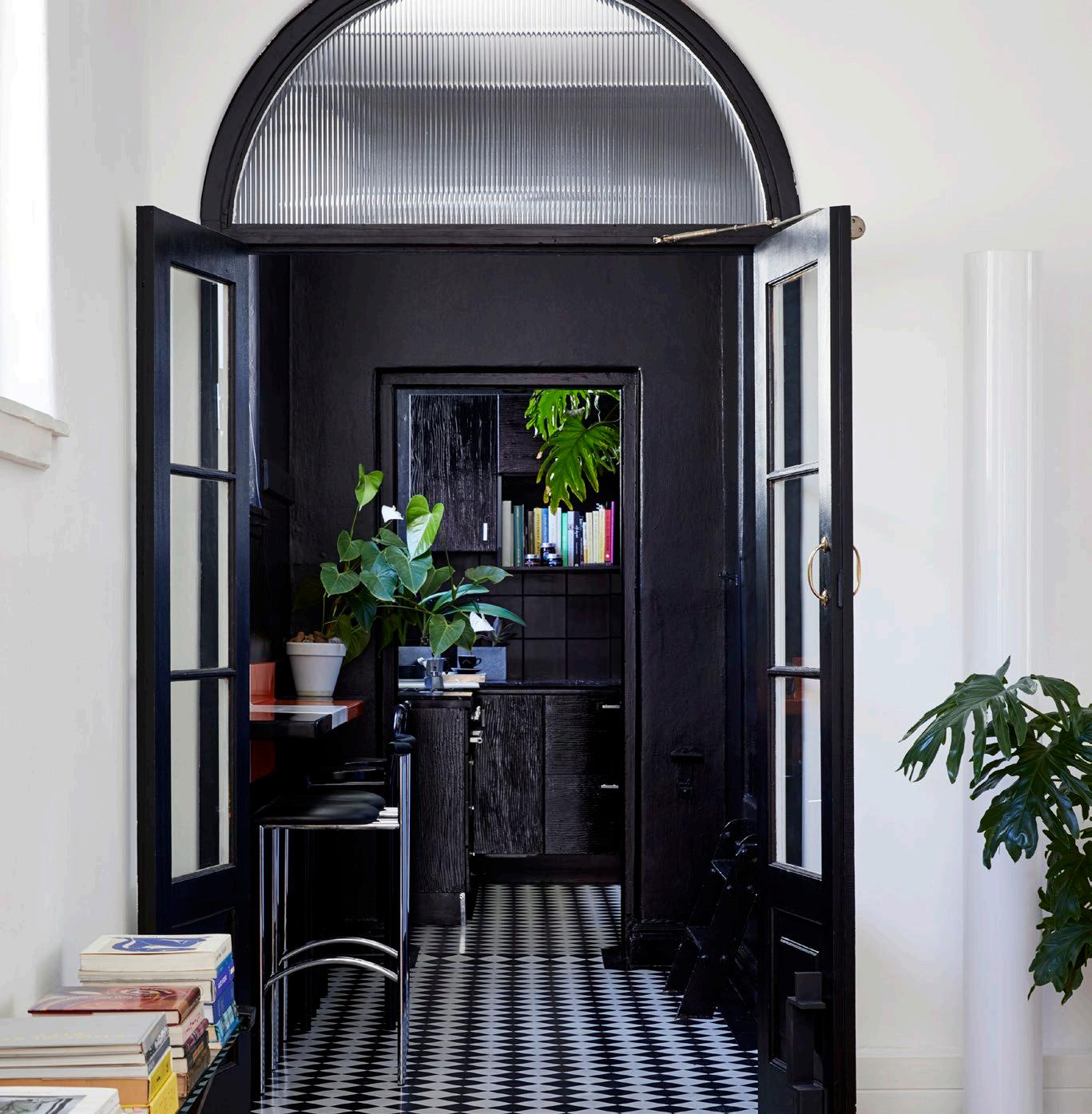
FAR LEFT: The kitchen features black-and-white checked linoleum floors and Tokyo Stools by British designer Rodney Kinsman for Bieffeplast, originally designed in 1985 for London’s famous Groucho Club.
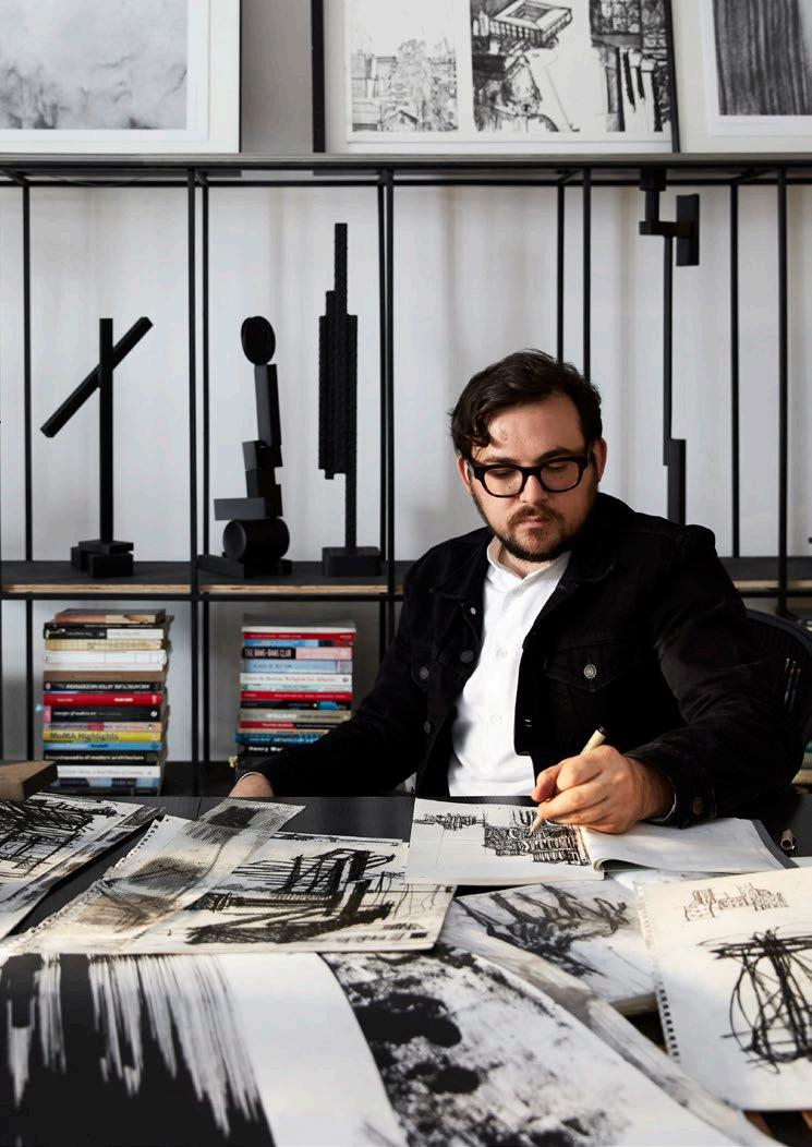
TOP LEFT: Sculptor Rodan Kane Hart in his studio among several of his own works. A limited edition of his monograph, At Work, included a steel sculpture.
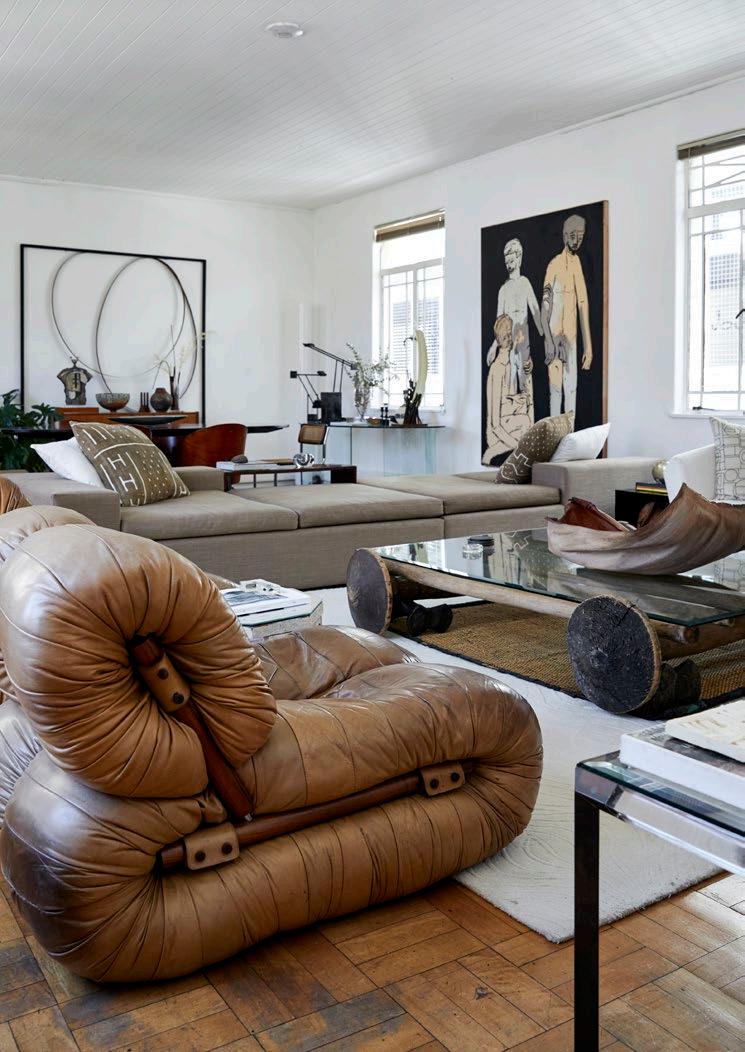
TOP RIGHT: In the lounge and dining area, a section from Brazilian mid-century designer Percival Lafer’s modular sofa is combined with a Taureg bed used as a coffee table. Artworks include works by Brett Charles Seiler and Rodan Kane Hart (behind the dining table).
BOTTOM LEFT: Interior curator Maybe Corpaci's study.
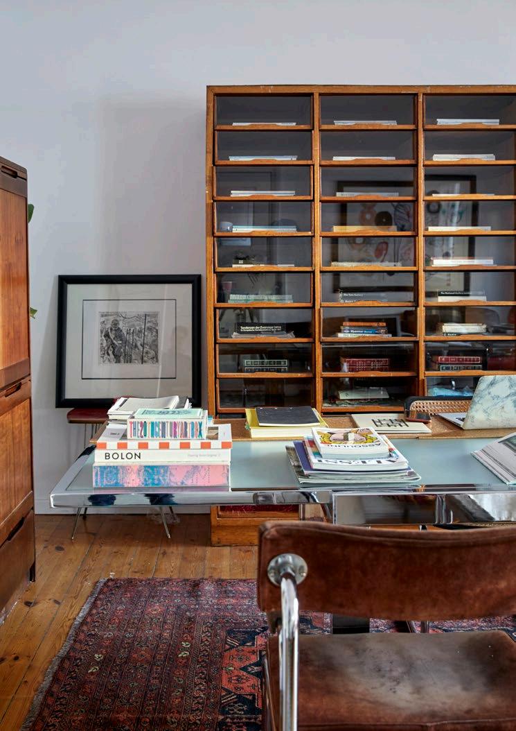
Although Maybe says they’ve never disagreed about a furniture piece (pointing out that they certainly don’t agree on everything), the apartment is very much a meeting of two individual styles. Maybe’s influence comes through in something a little softer and in the whites, creams, and beiges in the living room, for example, while she describes Rodan’s preferences as ‘angular… black and chrome’.
Having his studio at home, now, Rodan says that he can easily test his sculptures in a domestic environment whenever he wants. ‘I can [bring in] some of my pieces to see how they work in a living space,’ he says. It’s a habit that led to their current venture, an alternative take on a gallery called THEFOURTH on (you guessed it) the fourth floor.
One year, instead of participating in the Cape Town Art Fair as an exhibitor, Rodan thought that he and Maybe should combine their talents and do something a little different. ‘I thought, let's look at doing a fringe event,’ says Rodan, ‘and we came up with this concept called Apartment.’
Essentially, it involved temporarily turning their apartment into a gallery and opening it to members of the public. The idea was based on the premise that, rather than the white cube of the gallery, in reality we tend to experience art in ‘domestic’ and ‘intimate spaces’ – people’s homes, in other words.
Following that notion, they launched THEFOURTH, which is an exhibition space set up like a domestic interior with artworks, furniture designs, and a private bar. ‘It's a similar concept to Apartment,’ says Maybe, ‘just in a more commercial fashion.’ She gets to experiment with interiors in a somewhat more abstract way than she can with clients or in her own home, while artworks by Rodan and a number of his contemporaries is experienced in something more like a domestic environment, with a sense of how they might belong in the individual, lived narrative of a life.
Upstairs, while Rodan and Maybe’s home might be a kind of personal creative laboratory, it’s also a testament to how life takes its own unexpected turns and how the ‘narrative’ of life has a way of leading us. Living spaces, as much as life, are humanised by acknowledging this aspect of history. It is one of the ways they become humanised, integrated with a new story while acknowledging that patina of history that fascinates Rodan. He likens the process to something he encountered collecting vinyl records, an interest he’s indulged in for longer even than he has been collecting furniture. They have an entire room of the apartment devoted to his collection of largely punk albums. He says that collecting isn’t so much about the objects one pursues as it is about the discoveries one makes along the journey. He thinks of all the other music he’s discovered in pursuit of one particular record or another: the richness the journey brings.
And that’s why, for him and Maybe, it’s so important that there’s no end in mind. ‘It's never finished,’ she says of their apartment. ‘It's a playground: an experimental place where there are no mistakes.’ Rather than proving a theory, however, this experiment is about ongoing inspiration, new interests, and ultimately adding another layer of history.
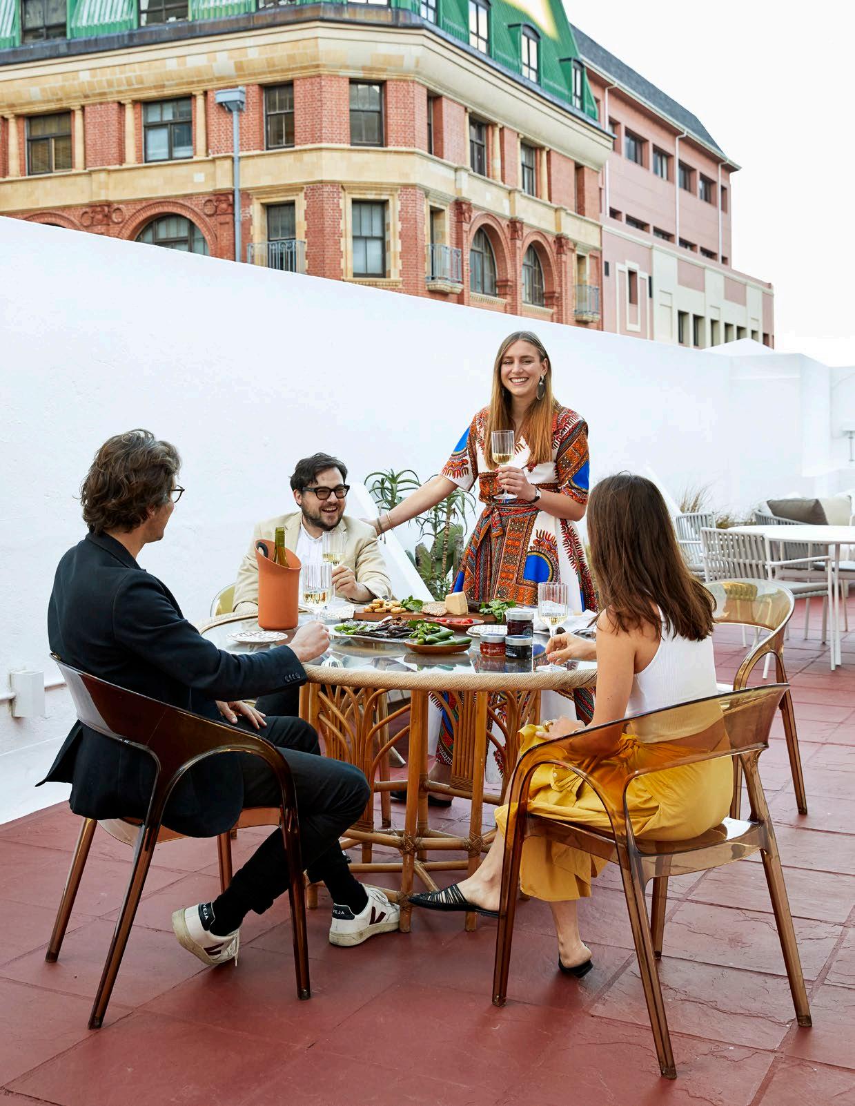
In the pursuit of atmospheric style, sometimes it’s the small stuff that can make all the difference. Inspired by the fervour of design à la française, The Stellenbosch Mom unpacks the subtleties of curating ambience in your home space with just a few unique items.

Not everyone may be familiar with the term ‘objet d’art’, but we have all experienced the sophistication and elegance these items can add to an interior. In French, objet d’art literally means ‘object of art’, and in the language of interior design, the term refers to decorative items that may range from antique figurines to a set of ceramic vases.
These objects are more than just eye-catching additions to a room, however. They hold a deeper meaning and can spark conversations about history, culture, and identity. They can tell stories of the past, and give us a glimpse into the artistic minds of those who created them — and those who selected them.
Incorporating objets d’art into your home is a subtle, but powerful way to transform any space, and doesn’t need to cost an arm and a leg. Here are three easy and frequently underrecognised ways to get started.
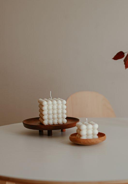
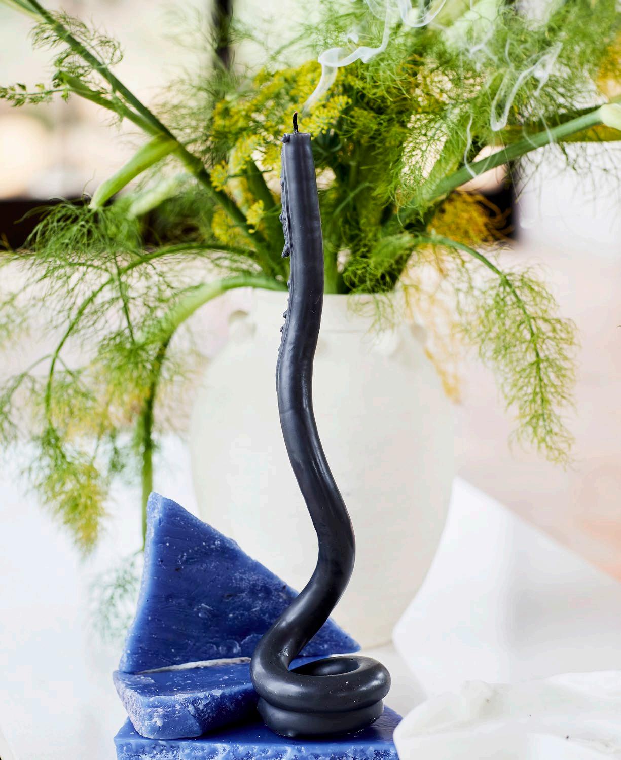
In a hyper-visual world, our sense of smell is often overlooked and understimulated. Home fragrances and luxury candles have particularly piqued my interest, since many of them use natural scents as key ingredients for a holistic experience. Used mainly for illumination and religious celebrations in the past, today candles are increasingly recognised as an essential element in home décor. Charming, romantic, peaceful, and inviting, flickering flames create instant ambience.
Candles are also extremely versatile, and come in a wide array of not only scents and colours, but also textures, moulds, and carvings. Whether displayed on beautiful stands, candelabra, or placed in attractive lanterns, they are a delight to the eye — even when unlit. When opting for fragranced candles or home fragrances in the dining room, take care to complement the fragrances and flavours of your menu.
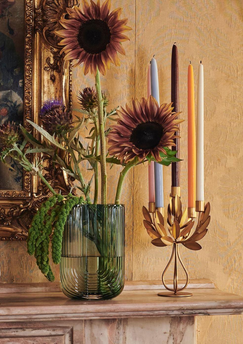
 Styling by Sanri Pienaar for Poetry Stores. Photography by Frances Marais. Candles by Okra Candle.
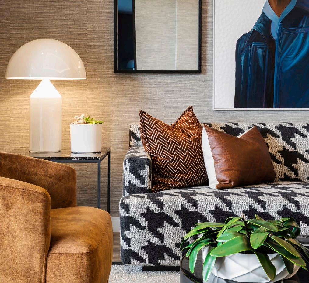
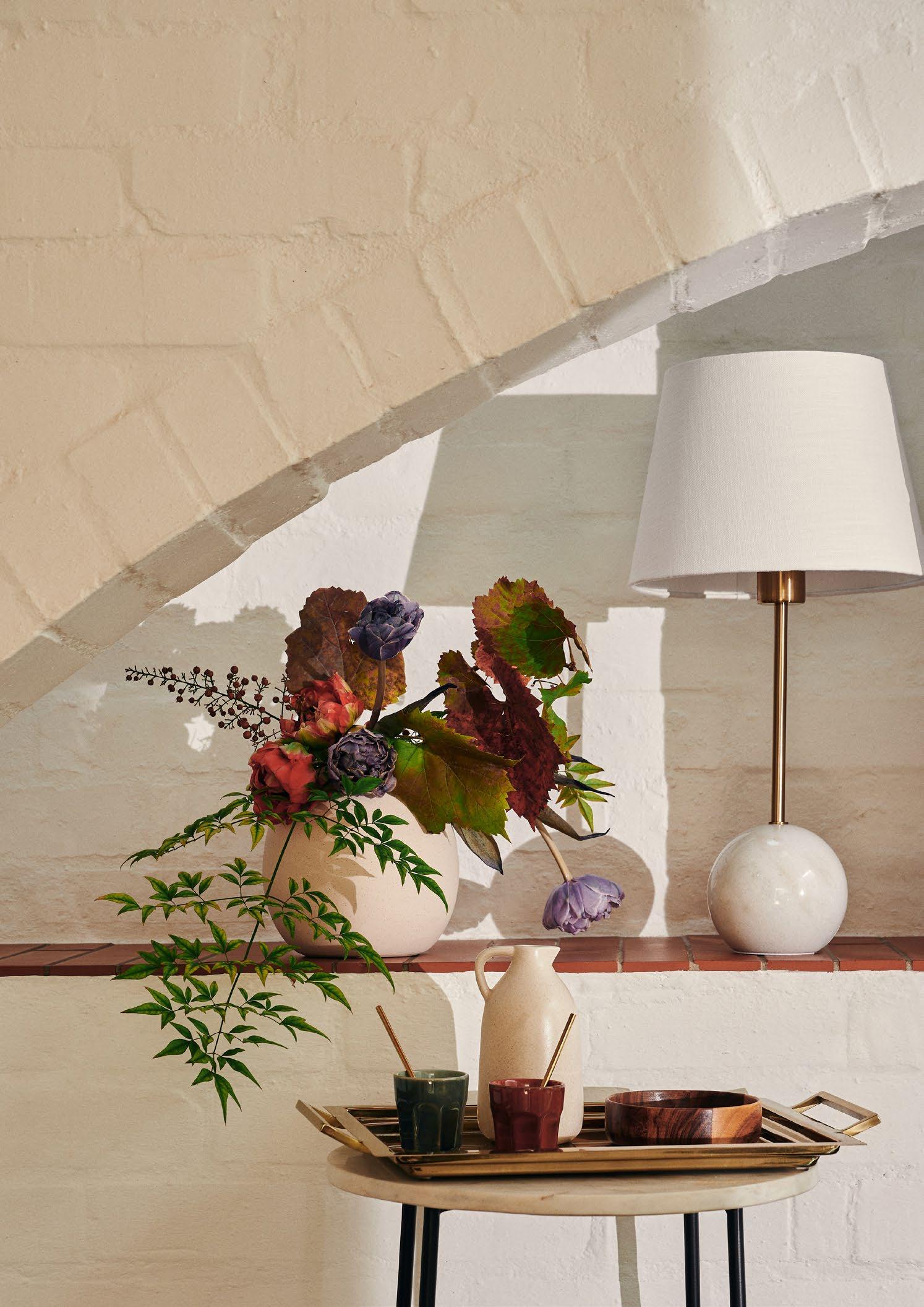 Styling by Sanri Pienaar for Superbalist.
• Use bigger trays for bigger tables or ottomans.
• Combine different heights, textures, and colours.
• Add sculptural pieces, like a pretty knick-knack on top of a stack of books.
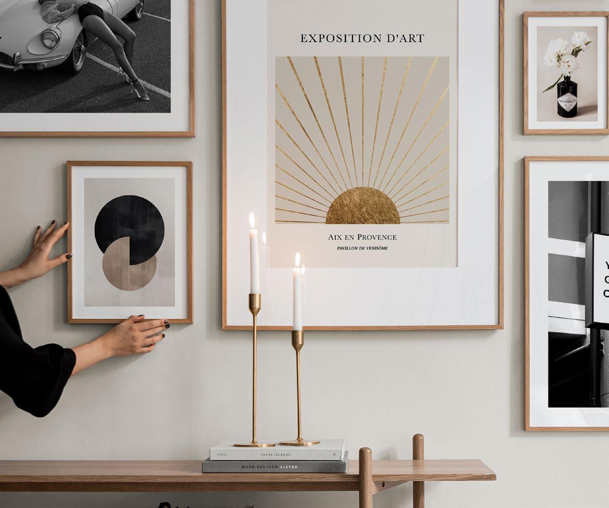
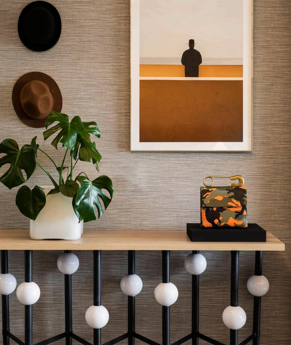
• Follow the ‘Rule of Three’, as odd numbers create a more relaxed feeling when it comes to decorating. For example, place a dish for your remote controls and keys; a larger decoration, such as a simple plant or a beautiful tall candle; and a smaller decorative object to add a bit of interest.
• Avoid overfilling the tray with small pieces; this will make it look bitty and cluttered.
• Layer pieces that act as a snapshot of your personality, and remember that table trays are a great place to show off a collection.
Decorative trays present a unique and practical way to style an ottoman, entrance hall, console, or dressing table. Aesthetically appealing and functional, they can easily be whisked off to a new location at a whim. Maximising a decorative tray requires considering several factors, such as materials, finishes, and the room it will be used in.
Statement lighting
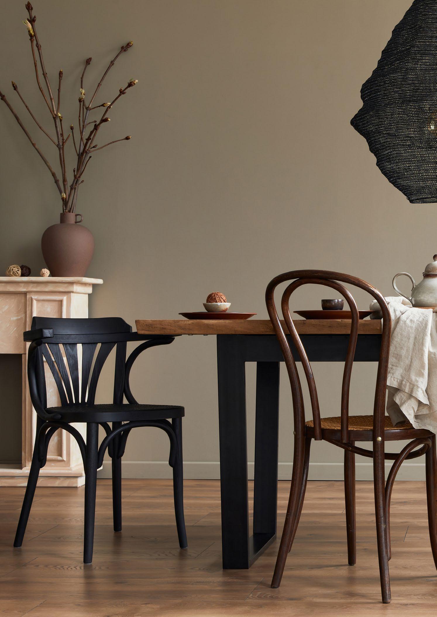
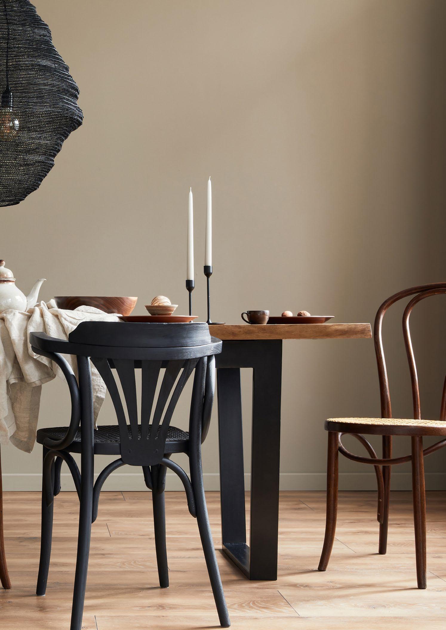
Whether it’s eating together as a family during the week or entertaining friends over the weekend, most people tend to gather around their dining room in the evening. Statement chandeliers and clusters of pendants are a great way to achieve a dramatic effect above the dining table. If your dining room is part of your kitchen or lounge, a statement light or row of pendants will also provide a zoning effect. Before you invest in your dining room lighting, be sure to consider the ratio of light versus table.
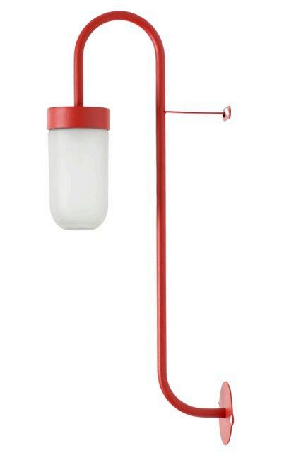
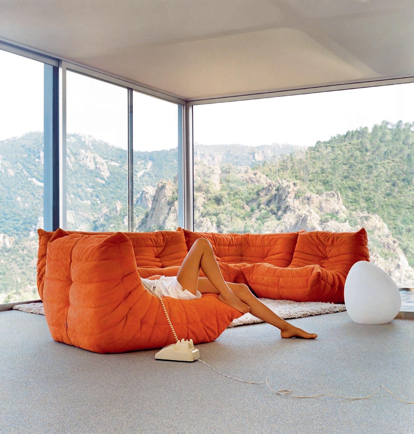
Introducing 10 of the most eye-catching lights around! Maximalism is here and lights that make a statement with quirky and unusual shapes are officially trending. From stylish pendants, to sculptural pieces, cute table lamps to sconces that drip sophistication – we’ll brighten your living spaces with our round-up of SA’s finest lights by SA’s grooviest artisans!
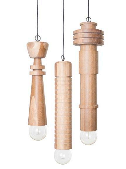
Jozi Skyline Cluster
75 mm DIA x 500 mm H
R22 080
Mash.T Design Studio | mashtdesignstudio.com
Matin Table Lamp
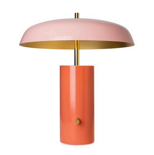

300 mm DIA x 380 mm H x 174 mm base L POR
Créma Design | cremadesign.co.za
01
Trumpet Light
300 mm L x 100 mm D x 700 mm H R4500
Dokter and Misses | dokterandmisses.com
Sunset Paradise Light
420 mm H x 120 mm base DIA x 370 mm shade DIA R6800
Arrange Studio | arrangestudio.co.za
Resort Table Lamp 700

Luminol Standing Lamp – Chrome 395


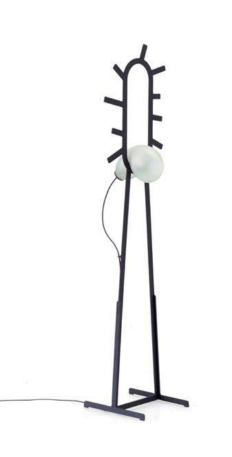
Flowerpot Portable Table Lamp VP9 160 mm
Bask Dome Pendant Light 200 mm H x 450 mm
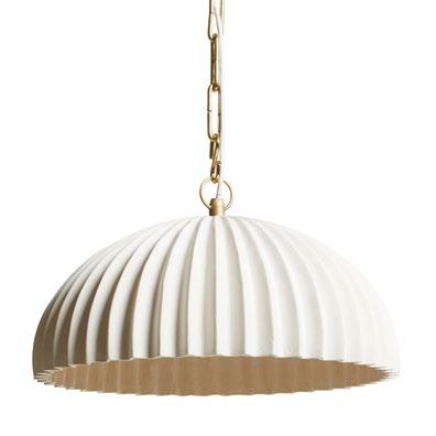
Angled Cork Pendant
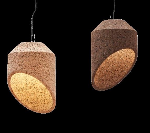
Wiid Design | wiiddesign.co.za
Moonjelly Light Sculpture
R28 900 Dokter and Misses | dokterandmisses.com


What happens when a biochemist and an event planner have a meeting of creative minds? In the case of Okra Candle’s Michelle and Erik Rust, the result has been an outpouring of cool, fresh takes on one of the oldest forms of craft on the planet — candle making.
In 2019, Okra Candle’s Michelle Rust was in search of a particular style of candle for an event she was curating, but could not find what she wanted anywhere. ‘I went to a candlemaker and what they came up with was not a success,’ she says. So, Michelle and her partner Erik talked it over, ‘and we decided, cool, we’ll try it ourselves.’ Armed with a reasonably-priced 3D printer and plenty of enthusiasm, the couple embarked on the project that has, in just three years, become their burgeoning candle-making business, Okra Candle.
Michelle and Erik complement each other perfectly: she has a creative eye and loves nothing more than to style beautiful tablescapes, events, and spaces; he is a biochemist by training, who also happens to be an instinctive teacher and gardener, as well as a musician. ‘Before I knew Erik was a biochemist, I actually thought he was just a musician,’ muses Michelle. But most of all, she adds, ‘Erik is a tinkerer. If something is not working, he will tinker with it until he has mastered the skill of creating it himself, or getting it to work again.’ As Michelle explains, ‘Erik’s background mainly comes into its own on the technical side of Okra — research and development — and his curiosity plays a big role; he works with the wax to figure it out. And then with my background, I have a good eye for the details, and I always have a desire to bring out new designs.’ Unsurprisingly, this blend of practical and conceptual abilities has served Okra Candle very well.
The brand’s name came to the duo during a road trip at the very end of 2019. They had created their first successful candle designs, and were ready to go beyond using the results in Michelle’s work to roll out a range for sale to the general public. ‘We were playing with names and we knew we wanted something short and powerful that would be remembered quite easily, and "Okra" just stuck. And then we added the "Candle" to tie in clearly with the nature of our business,’ Michelle explains. Coincidentally, one of Okra Candle’s early designs was their Gear candle: a concept that visually referenced both gear cogs and the ridged shape of an okra fruit.
Since the creation of the Gear — a strikingly bold, cone-shaped design that immediately catches the eye — there has been a veritable outpouring of fresh takes on 'chandling' from Okra Candle. From the most elegant of hand-dipped dinner tapers to the bold beauty of sculpted and moulded forms, it seems the sky’s the limit when it comes to Michelle and Erik’s ability to reconceptualise their product. Rather remarkable, really, when you consider that candle making is one of the oldest forms of craft on the planet — its basic technology is at least 5000 years old, dating back to the simple rushlights used by the ancient Egyptians.
Counterintuitively, perhaps it was precisely the fact that neither Erik nor Michelle had any formal training in candle making that has enabled them to work so freely with the possibilities of their chosen medium. They learnt on the job, by way of trial, error, and experimentation. ‘It took us a while to get to know our medium,’ says Michelle. She explains that it’s taken time to understand precisely how wick sizing works best, for example, and to develop just the right blends of waxes to use when moulding or dipping candles. ‘This year we’ve been able to push on a lot further, because we really understand it now. Wax is a wonderful medium to work with,’ she says, ‘and when you understand it, you can push its boundaries quite a lot.’
The most enjoyable part of their process? Without a doubt, every time Michelle has made a candle in the last three years, the most thrilling part has been seeing candles emerge from their moulds. ‘It doesn't matter how many times I’ve made that specific candle,’ she says. ‘You have an "Oh, wow!" moment every single time.’ The process begins with selecting or creating a mould and choosing a colour, and then heating the mould and wax to just the right temperature, securing the wick, and carefully pouring the molten wax in a steady stream. The time taken for the candle to set depends on how big the mould is: ‘Candle making takes a lot of patience,’ says Michelle. After demoulding, each candle goes to the finishing station, then to the packaging department, before finally being shipped to its happy purchaser.
"I think anything can inspire, from the movement of sand on a dune, to the way someone walks down the street, or an earring that someone is wearing."
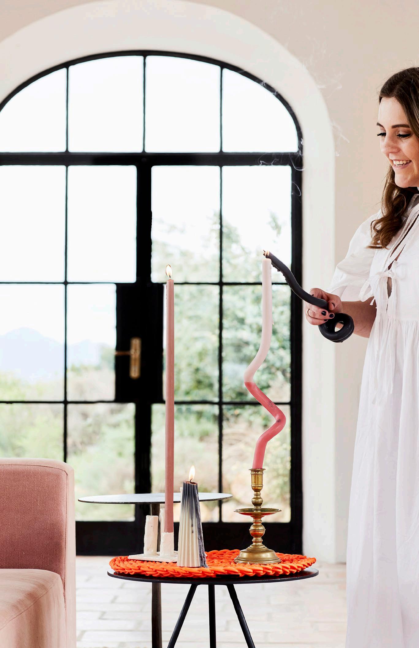
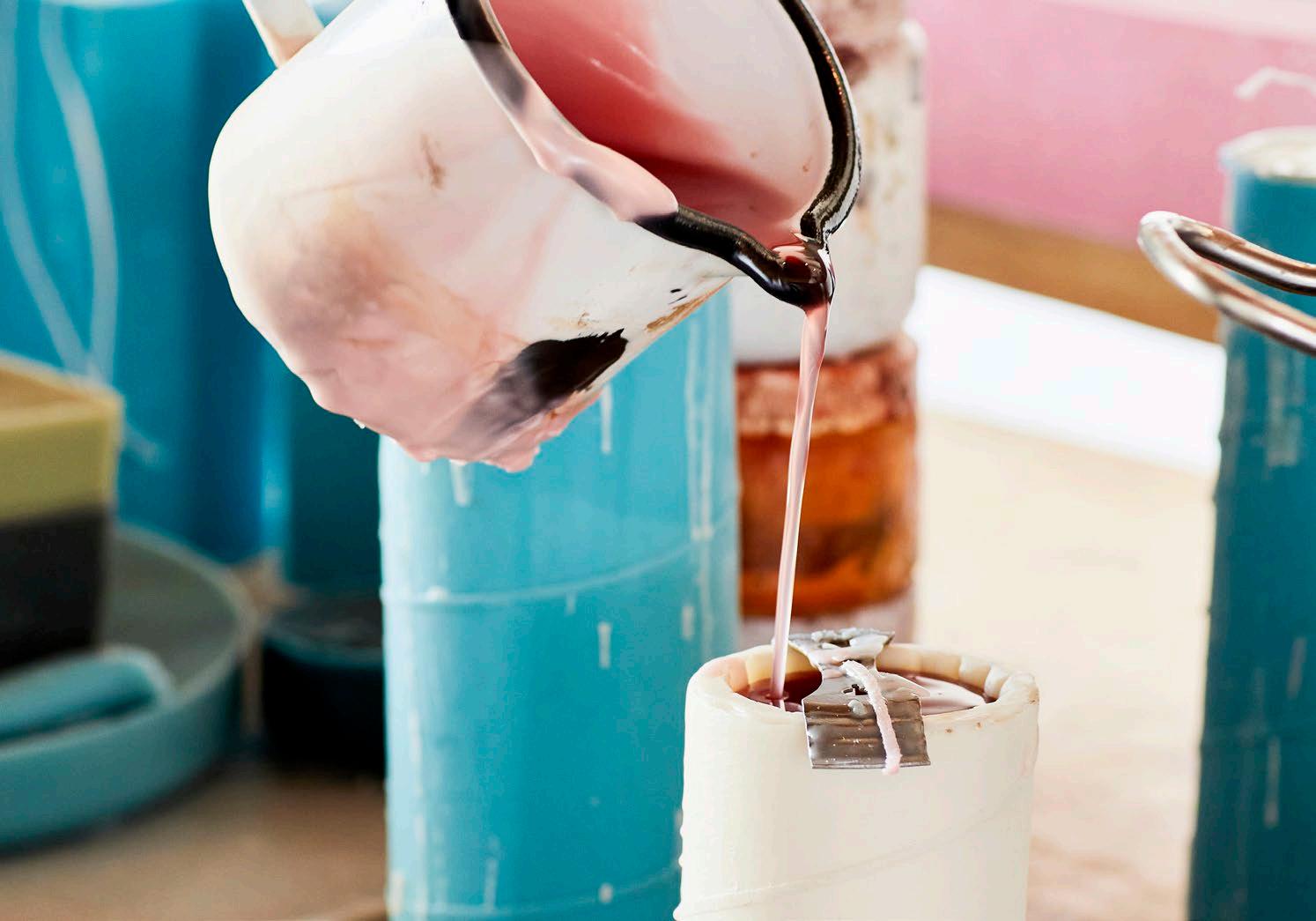
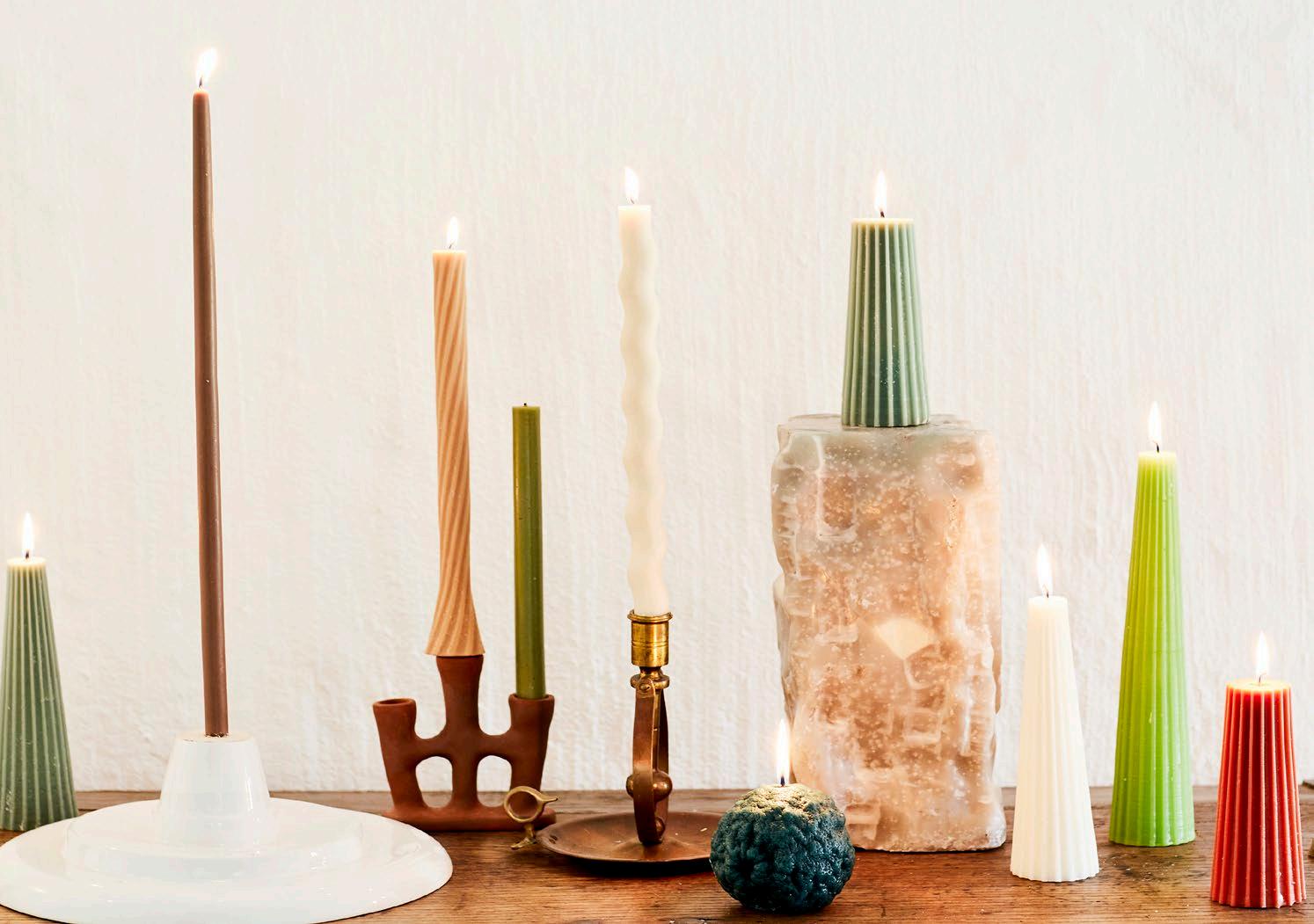
Many of Okra Candle’s designs are made in 3D-printed moulds that enable the creation of candles with a playful variety of twists, turns, and unexpected details. And then there’s the brand’s wide-ranging colour palette, which is vibrant and innovative, ranging from lilac and topaz to a spectrum of cool, contemporary greens. Experimentation has been at the heart of Michelle and Erik’s work to date, and this shows in everything they create. ‘When we train new people,’ says Michelle, ‘we explain that wax is a very forgiving medium. Obviously, if you have to re-melt a candle you lose some of the mass of the wax, but at least you can re-melt it if something goes wrong, and then you can create something new.’
The public’s response to the duo’s work has been hugely enthusiastic — not entirely a surprise to Michelle and Erik, who had seen the gap in the market that their designs were made to fill. But as Michelle shares, ‘As a business owner, you will always be uncertain about its future success, and we put ourselves completely into the product and into our brand.’ The overwhelmingly positive feedback, and the achievement of rapidly racking up a range of collaborations with fellow South African creatives, have been very gratifying.
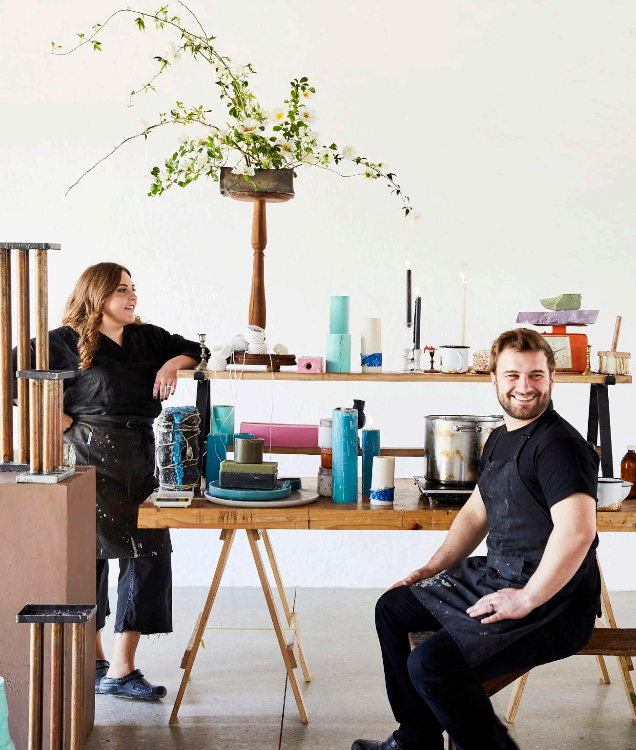
Ideas for new candle designs ‘come from everywhere,’ says Michelle. ‘I think anything can inspire, from the movement of sand on a dune, to the way someone walks down the street, or an earring that someone is wearing.’ The Okra Candle aesthetic is sophisticated, yet with an irreverent, tongue-in-cheek quality that both charms and beguiles. ‘We do enjoy expressing ourselves,’ Michelle says. ‘Like the Screwed candle, for example. We designed it on a Sunday evening after working all weekend, so we felt absolutely freakin’ screwed. And that’s it; it looks like a screw and we felt screwed. So it was just very fitting.’

From the delightfully witty to the everyday essential (Okra Candle has just expanded into making a range of classic boxed dinner candles), Michelle and Erik seem capable of bringing an almost limitless range of desirable designs into candle form. Combining functionality with charm, their creations are affordable luxuries that add a unique touch to a table or display, and Okra Candle looks set to garner many more admirers in the years to come.
 The Great Indoors with Donald Nxumalo
Whether it’s gracing the homepage of local design collective Always Welcome, or completing the luxury homes of South African celebrities, Donald Nxumalo has come a long way from his modest beginnings in Pretoria West to become one of the most celebrated interior designers on the scene. Giving us a glimpse into his rare talent for creating cohesive interiors, Donald keeps it in the bedroom by sharing his current inspiration for designing the ultimate master suite.
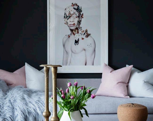
The bedroom is one of the most personal spaces in our homes, and the place where we spend most our time. It is a sacred space to retreat and rewind after the hustle and bustle of everyday life, and, fortunately, one of the easiest rooms to refresh. This winter, we’re seeing a heightened, more emphasised focus on soft lighting, lush fabrics, warm finishes, cocooning furniture, and plush comfort to create a luxury hotel experience at home. From headboards to wall finishes, here are a few ways you can improve your beauty sleep.
Nestle into the night
A headboard is often the centrepiece of a bedroom, and in 2023, headboards are going extra-large! A wide headboard can instantly make your bedroom feel more eye-catching and elegant, especially if the piece has ornate detailing. Select soft, neutral upholstery — custom, if needed — with backlighting for a dreamy nest.
When creating a luxurious, layered bed, opt for natural materials like 100% cotton or linen, as well as silk pillowcases (your hair and skin will thank you later). Linen is also a moody curtain option and great for creating a textured atmosphere. Next, pile on the pillows and select oversized bedding. This will create a lovely hang and cover the sides of the bed frame or base. One size up is a good rule of thumb. A pile of plush pillows in different shapes and shades can instantly transform an ordinary bed. A clever hack is to overfill your pillowcases — stylists do this by buying inserts that are slightly larger than their covers. Layering textures and fabrics are also a fantastic way to make a bedroom feel more visually rich. Lastly, top off your bedding with a statement throw blanket from a local artisan.
You can leave a light on
Pendant lights are popular and for good reason: they’re a functional, stylish way to create a beautifully ambient lighting scheme that can instantly elevate your bedroom and make it feel cosier. These light fixtures come in various shapes, sizes, and styles, making finding the perfect match for your home easy. Pendant lights can either be suspended over your nightstands or wall-mounted on either side of the bed to frame the focal headboard. These accent lights should be your main source of light, with the centre ceiling fixture primarily serving a decorative purpose. Choose warm-toned bulbs for that ambient aesthetic and try installing a dimmer switch so that you can control the level of brightness. Brass fittings are also perfect for adding warmth and heritage-chic character.
“Blending contemporary elements with African influences, leading South African interior designer Donald Nxumalo has created a distinct design aesthetic that is modern, sophisticated, and bold.”
Wooden floors are always an excellent option for bedrooms, bringing a natural softness and warmth to your sleep sanctuary. This flooring finish remains a timeless foundation for both traditional and contemporary homes and is available in a host of grains and colours — although darker, walnut woods are definitely making a bit of a comeback. Good quality wood flooring will last for decades to come, and with minimal maintenance, will age gracefully.
Layering hardwood floors with a bespoke rug is a surefire way to make your bedroom plush and inviting. Two of Donald’s favourite local brands known for their high-quality artisanal pieces are Soho Rugs and Lund Rugs. A focal floor feature will add texture and warmth to your bedroom, and is one of the easiest ways to boost its luxe factor. Plus, nothing pulls a room together quite like a rug does, so in this case, bigger is better!
A humble bedside table is essential and can be one of the most important furniture pieces in your bedroom. Balancing functionality with beauty is incredibly important when considering how to customise your bedside table, so choose a design that’s aesthetically pleasing and has enough space for your personal items! Style your bedside table with things that make you happy: choose colours that you love, and add practical pieces such as a favourite book, a statement lamp, a scented candle, or other items that will make you appreciate the space more. The epitome of comfort is convenience, so above all, bedrooms should be as liveable as they are beautiful.
When it comes to wall finishes, you really can’t go wrong with neutral tones. If you’re feeling adventurous, then wooden or fluted panelling is a timeless choice for texture. Painted moulding and wallpaper are also good avenues to explore, especially if your room leans to the minimalist side.

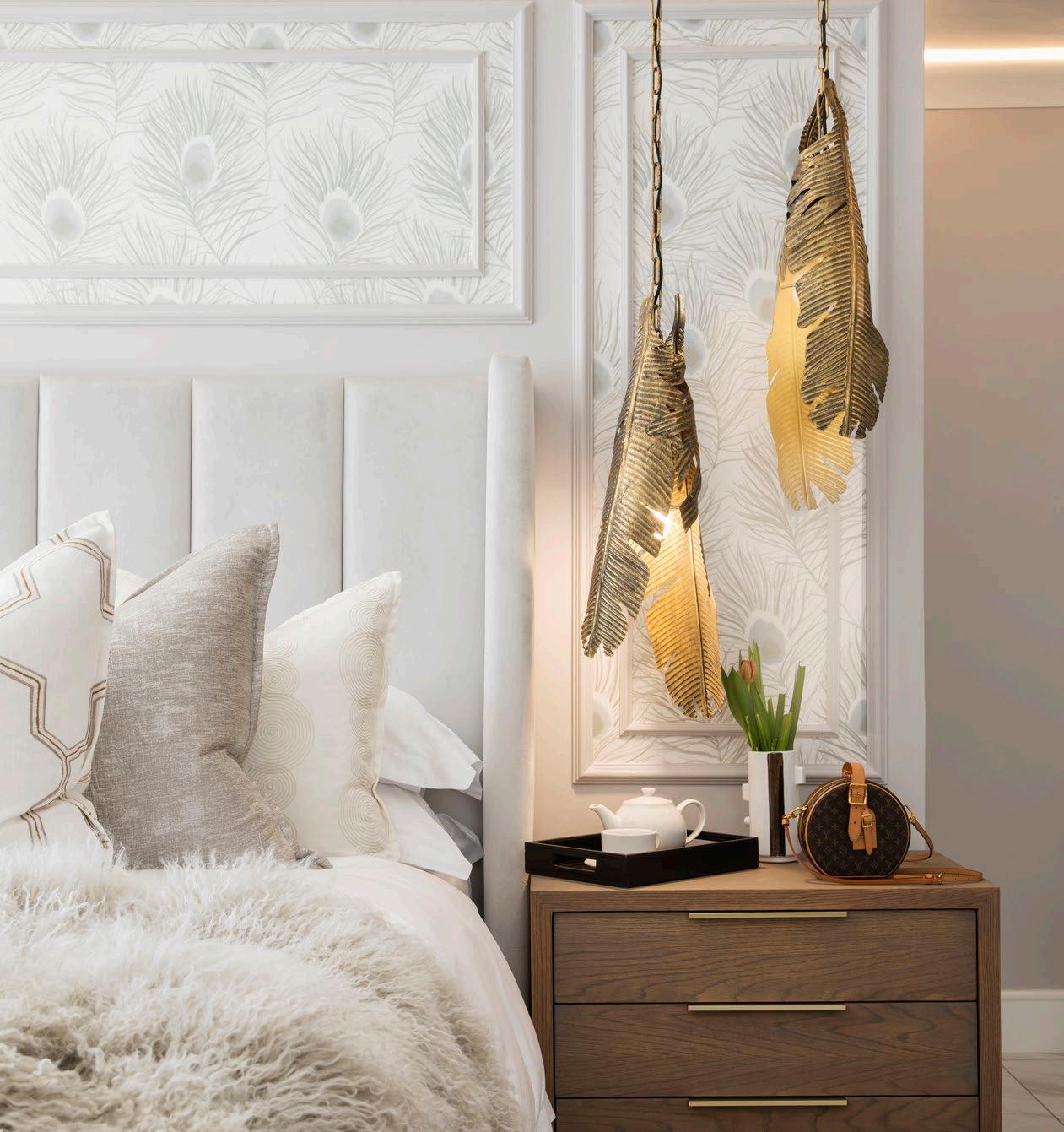
Then there’s the miscellaneous. Mirrors, accessories, table lights, candles, vases, greenery, trays, décor boxes, and personal trinkets are crucial for completing your bedroom aesthetic. Whether it’s a family heirloom or a piece picked up on travels, this is the part where you can have some commitment-free fun. Play around with styling (the rule of three is always golden), and update your arrangements when you’re ready for a room refresh. If you’re interested in something more permanent, then marble tops are an excellent way to add colour and texture to the vanity, en-suite, or dresser. Of course, art is the biggest investment you can ever make, so don’t be afraid to fill up those walls with frames.
Dreaming of a white winter? Light tones can bring in some much-needed brightness to dark rooms this time of year. But how do you go from stark and empty to cosy and calming? A good place to start is by selecting statement furniture pieces and lighting fixtures that will add form and interest to an otherwise unobtrusive interior. Vary your palette by layering different tones, textures, and materials for additional character and depth.
This contemporary artist is best known for his vibrant charcoal and oil paintings that speak to changing the world’s mindset of what it means to be an African child. His distinct work has been featured in many public and private collections worldwide.

Trevor is a globally-known visual artist with a photographic portfolio that includes celebrity portraiture from Naomi Campbell to Barack Obama, and creative collaborations on projects such as Beyonce’s Black is King. His photography is inspired by finding beauty in what reminds him of home.



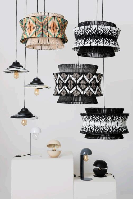
Founded by designer Thabiso Mjo, this award-winning studio brings together technology and traditional dress to create a contemporary craft-driven design aesthetic for Africa. The Liz pendant light is a customer favourite developed in partnership with Tin Lab Design. Its frame serves as a backdrop for the striking pattern of hand-arranged beads, making it a modern yet lively addition.
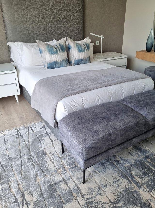
With a luxurious collection of modern rugs, Soho Rugs’ supreme craftsmanship will add that extra ‘wow factor’ to your space. Here, the elegant Soho Saluki rug features a contemprary design in grey neutral tones with touches of silver.
If you’re looking for stylish and sophisticated, Lund has a versatile range of contemporary rugs in pared-back neutrals and calming earth tones. You can choose by style from abstract to traditional, and even decide on a specific weaving type. A beloved centrepiece is their 100% wool, hand-tufted collection, loved for its striking patterns, and thick, soft, and luxurious texture. These rugs feature artful embellishments of silk accents, raised carving, and a mix of loop and cut construction techniques, making each piece unique.

 Inside Sophie Ashby's London Showroom
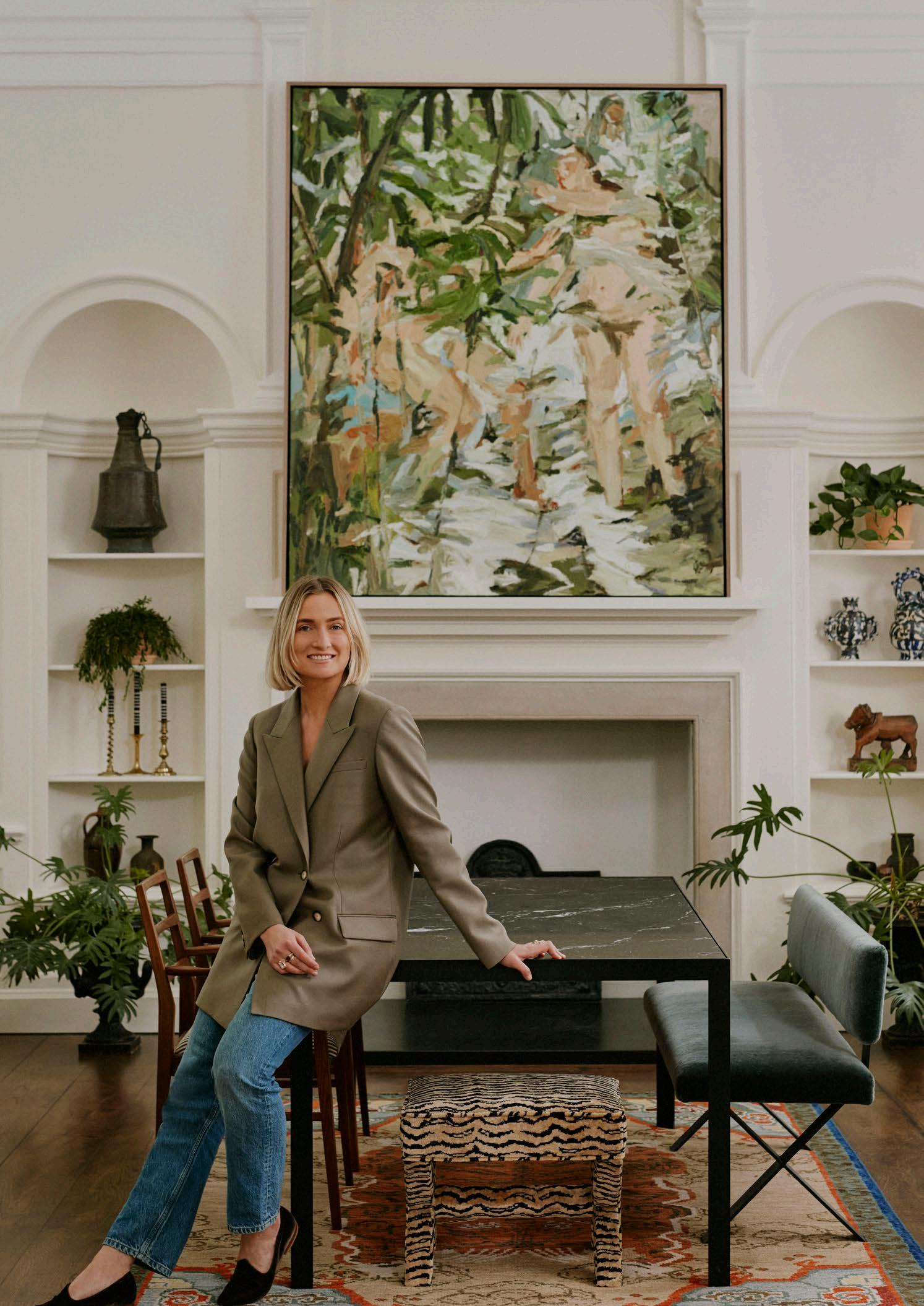
Steeped in history, the red-brick building neighbouring Buckingham Palace has been reimagined as the dazzling destination for the stylish Studio Ashby and its homeware offshoot brand, Sister. Unswayed by the passing dictates of fashion, Designer and Creative Director Sophie Ashby drew on her love of antiques, colour, modernist furniture, photography, and her latest discoveries to deliver an eclectic richness to the interior — and the design world hasn’t seen anything quite like it!
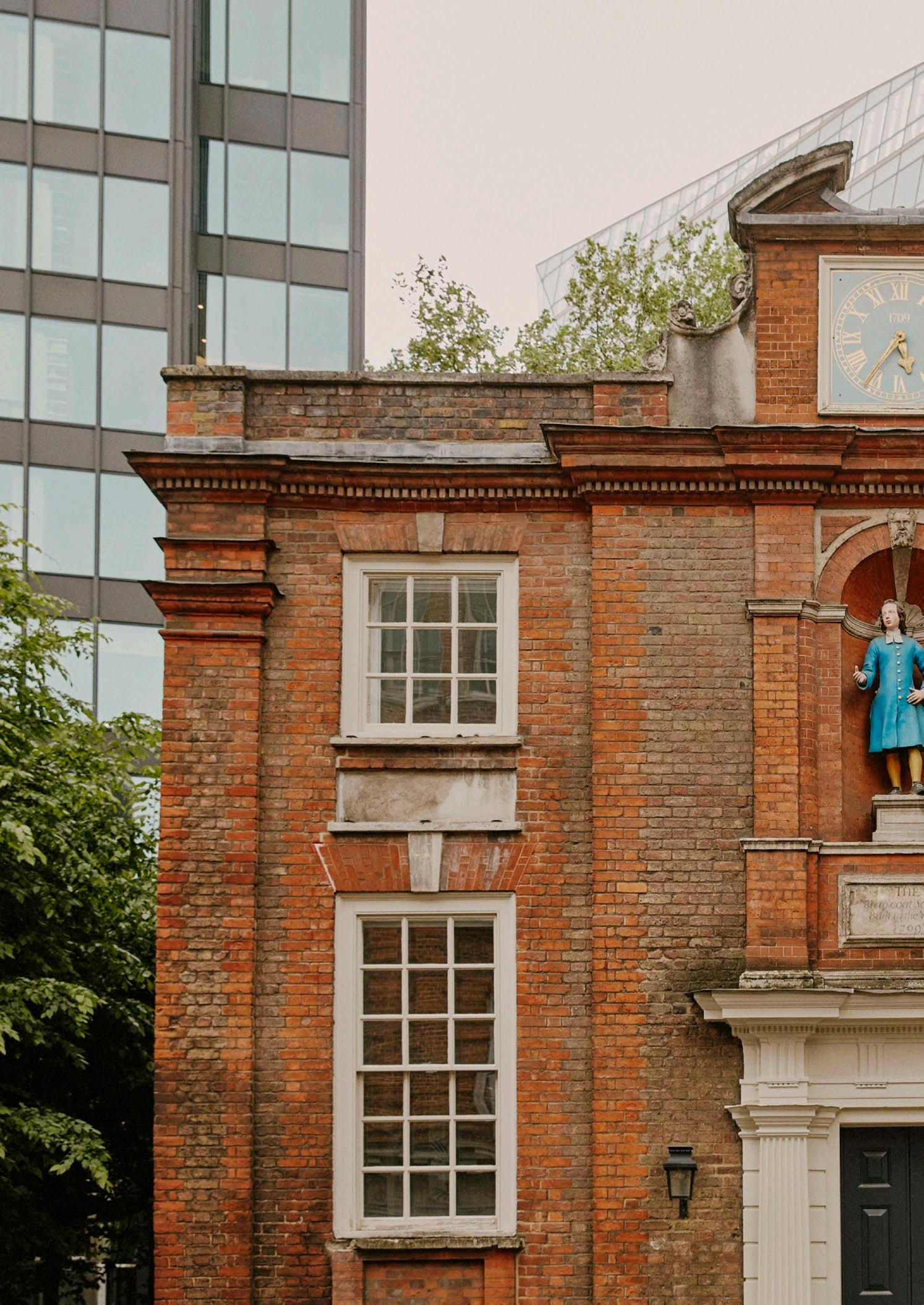
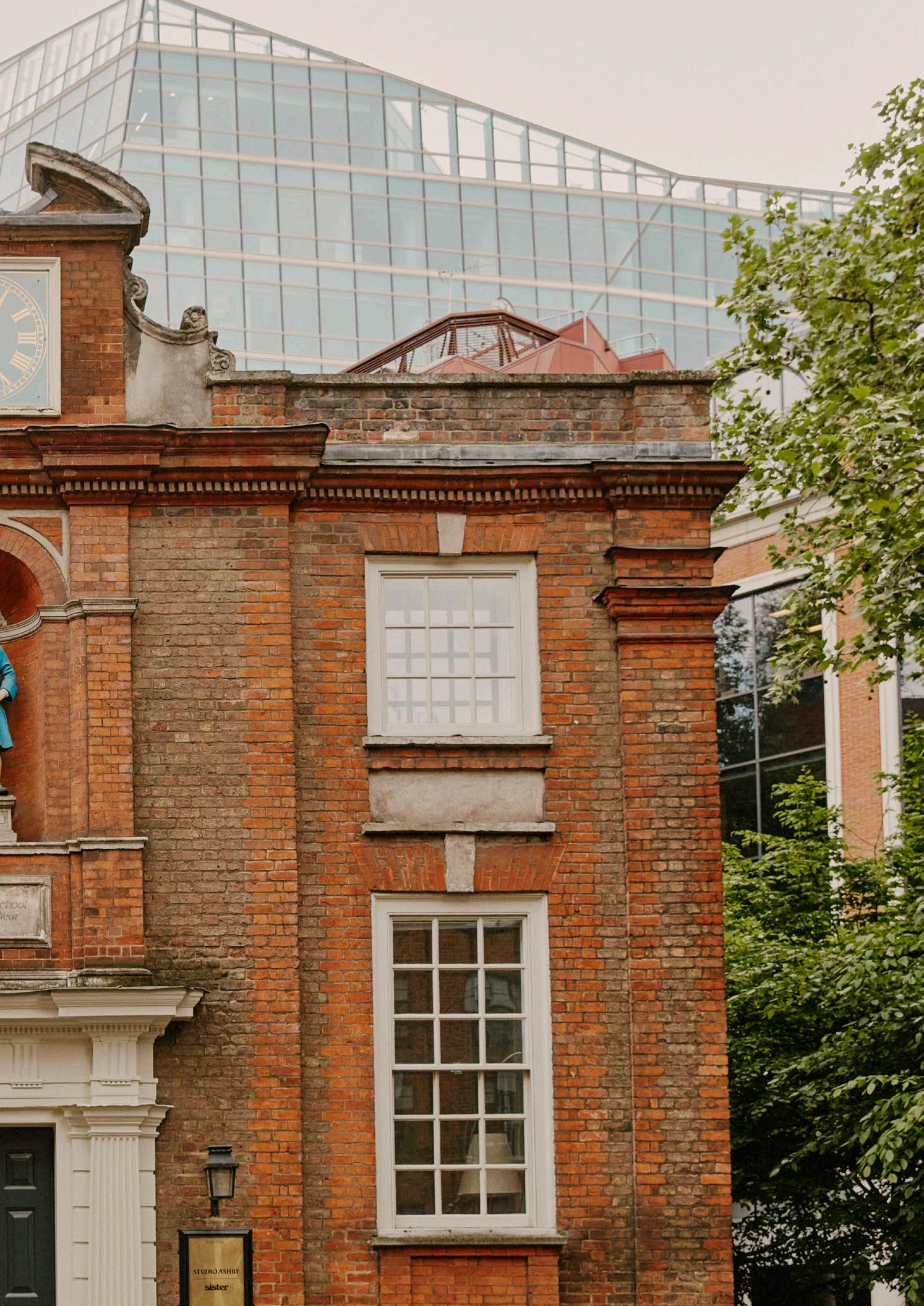
The Blewcoat School has been a commanding presence in the area since 1709 when it was constructed as a school for the underprivileged — a Blue Coat School. In 1899 the Blewcoat charity relocated to a purpose-built space, leaving the building as an elementary school. The name, however, remained through the decades. In 1954, the building was purchased by the National Trust to house a gift shop. This would remain operational until 2013 when fashion and bridal designer Ian Stewart reimagined it into his showroom: The Blewcoat.
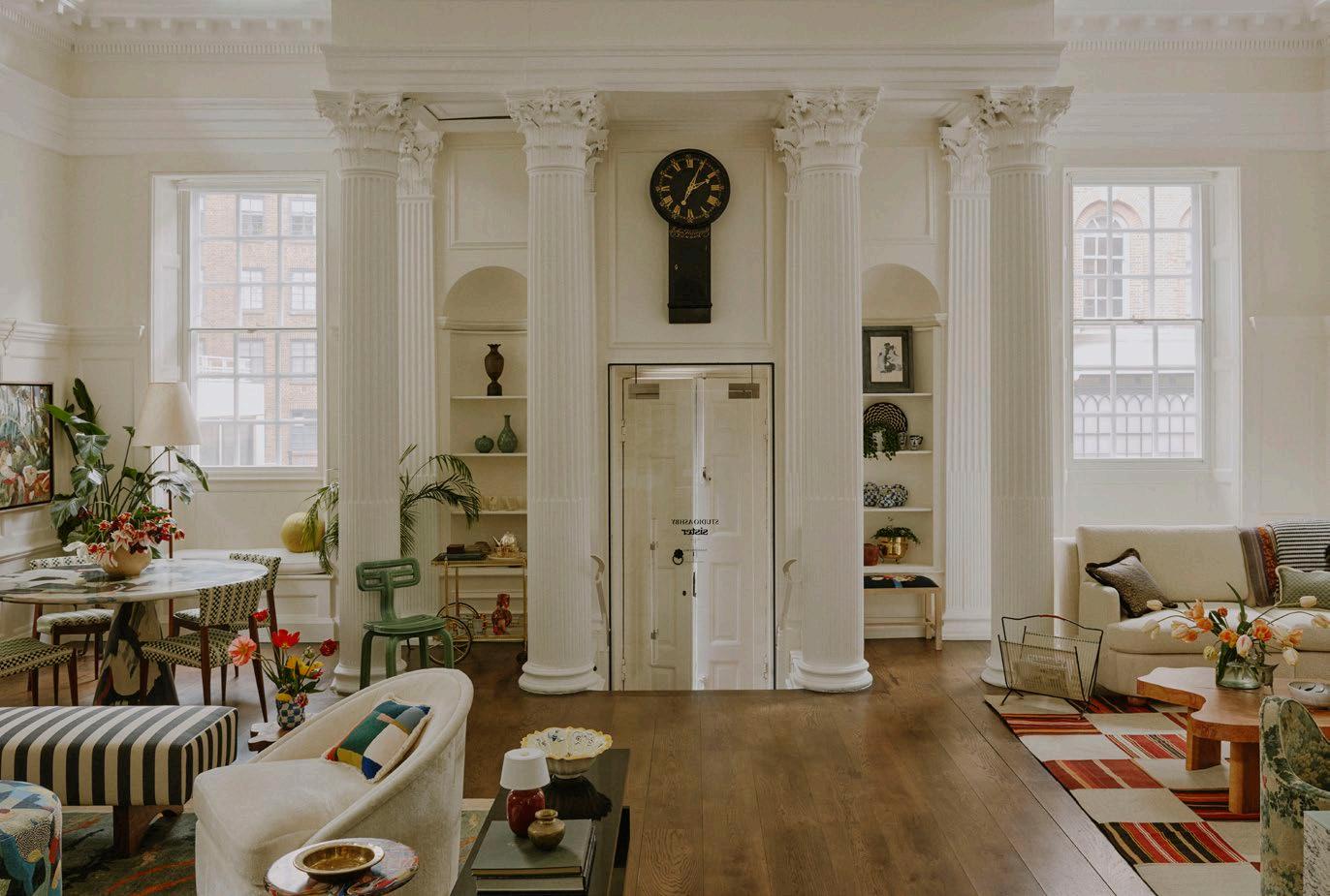
Astone’s throw from St James’s Park, nestled in a rare skyscraper-less clearing on Caxton Street in London sits the Grade I Listed, National Trust-owned Blewcoat School.Opening page: South African contemporary painter and former Blewcoat Artist in Residence, Mia Chaplin's 'Foundation', oil on canvas, is serenely framed by antiques, ceramics, and foliage in the alcoves.
"Part playground, part shop, Sister by Studio Ashby is a collection of future heirlooms, bespoke furniture, art, and accessories created and curated by Studio Ashby.”
Today, the London landmark is the real-life moodboard and shoppable universe for Sister by Studio Ashby Studio. Complete with six-metre ceiling heights, Corinthian columns, and a majestic fireplace, the space’s rich and magical history has been renovated with care and respect by the new custodians, who created a series of vibrant art and vintage-adorned mise-en-scènes to bring comfort and warmth to the grand, historic building.
It shouldn’t come as much of a surprise that the visionary studio-showroom-shop has become a designer haven for art and interiors aficionados. Interactive, everevolving, and welcoming, Blewcoat showcases a special curation of shoppable and highly covetable design pieces, from vivid paintings and future heirlooms, to statement chairs and charming trinkets.
Nostalgic with a contemporary feel, the top floor is Sister by Studio Ashby’s playground, a fresh and approachable home away from home that welcomes visitors and shoppers alike throughout the week. Downstairs is the realm of the design studio, housing enviable material libraries, meeting spaces, moodboards, and more.
No stranger to gracing the front page of some of the most renowned magazines in the world, Studio Ashby has fast become one of the go-to design studios in the UK and abroad.
As a half-South African growing up between Stellenbosch, London, and Devon, Sophie’s palette is inevitably influenced by the smokey blues, soft greens, ochres, and rusts of the Bushveld.
She loves weaving patterns and layering pieces that mean something. Whether it’s an item picked up while travelling or a family heirloom, she thinks it’s important to use objets that tell a story — sparking connection.
The perfect example of starting with the art: ‘Glory’, 2022, oil on canvas, by South African artist Erin
Art is undoubtedly Sophie’s first love, which makes perfect sense given she studied a BA (Hons) in History of Art at Leeds University, with summer courses in interior design in New York. She has a particular penchant for South African artists, with Amy Rusch and Michael Taylor standing out as a couple of her favourites. Their work is often spotted on the walls of Sister’s showroom, with an art exhibition that changes every six months.
The collection in these photographs was hand-picked by South African curator Amy Ellenbogen, with former Blewcoat Artists in Residence Erin and Mia Chaplin’s beautiful textured paintings dotted throughout the space. But art isn’t just masterpiece paintings: it can be photography, sculpture, illustrations, and mixed media, all jumbled together to create a rich and layered feel.
‘We had such a great time reimagining this incredible neoclassical building to work for us. It was an amazing opportunity to play with scale,’ Sophie reflects. ‘The picture rail allowed us to keep amazing art at eye level, which brings the focus down and helps our furniture (albeit supersize) feel at home. We can’t help but regularly look up at the vast columns, windows, and amazing ceiling.’ Indeed, it is hard to imagine a more fitting chapter for the Blewcoat School to live on its 300-year-strong legacy.
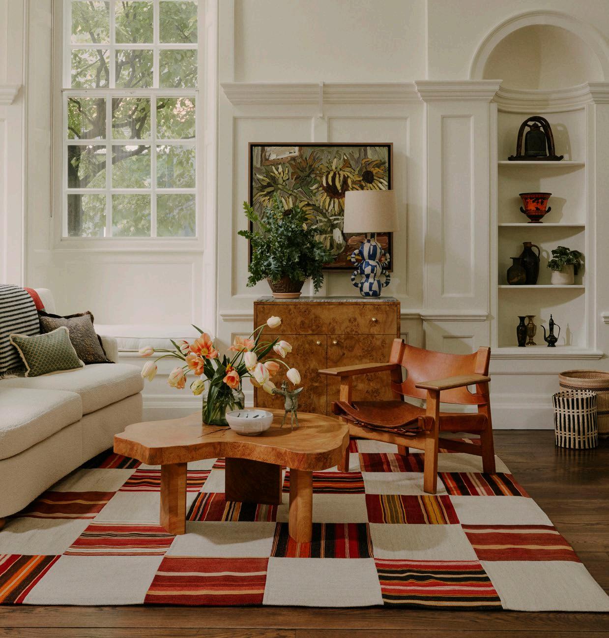

• SMITH Studio Fine Art Gallery, Cape Town
• WHATIFTHEWORLD, Cape Town
• Cob Gallery, London
• Tappan Collective, Los Angeles
• Highgate Contemporary Art, London
• Amy Badenhorst, Independent Curator and Art Advisor
• Tiwani Contemporary, London and Lagos
• Jack Bell Gallery, London
• JP Art Gallery, London
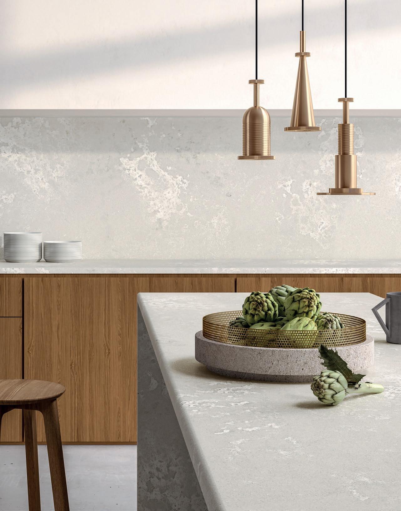
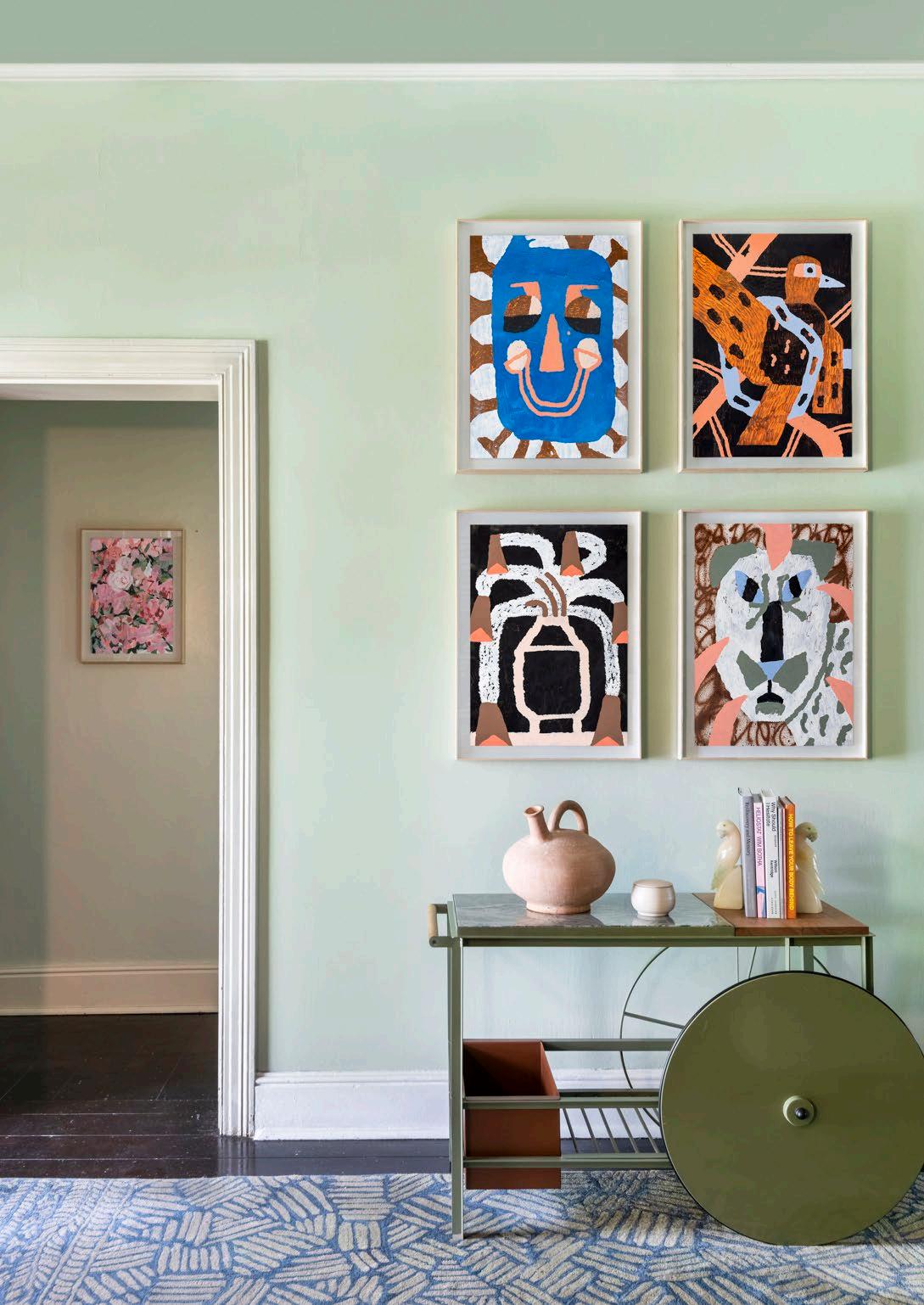
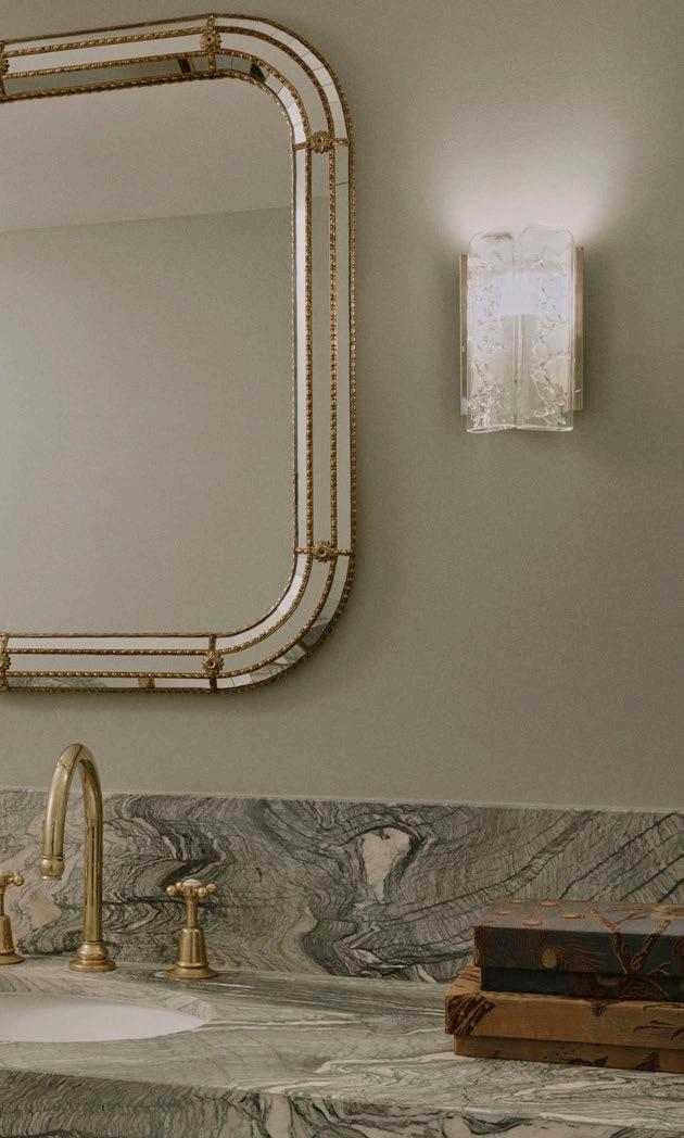
There’s nothing quite like a mid-year road trip to the Little Karoo. A welcome stop along Route 62, one of the longest wine routes in the world, is the charming country town of Robertson. Blissfully tucked between the banks of the Breede River and mountains, in a leafy part of town, a delightful Victorian grande dame awaits: The Robertson Small Hotel. A place to pause, ease into the new season, and gather some inspiration along the way, the luxurious yet homely interior was reimagined by Sophie Ashby of Studio Ashby — and it’s a gem!
With 10 distinct rooms, a restaurant headed by legendary chef Chris Erasmus, a bar and wine room, two pool areas, a wellness room, and a wrought-iron-edged veranda overlooking ample gardens, what Robertson’s only five-star hotel lacks in size, it makes up for in selections. Every single piece in the quaint national monument was sourced locally from South Africa, with masterpieces by artists Kylie Wentzel, Mia Chaplin, Bella Knemeyer, Lebogang Mogul Mabusela, Nico Krijno, Claire Johnson, Jeanne Gaigher, Cathy Abraham, Sue Pam-Grant, and Dale Lawrence to be found throughout. Using her relationships with artisans and craftsmen, extensive resources, and continual foraging, Sophie Ashby inserts humour and a love of objects with an explicit narrative to create a carefully balanced body of work.
Thoughtful curation is how you would describe the space. From the exquisite room key chains crafted by jewellery brand Pichulik to the custom playlist by Cape Town-based Roastin' Records and a signature hotel scent expertly blended by House of Gozdawa, every detail is a testament to artistic finesse and discerning taste.
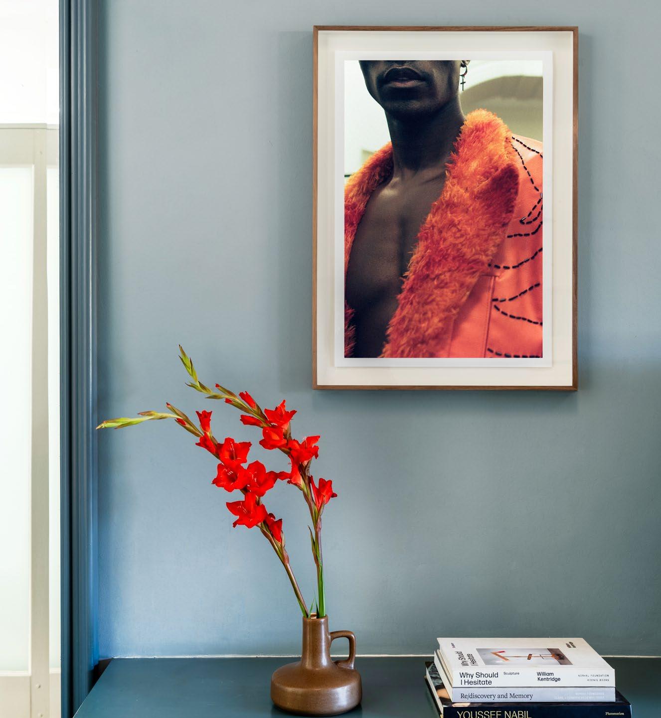
‘I have used 12 different colour tones throughout the hotel and each room varies slightly in combination. I was inspired by the local terrain, flora, and fauna, so there are elements of clay, ochre, aloes, the mountains — colours you could be surrounded by whatever the weather, wherever you are. I wanted there to be a strong link between outside and in.’


The project is certainly on-brand with Studio Ashby’s motto to 'Start with the Art'. Sophie Ashby explains, ‘Art plays a central role in our inspiration and process, and I believe art has a vital place in every interior and no space feels complete without it. It’s through art that the spaces become highly personalised and unique’. The acclaimed designer used her love of colour, contemporary ‘world art’, and photography to bring an eclectic richness to every room.
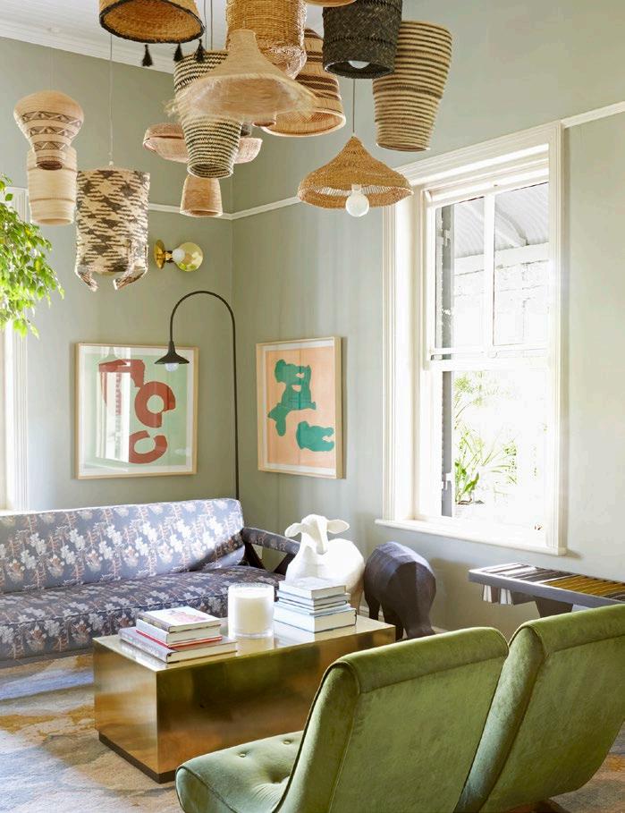
Once the London maestro hung up her boots in a satisfactory conclusion, Art Gazette, in partnership with Abigail Rands, filled the space with their splendid collection.
‘Magic lies in that liminal space that exists between collaborators,’ Art Gazette muses, ‘and our initiative with The Robertson Small Hotel proves this rule.’ The Small is one of the very few places where art buyers can connect with Art Gazette’s portfolio in situ, with the added intrigue of allowing guests the opportunity to take selected works home.
The hotel’s Rotational Gallery is an ever-evolving, living gallery, which is displayed across the boutique accommodation’s picturesque grounds, award-winning restaurant, and spellbinding hallways. Art Gazette assisted with the advisory and selection of 90 local artworks for the collection, which was carefully curated by Morné Visagie, a talented South African artist who is also the co-founder and chief curator of Art Gazette.
Then there is the Permanent Collection — a collaborative vision between Morné Visagie and proprietor Abigail Rands that has found its perpetual home in Robertson. The duo’s mission was to select works that, together, create a strong and diverse collection of contemporary South African art that would holistically form part of The Small’s identity, the design, the people, and the overall guest experience. The result is nothing short of spectacular, giving the Valley of Wine and Roses an air of artistic allure, attracting aficionados the globe over.
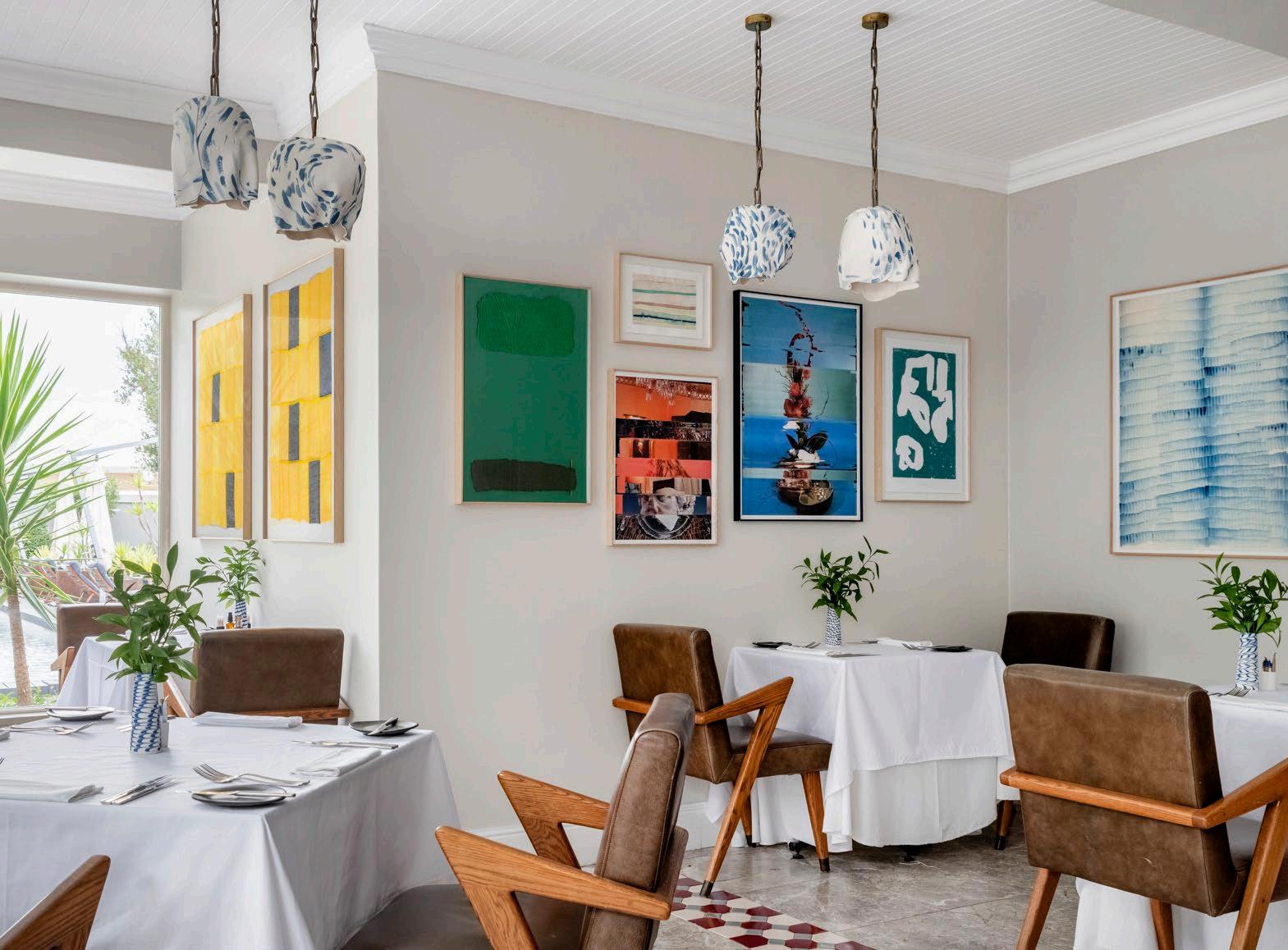
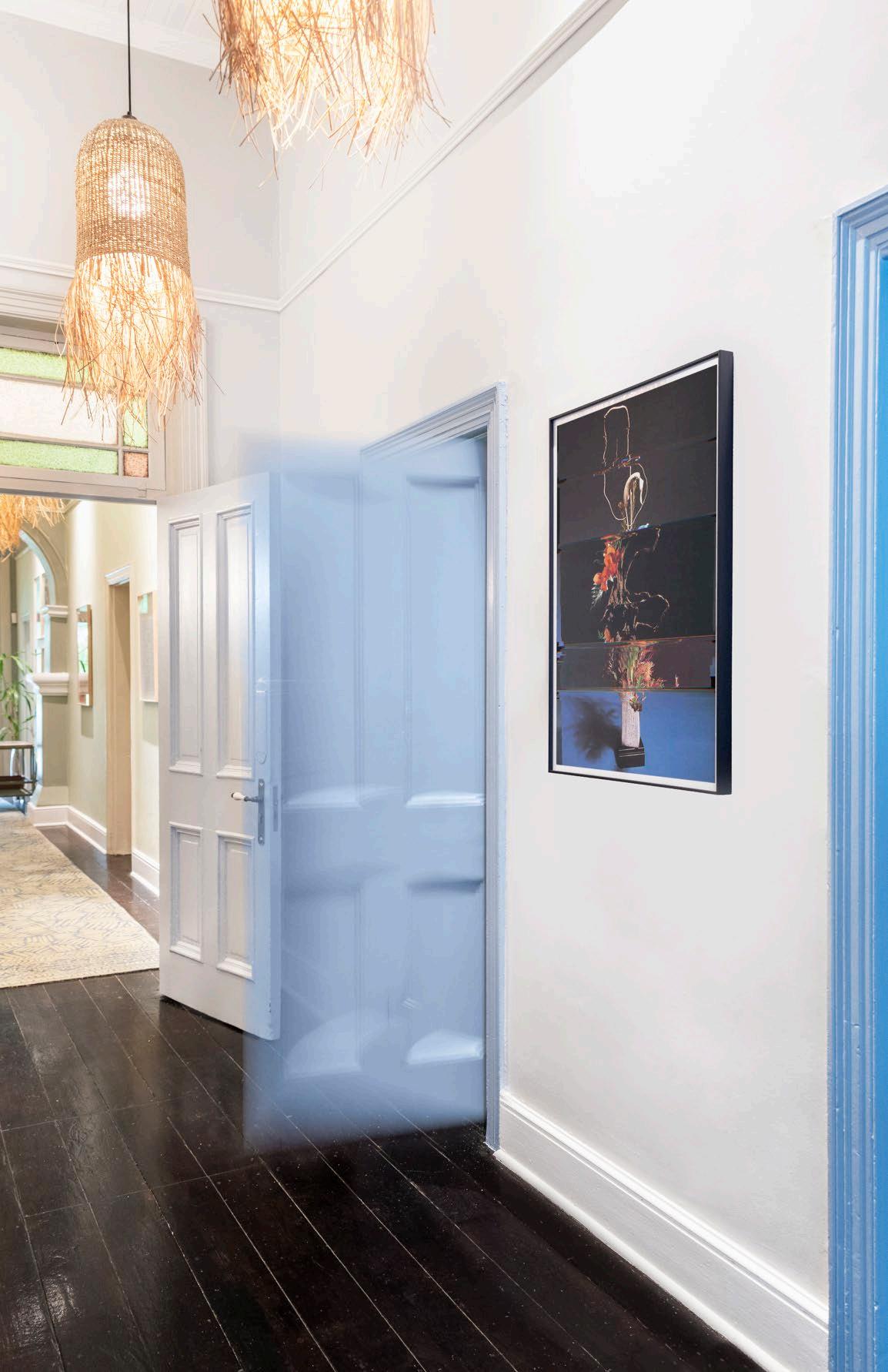
INTERIOR DESIGN
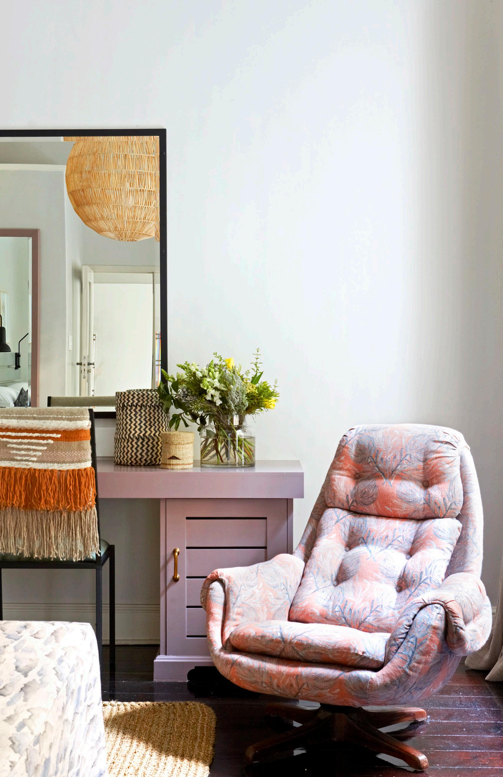
Sophie Ashby
Studio Ashby
ART CURATION
Art Gazette
Morné Visagie
Abigail Rands
PHOTOGRAPHY
Mickey Hoyle
Paris Brummer
The stunning custom blue and white porcelain bar, designed by artist Michael Chandler, pays homage to the parlour’s former resident, the mysterious ‘Tannie Em’, who is said to have enjoyed a drink before bed. The traditional Victorian style heroes Robertson and its beautiful proteas, prickly pears, aloes, ericas, and succulents.

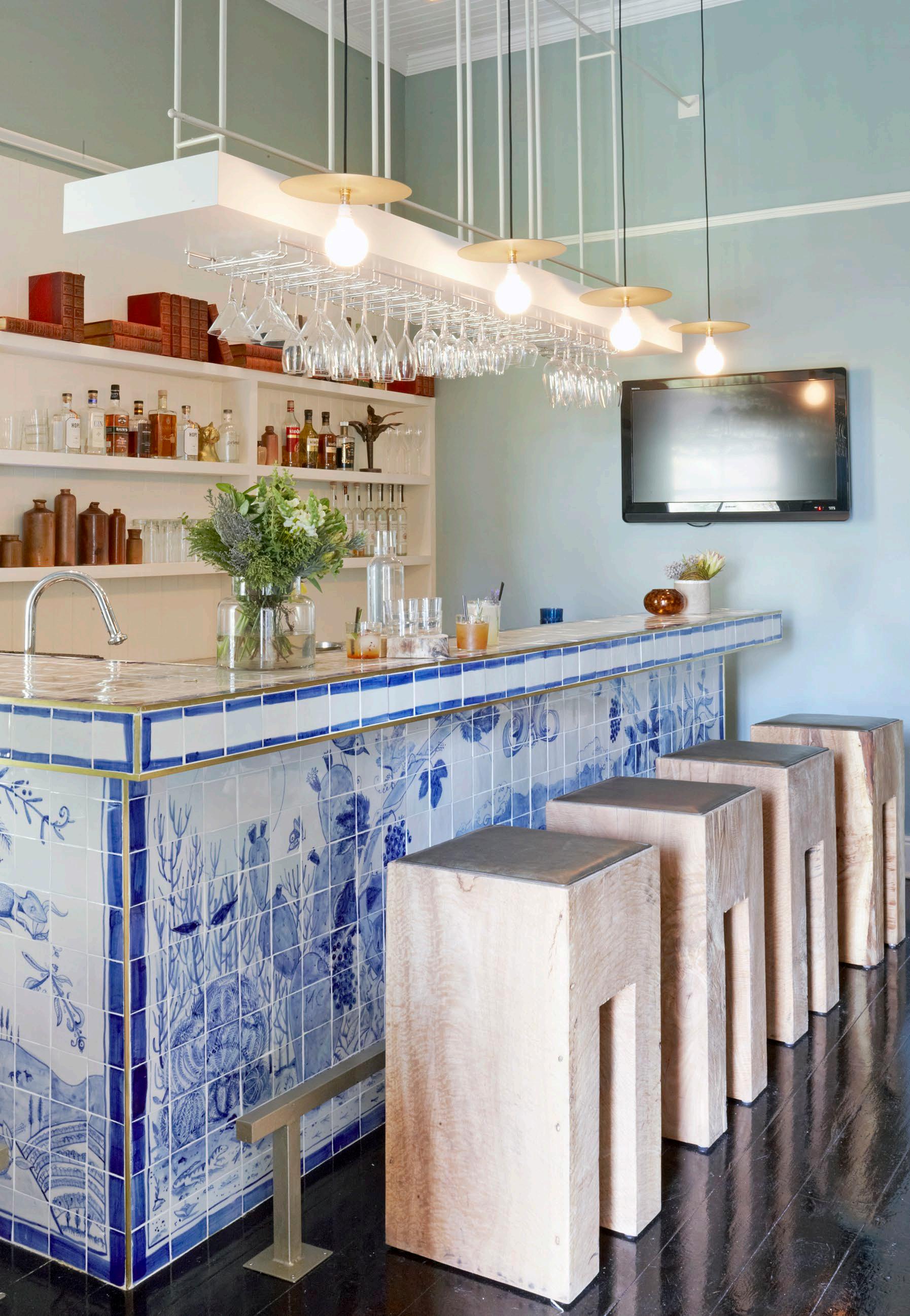
It’s time to uncork, unwind, and entertain in style! Here’s our top picks of local red delights and exquisite glassware fit for a dinner party.
Savage Wines | savagewines.com

R300
The bottomless blend: This bold red blend of 50% Touriga and 50% Syrah really hits the spot! The aromas are dark and alluring, with a mix of plum fruit, spicy notes, and savoury tones.
Red Wine Glasses
Ngwenya Glass | ngwenyaglass.co.sz
R789 set of 4
Luddite Wines | luddite.co.za
R1305
The dust collector: This cult classic Shiraz is juicy with a welcoming spice and a touch of toastiness opening to a plummy dark fruit on the nose.

Douro Wine Glasses


Weylandts | weylandts.co.za
R1595 set of 6
Peter’s Vision 2017
Catherine Marshall Wines | cmwines.co.za
R480
The eccentric enigma: this 60% Merlot and 40% Cabernet Franc is a classic pick with aromatics of fresh black plums, mulberries, and violets.

Baobab Red Wine Glasses
Carrol Boyes | carrolboyes.com
R949 set of 4
Le Général Red Blend 2019
Lanzerac | lanzerac.co.za

R595
The French dispatch: A ‘Left Bank Blend’ of 79% Cabernet Sauvignon, 17% Malbec, 3% Petit Verdot, and 1% Merlot, this limited barrel vintage is both full-bodied and smooth. It serves a taste of vanilla and nutmeg with a blend of berries and hints of chocolate and smoke.
Wine Goblet

KNUS | knus.co
R500 set of 4

