

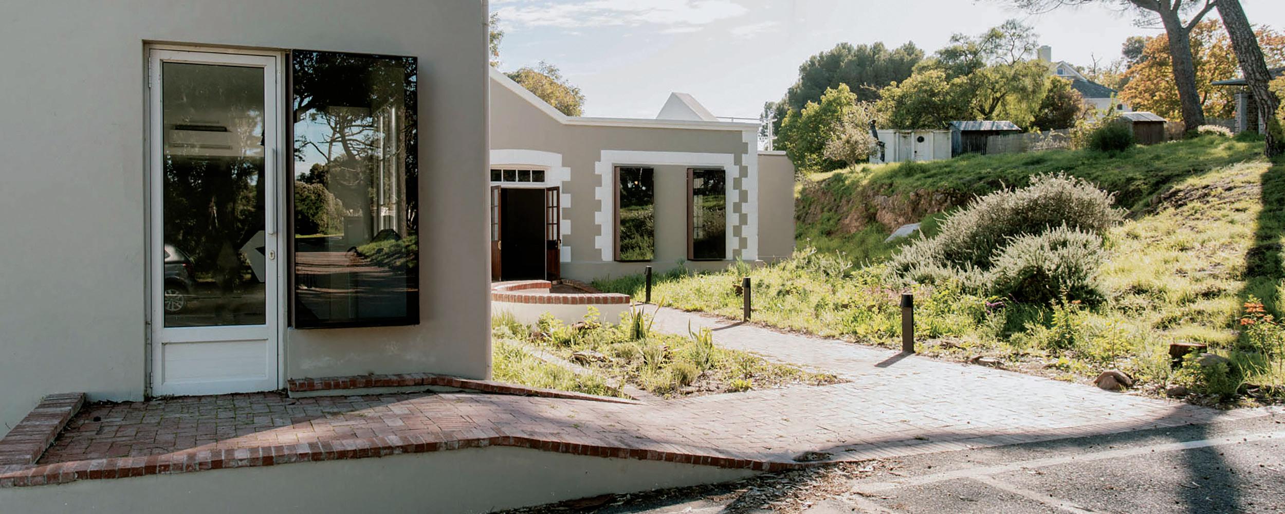
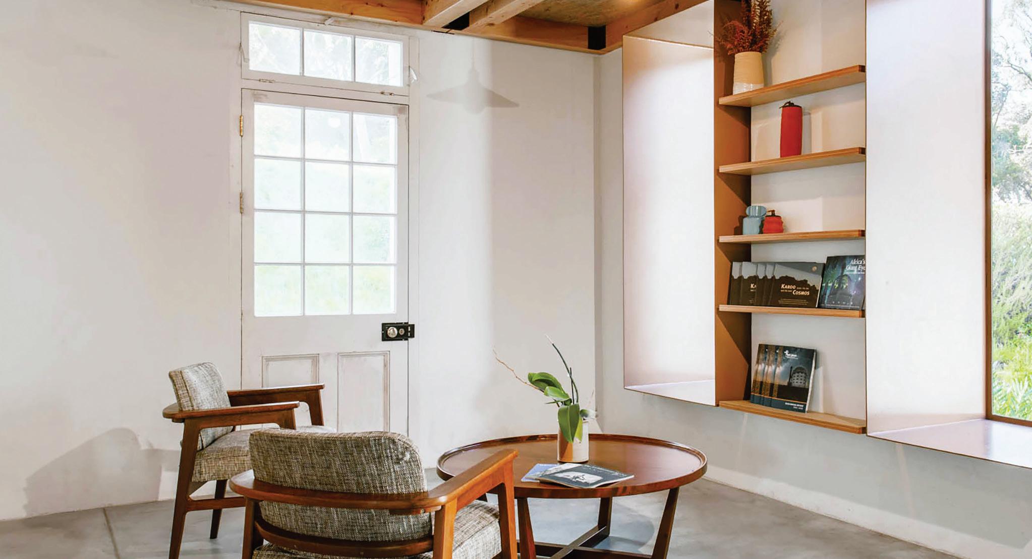
We believe in breathing new life into heritage buildings. With stricter heritage building legislation and an increasing move towards reusing existing buildings in line with the circular economy, heritage building refurbishments have become a hot topic in balancing the heritage look with modern and sustainable building materials.
We pride ourselves for being at the forefront of the latest steel technology to offer our clients a range of quality steel products to turn their next refurbishment project into a long-lasting masterpiece.
Choose the steel that true visionaries prefer to use. Safal Steel, the possibilities are endless.


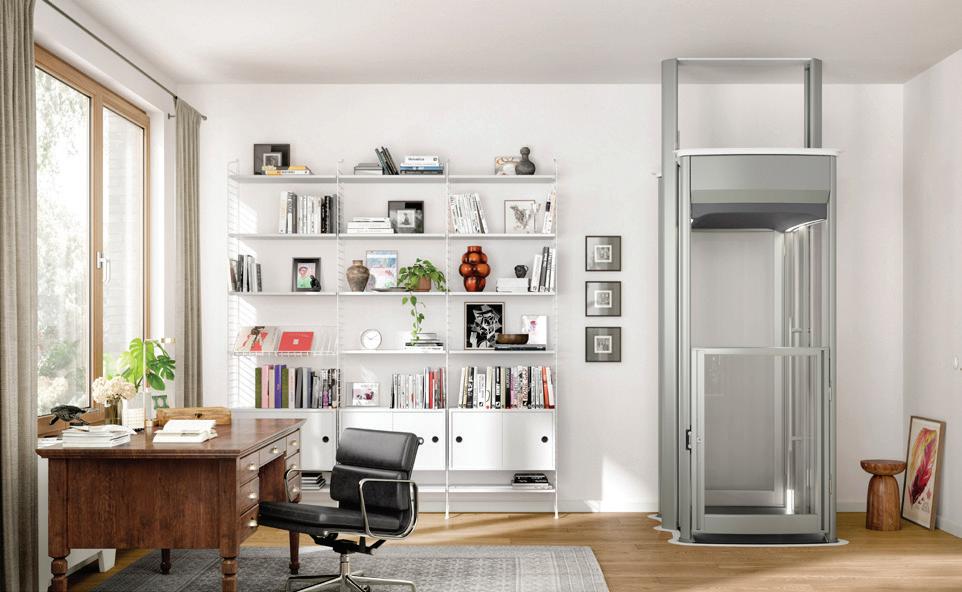
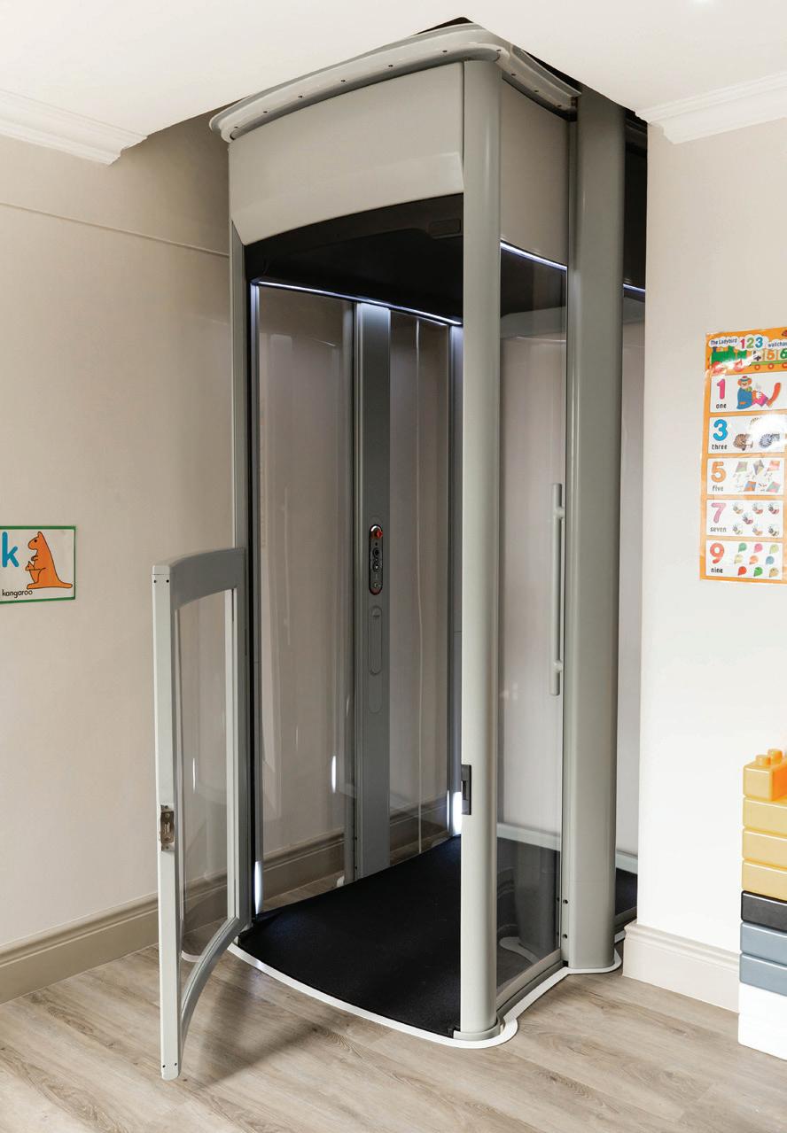
Lifta SA is the exclusive distributor of the Stiltz Home Lift in Southern Africa. Stiltz is an award-winning, UK-based lift company that offers an impressive variety of innovative and unique Home Lifts specifically for use in double-storey homes.
Serving South African personalisation
Since Stiltz started selling lifts in England in 2010, they have grown rapidly to become a key player in the Home Lift industry with markets in the USA, Germany, Australia, China, the Middle East, and South Africa, of course. Established in 2007, Lifta SA is the South African subsidiary of the family-owned German company Liftstar GmbH. Lifta SA prides itself on being at the forefront of innovation and style in the local mobility solutions market. With the support of its German shareholders, Lifta SA offers you European quality and design with a proudly South African personalised and focussed level of service.
Considering capacity
Lifta SA offers two varieties of Home Lift – the Duo and the Trio Home Lift. The Duo, capable of carrying two passengers, has the smallest footprint on the residential market at just 0.8 m² and a weight capacity of 170 kg. The wheelchair-friendly Trio’s footprint is only 1.3 m² with a weight capacity of 250 kg.
It’s never too late
A wonderful feature of the Home Lift is that can also be installed retrospectively – after your house has been built and even after you have been living in it for a number of years. Lifta’s highly skilled team of technicians can install the lift within two days with minimal disruption to your daily life. The Home Lift does not require a shaft, motor room, or pit room, making construction costs substantially more affordable than conventional lifts. No three-phase power is required either as the lift operates by way of a normal residential 220V plug. Due to its minimal power usage, Home Lifts operate by way of a regular inverter and solar power.
www.lifta.co.za
Diversity at its finest
Due to their size and no need for a shaft, Home Lifts can be installed almost anywhere within your home, including braai rooms, bedrooms, entertainment areas, and kitchens. With incredible diversity, it can be used as a mobility solution for wheelchair users, transport groceries or pets from one floor to another, or just as an affordable, elegant alternative to a stairlift or commercial lift.
Getting there
The sales process is designed to be as simple and stress-free as the lift itself. A no-obligation, free on-site assessment will be booked at a time and date that suits your schedule. A Product Specialist will introduce you to the product, and help you find the perfect location for your client’s Home Lift.
Call us now on 080 737 3737 for a free, no-obligation, on-site assessment to find a new home for your project’s Home Lift.
L i a Ho m e L i s a re t h e epi to m e of st yle, fun ction and com for t - t h e per fe ct a dditio n to your doub l e sto re y home


From forest to floor
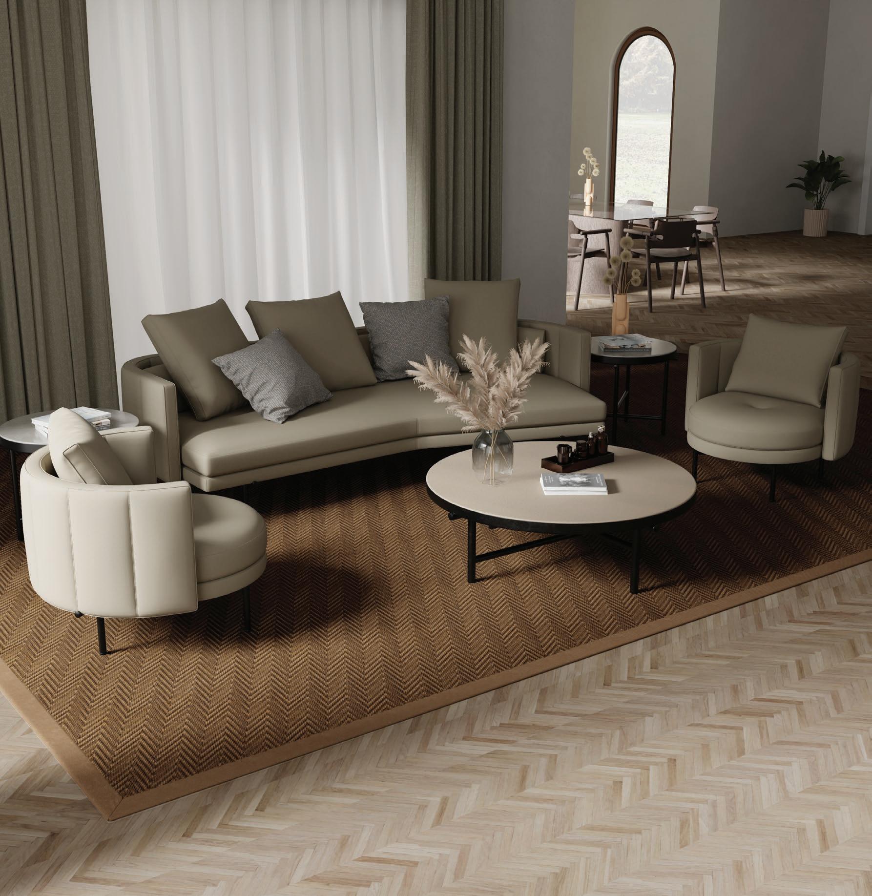
Hardwood Flooring, Cladding & Decking Manufacturers


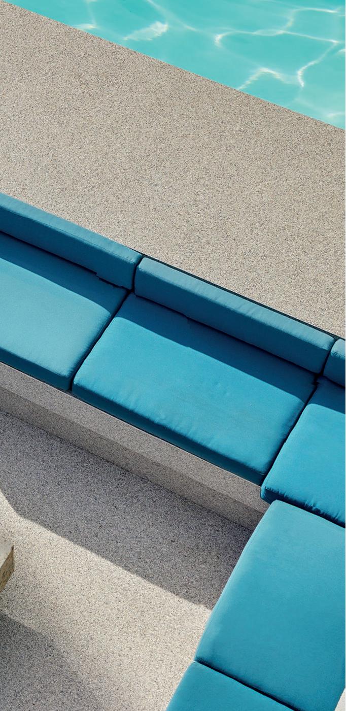
Timeless and luxurious flooring.
Smooth, versatile and hygienic.
Seamless indoor to outdoor flow.
Ideal for residential and hospitality.
Suitable for commercial and retail.


Impact and scratch-resistant.
Stain-resistant.
Slip-resistant.
Low maintenance and durable.
Eco-friendly and sustainable
100% UV stable and colour-fast.
Can be applied directly over tiles, eliminating grout lines.
Quick and neat installation by certified national applicators.
Available in 36 colours.
Available in 60 countries worldwide.

In architecture and design, the power of transformation is unparalleled. Each renovation tells a story of renewal — where old and new collide to give way to something nuanced: spaces that feel reimagined and redefined.
This issue of SCAPE is a tribute to the art of renovation and refurbishment, and a nod to the complexity of historic builds and restorations. It’s where design isn’t about starting from scratch but about peeling back layers, revealing contextual treasures, and rebuilding potential. Lately, we're all about breathing new life into the industry, and our revamp and refurb issue mirrors this sentiment for the built environment.
Whether restoring heritage buildings or injecting modernity into forgotten corners, architects and designers possess an extraordinary ability to bridge the past and the future. In the projects we spotlight, structures retain the integrity of their origins while embracing contemporary narratives, making these spaces all the more special.
To offer some insight into this realm of design, Enrike De Villiers from Sketch Interior Architects shares her experience in restaurant renovations, while Rebel Base Collective’s Vedhant Maharaj explores the topic of heritage in architecture. After a chat with the ladies at ATTIK Design and Bryce Henderson from Studio BHD, we present a collection of must-see projects from firms like Morris & Co, TDC&Co, and MR. Design Studio.
From adaptive reuse to the fine art of preserving patina, this issue delves into how transformation can be a profound dialogue between material, time, and intention. Renovation, after all, is more than just a physical act; it’s an exploration of history, memory, and the relentless pursuit of innovation.
Welcome to the renaissance of design. We'll see you all in November for our Winners Volume of the inaugural SCAPE Awards of Excellence.
Ed’s Note. C x
12 The Theatre of Design
SCAPE Trade Show Takes to the Stage
37 Notes on Designing Moments
A Tour Through Sunset House with ATTIK Design
67 A New Era of Hospitality
Cape Grace’s Reinvention by 1508 London
19 Stripping Back
The Art of the Restaurant Renovation
45 Journaling the Journey Designing Transformation with Bryce Henderson
74
Sole of the City
A New Home for Shelflife by TDC&Co
25 Heritage Re-crafted In New Dialogue with the Past
52 An Eye to the Future Morris & Co Revisits House 33
82
Unearthing Elegance
La Colombe’s Secret Cellar
33 A Night on the Town With Open Studios
CONTRIBUTORS
60 Boutique, But Make It Bold
The Ivory Haus by Westhaus
Enrike de Villiers, Sketch Interior Architects | Vedhant Maharaj, Rebel Base Collective | Open Studios | Brigid White and Cecile van Schoor, ATTIK Design | Bryce Henderson, Studio BHD | Morris & Co | Westhaus | Fairmont Hotels & Resorts and 1508 London | TDC&Co | MR. Design Studio, One to One by Martin Döller, and Wiid Design


If you’ve been part of the SCAPE community for a while, you know that this time of the year is Trade Show season. You could say this year was no different, but in true SCAPE fashion we had a few new features on the agenda to make it a show to remember.

On Friday the 6th of September, we took the industry to new heights and brighter sights — at our 6th annual SCAPE Trade Show. Titled In Tension, this year we welcomed over 887 discerning delegates through the doors of the CTICC’s Ballroom with a stunning view of the city on offer. The goal for the day? Inspire the design and architecture community and challenge firms, friends, and thought leaders to look at the influence of contrast, juxtaposition, balance, and opposition in design. From our speaker panels and superb suppliers to our dazzling delegates, the industry helped us knock it out of the park. With an incredible electricity in the air, we joined together to raise our voices and rewrite the script.
Hot topics
Entering a theatre of design, a star-studded cast took to the stage to create a reinvigorating day for design. Hot topics on culture in architecture, the art of collaboration, and blended design practices were the talk of the day. A highlight of the show, we want to honour the voices that raised the crowd to an elevated perspective: Dr Philippa Tumubweinee, The MAAK, Jacques van Embden of Blok, Benjamin Kollenberg of Urban Think Tank, BPAS’s Landseer Collen, and Dr Luyanda Mpahlwa, Jon Case of ARRCC, Veld Architects’ Gillian Holl, Adam Court of OKHA and Jan Ernst, Donald Nxumalo, Hours Clear, and Asher Marcus of Hubo Studio.
Bagels, brunch and bubbles
Everyone loves a Happy Hour, and our intermission between the two Acts was just that. Our bagel brunch served guests with wine and bubbly courtesy of Spier. As delegates visited supplier stands and specified the top products on the market, a celebration of these brands was the perfect intro to a session of celebration for the SCAPE Supplier of the Year Award.



In a year of firsts for us, 2024 saw the launch of the groundbreaking SCAPE Supplier of the Year Award. The inspired initiative is another new spin on industry awards, recognising the brands that make the materiality of the built environment a reality — a stride in the movement towards championing excellence!
The hunt for the top brands saw over 20 local industry icons selected to recognise the quality, reliability, customer service, innovation, and sustainable approach that it takes to be a winner. The industry leaders who showed their commitment by joining this endeavour were nothing short of excellent themselves: Georg van Gass, Pieter Mathews, Mphethi Morojele, Clinton Savage, Roxanne Kaye, Danielle Reimers, Chris van Niekerk, Sarah Stubbs-D’Ahl, Jean-Paul D’Ahl, Bryce Henderson, Gillian Holl, Gregory Katz, Warren Papier, Nicola Orpen, Hayley Turner, Amy Thompson, Liam Mooney, Natalie Hauman, Phillip Nel, Heinrich van Zyl, and Stuart Anderson.

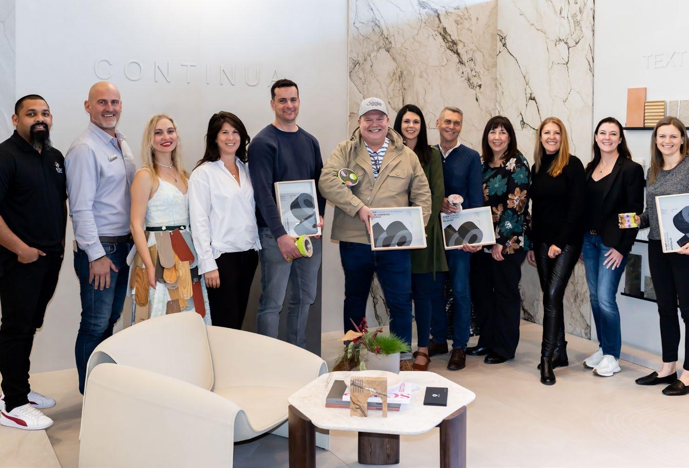
The Award Ceremony was a celebration of the 15 shortlisted brands that made

Each brand brought its best and showed us what excellence is really about, but as the votes were counted, only six remained in the running for the title of ‘as chosen by the top professionals in the industry’. Honourable mentions went to Kansai Plascon and Polyflor, before the final four were announced. The Trophy set, hand-crafted by MonkeyBiz, was reserved for the four brands that raised the stakes and outperformed their contenders. After a sparkling reveal, the top four were applauded — Interslab, Belgotex, Zuberi Flooring in second place, and the grand prize winner Oggie Hardwood Flooring! Standing as exemplars of the brilliance of product suppliers in SA, all those involved can proudly say they were part of history in the making, as the SCAPE Supplier of the Year Award introduces a new era of excellence.
For the final bow and as the curtains closed, we raised a glass to a showstopping event and the industry we love to spotlight. Glasses clinked, conversations buzzed, and the atmosphere carried the vibe that nobody could deny; the SCAPE Trade Show 2024 was a resounding success and a game-changing step for industry growth!

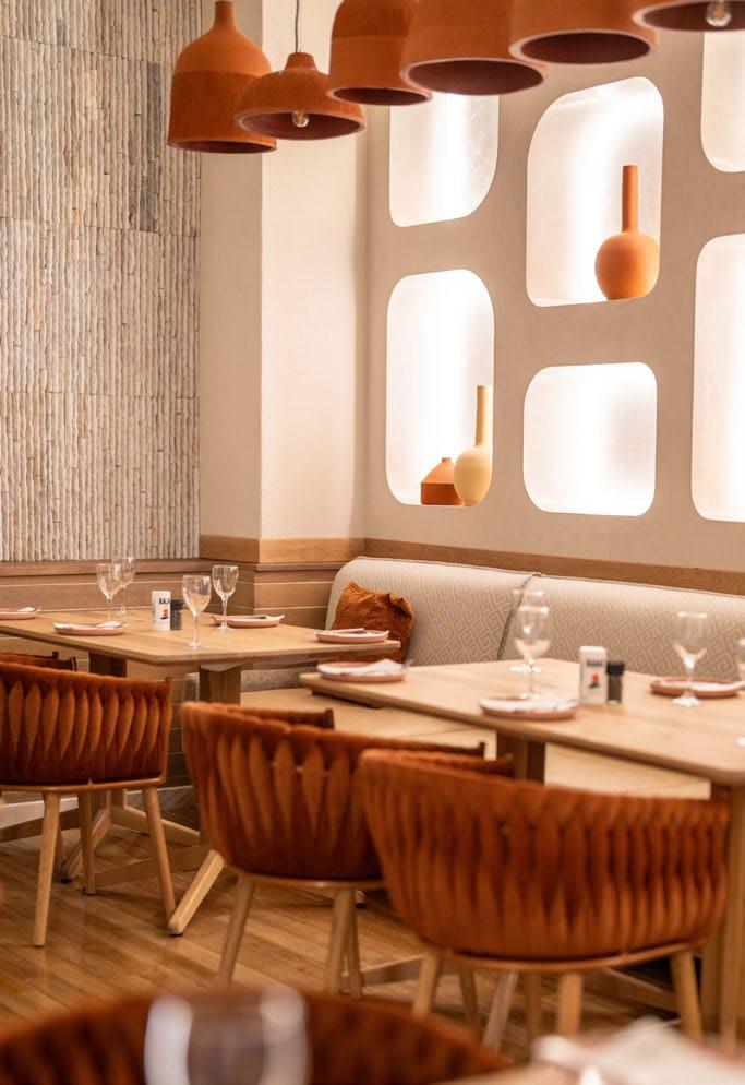
Second chances don’t come around often, but when they do, they hold the power to transform the past and curate the future. Combine that with the concept of serving up the best in gastronomy and you get the art of the restaurant renovation. Finely attuned to this area of expertise, Enrike de Villiers from Sketch Interior Architects sat down to collate her thoughts on this niche practice.
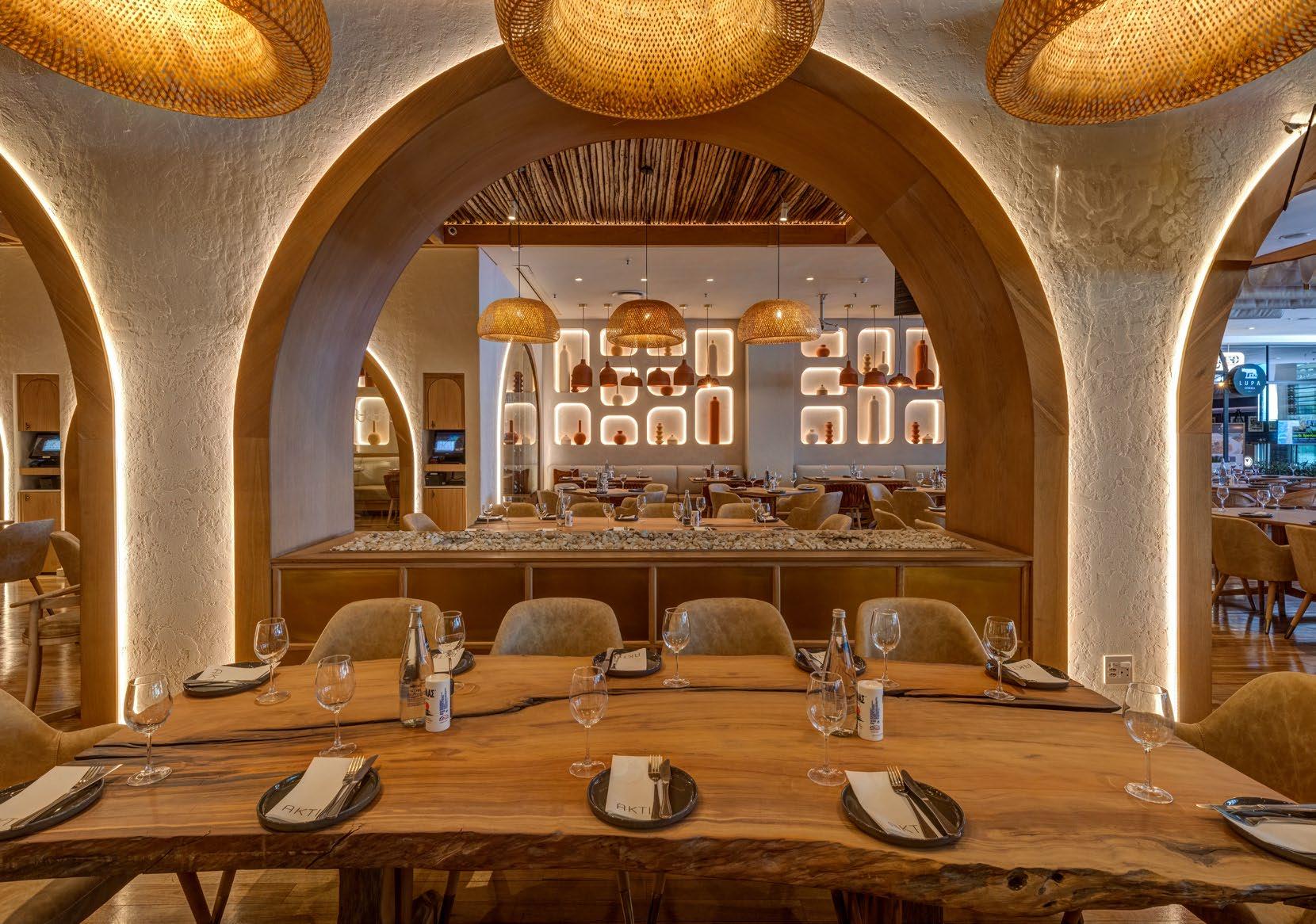
Approaching a restaurant renovation carries all the usual approaches of a new build: an initial consultation with the client and assessing their needs, defining the brief, budget, and goals, and a site survey and analysis. The uniqueness of this art comes forth in the challenges that renovation projects present. You’re not starting with a blank canvas and there is so much existing fabric to consider.
My key approach to this creative challenge is what I call ‘stripping back’. The process of stripping back is not physical (yet), but rather conceptual, through which I make three essential decisions: which parts of the existing design will remain as is, which parts will be changed or modified, and which parts will be demolished entirely.
Consulting the past
Then there is the heritage status factor. When that comes into play, albeit very rare in the industry, a large part of this process entails historic research, too. Historic architectural plans, old photographs, and articles about the building or interior in question are ideal resources. The general period of time and the architectural and design styles specific to that era are also invaluable in this process. In most cases, other professionals such as architects and engineers would be consulted to assess the structure of the building, and at times also a heritage consultant that specialises in preservation and restoration if required.
Balancing good and bad
Navigating this process alongside a client requires balancing the good and the bad, while always being straightforward and honest. A renovation project can be tricky in that you can only see the surface of the existing space. Often when demolition starts, we then uncover structural issues or degraded services that need to be fixed or replaced. The wisest move here is always to make sure that the client is aware of the risks and ‘unknowns’ in advance. Luckily, it is not all doom and gloom. One of the main benefits of a restaurant refurb is that you can reuse the existing services’ infrastructure and improve only where necessary. From this comes a huge advantage: added flexibility within the budget. You can then allocate more budget in areas that are more impactful for the customer experience.

The guardians of heritage
Honouring the existing design and build always plays a primary role, but it varies from project to project. Restaurant interiors are high traffic spaces that are subjected to a lot of wear and tear. Restaurants are often renovated every 3-5 years, in which case the existing build is not as significant and has no historic value yet. Once in while we get the privilege to renovate a restaurant that is in the region of one to two decades old. These types of places are icons, having survived the test of time. Naturally, honouring them becomes an integral part of the approach.
Even less often — perhaps a few times in the span of a career, if you’re lucky — a designer has the opportunity that I have now, which is to design within a host building that is older than 200 years. A unique case, these projects prioritise the survival, protection, and restoration of the existing design elements. The heritage comes first, everything else second. As a designer, you become the guardian of these elements.
The appeal of the reno
All design is a process. Renovation design is even more of a process. Anyone who designs renovations will tell you it is much more challenging than any new build. It is this challenging yet stimulating process that appeals to me in the short term while the project is ongoing. However, on a long-term and deeper level, there is something special about relinquishing the need to wholly author and fully own a design. Instead, it’s about embracing collaboration and co-ownership with the creative minds that came before you.
Refurb on the rise
Restaurant renovations have always been and will always be a significant part of the industry, because restaurants will always have to refurb as a way of implementing large scale maintenance (again due to the high traffic nature of these interiors). However, reno projects are increasingly more in vogue now as people are more aware of their footprint on the planet. Reuse and refurb come out on top, rather than building from scratch, while also refreshing the look and feel of a space and keeping up with trends.
In the blend of functional restoration, creativity, and aesthetics, the restaurant renovation is not only rewarding, but it’s also essential for the evolution of the industry. It is in this space that architects and designers are given the opportunity to honour the history that’s embedded in a building while also propelling an evolution of design.


“It’s about embracing collaboration and co-ownership with the creative minds that came before you.”


In New Dialogue with the Past
Vedhant Maharaj, Founding Director at Rebel Base Collective, leads a transformative movement that seeks to bridge the gap between heritage and modernity. With a focus on dismantling the status quo, the collective embraces the complexities of colonial heritage in South Africa, creating spaces that not only honour the past but also boldly envision the future. On this enlightening journey of re-crafting heritage, Vedhant sat down to share how he approaches heritage, the analyses inherent to the process, and how the old informs the new when designing for the future.
As a collective aimed at dismantling and reorganising the status quo within design, we believe that the interplay between old and new plays a pivotal role in our work. Heritage and the idea of ‘the old’ hold many, often contradictory meanings for people. In South Africa, colonial forms of heritage find themselves at the forefront of many conversations. Some celebrate and protect these spaces, while others find their presence imposing and alienating. At Rebel Base, we aim to challenge the line that divides the question of ‘whose heritage?’ and introduce ideas that are less obvious, creating spaces that are new yet derive a unique character by responding cleverly to what was.
Our process involves deep analysis. We dissect as many challenges as possible regarding the existing buildings, spaces, frameworks, and the feelings surrounding our projects. This often leads us down a rabbit hole, sometimes delving into places even we do not fully understand. However, the collection and understanding of this information provide us with a wealth of material to work from. Truly listening and observing are critical design drivers in finding unique solutions, which we then fuse with the practical requirements of our briefs.

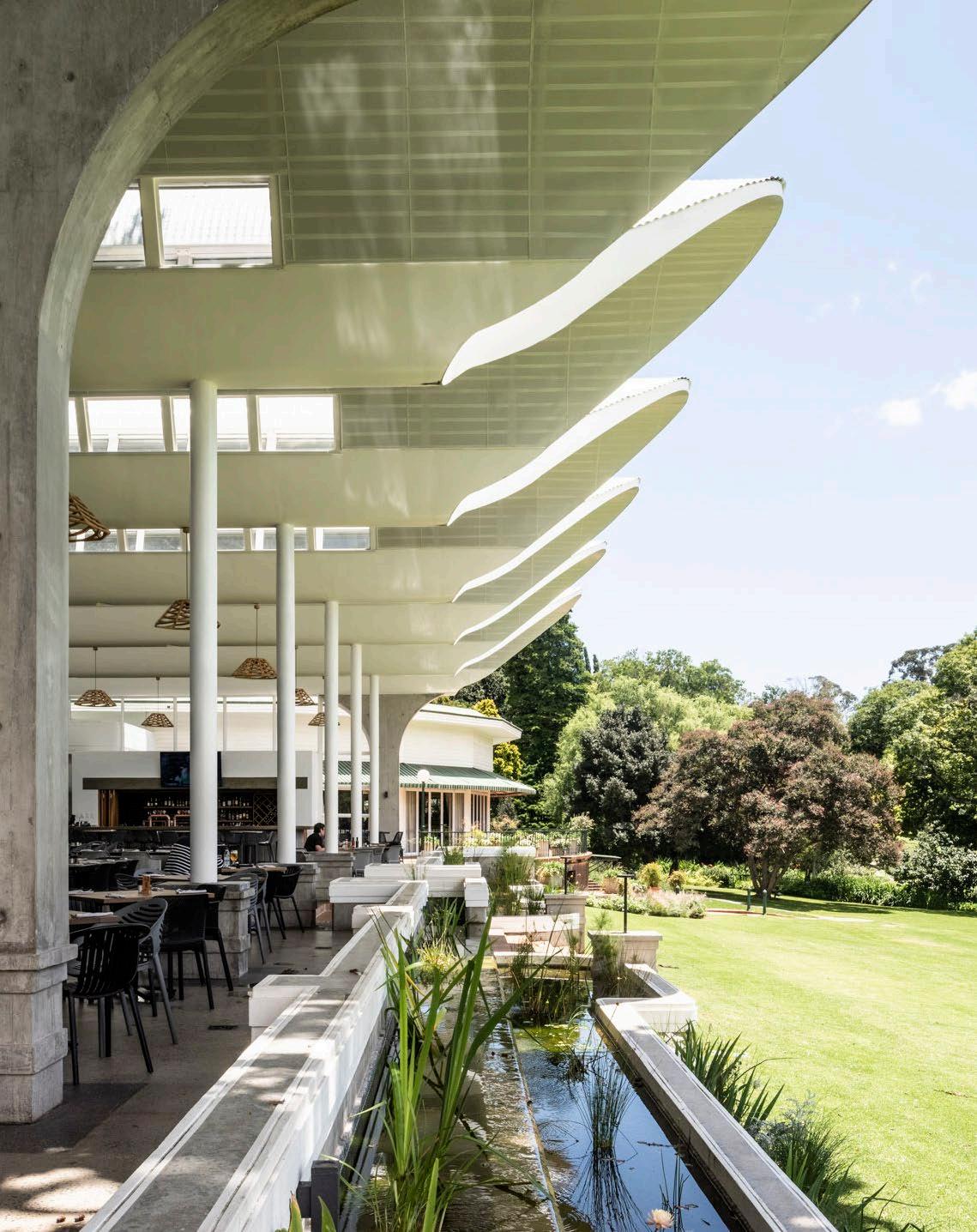
Our central approach was exemplified in our Ode to Oak project, where we aimed not only to satisfy practical needs but also to contribute to the layered conversation surrounding colonial heritage in Auckland Park, South Africa. Every element of the design responded to practical needs and desires rather than pursuing form for its own sake.
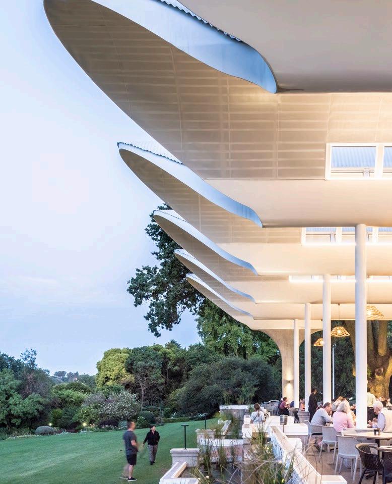
The undulating roof creates a light, voluminous space that remains intimate, hovering above the existing art-deco handrail, which needed to be retained. The rounded perforated ceiling surface optimises acoustic performance, reflecting sound in various directions to minimise direct reverberation.

“Every element of the design responded to practical needs and desires rather than pursuing form for its own sake.”
Clerestory windows allow light into the space while framing views of the sky and the grand old oak tree, further celebrated through a semi-circular cutout in the eastern-most vault. The soft tapered profile of the vaults merges the roofline into the sky, guiding the eye to the northern forest.
The resulting structure is bold yet soft, nodding to the old art-deco extension of the restaurant’s interior and unfolding into the majestic oak tree and rolling lawns. The weighty, utilitarian base of the reflecting and trickling water feature allows the roof to fly, acknowledging the club’s legacy while launching it into the future.
An exercise in blurring boundaries
Adaptive reuse is a powerful tool for creating sustainable and versatile buildings. We aim to blur the line between what is old and what is new; what the space can be used for now versus in the future. Our first step is to effectively use what we have. Whether salvaging and reusing materials or preserving spaces with unique features, we focus on sustainability.
BIKE HAUS represents a celebration of the raw building and how its purity serves as a backdrop for an exquisite tale of time. Home to a private collection of vintage motorcycles, the building draws inspiration from the shapes and elements found in motorcycles, subtly translated into the architecture.
Every element in the building is painstakingly handmade, challenging the norms of construction. The staircase hangs from the roof, casting dynamic shadows in the light-filled atrium. The brief required a design that could function as both a museum and a future home, prompting us to create a dual-purpose space that efficiently accommodates both needs, designing for the present and simultaneously planning for the future.
Often, we reinstate a detail that was removed from a building but that was part of the original design. This then gets a modern twist. Our corner windows in our MOD House project were removed at some point. We reintroduced these but made the corner completely openable to create an absence of space.
Looking towards the
Our approach is future-centric. I once found myself in hot water for stating that ‘heritage is not sacrosanct’ to a friend and fellow heritage-centric architect. For us, however, this statement rings true. Often, one can be so engulfed by the old that they try to replicate it or protect parts of it that hold little value simply because of their perceived heritage. We prefer to open a conversation with heritage — to challenge it, respect it, and find depth in how we create space for new heritages, allowing people who lack personal ties to past histories to find a place in our narrative.
Our addition to the St Mary’s campus envisages the future of education, revamping a familiar space and feel. By deviating from traditional forms and formats of schools, we’ve expanded the notion of educational spaces. The development was planned along the two main campus axial lines, making it a nexus and entrance point. This design splits the building into four parts, allowing for movement rather than merely arrival, fostering intimate inbetween spaces for students to inhabit during their breaks.


At Rebel Base Collective, we envision a future where heritage is not merely preserved but re-crafted — where the old informs the new, and where every space tells a story that resonates with the complexities of our shared past. As we continue to challenge the status quo, we remain steadfast in our belief that architecture can forge meaningful connections to heritage, and as intentional understanding of the future, allowing all individuals to find their place within the narrative of our built environment.

Director @rebelbase_clctv www.rebelbase.camp


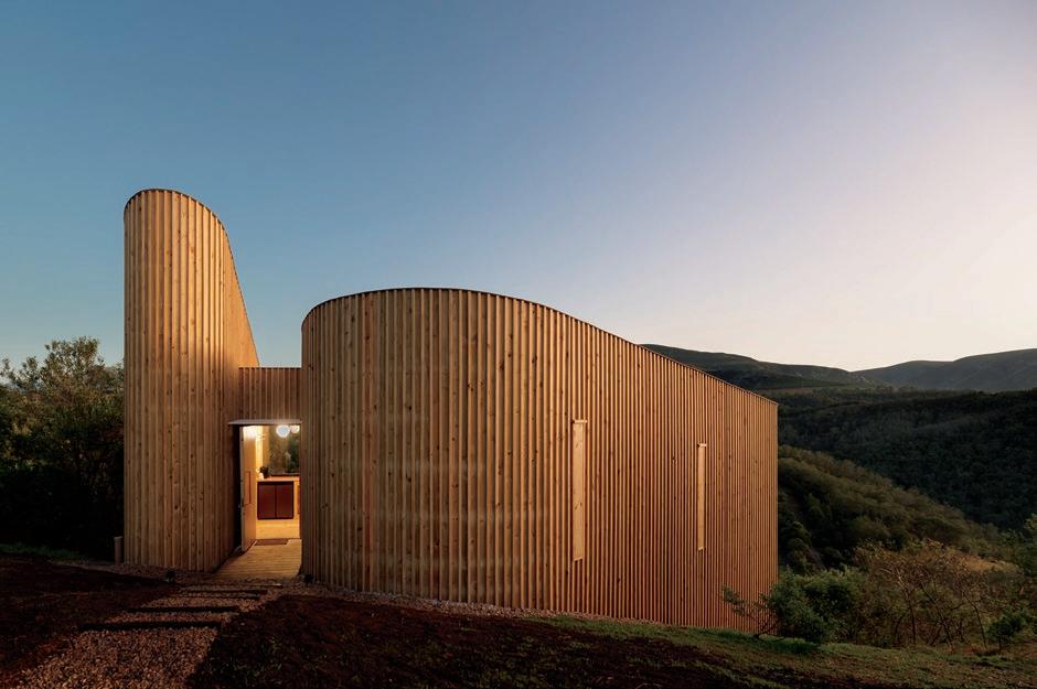

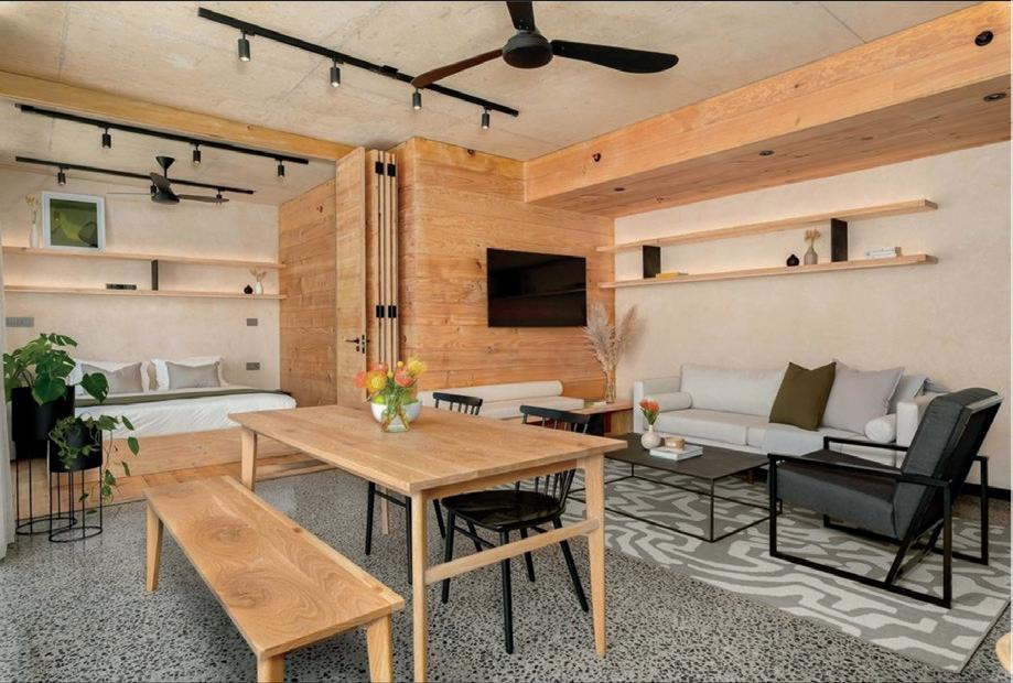


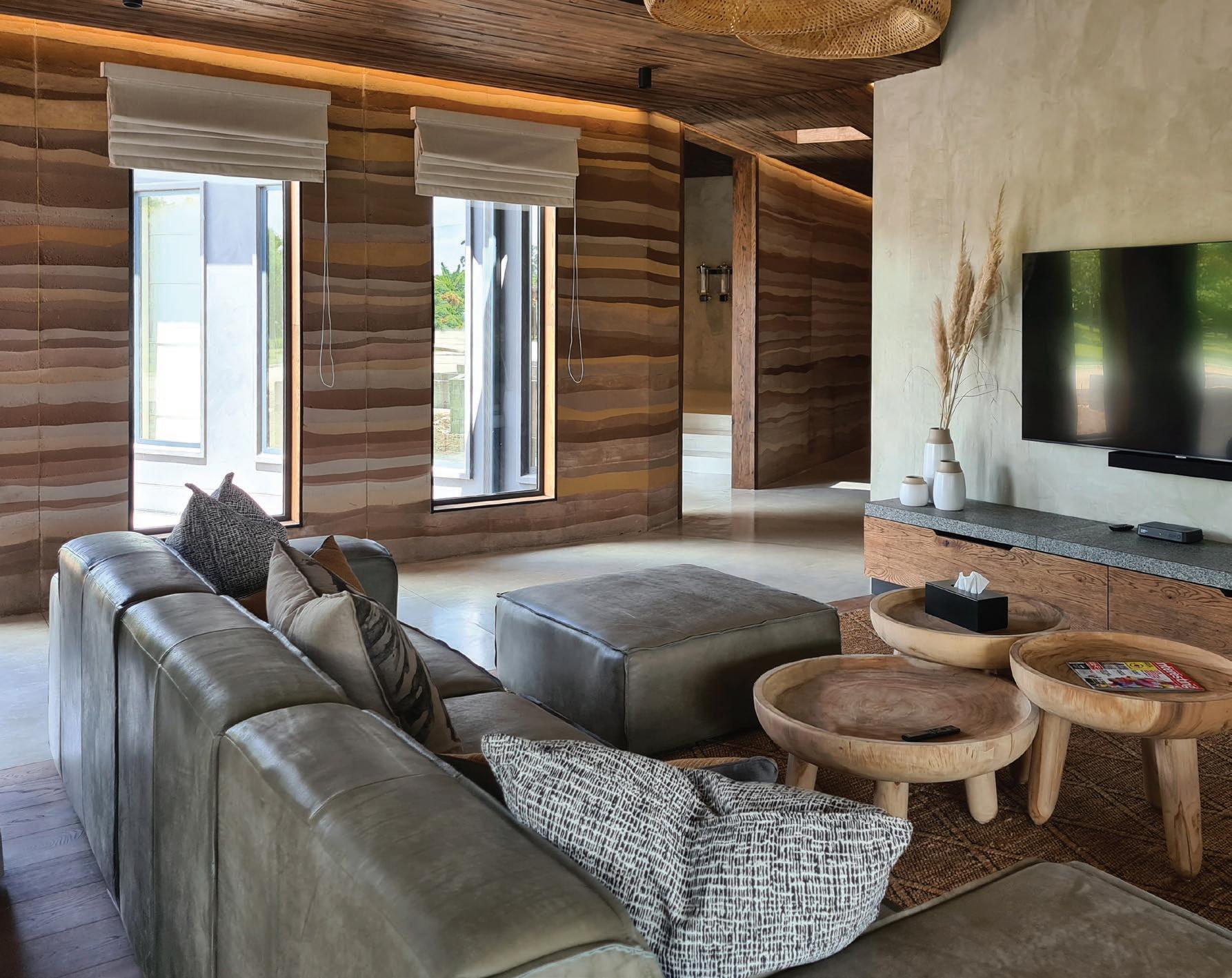
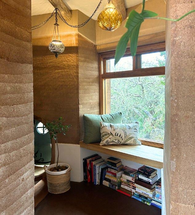
Nestled in the breathtaking Lowveld region, Jordana’s home is a striking example of modern, eco-conscious design. This meticulously crafted residence not only minimises its environmental impact but also maximises energy efficiency through cutting-edge technologies.
A bold vision
Jordana and Simon Morgan embraced a daring vision — one where sustainability and harmony with nature thrive together. Their dream transcended traditional boundaries, aspiring to create an eco-friendly home that inspires others to adopt a more sustainable lifestyle.
Driven by a deep appreciation for the Lowveld’s stunning landscapes, wildlife, and untouched habitats, the Morgans sought to build a sanctuary that seamlessly integrates with its surroundings. Their vision encompassed not just practicality, but the creation of a home that captivates the senses — merging modern elegance with the rustic charm of natural materials. The design invites the outdoors in, fostering a fluid connection between the house and its environment.
Architectural brilliance at its best
At the heart of this architectural masterpiece is Andy Horn of Eco Design Architects, a trailblazer in sustainable architecture. His renowned expertise has garnered widespread accolades, making him essential to the construction of the rammed earth walls and striking timber structures that define the home’s unique character.
The collaboration between Eco Design Architects and Assegai Services brought the Morgans’ dream to life. Experts from both teams dedicated themselves to creating a remarkable final product. JNA Roofing played a vital role, developing an innovative roofing system that marries the benefits of a green roof with the strength and sustainability of timber trusses. Locally sourced timber, treated with boron for enhanced durability and decay resistance, further underscores the home’s commitment to sustainability.
A masterpiece of natural materials
The earthy tones of the rammed earth walls, earthen floors, and eucalyptus timber create a stunning contrast with the sleek, lime-plastered internal brick walls. This harmonious blend of raw materials and refined finishes weaves a captivating visual narrative throughout the home.
ProNature’s breathable wood, wall, and floor coatings, both inside and out, enhance and preserve the natural beauty of these materials. Crafted from natural ingredients and mineral pigments, these coatings strike the perfect balance between earthy textures and contemporary colour palettes, infusing warmth and sophistication into the space.
Inspiring a greener tomorrow
This residence exemplifies sustainable construction and eco-friendly living in every sense. May it inspire us all to work towards a greener future — together!
For more information on ProNature’s coatings, including detailed technical data, visit their website at www.pronature.co.za. Their friendly and knowledgeable team is ready to assist with your project!


ater is among the world’s most valuable resources, yet it is also a universally mismanaged resource. As a result, water shortages are becoming ever more common. Leaks, amongst others, are the main factors that exacerbate water scarcity which results from network failure caused by, incorrect installation, lack of maintenance, aging infrastructure, and too high-water pressure. To reduce network failure, it is necessary to plan and budget for resources that will investigate and implement the necessary corrective steps to the water supply system. Furthermore, the advancement in technology has led to the development of quick “leak detector” devices that enables a quick detection and location of leaks within the network system, including the so-called hidden leaks which lose water into the ground through gaps derived in impaired pipelines.
South Africa loses about 40% of its water through leaks and unaccounted for water. This triggers the need for the architectural and maintenance industry to consider investing in a Smart Water concept as an innovative approach to improve efficiency and sustainability. Smart water systems use equipment and technology like sensors and control panels to detect and relay information about leaks and variation in water pressure. This system can be integrated with automated shut-off valves that automatically switch off the water supply when a leak is detected. To a certain extent, buidlings could be complemented by divine landscapes which will then necessitate the extention of the smart water system to help detect leaks within the landscape’s irrigation system. To assist with reducing the unnecessary water leaks, each water offtake in the landscape should ideally be fitted with its own meter that is either monitored manually or via a
smart device (preferred). Moreover, it’s essential to consider other areas where water leakage could pose a significant problem. For instance, a constantly dripping faucet or a leaking toilet can result in an average daily water wastage of 30 to 60 liters.
To address these issues and reduce water expenses, Water Wise provides straightforward DIY solutions, including:
• Monitor your water usage: Reading your water meter at the beginning and at the end of each day/every month can help you gauge your household and business water consumption.
• Irrigation system leaks: If an irrigation head is steadily dripping water when the system is off, you may have a leaking valve underground or a worn diaphragm which needs to be replaced. It’s always best to call in the professional landscaper to step in and patch things up properly.
• Landscape inspection: It’s a good idea to periodically inspect your landscape for irrigation system problems, such as moist ground which indicate an underground leak.
• Toilet leak detection: To check if your toilet is leaking, simply add approximately 4 to 5 drops of food coloring into the toilet tank/cistern. If you notice the coloring seeping into the bowl without flushing within 30 minutes, it signals the presence of a leak that require immediate repairs.
• Fixing leaking taps: Address tap leaks by replacing wornout tap washers.
Be #WaterWise


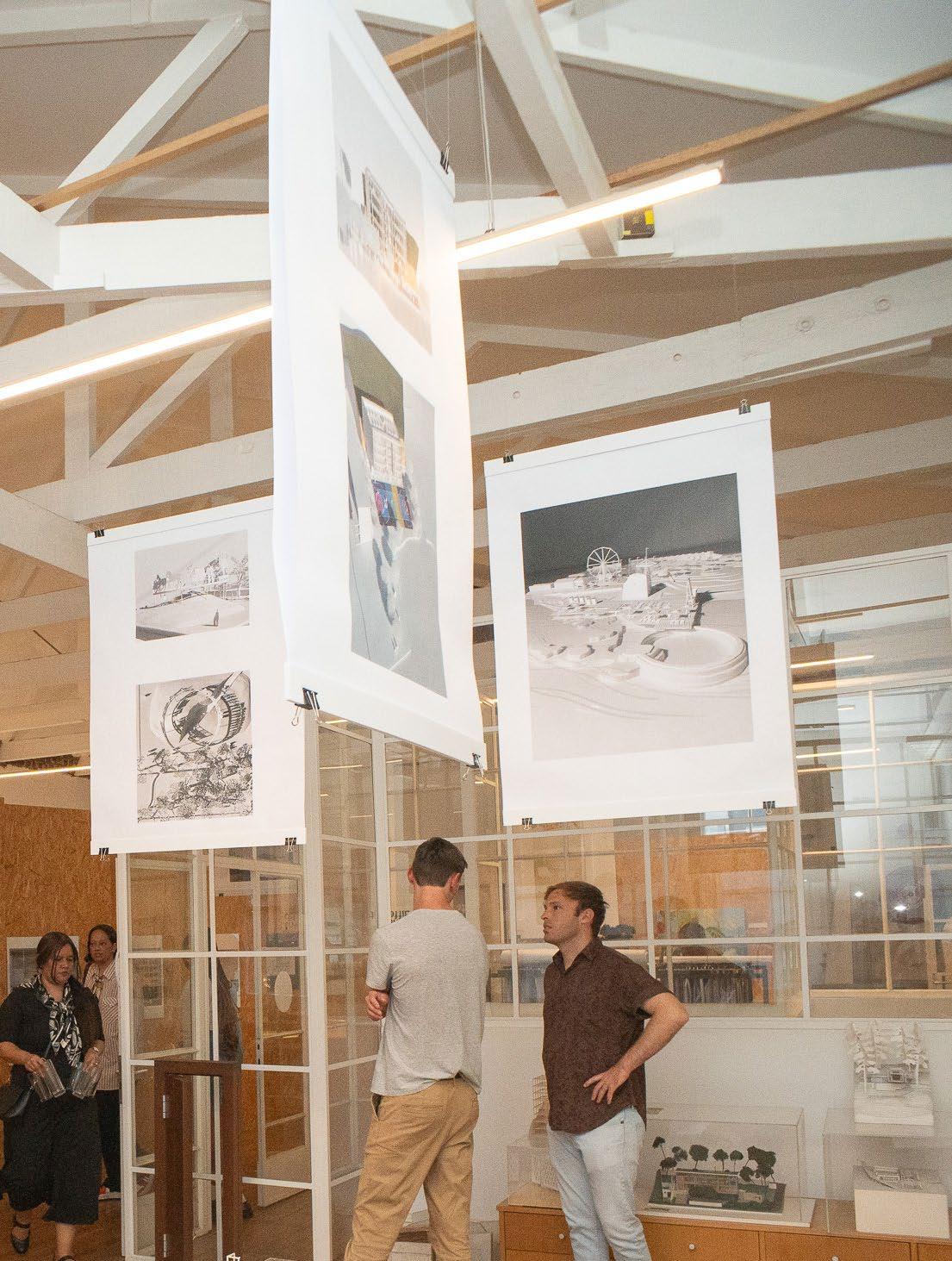
As we land in October and the weather turns brighter, the streets of Cape Town become the highlight of a weeknight out once more. With this returns an industry favourite, an opportunity to get to know the firms in the neighbourhood, an evening to join the community: Open Studios.

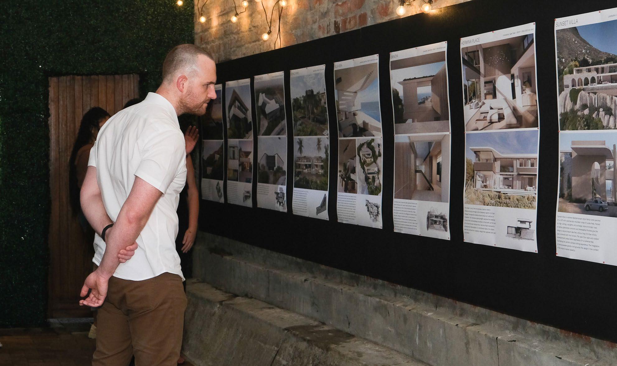
This affair offers something that few get to experience — a behind-thescenes look at the studios and firms that grace our city and build the environment across the country (and beyond). On Tuesday 15th and Wednesday 16th of October, more than 20 doors will open, inviting guests to witness the spaces where the magic happens. Save the date, because from 5-8pm, you’ll be exploring the CBD, Gardens, and Woodstock to visit some of the top architecture firms, landscape designers and architects, urban planners, and interior designers in the country.
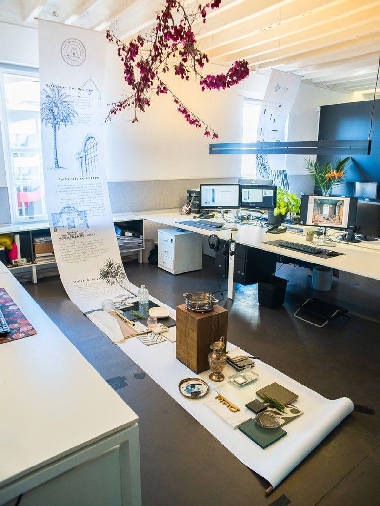
After a decade since its inception, Open Studios is hotter than ever. From drinks and canapés to activities and workshops, the studios are pulling out all the stops to make it a night to remember. Whether you’re a design fundi, a student, or a novice looking to make it in the industry, there’s a free pass with your name on it.
This year’s event is brought to you by Oggie and supported by OWA, Modena Technologies, Ceramica, Decobella, Fima, and WOMAG. For a list of participating studios and how to map your route over the two nights, visit Open Studios online. Mark your calendars — we’ll see you there!

@openstudiosza
www.openstudios.co.za








“Previously, you entered the door, and you landed on the couch almost, so it really needed a pause area. I think that's important in a home.”
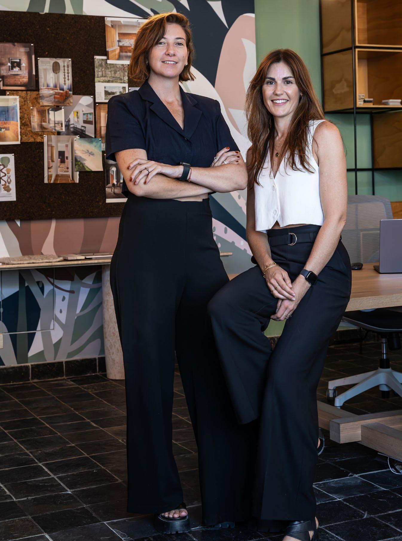
Interior spaces shape and influence our daily experiences and interactions, and few environments are as intimate as the interior of a family home. We had the pleasure of speaking with the dynamic duo Brigid White and Cecile van Schoor from ATTIK Design as part of our ongoing SCAPE Sessions series. Join us as we delve into their flagship project, Sunset House in Llandudno, Cape Town, and explore the transformation of a bland beachfront holiday rental into a unique ‘home away from home’.
Can you tell us about the story behind Sunset House?
Brigid: The client gave me a call in October and said, ‘We really need someone to help us with some new furniture. We've just purchased this home,’ which was a short-term rental they had bought fully furnished. They needed the furniture before December because they had family coming to stay, so I said, ‘Okay, great. Let's meet at the house and see what we can do.’
We spent about three hours there, walking around and really getting to know them. We soon realised that the issue with the house wasn’t just the furniture. As a short-term rental, the house lacked depth — it was really stark, basically a neutral canvas without any personality. They were telling us about a renovation that they did in Europe, where they used reclaimed European oak beams as flooring. Their whole design ethos is about tactility; everything needs to be tactile and have depth. So, what started as a two-month project focussing on furniture turned into a complete gut.
How did you approach materiality on this project?
Cecile: We put in a sort of rough-hewn brushed flooring, so just walking barefoot is an incredible feeling. We wanted to create textures, bringing in layers and depth so that it is not just a flat canvas. You really walk around this house just wanting to touch everything.
Brigid: They also wanted us to use natural materials, so we incorporated brick, wood, and metals. It was important for them to connect with the landscape, so integrating the exterior was a main aspect of the brief.
How do you view a renovation typically?
Brigid: We see renovation as a collaboration between ourselves and our clients. We treat our clients as our design partners, working with them throughout the entire process. It’s quite a long process for us in the beginning to really get to know them. We spend time with them to understand their vision, goals, lifestyle, and habits. By connecting with them and learning how they use space, we can create a space that truly works for them.
Talk us through the main challenges experienced during the renovation of Sunset House.
Cecile: The first major challenge arose when we started to take things out of the house and discovered some poorly constructed features. This unfortunately added to the budget as we had to do a lot of remedial work. We also found a natural stream running underneath the master bedroom, which flooded, and we had to install a sump system.
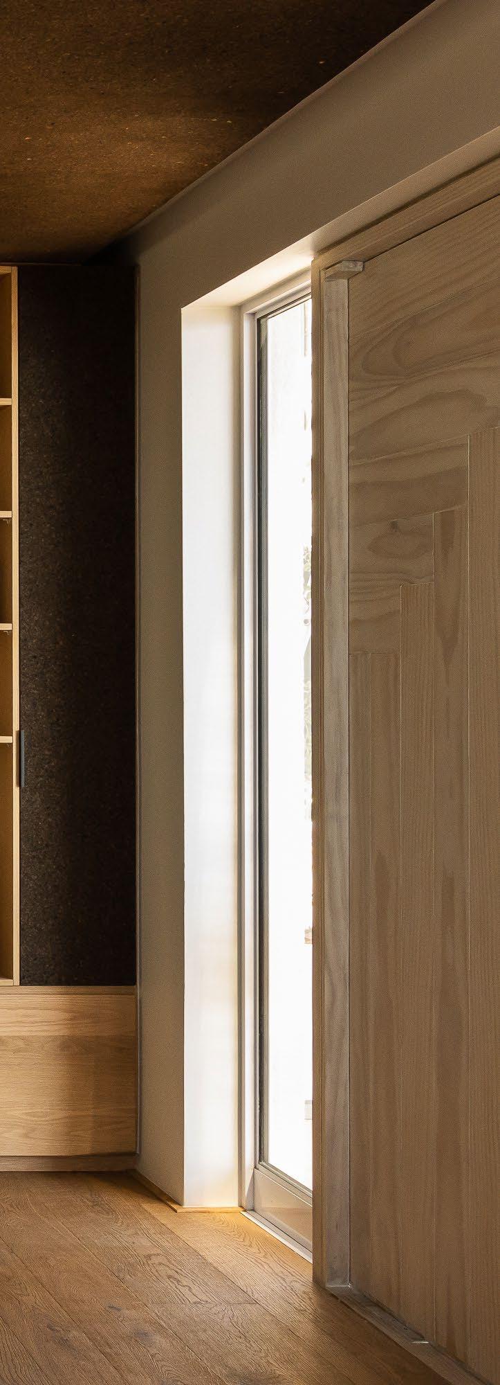
The way you entered the house was also quite sudden. It was almost as if you fell into the space. The front door led directly into the lounge. The lounge is a huge area with two front doors, which was quite strange. You would arrive, coming down this beautiful staircase with this incredible view, only to almost trip into the house.
Brigid: There was no landing space, so we created a separation between the landing and the lounge. Previously, you entered the door, and you landed on the couch almost, so it really needed a pause area. I think that's important in a home.


Cecile: We addressed this by working with the room’s reasonable size without detracting from the lounge. Our goal was to create a space that still offered permeability while establishing a distinct arrival and reception space.
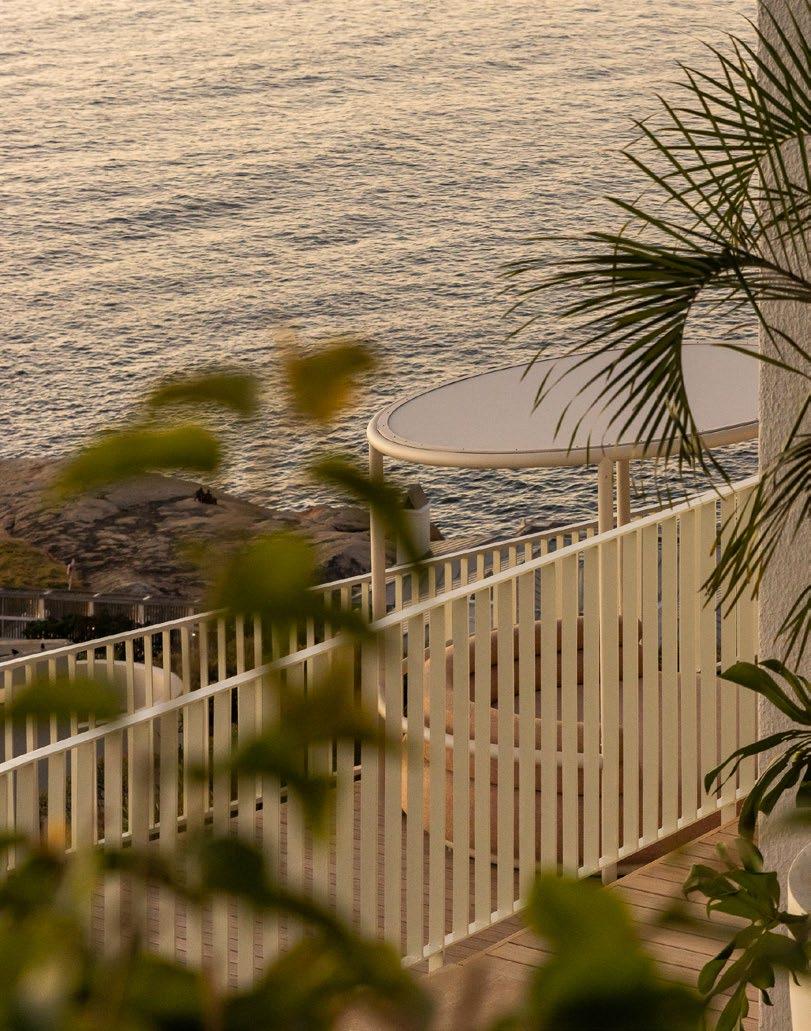
Another challenge was the house’s various levels, which naturally split the family. The kids' bedrooms are on the top floor, the living spaces are in the middle section, the master suite is downstairs, and the pool level is even further down. To achieve a connection between the inside and outside, we had to carefully consider how to create these transitions. On every level, we ensured there was a connection between the internal areas and outdoor spaces, whether that was a deck, the transition from the master bedroom to the pool, or moving from one level to another.
What were some of the highlights of the project?
Brigid: We orchestrated a major reveal for the client, who was abroad during the project's execution. We opened the front gates, and as they walked down the stairs, they were in absolute awe. It was incredible to see their reactions — they touched everything as they walked through the house. The most memorable part of the reveal was unveiling the ‘big boy’ room for the client’s son. This was his first move into his own bedroom, and the wife had emphasised that it needed to be extra special. When we showed him his bedroom, he literally couldn’t leave it. That was definitely the standout moment.

What is the most unconventional design element you incorporated, and what impact did it have?
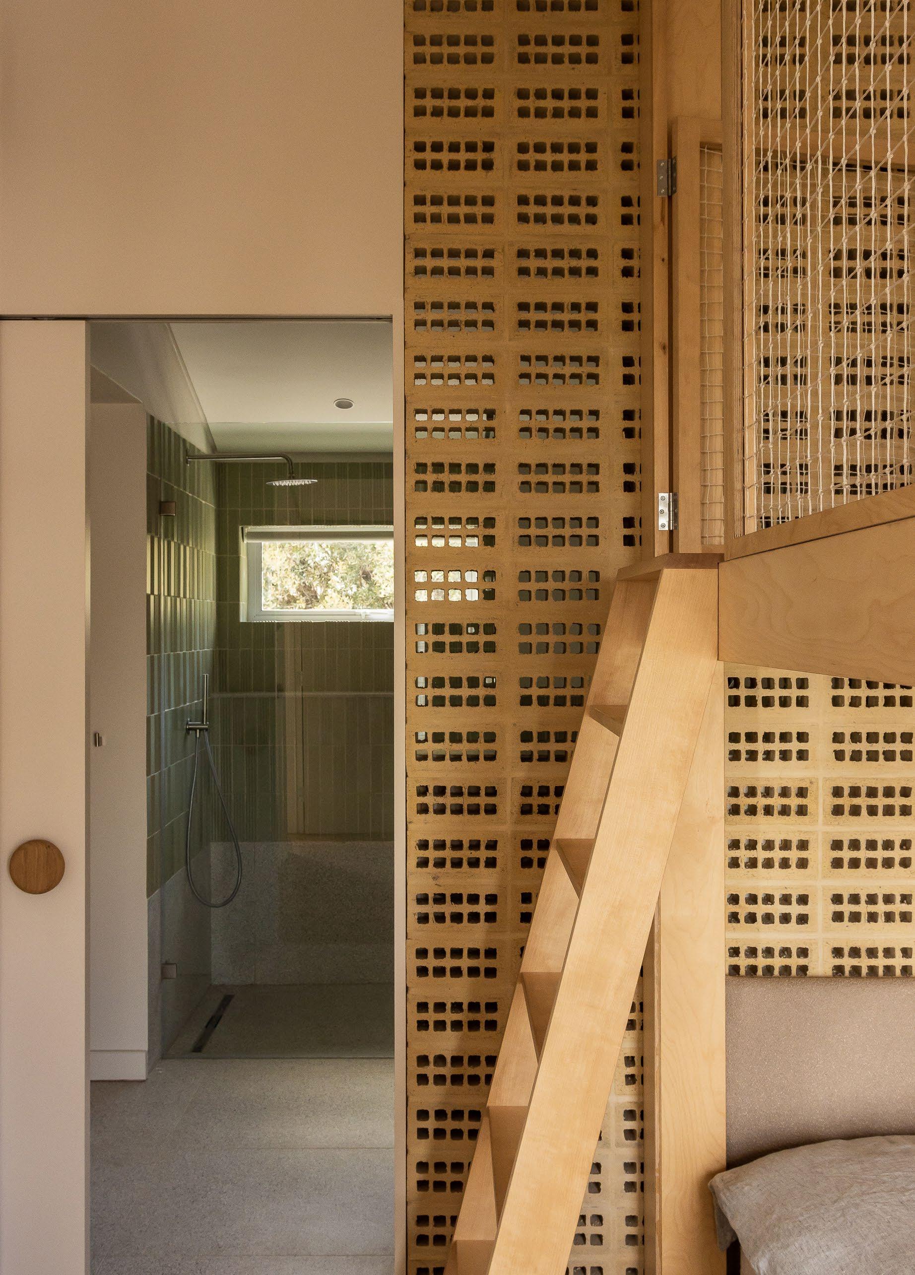
Brigid: The bricks on edge. I think they (the client) weren't 100% sold in the beginning. Everyone was afraid of doing it, our contractors included. We stood by it because in our gut, our intuition, we knew this was the right thing for the space. The wall is an example of using something that's seen everywhere in an unusual way, and it creates a really dynamic space.
Considering this experience and coming from such a successful project, is there a thought you’d like to leave your fellow design professionals with?
Cecile: Immerse yourself in your world. Feel everything, touch everything, experience everything. Design inspiration doesn’t generally come from looking at magazines or Pinterest or Instagram. It does happen, but if you’re out there looking at things, take your measuring tape with you, measure things, and that’s how you learn. Design is immersive, and good design is invisible.
@attikdesign
www.attik.co.za
Photography by Emma Jude Jackson

GCC ARTS is a boutique art consultancy based in Dubai, specialising in bespoke art packages that inject creativity into diverse environments — from luxurious hotels and villas to vibrant public spaces. This visionary consultancy is dedicated to transforming ordinary settings into engaging, dynamic spaces that resonate with their surroundings. With a portfolio of projects across the UAE, Oman, and Saudi Arabia, GCC ARTS is leaving a remarkable imprint on the region.
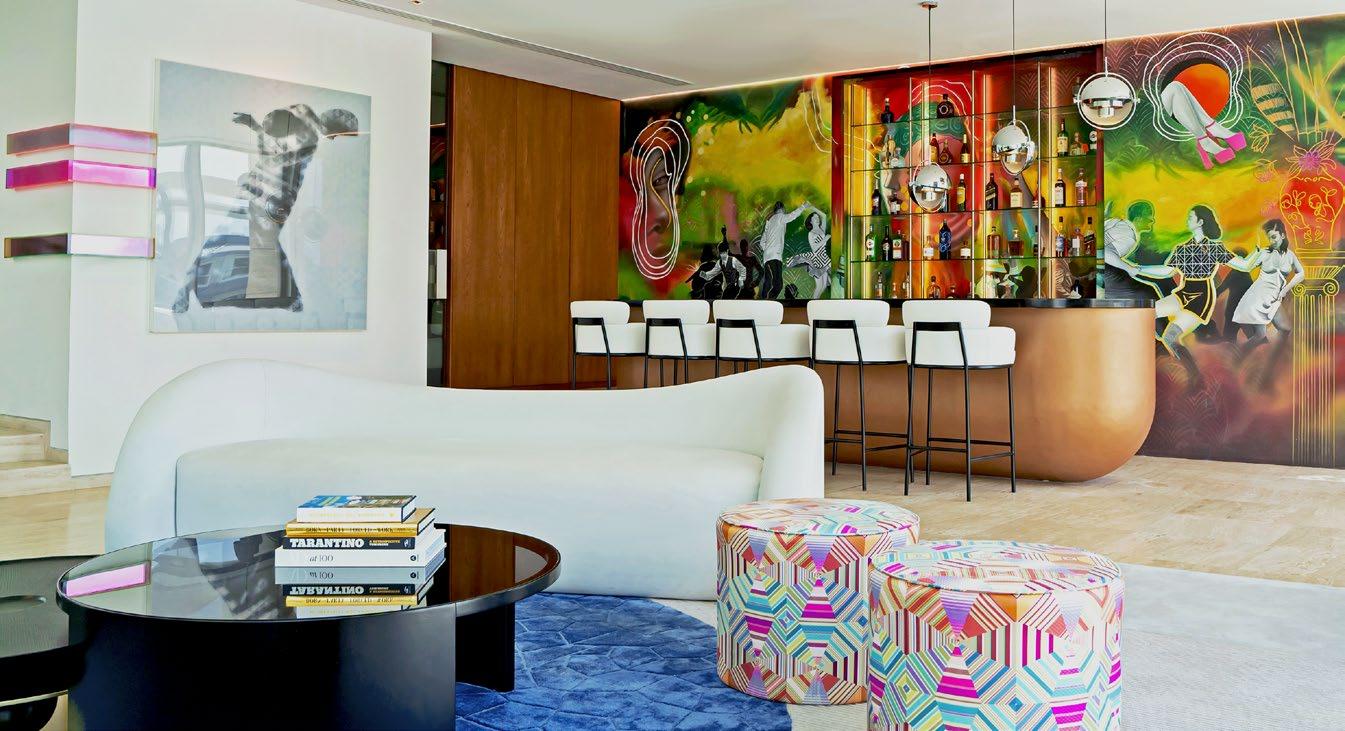
Founded by South African-born Josh Knödl, GCC ARTS finds its heartbeat in the passion for elevating environments through aesthetic innovation. Knödl believes in supporting artists and craftsmen, asserting that the future of cultures and societies is rooted in the visions and dreams of these creatives. The consultancy's holistic approach sees art not just as decoration, but as an essential component in fostering community and identity. By thoughtfully integrating art into urban landscapes, GCC ARTS enhances the unique character of each location, enriching both its functionality and aesthetic appeal.
From concept to creation
Beyond consultancy, GCC ARTS expertly manages the entire art production process. Their dedicated team is involved in every stage — from concept development to final installation — ensuring that each piece is meticulously crafted and seamlessly integrated. Their portfolio boasts prestigious projects like Jumeirah Marsa Al Arab, Waldorf Astoria Residences Dubai, and Six Senses Red Sea.
Nuance in every brushstroke
Deeply informed by the cultural and architectural contexts of the Middle East, GCC ARTS brings a nuanced understanding to each project. They masterfully blend local traditions with contemporary design elements, creating art that not only complements but enriches its environment.
Shaping experiences through art
GCC ARTS’ unique ability to fuse cultural awareness with artistic innovation sets it apart in the art consultancy arena. Through their transformative work, they illustrate how art can serve as a powerful tool for shaping experiences, inspiring individuals, and leaving a lasting impression. As they continue to expand their influence across the Middle East, GCC ARTS is redefining how art transforms spaces and enhances the quality of life for all who experience it.
For more information, email info@gccart.ae.




Designing Transformation with Bryce Henderson
Photography by Paris Brummer
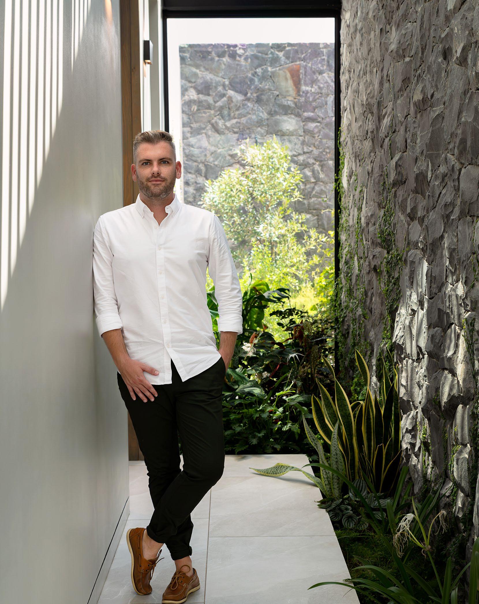
As the Founder and Director of Studio BHD, Bryce Henderson has navigated his way through his fair share of renovations. With a focus on two examples of his expertise in this area, we sat Bryce down for one of our SCAPE Sessions to uncover where his design story started, how he approaches renovations, and what about the industry makes it all worth it.
Where does your story with design begin?
My journey in design started at a young age. If you look back at my pre-primary and primary school journals, I think for the first three years I wrote that I wanted to be a pet shop owner. I think I was deprived of a Labrador or something from my parents, so I was like, I'll just be the pet shop owner and then everything will be fine. But if you go past grade three, which is still quite young, I wrote architect.
My dad's a land surveyor, so I grew up in a household with plans on the table, and an understanding of sites and spaces. He was also particularly interested in property development. We were always dragged as kids to sites. Seeing a project develop from what was 2D plans on a table to something that's built was really exciting to me.
My mom moved quite a lot for work, so one of our favorite pastimes was always looking at show houses on a Sunday. She had to pull me out of a few houses for speaking too loudly about what I thought didn't work. I think growing up in that environment led me into architecture quite naturally.
Is there a figure from your early years in the industry that inspired you and that you still look up to now?
An influential person in my growth in design would definitely be Mark Bullivant from SAOTA. I worked under him directly, fresh out of university, and we were part of a smaller team and committee within the greater firm. I really felt like time and energy was pushed onto me in order to grow and substantiate a design field like luxury residential architecture.
What are the initial questions you ask a client when you first begin a project, and how do you stay curious about the project so that the end result is true to what the client wanted originally?
Instead of a particular question with my clients, I enjoy understanding their lifestyle and how they like to live in a space; how architecture and the environment that we are tasked with creating can better their life at the end of the day.
Throughout our process, we stick to a boutique experience and a smaller collection of projects. We’re very lucky to have a various and dynamic range of people that we get to work with and that keeps us intrigued and vulnerable, where the sharing of knowledge and information guides us through to the end.
Can you tell us about some of the design choices you made in your Penthouse A renovation?
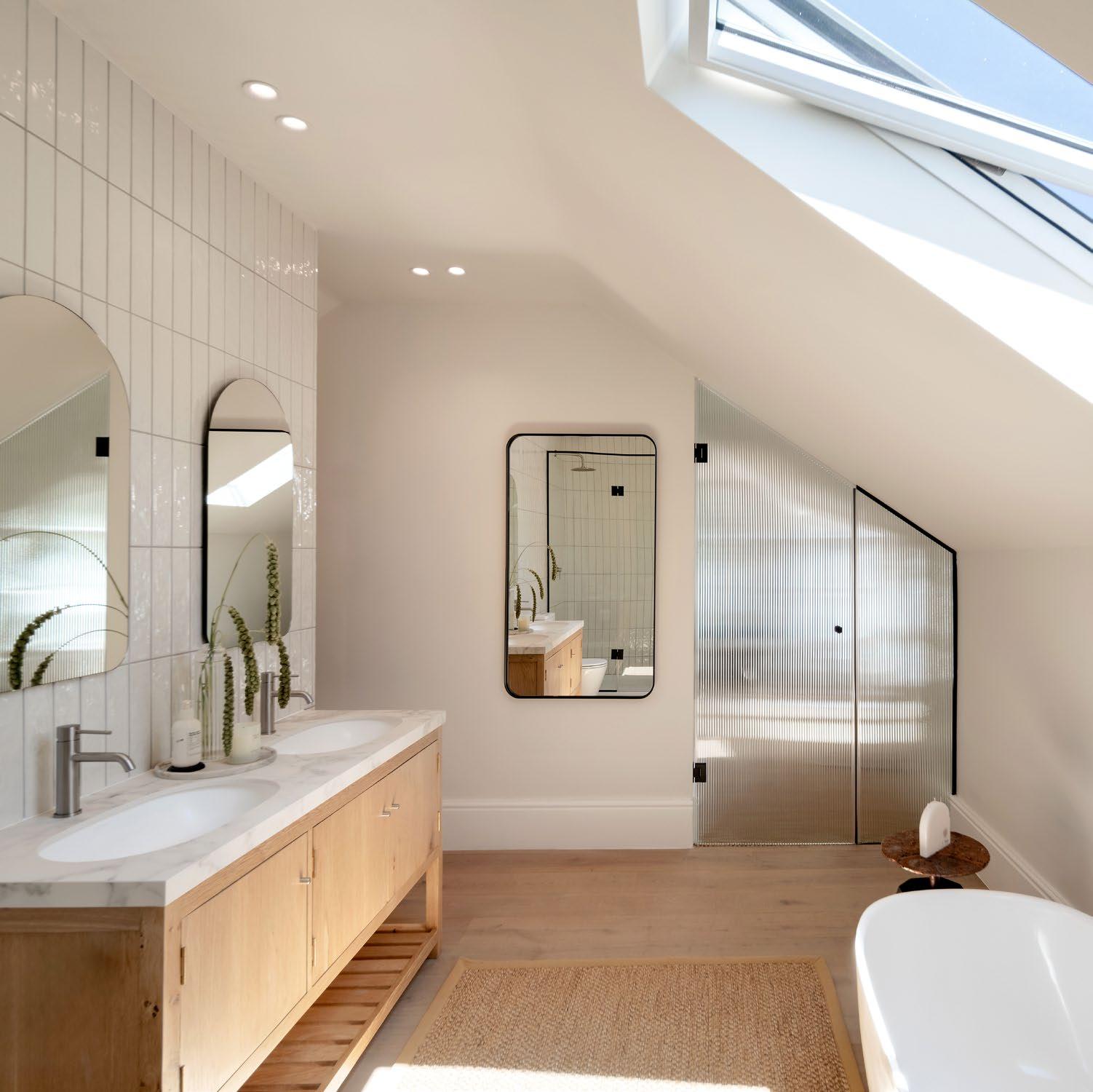
Penthouse A was originally quite a pokey, closed-off, dark space, so the biggest challenge was opening it up and maximising the view. In doing so, we also created a harmonious flow for entertaining. When you're in the kitchen or outside on the terrace, you're completely connected to your guests no matter where they are.
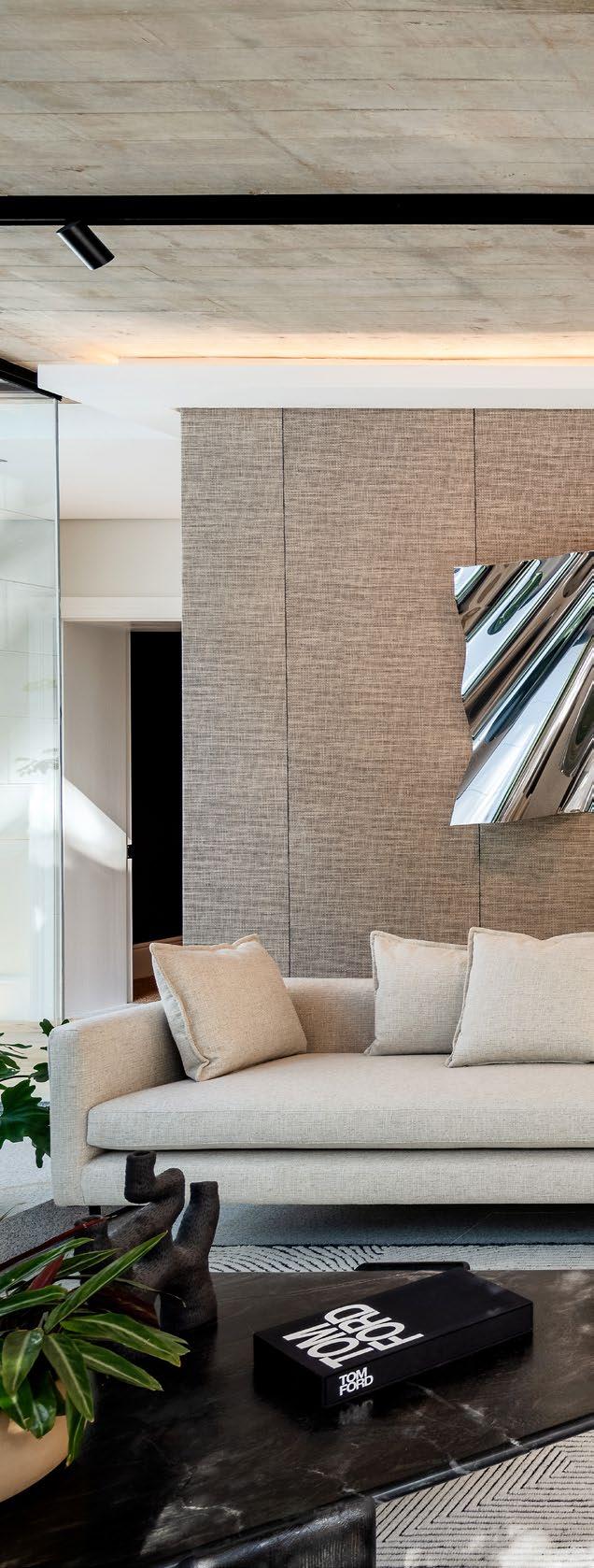
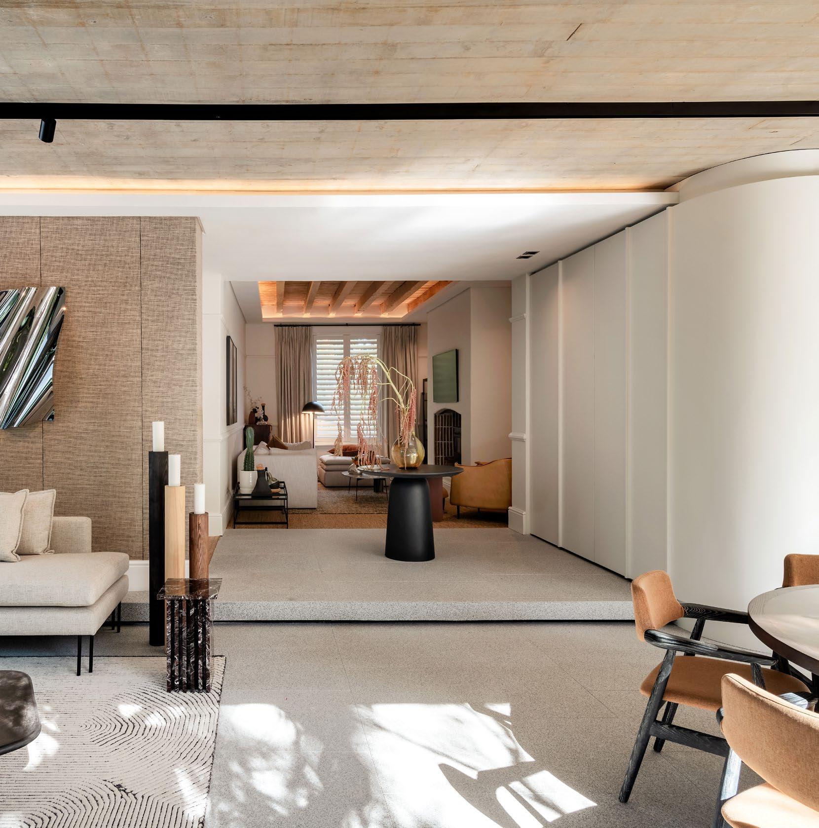


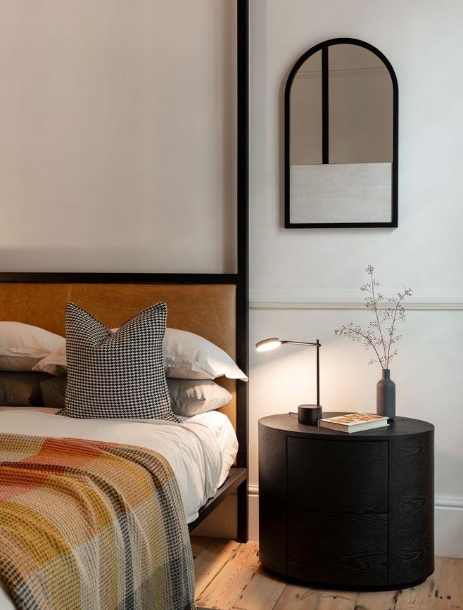
We managed to extend the terrace out by about 1.5 metres, which gives that cantilevered feeling over the Green Point space. Various elements, like a play on reflective items like mirrors, have enhanced the feeling of width and bands within the space. You constantly feel like your eyes draw into a different environment, a different view. With the one mirror column, for example, we found that as soon as we placed the mirror on it, we saw the Mouille Point lighthouse in it.
You also recently renovated a gorgeous Newlands residence which was your own home. How was this different to how you would approach a client?
When designing my own space, instead of having a client brief, I drew inspiration from the property itself as well as its surroundings. There are a few commercial aspects that you want to bring into the design, especially area-specific things like the number of bedrooms and the size of the rooms and spaces. There's a risk that you can take when it's your own space and you don't have to sell the idea to a client. This risk can either be a really expensive flop or it can be a really amazing feature of the home. I tend to use these projects of my own as design outlets, where I get to experiment and try things that are maybe a bit risky for clients. And if they are successful, I then get to implement them in other spaces.
What was the biggest challenge with the renovation?
The house was built in 1856, so a lot of the time afforded on the project was just trying to maintain the property and bring in its years of bad repair and neglect to a state of place that we could actually renovate. One of the biggest victories of the space was this tension point that we created between the old and the new. A driving factor behind the implementation of the design was that I conceded to designing a viewing box, which is the new section and which enables you to look back onto the heritage home and appreciate its detail and heritage. In doing so, the rawness and simplicity of the contemporary lines of the new box highlight those features.
“South African designers are exceptional people. They're pushing boundaries on every level.”


@studio_bhd www.bhd.design
What’s the most unusual object you have had to incorporate into a design?
Usually in residential architecture we are asked to incorporate family heirloom pieces or quite unique artworks that don't necessarily gel with the design that we're doing. These pieces hold special places in our clients' hearts, so we often try to create unique niches or spaces for them where they can isolate themselves and be the uniqueness that they are.
If you had to choose one aspect of the job that makes it all worth it for you, what would it be? Seeing a client's emotion at the end of a project is so special. Most people are tasked with designing a family home or their own space only once in their life. It's incredibly special that we get to enable those spaces where we foster memories and an environment that they can live happily in.


Size: 1130 m²
Cost: R10 million
Completed: July 2023
Location: Johannesburg
It’snot often that an architect or designer has the opportunity to renovate a project they originally designed. For House 33, Morris & Co got the chance to revisit a past project and rekindle a love for the space, for both their own practice and for their clients.

In 2008, Morris & Co were assigned the task of designing the architecture and interior for House 33. Their intimate involvement in the original project made them the natural choice when the clients decided it was time to relook the interiors. It also helped that the team knew the clients well beyond this house — when the brief came through in 2021, Morris & Co had recently completed the family’s holiday home, too. Considering their existing relationship, the team believed that it would be beneficial to bring a ‘fresh perspective’ to the project and the client relationship. Thus began the design journey for a new interior fit out of the entire residence.
The process began with a collaboration with Julia Day on the early conceptual design, forming the first of multiple parts of a two-year journey to the new home. The client wanted this space to be a home that considered the flexible dynamics of a young family. So, the ambition for the renovation was to reimagine the next chapter beyond that of the young family, to consider a more sophisticated environment, and to enhance connections to the garden.

An inside-out connection
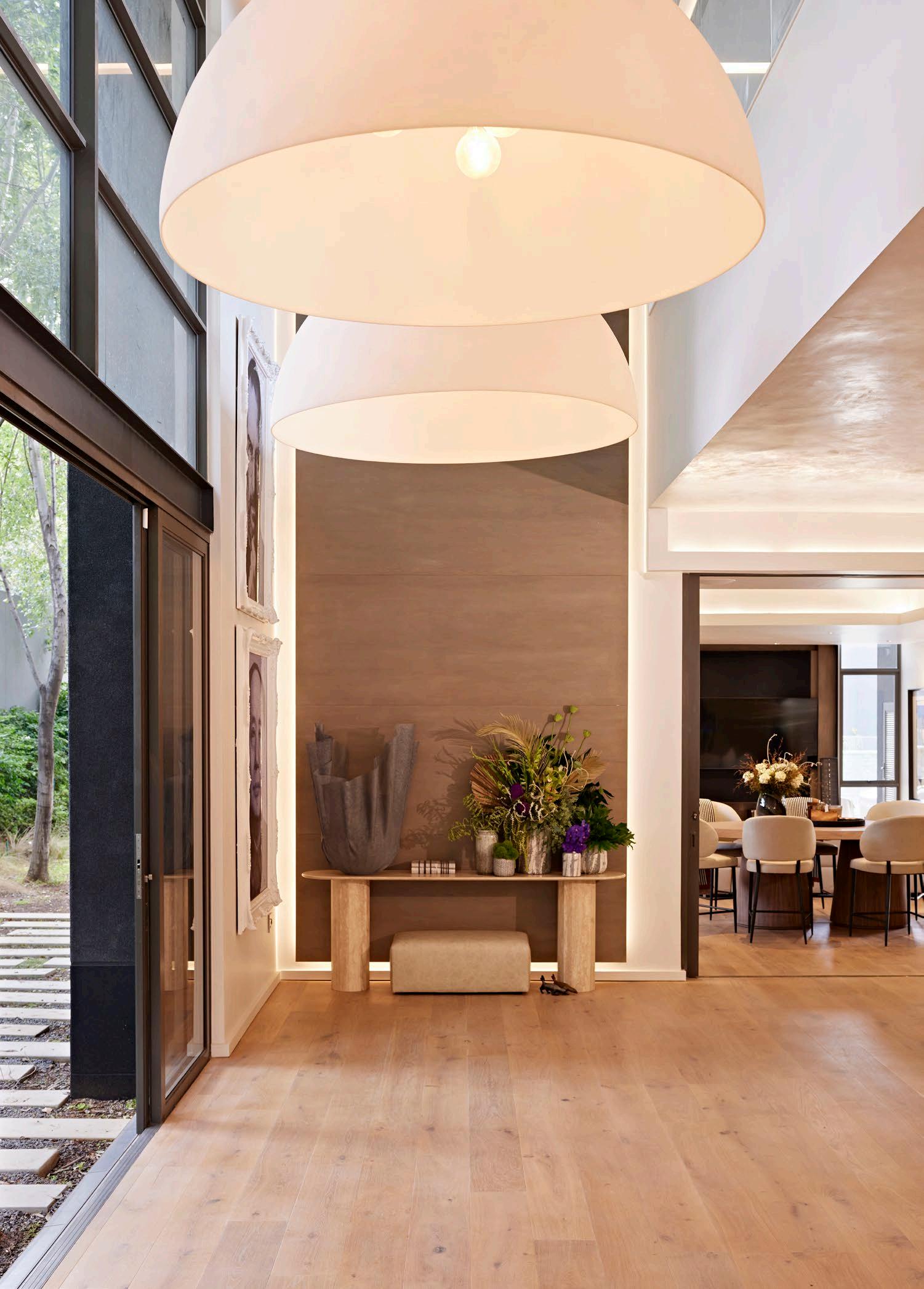
Being based in Johannesburg, with its temperate climate, space for home entertainment and an essence of indoor-outdoor living was a primary consideration. To achieve this goal, the ground floor was conceptualised as a series of connected spaces that can flex from independent rooms into a large open plan family space. This space accommodates connections to the outdoor area and its generous garden.
The introduction of fireplaces, each with a signature design, was key to anchoring the multiple living rooms through scale and elegant detailing. The furniture layout and design were reconsidered to be more personal and intimate, achieved by creating distinct compartments for living within the home, presenting multiple opportunities to cocoon. The new design aesthetic combines warmer tones and tactility to create a beautiful and opulent backdrop for an eclectic art and object collection.
Throughout the house a rich material palette of natural timbers, bespoke marble details, and veined marble complements the soft furnishings, creating a contemporary and welcoming family haven. Vignettes further speak to the client’s love for entertaining. The home's materials and finishes were carefully selected to meet the desire for a warm, relaxed, and sophisticated environment throughout. Natural, high-quality finishes were used consistently, while soft furnishings like linen, leather, and timber were incorporated across various features to enhance its natural texture.
Architects: Morris & Co | Interior Designers: Morris & Co, Julia Day | Contractor: Interbau | Engineer: BSM Baker Photographer: Graeme Wyllie

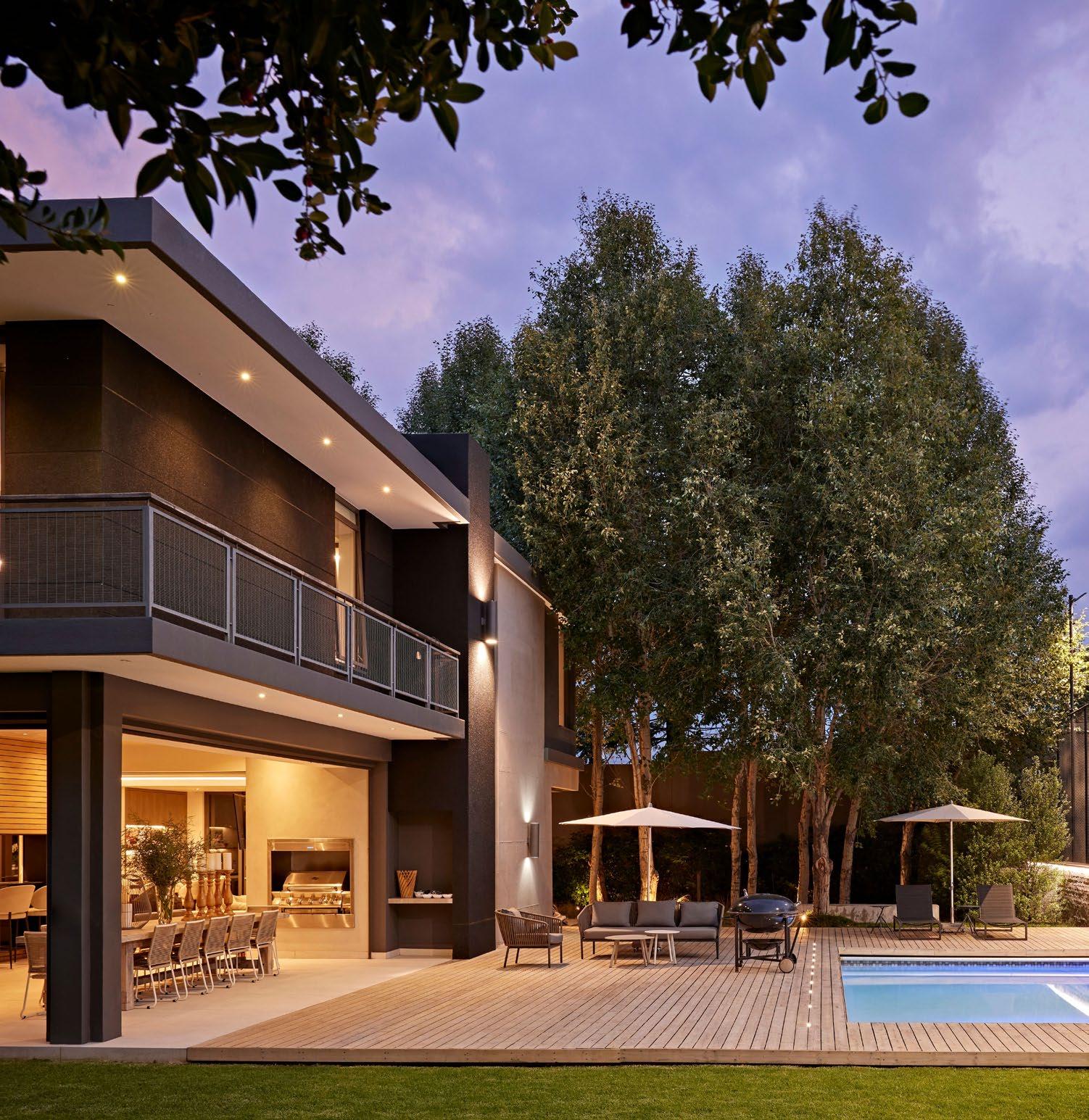
Whether indoors or out, House 33 was reimagined to evolve at the same pace of the family that inhabits it. As the new aesthetic features and updated functions lay the page for a new chapter, the home hits every mark for a dynamic family looking to enhance and expand their living environment. In doing so, Morris & Co were able to revisit a beloved project, bringing updated skills and insights to offer the interiors a new level of connection and sophistication.

@morriscolab www.morriscolab.com


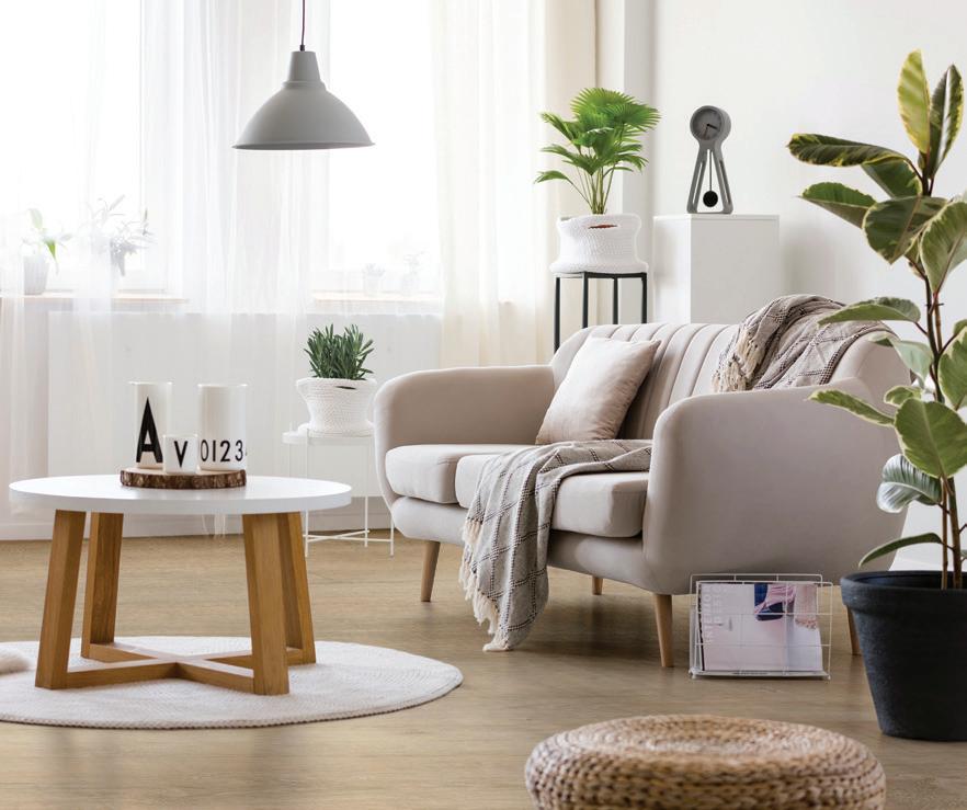

Your project's outdoor space feeling a bit lacklustre? Whether it’s a drab garden patio or a neglected balcony, an upgrade can transform a property’s first impression from ‘meh’ to magnificent. With Eva-Last’s innovative building products, you’ll discover how to marry functionality with flair, while boosting a home's appeal and value.
Functionality meets flair
Before diving into design, ask yourself: what’s the goal? Do you need a space for entertaining, a quiet spot to relax, or a safe play area for kids?
From elegant decking to sturdy pergola beams and privacy screens, Eva-Last’s modern composite building materials are versatile enough to create the outdoor oasis of your client's dreams — without sacrificing style.
Weather the storm in style
Consider your climate when planning upgrades. Do you need protection from the sun, wind, or rain? Eva-Last’s composite products, crafted from recycled plastic and bamboo fibres, are built to withstand the elements. Rain or shine, these low-maintenance materials resist rotting and fading, ensuring every outdoor haven stays stunning year after year.
A solid foundation
Safety is paramount when upgrading outdoor spaces. Unstable railings or uneven steps can lead to disaster. With Eva-Last, you’re choosing industry-leading durability. Their products meet stringent building codes and come with impressive warranties — so spaces can be enjoyed with complete peace of mind.
A splash of colour
Don’t underestimate the power of a fresh finish! Eva-Last’s VistaClad cladding is weather resistant, protects against insects, moisture and fading, making it an excellent choice for covering imperfections while adding the WOW factor. Whether you need a lighter shade to reflect heat or a darker tone for warmth, Eva-Last’s bamboo composite products ensure long-lasting aesthetics.
Low maintenance, high rewards
With Eva-Last’s bamboo composite materials, there's less time scrubbing and more time enjoying the space. A simple clean now and then is all it takes to keep the area looking pristine.

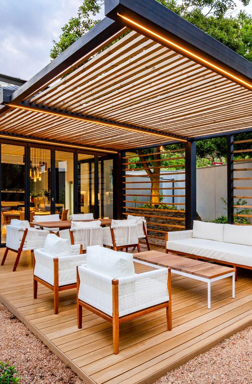
By opting for Eva-Last’s high-performance, sustainable materials, you’re not just enhancing an outdoor environment — you're also making a positive impact on the planet. Upgrade today and watch your outdoor designs shine!
www.eva-last.co.za

Size: 1182 m2
Completed: November 2023
Location: Plettenberg Bay, Western Cape
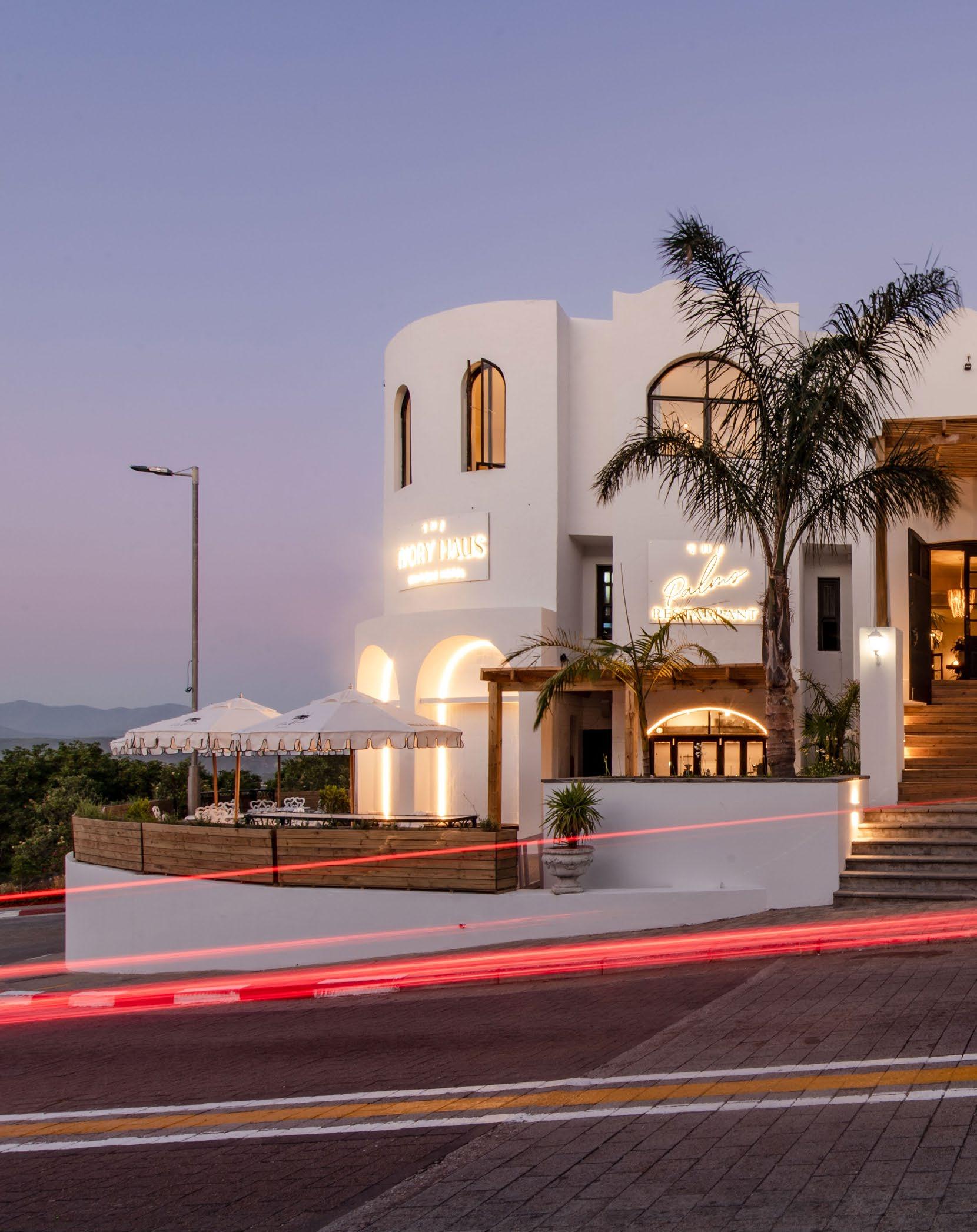
Sitting on the corner of Main and Hill Street in Plettenberg Bay (a byword throughout the Western Cape for breathtaking beaches and end of year festivities) the newly renovated The Ivory Haus Boutique Hotel stands as a thoughtful architectural transformation. Once known as The Grand, this iconic establishment has undergone a remarkable metamorphosis under the guide of new ownership, who enlisted the expertise of Westhaus to breathe new life into the former ‘pink hotel’.
When the Teubes family acquired the hotel, they sought to infuse new life into its storied walls, retaining the charm of its past while elevating its presence to meet contemporary expectations of this beloved holiday destination. The result is a resplendent blend of past and present that honours the hotel's original character while welcoming a fresh, sophisticated aesthetic.
Preserving character, enhancing experience
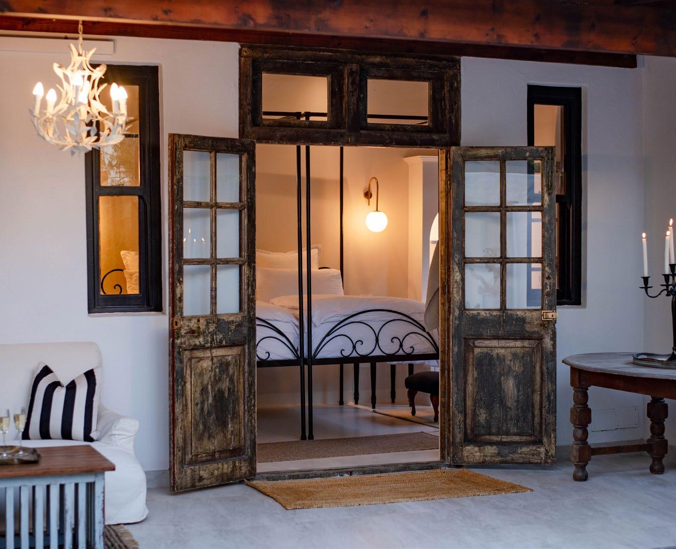
At the heart of this renovation was a desire to enhance both the hotel's street presence and its internal vibrancy. Leon van der Westhuizen and the team at Westhaus spent a weekend with the new owners, immersing themselves in the space to fully grasp its potential. The design concept emerged from a deep appreciation for the building’s inherent qualities — its arches, old doors, and spacious interiors — integrating these elements with a modern flourish.
A key objective was to solidify its position as a landmark within Plettenberg Bay’s bustling precinct. The dull pink exterior has been transformed with an eggshell white finish, reflecting the new brand identity and establishing the hotel as a beacon on Main Street.

“A space that is at once familiar and excitingly new.”

An exercise in activating space
The renovation concept focussed on increasing activity across all levels of the hotel. A newly defined grand entrance and strategically placed landscaping draw visitors in from the street. The addition of a Street Café creates a welcoming interface between the hotel and the town life, offering a sheltered pause space for beachgoers and passersby alike.
Moving inward, guests are guided to the middle level, where they discover The Palms — a new restaurant and bar that spills out onto enhanced courtyards. A striking black spiral staircase serves as both a visual centrepiece and a functional element, activating new circulation routes within the building.
An exciting and noteworthy addition is the rooftop terrace, a previously underutilised space now transformed into a crown jewel of the build and overall experience. Here, guests can revel in panoramic views of the Indian Ocean and witness breathtaking sunrises. Timber arches frame the vistas, while glass balustrades and planters complete the thoughtful ambience.
Room revelations
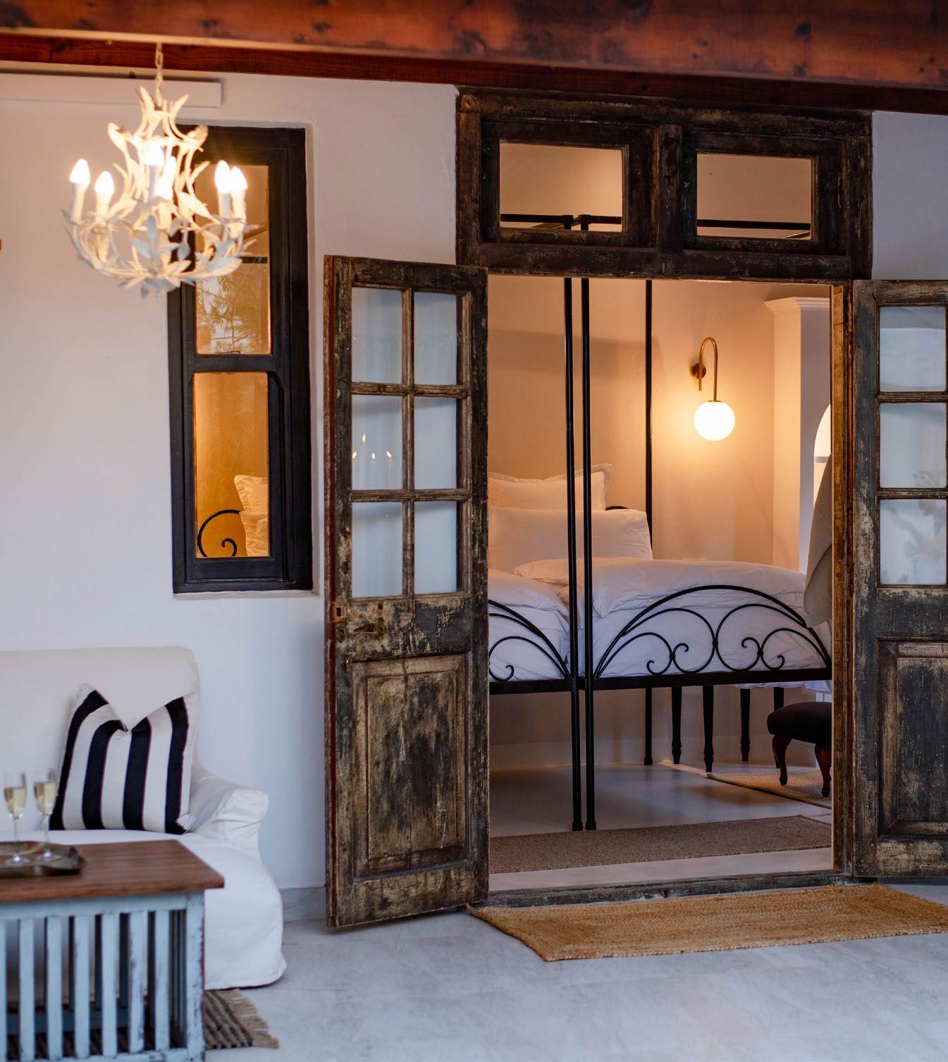
The Ivory Haus boasts 11 spacious rooms, each offering a unique guest experience. Some rooms provide sprawling vistas, while others grant direct access to the main pool deck. The renovation simplified and brightened the interiors with a crisp white palette, allowing natural light to filter through new arched windows and doors.


In a nod to sustainability and character, existing furniture pieces were thoughtfully upcycled, creating distinctive moments in each room. The juxtaposition of these restored elements against the refreshed backdrop speaks to the hotel's commitment to simultaneously respecting heritage and modernity. Embracing contemporary concerns, the renovation included impressive upgrades to the hotel's infrastructure. A new solar and water system allows for an off-the-grid solution, aligning The Ivory Haus with eco-conscious traveller expectations without compromising on luxury.
The transformation of The Ivory Haus stands as proof in the power of collaborative vision between client and architect. From the enhanced street appeal and maximised views to the thoughtful preservation of historical elements, every aspect of the renovation was carefully considered. As Plettenberg Bay continues to evolve as a sought-after stop on the Garden Route, The Ivory Haus now stands ready to welcome guests with open arms, offering a luxurious retreat that honours its roots while embracing a future of renewed possibilities. This seaside revival not only enhances the town's architectural façade but also provides visitors with an unforgettable stay, where every detail tells a story of thoughtful design and warm hospitality.
SUPPLIERS

Cape Grace’s Reinvention by 1508 London

Completed: May 2024
Location: Cape Town
Embracing a new era of hospitality, the iconic Cape Grace Hotel steps forward onto the scene after a reinvention of international proportions while humbly maintaining its local charm. This new chapter comes after a ninemonth renovation by world-renowned design firm 1508 London. The legendary V&A Waterfront hotel captures the spirit of South Africa through elegant design and authentic cuisine as it reopens its doors to a world of experiences incomparable to anything guests have indulged in before.

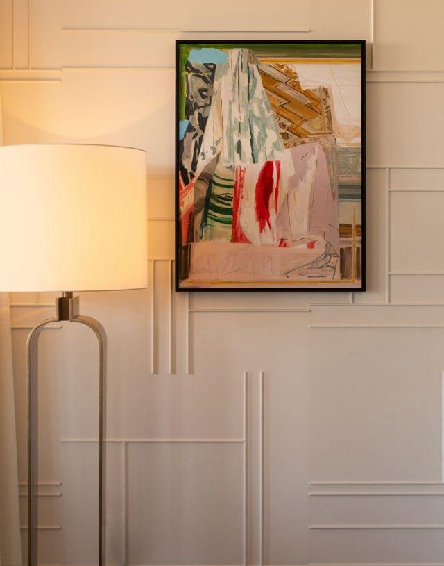
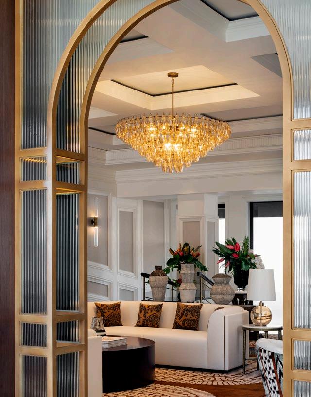
When 1508 London’s Dubai Studio was appointed by Fairmont Hotels & Resorts to the esteemed task of transforming the Cape Grace, the brief stretched across every area of the hotel. The transformation needed to reflect inspiration from South Africa’s heritage, culture, and artistry, as well as Cape Town’s evolution from a bustling trading port to one of the world’s most beloved cosmopolitan hubs. Originally established in 1996, this endeavour is the most extensive reimagining the hotel has ever seen, and one that exudes contemporary sophistication among a city deeply rooted in its heritage.
The city’s sanctuary
Cape Grace welcomes guests into 112 elegant rooms and suites, hosting an experience of the best in Cape Town’s cultural, culinary, and historical treasures, making for an unrivalled sanctuary in the city centre. Under its new guise, the interiors are a curated celebration of the country’s diverse narrative from its landscapes and languages, vibrant arts, and varied cultures. Curated artwork from local artists throughout the new hotel is a clear showcase of local love, while materials have been chosen for a contemporary, understated look that harmonises with the location’s natural surroundings. The palettes in the rooms vary from bold and vibrant to subtle yet inviting, but one thing remains consistent across each one — a contemporary take on classic luxury.
With unrivalled views of the city, each of the rooms and suites also draw on international features, such as large French windows and balconies that look out onto the Marina or the famous backdrop of Table Mountain. An offering in the sublime, the stand-out suite has to be the two-bedroom Cape Grace Suite with an expansive terrace offering panoramic views of the mountain range, a stylish lounge, and a dining area with a private bar and butler’s pantry. Dynamic and decadent, the space perfectly accommodates families, couples, or individuals looking to entertain in style.
Elevated Heirloom
To suit this sophisticated space, 1508 London needed to ensure the culinary vision was as delicious as the food it served, with an emphasis on presenting locals and international guests with elevated South African-inspired cuisine. The Heirloom Restaurant’s name is a tribute to the hotel’s family roots and timeless, intimate setting. The highlight, the Degustation Menu, features seven cleverly composed courses using locally sourced ingredients, naturally.
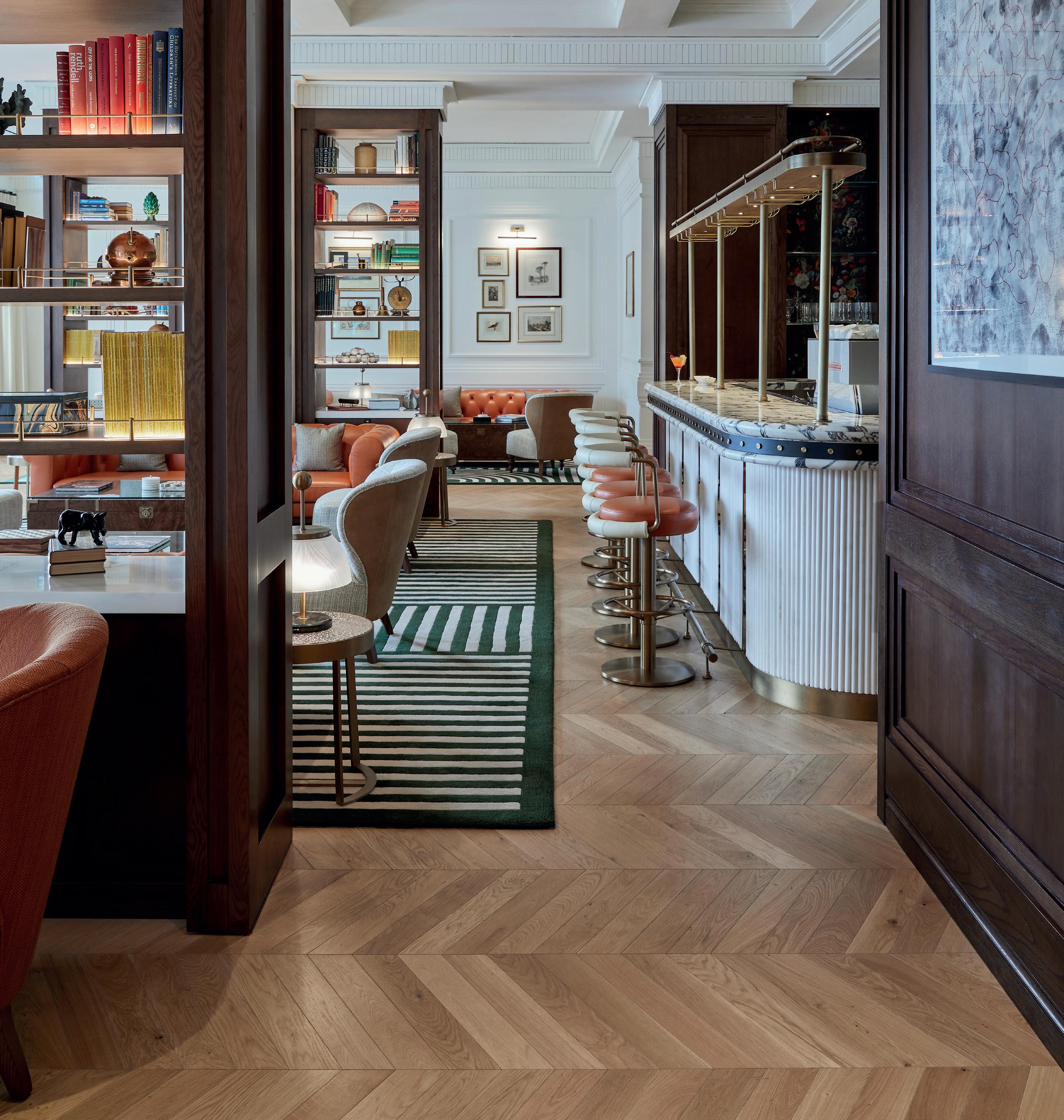
Sanitaryware: Gessi | Tiles: Botteganove | Flooring: Oggie Hardwood Flooring | Steel profiles: Jansen | Wall covering: Cara Saven | Outdoor furniture: Bloc Outdoor

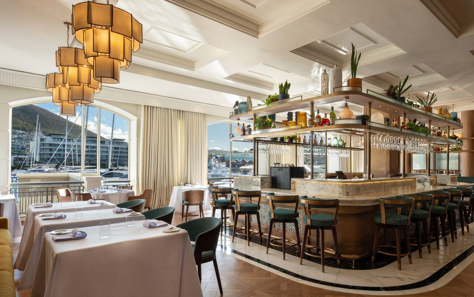

The evenings are saved for a pre- or post-dinner drink in the revamped Bascule Bar & Lounge. The bar is known for its extensive whisky collection, exclusive wine cellar, and a design that celebrates South Africa’s rich history and shebeen culture, with an ambience of a high-class take on a Prohibition-era speakeasy adorned with paintings by local artists.
The epitome of serenity, the new Fairmont Spa at Cape Grace features treatments inspired by local natural elements including tailored bath rituals, jet lag recovery, detox massages, a salt room experience, guided meditation, and curated packages to help guests sink into an oasis of relaxation. It is an urban retreat, an exclusive space to indulge and feel the essence of South Africa’s soul.
By landing on the doorstep of the city's finest cultural, culinary, and historical landmarks, Cape Grace quickly developed a reputation for being the best in town. Nearly three decades later, the treasured hotel embarks on a new venture. With the grace of its namesake, the hotel will grow in its legacy of leading luminaries from the world of politics, film, and business. In doing so, a welcoming offering a new era of hospitality emerges and presents the perfect destination to explore the very best of the Cape.

@1508london www.1508london.com

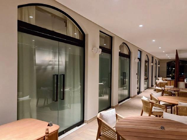
At the heart of the Cape Grace Hotel, a newly renovated main entrance stands with unmistakable strength and elegance, designed and locally fabricated with Jansen cold-rolled Swiss steel profiles. Chosen by architects for their exceptional durability, the Jansen steel system is designed to withstand the rigors of daily use, ensuring the entrance remains functional and visually striking for years to come. Steel is known for its superior strength and reliability, making it the perfect material for high-traffic areas like hotel entrances or other upmarket commercial applications.
The Jansen's Swiss profiles also offer unparalleled design flexibility, allowing architects to craft clean, thin lines that complement both classic and contemporary aesthetics. Through expert craftsmanship, 10EXP, a leading Jansen ambassador for SA, has delivered a bespoke entrance that reflects the raw beauty of steel, offering timeless durability and style.




Size: 560 m²
Completed: April 2024
Location: Cape Town
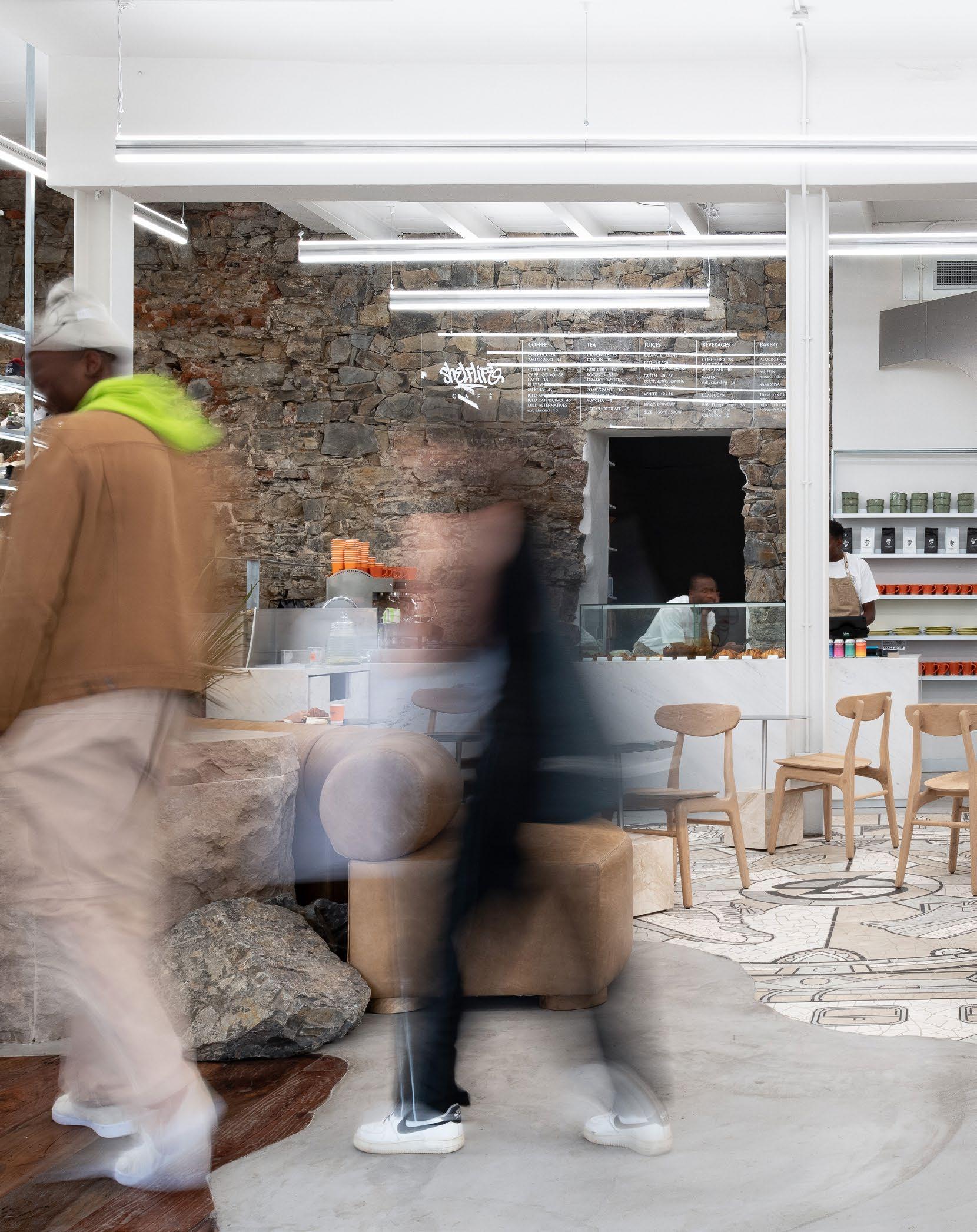
Stepping into the centre of Cape Town’s CBD, visitors are greeted with a refreshed take on retail space, affectionally considered the city’s new sneaker destination. Located in The Barracks on Bree Street, this project, spearheaded by TDC&Co in collaboration with Shelflife, explores and defines what new world heritage can look like.


The foundation of the design rests on three pivotal pillars: site, surroundings, and sub-culture. This has resulted in a space that transcends the typical retail experience. As you stride into the store, there is an immediate sense of belonging, an indication of the meticulous attention paid to every design detail. The result is a sophisticated commercial destination that relies greatly on its layered past while aligning with the modern vibrancy of the city.
The 275-year-old heritage building has seen Cape Town in all its forms, from the sand and stone origins to the waves that once lapped its walls. Embracing the role as guardians of this site, TDC&Co committed to honouring its rich history while writing a new chapter in its story. Original stone walls, once weathered by the sea, now stand as proud sentinels, their rugged textures highlighted by clever lighting. This tribute to maritime heritage extends to the use of float boxes, salvaged from the Paarden Eiland shoreline and reimagined as striking wall cladding.
Cape Town’s unique urban wabi-sabi — where grit meets glamour — is reflected throughout the design. The city’s blend of historical charm with modern high-rises and serene beaches with industrial remnants provided the inspiration for the store’s aesthetic. The design merges Cape Town’s raw natural elements with its architectural evolution.
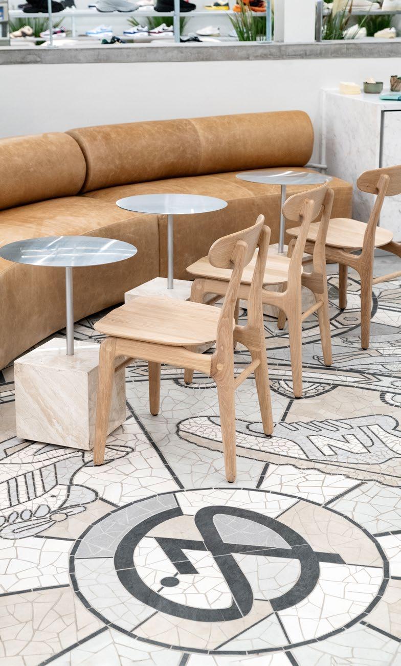
The central walkway, crafted from reclaimed railway sleepers, guides visitors through the store's multi-level layout. Elements of the mountain, shore, and ocean are actively integrated, with large-scale Malmesbury slate rocks and solid 120 mm thick sandstone placed to echo the surrounding landscape. The most striking feature is the central dolos — a massive concrete structure typically used in breakwaters — housed in elegant resin. Serving both as a functional seating area and a bold artistic statement, it embodies Cape Town’s coastal context, leaving an impression on all who enter.
This project reflects a deep respect for street life, honouring local icons and styles while resisting the lure of overt commercialism. The store becomes a vibrant stage for community expression with local artisans at the heart of this transformation. A rising cement artist crafted bespoke planters, each weighing an impressive 400 kg. Manoeuvring these creations into the store was no small feat — it involved makeshift ramps and a dedicated team of seven.
Stonework: Sangengalo Marble & Granite | Lighting: LED Lighting
SA | Dolos: Concrete Studio | Planters: Resonate
“As one steps into the store, there's an immediate sense of belonging, an indication of the meticulous attention paid to every design detail.”
On crafting experiences
Championing sustainability and local collaboration, TDC&Co created a sensory-rich environment that celebrates creative spirit. Murals adorn formerly utilitarian spaces, turning fitting rooms and bathrooms into Instagramworthy spots. A dynamic spray paint wall behind the tills pays homage to the graffiti roots of the many featured sneaker brands.
The store's layout is a carefully choreographed journey, designed to encourage exploration and lingering. An exhibition space near the entrance sets the tone, while a history wall showcases Shelflife's strategic brand partnerships. The addition of a coffee bar, complete with comfortable seating, invites customers to relax and soak in the atmosphere, doubling as a venue for brand launches and community gatherings. In a nod to the ever-evolving nature of street fashion, a dedicated ‘Designer of the Month’ space in the apparel area showcases emerging local talent.
In a world often dominated by fleeting trends, this project proudly announces that it is here to stay as a mustvisit destination for sneaker enthusiasts, design aficionados, and anyone with an appreciation for thoughtful urban renewal. A new chapter in the building's history has been cast in stone, creating a blueprint for what modern heritage can look like — a space where history and innovation coexist, where global trends meet local craftsmanship, and where every visit promises a journey of discovery.

@tdcandco www.designcompany.co.za


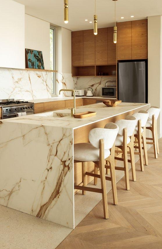
At Sangengalo, we are passionate about pushing the boundaries of stone fabrication, blending natural beauty with cutting-edge precision. Our recent collaboration with TDC&Co for the iconic Shelflife project in Cape Town showcases our dedication to excellence and innovation.
Locally sourced sandstone slabs required precision CNC machining and meticulous hand-chiselling. Our skilled artisans rose to the occasion, creating custom stone feature blocks that would become the crowning glory of Shelflife. The Volakas marble café corner adds a touch of timeless elegance, blending seamlessly with the natural sandstone.
At Sangengalo, we fuse traditional craftsmanship with cutting-edge technology to bring your vision to life. Our state-of-the-art machinery, including a 5-axis CNC Bridge-Saw, empowers our team to tackle even the most complex projects. With an extensive stockholding of over 1000 exquisite marble, granite, terrazzo, and Teramo Quartz slabs, the possibilities are endless.
Explore the limitless possibilities of stone design and fabrication. Contact us to discuss your next project and discover how we can cast a new chapter in the history of your building.
www.ske.co.za | info@ske.co.za | 021 907 1680

Size: 50 m2
Completed: June 2023
Location: Cape Town
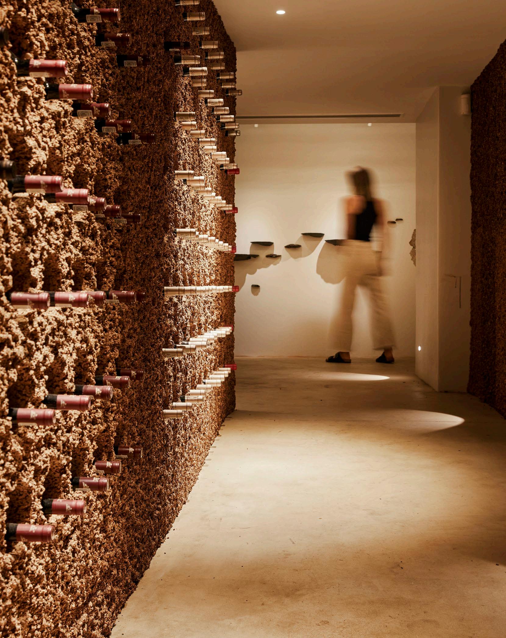
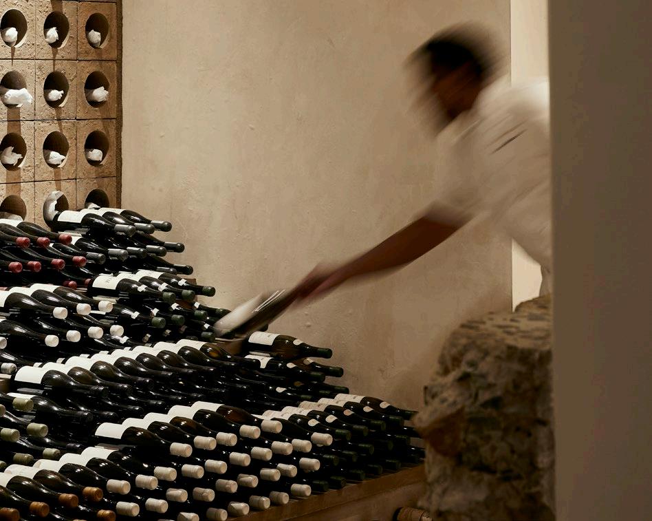
Hidden beneath the forest floor at Silvermist Wine Estate, La Colombe's secret cellar transcends the conventional wine storage space. Shortlisted for the 2024 Restaurant & Bar Design Awards, this underground retreat is the result of trusted collaboration and innovation, crafted by MR. Design Studio, lighting virtuoso Martin Döller of One to One, and the exquisite craftsmanship of Wiid Design. Together, they've transformed a mundane storage area into an immersive sanctuary that celebrates nature, design, and light.

@onetoonebymartindoller www.1-to-1.world
Interior Designers: MR. Design
Studio | Lighting Designer: One to One by Martin Döller | Cellar
Walls Designer: Wiid Design
Photographer: Warren Heath
“The cellar, with its rebellious spirit and sensorial richness, reminds us that true innovation lies in crafting spaces that resonate deeply, inviting us to explore, taste, and feel.”
The creative minds at MR. Design Studio, Rotem Shachar and Megan Bond, approached the project with a clear objective: to transform a ‘pokey storage room’ into a compelling sensory experience. With the aim of capturing what happens below the forest floor, they envisioned a space that felt alive and vibrant.
The team focussed on the underlying concept of biophilic design, stripping the cellar down to its essentials. ‘We made sure each element had purpose and function,’ they note, using earthy materials and lighting elements that mimic the natural world.
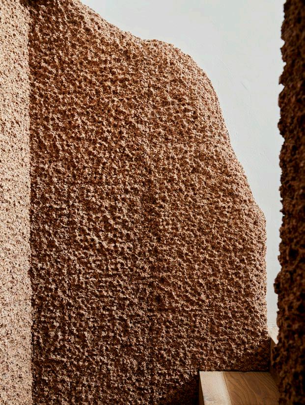
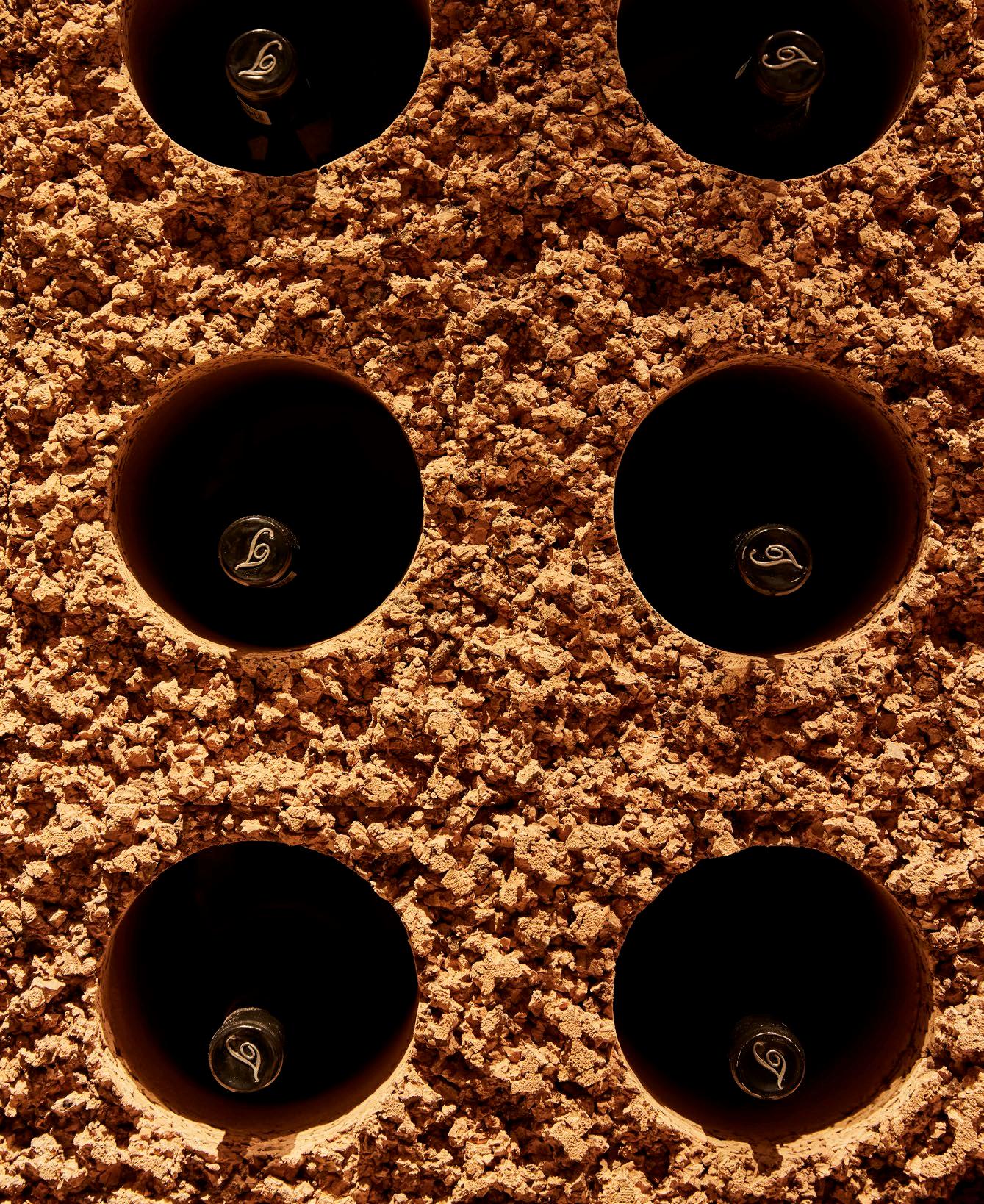
As guests descend into the cellar, the magical quality of the cork mutes sound and absorbs distractions, allowing for a focussed engagement with this unique dining experience. Punctured roots not only serve as functional lighting but also add drama, enhancing the cellar’s immersive quality. In this thoughtfully designed environment, every bite and sip invite deep appreciation.
Laurie Wiid van Heerden, the visionary behind Wiid Design, followed this pursuit of harmonising with nature. More than 200 panels of solid, recycled virgin cork were employed, each ‘individually hand-chopped and carved to create the unique, natural texture.’ This painstaking technique, honed over many years, ensures that every panel contributes to a seamless, earthy aesthetic.


@wiid_design www.wiiddesign.co.za
Cork walls: Wiid Design | Bronze sculpture: Bronze Age
Bricks and terra table: Plaster Art
The design journey transports visitors into a quiet subterranean world, where ‘tree roots pierce the surface’ and mycelium lines the walls. Here, food and wine achieve new heights — flavours intensify, aromas deepen, and the experience becomes almost tactile. The fusion of nature with interior design allows guests to engage with their surroundings in a profoundly intimate way.
Martin Döller, Creative Director at One to One, played a critical role in bringing the cellar to life through innovative lighting design. Recognising the power of light in hospitality, he aimed to enhance the sensory journey within this realm.
Döller focussed on creating a balance between task and ambient lighting, ensuring that the cellar’s natural elements are accentuated. His lighting design ‘aligns seamlessly’ with the cellar’s biophilic aesthetic, enhancing the overall atmosphere while maintaining functionality. The use of indirect lighting allows for captivating shadows cast by the existing sculptural bronze roots, enriching the visual experience without overwhelming it.
Furthermore, the gentle wash of floor lighting guides guests through the space, creating a narrative quality to their journey. Döller’s approach exemplifies the importance of fluent spatial flow, which is essential in ensuring that guests feel enveloped in the experience. Each layer of light enhances depth and mood, inviting diners to revel in their surroundings.

A feast for the senses
La Colombe’s secret cellar is more than an exquisite wine-tasting venue; it is a testament to the power of collaborative design. By marrying the artistic vision of Wiid Design, the storytelling finesse of MR. Design Studio, and the illuminating expertise of One to One, the project embodies a harmonious blend of nature and craftsmanship, a complete transformation of a once depthless space.
The cellar, with its rebellious spirit and sensorial richness, reminds us that true innovation lies in crafting spaces that resonate deeply, inviting us to explore, taste, and feel. This unearthed gem offers an unforgettable journey that lingers long after the last glass has been poured.

@instabymr
www.bymr.co.za
