

There is something magical about the change of seasons, isn’t there?
I have always loved autumn for its ability to create a sense of pause. As the air turns crisp, colouring every tree in sight a brilliant shade of amber, nature somehow inspires a moment of introspection and self-reflection. Every falling leaf a reminder of the impermanence of life — that beauty can be found in letting go. Maybe it’s the thought of how quickly things can change or how perfectly life comes full circle that helps us move forward in hope. May this new season’s intermission settle us after the busy first few months of 2023.
Breathe in… We’re here now.
Mimicking the circularity of seasons, we’ve diverged from our maximalist summer issue and segued into what we call a ‘toast to Ed’s
neutrals’. Our autumn issue is inspired by 2023’s burgeoning focus on well-being and self-care. Therefore, it is only natural that this sentiment is echoed in our design process and, of course, in our selection of homes.
Together with our talented team of O&I curators and collaborators, we’ve conjured up a thoughtful issue, keeping you intrigued and inspired until we see you again in winter. From selecting the right roommate (don’t worry, we mean plants) to mesmerising Mediterranean meanders, we hope you enjoy this labour of love.

Let’s fill our cups with long walks, fresh deep breaths, and our favourite hot bevvy or two. May you find Outside & In to be the perfect cosy companion.
Design
@madevisual_design Sarah Ternent

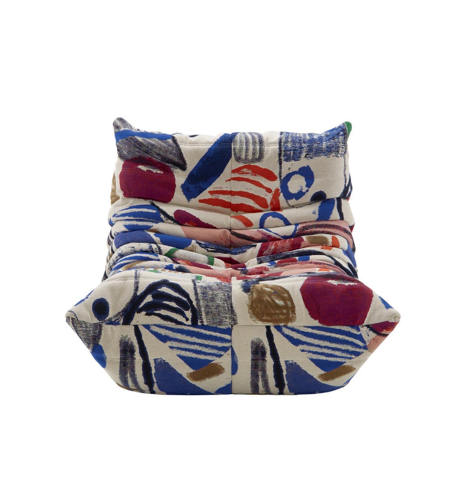
TOGO TRIUMPH
77
MI
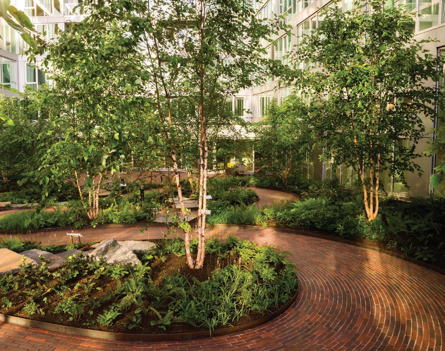
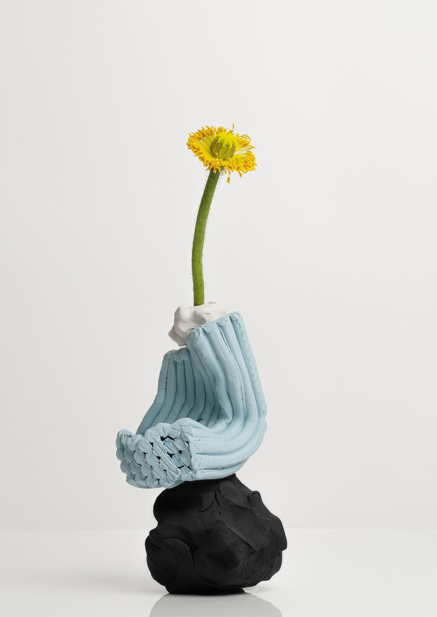
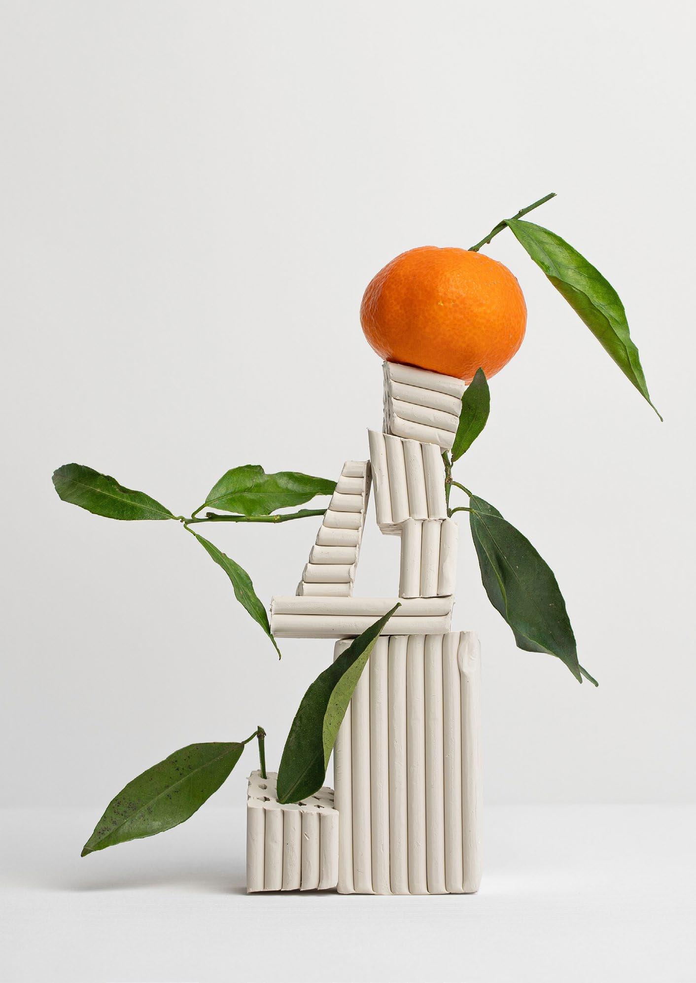
Clay, a versatile and ancient material, is currently enjoying a resurgence in popularity in the design world. From ceramics to architecture, the tactile and organic nature of clay is being used to create unique and inspiring designs. It makes you wonder why we ever started using plastic in the first place?
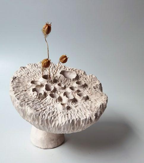
One area where clay is being used in innovative ways is in ceramics. Ceramic artists are pushing the boundaries of traditional techniques, using the malleability of clay to create intricate and detailed designs. The work of ceramic artist Akiko Hirai, for example, is known for its delicate, almost lace-like designs, which are achieved through a process of layering and cutting the clay. Another ceramic artist, Jun Kaneko, creates large-scale, abstract ceramic sculptures that are known for their bold, colourful glazes.
Clay is also being used in architecture as both a structural material and a decorative element. In addition to its aesthetic qualities, clay bricks have the added benefit of being a sustainable building material, as they are made from natural, locally-sourced materials and have a low carbon footprint.
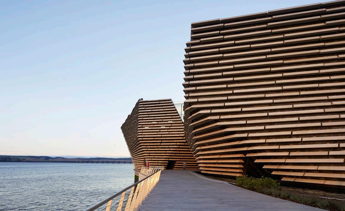
At Scotland’s design museum, the V&A Dundee, renowned Japanese architect Kengo Kuma used clay bricks to create a subtle, textured façade reminiscent of a cliff face, which harmoniously complements the sweeping building’s natural surroundings. Made from thousands of cast-glass panels resembling the layers of sedimentary rock found along the nearby River Tay, the building appears to be carved out of the earth.
 Designer

In addition to ceramics and architecture, clay is being used in product design as well. The work of design studio Nendo, for example, includes a series of vases and other objects that feature a unique, ‘crumpled’ surface achieved by folding and manipulating the clay before firing in the kiln. The resulting pieces have a dynamic, sculptural quality that sets them apart from more traditional ceramic designs.
The use of clay in design is not limited to any one specific industry, form, or medium, but is being used across the board. It is a traditional material that has a timeless appeal, yet it is also a modern material that can be used in contemporary and experimental ways.
Overall, clay is proving to be a versatile and inspiring material in the design world. Its organic, tactile nature allows for infinite innovation, and as the world continues to focus on sustainability and the use of natural materials, it is likely that we will see even more creative uses of clay in the future.

"In addition to its aesthetic qualities, clay bricks have the added benefit of being a sustainable building material, as they are made from natural, locallysourced materials and have a low carbon footprint."
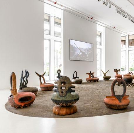
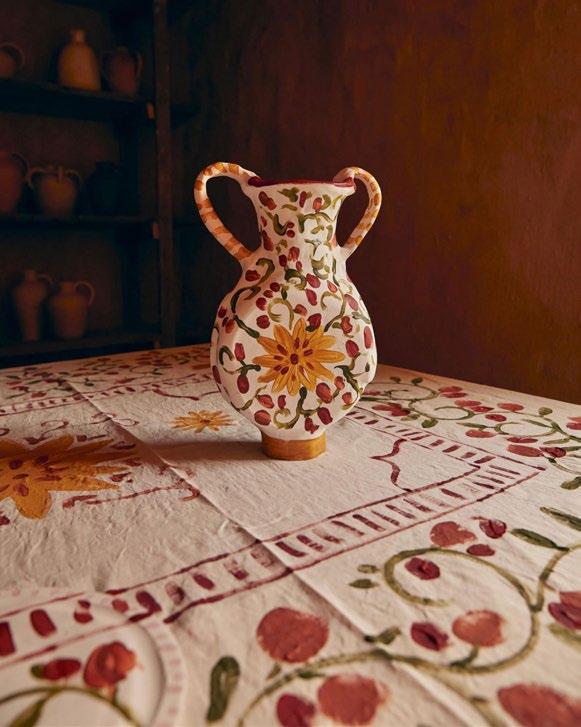
iThongo, a solo exhibition at Southern Guild by ceramicist Andile Dyalvane, co-founder of IMISO Ceramics. Photography by Adriaan Louw/Southern Guild Gallery.
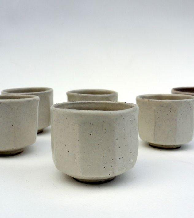
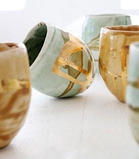
Hand-painted Espresso Cups by IMISO Ceramics' co-founder, Zizipho Poswa, in collaboration with The Trenery Guild.
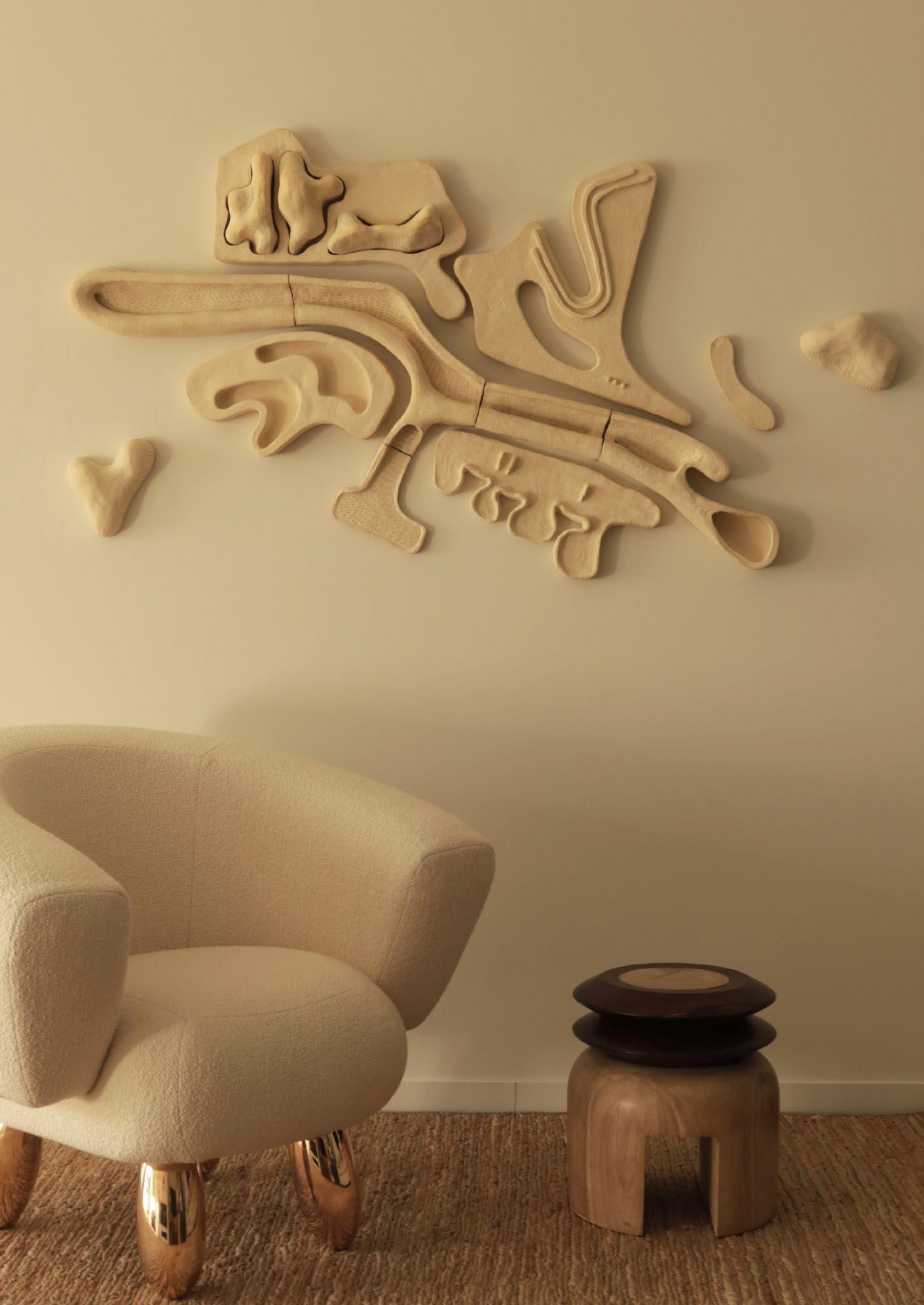 'Fragments of a French Landscape' mural by Jan Ernst. Photography by Milan Mazaud.
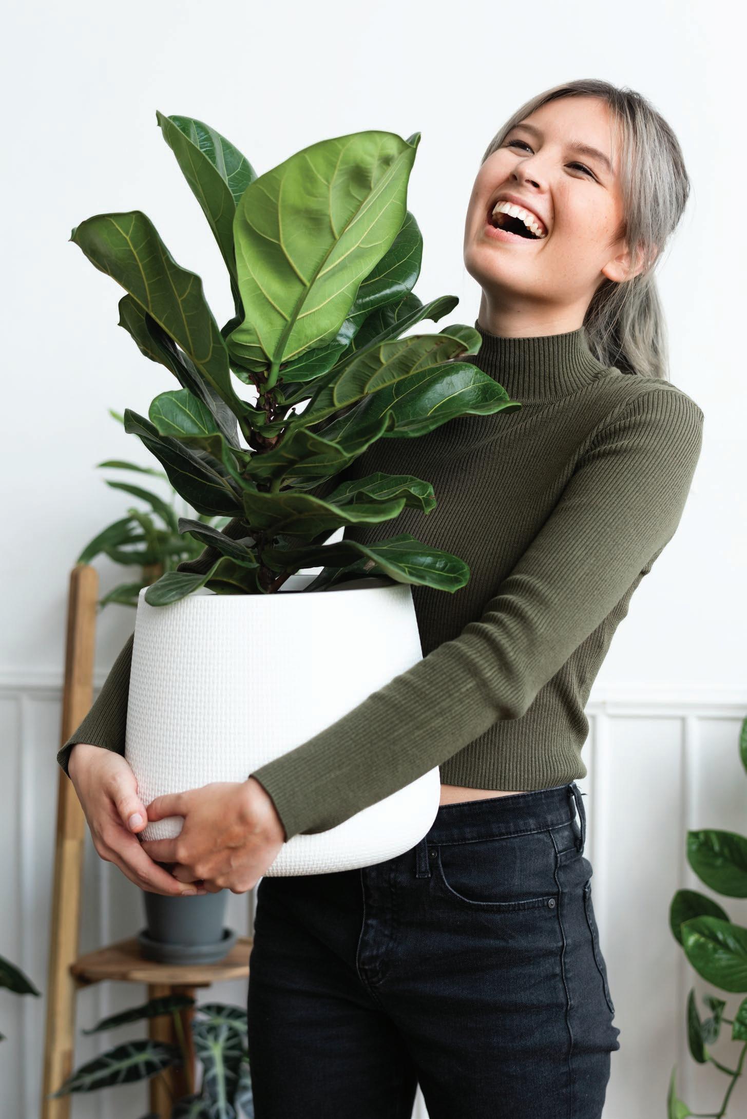





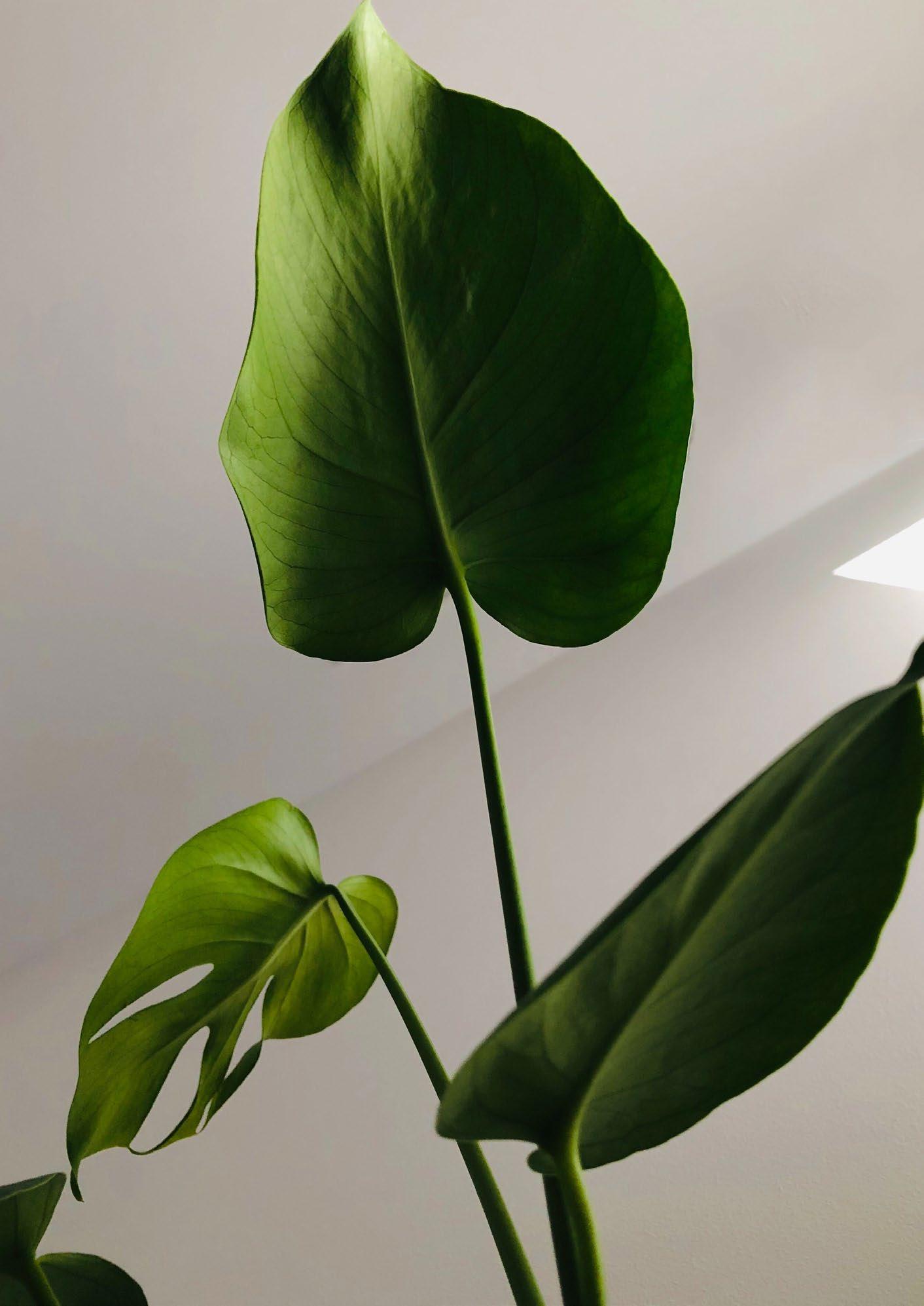
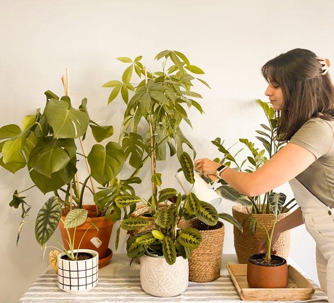
Want to adorn your house with lush greenery, but have no idea where to start? The easiest approach is to consider one room at a time. Not only do certain plants simply fare better in different areas of the house, but strategically placing plants in your home can also help facilitate some of our most vital needs — like a good night’s rest, for example.

Similar to humans, each plant has its own individual likes and dislikes. When these needs are met, our plants start to thrive and, in thanks, they contribute to our mental and physical wellbeing in the most mysterious ways.

Being an avid collector of indoor plants and having referred to myself numerous times as a plant mom, a green thumb, an anthophile, and just about any other cringe plant noun you can think of, I have learned the hard way in which rooms to reside my indoor plants, and, more importantly, where not to place them.
There are many factors we need to consider when choosing indoor plants for a specific room:
• The amount of natural direct and indirect light that enters the room throughout the day.
• The use of the room. Is it for sleeping, eating, relaxing, working, or washing up?
• The humidity level of the room.
• The temperature of the room.
• The aesthetic of the room. For example, does the scale of the plant work with the size of the space? How can the style and texture of the plant elevate the design of the interior?
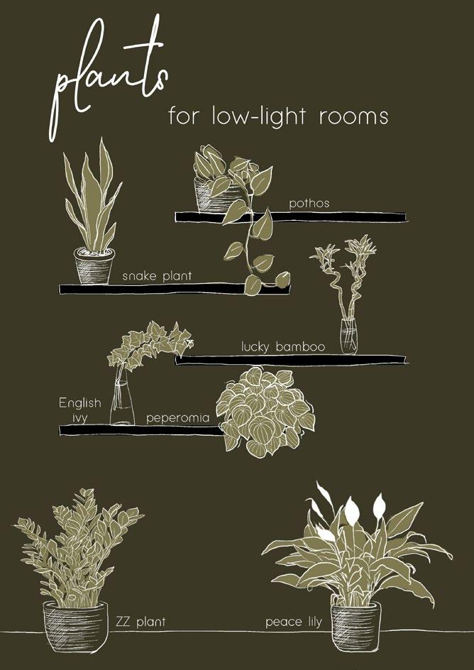
Just because you live in a poorly lit house doesn’t mean you have to deprive yourself of the company of these beauties altogether. Sure, no plant necessarily prefers a poorly lit room, but there are many plants that are very content with these dungeon-like conditions. Among those are the ZZ plant (Zamioculcas zamiifolia), snake plant (Dracaena trifasciata) , peace lily (Spathiphyllum) , and pothos (Epipremnum aureum).
If you are set on having a specific plant in a low-lit room that needs very bright light to just barely survive, there are other solutions that are worth considering. One of these solutions is as simple as purchasing plant grow lights that imitate natural lighting.
There are also plenty of ways to lighten up a room visually, like painting the walls and ceilings white and sticking to noticeably light and natural colours for the furniture and décor. Light colours reflect light, which makes a space appear much bigger and encourages plant growth. Two for the price of one.
"Always consider the amount of natural light that enters the room, along with the humidity level."
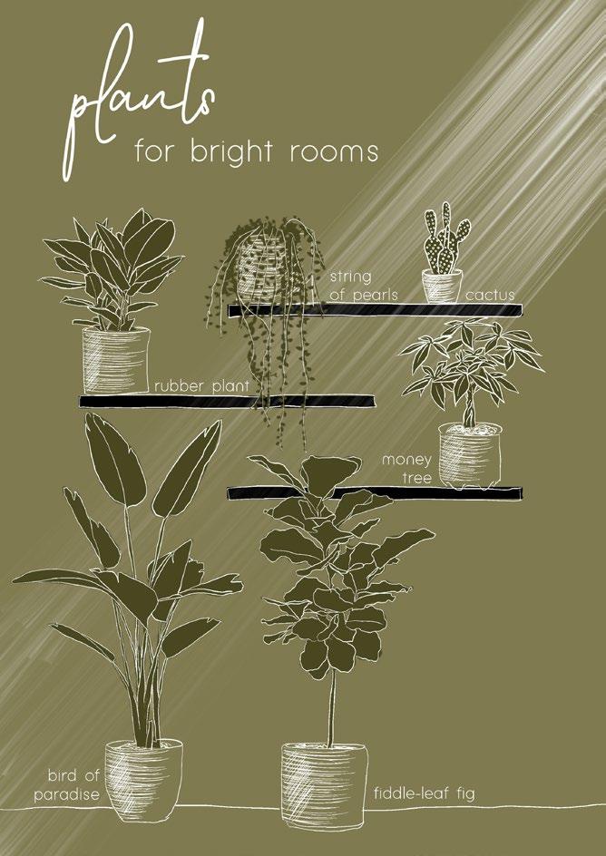
At the other end of the spectrum, there are also plants that enjoy bathing in very bright light throughout the day. Most indoor plants tend to fall into this category, so if you have a north-facing house with bright light streaming through large windows, then you are in luck (and also, I envy you).
It is important to note that bright light doesn’t mean direct sunlight. Most plants have a severe dislike of direct sunlight, as it dehydrates them at a fast pace, and can also cause the leaves to burn (just like us humans).
Indirect sunlight can be achieved by diffusing northfacing windows by installing sheer fabric blinds or curtains, as well as applying sandblasting vinyl stickers to the interior of the windows. Plants that enjoy bright light are the string of pearls (Senecio rowleyanus) , cacti, rubber plant (Ficus elastica) , money tree (Pachira aquatica), bird of paradise (Strelitzia) , and the fiddle-leaf fig (Ficus lyrata).
Now that you are aware of the general needs of most plants in terms of lighting, we can have a closer look at more room-specific plants. Always consider the amount of natural light that enters the room, along with the humidity level, regardless of the characteristics discussed on the next few pages. English
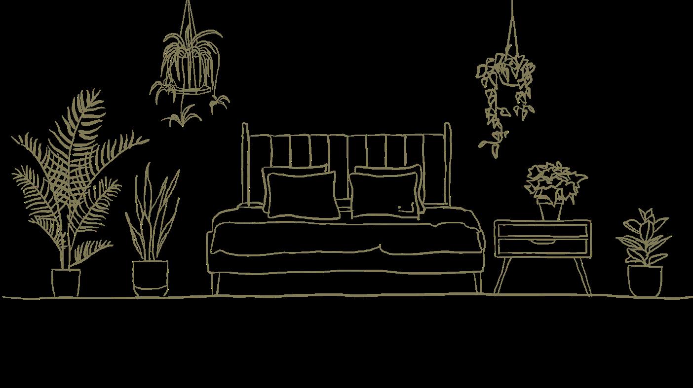
The bedroom: the place where our bodies relax and recharge after busy days, in preparation for even busier days. The bedroom is one of the rooms in the house where we spend most of our time. Up to at least eight hours a day if you follow the doctor’s orders. What’s more, the plants you add to your bedroom décor have the potential to contribute to your sleep quality, so it’s worth experimenting with a wide variety of greenery for peaceful slumber.
The snake plant is by far the best plant to have in your bedroom. Aside from being exceptionally low-maintenance, the snake plant is one of the most airpurifying plants out there. What makes it such a terrific addition to the bedroom, specifically, is the fact that it releases oxygen during the day as well as at night, whereas most house plants only release oxygen during the day. Such a hard worker.
Another plant that will make a great sleepover buddy is the toxin-absorbing English ivy (Hedera helix) , which is also known for clearing the air of mold and helping to alleviate allergy symptoms. Golden pothos not only purifies the air, but it also absorbs unpleasant odors. Among the toxin-absorbing plants are spider plants (Chlorophytum comosum) , areca palm (Dypsis lutescens) , and the hardy rubber plant.
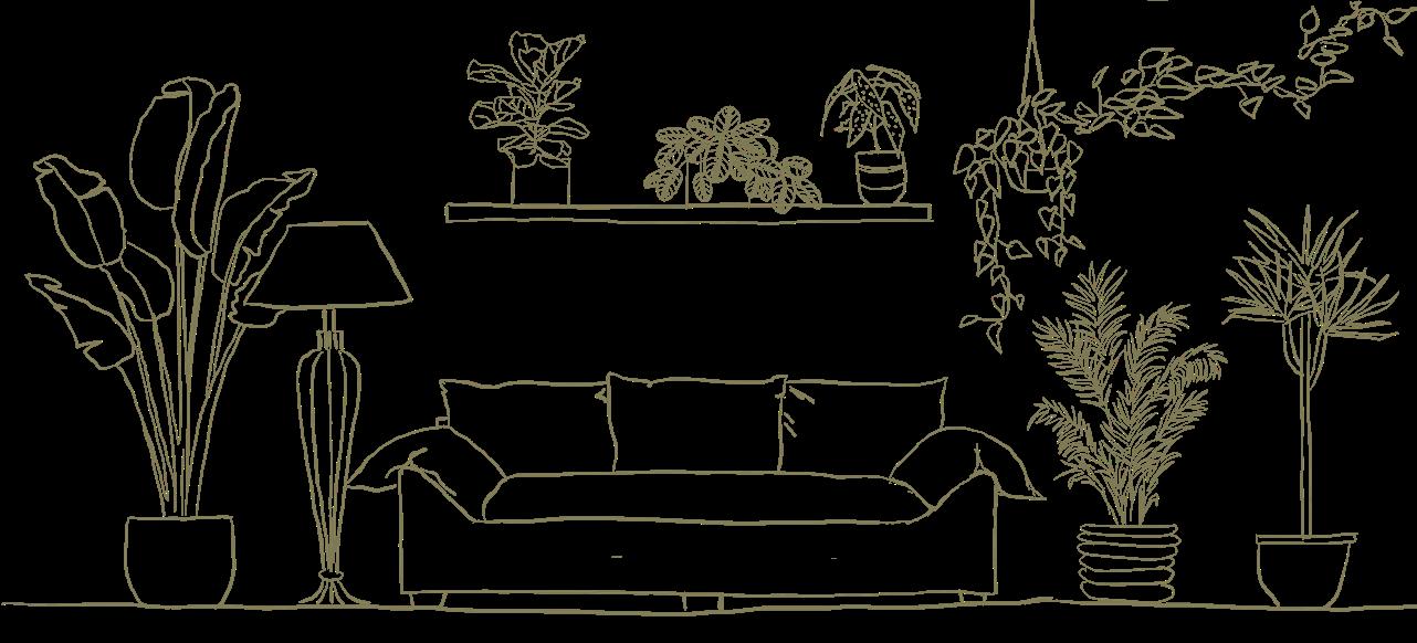
The other room in the house where we tend to spend a lot of our time is, of course, the living room. Not to be overlooked, this room is where we relax and entertain guests, and is, in most homes, the focal point around which the entire house is designed.
When selecting plants for your living room, the most important aspect to consider is the available space. A lot of negative space calls for large plants, like the bird of paradise, especially if the said living room is filled with natural light throughout the day. Other large plants that are perfect as focal pieces include the infamous fiddle-leaf fig, dragon tree (Dracaena draco), and the parlor palm (Chamaedorea elegans).
Running out of space in your living room? Plants like the prayer plant (Chamaedorea elegans) and polka dot begonia (Begonia maculata) are enjoyable conversation starters with their interesting leaf patterns, and they don’t take up a lot of space. Pothos can also be trained to fill those empty corners in your living room in the best conceivable way.
The bathroom is THE best room in your house for indoor plants, due to the humidity level. Think of your bathroom as a tropical oasis for your plants. Although most plants do quite well in wash rooms, there are some that like the humidity even more than others: fiddle-leaf fig, lucky bamboo (Begonia maculata) , Chinese evergreen (Aglaonema commutatum) , ZZ plant, English ivy, peace lily, and pothos are among the plants that make great bathroom buddies.
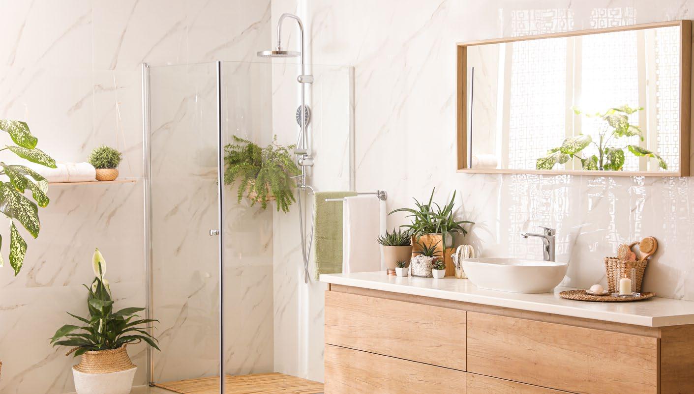
And no, contrary to popular belief, filling your bathroom with plants will NOT cause mold. In fact, plants prohibit the growth of mold by absorbing excess moisture from the air.
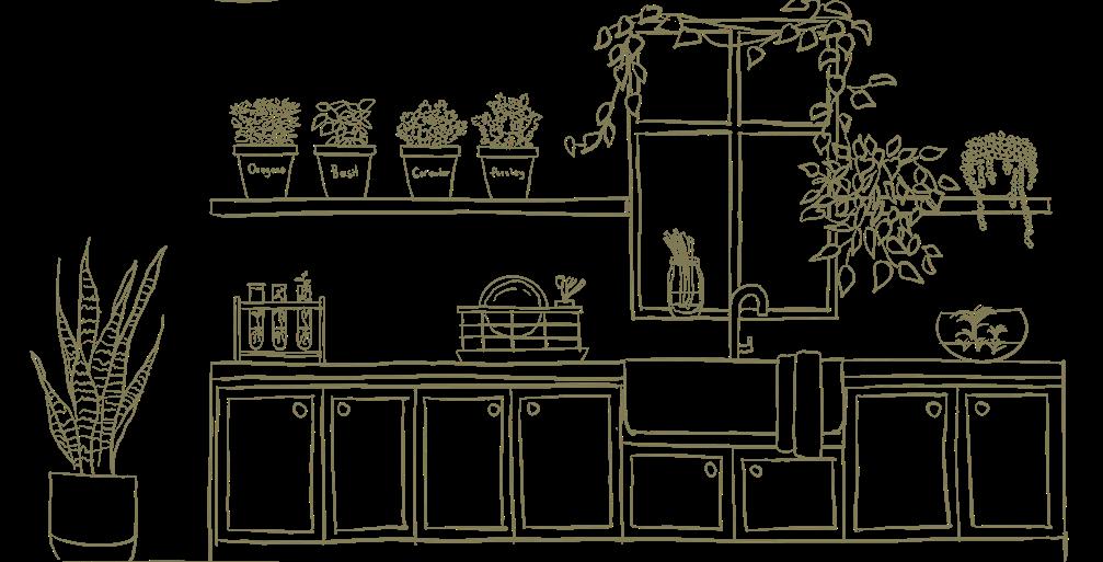
This one is a no-brainer. Of course, potted vegetables and herbs are a terrific addition to any kitchen. What is more inspiring than cooking in a kitchen filled with fresh produce? Aside from an actual chef being present, I can’t think of anything. Spring onions, mint, parsley, and basil are the ideal plants for a well-lit kitchen.
If, on the other hand, you don’t cook and your kitchen is strictly for decorative purposes (no judgement here), it is important to take into consideration the fact that the kitchen is the second most humid room in the house. Air plants, pothos, and string of pearls will all thrive in a humid kitchen.
string of pearls
The home office doesn’t have to be dreadful and depressing. Adding a few plants can inspire productivity and creativity, while instantly perking up the aesthetics of the room. Studies have shown that greenery in the workplace has a positive psychological effect on workers. This is why it is so important to try and bring the outside indoors as much as possible when it comes to the place where you live, and especially where you work.
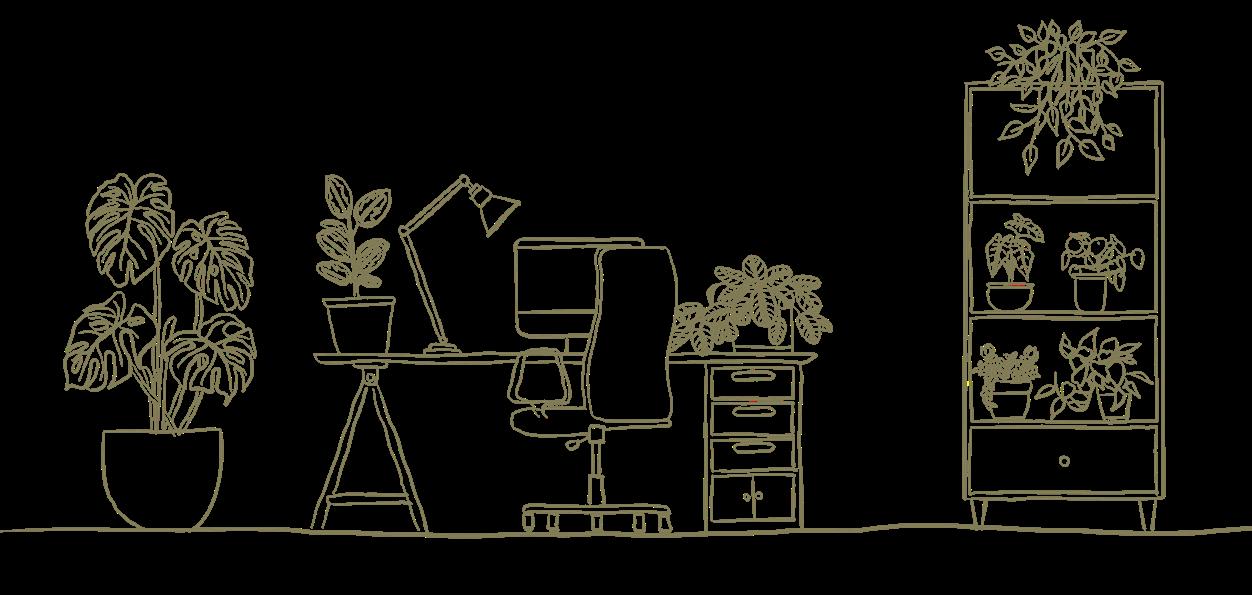
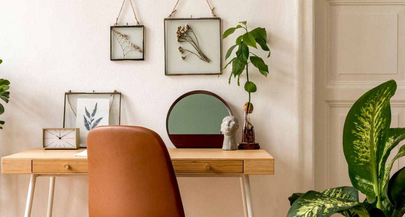
Depending on the quality of natural light in your home office, any plant that you find beautiful and inspiring should be placed on your desk! There are, however, plants like the mum flower that absorb chemicals emitted from copiers and printers, which make them the ideal plants for your home office. Of course, if you are into feng shui, then the money tree is always a good option for your home office, as it encourages wealth and prosperity.
I hope this article inspired you to make a few home improvements by incorporating plants as an essential part of your décor. If you’re still not sure where to start with your plant collection or next addition, be sure to contact me and we’ll have your space greenified in no time.
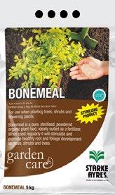
Bonemeal

Bonemeal is a pure, sterilized, powdered organic plant food, ideally suited as a fertiliser. When used regularly it will stimulate and promote healthy root and foliage development on roses, shrubs and trees.






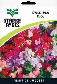
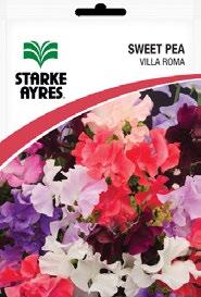
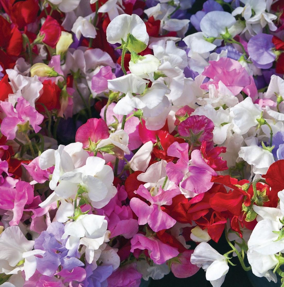
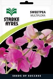
Sweet peas attract bees, butterflies and other pollinators which are needed in your winter vegetable garden as they give off a beautiful fragrance which will benefit a wide range of vegetables such as your peas, brassicas (cabbages, cauliflower, broccoli and turnips) and your leafy greens (lettuces and spinach).
Trelmix
For the best results when planting SWEETPEA flower seeds, soak them in warm water with TRELMIX overnight and plant them straight in your garden.

 Bonemeal Reg No. K2936 (Act 36 of 1947)
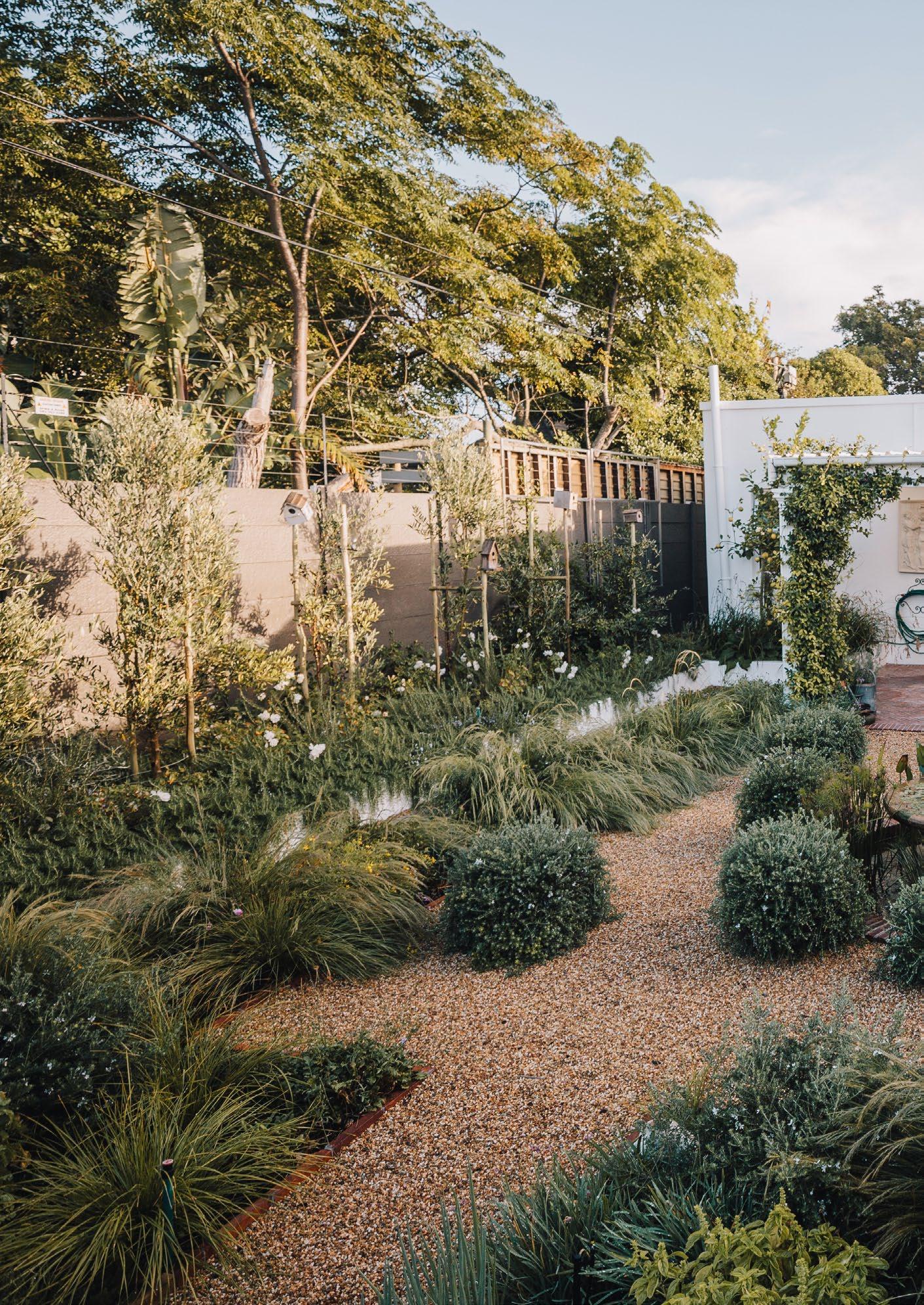
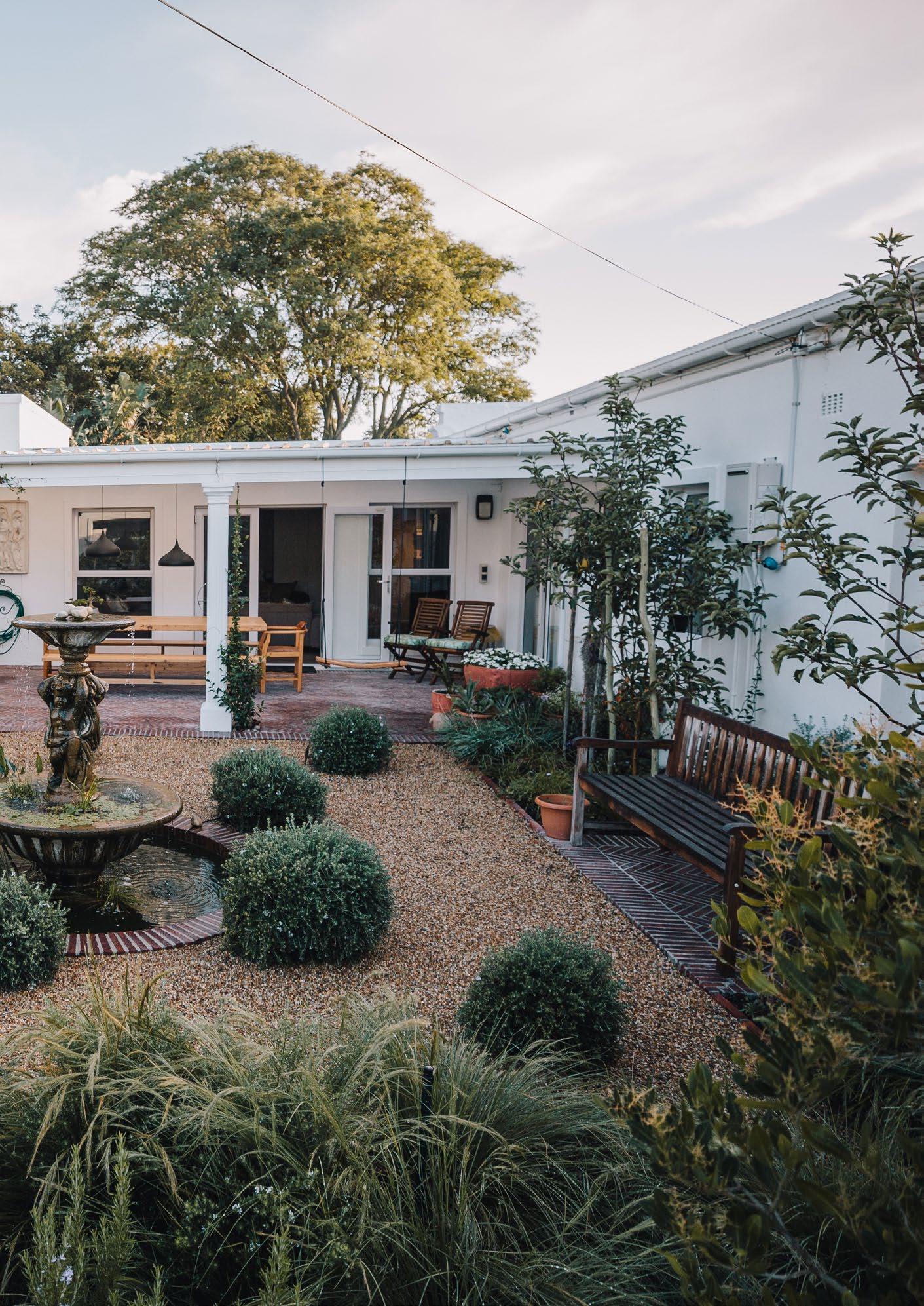
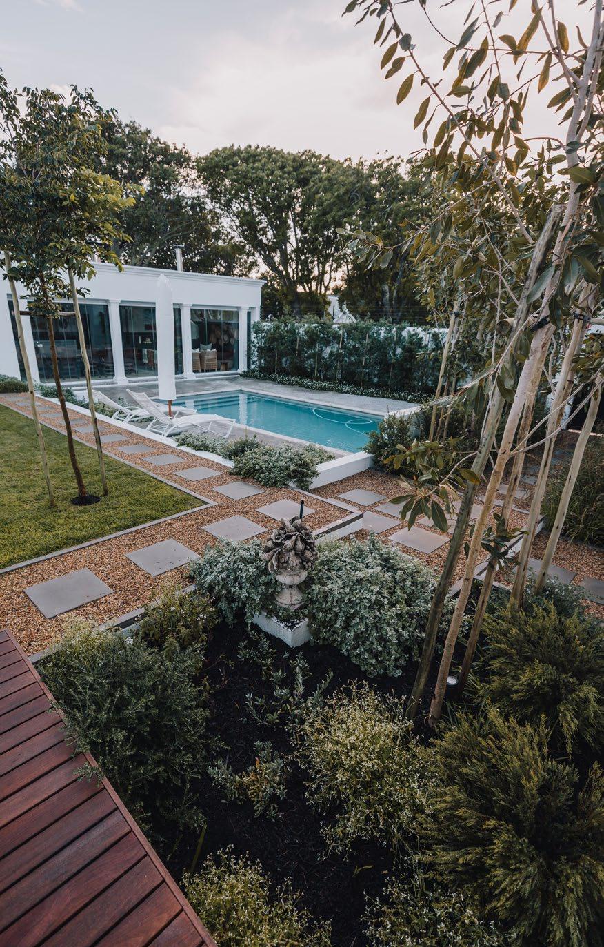
The classical garden style has crawled back into the contemporary landscape space, with a yearning for whimsical features and delightful blooms, welcoming nostalgia back into our lives. This garden at a Georgian-style home in Tokai was very sad after the drought, so during lockdown our client decided to start with a fresh new design. The wonderful journey from the entrance introduces you to a loose meadow verge, with dainty flowers close to the ground bringing your attention to beautiful herringbone paving. As you open the front door there is a lovely surprise avenue of trees enticing you further; travel deeper into the garden and you will discover a delightful pool area and welcoming main entrance. The pool was given a fresh new Cape grey fibre lining, custom cut stone coping, and stone grey cobble paving laid in a herringbone pattern. We gave the feature wall a moulding detail to match the house and reshaped it to have more relevance to the design — in time there will be a hedge beautifully framing this from behind. A noticeable difference from the traditional, old-fashioned-style gardens is the limit to two to three colours and a sharp contrast between loose planting and neat, orderly lines. Whether this is achieved by using a strong gravel strip with steel edging, wide granite tile platforms, or ‘klompie’ edging — we like a sense of order and ‘tidiness’ in our outdoor spaces, especially living in smaller homes where these areas become an extension of our living space.
A lovely trend has been the inclusion of indigenous grasses to contrast and complement the pops of flowers. Here are my modern romantic plant palettes for this all-white garden in Tokai, in collaboration with the installer, Julip Landscaping (@julip_landscaping):
• White lion’s tail (Leonotis leonurus)
• Gongoni grass (Aristida junciformis)
• Fama white (Scabiosa)
• African lily (Agapanthus ‘Superior White’)
• Yarrow (Achillea millefolium)
• White shasta daisy (Leucanthemum × superbum)
• White marguerite (Felicia amelloides)
• Weeping anthericum (Chlorophytum saundersiae)
• Tanika (Lomandra longifolia)
• African lily (Agapanthus ‘Nana White’)
• African lily (Agapanthus ‘Superior White’)
• White foxglove (Digitalis purpurea ‘Alba’)
• White heliotrope (Heliotropium arborescens ‘Alba’)
• Spanish daisy (Erigeron karvinskianus)
• White confetti bush (Coleonema alba)
• Coastal rosemary (Westringia fruticosa)
• Diamond frost (Euphorbia hypericifolia)
• White watsonia (Watsonia pyramidata)
• White bearded iris (Iris × germanica)
• Star jasmine (Trachelospermum jasminoides)
• Lily turf (Liriope muscari ‘Evergreen Giant’)
• Lace fern (Microlepia strigosa)
• Licorice plant (Helichrysum petiolare)

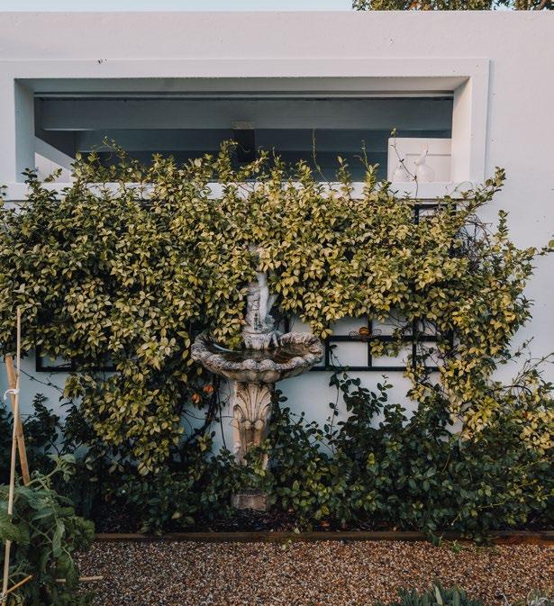
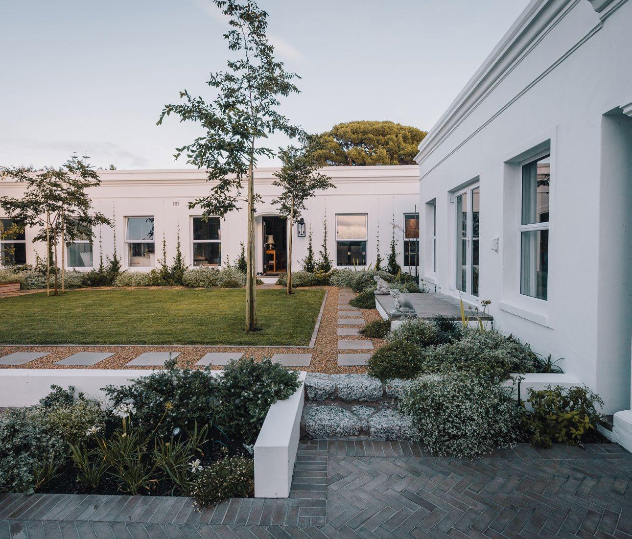
What makes this type of garden so romantic is the delicate foliage and soft flowers; however, to achieve such lush greenery you will likely need to consume plenty of water. No need to fret, you can achieve the feeling of lush borders in no deeper than one-and-a-half-metre beds, and by including vertical greenery through trees and creepers, you can create depth and further soften the hard building façade. Creepers are especially useful as they take up minimal root space and can add a wonderful flower, foliage, or scent element to the space.
Biodiverse flowering gardens are also extremely high maintenance due to their seasonality and different requirements, so I like to fill the beds with a majority of ‘anchoring’ evergreen plants and include only one or two seasonal flowering elements for each season. Lawn areas should be limited to their absolute essential usage requirements and be an easy, low-maintenance shape with a sharp clean border. In this case, I used a wide gravel path to formalise and create order within the space.
With that being said, a romantic garden is more of a feeling you get when the rhythms of natural beauty spark inspiration and appreciation in you. There is no recipe to create this as every space has its own unique aspects to be enhanced. You need to look at the way light travels, how it is reflected or diffused, and the way sounds are absorbed or created by the water, gravel floor, or trees. See? Romance isn’t dead.
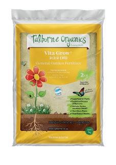
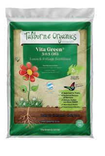
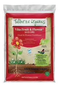
Give your garden the ultimate makeover with these eight fabulous gardening goods! Whether you're a seasoned green thumb or a plant newbie, our product picks will help you unleash your inner landscaper to spruce up a green space that's lush and thriving. Just a spoonful of fertiliser will make your neighbours green with envy... So grab a trowel, dig your fingers in the soil, and get down and dirty!
01
Bio Ganic All Purpose Fertiliser
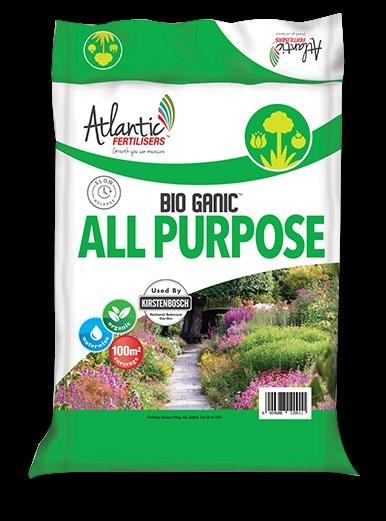
Atlantic Fertilisers
R 265 for 20 kg
www.agrimark.co.za
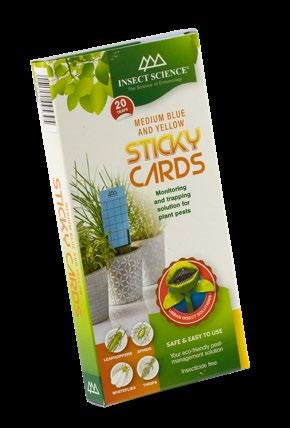
Insect Science Sticky Cards R185 www.staghornandpitcher.com
Rose Food Starke Ayres
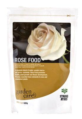
R129 for 500 g
www.builders.co.za
02 06

03 05 04 08 07
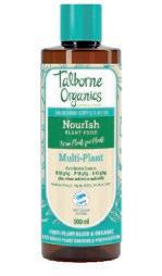
Nourish Plant Food Talborne Urban Organics

R79 for 500 ml
www.lifestyle.co.za
Bird Bath 1 Kassa Studio R5000 www.kassa-studio. myshopify.com
Cream Watering Can
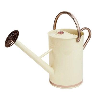
Good Roots R480
www.faithful-to-nature.co.za
Glyphogan
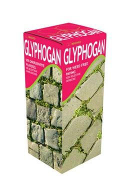
Makhro Home & Garden
R75 for 100 ml
www.capegardencentre.co.za
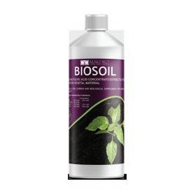
Biosoil
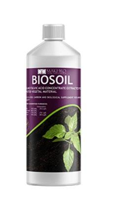
Makhro Home & Garden
R125 for 500 ml
www.agrimark.co.za
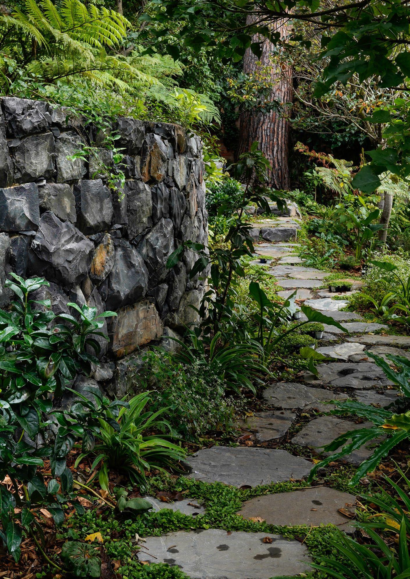 Dawn Villa, Constantia, Cape Town. Stone wall by Elem Stone & Garden.
In the face of our fast-paced, machine-made, money-driven future, today’s luxury can be defined as artisanal. It’s natural and sustainable, easygoing and unpretentious. Therefore, in terms of hard-landscaping materials, natural stone is the ultimate in contemporary luxury.
When designing with stone there really is only one ideal: authenticity. It is a simple truth that the more out of place and character stonework looks, the less sophisticated the ultimate effect and the higher the environmental footprint. So, we really should be looking to our local neighbourhood and natural landscape rather than Google and Pinterest for inspiration.
I always feel like I’ve hit the jackpot when a site I’m working on has its own stone, and I hardly ever send rock off site, but rather incorporate it into the design. In the absence of this blessing, I turn to my stone masons who always know what stone is being excavated on building sites in the area. Essentially a waste product, this is a very environmentally friendly source of stone and guaranteed to be locally appropriate.
One of my favorite examples of this is how we are seeing gorgeous applications of pebbled paving emerging in areas of the Boland rich in alluvial stone. Not only does this feel in keeping with the natural landscape, but it speaks to our Cape vernacular ensuring an utterly timeless installation. Depending on where a property lies in Cape Town, where I’m based for example, the primary choices are sandstone, granite, or shale. The most enduringly elegant stonework is always that which comes from its closest natural environment.
Stone walling is where we are seeing the market’s increasing desire for authenticity most clearly. There is a distinct move away from the very static, tightly packed, dry-stone cladding that has been so prevalent over the last thirty years. Today, it’s the intangible allure and rich character of stonework that can only truly be achieved using time-honoured building techniques that capture our imagination. There is a magic to solid stone walling, which is very hard to achieve with a brick wall only clad in stone. Solid stone walls are now my first prize always and we sometimes need to push project engineers to embrace this traditional approach.
When building solid stone walls, one needs to first decide if they will be dry packed (no cement used) or held together with mortar. Dry-packed walls, as one often sees in rural settings, are incredibly charming and are essentially living walls as one can grow plants in their crevices. The design possibilities for dry-pack walls are truly endless and this application is not limited to traditional-style gardens. Dry walls constructed of flat shales or slate, for example, sit beautifully in a contemporary setting — as do dramatic retaining walls of giant stacked boulders.
In instances where a mortar-held stone wall is more appropriate or when the only solution is to clad a brick wall in stone, the choice of grouting method is as important to the end look as the choice of stone itself. I love exploring the local neighbourhood and taking inspiration from old buildings in the area as this ensures a sense of harmony with the built environment.
There is endless room for expression and creativity within the choice of grouting, and it's astonishing how a grouting technique as traditional as monumental pointing can look absolutely smashing in a contemporary context. Gone are the days when we try to make a clad wall look like a dry-pack wall, with natural stone, it’s all about keeping it real.
Carrie Latimer Landscape Designer


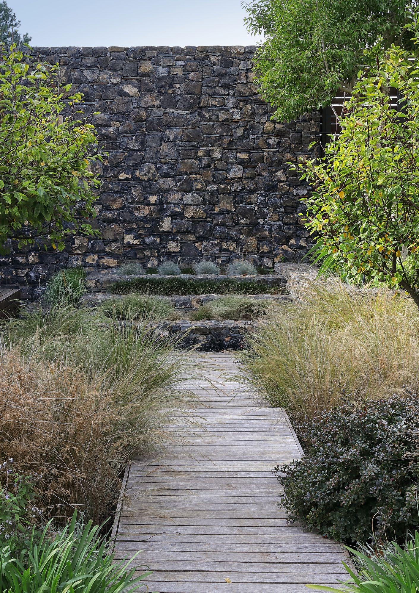
 Dawn Villa, Constantia, Cape Town. Stone wall by Elem Stone & Garden.
www.thermofires.co.za

@thermofires
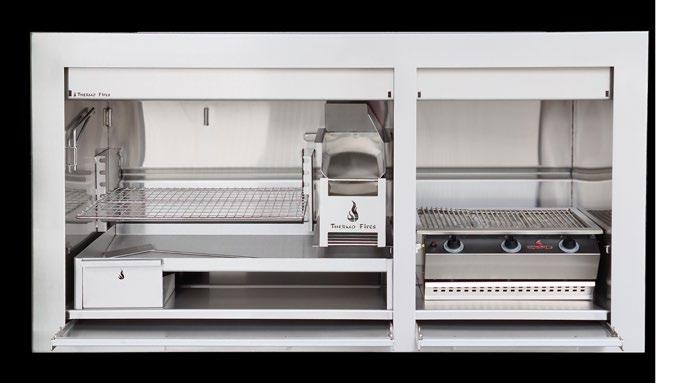
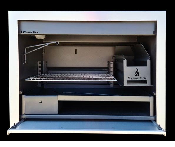
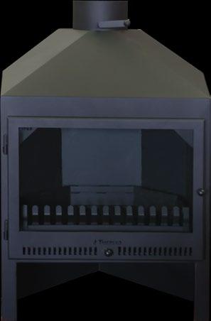
At Thermo Fires you can find one of the most extensive ranges of locallymanufactured indoor and outdoor braais. Our current hottest seller is our Professional range of built-in braais. This range boasts modern, clean lines that complement any design aesthetic, whether you choose mild steel (black) or brushed stainless steel.
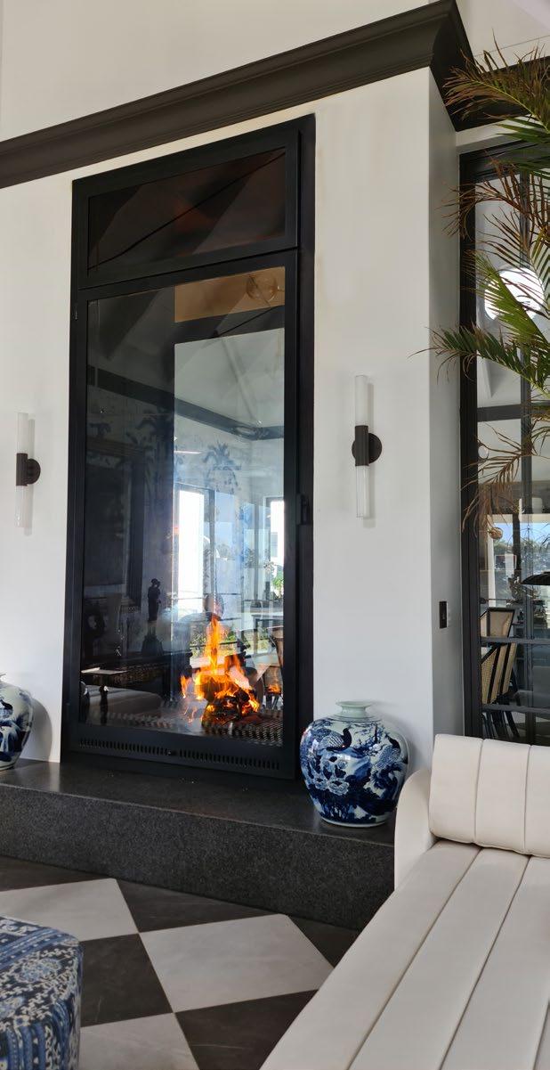
The door makes a statement when closed, and when opened, it slides neatly out of the way underneath the ashpan to provide a convenient workspace when needed. Our DeLuxe range includes double doors that are closed with turn-knobs to eliminate any rattling noises.
• Both ranges are available in 5 standard sizes (from 800 mm to 1800 mm wide) and custom.
• Units larger than 1.2 m include a second polished stainless-steel grid that is height-adjustable without having to move the coal maker.
• Also include spit braais and double-sided braais
• Available in 19 sizes (from 1200 mm to 2250 mm wide) and custom.
• Incorporates a 3, 4, or 5-burner gas BBQ
• Also available without the BBQ
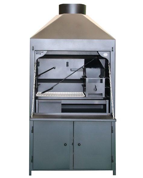
• Thermo Fires is the first to manufacture a braai with double-skinned sides to keep the outside cooler to the touch.
• Supplied on a closed cabinet with 2.4 m flues, turbo cowl, and a ceiling plate.
• Avoid messy building work — ready to braai in 24 hours.
• Available in 3 standard sizes
*All braais are available in mild steel, 3CR12, 304 stainless steel, or a combination of materials. For example, a mild steel braai with a brushed stainless-steel façade.
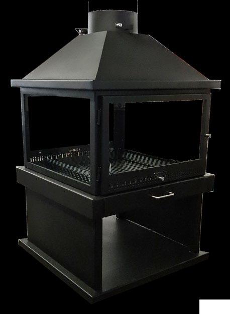
Thermo Fires also designs and manufactures a diverse range of standard and bespoke indoor fireplaces, including freestanding and built-in types.
Our best-sellers are the Slimline and Corner freestanding ranges. The Slimline range is designed to be wall-standing, and the Corner unit (unique to Thermo Fires) neatly tucks into any unused corner of your room. It radiates heat at a 90-degree angle, and you can enjoy a view of the flames from all sides.
Both ranges come in 4 sizes and are equipped with convection channels, an adjustable air-intake door, and 3.6 m stainless steel flues. Want to make a statement? We also manufacture square and octagon units. You simply can't go wrong!
THERMO FIRES is a privately owned Proudly South African, Cape Town-based family business. We are manufacturers of Quality and Bespoke Braais & Fireplaces. With over 18 years’ experience in manufacturing and design, THERMO has become synonymous with quality and custom products. As proof of our commitment to our products, THERMO is the only company that gives a 20-year warranty against faulty workmanship.









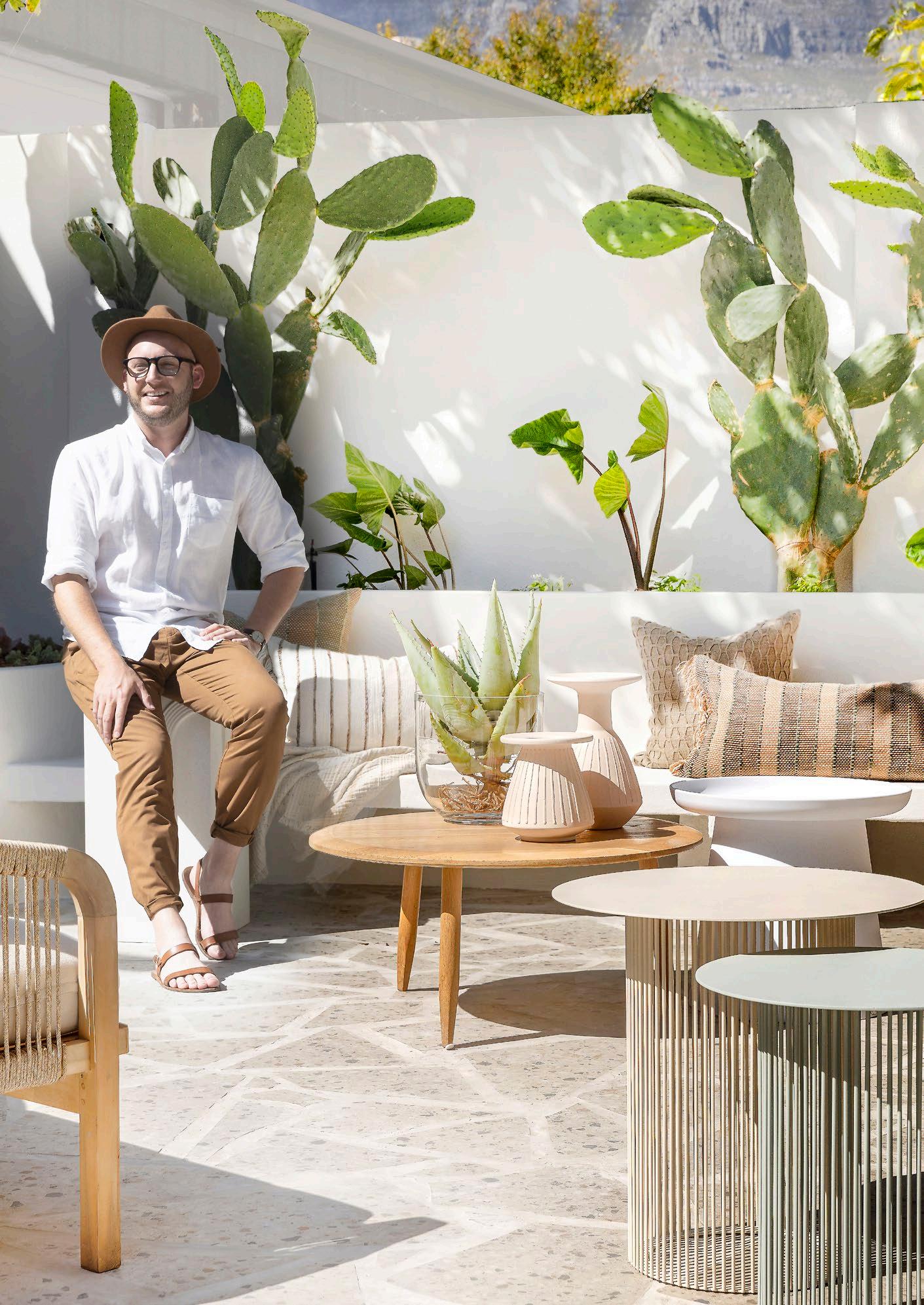

Interior design is a constantly evolving field influenced by changing tastes, advances in technology, popular culture, and shifts in social and economic conditions. Usually, a standout mark helps to define the era — whether it’s the recent ‘Year of the Curve’, ‘Year of the Chubby Furniture’, or ‘Year of the Waterfall Edge’. But how would we describe this year’s interior identity?
Seeking to make sense of the constant flux of decorative aesthetics while pinpointing the unknown, join leading interior architect Anlo Neethling as he takes a closer look at the key trends shaping design in 2023.
In recent years, wellness has become a hot top in design (especially after the pandemic), creating a space for us to slow down, reflect, and function at our utmost. Unsurprisingly, the chaos and uncertainty of the stressful lockdown years prompted many to find refuge in calming textures, which became increasingly popular in residences the globe over. People want their home to feel like a tranquil haven, a sanctuary, particularly in the bedroom and living room— both designated for relaxing and filled with plush, soft furnishings. And why not? We’re all in need of some nurturing this year!
In application, this trend translates to plenty of calm neutrals. Warm hues like clay, terracotta, stone, sunlit yellow, and rust will likely dominate, which means lovers of gold accents, honeyedwood tones, and cream sofas will rejoice.
We may see the return of minimalism in wellness-focussed interiors, but in a more sophisticated and homelier manner than we've seen previously. Warm wood tones and natural textures will become a feature in and of themselves, without compromising the simplicity and cleanliness of minimalist styles.
Viva Magenta 18-1750, Pantone’s Colour of the Year 2023, can be woven into a variety of palettes — whether it's the primary bright colour in a sea of muted hues or a fitting addition to a jewel toned collection of colours. You can incorporate this crimson red using patterned wallpaper and throw pillows, a striking feature wall, or even a bold furniture piece.
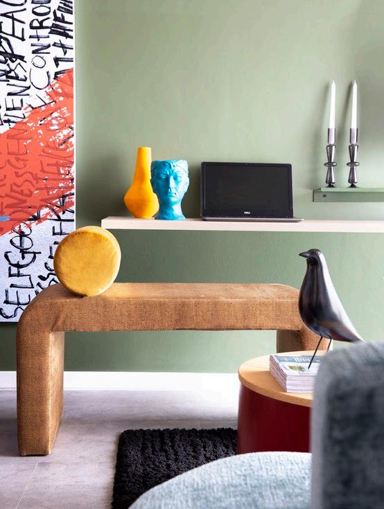
The ‘70s are back! Interior design trends, just like fashion, are proving to be cyclical, and the 1970s is projected to be a key influence in 2023. You can tap into this aesthetic by using warm brown, gold, and red tones such as clay, honey, or paprika as the base for your interior and layer with fun colours and forms to add interest.
Soft shapes and relaxed-style seating not only tap into the 1970s aesthetic but are comfortable and have a cocooning effect, creating a happy and enjoyable interior with soft edges and dramatic accents. Try selecting sofas with deeper seats and plumped-up cushions for a real ‘sink-in’ experience.
Over the past years, rounded and curved shapes have increasingly found their way into interior design, from crescentshaped sofas and egg and tulip chairs to circular rugs. This year we’ll see a parallel pivot within this trend as designers shift towards more oblong and angled curves. Say hello to ovaloid mirrors and mushroom-shaped lighting fixtures, as well as much more rounded cabinets, credenzas, and nightstands. Needless to say, arched door frames, thresholds, and ceilings will continue to be big in 2023.
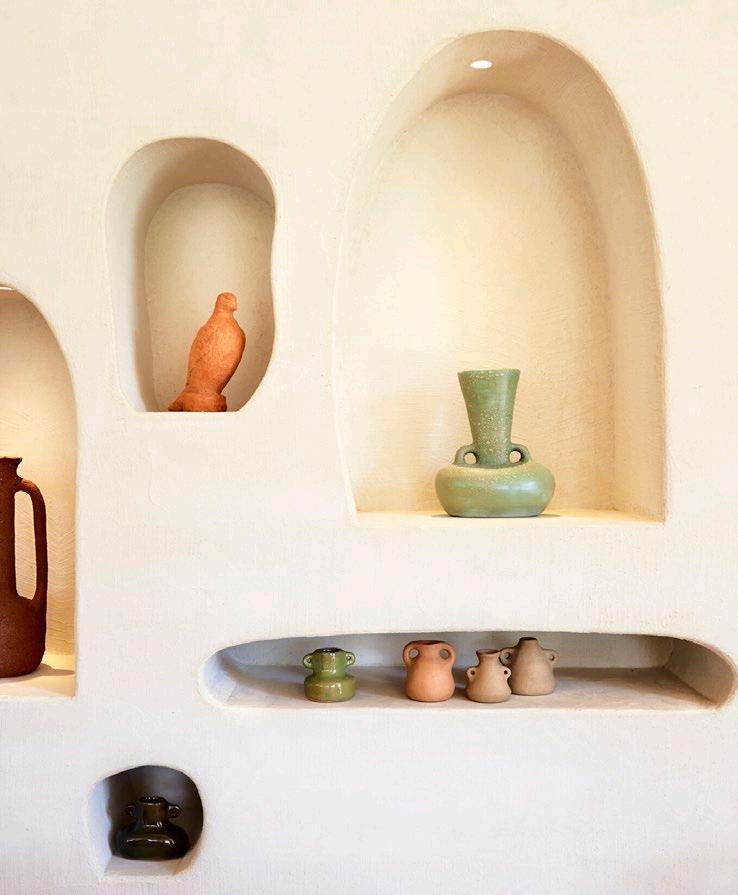
The use of alcoves and niches in architecture has been popular since the Renaissance period as a way to display artwork, particularly sculptures. Today, these distinct architectural elements are experiencing a resurgence in popularity thanks to their versatility. Not only do they provide a spot for showcasing decorative items in your home, they can also serve a functional purpose by saving space, adding visual interest, or creating a peaceful retreat. Regardless of their size, alcoves and niches are an effective way to accentuate the décor and furnishings within a room.
"Warm hues like clay, terracotta, stone, sunlit yellow, and rust will likely dominate, which means lovers of gold accents, honeyed wood tones , and cream sofas will rejoice."LaPetite Colombe, Franschhoek, designed by MR Design
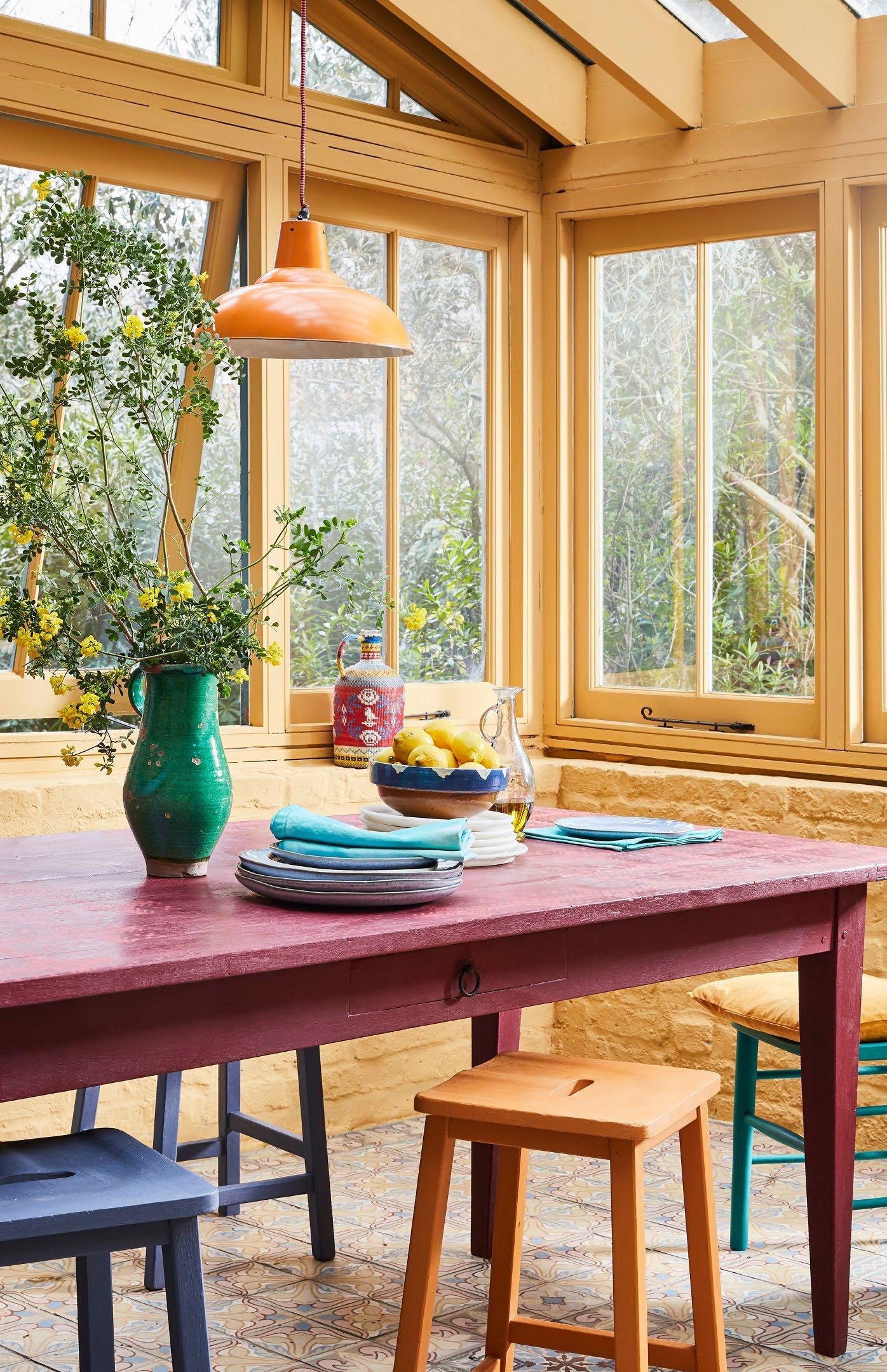 Sunroom Chalk Paint in Arles, Table in Burgundy, and Emperor's Silk with Tallulah stencil
Lifestyle
Portrait by Annie Sloan
Perfectly imperfect
2023 is leaning towards items that are organic, handmade, and locally sourced. This shift towards authenticity and individualism will result in more one-of-a-kind and distinctive pieces. The future of décor is characterised by a fusion of natural, raw elements and refined design, creating a unique aesthetic that showcases expert craftsmanship and artistic vision. Such pieces are sure to be highly desirable and trendy.
Sustainable selections
Sustainability, ethics, and recyclability are becoming increasingly important in all areas of life, and this is reflected in the home décor trends of 2023. As more and more people become aware of the impact of their choices on the planet, there is a growing emphasis on green materials and organic surfaces in interior design. We can anticipate conscious choices of materials, the repurposing of furniture, and a reduction of plastic and waste.
Colourful kitchens
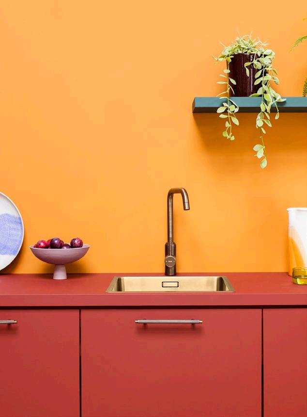
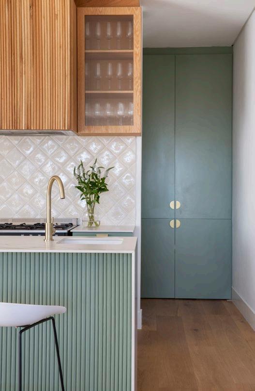
I think people are finally embracing colour and will choose to redesign their kitchens in a wash of exciting hues. The use of soft yet bold tones will be used in kitchens, with palettes inspired by the ‘70s: think soft greens, blues, and soft, warm yellows.
Personality-driven design

Many of my clients are shifting away from neutral, Pinterest-perfect rooms and opting instead for cosier spaces that feature personal collections, layered textiles, heirlooms, unique art, and a mix of old and new furnishings. We have seen so much minimalism over the last few years; our clients are now craving warmth, depth, and character in their personal spaces. Conjuring a sense of nostalgia, expect pastoral patterns, restored antiques, and bucolic artwork in homes resembling the Granny-chic country farmhouse aesthetic. Cue the everyday curator!
Anlo Neethling Interior Architect and DirectorThe rise of highly personalised, character-rich interiors certainly left the door wide open for a Gothic revival. Given the internet’s preoccupation with shows like Wednesday, it shouldn’t come as much of a surprise if we see the return to noir and Dark Academia. Dramatic, layered, and fascinating, this trend goes beyond its signature dark hues to include elements like sweeping curtains, arched mirrors, sculptures, and lavish chandeliers.
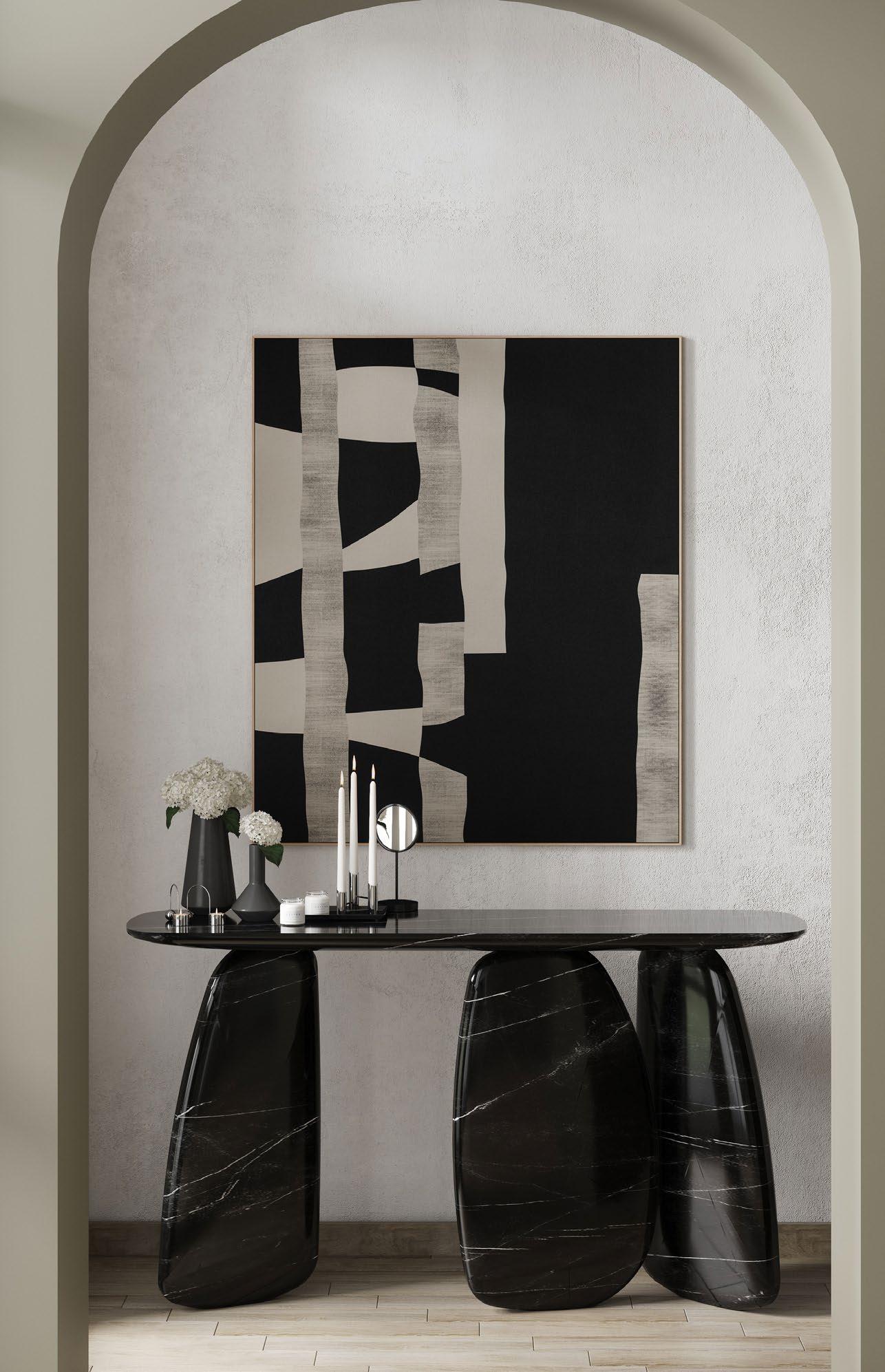 Dolmen-inspired ARDARA Console Table with a Sahara Noir Faux
Marble Finish by Cafe Latte
Gothic revival
With the continued rise of layered Art Deco-inspired styles, 2023 will see more intentional curation expressed through custom upholstered furniture silhouettes, ornate pieces, traditional yet polished ParisianChic apartment elements, geometric patterns, wall stencilling and molding, and decorative passementerie.

Penchant
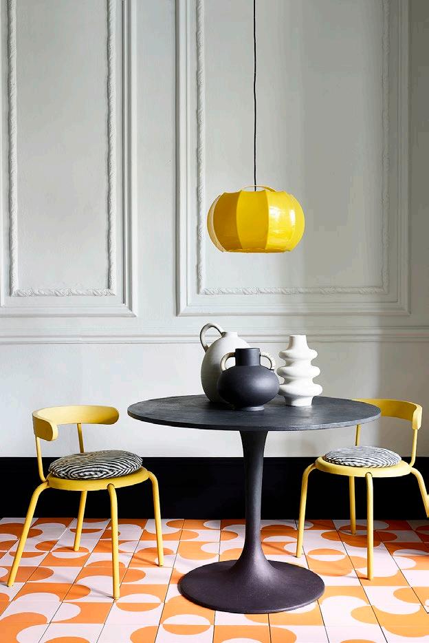
Perfectly segueing into the steady advance of maximalism, oversized lighting design will most likely scale to new heights this year. Elaborate lamp shades and statement lighting fixtures will create a unique, artistic flair.
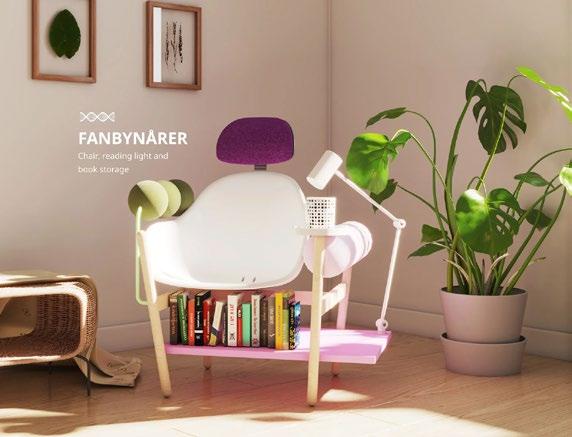
Commercial and residential interiors alike are seeing a heightened focus on designing for everyday well-being and convenience. Homes will be overhauled to become more multi-functional, utilising space until no room is left untouched, while offices will continue their effort to create break-out pockets and think tanks for promoting creativity. This prioritisation of everyday activities will most clearly be seen in the home office, mudrooms and laundry rooms, exercise spaces, and entertainment and game rooms. In the image above, IKEA's research and design lab Space10 and creative studio Oio have created an Every Experiments Updatables concept furniture series, which would use artificial intelligence to tell owners how it can be updated to suit their evolving needs.
It seems as if 2023 may play an Uno reverse card with a return to enclosed kitchens. That said, the design of the kitchen itself will tend to be more open plan with less conventional wall shelving and cabinetry. Tying into the focus on well-being and sustainability, we'll also see more wood panelling on walls and built-in features alike.
After swinging hard to the spectrum of minimal whites and neutrals, the interior design world has gone drastically over to the bold side. Jewel tones have been trending for a while now, and we are seeing entire walls and ceilings, upholstery, rugs, tiles, curtains, and cabinetry fully immersed in bright colours. One thing is for certain: no one is playing it safe anymore — and we are here for it! This year, we will likely see more tonal pastels mixed into the technicolour palette. Think lavender, jade, pistachio, ocean blue, gentle gold, yellow, and baby pink paired with teal green (a projected favourite).
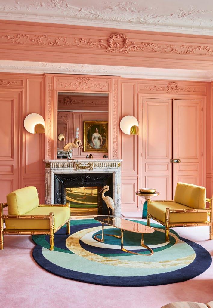
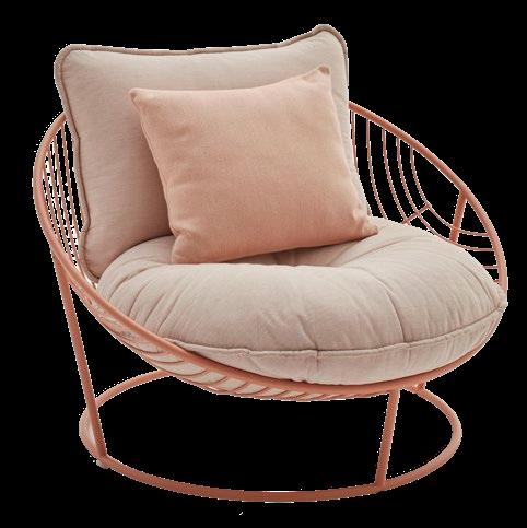
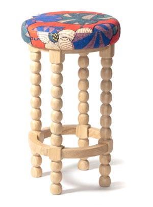
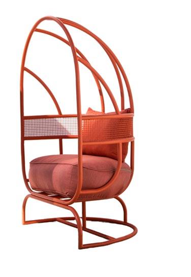
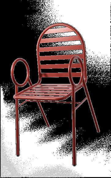
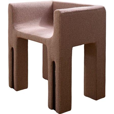
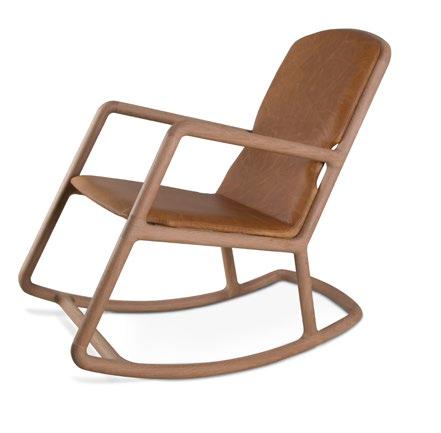
Introducing 10 of the most magnificent ‘rump-resters’ around! We’ve sourced and narrowed down a long list of SA’s finest artisans and makers to come up with the perfect selection to set the stage in your living space. Whether you are after subtle sophistication or wanting a vibrant statement piece... Try these on for size.
Full Moon Armchair
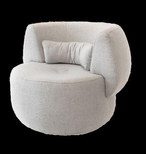
900 mm W x 815 mm D x 850 mm H
R 19 600 Murrmurr | www.murrmurr.co.za
Chameleon Occasional Chair
660 mm W x 750 mm D x 700 mm H
R 6 030
Kipekee Studio | www.kipekeestudio.co.za
Cremi Armchair
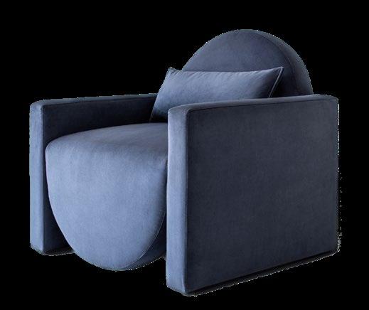
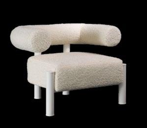
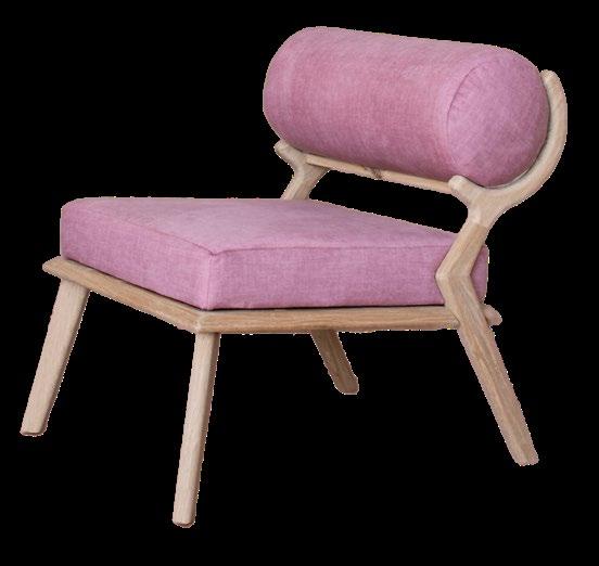
1000 mm W x 750 mm H
R 18 200 Murrmurr | www.murrmurr.co.za
CASEY Occasional Chair
850 mm W x 850 mm D x 750 mm H
R 14 750
Curación Collection | www.curacion-collection.co.za













I h e a r d i t t h r o u g h t h e
LIFE OFF-GRID AT SEMPRE VINEYARD COTTAGE, TESSELAARSDAL
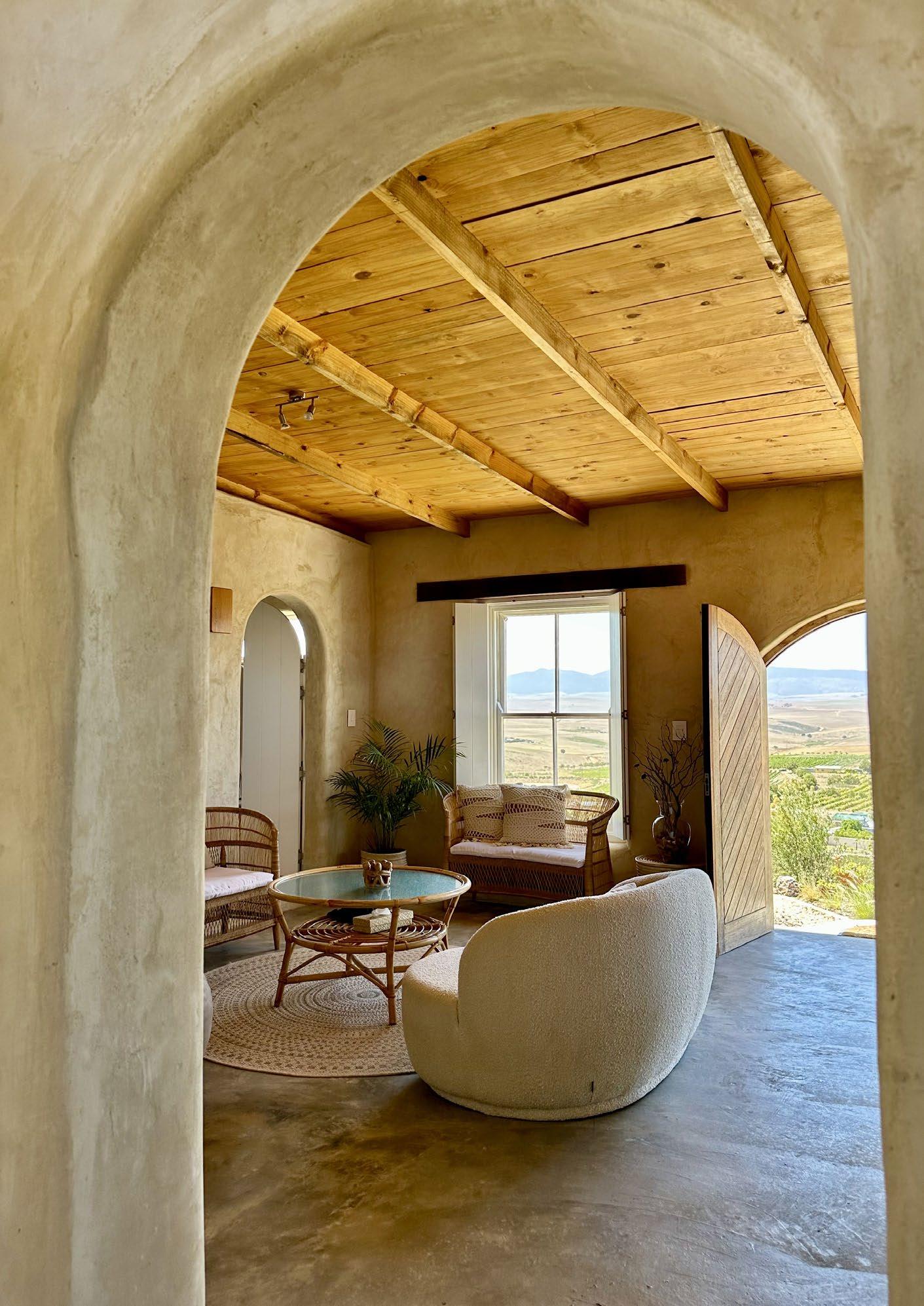
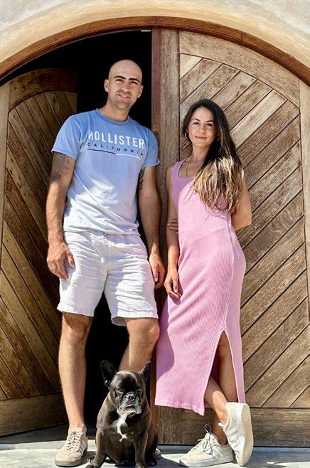
Looking to escape the chaos of city life for a slower existence in the countryside, Bianca Antunes and her partner Rob decided to take the plunge and build their very own off-grid eco cottage in the idyllic Overberg region. Combining natural building techniques with a love for sustainable living, the result is the beautiful Sempre Vineyard Cottage, a house on a hill that showcases the simplicity of living in tune with the rhythms of nature. Read along as Bianca recounts how their new home was built from the ground up...
I will never forget my first visit to Sempre.
As I walked through the rehabilitated Renosterveld, inspecting the quartz-rich ground beneath my feet and admiring the uninterrupted outlook over the Overberg valley, I could not deny the sense of belonging and connection I felt to this land. Wide eyed, I turned to my partner Rob and said three words that would fundamentally change our lives: This is it.
Bianca L. Antunes Designer @bianca_lucille
By the time the legalities were finalised, my initial design ideas were put on paper and we’d agreed that an authentically sustainable build would be our priority. This led us to the principles and techniques of natural building.
Natural building makes use of primarily natural and abundantly available, renewable, reused or recycled materials. It significantly reduces the carbon footprint of construction with its predominant use of on-site and local resources as well as in the manual production of construction materials (i.e. bricks, mortar, and plaster).
There were a few logistical and technical considerations that influenced the design:
• Rob intended to construct the bulk of the cottage himself with some part-time help from a local labourer and myself. By keeping the footprint small and the cottage layout and structural elements simple, execution of our build would be fairly straightforward.
• We endeavoured to push the boundaries of sustainable building. Rob suggested the use of tyres for the cottage foundations, minimising our use of concrete and drastically lowering the carbon footprint of our build. Upcycling used tyres for construction saves them from our overburdened landfills and gives them a second life.
• Buildings constructed with earth by design have thick structural walls. This factor paired with passive solar design principles helps the home to maintain an ambient internal temperature naturally.
• A robust off-grid setup is crucial to ensure the cottage does not lack modern conveniences. ranging from a dishwasher to wifi and so forth.
Once the technicalities of our build were addressed, I considered my design vision for this project. It was a simple one: our natural build must be followed through with natural design.
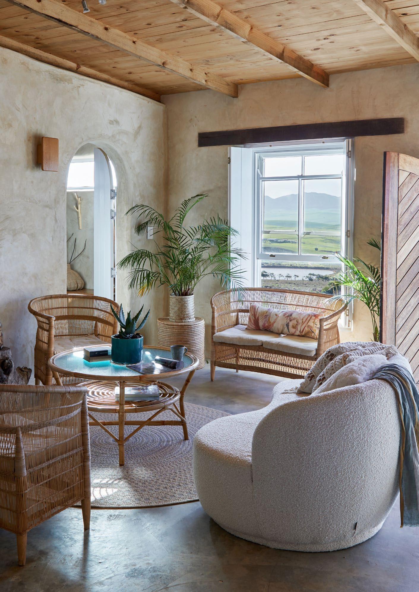
I endeavoured to connect our cottage with nature not only in its construction or by showcasing its incredible outlook over the valley, but by connecting the outdoors with our indoor lifestyle through natural light and texture, and harnessing the unique positions of the sky, mountain, or valley as you move through each space.
Winter: capture and store the sun’s energy
Summer: reflect/prevent the sun’s energy from entering
I incorporated this principle into the cottage design by sourcing large north-facing sash windows to capture sunlight inside the cottage during winter. Our structural walls are 300 mm thick, which serves dual purposes. A roof overhang prevents excessive sunlight and heat from entering the building in the summer months.
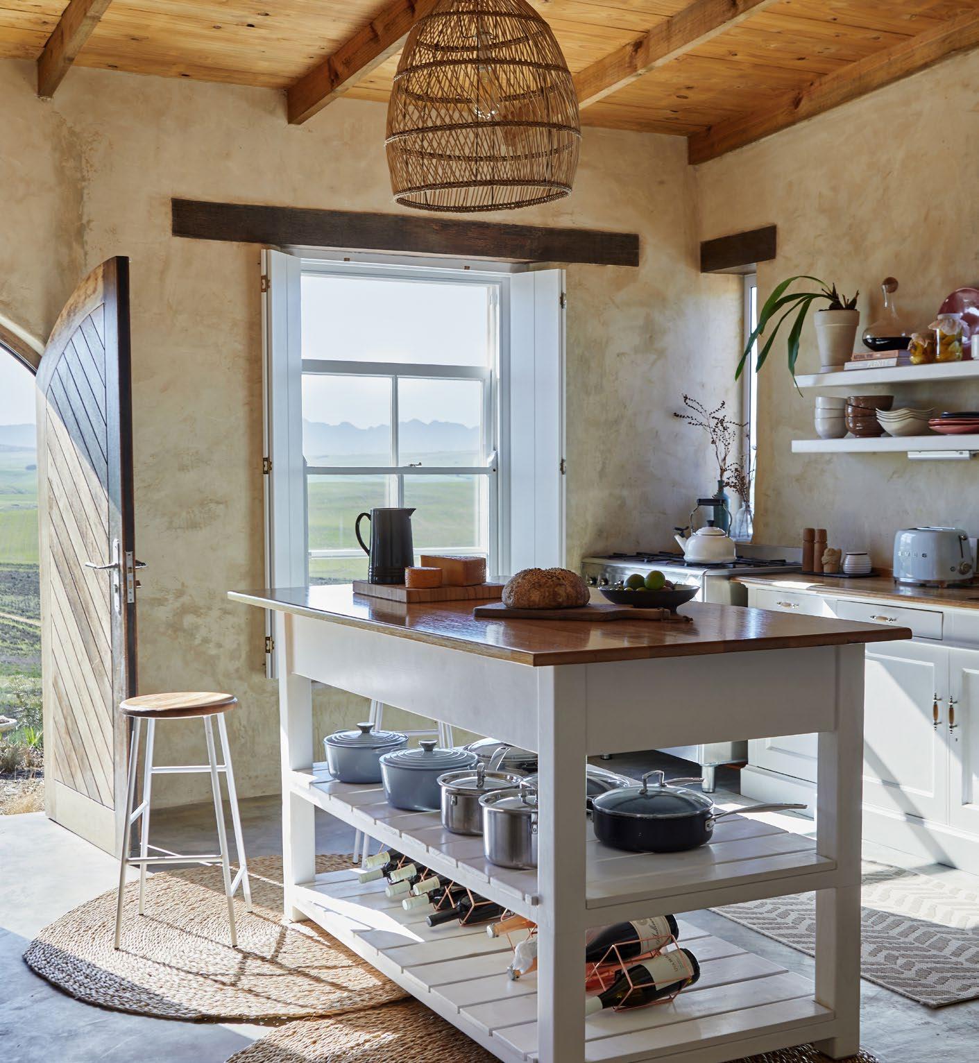 Photography by Greg Cox. Styling by Marian van Wykt
Kitchen island and oak sconces
Wood ‘n Things Sedgefield
Rose sofa
Sofa Company
Sanitaryware
Victorian Bathrooms
Cotton throws
Mungo
• 100% off-grid
• 300 used car tyres were saved from landfill for the cottage foundations. Each tyre was rammed with earth and weighs roughly 100 kg.
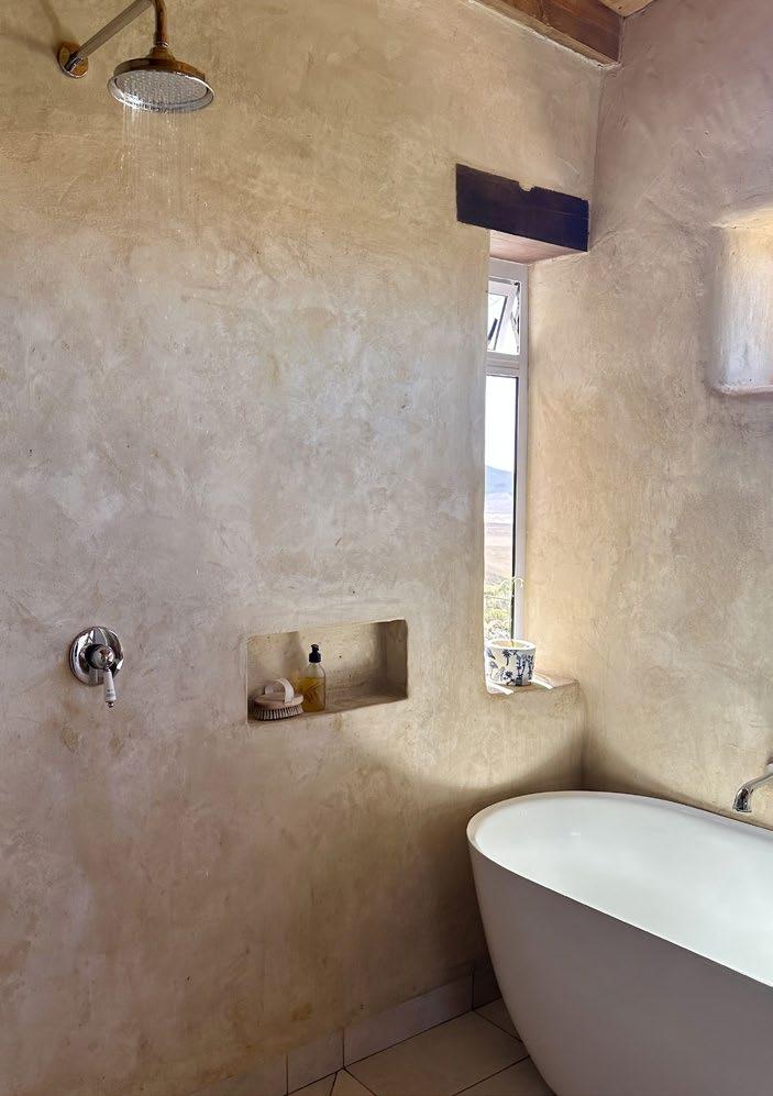
• 3000 earth bricks were manually produced on site for the wall structures. The bricks were laid with a cob mortar and finished with a natural lime plaster blended with clay from our site for colour.
• Our self-build journey took place over two years with the final round of exterior plaster going on the walls in June 2022.
We carved a small area out of the slope for our cottage. All the excavated soil was put to good use in either the construction of our build or returned to the earth for use in the predominantly indigenous and diversely planted cottage gardens. The area is unprotected against the winter westerly winds, so plant selection was key. I embraced the native vegetation in this area and introduced indigenous trees (like the drought-tolerant wild pear) and perennial plants (dassie vygies, red hot pokers, blue chalk stick ground covers, and felicia daisies) to encourage more insect diversity and wildlife.
As our cottage began to take shape, I took cues from a handful of elements that resonated with me. My design for the interior evolved organically from there.
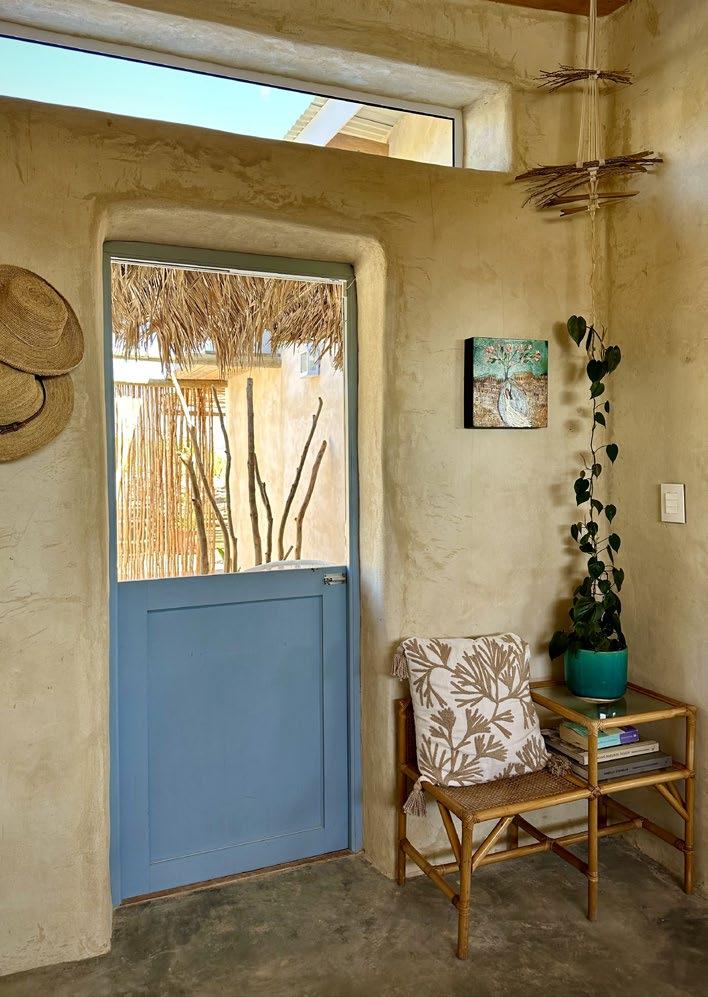
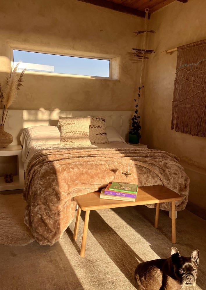
• The texture and colour of the natural plaster served as the primary source of inspiration. The finish of the plaster has a tactile beauty to it and draws the eye, while its neutral tone connects our home to the landscape and inspires the colour palette. These elements flow into the interior design with the use of boucle, malawi chairs, and white oak.
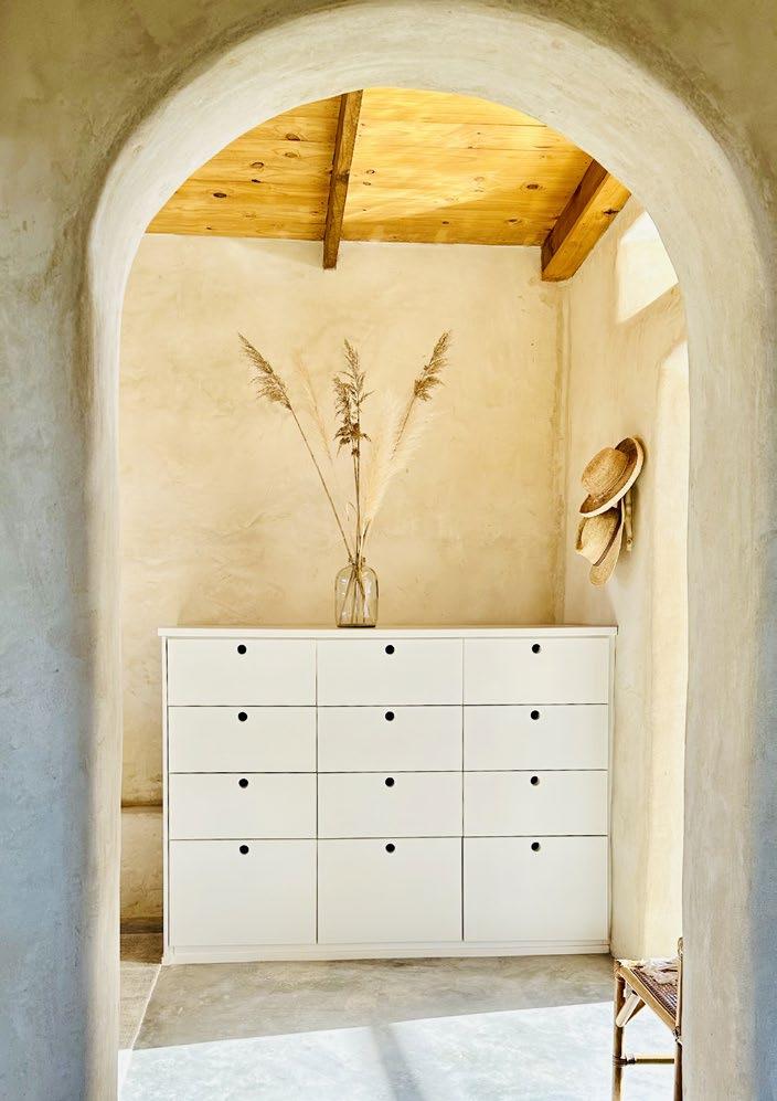
• Arches and curves feature throughout our home. The arches in the design were initially inspired by the arched double doors I sourced in 2019. The door and window recesses were carefully chiselled and curved for a rounder, softer finish. The organic and curved shape of the sofa, malawi chairs, and fireplace further reinforce these curves.
I can best describe my design style as one which takes inspiration from nature and its organic shapes. It is dominated by a neutral palette and rich in texture with nods to Africa and the Mediterranean. Collaborating with similar-minded, talented artisans and artists was an important part of my design journey and resulted in unique custom interior finishes and beautiful art for our home.
Rob and I made a formidable team. Rob is a talented craftsman, demands a high quality finish, and has a keen eye for detail. In turn, my vision and design steered the ship, with many years of project management skills being put to work in coordinating and managing our build. The result? A unique, handcrafted home, carved and constructed from the earth it rests on.
We all deserve a high quality of life, spending our days beautifully and safely in a home that is kind to us and to the environment. Our home serves as our sanctuary; it inspires creativity and by design and execution connects us to the earth.
Sempre epitomises living sustainably within a natural surrounding that encourages you to slow down, reflect, and take in the view.
Our special cottage will continue to take its environmentally-conscious and considered shape in this landscape. There is so much more to come and I look forward to sharing our journey with you. Sempre Guest Accommodation will be introduced over the next three years with our first bungalow expected to be available for short stay bookings by summer 2024.
• Saves them from overburdened landfills and gives them a second life
• Fire retardant (studies facilitated at the Univeristy of Stellenbosch, Western Cape)
• Thermal mass (moderates the temperature within buildings naturally and evenly)
• Abundant and cost effective
• One solution to saving the planet
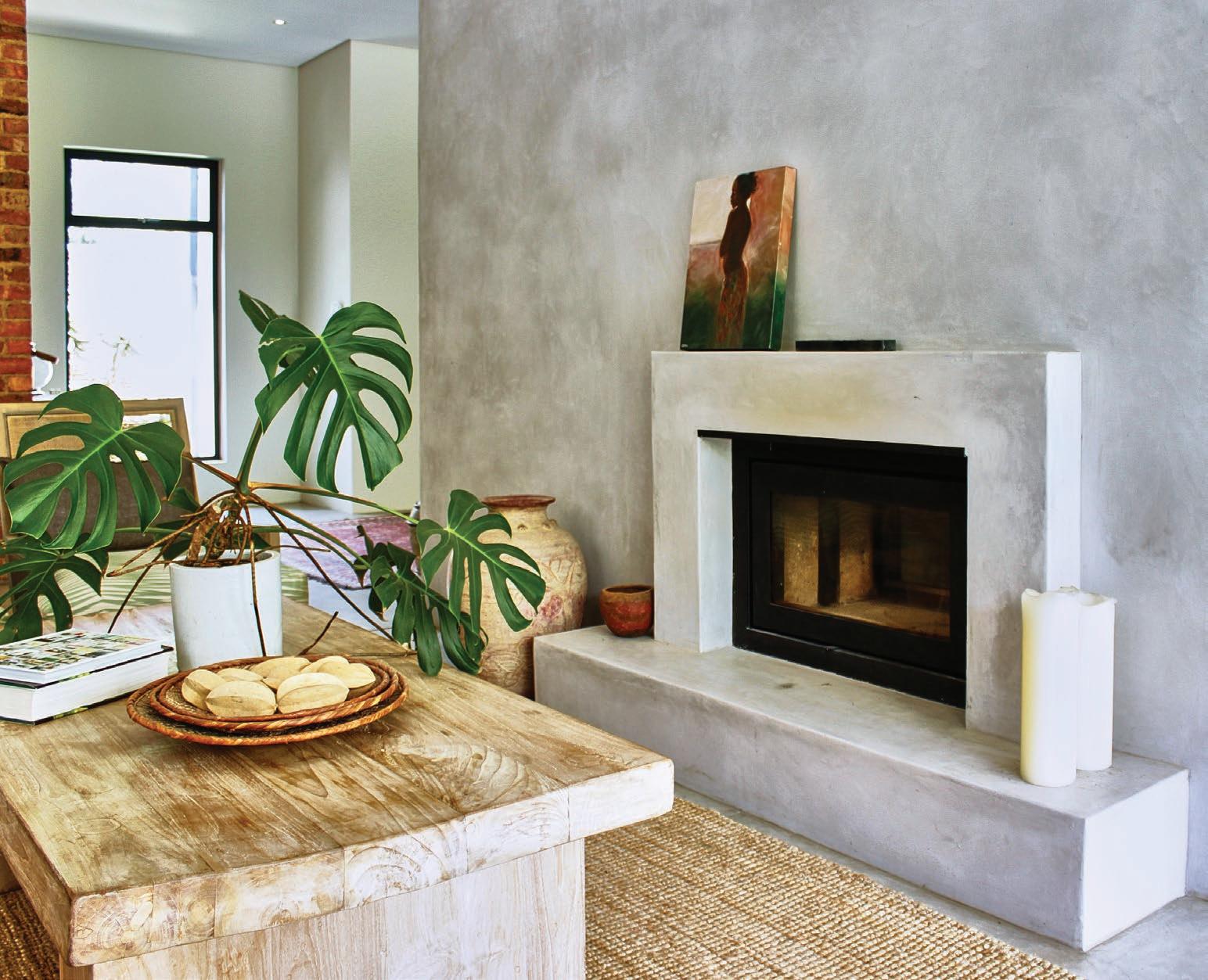
Photography by Greg Cox. Styling by Marian van WykI love the earthy, natural textured look that Cemcrete is able to achieve. It is the perfect blend of elegant, modern refinement and a down-to-earth honest expression of material.

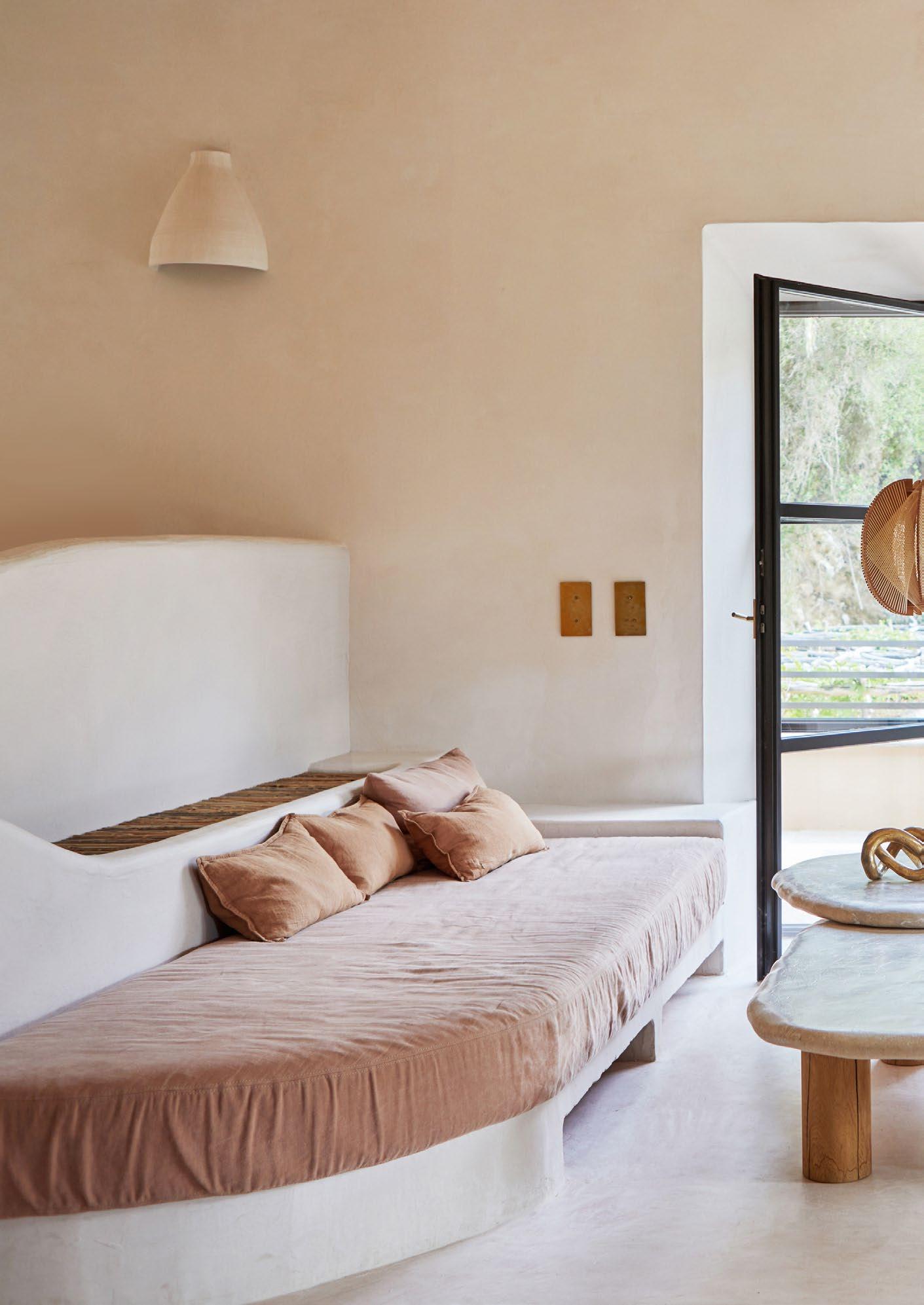
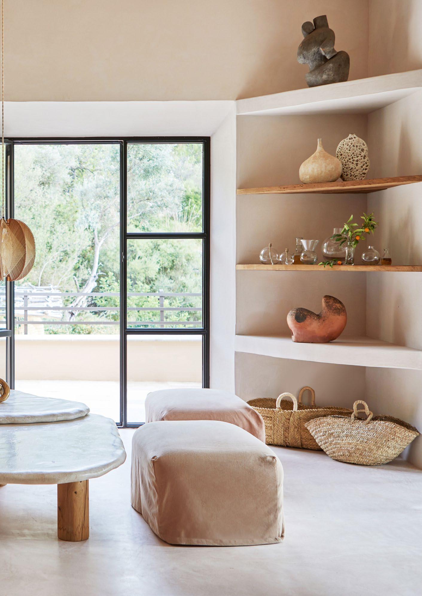
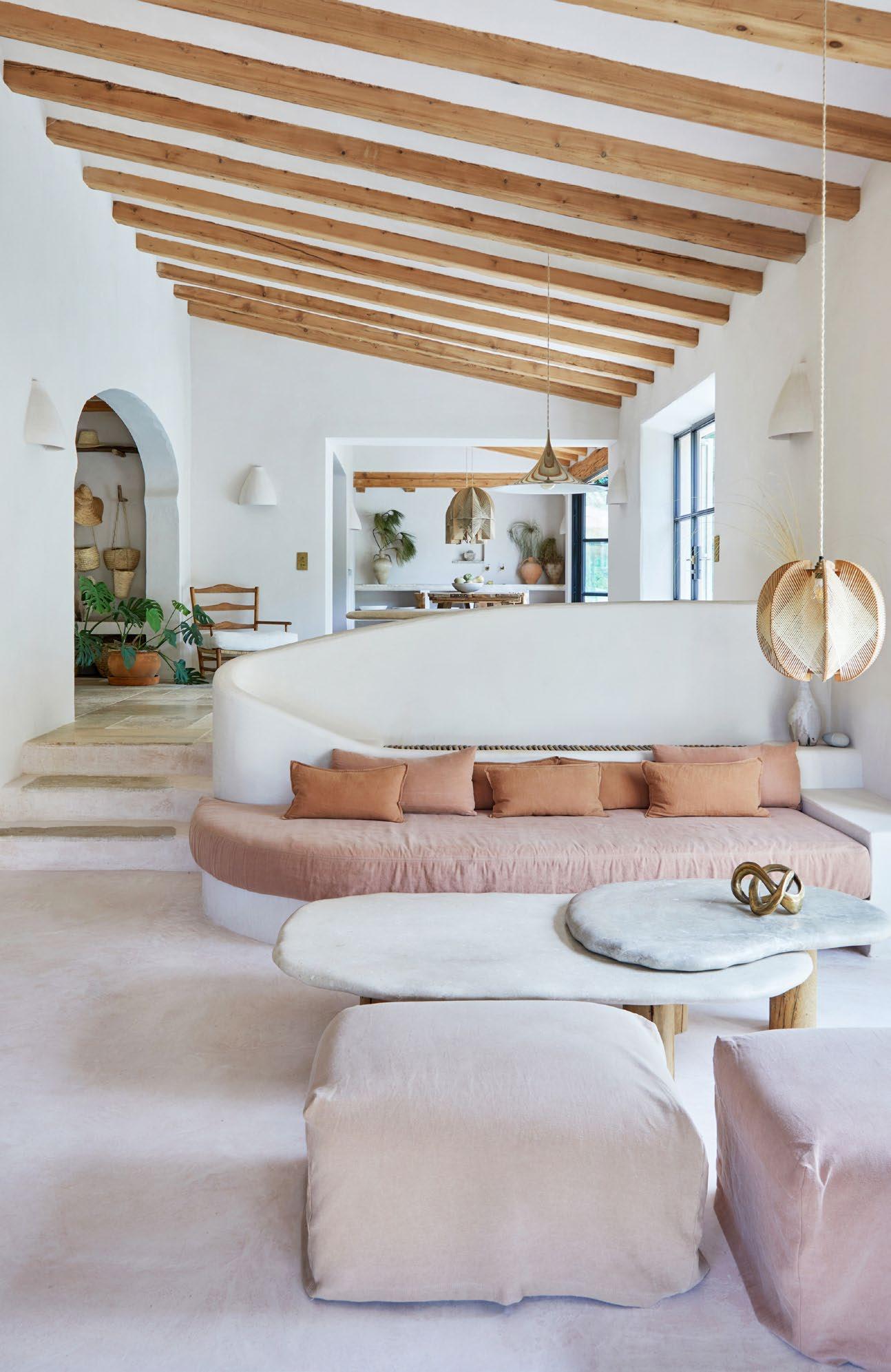
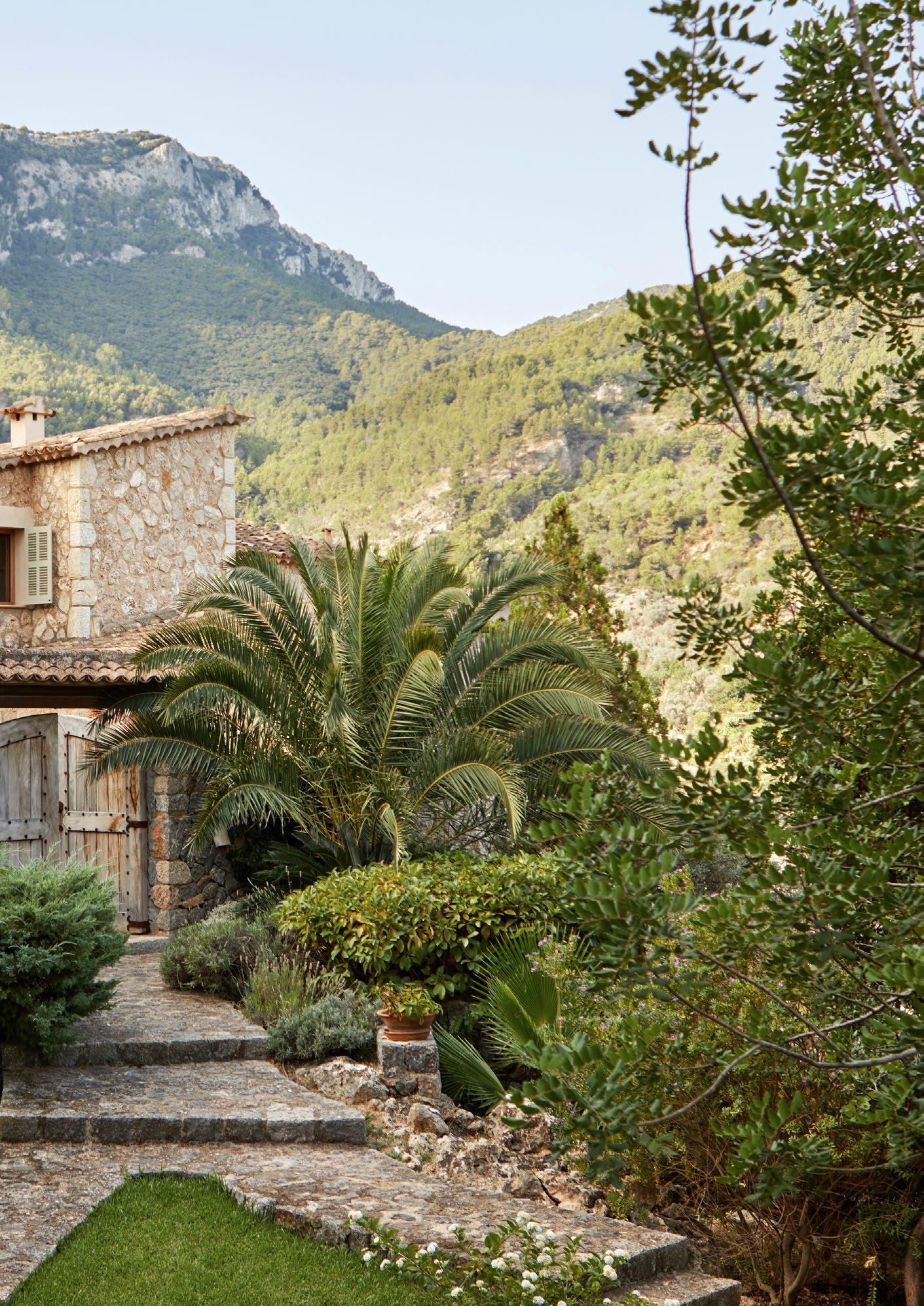
Nestled into the hillside just above a small bay, this holiday home in the Mallorquin seaside village of Deià was recently renovated, and now combines timeless Mediterranean style with an expansive sense of ease.
The ideal location for a holiday home? It doesn’t get much better than the picturesque village of Deià, on the sea’s edge among the beautiful landscape of Mallorca’s Tramuntana mountains. Petite and discreet, Deià plays host each summer to a glamorous visiting cast of celebrities and power players — most of whom stay in private villas that belong either to the stars themselves, or to their close friends. But even in a place as exclusive and seductive as this, some properties are inevitably even more enviable than others. As is demonstrated by this hidden gem of a house, which combines a completely private position with easy on-foot access to village and beach alike.
Purchased a few years ago from its original owner by a family from the UK, the house is one of a select few built during the late 1990s and early 2000s, when permission was given for the development of some properties off the winding road en route to Cala Deià. The cala is a tiny bay and beach that is perfectly suited to dips in the sea — as well as offering the possibility of relaxed summer lunches at its pair of charmingly rustic and ever-popular seaside restaurants.
The new owners were faced with a spacious but very 1990s-style house, which included ‘glossy wall paint, dated direct light sources [and] heavy dark wood beams, doors and windows,’ says Oro del Negro from Deià-based architecture firm More Design, which was appointed by the owners to renovate the property. There were also quite a few ‘smaller, segregated spaces,’ adds Oro, and some slightly ostentatious fittings, such as gold-plated taps.
Briefed to create ‘the Mediterranean dream home’, More Design set about ‘opening up spaces, generating more flow and connectivity in the common areas, refreshing all the tactile elements and, of course, adding some magic to the outdoor spaces,’ says Oro. The practice has extensive experience in reworking and updating homes in the area, and over the years has developed an aesthetic that feels refreshingly contemporary, yet also reflects a considered, uniquely Mallorquin heritage in terms of style, design, and locally handmade craftsmanship. As a result of restrictions imposed by the island’s planning authorities, the ‘core envelope’ of the structure had to be respected, Oro says, with no changes to either its volume or footprint being permitted. Central to the success of More Design’s spatial reorganisation of the interior was the firm’s core design dictum: ‘flow forms’.
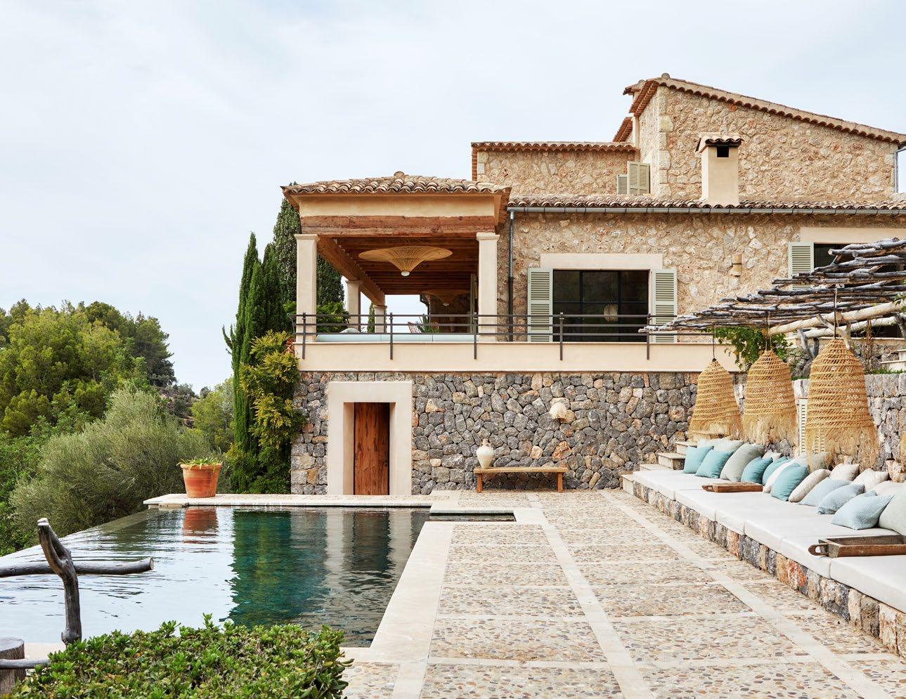
The layout was opened up and altered, with a new entrance hall added to decisively separate this space from the kitchen. The latter is now positioned to function in old-school, ‘heart of the home’, open-plan style by being linked to a previous enclosed porch, which has become a dining area that, in turn, opens onto a wrap-around veranda overlooking the pool area and lush garden.
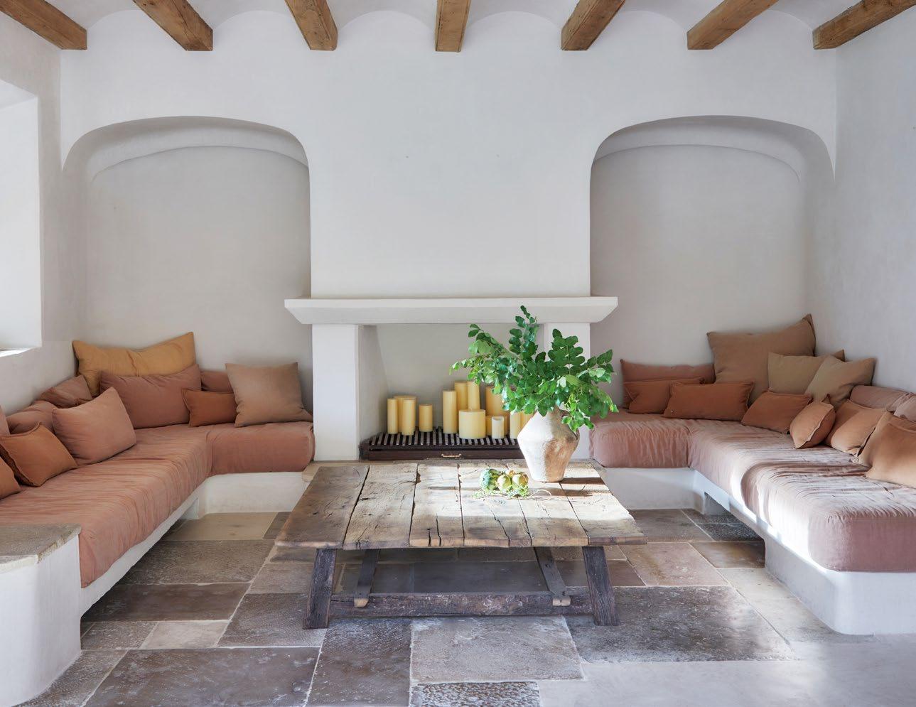
In addition to the spatial alterations, and just as important to the final feel of the house, is the use of finishes and fixtures that are appropriate to — and authentically reflect — the property’s Mallorquin location. These include the natural clay and stone, traditional Albarracín plaster, and lime renders that are used in combination as the main interior surfaces.
As Oro says, these finishes ‘embrace longevity in the truest sense’. Likewise, the home’s selection of lighting fixtures, taps, and other hardware seamlessly merges with the timeless aesthetic. The overall impression is of soft curves, with all rigid geometry eschewed: this was a deliberate choice on the part of More Design, to create a relaxed and easygoing feel in the space.
Currently used by the owners for family vacations and frequent shorter breaks too, the house enables its occupants to completely relax and unwind without ever leaving its environs. The beautifully redeveloped pool area and the surrounding garden are so spacious and inviting, it’s difficult to imagine ever wanting to go anywhere else once ensconced here.
Greg Cox Robyn Alexander"The overall impression is of soft curves , with all rigid geometry eschewed: this was a deliberate choice on the part of More Design, to create a relaxed and easygoing feel in the space."
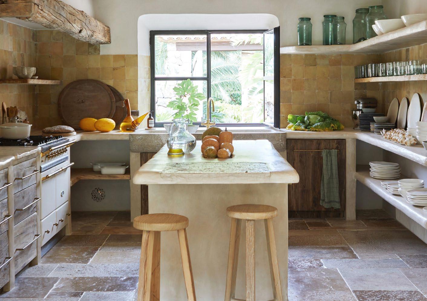
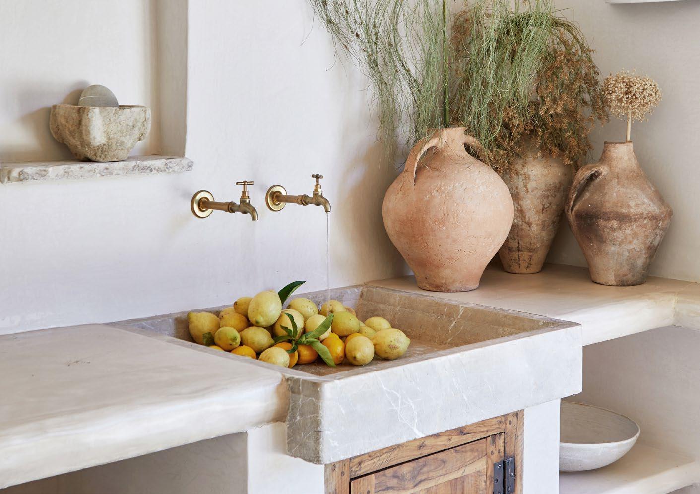
That said, however, the property’s perfect location also makes for an easy walk — via a charming boardwalk path — into the centre of the village for dinner, or a quick stroll down to the cala beach for lunch or a swim in the Mediterranean. Its position and superb southwesterly orientation means it also has wonderful views, which include vistas of the Tramuntana mountains, a peek or two at the sea, and even a glimpse of the village church tower.
Aptly described by Oro as ‘so complete and well put together’, this is a substantial and sizable home that nevertheless feels both welcoming and cosy. Combining a sense of intimacy with a casual, very Mediterranean elegance, it’s a house in which to rediscover a sense of ease and equanimity with the world, one regenerative summer’s day at a time.
In the main bedroom, a built-in bed and arched recesses were added during the renovation. They are made from ceramic brick finished in lime mortar renders with insertions of natural stone. The hanging bedside reading lights are formed in clay and finished in a unique ‘Moon glaze’ for the More Decor collection.
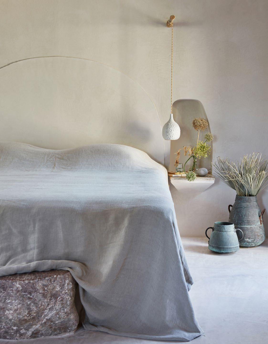
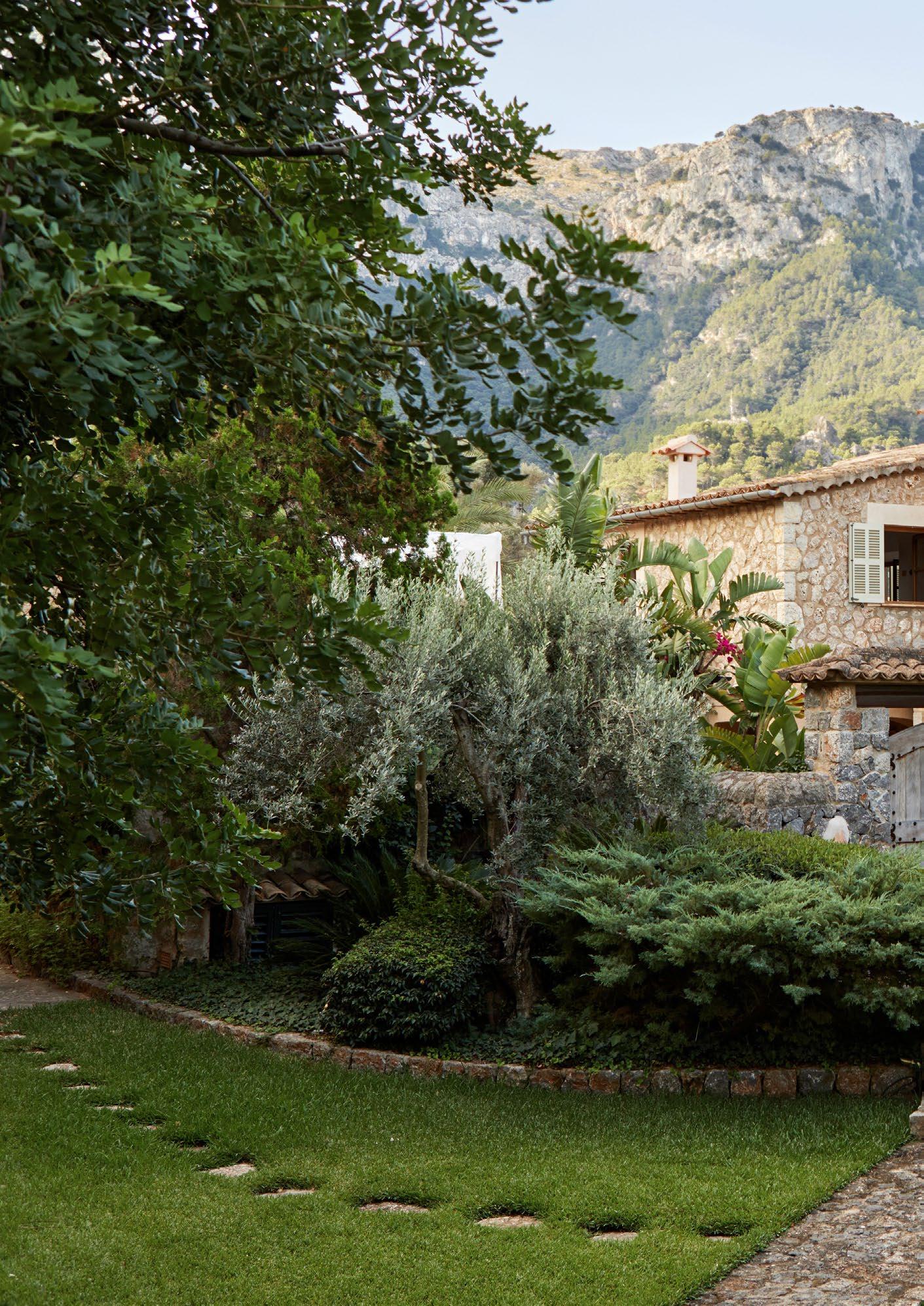
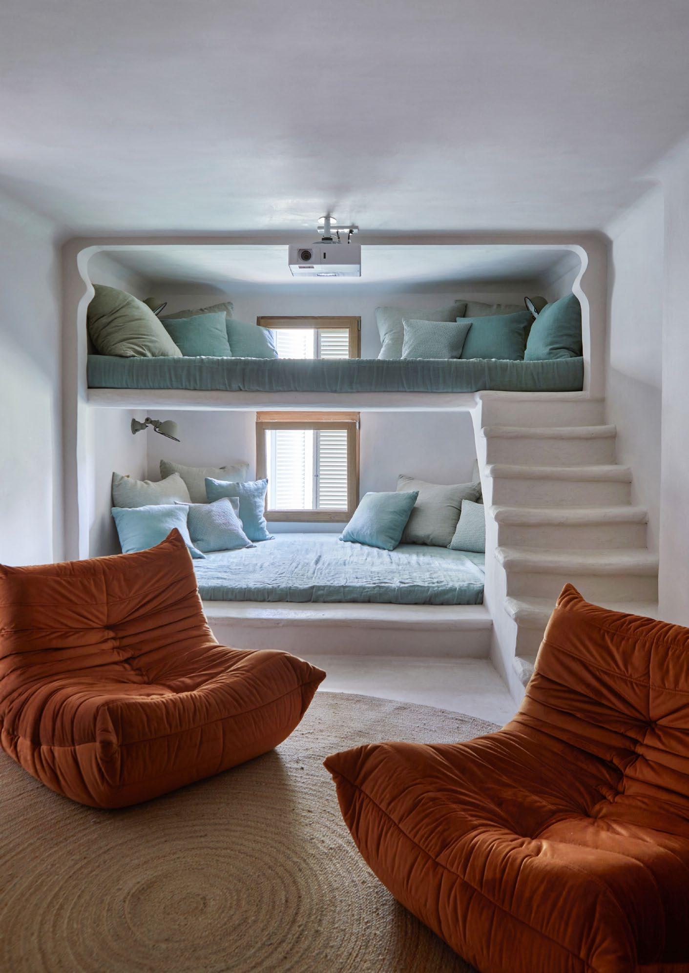 On the lower ground level is the series and movie viewing room, which is furnished with plenty of built-in seating (which also, usefully, doubles as extra sleeping space for kids). The Togo chairs are by Ligne Roset.


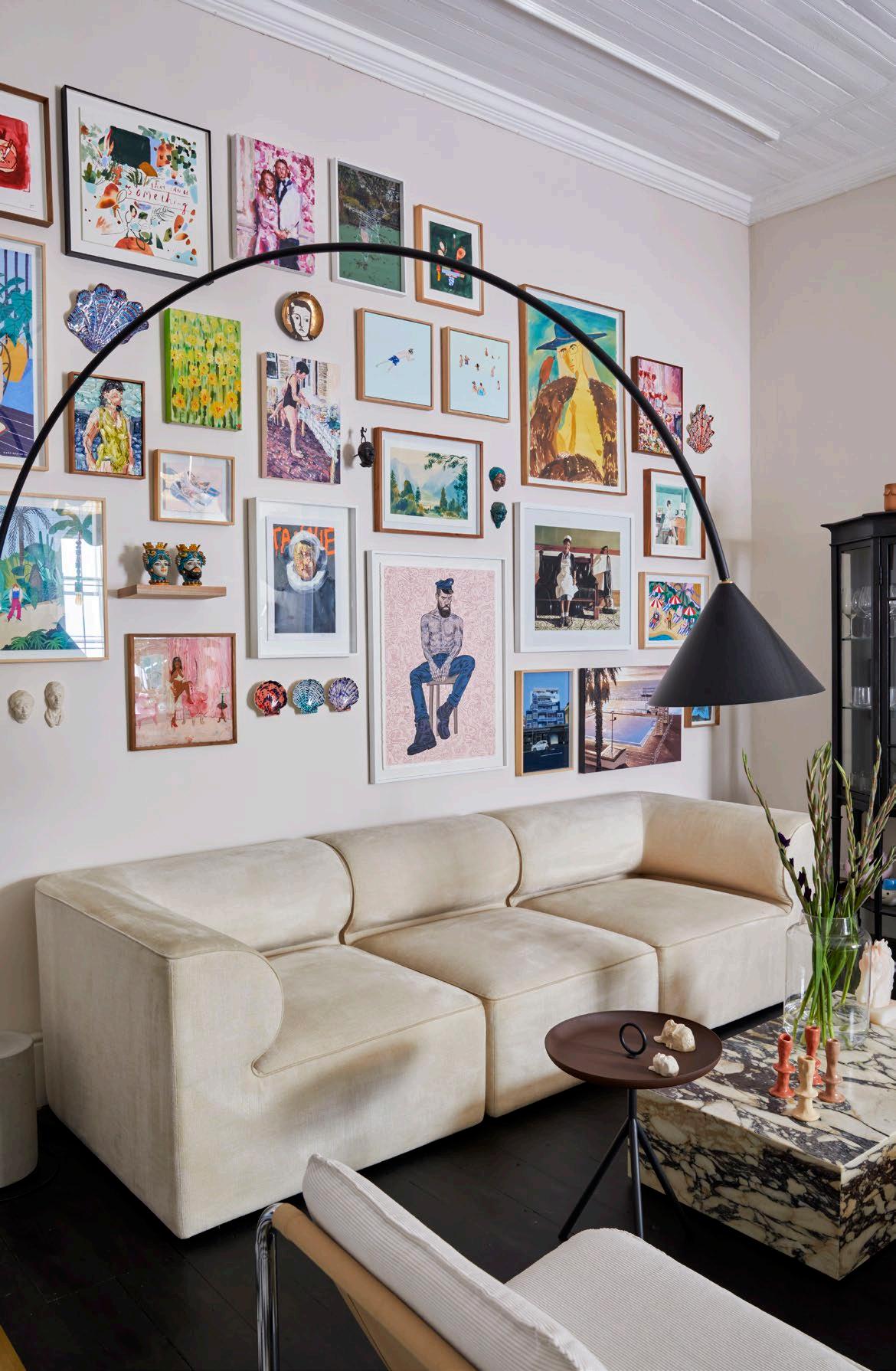
This bold Victorian home in Cape Town is a triumph of contemporary confidence in colour, peppered with nostalgic references steeped in tradition.
‘One of the reasons I decided to move was that I had run out of walls to put art on,’ confesses Jocelyn Hellig. A new beginning deserved a new perspective. So the busy doctor asked her friend Dawid Augustyn, interior specialist and founder of design firm Establishment, to help her transform the faded centenarian from its role as a practical guest house into a home that would highlight its heritage, while inviting in a sophisticated palette of energising colours and artwork.
Part of a series of semi-detached homes below the slopes of Lion’s Head, Jocelyn's house in particular was one of three that operated together as a guest house. To free the property from its neighbours, she opted to paint it with a combination of charcoal and pink — a hint at the dramatic use of colour to be found inside.
‘I just like stuff! Dawid knows how to put it all together and make it work,’ Jocelyn confesses. Dawid chose to treat the two floors of the property differently. The ground floor has a moody aesthetic, characterised by jewel-toned rooms and dark-stained wood floors, while the upstairs is all about natural tones and nurturing textures.
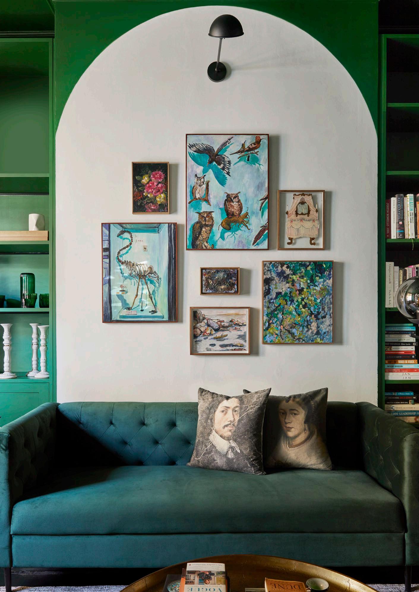
Convincing Jocelyn to envelop the walls and ceilings in the same hues — a shamrock green in the case of the office and a deep rose for the foyer — wasn't difficult, says Dawid, because she was immediately sold on the idea of creating a dramatic entrance. Dawid compares the effect to that of treasure boxes coated in a singular shade and then filled with cherished pieces.
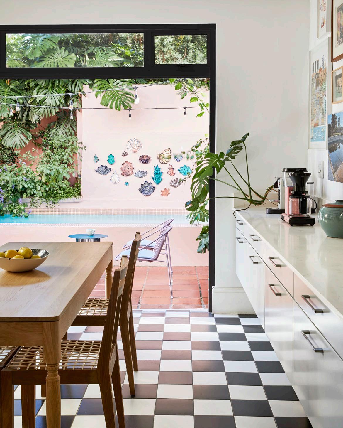
‘Using only one shade to dominate the space also downplayed the pockets of art on the walls, so they didn't overshadow the room,’ Dawid explains. He replaced the wooden inlay tiles in the entry hall with oversized checkerboard tiles to compliment the period home. This detail was continued in the central living and dining area and the kitchen behind them to connect the spaces.
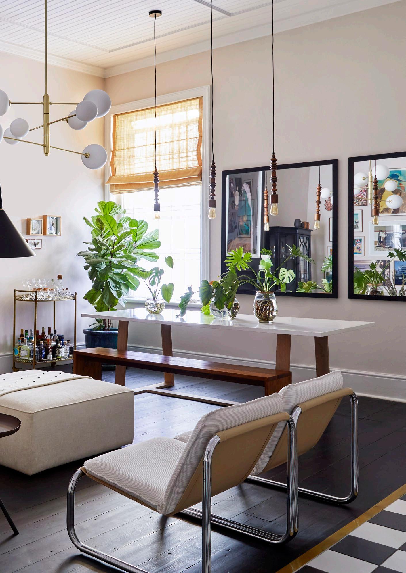
While the kitchen was kept simple and utilitarian, the living and dining room, at the heart of the home, was where Dawid had the freedom to play with bright artwork and whimsical lighting elements to add a contemporary accent. He darkened the wood floor and installed a molecular chandelier in the centre to anchor the room and enhance the sense of height and expansiveness.
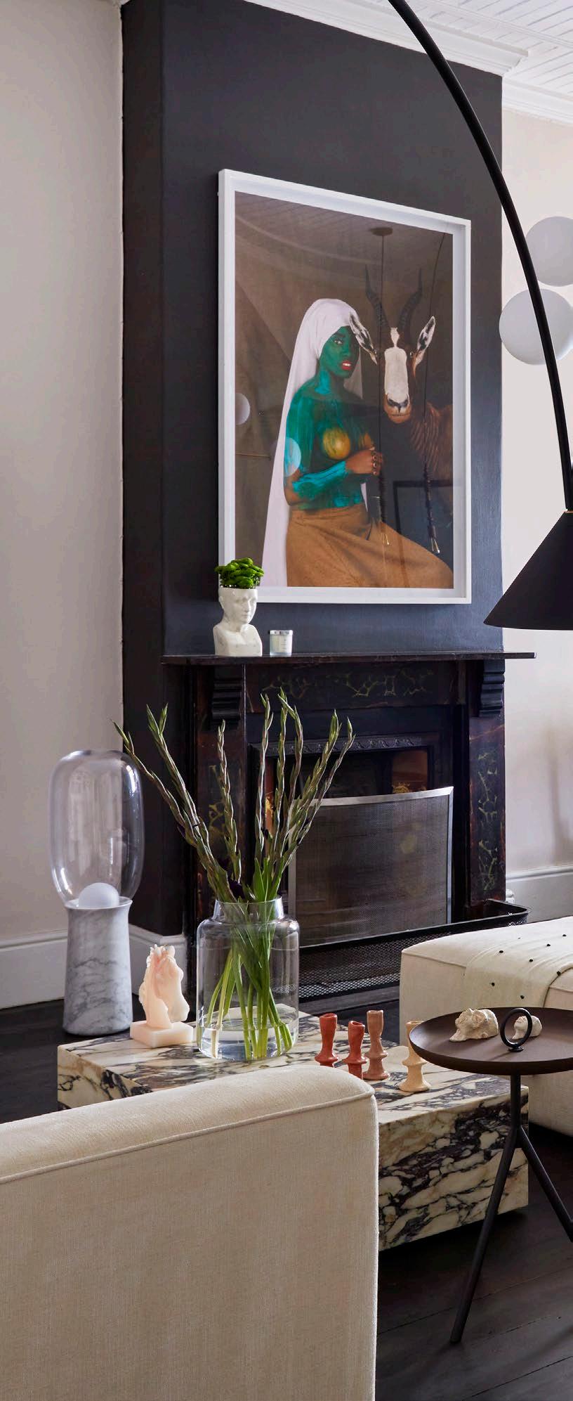
One of the challenges of integrating so many artworks into one house was breaking away from the dominance of the gallery walls, Dawid says. He was presented with a kaleidoscopic collection of dozens of artworks to incorporate into the design. He explains that he started with one wall in the living area, staggering and mismatching pieces, mostly by some of the freshest names on the art scene, such as Mia Darling and Katrien Claassens, and it all came together. The furniture is eclectic, ranging from functional art pieces like a whimsical steel cabinet and pink marble coffee table to chrome vintage chairs that create a challenging, inspiring yet comfortable space.
"The first room next to the passage (which previously served as a bedroom) was converted into a study for Jocelyn. The traditional fireplace was celebrated with an arch of white paint, while the rest of the room was cocooned in emerald green."
To transition from the public to the private areas of the home, the wall in the stairwell was scattered with a collection by Capetonian artist Lucie de Moyencourt depicting city life. The artwork is particularly evocative in monochrome and complements the chequered floors of the landing, creating a nostalgic journey that Jocelyn says she enjoys every time she walks up or down the stairs.
‘I wanted Jocelyn to find a real sanctuary and calming space in her bathroom and bedroom without neglecting the house's heritage,’ Dawid says of the design work on the second floor. The bathrooms were the only rooms that were completely renovated. He replaced industrial flooring and off-the-shelf fixtures with black and white tiles, a skirted standalone bath, pedestal basins, and other period-inspired features. At the same time, he accentuated the cornices to soften them further. Showers were custom-designed with black steel and glass partitions — a touch more modern, but in keeping with the muted tones dedicated to the bathrooms and bedrooms.
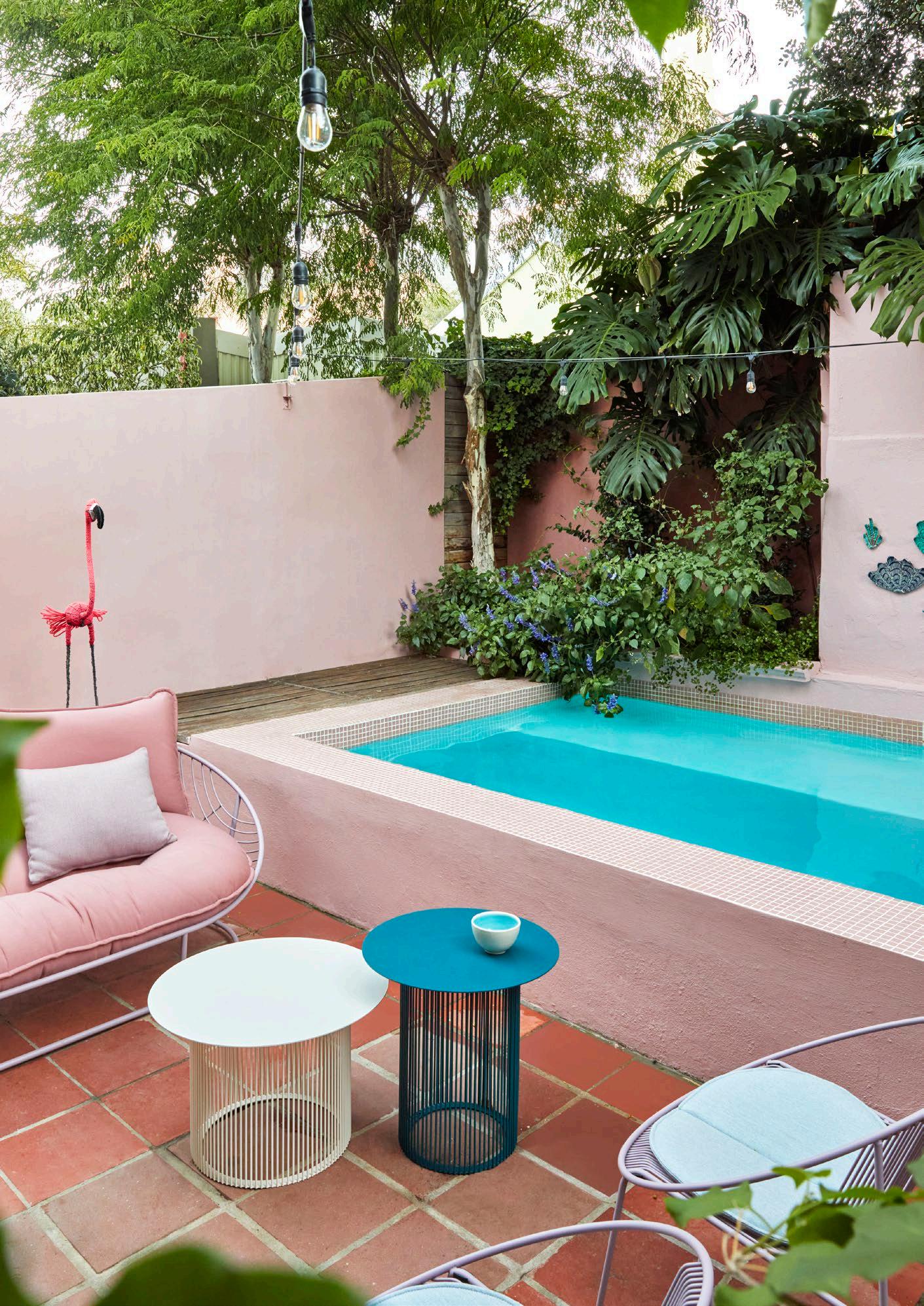 The outdoor space playfully combines pink hues, flamingos, shell murals, and retro-inspired furniture by South African designer Haldane Martin.
STUDY
Sofa: Superbalist
Brass coffee table: Weylandts
Rug: Superbalist
Fluffy stool: Weylandts
Office table and chair : Louw Roets
Pendant lamp: Establishment
Pedestal basin: Victorian Bathrooms
Wallpaper: Cara Saven Wall Design
LIVING AND DINING ROOM
Molecular Atom chandelier:
Aromas Del Campo
Miniforms Ozz lamp: Establishment
Wooden pendant lamps: Establishment
Torch lamp: Collection Particuliere
Table and bench chair: Pedersen + Lennard
Chrome and leather chairs: vintage
Sofa and coffee table: Menu
Cabinet: Jacobs Collection
Drinks trolley: Gorgeous by Olivia
KITCHEN AND PATIO
Kitchen table and chairs:
James Mudge Furniture Studio
Papa Sun Collection (sofa, chairs, stools, and table): Haldane Martin
Handmade ceramic art pieces: Lucie de Moyencourt's Shellengance
MASTER BEDROOM
Bed and bench: Houtlander
Side table: Lemon
Chubby chair: Establishment
Rosa sofa: Sofa Company
Mounted sideboard:
James Mudge Furniture Studio
Lamps: Kitto lamps by Aromas Del Campo
Rug: Hertex
Painting: Weylandts
MASTER BATHROOM
Mirror: Menu
Bath, basins, and tapware: Victorian Bathrooms
Pendant light: Establishment
GUEST BEDROOM AND BATHROOM
Bed: Weylandts
Fittings, tapware, and mirror: Victorian Bathrooms
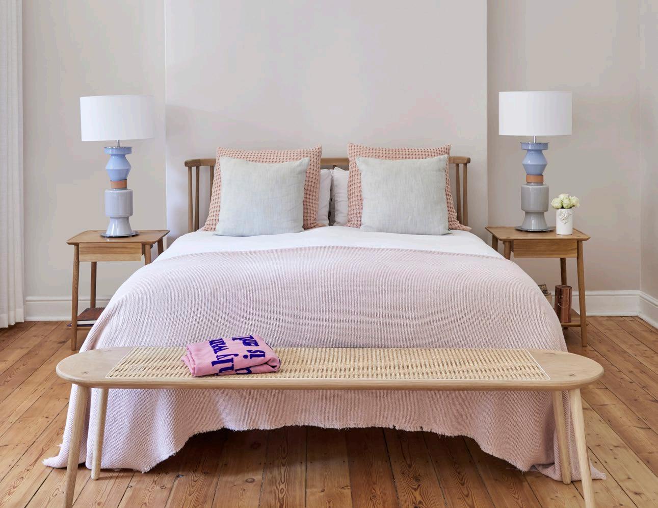
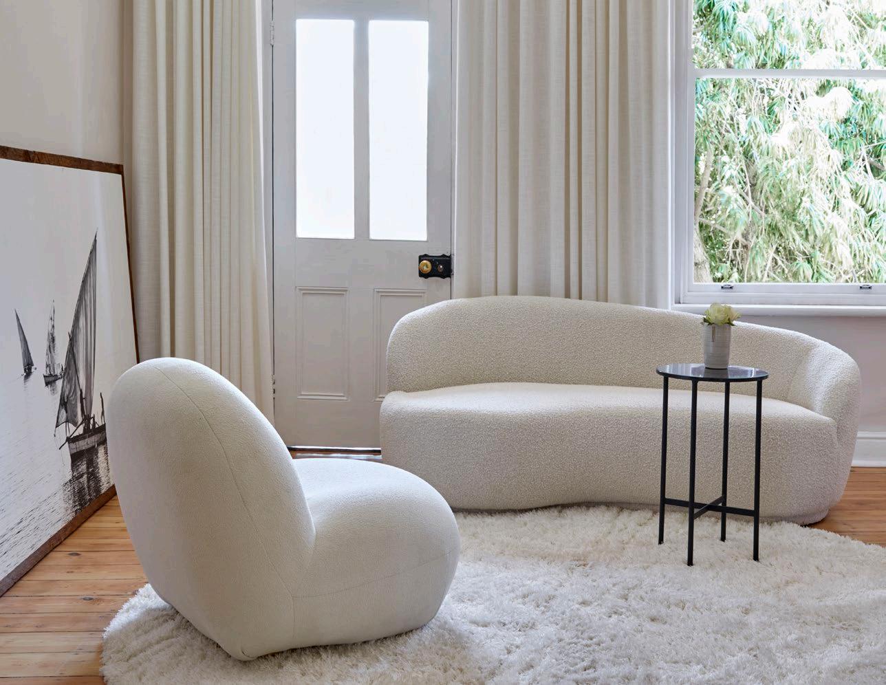
On the other hand, Jocelyn's bedroom is utterly feminine and feels like slipping into a cashmere sweater. Dawid wanted to create a retreat — a space where she could relax and sleep. The large room is defined by a luxurious, chic, cream moulded sofa and a comfortable chubby armchair floating on a cream shag carpet. Sheer linen curtains let soft light into the room. The simply dressed, clean-lined raw wood bed is the room's focal point and rests on the unfinished original wood floor unearthed from a carpet during the renovation, giving the room a Shaker feel. It is flanked by whimsical lamps that add personality and charm to the room without distracting from its elegant atmosphere.
‘Having lived in an apartment, I was overwhelmed by how large the house was when I first bought it. But Dawid transformed it into a light, warm space with my beautiful things around me — I couldn’t be happier,’ says Jocelyn.
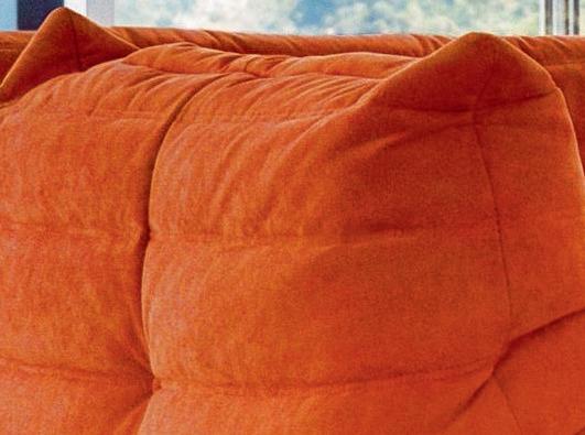

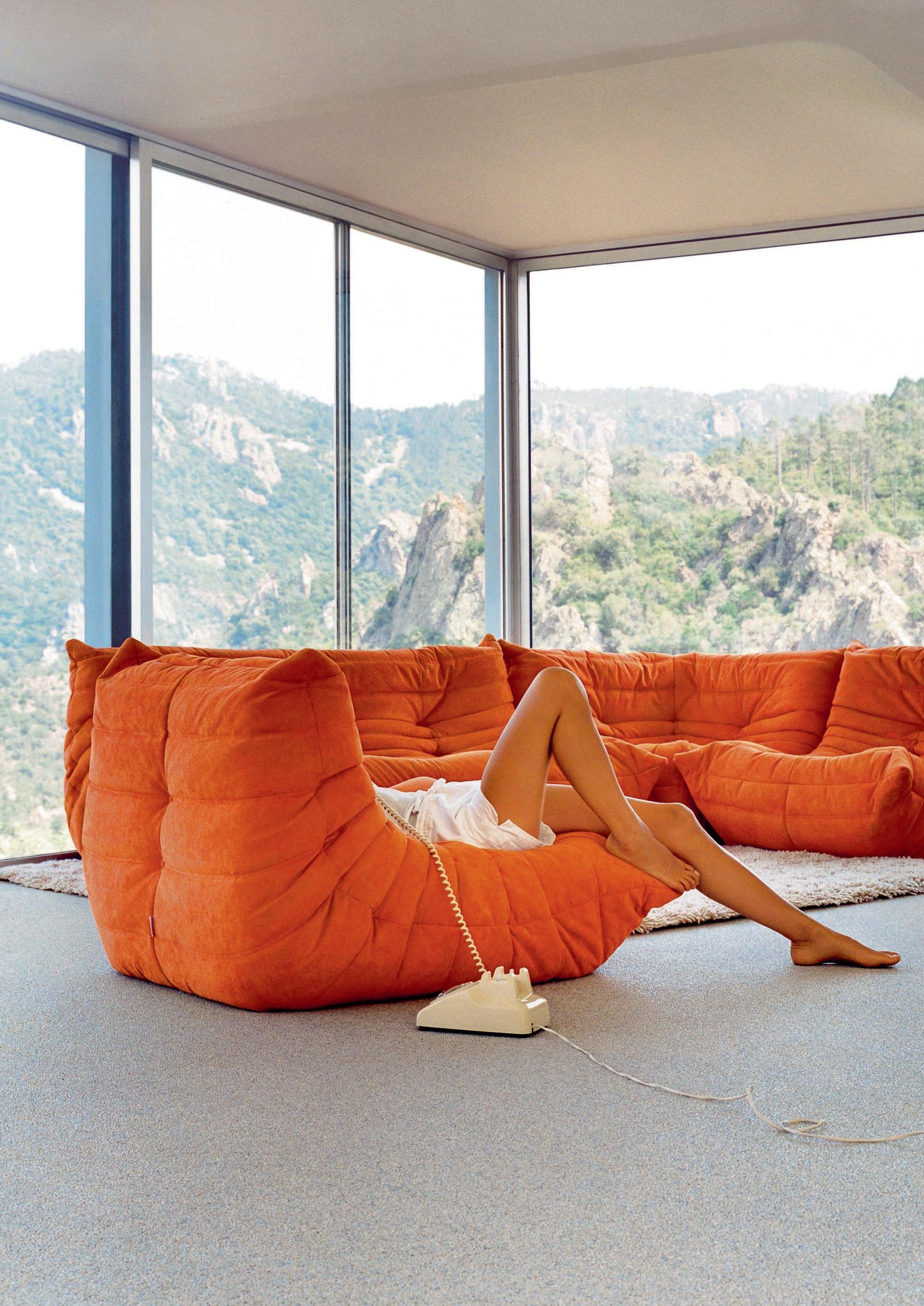
Few pieces of furniture are quite as coveted and celebrated as the Togo by Ligne Roset. With its distinctive design, luxurious comfort, and enduring popularity, the seat has firmly secured its place in the pantheon of furniture icons. As we celebrate the 50th anniversary of this remarkable creation, from its inception to its current status as a design classic, let’s take a closer look at the secrets behind the Togo's appeal and why it's still as relevant today as it was half a century ago.
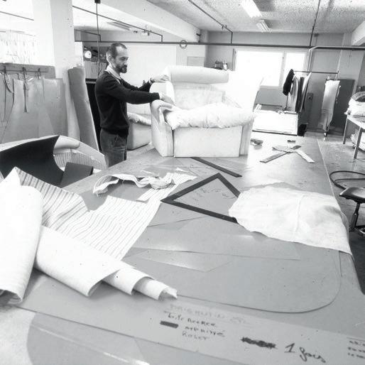
First things first, let’s start at the very beginning. The man behind the milestone is French designer Michel Ducaroy. He was born in Lyon in 1925 and raised in a family of designers and makers of contemporary furniture who were commissioned by the Chaleyssin factory, which most notably supplied furniture to the liner SS Normandie. Michel Ducaroy’s pivotal meeting with Jean Roset in 1960 and the creative explosion of the 1970s led to his appointment as head of the Roset design department, and ultimately down the brand’s road of success.
The era’s quest for new seating concepts, encouraged by swift changes in social attitudes and the advent of new materials (foams, polyester quilting, thermoformed plastics), drove Jean Roset and Michel Ducaroy to develop new production techniques in the years between 1960 and 1970. Yet it was the Togo ‘seat-cushion’, presented at the Salon des Arts Ménagers in Paris in 1973, that was to earn Michel Ducaroy his fame.
Its crumpled, ‘newborn’ appearance and Shar-Pei wrinkles garnered more than a few doubtful looks from professionals and public alike. The organisers of the fair, however, were sufficiently inspired to award Michel Ducaroy the René-Gabriel prize, which recognized ‘innovative and democratic furniture’, that is, pieces which offer a good price-to-quality ratio.

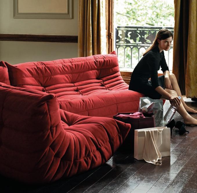
A symbol of the changing times post-1968, the hippie generation quickly seized on it as a place to curl up and enjoy their new idleness and aspirations to being different. A bête de mode (‘fashion behemoth’) for 50 years, acquiring no wrinkles along the way other than those in its fabric or leather covering, the Togo has turned up in many hotels and celebrity homes, including that of Lenny Kravitz, Bob Sinclar, Matt Sorum, Florence Foresti, Marc Rebillet to name a few.
The cult piece of the Seventies, with its floor-level seat emblematic of Ligne Roset's revolutionary modernity, Togo has become the brand’s star product and uncontested bestseller. Its characteristic soft and pleated silhouette, in which two generations have comfortably snuggled, continues to beguile to this day.
". . . a tube of
back on itself like a stovepipe and closed at both ends.”
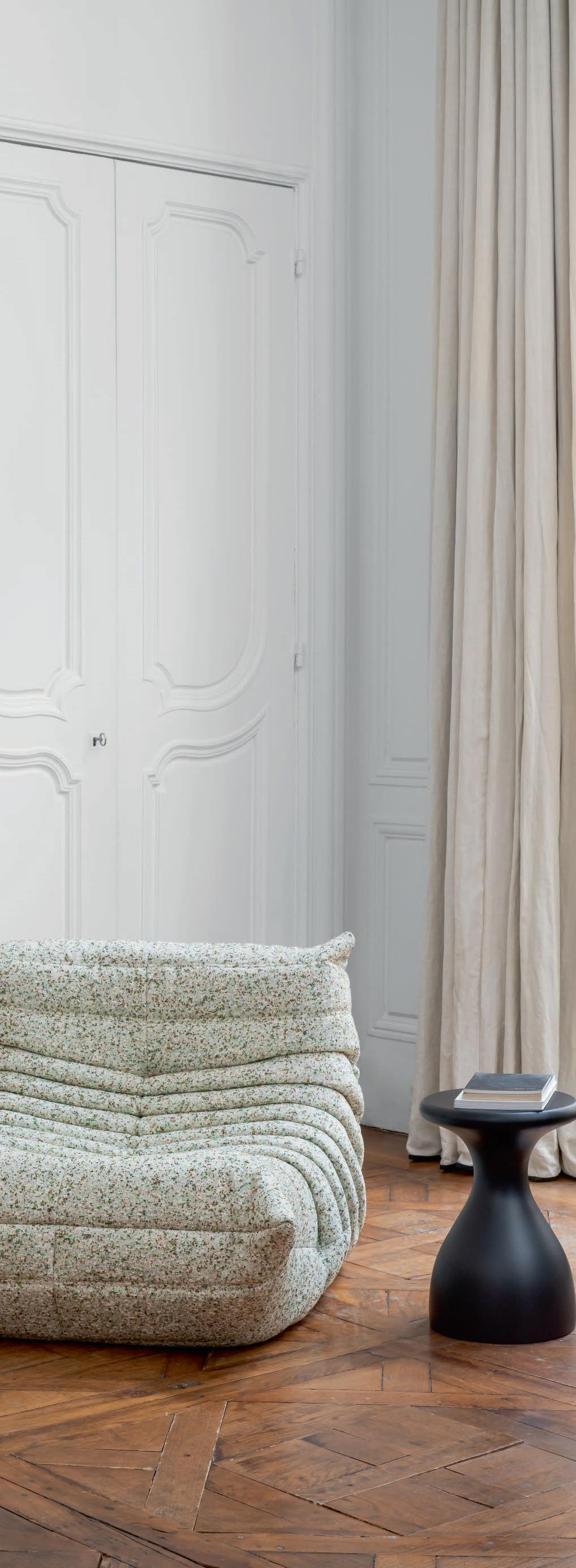
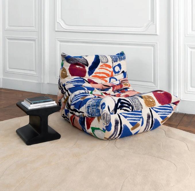
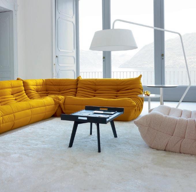 The limited edition Togo Atom by Raf Simons for Kvadrat.
The limited edition Togo La Toile du Peintre by Pierre Frey.
 Photography by Alexa Singer
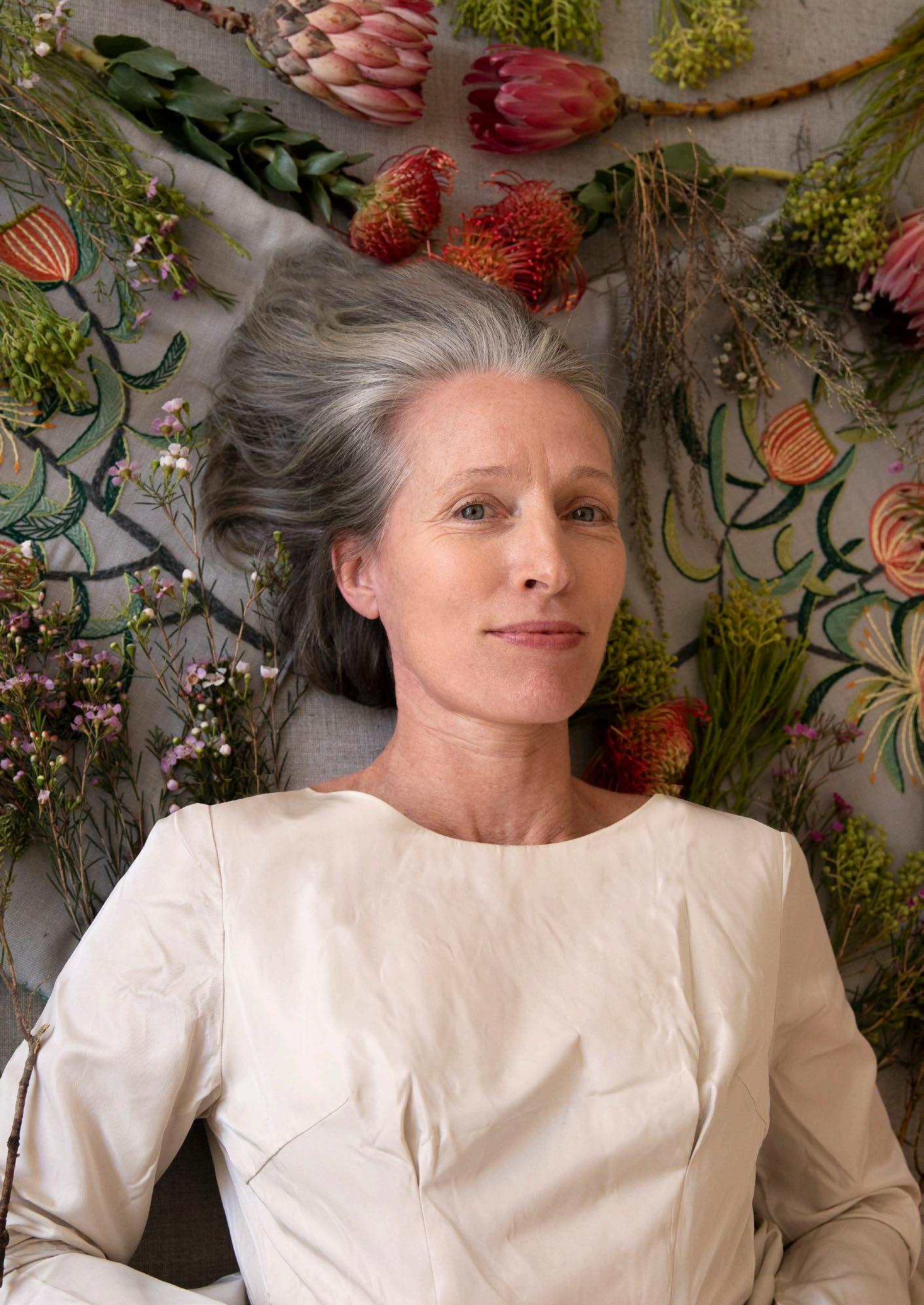
Ready to charm you with her incredible craft, Casamento founder Starry-Eve Collett is the tour de force behind a talented team of artisans creating unique upholstered furniture and hand-embroidered cushions that would make a beautiful statement in just about every home. Inspired by botanicals and nature, the methods they use are innovative yet traditional, reviving the forgotten techniques of hand-stitched artistry with an imaginative flair.
Q: Starting a unique brand in the saturated textile and furniture industry can be tough, but somehow, you’ve managed to capture a market of South African homeowners who are enthralled by your beautiful brand. Talk us through your story — from where it all began, up to where you are today…
I started Casamento with my sister Misty Dawn in 2007 as a mid-century-style, second-hand furniture business. We found amazing pieces from the 1950s to 1970s eras and upcycled them. I just love the furniture from that time: it’s so elegant and unimposing. Then everything just sort of mushroomed from there. We first introduced a few reproductions of the more popular shapes, then added the needlework element — that took things to a new level, of course. I’m inspired by the late Erica Wilson’s work for her husband Vladimir Kagan; she introduced a soft feminine stitch craft onto some of his very masculine furniture designs. I just love the contrast of texture!
Q: Hand-stitching has been making a bit of a comeback in recent years, which has enabled you to position yourself perfectly in the market! Can you share more about the materials, techniques, and styles behind your craft?
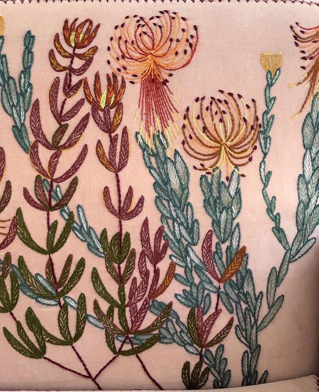
We use a range of crewel embroidery stitches. It's not as delicate as classical crewel, due to the nature of upholstery weight fabrics. Bamboo yarn is particularly strong, and the product we use (Vinni’s yarn) has a great range of colours. Waxed twine is used for leather work as it doesn’t fray. We have just started doing embroidered grasses onto leather. Our upholstery process also combines older techniques with modern ones, such as lining the frame with coir or recycled textile waste and using tack nails. We manufacture our frames with proper joints and screws, no nail guns or chipboard. This all makes for a product that should last.
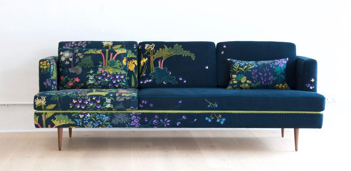
We have developed various finishing styles over the years, either due to commissions with adventurous clients or our own experimentation. The Enchanted style is a celebration of the dramatic prints on linen that I love. I combine them with a plain linen and embroider across from the print to the plain, to blur the join. I love re-interpreting the print to make it dreamier, as if you are stepping off the printed fabric into a dreamscape. These sofas always have one end that is very busy and one end that is completely plain, where you can take a break from the drama! My favourite print right now is Rabarba by a Swedish company called Jobs Handtryck. It was originally printed in the 1950s (of course), but they still screen-print it today.
Starry-Eve Collett Artist, Designer, and Founder of Casamento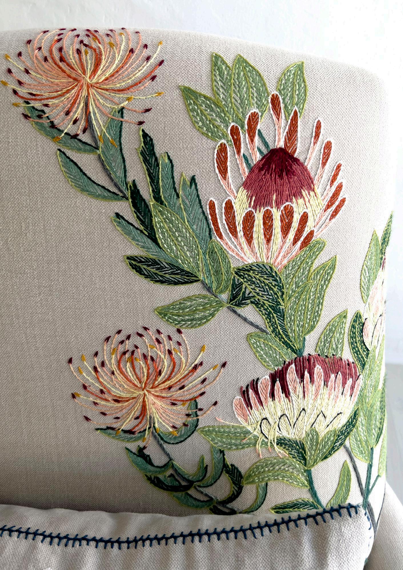
The Botanicals style is just embroidery of either fynbos, wildflowers, roots, seeds, or trees onto a plain linen or velvet. We recently did a passionfruit vine on our new shape ‘Mbotyi’.
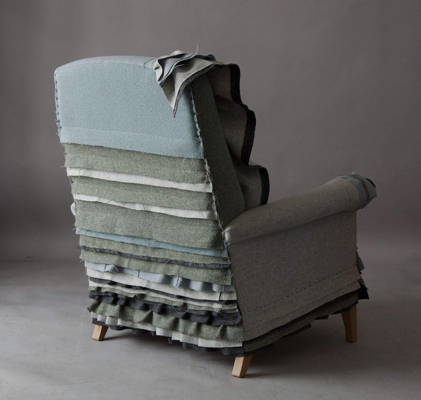
Our Raw style is based on the age-old upholstery technique of introducing a protective roll along the edge of the frame, stitched down with giant blanket stitching. We can also accentuate the design with contrasting twines and loose threads, embellished with knots and beads. The Slow style is just seams that are embroidered by hand; if someone wants a plain sofa with a touch of handwork. It works really well with leather.
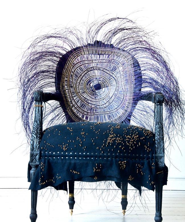
Afropunk is my own art project where I ‘decolonise’ an antique frame. I love sandblasting and burning the frame, deconstructing the fabric, and also collaborating with other artists on these chairs. We made one in 2017 with artist Atang Tshikare called the Leifo chair. They are meant to be artworks more than furniture.
Q: Is custom work a big part of your design process? If so, how do you merge a client’s brief and expectations with your creativity and approach?
It’s very much an organic process. There are always pieces on the showroom floor if people don’t want to wait. Or people can choose an example from our website and we will reproduce it in the client’s choice of colour or length.
Completely custom commissions are a lot more time consuming. Generally, a client will have a shape and style in mind that they resonate with, and we will suggest colours and embroidery designs that we think will suit the space. We provide drawings, and also do site visits if necessary. Some projects are easier than others. I’d like to scale commission work down this year to focus on exciting upcoming projects, so I’m currently working on a catalogue of pieces that clients can easily order to free up my design time.
Q: You try, whenever possible, to do business in an environmentally conscious manner. Can you share more about your sustainability initiatives?
Our team obviously tries to recycle as much as we can. We use about 30% less foam than other furniture manufacturers and only use plantation woods (e.g. SA pine, American walnut, and European oak and ash). We have recently acquired a consignment of natural rubber latex foam, which is non-toxic and sustainable. This type of raw material is very hard to come by in South Africa.
“We use about 30 % less foam than other furniture manufacturers and only use plantation woods (e.g. SA pine, American walnut, and European oak and ash)."
I am currently developing a chair that only uses local or African raw materials. The logistical nightmare that happened after lockdown in 2020 made me realise how dependant we are on Chinese supply chains and other imported raw materials. I’d like to reduce that as much as possible. Additionally, we try to only use natural fibre fabrics, especially the ‘baste’ textiles such as wool, hemp, and flax. These textiles cause the least harm to the environment.
Q: To us, your fynbos stitching is the real star of the show! What other styles, shapes, and variations are in high demand this autumn? And what else can we expect to see from Casamento in the coming months?
We are developing a circular sofa, a continuation of the curved shapes we started exploring last year. I am also working on a beautiful commission that is destined for Los Angeles. I grew up in a small town in Mpumalanga called Pilgrim’s Rest, but what most people don't know is that I am also an American, born in Los Angeles. Bringing our hand embroidered fynbos back to my place of birth is especially meaningful to me, a bit like coming full circle…
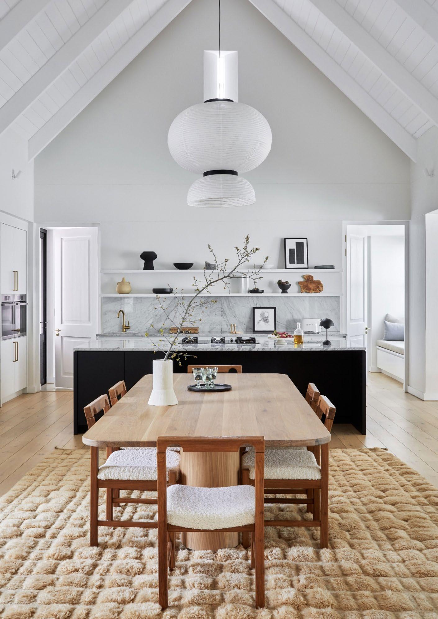
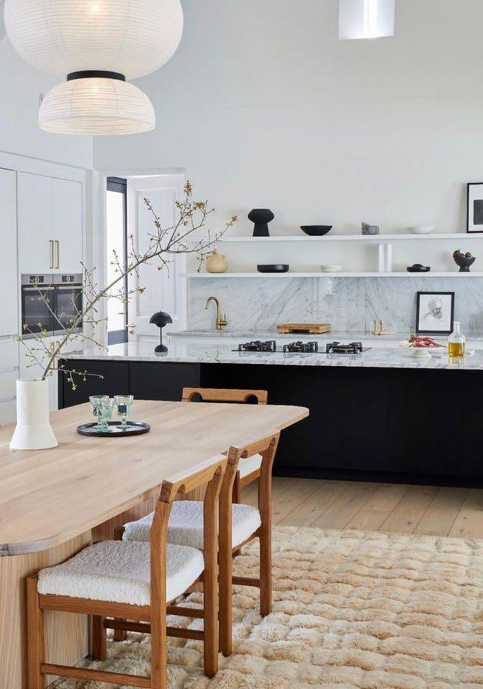
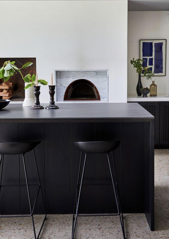
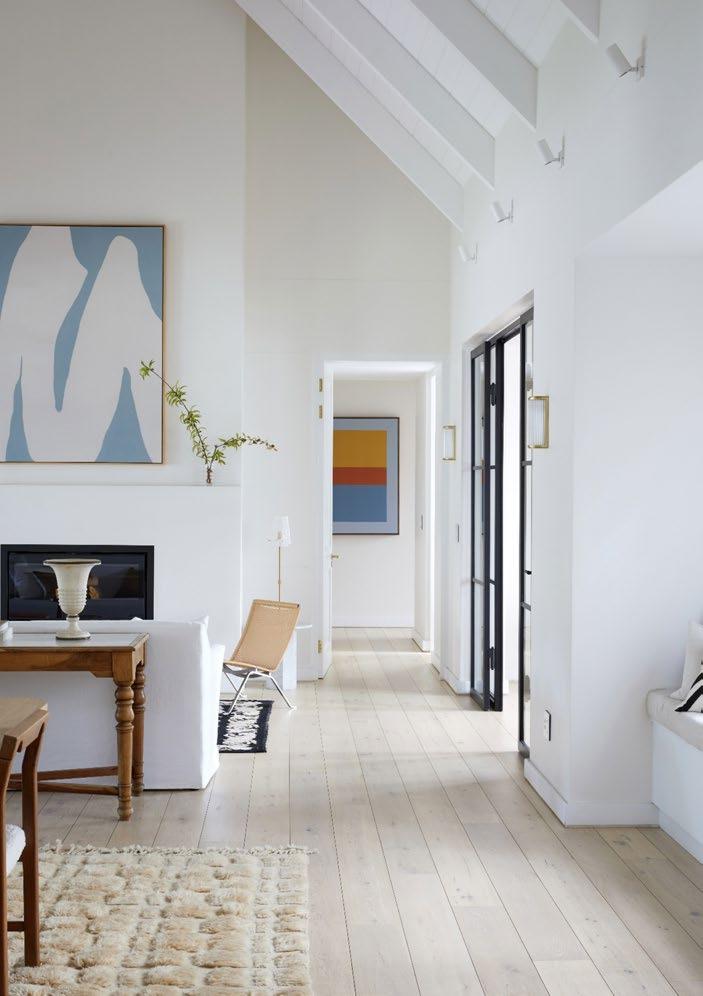
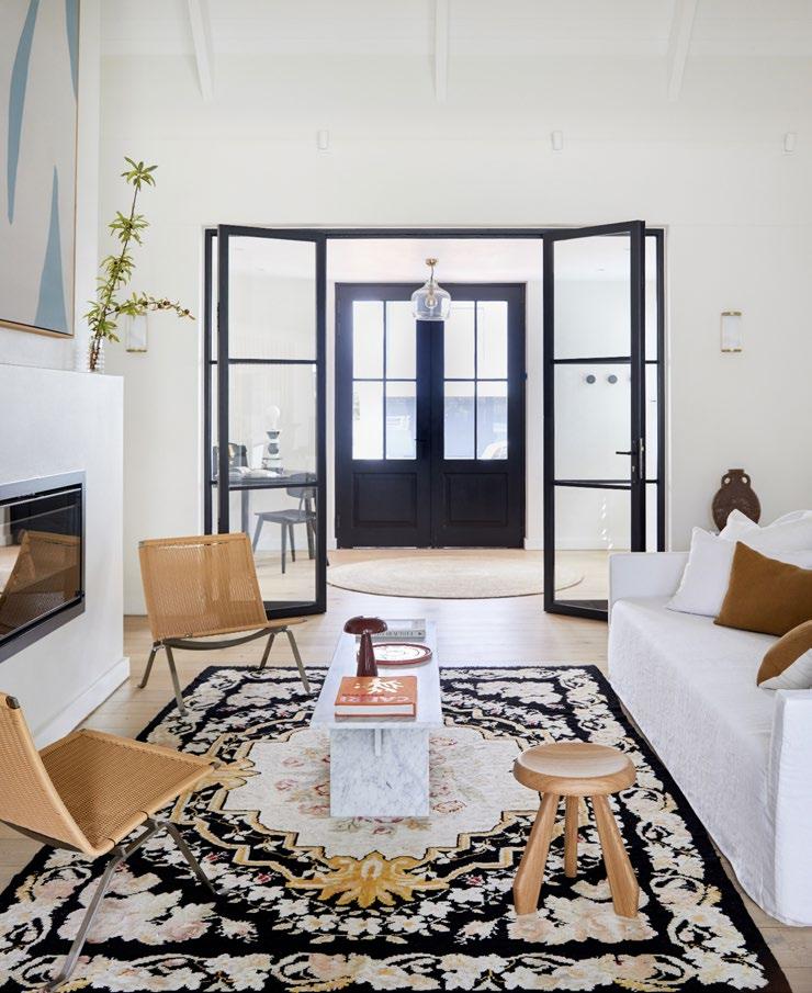
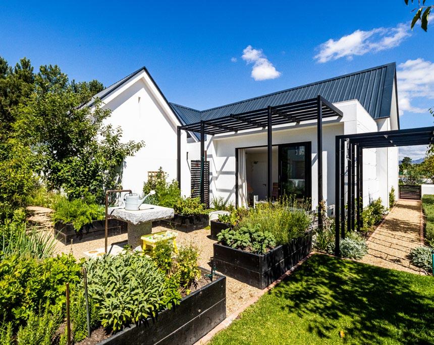
Nestled between Drakenstein and Simonsberg mountains alongside the Berg River lies Val de Vie Estate, where Anette de Jager of 360 Design created a contemporary farmhouse for a family in search of country convergence. With minimalistic interiors championing the natural landscape, vintage furniture, and honest materials, every detail was carefully crafted to tell the story of the family who calls it home.
Somehow serendipity played its part in my crossing paths with the client in cyber space through the platform called Instagram. I was working on a project in Paarl Valley when I received a message from Claire asking for an appointment to come and see the house they had just recently built in Val de Vie. Our journey together started after the meeting.
Applying my proclivity for vintage furniture mixed in a modern contemporary narrative was the starting point, and eventually after more than a year, the rooms started taking shape.
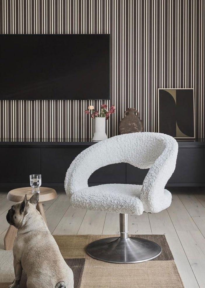
Clean lines, concealed detailing, and a limited palette of materials and colours all contribute to the timeless and minimalistic aesthetic in this farmhouse-inspired home.
The open-plan abode accommodates four bedrooms with en-suites, a double garage, openplan living room, dining room, and kitchen, a scullery and laundry room, formal lounge area, staff quarters, and outside entertainment patios.
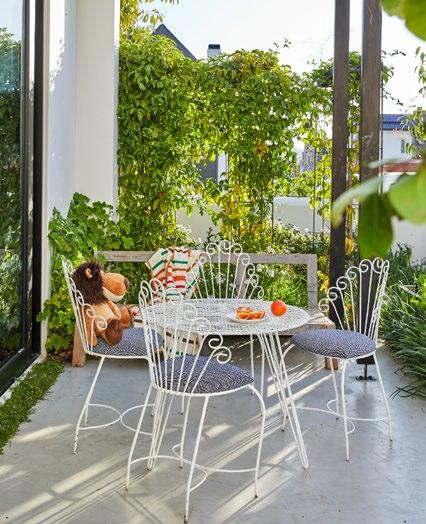
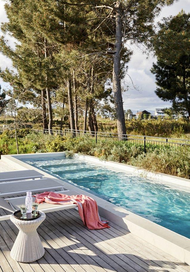
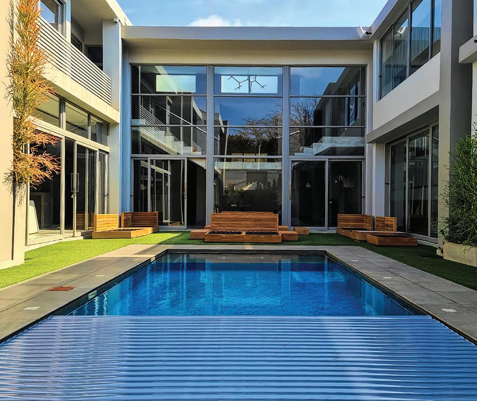
With a biodiversity corridor to the east, including breath-taking panoramas, an inviting pool, and landscaped sanctuaries, the project embodies the ethos of country living.
My design approach is firmly rooted in the principles captured by Victor Papanek: ‘Design must dedicate itself to nature’s principle of least effort. Maximum diversity with minimum inventory. Consume less. Use things longer. Be frugal about recycling materials.’

The process of sourcing specific vintage items with the goal to recycle them can be arduous, but the benefits are so much more rewarding and soulful. Collecting timeless pieces and curating furniture and objects made by human hands and honest materials were our main objectives in the sourcing process.
The possibilities in creating the interiors for this family home — their story narrative, setting the stage for their newly built dream home, and how each space unfolded — were far from only ‘wants and desires’. A deeper need to create by embarking on a journey where the intangibles became as much part of the essence of the home was required. 360 Design feels honoured and privileged to have played a part in creating this home with a sense of belonging and a country convergence for city folk.
Flooring Oggie Hardwood Flooring World of Decorative Concrete
Tiling
Akashic Tiles
Carpet Fibre Design Rug Gallery
Home automation system
Smart Spaces Home Automation and Theatre
Frameless stacking patio doors
Frameless Glass
Shower glass and fixings
Frameless Studio
Sanware Flush Bathrooms Bathrooms 4 U
Tapware Vado, available at Victorian Side Bathrooms
Joinery Joos
Ironmongery Handles Inc.
Marble countertops Granite Works
Oak dining table, travertine coffee table, and artwork
Lemon Collection
Carpet Herringbone
Lighting
Créma Design Eagle Lighting
Ceramics
Jade Paton, available at AKJP Studio
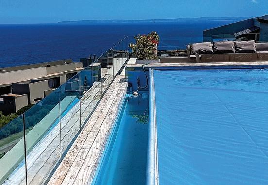


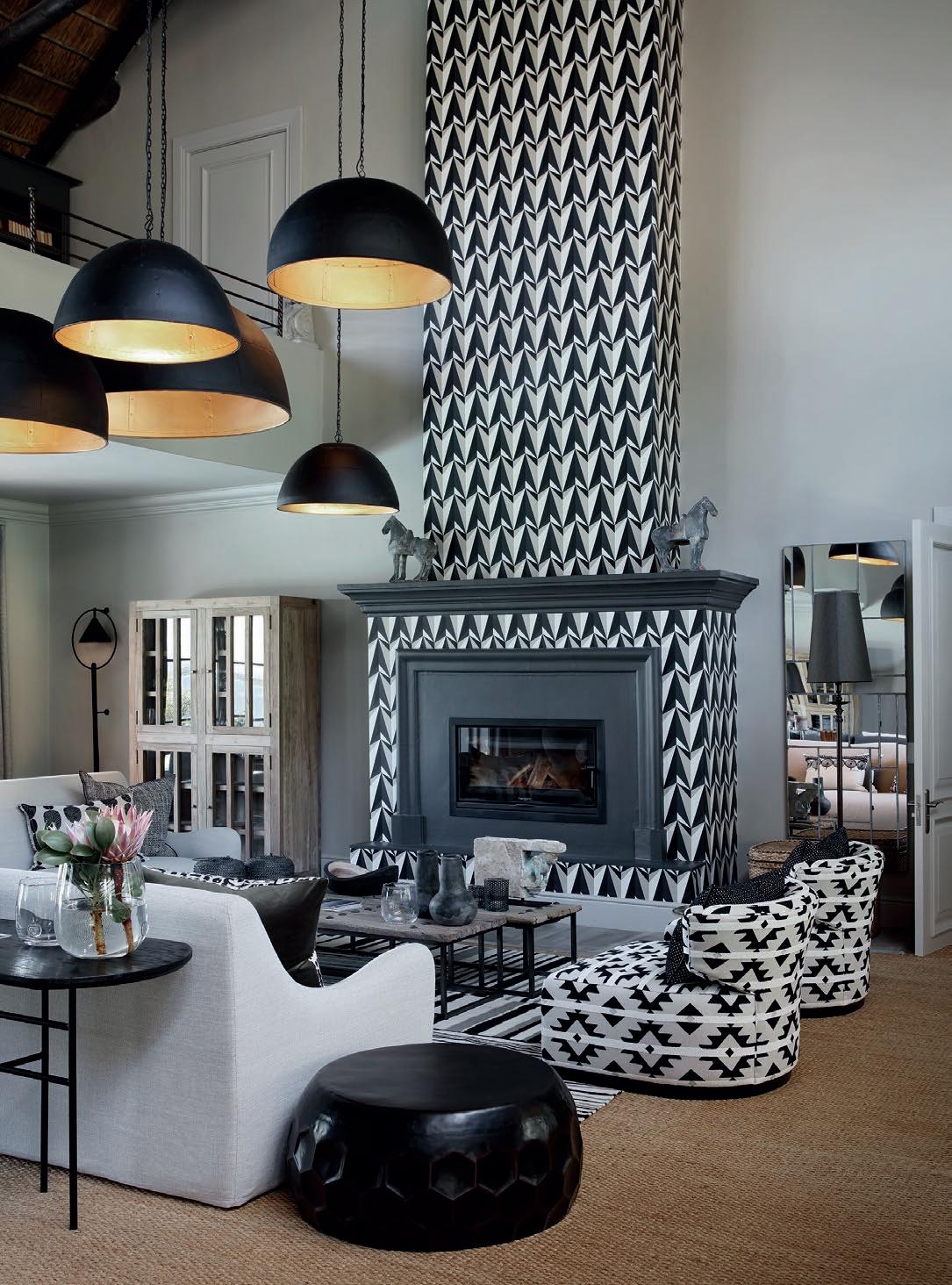

The last few years have been all about survival and necessity, leaving little room for pleasures and aesthetics. We are entering a new roaring '20s, which promotes not only a decent level of self-care but also finding and discovering the things in life that spark joy, whether it’s out in the streets or inside the safe spaces of our homes.
The time has come to Marie Kondo on everything useful, serious, and boring and style our homes to bring back the art, colour, and the flavours of life. Treat yourself to creating a home that not only reflects who you are but also brings a sense of pride and happiness.
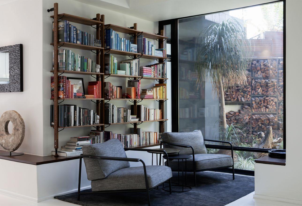
The first step is to start, and we hope that these few easy tips will result in a joy-sparking visually appealing end-product that is plenty of fun to do too. Get yourself ready for a blast of a time and let the magic begin!
The easiest way to get to know yourself is to open Pinterest, start scrolling, and let the app guide you to photos of spaces you like and find enjoyable. There are no rules — simply play and know that when they said ‘dance like no one is watching’, this is what they meant. Organise it into rooms or don’t, and see how your style becomes more apparent even to you.
Save the date and hit the streets to see what’s out there. If this is too scary, online shops like Local Edit are great places to start. Remember, it must have zero function other than bringing you joy. Accessories, art, cushions, and books are on the list and, should you have even more energy, thrift shops in real life and on Instagram are treasure troves of great finds.
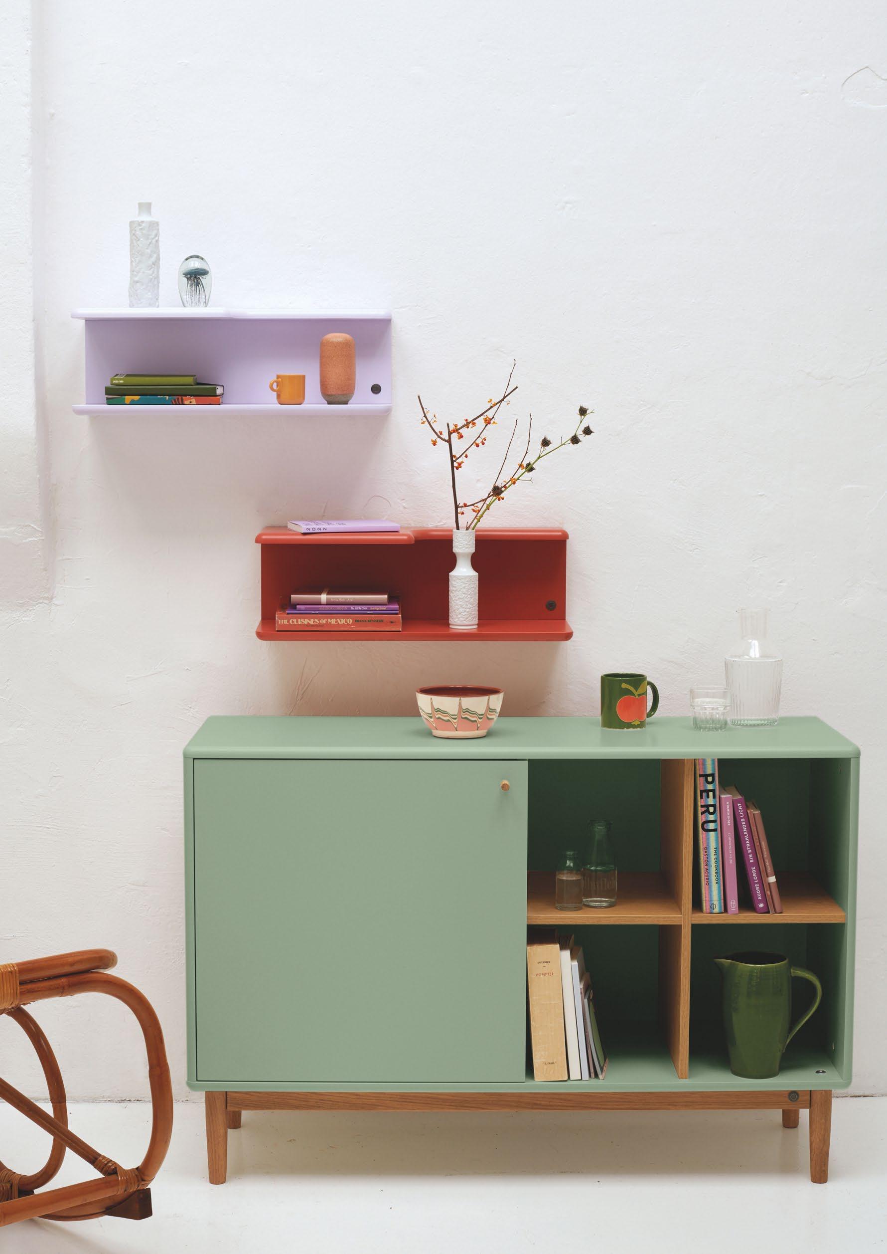
"Do a composition and sleep with it for a night. Redo and play again and follow the rules set out above or go crazy."
Now that the shopping bags are filling up the foyer and you know what you have, it’s time to declutter. Form follows function, so make sure you don’t go too rogue by purging necessary items. If they’re not visually pleasing, find something aesthetic to put them in like baskets, paper boxes, and crates.
It’s time to create and curate the gallery of you into a master artwork. Go back to your Pinterest images and look at how the items flow on a shelf.
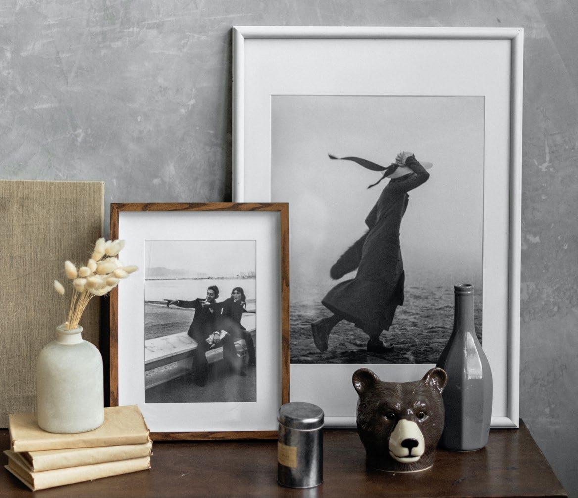
Balance two items with each other in terms of size and weight and create a pattern in your objects. When placing something tall on one side, balance it out with maybe two items that take up the same visual weight in width and depth. When placing three items next to each other, place the tallest one in the middle, but ensure that the other two are balanced as mentioned above and not completely matching in height.
Think of colour schemes that appeal to you. Apply some simple colour wheel rules using colours on opposite sides to match. This obviously applies to a very varied and colourful approach. When your look and style is more subdued, look at following a monochromatic scheme. Neutrals can go from beige into whites and mushrooms, and mushrooms can then go into marches and greens. Let the colours flow and play off each other.
Erica Schalkwyk Interior Designer and Founder of Form Interior www.forminterior.co.za @forminteriordesign

The best way to finish off a space is with what we call the jewellery of the interior industry: greenery, dry bouquets, and anything natural. When in doubt, add a plant. You’ll see how it livens up a well curated space of beautiful objects.
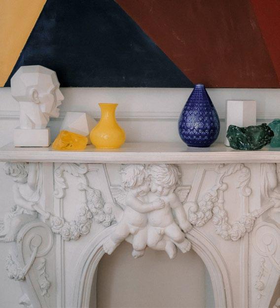
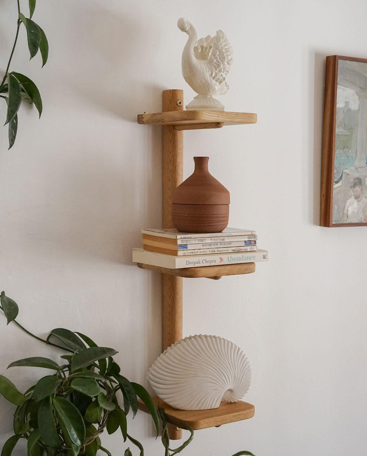
Do a composition and sleep with it for a night. Redo and play again and follow the rules set out above or go crazy. You are a visual person and the composition and artwork will come alive as much as you engage with it. There is no deadline, and your artwork will be an ever-changing organic ‘shelf portrait’.
Let’s take it back to the early years. Yes, I'm talking about crib couture (aka nursery interior design) — the magical space where your little bundle of joy will experience their first few rounds around the sun. Whether you’re expecting, a mom of two, an interior design fanatic, or simply an aficionado of teeny tiny things (I, for one, identify with this category), then you're bound to find some cute inspiration to tickle your fancy. So let's get started, shall we?
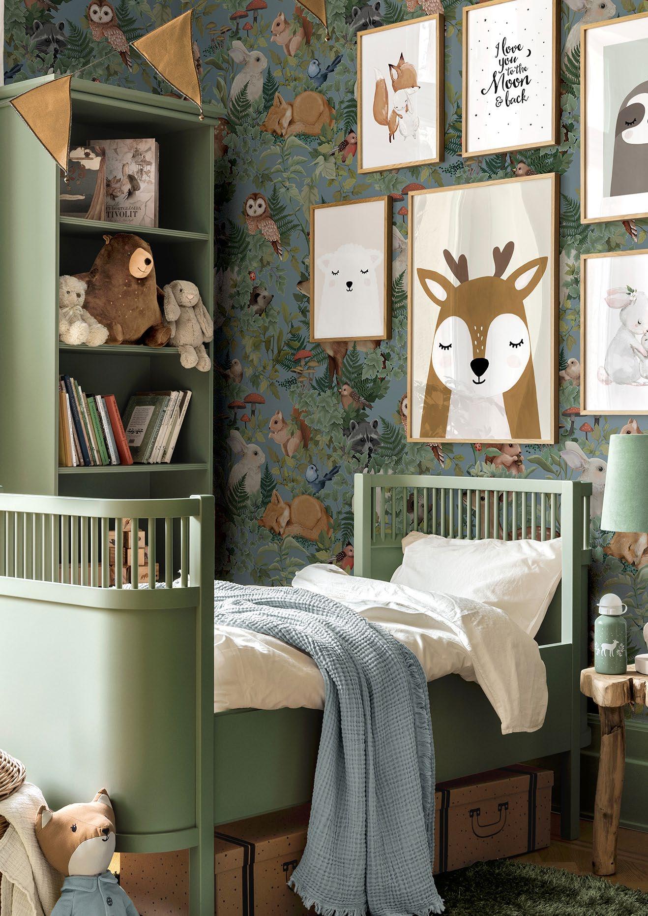
Oh to be a child again! We’d all love to be whisked away to this enchanting room designed for curious little explorers who love to play and dream. The open-sided cot is perfect for growing adventurers who are ready to take on the world, and the walls are adorned with adorably stunning wallpaper featuring an array of forest friends complementing the room's meadowgreen hues. Then there's also the toys and artwork. From cuddly bears and lazy sloths to sprightly foxes and graceful deer, this snuggle room maximises its display of charming creatures.
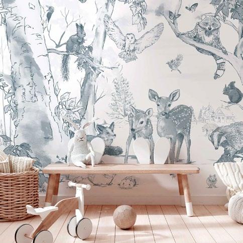
Calm, cool, and collected, this breezy-blue kid's bedroom and playroom tick all the boxes. At once charmingly classic and in vogue, the trendy mushroom pendant light fixtures make a beautiful standout feature when paired with more traditional artwork and paraphernalia. Whether you're snuggling up for storytime or tucking your little one in for a nap, this tranquil den offers a delightfully endearing atmosphere that both you and your baby will cherish. The playroom was designed by Anette de Jager of 360 Design (360design.co.za) for a family home in Val de Vie. The gorgeous green Flowerpot Pendant is by Créma Design (cremadesign.co.za).
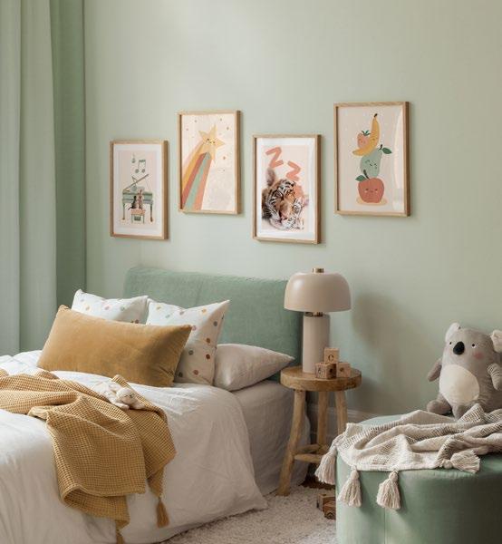
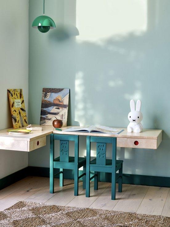
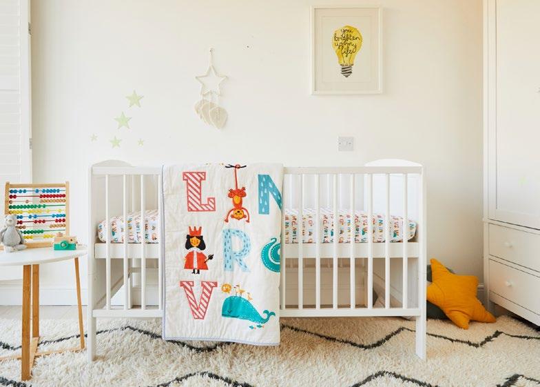
Bursting with energy and giggles, this cheerful nursery is awash with hues like sunny yellow, sky blue, and cherry red, creating a lively and stimulating space. Colourful yet muted, playful yet stylish, the room is filled with patterns, from the rug to the cot mattress. There is no shortage of toys, games, and artwork, inspiring creativity and imagination. This is a room where your little one can play, learn, and grow in a vibrant world of fun and excitement.
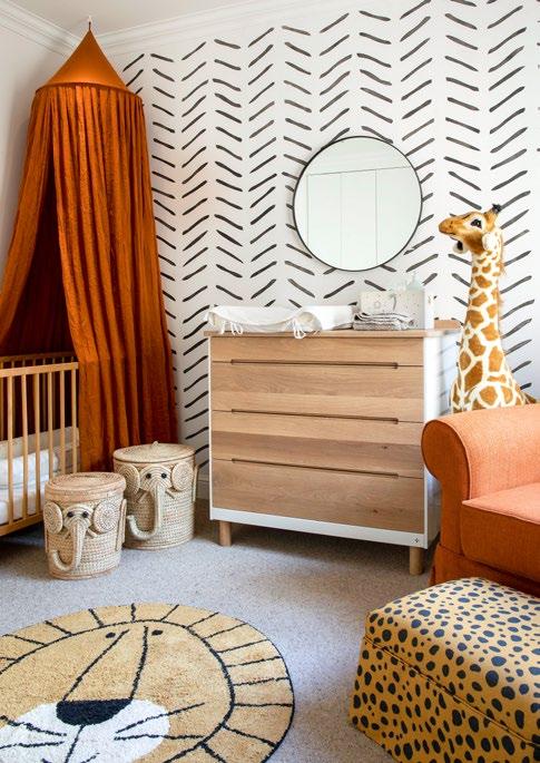
Welcome to the jungle, baby! This nursery is a wild wonderland filled with playful pops of orange and daring dashes of leopard print. Talk about fierce fashion! The lion rug is the king of the floor and adds a cosy texture to the space, while the elephant baskets provide functional storage with a fun twist. And of course, no animal kingdom would be complete without a friendly giraffe soft toy — it's the perfect snuggly companion for your little adventurer.
Pictured here in oak and a natural oil finish, Pedersen + Lennard’s Compactum is designed to become a useful chest of drawers beyond changing nappies — ideal for when you want to redesign the space as your wee one grows. From the saffron colour scheme capturing the iconic hues of an African sunset to the animal-inspired accents, this nursery is sure to inspire endless fun for you and your little one.
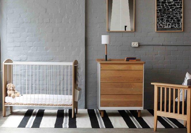
Summoning 50 shades of grey, this subtle-chic nursery (or should I say loft apartment) is perfect for parents who want to preserve their home’s distinguished style while adding a bit of child-like flair. The monochrome room features Pedersen + Lennard’s heirloom Baby Cot — a piece of furniture that is as functional as it is fashionable. What is especially great about this cot’s design is its ability to evolve with your little one: the bed’s surface can be raised or lowered, and one side of the fence can entirely be removed, creating a toddler bed or small couch. You can zhoosh it up by swapping out the rug or wall art for something with a little more pizazz.
design and photography by Kelly Adami, Copperleaf Studio (copperleafstudio.co.za)
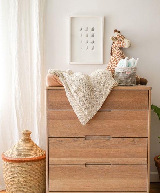
Calling all basic beige moms! This little nest is understated and timeless, with natural wood finishes and simple, elegant accents creating a soothing space for peaceful slumber. The room is filled with soft textures, from the rug to the blanket and curtains, further enhanced by plenty of natural lighting for a warm and inviting glow. With a neutral palette, you can easily add personal touches and switch up the room's decor as your baby grows, making it a versatile and long-lasting space for your little one to make their earliest memories. The All Timber 1887 Compactum is by Pedersen + Lennard and the Togo chair by Ligne Roset.
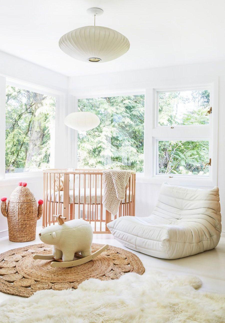 Interiors by Leanne Ford (leanneford.com)
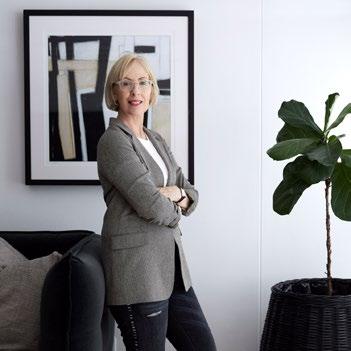
Liesl Lamprecht Content Manager Outside & In

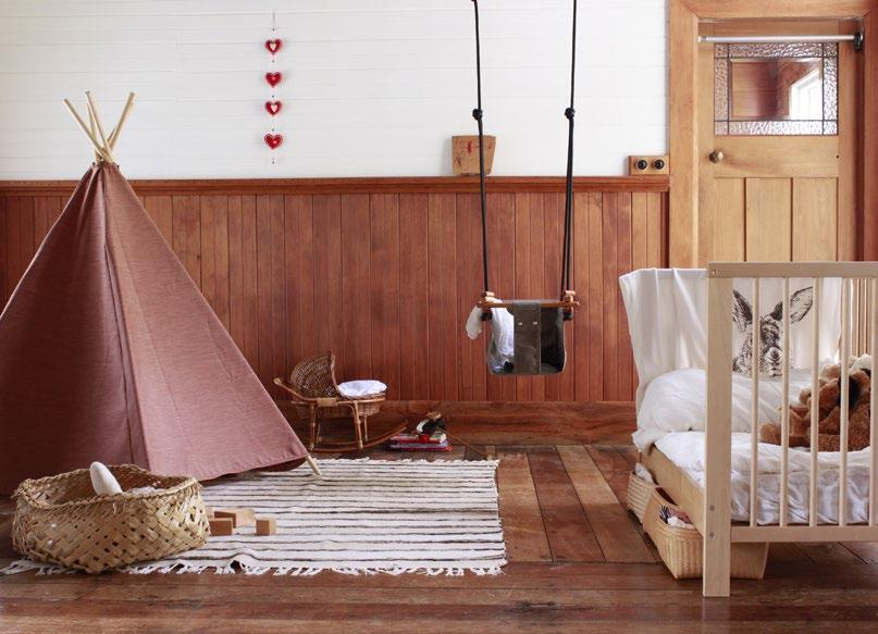
If your home has natural wood floors or wall panelling, then the arrival of a new family member might be the time to channel your inner vintage aesthetic. Timeless and nostalgic, this design taps into raw woods and cream-beige wall paint for a classy look reminiscent of traditional classrooms from the past. Look for a wooden cot or crib that will add warmth and richness to the room. Vintage posters or educational charts can be fun to hang on the walls, adding to the classroom theme. Your nursery can also feature a chalkboard or a map, bringing a sense of stimulation to the space.
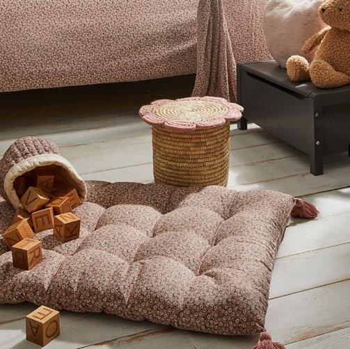
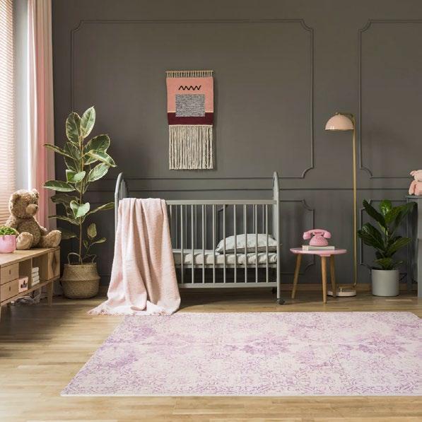
Step into sweet sophistication... This baby’s abode is all about chic contrasts. The deep, rich tones of charcoal create a bold and dramatic backdrop for the delicate touches of pink throughout the room. A mushroom light gives the nursery a distinctly contemporary feel, while the classic wall stencilling adds an elegant edge, creating a stunning focal point that draws the eye in. Tie the room together with the non-toxic Vintage Blush Play Mat by ARK Playmats to give your bambino a safe surface for tummy time, crawling, exploring, and all the developmental milestones in between.
